If it’s interactive, it needs a focus style

A presentation at #a11yTO Conference in October 2018 in Toronto, ON, Canada by Eric Bailey

Slide 1

Slide 1

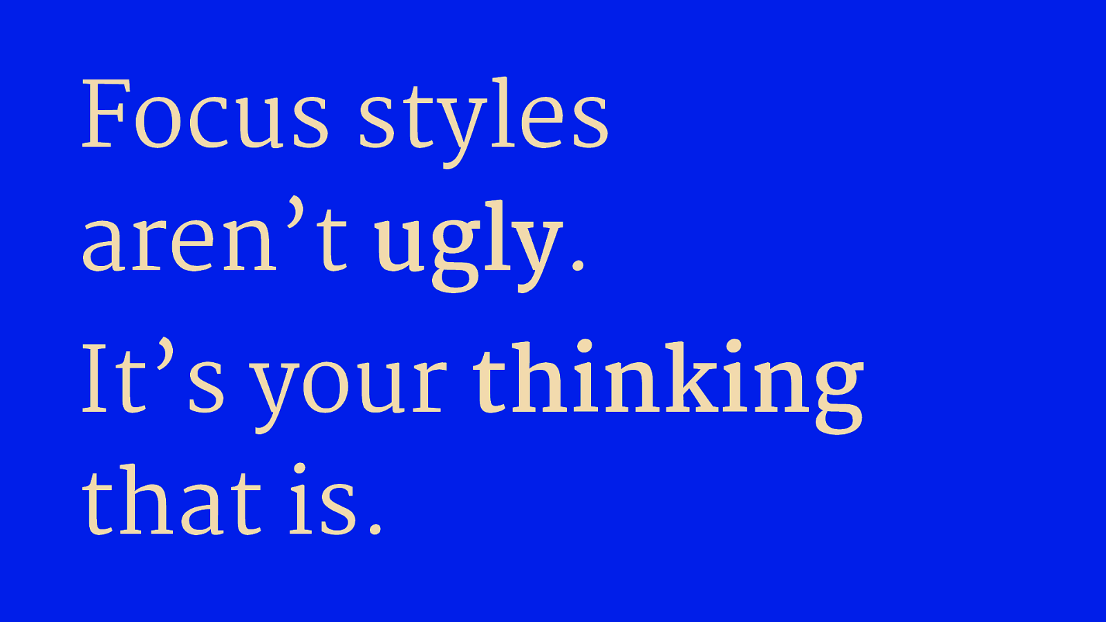
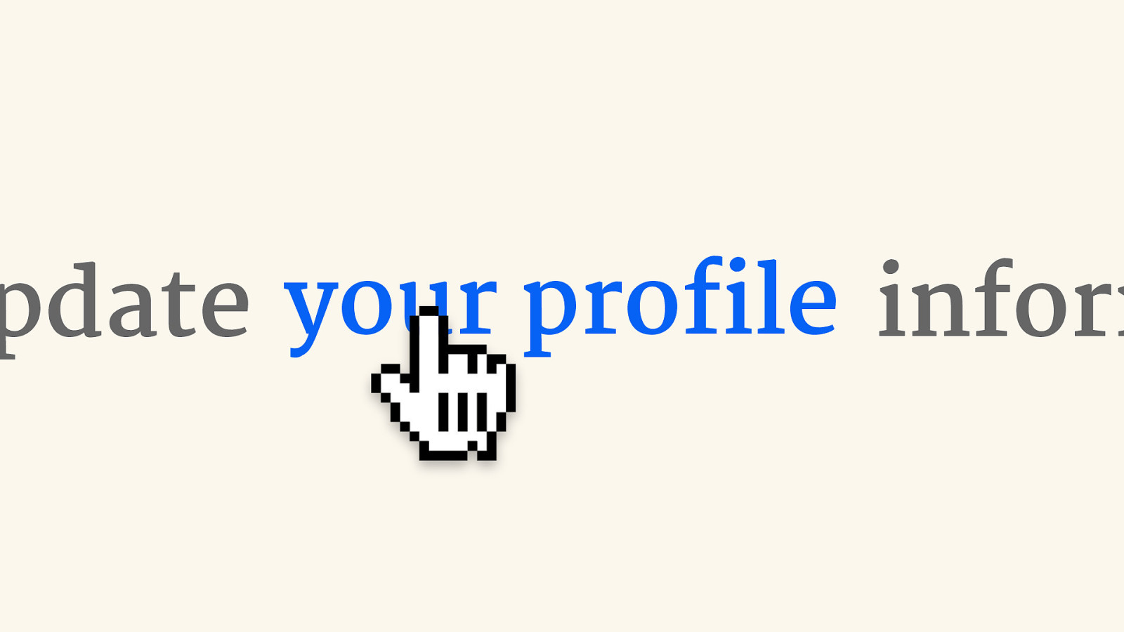
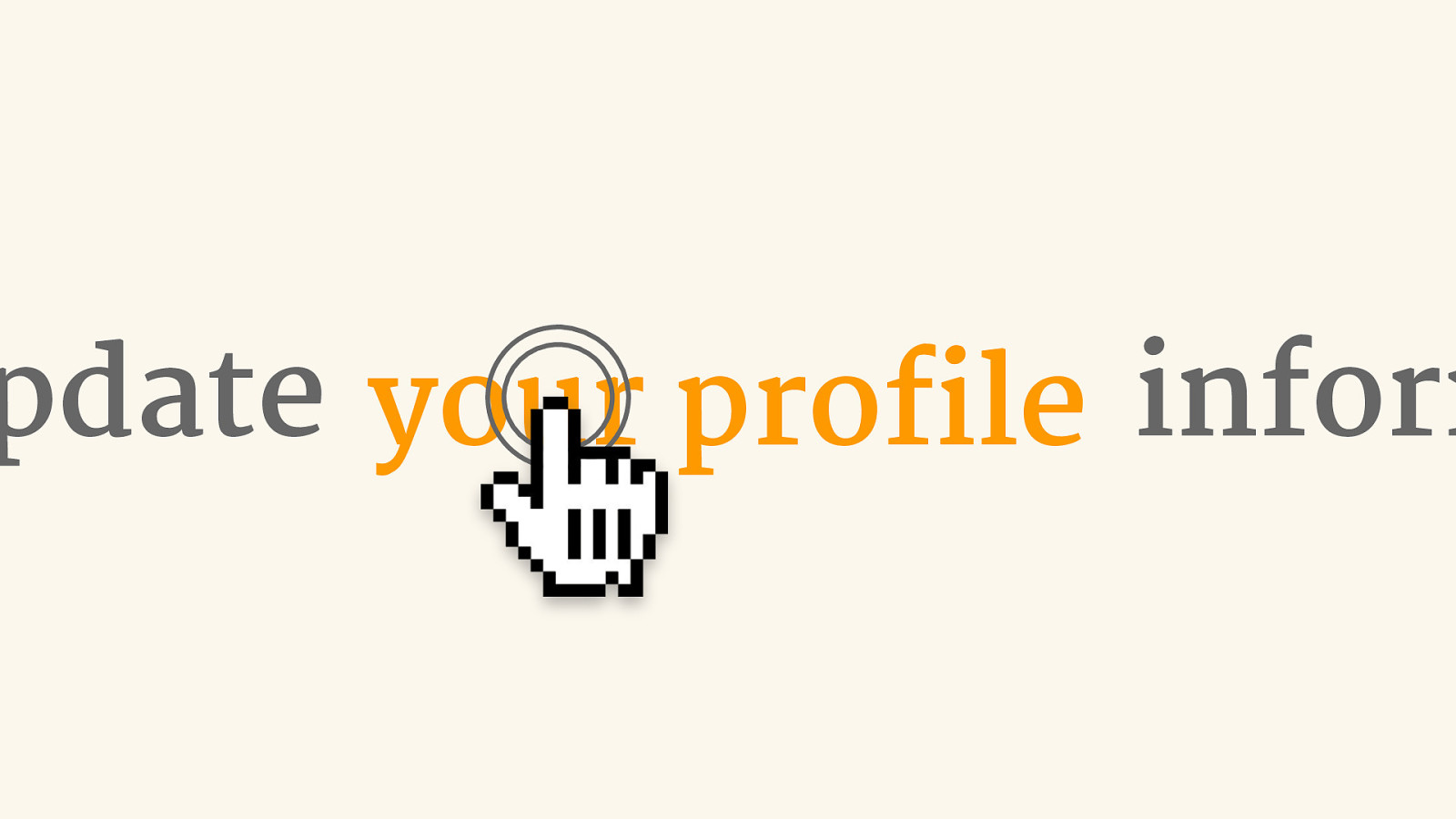
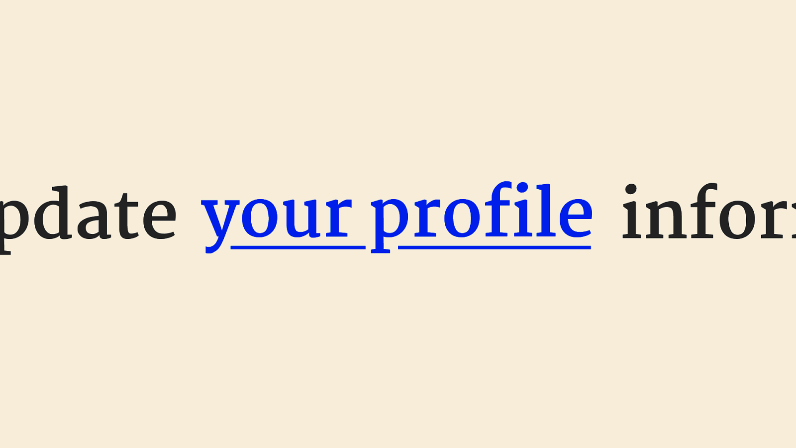
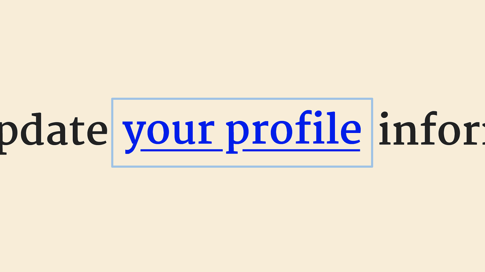
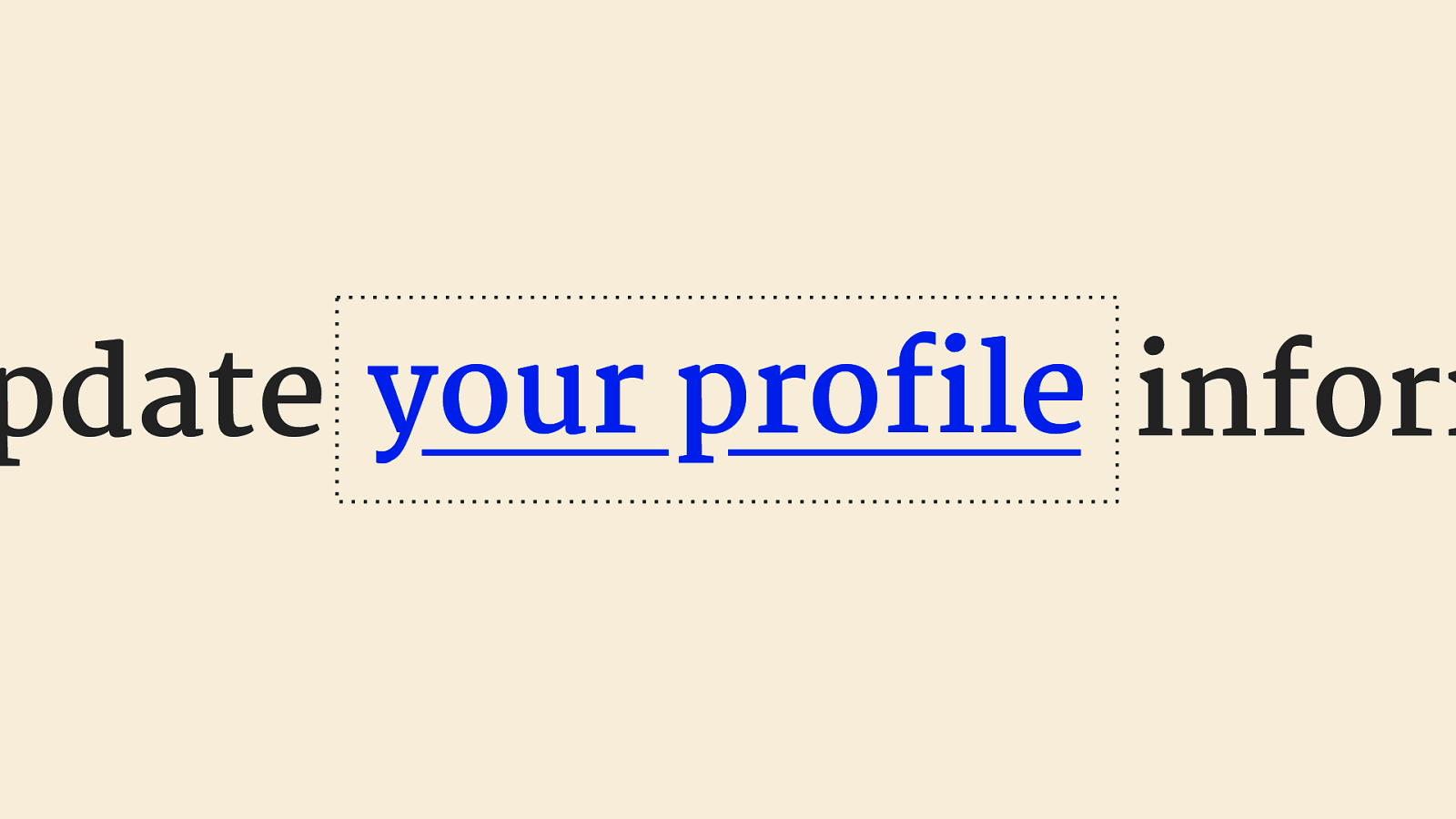
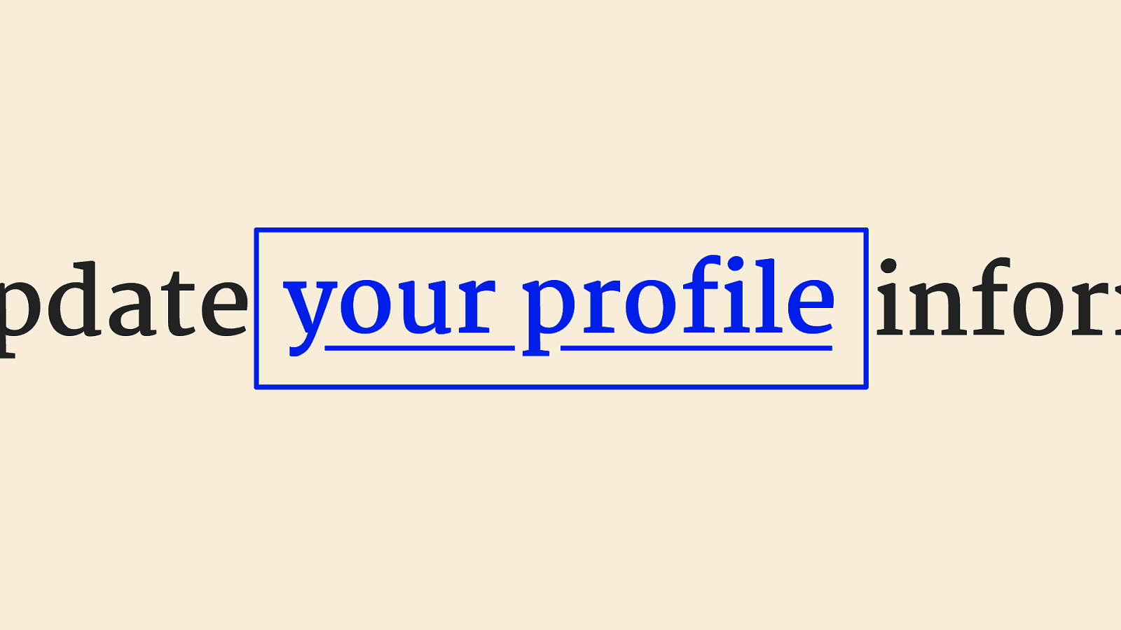
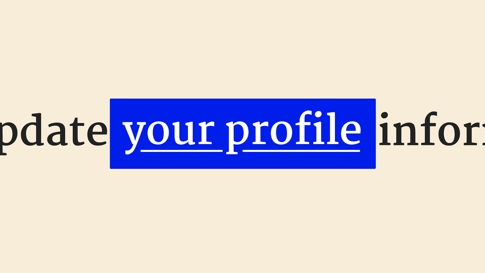
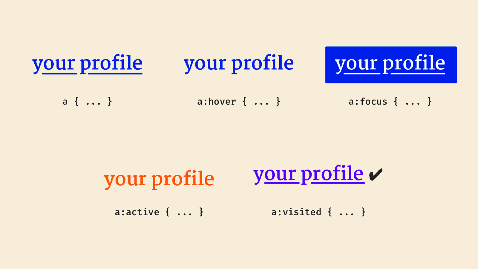
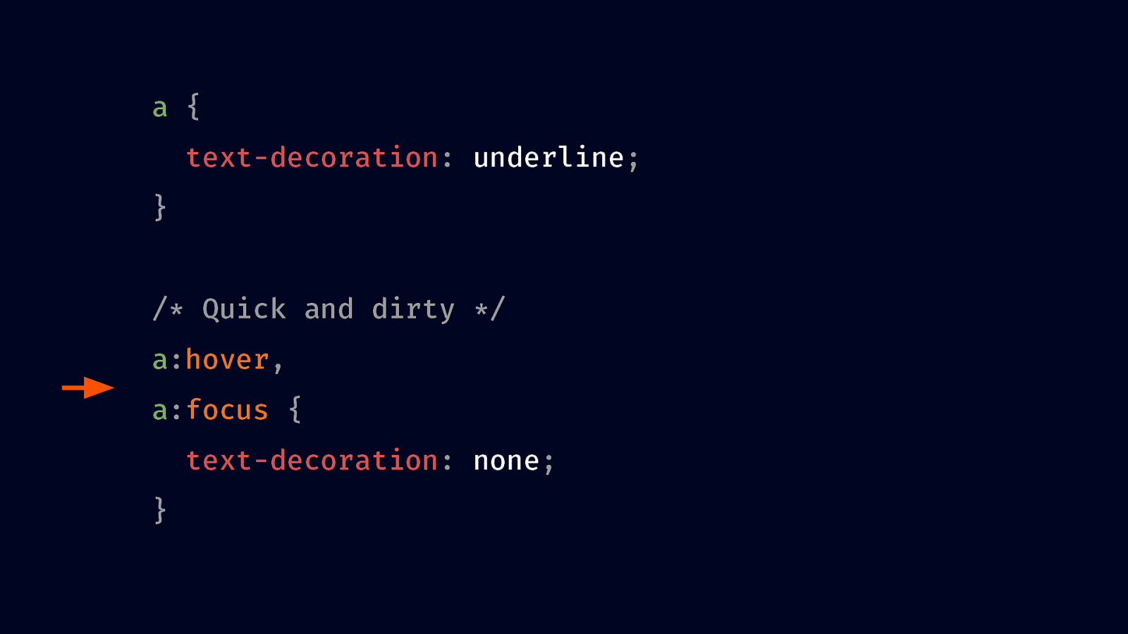
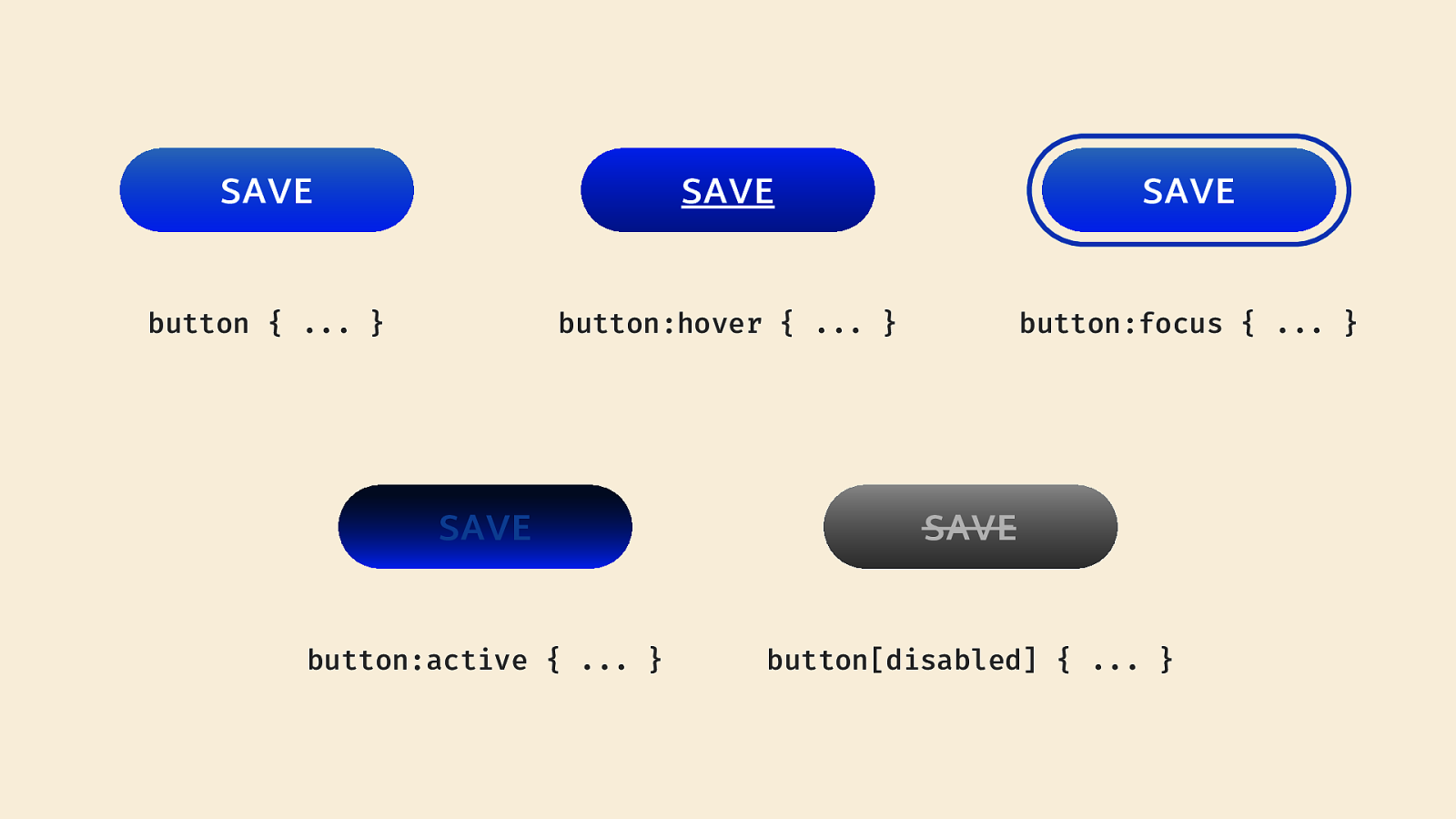
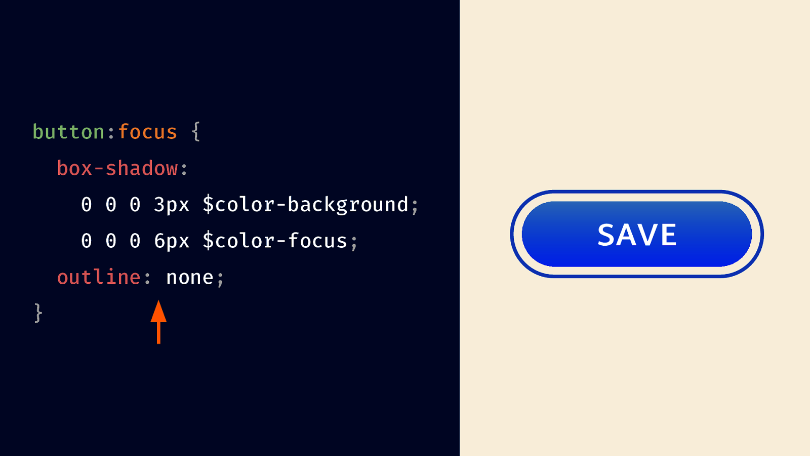
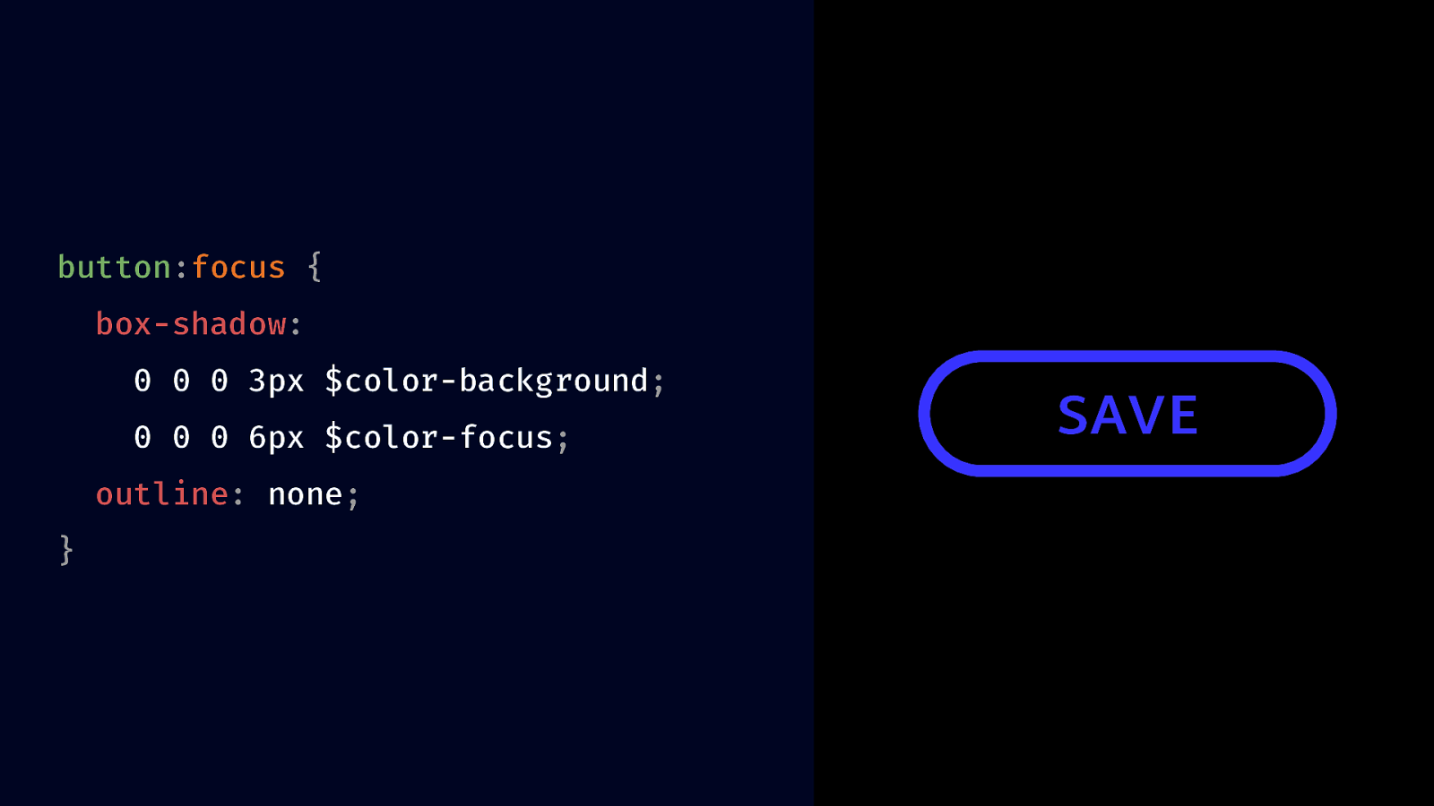
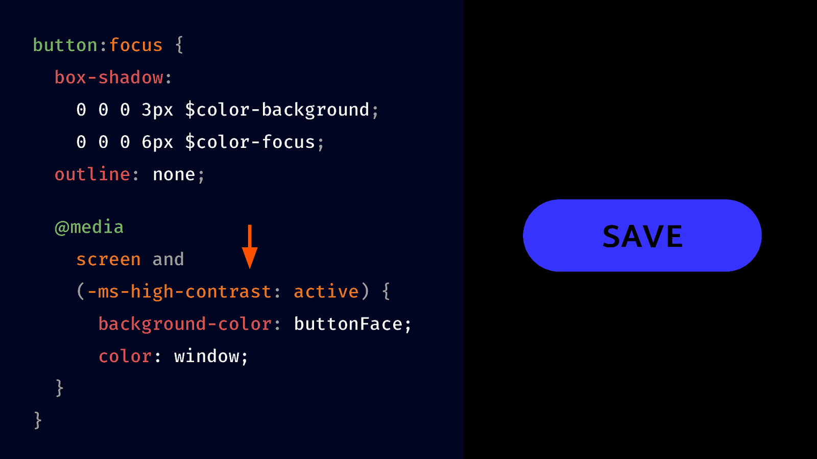
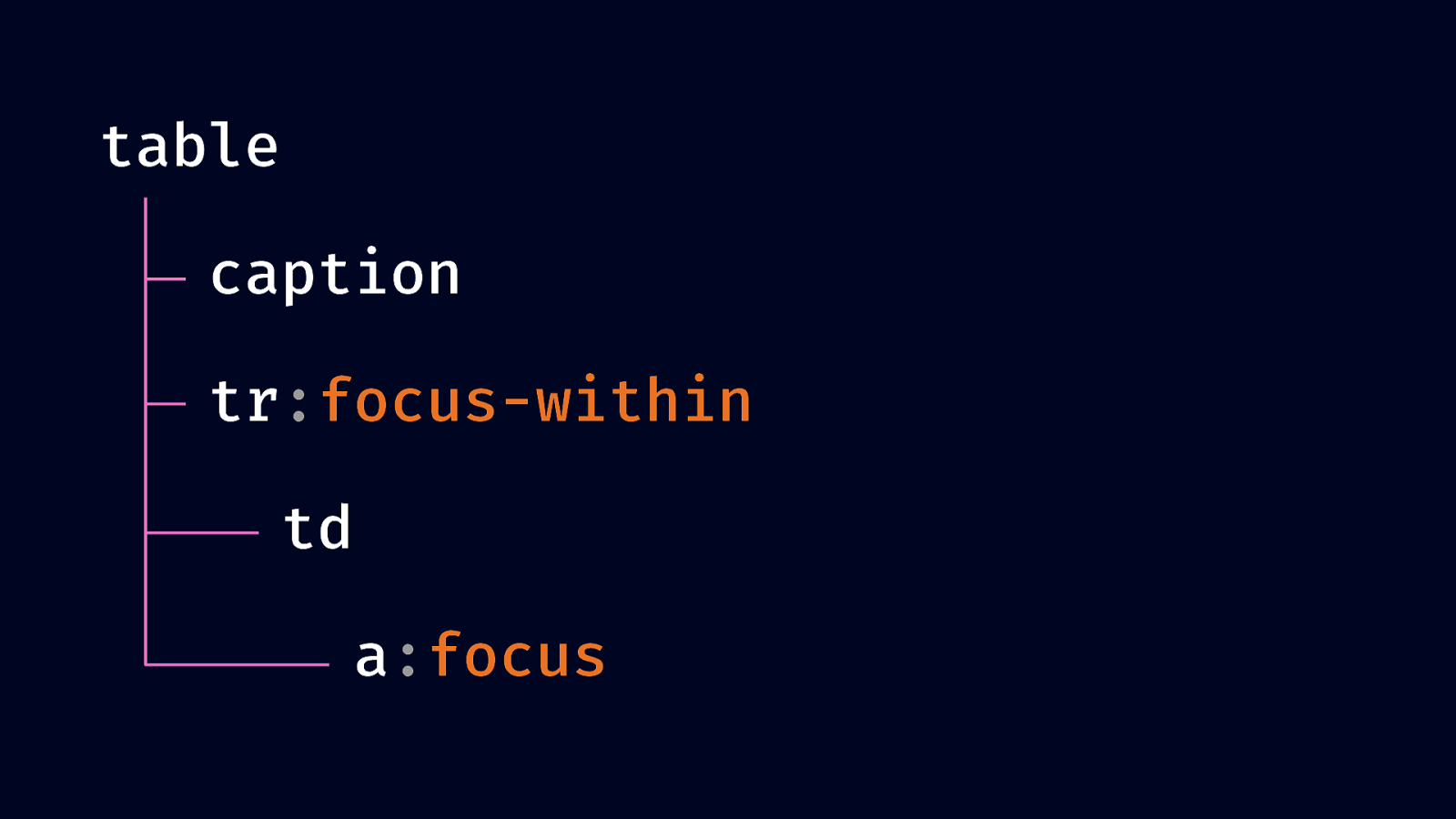
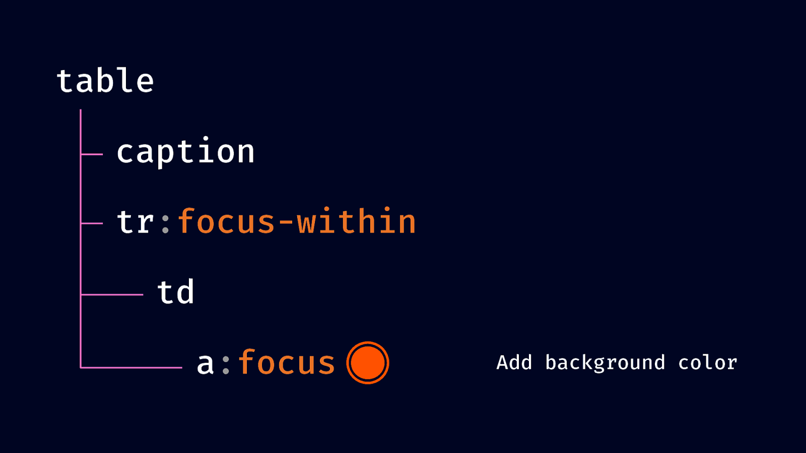
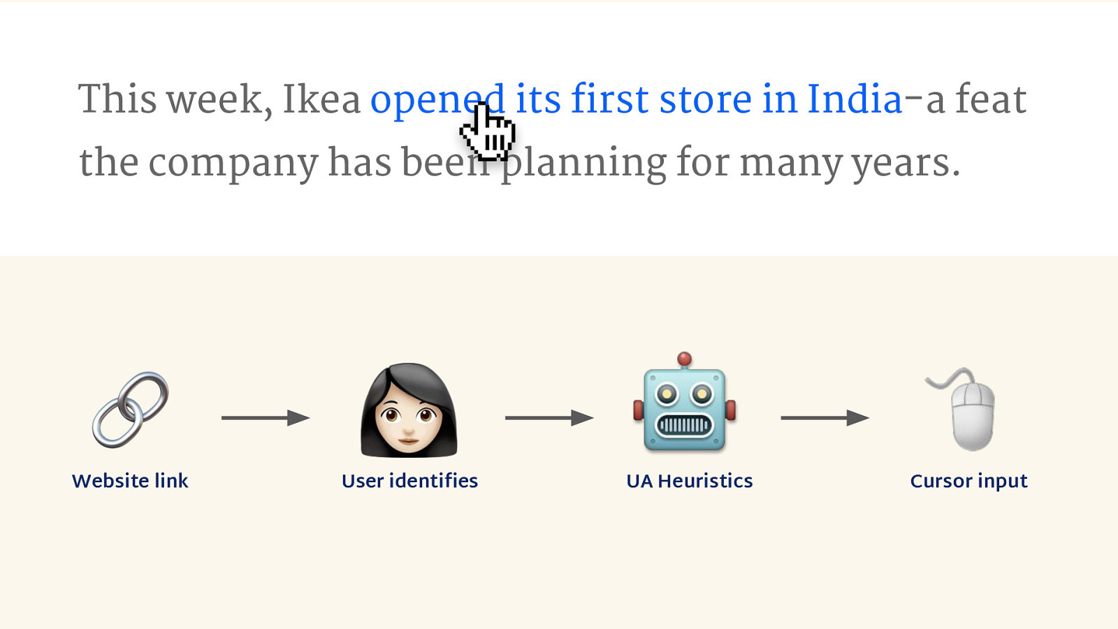
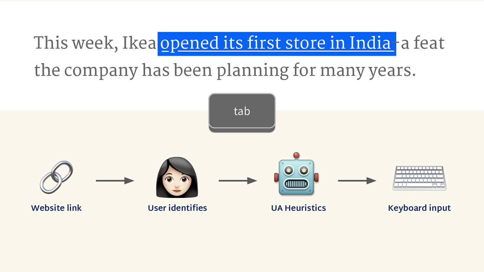
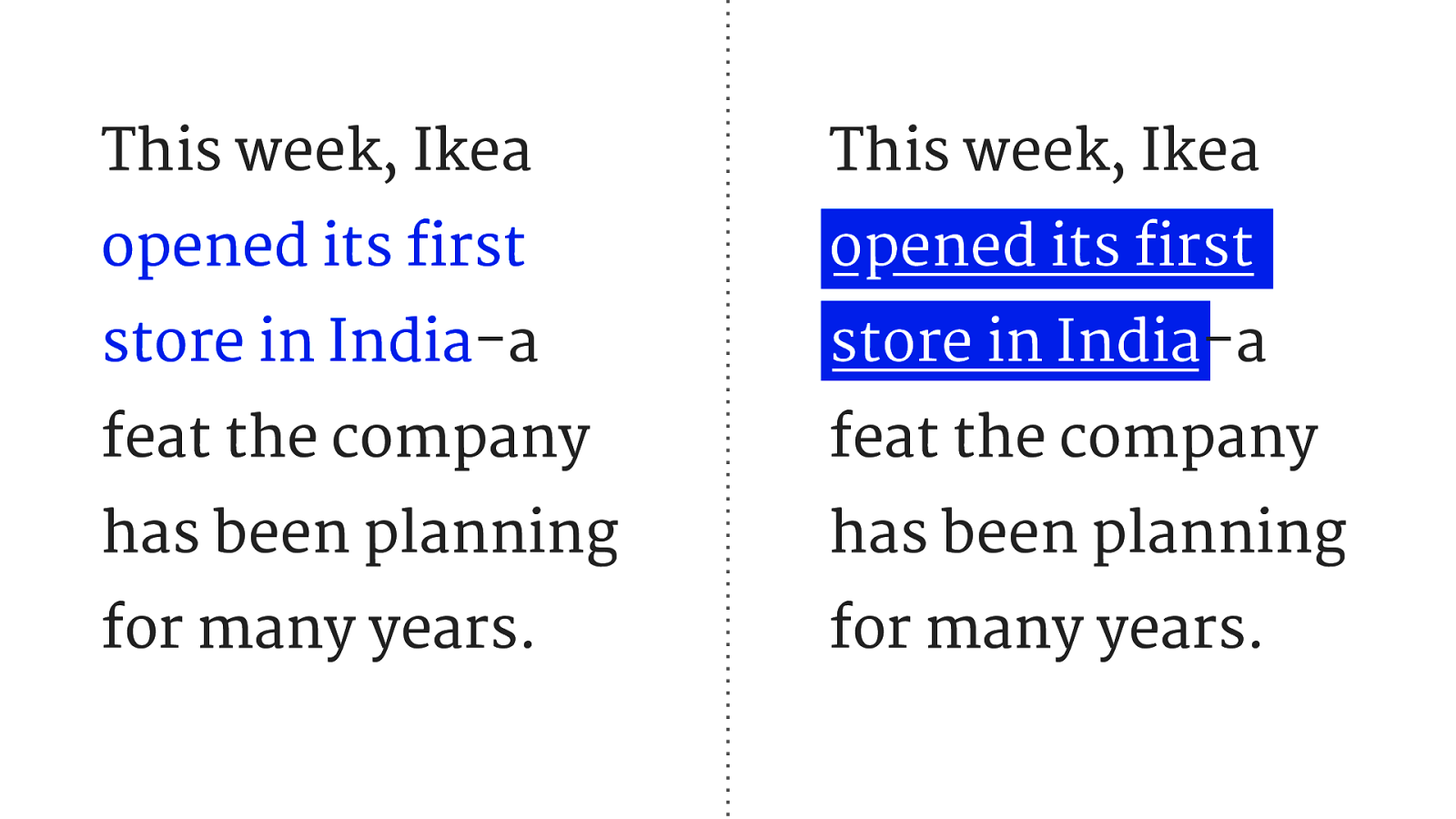
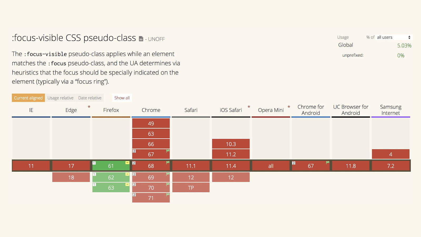
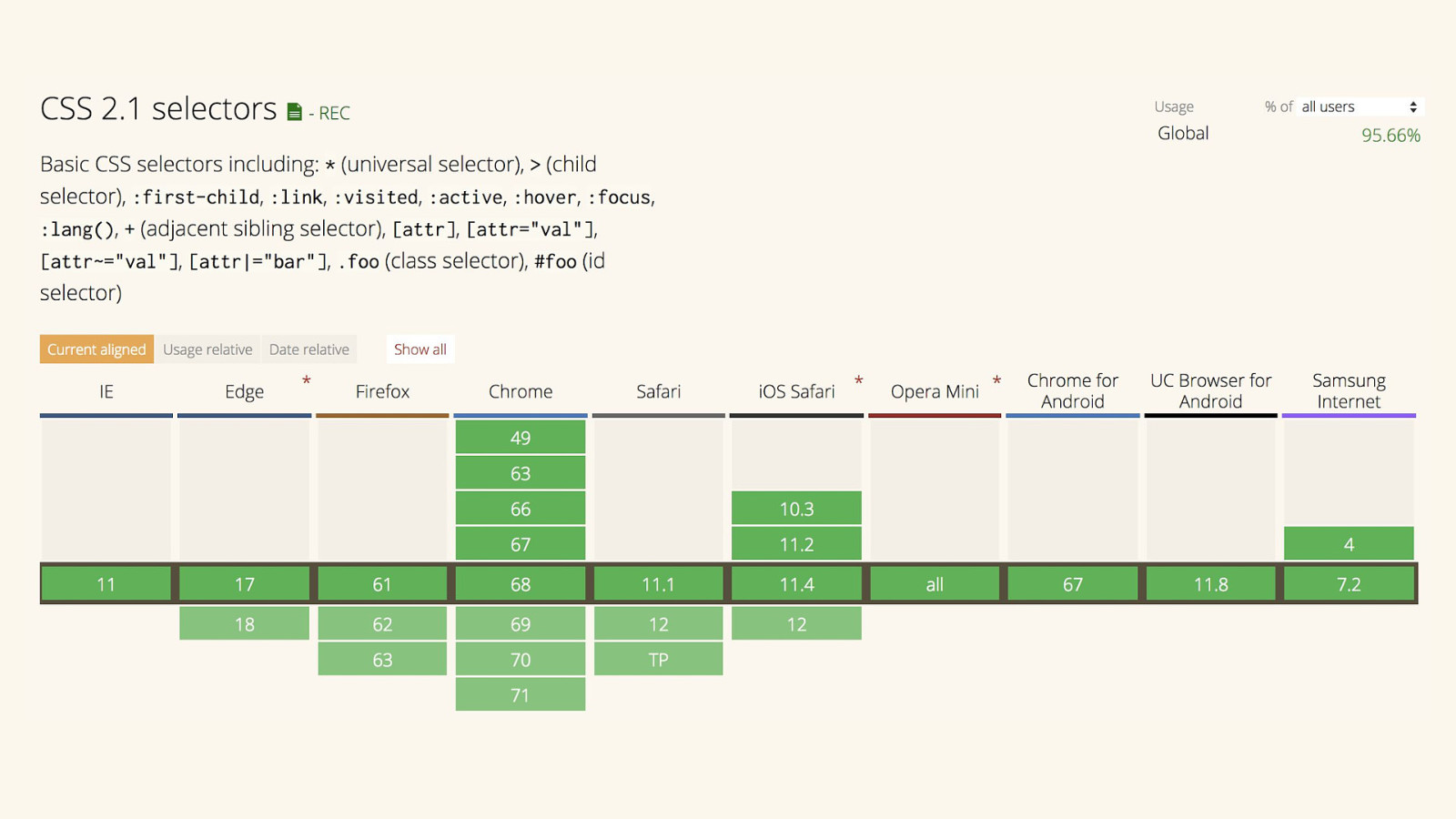
If it’s interactive, it needs a focus style. October 15, 2018. #a11yTOConf

Slide 2

Slide 2

  • This is the Mona Lisa, by Italian Renaissance painter Leonardo da Vinci
  • It is a priceless work of art, easily one of the most famous paintings ever created
  • So, two questions I want to ask you:

Slide 3

Slide 3

  • Is it beautiful? Is it useful?
  • Beautiful, yes. Da Vinci was a master of his medium.
  • The subject’s enigmatic expression has inspired generations of tribute, imitation, parody, and analysis.
  • Useful? From a societal perspective, undoubtedly. However, it’s just a wood panel with some paint applied to it.
  • Fragile, brittle, and needs a controlled environment and constant conservation efforts What can we do with that? Not a whole lot.

Slide 4

Slide 4

  • This is a leg splint made by the husband and wife design team Charles and Ray Eames.
  • They were commissioned by the US Navy during WWII to design a lightweight splint to get wounded soldiers out of the field without causing additional injuries
  • The metal splints of that period weren’t secure enough to hold the leg still, causing unnecessary traumatic injury and death from things like gangrene, shock, and blood loss

Slide 5

Slide 5

  • Is it beautiful? I think so. The molding followed the contours of the human leg, giving the splint a flowing, organic shape.
  • This molding technique was later used by the Eames to make both sculpture and furniture, including the Eames Chair.
  • You might have heard of it, it’s a highly coveted piece of designer furniture.
  • But is it useful?
  • Definitely. It’s literally saved lives.

Slide 6

Slide 6

  • This is a hammer you can find at any hardware store.

Slide 7

Slide 7

  • Is it useful? Very much so.
  • Is it beautiful? When viewed through the right lens, definitely.
  • The hammer’s bell and neck are elegantly tapered to minimize weight and maximize driving force.
  • The claw’s V shape makes it so it can pry out nails of many different sizes without any special attachments.
  • And the handle is sculpted in such a way that it is both comfortable to grip and is slip-resistant.

Slide 8

Slide 8

  • This is a CSS declaration of outline: none applied to everything on a website.
  • Way back when, many print designers transitioned to web design and brought their biases with them, codifying and perpetuating and a lot of bad ideas.
  • This included writing CSS resets that globally removed all outlines, because there was the perception that they were ugly when compared to the static layout you get with printed content.
  • While the web does borrow a lot from print, it isn’t print and we should stop thinking about it that way.
  • Many people rely on not having outlines removed, for reasons we’ll get into in a bit.
  • For the record, I’d like to point out that many CSS reset authors later recanted this decision to remove outlines from their resets after learning how important they were to the people that relied on them.

Slide 9

Slide 9

  • Focus styles are commonly thought of as ugly, but I think that’s because we approach it with the wrong mindset.
  • They’re an integral part of the web.
  • And we should treat them like such.
  • A good link includes a good focus style, to help the people who rely on them navigate.

Slide 10

Slide 10

  • So, what makes a good link?

Slide 11

Slide 11

  • First we write a word, “link”
  • That clues us in to what we’re trying to do.
  • We don’t say “click here” because not everyone clicks things with mice.

Slide 12

Slide 12

  • But the word “link” is pretty ambiguous when placed in the context of multiple links.

Slide 13

Slide 13

  • So what we want to do is use a word or phrase that describes where activating the link will take you.
  • In the context of a page, you begin to tell a story of where you can go and what you can expect to find when you get there.

Slide 14

Slide 14

  • The text that describes a link is what we call an affordance.
  • Affordances are hints about how something should be used.
  • Think of them of little cheatsheets for operating things.

Slide 15

Slide 15

  • Another common affordance we use for links is assigning them a color to distinguish them from the surrounding non-link text.
  • Blue is a commonly understood link color because it is the color used in many browser’s fallback stylesheets.
  • This external consistency is a quick win for cognitive considerations, it’s one less hurdle to overcome when first learning the ins and outs of a site’s interface.

Slide 16

Slide 16

  • But if you don’t see color the same way other people do, this may prevent you from determining if text is a link or not.

Slide 17

Slide 17

  • To get around this, we add an underline to help distinguish what a link is.
  • This affordance is as old as the internet itself. Underlines equal links.

Slide 18

Slide 18

  • If we’re using a mouse or a trackpad, we want feedback to tell us that we’ve successfully identified the link we want to activate.
  • This communicates to the user that the cursor has been successfully placed on an area that can be interacted with.
  • Removing the underline on a link when a cursor is hovering over it is a good way to indicate that, it doesn’t rely on just color alone to communicate change.

Slide 19

Slide 19

  • We also want to have a state that confirms that we’ve successfully activated the link in question.
  • This reassures the person clicking on the link that something is actually going to happen after clicking on it.
  • This is ideal for low-powered devices, low-bandwidth and/or high server load scenarios, where it might take some time for the site to deliver on your request.

Slide 20

Slide 20

  • But how do we identify a link if we aren’t using a cursor or trackpad?

Slide 21

Slide 21

  • We use a focus style, which is a visual indicator that works much like the hover style.
  • Here, we have successfully identified the link we want to activate via the tab key on a keyboard.
  • The fallback stylesheet that ships with every browser includes code for focus styles that appear if none is provided by the author.
  • This is important to note: the deliberate inclusion of focus styles is a recognition by browser manufacturers that people interact with web content in multiple ways.

Slide 22

Slide 22

  • However, not all fallback browser focus styles are good enough to meet acceptable WCAG criteria for contrast.
  • Firefox in particular uses a tiny dotted outline.
  • This might prevent low vision users from being able to perceive which link has been focused on, which isn’t great.
  • If they can’t see if something has been identified, it will be tough, or impossible, to know they can activate it.

Slide 23

Slide 23

  • What we can do to is use CSS to overwrite the browser’s default focus style, and create one that is WCAG compliant.
  • Here I’ve turned the dotted outline into a solid blue outline, using a color that matches the hyperlink color, to further visually reinforce the fact that it’s a link.

Slide 24

Slide 24

  • We could also fill in the background of the link with the blue color and update the text to be white.
  • Now it’s even more visually apparent. That’s great for both biological and environmental low vision conditions.

Slide 25

Slide 25

  • You want to make sure each of your states is visually distinct and separate from the other states when styling an interactive element.
  • Because each state is discrete, it allows us to more easily understand what’s happening to it.
  • Notice that there is also a visited link state, which may not always be desirable.
  • It’s best to use a visited state when a collection of links are used for task completion, such as viewing training material or a navigating through a table of contents.
  • You'll want to also test this, and plan it out, as CSS' limits the properties you can use due to some privacy concerns.

Slide 26

Slide 26

  • In a pinch, you can usually use your hover state for your focus state.
  • Combine the two selectors with a comma to save on effort and file size.
  • If there’s one practical thing you take away from this talk it’s that this little hack can go a long way to helping your users out.

Slide 27

Slide 27

  • Links aren’t the only interactive element out there, either.
  • Here’s a button element, another workhorse of a modern user interface.
  • You’ll note that the button has a disabled state, and not a visited one.
  • This is because a button is a trigger for an an action, not a destination.
  • Disabling links is technically possible, but can wreak havoc on assistive technology. It’s best not to do it.
  • I’m using the disabled HTML attribute as a CSS selector, meaning that appearance is semantically tied to state.
  • But like the visited link style, you'll also want to be careful, as disabling buttons has proven to be problematic for some people with cognitive concerns.

Slide 28

Slide 28

  • So, now we know why it’s important to have all states represented for our links and buttons and and how to implement them.

Slide 29

Slide 29

  • But interactive elements on the web aren’t just limited to links and buttons
  • And this system of distinct and discrete visual treatments for state should be applied to anything a person can interact with.
  • These other interactive elements are select, details, sometimes object, and input and textarea elements with an accompanying label element.
  • These elements all constitute the basic building blocks of any modern, robust design system.

Slide 30

Slide 30

  • You should also make sure your focus styles work for links that wrap non-text content, including things like images.

Slide 31

Slide 31

  • It doesn’t have to be anything fancy, just make sure it’s obvious.

Slide 32

Slide 32

  • And of course, don’t forget to provide alternate descriptions for those who may be unable to view your content!

Slide 33

Slide 33

  • It’s a myth that styling focus states is limited to just the outline property, you have the full range of CSS to work with!

Slide 34

Slide 34

  • Just make sure that when a state is styled, it is done so in such a way that it does not shift the page’s layout around when activated.
  • This is disorienting and can make a person lose their place.
  • I like to use properties that won’t cause the browser to recalculate box sizes, such as color, background, and box-shadow.

Slide 35

Slide 35

  • Speaking of box shadows, one technique I especially like is using stacked box-shadows to create a ring around an element that will honor its border radius.

Slide 36

Slide 36

  • You’ll notice that I’m removing the outline to get this effect.
  • This is a situation where it’s acceptable to remove the outline, so long as the focus style you replace it with is distinct and passes WCAG color contrast criteria.

Slide 37

Slide 37

  • However, people experiencing low vision conditions may use Windows’ High Contrast Mode to help them read.
  • So it’s good to check our styled states to see if they hold up.
  • High Contrast Mode will strip away a lot of CSS, including box-shadow.

Slide 38

Slide 38

  • To get around this, I’ve used a high contrast media query to tweak the focus style to fill in the button instead.
  • This could be helpful for people who are magnifying their screen, as the focus effect is more pronounced and therefore easier to perceive.

Slide 39

Slide 39

  • Alternate ways to identify and activate content aren’t just limited to keyboards.
  • This is a switch, which helps some people with motor control issues operate technology.
  • They’re typically large hardware buttons that you can program to do different things.
  • This is neither a mouse or keyboard interaction. It’s binary input that may emulate other kinds of input.

Slide 40

Slide 40

  • Focus styles aren’t limited to just assistive technology users, either.
  • Here I’m using the Apple TV remote to identify the tile I want to activate.

Slide 41

Slide 41

  • We’re not just limited to the focus selector anymore.
  • The W3C has two new CSS properties for us to play with: focus-within and focus-visible

Slide 42

Slide 42

  • Focus-within is a pseudo-class that is activated when an element is focused, or contains an element that is focused.

Slide 43

Slide 43

  • Currently the most recent versions of Firefox, Chrome, and Safari support it.

Slide 44

Slide 44

  • A practical example of how we could use it could be for a table whose cells contain links.

Slide 45

Slide 45

  • With focus-within, I’m able to a highlight an entire table row when a link in one of its table cells has received focus.
  • This is done entirely with CSS, something you could previously only accomplish with the help of JavaScript.

Slide 46

Slide 46

  • Here’s how it works.
  • We’re looking at the table represented as a hierarchical tree in the document object model, or DOM for short.

Slide 47

Slide 47

  • focus-within is declared on a parent node to the one that will receive focus events,
  • In our example, that’s the table row.

Slide 48

Slide 48

  • When a focus event occurs on the link inside of a table cell

Slide 49

Slide 49

  • the event travels up the DOM tree until it hits the element that has focus-within declared on it.

Slide 50

Slide 50

  • Styling rules are then applied, as the conditions required by focus-within have been met.

Slide 51

Slide 51

  • Note that if the browser does not support this selector and it is included in a list of other, valid selectors the entire grouped declaration will be ignored.
  • So be sure to author your CSS with care and discretion.

Slide 52

Slide 52

  • Next we’re going to talk about other people’s opinions regarding focus styles and what you can do about them.
  • Sometimes you’re being a good ally and have a strong case for incorporating focus states into your site but a less informed person can override you because they have more organizational clout.
  • So what can we do about it?

Slide 53

Slide 53

  • focus-visible is a pseudo-class that is activated when an element is focused and a user agent determines via heuristics the user’s input modality.
  • That’s a fancy way of saying it shows focus styling when activated via input via other than mouse cursor or finger tap.

Slide 54

Slide 54

  • So, say you have a link on a website

Slide 55

Slide 55

  • And a person decides it’s interesting and wants to visit it

Slide 56

Slide 56

  • They identify the link. If focus-visible is declared on it, the browser runs a bunch of logic to figure out what input the person is using.

Slide 57

Slide 57

  • This allows us to create separate focus styles:
  • One for cursor input

Slide 58

Slide 58

  • And one for keyboard input.
  • This allows us to create two separate “modes” for your website:

Slide 59

Slide 59

  • One that is shown to mouse or trackpad users, and one that is for everyone else.

Slide 60

Slide 60

  • Currently only Firefox supports it,
  • And even then with some strange caveats that are unfortunately outside the scope of this talk.

Slide 61

Slide 61

  • But we can get other browsers supporting it by using a polyfill, which is a technique that uses JavaScript to recreate a browser feature.
  • But in addition to the extra data to download and maintenance concerns that come with introducing a polyfill,
  • I’d like you to consider this:

Slide 62

Slide 62

  • Can you trust your heuristics?
  • Computers are awful at understanding the context of the real world.

Slide 63

Slide 63

  • Here’s Google’s world-class algorithm having trouble telling the difference between fluffy dogs and fried chicken.

Slide 64

Slide 64

  • And the web is more than just mice and keyboards.

Slide 65

Slide 65

  • We’re seeing more and more devices with multi-modal inputs becoming commonplace, meaning that a person might be switching input on the fly to best accomplish their task.
  • For example, someone using the Microsoft Surface may at any point be using:

Slide 66

Slide 66

  • A mouse

Slide 67

Slide 67

  • A trackpad

Slide 68

Slide 68

  • Touch

Slide 69

Slide 69

  • Keyboard

Slide 70

Slide 70

  • Stylus

Slide 71

Slide 71

  • Gesture

Slide 72

Slide 72

  • Or voice inputs

Slide 73

Slide 73

  • Form factor is also an unreliable metric, so device sniffing is out.
  • For example, here’s a Gemini PDA, a clamshell Android smartphone with a QWERTY keyboard.
  • It's a delightful little mutant of a device, and I love it.

Slide 74

Slide 74

  • Devices may also have their input augmented.
  • The latest screen reader survey by WebAIM revealed that a total of 62% of all participants use an external keyboard in conjunction with their mobile device in some capacity.
  • This especially should give us pause for concern about making assumptions about how people actually their devices.

Slide 75

Slide 75

  • Now let’s talk about people.
  • I have a lot of problems with identifying people as assistive technology users without their express consent.
  • I think the general idea behind focus-visible is well-intentioned, but ultimately may be a slippery slope solution.

Slide 76

Slide 76

  • The specific concerns I have aren’t new, nor are they exclusive to just me.
  • For starters, if you’ve spent any amount of time doing web development, you know that trying to make solutions based on detecting what the browser reports is an unsustainable nightmare.

Slide 77

Slide 77

  • There’s also the collecting, and sharing of personally identifying information.
  • focus-within can be used as a hook as a really poor attempt to try and identify people as an assistive technology users.
  • And regardless of its accuracy, who the hell knows what a person collecting this kind information is doing with it.
  • Mass data breaches are also commonplace occurrences these days—would you feel comfortable having this kind of information about you sold to the highest bidder?

Slide 78

Slide 78

  • Another big-picture concern is if you don’t check to see if your design solutions actually work the way you intended with the people you’re designing for.
  • There’s a whole host of biases, assumptions, and subtle nuance that silently worm their way into the design process, especially when it comes to designing for disability and we should always be on guard to prevent that.

Slide 79

Slide 79

  • Finally, this line of thinking is starting to creep back into a terrible trend of the early web, which was separate sites for assistive technology users.
  • These sites didn’t always have parity in information or capability compared to the sites they were supposed to accompany, and often forced people to contact support if they needed assistance—an embarrassing act that diminishes personal autonomy.
  • There’s a reason you don’t see these kinds of sites that much anymore, and that’s because they don’t work.

Slide 80

Slide 80

  • People aren’t binary about their skill in operating websites.
  • I tab through forms all the time. Am I an assistive technology user?
  • Really it’s not about what a system identifies me as, it’s about who I am and what I’m experiencing when I use it.

Slide 81

Slide 81

  • Because of this, what I’m asking you to do is embrace the unknown.

Slide 82

Slide 82

  • Focus styles are so baked into what the web is that we don’t even consider it a unique, standalone feature.
  • If you’re going to make a browser for mass consumption, it’s simply just part of the table stakes.

Slide 83

Slide 83

  • We’re not always using the latest device or the latest version of a browser, either.

Slide 84

Slide 84

  • If you’re economically disadvantaged, unhoused, or live in an emerging market, you simply may not have access to a device capable of taking advantage of the latest technology.

Slide 85

Slide 85

  • In fact, some people purchase and use devices that are no longer supported specifically because of the fact that it makes it affordable.
  • These groups of users represents millions of people, many of whom have never used the internet before.
  • Should we turn our backs on them because of it?

Slide 86

Slide 86

  • Browsers are eating the world,
  • And we’re going to keep finding them in places we never thought they’d be.
  • So in closing, it’s important to keep the following in mind:

Slide 87

Slide 87

  • Good user experiences meet the user where they are, not where we hope they’ll be.

Slide 88

Slide 88

Slide 89

Slide 89

References

Slide 90

Slide 90

Slide 91

Slide 91

Slide 92

Slide 92

Slide 93

Slide 93

Slide 94

Slide 94