Baby Steps for Metrics

A presentation at DevRelCon Earth 2020 in July 2020 in by Jason St-Cyr

Slide 1

Slide 1

Baby Steps for Metrics

Hello everybody, welcome to Baby Steps to Metrics, where we get to look at the ugly side of metrics: the getting started part.

My name is Jason, and I lead a team of Technical Evangelists over at Sitecore. And I have some pretty awful reporting to show you today! A few years back, we had nothing to start from and I want to show you our journey so that maybe you can see how you might get started on adopting some metrics.

When I got started on this journey, I prioritized based on a few factors:

  1. I have no time to this
  2. It has to be easy
  3. I want to make us look good

Slide 2

Slide 2

HELP! I have no metrics!

When I started in at Sitecore a few year’s back, I was added to a growing team that up until then was just a few people trying to do everything. I had never had DevRel as my job role before. Or product marketing. I took charge of our enablement program and started trying to build out some ways of reporting on what we were doing.

Ultimately, what I wanted to do is make sure we captured what we did accurately, but made it look like the investment in our team was worth it.

Slide 3

Slide 3

Nothing.

SCRIPT: We had nothing.

It’s probably important to note that our team is part of product marketing, which in turn reports into the Marketing department. Why is that important?

Well, different departments value different things and have a different understanding of the value of DevRel. Our marketing department was very clear that they wanted to make data-driven decisions. And I knew that meant making sure we had data to back up our decisions.

And there I was, like a lot of you, looking at a blank PowerPoint slide trying to figure out what to say.

Slide 4

Slide 4

What do we do?

We don’t have a SaaS-based developer API. We’ve got a platform for on-prem, IaaS, PaaS, SaaS… all done with an Enterprise purchasing model. We want to help marketing teams deliver the best customer experiences possible. Devs, IT, tech folks aren’t always the customer. Sometimes they influence the purchase, sometimes they work at an implementation partner, sometimes they are freelancers helping out customers.

So there we are, in this enterprise delivery model, trying to help devs at:

  1. Partners,
  2. Customers, and
  3. Freelancers.
  4. We help out the documentation and training teams in product,
  5. We create videos and blogs, and live presentations
  6. We do enablement for our sales engineers so they understand the WHAT and HOW,
  7. We participate in the community channels and social
  8. We help product marketing with launches, positioning for technical audiences, that sort of thing.
  9. We’re in with the customer success team trying to support the customer community.

It’s a lot.

And somewhere in there we need to track what it is we’re doing.

Slide 5

Slide 5

How do we get started!

And our starting point is nothing. No access to data stores, no dashboards, no insights.

So we had to do baby steps. We had to grow this thing. I had to find a way to piece out a bit of time here and there to make things just a little bit better.

Just like a continuous delivery cycle, you need to iterate and improve.

We’re going to look at a few basic things to help get started on your metrics journey:

  1. Starting small with counting things.
  2. Expanding into tracking analytics.
  3. Figuring out what is popular.
  4. Wrapping a story around your data.

So come along on the journey, let’s see if I can help you get started too!

Slide 6

Slide 6

Start small. Count stuff!

The key to getting started is to give yourself some small, easily achievable, goals. Something you can hold onto and build upon. Something that will give you that early success.

What should that be?

My suggestion? Count. Things. Measure something. ANYTHING!

Anybody talking to you about metrics tells you that counting things is a terrible metric. We’ve all heard the horror stories of developer productivity being measured by lines of code. It doesn’t measure the right thing! You wouldn’t want a team of developers optimizing to deliver more lines of code, and you wouldn’t want a DevRel team optimizing to deliver more blog articles or more videos “just because”.

But you have to start somewhere.

So how did we start?

Slide 7

Slide 7

In the beginning...

This ugly little report box was the first time I got some enablement metrics into a quarterly report. The most obvious thing to include was “what were the things we published?”. What you see here is… not impressive. Just a tiny note in the middle of some other stuff (I emphasized it for the purposes here). Just some straight-up Number Of Things. But those two numbers started something much bigger.

Slide 8

Slide 8

Use counting to drive tracking work done.

First, we had to figure out how to get the data for those two numbers. We literally had no way of knowing what the team was doing. I had put into place a Kanban work board and we started tagging our items (video, blog, deck, etc.). We started tracking which ones got completed in which quarter.

This was not pretty, but by saying “what did we do this quarter?” forced us to figure out a way to track what we were doing.

Lesson #1: Use a counting metric to drive you to find a way to track what work the team is doing.

Slide 9

Slide 9

Compare over time

The next logical step was to capture these over time. Not just raw numbers reported on a slide, but showing how it was different from before.

Are the numbers going up? Or down?

By creating trend dashboards on these counts we could start showing shifts in activity between different types of work.

The graph here compares recent activity to look at where the team’s efforts are going into different types of deliverables. I can look here and see there are some interesting changes worth looking into. For example, why did our doc count go up so drastically? Why did our video output drop? Why aren’t we doing in-person events this season? (I think I know why)

Lesson #2: Compare over time in your dashboards to be able to highlight areas that need investigating regarding team productivity.

Slide 10

Slide 10

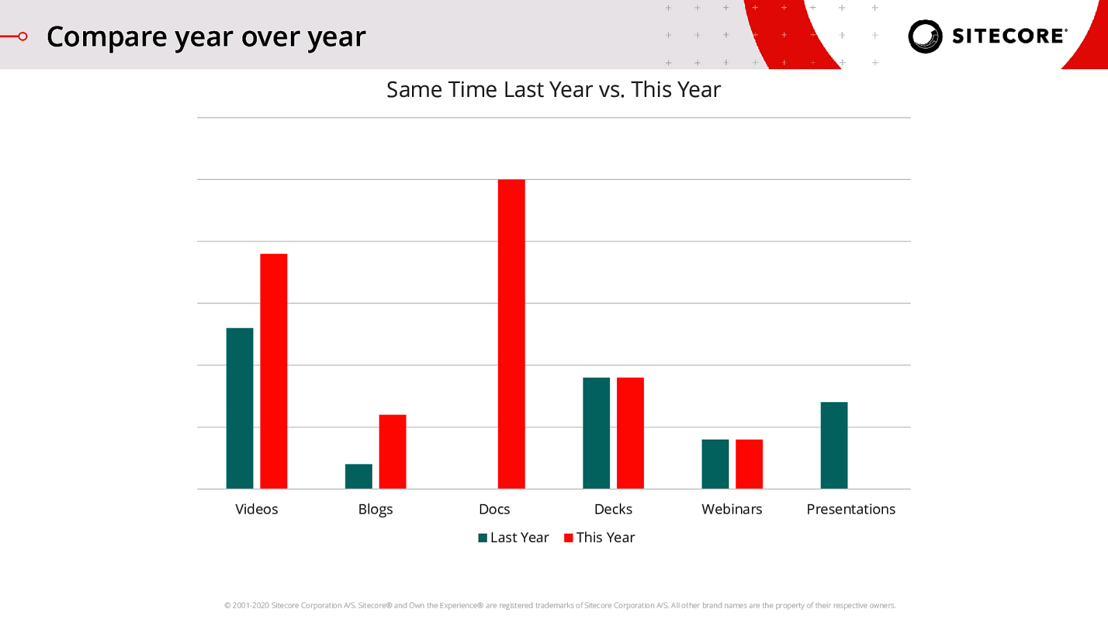
Compare year over year

I’ve been doing this a few years now, so now I’ve built up data on this activity year over year. One of the dashboards marketing managers love seeing is comparison against the same period of time from the last year. Were you given a bigger team or more budget to work with this year but your numbers look the same? Why is that?

By comparing year over year, I can eliminate seasonal factors, or recurring ‘happenings’ like events, and get a better look at the current time period’s performance.

So, for example, when I looked at the previous activity graph it looked like our Decks output went up, but really it is the same as what we did last year. Similarly, it felt like our videos took a sharp nose-dive versus the previous quarter, but we’re actually up compared to last year, so it feels like maybe that isn’t an issue.

However, between both graphs I can see that the Docs and Presentations changes seem to be outliers. Worth looking into.

Lesson #3: Comparing against the ‘same thing’ across years is helpful to look for changes in seasonal activity levels. This type of graph will help you identify something strange that doesn’t normally happen at that time of year.

Slide 11

Slide 11

Gather analytics

Alrighty, so at this point we started small, we got a few numbers, and over time we have a few more things we’re counting. But, like I said before, counting things is a pretty terrible metric overall. We need to start seeing what impact we are having. At the very least, is anybody looking at this stuff we’re creating?

Slide 12

Slide 12

“Eyeball” metrics are easy to grab

The concept of “eyeball” metrics is a very early step in measuring content marketing effectiveness, but it can apply to other engagement measurement as well. It’s a great place to start seeing the impact of the work you and your team are doing.

There are some easy ones you can do right away:

  1. For video, grab things like the number of views you are getting, and the number of new subscribers
  2. Similarly for blogs, you can easily grab things like unique visitors and total views
  3. If you have any NPM packages, tracking those downloads over time is an easy way to chart adoption.
  4. If you have a community Slack, you can start tracking how the various channels are growing over time. In our case, our community tends to create new channels for specific tech/features as demand for it grows. Then, we can add those channels into our metrics to see what adoption is like for various products compared to each other. This gives us an insight into what is being used/adopted/triggering discussion.

Slide 13

Slide 13

Trends are your friend!

Those raw numbers in and of themselves are not particularly valuable. Where’s the context? So you had 10K views of videos your YouTube channel. Great! Is that good? Bad? WHO KNOWS!

You need to chart this over time, just like I was talking about with those basic counting metrics. This way you can see how what you are releasing works. Try to set yourself a target for the year, maybe a 10 or 20% increase? Pick what you want to aim for and as you go along the year you can see whether the work you are doing is getting you closer to your goal, or further away.

Eventually, you’ll want to go on to deeper engagement metrics like time on site, scroll depth, watch time, that sort of thing… but for now, this is a good step for you to start seeing some impact.

Slide 14

Slide 14

Using counting and engagement together

So, at this point, from a ‘showing management some graphs’, we’ve got some stuff. But can we pull this all together? Like I said before… counting things is pretty terrible. It doesn’t show the value of the work done. But counting things is not lost investment!

You can use these numbers to start tracking the amount of effort your team is putting in versus the value delivered. Let us say that you are looking at videos. Are you getting the same number of new subscribers even though your team put in extra effort to publish more video content?

The activity tracking combined with your deeper engagement insights give you a total Return on Investment view. You can start looking at ways to possibly dial back in certain areas if you can achieve the same results with less effort.

Lesson #4: All those things you counted and the trends on activity you graphed out help you balance against the aggregate value being delivered. You can now dig into where the team can focus time and perhaps relax effort a little.

Slide 15

Slide 15

What's popular?

So, the last two sections were intended to get you started on very basic data points that you can grab: Counting stuff, and tracking ‘eyeball’ types of metrics.

The next step after that is start trying to get insights in what you’ve started tracking with your analytics. For example, now you have total views, but which pieces of content are contributing to those views? What topics are popular? Is there a particular topic that is popping up again and again across your channels?

Using popularity metrics can help you understand what type of content is likely to be effective in the future, and give you an insight into what your community is looking for. This helps you prioritize which work the team should be focused on, but also can be used to back up decisions you’ve made where you’ve chosen to focus on specific topics.

Slide 16

Slide 16

Find the leaders

So how do you find these leading topics? The first step is finding the leading things in your various categories.

Almost all analytics tools will give you the aggregate analytics as a total for a time period, which is great for the previous stage where we are looking for those eyeball metrics. However, most of them also give you a ranking of which individual pieces contributed to that total.

For your blogs or articles, you likely are using something like Google Analytics reports to find the top content.

In YouTube, as shown here, you can see which videos were the most viewed in a given time frame.

The first step is capturing these ‘top things’. This doesn’t get us to the top topics, but it gives us the first layer: knowing what is popular in a given time frame on a given channel.

Slide 17

Slide 17

Analyze for patterns

This is the first time where you will be needing to do some analysis of the data. For this, we are trying to provide insight into the raw metric, not just raw data. In the scenario above, I’ve captured top lists across multiple different channels. I can start seeing a pattern…

Slide 18

Slide 18

Analyze for patterns

Because I know what we created this quarter, I can tell that these trends are not just driven by what we created. We had limited content on this topic put out, but it’s hitting across all channels. This tells me that the community is craving this type of information, indicating that adoption is good here but that people need help.

Slide 19

Slide 19

Tell the story

Alrighty, we did some basics on metrics, but I want to switch gears a little bit. One of the things you need to do very early on is learning how to tell the story.

When I started my career in software development, I had a strong disbelief in the usage of metrics. Metrics lied. My argument at the time was that they were just numbers and you can tell anything you want with numbers. Numbers also change how people behave as they naturally try to ‘game the system’ and do what your numbers measure.

But now, 20 years later, I realize… I was exactly right. You CAN tell anything you want with numbers. You CAN influence how people behave with numbers.

And that is why it is so important.

Slide 20

Slide 20

The data behind the story

Let’s take a look at this picture here. We can easily recognize the raw data about it. It’s bright, there seems to be some sort of desert, dude has flippers and a snorkeling mask. Also wearing a tube. There seems to be a shadow as well, indicating likely direction from which the sun is shining.

That is data. That is what your metrics look like to somebody else. A whole lot of ‘stuff’ with no context.

It can make you feel a certain way, bringing it all together, but it is missing the “why” of all this data. So the feeling somebody has is based on their interpretation. Based on what they bring to the table.

Why is this person in the desert apparently dressed to get in a pool? No pool seems to be there? And why have snorkeling gear if you are going to wear a flotation device that keeps you from going under the water?

That’s the story part. That’s the story we need. We need to look at the data and create the story that explains our data points. Otherwise somebody else will make the story up based on their interpretation.

Slide 21

Slide 21

Data analysis drives the story

Here we see an example of using some numbers to back up the insights the team has on what happened in the quarter. The real report is not the numbers, it’s the insights and analysis. The context.

Telling the story using numbers is incredibly influential. People are afraid of gut feelings. People are afraid of making mistakes. Backing things up with numbers allows them to feel that what they believed was the right thing to do is not just a hunch, there’s ALMIGHTY DATA.

Data-driven really means “data-supported”. Usually, the decisions are not made on the data, they are made on the story that presented the data.

For every stat you have gathered, no matter what it is, the tale you spin around it is the most important.

Why did a number go up? Go down? What does it mean? What is the team going to do about it? How does this change things? Why is this data important?

The story, the interpretation of the data, is where you help people understand what your team is doing and what is happening.

Slide 22

Slide 22

When things go wrong

Let’s take a look at a different scenario, though. Here we have numbers REALLY going wrong. A massive drop… why did that happen? Telling the story around these numbers is key, but we don’t actually know. We need to present some possible things that need investigating.

In our case, for some reason, the number of views we were getting from our partners went drastically down. We thought it might be a blip, but after two straight quarters at a consistent new lower level, we had to admit that something had fundamentally changed. We hadn’t done anything particularly different, and the numbers couldn’t tell us why they went down. We had to start telling some possible stories as to what happened, and what we were going to investigate and do about it.

Slide 23

Slide 23

Next? Value!

Hopefully with these first few baby steps you can start seeing your path towards getting into all that cool stuff that everybody else is talking about with DevRel Qualified Leads or Orbits, or funnels.

Remember that your metrics are about supporting the story you are going to tell. Your reporting should be about sharing great accomplishments and insights into what is working and what is not, and really… it’s about making your boss look good to their boss.

How you make them look good is also less about the numbers you have and more about understanding what they value. Your management chain may not understand what you do, or why you do it, or why it matters. Learning to translate your work into something they understand and can tie to the strategic goals is very important!

Slide 24

Slide 24

How are you helping?

A lot of the metrics we talked about so far were about raw data, with no tie back to the value delivered. So from here, that is where you need to be going. How are you ultimately helping customers?

Take small steps and iterate on what you report, figure out how to tell the story about all that great work you are doing, and use your data to back it up.

Then, ask yourself: What are management or business priorities right now? Who do we want to help? What is great about the work we are doing? Where should we do more? Use those questions to drive yourself from these initial baby steps to your next stage of reporting on the value you are ultimately delivering.

The data is all a backdrop to how you are helping others. In the end, we’re not here for the numbers, you do what you’re doing because you want to help others. So make sure you are doing that, and make sure you are telling your story.

Slide 25

Slide 25

Thank you.

Be excellent to each other! Follow me @StCyrThoughts on Twitter.