Inclusion by Design
Inclusion by Design Alicia Jarvis (She/Her) #a11yTO Conf 2021
A presentation at #a11yTOConf in October 2021 in by Alicia Jarvis
Inclusion by Design Alicia Jarvis (She/Her) #a11yTO Conf 2021
Intro to inclusive design Guiding principles Inclusive design research Inclusive interaction design Inclusive content design Inclusive visual design

Introduction

“The Computer will be ‘the Great Equalizer’. “
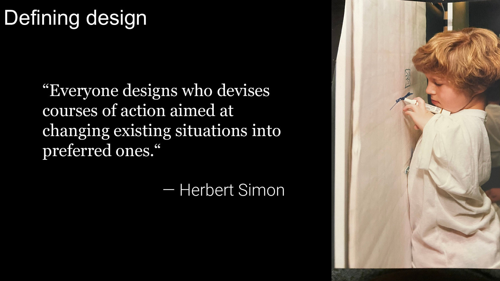
Defining design “Everyone designs who devises courses of action aimed at changing existing situations into preferred ones.“ — Herbert Simon
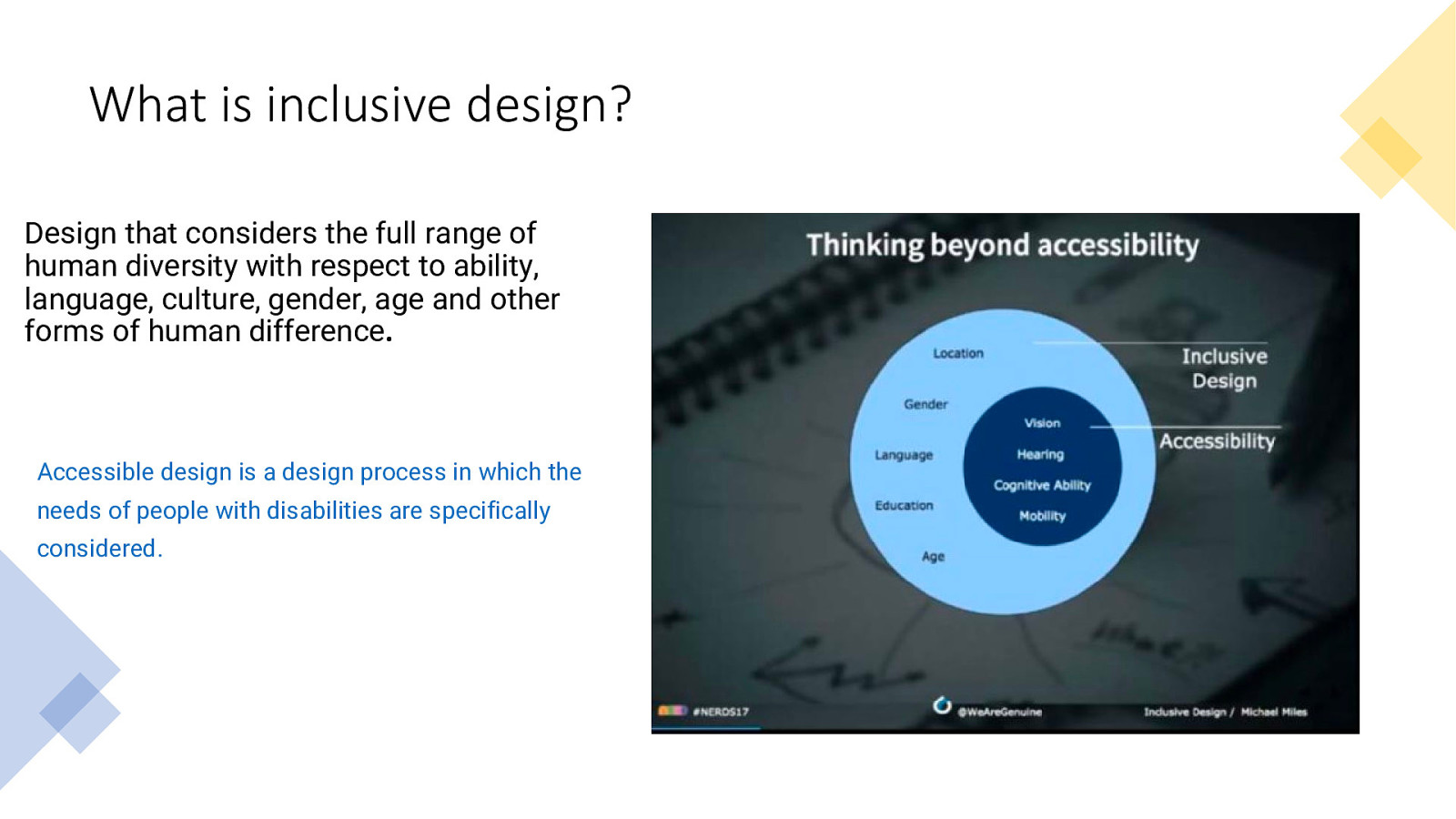
What is inclusive design? Design that considers the full range of human diversity with respect to ability, language, culture, gender, age and other forms of human difference. Accessible design is a design process in which the needs of people with disabilities are specifically considered.
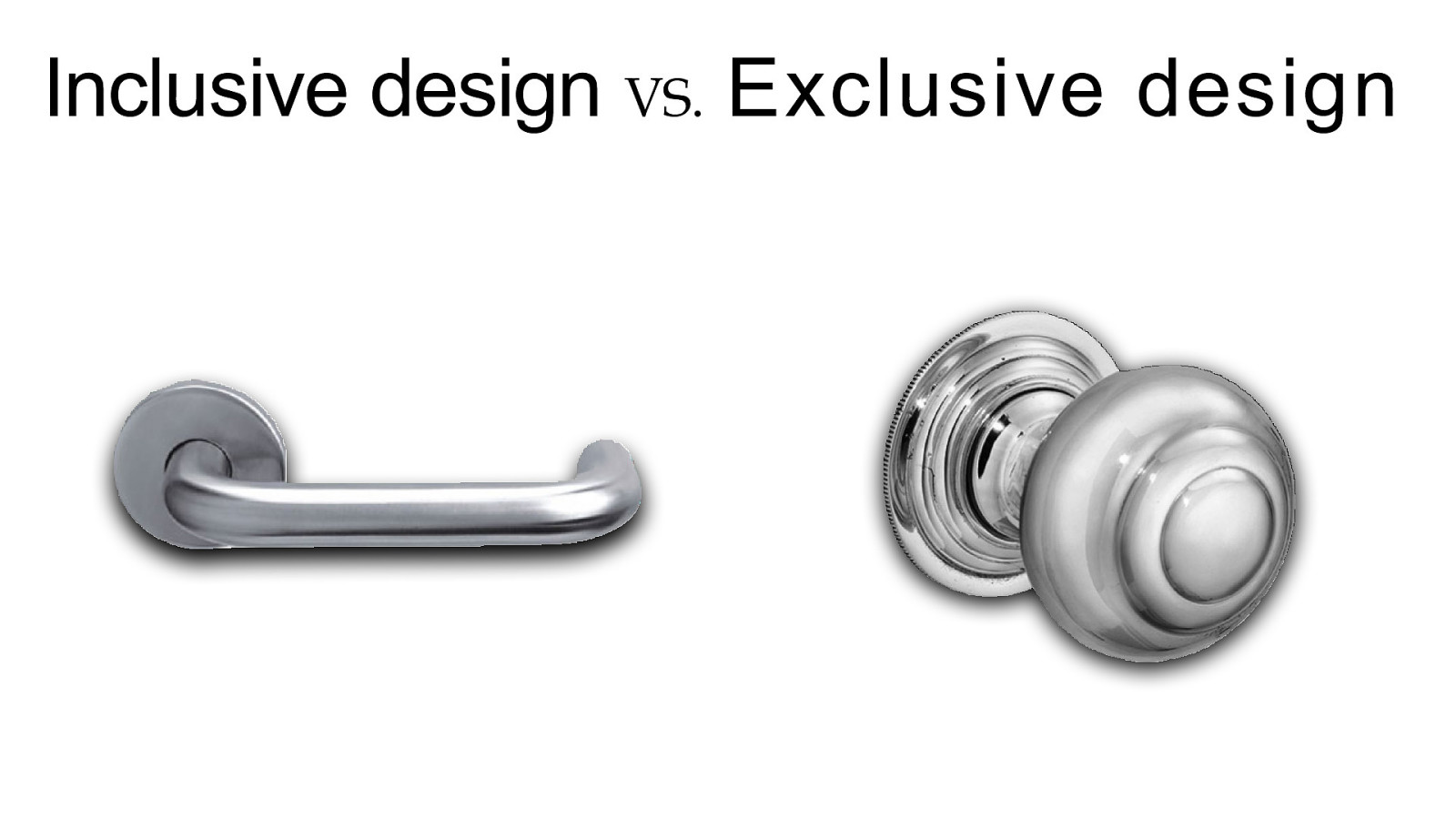
Door levers VS. Door knobs
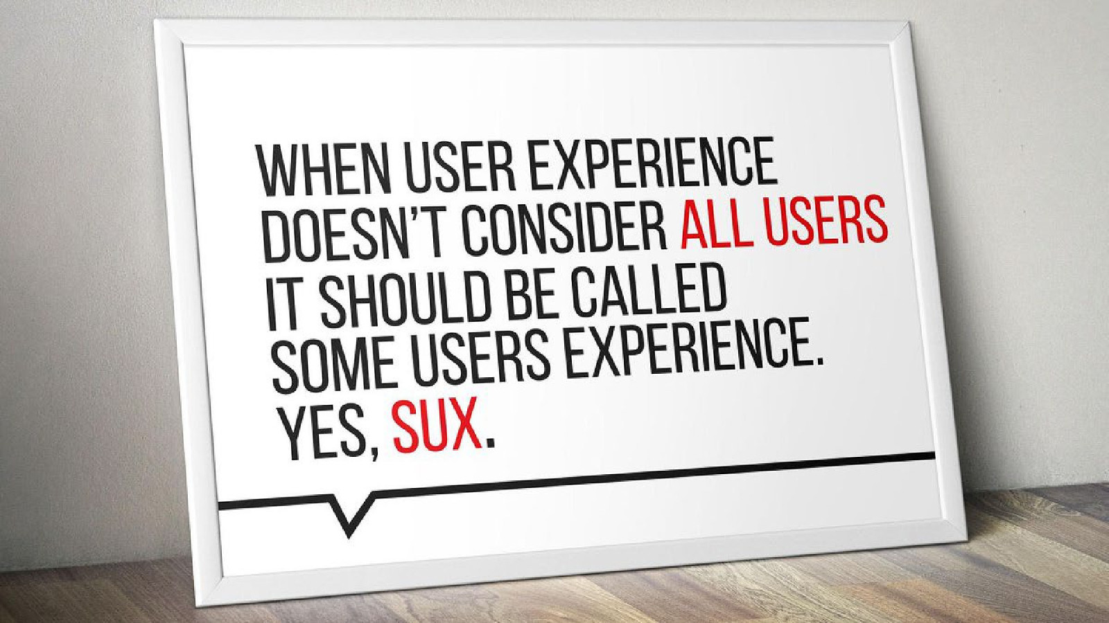
“When user experience doesn’t consider all users, it should be called some users experience. Yes, sux. - Billy Gregory

Guiding principles
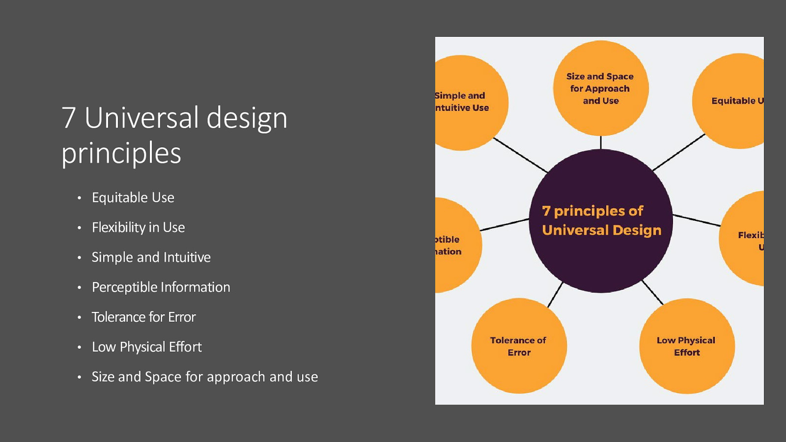
• Equitable Use • Flexibility in Use • Simple and Intuitive • Perceptible Information • Tolerance for Error • Low Physical Effort • Size and Space for approach and use
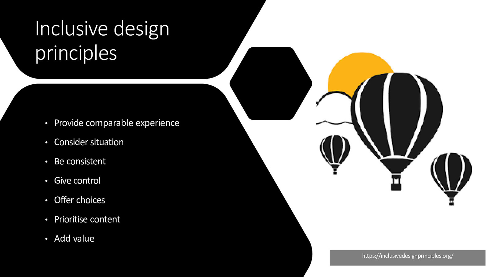
• Provide comparable experience • Consider situation • Be consistent • Give control • Offer choices • Prioritise content • Add value
https://inclusivedesignprinciples.org/
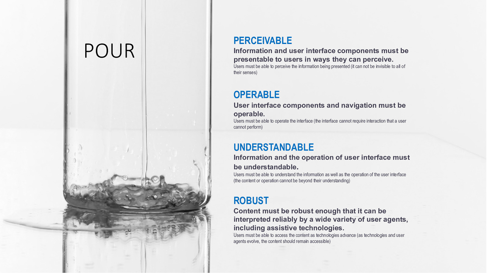
PERCEIVABLE Information and user interface components must be presentable to users in ways they can perceive. Users must be able to perceive the information being presented (it can not be invisible to all of their senses) OPERABLE User interface components and navigation must be operable. Users must be able to operate the interface (the interface cannot require interaction that a user cannot perform) UNDERSTANDABLE Information and the operation of user interface must be understandable. Users must be able to understand the information as well as the operation of the user interface (the content or operation cannot be beyond their understanding) ROBUST Content must be robust enough that it can be interpreted reliably by a wide variety of user agents, including assistive technologies. Users must be able to access the content as technologies advance (as technologies and user agents evolve, the content should remain accessible)

Inclusive Design Research
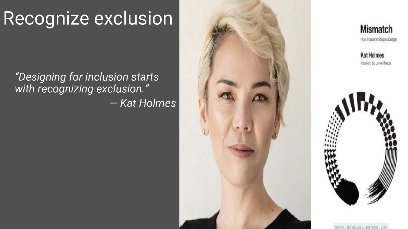
“Designing for inclusion starts with recognizing exclusion.” — Kat Holmes
Consider who is designing the product
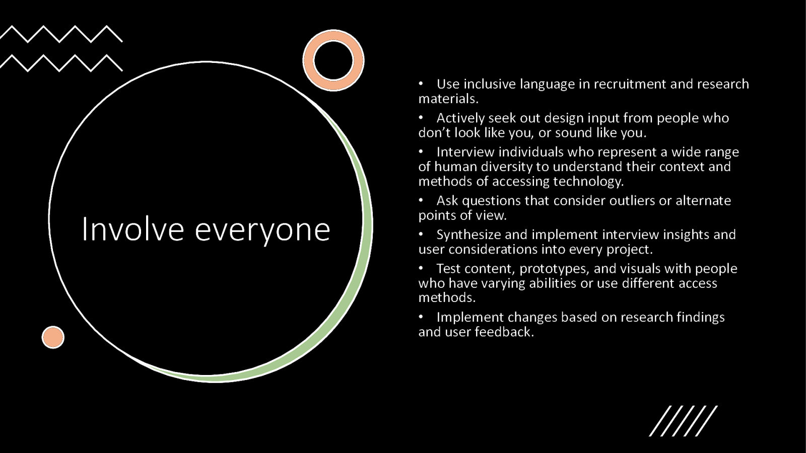
• Use inclusive language in recruitment and research materials. • Actively seek out design input from people who don’t look like you, or sound like you. • Interview individuals who represent a wide range of human diversity to understand their context and methods of accessing technology. • Ask questions that consider outliers or alternate points of view. • Synthesize and implement interview insights and user considerations into every project. • Test content, prototypes, and visuals with people who have varying abilities or use different access methods. • Implement changes based on research findings and user feedback.

Inclusive Interaction Design
“Disability is a mismatched interaction between the features of a person’s body and the features of the environment in which they live.” — World Health Organization, 2011 World Report on Disability
• Keyboard accessibility is one of the most important aspects of digital accessibility. • People with mobility / dexterity disabilities rely on keyboards for navigation. • Blind individuals typically use a keyboard for navigation in combination with screen readers. • Other assistive technology mimics keyboard functionality.
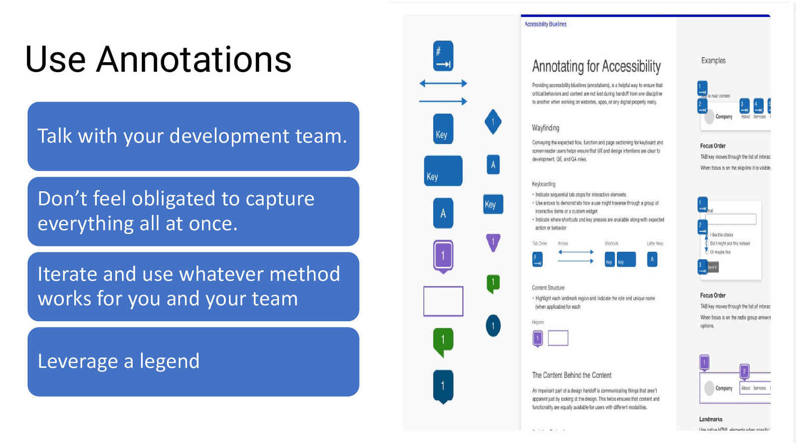
Talk with your development team. Don’t feel obligated to capture everything all at once. Iterate and use whatever method works for you and your team Leverage a legend

Inclusive Content Design
• Avoid using descriptors that refer to a person’s race, gender, sexual orientation, disability, or age, unless those descriptors are relevant to the story • When possible, omit gender-specific pronouns. • Replace third person (she/he) with second person pronoun (you). • Replace adjectives for neutral alternatives, such as indefinite adjectives, substantives, or objects. • Don’t use black, white, dark, or light as metaphors .
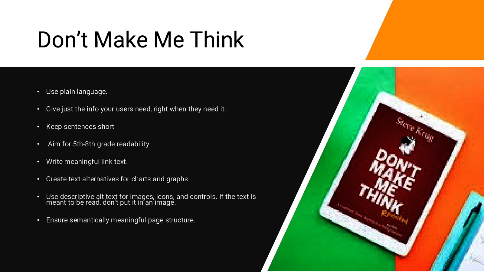
• Use plain language. • Give just the info your users need, right when they need it. • Keep sentences short • Aim for 5th-8th grade readability. • Write meaningful link text. • Create text alternatives for charts and graphs. • Use descriptive alt text for images, icons, and controls. If the text is meant to be read, don’t put it in an image. • Ensure semantically meaningful page structure.

Inclusive Visual Design
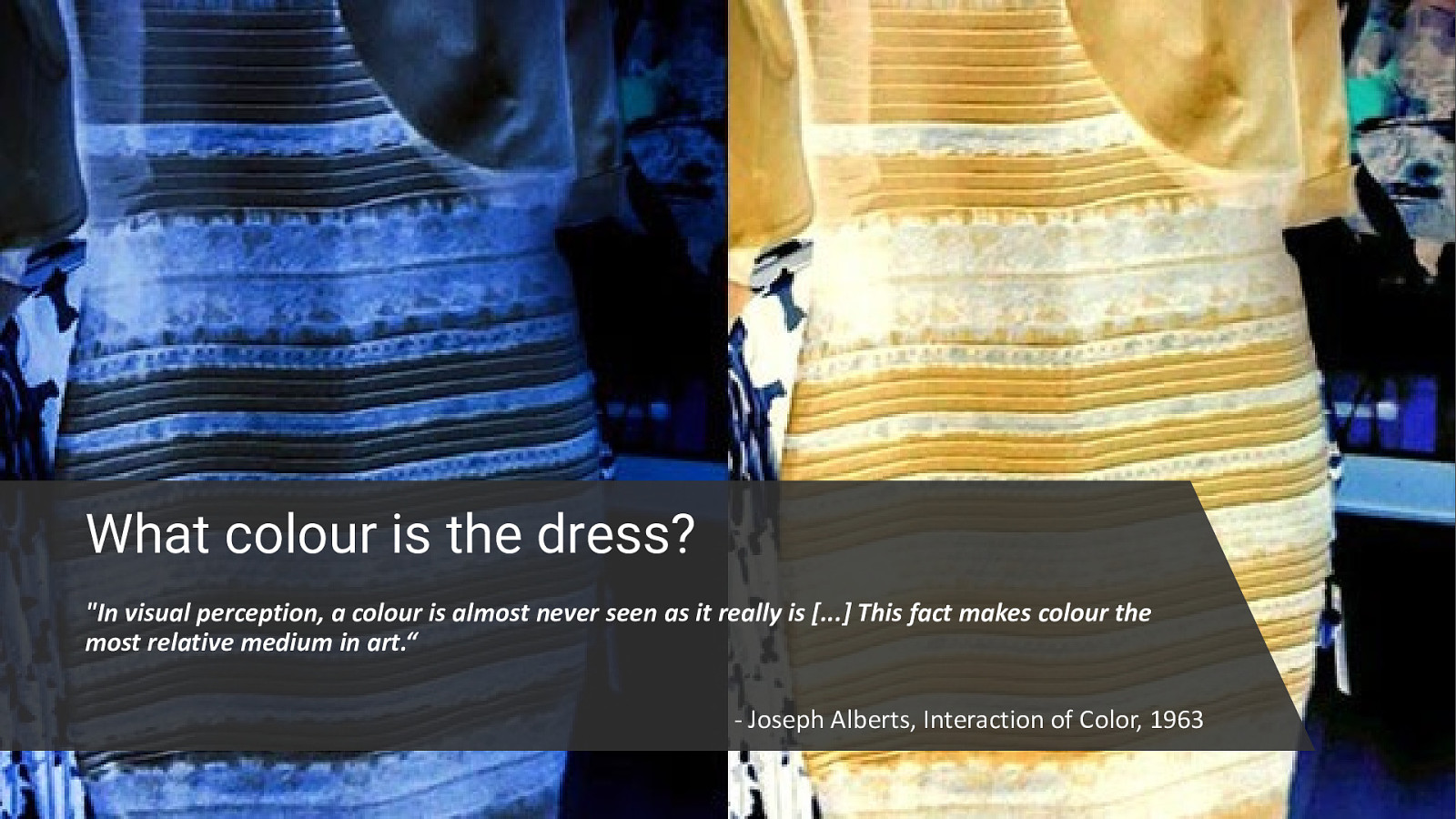
“In visual perception, a colour is almost never seen as it really is […] This fact makes colour the most relative medium in art.“ - Joseph Alberts, Interaction of Color, 1963
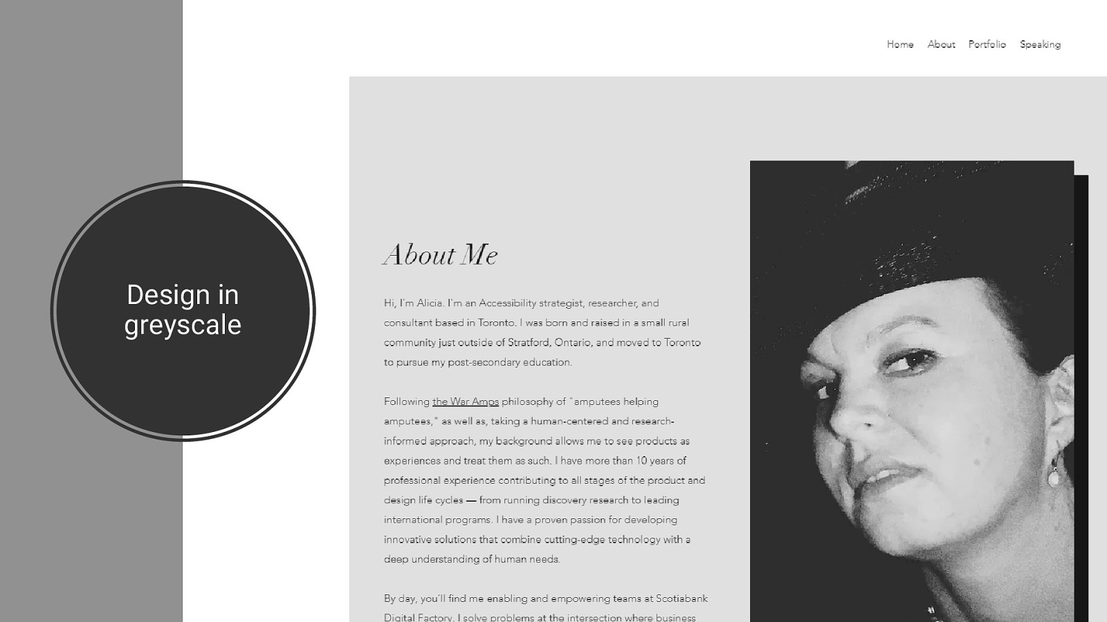
Design in greyscale
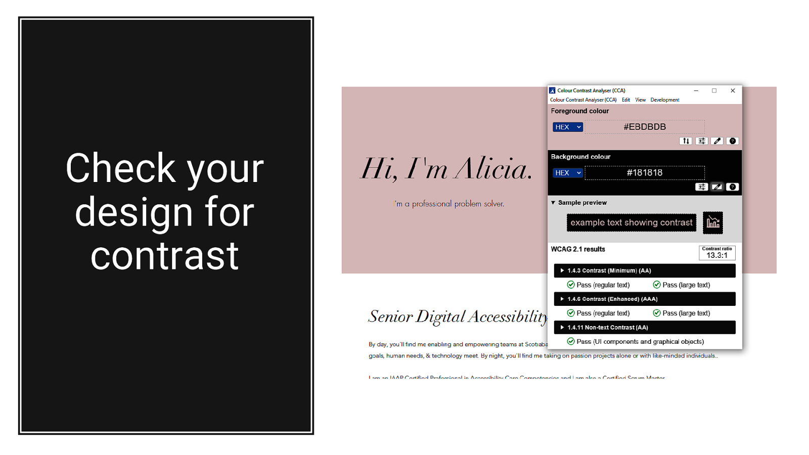
Check your design for contrast
“Customer and employee delight is the goal. All day. Every day. Understanding and delivering actions that delight define whether or not revenue is maximized. Diverse demand has changed how great brands deliver delight. Are you ready to ‘unleash different’?” - Rich Donovan
Alicia Jarvis, CPACC, CSM Website: Alicia.design Twitter: @A11yAlicia LinkedIn: linkedin.com/in/aliciajarvis