Of Time And The Web

A presentation at border:none 2023 in October 2023 in Nuremberg, Germany by Jeremy Keith

Of Time And The Web
I want to tell you about a word. And the reaction I had to reading that word. I had a very big reaction to a very small word.
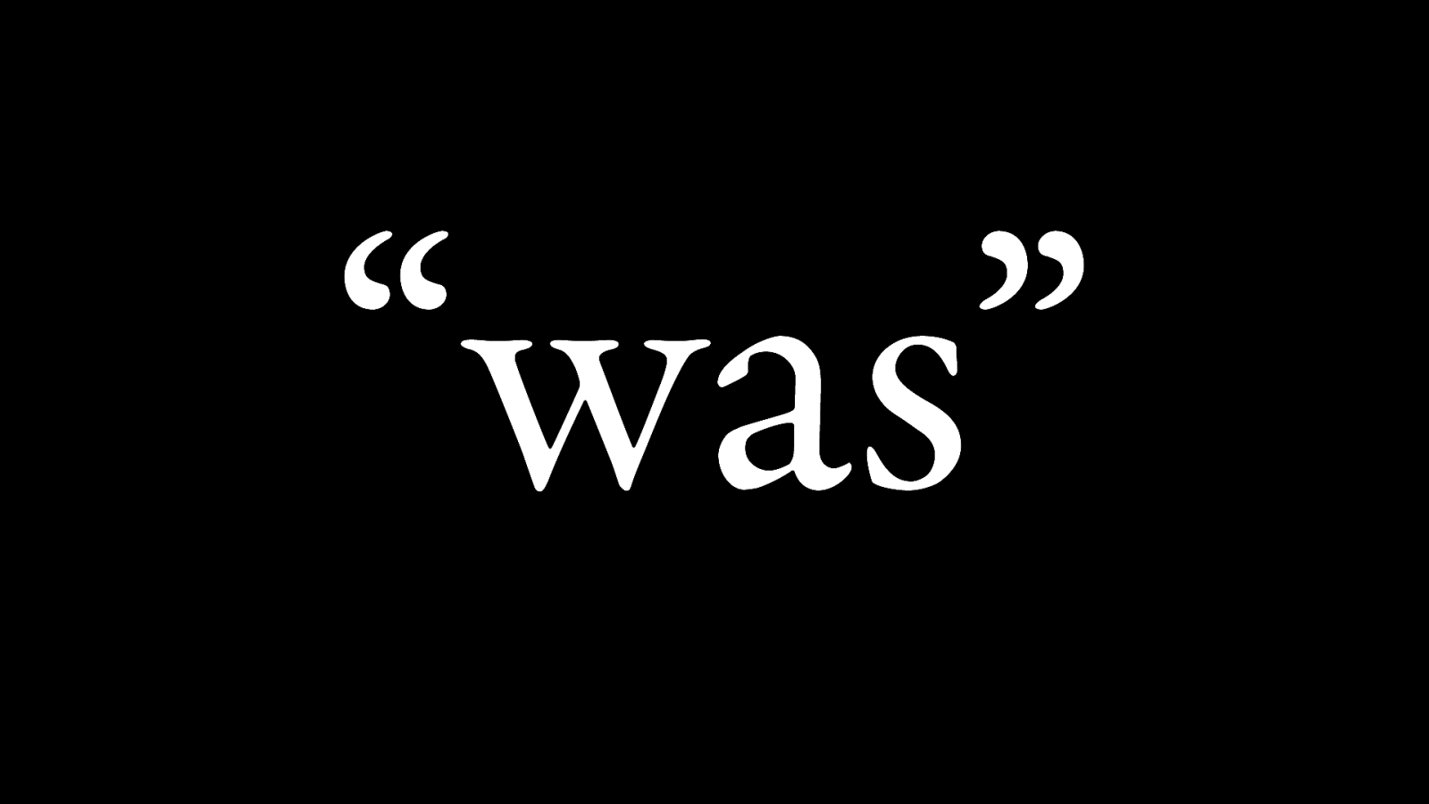
This is the word.
Was.
The past tense of the verb “to be.” I saw this word and I was struck with a sense of awe.
Now, obviously it’s not just about the word itself—I don’t get struck by feelings of awe anytime anyone says the word “was.” The context matters. Here’s the context…
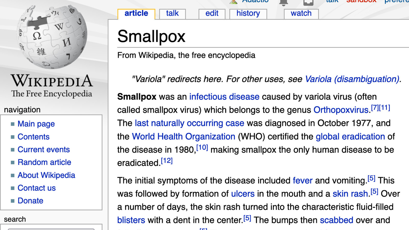
I was reading the WikiPedia entry for smallpox. Don’t ask me how I ended up here, I don’t remember. But I read the second word in the rst sentence, “Smallpox was…” And I think for the rst time I really grasped what an astonishing achievement it is to eradicate a deadly disease.
We did that! Humans! Using science!

Surely this must stand as one of the greatest achievements of our species? I was curious as to how this was reported in news outlets at the time. I went searching through newspaper archives on the web to find out.
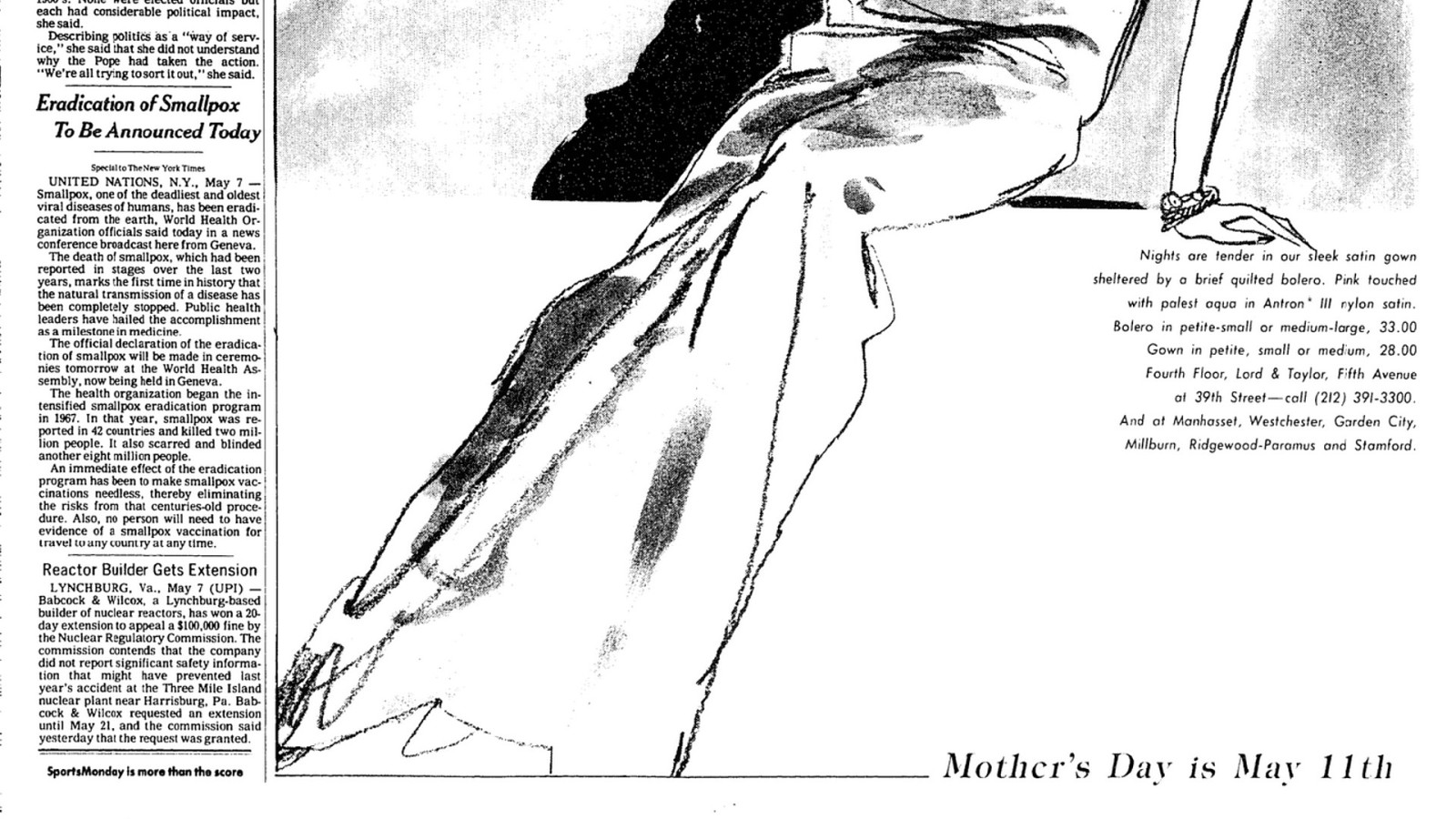
Here’s an article on Page 21 of The New York Times. It’s ve paragraphs long. The rst paragraph says:
“Smallpox, one of the deadliest and oldest viral diseases of humans, has been eradicated, World Health Organization officials said today in a news conference broadcast here from Geneva.”

A few paragraphs down it says: “The health organization began the intensi ed smallpox eradication program in 1967. In that year, smallpox was reported in 42 countries and killed 2 million people. It also scarred and blinded another eight million people.”
In one year!
About ten years later, the disease was eradicated!
But it was a gradual process.
If something changes gradually, we don’t notice it. We literally exhibit something called change blindness.
But we are hard-wired to notice sudden changes.
We pay attention to moments of change.
“Where were you when JFK was assassinated?”
“Where were you on September 11th?”
Nobody is ever going to ask “where were you when smallpox was eradicated?”

We mark the moments when an election is won or lost, the moment war breaks out, the moment a cease re is signed. We also seem to be particular attuned to breaking changes—the moments when bad things happen.
We’re downright suspicious of good news.
We have this phrase: “sounds too good to be true.”
But we don’t have this phrase: “sounds too bad to be true.”
There may well be solid evolutionary reasons for being attuned to danger and threats. But maybe we should occasionally take a step back and notice the changes we’ve been blind to.
What if there were a newspaper that wasn’t published daily or weekly, but once every 100 years? What would the headline on the front page be?
Maybe it would be a moment, like “Yuri Gagarin went into space”—that was a pretty big one!
But maybe the headline would be something we don’t even think about.
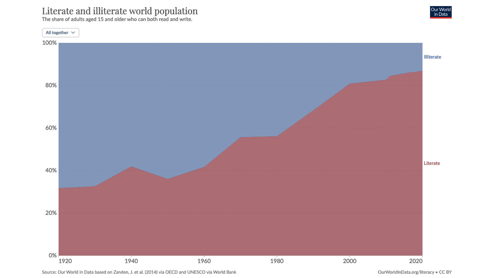
Maybe the headline would be about how many more people can read the headline! Adult literacy rates have skyrocketed over the last hundred years—and this is showing percentages, not raw numbers; then the chart would be even more dramatic.
What about a 50 year newspaper? What would the headline be? Maybe it would be about climate change: “burning coal and oil turns out to have been really bad.”
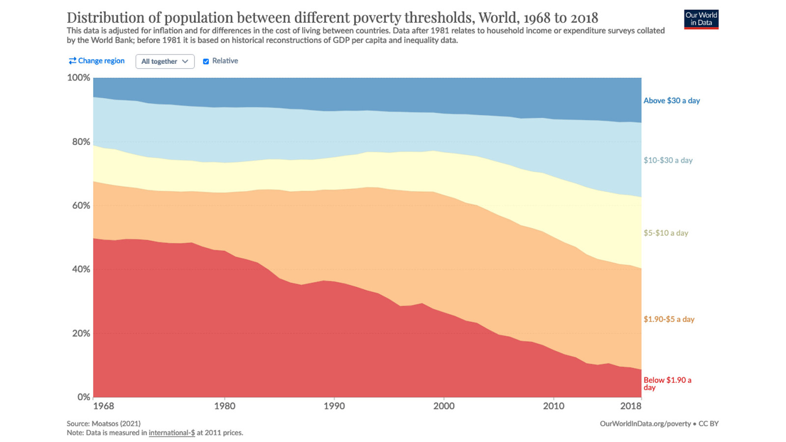
Or maybe the headline would be about the remarkable drop in extreme poverty. Any percentage is still too much, but still, look at that rapid fall… particularly over the last 25 years.
Every single day, a real-time newspaper could’ve run the headline: “130,000 People Escape Extreme Poverty Today” …but no newspaper has every reported that.
Sounds too good to be true.
What about a newspaper published once every 25 years? Maybe the headline would still be about the drop in extreme poverty. Or maybe the headline would be about the equally steep drop in violent crime. Or deaths in natural disasters.
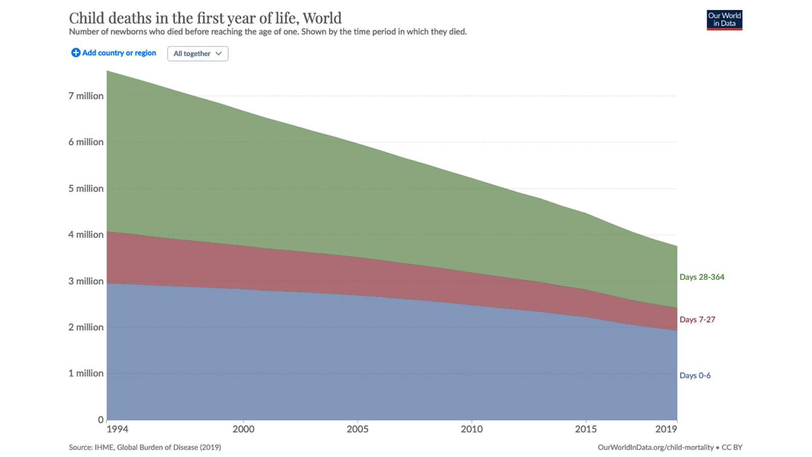
Or perhaps the editor would run with the story of infant mortality rates being halved.
This time we are looking at the raw numbers; if this were percentages of the world population, the effect would be even more dramatic.
What about a newspaper published every 10 years? That’s the time frame we’re looking at here today, right?
For a newspaper published once a decade, I reckon today’s headline would probably be about climate change and the environment.
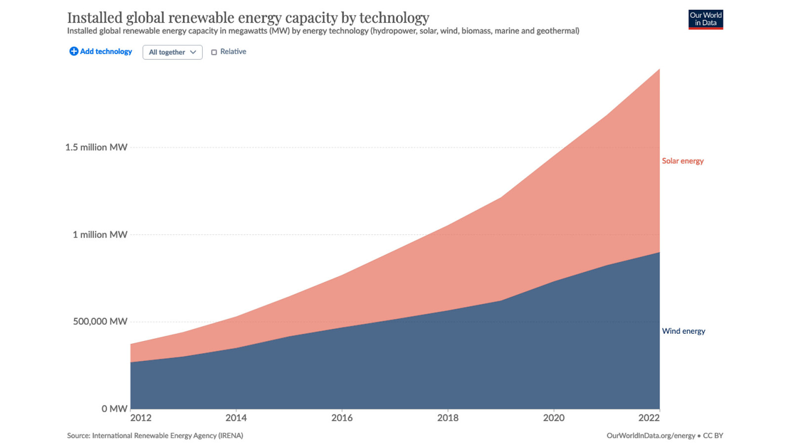
Maybe this is the most surprising development in the last 10 years: the huge increase in solar and wind energy. There’s a corresponding graph showing an equally dramatic drop in price, especially for solar. We could be looking at part of an exponential curve here—time will tell!
But let’s get more specific.
Let’s look at the World Wide Web. How has the web changed since I was standing here 10 years ago?
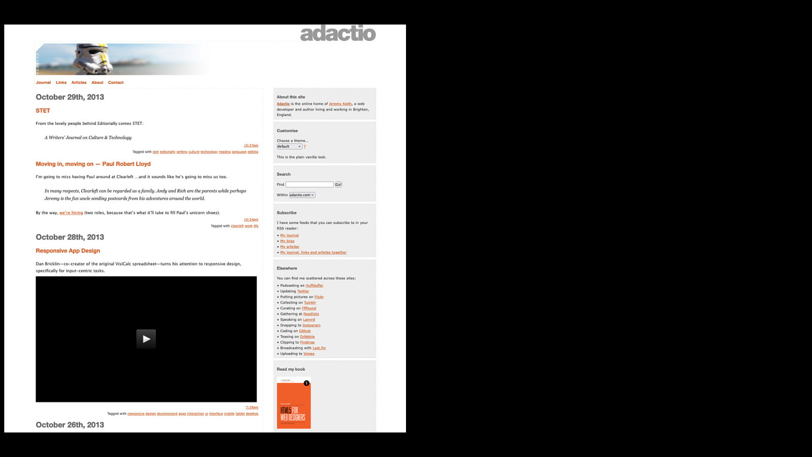
Thanks to the internet archive, I can show what my own website looked like at the moment I was speaking at the first border: none.
Now let’s compare this to how my website looks today…
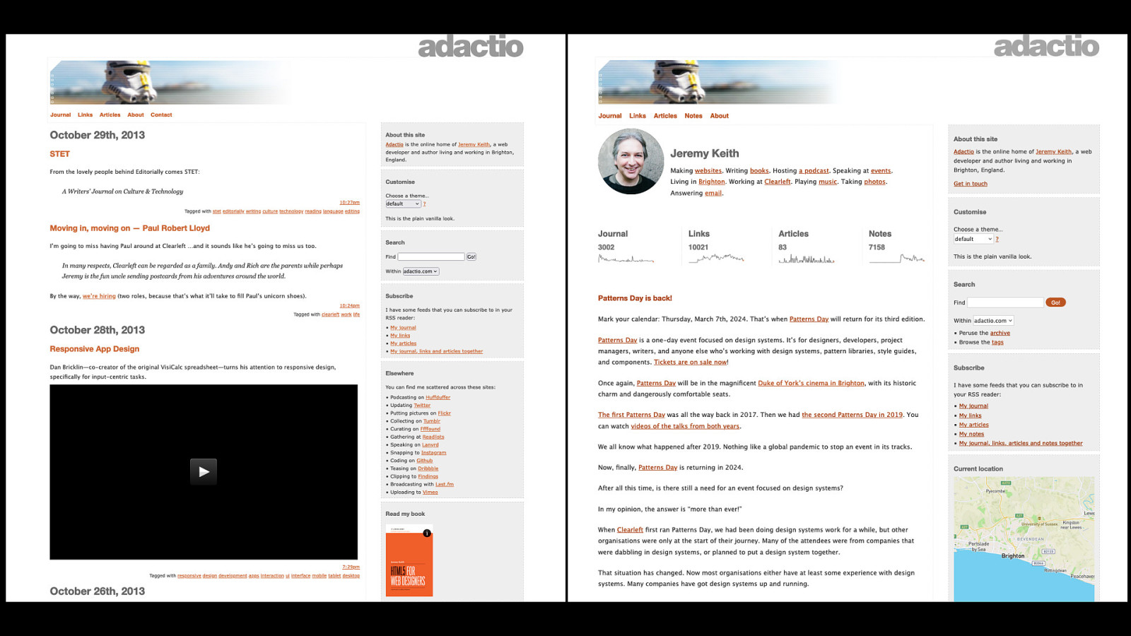
Hmmm …not exactly an astonishing amount of change, is it? I think we need to go further back than 10 years. I think we need to go all the way back.

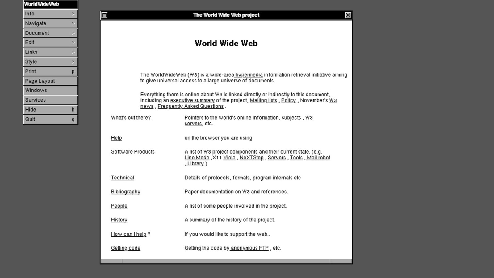
This is the first website ever made, displayed in the first web browser ever made. They were both made by Tim Berners-Lee 30 years ago.
And this website is still online today at its original URL, because it’s cool.

The World Wide Web was somewhat lacking in colour originally. When I started making websites in the mid nineties, colour had arrived but it was limited.
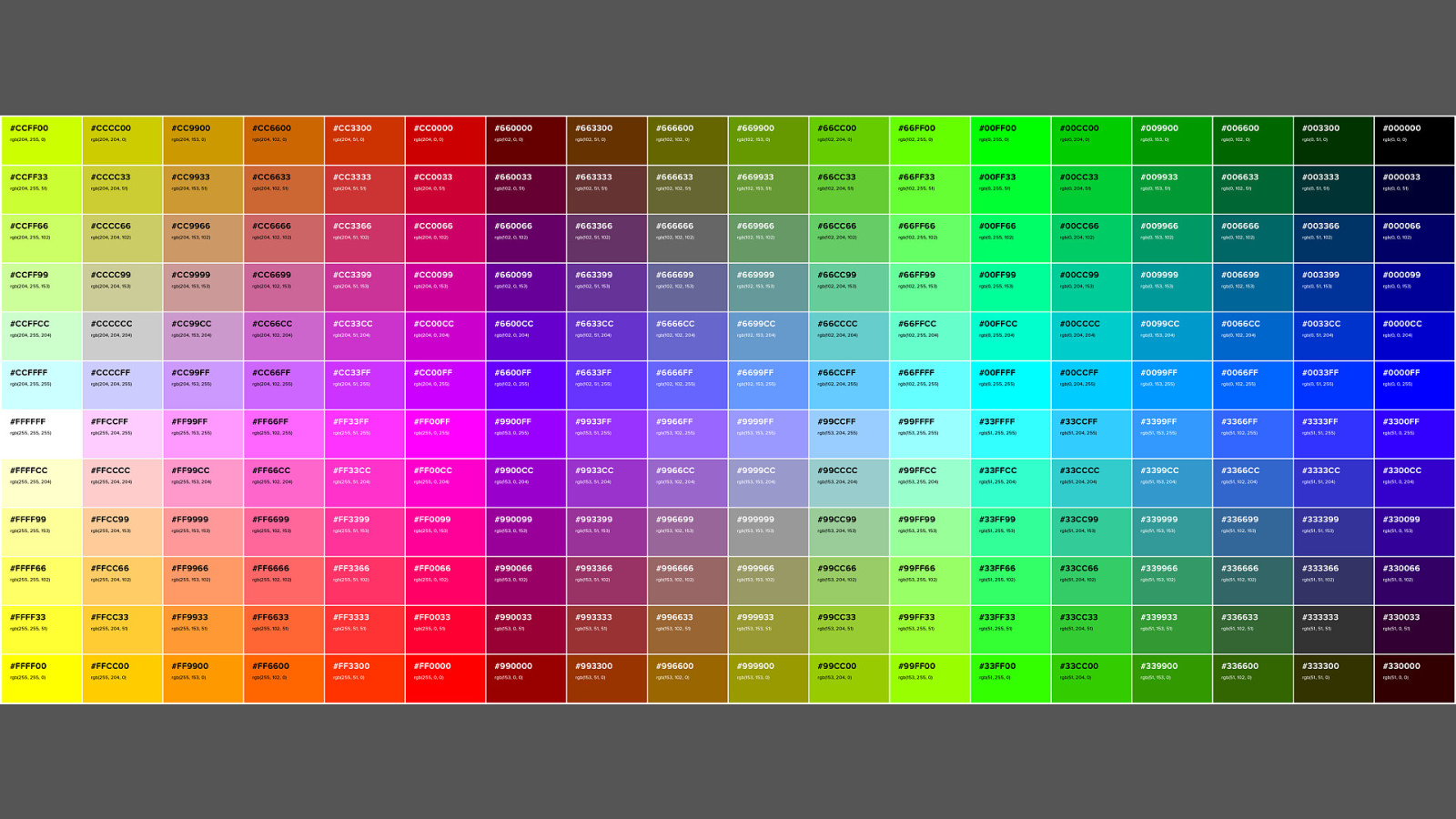
We had a palette of 216 web safe colours.
You knew if a colour was “web safe” if the hexadecimal notation was three sets of duplicated values.
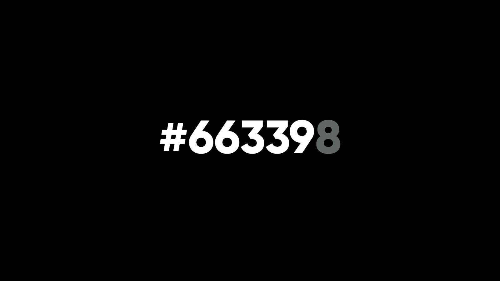
If you altered one of those values even slightly, there was no guarantee that the colour would display consistently on the monitors of the time.
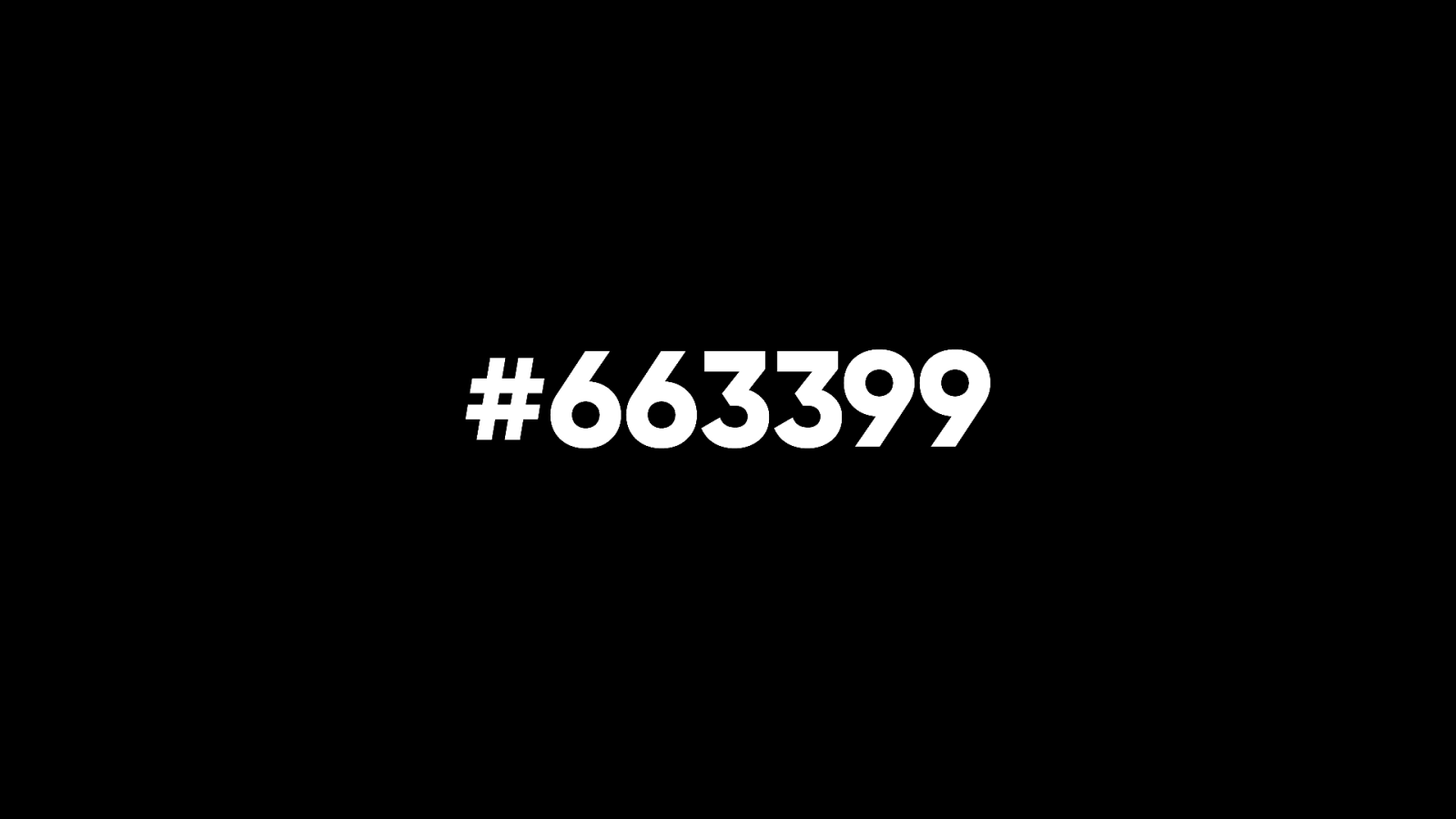
I have a confession to make: I kind of liked this constraint in a weird way. To this day, if I have a colour value that’s almost web-safe….

…I can’t resist nudging it slightly.
Fortunately, monitors improved. They got atter for one thing. They were also capable of displaying plenty of colours.
And we also got more and more ways of specifying colours.
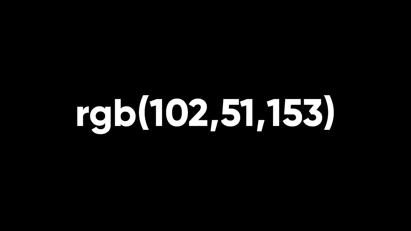
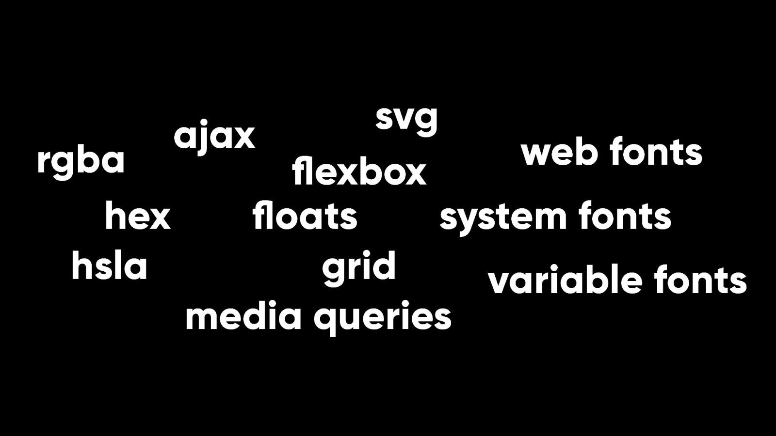
As well as hexadecimal, we got RGB: Red, Green, Blue.
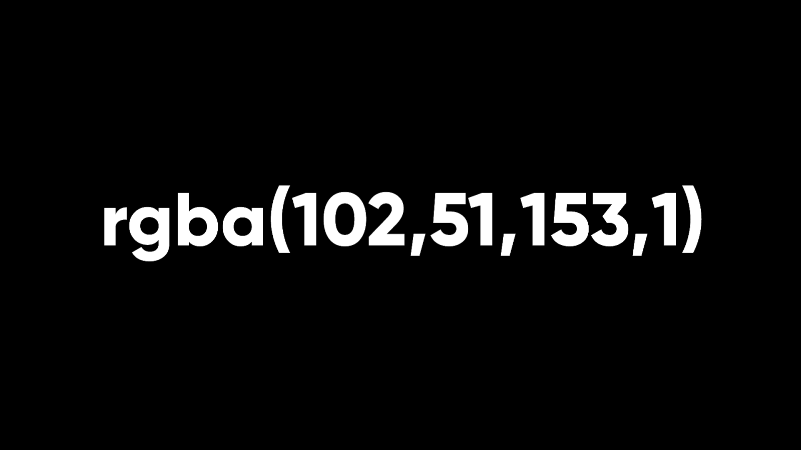
Better yet, we got RGBa …with alpha transparency. That’s opacity to you and me.
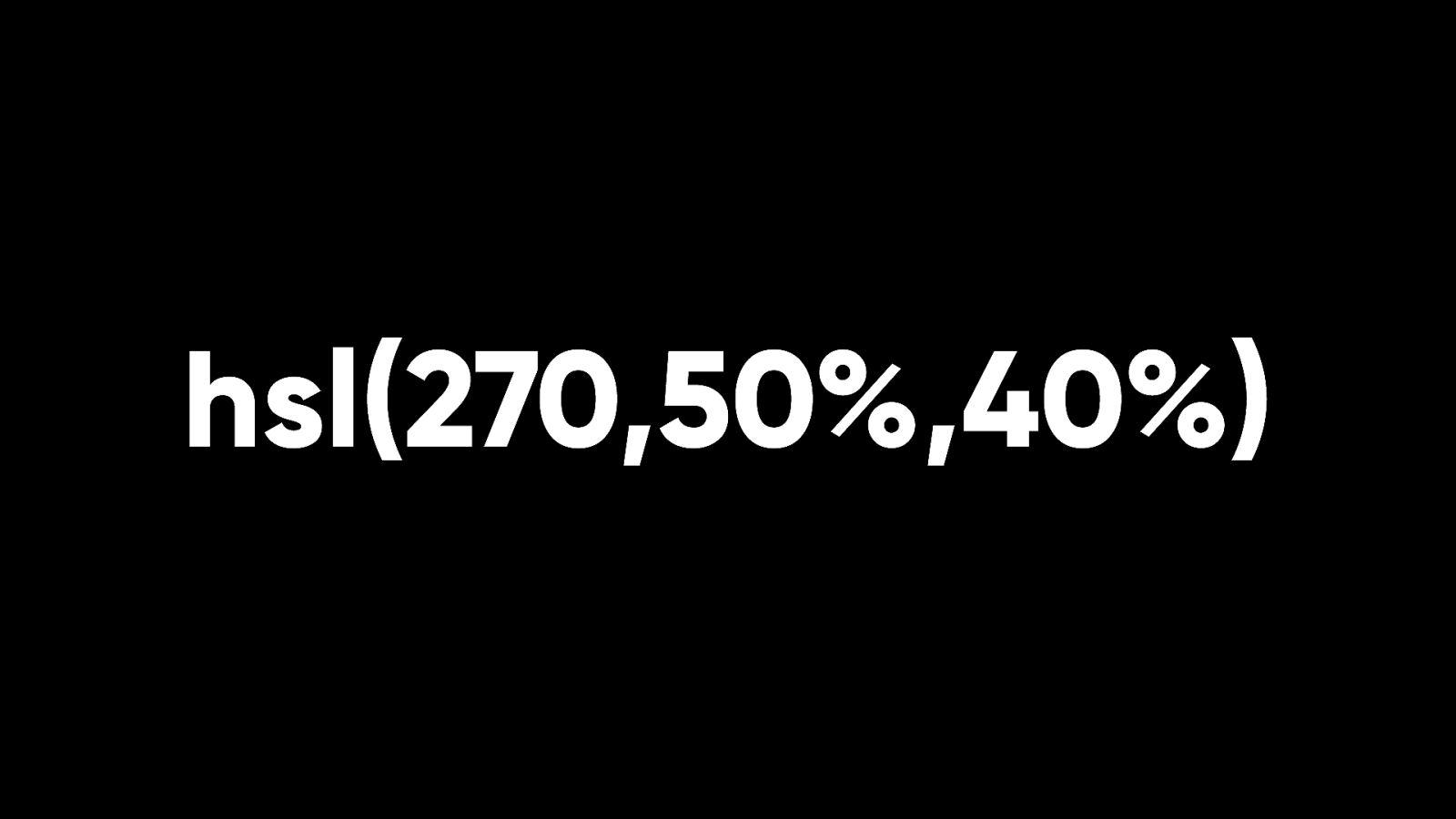
Then we got HSL: hue, saturation, lightness.
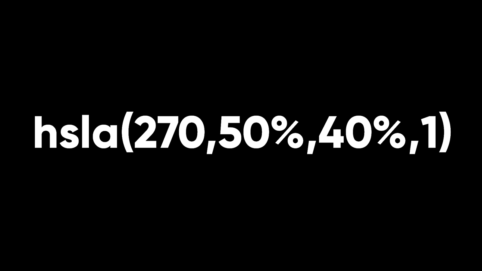
Or should I say HSLa: hue, saturation, lightness, and alpha transparency. And there are more colour spaces available today.
HWB (hue, whiteness, blackness)
LAB
LCH
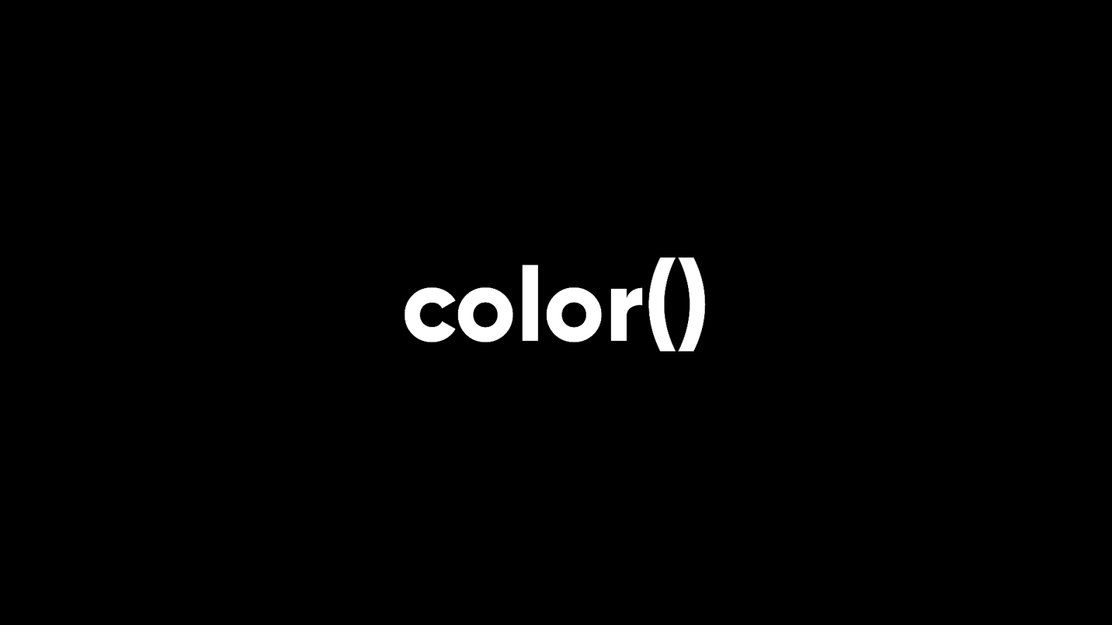
And now we’ve got a color() function so you can specify even more colour spaces. Sounds too good to be true.

In the beginning, typography on the World Wide Web was non-existent. Your browser used whatever was available on your operating system. That situation continued for quite a while. You’d have to guess which fonts were likely to be available on Windows or Mac.
If you wanted to use a sans-serif typeface, there was Arial on Windows…
…and Helvetica on the Mac
Verdana was a pretty safe bet too.

For a while your only safe option for a serif typeface was Times New Roman.
When Mathew Carter’s Georgia was released, it was a godsend. Here was a typeface specifically designed for the screen. Later Microsoft released another four fonts designed for the screen.
Four new fonts! It felt like we were being spoiled.

But what if you wanted to use a typeface that didn’t come installed with an operating system?
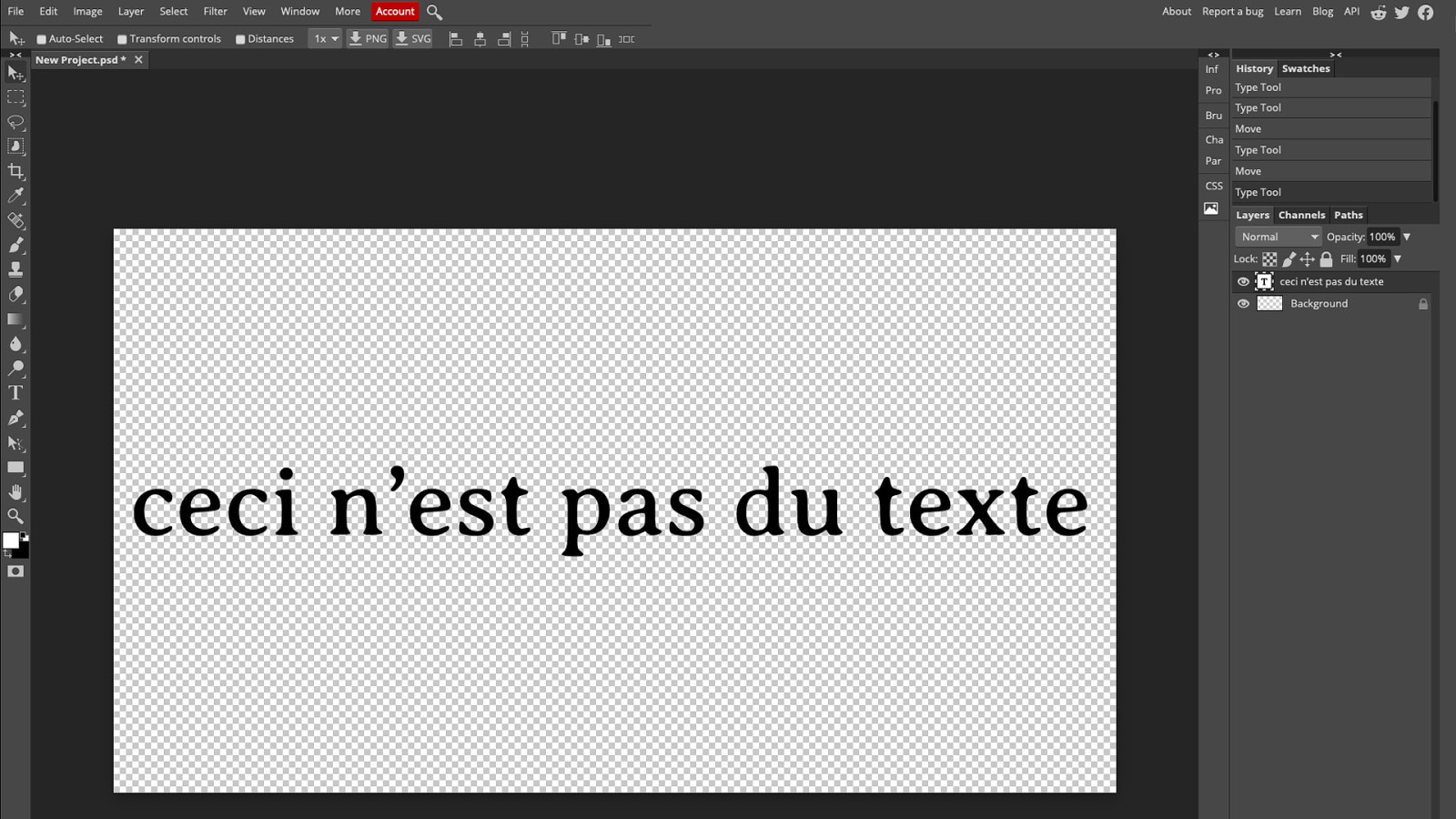
Well, you went into Photoshop and made an image of the text. Now the user had to download additional images.
The text wasn’t selectable and it was a fixed width.
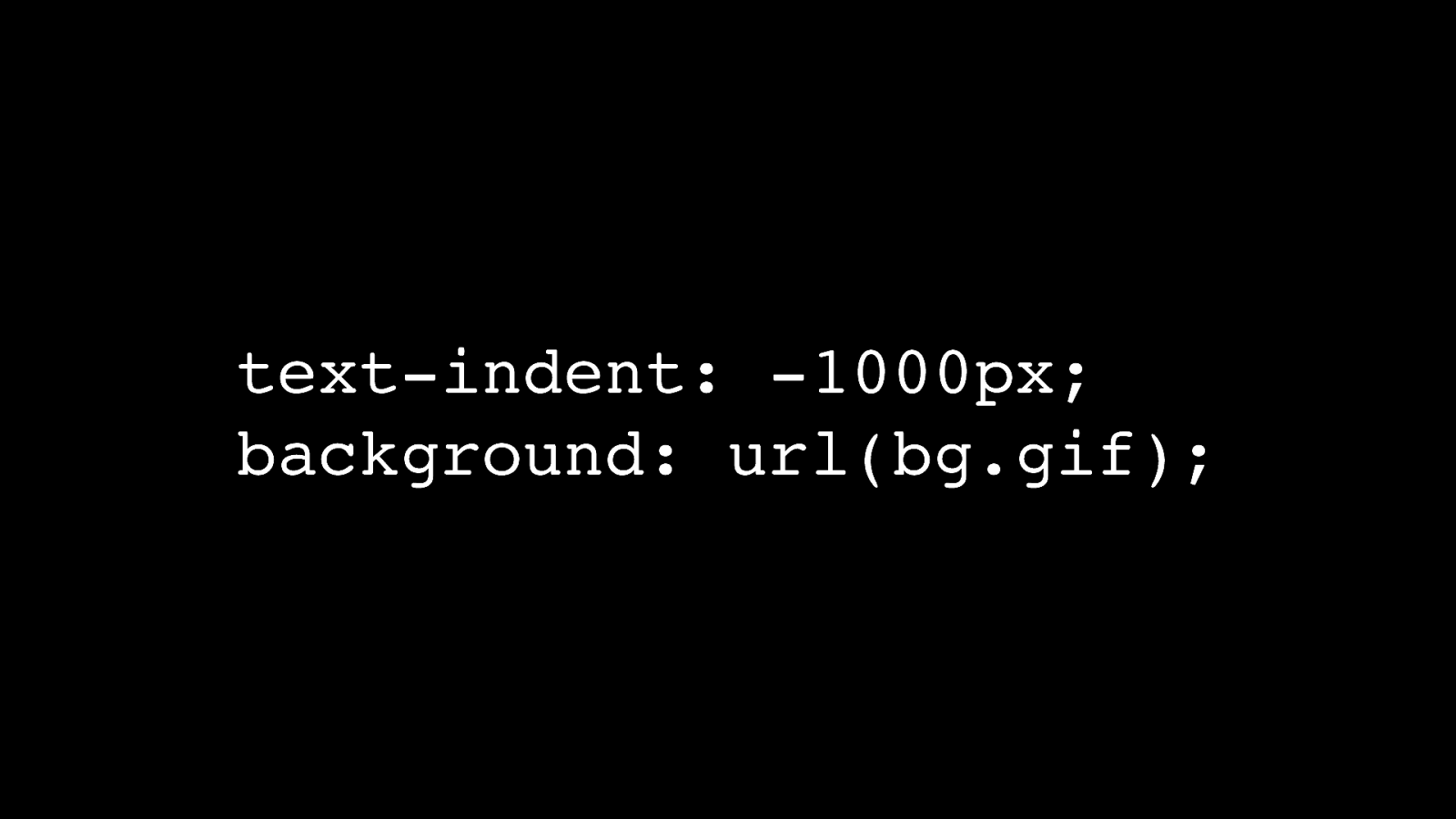
We came up with all sorts of clever techniques to do what was called “image replacement” for text. Some of the techniques involved CSS and background images.

One of the techniques involved Flash. It was called sIFR: Scalable Inman Flash Replacement.

A later technique called Cufón converted the letter shapes into paths in Canvas.
All of these techniques were hacks. Very clever hacks, but hacks nonetheless. They were clever and they worked but they always reminded me of Samuel Johnson’s description of a dog walking on its hind legs.
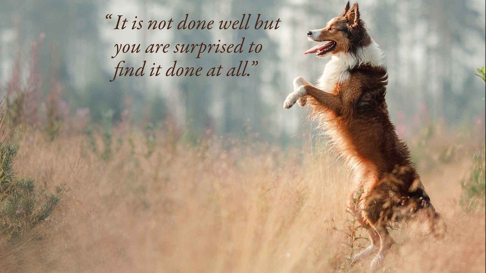
“It is not done well but you are surprised to find it done at all.”
What if you wanted to use an actual font le in a web page?
There was only one browser that supported font embedding: Microsoft’s Internet Explorer.

The catch was that you had to use a proprietary font format called Embedded Open Type.
Both type foundries and browser makers were nervous about allowing regular font les to be embedded in web pages. They were worried about licensing. Wouldn’t this lead to even more people downloading fonts illegally? How would the licensing be enforced?

The impasse was broken with a two-pronged approach.

First of all, we got a new font format called Web Open Font Format or WOFF. It could be used to take a regular font file and wrap it in a light veneer of metadata about licensing.
There’s a sequel that’s even better than the original, WOFF2.

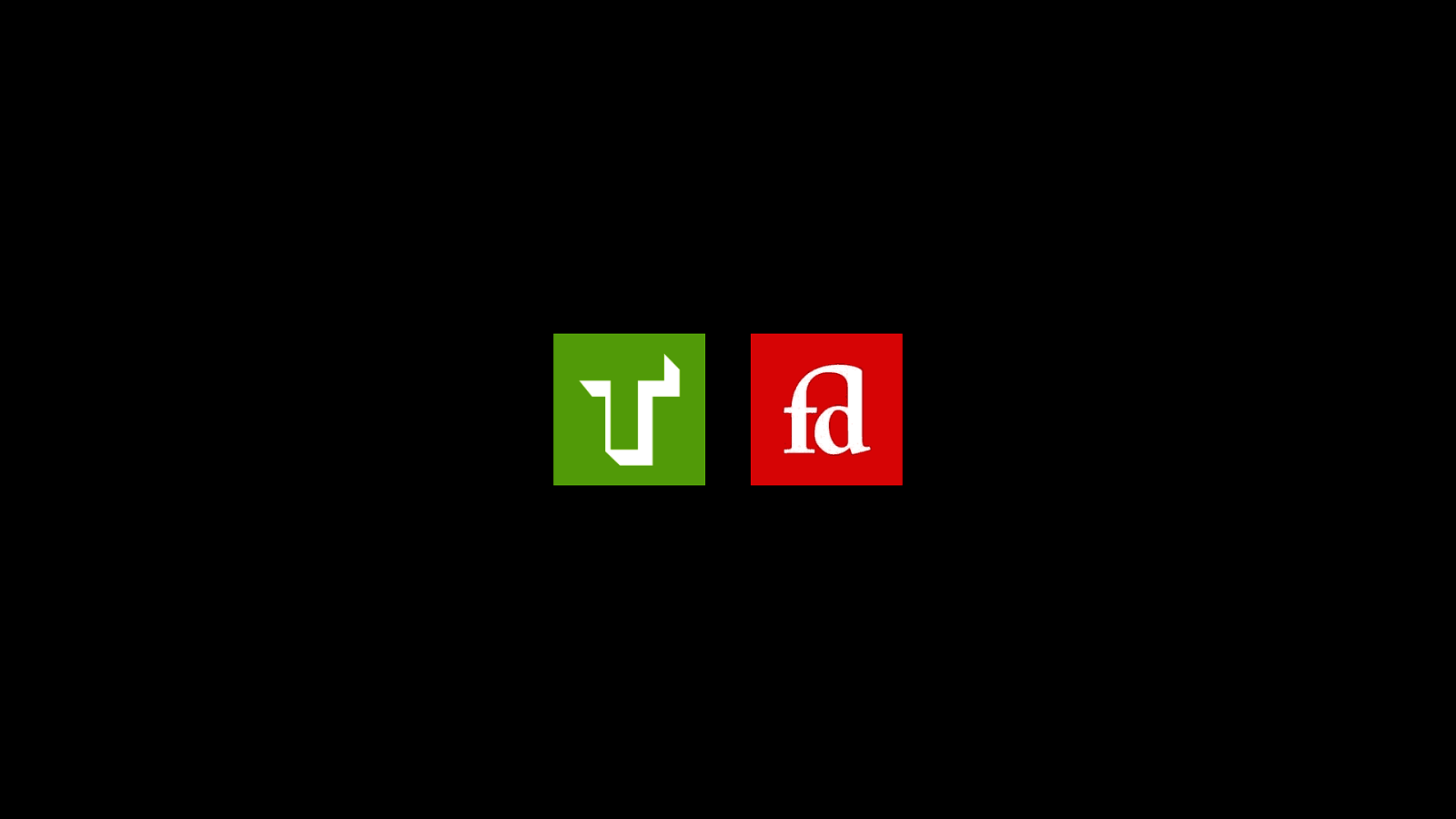
The other breakthrough was the creation of intermediary services like Typekit and Fontdeck. They would take care of serving the actual font files, making sure they couldn’t be easily downloaded.
They could also keep track of numbers to ensure that type foundries were being compensated fairly.
Over time it became clear to type foundries that most web designers wanted to do the right thing when it came to licensing fonts. And so these days, you can probably license a font straight from a type foundry for use on the web and host it yourself.
You might need to buy a few different weights…
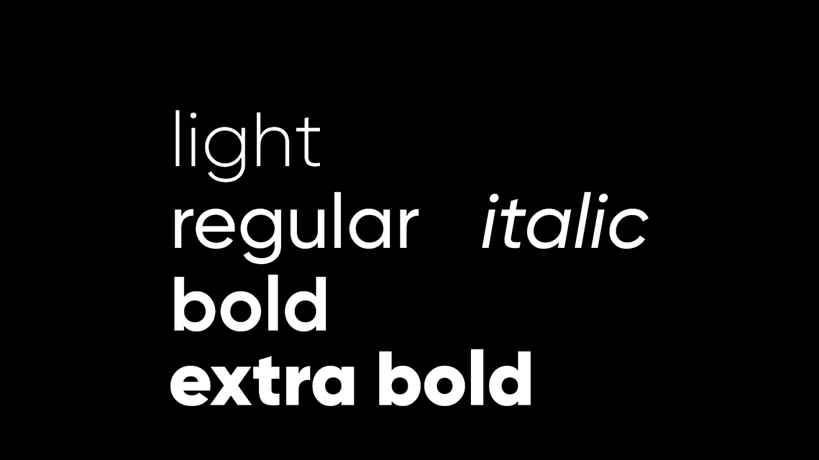
Regular. Bold. Maybe italic. What about extra bold? Or a light weight?
It all starts to add up, especially for the end user who has to download all those files.
I remember being at the web typography conference Ampersand years ago and hearing a talk from Nick Sherman.
He asked us to imagine one single font le that could go from light to regular to bold and everything in between.
What he described sounded like science fiction.
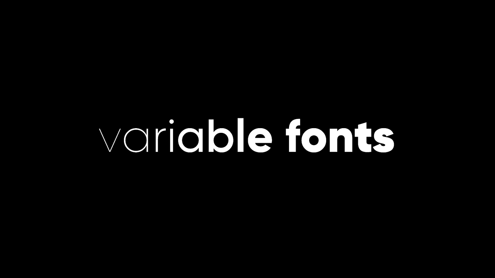
It is now science fact, indistinguishable from magic. Variable fonts are here. You can typeset text on the web to be light, or regular, or bold, or anything in between.
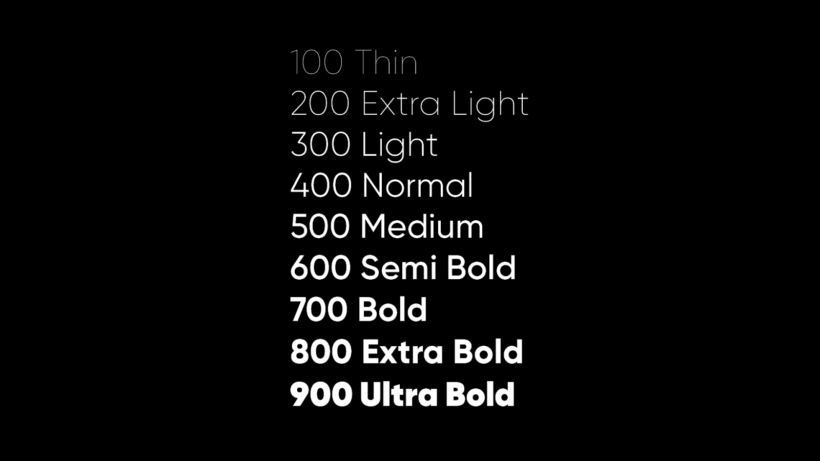
When you use CSS to declare the font-weight property, you can use keywords like “normal” or “bold” but you can also use corresponding numbers like 400 or 700. There’s a scale with nine options from 100 to 900. But why isn’t the scale simply one to nine? Well, even though the idea of variable fonts would have been pure fantasy when this part of CSS was being specced, the authors had some foresight:
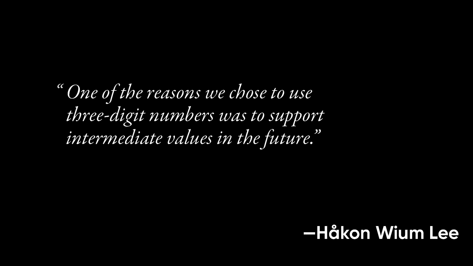
“One of the reasons we chose to use three-digit numbers was to support intermediate values in the future.” With the creation of variable fonts, Håkon Wium Lee added…
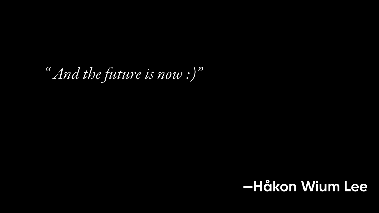
“And the future is now”
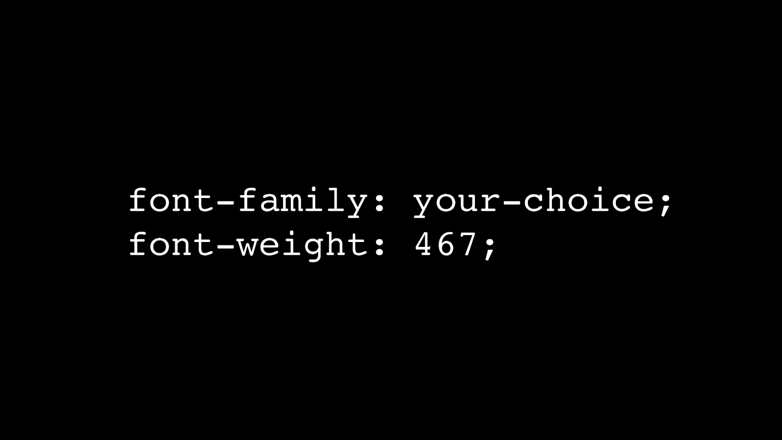
On today’s web you could have 999 font-weight options. Sounds too good to be true.

In the beginning, the World Wide Web was a medium for text only. There were no images and certainly no videos. In an early mailing list discussion, there was talk of creating a new HTML element for images.
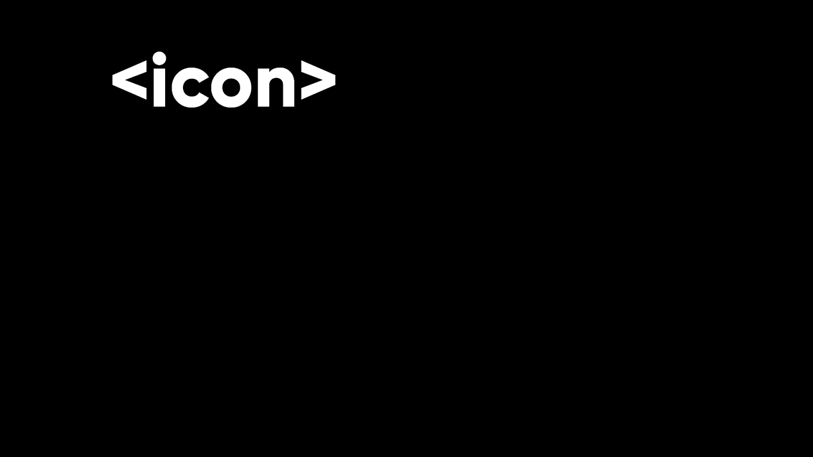
Perhaps it should be called “icon”.
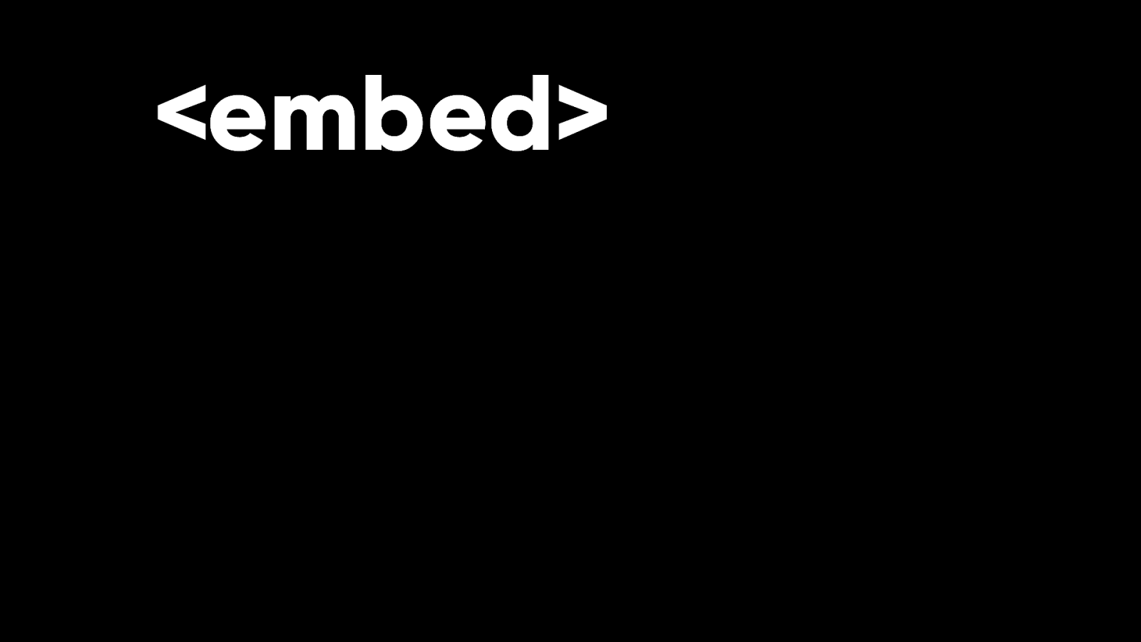
Or maybe it should be more generic and be called “embed”.
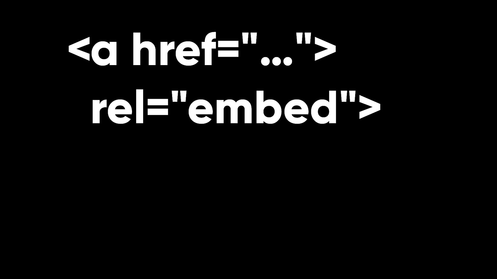
Tim Berners-Lee said he imagined using the rel attribute on the A element for embedding images. While this discussion was happening, Marc Andreessen popped in to say that he had just shipped a new HTML element in the Mosaic browser.
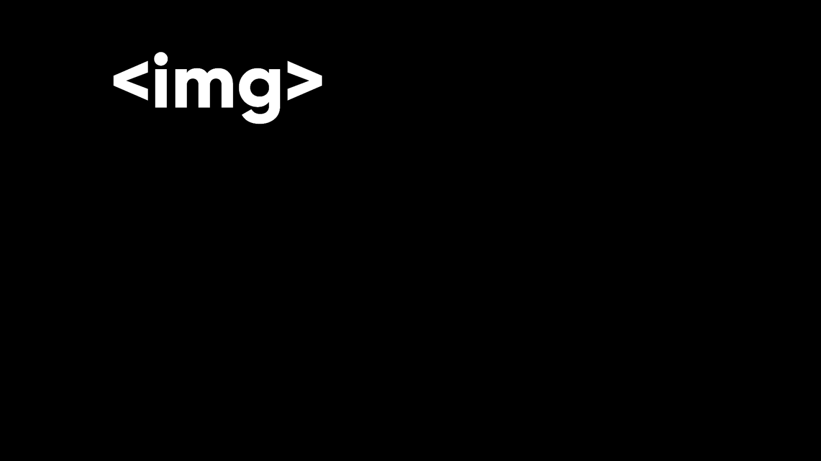
It’s called IMG.
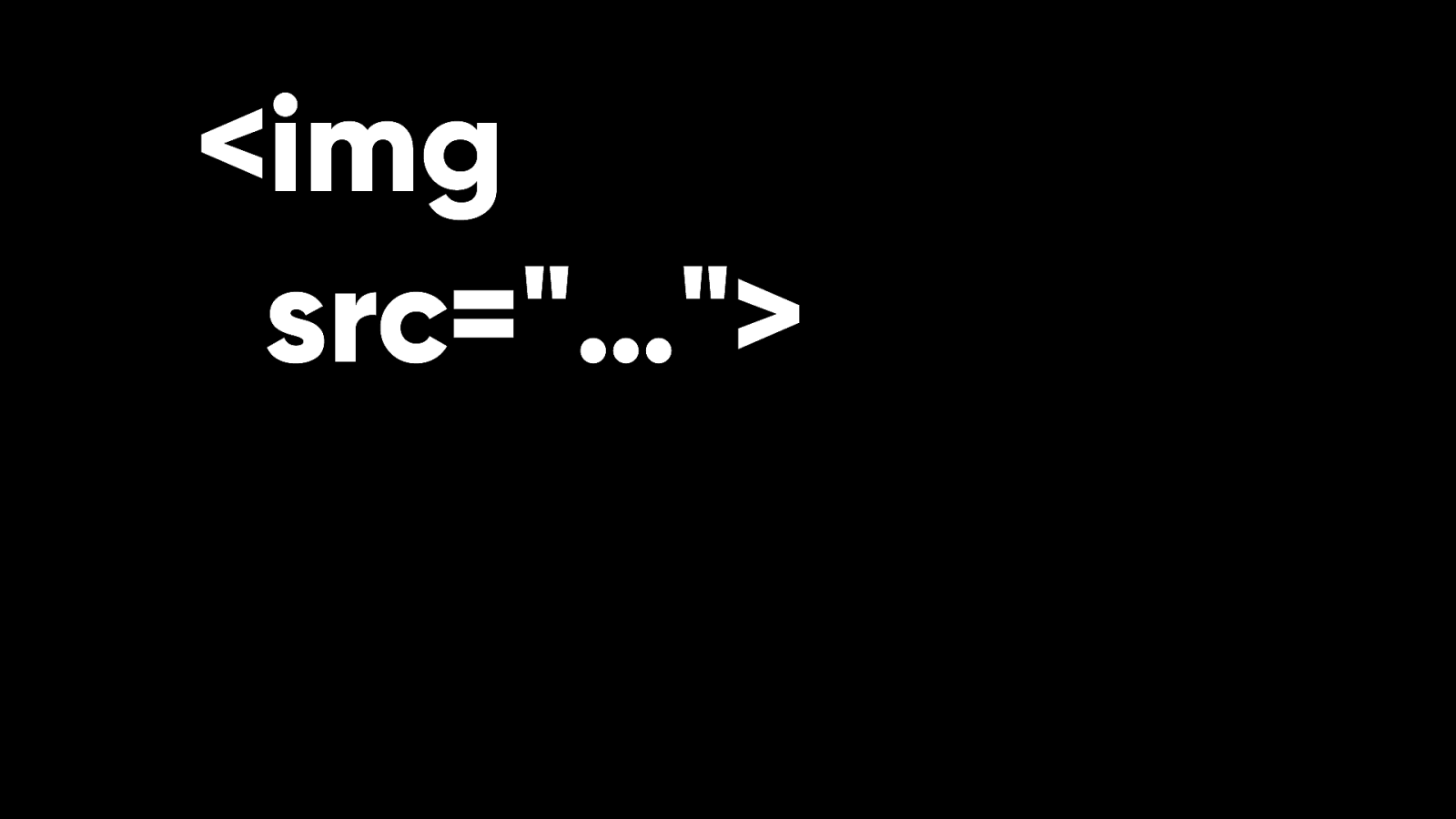
It takes an attribute called SRC that points to the source of the image.
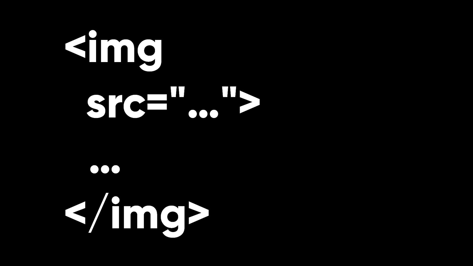
This was a self-closing tag so there was no way to put fallback content in between the opening and closing tags if the image couldn’t be displayed.
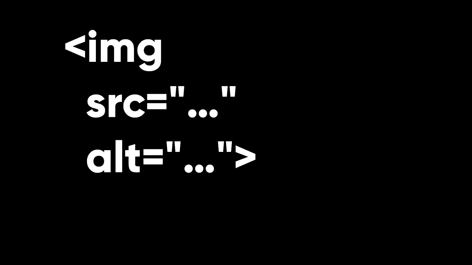
So the ALT attribute was introduced instead to provide an alternative description of the image. For the images themselves, there were really only two choices.
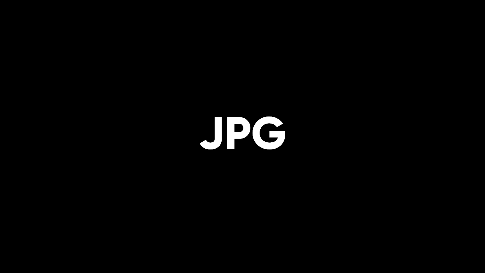
JPG for photographic images.

GIF for icons or anything that needed basic transparency. GIFs could also do animation and today, that’s pretty much all they’re used for. That’s because there was a concerted campaign to ditch the GIF format on the web. Unisys, who owned the rights to a compression algorithm used by the GIF format, had started to make noises about potentially demanding license fees for its use.
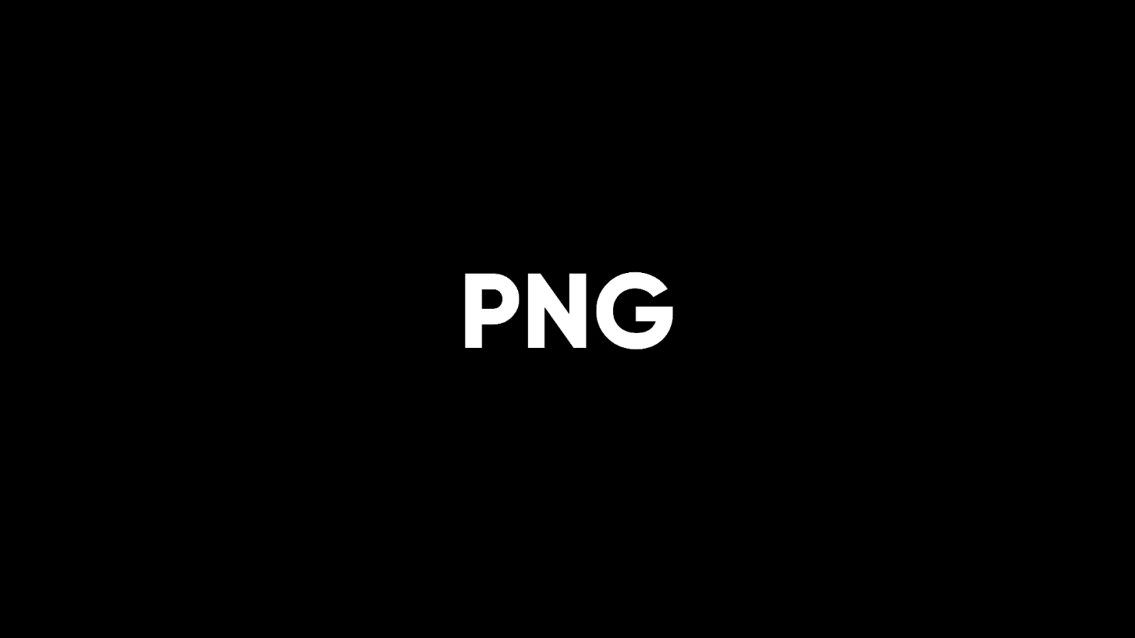
The Portable Network Graphics format—or PNG—was created in response. It was more performant and it allowed you to have proper alpha transparency. These were all bitmap formats. What if you wanted a vector format for images that would retain crispness at any size or resolution? There was only one option….

Flash. You’d have to embed a Flash movie in your web page just to get the bene t of vector graphics.
By the 21st century there were some eggheads working on a text-based vector le format that could be embedded in webpages, but it sounded like a pipe dream.
It was called SVG for Scalable Vector Graphics.
The format was dreamed up in 2001 but for years, not a single browser supported it. It was like some theoretical graphical Shangri-La.

But by 2011, every major browser supported it. Styleable, scriptable, animatable, vector graphics have gone from fantasy to reality. Sounds too good to be true. There’s more choice in the world of bitmap images too.
WebP is well supported.

AVIF is gaining support. The IMG element itself has grown too.
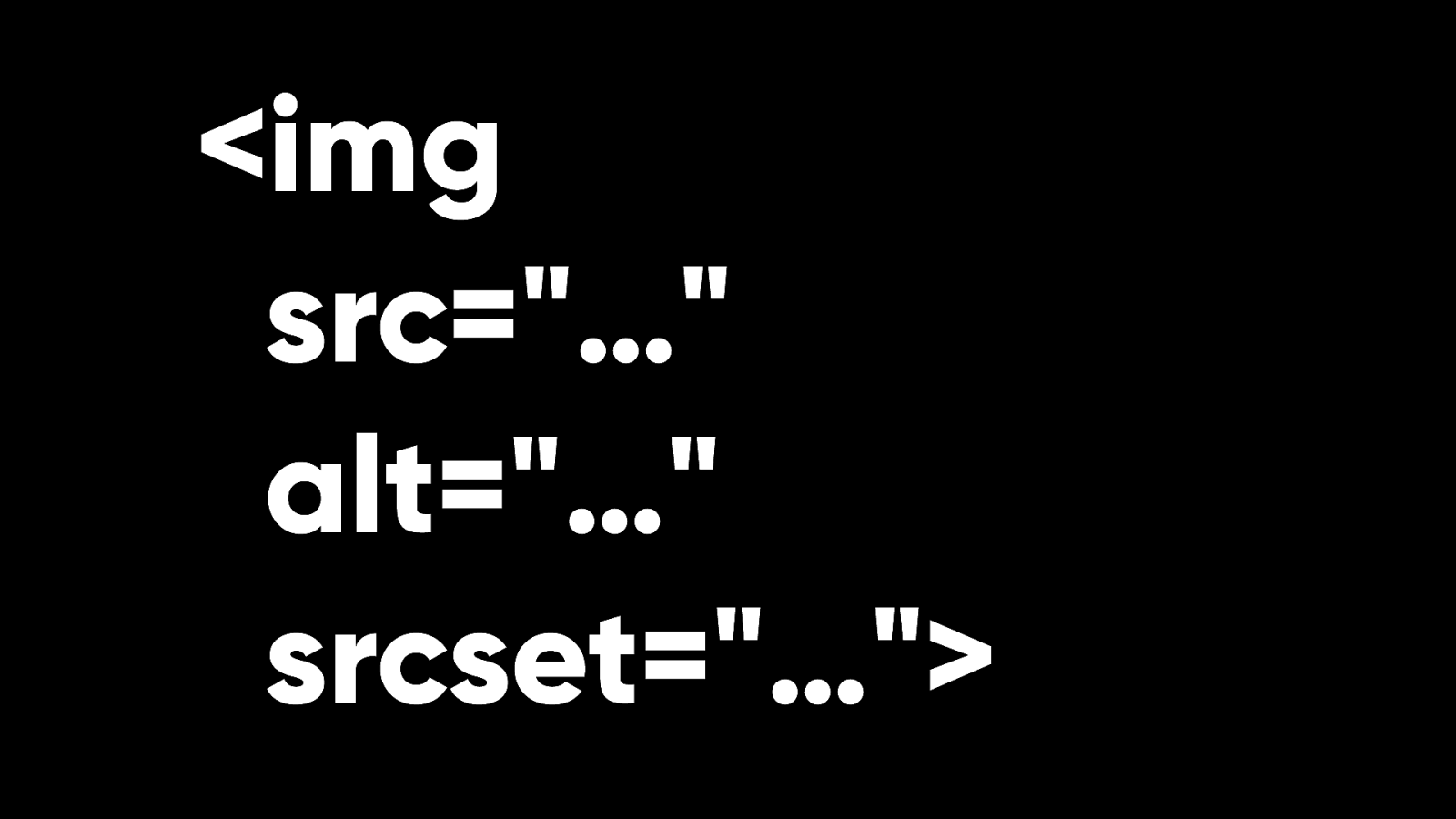
You can use the srcset attribute to give the browser a range of images to choose from to best suit the user’s device and network connection.
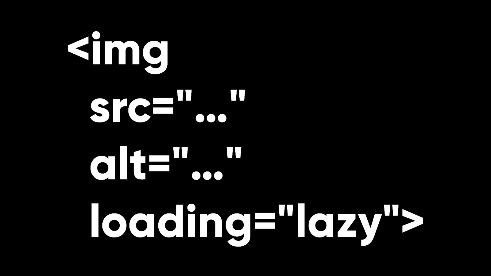
You can use the loading attribute to get lazy loading of images for free—no JavaScript required.
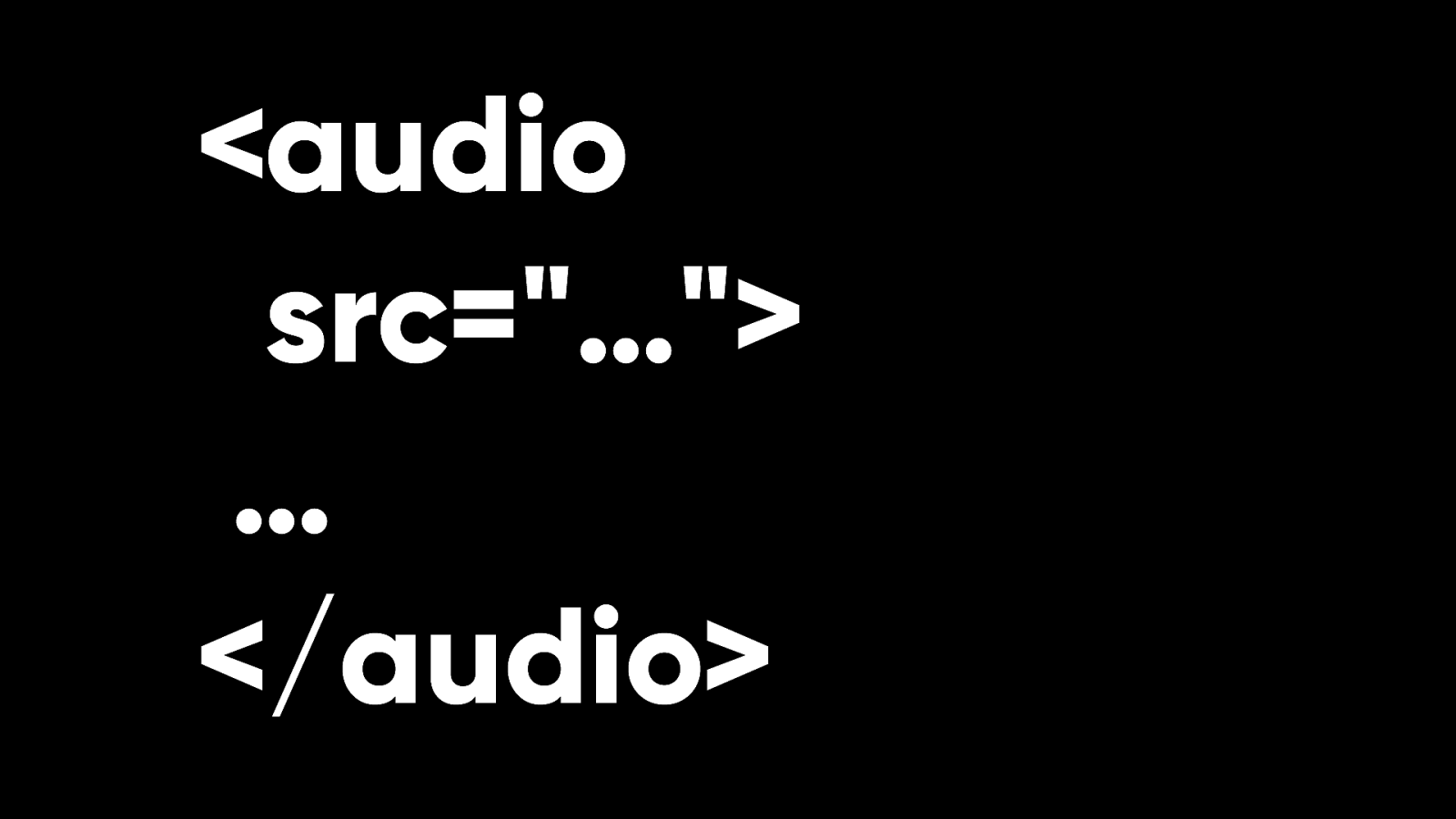
We now have audio in HTML. No JavaScript required.
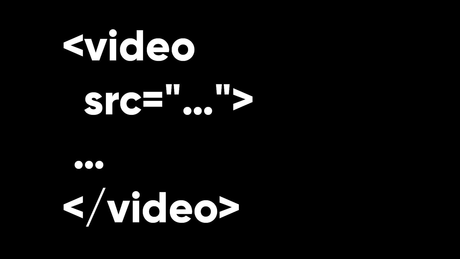
We now have video in HTML. No JavaScript required. These elements have been designed with more thought than the IMG element. They are not self-closing elements, by design. You can put fallback content between the opening and closing tags.
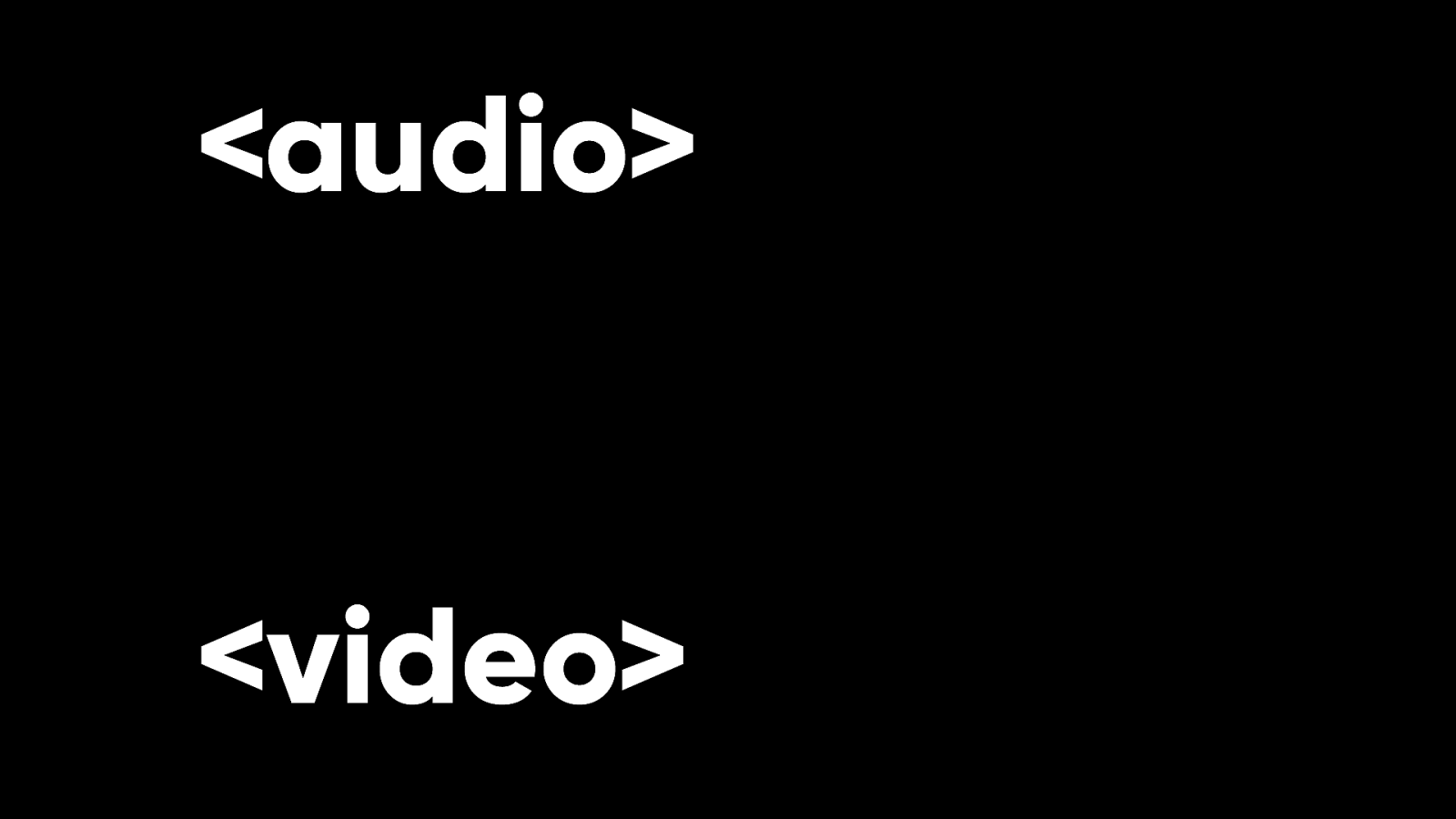
The audio and video elements arrived long after the IMG element. For a long time, there was no easy way to do video or audio on the web. That was very frustrating for me.
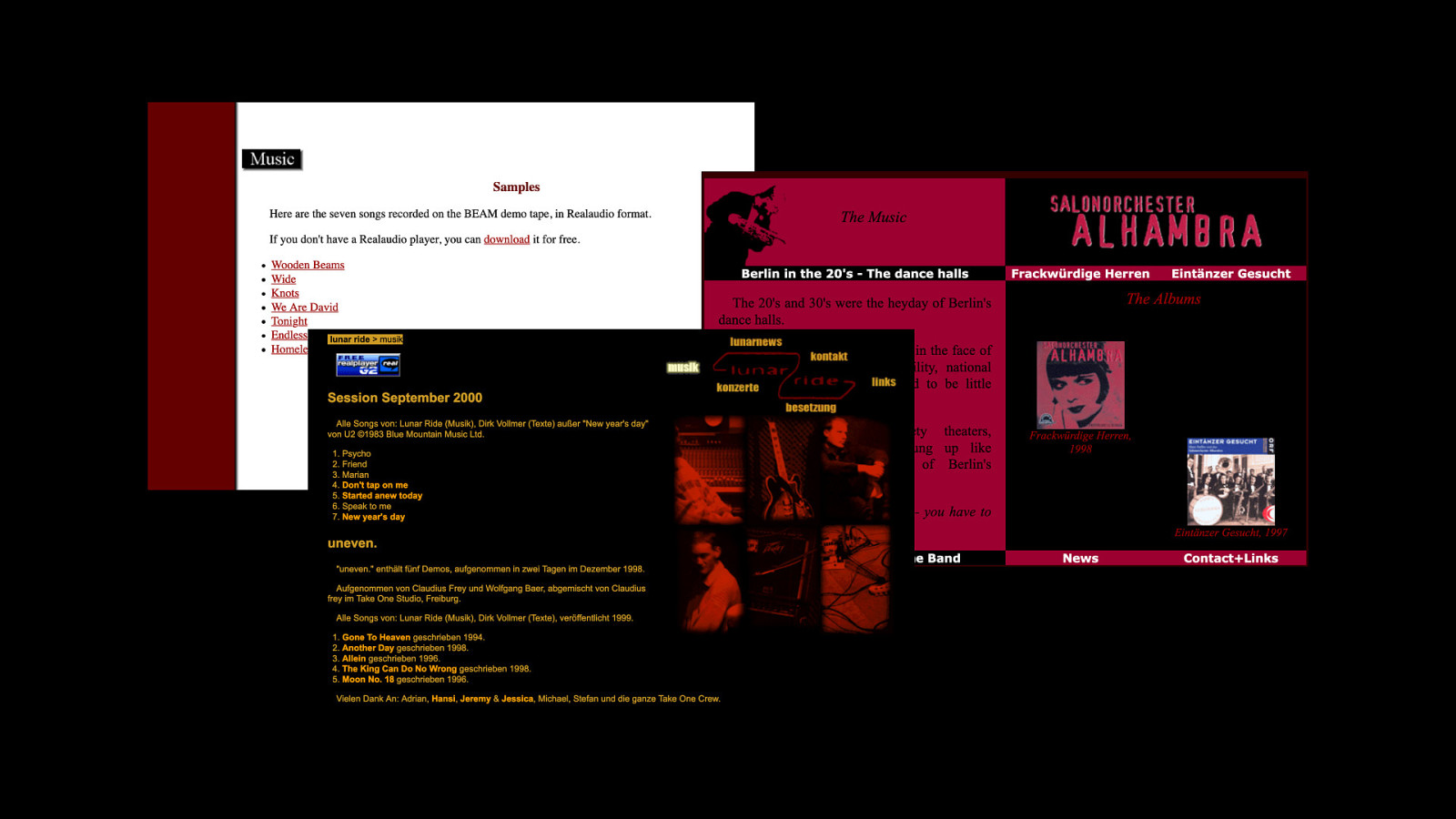
The first websites I ever built were for bands. The only way to stream music was with a proprietary plug-in like Real Audio.
Or …

Flash. While the web standards were still being worked on, Flash delivered the goods with streaming audio and video. This happened over and over. Flash gave us vector graphics, animation, video, and more. But the price was lock-in. Flash was a proprietary format. Still, Flash showed the web standards bodies the direction of travel.

Flash was the hare. Web standards were the tortoise. We know how that race ended. In a way, Flash was like the Research and Development incubator for the World Wide Web.
We got CSS animations, SVG, and streaming video because Flash showed that there was an appetite for them. Until web standards provide a way to do something, designers and developers will reach for whatever tool gets the job done. Take layout, for example.

In the early days of the web, you could have any layout you wanted …as long as it was a single column.

Before long, HTML expanded to provide some rudimentary formatting for that single column of text. Presentational elements and attributes were invented. And even when elements and attributes weren’t meant to be used for formatting, people got creative.
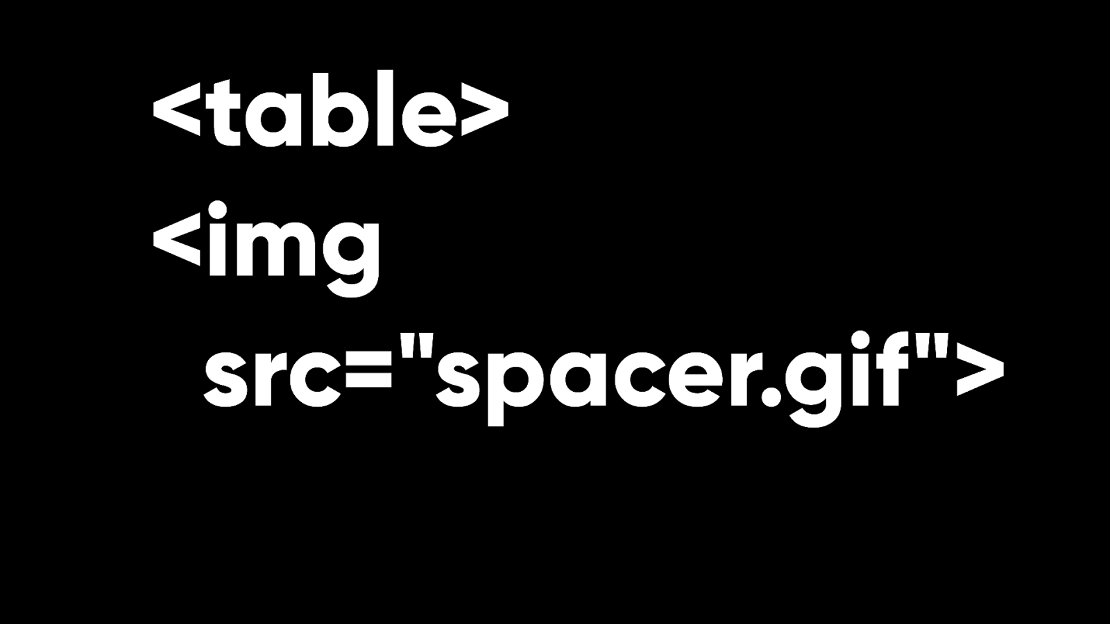
Tables for layout. A single pixel GIF that could be given width and height. These were clever solutions.

But they were hacks. And they were in danger of turning HTML into a presentational language instead of a language for structuring content.
CSS came to the rescue. A language speci cally for presentation.
But we still didn’t get proper layout tools. There was a lot of debate in the early days about whether CSS should even attempt to provide layout tools or whether that was a job for a separate technology.
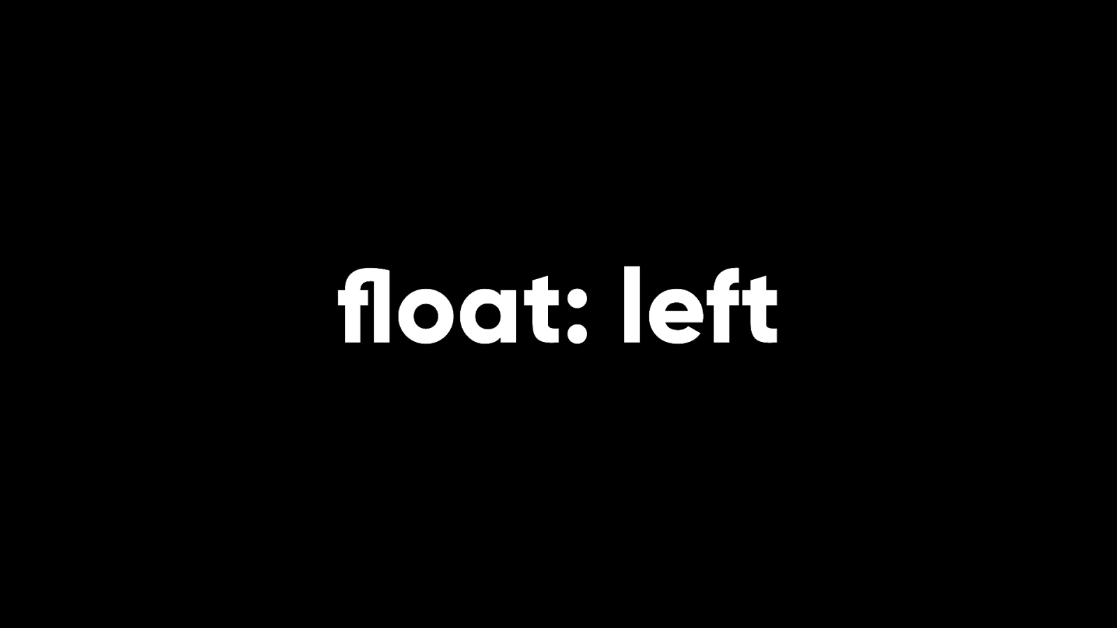
We could lay things out using the oat property, but really that was just another hack. Floats were an improvement over tables for layout, but we only swapped one tool for another. Our collective thinking still wasn’t very web-like.

For example, designers and developers insisted on building websites with a xed width.
This started in the era of table layouts and carried over into CSS.
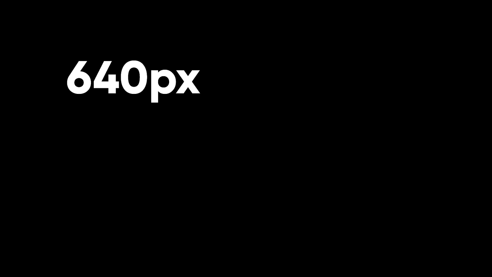
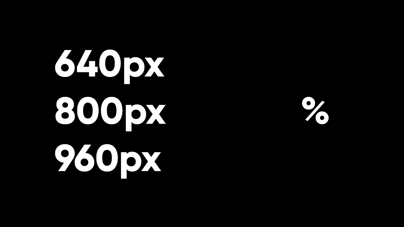
640px
To start with, the fixed width was 640 pixels.

Then it was 800 pixels.

Then people settled on the magical number of 960 pixels.
Designers and developers didn’t seem at all concerned that people had different sized screens.
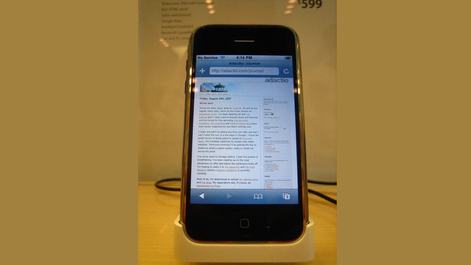
That was until the iPhone came out. Everyone shat the bed.
What fixed width were we supposed to design for now?
The answer was there all along. Even before the web appeared in mobile devices, it was possible to build uid layouts that would adapt to screen size.
It’s just that the majority of designers and developers chose not to build in this way.
I was pleased that mobile came along and shook things up. It exposed the assumptions that people were making.
And it forced designers and developers to think in a more uid, webby way. %
Even better, CSS had expanded to include media queries so it was possible to alter layouts at different breakpoints.
Ethan came along and put a nice bow on it with his de nition of responsive design:
fluid media, uid layouts, and media queries.
I fell in love with responsive web design instantly because it matched how I was already thinking about the web. I was one of the handful of weirdos who insisted on building uid websites when everyone else was using xed-width layouts. But I thought that responsive web design would struggle to take hold.
I’m delighted to say that I was wrong. Responsive web design has become the default!

If I could go back to my past self in the mid 2000s, I’d love to tell them that in the future, everyone would be building with uid layouts (and also that time travel had been invented apparently).
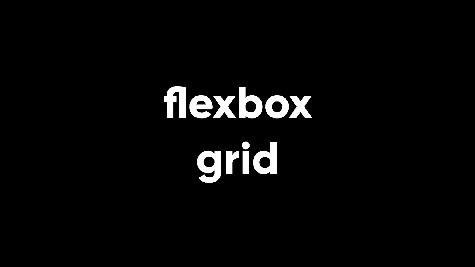
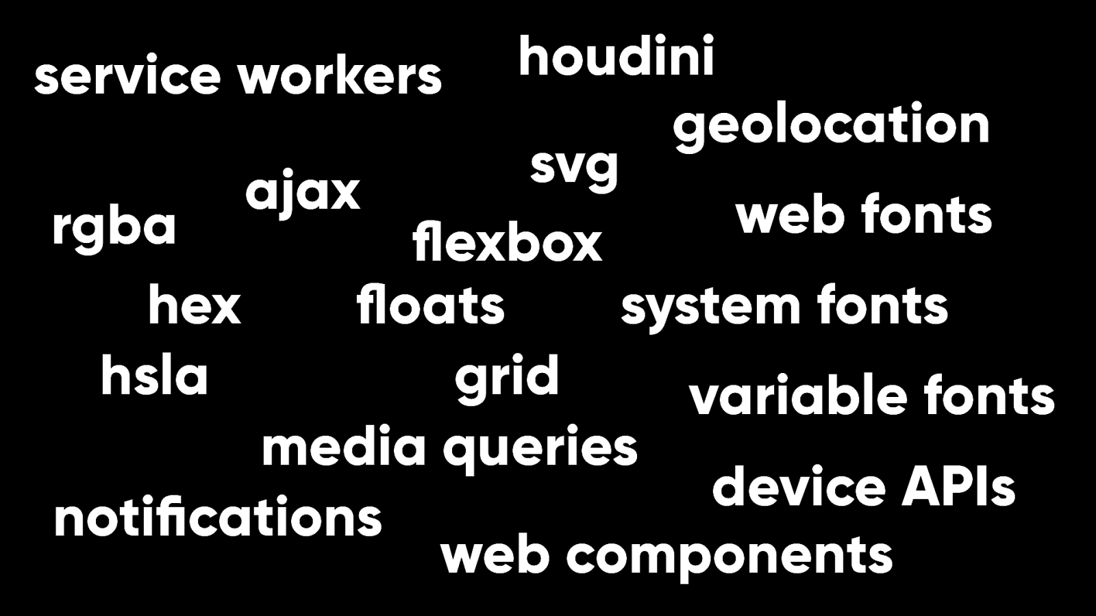
Not only that, but we nally have proper layout tools for the web. Flexbox. Grid. No more hacks. We’ve even got container queries, which for years we were told were literally too good to be true.
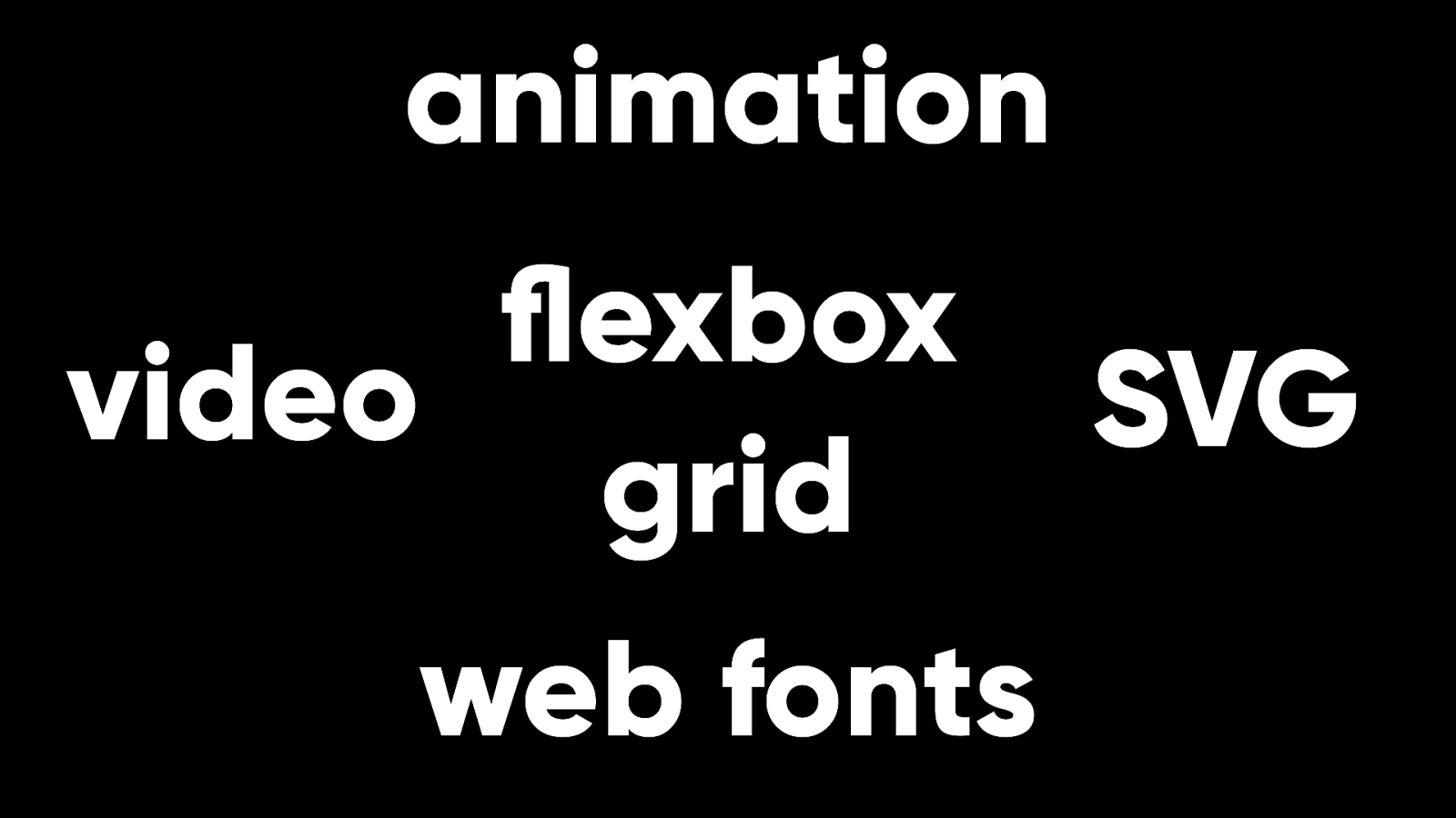
Web browsers now are positively over owing with fantastic design tools that would have been unimaginable to my past self. Support for these technologies is pretty much universal.
When browsers differ today, it’s only terms of which standards they don’t yet support.
The web has come along way.
It has grown and evolved.
Browsers have become more and more powerful while maintaining backward compatibility. In the past we had to hack our way around the technological limitations of the web and we had a long wish list of features we wanted. I’m not saying we’re done. I’m sure that more features will keep coming. But our wish list has shrunk.

The biggest challenges facing the World Wide Web today are not technical challenges.
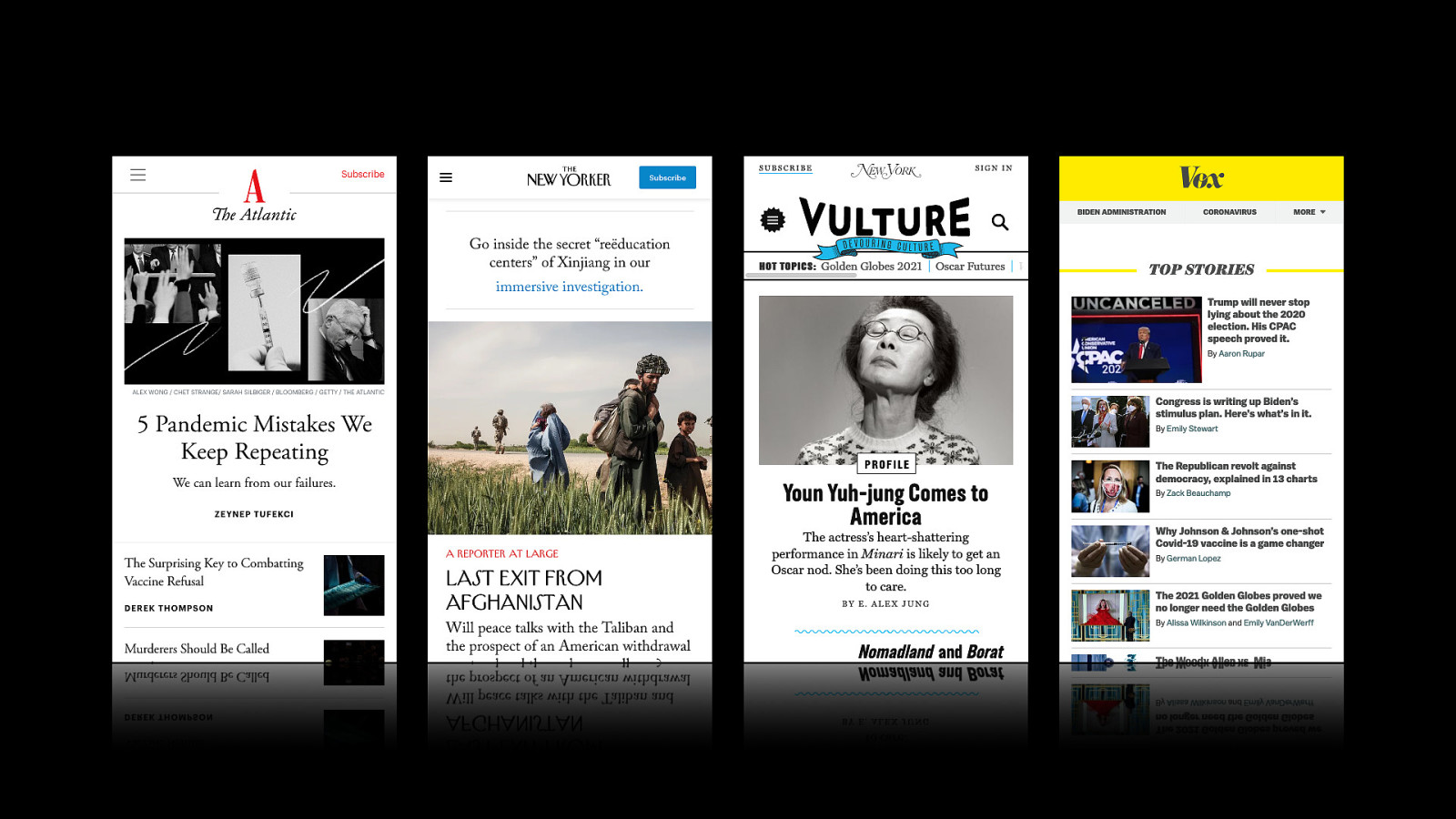
Today it is possible to create beautiful websites that make full use of colour, typography, layout, animation, and more. But this isn’t what users experience.
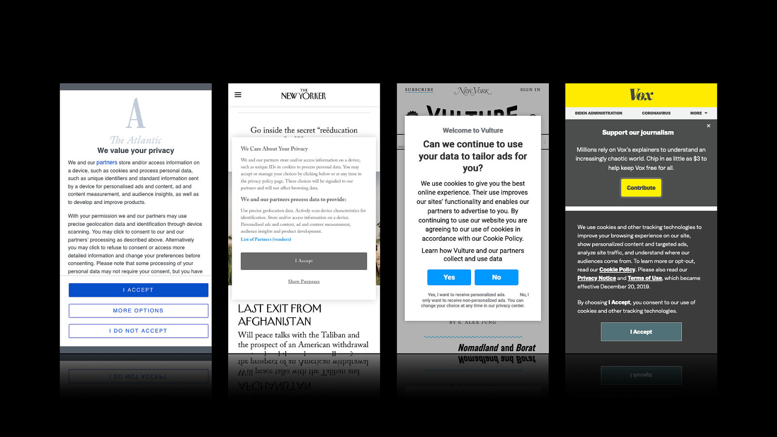
This is what users experience. A tedious frustrating game of whack-a-mole with websites that claim to value our privacy while asking us to relinquish it. This is not a technical problem. It is a design decision.
The decision might not be made by anyone with designer in their job title, but make no mistake, business decisions have a direct e ect on user experience.
On the face of it, the problem seems to be with the business model of advertising. But that’s not quite right.
To be more precise, the problem is with the business model of behavioural advertising. That relies on intermediaries to amass huge amounts of personal data so that they can supposedly serve up relevant advertising.
But contextual advertising, which serves up ads based on the content you’re looking at doesn’t require the invasive collection of personal data. And it works.

Behavioural advertising, despite being a huge industry that depends on people giving up their privacy, doesn’t even work very well. And on the few occasions when it does work, it just feels creepy.
The problem is not advertising. The problem is tracking. The greatest trick the middlemen ever pulled was convincing us that you can’t have e ective advertising without tracking.
That is false. But they’ve managed to skew our sense of perspective so that invasive advertising seems inevitable.
Advertising was always possible on the web. You could publish anything and an ad is just one more thing you could choose to publish. But tracking was impossible.
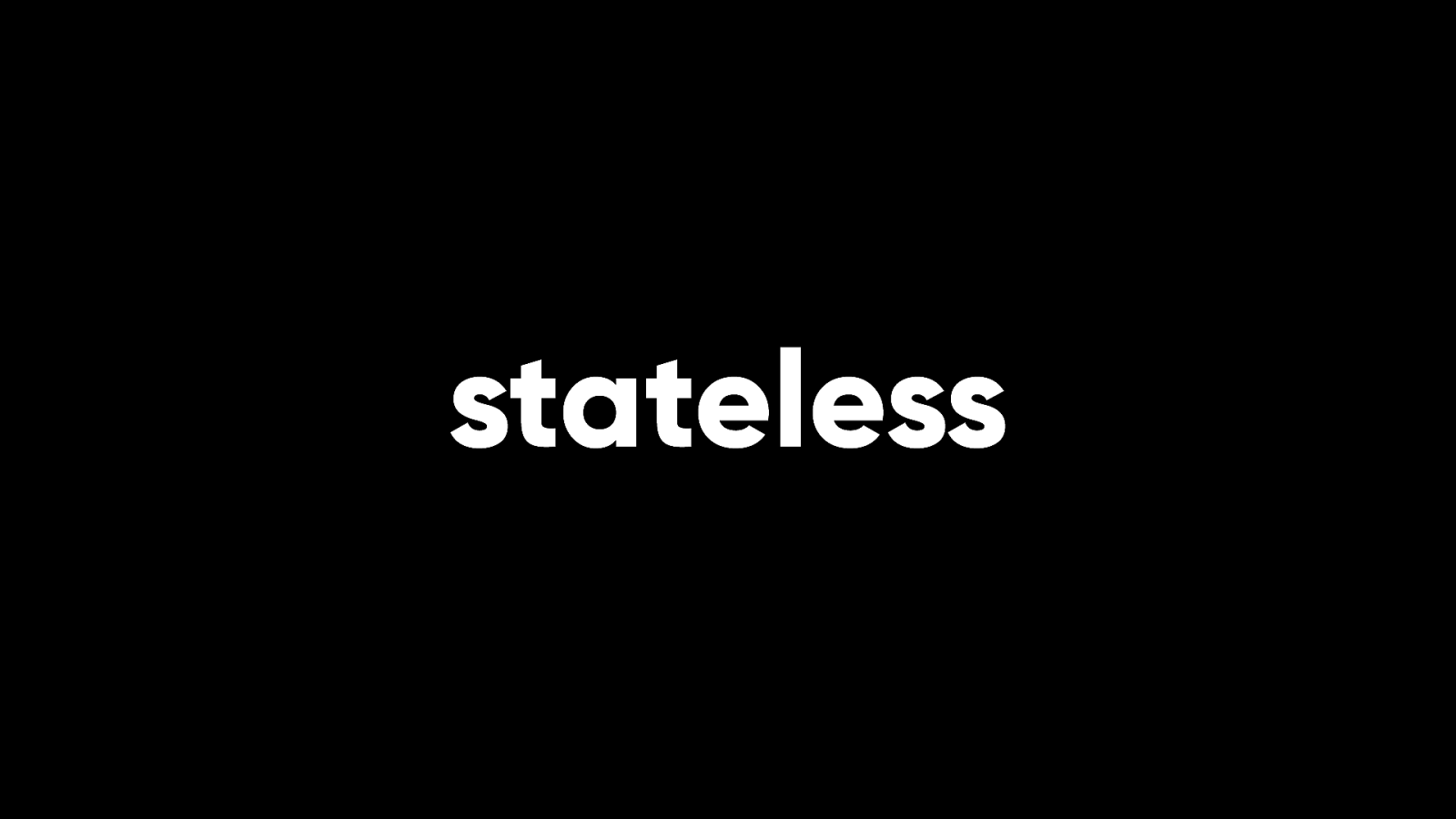
That’s because the early web was stateless. A browser requests a resource from a server and once that transaction is done, they both promptly forget about it. That made it very hard to do things like online shopping or logging into an account.
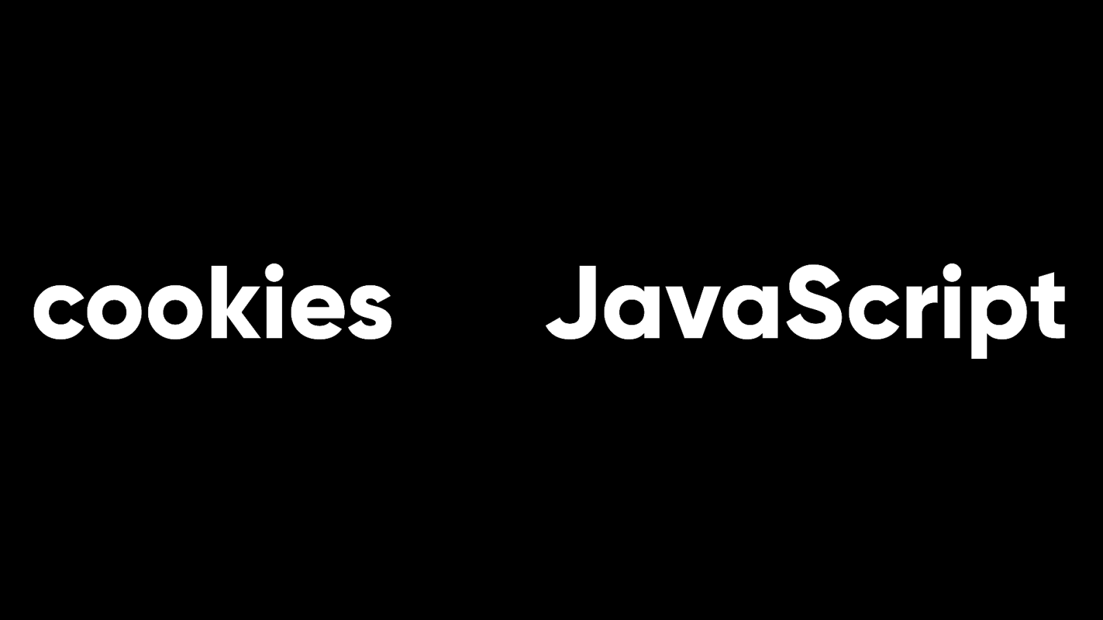
Two technologies were created later that enabled state on the web. Cookies and JavaScript.
If these technologies had been limited to a same origin policy (like how cookies were originally specified), they would have nicely solved the problems of online shopping and authentication.
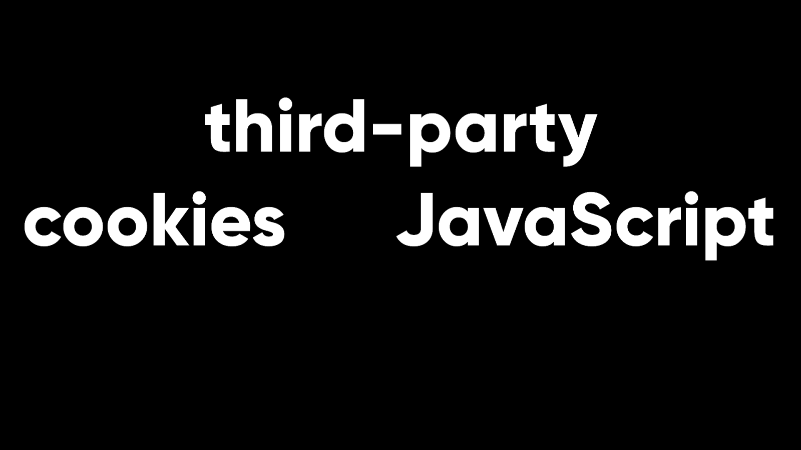
But these technologies work across domains. Third party cookies and third-party JavaScript enables users to be tracked as they move from site to site.
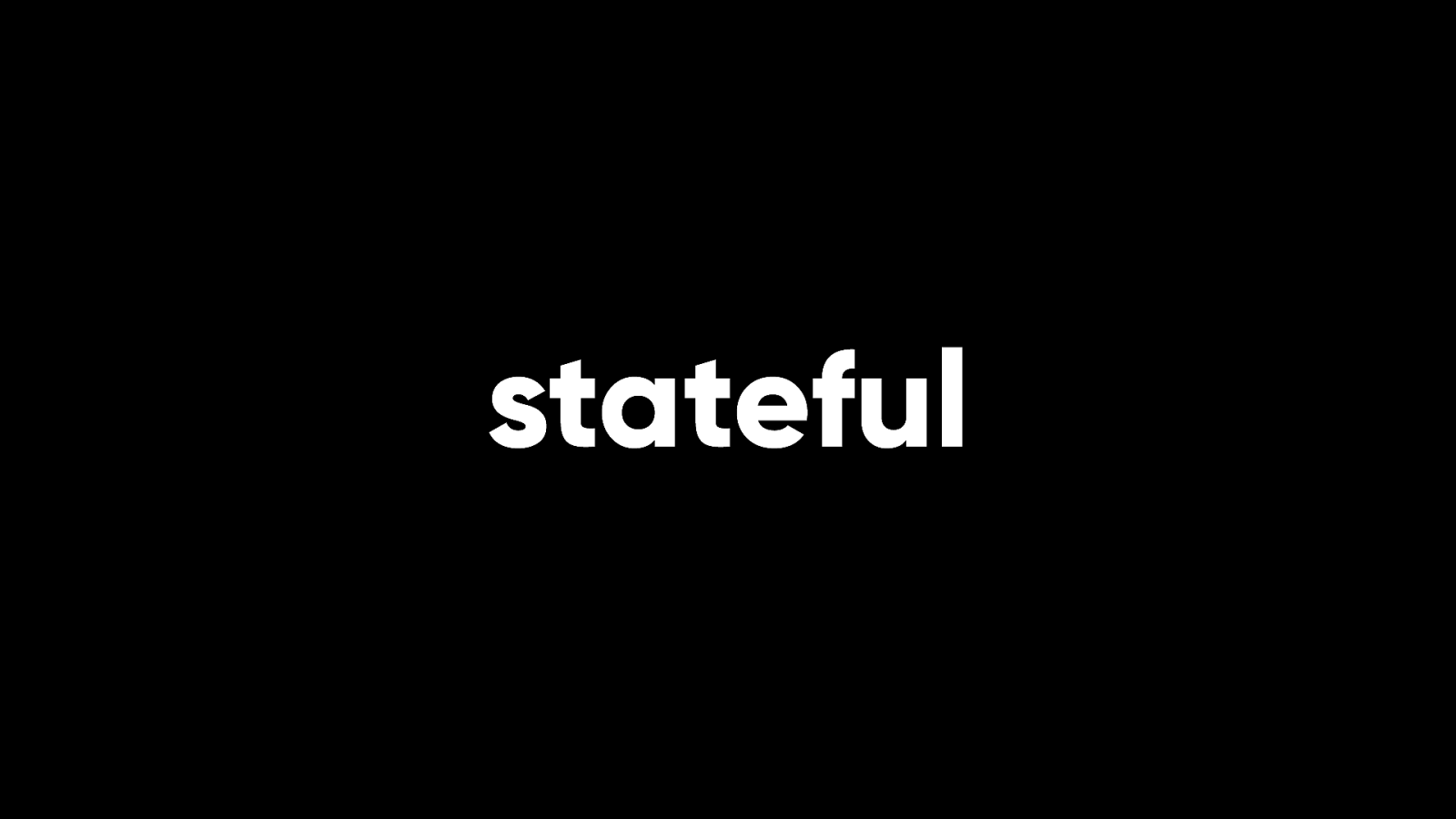
The web gone from having no state to having too much. There is hope.
Browsers like Firefox and Safari are blocking third-party cookies by default. Personally, I’d love it if third-party JavaScript got the same treatment. You can also install add-ons to make your browser more secure…
…although these add-ons are often labelled ad-blockers, which is a shame. Because the problem is not advertising. The problem is tracking.

Perhaps none of this applies to you anyway. You may be thinking that this is a problem for websites…
…but you build web apps that don’t rely on behavioural advertising. As I said here ten years ago, I’m not keen on the idea of dividing the entirety of the World Wide Web into two vaguely-de ned categories.
Ten years on, I still have yet to hear a good de nition of “web app” other than “a website that requires JavaScript to work.”
But the phrase “single page app” has a more de nite meaning. It refers to an architectural decision.
That decision is to reinvent the web browser inside a web browser.
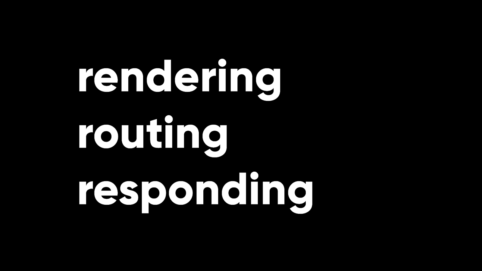
In a sense, it’s a testament to the power of JavaScript that you can choose to do this. Browsers render content and perform navigations, but if you’d rather recreate that functionality from scratch in JavaScript, you can. But should you?
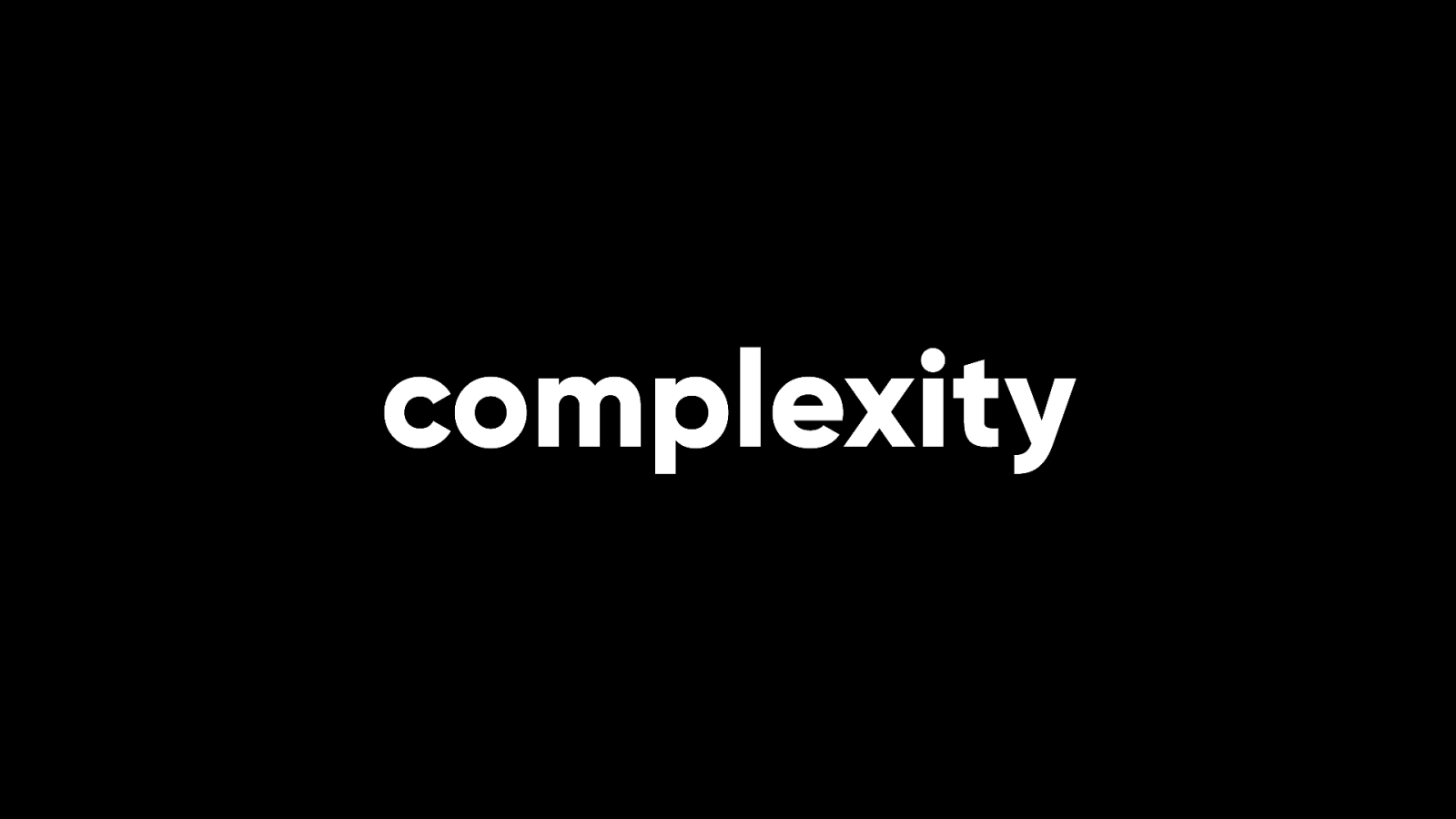
Browsers have increased in complexity so that we can build without complexity. We can use the built-in power of modern HTML, CSS, and JavaScript to make web browsers do the work. If we work with the grain of the web, we can accomplish more and more with less and less code. But that isn’t what happened.
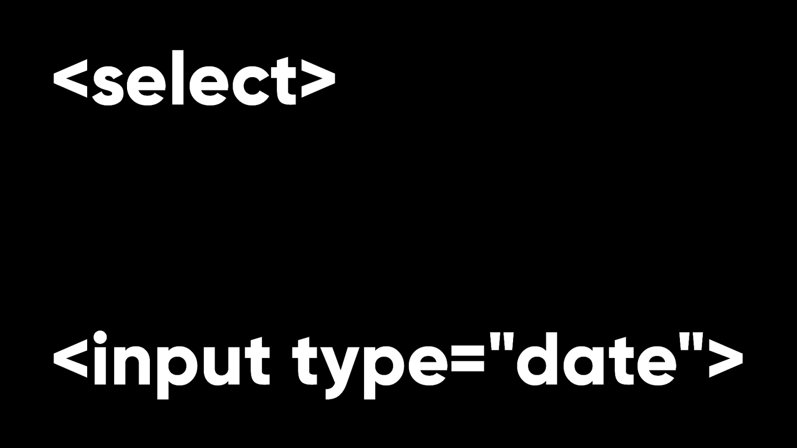
Instead developers have recreated form controls like dropdowns and datepickers from scratch using divs and lashings and lashings of JavaScript. Perhaps this points to some missing features on the web. It’s still too hard to style native dropdowns and datepickers (but that’s being worked on—there’s standards work underway to give us more styling control over form elements).
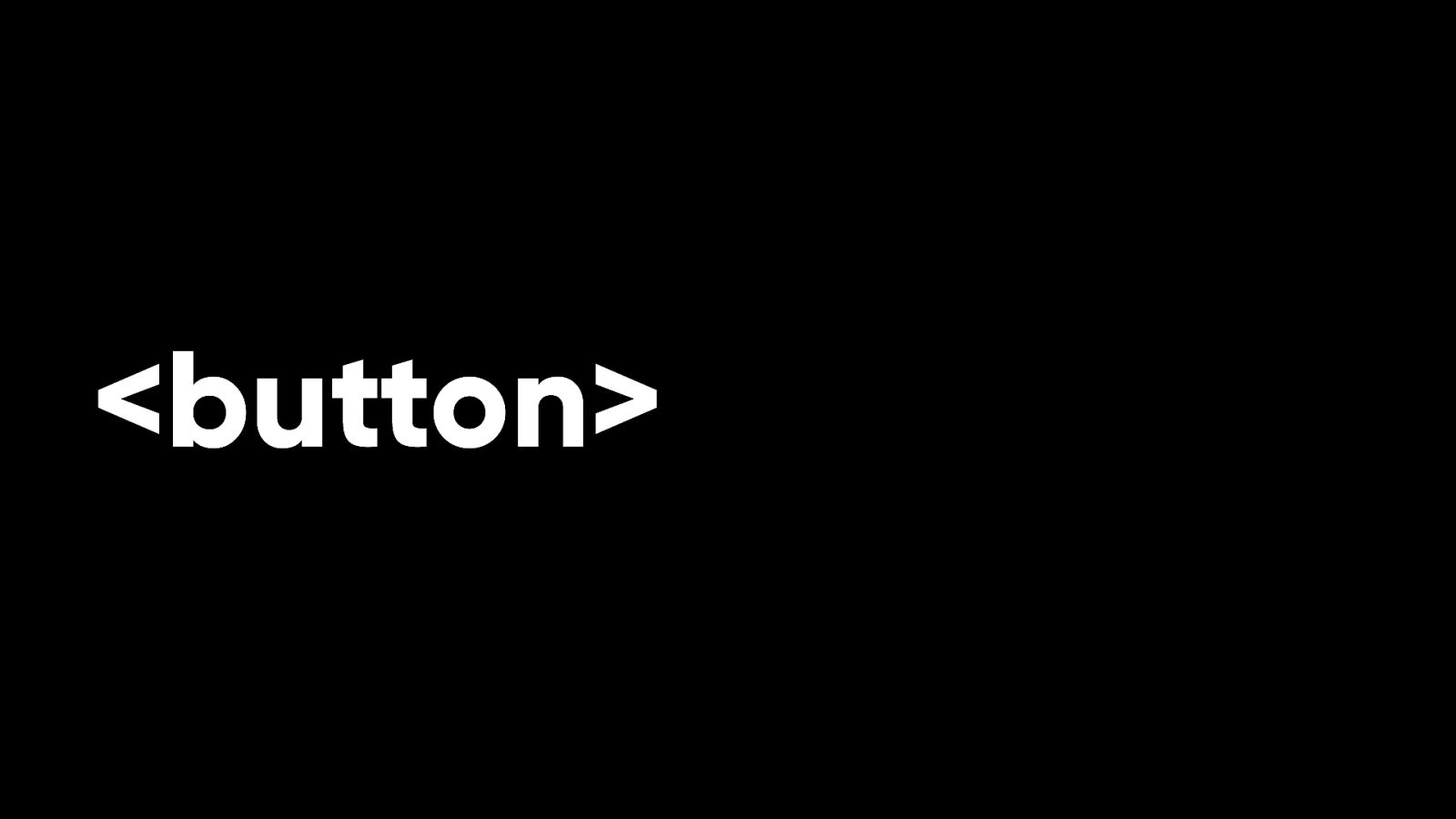
But that doesn’t explain why developers would choose to recreate something like a button using divs and JavaScript when the button element already exists and can be styled any way you like.
I think there’s a certain mindset being applied to web development here. And that mindset comes from the world of software. Again, it’s a testament to how far the web has come that it can be treated as a software platform on par with operating systems like iOS, Android, or Windows. There’s a lot to be learned from the world of software development, like testing, for example. ff But the web is di erent. When a user navigates to a URL, it shouldn’t feel like they’re installing a piece of software.
We should be aiming to keep our payloads as small as possible. And given how powerful browsers have become, we need fewer and fewer dependencies. But performance has gotten worse. Payloads have gotten bigger. Dependencies like JavaScript frameworks have become more and more widespread even as they became less and less necessary.

When asked to justify the enormous payloads, web developers have responded by saying that user’s expectations have changed. That is correct, but not in the way that I think they mean.

When I talk to people about using the web—especially on mobile—their expectations are that they will have a terrible experience. That websites will be slow to load.
And I guarantee you that none of them are saying, “Well I’d be annoyed if this were a website but seeing as this is a web app, I’m absolutely ne with this terrible experience.”

I said that the biggest challenges facing the World Wide Web today are not technical challenges. I think the biggest challenge facing the web today is people’s expectations. There is no technical reason for websites or web apps to be so frustrating. But we have collectively led people to expect a bad experience on the web.
Our intentions may be have good. We thought users wanted nice page transitions and form elements that were on-brand.
But if you talk to people, you nd out that what they want is to accomplish their task without megabytes of JavaScript getting in the way.
There’s a great German word, “Verschlimmbessern”: the act of making something worse in the attempt to make it better. Perhaps we verschlimmbessert the web.

Let’s step back. Get some perspective.
Instead of assuming that a single page app architecture is needed, ask what users need to accomplish. Instead of assuming you need a CSS framework or a JavaScript library, see what you can do in browsers today with native CSS and vanilla JavaScript. Don’t include a bunch of dependencies by default just in case you might need them. Instead, as Rachel puts it…
“Stop solving problems you don’t yet have.” Lean into what web browsers can accomplish today.
If you nd something missing, that’s the time to reach for a library…
…but treat it like a poly ll. Whereas web standards stick around, every library and framework comes with a limited lifespan.
Treat them as cattle, not pets.

I understand that tools and frameworks can make your life easier. And if we’re talking about server-side frameworks, then I say “Go for it.” Or if you’re using build tools that sit on your computer to do version control, linting, pre-processing, or transpiling, then I say “Go for it.” But once you make users download tools or frameworks, you’re making them pay a tax for your developer convenience.
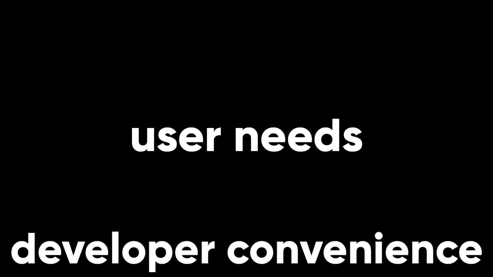
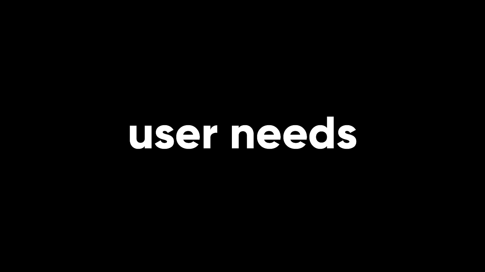
We need to value user needs above developer convenience. If I have the choice of making something the user’s problem or making it my problem, I’ll make it my problem every time. That’s my job.
We need to change people’s expectations of the World Wide Web, especially on mobile. Otherwise, the web will be lost.
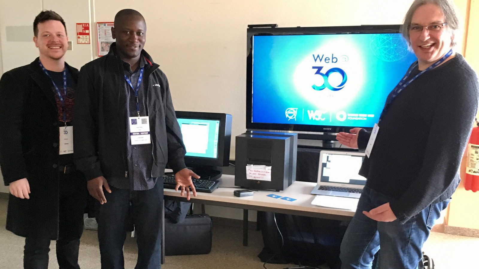
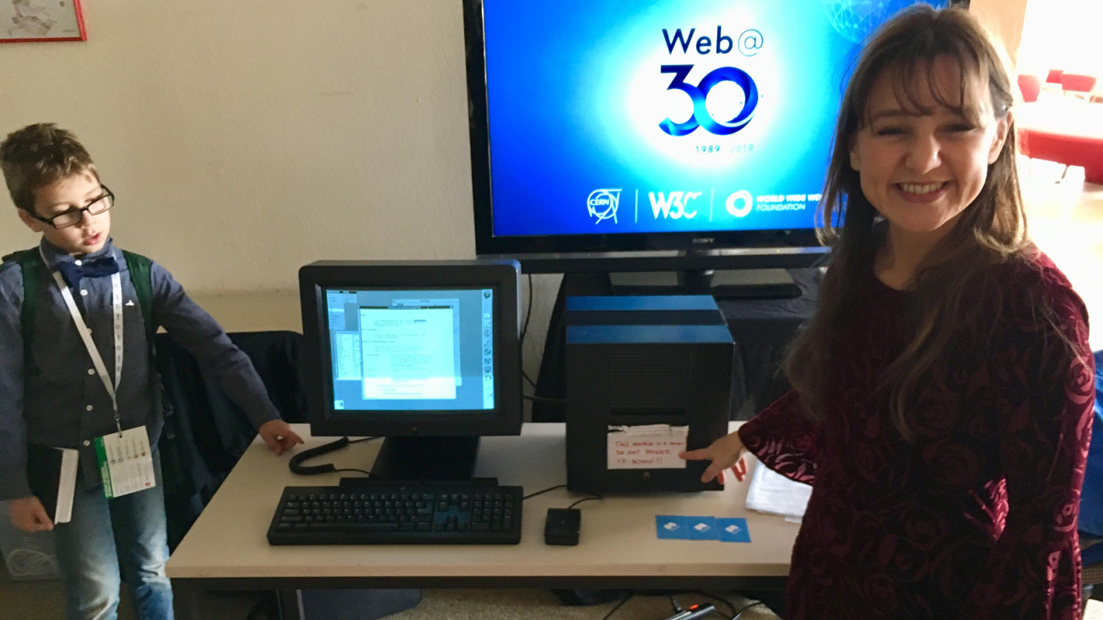
In 2019, I had the great honour of being invited to CERN to mark the 30th anniversary of the original proposal for the World Wide Web.
One of the other people there was the journalist Zeynep Tüfekçi.
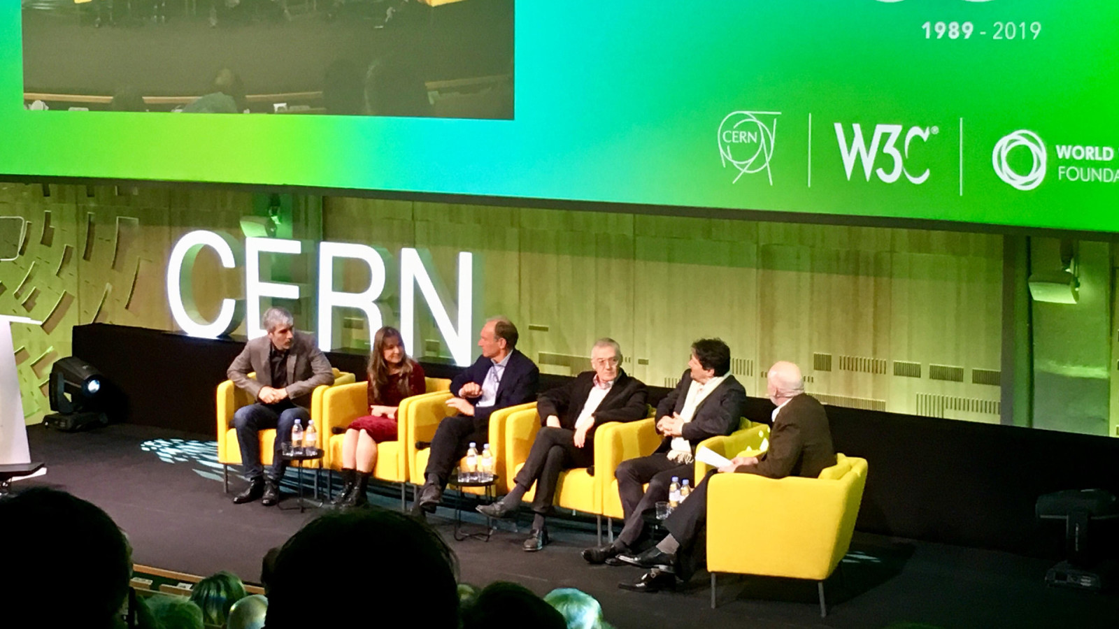
She was on a panel along with Tim Berners-Lee and other luminaries of the early web. At the end of the panel discussion, she was asked: “What would you tell the next generation about how to use this wonderful tool?” She replied…
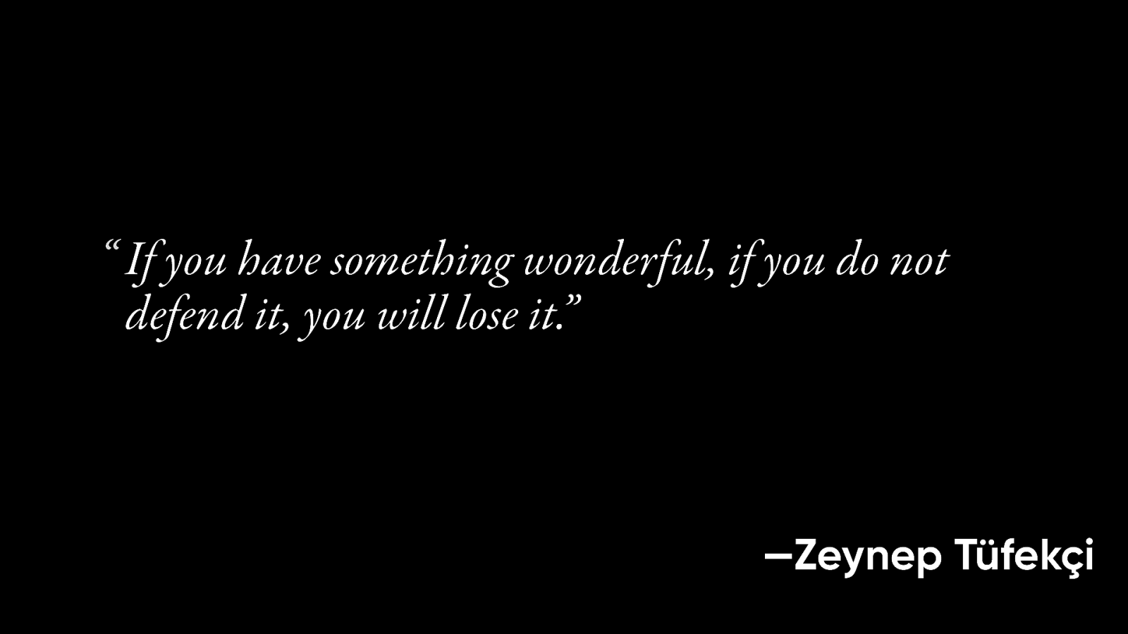
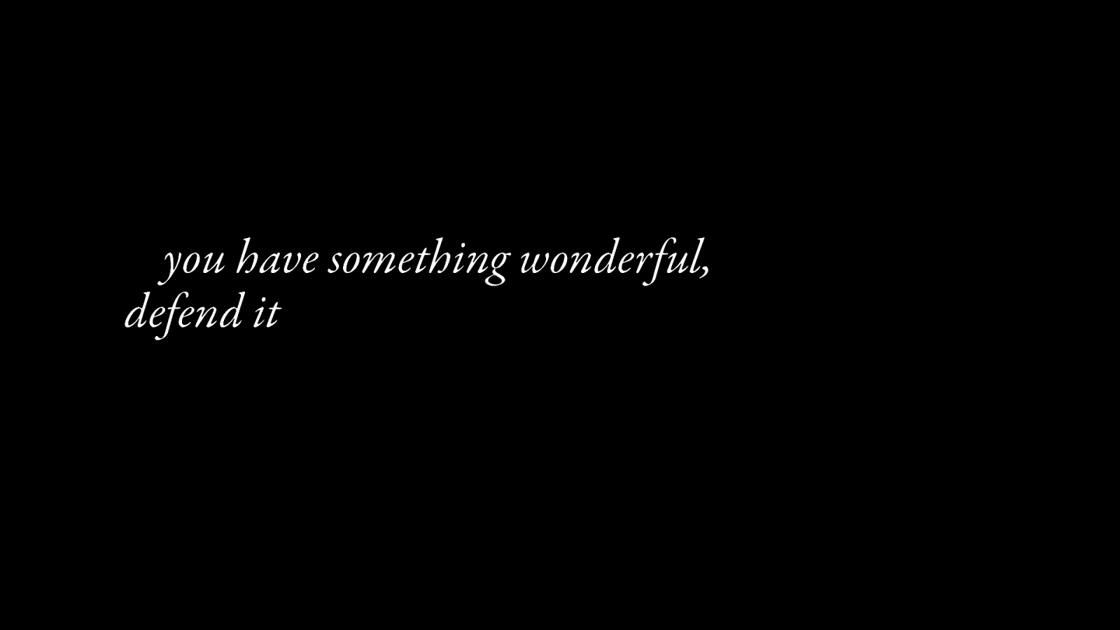
“If you have something wonderful, if you do not defend it, you will lose it. If you do not defend the magic and the things that make it wonderful, it’s just not going to stay magical by itself.”
I believe that we can save the web. I believe that we can change people’s expectations. We’ll do that by showing them what the web is capable of.
thank you