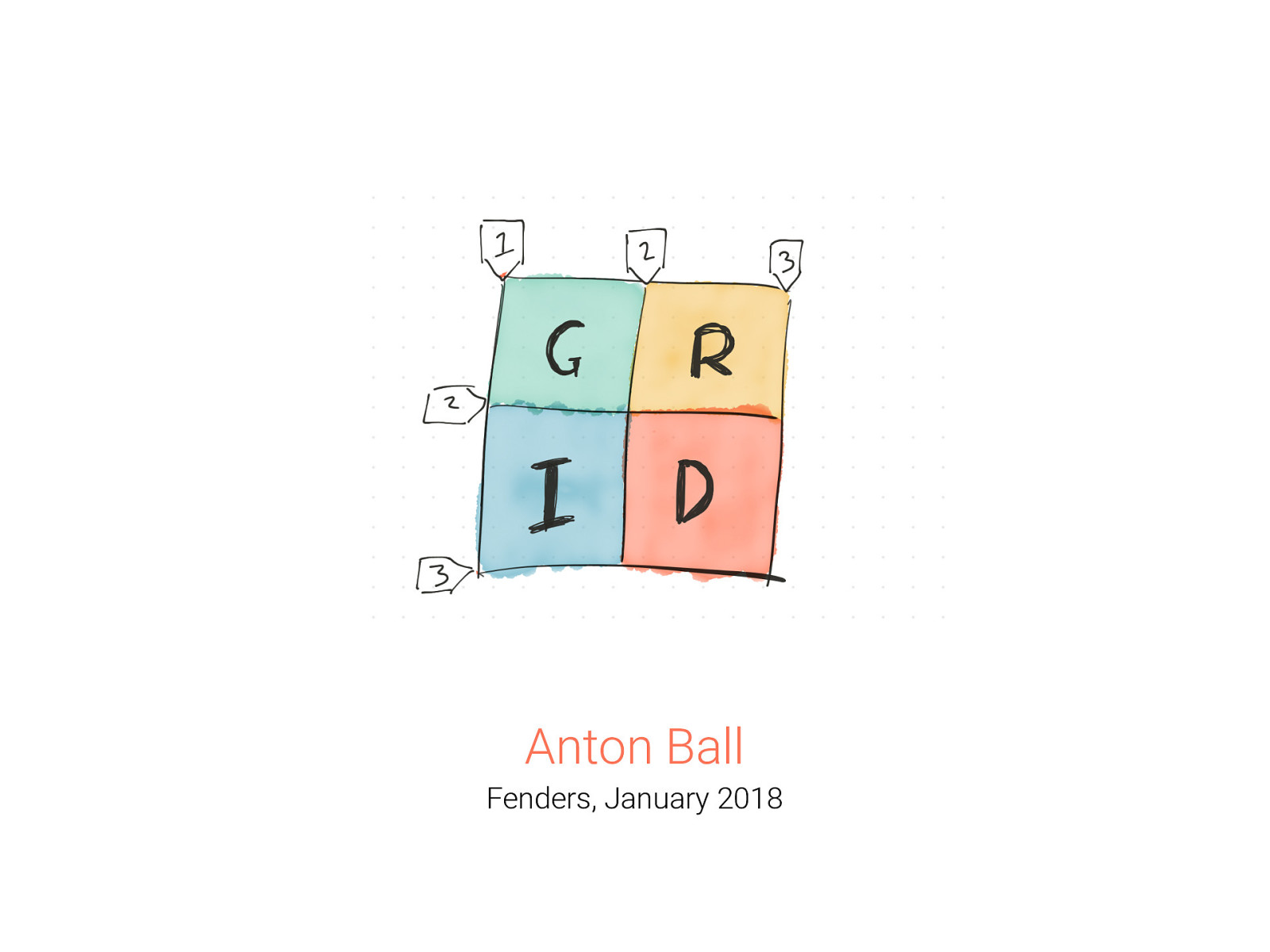
Anton Ball Fenders, January 2018

A presentation at Fenders Perth in January 2018 in Perth WA, Australia by Anton Ball
Anton Ball Fenders, January 2018

Anton Ball Senior UI Integrator at Velpic
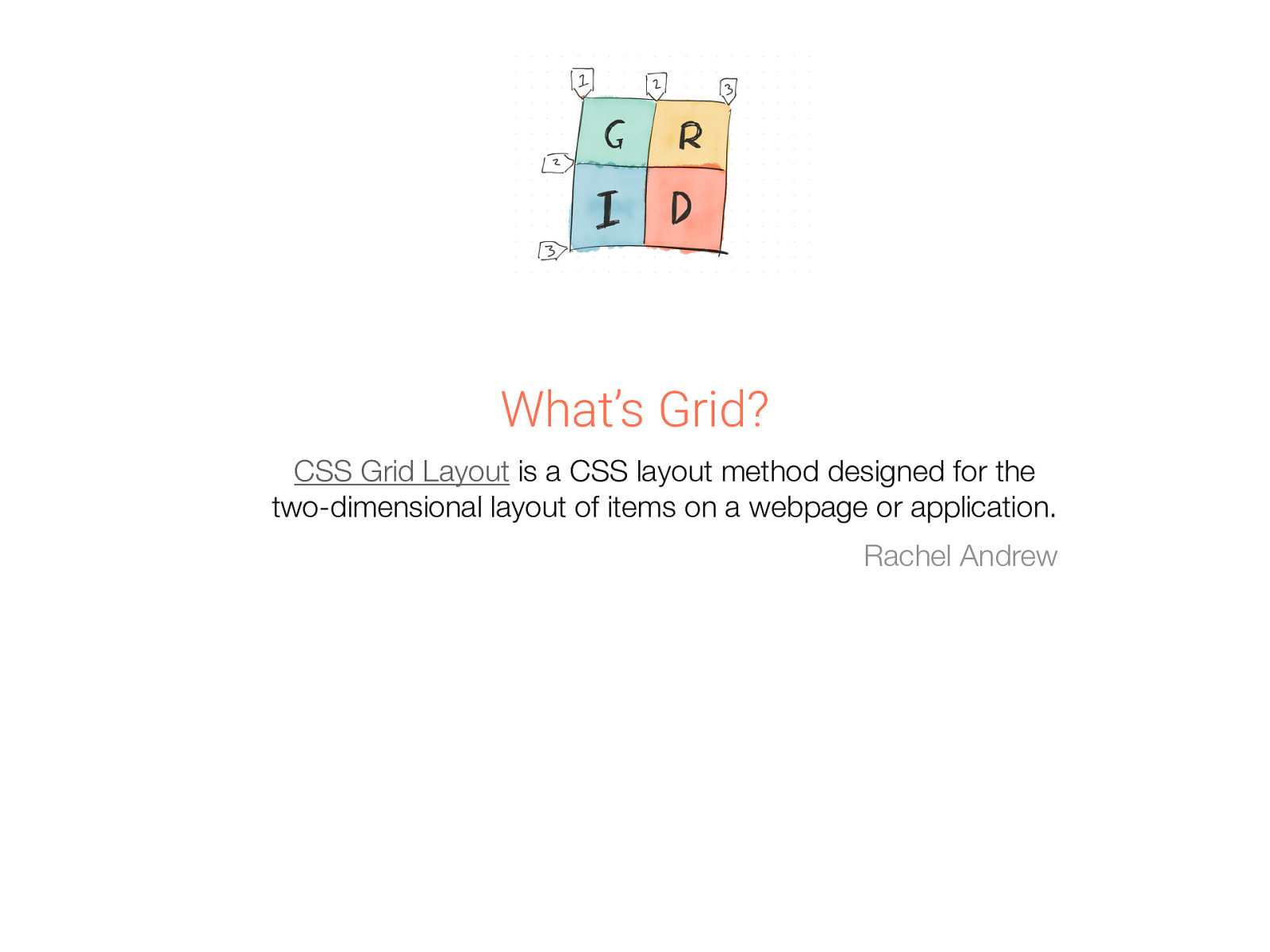
What’s Grid? CSS Grid Layout is a CSS layout method designed for the two-dimensional layout of items on a webpage or application. Rachel Andrew
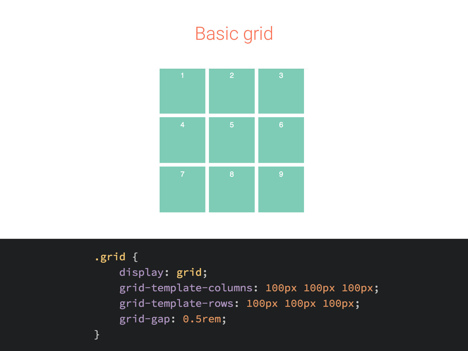
Basic grid
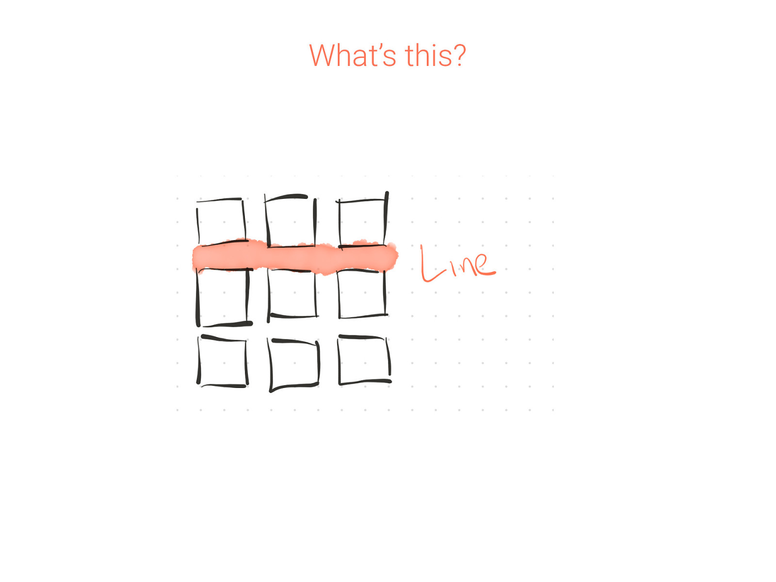
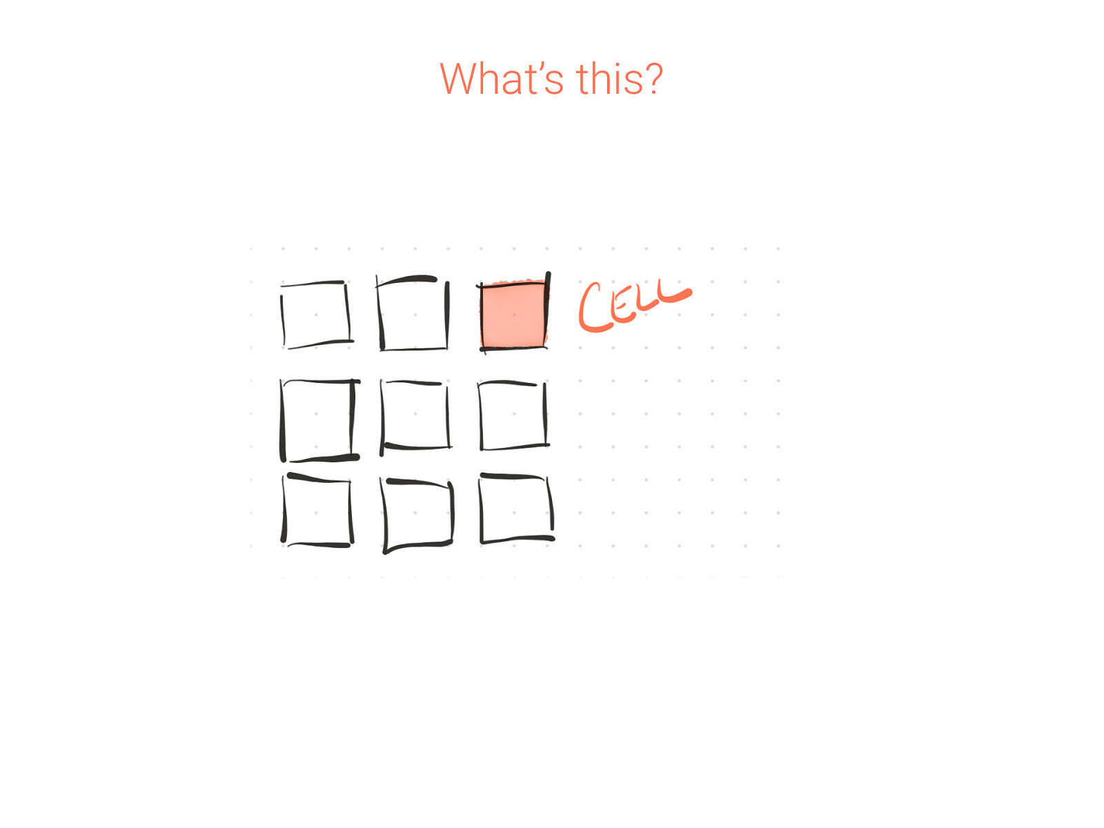
What’s this?
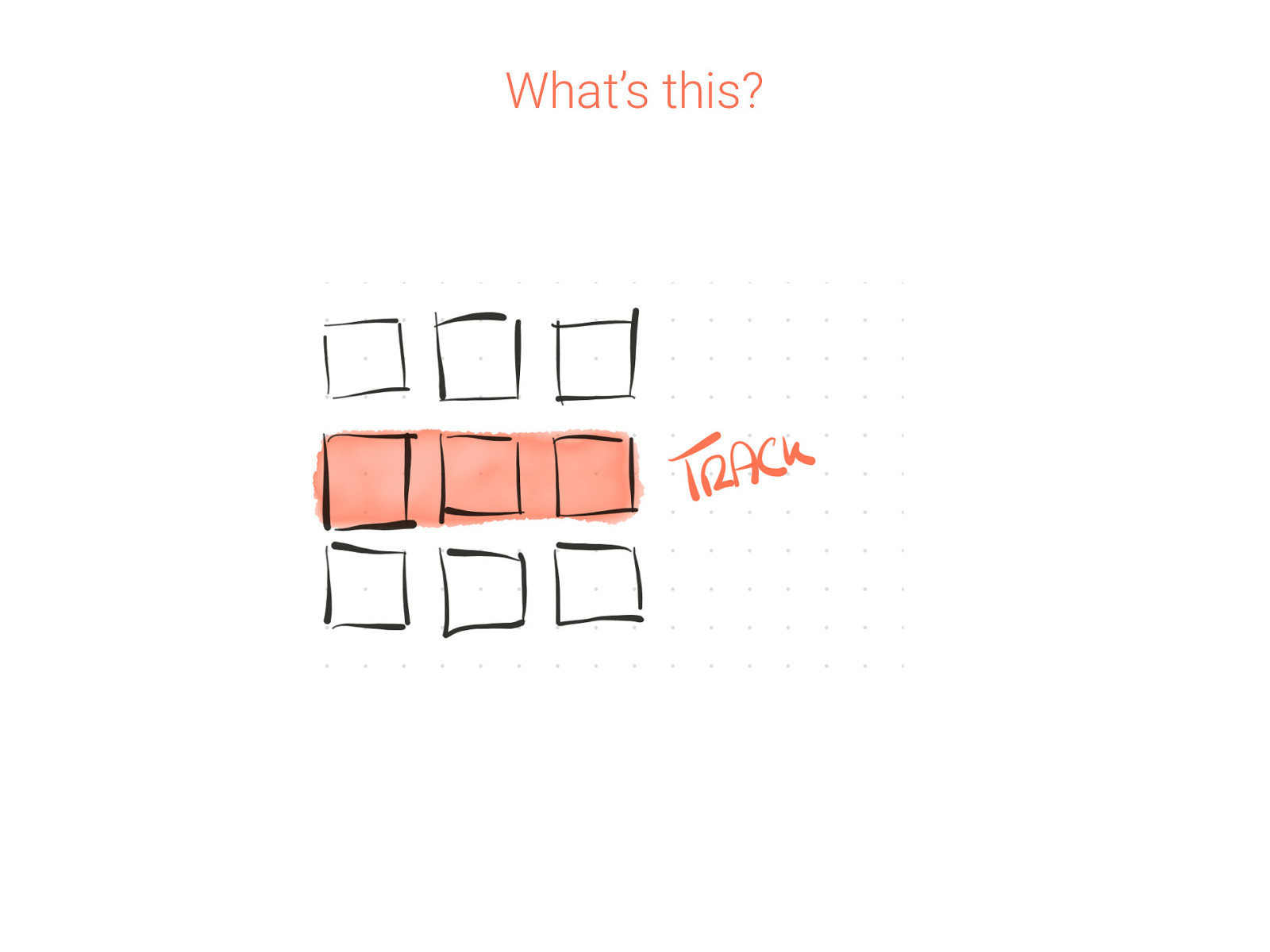
What’s this?
What’s this?
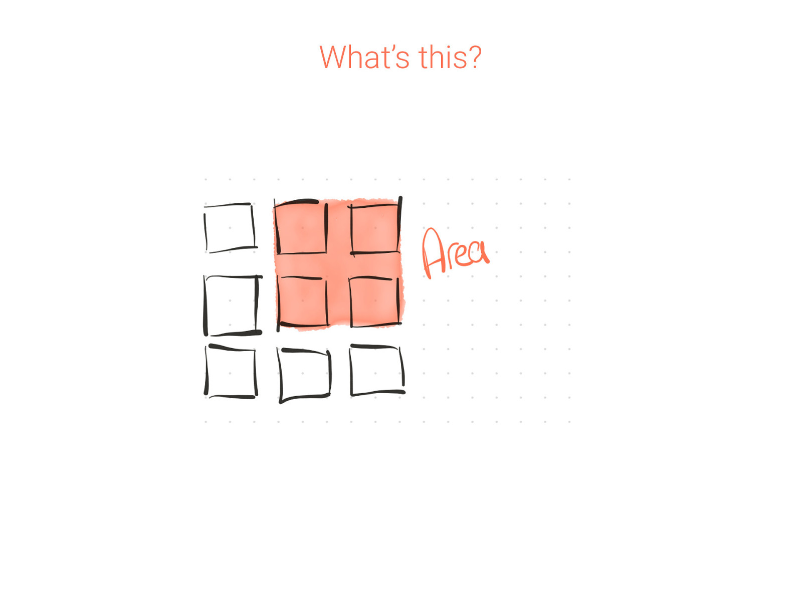
What’s this?
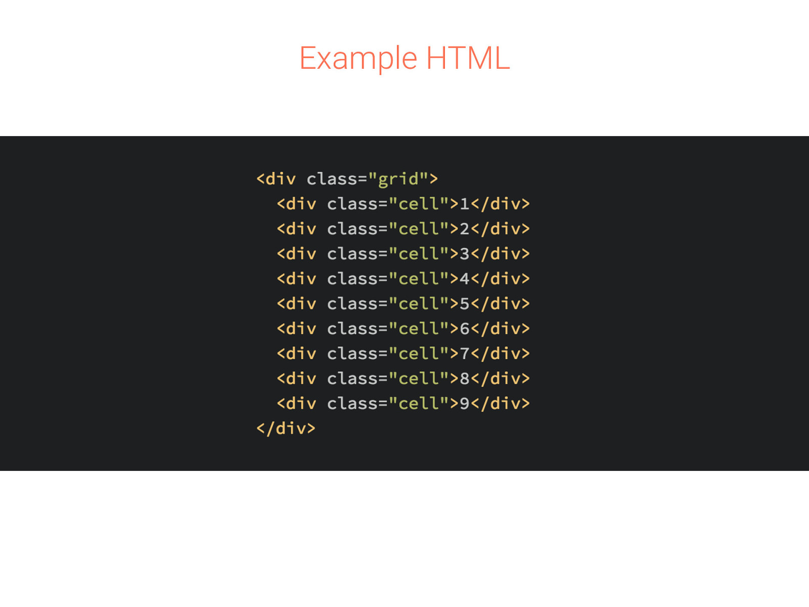
Example HTML
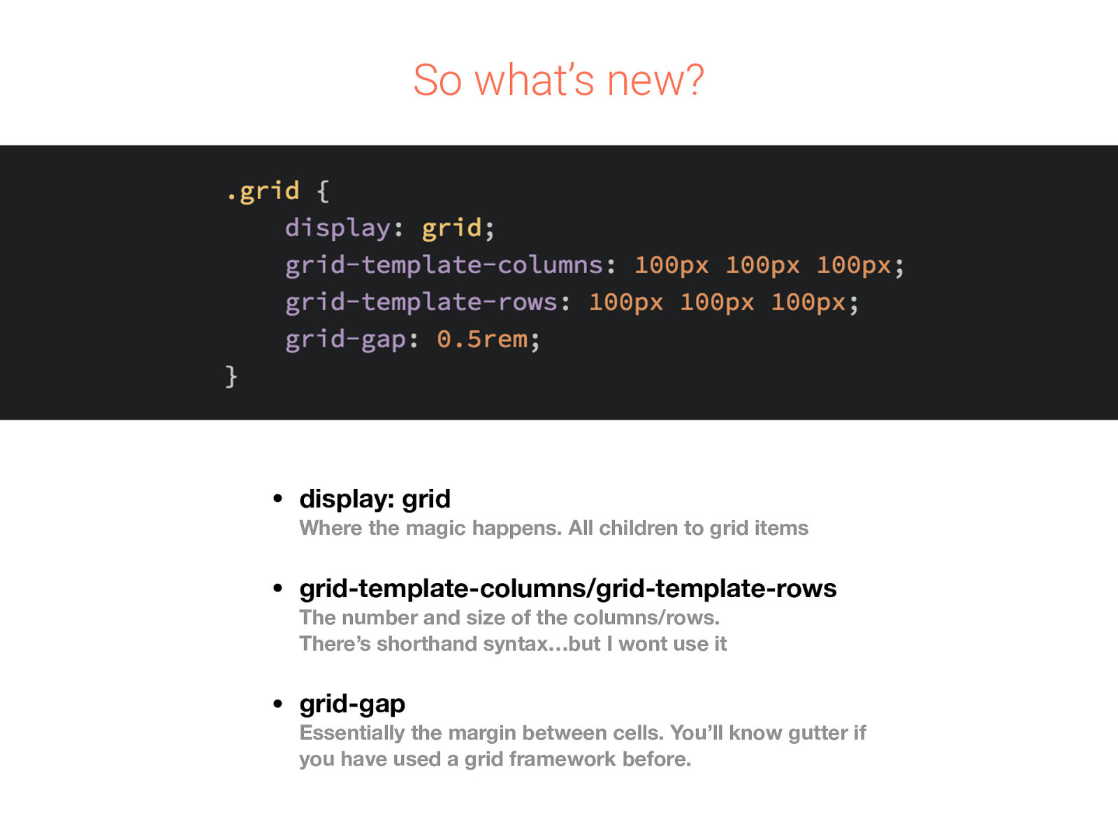
So what’s new? • display: grid • grid-template-columns/grid-template-rows • grid-gap Where the magic happens. All children to grid items The number and size of the columns/rows. There’s shorthand syntax…but I wont use it Essentially the margin between cells. You’ll know gutter if you have used a grid framework before.
That’s interesting… if you’re making a static gallery Lets look at new units and CSS functions and make our grid fluid
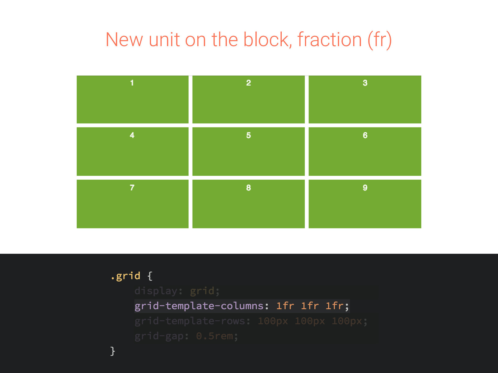
New unit on the block, fraction (fr)
Setting up rows and columns is repetitive If we had a lot more columns than we are currently making, this will get painful. Enter repeat.
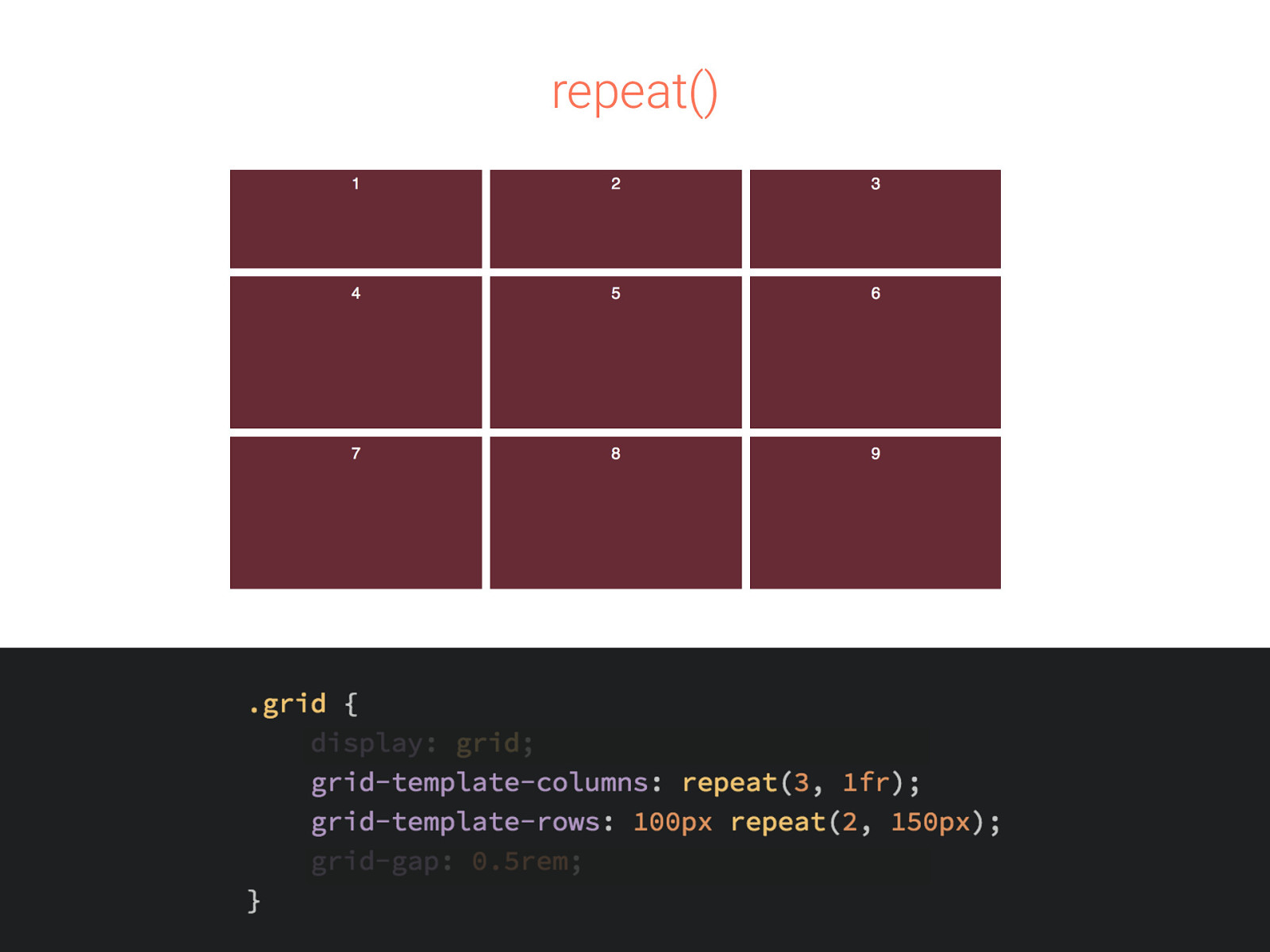
repeat()
Cells could get tiny, so minmax() Sets the sizes no smaller than the min and no greater than the max. You can get a long way with this without needing media queries!
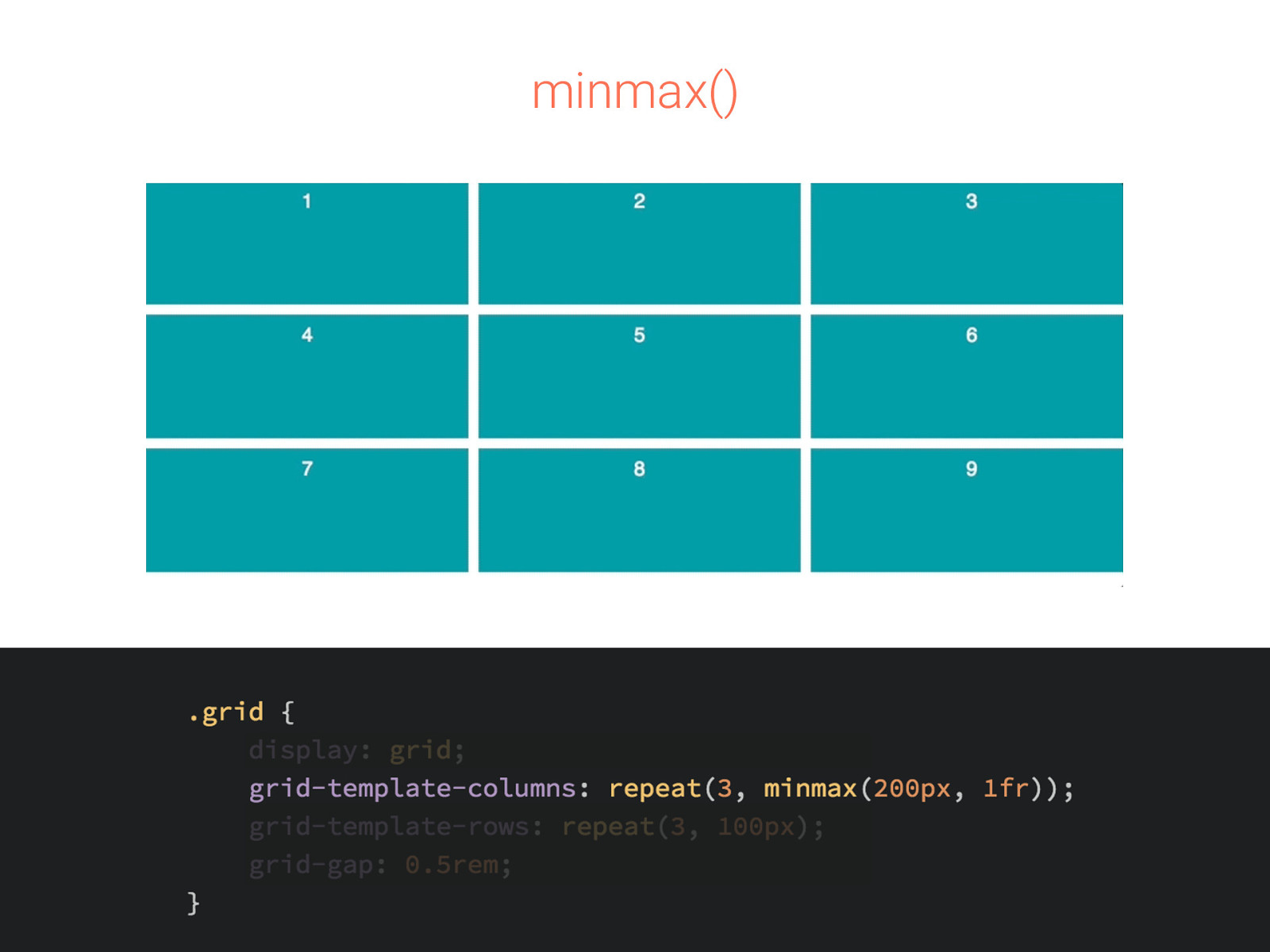
minmax()
All together now You aren’t limited to just one of the units we have discussed. You can mix them all together.
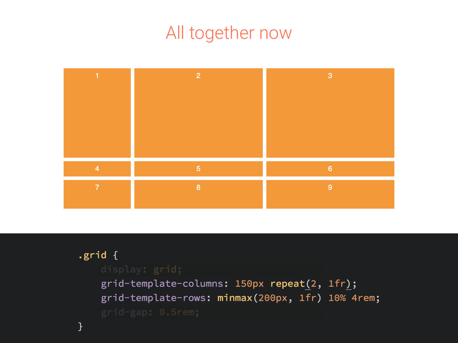
All together now
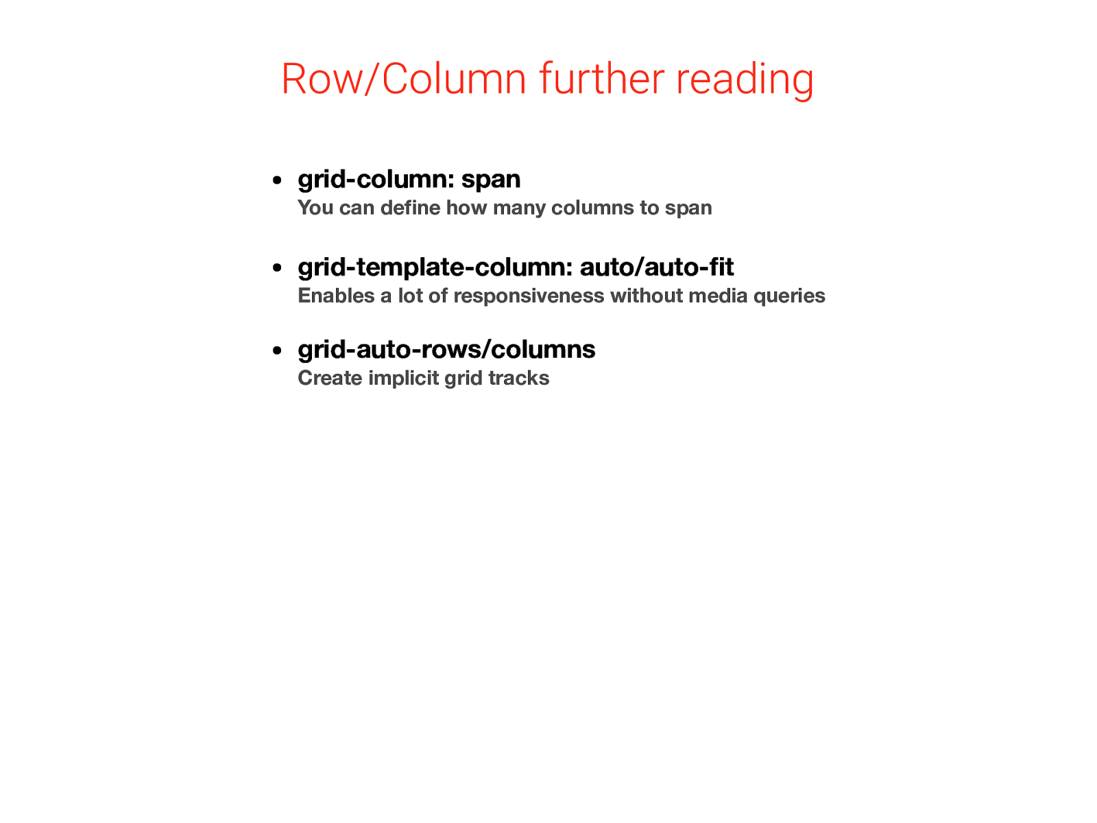
Row/Column further reading • grid-column: span • grid-template-column: auto/auto-fit • grid-auto-rows/columns You can define how many columns to span Enables a lot of responsiveness without media queries Create implicit grid tracks
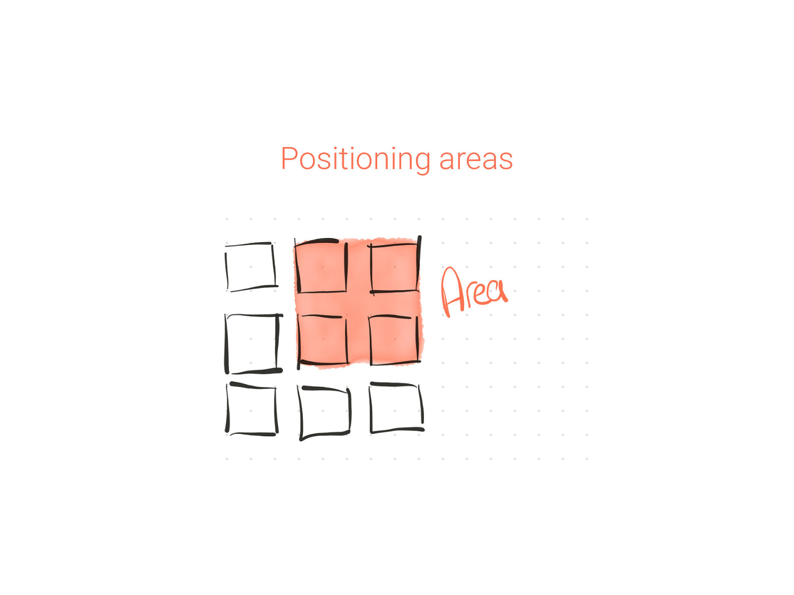
Positioning areas
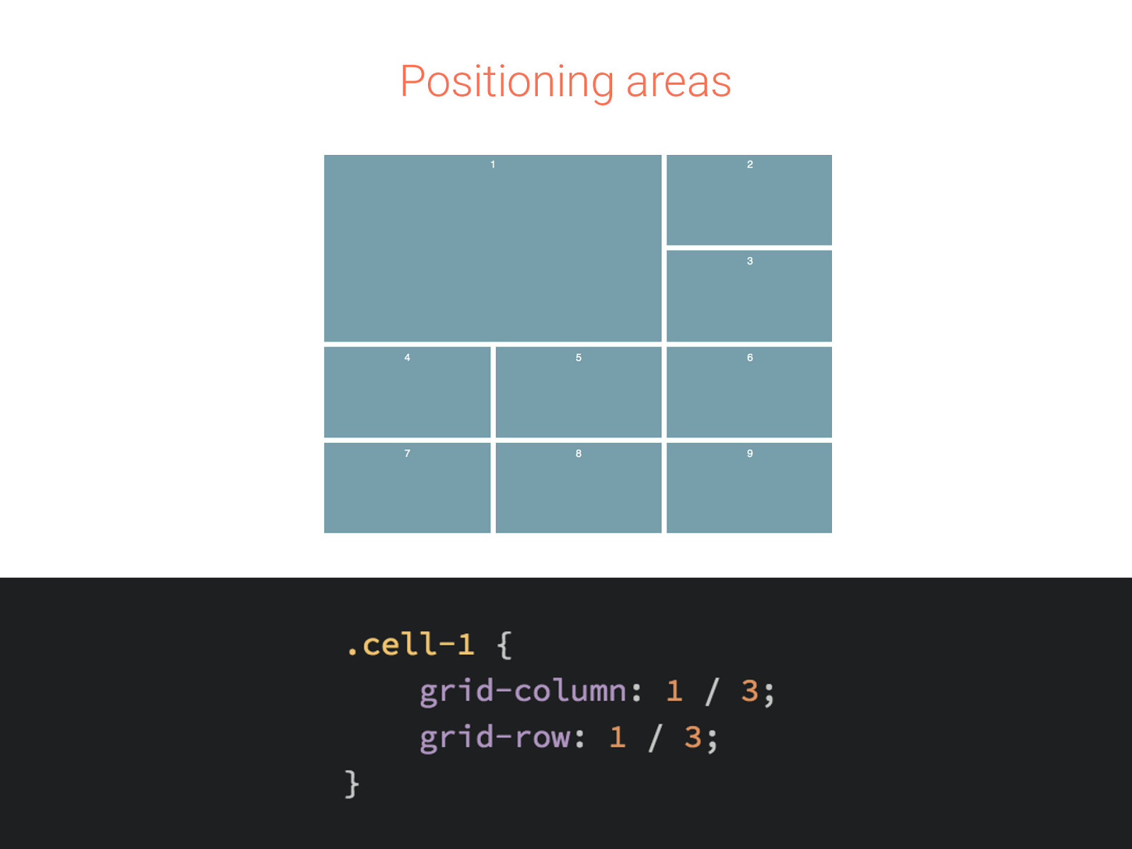
Positioning areas
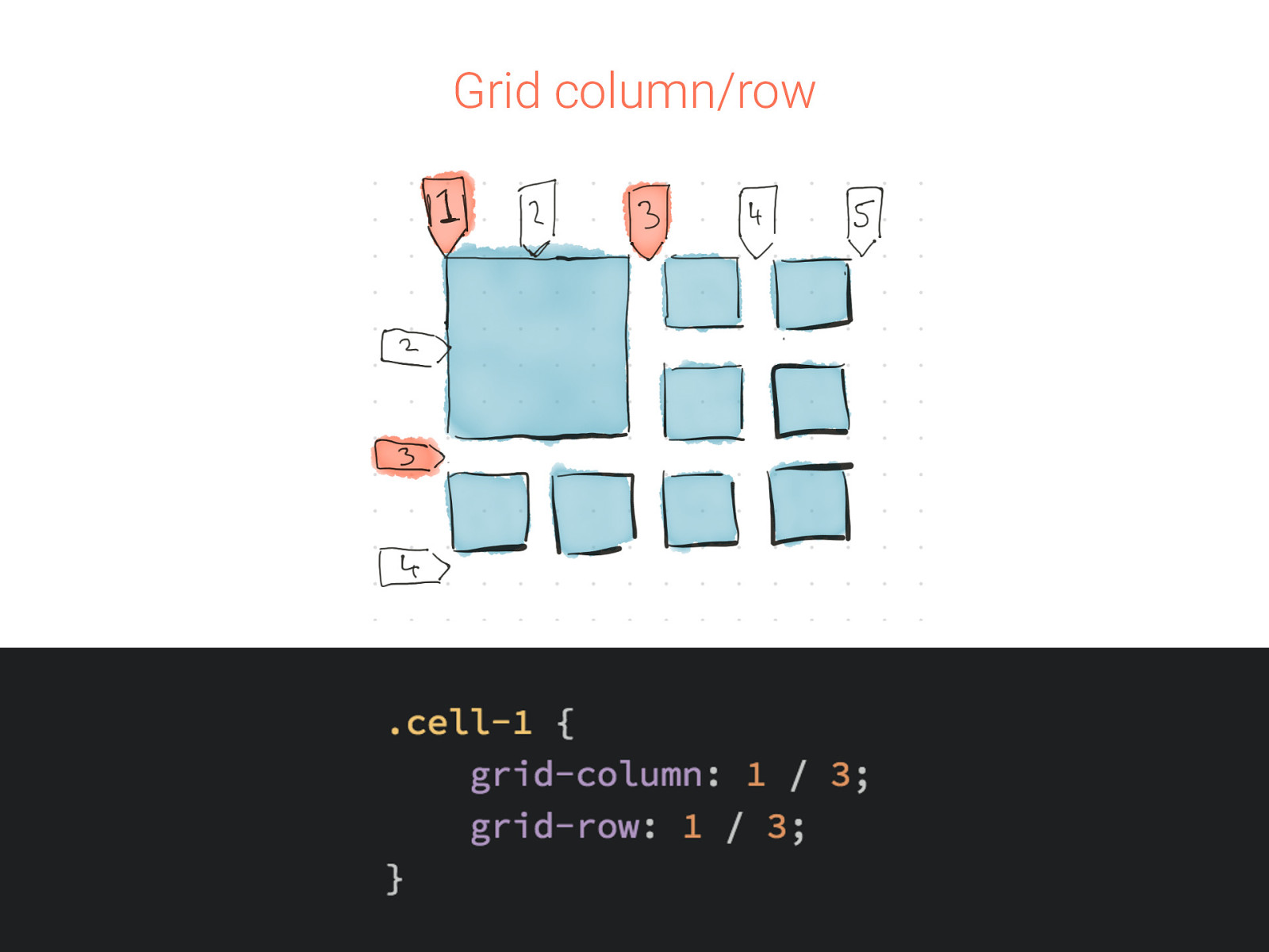
Grid column/row
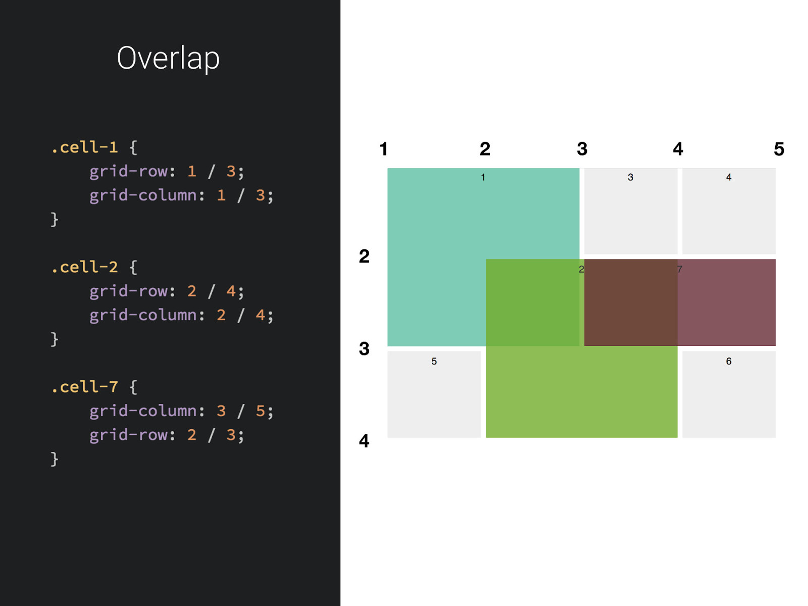
Overlap 1 2 3 4 2 3 4 5
The holy grail at least it was.
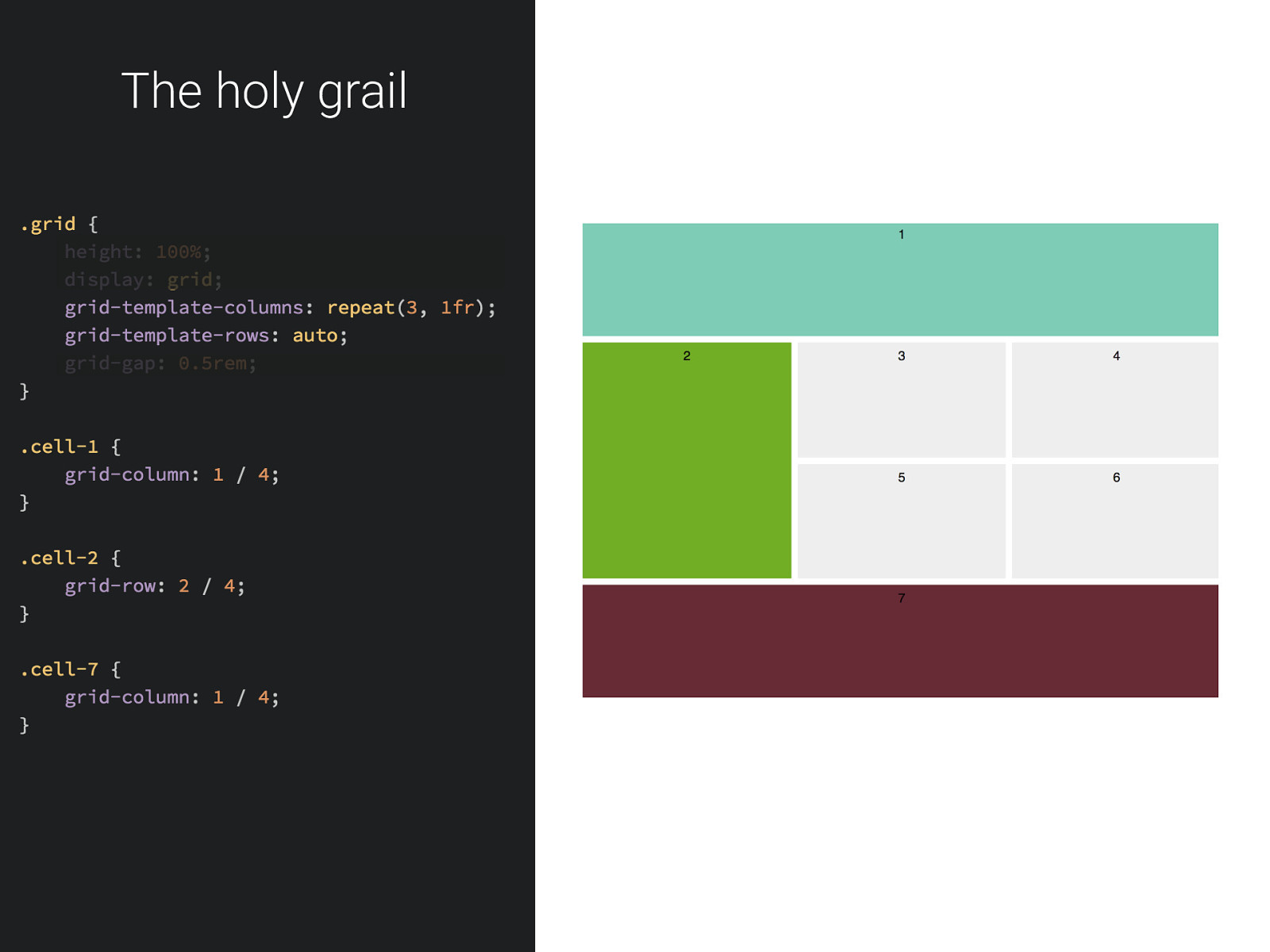
The holy grail
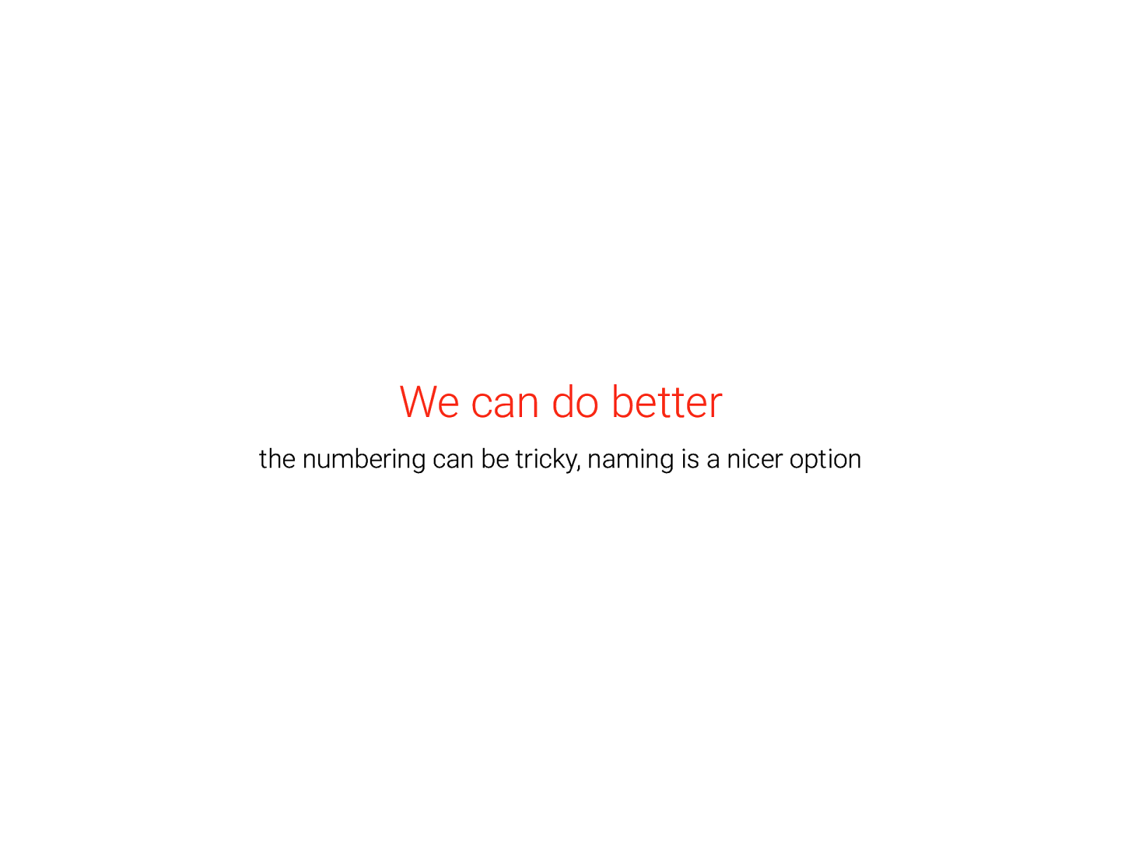
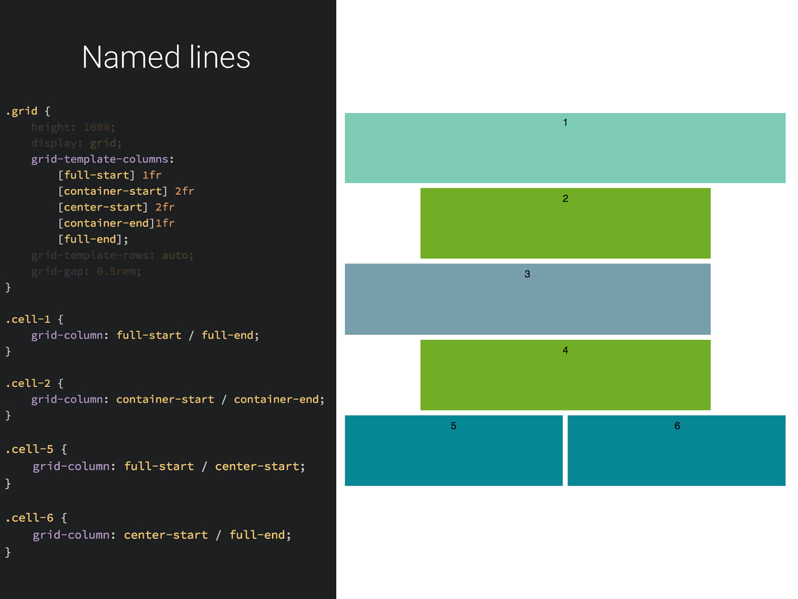
We can do better the numbering can be tricky, naming is a nicer option
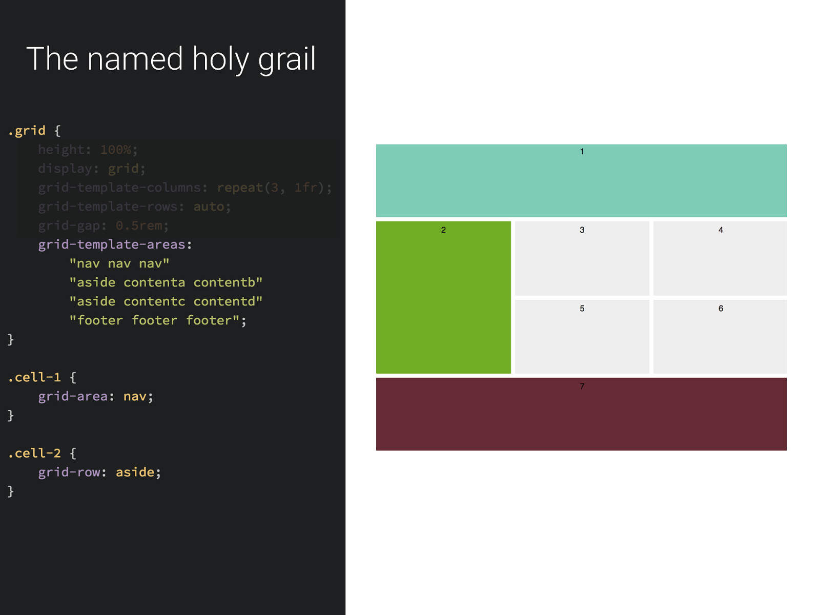
The named holy grail
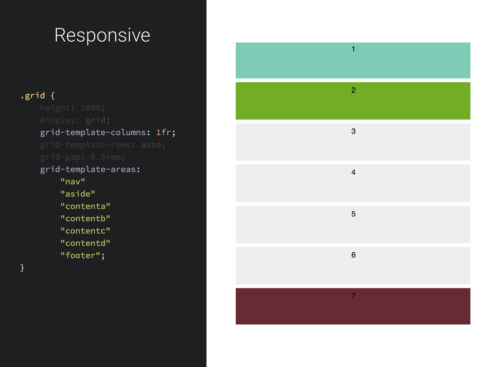
Responsive
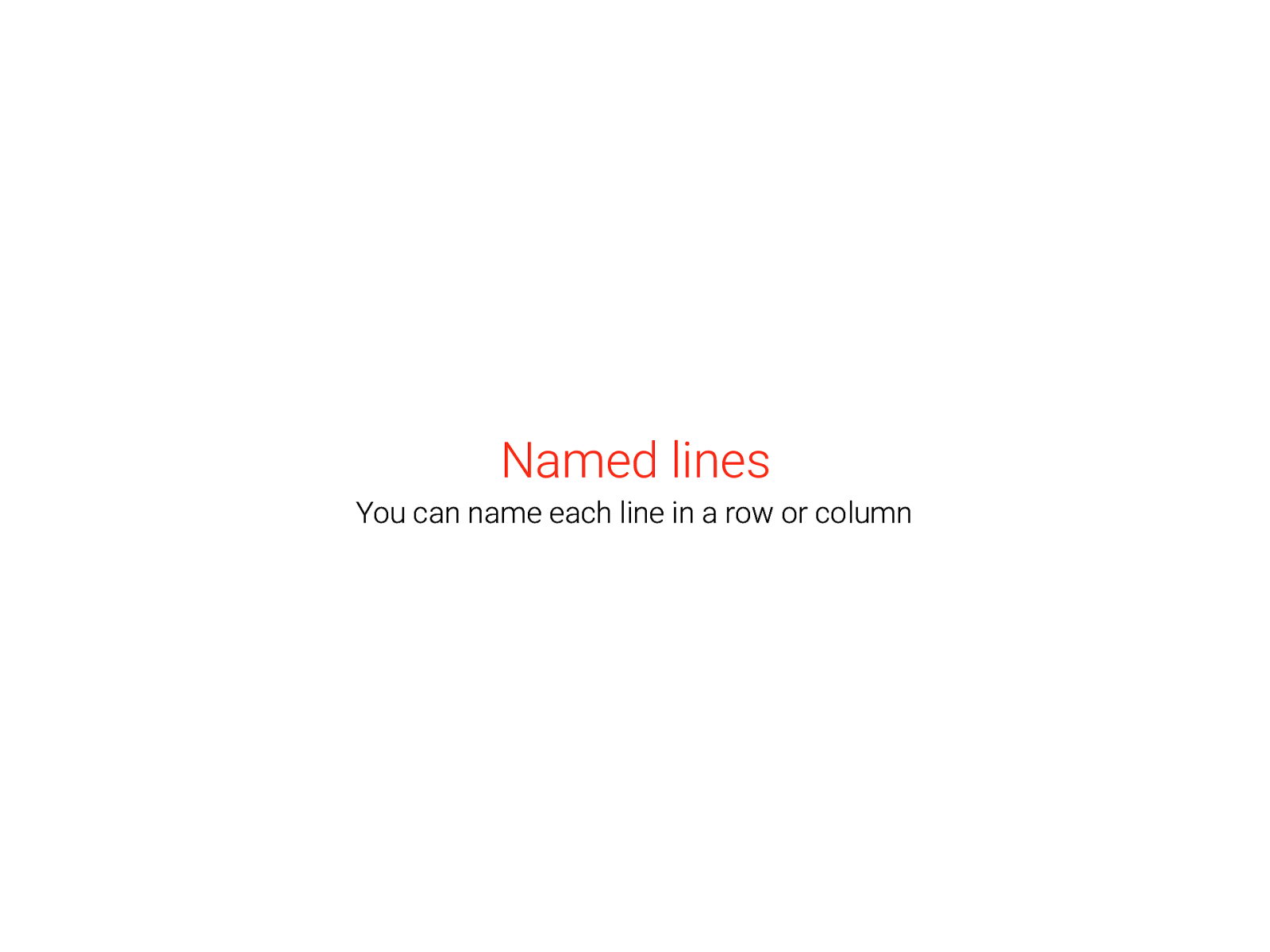
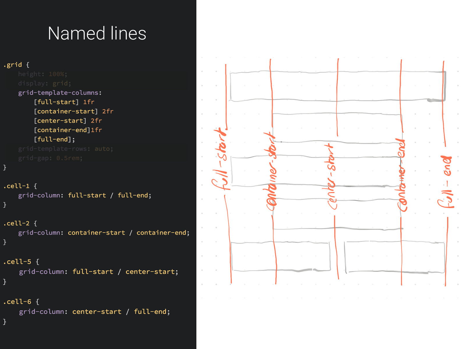
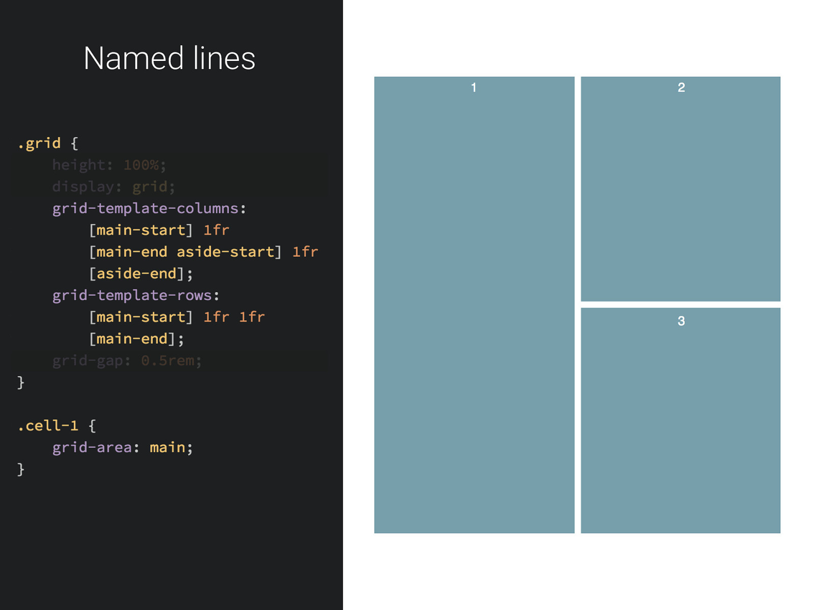
Named lines You can name each line in a row or column
Named lines
Named lines
Named lines
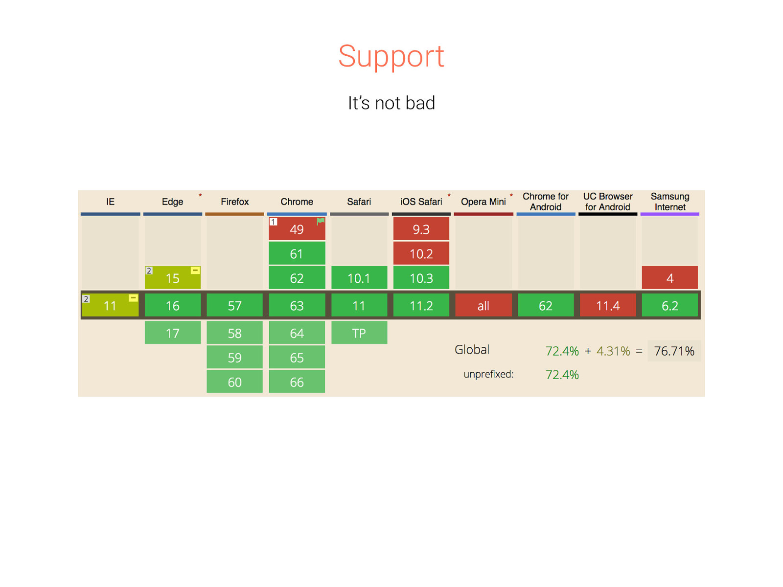
Support It’s not bad
Use in production • There’s no Polyfill • @supports(display: grid) • JS load a fallback Grid is too complex Fallback will likely be Flex - depends on your project There’s efficiency to be gained Stripe does this, but…
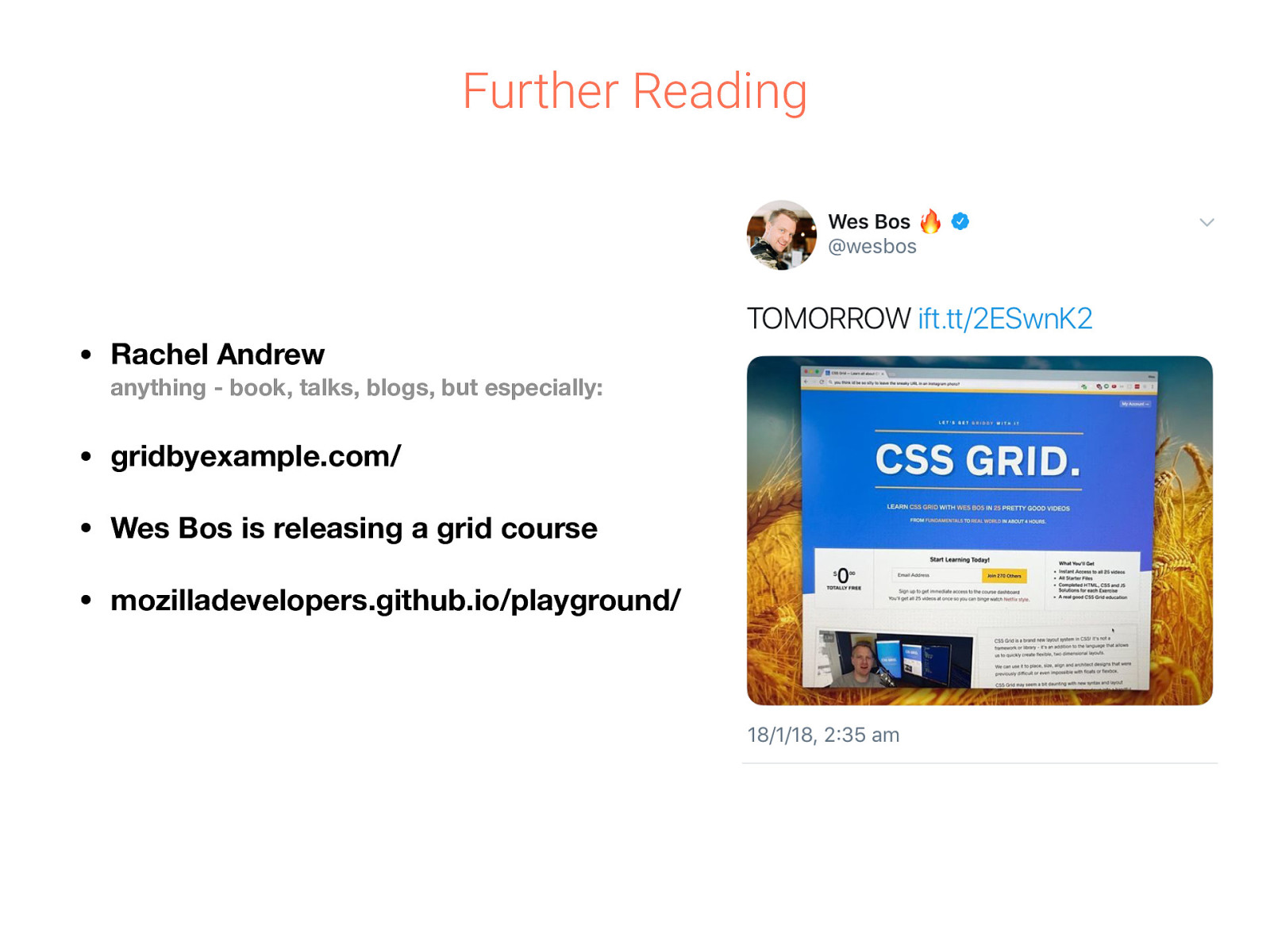
Further Reading • Rachel Andrew • gridbyexample.com/ • Wes Bos is releasing a grid course • mozilladevelopers.github.io/playground/ anything - book, talks, blogs, but especially:
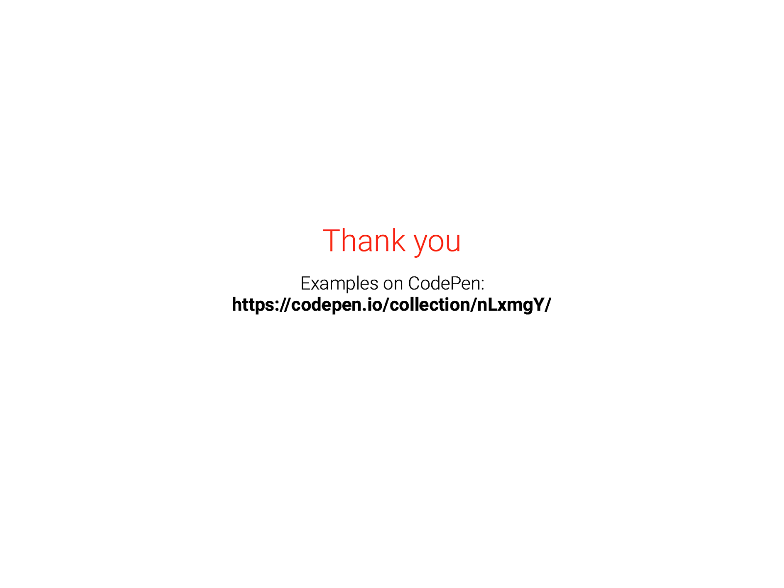
Thank you Examples on CodePen: https://codepen.io/collection/nLxmgY/