Real world CSS custom properties Ben Buchanan weblog.200ok.com.au

A presentation at Web Directions Hover 2022 in April 2022 in Sydney NSW, Australia by Ben Buchanan (200ok)
Real world CSS custom properties Ben Buchanan weblog.200ok.com.au


SCSS for style API & customisation Imposes stack choice on consumer :( Precompiled modifications only :-/ Provides error handling :)

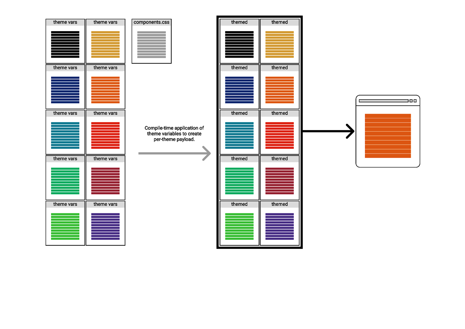
SCSS for themes
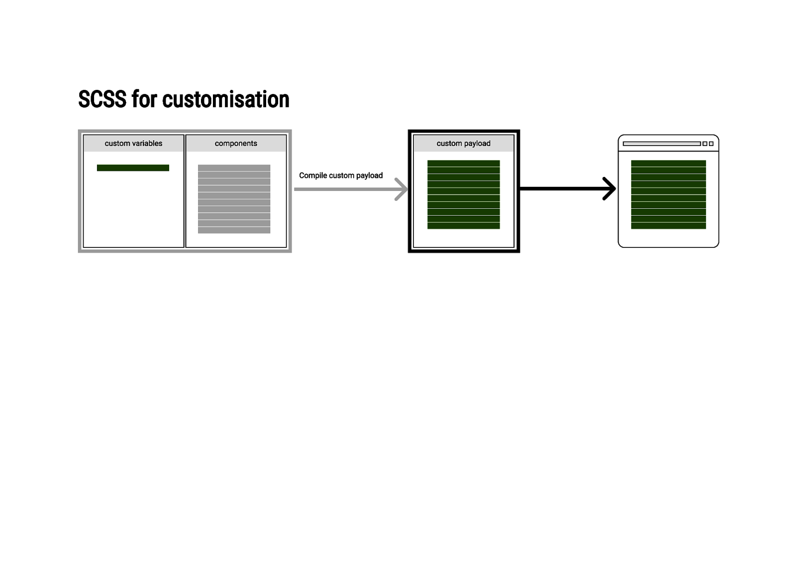
SCSS for customisation
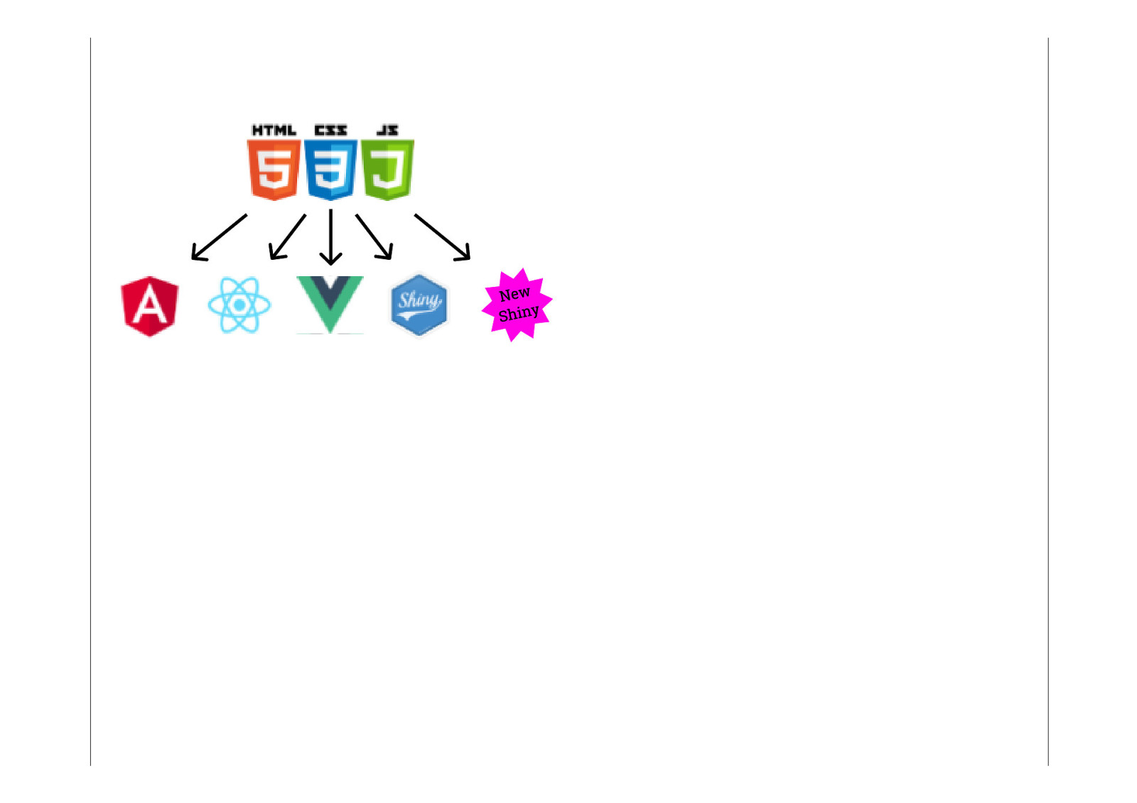
I wanted a better way Native portability Runtime features Easier customisation
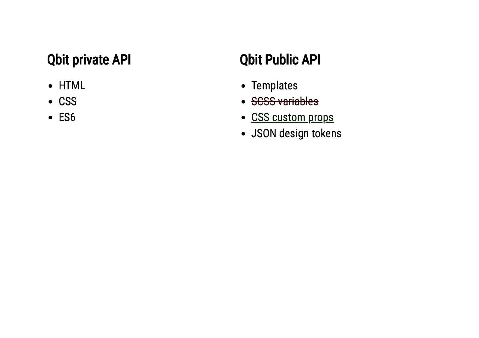
Qbit private API HTML CSS ES6 Qbit Public API Templates SCSS variables CSS custom props JSON design tokens
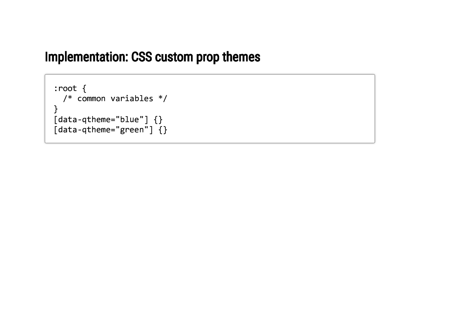
Implementation: CSS custom prop themes :root { /* common variables */ } [data-qtheme=”blue”] {} [data-qtheme=”green”] {}
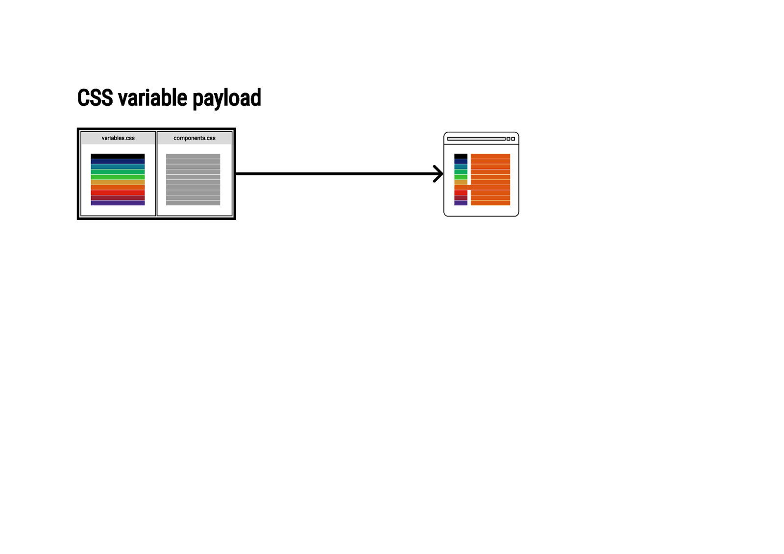
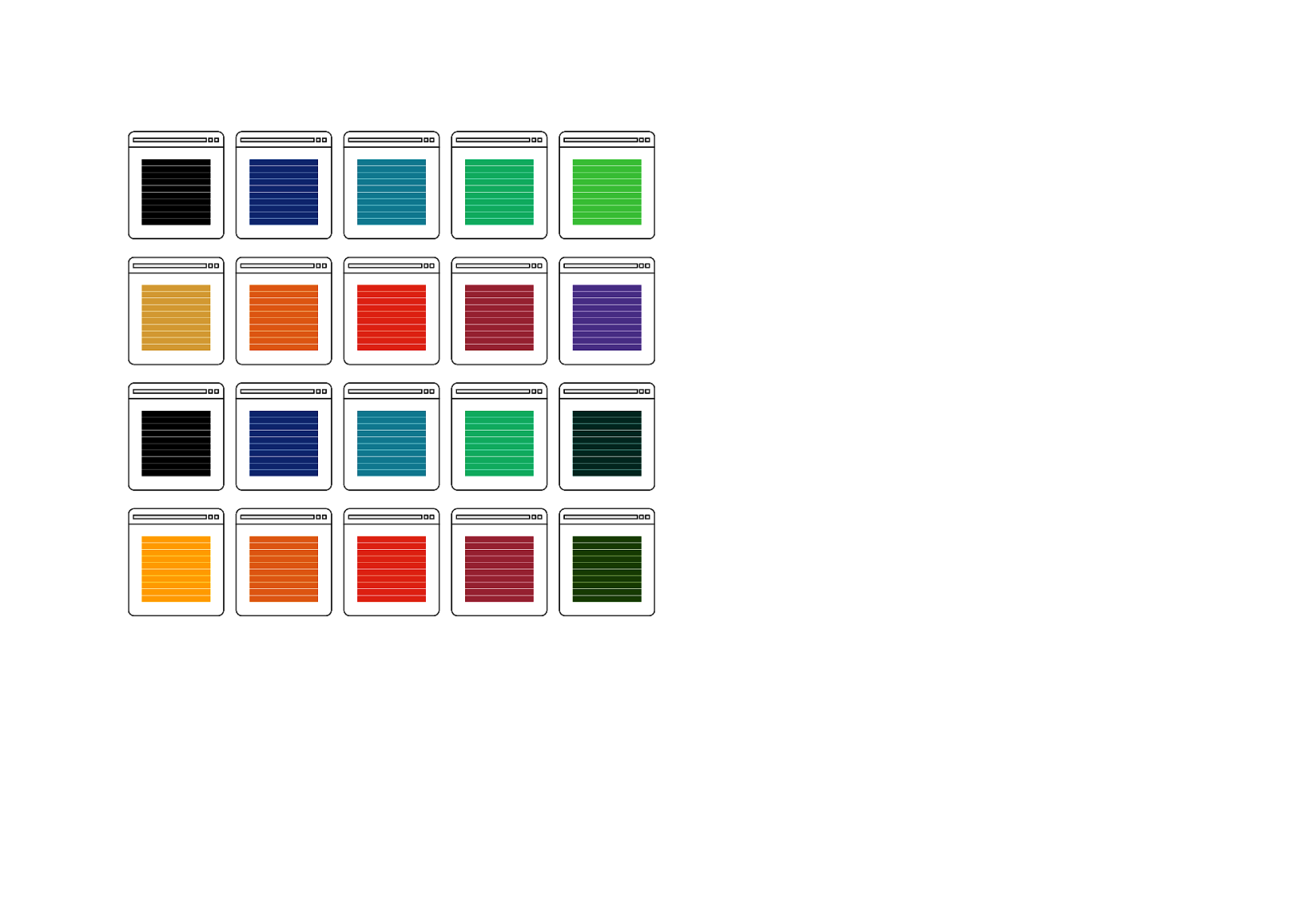
CSS variable payload
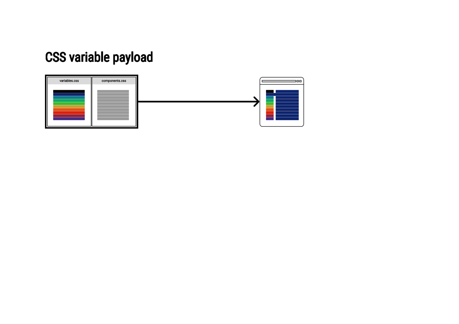
CSS variable payload
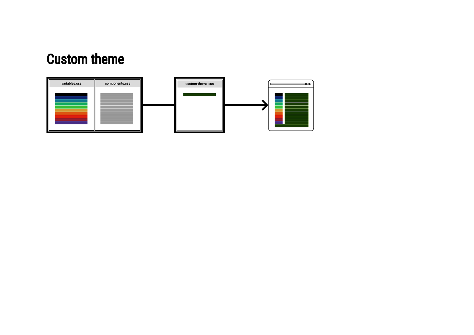
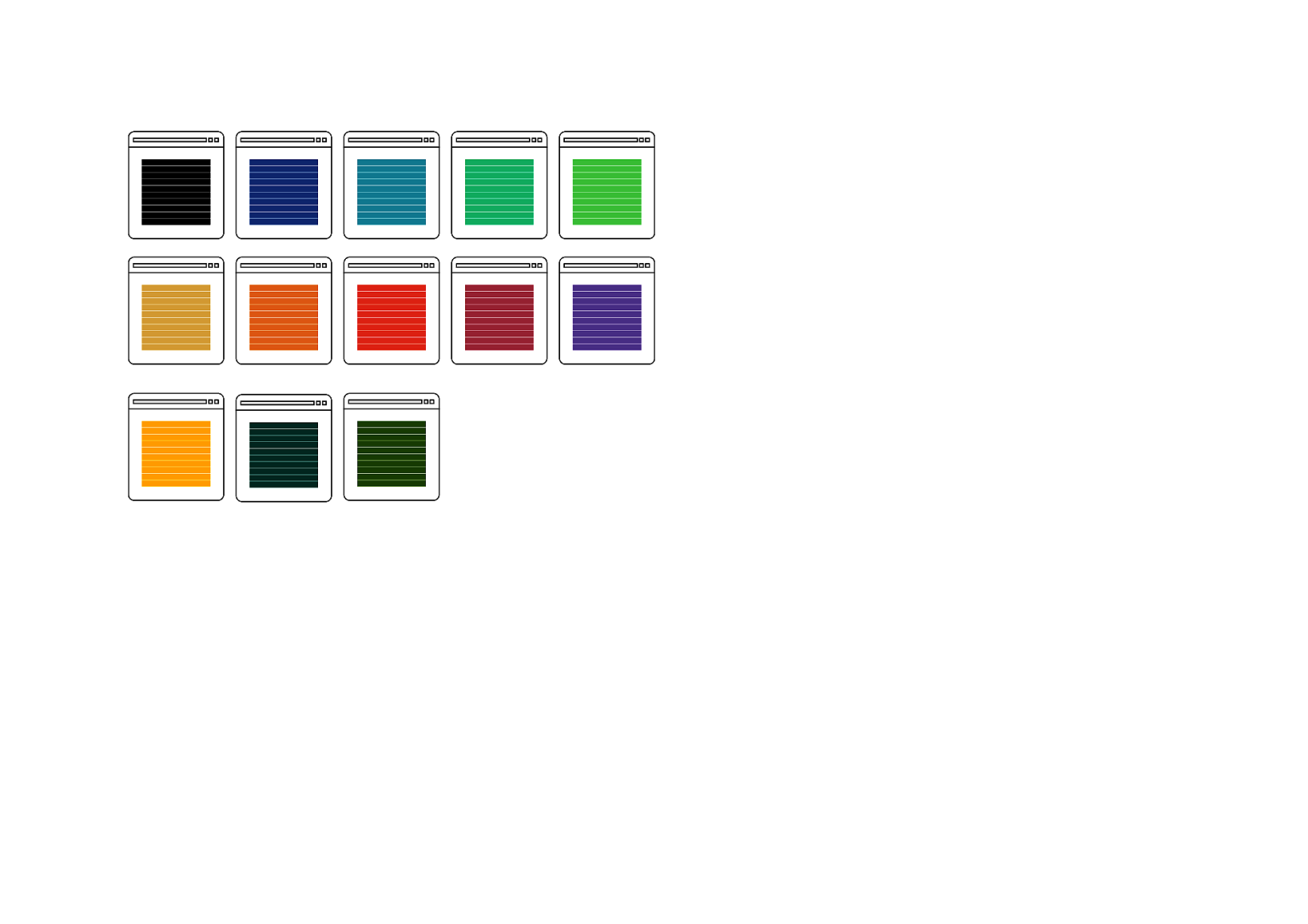
Custom theme
So how is it going?
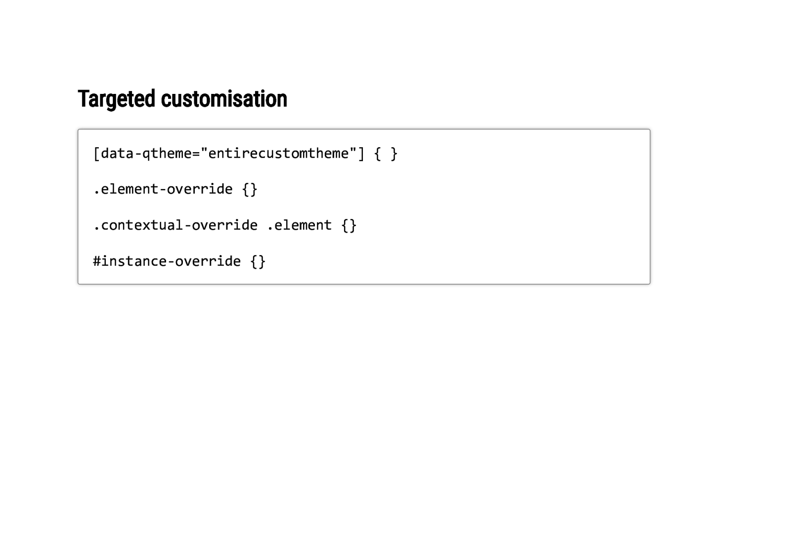
Targeted customisation [data-qtheme=”entirecustomtheme”] { } .element-override {} .contextual-override .element {} #instance-override {}
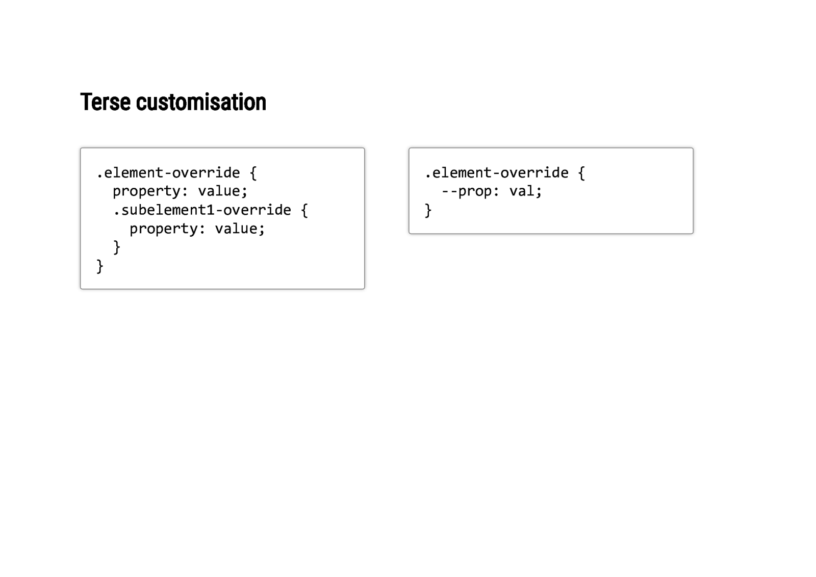
Terse customisation .element-override { property: value; .subelement1-override { property: value; } } .element-override { —prop: val; }
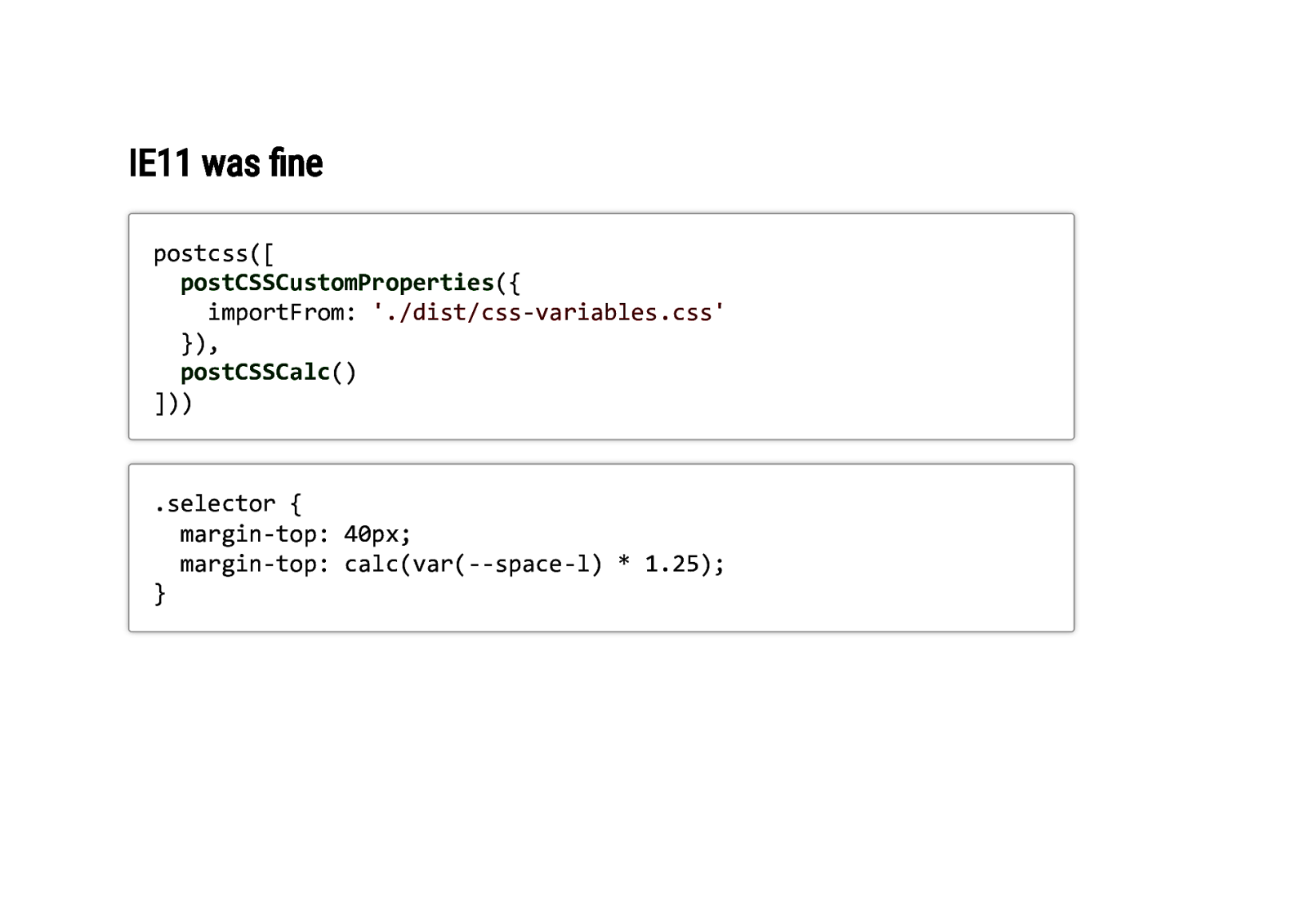
IE11 was fine postcss([ postCSSCustomProperties({ importFrom: ‘./dist/css-variables.css’ }), postCSSCalc() ])) .selector { margin-top: 40px; margin-top: calc(var(—space-l) * 1.25); }
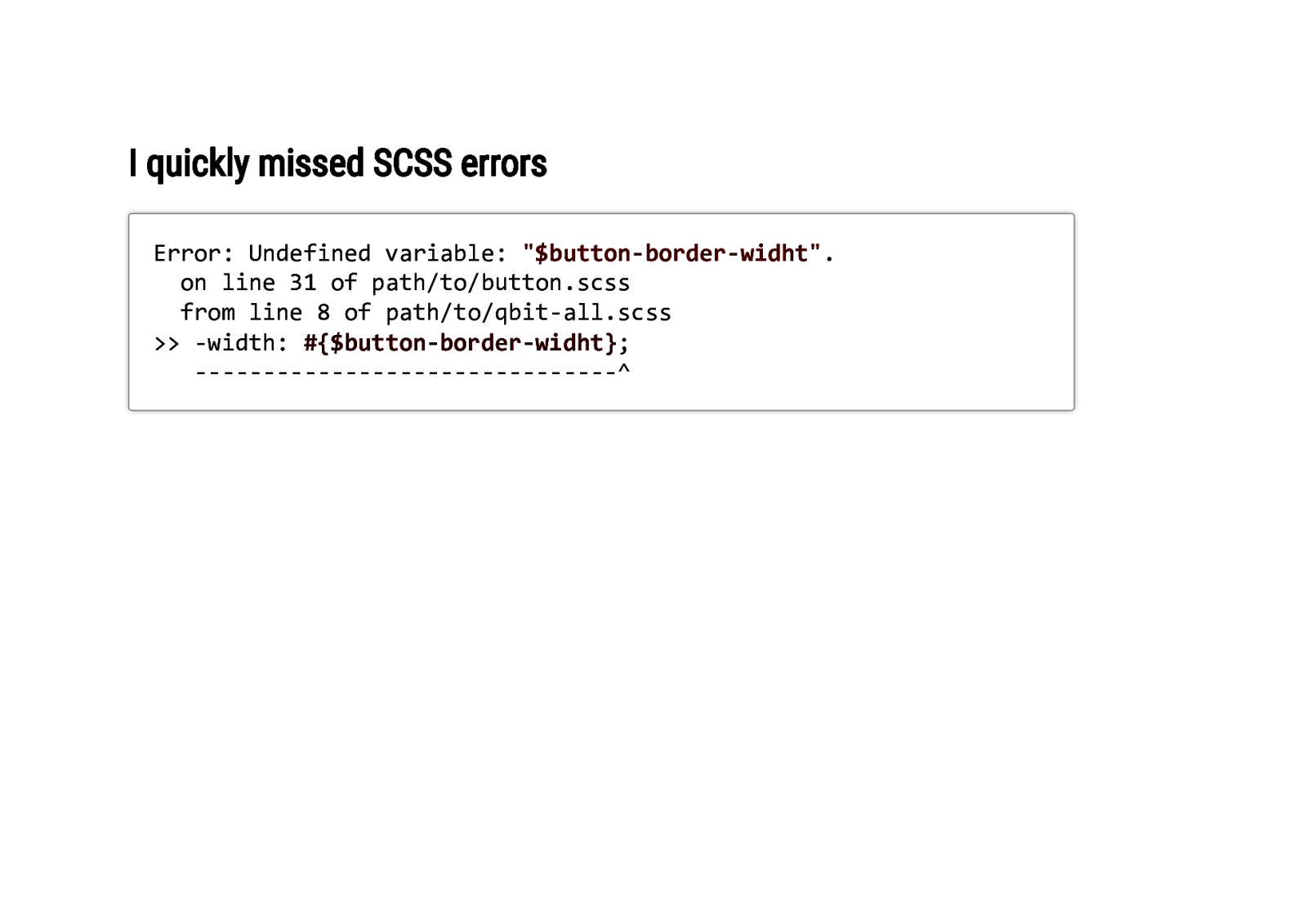
I quickly missed SCSS errors Error: Undefined variable: “$button-border-widht”. on line 31 of path/to/button.scss from line 8 of path/to/qbit-all.scss >> -width: #{$button-border-widht}; ———————————————-^
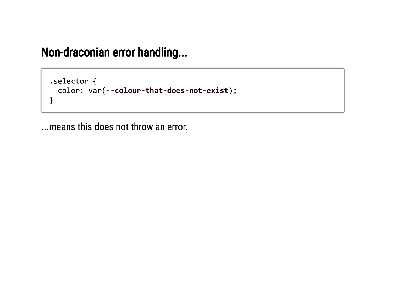
Non-draconian error handling… .selector { color: var(—colour-that-does-not-exist); } …means this does not throw an error.
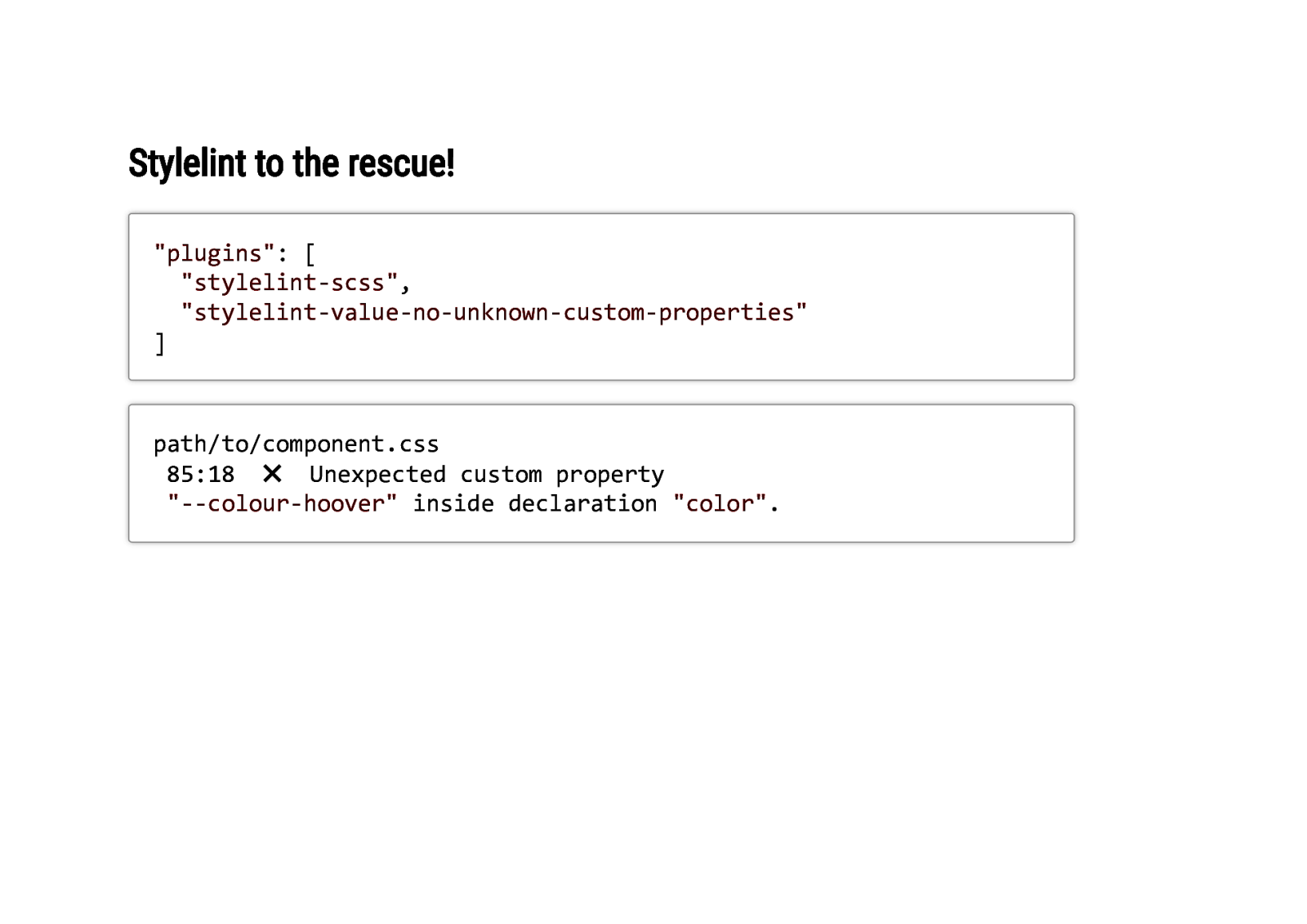
Stylelint to the rescue! “plugins”: [ “stylelint-scss”, “stylelint-value-no-unknown-custom-properties” ] path/to/component.css 85:18 ✖ Unexpected custom property “—colour-hoover” inside declaration “color”.
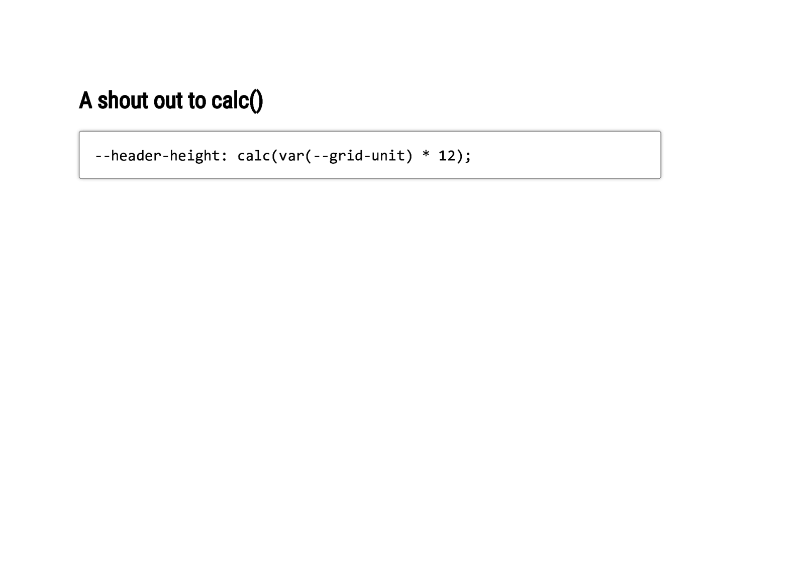
A shout out to calc() —header-height: calc(var(—grid-unit) * 12);
So what went….not so well?
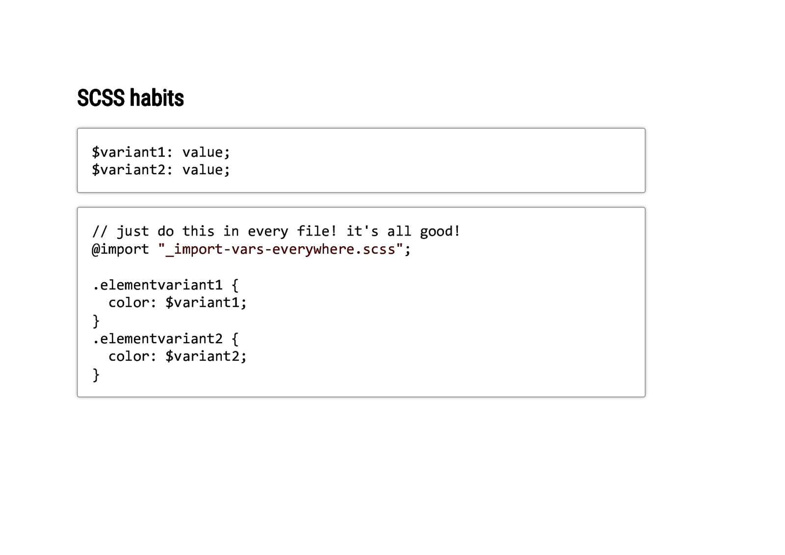
SCSS habits $variant1: value; $variant2: value; // just do this in every file! it’s all good! @import “_import-vars-everywhere.scss”; .elementvariant1 { color: $variant1; } .elementvariant2 { color: $variant2; }
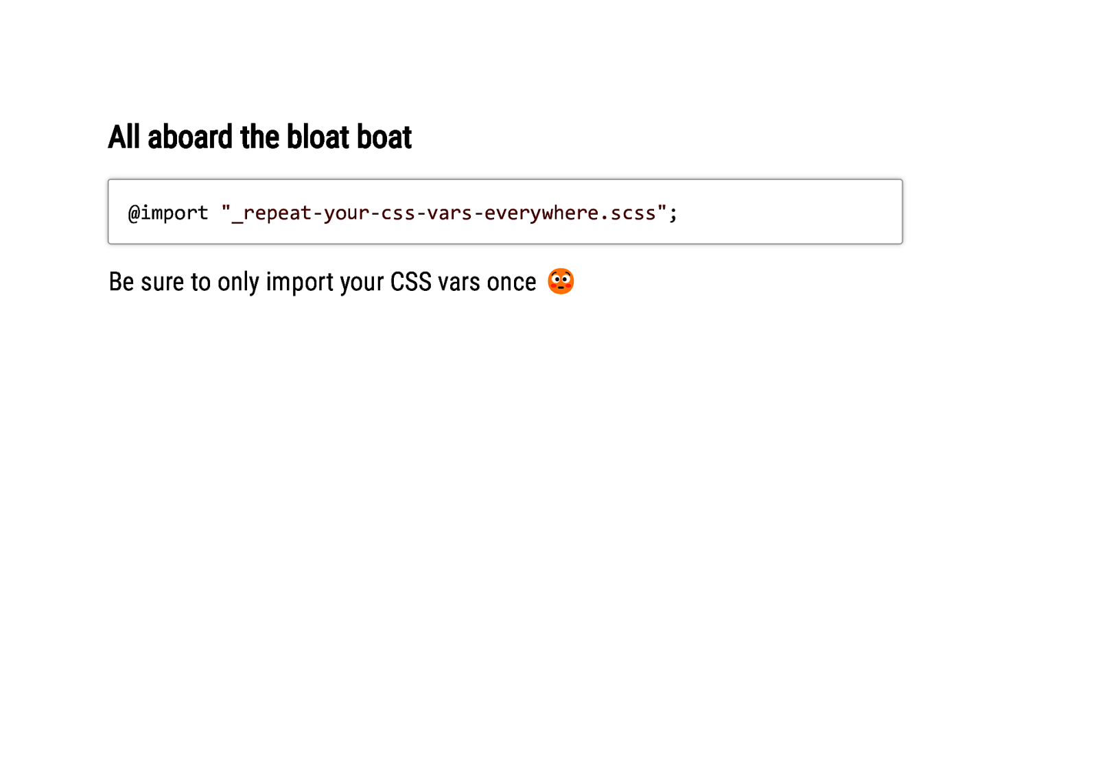
All aboard the bloat boat @import “_repeat-your-css-vars-everywhere.scss”; Be sure to only import your CSS vars once 😳
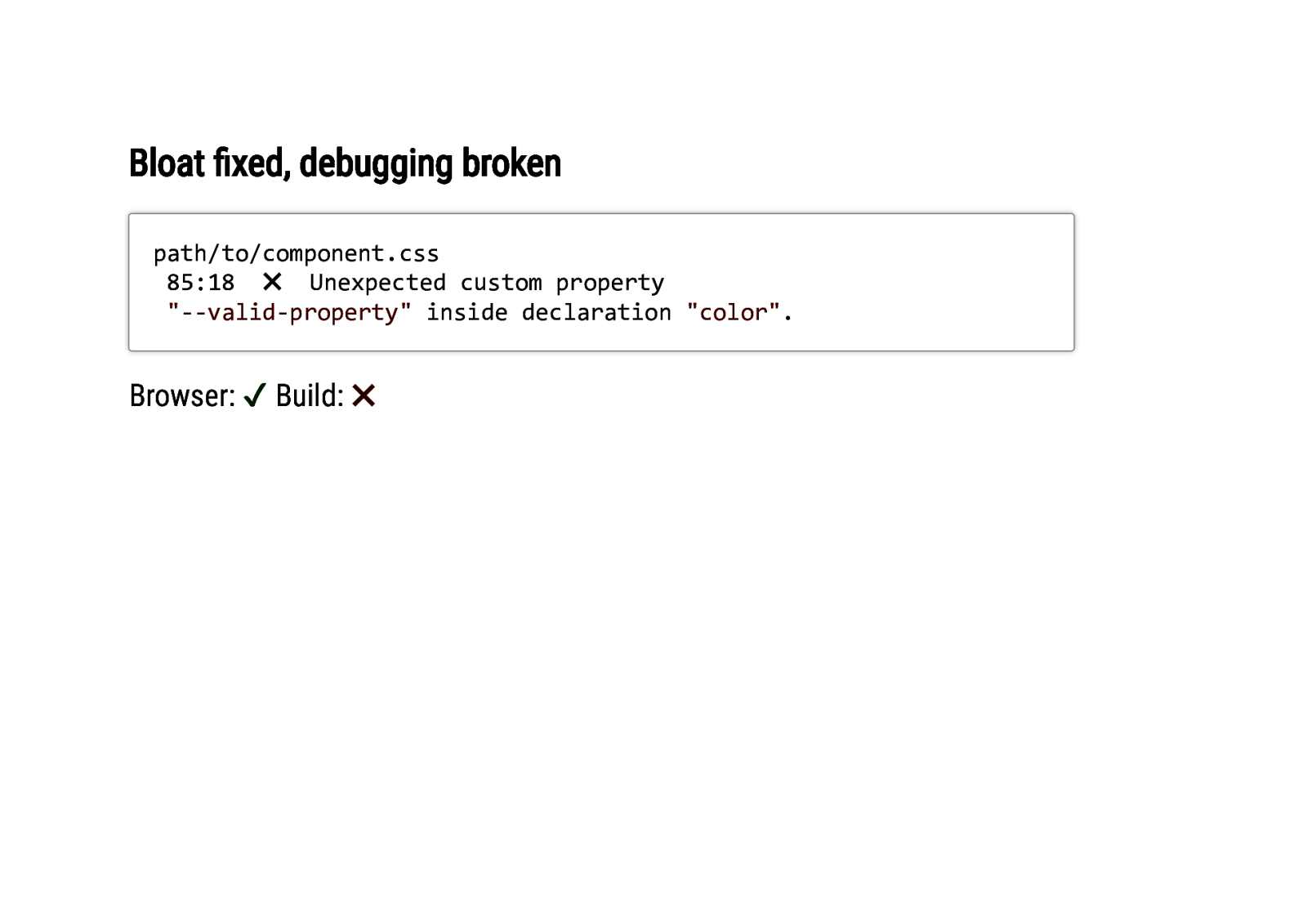
Bloat fixed, debugging broken path/to/component.css 85:18 ✖ Unexpected custom property “—valid-property” inside declaration “color”. Browser: ✔ Build: ✖
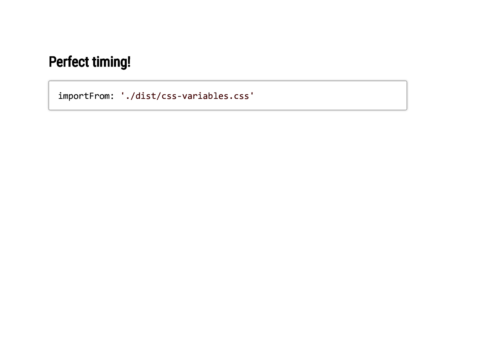
Perfect timing! importFrom: ‘./dist/css-variables.css’
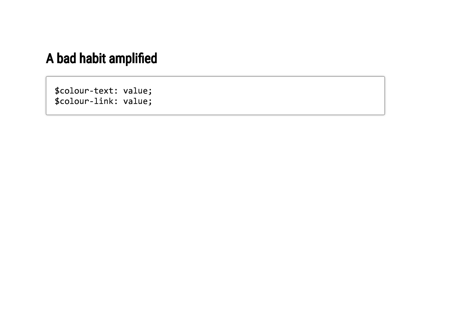
A bad habit amplified $colour-text: value; $colour-link: value;
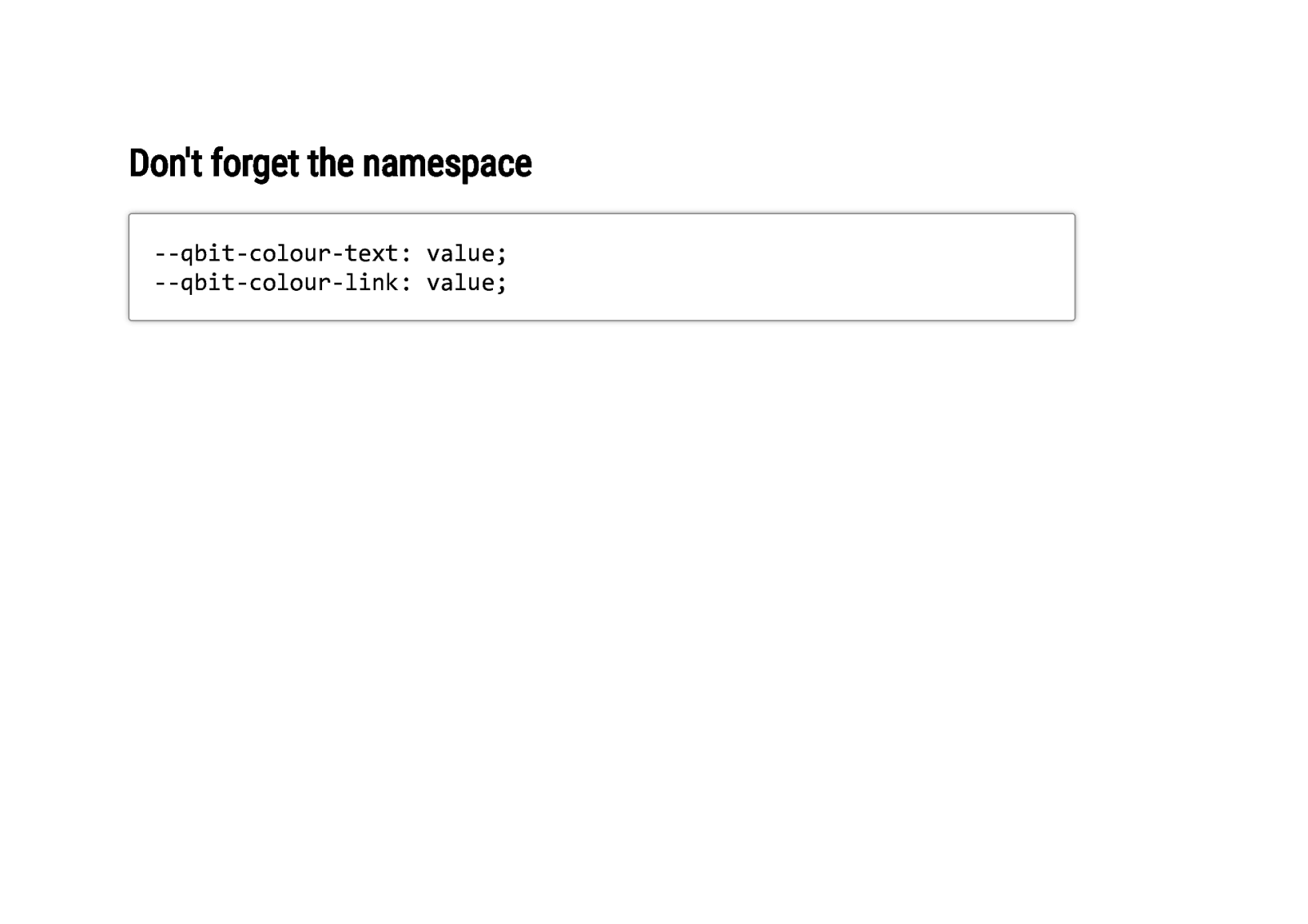
Don’t forget the namespace —qbit-colour-text: value; —qbit-colour-link: value;
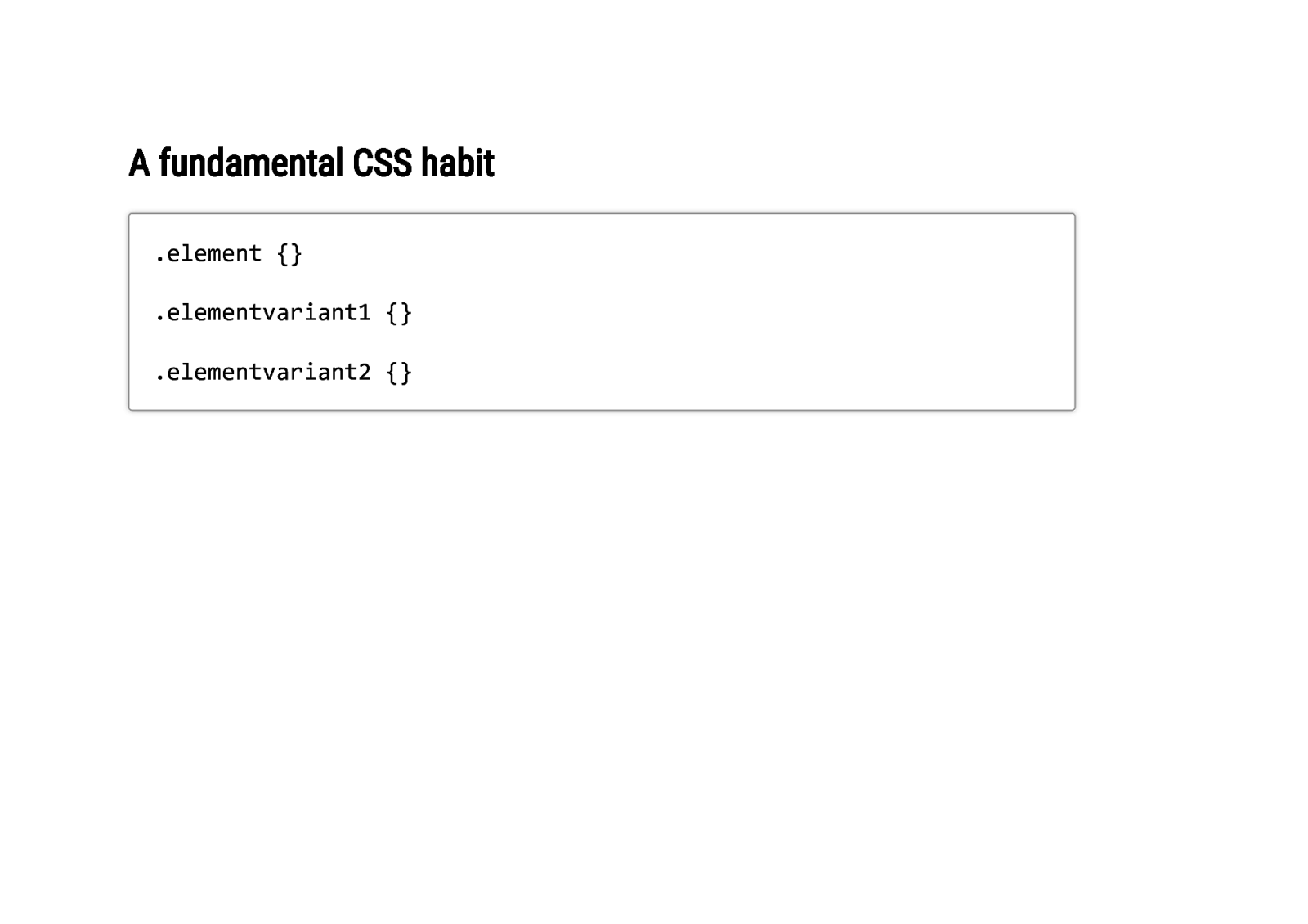
A fundamental CSS habit .element {} .elementvariant1 {} .elementvariant2 {}
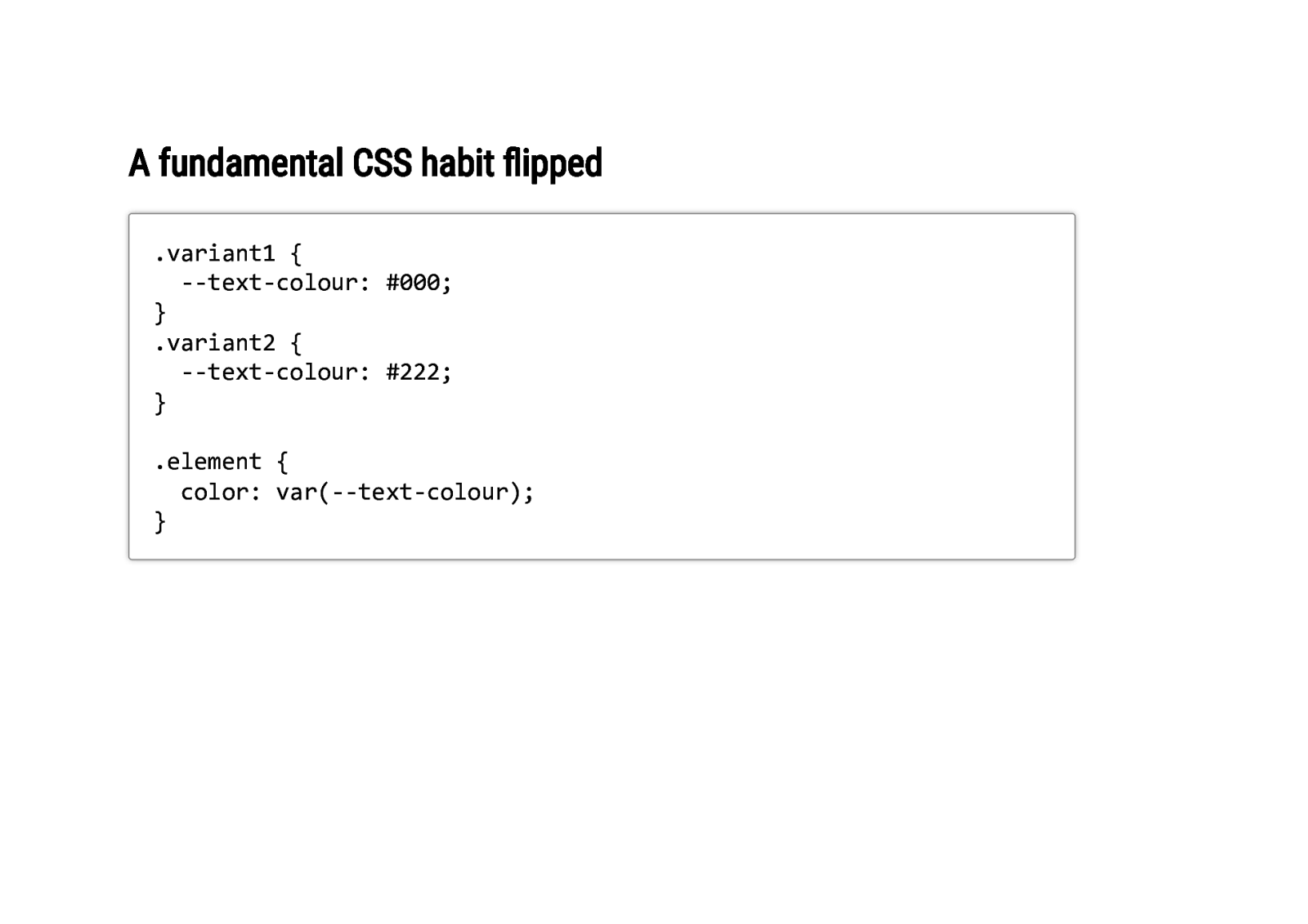
A fundamental CSS habit flipped .variant1 { —text-colour: #000; } .variant2 { —text-colour: #222; } .element { color: var(—text-colour); }
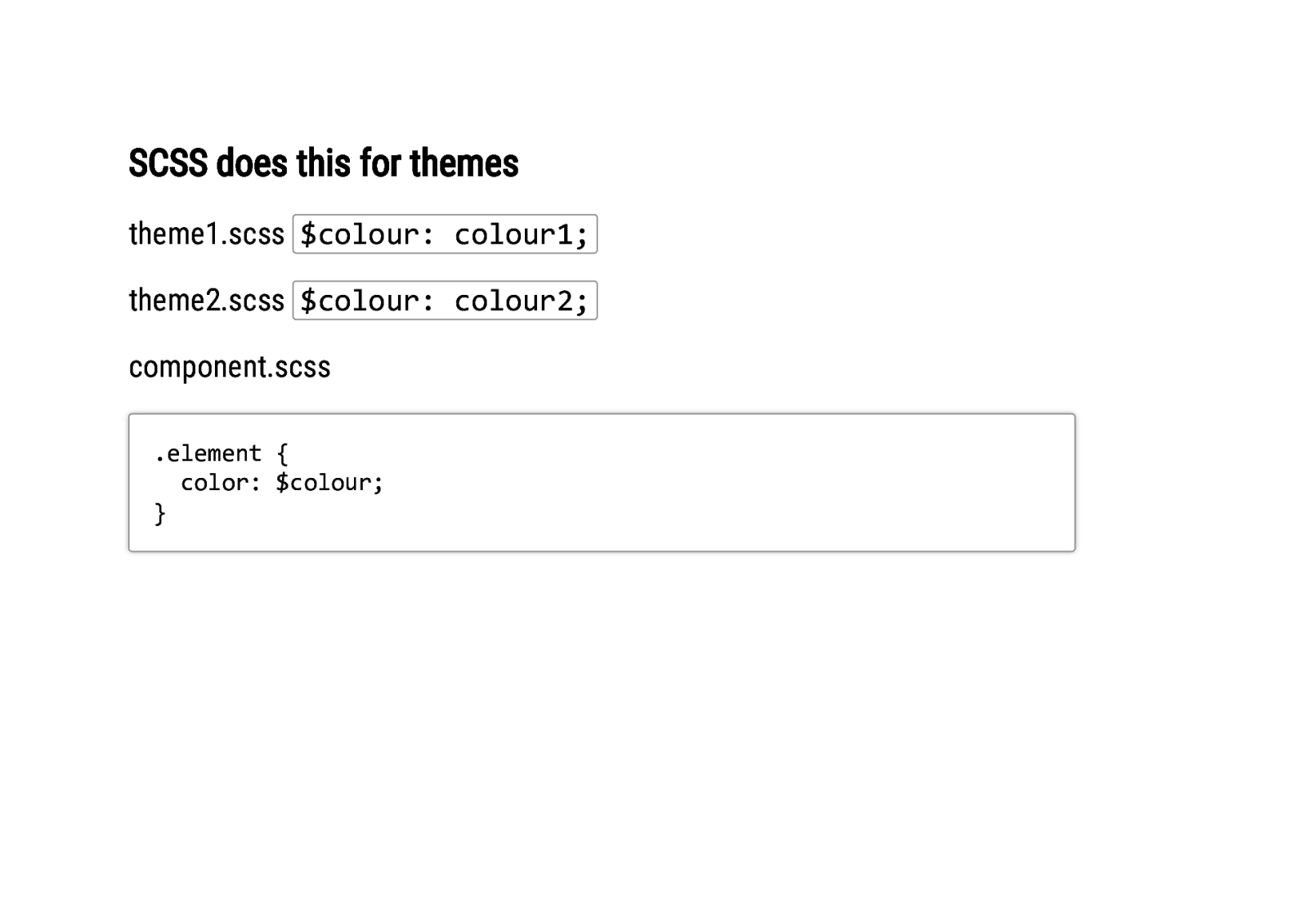
SCSS does this for themes theme1.scss $colour: colour1; theme2.scss $colour: colour2; component.scss .element { color: $colour; }
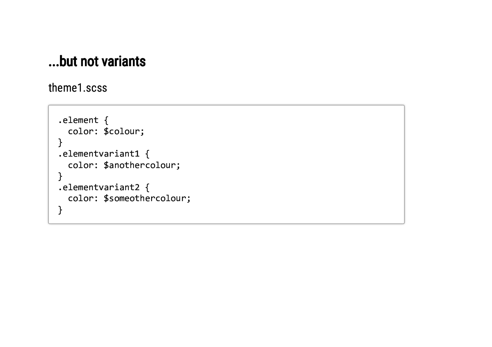
…but not variants theme1.scss .element { color: $colour; } .elementvariant1 { color: $anothercolour; } .elementvariant2 { color: $someothercolour; }
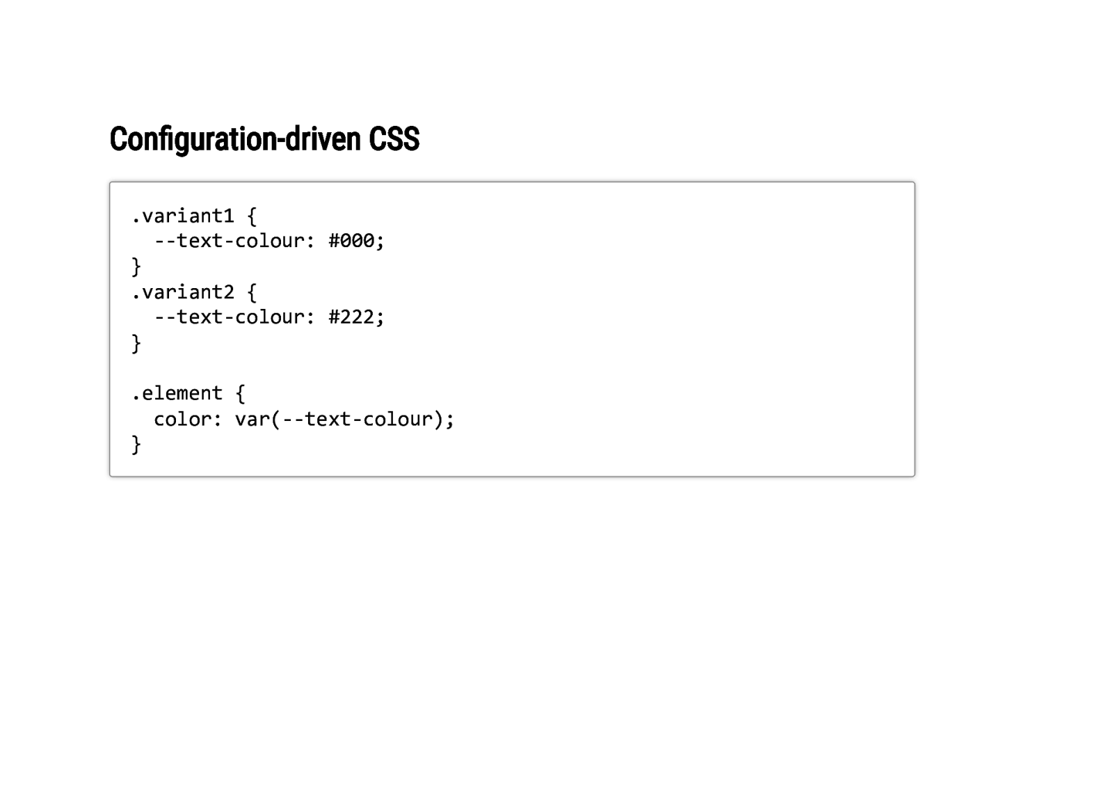
Configuration-driven CSS .variant1 { —text-colour: #000; } .variant2 { —text-colour: #222; } .element { color: var(—text-colour); }
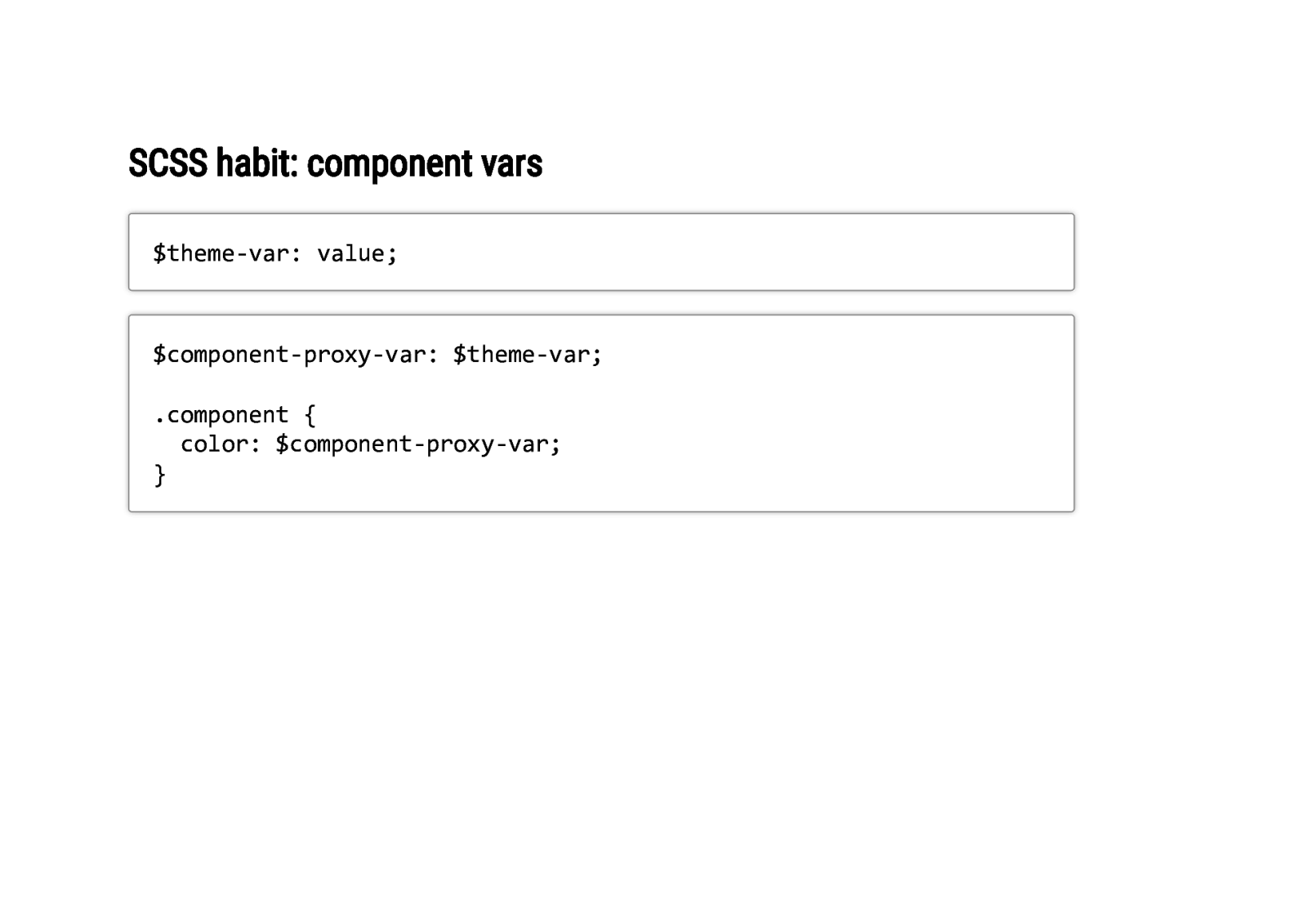
SCSS habit: component vars $theme-var: value; $component-proxy-var: $theme-var; .component { color: $component-proxy-var; }
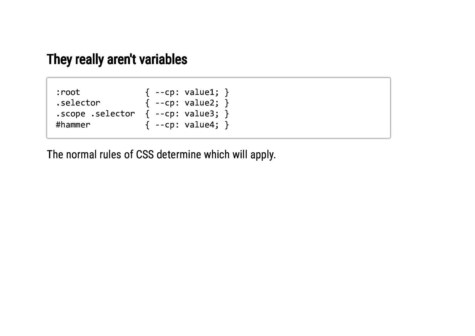
They really aren’t variables :root .selector .scope .selector #hammer { { { { —cp: —cp: —cp: —cp: value1; value2; value3; value4; } } } } The normal rules of CSS determine which will apply.
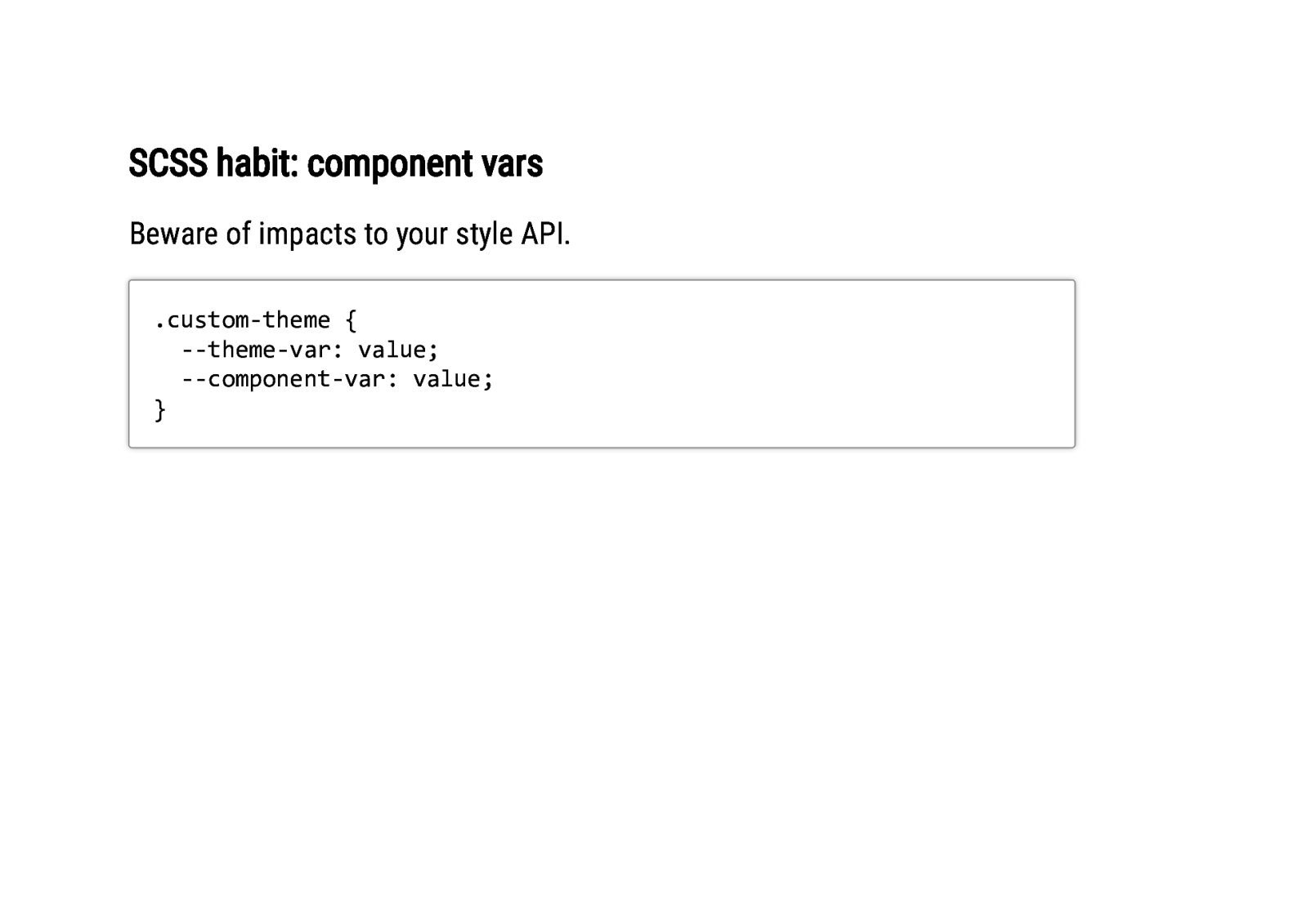
SCSS habit: component vars Beware of impacts to your style API. .custom-theme { —theme-var: value; —component-var: value; }
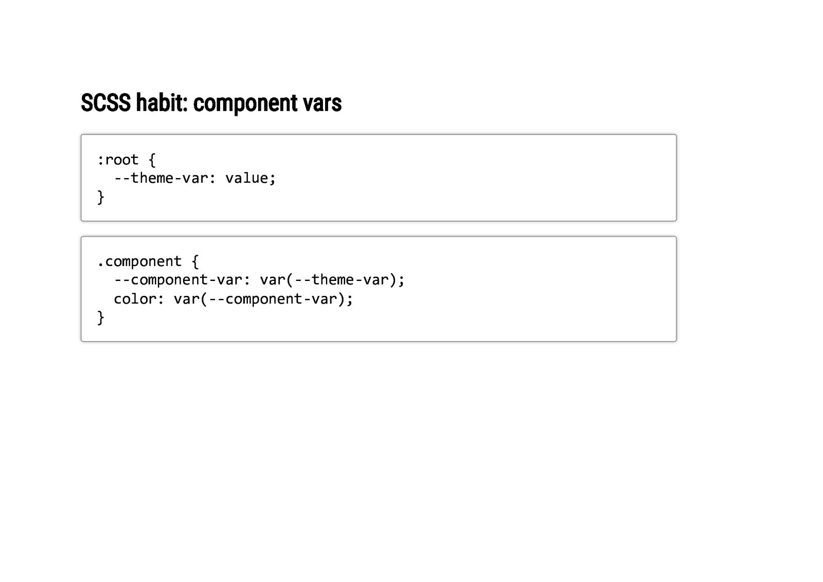
SCSS habit: component vars :root { —theme-var: value; } .component { —component-var: var(—theme-var); color: var(—component-var); }

In summary…

In summary… CSS custom properties are awesome and we’re not looking back!
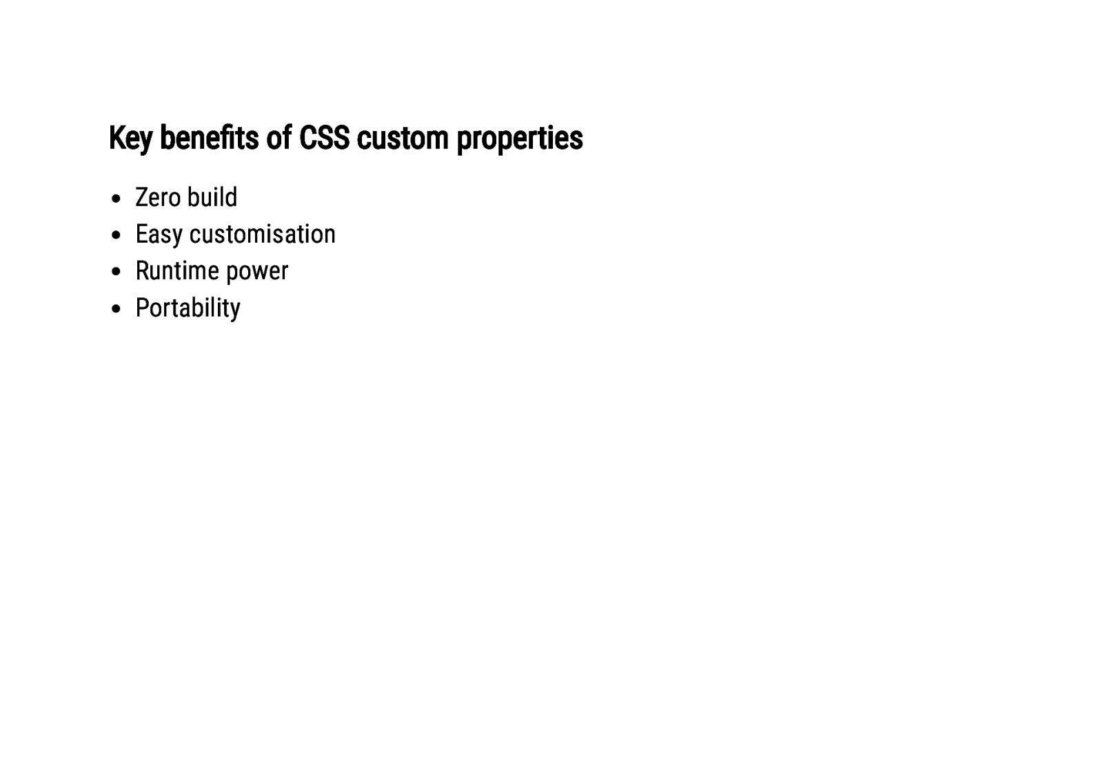
Key benefits of CSS custom properties Zero build Easy customisation Runtime power Portability
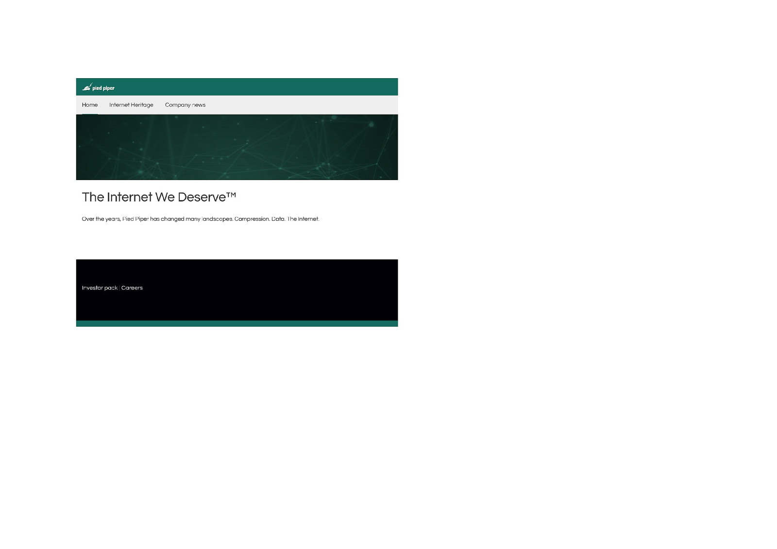
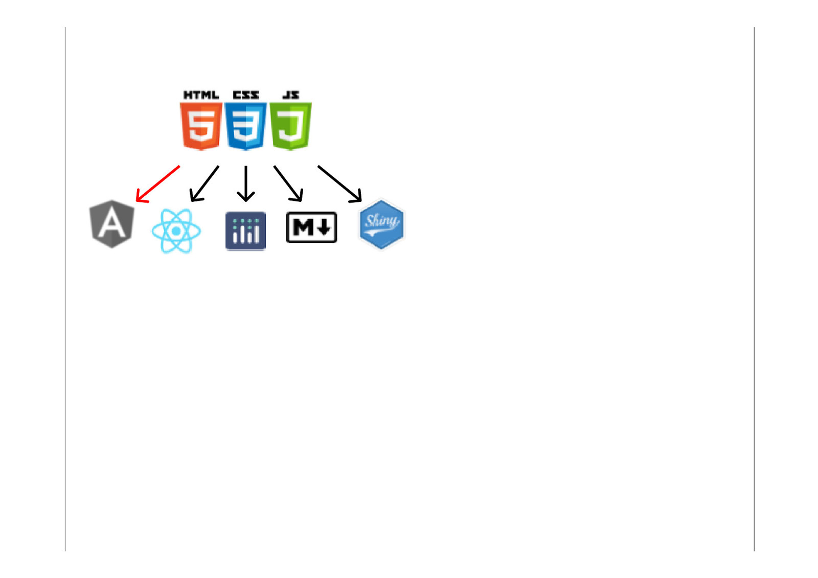
Portability wins Anything that can produce HTML can use Qbit’s CSS API.
Embracing Custom Properties Build new habits They aren’t variables Use the power of specificity and the cascade Think config-driven style

Use native CSS! -finweblog.200ok.com.au