Flexbox 101 Benjamin Hong UX Developer @bencodezen

A presentation at DC Digital Experiences Meetup in August 2015 in Washington, DC, USA by Ben Hong
Flexbox 101 Benjamin Hong UX Developer @bencodezen
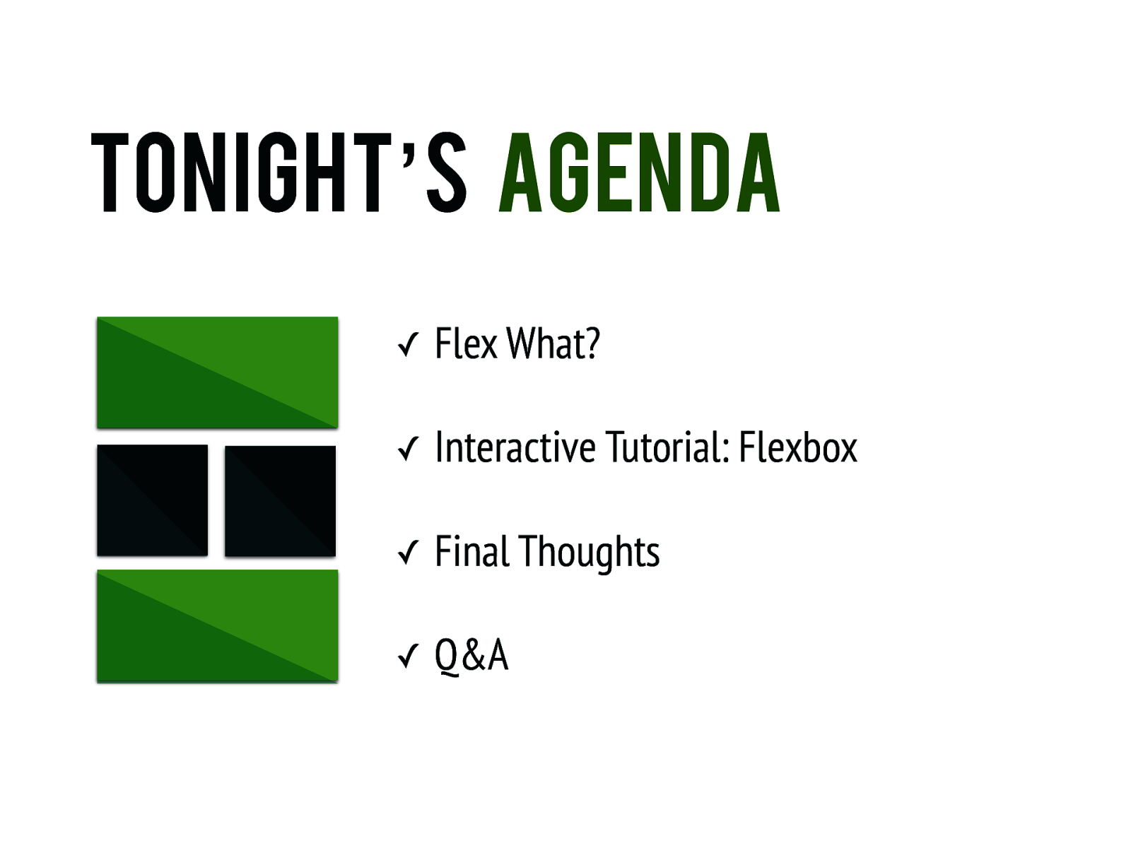
Tonight’s Agenda ✓ Flex What? ✓ Interactive Tutorial: Flexbox ✓ Final Thoughts ✓ Q&A
Flex what?
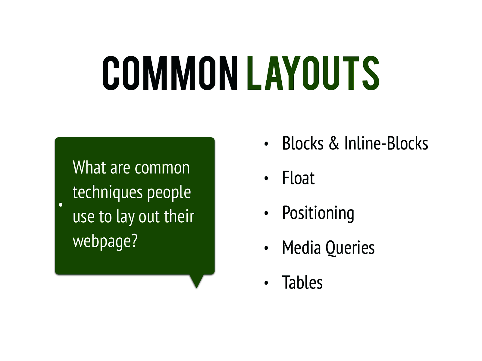
Common Layouts • What are common techniques people use to lay out their webpage? • Blocks & Inline-Blocks • Float • Positioning • Media Queries • Tables
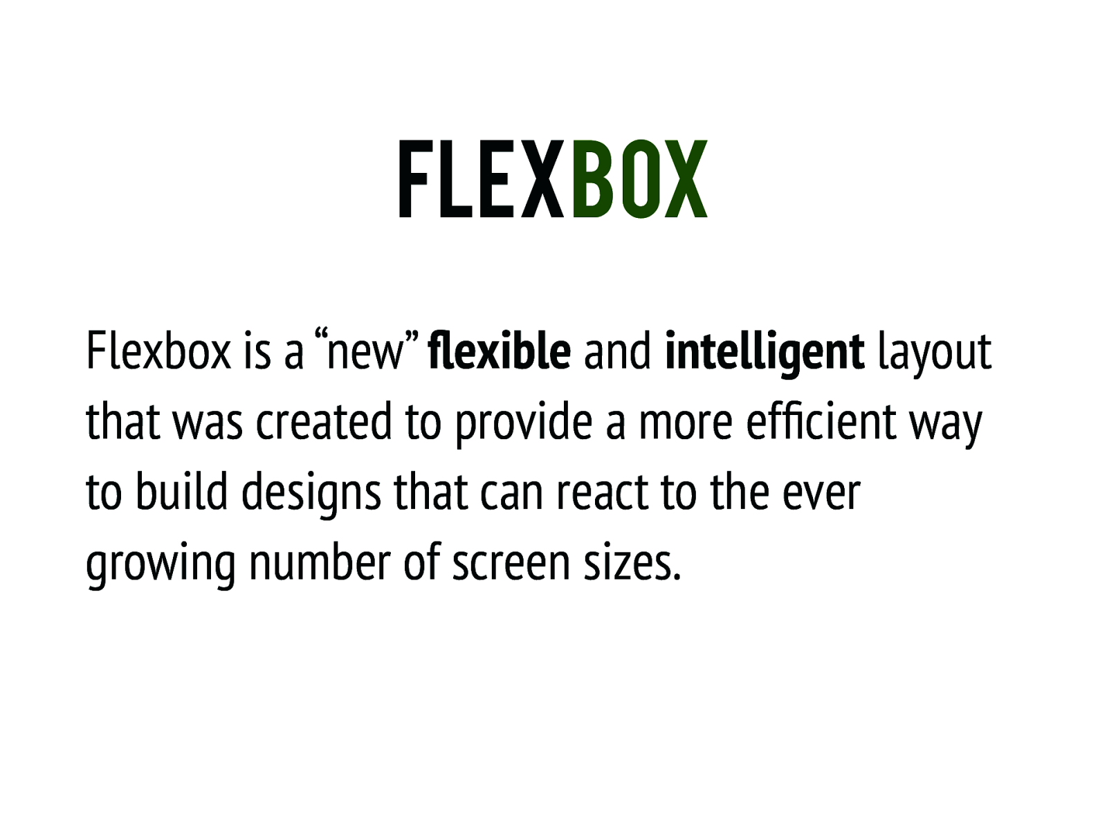
Flexbox Flexbox is a “new” flexible and intelligent layout that was created to provide a more efficient way to build designs that can react to the ever growing number of screen sizes.
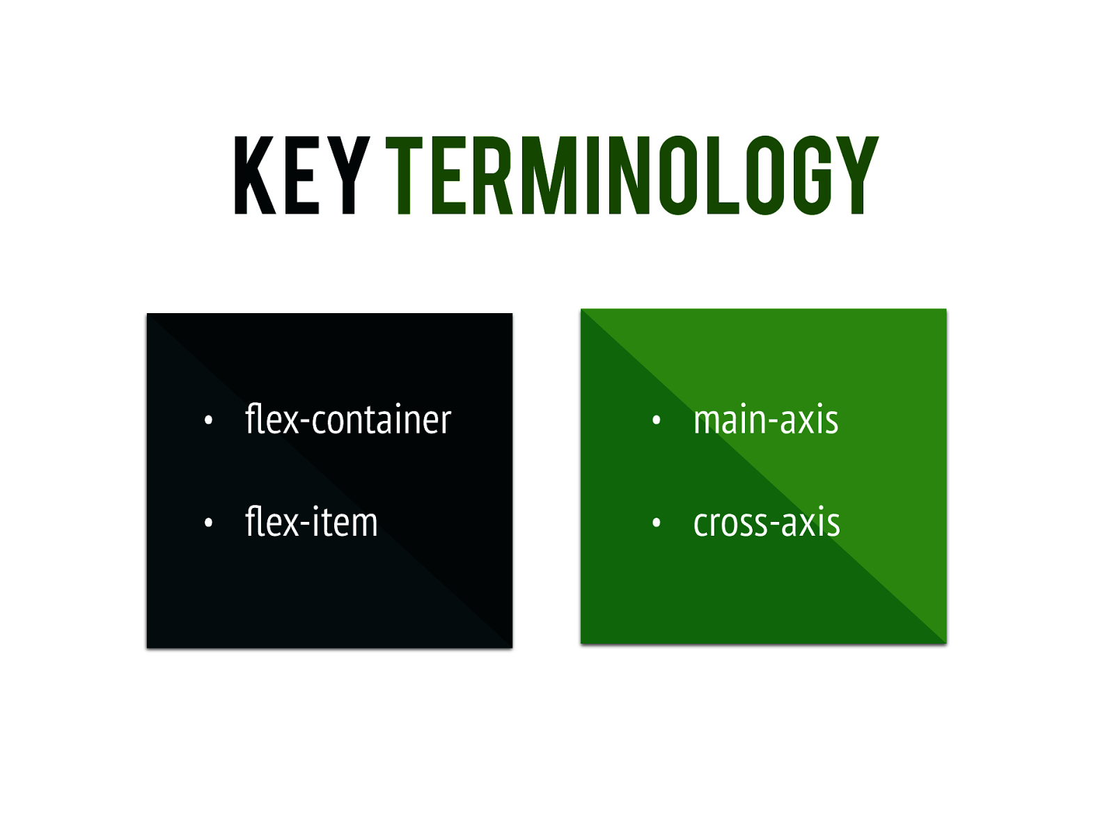
Key Terminology • flex-container • main-axis • flex-item • cross-axis
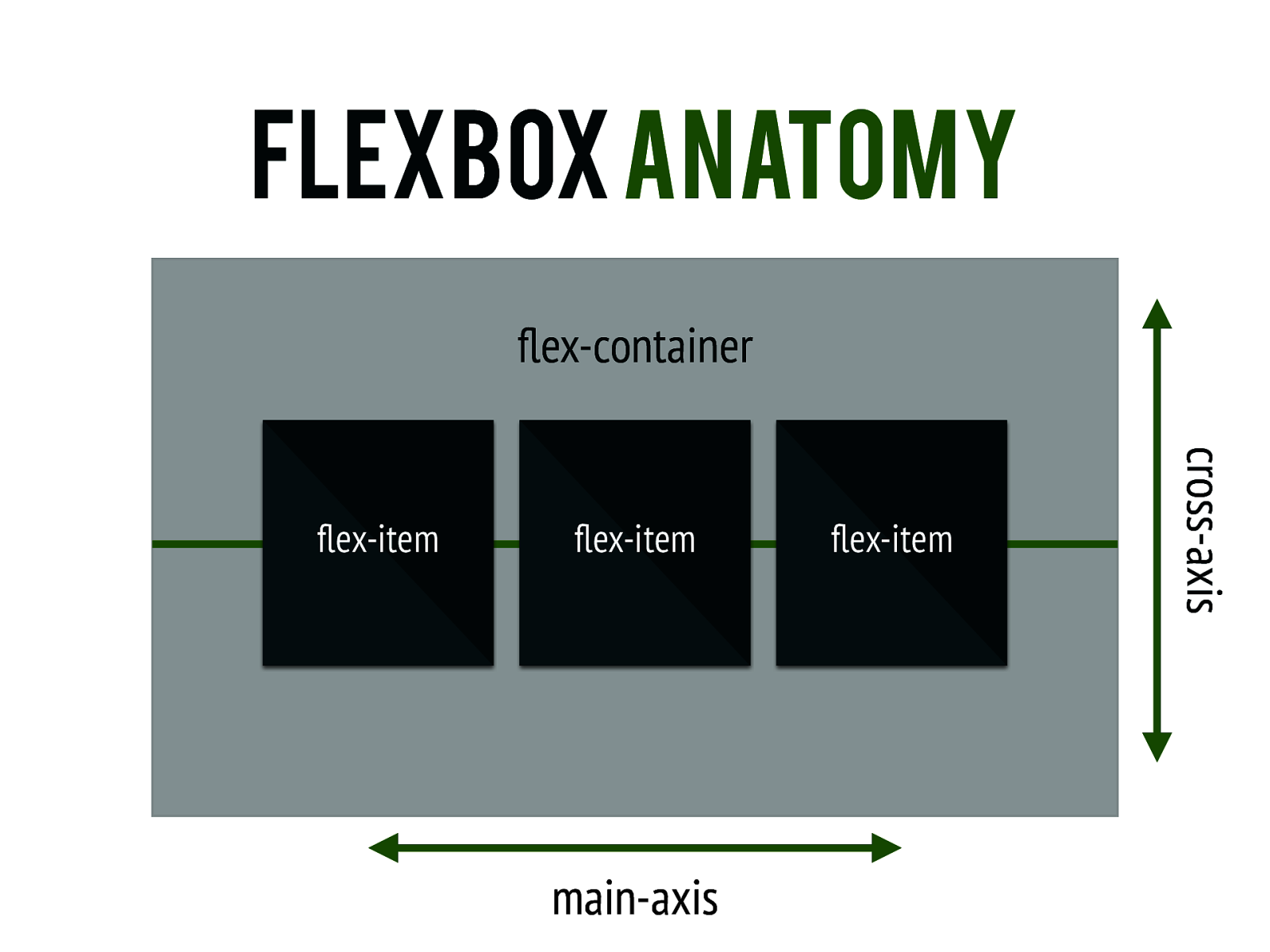
Flexbox Anatomy flex-container flex-item main-axis flex-item cross-axis flex-item

Interactive tutorial http://codepen.io/collection/AWvMoQ/

final thoughts
using flexbox Flexbox is simple to learn and use, so the complexities lay in how it is implemented across your designs.
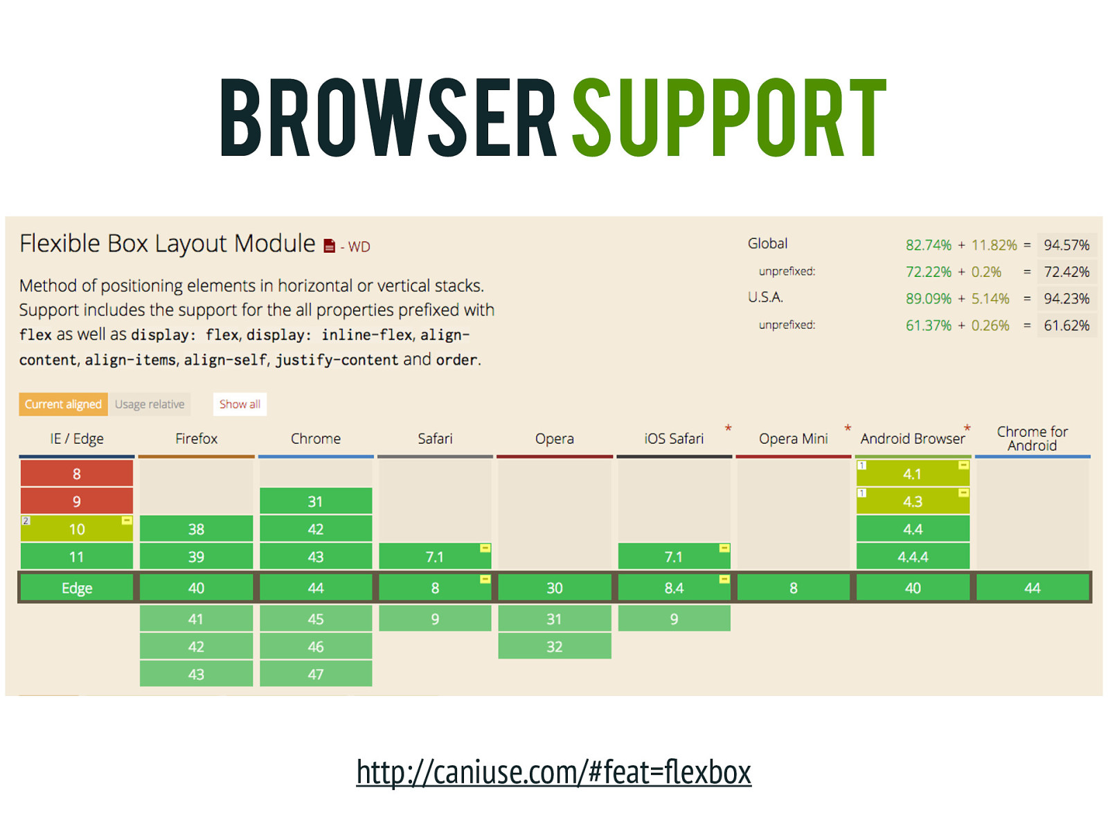
browser support http://caniuse.com/#feat=flexbox
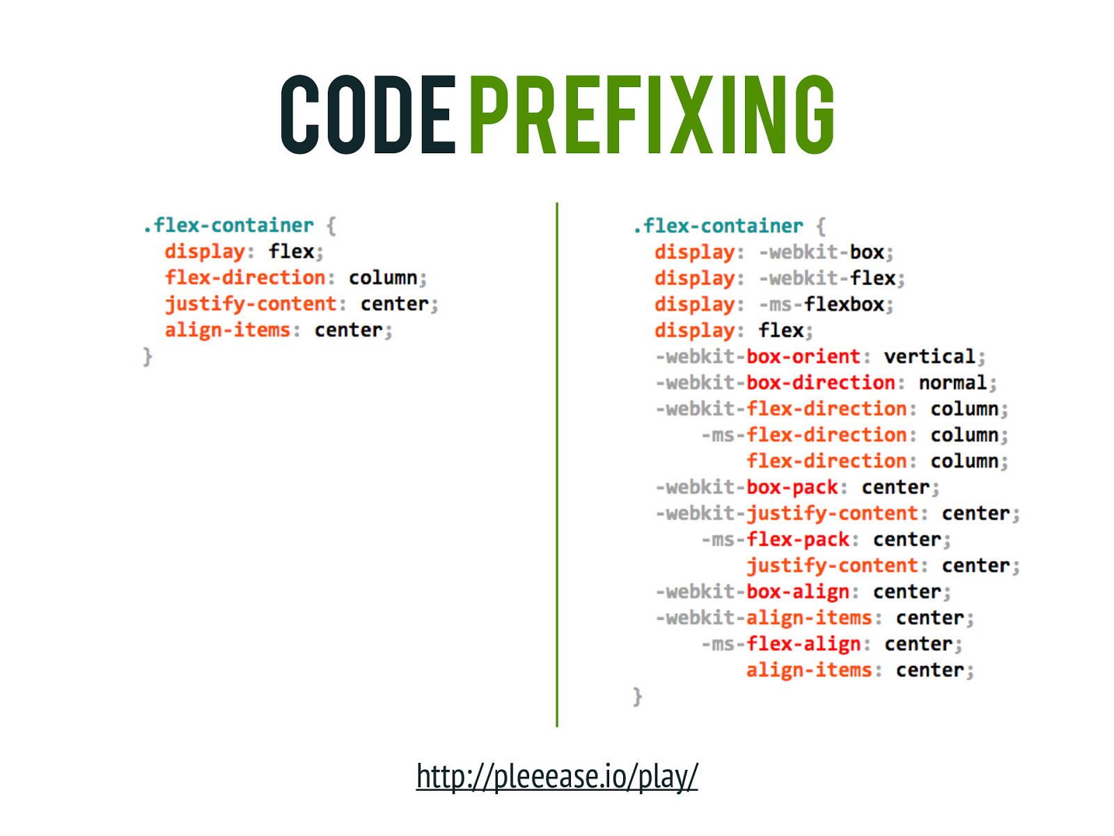
Code prefixing http://pleeease.io/play/
Additional Resources • A Complete Guide to Flexbox by CSS Tricks https://css-tricks.com/snippets/css/a-guide-to-flexbox/ • What the Flexbox? by Wes Bos http://flexbox.io • A Visual Guide to CSS3 Flexbox Properties by Dimitar Stojanov https://scotch.io/tutorials/a-visual-guide-to-css3-flexbox-properties • Laying Out a Flexible Future for Web Design with Flexbox by Ben Gremillion http://www.smashingmagazine.com/2015/08/flexible-future-for-web-designwith-flexbox/
Q&A
Thank You! If you have any additional questions, feel free to reach out to me @bencodezen!