Practical Responsive Images http://unsplash.com/

A presentation at Digital Henley in July 2016 in Henley-on-Thames RG9, UK by Ben Seymour
Practical Responsive Images http://unsplash.com/
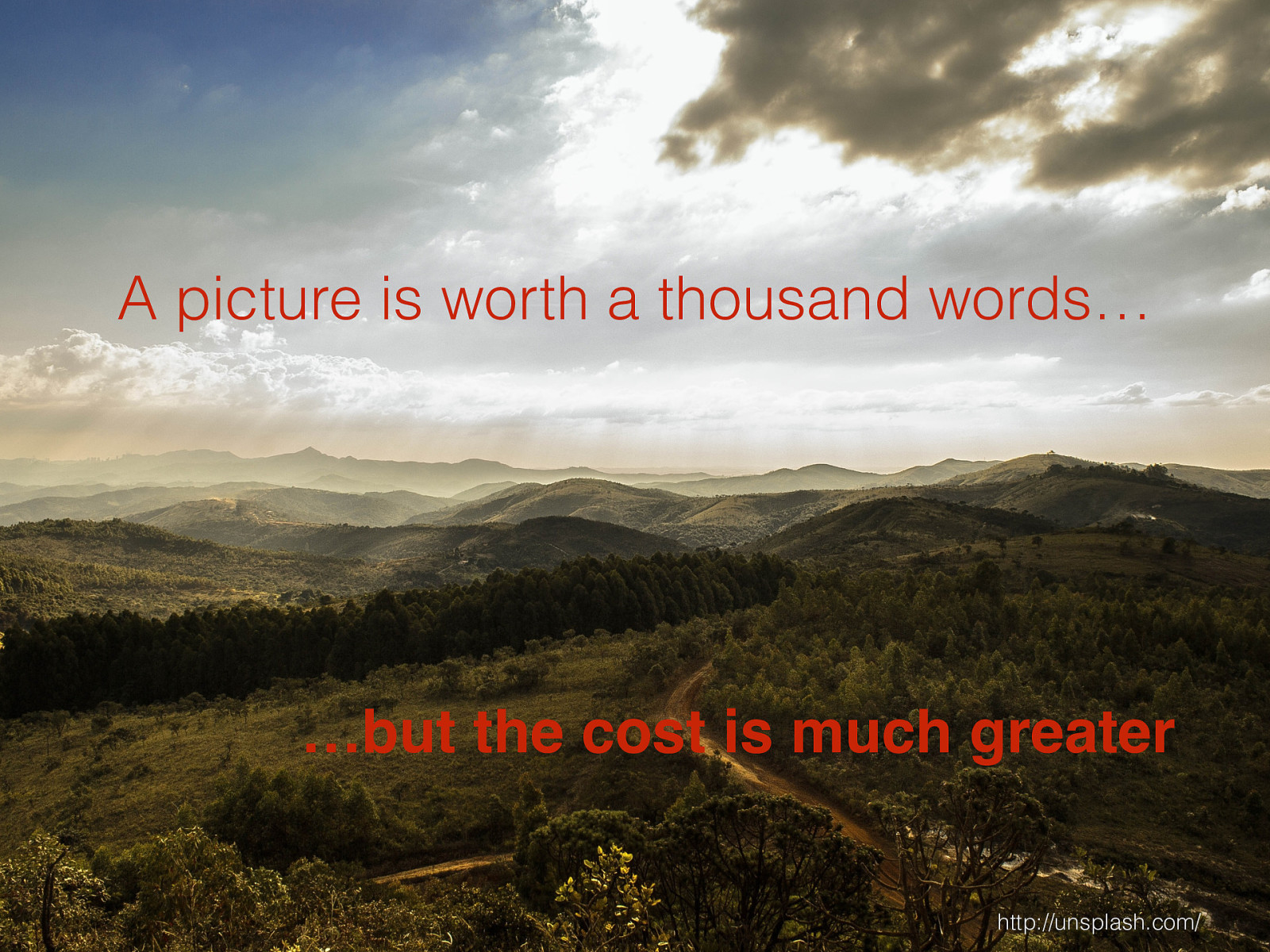
A picture is worth a thousand words… http://unsplash.com/ …but the cost is much greater
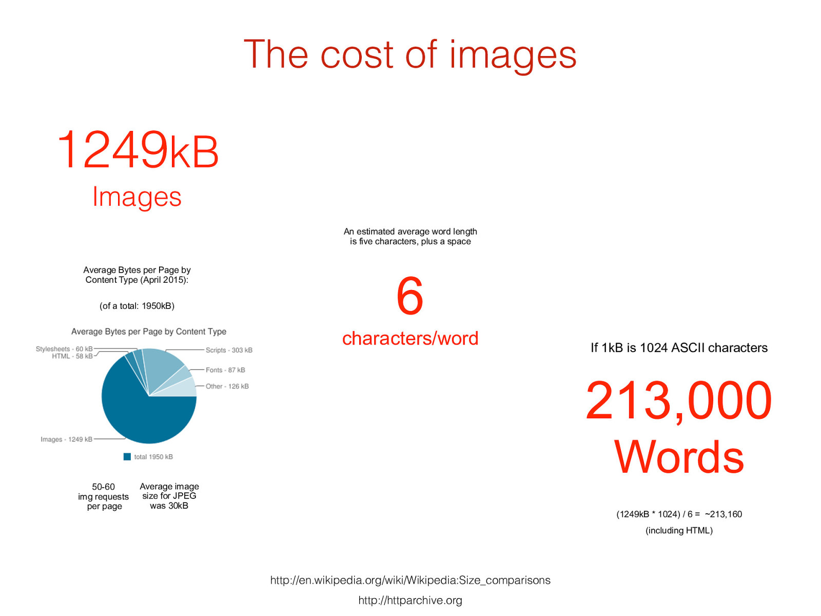
http://httparchive.org http://en.wikipedia.org/wiki/Wikipedia:Size_comparisons 213,000
Words 1249 kB
Images Average Bytes per Page by Content Type (April 2015) : If 1kB is 1024 ASCII character s 6
characters/word An estimated average word length
is five characters
, plus a space
(1249kB * 1024) / 6 = ~213,160
(including HTML)
(of a total: 1950kB)
50-60
img requests
per page
Average image
size for JPEG
was 30kB
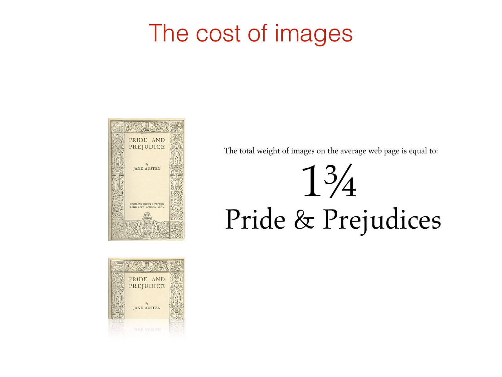
The cost of images
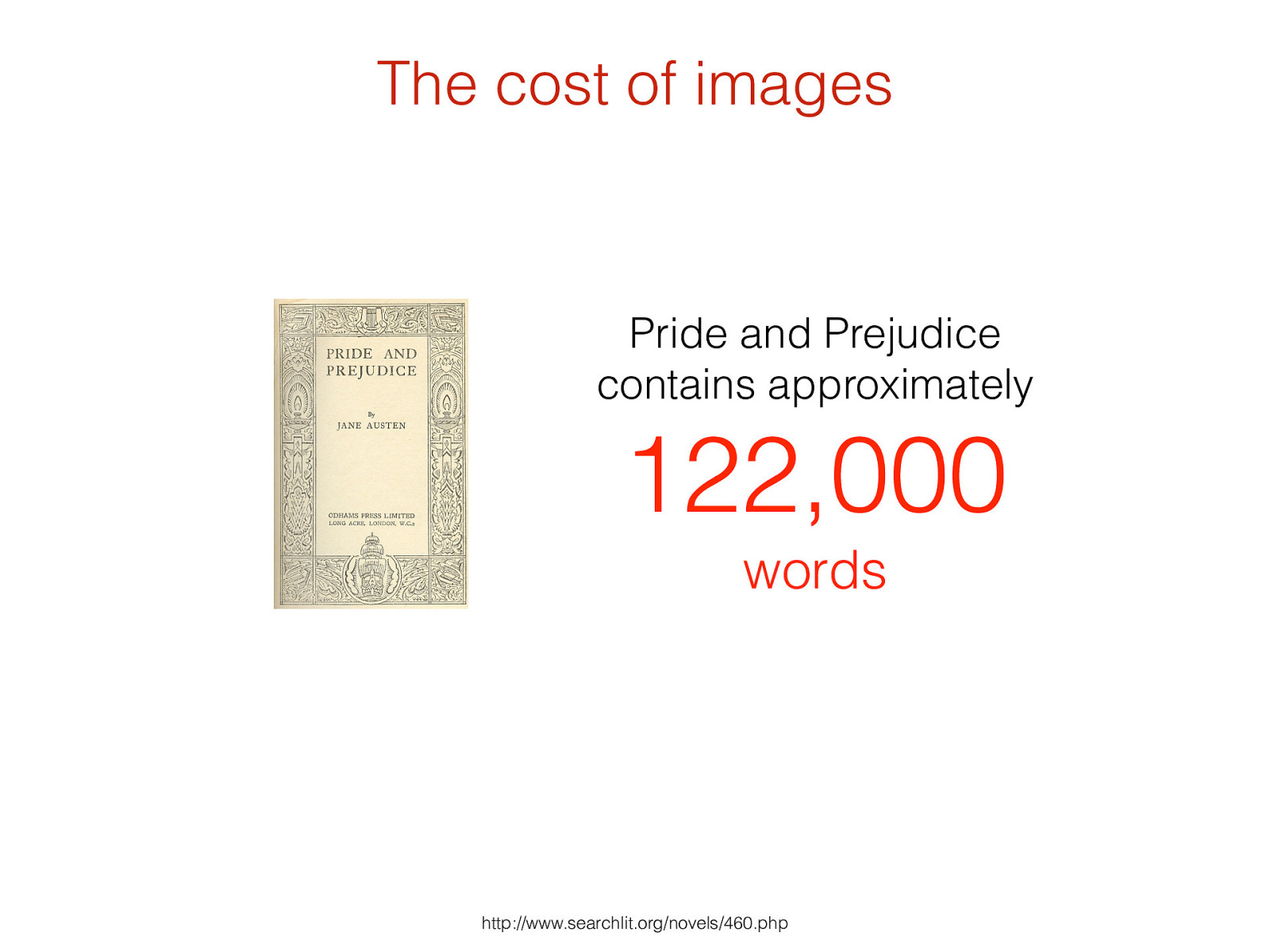
Pride and Prejudice
contains approximately
122,000
words http://www.searchlit.org/novels/460.php The cost of images
The cost of images
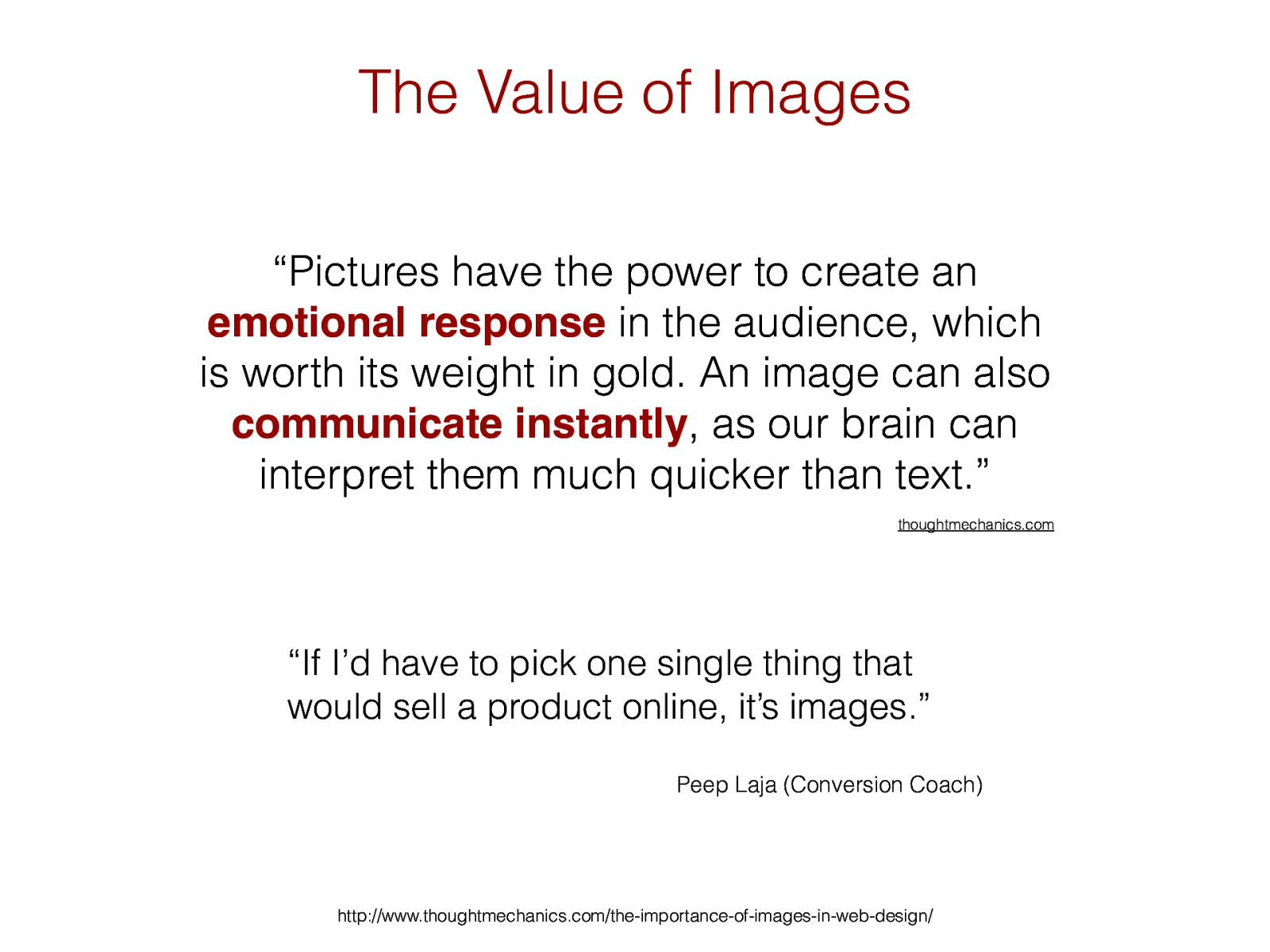
The Value of Images http://www.thoughtmechanics.com/the-importance-of-images-in-web-design/ “Pictures have the power to create an emotional response in the audience, which is worth its weight in gold. An image can also communicate instantly , as our brain can interpret them much quicker than text. ” thoughtmechanics.com “If I’d have to pick one single thing that would sell a product online, it’s images.”
Peep Laja (Conversion Coach)
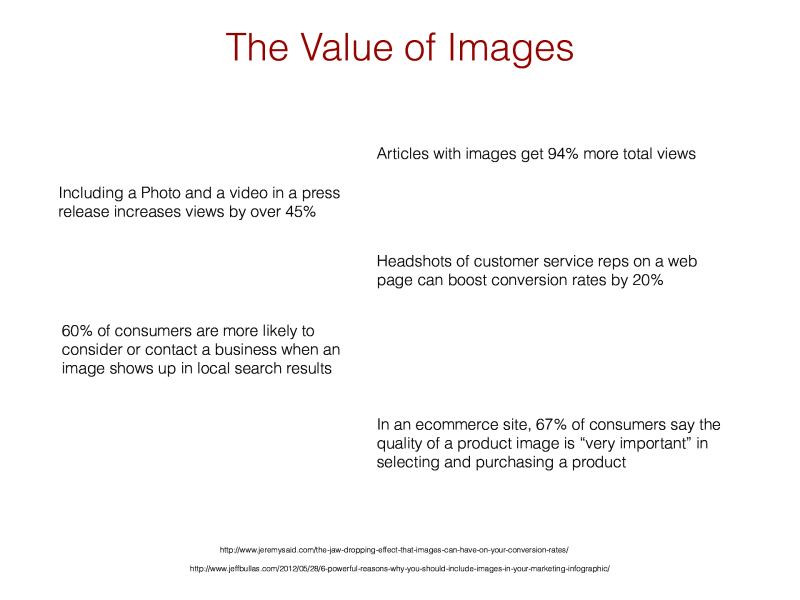
The Value of Images http://www.jeffbullas.com/2012/05/28/6-powerful-reasons-why-you-should-include-images-in-your-marketing-infographic/ In an ecommerce site, 67% of consumers say the quality of a product image is “very important” in selecting and purchasing a product http://www.jeremysaid.com/the-jaw-dropping-effect-that-images-can-have-on-your-conversion-rates/ H eadshots of customer service reps on a web page can boost conversion rates by 20% Articles with images get 94% more total views Including a Photo and a video in a press release increases views by over 45% 60% of consumers are more likely to consider or contact a business when an image shows up in local search results
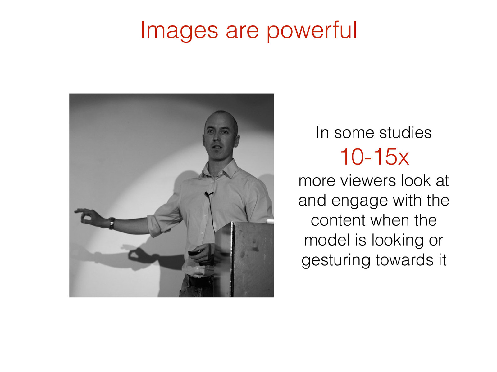
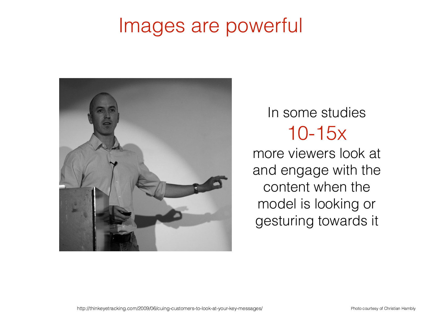
In some studies 10-15x
more viewers look at and engage with the content when the model is looking or gesturing towards it Images are powerful
http://thinkeyetracking.com/2009/06/cuing-customers-to-look-at-your-key-messages/ Photo courtesy of Christian Hambly In some studies 10-15x
more viewers look at and engage with the content when the model is looking or gesturing towards it Images are powerful
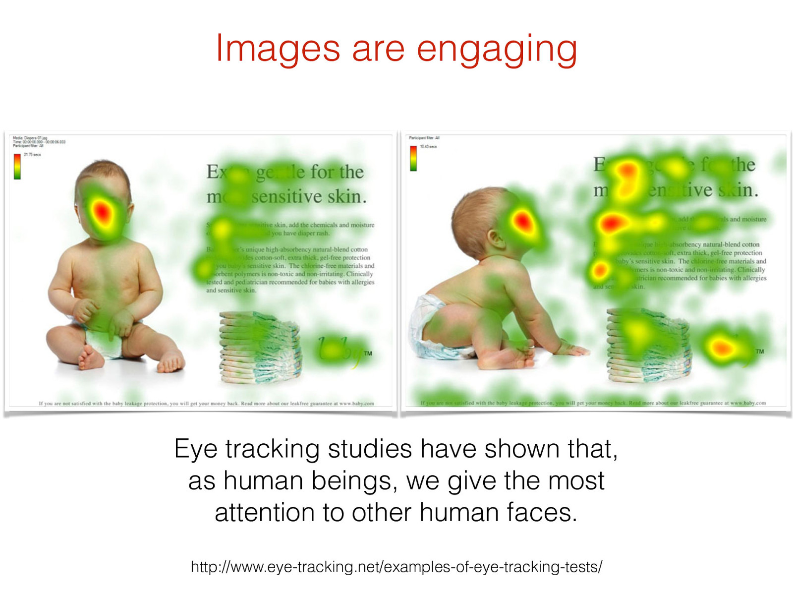
Images are engaging http://www.eye-tracking.net/examples-of-eye-tracking-tests/ Eye tracking studies have shown that, as human beings, we give the most attention to other human faces.
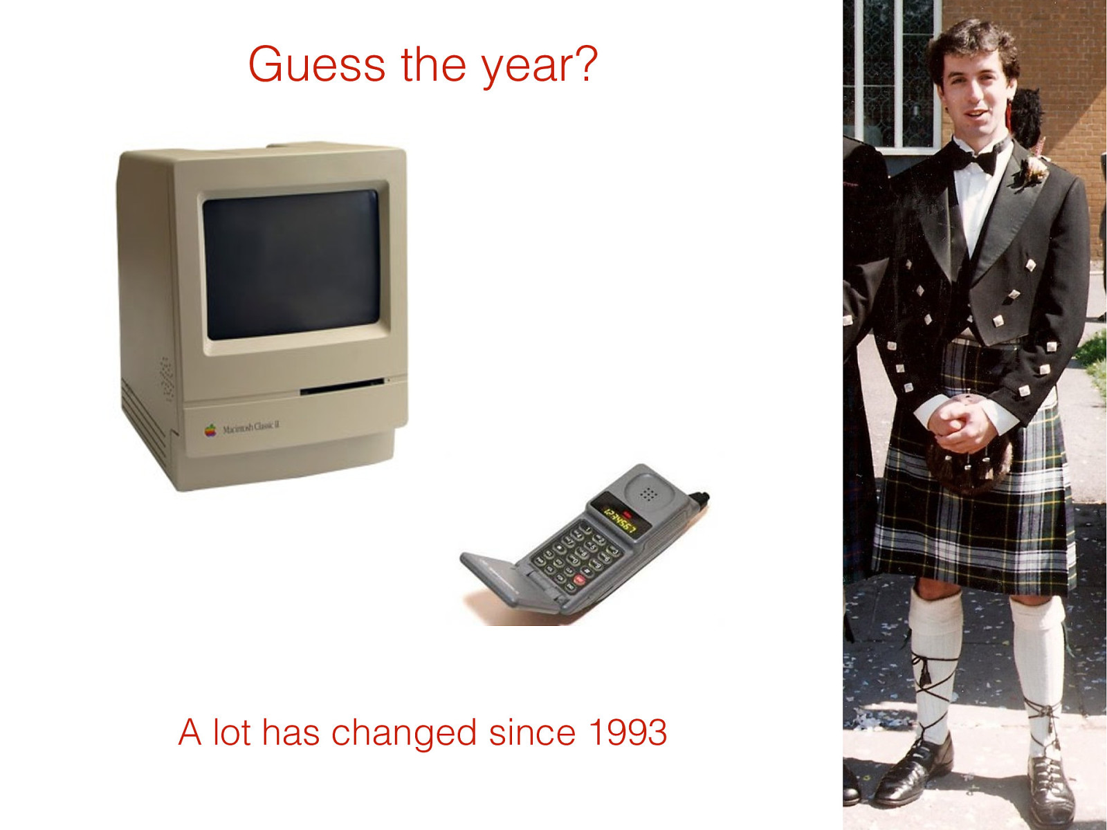
A lot has changed since 1993 Guess the year?
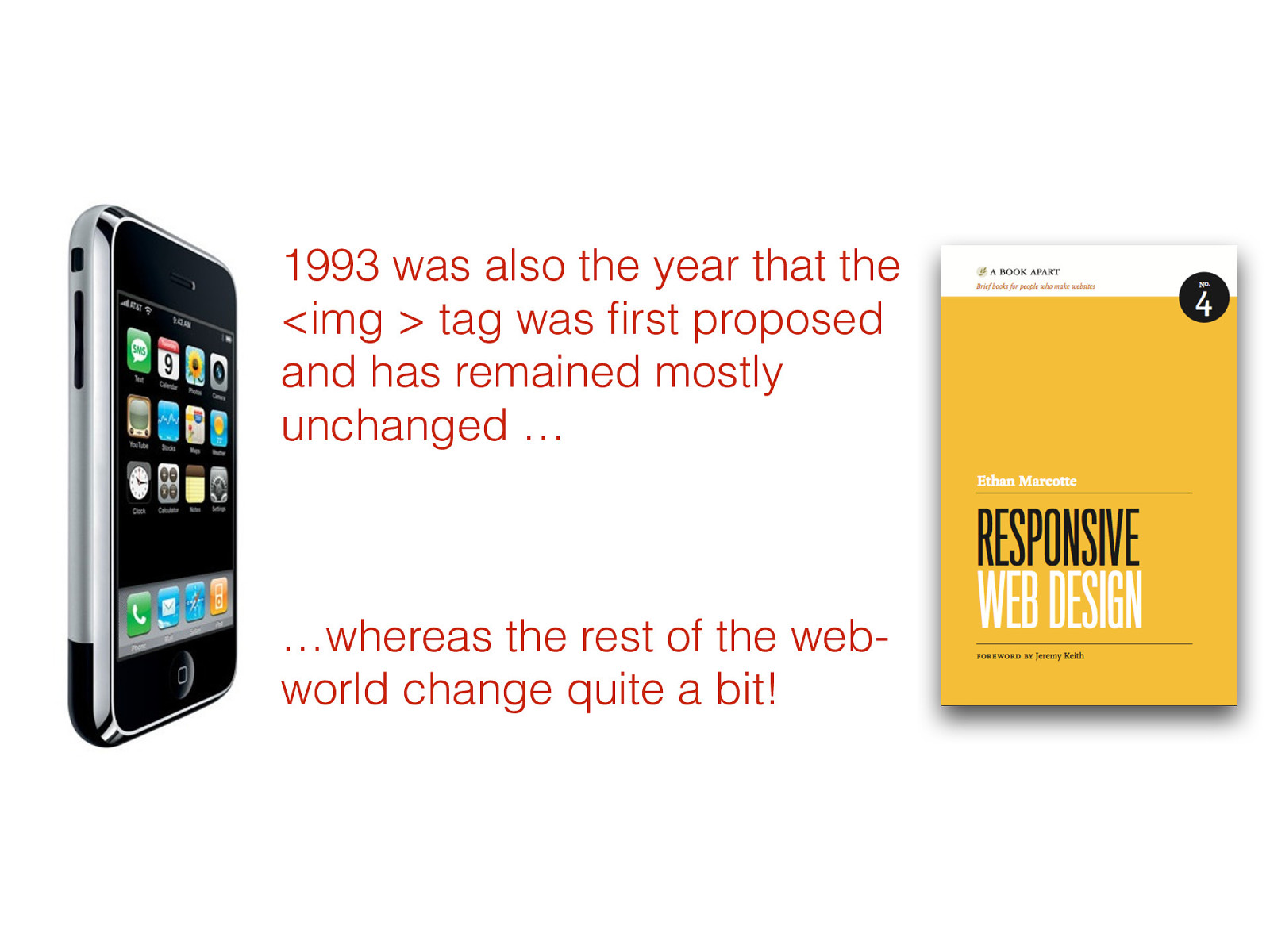
1993 was also the year that the <img > tag was first proposed and has remained mostly unchanged … …whereas the rest of the web- world change quite a bit!
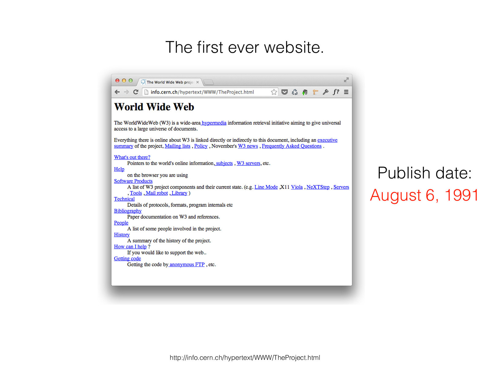
http://info.cern.ch/hypertext/WWW/TheProject.html The first ever website . August 6, 1991 Publish date:
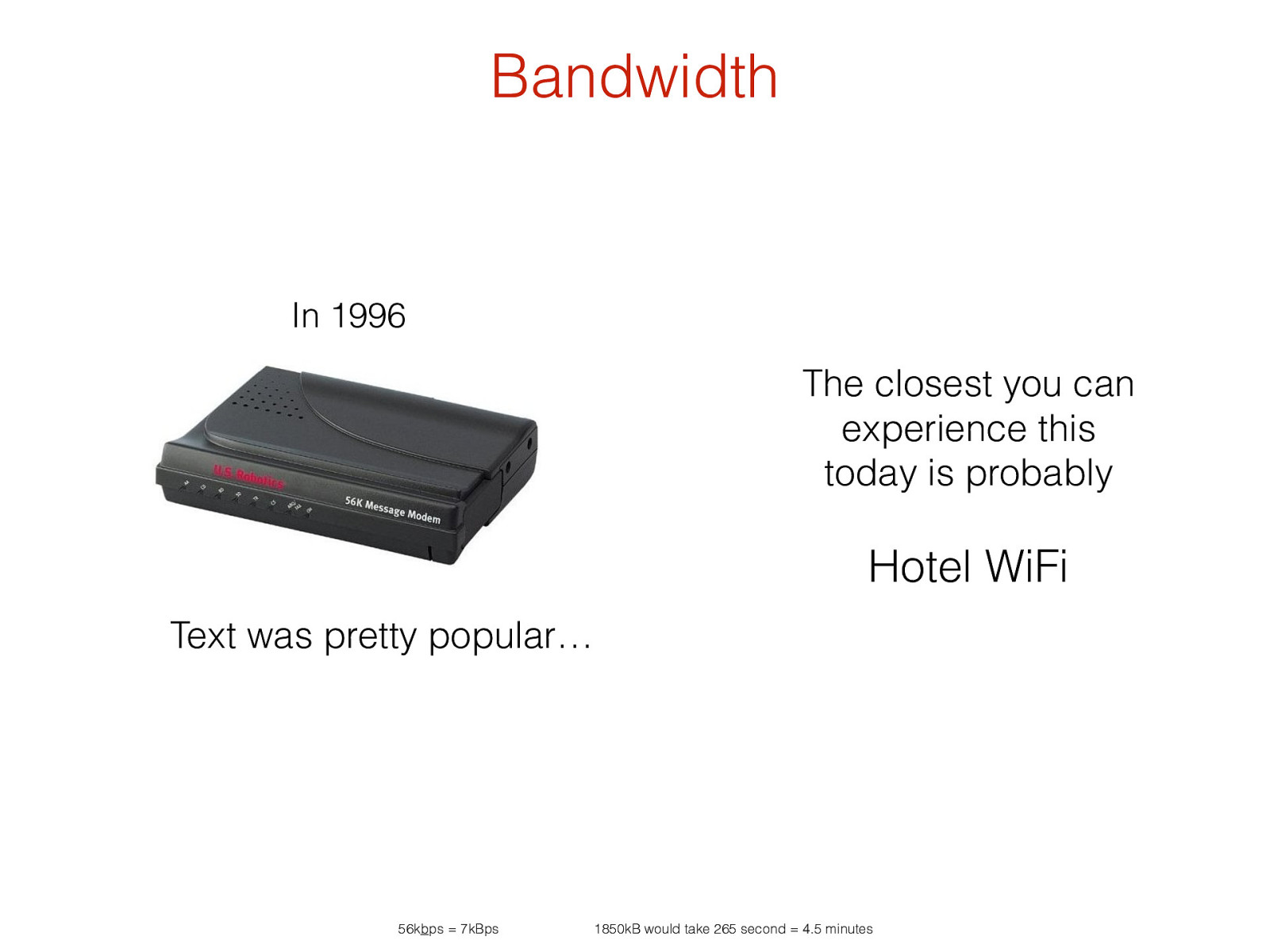
In 1996 The closest you can experience this today is probably Hotel WiFi Text was pretty popular… 56k b ps = 7kBps 1850kB would take 265 second = 4.5 minutes Bandwidth
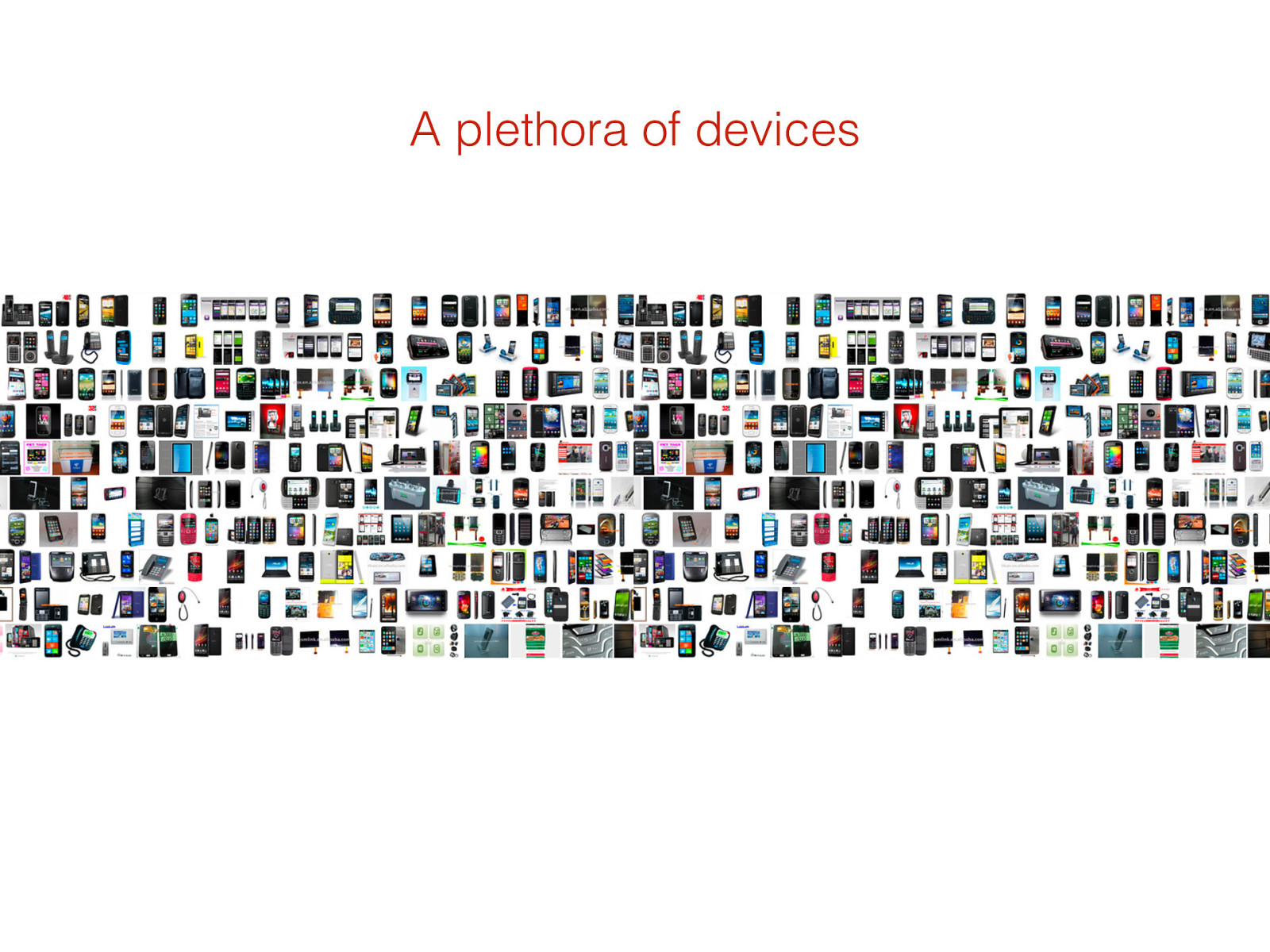
A plethora of devices
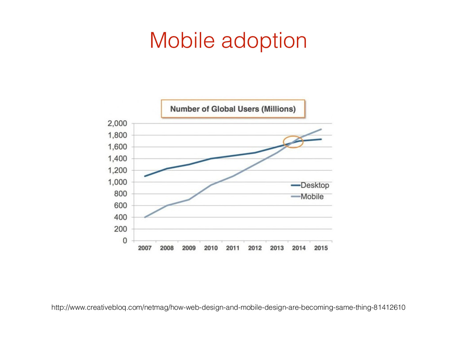
Mobile adoption http://www.creativebloq.com/netmag/how-web-design-and-mobile-design-are-becoming-same-thing-81412610
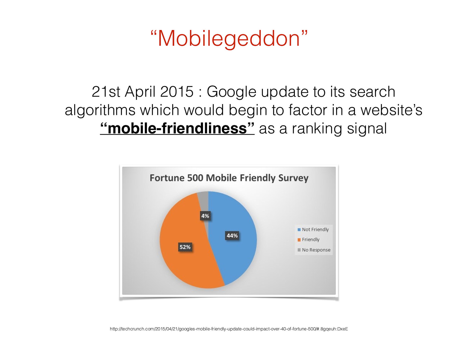
“Mobilegeddon ” 21st April 2015 : Google update to its search algorithms which would begin to factor in a website’s “mobile-friendliness” as a ranking signal
http://techcrunch.com/2015/04/21/googles-mobile-friendly-update-could-impact-over-40-of-fortune-500/#.8gqeuh:DxeE
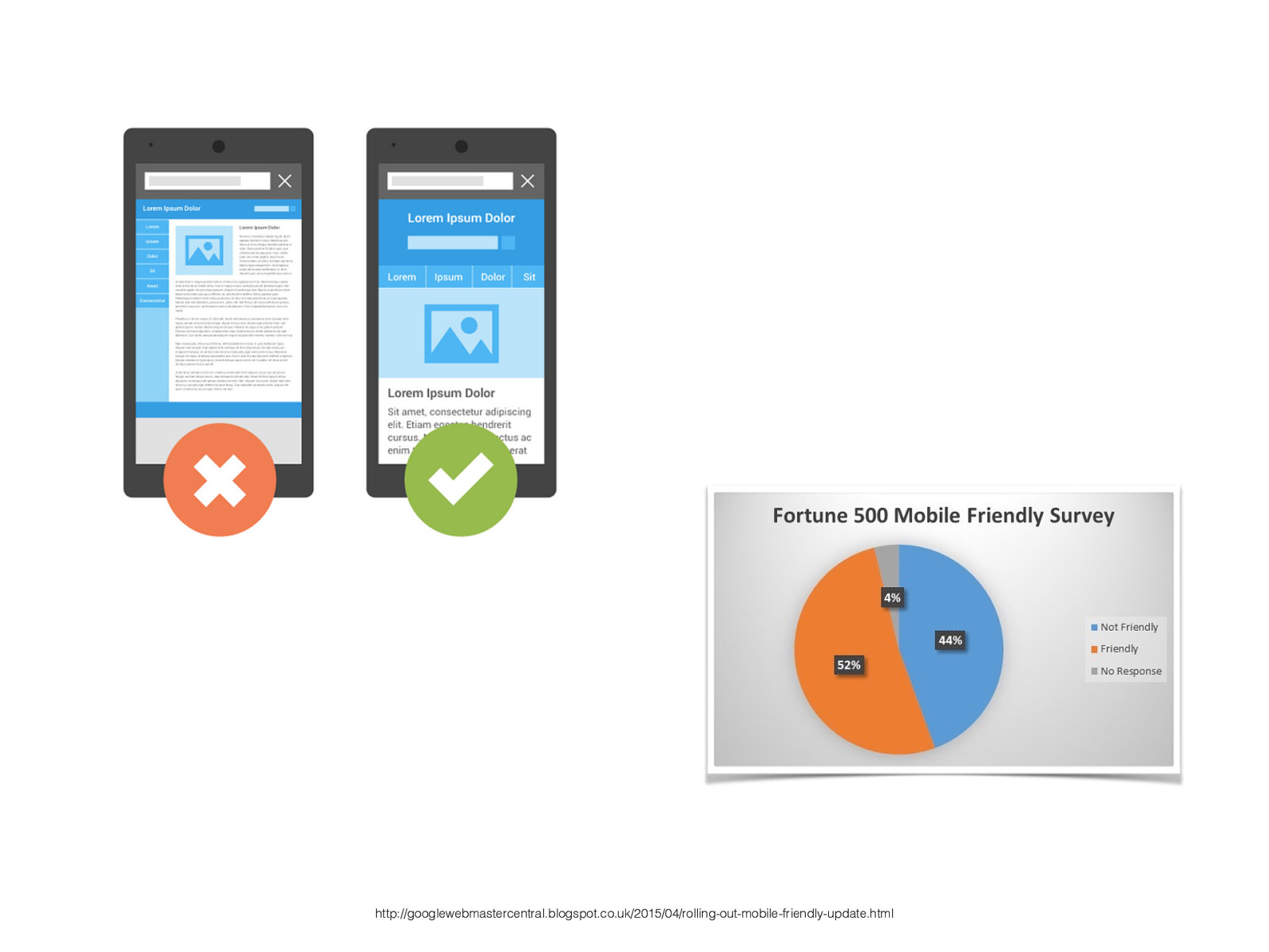
http://googlewebmastercentral.blogspot.co.uk/2015/04/rolling-out-mobile-friendly-update.html
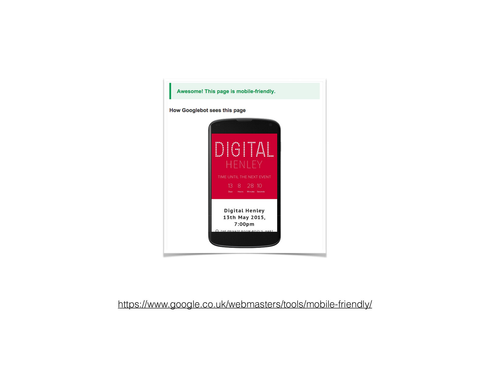
https://www.google.co.uk/webmasters/tools/mobile-friendly/
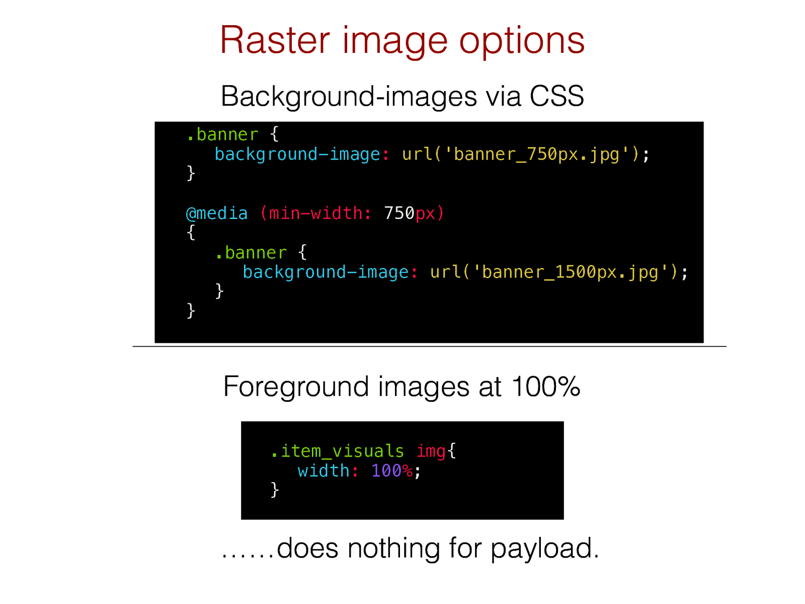
Foreground images at 100% Raster image options Background-images via CSS .item_visuals
img {
width :
100 % ;
} ……does nothing for payload.
.banner {
background-image :
url('banner_750px.jpg') ; }
@media
(min-width: 750 px)
{
.banner {
background-image :
url('banner_1500px.jpg') ; } }
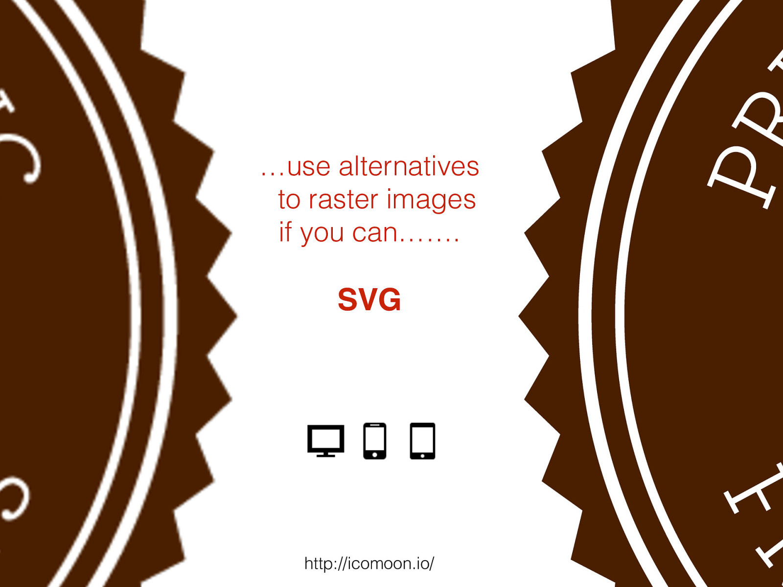
…use alternatives
to raster images
if you can…….
SVG
http://icomoon.io/
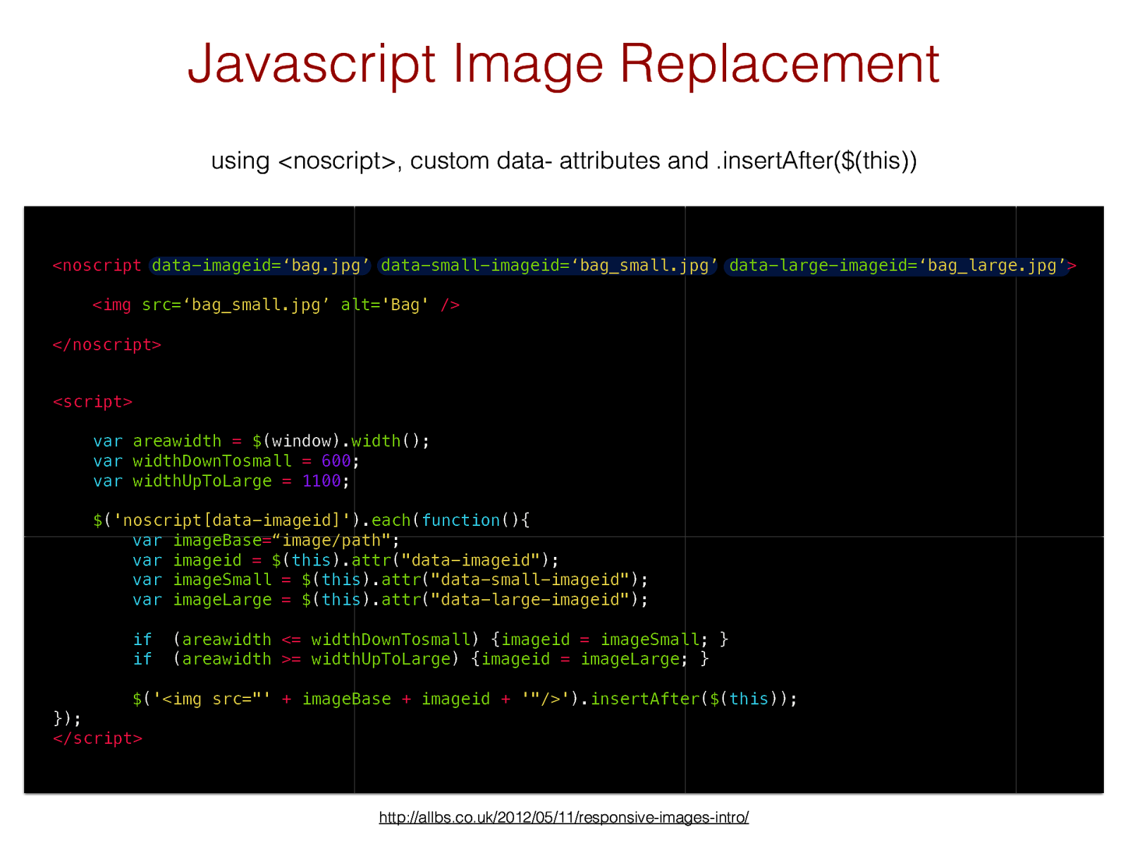
using <noscript>, custom data- attributes and .insertAfter($(this)) http://allbs.co.uk/2012/05/11/responsive-images-intro/ Javascript Image Replacement
<script> var areawidth = $ (window). width (); var widthDownTosmall = 600 ; var widthUpToLarge = 1100 ; $ ( 'noscript[data-imageid]' ). each ( function (){ var imageBase = “image/path" ; var imageid = $ ( this ). attr ( "data-imageid" ); var imageSmall = $ ( this ). attr ( "data-small-imageid" ); var imageLarge = $ ( this ). attr ( "data-large-imageid" ); if ( areawidth <= widthDownTosmall ) { imageid = imageSmall ; } if ( areawidth >= widthUpToLarge ) { imageid = imageLarge ; } $ ( '<img src="' + imageBase + imageid + '"/>' ). insertAfter ( $ ( this )); }); </script><noscript
data-imageid= ‘bag.jpg’
data-small-imageid= ‘bag_small.jpg’ data-large-imageid= ‘bag_large.jpg’
<img
src= ‘bag_small.jpg’
alt= 'Bag'
/>
</noscript>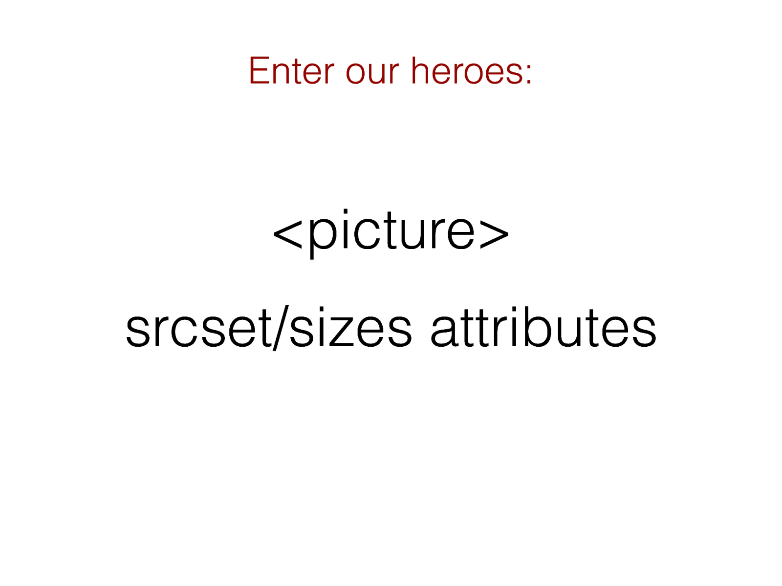
http://responsiveimages.org/ Responsive Images Community Group
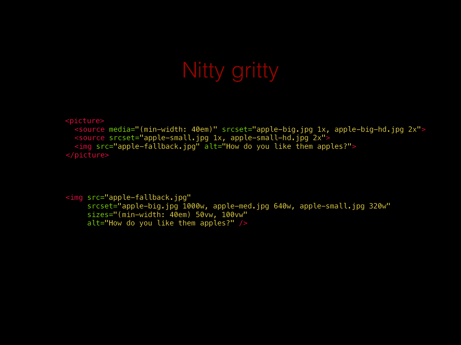
Nitty gritty
<picture> <sourcemedia= "(min-width: 40em)"
srcset= "apple-big.jpg 1x, apple-big-hd.jpg 2x"
<sourcesrcset= "apple-small.jpg 1x, apple-small-hd.jpg 2x"
<img
src= "apple-fallback.jpg"
alt= "How do you like them apples?"
</picture><img
src= "apple-fallback.jpg"
srcset= "apple-big.jpg 1000w, apple-med.jpg 640w, apple-small.jpg 320w"
sizes= "(min-width: 40em) 50vw, 100vw"
alt= "How do you like them apples?"
/>
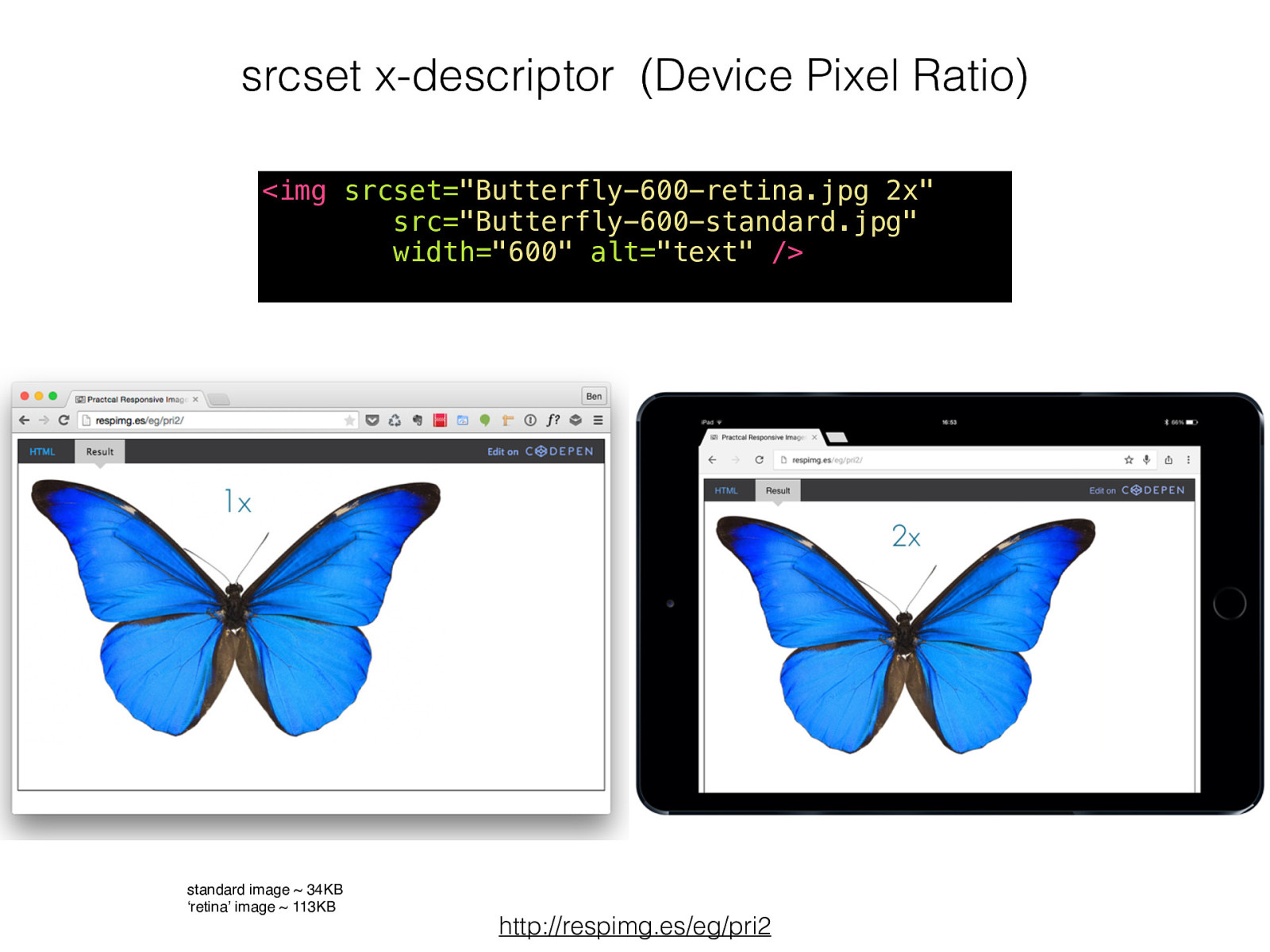
srcset x-descriptor (Device Pixel Ratio) http://respimg.es/eg/ pri2 <img
srcset= "Butterfly-600-retina.jpg 2x"
src= "Butterfly-600-standard.jpg"
width= "600"
alt= "text"
/>
standard image ~ 34KB ‘retina’ image ~ 113KB
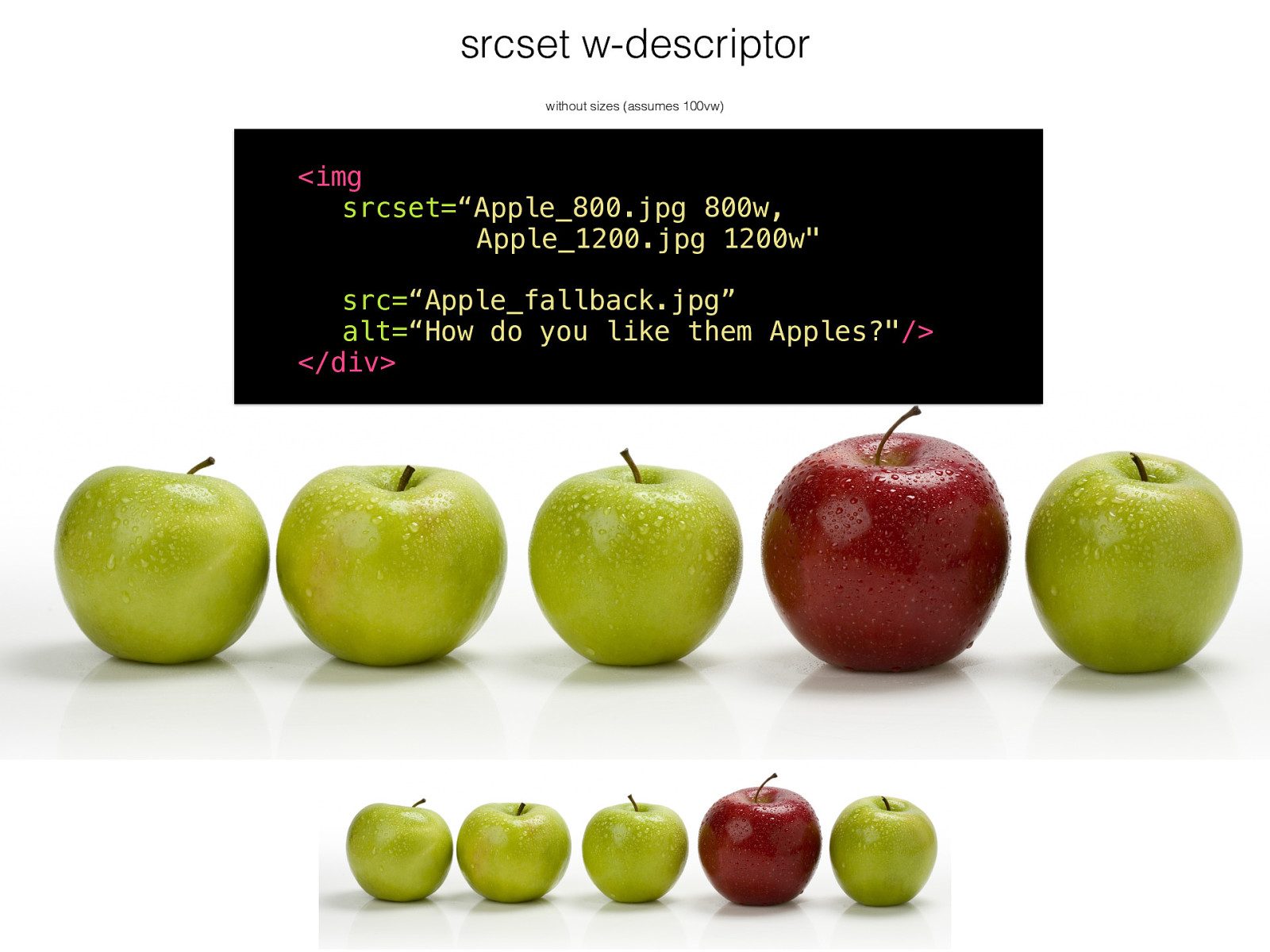
srcset w-descriptor without sizes (assumes 100vw)
<img
srcset= “Apple_800 .jpg 800w, Apple_1200.jpg 1200w"
src= “Apple_fallback.jpg”
alt= “How do you like them Apples?" />
</div>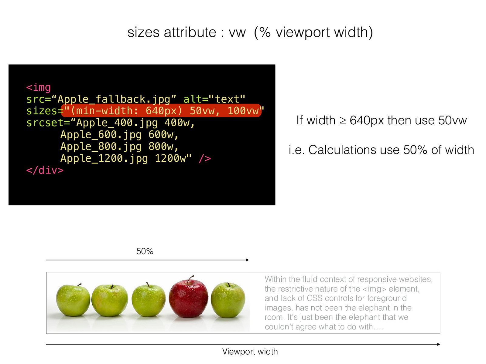
sizes attribute : vw (% viewport width)
<img
src= “Apple_fallback.jpg”
alt= "text"
sizes= "(min-width: 640px) 50vw, 100vw"
srcset= “Apple_400 .jpg 400w, Apple_600 .jpg 600w, Apple_800 .jpg 800w, Apple_1200.jpg 1200w"
/>
</div>Viewport width If width ≥ 640px then use 50vw i.e. Calculations use 50% of width 50% Within the fluid context of responsive websites, the restrictive nature of the <img> element, and lack of CSS controls for foreground images, has not been the elephant in the room. It's just been the elephant that we couldn't agree what to do with ….
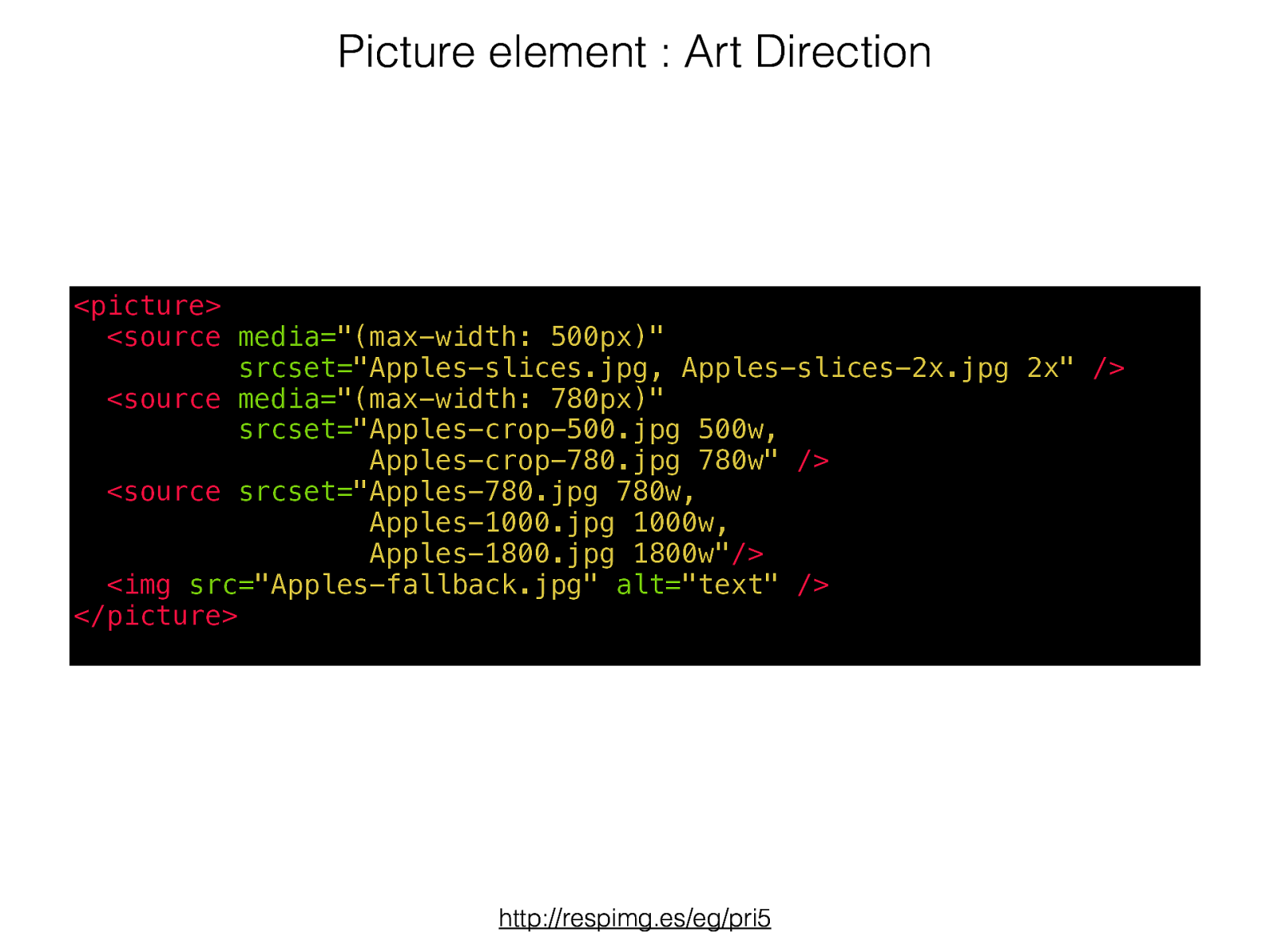
Picture element : Art Direction http://respimg.es/eg/pri5 <picture>
<sourcemedia= "(max-width: 500px)"
srcset= "Apples-slices.jpg, Apples-slices-2x.jpg 2x"
/>
<sourcemedia= "(max-width: 780px)"
srcset= "Apples-crop-500.jpg 500w, Apples-crop-780.jpg 780w"
/>
<sourcesrcset= "Apples-780.jpg 780w,
   Apples-1000.jpg 1000w,
              Apples-1800.jpg 1800w"
/>
<img
src= "Apples-fallback.jpg" alt= "text"
/>
</picture>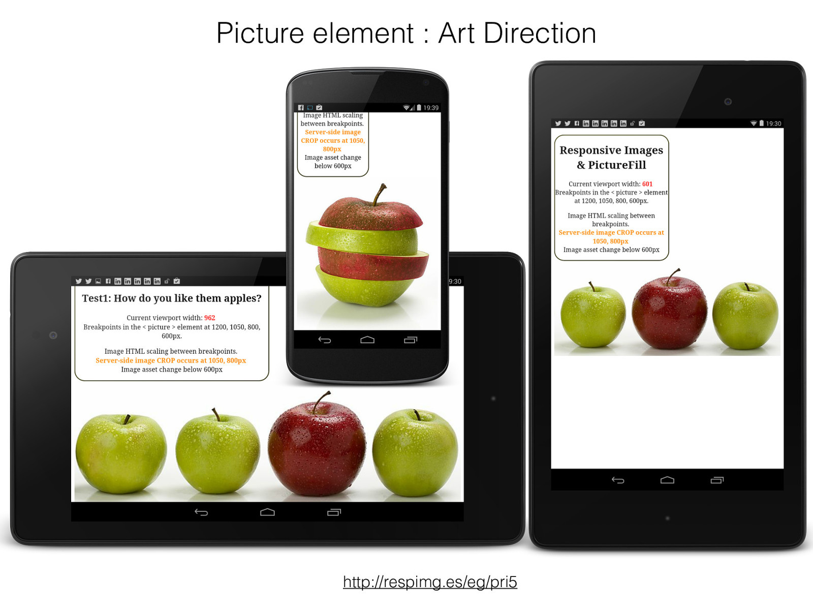
Picture element : Art Direction http://respimg.es/eg/pri5
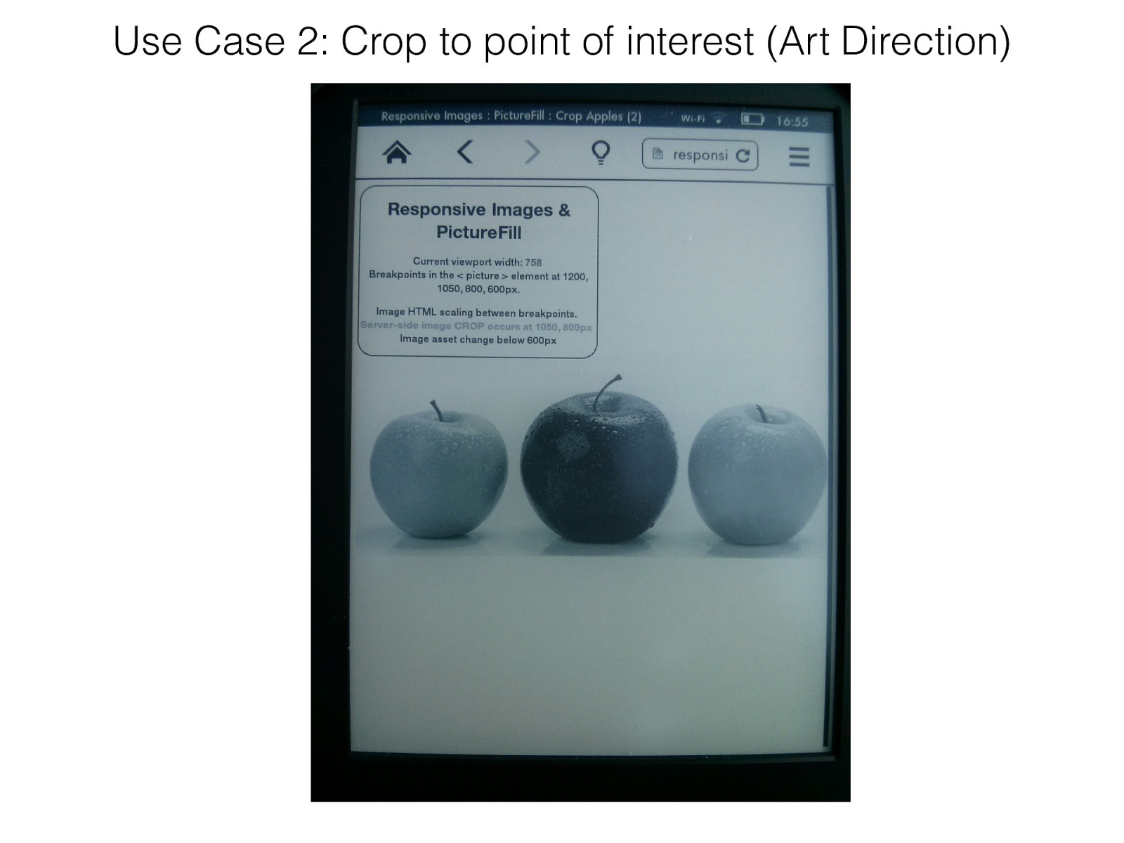
Use Case 2: Crop to point of interest (Art Direction)
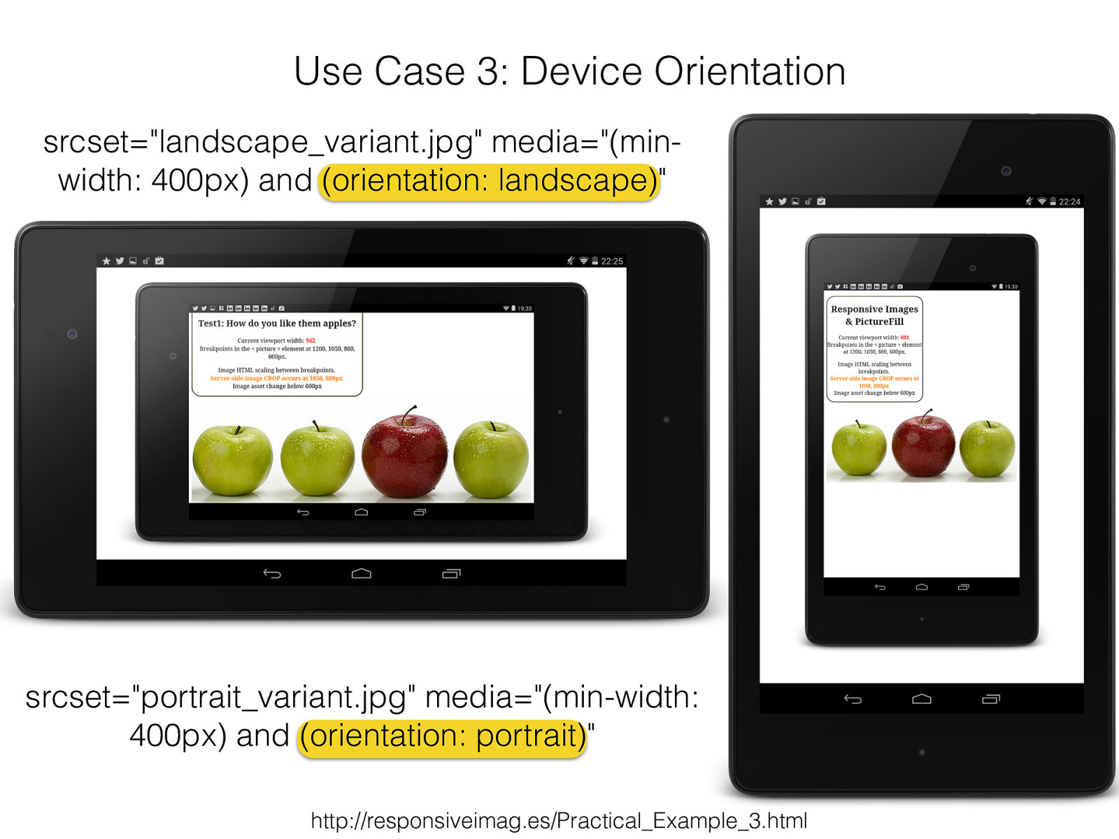
Use Case 3: Device Orientation srcset="landscape_variant.jpg" media="(min- width: 400px) and (orientation: landscape)" srcset="portrait_variant.jpg" media="(min-width: 400px) and (orientation: portrait )" http://responsiveimag.es/Practical_Example_3.html
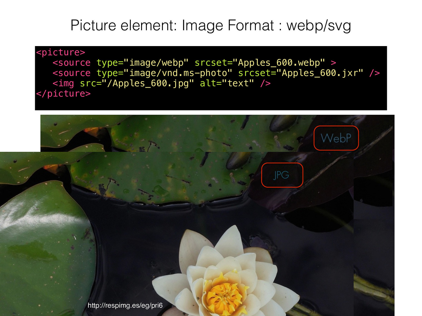
Picture element: Image Format : webp/svg <picture>
<sourcetype= "image/webp" srcset= "Apples_600.webp"
<sourcetype= "image/vnd.ms-photo"
srcset= "Apples_600.jxr"
/>
<img
src= "/Apples_600.jpg"
alt= "text"
/>
</picture> http://respimg.es/eg/pri6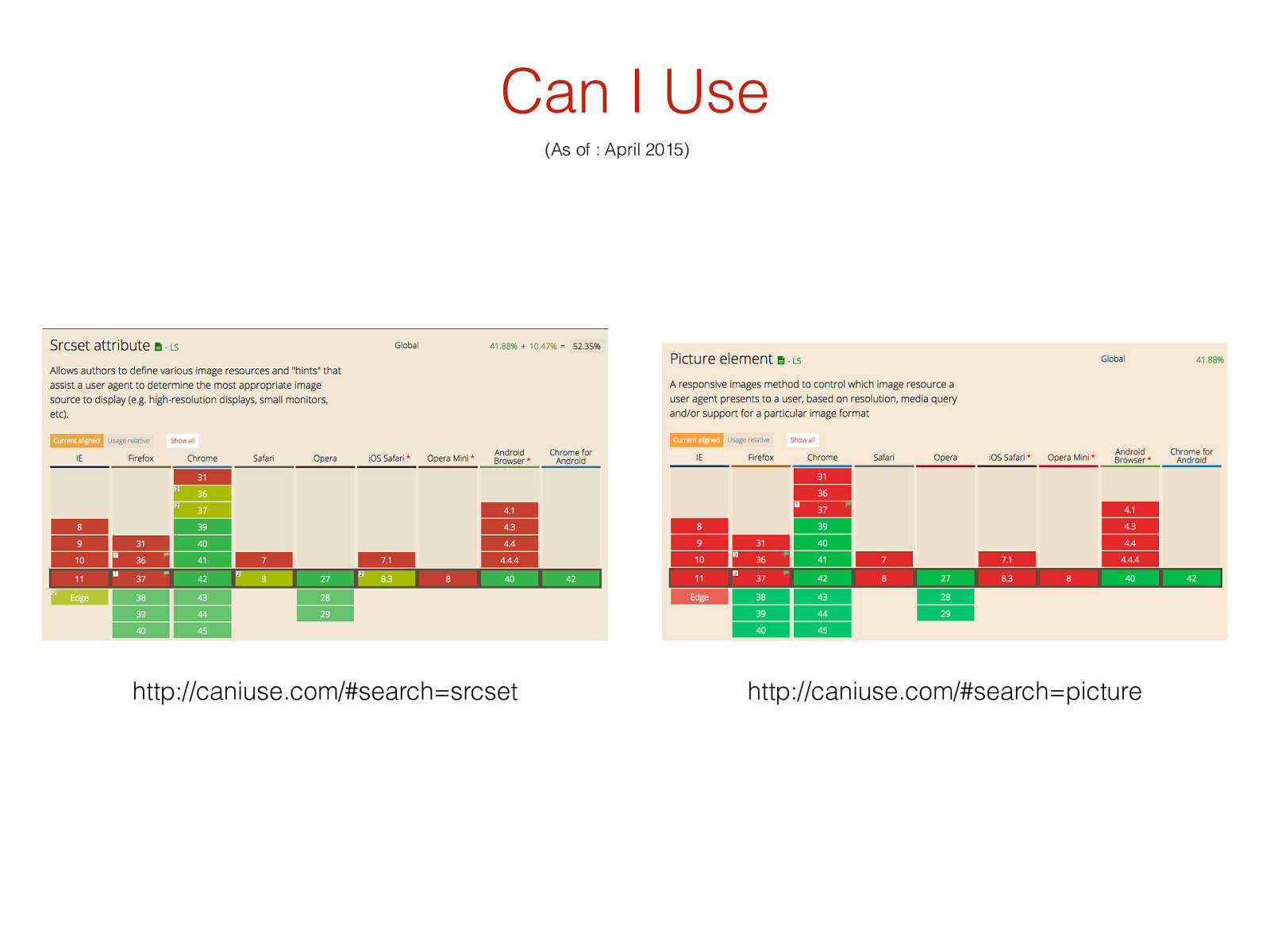
(As of : April 2015) Can I Use http://caniuse.com/#search=srcset http://caniuse.com/#search=picture
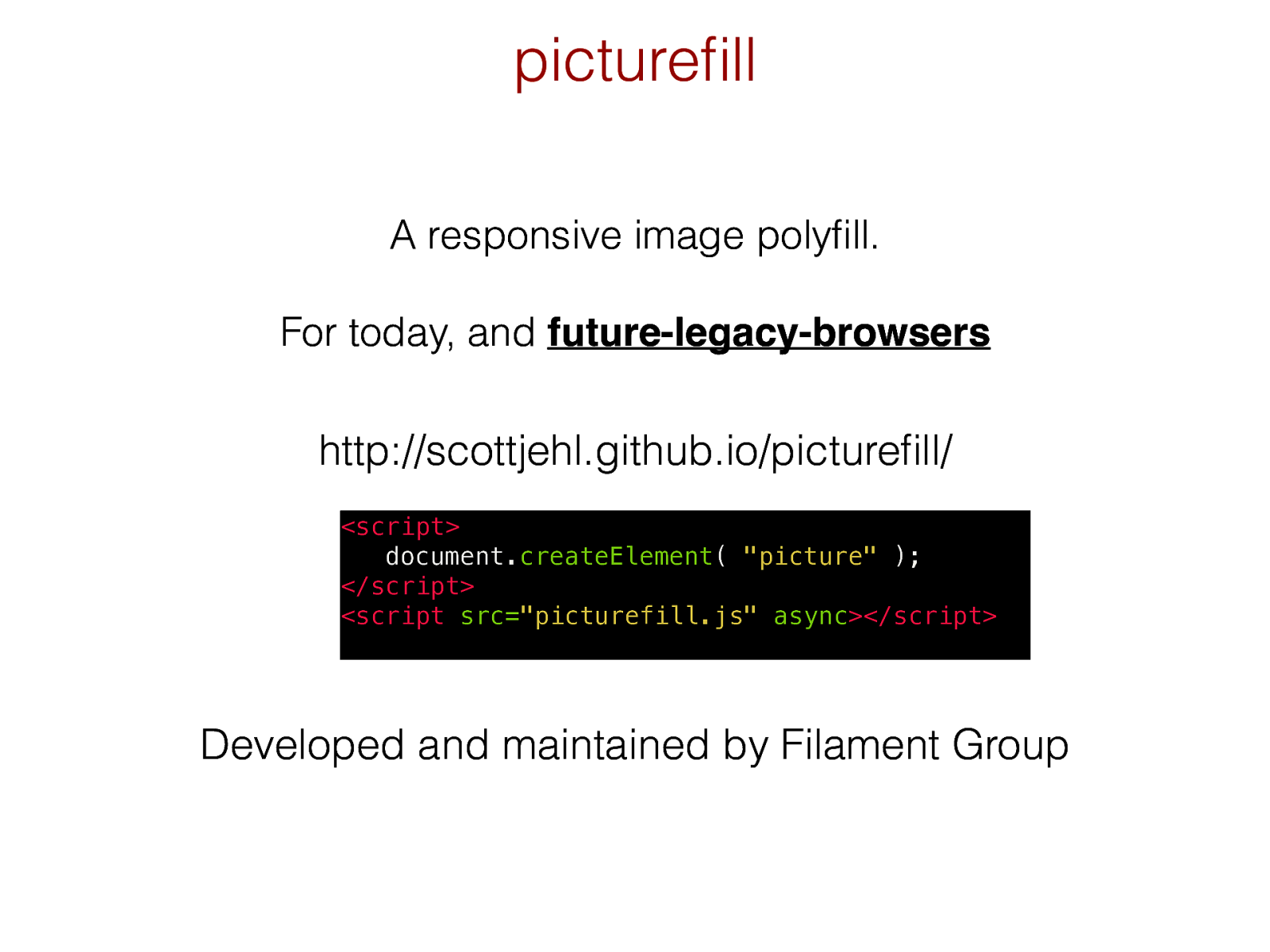
A responsive image polyfill . For today, and future-legacy-browsers picturefill http://scottjehl.github.io/picturefill/ D eveloped and maintained by Filament Group
<script> document. createElement ( "picture" ); </script> <script src= "picturefill.js" async ></script>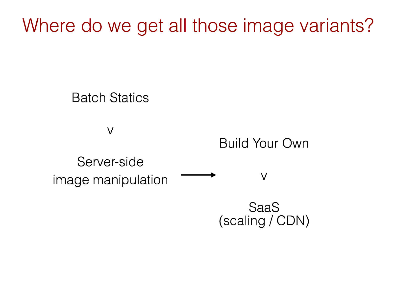
(scaling / CDN)
Where do we get all those image variants?
Batch Statics
v
Server-side
image manipulation
Build Your Own
v
SaaS
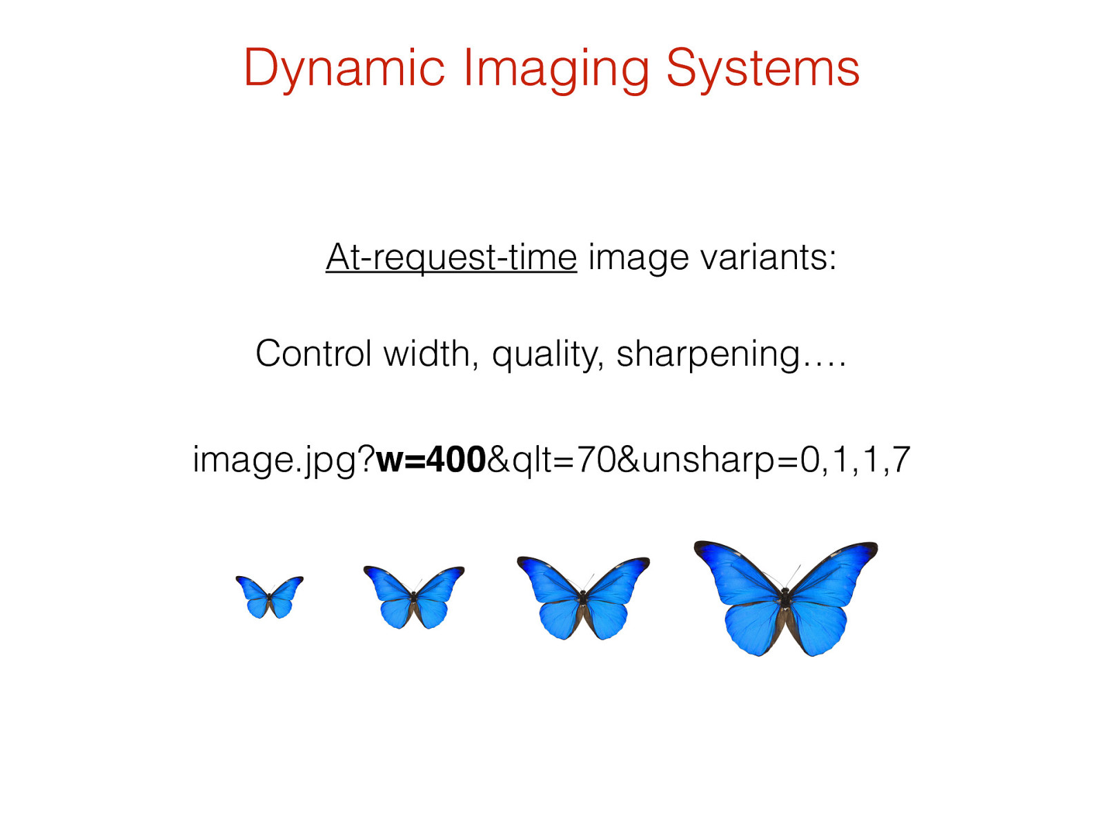
image.jpg? w=400 &qlt=70&unsharp=0,1,1,7 At-request-time image variants: Control width, quality, sharpening…. Dynamic Imaging Systems
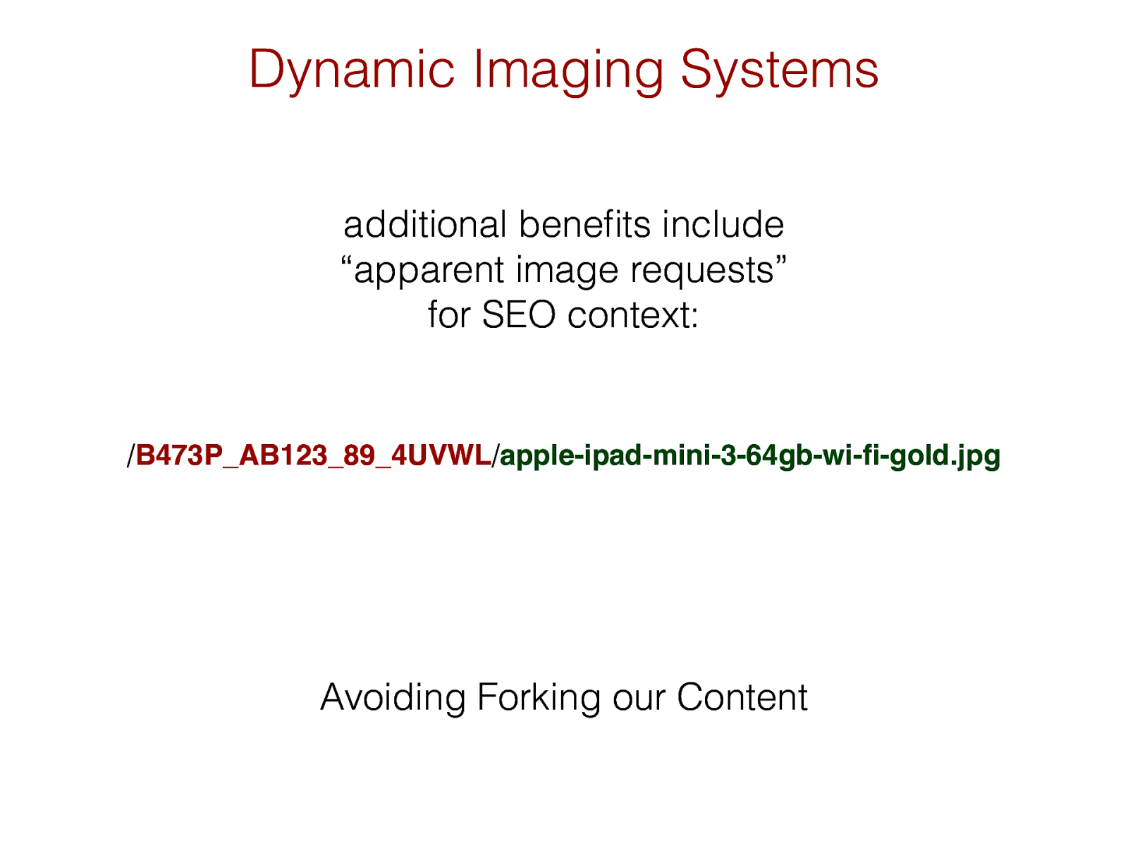
additional benefits include “apparent image requests” for SEO context: Dynamic Imaging Systems / B473P_AB123_89_4UVWL / apple-ipad-mini-3-64gb-wi-fi-gold.jpg Avoiding Forking our Content
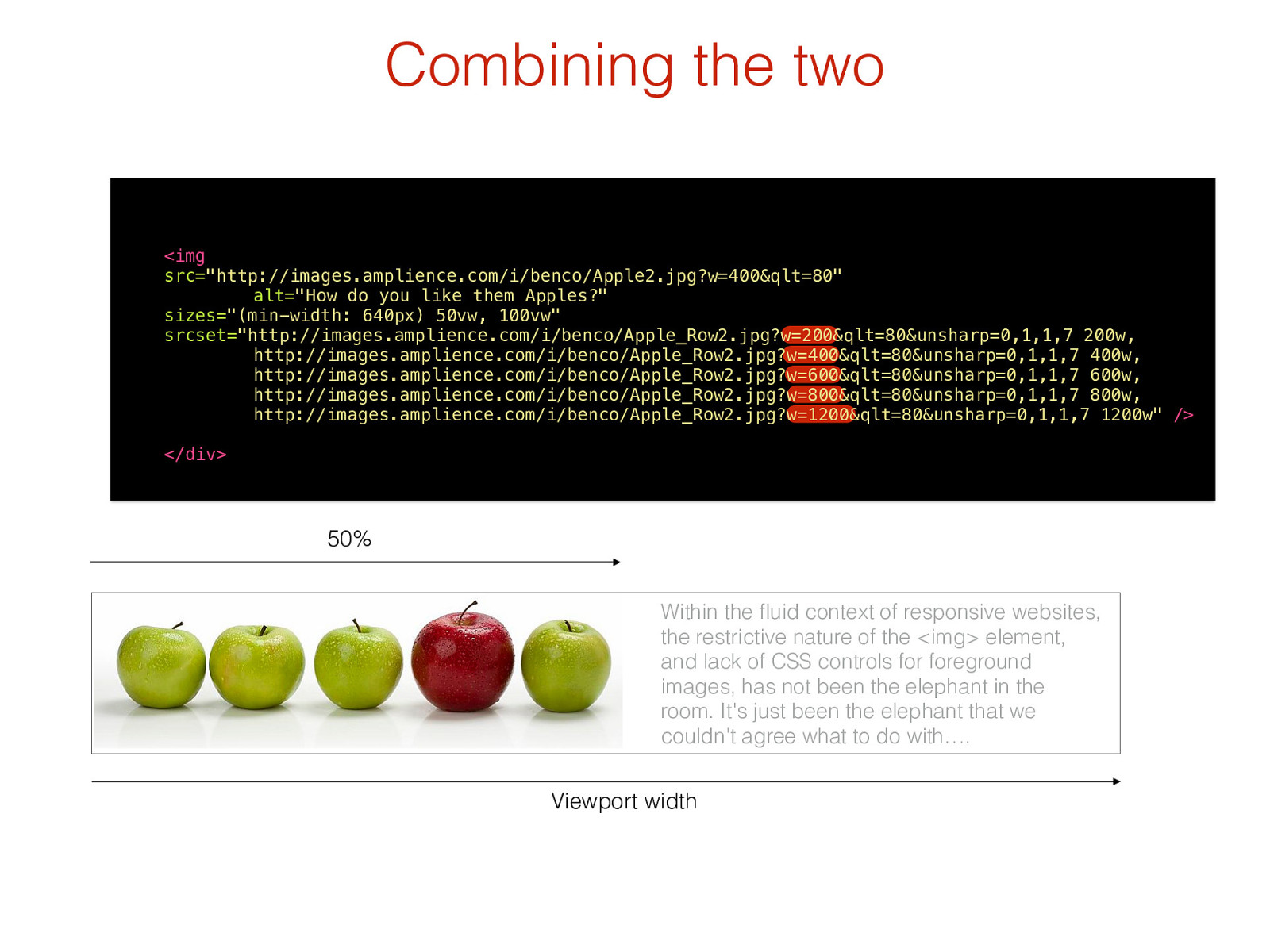
Viewport width 50% Within the fluid context of responsive websites, the restrictive nature of the <img> element, and lack of CSS controls for foreground images, has not been the elephant in the room. It's just been the elephant that we couldn't agree what to do with …. Combining the two
<img
src= "http://images.amplience.com/i/benco/Apple2.jpg?w=400&qlt=80"
alt= "How do you like them Apples?"
sizes= "(min-width: 640px) 50vw, 100vw"
srcset= "http://images.amplience.com/i/benco/Apple_Row2.jpg?w=200&qlt=80&unsharp=0,1,1,7 200w, http://images.amplience.com/i/benco/Apple_Row2.jpg?w=400&qlt=80&unsharp=0,1,1,7 400w, http://images.amplience.com/i/benco/Apple_Row2.jpg?w=600&qlt=80&unsharp=0,1,1,7 600w, http://images.amplience.com/i/benco/Apple_Row2.jpg?w=800&qlt=80&unsharp=0,1,1,7 800w, http://images.amplience.com/i/benco/Apple_Row2.jpg?w=1200&qlt=80&unsharp=0,1,1,7 1200w"
/>
</div>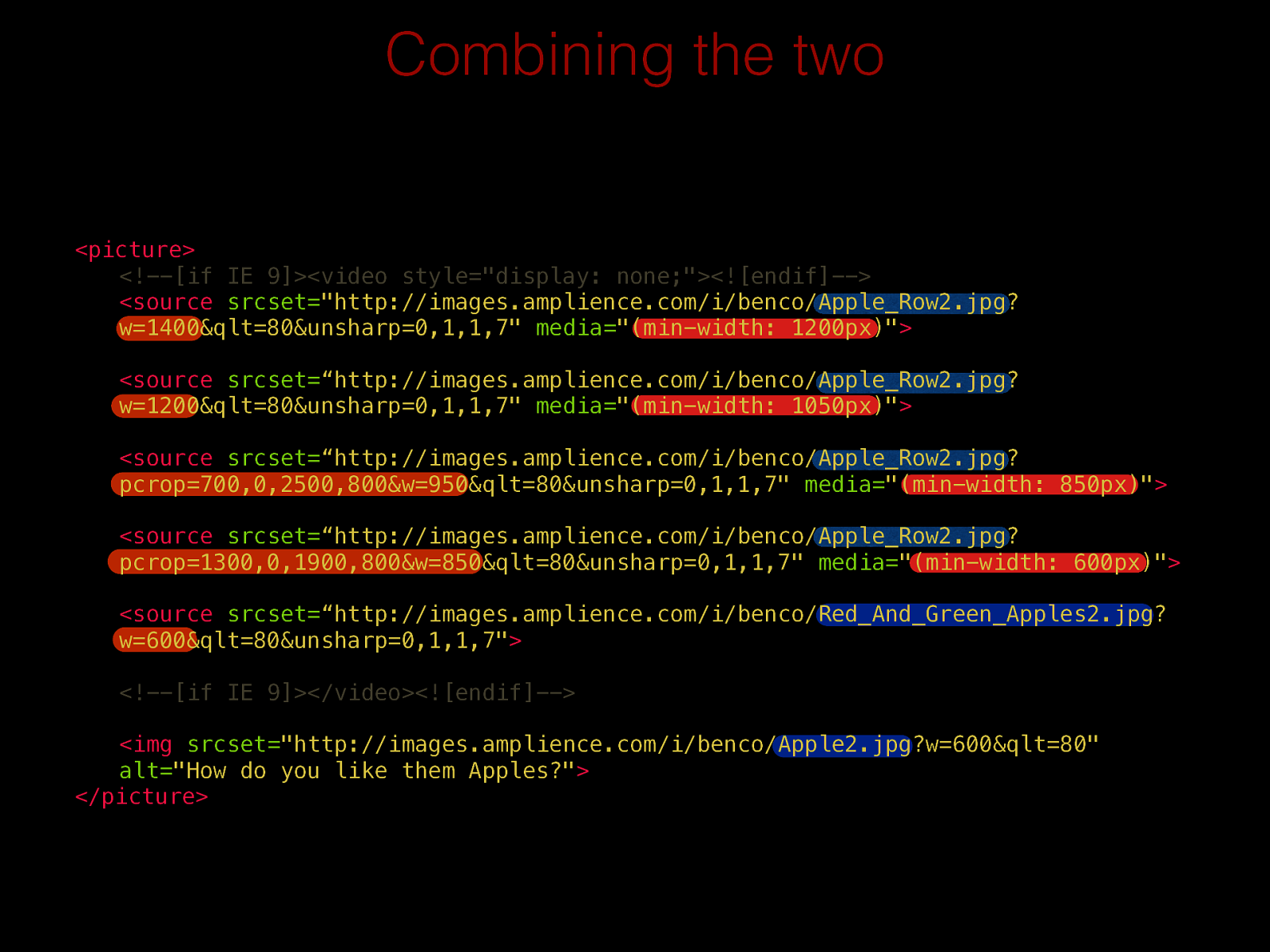
Combining the two <picture>
<!--[if IE 9]><video style="display: none;"><![endif]--> <sourcesrcset= "http://images.amplience.com/i/benco/Apple_Row2.jpg?
w=1400&qlt=80&unsharp=0,1,1,7"
media= "(min-width: 1200px)"
<sourcesrcset= “http://images.amplience.com/i/benco/Apple_Row2.jpg?
w=1200&qlt=80&unsharp=0,1,1,7"
media= "(min-width: 1050px)"
<sourcesrcset= “http://images.amplience.com/i/benco/Apple_Row2.jpg?
pcrop=700,0,2500,800&w=950&qlt=80&unsharp=0,1,1,7"
media= "(min-width: 850px)"
<sourcesrcset= “http://images.amplience.com/i/benco/Apple_Row2.jpg?
pcrop=1300,0,1900,800&w=850&qlt=80&unsharp=0,1,1,7"
media= "(min-width: 600px)"
<sourcesrcset= “http://images.amplience.com/i/benco/Red_And_Green_Apples2.jpg?
w=600&qlt=80&unsharp=0,1,1,7"
<!--[if IE 9]></video><![endif]--><img
srcset= "http://images.amplience.com/i/benco/Apple2.jpg?w=600&qlt=80"
alt= "How do you like them Apples?"
</picture>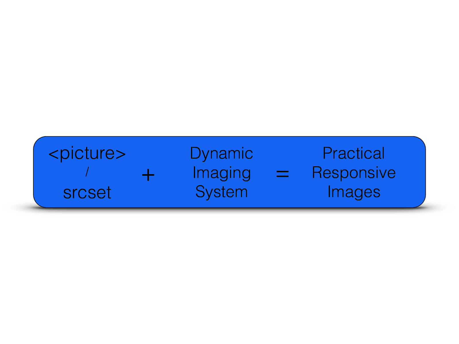
@bseymour respimg.es Thank you benseymour.com

https://www.codeclub.org.uk/ http://www.stemnet.org.uk/
https://www.codeclub.org.uk/