Inclusive Development Using Style Guides to Improve Website Accessibility
Using Style Guides to Improve Website Accessibility
A presentation at MidCamp in April 2017 in Chicago, IL, USA by Carie Fisher
Using Style Guides to Improve Website Accessibility
I have been building websites since 2005 and has been exclusively working with Drupal since 2009. As the Accessibility Lead, she works with the Hook 42 team and clients to make sites more inclusive to others. In her role as a Senior Front-End Developer at Hook 42, she thrives on the challenge of turning a static mock-up into a responsive, live site that is both beautiful and functional.

How many of you would consider yourselves “front end developers?” What exactly does that mean? From company to company? From website to website? Really from day to day? Do we all actually do the same job? For example, some days I’m working in InDesign or Photoshop all day, the next I’m writing JS or building features and views. The very next day I’m writing blog post, prepping for a presentation, or doing research on the latest trends…oh and I also write traditional Front-end code like SASS and Twig. So when I meet someone new who is not a developer, I immediately think of a poem by Shel Silverstein…

Mr. Smeds & Mr. Spats Shel Silverstein (A Light In The Attic) Mr. Spats Now, when Mr. Smeds Had twenty-one hats, Met Mr. Spats, And none of them They talked of the were the same Buying and selling of hats. And Mr. Smeds And Mr. Spats Had twenty-one heads Bought Mr. Smeds’ hat! And only one hat Did you ever hear anything to his name. Crazier than that?
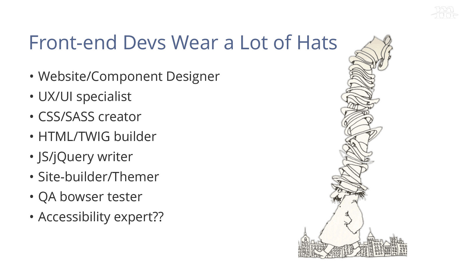
• Website/Component Designer • UX/UI specialist • CSS/SASS creator • HTML/TWIG builder • JS/jQuery writer • Site-builder/Themer • QA bowser tester • Accessibility expert??
How can we possibly add the “accessibility” hat…well why would we want to even if we had the time?
What is website accessibility? Who is in need of accessible sites? And really why should you care?
Web accessibility means that people with disabilities can use the Web. More specifically, Web accessibility means that people with disabilities can perceive, understand, navigate, and interact with the Web, and that they can contribute to the Web. - Web Accessibility Initiative (WAI) I love this quote from The Web Accessibility Initiative (WAI). For a little background, the WAI group is a subset of the W3C World Wide Web Consortium. The WAI group is an international community a lot of different people work together to develop accessible Web standards. WAI’s mission is to lead the Web to its full potential. They are also the ones behind the WCAG Guidelines. Website accessibility should not be just a box you check off when you deliver a new website to a client, it is a way of rethinking design and development, where you go beyond just the base level of access to information. Website accessibility should be about making something valuable, not just accessible, to as many people as we can.
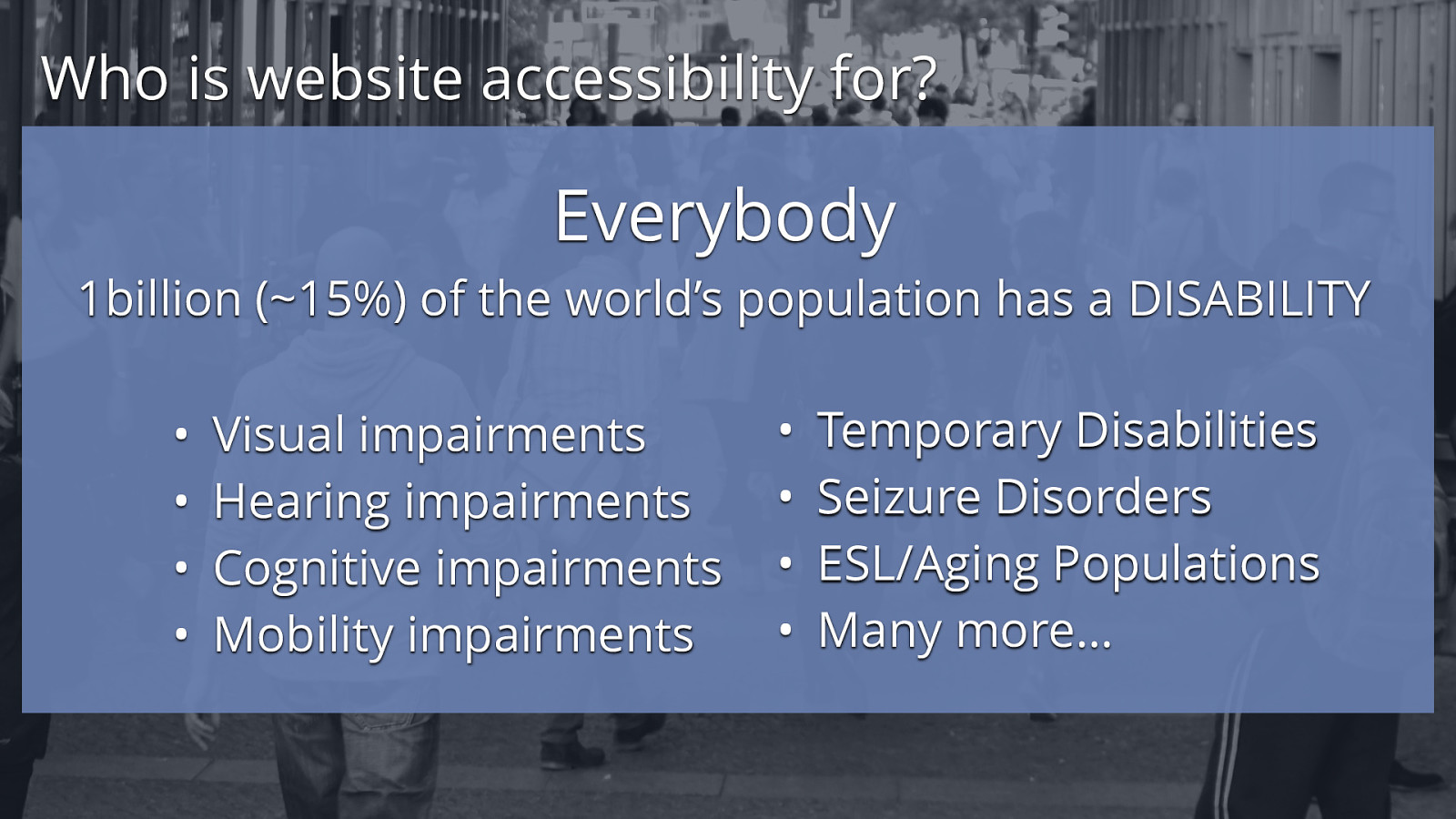
Everybody 1billion (~15%) of the world’s population has a DISABILITY Visual impairments Hearing impairments Cognitive impairments Mobility impairments
Temporary Disabilities Seizure Disorders ESL/Aging Populations Many more… According to the US Census Bureau, 19% of the United States population identifies as having a disability, which is roughly 57 million people. If you consider a global audience, you are talking about 15% of the world’s population or one billion people according to World Health Organization (WHO). That is a huge number of people who could benefit from an accessible website right from the start, but keep in mind, the official numbers do not even include people that either do not identify as having a disability or those populations that could benefit from accessible websites, such as English as a second language (ESL) users and the aging population—so the number of people needing accessible websites in reality could be much higher. Even if you do not identify with any of those populations, there is also situational disability to consider. Situational disability is just what it sounds like, there are times where you are in a situation that would benefit from accessibility, such as captions for a video when you are not able to turn on the audio due to your surroundings. So really, all people can benefit from accessible websites at one point or another.
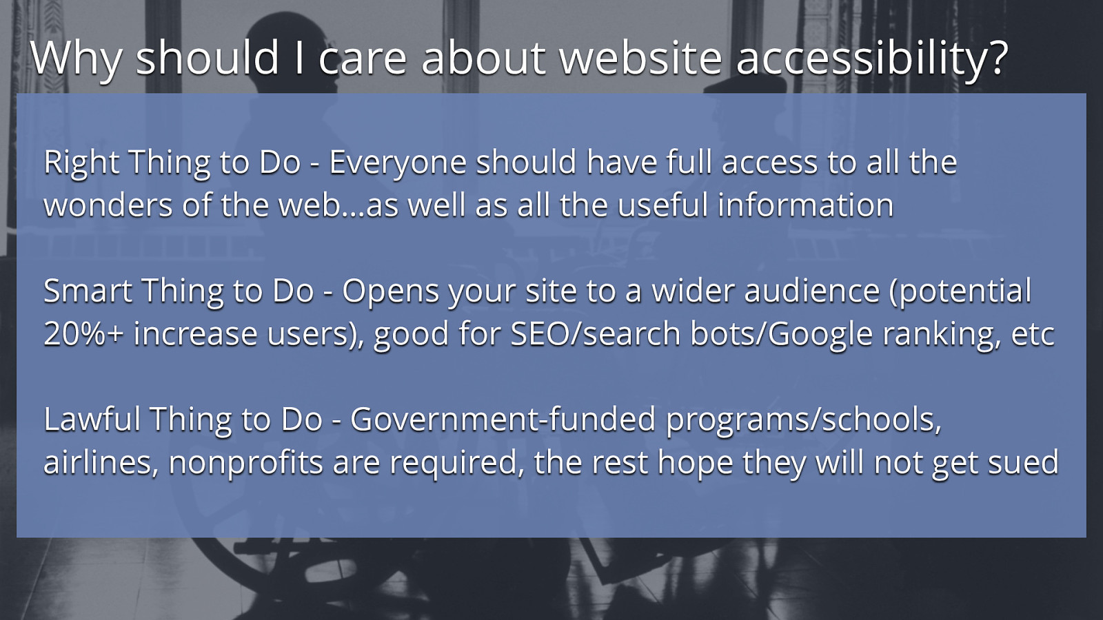
Right Thing to Do - Everyone should have full access to all the wonders of the web…as well as all the useful information Smart Thing to Do - Opens your site to a wider audience (potential 20%+ increase users), good for SEO/search bots/Google ranking, etc Lawful Thing to Do - Government-funded programs/schools, airlines, nonprofits are required, the rest hope they will not get sued Read slide Right Thing to Do It is important that your website is perceivable, operable, understandable, and robust(POUR)—all successful criteria for a user experience that provides optimal usability for everyone. Everyone should have full access to cat videos and ridiculous internet memes—as well as all the useful information. Smart Thing to Do When your website is accessible, it opens your site to a wider audience (over one billion people to start) and is good for SEO/search bots/Google rankings. The states of California and NY combined is around 57 million users, the same number as those in the US who identify as being disabled. Would you ever create a website that would exclude two states? Lawful Thing to Do In the US, public sector entities (government-funded programs/schools, airlines, and nonprofits) are required to follow certain website accessibility rules, while private sector companies just hope they will not get sued. Earlier this year the Information and Communication Technology (ICT) passed a ruling to update the old 508 rules to be more inline with current WCAG 2.0 guidelines, meaning that website accessibility updates are required for most public websites—and it is just a matter of time before private websites will be as well.
Just like the Roman Empire, our bodies will crumble some day. So if none of those earlier reasons convinces you to build a better website…build the site for your future self. Website accessibility is for everyone and benefits everyone
The first step in making a website accessible is simply being aware of how people use and experience computers differently - with and without assistive technologies. The next step is to learn how to accommodate these different ways of navigating a website through an understanding of best practices and the accessibility guidelines. In these cases, it’s necessary to do an accessibility audit on the site to determine its general state of accessibility, identify any major functionality that is inaccessible, get a picture of the level of effort required to bring the site up to standards, and then come up with a plan for correcting the issues.
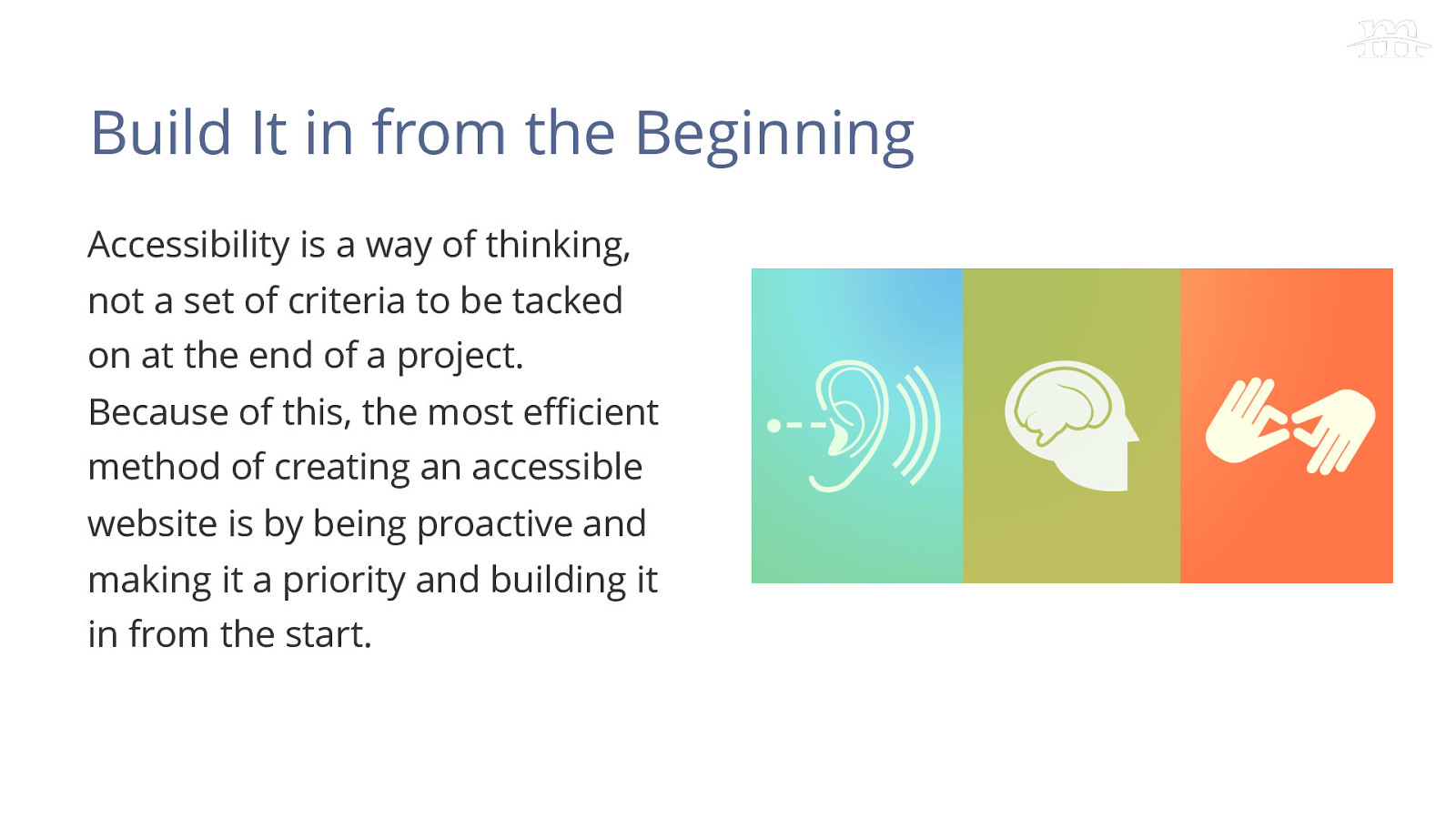
Accessibility is a way of thinking, not a set of criteria to be tacked on at the end of a project. Because of this, the most efficient method of creating an accessible website is by being proactive and making it a priority and building it in from the start. Incorporating accessibility best practices into the wireframes, mockup, theming, development, QA, and content creation processes and reviewing and testing for accessibility at each step will mitigate the majority of accessibility issues.
Building accessibility into a project from the beginning is not always possible. In these cases, it is necessary to do an accessibility audit on the site to determine its general state of accessibility, identify any major functionality that is inaccessible, and then come up with a plan for correcting the issues. In these cases, it’s necessary to do an accessibility audit on the site to determine its general state of accessibility, identify any major functionality that is inaccessible, get a picture of the level of effort required to bring the site up to standards, and then come up with a plan for correcting the issues.
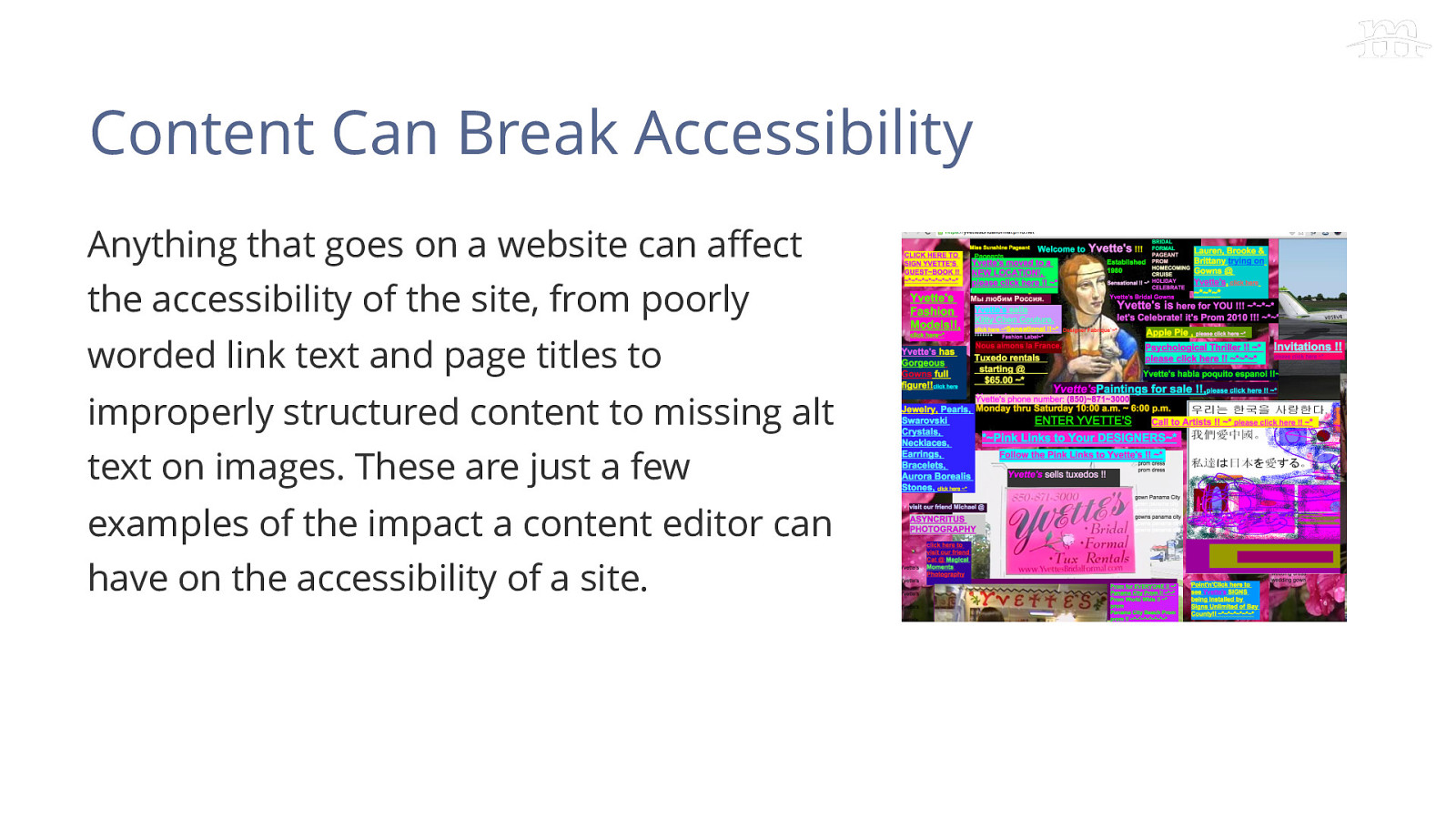
Can Break Accessibility Anything that goes on a website can affect the accessibility of the site, from poorly worded link text and page titles to improperly structured content to missing alt text on images. These are just a few examples of the impact a content editor can have on the accessibility of a site.
In these cases, it’s necessary to do an accessibility audit on the site to determine its general state of accessibility, identify any major functionality that is inaccessible, get a picture of the level of effort required to bring the site up to standards, and then come up with a plan for correcting the issues.
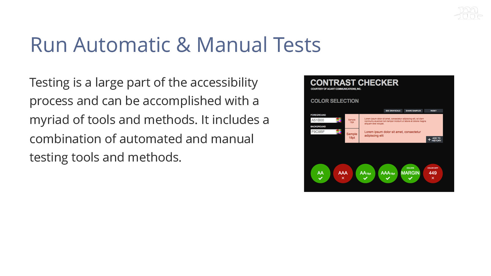
Testing is a large part of the accessibility process and can be accomplished with a myriad of tools and methods. It includes a combination of automated and manual testing tools and methods. In these cases, it’s necessary to do an accessibility audit on the site to determine its general state of accessibility, identify any major functionality that is inaccessible, get a picture of the level of effort required to bring the site up to standards, and then come up with a plan for correcting the issues.
Invite User Feedback Invite feedback and respond and act on it companies do not get sued for missing an alt text on an image on their site or for not following a particular guideline to the letter of the law. They get sued when core functionalities of their site are inaccessible or unusable by a person or group of people with a disability and they are alerted to the issue and make no effort to correct it. It’s difficult to test for every single scenario and combination of OS, browser and assistive technology and there will be things that get missed. Show your users your commitment to their ability to use your site by giving them a way to provide feedback around accessibility issues and make it easy to find by linking to it from every page on the site. Value their input and engage them in conversation and take the necessary steps to remedy the situation in a timely manner. You’ll earn their appreciation and respect.
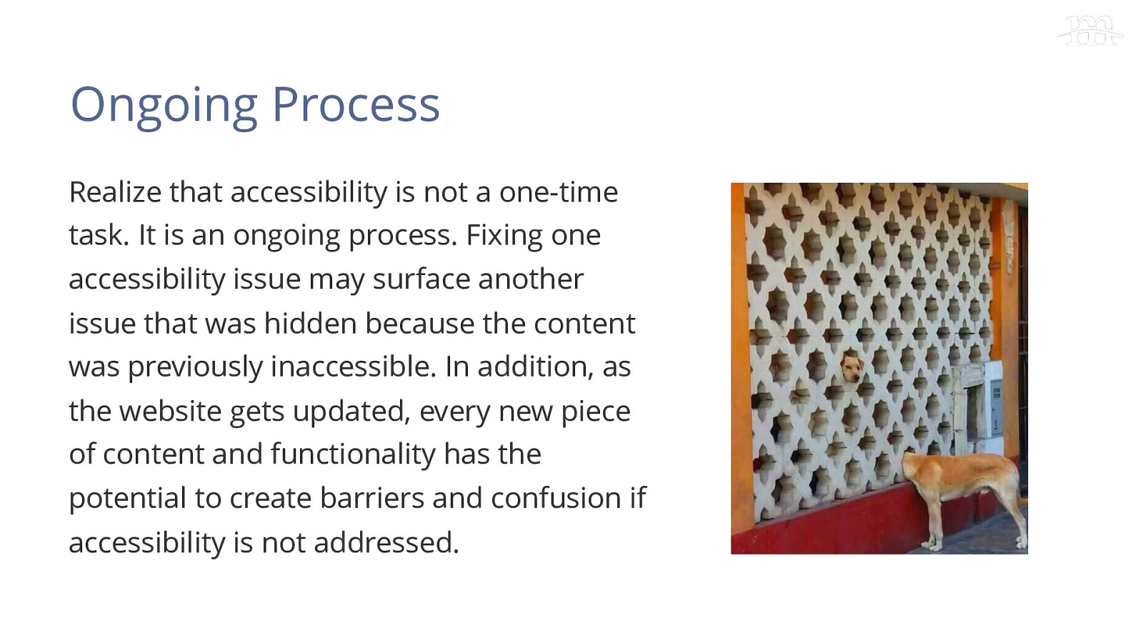
Realize that accessibility is not a one-time task. It is an ongoing process. Fixing one accessibility issue may surface another issue that was hidden because the content was previously inaccessible. In addition, as the website gets updated, every new piece of content and functionality has the potential to create barriers and confusion if accessibility is not addressed. Consider implementing a plan to monitor your site’s accessibility such as monthly or quarterly automated accessibility scans and regular trainings for content editors.
OK so we have defined what being a front-end developer is (that it is variable) and what accessibility is (sort of nebulous but we know it’s important), but what is Inclusive Development? Is that just a fancy word for “developing with accessibility in mind”? Yes and no…
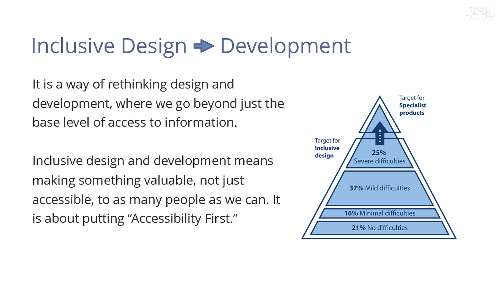
It is a way of rethinking design and development, where we go beyond just the base level of access to information. Inclusive design and development means making something valuable, not just accessible, to as many people as we can. It is about putting “Accessibility First.” So the term Inclusive Design is not a new one. It is a phrase that has been around since 2005. It’s defined as ‘The design of mainstream products and/or services that are accessible to, and usable by, as many people as reasonably possible … without the need for special adaptation or specialized design.’ Inclusive Development is really taking that next step and adhering to inclusive design practices. It’s a way of rethinking development in a way that adds value to all users, not just accessibility to some users. It’s a shift in the way you approach your thinking about development. So basically, if you target your website for the 25% of your users that have severe difficulties, then it will cover all the additional users with little to no difficulties. Adaptive technologies (often called AT) help cover the severely disabled users with specialized products. So that is the theory…practically speaking let’s see an example…
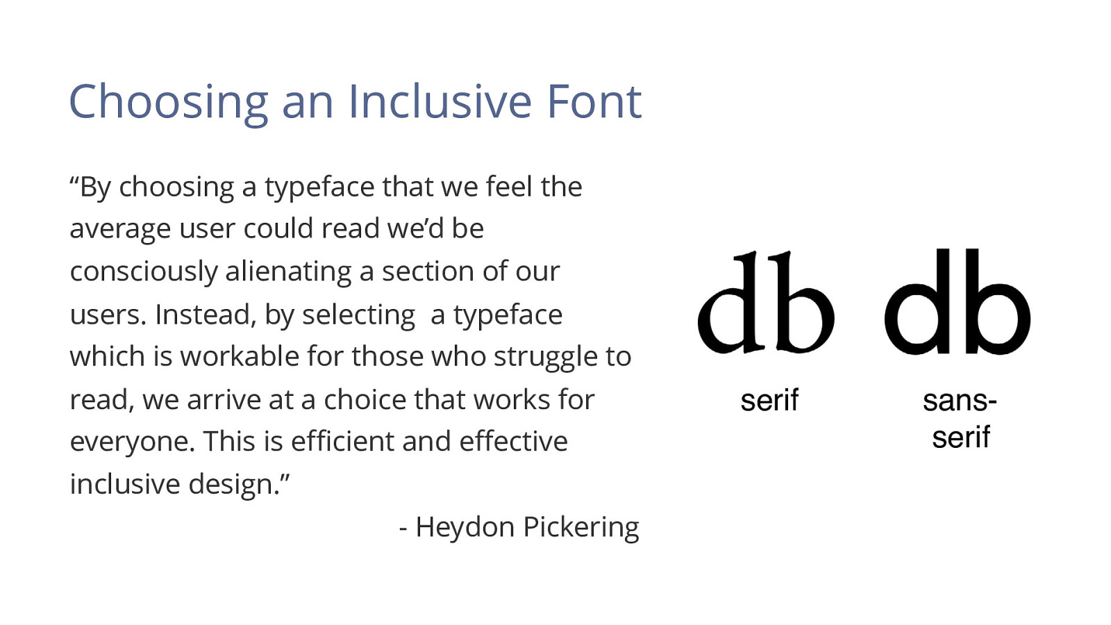
“By choosing a typeface that we feel the average user could read we’d be consciously alienating a section of our users. Instead, by selecting a typeface which is workable for those who struggle to read, we arrive at a choice that works for everyone. This is efficient and effective inclusive design.” - Heydon Pickering Font families are a good example of a place where you can make an inclusive development choice. When you are picking out font families, some things to think about…include: • Does the font have any ornamentation that gets in the way of comprehension? • Are individual letters distinct in shape or can they be confused with others? • Serif vs sans-serif? (Special note: although sans serif fonts are generally thought to be more readable, their simplicity makes them more vulnerable to having similar letterforms.) • Researchers estimate that 10-17% of the population in the U.S.A. have dyslexia. That’s a pretty significant percentage, sometimes even higher than IE, depending on the project. There are some specific characteristics that can aid legibility. • Generous ascenders (e.g.the vertical line in d) and descenders (e.g. the down-pointing line in y) • A d and b which were not an exact mirror image of one another also helped • Uppercase I, lowercase l and 1…you want to find a font family that has different characteristics in these characters • Kerning (the spacing between characters) is also important….particularly between r and n. Otherwise “modern” could be read as “modem.”
Back in 2009, the “Mobile First” approach appeared, where we design/develop for smaller screens first, then add more features and content for larger screens. Now in 2017, “Accessibility First” may seem just as daunting and impossible…but it isn’t if you have the right tools and attitude. At this point you might be thinking…ahh! Design terms, accessibly philosophies, actually thinking about my code…I did not sign up for this. Well, I would argue that the way you might feel about accessibility today is much like how we felt when we heard about the “mobile first” approach way back in 2009…. The accessibility first approach may seem a little daunting. There is so much to know, so many different ideas of what accessibility means, new rules, new tools, etc. But there is hope!
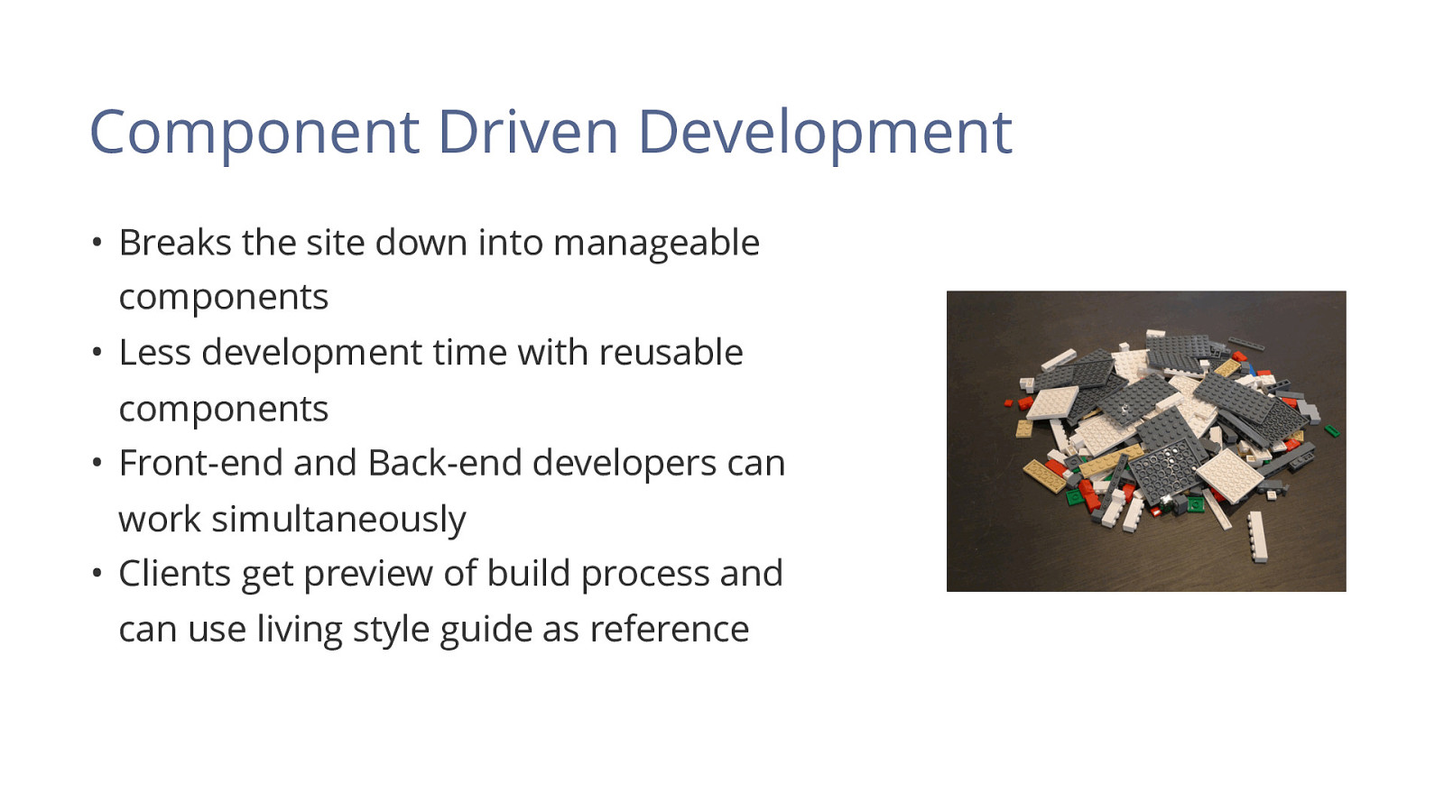
• Breaks the site down into manageable components • Less development time with reusable components • Front-end and Back-end developers can work simultaneously • Clients get preview of build process and can use living style guide as reference (breathe) OK so to recap we are front-end developers and we are concerned about accessibility, maybe we even think about accessibility first…now what? How does Component Driven Development play a role in all of this? Many of you have used component driven development before or Even if you have not formally heard the term or using the tools, I’m betting you are already doing it to some degree already…it’s about breaking a large site down into manageable pieces. It is 2017! I hope you all have heard about component driven development by now. If not, here is your quick intro. Much like creating a house (out of legos or real building materials), you need to build one piece of your house at a time…first the foundation, then the skeleton structure (wood, metal, etc), walls, windows, roof, and everything in between. Component driven development tools allow us to do this, but for websites.
The A11Y style guide comes with prepopulated accessible components that include helpful links to related tools, articles, and WCAG guidelines to make your site more inclusive. http://a11y-style-guide.com/style-guide (breathe) Job + Motivation + Philosophy + KSS Tool = A11Y style guide These components also serve as a guide for both HTML markup and SCSS/CSS code, to inform designers, front-end and back-end developers at every stage of the website’s creation. Pro tip: a11y is shorthand for accessibility just like internationalization (i18n) and localization (l10n) Now it’s everyone’s favorite time of a presentation…live demo time!
• As a reference. • As a base for your own style guide. • As a base for creating your own accessible components. • As a base for a new accessible theme. • Contribute to the guide and make it better. • Fork it and give your own spin to it. The A11Y style guide is really a simple concept. I did not reinvent the wheel with this project…really there is nothing new in it that isn’t already out there. I lovingly think of it as the “Cliff Notes” of accessibility or a better term may be “accessible pattern library.” By using a reusable, accessible, component driven approach and thinking about inclusiveness from the start, we can get a head start on building accessible websites. So ultimately you and your clients save time and money, plus your site is a little more inclusive…what’s not to love?
Thanks for joining me today! Constructive feedback is appreciated. If you are interested in learning more about the style guide, follow me on Twitter or checkout the GitHub project page.