Inclusive Development
Using patterns to improve digital accessibility

A presentation at WPCampus Online 2019 in January 2019 in by Carie Fisher
Using patterns to improve digital accessibility
Sr. Accessibility Instructor & Developer - Deque Systems Email: carie.fisher@deque.com Twitter/LinkedIn/Medium: @cariefisher GitHub: @cehfisher Slides: https://noti.st/cariefisher
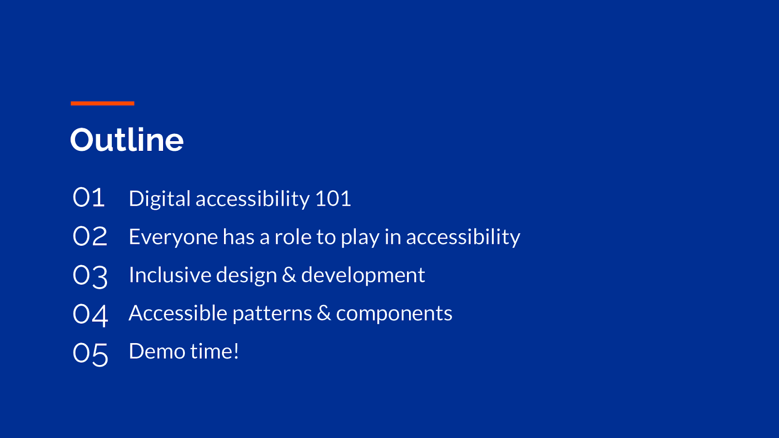
Digital accessibility 101 Everyone has a role to play in accessibility Inclusive design & development Accessible patterns & components Demo time!
What is digital accessibility? Who is in need of accessible sites? And really why should you care?
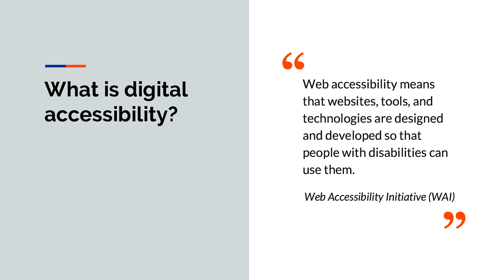
“Web accessibility means that websites, tools, and technologies are designed and developed so that people with disabilities can use them. Web Accessibility Initiative (WAI)”
I love this quote from The Web Accessibility Initiative (WAI). For a little background, the WAI group is a subset of the W3C World Wide Web Consortium. The WAI group is an international community a lot of different people work together to develop accessible Web standards. WAI’s mission is to lead the Web to its full potential. They are also the ones behind the WCAG Guidelines.
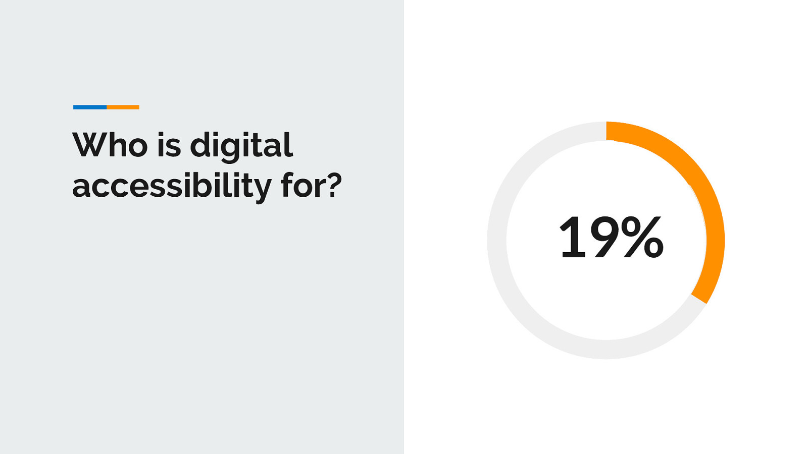
According to last US census results, about 19% of the United States population identifies as having a disability. That works out to roughly 57 million individual people. Thinking of these numbers in a different way, there are more people with disabilities than populations of New York and California combined. If you consider a global audience, you are talking about 15% of the world’s population according to the World Health Organization (WHO). That is over one billion people worldwide!
Of course 19% is a huge number of people who could benefit from an accessible website or app right from the start, but keep in mind, the official numbers do not even include people that either do not identify as having a disability or those populations that could benefit from accessible websites and apps, such as the aging population — so the number of people needing accessibility in reality is closer to 32% if you just consider those two groups. And of course, that number will continue to grow as people live longer and technology becomes even more prevalent and important to our daily lives.
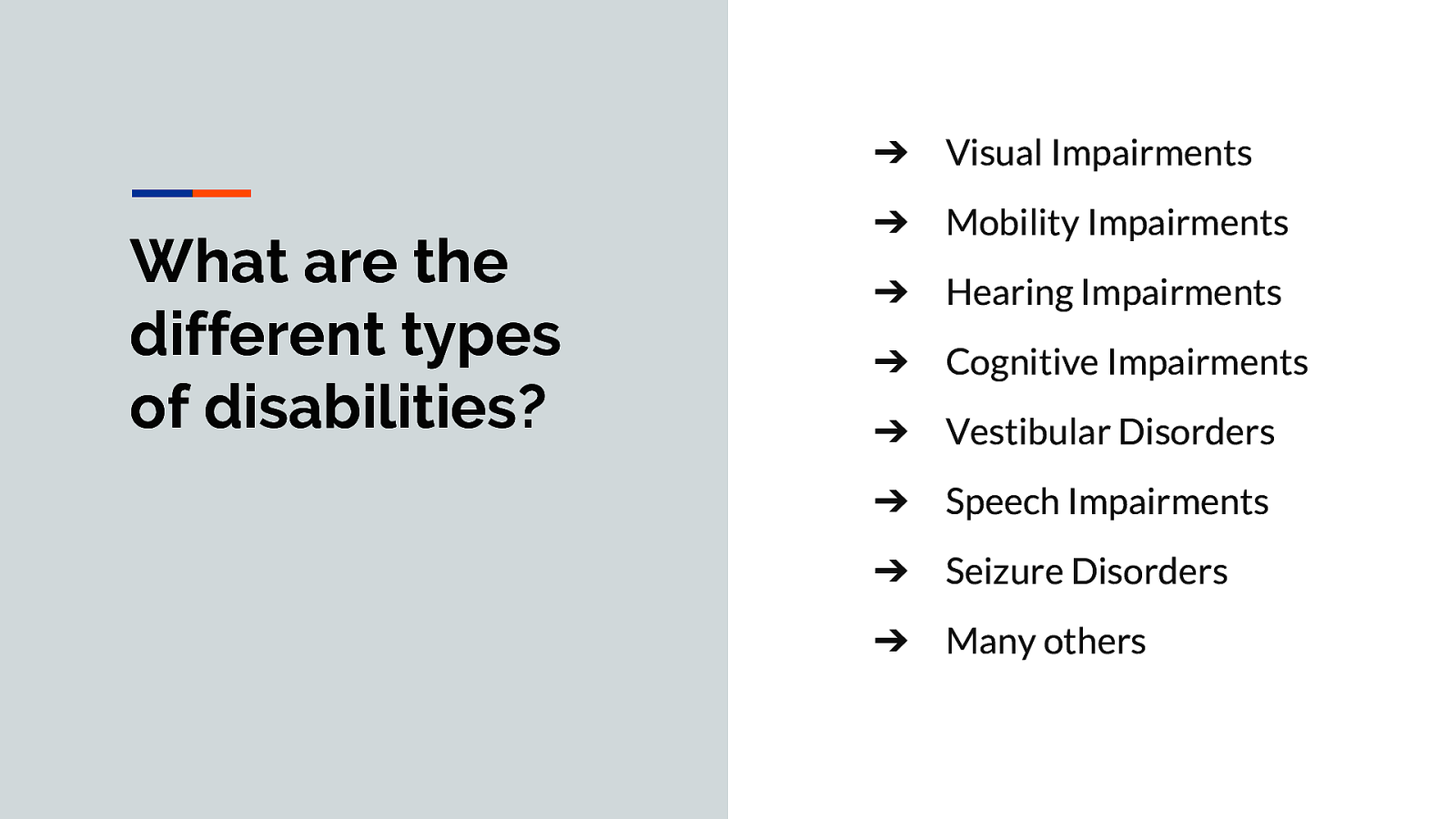
➔ Visual Impairments ➔ Mobility Impairments ➔ Hearing Impairments ➔ Cognitive Impairments ➔ Vestibular Disorders ➔ Speech Impairments ➔ Seizure Disorders ➔ Many others
Visual: Blindness, low vision, and color blindness. Assistive Technologies: Includes screen reader and screen magnification software, braille output devices, etc.
Mobility: Arthritis, paralysis, amputees, carpal tunnel syndrome, seizure disorders and other forms of fine motor control restrictions. Assistive Technologies: Includes adaptive switches, eye tracking devices, mouth sticks, speech input, etc.
Hearing: Deafness, and hard of hearing. Assistive Technologies: Includes hearing aids, captions, transcripts, sign language, etc.
Cognitive: This is the largest group of disabilities. Ranges from Down’s Syndrome to conditions such as Autism, ADHD, Dyslexia and more. Assistive Technologies: Includes screen readers, text highlighting, text prediction, abstractive summarization tools, etc.
Vestibular Disorders: Vertigo, dizziness, and other types of balance and eye movement disorders. Assistive Technologies: None
Speech Impairments: Muscular or cognitive issues that impede speech, like MS or stuttering. Assistive Technologies: Augmentative and alternative communication (AAC) and speech-generating devices like speech to text.
Seizure Disorders: Ranges from abnormal or erratic electrical impulses and involuntary muscle movement to photo-epileptic Seizures. Assistive Technologies: None
And many more
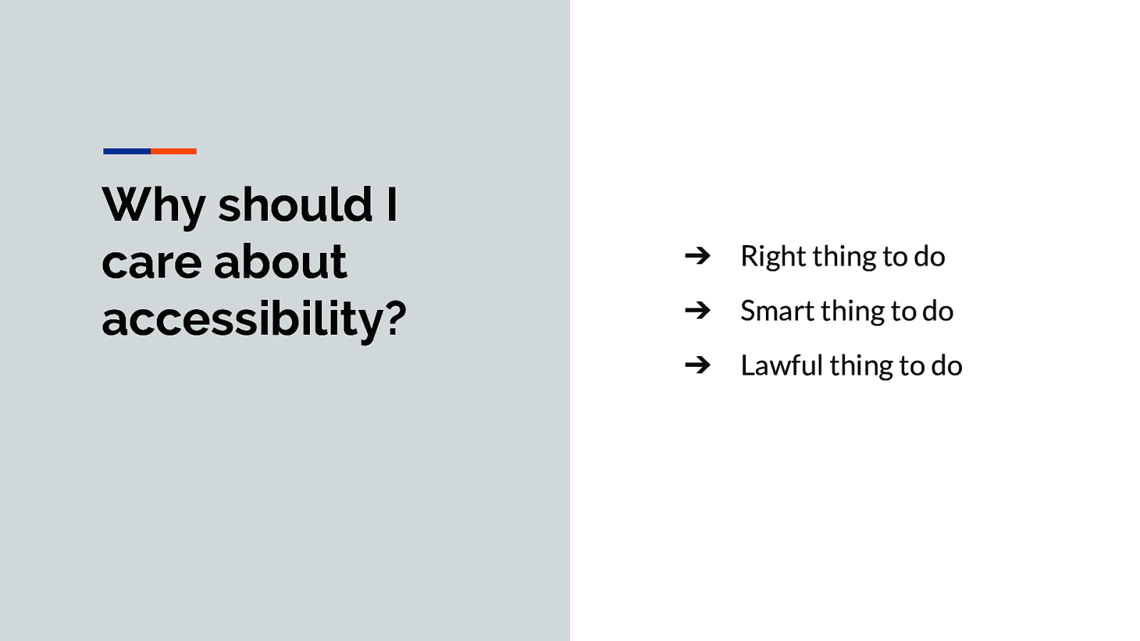
➔ Right thing to do ➔ Smart thing to do ➔ Lawful thing to do
Right Thing to Do It is important that your website or app is perceivable, operable, understandable, and robust (POUR) — all successful criteria for a user experience that provides optimal usability for everyone. Everyone should have full access to cat videos and ridiculous internet memes — as well as all the useful information.
Smart Thing to Do When your website or app is accessible, it opens your site to a wider audience (over one billion people to start) and is good for SEO/search bots/Google rankings. The states of California and NY combined is around 57 million users, the same number as those in the US who identify as being disabled. Would you ever create a website that would exclude two states?
Lawful Thing to Do In the US, public sector entities (government-funded programs/schools, airlines, and nonprofits) are required to follow certain accessibility rules, while private sector companies just hope they will not get sued.
When training clients I routinely say how accessibility related lawsuits have become common, saying that we hear about a new one every week. According to @UsableNet it’s actually closer to 42+ per week with over 2200 recorded in 2018. The lawsuit culture that surrounds website accessibility has grown steadily over the past few years and shows no signs of slowing. 2018 shows an increase of 181% of lawsuits in the United States, compared to 2017.
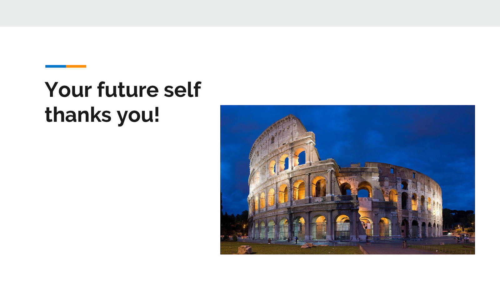
If none of the earlier reasons convinces you to build a more inclusive website or app…build the site for your future self.
Just like the Roman Empire, our bodies will crumble some day. You might have a hand tremor and not be able to use a mouse. You might lose your hearing and need captions on a video. You might lose your sight and need more legible fonts at larger sizes.
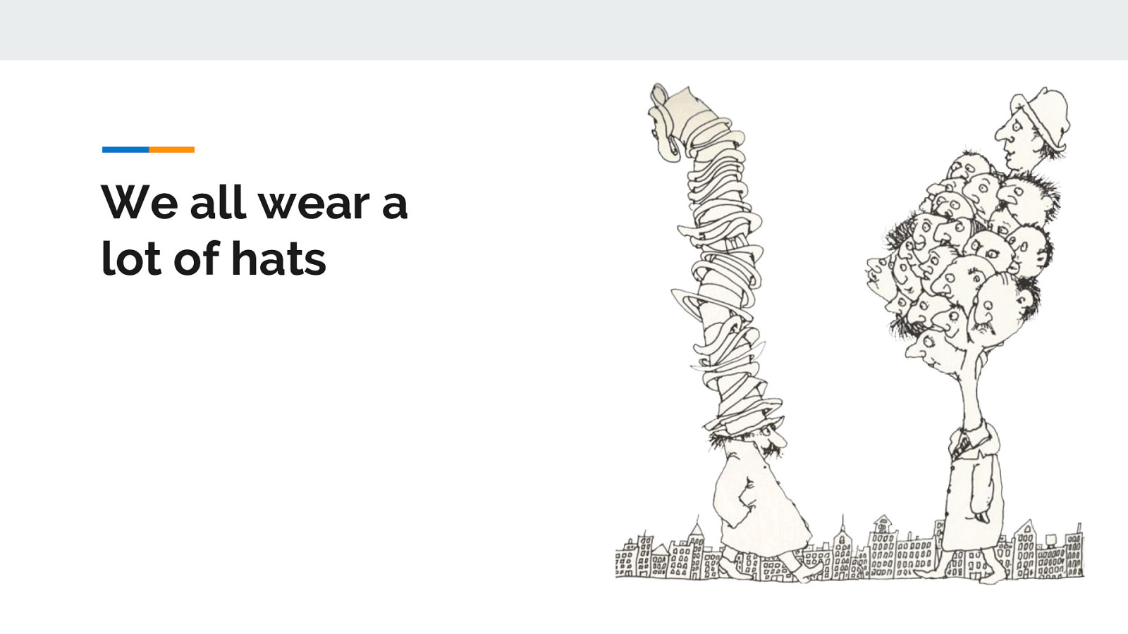
We all wear a lot of hats in life and on the job.
When I worked as a FT front-end developer at a small company, some days I’d be using InDesign or Photoshop all day, the next day I’m writing JavaScript. The very next day I’m writing blog post, prepping for a presentation, or doing research on the latest trends…oh and I also wrote traditional Front-end code like CSS and HTML.
You may feel the same way about your role. So with so many hats, where does the “accessibility hat” fit in and who should wear it?
think of a poem by Shel Silverstein…
Mr. Smeds & Mr. Spats Shel Silverstein (A Light In The Attic)
Mr. Spats Had twenty-one hats, And none of them were the same And Mr. Smeds Had twenty-one heads And only one hat to his name.
Now, when Mr. Smeds Met Mr. Spats, They talked of the Buying and selling of hats. And Mr. Spats Bought Mr. Smeds’ hat! Did you ever hear anything Crazier than that?
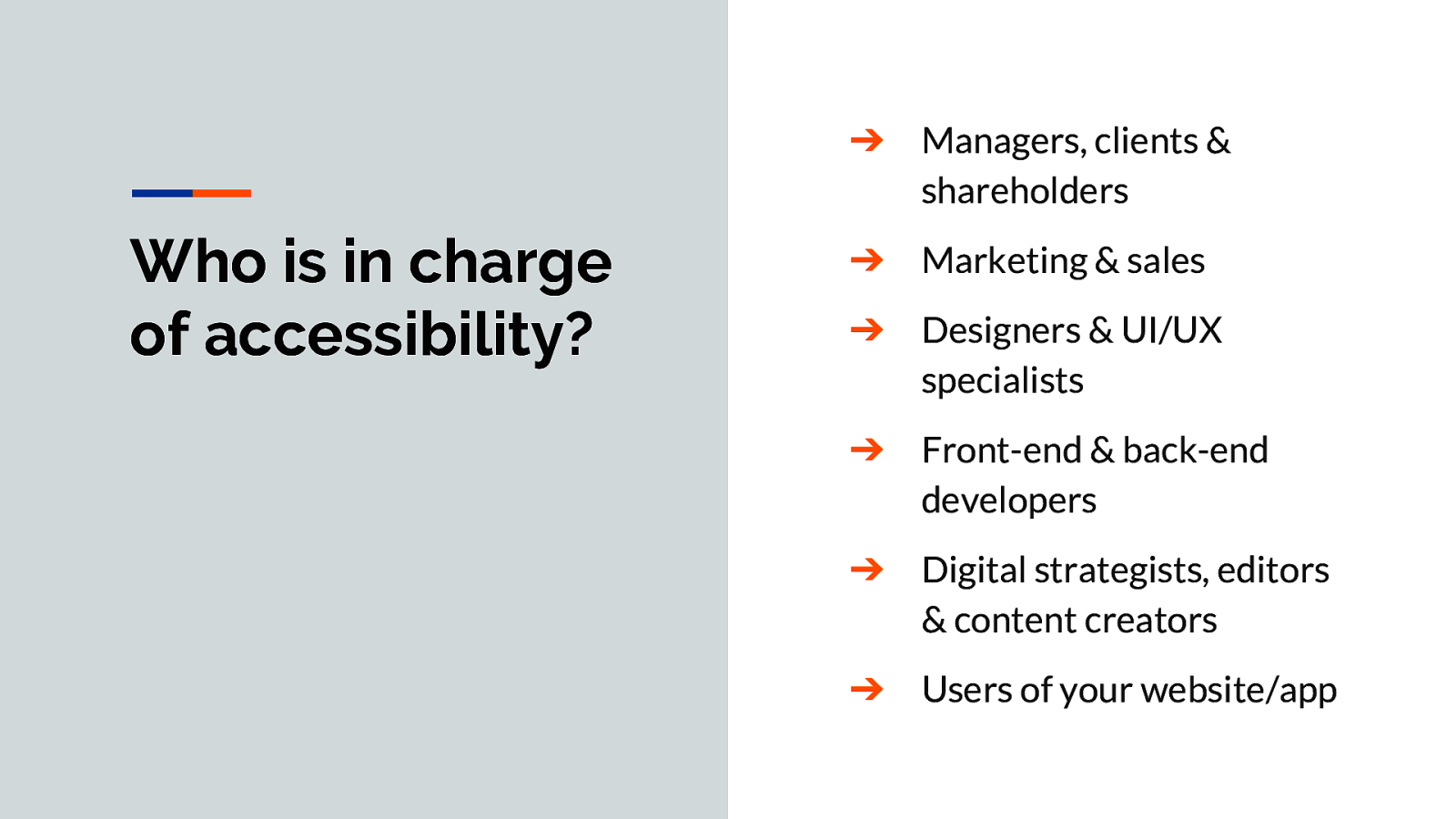
➔ Managers, clients & shareholders ➔ Marketing & sales ➔ Designers & UI/UX specialists ➔ Front-end & back-end developers ➔ Digital strategists, editors & content creators ➔ Users of your website/app
There is this myth that developers are responsible for accessibility. While it is true that developers have a lot of influence on how accessible a website or app is in general, there are a lot of other people that should also be responsible for digital accessibility as well including:
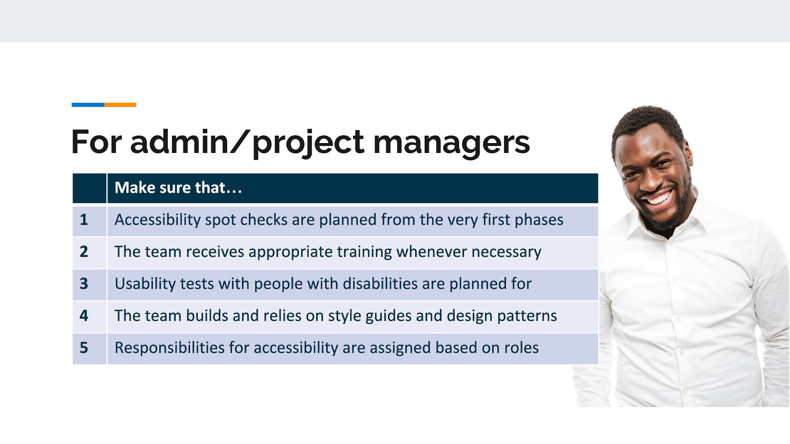
managers/Clients/Shareholders—This group holds the money and dictates the timeline of the project. They need to understand that taking some extra time and budget to build accessibility into the beginning of the project will help them in the long-run — especially if they are one of the unlucky ones who gets sued for not having an accessible website or app in the first place.
Marketing/Sales—This group should understand that making websites and apps more usable can directly lead to more sales/web traffic for the client. By pointing out that some SEO techniques are directly related to accessibility best practices, they can maximize their client’s time and money.
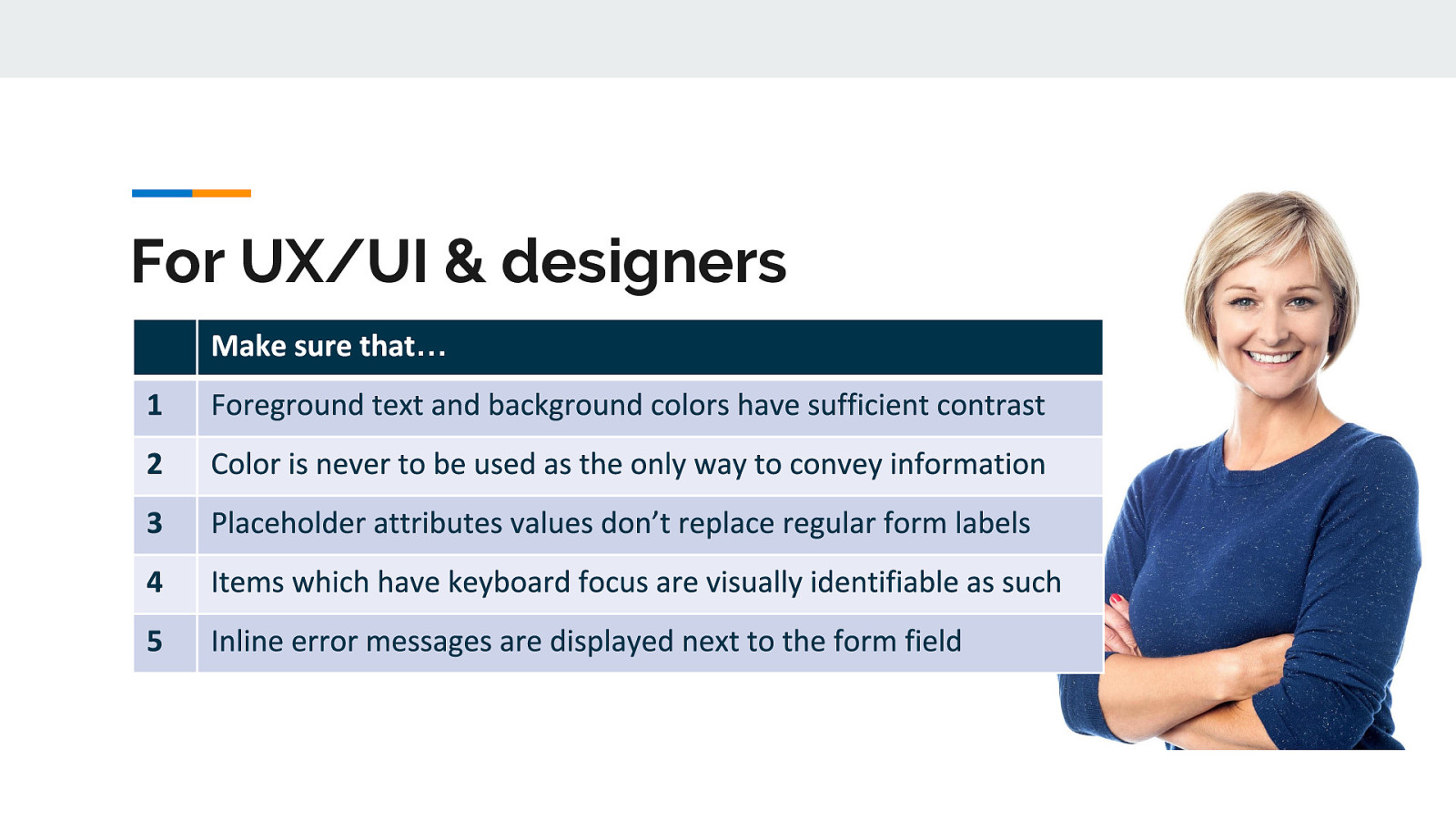
Designers/UI and UX Specialists—This group inspires the code that will be written and is a big influence on a website or app’s accessibility. In some organizations, a developer will not (or cannot) question what is sent to them from this group, so designers and UI/UX specialists must ensure their wireframes and mockups are accessible before a developer even writes one line of code.
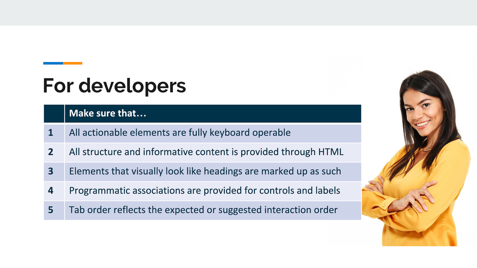
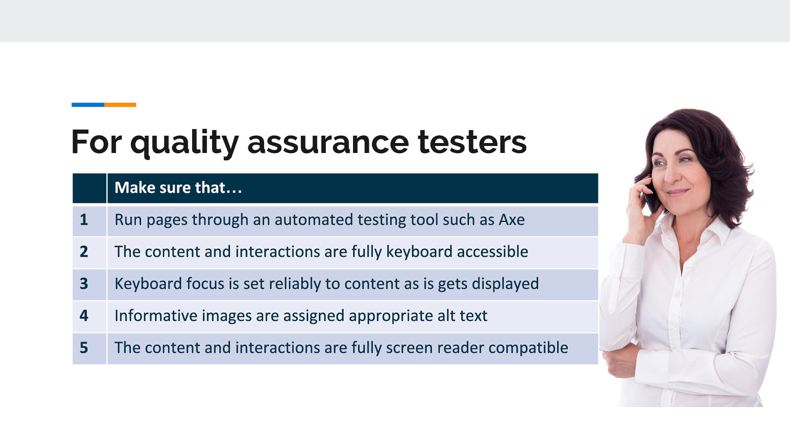
Developers - both front and back-end developers have a lot of influence on how accessible a website or app is in general. They are in charge of markup, styles, JS, etc. so they do have a lot of control on the website or app’s base accessibility
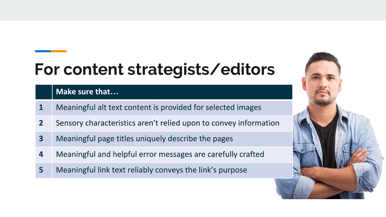
Digital Strategists/Editors/Content creators—This group has more influence on accessibility than some might realize. Even if the website or app has been optimized, designed, and developed with accessibility in mind the actual content on the page can break all of that down. Content is fundamental to the overall accessibility of your website or app.
Users—This group is really what it is all about. Let’s say you did your job and your website or app is as accessible as you could possibly make it — awesome! But guess what? Users are people. And people are varied and so are the browsers, devices, environments, and assistive technologies that they use. It is impossible to make your website or app 100% accessible to all of that variety, so users should have a place to report issues that they encounter with your website or app and you should listen and make those changes.
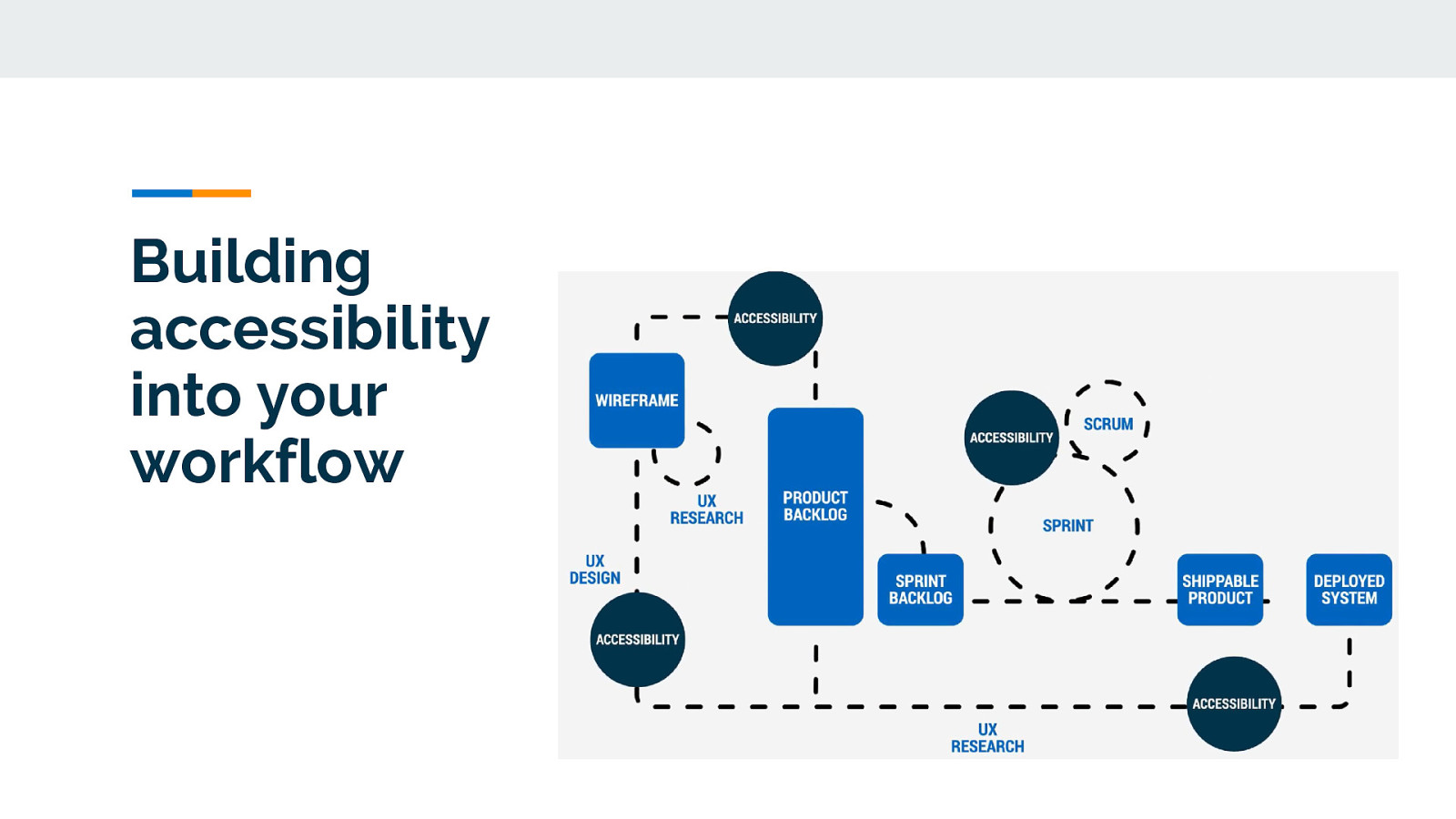
A lot of companies test accessibility at the end of the development cycle, right before their new website or app is launched to the public. But if you wait to test accessibility at the end— then you are late to the party. The tiny accessibility bugs that could have been squished with one line of code, have morphed into giant Mothra-sized bugs that may require major rewrites that can frustrate the entire team. But by being a little proactive about accessibility and building it in from the beginning, you will stomp the bugs as you find them and thus save time, effort, and money in the long run.
With digital accessibility being so complex, the only way forward is for everyone involved in the process to actively take part in working towards that goal.
Something that can help us make accessibility a priority is called inclusive design and development. This is for all roles.
The term Inclusive Design is not a new one. It is a phrase that has been around since 2005. It is defined as “The design of mainstream products and/or services that are accessible to, and usable by, as many people as reasonably possible…without the need for special adaptation or specialized design.”
Inclusive Development is really taking that next logical step and adhering to inclusive design principles during the development process. Essentially, it is a shift in the way you approach your thinking about development. So during the development phase, you choose or create code, markup, libraries, and other developmental pieces that are accessible (or as accessible as possible).
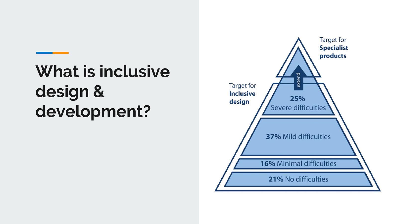
In both inclusive design and development, you want to target the users near the top of the pyramid that have severe difficulties (~25% of the population). By making that your target, you will cover all the additional users with little to no difficulties (~74% of the population). This is essentially a “trickle down” effect for accessibility. Assistive technology devices (often called AT) help cover the severely disabled users at the top of the pyramid with specialized products.
When we rethink our approach to development, we go beyond just the base level of access to information. Inclusive development means making something valuable, not just accessible, to as many people as we can*. It is about putting Accessibility First.
So that is the theory…practically speaking let’s see an example…
Font families are a good example of a place where you can make an inclusive design and development choice. Your choice of typeface/fonts can make or break a website, especially from an accessibility point of view. English as a second language (ESL) users, users with low vision, and users with reading, learning, and attention disorders (ex. dyslexia, ADHD), all benefit from accessible typography.
Researchers estimate that 10-17% of the U.S. population has dyslexia. That is a pretty significant percentage, which is even higher than current Internet Explorer, Edge, Firefox and Opera users combined (as of September 2017).
So if we choose a typeface we know that is legible for people with dyslexia (as shown by the top section on the pyramid with severe difficulties), then we also know every group under that section can also read the font. People who are blind or have more serious sight issues other than dyslexia would need additional typography or assistive technology considerations.
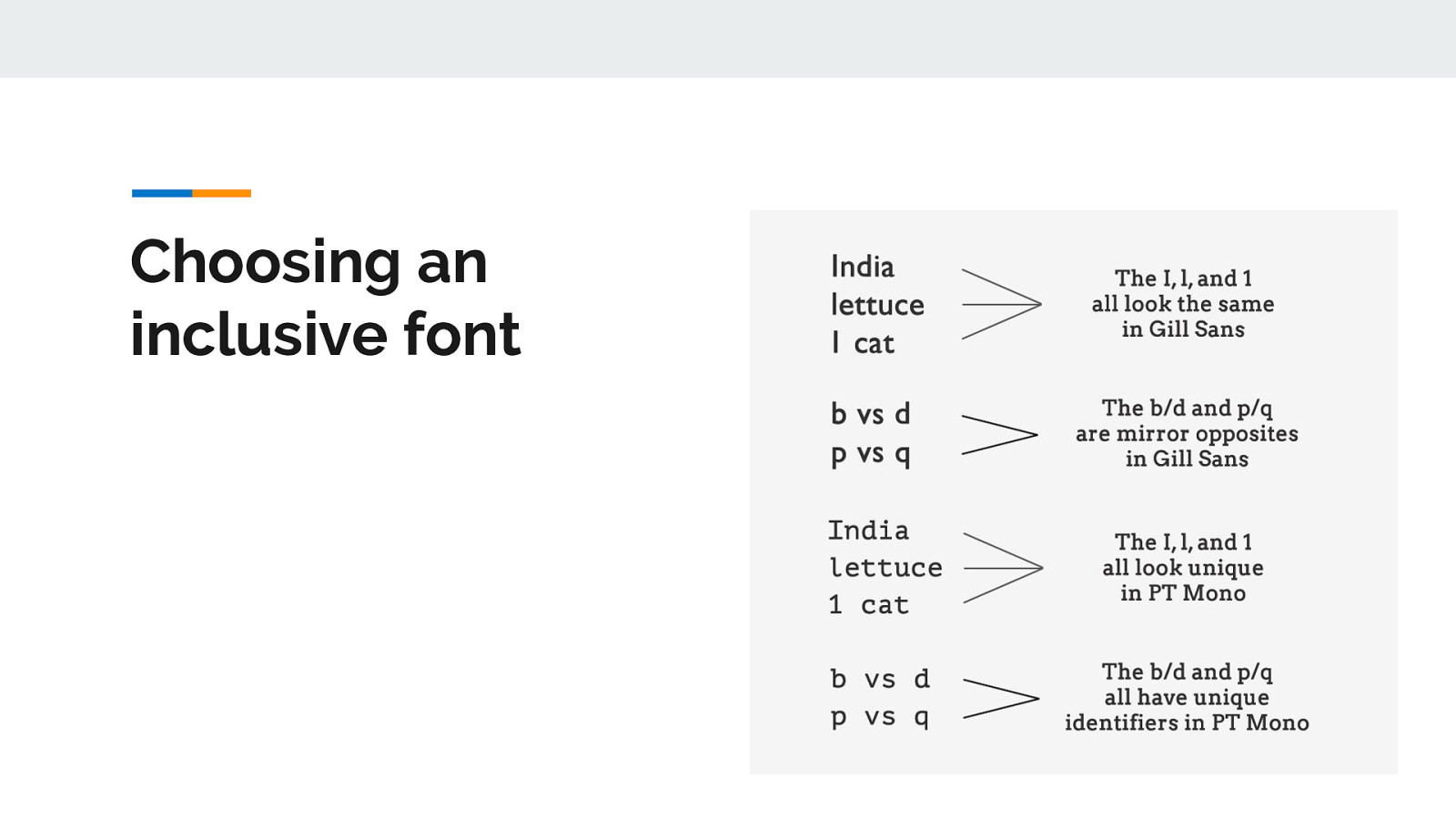
For example, people with visual impairments or dyslexia, certain letters or combinations of letters can be confusing, so it’s important that letter shapes are clearly defined and unique. Common offenders are the “I” (ex. India), “l” (ex. lettuce) and “1” (ex. one). Likewise, characters like “b” and “d” and “q” and “p” can sometimes be mirrored (either left-right or up-down) so words could be flipped into a nonsensical words or sometimes into a real word that would entirely change the meaning of the content.
There are some characteristics that can aid legibility. So when you are looking for your next font family, pay particular attention to the following things and you’ll be on your way to choosing an accessible font:
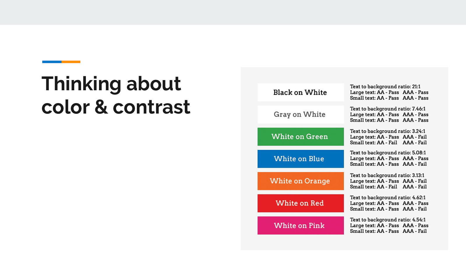
With the number of people who have some variant of color blindness, suffer from low vision, or are completely blind (all together roughly 9% of the global population), this is a very large area where designers can have a direct and immediate impact on website accessibility.
There are a lot of things to consider when making your content accessible from a color and contrast perspective including:
In 1996 Bill Gates wrote an essay on the emerging internet and predicted that “Content is where I expect much of the real money will be made.” For your users, content is still the foundation of everything. It does not matter how good your social media presence is, or how clean your links are, or how awesome your keywords might be if your content isn’t both relevant and easily consumed - people will leave your site quickly.
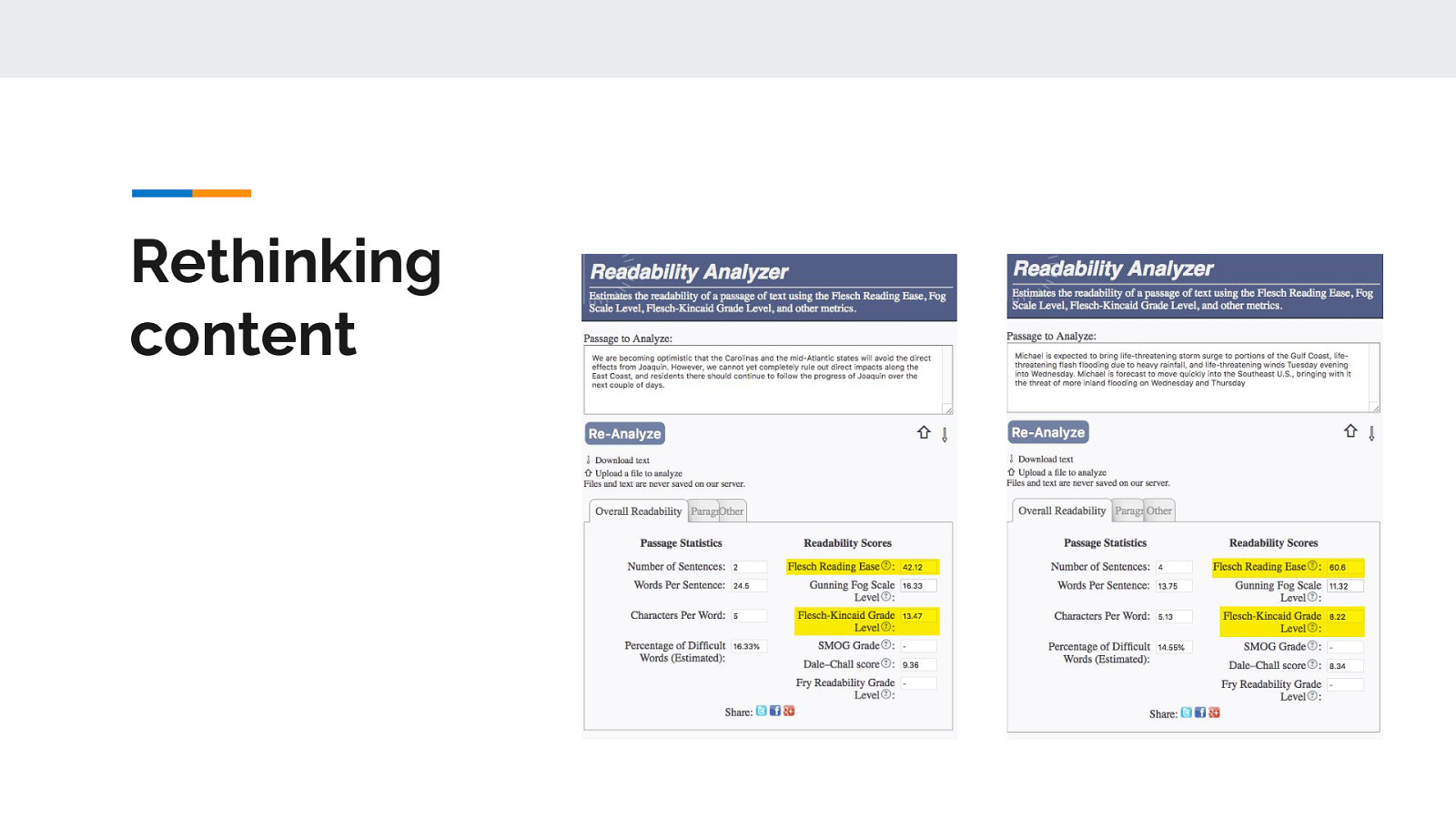
To make sure that your content is ready for prime-time, there are many tools that analyze different aspects of readability - spelling, grammar, sentence length, character count, etc. For SEO and accessibility, one of the most important aspect to pay attention to is the Flesch-Kincaid score. The Flesch-Kincaid score looks at the average sentence length (ASL) vs the average number of syllables per word (ASW) and formulates an overall readability ease and grade level. For SEO purposes, content that scores between 40 and 70 (which is equivalent to 7th grade to entering college) rank best.
So today I’m showing a quick example of two different real-life passages from the The National Weather Service using a free tool called the Readability Analyzer. A big thanks for Ashley Bischoff from the Pacellio Group for letting me know about this tool.
So the first one we are testing is from The National Weather Service on Oct 1, 2015 about hurricane Joaquin and it included some very complex words. “We are becoming optimistic that the Carolinas and the mid-Atlantic states will avoid the direct effects from Joaquin. However, we cannot yet completely rule out direct impacts along the East Coast, and residents there should continue to follow the progress of Joaquin over the next couple of days.” This alert ranked 13.47 and confused a lot of people who heard it. In fact, many people stayed in their homes when they should have left because they didn’t understand what the warning meant.
The second one we are testing is from The National Weather Service on Oct 10, 2018 for hurricane Michael which repeated some words for emphasis and clarity. “Michael is expected to bring life-threatening storm surge to portions of the Gulf Coast, life-threatening flash flooding due to heavy rainfall, and life-threatening winds Tuesday evening into Wednesday. Michael is forecast to move quickly into the Southeast U.S., bringing with it the threat of more inland flooding on Wednesday and Thursday” This alert ranked 8.22 and is much clearer and easier for people to understand.
The difference between these two alerts is over 5 grade levels which is a decent divide on its own, but that divide can be amplified when people are in extreme circumstances - like when people are worried about their safety.
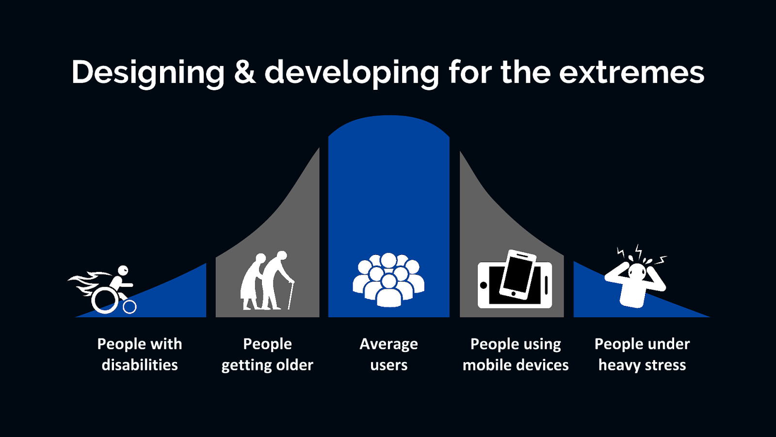
Those three examples: font choice, color and contrast, and content are all examples of making good inclusive design and development choice. When we plan, design, and develop for the extremes, then the middle is taken care of automatically.
Just a quick note to anyone who might be overwhelmed by this concept of “accessibility first” approach. It may seem a little daunting. It might even seem like a radical shift in thinking to some, but we’ve been here before. In fact, the way you might feel about digital accessibility today is much like how a lot of us felt when we first heard about the “mobile first” approach. In the beginning, the “mobile first” approach was confusing and sometimes frustrating (remember pixel perfect breakpoints?!). But we struggled through it and now it is a normal part of our daily workflow. In fact, it’s hard to image designing or developing a website or app without considering multiple devices now. I predict that is what digital accessibility will feel like in a few years—just a normal part of the workflow process that doesn’t require much additional time or effort.

One of the questions I get asked a lot is: how do we add digital accessibility to a project does not have a lot of time or budget to include that piece? Well, one way we can tackle these issues is by using an accessible component-driven approach using the inclusive design and development principles. By thinking about inclusiveness from the start, we can get a head start on accessibility while still building the required website components.
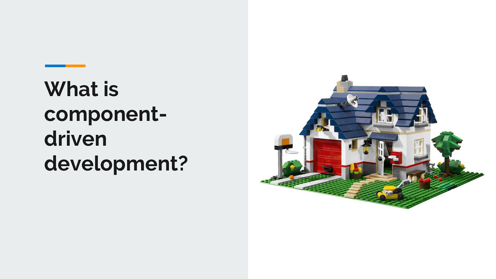
By now, a lot of people have used component driven development using style guides or pattern libraries in their development workflow process. Even if you have not formally heard the term or use the tools, I am betting you are already doing it to some degree already…it is about breaking a large website or app down into manageable pieces. Much like building a house, you need to build one piece of your house at a time…first the foundation, then the structure, walls, windows, roof, and everything in between. Component driven development tools allow us to do this, but for websites.
Some perks to component driven development include the ability to break things down to manageable pieces, so there is less development time with these reusable components. It allows front-end and back-end developers to work simultaneously. And clients, designers, PMs, etc love it because they can preview the build process and can use living style guide as a reference after the website has launched.
In late 2016, I created the A11Y Style Guide to help the team I was working with at the time better understand the different accessibility options for patterns. The A11Y Style Guide is ultimately a pattern library that comes with pre-populated accessible components that include helpful links to related tools, articles, and WCAG guidelines to make your website more inclusive. http://a11y-style-guide.com/style-guide/
➔ As a reference ➔ As a base for your own style guide ➔ As a base for creating your own accessible components ➔ As a base for a new accessible theme ➔ Contribute to the guide and make it better
My style guide tool builds on all the wonderful work that is already being done in the world of accessibility and makes that existing knowledge base more applicable to real-world scenarios in a condensed manner. I lovingly think of it as the CliffsNotes of website accessibility or a nicer term may be accessible pattern library for developers. But by using a reusable, accessible, component-driven approach and thinking about inclusiveness from the start, we can get a head start on building accessible websites. So ultimately you and your clients save time and money, plus your website is a little more inclusive…what’s not to love?
Alright enough talk…let’s demo some things
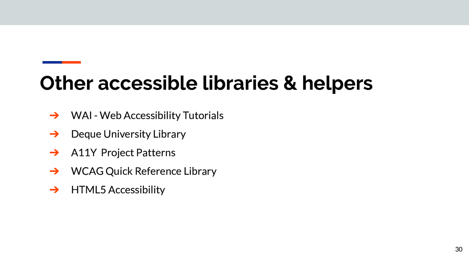
➔ WAI - Web Accessibility Tutorials (https://www.w3.org/WAI/tutorials/) ➔ Deque University Library (https://dequeuniversity.com/library/) ➔ A11Y Project Patterns (https://a11yproject.com/patterns) ➔ WCAG Quick Reference Library (https://www.w3.org/WAI/WCAG21/quickref/) ➔ HTML5 Accessibility (https://www.html5accessibility.com/)
To recap: Digital accessibility should not be just a box you check off when you deliver a new website to a client, it is a way of rethinking design and development, where you go beyond just the base level of access to information. Digital accessibility should be about making something valuable, not just accessible, to as many people as we can regardless of device. Digital accessibility is for everyone and benefits everyone
Email: carie.fisher@deque.com Twitter/LinkedIn/Medium: @cariefisher GitHub: @cehfisher Slides: https://noti.st/cariefisher