A presentation at DrupalCon Seattle in April 2019 in Seattle, WA, USA by Carie Fisher
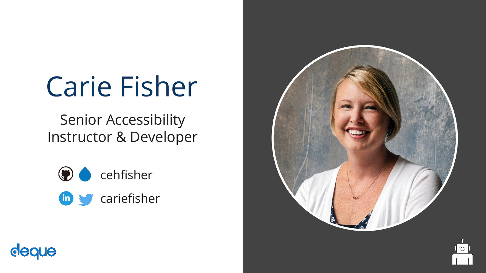
Senior Accessibility Instructor & Developer at Deque Systems @cariefisher @dequesystems
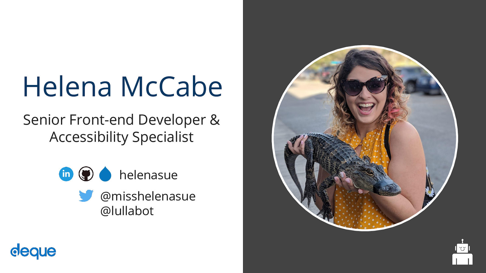
Senior Front-end Developer & Accessibility Specialist @misshelenasue @lullabot
1 - Background 2 - Personas 3 - Takeaways
Website accessibility. We have all heard that term by now, but what does it actually mean? Simply stated: website accessibility is making sure the website you create is able to be used by as many people as possible.
According to the US Census Bureau, about 19% of the United States population identifies as having a disability, which is roughly 57 million people. Thinking of these numbers in a different way, there are more people with disabilities than twice the number of people living in the state of New York. If you consider a global audience, you are talking about 15% of the world’s population or one billion people. Or almost 18 times the number of people living in the state of NY.
That is a huge number of people who could benefit from an accessible website right from the start, but keep in mind, the official numbers do not even include people that either do not identify as having a disability or those populations that could benefit from accessible websites, such as English as a second language (ESL) users and the aging population — so the number of people needing accessible websites in reality could be much higher.
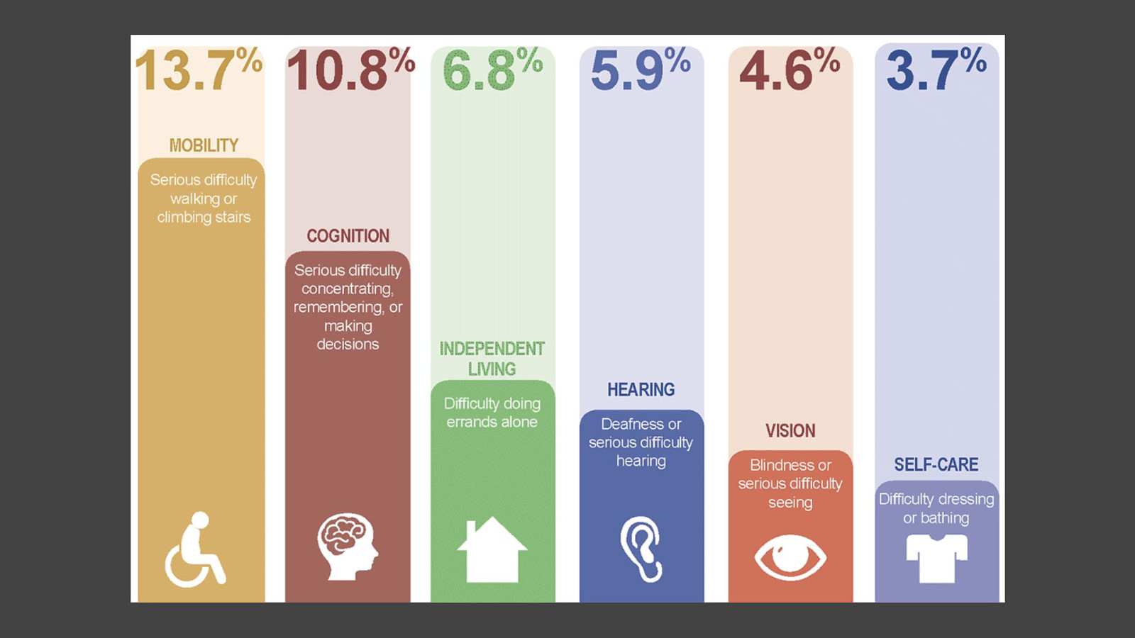
https://www.cdc.gov/ncbddd/disabilityandhealth/infographic-disability-impacts-all.html
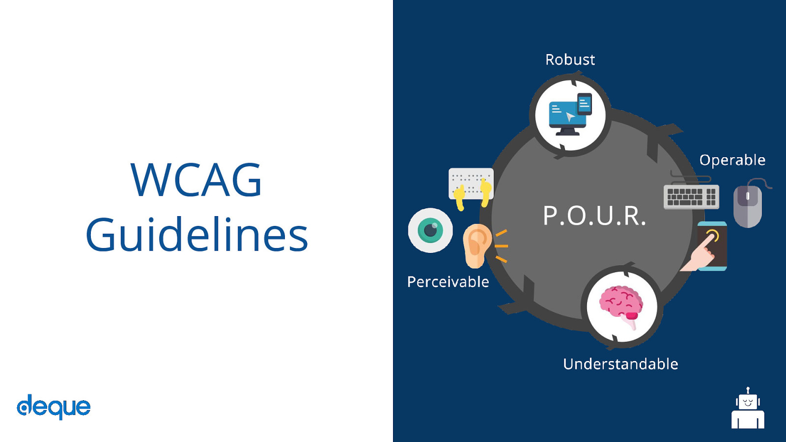
The WCAG guidelines are an international set of principles to aid developers in creating accessible websites. The spirit of POUR isn’t about rigidly adhering to hard and fast rules; it’s about understanding and meeting the diverse needs of our users.
The rules are broken into four main categories that we will go over now.
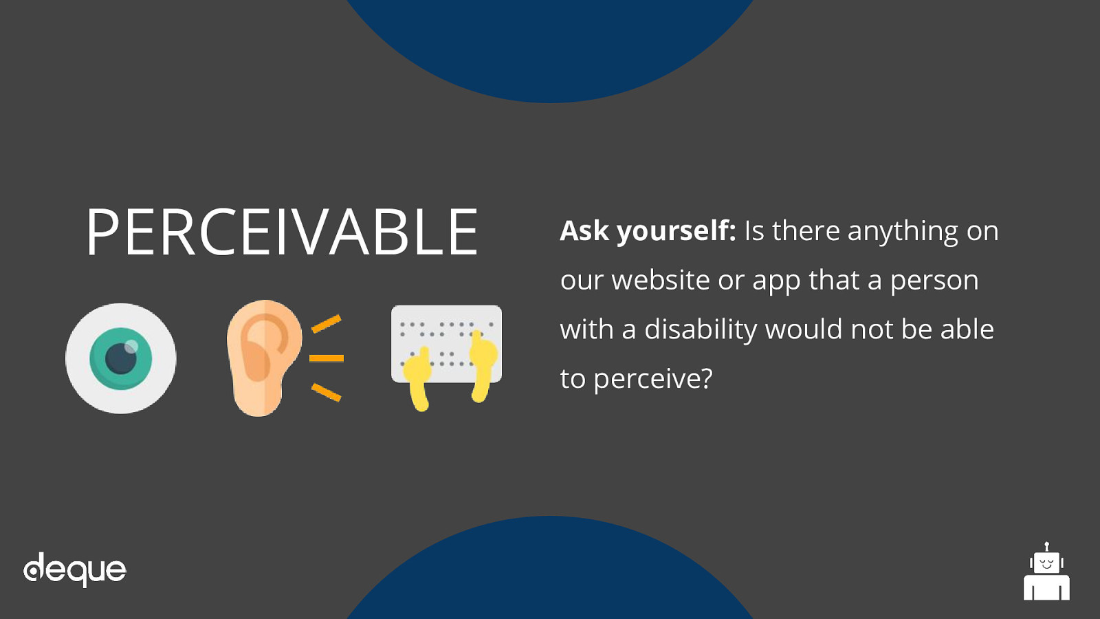
Ask yourself: Is there anything on our website or app that a person with a disability would not be able to perceive?
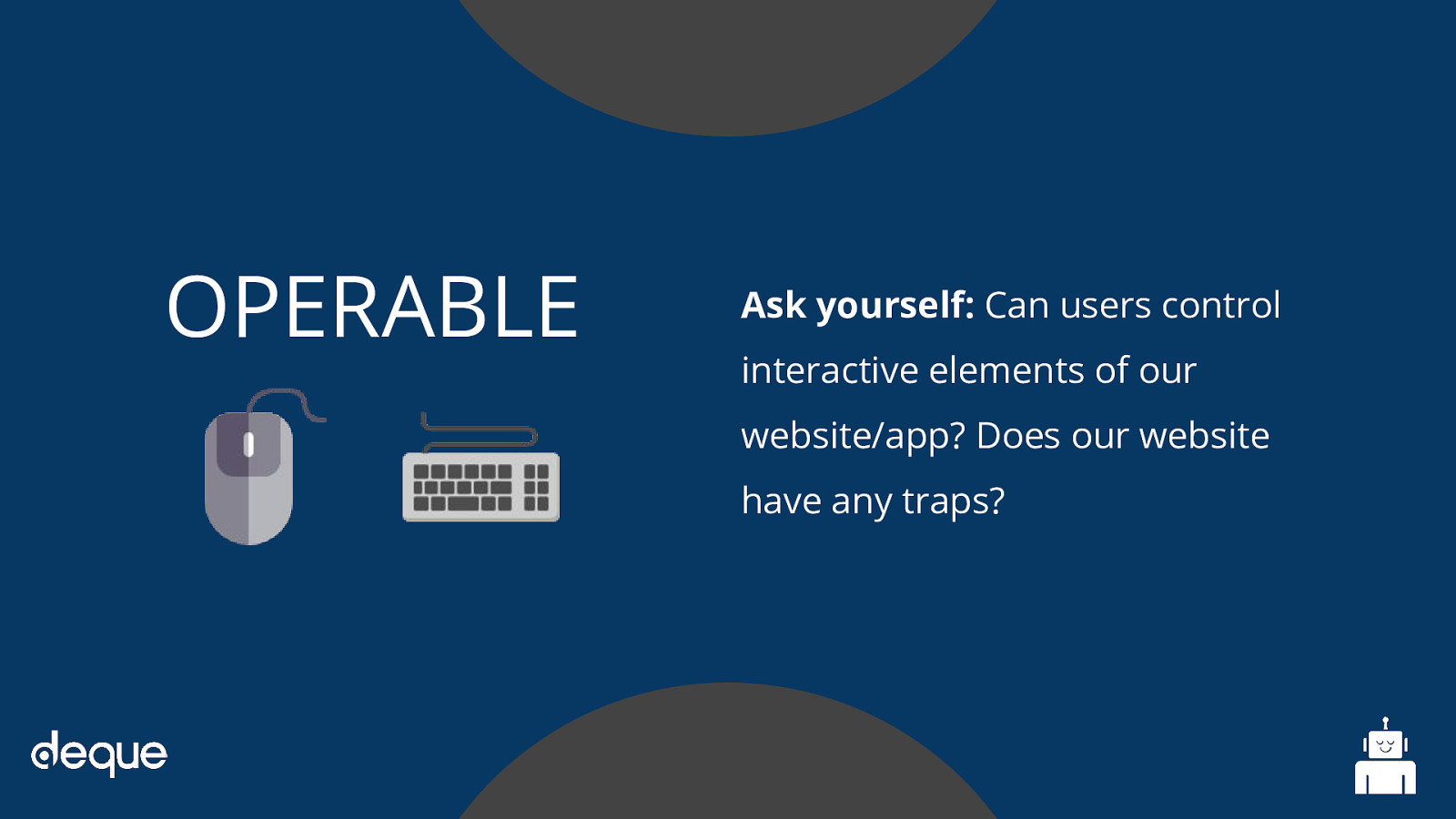
Ask yourself: Can users control interactive elements of our website/app? Does our website have any traps?
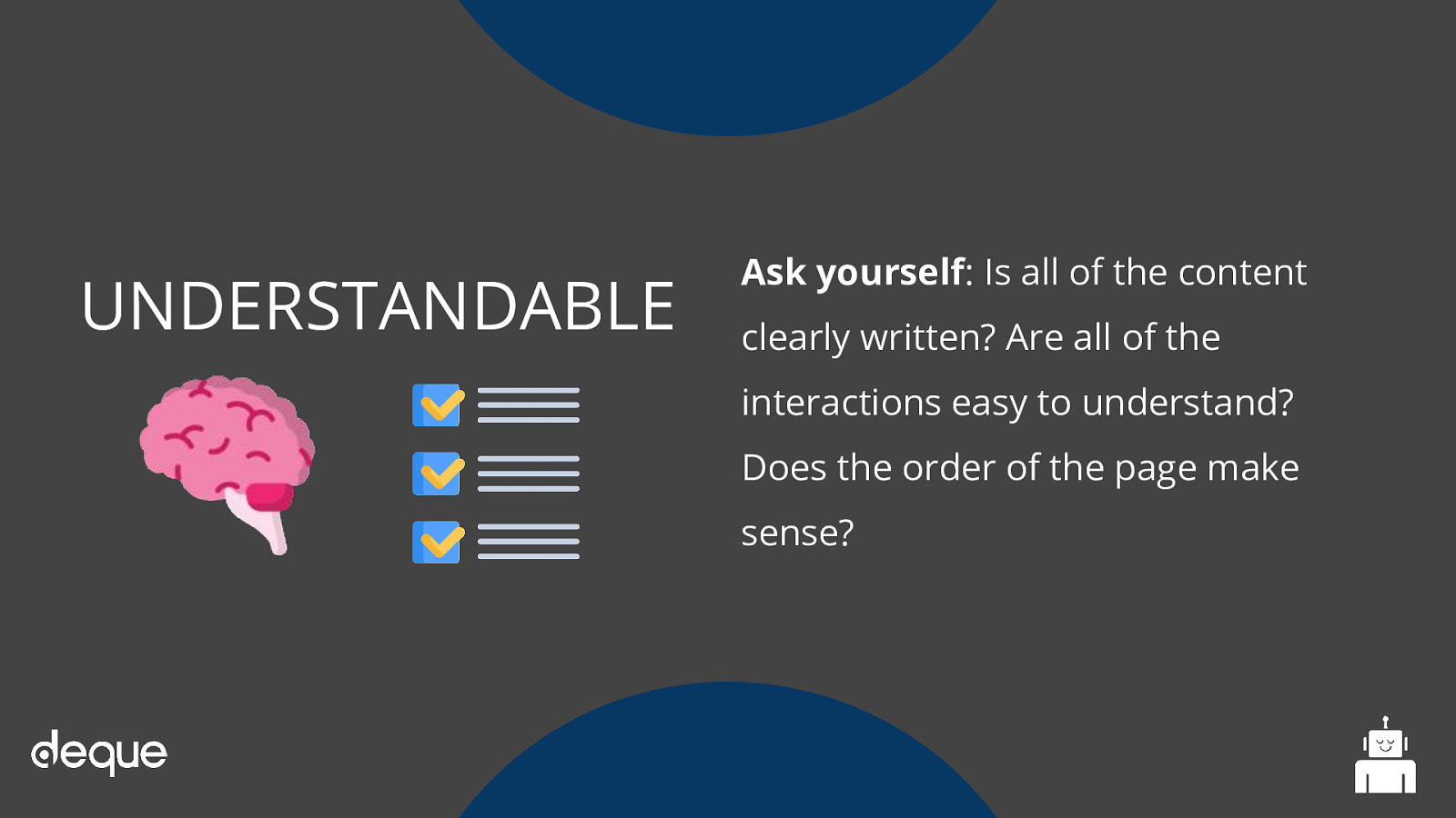
Ask yourself: Is all of the content clearly written? Are all of the interactions easy to understand? Does the order of the page make sense?
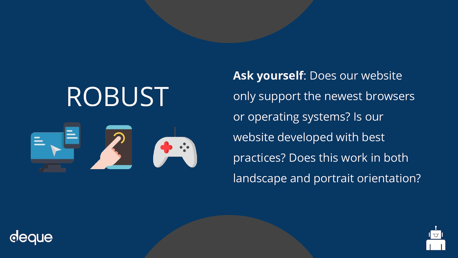
Ask yourself: Does our website only support the newest browsers or operating systems? Is our website developed with best practices? Does this work in both landscape and portrait orientation?
“a11y” is a numeronym that is short for “accessibility” A -> [11 letters] -> Y
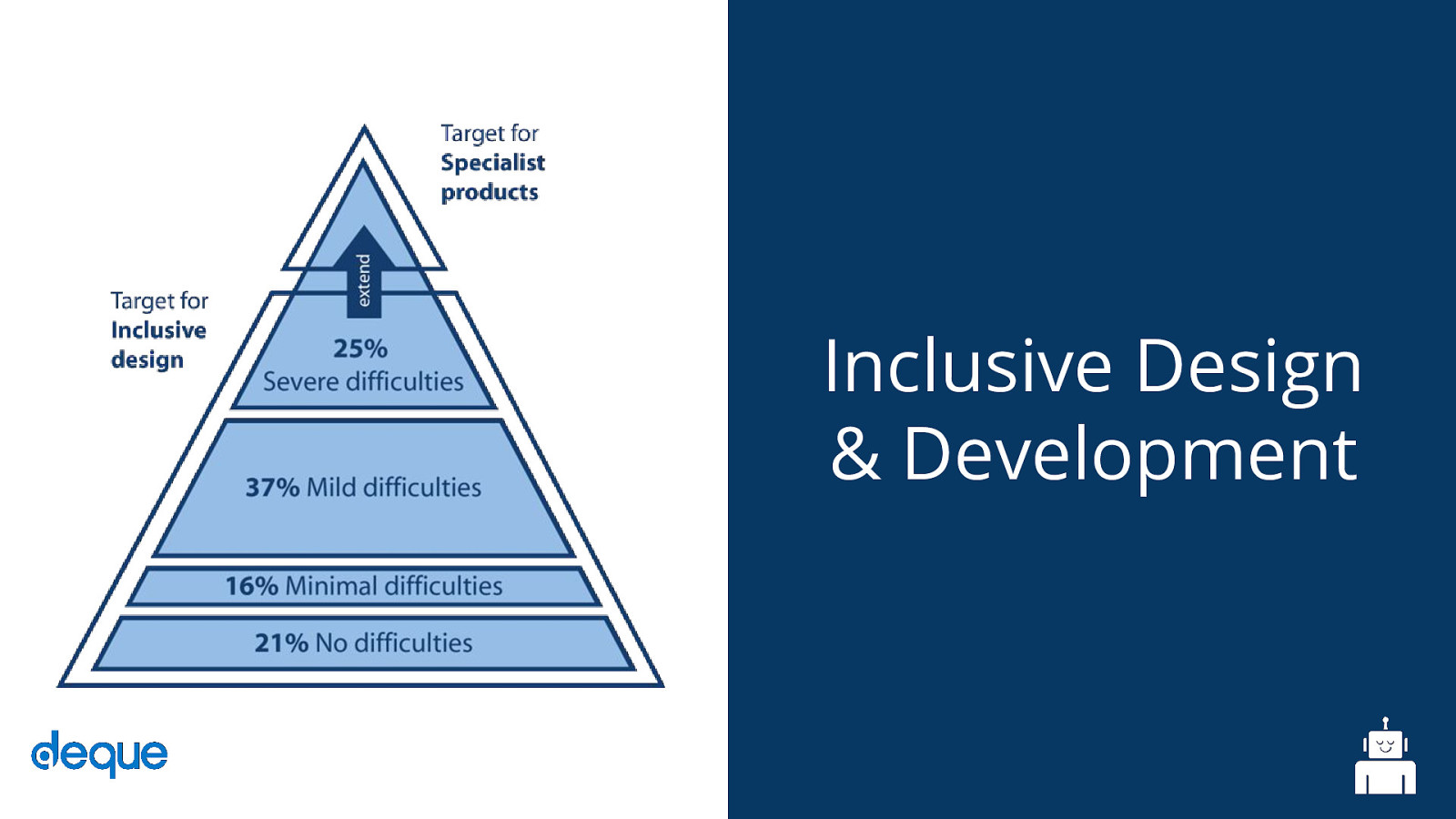
The term Inclusive Design is not a new one. It is a phrase that has been around since 2005. It is defined as “The design of mainstream products and/or services that are accessible to, and usable by, as many people as reasonably possible…without the need for special adaptation or specialized design.”
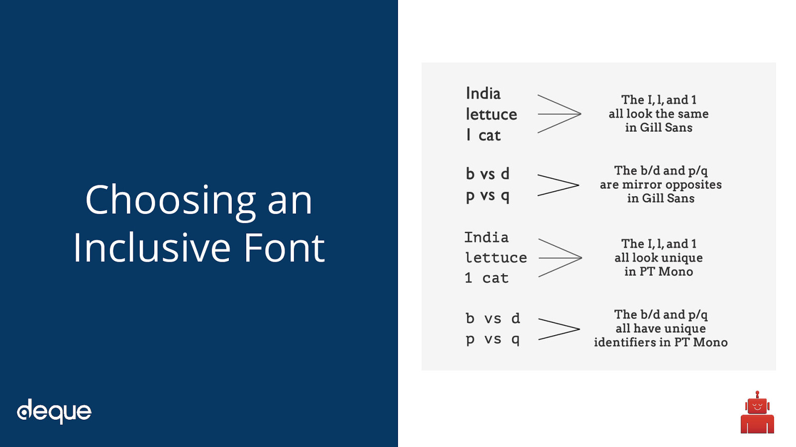
Font families are a good example of a place where you can make an inclusive design and development choice. Your choice of typeface/fonts can make or break a website, especially from an accessibility point of view. English as a second language (ESL) users, users with low vision, and users with reading, learning, and attention disorders (ex. dyslexia, ADHD), all benefit from accessible typography.
Researchers estimate that 10-17% of the U.S. population has dyslexia. That is a pretty significant percentage, which is even higher than current Internet Explorer, Edge, Firefox and Opera users combined (as of September 2017).
So if we choose a typeface we know that is legible for people with dyslexia (as shown by the top section on the pyramid with severe difficulties), then we also know every group under that section can also read the font. People who are blind or have more serious sight issues other than dyslexia would need additional typography or assistive technology considerations.
For example, people with visual impairments or dyslexia, certain letters or combinations of letters can be confusing, so it’s important that letter shapes are clearly defined and unique. Common offenders are the “I” (ex. India), “l” (ex. lettuce) and “1” (ex. one). Likewise, characters like “b” and “d” and “q” and “p” can sometimes be mirrored (either left-right or up-down) so words could be flipped into a nonsensical words or sometimes into a real word that would entirely change the meaning of the content.
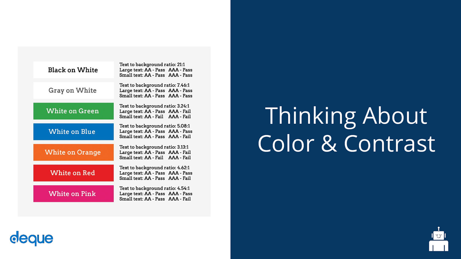
With the number of people living with some variant of color blindness, low vision, or complete blindness (all together roughly 9% of the global population), this is a very large area where designers can have a direct and immediate impact on website accessibility.

A11y rocks tool demo - http://a11yrocks.com/colorPalette/ Paciello group color tool -https://developer.paciellogroup.com/resources/contrastanalyser/
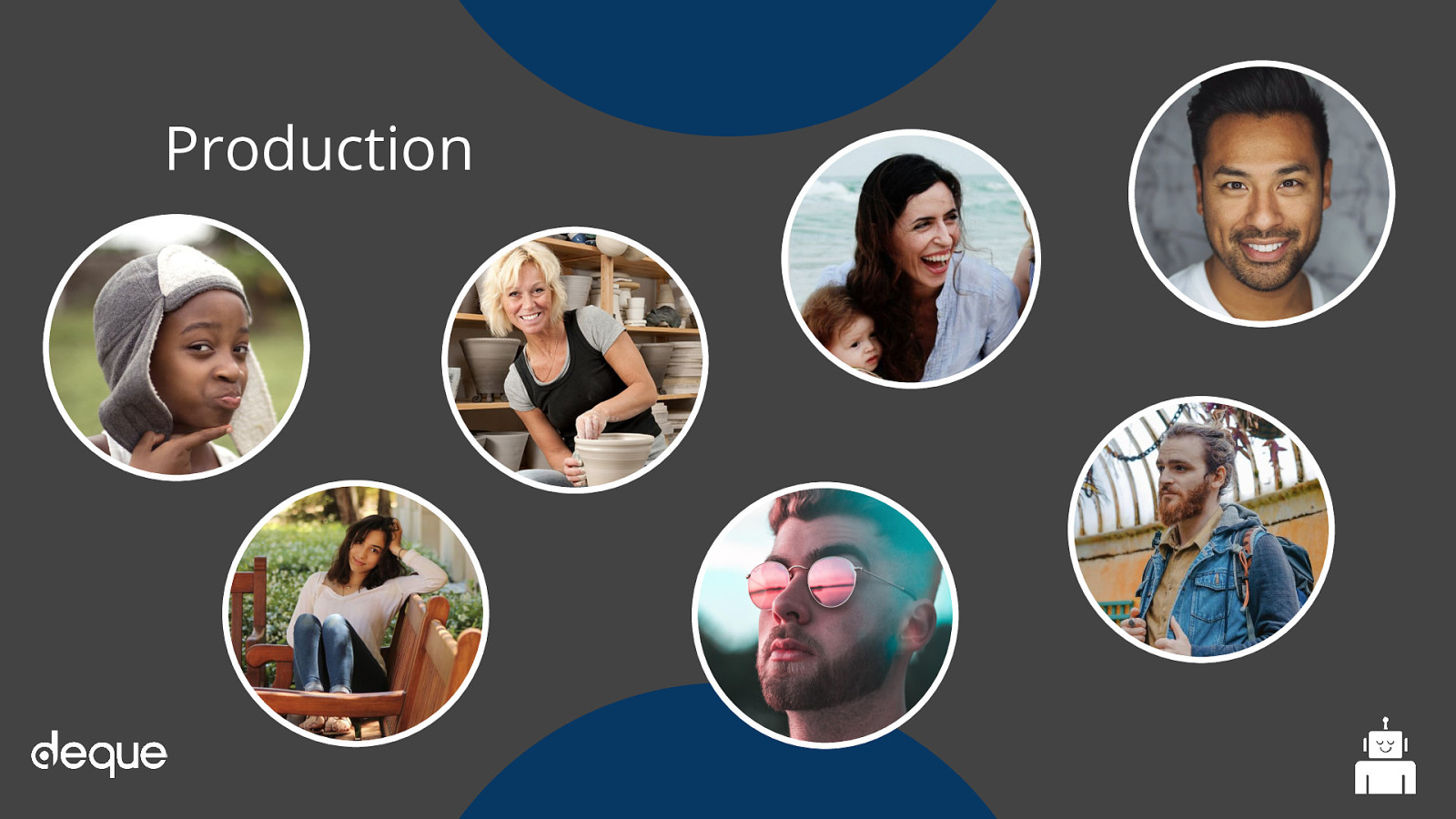
Personas answer the question, “Who are we designing and developing for?” and they help to align strategy and goals to specific user groups. A user persona can be formal or informal…on paper on in your head. It is important when planning a new website to keep people of varying backgrounds, ethnicities, genders, ages, technical abilities, etc. as a part of your personas so that you’re working toward meeting a realistic variety of perspectives and needs.
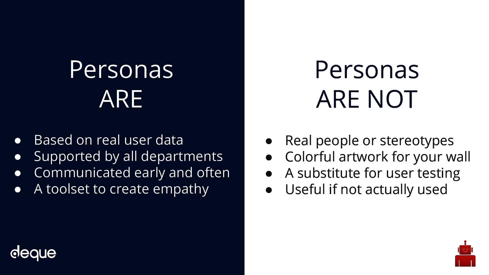
A persona is a representation of a type of customer. The purpose of personas is to create reliable and realistic representations of your key audience segments for reference. These representations should be based on qualitative and some quantitative user research and web analytics. Personas help to focus decisions surrounding site components by adding a layer of real-world consideration to the conversation. They also offer a quick and inexpensive way to test and prioritize those features throughout the development process.
Quick note: each persona we are going through today is completely fictitious. The personas are not meant to represent all people of a particular community, but should be seen as a potential member of a community and a potential visitor to your website.
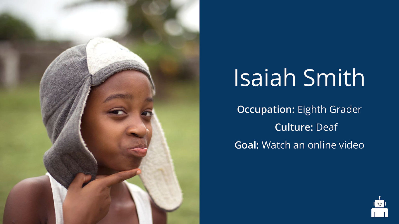
First persona we have today is Isaiah. Isaiah is deaf, but he actually doesn’t see being Deaf as a disability - he considers it a culture, as many Deaf people do. He attends a Deaf high school, and his primary language is ASL.
Being Deaf hasn’t slowed him down much in his thirteen years. He may be young, but he’s already a wiz on the computer. He builds websites in his spare time and is part of his school’s robotics club. He’s hoping for his team to win Nationals this year, but a lot of the tutorials he’s found online have been hard for him to use, since the instructions aren’t subtitled.


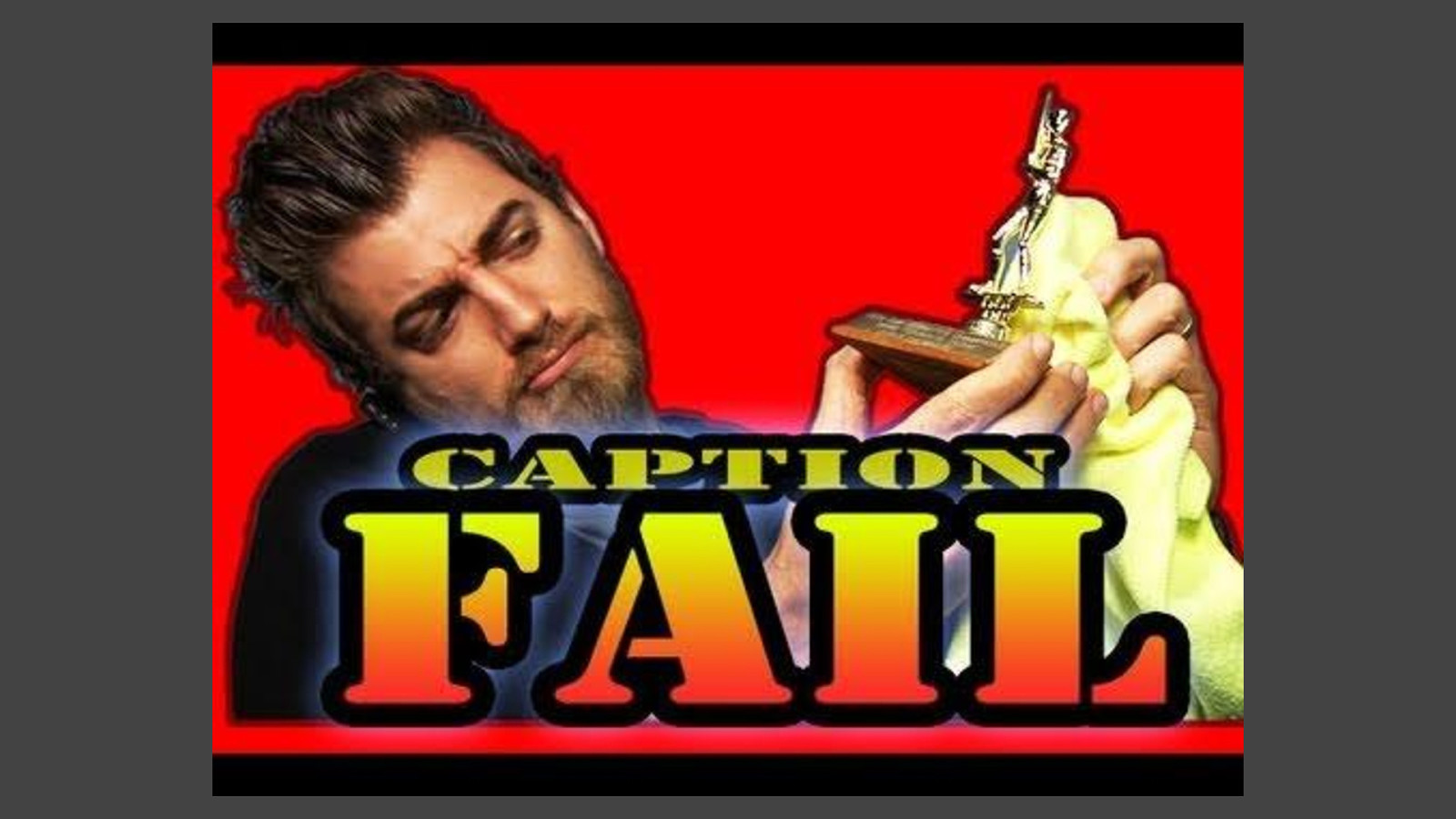
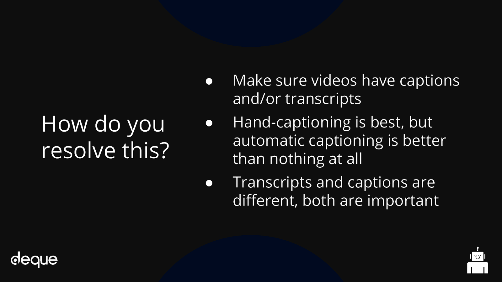
● Make sure videos have captions and/or transcripts ● Hand-captioning is best, but automatic captioning is better than nothing at all ● Transcripts and captions are different, both are important
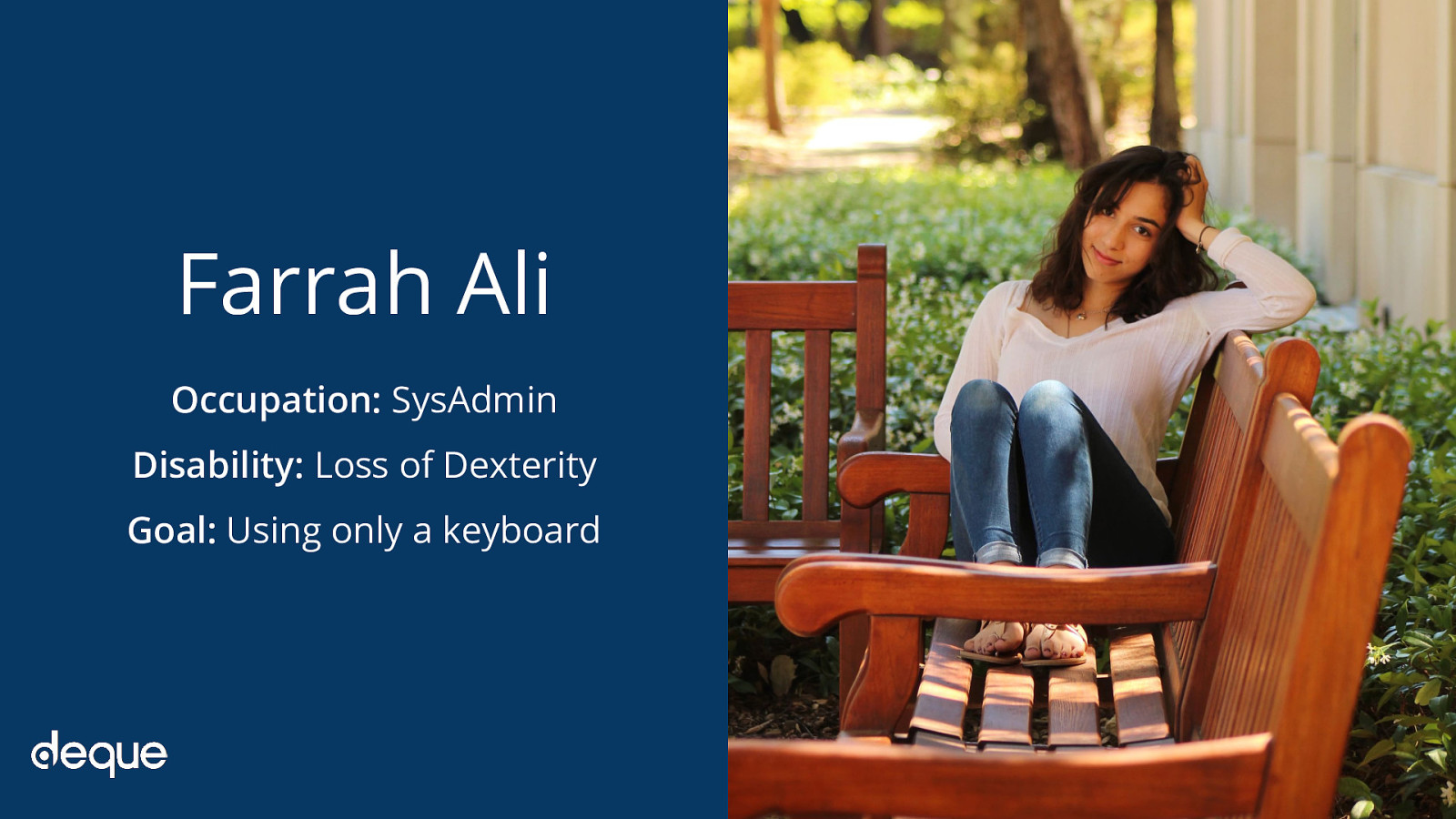
Farrah is a SysAdmin for a well-known company. The systems she maintains are crucial to keeping her company’s services running and she has a lot of team members whose needs she ends up supporting throughout the day. She’s the queen of putting out technical fires, and she’s everyone’s go-to in the department when anything goes down unexpectedly.
Farrah has always been dedicated to her physical fitness. She played left forward on her college soccer team and loves running marathons. This made it all the more of a blow when she was diagnosed with the early onset of Parkinson’s last year. Losing her fine motor skills to tremors is making it increasingly more difficult for her to use a mouse, and she’s been steadily relying on the keyboard more and more to navigate the web.
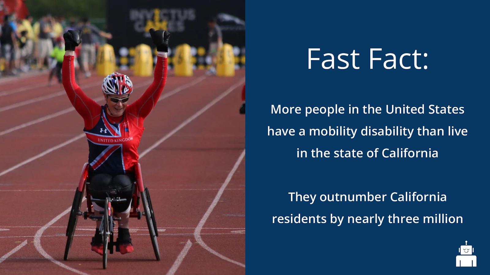
More people in the United States have a mobility disability than live in the state of California. They outnumber California residents by nearly three million.

● Plan out heading and page structure - make sure it makes sense to all users and devices ● Place important actions at the top or bottom of the page ● Use skip links and don’t forget your focus indicators
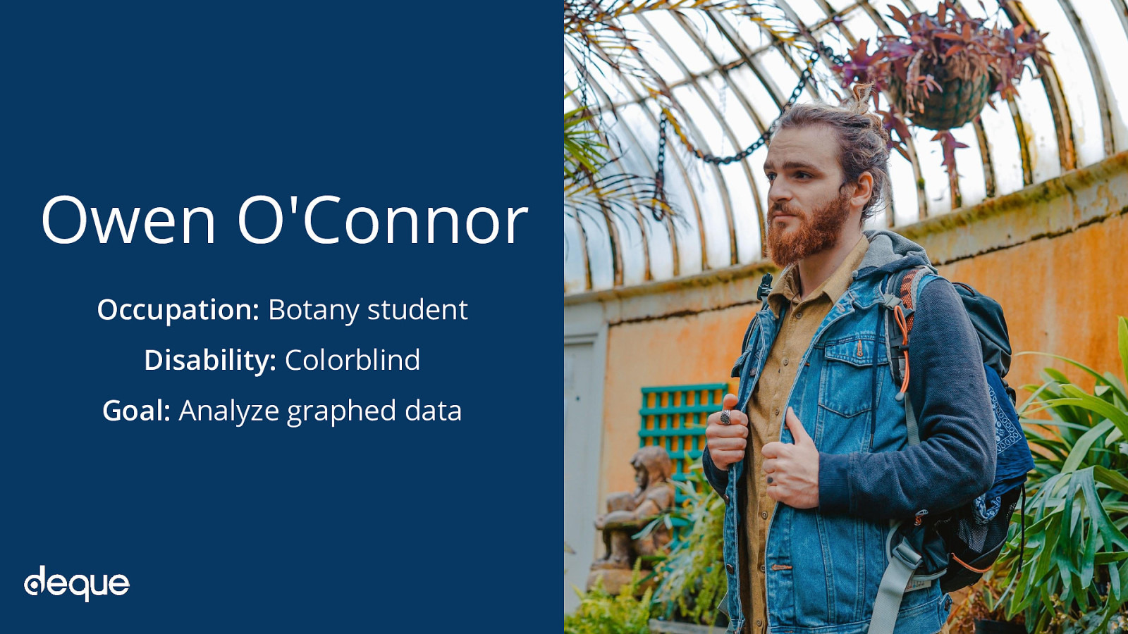
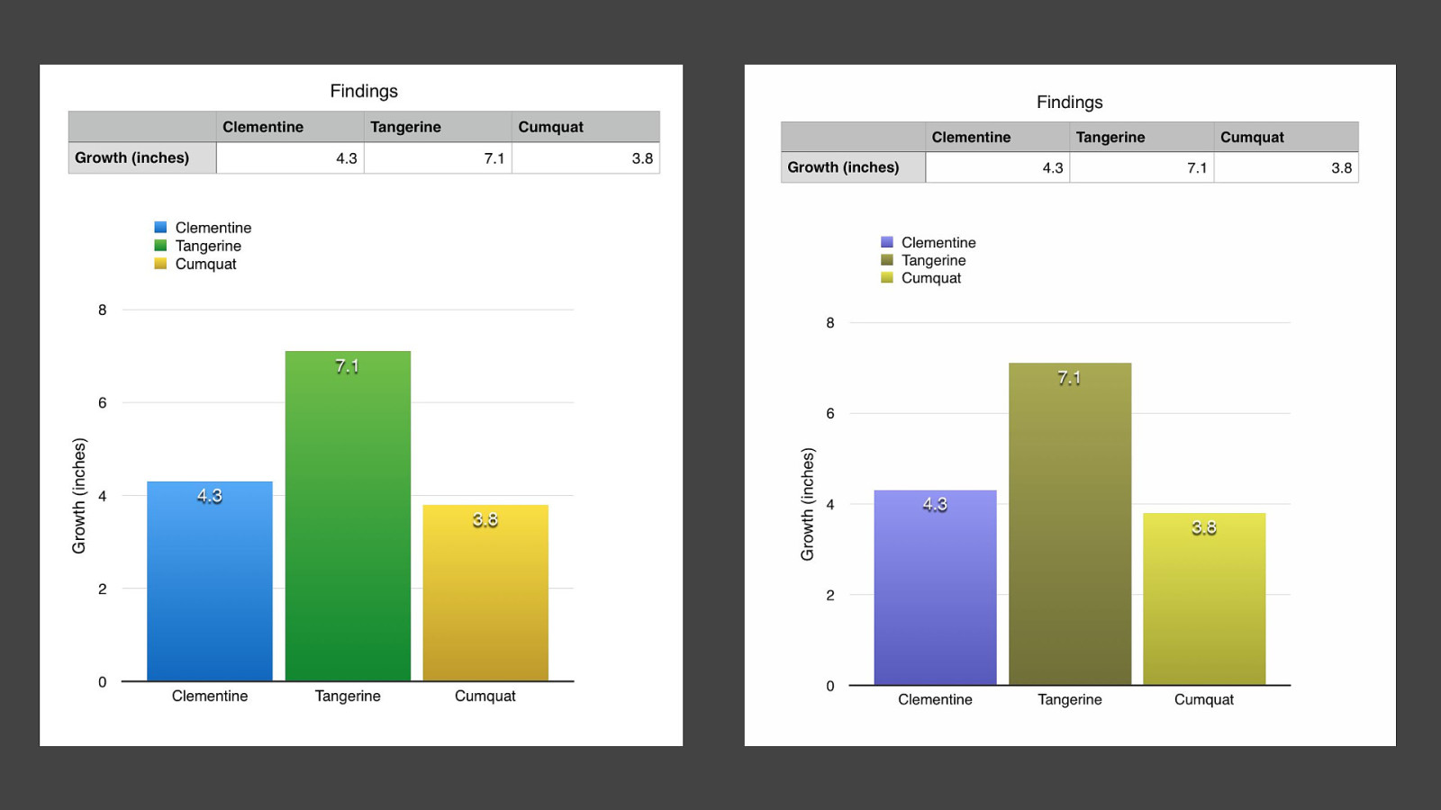
Owen O’Connor is a student at a local university who is studying Botany. He really loves learning about the latest discoveries in the plant world and regularly visits online plant journals to read their articles. His favorite website just released an interesting new study, but he can’t interpret the findings because the charts are all color-coded and poorly labeled.
1 in 12 men have some type of color blindness.

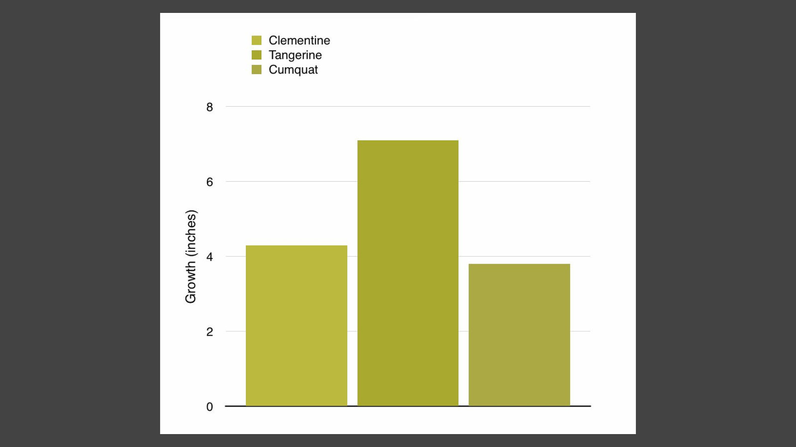
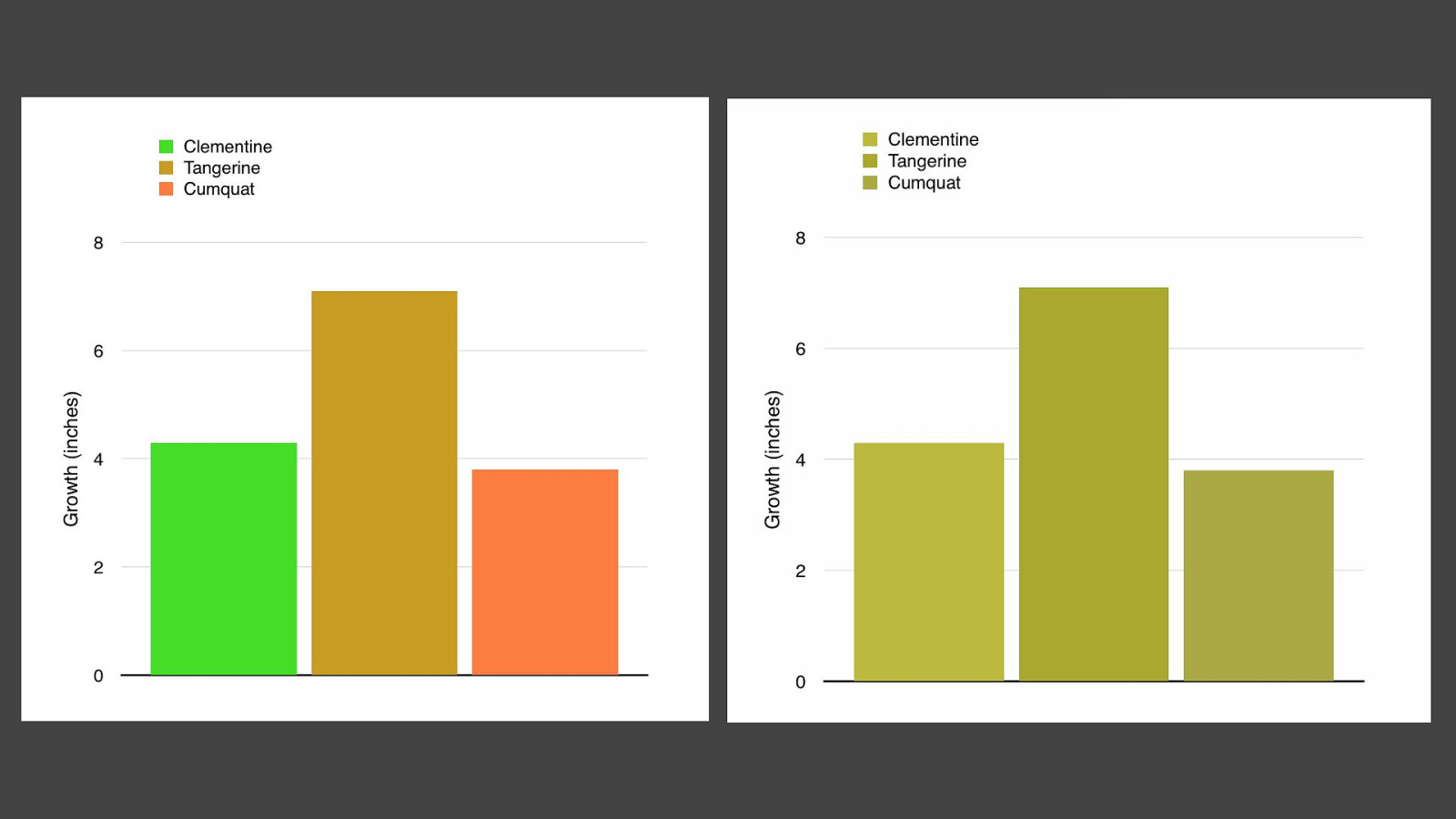
● Make sure color is not the only identifier ● Use tools to simulate what your site or app would look like for different types of color blindness ● Test color contrast levels for grayscale too
Eddie has loved to build websites since middle school. He’s always had a natural talent with code, especially back-end development. He primarily works in Drupal and loves Drupal 8 because it’s so much more convenient for him to use. Despite being great at building websites and knowing all of the ins and outs of his assistive tech, there’s still a lot online that even a pro like him can’t access.
He’s always considered himself a social guy, and he’s got a pretty serious relationship going on with his smartphone. He loves social media and spends a lot of his idle time on Facebook and Twitter. While most of his friends are pretty good about adding alternative text on their posts for him, a lot of the people and companies he follows on Twitter tend to forget. He wants to stay up to date, but the popularity of posting all-text memes and other picture-based posts blocks him from being included.

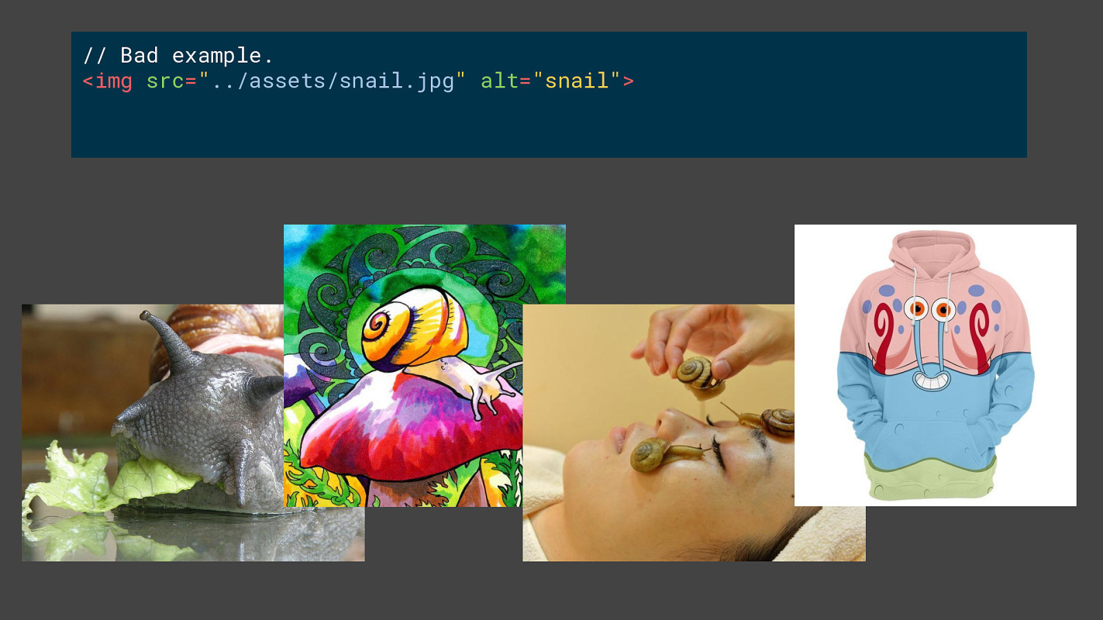

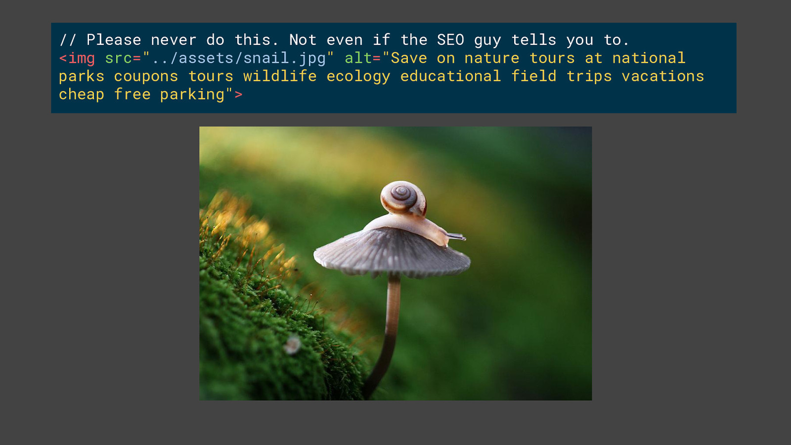
Not even if the SEO guy/gal tells you to. <img src=”../assets/snail.jpg” alt=”Save on nature tours at national parks coupons tours wildlife ecology educational field trips vacations cheap free parking”>
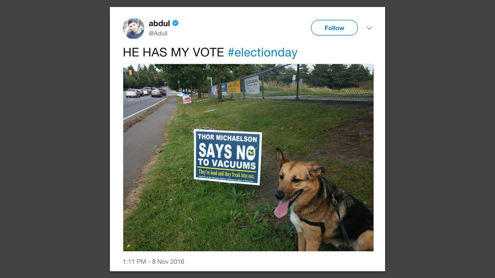
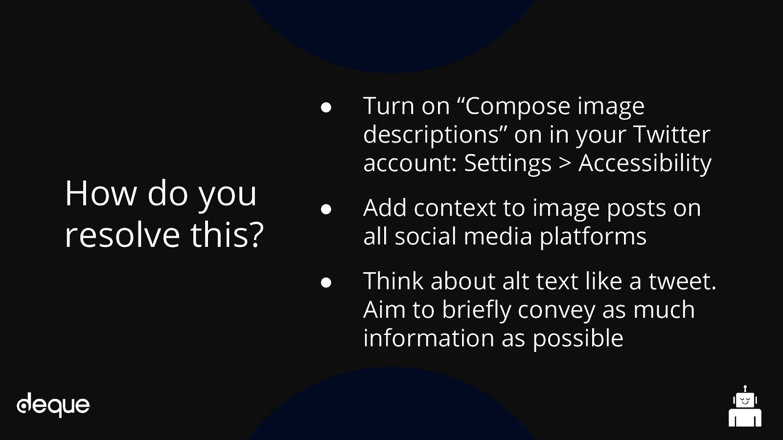
● Turn on “Compose image descriptions” on in your Twitter account: Settings > Accessibility ● Add context to image posts on all social media platforms ● Think about alt text like a tweet. Aim to briefly convey as much information as possible
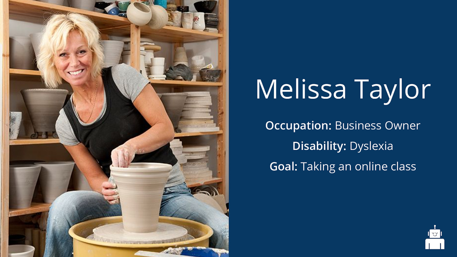
This is Melissa Taylor. She’s 47 and has created a thriving business for herself as the owner of a pottery studio. She uses a variety of online tools to balance the budget for her small business and to schedule her employees for their shifts. She loves reading online articles about new techniques for working with clay on Pinterest.
Even though she already has a successful business, she loves to push her boundaries. She’s working on her Master’s degree in Fine Arts online. The new online learning system for her class has timed tests, so she needs to read the material quickly and answer correctly to pass.
● Use an inclusive font in relative units like rems and ems ● Make sure to add enough margins, padding, and line spacing to your text ● Break text into small pieces or use bullet points/numbers
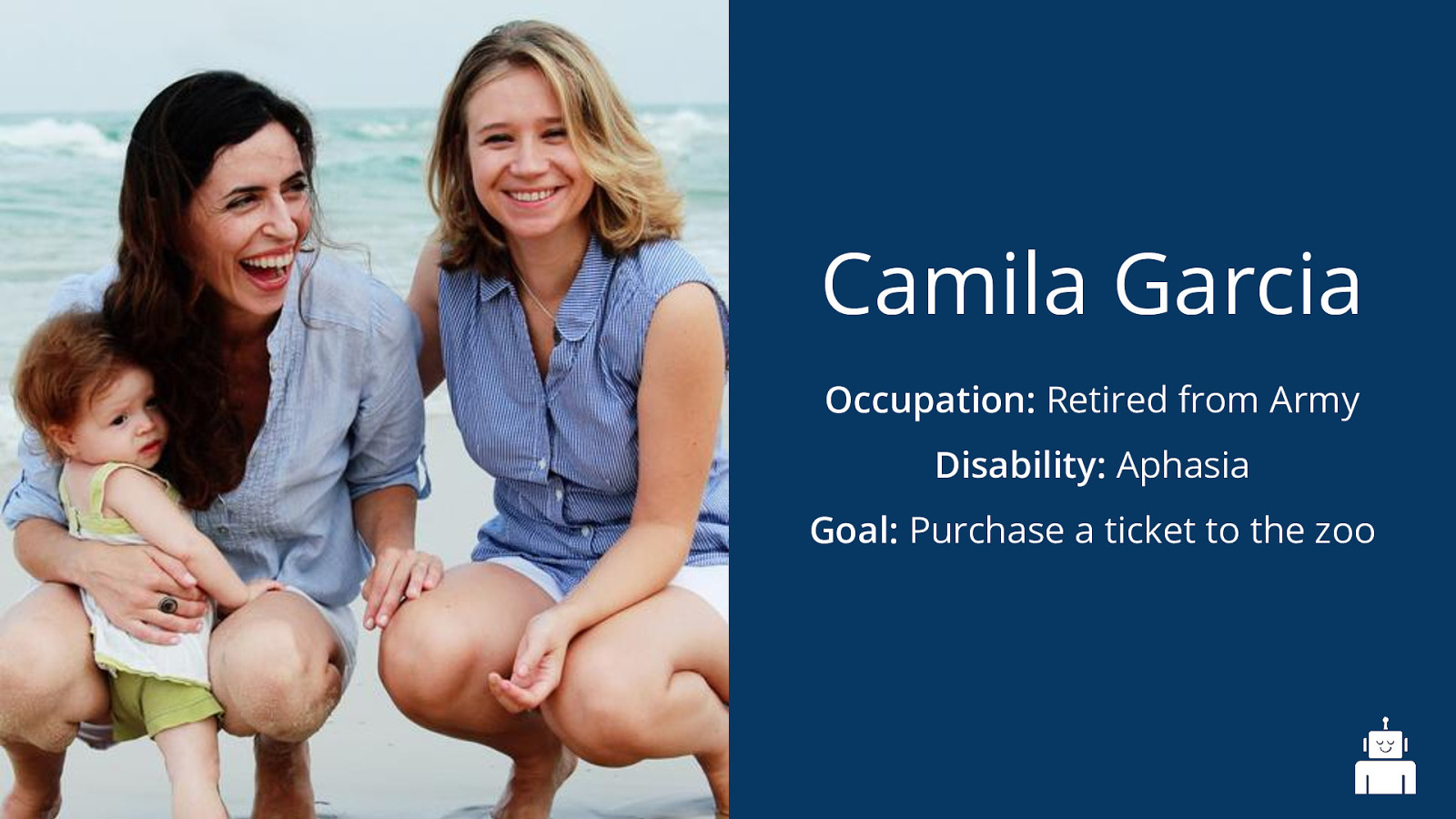
Camila Garcia is a former Sergeant Major in the Army who was honorably discharged after she suffered a traumatic brain injury on active duty. Due to the injury, Camila now has a condition known as aphasia.
Aphasia is a type of traumatic brain injury, often resulting from a stroke. It is an impairment of language and can interfere with a person’s ability to produce or comprehend language. Imagine going to a foreign country where you do not speak the language, or you only remember a few words from your high school or college language course. You would have difficulty saying what you mean, understanding what others were saying to you, reading the language, and writing things down. This provides a little insight into what it might be like to have aphasia.
Despite her new found disability, Camila is adjusting well to civilian life with her wife and young daughter. To show her family how much she cares for them, Camila decides to plan a day at the zoo as a surprise for her wife, but she is having a difficult time purchasing a ticket due to her aphasia. The form is difficult to understand to understand and worse, it keeps timing her out!
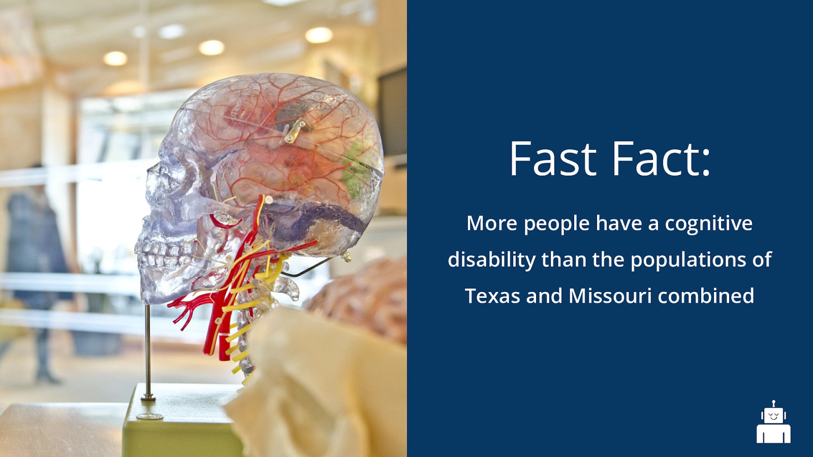
More people have a cognitive disability than the populations of Texas and Missouri combined.

● Use icons along with text on important features ● Make sure there is enough white space on the page and minimize or eliminate distractions ● Give users enough time to complete tasks
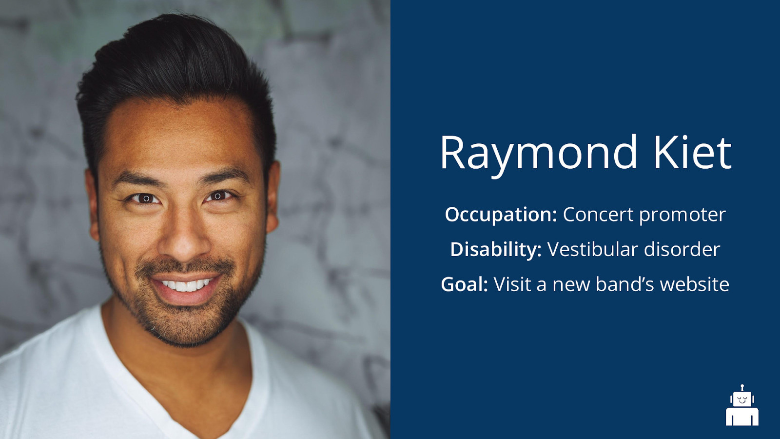
Ever since Raymond was little, he knew he’d somehow be involved in the music industry. After years of trying to make it big as a musician, Raymond found he was better at concert promotion than playing in a band. Raymond loves making schedules, organizing concerts and all the behind-the-scenes work at a music show, from recruiting the act to providing security. As part of his job, Raymond must check out new musical acts all the time. But with the advent of animated gifs, infinite scrolling, and moving backgrounds on many bands websites, he is finding it harder and harder to do his job without aggravating his vestibular disorder. For Raymond, these website “delights” actually trigger dizziness and migraines and make him physically sick.

● Do not automatically play your media or slideshows ● Allow the user to take control of media-based features ● Be careful of gifs, animations, and other “delights” that may trigger vertigo and seizures

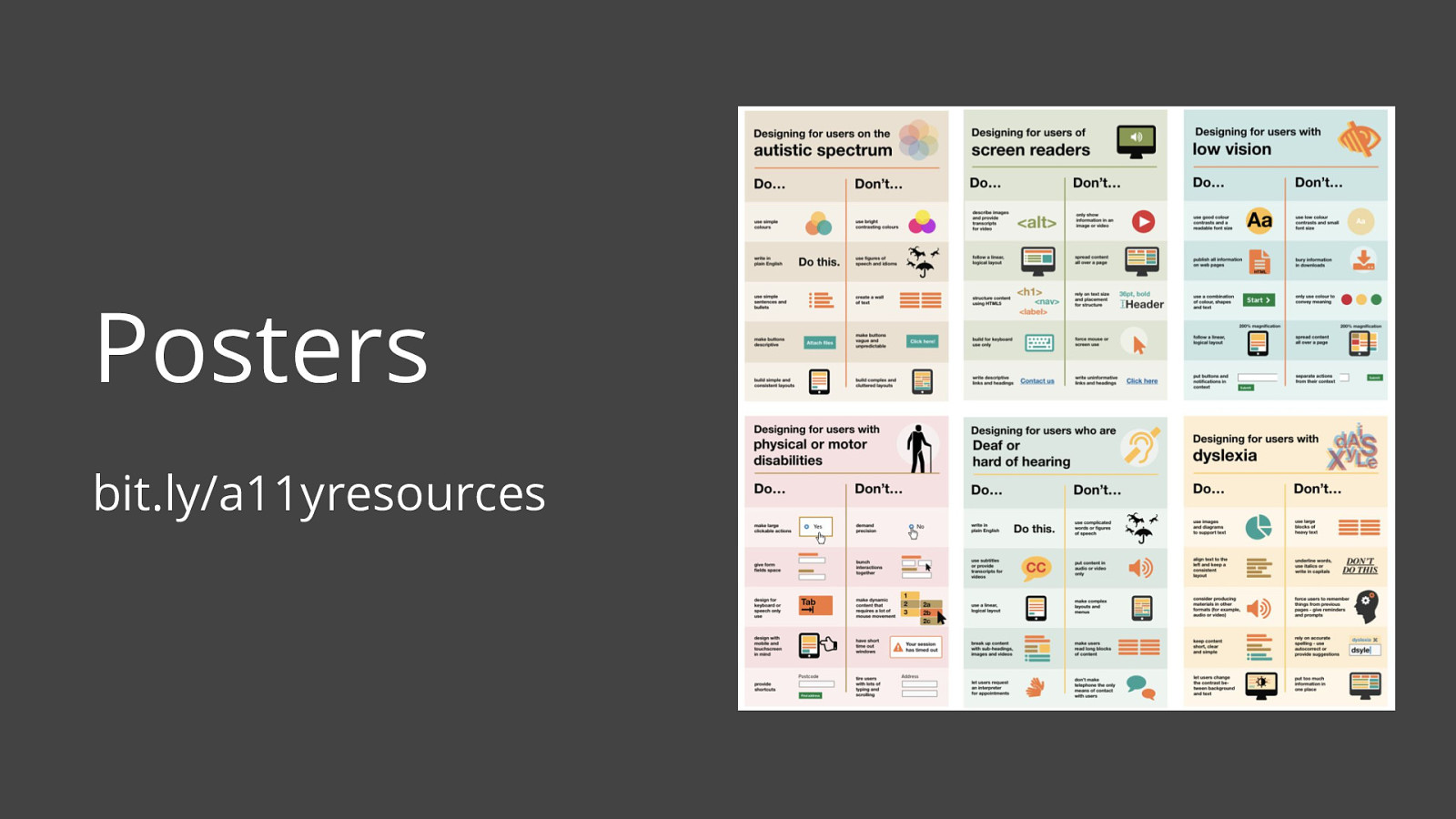
bit.ly/a11yresources

bit.ly/a11yresources
The power of the Web is in its universality. Access by everyone regardless of disability is an essential aspect. Tim Berners-Lee
