
A presentation at Drupal Camp Asheville in July 2021 in by Carie Fisher

Sr. Accessibility Consultant & Trainer at Deque & HCI Ph.D. Student at Iowa State University
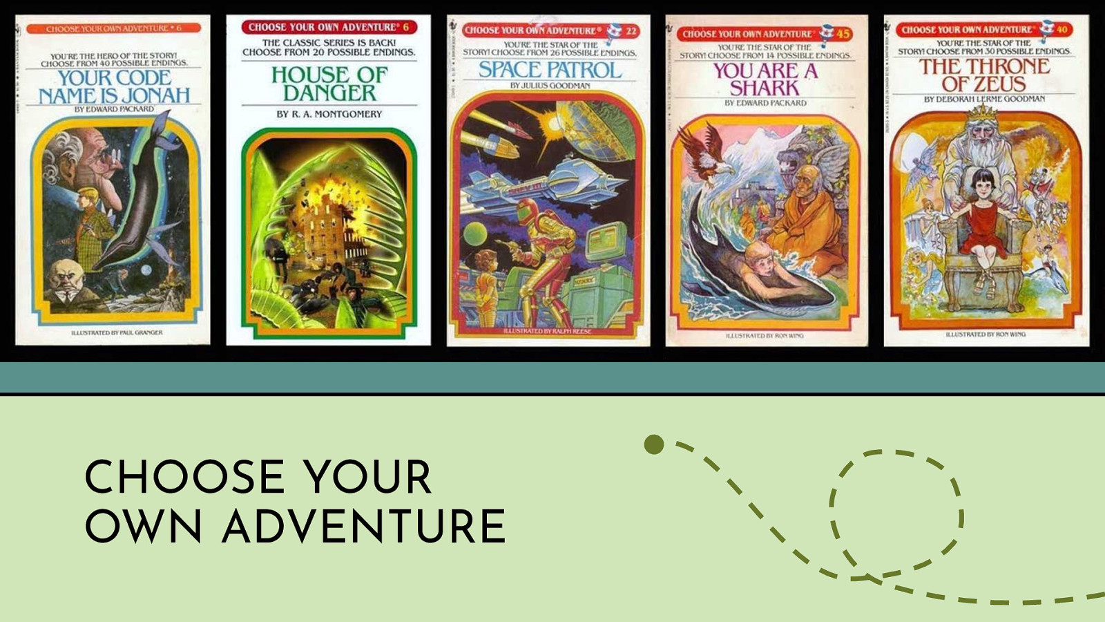
The idea of this talk came about when reading some Choose Your Own Adventures books with my son. If you are unfamiliar with the books on the screen…let me give you a brief history. The Choose Your Own Adventure is a series of children’s gamebooks where each story is written from a second-person point of view, with the reader assuming the role of the protagonist and making choices that determine the main character’s actions and the plot’s outcome. This book series started back in 1976 and became one of the most popular children’s series during the 1980s and 1990s. Today the Choose Your Own Adventure book series boasts 184 stories (not counting various spin-offs) and is available in several different formats including Braille formatted books and voice-activated interactive audio books.
Of course, as a 90s kid I have many wonderful memories reading these books and today my kids have started their own collection of Choose Your Own Adventure books. As a kid, I never stopped to consider why these kinds of books were so engrossing, but as a parent I now see how this type of book became so popular - it is all about freedom of choice. Think back to when you were 9 or 10 or so, you don’t have a lot of control over your life. But when you read this type of book you suddenly control everything - you make all of the choices, you are empowered.
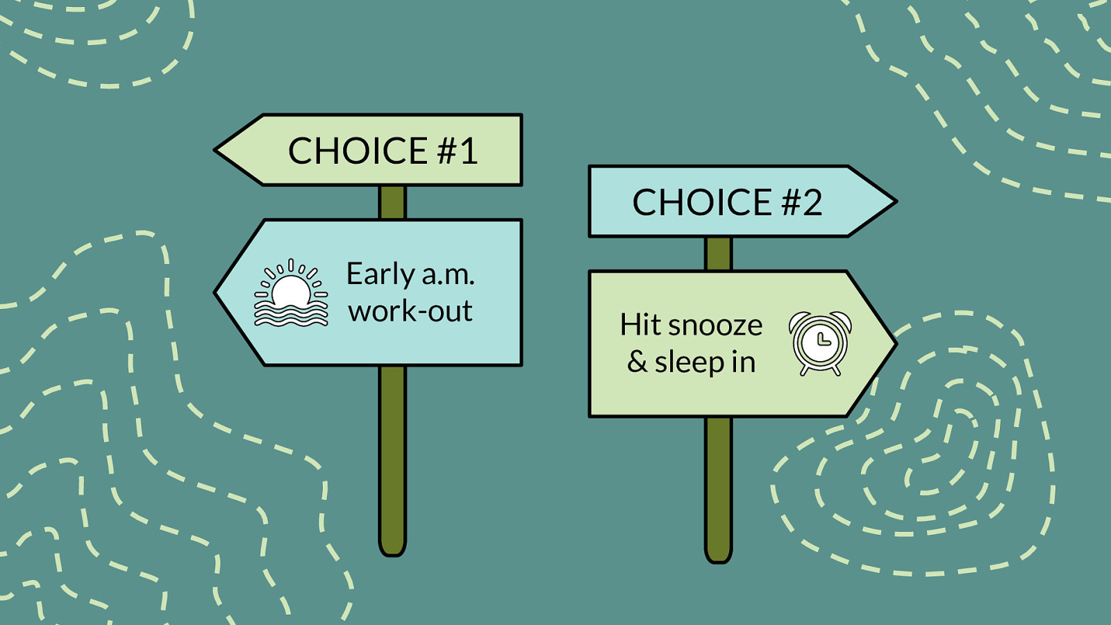
Every day we have a series of choices to make. Get up early to work-out or hit snooze and sleep a bit longer? Make a nutritious meal at home or order something maybe just a bit less healthy to go? Finally stop rocking sweatpants at work or switch to wearing PJs instead? All the choices we make - even the little ones - shape our identities and empower us in our own lives. In today’s world, we all expect to have multiple choices regardless of the product or service we are researching. In the recent past, this was not always the case.
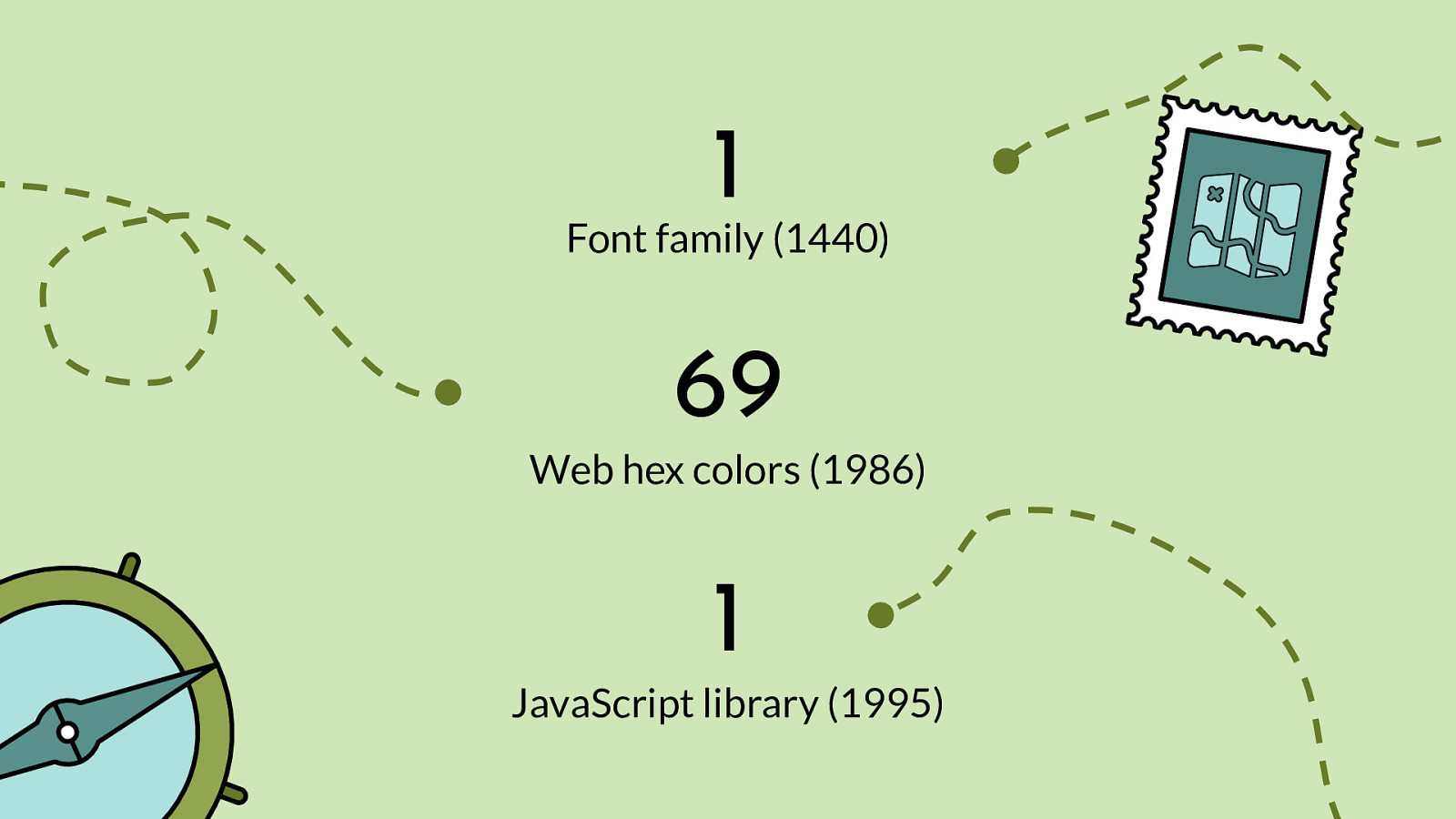
For example, at one time there was only one font family in the world. The first typeface was a Blackletter variety used by Johannes Gutenberg on the first printing press, starting in 1440.
The first set of web colors were produced at MIT called “X10R3” a precursor to X11. There were 69 basic shades, with 138 entries to account for different cases in the color names (e.g., “dark red”).
In September 1995, a Netscape programmer named Brendan Eich developed a new scripting language called “Mocha” which was later renamed JavaScript.
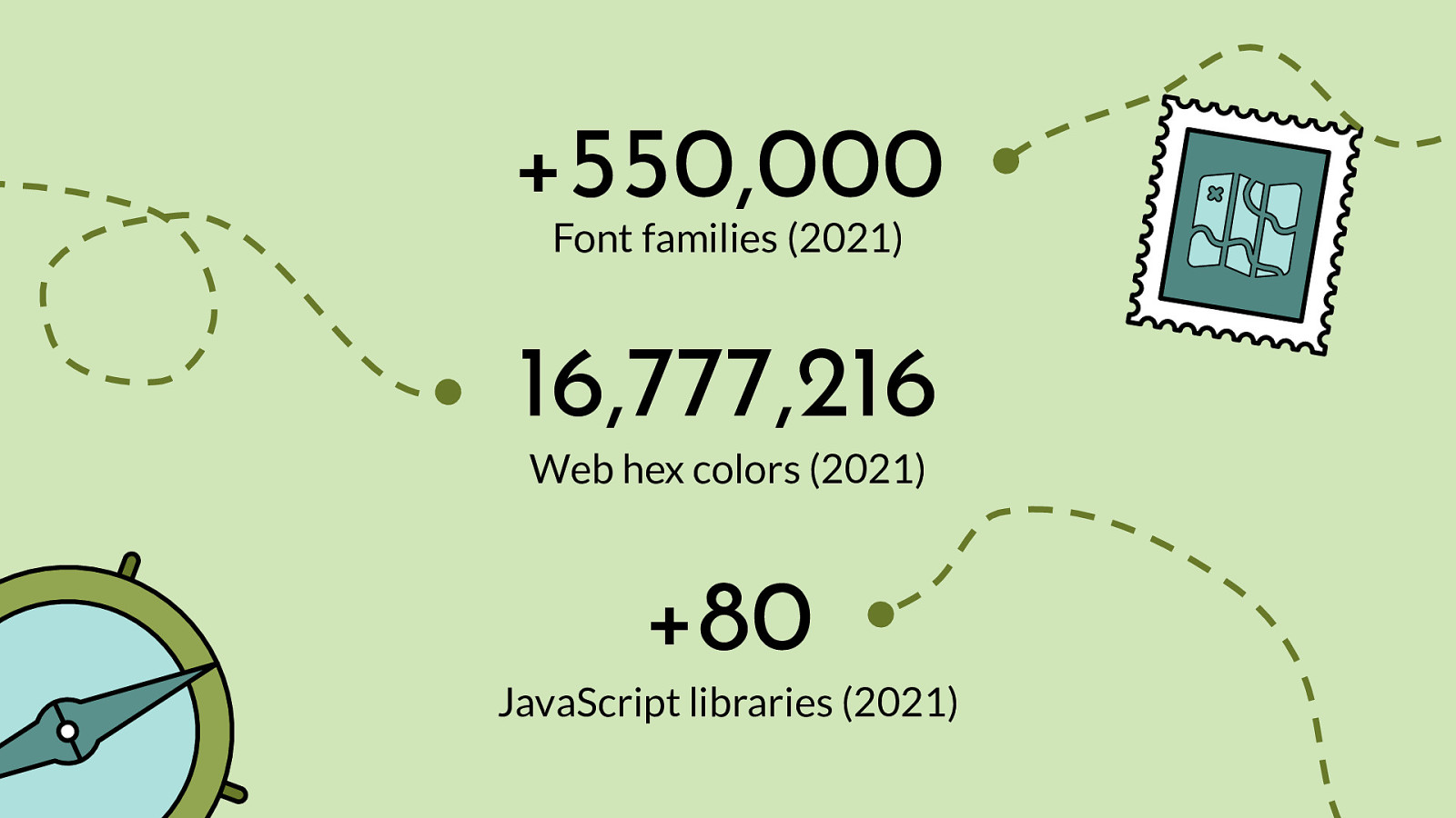
+550,000 Font families (2021) 16,777,216 Web hex colors (2021) +80 JavaScript libraries (2021)

“Life is a sum of all your choices.” Albert Camus (French philosopher)
But what happens when that choice is taken away from us? How do we respond when given no choice? Not surprisingly, many studies in vastly different academic areas have shown that feelings of powerlessness can lead to negative outcomes like depression, anxiety, and a feeling of worthlessness. One pivotal study from the UK’s London Business School found a link between choice and empowerment in a workplace. Another study found women became empowered when they were given a choice of contraceptive methods. While another study measured parents’ satisfaction levels when empowered to choose which school their child attends. The researchers in all these cases proved what has long been suspected: that giving people choices counterbalances feelings of powerlessness and also improves psychological well-being by giving people a greater sense of control over their lives.
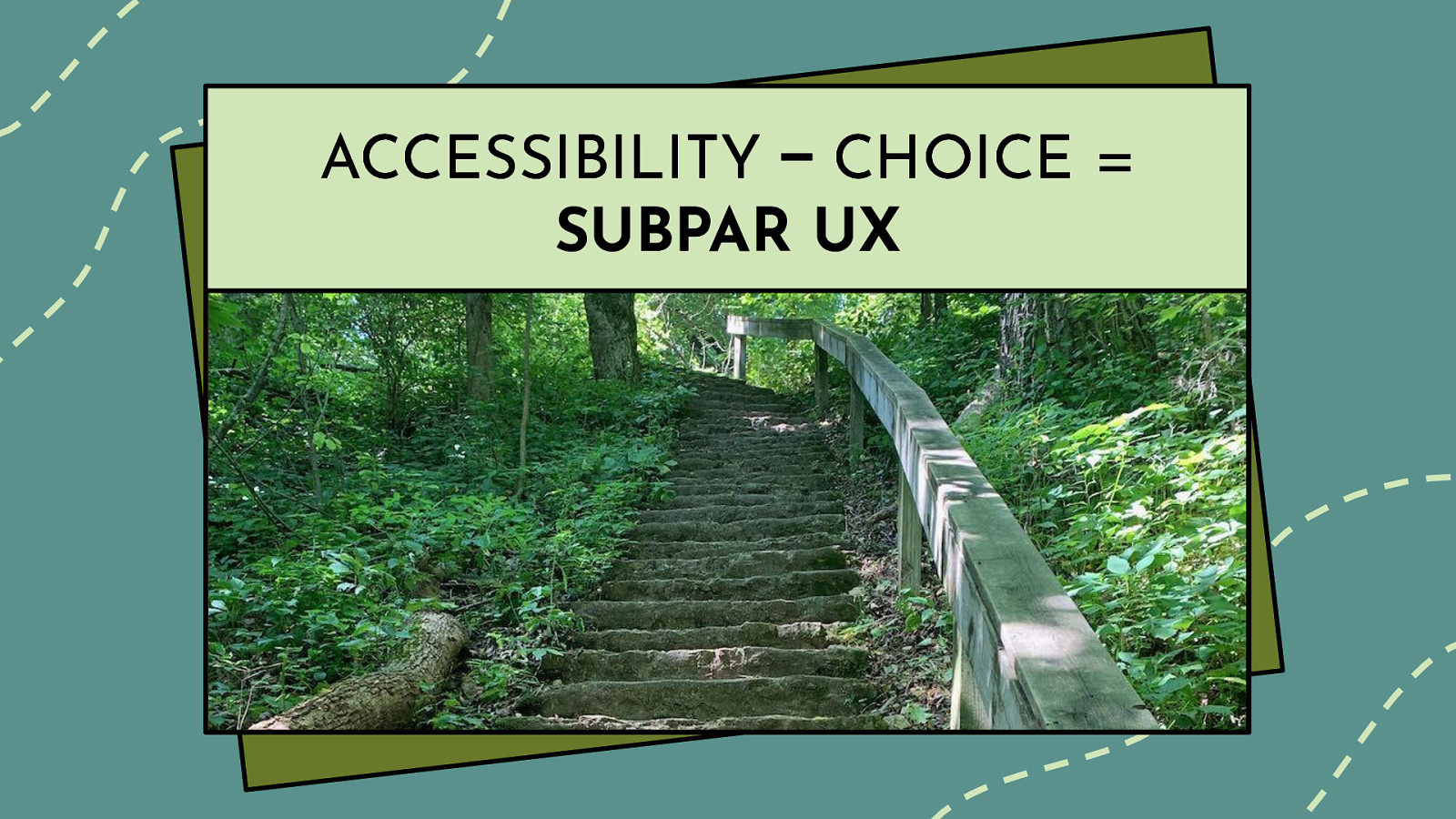
With the abundance of options we are used to these days and all the positive aspects of choice as independent researchers found, why is it that in the digital sphere, we often don’t give our users many options? By allowing a user to make choices, we could help them accomplish the tasks they set out to do, connect more easily with others, and ultimately help empower them. When we don’t offer choices, we are sending the message that we think we know what is the best for the user. While we might get it right sometime…how can we possibly know what the 7 billion people inhabiting the earth really prefer? Don’t users know best when it comes to their own needs?
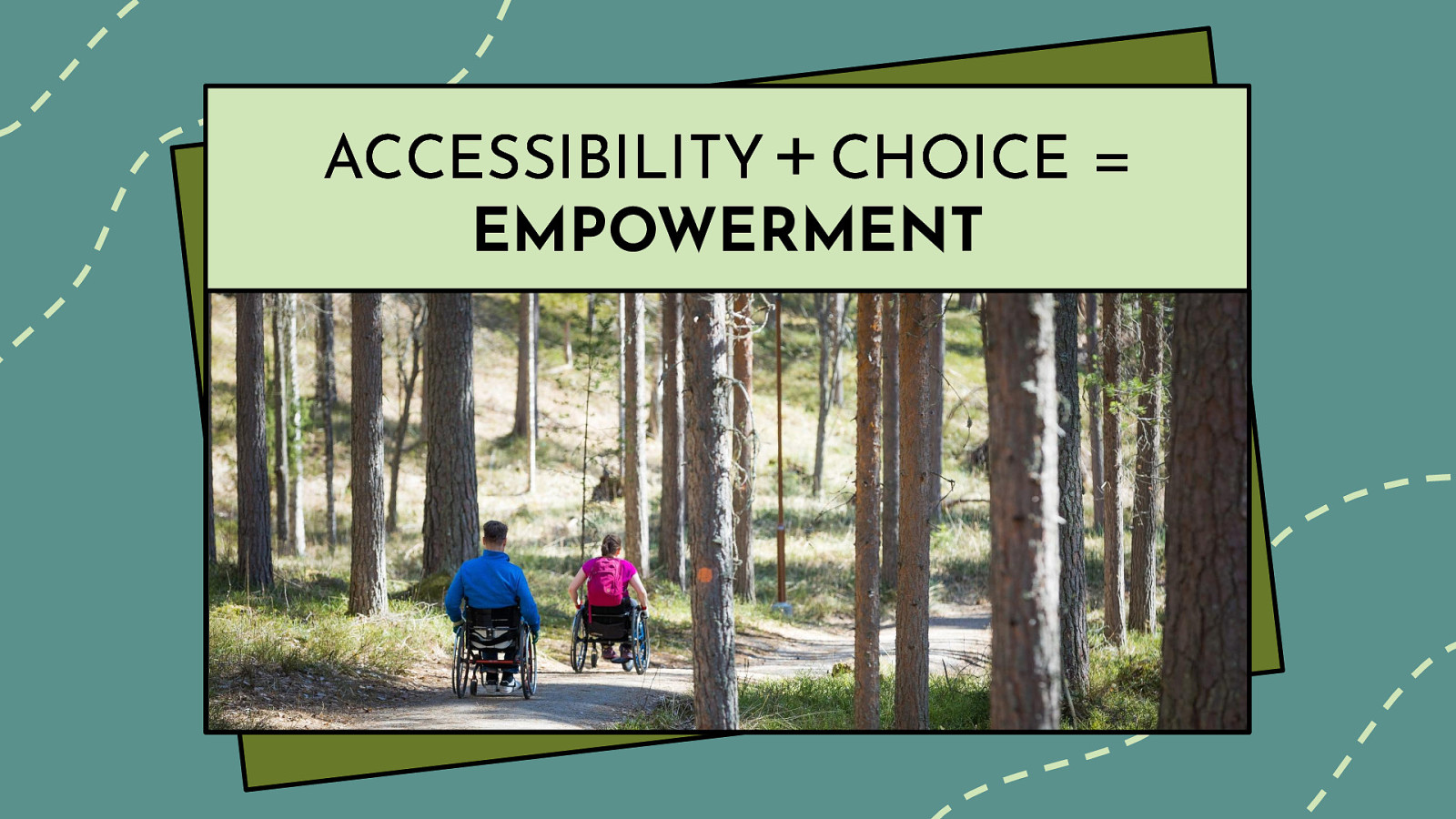
Of course, one might argue that things get more complicated when you bring digital accessibility into the mix and designers and developers need to have more control over the user experience. While there certainly are considerations you need to make for each disability type (speaking in on a broad sense) and there is the matter of assistive technology (AT) device support, but really, people with disabilities are no different than any other users. They want choices too.
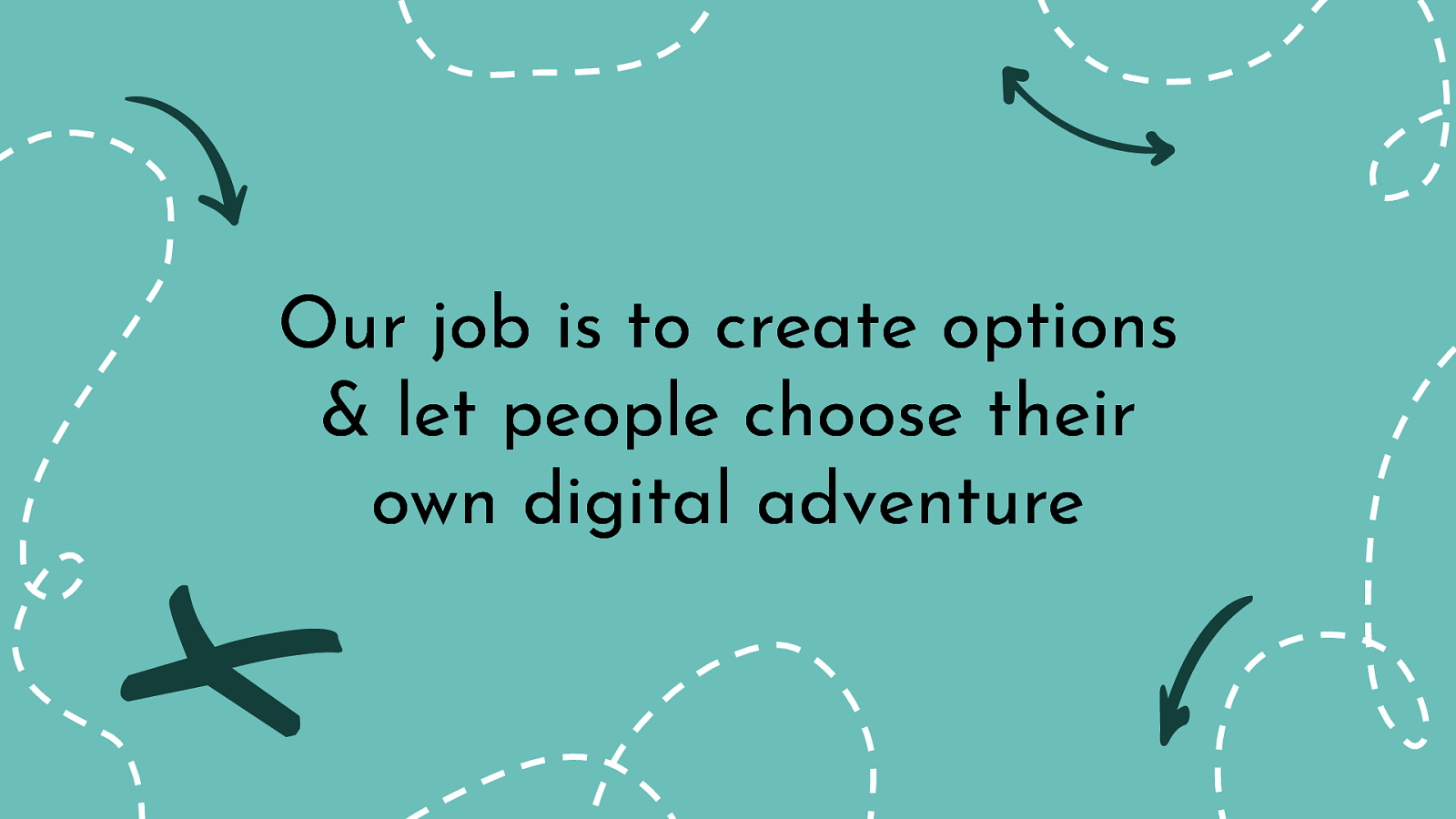
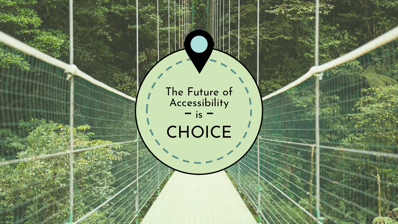
As professionals in the tech industry, our job is to make digital products accessible, but also offer choices for each individual to customize their experience. Our job is to create options and let people choose their own digital adventure.
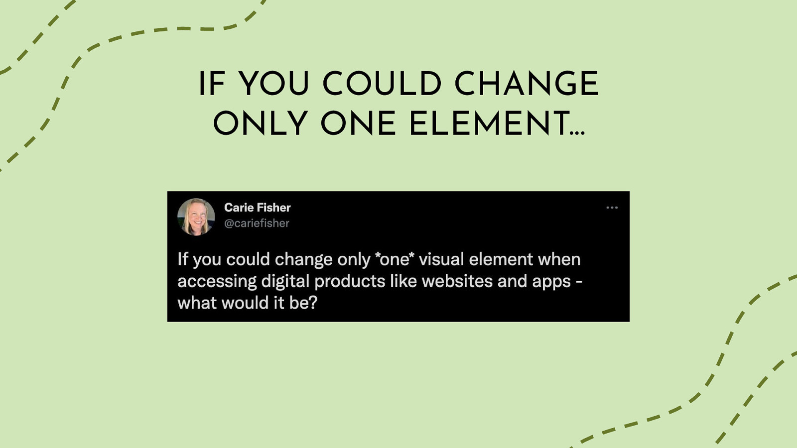
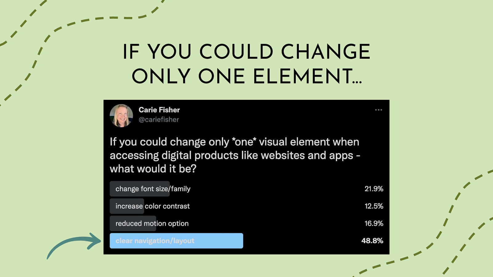
So people who have listened to me talk on this subject matter before, know that I am practical to a fault. Before this whole tech thing, I was a researcher in the life sciences studying the sleep cycles of the small, but mighty Drosophila (aka fruit flies). My brain is wired to see and understand the theory behind things, but I really find the application of said theory to be more rewarding. Enter the totally unscientific Twitter poll where I asked “If you could change only one element when accessing digital products like websites and apps - what would it be?” (https://twitter.com/cariefisher/status/1393922866119389193). The options were: change font size/family, increase color contrast, reduced motion option, clear navigation/layout.
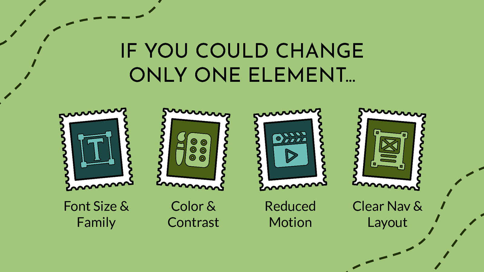
Font Size & Family Color & Contrast Reduced Motion Clear Nav & Layout
Now let’s dive-into these four categories of user pain-points from the perspective of digital accessibility and user choice…
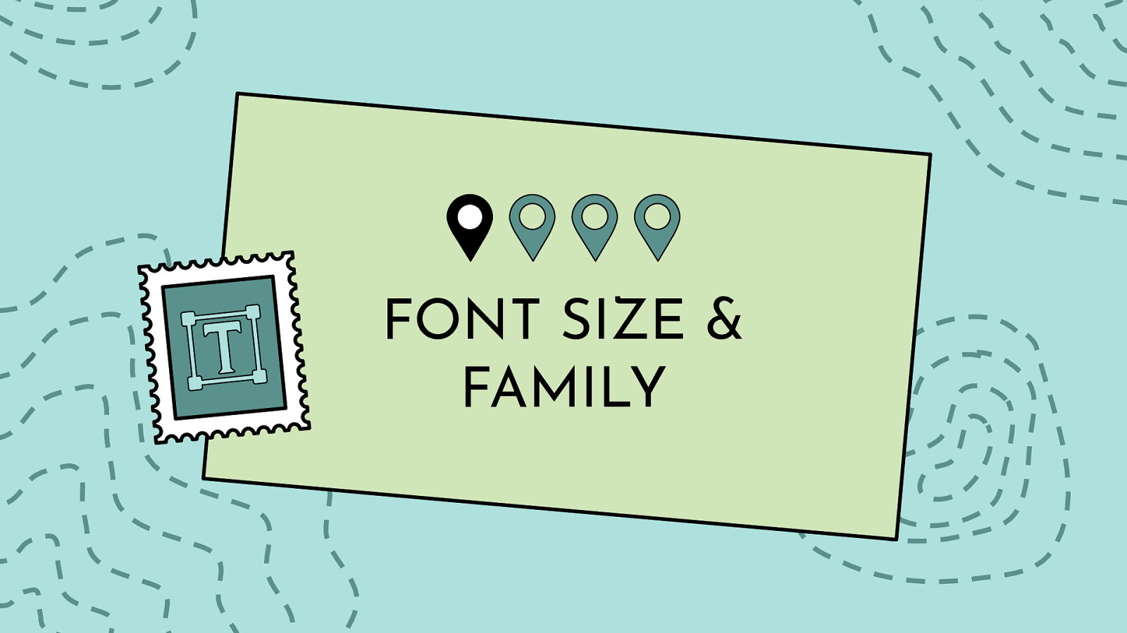
Your choice of typeface/fonts can make or break a website, especially from an accessibility point of view. Users with reading, learning, and attention disorders (ex. dyslexia, ADHD), English as a second language (ESL) users, and users with low vision all benefit from accessible typography.
While it can be a bit overwhelming when you think of all the elements you have to consider when choosing an accessible typeface: serif vs sans-serif, font variations, font size, kerning, tracking…just to name a few, if you follow the guidelines below you will have taken the first steps to make your website typography more accessible.
Font size: sometimes it’s too big, but more often too small, and full page zoom is a PITA. (Sarah)
For me, changing contrast would be good, so long as it works for everything, not just certain parts of a page. it is usually not a problem but can be of text is also small. (Richard)
Font size- large print is the best! (Veronica)
Definitely font size — and that’s because of my deteriorating vision. (Frank)
fonts - some sites using default fonts are borderline unreadable to me. (Shriram)
Companies need to stop using fonts that are so small ants need a magnifying glass. My eyes aren’t that bad either but it hurts my neck as I’m subconsciously straining to see. (Freedom Housing)
Being able to increase text size on the application interface. Not the content, the application itself - toolbars, menus, status bars, other chrome. Some applications have that in settings but most don’t. Changing screen resolution makes everything bigger but causes other issues. (Clarissa)
For me personally? Font size. Contrast is a close second, but that’s less often a problem these days. (Dwayne)
My vision has deteriorated rapidly over the last like 3 years and my phone’s default font-size ranges from large to mega-large. There are a decent amount of mobile apps that I can barely use because of their absurd font sizes. (Frank)
Font size, way too many apps that start at 10px or something absurd. I use zoom on almost all of the websites I use for my job. My vision is still good, but I don’t feel like I should have to get closer to screens because of bad design. (Wes)
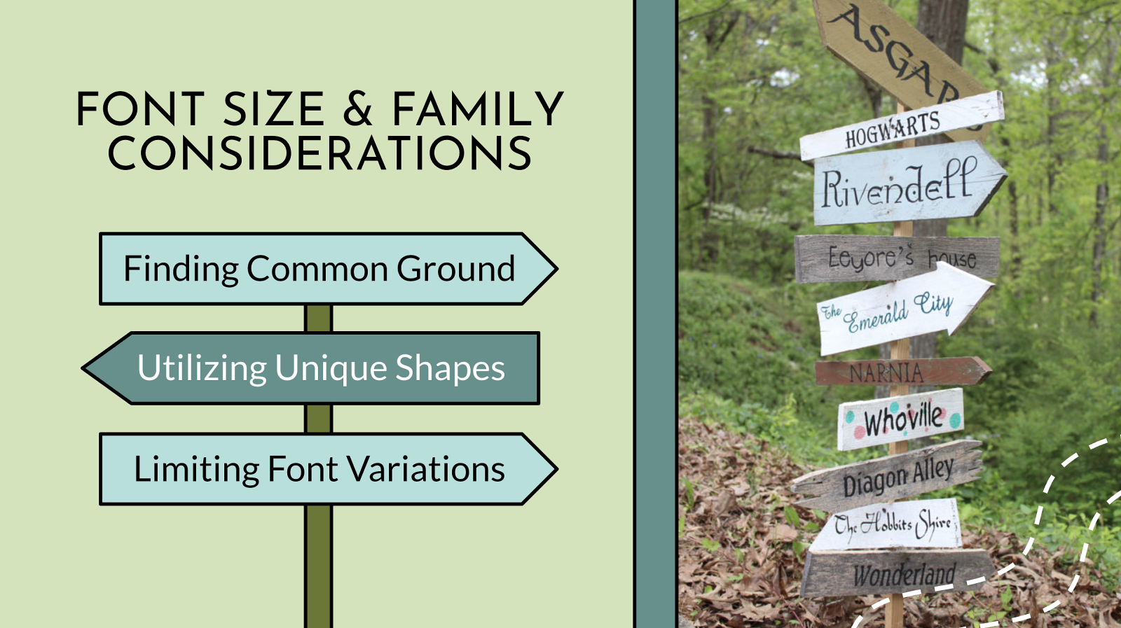
Finding Common Ground Utilizing Unique Shapes Limiting Font Variations
Less is more when it comes to accessible typography. The easiest way to make your typography accessible is to choose a common font and limit the number of fonts on your website. This is especially important for your main body copy. Studies show common fonts most often win when reading speed and user preference of different fonts is compared. Common fonts include: sans-serif font families: Arial, Calibri, Century Gothic, Helvetica, Tahoma, and Verdana serif font families: Times New Roman and Georgia slab serif font families: Arvo, Museo Slab, and Rockwell It’s not that these fonts are inherently accessible, but most users who have difficulty with typography choices have already seen these fonts and learned how to work with (or around) them. Similarly, the research is not conclusive as to whether serif or sans serif typefaces are easier to read. So this choice is entirely yours as long as you are picking common fonts or font families that have strong and unique characters. Please don’t use fonts that claim to be accessible or help one particular disability (ex. dyslexic fonts). They are tempting to use, but there is no clear evidence they actually help readers. You are better off picking a common font that the majority of your users are already familiar with. For people with visual impairments or dyslexia, certain letters or combinations of letters can be confusing, so it’s important that letter shapes are clearly defined and unique. Common offenders are the “I” (ex. India), “l” (ex. lettuce) and “1” (ex. one). Likewise, characters like “b” and “d” and “q” and “p” can sometimes be mirrored (either left-right or up-down) so words such as “piqued” could be flipped into a nonsensical word like “qipueb” or sometimes into a real word that would entirely change the meaning of the content. Font Size and Variations: Some font sizes and styling can be problematic for people with disabilities. For example, screen readers often ignore styling methods, such as bold and italics, making these styles useless for blind users. Users with low vision or color blindness may not be able to see some of the text if it is too small, while other users may have trouble reading italic text. For these reasons, you should consider the following guidelines: Base font sizes should be set to at least 14px (0.875rem)—in fact, many publications use 20px or larger for their body copy nowadays. Font size should be defined with a relative value (ex. %, rem, or em) to allow easy resizing. Limit the use of font variations such as italic, bold, ALL CAPS or other styling methods that may make the content difficult to read. Do not use underlines for items that are not links. Use markup instead of text on images!* Screen readers cannot read embedded text on images (without extra code added) and embedded text can also become pixelated when magnified by users with low vision.
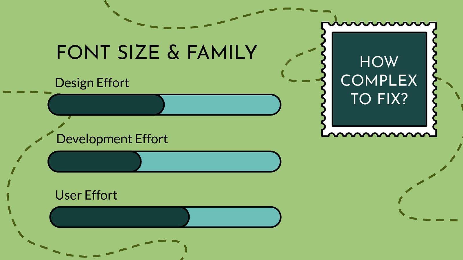
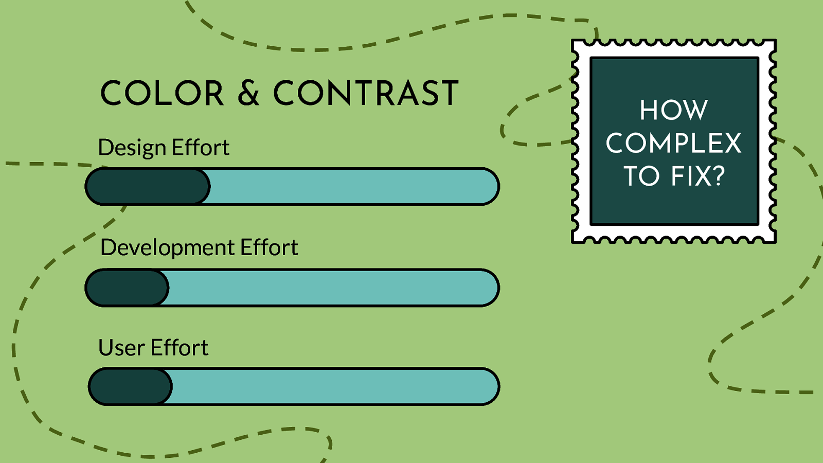
Design Effort Development Effort User Effort
Scale of 1-5 on how complex this issue is to fix: 2 This is not due to not having enough font options, but more related to how to manage switching to the user’s settings, plus some initial dev set-up like making sure fonts are set in relative values (user cannot control this)
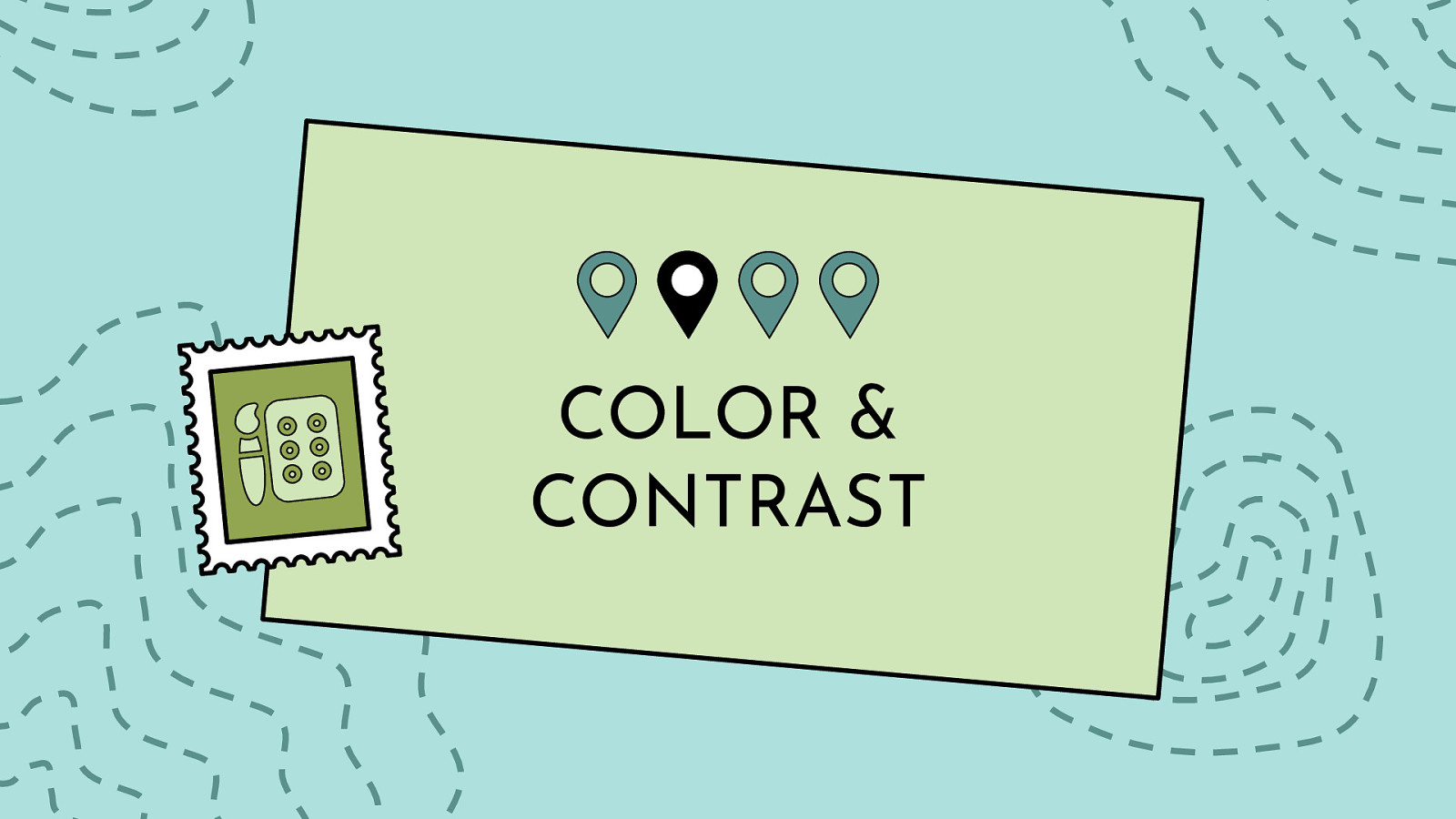
Color and contrast is at the heart of every design. There are numerous studies and articles showing how the perception of a brand is really tied to the colors it uses. One study even suggests that up to 90% of snap judgments made about products can be based on color alone. When you pair that information on color theory with the number of people who have some variant of color blindness, suffer from low vision, or are completely blind (all together roughly 9% of the global population), this is a very large area where designers can have a direct and immediate impact on website accessibility.
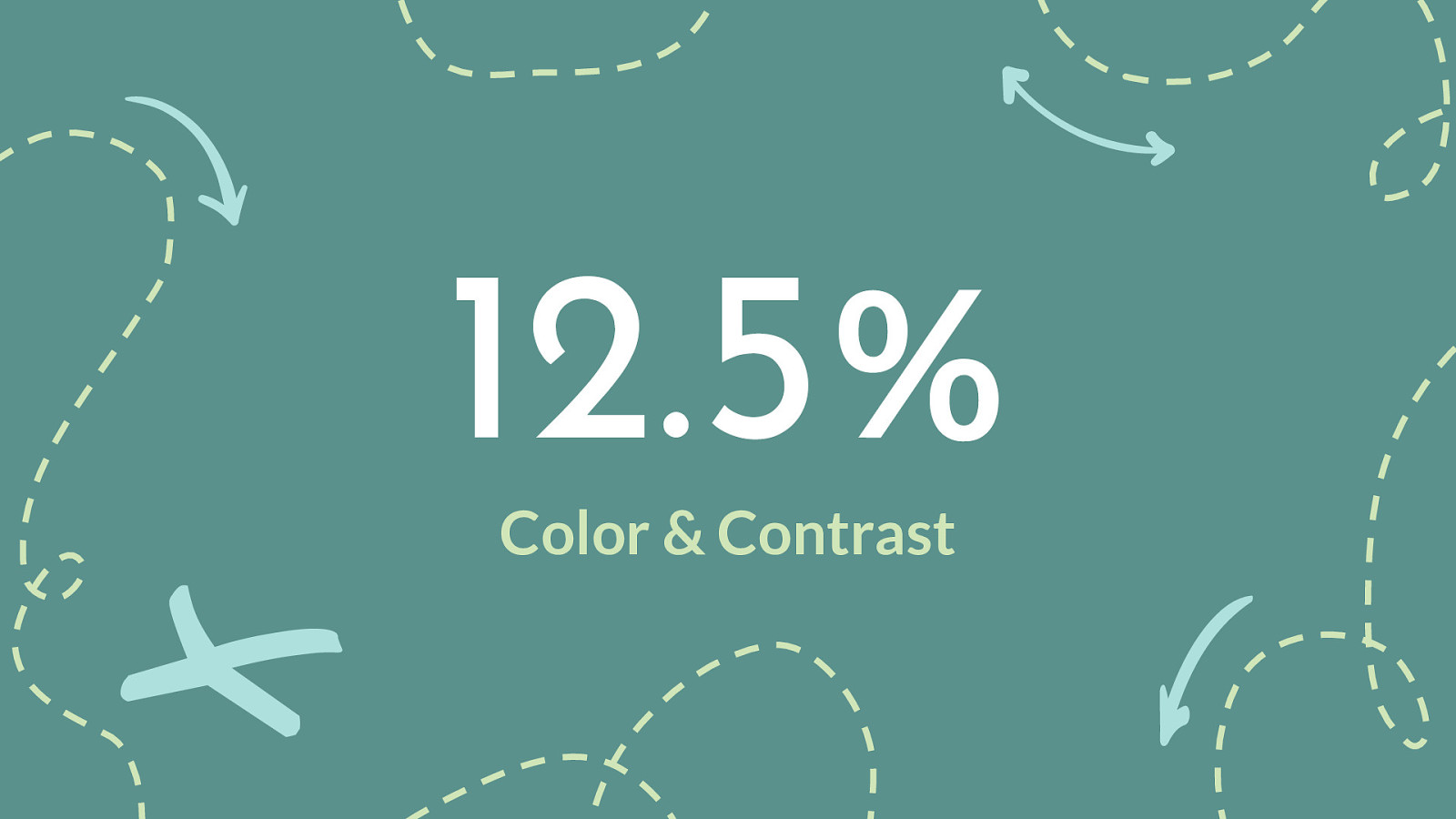
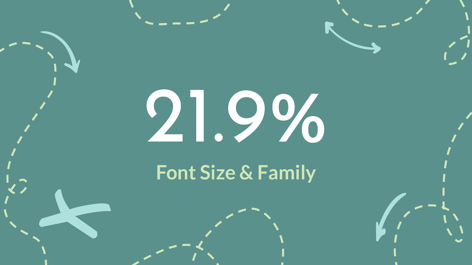
#4 in our poll but #1 failure three years in a row of the WebAIM million survey - https://webaim.org/projects/million/
In February of 2019, 2020, and 2021 WebAIM conducted an accessibility evaluation of the home pages for the top 1,000,000 web sites. The evaluation was conducted using the WAVE stand-alone API (with additional tools to collect site technology and sector parameters). The results provide an overview of and insight into the current state of web accessibility for individuals with disabilities and trends over time.
Across the one million home pages, 51,379,694 distinct accessibility errors were detected—an average of 51.4 errors per page. The number of errors decreased by 15.6% between February 2020 (60.9 errors) and February 2021 (51.4 errors)! “Errors” are WAVE-detected accessibility barriers having notable end user impact, and which have a very high likelihood of being WCAG 2 Level A/AA conformance failures.
Home page complexity increased slightly in 12 months, from an average of 864 elements per page to 887 elements. 5.8% of all home page elements had a detectable accessibility error. Users with disabilities would expect to encounter detectable errors on 1 in every 17 home page elements with which they engage.
February 2019-2021
Low contrast text 86.4% 86.3% 85.3% Missing alternative text for images 60.6% 66.0% 68.0% Missing form input labels 54.4% 53.8% 52.8% Empty links 51.3% 59.9% 58.1% Missing document language 28.9% 28.0% 33.1% Empty buttons 26.9% 28.7% 25.0%
I need control on font size, & text contrast. I want dark mode (mostly use in evenings). (Glenda)
UI which contain both light and dark themes in the same interface, as this essentially guarantees anyone who relies on high contrast, invert colors, etc. will not have equal access to some portion of that content. (Erich)
SQUARING OFF WINDOW OPTIONS AND TEXT BOXES I am so sick of this hyper minimalist design where nothing has edges or borders or anything to tell me where it’s safe to click!! (Anaxium)
I’d probably go with contrast. There’s so many use cases whether visual disability, migraines, being outdoors, etc. that it affects so many people in many situations on a daily basis. (Courtney)
Right now as recently had and recovering from an ocular migraine would say being able to turn off white. Dark mode not helping enough really as text still bright white. Still need contrast, but less harshly bright. Turned phone into chromatic, but nothing seems to disabled white! (Ruth)
Changing the contrast, specifically the option of a dark mode, and font size. I know that’s two but if more sites and formats supported that. This is to help address for my vision but I know lots of folks who also like it as a preference (Andrew)
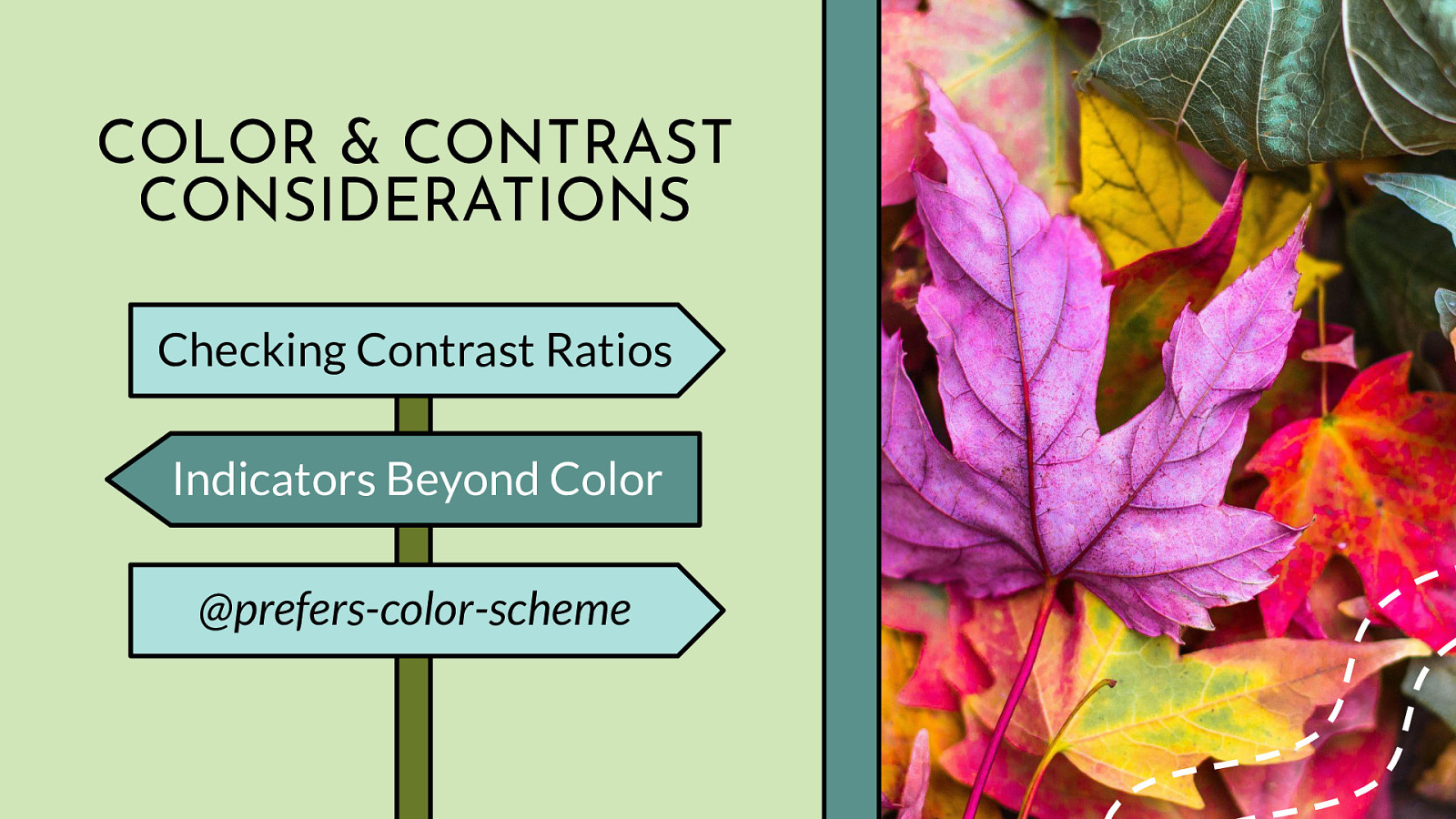
Checking Contrast Ratios Indicators Beyond Color @prefers-color-scheme
The very first step you should take when designing your website or app color palette is to review the WCAG color contrast ratio guidelines (4.5:1 regular text and 3:1 for bolded 14pt or regular 18pt, plus now essential images). To check for accessible color contrast ratios, there are many tools available for use. For a quick color contrast spot check, you could use the Contrast Checker in Chrome DevTools. For checking color contrast on non-coded designs, check out the Colour Contrast Analyser tool. And for a full-color palette review, A11y Color Palette is a great way to help you see which color combinations are the most accessible. Of course, make sure you try out a few of the tools and pick whatever works best for you and your team — the best tool is the one you actually use. Do not rely on color alone to convey info to your users. Make sure your links have underlines, your form fields have icons, or some other visual indicator besides color. (Recent table example.) Beyond checking for color contrast ratios and making sure you on not relying on color alone, you should also consider the increasingly popular and supported media query called @prefers-color-scheme that allows a user to choose a light or dark themed version of the website or app they are visiting. While this media query does not replace checking for color contrast ratios, it can give your users more choice when it comes to the overall experience of your website or app. As with other media queries, to see the light/dark theme changes, the website or app developer must add additional code targeting the query. Unlike some other color or contrast based media queries like @inverted-colors (currently only supported by Safari) and @forced-colors (developed by Edge/IE engineers with Chromium support coming soon), the browser support is pretty universal for @prefers-color-scheme — so this media query is useful out of the box today and it should be sticking around for awhile. Plus with the recent changes to MS Edge using Chromium under the hood, there is even more support for this media query going forward (R.I.P. -ms-high-contrast-mode).
Design Effort Development Effort User Effort
Scale of 1-5 on how complex this issue is to fix: 1-2 We have the technology, the tools, and know-how plus lots of OS settings already. We just need to be sure our base colors conform to WCAG standards before we allow users to change them.
I can admit it…I am a sucker for a good GIF. If I could design interactive SVGs for a living, I would. I also love having millions of photos and videos at my fingertips at all times (well, as long as the wifi is good). All of these forms of media can enrich our lives — but for lot of people, it can also mean frustration.
People with visual disabilities (ex. seizure disorders, blind), auditory disabilities (ex. deaf, hard of hearing), situational/temporary disabilities, people with poor bandwidth connections, and many others can benefit greatly from media that is displayed in an accessible way. While we often like being “delighted” with interesting website and app features — we need to strike a balance between being creative versus distracting (or harming) our users during their interaction with moving content.
I really dislike the superfluous animation that plagues iOS transitions between apps so I turn it off - Downside: I’m denied most of the thoughtfully executed motion design on the web because there’s no “some motion is fine” middle ground (Oliver)
I need reduced motion (I get dizzy easily). I detest autoplay video/audio (scrolling in instagram where I can’t stop autoplay makes me dizzy. audio w autostart can make me jump (in surprise) (Glenda)
Never, ever auto-play anything. No animated hero images, no auto-playing videos that I can’t prevent, unless that’s reason for the existence of that page. A YouTube video should play if I pick a video, but never videos on CNN stories unless the video is the entire content. (James)
I would very much like to disable any sort of animations or auto-playing videos (I’m looking at you, CNN). It’s so distracting, I’ll often just close the window instead. (James)
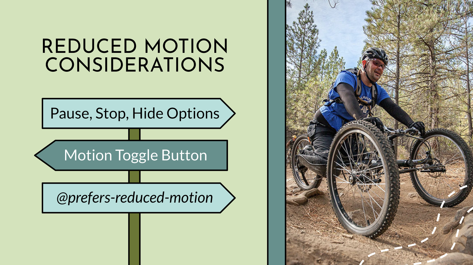
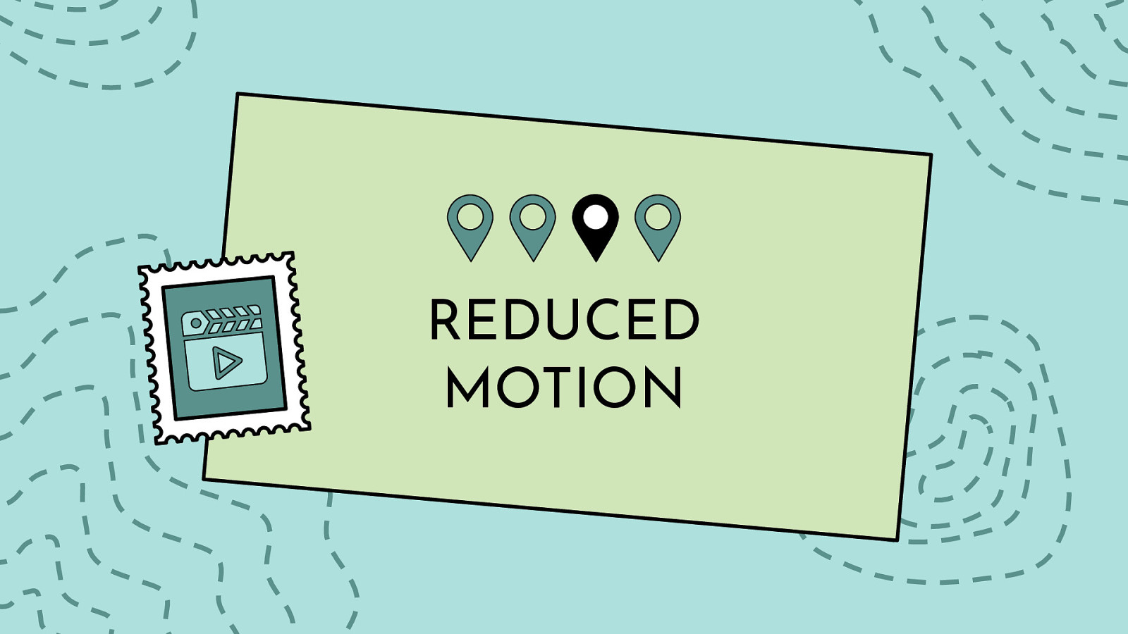
Pause, Stop, Hide Options Motion Toggle Button @prefers-reduced-motion
How your elements move on the screen is a major area to consider when designing and developing with inclusiveness in mind. The WCAG motion guidelines are clear: non-essential moving, blinking, or scrolling information that starts automatically, lasts more than five seconds, and is part of other page elements must allow the user to pause, stop, or hide it. This rule is important for users where moving, blinking, or scrolling content can be very distracting. People with ADHD and other attention deficit disorders might be so distracted by your animations they forget why they even went to your website/app in the first place. While for other people, motion can trigger physical reactions. For example, people with vestibular issues can become nauseous and dizzy when viewing movement. While others can be triggered to have a seizure when viewing content that flashes or is bright — a situation you obviously want to avoid. Since animations must not auto-play for more than five seconds, you must create a way for users to pause or stop the animation. One way to do this is to create a JS toggle button to play/pause the animation. If your animations are large or is the main feature of your website (e.g. animations that pop in and out as you scroll down a page) a pause/play button at the top of the screen might be a realistic option to control the entire experience of the page. If your animations are smaller in scale or related to user input (e.g. an animation happens when a user submits a form), a pause/play button might not be realistic for each individual image, so an alternative option is to code the animation to stop at five seconds vs. playing it on an infinite loop. In addition to using a pause/play option or creating a finite animation loop, you may also consider adding @prefers-reduced-motion media query to address the animation on your website or app. Similar to the light/dark theme example, the @prefers-reduced-motion media query checks the user’s settings for motion restrictions and then implements a visual experience based on their preference. In the case of @prefers-reduced-motion, a user can choose to minimize the amount of animation or motion they see. Keep in mind, having @prefers-reduced-motion code in place is one step in making your animations more accessible, but you also need to consider the way the motion is reduced. For example, let’s say you create a slowed-down version of your animation using @prefers-reduced-motion. However, the slower version is on an infinite loop so the animation lasts more than five seconds, that violates one part of the WCAG rules on motion. If you instead create a reduced motion version of your animation that stops the animation at five seconds, then it would pass that part of the rule. This subtle code change equals two completely different user experiences. Most major browsers now support @prefers-reduced-motion media query both on desktop and mobile devices — meaning that more people can limit their exposure to unwanted movement on their screens. Unlike the media query @prefers-color-scheme which has a lot of competitors, there is currently no other motion reducing media query available.
Design Effort Development Effort User Effort
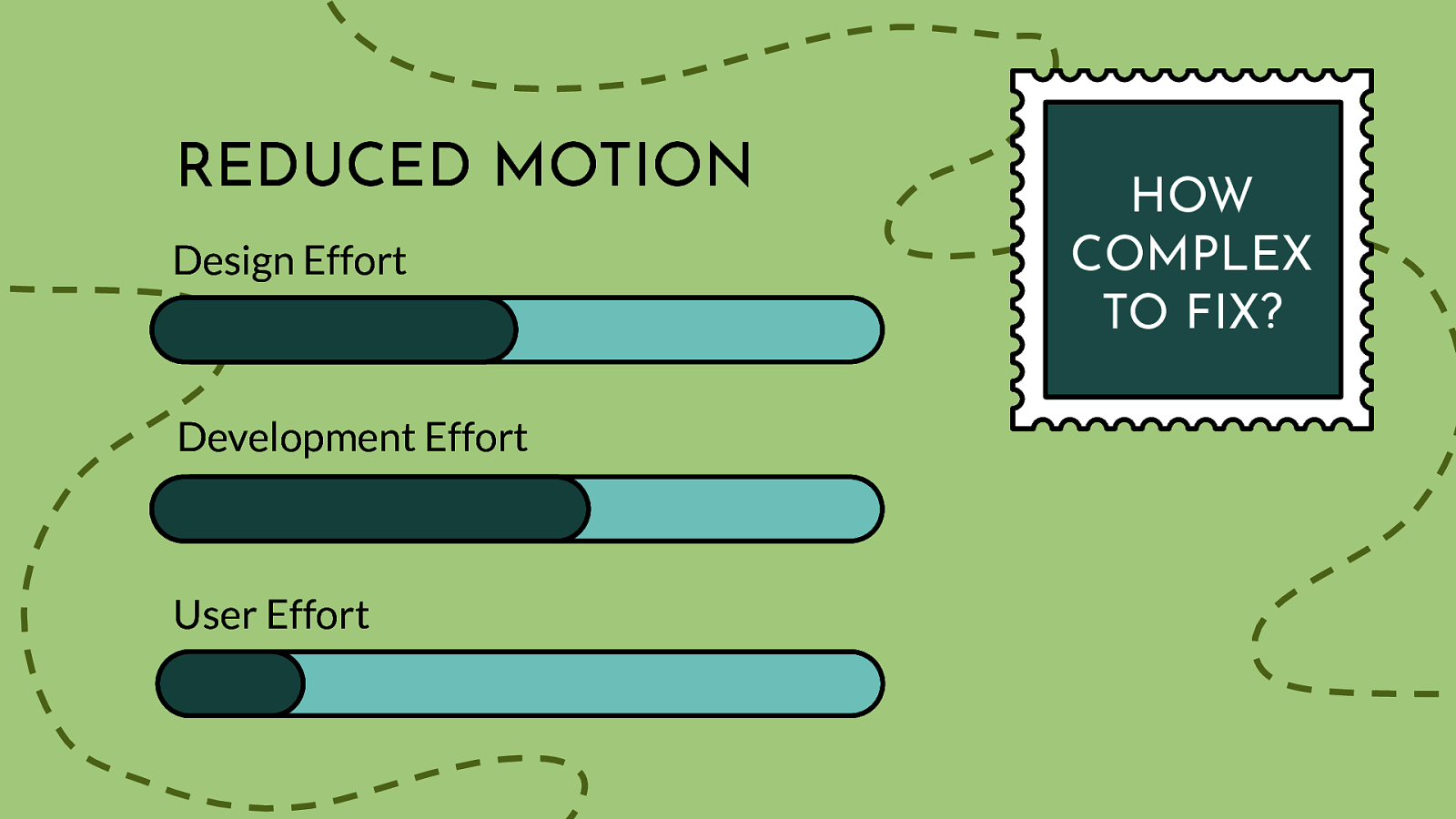
Scale of 1-5 on how complex this issue is to fix: 2-3 Again, we have the technology to fix these kinds of issue…we need to expand on teaching designers, devs, about the importance of giving alternate motion options to our users. We also need to be sure our user are aware of the OS settings already out there.
While your choice of typography, colors, and motion can certainly help make or break a website from an accessibility point of view, the importance of structure and layout should not be ignored. How your website is laid out (UI) and how people actually interact with your website (UX) are equally important factors when making your content accessible. Users with screen readers, reading disorders, learning disabilities, or attention deficit disorders will especially benefit from having a clear layout and concise content.
Taking me right to the island of content I’d searched for in its sea of other stuff would be wonderful (J Ayen)
I am not sure if this is actually covered by „digital product“: Reduce stuff that is displayed by default, e.g. I am not interested in reviews or stuff other customers bought or footnotes or similar articles or table columns with stuff I do not want to see or… (Voll)
I’ll add my vote to this one. Products are complicated because it earns the owner money, not because it’s good UX. Examples: Facebook, Amazon. (Anders)
I am a small adult human who has to use ever embiggening mobile devices and it would be super nice if more mobile apps understood that I can’t use them one-handed. so… bottom menus. (Frank)
A quick way to center all the content on large screens, rather than some of these new layouts that push sidebars out to the extreme left and right. I’ve ended up jumping into dev tools to get a mobile view, or enabling reader view. I like to keep my browser full screen most of the time, so sites that don’t work on big screens really annoy me…! (Matt)
Remove any kind of popup (especially the chatbot “here to help!” ones) and be able to hide sidebar / navbar (XAB)
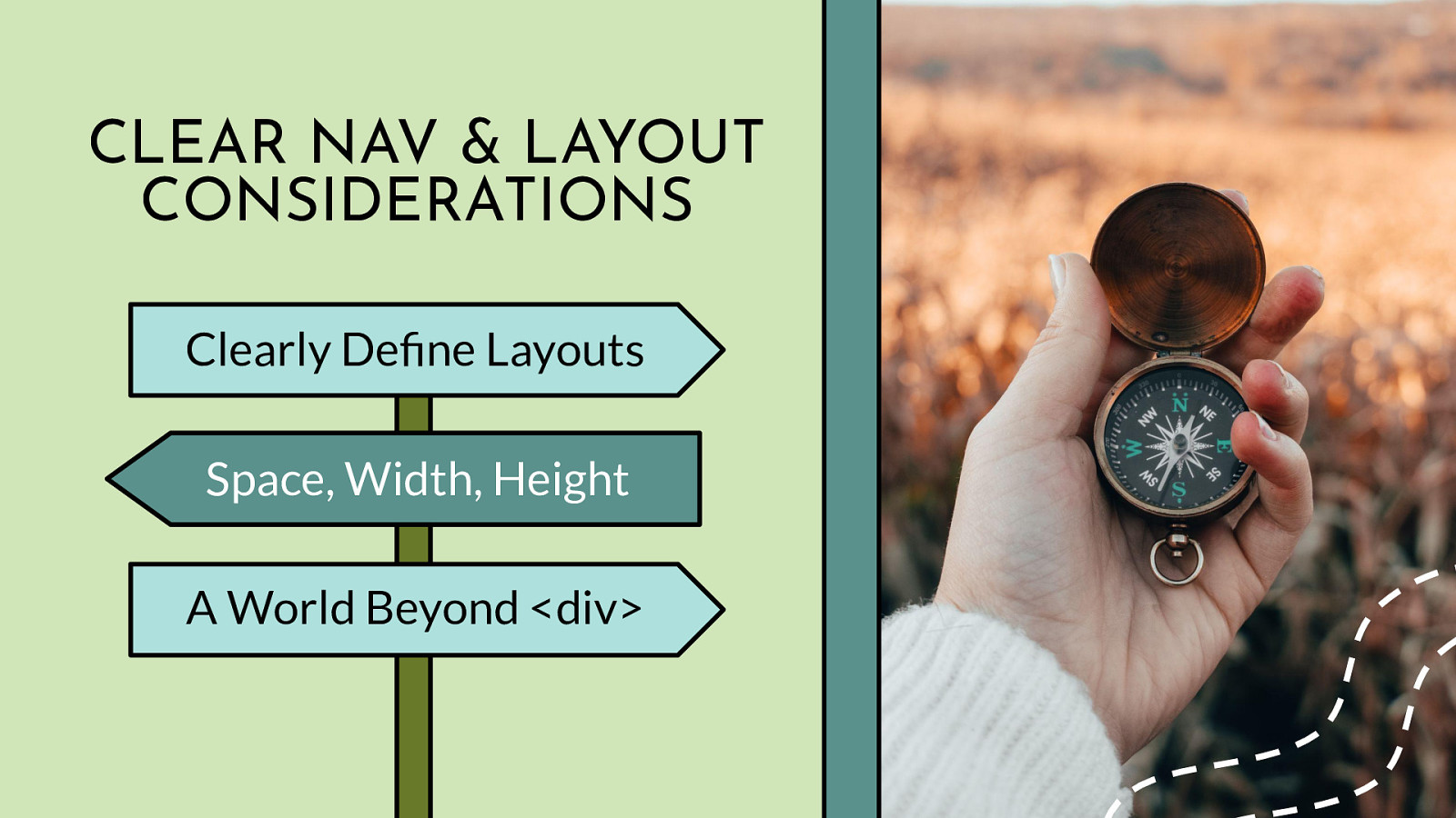
Clearly Define Layouts Space, Width, Height A World Beyond <div>
Clearly Define Your Page Layout: Think of each page on your website as being an outline to a story. By thinking about your web pages as individual stories, it will help you plan out the overall page structure using headings, subheadings, and paragraphs. A big piece of that is making critical elements visually distinct from one another. If they are too close in proximity to each other, it can be difficult to tell where one element begins and another ends, especially if they have similar styling. When considering your page structure and layout, make sure you think about all your users. The page should make sense to users on any breakpoint and device using a mouse, keyboard, touchscreen screen, or other assistive technology device. For people with some reading or vision disabilities, long lines of text can be a barrier. These users have trouble keeping their place and following the flow of the content. Having a narrow block of text makes it easier for them to continue on to the next line in a block. The number of characters per line in any paragraph or section of text (the “measure”) should not exceed 80. For Chinese, Japanese, or Korean characters you should limit each line width to 40 to help with focus and readability. Paragraph and Sentence Spacing: For people with cognitive and attention-deficit disorders, whitespace is helpful to retain reading focus. It is best practice to set the space between each sentence to 1.5 relative to the line-height of your type. Within paragraphs, the spacing should be at least 1.5 times larger than the line spacing to clearly define new sections of content. Under most circumstances, line spacing should not exceed 2.0, and the spacing between paragraphs should not exceed 2.0 times larger than the line spacing, or you risk distracting your readers. Similarly, people with certain reading or cognitive disabilities have problems reading text that is fully justified. The uneven spacing between words in fully justified text can cause “rivers of space” to form down the page, making content difficult to read. Text justification can also cause words to be either bunched closely together or stretched in unnatural ways so readers find it difficult to locate word boundaries. Finally, learn and use HTML! It’s not a dead language and it so much more nuanced than using 700 divs. HTML is especially important for assistive technology device support - when used properly HTML can be more meaningful and powerful than any of the 80+ JS libraries mentioned previously combined. Things that look like lists, need to be marked-up as lists. Things that look like headings, need to be marked-up as headings. Things that look like form elements, buttons, links, etc. need to be marked up properly as well. Bonus points for using landmarks!
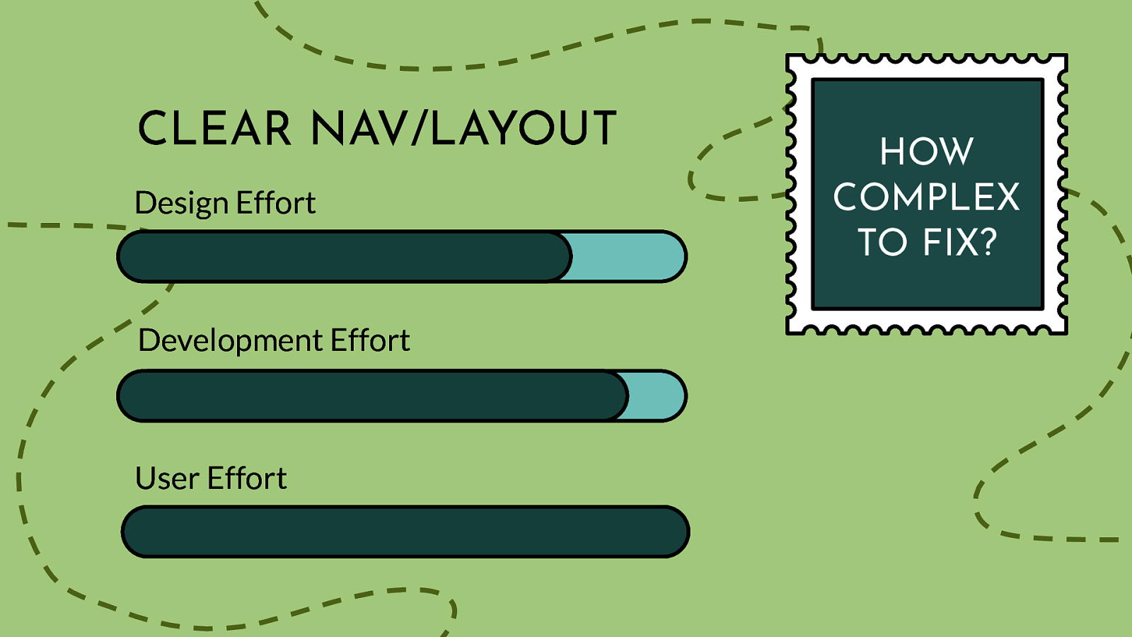
Design Effort Development Effort User Effort
Scale of 1-5 on how complex this issue is to fix: 4-5
Clear nav/layouts have some relatively simple solutions…as long as designers and devs understand the basic WCAG success criteria around this topic. Adding sentence or paragraph spacing is easy enough, and users can use a screen magnifier or text spacing tool to help them see what is on the screen. For designers and developers, planning the layout and adding/updating HTML isn’t tough, it just requires time and effort. This tricky part is around user options - currently, without editing the code in an inspector - there are not a lot of great work-arounds when you encounter crappy code.
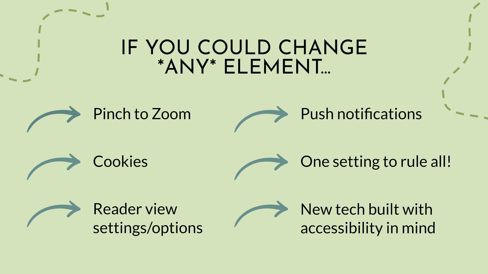
IF YOU COULD CHANGE ONLY ONE ELEMENT… Pinch to Zoom Push notifications Cookies One setting to rule all! Reader view settings/options New tech built with accessibility in mind
Of course there are many additional ways people would like to take charge of their own adventure including:
Pinch to zoom: The ability to override disabled pinch-to-zoom on mobile. Sometimes things are just too small (Erik) I would like to pinch zoom on phones to change text size but keeping document fitted to device width. My eyesight isn’t great, but it’s annoying to keep moving the document around to read it. (Sunil)
Cookies: Cookies preferences: I only accept the essential cookies. It’s tiring selecting those over and over again. (Sandria) Create an alternative for cookie consent banners (Billy)
Push notifications/pop-ups/modals: Opting out of all pre-selected email/push notifications (Quinten) Remove all those nagging popups: cookie warnings, proposal to receive notifications, proposal to subscribe to newsletter… (Luis)
Reader settings: For sites to respect Reader View (Nic) Reading length (Stephanie) Touch sensitivity. When holding my device to read an article, would love to have it be less responsive to accidentally grazing a link. (Zac)
OS control over all: When I change font size I want the battery icon to be bigger too. If I turn of vibrations it should cover all haptic feedback (Freedom Housing) on mobile, i’d almost always like the ability to ‘swipe right’ to go back to the previous page i was on. on desktop, give me backspace - all day - (when not in a text box/entry field) (JP)
AR/VR/XR - or any new cool tech: BONUS! XR access - https://xraccess.org The XR Access Research Network aims to foster academic-style research across fields and disciplines, with a shared interest in making XR technologies accessible, enabling innovative research, new collaborations, resource-sharing, and translational impact. Larry Goldberg (Verizon Media), Reginé Gilbert, Jessie Taft, a11yVR: https://www.meetup.com/a11yvr People who want to meet and discuss topics around accessibility in technology for people with disabilities that apply to XR/VR/AR. Tomas Logan
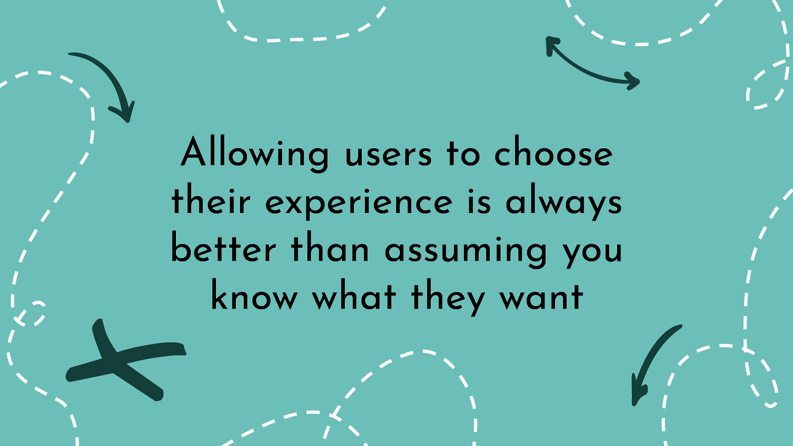
While this kind of social media data is fun and interesting to compile, what many people taking this poll might not realize is - it doesn’t really matter what you voted for. All of these poll options are real user issues - that also happen to cross-over into digital accessibility relm - and they should be resolved. The good news is - almost all of these are simple enough to resolve from a design and tech perspective. The part that is missing is simply, choice. Allowing your users to choose their experience is always better than assuming you know what they want.
anything from dark mode & font size, to font style, line spacing, and enhanced focus. There’s really no reason that we can’t give users more choice and make it easy for them to have content delivered in a way that is best for them. (Mike)
The answer is that for each person their need/preference will be different. This is why UDL and usability are vital in development of products. Choice, flexibility and options are needed. (Carol)

As Helen Keller famously said: “Life is either a daring adventure or nothing at all.” I assume you’d rather be doing something - like leaving a positive design and coding legacy - so get out and choose your own adventure and help others do the same.
Twitter @cariefisher LinkedIn /in/cariefisher Website cariefisher.com