Accessible SVGs: Inclusiveness Beyond Patterns

A presentation at axe-con 2021 in March 2021 in by Carie Fisher

Slide 1

Slide 1

Accessible SVGs Inclusiveness Beyond Patterns

Hello! Today I’m going to talk to you about SVGs and how to make them more inclusive, plus hopefully challenge you all to think a bit more about real users and their needs — all in roughly 45 minutes and before your second cup of coffee (or tea, wine, beer depending on your time-zone)!

For those of you new to Scalable Vector Graphics (SVGs) - they became a W3C open standard in 1999 — back when the new tech hotness was the Blackberry phone, Napster first invaded college dorms, and the Y2K bug sparked fear in us all. Fast forward to our modern digital world and you’ll notice that while the other tech trends have waned, SVGs are still around and thriving. This is partly due to SVGs having a small footprint for such high visual fidelity, in a world where bandwidth and performance matter more than ever but also because SVGs are so flexible with their integrated styles, interactivity, and animation options. What we can do with SVGs today goes way beyond the basic shapes of yesteryear.

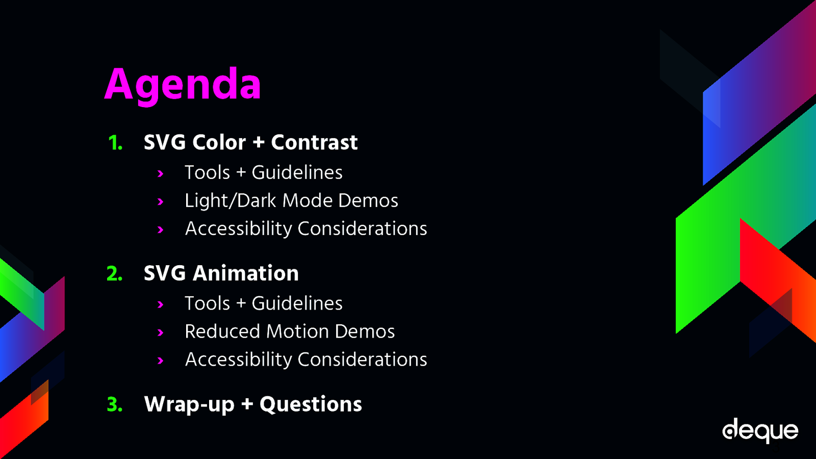
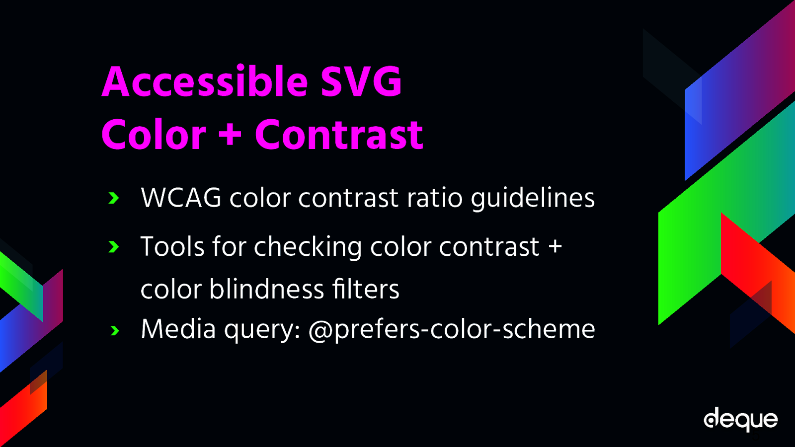
If we focus on the accessibility aspect of SVGs, we have come a long way as well. Today, we have many robust patterns and techniques to help us optimize inclusiveness. This is true regardless if you are creating icons, simple images, or more complex dynamic SVGs. While the specific pattern you decide to use might vary depending on your situation and targeted WCAG conformance level — the reality is, most people stop there, focusing on code compliance and not actual end-users and their needs. If true inclusiveness lies beyond patterns — what other factors should we consider when designing and developing accessible SVGs?

Slide 2

Slide 2

Hello!

Carie Fisher Sr. Accessibility Consultant/Trainer @ Deque HCI Ph.D. Student @ Iowa State University

My name is Carie Fisher. I am Senior Accessibility Consultant/Trainer at Deque and I’m a recovering front-end developer has been building websites professionally since the early 2000s utilizing various CMS’s and frameworks. I’ve spent the majority of my professional career working as a front-end dev before focusing on UX and accessibility. Recently, I went back to grad school to work on my PhD in Human-computer interaction at Iowa State University. Where our mascot is a cardinal but we are called cyclones.

Slide 3

Slide 3

Agenda

  1. SVG Color + Contrast › Tools + Guidelines › Light/Dark Mode Demos › Accessibility Considerations
  2. SVG Animation › Tools + Guidelines › Reduced Motion Demos › Accessibility Considerations
  3. Wrap-up + Questions 3

Slide 4

Slide 4

1. SVG Color + Contrast

The typical focus of accessible SVGs is essentially screen readers compliance — which is only part of the issue and part of the solution. Globally, people with low-vision and color blindness outnumber the people who are blind 14:1. We are talking a staggering 546 million in total (246 million low-vision users plus 300 million colorblind users) vs. 39 million users who are legally blind. Many people with low-vision and colorblindness do not rely on screen readers, but may instead use tools like browser resizing, customized stylesheets, or magnification software to help them see what is on the screen. To these 546 million people, screen reader output is probably not as important to them as making sure the color and contrast is great enough that they can see the SVG on the screen — but how do we go about checking for this?

Slide 5

Slide 5

Accessible SVG Color + Contrast

The very first step you should take when designing your SVG color palette is to review the WCAG color contrast ratio guidelines. While SVGs and other icons were exempt from color contrast ratio requirements not too long ago (when targeting WCAG AA compliance), the update to the WCAG 2.1 guidelines have made it so all essential non-text imagery must adhere to a contrast ratio of at least 3:1 against adjacent colors (Success Criterion 1.4.11 Non-text Contrast (Level AA)). By essential, it means if your SVG was to vanish, would it fundamentally change the information or functionality of the content? If you can answer “no,” then you are likely exempt from this guideline. If you can answer “yes” or “maybe,” then you need to make sure your SVG color contrast ratios are legit.

To check for accessible color contrast ratios, there are many, many tools available for use. For a quick color contrast spot check, you could use the Contrast Checker in Chrome DevTools. For checking color contrast on non-coded designs, check out the Colour Contrast Analyser tool. And for a full-color palette review, A11y Color Palette is a great way to help you see which color combinations are the most accessible. Likewise, I often use color blindness filters when trying to make my point about accessible designs. Be cautious with simulators like these filters as they are not a true representation of a disability - they are used to give you an approximation and to help build empathy.

Of course, with all tools just make sure you try out a few and pick whatever works best for you and your team — the best tool is the one you actually use.

Beyond checking for color contrast ratios and applying filters, you should also consider the increasingly popular and supported media query called @prefers-color-scheme that allows a user to choose a light or dark themed version of the website or app they are visiting. While this media query does not replace checking for color contrast ratios, it can give your users more choice when it comes to the overall experience of your website or app.

Slide 6

Slide 6

Light Mode

https://codepen.io/cariefisher/pen/YzXWPBo As with other media queries, to see the light/dark theme changes brought about by the @prefers-color-scheme media query, the website or app developer must add additional code targeting the query. Using this icon of a house, you can see in the following code that the SVG’s stroke, fill, and background colors are controlled by the CSS. Since these style elements are externally controlled and not hard-coded in the SVG markup, we can add a few extra lines of CSS to make the SVG work in a dark theme.

Slide 7

Slide 7

Dark Mode

https://codepen.io/cariefisher/pen/YzXWPBo As this example shows, setting up your designs to use CSS to control style elements means that creating a dark theme version of your SVG can be relatively simple. Conversely, if you have hard-coded styles into the SVG markup, you may need to reimagine your SVG in a way that allows CSS to have more control over the design. Or you may want to consider creating a completely new dark version of your SVG and swap out the light version when the theme preferences change. Just remember, if you do plan to show/hide different images based on the user mode, you also need to hide the nonvisible SVG from AT users!

Note: in this particular example, the default theme was already light so it made sense to build a dark theme for an alternate experience. Otherwise, if we started with a dark theme, we could have done the opposite making the dark theme the default experience and using @media (prefers-color-scheme: light) to create a light theme.

Slide 8

Slide 8

Demo Time!

https://codepen.io/cariefisher/pen/QWwaVbQ In the next example, we are looking at a more complex SVG with both light and dark mode versions via the @prefers-color-scheme media query. Our friend Karma Chameleon (in SVG form) has both a dark theme and a light/default theme. By changing your light/dark preference settings and navigating to a browser that supports @prefers-color-scheme media query, you can see the environment change. In the light/default mode, Karma Chameleon is sitting on a branch in a green forest surrounded by a fluttering red butterfly. In dark mode, she is sitting on a branch in space with a blue rocket zooming past.

(DEMO)

COLOR AND CONTRAST ACCESSIBILITY While the examples are fun ways to show what you can do with color and contrast and the @prefers-color-scheme media query, there are some really great real-world reasons to consider adding a dark theme including:

Dark themes can be helpful to people with photophobia, or light sensitivity. People with photophobia can trigger headaches and migraines when they view a website or app that is too bright.

Some people find the text on a website or app easier to read in dark mode while others might find lighter themes are easier to read — it essentially comes down to giving your user a choice and allowing them to set their preference.

Unlike some other color or contrast based media queries like @inverted-colors (currently only supported by Safari) and @forced-colors, the browser support is pretty universal for @prefers-color-scheme — so this media query is useful out of the box today and it should be sticking around for awhile.

Slide 9

Slide 9

2. SVG Animation

In conjunction with color and contrast, how your SVG moves on the screen is another aspect to consider when designing and developing with inclusiveness in mind.

Slide 10

Slide 10

Accessible SVG Animation

The WCAG motion guidelines are clear (but rather lengthy): non-essential moving, blinking, or scrolling information that starts automatically, lasts more than five seconds, and is part of other page elements must allow the user to pause, stop, or hide it. Success Criterion 2.2.2 Pause, Stop, Hide (Level A) - the most applicable guideline for animated SVGs.

Why do we need this rule? For some users, moving, blinking, or scrolling content can be very distracting. People with ADHD and other attention deficit disorders might be so distracted by your animated SVGs they forget why they even went to your website/app in the first place. While for other people, motion can trigger physical reactions. For example, people with vestibular issues can become nauseous and dizzy when viewing movement. While others can be triggered to have a seizure when viewing content that flashes or is bright — a situation you obviously want to avoid.

MANUAL/AUTO STOP Since SVG animations, like other moving content, must not auto-play for more than five seconds, you must create a way for users to pause or stop the animation. One way to do this is to create a JS toggle button to play/pause the animation.

If your SVG is large or is the main feature of your website (e.g. animations that pop in and out as you scroll down a page) a pause/play button at the top of the screen might be a realistic option to control the entire experience of the page. If your SVGs are smaller in scale or related to user input (e.g. an animation happens when a user submits a form), a pause/play button might not be realistic for each individual image, so an alternative option is to code the animation to stop at five seconds vs. playing it on an infinite loop.

REDUCED MOTION In addition to using a pause/play option or creating a finite animation loop, you may also consider adding @prefers-reduced-motion media query to address the animation in your SVGs. Similar to the light/dark theme example, the @prefers-reduced-motion media query checks the user’s settings for motion restrictions and then implements a visual experience based on their preference. In the case of @prefers-reduced-motion, a user can choose to minimize the amount of animation or motion they see.

In the following example, the animated SVG “writes out” a word as the page loads — this is its default animation. In the reduced motion version, the SVG is stationary and the word loads without the animation. Depending on the complexity of your SVG animation and how you want the reduced motion experience to look, the amount of extra code involved can vary.

Slide 11

Slide 11

Default Motion

https://codepen.io/cariefisher/pen/rNVLxoJ

Slide 12

Slide 12

Default Motion

https://codepen.io/cariefisher/pen/rNVLxoJ

Slide 13

Slide 13

Reduced Motion

https://codepen.io/cariefisher/pen/rNVLxoJ As with other media queries, to see the light/dark theme changes, the website or app developer must add additional code targeting the query.

Slide 14

Slide 14

Reduced Motion

https://codepen.io/cariefisher/pen/rNVLxoJ Keep in mind, having @prefers-reduced-motion code in place is one step in making your SVGs more accessible, but you also need to consider the way the motion is reduced. For example, let’s say you create a slowed-down version of your SVG animation using @prefers-reduced-motion. However, the slower version is on an infinite loop so the animation lasts more than five seconds, which violates one part of the WCAG rules on this kind of motion. If you instead create a reduced motion version of your animated SVG that stops the animation at five seconds, then it would pass that part of the rule. This subtle code change equals two completely different user experiences.

Slide 15

Slide 15

Demo Time!

https://codepen.io/cariefisher/ pen/QWwaVbQ In the next example, Karma Chameleon is back with a @prefers-reduced-motion media query and related code. By changing your motion settings and using a browser that supports @prefers-reduced-motion media query, you can see the animation change. In the light mode with reduced motion, Karma Chameleon in a forest with a stationary red butterfly. In dark mode with reduced motion, she is in space with a stationary blue rocket in the background. In both environments, her colors and eyes are also stationary, as the original SVG animation is completely removed.

(DEMO)

ANIMATION ACCESSIBILITY From an accessibility standpoint, there are some great reasons to consider limiting the movement on your screen or providing alternative animations in your SVGs including:

Less is more! Keeping your SVG animations simple for people with cognitive and attention disorders can help with your overall user experience. This is especially true for SVGs critical to the content or functionality of your website or app — such as navigation, buttons, links, or any animation triggered by user input.

Don’t make people sick! Some people with seizure, vestibular, and vision disorders can trigger physical reaction by motion in your SVGs, so please be responsible with your designs and code. Note: you should double-check any animated SVGs that could be problematic in the flashing/blinking area, by using the free Photosensitive Epilepsy Analysis Tool (PEAT) to ensure you don’t trigger seizures with your content.

Most major browsers now support @prefers-reduced-motion media query both on desktop and mobile devices — meaning that more people can limit their exposure to unwanted movement on their screens. Unlike the media query @prefers-color-scheme which has a lot of competitors, there is currently no other motion reducing media query available.

Slide 16

Slide 16

  1. Wrap-up + Questions 16

Slide 17

Slide 17

Quote

“Inclusion is not bringing people into what already exists — it is making a new space, a better space for everyone.” George Dei

Color, contrast, and animation is at the heart of every SVG. Studies report that these visual elements hold intrinsic meaning, contribute to brand recognition, and are tied to a company’s perceived value — making SVGs a very large area where designers and developers can have a direct and immediate impact on our users.

But it is also important that we don’t just think of SVG accessibility as something to help “other people” — because who hasn’t found themselves in a situation where they have to battle glare on a device screen? Or you have a migraine and SVGs keep floating on and off the screen making you sick instead of “delighted”. Or maybe you visit a website in a low-light setting and the text is hard to read due to the gray-on-gray color scheme?

With the help of the WCAG guidelines, use of accessibility tools, and the continued addition and support of new CSS media queries to allow for more choice, we can impact all people in a more responsible and inclusive way and make a better space for everyone.

Slide 18

Slide 18

Thanks!

Twitter/LinkedIn @ cariefisher GitHub @ cehfisher cariefisher.com