
A presentation at DrupalCon Europe 2020 in December 2020 in by Carie Fisher
Sr. Accessibility Consultant & Trainer Email: carie.fisher@deque.com Twitter/LinkedIn: @cariefisher
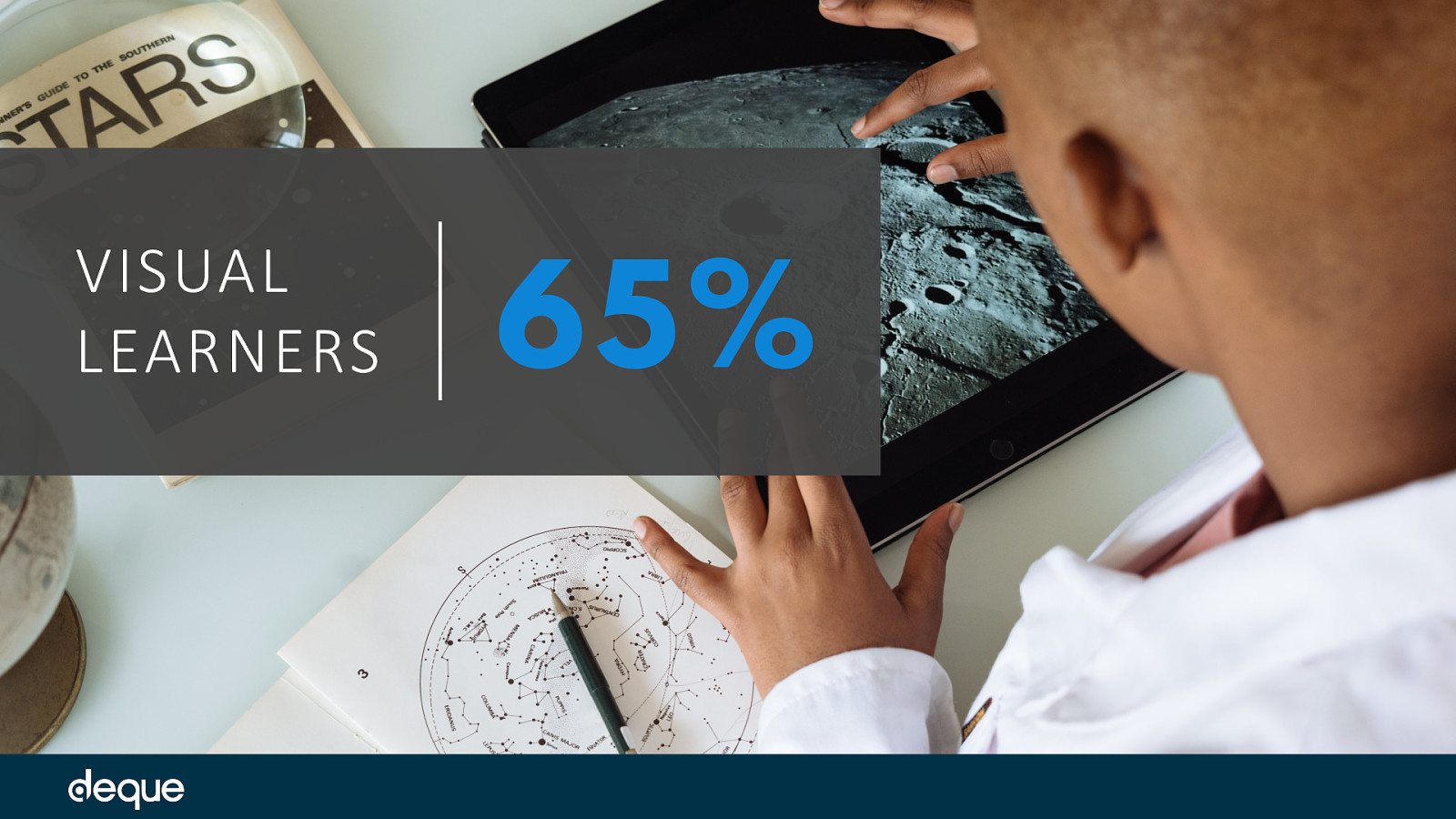
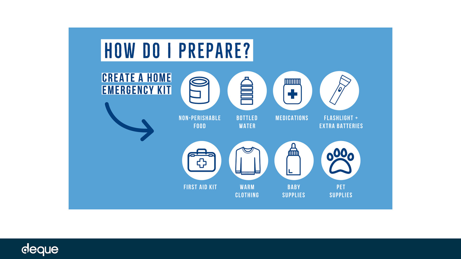
When it comes to informing the public about critical health issues – timing is everything. The information you consume today could literally save your life tomorrow. And with more than 65 percent of the population being visual learners – meaning they learn and remember best through visual communication – the job of creating and sharing accessible images has never been more important. This is especially true for public service announcements (PSAs) aimed at providing crucial and urgent information to the public.
But what happens when your users have visual impairments? Or dyslexia? Or cognitive disorders? How do people with these disabilities receive and understand visual information? what elements make an image accessible or inaccessible?
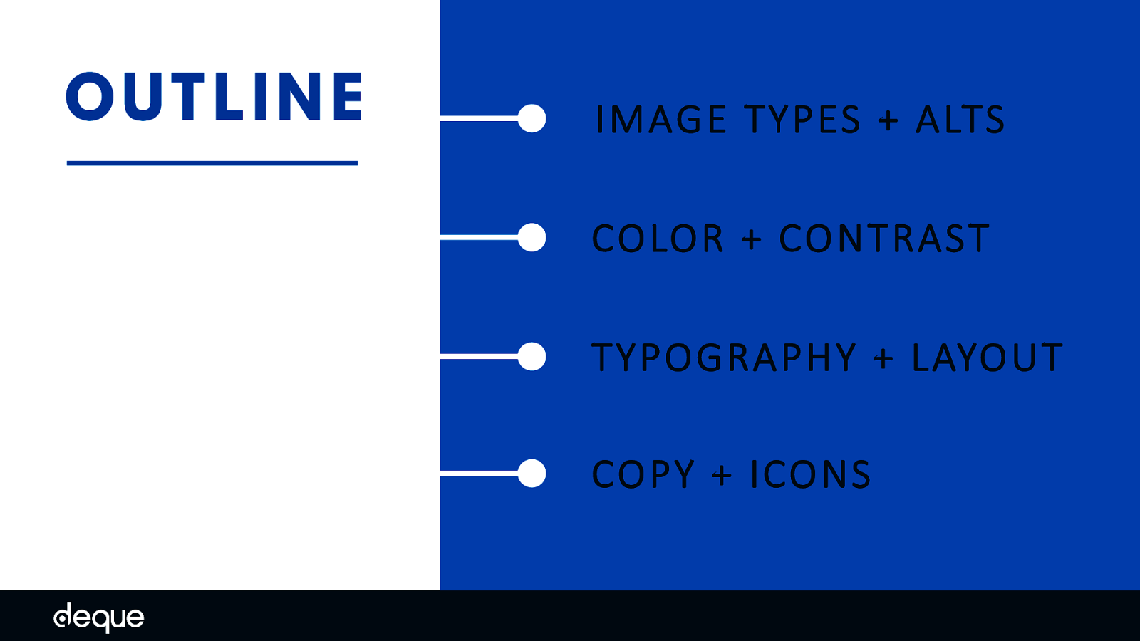
IMAGE TYPES + ALTS COLOR + CONTRAST TYPOGRAPHY + LAYOUT COPY + ICONS
To help you produce more accessible images, we will go over some different types of images and their corresponding message – also called alterative text, then dive into some real-world examples of inaccessible images, and discuss which elements matter most when critical messages need to reach everyone – grouped by color and contrast, typography and layout, copy and icons
First up, let’s talk about the different types of images and how to provide alternative information about your images to your users.
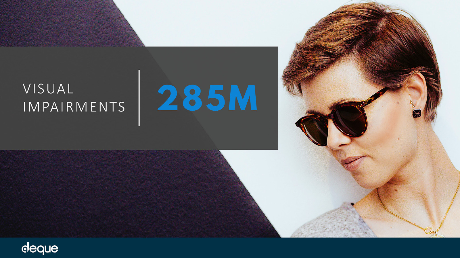
The world health organization estimates that there are 39 million people who are blind and 246 million people with low vision worldwide – a total of 285 million people who might be using an assistive tech device like a screen reader to understand your image. This is a huge piece of your audience you are forgetting if you don’t think about your image alt message.
But before we get into the methods about how the message will be delivered, we need to take a step back before we think about the why - of the image.
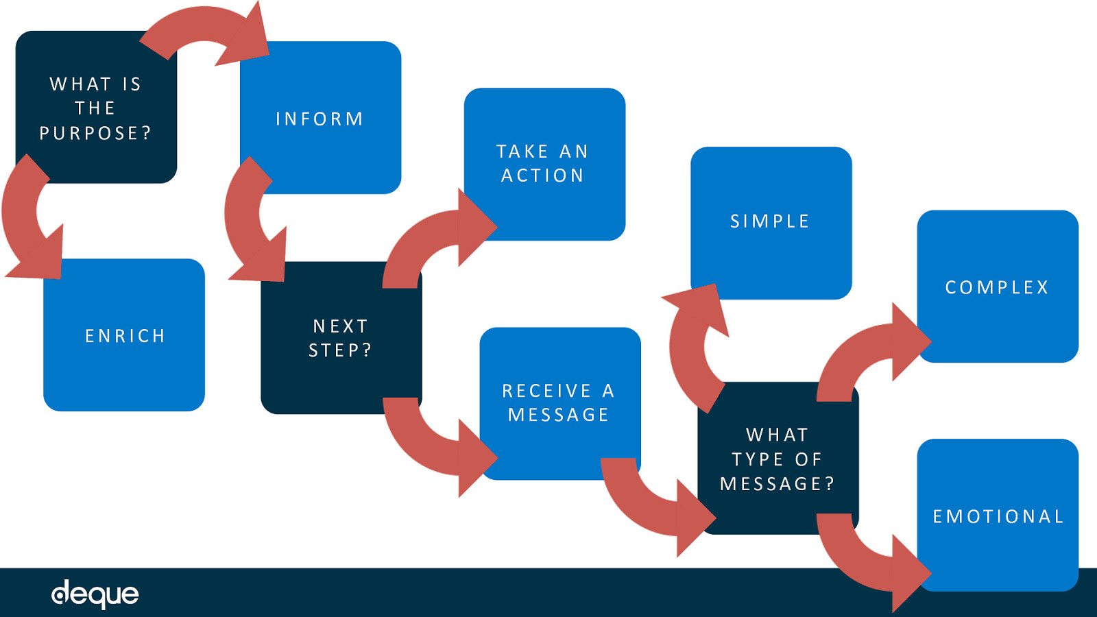
So first what is the purpose of your image? READ steps
By asking the questions “What type of message is the image trying to convey?” and “Is the message simple, complex, emotional, or actionable?” will help you determine how best to convey the image information to a person using an assistive technology (AT) device.
Using a tool such as an online WCAG image decision tree or the simplified chart shown here can help you decide which category your image belongs to.
Or if decision trees are not your thing, you could just imagine your image has – poof! – vanished. Then ask yourself: “Do I understand the content that remains?” If the answer is yes, the image is decorative. If not, the image is informative and contextually necessary.
Let’s look at a decorative image.
In this example, we see a giant letter “S” and a drawing of a black cat with green eyes used to make the drop cap look a bit more fun on a Smashing Magazine article.
When we remove the drop cap illustration, what changes? Certainly, there are visual differences, but no information is lost.
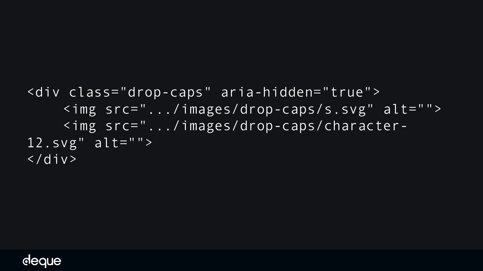
OK let’s look at the code.
In this drop cap example, both aria-hidden=”true” and an empty/null alt <img alt=”“> were used to hide the images from assistive technology devices. While this kind of redundancy is not necessary to make it accessible – it is also not harmful in this particular situation since the div only contains the images we want to hide.
Remember: when it comes to accessible code, more is not always better.
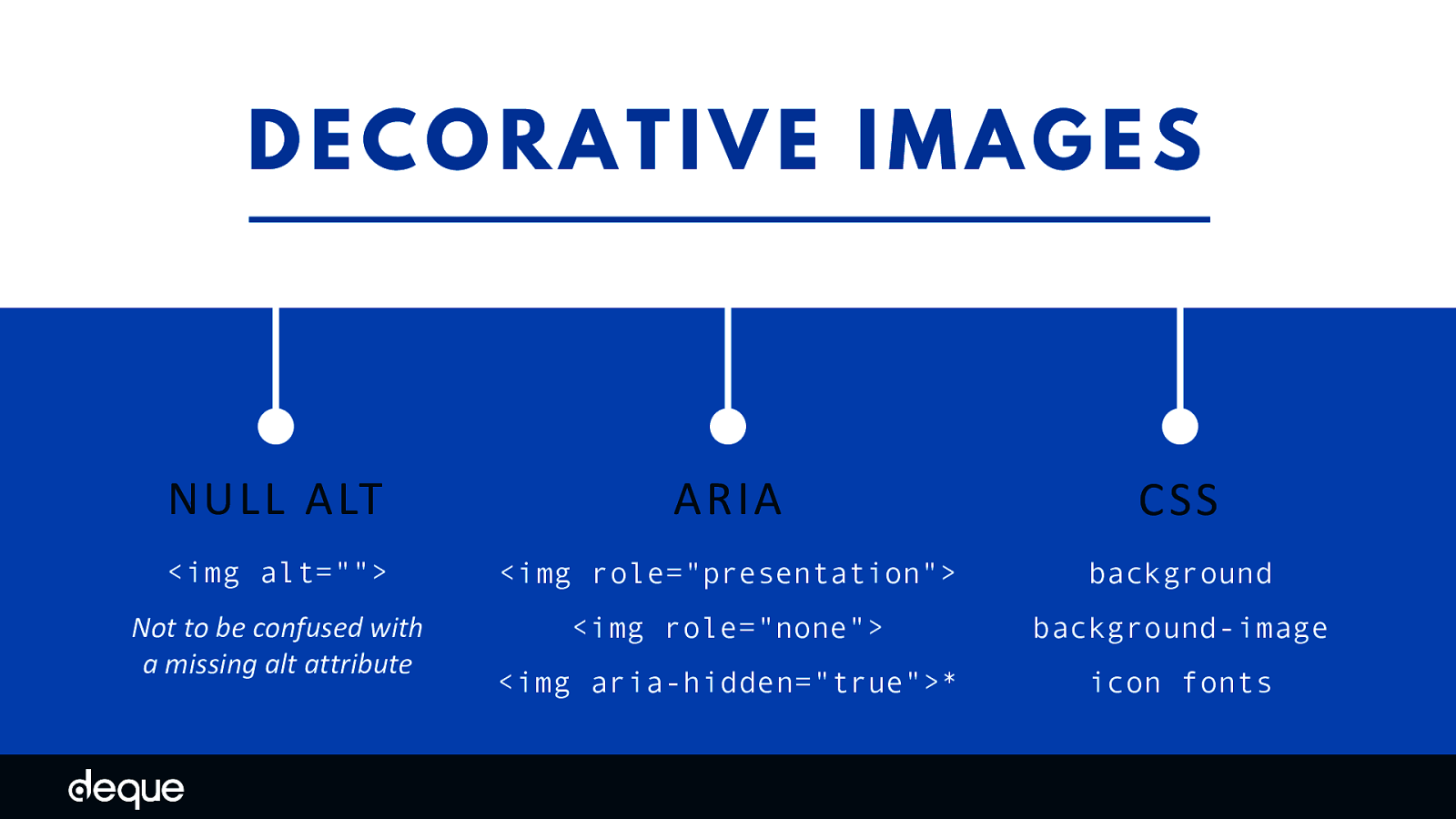
The big take-away is - If you decide your image is decorative, then programmatically the image needs to be hidden.
There are many ways to hide images including using an empty/null alt (e.g.. <img alt=”“>), using ARIA (e.g. <img role=”presentation”> or <img aria-hidden=”true”>), or by implementing the image as a CSS background or icon font. The first two methods send a signal to the AT devices to ignore the image as it is not needed to understand the content or action on the page. The third message by default is not shown to an AT device. A couple of points: An empty/null alternative text attribute is not the same as a missing alternative text attribute. If the alternative text attribute is missing, the AT device might read out the file name or surrounding content in an attempt to give the user more information about the image.
While aria-hidden=”true” is an option to hide images, be cautious where you apply it as it will remove the entire element from the accessibility API.
Beyond programmatically hiding your image there is not much more you need to consider when it comes to decorative images.
If you are saying “But wait…what about X?” or “How about Y?” then you might need to go back to the image decision tree tools and re-evaluate your image – it might not be 100% decorative after all. One of the most difficult types of images to categorize tends to be the “emotional/mood” based images since this subtype is a bit subjective. What one person considers decorative another person might consider informative…so use your best judgment.
OK moving on from decorative, Let’s look at an informative image.
An example of an informative image is the following Deque logo. If we ask the same question as before – does the context or content change if this image is missing? – the answer is “yes.” In this example, the logo is both informative and actionable since it is both an image and a link.
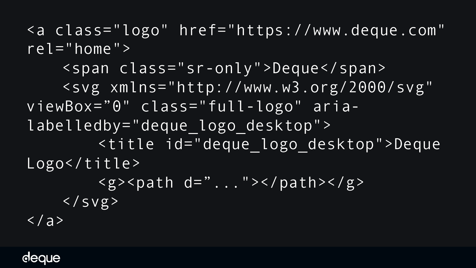
<a class=”logo” href=”https://www.deque.com” rel=”home”> <span class=”sr-only”>Deque</span> <svg xmlns=”http://www.w3.org/2000/svg” viewBox=”0” class=”full-logo” arialabelledby=”deque_logo_desktop”> <title id=”deque_logo_desktop”>Deque Logo</title> <g><path d=”…”></path></g> </svg> </a>
If we inspect the logo we see it is an SVG utilizing aria-labelledby and a title plus a screen reader only span tag. When we fire up an AT device – we should hear “Deque - Deque logo”.
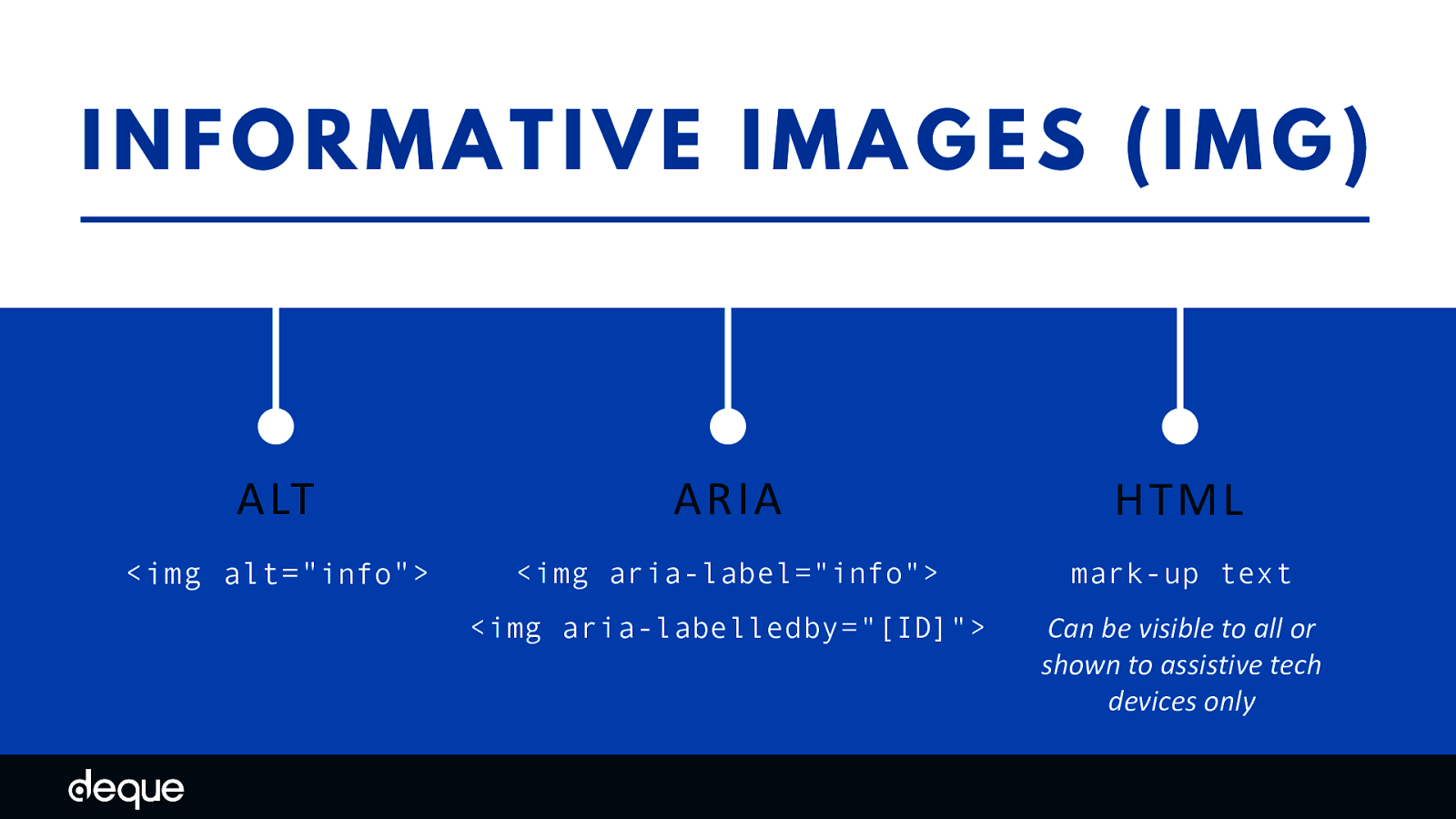
For AT devices to understand the message or intent of an image, informative images must have programmatically-discernible alternative text. Typically, this is accomplished using the <img alt=”[some description]”> method, but there are alternative ways to add image information – including ARIA and HTML - depending on its subtype (e.g. complex vs simple).
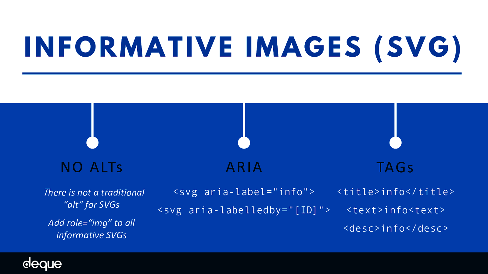
Informative Images - SVGs
Note: it is recommended you add role=“img” to all SVGs

But having alternate text is great but it is not enough – it must also be meaningful. For example, if your image is about feeling safe at home, but your alternative information says “house” – does that convey the full message?
For more complex alternative text phrases, I like to conduct the telephone test. If you called up a friend and said “snail” and hung up the phone your friend would probably be confused, but also might think of a snail– but in what context?
If you called a friend and said “the snail is eating my hydrangeas,” that would paint a more vivid picture – without adding a lot of additional characters or effort. Of course, an AT user will have to listen to your alternative text, so don’t go overboard. That is why it is suggested to cap your text at 150 characters. If you need to add more context to the image (e.g. complex images or graphs), there are other, more descriptive patterns or methods you can use to add more detail.

There is a world beyond image alts
It is important to note that image alt text is important and addresess the needs of screen reader users. But a lot of people with disabilities do not rely on screen readers, and may instead use other AT tools like browser resizing, customized stylesheets, or magnification software to help them see what is on the screen. To these people, screen reader output is probably not as important to them as other image elements like color, contrast, typography, layout, copy and icons.
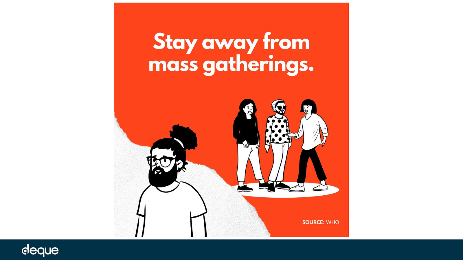
let’s look beyond image alts and consider some additional image elements using real-world PSA examples. In each PSA example, we will look at the image through the lens of a different type of disability – keeping in mind that simulators are tools and may not represent an individual’s true experience. Yet, by using such tools, we can begin to build empathy into our designs and really consider the different ways our images are being consumed. Also to be clear - the following examples are for illustrative and educational purposes only and not meant to call-out or otherwise pass judgment about the designs in question. there may be multiple issues in one PSA, but we will just focus on one issue type per example. There will be a lot of opportunities for improvement in the area of digital communications when the dust settles on COVID-19 and accessibility is just one more area to consider reviewing.
United Nations: avoid touching your face
Color and Contrast The beating heart of design arguably is color. And if color is the heart of design, then contrast is the muscle. Without good color contrast levels in place elements like words, icons, and other graphical shapes are hard to discern and the design can quickly become inaccessible.
But what happens when you perceive color and contrast differently than others – does the same message and intent come through? How to reach people with color-sensing issues – such as color blindness?
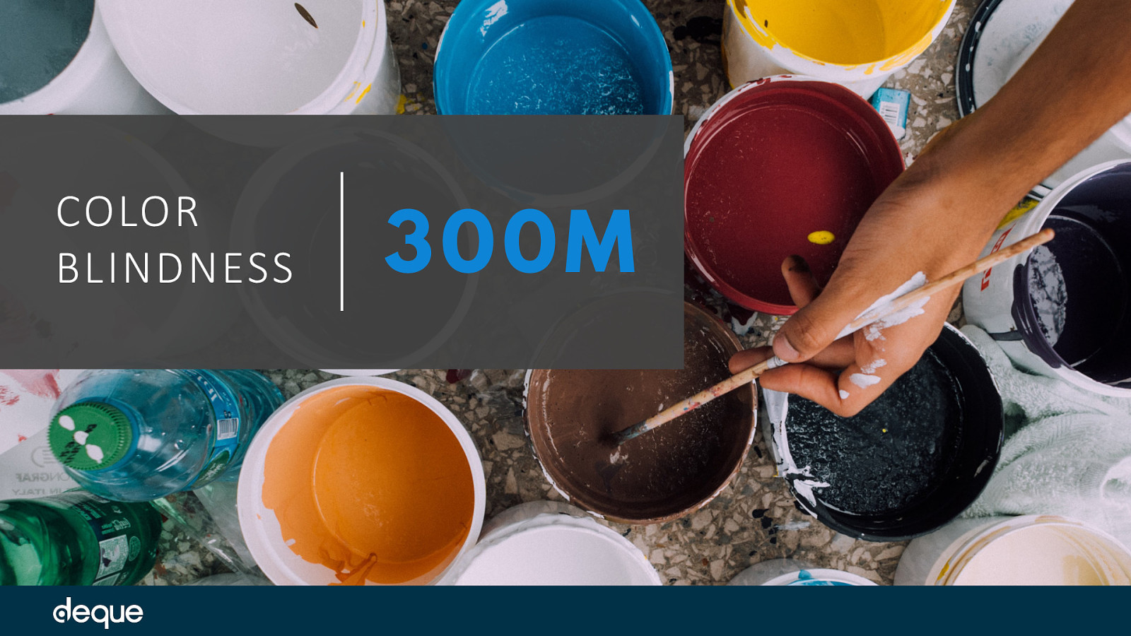
It is estimated that 300 million people worldwide are color blind, so that is a lot of people and experiences to consider. But color and contrast also affects people with partial sight, older adults, and people in certain situations (e.g. low lighting in a room, screen glare) so the number of actual people you reach with accessible color and contrast is much higher.
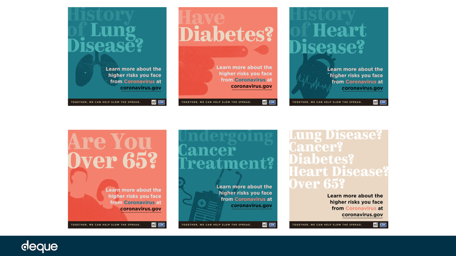
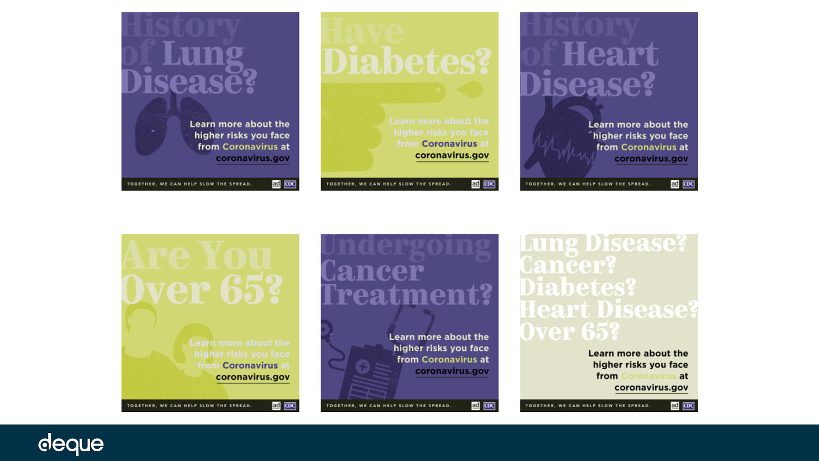
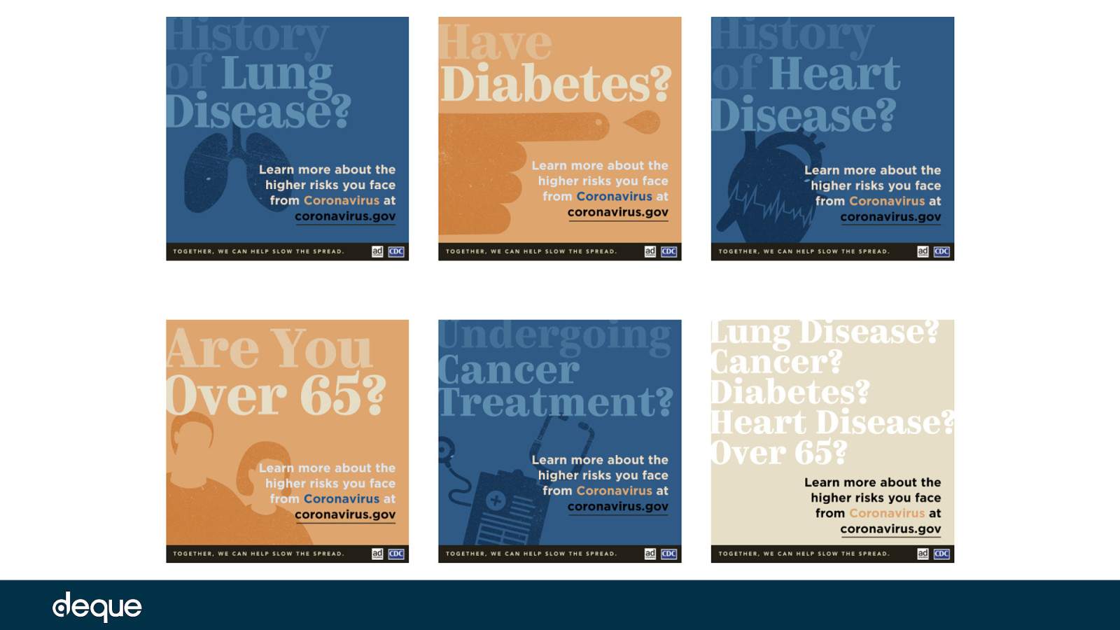
In the first example, we are reviewing PSAs from the Centers for Disease Control and Prevention (CDC) plus the non-profit group called the Ad Council – one of the oldest and most prolific producers of such material in the US. This particular group of PSAs have been created for “higher risk” individuals for COVID-19. While these PSAs incorporate a variety of striking color choices and are visually appealing – when testing the text against the background in these images, many of the combinations do not pass the Web Content Accessibility Guidelines (WCAG) color contrast ratios. This is true even for the unedited versions of these designs, but when we apply simulators for color blindness and low vision – the color contrast ratios get even worse.
Let’s take a look
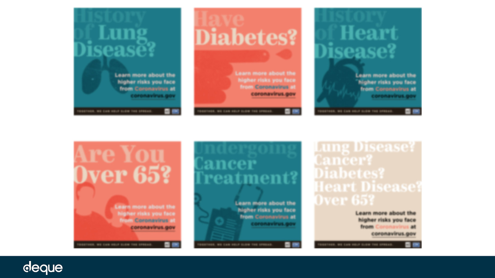
Next, we can see two types of color blindness simulated using the ChromeLens extension. This tool includes the Lens Vision Simulator, which transforms the colors on a website simulating what a colorblind person might see. #1
Simulated PSA with red/green color-blindness called (doo·tr·uh·now·pee·uh) Deuteranopia
Simulated PSA with red-weak color blindness called (proht-a-om-uh-lee) Protanomaly
Next, using the NoCoffee Vision Simulator tool, we can see how the PSAs might look to someone with low vision and cataracts. PSAs with simulated low vision filter applied
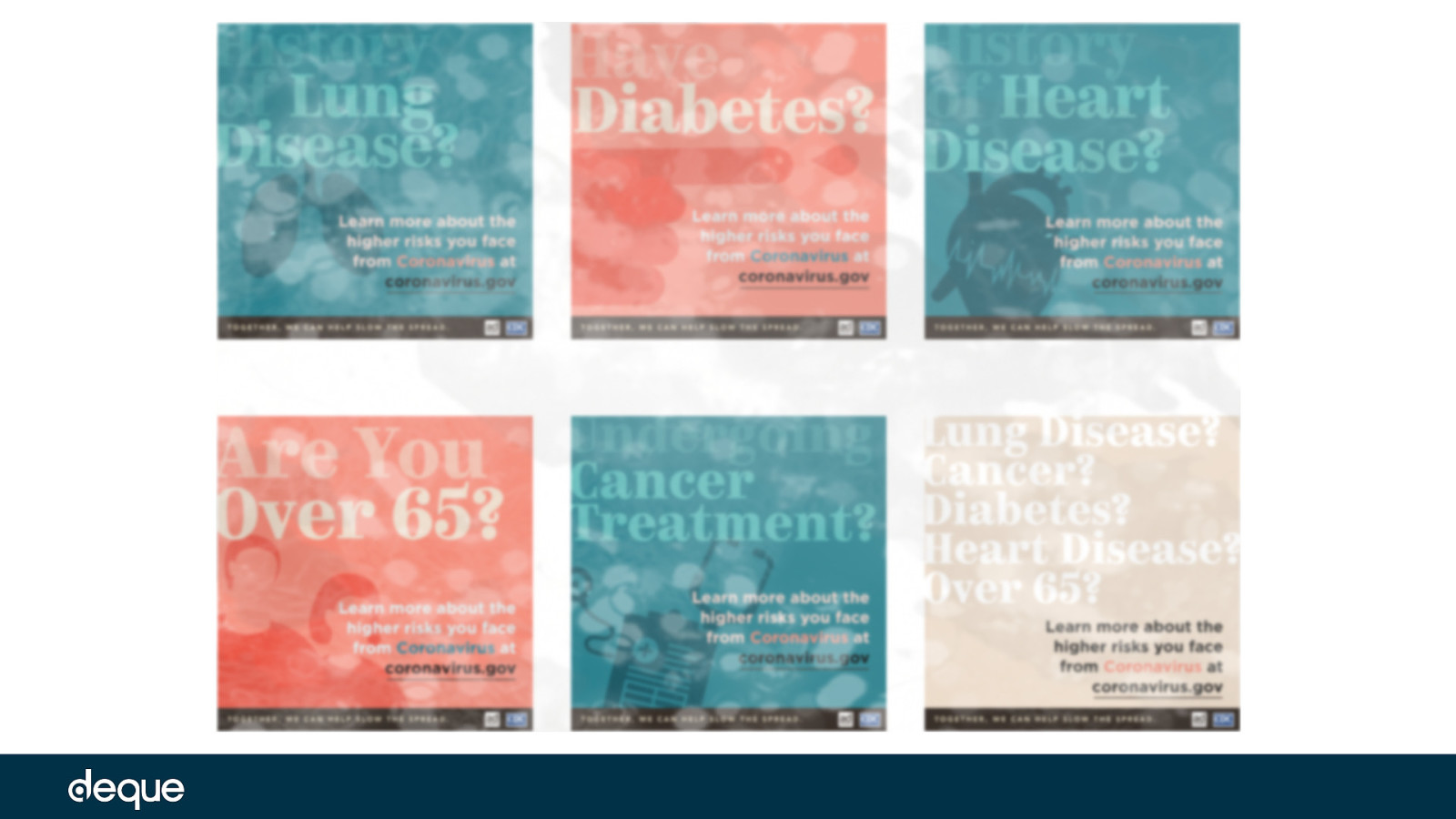
PSAs with simulated cataract filter applied
Next is a break-down of some color contrast ratios found on the PSAs between the different color blindness and low vision simulators.
at least 4.5:1 for regular-sized text, and at least 3:1 for large-sized text (18pt and larger) and essential icons
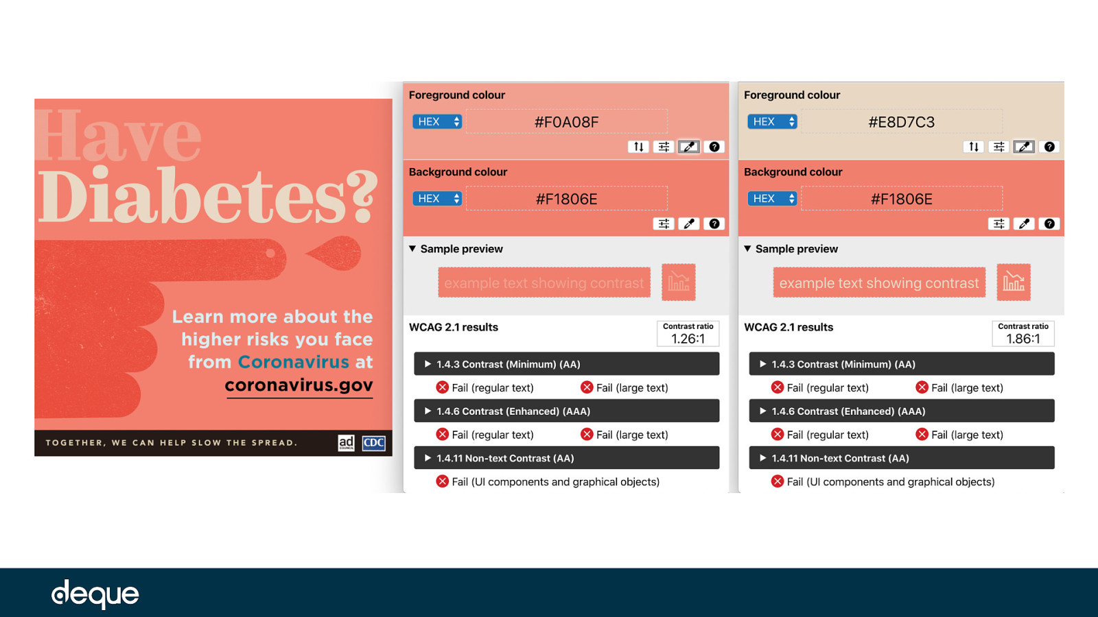
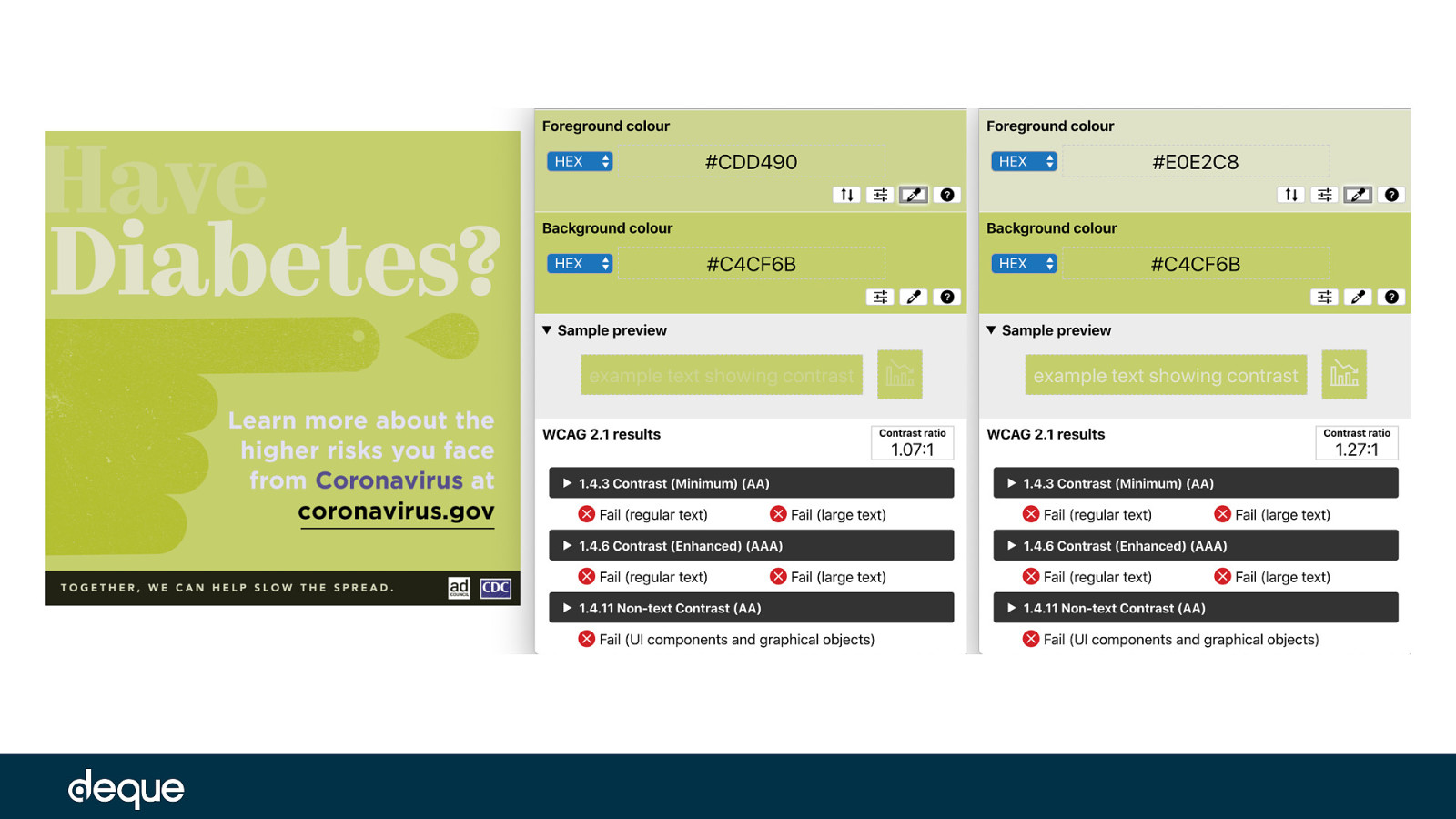
Original PSA – color contrast ratio of 1.26:1 with the text “Have” against the background Original PSA – color contrast ratio of 1.86:1 with the text “Diabetes” against the background
red/green color-blindness
(doo·tr·uh·now·pee·uh) Deuteranopia simulation filter applied – color contrast ratio of 1.07:1 with the text “Have” against the background (doo·tr·uh·now·pee·uh) Deuteranopia simulation filter applied – color contrast ratio of 1.27:1 with the text “Diabetes” against the background
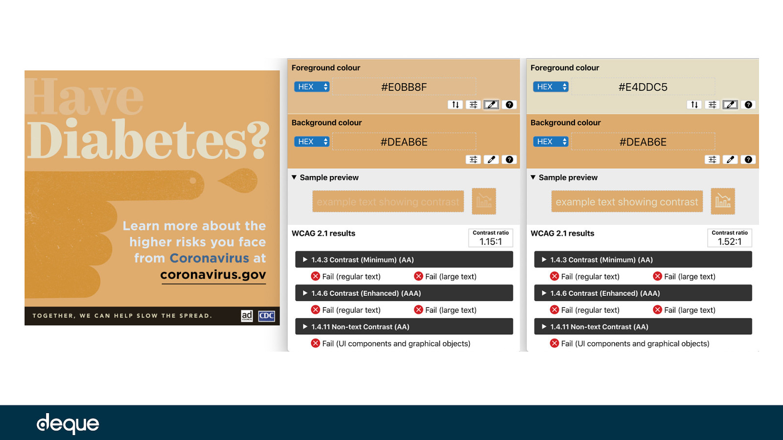
(proht-a-om-uh-lee) Protanomaly simulation filter applied – color contrast ratio of 1.15:1 with the text “Have” against the background (proht-a-om-uh-lee) Protanomaly simulation filter applied – color contrast ratio of 1.52:1 with the text “Diabetes” against the background
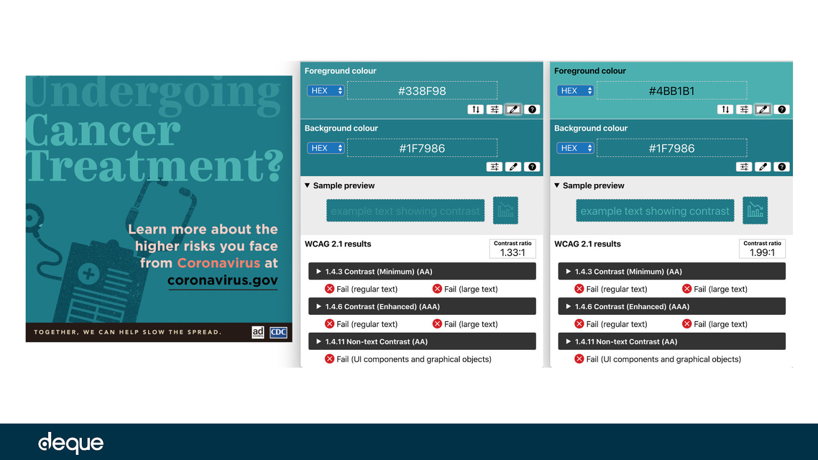
Below is a break-down of some color contrast ratios found on the PSAs between the different low vision simulators. Original PSA – color contrast ratio of 1.33:1 with the word “Undergoing” against the background Original PSA – color contrast ratio of 1.99:1 with the words “Cancer Treatment” against the background
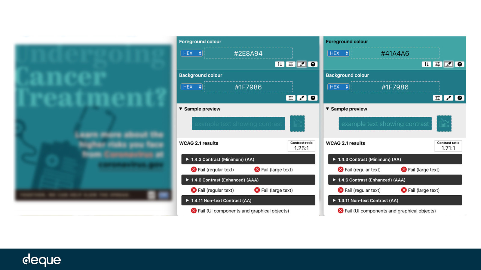
PSA with low vision simulation filter applied – color contrast ratio of 1.25:1 with the word “Undergoing” against the background PSA with low vision simulation filter applied – color contrast ratio of 1.71:1 with the words “Cancer Treatment” against the background
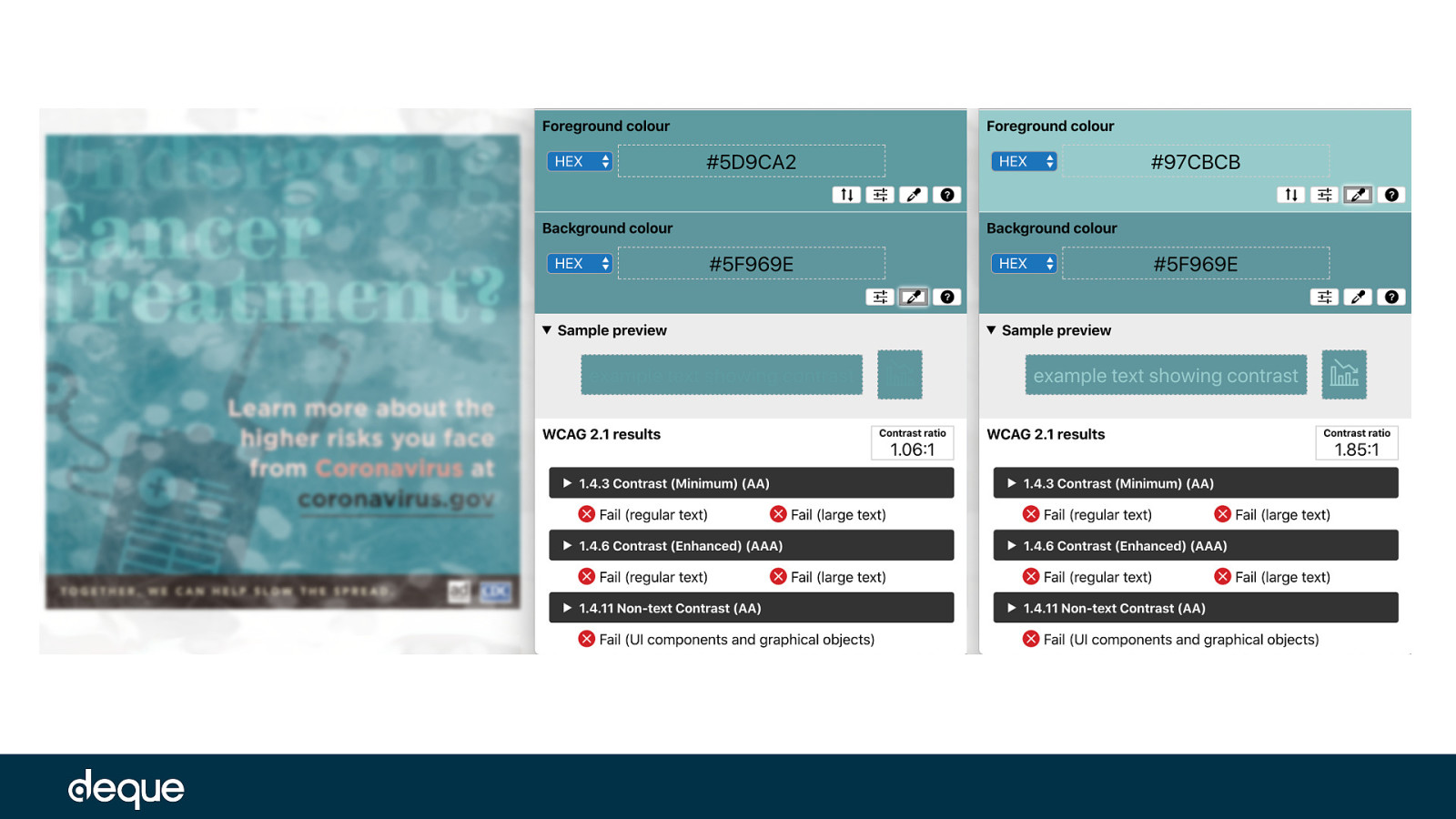
PSA with cataract simulation filter applied – color contrast ratio of 1.06:1 with the word “Undergoing” against the background PSA with cataract simulation filter applied – color contrast ratio of 1.85:1 with the word “Cancer Treatment” against the background
A lot of people blame color for their design accessibility issues – but these examples show that contrast plays a key role as well. Without changing the colors on these PSAs, but by changing the user perspective and blurring or obfuscating the text, we can see that the text on the images are more difficult to read even though the contrast ratios in some cases didn’t change by much. To make these PSAs more accessible, we need to increase the contrast on these images so people with colorblindness, low vision, and eye disorders could read the text.
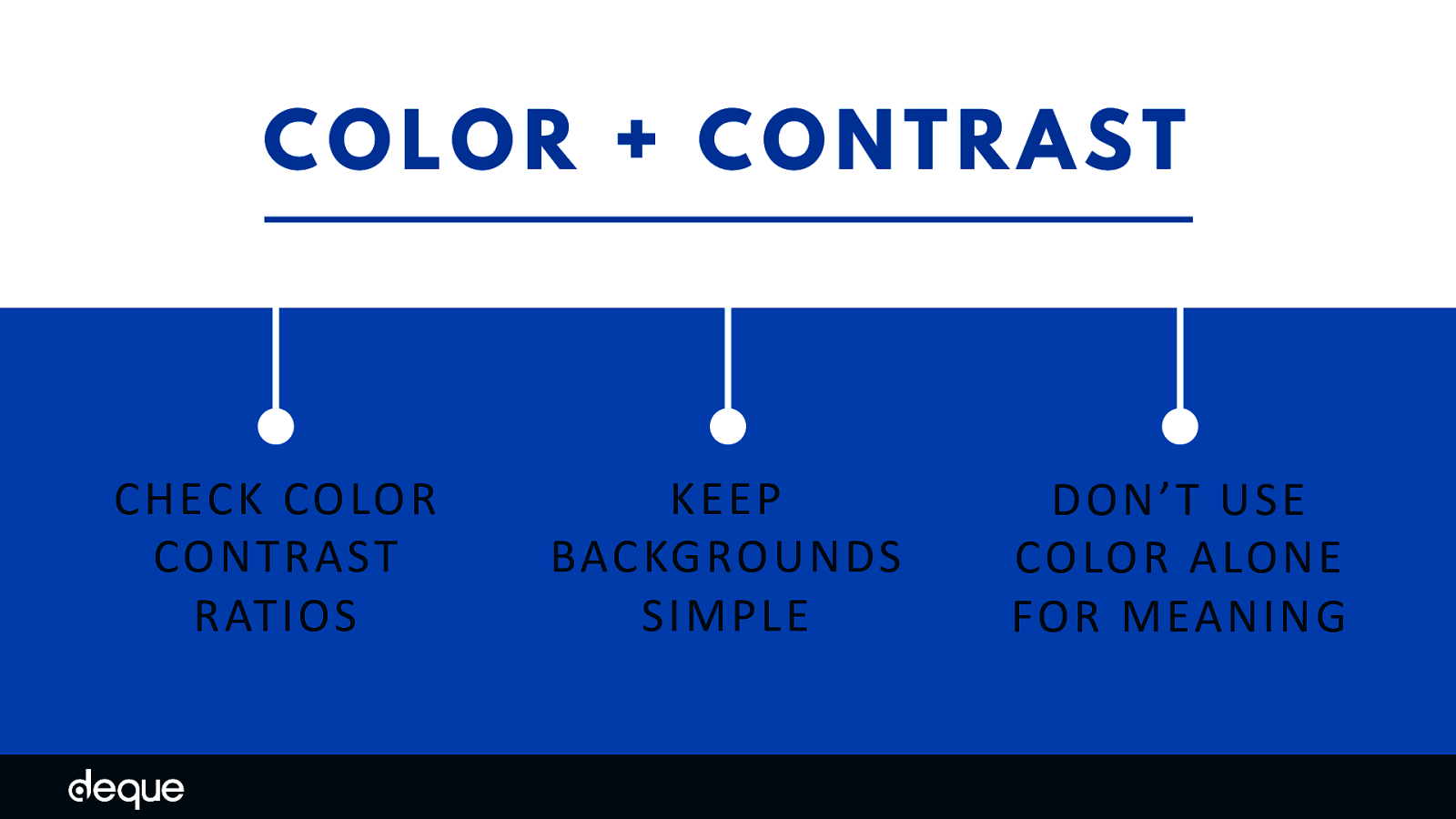
Review the WCAG color contrast ratio guidelines and use color contrast tools to check your designs. Remember, your images with copy need a color contrast ratio of at least 4.5:1 for regular-sized text, and at least 3:1 for large-sized text (18pt and larger) and essential icons. Next, utilize solid backgrounds – reading text on busy backgrounds, overlays, textures, or gradients is difficult in general, but especially when the text does not have enough contrast. Use a tool like the ChromeLens extension to double-check the color contrast with color blindness in mind. Use tools like NoCoffee Vision Simulator to simulate low vision issues and see how your design holds-up in these situations. Going beyond color contrast ratios, it is also important to not use color alone to convey information. For example, “contact information can be seen in red” or “click the blue button to learn more.” If you can’t see blue or red how would you know what to do in that situation?
In a perfect world, we would keep our text and images separated. This would allow users to manipulate the typography and layout in any way they would want – font size, letter spacing/kerning, justification, margins/padding, and more. But unfortunately, there are a lot of formats that this kind of separation is difficult or impossible, such as social media posts, emails, PDFs, and other fixed form media.
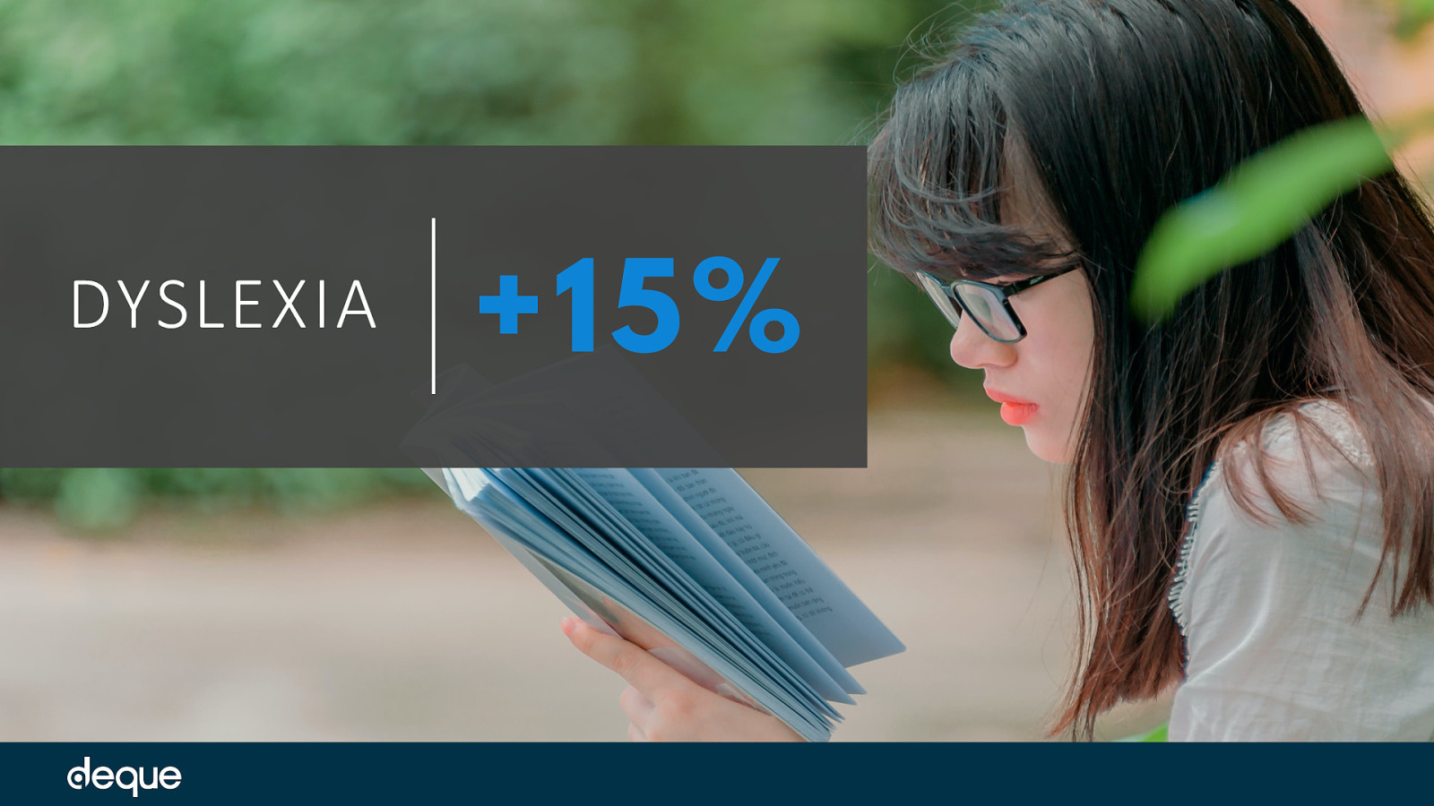
Who Typography and Layout Can Affect Typography is especially important to the estimated 15–20% of the world’s population with dyslexia – which is a learning disorder where certain letters, numbers, or combinations of letters can be confusing or seem to flip/move around.
For people with low vision, attention-deficit disorders, and reading disabilities, a complex layout is a real barrier. These users have trouble keeping their place and following the flow of the content due to the lack of whitespace and clear linear pathways.
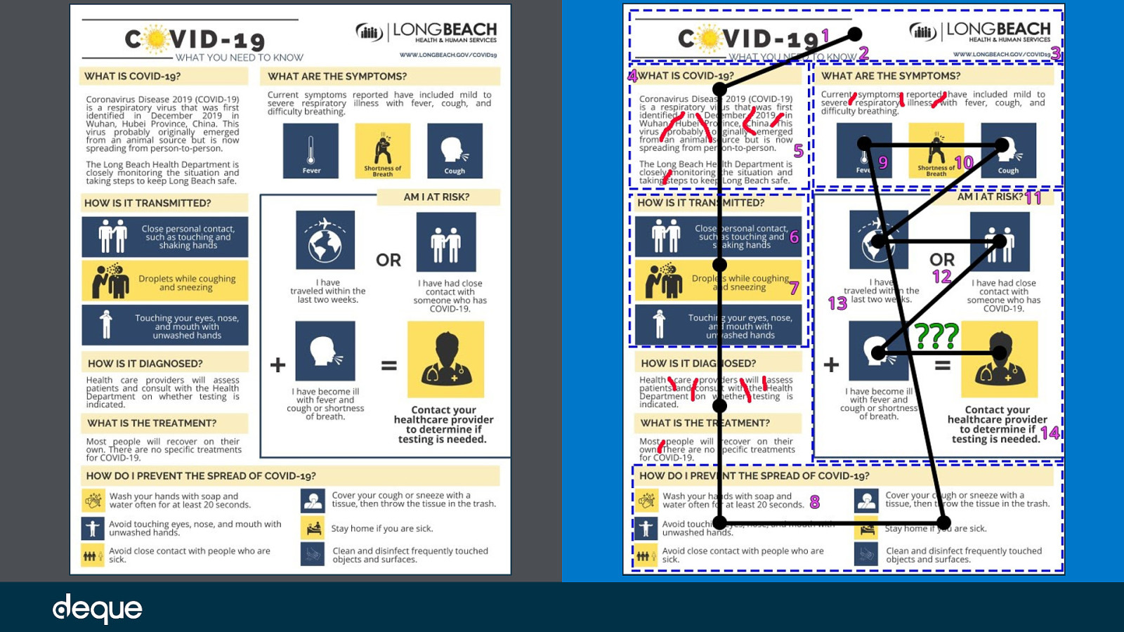
Let’s first take a look at a PSA from California’s Long Beach Health and Human Services. If we are looking at this PSA from an accessibility point of view, what typography and layout issues do you see? In what ways could we improve this image?
Unedited PSA with mark-up and notes: If we focus on the typography and layout the following elements stand out: Red hand-drawn lines = illustrating the multiple “rivers of space” created by the justified alignment Blue dotted boxes = outlining six different layout changes Pink numbers = highlighting the 14 different typography treatments discovered (ignoring the logo). Some changes are more obvious like font family or color changes, some are more subtle like alignment, size, or weight changes in the typography Green question marks = what does this equation even mean? Cognitively this is a difficult thing to ascertain given the odd layout Black lines and dots = expected 12 points of visual interest in an UX eye-tracking test based on the order of the content blocks (top to bottom, left to right) and typical equation flow (X + Y = Z)
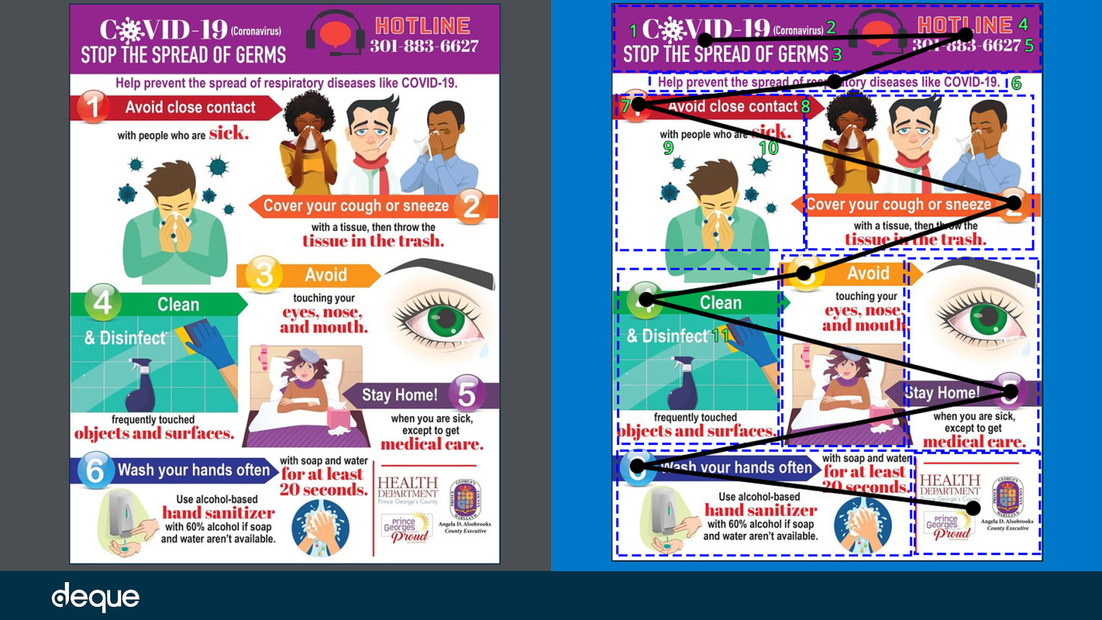
Let’s look at another PSA and again evaluate the typography and layout from an accessibility point of view. This time the image was created by the Health Department of Prince George County in Maryland.
Original PSA:
Unedited PSA with mark-up and notes If we focus on the typography and layout the following elements stand out: Blue dotted boxes = outlining 9 different layout changes Green numbers = highlighting the 11 different typography treatments discovered (ignoring the logos). Some changes are more obvious like font family or color changes, some are more subtle like alignment, size, or weight changes in the typography Black lines and dots = expected 10 points of visual interest in an UX eye-tracking test based on the order of the content blocks (top to bottom, left to right) and numbering order (1 to 6) forming a zig-zag type eye movement
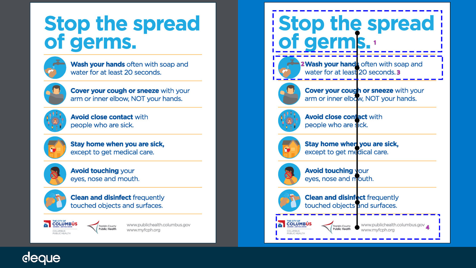
So far we’ve seen some examples where there are a lot of typography changes and the layouts are complex, now let’s review a cleaner PSA. This one is from the Prevention Action Alliance out of Columbus, Ohio. Original PSA:
Unedited PSA with mark-up and notes: Blue dotted boxes = outlining three different layout changes Pink numbers = highlighting the four different typography treatments discovered (ignoring the logos). In this case, only one font family was used, with variations only on size, color, and weight Black lines and dots = expected eight points of visual interest in an UX eye-tracking test based on the order of the content blocks (top to bottom) The third PSA example is more consistent when it comes to typography and layout and has more overall whitespace and a linear visual pathway compared to the first two examples.
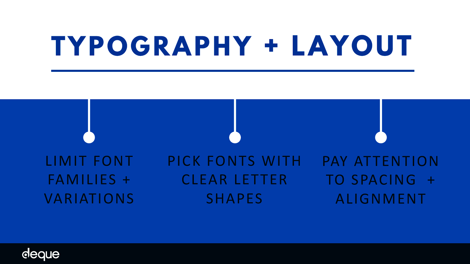
Less is more when it comes to accessible typography, so limit the number of different font families and variations such as italic, bold, ALL CAPS, or other styling methods that may make the content difficult to read.
While the research is not conclusive about whether serif or sans-serif typefaces are easier to read, if you choose font families that have clearly defined letter shapes it is more likely that the font will be accessible. Some common offenders to look out for when choosing an inclusive font include the “I” (ex. India), “l” (ex. lettuce) and “1” (ex. one). Likewise, characters like “b” and “d” and “q” and “p” can sometimes be mirrored (either left-right or up-down), and the letter “B” and the number “8” oftentimes look too similar. In regards to layout, less is also more. Try and repeat patterns whenever and avoid paragraph alignment which creates whitespace or “rivers of space” within the content (e.g. justified alignment). Line spacing (leading) is at least space-and-a-half within paragraphs, and paragraph spacing is at least 1.5 times larger than the line spacing. Incorporating these guidelines will help people with attention-deficit disorders, reading and vision-based disabilities focus more on the content and less on the layout.
Last but not least, let’s focus on the actual PSA message. Arguably, copy is the key element in informing the public on the latest COVID-19 updates and providing information about preventing the spread of the virus. But icons in this situation serve up more than just decoration, these elements visually repeat the same message as the copy. No pressure – but both copy and icons need to be spot-on to reach the widest array of people.

Who Copy and Icons Can Affect People with attention-deficit disorders – estimated at 129 million people worldwide – can have issues focusing on copy that is too long, does not break items into lists, and lacks whitespace (think: line height, paragraph margins, etc).
While people with cognitive, language, and learning disabilities may need visual icons, graphics, and symbols to understand the accompanying copy.
For this example, let’s test the copy of two PSAs from the Centers for Disease Control and Prevention (CDC) for readability. Readability is the ease with which a reader can understand a written text. Readability of copy depends on both the content and presentation.
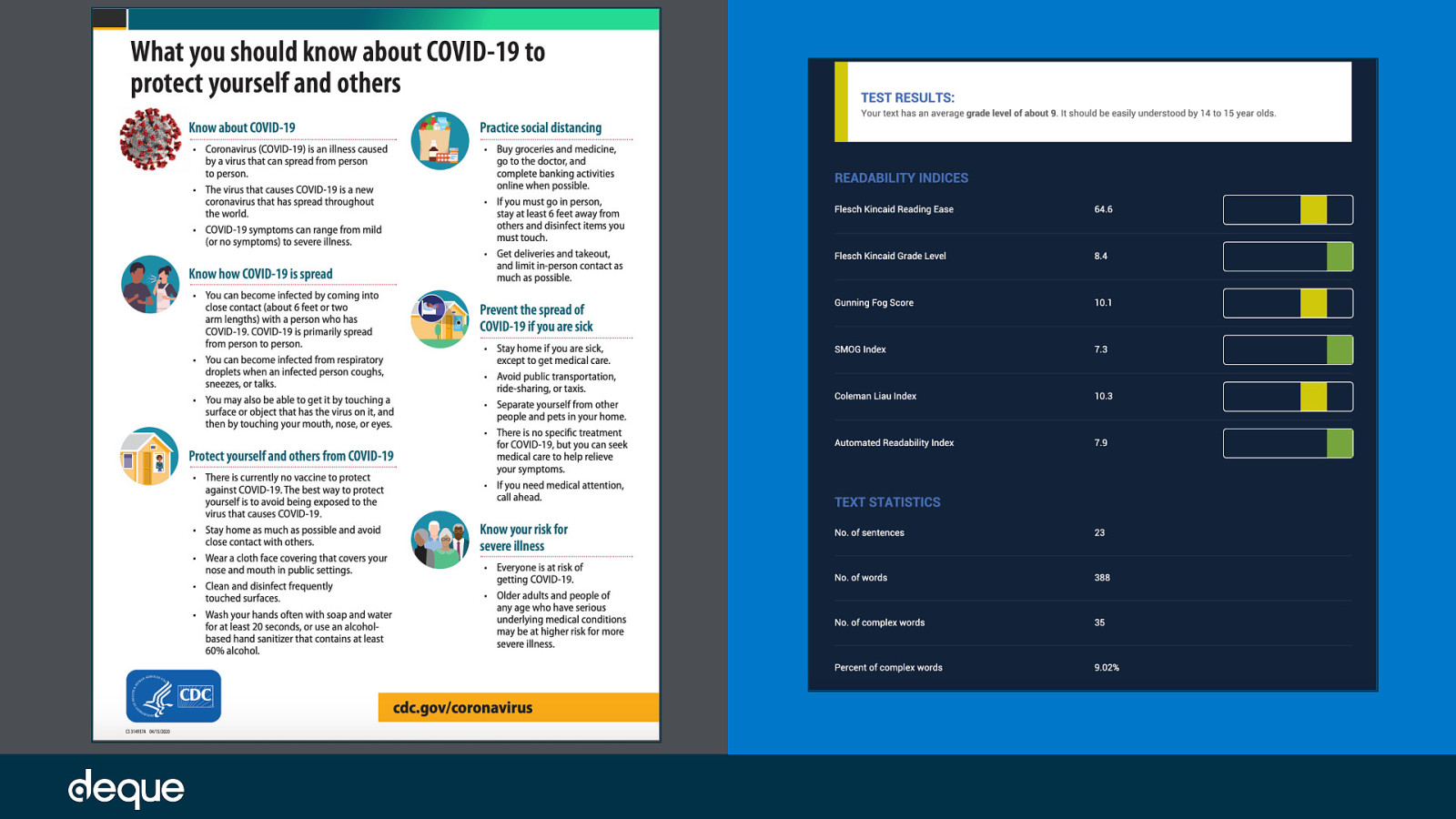
CDC created PSA – What you should know about COVID-19 to protect yourself and others : If we evaluate the main body copy using readability indicator tools like Readable and The Readability Test, we see that the PSA has 388 words at an average reading grade level of 9 and a Flesch kincaid Reading Ease* of 64.6. In addition to those metrics, for accessible copy we also want to look at the number of complex words and their frequency – in this case 35 and 9.02% respectively. *The Flesch Kincaid Reading Ease level is out of 100. The lower the number, the more difficult the copy is to read. For reference, a reading ease score of 60-70 is considered acceptable for basic web copy.
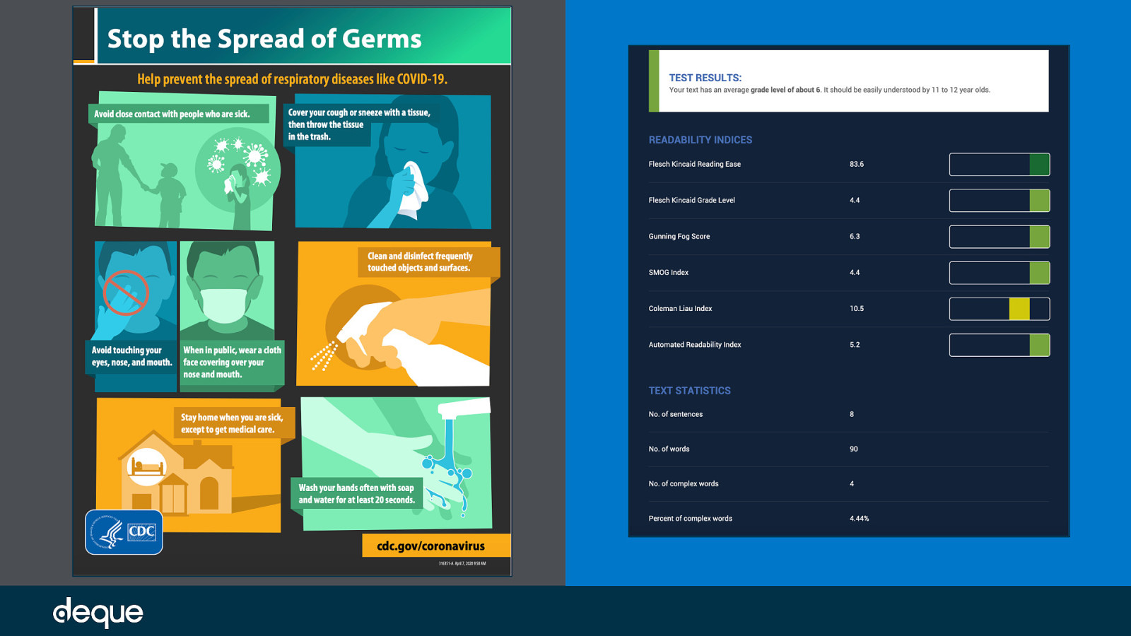
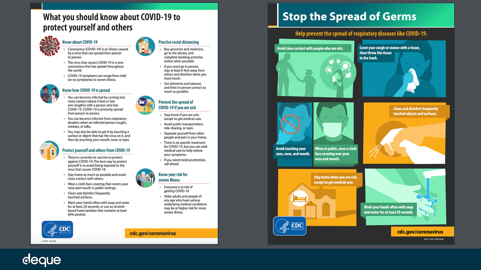
While the copy in the first image was adequate and falls in the suggested readability ranges for web-based copy, let’s compare it to another PSA created by the CDC on the same subject. CDC created PSA – Stop the Spread of Germs:
This PSA has a lot more imagery and a lot less text. If we again evaluate the main copy, we see that our copy now has a total of 90 words with an average grade of 6 and a Flesch Kincaid Reading Ease of 83.6. The number of complex words is now down to 4 with a frequency of 4.44%.
Compared to the first PSA, this PSA one has 298 fewer words, is easier to read by 3 grade levels, has a reading ease level increase of 19 points, and is overall just less complex. Based on these numbers, we can extrapolate that the second PSA is more inclusive than the first when looking at copy alone.
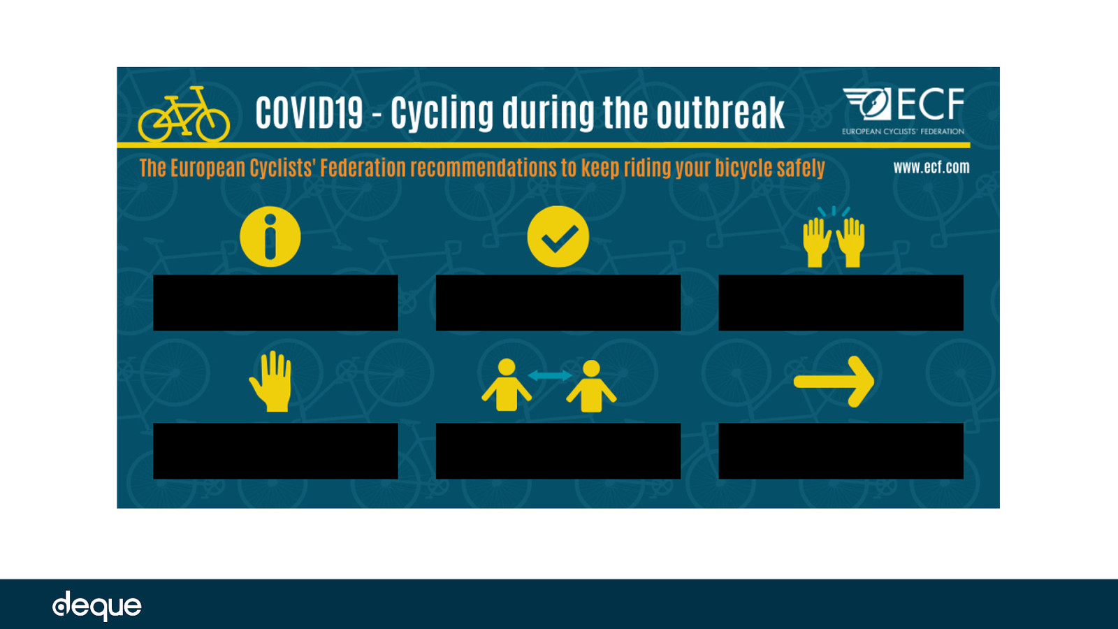
But testing the readability of copy isn’t the only way to measure the effectiveness of a PSA when it comes to message accessibility. Another element we need to look at are the icons accompanying the copy. If we are presented only the icons – is the same message received? Let’s now look at a couple of examples. Based on the icons alone, what is the message the image is trying to convey about riding your bicycle safely during COVID-19? Edited PSA from the European Cyclists’ Federation
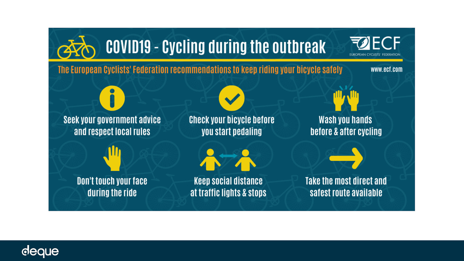
This is the unedited PSA. Were you able to figure out the full message? While you might have been able to guess correctly for a couple of icons, were there parts of the message you missed not having the copy?
OK let’s look at another example. This next PSA comes from the Pennsylvania Department of Health. Let’s do the same exercise as before – without the icon copy can you understand the message in this PSA? Edited PSA
Original PSA: Now we can see the PSA with copy. Were you able to figure out the full message? While there may have been an icon or two that tripped you up, was it easier to decipher the icons on the second PSA versus the first?
No what if your message was one big icon? Here we see an Edited PSA from Canva sourcing the world health organization WHO. What is the message here?
To be honest, I first thought it was a PSA on bullying – not realizing the man on the left was also the man in the middle of the group on the right.
Original PSA: Now we can see the PSA with copy. Were you able to figure out the full message?
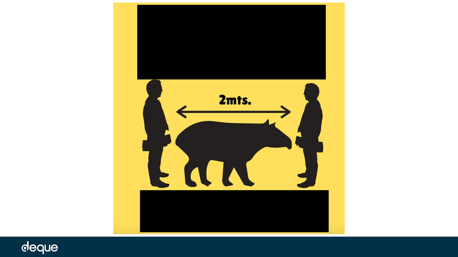
One of my favorites – central american PSA From the biologists for nature of Guatemala organziation BioNaG
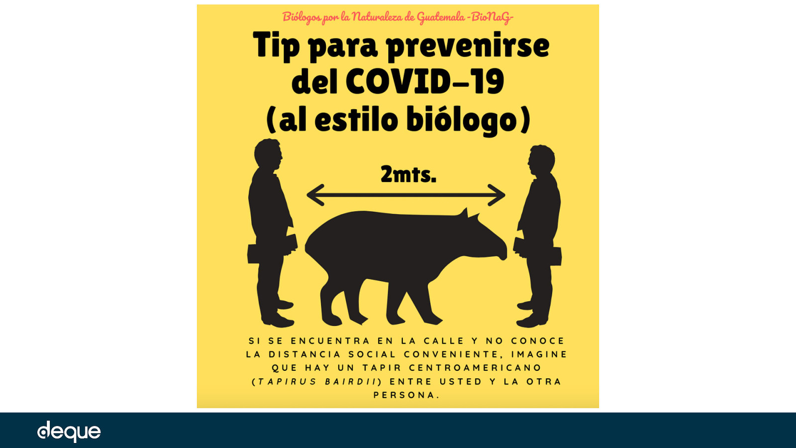
Original PSA: Now we can see the PSA with copy. Were you able to figure out the full message?
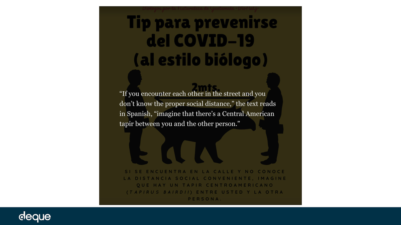
If you encounter each other in the street and you don’t know the proper social distance, imagine that there’s a Central American tapir between you and the other person.
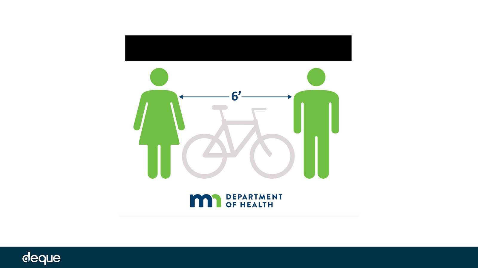
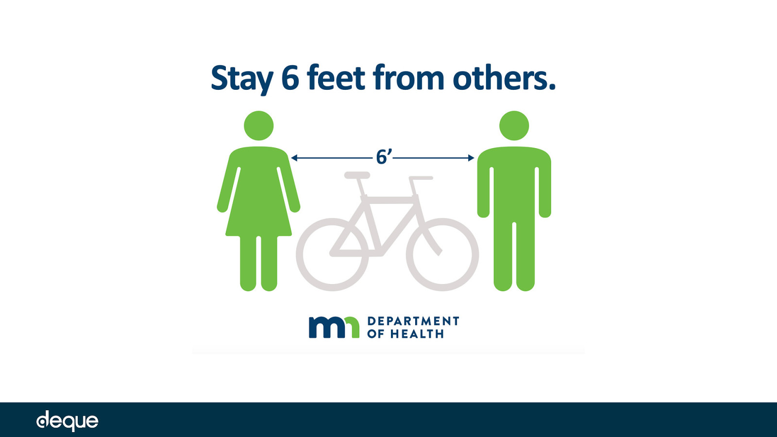
Another good one – this time suited for americans who don’t understand meters from the Minnesota dept of health
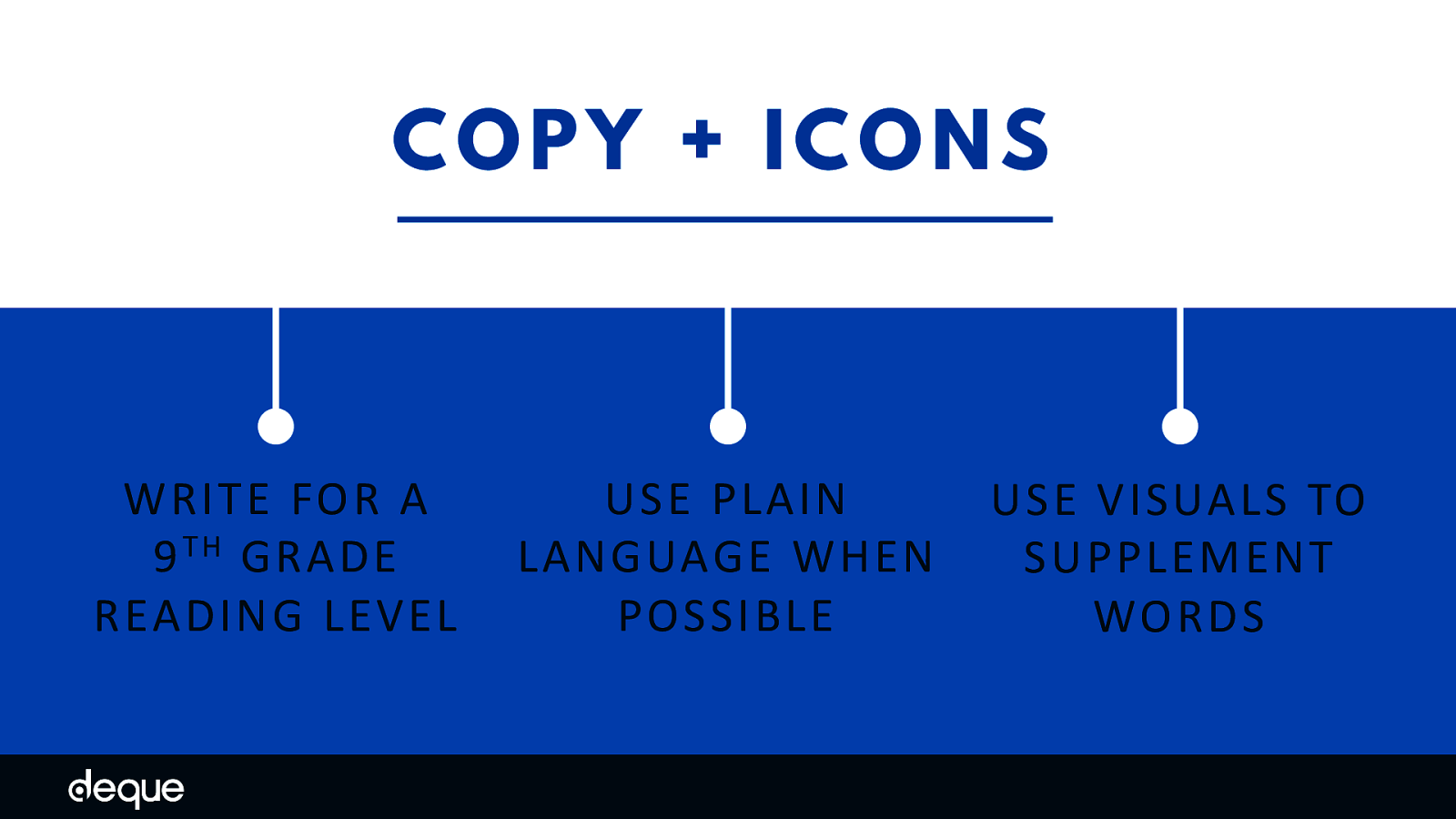
Be clear and concise. The unofficial rule of thumb is to write for a 9th-grade reading level. This level is based on the assumption that most people reach the 12th-grade reading level, but in times of peak stress, they might not be reading at their highest level.
Try and use plain language and avoid technical jargon, fancy words, expressions, acronyms, abbreviations, or unusual words – or if you need to use those more complex words, make sure you explaining them in more detail. Tools like Readable and The Readability Test can help you determine the reading level of your copy, while tools like Hemingway Editor or Grammarly can suggest edits to make your copy more inclusive. Use icons, graphics, and symbols to supplement copy whenever possible. Adding imagery allows you to break down some language and cognitive barriers and not rely on your typography to carry all the weight. Just be sure to choose icons that are common or don’t require a lot of thought.
Creating accessible images involves a lot more than just adding alt text. It is important to consider how all image elements – color, contrast, typography, layout, copy, and icons – affect your users as well. By taking a bit more time and building these accessibility principles into your images you will undoubtedly reach more people – on their terms. In uncertain times like these, we need to be sure we are addressing all the ways we can improve our images to be more inclusive in our messaging.
As George Dei - a professor at the University of Toronto and an expert on inclusion would say:
Inclusion is not bringing people into what already exists — it is making a new space, a better space for everyone.

Twitter/LinkedIn: @cariefisher GitHub: @cehfisher website: cariefisher.com
