Accessible Patterns from the Ground Up

A presentation at DrupalCon Global 2020 in July 2020 in by Carie Fisher

Slide 1

Slide 1

Accessible Patterns From the Ground Up

Before we begin I’d like to thank the Drupalcon team for the opportunity to speak tonight. I’m very honored to be a part of such a fantastic lineup this year!

Welcome everyone to my talk - accessible patterns from the ground up! So Digital accessibility can be difficult or frustrating to a lot of people, but it doesn’t have to be. By making small changes to your everyday workflow, you can have a huge impact on making the digital world more inclusive - without crushing your creativity or sacrificing your sanity!

In this talk, I will walk-through the process of creating an accessible pattern from design to development, while focusing on accessibility best practices and tools at each step. I will start with a wireframe, process that into a design, translate the design into code, and finally, test for accessibility.

Slide 2

Slide 2

Hello! I am Carie Fisher Sr. Accessibility Consultant Deque Systems

My name is Carie Fisher. I am senior Accessibility Consultant at Deque and I have been building websites professionally from the early 2000s primarily with various frameworks. In fact, my first real job as a web developer was taking a website from Drupal 4 to 6…with no prior Drupal experience. While it was a quite the challenge…it also introduced me to the amazing community, so I am very thankful for that project.

Since that initial project, I’ve spent the majority of my professional career working as a front-end dev at various Drupal shops before focusing more on UX and accessibility. Which led me to Deque…one of the top companies in the world specializing in digital accessibility. We help many Fortune 500 companies make their websites and mobile applications more accessible by providing educational resources, training, audits, and a suite of tools to help automate accessibility reviews.

Slide 3

Slide 3

Let’s prep the soil...

So today we are going to talk about the process of going from accessible pattern idea to the final product and will chat about four stages we go through on our accessible journey - Awareness, Knowledge, Practice and Understanding.

This talk was inspired by the variety of students I have trained in accessibility and addresses some of typical questions I get during these beginner trainings. It is good to mention that, while we go through the process outlined in these slides - that one size does not fit all. Based on your team’s size or budgetary constraints, you may do one piece and hand it off to another team member or outside consultant or you might not need to use all the tools or steps outlined - that’s OK. It is more important to find something that works for you and your team than abandoning accessibility all together. This talk is meant to help you start that initial internal conversation.

Alright…moving on. As any good farmer or gardener knows, before you plant any seeds, you must prep the soil. So let’s chat a little bit about Stage one…

Slide 4

Slide 4

Accessibility awareness

Before you can fix a problem, you have to realize there is a problem. Typically Stage 1: Awareness — You are brand new to digital accessibility and are still trying to understand what it is and how you can implement changes in your daily workflow. You may be aware that there is a set of digital accessibility guidelines that other designers or developers follow, but you are a bit hazy on what it all means in a practical sense.

If you are new to the field of accessibility, the following slides will help give you a deeper foundation before we go into the pattern workflow. If you are less new, you might know some of this already, but it is important to review quickly so we all can start off on roughly the same level.

Slide 5

Slide 5

Accessibility

Digital Accessibility (sometimes abbreviated A11y) is about designing and building your digital offerings in such a way that regardless of a person’s mental or physical ability they could still interact with your website, app, or electronic document in a meaningful and equal way.

Slide 6

Slide 6

1,116,300,000+ or 15% of the world’s population self-identifies as having a disability

According to the World Health Organization, 1 Billion or 15% of the world’s population self-identify as having a disability.

Of course, that original number is a bit deceiving. because if you consider people who don’t identify as having a disability, but who could benefit from accessible websites and apps, that number jumps up way higher. - for example, people temporarily disabled (broken wrist), situationally disabled (glare on a device screen), mildly disabled (hard or hearing, color blind), English as a second language and need more time to process the content

Slide 7

Slide 7

US Disability stats

If we focus on the US alone, there are 56.7 million people, roughly 19% of the population, who identify as being disabled. This is the same as the entire population of California + New York (~56 million).

There are 39.6 million people, roughly 13% of the population, who are over the age of 65 and could benefit from accessible websites due to loss of hearing, eyesight, motor control, and decreased cognition. This is the same as the entire population of Texas + Illinois (~38 million). This number is expected to double in the next 20 years…and it will continue to grow as people live longer and technology becomes even more prevalent and important to our daily lives.

In total accessibility cover over 96.3 million or 32% of the US population alone. If you are ignoring this collective demographic, you are losing up to 32% of your potential users.

Slide 8

Slide 8

$200,000,000,000 annual discretionary spending by people who identify as disabled + 65 and older in the US

So you might understand that people with disabilities and people over 65+ equal about a third of the population, but did you know that they also have a lot of money to spend?

People with disabilities in the U.S. alone control an aggregate annual income of > $1 trillion and have over 200 Billion of that to spend as they see fit.

So long story short, if your company is spending money on a lot of other things like SEO and marketing but not addressing accessibility needs of their users, they are missing out on both the number of users and their money.

Slide 9

Slide 9

WCAG's POUR

So those are the rough numbers on people who could benefit from accessible websites/apps and money that they can spend, but about the regulations related to accessibility?

This is where the Web Content Accessibility Guidelines (WCAG) comes into play. WCAG was developed through the W3C process in cooperation with individuals and organizations around the world, with a goal of providing a single shared standard for web content accessibility that meets the needs of individuals, organizations, and governments internationally.

The WCAG guidelines are intended to aid designers and developers with creating accessible websites and apps. But it gets really technical really fast. so for beginners, I try to focus on the actionable parts of the guidelines, namely the P.O.U.R. concepts – Perceivable, Operable, Understandable, and Robust. The acronym POUR is not about rigidly adhering to hard and fast rules; it’s about understanding and meeting the diverse needs of our users.

It is important to note Each facet of POUR is interconnected. It might be more accurate to show it as a symbiotic relationship, like this illustration shows

Slide 10

Slide 10

More info on Perceivable, Operable, Understandable, and Robust

Breaking it down a bit further…

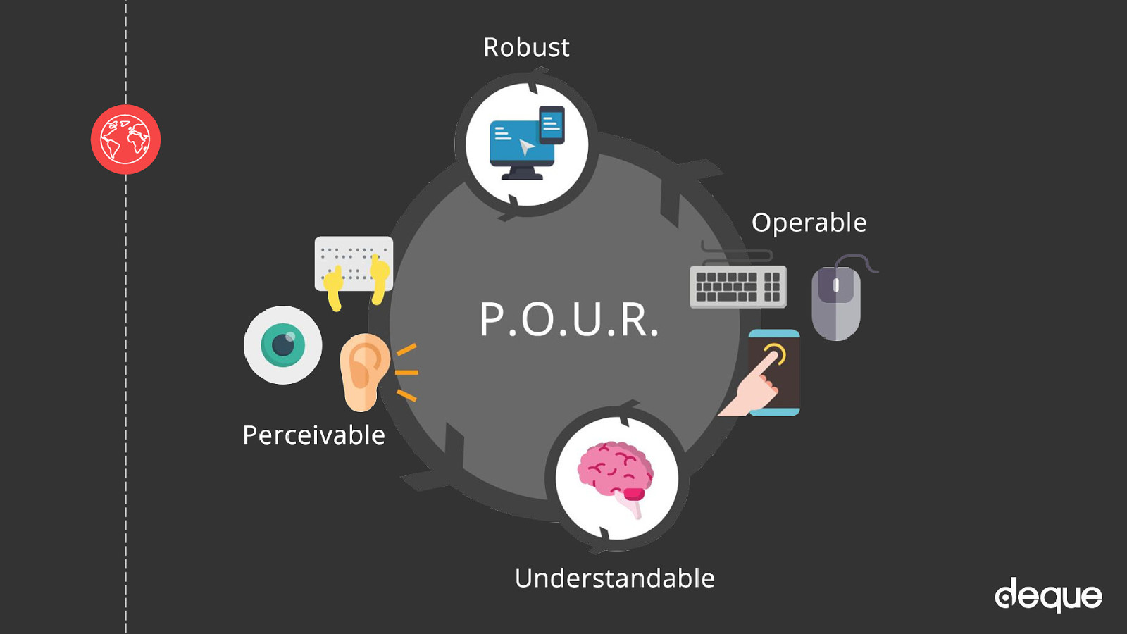
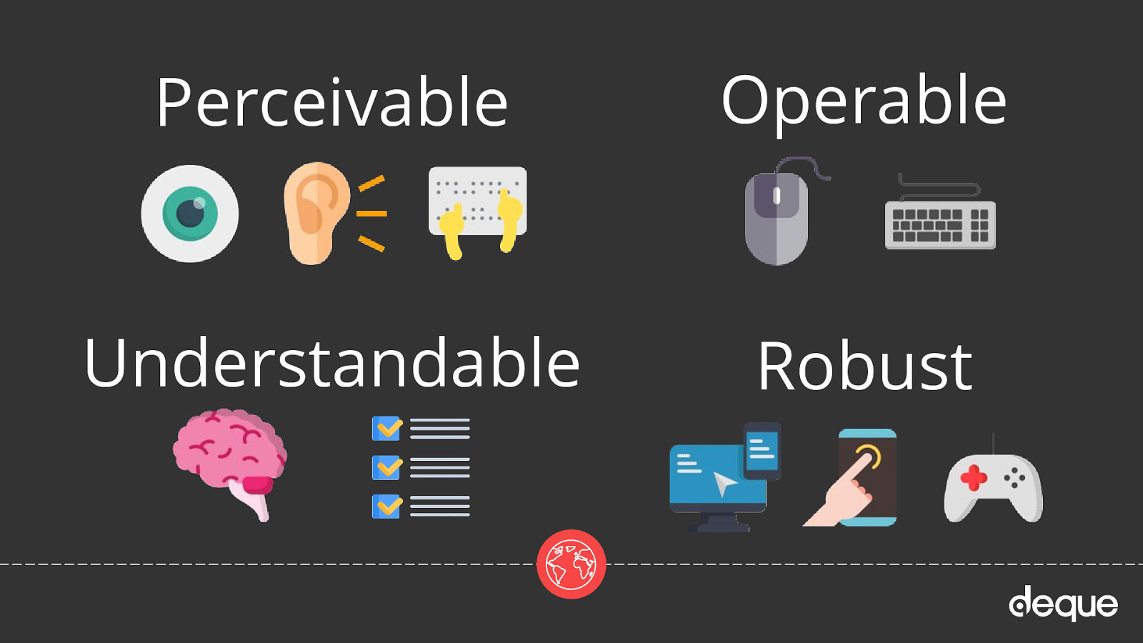
The first category in P.O.U.R. is Perceivable. This means that users must be able to perceive the information being presented – it cannot be invisible to all of their senses.

Questions: Is there anything on our website or app that a person with a disability would not be able to perceive? Does this work with different types of assistive technology devices? Make sure to think of all the different types of disabilities – visual, mobility, hearing, cognitive, and speech impairments, vestibular and seizure disorders, and many more. Examples: adding text alternatives to non-decorative images, adding captions and transcripts to videos, making sure the color is not the only method to convey meaning.

The second category is Operable. Users must be able to operate the interface – the interface cannot require interaction that a user cannot perform.

Questions: Can users control interactive elements of our website/app? Does our website have any traps? Examples: using keyboard only navigation, making sure slideshows have all of the controls shown, making sure users have enough time to fill out a form.

The third category is Understandable. Users must be able to understand the information as well as the operation of the user interface – the content or operation cannot be beyond their understanding.

Questions: Is all of the content clearly written? Are all of the interactions easy to understand? Does the order of the page make sense? Examples: write content at a 9th-grade reading level – don’t use a $10 word when a $1 word will do, make sure your website is predictable, make sure any error messages on your website are clear and easy to resolve.

The last category is Robust. It means that users must be able to access the content as technologies advance – as technologies and user agents evolve, the content should remain accessible.

Questions: Does our website only support the newest browsers or operating systems? Is our website developed with best practices? Does this work in both landscape and portrait orientations? 
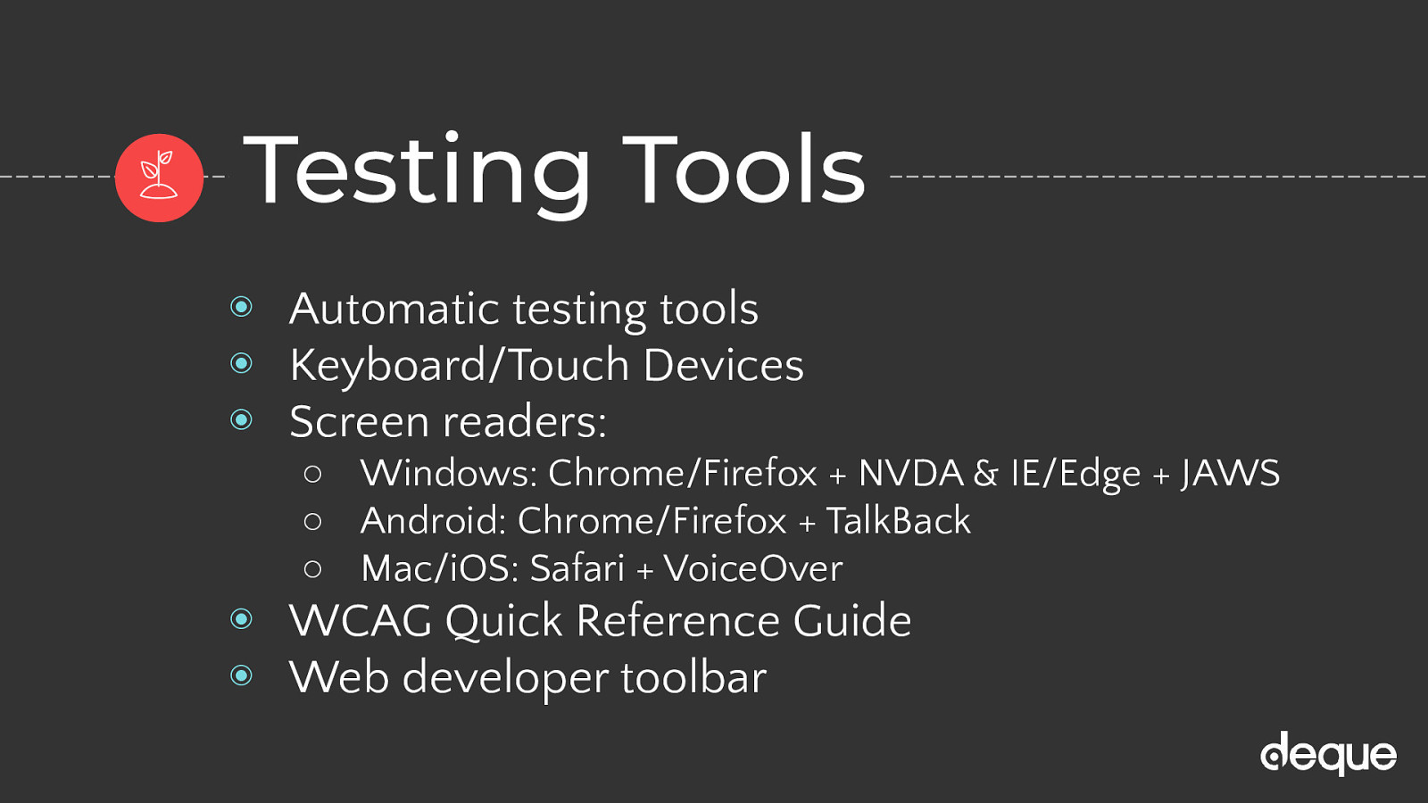
There are no real examples of this…just test your website/app! Be sure to use all types of tools – automatic, manual, AT, and user tests. After your initial accessibility testing, do more tests when new features or functionality are added.

Again The underlying spirit of P.O.U.R. isn’t about rigidly adhering to hard and fast rules; it’s about understanding and meeting the diverse needs of your users. Once you are on board with that, following the WCAG guidelines become more of a roadmap than a to-do list.

Slide 11

Slide 11

Planting the seed…

OK so far we have covered the number of people needing accessible websites/apps, the amount of money they have to spend, and an international set of rules already well-thought out with people in mind…

Slide 12

Slide 12

Accessible design

It’s on to Stage 2: Knowledge — At this stage you are aware of digital inequality at some level and some regulations like WCAG and POUR principals - but what else can help you make your designs more inclusive?

Slide 13

Slide 13

Accessibility Heuristics

Before you even pick up your pencil or open up your digital design program of choice, you need to keep a couple things in your mind.

First up Accessibility heuristics. What are accessibility heuristics?

They are Accessibility-specific rules of thumb inspired from WCAG, and built for the purpose of evaluating design assets for accessibility. These rules help designers integrate accessibility considerations into their work. This particular list was developed by Denis Boudreau, Aparna Pasi, and Cailin Geier at Deque Systems.

One example is Contrast and legibility where you would look at the design and ask questions like: Is information conveyed by means other than just color alone? Is the foreground/background contrast ratio of text at least 4.5:1 (3:1 for large text)? Is the design exempt of images with embedded text in them? Is line-spacing set to at least 1.5 in paragraphs, and twice as much between them? Are the selected typefaces easy to read and do they render properly on mobile?

Then there is a form for RATING each checkpoint (heuristics evaluation) Whether or not the design asset or user interface successfully integrates the concepts of said heuristic. Possible options include: “beyond” (★) “positive” (pass) “negative” (fail) “n/a” (not applicable)

http://bit.ly/a11y-heuristics-2019

Slide 14

Slide 14

Personas

Beyond Heuristics we can begin to think about Personas as well

Personas answer the question, “Who are we designing and developing for?” and they help to align strategy and goals to specific user groups. A user persona can be formal or informal…on paper on in your head. It is important when planning a new website or app to keep people of varying backgrounds, ethnicities, genders, ages, technical abilities, and disabilities as a part of your personas so that you’re working toward meeting a realistic variety of perspectives and needs.

The purpose of personas is to create reliable and realistic representations of your key audience segments for reference. These representations should be based on qualitative and some quantitative user research and web analytics whenever possible. Personas help to focus decisions surrounding site components by adding a layer of real-world consideration to the conversation. They also offer a quick and inexpensive way to test and prioritize those features throughout the development process.

A word of caution: you have to be very careful with personas. They ARE NOT: Based on real people or stereotypes A substitute for user testing Useful if not actually used

They ARE/should however: Based on real user data Supported by all departments Communicated early and often

Really think of it as a toolset to create empathy

https://github.com/UKHomeOffice/posters/blob/master/accessibility/dos-donts https://github.com/UKHomeOffice/posters/blob/master/accessibility/dos-donts/posters_en-UK/accessibility-posters-set.pdf

Slide 15

Slide 15

UX design process

Lo-fi: Rapid exploration and iterative fidelity. Allows design to work through different combinations of ideas fairly cheaply. Here you’ll start to see things like tab order, roles, and buttons worked out. Hi-fi: The most expensive and detailed fidelity. This will likely be the representation of the desired end-state of the product. Here you’ll see things like color, spacing, accessible names and custom focuses.

Slide 16

Slide 16

Low-fi flip image card without annotations

OK now on to a pattern design! Today we are going to make an image Card that flips when you click it. We are going to use a modified annotation symbol system that Jack Nicolai from Adobe created originally and Aaron Pearlman our lead designer at Deque made some modifications to. These include symbols B and L in red teardrops to indicated buttons or links. Green comment bubble to add specific accessibility information like accessible names. A blue square symbol to indicate tab order

You can see here a low-fi flip image card without annotations

Slide 17

Slide 17

Low-fi flip image card with annotations

Slide 18

Slide 18

Hi-fi flip image card with annotations

Outside of the normal things you’re watching as your designs move through development, there are a few accessibility-centric things to make sure are moving smoothly:

Color & font - contrast, type size, type weight Focuses - z-indexing, spacing, custom focuses Tab order - order should be correct, especially between patterns Accessible names/alt texts - make sure they are accurate and evoked correctly

Slide 19

Slide 19

Design Tools

A11y Rocks Color Palette - This tool should help you visualize an entire palette of all color combinations with accessibility in mind. The combinations are ordered by color contrast ratio. Try it out with these sample colors, and then create a palette of your own

Colour Contrast Analyser - The Colour Contrast Analyser (CCA) helps you determine the legibility of text and the contrast of visual elements, such as graphical controls and visual indicators.

Contrast Checker - This tool is built for designers and developers to test color contrast compliance with the Web Content Accessibility Guidelines (WCAG) as set forth by the World Wide Web Consortium (W3C). These calculations are based on the formulas specified by the W3C.

ChromeLens - ChromeLens is a Google Chrome extension that provides a suite of tools to help with web accessibility development.

Funkify - Funkify is a brand new extension for Chrome that helps you experience the web and interfaces through the eyes of extreme users with different abilities and disabilities.

UK Home Office Posters - Home Office repository of posters covering different topics - research, access needs, accessibility and design.

Slide 20

Slide 20

Here comes the sun...

Now it’s time for the design team to hand-off their mockups to the front-end developers. Depending on the number of people and types of roles you have at your office, this workflow might look a bit different. But at some point the design needs to be translated into code.

Slide 21

Slide 21

Accessible development

By sharing design and wireframes with the dev team as soon as possible and creating a list of all assets needed for each component, that helps the developers understand a bit about what’s expected from the pattern, and allows them to think about potential technical and accessibility issues more deeply. So at the design hand-off the engineers/developers are at stage 2: knowledge and will get to stage 3: practice once the pattern is turned into code

Slide 22

Slide 22

Guides/Libraries

Before I write one line of code I do some research! If an accessible version of my pattern is already out there…why reinvent the wheel? Of course, there is some interesting code out there…it’s important to git your patterns for reputable sources, not just the first solution that pops up on Stack Overflow or Google search

A11y style guide - (awesome resource - but I’m biased b/c I created it) This is a living style guide or pattern library, generated from KSS documented styles…with an accessibility twist. No matter your level of development or accessibility expertise, there are ways to help contribute to the a11y style guide.

Accessible Components - Scott O’Hara develops and designs accessible user experiences for the web (Scott O’Hara - @scottohara).

Deque - This code library is a work in progress. It draws on the principles taught in the course Custom JavaScript/ARIA Widgets. There is also another repository called Cauldron that uses PUG.

GOV.UK Design System - Use this design system to make your service consistent with GOV.UK. Learn from the research and experience of other service teams and avoid repeating work that’s already been done.

Inclusive Components - A blog trying to be a pattern library, with a focus on inclusive design. Each post explores a common interface component and comes up with a better, more robust and accessible version of it (Heydon Pickering -@inclusicomps).

U.S. Web Design System - The UI components are built on a solid HTML foundation, progressively enhanced to provide core experiences across browsers. All users will have access to the same critical information and experiences regardless of what browser they use, although those experiences will render better in newer browsers. If JavaScript fails, users will still get a robust HTML foundation.

Various JS frameworks have made great strides when it comes to accessibility including Gatsby thanks to Marcy Sutton

Slide 23

Slide 23

Code snippet

Slide 24

Slide 24

Code snippet

Slide 25

Slide 25

Developer Tools

A11y Project - Web Accessibility Checklist - Accessibility can be a complex and difficult topic. The Accessibility Project understands this and wants to help make it easier to implement on the web.

ARIA specs - Accessible Rich Internet Applications (ARIA) is a set of attributes that define ways to make web content and web applications (especially those developed with JavaScript) more accessible to people with disabilities.

It supplements HTML so that interactions and widgets commonly used in applications can be passed to assistive technologies when there is not otherwise a mechanism. For example, ARIA enables accessible navigation landmarks in HTML4, JavaScript widgets, form hints and error messages, live content updates, and more.

Deque University - wealth of knowledge on just about anything accessibility. There is a cost, but it’s pretty minimal for a full year of access. On top of that, if you have a disability you can get the courses for free

HTML5 Accessibility - Get the current accessibility support status of HTML5 features across major browsers.

WCAG 2 (Quick Reference Guide) - A customizable quick reference to Web Content Accessibility Guidelines (WCAG) 2 requirements (success criteria) and techniques.

WCAG Web Accessibility Tutorials - Guidance on how to create websites that meet WCAG.

Slide 26

Slide 26

In full bloom…almost

Yeah! You have tilled the soil, planted and watered the seeds, and let some light in so you are done growing your accessible component, right?!

Well almost…

Slide 27

Slide 27

Beware of weeds...

If your garden isn’t tended to, weeds will creep in and take over…Now I don’t know a lot of people like to weed a garden - but it is a necessary task otherwise your flowers will die

Slide 28

Slide 28

Accessibility testing

Similarly accessibility audits/testing are not super glamorous but very necessary…and just like weeding it’s not a one and done activity.

Accessibility testing is never done! With new updates to browsers, assistive technology devices, markup rules, code regressions, etc. you should consider accessibility testing an ongoing maintenance task. By setting aside some time each month to review accessibility, you can catch mistakes when they are small and easier to manage or fix.

Slide 29

Slide 29

Types of accessibility testing

When people ask me about automatic accessibility tools at trainings and conferences, I am not surprised. They want to push a few buttons and poof! summon magical creatures that can go in and find and fix all of their issues. Of course, they don’t like my answer that regardless of the tool, automatic testing can only reliably pick-up 30-40% of all accessibility issues. And some tools are better at picking up some accessibility issues, while others might be better suited for catching other errors, so you really need to run a suite of tools. On top of that, of the issues automatic testing tools do find, many still require a human to interpret the results and prioritize the issues. For example, an automated testing tool might tell you that your image is missing alternative text, but it cannot tell you what alternative text to write. Whew…it’s exhausting just thinking about it!

But it is not all bad news! The good news is automated testing tools are truly amazing and getting “smarter” with each new version - shout out to Axe Pro which I was able to demo at a client training this week. There may be a day soon where these tools can reliably catch closer to 100% of all issues and even fix them for you. But until then, you can add UX/UI tests, manual keyboard tests, mobile touch tests, screen reader tests (and other ATs), content readability tests, and (I think, most important) user tests to your workflow to cover the gaps automatic testing leaves behind.

Also, don’t forget adding an accessibility statement and an accessible way for users to contact you about any issues they may have with your website/app, go a long way in terms of overall user experience and satisfaction.

Slide 30

Slide 30

VoiceOver demo

Slide 31

Slide 31

Testing Tools

Keyboard/Mobile Assistive Technology Devices (ATs) Windows: Chrome/Firefox + NVDA and IE/Edge + JAWS Mac: Safari + VoiceOver Android: Chrome/Firefox + TalkBack iOS: Safari + VoiceOver Content/Readability/User

Slide 32

Slide 32

Digital inclusion

NOW our pattern is in full bloom - but what about stage 4 Understanding?

As we have discussed there are different stages of digital accessibility that we are all on. True beginners may not be to even stage one: awareness, but I am finding that group rarer and rarer these days. The word about digital accessibility seems to be out! Which is great; but that’s only the first hurdle. What I’m seeing now is that a lot of people stop at Stage 2: Knowledge or Stage 3: Practice — where you are aware of the digital accessibility guidelines, have some testing tools in your back pocket, and know how to fix some of the issues reported, but haven’t quite connected the dots to the humans they impact.

From the standpoint of getting stuff done, honestly stages two and three are okay stopping points. But what happens when the things you need to do are too complex for a quick fix, or you have no buy-in from your peers or management? I feel that once we get to Stage 4: Understanding, and really get why these kinds of changes are needed, people will be more motivated to make those changes regardless of the challenges involved.

Slide 33

Slide 33

The power of the Web is in its universality. Access by everyone regardless of disability is an essential aspect. Tim Berners-Lee

Because at the end of the day when we talk about accessibility, what we are really talking about at its core is inclusiveness. The actual process of writing accessible code and building accessible designs - involves rules and standards, tests and tools; but inclusive design and development is more abstract than that. It’s a shift in thinking. And when we rethink our approach to design and development, we go beyond just the base level of simple code functionality. We instead think, how is this element consumed? How can we make it even more intelligible and easier for people to use? Inclusive development means making something valuable, not just accessible, to as many people as we can.

Maybe I’m naive, but I’d like to think we’ve come to a point in our society where we want our work lives to have meaning. And that we don’t want to just hear about the positive change that is happening, but want to be part of the change. Digital accessibility is a place where this can happen! So I encourage you to go out and be the change, one accessible pattern at a time.

Slide 34

Slide 34

Thanks! Any questions?

Twitter & LinkedIn: @cariefisher GitHub: @cehfisher Example: bit.ly/a11ycard Resources: bit.ly/a11yresources Slides: noti.st/cariefisher