Easy Ways to Make Your Site More Accessible
Hi everyone! I’m Carie Fisher and today I will be talking about Easy Ways to Make Your Site More Accessible.

A presentation at MidCamp in March 2016 in Chicago, IL, USA by Carie Fisher
Hi everyone! I’m Carie Fisher and today I will be talking about Easy Ways to Make Your Site More Accessible.
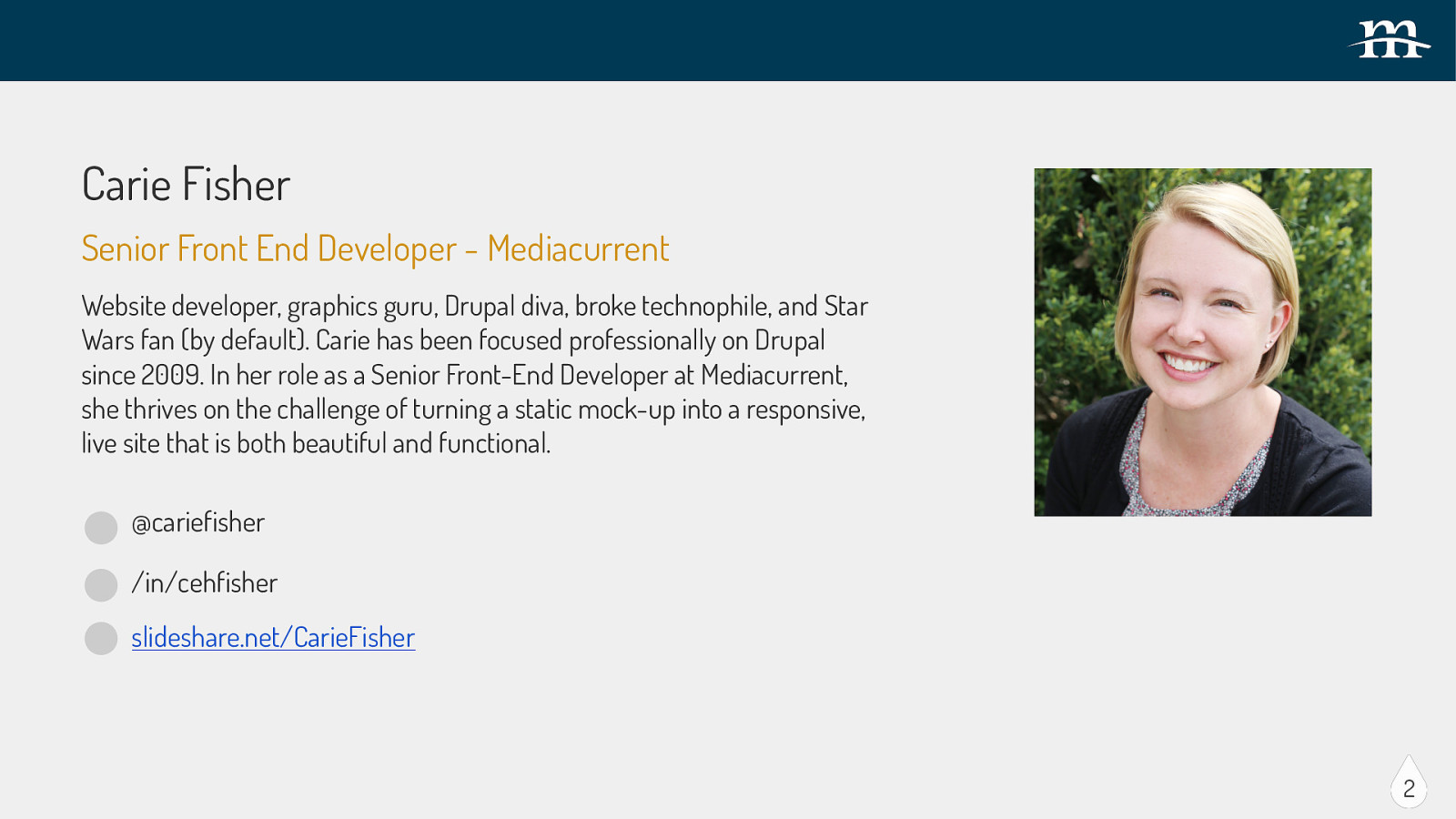
Carie Fisher Senior Front End Developer - Mediacurrent Website developer, graphics guru, Drupal diva, broke technophile, and Star Wars fan (by default).
Carie has been focused professionally on Drupal since 2009. In her role as a Senior Front-End Developer at Mediacurrent, she thrives on the challenge of turning a static mock-up into a responsive, live site that is both beautiful and functional. @cariefisher /in/cehfisher slideshare.net/CarieFisher 2 I work at Mediacurrent as a senior front-end developer. If you want to know more about me you can find me on the Mediacurrent website or on Twitter @cariefisher There is a lot of exciting information to cover today, so here we go…
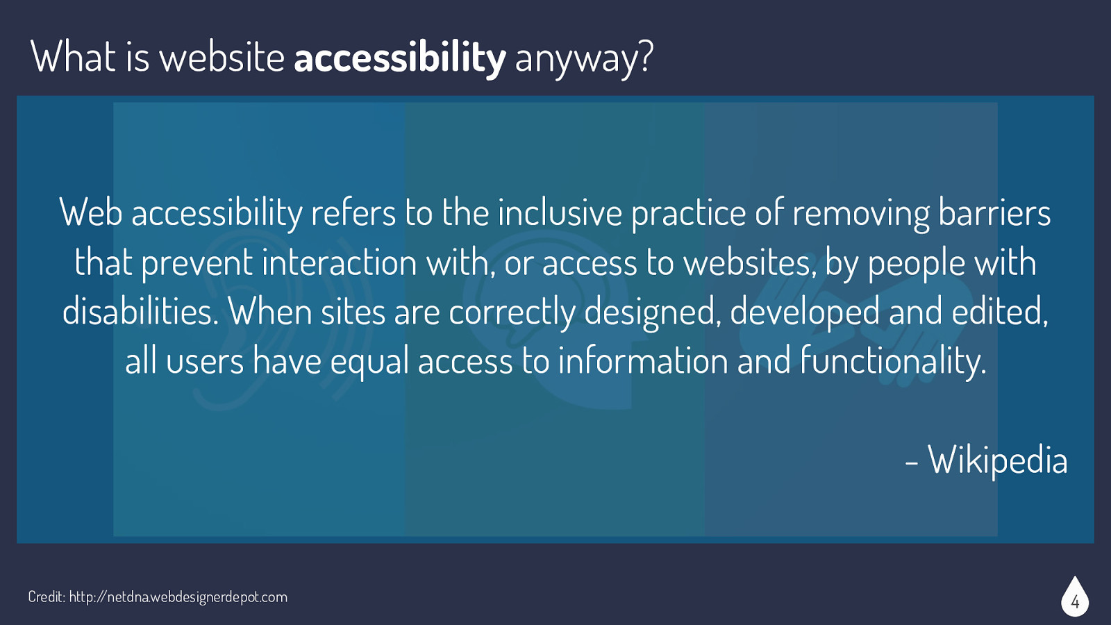
Wikipedia says that “Web accessibility refers to the inclusive practice of removing barriers that prevent interaction with, or access to websites, by people with disabilities. When sites are correctly designed, developed and edited, all users have equal access to information and functionality.” So basically, make your site available to as many people as possible.
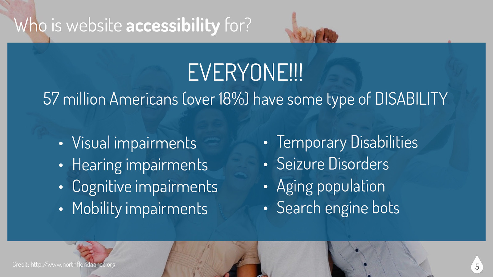
If you look at this stock photo of perfect people with their perfect teeth you may think that none of them has a disability, but just because a disability is not visually obvious does not mean that it doesn’t exist. In fact, 57 million Americans (over 18%) have some type of DISABILITY Examples of disabilities include: Visual impairments, Hearing impairments, Cognitive impairments, Mobility impairments, Temporary Disabilities, Seizure Disorders, Aging population. Also good to consider that search engine bots benefit from accessible websites as well. Website accessibility is for everyone and benefits everyone
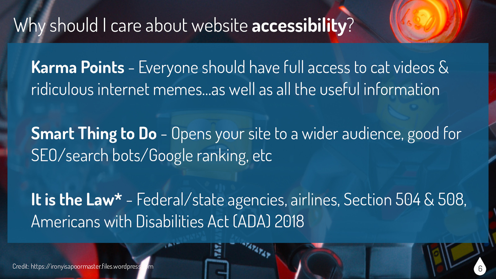
Why should I care about website accessibility? It might sound like a bunch of “hippy dippy bologna” but there are a lot of reasons to care about website accessibility, including:
I should say these are my unofficial guidelines or rules, your guidelines or someone else’s guidelines might be a bit different and that’s ok. The point is that we are thinking about accessibility in some way when designing and developing our sites.
So what can I do about website accessibility? Rule #1: Don’t Freak Out - there is a ton of information out there about website accessibility. No one expects you to know everything about everything. It’s ok to say you don’t know something. Which brings me to my next rule…

Rule #2: Learn a Few Things - read an article, watch a video, attend a webinar, chat with someone on twitter. If you focus on one aspect of accessibility at a time, you will not get overwhelmed and you will retain the information better.
Rule #3: Build from the Ground Up - if you have the opportunity, work the accessibility into the beginning of a project. It will be more difficult, more timely and thus more expensive to retrofit your site for accessibility after the site is complete.
Rule #4: Use the Right Tools - there are lots of accessibility tools that wonderful people spent lots of time creating, so use them. Use tools during the build process (ex. using Color Safe to check color combos) and after the site is finished (ex. using WAVE to evaluate accessibility errors and alerts, etc)
Do or do not. There is no try. I love Yoda and generally find myself agreeing with his logic, but not in this case. Rule #5: Try, Try Again - even adding one or two accessible pieces to a website is moving in the right direction. The next site might have four or five pieces. “Rome wasn’t built in a day” and neither are accessible websites.
Now we come to the “easy” things you can do to incorporate accessibility into your website. I say easy in quotes, because collectively all of these tasks seem a bit difficult or at least overwhelming, but really each task on its own is easy to accomplish.
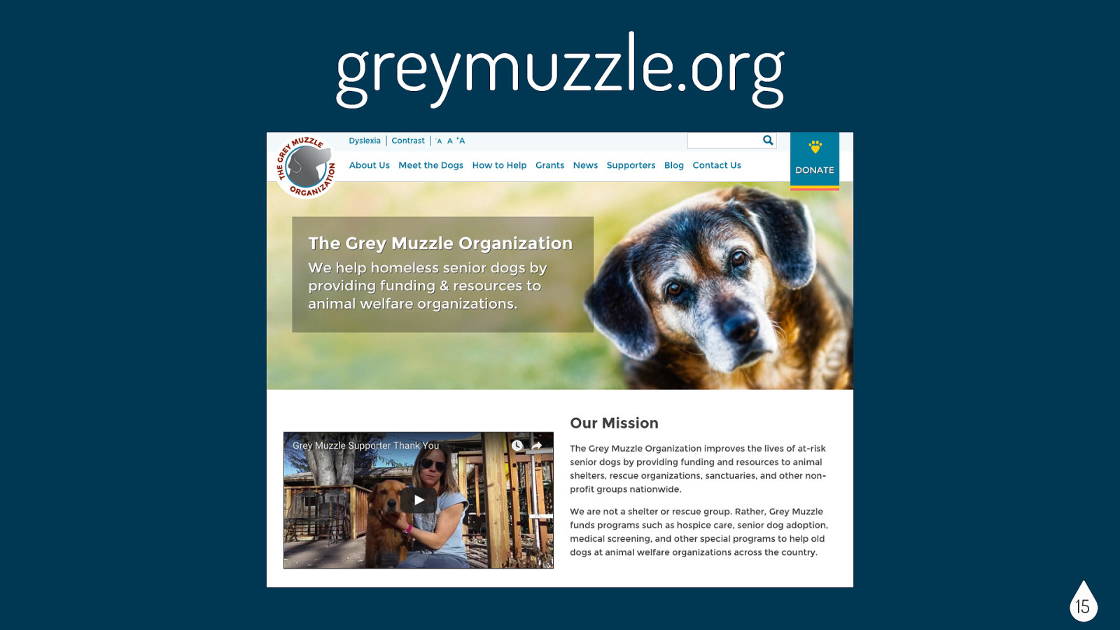
So for the background to the next few slides, in the fall of 2015 a team at Mediacurrent in conjunction with BlackMesh accepted the OpenAIR, Knowbility challenge to create a website in a month that was fully accessible. As a team we chose to redo the Grey Muzzle website, which is an organization that improves the lives of at-risk senior dogs by providing funding and resources to animal shelters, rescue organizations, sanctuaries, and other non-profit groups nationwide. (Pictured here is my old dog, Newton.)
Before we even began the challenge, our fearless accessibility leader Mickey Williamson gave us lots of resources and guidelines. Here are some of the things she had us think about while we were building the site.
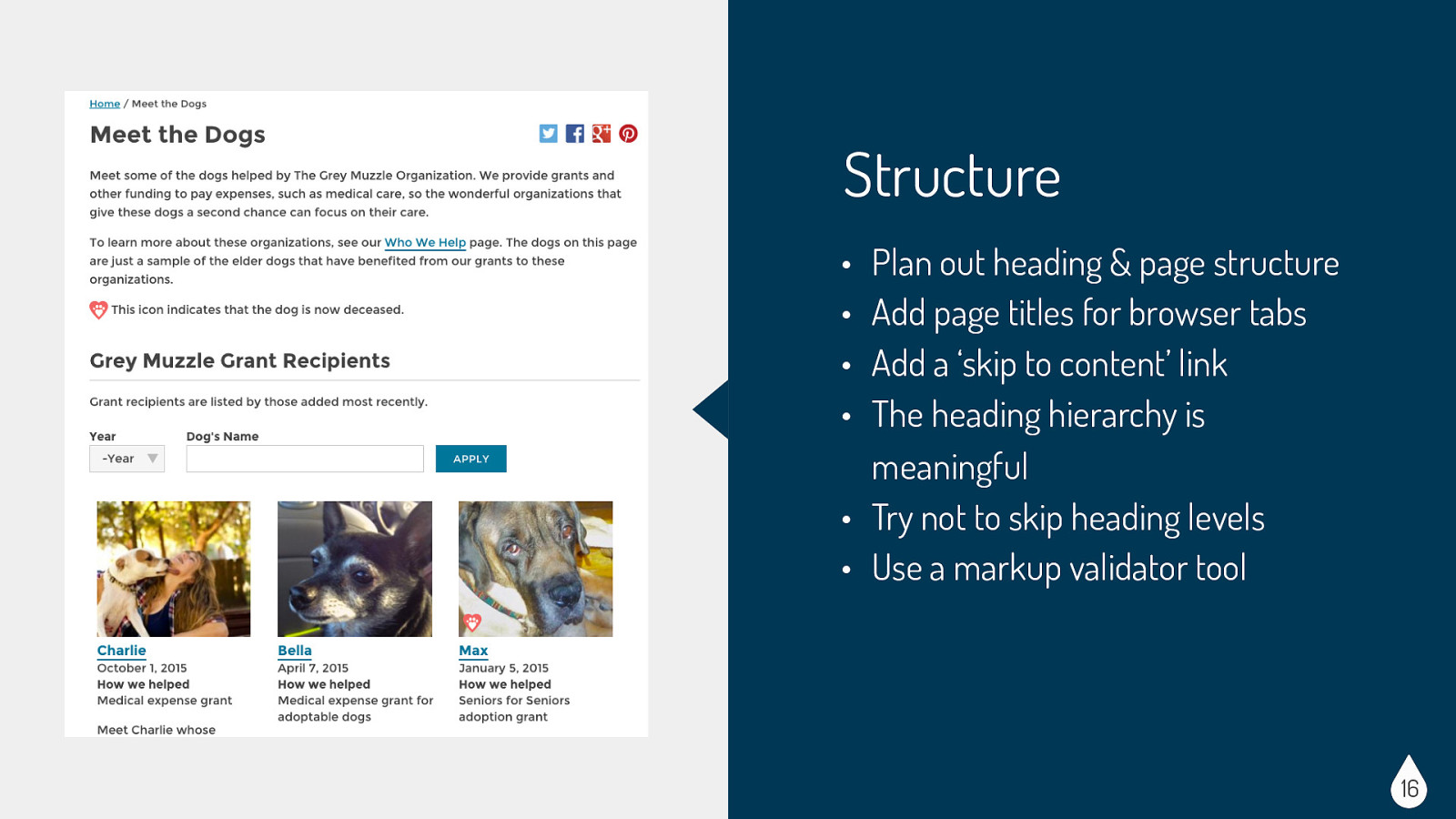
Considerations for Structure: • Users with screen readers (blind, low vision, etc) • Users with reading disorders, learning disabilities, or attention deficit disorders • Search engine robots • General user experience Easy Wins for Structure: • Plan out heading & page structure - make sure it makes sense to readers • Add page titles for browser tabs & ‘skip to content’ link - both useful to screenreader • The heading hierarchy is meaningful • Try not to skip heading levels - so h1 first, h2, h3 etc. • Use a markup validator tool - test the page to make sure you didn’t forget something in your mark-up
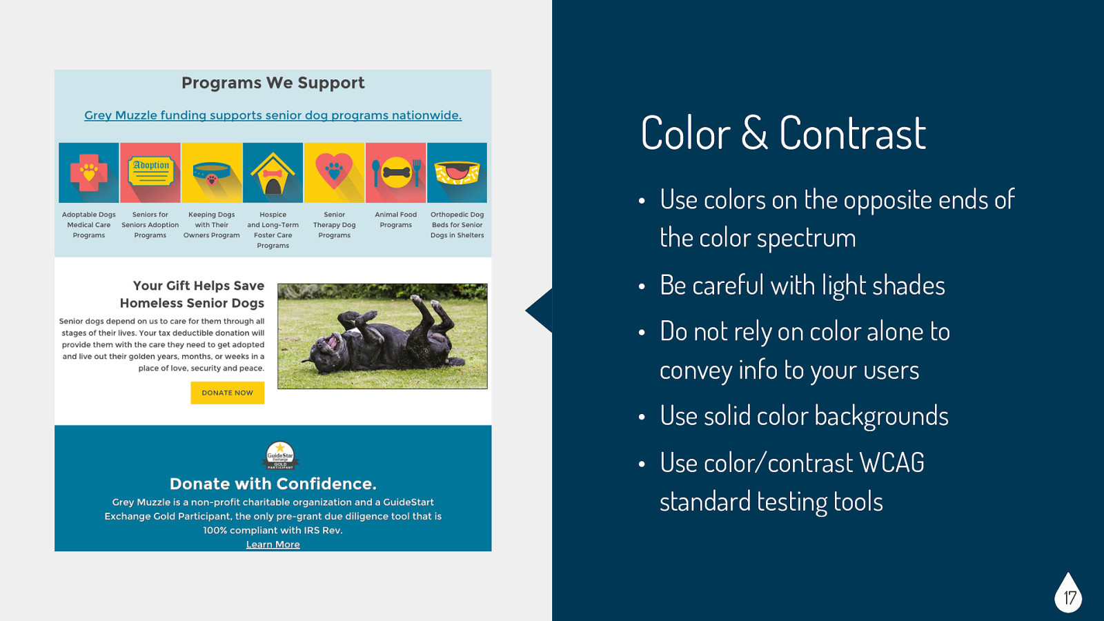
Considerations for Color & Contrast: • Users who are colorblind or have low vision • Monochrome displays • CSS/JS disabled or text-only browsers • Users viewing a site under less than ideal circumstances (low-light, glare, etc) Easy Wins for Color & Contrast: • Use colors on the opposite ends of the color spectrum - avoid red/green and blue/yellow combos • Be careful with light shades - hard to see for people with low vision • Do not rely on color alone to convey info to your users - for example, make sure your links have underlines or some other indicator besides color • Use solid color backgrounds - reading text on busy backgrounds is difficult, especially if it does not have enough contrast • Use color/contrast WCAG standard testing tools - WCAG levels are basically measuring contrast ratios. 4.5:1 was chosen for level AA, while 7:1 was chosen for level AAA. Typically most sites just need a AA level, but some government agencies must achieve the AAA level
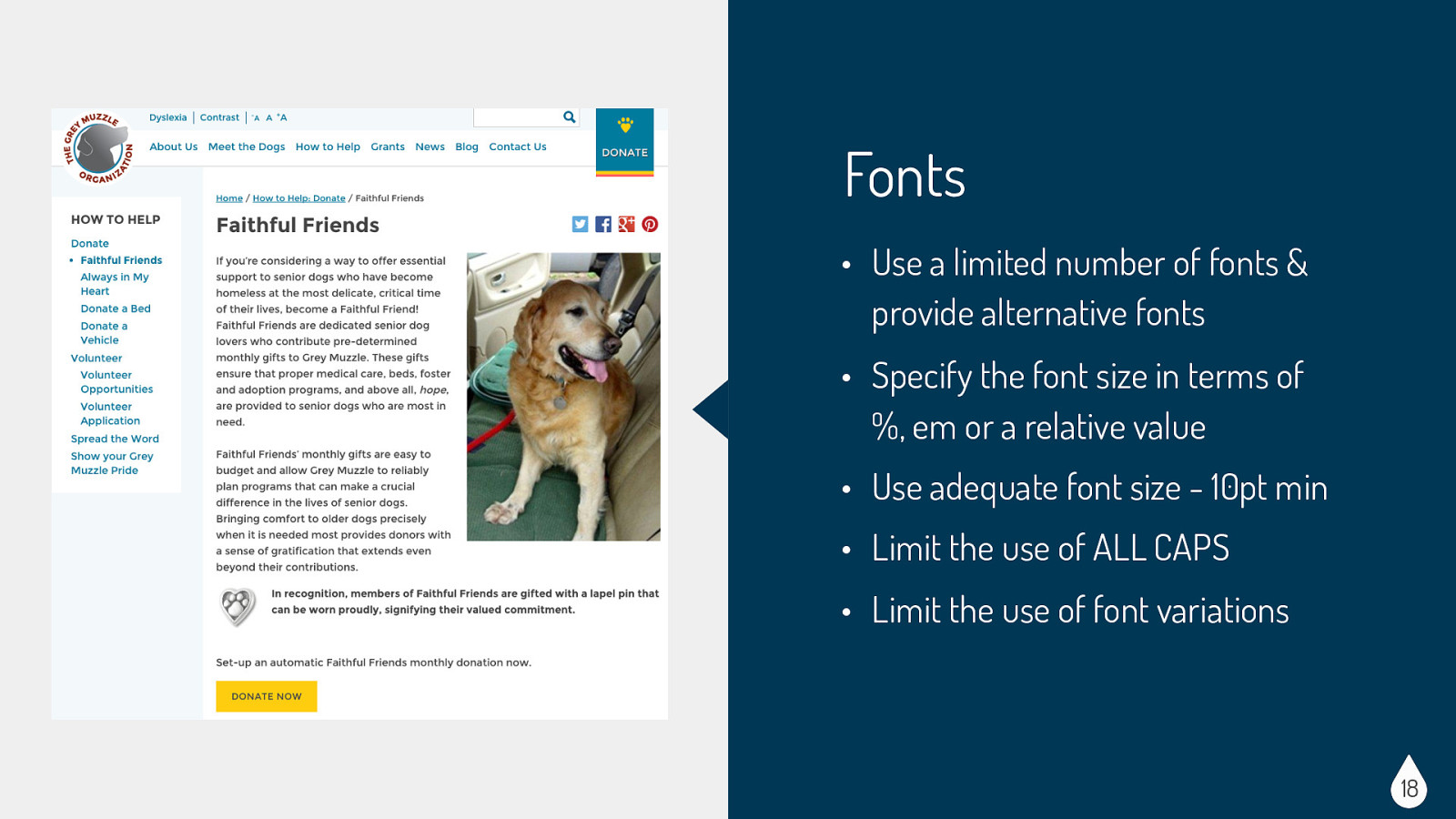
Considerations for Fonts: • Users with reading disorders, learning disabilities, or attention deficit disorders (ex. dyslexia, ADHD) • Users with low vision Easy Wins for Fonts: • Use a limited number of fonts & provide alternative fonts - if you can provide accessible fonts as an option, that is great. If you can use true text that is also great. True text enlarges better, loads faster, and is easier to translate. • Specify the font size in terms of %, em or a relative value • Use adequate font size - 10pt min • Limit the use of ALL CAPS. All caps can be difficult to read and can be read incorrectly by screen readers. • Limit the use of font variations (ex. italics, bolds, etc)
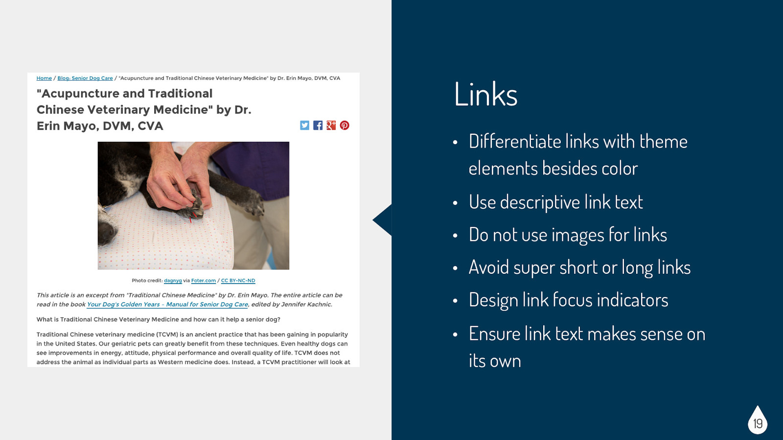
Considerations for Links: • Users with screen readers (blind, low vision, etc) • Users who cannot or choose not to use a mouse • CSS/JS disabled or text-only browsers • Search engine robots Easy Wins for Links: • Differentiate links with theme elements besides color (ex. underlines) - make sure links are recognizable • Use descriptive link text • Do not use images for links • Avoid super short or long links • Design link focus indicators. Ensure keyboard users can visibly identify links • Ensure link text makes sense on its own. Avoid “click here” or other ambiguous link text, such as “more” or “continue”
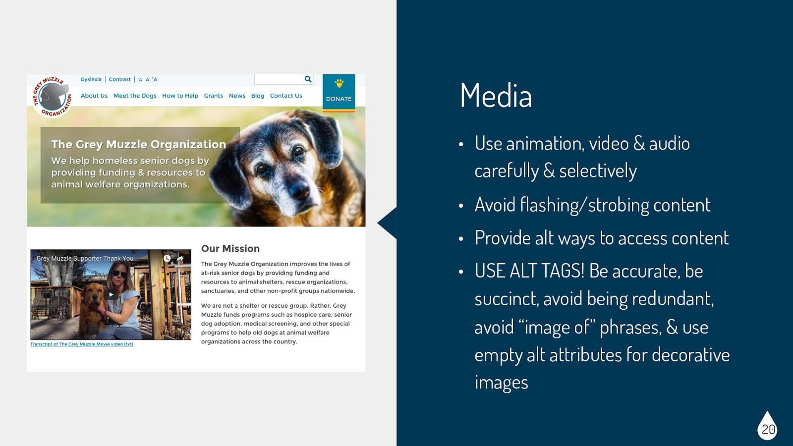
Considerations for Media: • Users with visual disabilities (seizure disorders, blind, etc) • Users with auditory disabilities (deaf, hard of hearing, etc) • CSS/JS disabled or text-only browsers • Devices with small displays (phones, tablets, etc) • Search engine robots Easy Wins for Media: • Use animation, video & audio carefully & selectively - Select images carefully and provide a clear, complete and concise alternative text description. The description may be provided in the alt attribute for the image, in the page content, or a combination of these techniques. If you are using videos or slideshows, provide at least a play/pause button. Ensure controls have descriptive labels, instructions, and validation/error messages. • Avoid flashing/strobing content - this kind of animation can trigger seizures • Provide alt ways to access content - video transcripts, captioning • USE ALT TAGS! • Be accurate — convey the information or function represented by the image. • Be succinct — do not burden screen reader and text-to-speech application users with listening to large amounts of text. • Avoid being redundant — within the alt attribute or with page content. • Avoid the use of phrases such as “image of …” or “graphic of …” — most users will be aware that an image is present, either by visual observation or as informed by their adaptive technology. • The use of an empty alt attribute (alt=”“) completely hides an image from screen readers — not even the presence of an image is announced. This is used for strictly decorative images that you want to hide
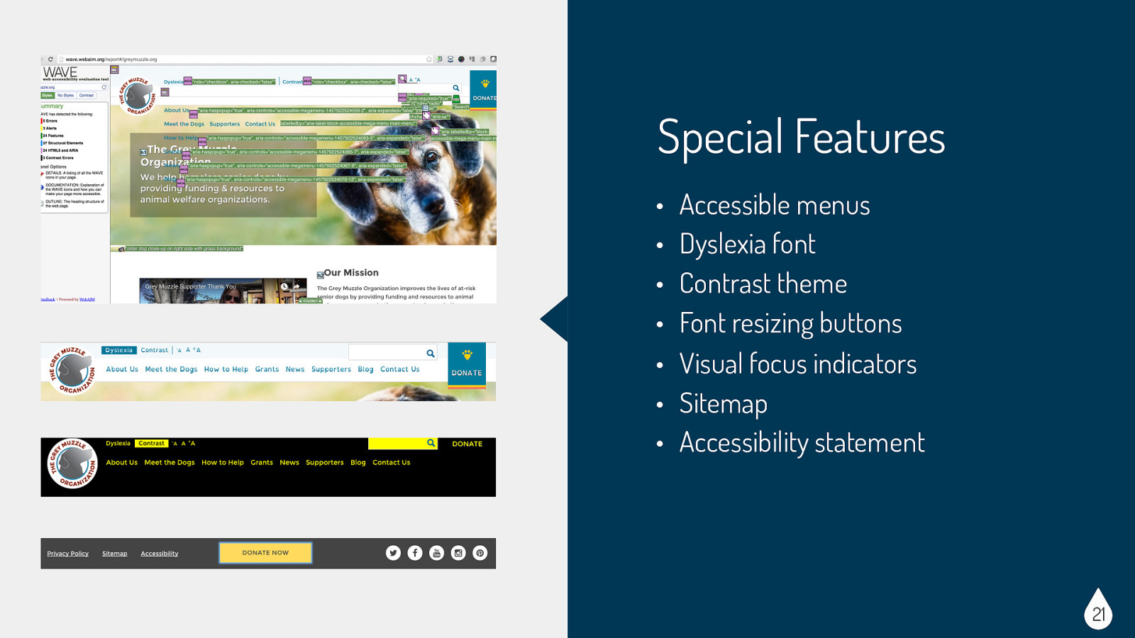
Special features: • Accessible menus - we worked hard to make sure the menu was as accessible as possible. We did some custom code to add ARIA labels • Dyslexia font - Fonts that flip d and b or p and q characters with no variation are easily reversed by people with dyslexia. So we created a button in the accessibility toolbar to turn a dyslexia-friendly font, Open Dyslexia (http:// opendyslexic.org/), on and off. • Contrast theme - High contrast mode makes all text very prominent while minimizing everything else (including non-critical images), making it easier for people with low vision to read the page’s text. We added a button to the accessibility toolbar to activate high contrast mode. • Font resizing buttons - also on the accessibility toolbar we had buttons to easily increase or decrease the font size. The advantage is that it doesn’t create the horizontal scrollbars that the browser text resize with command-+ creates. • Visual focus indicators - we made sure to add styling to our tabbing focus indicators to allow links to be easier to identify. Unfortunately some base themes have this turned off by default. The tabbing focus has been set to not display — :focus {outline: 0;} • Sitemap - good for users, SEO, and bots alike • Accessibility statement - great to include a statement about what the site is trying to achieve with accessibility and ways to contact the site maintainer if you notice issues
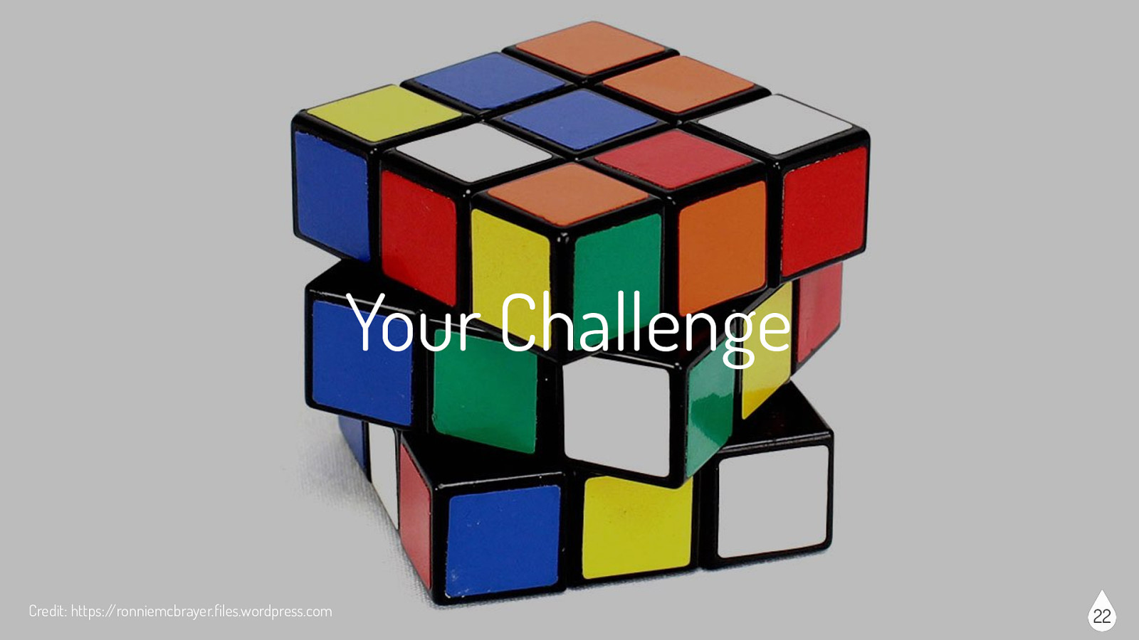
Now time for your own challenge…the next time you build or design your next site, I challenge you to take one or two accessibility tasks from each section and try to incorporate it. Like any new skill, incorporating these tasks might seem awkward or take a little more time than you are used to, but you will soon see that these tasks will become second nature to your build or design process.

The following three slides will give you a head-start on some of the accessibility resources out there. I have listed some links to good general information as well as guidelines, checklists, and tools that might be useful.
Types of Disabilities - https://www.w3.org/WAI/intro/people-useweb/diversity Accessibility Law - http://webaim.org/articles/laws/usa Understanding Web Accessibility - http://uiaccess.com/ understanding.html User Stories - https://www.w3.org/WAI/intro/people-use-web/ stories Design/Theme Specific - http://alistapart.com/topic/accessibility Credit: http://indianagrace.org 24
WCAG 2.0 - https://www.w3.org/TR/WCAG20/#guidelines WCAG 2.0 Checklist - http://webaim.org/standards/wcag/ checklist Section 508 - http://www.section508.gov Section 508 Checklist - http://webaim.org/standards/508/ checklist ATAG - https://www.w3.org/WAI/intro/atag.php UAAG - https://www.w3.org/WAI/intro/uaag.php General checklist - http://a11yproject.com/checklist.html Credit: http://indianagrace.org 25
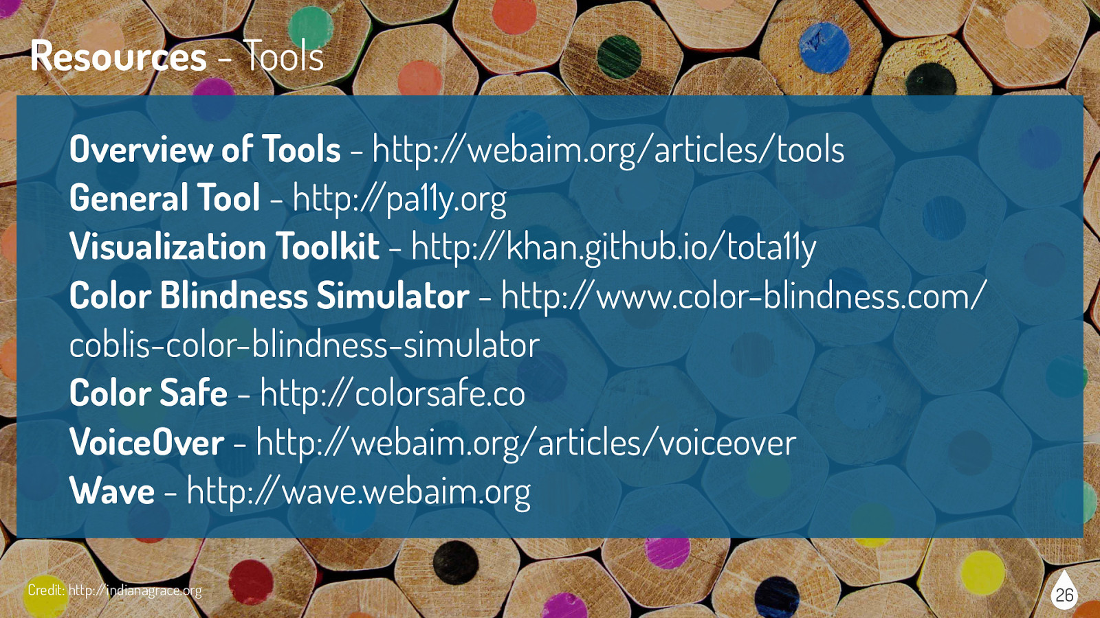
Overview of Tools - http://webaim.org/articles/tools General Tool - http://pa11y.org Visualization Toolkit - http://khan.github.io/tota11y Color Blindness Simulator - http://www.color-blindness.com/ coblis-color-blindness-simulator Color Safe - http://colorsafe.co VoiceOver - http://webaim.org/articles/voiceover Wave - http://wave.webaim.org Credit: http://indianagrace.org 26