Living Personas: A Hands-On Accessibility Experience Helena
A presentation at Florida Drupal Camp in February 2018 in Orlando, FL, USA by Carie Fisher
Living Personas: A Hands-On Accessibility Experience Helena
Carie Fisher Accessibility Lead & Senior Front-end Developer
Helena McCabe Senior Front-end Developer & Accessibility Specialist
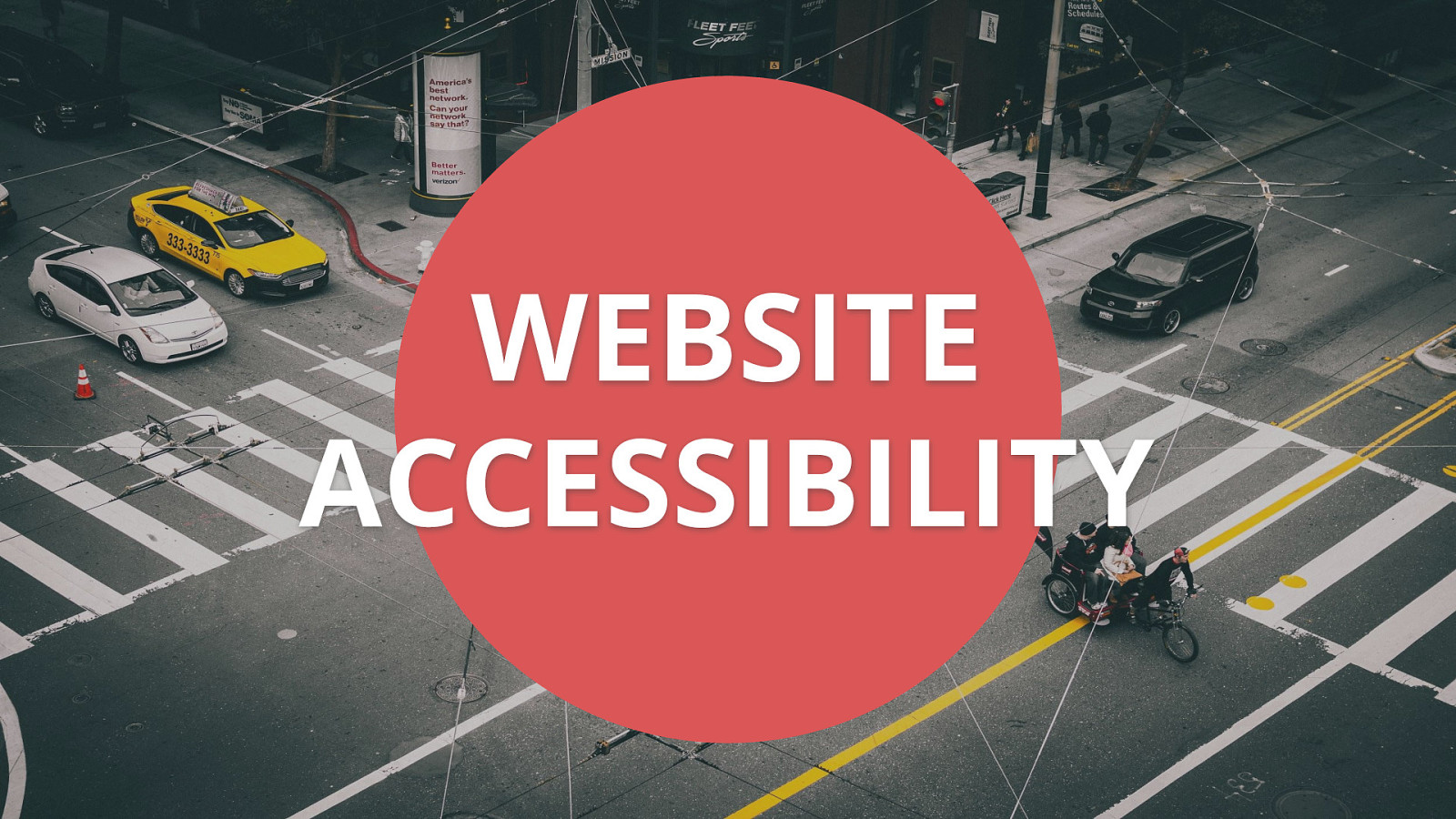
Website accessibility. We have all heard that term by now, but what does it actually mean? Simply stated: website accessibility is making sure the website you create is able to be used by as many people as possible. According to the US Census Bureau, about 19% of the United States population identifies as having a disability, which is roughly 57 million people. Thinking of these numbers in a different way, there are more people with disabilities than twice the number of people living in the state of New York. If you consider a global audience, you are talking about 15% of the world’s population or one billion people. Or almost 18 times the number of people living in the state of NY. That is a huge number of people who could benefit from an accessible website right from the start, but keep in mind, the official numbers do not even include people that either do not identify as having a disability or those populations that could benefit from accessible websites, such as English as a second language (ESL) users and the aging population — so the number of people needing accessible websites in reality could be much higher. https://www.w3.org/WAI/WCAG20/quickref/
https://www.w3.org/WAI/WCAG20/quickref Quick intro WCAG 2.0 (concept) The WCAG guidelines are an international set of rules to aid developers in creating accessible websites. The rules are broken into four main categories that we will go over now.
The first category is Perceivable. This means that users must be able to perceive the information being presented - it cannot be invisible to all of their senses. Examples include: adding text alternatives to non-decorative images, adding captions and transcripts to videos, making sure color is not the only method to convey meaning (ie. link has an underline or bold added)
The second category is Operable. Users must be able to operate the interface - the interface cannot require interaction that a user cannot perform. Examples include: using keyboard only navigation, making sure slideshows have all of the controls shown, making sure users have enough time to fill out a form (ie. not timed out)
The third category is Understandable. Users must be able to understand the information as well as the operation of the user interface - the content or operation cannot be beyond their understanding. Examples include: write content at a 9th grade reading level - don’t use a $10 word when a $1 word will do, make sure your website is predictable (ex. your navigation doesn’t change from page to page), make sure any error messages on your website are clear and easy to resolve
The last category is Robust. It mean that users must be able to access the content as technologies advance - as technologies and user agents evolve, the content should remain accessible. This is actually one of the hardest categories to achieve, but one of the most important. Once your site is in a good place from an accessibility point of view, you need to test and retest your site for accessibility. Do your initial testing, but also remember to do sprint regression testing as well especially when new features are added to your website. It is important that your website is perceivable, operable, understandable, and robust (POUR) — all successful criteria for a user experience that provides optimal usability for everyone.
A persona is a representation of a type of customer. Personas answer the question, “Who are we designing and developing for?” and they help to align strategy and goals to specific user groups. A user persona can be formal or informal…on paper on in your head. It is important when planning a new website to keep people of varying backgrounds, ethnicities, genders, technical abilities, etc. as a part of your personas so that you’re working toward meeting a realistic variety of perspectives and needs
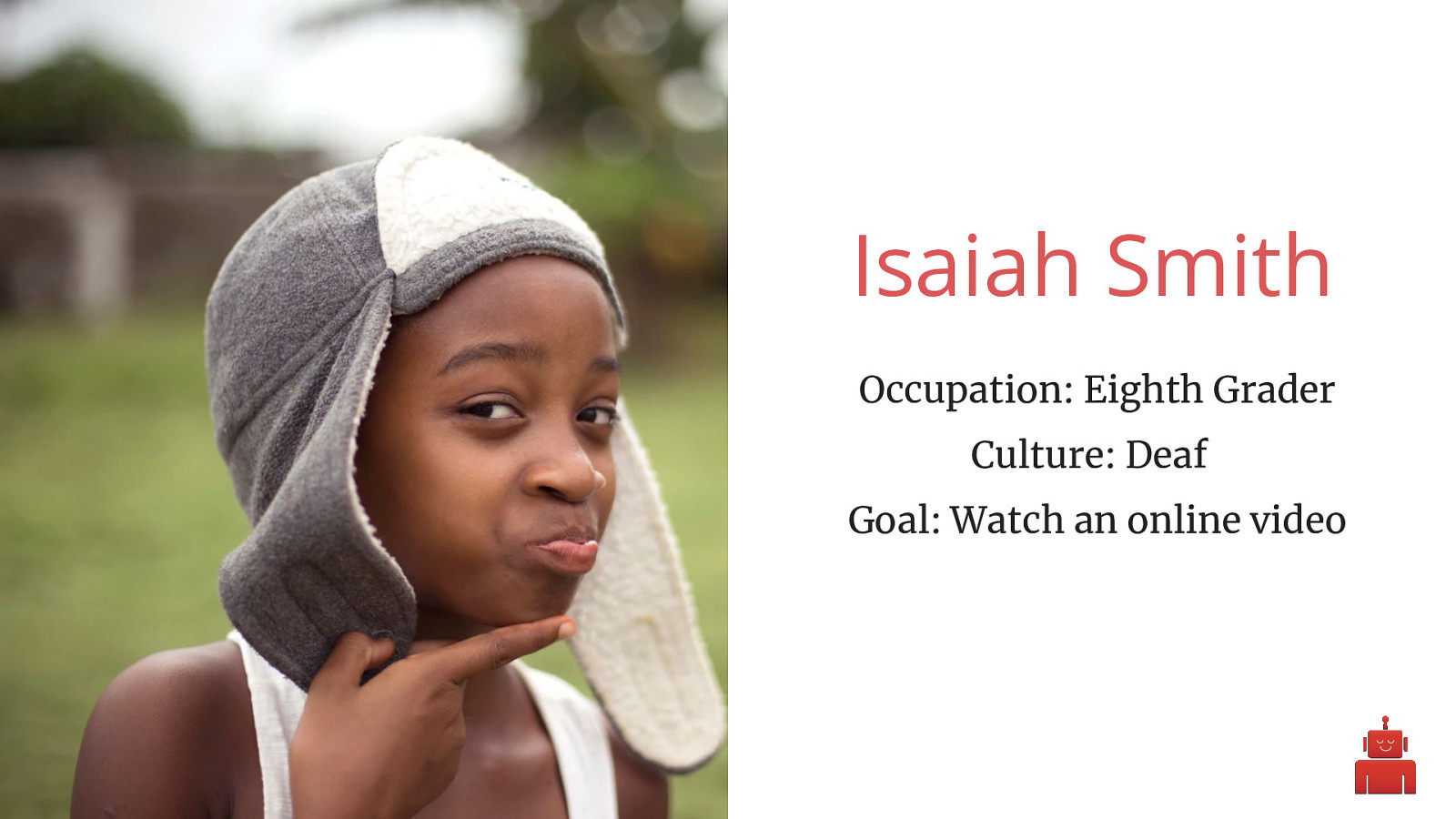
Isaiah Smith Occupation: Eighth Grader Culture: Deaf Goal: Watch an online video
Quick note: each persona we are going through today is completely fictitious. The personas are not meant to represent all people of a particular community, but should be seen as a potential member of a community and a potential visitor to your website. First persona we have today is Isaiah. Isaiah is deaf, but he actually doesn’t see being Deaf as a disability - he considers it a culture, as many Deaf people do. He attends a Deaf high school, and his primary language is ASL. Being Deaf hasn’t slowed him down much in his thirteen years. He may be young, but he’s already a wiz on the computer. He builds websites in his spare time and is part of his school’s robotics club. He’s hoping for his team to win Nationals this year, but a lot of the tutorials he’s found online have been hard for him to use, since the instructions aren’t subtitled.

Demo Time!
View one complex snippet of video without volume. Try to explain what is happening. View same snippet of video with volume on or closed captioning. https://www.youtube.com/watch?v=QcIiINAPpe4 Take-away Demo: Uploading a transcript to YouTube using https://youtu.be/TPVoLQDe1Mg
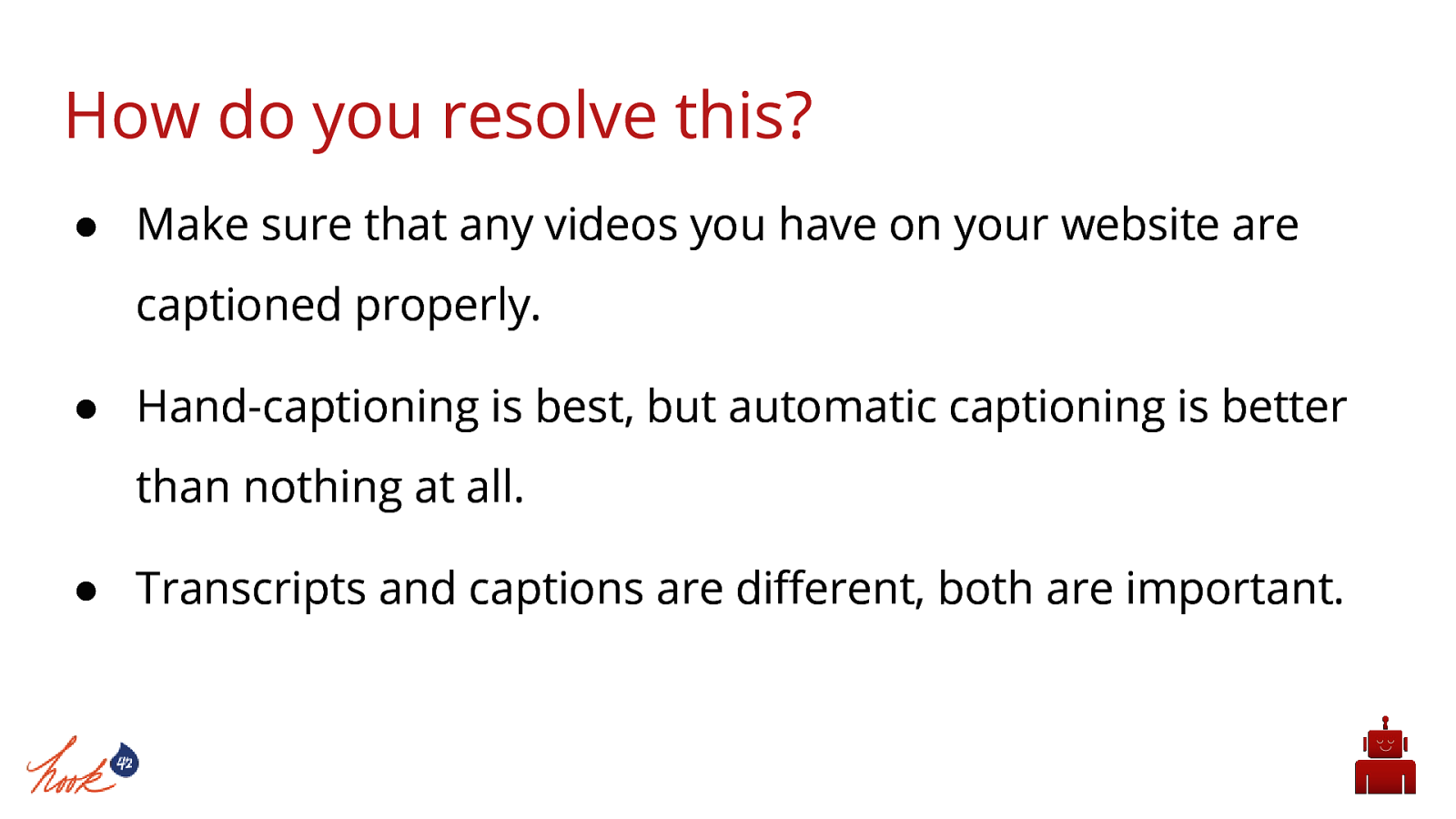
How do you resolve this?
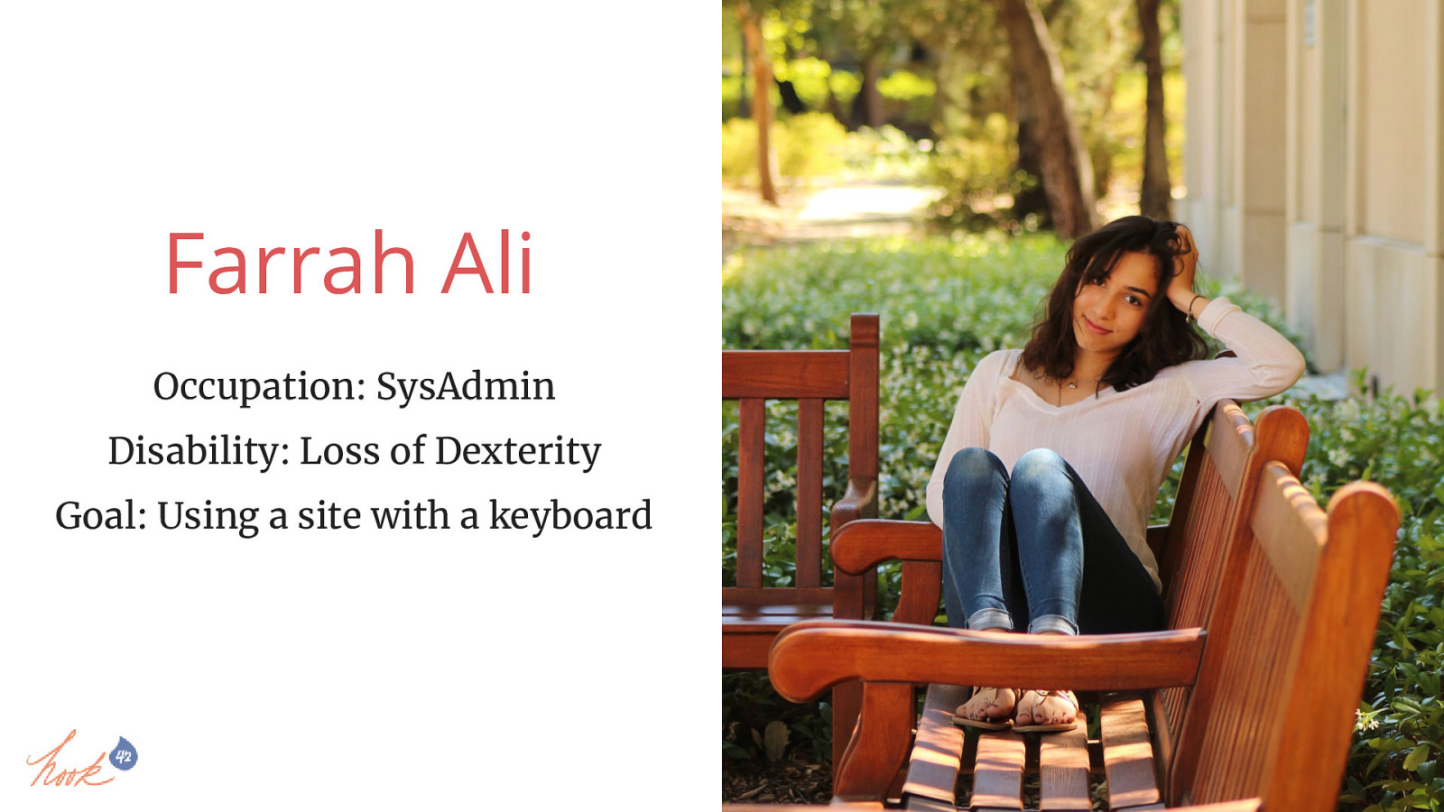
Farrah Ali Occupation: SysAdmin Disability: Loss of Dexterity Goal: Using a site with a keyboard
Demo person first Farrah is a SysAdmin for a well-known company. The systems she maintains are crucial to keeping her company’s services running and she has a lot of team members whose needs she ends up supporting throughout the day. She’s the queen of putting out technical fires, and she’s everyone’s go-to in the department when anything goes down unexpectedly. Farrah has always been dedicated to her physical fitness. She played left forward on her college soccer team and loves running marathons. This made it all the more of a blow when she was diagnosed with the early onset of Parkinson’s last year. Losing her fine motor skills to tremors is making it increasingly more difficult for her to use a mouse, and she’s been steadily relying on the keyboard more and more to navigate the web.

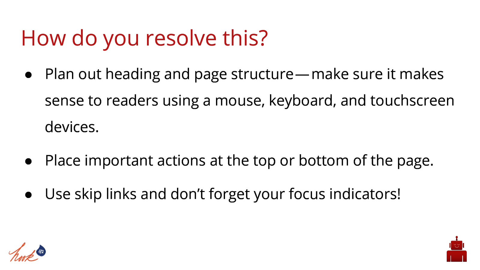
Tell story of husband (wrist tumor) and how at times it felt like he had mittens on his hands. Temporary disability Type out “hello my name is X” with mittens on. Navigate to the “Online Courses” page of this website http://gaates.org (no focus indicators, cannot tab into submenu items)
Really bad form example: http://www.gatesnfences.com/contact_us.htm Take-away Demo: Show how to add focus indicators to a button. Focus indicator demo: https://youtu.be/TPVoLQDe1Mg
How do you resolve this?
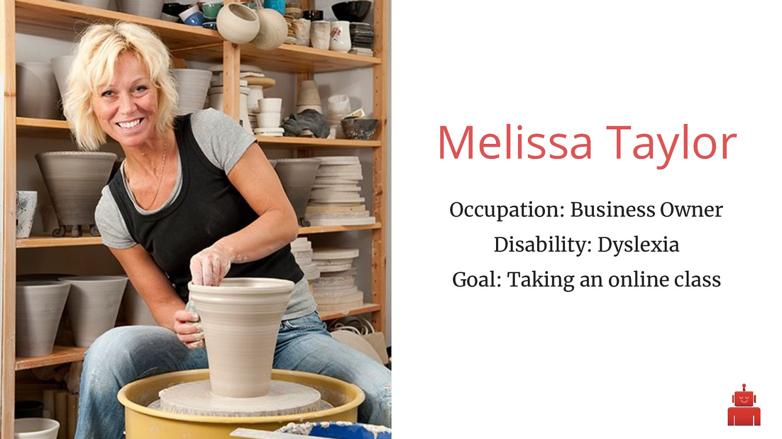
Melissa Taylor Occupation: Business Owner Disability: Dyslexia Goal: Taking an online class
This is Melissa Taylor. She’s 47 and has created a thriving business for herself as the owner of a pottery studio. She uses a variety of online tools to balance the budget for her small business and to schedule her employees for their shifts. She loves reading online articles about new techniques for working with clay on Pinterest. Even though she already has a successful business, she loves to push her boundaries. She’s working on her Master’s degree in Fine Arts online. The new online learning system for her class has timed tests, so she needs to read the material quickly and answer correctly to pass.

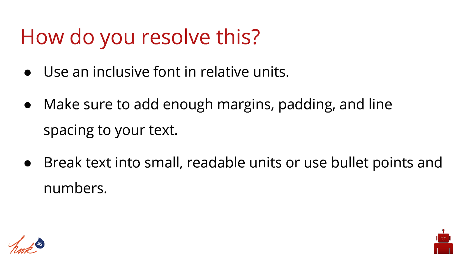
Read course quiz with bad spacing, fonts, etc Read course quiz with just those small things fixed.
Take-away Demo: Show the GitHub version of this https://github.com/L1fescape/dyslexia Dyslexia font theme - https://opendyslexic.org
How do you resolve this?
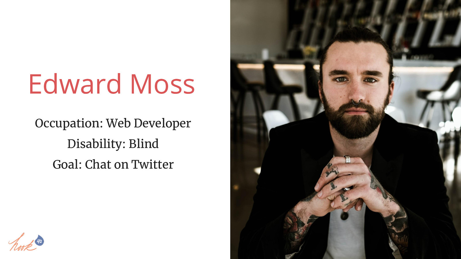
Edward Moss Occupation: Web Developer Disability: Blind Goal: Chat on Twitter
Edward has loved to build websites since middle school. He’s always had a natural talent with code, especially back-end development. He primarily works in Drupal and loves Drupal 8 because it’s so much more convenient for him to use. Despite being great at building websites and knowing all of the ins and outs of his assistive tech, there’s still a lot online that even a pro like him can’t access. He’s always considered himself a social guy, and he’s got a pretty serious relationship going on with his smartphone. He loves social media and spends a lot of his idle time on Facebook and Twitter. While most of his friends are pretty good about adding alternative text on their posts for him, a lot of the people and companies he follows on Twitter tend to forget. He wants to stay up to date and included, but the popularity of posting all-text memes and other picture-based posts blocks him from being included.

Try describing an image or a meme with limited or no sight Have the room send tweets (where?) describing the image and read those to the volunteer Ask the volunteer what they think the image probably looks like
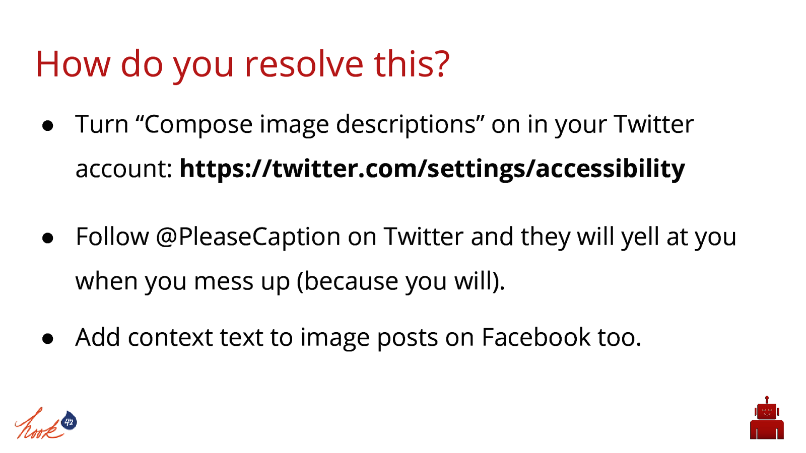
Take-away Demo: Turn on Twitter image captioning in settings. Follow @PleaseCaption on Twitter and they will yell at you when you mess up (because you will)
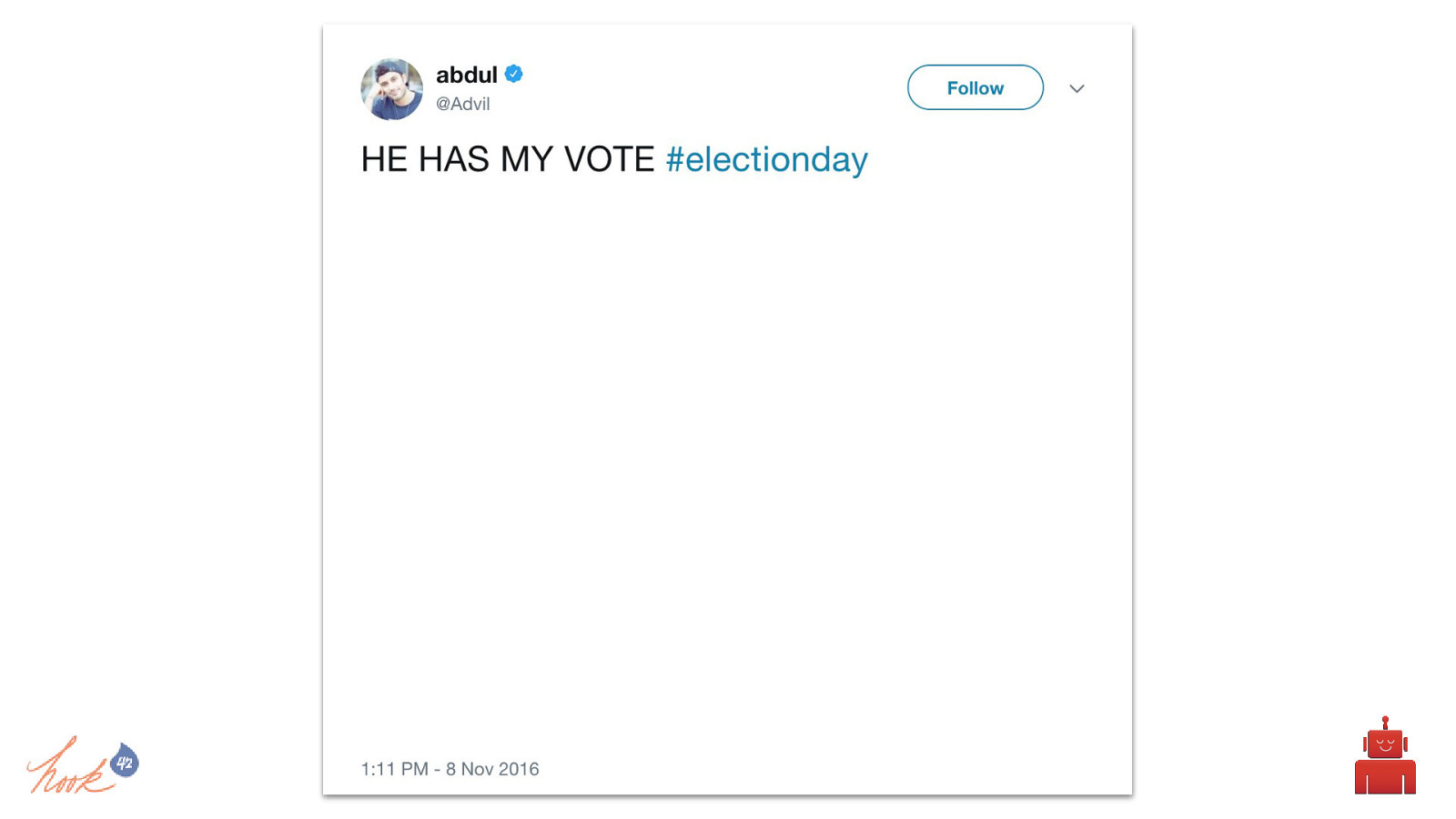
Read the text from this tweet a. Have volunteer guess what the image is of based on that text without being able to see the image Have the room send tweets describing the image and read those to the volunteer a. #FLDCa11y Ask the volunteer what they think the image probably looks like Show the image
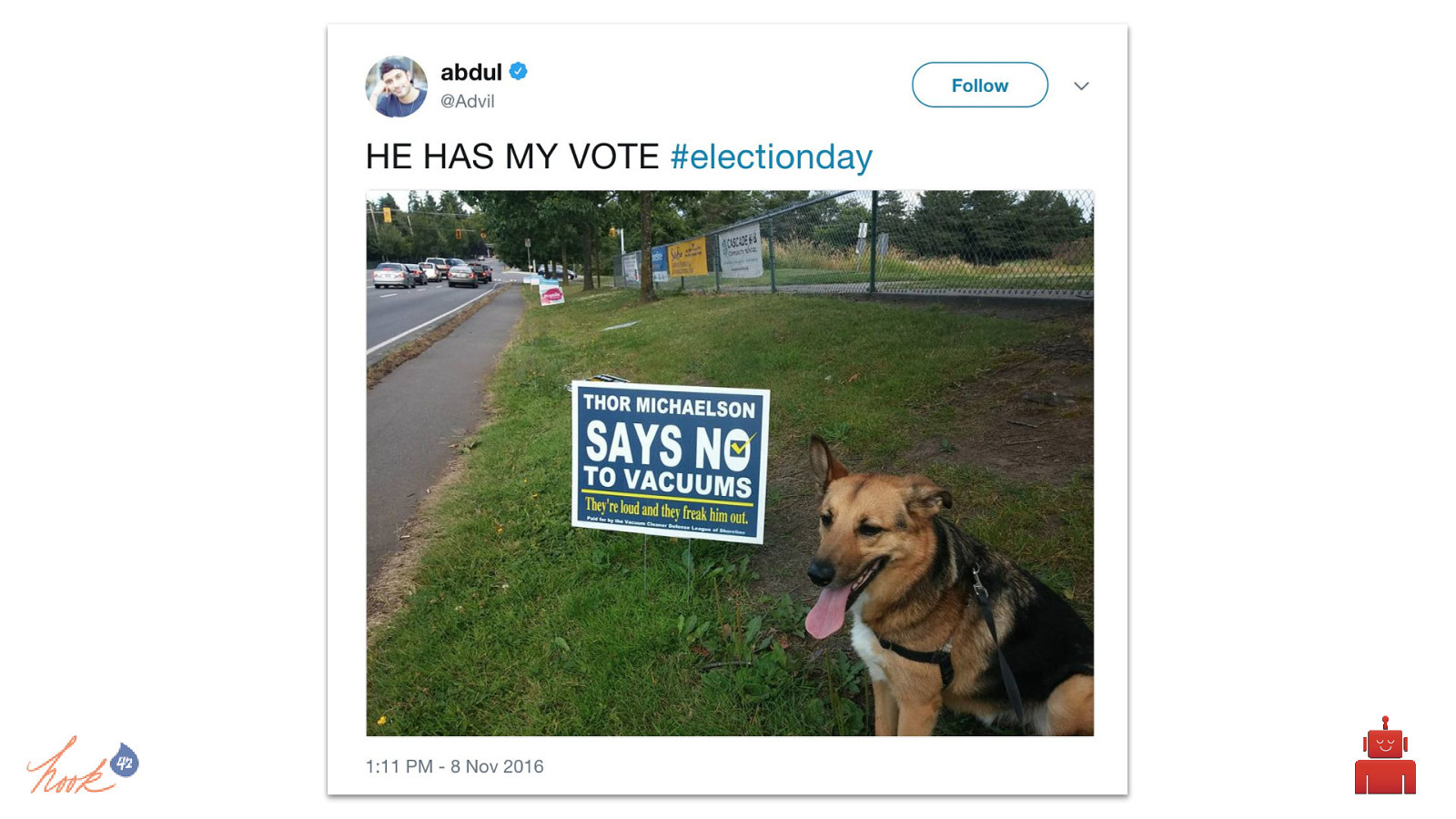
Read the text from this tweet a. Have volunteer guess what the image is of based on that text without being able to see the image Have the room send tweets describing the image and read those to the volunteer a. #FLDCa11y Ask the volunteer what they think the image probably looks like Show the image
How do you resolve this?
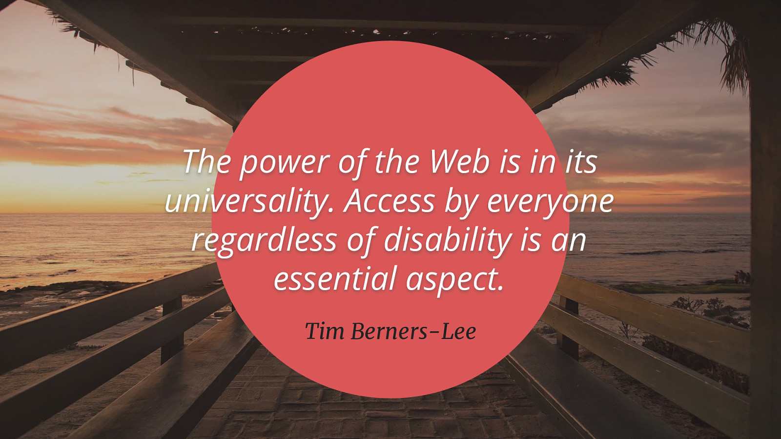
The power of the Web is in its universality. Access by everyone regardless of disability is an essential aspect. Tim Berners-Lee
Web accessibility shouldn’t be seen an ‘extra frill’ or something we do to be charitable to “unfortunate disabled people” - it’s a quality and user experience issue. If a contractor installed a doorbell on your house that someone had to be six feet tall to reach, you wouldn’t be okay with that. Creating a website that only certain bodies can use means that it hasn’t been built properly. Website accessibility should not be just a box you check off when you deliver a new website to a client, it is a way of rethinking design and development, where you go beyond just the base level of access to information. Website accessibility should be about making something valuable, not just accessible, to as many people as we can.
Carie - https://twitter.com/cariefisher Helena - https://twitter.com/misshelenasue