Accessible Patterns from the Ground Up

A presentation at WordSesh in May 2019 in by Carie Fisher

Slide 1

Slide 1

Accessible Patterns From the Ground Up

Digital accessibility can be difficult or frustrating to a lot of people, but it doesn’t have to be. By making small changes to your everyday workflow, you can have a huge impact on making the digital world more inclusive - without crushing your creativity or sacrificing your sanity!

In this talk, we will walk-through the process of creating an accessible pattern from design to development, while focusing on accessibility best practices at each step. We will start with a wireframe/sketch, process that into a design, translate the design into code, and finally, retest for accessibility. We will also talk about the different kinds of patterns out in the wild and which are the most accessible to the widest range of users.

Slide 2

Slide 2

Carie Fisher

My name is Carie Fisher. I am an IAAP CPWA certified senior Accessibility Consultant at Deque and I have been building websites professionally since 2005 primarily with CMS’s like Drupal and WordPress. I am passionate about front-end development, accessibility, and promoting diversity in the tech world.

A little bit About Deque Systems… Deque is a company that specializes in digital accessibility. We help other companies make their websites and mobile applications more accessible by providing educational resources, accessibility audits, and a suite of tools to help automate accessibility reviews. You may be familiar with our open sourced tool called Axe, which is now built into Firefox and google’s accessibility inspector and also are available as independent add-ons.

We have helped thousands of companies from technology leaders like Google and Microsoft, the top US banks, insurance companies, retailers, airlines, hotel chains and the biggest government agencies.

Just a quick house-keeping note before we go too far into this, all of the tools and resources I mention here will be available at: bit.ly/a11yresources and that link will be posted on the last slide as well. OK on with the show…

Slide 3

Slide 3

Let's prep the soil

First let’s prep the soil

As a former biologist and part of the midwestern farming community, I feel qualified to be your master gardener today as we build our accessible patterns from the ground-up.

Before we go too far as any good farmer or gardener knows, before you plant any seeds, you must prep the soil. So let’s chat a little bit about digital accessibility…

If you are new to the field of accessibility, this will help give you a foundation before we go into the patterns. If you are less new, you might know some of this already, but it is important to review quickly so we all can start off on roughly the same level.

Slide 4

Slide 4

Accessibility

Digital Accessibility (sometimes abbreviated A11y) is about designing and building your digital offerings in such a way that regardless of a person’s mental or physical ability they could still interact with your website, app, or electronic document in a meaningful and equal way.

Slide 5

Slide 5

Accessibility world stats

Of course, that original number is a bit deceiving. because if you consider people who don’t identify as having a disability, but who could benefit from accessible websites and apps, that number jumps up way higher.

It is estimated that about 30 to 40% of the world’s population can benefit from accessible websites such as people temporarily disabled (broken wrist), situationally disabled (glare on a device screen), mildly disabled (hard or hearing, color blind), English as a second language, etc

Slide 6

Slide 6

Accessibility US stats

So if we focus on the US alone, there are 56.7 million people, roughly 19% of the population, who identify as being disabled. This is the same as the entire population of California + New York (~56 million).

There are 39.6 million people, roughly 13% of the population, who are over the age of 65 and could benefit from accessible websites. This is the same as the entire population of Texas + Illinois (~38 million). This number is expected to double in the next 20 years…and it will continue to grow as people live longer and technology becomes even more prevalent and important to our daily lives.

In total accessibility cover over 96.3 million or 32% of the US population alone. If you are ignoring this collective demographic, you are losing up to 32% of your potential users.

Slide 7

Slide 7

Accessibility money stats

So you might understand that people with disabilities and people over 65+ equal about a third of the population, but did you know that they also have a lot of money to spend?

People with disabilities in the U.S. alone control an aggregate annual income of > $1 trillion and have over 200 Billion of that to spend as they see fit.

Bureau of Labor Statistics states that people over 65 are spending abound 81 million US dollars each year, with that number expected to rise dramatically over the years due to people living longer and pushing back retirements. That number almost doubles when you include the Baby Boomer age group who are 55-64 year olds.

So long story short, if your company is spending money on a lot of other things like SEO but not addressing accessibility needs of their users, they are missing out on both the number of users and their money.

Slide 8

Slide 8

P.O.U.R. concepts

So those are the rough numbers on people who could benefit from accessible websites/apps and money that is associated with them, but about the regulations related to accessibility?

Web Content Accessibility Guidelines (WCAG) is developed through the W3C process in cooperation with individuals and organizations around the world, with a goal of providing a single shared standard for web content accessibility that meets the needs of individuals, organizations, and governments internationally.

The WCAG guidelines are intended to aid designers and developers with creating accessible websites and apps. But it gets really technical really fast. so for beginners, I try to focus on the actionable parts of the guidelines, namely the P.O.U.R. concepts – Perceivable, Operable, Understandable, and Robust. The acronym POUR is not about rigidly adhering to hard and fast rules; it’s about understanding and meeting the diverse needs of our users.

Each facet of POUR is interconnected. It might be more accurate to show it as a symbiotic relationship, like this. Where the connectivity is important as a user interacts with a website or app. They first must perceive the content, then they must understand the content, they operate their device to interact with the content, and the device must be as flexible as possible when it digests the input.

Slide 9

Slide 9

Perceivable - Operable - Understandable - Robust Details

The first category in P.O.U.R. is Perceivable. This means that users must be able to perceive the information being presented – it cannot be invisible to all of their senses.

Questions: Is there anything on our website or app that a person with a disability would not be able to perceive? Does this work with different types of assistive technology devices? Make sure to think of all the different types of disabilities – visual, mobility, hearing, cognitive, and speech impairments, vestibular and seizure disorders, and many more. Examples: adding text alternatives to non-decorative images, adding captions and transcripts to videos, making sure the color is not the only method to convey meaning. The second category is Operable. Users must be able to operate the interface – the interface cannot require interaction that a user cannot perform.

Questions: Can users control interactive elements of our website/app? Does our website have any traps? Examples: using keyboard only navigation, making sure slideshows have all of the controls shown, making sure users have enough time to fill out a form. The third category is Understandable. Users must be able to understand the information as well as the operation of the user interface – the content or operation cannot be beyond their understanding.

Questions: Is all of the content clearly written? Are all of the interactions easy to understand? Does the order of the page make sense? Examples: write content at a 9th-grade reading level – don’t use a $10 word when a $1 word will do, make sure your website is predictable, make sure any error messages on your website are clear and easy to resolve. The last category is Robust. It means that users must be able to access the content as technologies advance – as technologies and user agents evolve, the content should remain accessible.

Questions: Does our website only support the newest browsers or operating systems? Is our website developed with best practices? Does this work in both landscape and portrait orientations? There are no real examples of this…just test your website/app! Be sure to use all types of tools – automatic, manual, AT, and user tests. After your initial accessibility testing, do more tests when new features or functionality are added. The underlying spirit of P.O.U.R. isn’t about rigidly adhering to hard and fast rules; it’s about understanding and meeting the diverse needs of your users. Once you are on board with that, following the WCAG guidelines become more of a roadmap than a to-do list.

Slide 10

Slide 10

Planting the seed

OK so far we have covered the number of people needing accessible websites/apps is high, the amount of money they have is great, and we have an international set of rules already well-thought out with people in mind…

It’s on to pattern design!

Slide 11

Slide 11

Accessibility heuristics

Before you even pick up your pencil or open up your digital design program of choice, you need to keep a couple things in your mind.

First up Accessibility heuristics. What are accessibility heuristics?

Accessibility-specific rules of thumb inspired from WCAG, and built for the purpose of evaluating design assets for accessibility.

They are Inspired by WCAG’s principles which we’ve already talked about and Nielsen’s heuristics, which are A set of simple, efficient rules of thumb, created by Jakob Nielsen in 1995, to help designers make decisions about whether a user interface is usable.

Because let’s face it WCAG is hard. While heuristics are Easy, simple and holistic approach to inclusive design without overthinking the requirements

10 general rules of thumb to help designers integrate accessibility considerations into their work this list was developed by Denis Boudreau, Aparna Pasi, and Cailin Geier at Deque Systems. It goes in-depth in each section and applies it to each design piece.

Then there is a form for RATING each checkpoint (heuristics evaluation) Whether or not the design asset or user interface successfully integrates the concepts of said heuristic. Possible options include: “beyond” (★) “positive” (pass) “negative” (fail) “n/a” (not applicable)

Slide 12

Slide 12

Accessible personas

Personas answer the question, “Who are we designing and developing for?” and they help to align strategy and goals to specific user groups. A user persona can be formal or informal…on paper on in your head. It is important when planning a new website to keep people of varying backgrounds, ethnicities, genders, ages, technical abilities, etc. as a part of your personas so that you’re working toward meeting a realistic variety of perspectives and needs.

A persona is a representation of a type of customer. The purpose of personas is to create reliable and realistic representations of your key audience segments for reference. These representations should be based on qualitative and some quantitative user research and web analytics. Personas help to focus decisions surrounding site components by adding a layer of real-world consideration to the conversation. They also offer a quick and inexpensive way to test and prioritize those features throughout the development process.

A word of caution: you have to be very careful with personas. They ARE NOT: Based on real people or stereotypes Colorful artwork for your wall A substitute for user testing Useful if not actually used

They ARE however: Based on real user data Supported by all departments Communicated early and often A toolset to create empathy

https://github.com/UKHomeOffice/posters/blob/master/accessibility/dos-donts https://github.com/UKHomeOffice/posters/blob/master/accessibility/dos-donts/posters_en-UK/accessibility-posters-set.pdf

Slide 13

Slide 13

Time to water

So let’s dig into some mock-ups and designs

Slide 14

Slide 14

UX design process

Lo-fi: Rapid exploration and iterative fidelity. Allows design to work through different combinations of ideas fairly cheaply. Here you’ll start to see things like tab order, roles, and buttons worked out.

Hi-fi: The most expensive and detailed fidelity. This will likely be the representation of the desired end-state of the product. Here you’ll see things like color, spacing, accessible names and custom focuses.

Slide 15

Slide 15

Flip card example

Today we are going to make a Card that flips when you click it. We are going to use a modified annotation symbol system that Jack Nicolai from Adobe created originally. These include symbols B and L in red teardrops to indicated buttons or links. Green comment bubble to add specific accessibility information like accessible names. A blue square symbol to indicate tab order, a purple square to show any ARIA roles

Slide 16

Slide 16

Flip card: lo-fi

Slide 17

Slide 17

Flip card: hi-fi

Slide 18

Slide 18

Design tools

A11y Rocks Color Palette - This tool should help you visualize an entire palette of all color combinations with accessibility in mind. The combinations are ordered by color contrast ratio. Try it out with these sample colors, and then create a palette of your own

Colour Contrast Analyser - The Colour Contrast Analyser (CCA) helps you determine the legibility of text and the contrast of visual elements, such as graphical controls and visual indicators.

Contrast Checker - This tool is built for designers and developers to test color contrast compliance with the Web Content Accessibility Guidelines (WCAG) as set forth by the World Wide Web Consortium (W3C). These calculations are based on the formulas specified by the W3C.

ChromeLens - ChromeLens is a Google Chrome extension that provides a suite of tools to help with web accessibility development.

Funkify - Funkify is a brand new extension for Chrome that helps you experience the web and interfaces through the eyes of extreme users with different abilities and disabilities.

UK Home Office Posters - Home Office repository of posters covering different topics - research, access needs, accessibility and design.

Adobe Photoshop - colorblindness filters View -> Proof set-up -> choose filter

Slide 19

Slide 19

Design quote

“We spend an awful lot of time designing the bridge, but not nearly enough time thinking about the people who are going to cross it.” Dr. Prabhjot Singh

Slide 20

Slide 20

Here comes the sun

Now it’s time for the design team to hand-off their mockups to the front-end developers. Depending on the number of people and types of roles you have at your office, this workflow might look a bit different. But at some point the design needs to be translated into code.

As part of an Effective Design Workflow communication is key. By sharing design and wireframes with the team as soon as possible and creating a list of all assets needed for each component, that should give developers a heads up on what’s coming, and allow them to think about potential technical issues more deeply.

Slide 21

Slide 21

Guides/Libraries

Before I write one line of code I do some research! If an accessible version of my pattern is already out there…why reinvent the wheel? Of course, there is some interesting code out there…it’s important to git your patterns for reputable sources, not just the first solution that pops up on Stack Overflow or Google search

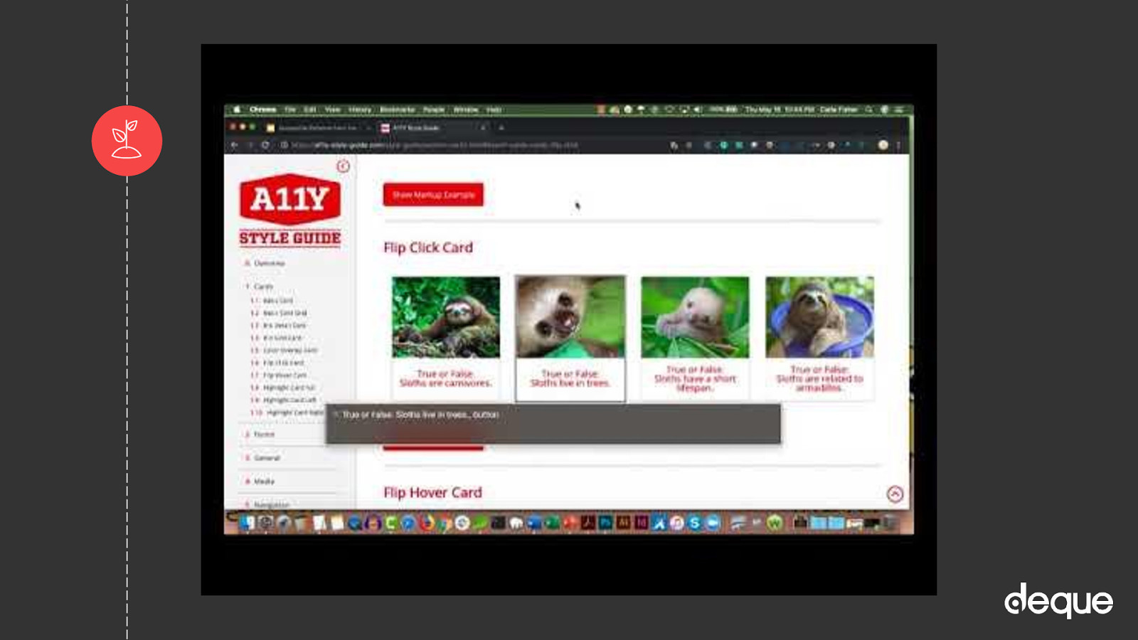
A11y style guide - (awesome resource - but I’m biased b/c I created it) This is a living style guide or pattern library, generated from KSS documented styles…with an accessibility twist. No matter your level of development or accessibility expertise, there are ways to help contribute to the a11y style guide.

Accessible Components - Scott O’Hara develops and designs accessible user experiences for the web (Scott O’Hara - @scottohara).

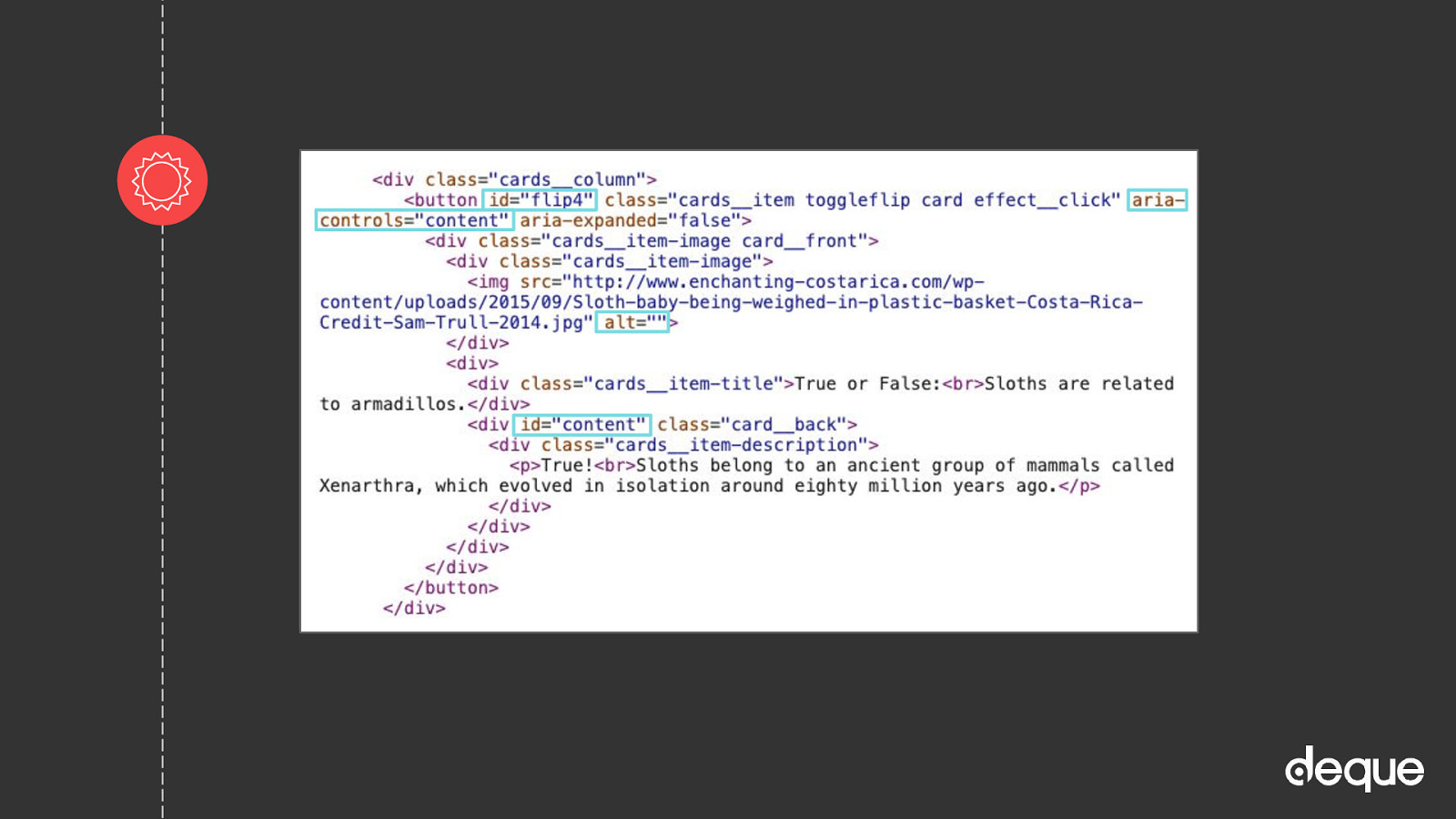
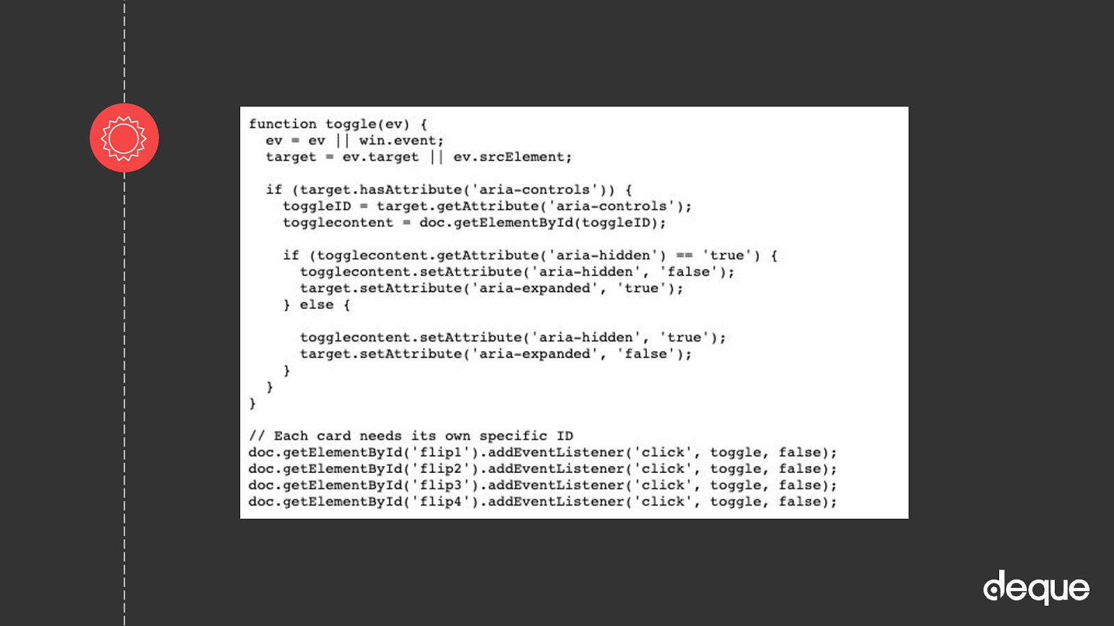
Deque - This code library is a work in progress. It draws on the principles taught in the course Custom JavaScript/ARIA Widgets. There is also another repository called Cauldron that uses PUG.

GOV.UK Design System - Use this design system to make your service consistent with GOV.UK. Learn from the research and experience of other service teams and avoid repeating work that’s already been done.

Inclusive Components - A blog trying to be a pattern library, with a focus on inclusive design. Each post explores a common interface component and comes up with a better, more robust and accessible version of it (Heydon Pickering -@inclusicomps).

U.S. Web Design System - The UI components are built on a solid HTML foundation, progressively enhanced to provide core experiences across browsers. All users will have access to the same critical information and experiences regardless of what browser they use, although those experiences will render better in newer browsers. If JavaScript fails, users will still get a robust HTML foundation.

Various JS frameworks have made great strides when it comes to accessibility including Gatsby thanks to Marcy Sutton

Slide 22

Slide 22

Code example: HTML

OK let’s say I find almost what I want…I can work with that usually.

Slide 23

Slide 23

Code example: JS

Slide 24

Slide 24

Developer Tools

A11y Project - Web Accessibility Checklist - Accessibility can be a complex and difficult topic. The Accessibility Project understands this and wants to help make it easier to implement on the web.

ARIA specs - Accessible Rich Internet Applications (ARIA) is a set of attributes that define ways to make web content and web applications (especially those developed with JavaScript) more accessible to people with disabilities.

It supplements HTML so that interactions and widgets commonly used in applications can be passed to assistive technologies when there is not otherwise a mechanism. For example, ARIA enables accessible navigation landmarks in HTML4, JavaScript widgets, form hints and error messages, live content updates, and more.

Deque University - wealth of knowledge on just about anything accessibility. There is a cost, but it’s pretty minimal for a full year of access. On top of that, if you have a disability you can get the courses for free

HTML5 Accessibility - Get the current accessibility support status of HTML5 features across major browsers.

WCAG 2 (Quick Reference Guide) - A customizable quick reference to Web Content Accessibility Guidelines (WCAG) 2 requirements (success criteria) and techniques.

WCAG Web Accessibility Tutorials - Guidance on how to create websites that meet WCAG.

Slide 25

Slide 25

In full bloom bloom…almost

Yeah! You have tilled the soil, planted and watered the seeds, and let some light in so you are done growing your accessible component, right?!

Well almost…

Slide 26

Slide 26

Beware of weeds

You aren’t done until youTime to actually test your creations!

Reminder: if your garden isn’t tended to, weeds will creep in and take over.

The same thing applies to digital accessibility! Make sure you revisit the workflow when adding a new feature or updates to your styles or even a new JS library. Along those same lines…accessibility testing is never done! With new updates to browsers, assistive technology devices, markup rules, code regressions, etc. you should consider accessibility testing an ongoing maintenance task. By setting aside some time each month to review accessibility, you can catch mistakes when they are small and easier to manage or fix.

Slide 27

Slide 27

Types of accessibility testing

When people ask me about accessibility tools at trainings and conferences, I am not surprised. They want to push a few buttons and poof! summon magical creatures that can go in and find and fix all of their issues. Of course, they don’t like my answer that regardless of the tool, automatic testing can only reliably pick-up 30-40% of all accessibility issues. And some tools are better at picking up some accessibility issues, while others might be better suited for catching other errors, so you really need to run a suite of tools. On top of that, of the issues automatic testing tools do find, many still require a human to interpret the results and prioritize the issues. For example, an automated testing tool might tell you that your image is missing alternative text, but it cannot tell you what alternative text to write. Whew…it’s exhausting just thinking about it!

But it is not all bad news! The good news is automated testing tools are truly amazing and getting “smarter” with each new version. There may be a day soon where these tools can reliably catch closer to 100% of all issues and even fix them for you. But until then, you can add UX/UI tests, manual keyboard tests, mobile touch tests, screen reader tests (and other ATs), content readability tests, and (I think, most important) user tests to your workflow to cover the gaps automatic testing leaves behind. Also, don’t forget adding an accessibility statement and an accessible way for users to contact you about any issues they may have with your website/app, go a long way in terms of overall user experience and satisfaction.

Slide 28

Slide 28

A11y style guide pattern test demo

Slide 29

Slide 29

Testing tools

Keyboard/Mobile Assistive Technology Devices (ATs) Windows: Chrome/Firefox + NVDA and IE/Edge + JAWS Mac: Safari + VoiceOver Android: Chrome/Firefox + TalkBack iOS: Safari + VoiceOver Content/Readability/User

Slide 30

Slide 30

Quote from Tim Berners-Lee

“The power of the Web is in its universality. Access by everyone regardless of disability is an essential aspect.” Tim Berners-Lee

I can’t say it any better than that.

You can hopefully now see how It is important that your website is perceivable, operable, understandable, and robust (POUR) — all successful criteria for a user experience that provides optimal usability for everyone.

Because digital accessibility is really about the people. Making the web better, easier, equal.

Maybe I’m naive, but I’d like to think we’ve come to a tipping point in our society recently. Where we don’t want to just hear about the positive change that is happening, but that we want to be a part of the change. Digital accessibility is a place where positive change can happen.

Slide 31

Slide 31

Thanks! Any questions?

Twitter & LinkedIn: @cariefisher GitHub: @cehfisher Example: bit.ly/a11ycard Resources: bit.ly/a11yresources Slides: noti.st/cariefisher