Accessible SVGs Inclusiveness Beyond Patterns
Hello! Today I’m going to talk to you about SVGs and how to make them more inclusive and challenging you all to think a bit more about real users and their needs — all in roughly 10 minutes!
A presentation at Vienna Calling in July 2020 in by Carie Fisher
Hello! Today I’m going to talk to you about SVGs and how to make them more inclusive and challenging you all to think a bit more about real users and their needs — all in roughly 10 minutes!
My name is Carie Fisher. I am Senior Accessibility Trainer/Dev at Deque who has been building websites professionally since the early 2000s utilizing various frameworks. I’ve spent the majority of my professional career working as a front-end dev before focusing on UX and accessibility. This fall I’m heading back to grad school to work on my PhD in Human-computer interaction
So going back to SVGs…the primary focus for most people when it comes to accessible SVGs is screen readers compliance — so whether the SVG is accurately described or hidden (depending on its function). But this is only part of the issue and part of the solution. We also need to consider other SVG elements like color and contrast.
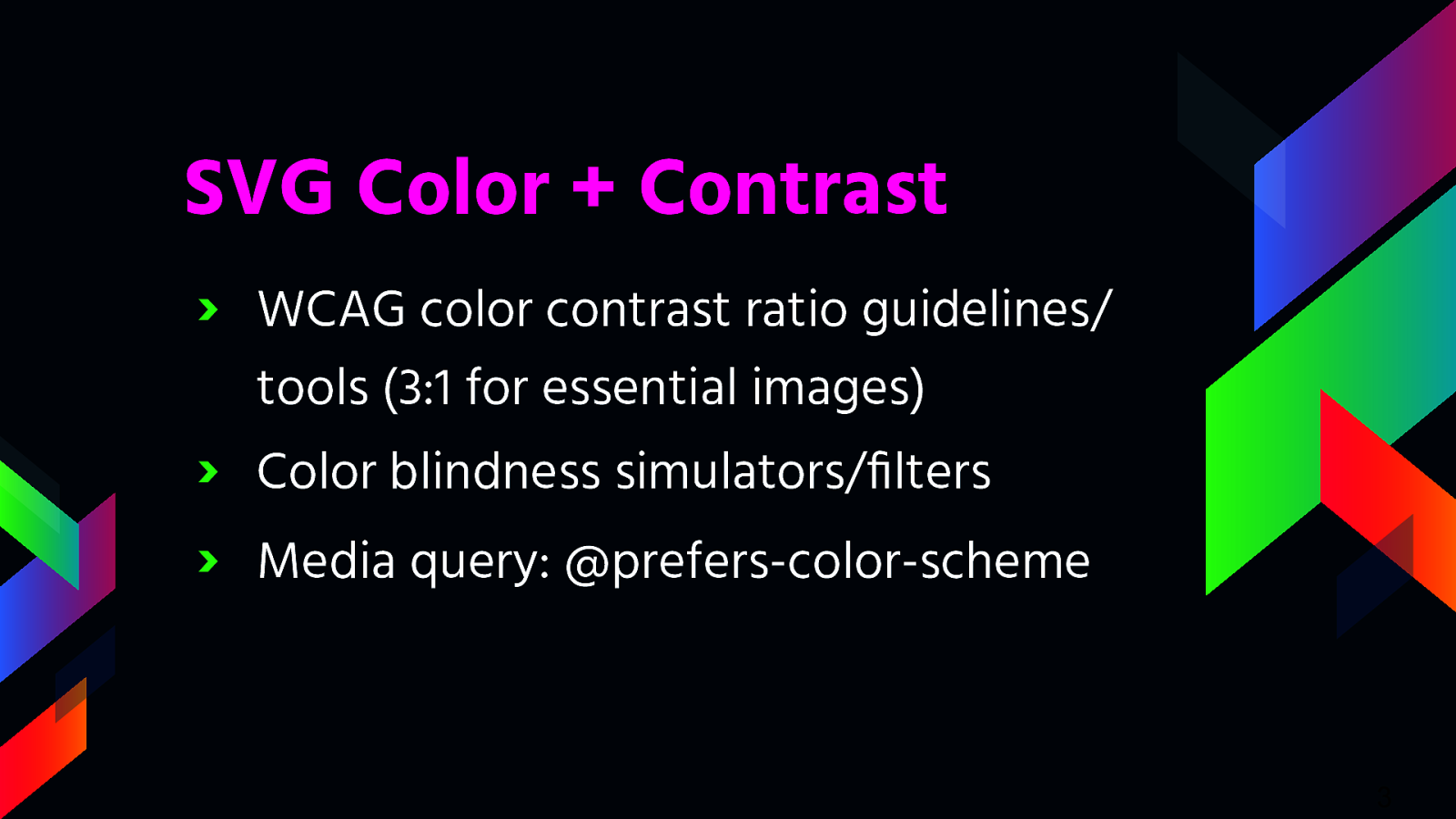
So the very first step you should take when designing your SVG color palette is to review the WCAG color contrast ratio guidelines. The recent update to the WCAG 2.1 guidelines have made it so all essential imagery must adhere to a contrast ratio of at least 3:1. There are a lot of great tools out there that can help you to figure this out like the Color Contrast Analyzer.
Second, there are a lot of great simulators/filters for color blindness available for you to use when designing or developing your SVGs - a couple of my favorites are NoCoffee Vision Simulator and ChromeLens extension. I will show you one today that is part of the Mac OS. That being said - please keep in mind that simulators and filters are tools and may not represent an individual’s true experience.
Beyond checking for color contrast ratios and using simulators/filters, you should also consider the increasingly popular and supported media query called @prefers-color-scheme that allows a user to choose a light or dark themed version of the website or app they are visiting by changing a OS system setting. Adding a dark/light mode gives your users more choice when it comes to the overall experience of your website or app. And this is a good thing because allowing your users to choose their experience is always better than assuming you know what they want.
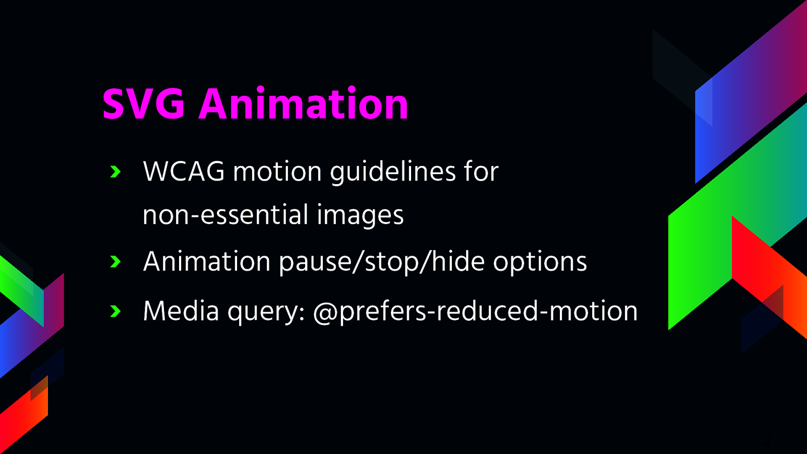
In conjunction with color and contrast, how your SVG moves on the screen is another aspect to consider when designing and developing with inclusiveness in mind. The WCAG motion guidelines are clear: non-essential moving, blinking, or scrolling information that starts automatically, lasts more than five seconds, and is part of other page elements (ie not stand-alone) must allow the user to pause, stop, or hide it.
Since SVG animations, must not auto-play for more than five seconds, you must create a way for users to pause or stop the animation. One way to do this is to create a JS toggle button to play/pause the animation. If your SVG is large or is the main feature of your website (e.g. animations that pop in and out as you scroll down a page) a pause/play button at the top of the screen might be a realistic option to control the entire experience of the page. If your SVGs are smaller in scale or related to user input (e.g. an animation happens when a user submits a form), an alternative option is to code the animation to stop at five seconds vs. playing it on an infinite loop.
In addition to using a pause/play option or creating a finite animation loop, you may also consider adding @prefers-reduced-motion media query to address the animation in your SVGs. Similar to the light/dark mode, the @prefers-reduced-motion media query checks the user’s settings for motion restrictions and then implements a visual experience based on their preference. In the case of @prefers-reduced-motion, a user can choose to minimize the amount of animation or motion they see.

https://codepen.io/cariefisher/pen/QWwaVbQ
Alright enough talk, let’s look at an example of these media queries. For this demo I’ll be using this codepen I created, if you want to follow along or dig a bit deeper into the code afterwards.
Twitter/LinkedIn @ cariefisher GitHub @ cehfisher cariefisher.com