Accessible Typography Essentials

A presentation at axe-con in March 2022 in by Carie Fisher
Accessible Typography Essentials
Hello! Carie Fisher, MS, CPWA Sr. Accessibility Consultant & Trainer HCI Ph.D. Student at Iowa State University
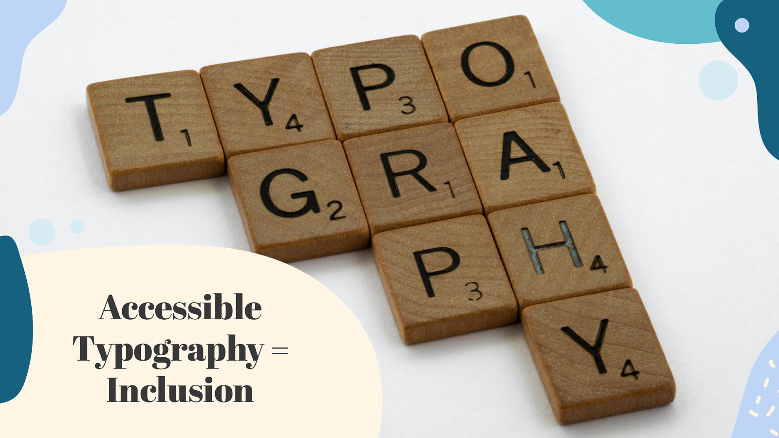
Accessible Typography = Inclusion
01 Color & Contrast
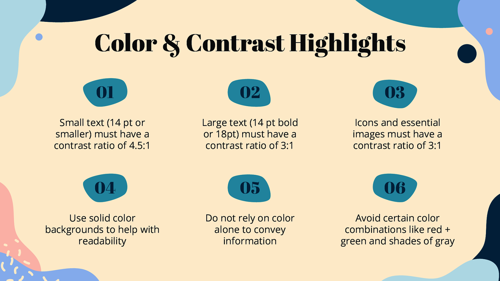
Color & Contrast Highlights 01 02 03 Small text (14 pt or smaller) must have a contrast ratio of 4.5:1 Large text (14 pt bold or 18pt) must have a contrast ratio of 3:1 Icons and essential images must have a contrast ratio of 3:1 04 05 06 Use solid color backgrounds to help with readability Do not rely on color alone to convey information Avoid certain color combinations like red + green and shades of gray
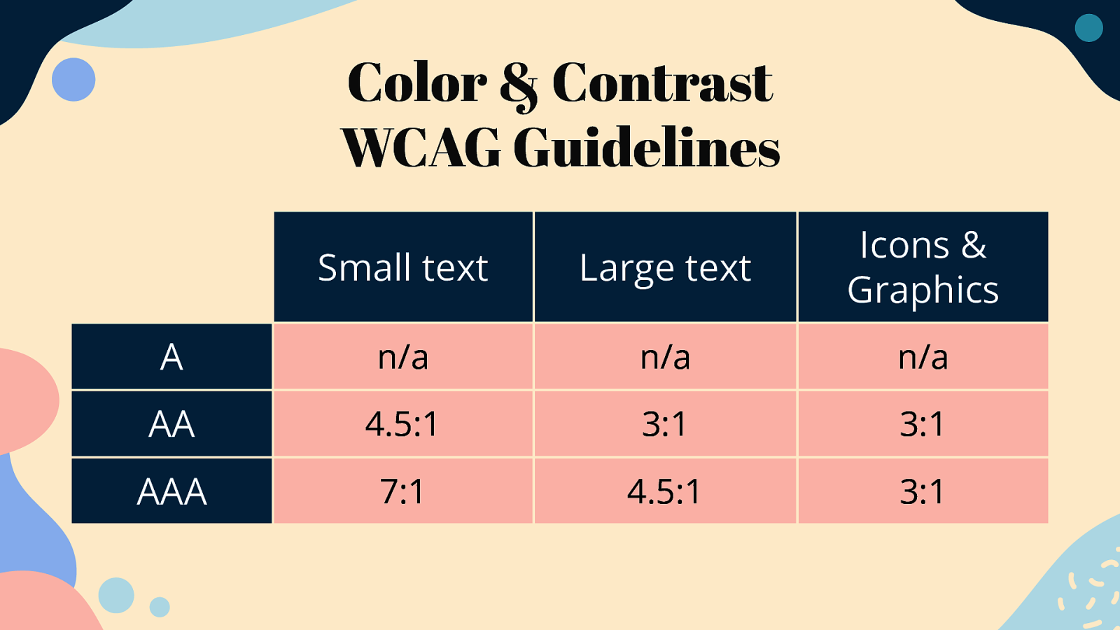
Color & Contrast WCAG Guidelines Small text Large text Icons & Graphics A n/a n/a n/a AA 4.5:1 3:1 3:1 AAA 7:1 4.5:1 3:1
Demo #1 youtu.be/GKekWDsYcBI
02 Typeface & Styling
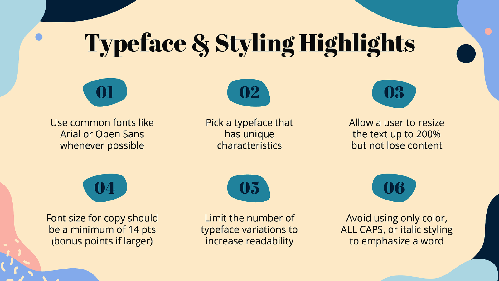
Typeface & Styling Highlights 01 02 03 Use common fonts like Arial or Open Sans whenever possible Pick a typeface that has unique characteristics Allow a user to resize the text up to 200% but not lose content 04 05 06 Font size for copy should be a minimum of 14 pts (bonus points if larger) Limit the number of typeface variations to increase readability Avoid using only color, ALL CAPS, or italic styling to emphasize a word
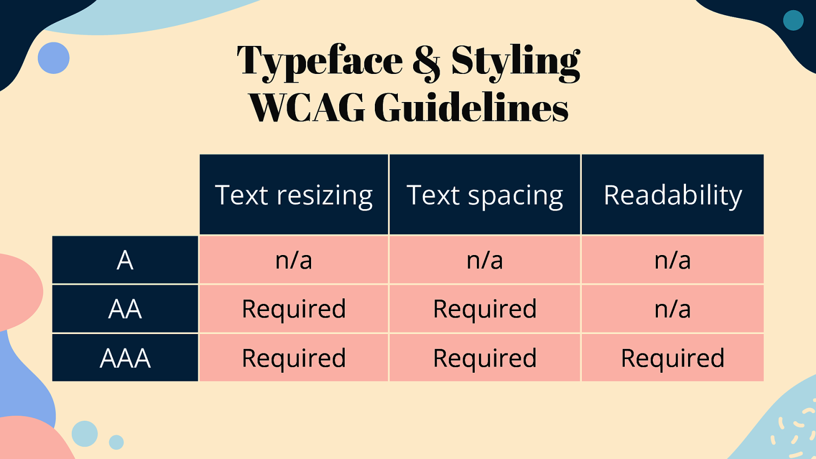
Typeface & Styling WCAG Guidelines Text resizing Text spacing Readability A n/a n/a n/a AA Required Required n/a AAA Required Required Required

Demo #2 youtu.be/JrzS-KUifP4
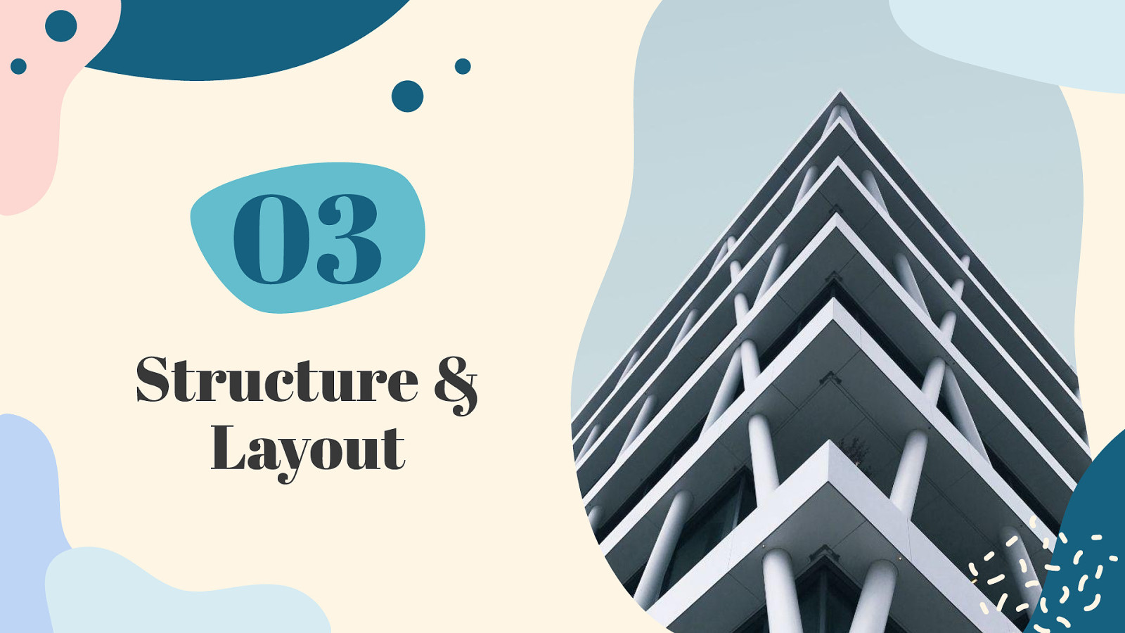
03 Structure & Layout
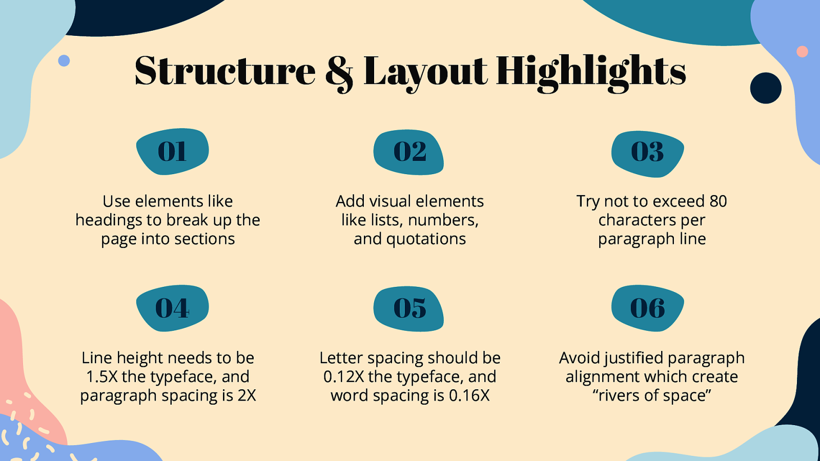
Structure & Layout Highlights 01 02 03 Use elements like headings to break up the page into sections Add visual elements like lists, numbers, and quotations Try not to exceed 80 characters per paragraph line 04 05 06 Line height needs to be 1.5X the typeface, and paragraph spacing is 2X Letter spacing should be 0.12X the typeface, and word spacing is 0.16X Avoid justified paragraph alignment which create “rivers of space”
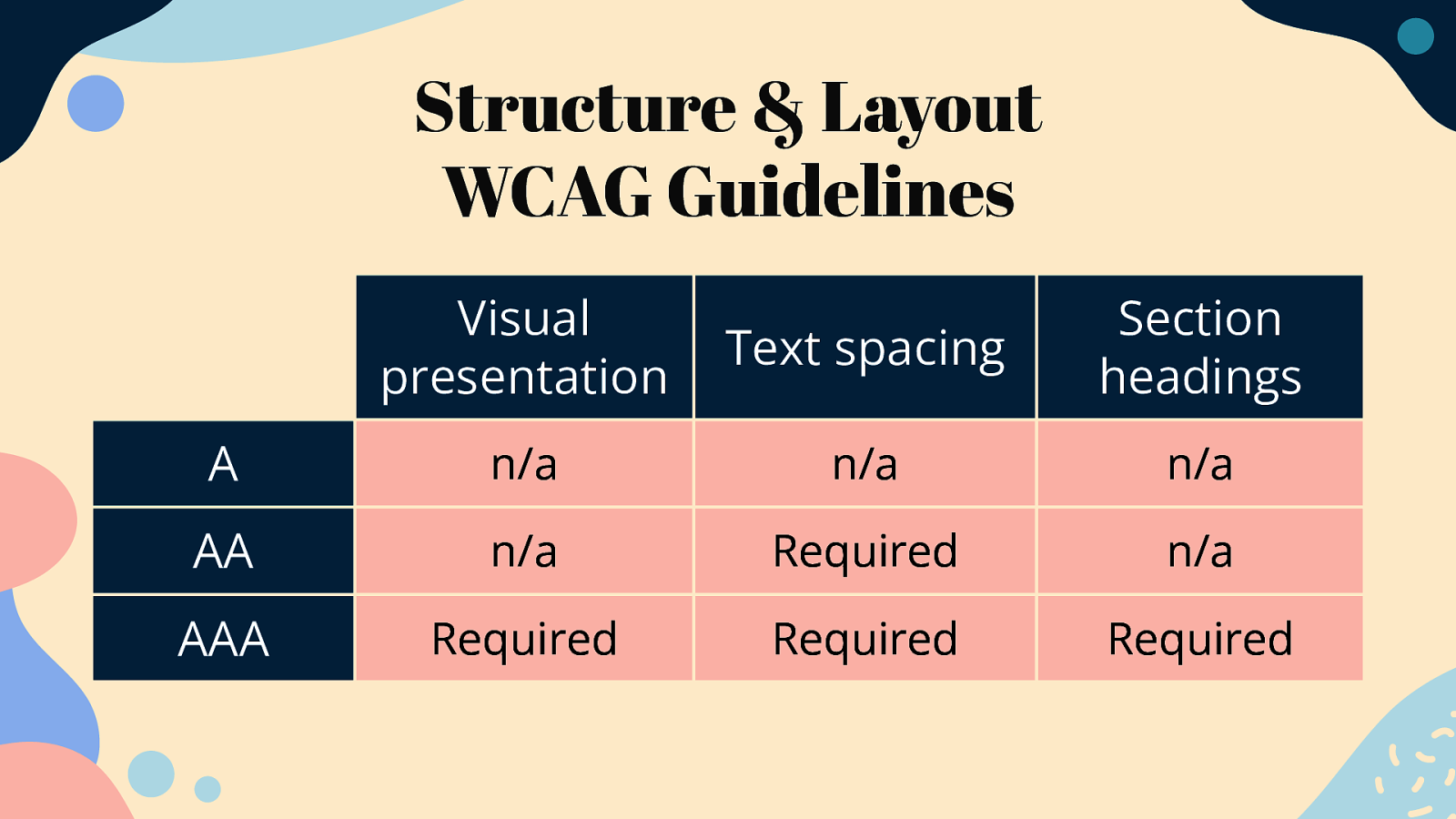
Structure & Layout WCAG Guidelines Visual presentation Text spacing Section headings A n/a n/a n/a AA n/a Required n/a AAA Required Required Required
Demo #3 youtu.be/5wKf9HEuxd8
“How many opportunities do we have to dramatically improve people’s lives just by doing our job a little better?” Steve Krug
Slides & Resources noti.st/cariefisher/ pN0E1T/accessibletypography-essentials
Thanks! @cariefisher /in/cariefisher cariefisher.com