Case Study: Making an Accessible GreyMuzzle.org February 27, 2016
A presentation at SANDcamp in February 2016 in San Diego, CA, USA by Carie Fisher
Case Study: Making an Accessible GreyMuzzle.org February 27, 2016
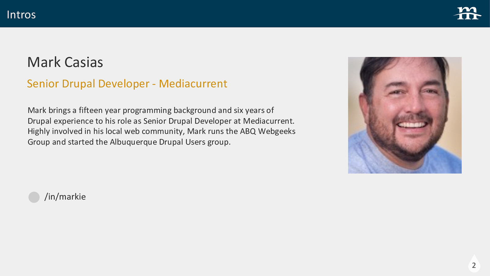
Intros Mark Casias Senior Drupal Developer - Mediacurrent Mark brings a fifteen year programming background and six years of Drupal experience to his role as Senior Drupal Developer at Mediacurrent. Highly involved in his local web community, Mark runs the ABQ Webgeeks Group and started the Albuquerque Drupal Users group. /in/markie 2
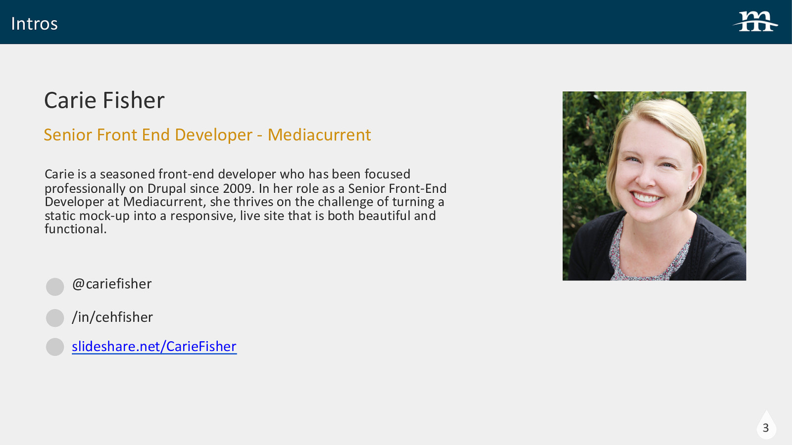
Intros Carie Fisher Senior Front End Developer - Mediacurrent Carie is a seasoned front-end developer who has been focused professionally on Drupal since 2009. In her role as a Senior Front-End Developer at Mediacurrent, she thrives on the challenge of turning a static mock-up into a responsive, live site that is both beautiful and functional. @cariefisher /in/cehfisher slideshare.net/CarieFisher 3
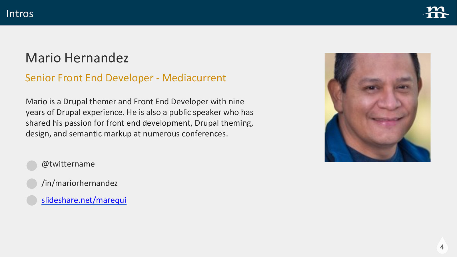
Intros Mario Hernandez Senior Front End Developer - Mediacurrent Mario is a Drupal themer and Front End Developer with nine years of Drupal experience. He is also a public speaker who has shared his passion for front end development, Drupal theming, design, and semantic markup at numerous conferences. @twittername /in/mariorhernandez slideshare.net/marequi 4
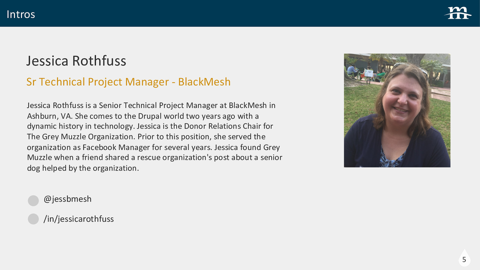
Intros Jessica Rothfuss Sr Technical Project Manager - BlackMesh Jessica Rothfuss is a Senior Technical Project Manager at BlackMesh in Ashburn, VA. She comes to the Drupal world two years ago with a dynamic history in technology. Jessica is the Donor Relations Chair for The Grey Muzzle Organization. Prior to this position, she served the organization as Facebook Manager for several years. Jessica found Grey Muzzle when a friend shared a rescue organization’s post about a senior dog helped by the organization. @jessbmesh /in/jessicarothfuss 5
Overview 1 About Grey Muzzle 2 Accessibility Considerations 3 Front End Development 4 Back End Development 6
About Grey Muzzle About Grey Muzzle
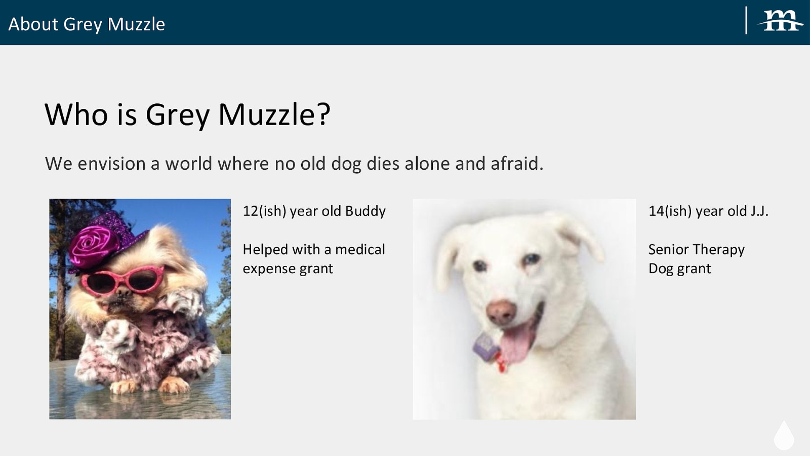
About Grey Muzzle Who is Grey Muzzle? We envision a world where no old dog dies alone and afraid. 12(ish) year old Buddy 14(ish) year old J.J. Helped with a medical expense grant Senior Therapy Dog grant
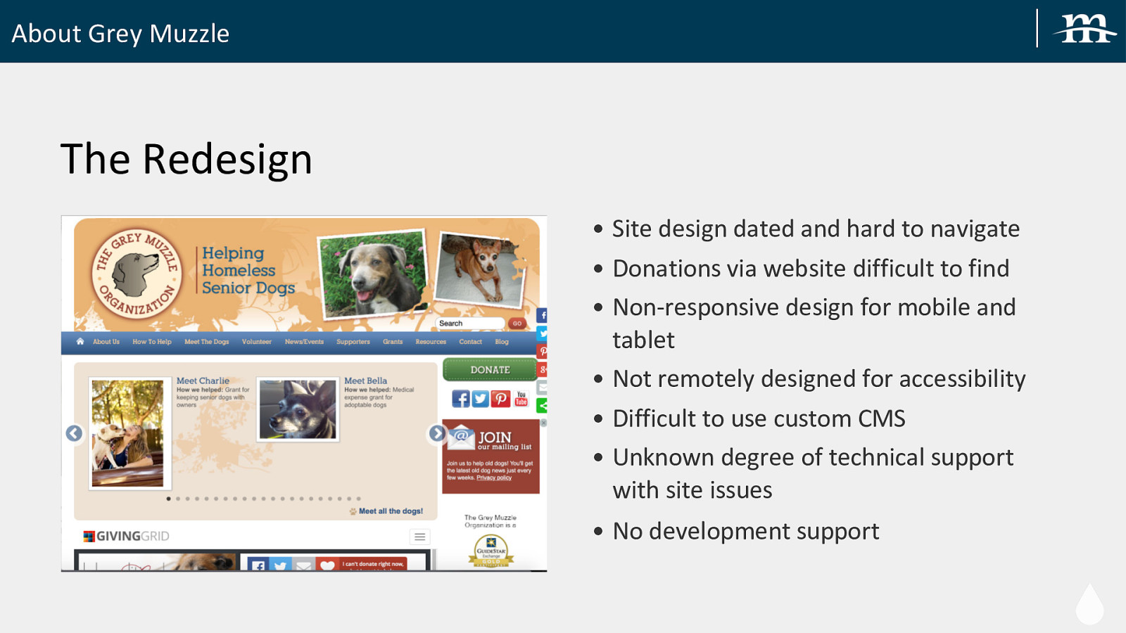
About Grey Muzzle The Redesign • Site design dated and hard to navigate • Donations via website difficult to find • Non-responsive design for mobile and tablet • Not remotely designed for accessibility • Difficult to use custom CMS • Unknown degree of technical support with site issues • No development support
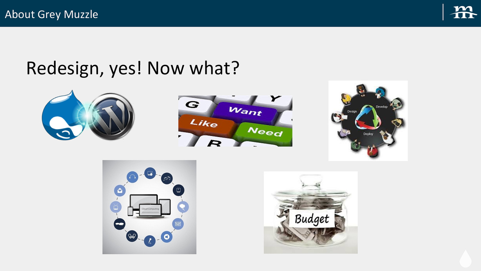
About Grey Muzzle Redesign, yes! Now what?

About Grey Muzzle Partners Found!
About Grey Muzzle Grey Muzzle Challenges • First time through web design process • Undefined requirements • Board approval & agreement could be time consuming • Competing priorities
Accessibility & Design Considerations Accessibility & Design Considerations
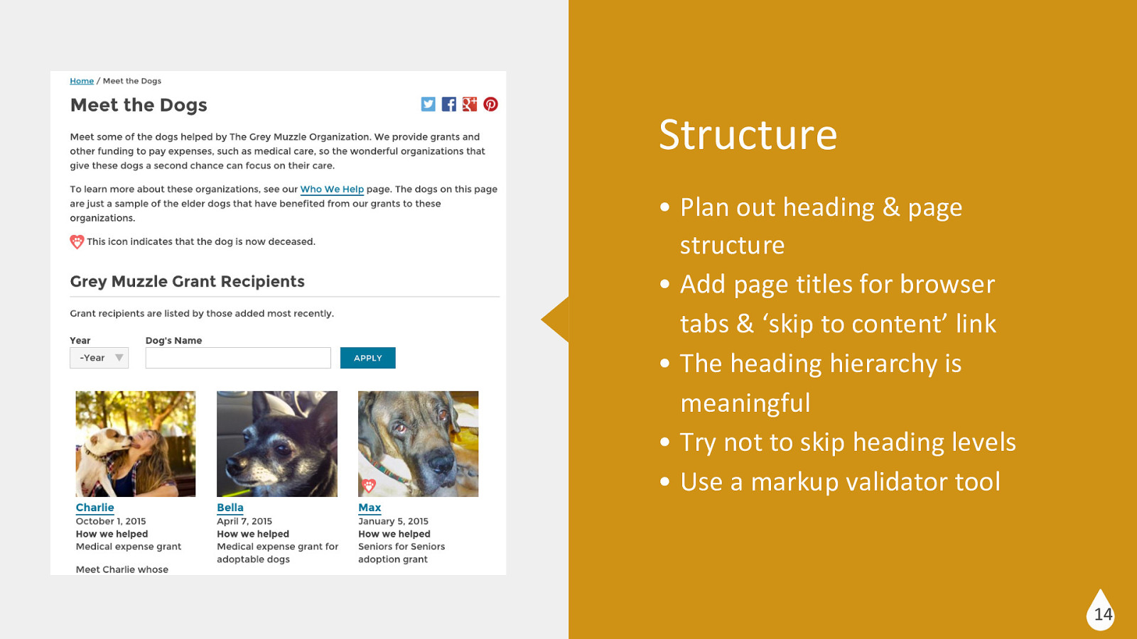
Structure • Plan out heading & page structure • Add page titles for browser tabs & ‘skip to content’ link • The heading hierarchy is meaningful • Try not to skip heading levels • Use a markup validator tool 14
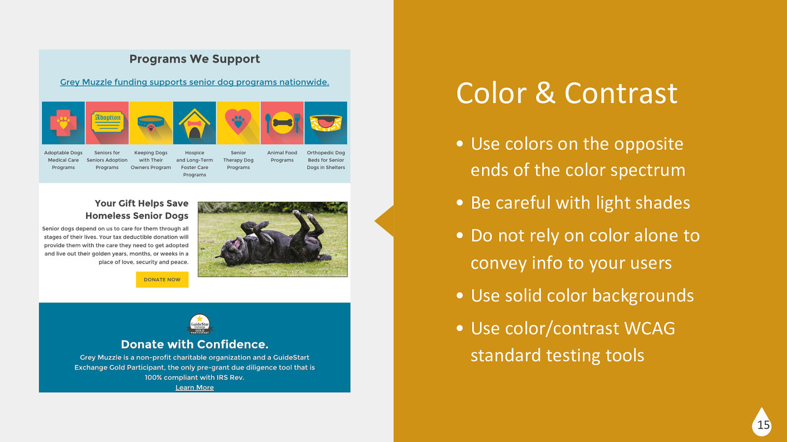
Color & Contrast • Use colors on the opposite ends of the color spectrum • Be careful with light shades • Do not rely on color alone to convey info to your users • Use solid color backgrounds • Use color/contrast WCAG standard testing tools 15
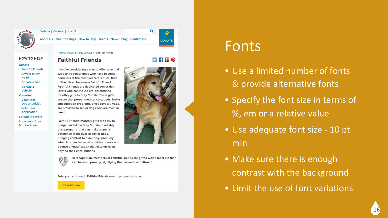
Fonts • Use a limited number of fonts & provide alternative fonts • Specify the font size in terms of %, em or a relative value • Use adequate font size - 10 pt min • Make sure there is enough contrast with the background • Limit the use of font variations 16
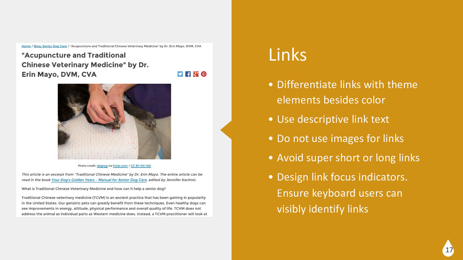
Links • Differentiate links with theme elements besides color • Use descriptive link text • Do not use images for links • Avoid super short or long links • Design link focus indicators. Ensure keyboard users can visibly identify links 17
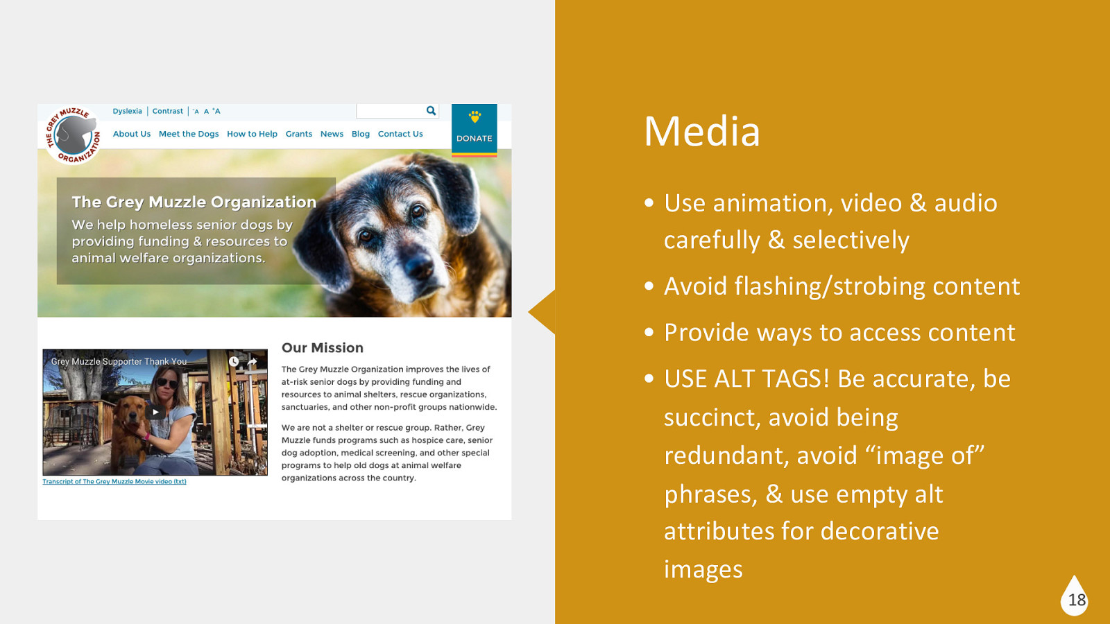
Media • Use animation, video & audio carefully & selectively • Avoid flashing/strobing content • Provide ways to access content • USE ALT TAGS! Be accurate, be succinct, avoid being redundant, avoid “image of” phrases, & use empty alt attributes for decorative images 18
Front End Development Front End Development
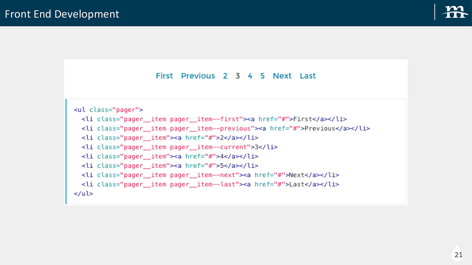
Front End Development Theme Driven Development KSS-Node Style Guide 20
Front End Development 21
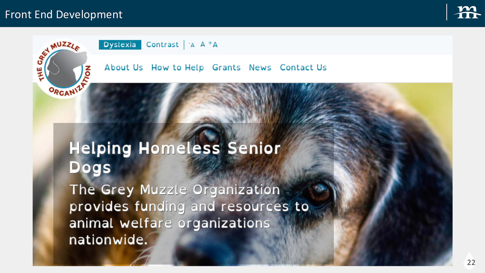
Front End Development 22
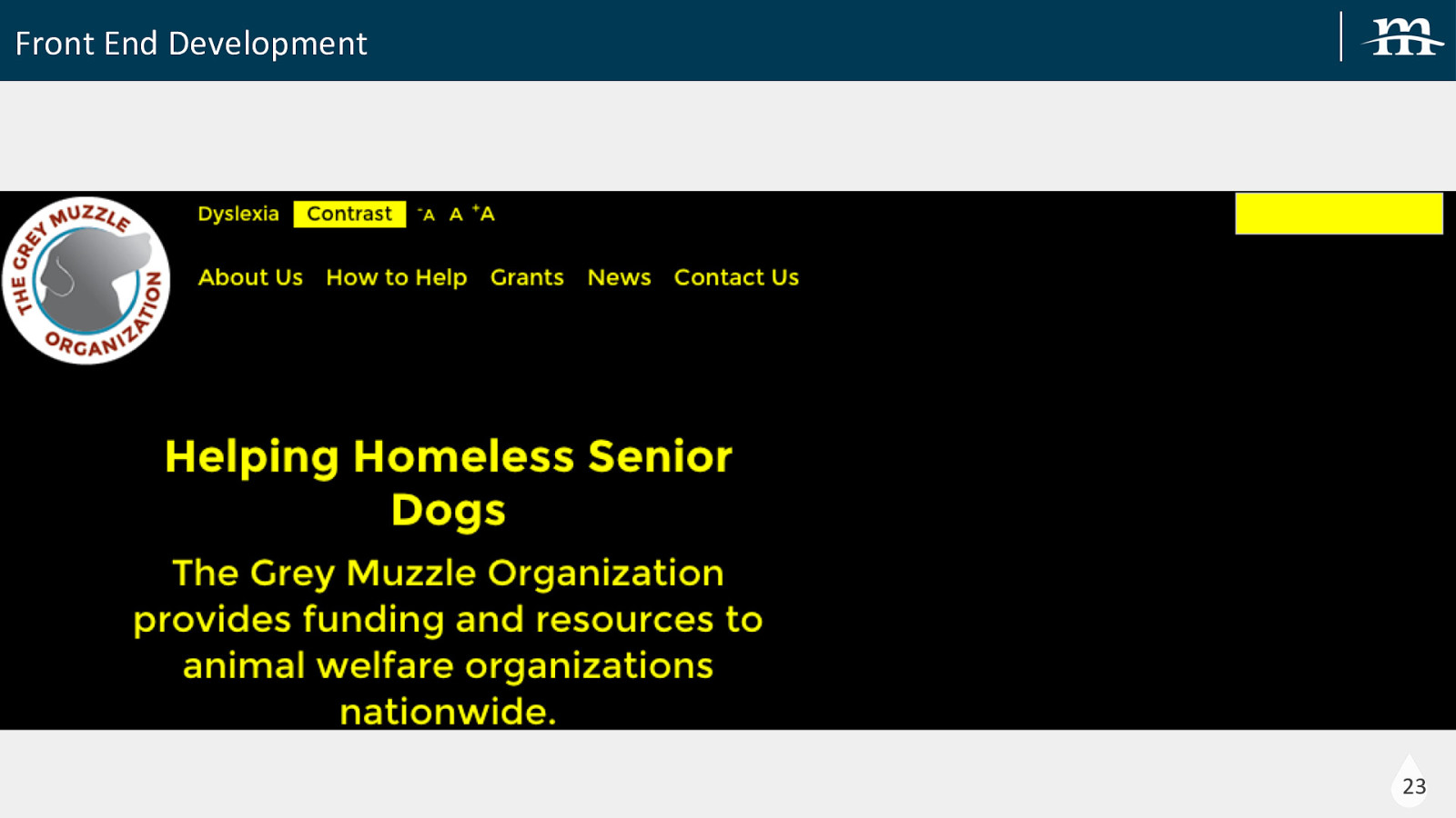
Front End Development 23
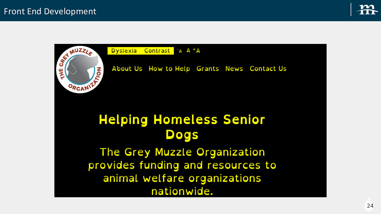
Front End Development 24
Front End Development Some Considerations Alt Text: Ensure your images use alternate text that describe the purpose of the image Semantic HTML Markup: Use proper HTML markups vs using CSS to style elements to look like markup (h1-h6) Skip Links: Helpful to provide jump links to allow visitors to jump through an entire menu into the main content Specify a language: Useful for screen readers (<html lang=”en”>….</html>) Use of ARIA: Defines a set of attributes that can be associated with elements to help assistive technologies interpret markup the right way. These attributes tell assistive technologies like screen readers the actual purpose of using those tags (i.e. <ul role=”menu”>…</ul>) Accessibility Developer Tool: Chrome Extension 25
Back End Development Back End Development
Back End Development Contributed Modules Accessible Mega Menu: used for the main menu of the site. This module integrates Adobe’s Accessible Mega Menu into Drupal. It does not all the features of a WAI-AIRA menu, but did allow users to tab through just the parent level menu items and expand and access the child level items only when desired Text Resize: for text resize capabilities. Browser zoom is better than nothing but it often adds a horizontal scroll to a page that is difficult for users with low vision. Add to Any: social share buttons. We tried other major social share buttons and none were remotely accessible without a major rewrite. Either the buttons weren’t navigable with a keyboard or the popup windows weren’t accessible or a combination of these 27
Back End Development Contributed Modules (cont.) Accessible Forms: great module that helped with better accessibility in Drupal forms. This module does 3 things: • Changes the required attribute from required=”true” to just required • Adds required label to required fields (instead of asterisk *) • Adds aria-invalid to form fields with errors 28
Back End Development Making the Output More Accessible • Overriding template (tpl.php) files • Using preprocess functions in our theme folder • Overriding Views output by excluding fields from display and then add markup with the appropriate fields to one custom text field • Updated: menu blocks, keyboard navigation, forms, accessibility toolbar, alt text, etc 29
Thank you! @Mediacurrent slideshare.net/mediacurrent Mediacurrent.com