SUPPORTING SUPPORTING MIDDLE-OUT MIDDLE-OUT IN CSS IN CSS 18 APRIL, 2016 18 APRIL, 2016 LONDON WEB STANDARDS LONDON WEB STANDARDS BY CHRIS BURNELL BY CHRIS BURNELL 1

A presentation at London Web Standards - Animation Chats in April 2016 in London, UK by Chris Burnell
SUPPORTING SUPPORTING MIDDLE-OUT MIDDLE-OUT IN CSS IN CSS 18 APRIL, 2016 18 APRIL, 2016 LONDON WEB STANDARDS LONDON WEB STANDARDS BY CHRIS BURNELL BY CHRIS BURNELL 1
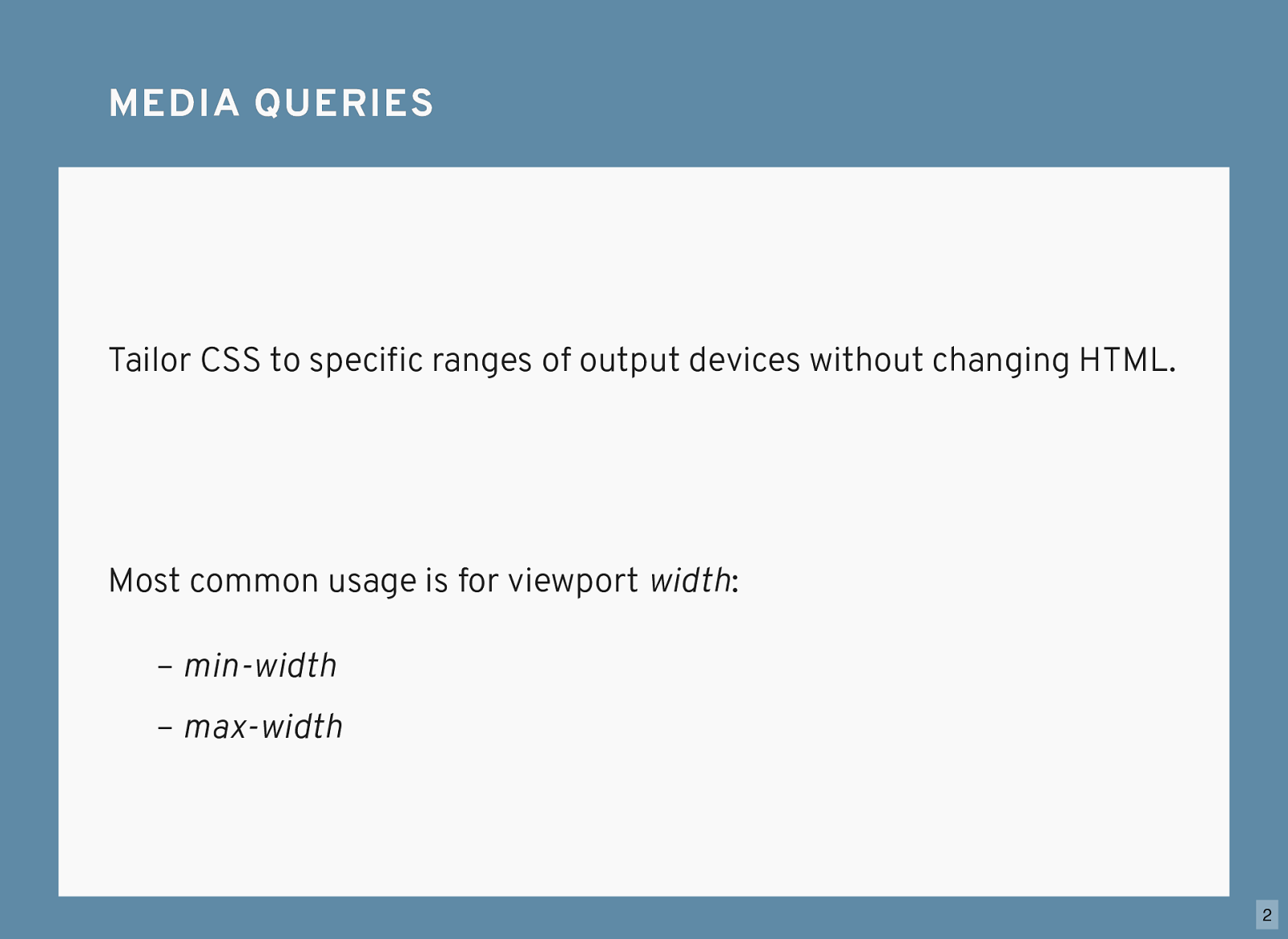
Tailor CSS to specific ranges of output devices without changing HTML. MEDIA QUERIES MEDIA QUERIES Most common usage is for viewport width : – max-width – min-width 2
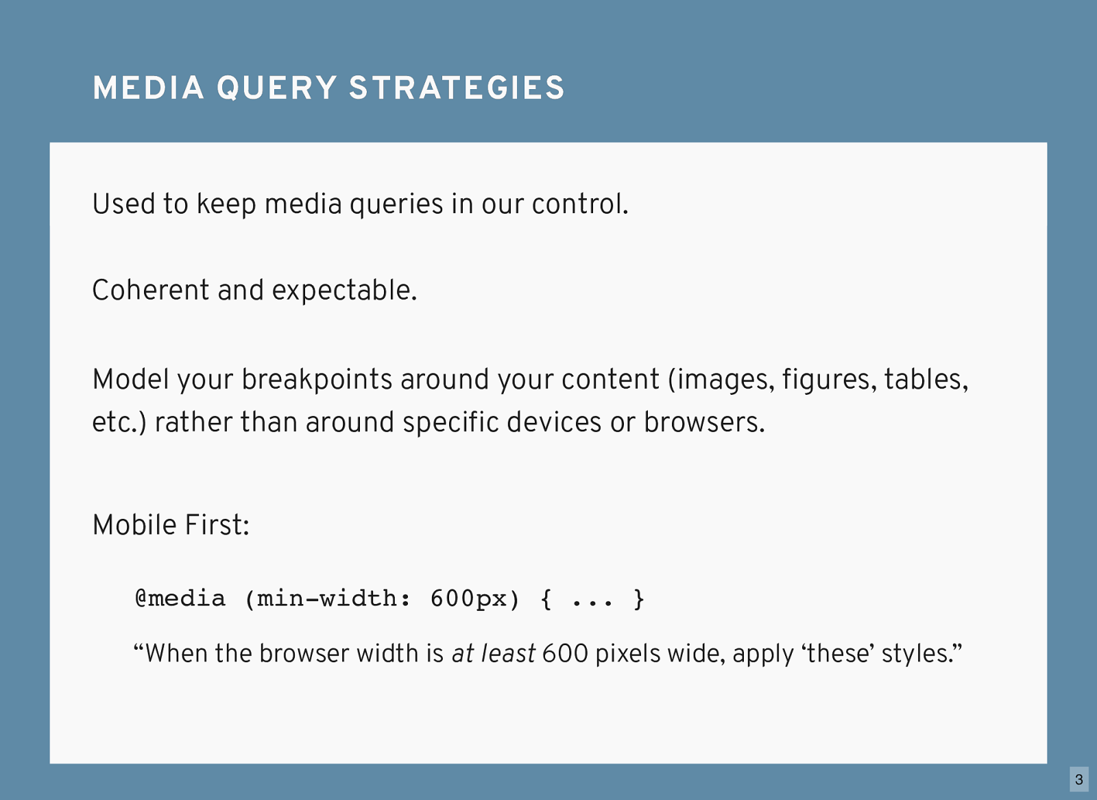
#1. Don’t spell it media quer y s. MEDIA QUERY STRATEGIES MEDIA QUERY STRATEGIES Used to keep media queries in our control. Coherent and expectable. @media (min-width: 600px) { ... } “When the browser width is at least 600 pixels wide, apply ‘these’ styles.” Mobile First: Model your breakpoints around your content (images, figures, tables, etc.) rather than around specific devices or browsers. 3
MOBILE FIRST EXAMPLE - CSS MOBILE FIRST EXAMPLE - CSS
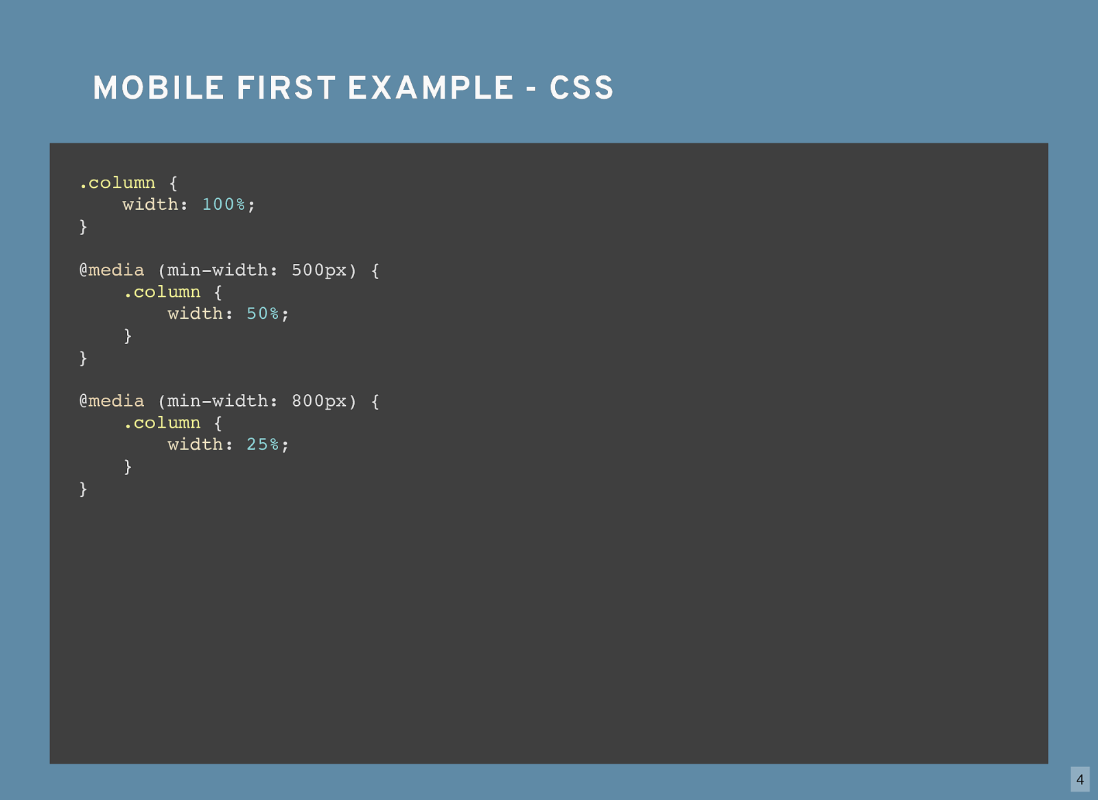
.column {
width : 100% ; }
.column {
width : 100% ; } @ media (min-width: 500px) {
.column {
width : 50% ; } }
.column {
width : 100% ; } @ media (min-width: 500px) {
.column {
width : 50% ; } } @ media (min-width: 800px) {
.column {
width : 25% ; } } 4
Is there a performance impact from writing poor media queries? PERFORMANCE PERFORMANCE Not really. Compared to a beefy Javascript framework or a couple of images? Bottom line is file size. Then why bother writing intelligent media queries? What benefits are there? Let’s look at an example: 5
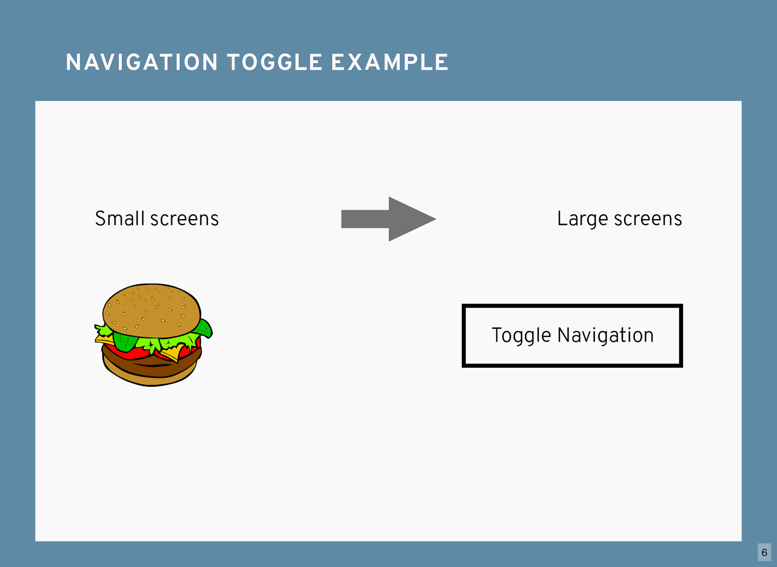
NAVIGATION TOGGLE EXAMPLE NAVIGATION TOGGLE EXAMPLE Small screens Large screens Toggle Navigation 6
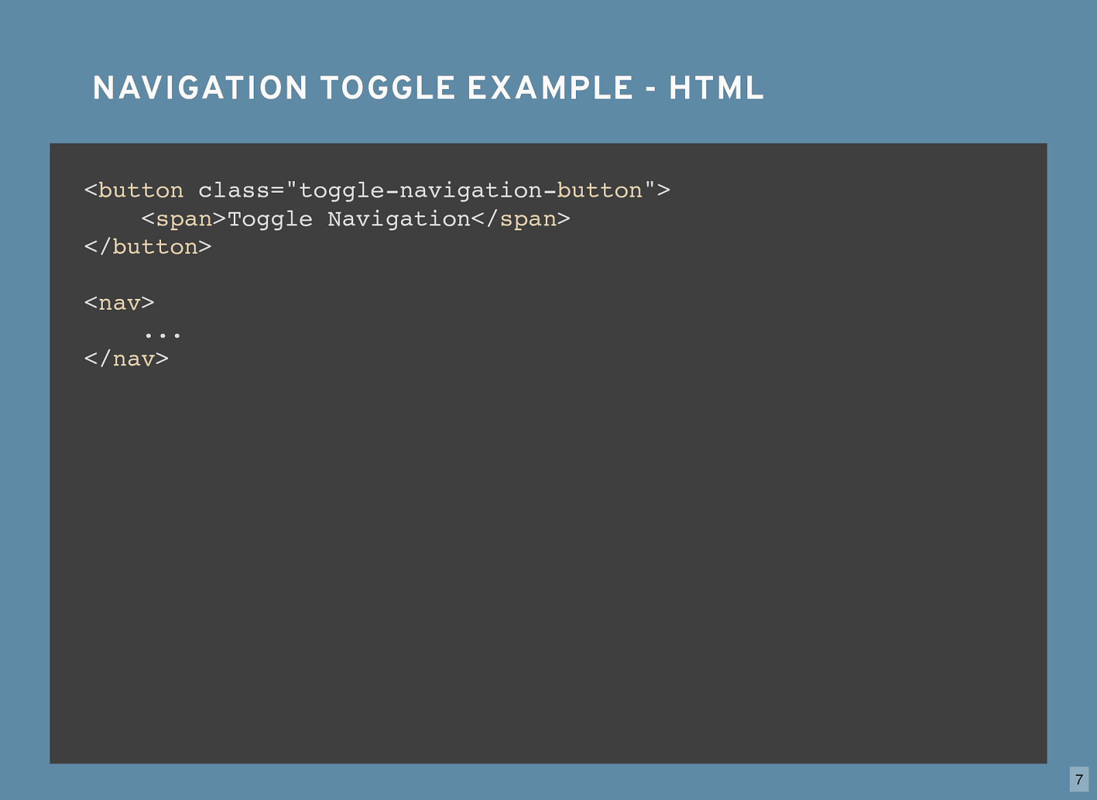
NAVIGATION TOGGLE EXAMPLE - HTML NAVIGATION TOGGLE EXAMPLE - HTML < button class="toggle-navigation- button "> < span
Toggle Navigation</ span
</ button
< nav
...
</ nav
7

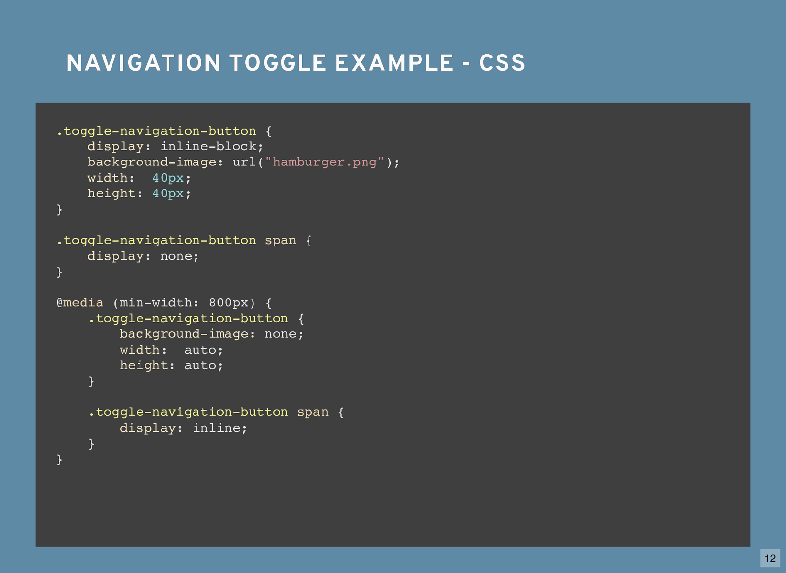
NAVIGATION TOGGLE EXAMPLE - CSS NAVIGATION TOGGLE EXAMPLE - CSS
.toggle-navigation-button {
display : inline-block; }
.toggle-navigation-button {
display : inline-block;
background-image : url( "hamburger.png" );
width
:
40px
;
height : 40px ; }
.toggle-navigation-button {
display : inline-block;
background-image : url( "hamburger.png" );
width
:
40px
;
height : 40px ; }
.toggle-navigation-button
span {
display : none; }
.toggle-navigation-button {
display : inline-block;
background-image : url( "hamburger.png" );
width
:
40px
;
height : 40px ; }
.toggle-navigation-button
span {
display : none; } @ media (min-width: 800px) { }
.toggle-navigation-button {
display : inline-block;
background-image : url( "hamburger.png" );
width
:
40px
;
height : 40px ; }
.toggle-navigation-button
span {
display : none; } @ media (min-width: 800px) {
.toggle-navigation-button {
background-image : none;
width : auto;
height : auto; } }
.toggle-navigation-button {
display : inline-block;
background-image : url( "hamburger.png" );
width
:
40px
;
height : 40px ; }
.toggle-navigation-button
span {
display : none; } @ media (min-width: 800px) {
.toggle-navigation-button {
background-image : none;
width : auto;
height : auto; }
.toggle-navigation-button
span {
display : inline; } } 8
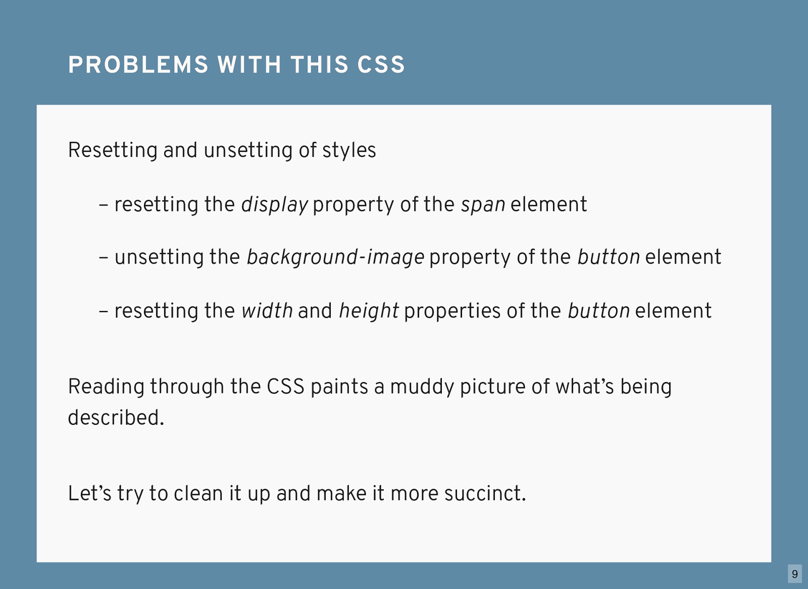
Resetting and unsetting of styles PROBLEMS WITH THIS CSS PROBLEMS WITH THIS CSS Reading through the CSS paints a muddy picture of what’s being described. – resetting the display property of the span element – unsetting the background-image property of the button element – resetting the width and height properties of the button element Let’s try to clean it up and make it more succinct. 9
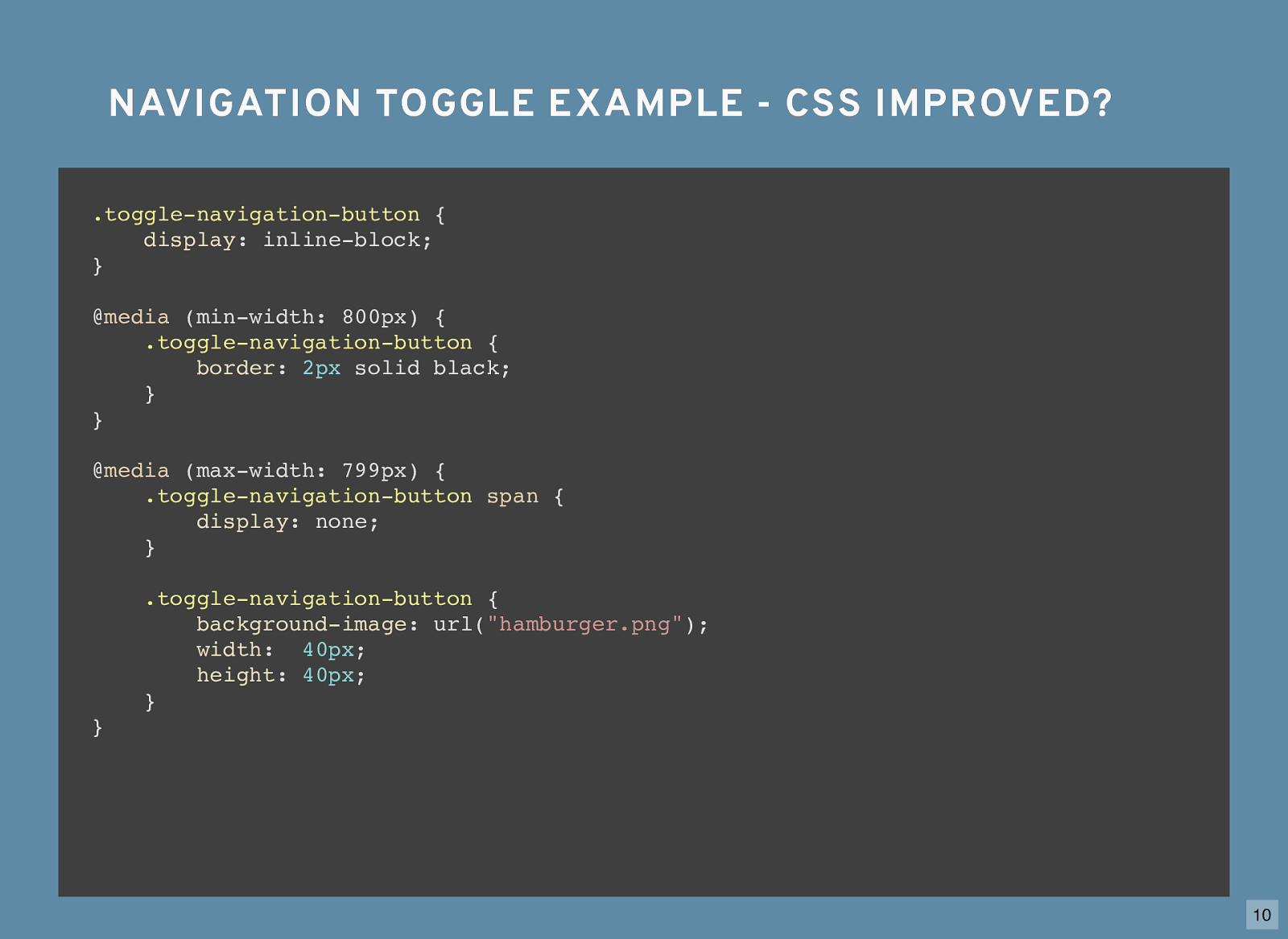
NAVIGATION TOGGLE EXAMPLE - CSS IMPROVED? NAVIGATION TOGGLE EXAMPLE - CSS IMPROVED?
.toggle-navigation-button {
display : inline-block; }
.toggle-navigation-button {
display : inline-block; } @ media (min-width: 800px) { }
.toggle-navigation-button {
display : inline-block; } @ media (min-width: 800px) {
.toggle-navigation-button {
border : 2px solid black; } }
.toggle-navigation-button {
display : inline-block; } @ media (min-width: 800px) {
.toggle-navigation-button {
border : 2px solid black; } } @ media (max-width: 799px) { }
.toggle-navigation-button {
display : inline-block; } @ media (min-width: 800px) {
.toggle-navigation-button {
border : 2px solid black; } } @ media (max-width: 799px) {
.toggle-navigation-button
span {
display : none; } }
.toggle-navigation-button {
display : inline-block; } @ media (min-width: 800px) {
.toggle-navigation-button {
border : 2px solid black; } } @ media (max-width: 799px) {
.toggle-navigation-button
span {
display : none; }
.toggle-navigation-button {
background-image : url( "hamburger.png" );
width
:
40px
;
height : 40px ; } } 10
When the end-result of our CSS is the same as far as the end-user is concerned, we benefit . SO WHO BENEFITS? SO WHO BENEFITS? Consider describing the two approaches to the same CSS styles out loud, as you might scan it in your head. 11
NAVIGATION TOGGLE EXAMPLE - CSS NAVIGATION TOGGLE EXAMPLE - CSS
.toggle-navigation-button {
display : inline-block;
background-image : url( "hamburger.png" );
width
:
40px
;
height : 40px ; }
.toggle-navigation-button
span {
display : none; } @ media (min-width: 800px) {
.toggle-navigation-button {
background-image : none;
width : auto;
height : auto; }
.toggle-navigation-button
span {
display : inline; } } 12

NAVIGATION TOGGLE EXAMPLE - CSS IMPROVED? NAVIGATION TOGGLE EXAMPLE - CSS IMPROVED?
.toggle-navigation-button {
display : inline-block; } @ media (min-width: 800px) {
.toggle-navigation-button {
border : 2px solid black; } } @ media (max-width: 799px) {
.toggle-navigation-button
span {
display : none; }
.toggle-navigation-button {
background-image : url( "hamburger.png" );
width
:
40px
;
height : 40px ; } } 13
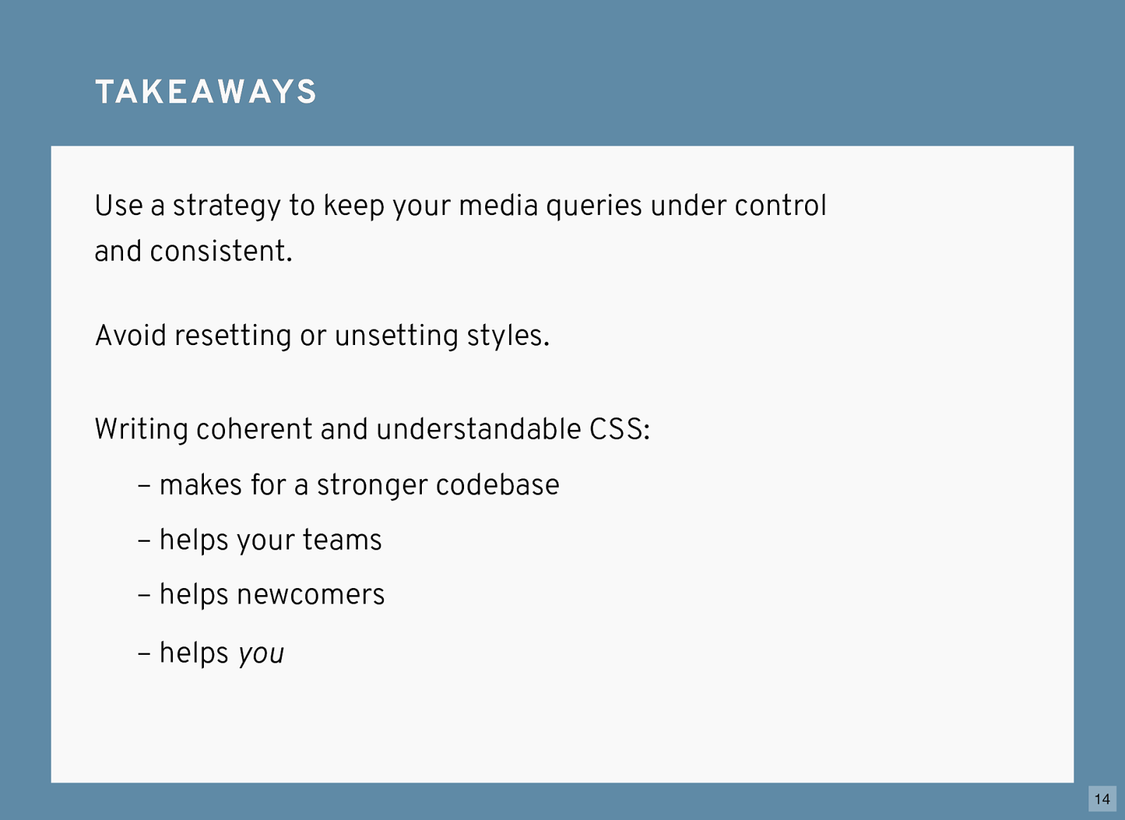
TA K E A W AY S TA K E A W AY S Use a strategy to keep your media queries under control and consistent. Writing coherent and understandable CSS: – makes for a stronger codebase – helps your teams – helps newcomers – helps you Avoid resetting or unsetting styles. 14
THANKS! THANKS! CHRIS BURNELL CHRIS BURNELL @iamchrisburnell chrisburnell.com 15