Making A Strong Case For Accessibility
by Todd Libby, @toddlibby
A presentation at #a11yTO Conf in October 2021 in by Todd Libby
by Todd Libby, @toddlibby
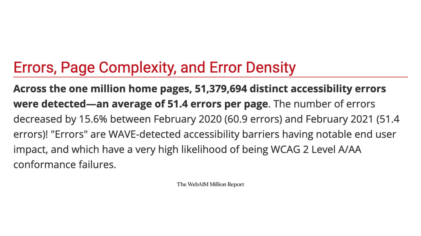
The WebAIM Million Report, Across the one million home pages, over 51 million distinct accessibility errors were detected—an average of 51.4 errors per page.
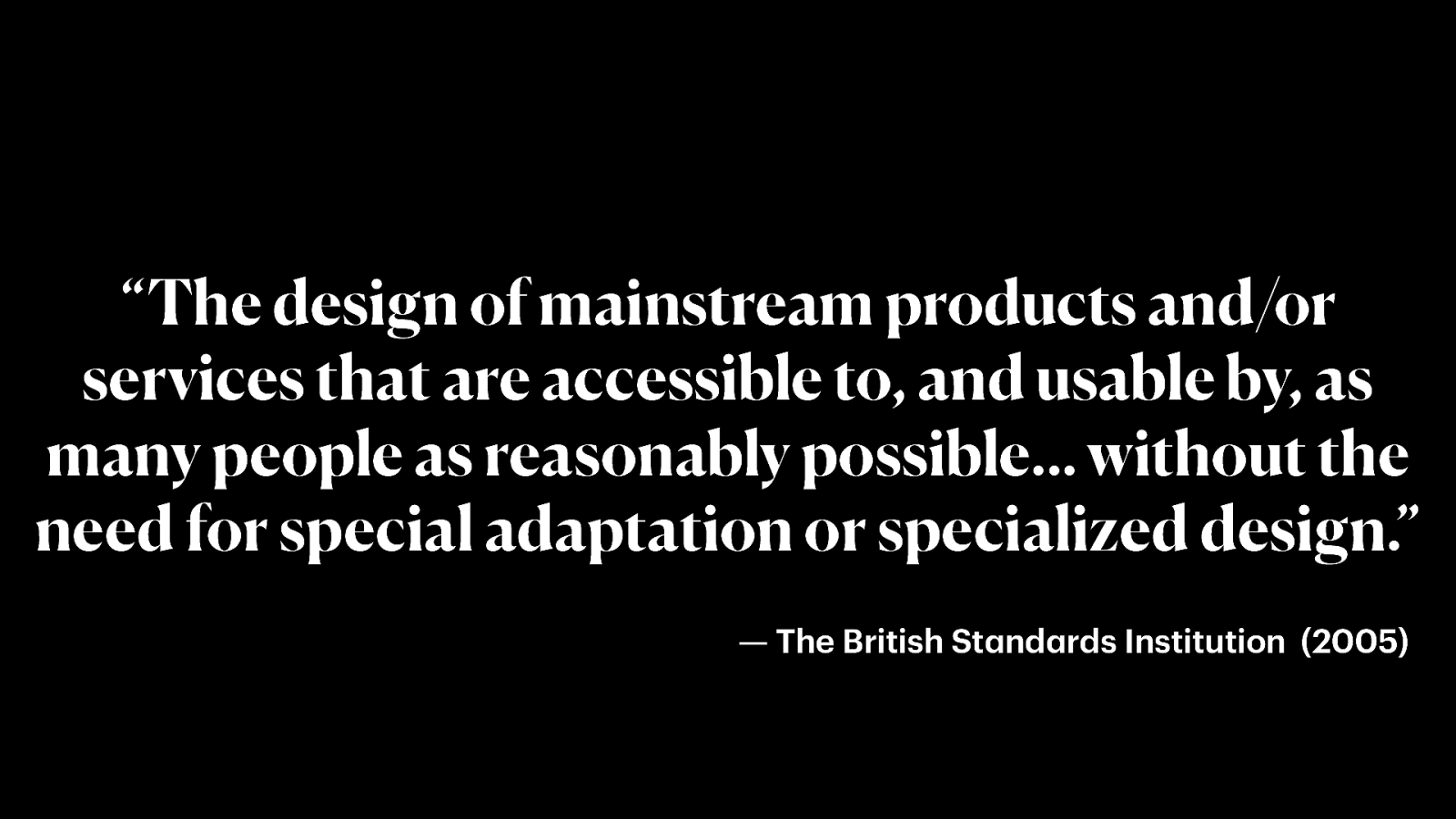
Black background with white text that reads, “The design of mainstream products and/or services that are accessible to, and usable by, as many people as reasonably possible… without the need for special adaptation or specialized design.” — The British Standards Institution (2005)
A paint palette with different colors of paint and a paintbrush laying on the side
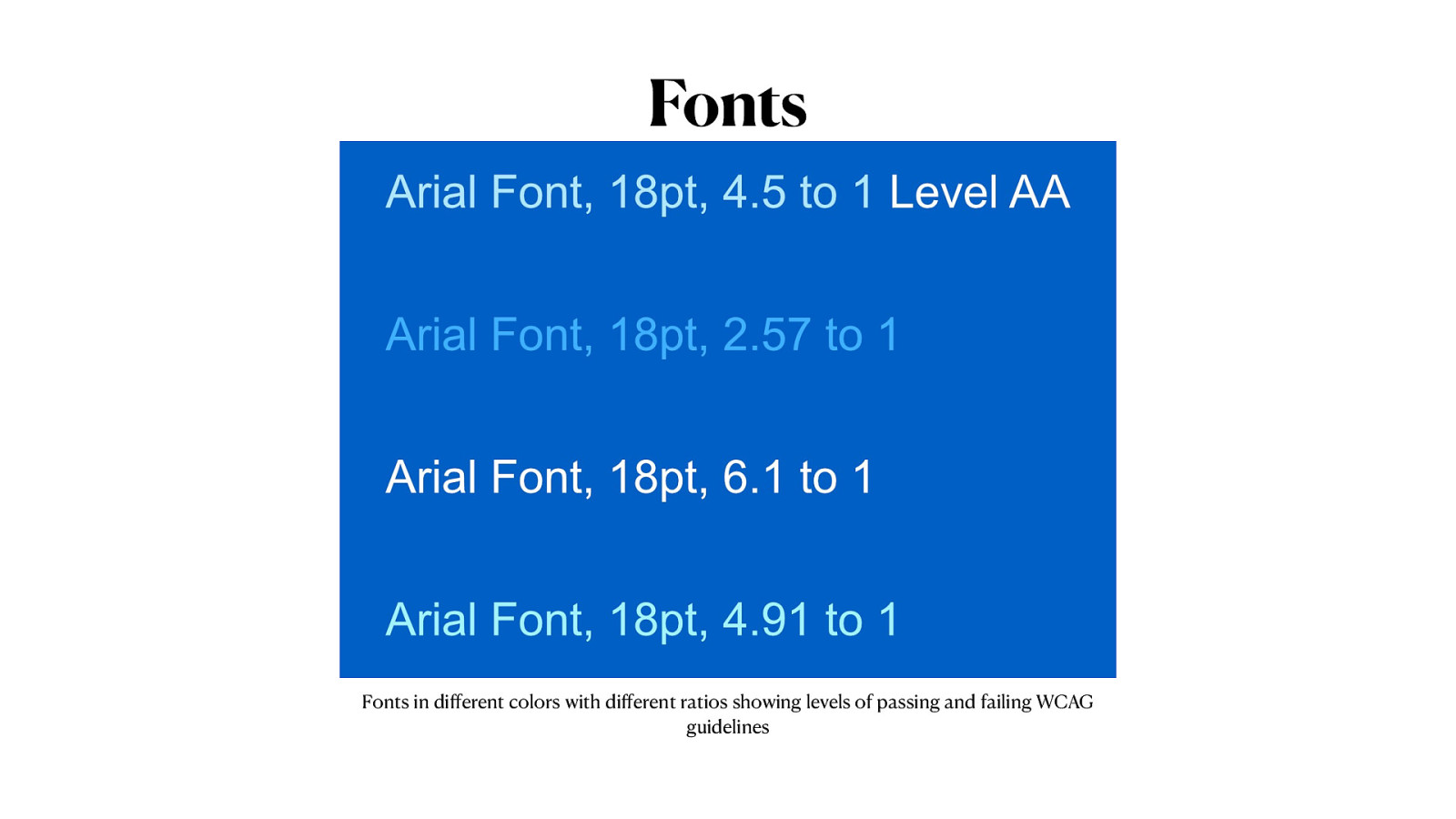
Fonts in different colors with different ratios showing levels of passing and failing WCAG guidelines
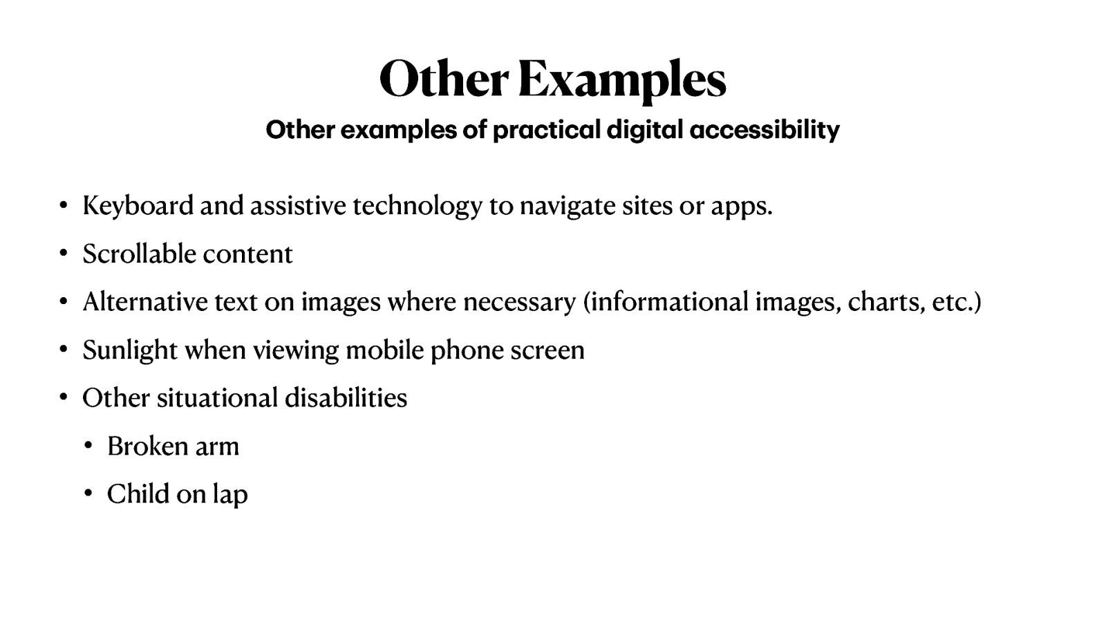
Keyboard and assistive technology to navigate sites or apps.
Scrollable content.
Alternative text on images where necessary (informational images, charts, etc.)
Sunlight when viewing mobile phone screen.
Other situational disabilities. Broken arm, Child on lap.
Black background with white text that reads;
“The client doesn’t have the budget for it.”
“We’ll get to it after launch.”
Once you have stakeholder support, then you may see support trickle down to managers, then teams, and then individuals.
“You’ll be saving the company a lot of money when you do this from the start. When maintenance is needed, it won’t take the team as long to maintain the code because of accessibility and clean code.”
Cite instances from the lawsuits that have been won against Target, Bank of America, Domino’s Pizza, and others.
Live testing with disabled users are also another way to get buy-in across the board.
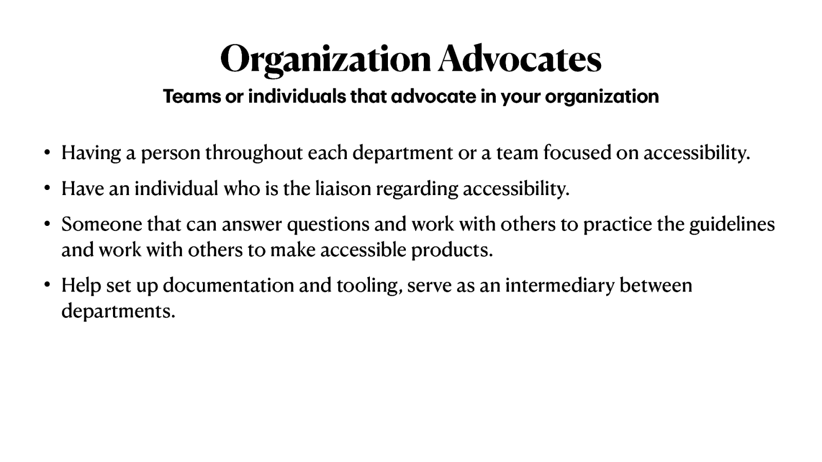
Have an individual who is the liaison regarding accessibility.
Someone that can answer questions and work with others to practice the guidelines and work with others to make accessible products.
Help set up documentation and tooling, serve as an intermediary between departments.
Having a person throughout each department or a team focused on accessibility.
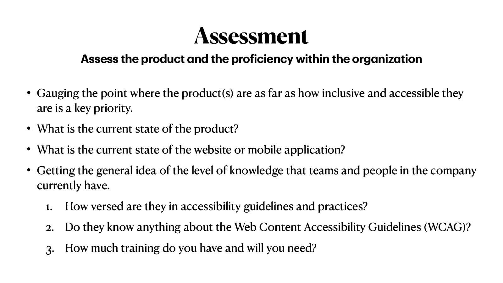
Gauging the point where the product(s) are as far as how inclusive and accessible they are is a key priority.
What is the current state of the product?
What is the current state of the website or mobile application?
Getting the general idea of the level of knowledge that teams and people in the company currently have.
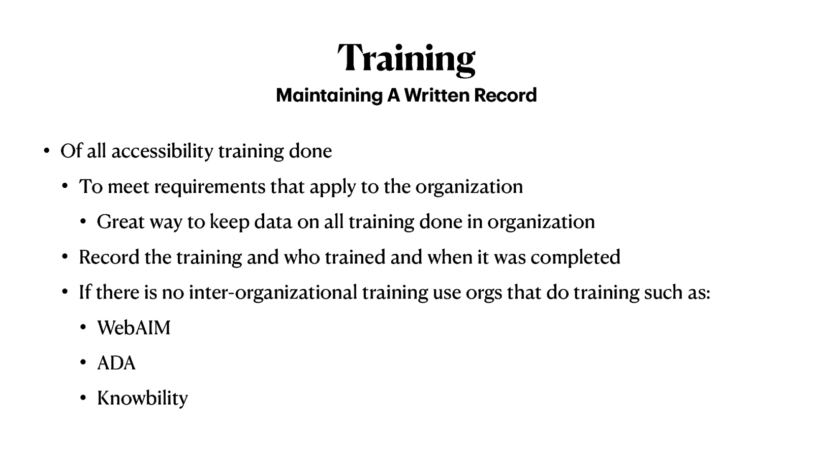
Of all accessibility training done
— Great way to keep data on all training done in organization.
If there is no inter-organizational training use orgs that do training such as:
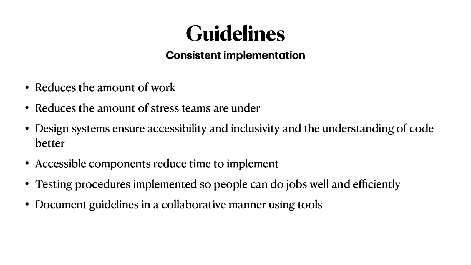
Reduces the amount of work.
Reduces the amount of stress teams are under.
Design systems ensure accessibility and inclusivity and the understanding of code better.
Accessible components reduce time to implement.
Testing procedures implemented so people can do jobs well and efficiently.
Document guidelines in a collaborative manner using tools
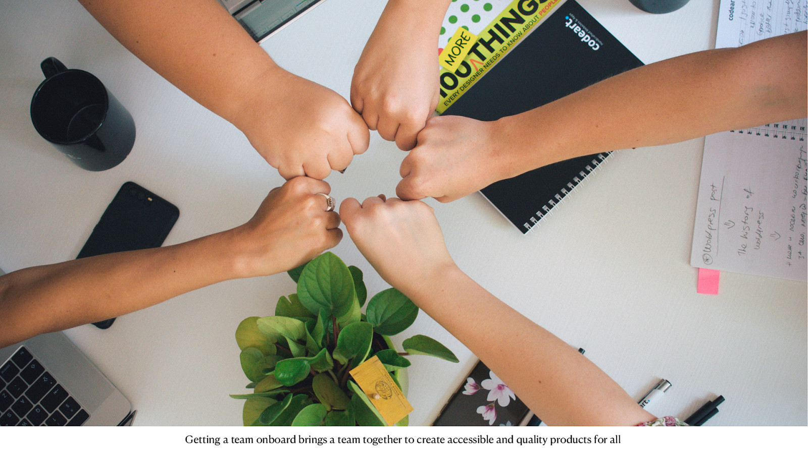
A slide showing a group of five arms with fists giving each other a fist bump.
Getting a team onboard brings a team together to create accessible and quality products for all.

A slide showing a gavel.
Sharing the importance of rules
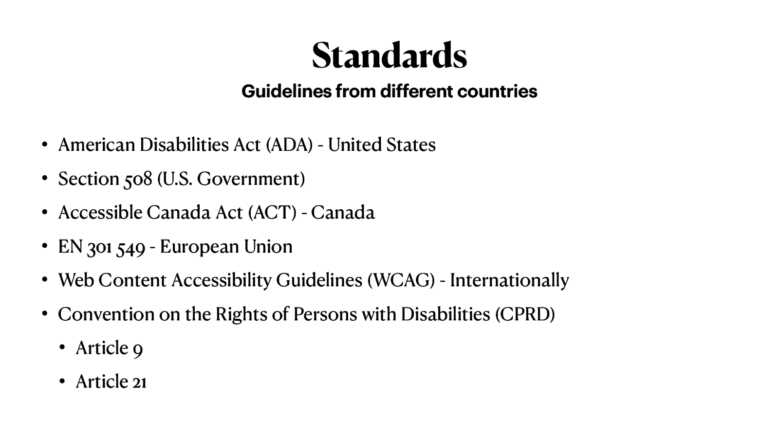
American Disabilities Act (ADA) - United States
Section 508 (U.S. Government)
Accessible Canada Act (ACA) - Canada
EN 301 549 - European Union
Web Content Accessibility Guidelines (WCAG) - Internationally
Convention on the Rights of Persons with Disabilities (CPRD)
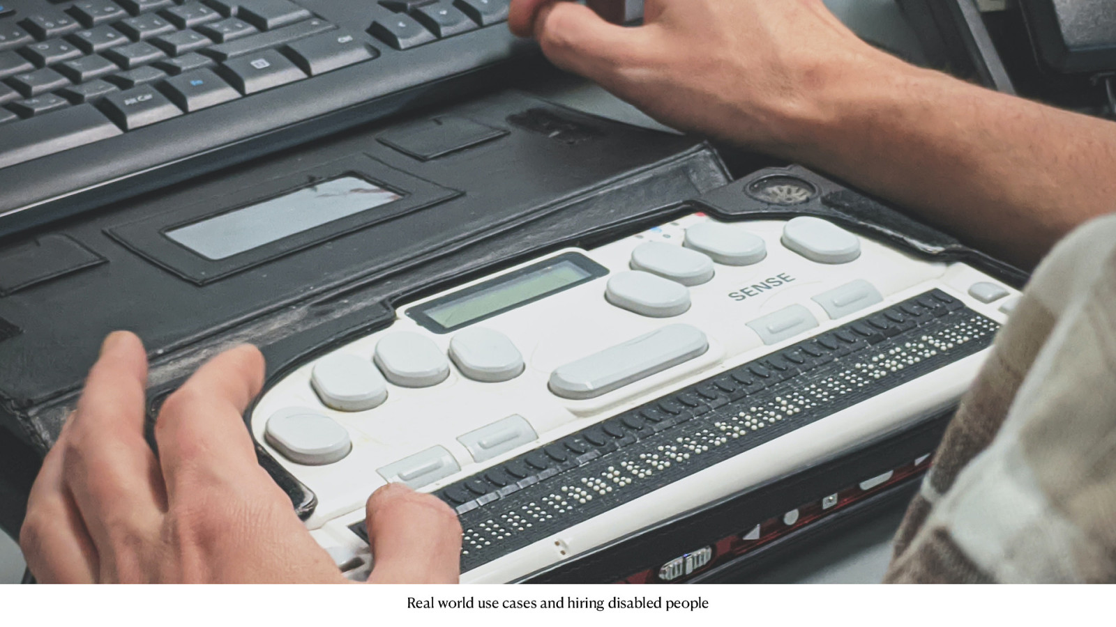
A slide showing a user using a Braille machine
Real world use cases and hiring disabled people
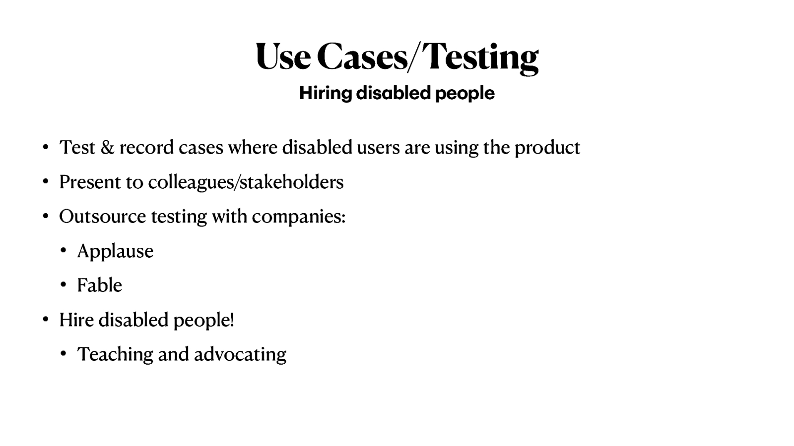
Test & record cases where disabled users are using the product
Present to colleagues/stakeholders Outsource testing with companies: -Applause -Fable
Hire disabled people!
Teaching and advocating
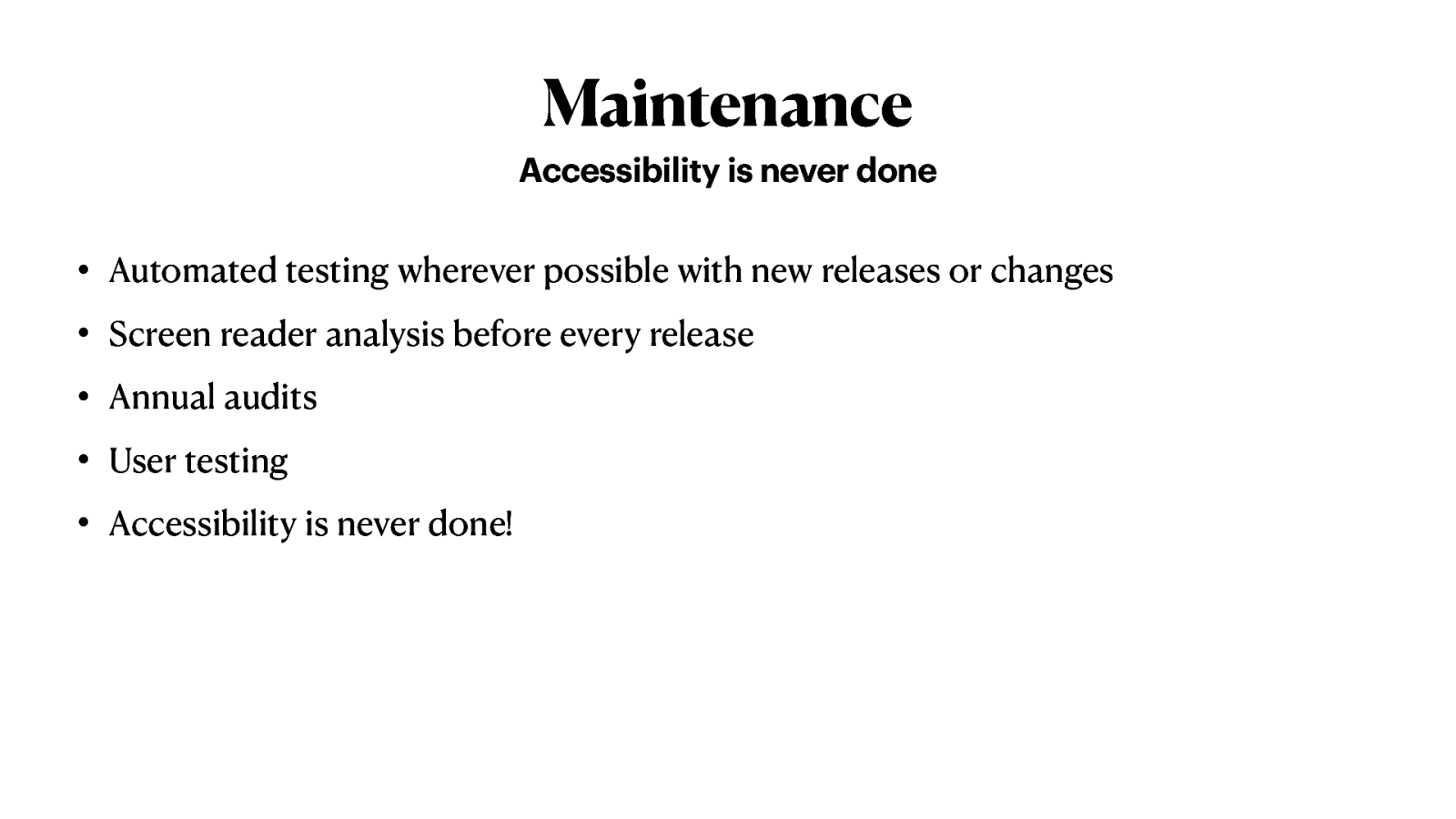
Automated testing wherever possible with new releases or changes
Screen reader analysis before every release
Annual audits
User testing
Accessibility is never done!
A red background with white text that reads, “A11y is a right. NOT a privilege.”
Todd Libby eating a lobster roll looking at the camera with a bit of surprise.
Thank you! @toddlibby