WEB CONTENT ACCESSIBILITY GUIDELINES(WCAG) COLOR CONTRAST

A presentation at Various Talks in December 2021 in by Todd Libby
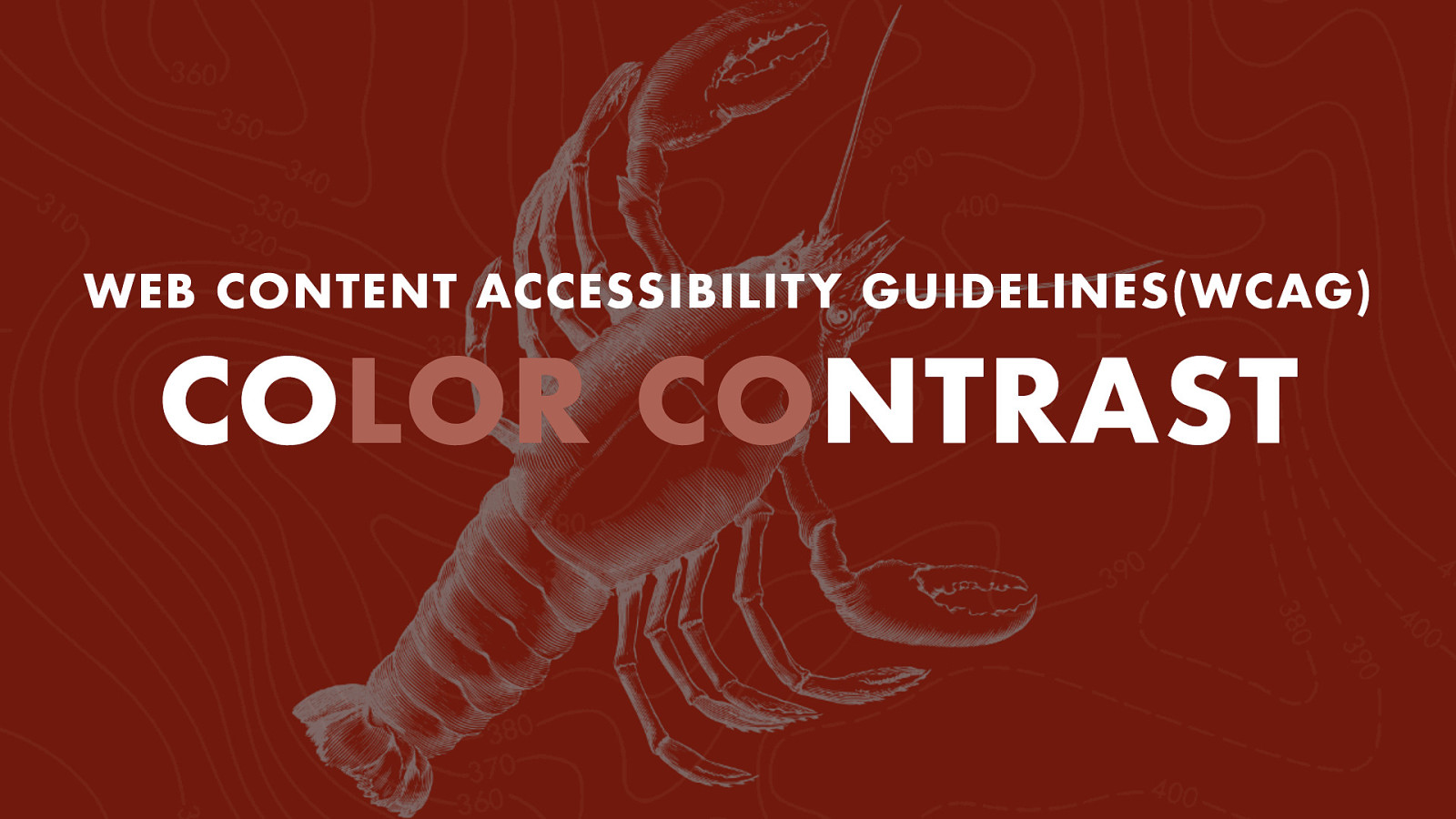
WEB CONTENT ACCESSIBILITY GUIDELINES(WCAG) COLOR CONTRAST
WCAG LEVELS OF CONFORMANCE A - AA - AAA
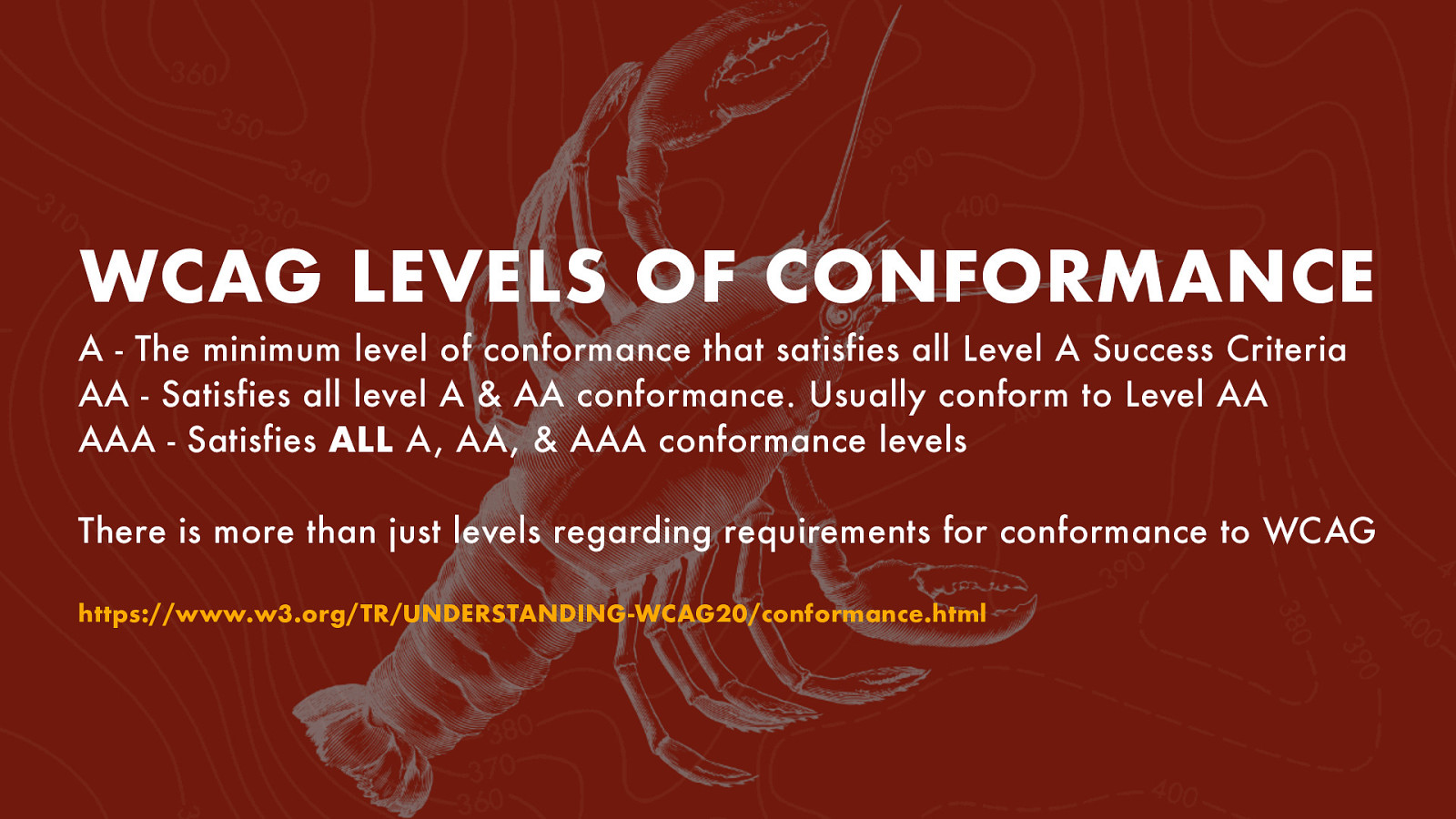
WCAG LEVELS OF CONFORMANCE A - The minimum level of conformance that satisfies all Level A Success Criteria AA - Satisfies all level A & AA conformance. Usually conform to Level AA AAA - Satisfies ALL A, AA, & AAA conformance levels There is more than just levels regarding requirements for conformance to WCAG https://www.w3.org/TR/UNDERSTANDING-WCAG20/conformance.html
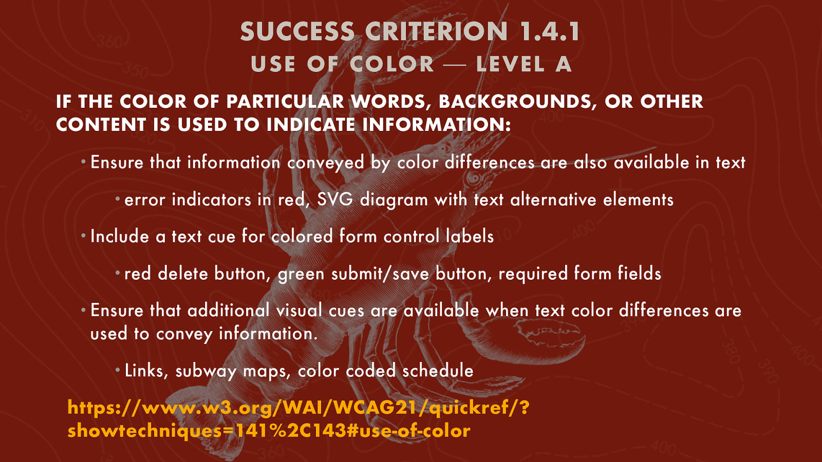
SUCCESS CRITERION 1.4.1 USE OF C OLOR ⎯ LEVEL A IF THE COLOR OF PARTICULAR WORDS, BACKGROUNDS, OR OTHER CONTENT IS USED TO INDICATE INFORMATION: • Ensure that information conveyed by color differences are also available in text • error • Include • red indicators in red, SVG diagram with text alternative elements a text cue for colored form control labels delete button, green submit/save button, required form fields • Ensure that additional visual cues are available when text color differences are used to convey information. • Links, subway maps, color coded schedule https://www.w3.org/WAI/WCAG21/quickref/? showtechniques=141%2C143#use-of-color
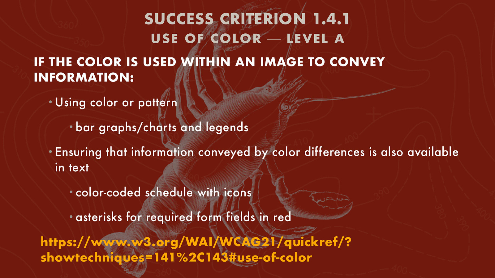
SUCCESS CRITERION 1.4.1 USE OF C OLOR ⎯ LEVEL A IF THE COLOR IS USED WITHIN AN IMAGE TO CONVEY INFORMATION: • Using color or pattern • bar graphs/charts and legends • Ensuring that information conveyed by color differences is also available in text • color-coded • asterisks schedule with icons for required form fields in red https://www.w3.org/WAI/WCAG21/quickref/? showtechniques=141%2C143#use-of-color
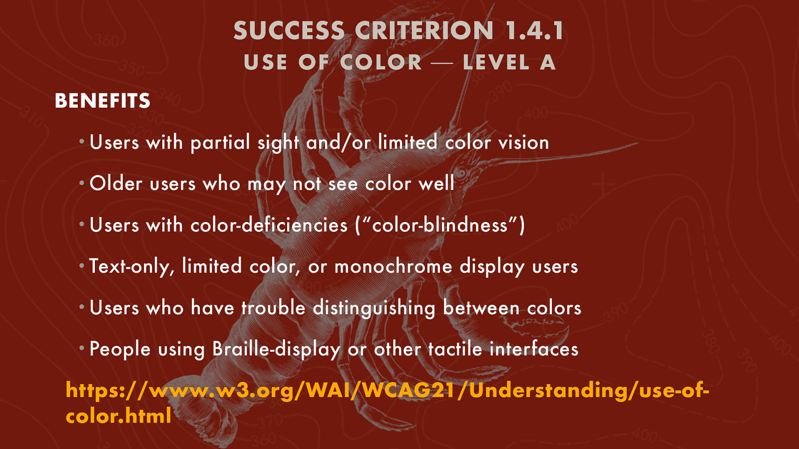
SUCCESS CRITERION 1.4.1 USE OF C OLOR ⎯ LEVEL A BENEFITS • Users with partial sight and/or limited color vision • Older users who may not see color well • Users with color-deficiencies (“color-blindness”) • Text-only, • Users limited color, or monochrome display users who have trouble distinguishing between colors • People using Braille-display or other tactile interfaces https://www.w3.org/WAI/WCAG21/Understanding/use-ofcolor.html
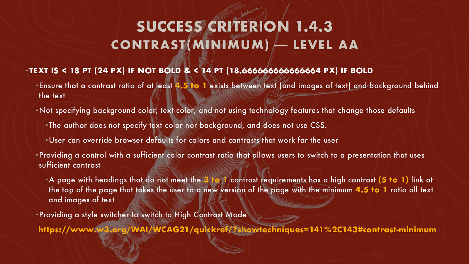
SUCCESS CRITERION 1.4.3 C ONTRAST(MINIMUM) ⎯ LEVEL AA •TEXT IS < 18 PT (24 PX) IF NOT BOLD & < 14 PT (18.666666666666664 PX) IF BOLD •Ensure that a contrast ratio of at least 4.5 to 1 exists between text (and images of text) and background behind the text •Not specifying background color, text color, and not using technology features that change those defaults •The author does not specify text color nor background, and does not use CSS. •User can override browser defaults for colors and contrasts that work for the user •Providing a control with a sufficient color contrast ratio that allows users to switch to a presentation that uses sufficient contrast •A page with headings that do not meet the 3 to 1 contrast requirements has a high contrast (5 to 1) link at the top of the page that takes the user to a new version of the page with the minimum 4.5 to 1 ratio all text and images of text •Providing a style switcher to switch to High Contrast Mode https://www.w3.org/WAI/WCAG21/quickref/?showtechniques=141%2C143#contrast-minimum
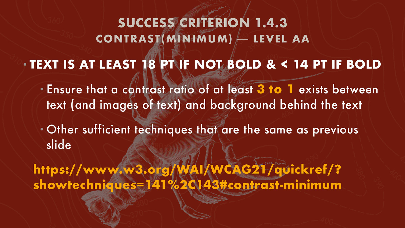
SUCCESS CRITERION 1.4.3 C ONTRAST(MINIMUM) ⎯ LEVEL AA • TEXT IS AT LEAST 18 PT IF NOT BOLD & < 14 PT IF BOLD • Ensure that a contrast ratio of at least 3 to 1 exists between text (and images of text) and background behind the text • Other sufficient techniques that are the same as previous slide https://www.w3.org/WAI/WCAG21/quickref/? showtechniques=141%2C143#contrast-minimum
SUCCESS CRITERION 1.4.3 C ONTRAST(MINIMUM) ⎯ LEVEL AA • BENEFITS • People with low vision who have difficulty reading text that does not have sufficient contrast with its background • People with color deficiencies (Achromatopsia, Tritanopia, etc.) https://www.w3.org/WAI/WCAG21/ Understanding/contrast-minimum.html
SUCCESS CRITERION 1.4.5 IMAGES OF TEXT ⎯ LEVEL AA • OTHER TECHNIQUES MAY ALSO BE SUFFICIENT IF THEY MEET THE SUCCESS CRITERION • Using CSS to control visual presentation of text • Using • Using font-family, text-align, font-size to control text CSS to replace text with images of text and providing UI controls to switch • Using a style switcher to present home page in two different ways • Default home page uses images of text instead of heading text • Alternate version uses heading text instead of images of text https://www.w3.org/WAI/WCAG21/quickref/? showtechniques=141%2C143%2C145#images-of-text
SUCCESS CRITERION 1.4.5 IMAGES OF TEXT ⎯ LEVEL AA • BENEFITS • People with low vision • People with visual tracking problems • People with cognitive disabilities that affect reading https://www.w3.org/WAI/WCAG21/Understanding/ images-of-text.html
SUCCESS CRITERION 1.4.6 C ONTRAST(ENHAN CED) ⎯ LEVEL AAA • IF TEXT IS < 18 PT IF NOT BOLD & < 14 PT IF BOLD • Ensure that a contrast ratio of at least 7 to 1 exists between text (and images of text) and background behind the text (should be minimum to strive for OR 10 to 1) • Other situations and sufficient techniques same as SC 1.4.3 Contrast(Minimum) https://www.w3.org/WAI/WCAG21/quickref/? showtechniques=141%2C143%2C145%2C1411%2C146#contrastenhanced
SUCCESS CRITERION 1.4.6 C ONTRAST(ENHAN CED) ⎯ LEVEL AAA BENEFITS • People with low vision who have difficulty reading text that does not have sufficient contrast with its background • People with color deficiencies (Achromatopsia, Tritanopia, etc.) https://www.w3.org/WAI/WCAG21/Understanding/ contrast-enhanced.html
SUCCESS CRITERION 1.4.9 IMAGES OF TEXT(NO EXCEPTION) ⎯ LEVEL AAA • OTHER TECHNIQUES MAY ALSO BE SUFFICIENT IF THEY MEET THE SUCCESS CRITERION • Using CSS to control visual presentation of text • Using • Using font-family, text-align, font-size to control text CSS to replace text with images of text and providing UI controls to switch • Using a style switcher to present home page in two different ways • Default home page uses images of text instead of heading text • Alternate version uses heading text instead of images of text https://www.w3.org/WAI/WCAG21/quickref/? showtechniques=141%2C143%2C145%2C146%2C148%2C1411%2C149#images-of-text-noexception
SUCCESS CRITERION 1.4.9 IMAGES OF TEXT(NO EXCEPTION) ⎯ LEVEL AAA • BENEFITS • People with low vision • People with visual tracking problems • People with cognitive disabilities that affect reading https://www.w3.org/WAI/WCAG21/Understanding/ images-of-text-no-exception.html
SUCCESS CRITERION 1.4.11 NON- TEXT C ONTRAST ⎯ LEVEL AA • OTHER TECHNIQUES MAY ALSO BE SUFFICIENT IF THEY MEET THE SUCCESS CRITERION • UI component contrast • Using an author-supplied, highly visible focus indicator • Graphics with suf cient contrast • Ensuring • Provide • Text that a contrast ratio of 3 to 1 is provided for icons sufficient contrast at the boundaries between adjoining colors in or over graphics • Ensuring that a contrast ratio of at least 4.5 to 1 exists between text (and images of text) and background behind the text • Ensuring that a contrast ratio of at least 3 to 1 exists between text (and images of text) and background behind the text • Providing a control with a sufficient contrast ratio that allows users to switch to a presentation that uses sufficient contrast fi https://www.w3.org/WAI/WCAG21/Understanding/non-text-contrast.html
SUCCESS CRITERION 1.4.11 NON- TEXT C ONTRAST ⎯ LEVEL AA • BENEFITS • People with low vision often have difficulty perceiving graphics that have insufficient contrast. https://www.w3.org/WAI/WCAG21/ Understanding/non-text-contrast.html
THANKS!