The Four Principles of the A“POUR”calypse The harbingers of accessibility Todd Libby 25 October - Connect.Tech

A presentation at Connect.Tech in October 2023 in Atlanta, GA, USA by Todd Libby
The Four Principles of the A“POUR”calypse The harbingers of accessibility Todd Libby 25 October - Connect.Tech

Thank You!

Me, Explained.

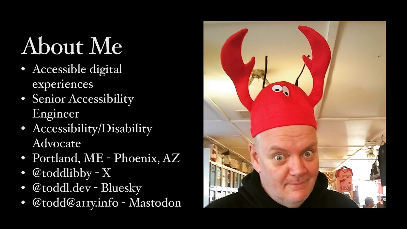
About Me • Accessible digital experiences • Senior Accessibility Engineer • Accessibility/Disability Advocate • Portland, ME - Phoenix, AZ • @toddlibby - X • @toddl.dev - Bluesky • @todd@a11y.info - Mastodon

Work What I do • Accessibility Consultant • W3C Invited Expert - WCAG 2.2 & WCAG3 • Advocate for Accessibility & Disability Rights

Four
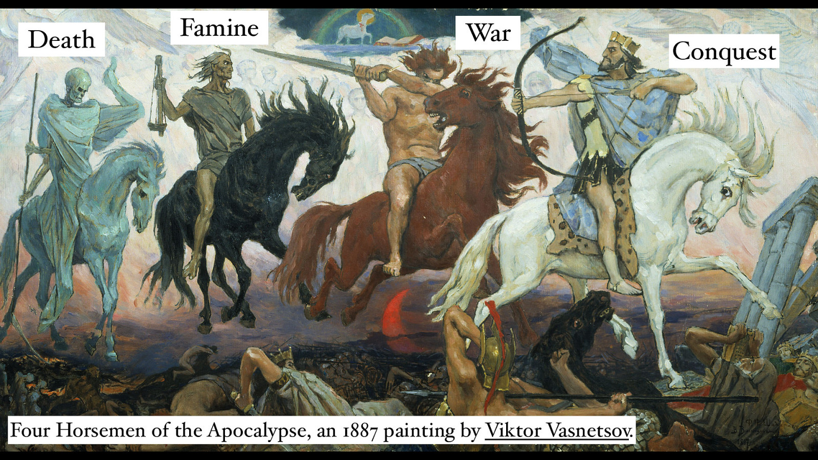
Death Famine War Four Horsemen of the Apocalypse, an 1887 painting by Viktor Vasnetsov. Conquest

Four Principles

History
2001 Public Working Draft
2003 Technical Reports (TR) Working Draft
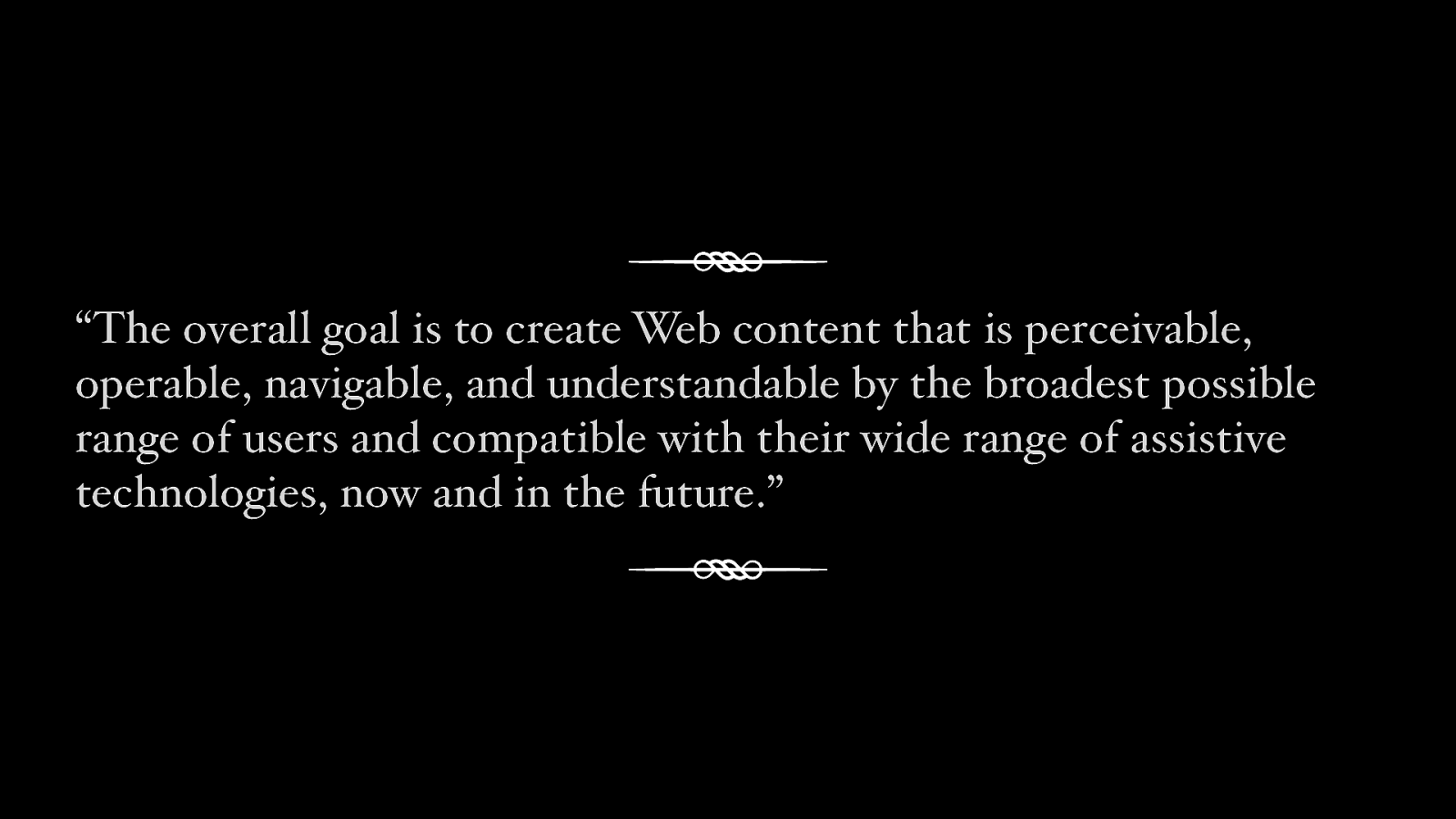
“The overall goal is to create Web content that is perceivable, operable, navigable, and understandable by the broadest possible range of users and compatible with their wide range of assistive technologies, now and in the future.”
Navigable
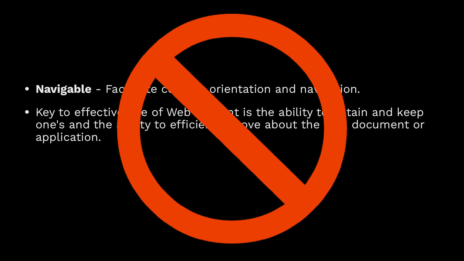
• Navigable - Facilitate content orientation and navigation. • Key to e ective use of Web content is the ability to obtain and keep ffi ff one’s and the ability to e application. ciently move about the site, document or
2008 Working Draft (CR) Candidate Recommendation
WCAG 2.1
2018 Recommendation published, 5 June

13

78


2023

WCAG 2.2 9 Success Criteria


2028?


The Four Principles
Perceivable
Operable
Understandable
Robust

Why?
Why do we care about accessible content?

Examples

Alternative Text alt=“Two lobster rolls in a styrofoam container. One with chives and mayonnaise and another with chipotle mayonnaise with a lemon wedge.”
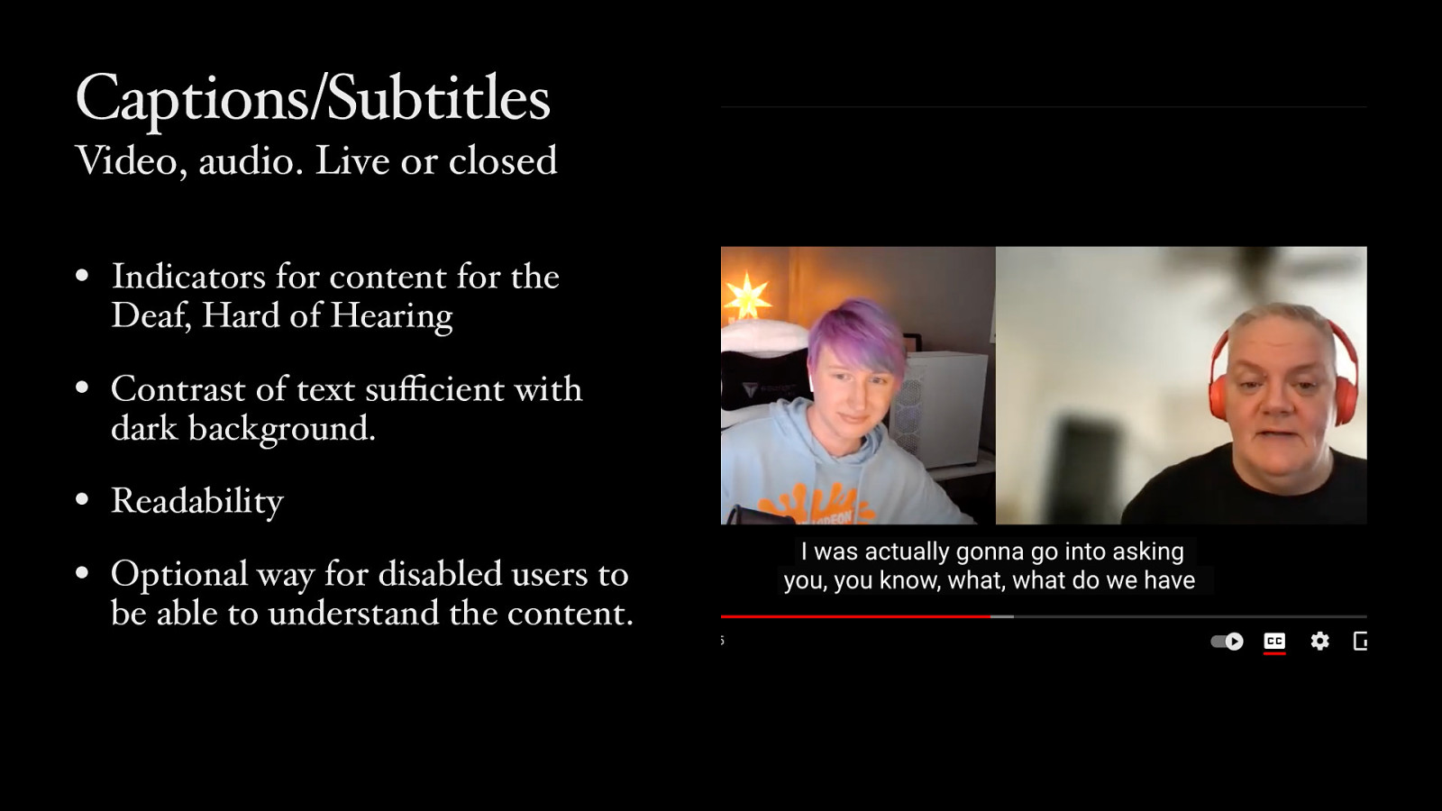
Captions/Subtitles Video, audio. Live or closed • Indicators for content for the Deaf, Hard of Hearing • Contrast of text su cient with dark background. • Readability • Optional way for disabled users to ffi be able to understand the content.
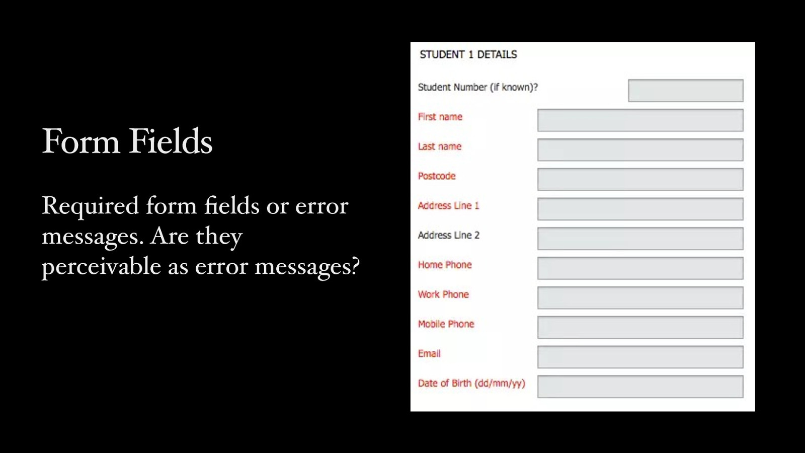
Form Fields fi Required form elds or error messages. Are they perceivable as error messages?
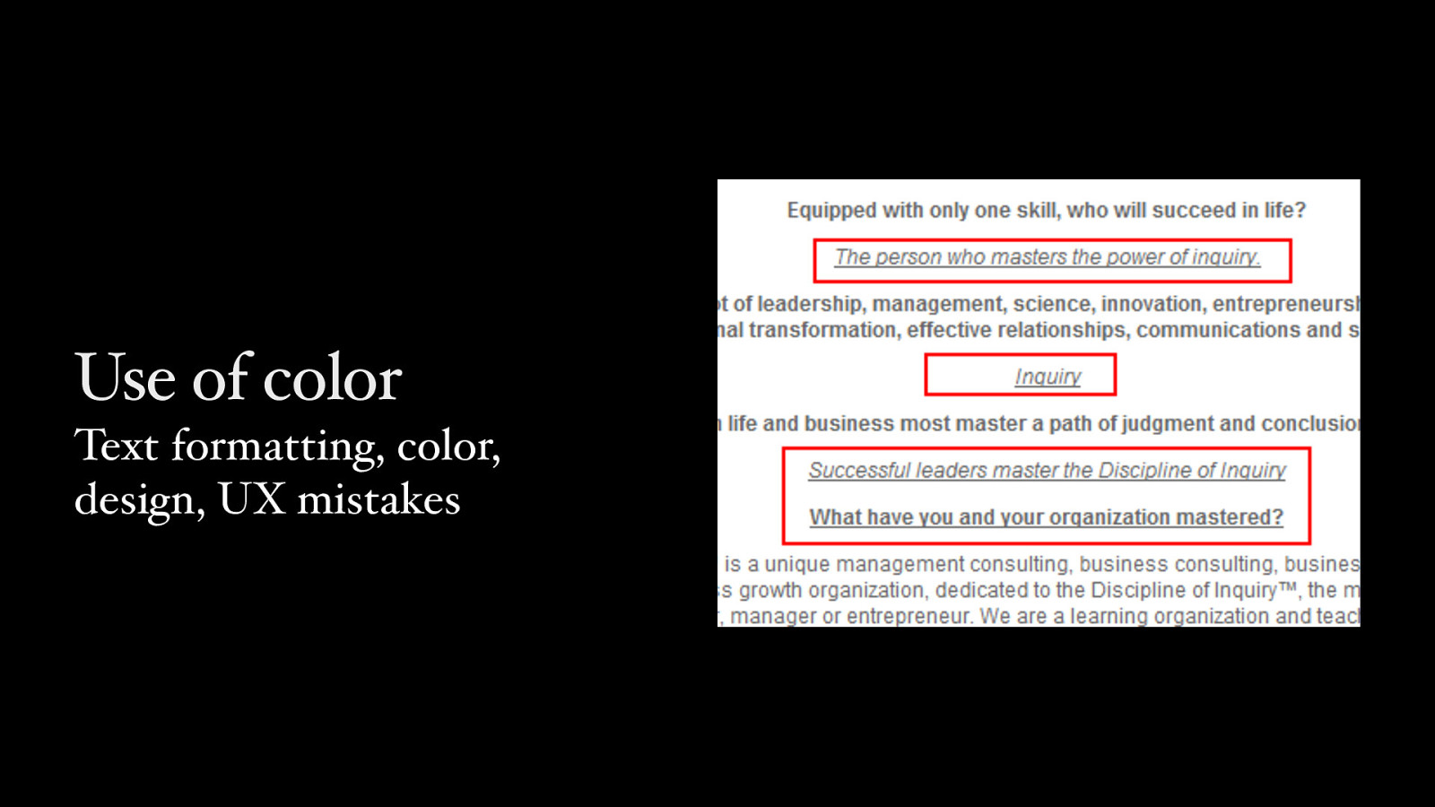
Use of color Text formatting, color, design, UX mistakes
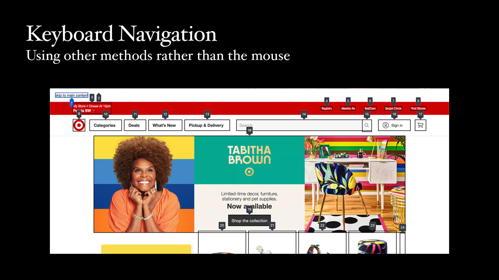
Keyboard Navigation Using other methods rather than the mouse
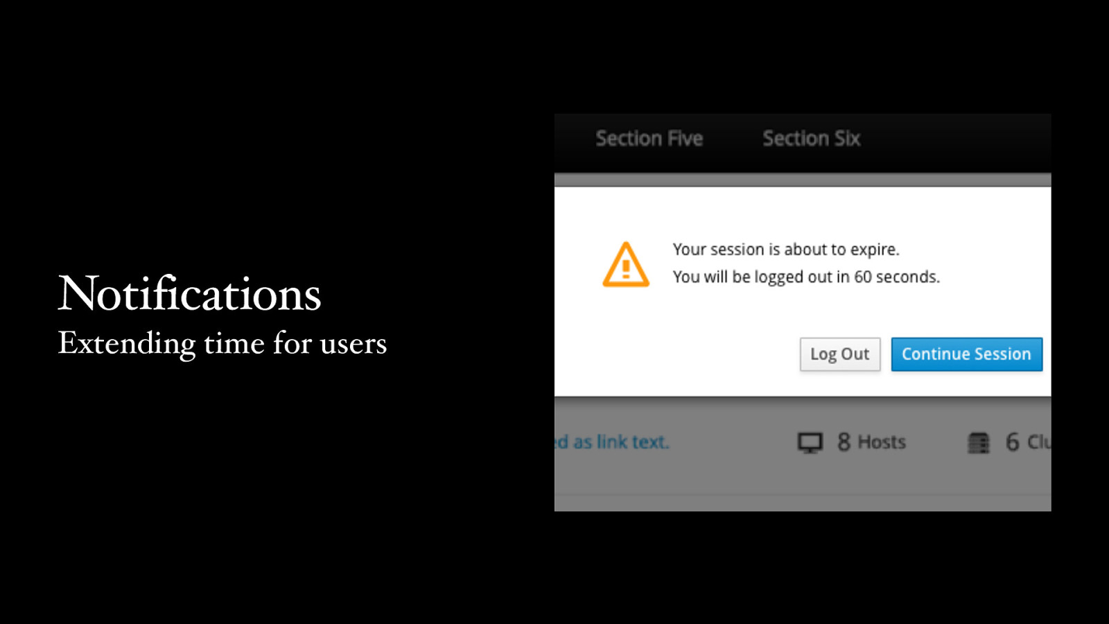
Notifications Extending time for users
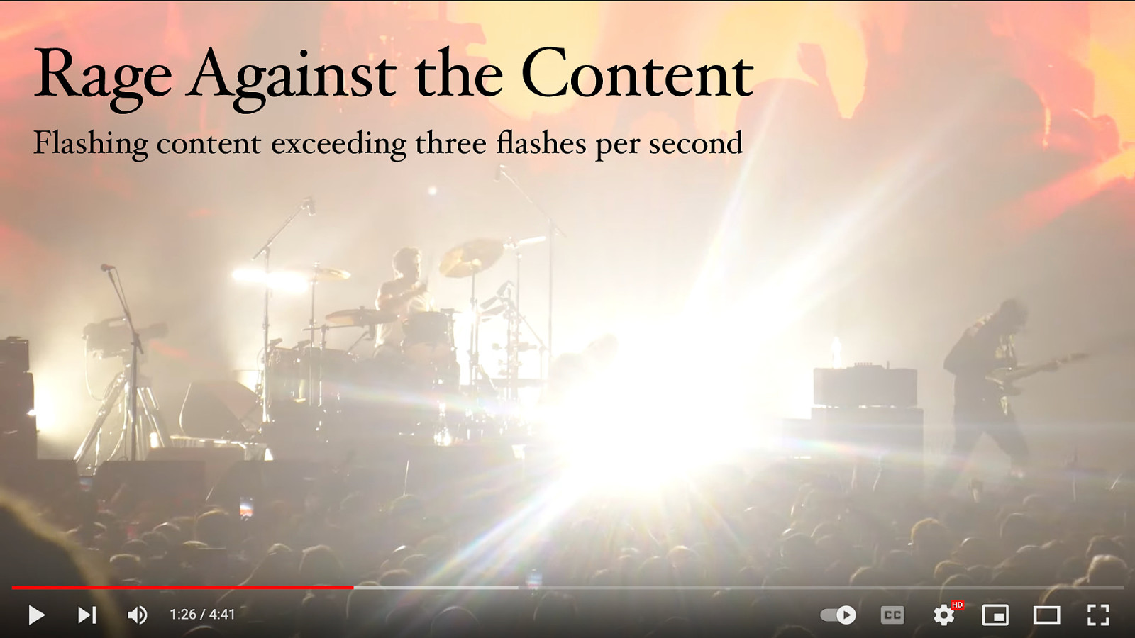
Rage Against the Content fl Flashing content exceeding three ashes per second

Navigation Visible focus indicators and a logical tab order
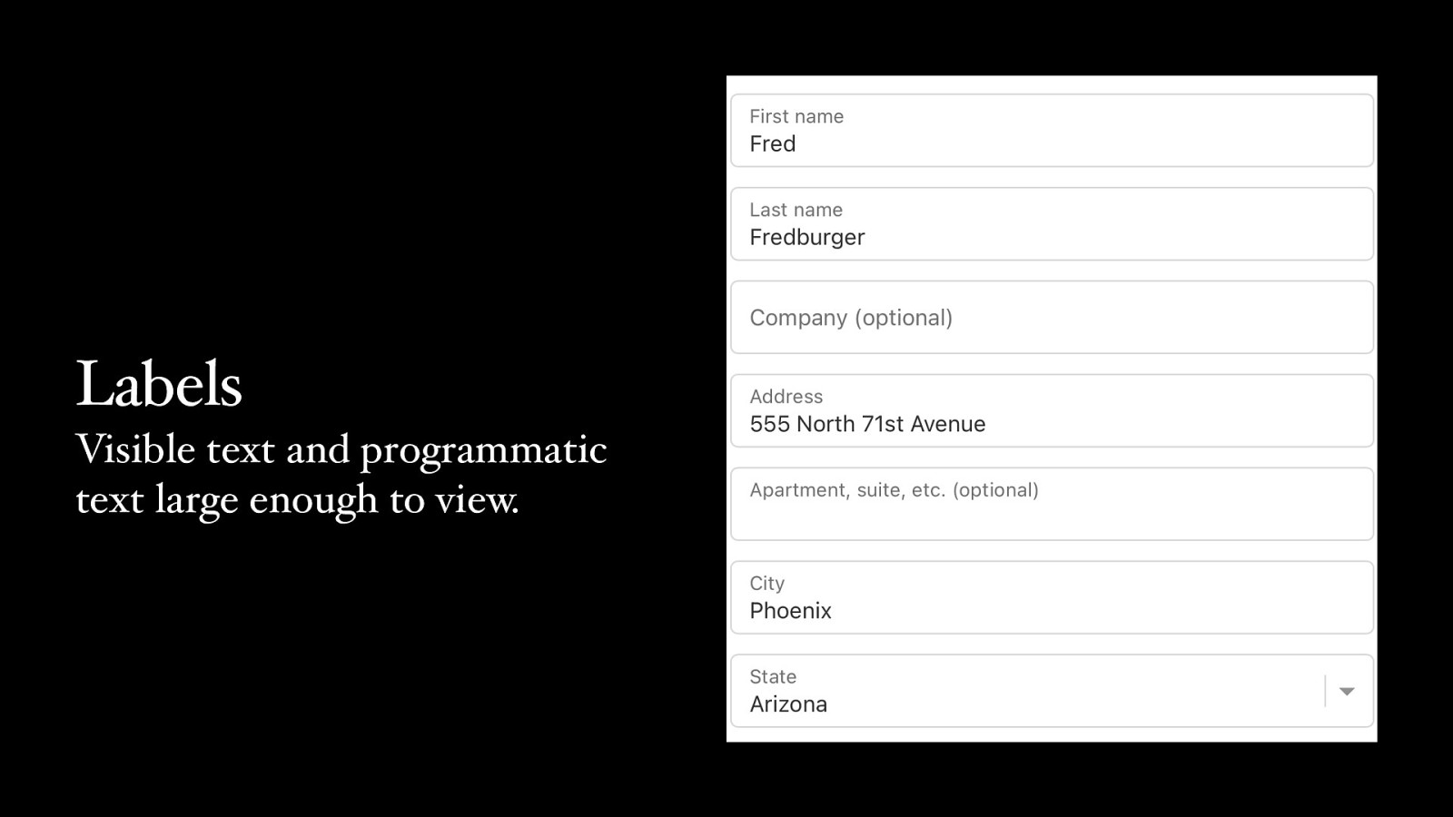
Labels Visible text and programmatic text large enough to view.

Placeholders Are not labels
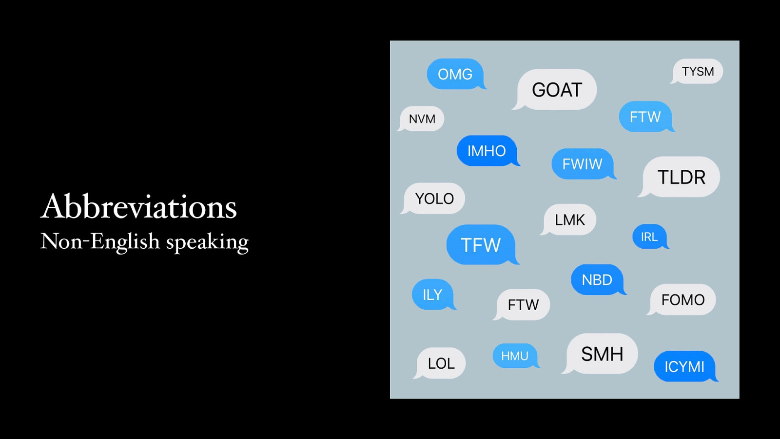
Abbreviations Non-English speaking
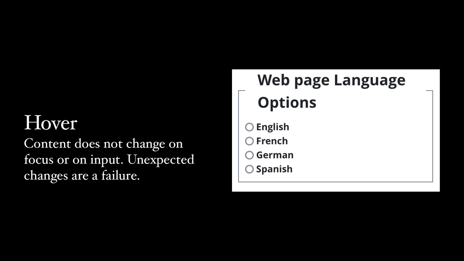
Hover Content does not change on focus or on input. Unexpected changes are a failure.
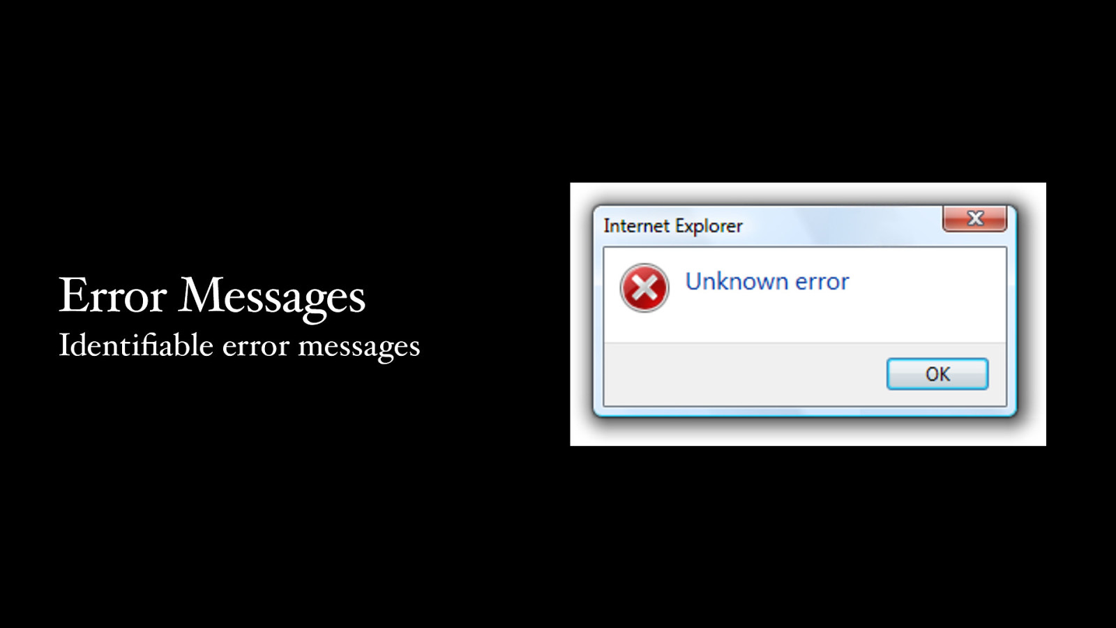
Error Messages fi Identi able error messages
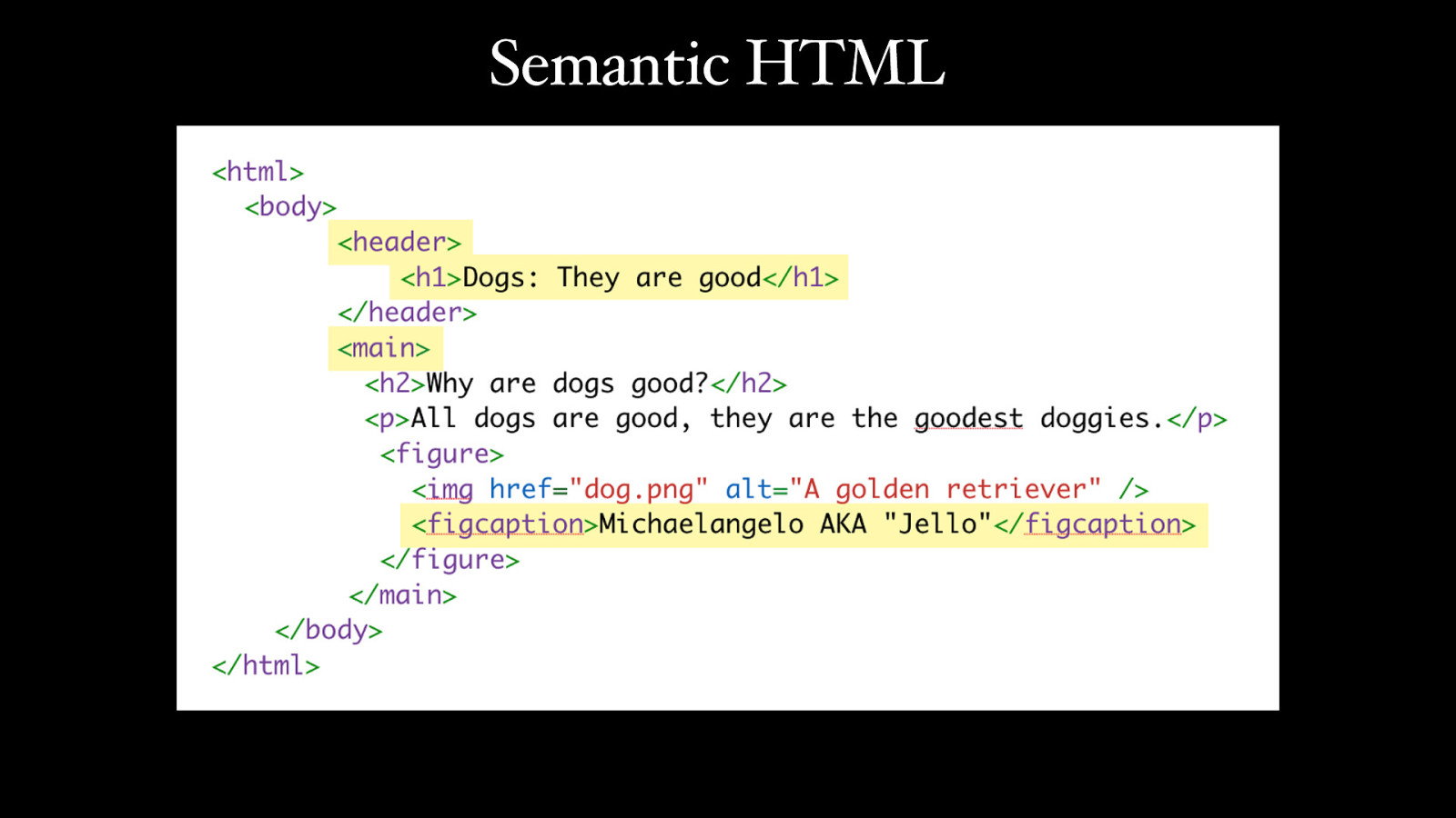
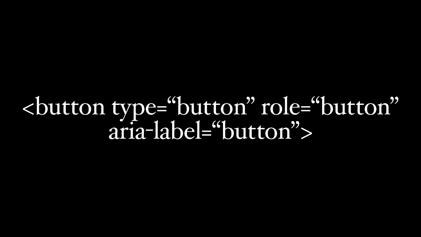
Semantic HTML

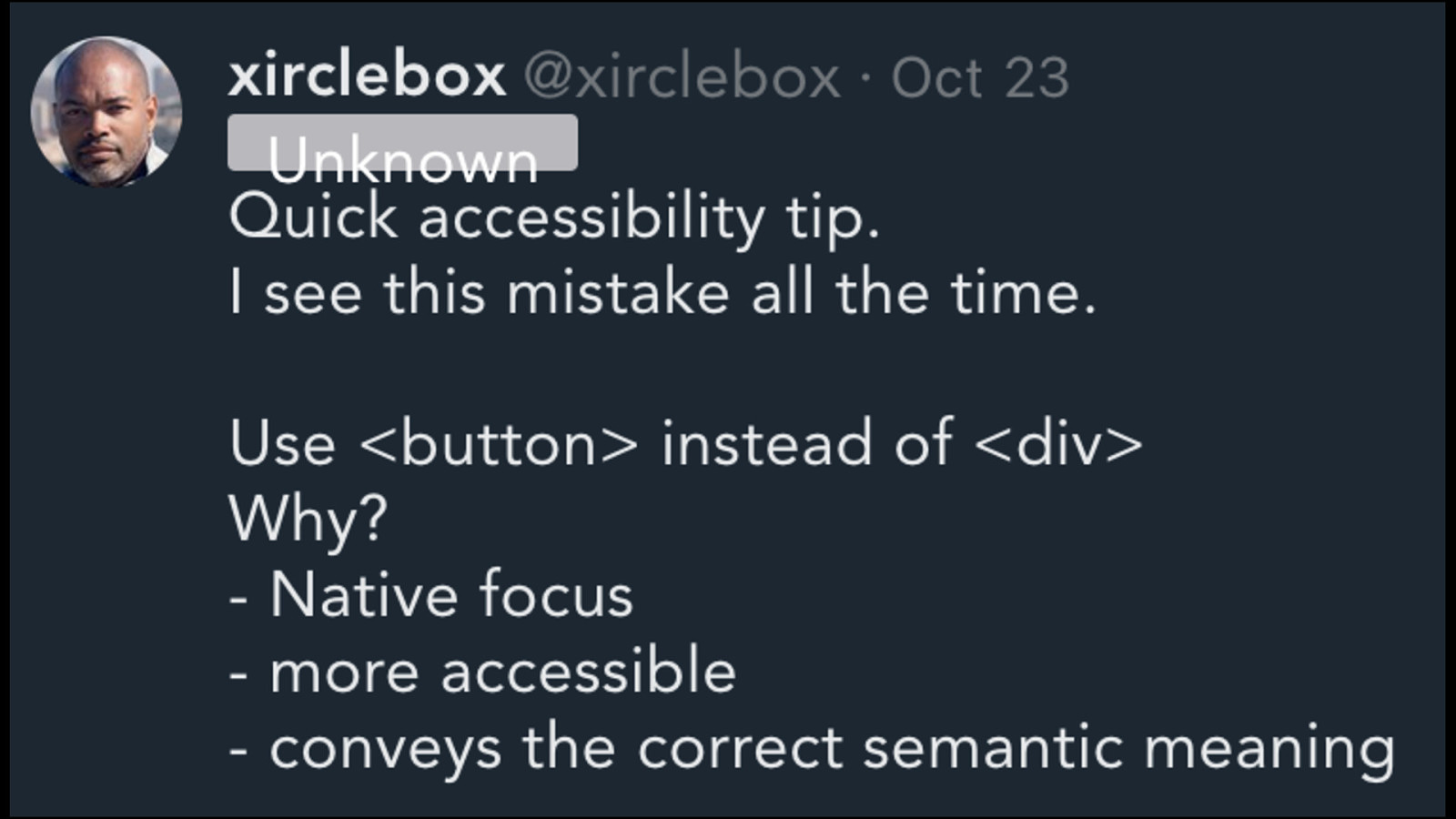
Buttons
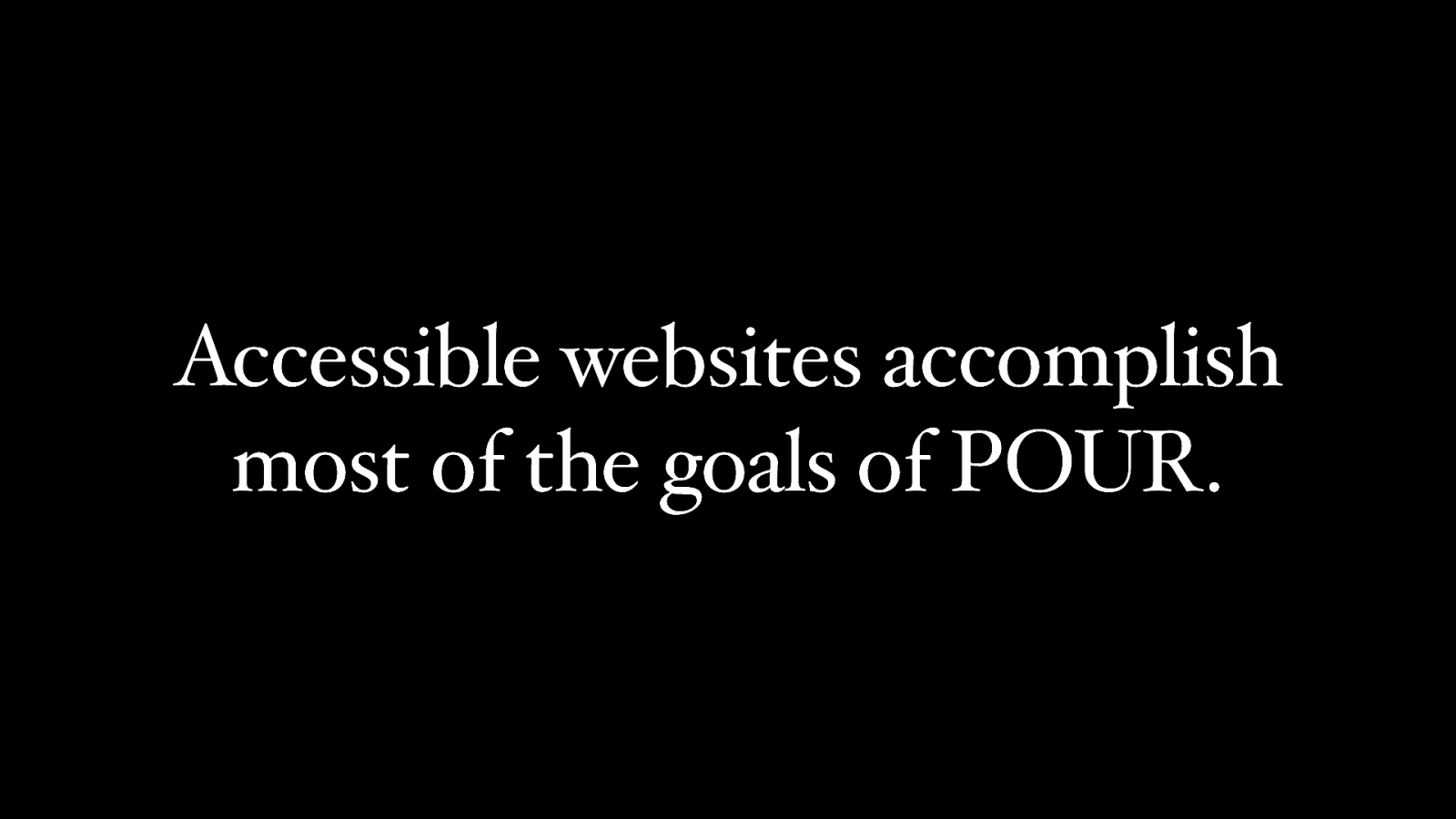
Accessible websites accomplish most of the goals of POUR.
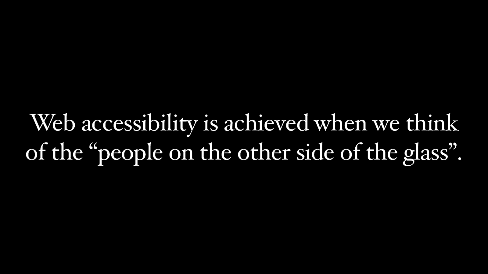
Web accessibility is achieved when we think of the “people on the other side of the glass”.
The needs of users with disabilities should be considered first and foremost.
Accessibility is a right. NOT a privilege.
Thank you! Slides: https://toddl.dev/slides