WCAG & Color Contrast @toddlibby https://toddl.dev 1
A presentation at Web Directions: Access All Areas in October 2021 in by Todd Libby
WCAG & Color Contrast @toddlibby https://toddl.dev 1
Thank You! Sponsors, Hosts, Speakers, and Guests! 2
WCAG Web Content Accessibility Guidelines https://www.w3.org/TR/WCAG21/ 3
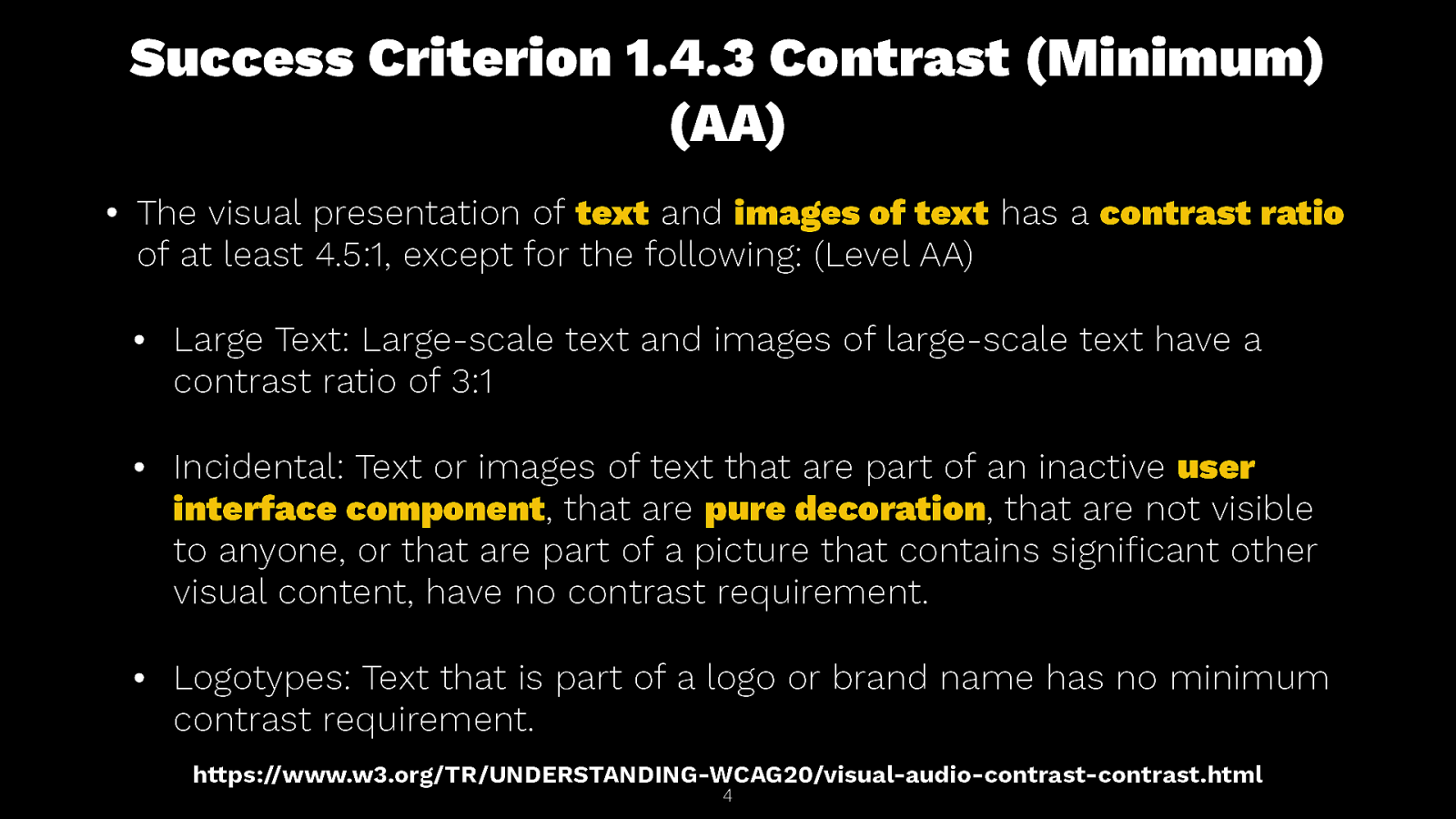
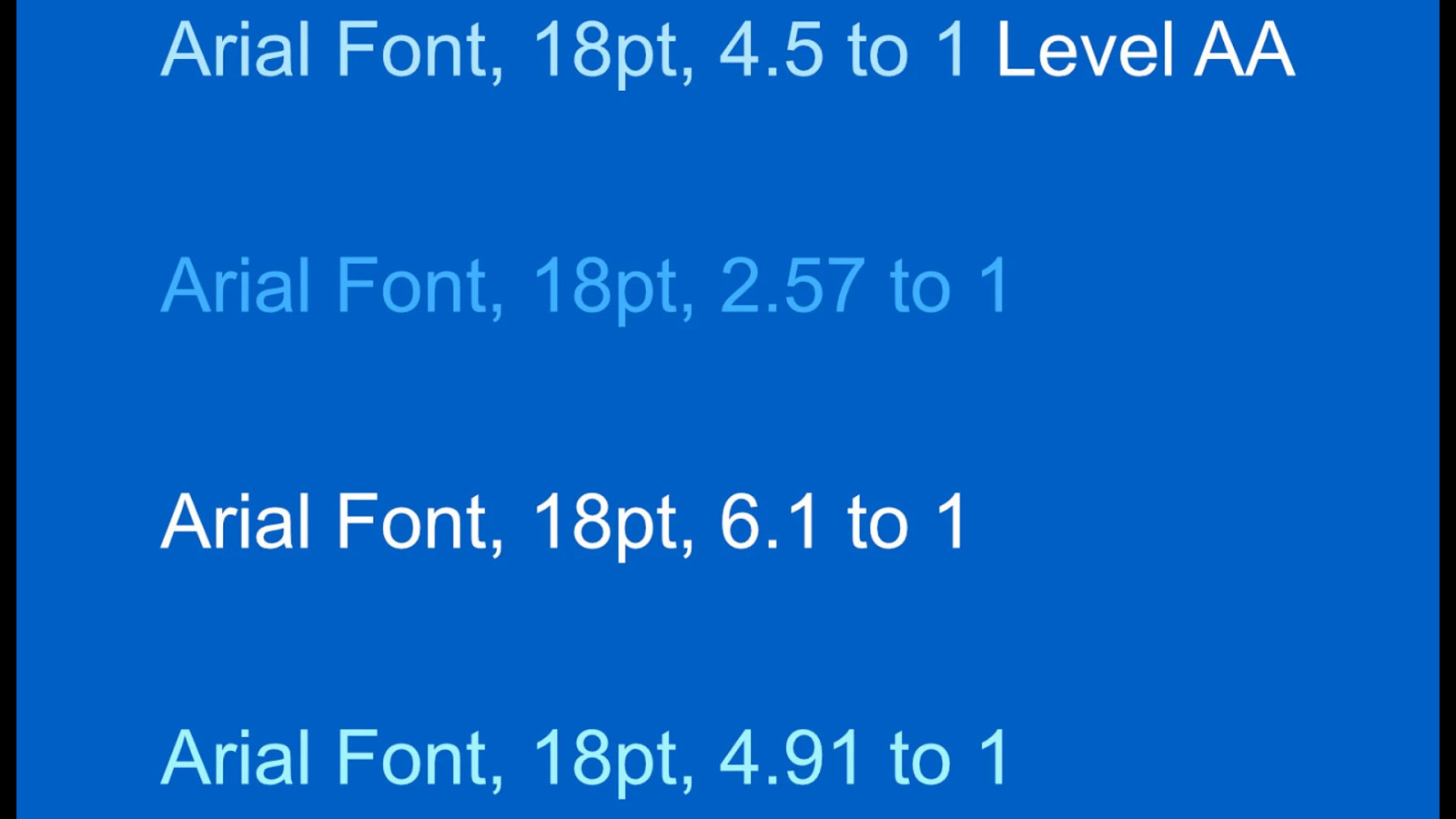
Success Criterion 1.4.3 Contrast (Minimum) (AA) • The visual presentation of text and images of text has a contrast ratio of at least 4.5:1, except for the following: (Level AA) • Large Text: Large-scale text and images of large-scale text have a contrast ratio of 3:1 • Incidental: Text or images of text that are part of an inactive user interface component, that are pure decoration, that are not visible to anyone, or that are part of a picture that contains signi cant other visual content, have no contrast requirement. • Logotypes: Text that is part of a logo or brand name has no minimum contrast requirement. https://www.w3.org/TR/UNDERSTANDING-WCAG20/visual-audio-contrast-contrast.html fi 4
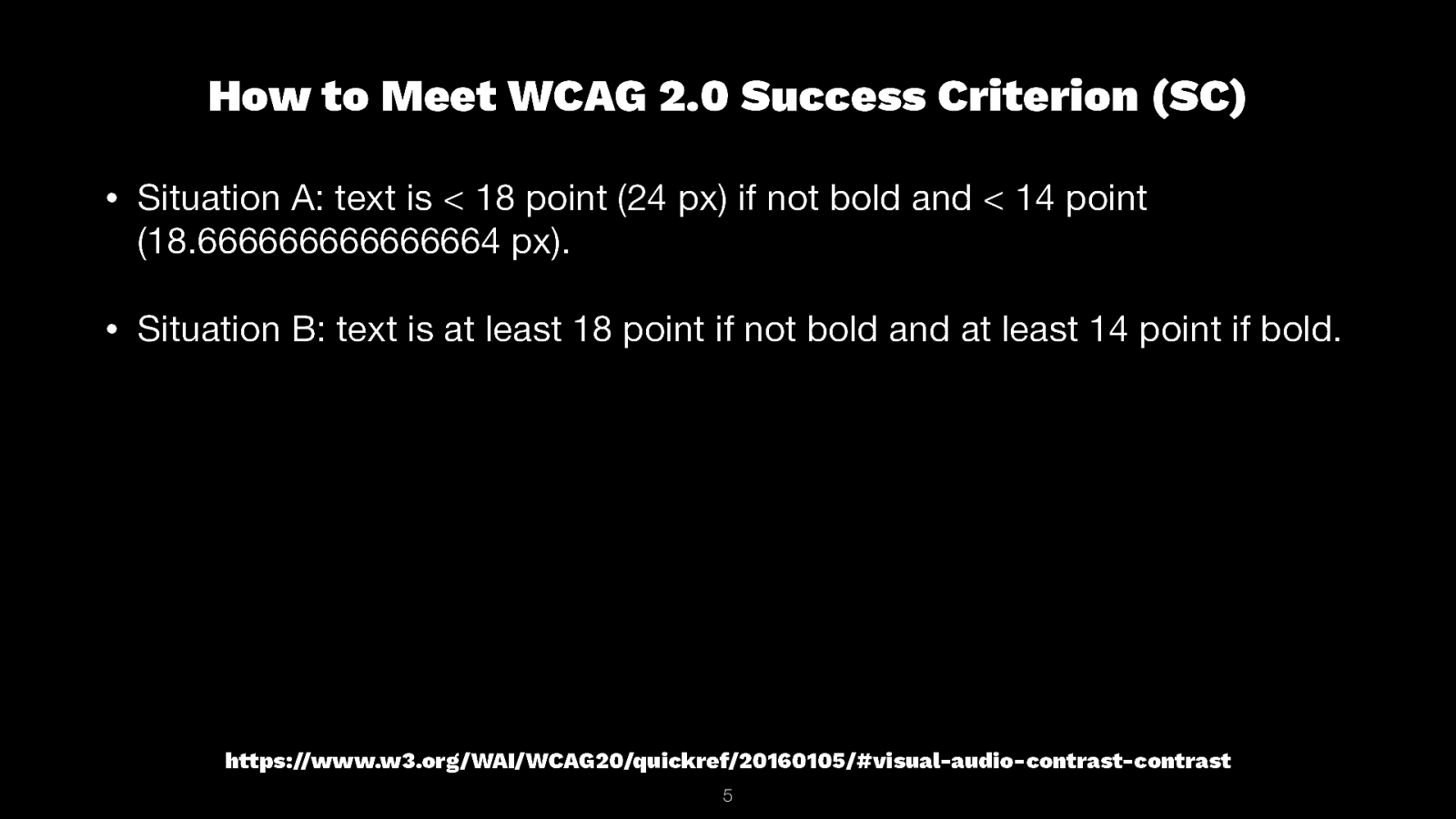
How to Meet WCAG 2.0 Success Criterion (SC) • Situation A: text is < 18 point (24 px) if not bold and < 14 point (18.666666666666664 px). • Situation B: text is at least 18 point if not bold and at least 14 point if bold. https://www.w3.org/WAI/WCAG20/quickref/20160105/#visual-audio-contrast-contrast 5
6
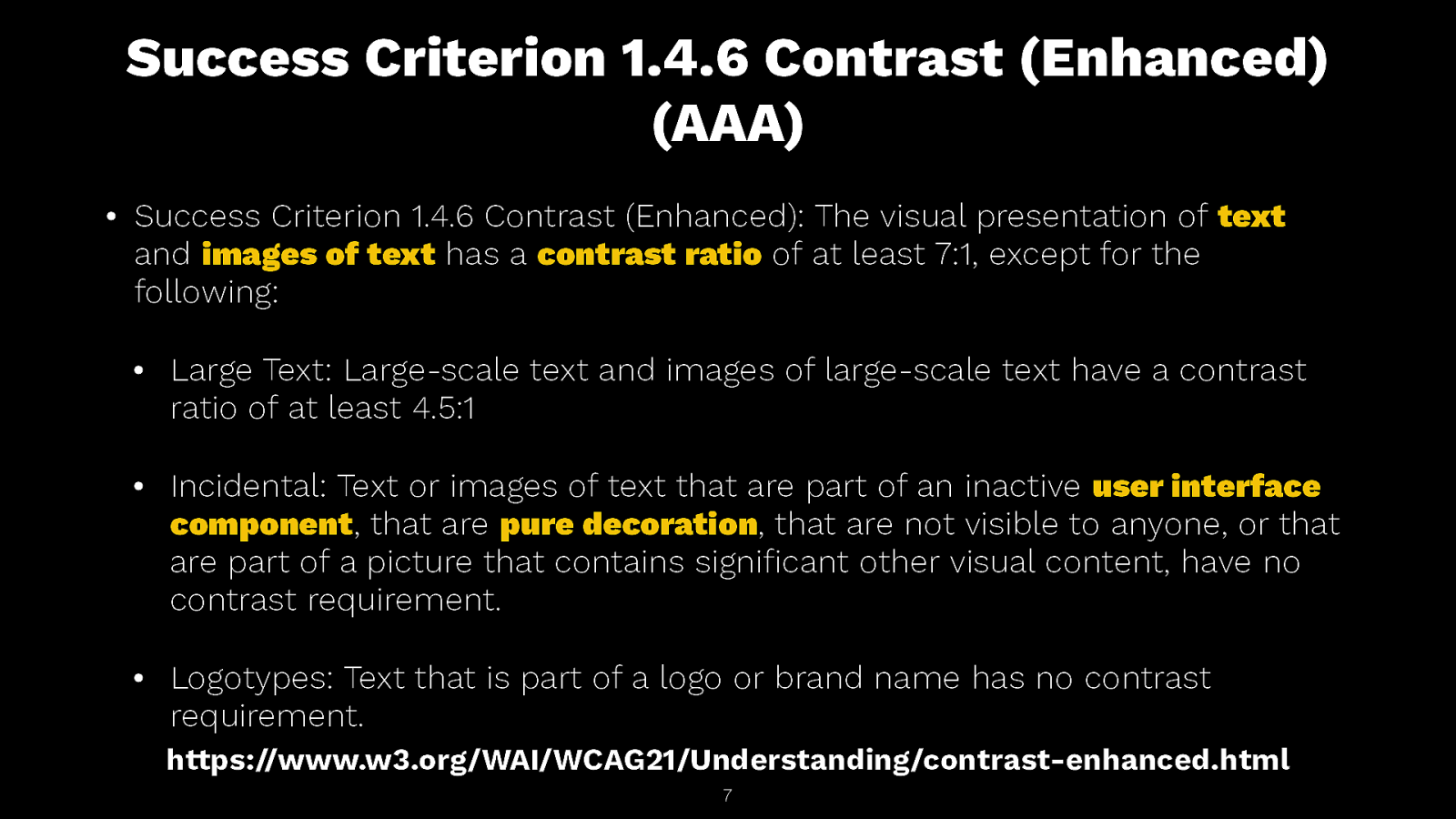
Success Criterion 1.4.6 Contrast (Enhanced) (AAA) • Success Criterion 1.4.6 Contrast (Enhanced): The visual presentation of text and images of text has a contrast ratio of at least 7:1, except for the following: • Large Text: Large-scale text and images of large-scale text have a contrast ratio of at least 4.5:1 • Incidental: Text or images of text that are part of an inactive user interface component, that are pure decoration, that are not visible to anyone, or that are part of a picture that contains signi cant other visual content, have no contrast requirement. • Logotypes: Text that is part of a logo or brand name has no contrast requirement. https://www.w3.org/WAI/WCAG21/Understanding/contrast-enhanced.html fi 7
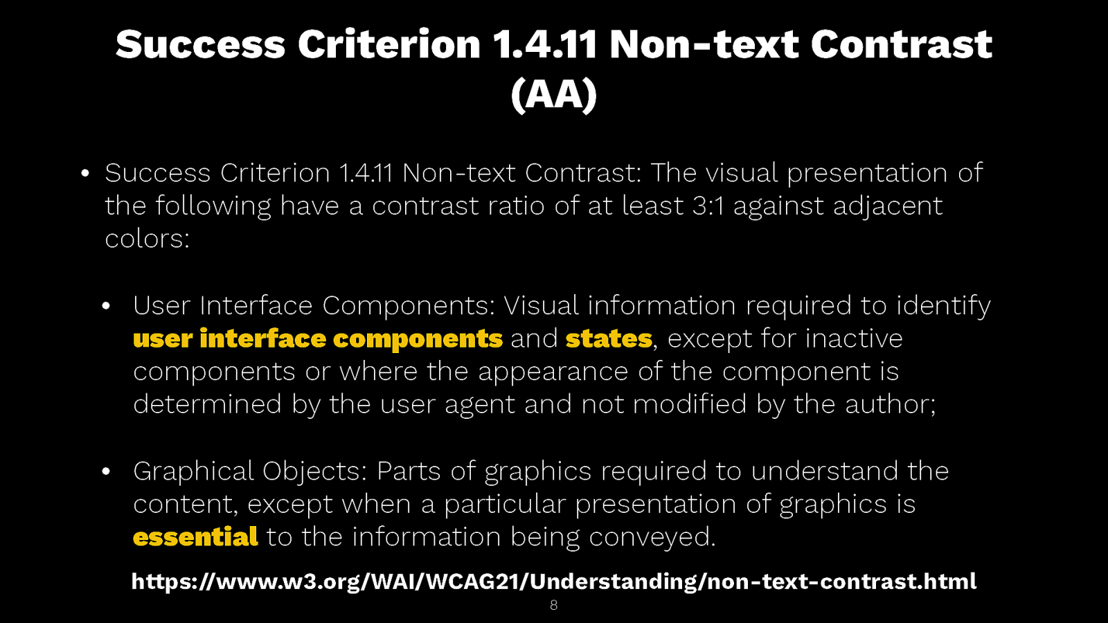
Success Criterion 1.4.11 Non-text Contrast (AA) Success Criterion 1.4.11 Non-text Contrast: The visual presentation of the following have a contrast ratio of at least 3:1 against adjacent colors: • User Interface Components: Visual information required to identify user interface components and states, except for inactive components or where the appearance of the component is determined by the user agent and not modi ed by the author; • Graphical Objects: Parts of graphics required to understand the content, except when a particular presentation of graphics is essential to the information being conveyed. https://www.w3.org/WAI/WCAG21/Understanding/non-text-contrast.html 8 fi •
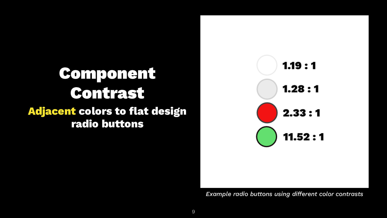
Component Contrast Adjacent colors to at design radio buttons Example radio buttons using di erent color contrasts fl ff 9

Success Criterion 1.4.11 Non-text Contrast (AA) Success Criterion 1.4.11 Non-text Contrast: The visual presentation of the following have a contrast ratio of at least 3:1 against adjacent colors: • User Interface Components: Visual information required to identify user interface components and states, except for inactive components or where the appearance of the component is determined by the user agent and not modi ed by the author; • Graphical Objects: Parts of graphics required to understand the content, except when a particular presentation of graphics is essential to the information being conveyed. https://www.w3.org/WAI/WCAG21/Understanding/non-text-contrast.html 10 fi •
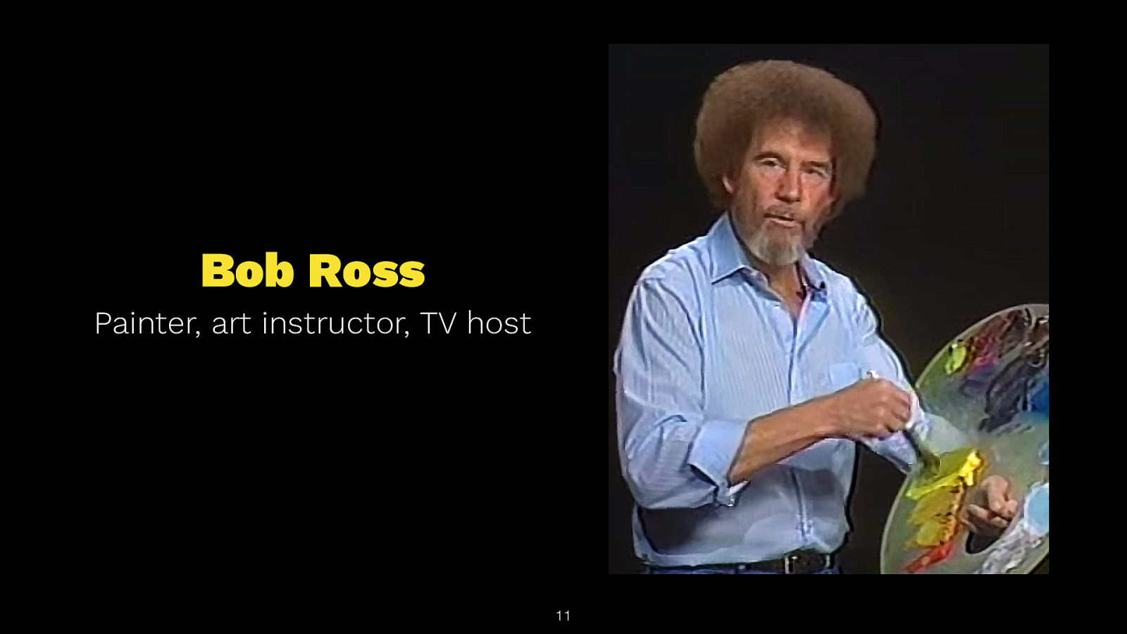
Bob Ross Painter, art instructor, TV host 11
“Mix up a little more shadow color here, then we can put us a little shadow right in there. See how you can move things around? You have unlimited power on this canvas—can literally, literally move mountains” ― Bob Ross 12
“We don’t make mistakes; we just have happy accidents.” — Bob Ross 13

14

15
What?! 16
What is the number one common failure in sites today regarding accessibility? 17
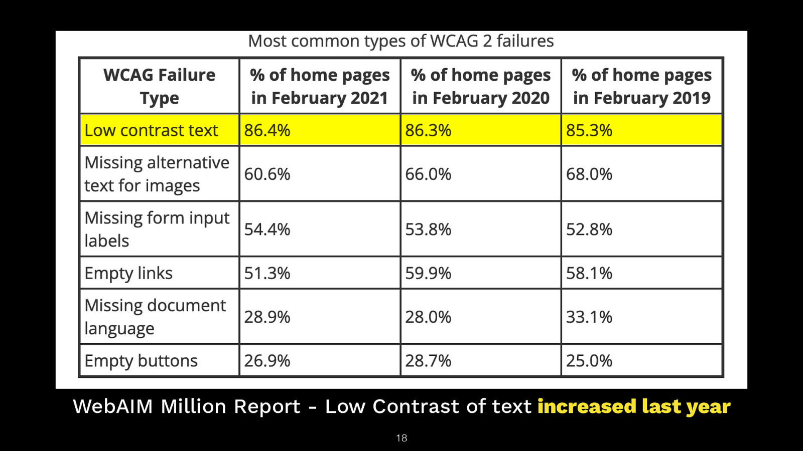
WebAIM Million Report - Low Contrast of text increased last year 18

19
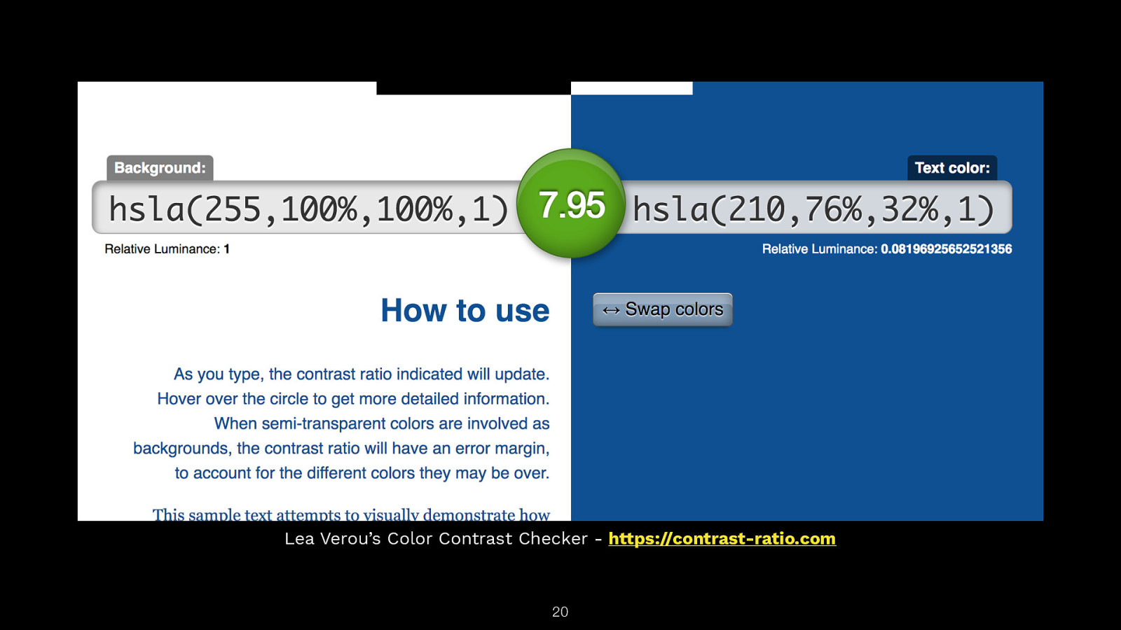
Lea Verou’s Color Contrast Checker - https://contrast-ratio.com 20
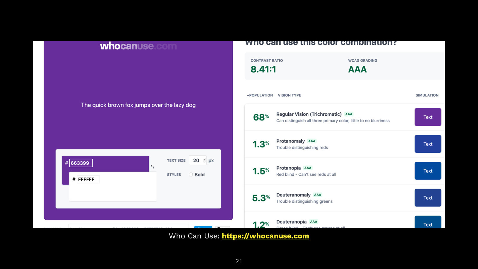
Who Can Use: https://whocanuse.com 21
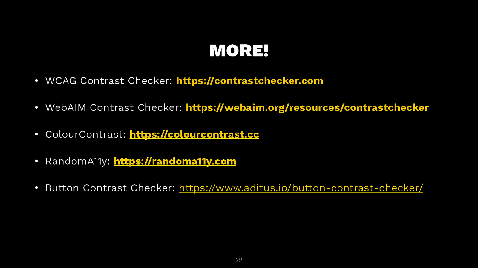
MORE! • WCAG Contrast Checker: https://contrastchecker.com • WebAIM Contrast Checker: https://webaim.org/resources/contrastchecker • ColourContrast: https://colourcontrast.cc • RandomA11y: https://randoma11y.com • Button Contrast Checker: https://www.aditus.io/button-contrast-checker/ 22
Browser Extensions 23
• WAVE: https://wave.webaim.org/extension • Axe: https://www.deque.com/axe • Firefox & Chrome DevTools 24
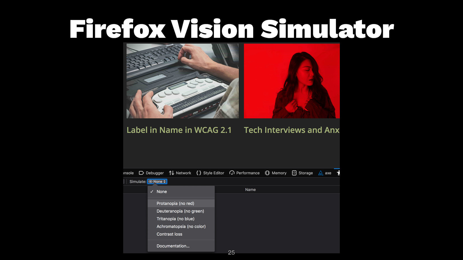
Firefox Vision Simulator 25
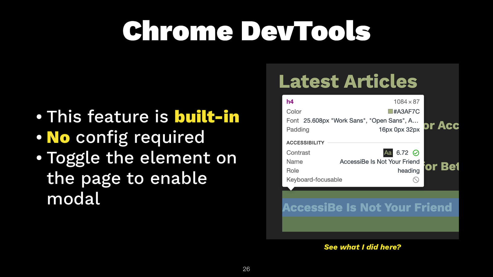
Chrome DevTools • This feature is built-in • No con g required • Toggle the element on the page to enable modal See what I did here? fi 26
Color Contrast Apps • Pika https://superhigh ves.com/pika - MacOS • Contraste https://contrasteapp.com/ - MacOS • Colour Contrast Analyser (CCA) https://www.tpgi.com/colorcontrast-checker/ - Windows • Chromatic Vision Simulator by Kazunori Asada for iOS/Android • VisionSim by The Braille Instititue for iOS fi 27
fi Color Palette Testers • Contrast Grid - https://contrast- grid.eightshapes.com • Accessible Color Palette Builder - https:// toolness.github.io/accessible-color-matrix/ • Tanaguru Contrast Finder - https://contrastnder.tanaguru.com/ • A11y Color Palette - http://a11yrocks.com/ colorPalette/ 28
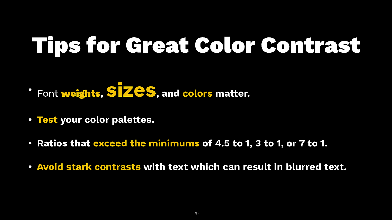
Tips for Great Color Contrast sizes, and colors matter. • Font weights, • Test your color palettes. • Ratios that exceed the minimums of 4.5 to 1, 3 to 1, or 7 to 1. • Avoid stark contrasts with text which can result in blurred text. 29
Captions! 30
“Readability is the most important aspect of captioning in video. No other rules matter if captions cannot be read.” –Meryl K. Evans 31

This is a lobster roll. They are delicious! They are the best food in the entire world and I love to eat them! 32

This is a lobster roll. They are delicious! They are the best food in the entire world and I love to eat them! 33
A11y is a right. NOT a privilege. — Me🦞 https://cottonbureau.com/products/a11y-is-a-right#/5254643/ 34
Thank You! Slides: https://noti.st/colabottles/gcPUQc/color-contrast-and-wcag 35 @toddlibby