TO <button> OR NOT To <Button>? THAT is the question.

A presentation at Various Talks in April 2024 in by Todd Libby
TO <button> OR NOT To <Button>? THAT is the question.
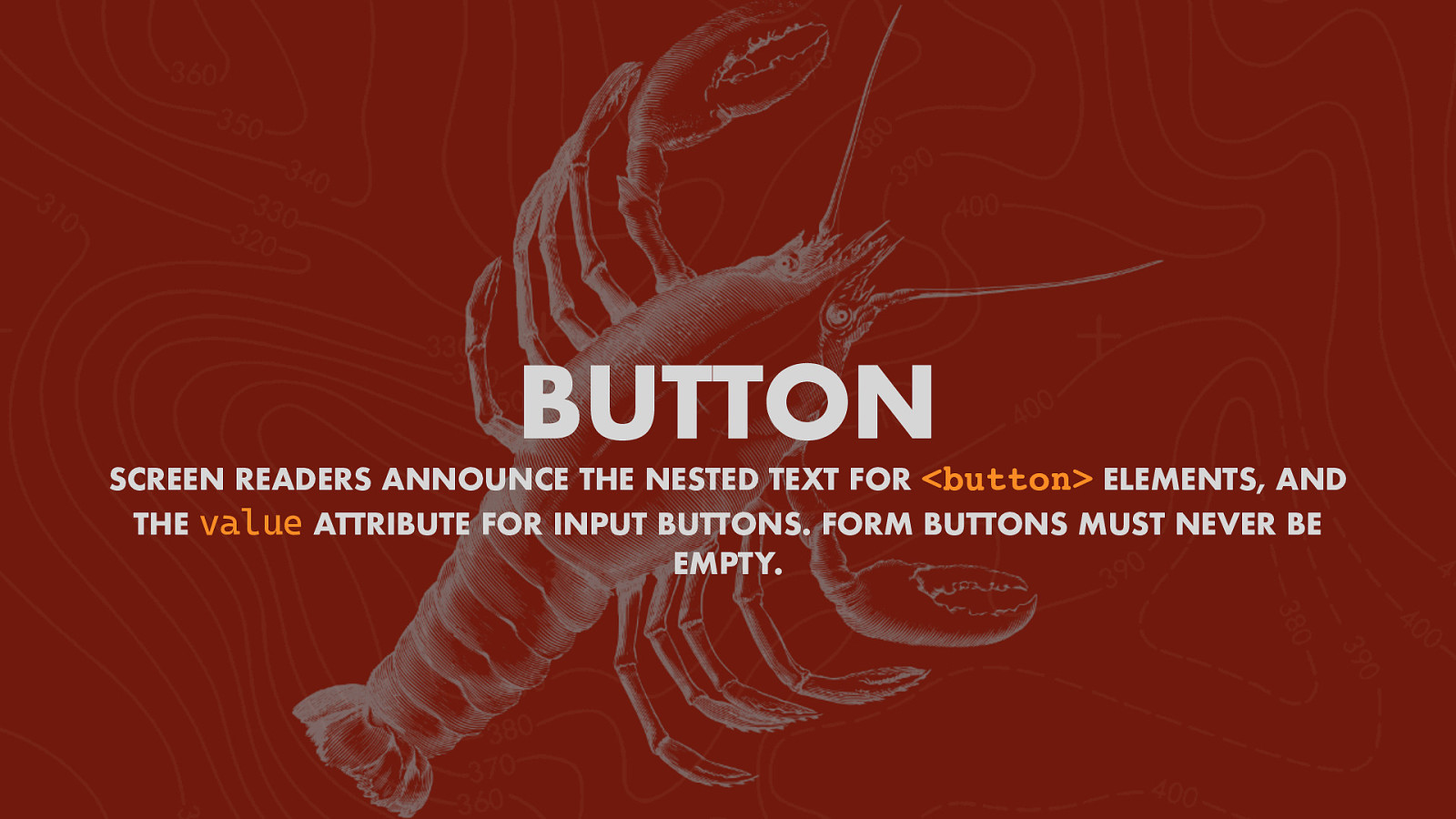
BUTTON SCREEN READERS ANNOUNCE THE NESTED TEXT FOR THE <button> ELEMENTS, AND value ATTRIBUTE FOR INPUT BUTTONS. FORM BUTTONS MUST NEVER BE EMPTY.
WHEN DO I USE A BUTTON?
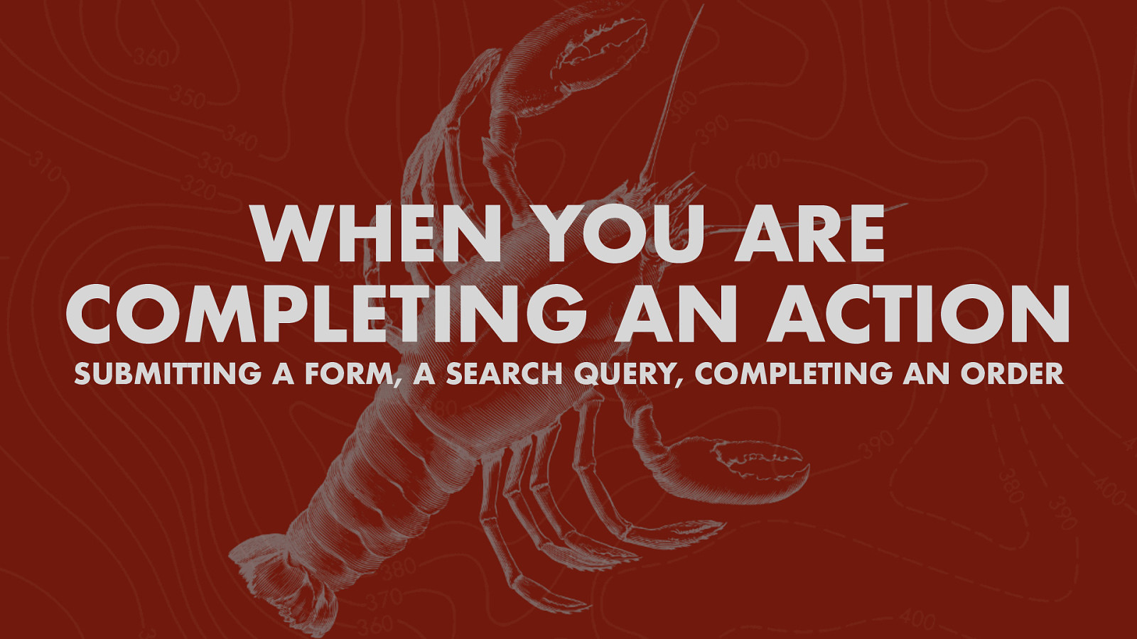
WHEN YOU ARE COMPLETING AN ACTION SUBMITTING A FORM, A SEARCH QUERY, COMPLETING AN ORDER
NOT! LINKING TO ANOTHER PAGE.
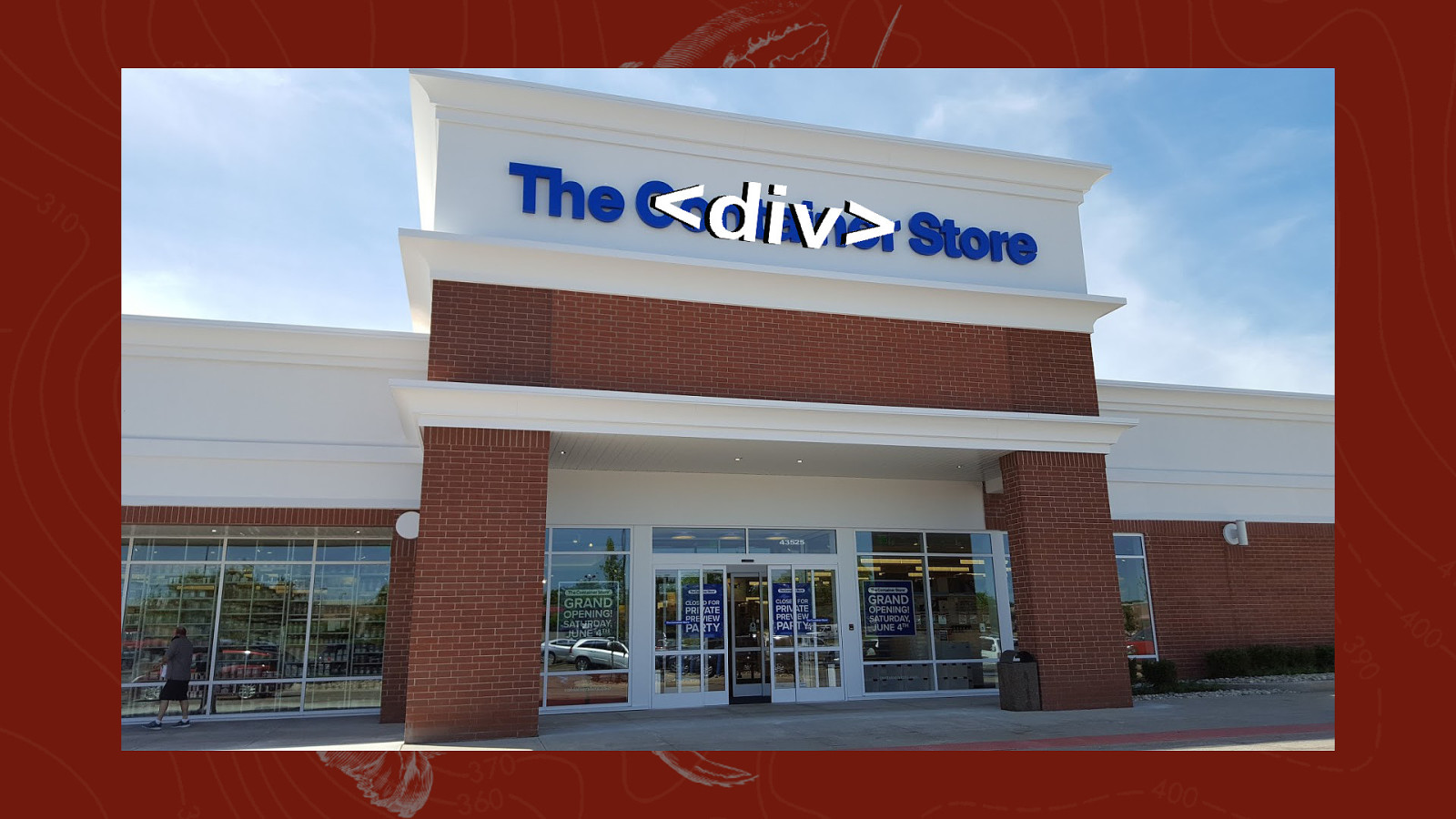
NOT! A SPAN OR A DIV!
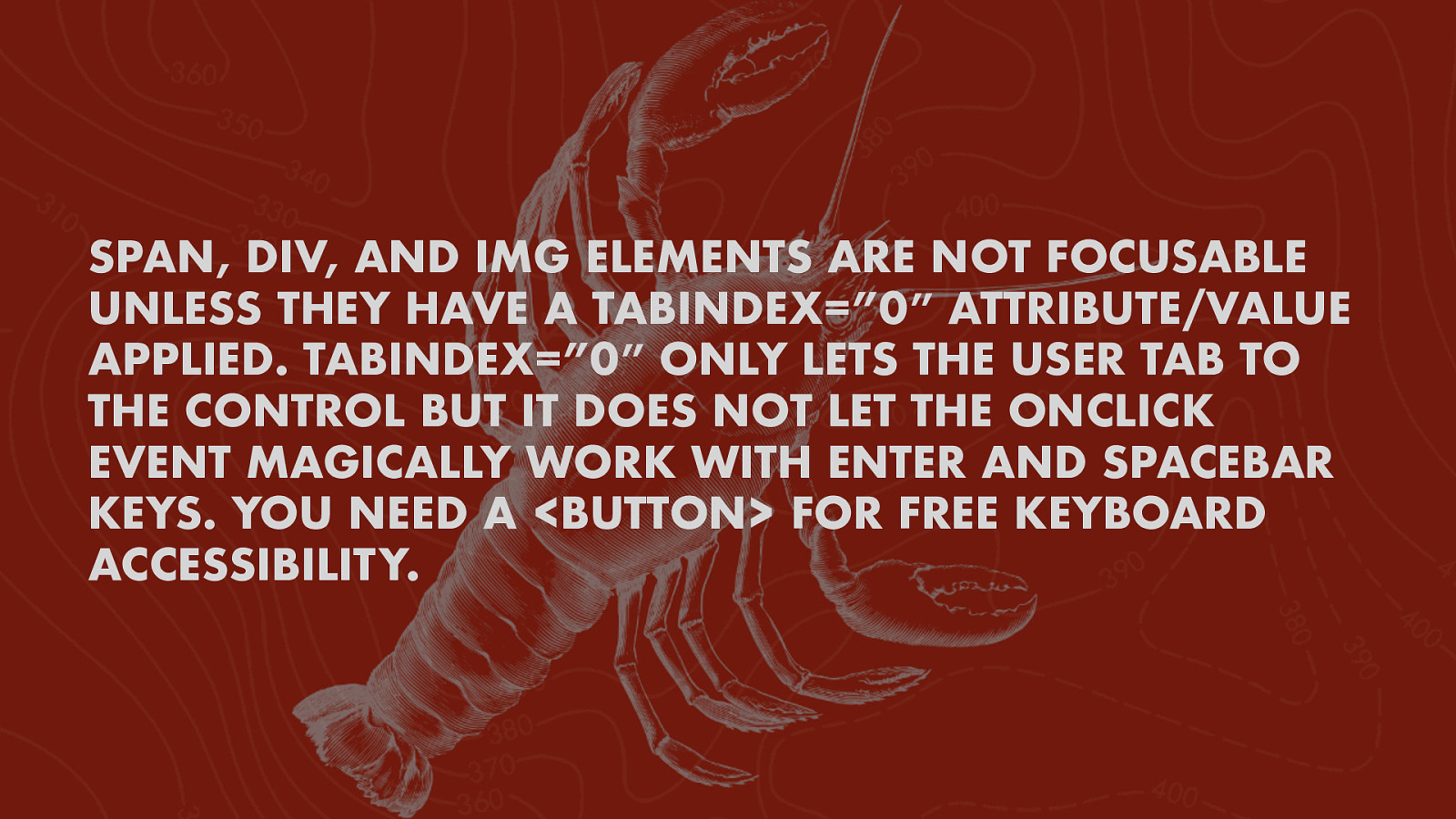
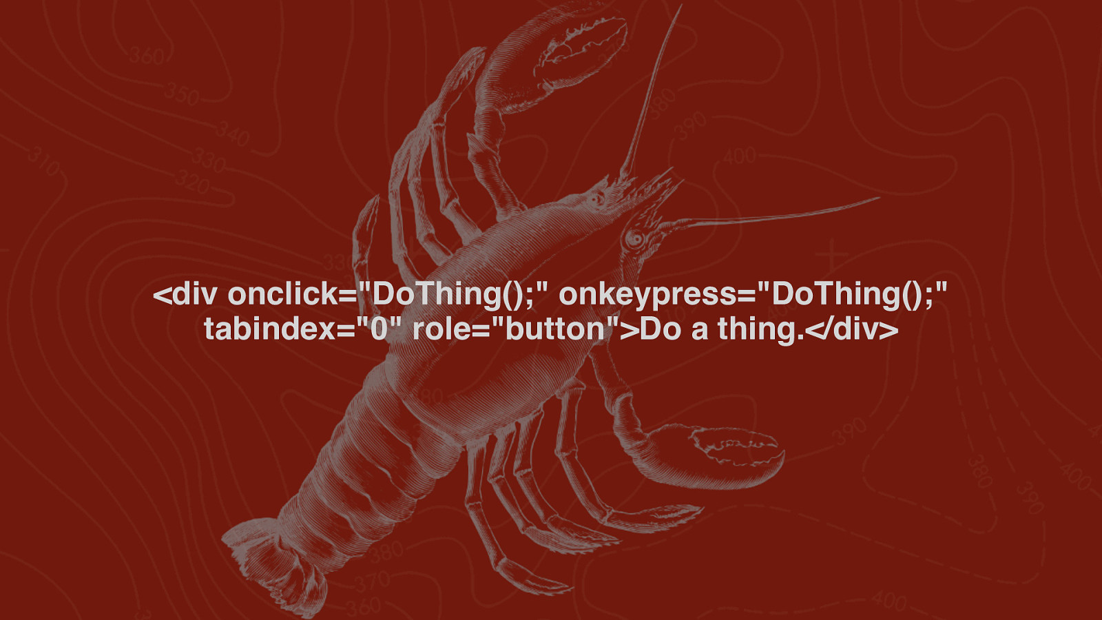
SPAN, DIV, AND IMG ELEMENTS ARE NOT FOCUSABLE UNLESS THEY HAVE A TABINDEX=”0″ ATTRIBUTE/VALUE APPLIED. TABINDEX=”0″ ONLY LETS THE USER TAB TO THE CONTROL BUT IT DOES NOT LET THE ONCLICK EVENT MAGICALLY WORK WITH ENTER AND SPACEBAR KEYS. YOU NEED A <BUTTON> FOR FREE KEYBOARD ACCESSIBILITY.
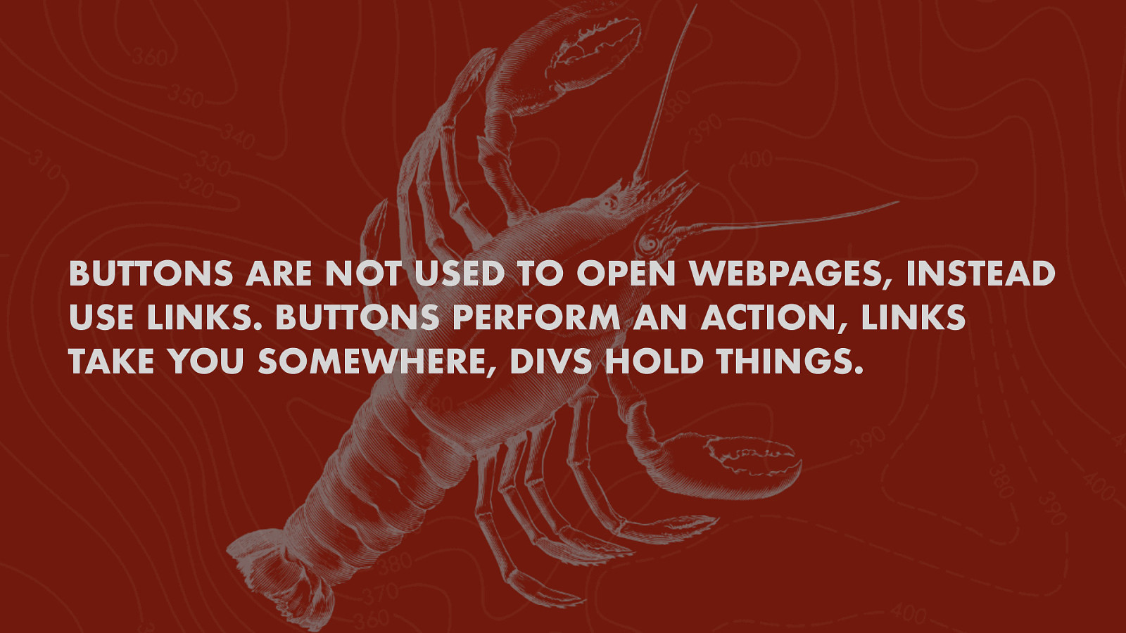
BUTTONS ARE NOT USED TO OPEN WEBPAGES, INSTEAD USE LINKS. BUTTONS PERFORM AN ACTION, LINKS TAKE YOU SOMEWHERE, DIVS HOLD THINGS.
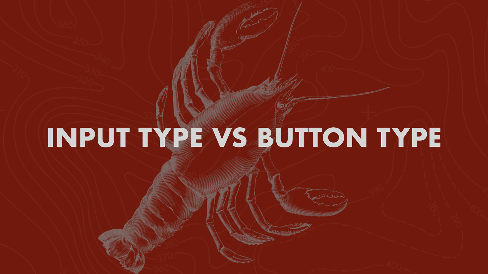
INPUT TYPE VS BUTTON TYPE
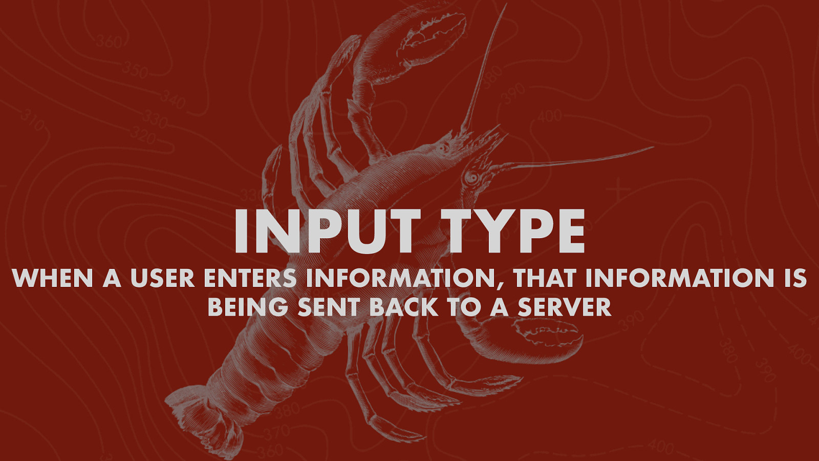
INPUT TYPE WHEN A USER ENTERS INFORMATION, THAT INFORMATION IS BEING SENT BACK TO A SERVER
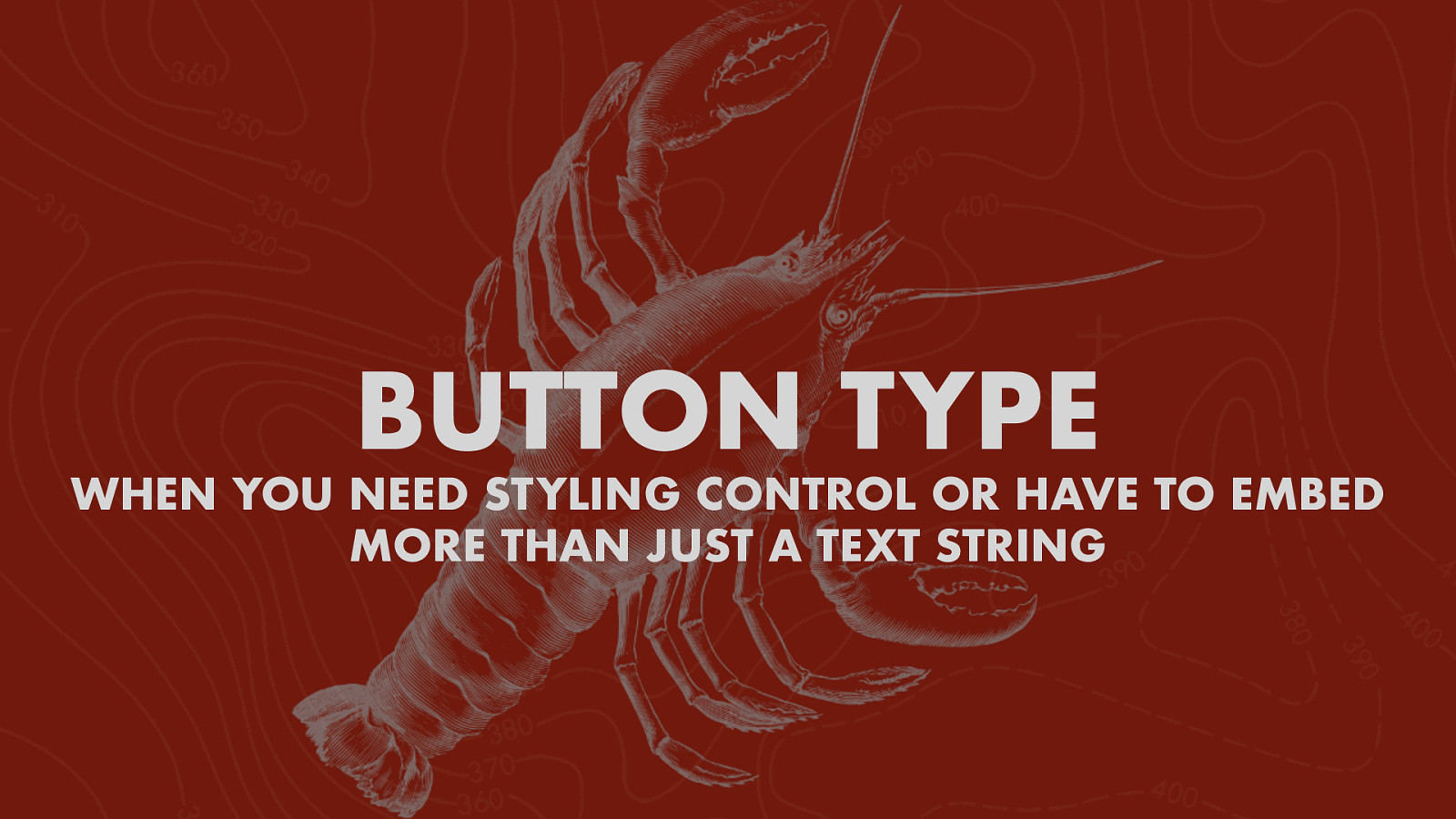
BUTTON TYPE WHEN YOU NEED STYLING CONTROL OR HAVE TO EMBED MORE THAN JUST A TEXT STRING
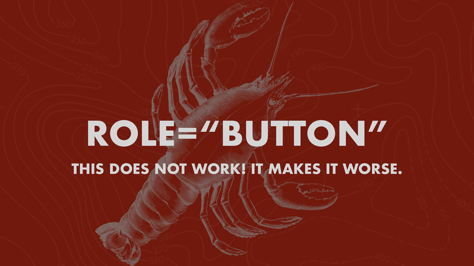
ROLE=“BUTTON” THIS DOES NOT WORK! IT MAKES IT WORSE.
IF YOU DO THIS…

SEMANTIC HTML KEYBOARD USERS WILL THANK YOU
BUT… BUTTONS SOMETIMES LINKS LOOK LIKE BUTTONS AND BUTTONS LOOK LIKE LINKS!
STOP IT! MAKE LINKS LOOK LIKE LINKS (A DIFFERENT PRESENTATION) MAKE BUTTONS LOOK LIKE BUTTONS (CUZ THEY’RE BUTTONS!)
EXAMPLES https://medium.com/simple-human/but-sometimes-links-looklike-buttons-and-buttons-look-like-links-9b371c57b3d2
ARIA Aria-pressed, aria-expanded, aria-disabled
ARIA-PRESSED
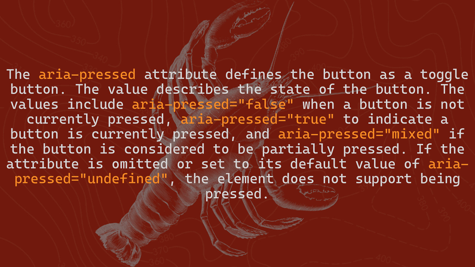
The aria pressed attribute defines the button as a toggle button. The value describes the state of the button. The values include aria pressed=”false” when a button is not currently pressed, aria pressed=”true” to indicate a button is currently pressed, and aria pressed=”mixed” if the button is considered to be partially pressed. If the attribute is omitted or set to its default value of aria pressed=”undefined”, the element does not support being pressed.
ARIA-EXPANDED
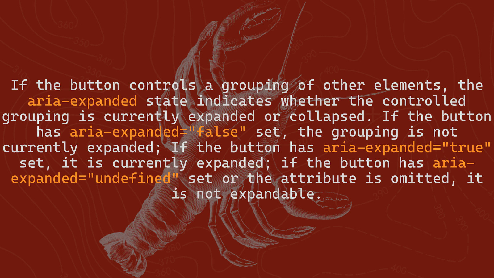
If the button controls a grouping of other elements, the aria expanded state indicates whether the controlled grouping is currently expanded or collapsed. If the button has aria expanded=”false” set, the grouping is not currently expanded; If the button has aria expanded=”true” set, it is currently expanded; if the button has aria expanded=”undefined” set or the attribute is omitted, it is not expandable.
ARIA-DISABLED
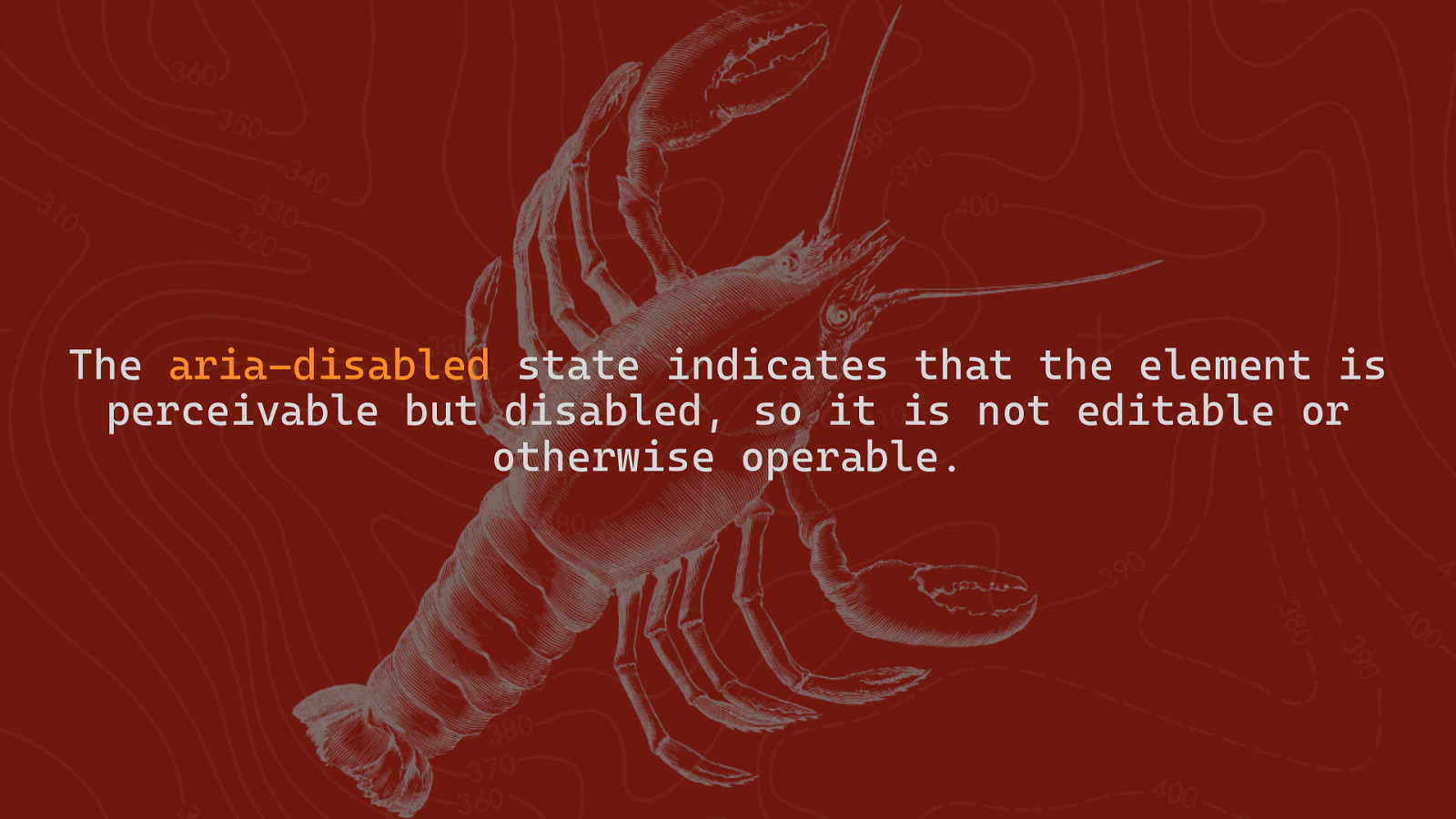
The aria disabled state indicates that the element is perceivable but disabled, so it is not editable or otherwise operable.
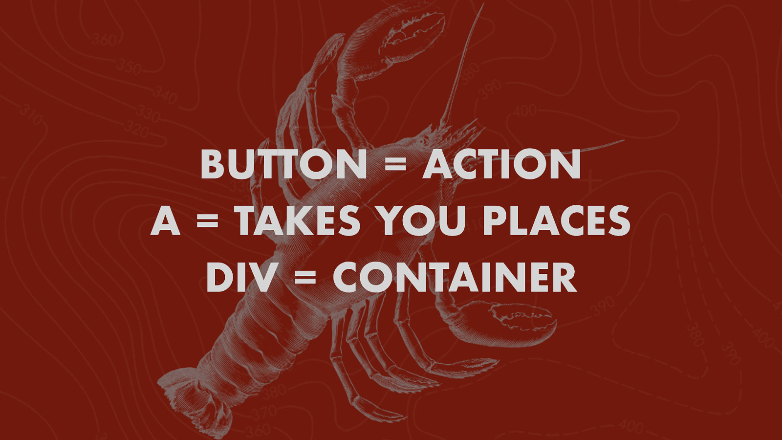
BUTTON = ACTION A = TAKES YOU PLACES DIV = CONTAINER
THANKS! @TODDLIBBY - TODD LIBBY