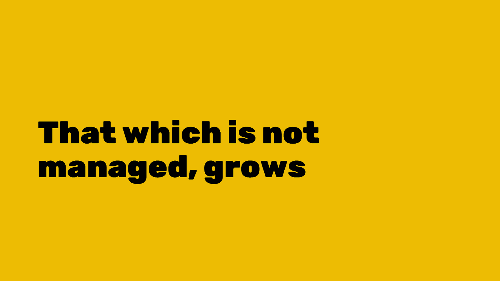
What's changed and where's it going
A Talk By Dave Rupert @davatron5000

A presentation at An Event Apart Washington DC in July 2019 in Washington, DC, USA by Dave Rupert
A Talk By Dave Rupert @davatron5000

This talk is a refresher course on Responsive Design. I feel like we’re at a point where RWD is nearly 10 years into Responsive Design and it’s a good time to reflect on all we’ve learned and also evaluate how it’s all going. A lot of my work in the last year or so has been rehabbing existing sites and I’ve learned a few things I’d like to share here today.

Let’s start by teleporting back to 2010… where it all started.
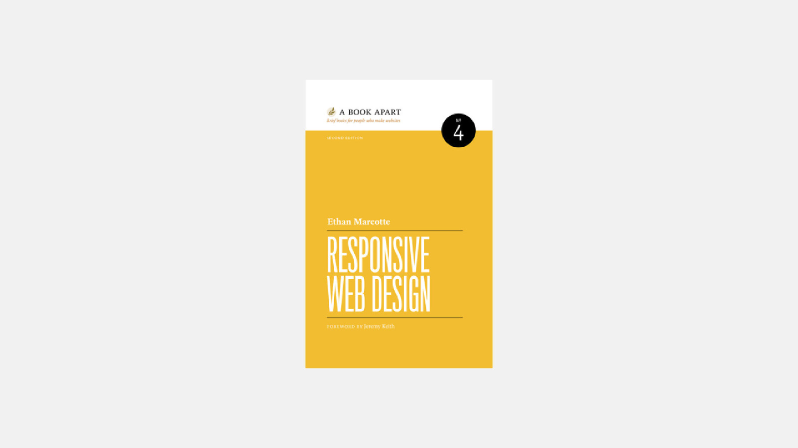
In 2010 Ethan Marcotte wrote a blog post that became a book called Responsive Web Design. During this time a lot of us were duplicating our effort by creating both a desktop site and an m-dot site that worked on these new-fangled iPhones.
In his blog post Ethan propsoed a new technique where you can use a combination of three things to create a site that works on both desktops and phones:
I was mad at Ethan for this. It was pretty disruptive to our pixel perfect workflows that we had essentially mastered. But the more we played with it, the more we realized the potential.

But in 2010/2011, RWD is still very much a web design technique.
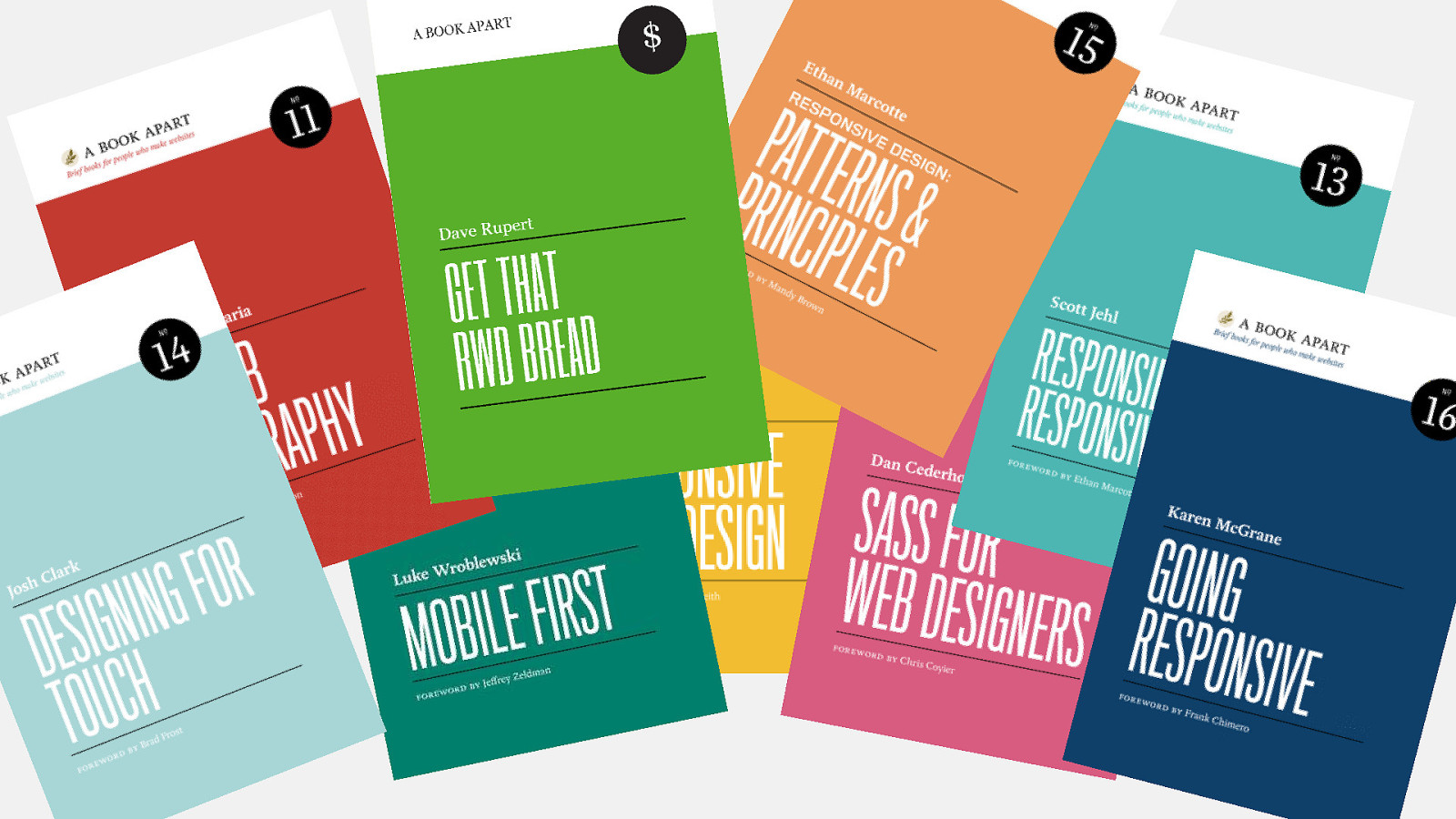
Slowly but surely, more and more concerns were piled on and the breadth of things you needed to understand to make a Responsive Website grew and grew.
Karen rightly pointed out that RWD is starting to impact our businesses. Through her and Ethan’s

It’s at this point, RWD pivots from a technique, to a philosophy.
In order to make a website, we now have to have some proficiency in…

If we look at some data we can see this explosion of concerns…

Let’s go back to 2014 and I picked 2014 for two reasons…
A lot of the website I’m being called in to help on are from this era and perhaps you have one too.
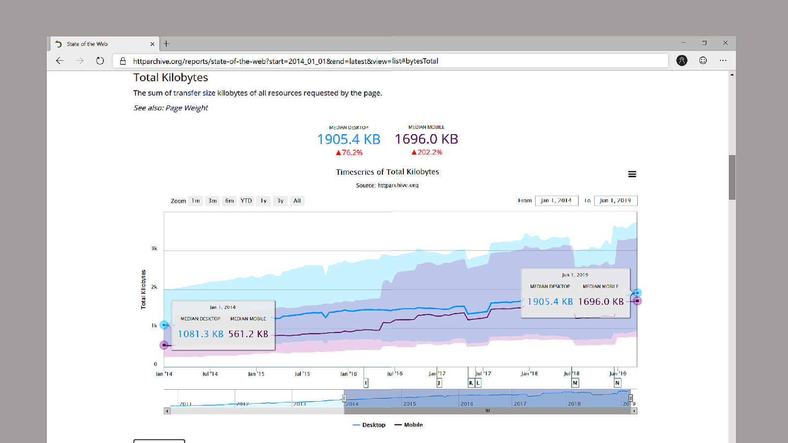
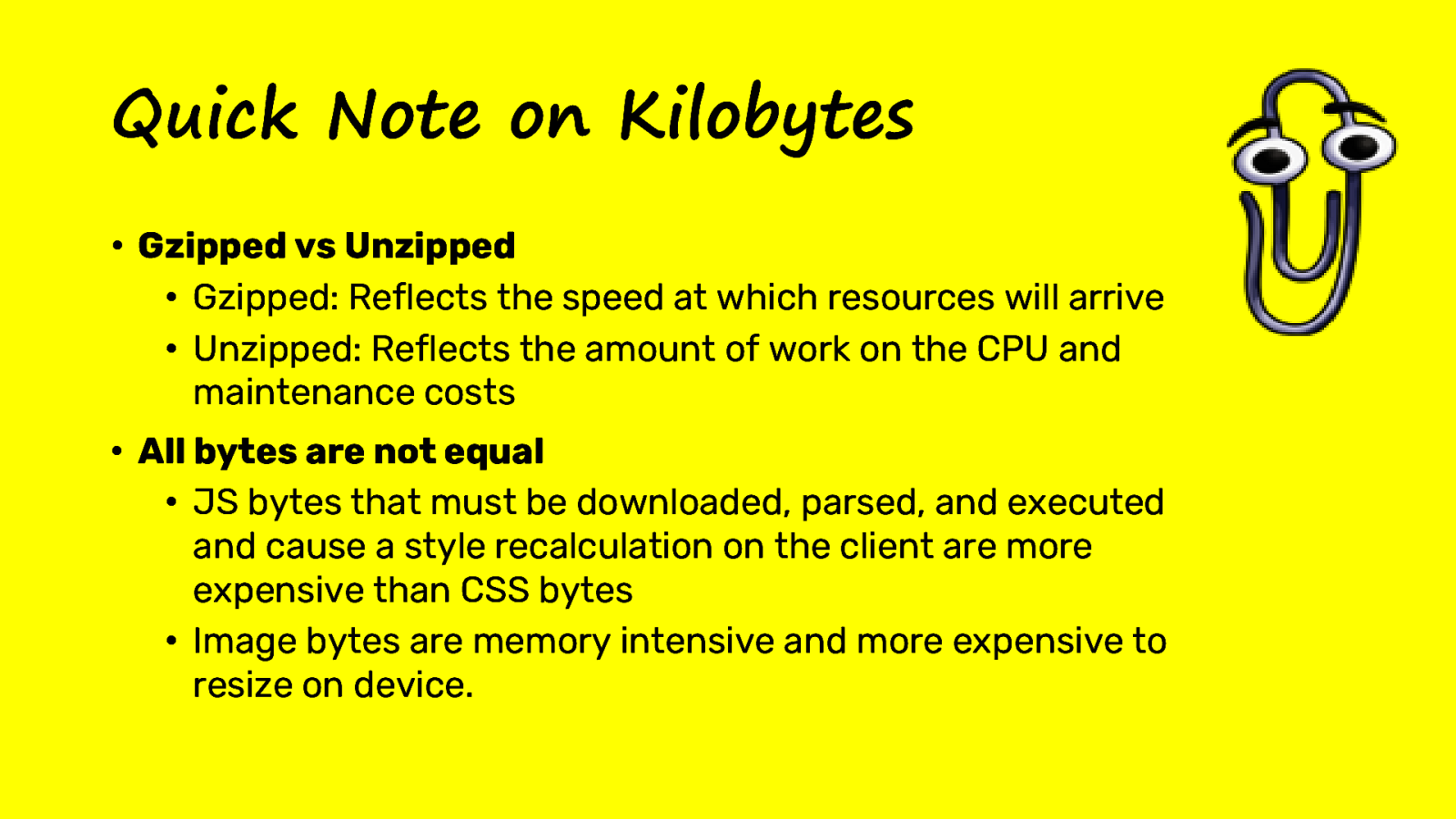
According to HTTP Archive, the average Mobile site has more than tripled in size since in the last 5 years from ~560kb to ~1.7MB. Don’t look at the Desktop stats, we’re only looking at mobile because that’s the only thing that matters.
JavaScript! JavaScript! The problem is JavaScript… well…
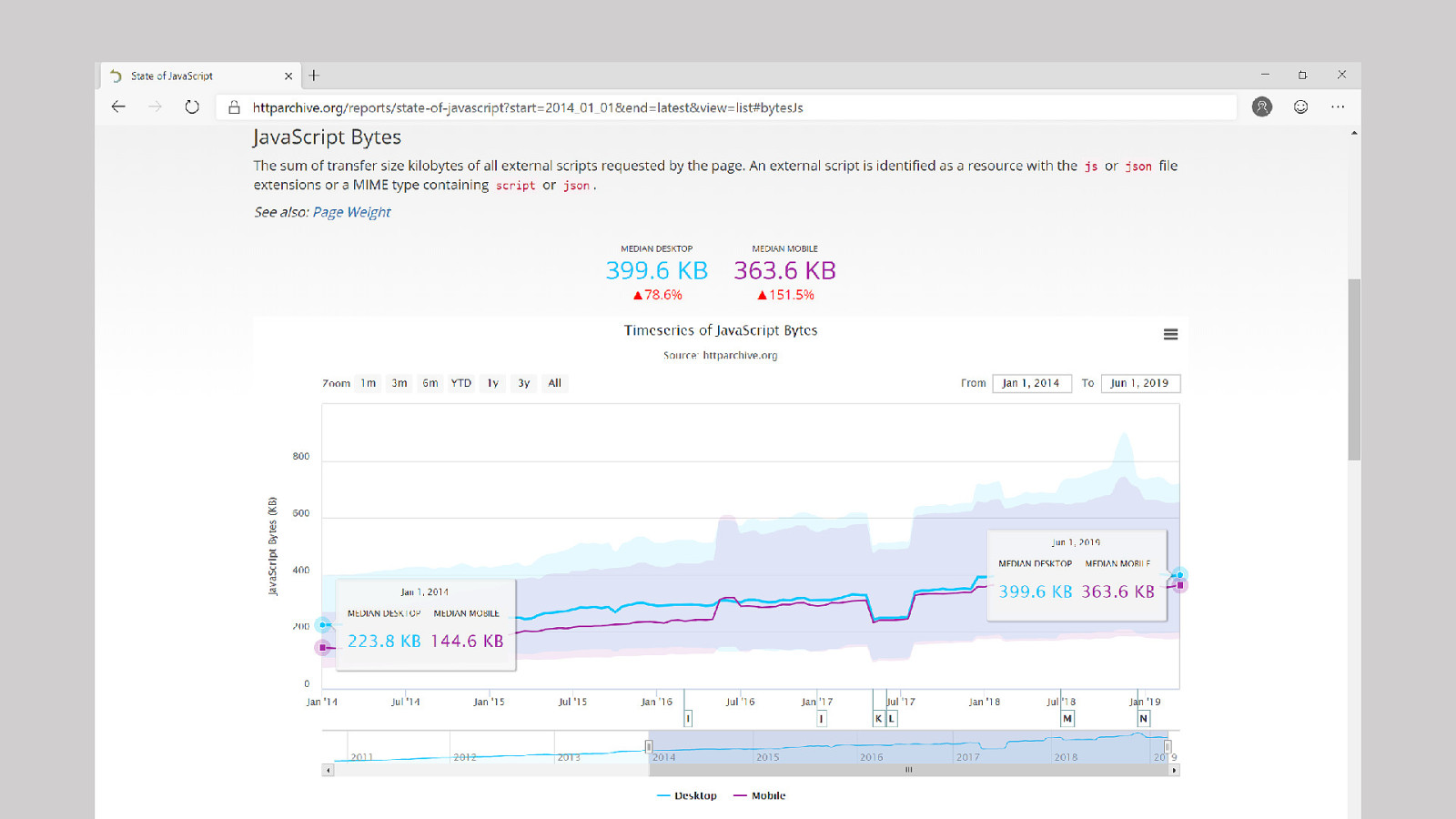
Not necessarily… but it’s still quite a lot.
JavaScript we’re sending to Mobile has more than doubled over the last 5 years. We’re now sending ~360kb of JS. And it’s important to note, this is just the transfer size, the actual JavaScript size is considerably more than this.
What about CSS?
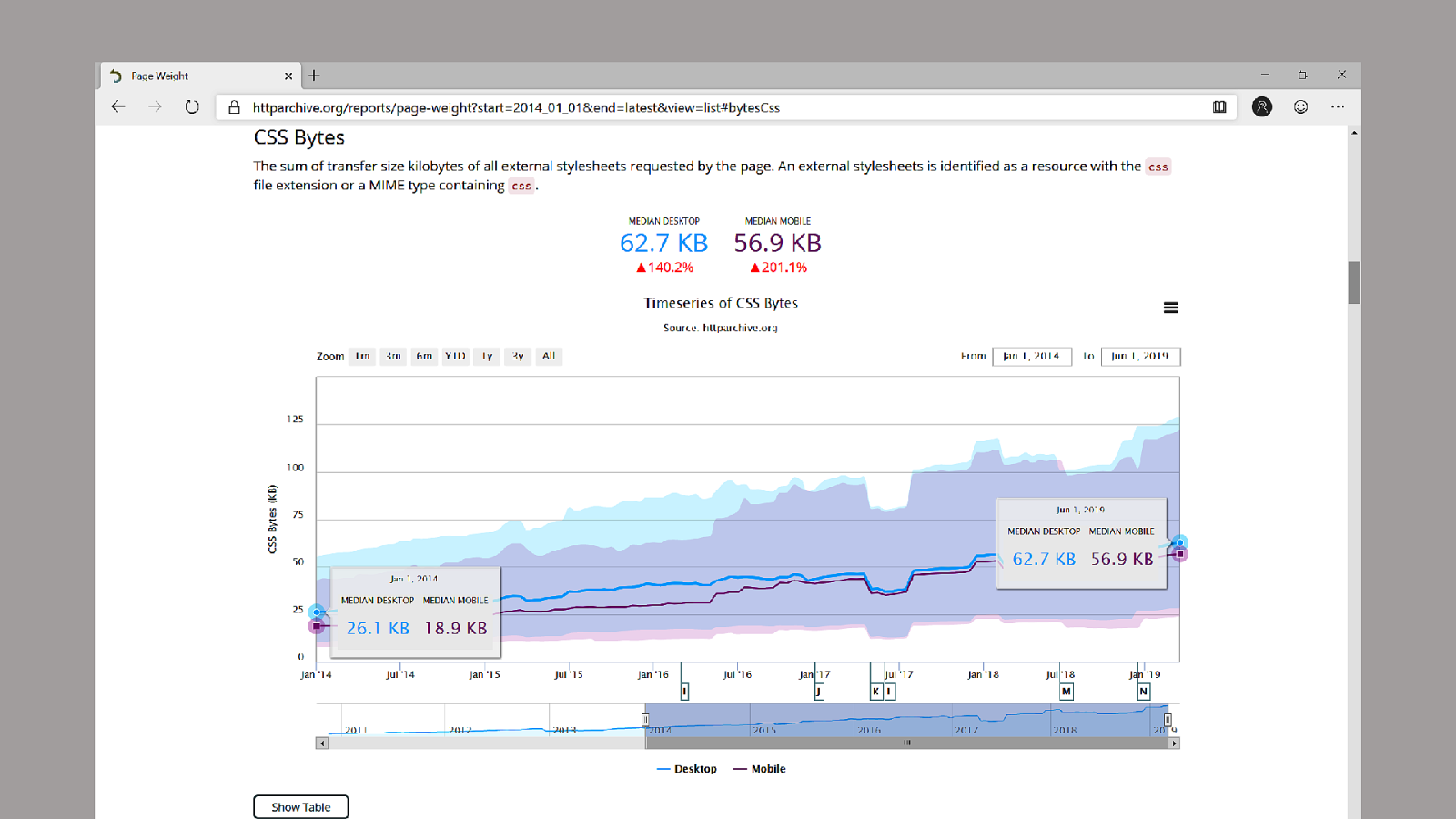
CSS has actually tripled in size over the last 3 years from 18kb to 56kb.
This is really curious to me because I don’t exactly think we have 3x the style problems compared to 5 years ago. If anything, with browser standardization we’ve removed the need for *most CSS prefixes.
I’d love to dig into this more. I wonder if CSS frameworks play into this or if we’ve all just got lazy.
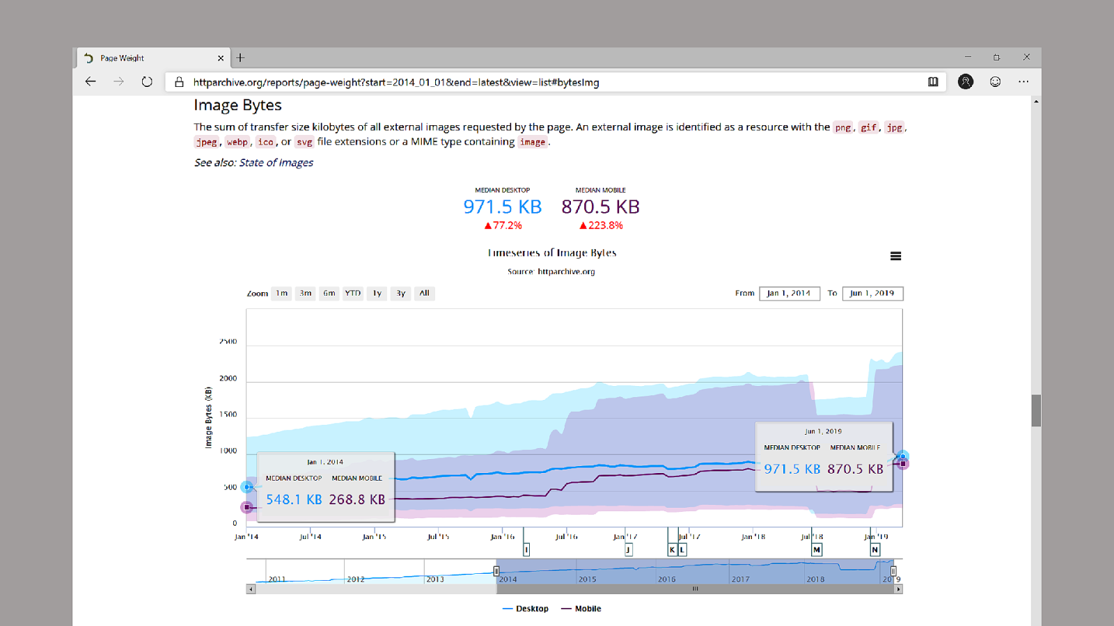
Now images make up the brunt of the website bloat. I have mixed feelings about this…
On one hand, we most certainly are sending down bloated images to the client. I’d bet you $100 I can unoptimized image on your homepage.
On the other hand, the Mobile landscape has changed. With 2x and 3x phones we have to send down larger imagery. And in the era of Instagram and Snapchat it’s really important that your brand maintains a level of visual fidelity.
So in someways, I want to externalize this blame say “not my fault” but also acknowledging there’s things I can control.

But Aren’t mobile Phones and mobile connection speeds getting faster? Won’t this problem go away?

Yes but No, Actually.
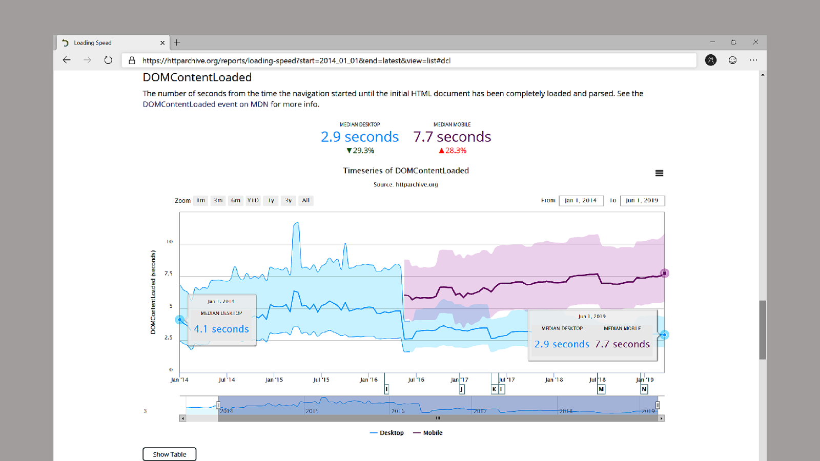
This chart is great because the dataset for DOMContentLoaded for Mobile and Desktop was actually joined together, but in ~2016 they started collecting different metrics for mobile and desktop. And you can see how mobile, even though devices and connection speeds are getting faster, this even where HTML says it’s ready has slowly creeped upwards.
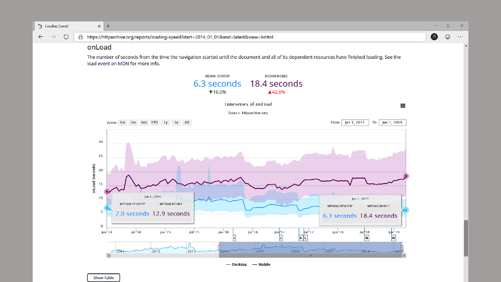
The chart of onLoad, the point where the browser has everything it thinks it needs for the page, fills in some of the details. We see the average mobile site has gotten ~6s slower, while the average desktop site has gotten ~1.5s faster.
Despite advancements in technology, mobile sites are getting slower. And this is due to all the HTML/CSS/JS/Fonts/etc that we’re sending to the device.
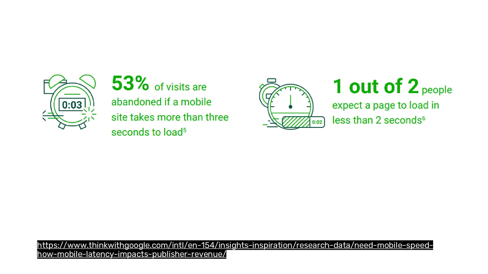
Why does this matter?
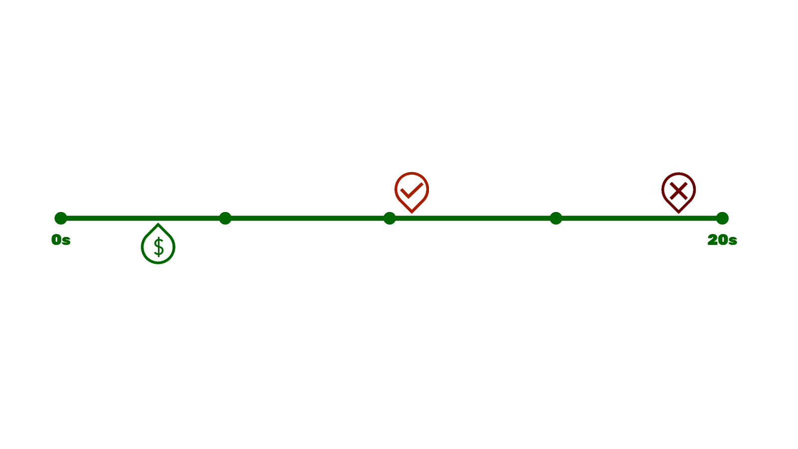
Accordion to DoubleClick’s study on the impact of mobile latency we know that 53% of users abandon a site if it takes more than 3s to load. 50% of people expect a page to load in 2s…

The average site takes 18.4s to load…
But the money zone is at 3s…
This is an incredible gap to close.

I thought it’d be good to look at some examples. These are all sites I’ve worked on in the last year or and while I’ll talk mainly about one site in particular, the stories here are mostly the same and
Khoros was a 6 month project, but 3 weeks into the project our client (spredfast.com at the time) announced a merger with (lithium.com). A couple weeks later we got a new creative director. A couple weeks later after the dust from the merger had settled we had a different CMO than the one that hired us. And a month after that it was decided there would be a NEW comapny established. But we still had an early March deadline. And the big catch was the branding (fonts, colors, logo, etc) for this new company wouldn’t be ready until early February. We had one month to build out and deliver a website coordinating with their in-house designers and content people. We all got a few grey hairs in the process, but using the power of a design system, we were able to meet the deadline.
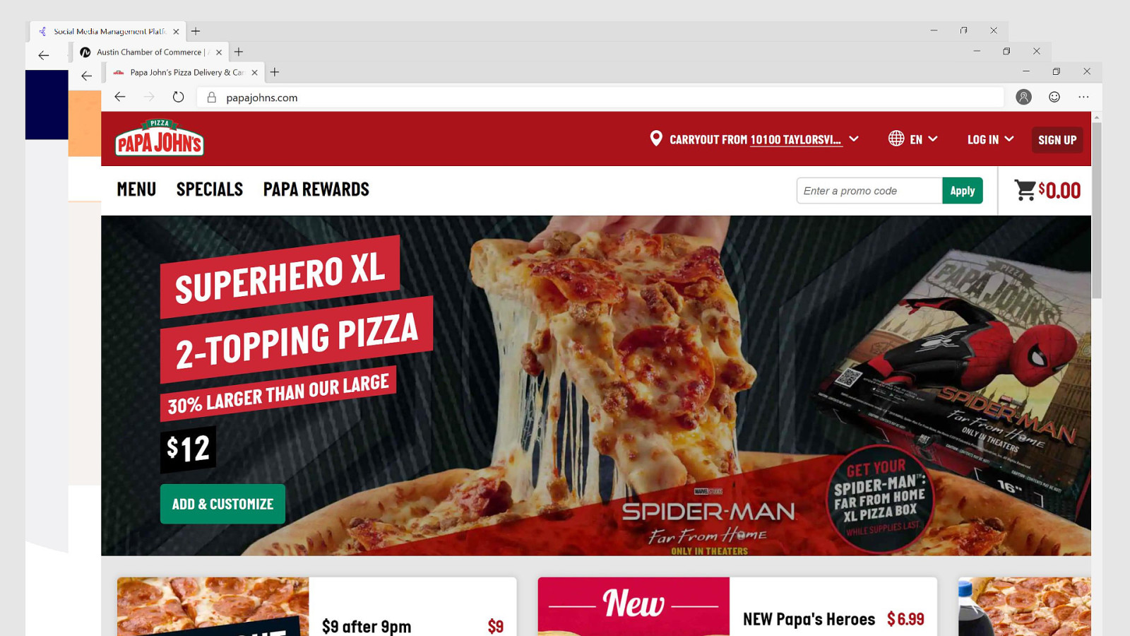
We recently launched the Austin Chamber of Commerce’s new website. We worked with them on establishing a new look and feel for this organization that plays a big role in attracting business to Austin. In about 3 months we handed off a design system to a development team who integrated that in nearly 3 months and we had a website. They even started building pages using the components without even asking us, which honestly was the entire goal of delivering a design system.
We helped a small pizza company from Kentucky update a few areas of their site. Addressing the elephant in the room, Papa Johns is a company that has undergone quite a few changes in the last couple years. Apparently Shaq is on the board now and visits the office!? One thing I’ve learned over the last couple years is that a lot of times the headlines in the news are very different than your experience and the diverse team of people you work with.
Papa Johns makes an interesting case study because this is a site that was handed off by Happy Cog (a talented agency and friends of my shop Paravel), but over the years the site - just like many sites I see - just grew and grew and grew.
How big you ask? Well…

They were sending down 1MB of CSS and 1MB of JS. Now this gzips down to around 256kb and 300kb. But. This is a lot of code.
How much code?

Approximately 37,000 lines of CSS. This is a maintenance burden. Every time you write a line of CSS, you have 37,000 potential collisions. This is a lot and makes it difficult to work in and it appears that most people would just copy and paste whole sections and give it more specificity to work around this issue.

So… let’s talk about managing CSS.

This section of my talk is going to sound really familiar, it’s a classic design system story.
We found ~32 different buttons on the site. The bulk of that was ~20 different green buttons with slightly different spacing, border-radii, sizes, and icons.
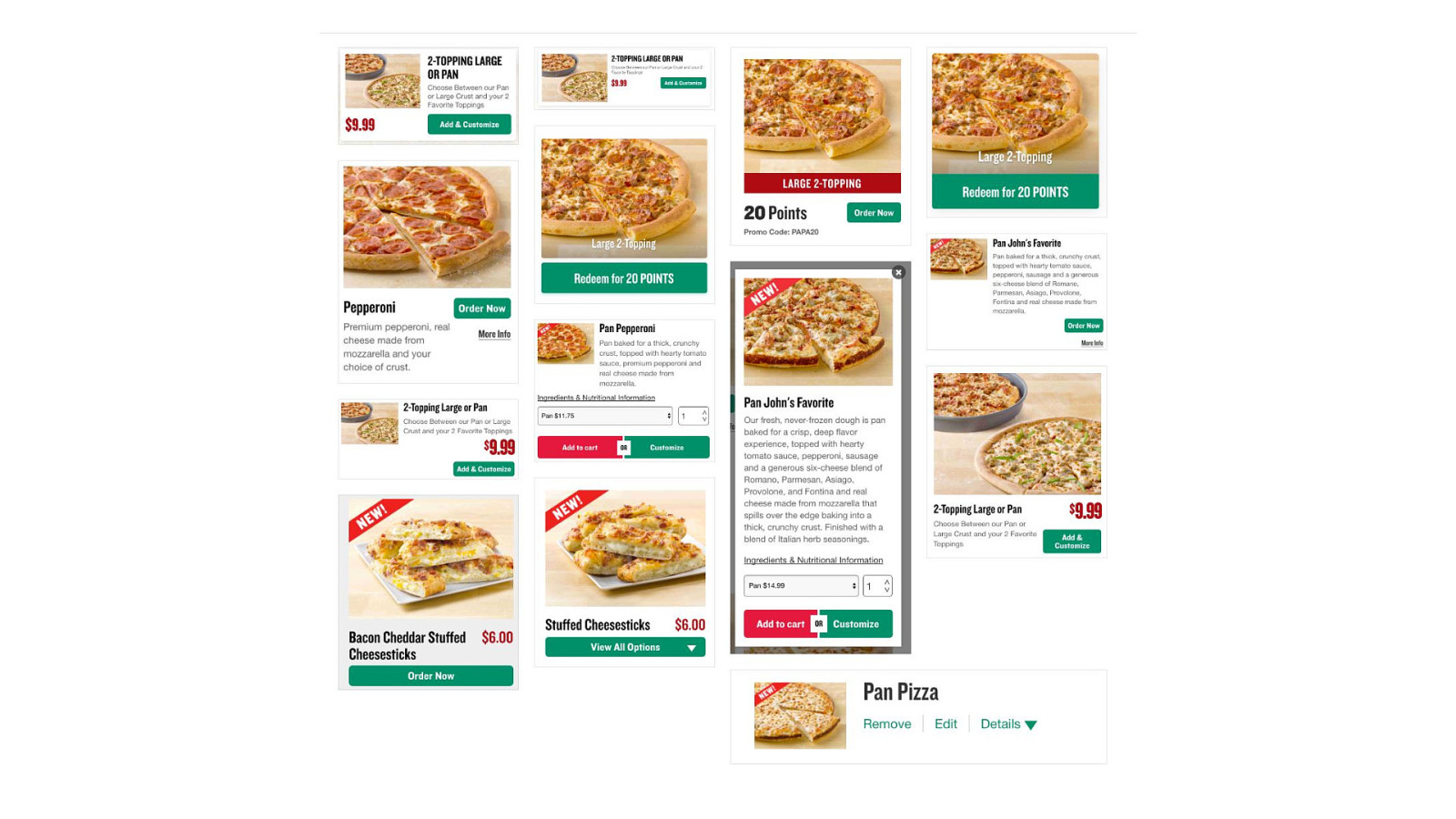
Digging in we found ~14 different product cards on the site which is somewhat unexpected for a company that more or less sells one product.
There’s more examples here of course, but hopefully we’re getting a sense of the explosion of variants that happened one small decision at a time over the life of the product.

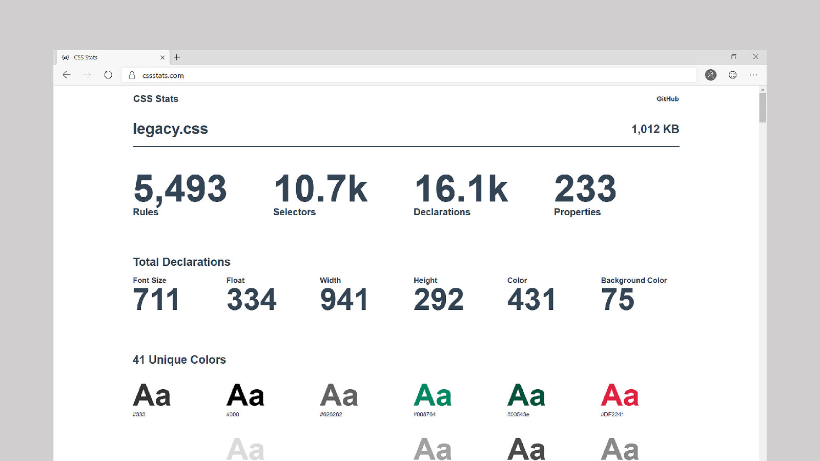
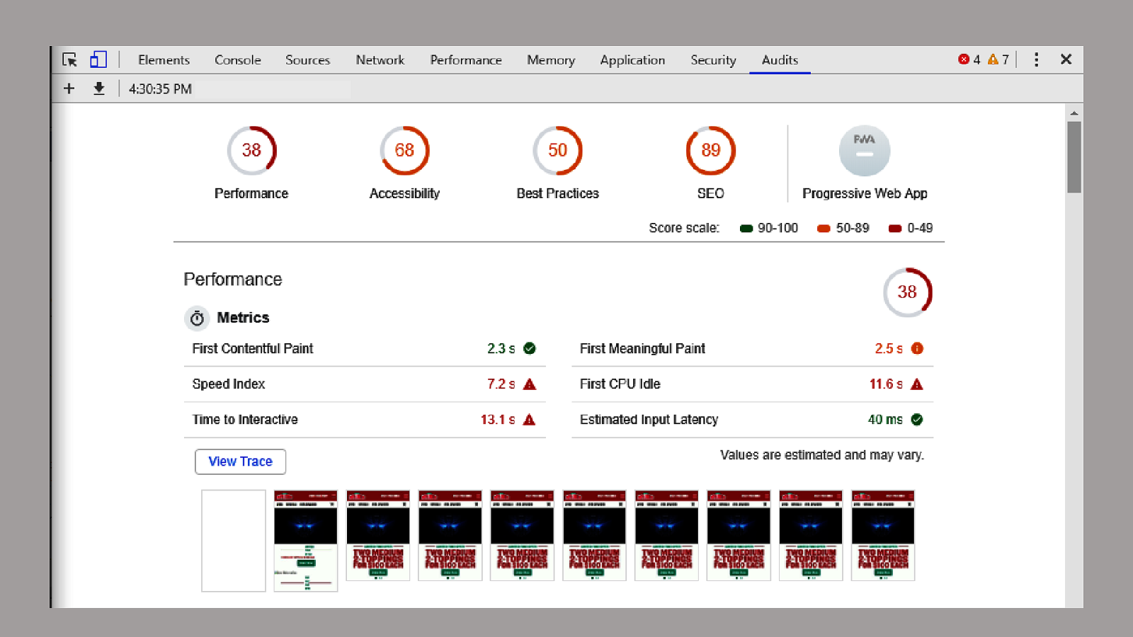
I find it really helpful at the start of a project to measure what you’re up against.
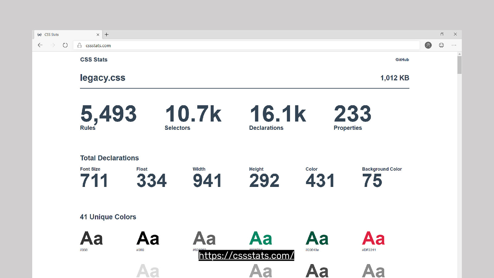
CSS Stats is a great tool that can help give you a 10,000ft view of your CSS file. You can see the 1,012kb (I wasn’t lying 😉). 10k selectors, 16k declarations, 711 font sizes, 75 background colors, and 41 unique colors for a site that really only has 3 colors red, white, and green. And black for text.
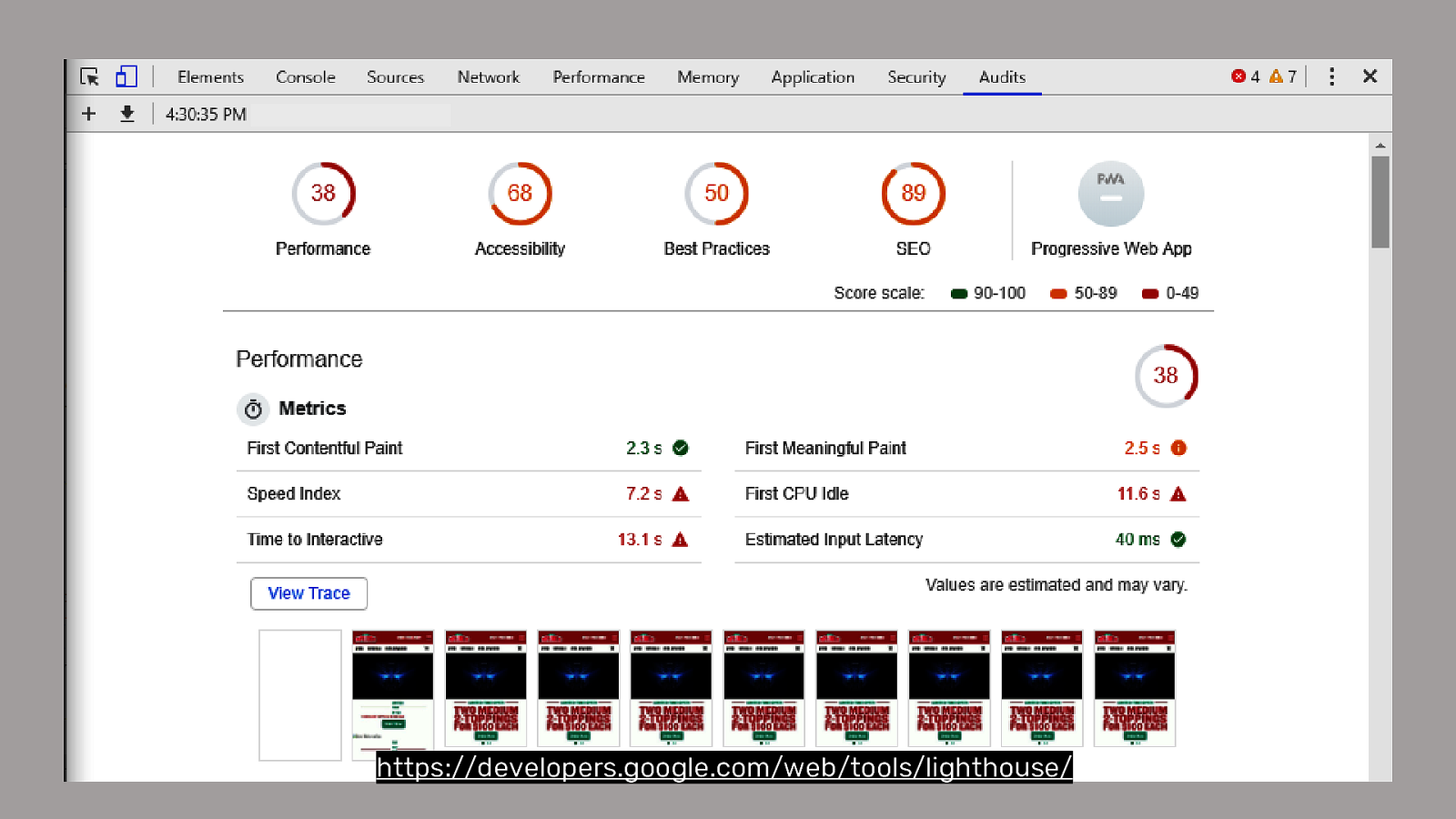
Lighthouse is built into Chrome/Edge/Opera/Brave so you have no excuse not to use it and run it on your site right now.
It gives you a rating on your Performance, your Accessibility, UX Best Practices, and SEO.
But I have some rules about how to use this tool. When you start it up you get asked to choose your Speed and we -in this room- choose Mobile with Applied 4G with 4X Slowdown. In this house we’re mobile first and don’t trust in vanity metrics.
These measurements are from a remote pre-production environment and won’t really reflect all the third-party scripts and CDN etc that might impact the site. Always know the limitations of your data.

The next step is doing the work.
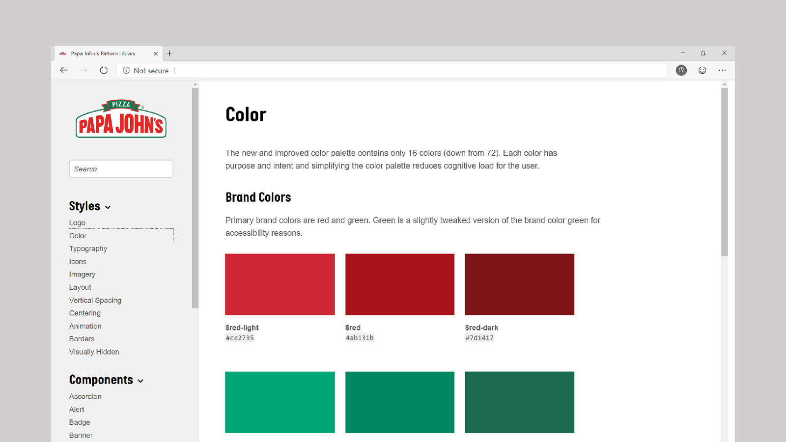
We reduced and improved the contrast of the colors to meet WCAG 2 AA recommendations and got the number down to ~16 colors and maybe 8 of those are greytones.
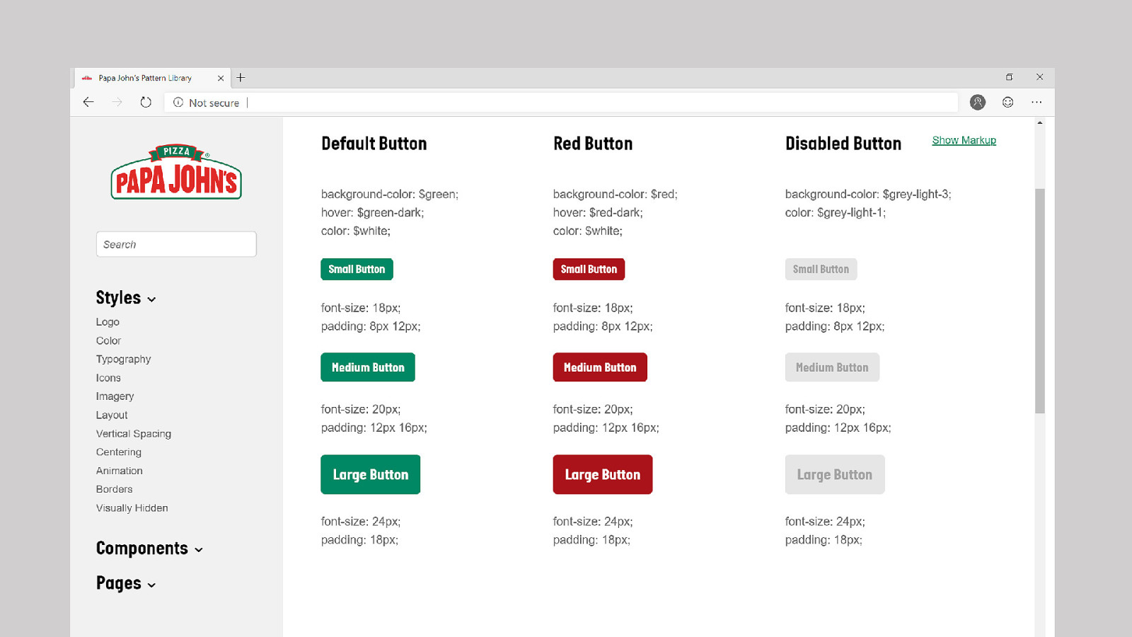
32 buttons became about 12. The majority is this matrix of 9 colors: 3 colors × 3 sizes. Using color and size we can prescribe consistent meaning though the site.
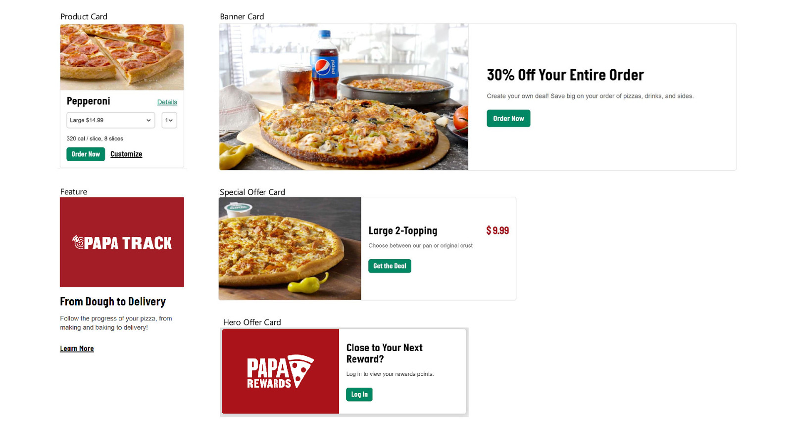
We ended up with ~5 different product cards each with similar, cohesive style but different define usecases.

Now that we’re finished, let’s measure the site and see how we’ve done…
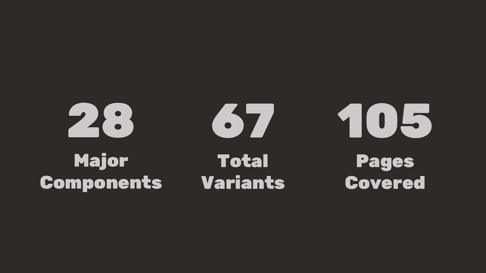
28 Major Components 67 Total Variants 105 Pages Covered
Pages play a crucial role in how we build design systems. Pages
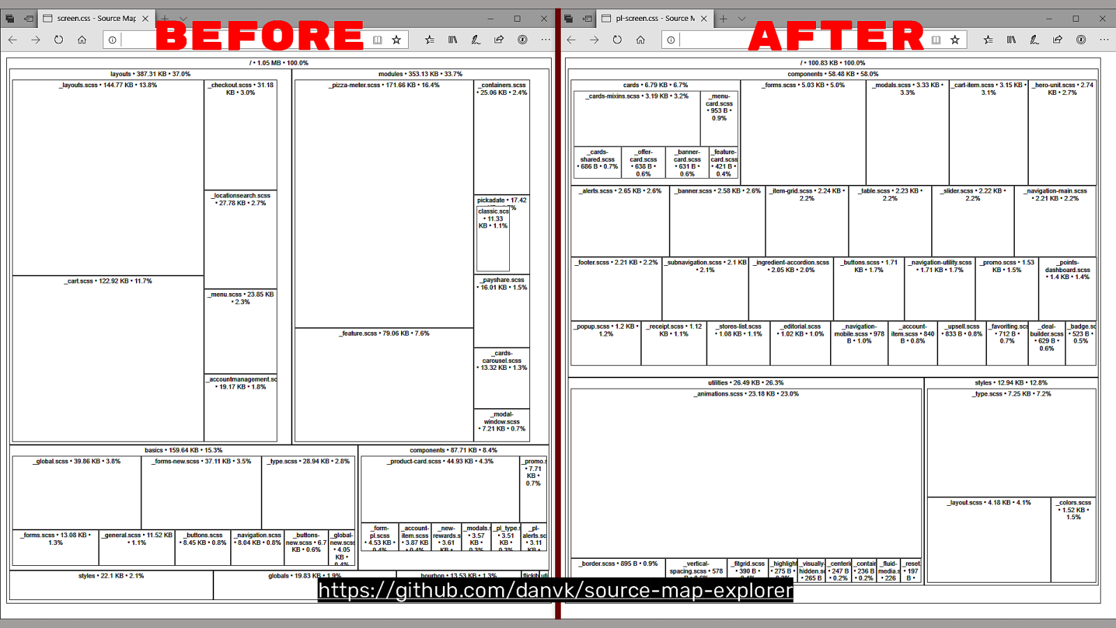
One other tool I use is source-map-explorer which takes your Sass and JavaScript sourcemaps and breaks them out into a treemap. This a good way to see files grouped together. On our “AFTER” side, the top half is our components and the bottom half are our utilities…
(Disclaimer: Animations is coming in verrrry large. There’s no way we have 28kb of animations. I think this is a problem with third party CSS getting lumped in)
I have some interesting data from this. Looking at my components, knowing I have 28 major components and 56kb of component CSS, I know that components average about 2kb of CSS. So if someone wants a new component, that’s going to add ~2kb of CSS to the total unzipped size. Variants? About 800 bytes each.
This is cool data to have and this visualization allows you to audit your CSS, combat the bloat, and you can identify large bits of CSS that you can potentially whittle down.
Let’s check CSS Stats for the before and after…
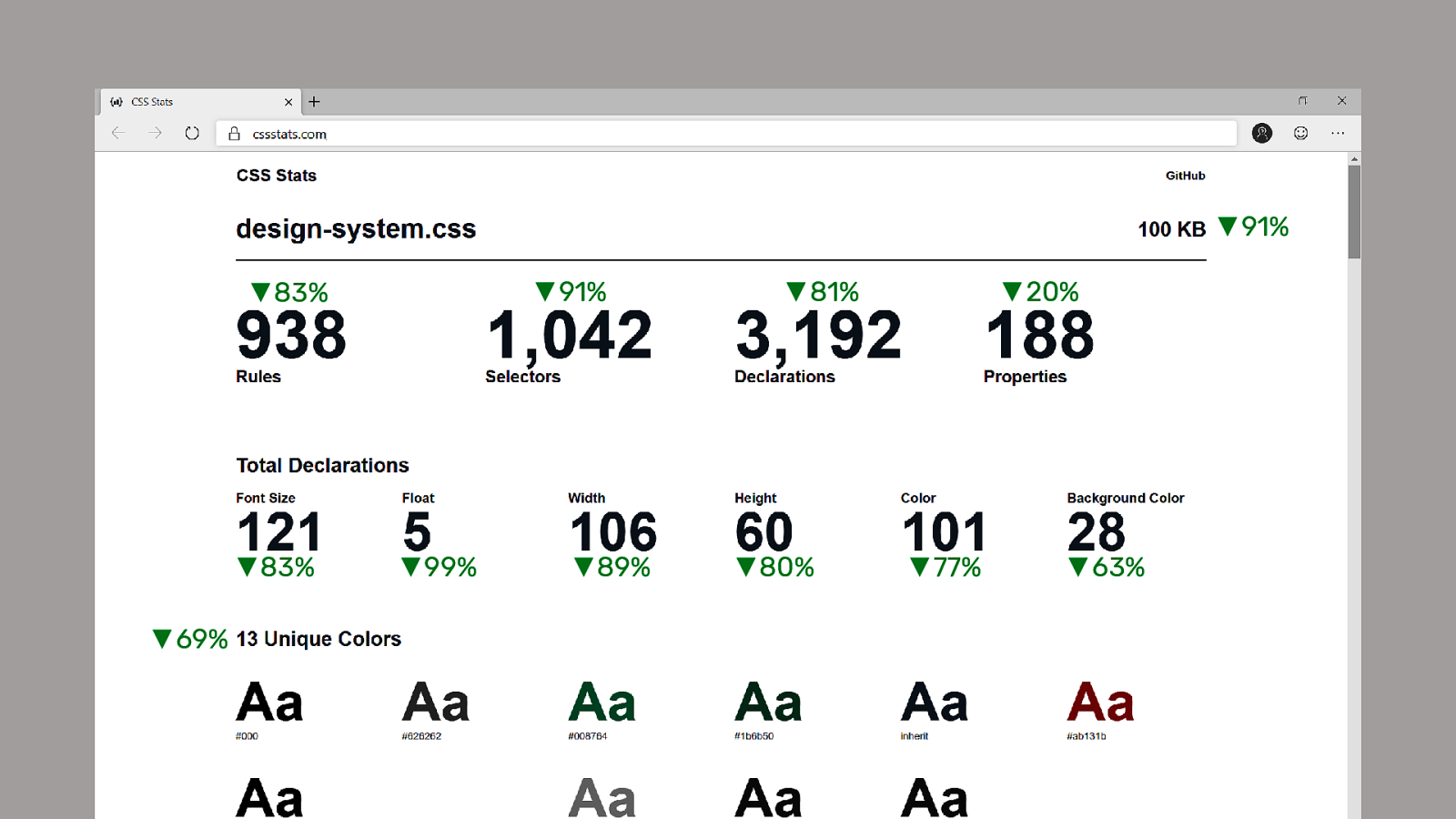
We reduced our CSS 91% to 100kb. This gzips down to ~14kb and we know it can build ~105 pages on the website.
Let’s check Lighthouse…
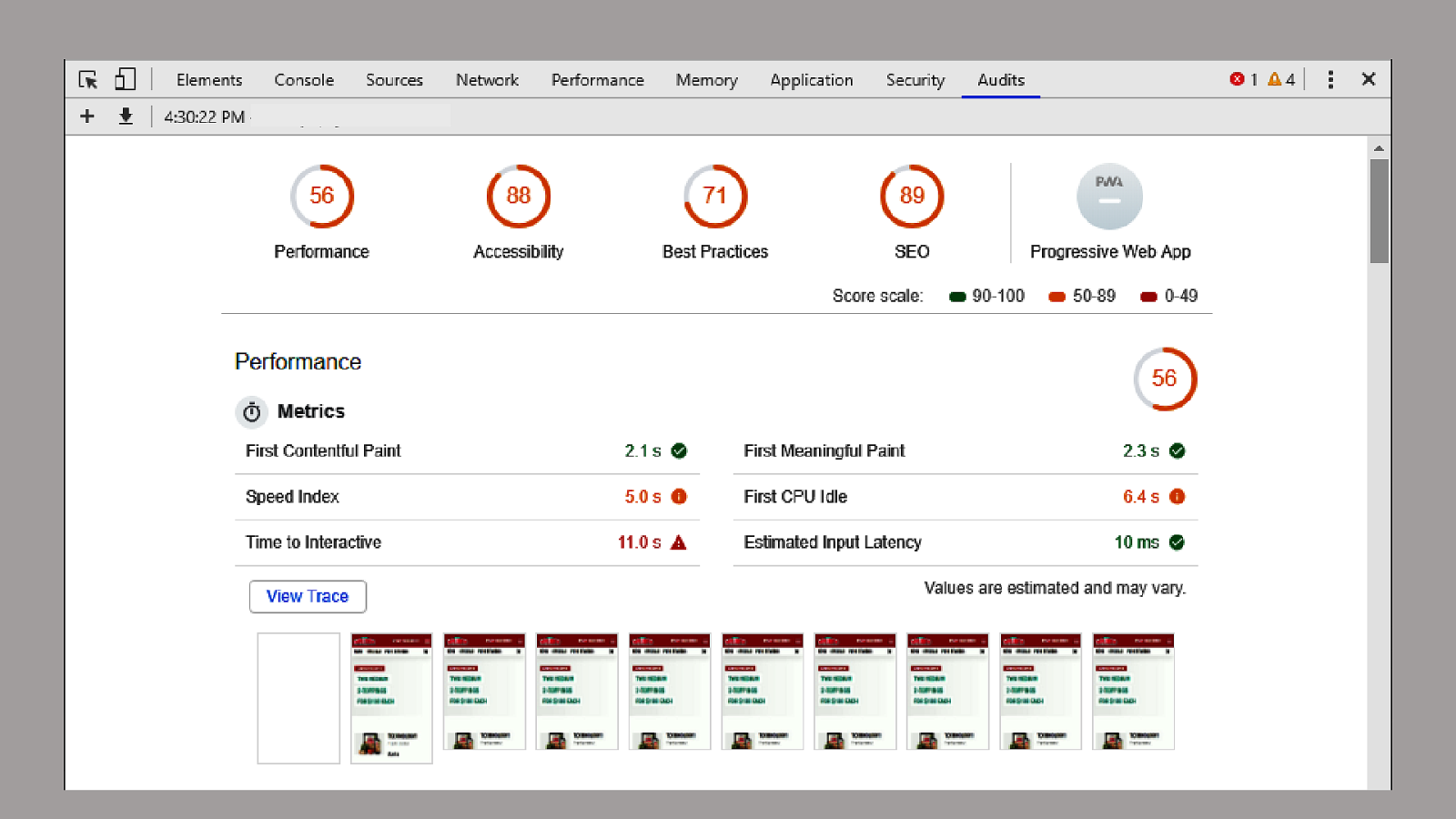
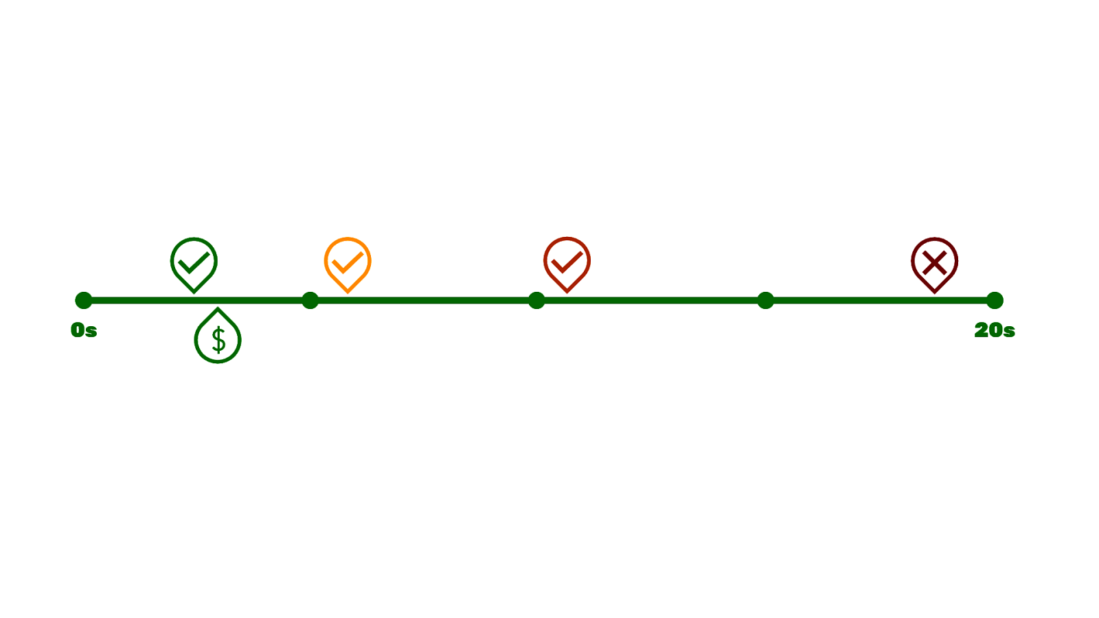
Not green across the board, but getting closer. You’ll see the number of green checkmarks goes up to up to 3 and we lost 2 red checkmarks.
Looking back at the money zone, our CPU Idle time, that’s more or less the onLoad meaning the CPU has a chance to take a breath…
Moved up to 6s. We’re getting closer.
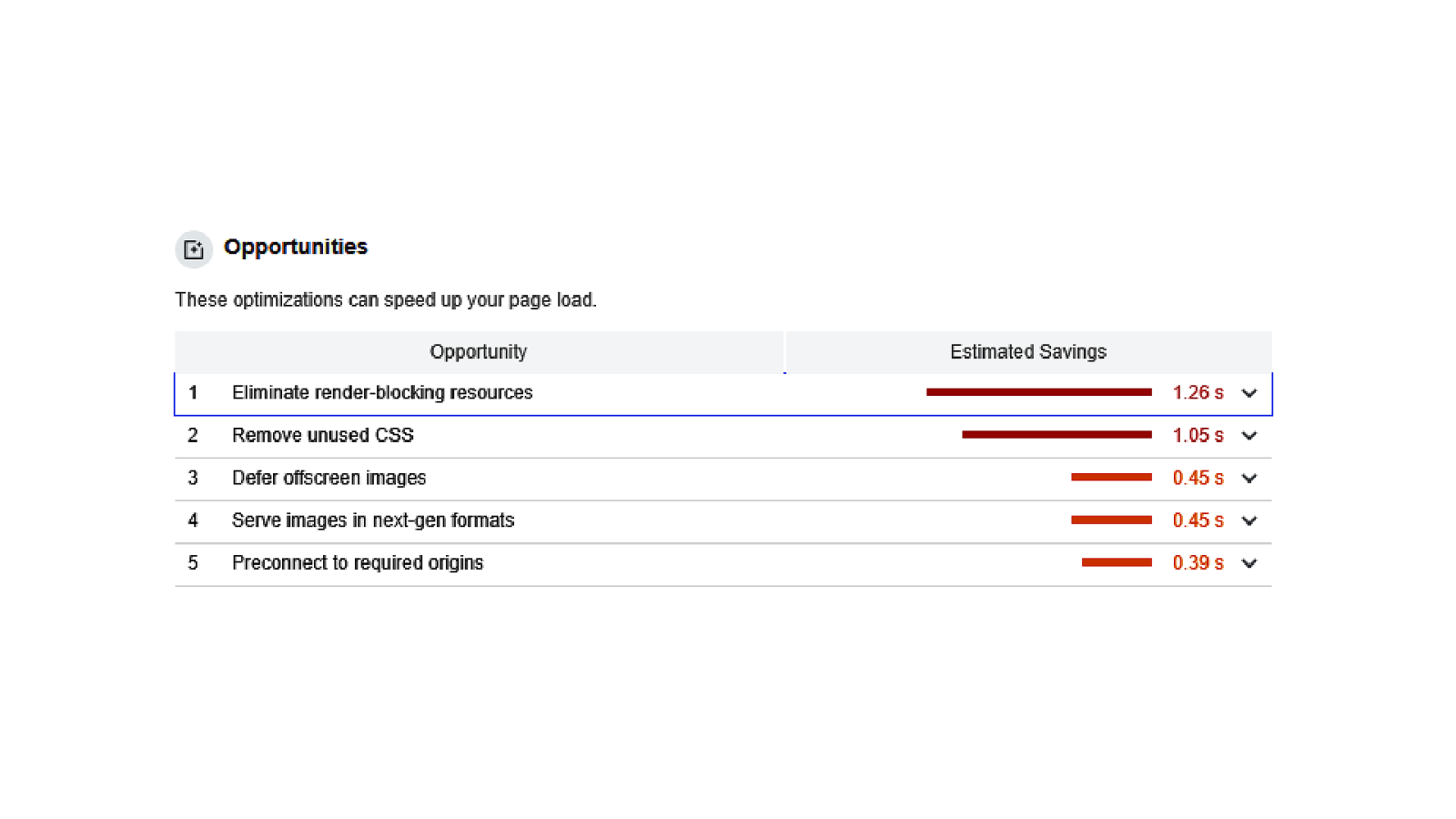
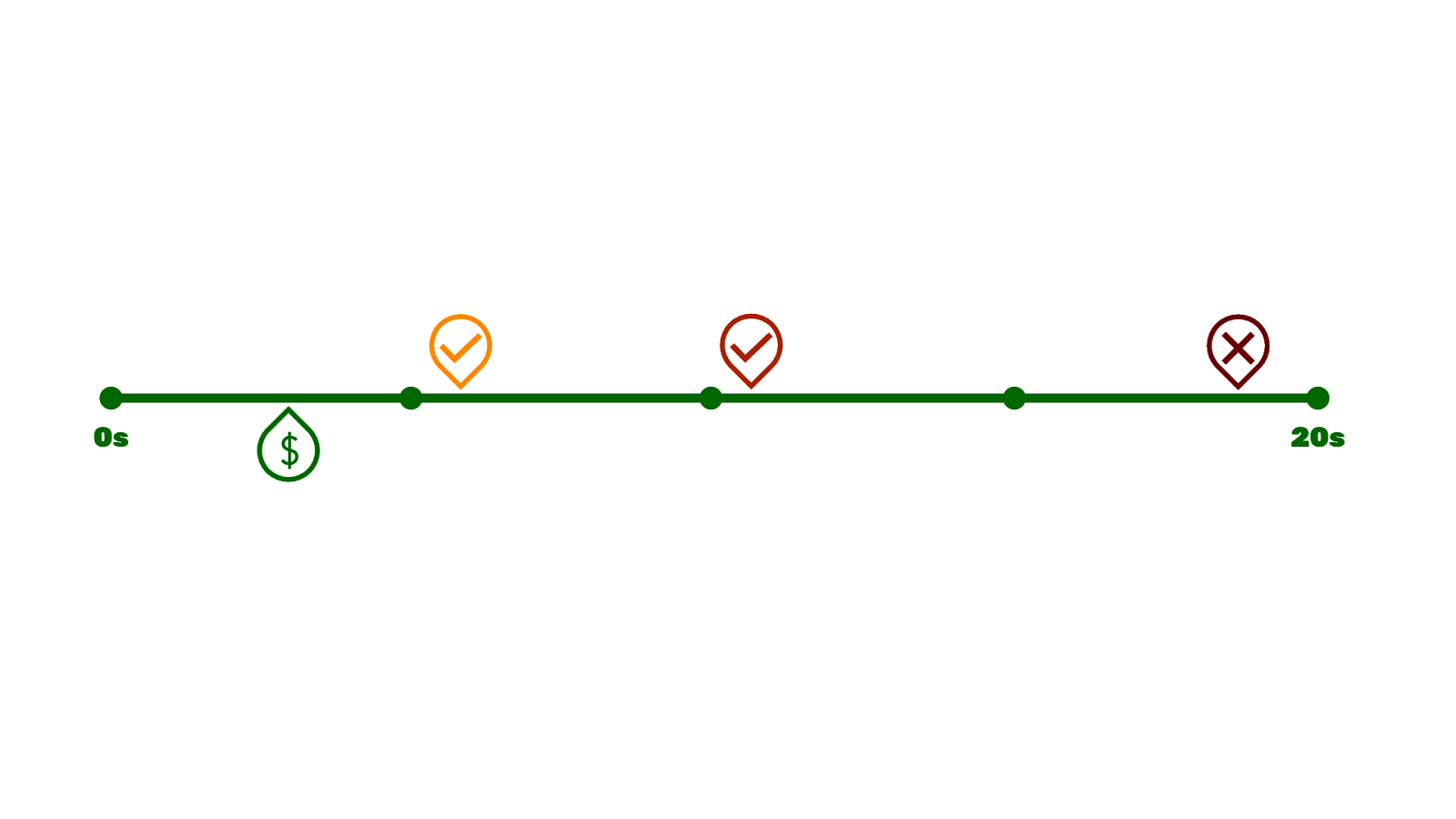
What’s nice about Lighthouse it gives you recommendations for how you can improve your site and shows the estimated impact it might have on your site…
Doing those tasks has the potential to move us into that money zone.


Over the last 5 years the JavaScript community has (more or less) settled on using npm to install dependencies, called “packages”, from the Internet.
This replaces manually going to a website, downloading a zip file, and then extracting that to your project inside a poorly organized directory structure.

Using npm to install these packages gives us a package.json which is a file that lists our dependencies. This is what we want. If you hop into a project, you can look at this file and get an idea of what technologies this site relies on. And if npm disappears tomorrow and is replaced by something else, we’ll have this list of packages that our needs to function.
And if these dependencies have dependencies, npm will fetch those files too. Very often, this can get out of control end up with thousands of dependencies… but hey.. at least it’s all organized.

JavaScript has also gained a native module importing syntax which improves the authoring experience of JavaScript.
You can import packages as objects and then write your JavaScript and then export pieces of your JavaScript that other files can import and use.
Imports and Exports. It makes decent sense.


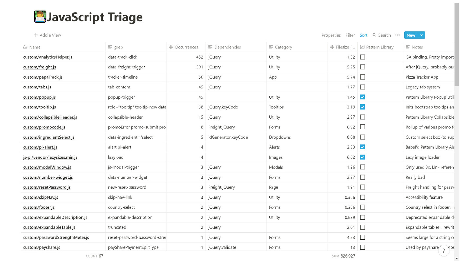
I took a couple days to manually audit all the JavaScript in an app called Notion. I have all 67 files in here, found a little snippet as an identifier I could search the code base with, I found the number of occurrences of each, documented their dependencies and page weight. It was quite illuminating.
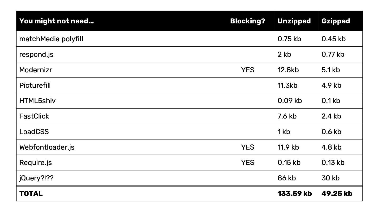
Looking at the codebase I found a few Responsive Design Solutions™ that you might not need anymore…
matchMedia polyfill - All browsers have this, even IE respond.js - A media query polyfill for IE6-8 Picturefill - Technically you need this for IE11.. but, there are workarounds HTML5shiv - Came with the famous HTML5 Boilerplate FastClick - Removed the 300ms tap delay in Webkit.. but this has been fixed LoadCSS - A script to compliment Critical CSS techniques, found out last week you don’t need it Modernizr - More or less replaced by @supports Webfontloader.js - Replaced by font-display: swap Require.js - A script to require scripts, don’t need it jQuery?!?? - Lots of jQuery’s good parts have been replaced by native browser tech and CSS animations.
TOTAL: 133.59 kb unzipped 49.25 kb gzipped

But looking at our site… removing jQuery is maybe a little more difficult. Take this freight.js tool, a way to declare button behavior in HTML that’s more or less a wrapper around $.ajax()…

391 occurrences
@ 1hr per fix
@ 1hr per QA
---------------------------
19.55 Weeks of Human Effort
And we still end up with a difficult to maintain jQuery app.
Auditing our JavaScript now gives us the ability to have a more informed discussion about what to do next.

JavaScript Frameworks were built to solve these kinds of problems with a lot more structure. So we’ve started on a path that leverages Angular to add more structure to our JavaScript system.
Alls this to say, CSS gets a bad wrap for being “append only”, but as you can clearly see JS can grow and grow and grow. The

I want to talk about rolling out a Design System real quick…

A Design System is a group of people with different abilities coming together to stitch together some patterns.
I’ve seen this process go many ways.

I’ve seen a group of people come together…

Upload some patterns to the cloud…

And rejoice.

I’ve also seen a team of people get ready to ship a Design System…

And get pulled over to fight some fire…
And when they’re about to get back to shipping the Design System…

They get pulled over to someone’s big idea.
And after they’ve lost a few people on the way and are about to push that Design System out…

New people show up and ask “Why not use Bootstrap?”

And then you’re back to the beginning, having the same conversations.
And what I have to say about this is the Patterns, the assembling the puzzle pieces of a Design System, that’s not the difficult part. It’s the people part.
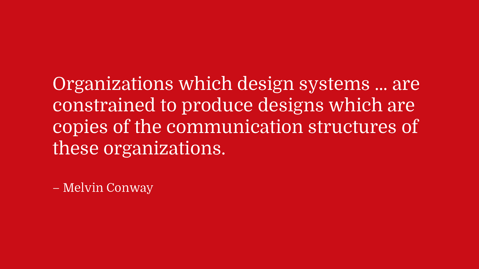
Computer Scientist Melvin COnway once said in the 60s
Organizations which design systems … are constrained to produce designs which are copies of the communication structures of these organizations. – Melvin Conway
Or as I like to put it…

Your website is a manifestation of your organization’s problems. – Dave Rupert
Why are two pages on the website different? That’s because of 2 different departments. Why does one page look good and one look weird? One team values design, the other doesn’t. Why does one page have too much animation? Design has too much unchecked power. Why is the site inaccessible? The org doesn’t care.
In fact, I’d go so far to the success of a Design System hinges on a person who is over Product, Engineering, and Design being bought in on the benefits of a design system.

Let’s fast-forward to this year.

JavaScript frameworks have exploded and are impossible to ignore in 2019.

Let’s look at the structure of a traditional HTML5 app…
This is the classic separation of concerns.

Angular has made the decision through their tooling to enforce a pattern called “co-location”. You HTML/CSS/JavaScript and Tests are split up at the Component level.
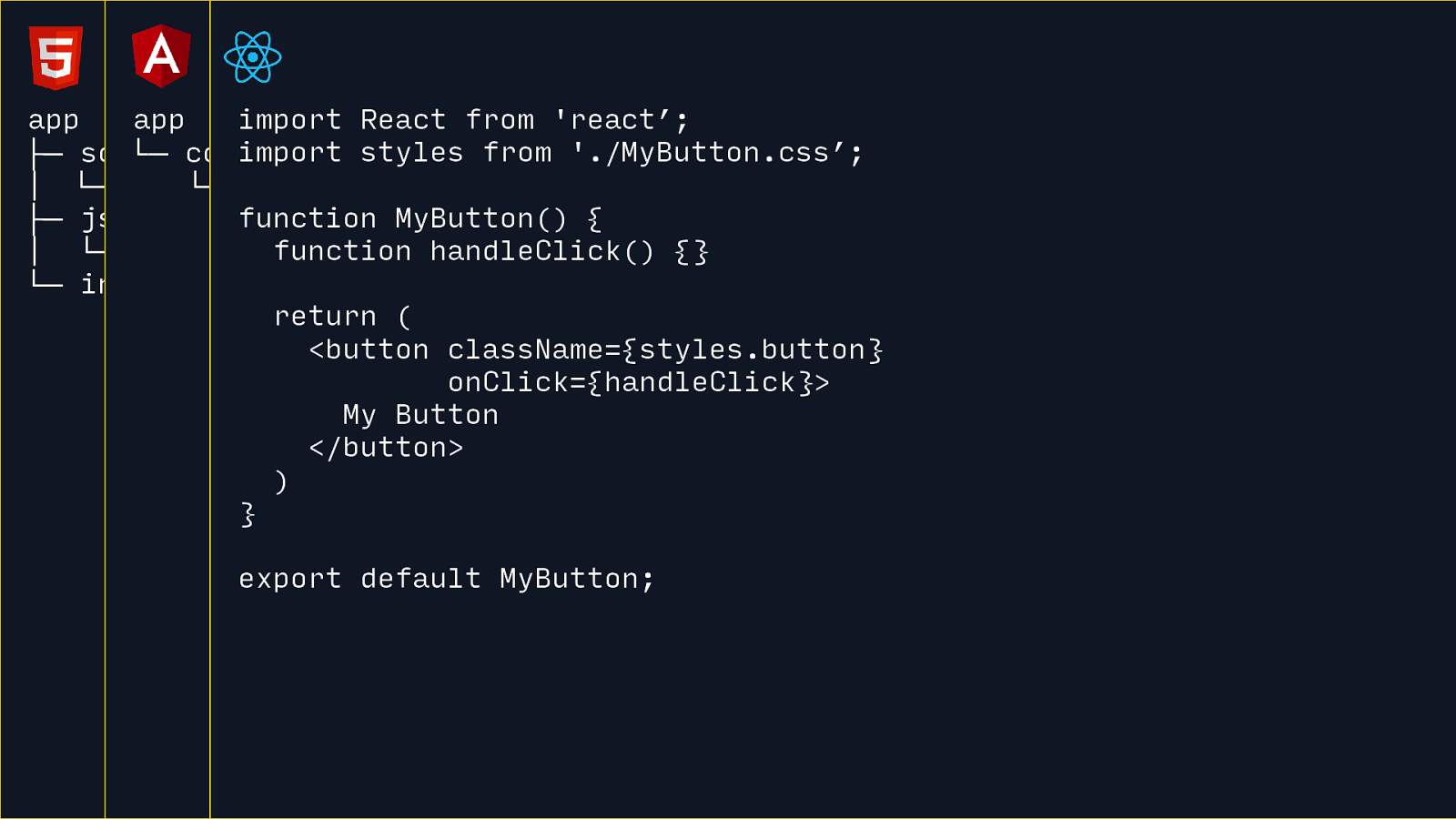
React components actually prescribes very little, but one thing React components do is render out HTML using a slightly modified syntax called JSX.
In general, the community at large has settled on a similar structure where everything about your component is managed (or pulled into) a single JS file. From this you get patterns like CSS-in-JS. Technically, this is demoing CSS Modules, but there are a lot of options here. And then relies on Webpack or whatever tool to split up and dissect this code.
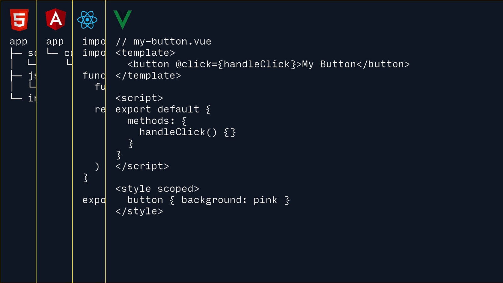
Vue Components are awesome. The sort of take things a step further and say “We’ll do HTML, CSS, and JavaScript in one file, but we’re going to add some structure.
I like this separation of concerns quite a bit. It’s still all handed off, sliced and diced by Webpack but it’s a pretty great authoring experience.
Regardless of your preference, I think it’s interesting to see this iteration on the “Separation of Concerns” and how different frameworks approach the “componentization” trend.

Once templating and data querying move to the client, well now we have to re-evaluate our relationship with the server. A “Serverless” server is a server that spins up on demand. It doesn’t run endlessly and fall over every two days. You hit the serverless API, the server starts up, and then shuts down when it’s all over.

One thing in 2019 we can’t ignore is that mobile has hit the tipping point.
According to Mary Meeker’s Internet Trends report we can see that mobile use is continuing to increase and laptop/desktop use is starting to taper off.
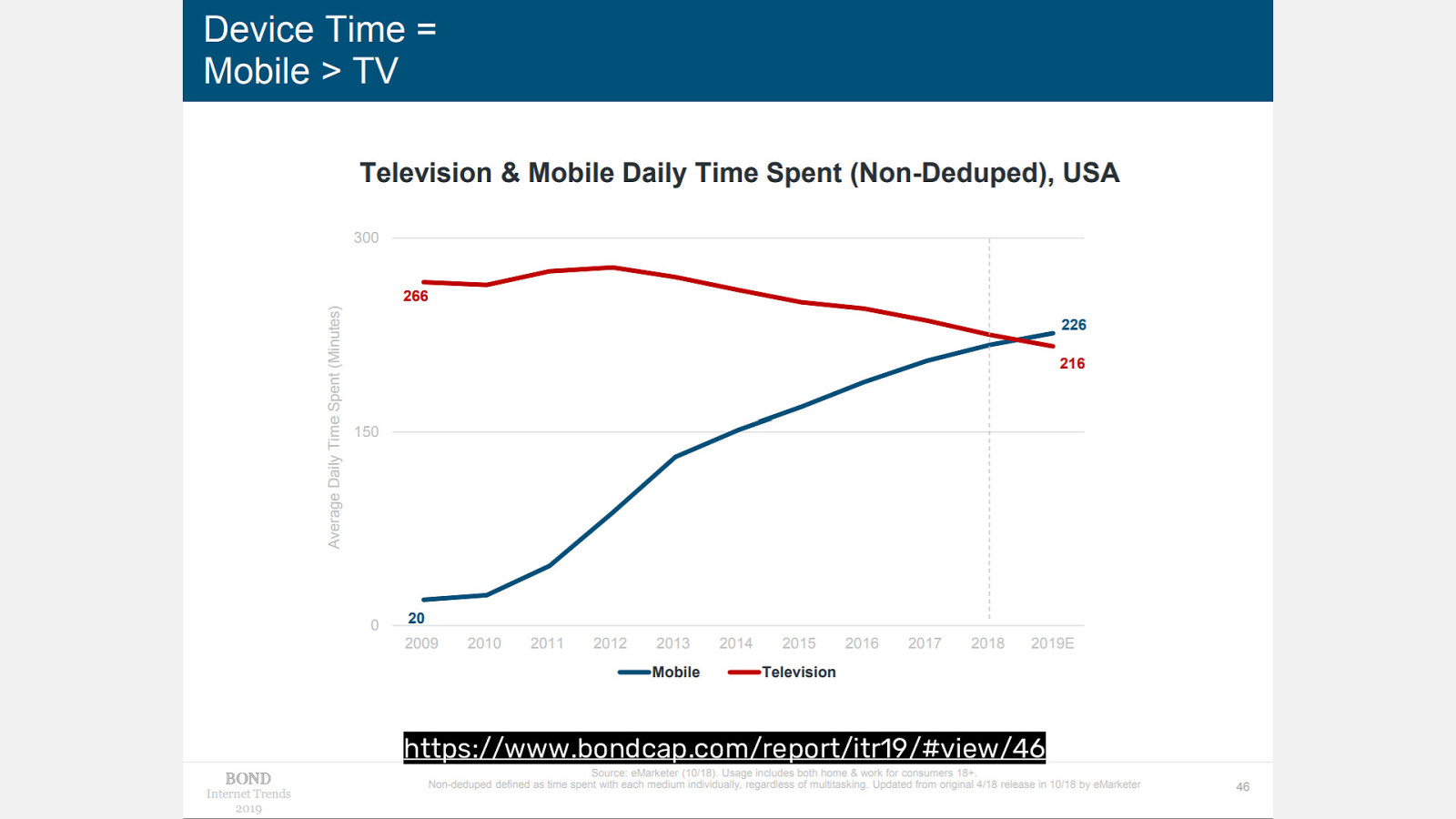
And interestingly mobile device time has overtaken TV. This is a big moment.
The traffic I’m seeing on client sites is overwhelmingly mobile right now. And if I truly start thinking Mobile First, it changes a lot of my perspectives. Even weird things like font-size should never go over 20px. Not really. But in a mobile world, larger type sizes become less useful.
The expectation gap is large. So there’s a lot of work to do.
And worth mentioning, all those JS Frameworks I talked about… they’re not mobile first. They were designed and shipped in the desktop era. We have a long way to go.
Let’s look into our potential future a bit…

Web Components have a sordid past, but it’s worth talking about because Web Components are also trying to solve the same problem as JS Frameworks: the story of JavaScript Components.
The potential here is that Web Components would be able to be a native solution, requiring less JS to performantly construct mobile-first component-based front-end experiences.
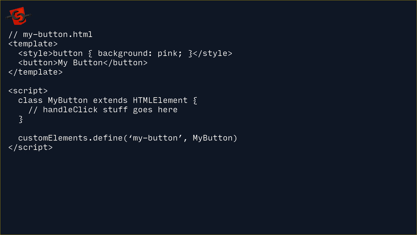
The original version of Web Components had a feature called “HTML Imports”. You author components in an HTML <template> element then use a <script> tag to define a Custom Element.
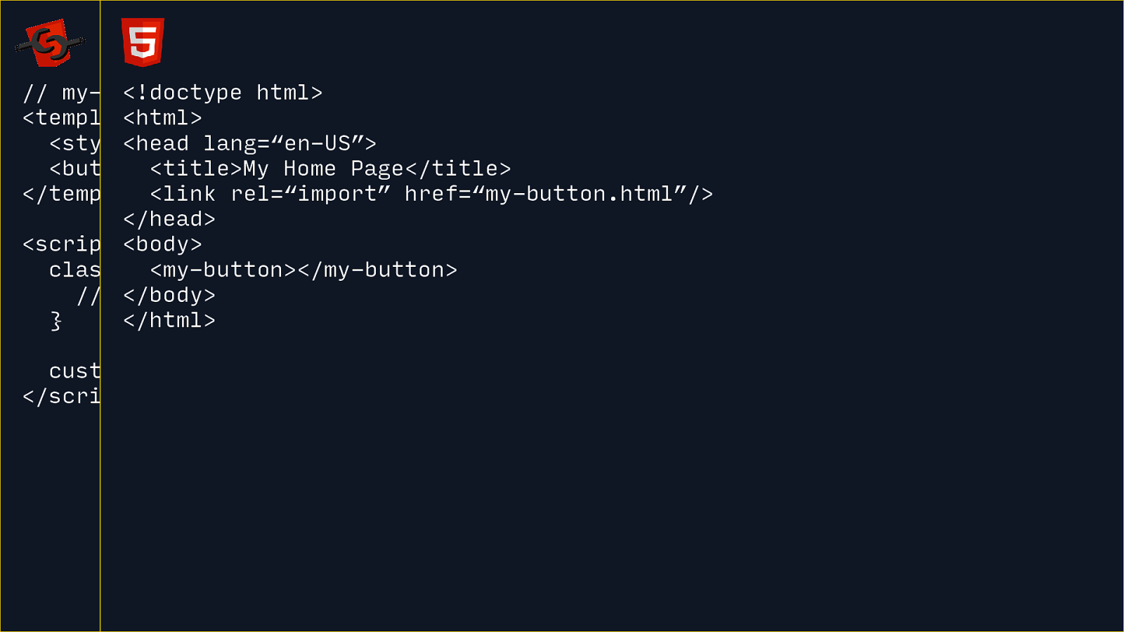
And then you use HTML <link rel="import"> to import that HTML file so you can use that custom HTML element. It’s HTML all the way down.
It worked pretty well. Polymer and AMP were built on this.
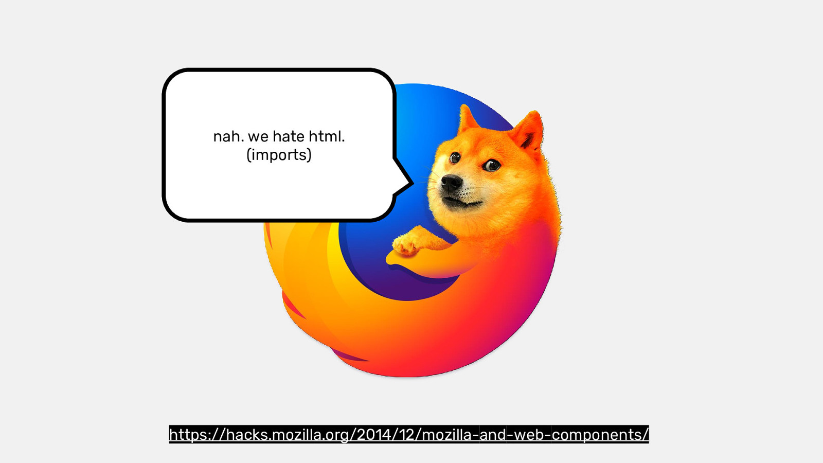
But Firefox draws a line in the sand and says they have no interest in implementing HTML Imports.
Their argument in 2014 was that they wanted to see how ES Modules would shake out and that might inform our decisions here.

ES Modules has now landed in most modern browsers so the most common way to author Web Components now is using JS.
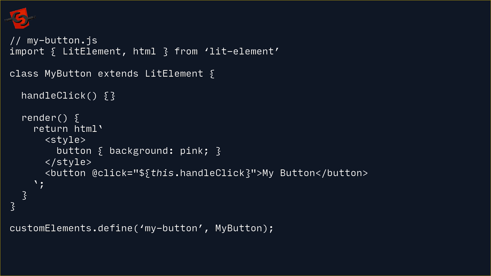
This is using LitElement, a small wrapper around native Web Components to make them a bit more easier to author.
You can see this style of component now looks a lot similar to a React Component.
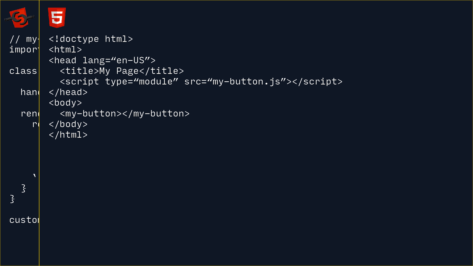
Then in your HTML, you import a JS module file to use your new custom HTML element.

Rich Harris recently wrote about why he doesn’t use Web Components and it highlights a lot of the nuanced problems in building component systems and frameworks with them.
In a lot of ways, Web Components were designed at a low-level for framework authors to build frameworks on… but framework authors aren’t building on it. Seems like Web Components has failed it’s core mission.

That’s not to say you can’t use Web Components right now. Lightning Web Components from Salesforce uses them. And projects like A-Frame, Ionic,
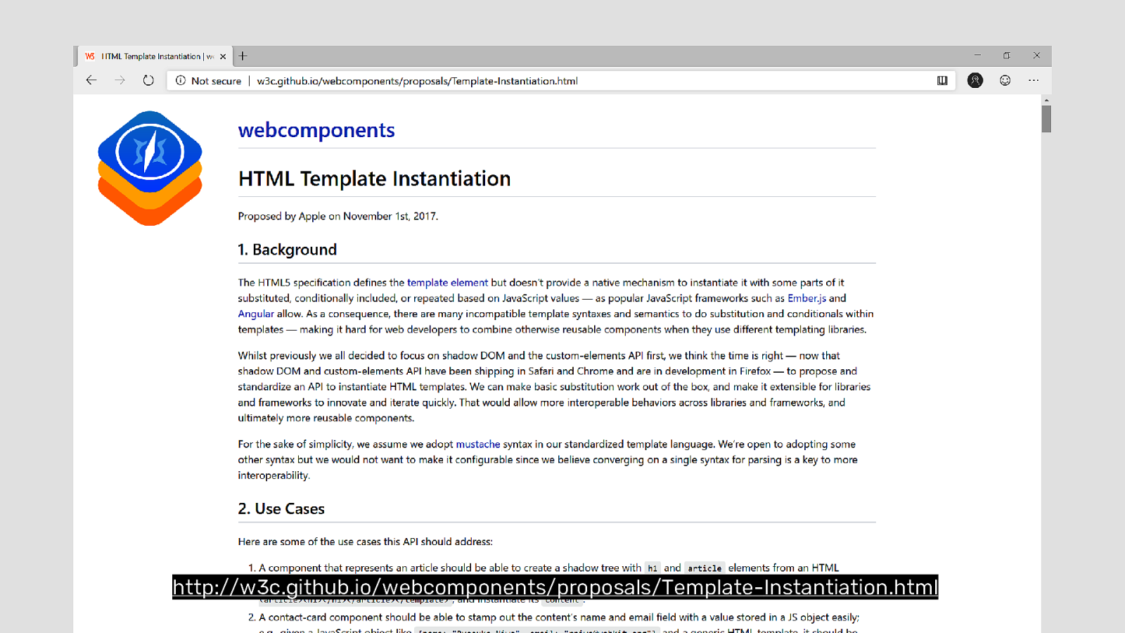
http://w3c.github.io/webcomponents/proposals/Template-Instantiation.html
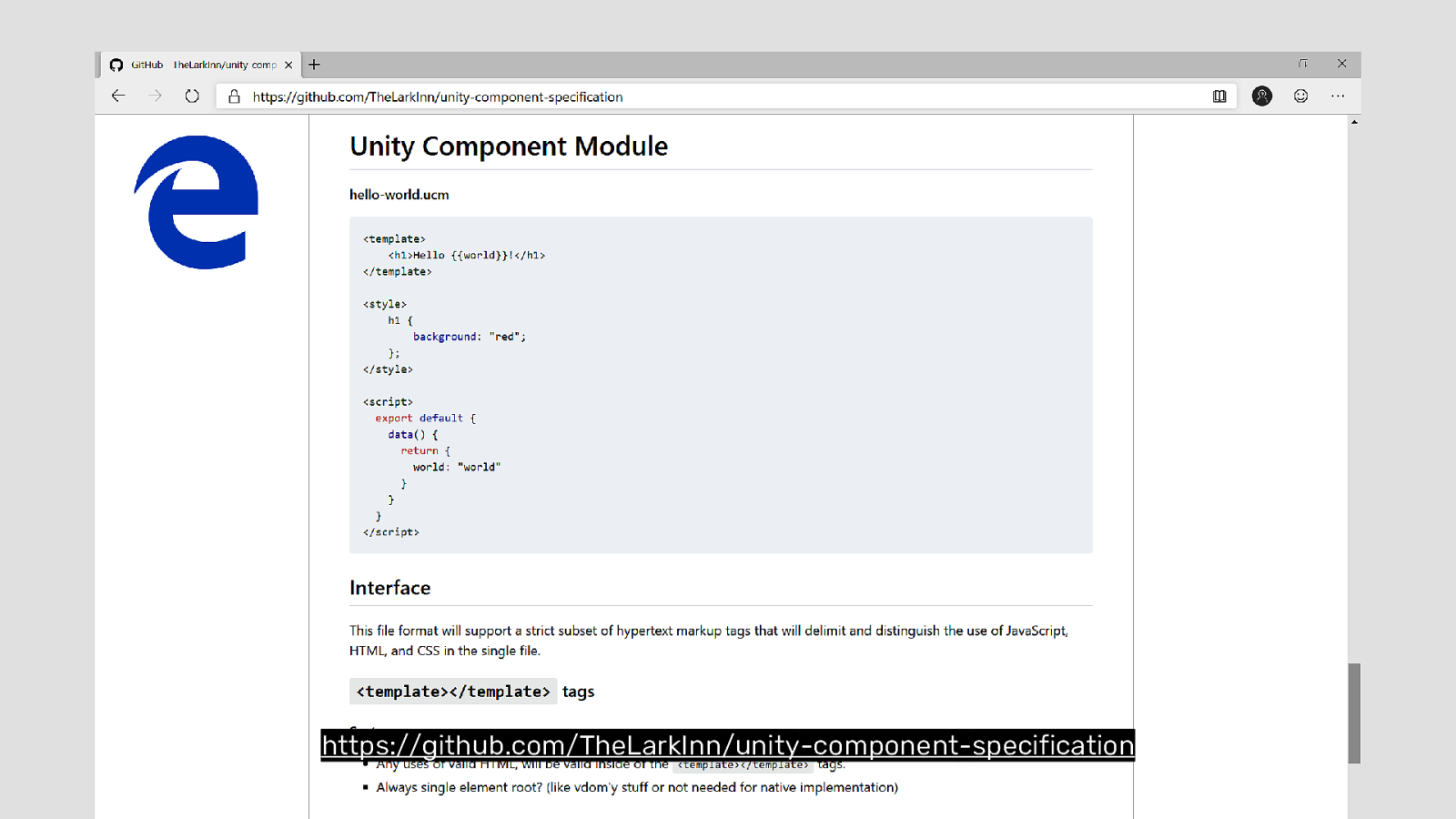
https://github.com/TheLarkInn/unity-component-specification


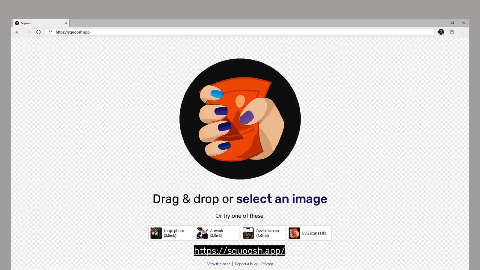
Squoosh is an image compression app from a few Google Dev Rels.
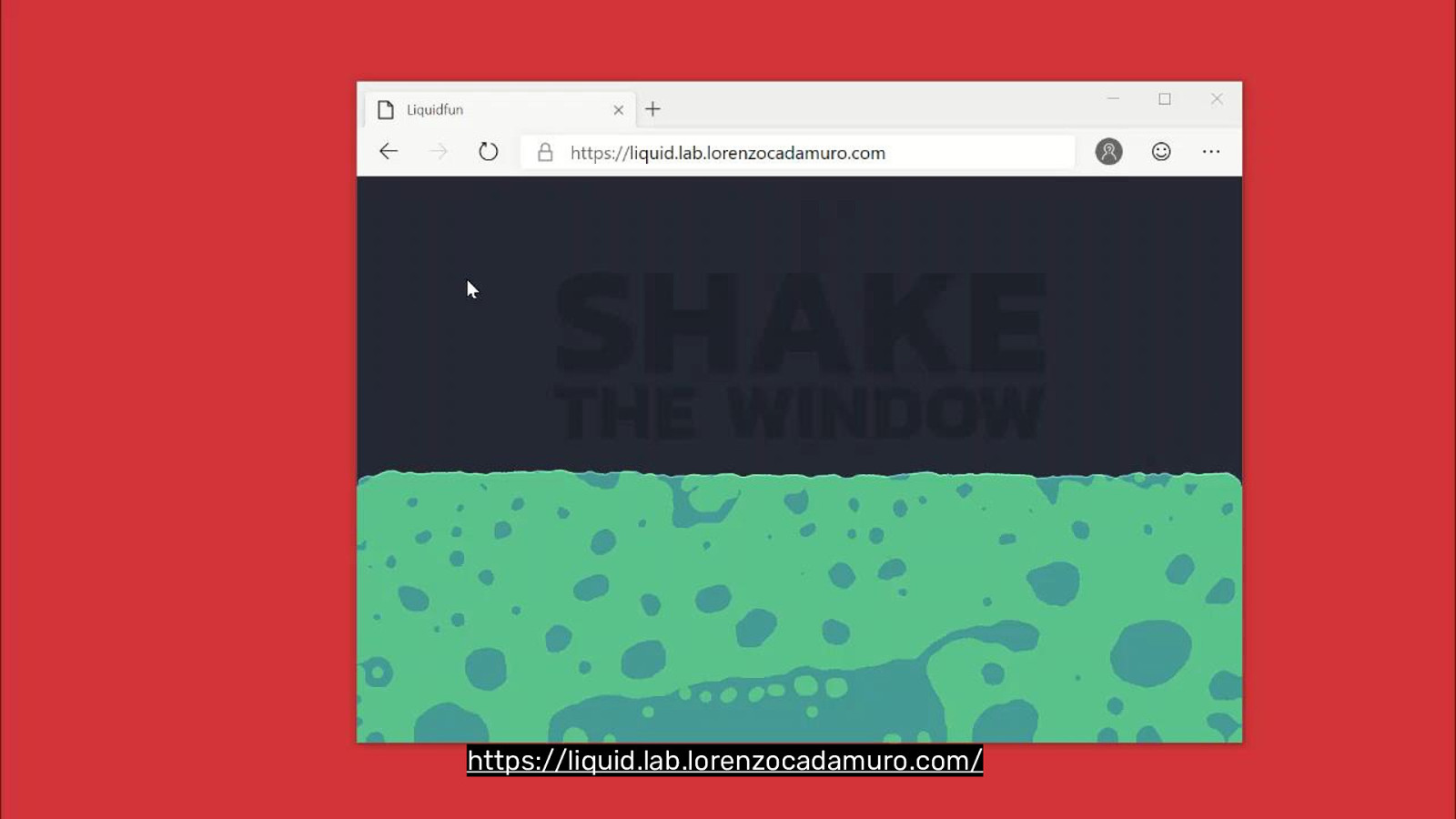
LiquidFun by Lorenzo Cadamuro is amazing. This would be nearly impossible with JavaScript. One thing that JavaScript is bad at is math. And liquid physics uses a lot of math. That’s being handled by the Web Assembly component handing the rending off to WebGL. This is very cool and very fast.

https://perceptiontoolkit.dev/


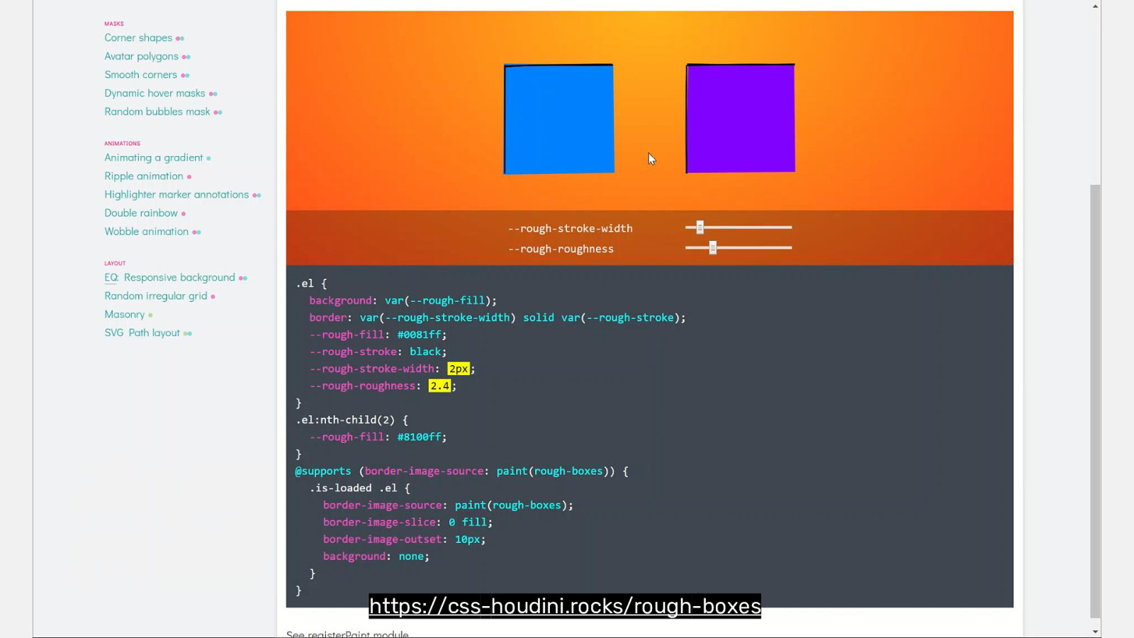
https://css-houdini.rocks/rough-boxes

https://css-houdini.rocks/irregular-grid
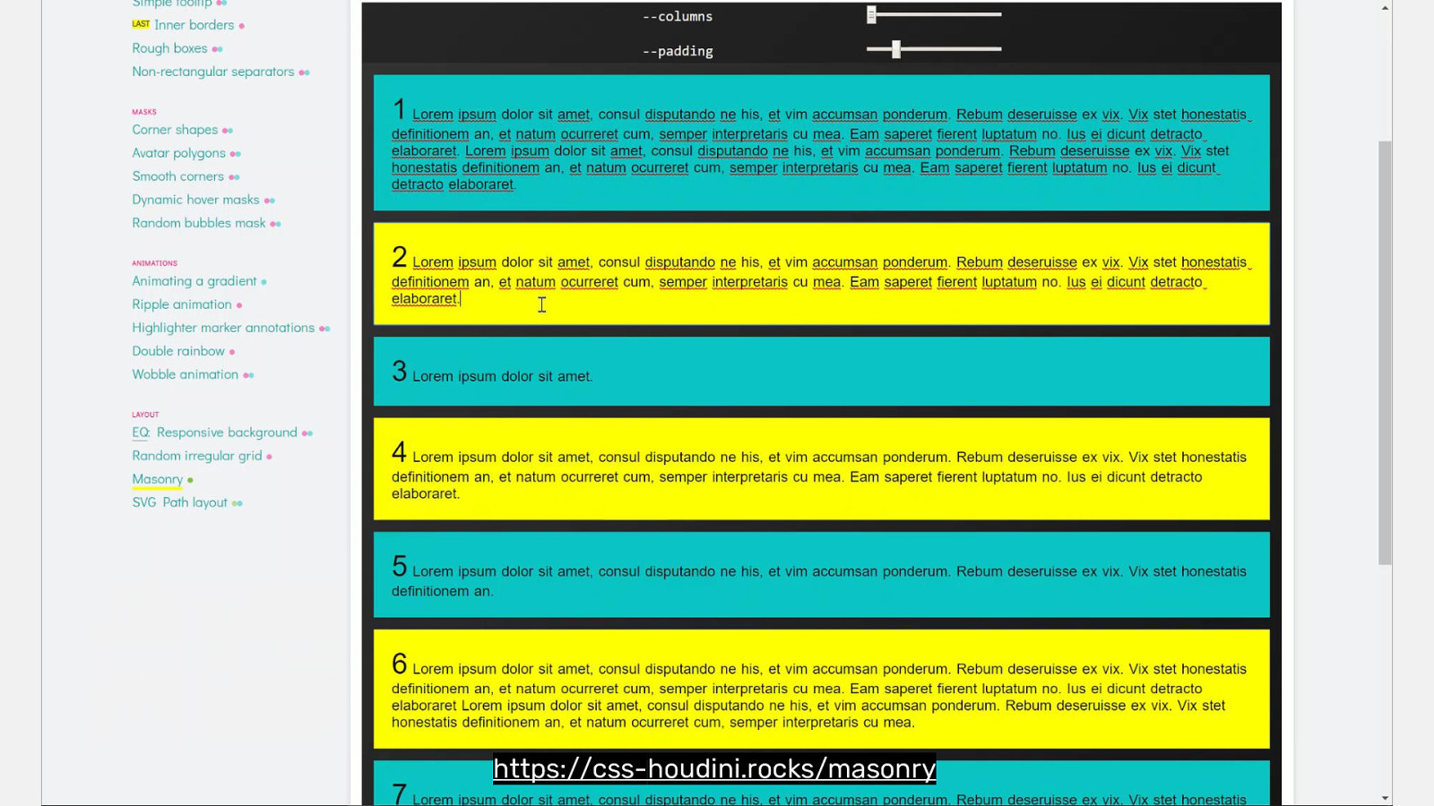
https://css-houdini.rocks/masonry

Houdini will make websites unique again.


Dave Rupert @davatron5000