
A presentation at An Event Apart Spring Summit in April 2021 in by Dave Rupert


Howdy, I’m Dave Rupert Work at Paravel in Austin, TX Co-host ShopTalk podcast with Chris Coyier W3C Web Components Community Group (member)
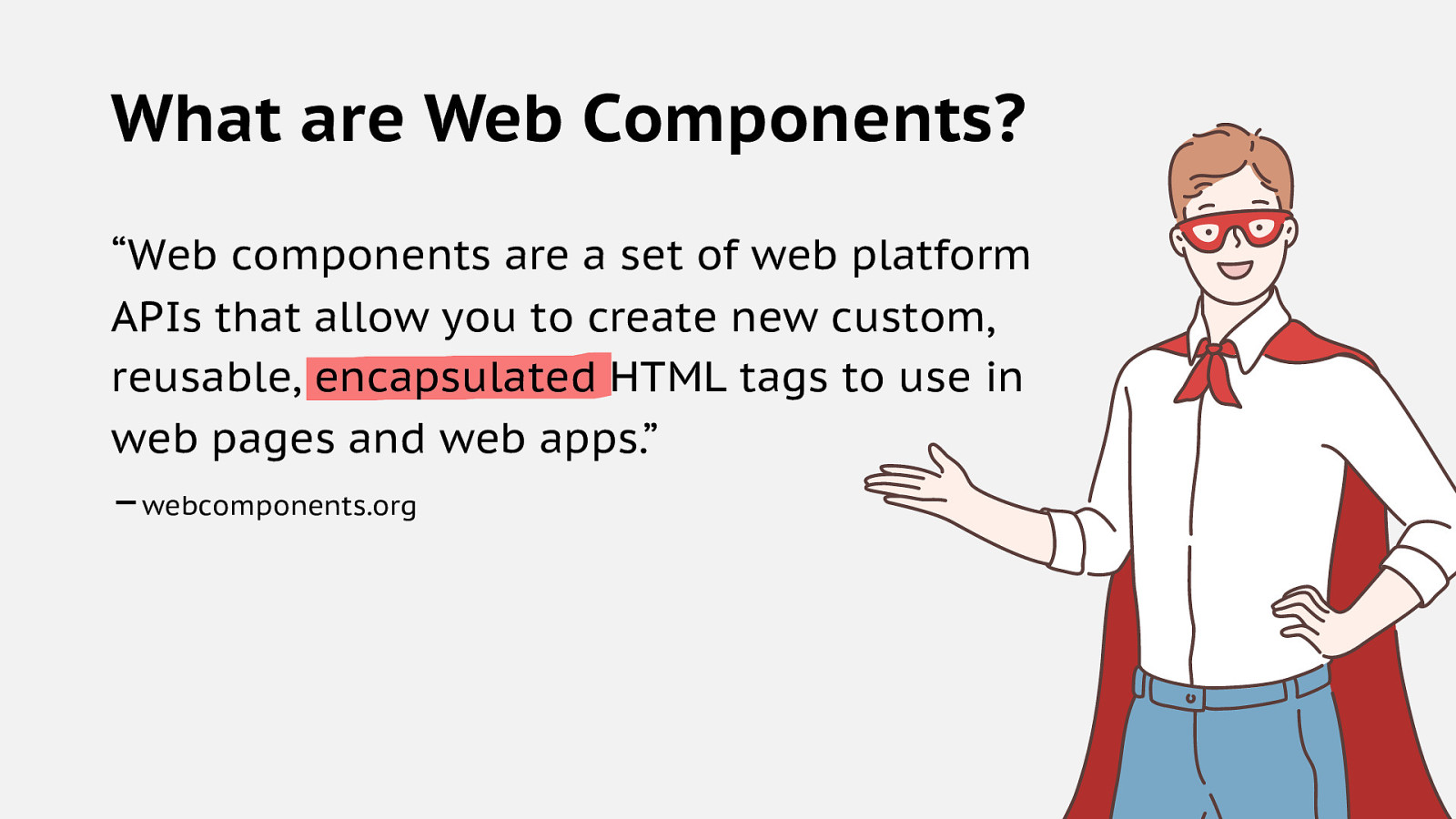
What are Web Components? “Web components are a set of web platform APIs that allow you to create new custom, reusable, encapsulated HTML tags to use in web pages and web apps.” –webcomponents.org
What are Web Components?
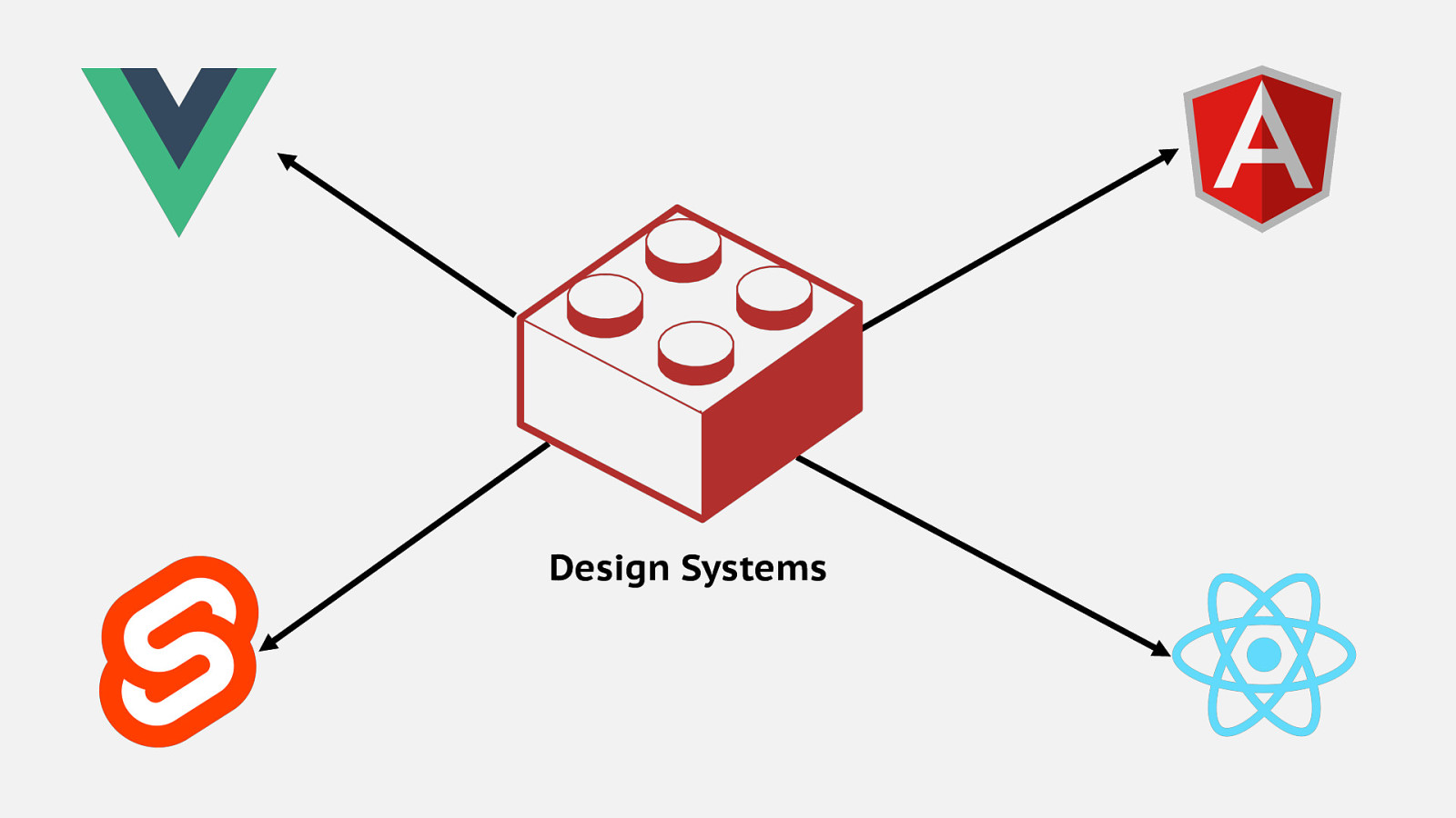
Design Systems
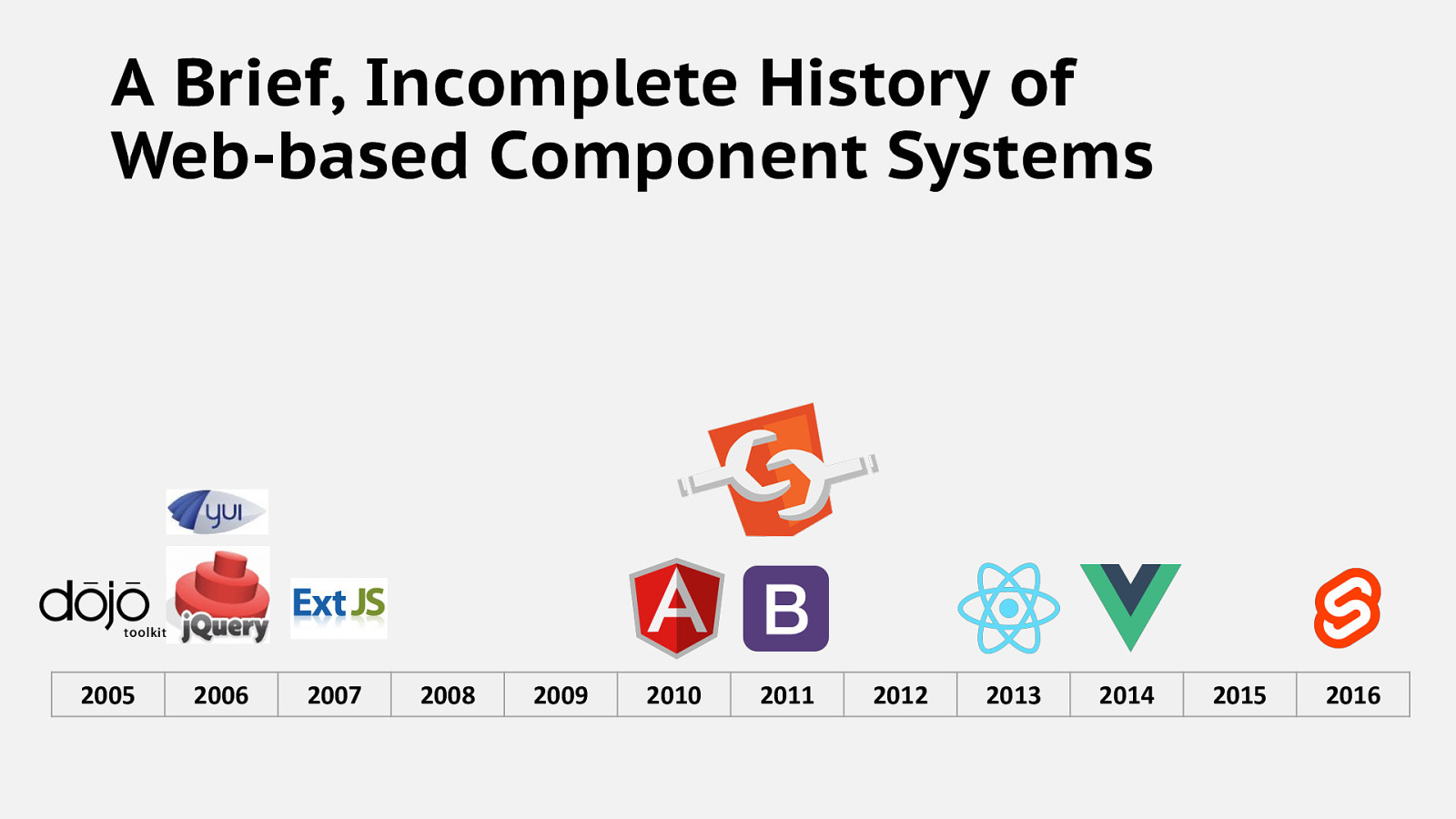
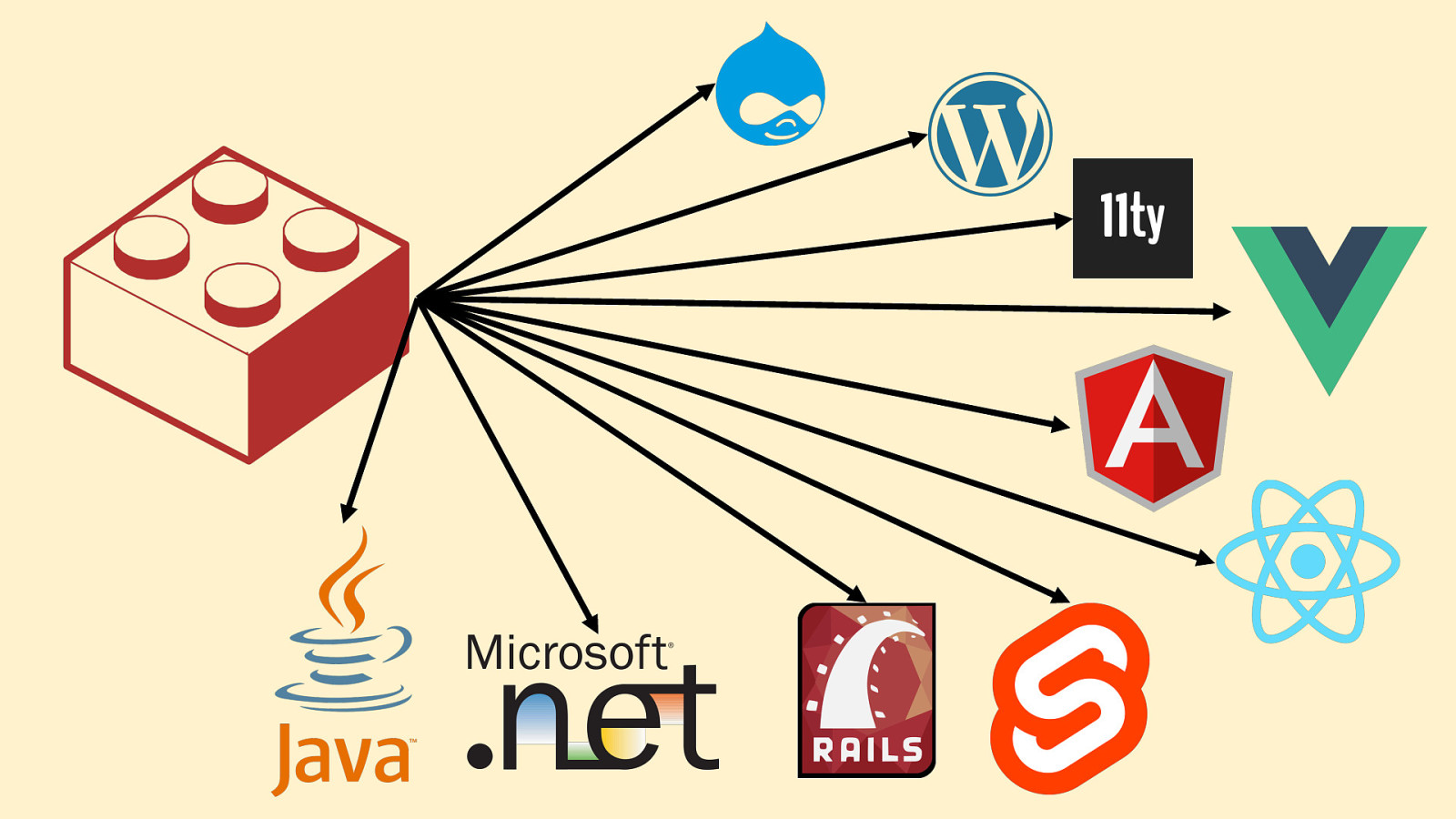
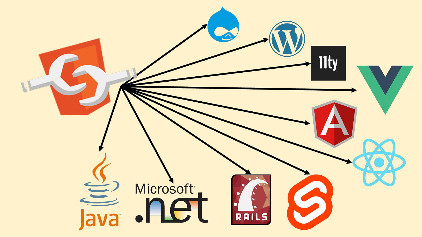
A Brief, Incomplete History of Web-based Component Systems 2005 2006 2007 2008 2009 2010 2011 2012 2013 2014 2015 2016
What makes Web Components so unique?
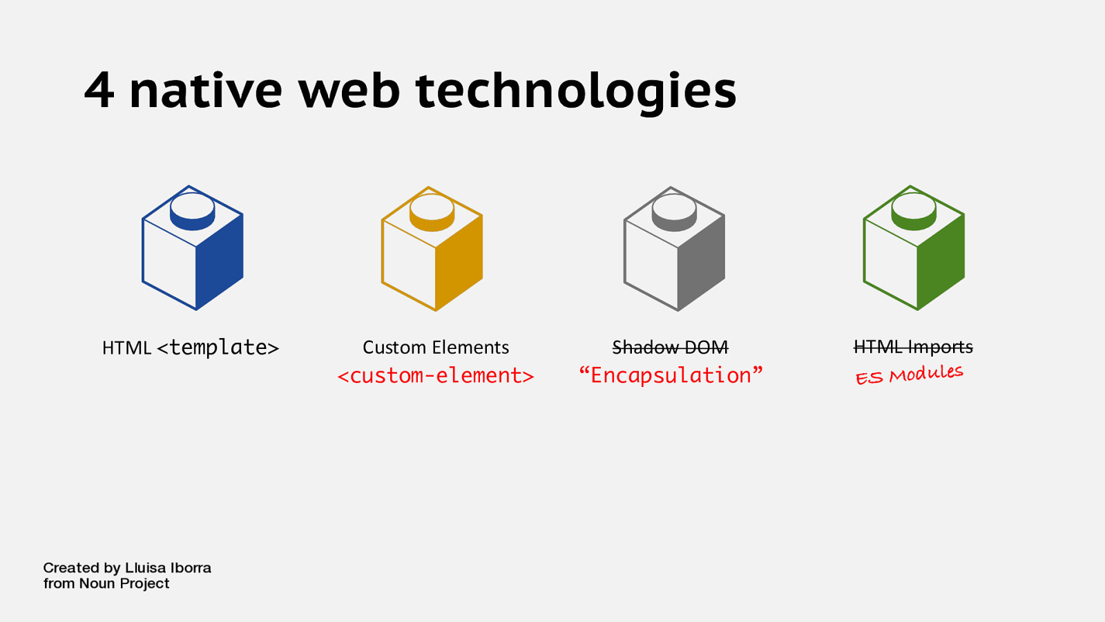
4 native web technologies HTML <template> Custom Elements <custom-element> Shadow DOM “Encapsulation” HTML Imports ES Modules

Great. But… Are any companies actually using this?
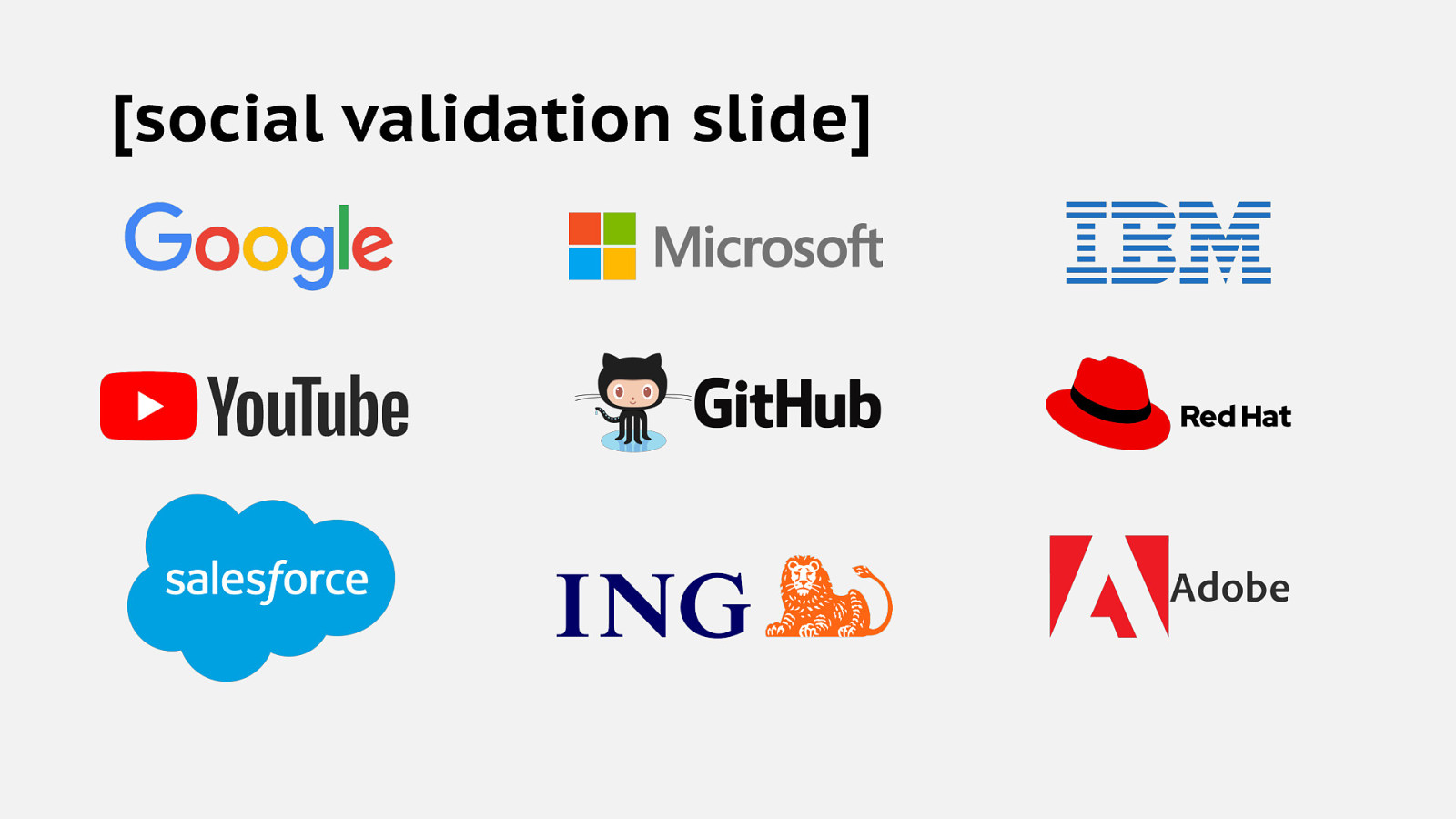
[social validation slide]
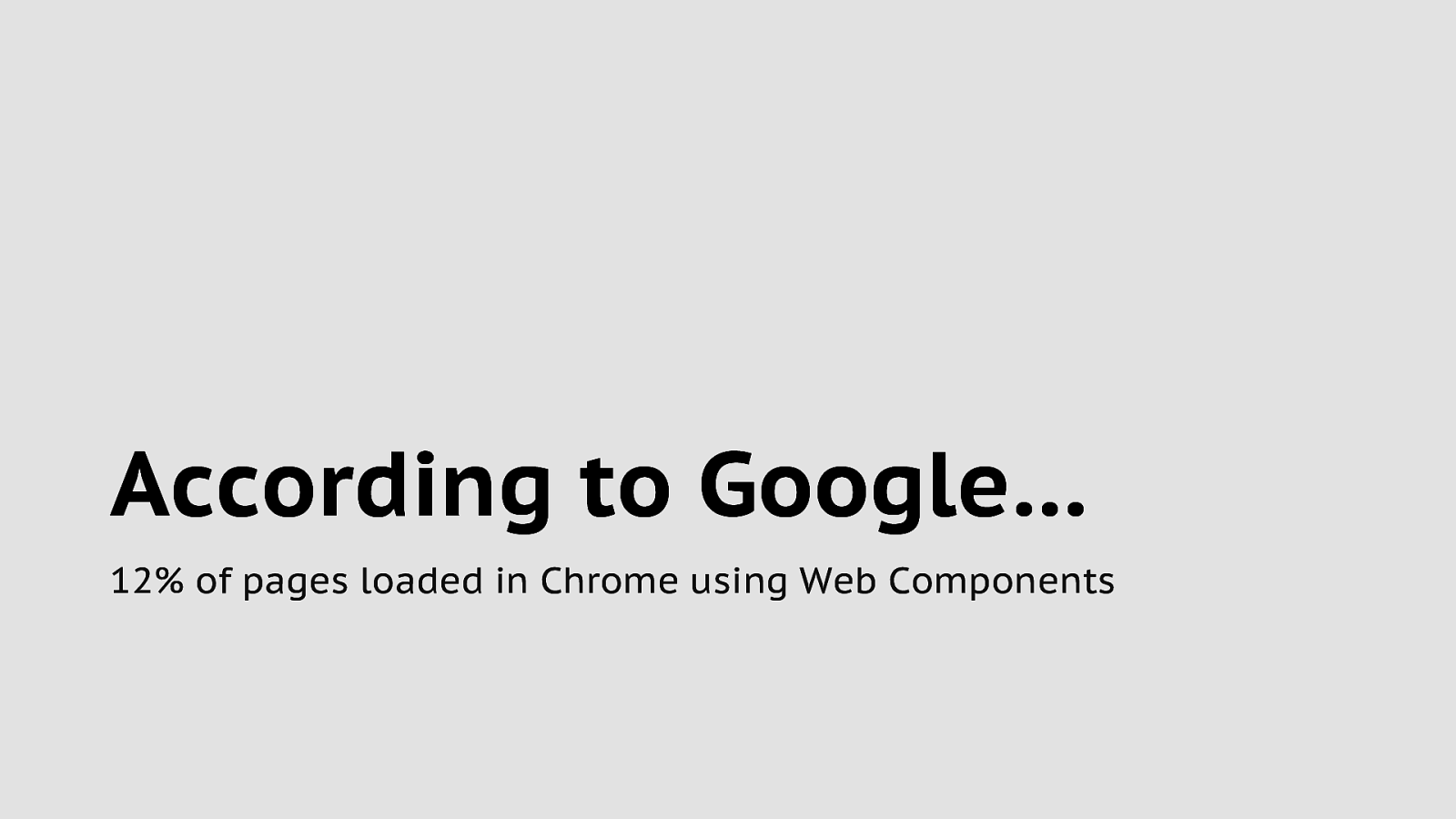
According to Google… 12% of pages loaded in Chrome using Web Components
If they’re so great… Why am I not using them?!?
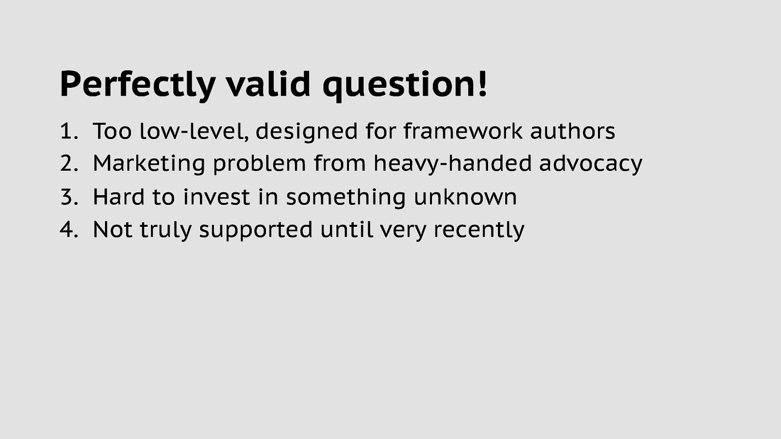
Perfectly valid question! 1. 2. 3. 4. Too low-level, designed for framework authors Marketing problem from heavy-handed advocacy Hard to invest in something unknown Not truly supported until very recently
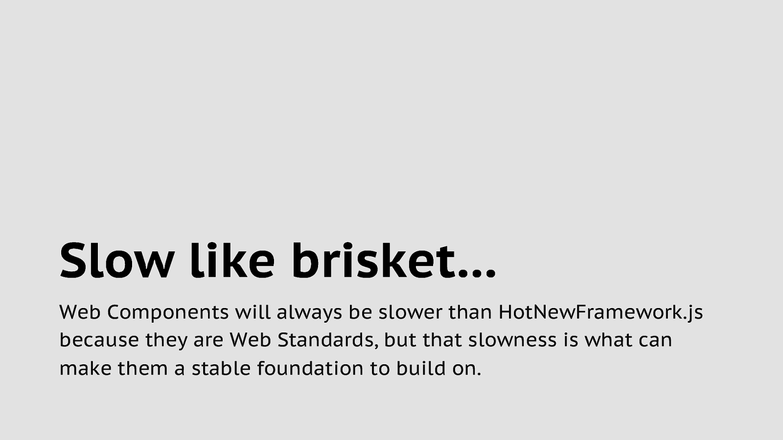
Slow like brisket… Web Components will always be slower than HotNewFramework.js because they are Web Standards, but that slowness is what can make them a stable foundation to build on.

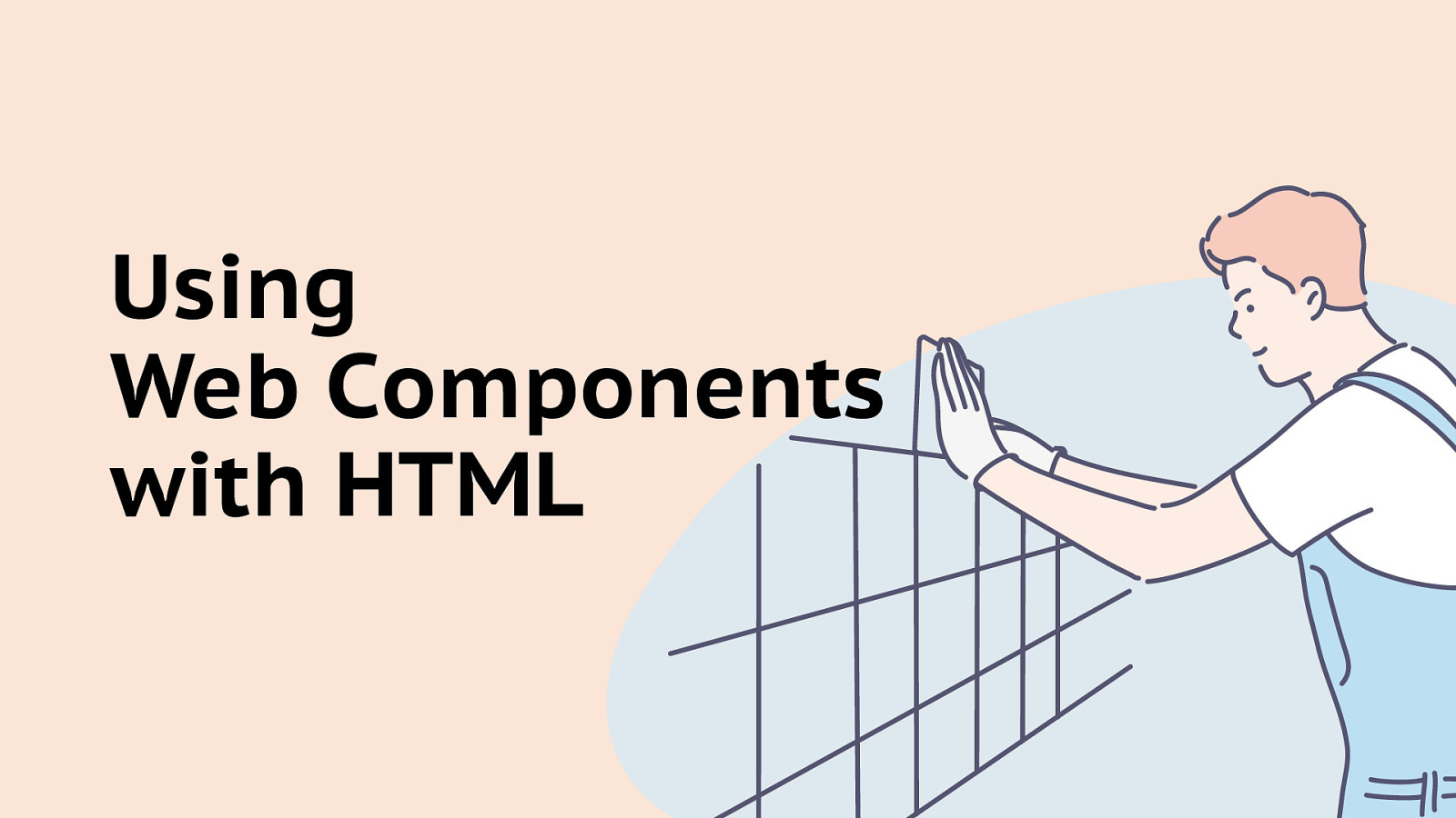
Using Web Components with HTML

JavaScript People who just want to write HTML and CSS
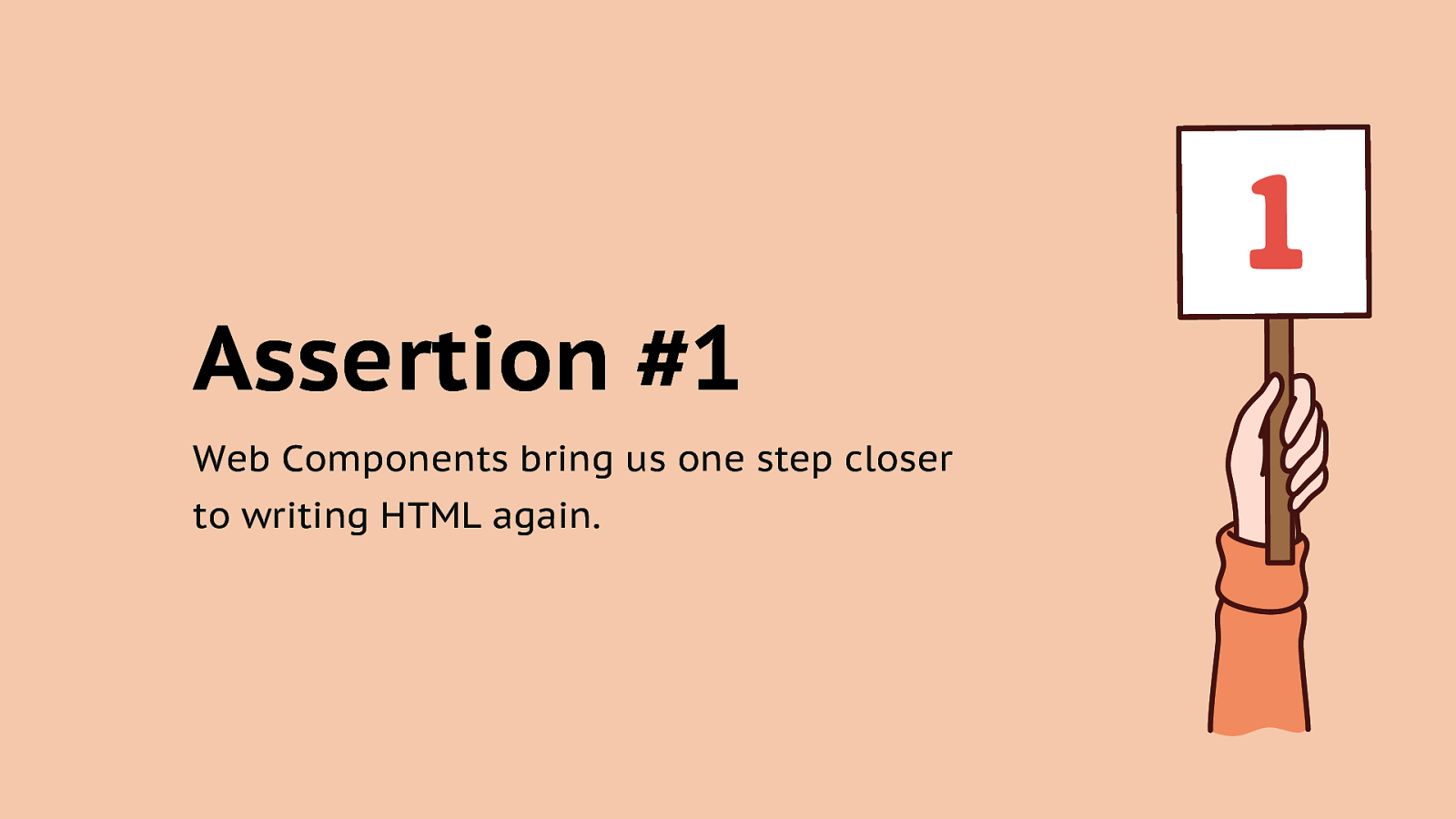
Assertion #1 Web Components bring us one step closer to writing HTML again.
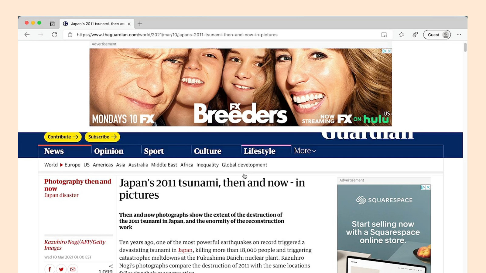
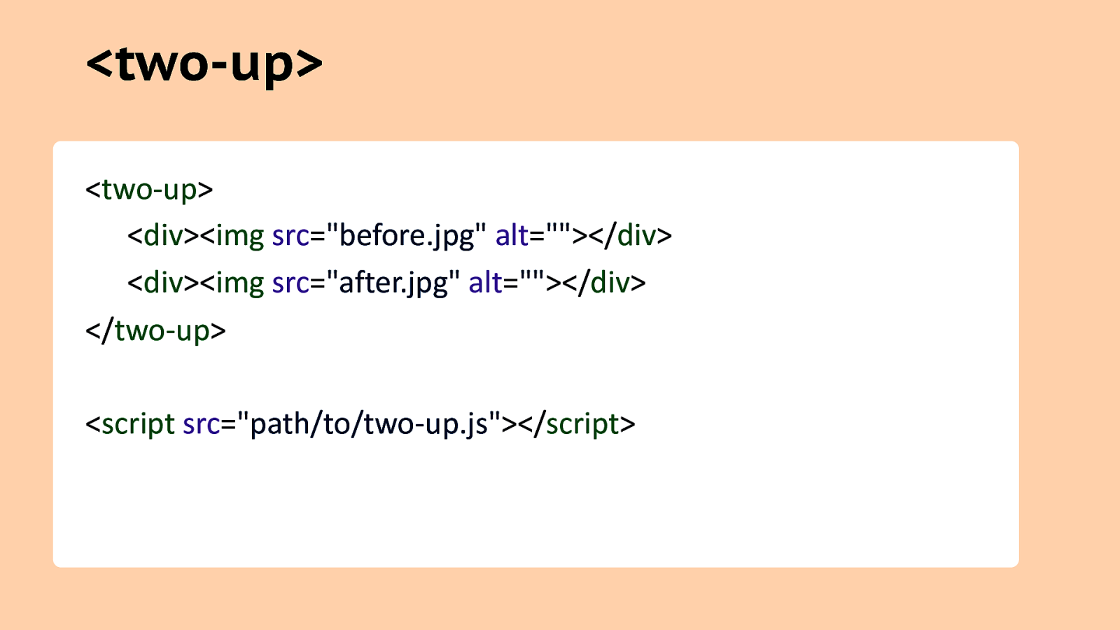
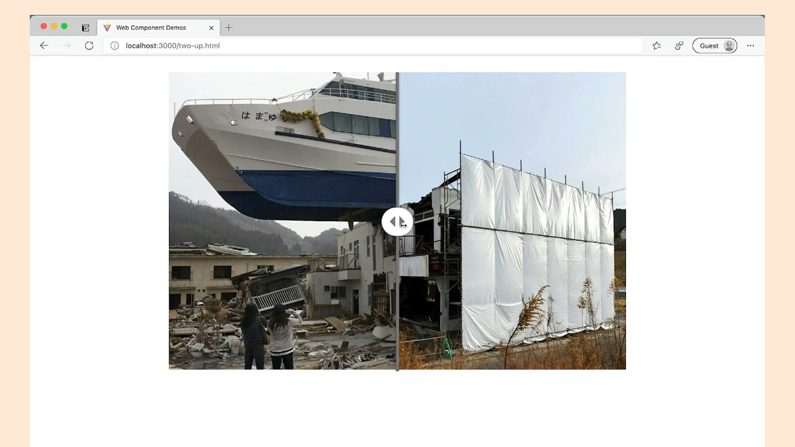
<two-up> <two-up> <div><img src=”before.jpg” alt=”“></div> <div><img src=”after.jpg” alt=”“></div> </two-up> <script src=”path/to/two-up.js”></script>
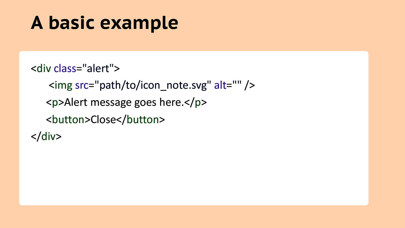
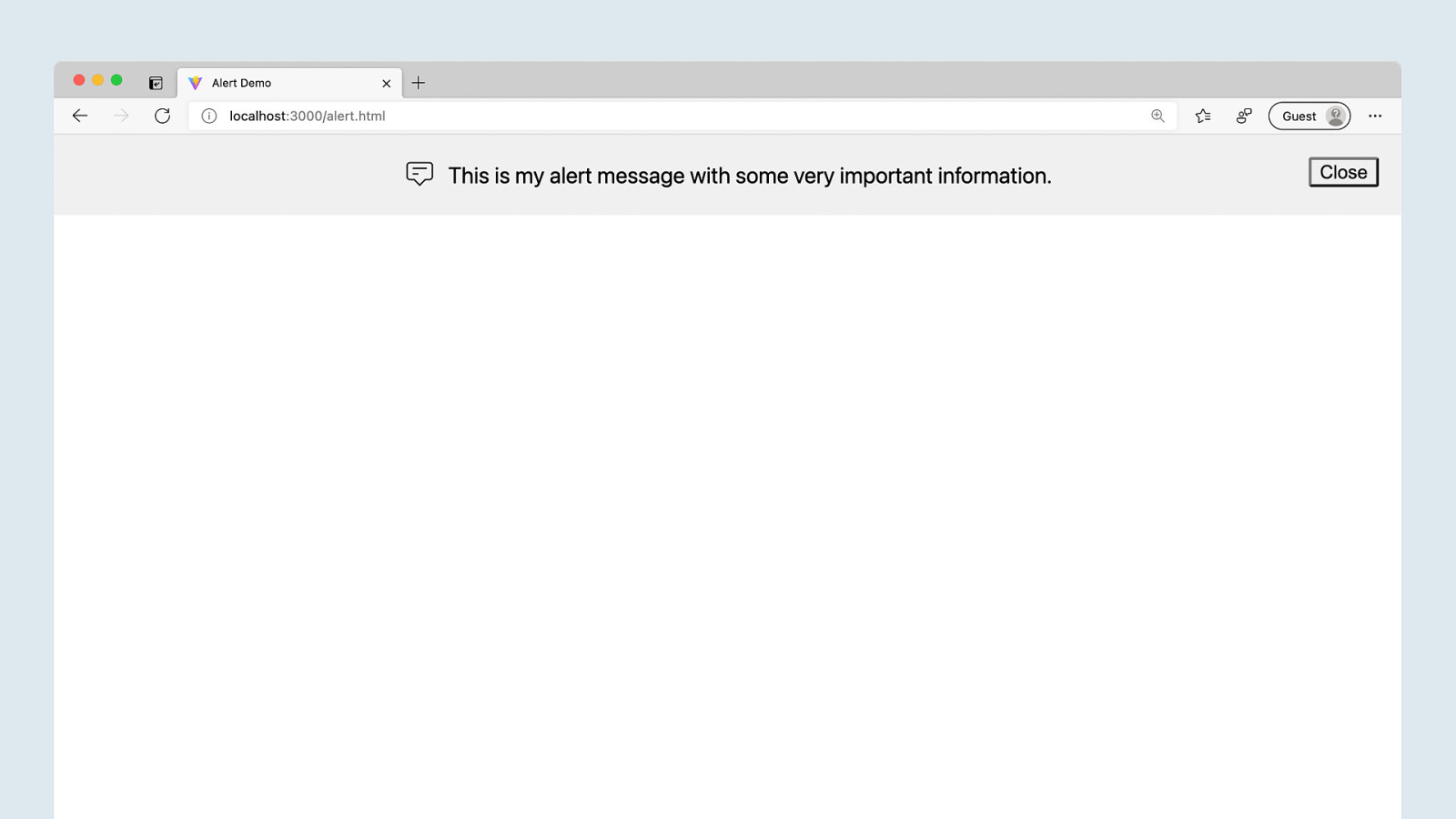
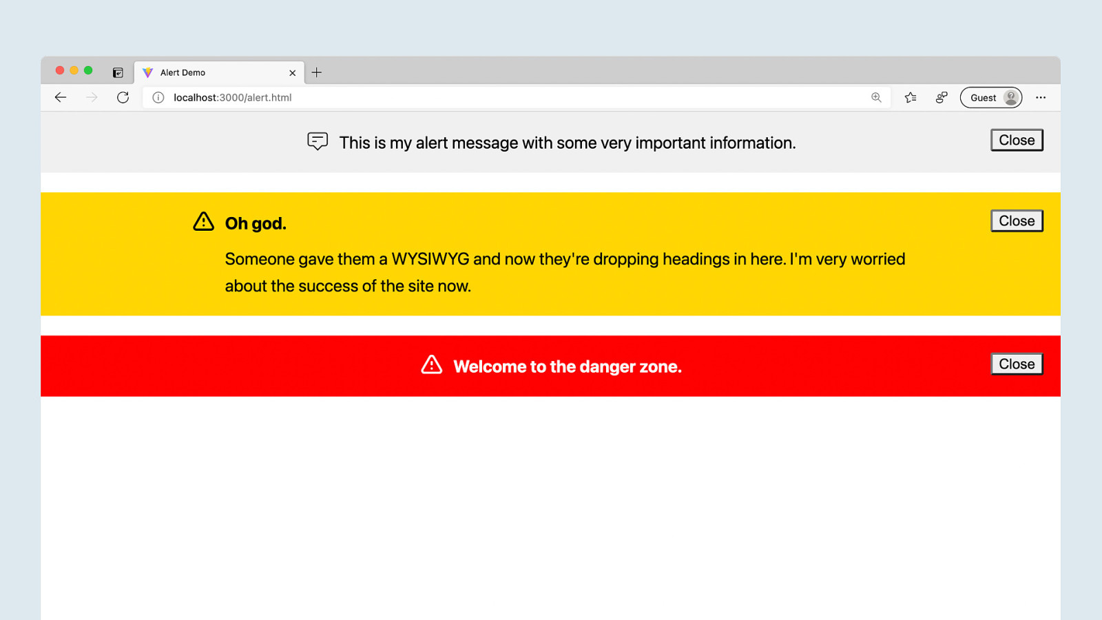
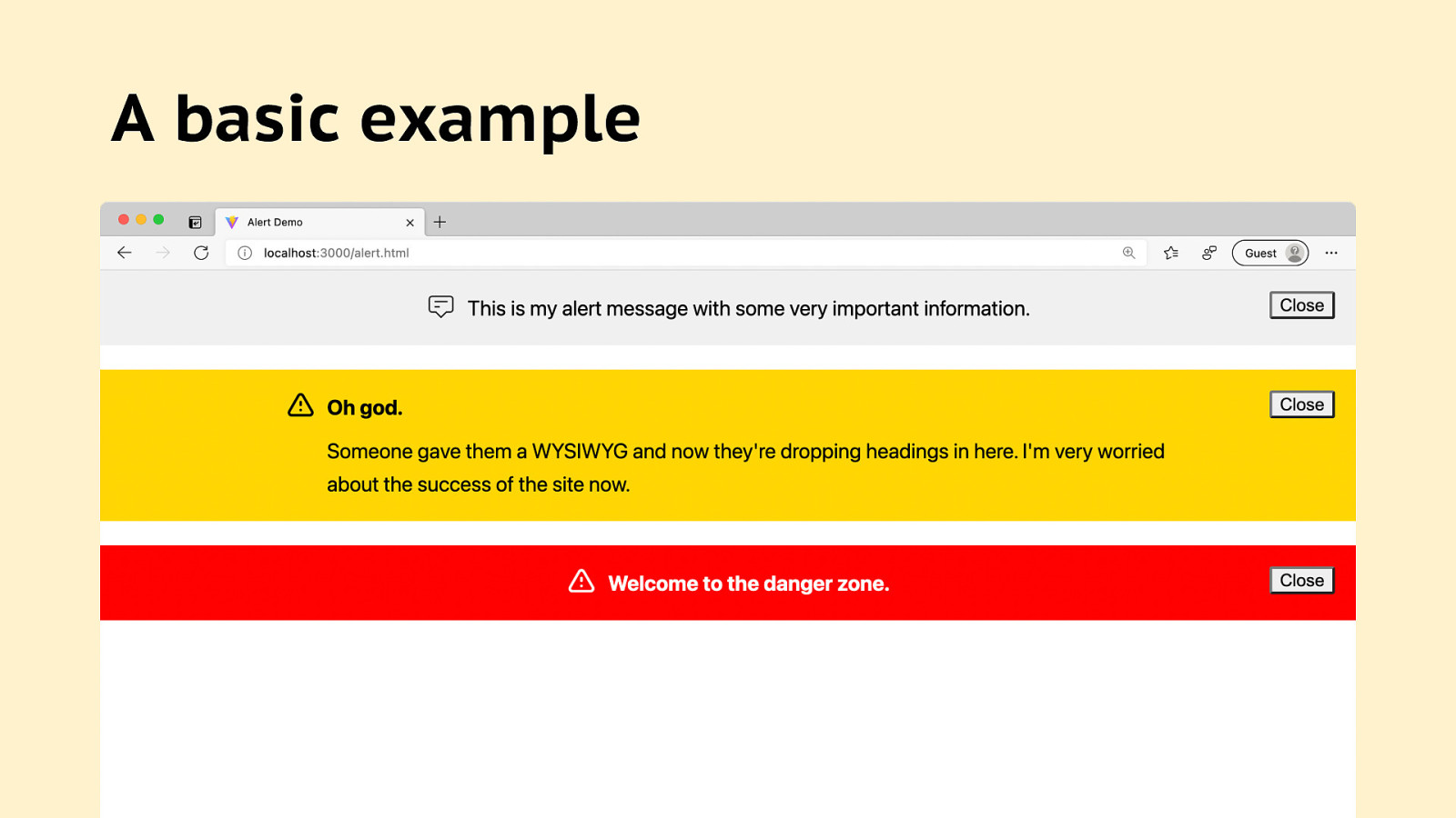
A basic example <div class=”alert”> <img src=”path/to/icon_note.svg” alt=”” /> <p>Alert message goes here.</p> <button>Close</button> </div>
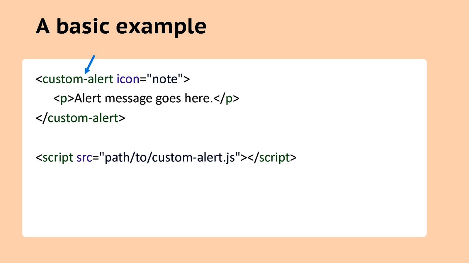
A basic example <custom-alert icon=”note”> <p>Alert message goes here.</p> </custom-alert> <script src=”path/to/custom-alert.js”></script>
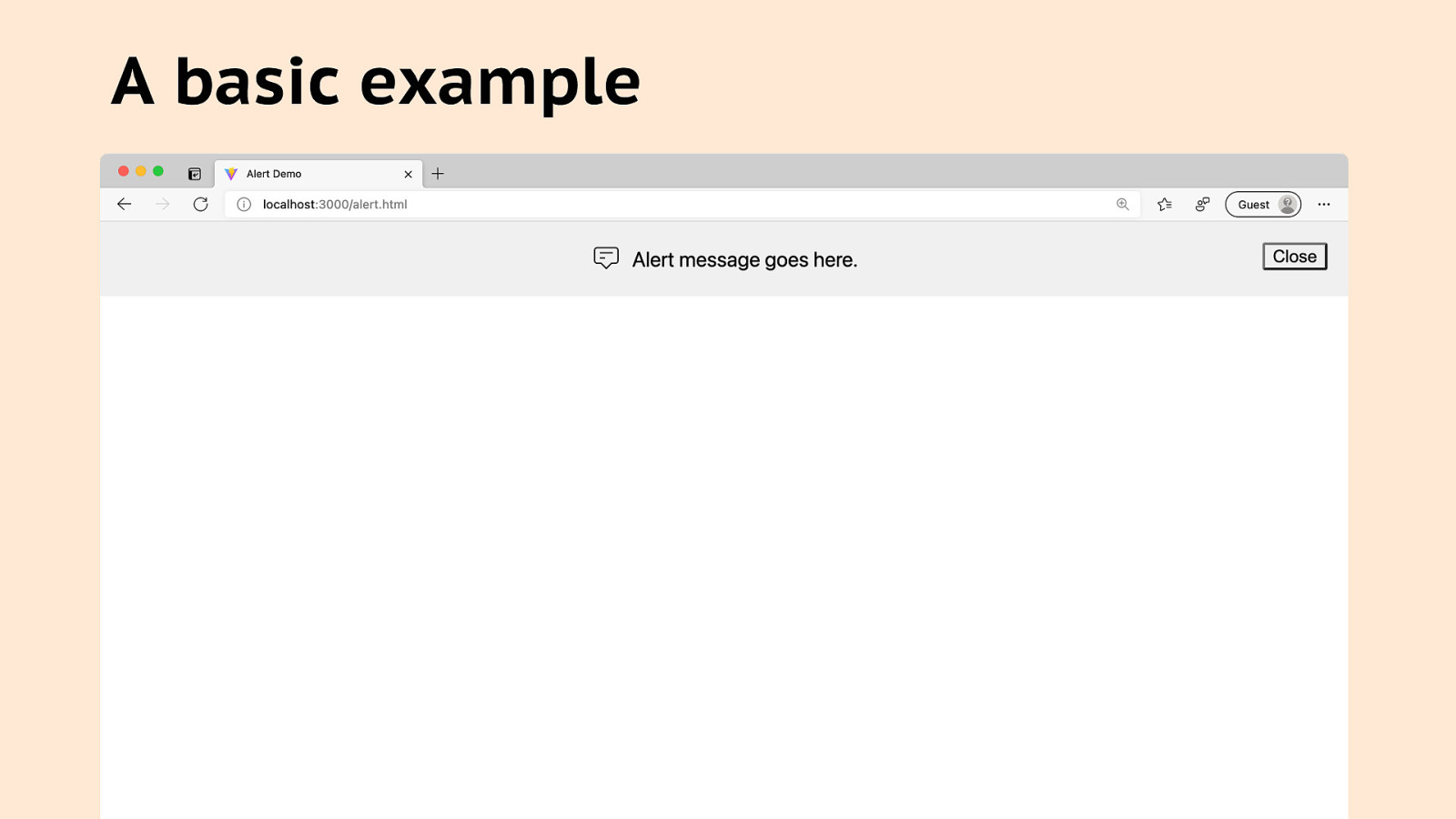
A basic example
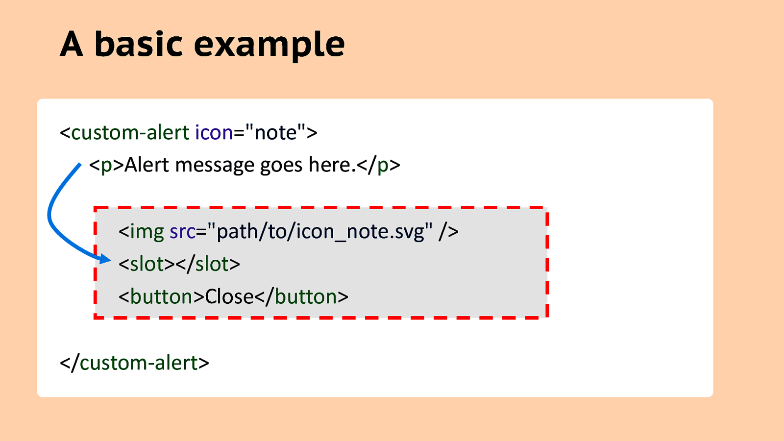
A basic example <custom-alert icon=”note”> <p>Alert message goes here.</p> <img src=”path/to/icon_note.svg” /> <slot></slot> <button>Close</button> </custom-alert>
Assertion #2 Web Components are great for Progressive Enhancement
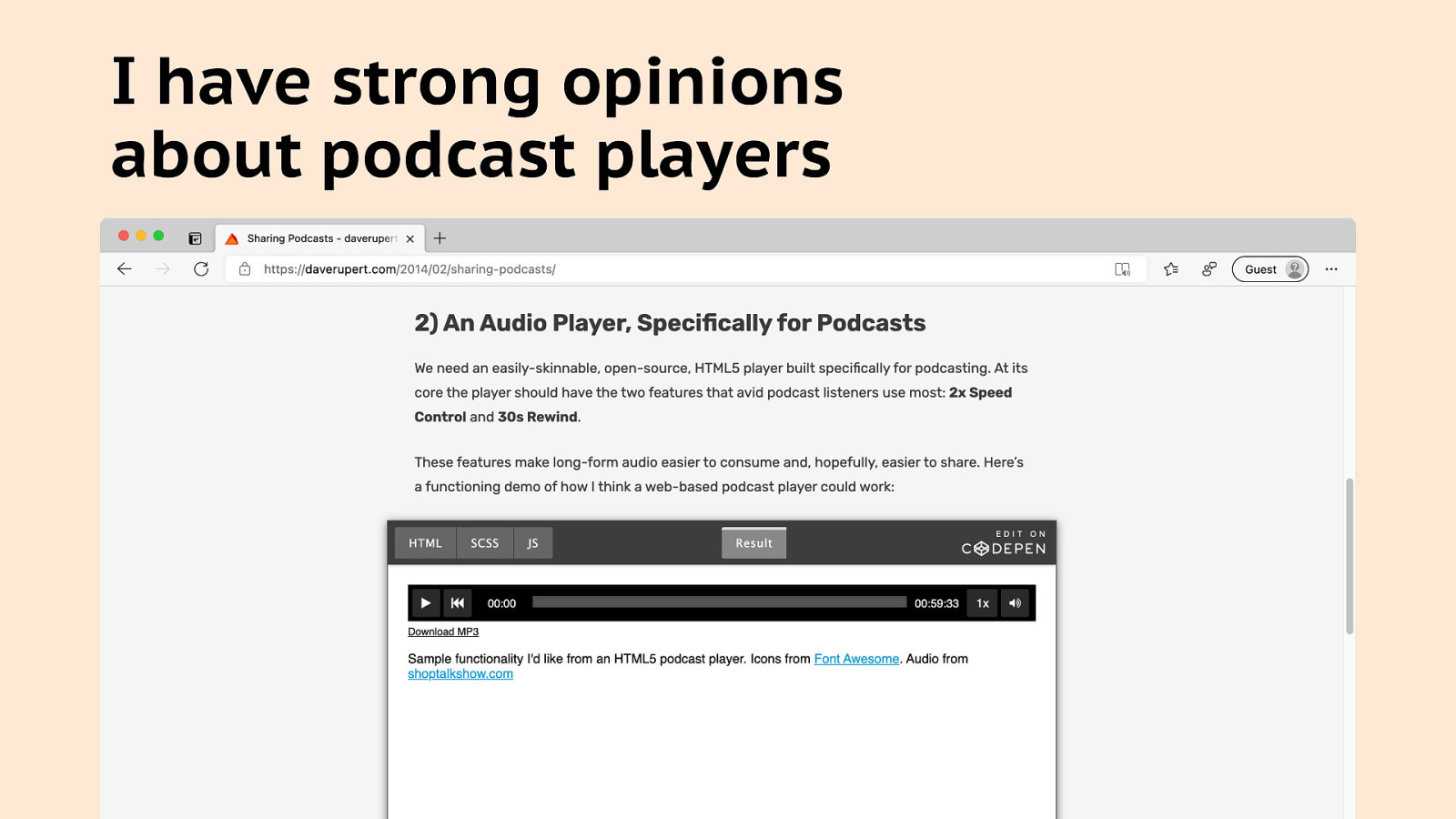
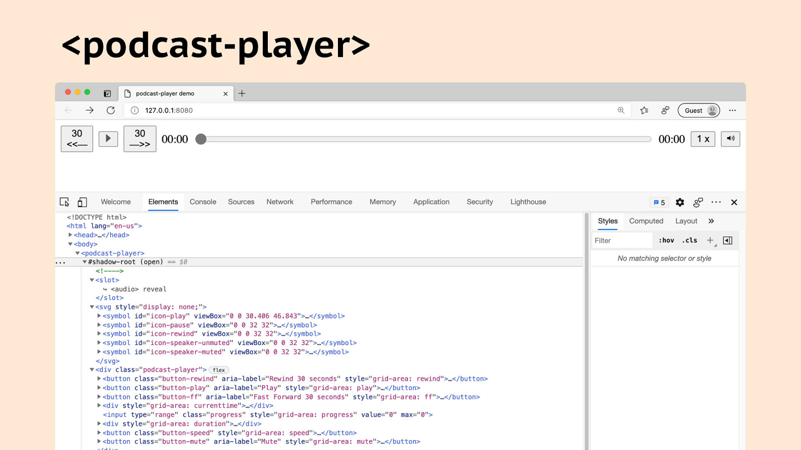
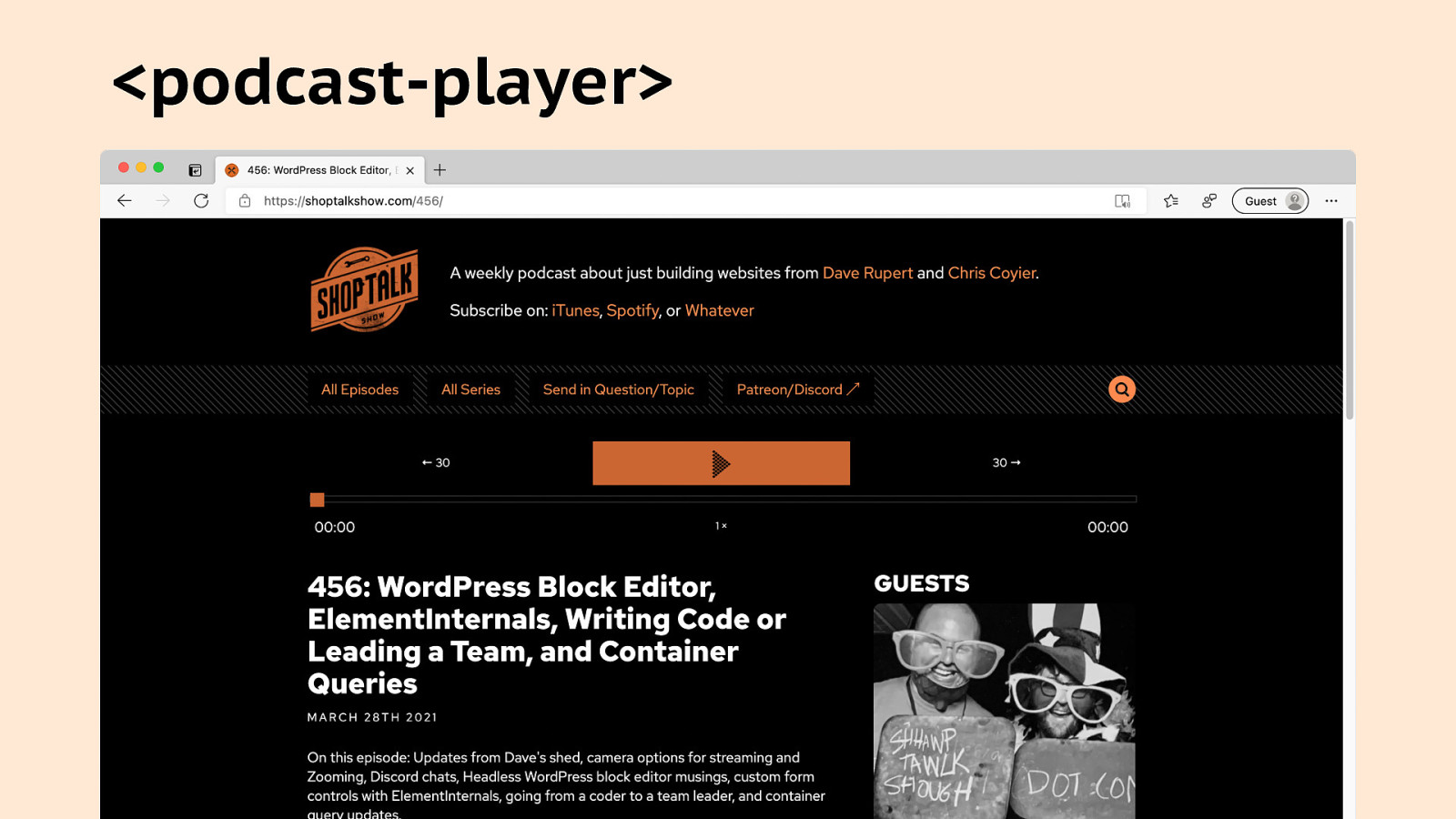
I have strong opinions about podcast players
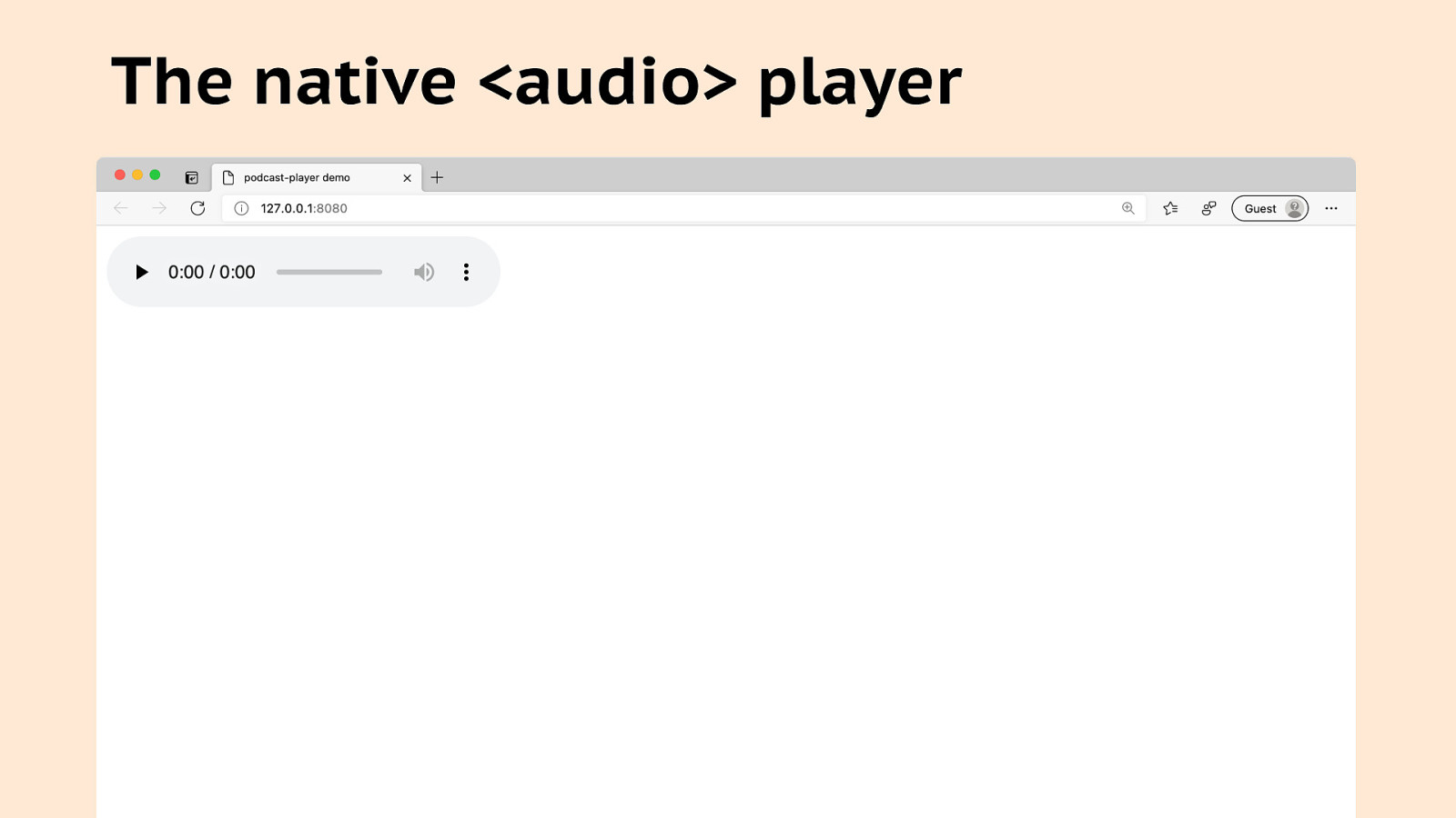
The native <audio> player
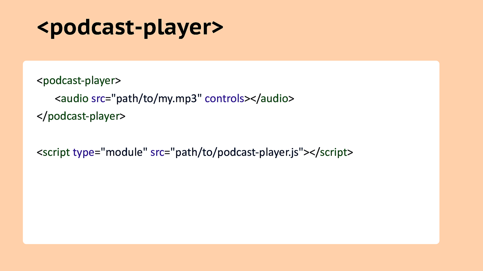
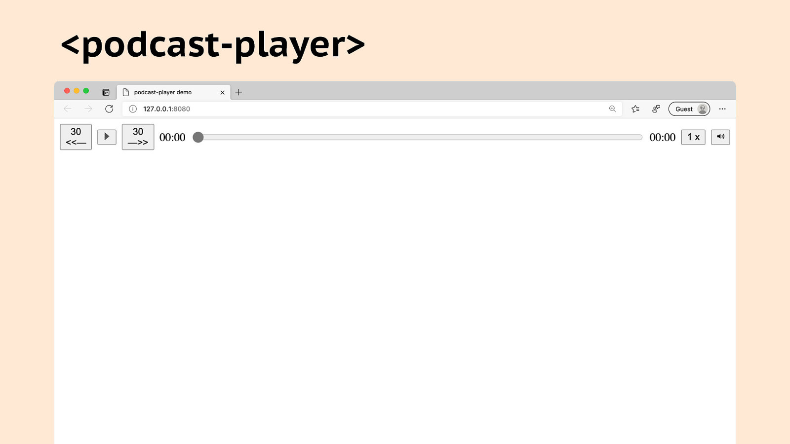
<podcast-player> <podcast-player> <audio src=”path/to/my.mp3” controls></audio> </podcast-player> <script type=”module” src=”path/to/podcast-player.js”></script>
Assertion #3 Web Components will let us make simpler, more accessible, and more maintainable websites.
Wait. Wait. Hold up. Wait. Are you saying Web Components would allow us to create and share accessible prebuilt components without the need for specific JavaScript libraries and overly complicated build processes?!

Yes. I am. That’s the vision.
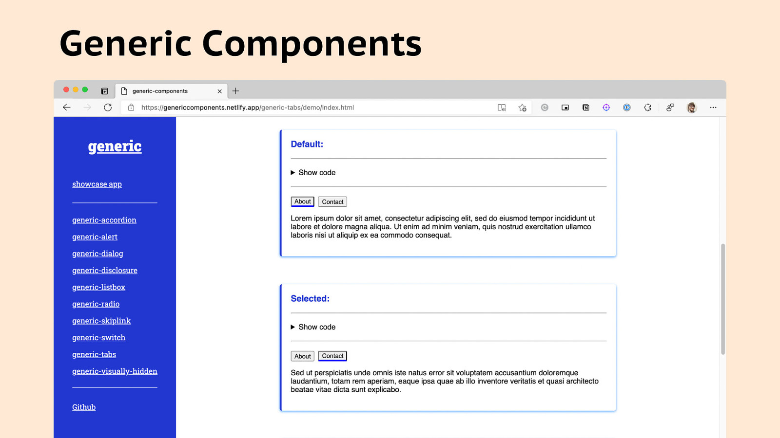
Generic Components
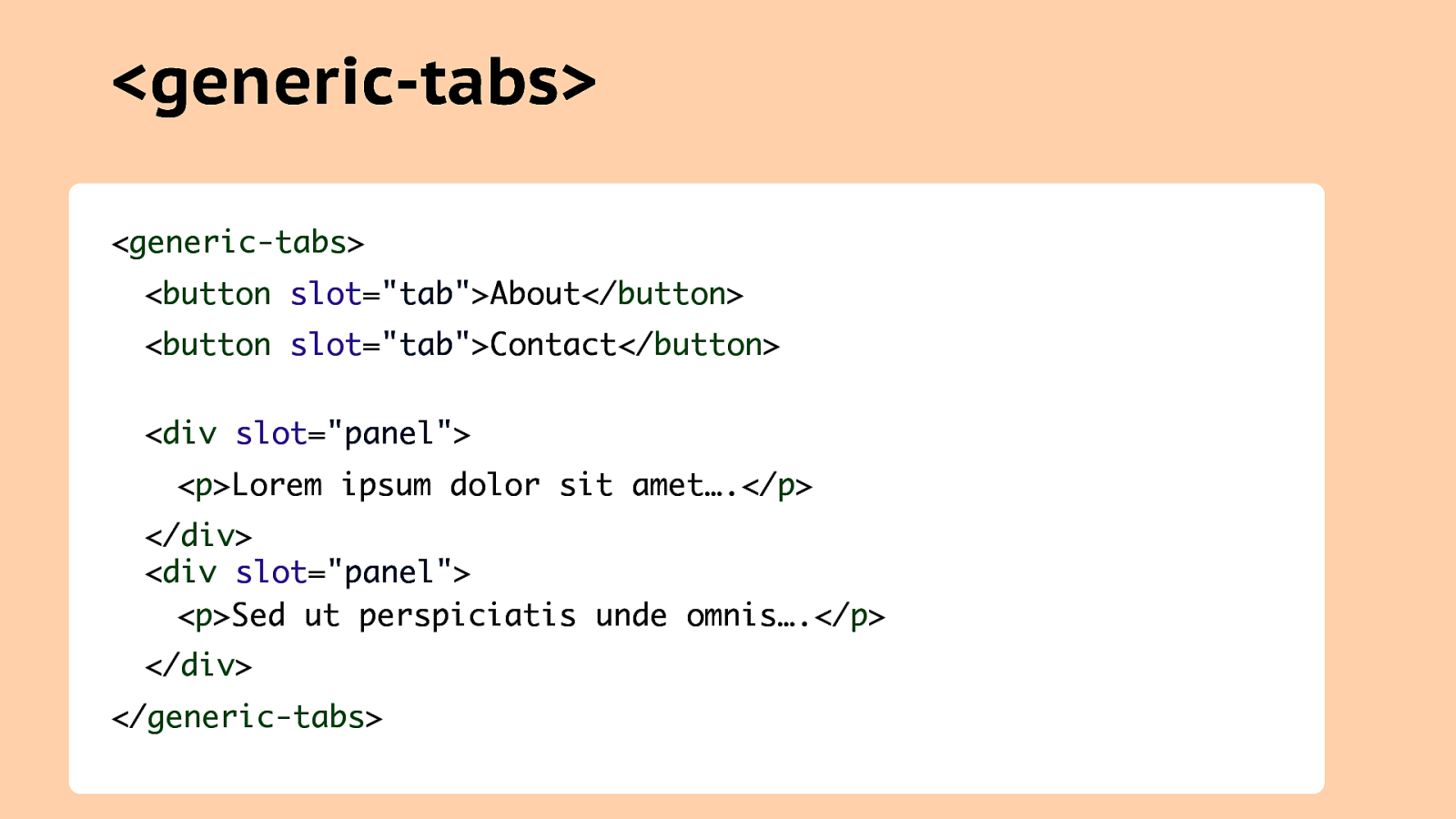
<generic-tabs> <generic-tabs> <button slot=”tab”>About</button> <button slot=”tab”>Contact</button> <div slot=”panel”> <p>Lorem ipsum dolor sit amet….</p> </div> <div slot=”panel”> <p>Sed ut perspiciatis unde omnis….</p> </div> </generic-tabs>
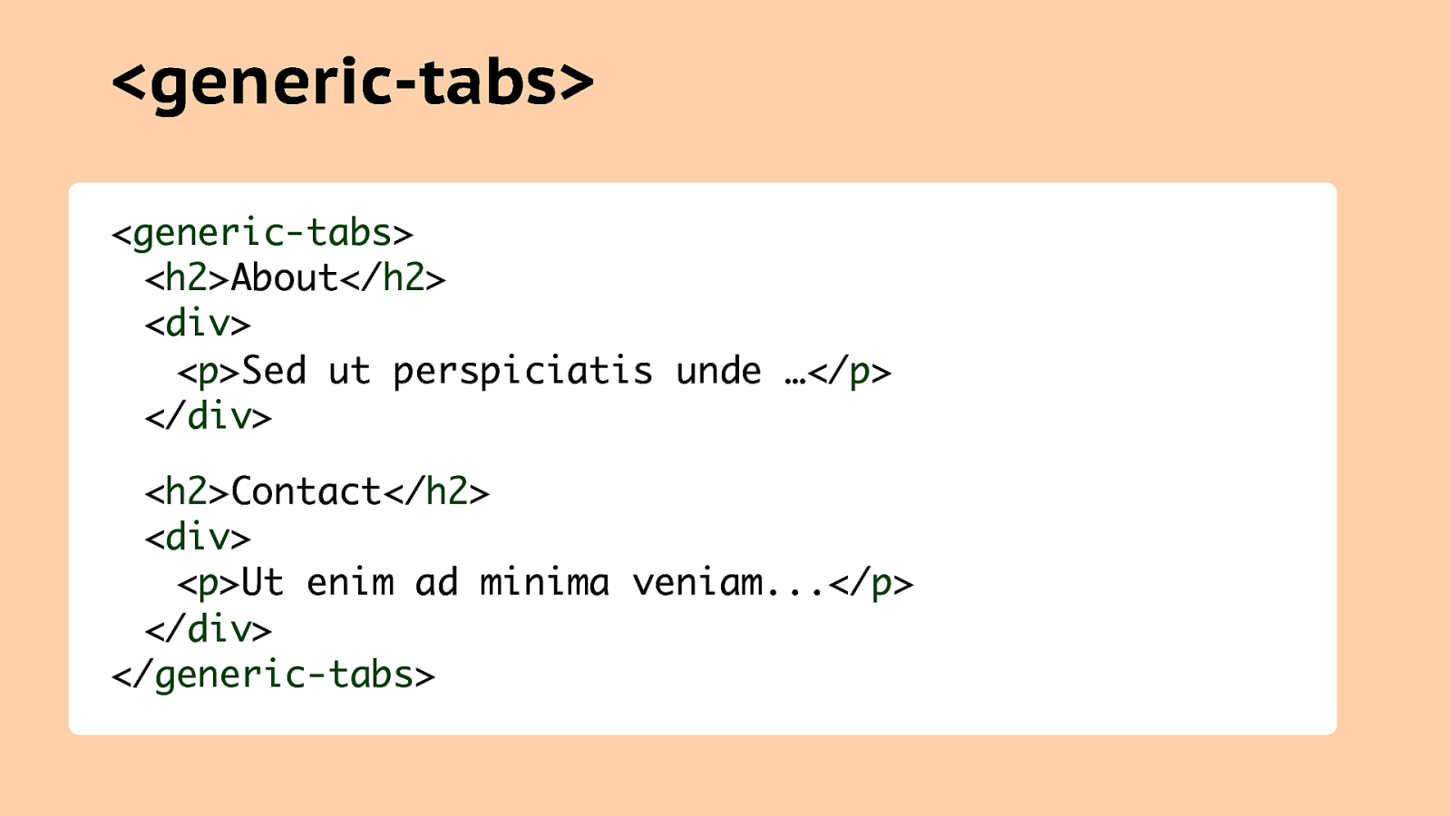
<generic-tabs> <generic-tabs> <h2>About</h2> <div> <p>Sed ut perspiciatis unde …</p> </div> <h2>Contact</h2> <div> <p>Ut enim ad minima veniam…</p> </div> </generic-tabs>
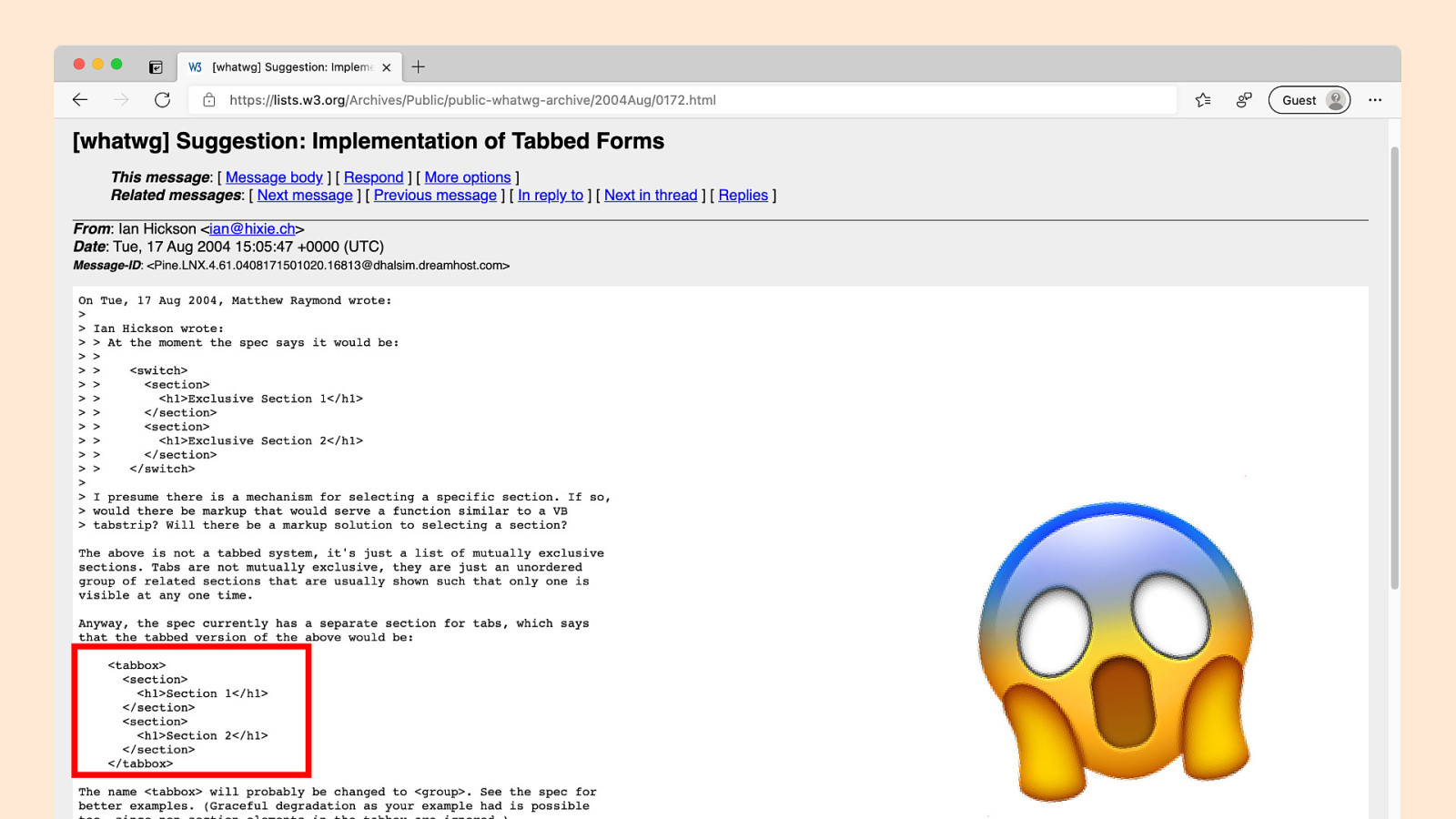
!
Assertion #4 Web Components are a gateway to a new dimension.
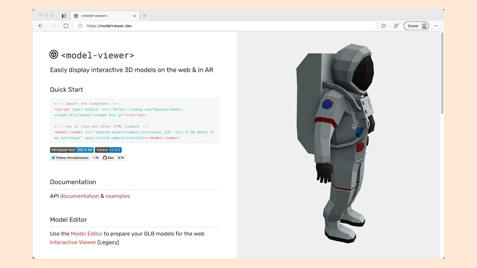
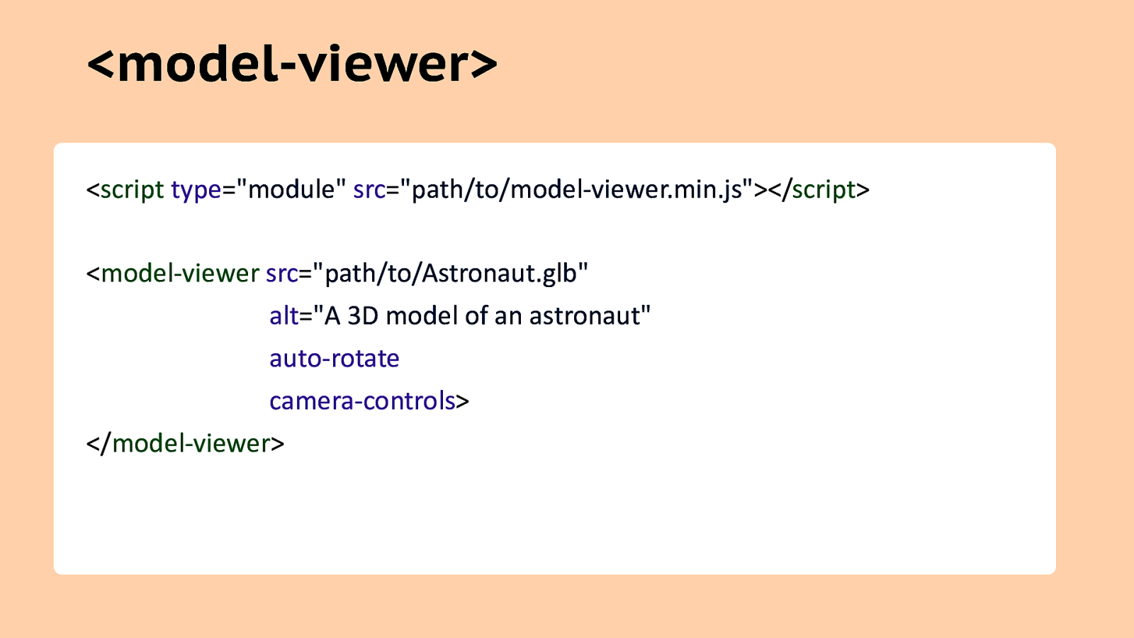
<model-viewer> <script type=”module” src=”path/to/model-viewer.min.js”></script> <model-viewer src=”path/to/Astronaut.glb” alt=”A 3D model of an astronaut” auto-rotate camera-controls> </model-viewer>

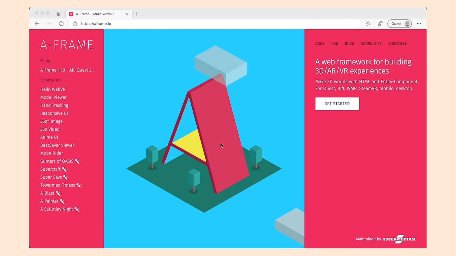
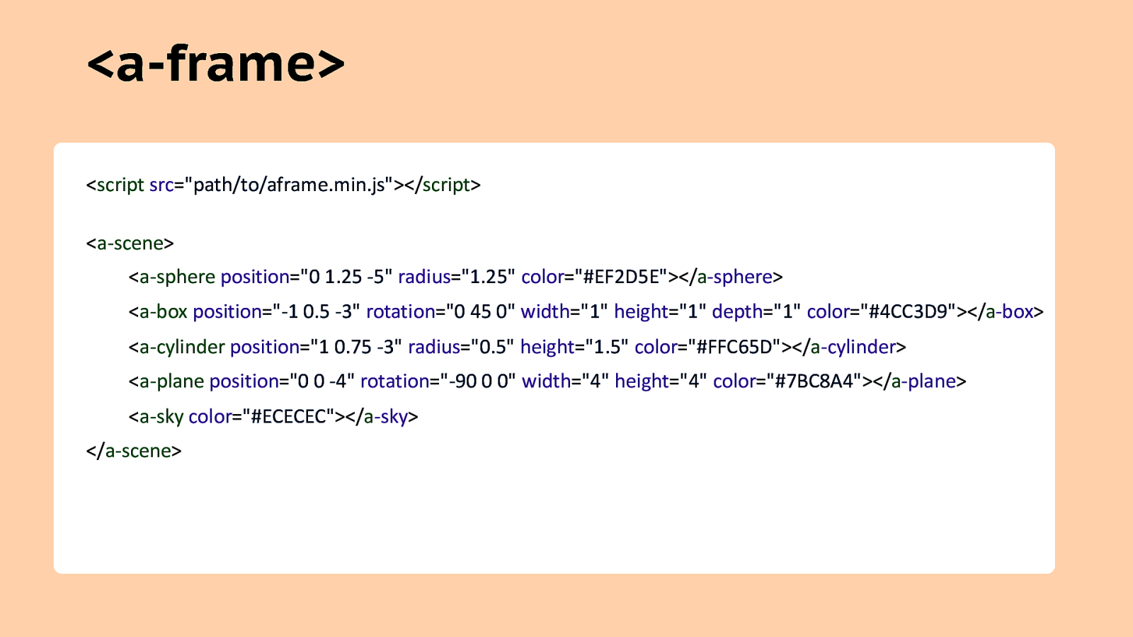
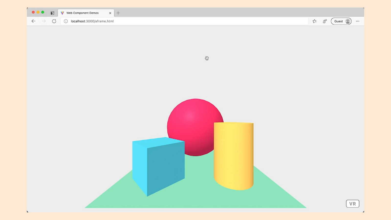
<a-frame> <script src=”path/to/aframe.min.js”></script> <a-scene> <a-sphere position=”0 1.25 -5” radius=”1.25” color=”#EF2D5E”></a-sphere> <a-box position=”-1 0.5 -3” rotation=”0 45 0” width=”1” height=”1” depth=”1” color=”#4CC3D9”></a-box> <a-cylinder position=”1 0.75 -3” radius=”0.5” height=”1.5” color=”#FFC65D”></a-cylinder> <a-plane position=”0 0 -4” rotation=”-90 0 0” width=”4” height=”4” color=”#7BC8A4”></a-plane> <a-sky color=”#ECECEC”></a-sky> </a-scene>
How do you find cool Web Components? Me, personally? Poor work/life balance. You?
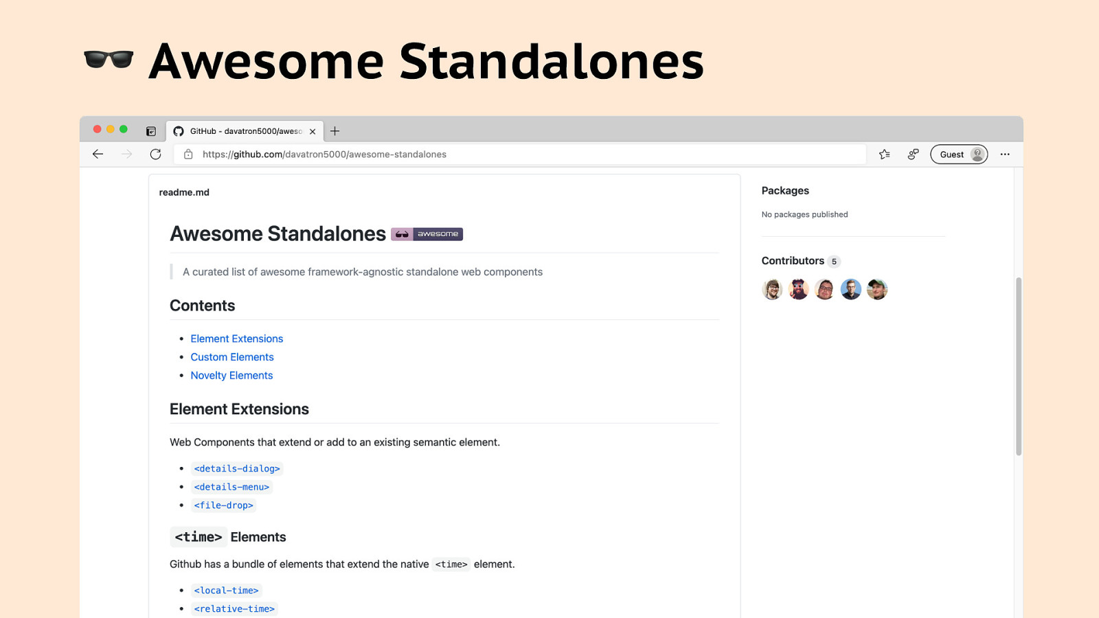
! Awesome Standalones
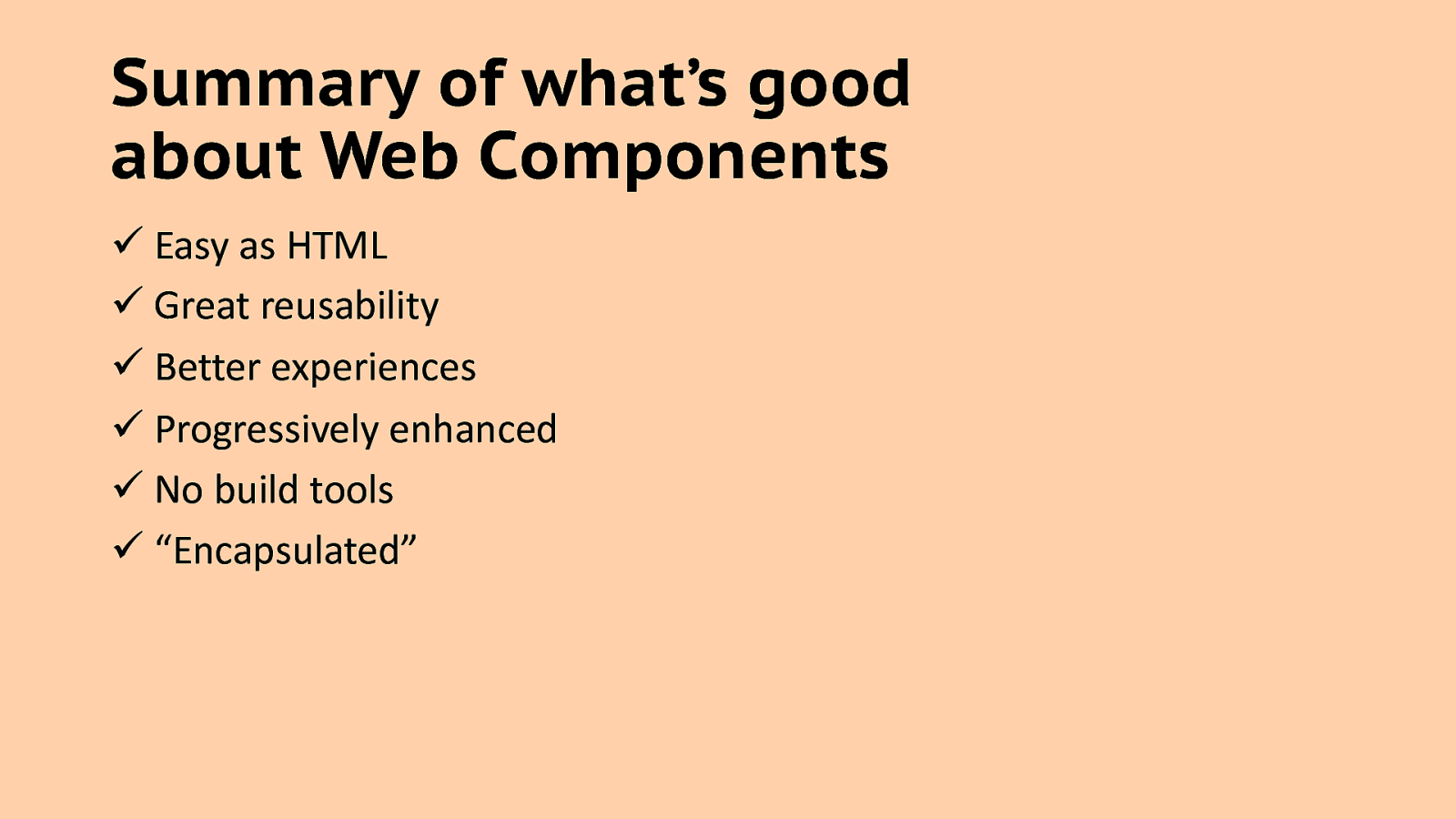
Summary of what’s good about Web Components ü Easy as HTML ü Great reusability ü Better experiences ü Progressively enhanced ü No build tools ü “Encapsulated”
Styling Web Components with CSS
Truth be told… This part isn’t very fun.
PIERCING THE SHADOW DOM This Photo by Unknown Author is licensed under CC BY-SA
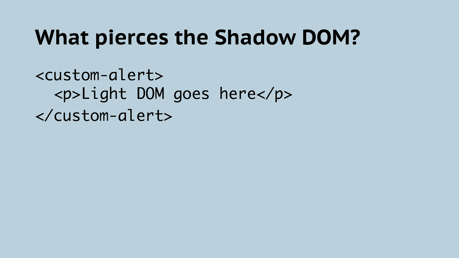
What pierces the Shadow DOM? <custom-alert> <p>Light DOM goes here</p> </custom-alert>
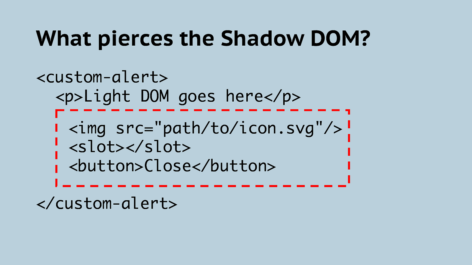
What pierces the Shadow DOM? <custom-alert> <p>Light DOM goes here</p> <img src=”path/to/icon.svg”/> <slot></slot> <button>Close</button> </custom-alert>
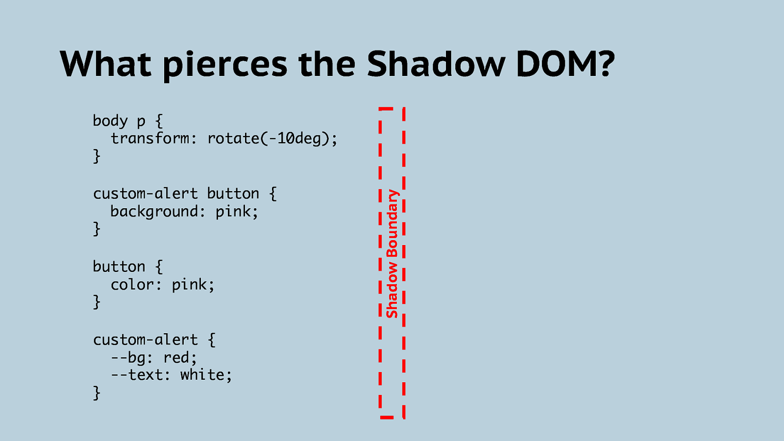
What pierces the Shadow DOM? custom-alert button { background: pink; } button { color: pink; } custom-alert { —bg: red; —text: white; } Shadow Boundary body p { transform: rotate(-10deg); }
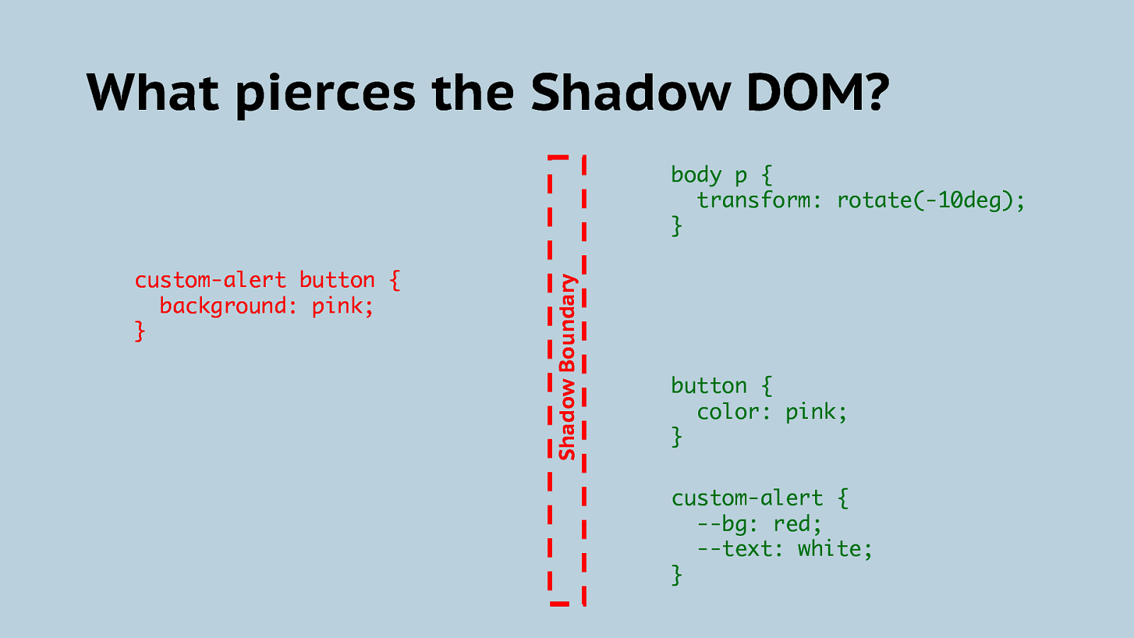
What pierces the Shadow DOM? custom-alert button { background: pink; } Shadow Boundary body p { transform: rotate(-10deg); } button { color: pink; } custom-alert { —bg: red; —text: white; }
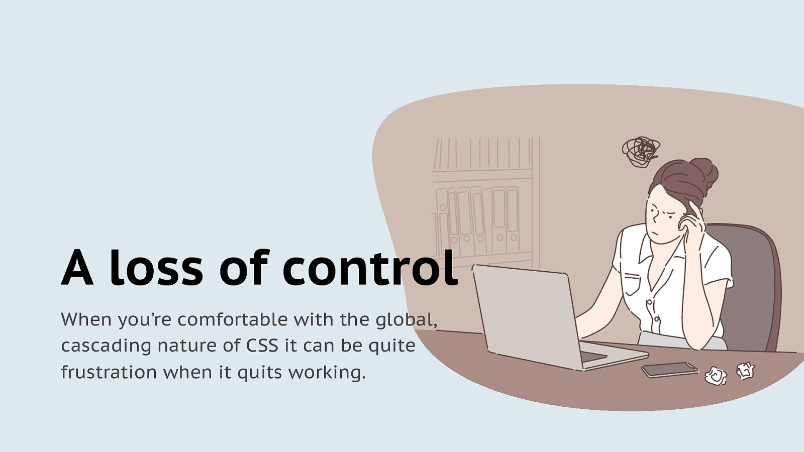
A loss of control When you’re comfortable with the global, cascading nature of CSS it can be quite frustration when it quits working.
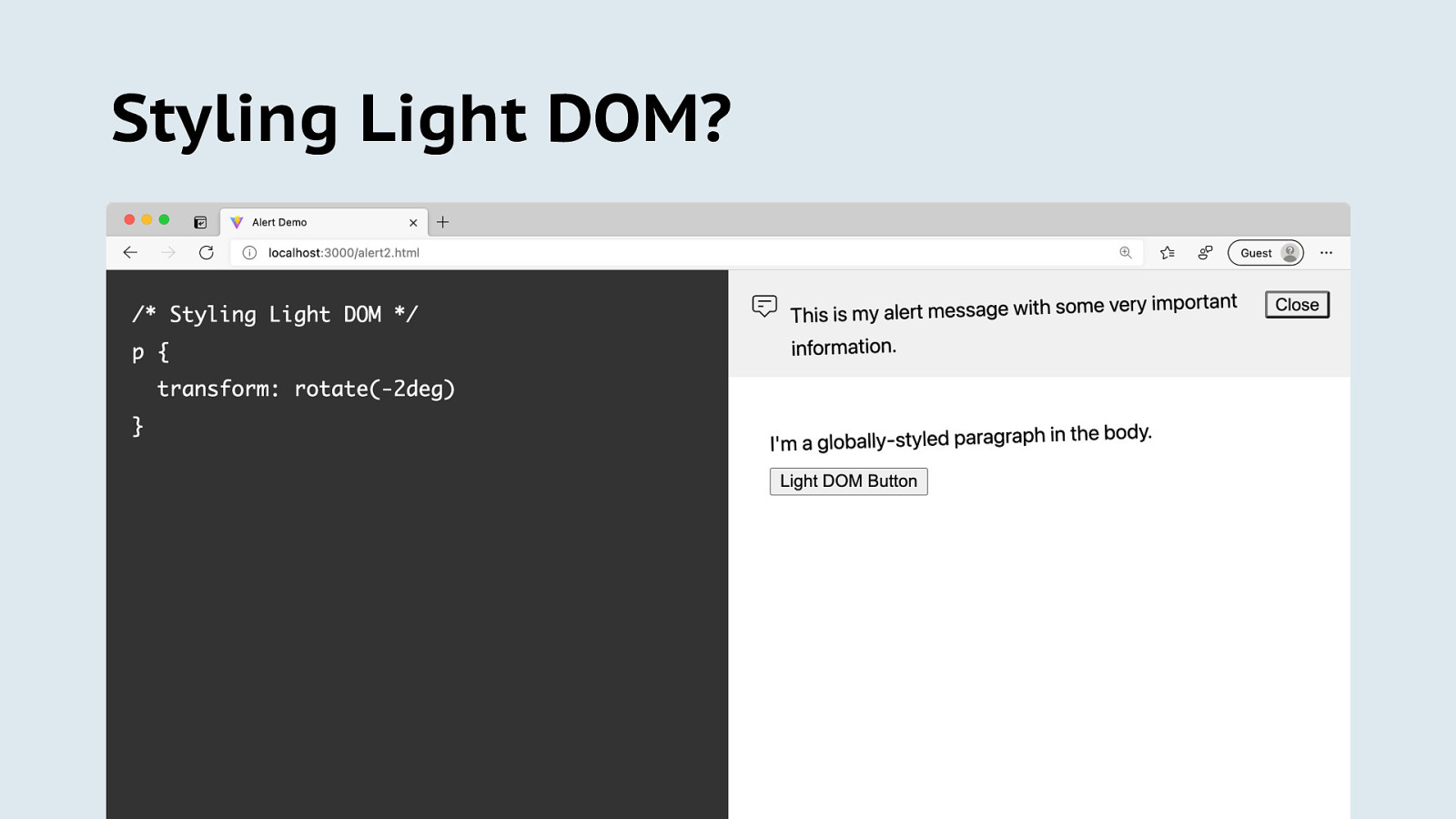
Styling Light DOM?
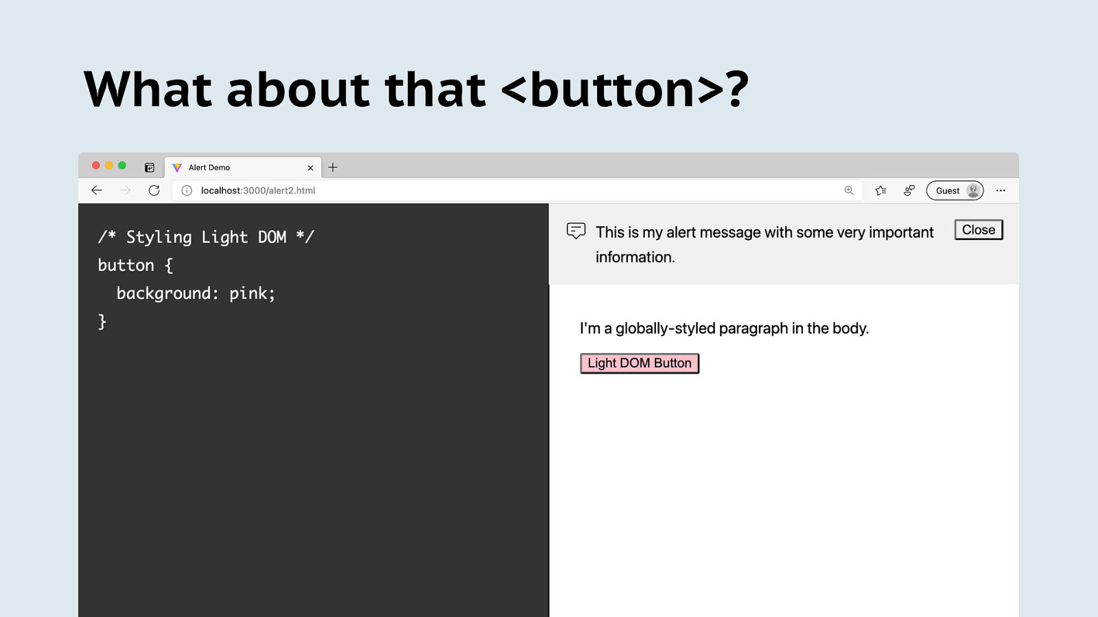
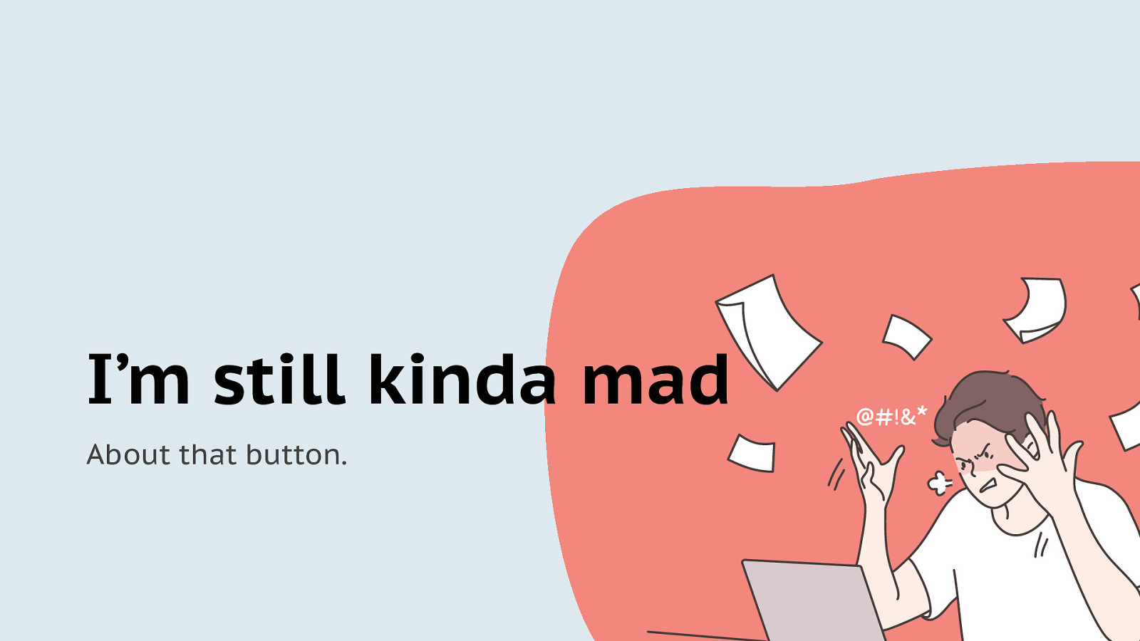
What about that <button>?
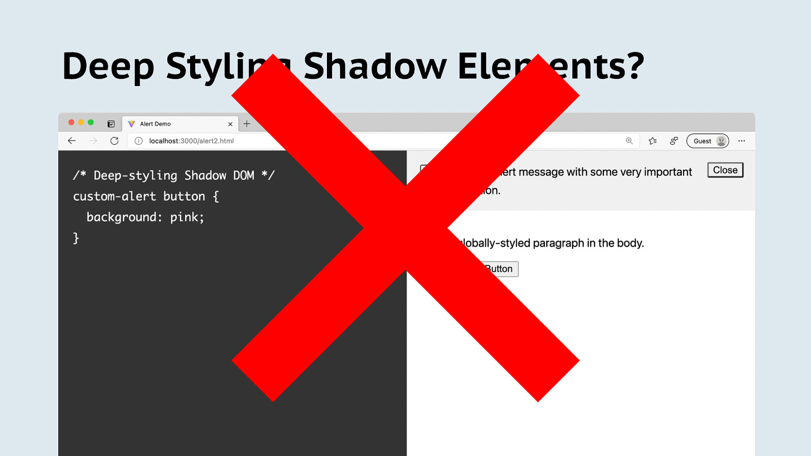
Deep Styling Shadow Elements?
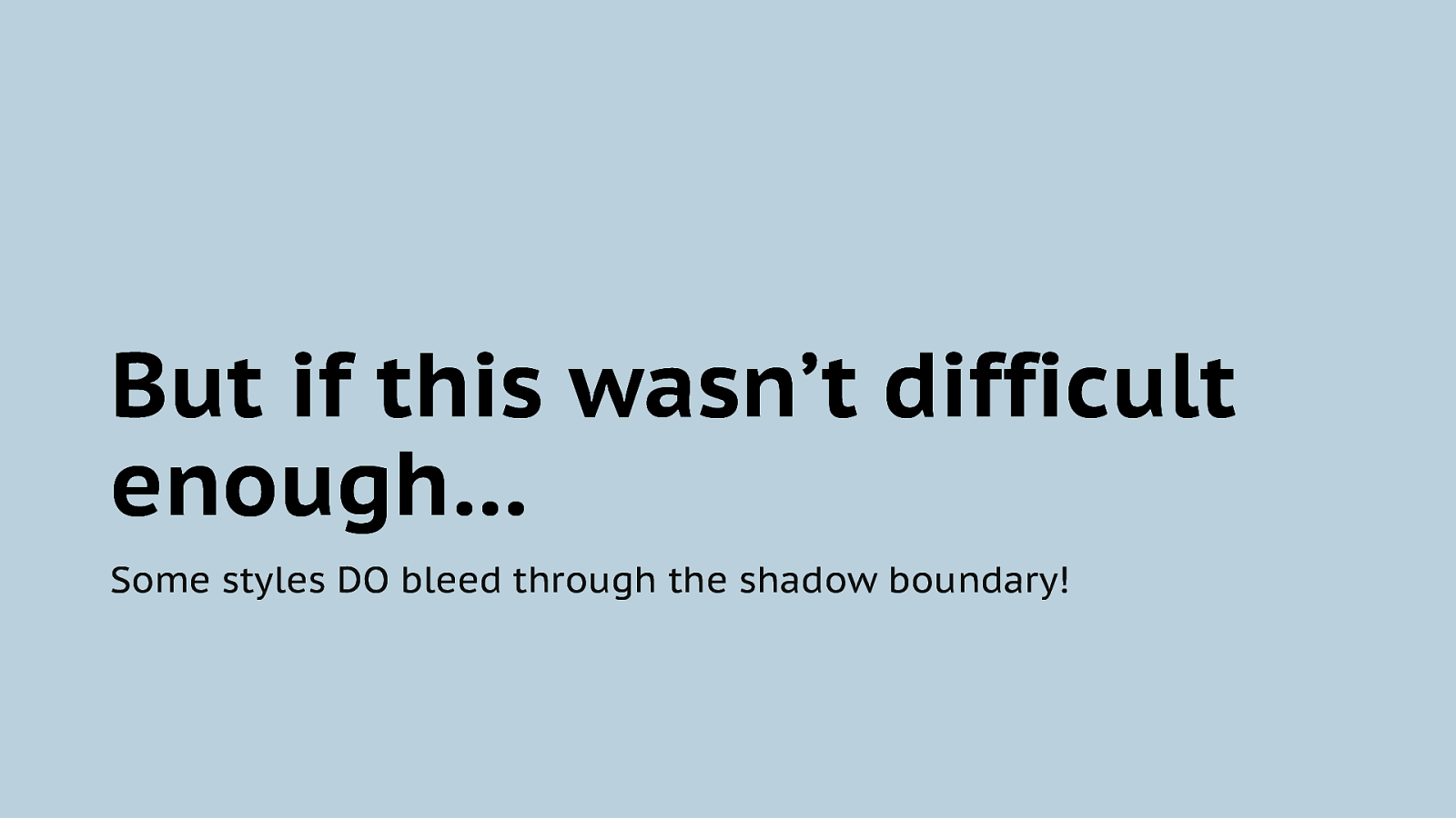
But if this wasn’t difficult enough… Some styles DO bleed through the shadow boundary!
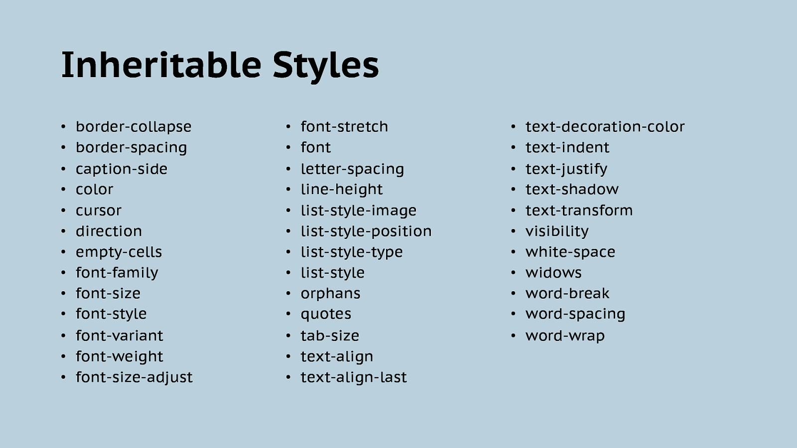
Inheritable Styles • • • • • • • • • • • • • border-collapse border-spacing caption-side color cursor direction empty-cells font-family font-size font-style font-variant font-weight font-size-adjust • • • • • • • • • • • • • font-stretch font letter-spacing line-height list-style-image list-style-position list-style-type list-style orphans quotes tab-size text-align text-align-last • • • • • • • • • • • text-decoration-color text-indent text-justify text-shadow text-transform visibility white-space widows word-break word-spacing word-wrap
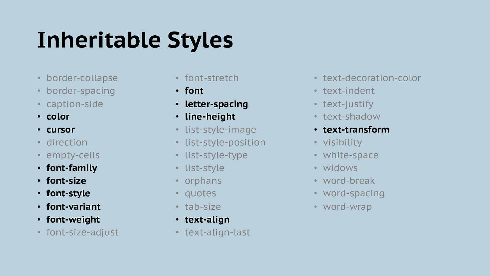
Inheritable Styles • • • • • • • • • • • • • border-collapse border-spacing caption-side color cursor direction empty-cells font-family font-size font-style font-variant font-weight font-size-adjust • • • • • • • • • • • • • font-stretch font letter-spacing line-height list-style-image list-style-position list-style-type list-style orphans quotes tab-size text-align text-align-last • • • • • • • • • • • text-decoration-color text-indent text-justify text-shadow text-transform visibility white-space widows word-break word-spacing word-wrap
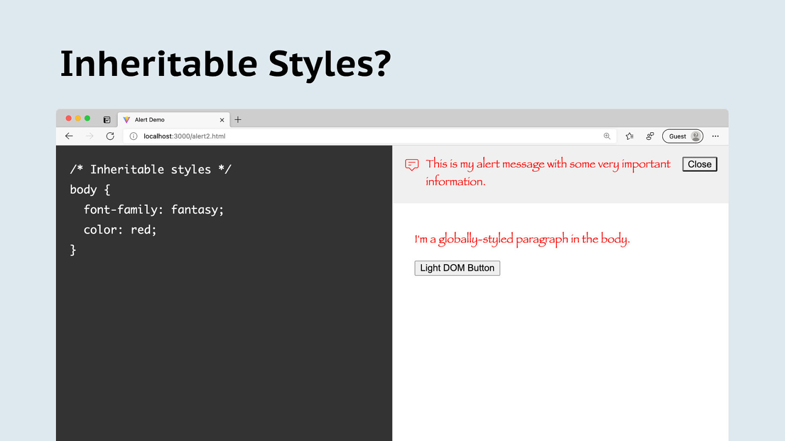
Inheritable Styles?
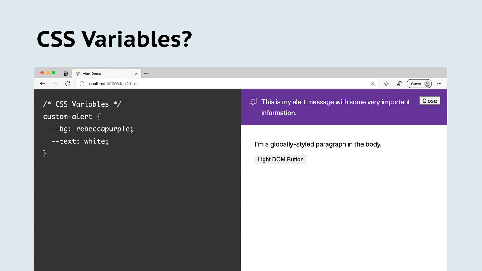
CSS Variables?
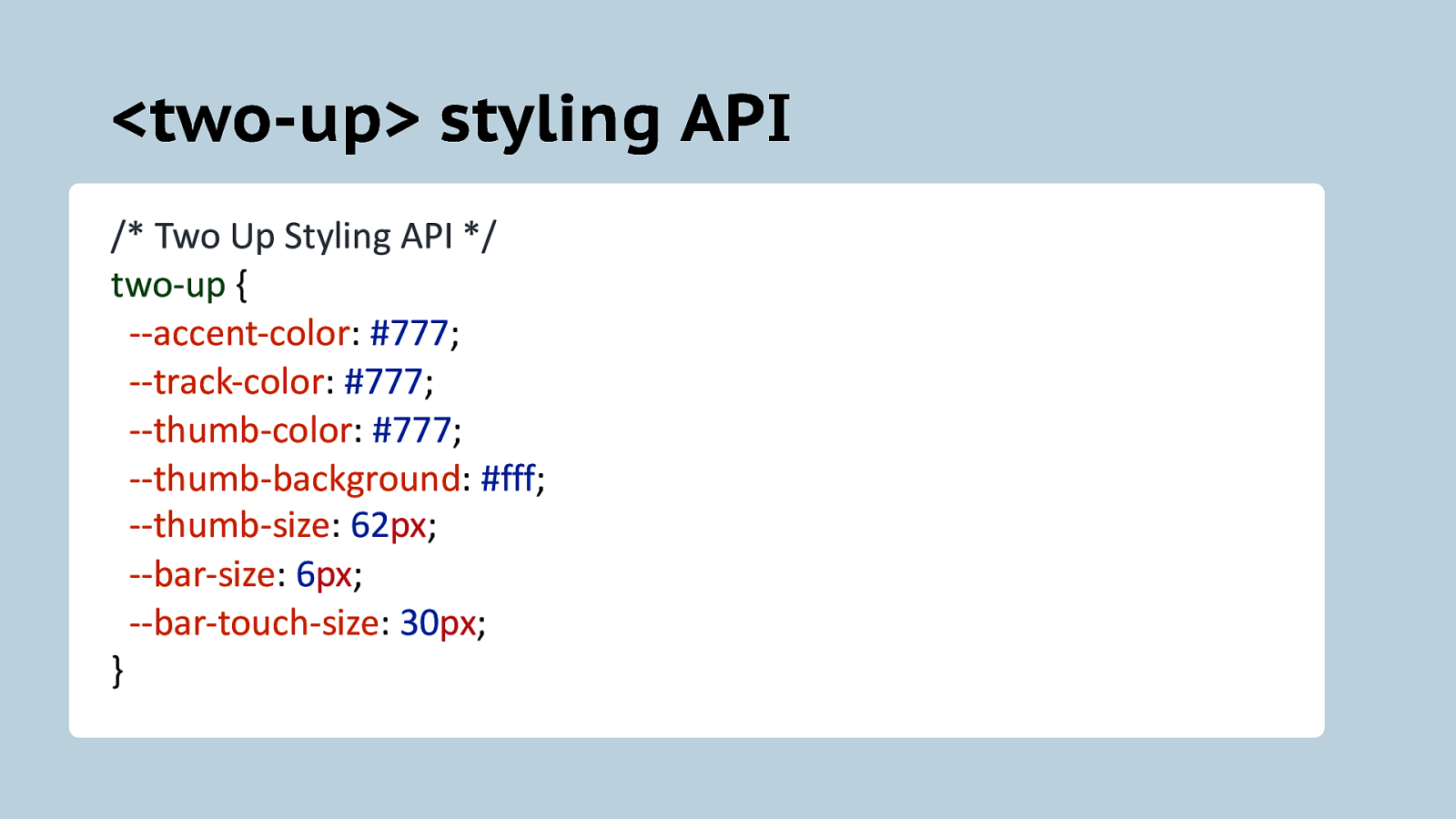
<two-up> styling API /* Two Up Styling API */ two-up { —accent-color: #777; —track-color: #777; —thumb-color: #777; —thumb-background: #fff; —thumb-size: 62px; —bar-size: 6px; —bar-touch-size: 30px; }
CSS Variables are a great way to add a styling API They offer the right amount of flexibility for most minor customizations.
More ways to offer styling APIs A few “hooks” to let their components be customized.
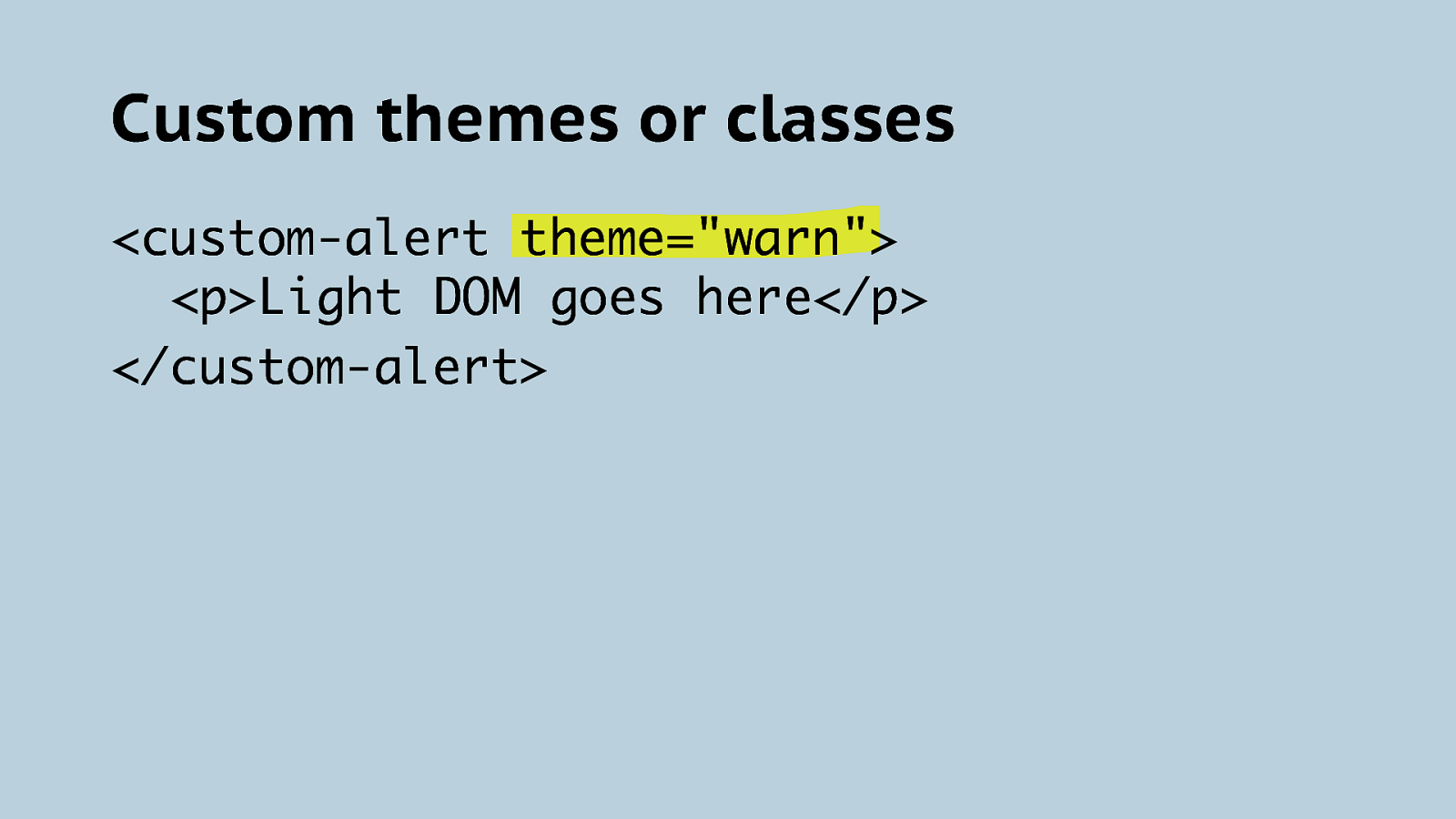
Custom themes or classes <custom-alert theme=”warn”> <p>Light DOM goes here</p> </custom-alert>
I’m still kinda mad About that button.
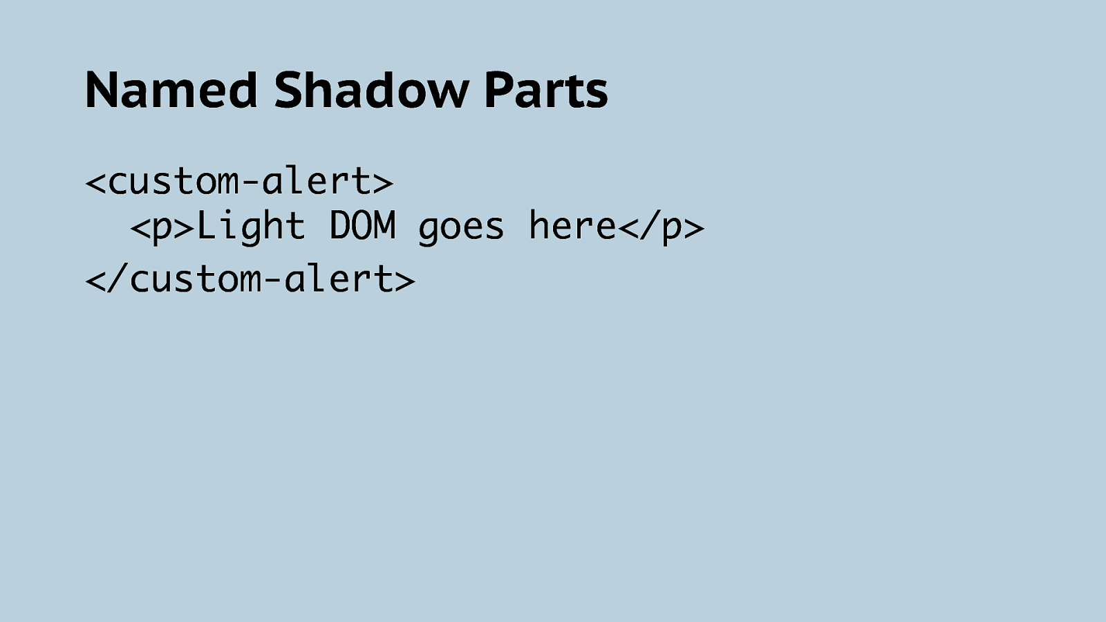
Named Shadow Parts <custom-alert> <p>Light DOM goes here</p> </custom-alert>
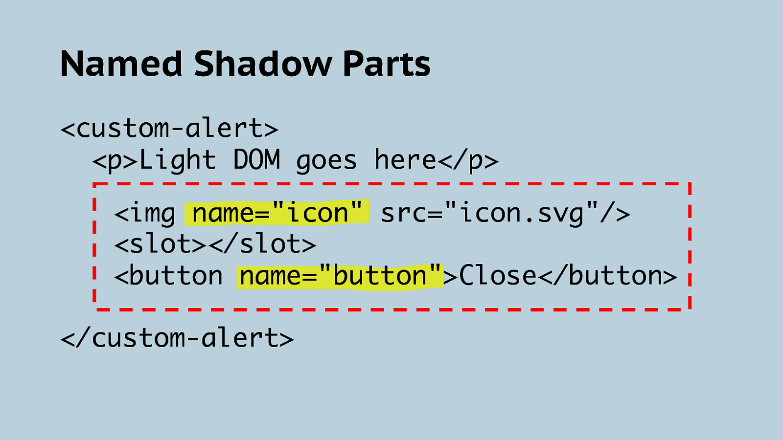
Named Shadow Parts <custom-alert> <p>Light DOM goes here</p> <img name=”icon” src=”icon.svg”/> <slot></slot> <button name=”button”>Close</button> </custom-alert>
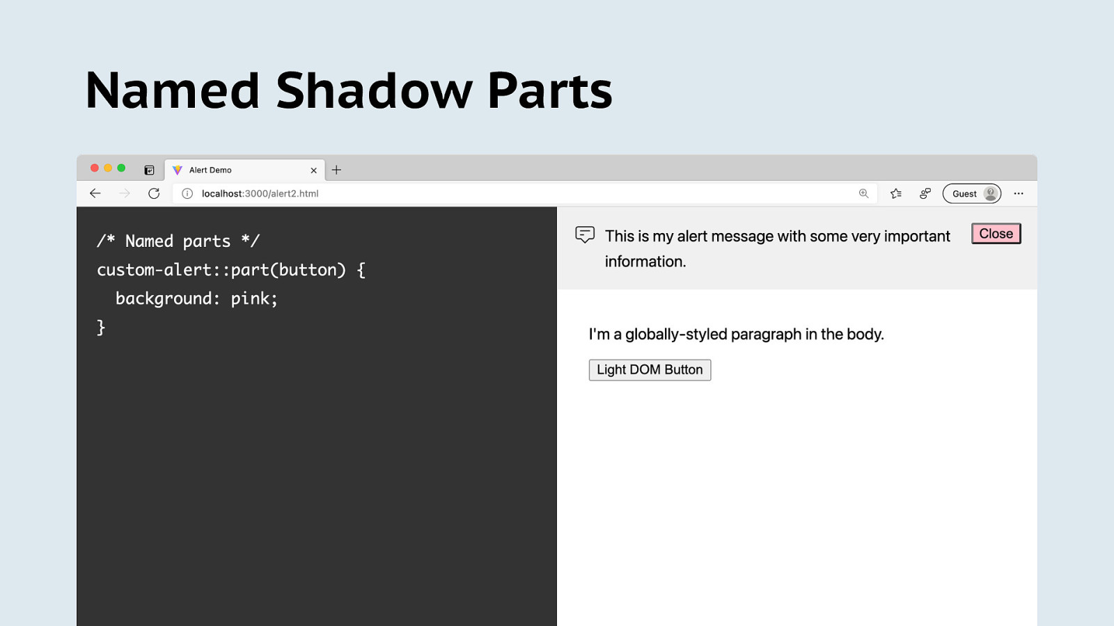
Named Shadow Parts
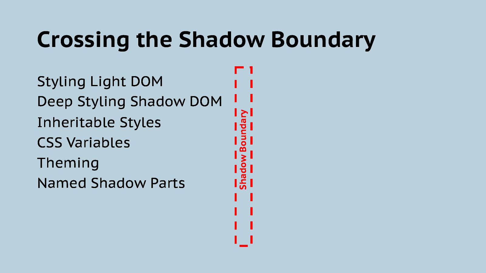
Styling Light DOM Deep Styling Shadow DOM Inheritable Styles CSS Variables Theming Named Shadow Parts Shadow Boundary Crossing the Shadow Boundary
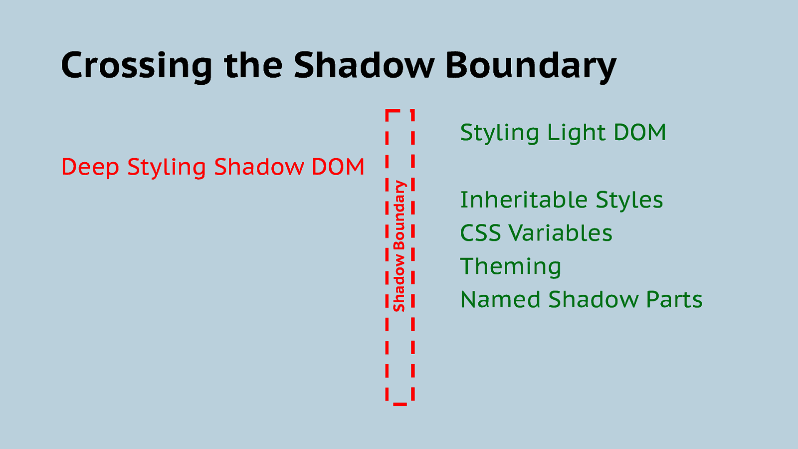
Crossing the Shadow Boundary Deep Styling Shadow DOM Shadow Boundary Styling Light DOM Inheritable Styles CSS Variables Theming Named Shadow Parts

Writing Web Components with JS
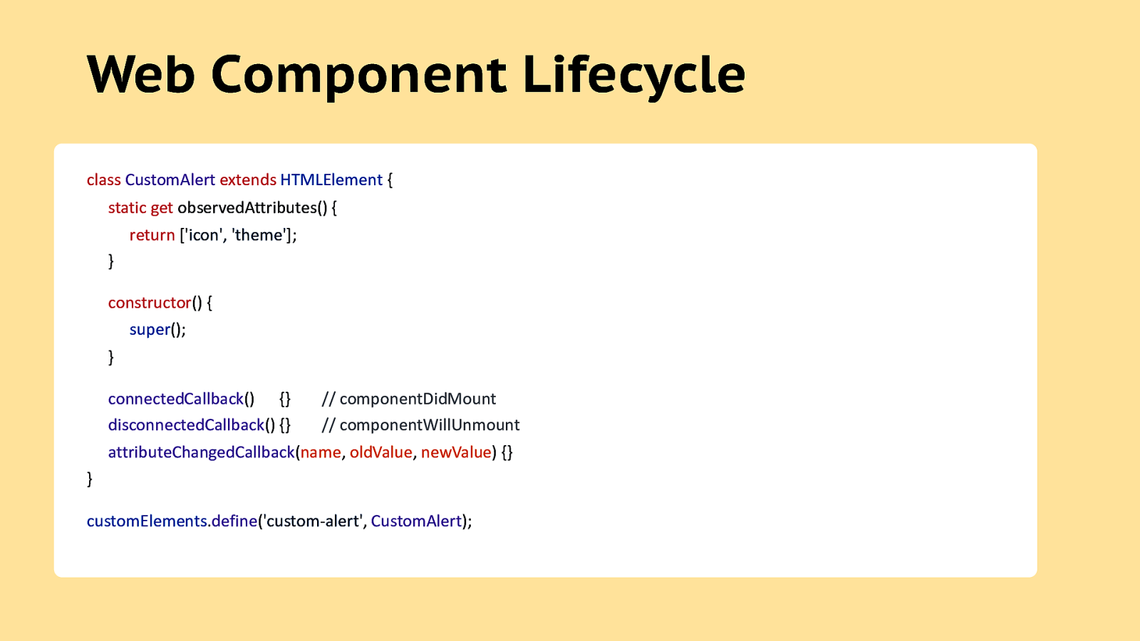
Web Component Lifecycle class CustomAlert extends HTMLElement { static get observedAttributes() { return [‘icon’, ‘theme’]; } constructor() { super(); } connectedCallback() {} disconnectedCallback() {} // componentDidMount // componentWillUnmount attributeChangedCallback(name, oldValue, newValue) {} } customElements.define(‘custom-alert’, CustomAlert);
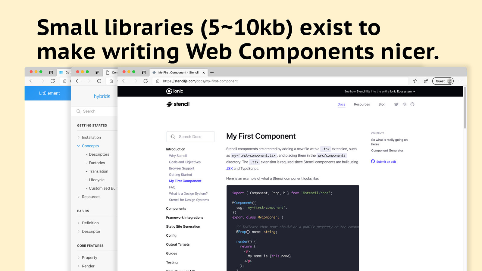
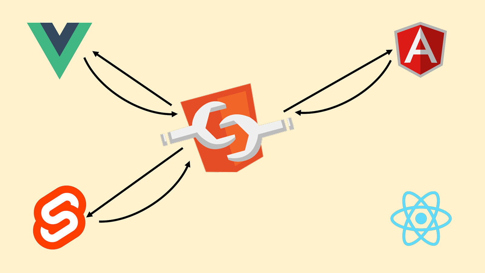
Small libraries (5~10kb) exist to make writing Web Components nicer.
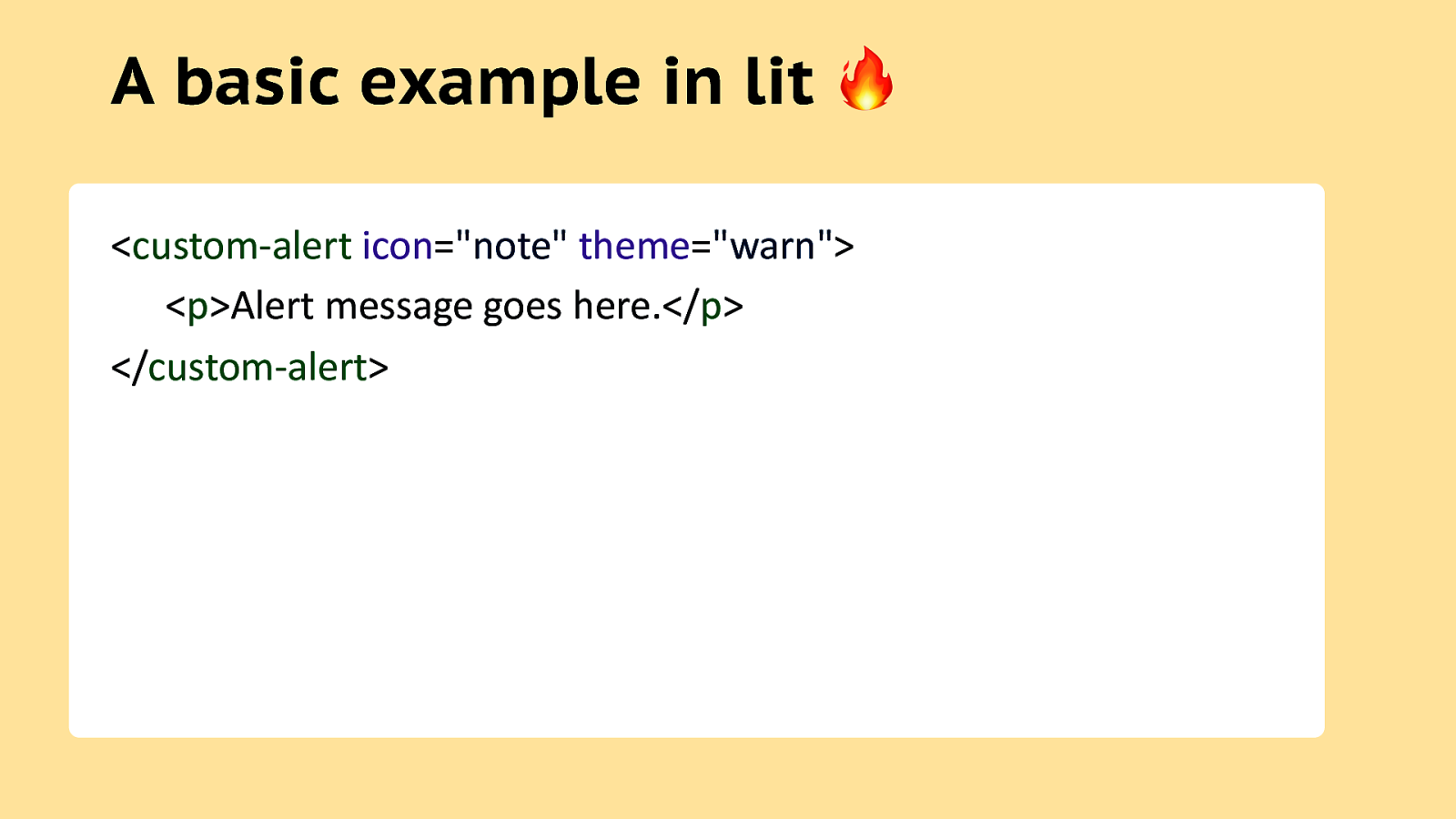
A basic example in lit ” <custom-alert icon=”note” theme=”warn”> <p>Alert message goes here.</p> </custom-alert>
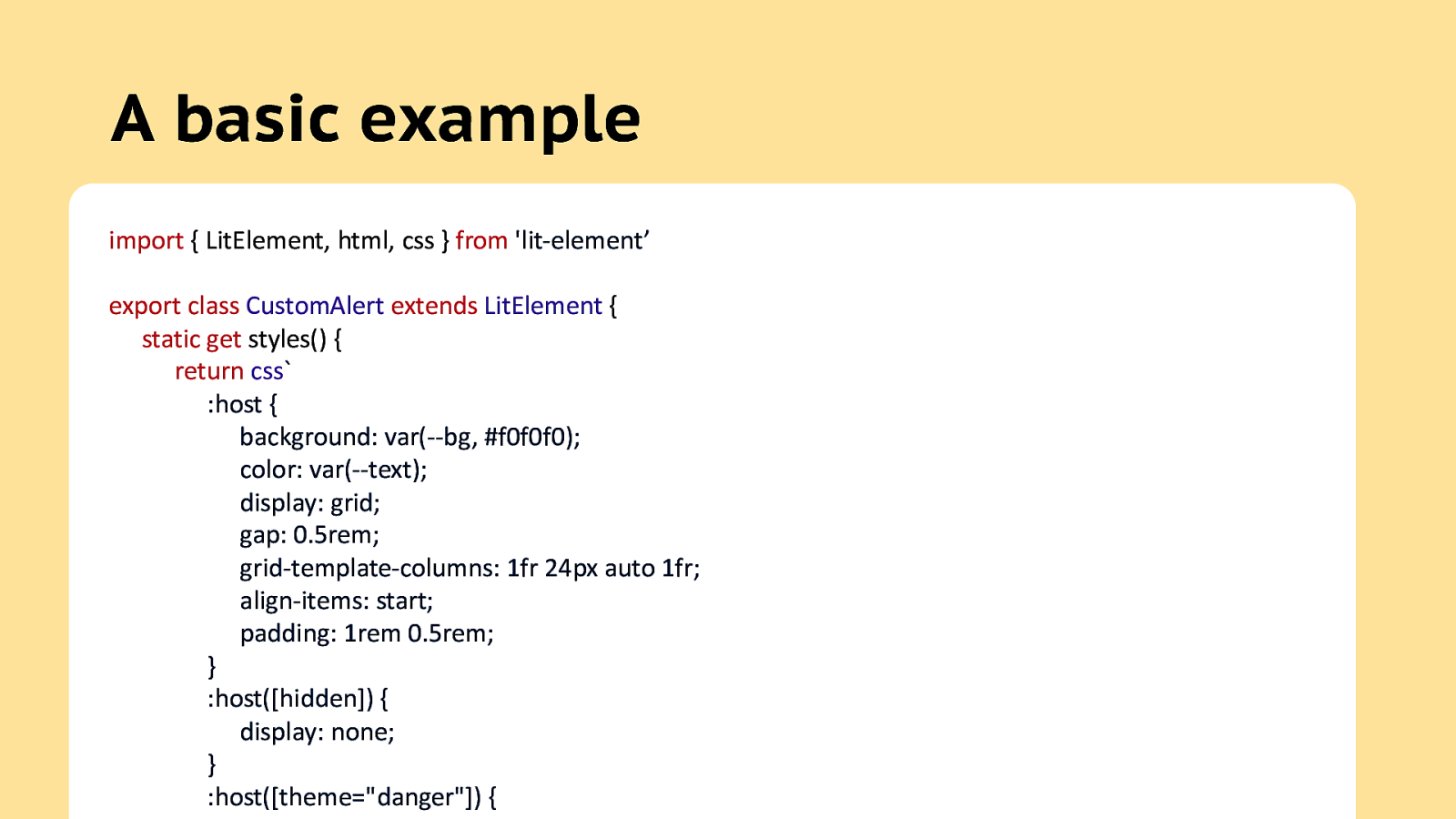
A basic example import { LitElement, html, css } from ‘lit-element’ export class CustomAlert extends LitElement { static get styles() { return css` :host { background: var(—bg, #f0f0f0); color: var(—text); display: grid; gap: 0.5rem; grid-template-columns: 1fr 24px auto 1fr; align-items: start; padding: 1rem 0.5rem; } :host([hidden]) { display: none; } :host([theme=”danger”]) {
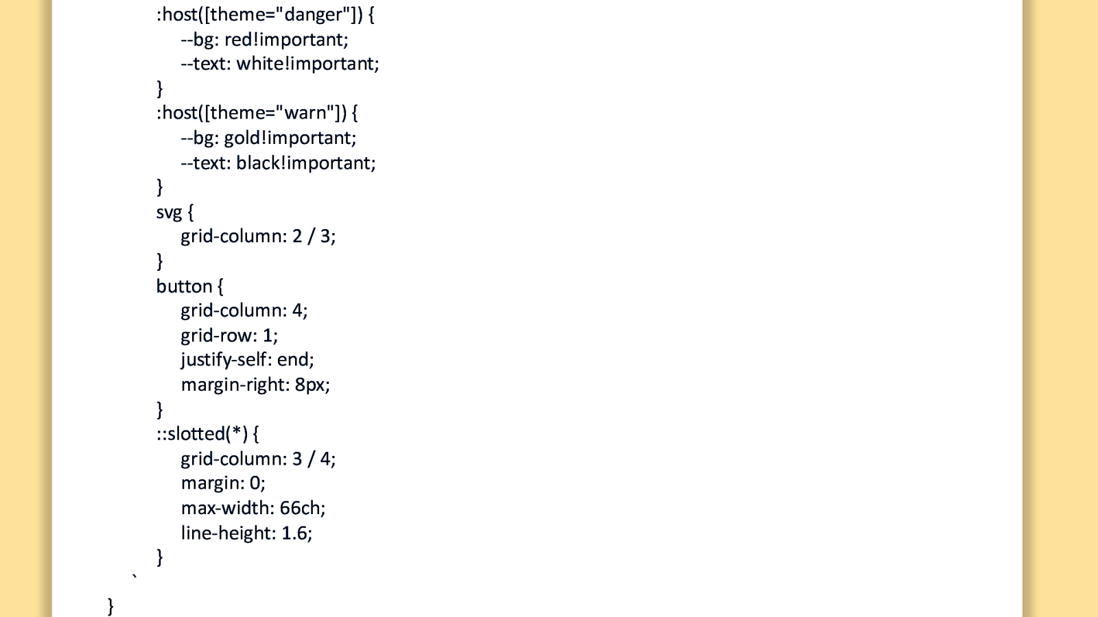
:host([theme=”danger”]) { —bg: red!important; —text: white!important; } :host([theme=”warn”]) { —bg: gold!important; —text: black!important; } svg { grid-column: 2 / 3; } button { grid-column: 4; grid-row: 1; justify-self: end; margin-right: 8px; } ::slotted(*) { grid-column: 3 / 4; margin: 0; max-width: 66ch; line-height: 1.6; } A basic example } `
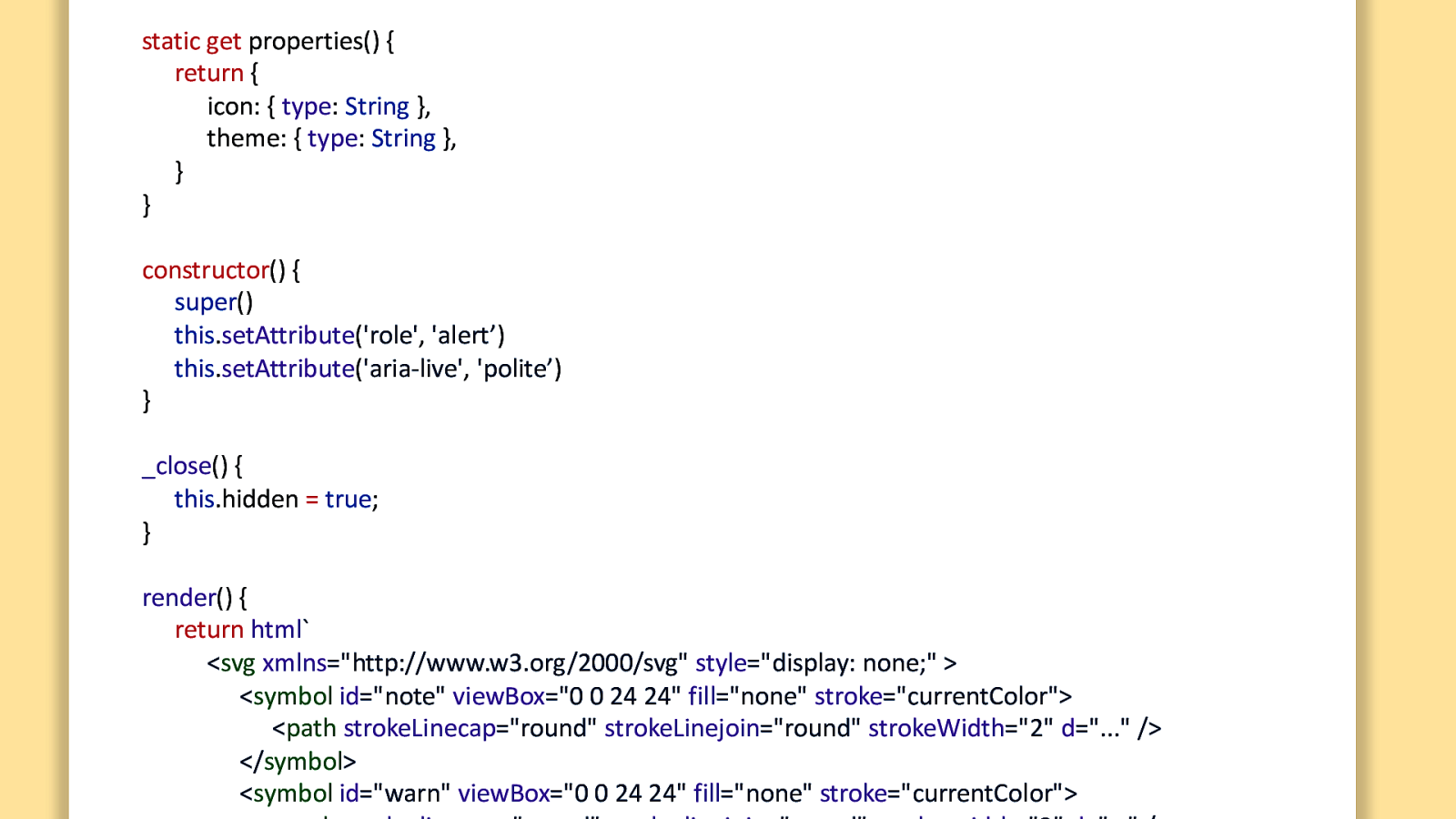
static get properties() { return { icon: { type: String }, theme: { type: String }, } } A basic example constructor() { super() this.setAttribute(‘role’, ‘alert’) this.setAttribute(‘aria-live’, ‘polite’) } _close() { this.hidden = true; } render() { return html` <svg xmlns=”http://www.w3.org/2000/svg” style=”display: none;” > <symbol id=”note” viewBox=”0 0 24 24” fill=”none” stroke=”currentColor”> <path strokeLinecap=”round” strokeLinejoin=”round” strokeWidth=”2” d=”…” /> </symbol> <symbol id=”warn” viewBox=”0 0 24 24” fill=”none” stroke=”currentColor”>
}
this.hidden = true;
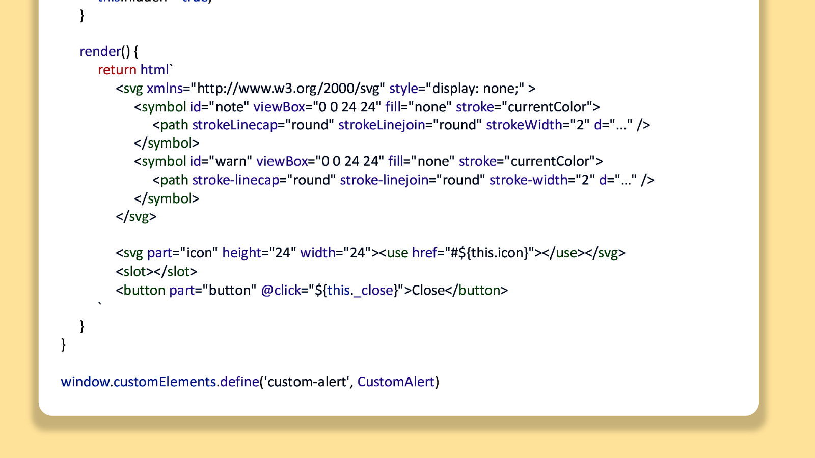
render() { return html<svg xmlns="http://www.w3.org/2000/svg" style="display: none;" > <symbol id="note" viewBox="0 0 24 24" fill="none" stroke="currentColor"> <path strokeLinecap="round" strokeLinejoin="round" strokeWidth="2" d="..." /> </symbol> <symbol id="warn" viewBox="0 0 24 24" fill="none" stroke="currentColor"> <path stroke-linecap="round" stroke-linejoin="round" stroke-width="2" d="…" /> </symbol> </svg> A basic example } }
<svg part=”icon” height=”24” width=”24”><use href=”#${this.icon}”></use></svg> <slot></slot> <button part=”button” @click=”${this._close}”>Close</button>
window.customElements.define(‘custom-alert’, CustomAlert)
A basic example

FAQ
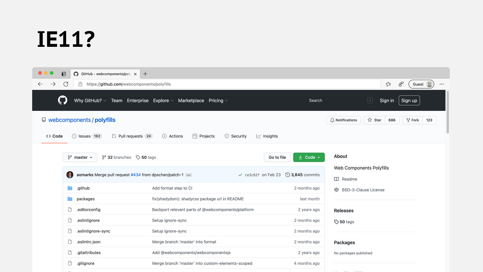
IE11?
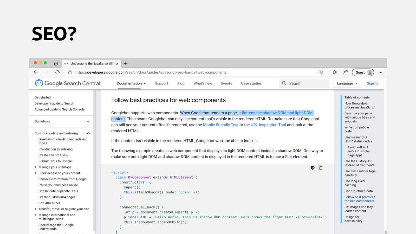
SEO?
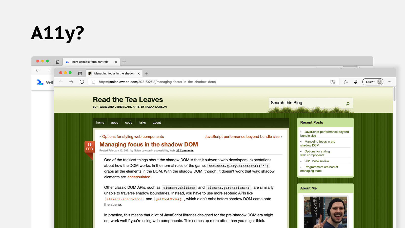
A11y?
tl;dr • Custom Elements around form controls have some gotchas. • Getting better with ElementInternals and formdata • Focus management is tricky, like always. • inert may be a hero here.
What about my favorite things? • State management? • Server-side rendering? • Props? • Hot Module Replacement?

A few big ideas before we go…
Web Components build into the Web Platform
If we have good, accessible Custom Elements…
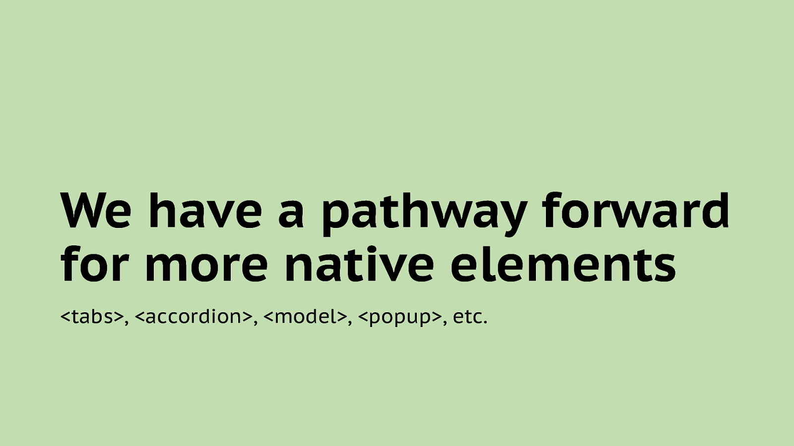
We have a pathway forward for more native elements <tabs>, <accordion>, <model>, <popup>, etc.
An easier Web lowers barriers Less complexity, less gatekeeping, a web for everyone.

Thanks Dave Rupert @davatron5000