Improve User Experience by Designing with Cognitive Differences in Mind
- Inclusive Design 24 (#id24)
- October 10, 2019
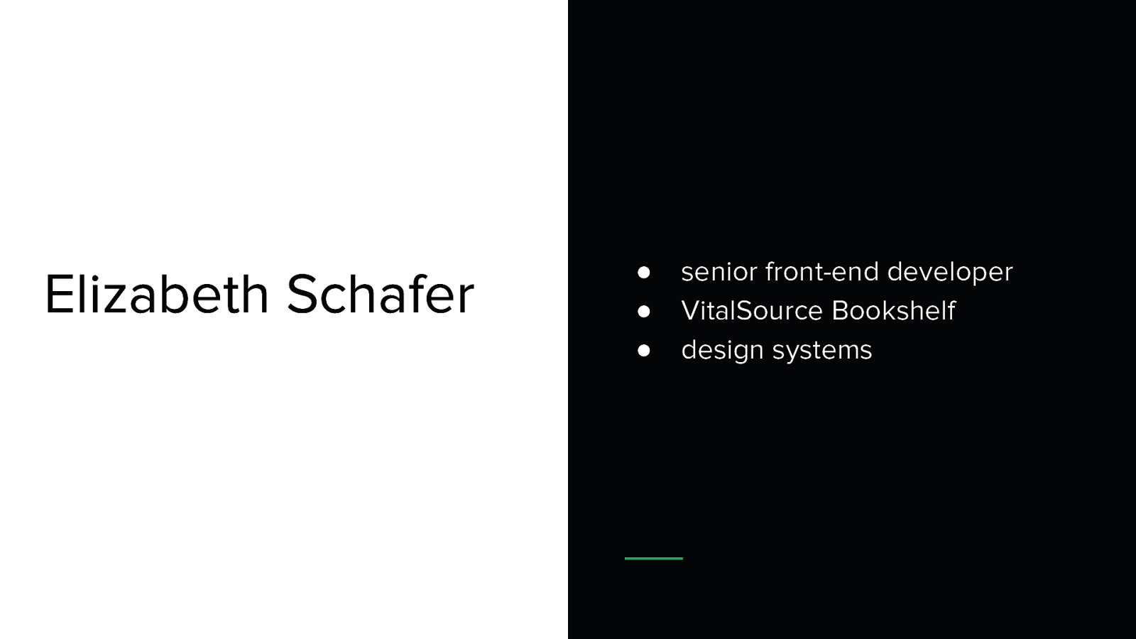
- Elizabeth Schafer (@elizschafer)
- Hi, thanks so much for the opportunity to talk today!
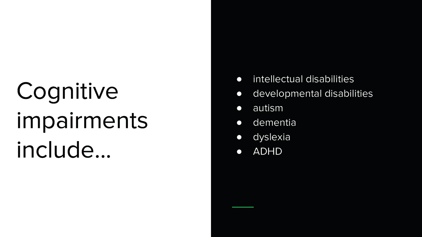
- I’m going to be talking about how to improve user experience by designing with cognitive differences in mind.