Introduction to modern CSS Emmanuel Aina @horlah_codes Frontend Dev, BuyCoins

A presentation at Frontstack in February 2019 in Lagos, Nigeria by Emmanuel Aina
Introduction to modern CSS Emmanuel Aina @horlah_codes Frontend Dev, BuyCoins
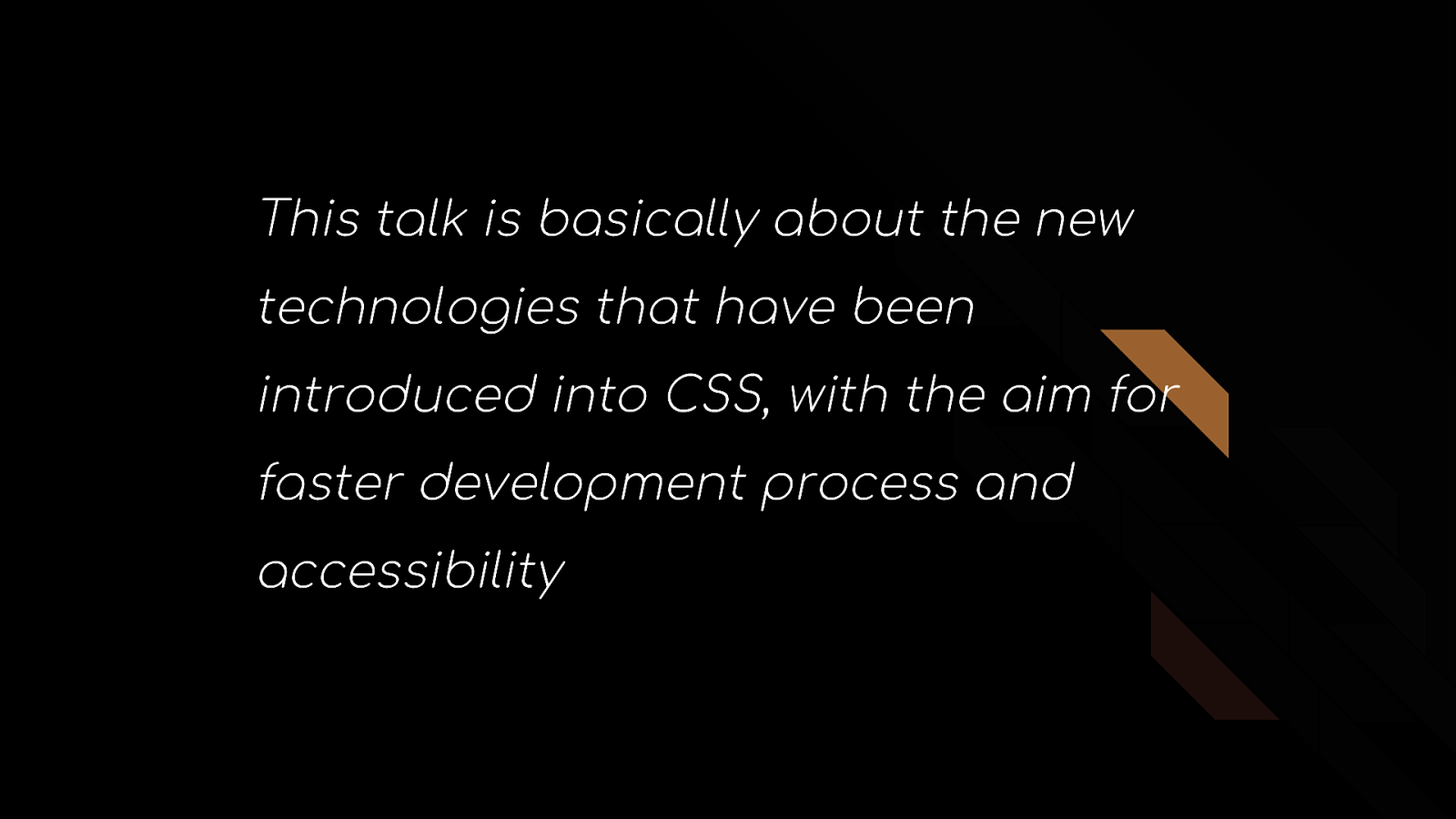
This talk is basically about the new technologies that have been introduced into CSS, with the aim for faster development process and accessibility
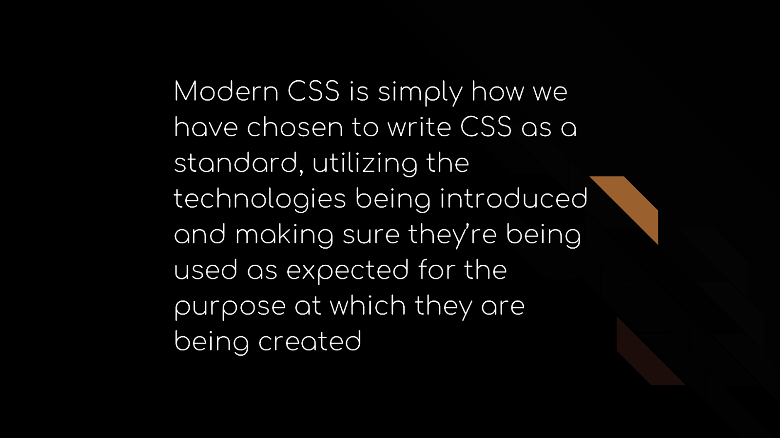
Modern CSS is simply how we have chosen to write CSS as a standard, utilizing the technologies being introduced and making sure they’re being used as expected for the purpose at which they are being created
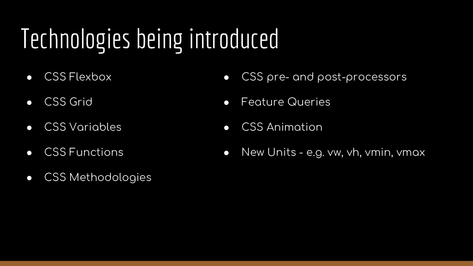
Technologies being introduced ● CSS Flexbox ● CSS pre- and post-processors ● CSS Grid ● Feature Queries ● CSS Variables ● CSS Animation ● CSS Functions ● New Units - e.g. vw, vh, vmin, vmax ● CSS Methodologies
Let’s pick them one after the other
CSS Flexbox m av u …
CSS Flexbox CSS Flexbox was proposed in 2009 but did not get implemented in browser spread adoption until 2015. Flexbox was designed to define how space is distributed across a single column or row, which makes it a better candidate for defining layout compared to using floats - Peter Jang, Dean of Instruction @Actualize
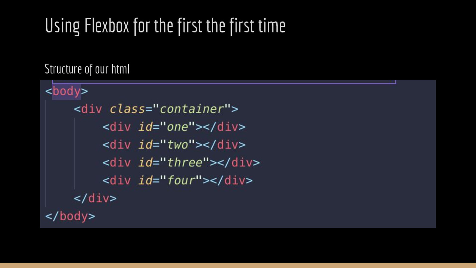
Using Flexbox for the first the first time Structure of our html
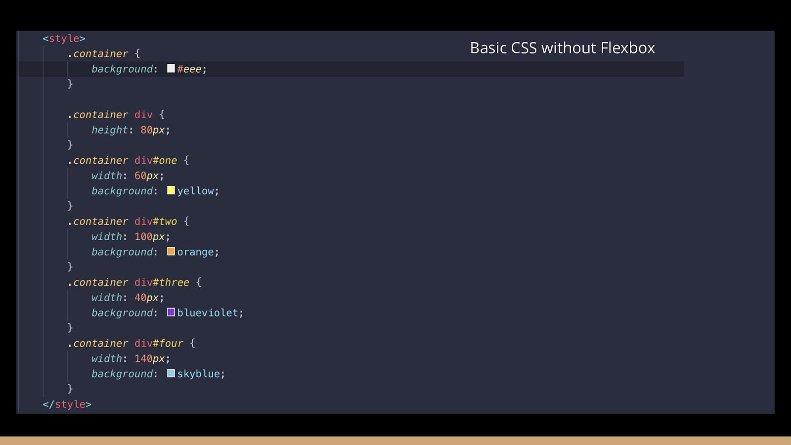
Basic CSS without Flexbox
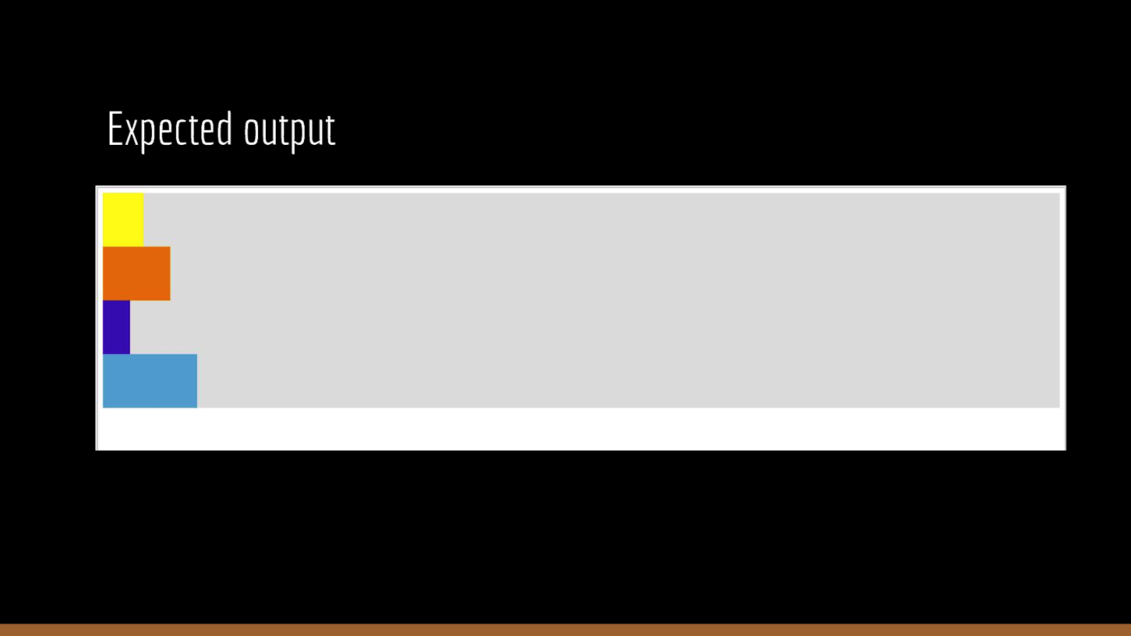
Expected output
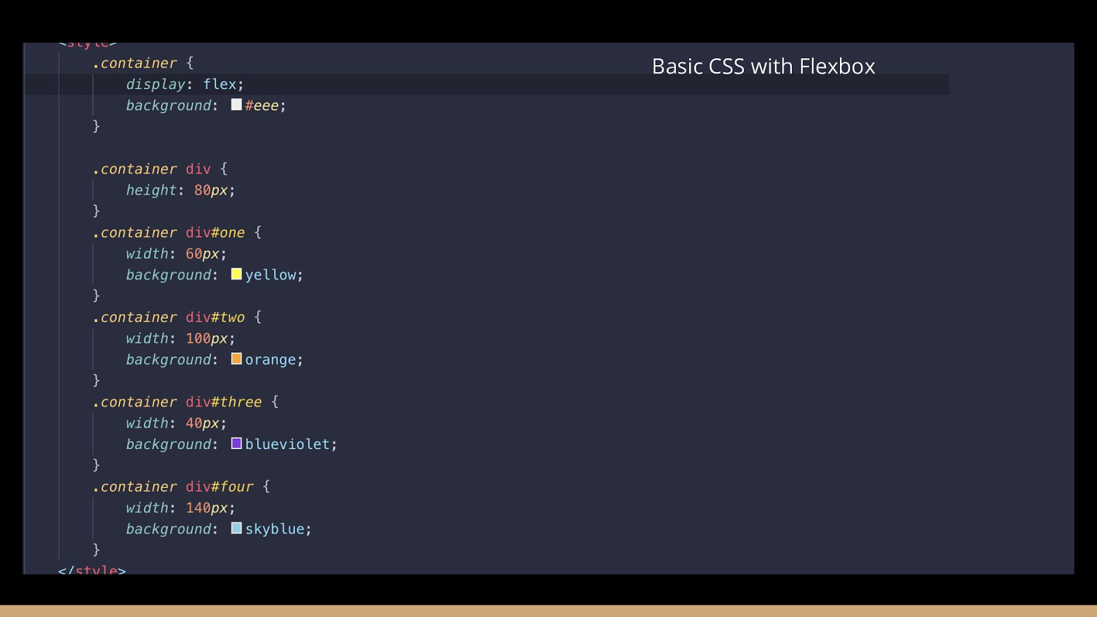
Basic CSS with Flexbox
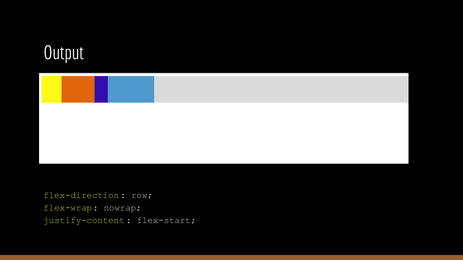
Output Default properties: flex-direction : row; flex-wrap: nowrap; justify-content : flex-start;
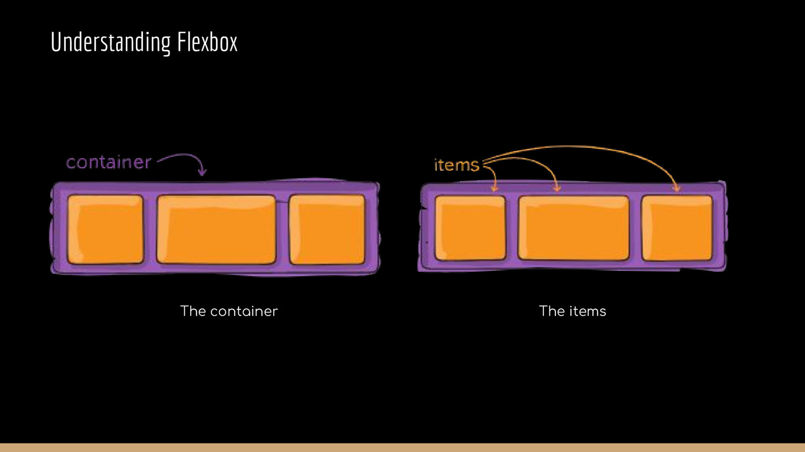
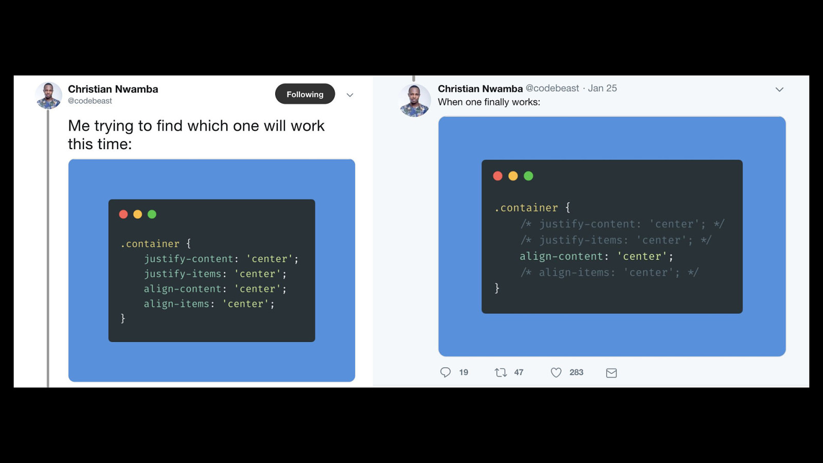
Understanding Flexbox The container The items
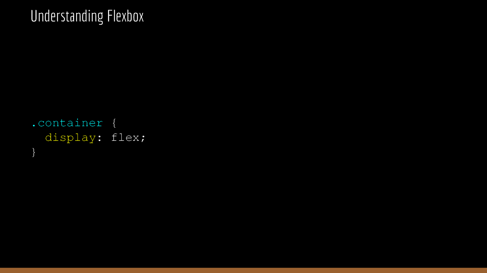
Understanding Flexbox .container { display: flex; }
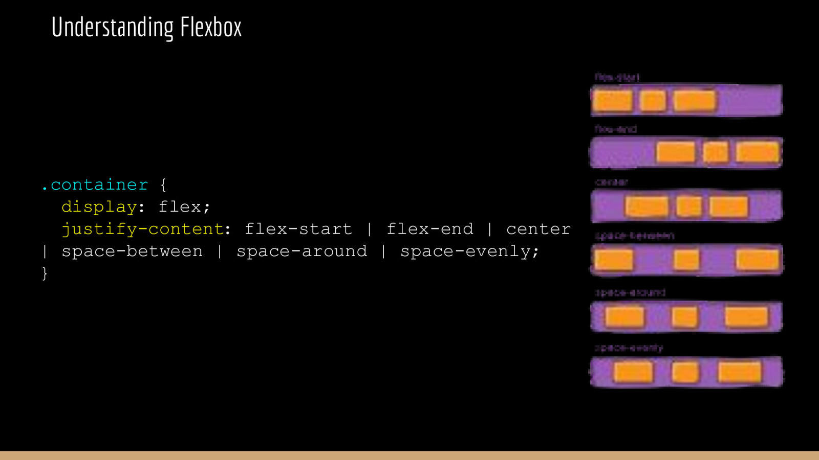
Understanding Flexbox .container { display: flex; justify-content: flex-start | flex-end | center | space-between | space-around | space-evenly; }
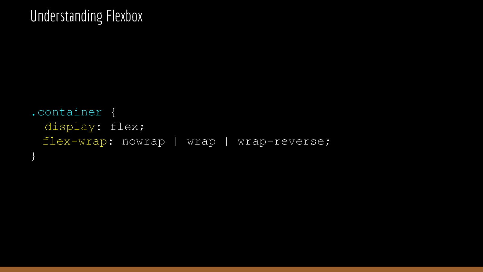
Understanding Flexbox .container { display: flex; flex-wrap: nowrap | wrap | wrap-reverse; }
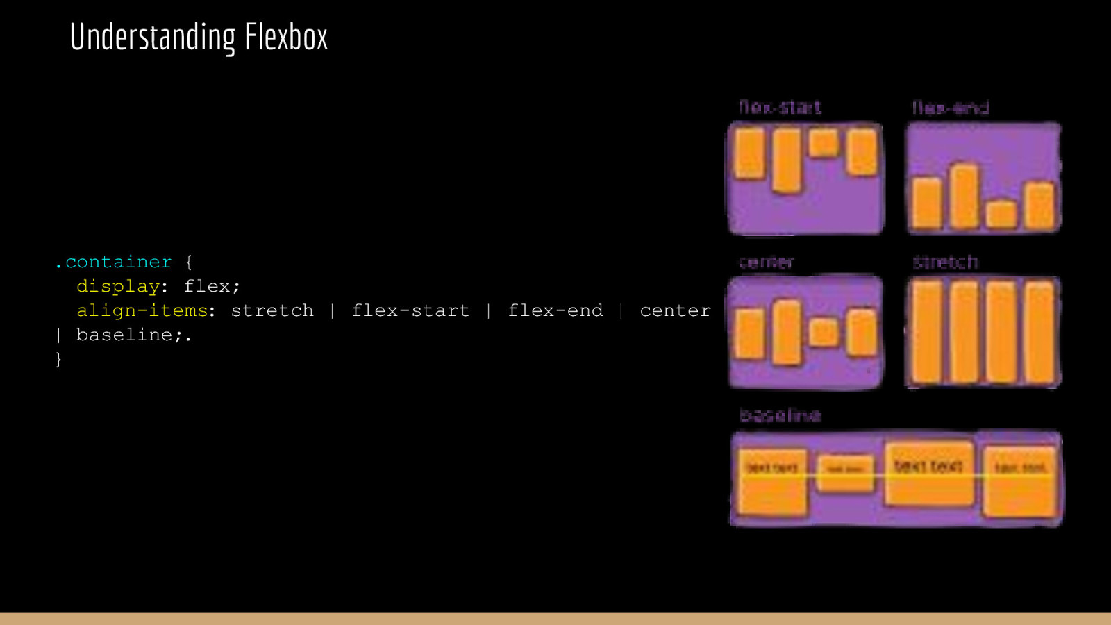
Understanding Flexbox .container { display: flex; align-items: stretch | flex-start | flex-end | center | baseline;. }
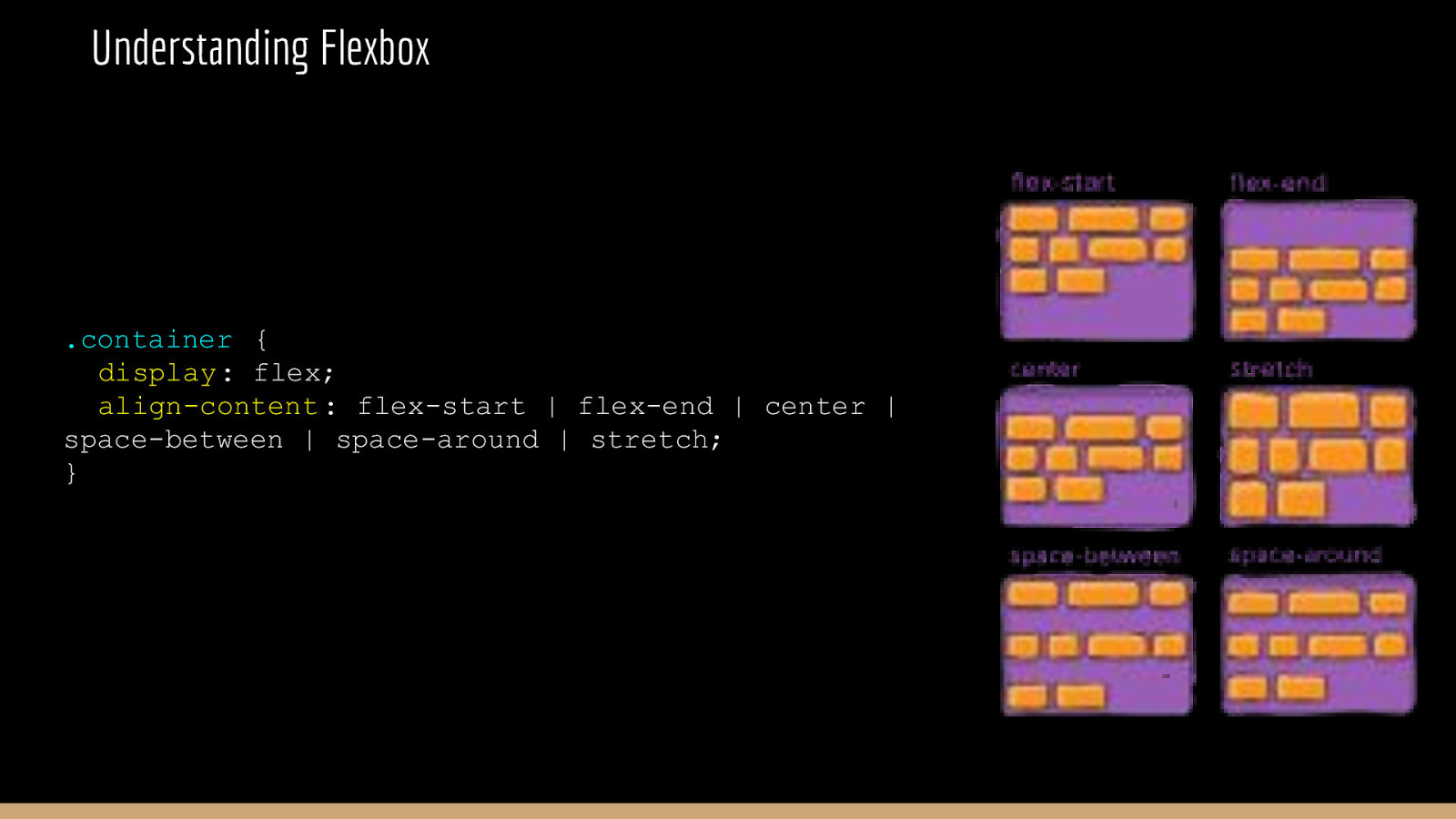
Understanding Flexbox .container { display: flex; align-content : flex-start | flex-end | center | space-between | space-around | stretch; }
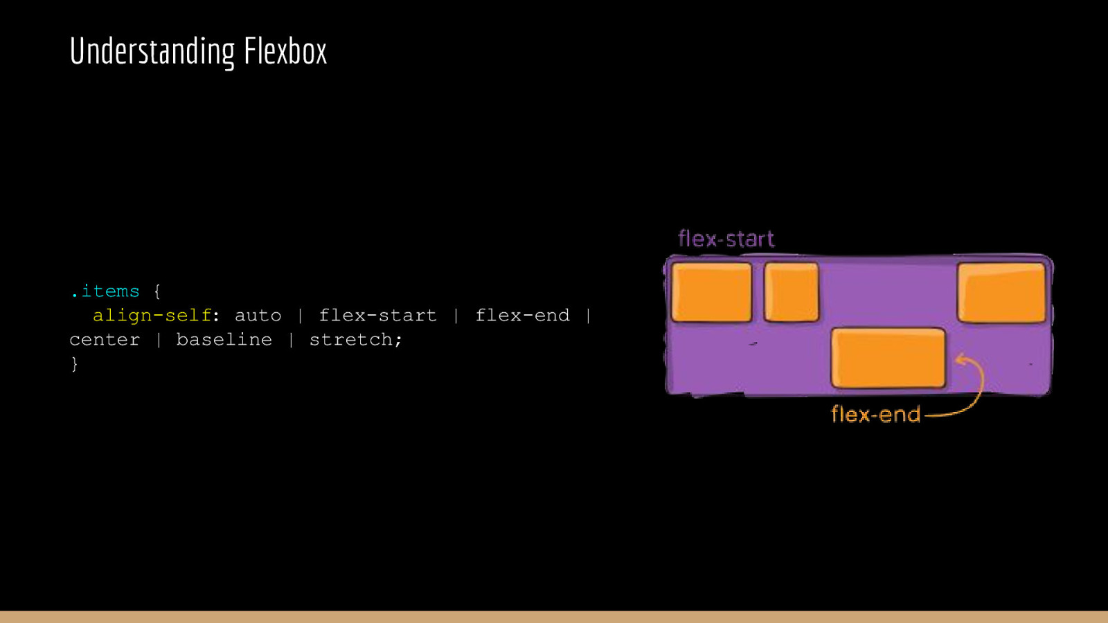
Understanding Flexbox .items { align-self: auto | flex-start | flex-end | center | baseline | stretch; }
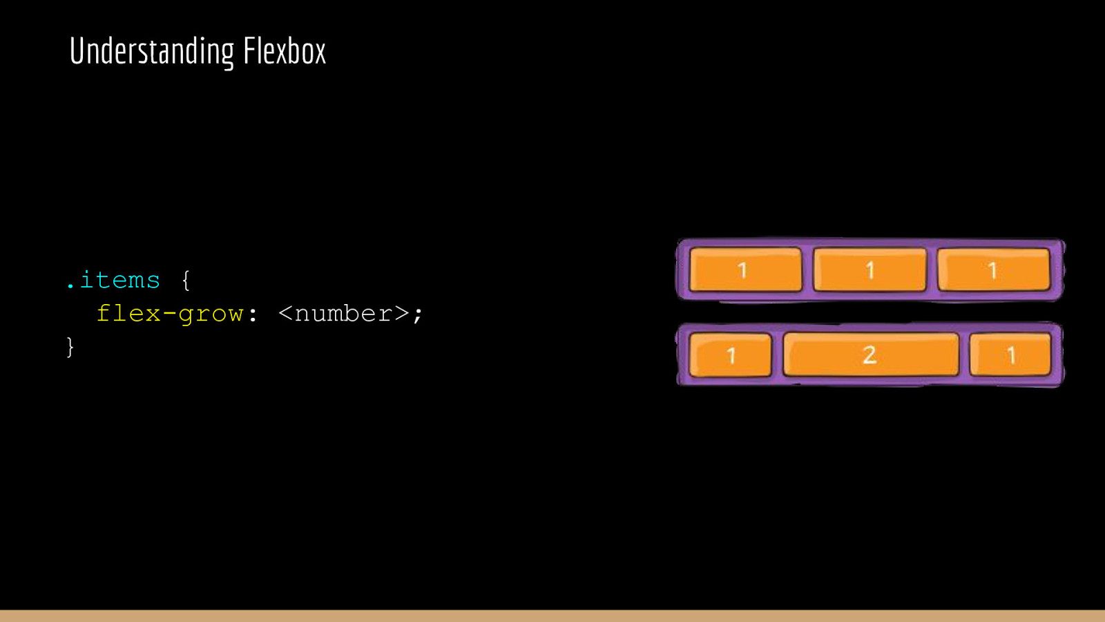
Understanding Flexbox .items { flex-grow: <number>; }

CSS Grid The s…
CSS Grid CSS Grid was proposed in 2011. It started getting adopted into browsers in 2018. CSS Grid Layout (aka “Grid”), is a two-dimensional grid-based layout system that aims to do nothing less than completely change the way we design grid-based user interfaces. - css-tricks.com
.container { display: grid | inline-grid; }
.container { grid-template-columns: <track-size>; grid-template-rows: <track-size>; }
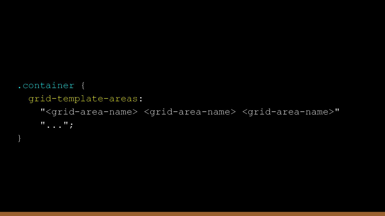
.container { grid-template-areas: “<grid-area-name> <grid-area-name> <grid-area-name>” “…”; }
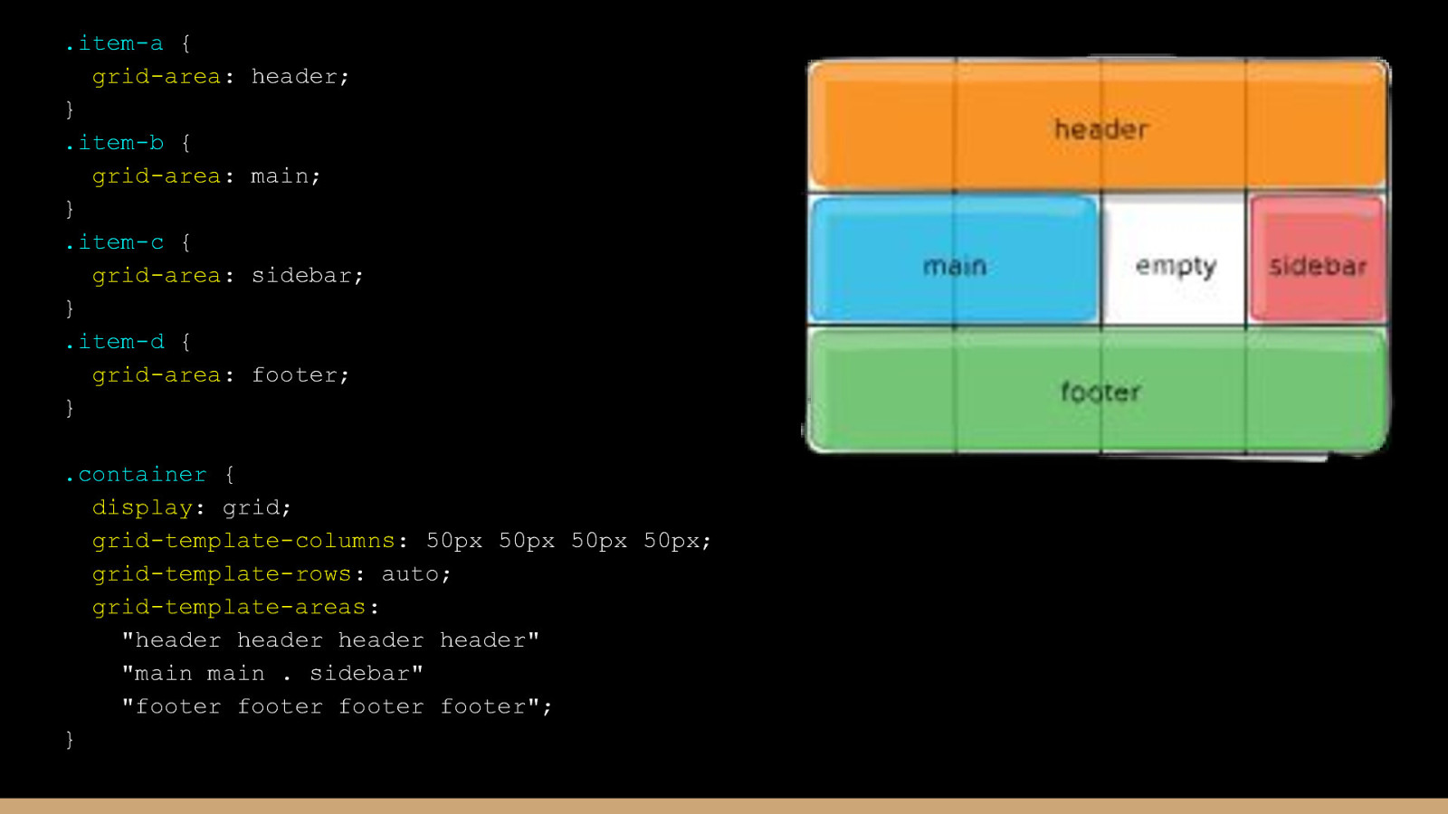
.item-a { grid-area: } .item-b { grid-area: } .item-c { grid-area: } .item-d { grid-area: } header; main; sidebar; footer; .container { display: grid; grid-template-columns: 50px 50px 50px 50px; grid-template-rows: auto; grid-template-areas: “header header header header” “main main . sidebar” “footer footer footer footer”; }
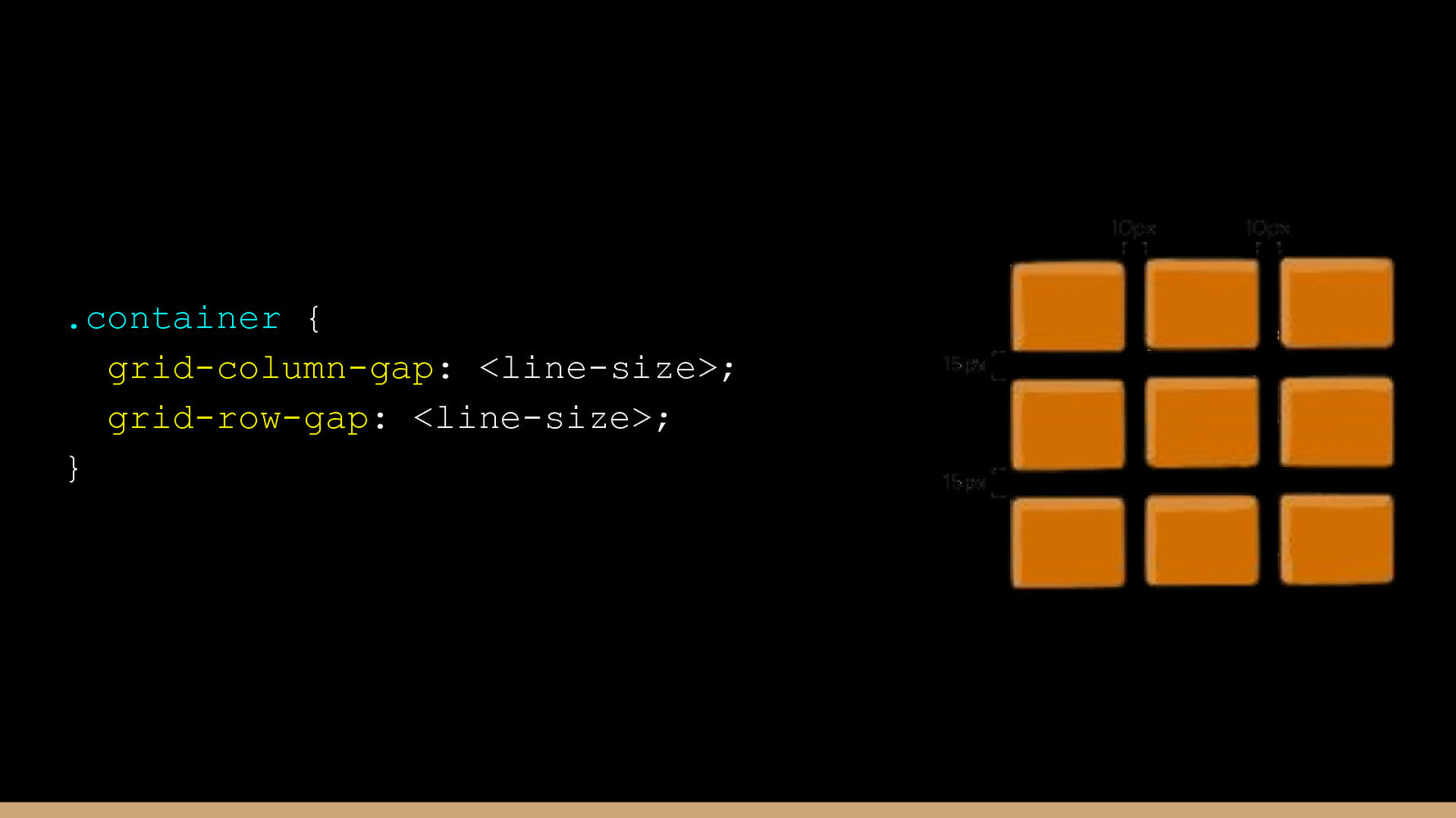
.container { grid-column-gap: <line-size>; grid-row-gap: <line-size>; }
CSS Variables sa , re i …
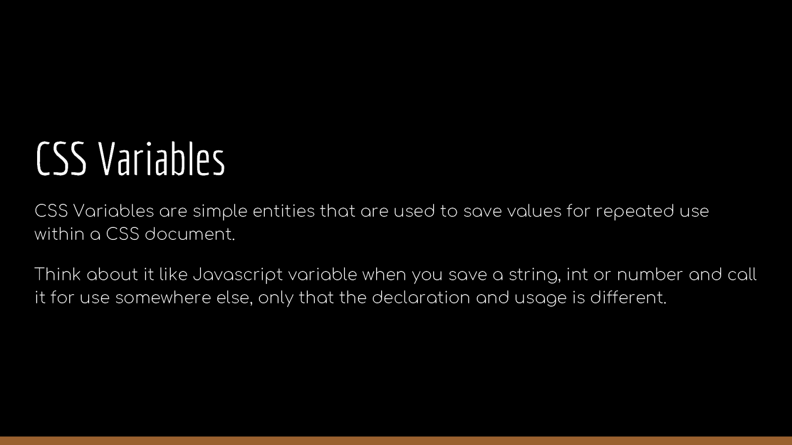
CSS Variables CSS Variables are simple entities that are used to save values for repeated use within a CSS document. Think about it like Javascript variable when you save a string, int or number and call it for use somewhere else, only that the declaration and usage is different.
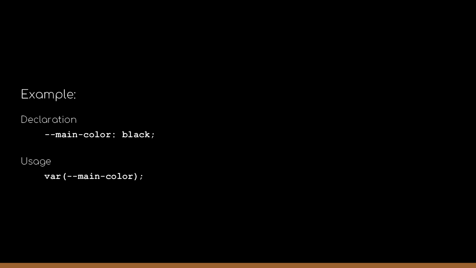
Example: Declaration —main-color: black; Usage var(—main-color);
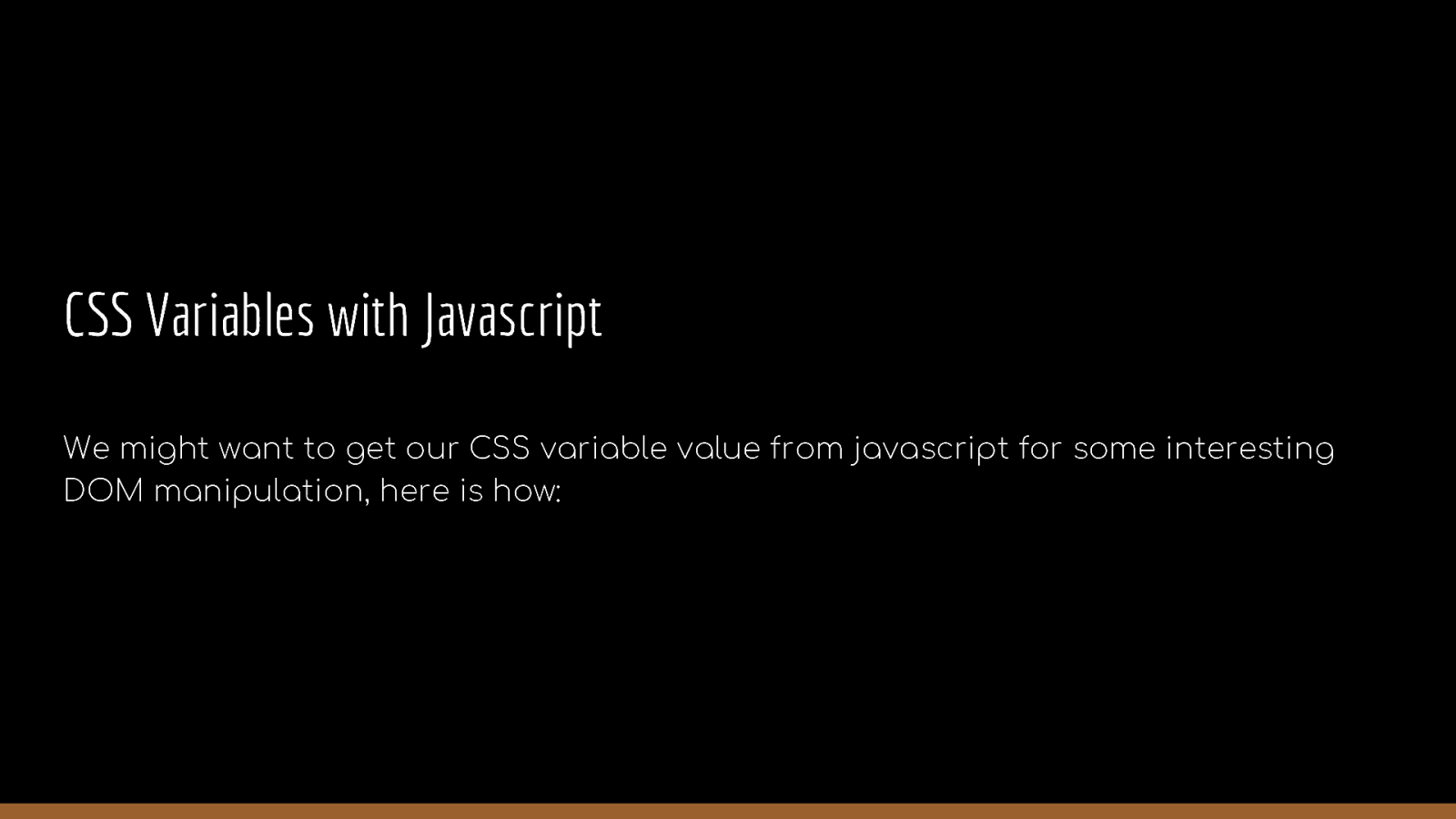
CSS Variables with Javascript We might want to get our CSS variable value from javascript for some interesting DOM manipulation, here is how:
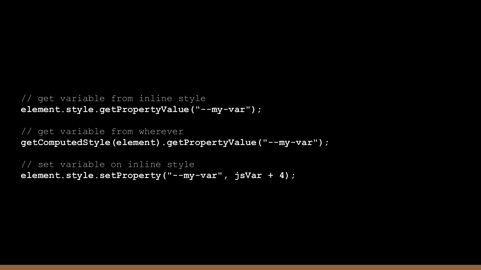
// get variable from inline style element.style.getPropertyValue(“—my-var”); // get variable from wherever getComputedStyle(element).getPropertyValue(“—my-var”); // set variable on inline style element.style.setProperty(“—my-var”, jsVar + 4);
CSS Functions re s es s …
CSS Functions CSS Functions, yeah functions. They are readily built methods that makes implementing and achieving some functionalities easy. Don’t be confused, they are things we already know and make use of. Yes!
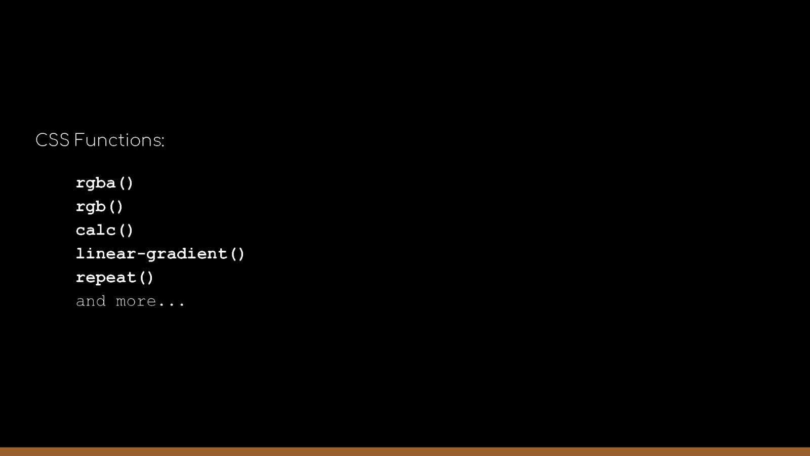
CSS Functions: rgba() rgb() calc() linear-gradient() repeat() and more…
CSS Methodologies For t tut g…
CSS Methodologies We often have our personal way of implementing our CSS styles, naming our class and id. A lot of complications arrive when it comes to sharing our code or having a new dev on the team who also has a personal preference of CSS.
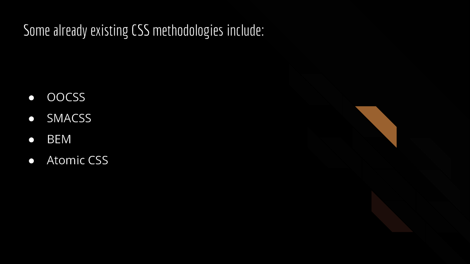
Some already existing CSS methodologies include: ● OOCSS ● SMACSS ● BEM ● Atomic CSS

let’s pick one…
SMACSS - Scalable and Modular Architecture of CSS Every project need some organisation. We should not throw styles on any elements the way we please no matter how small. SMACSS methodology is about breaking down your styles into scalable modules which will ease development process and updates deployment.
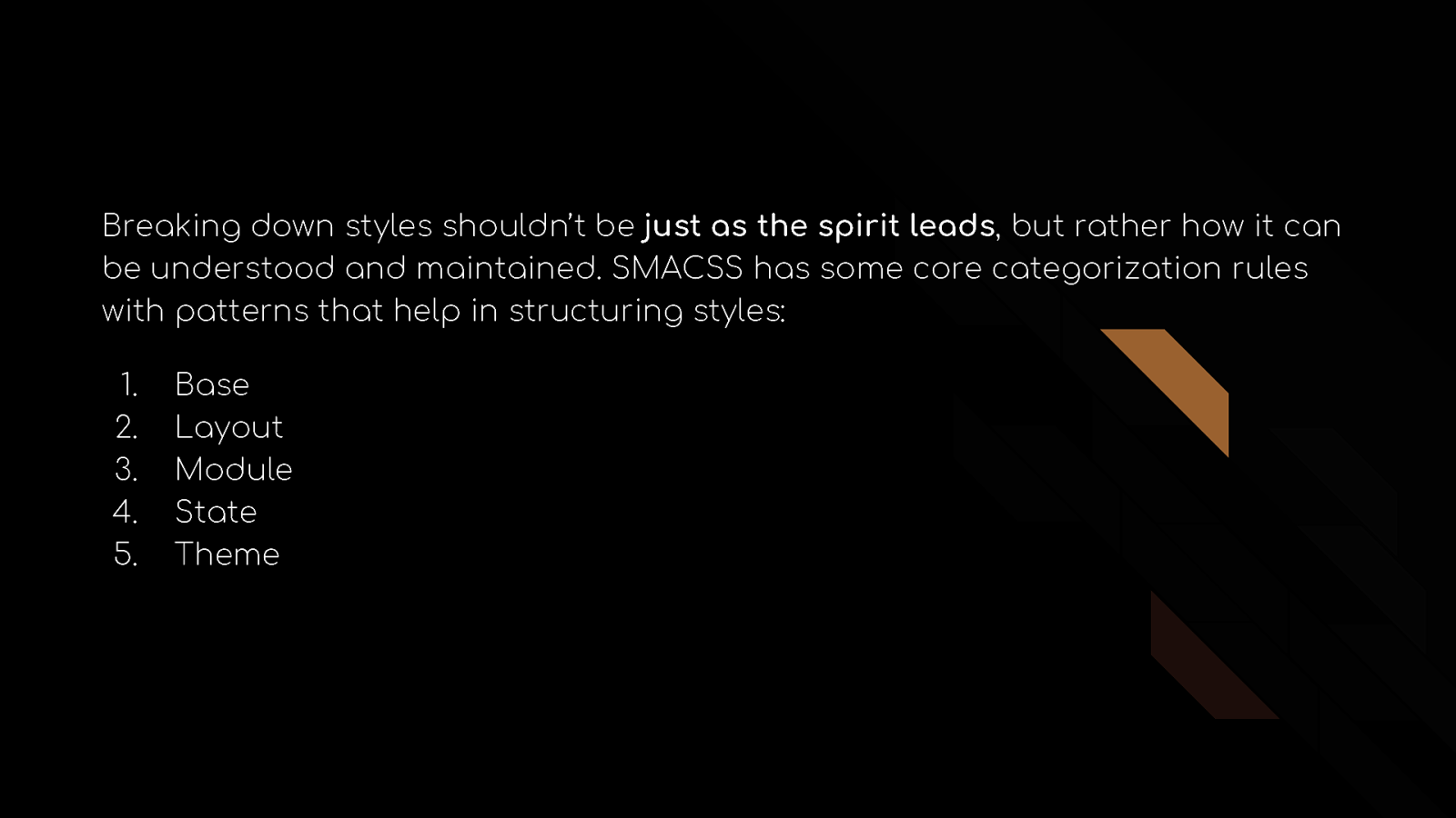
Breaking down styles shouldn’t be just as the spirit leads, but rather how it can be understood and maintained. SMACSS has some core categorization rules with patterns that help in structuring styles: 1. 2. 3. 4. 5. Base Layout Module State Theme
Base They are the default styles. They are more of styles we reset some default styles exclusive to certain HTML elements, the other part of it are styles we want to apply to elements generally (platform wide).
Layout They are styles that are used to structure layouts. They are styles that are applied to section, header, footer, aside e.tc to define their placement on browsers.
Modules They are the reusable styles. Modules contain styles for elements like buttons, lists, links e.tc that can be used and reused in different places all through the project
State They are styles that are used to determine how layouts and modules will look in different states e.g. collapsed menu, desktop view, tablet view e.t.c
Theme This is very similar to the state rules in that it also determine the looks of modules and layout but instead of also focusing on the state of elements, theme styles are about more of the looks like the color variables and it’s likes, 😉.
Naming system is also as important as structuring the styles, with SMACSS prefixes + hyphens ( - ) are used to name classes and ids while the prefixes are based on categories e.g For layouts: layout-, l- e.t.c.
CSS Pre and Post Processors we m o h a l …
CSS Preprocessors and Postprocessors Writing CSS got easier with preprocessors and postprocessors.
CSS preprocessors controls how the CSS file will look like, they have their own structure and pattern. Their syntax is usually simpler, easier, structural, and they provide more functions. They make implementing CSS methodology easier because they support breaking down styles into modules seamless.
CSS preprocessors pickup files with their file extension, process them to be sure none there syntax rules are disobeyed, then converts them to standard CSS files that are understood by our browsers. Simple!
They are configurable too for, so you have total power over it including how you want the processor file to be converted, which file should the processor watch out for, enable auto conversion, what your converted CSS should be named and many more Some of the preprocessor we have includes: ● SASS ● LESS ● Stylus
CSS postprocessors are processors that help to optimise CSS code by, for example, adding backwards compatibility support (for older browsers) and CSS property prefixes to properties yet to be supported by some browsers. When you write your CSS normally as you should, the processor converts them into a much more cross-browser compatible CSS code all according your installed configuration.
Postprocessors help to ease the stress of checking out auto prefixes for certain CSS properties, once you save your CSS file the post-processor picks it, add the necessities you might have missed and renders the output as your file name configure.

Feature Queries if t e t c …
Feature Queries Think about it like writing if statements in Js, you want to carry out an action if and only if a certain condition is met. Yeah that’s now possible with CSS, the conditions are based on if certain features are available for use within that browser.
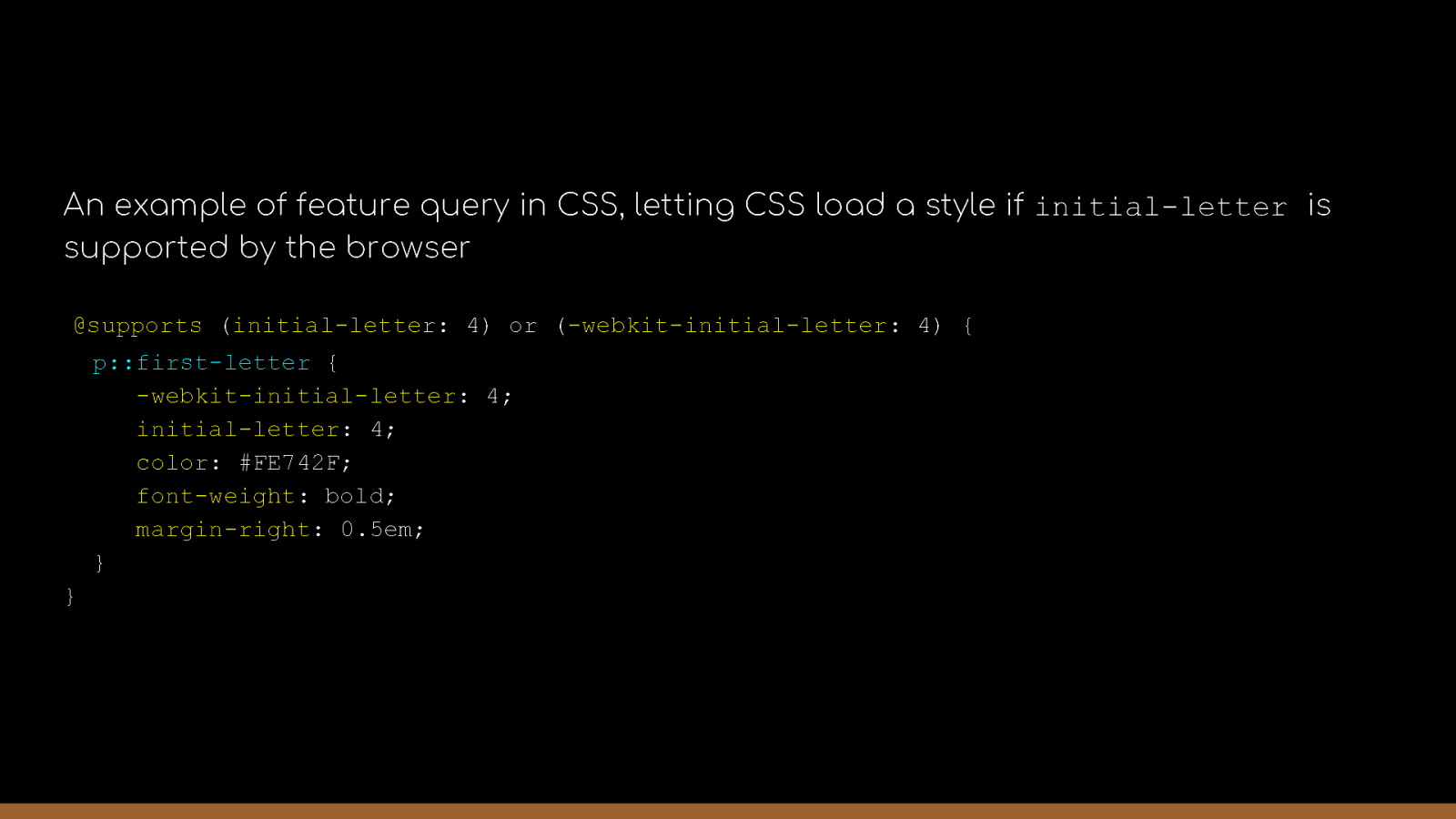
An example of feature query in CSS, letting CSS load a style if initial-letter is supported by the browser @supports (initial-letter: 4) or (-webkit-initial-letter: 4) { p::first-letter { -webkit-initial-letter: 4; initial-letter: 4; color: #FE742F; font-weight: bold; margin-right: 0.5em; } }
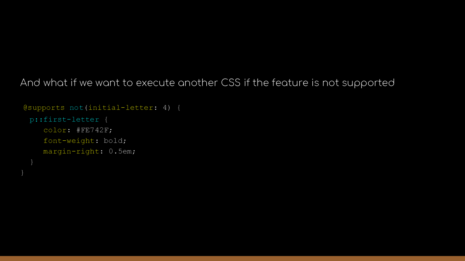
And what if we want to execute another CSS if the feature is not supported @supports not(initial-letter: 4) { p::first-letter { color: #FE742F; font-weight: bold; margin-right: 0.5em; } }
CSS Animations ma g s u n o n…
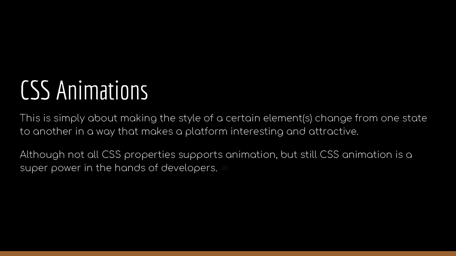
CSS Animations This is simply about making the style of a certain element(s) change from one state to another in a way that makes a platform interesting and attractive. Although not all CSS properties supports animation, but still CSS animation is a super power in the hands of developers. 😉
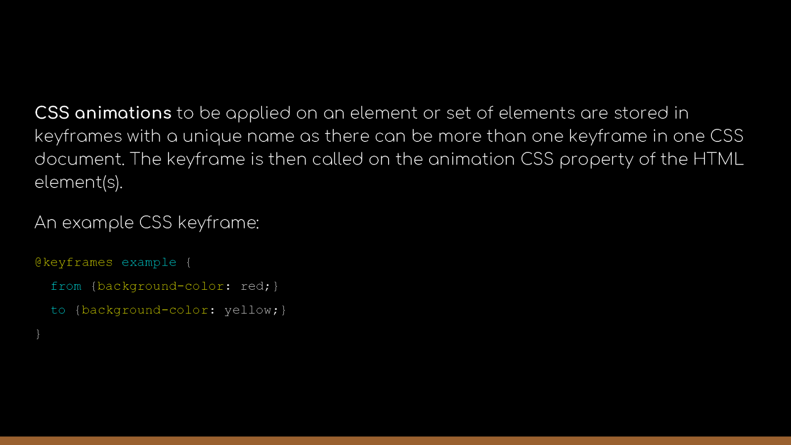
CSS animations to be applied on an element or set of elements are stored in keyframes with a unique name as there can be more than one keyframe in one CSS document. The keyframe is then called on the animation CSS property of the HTML element(s). An example CSS keyframe: @keyframes example { from {background-color: red;} to {background-color: yellow;} }
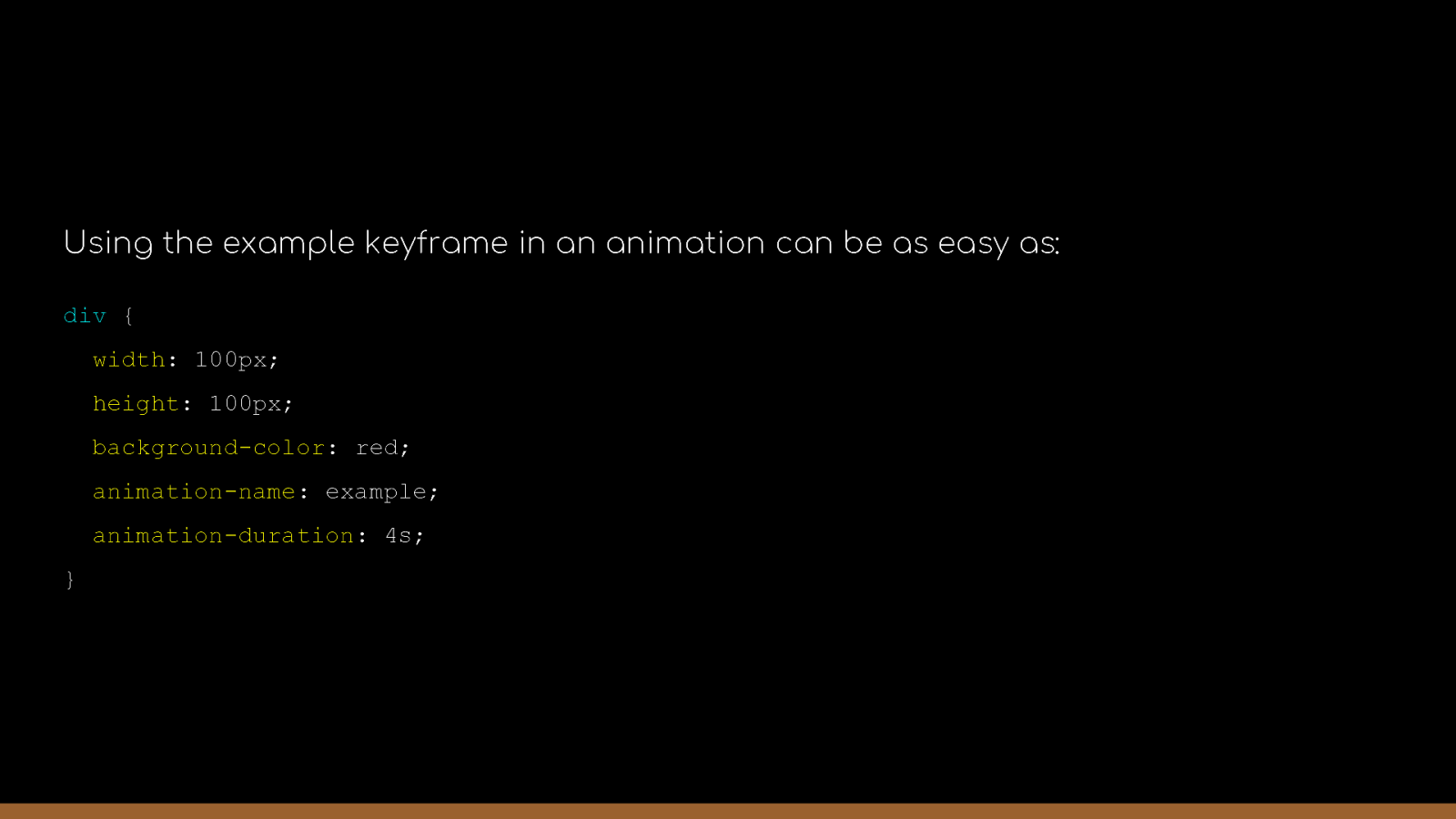
Using the example keyframe in an animation can be as easy as: div { width: 100px; height: 100px; background-color: red; animation-name: example; animation-duration: 4s; }
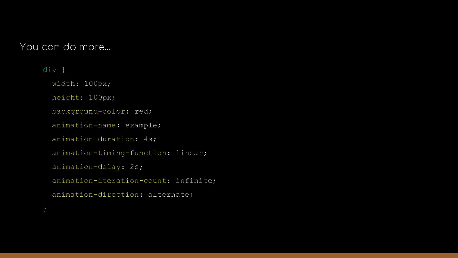
You can do more… div { width: 100px; height: 100px; background-color: red; animation-name: example; animation-duration: 4s; animation-timing-function: linear; animation-delay: 2s; animation-iteration-count: infinite; animation-direction: alternate; }
CSS Units re n en j go r i r in …
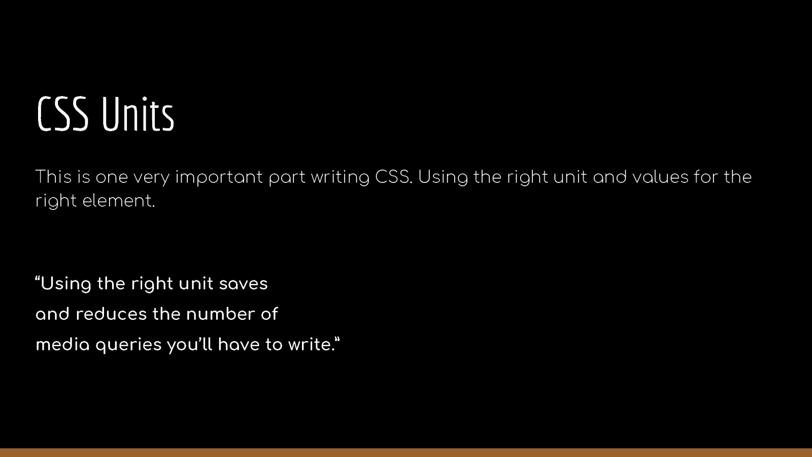
CSS Units This is one very important part writing CSS. Using the right unit and values for the right element. “Using the right unit saves and reduces the number of media queries you’ll have to write.”
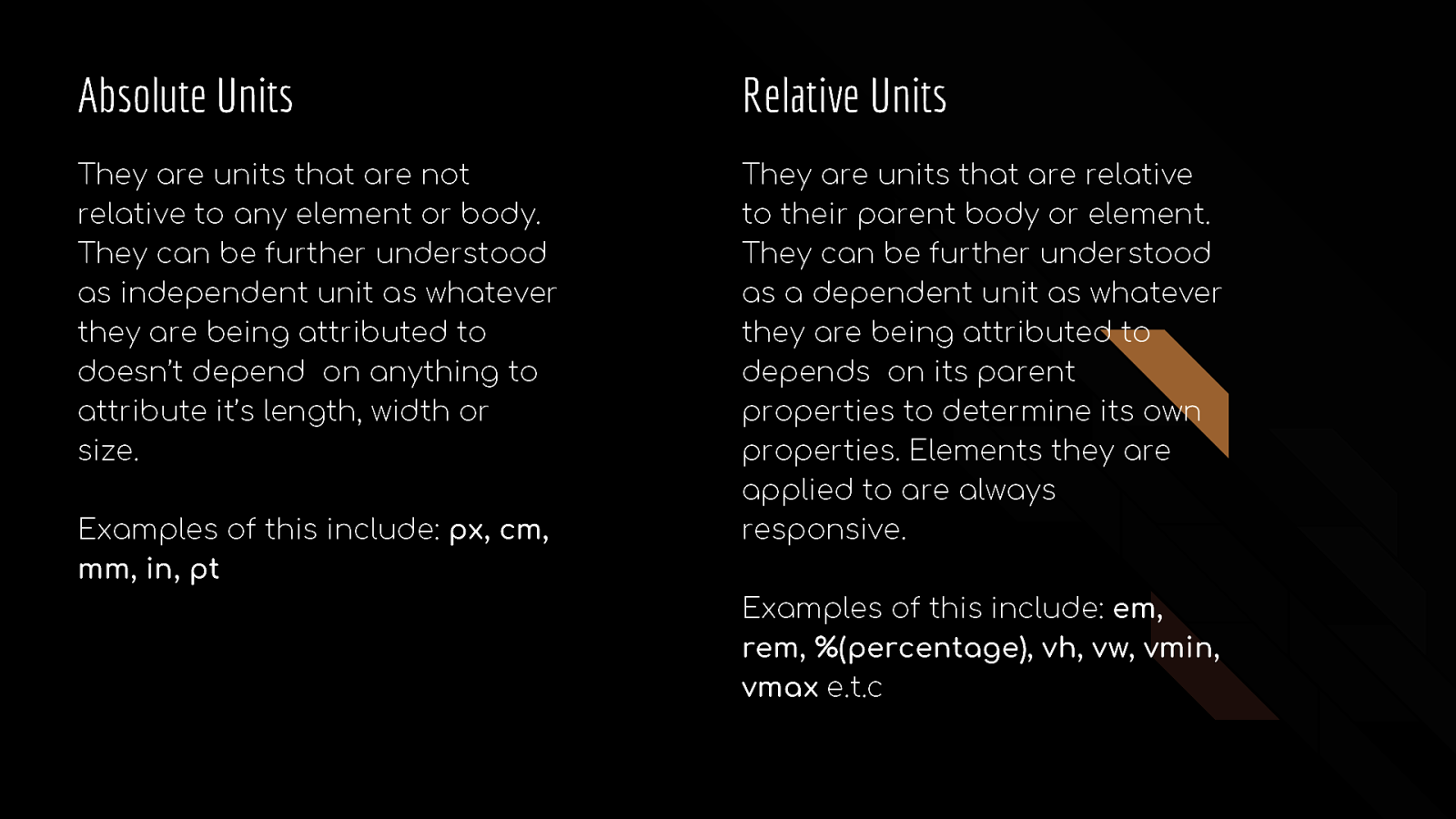
Absolute Units Relative Units They are units that are not relative to any element or body. They can be further understood as independent unit as whatever they are being attributed to doesn’t depend on anything to attribute it’s length, width or size. They are units that are relative to their parent body or element. They can be further understood as a dependent unit as whatever they are being attributed to depends on its parent properties to determine its own properties. Elements they are applied to are always responsive. Examples of this include: px, cm, mm, in, pt Examples of this include: em, rem, %(percentage), vh, vw, vmin, vmax e.t.c
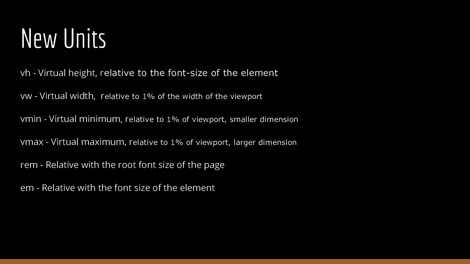
New Units vh - Virtual height, relative to the font-size of the element vw - Virtual width, relative to 1% of the width of the viewport vmin - Virtual minimum, relative to 1% of viewport, smaller dimension vmax - Virtual maximum, relative to 1% of viewport, larger dimension rem - Relative with the root font size of the page em - Relative with the font size of the element
Thank you! @horlah_codes