Colour and contrast What does it mean?

A presentation at Inclusive Design & Accessibility Meetup in March 2019 in Rotterdam, Netherlands by Erik Kroes

Colour and contrast What does it mean?
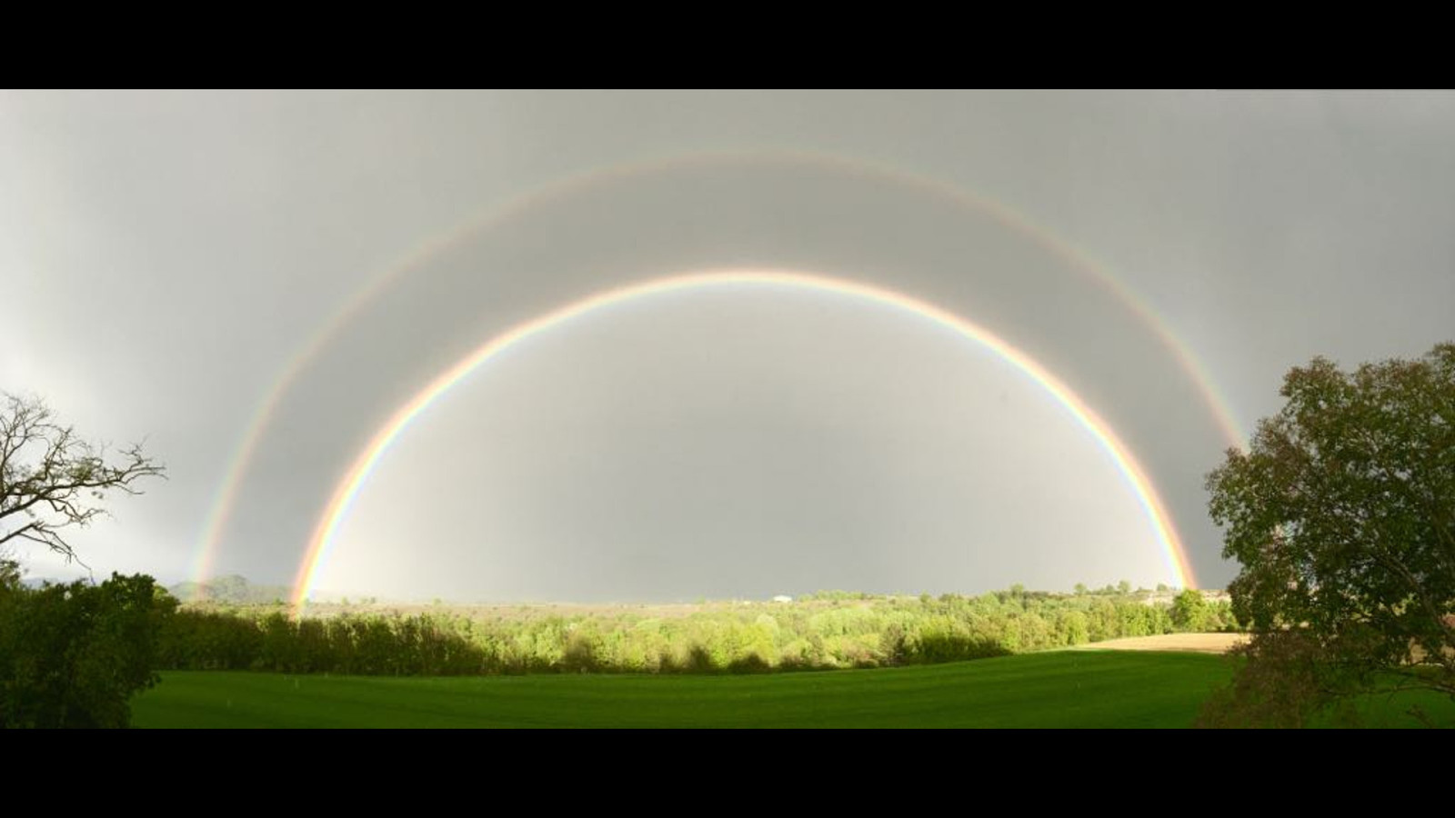
A double rainbow

Let’s talk about me first. Erik Kroes

• Photographer • Visual Artist • Creative Coder • Accessibility Specialist • Front End Developer • Online Fabric Store Owner

Colour and contrast. A short recap

Text has a contrast ratio of at least 4.5:1. Except large text, that should be at least 3.0:1
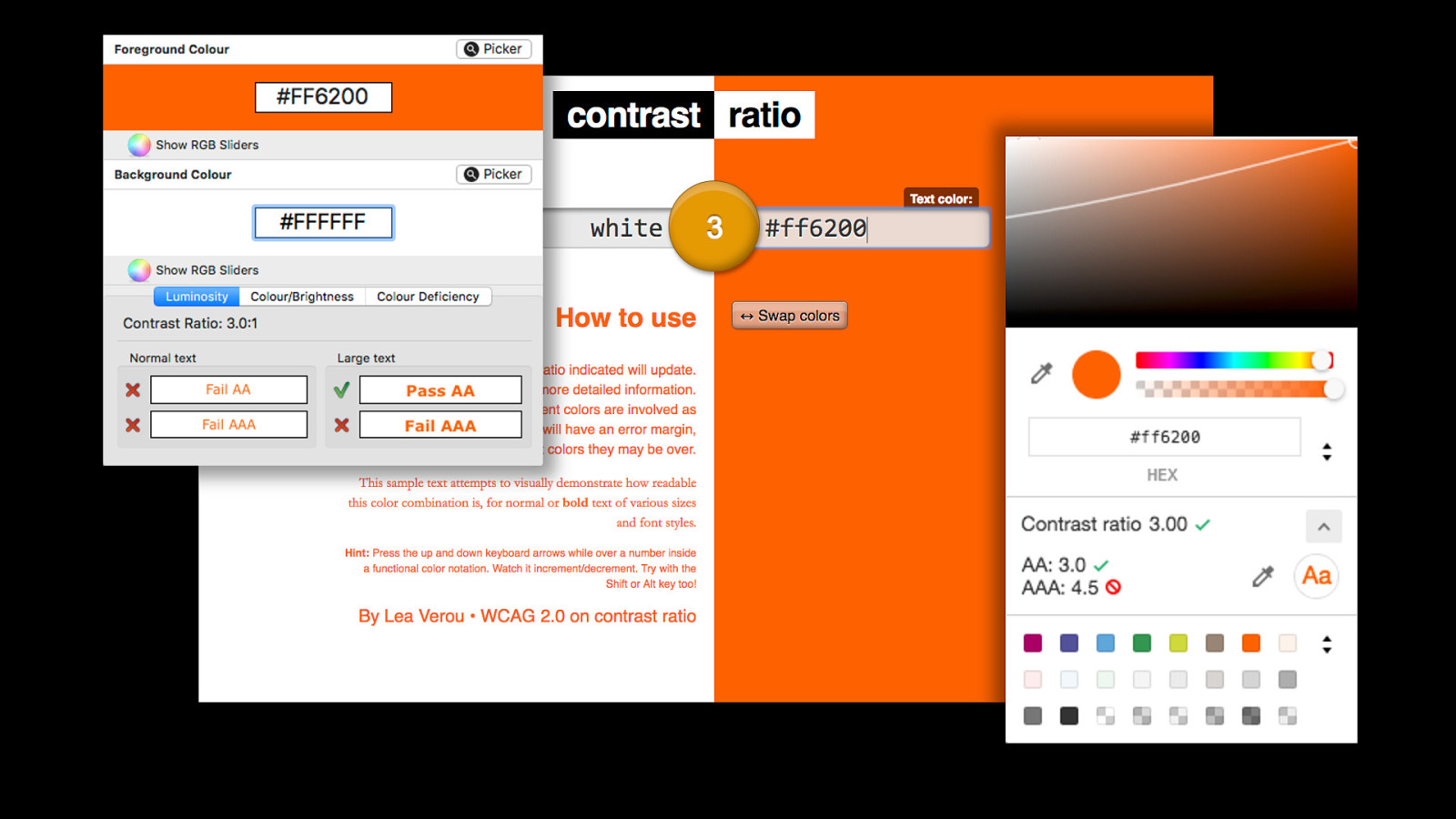
Screenshots of color contrast analyzer, contrast-ratio.com and the color contrast tool inside chrome developer tools

But let’s go back a step. My fabric store
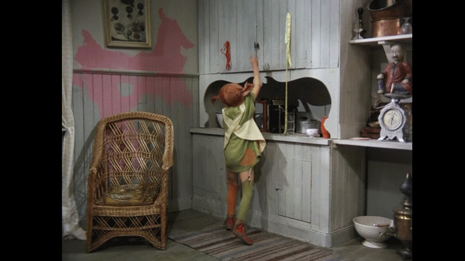
Pippi Longstockings opening a cupboard with piles of cloths coming out.

It’s a mess. Wordpress, woocommerce, a theme, a child theme, lots of extensions and two versions of bootstrap.
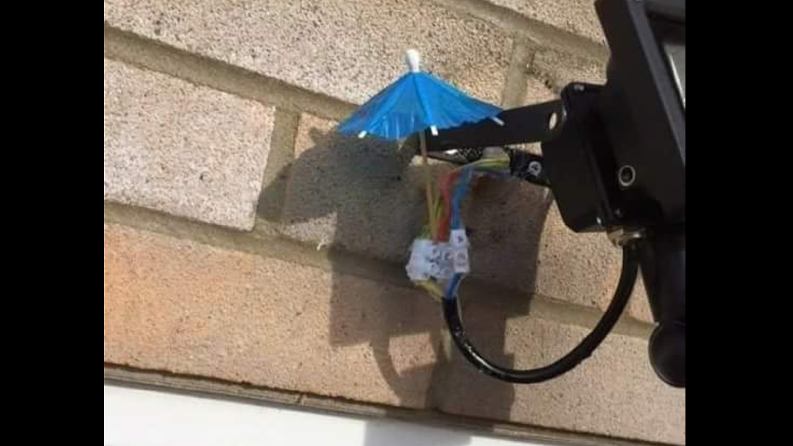
Open electric wires covered by a paper umbrella

Clean this up the right. Start with a color palette, easy
Nyan cat

An accessible color palette
A guy surrounded by complicated looking math

One does not simply pick a colour. How many colour spaces are there?

Which colour space does WCAG use?
Dr. Evil saying “How about no!”

HSL sounds good But it’s not
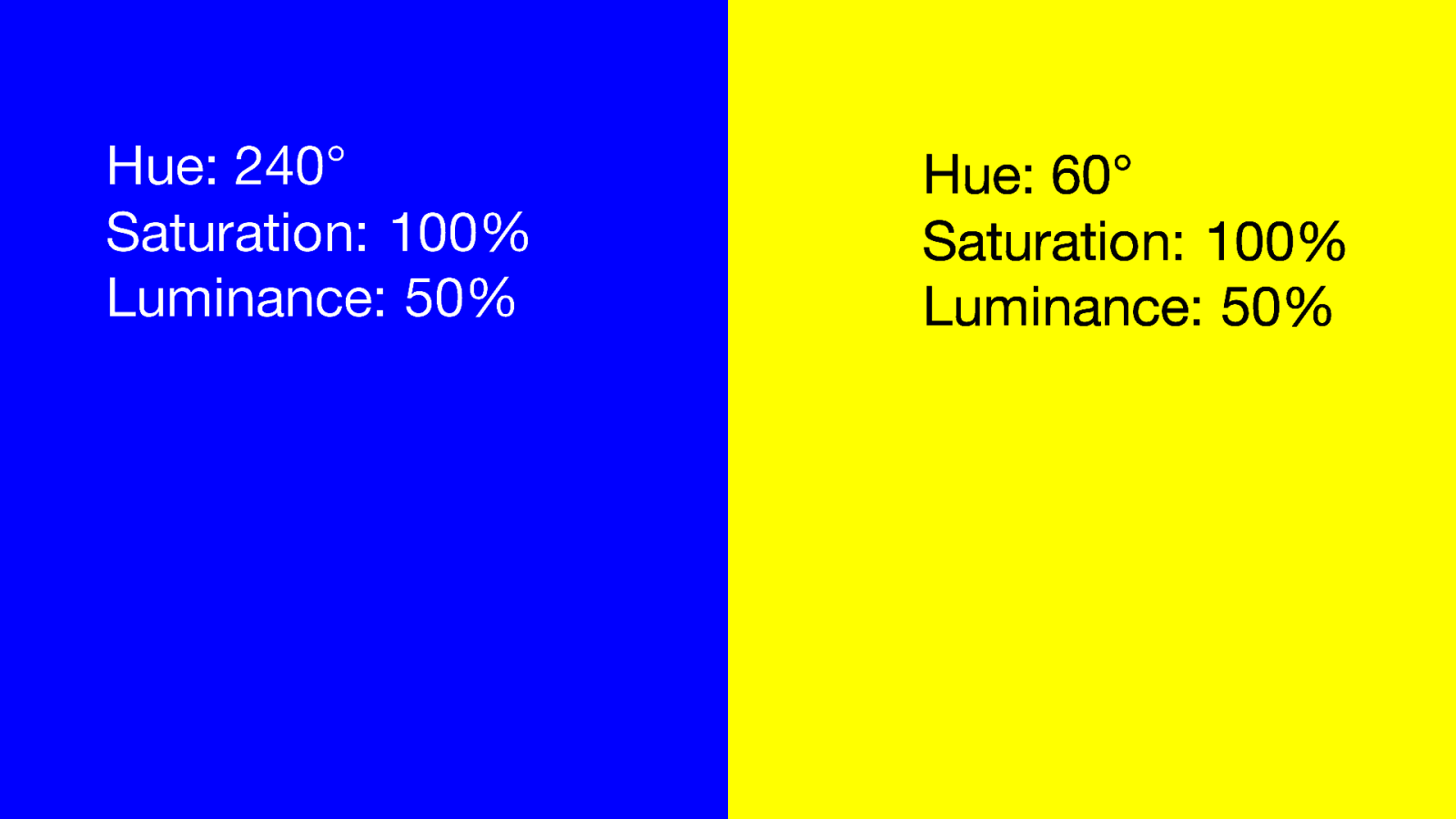
A blue and a yellow panel with the same saturation and luminance. Hue: 240° Saturation: 100% Luminance: 50% Hue: 60° Saturation: 100% Luminance: 50%
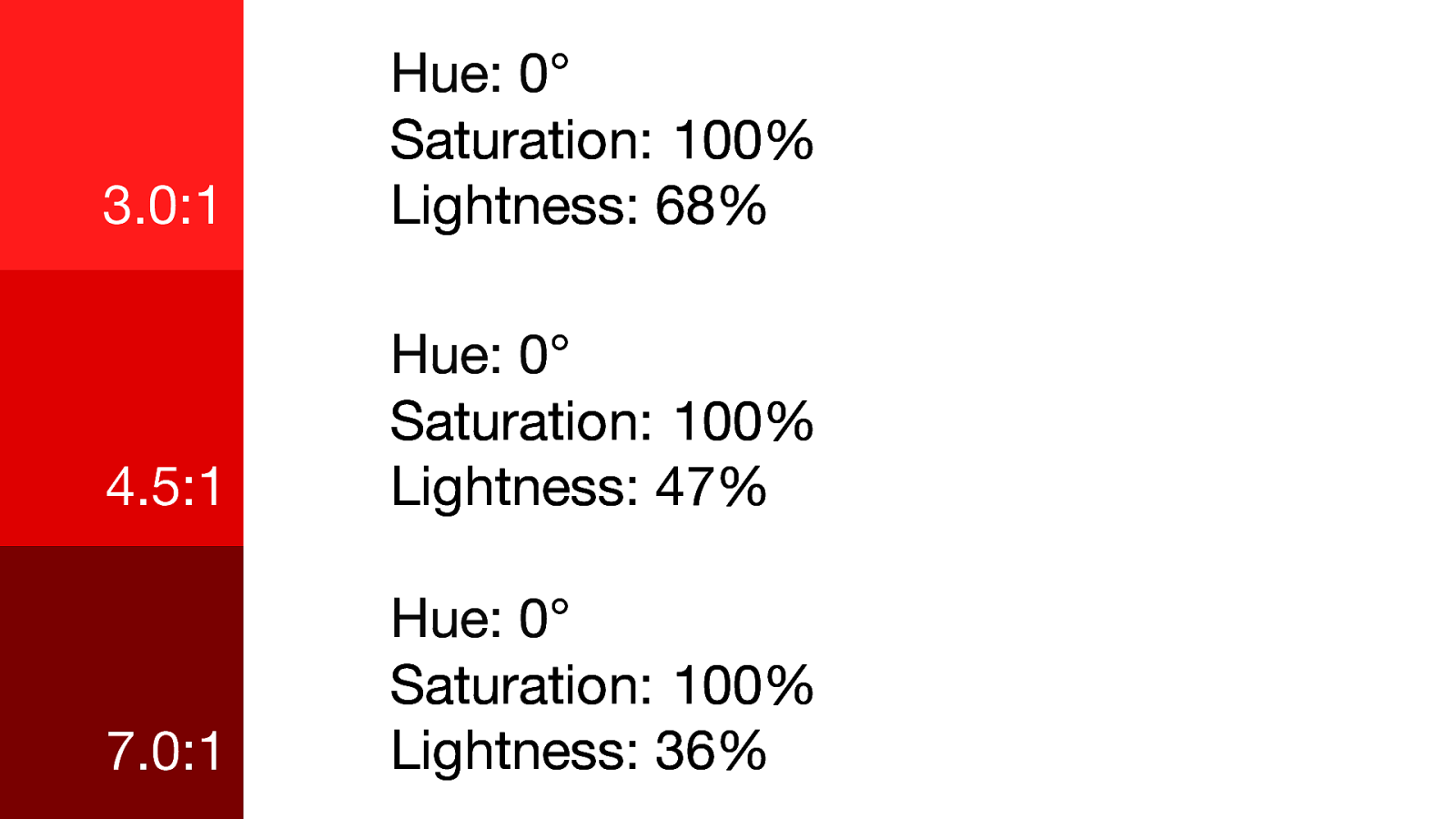
3 shades of red with the same hue and saturation but different lightness.
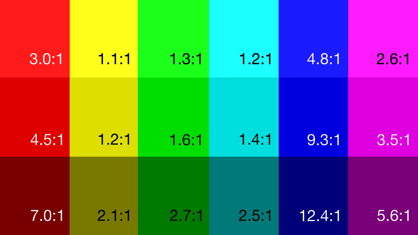
A rainbow of colors with the same hue and saturation but different lightness. The contrast ratio’s vary wildly.

So where does it come from? ITU-R Recommendation BT.709
Michael Scott from the Office looking tired and saying: Why don’t you explain this to me like I’m 5?

• It is a television standard • It has the same color coverage as sRGB • It has a component called Luma • It is a way to measure brightness in sRGB that takes the human eye in account
John Travolta in Pulp Fiction, not knowing what to do

It’s not the Luma that matters. It’s what you do with it

It’s a contrast ratio. Black on white is 21:1

• Black is 21 times as dark as white • White is 21 times as bright as black • The range we work with is always 21

A color that is 3.0:1 on white. 21 / 3… 7.0:1 on black

A color that is 4.5:1 on white. 21 / 4.5… 4.67:1 on black

Chris Pratt getting his mind blown

Only 3 shades fit with 3.0:1. 1:3:9

Only 3 shades fit with 4.5:1. 1:4.5:20.25

Only 2 shades fit with 7:1. 1:7

Where does that leave us?
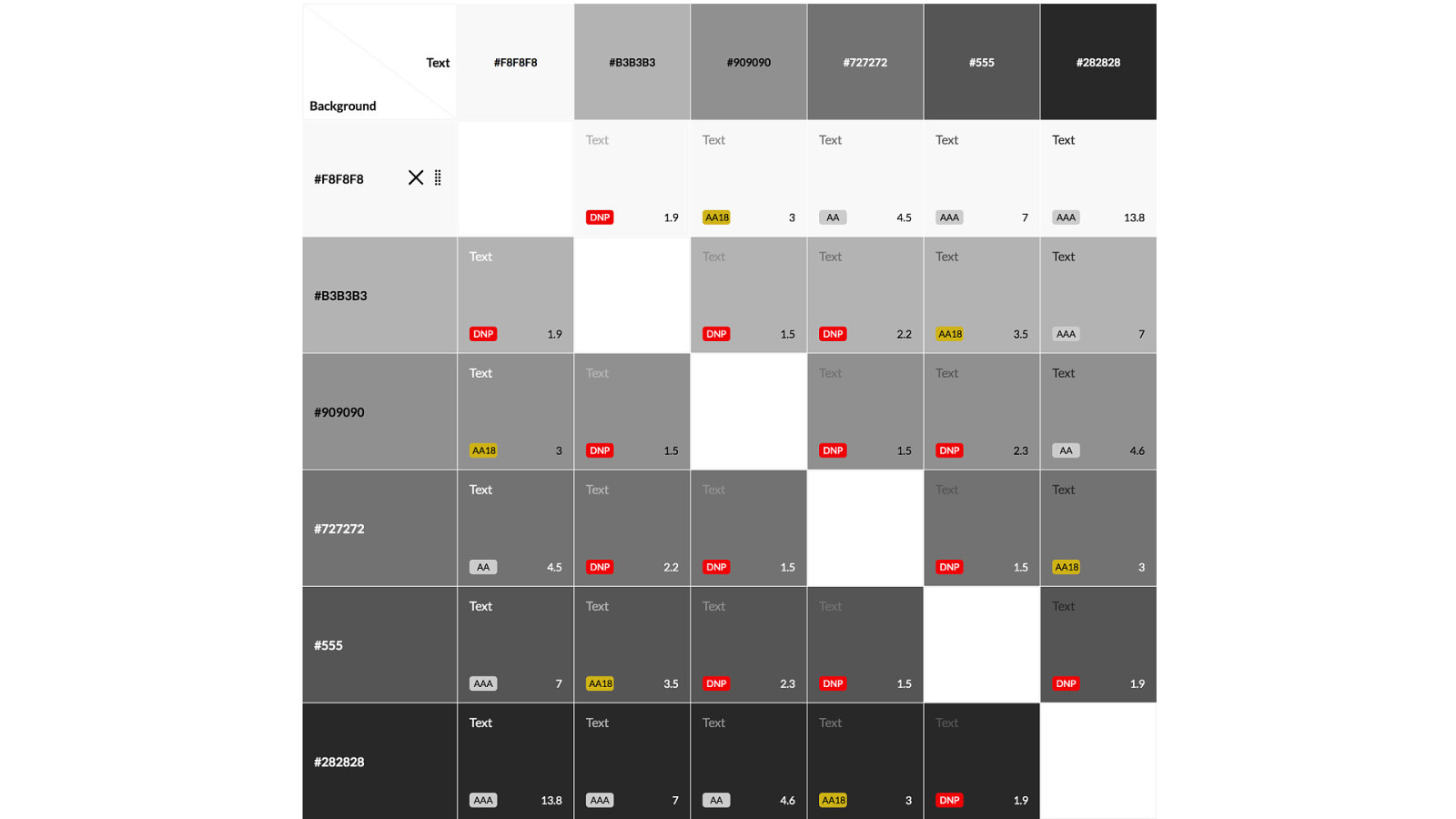
A grid with shades of gray and their wcag contrast ratio’s
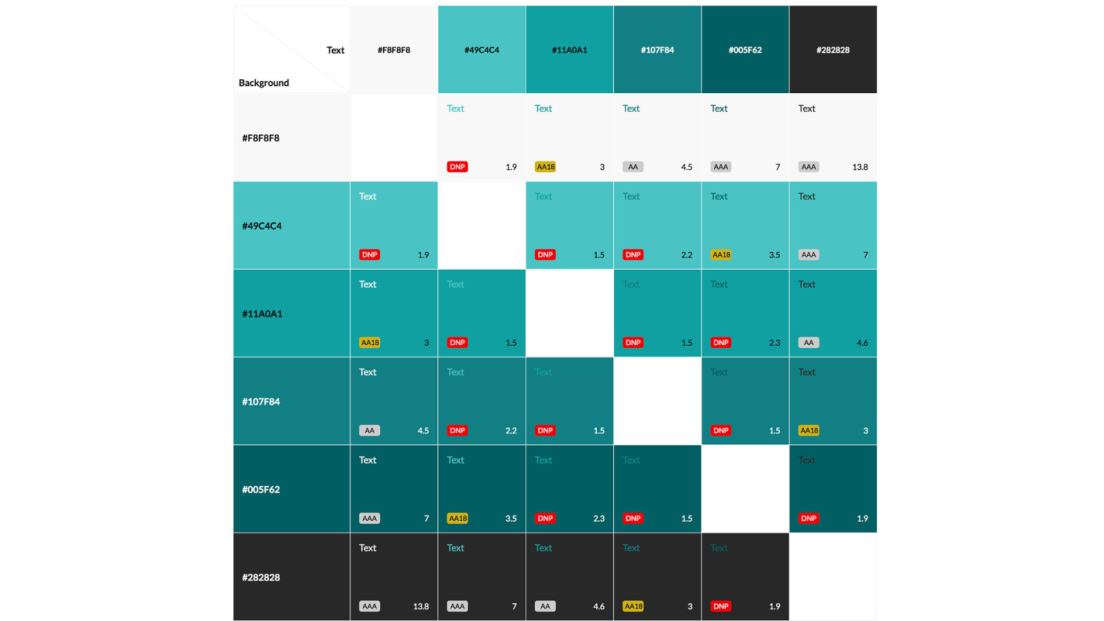
A grid with shades of teal and their wcag contrast ratio’s
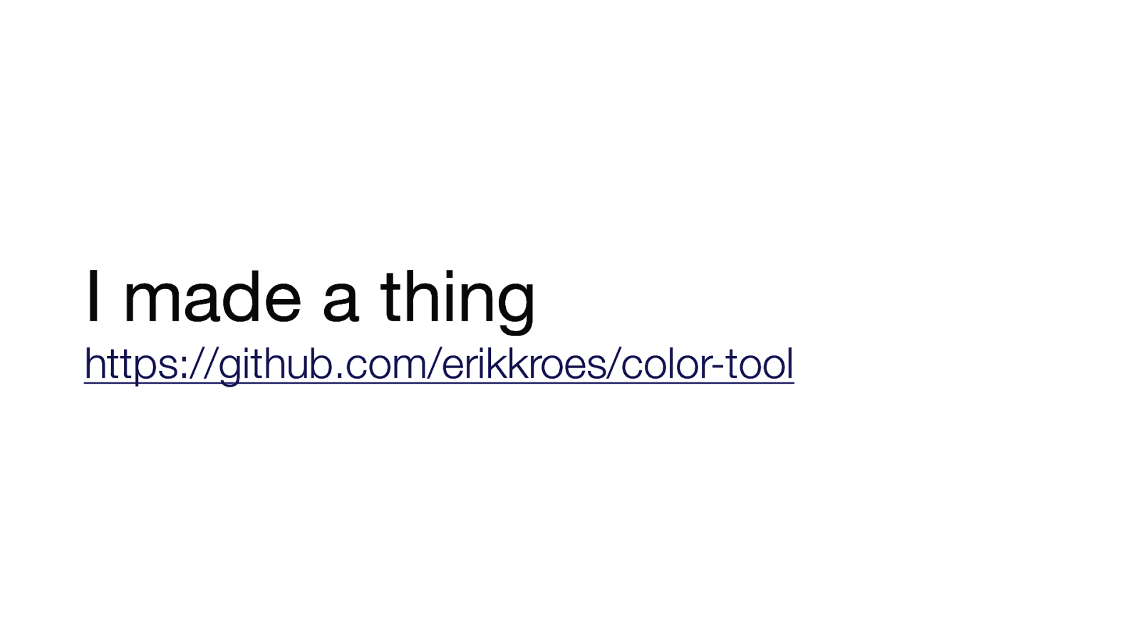
I made a thing. https://github.com/erikkroes/color-tool

But my website is still a mess
• http://contrast-grid.eightshapes.com • http://bit.ly/a11y-color-palette • https://github.com/erikkroes/color-tool • https://twitter.com/erikkroes