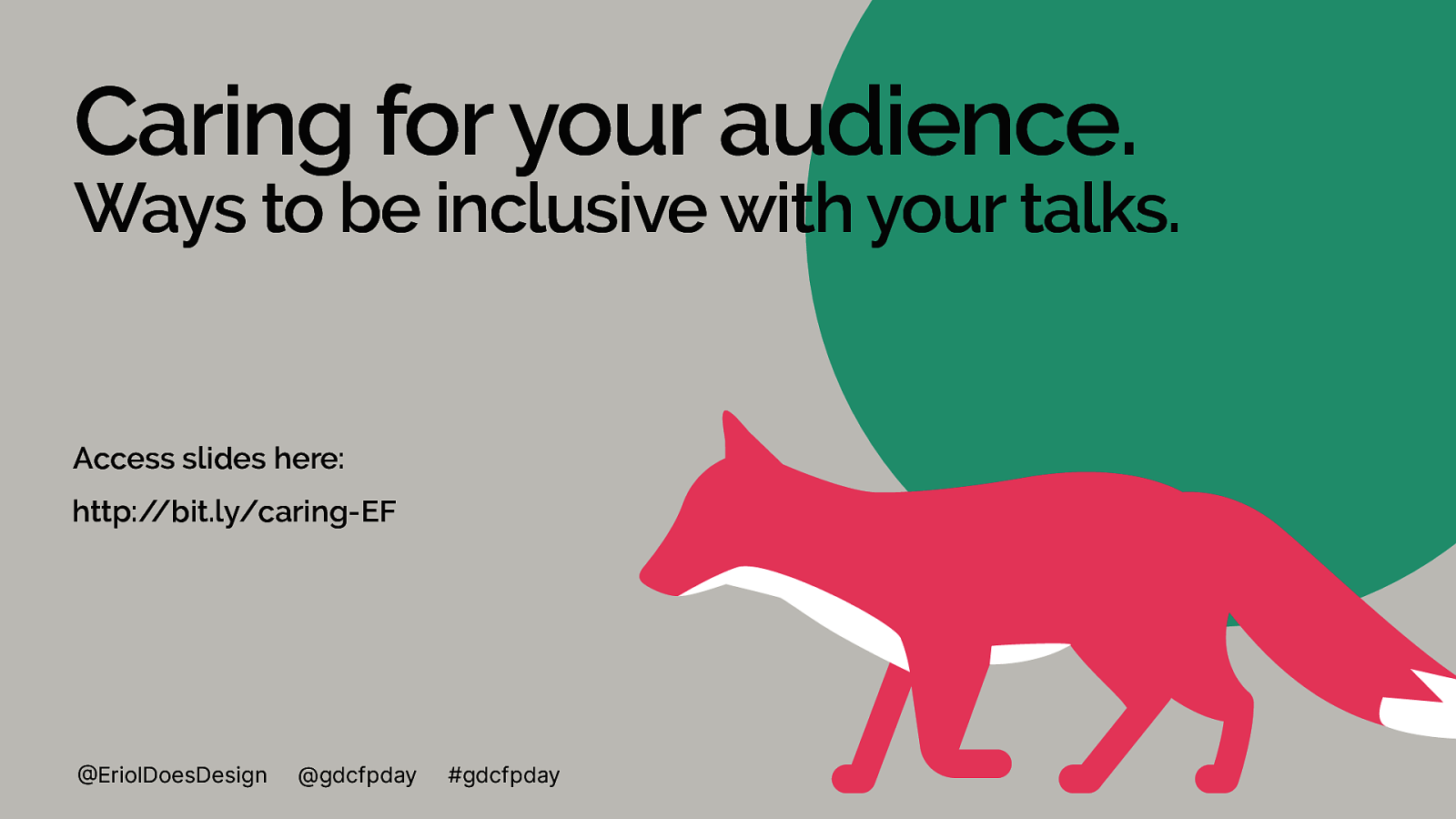
‘Caring for your audience. Ways to be inclusive with your talks.’
Hello, I’m here to talk about ‘Caring for your audience. Ways to be inclusive with your talks.’
On screen right now is a the title text and an illustration of a pink fox.

A presentation at global diversity CFP day in January 2021 in by Eriol Fox
Hello, I’m here to talk about ‘Caring for your audience. Ways to be inclusive with your talks.’
On screen right now is a the title text and an illustration of a pink fox.
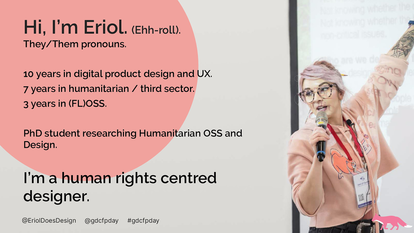
On screen now is an image of myself with a microphone and text with details about myself, I’m Eriol, my pronouns are they/them.
I’ve been working in digital product design and UX for around 10 years. I’ve spent 7 years doing humanitarian or third sector work. And I’ve been working on, and contributing to OSS for 3 years,
I’m working towards PhD research that explores the relationship between designers and humanitarian or ‘for good’ OSS project and how designers participate in OSS.
I call myself a ‘human rights centred designer’
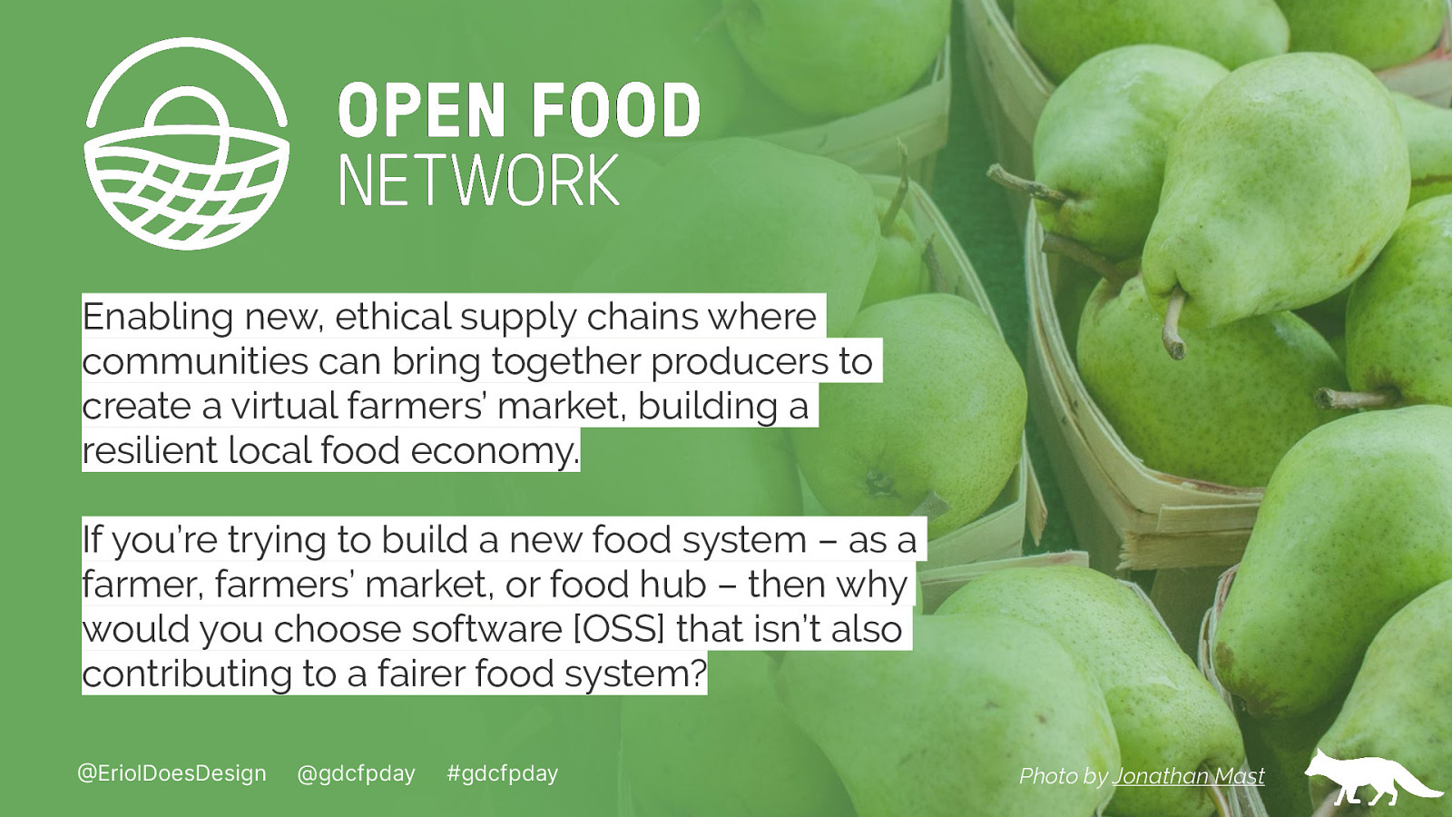
On screen now is an image of green pears alongside a logo for ‘the open food network’ and text.
I now do design at the Open Food Network where I work on their OSS technology to enable new, ethical supply chains where communities can bring together producers to create a virtual farmers’ market, building a resilient local food economies.
The open food network doesn’t just maintain and support an OSS platform that allows producers globally to sell their produce and people to buy from them but enables and nourishes a global community focussed on learning, understanding and improving how we as humans consume and care for the planet through produce.

The first thing I’d like to speak about is how your profile slide can, if you choose, indicate your own intersections of identity.
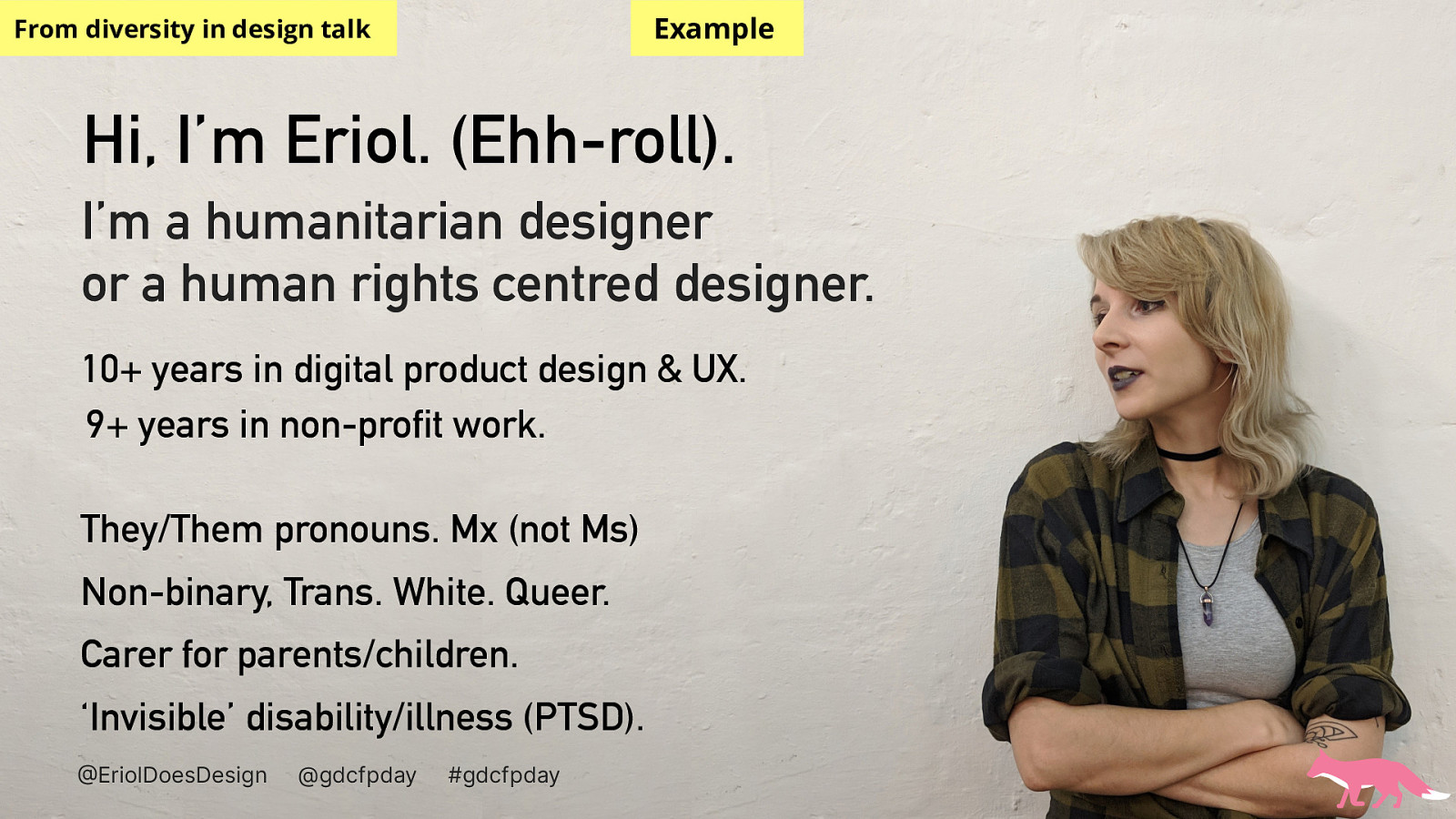
On screen is an example of a profile and intro slide, with a photo of myself alongside my introduction text which reads:
Hi, I’m Eriol. (Ehh-roll). I’m a humanitarian designer or a human rights centred designer. 10+ years in digital product design & UX. 9+ years in non-profit work. They/Them pronouns. Mx (not Ms) Non-binary, Trans. White. Queer. Carer for parents/children. ‘Invisible’ disability/illness (PTSD).
…if you choose can be more inclusive and connect with your audience.
When I speak about diversity in design and tech. I intro myself and spend time detailing my own thoughts on my ivtersectionalities.
This can however, put you at risk. Understand that your safety is very important too.
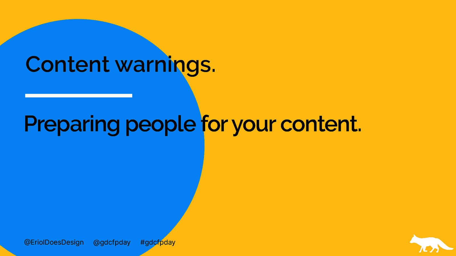
Next I’d like to speak about are content warnings.
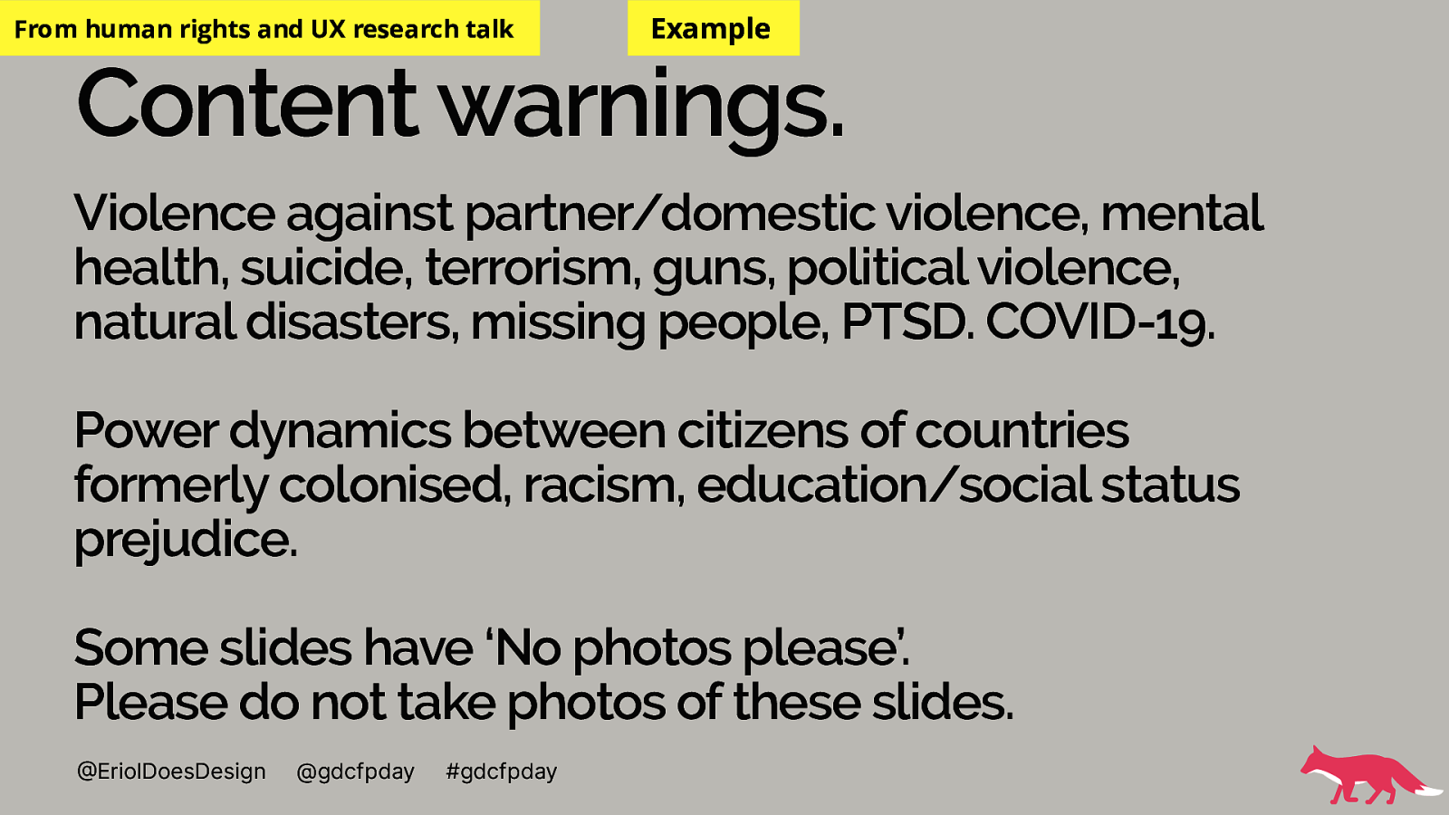
Content warnings are always recommended to cover. You can never know what people attending your talk have experience of and it’s a caring action to cover what you know you will speak about that could be difficult for someone.
Give yourself permission to not know that a particular topic might be hard for someone and take feedback if given to include that in your content warnings.
Saying these out loud can be difficult at first but with practice and care this becomes easier.
Unless your talk is scripted and structured you could move into areas that have not been content warned at the start.
Often I introduce myself, then the content warnings. I then invite the audience to do what they need to do to be safe and comfortable including but not exclusive of: Leaving the room at anytime they need, doing what they need to do to not see or hear content they don’t want to and a zero judgement environment of doing what is needed including inviting others to not question those that leave after the talk unless they have a duty of care concern.
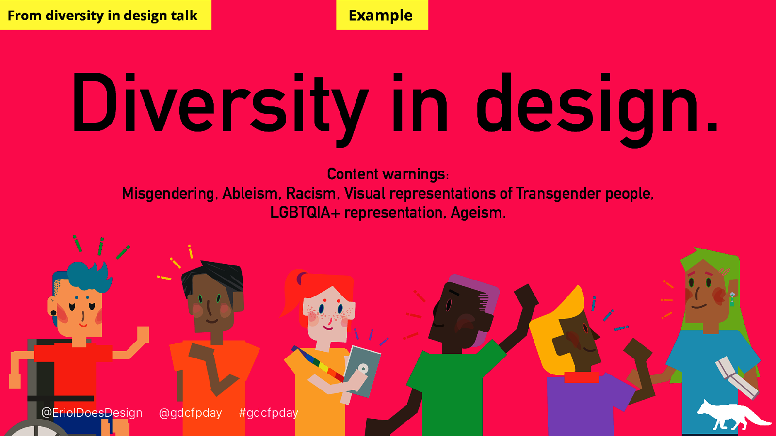
These content warnings are included in a title slide of a presentation where I’ve illustrated 6 different people of varied skin tones, hair colours and visible disabilities.
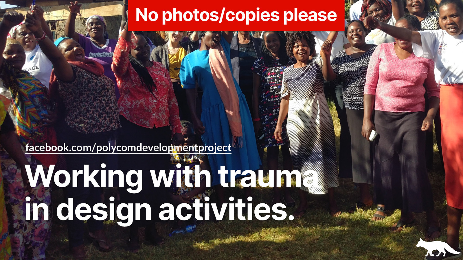
On screen right now is a group image of a community group from Kibera in Nairobi smiling at the camera with raised arms.
This is an image of work that I did in a role around building technology for peace building.
Because of the nature of the work I do in the human rights space it’s critical for me to ensure that people listening understand what will be talked about and ensure their own safety and comfort.
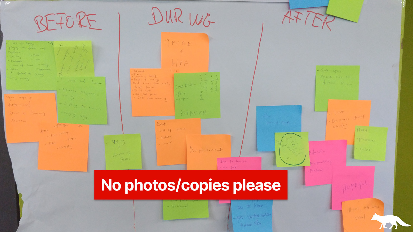
On screen right now is a zoomed out image of a ‘user journey map’ from a workshop participant that mapped a dangerous incident’ The topics mapped were topics like kidnapping, civil unrest and many more difficult topics.
My last comment on the complexity of content warnings is that you can have a good idea of the topics that will be difficult to engage with but you’re likely to discover more topics that you can include in your content warnings as you speak. Just be aware, that if you have a question in your mind ‘Could this topic raise trauma for someone listening?’ Then it’s likely a good idea to include it in your content warnings.
The imagery you use across your presentations sends a message to your audience. I know as much as you may do how difficult it can be to find free resources for talks and paying for talk photos, illustrations or layouts don’t often cross speakers minds.
It’s hard then to find inclusive imagery to ensure your audience is well represented.
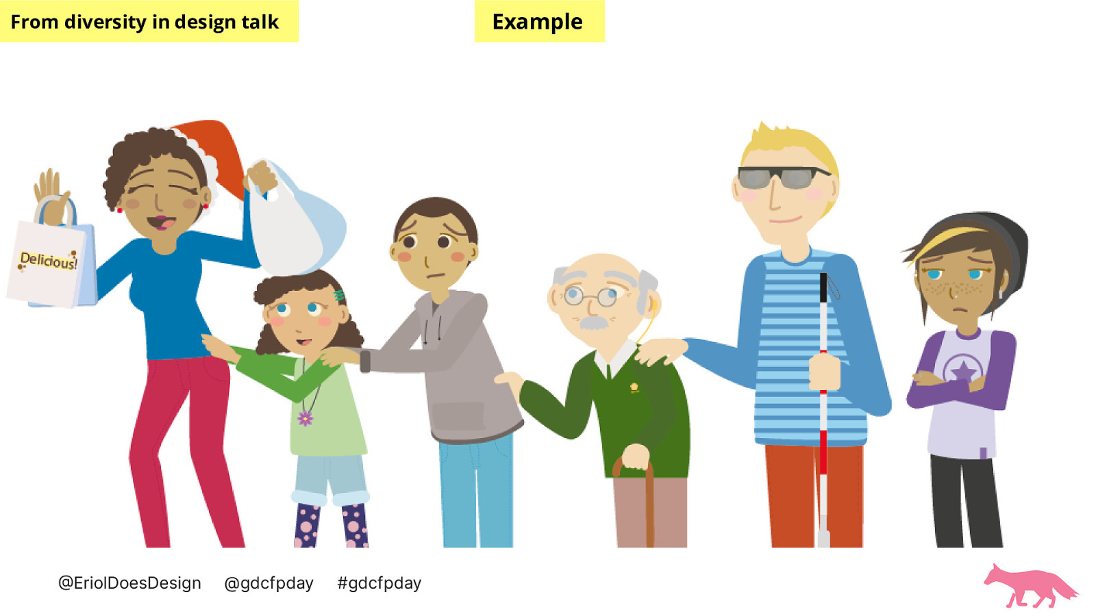
These examples are from a talk about how I was trying to increase diverse representation in my illustration work for my job. While doing this I realised that if I’m creating my own visuals, there’s no reason why I cannot make them widely representative.
On the screen is an image of a family with different dark to light skin-tones and different visible disabilities and physical shapes. This was one of my first attempts to draw diverse representations of humans.
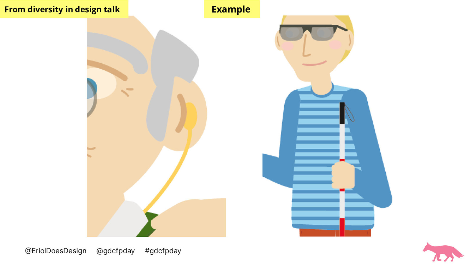
On the screen now is a close up of some of the visible disabilities of the figures. A hearing aid type device in the ear of an older person and dark glasses and a red and white striped cane for one of the adult figures in the family.
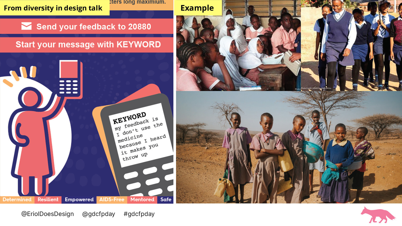
Use of photography should also be carefully considered in your talks. This slide has an example of a project I worked on that had an illustrative visual but also a request to make a photo based visual. The photos that were commonly used by similar organisations or partners. They depict young people in school uniforms with dresses in a sandy landscape holding buckets and other similar figures in school or class settings.
I had a feeling these images were not good to use and after some research and conversations with people living near the communities where our audience was, I was confident that these images that are used are not representative of the community that was intended for these visuals.
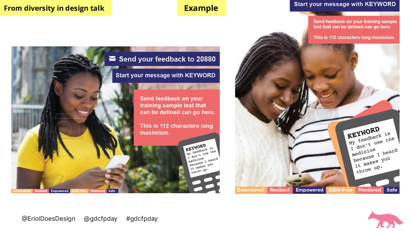
After doing searches on google image search and instagram for the locations, looking for terms such as ‘nightclubs’ or ‘young people’ I found more accurate representations of young people that I wanted to accurately depict. The images on screen are young dark skinned people with long braided hair and tied back hair looking at mobile phones.
After showing these images to my ‘intended audience’ I received much more positive reactions.
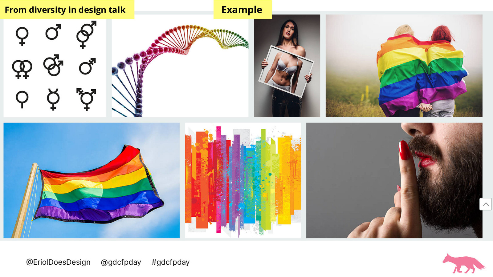
On screen right now are 7 image results for ‘trans person’ from a popular stock image search.
From top left to right are: Gender or sex symbols with the plus and arrow, rainbow 3D rendered DNA, an image of a person holding a photo in front of their torso/chest of a body in a bra and underwear, two figures from behind wrapped in a rainbow pride flag holding hands, A rainbow pride flag, an artistic rainbow illustration and a close up side shot of a person with a dark beard, red lips and red long nails in a ‘shh’ physical motion with their finger in front of their lips.
When we come to look for ways to depict non cis-gendered folks we find less useful and images that have complex and potentially harmful meaning.
The advice I offer here is First is that gender diversity has no ‘standard’ visual code when you’re using images of humans. They could identify as LGBTQ+ or not but there is certainly no way of ‘knowing’ from visual alone. If you’re content is about LGBTQ+ representation then there are places you can find stock photo sets of folks that identify on the LGBTQ+ spectrum. Such as Mapbox’s Queer in tech photo set.
https://blog.mapbox.com/queer-in-tech-free-stock-photos-from-mapbox-87aba2e7c7da
The second piece of advice is to be careful when using symbol imagery such as the rainbow pride flag. The rainbow flag particularly has changed recently to include both a black and brown stripe for marginalised races and ethnicities and the transgender flag.
One of the best ways to ascertain whether your content is ‘caring’ is to ask the communities you wish to represent.
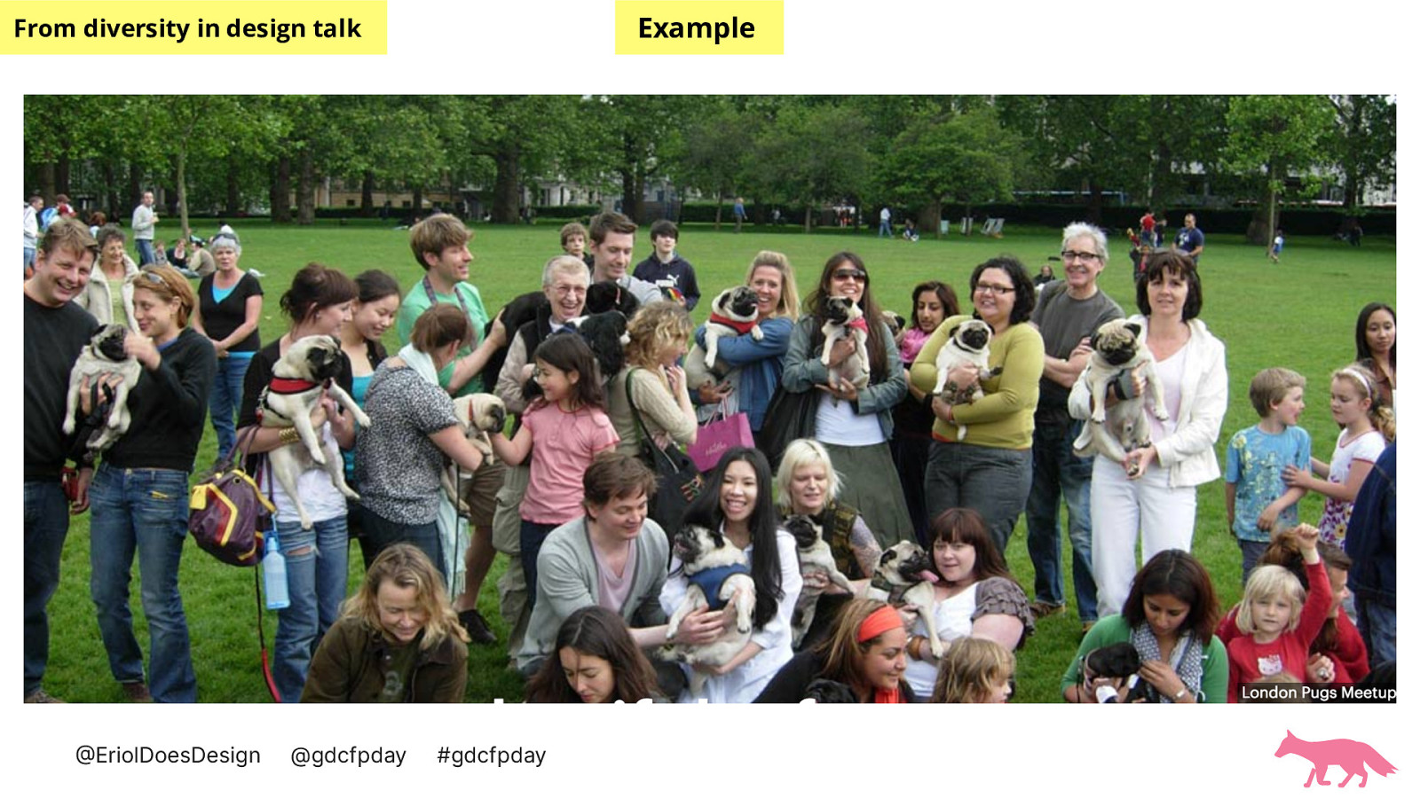
On screen now is an image taken from meet-up.com on London pugs meet-up.
It shows many different kinds of people holding pugs.
One of the reasons I show this image is to encourage people to use images that are accurate depictions of what they want to show and this image is what it is, the London pug meet-up. I encourage you to create, find and use images that are representative of the truth over images that are more ‘traditionally visually pleasing’.
We’re going to move away from visual content to written content now.
You might have noticed that I’ve been describing slides that have visual content.
This is a great to do as not everyone will be able to see your visuals and if the visuals are important to the content, make sure everyone can experience it.
This includes URLs.
You may need to make sure that you time your talk well to include the descriptions of your slides.
Making sure that your visuals and slide design is clear and ‘high contrast’ is another way that you can ensure your audience is comfortable.
Shorter sentences, clear language and visual consistency ensures that folks who need that to fully engage with your talk get what they need.
Connected to language writing out acronyms ensures that everyone in your audience regardless of familiarity with the subject matter can understand and enjoy your talk. We cannot assume what anyone knows already and often, acronyms can make it harder to take in information as the audience member has to deconstruct that acronyms before taking in the information.
These language tips I’ve found help with multi-lingual folks that are in your audience.
Assuming a level of comfort in your own language is shared universally could quickly exclude many from your content.
Also the pace, tone and clarity of your words helps keep everyone included.
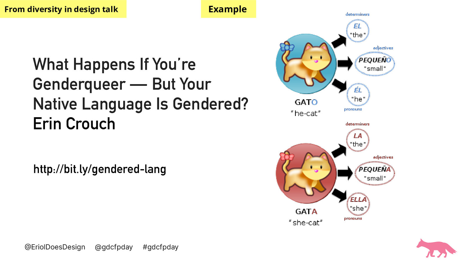
On screen now is an article title’ What Happens If You’re Genderqueer — But Your Native Language Is Gendered? Erin Crouch’
http://bit.ly/gendered-lang
With an image of two cats, one with a blue background and one with a red background. One is of a ‘he-cat’ and one is of a ‘she-cat’
A complex topic I’ve worked with is gender in tech and advocating for gender neutrality across design and tech. But historically gendered languages must be considered in these particular topics and I encourage you to research how you might be more inclusive by understanding what is happening globally around a subject like this such as when new gender neutral pronouns are used in countries.
As we run short on time I’d like to say how importance it is to offer links to your slides and content online for this that prefer to use those resources to follow along. Perhaps they need to save bandwidth from your video share but still want to listen? Perhaps they want to read certain parts again? Whatever the audience needs to do to better understand your content it’s always worth giving easy accessible access to it.
An image of a pink fox alongside Thanks for listening.
And where you can find me on the internet @erioldoesdesign linkedin.com/in/eriolfox github.com/Erioldoesdesign medium.com/@EriolDoesDesign