Typographic Readability in Theme Design & Development
WORKSHOP by GIULIA LACO June 8th-10th, Athens (Greece) #WCEU2023 #WCEU

A presentation at WordCamp Europe 2023 in June 2023 in Athens, Greece by Giulia Laco
WORKSHOP by GIULIA LACO June 8th-10th, Athens (Greece) #WCEU2023 #WCEU
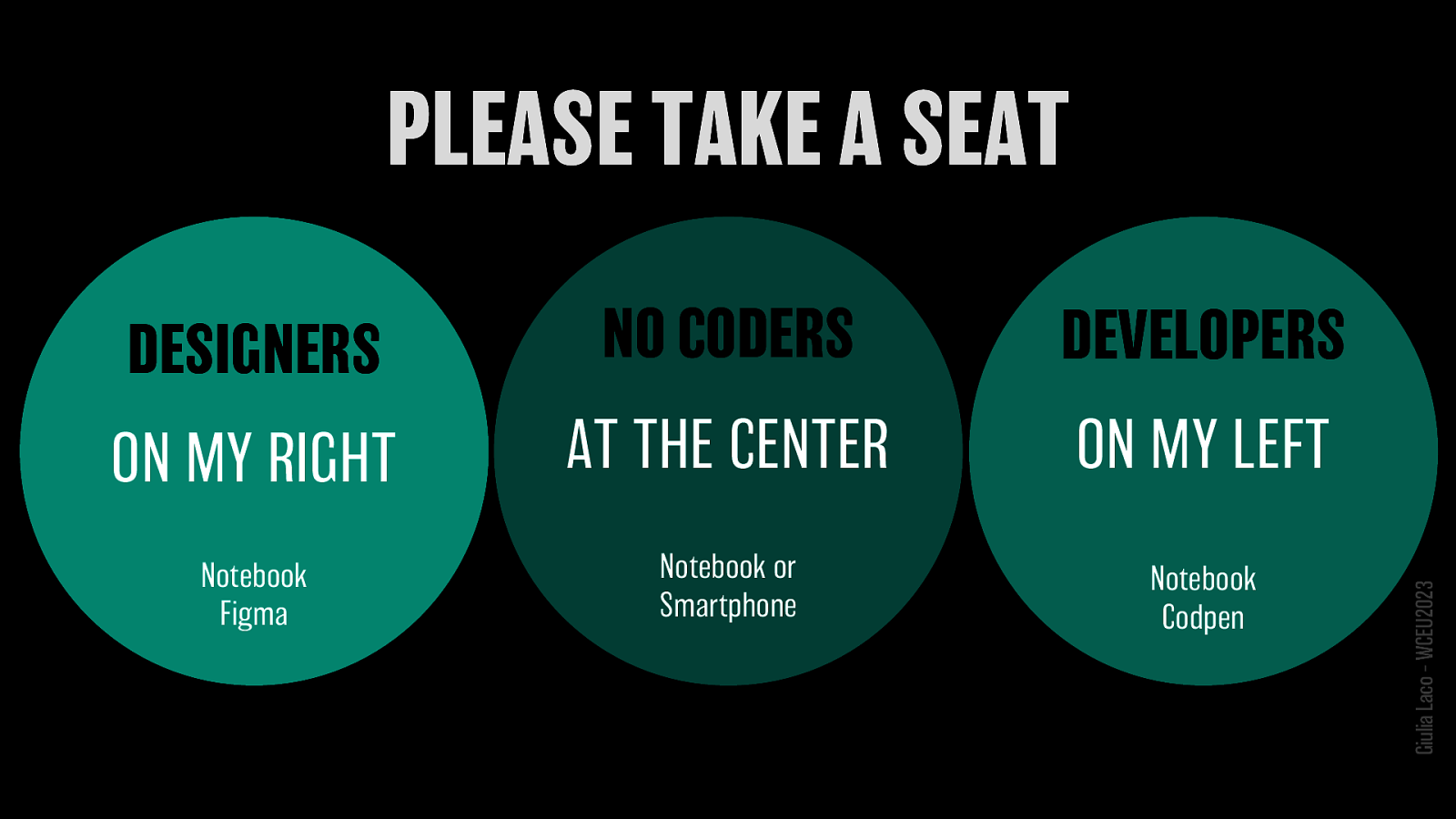
DESIGNERS ON MY RIGHT NO CODERS AT THE CENTER DEVELOPERS ON MY LEFT Notebook Figma Notebook or Smartphone Notebook Codpen Giulia Laco – WCEU2023


#WCEU #WCEU2023 @wceurope @webmatter_it
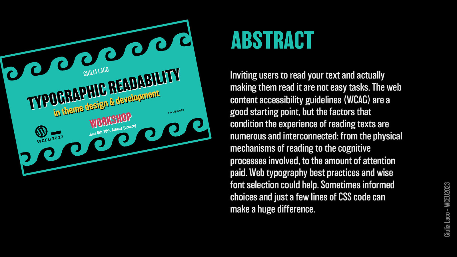
Inviting users to read your text and actually making them read it are not easy tasks. The web content accessibility guidelines (WCAG) are a good starting point, but the factors that condition the experience of reading texts are numerous and interconnected: from the physical mechanisms of reading to the cognitive processes involved, to the amount of attention paid. Web typography best practices and wise font selection could help. Sometimes informed choices and just a few lines of CSS code can make a huge difference. Giulia Laco – WCEU2023 ABSTRACT
Inviting users to read your text and actually making them read it are not easy tasks. The web content accessibility guidelines (WCAG) are a good starting point, but the factors that condition the experience of reading texts are numerous and interconnected: from the physical mechanisms of reading to the attention paid. Web typography best practices and wise font selection could help. Sometimes informed choices and just a few lines of CSS code can make a huge difference. Giulia Laco – WCEU2023 cognitive processes involved, to the amount of
Inviting users to read your text and actually making them read it are not easy tasks. The web content accessibility guidelines (WCAG) are a good starting point, but the factors that condition the experience of reading texts are numerous and interconnected: from the involved, to the amount of attention paid. Web typography best practices and wise font selection could help. Sometimes informed choices and just a few lines of CSS code can make a huge difference. Giulia Laco – WCEU2023 physical mechanisms of reading to the cognitive processes
Giulia Laco
Webmatter.it Type Strategy
I’m a web designer/developer, I have been working on the Web since the mid-’90s. In recent years my main interest in design has centered around the use of typography and web fonts for readability and communication. In addition to project development, I do consulting and training on CSS and web typography.
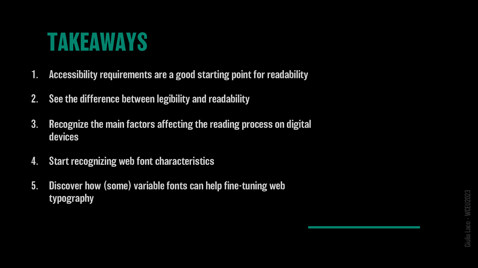
Accessibility requirements are a good starting point for readability 2. See the difference between legibility and readability 3. Recognize the main factors affecting the reading process on digital devices 4. Start recognizing web font characteristics 5. Discover how (some) variable fonts can help fine-tuning web typography Giulia Laco – WCEU2023
HOW WE READ Giulia Laco – WCEU2023
HOW WE READ
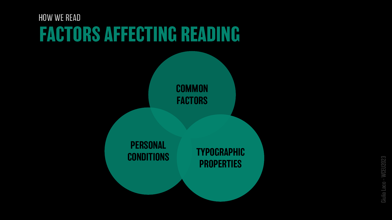
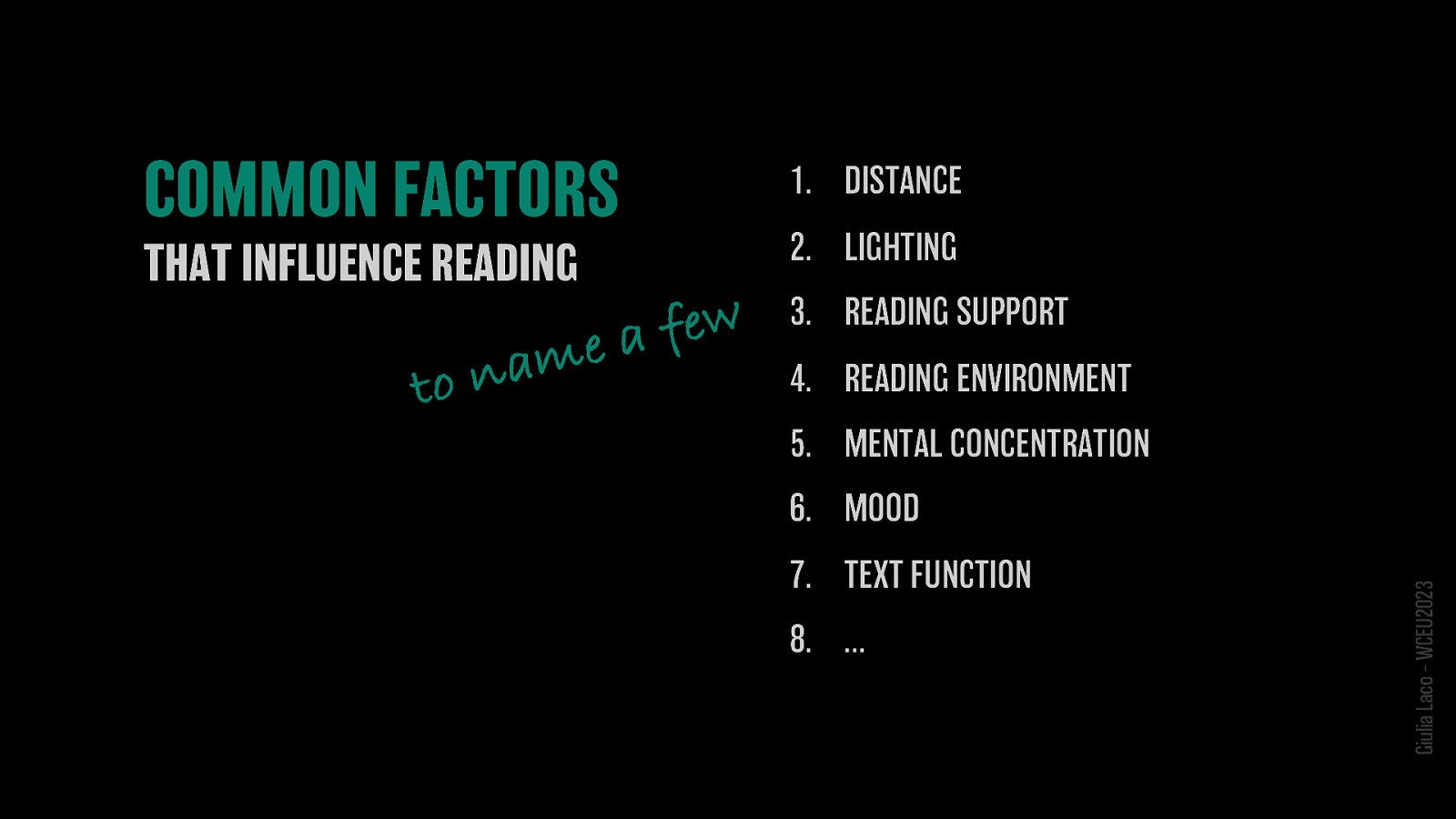
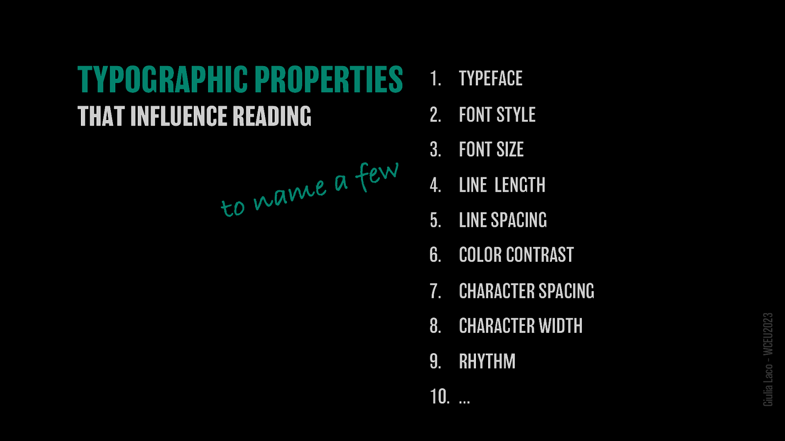
PERSONAL CONDITIONS TYPOGRAPHIC PROPERTIES Giulia Laco – WCEU2023 COMMON FACTORS
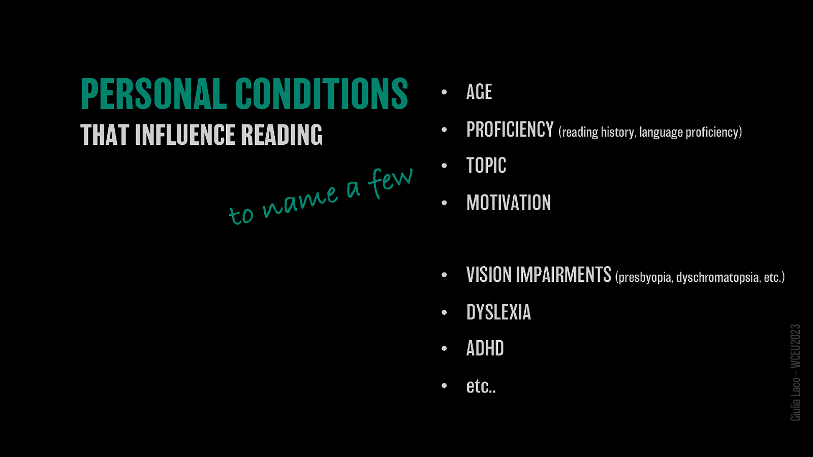
• AGE • PROFICIENCY (reading history, language proficiency) • TOPIC • MOTIVATION • VISION IMPAIRMENTS (presbyopia, dyschromatopsia, etc.) • DYSLEXIA • ADHD • etc.. Giulia Laco – WCEU2023

WORKSHOP Giulia Laco – WCEU2023

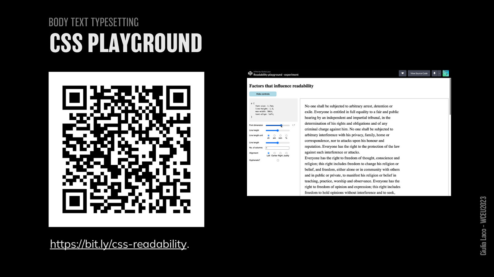
BODY TEXT TYPESETTING https://bit.ly/css-readability Giulia Laco – WCEU2023

BODY TEXT TYPESETTING https://bit.ly/figma-readability Giulia Laco – WCEU2023
ABOUT READING Giulia Laco – WCEU2023
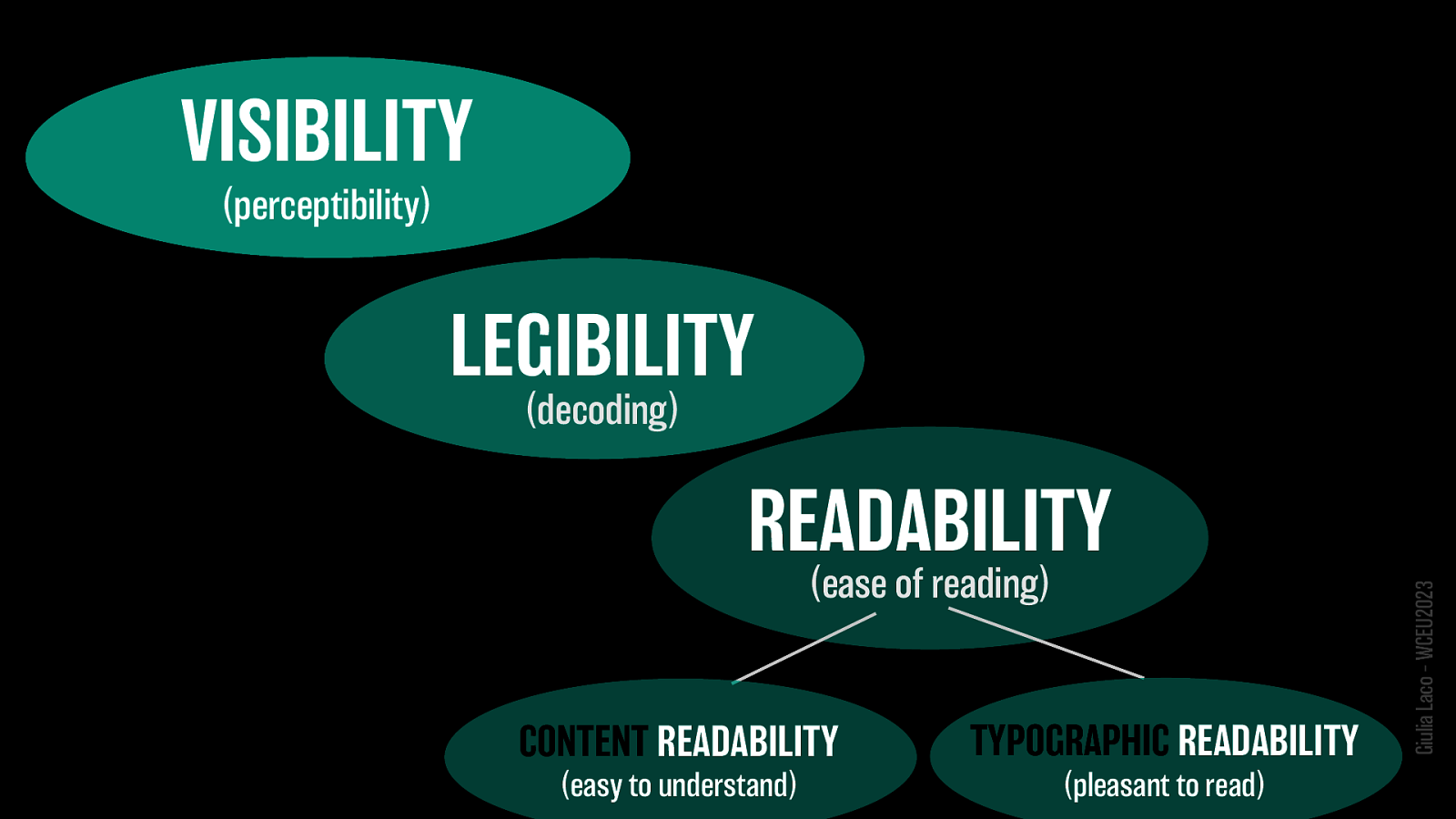
VISIBILITY (perceptibility) LEGIBILITY (decoding) READABILITY (ease of reading):
WEB CONTENT ACCESSIBILITY GUIDELINES Giulia Laco – WCEU2023
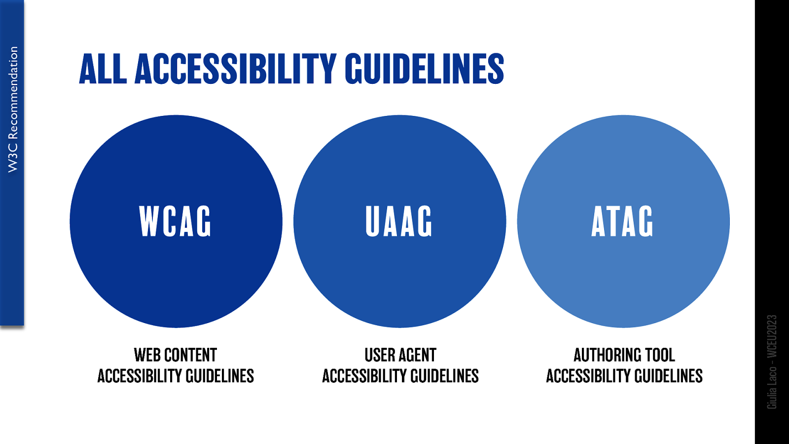
W3C Recommendation
Giulia Laco – WCEU2023
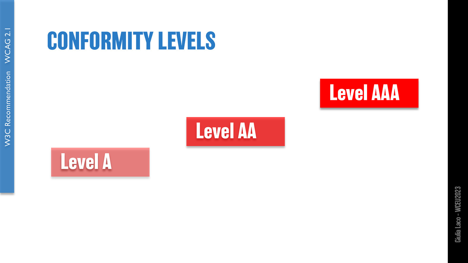
W3C Recommendation WCAG 2.1 Level A Level AA Level AA Giulia Laco – WCEU2023
WCAG 2.1 W3C Recommendation
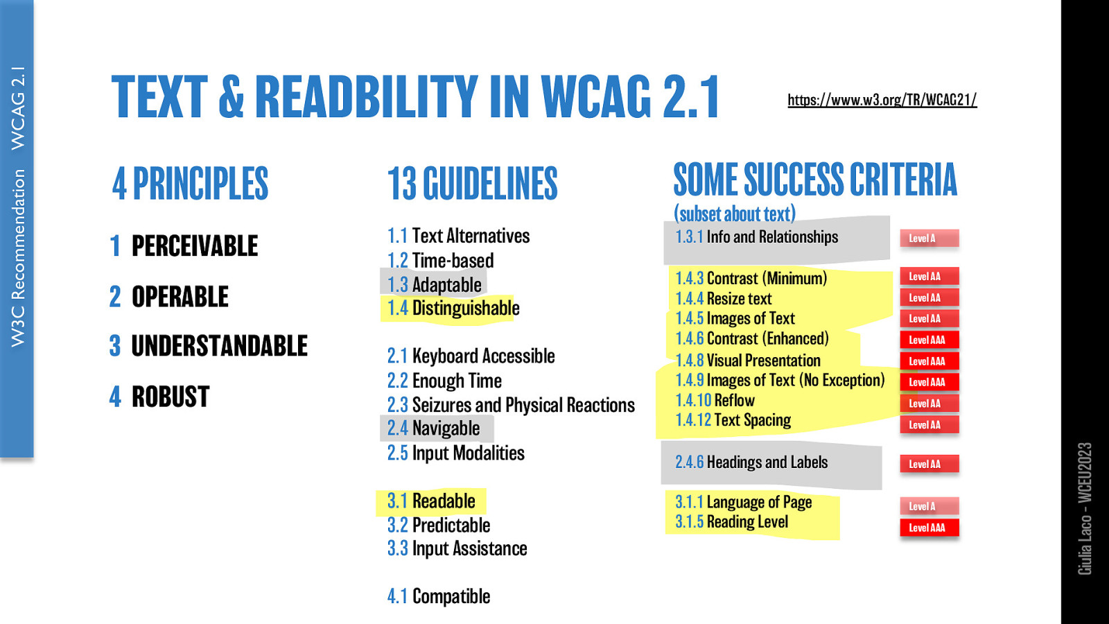
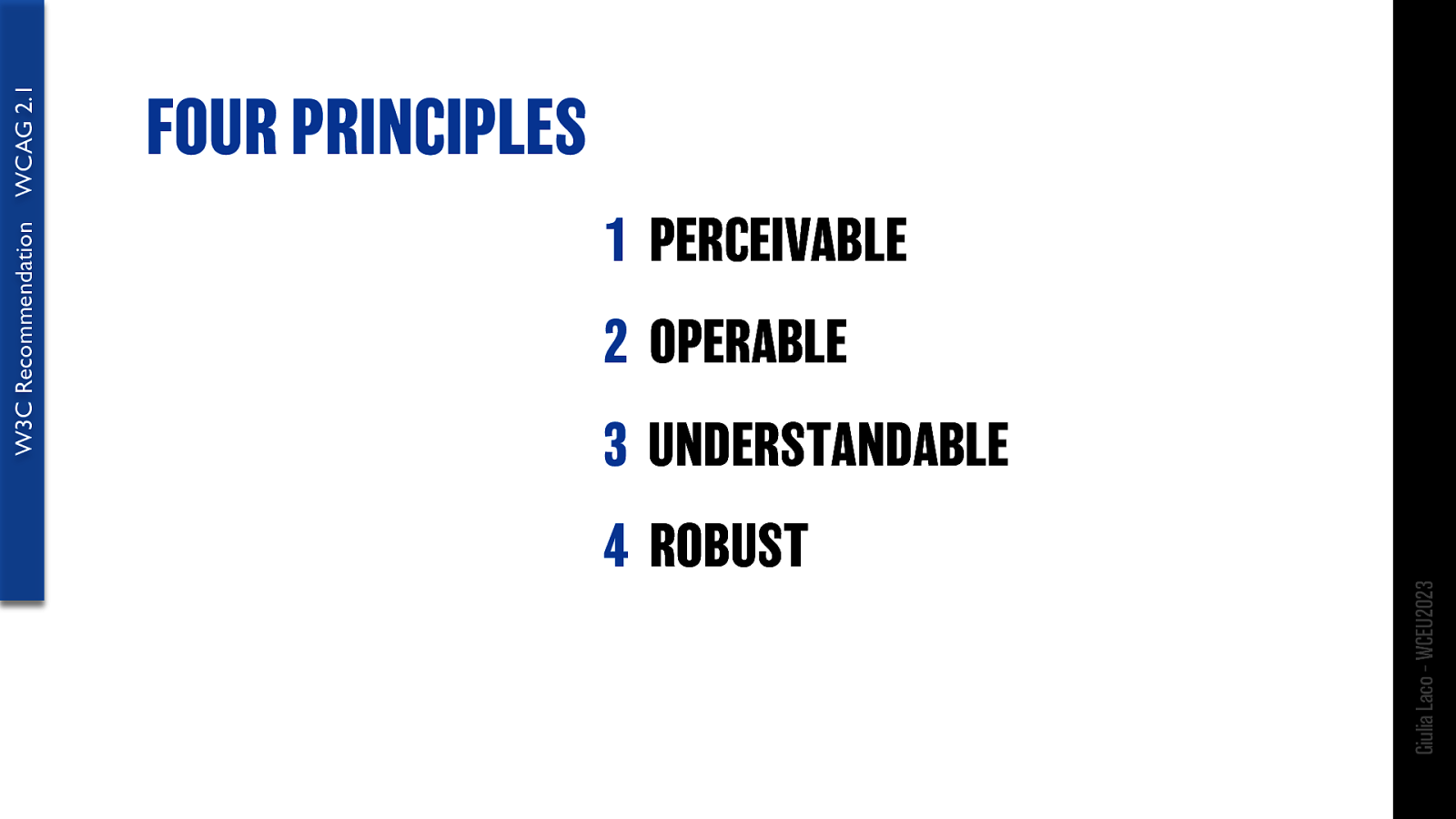
WCAG 2.1 W3C Recommendation 4 PRINCIPLES 13 GUIDELINES SOME SUCCESS CRITERIA (subset about text)
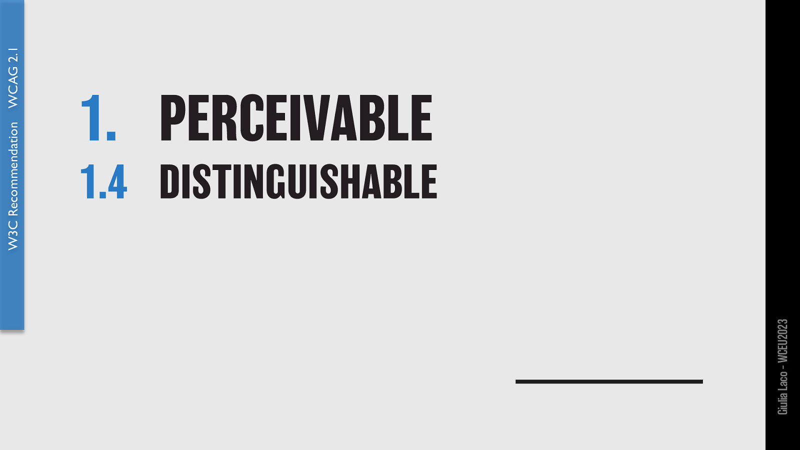
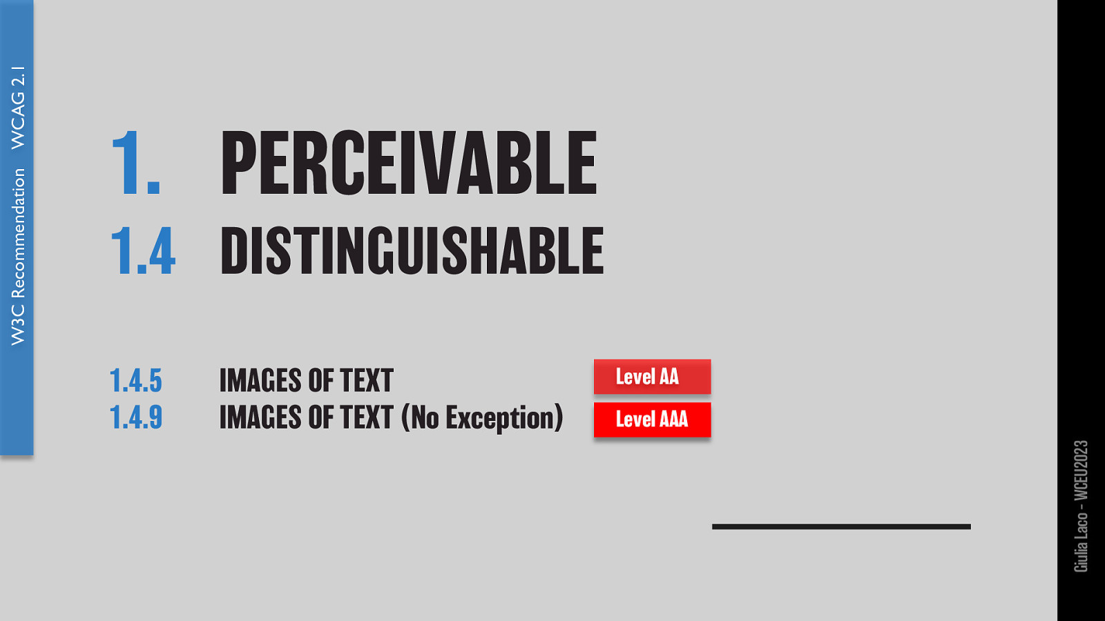
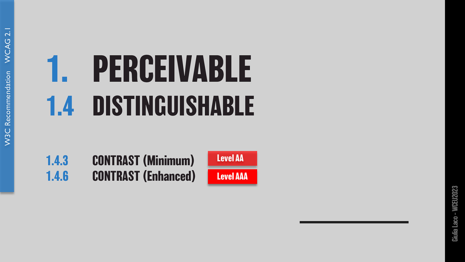
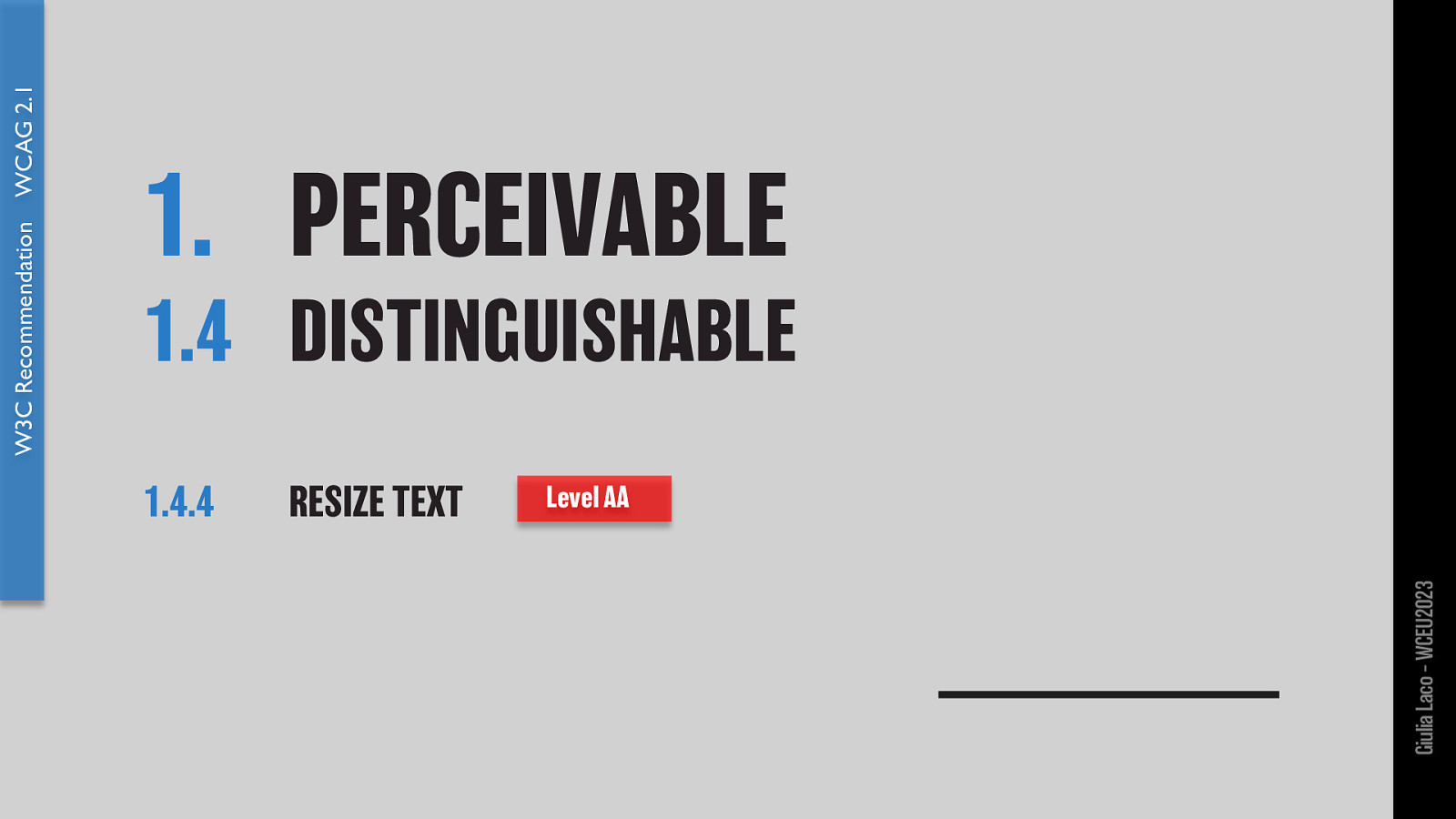
PERCEIVABLE 1.1 Text Alternatives 1.2 Time-based Media 1.3 Adaptable 1.3.1 Info and Relationships 1.4 Distinguishable 1.4.3 Contrast (Minimum) 1.4.4 Resize text 1.4.5 Images of Text 1.4.6 Contrast (Enhanced) 1.4.8 Visual Presentation 1.4.9 Images of Text (No Exception) 1.4.10 Reflow 1.4.12 Text Spacing
OPERABLE 2.1 Keyboard Accessible 2.2 Enough Time 2.3 Seizures and Physical Reactions 2.4 Navigable 2.4.6 Headings and Labels 2.5 Input Modalities
UNDERSTANDABLE 3.1 Readable 3.1.1 Language of Page 3.1.5 Reading 3.2 Predictable 3.3 Input Assistance
ROBUST 4.1 Compatible Level
Level A, AA, AAA https://www.w3.org/TR/WCAG21/ Giulia Laco – WCEU2023
W3C Recommendation WCAG 2.1 Giulia Laco – WCEU2023
W3C Recommendation WCAG 2.1 Giulia Laco – WCEU2023
W3C Recommendation WCAG 2.1 Giulia Laco – WCEU2023
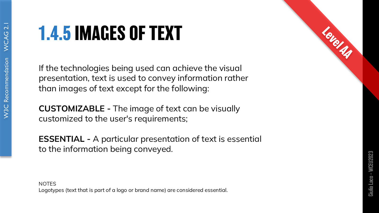
If the technologies being used can achieve the visual presentation, text is used to convey information rather than images of text except for the following:
CUSTOMIZABLE - The image of text can be visually customized to the user’s requirements;
ESSENTIAL - A particular presentation of text is essential to the information being conveyed.
NOTES Logotypes (text that is part of a logo or brand name) are considered essential.
W3C Recommendation WCAG 2.1 Giulia Laco – WCEU2023
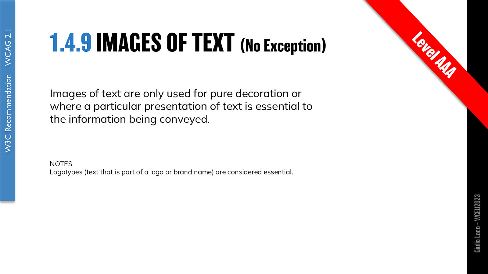
Images of text are only used for pure decoration or where a particular presentation of text is essential to the information being conveyed.
NOTES Logotypes (text that is part of a logo or brand name) are considered essential.
W3C Recommendation WCAG 2.1 Giulia Laco – WCEU2023

Giulia Laco – WCEU2023
W3C Recommendation WCAG 2.1 Giulia Laco – WCEU2023
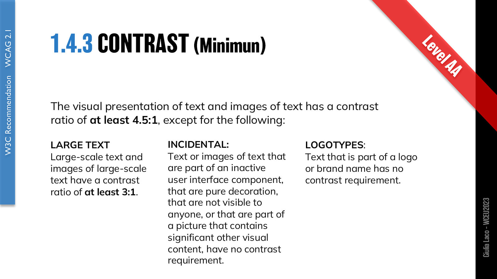
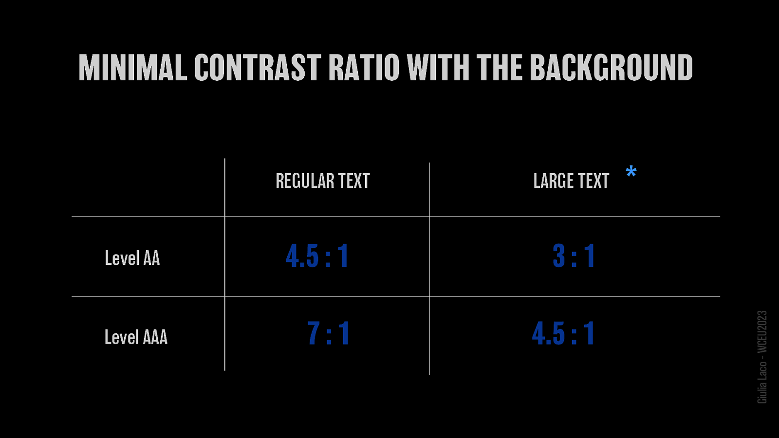
The visual presentation of text and images of text has a contrast ratio of at least 4.5:1, except for the following:
LARGE TEXT Large-scale text and images of large-scale text have a contrast ratio of at least 3:1.
INCIDENTAL: Text or images of text that are part of an inactive user interface component, that are pure decoration, that are not visible to anyone, or that are part of a picture that contains significant other visual content, have no contrast requirement.
LOGOTYPES: Text that is part of a logo or brand name has no contrast requirement.
W3C Recommendation WCAG 2.1 Giulia Laco – WCEU2023
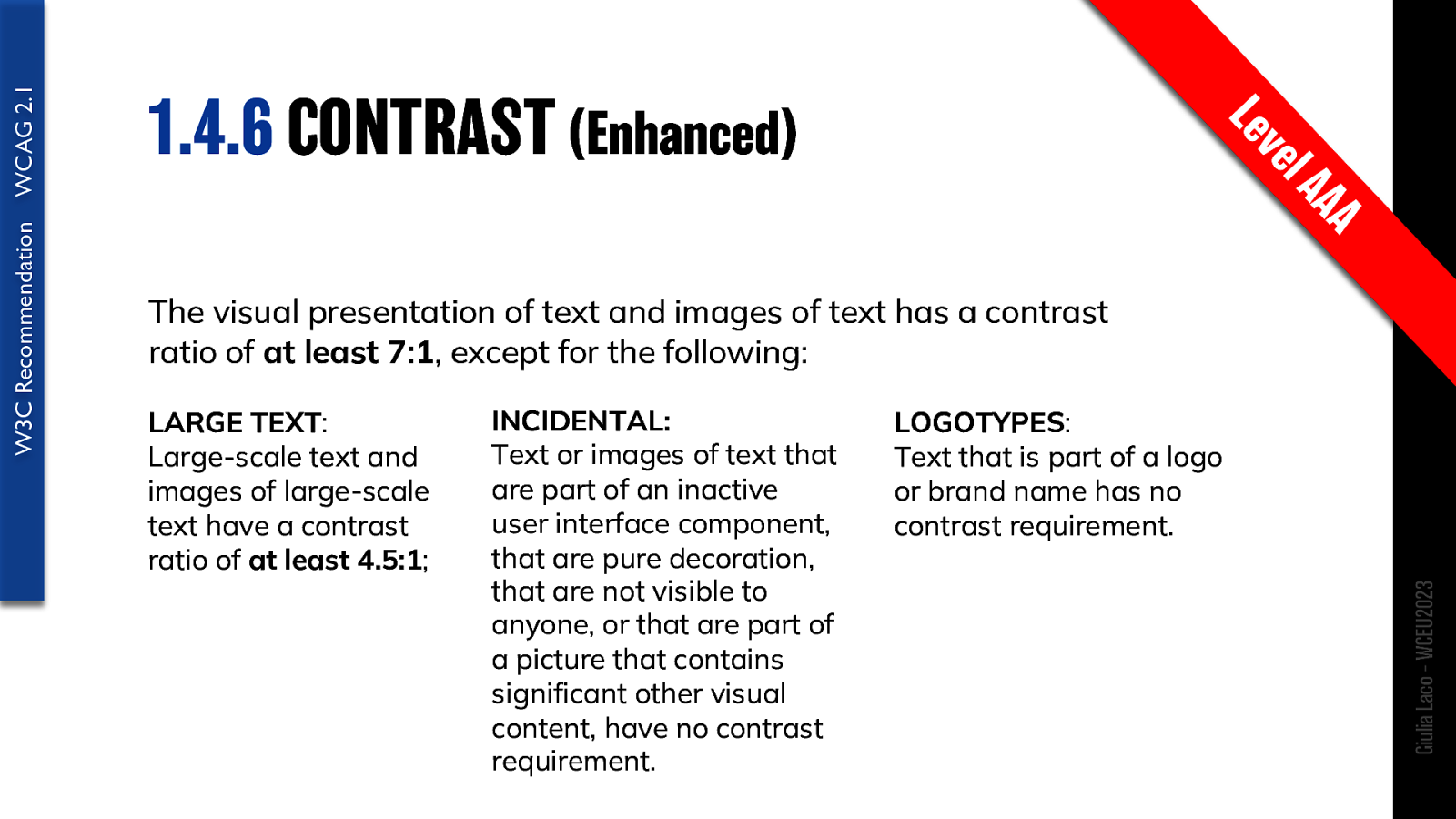
The visual presentation of text and images of text has a contrast ratio of at least 7:1, except for the following:
LARGE TEXT: Large-scale text and images of large-scale text have a contrast ratio of at least 4.5:1;
INCIDENTAL: Text or images of text that are part of an inactive user interface component, that are pure decoration, that are not visible to anyone, or that are part of a picture that contains significant other visual content, have no contrast requirement.
LOGOTYPES: Text that is part of a logo or brand name has no contrast requirement.
W3C Recommendation WCAG 2.1 Giulia Laco – WCEU2023
Giulia Laco – WCEU2023 🤯
Level AA
Level AAA
W3C Recommendation WCAG 2.1 Giulia Laco – WCEU2023
🤔 Giulia Laco – WCEU2023
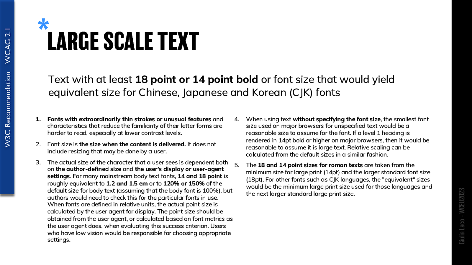
Text with at least 18 point or 14 point bold or font size that would yield equivalent size for Chinese, Japanese and Korean (CJK) fonts
Fonts with extraordinarily thin strokes or unusual features and characteristics that reduce the familiarity of their letter forms are harder to read, especially at lower contrast levels.
Font size is the size when the content is delivered. It does not include resizing that may be done by a user.
The actual size of the character that a user sees is dependent both 5. on the author-defined size and the user’s display or user-agent settings. For many mainstream body text fonts, 14 and 18 point is roughly equivalent to 1.2 and 1.5 em or to 120% or 150% of the default size for body text (assuming that the body font is 100%), but authors would need to check this for the particular fonts in use. When fonts are defined in relative units, the actual point size is calculated by the user agent for display. The point size should be obtained from the user agent, or calculated based on font metrics as the user agent does, when evaluating this success criterion. Users who have low vision would be responsible for choosing appropriate settings.
When using text without specifying the font size, the smallest font size used on major browsers for unspecified text would be a reasonable size to assume for the font. If a level 1 heading is rendered in 14pt bold or higher on major browsers, then it would be reasonable to assume it is large text. Relative scaling can be calculated from the default sizes in a similar fashion.
The 18 and 14 point sizes for roman texts are taken from the minimum size for large print (14pt) and the larger standard font size (18pt). For other fonts such as CJK languages, the “equivalent” sizes would be the minimum large print size used for those languages and the next larger standard large print size.
W3C Recommendation WCAG 2.1 Giulia Laco – WCEU2023
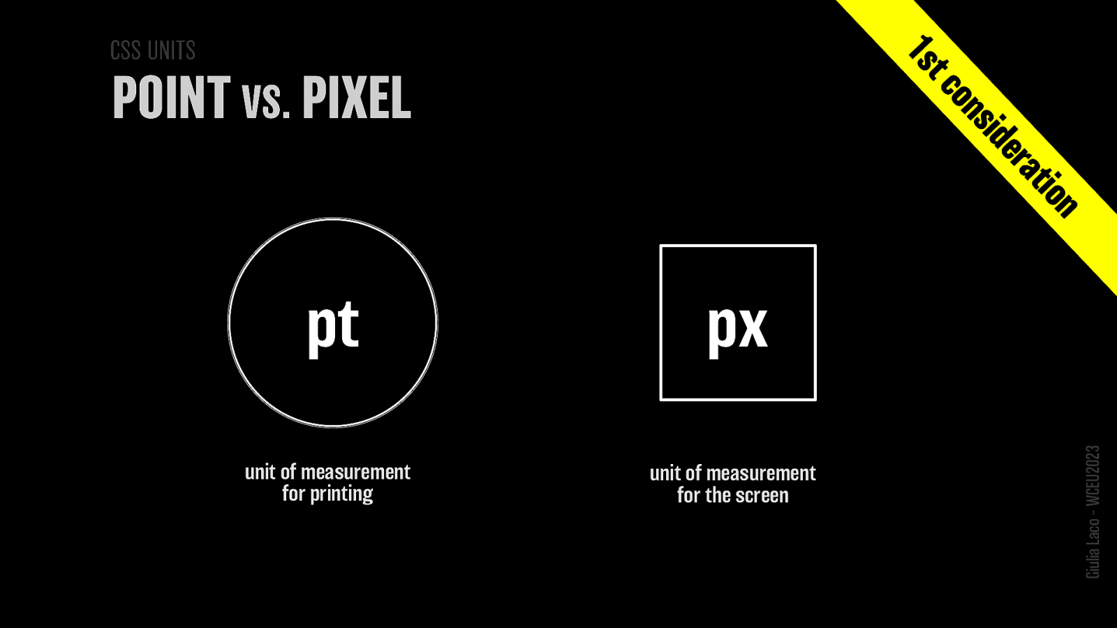
POINT (pt): unit of measurement for printing PIXEL (px): unit of measurement for the screen
W3C Recommendation WCAG 2.1 Giulia Laco – WCEU2023
😳 Giulia Laco – WCEU2023
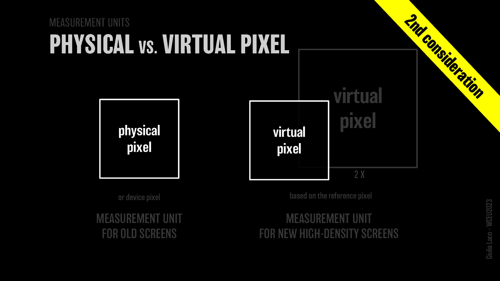
Physical pixel (or device pixel) MEASUREMENT UNIT FOR OLD SCREENS
Virtual pixel (based on the reference pixel) MEASUREMENT UNIT FOR NEW HIGH-DENSITY SCREENS
Giulia Laco – WCEU2023
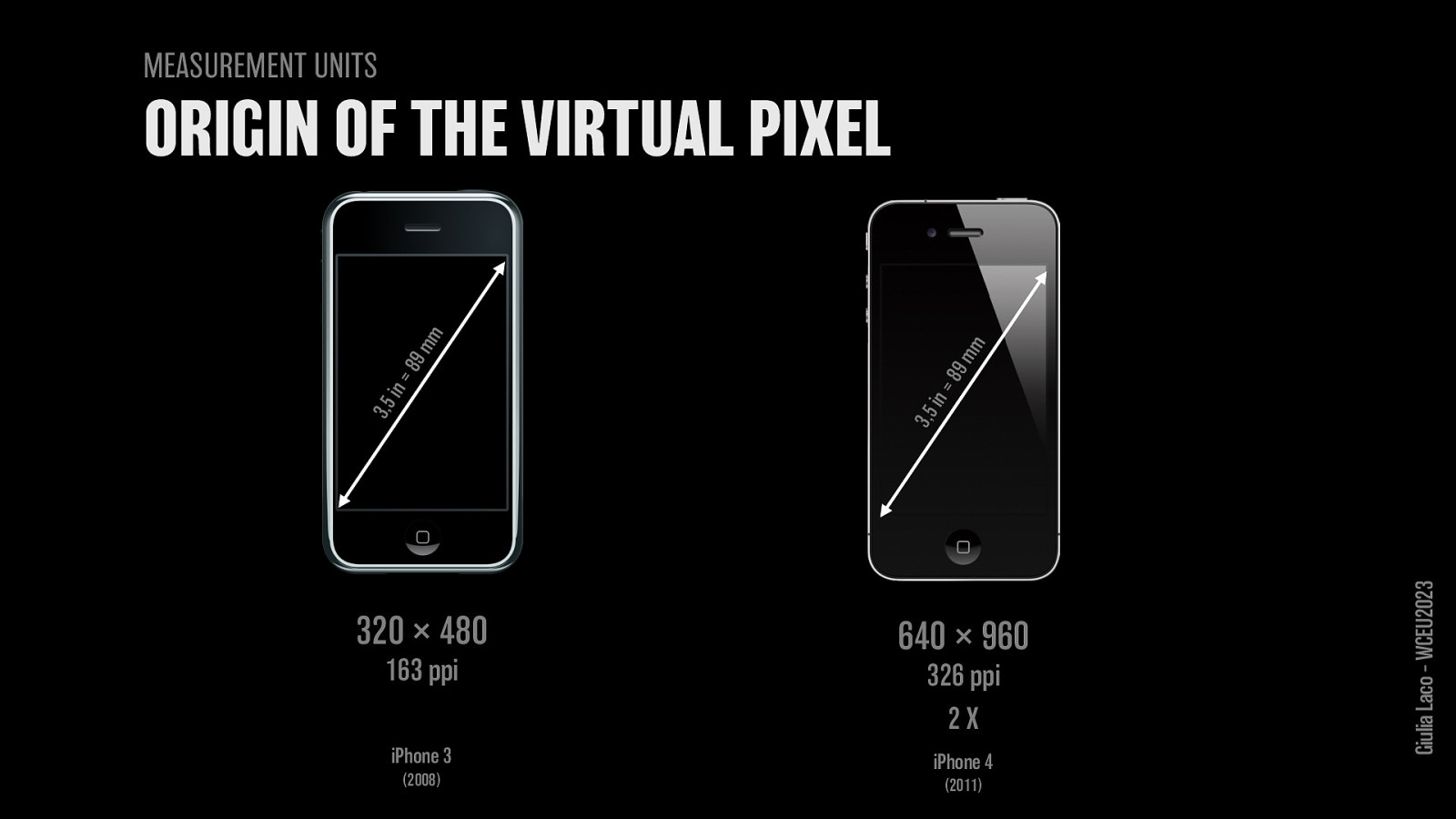
iPhone 3 (2008) screen diagonal: 3.5 in = 89 mm 320×480 px 163 ppi
iPhone 4 (2011) screen diagonal: 3.5 in = 89 mm 640×960 px 326 ppi
Giulia Laco – WCEU2023
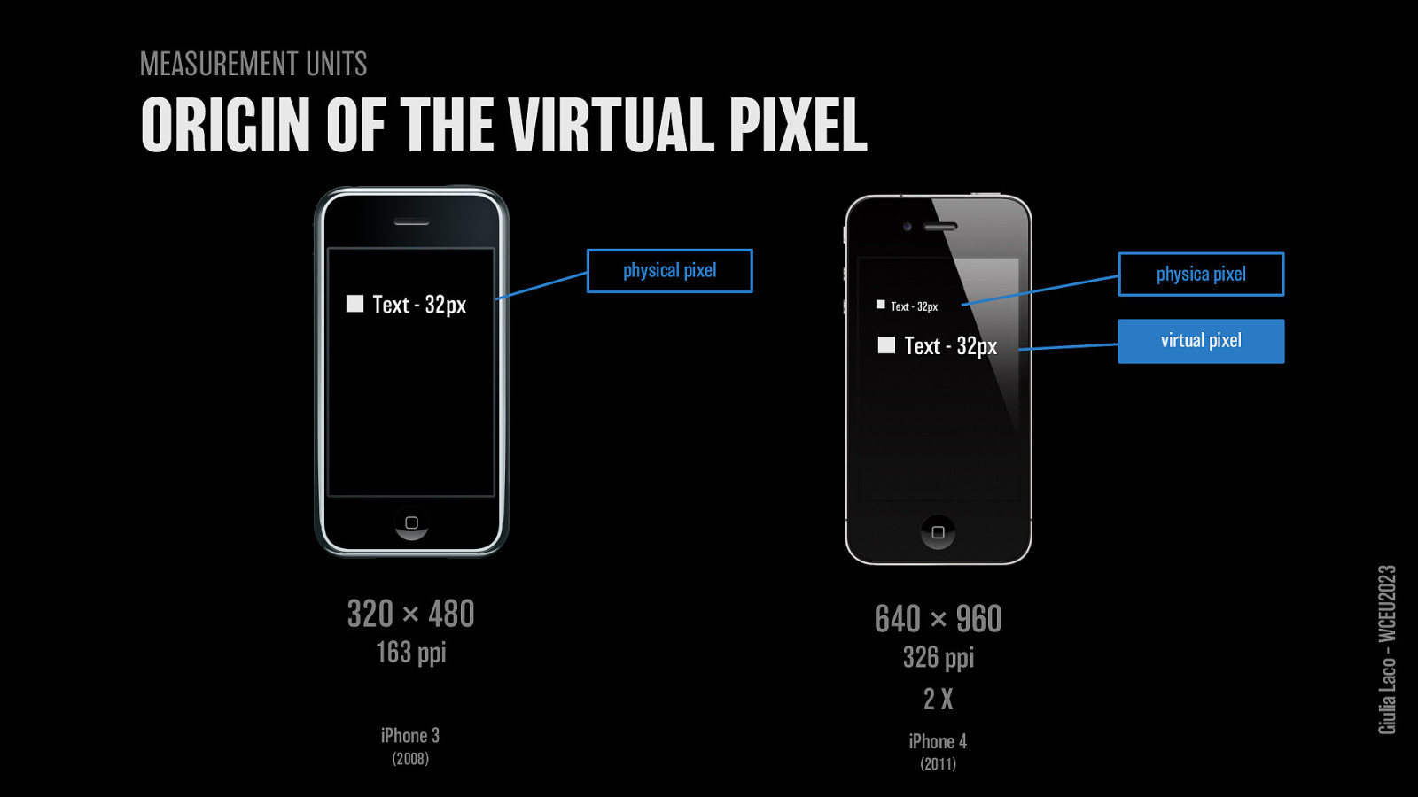
iPhone 3 physical pixel
iPhone 4 virtual pixel
Giulia Laco – WCEU2023
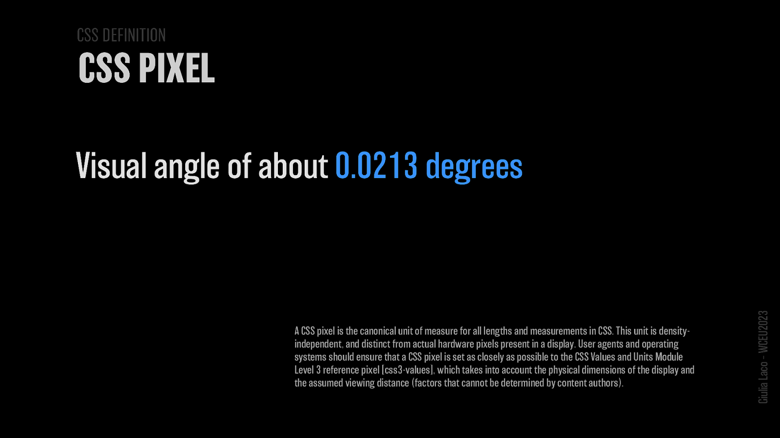
Visual angle of about 0.0213 degrees
A CSS pixel is the canonical unit of measure for all lengths and measurements in CSS. This unit is density-independent, and distinct from actual hardware pixels present in a display. User agents and operating systems should ensure that a CSS pixel is set as closely as possible to the CSS Values and Units Module Level 3 reference pixel [css3-values], which takes into account the physical dimensions of the display and the assumed viewing distance (factors that cannot be determined by content authors).
Giulia Laco – WCEU2023
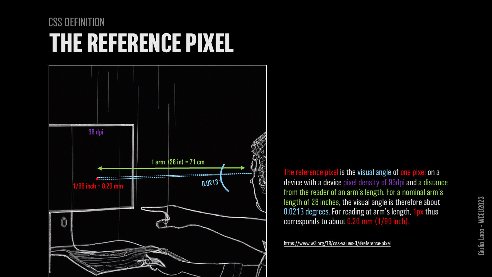
The reference pixel is the visual angle of one pixel on a device with a device pixel density of 96dpi and a distance from the reader of an arm’s length. For a nominal arm’s length of 28 inches, the visual angle is therefore about 0.0213 degrees. For reading at arm’s length, 1px thus corresponds to about 0.26 mm (1/96 inch).
https://www.w3.org/TR/css-values-3/#reference-pixel
1 arm (28 in) = 71 cm
Giulia Laco – WCEU2023
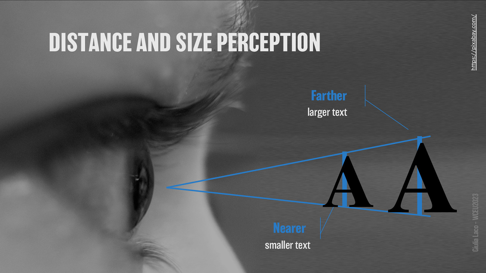
Farther - larger text Nearer - smaller text
Giulia Laco – WCEU2023
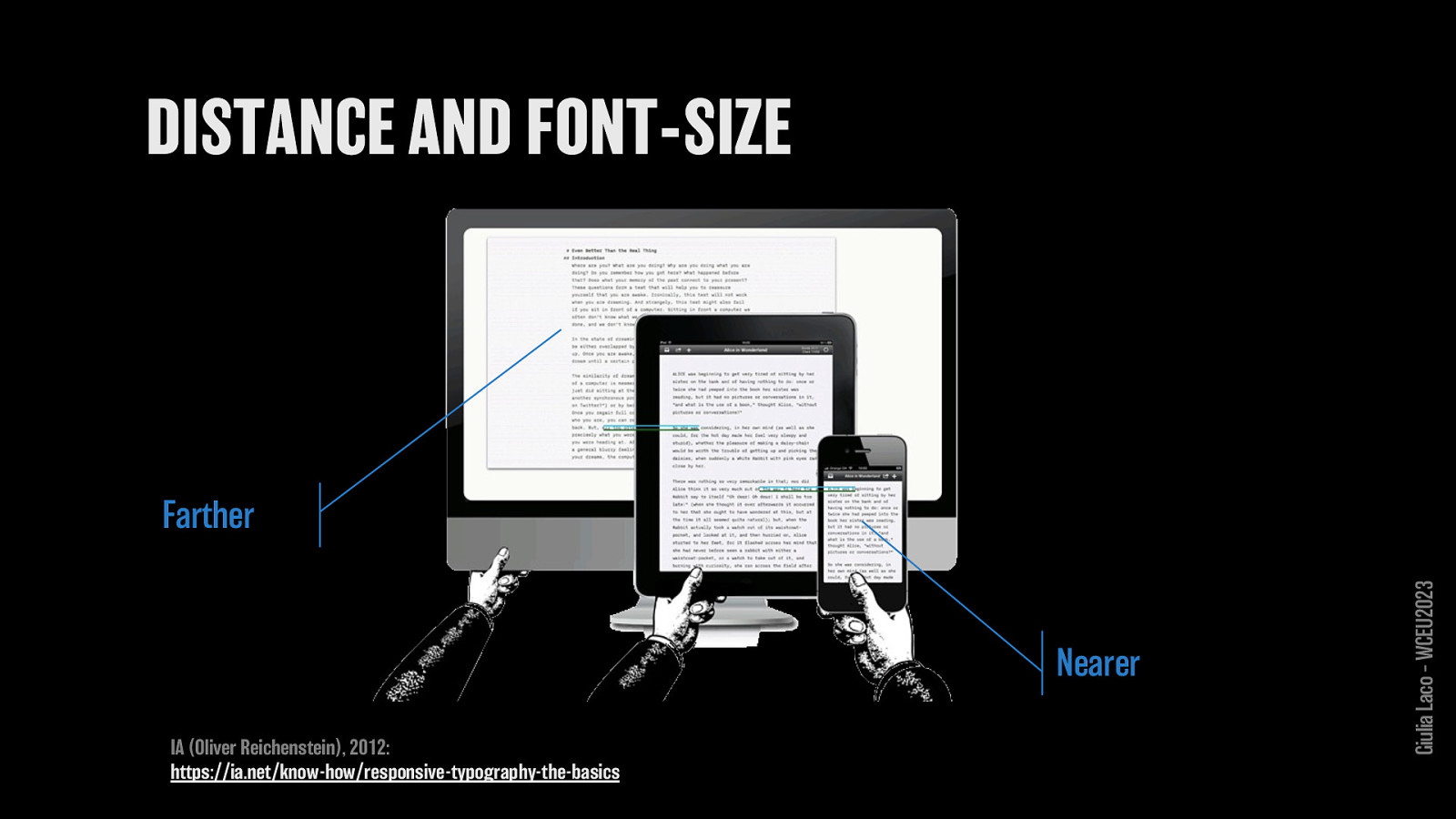
Farther Nearer IA (Oliver Reichenstein), 2012: https://ia.net/know-how/responsive-typography-the-basics
Giulia Laco – WCEU2023
Giulia Laco – WCEU2023
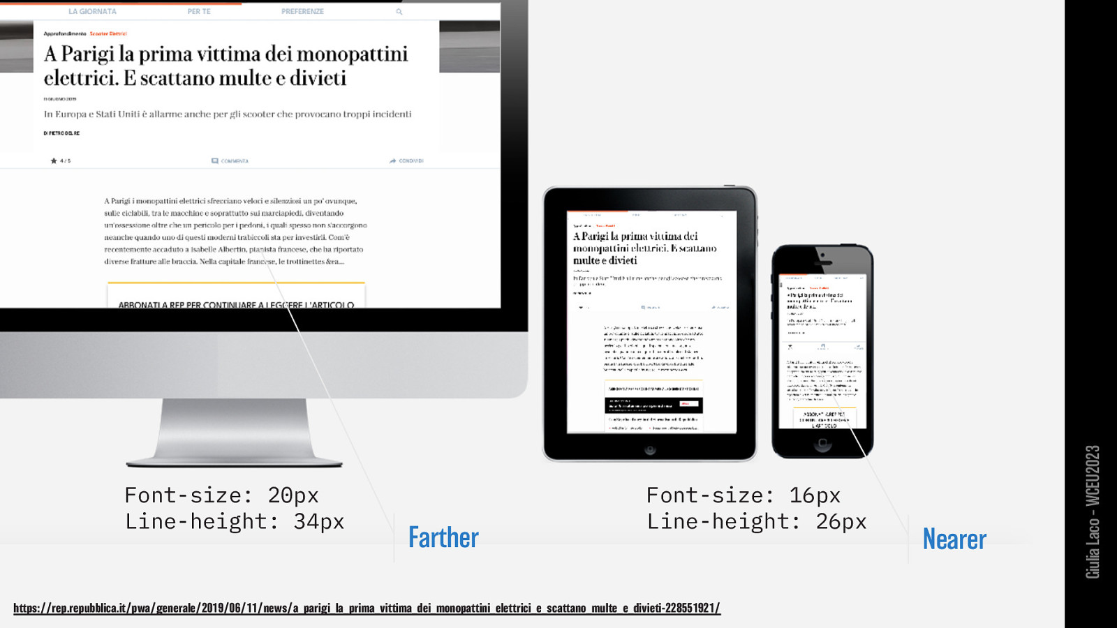
Farther Font-size: 16px; Line-height: 26px;
Nearer Font-size: 20px; Line-height: 34px;
Giulia Laco – WCEU2023
🤗 Giulia Laco – WCEU2023
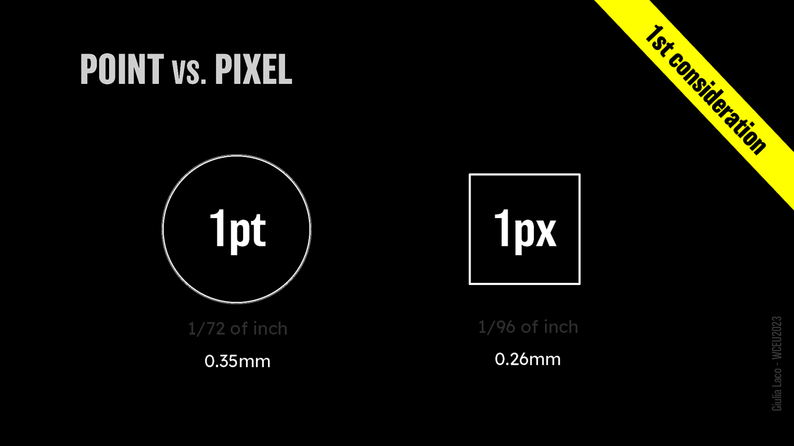
1pt = 1/72 of inch = 0.35mm 1px = 1/96 of inch = 0.26mm
Giulia Laco – WCEU2023
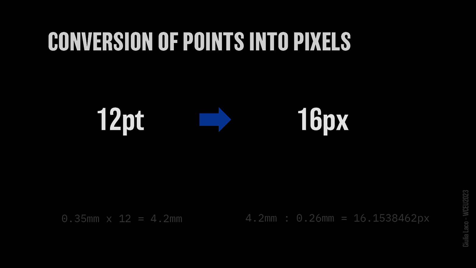
12pt converts to 16px
0.35mm x 12 = 4.2mm 4.2mm : 0.26mm = 16.1538462px approx 16px
Giulia Laco – WCEU2023
🤓 Giulia Laco – WCEU2023
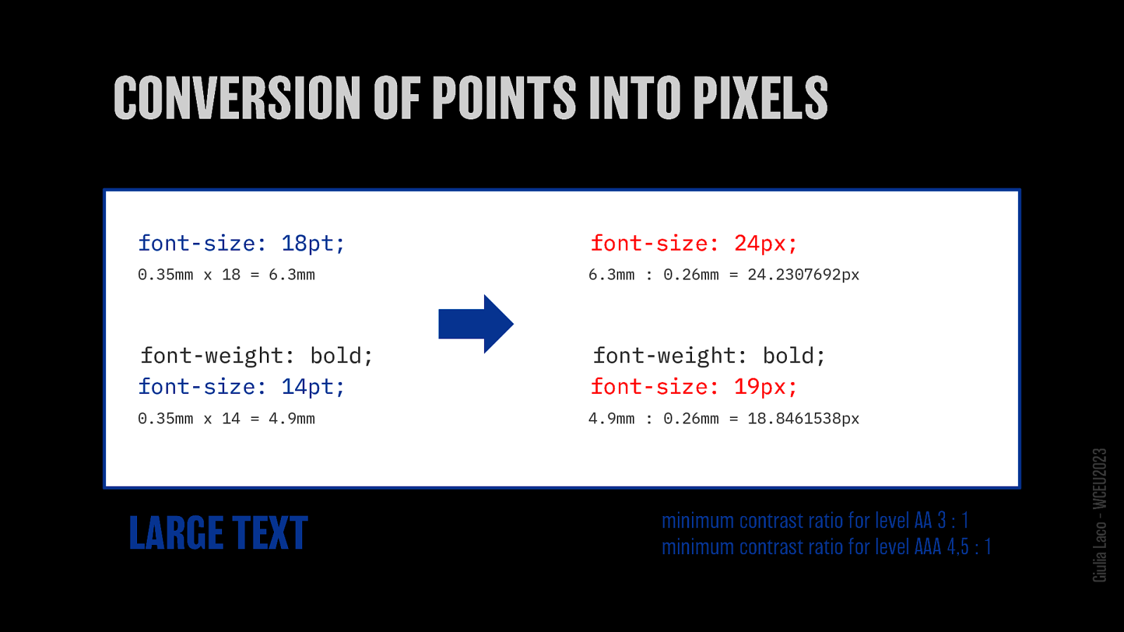
font-size: 18pt > 24px
font-weight: bold font-size: 14pt > 19px
LARGE TEXT minimum contrast ratio for level AA 3 : 1 minimum contrast ratio for level AAA 4,5 : 1
W3C Recommendation WCAG 2.1 Giulia Laco – WCEU2023
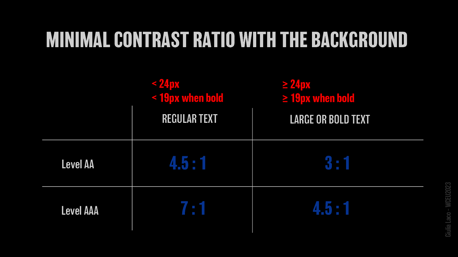
< 24px < 19px when bold is considered REGULAR TEXT Level AA min. contrast ratio 4.5:1 Level AAA min. contrast ratio 3:1
≥ 24px ≥ 19px when bold is considered LARGE OR BOLD TEXT Level AA min. contrast ratio 7:1 Level AAA min. contrast ratio 4.5:1
W3C Recommendation WCAG 2.1 Giulia Laco – WCEU2023
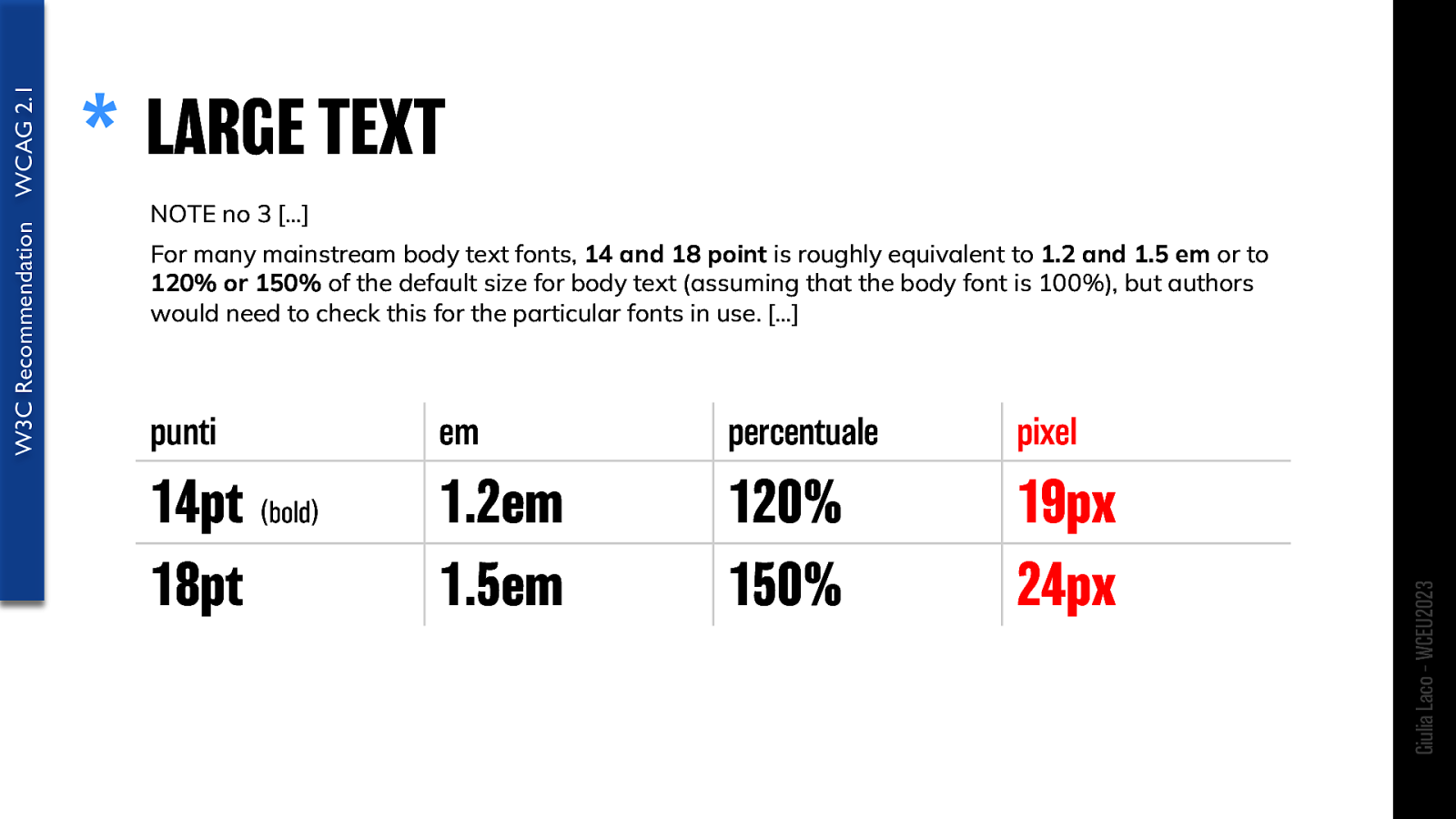
NOTE no 3 […] For many mainstream body text fonts, 14 and 18 point is roughly equivalent to 1.2 and 1.5 em or to 120% or 150% of the default size for body text (assuming that the body font is 100%), but authors would need to check this for the particular fonts in use. […]
points: 14pt (bold) 18pt ems: 1.2em 1.5em percentage: 120% 150% pixels: 19px 24px
W3C Recommendation WCAG 2.1 Giulia Laco – WCEU2023
…mmmmh 🤔 Giulia Laco – WCEU2023
Giulia Laco – WCEU2023
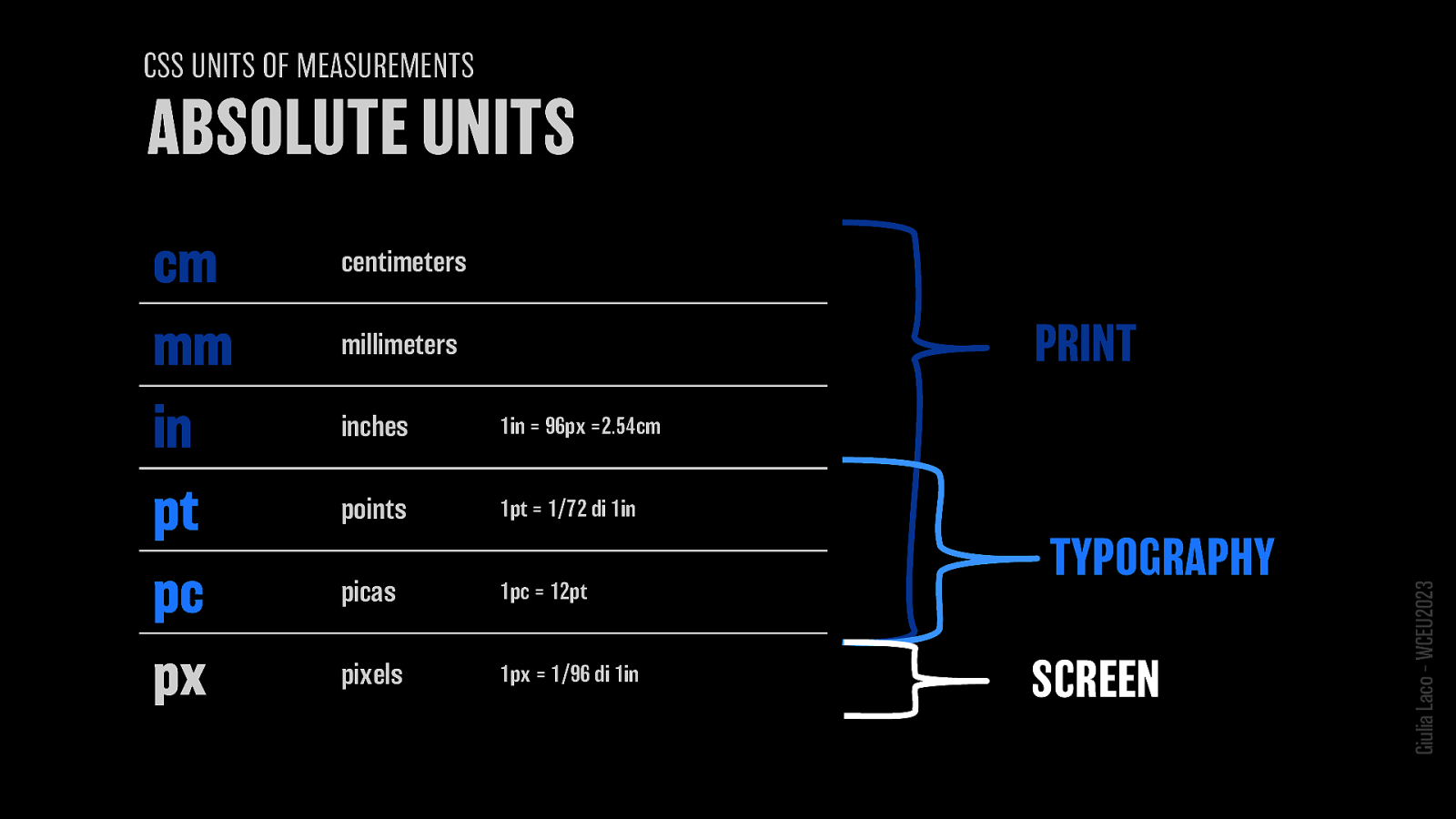
centimeters (cm) millimeters (mm) inches (in) points (pt) picas (pc) pixels (px)
PRINT TYPOGRAPHY SCREEN
Giulia Laco – WCEU2023
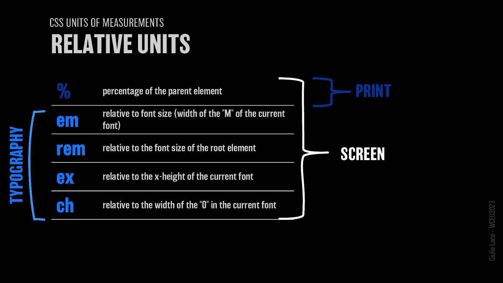
% = percentage of the parent element em = relative to font size (width of the “M” of the current font) rem = relative to the font size of the root element ex = relative to the x-height of the current font ch = relative to the width of the “0” in the current font
PRINT SCREEN TYPOGRAPHY
Giulia Laco – WCEU2023
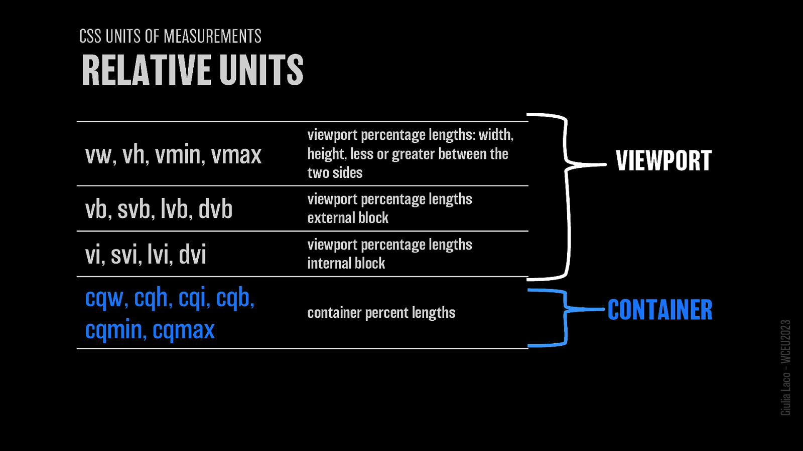
vw, vh, vmin, vmax = viewport percentage lengths: width, height, less or greater between the two sides
vb, svb, lvb, dvb = viewport percentage lengths external block
vi, svi, lvi, dvi = viewport percentage lengths internal block
cqw, cqh, cqi, cqb, cqmin, cqmax = container percent lengths VIEWPORT CONTAINER
Giulia Laco – WCEU2023

…mmmmh 🤔 Giulia Laco – WCEU2023
W3C Recommendation WCAG 2.1 Giulia Laco – WCEU2023
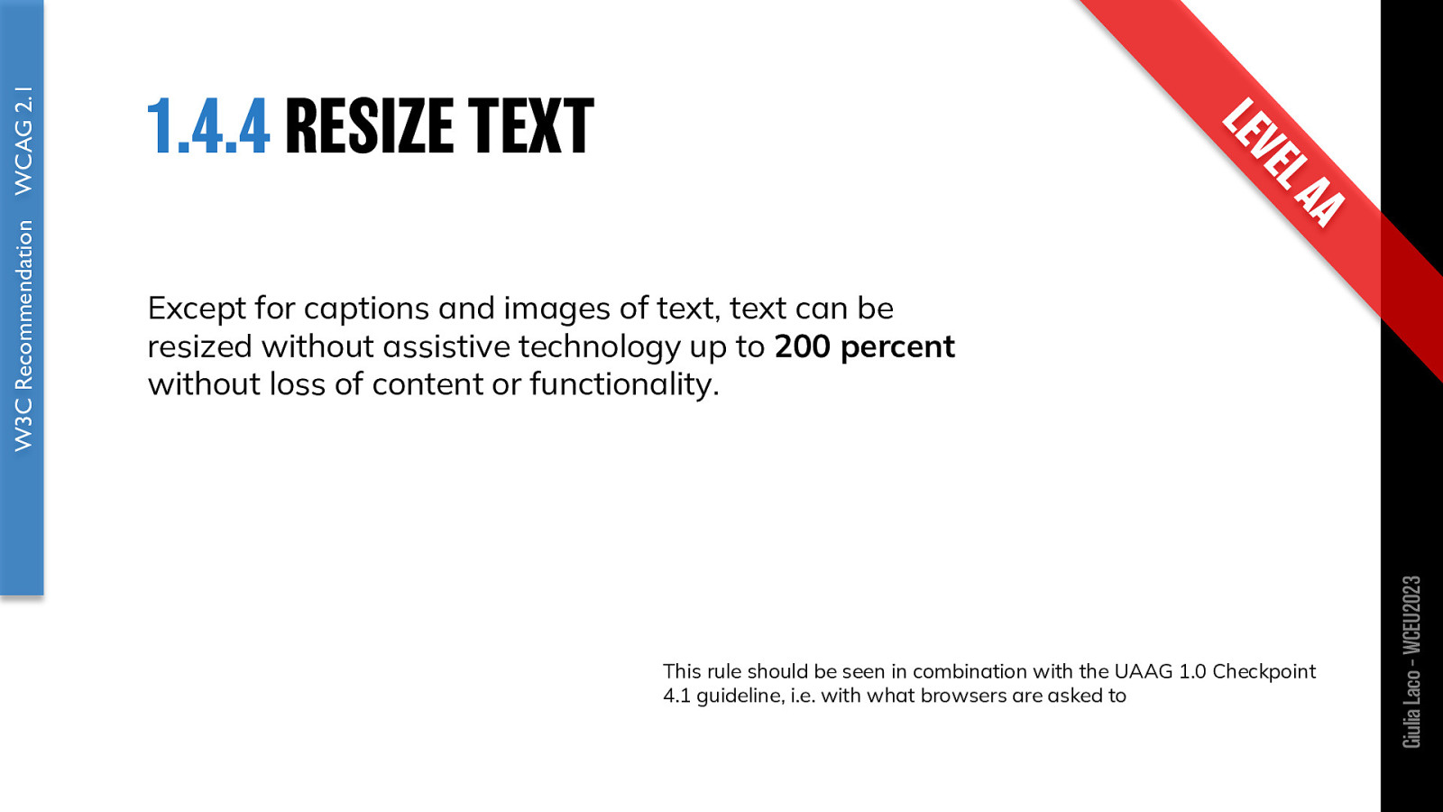
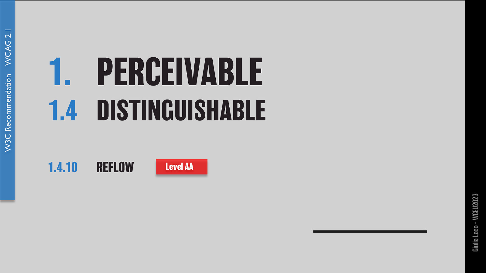
Except for captions and images of text, text can be resized without assistive technology up to 200 percent without loss of content or functionality.
This rule should be seen in combination with the UAAG 1.0 Checkpoint 4.1 guideline, i.e. with what browsers are asked to
W3C Recommendation WCAG 2.1 Giulia Laco – WCEU2023
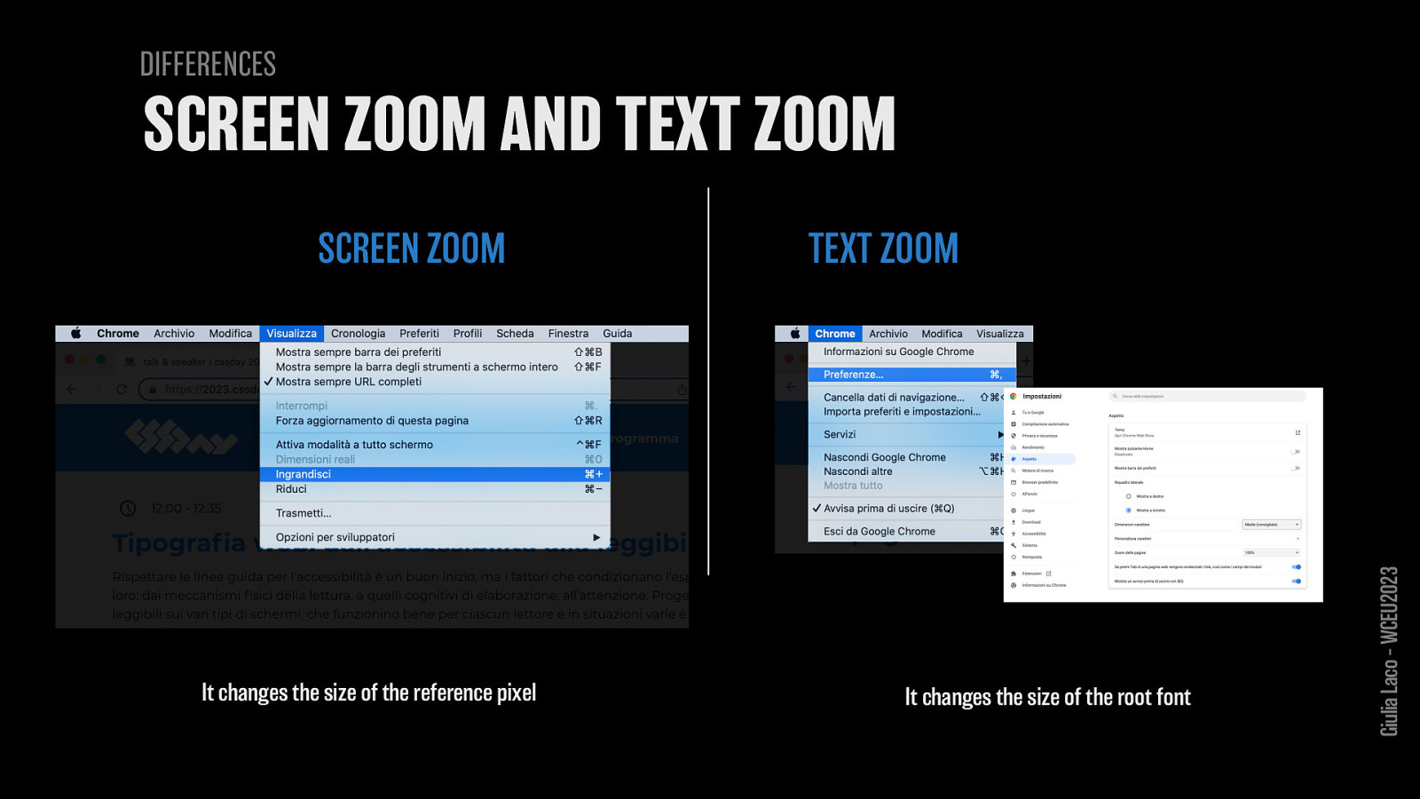
SCREEN ZOOM It changes the size of the reference pixel
TEXT ZOOM It changes the size of the root font
Giulia Laco – WCEU2023
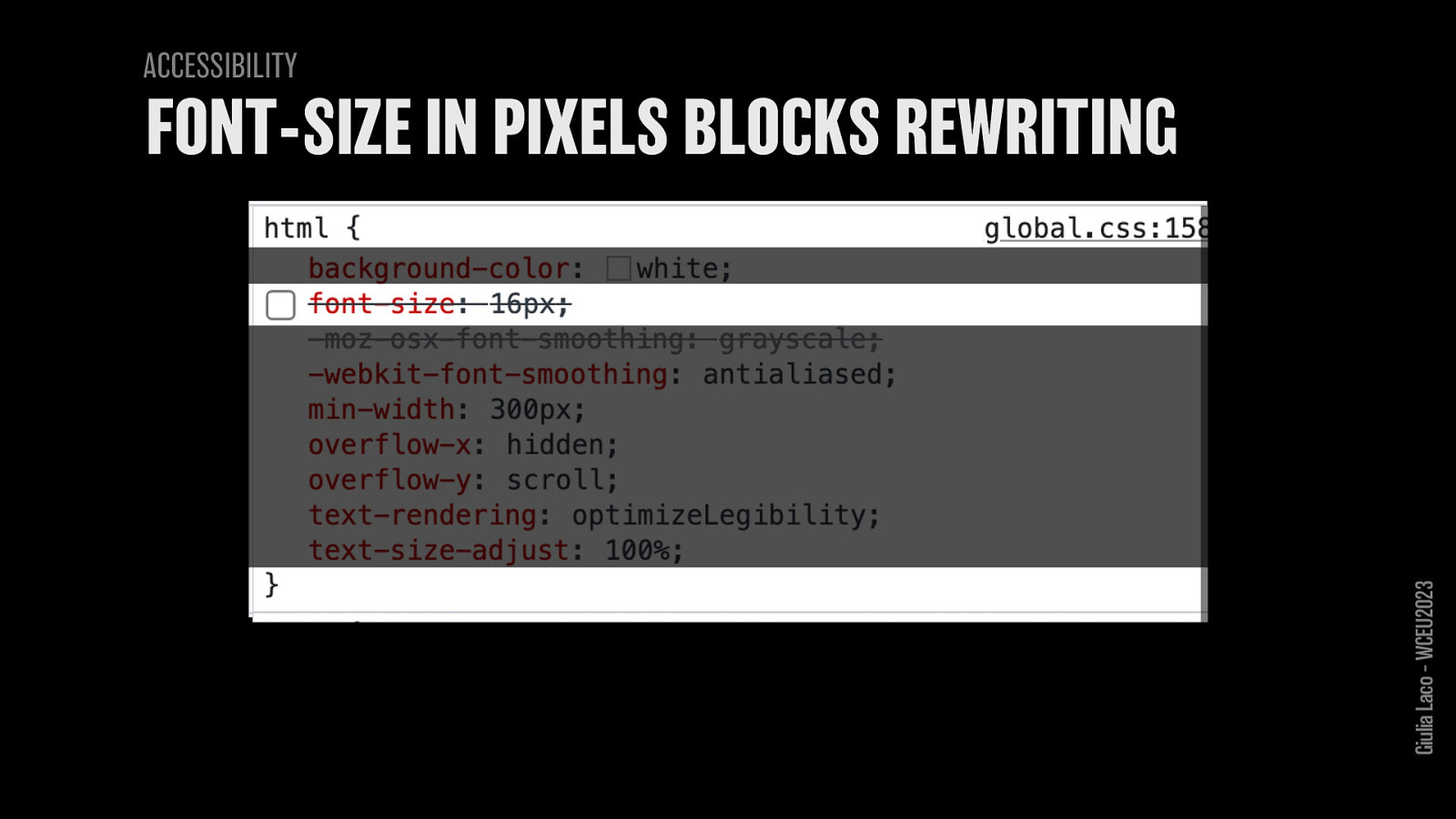
ACCESSIBILITY no font-size in pixels on the root element Giulia Laco – WCEU2023
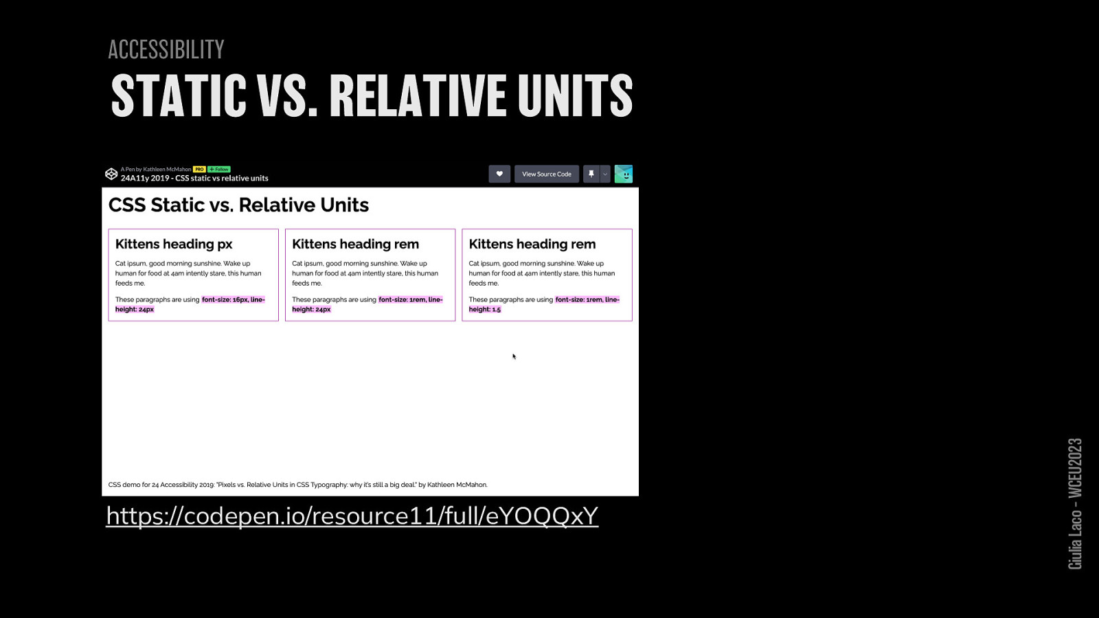
ACCESSIBILITY https://codepen.io/resource11/full/eYOQQxY Giulia Laco – WCEU2023
W3C Recommendation WCAG 2.1 Giulia Laco – WCEU2023
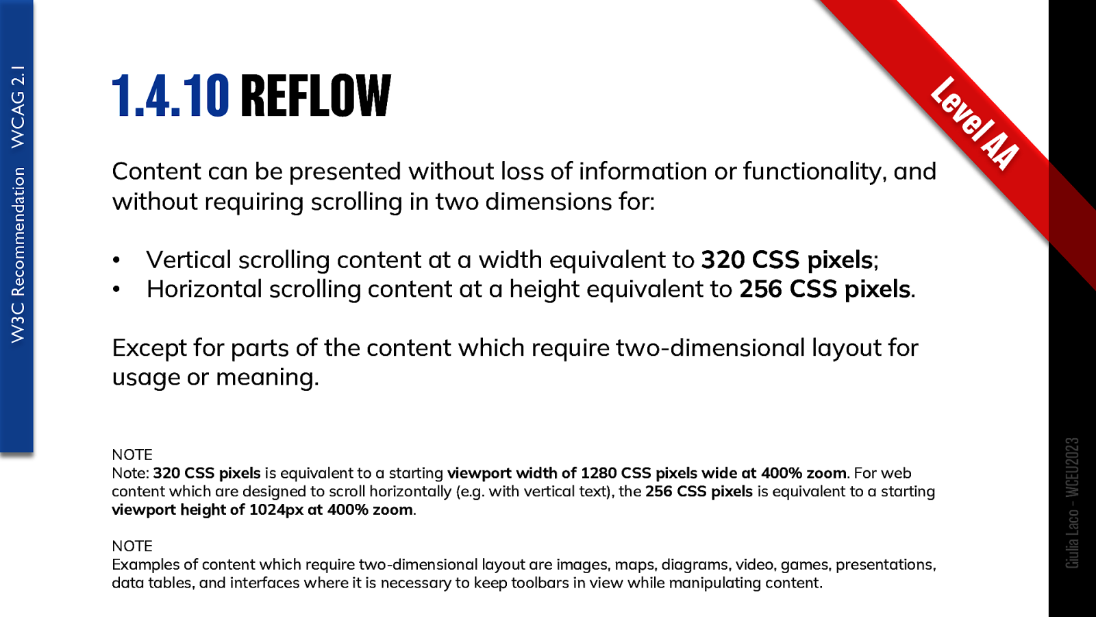
Content can be presented without loss of information or functionality, and without requiring scrolling in two dimensions for:
Except for parts of the content which require two-dimensional layout for usage or meaning.
NOTE Note: 320 CSS pixels is equivalent to a starting viewport width of 1280 CSS pixels wide at 400% zoom. For web content which are designed to scroll horizontally (e.g. with vertical text), the 256 CSS pixels is equivalent to a starting viewport height of 1024px at 400% zoom.
NOTE Examples of content which require two-dimensional layout are images, maps, diagrams, video, games, presentations, data tables, and interfaces where it is necessary to keep toolbars in view while manipulating content.
W3C Recommendation WCAG 2.1 Giulia Laco – WCEU2023
W3C Recommendation WCAG 2.1 Giulia Laco – WCEU2023
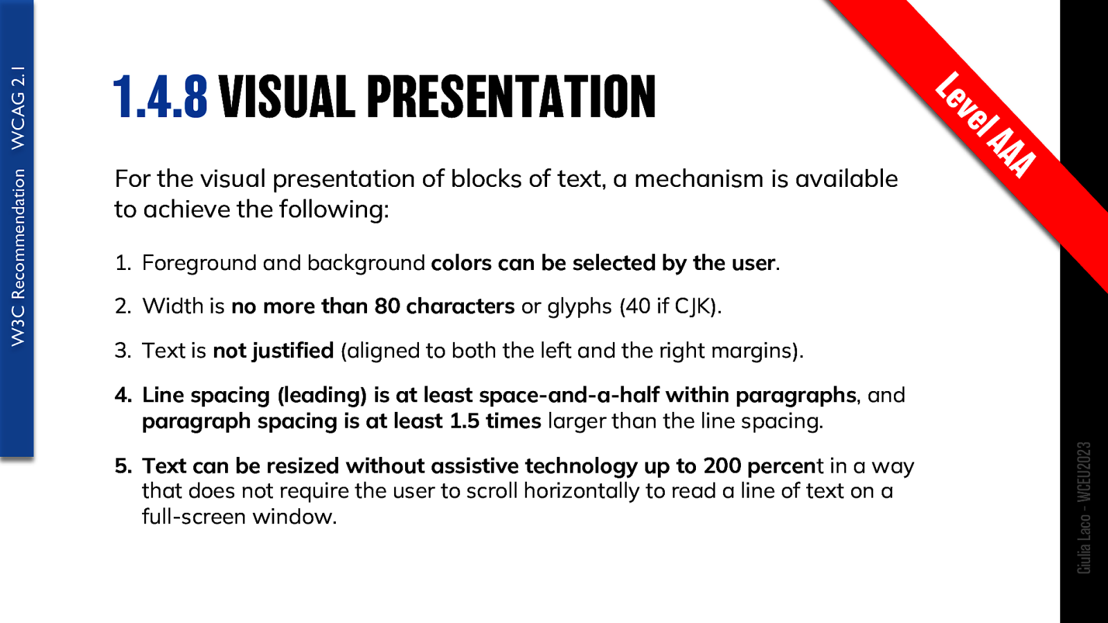
For the visual presentation of blocks of text, a mechanism is available to achieve the following:
W3C Recommendation WCAG 2.1 Giulia Laco – WCEU2023
W3C Recommendation WCAG 2.1 Giulia Laco – WCEU2023
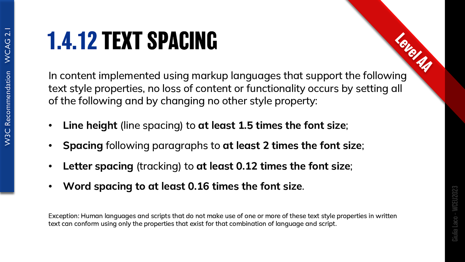
In content implemented using markup languages that support the following text style properties, no loss of content or functionality occurs by setting all of the following and by changing no other style property: • Line height (line spacing) to at least 1.5 times the font size; • Spacing following paragraphs to at least 2 times the font size; • Letter spacing (tracking) to at least 0.12 times the font size; • Word spacing to at least 0.16 times the font size.
Exception: Human languages and scripts that do not make use of one or more of these text style properties in written text can conform using only the properties that exist for that combination of language and script.
W3C Recommendation WCAG 2.1 Giulia Laco – WCEU2023
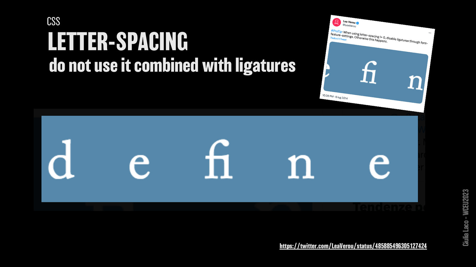
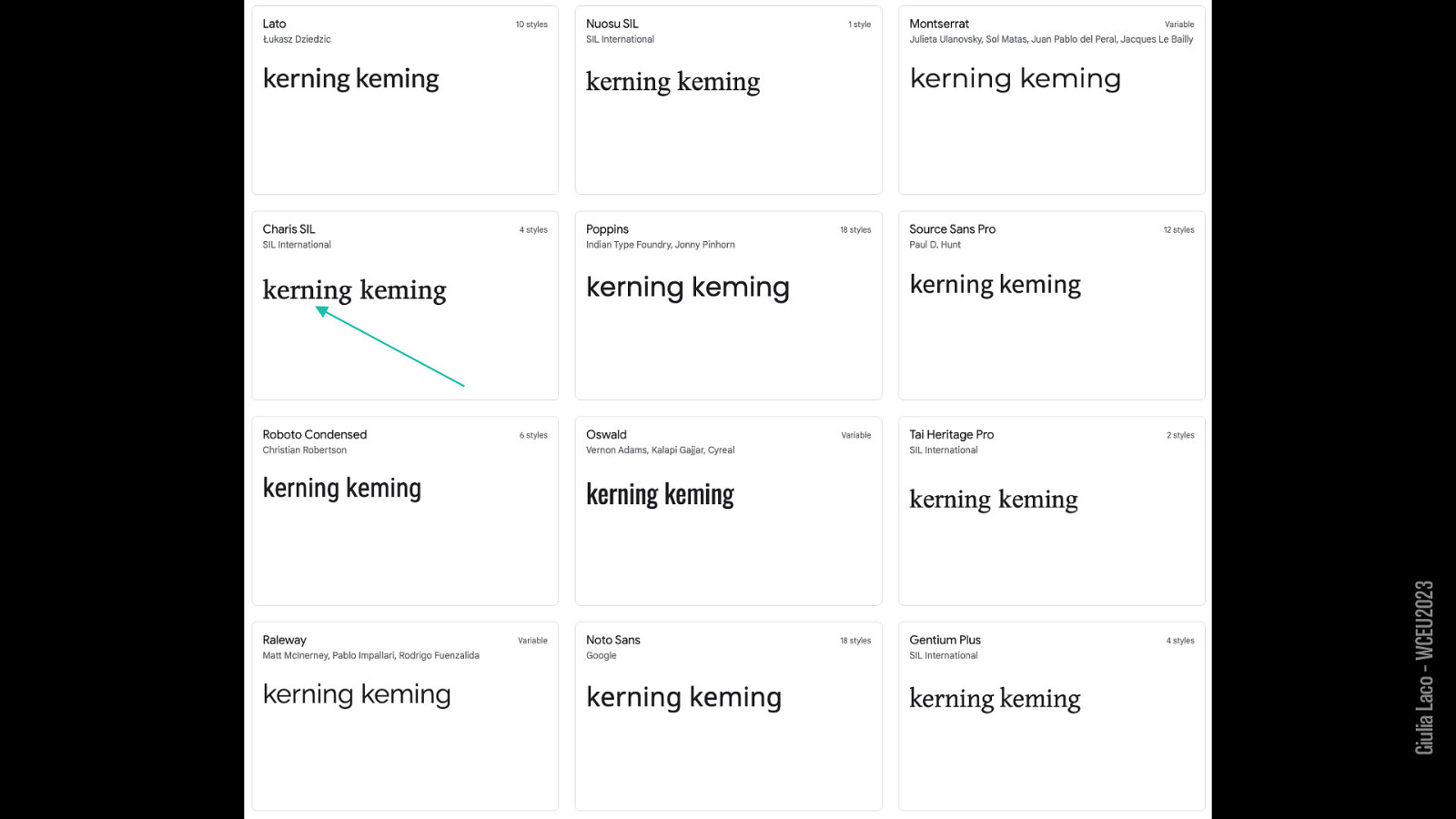
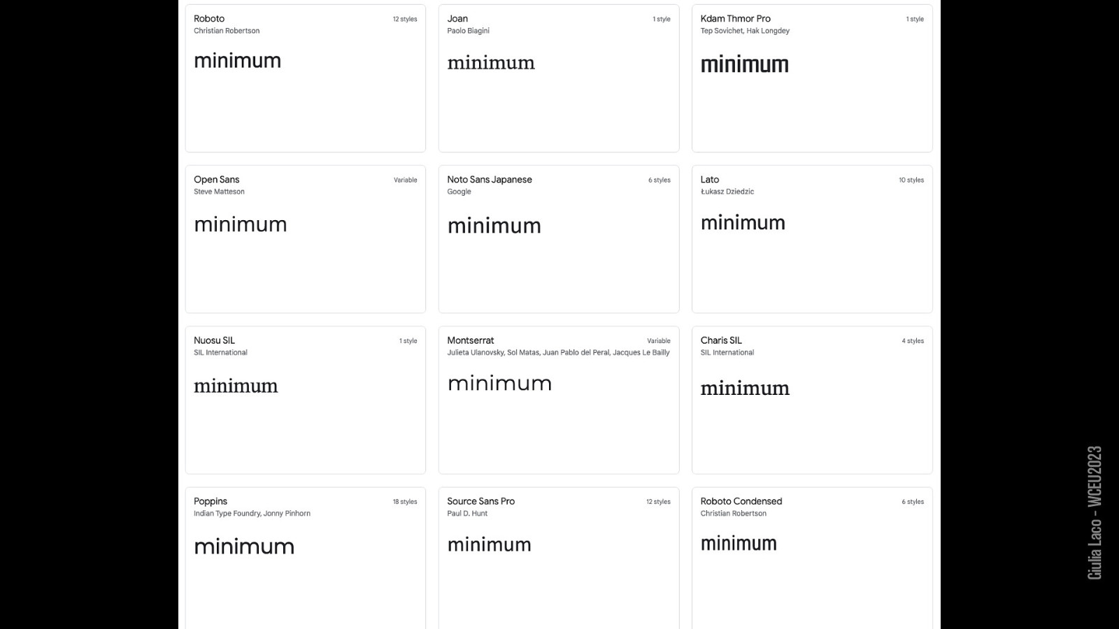
CSS: LETTER-SPACING do not use it combined with ligatures
https://twitter.com/LeaVerou/status/485885496305127424
Giulia Laco – WCEU2023
W3C Recommendation WCAG 2.1 Giulia Laco – WCEU2023
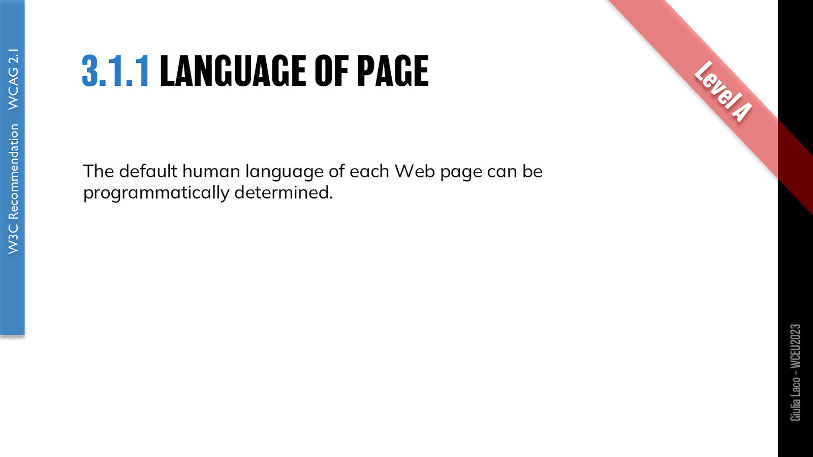
The default human language of each Web page can be programmatically determined.
W3C Recommendation WCAG 2.1 Giulia Laco – WCEU2023
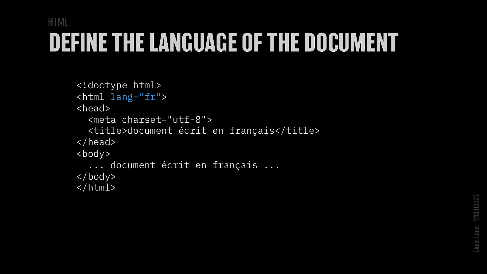
<!doctype html>
<html lang=”fr”> <head> <meta charset=”utf-8”> <title>document écrit en français</title> </head> <body> … document écrit en français … </body> </html>Giulia Laco – WCEU2023

Giulia Laco – WCEU2023
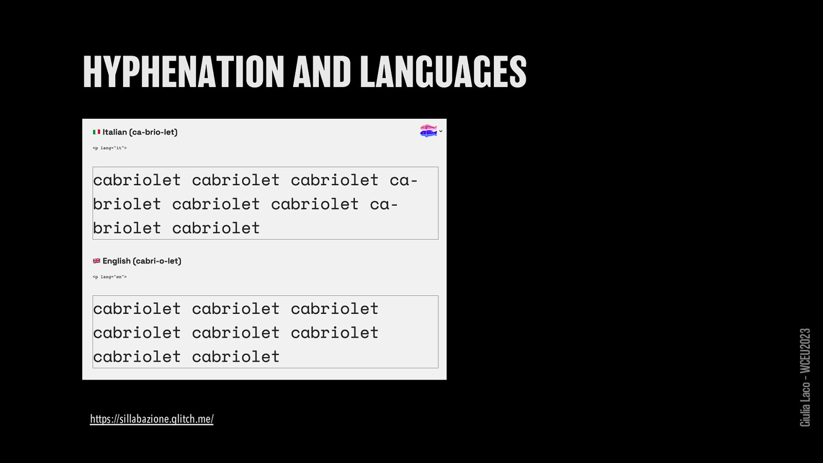
https://sillabazione.glitch.me/ Giulia Laco – WCEU2023
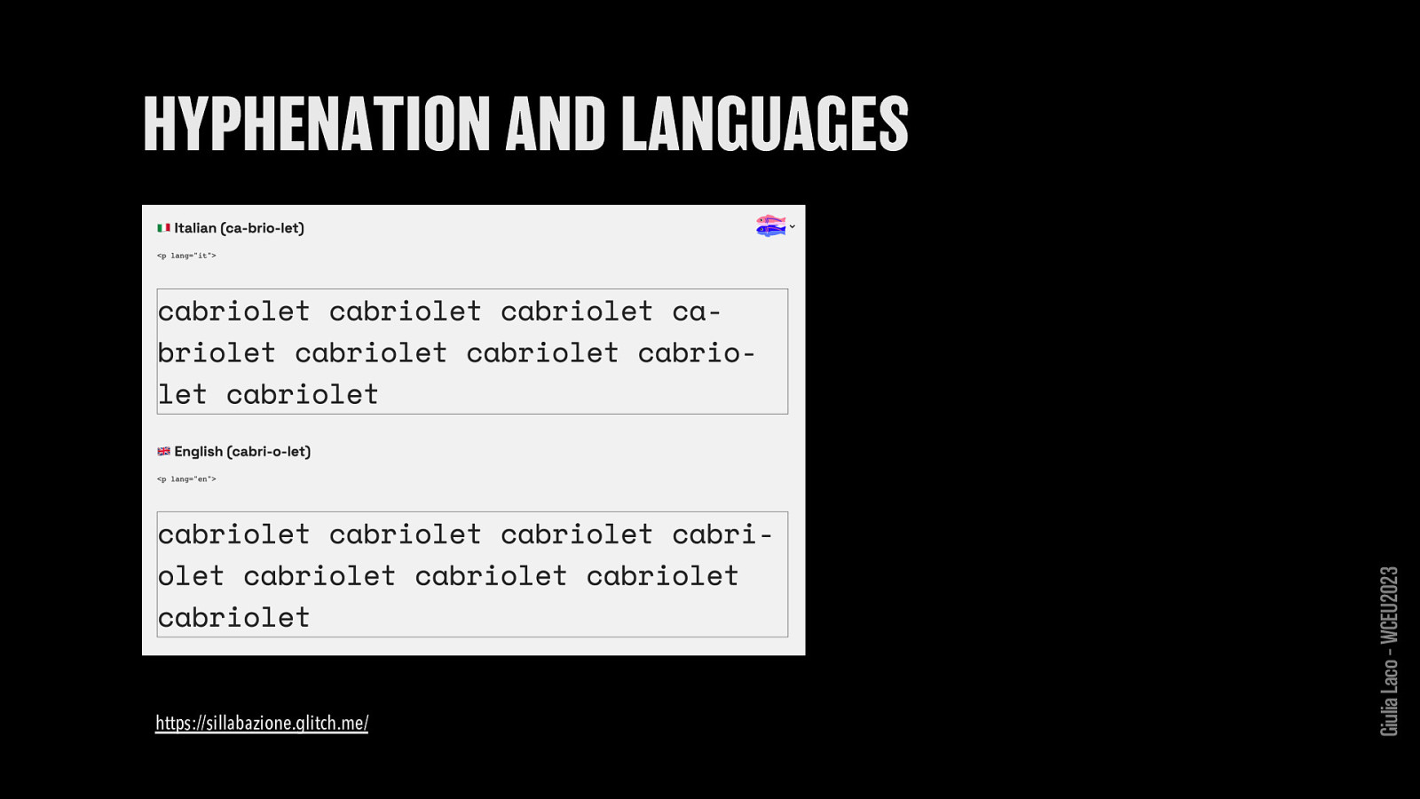
https://sillabazione.glitch.me/ Giulia Laco – WCEU2023
W3C Recommendation WCAG 2.1 Giulia Laco – WCEU2023
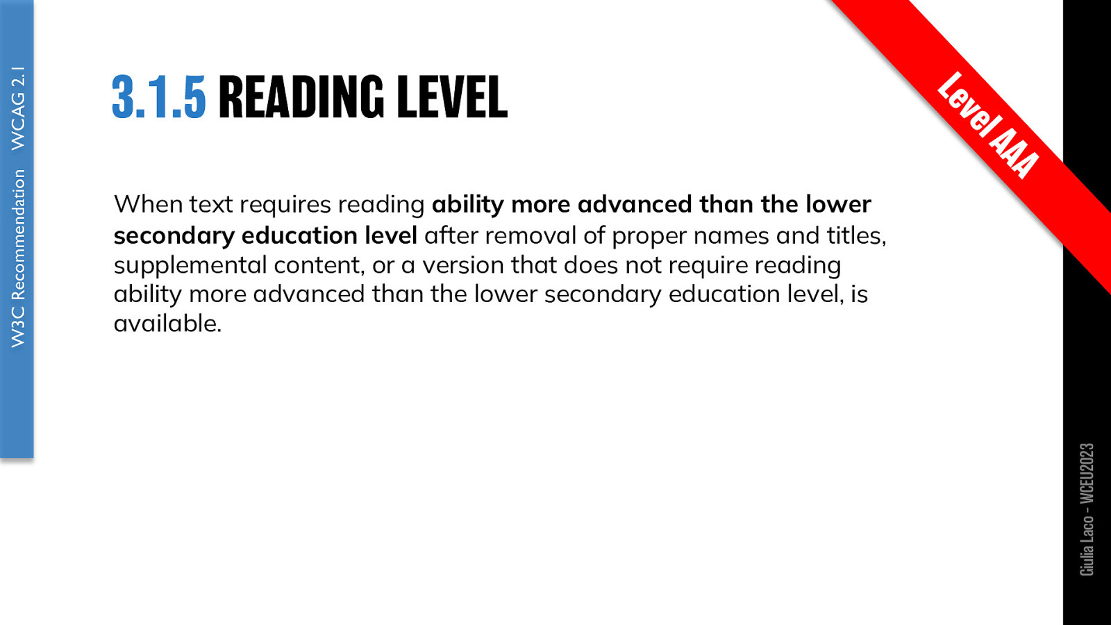
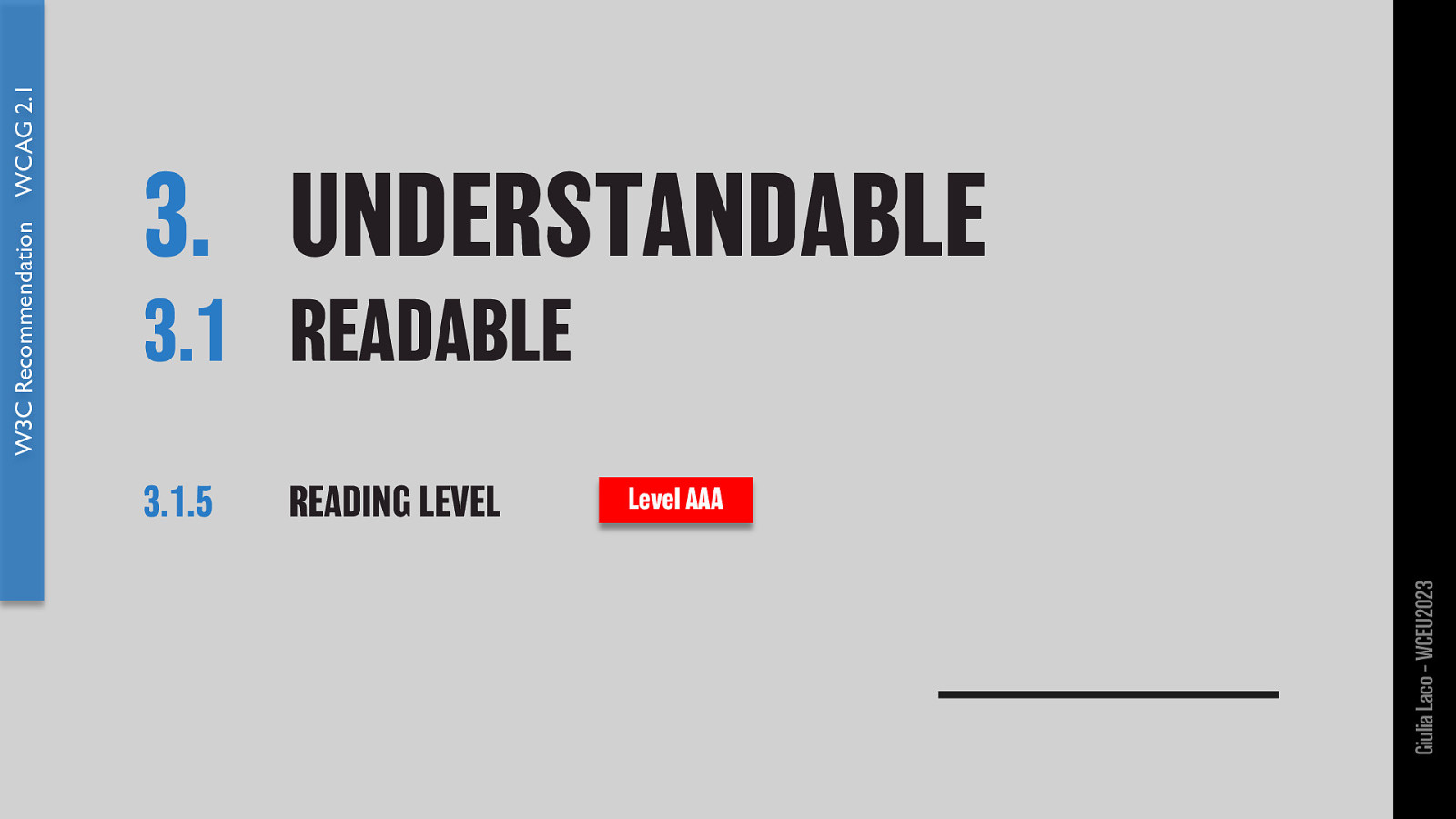
When text requires reading ability more advanced than the lower secondary education level after removal of proper names and titles, supplemental content, or a version that does not require reading ability more advanced than the lower secondary education level, is available.
W3C Recommendation WCAG 2.1 Giulia Laco – WCEU2023

Giulia Laco – WCEU2023

VISIBILITY (perceptibility) LEGIBILITY (decoding) READABILITY (ease of reading):
Giulia Laco – WCEU2023
DEFINITIONS Giulia Laco – WCEU2023
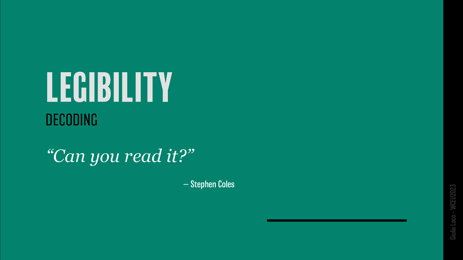
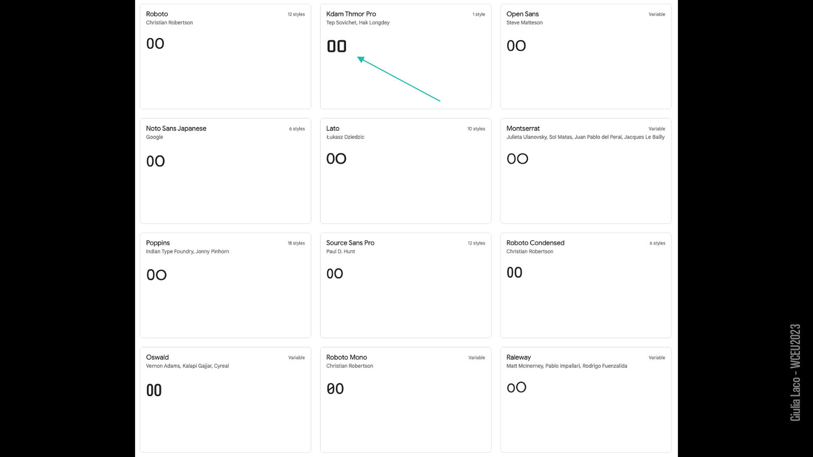
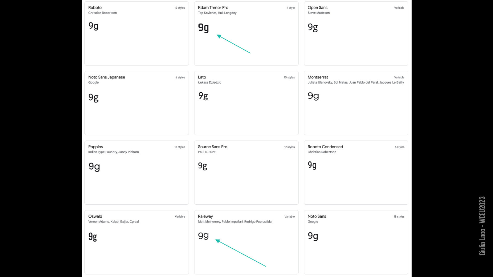
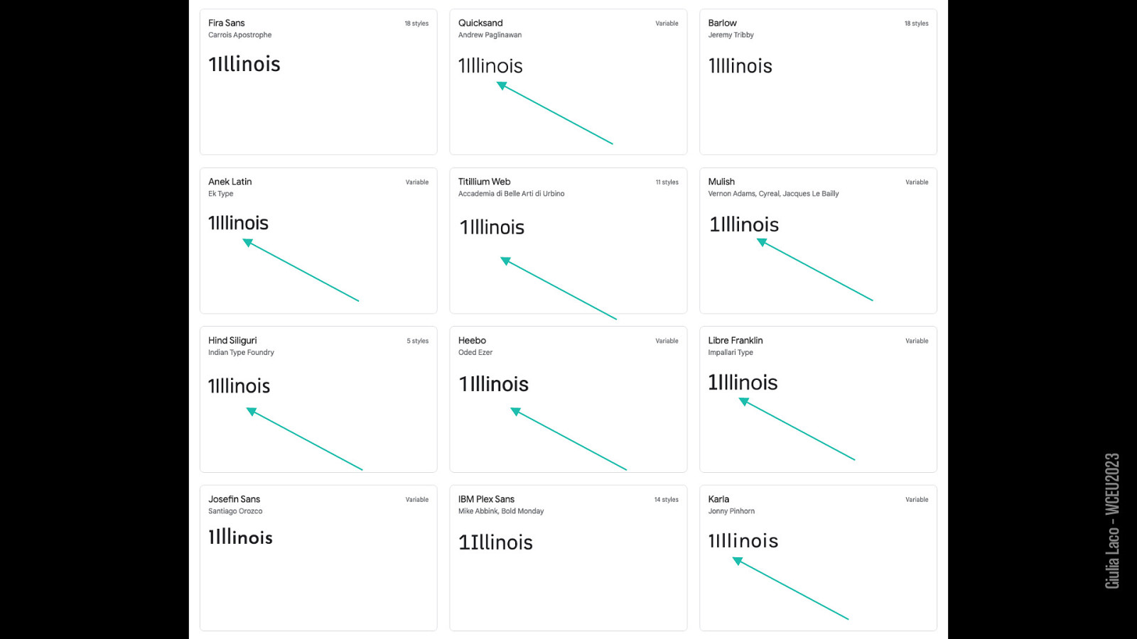
(DECODING) “Can you read it?” — Stephen Coles
Giulia Laco – WCEU2023
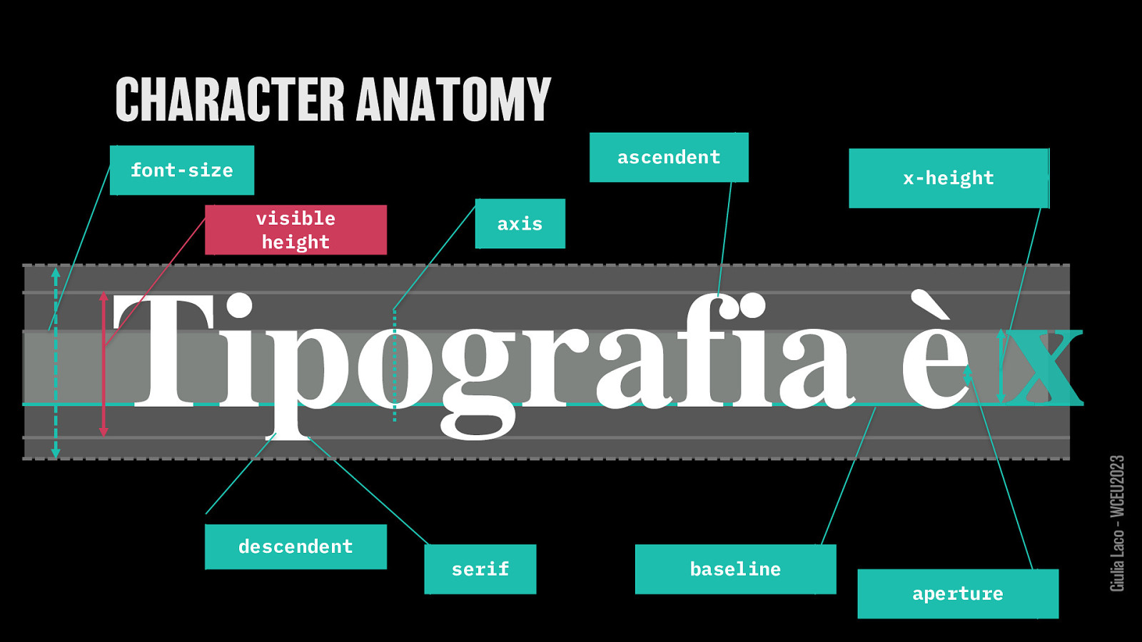
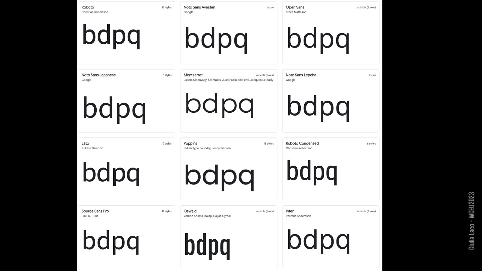
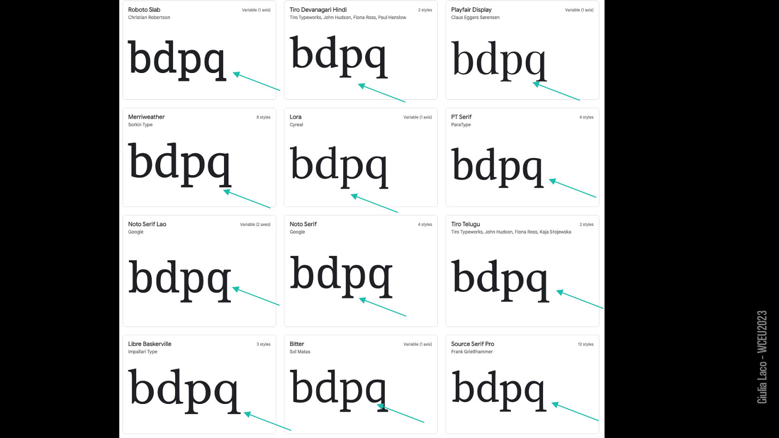
ascendent font-size visible height x-height axis descendent serif baseline aperture
Giulia Laco – WCEU2023
Giulia Laco – WCEU2023
Giulia Laco – WCEU2023
Giulia Laco – WCEU2023
Giulia Laco – WCEU2023
Giulia Laco – WCEU2023
Giulia Laco – WCEU2023
Giulia Laco – WCEU2023
Giulia Laco – WCEU2023
Giulia Laco – WCEU2023
Giulia Laco – WCEU2023

Giulia Laco – WCEU2023
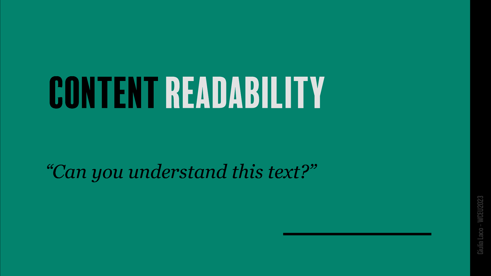
“Can you understand this text?”
Giulia Laco – WCEU2023
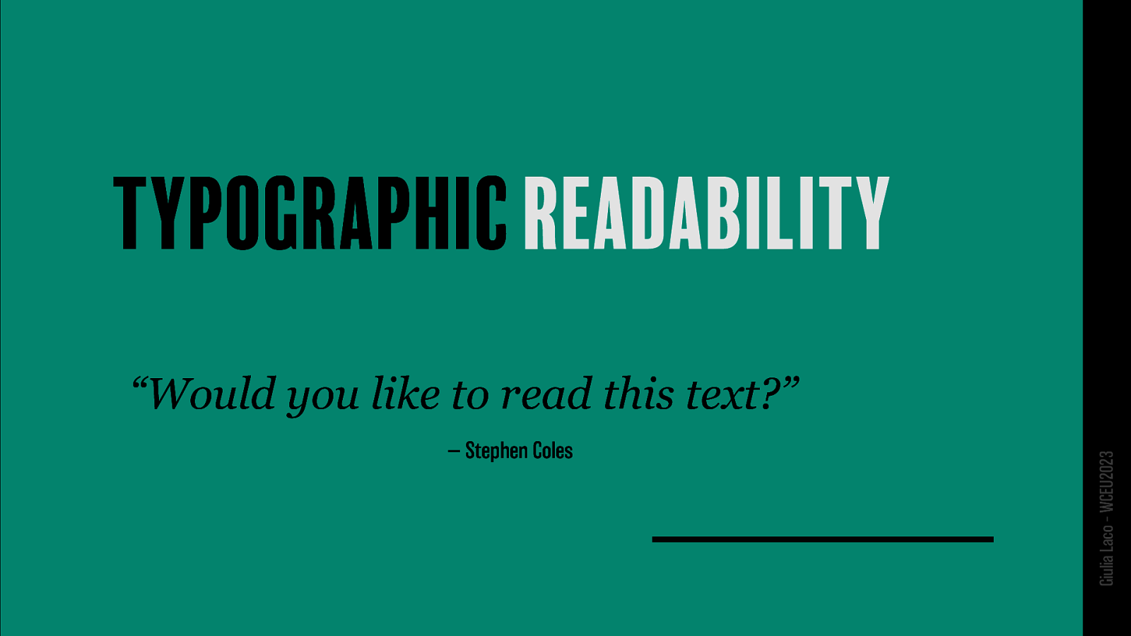
“Would you like to read this text?” — Stephen Coles
Giulia Laco – WCEU2023
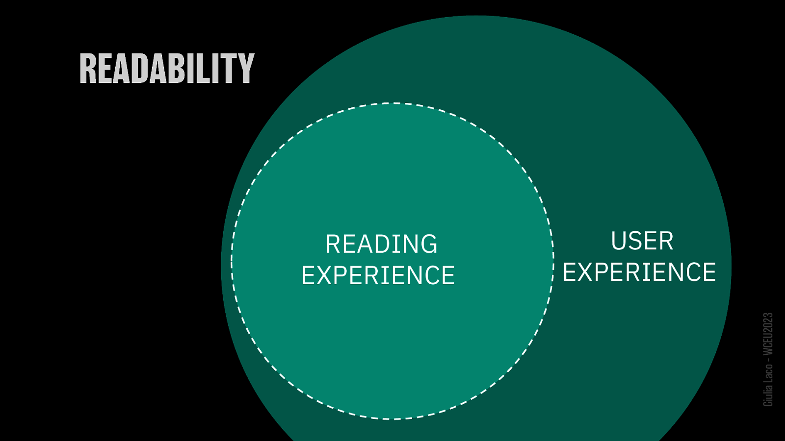
READING EXPERIENCE is a subset of USER EXPERIENCE
Giulia Laco – WCEU2023
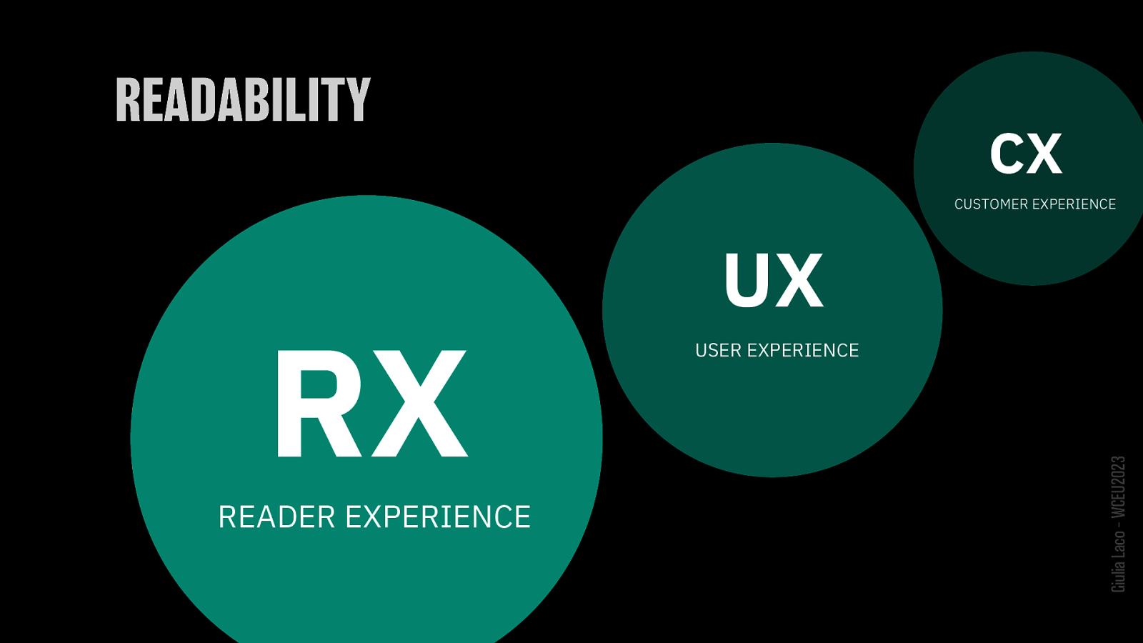
UX = USER EXPERIENCE CX = CUSTOMER EXPERIENCE RX = READER EXPERIENCE
Giulia Laco – WCEU2023
TECHNICAL ASPECTS Giulia Laco – WCEU2023
Giulia Laco – WCEU2023
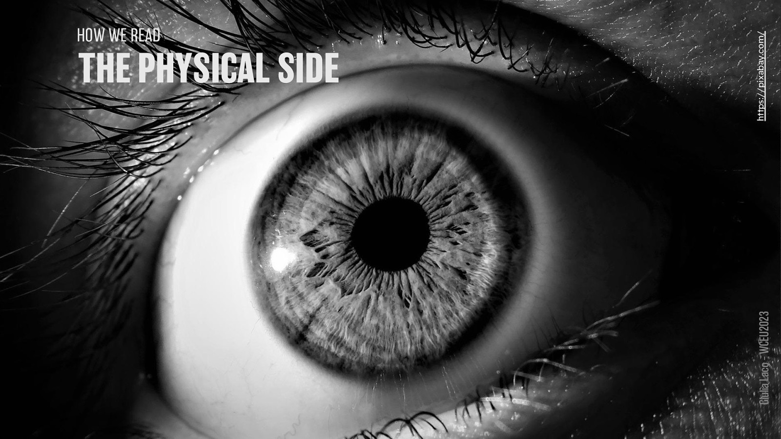
EYES Giulia Laco – WCEU2023
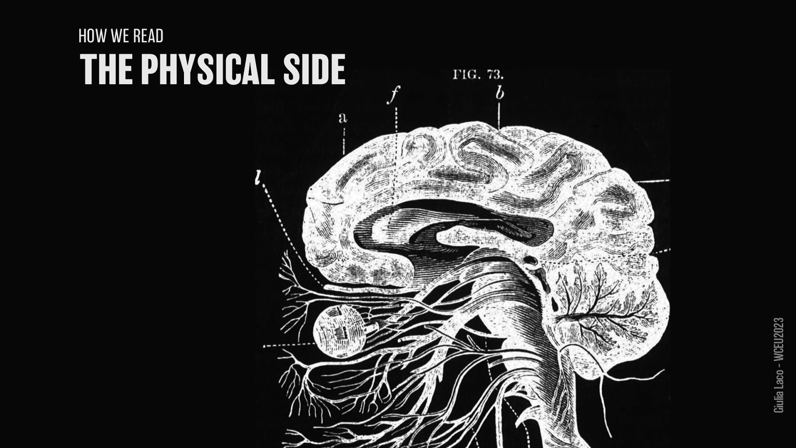
BRAIN Giulia Laco – WCEU2023
Giulia Laco – WCEU2023
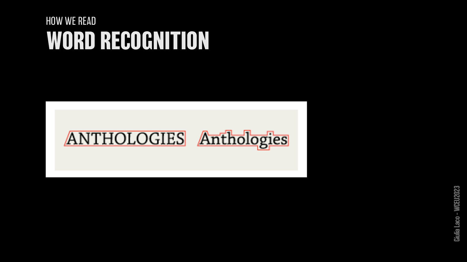
HOW WE READ
Giulia Laco – WCEU2023
HOW WE READ
Giulia Laco – WCEU2023

HOW WE READ
Giulia Laco – WCEU2023
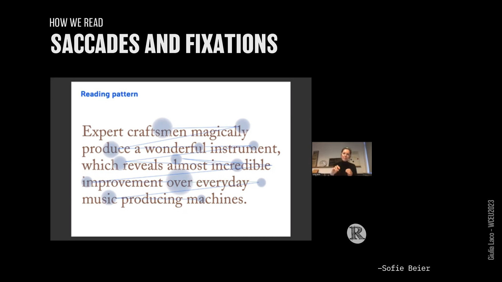
HOW WE READ – Sofie Beier,–Sofie 2022 Beier Giulia Laco – WCEU2023
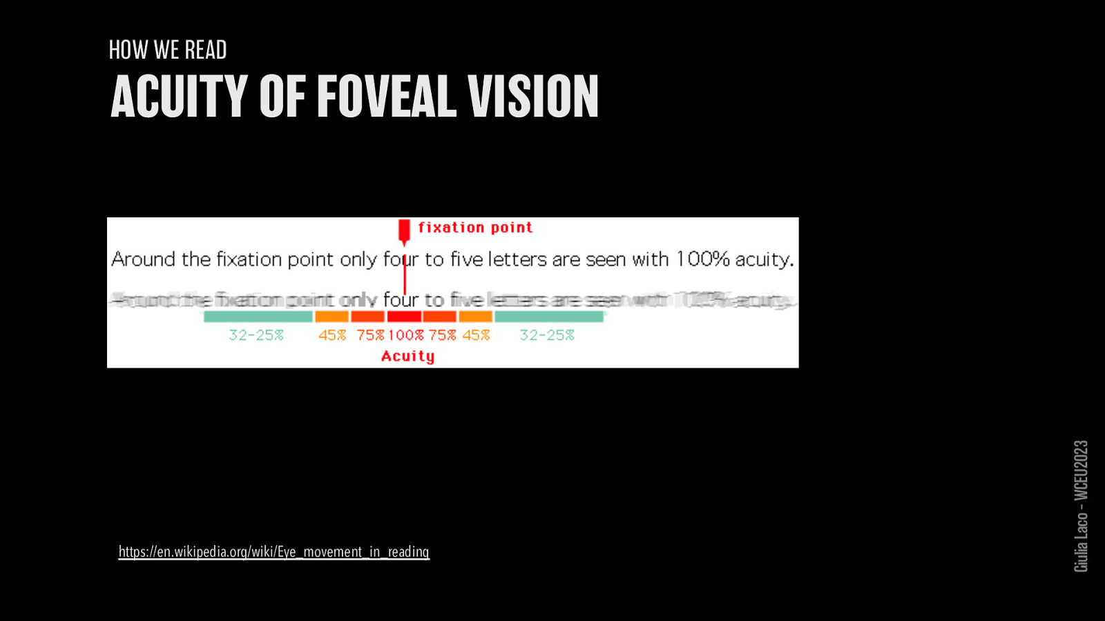
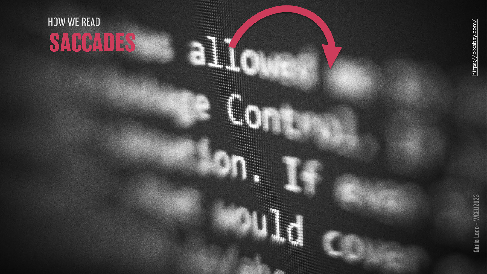
HOW WE READ https://en.wikipedia.org/wiki/Eye_movement_in_reading Giulia Laco – WCEU2023
HOW WE READ
Giulia Laco – WCEU2023
HOW WE READ
Giulia Laco – WCEU2023
HOW WE READ
Giulia Laco – WCEU2023
Giulia Laco – WCEU2023
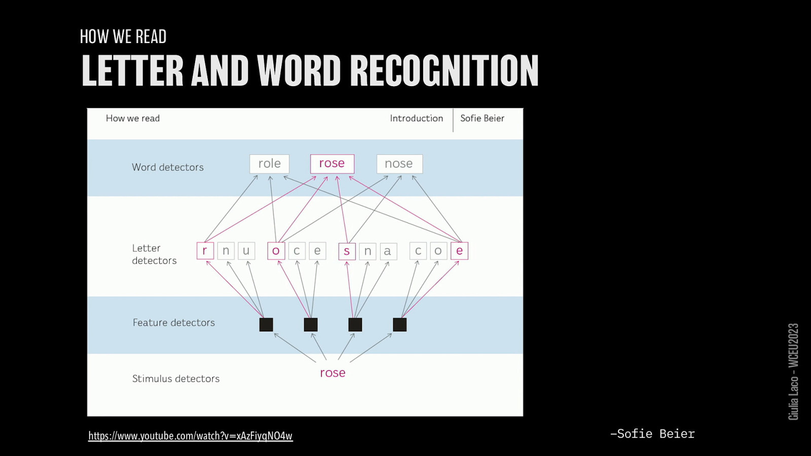
HOW WE READ https://www.youtube.com/watch?v=xAzFiyqNO4w –Sofie Beier
Giulia Laco – WCEU2023
HOW WE READ Giulia Laco – WCEU2023
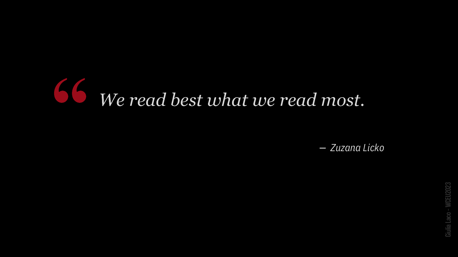
“We read best what we read most. — Zuzana Licko Giulia Laco – WCEU2023
TYPES OF READING Giulia Laco – WCEU2023
Giulia Laco – WCEU2023
Giulia Laco – WCEU2023
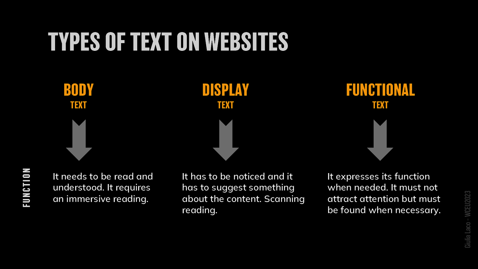
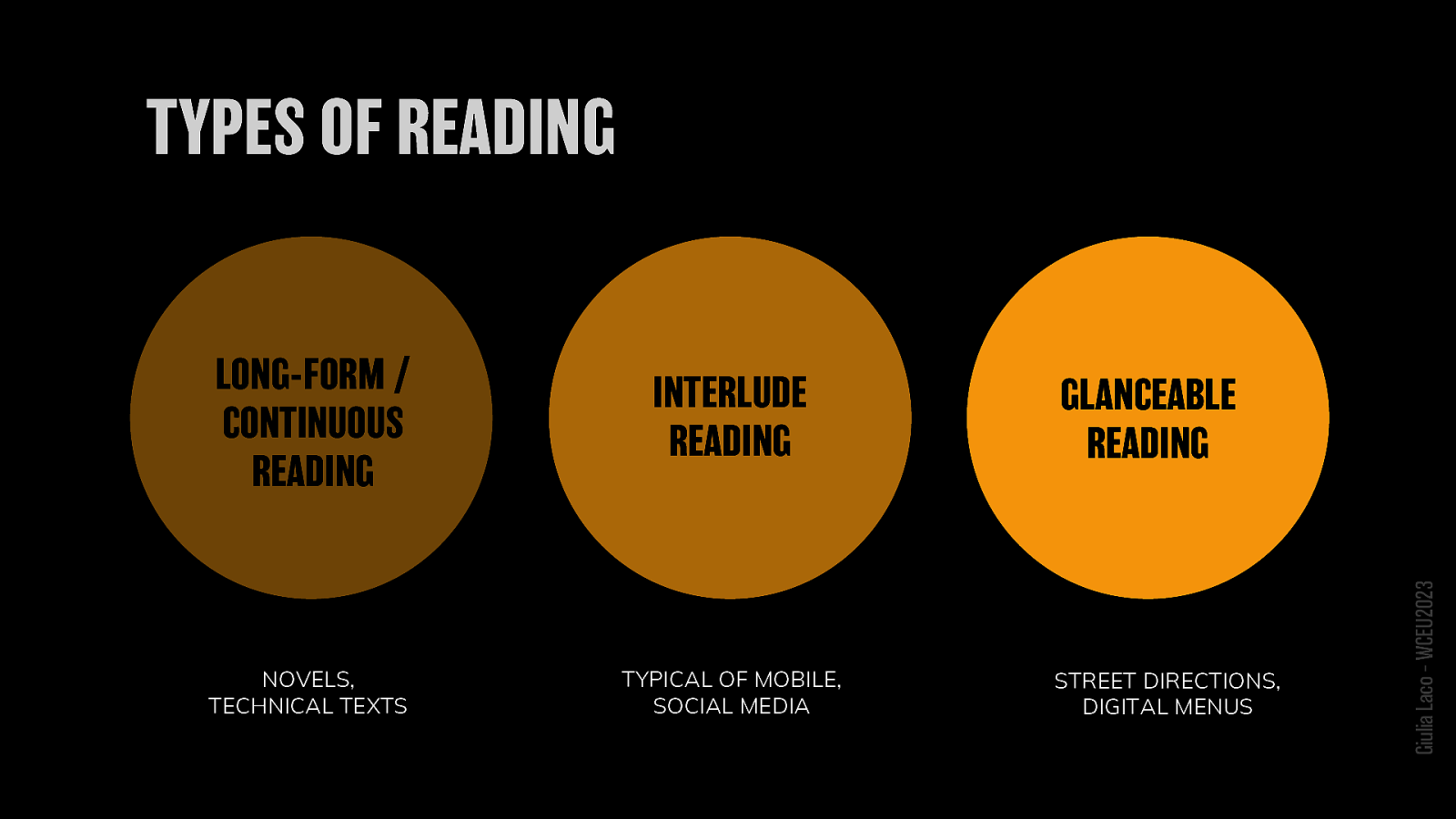
FUNCTIONS:
BODY TEXT It needs to be read and understood. It requires an immersive reading.
DISPLAY TEXT It has to be noticed and it has to suggest something about the content. Scanning reading.
FUNCTIONAL TEXT It expresses its function when needed. It must not attract attention but must be found when necessary.
Giulia Laco – WCEU2023

Giulia Laco – WCEU2023
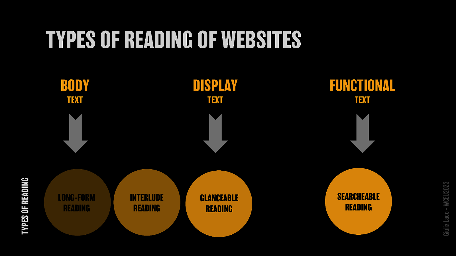
-BODY TEXT LONG-FORM READING INTERLUDE READING -DISPLAY TEXT GLANCEABLE READING -FUNCTIONAL TEXT SEARCHEABLE READING
Giulia Laco – WCEU2023
Giulia Laco – WCEU2023

https://bit.ly/css-readability.
Giulia Laco – WCEU2023

https://bit.ly/figma-readability
Giulia Laco – WCEU2023
Giulia Laco – WCEU2023
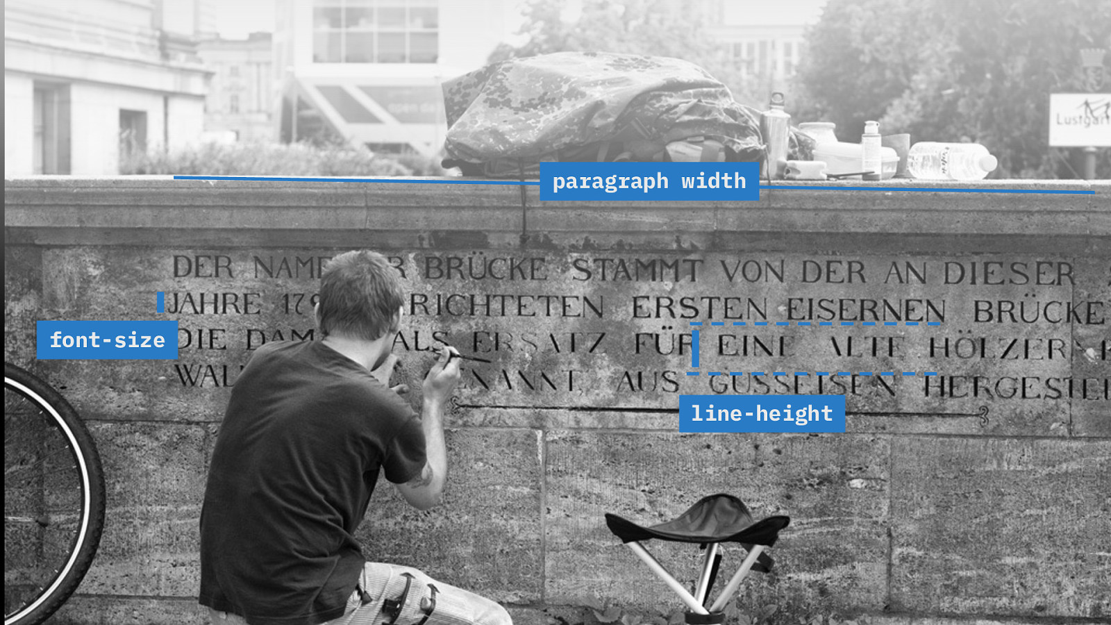
font-size line-height paragraph width
Giulia Laco – WCEU2023
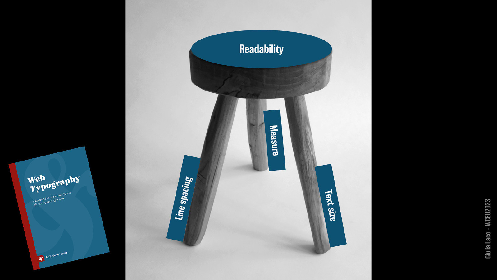
Readability:
Text size Measure Line spacing
Giulia Laco – WCEU2023
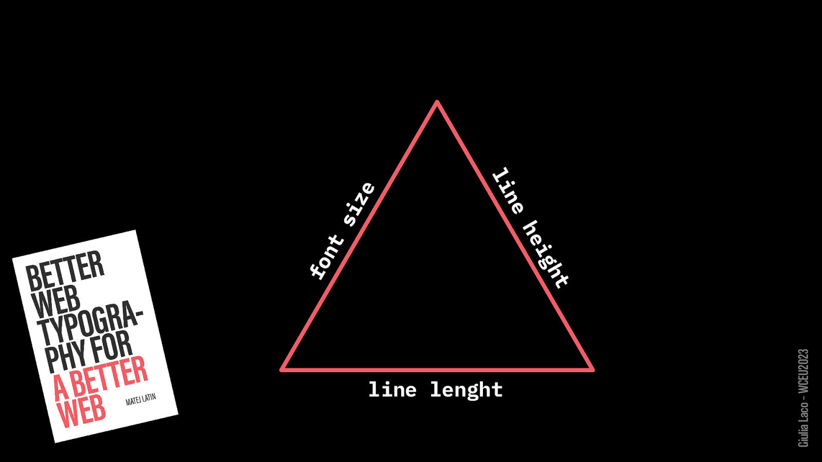
font size line height line length
Giulia Laco – WCEU2023
Giulia Laco – WCEU2023

HOW WE READ
Giulia Laco – WCEU2023
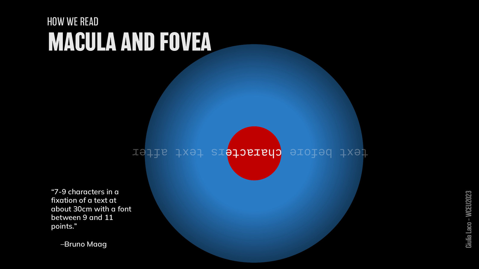
HOW WE READ
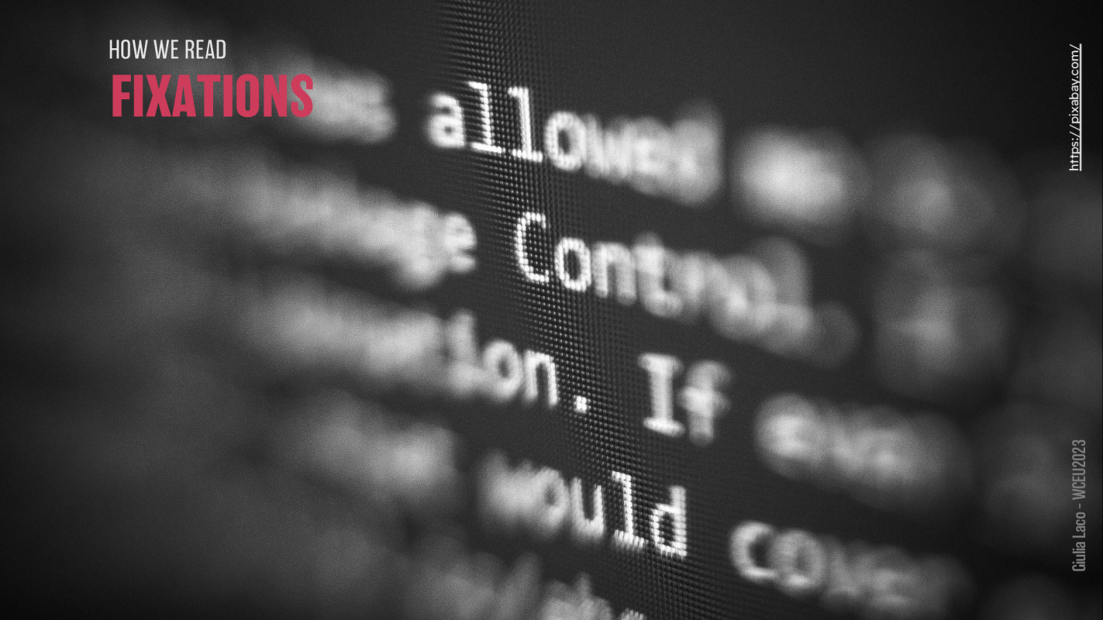
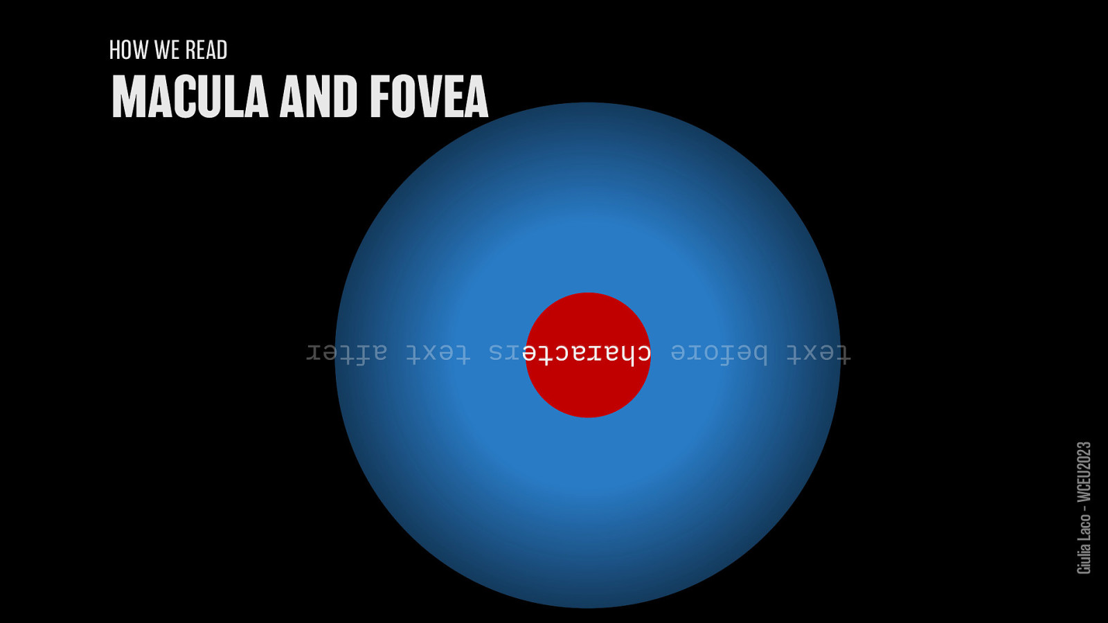
“7-9 characters in a fixation of a text at about 30cm with a font between 9 and 11 points.”
– Bruno Maag
Giulia Laco – WCEU2023
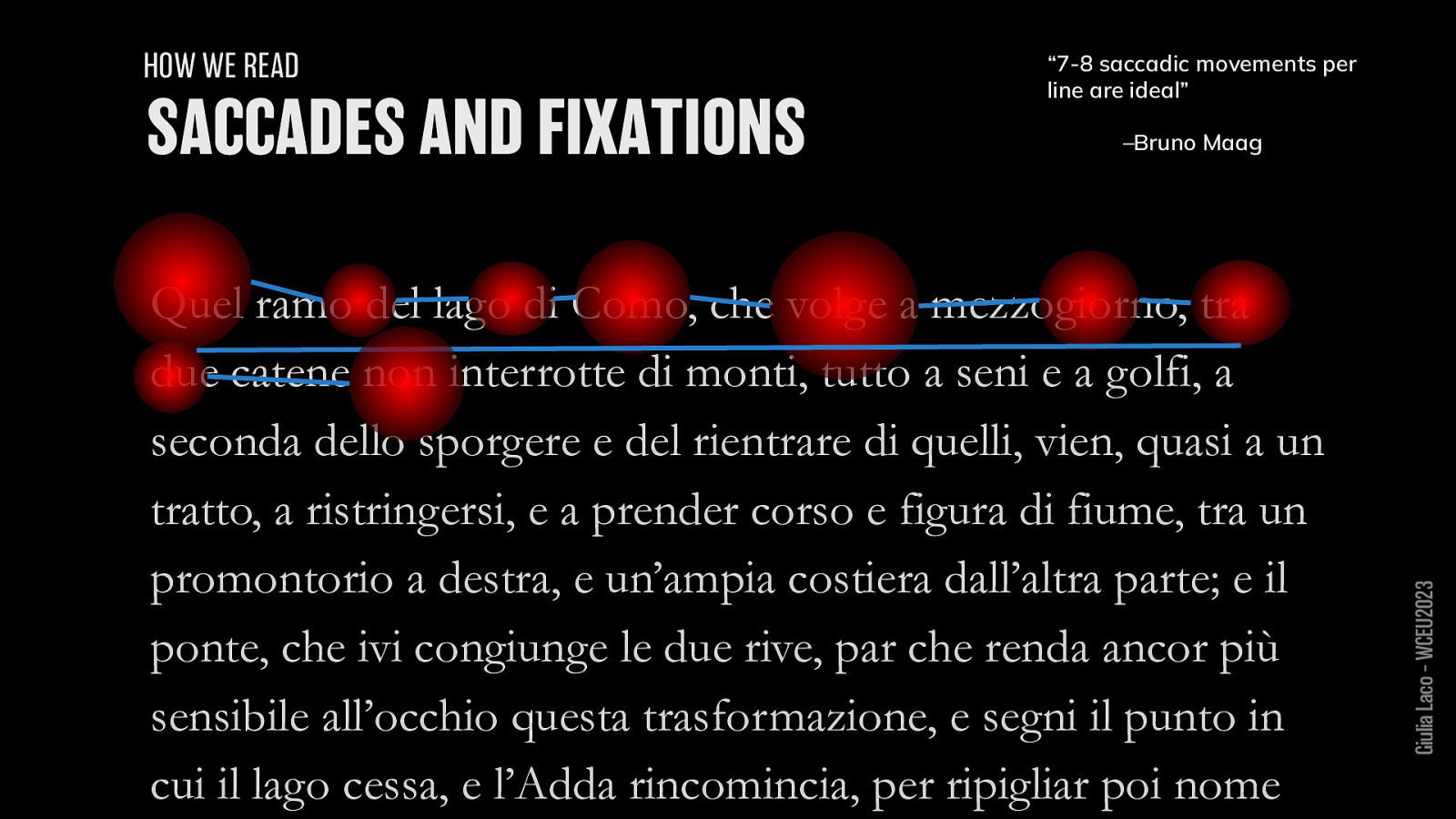
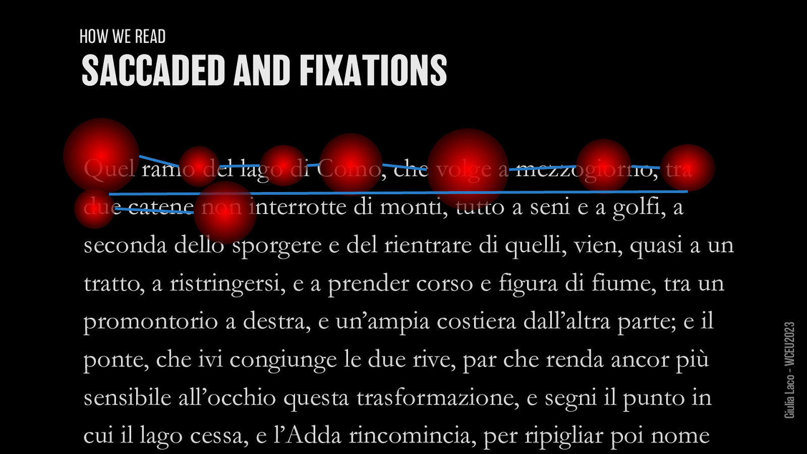
HOW WE READ “7-8 saccadic movements per line are ideal”
– Bruno Maag
Giulia Laco – WCEU2023
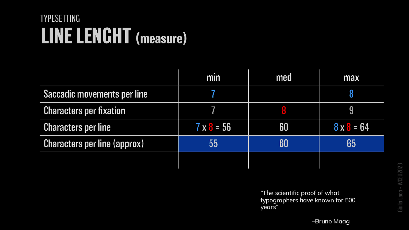
Saccadic movements per line: 7-9 Characters per fixation: 7-9 Characters per line: 56-64 Characters per line (approx): 55-65
“The scientific proof of what typographers have known for 500 years” – Bruno Maag Giulia Laco – WCEU2023
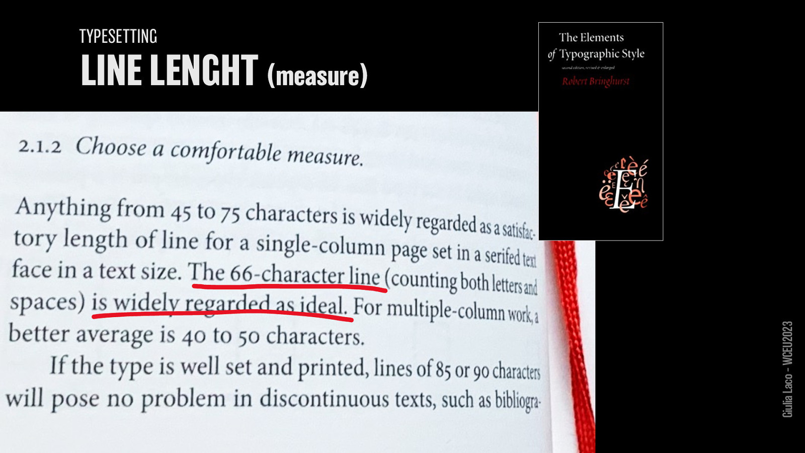
R. Bringhurst, The elements of typographic style
Giulia Laco – WCEU2023
Giulia Laco – WCEU2023
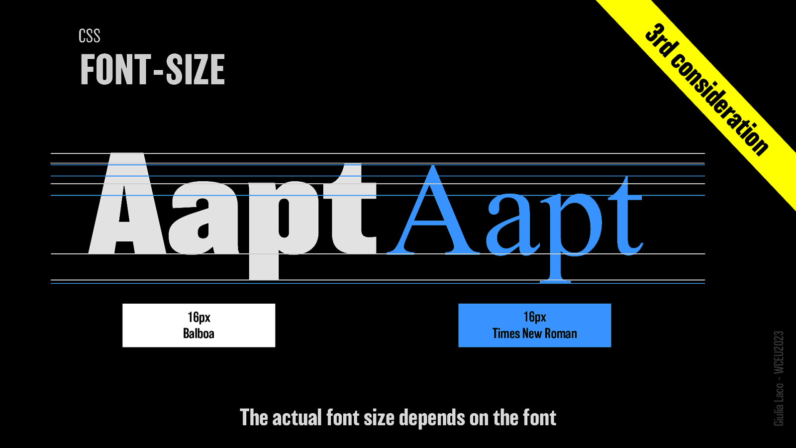
The actual font size depends on the font
Giulia Laco – WCEU2023
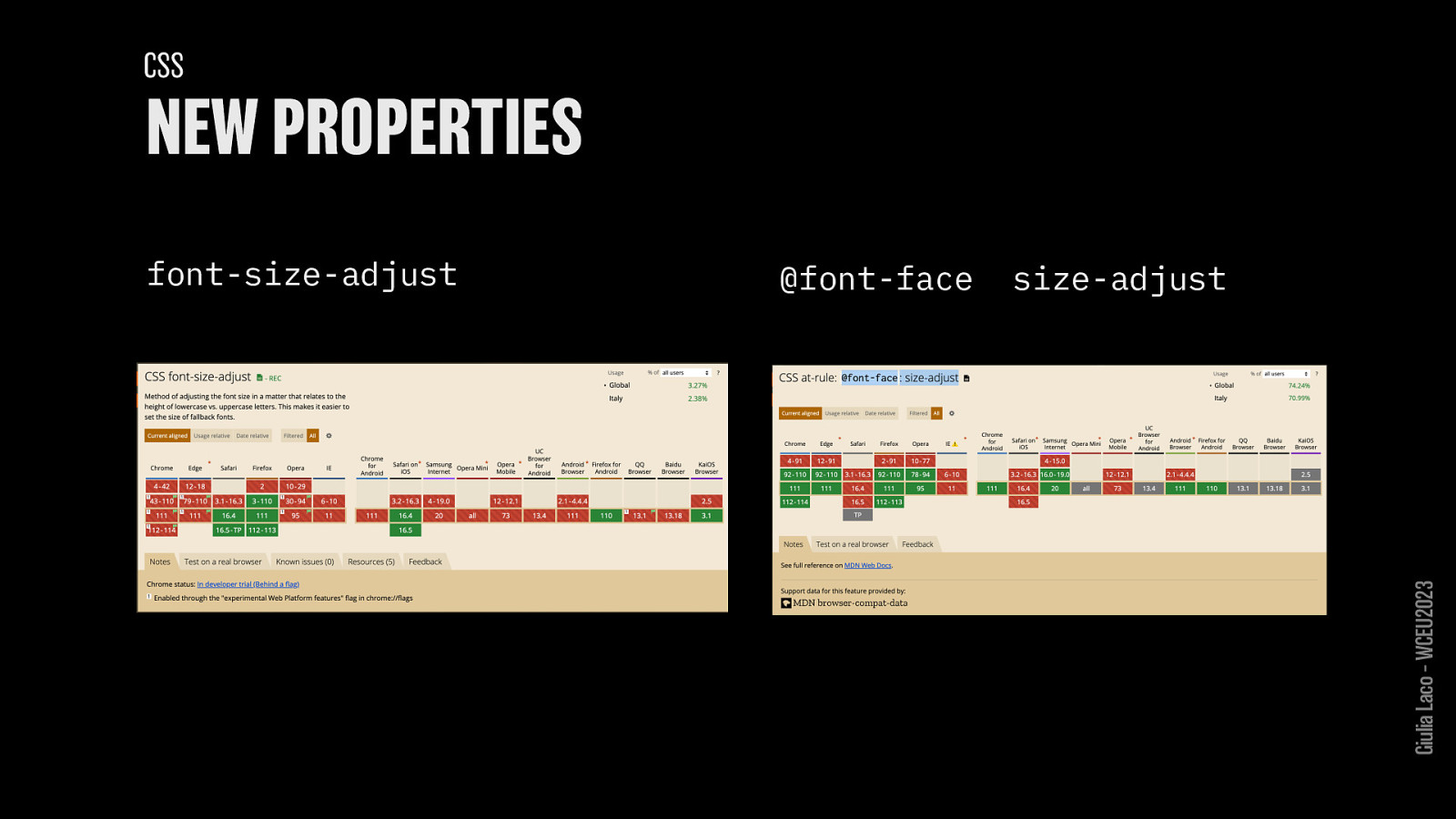
font-size-adjust @font-face size-adjust
Giulia Laco – WCEU2023
TYPOGRAPHIC REVOLUITION Giulia Laco – WCEU2023
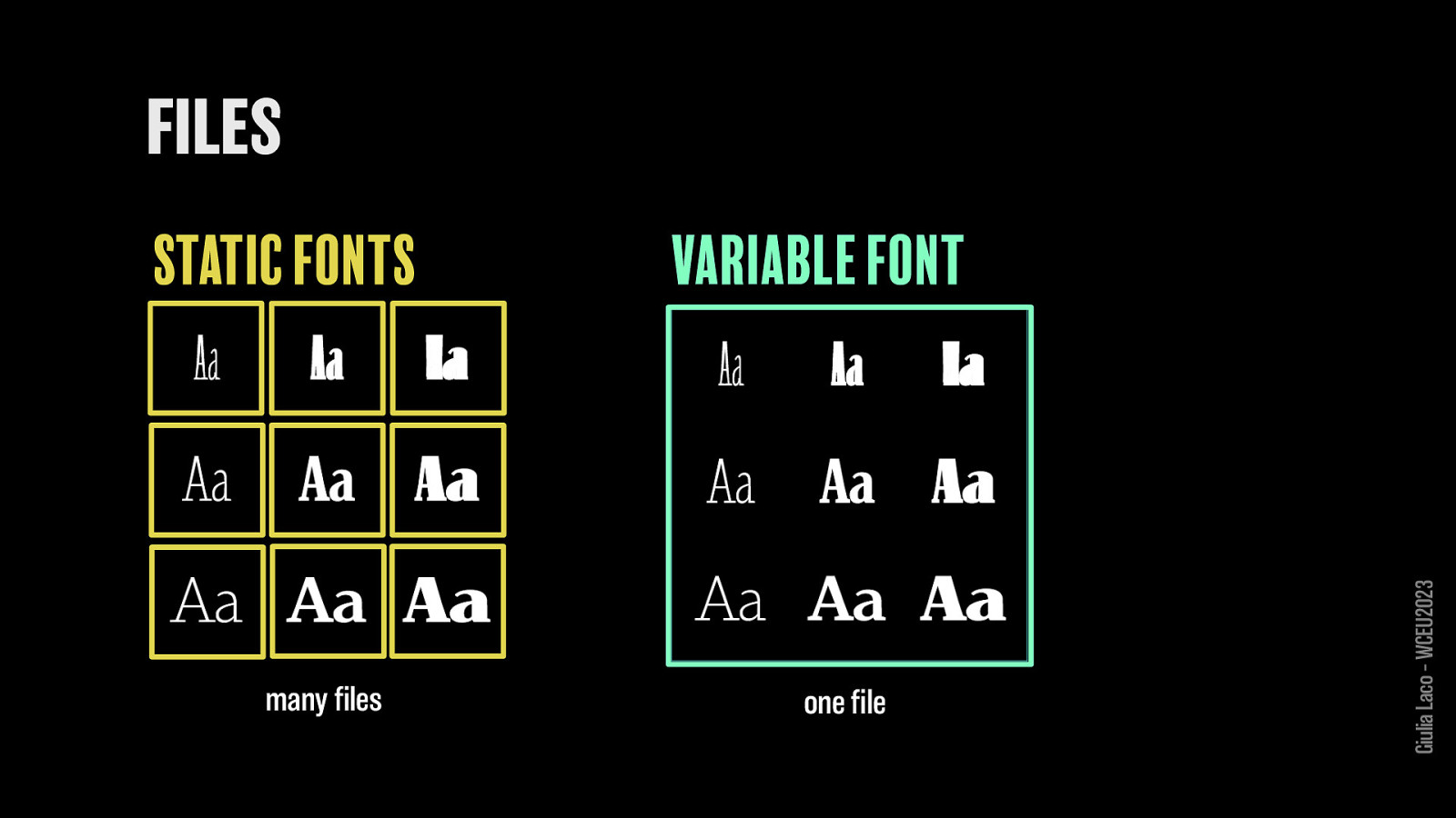
STATIC FONTS many files
VARIABLE FONT one file
Giulia Laco – WCEU2023
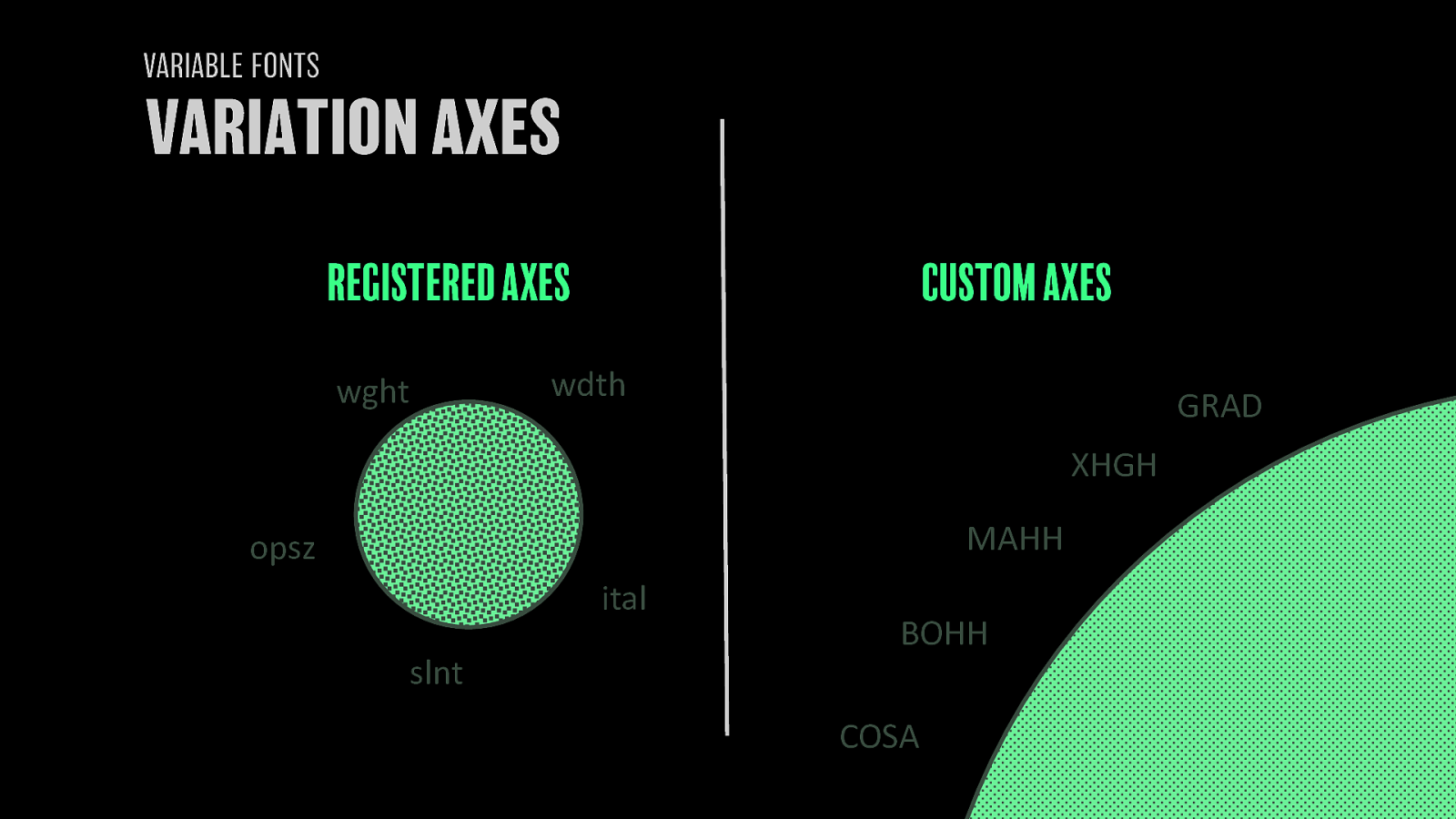
REGISTERED AXES CUSTOM AXES
Giulia Laco – WCEU2023
Giulia Laco – WCEU2023
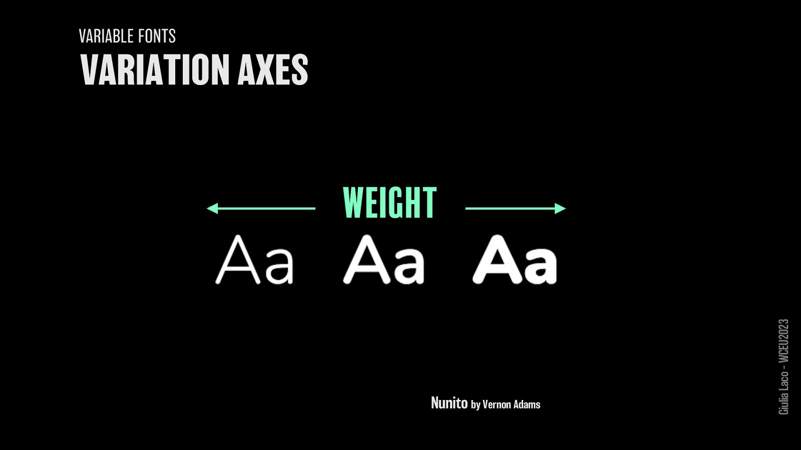
WEIGHT Nunito by Vernon Adams Giulia Laco – WCEU2023
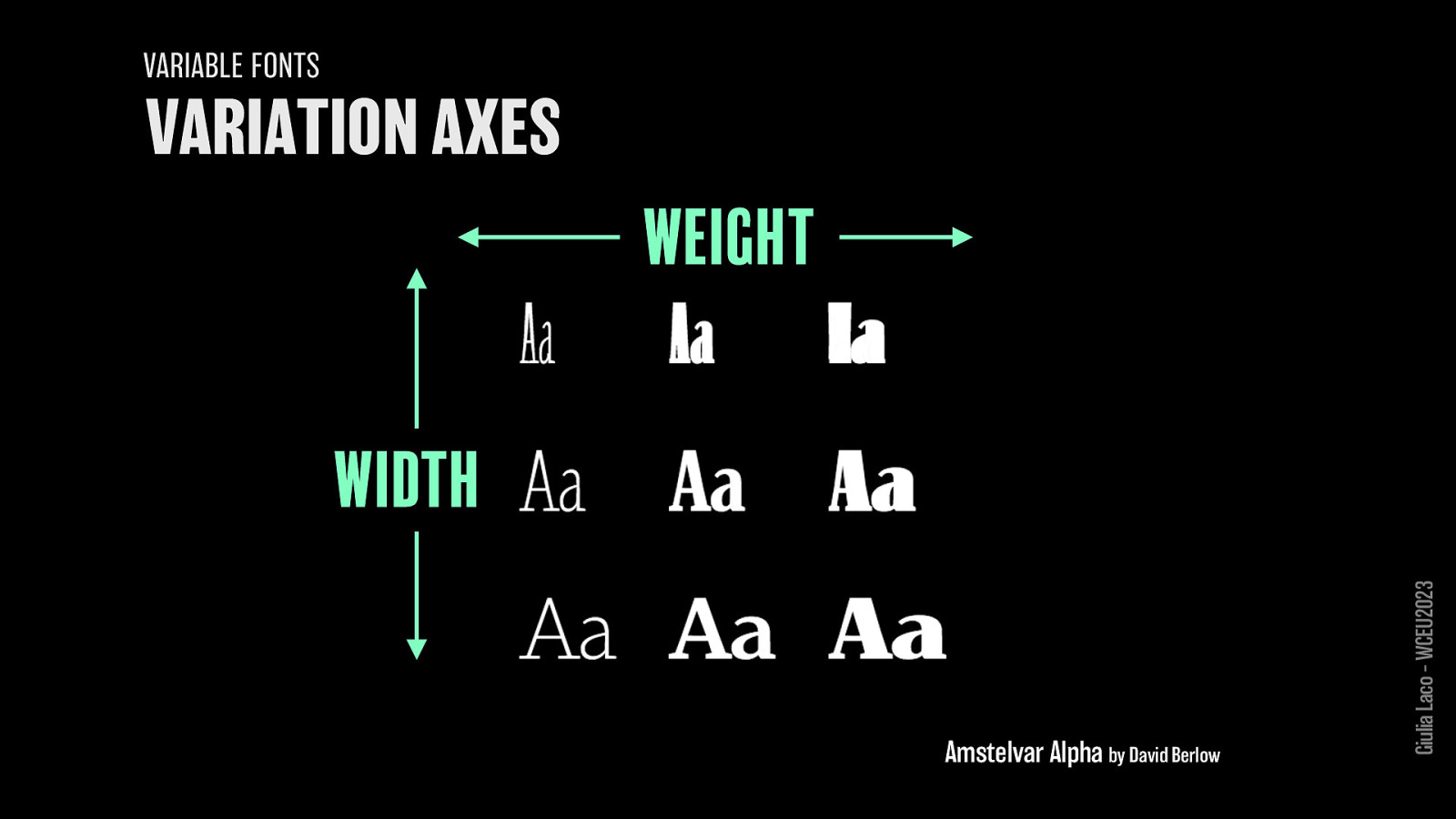
WEIGHT WIDTH Amstelvar Alpha by David Berlow Giulia Laco – WCEU2023
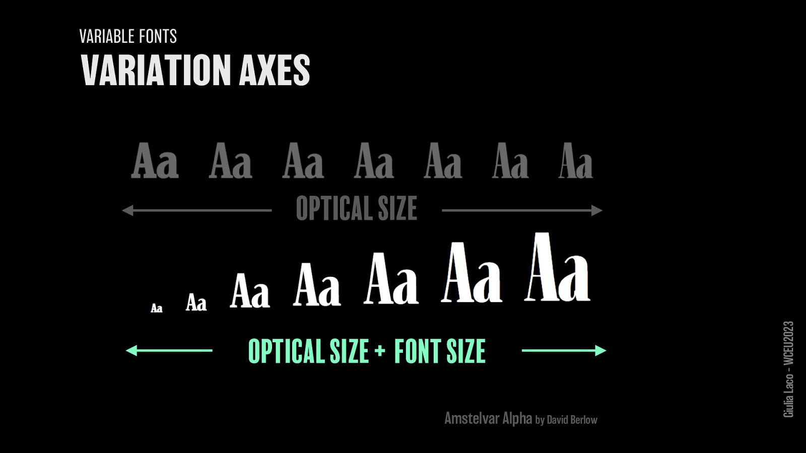
OPTICAL SIZE OPTICAL SIZE + FONT SIZE Amstelvar Alpha by David Berlow Giulia Laco – WCEU2023
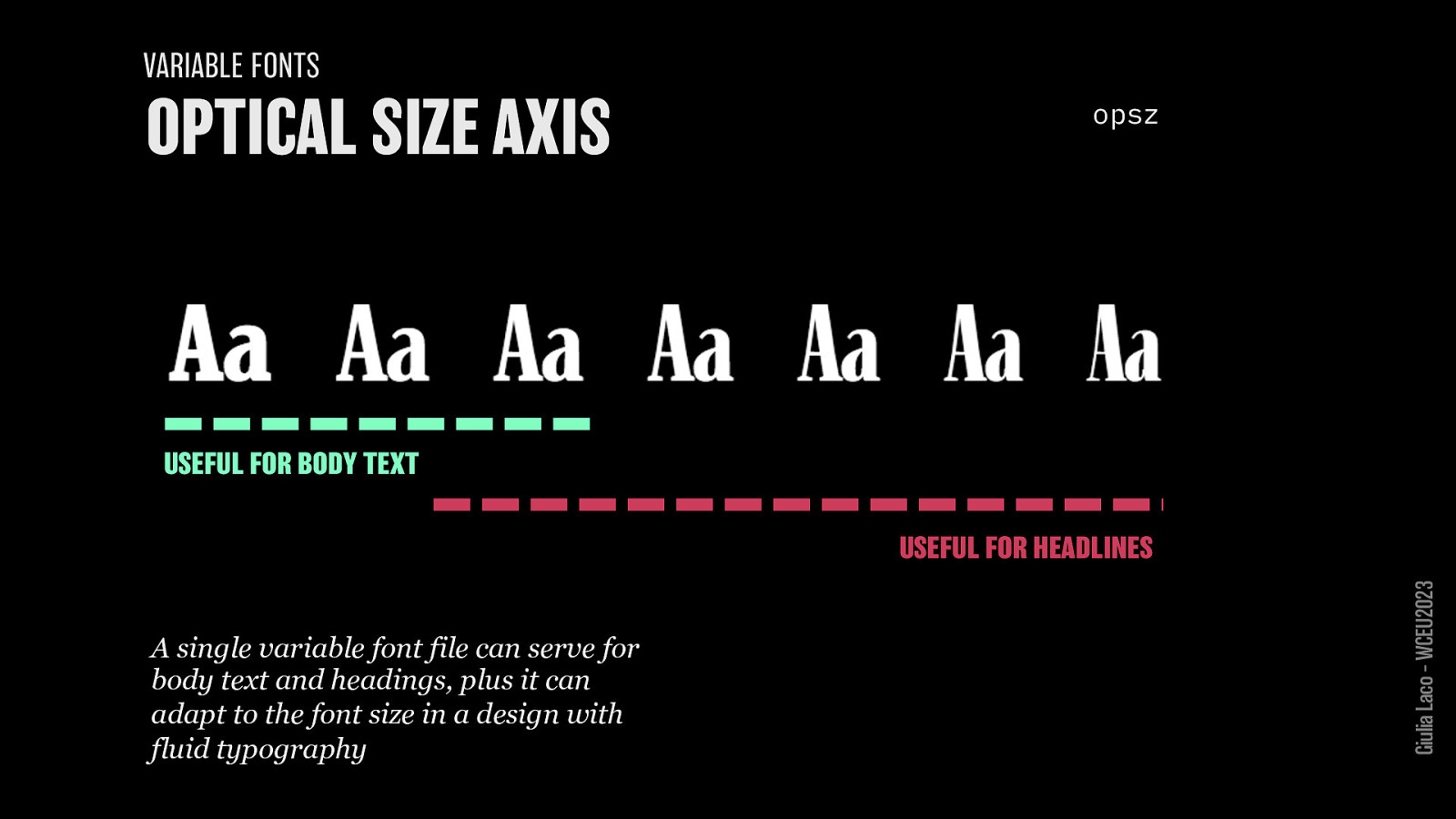
opsz USEFUL FOR BODY TEXT or USEFUL FOR HEADLINES
A single variable font file can serve for body text and headings, plus it can adapt to the font size in a design with fluid typography
Giulia Laco – WCEU2023
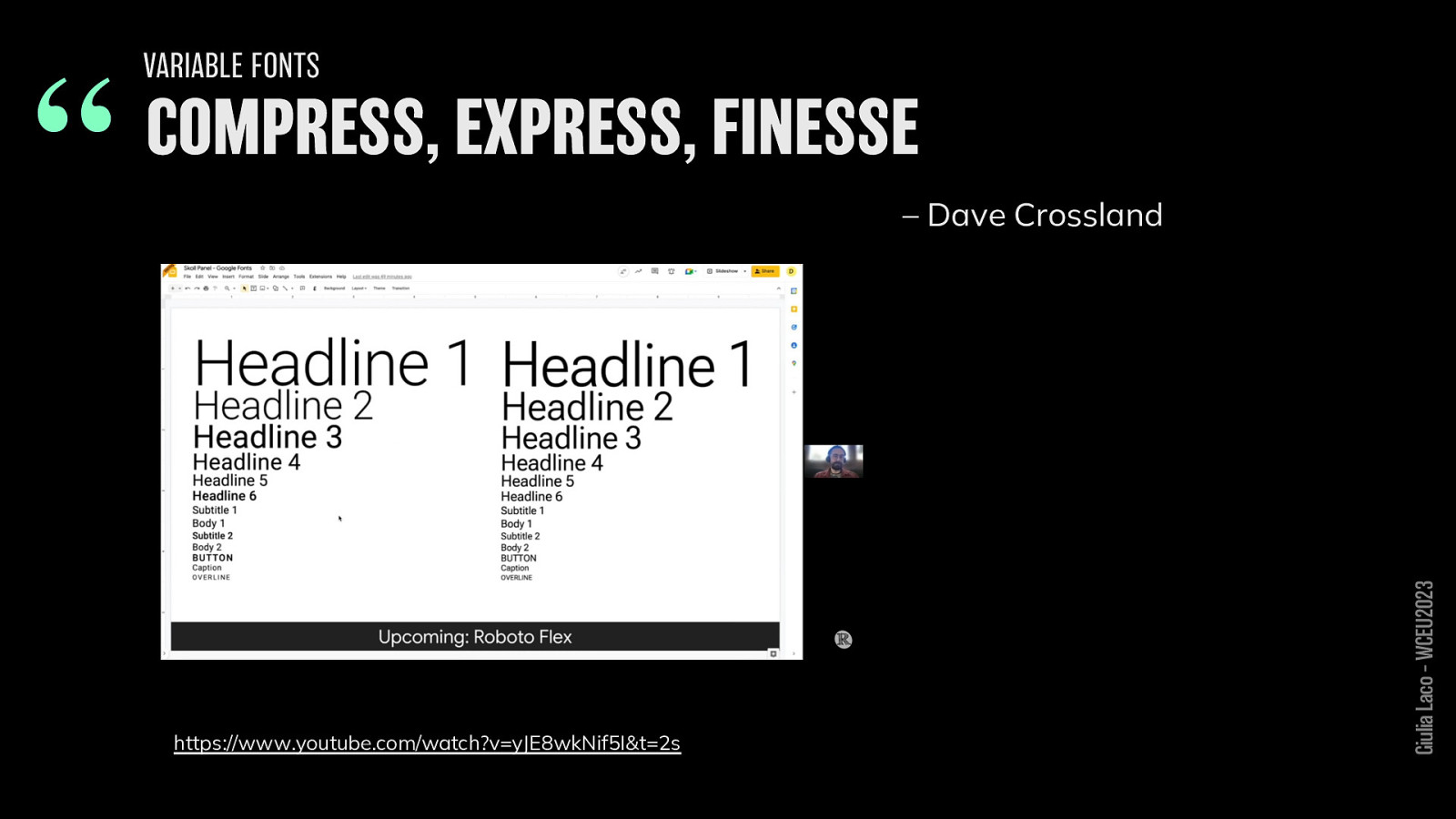
“COMPRESS, EXPRESS, FINESSE – Dave Crossland https://www.youtube.com/watch?v=yJE8wkNif5I&t=2s Giulia Laco – WCEU2023
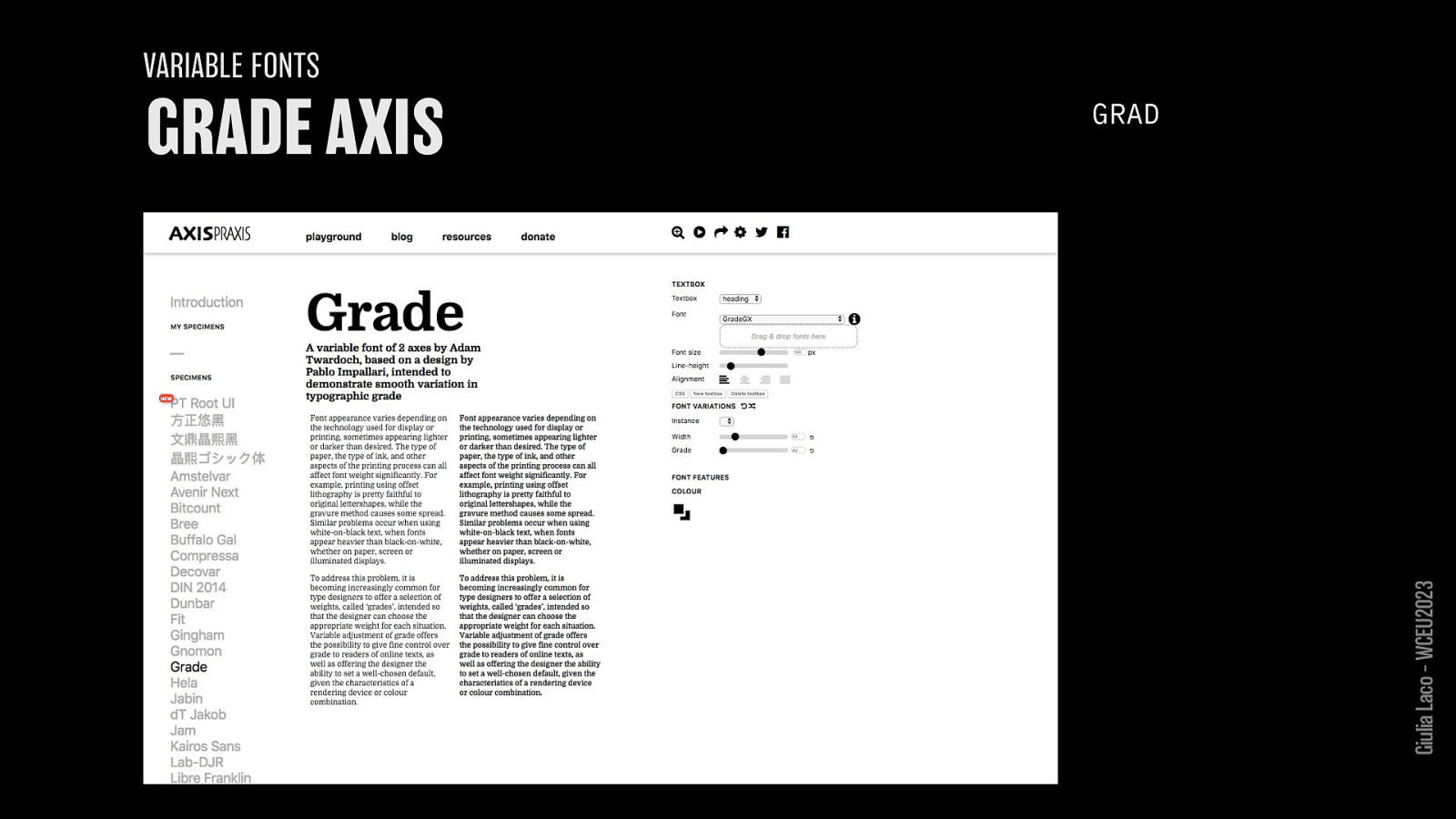
GRAD Giulia Laco – WCEU2023
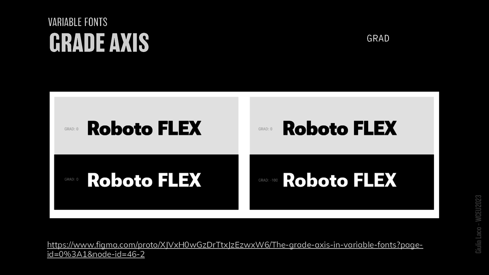
GRAD https://www.figma.com/proto/XJVxH0wGzDrTtxJzEzwxW6/The-grade-axis-in-variable-fonts?pageid=0%3A1&node-id=46-2 Giulia Laco – WCEU2023
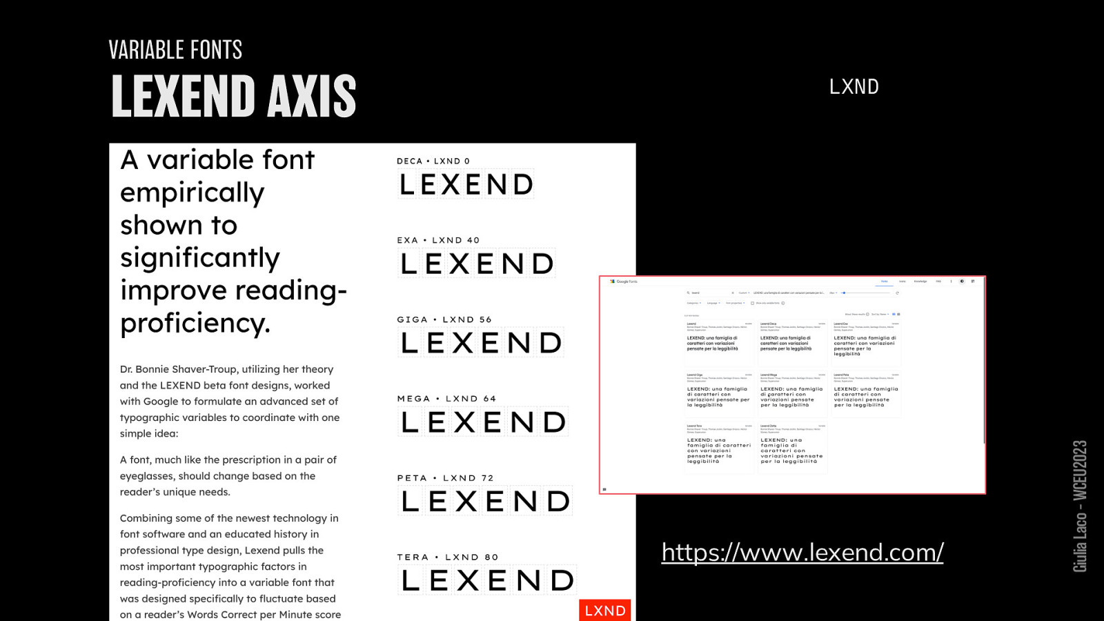
LXND https://www.lexend.com/ Giulia Laco – WCEU2023

Giulia Laco – WCEU2023
READABILITY RESEARCH
Giulia Laco – WCEU2023
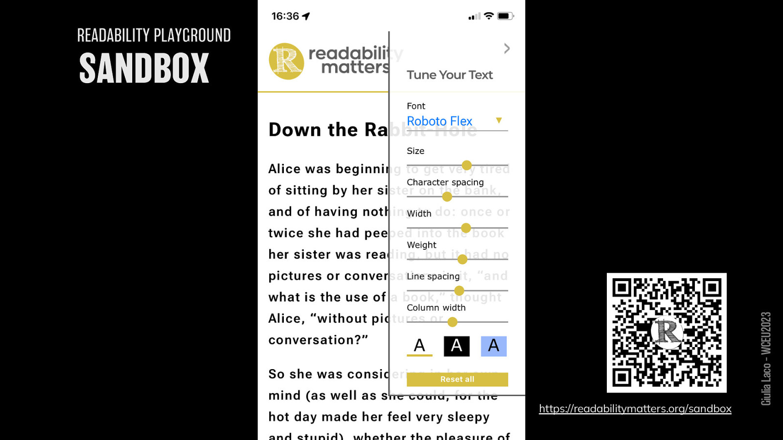
READABILITY PLAYGROUND https://readabilitymatters.org/sandbox Giulia Laco – WCEU2023
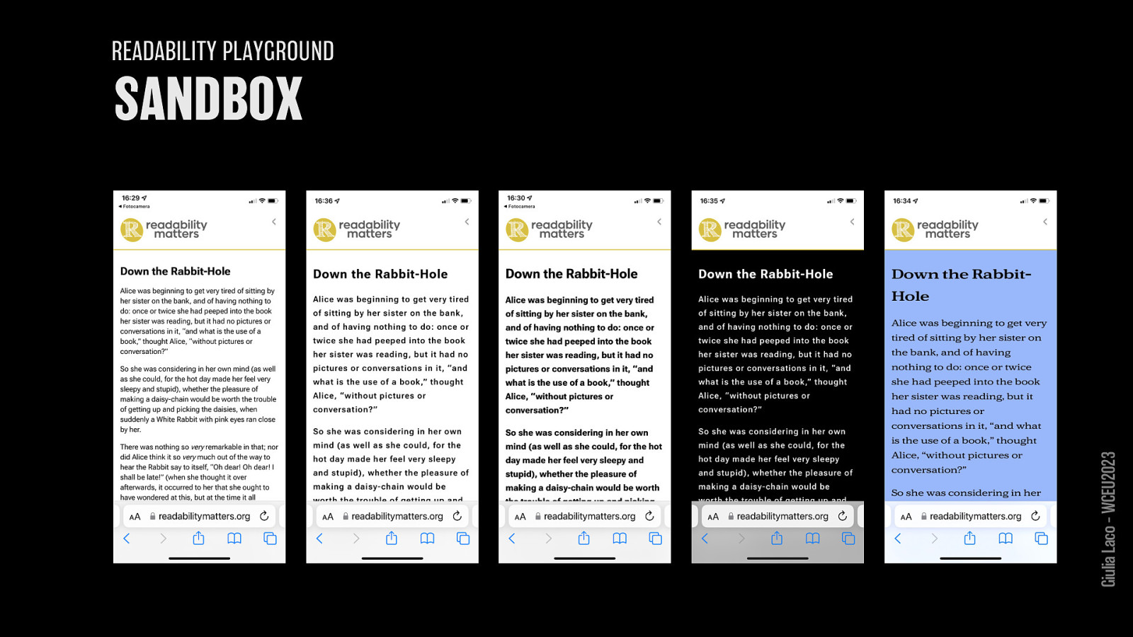
some samples Giulia Laco – WCEU2023
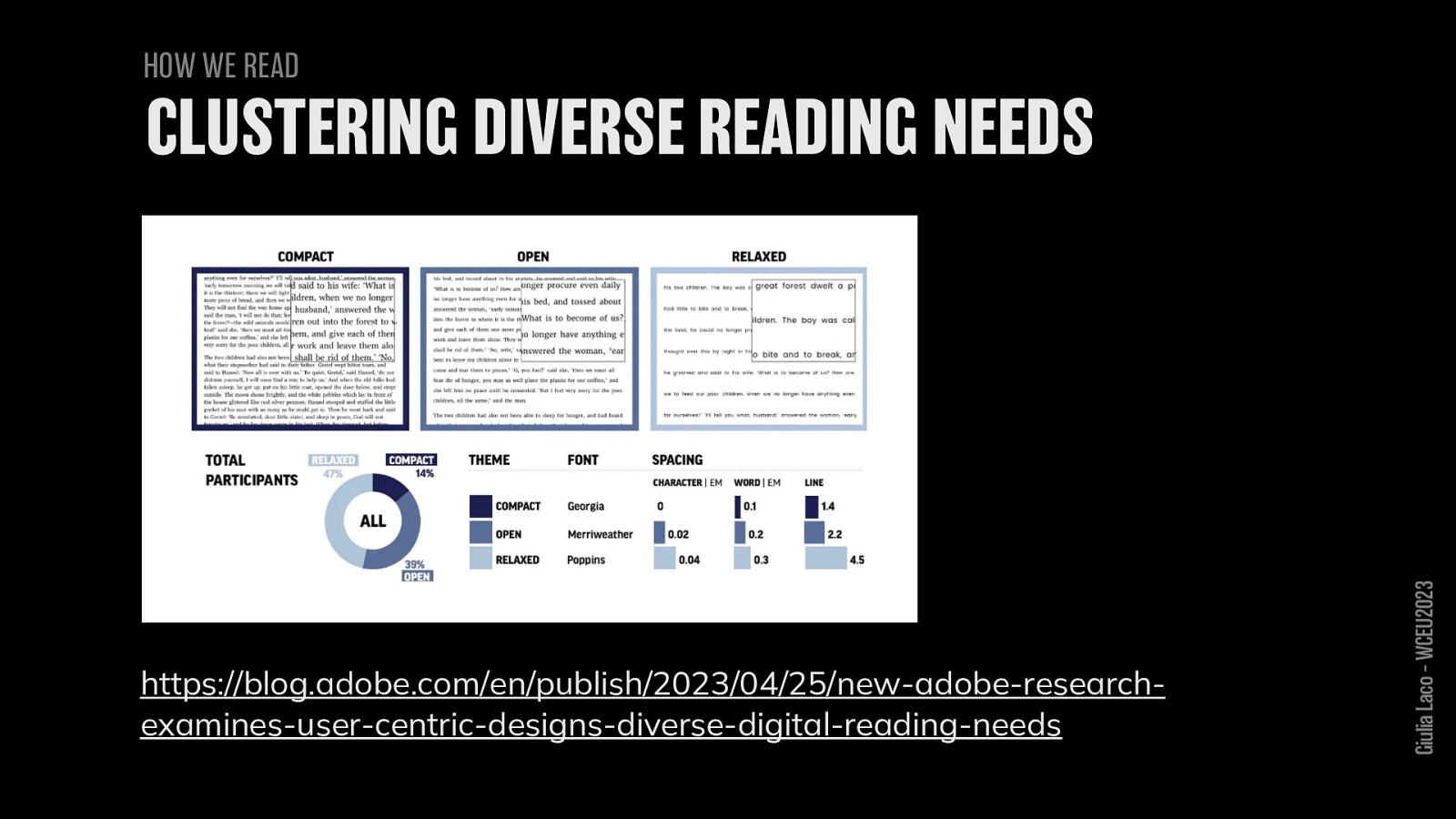
HOW WE READ https://blog.adobe.com/en/publish/2023/04/25/new-adobe-researchexamines-user-centric-designs-diverse-digital-reading-needs Giulia Laco – WCEU2023
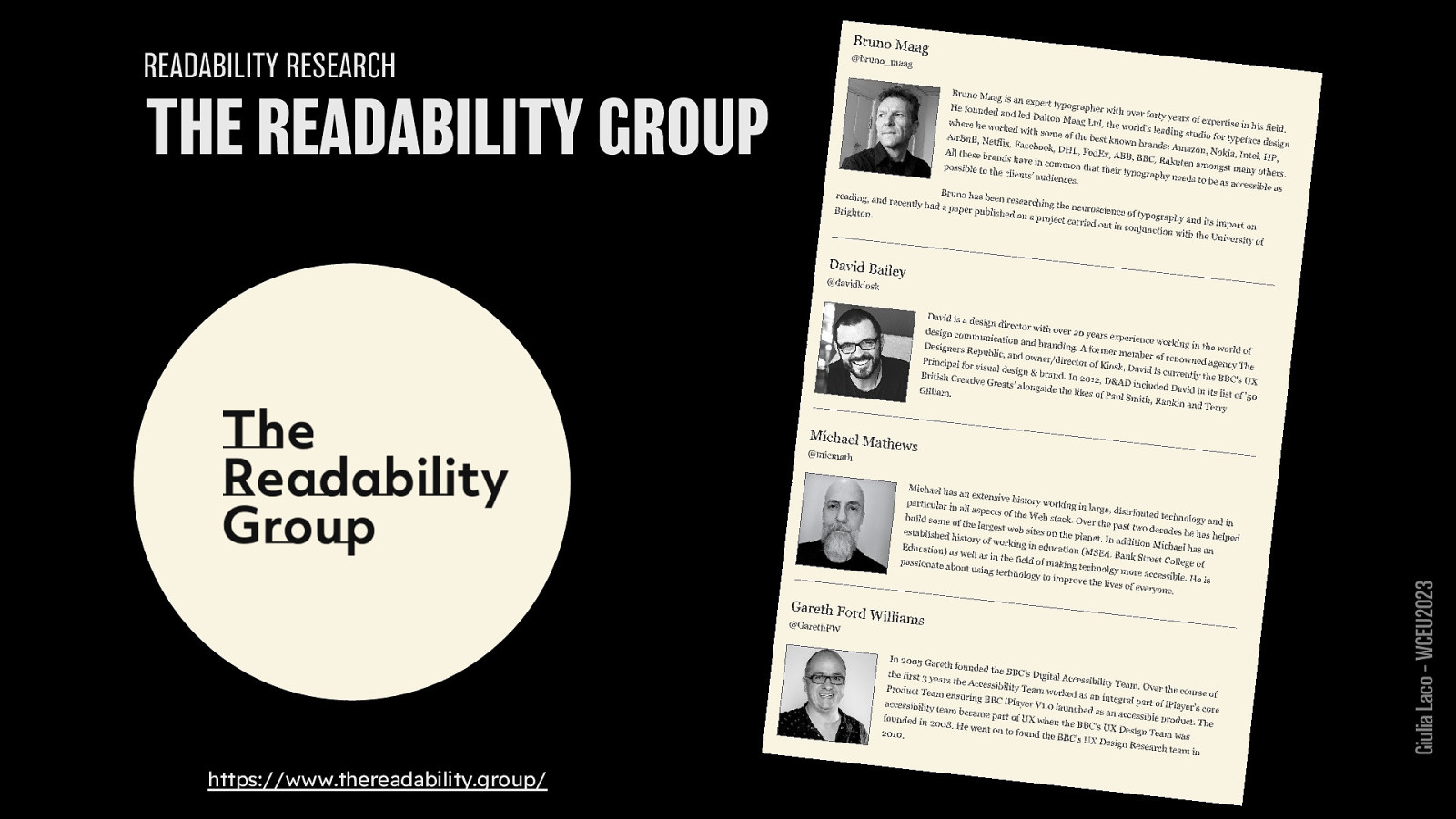
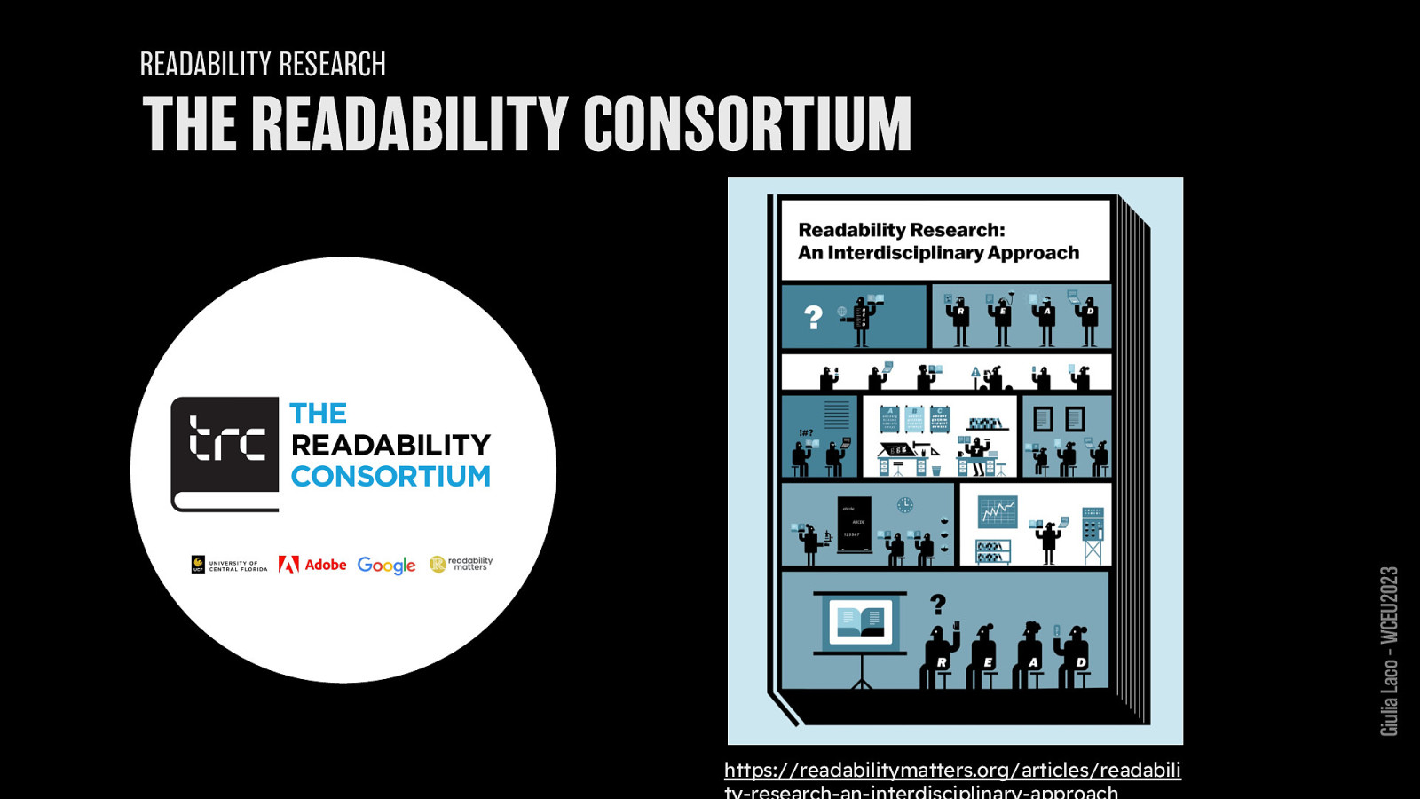
READABILITY RESEARCH
https://www.thereadability.group/
Giulia Laco – WCEU2023
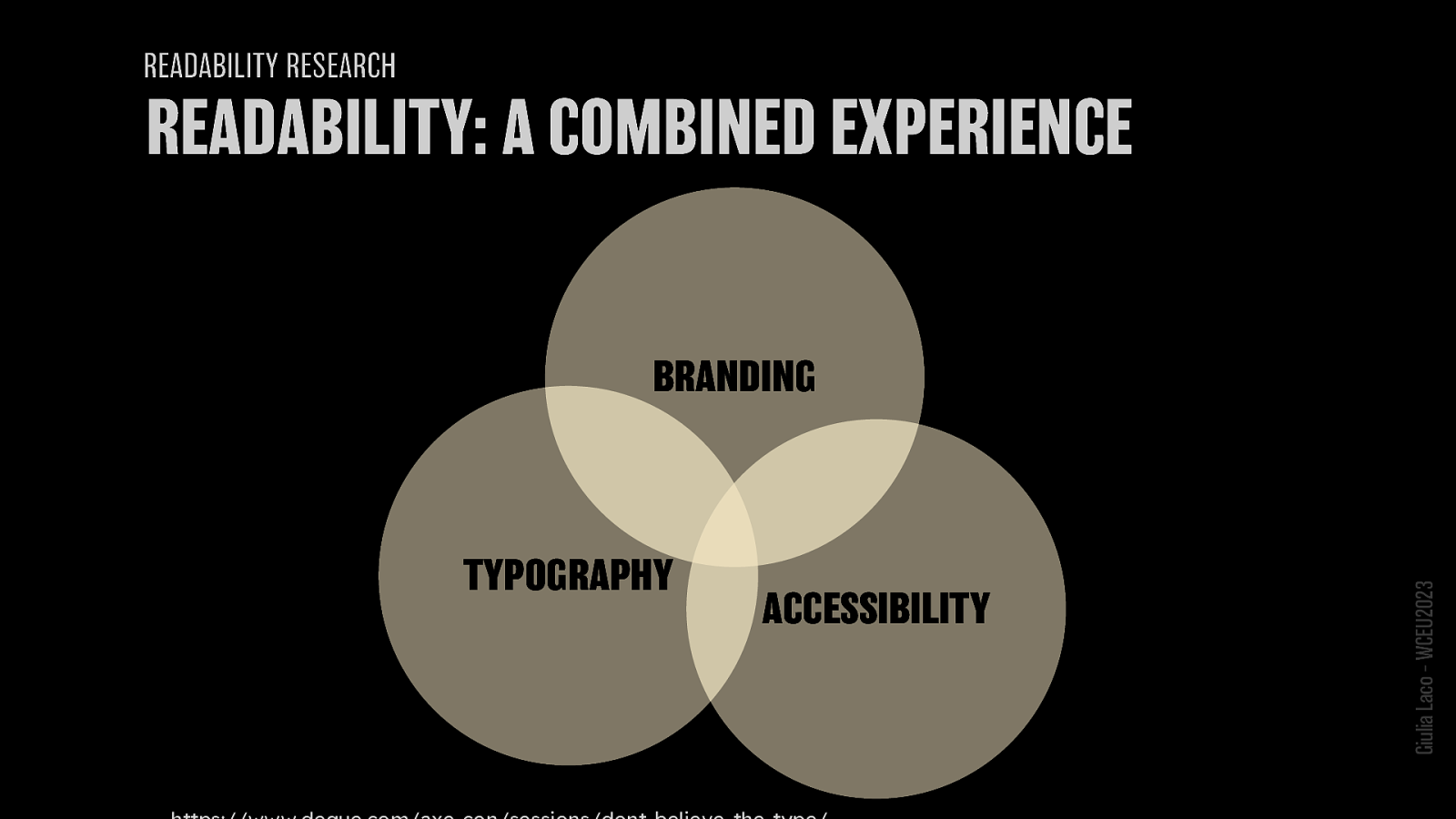
READABILITY RESEARCH
TYPOGRAPHY ACCESSIBILITY BRANDING https://www.thereadability.group/
Giulia Laco – WCEU2023

Giulia Laco – WCEU2023

NEW IDEAS
Giulia Laco – WCEU2023
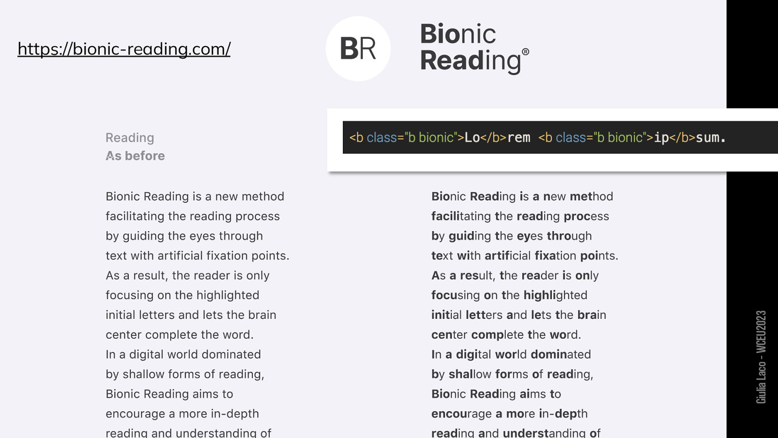
https://bionic-reading.com/ Giulia Laco – WCEU2023
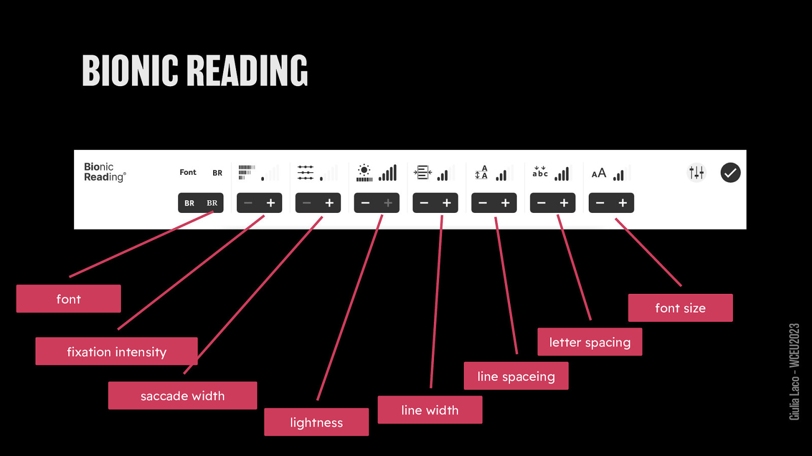
font size font family letter spacing fixation intensity line spacing saccade width lightness line width
Giulia Laco – WCEU2023

Giulia Laco – WCEU2023
https://bit.ly/css-readability. Giulia Laco – WCEU2023
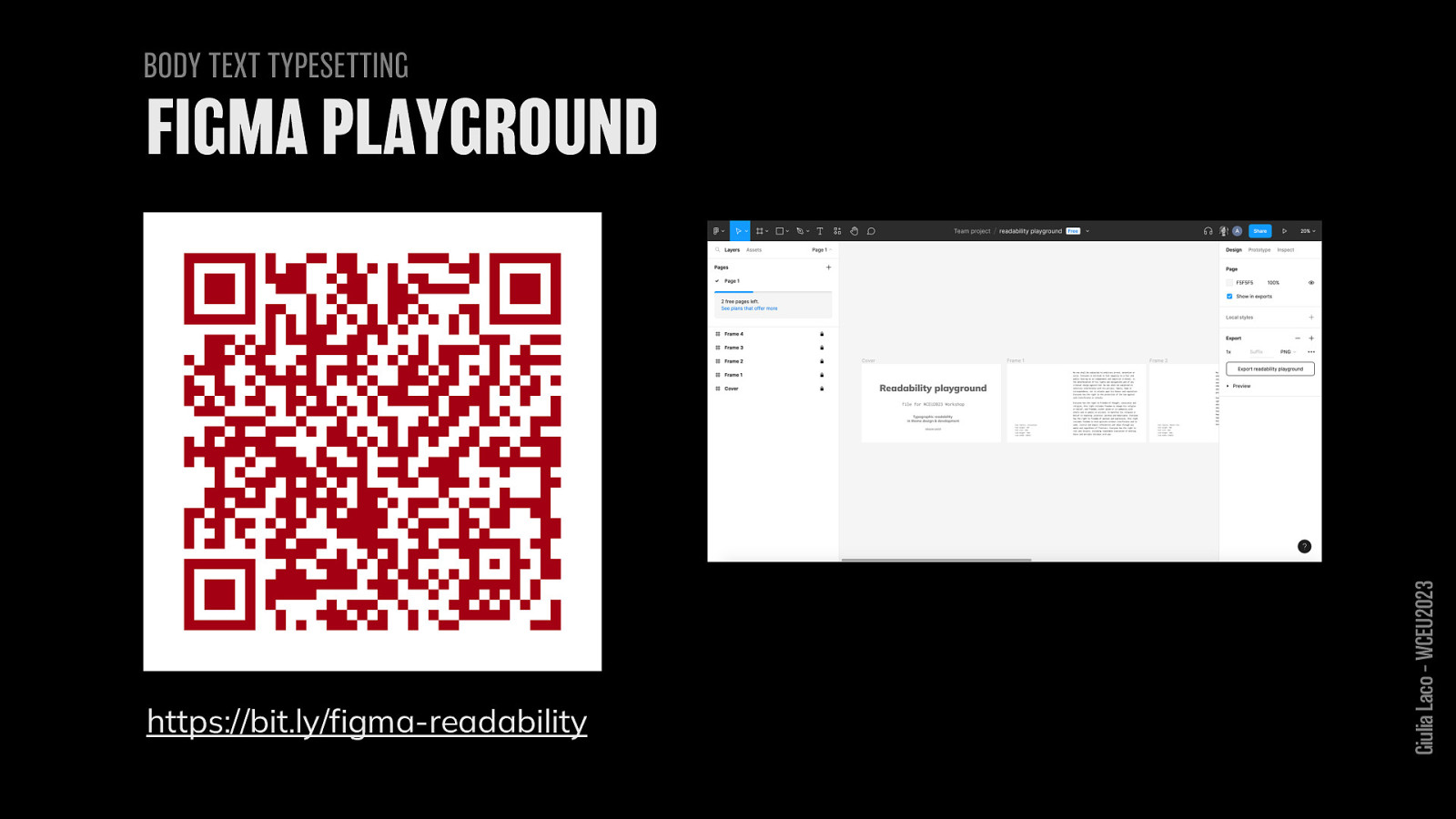
BODY TEXT TYPESETTING https://bit.ly/figma-readability Giulia Laco – WCEU2023 FIGMA PLAYGROUND

Thank you for your attention!
and thanks to

Giulia Laco – WCEU2023

Giulia Laco – WCEU2023
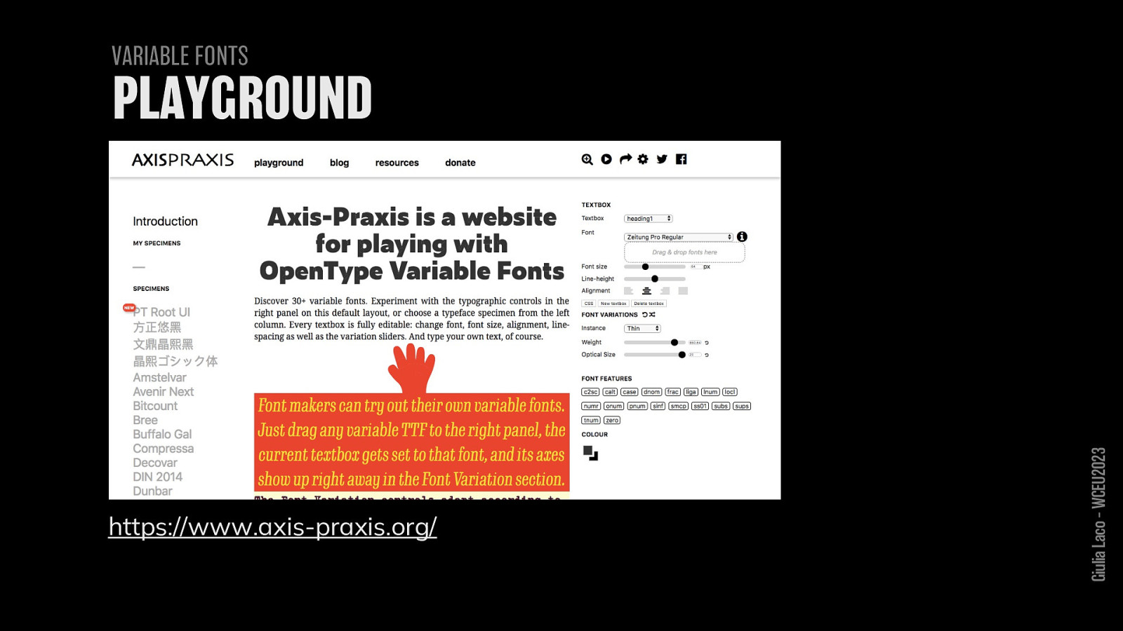
https://www.axis-praxis.org/ Giulia Laco – WCEU2023
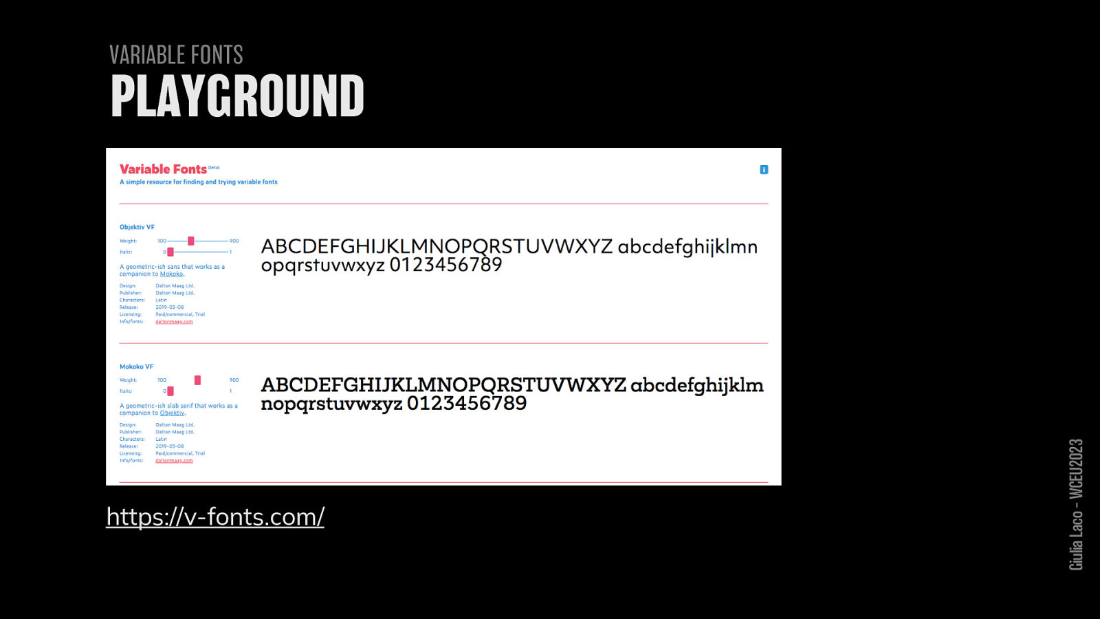
https://v-fonts.com/ Giulia Laco – WCEU202

https://readabilitymatters.org/sandbox Giulia Laco – WCEU2023

Giulia Laco – WCEU2023
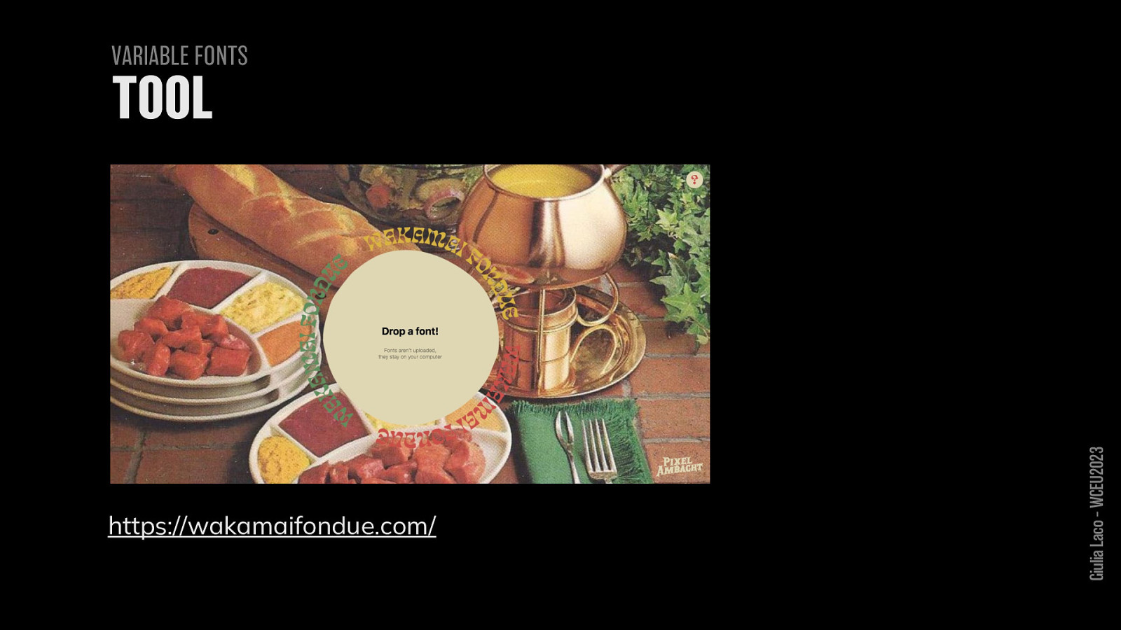
https://wakamaifondue.com/ Giulia Laco – WCEU2023

Giulia Laco – WCEU2023
ACCESSIBILITY WCAG 2.1 https://www.w3.org/TR/WCAG21/ CSS Reference pixel https://www.w3.org/TR/css-values-3/#reference-pixel
VIDEOS Typographic accessibility – Bruno Maag https://www.youtube.com/watch?v=bLWZAbgwj_c&t=3556s Don’t believe the type https://www.deque.com/axe-con/sessions/dont-believe-the-type
BOOKS https://legible-typography.com/en/
Giulia Laco – WCEU2023
CSS UNITS Conversion tools https://codepen.io/webrocker/pen/gXQyvo https://pixelsconverter.com/pt-to-px Problem https://www.24a11y.com/2019/pixels-vs-relative-units-in-css-why-its-stilla-big-deal/ https://codepen.io/resource11/full/eYOQQxY
COLOUR CONTRAST
WCAG contrast checker tools
https://color.adobe.com/it/create/color-contrast-analyzer
http://a11yrocks.com/colorPalette/
https://www.tpgi.com/color-contrast-checker/
APCA contrast checker tools
http://www.myndex.com/APCA/ https://contrast-checker.bellette.com.au/
Giulia Laco – WCEU2023
Pixabay.com Flickr.com Giulia Laco – WCEU2023