RESPONSIVE TYPOGRAPHY

A presentation at Tech Talk @ Tagesspiegel in July 2019 in Berlin, Germany by Gunnar Bittersmann
RESPONSIVE TYPOGRAPHY

LEGIBLE READABLE
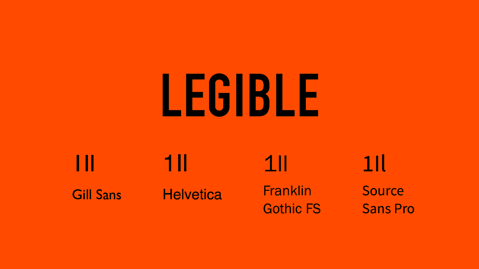
LEGIBLE 1Il Gill Sans 1Il 1Il 1Il Helvetica Franklin Gothic FS Source Sans Pro
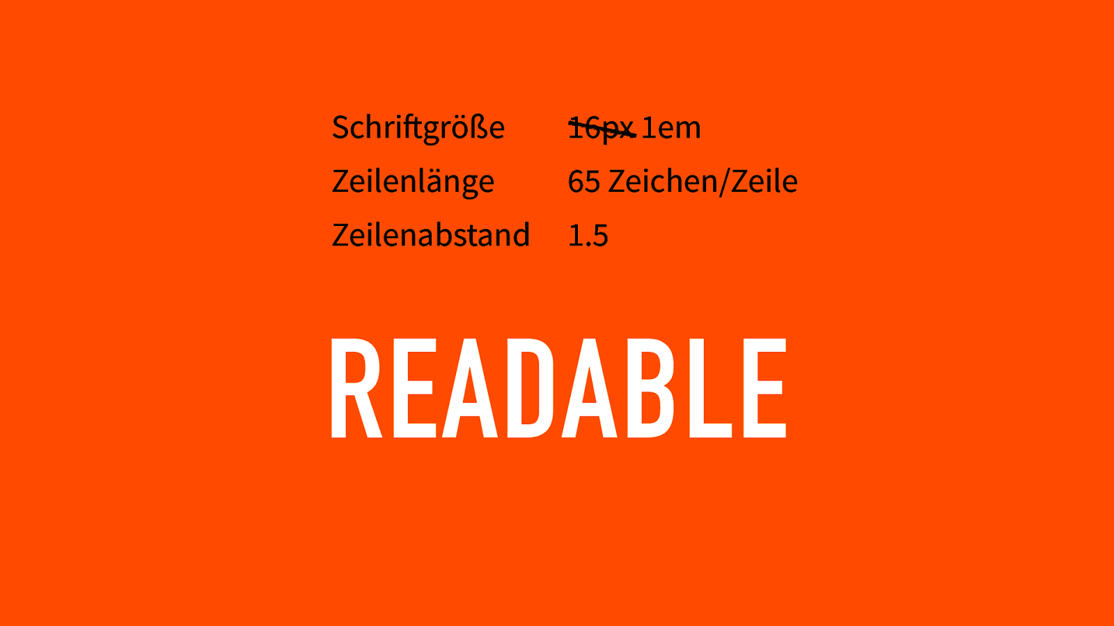
Schriftgröße 16px 1em Zeilenlänge 65 Zeichen/Zeile Zeilenabstand 1.5 READABLE
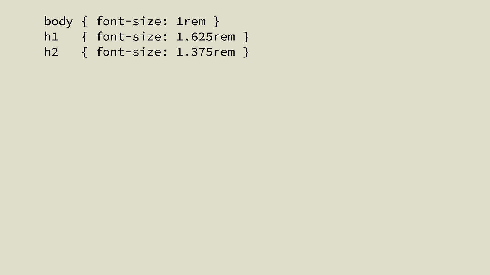
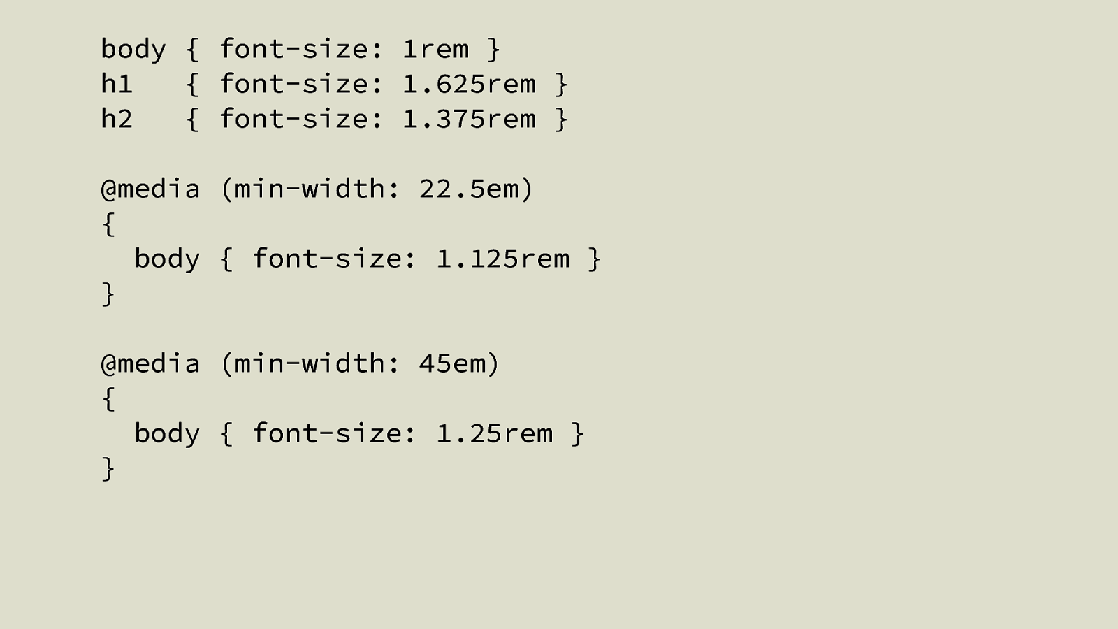
body { font-size: 1rem } h1 { font-size: 1.625rem } h2 { font-size: 1.375rem }
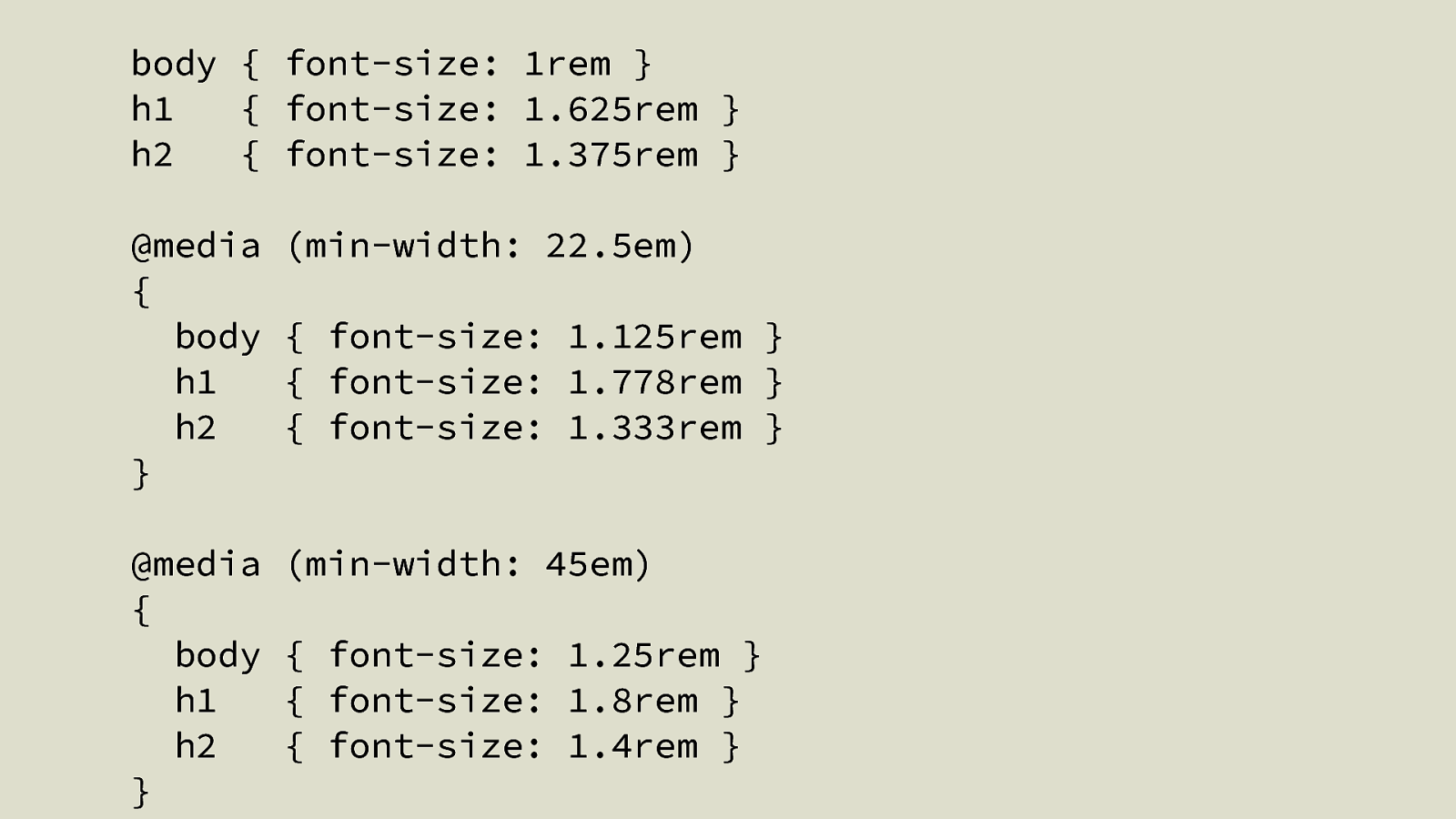
body { font-size: 1rem } h1 { font-size: 1.625rem } h2 { font-size: 1.375rem } @media (min-width: 22.5em) { body { font-size: 1.125rem } } @media (min-width: 45em) { body { font-size: 1.25rem } }
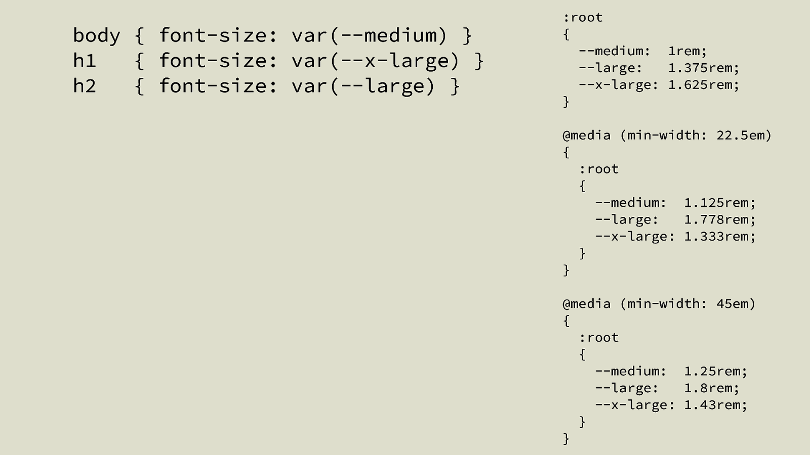
body { font-size: 1rem } h1 { font-size: 1.625rem } h2 { font-size: 1.375rem } @media { body h1 h2 } (min-width: 22.5em) @media { body h1 h2 } (min-width: 45em) { font-size: 1.125rem } { font-size: 1.778rem } { font-size: 1.333rem } { font-size: 1.25rem } { font-size: 1.8rem } { font-size: 1.4rem }
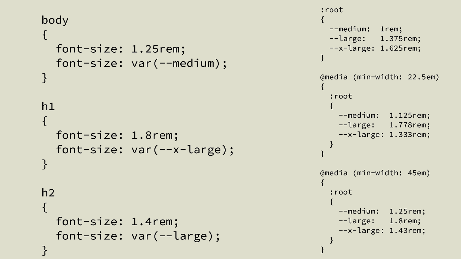
body { font-size: var(—medium) } h1 { font-size: var(—x-large) } h2 { font-size: var(—large) } :root { —medium: 1rem; —large: 1.375rem; —x-large: 1.625rem; } @media (min-width: 22.5em) { :root { —medium: 1.125rem; —large: 1.778rem; —x-large: 1.333rem; } } @media (min-width: 45em) { :root { —medium: 1.25rem; —large: 1.8rem; —x-large: 1.43rem; } }
body { font-size: 1.25rem; font-size: var(—medium); } h1 { font-size: 1.8rem; font-size: var(—x-large); } h2 { font-size: 1.4rem; font-size: var(—large); } :root { —medium: 1rem; —large: 1.375rem; —x-large: 1.625rem; } @media (min-width: 22.5em) { :root { —medium: 1.125rem; —large: 1.778rem; —x-large: 1.333rem; } } @media (min-width: 45em) { :root { —medium: 1.25rem; —large: 1.8rem; —x-large: 1.43rem; } }
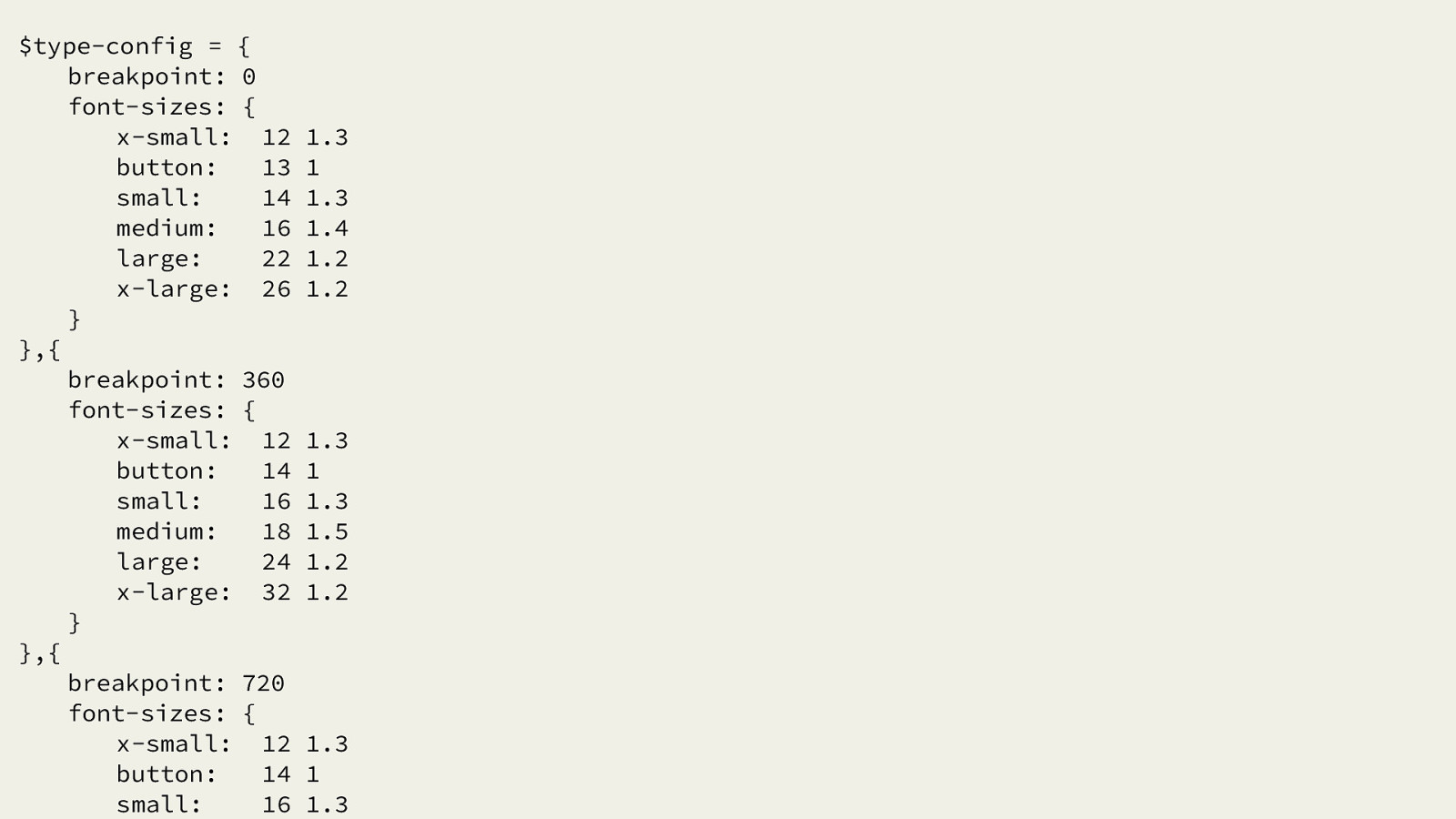
$type-config = { breakpoint: 0 font-sizes: { x-small: 12 button: 13 small: 14 medium: 16 large: 22 x-large: 26 } },{ breakpoint: 360 font-sizes: { x-small: 12 button: 14 small: 16 medium: 18 large: 24 x-large: 32 } },{ breakpoint: 720 font-sizes: { x-small: 12 button: 14 small: 16 1.3 1 1.3 1.4 1.2 1.2 1.3 1 1.3 1.5 1.2 1.2 1.3 1 1.3
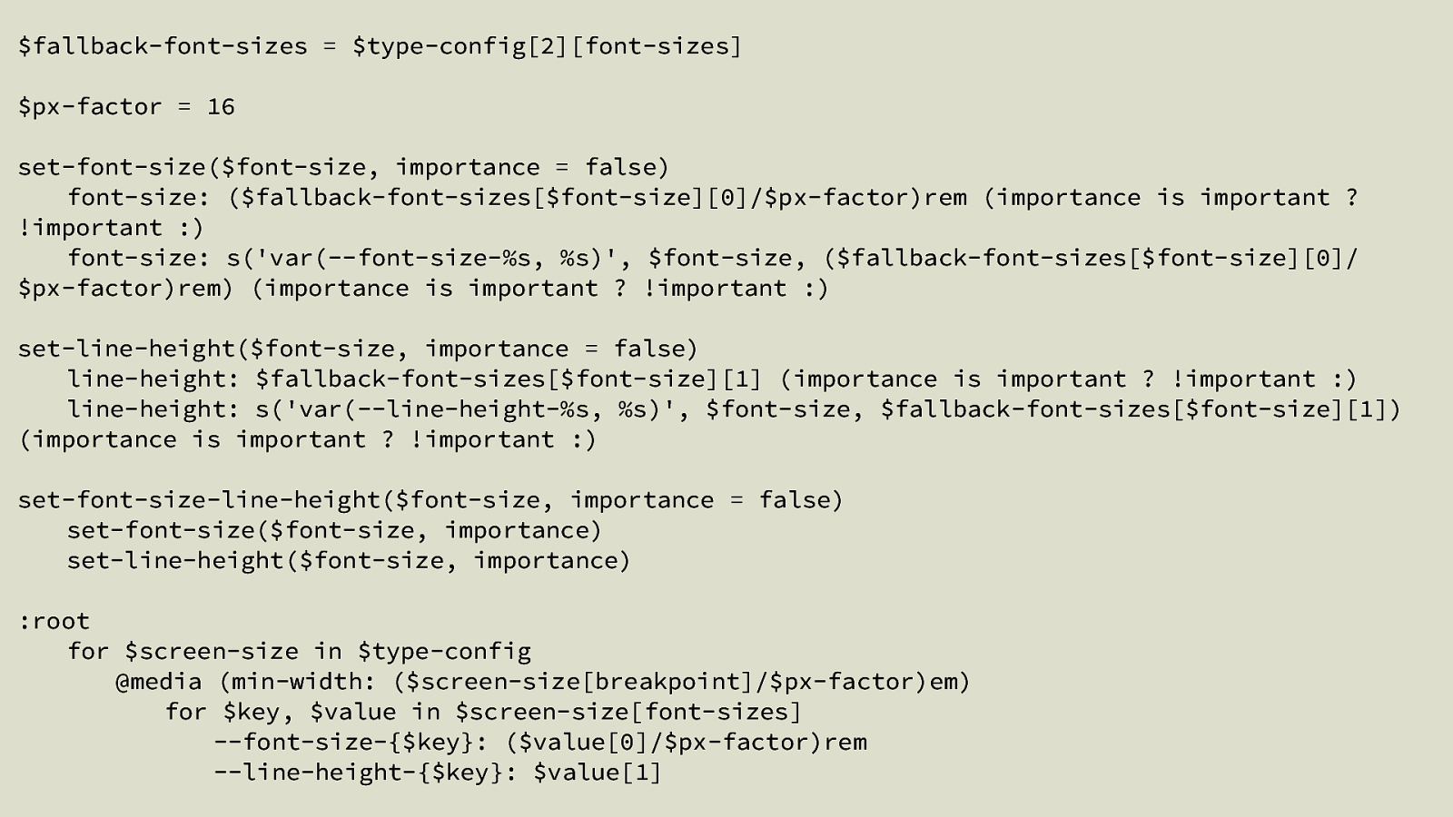
$fallback-font-sizes = $type-config[2][font-sizes] $px-factor = 16 set-font-size($font-size, importance = false) font-size: ($fallback-font-sizes[$font-size][0]/$px-factor)rem (importance is important ? !important :) font-size: s(‘var(—font-size-%s, %s)’, $font-size, ($fallback-font-sizes[$font-size][0]/ $px-factor)rem) (importance is important ? !important :) set-line-height($font-size, importance = false) line-height: $fallback-font-sizes[$font-size][1] (importance is important ? !important :) line-height: s(‘var(—line-height-%s, %s)’, $font-size, $fallback-font-sizes[$font-size][1]) (importance is important ? !important :) set-font-size-line-height($font-size, importance = false) set-font-size($font-size, importance) set-line-height($font-size, importance) :root for $screen-size in $type-config @media (min-width: ($screen-size[breakpoint]/$px-factor)em) for $key, $value in $screen-size[font-sizes] —font-size-{$key}: ($value[0]/$px-factor)rem —line-height-{$key}: $value[1]
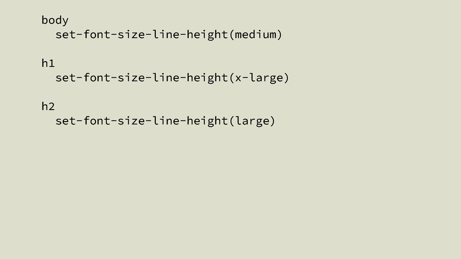
body set-font-size-line-height(medium) h1 set-font-size-line-height(x-large) h2 set-font-size-line-height(large)

FLUID TYPOGRAPHY
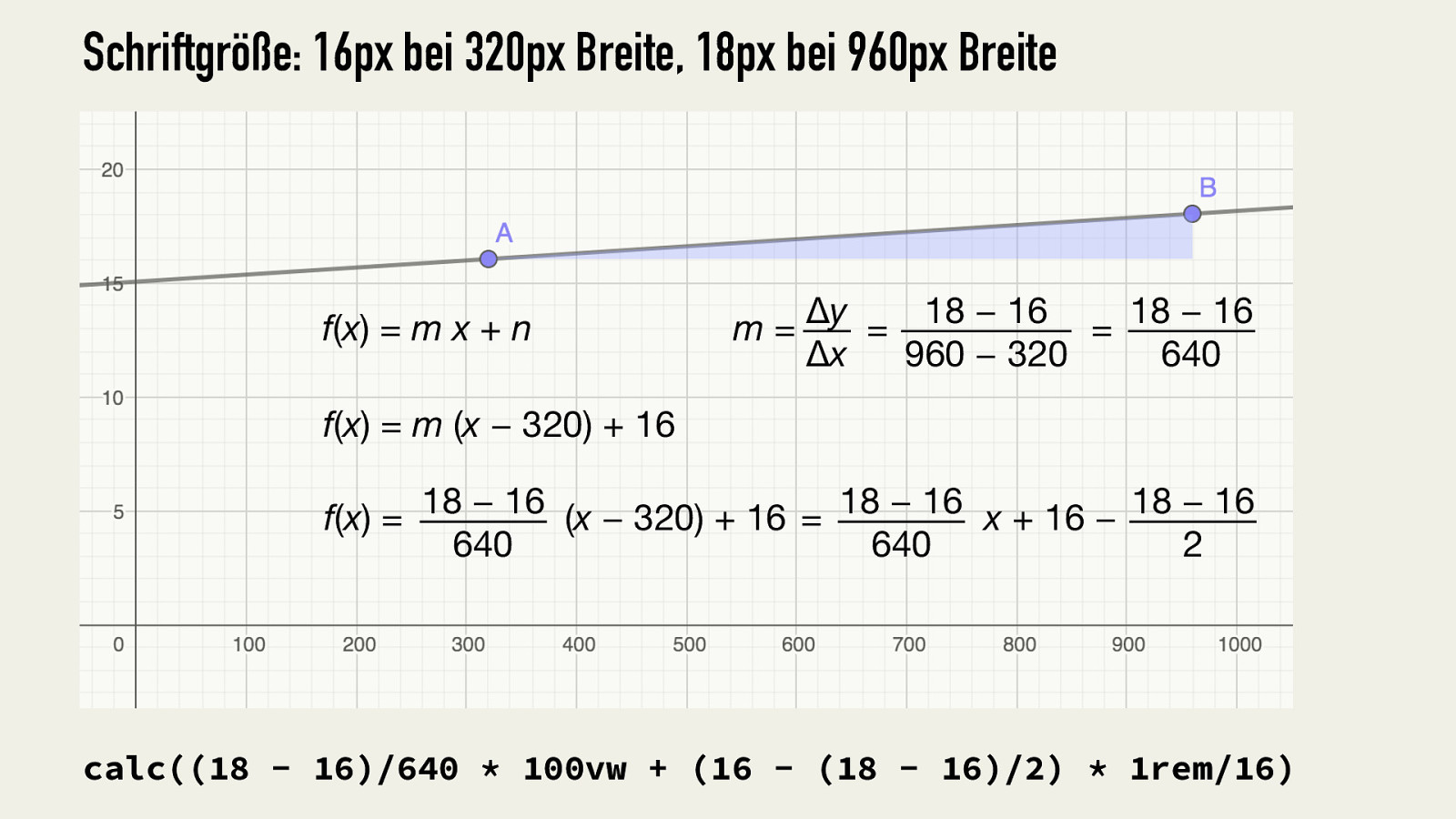
Schriftgröße: 16px bei 320px Breite, 18px bei 960px Breite f(x) = m x + n Δy 18 − 16 18 − 16 m= = = Δx 960 − 320 640 f(x) = m (x − 320) + 16 18 − 16 18 − 16 18 − 16 f(x) = (x − 320) + 16 = x + 16 − 640 640 2 calc((18 - 16)/640 * 100vw + (16 - (18 - 16)/2) * 1rem/16)
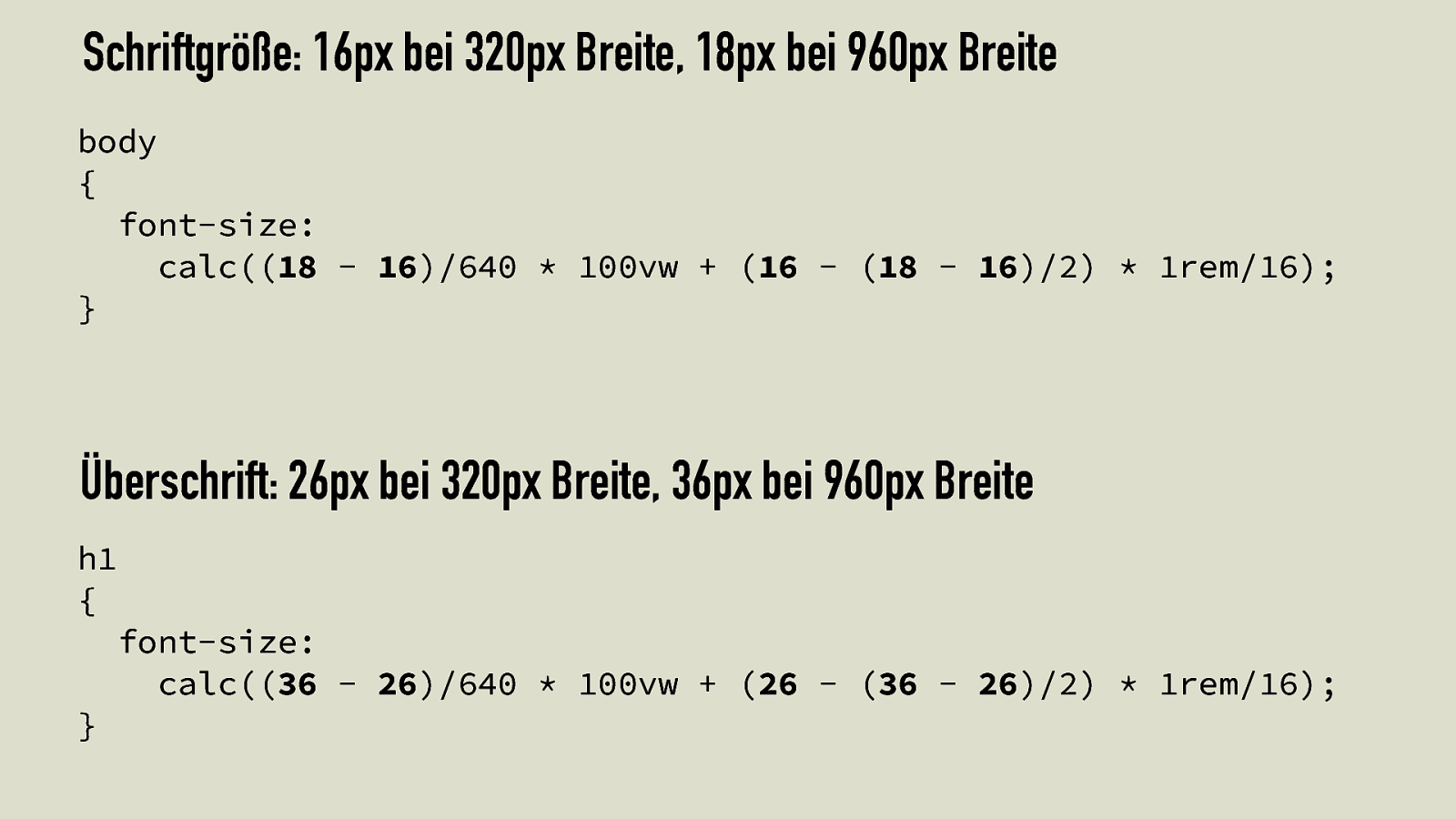
Schriftgröße: 16px bei 320px Breite, 18px bei 960px Breite body { font-size: calc((18 - 16)/640 * 100vw + (16 - (18 - 16)/2) * 1rem/16); } Überschrift: 26px bei 320px Breite, 36px bei 960px Breite h1 { } font-size: calc((36 - 26)/640 * 100vw + (26 - (36 - 26)/2) * 1rem/16);
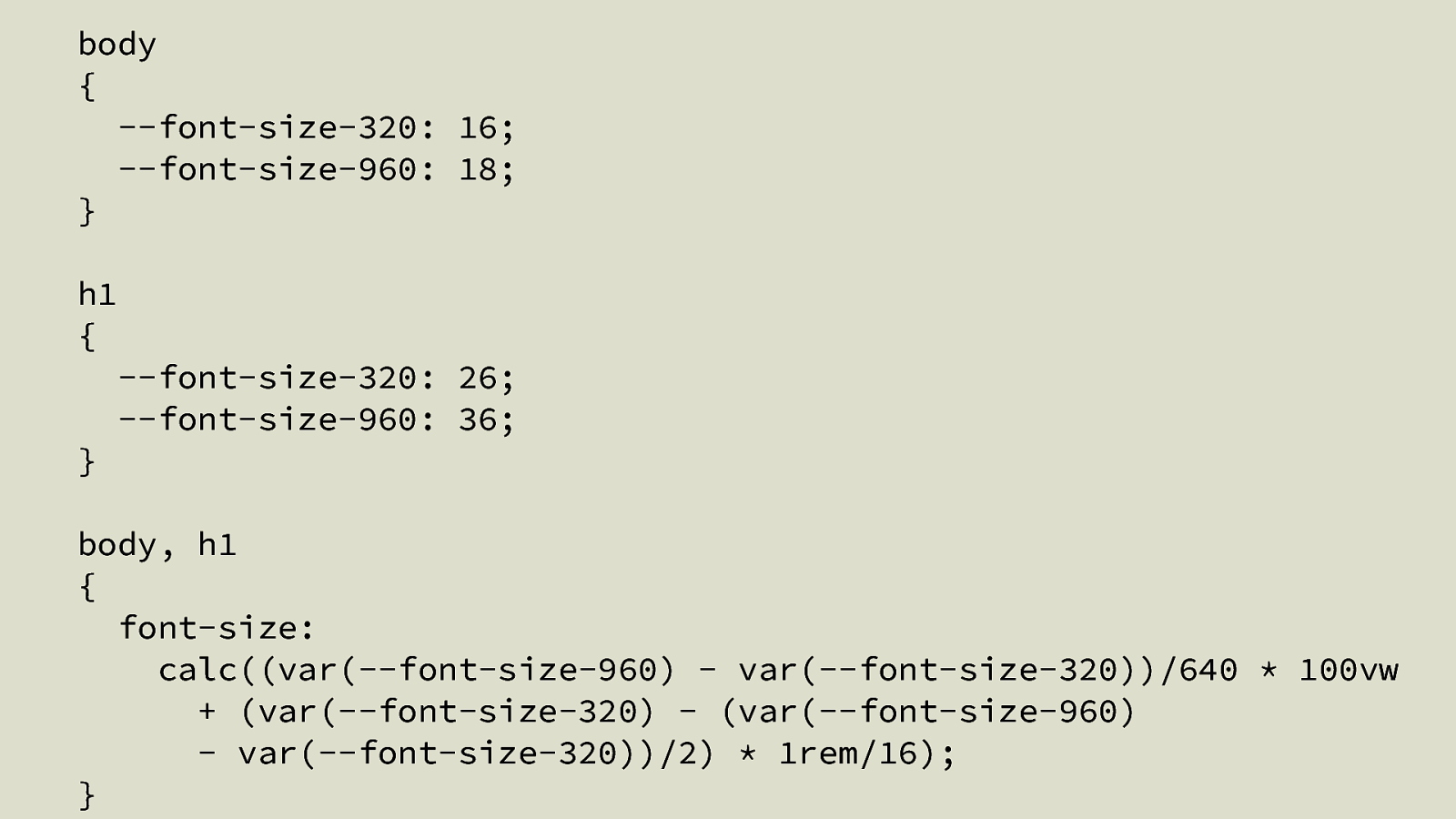
body { —font-size-320: 16; —font-size-960: 18; } h1 { } —font-size-320: 26; —font-size-960: 36; body, h1 { font-size: calc((var(—font-size-960) - var(—font-size-320))/640 * 100vw + (var(—font-size-320) - (var(—font-size-960) - var(—font-size-320))/2) * 1rem/16); }