Primer: Designer's a11y Responsibility

A presentation at #a11yTO Conference in October 2018 in Toronto, ON, Canada by Hala Anwar

Slide 1

Slide 1

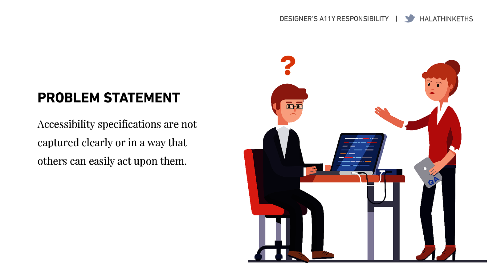
I’m gonna tell you how it is. I’ve met a few consultants over the past few days so I think some of you may relate: Consulting is a ‘Throw people at the problem’ kinda business.

Whenever I’ve needed a team, I’ve been given several recent business grads who (and I quote) “know nothing about accessibility and design, but… they’re good at Excel!”

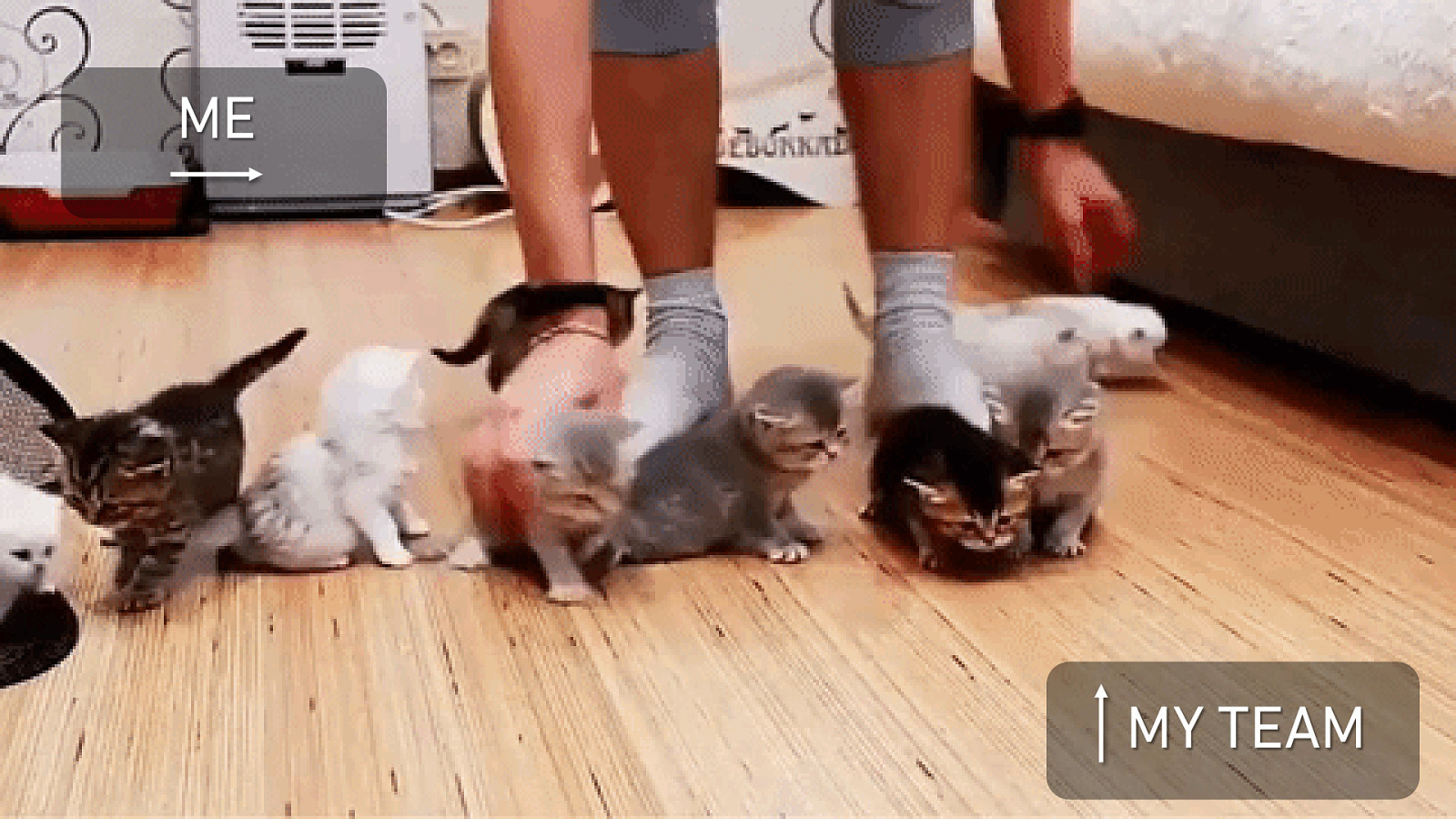
And if you’ve ever wondered what its like to teach a team of Business Grads accessibility and design, let me tell you: it looks a lot like herding kittens.

On the screen, we have a gif of someone scrambling to keep a group of kittens in line.

Slide 2

Slide 2

Now that you’re warm and fuzzy from the kittens:

Good morning, everyone! What an amazing two days so far!

Thank you for coming to the a11y conference and attending my lightning talk on the Designer’s a11y responsibility. We only have 20 minutes.. Or 25.. (depending on how generous Billy and Oskar are feeling) and a lot of ground to cover, so lets begin!

Slide 3

Slide 3

Over the past few years, I have been part of several web and mobile projects. I put together this flow representing the product life cycle in its various forms. Waterfall, Agile, or Lean.. at the end of the day, the steps are fairly similar, just with smaller feedback loops.

Typically, accessibility has only factored in the last few stages of this process:

  • If the developer decides to build responsibly,
  • If the QA team catches an issue, or
  • In the worst case scenario: if the company is sued by a customer after launch.

By the time accessibility issues are identified as bugs by the QA team (who by the way are largely rummaging around in the dark), both the dev and test teams will end up working overtime and doing rework. For the project managers in the room, this ends up costing more than if it had been baked into the project planning from the start.

Slide 4

Slide 4

Time and time again, I have been called in to advise on projects that looked great on the surface but once the development team started building them, we realized the designers had only been designing for people like themselves.

When you handoff sketches of a website or app to your developers, you are literally only designing the product for one particular sighted user group; for everyone else, the developers have to guess as to how the product should behave. That’s a pretty big group’s user experience for the designers to forget about.

Slide 5

Slide 5

Now imagine if the designer had started thinking about inclusive design long before a wireframe was ever sketched out, if accessibility specifications were documented or communicated clearly, consistently, or in a way that other team members can easily act upon them:

  • The project manager would then have something to plan against
  • The product manager would have something to communicate to the business stakeholders
  • The developers and testers wouldn’t have to guess so much.

Slide 6

Slide 6

In this way, I do firmly believe it is the designer’s responsibility to create comparable experiences for everyone who uses your product or service, regardless of how they use it.

  • Accessible and inclusive thinking starts in the Discovery / User Research stage long before the first line of code is written.
  • It continues on as the Designer then channels the user research into creating personas and mapping different journeys.
  • Similarly, the Business Analyst and Product Manager can use these personas to create user stories and requirements, considering all user groups.
  • In the ideation phase, this is when the designer would sketch out wireframes, incorporating accessibility. If this is documented clearly at this stage, it will then get integrated into the product life cycle for the rest of the team.

In this talk, we’ll only focus on the Ideation stage: things to consider while wireframing and creating a design system or style guide.

Slide 7

Slide 7

In a recent survey by Elle Waters, she asked designers and developers why they don’t factor in accessibility in their work. The top 3 responses ranged from:

  • Accessibility is intimidating.
  • Accessibility is hard.
  • Accessibility is not my job.

Since you are all here at the conference, I don’t think #3 is an issue with this group. My goal is to help mitigate #1 and 2 by the end of this presentation. Based on my experience teaching my team of non-designers, I’ll be sharing some practical tips and tricky areas that my team has learnt from experience to keep our eyes on.

Slide 8

Slide 8

We will begin by taking a real-world website, thinking of it as a high-fidelity mockup, and looking at aspects of accessibility that should be standardized in design systems or style guides, and those that will vary for each wireframe.

This is not an exhaustive list of what you need to document for better communication and by no means is it the only way to capture accessibility requirements. I’ll share with you some best practices that have worked for my team and I’ve seen similar versions from our colleagues over at TPG, Adobe, etc.

The slides will be available to download and I will of course be verbally describing any diagrams that are on screen.

Slide 9

Slide 9

For our case study today, we will be taking apart an abridged version of TELUS Digital’s homepage. (Don’t worry, I got Oskar’s permission. He’s around here somewhere.)

Slide 10

Slide 10

On the screen, I’ve put up the web and mobile view of the TELUS Digital homepage. Thinking of these as high-fidelity mockups, lets see what implicit visual information we can point out in terms of:

  • Structure
  • Interaction Elements
  • Images

Slide 11

Slide 11

There are two significant modals or menus to point out here.

  • One for ‘Change your region’ which contain an alphabetical list of provinces and languages.
  • Mobile hamburger menu that is a compact list of the button/links from the two menu bars.

Slide 12

Slide 12

Our goal here is to make all the implicit visual information explicit to ensure that our interface provides a comparable experience for all, regardless of how our users are consuming our product or service.

Slide 13

Slide 13

Starting with design systems..

I’m a huge fan of design systems. The nerd in me sometimes opens one up like a good book (of best practices) when I’m bored. Its amazing to see so many companies now using them, because they are great for standardizing accessible components and in-house preferred patterns. Design systems and style guides introduce consistency, and consistency begets usability. Inconsistency creates unnecessary obstacles.

Slide 14

Slide 14

One of the most important aspect to capture in your design system are guidelines around use of color. For users with color blindness, it is important not rely on color alone to indicate an action. I’ve seen this frequently go wrong with links.

TELUS Digital uses a chevron as a visual cue to indicate a link, which you can see in the top half of the mobile menu here. However, in the same mobile menu, you can see that this isn’t kept consistent and the bottom 4 links do not have any clear visual cues.

Slide 15

Slide 15

On the topic of color, W3C has guidelines for color contrast that you must follow. If you have ever tried reading a message on your phone while standing in the sun, you can vouch for how important this is.

I really like how Shopify’s Polaris design system capture some Dos and Donts, showing some color combinations that work with their brand colors alongside some combinations that don’t.

Slide 16

Slide 16

Continuing on with color…

Visible focus states are visual outlines which indicate where the user currently is while navigating through the page. Key colors to capture are: default, hover, and focused state, which Mozilla’s Photon System lays out very clearly.

Slide 17

Slide 17

An important thing to keep in mind is if your brand colors are similar to the browser’s default focus color (e.g. you use a lot of blue), consider replacing the native browser style. On the right is an example from Google Images of what happens if you don’t.

Slide 18

Slide 18

After laying out some guidelines in our design system or style guide, we will now take a quick look at some important aspects of accessibility which should be captured for each wireframe.

Slide 19

Slide 19

For the TELUS Digital “mockup”, we looked at some of the implicit structural information earlier. Now we’ll work on making this explicit in our designs. Group elements in your wireframe and identify them as a landmark. This will allow screen reader users to quickly jump to them. As a bonus: Carrie mentioned yesterday this would help with the Search Engine Optimization of your website as well.

Some of you may be thinking “this is simple enough, why can’t the developer YOLO it?” Well, the TELUS Digital homepage is relatively simple. On most pages, you could have multiple forms of navigation (for example: breadcrumbs or navigation controls) and only you as the designer will know best how to group elements together.

Slide 20

Slide 20

The content strategist or designer knows the content best and should assign the heading levels to information on a page, following a meaningful order. This is important for screen reader users to jump ahead, and like Aamir says, the H button is his favorite button on the keyboard. For headings, I always tell my team to think of the page as a newspaper. The headings levels will allow screen reader users to read the headlines and jump ahead to the information which is relevant to them, without having to listen to every word in between.

Slide 21

Slide 21

When focus jumps randomly around the page, the user gets confused. Sometimes a logical order will be obvious to your front end team based on a simple layout, but in more complicated layouts you may need to identify the tab order in your wireframes.

Slide 22

Slide 22

Slide 23

Slide 23

3 way to navigate through a page:

  1. Landmarks
  2. Headings
  3. Links / Buttons

Slide 24

Slide 24

Slide 25

Slide 25

Slide 26

Slide 26

I know this can look a little intimidating at first, so I’m gonna let you in on a little secret: This doesn’t have to be 100% right. But it is enough to get the discussion started with your development team. They will provide you feedback and that’s how you will learn.

I’ve been doing this for several years now and I can tell you right now: there are probably several people in the audience right now thinking “Nawwww, you should not have put an aria-haspopup=true on the link since NVDA reads it differently.” I’ve been on projects where my dev team has said “No, we can’t do these heading levels, they will have to skip a level because we are reusing components” And you know what? That’s perfectly okay. I made a note and when it came time for QA, the testers knew what to look for.

Slide 27

Slide 27

Applying semantic HTML is the most effective and the easiest way to make a page accessible. It avoids situations where <a> elements are used for buttons instead of buttons. As the saying goes, if it looks like a duck and quacks like a duck, make sure you are getting a duck.

Slide 28

Slide 28

Slide 29

Slide 29

To recap, accessibility is a team effort that starts with the researchers and the designers.

Slide 30

Slide 30

I hope this talk has made accessibility a little less intimidating for you, and that you walk away thinking of accessibility as a set of design constraints that help you create a better product for all users. In doing so, you will be testing the feasibility of your designs early on, ensure consistency, and take the guessing out of your development and QA team’s work.

Slide 31

Slide 31

Slide 32

Slide 32