Keeping it simple with CSS that scales Andy Bell @andybelldesign

A presentation at State Of The Browser in September 2019 in London, UK by Andy Bell

Keeping it simple with CSS that scales Andy Bell @andybelldesign
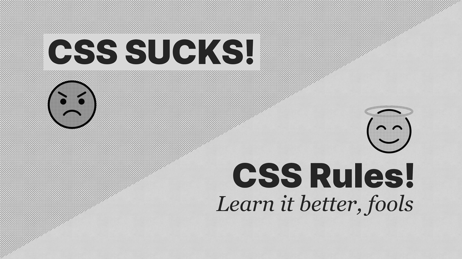
CSS SUCKS! CSS Rules! Learn it better, fools
import CSS from ‘css’;

import CSS from ‘css’;

Let’s talk about “scale”
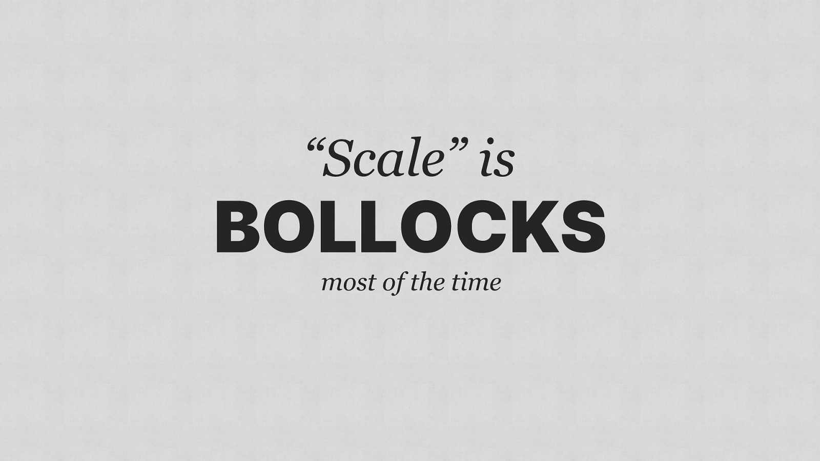
“Scale” is BOLLOCKS most of the time
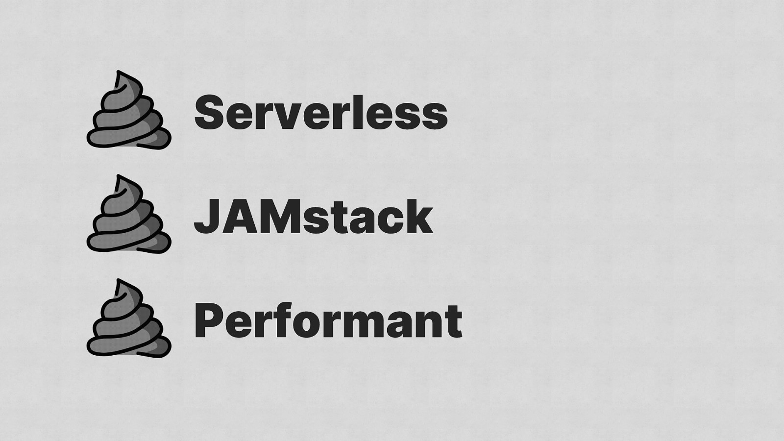
Serverless JAMstack Performant
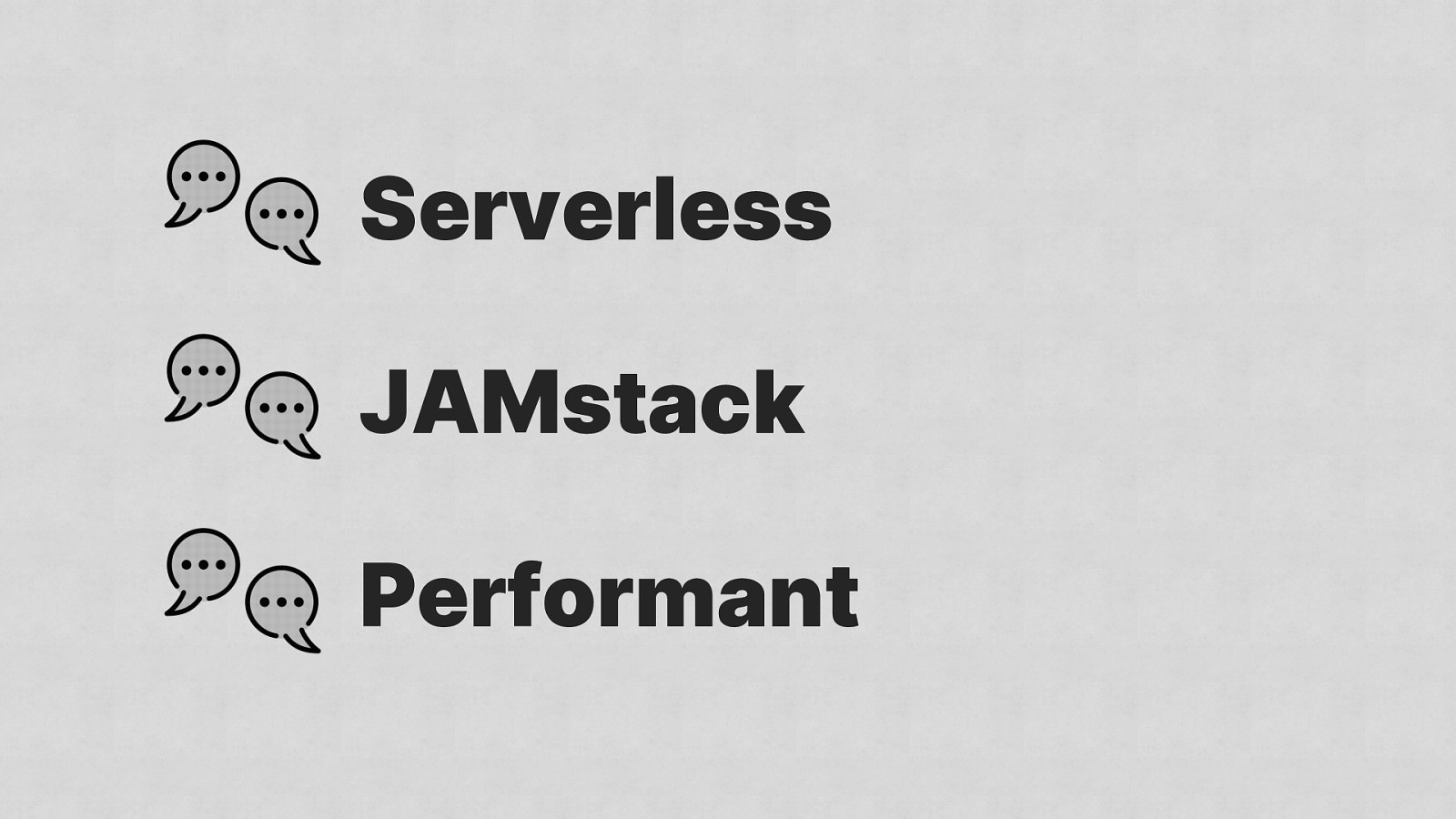
Serverless JAMstack Performant
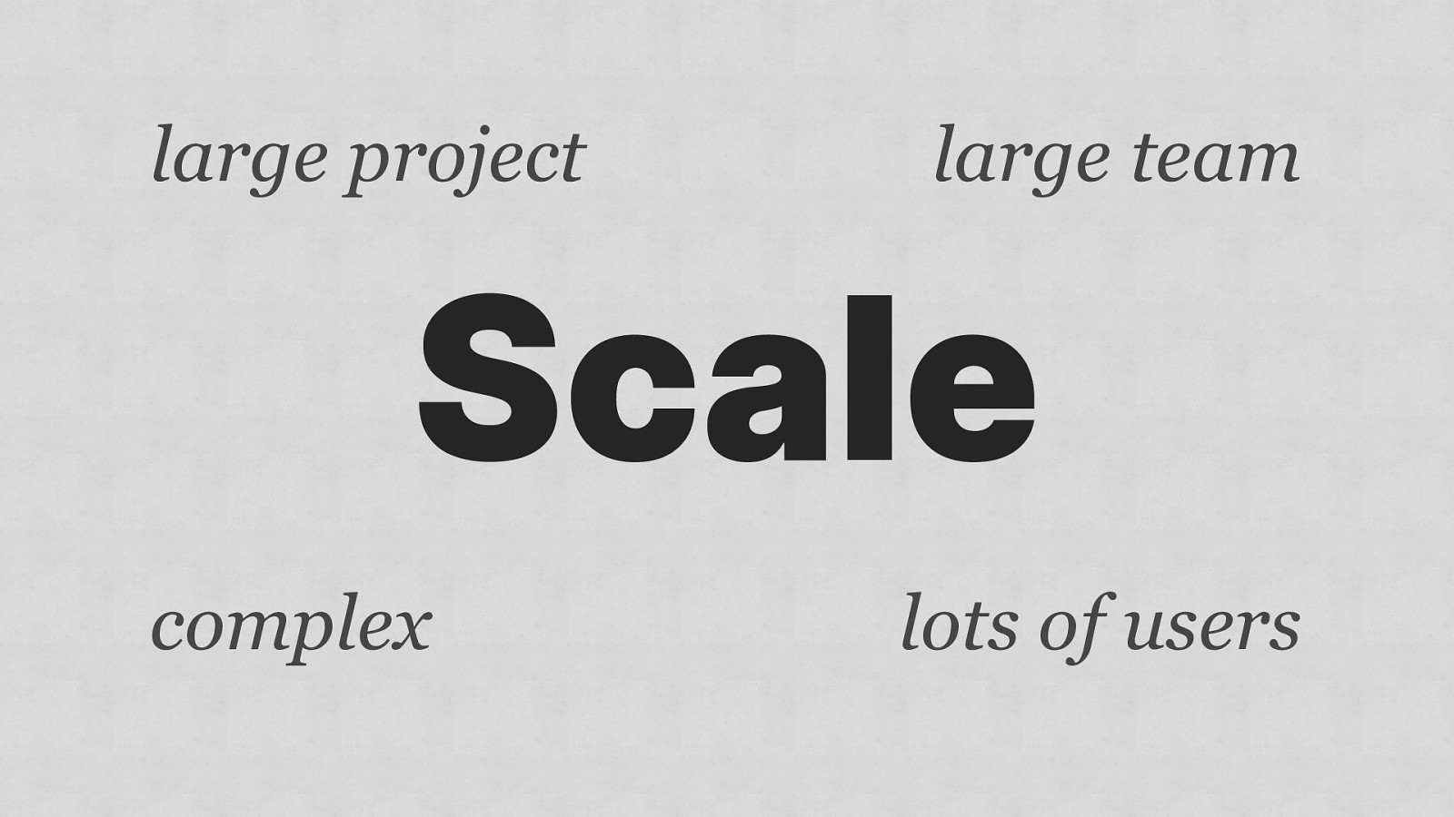
large project large team Scale complex lots of users
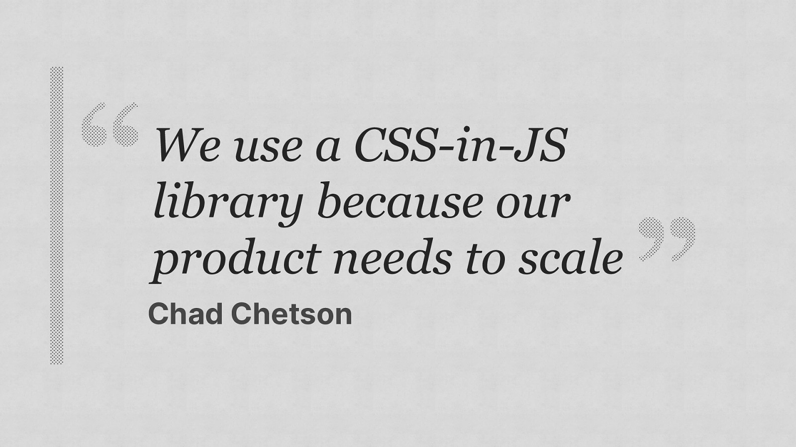
We use a CSS-in-JS library because our product needs to scale Chad Chetson
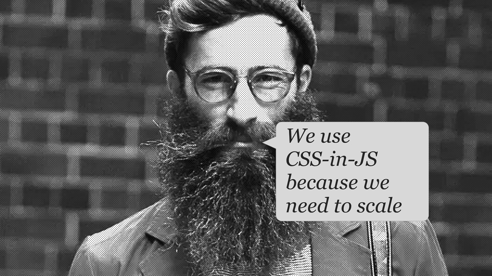
We use CSS-in-JS because we need to scale

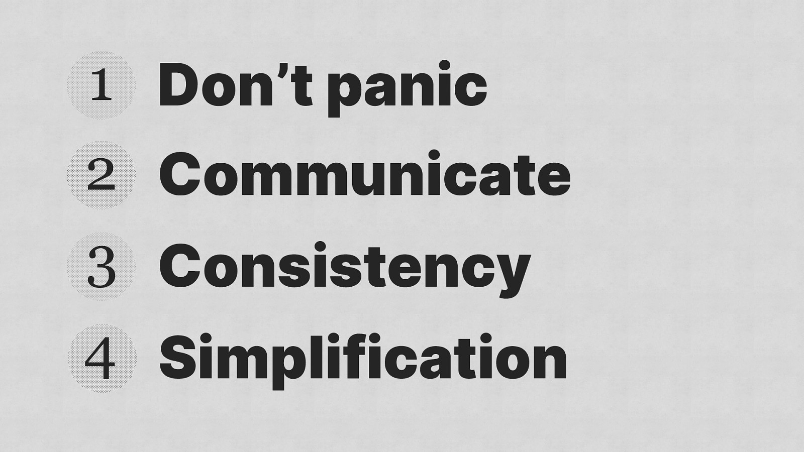
Four key things

1 Don’t panic 2 Communicate 3 Consistency 4 Simplification

1 Don’t panic 2 Communicate 3 Consistency 4 Simplification
Image from bbc.co.uk
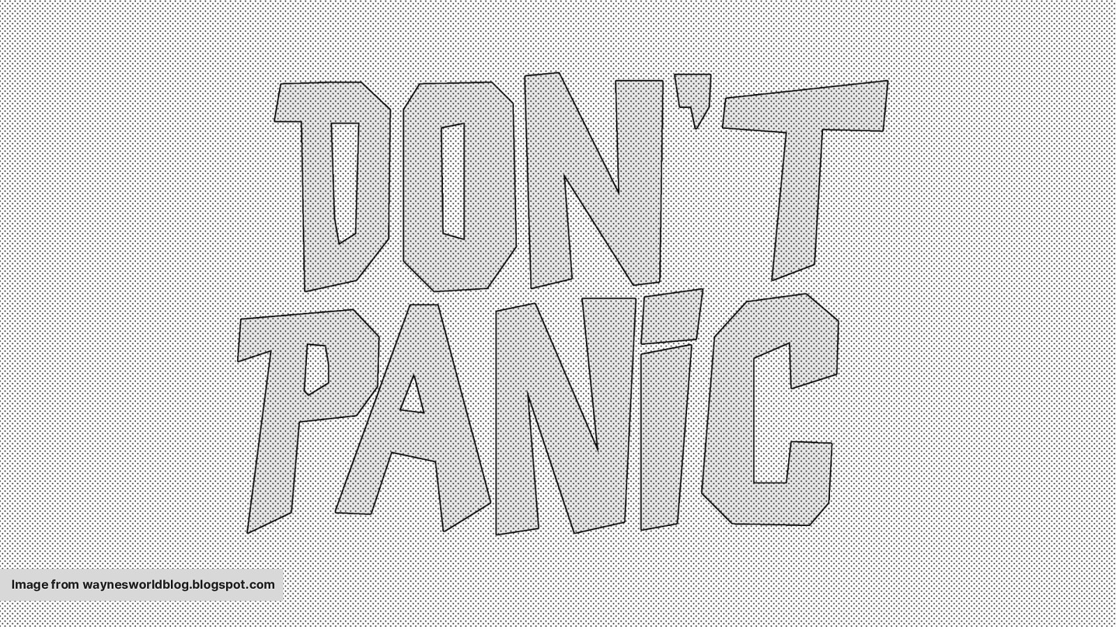
Image from waynesworldblog.blogspot.com
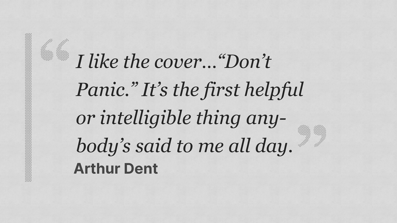
I like the cover…“Don’t Panic.” It’s the first helpful or intelligible thing anybody’s said to me all day. Arthur Dent

Fool
Image from thisismoney.co.uk
̂͋ ͛ ̓ ̽ ̄ ̒ ͛ ̓ ̏ ͂ ̋ ̚ ͌ ̕ !important !̷̘ĩ́ ͓̻̭ m̴ ̸ ͖̺̙͒ p̵͖̬͆ ő̵̞ͅ ̀ ř̴̦̖͈ ̡̛t̶͇å ̴ ̈ͅ t̴̞͕ ̀̅ ̝̖̹ ͜ n̵ ͖ ̜͙ ̟ ̤̻

The current state of CSS
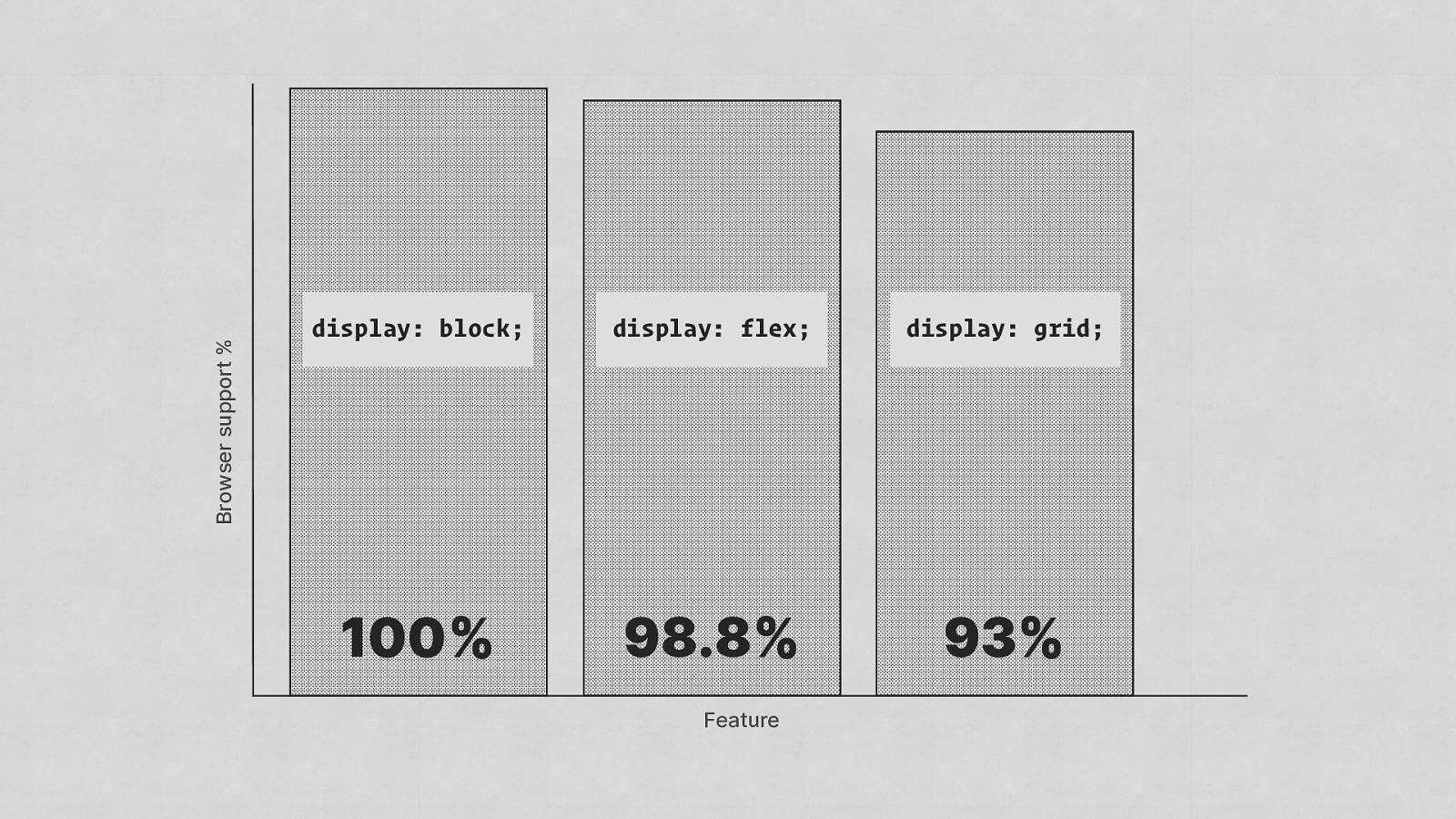
Browser support % display: block; display: flex; display: grid; 100% 98.8% 93% Feature
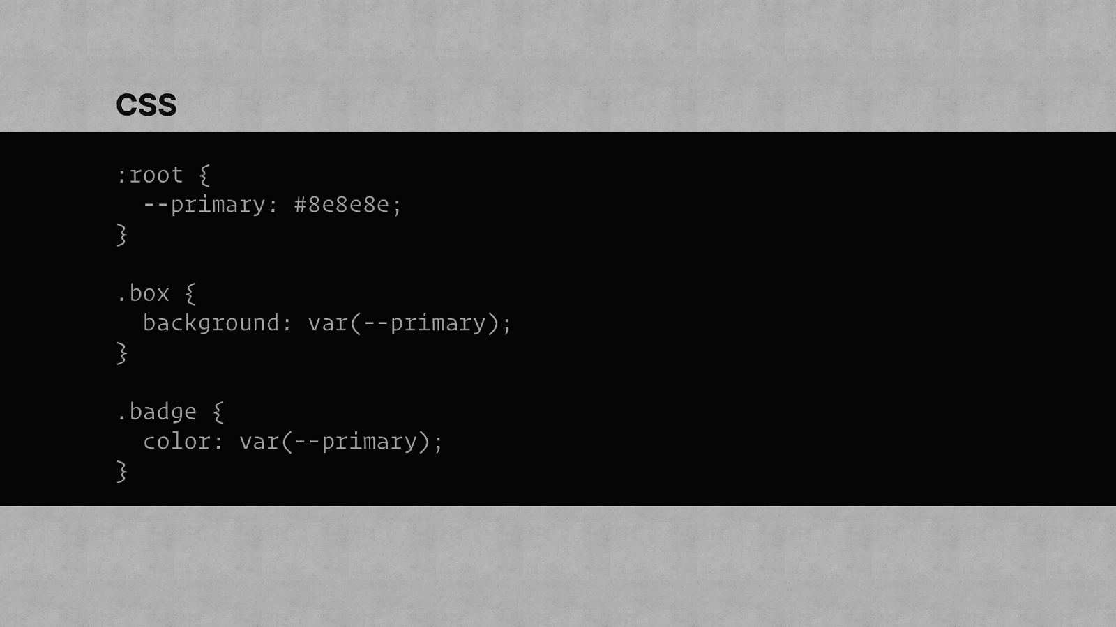
CSS :root { —primary: #8e8e8e; } .box { background: var(—primary); } .badge { color: var(—primary); }
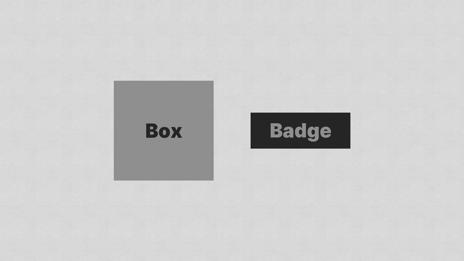
Box Badge

CSS .about-page { —primary: #ff00ff; }
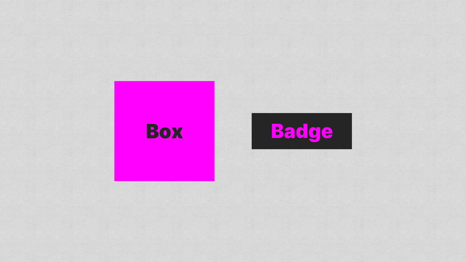
Box Badge

Sass FTW
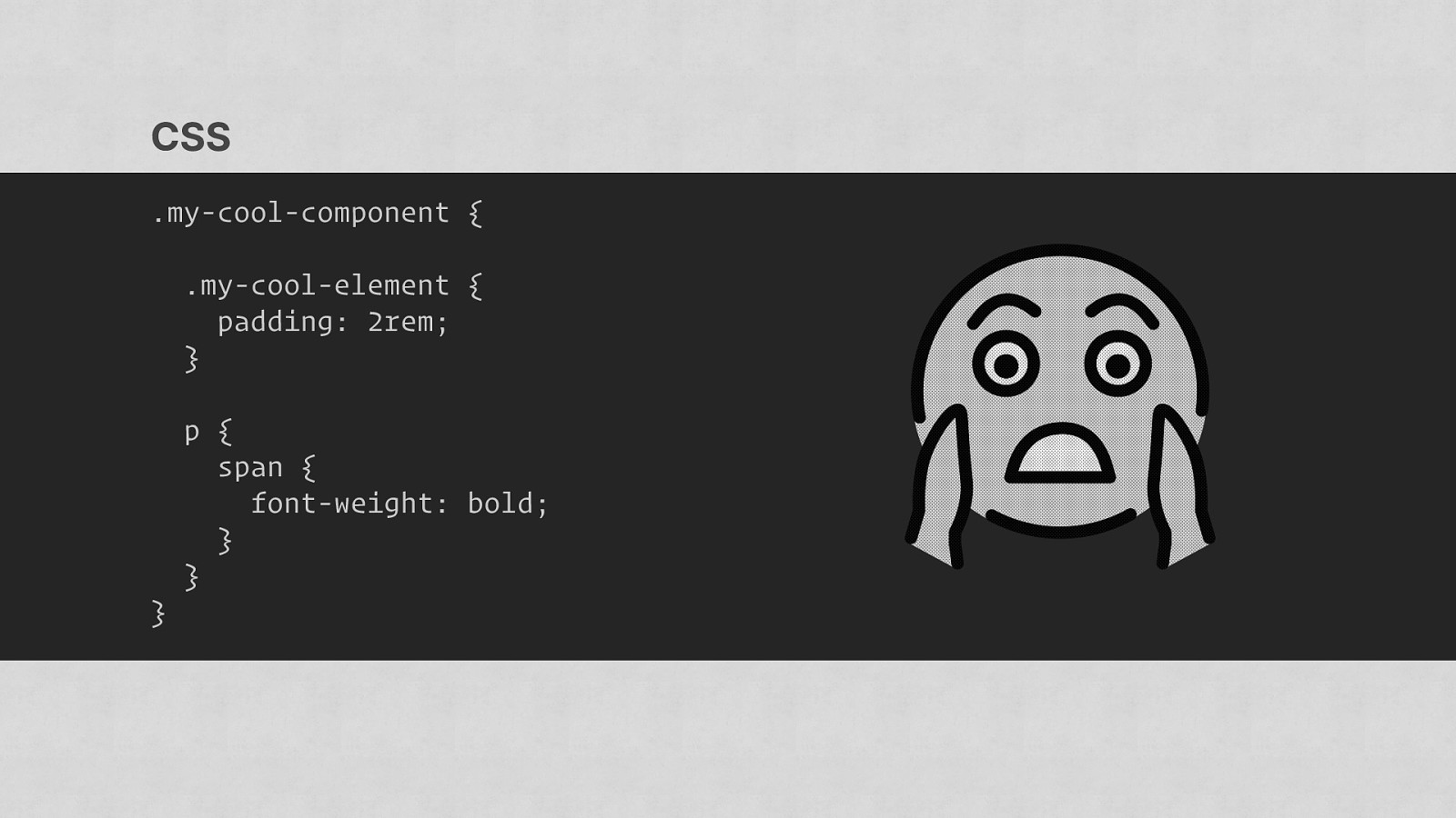
CSS .my-cool-component { .my-cool-element { padding: 2rem; } } p { span { font-weight: bold; } }
Image from commons.wikimedia.org
Image from iwradio.co.uk
Image from gsmarena.com
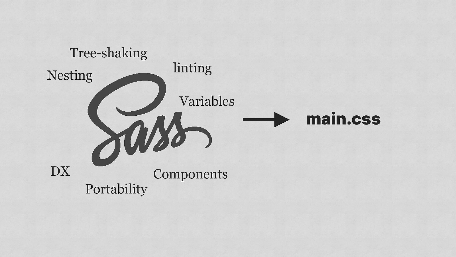
Tree-shaking Nesting linting Variables DX Portability Components main.css
The “S” in SCSS stands for “Spicy”. The_C_In_CSS https://twitter.com/The_C_In_CSS/status/1165990844882653184

1 Don’t panic 2 Communicate 3 Consistency 4 Simplification

Naming is hard*
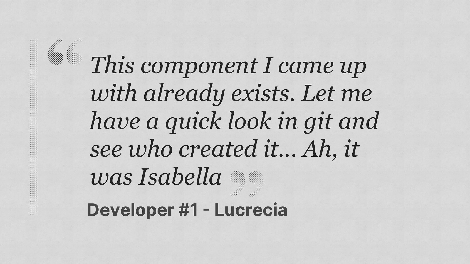
This component I came up with already exists. Let me have a quick look in git and see who created it… Ah, it was Isabella Developer #1 Lucrecia
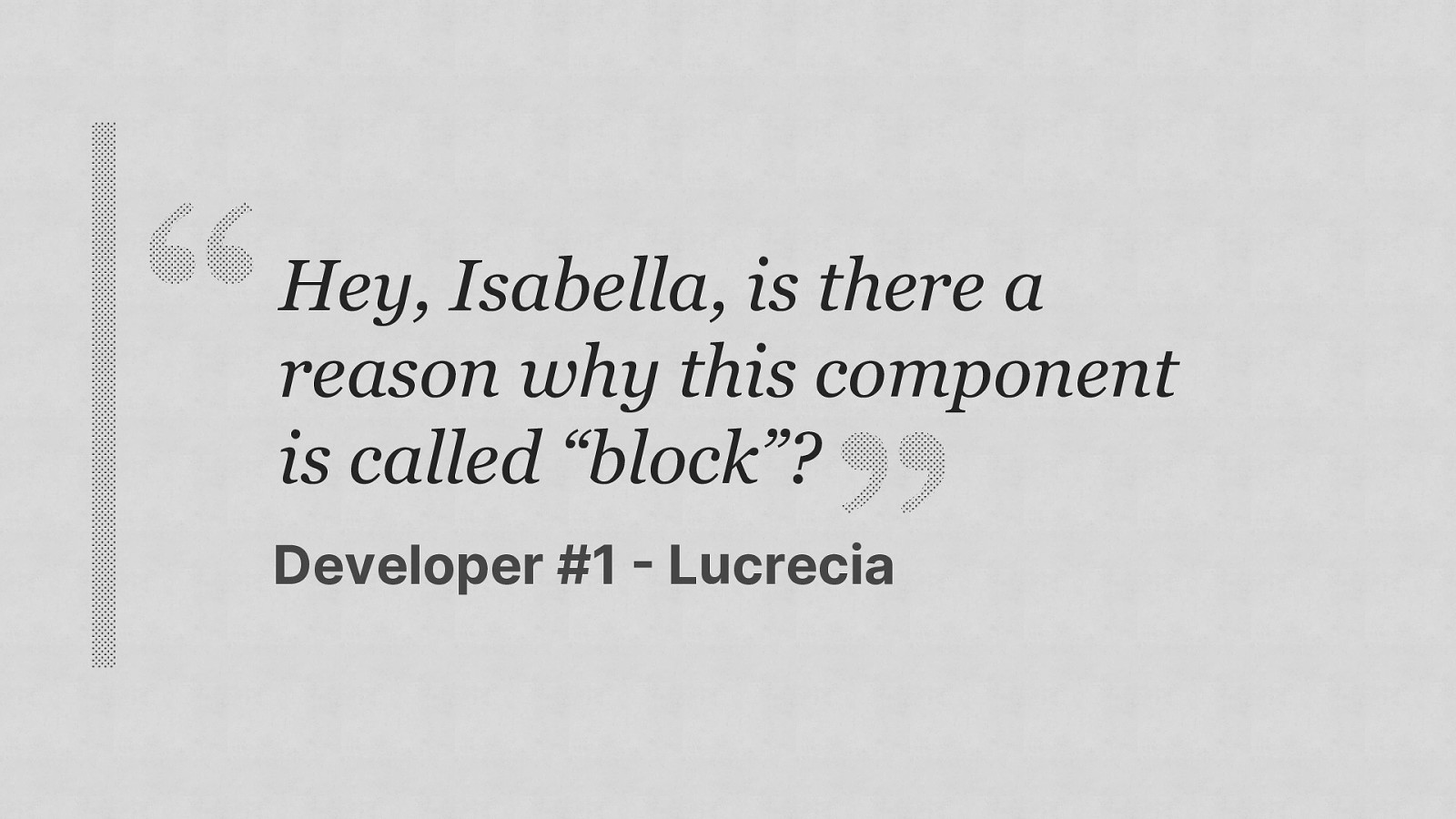
Hey, Isabella, is there a reason why this component is called “block”? Developer #1 Lucrecia
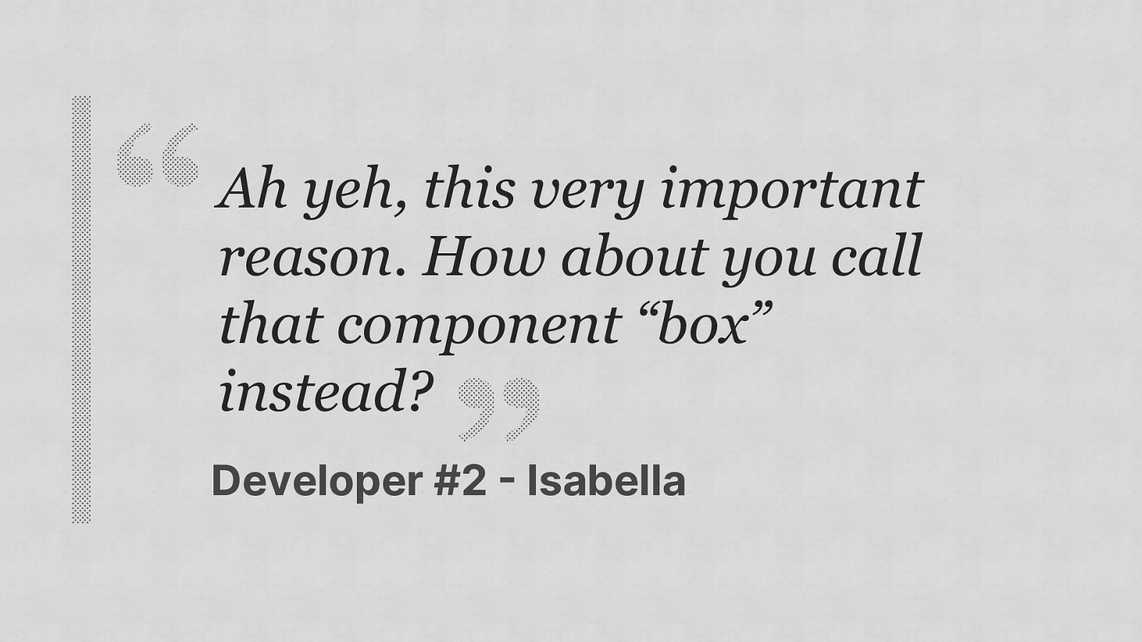
Ah yeh, this very important reason. How about you call that component “box” instead? Developer #2 Isabella
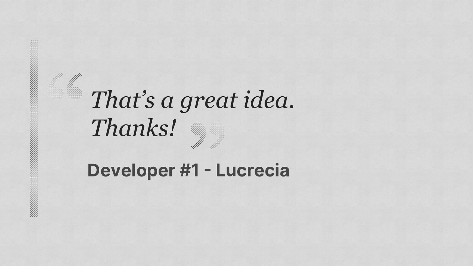
That’s a great idea. Thanks! Developer #1 Lucrecia
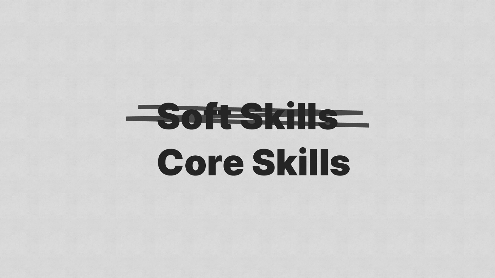
Soft Skills Core Skills

Document everything
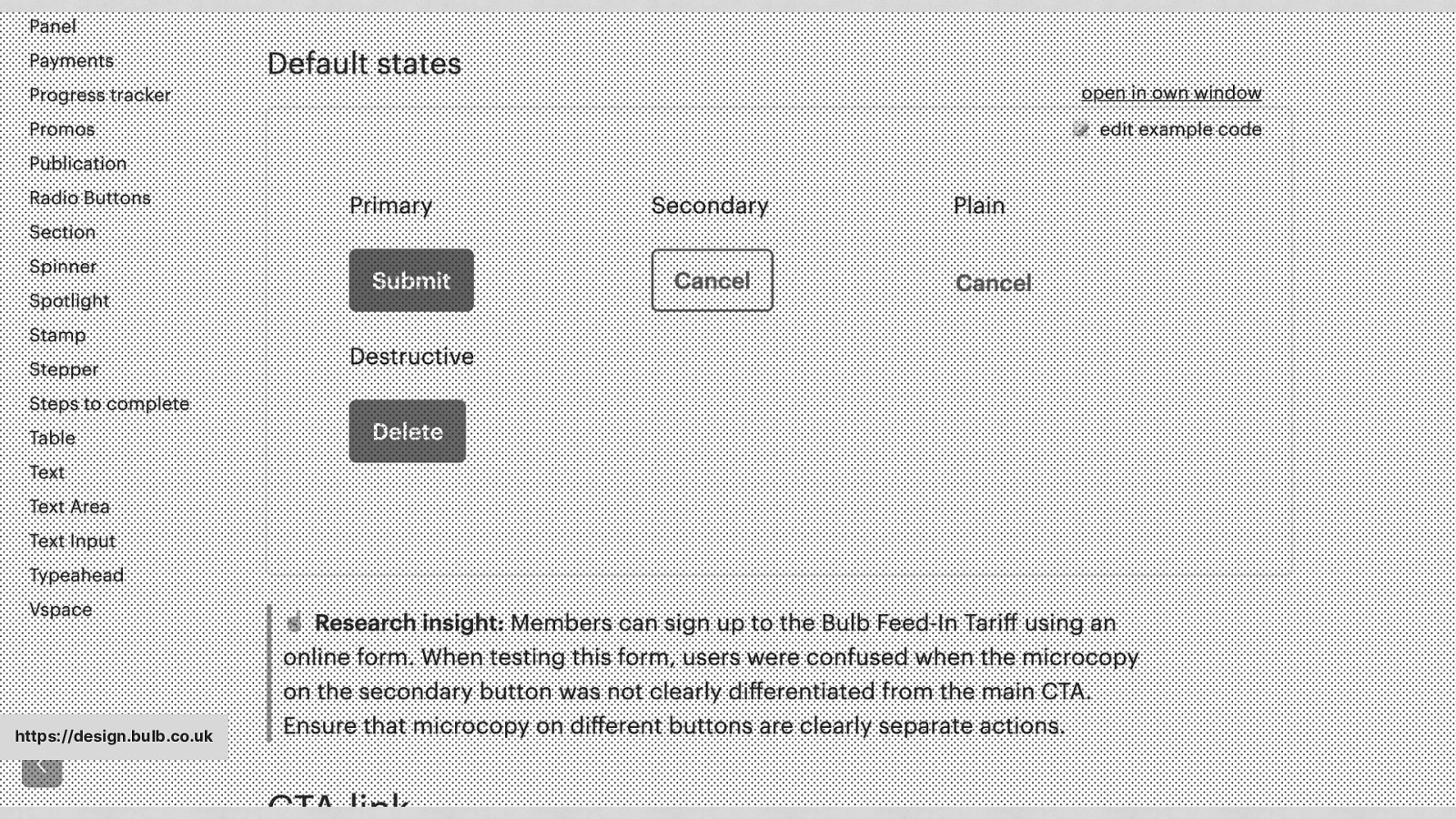
https://design.bulb.co.uk
One of my favourite details in @bulbenergy’s new pattern library – research insights that explain rationale behind some of the patterns, based on user research. Alla Kholmatova - @craftui

CSS .card { background-color: #ffffff !important; }

CSS .card { /* When this card is used in the legacy app, there is a collision between existing styles, so unfortunately we had to go nuclear. It’s certainly a refactor target. */ } background-color: #ffffff !important;
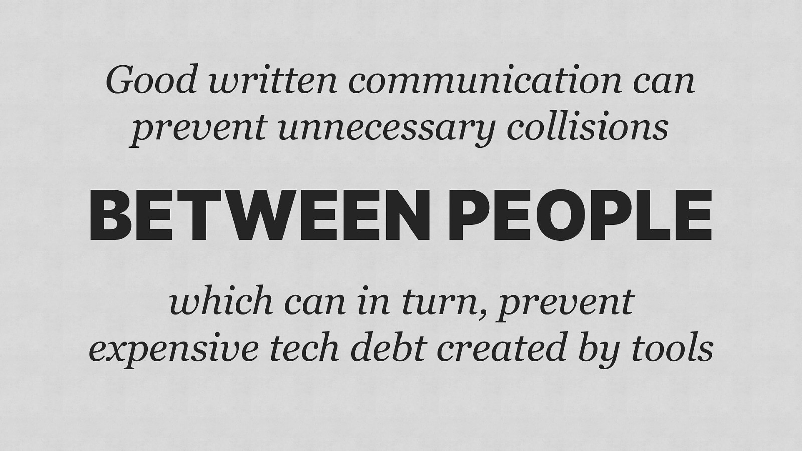
Good written communication can prevent unnecessary collisions BETWEEN PEOPLE which can in turn, prevent expensive tech debt created by tools

1 Don’t panic 2 Communicate 3 Consistency 4 Simplification
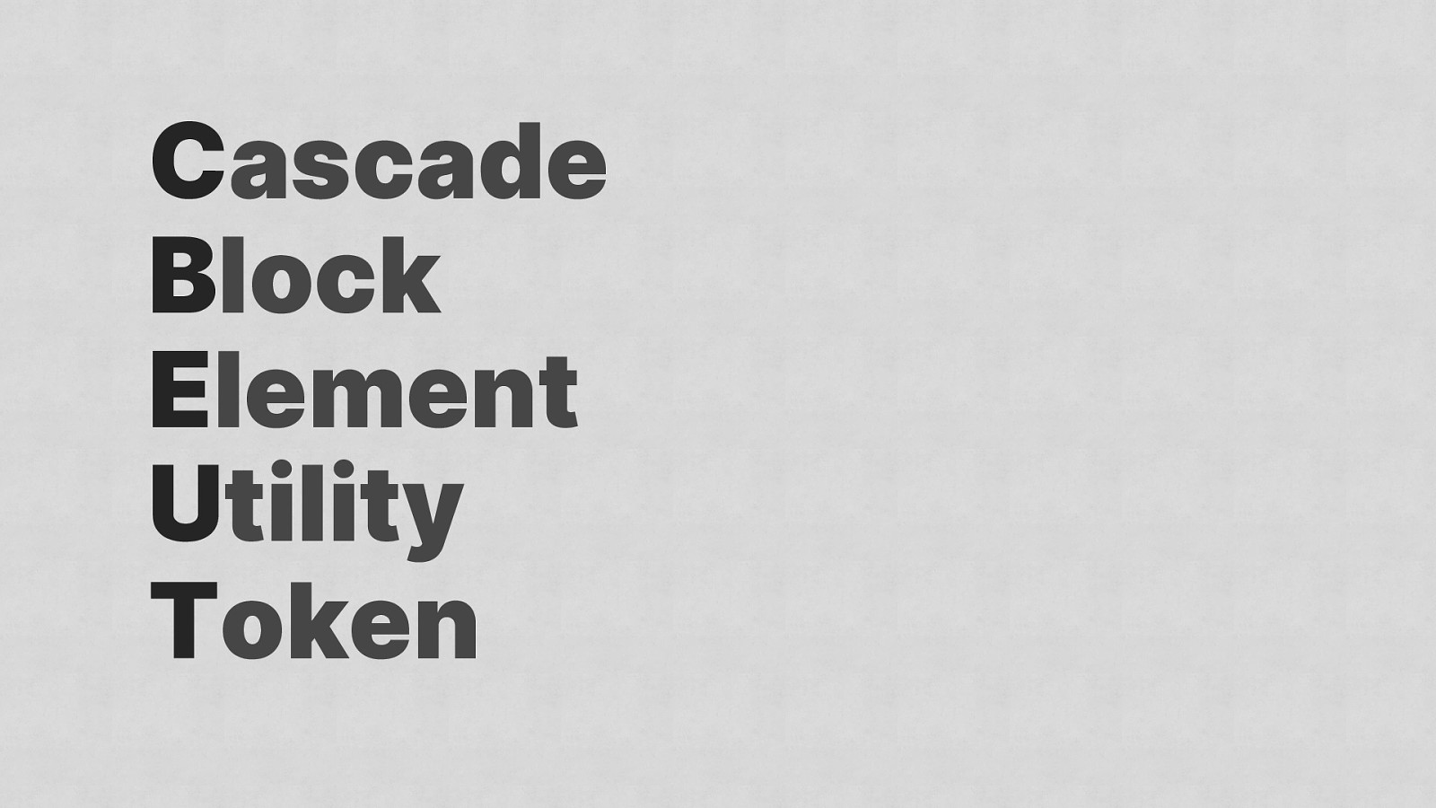
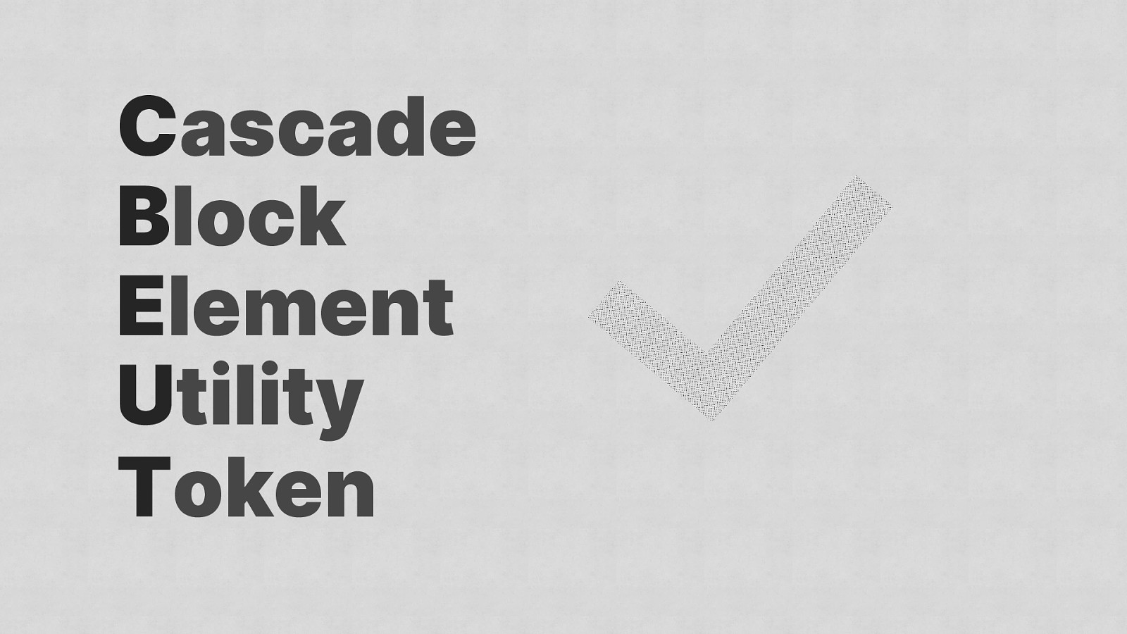
Cascade Block Element Utility Token

CBEUT what a shit name, I know
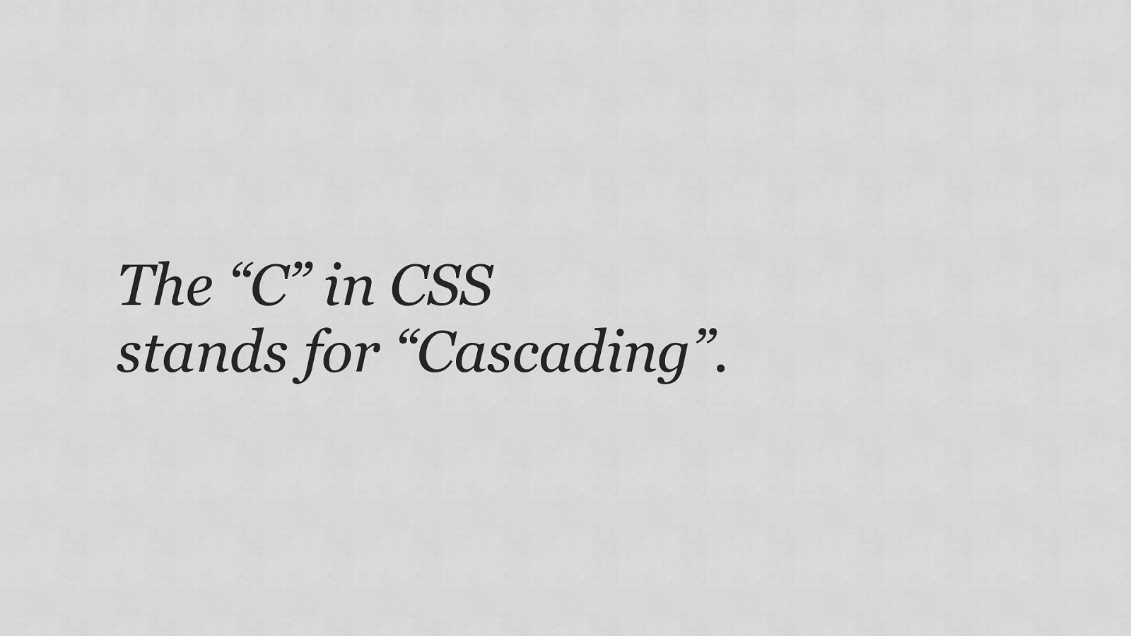
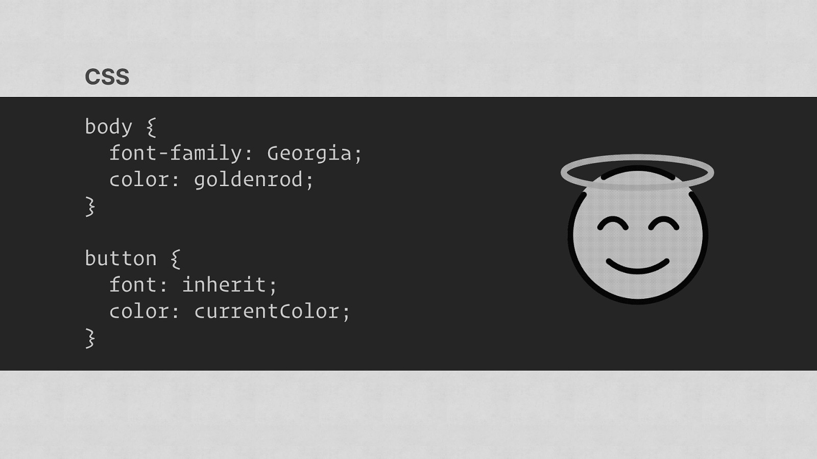
The “C” in CSS stands for “Cascading”.
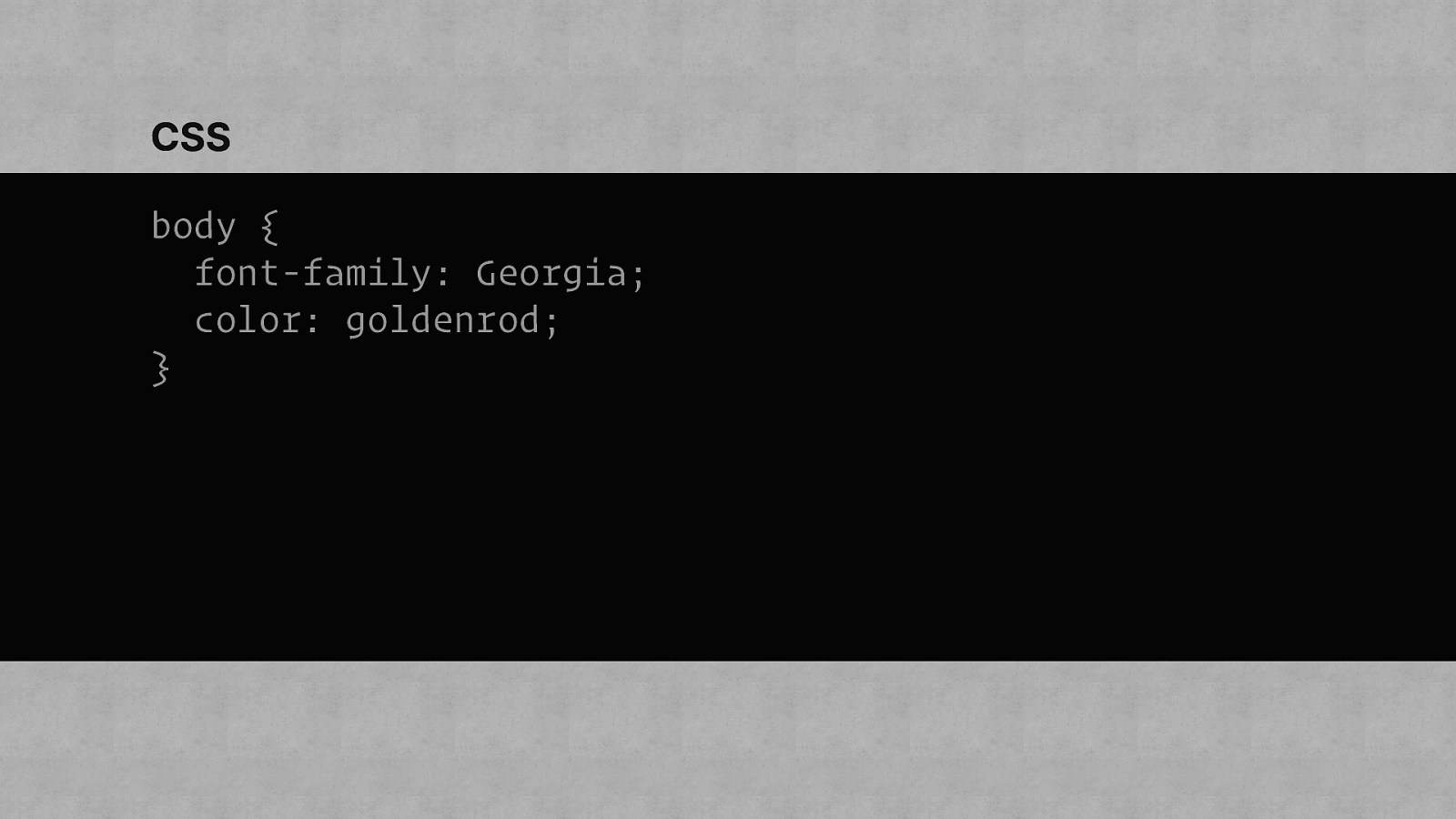
CSS body { font-family: Georgia; color: goldenrod; }
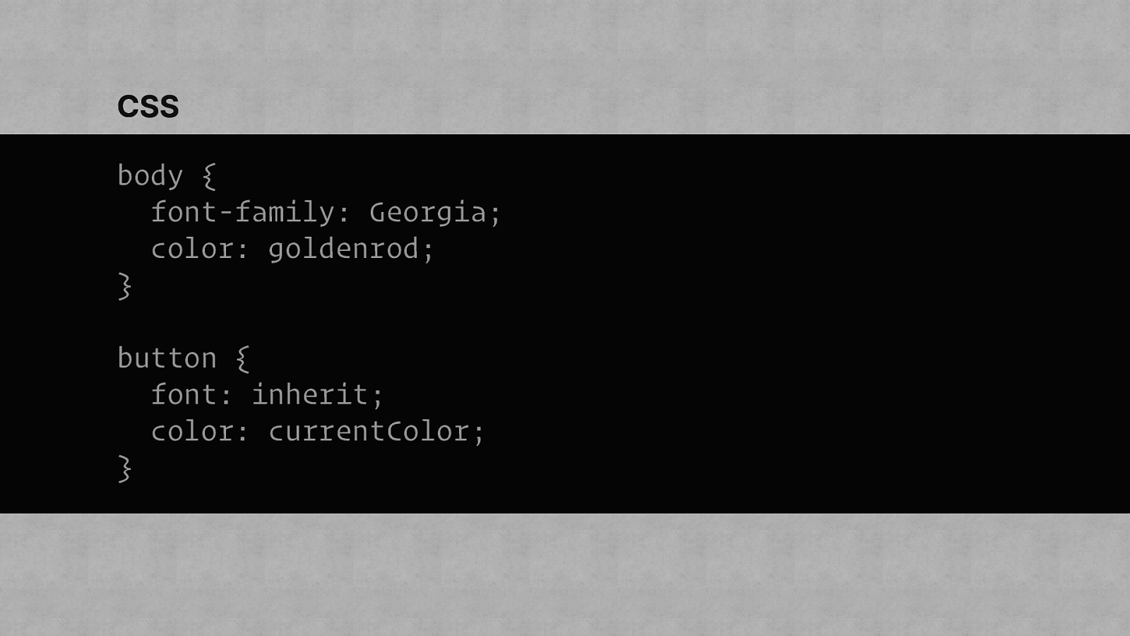
CSS body { font-family: Georgia; color: goldenrod; } button { font: inherit; color: currentColor; }
CSS body { font-family: Georgia; color: goldenrod; } button { font: inherit; color: currentColor; }
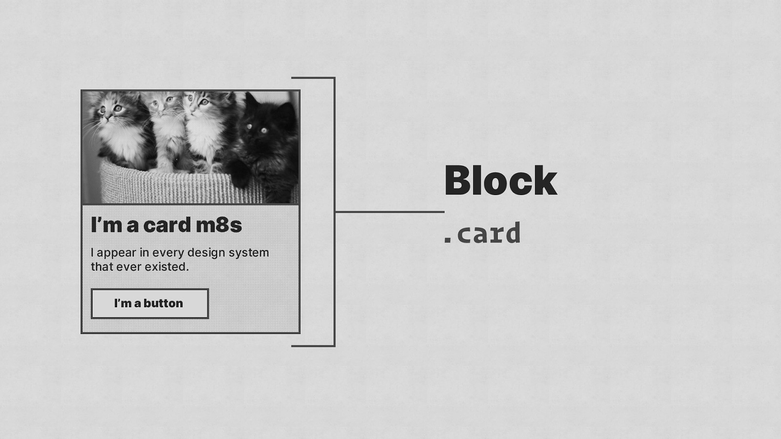
Block I’m a card m8s I appear in every design system that ever existed. I’m a button .card
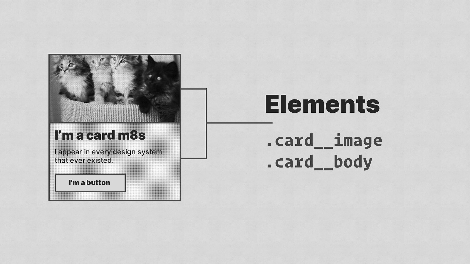
Elements I’m a card m8s I appear in every design system that ever existed. I’m a button .card__image .card__body
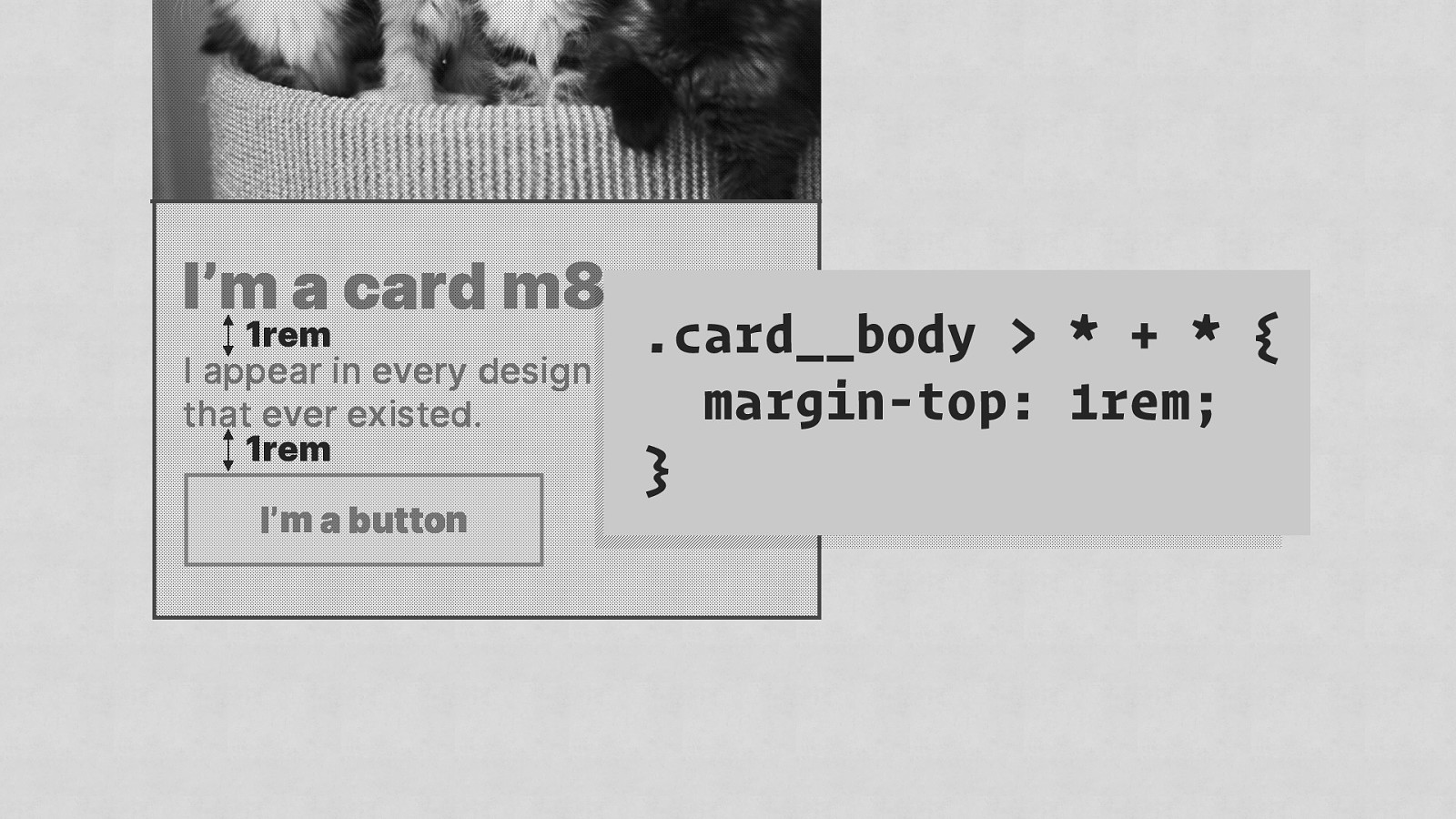
1rem 1rem .card__body > * + * { margin-top: 1rem; }
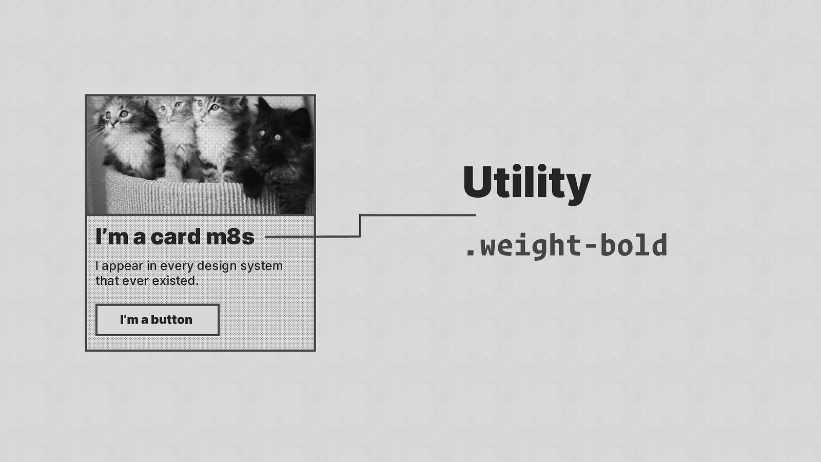
Utility I’m a card m8s I appear in every design system that ever existed. I’m a button .weight-bold

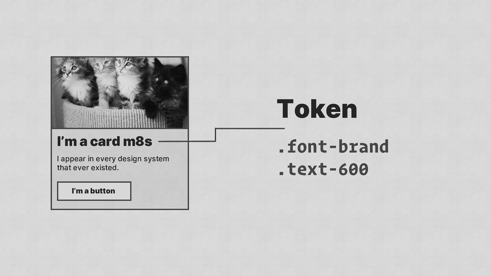
Token I’m a card m8s I appear in every design system that ever existed. I’m a button .font-brand .text-600
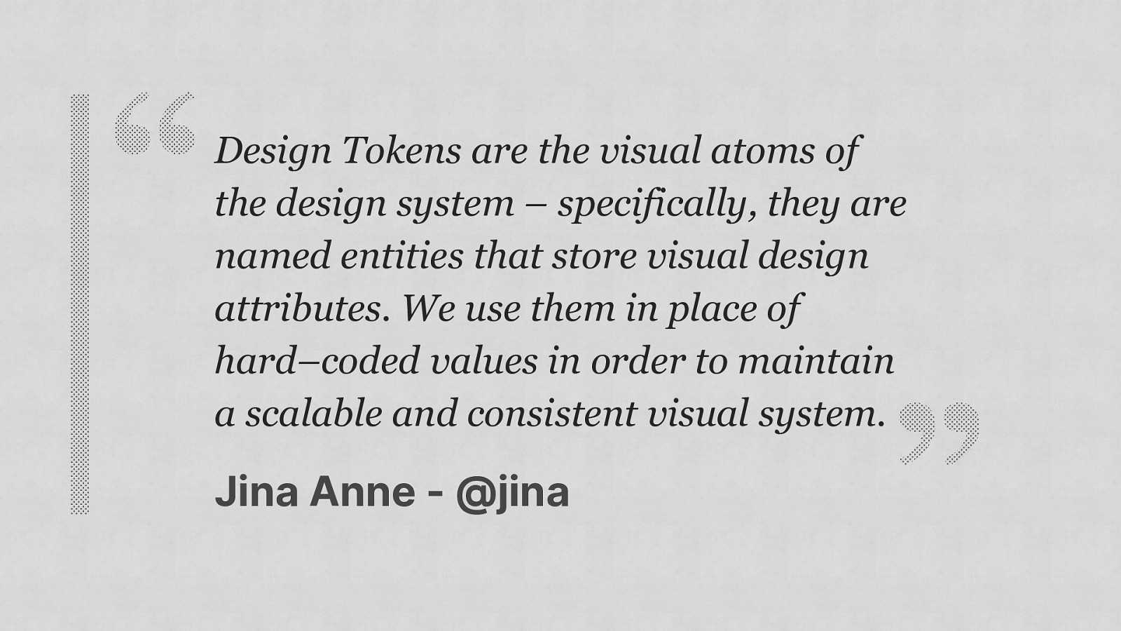
Design Tokens are the visual atoms of the design system – specifically, they are named entities that store visual design attributes. We use them in place of hard–coded values in order to maintain a scalable and consistent visual system. Jina Anne - @jina
Token I’m a card m8s I appear in every design system that ever existed. I’m a button .font-brand .text-600
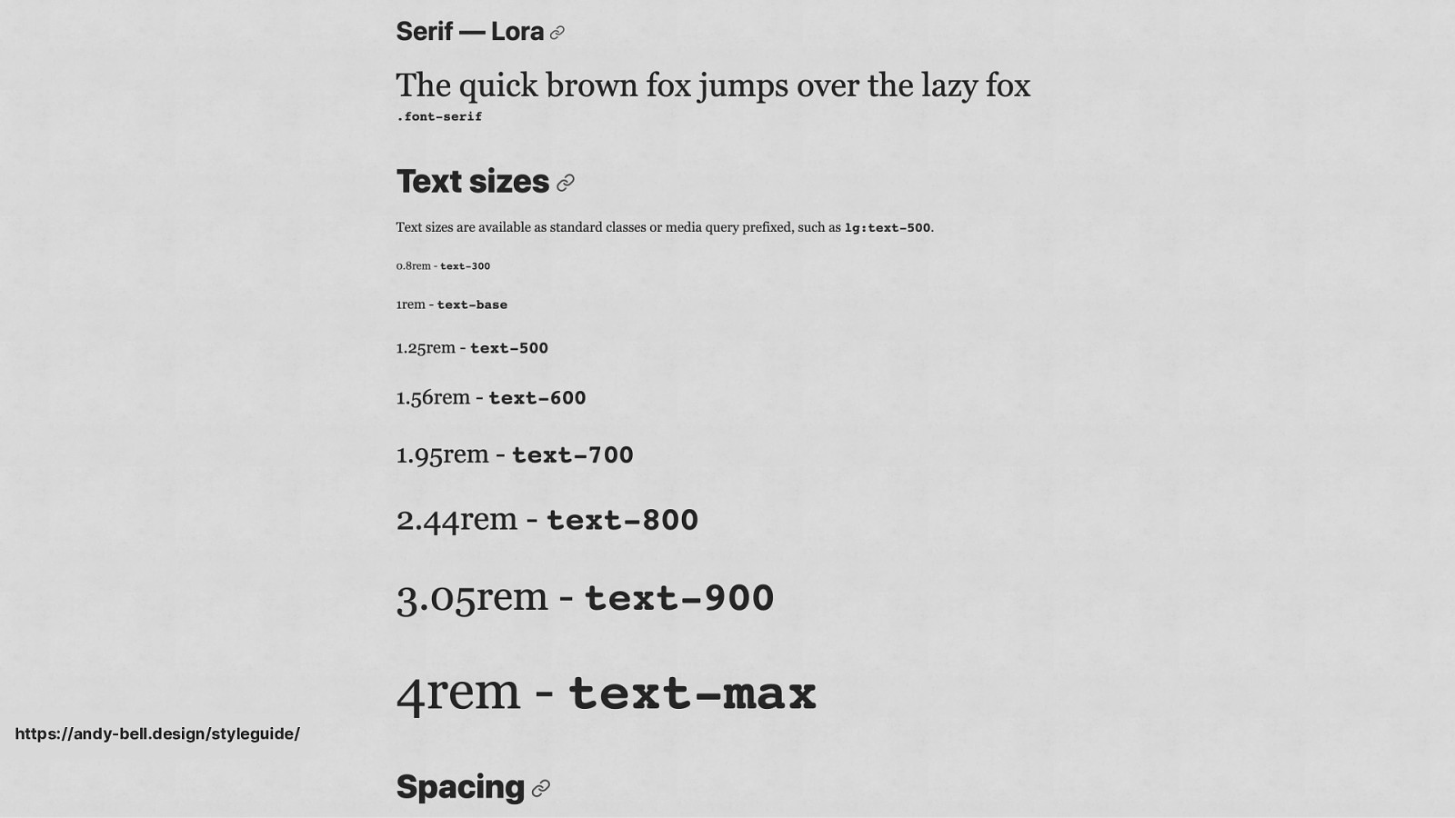
https://andy-bell.design/styleguide/
Cascade Block Element Utility Token
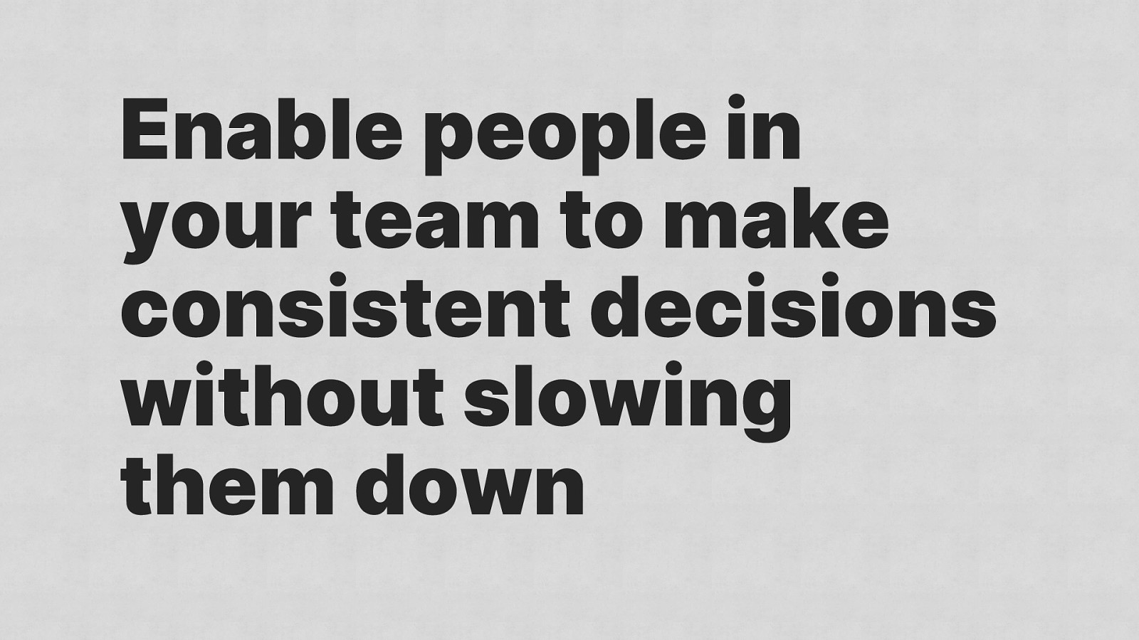
Enable people in your team to make consistent decisions without slowing them down

Cascade Block Element Utility Token
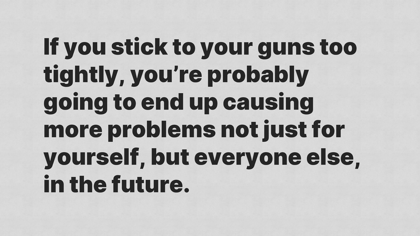
If you stick to your guns too tightly, you’re probably going to end up causing more problems not just for yourself, but everyone else, in the future.
1 Don’t panic 2 Communicate 3 Consistency 4 Simplification

By accident, Bootstrap is one of the best design systems ever created
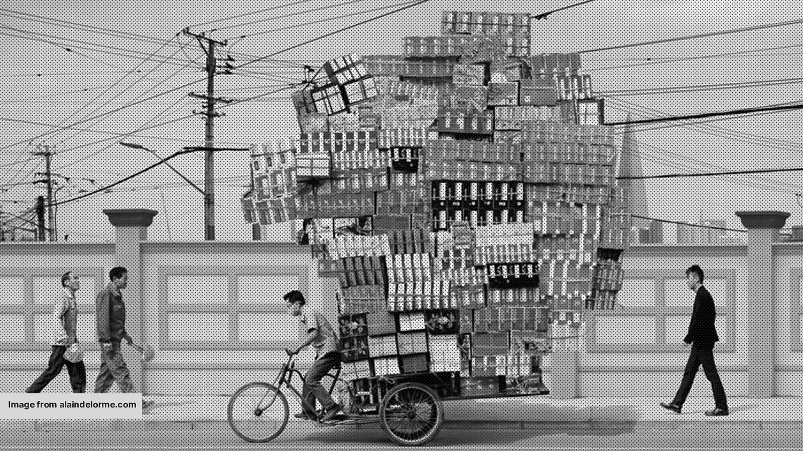
Image from alaindelorme.com
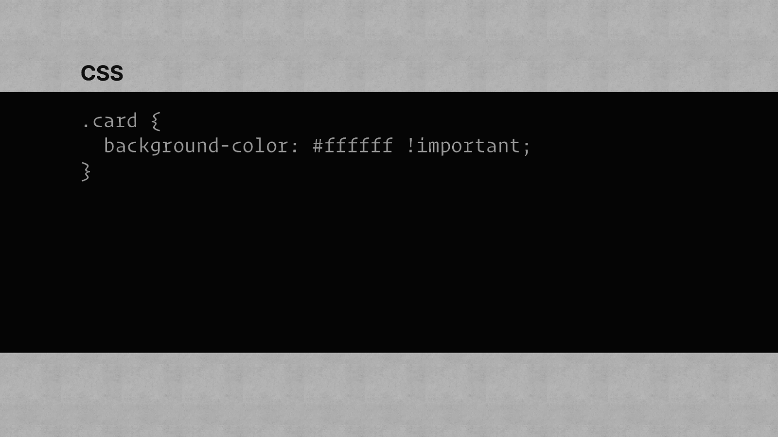
CSS .card { background-color: #ffffff !important; }
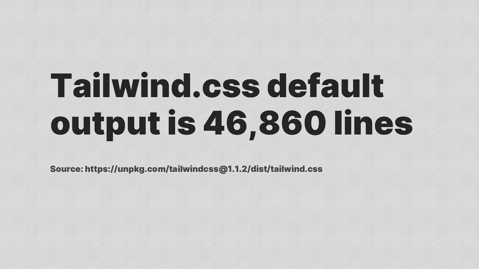
Tailwind.css default output is 46,860 lines Source: https://unpkg.com/tailwindcss@1.1.2/dist/tailwind.css
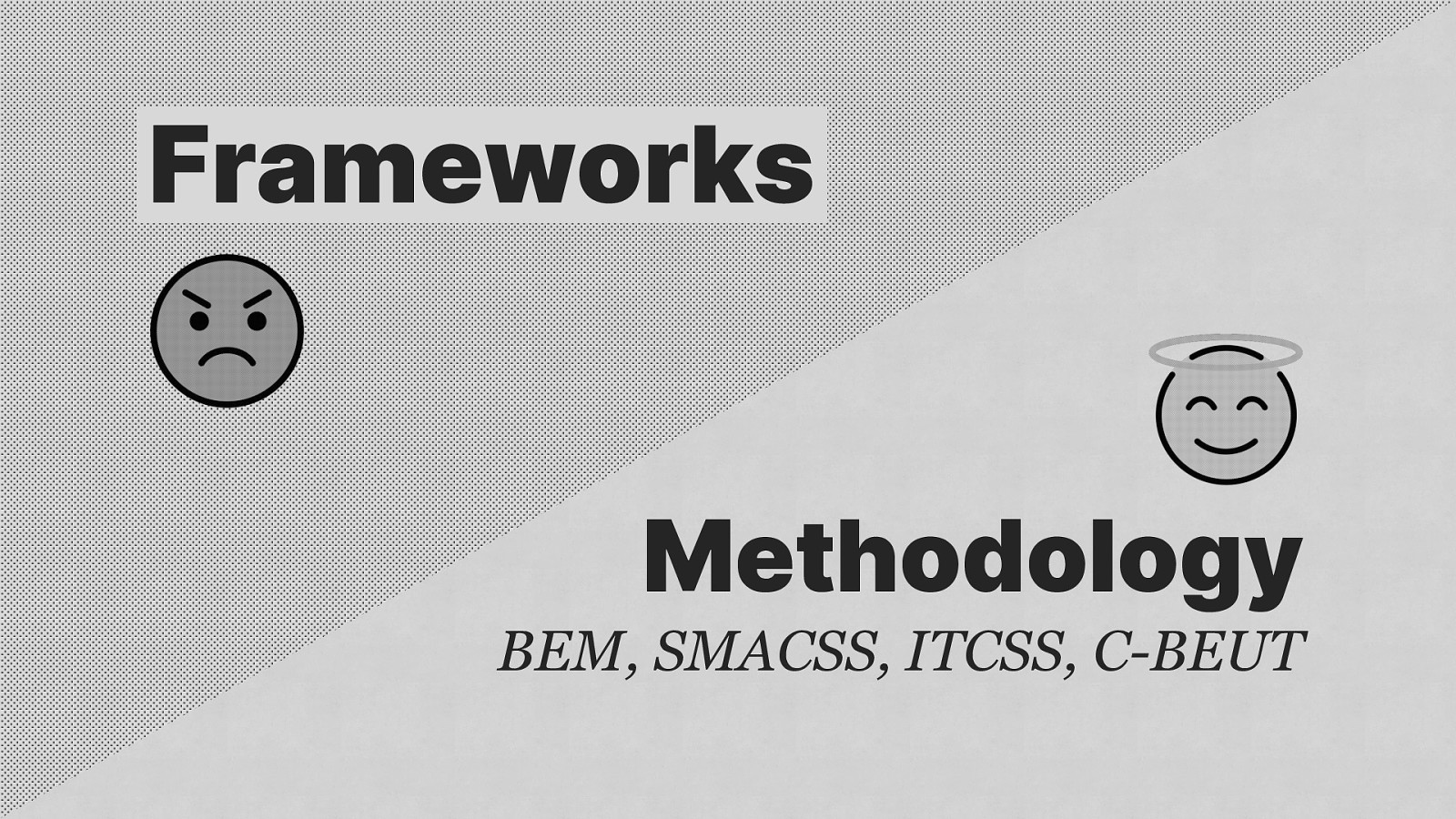
Frameworks Methodology BEM, SMACSS, ITCSS, C-BEUT

Featuring Heydon Pickering

Simplify and distill layout
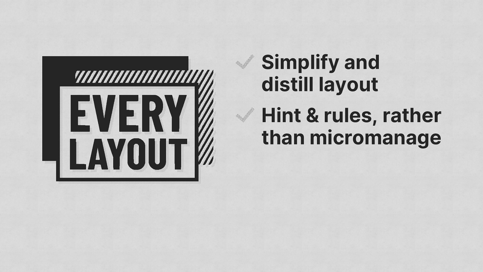
Simplify and distill layout Hint & rules, rather than micromanage
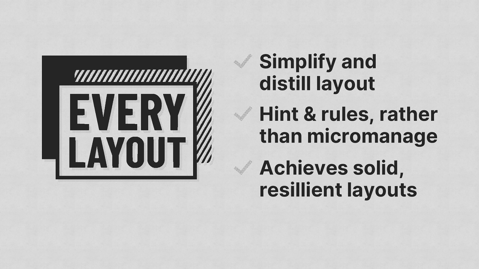
Simplify and distill layout Hint & rules, rather than micromanage Achieves solid, resillient layouts
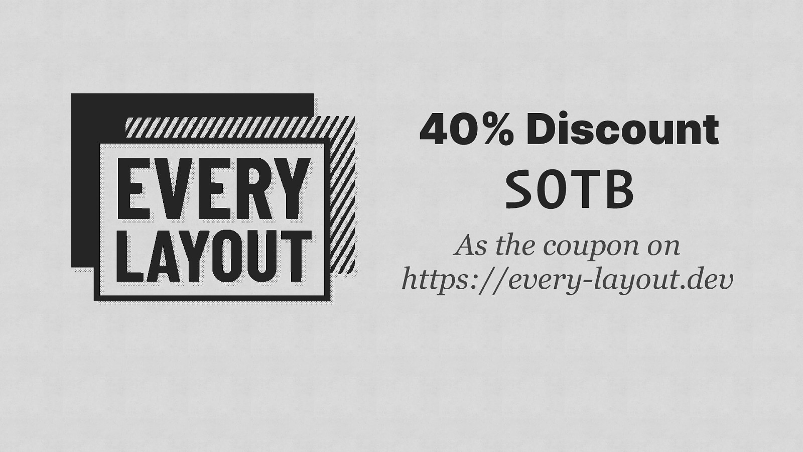
40% Discount SOTB As the coupon on https://every-layout.dev
On the subject of progressive enhancement…
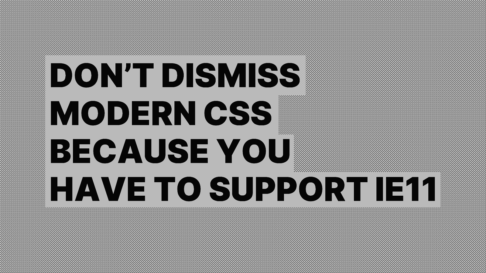
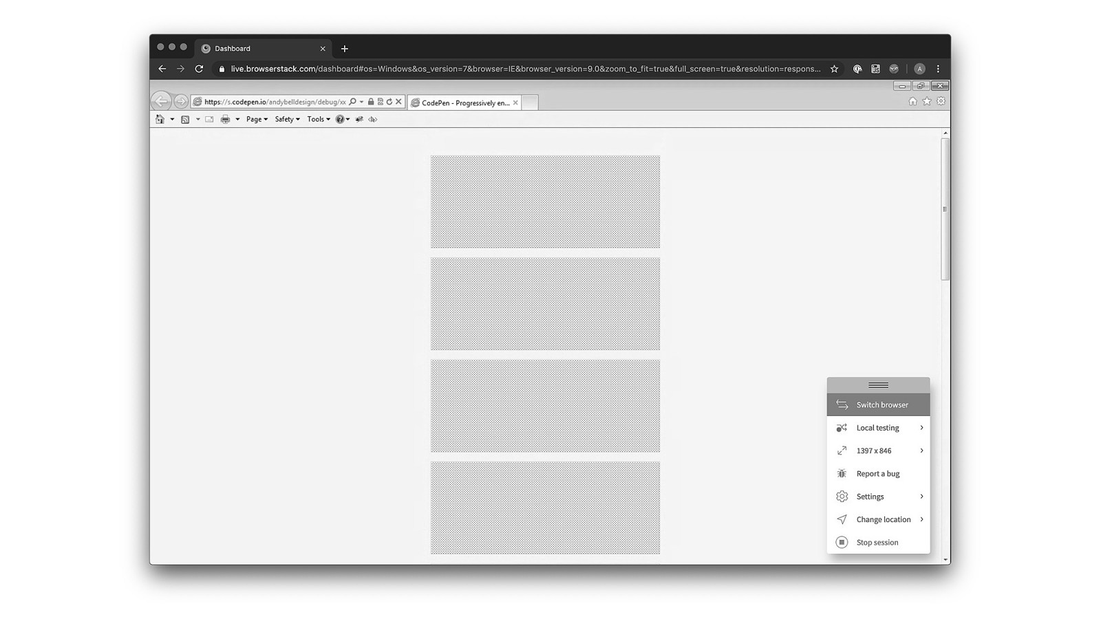
DON’T DISMISS MODERN CSS BECAUSE YOU HAVE TO SUPPORT IE11

WhAt aboUt IE 11 tHOuGh

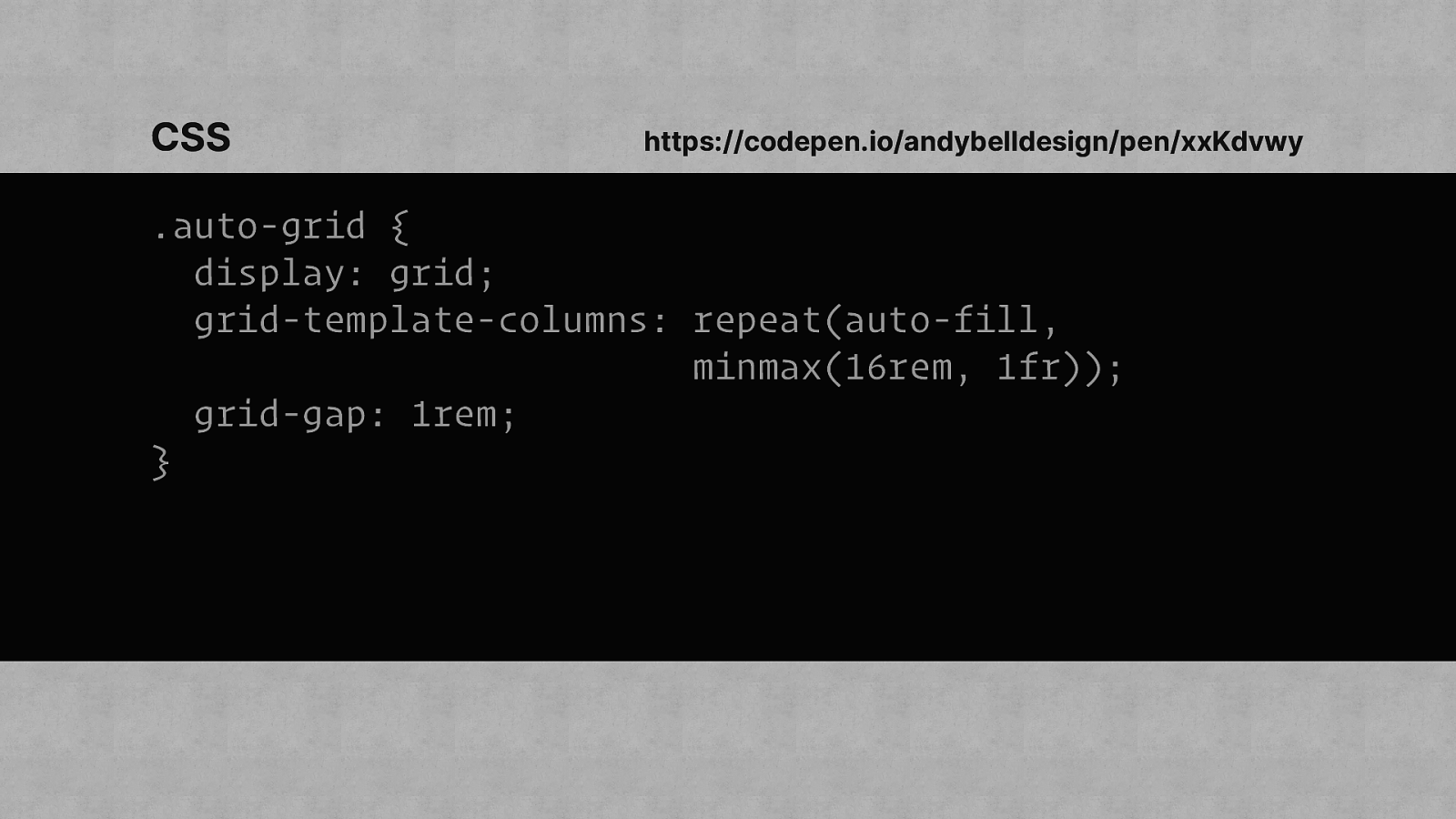
CSS https://codepen.io/andybelldesign/pen/xxKdvwy .auto-grid { display: grid; grid-template-columns: repeat(auto-fill, minmax(16rem, 1fr)); grid-gap: 1rem; }
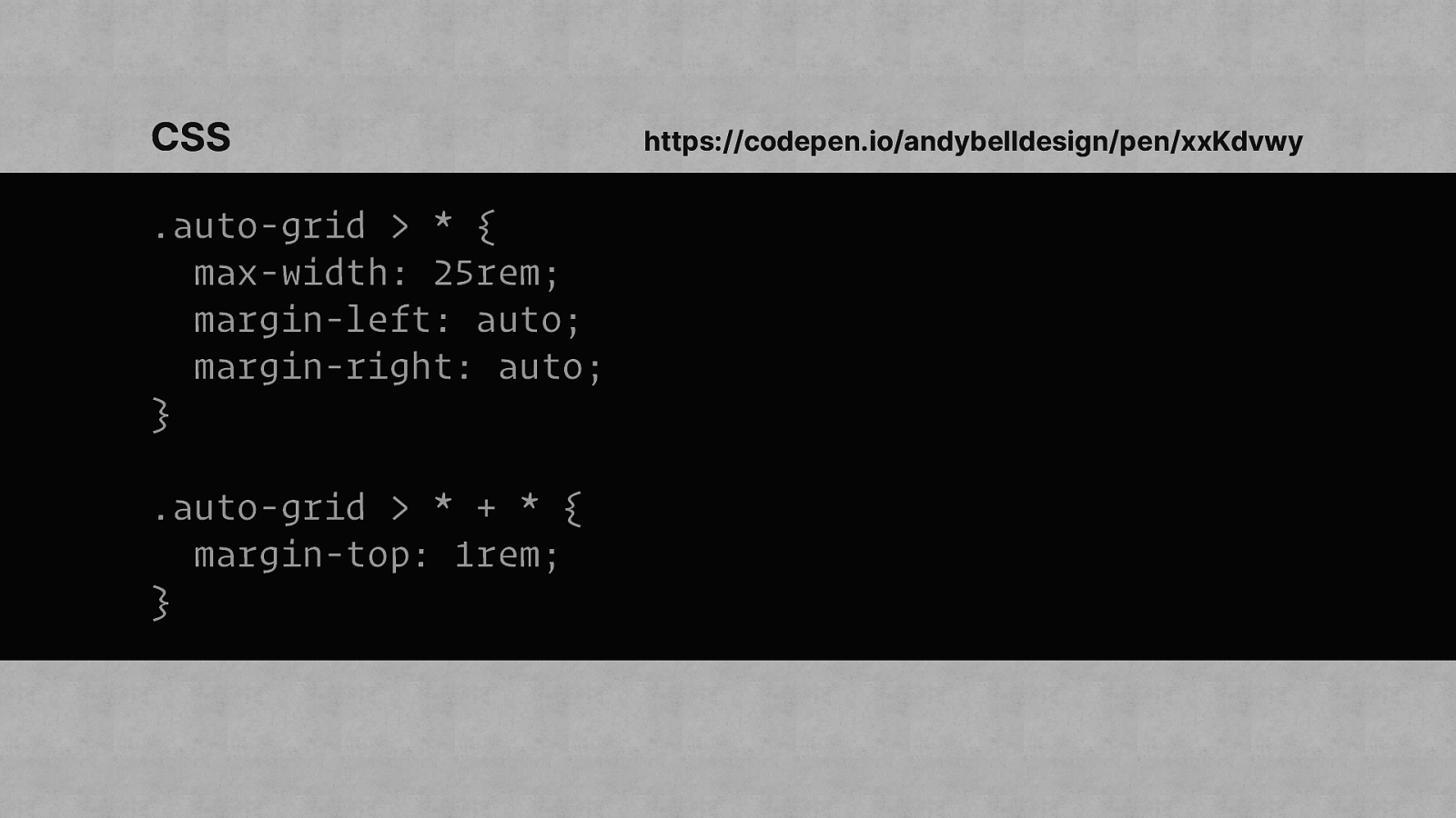
CSS .auto-grid > * { max-width: 25rem; margin-left: auto; margin-right: auto; } .auto-grid > * + * { margin-top: 1rem; } https://codepen.io/andybelldesign/pen/xxKdvwy
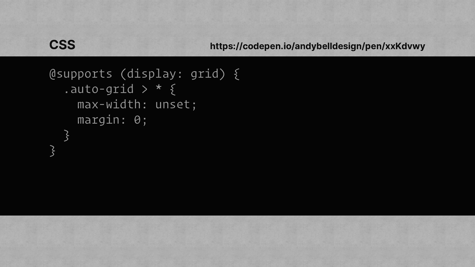
CSS https://codepen.io/andybelldesign/pen/xxKdvwy @supports (display: grid) { .auto-grid > * { max-width: unset; margin: 0; } }
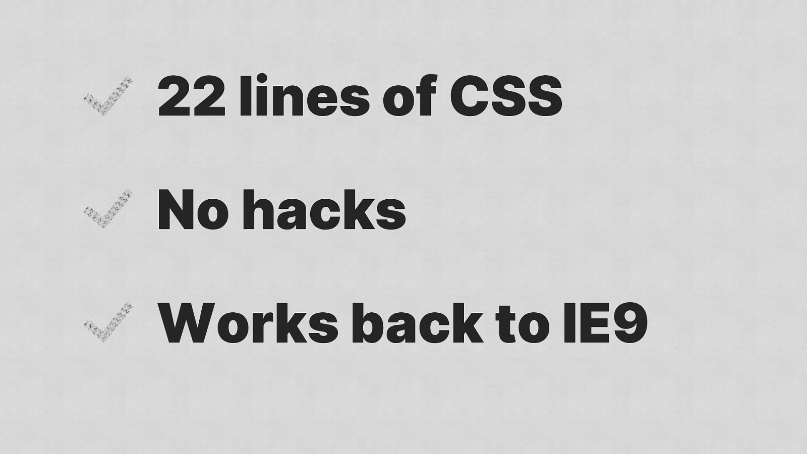
22 lines of CSS No hacks Works back to IE9

Slow down
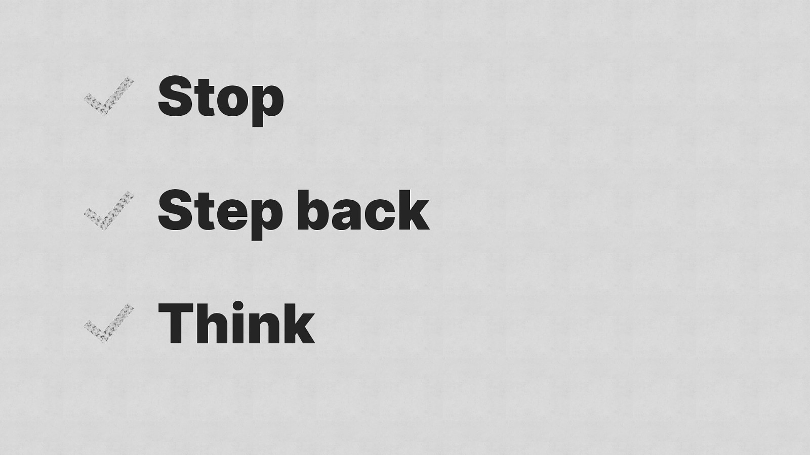
Stop Step back Think

Instead of moving fast and breaking things, move slowly and deliberately instead.

Thank you Andy Bell @andybelldesign https://andy-bell.design