Design System Team at Kiwi.com – 
Zero to five people in less than 2 years

A presentation at UXcamp Europe in June 2019 in Berlin, Germany by Jan Toman
Slide 1

Slide 1

Design System Team at Kiwi.com Zero to five people in less than 2 years How did I sell and create the tea m of 5 fully dedi cate d p e o p le o nl y fo r Ki wi .co m d e s ign system @HonzaTmn
Slide 2

Slide 2

Making travel better at Jan Toman Design System Lead at Kiwi.com Previously working for & Twitter: @HonzaTmn
  • I do web stuff for more than 10 years, I have worked as front-end developer or product manager - almost 2 years ago I’ve joined with design system in kiwi.com - kiwi.com – travel startup (or just company) focusing on connecting flights that weren’t supposed to be connected - and that just got an huge investment from General Atlantic

Slide 3

Slide 3

Outside of work

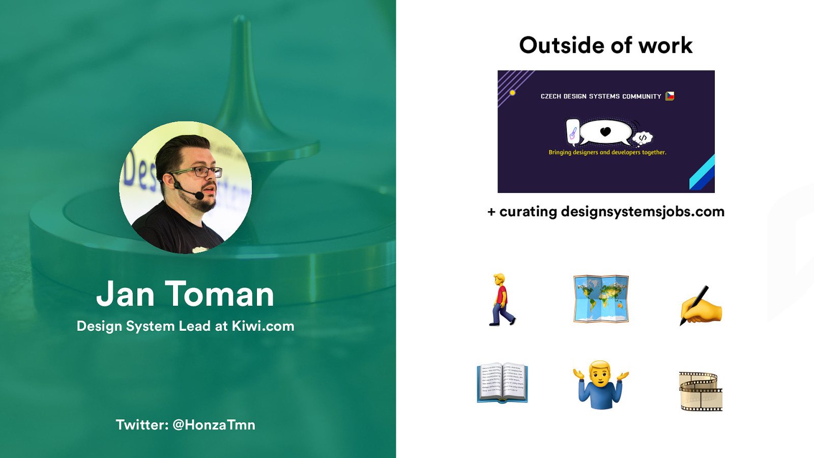
  • curating designsystemsjobs.com Jan Toman Design System Lead at Kiwi.com Twitter: @HonzaTmn 🚶 🗺 📖 % ✍ 🎞
  • walking - traveling - design systems meetups in Czech Republic – and we are looking also for international speakers so if that might be you, reach out to me and we can talk more about it

Slide 4

Slide 4

Design systems are popular. @HonzaTmn

I will just start with this slide.

Slide 5

Slide 5

@HonzaTmn

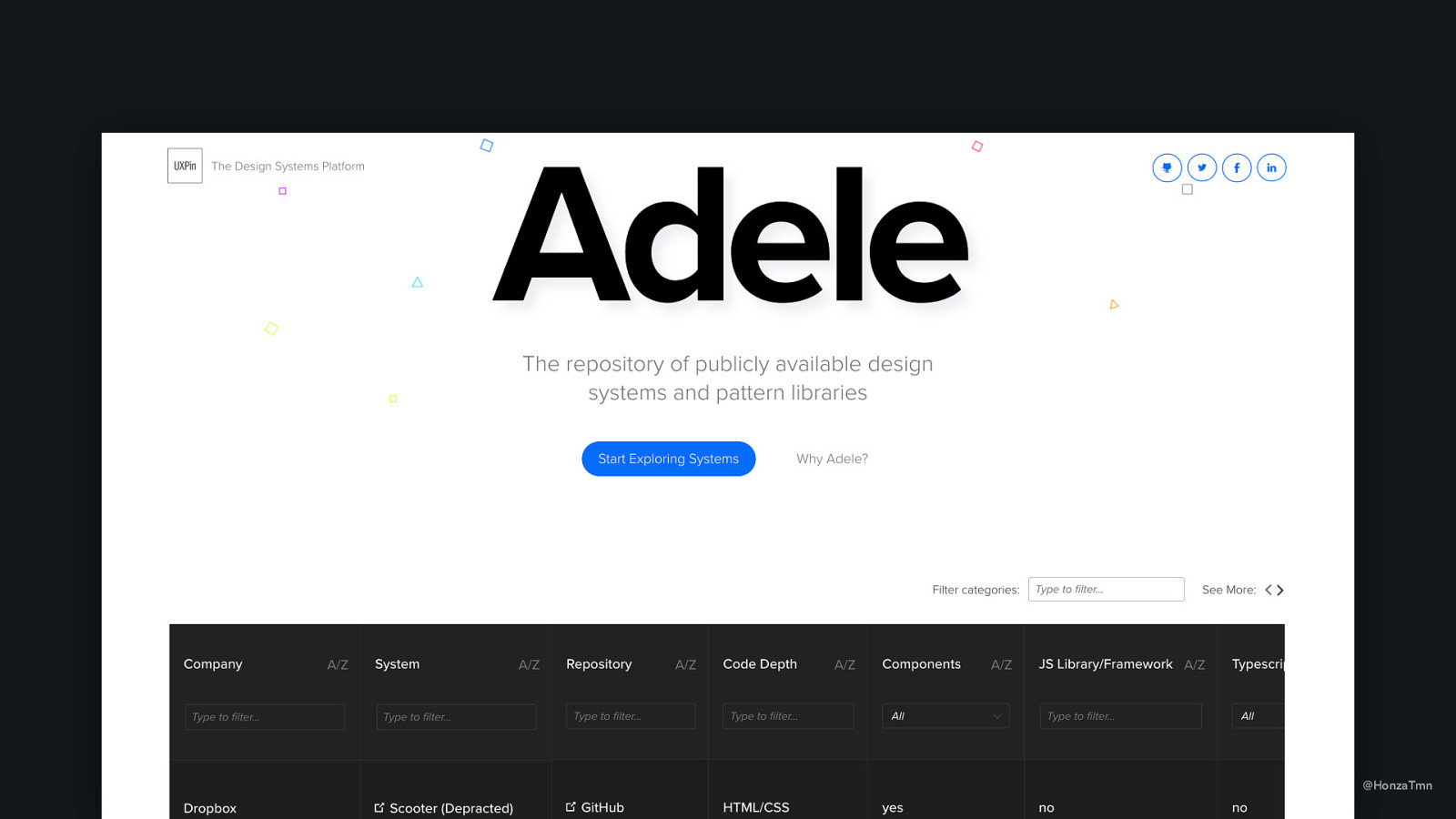
  • If we check Adele, public repository of design systems, there is up to 100 public design systems - most of them has very detailed documentation -

Slide 6

Slide 6

@HonzaTmn

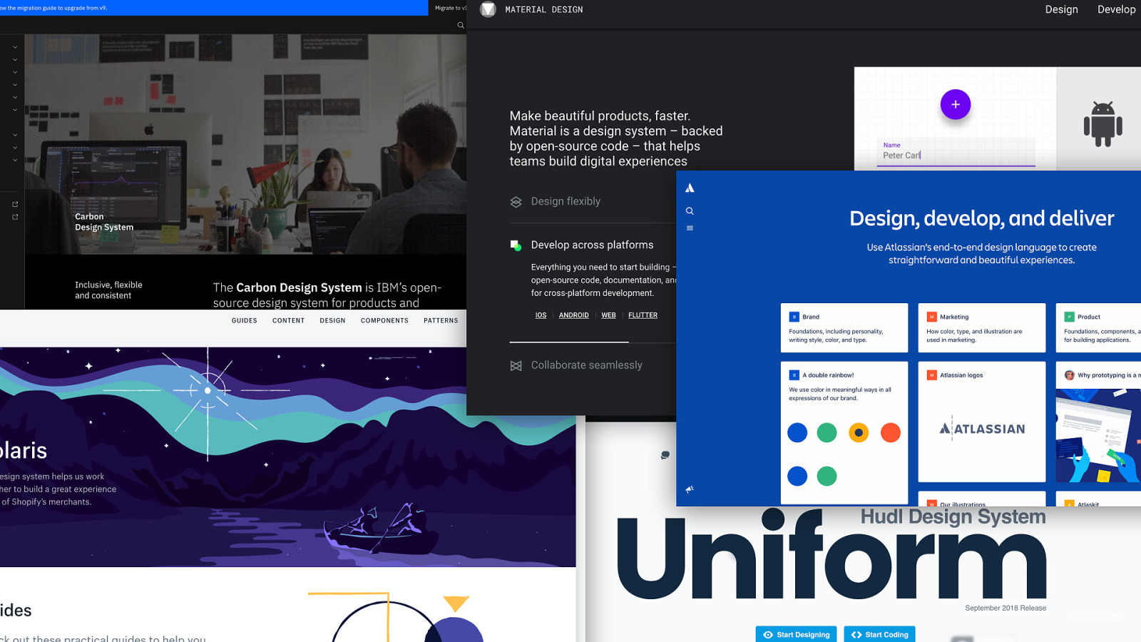
  • If you start to explore it more, you’ll find some of them that stood up. I can assure you that one of these will be on top of your list. - When I saw what is possible and what companies are investing it, it totally inspired me.

Slide 7

Slide 7

@HonzaTmn

  • And I have only one thing in my head when I joined kiwi.com. - And I know that you want it too. - Because it’s current standard. Everyone is doing it, why shouldn’t we, right? -

Slide 8

Slide 8

“Change doesn’t happen overnight.“ Lot of people said that. I just agree. @HonzaTmn
  • So how long does it take, you may ask. - You can find some articles on internet that say that base of Polaris from Shopify was build by small team of people in 3 months. I don’t know the exact number, but it was somewhere around 10. - However - it took another year to release first stable React component library! It wasn’t different with Material or Atlassian’s - To be honest: we got lucky a bit. We used Kiwi culture to achieve it, it might have take at least two times longer in different company.

Slide 9

Slide 9

Our journey to dedicated design system team Current team: Lead, UI designer, 3 front-end developers @HonzaTmn
  • steps that did work and were essential in my opinion - some steps that didn’t work that much - a lot of about communication – what we’ve communicated, to whom and what worked well - change management - how team grew over the course of two years, which people were hired and why

Slide 10

Slide 10

A bit of context ’ Hired to Kiwi.com in August 2017 as 5th designer 🚀 The plan: grow from 4 to 15 designers in the next 12 months 🎨 Partial responsibility: prepare UI kit for growing design team ⏱ 3 – 6 months-long side project @HonzaTmn
Slide 11

Slide 11

Very first challenge “How might I prove that design system is worth full-time investment?” @HonzaTmn
    • I could create a palette of colors, typography, or etc, but I wouldn’t even know how to sell it to current designers. I was a newcomer, they were there for a long time. -

Slide 12

Slide 12

The first three months @HonzaTmn

  • For me, it was totally new company and I knew nothing. Blank paper. - All Medium article tells you to start with styleguide – create a palette of colors, typography, or etc, -But I wouldn’t even know how to sell it to current designers. I was a newcomer, they were there for a long time. And another thing – current designers were stronger visual designers than I am. - Starting as a UX designer – with data.

Slide 13

Slide 13

@HonzaTmn

  • To get data, I needed research. -And the best research is talking to people. Some people knew that I will be working on UI kit, but I framed also as „get to know each other a bit because I am new here“

Slide 14

Slide 14

http://bit.ly/ds-research @HonzaTmn

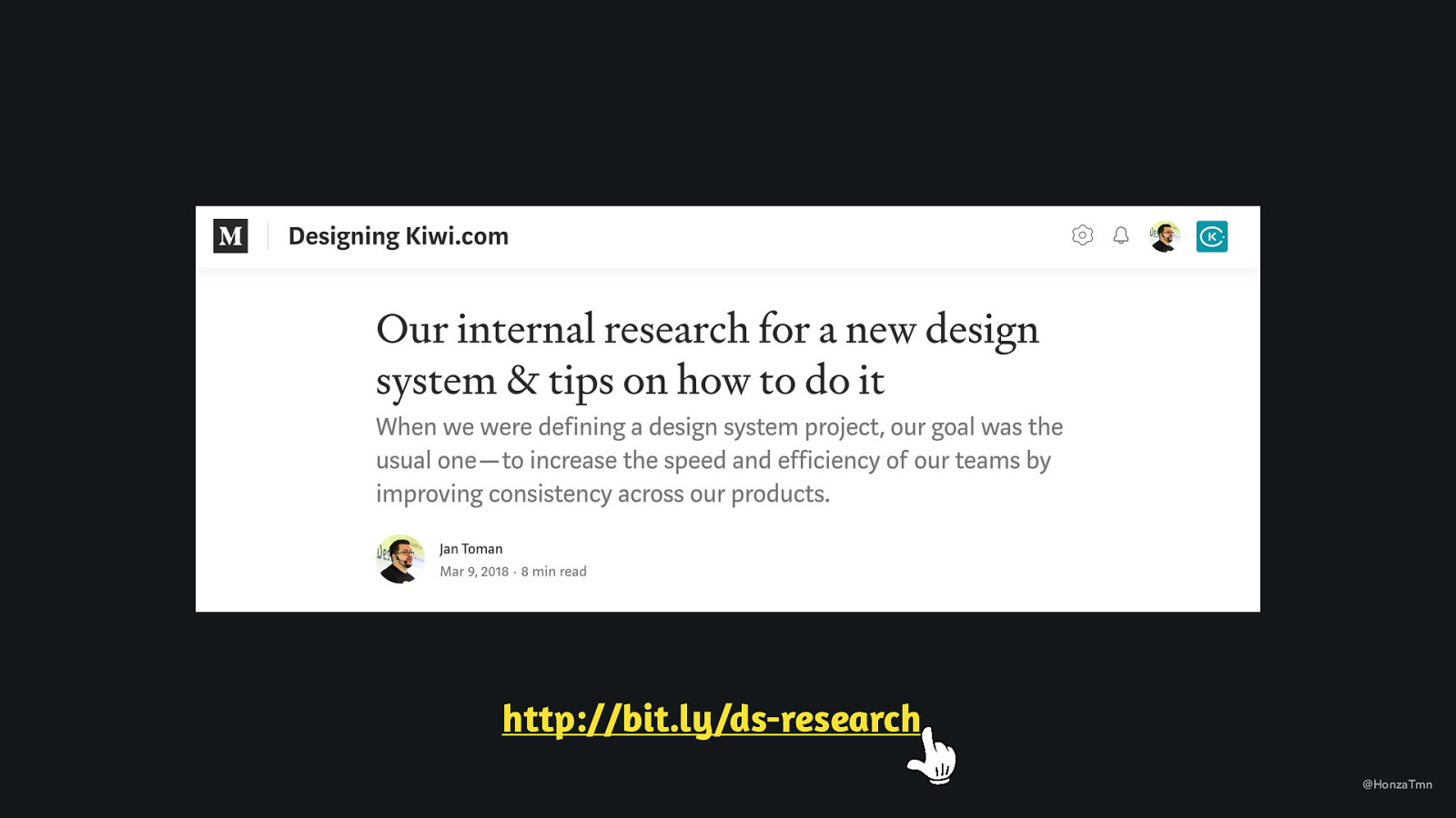
  • I’ve described this in the article I wrote for our design blog, with all possible questions I asked. Check it for more info. - But basically, I framed it as that I want to understand how they work, what tools they use, if there is already something existing. -And I asked about design system and if there is something there are afraid of.

Slide 15

Slide 15

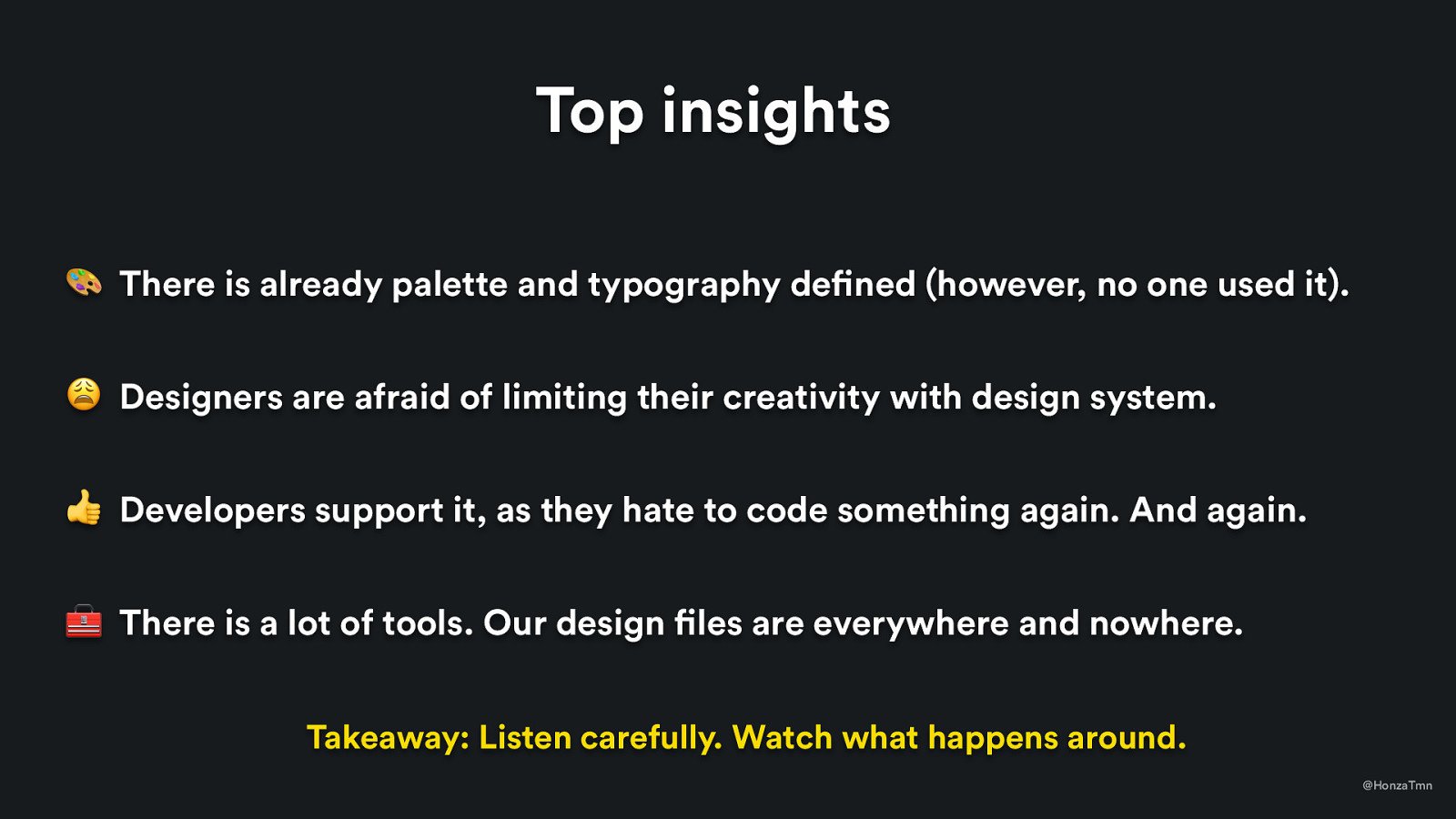
Top insights 🎨 There is already palette and typography defined (however, no one used it). 😩 Designers are afraid of limiting their creativity with design system. 👍 Developers support it, as they hate to code something again. And again. 🧰 There is a lot of tools. Our design files are everywhere and nowhere. Takeaway: Listen carefully. Watch what happens around. @HonzaTmn
  • All this can be seen as opportunities to solve. - palette and typo defined – it can be used and iterated. It will help to give a feeling that you are just trying to help to make it more useful - limiting creativity – keep people closely involved in decisions, don’t push design guidelines, be open to any change and keep them playing with atomic component to discover patterns - developer support – that’s great. they are stakeholders and that can help. Also, developers mentioned „open source“ several times – note for me for future. It was important to them, we can use it. - tools – easy problem to solve usually, that’s what I’ve started with – with reasoning that we will save some money and we will have design files in place where we need them

Slide 16

Slide 16

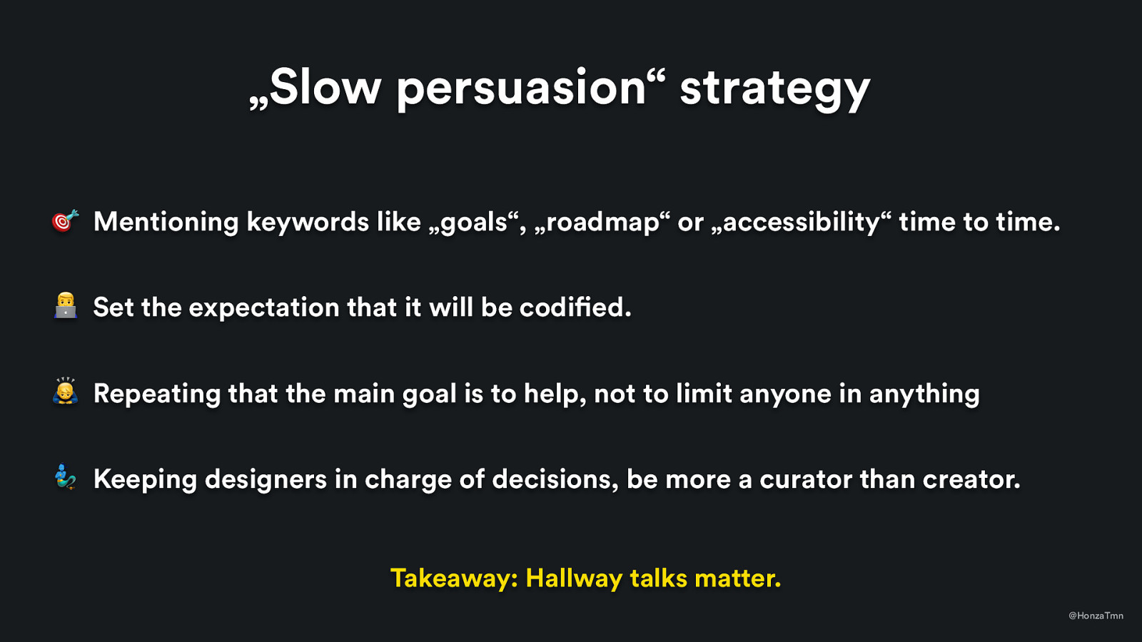
„Slow persuasion“ strategy 🎯 Mentioning keywords like „goals“, „roadmap“ or „accessibility“ time to time. / Set the expectation that it will be codified. 🙇 Repeating that the main goal is to help, not to limit anyone in anything 🧞 Keeping designers in charge of decisions, be more a curator than creator. Takeaway: Hallway talks matter. @HonzaTmn
  • But what was important that conversations started. We already started to talk about „design system“ with the team. - mentioning words – so it just does feel like product that we are building - it will happen in code – even that it took another 4 months before we actually started with code - help them – get rid of stuff they find boring (and I found which is it in research) - in charge – removing my ego from it

Slide 17

Slide 17

What did it mean „keep them in charge“? @HonzaTmn
  • But what was important that conversations started. We already started to talk about „design system“ with the team. - mentioning words – so it just does feel like product that we are building - it will happen in code – even that it took another 4 months before we actually started with code - help them – get rid of stuff they find boring (and I found which is it in research) - in charge – removing my ego from it

Slide 18

Slide 18

@HonzaTmn

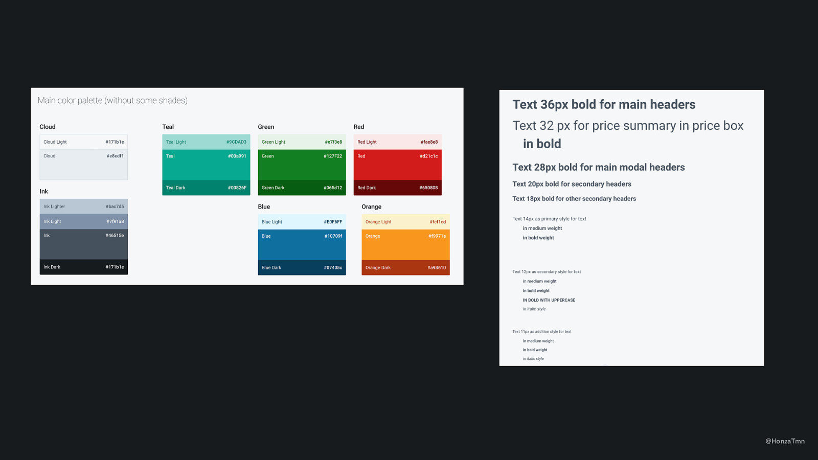
One of my first steps on styleguide was to clear palette (and introduce some logical structure in it)
Slide 19

Slide 19

„You decide if it’s enough.“ @HonzaTmn
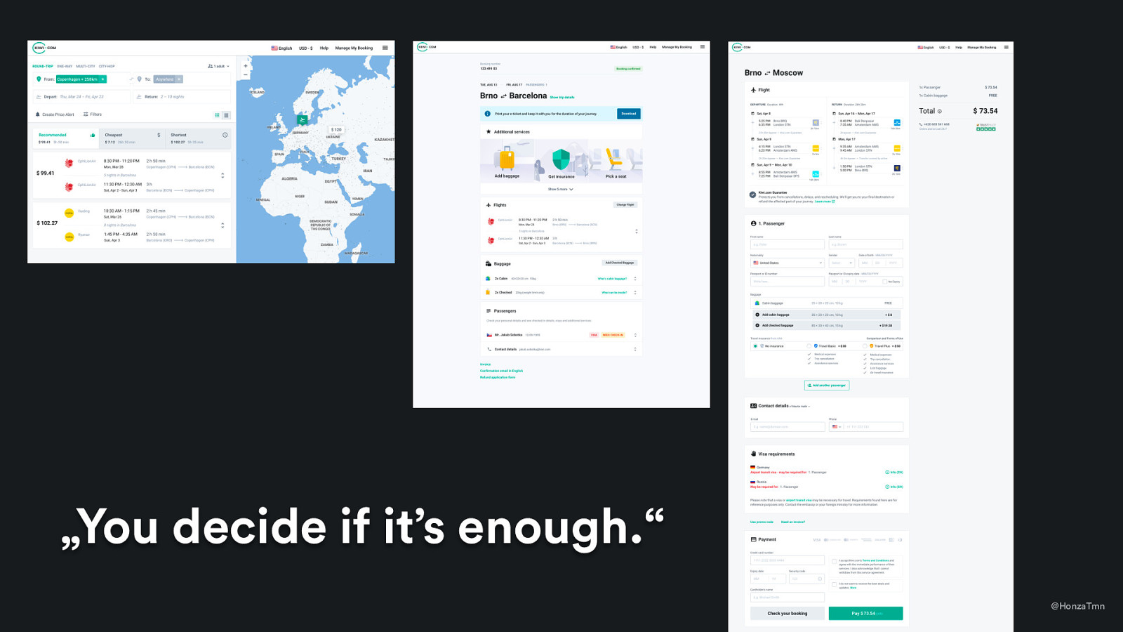
  • Where I cleared a color palette and typography, I gave back the website that did one thing only – adopted this palette and typography – nothing else. - And I gave them power to decide if it’s good enough or we need to define more styles. - The good thing? Visual style didn’t change basically, it was just tweaking details and documenting what we’ve used for it. In practice => we didn’t need product managers involved.

Slide 20

Slide 20

Takeaway: It doesn’t need to be perfect. Iterate. @HonzaTmn

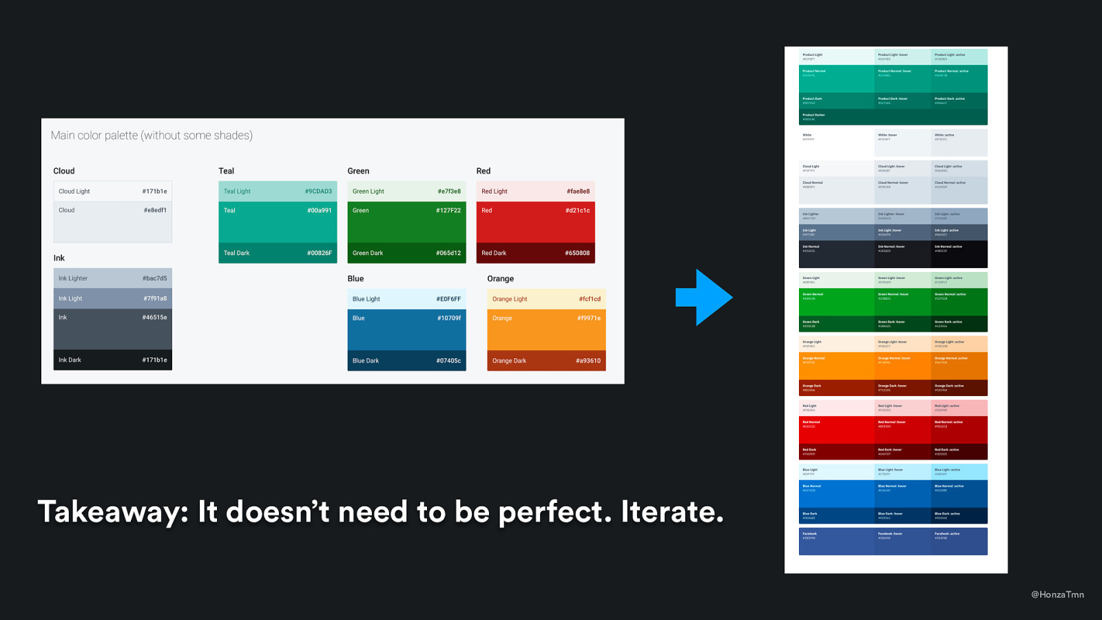
And it wasn’t a final palette, not at all. We tweaked it a lot during this year and improve it, but today – majority of designers aren’t questioning these choices that much.
Slide 21

Slide 21

The effect of this strategy People believed in styleguide, so they started to use it. @HonzaTmn
Slide 22

Slide 22

3 – 6 months 🗣 @HonzaTmn

  • repeating the same steps with all component – just taking it from the current UI and putting it Sketch - and communication - what does it mean in practice?

Slide 23

Slide 23

@HonzaTmn

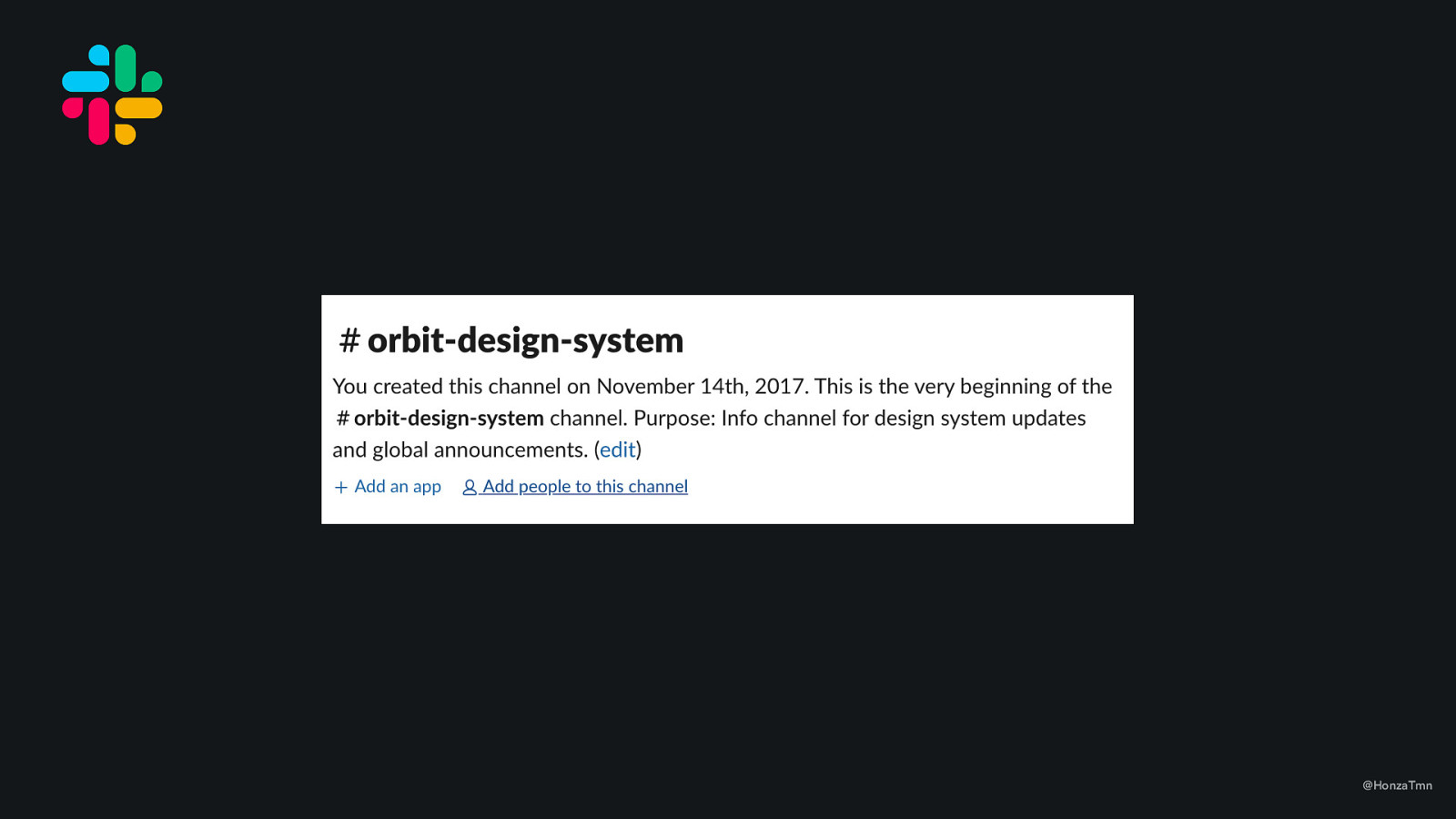
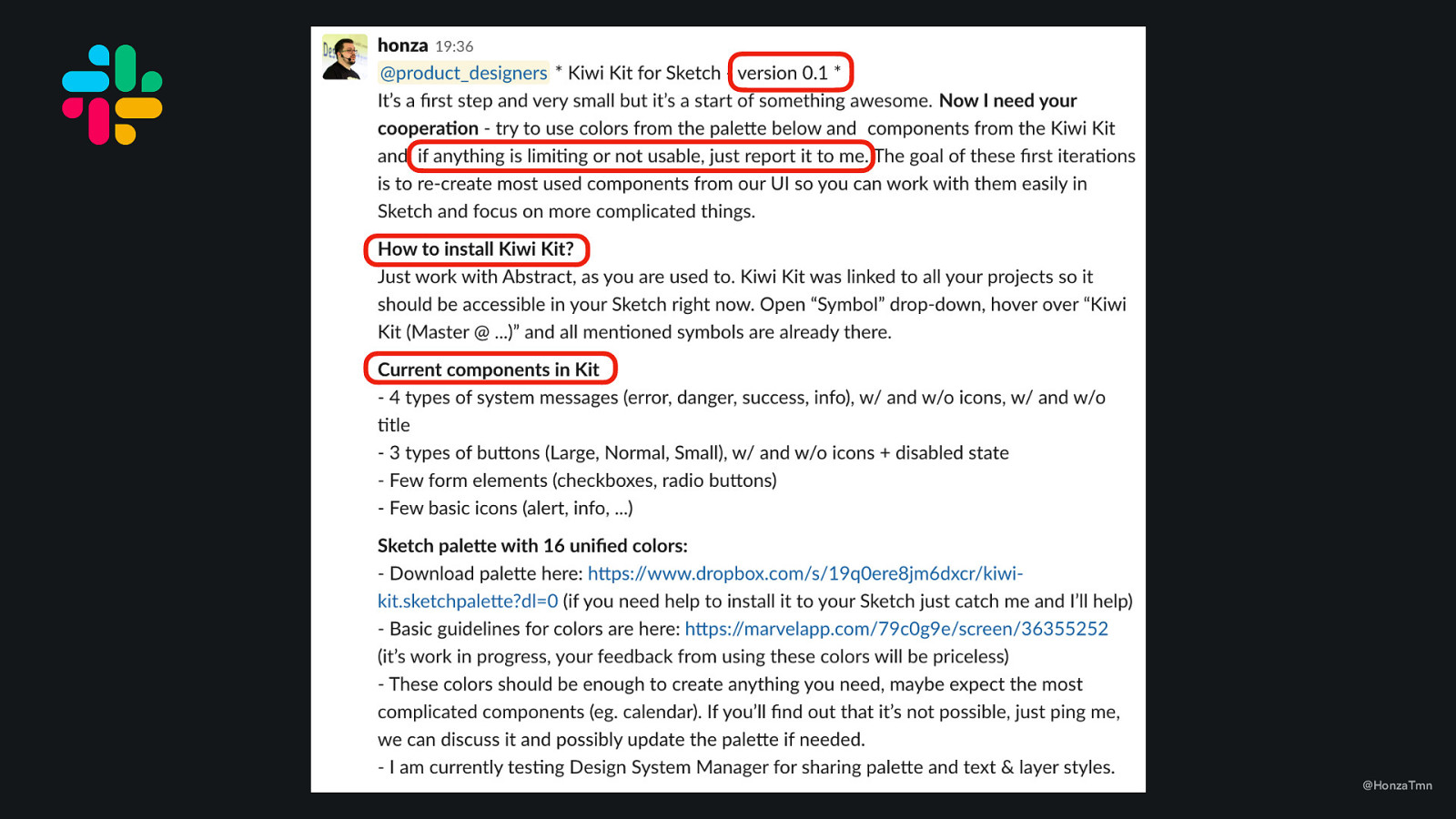
  • 1st step – creating a channel with clear purpose.

Slide 24

Slide 24

@HonzaTmn

  • 2nd step – be as transparent as possible. - This is my first post in that slack channel

Slide 25

Slide 25

@HonzaTmn

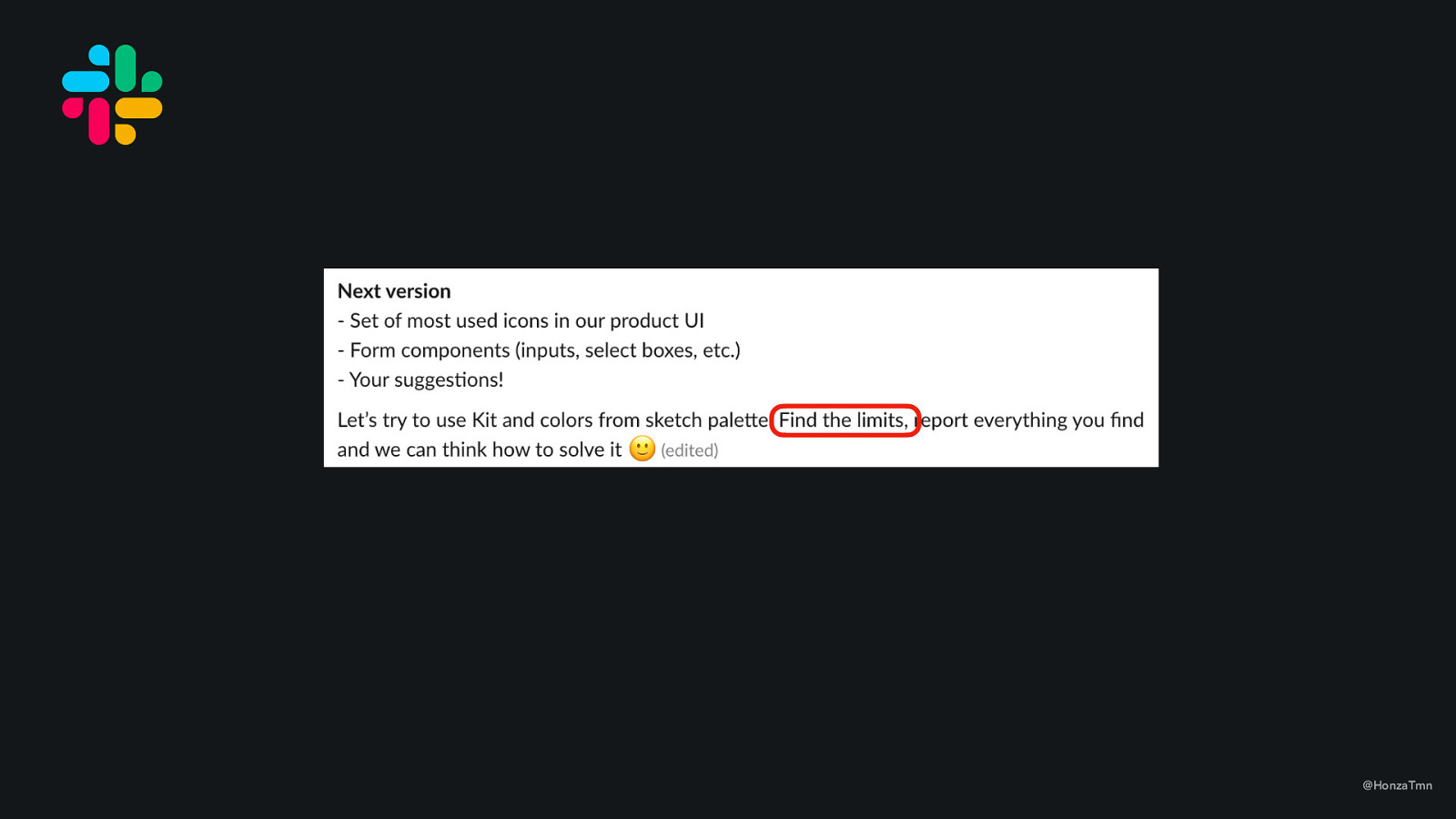
  • encourage people to break it

Slide 26

Slide 26

A lot of small changes, often. @HonzaTmn
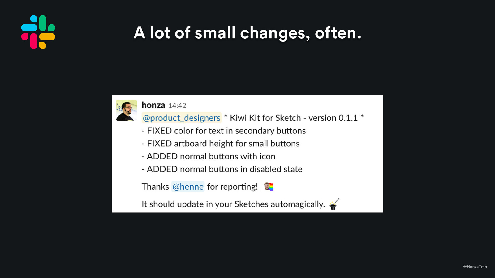
  • I was very flexible. If people find bug, fix it as soon as possible – because if not, it might lead to people not using it because it is blocking them.

Slide 27

Slide 27

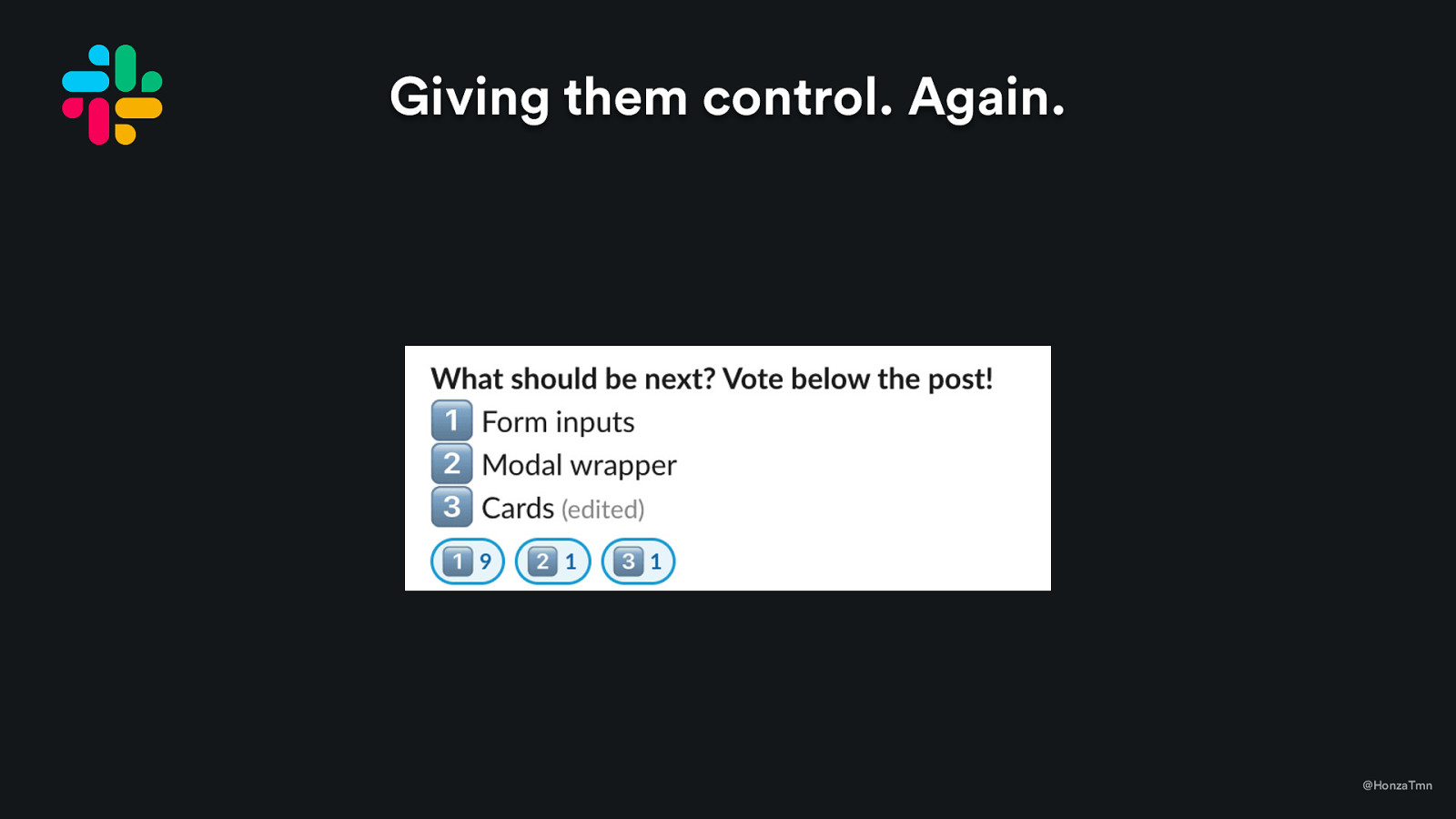
Giving them control. Again. @HonzaTmn
  • I was very flexible. If people find bug, fix it as soon as possible – because if not, it might lead to people not using it because it is blocking them.

Slide 28

Slide 28

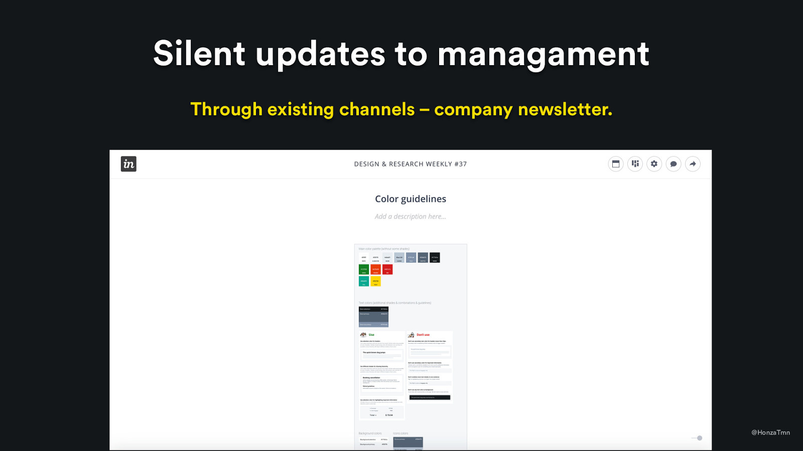
Silent updates to managament Through existing channels – company newsletter. @HonzaTmn
  • just to let them know that something systematic is happening in design (for now)

Slide 29

Slide 29

@HonzaTmn

  • All these small steps, all this communication and flexibility was about one thing – to gain trust of designers. - Because people trusted it (and all activity was exposed!), people used our UI kit component from the day one. They’ve felt that they can count on me if there is any request and that it can be added as soon as possible.

Slide 30

Slide 30

December 2017 Situation: more requests for new components and variations @HonzaTmn
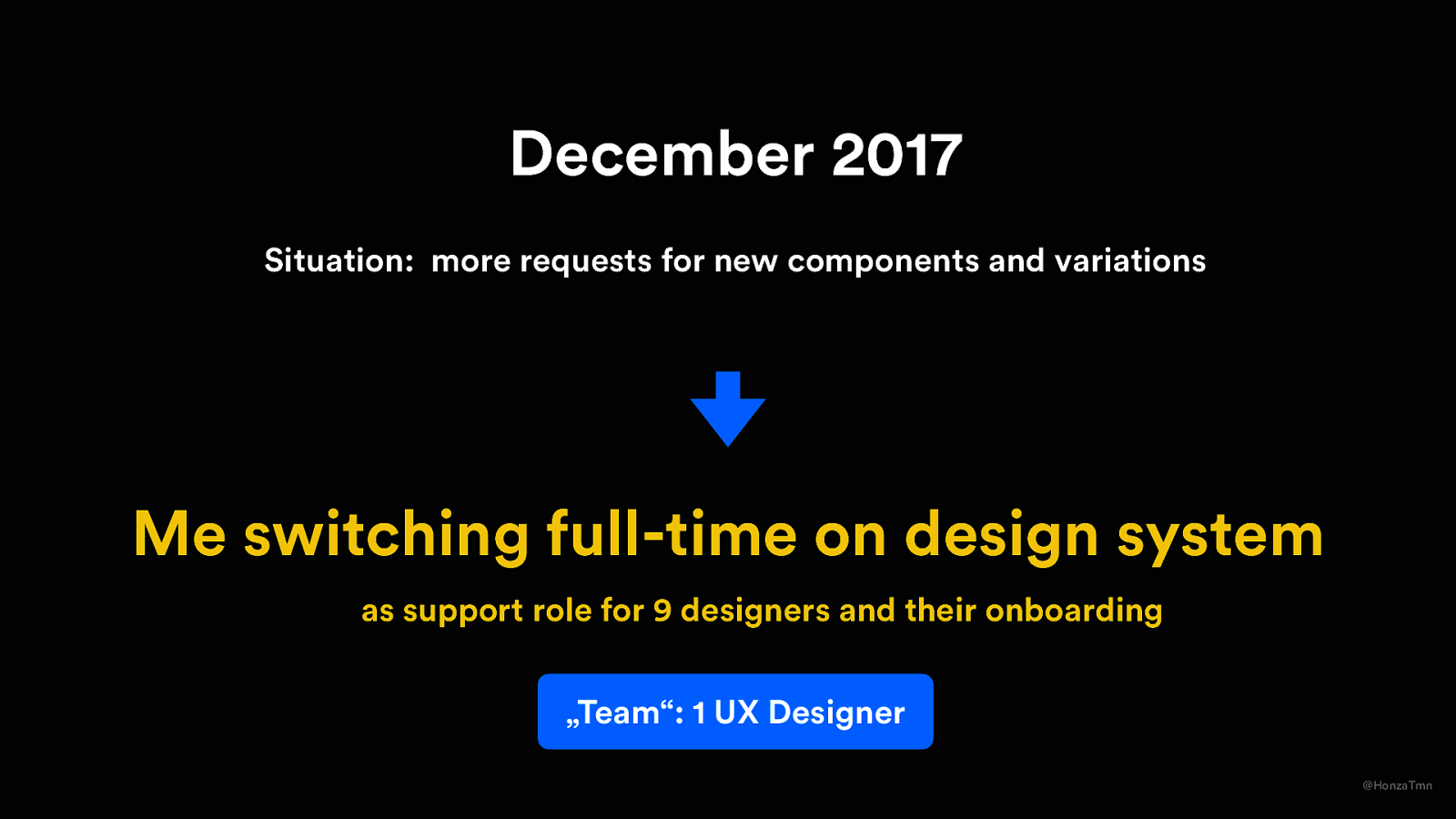
  • That also meant that designers requested more and more components and variations, documentation of visual style needed to be written, etc. – which lead to discussion

Slide 31

Slide 31

December 2017 Situation: more requests for new components and variations Me switching full-time on design system as support role for 9 designers and their onboarding „Team“: 1 UX Designer @HonzaTmn

Slide 32

Slide 32

January 2018 Six months after my start. @HonzaTmn

Slide 33

Slide 33

January 2018 Junior Front-end Developer is joining design team. @HonzaTmn
  • This was a result of my discussion with design lead about design system. -

Slide 34

Slide 34

January 2018 Junior Front-end Developer is joining design team. @HonzaTmn
  • Not for coding UI kit components, thought. -The original plan: he should focus mostly on building interactive prototypes. On components partially, when there is no prototype to build. - Design lead just didn’t see a value for hiring someone only for coding components. -What did I do wrong? Probably didn’t stress enough to design lead that we really need someone to code it and who needs to be design precise. -

Slide 35

Slide 35

Current challenge “How might I prove that we need someone for coding components?“ @HonzaTmn

Slide 36

Slide 36

Using insights from my research @HonzaTmn

If you remember, I’ve mentioned that developers were in from the day one – they just waited for someone to unify designers and they want to build component library that can be reused. - And now we had a UI kit with a small amount of components to code, so we finally have something to start with.
Slide 37

Slide 37

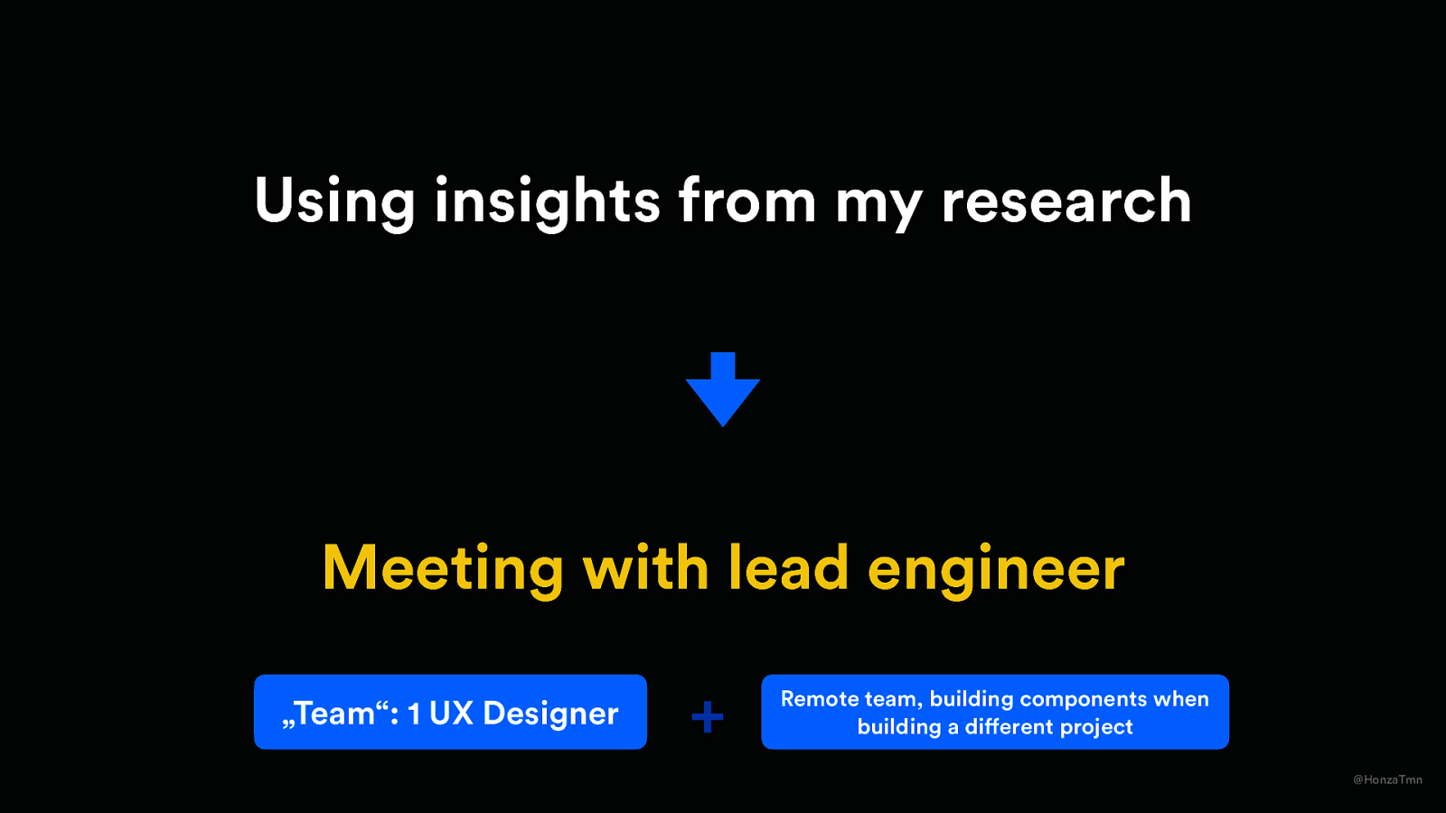
Using insights from my research Meeting with lead engineer „Team“: 1 UX Designer + Remote team, building components when building a different project @HonzaTmn
  • We tried to give it to one of our remote teams - so they can build components when building new feature. - What did it mean in the practice? That there was product manager who was setting that team priorities.

Slide 38

Slide 38

Two months after start with remote team. March/April 2018 Some components coded, not fully completed. Quality of coding was questionable. There just wasn’t time (because they needed to work on other projects) @HonzaTmn
  • Didn’t work, we’ve lost 2 months. So all we met again and trying to find out why. Then we decide that we will go in other direction

Slide 39

Slide 39

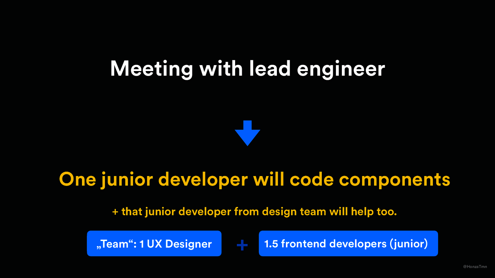
Meeting with lead engineer One junior developer will code components + that junior developer from design team will help too. „Team“: 1 UX Designer + 1.5 frontend developers (junior) @HonzaTmn
  • It was pretty cheap for company. Low risk. - And both selected guys were also partially designers, so they have pretty good eye for coding pixel-perfect components. - team still was very unofficial – dev team basically borrowed us one guy who just started in the company and there was plan to take him back if other priorities

Slide 40

Slide 40

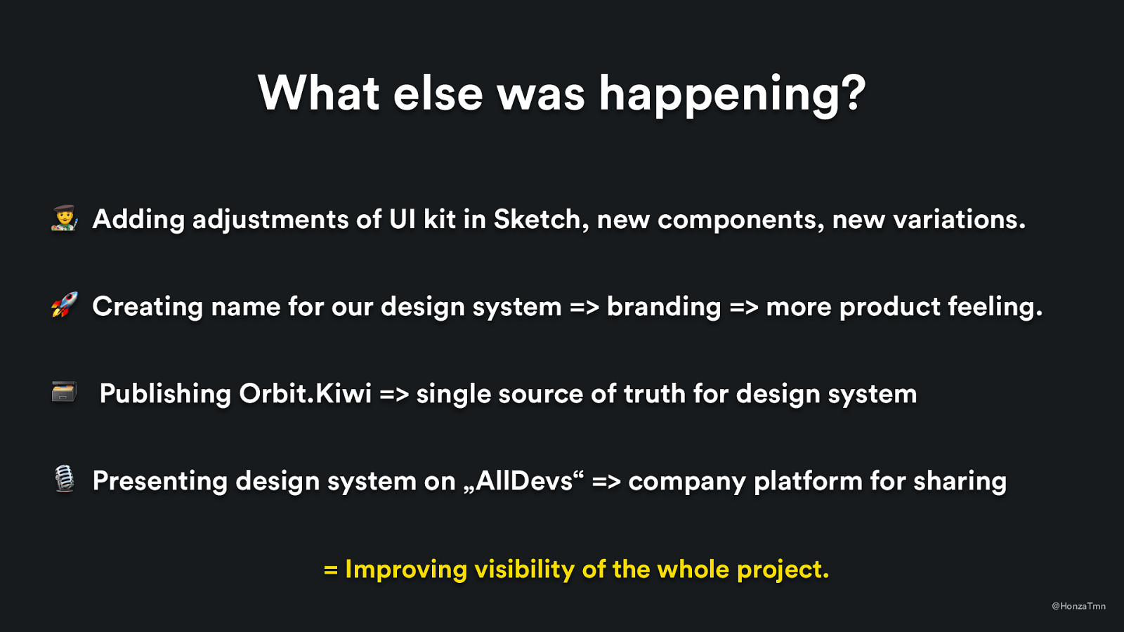
What else was happening? ’ Adding adjustments of UI kit in Sketch, new components, new variations. 🚀 Creating name for our design system => branding => more product feeling. 🗃 Publishing Orbit.Kiwi => single source of truth for design system 🎙 Presenting design system on „AllDevs“ => company platform for sharing = Improving visibility of the whole project. @HonzaTmn
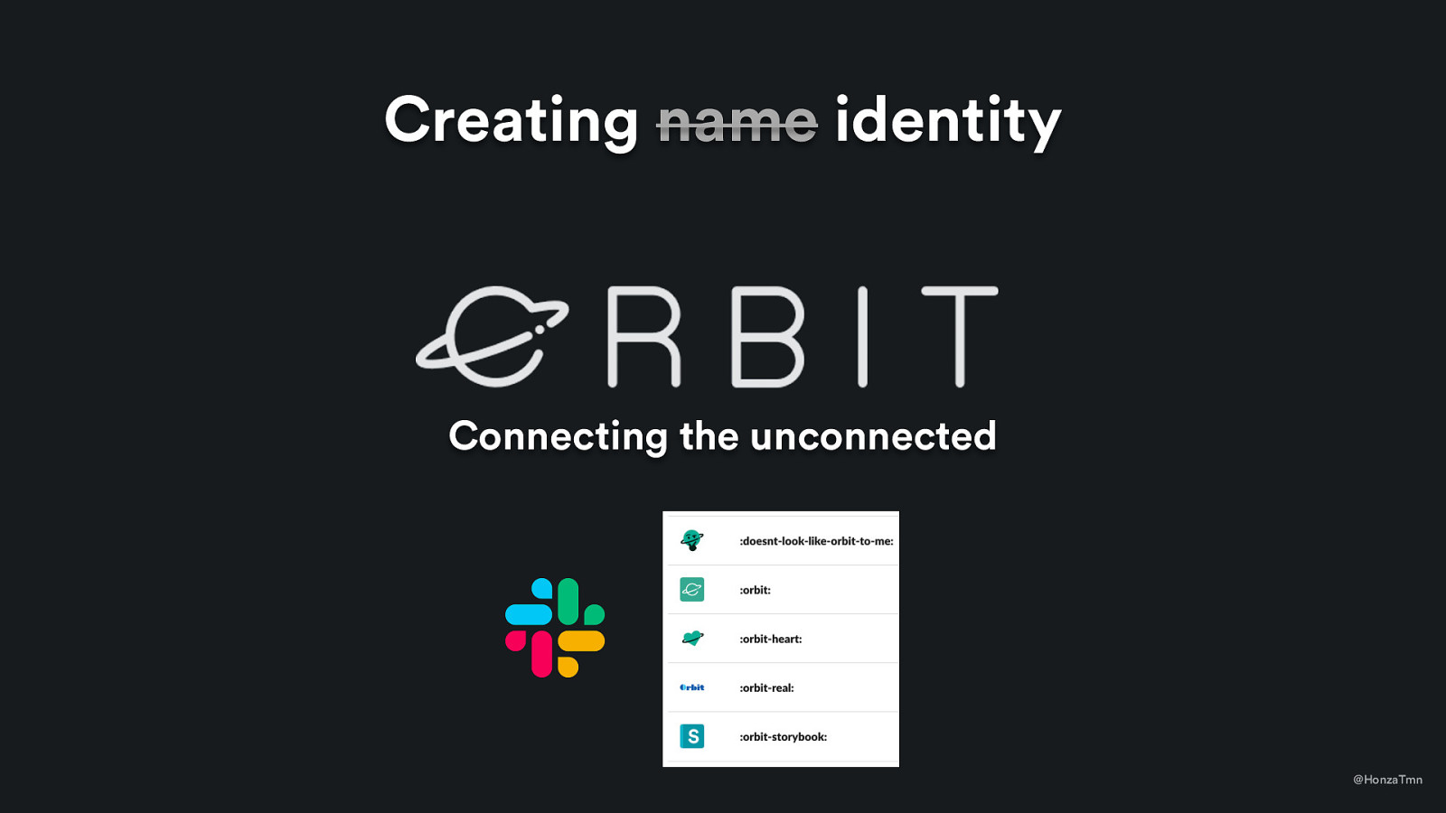
  • new components – and of course, publishing changes on Slack channel, so people still felt engaged and we improved a visibility of the whole project - name - a lot of people started to mention it as KiwiKit (original name), UI kit, component library, design system, and it was just messy. Also, Slack channels related to design system was getting out of hand. - talk about some points little more, because two things from this were game-changing and I believe that they were the most important things that happened in kiwi.com to push design system

Slide 41

Slide 41

Creating name identity Connecting the unconnected @HonzaTmn

So we voted for a new name (Orbit) and when announced, people started to make jokes. People started to use this name immediatelly. People started to see „Orbit“ word and emojis on Slack and asked „what is this project?“ - Everything related to design system acticities had „orbit“ before, so it was clear what belongs to design system and what doesn’t. - logo & company slogan „Connecting the unconnected“ - funny story, Orbit conference (they chose different name and that was where I realized that they take us seriously)

Slide 42

Slide 42

Orbit.Kiwi – Documentation page @HonzaTmn
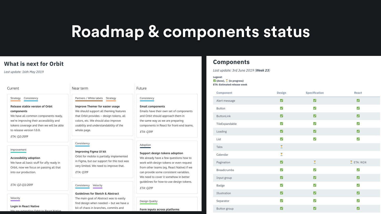
  • orbit.kiwi = probably the most important thing that happened. we created a space where everything lived - we use wordpress for it – which from technology POV? Not nice. But it works. And that’s my advice here – make it work, care about details later. - we introduced principles there, we collected all documentation for visual style and published it there too. - We showed that this will be the place where all components will be available. - Most importantly – we published roadmap and component status there too.

Slide 43

Slide 43

Roadmap & components status @HonzaTmn
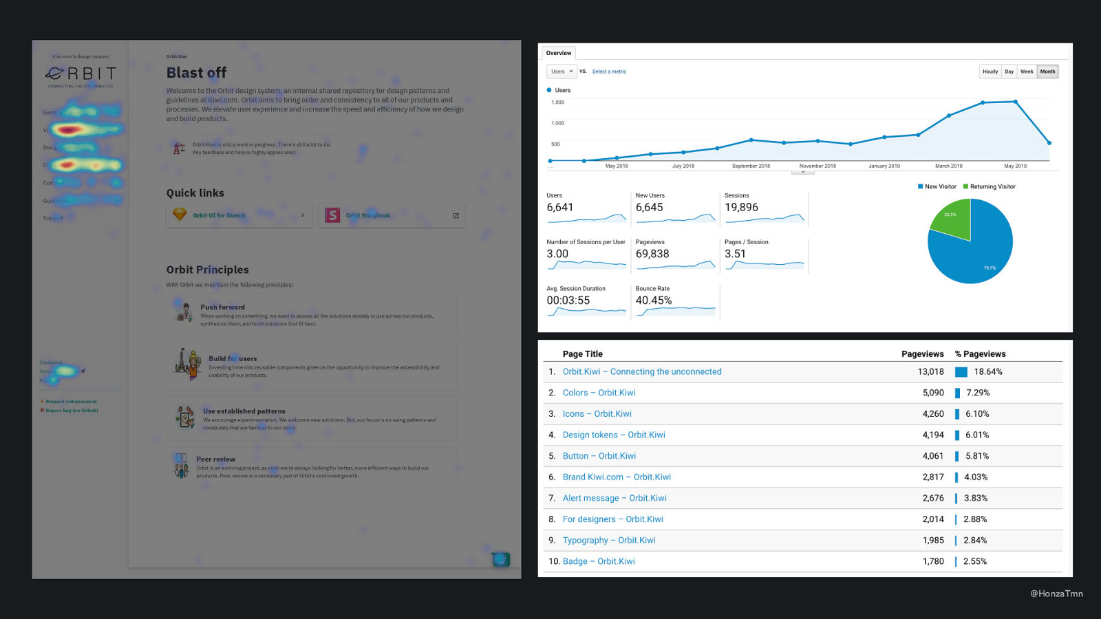
  • Most importantly – we published roadmap and component status there too. So people knew what is planned. - The results: much less questions of what is planned, stronger feeling that we know what we are doing and that we have some clear direction

Slide 44

Slide 44

@HonzaTmn

we also wanted to get some data from it: we have Google Analytics there, and people can send us feedback through Hotjar. Easy to implement but very useful data.
Slide 45

Slide 45

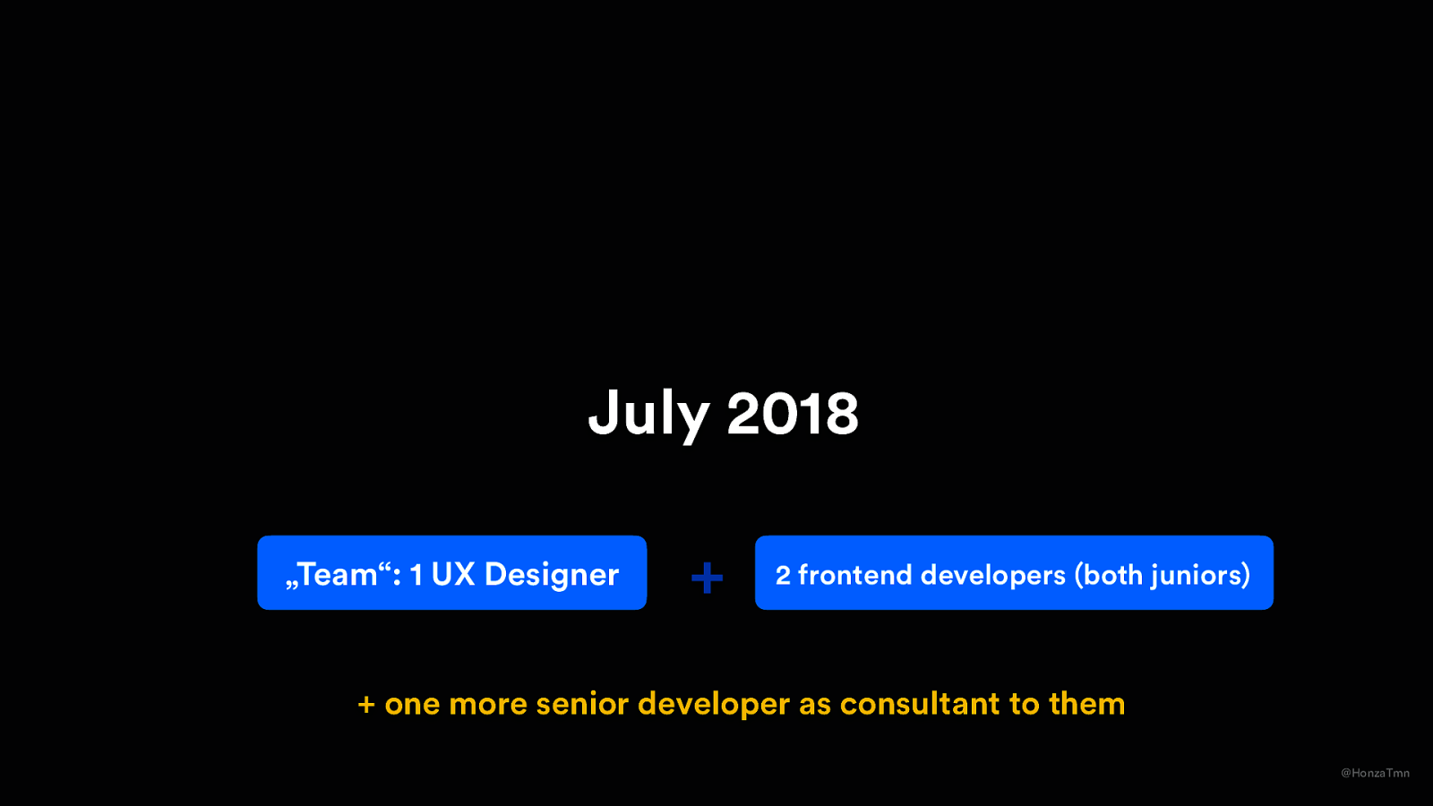
July 2018 „Team“: 1 UX Designer + 2 frontend developers (both juniors)
  • one more senior developer as consultant to them @HonzaTmn
  • Current team:

Slide 46

Slide 46

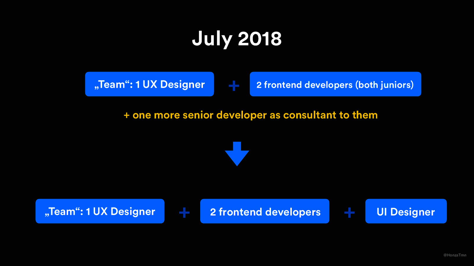
July 2018 „Team“: 1 UX Designer + 2 frontend developers (both juniors)

  • one more senior developer as consultant to them „Team“: 1 UX Designer

2 frontend developers + UI Designer @HonzaTmn
  • during those 3 months, we convinced design lead that we need full time of the second FE developer and with some reasoning and discussion (and not that many prototypes needed), we got it. - what also happened, that devs from other teams started to be interested in Orbit and wanted to help. Mostly one guy was consulting tech decisions for our junior devs. - and one of junior developers wanted to focus more on UI design, so he switched the role

Slide 47

Slide 47

After 1 year – September 2018 @HonzaTmn
  • That also meant that designers requested more and more components and variations, documentation of visual style needed to be written, etc. – which lead to discussion

Slide 48

Slide 48

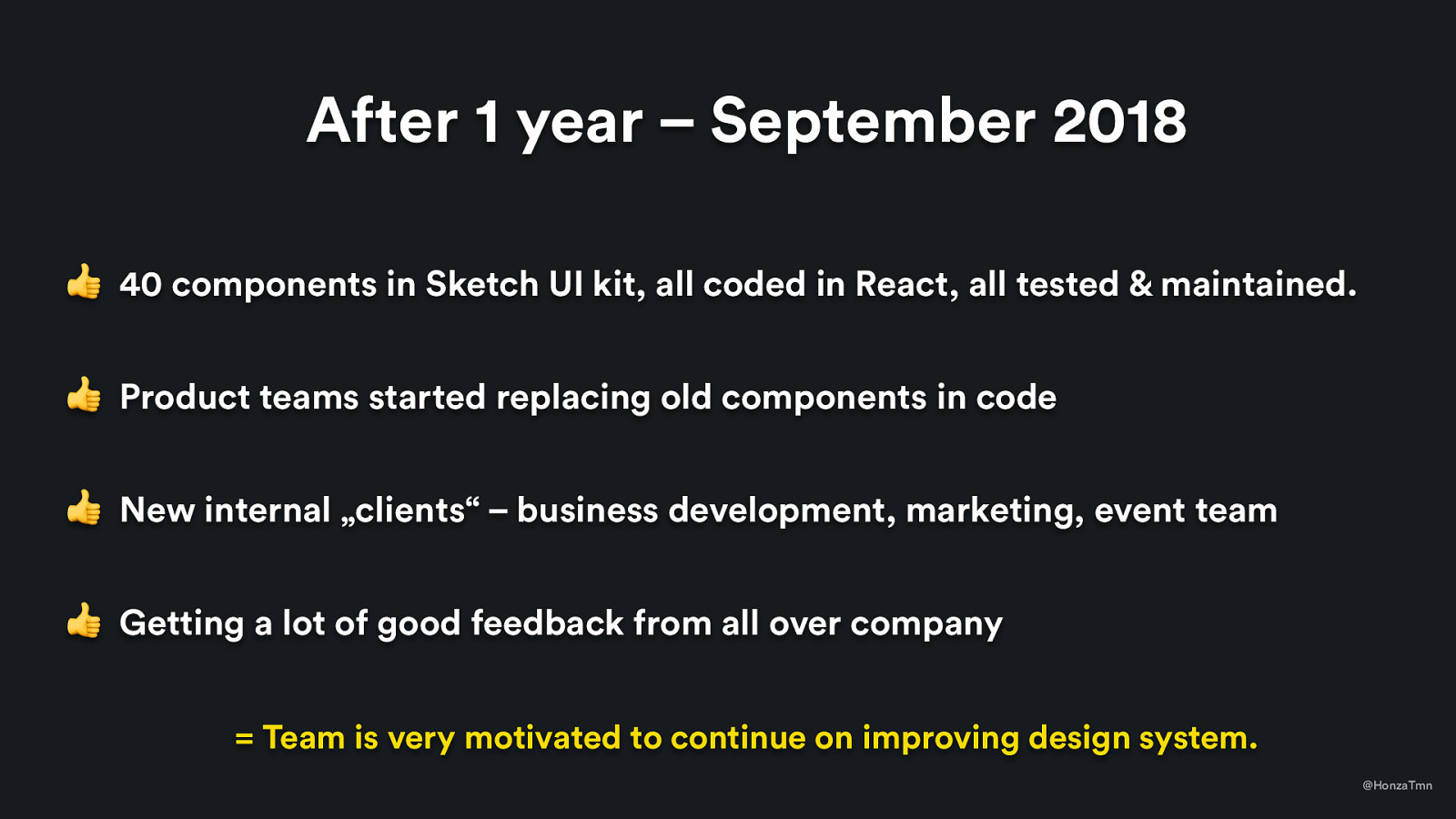
After 1 year – September 2018 👍 40 components in Sketch UI kit, all coded in React, all tested & maintained. 👍 Product teams started replacing old components in code 👍 New internal „clients“ – business development, marketing, event team 👍 Getting a lot of good feedback from all over company = Team is very motivated to continue on improving design system. @HonzaTmn
Slide 49

Slide 49

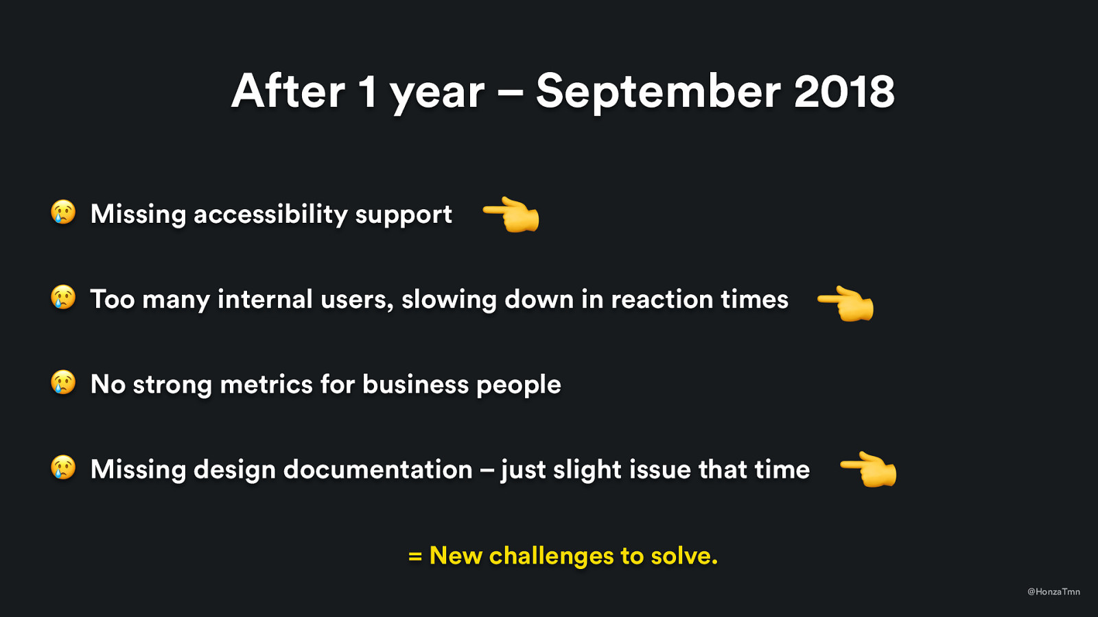
After 1 year – September 2018 😢 Missing accessibility support 👈 😢 Too many internal users, slowing down in reaction times 👈 😢 No strong metrics for business people 😢 Missing design documentation – just slight issue that time 👈 = New challenges to solve. @HonzaTmn
  • The first ones – we could hire a new developer to solve it. In this point, with so many clients in the company? It was very easy to get support for it.) - the last one about documentation – some people asked about it but we didn’t need it that much (and it was a mistake to not solve)

Slide 50

Slide 50

After 1 year – September 2018 😢 No strong metrics for business people @HonzaTmn
  • Metrics are issue, we are still experimenting with what works well - Currently, we just communicate that we need one less frontend developer and one less UI designer in the team - We are playing with some code analysis and trying to get some data from QA testing but we still didn’t crack it

Slide 51

Slide 51

January 2019 @HonzaTmn

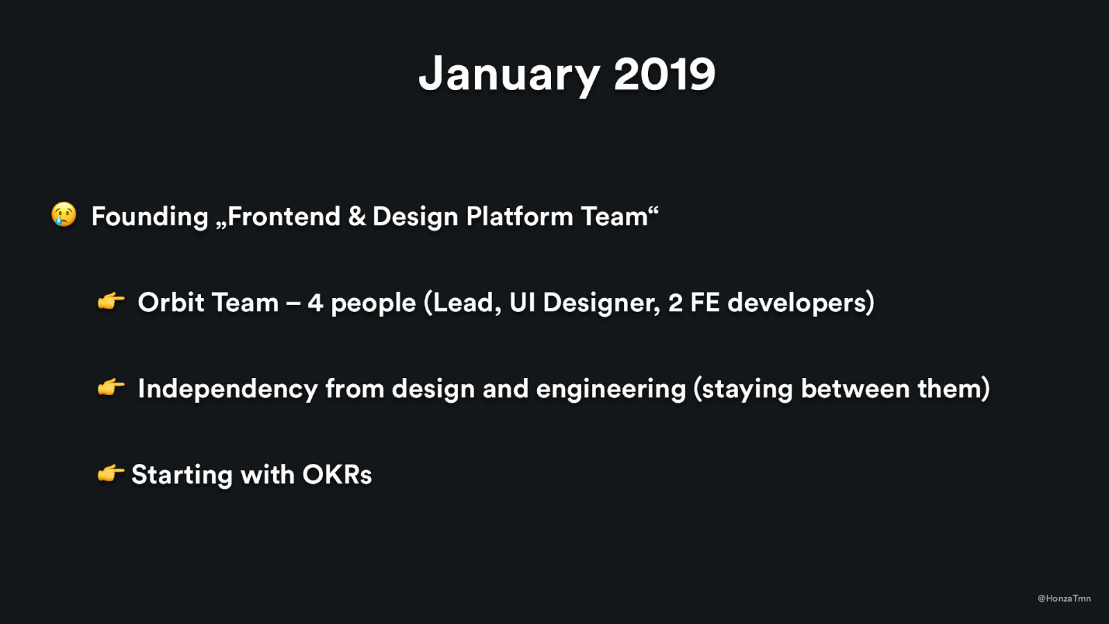
  • Current team:

Slide 52

Slide 52

January 2019 😢 Founding „Frontend & Design Platform Team“ 👉 Orbit Team – 4 people (Lead, UI Designer, 2 FE developers) 👉 Independency from design and engineering (staying between them) 👉 Starting with OKRs @HonzaTmn
Slide 53

Slide 53

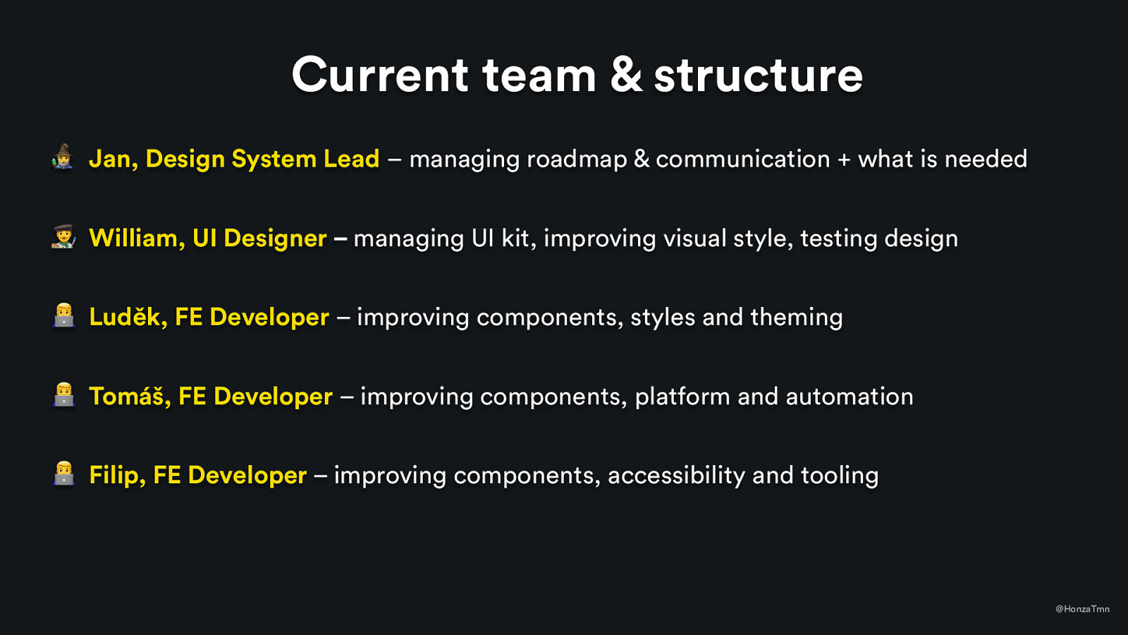
Current team & structure 8 Jan, Design System Lead – managing roadmap & communication + what is needed ’ William, UI Designer – managing UI kit, improving visual style, testing design / Luděk, FE Developer – improving components, styles and theming / Tomáš, FE Developer – improving components, platform and automation / Filip, FE Developer – improving components, accessibility and tooling @HonzaTmn
Slide 54

Slide 54

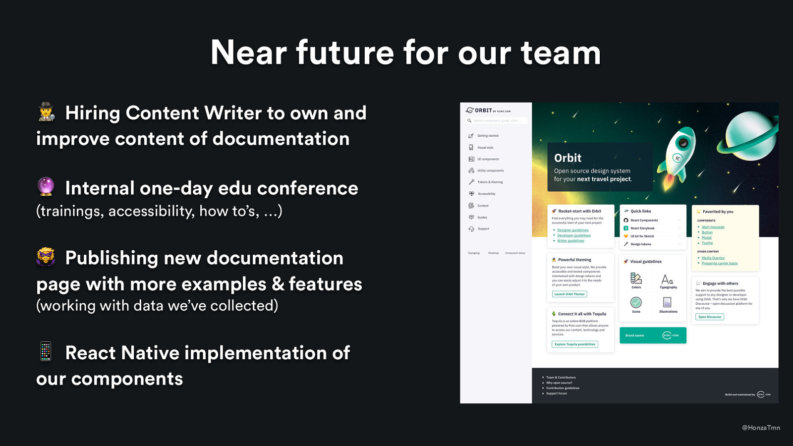
Near future for our team 🕵 Hiring Content Writer to own and improve content of documentation 🔮 Internal one-day edu conference (trainings, accessibility, how to’s, …) 🦹 Publishing new documentation page with more examples & features (working with data we’ve collected) 📱 React Native implementation of our components @HonzaTmn
Slide 55

Slide 55

Let’s discuss :-) + reach out to me on Twitter: @HonzaTmn 🕵 We’re hiring Content Writer to own and improve our documentation