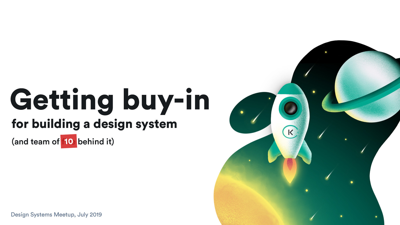
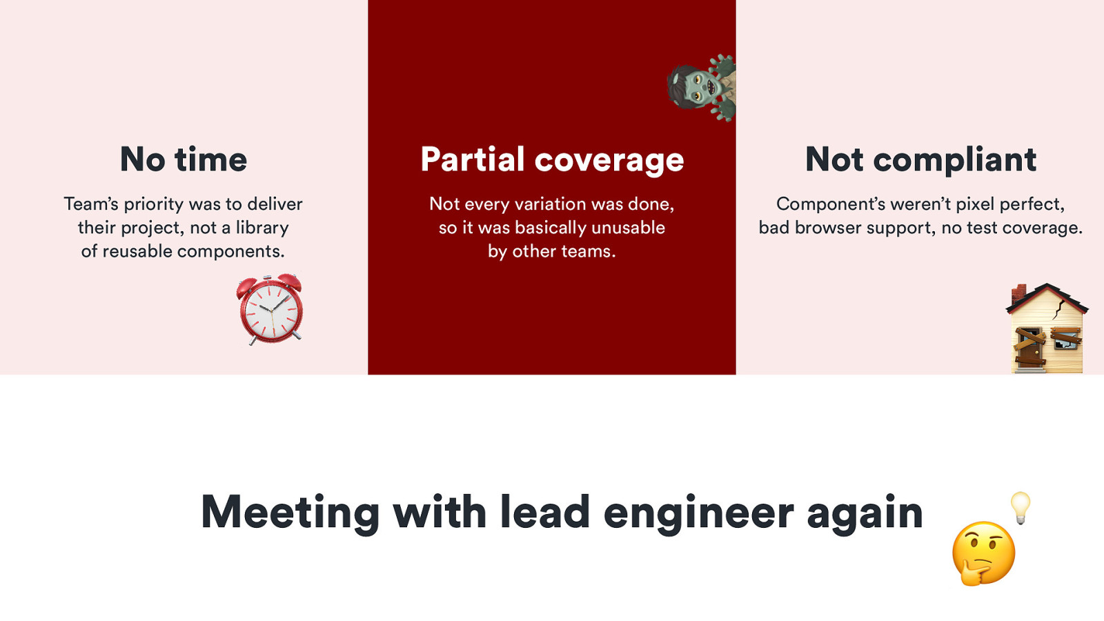
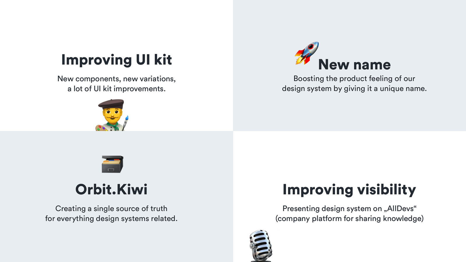
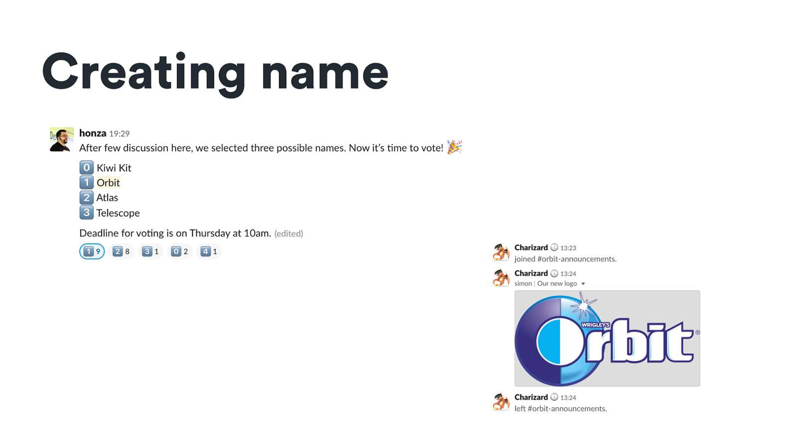
🚀New name
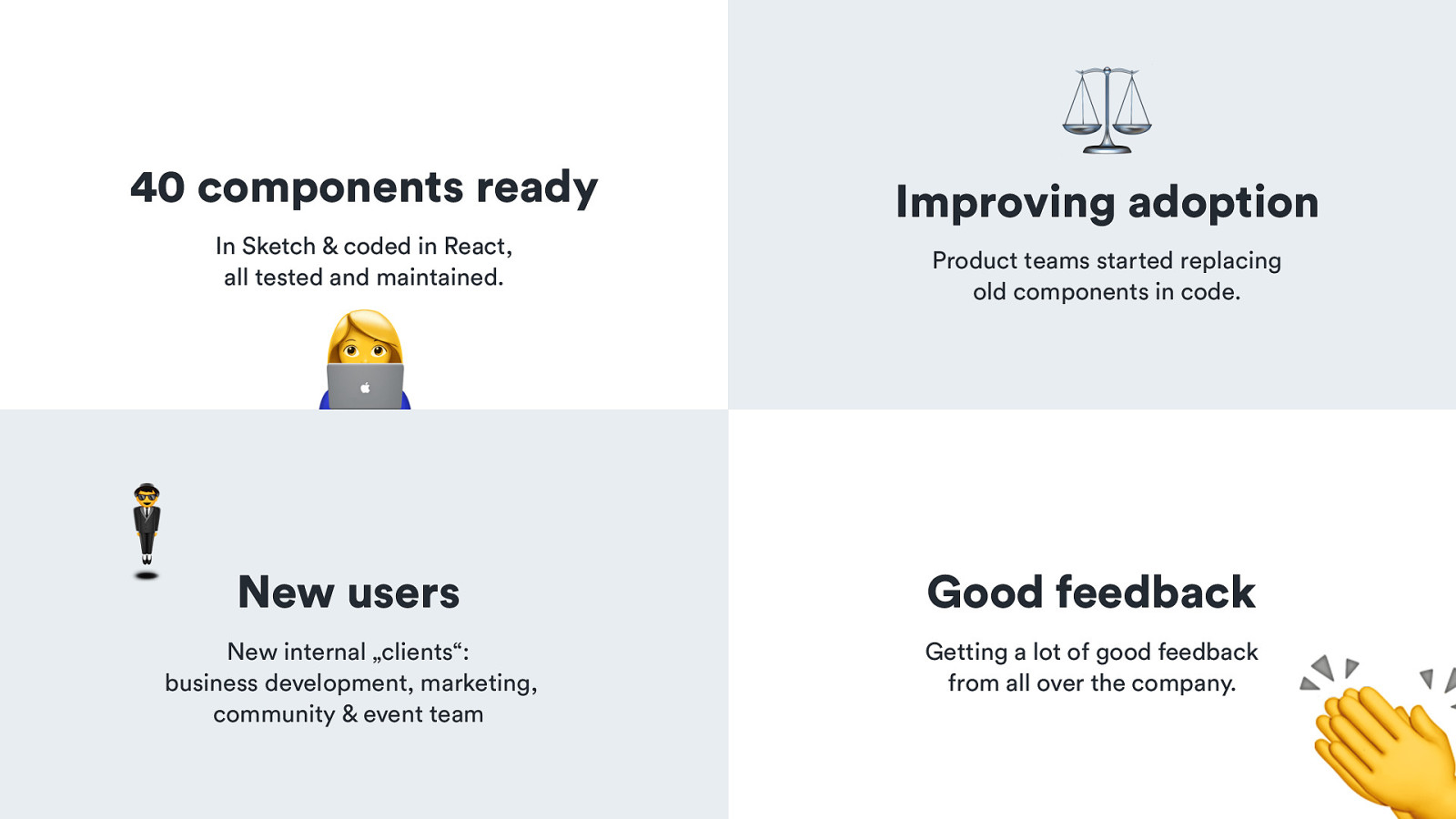
Improving UI kit New components, new variations, a lot of UI kit improvements.
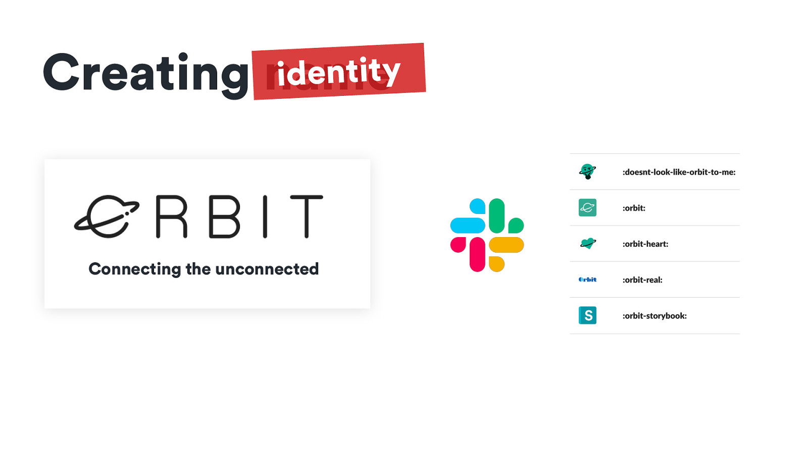
Boosting the product feeling of our design system by giving it a unique name.
! 🗃
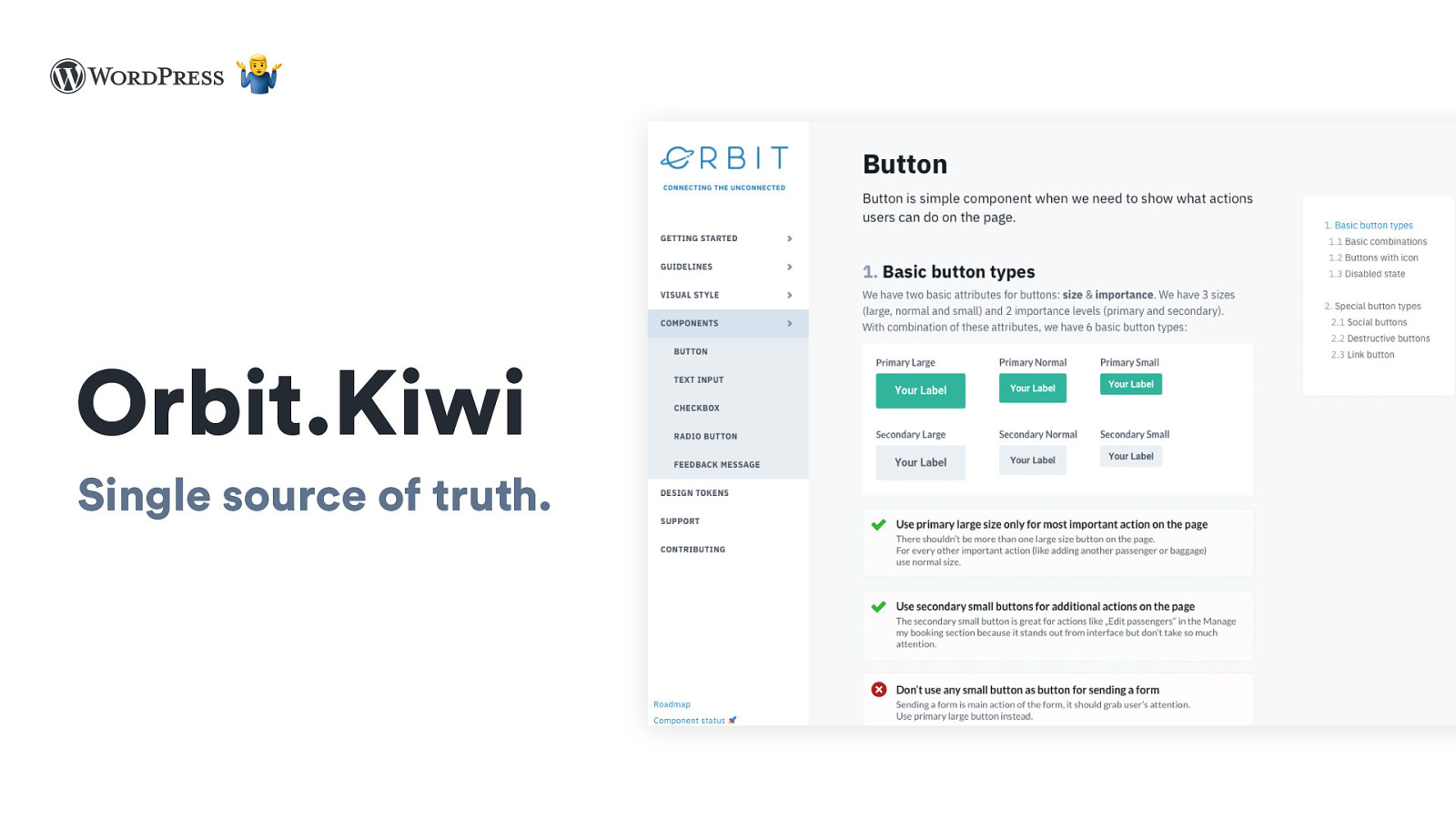
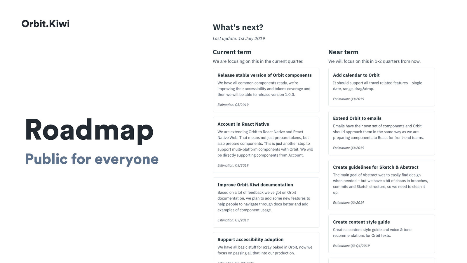
Orbit.Kiwi
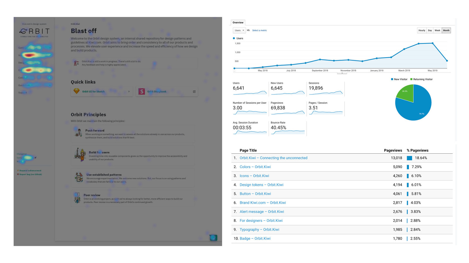
Improving visibility
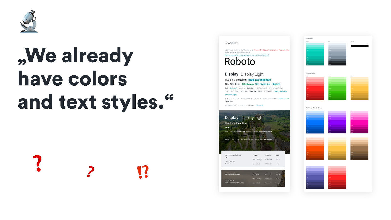
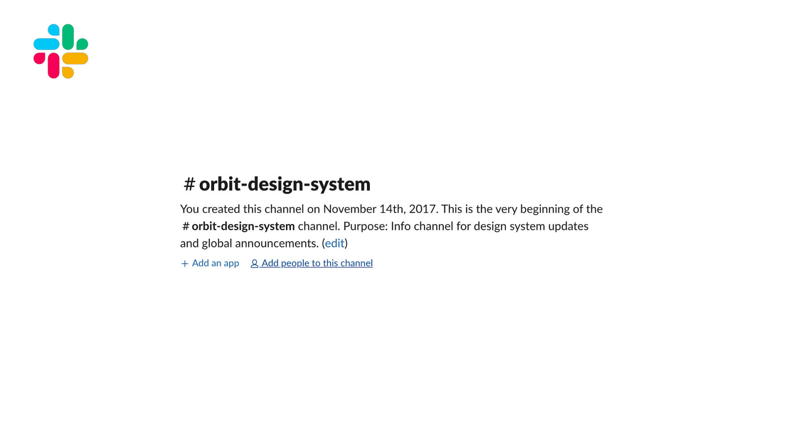
Creating a single source of truth for everything design systems related.
Presenting design system on „AllDevs“ (company platform for sharing knowledge)
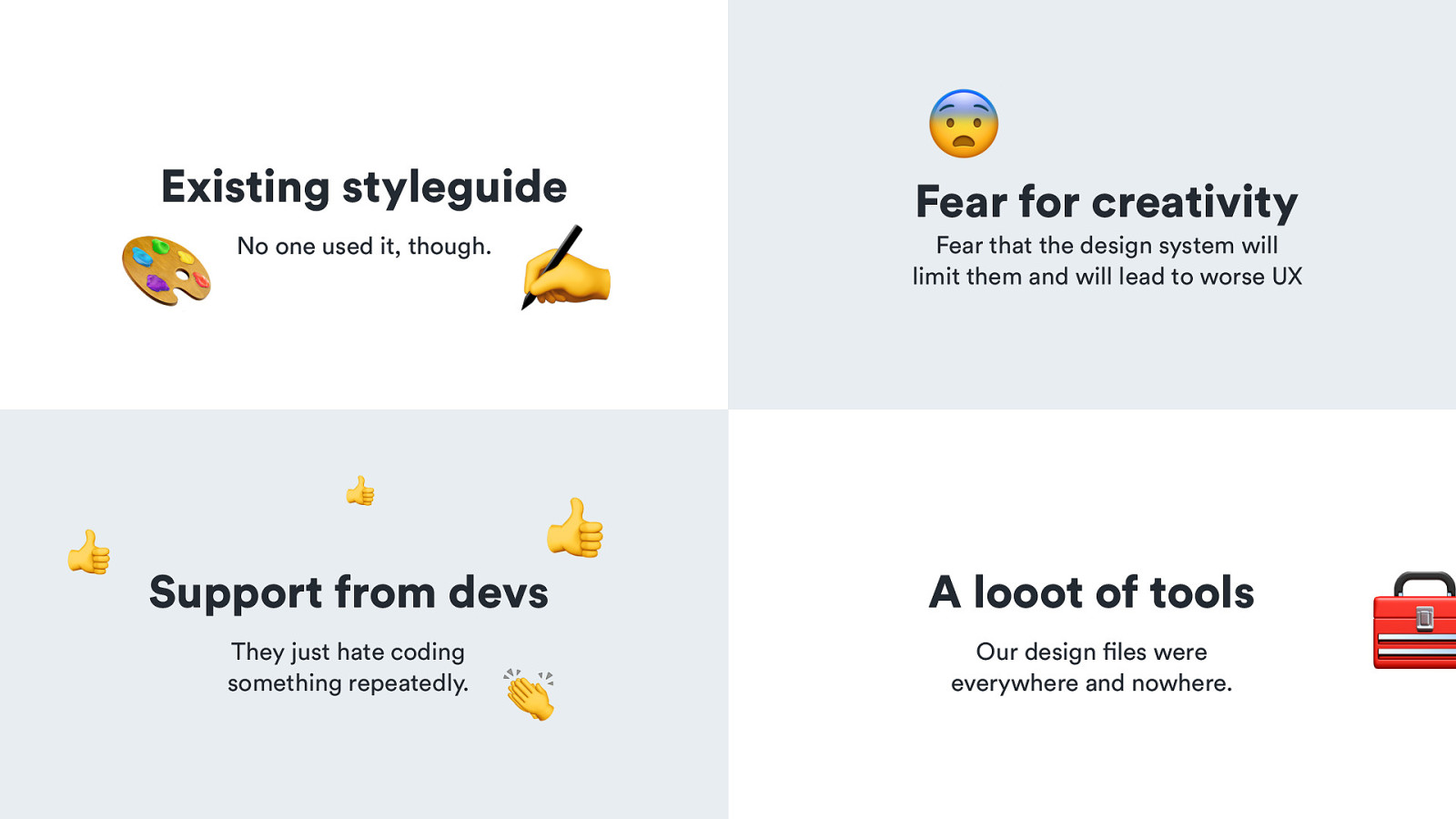
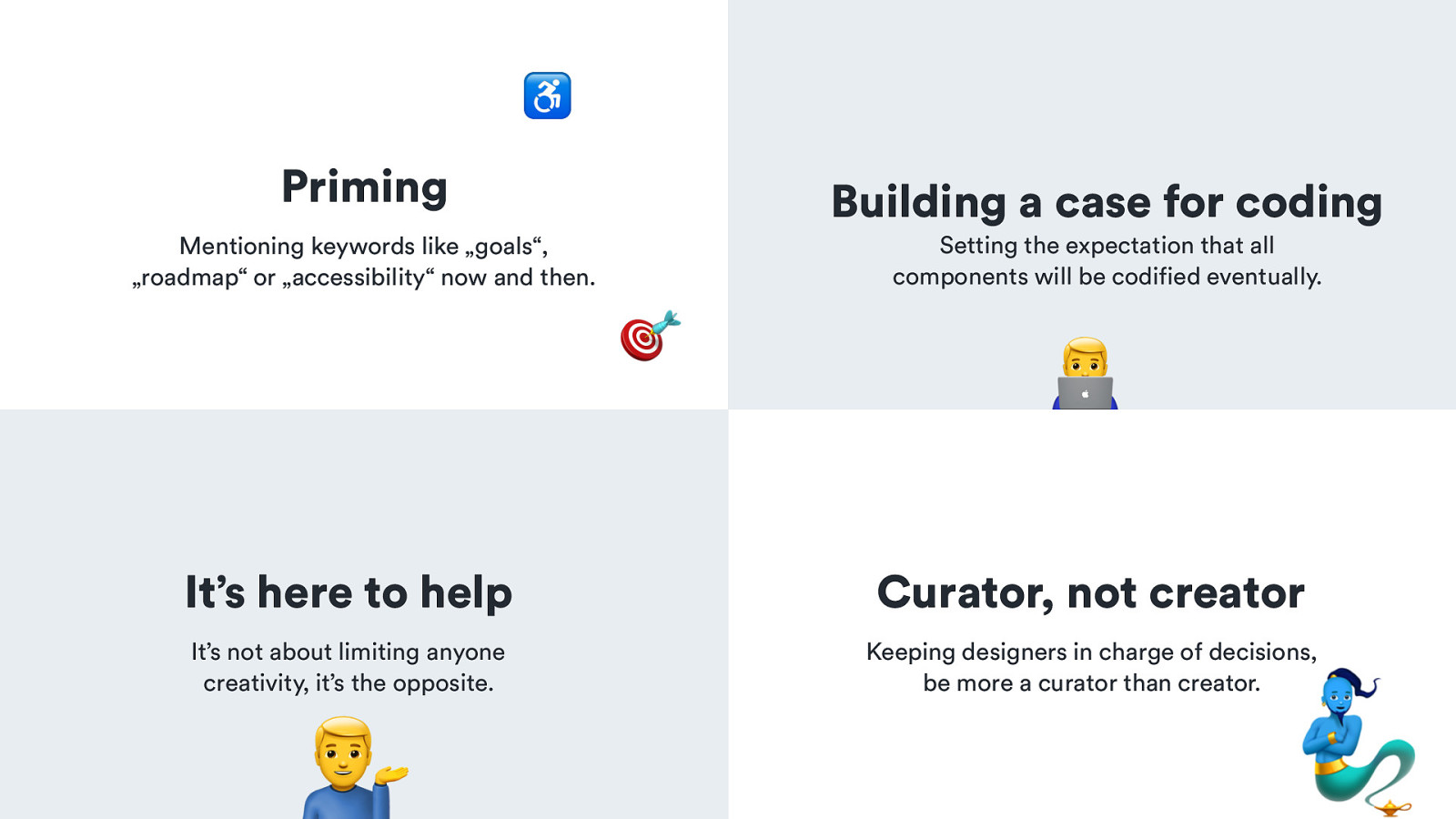
🎙 - new components – and of course, publishing changes on Slack channel, so people still felt engaged and we improved a visibility of the whole project - name - a lot of people started to mention it as KiwiKit (original name), UI kit, component library, design system, and it was just messy. Also, Slack channels related to
design system was getting out of hand. - talk about some points little more, because two things from this were game-changing and I believe that they were the most important things that happened in kiwi.com to push design system


