Mastering the art of crafting code-aligned UI kits Jan Toman Design System Lead, Productboard logo

A presentation at Figma Schema in October 2021 in by Jan Toman

Mastering the art of crafting code-aligned UI kits Jan Toman Design System Lead, Productboard logo
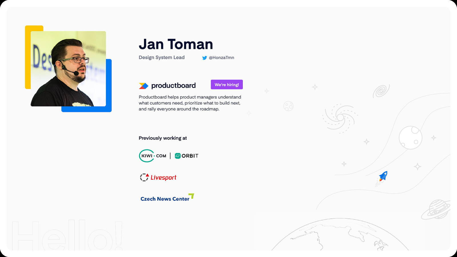
Jan Toman Design System Lead @HonzaTmn We’re hiring! Productboard helps product managers understand what customers need, prioritize what to build next, and rally everyone around the roadmap. Previously working at

Let’s talk about design systems
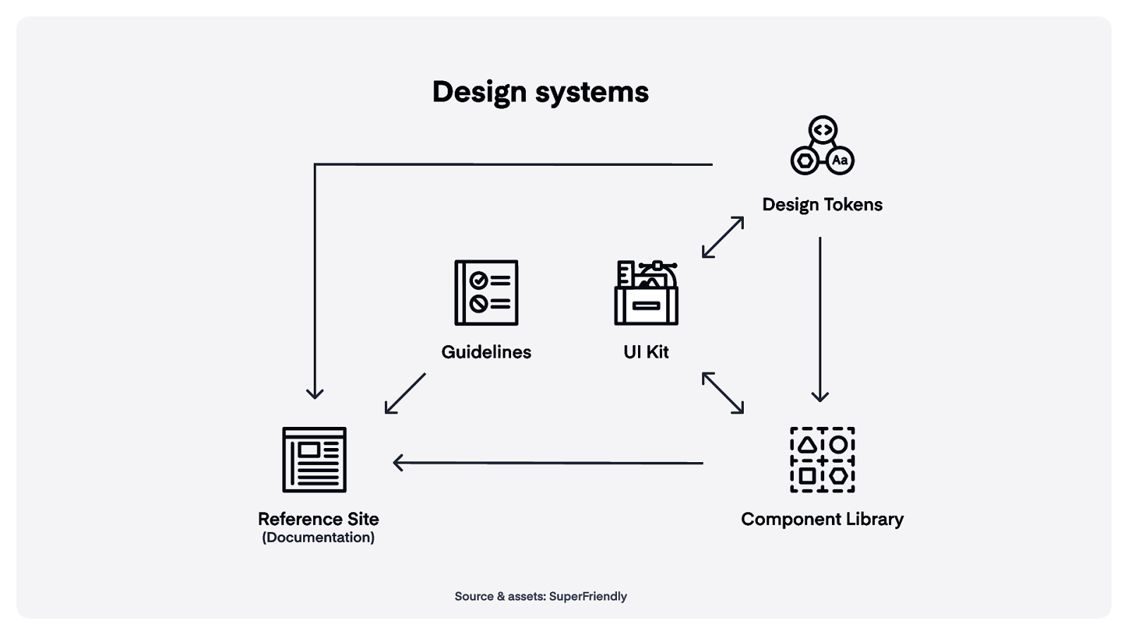
Design systems Design Tokens Guidelines UI Kit Reference Site Component Library (Documentation) Source & assets: SuperFriendly
Design Tokens UI Kit Reference Site Component Library (Documentation) Source & assets: SuperFriendly
Design Tokens UI Kit Reference Site Component Library (Documentation) Source & assets: SuperFriendly
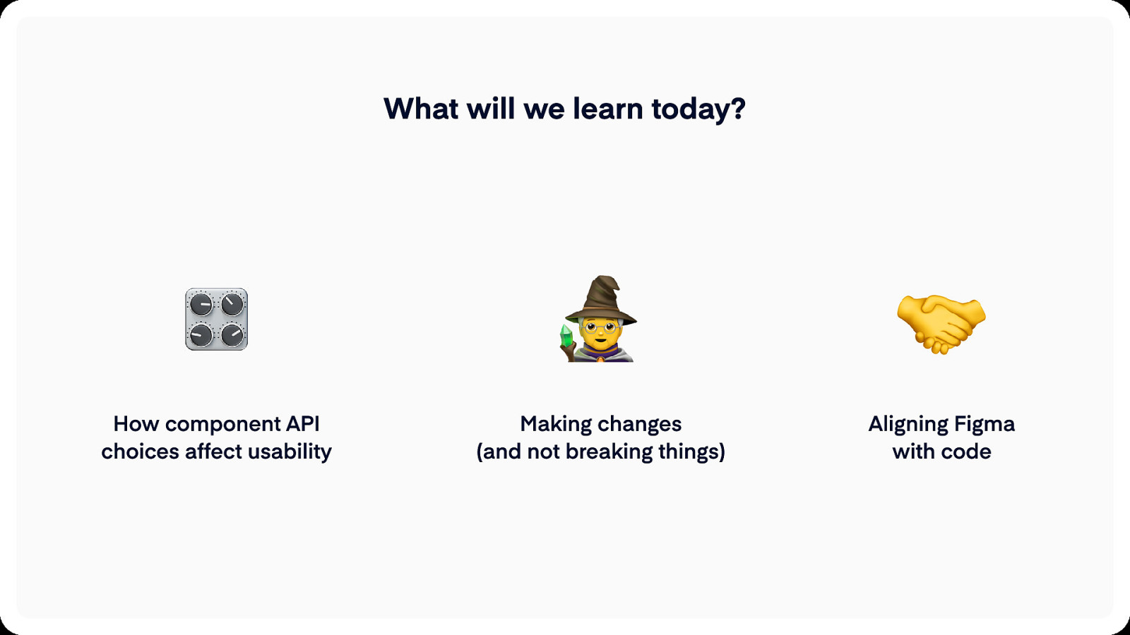
What will we learn today? How component API choices affect usability Making changes (and not breaking things) Aligning Figma with code

How component API choices affect usability
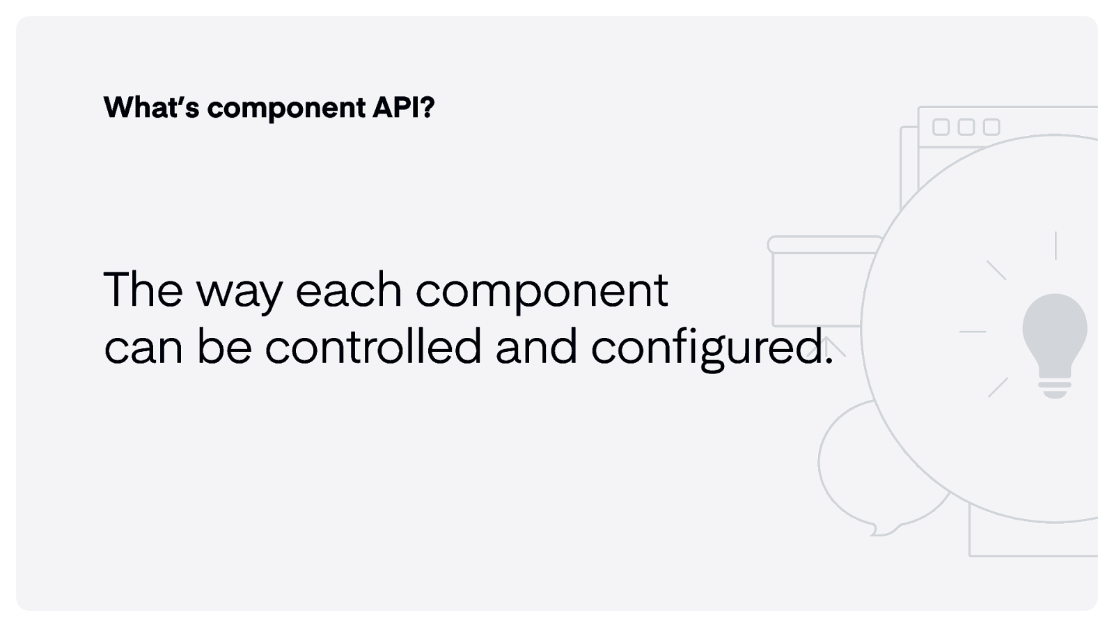
What’s component API? The way each component can be controlled and configured.
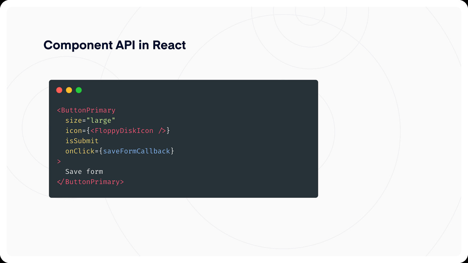
Component API in React
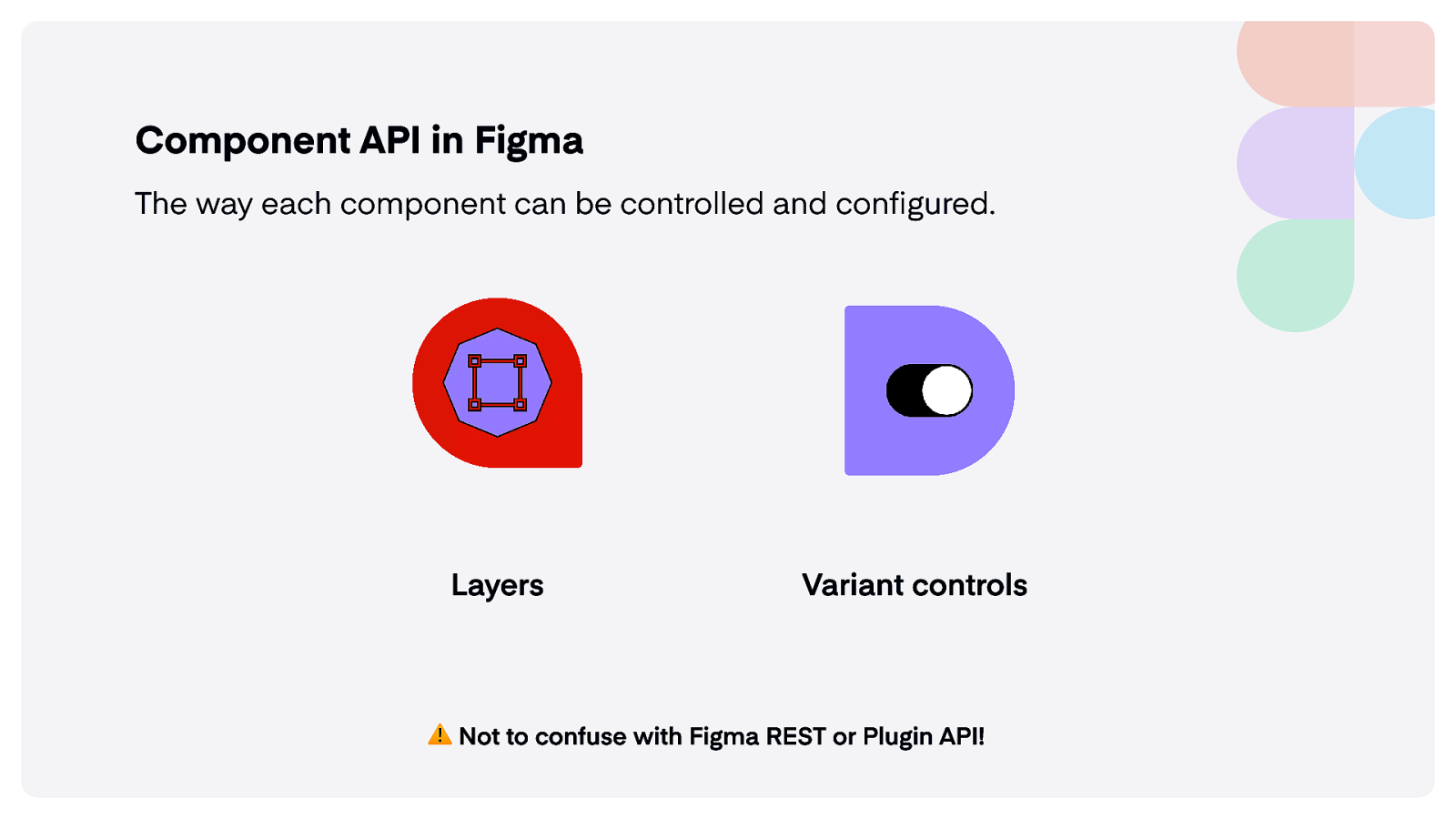
Component API in Figma The way each component can be controlled and configured. Layers Variant controls ️Not to confuse with Figma REST or Plugin API!
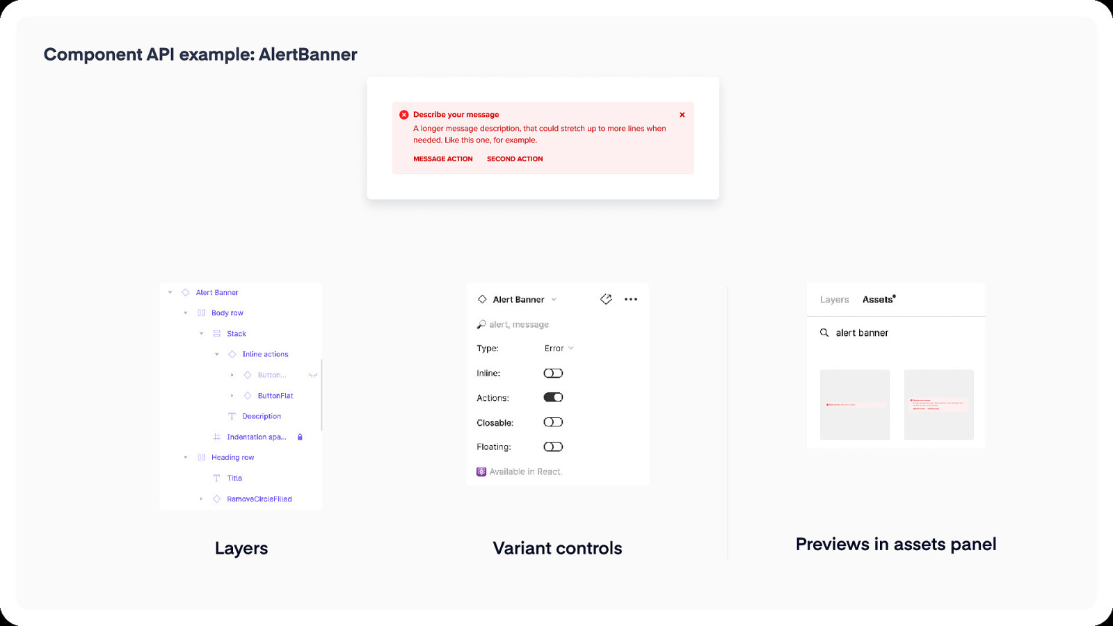
Component API example: AlertBanner Describe your message A longer message description, that could stretch up to more lines when needed. Like this one, for example. message action Layers second action Variant controls Previews in assets panel
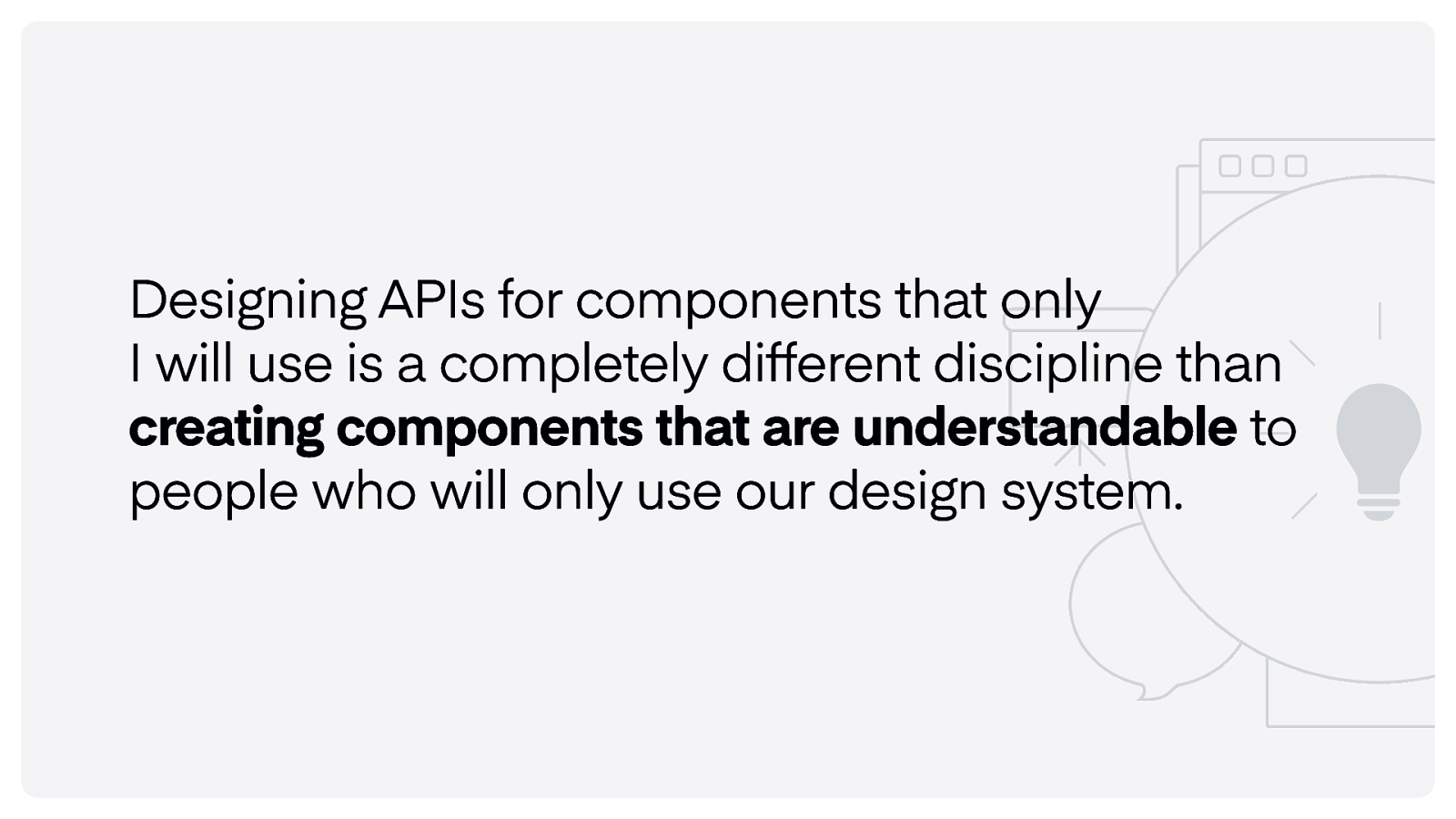
Designing APIs for components that only I will use is a completely different discipline than creating components that are understandable to people who will only use our design system.
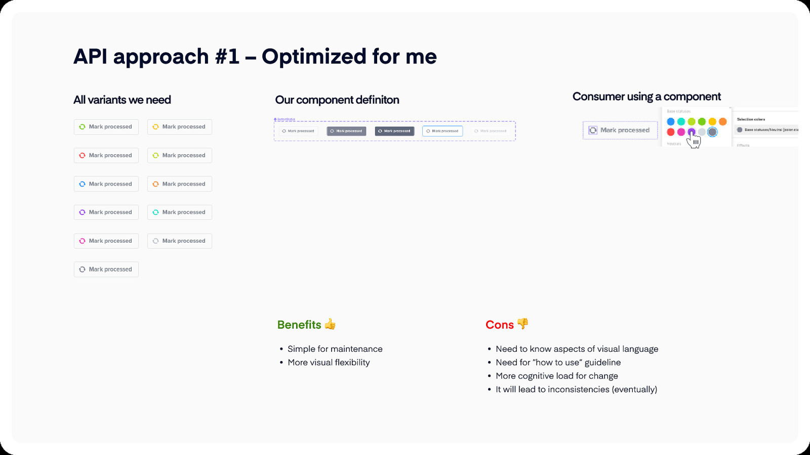
API approach #1 – Optimized for me All variants we need Consumer using a component Our component definiton Benefits Cons Simple for maintenanc Need to know aspects of visual languag More visual flexibility Need for “how to use” guidelin More cognitive load for chang It will lead to inconsistencies (eventually)
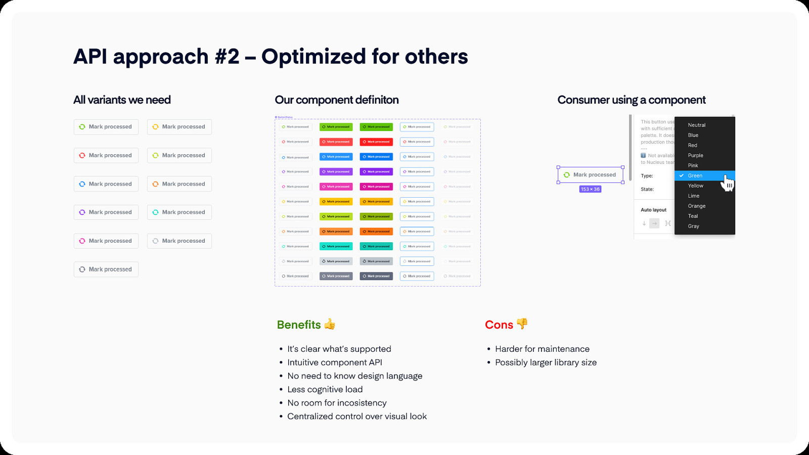
API approach #2 – Optimized for others All variants we need Our component definiton Benefits Consumer using a component Cons It’s clear what’s supporte Harder for maintenanc Intuitive component AP Possibly larger library size No need to know design languag Less cognitive loa No room for incosistenc Centralized control over visual look
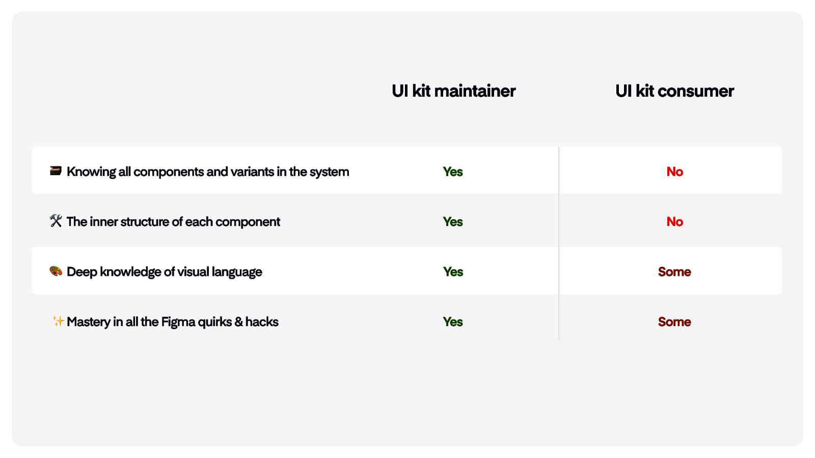
UI kit maintainer UI kit consumer Knowing all components and variants in the system Yes No The inner structure of each component Yes No Deep knowledge of visual language Yes Some Mastery in all the Figma quirks & hacks Yes Some
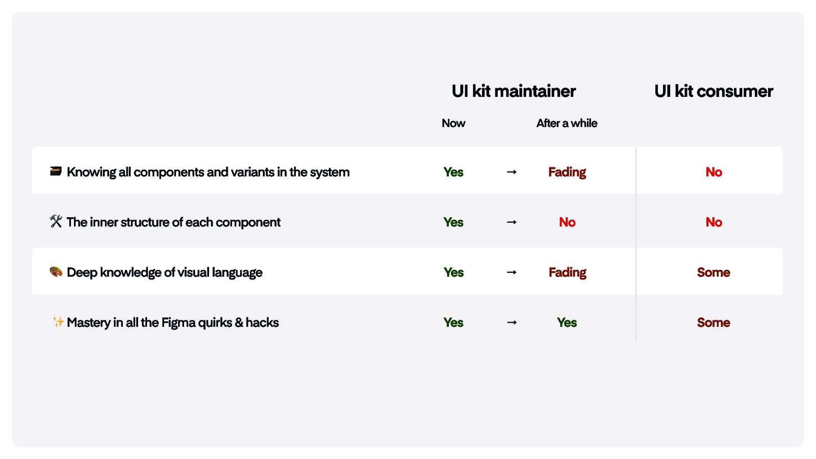
UI kit maintainer Now UI kit consumer After a while Knowing all components and variants in the system Yes → Fading No The inner structure of each component Yes → No No Deep knowledge of visual language Yes → Fading Some Mastery in all the Figma quirks & hacks Yes → Yes Some
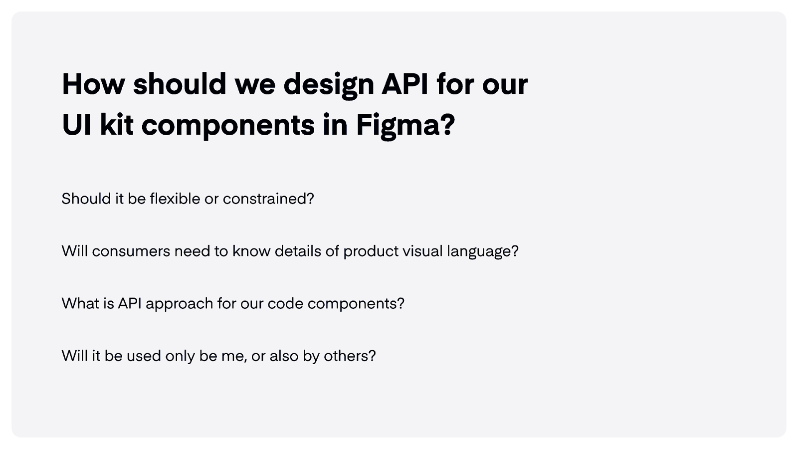
How should we design API for our UI kit components in Figma? Should it be flexible or constrained? Will consumers need to know details of product visual language? What is API approach for our code components? Will it be used only be me, or also by others?
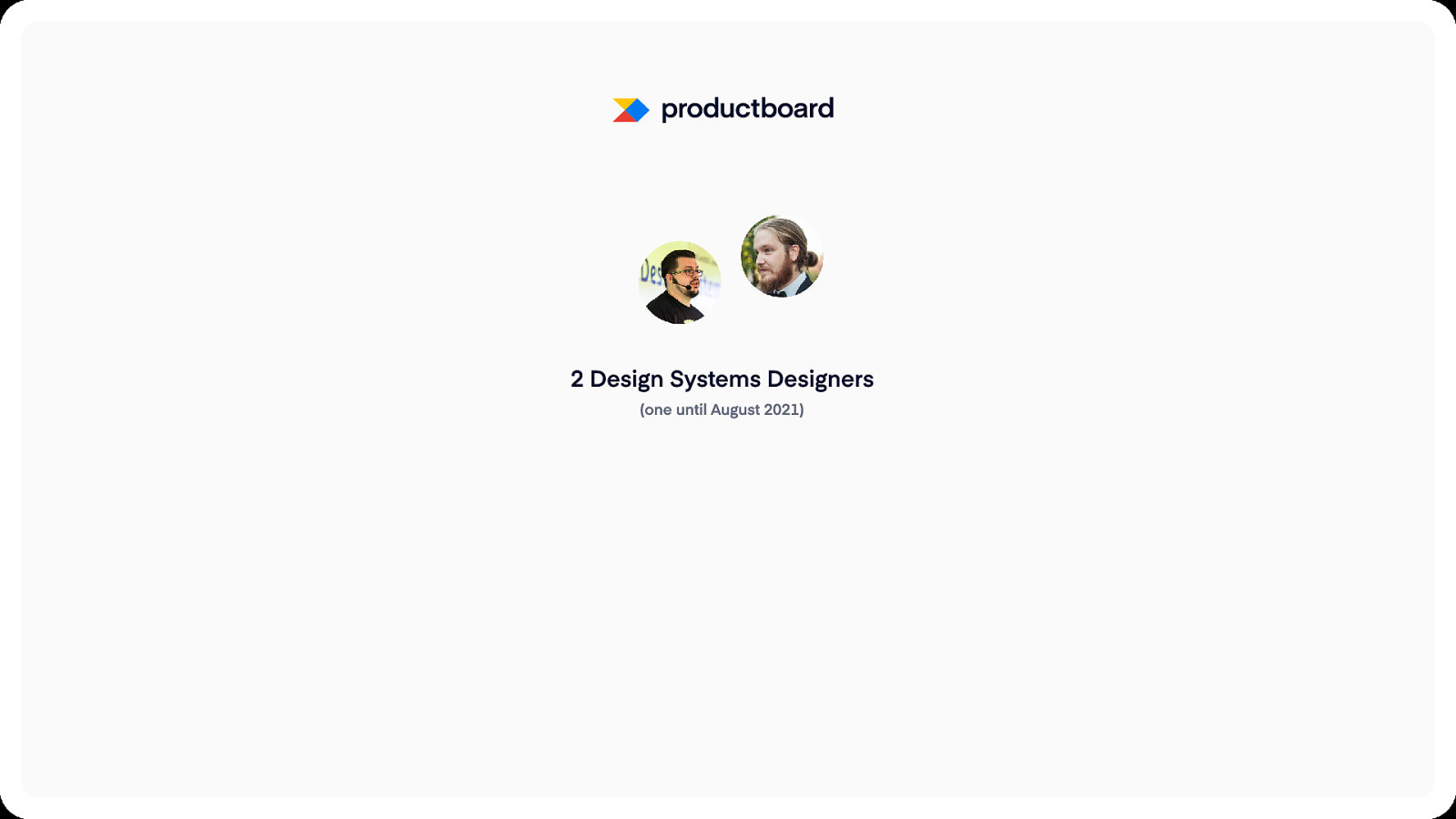
2 Design Systems Designers (one until August 2021)
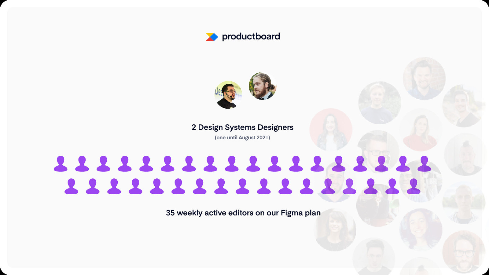
2 Design Systems Designers (one until August 2021) 35 weekly active editors on our Figma plan
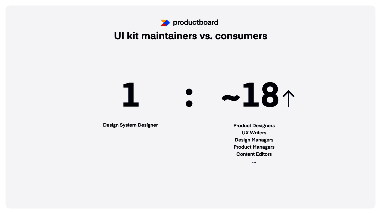
UI kit maintainers vs. consumers 1 Design System Designer : ~18 Product Designers UX Writers Design Managers Product Managers Content Editors …
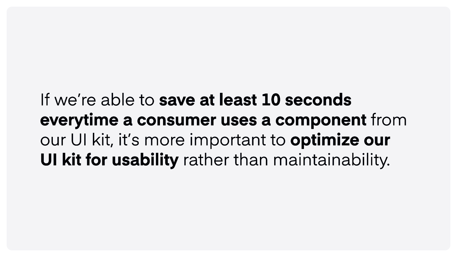
If we’re able to save at least 10 seconds everytime a consumer uses a component from our UI kit, it’s more important to optimize our UI kit for usability rather than maintainability.
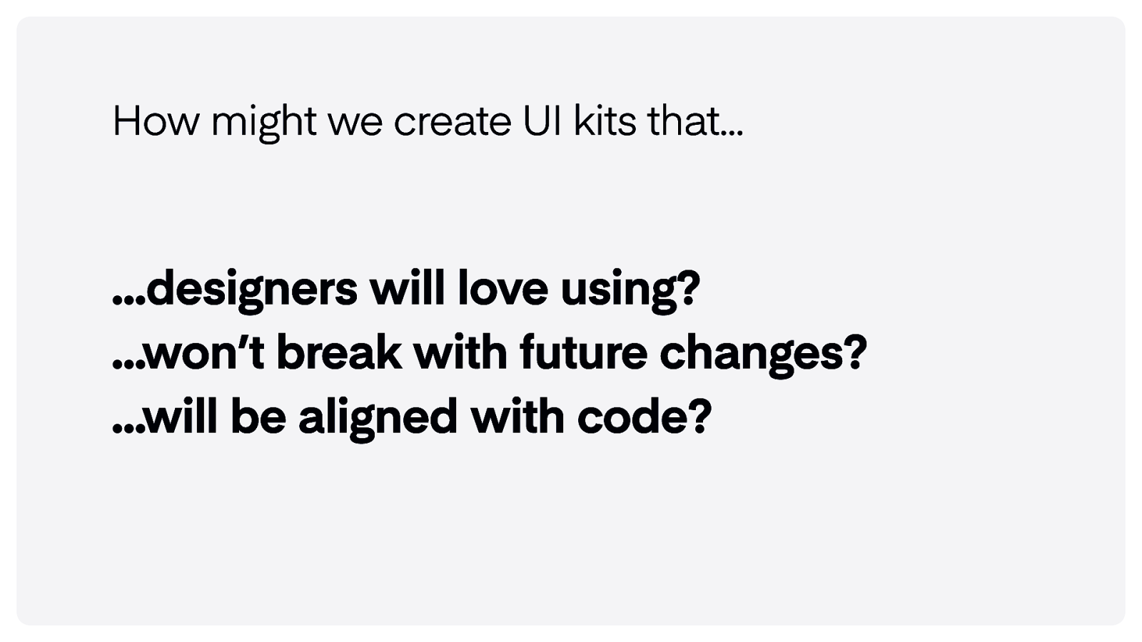
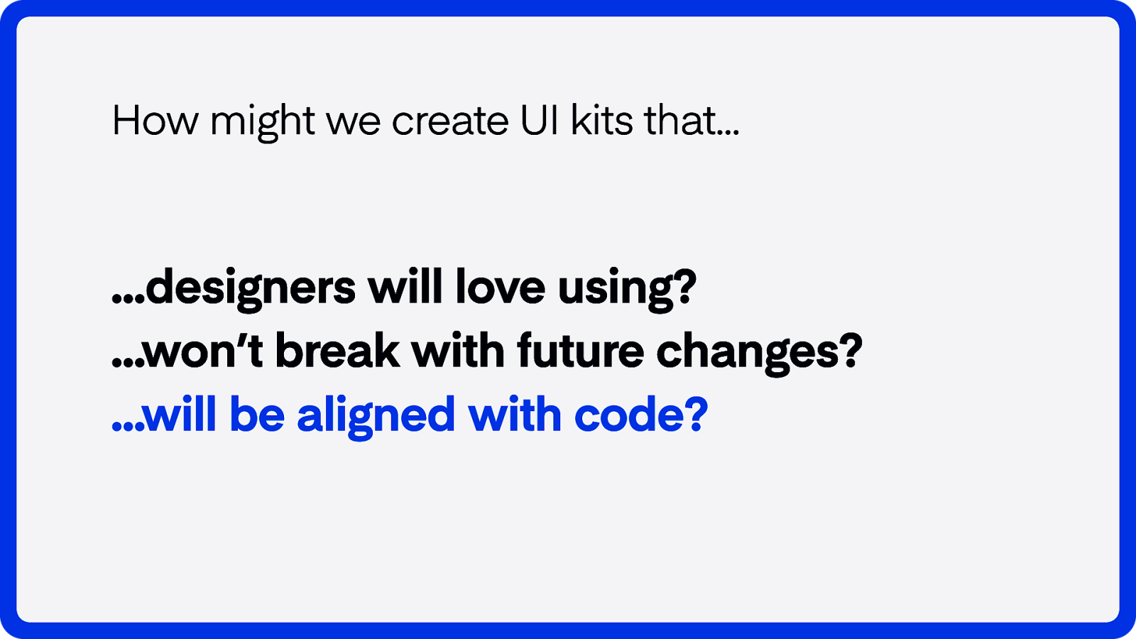
How might we create UI kits that… …designers will love using? …won’t break with future changes? …will be aligned with code?
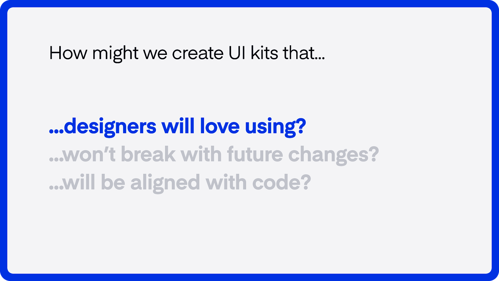
How might we create UI kits that… …designers will love using?
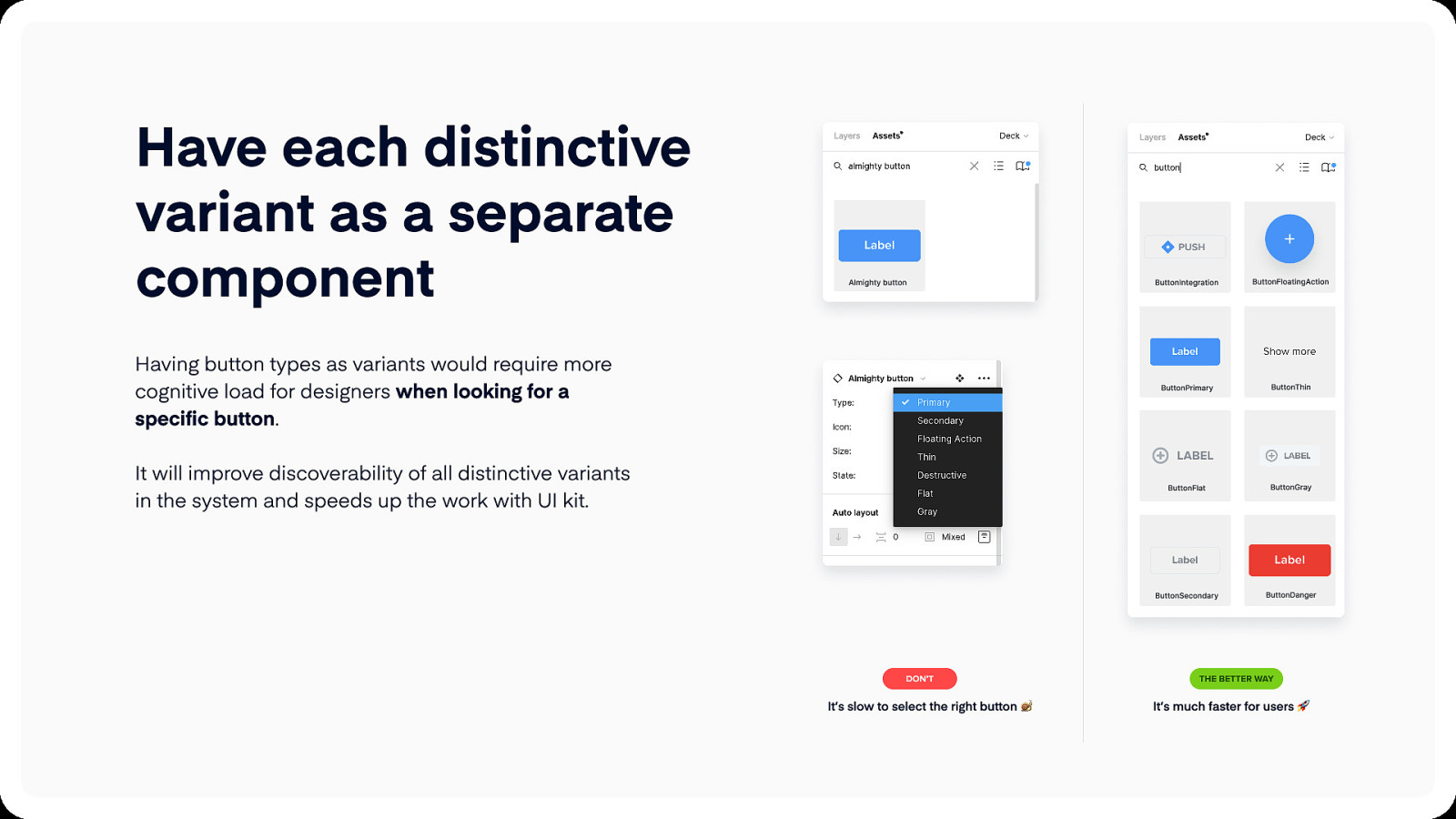
Have each distinctive variant as a separate component Almighty button Having button types as variants would require more cognitive load for designers when looking for a specific button. It will improve discoverability of all distinctive variants in the system and speeds up the work with UI kit. don’t It’s slow to select the right button ButtonIntegration ButtonFloatingAction ButtonPrimary ButtonThin ButtonFlat ButtonGray ButtonSecondary ButtonDanger The better way It’s much faster for users
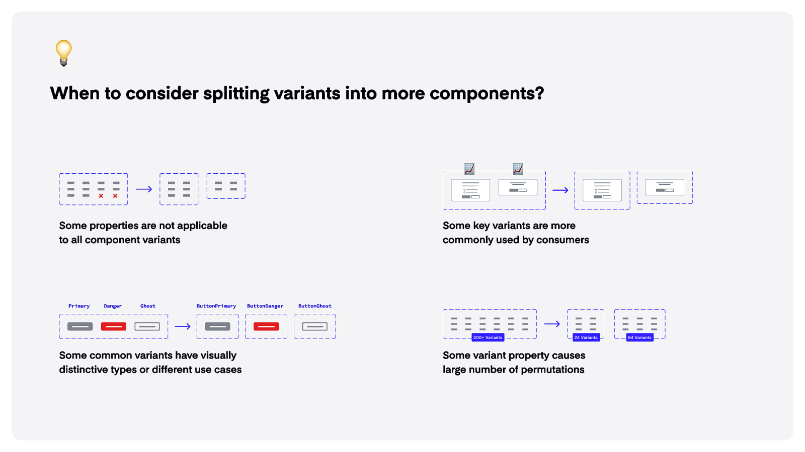
When to consider splitting variants into more components? Some properties are not applicable to all component variants Primary Danger Ghost ButtonPrimary Some key variants are more commonly used by consumers ButtonDanger ButtonGhost 200+ Variants Some common variants have visually distinctive types or different use cases 24 Variants Some variant property causes large number of permutations 64 Variants
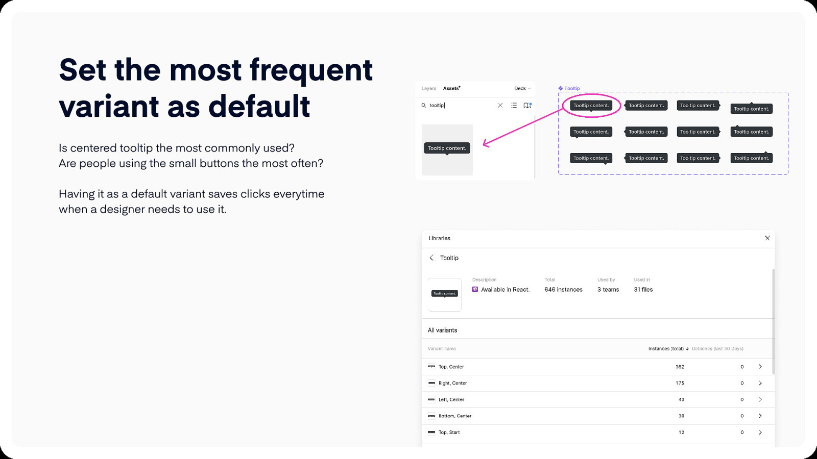
Set the most frequent variant as default Is centered tooltip the most commonly used? Are people using the small buttons the most often?
Having it as a default variant saves clicks everytime when a designer needs to use it.
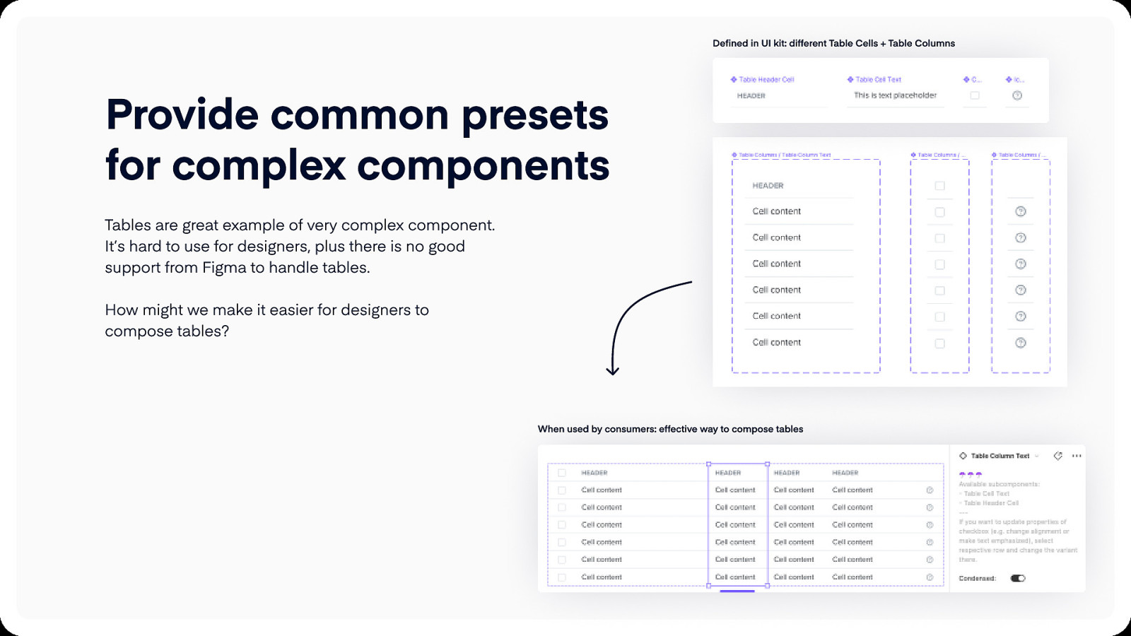
Defined in UI kit: different Table Cells + Table Columns Provide common presets for complex components Tables are great example of very complex component. It’s hard to use for designers, plus there is no good support from Figma to handle tables. How might we make it easier for designers to compose tables? When used by consumers: effective way to compose tables
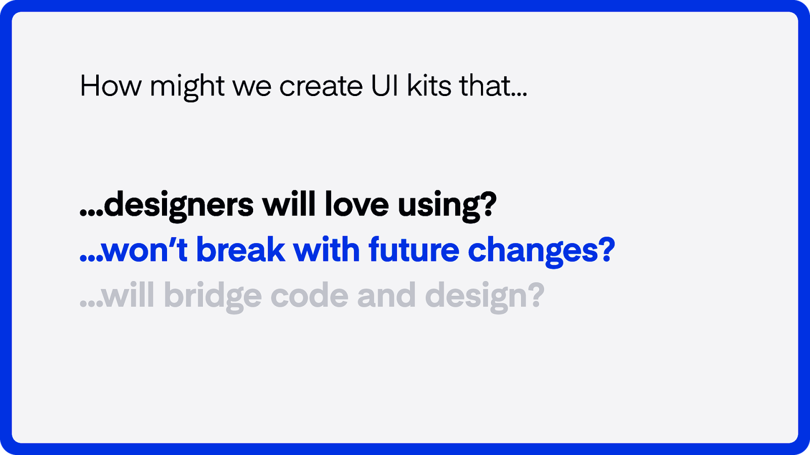
How might we create UI kits that… …designers will love using? …won’t break with future changes?
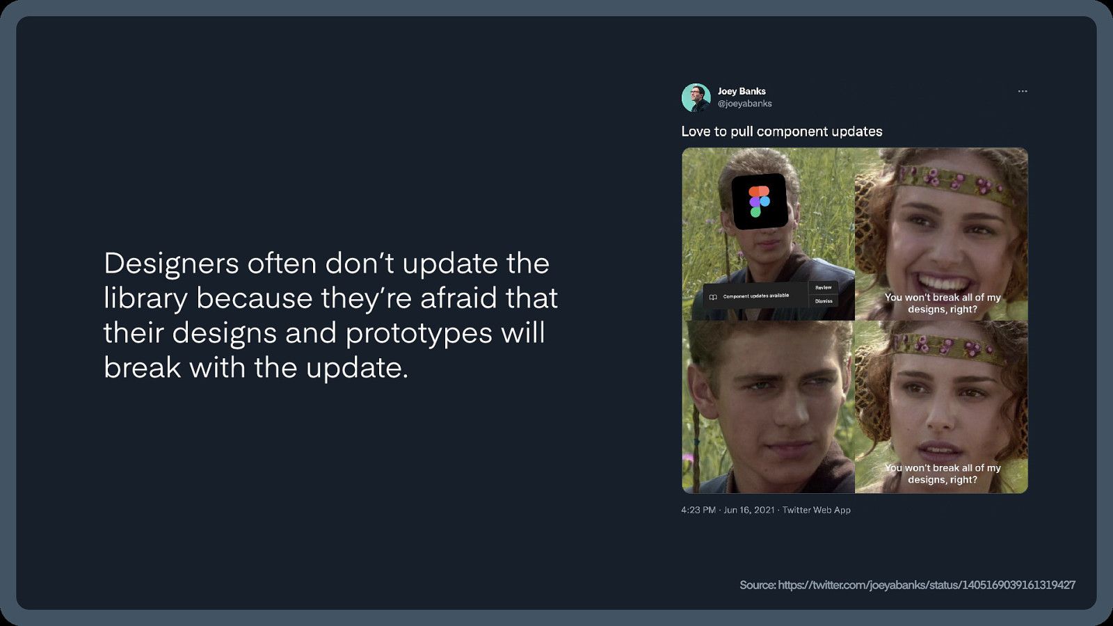
Designers often don’t update the library because they’re afraid that their designs and prototypes will break with the update. Source: https://twitter.com/joeyabanks/status/1405169039161319427
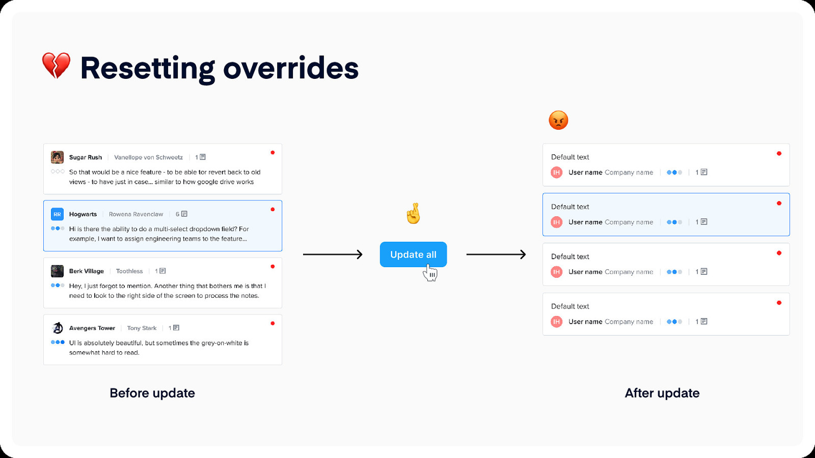
Resetting overrides Before update After update
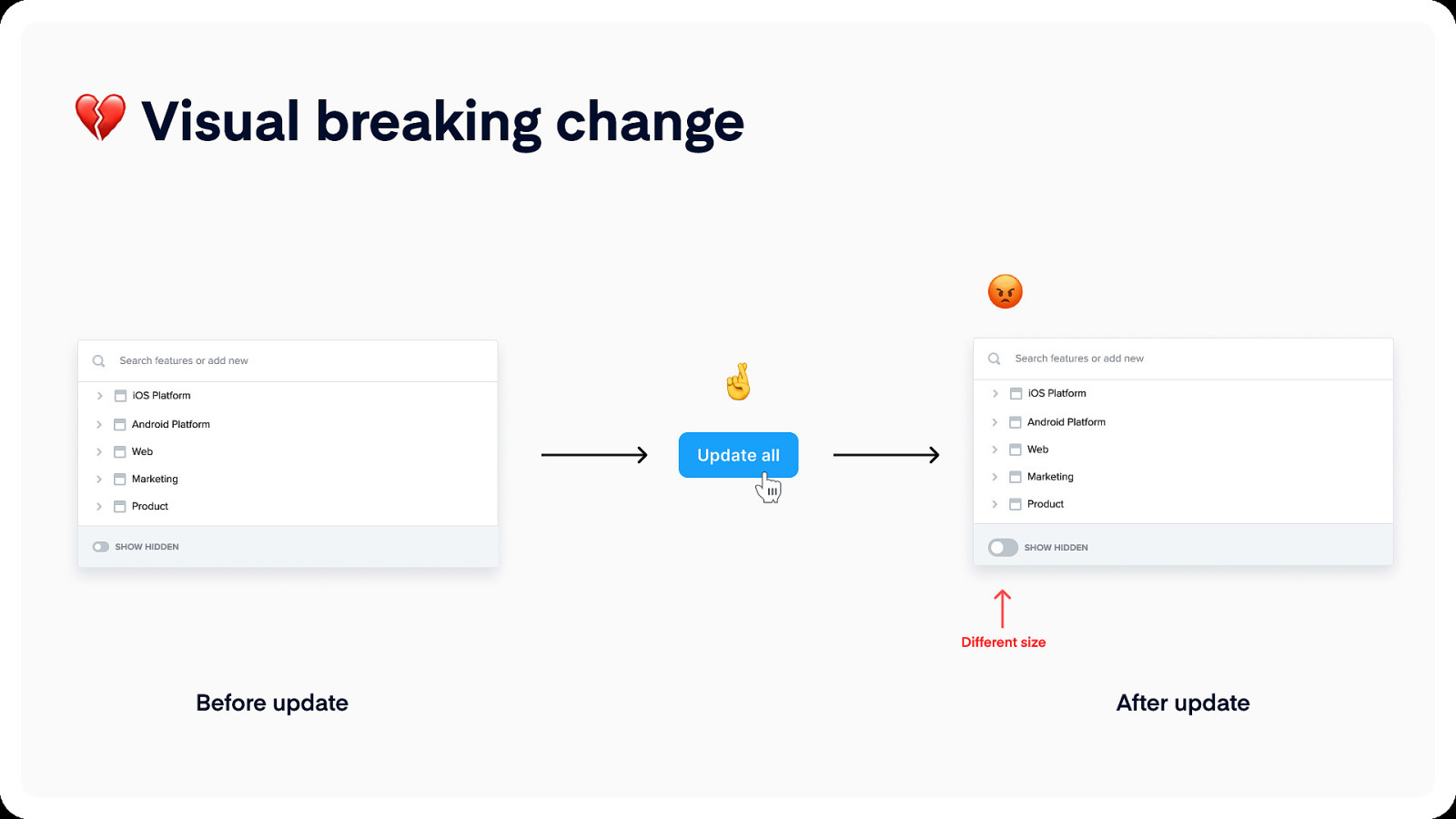
Visual breaking change Search features or add new iOS Platform Android Platform Web Marketing Product show hidden Search features or add new iOS Platform Android Platform Web Marketing Product show hidden Different size Before update After update
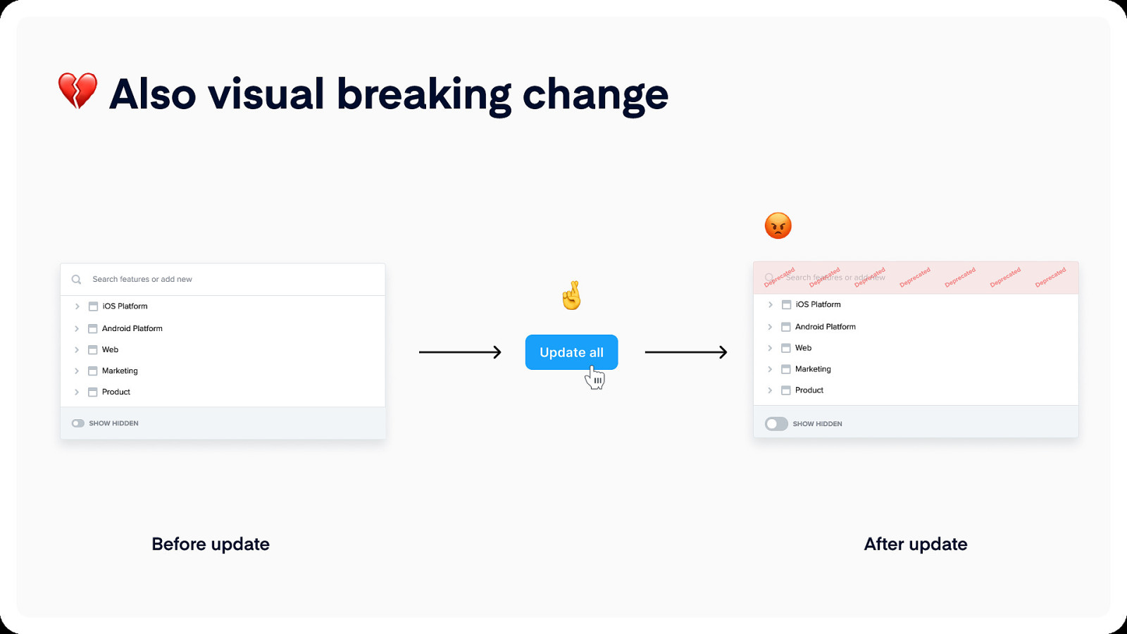
Also visual breaking change Search features or add new iOS Platform Android Platform Web Marketing Product show hidden Search features or add new iOS Platform Android Platform Web Marketing Product show hidden Before update After update
Let’s do some demos Preventing breaking changes Base components Canvas organization
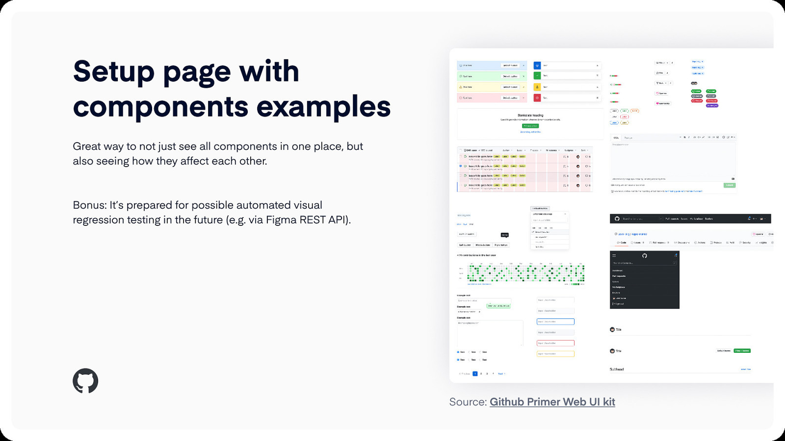
Setup page with components examples Great way to not just see all components in one place, but also seeing how they affect each other.
Bonus: It’s prepared for possible automated visual regression testing in the future (e.g. via Figma REST API). Source: Github Primer Web UI kit
How might we create UI kits that… …designers will love using? …won’t break with future changes? …will be aligned with code?

Design Tokens UI Kit Reference Site Component Library (Documentation) Source & assets: SuperFriendly

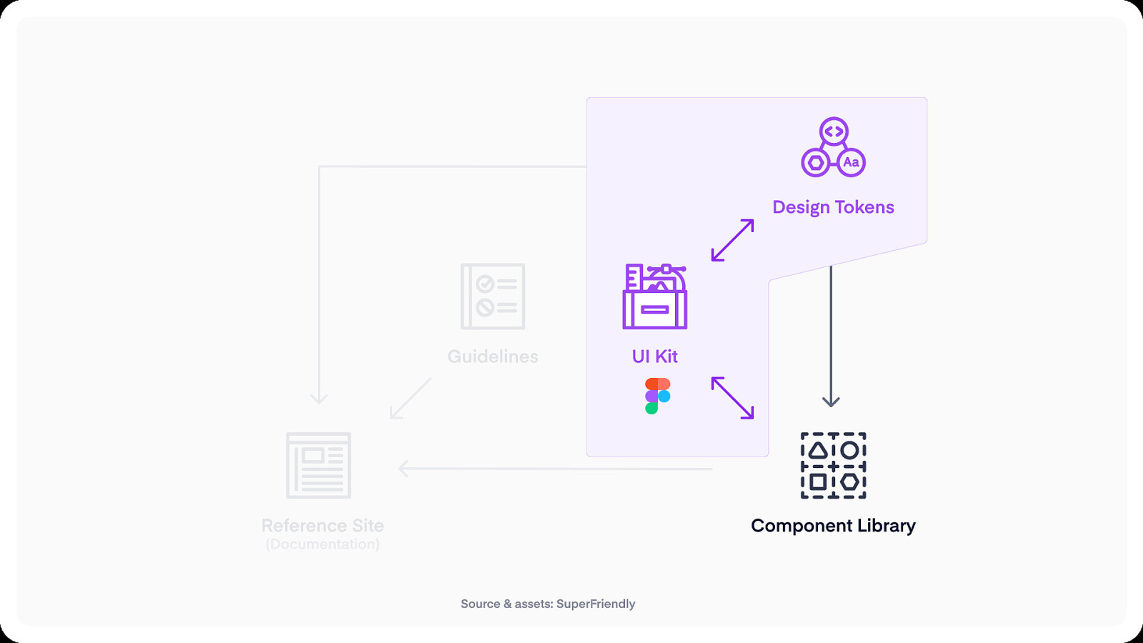
Design tokens
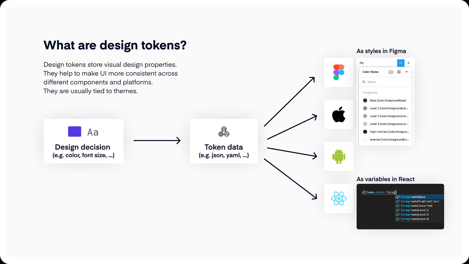
What are design tokens? As styles in Figma Design tokens store visual design properties. They help to make UI more consistent across different components and platforms. They are usually tied to themes. Aa Design decision (e.g. color, font size, …) Token data (e.g. json, yaml, …) As variables in React

Tips and trick for aligning design tokens in Figma and in code
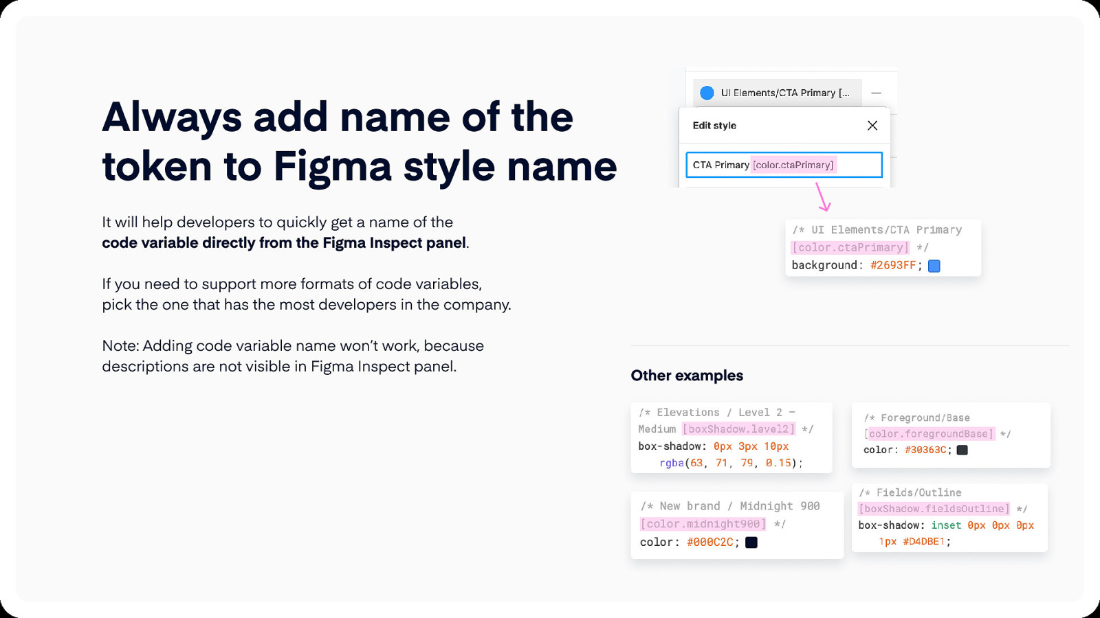
Always add name of the token to Figma style name It will help developers to quickly get a name of the code variable directly from the Figma Inspect panel.
If you need to support more formats of code variables, pick the one that has the most developers in the company.
Note: Adding code variable name won’t work, because descriptions are not visible in Figma Inspect panel. Other examples
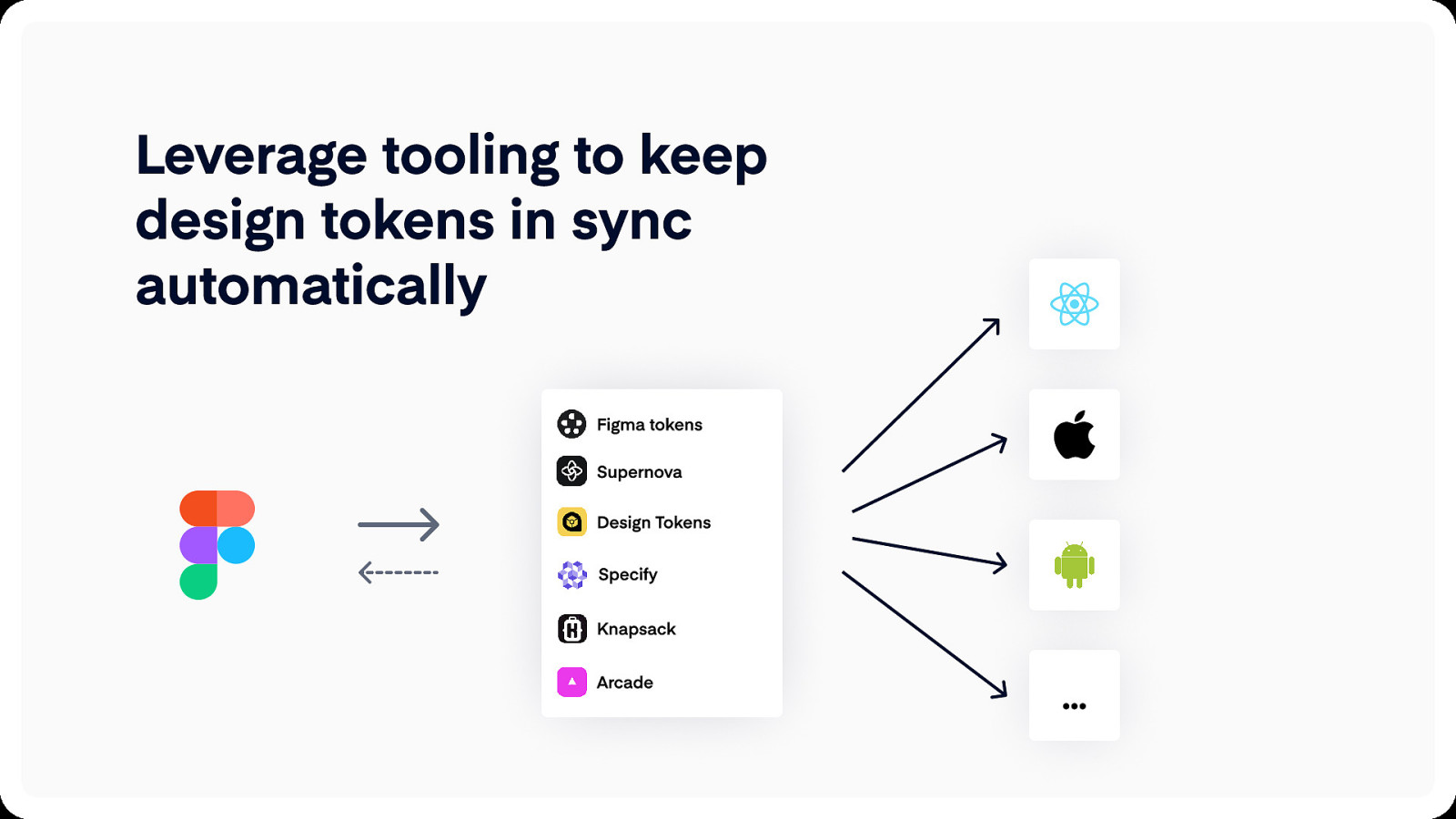
Leverage tooling to keep design tokens in sync automatically Figma tokens Supernova Design Tokens Specify Knapsack Arcade …

What about components?
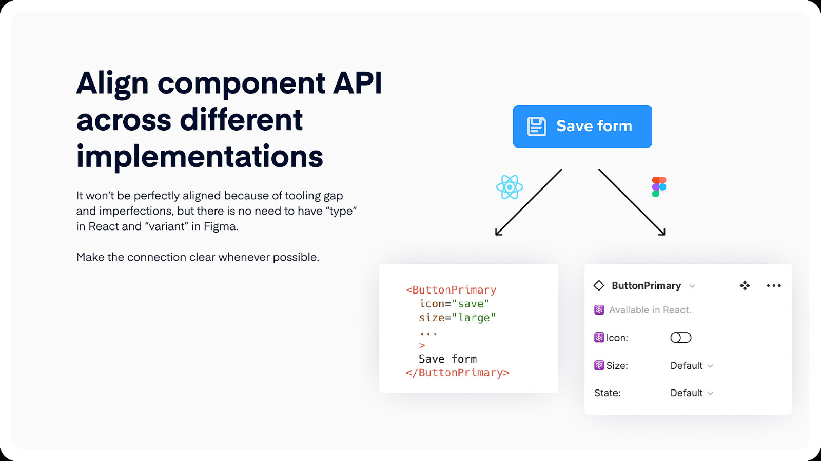
Align component API across different implementations It won’t be perfectly aligned because of tooling gap and imperfections, but there is no need to have “type” in React and “variant” in Figma.
Make the connection clear whenever possible.
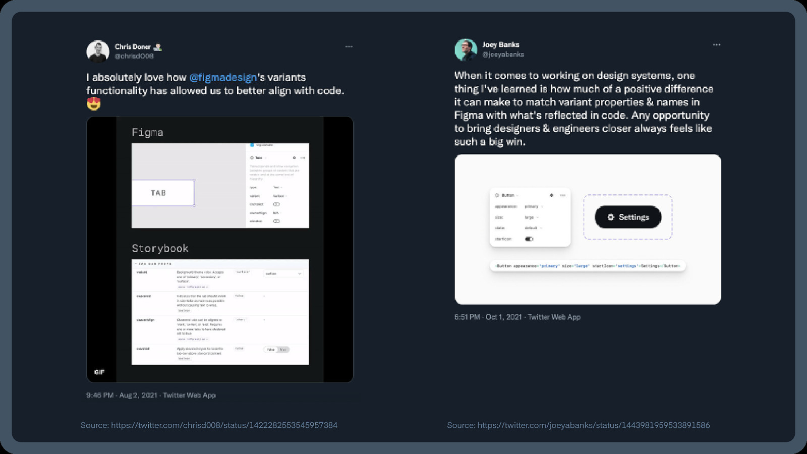
Source: https://twitter.com/chrisd008/status/1422282553545957384 Source: https://twitter.com/joeyabanks/status/1443981959533891586
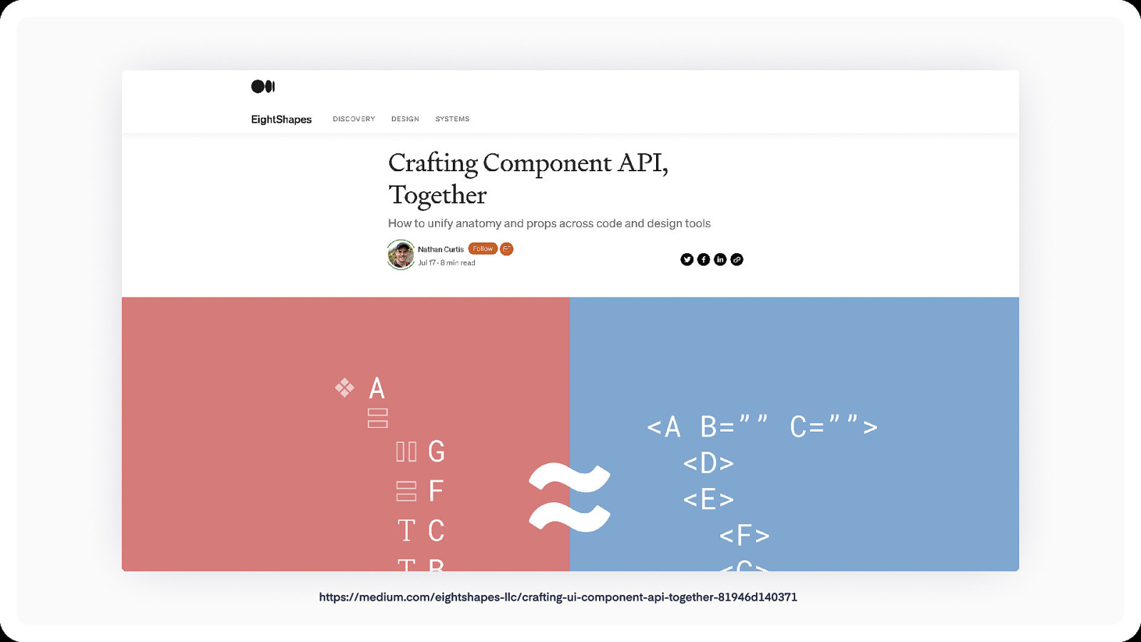
https://medium.com/eightshapes-llc/crafting-ui-component-api-together-81946d140371
What’s our process for bringing component API in Figma closer to our code?
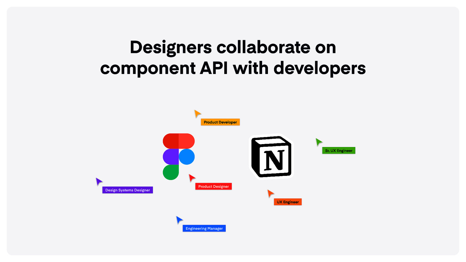
Designers collaborate on component API with developers Product Developer Sr. UX Engineer Design Systems Designer Product Designer UX Engineer Engineering Manager
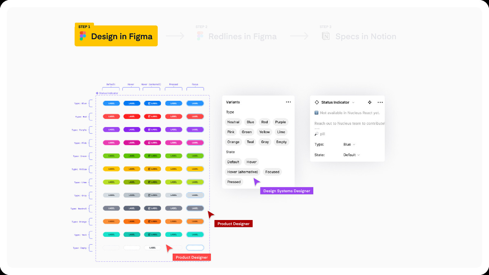
Step 1 Step 2 Design in Figma Step 3 Redlines in Figma Design Systems Designer Product Designer Product Designer Specs in Notion
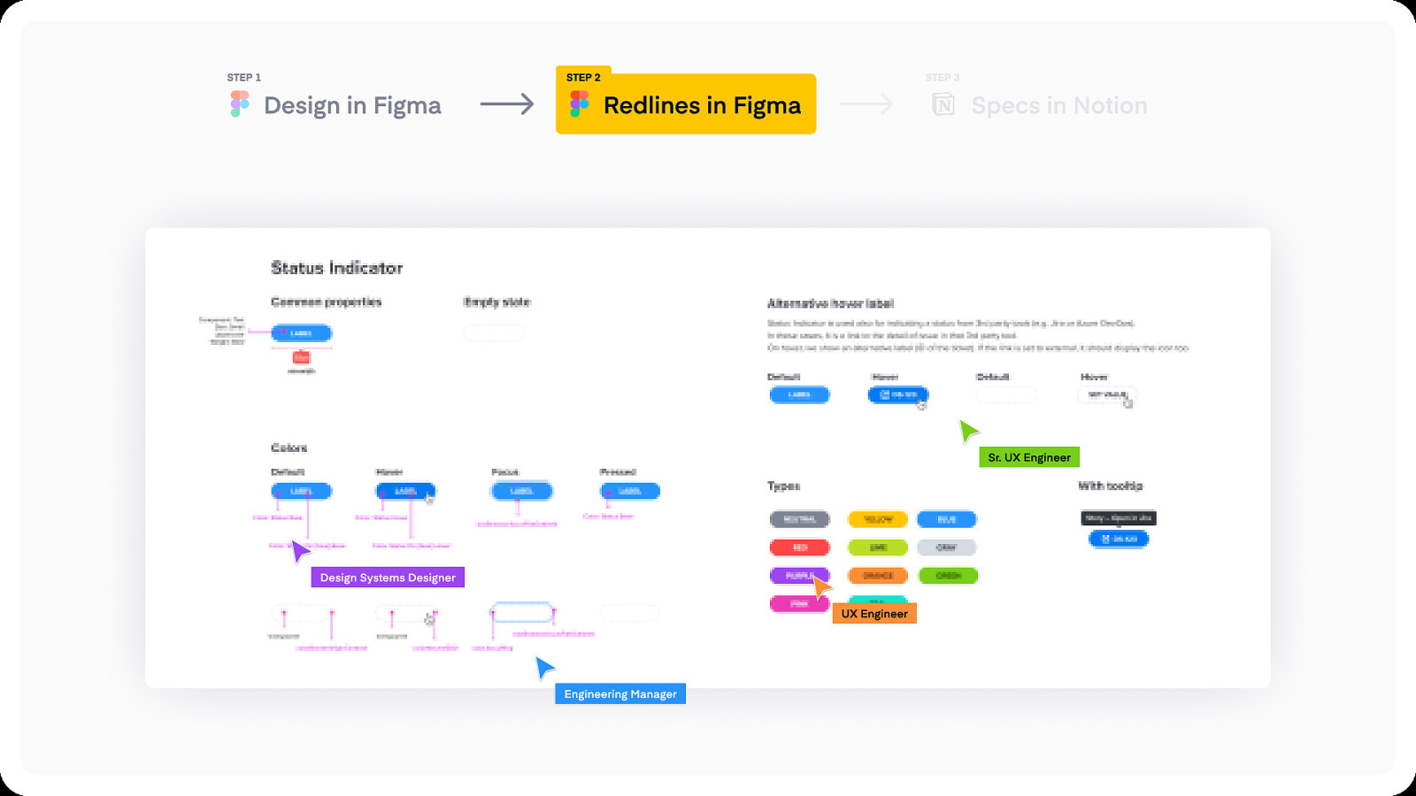
Step 1 Step 2 Design in Figma Step 3 Specs in Notion Redlines in Figma Sr. UX Engineer Design Systems Designer UX Engineer Engineering Manager
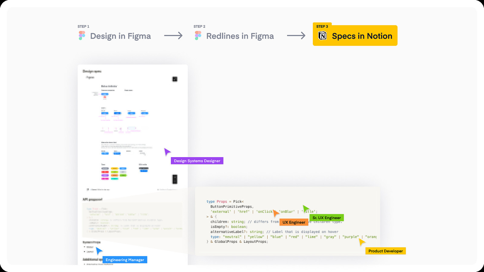
Step 1 Step 2 Design in Figma Step 3 Specs in Notion Redlines in Figma Design Systems Designer UX Engineer Sr. UX Engineer Product Developer Engineering Manager
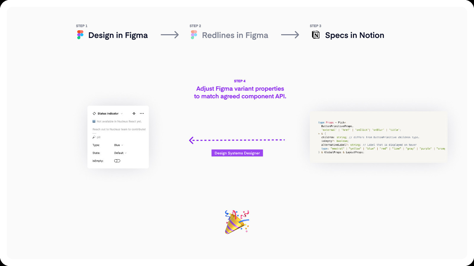
Step 1 Step 2 Design in Figma Step 3 Redlines in Figma Step 4 Adjust Figma variant properties to match agreed component API. Design Systems Designer Specs in Notion
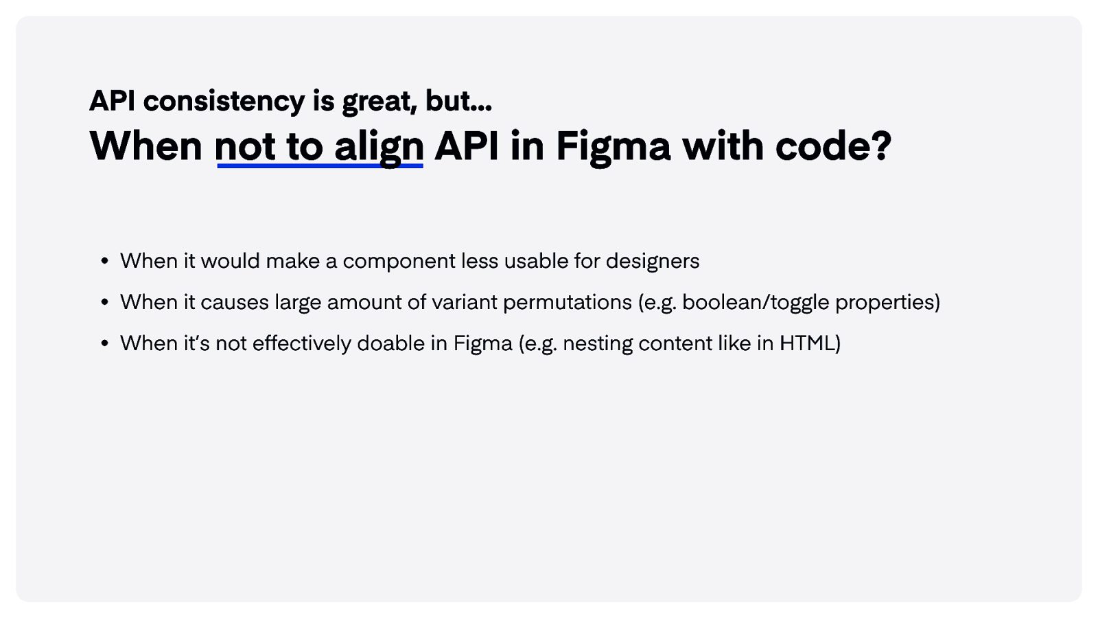
API consistency is great, but… When not to align API in Figma with code? When it would make a component less usable for designer When it causes large amount of variant permutations (e.g. boolean/toggle properties When it’s not effectively doable in Figma (e.g. nesting content like in HTML)
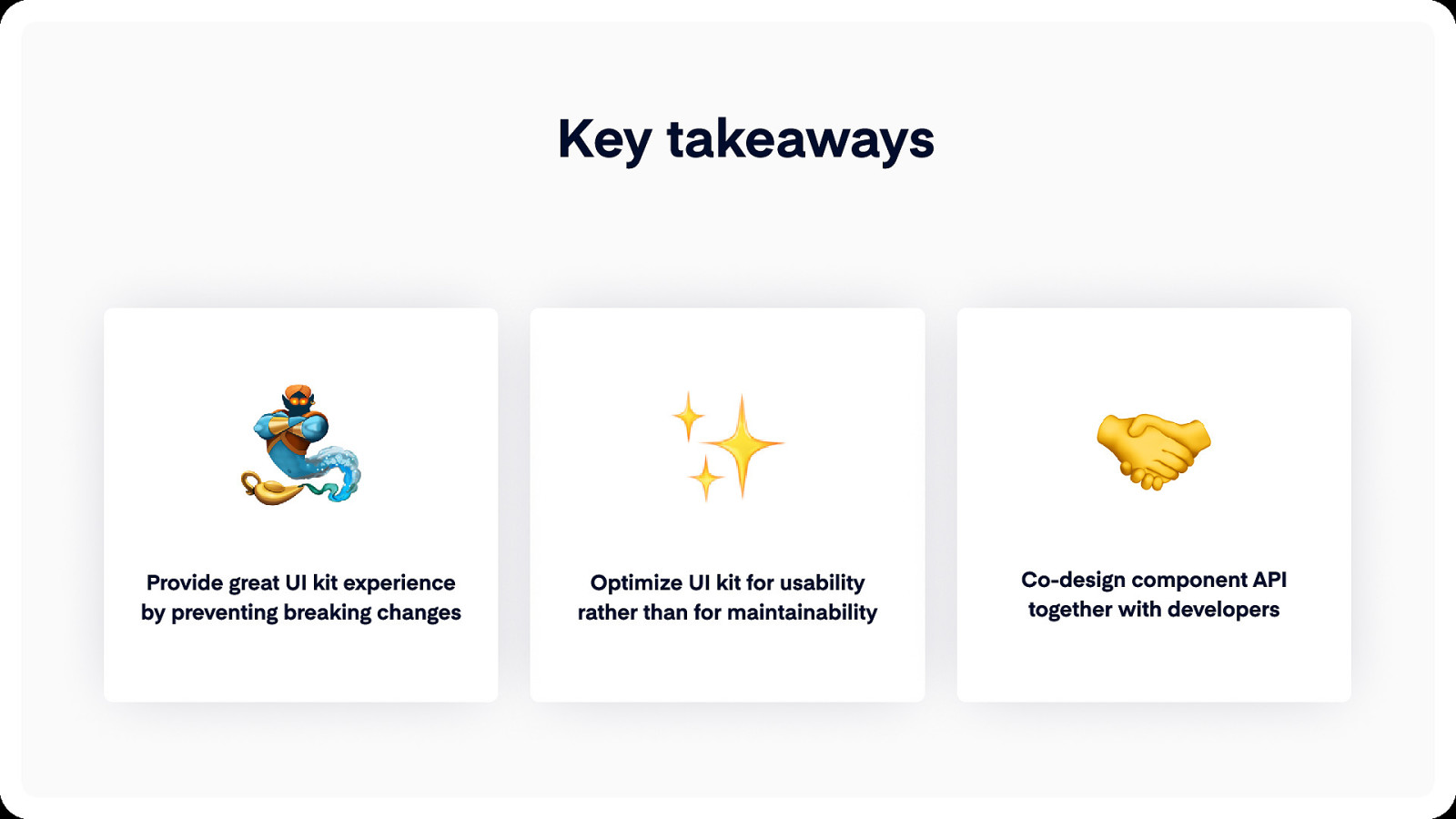
Key takeaways Provide great UI kit experience by preventing breaking changes Optimize UI kit for usability rather than for maintainability Co-design component API together with developers
Thank you title xxl icon title xxl logo Jan Toman Design System Lead Productboard @HonzaTmn