SMASHING CONF Freiburg, 09/09/2019
A presentation at Smashing Conference in September 2019 in Freiburg, Germany by Rémi Parmentier
SMASHING CONF Freiburg, 09/09/2019

Hello everyone. My name is Rémi Parmentier, and I have been a web developer and an e‑mail developer for the past 13 years. I love video games. My favorite movie is Jurassic Park.
And I’m proud to say that I’m an e‑mail geek. This might come as a different experience from yours. Which is why today, I’d like to explain to you…
How to think like an e‑mail geek. Because you see, there’s definitely something up with loving HTML emails.
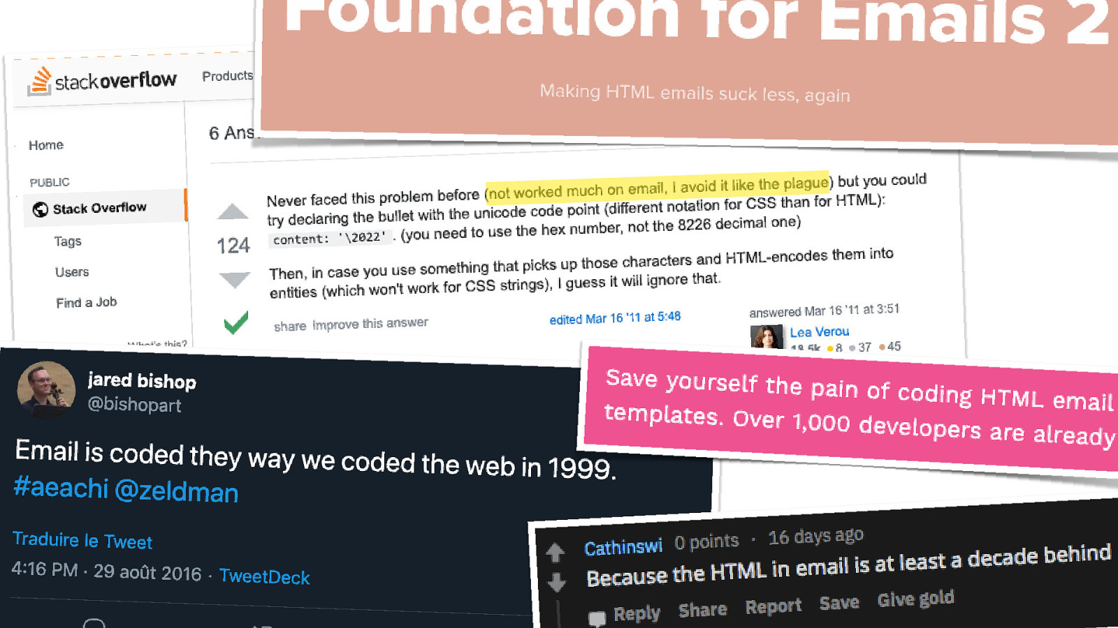
Because whenever I stumble upon a discussion online about HTML emails, it’s usually messages like this.
And let’s be honest, even I can’t resist making a bad pun about HTML emails.
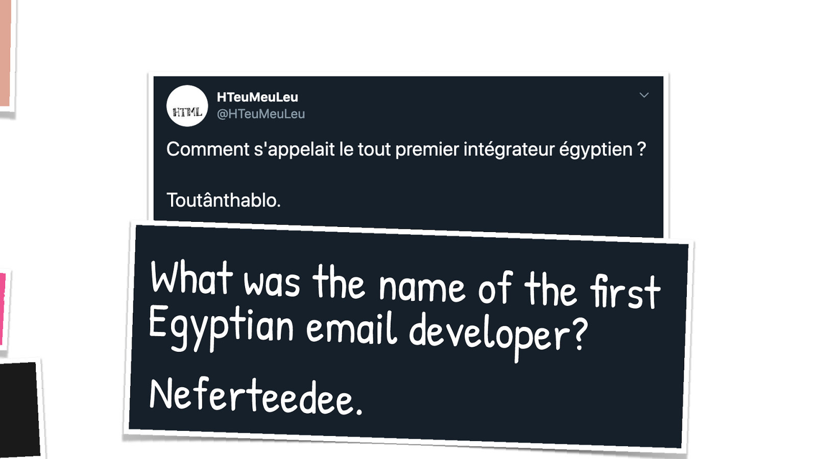
Like this joke I made on Twitter in 2012. And it’s a real shame if you don’t speak French it. But I’d roughly translate it for you. What was the name of the first Egyptian email developer? Neferteedee.
One thing I constantly hear in these kind of discussions is… Just use plain text. And I must say, I agree, that’s a perfectly valid point. If you can contempt yourself to do plain text emails, then do it.
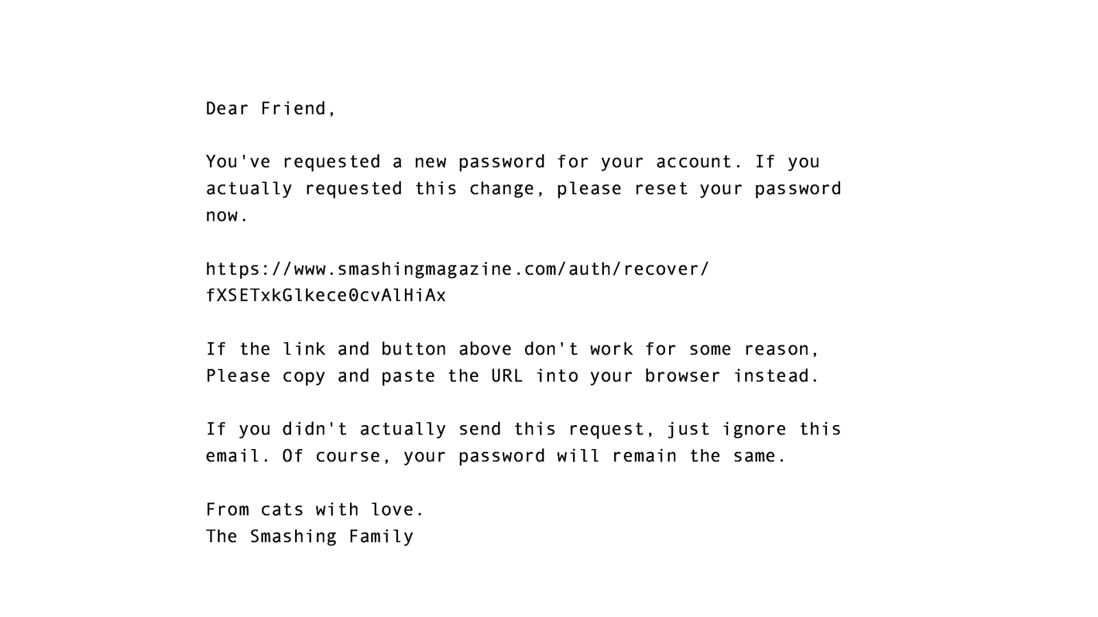
Just remember that this is what a plain text e‑mail looks like. No text formatting. No colors. No links. And maybe this is where HTML starts to be interesting. Like, do you really expect people receiving your emails to copy and paste URLs like this?
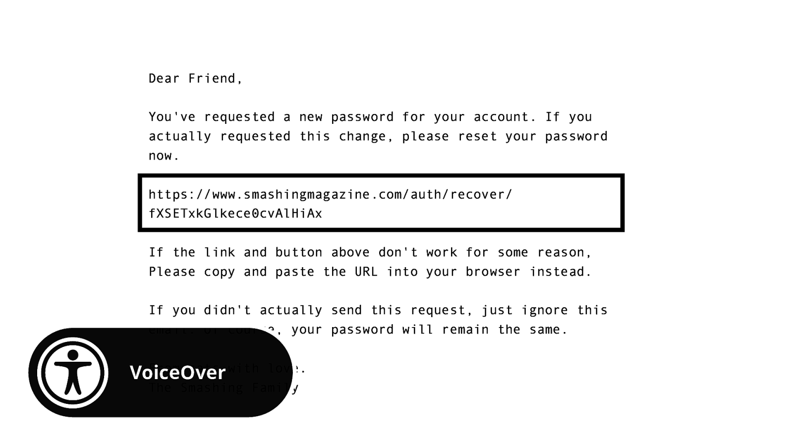
And it’s even worse for the people who use screen readers to read your emails. Because this means they’ll have to endure hearing URLs like this.
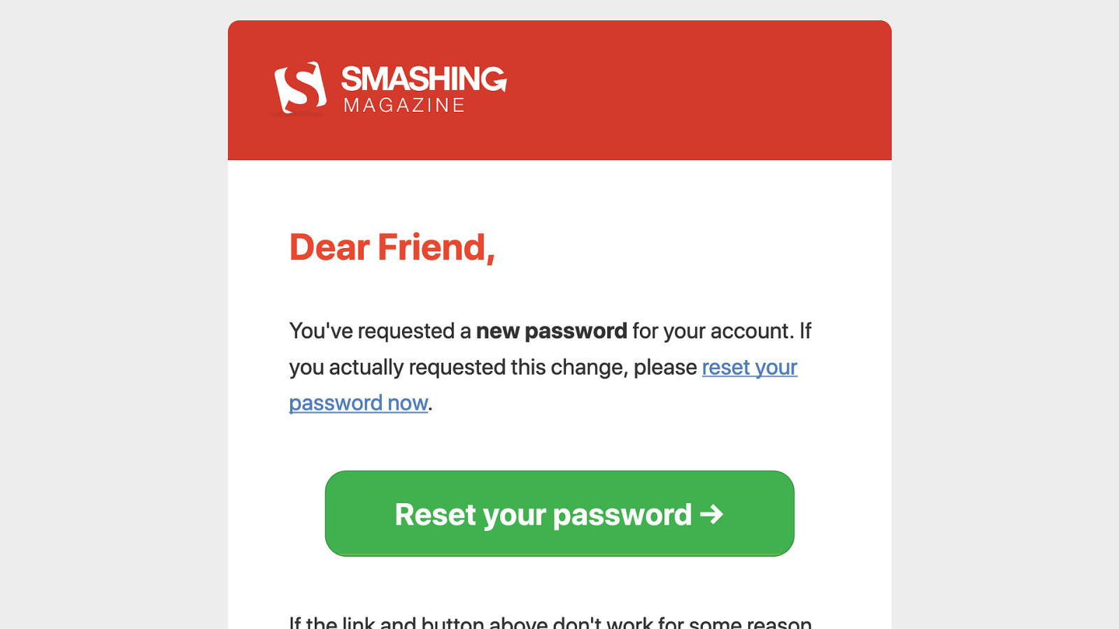
HTML emails is not bad per se. It can help you provide better accessibility, better design and overall a better experience. And in 2019, we shouldn’t see making an e‑mail like this as something impossible.
But I agree that E‑mail is hard. And this is why I love it. To paraphrase JFK, I chose to code HTML e‑mail not because it’s easy, but because it’s hard. And it’s really about time we consider that coding HTML emails is a different to coding web pages. That doesn’t mean it sucks. That doesn’t mean it’s for the worse. It’s just a different job. And it should never be an excuse to do things poorly. And it always makes me mad when I receive bad emails.
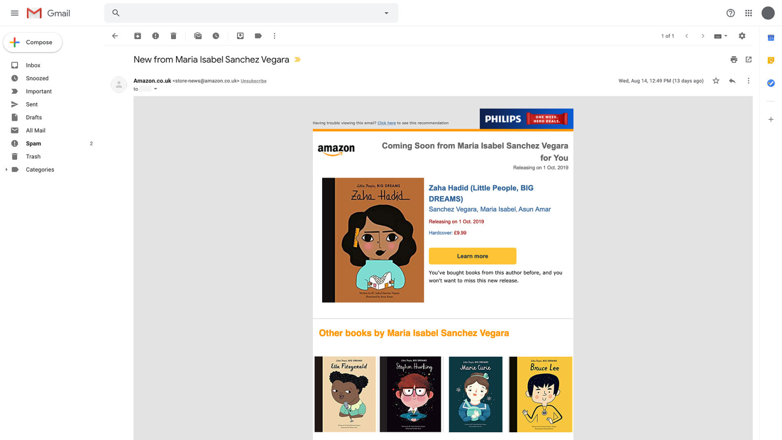
Like this e‑mail I received last month from Amazon UK for example. Looks fairly decent on a desktop webmail like Gmail.
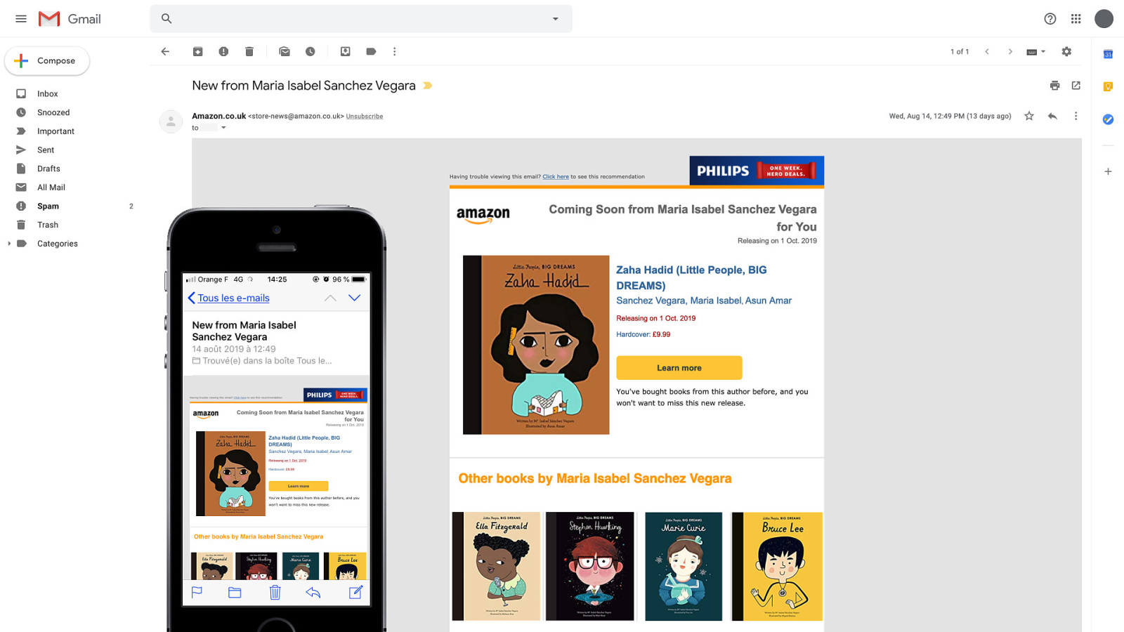
But then on my phone, everything is zoomed out to fit the screen. And most texts become barely readable, and links and buttons are so small they are hard to click on.
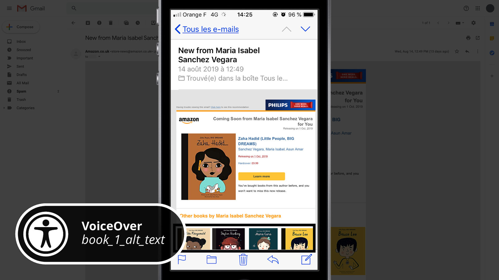
And even worse: if you use a screen reader, this is what you’ll hear.
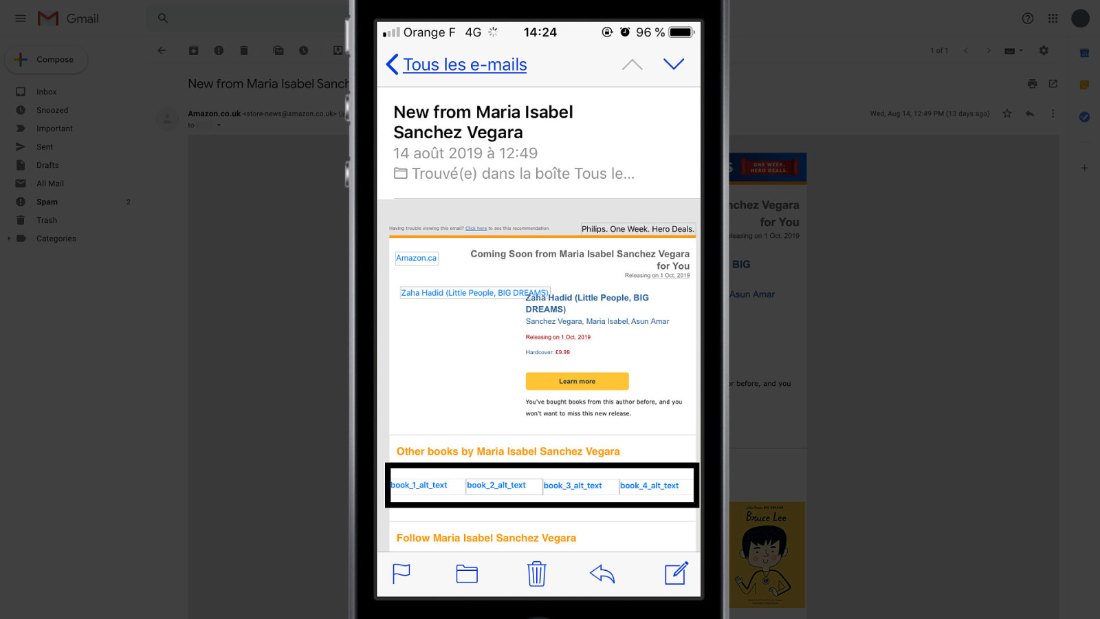
That’s because they have those terrible texts as alt attributes in their HTML.
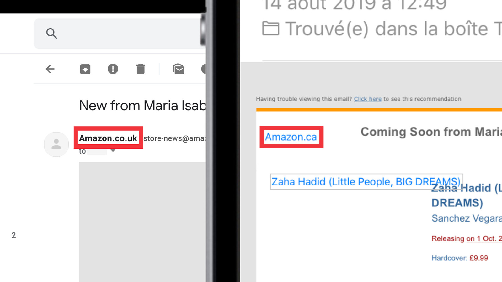
And the icing on the cake of that emails is that Even though this is an e‑mail from Amazon UK, the alternative text on their logo says it’s from Amazon Canada.
If you’re the richest man in the world and your company is famous for claiming that shaving a few milliseconds of load times on your sites increased revenues, your emails should be better than that.
So e‑mail is hard. But… As I always like to say…
Everything is possible.
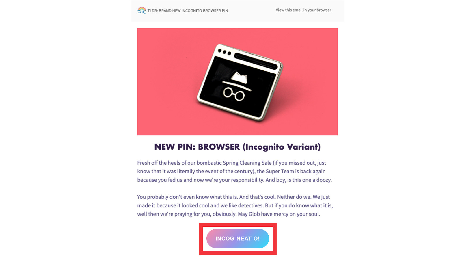
You want to use linear-gradient in CSS? Go for it!
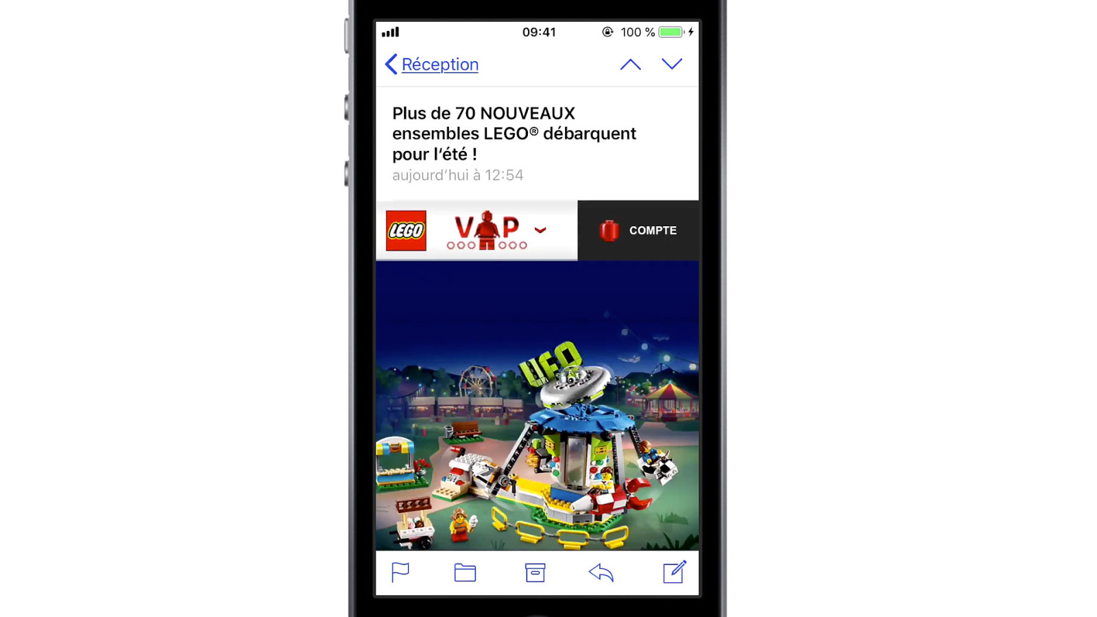
Or do you want to make drop down menus and interactive and animated carousels? Go!
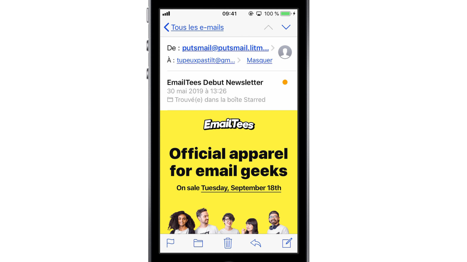
Or look at this e‑mail from EmailTees. It has a little circle placeholder over every shirt. And if you tap on it, it’ll allow you to use your camera, take your picture, and have it right inside your e‑mail.
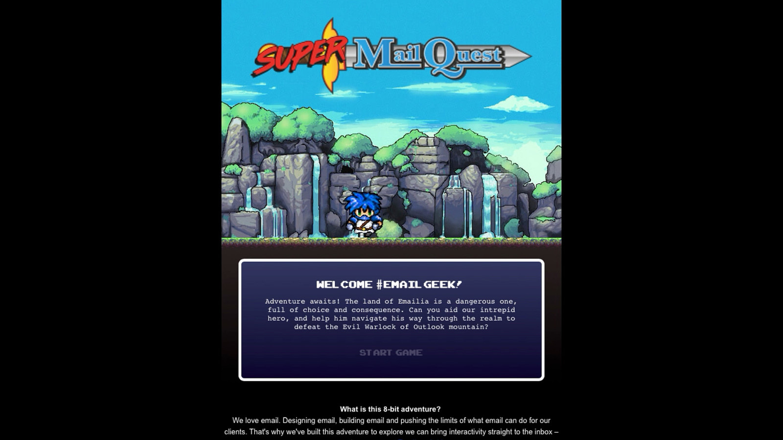
And then you can also make video games inside e‑mail. This is Super Mail Quest, a choose your own path game created in an e‑mail by Aaron Simmonds.
So everything is possible. But…
Nothing works everywhere.

Let’s take that button I just showed you. Not all e‑mail clients will support CSS linear-gradient.
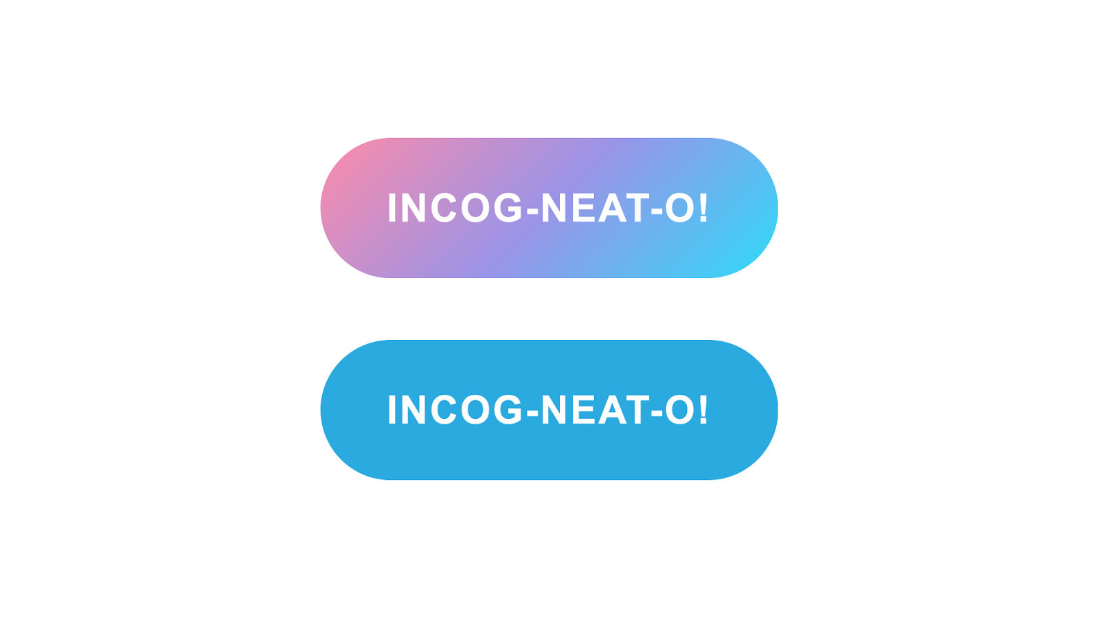
So some e‑mail clients will just show a plain color instead. But then not all e‑mail clients support border-radius to create those rounded corners.
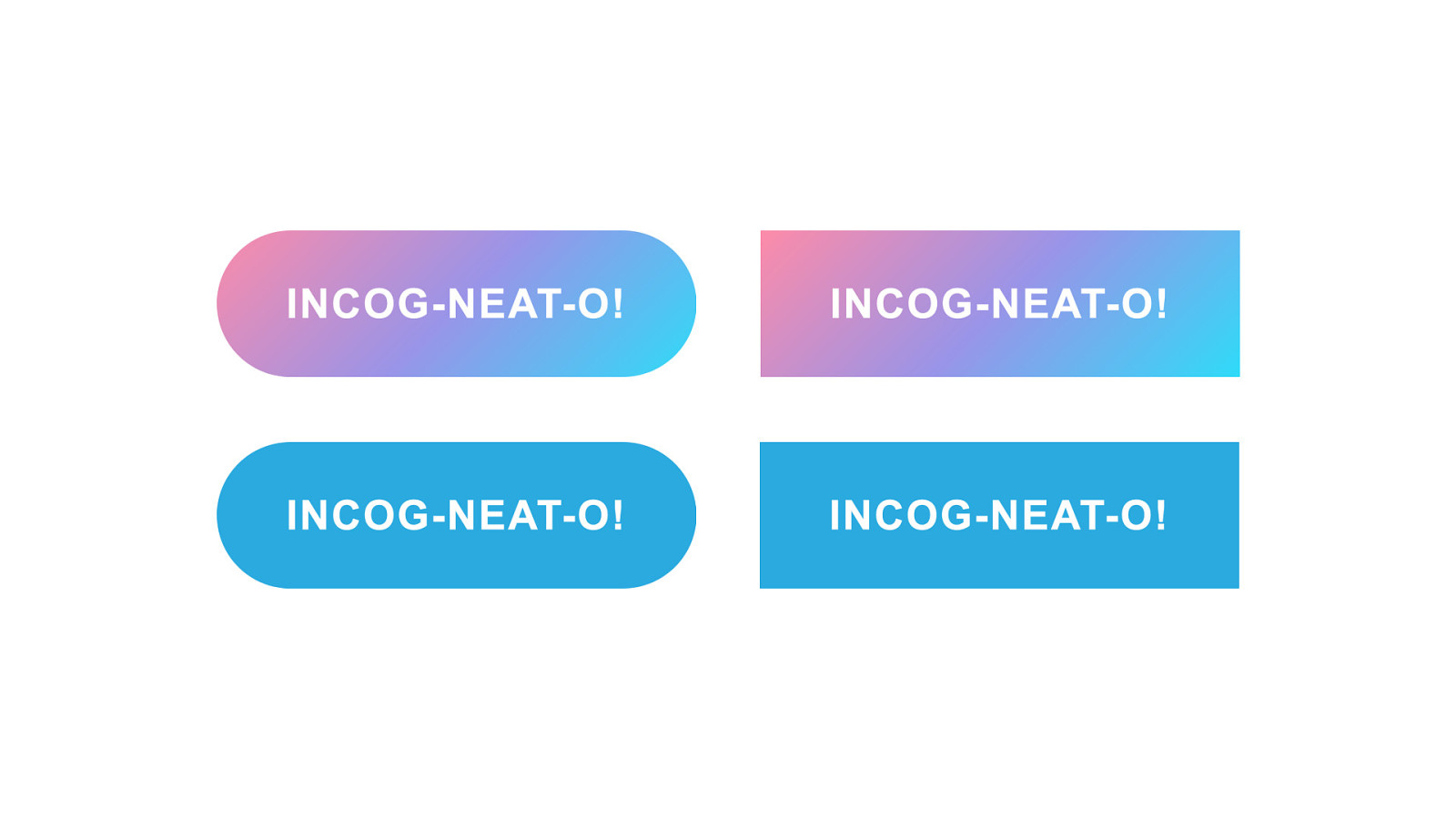
So you’ll end up with a rectangle with linear-gradient or just plain color depending on support.
Chad White, the Research Director at Litmus says: “Every email […] has approximately 15,000 potential renderings (and that’s using conservative math).” I usually consider that there can be as much potential renderings as there are people opening our emails. And I think this is true for the web as well. So HTML emails, just like the web, are all about progressive enhancement and graceful degradation.
But then e‑mail clients have quirks of their own. And the biggest thing you need to remember is that…
Email clients change your code. This may seem wrong to say. But it’s always done with the best intent, either for security or for user experience. And perhaps the easiest way to start with this is to show you how…

Email clients add links.
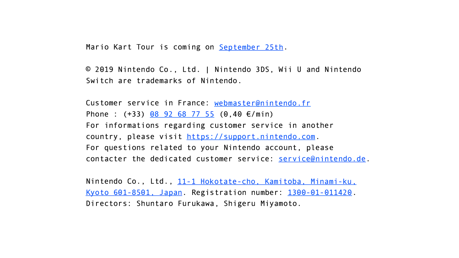
Let’s say you have this huge block of text at the end of your e‑mail. Even if it’s plain text, or simple formatted HTML, e‑mail clients will add links whenever they see something that looks like an URL.
e‑mail addresses, upcoming dates, physical addresses, phone numbers. And each of those can create a few quirks. Like on this company registration number, thinking it looks like a phone number of some sort.

And then there’s this guy. Bono, the lead singer of U2. Because if you write « Bono » in an e‑mail…
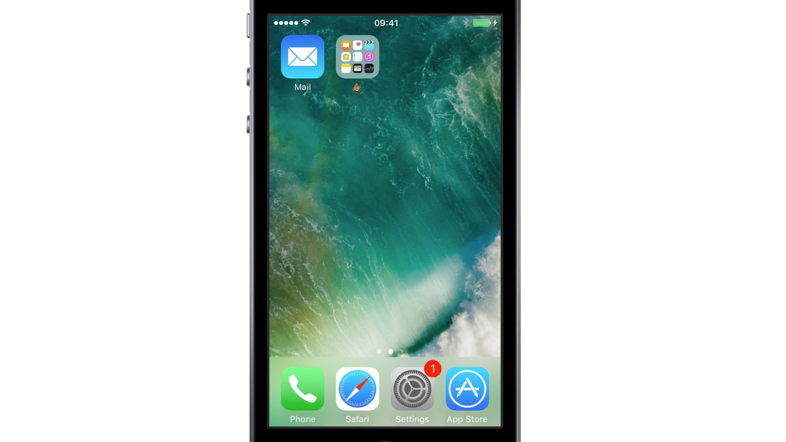
…and you open that e‑mail in Apple Mail in iOS 11…
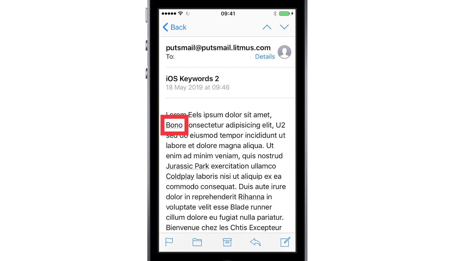
A link will automatically be added, suggesting you different related places, like a link to the iTunes Store or Wikipedia.
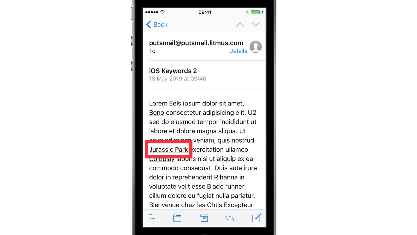
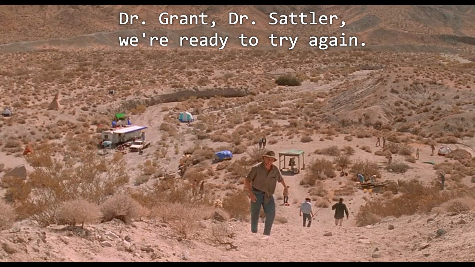
And the thing that drives me mad the most about all of this, is that it’ll also add a link if you mention Jurassic Park. But it links to perhaps the worst movie of the first trilogy.
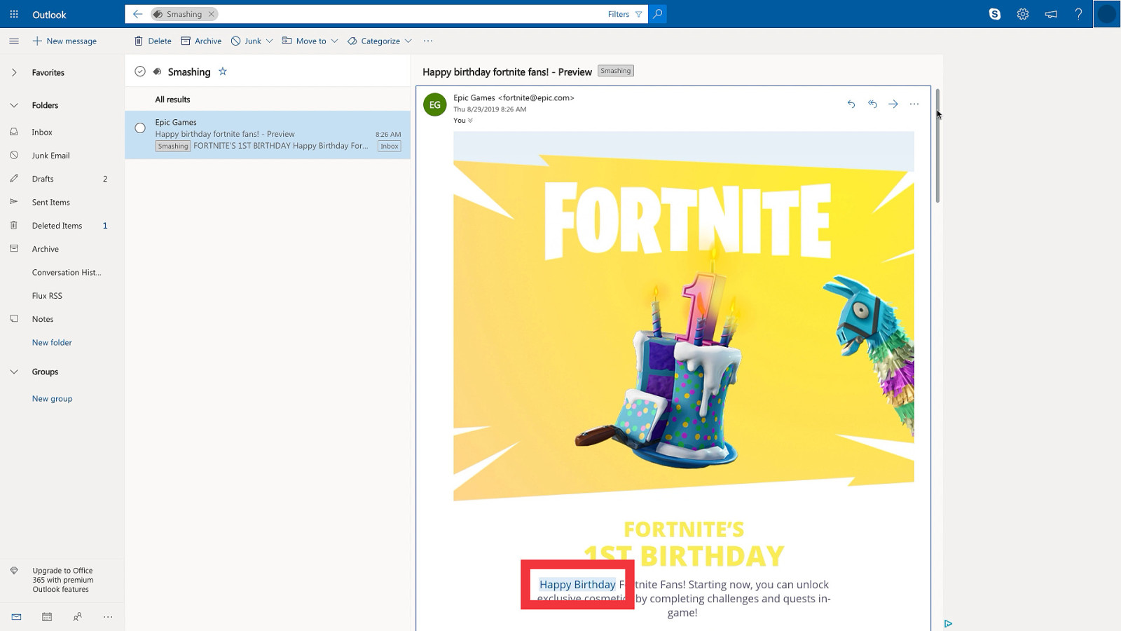
Apple Mail is not the only one to do this sort of things. About a year ago, outlook.com added a feature called “Joyful Animations”. Where certain keywords like “Happy birthday”, “Congrats” or “Congratulations” will be highlighted. And when you pass your cursor over it, boom. Confettis.
And I can imagine why they’d think it’s a fun thing to add. But I can also imagine receiving an e‑mail from your boss saying « Congratulations, Rémi, you’re fired » and seeing those confettis and it might not be very appropriate.
Email client change your styles.
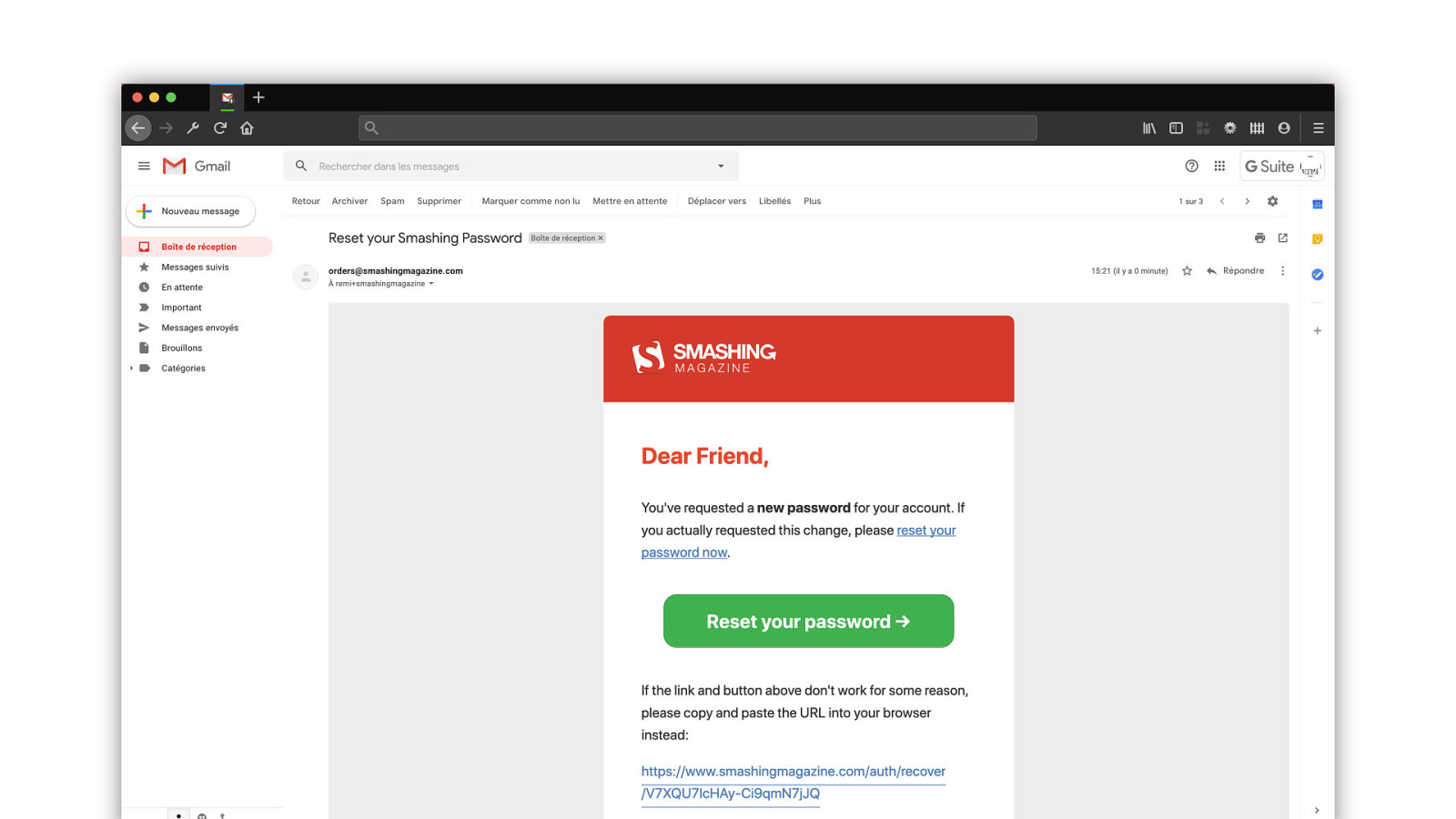
When an e‑mail client displays a webmail, it never brings the entirety of your HTML code. Things like doctype and meta tags almost always get removed. So what happens, in a webmail like Gmail for example, is that…
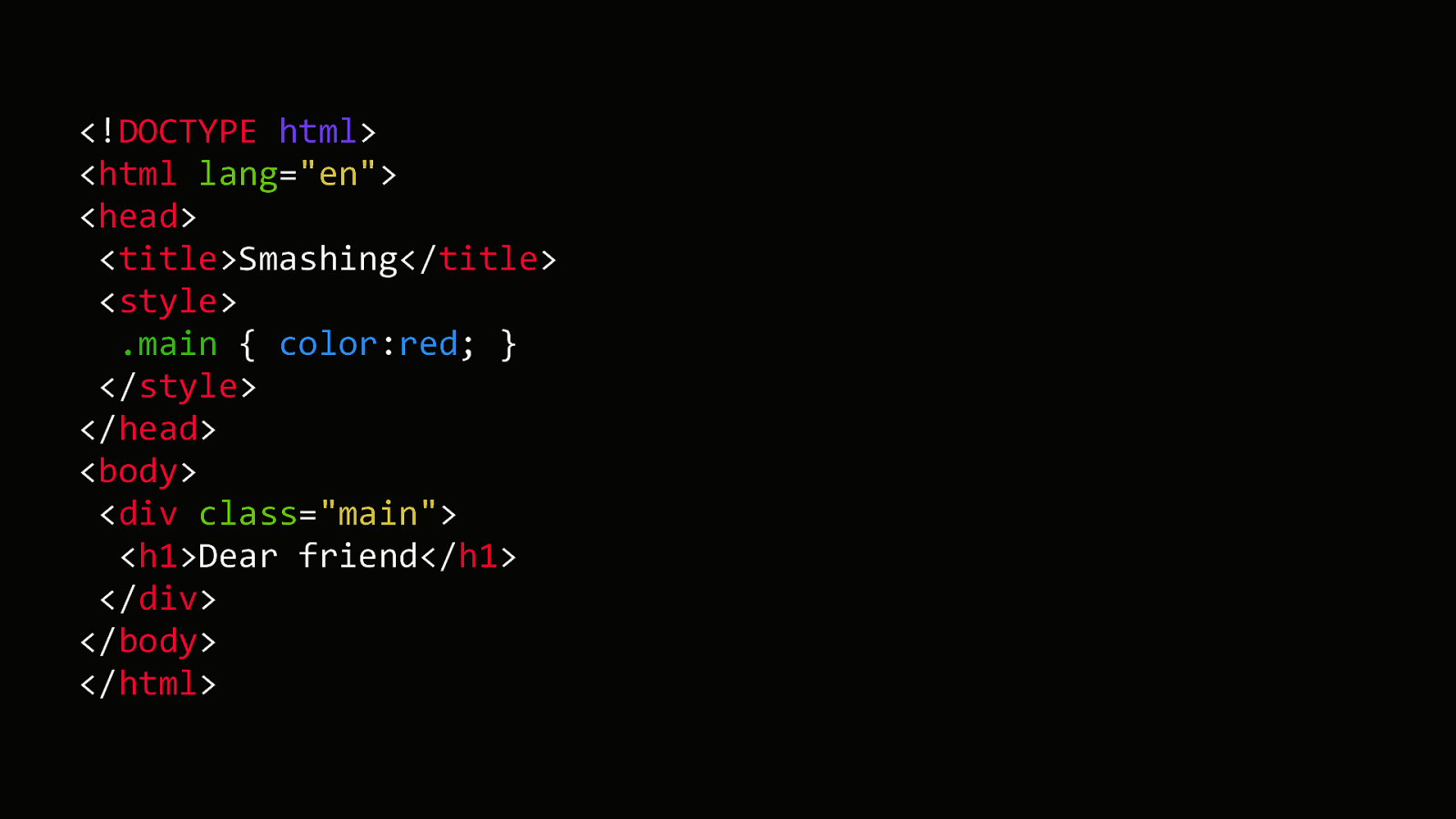
Your code will be stripped from lots of things except style tags and the content of the body.
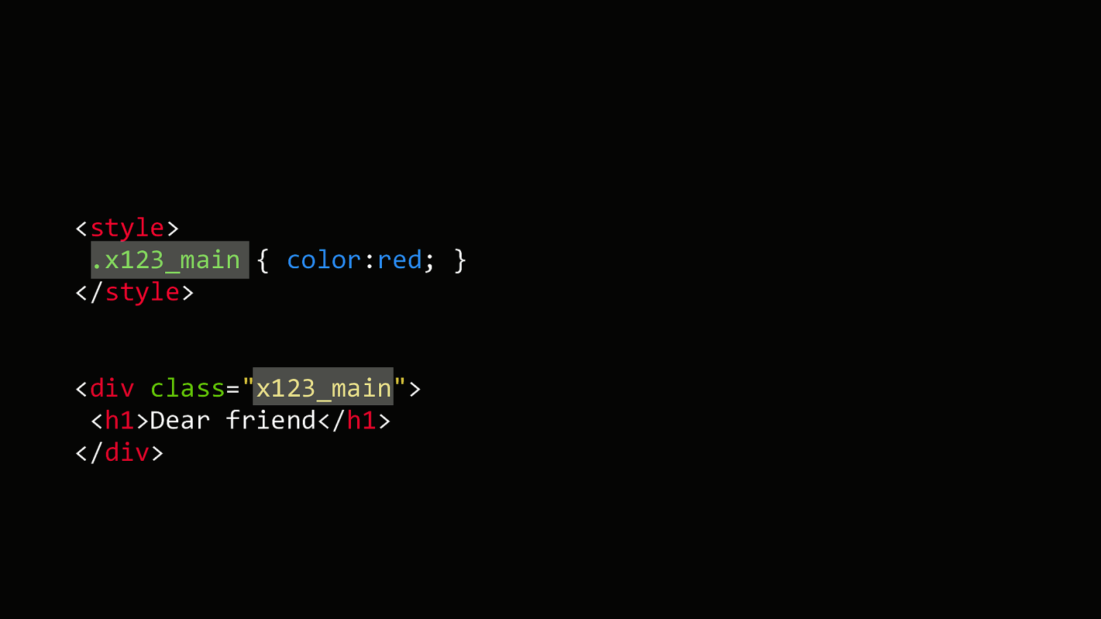
Then all of your class names will be prefixed by something generated by the e‑mail client. This is very important for security, because it prevents you to override the webmail’s own styles. If it also used a class « main » for example, I wouldn’t be able to apply any styles on it.
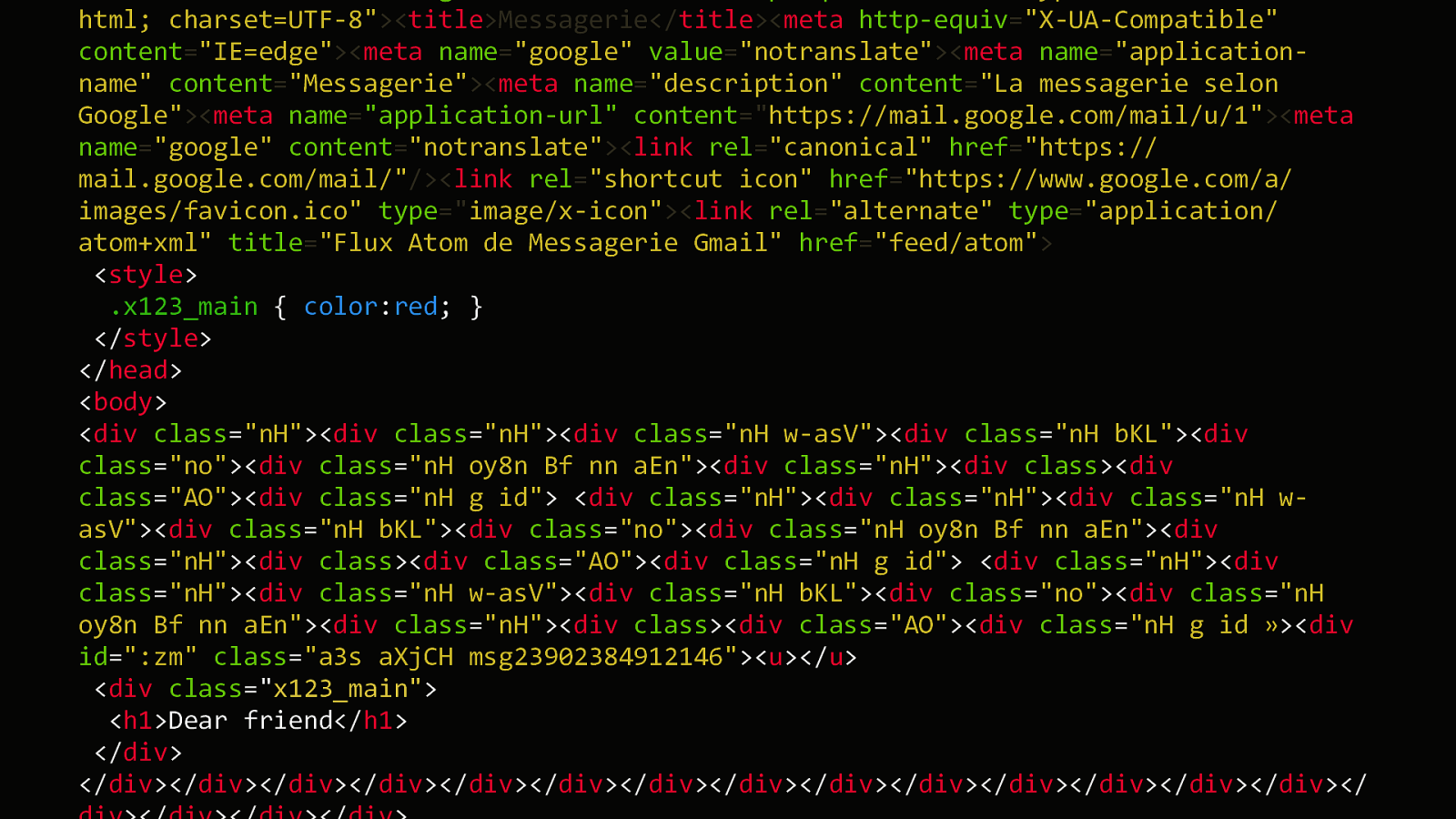
And then this content is reinjected into the webmail’s own HTML. But then from this point, every webmail has its own quirks and bugs. For example…
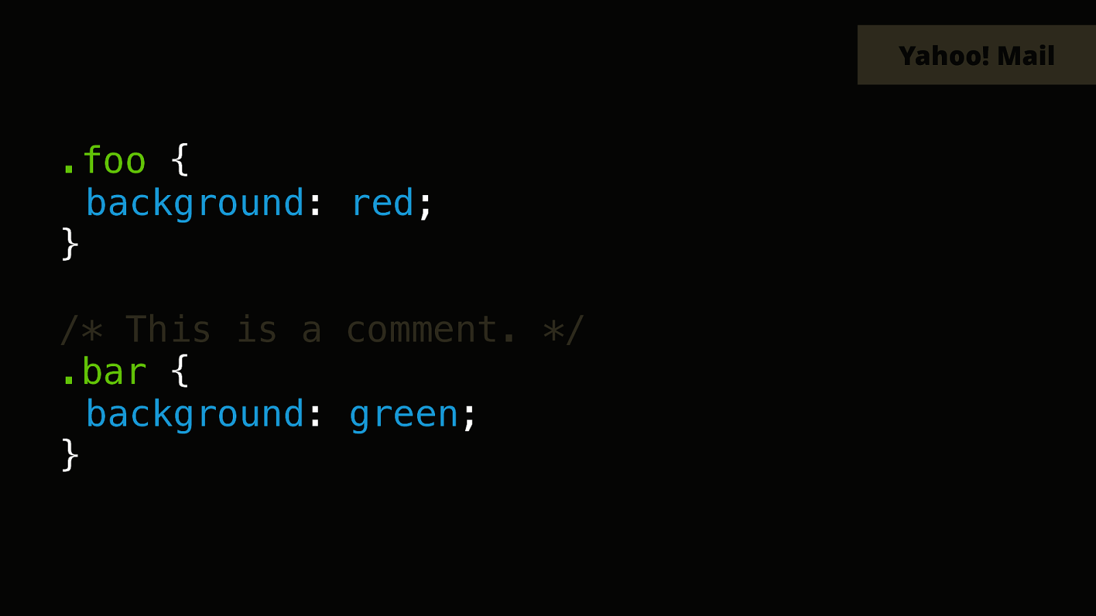
In the desktop webmail of Yahoo, all your rules will be prefixed and renamed.
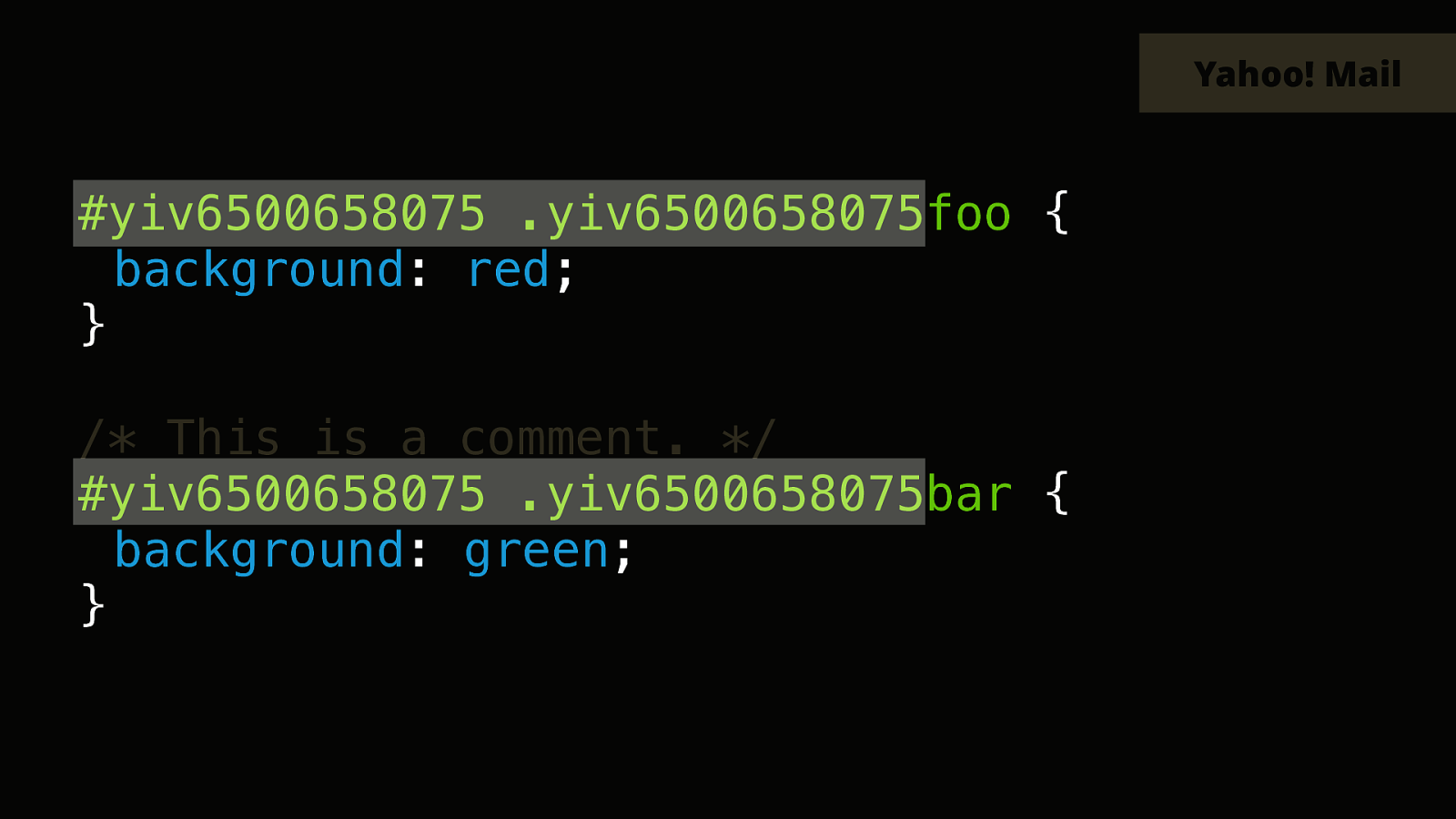
This is ok and is pretty standard. But then…
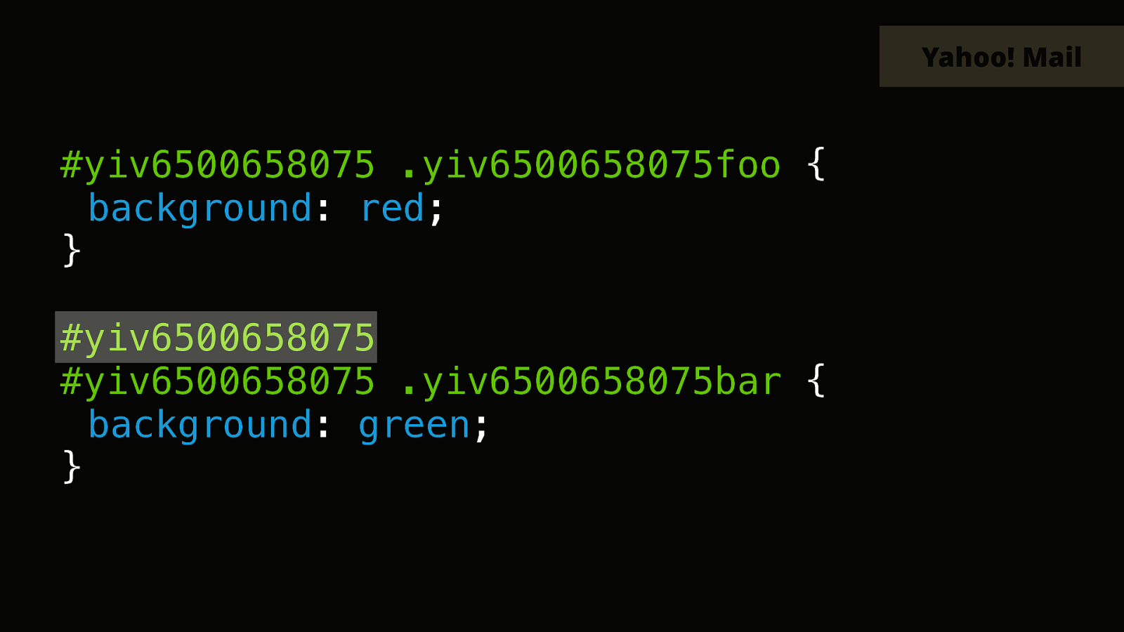
The CSS comment will also be removed and prefixed like this.
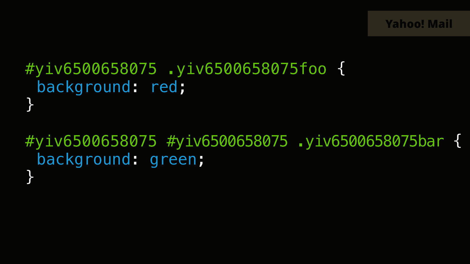
But this new id right there totally changes the meaning of the following selector, so this one won’t work any more.

That’s a huge pile of shit.
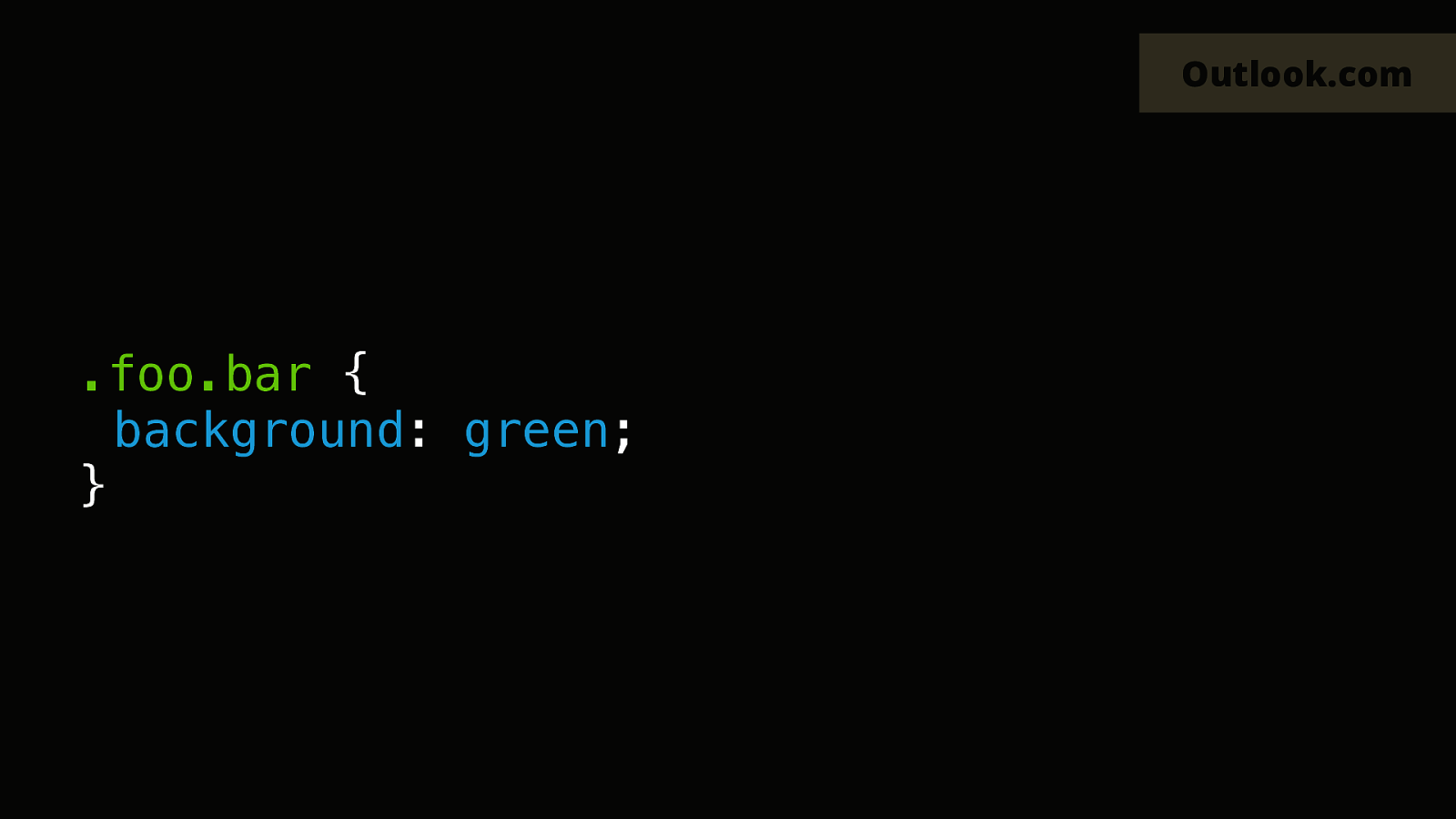
The webmail of outlook.com also has a few bugs of its own. So if you use chained class selectors, like in this example.
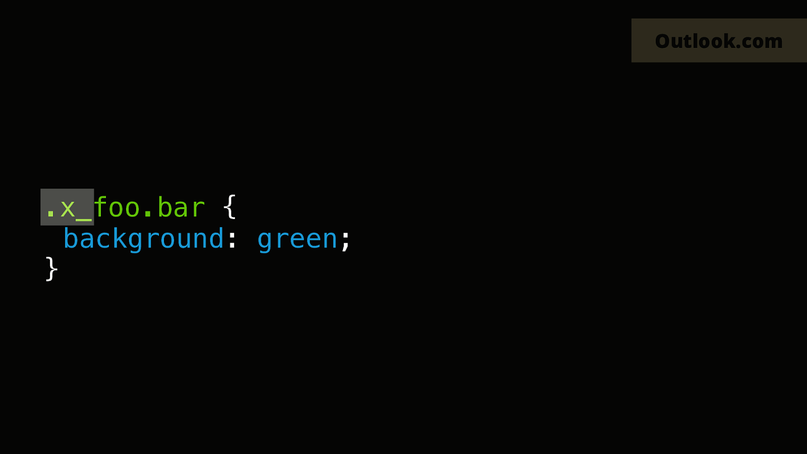
outlook.com will only rename the first class in CSS. The second class will be renamed in the HTML, but not in the CSS, so it will no longer match either.
I puked.
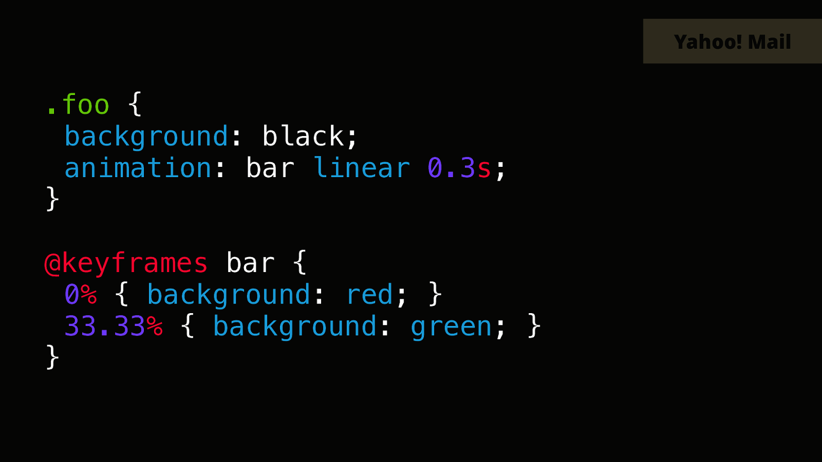
And then most emails clients don’t support every CSS features or properties. So back to Yahoo for example. It won’t support CSS animation. So it’ll remove the animation property.
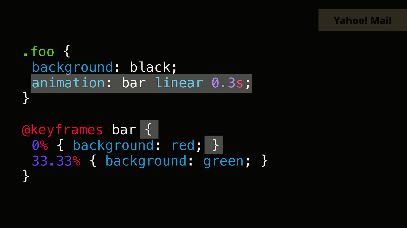
But it will also try to remove the keyframes declaration. And the way it does this is by finding the first opening accolade, and the first closing accolade, and filtering this as if it was one style ruleset.
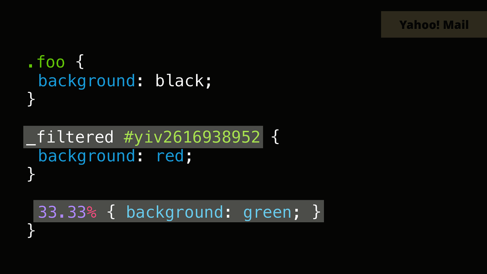
So now the second keyframe inside our animation is left out. But then Yahoo will apply its usual prefixes to this.
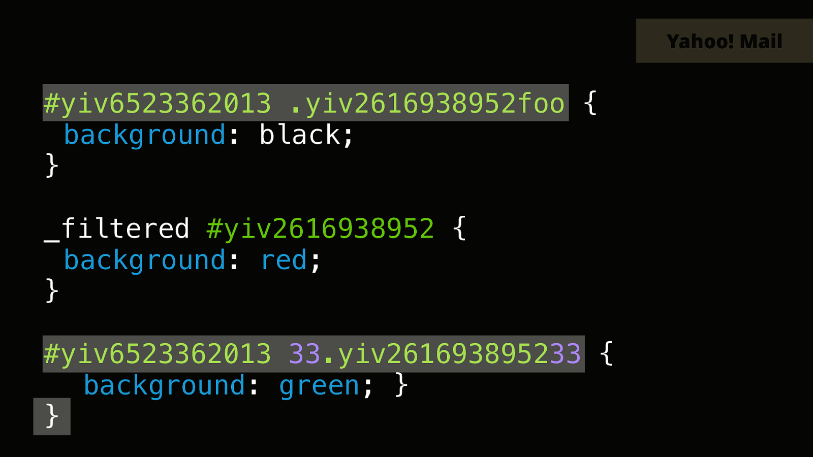
And it will also apply it right inside our thirty three dot thirty three keyframe, because it thinks the dot in the middle is for a class name.
But this is not much of a big deal because those styles won’t match anything anyway. But then there’s a single closing accolade left out at the end.
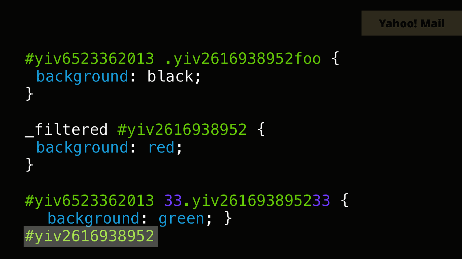
And this one will be prefixed as well. Which means it will likely break whatever style your have next in your style tag.

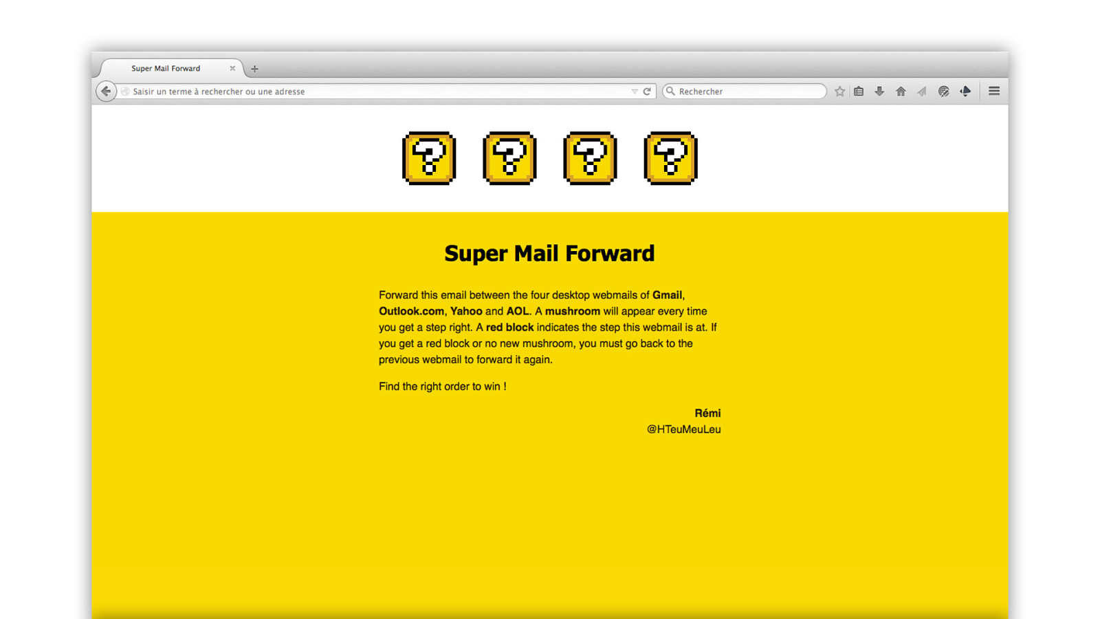
In 2015, this inspired me to create a very fun experiment that I called Super Mail Forward. The e‑mail testing tool Litmus held a contest to create an e‑mail worth forwarding. Something that would take advantage of the quirks that happen in e‑mail clients when you forward an e‑mail.
So I had this idea of a game where you would have to forward this e‑mail between the four webmail of Gmail, outlook.com, Yahoo and AOL. And if you did it in the correct order, each block here would turn into something else.
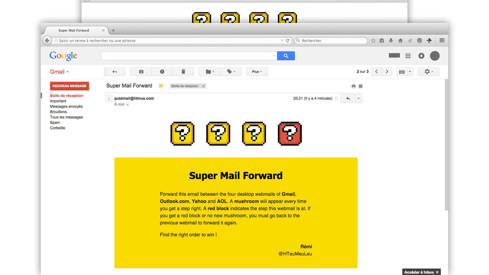
But if you sent it to a webmail in the wrong order, the block corresponding to the position that this webmail is expected to be would turn a different color. So if you did everything correctly…
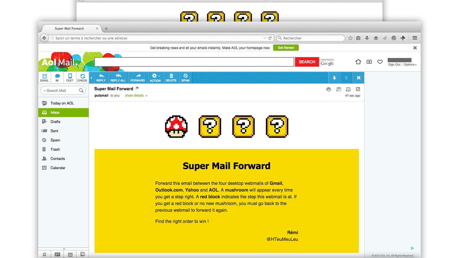
Sending it to AOL first would turn the first block into a red mushroom.
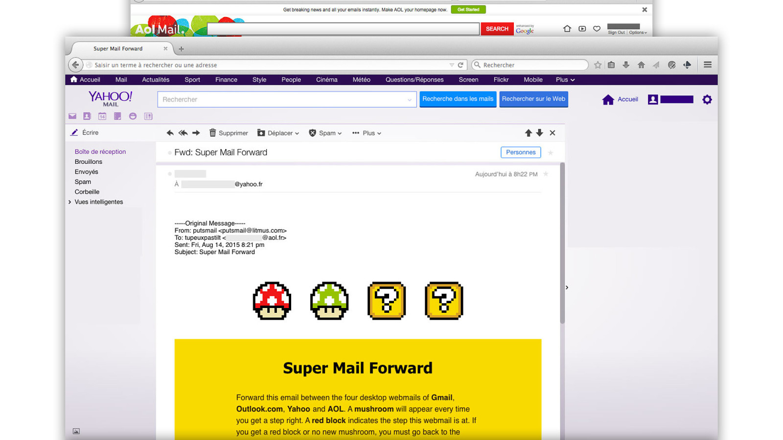
Then forwarding it from AOL to Yahoo would reveal the second green mushroom.
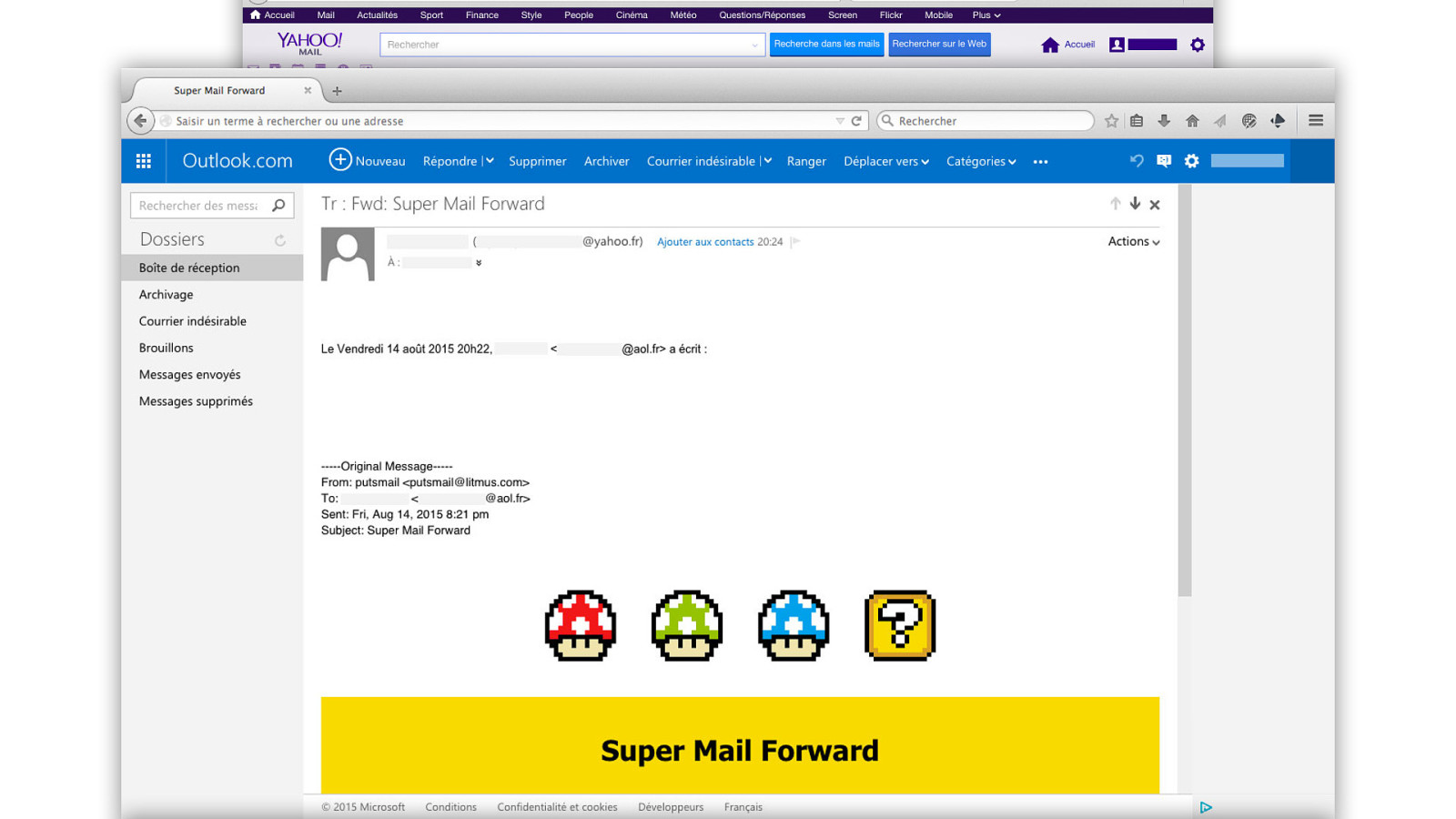
Then forwarding it from Yahoo to outlook.com would reveal the third blue mushroom.
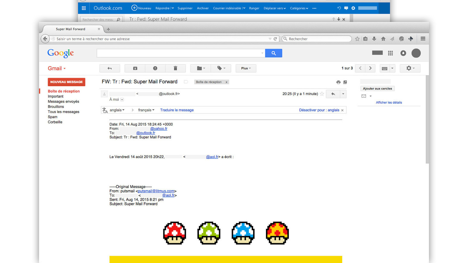
And finally forwarding it to Gmail last would reveal the final mushroom. This is a pretty fun example that shows how you can take advantage of e‑mail clients in some of the most extremes conditions.
So as I said, this was done for a contest, and I was super excited to learn that I won.
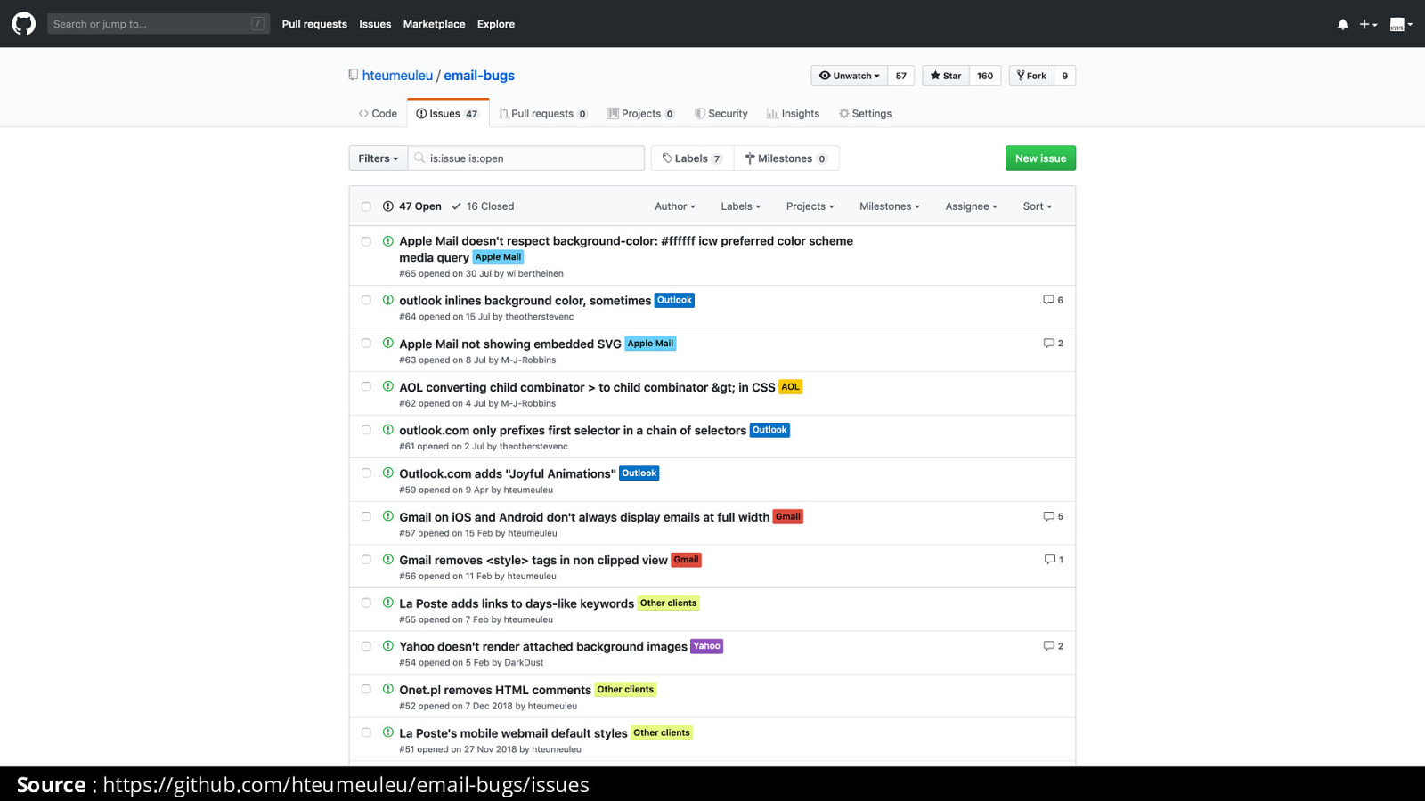
But anyway, Since 2015, I launched an e‑mail bugs list repository on GitHub, where I use GitHub issues to document and report various e‑mail client bugs. And Super Mail Forward actually helped me highlight a few bugs in AOL that then got fixed by their team.
So complaining that HTML emails suck helps no one. But making fun experiments and helping e‑mail clients vendor fix their bugs does.
But then there’s Outlook.
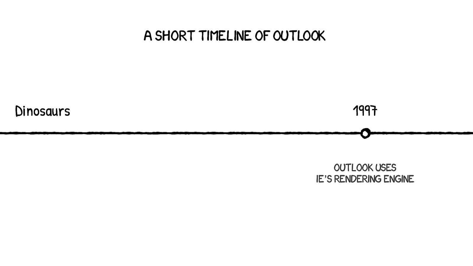
In 1997 Microsoft released the first Outlook version as part of the Office 97 suite. And at that time, it used whatever Internet Explorer’s was installed on your computer’s rendering engine. This was the case way up until 2003.
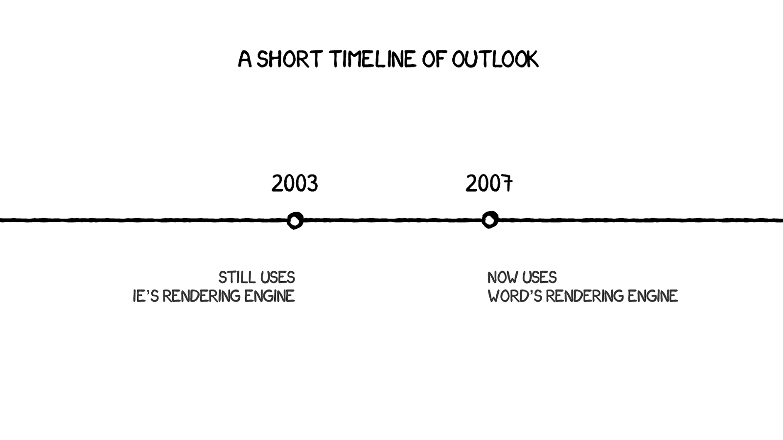
2003, The last version of Outlook to use Internet Explorer’s rendering engine. But then in 2007, Microsoft had the genius idea to replace it by Word’s rendering engine.
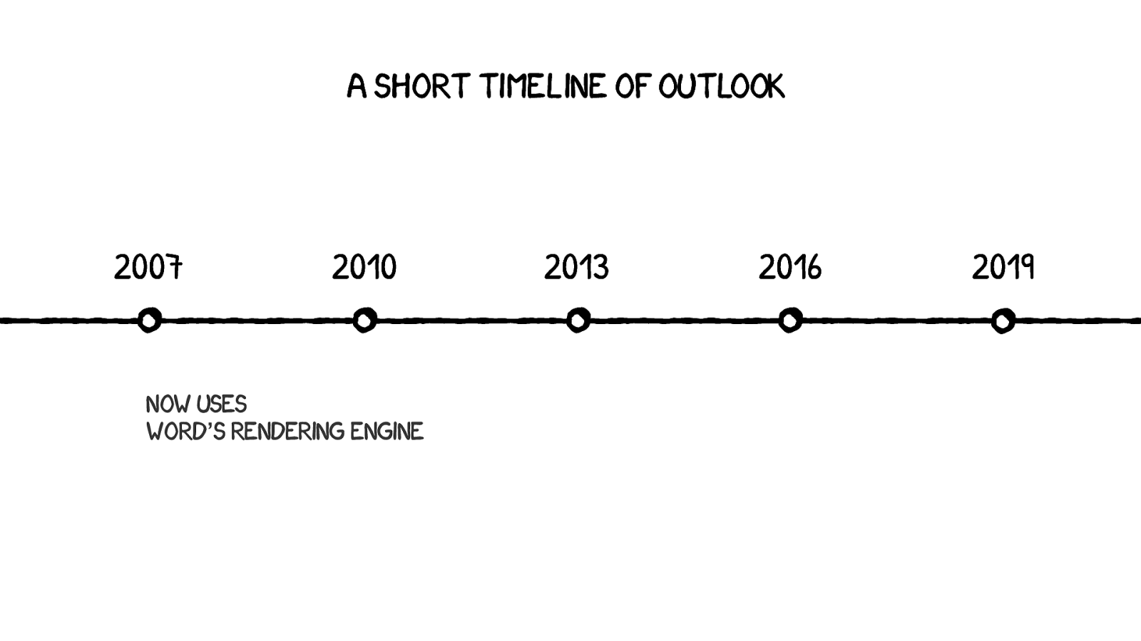
Word is still the default rendering engine in Outlook 2019. And Word is often despised as a rendering engine because let’s face it, it’s not very good at rendering HTML and CSS.
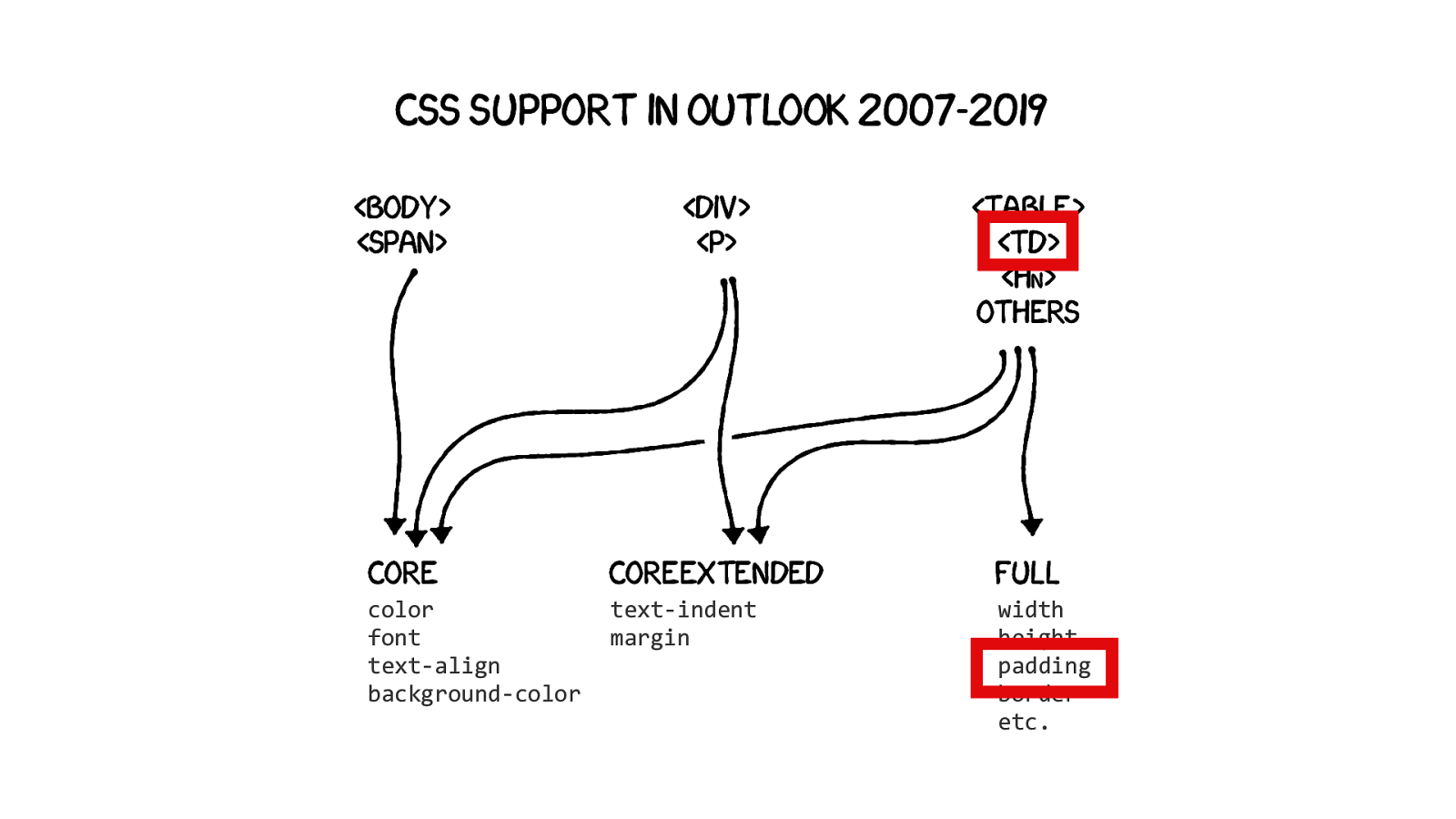
Perhaps the most surprising thing is that CSS support in Outlook 2007-2019 varies depending on the elements you use. Microsoft has a documentation where they define three levels of CSS support. The first one applies to body and span elements, on which you can apply only what Microsoft calls CORE CSS properties. Things like color, font-family, font-size, text-align, background-color.
Then the second level applies only to divs and paragraphs elements, on which you can apply properties from the first CORE level, but also from a second COREEXTENDED level. And this level only has two more CSS properties, text-indent and margin.
Finally, the third level applies to all the others elements supported by Outlook, like table, tds, h1 and such, on which you can apply styles from both previous levels, but also from a new « FULL » level which includes properties like width, height, padding, border. etc.
This means that if you want to use a padding in an HTML e‑mail and have it work on Outlook, you can only use containers like a table and a td to be sure it’ll work. And this is the only reason to this day why we still have to use tables in HTML emails.
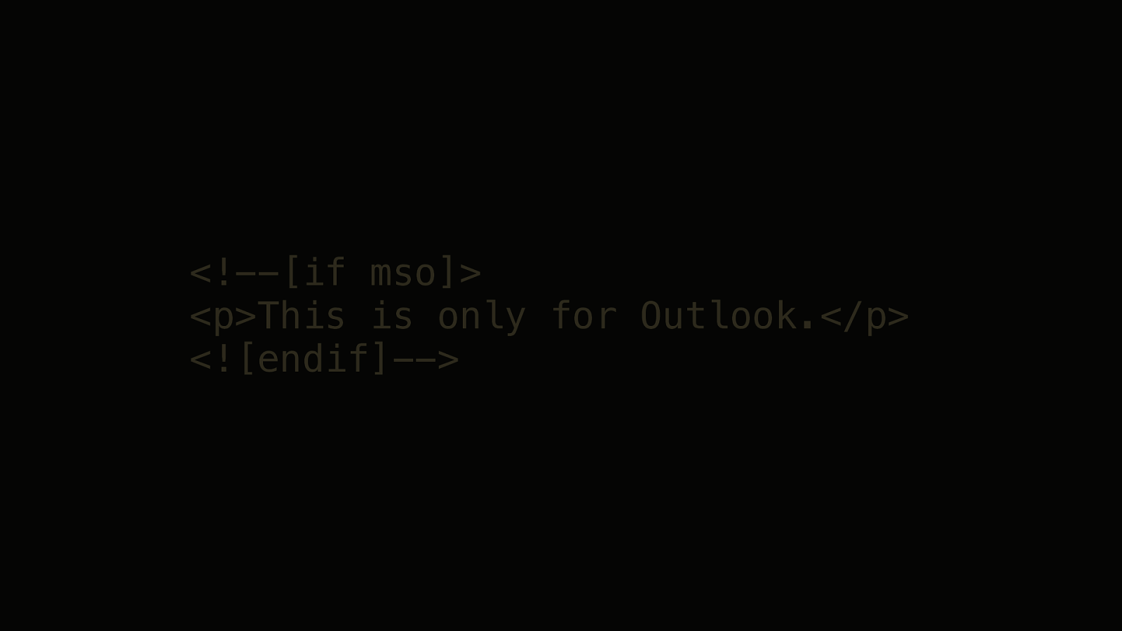
Luckily for us, Outlook has this system of conditional comment. If you’re old enough, you might remember this from the IE6 era. So inside a regular HTML comment, between brackets, you can write an if mso condition. And if you’re on Word, the following code will be interpreted. Other rendering engines will just disregard it as an HTML comment.
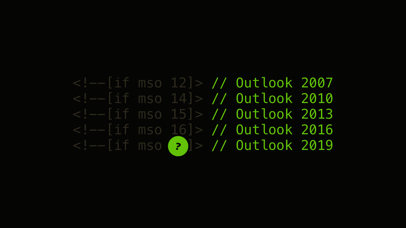
An we can also use numbers to target specific versions of Outlook. So Outlook 2007 is mso version 12. Then we get a little jump as Outlook 2010 is version 14. There’s is no version 13 as Microsoft is superstitious apparently.
Then Outlook 2013 is version 15. And Outlook 2016 is version 16. Which was quite nice because then the version number matched the year number.
But as you probably guessed, there’s a pattern here. And so Outlook 2019 is version… 16 as well.
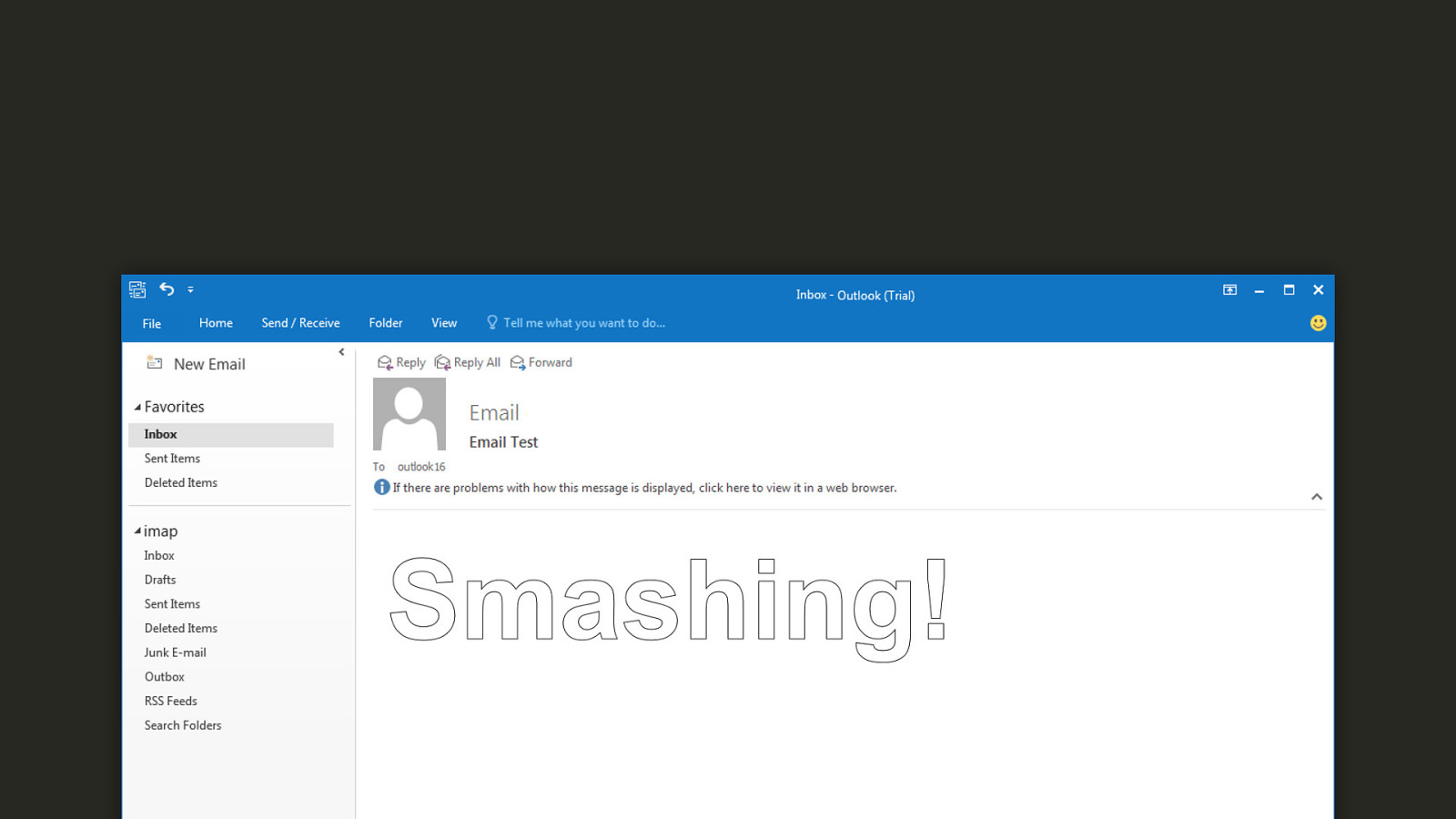
But Outlook is not all bad. The more I think about it, the more I believe that Outlook is just different. And it even has exciting things that don’t exist in standards CSS. Things like text-effect:outline;
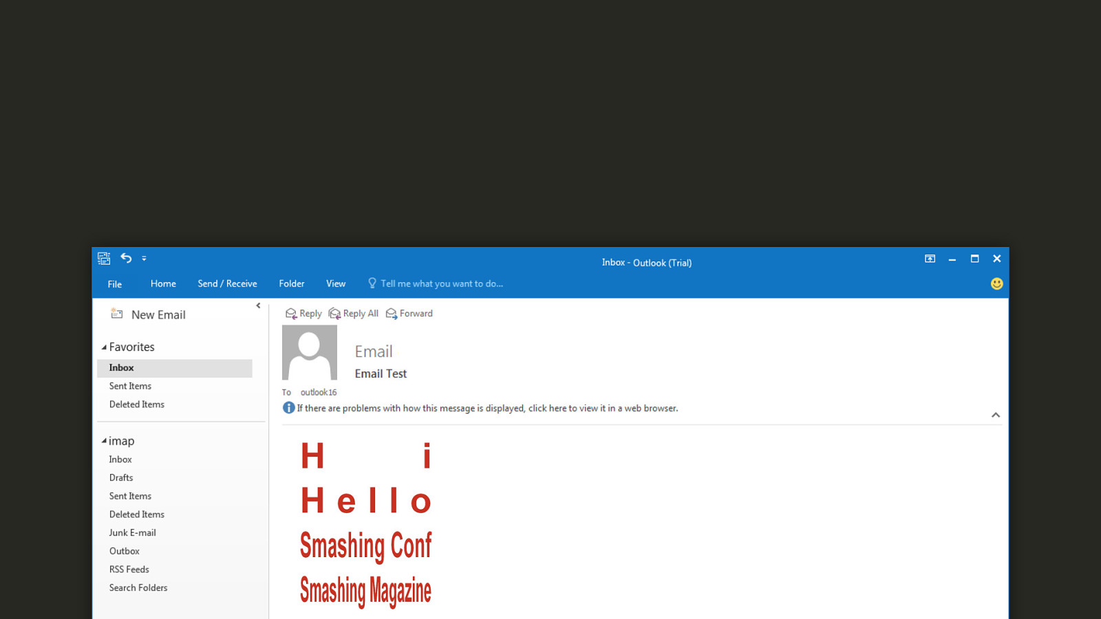
Or text-fit:600px;
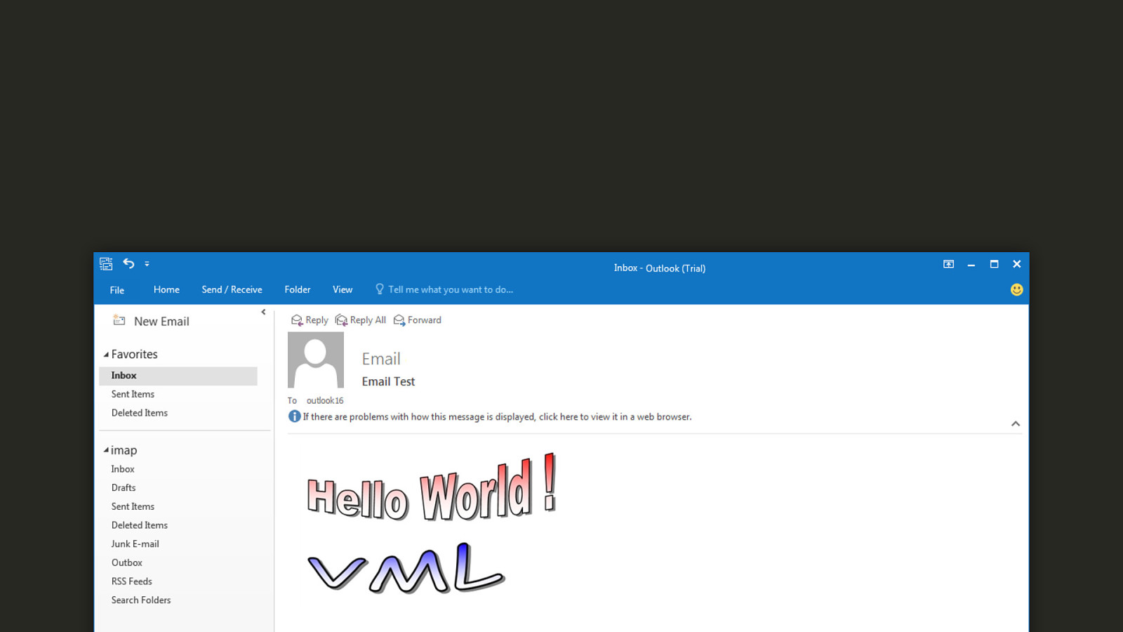
VML.
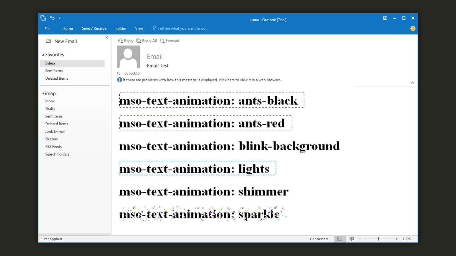
Or perhaps my favorite, mso-text-animation.
Contraints drive creativity. We often think of constraints and creativity as things touching graphic design. Like you can only design this banner with this number of colours or this fixed size. But constraints are also amazing for developers because they force you to think differently. Sometimes I feel like web developers forget about this when I see them throw insane amounts of JavaScript to fix problems they caused in the first place.
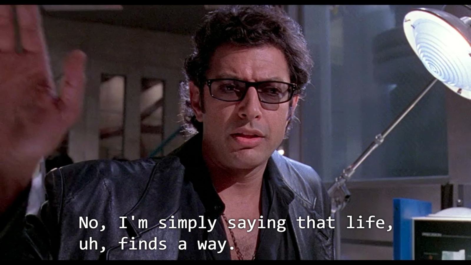
Perhaps another way to put it is:
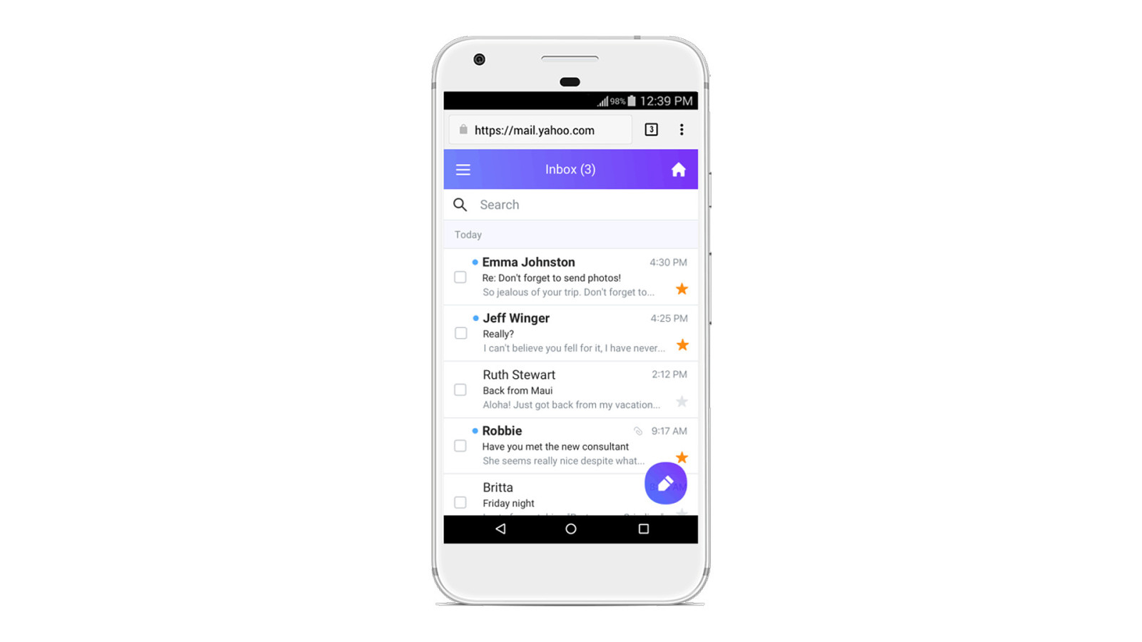
Officially, The Yahoo! Mail app on Android doesn’t support <style> tags.
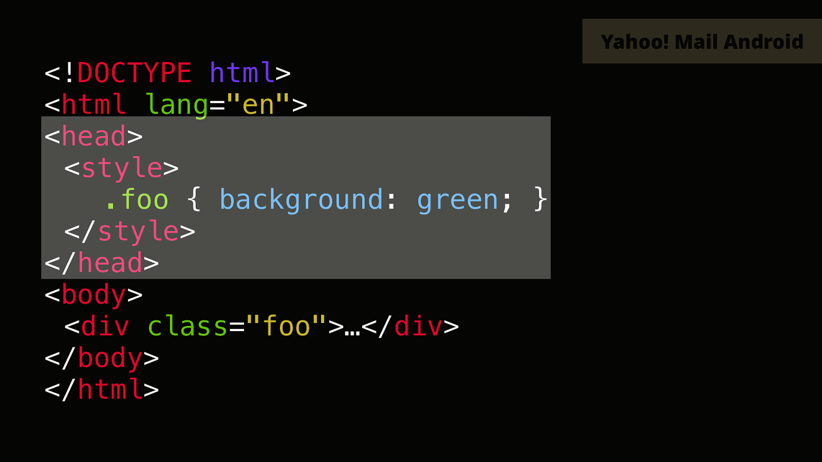
This is because the app removes the entirety of the <head> tag in your HTML.
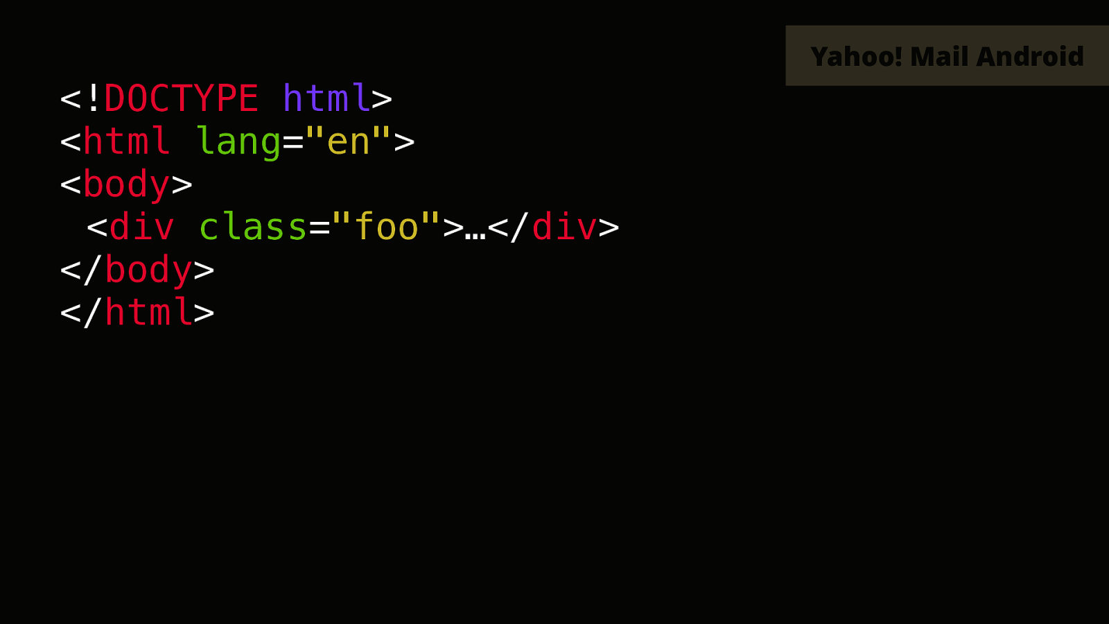
This is quite inconvenient to say the least to get things to work on mobile. But people have found that Yahoo doesn’t remove all head tags. It only removes the first one. This might come as a bit of a surprise as you usually wouldn’t expect to see anything with two heads.
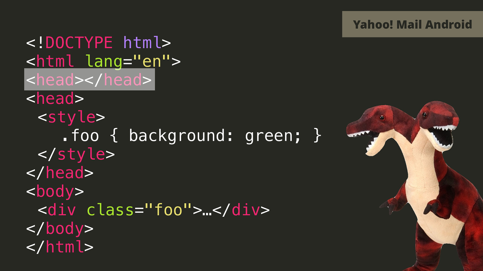
But if you have one empty dummy head in your HTML, and then your real head with all your styles and such, then Yahoo on Android will only remove that first head.
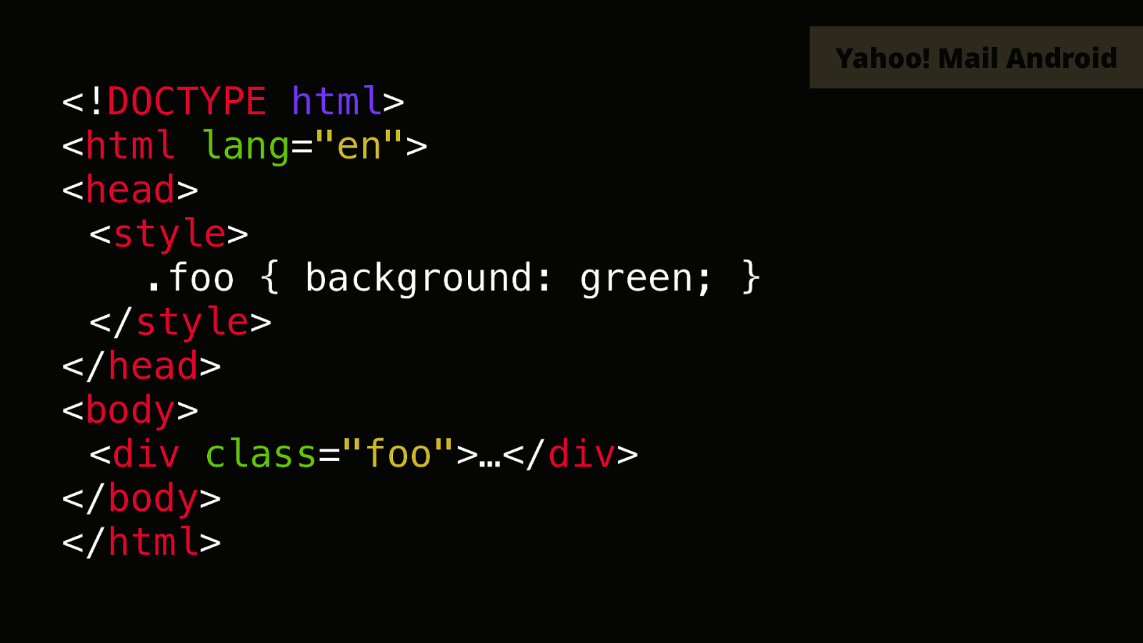

One of my motto is to “fake it ‘til you make it”. When something’s not supported in an email client, try to think about how you could fake it another way. Here are a few live demos now.
One more thing…
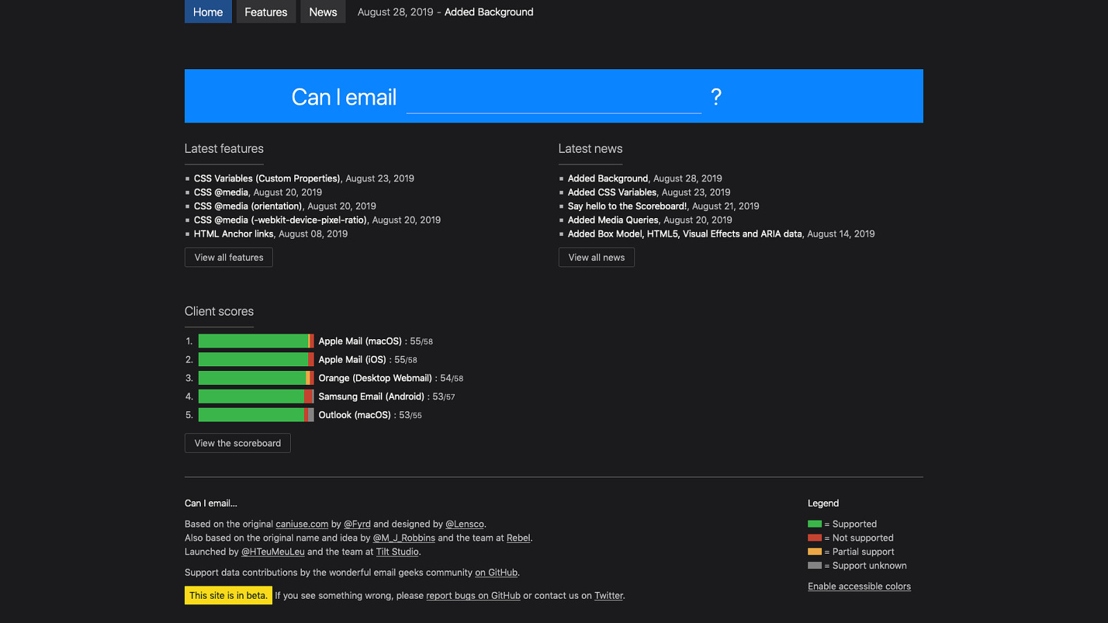
I am super happy and excited to announce that with the help of my colleagues and members of the email geeks community, today we’re officially launching caniemail.com.

Thank you!