Smashing Conference Freiburg September 6th 2022

A presentation at Smashing Conference Freiburg 2022 in September 2022 in Freiburg, Germany by Rémi Parmentier
Smashing Conference Freiburg September 6th 2022
My name is Rémi Parmentier. I go by the nickname HTeuMeuLeu. And I am an email developer. Some of you might remember me because three years ago, I had the chance to be on this stage to talk about HTML emails already. And I ended this talk with a surprise announcement…
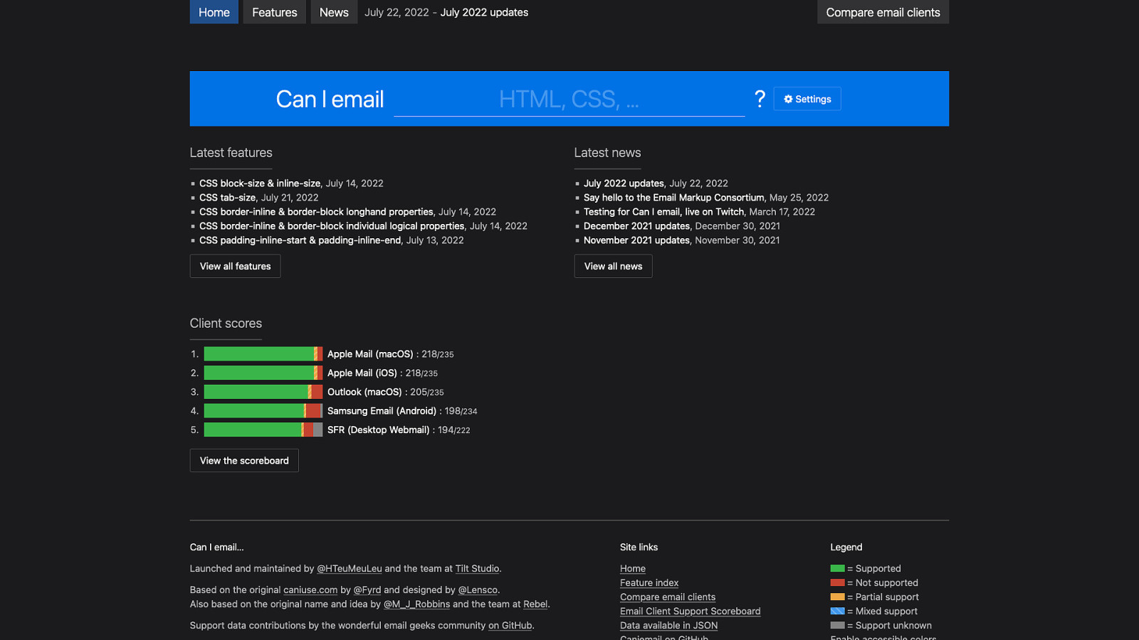
… with the launch of the website Caniemail.com. It is similar to caniuse.com but for email developers. I’ve been maintaining this site for the past three years and a lot of things sure happened in the emails world.
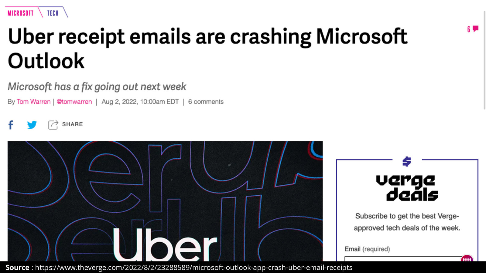
Including this thing, just last month, where Microsoft had to push a quick fix to Outlook on Windows because Uber emails were crashing Outlook.
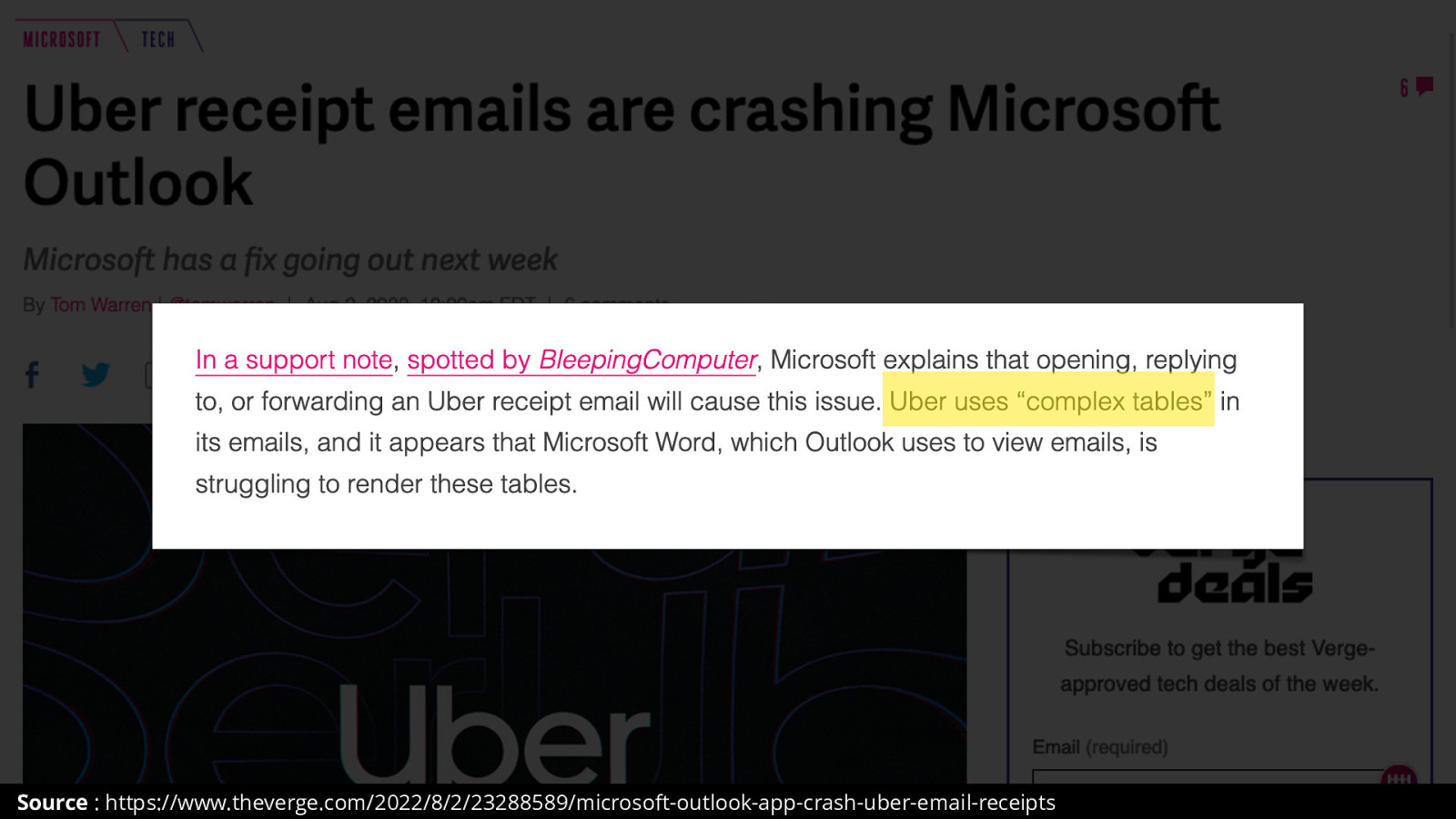
And the official reason from Microsoft was because the emails « used complex tables ». Which is hilarious to me, because the only reason we use tables in the first table is because Microsoft Outlook uses Word as a rendering engine and only understands tables in the first place.
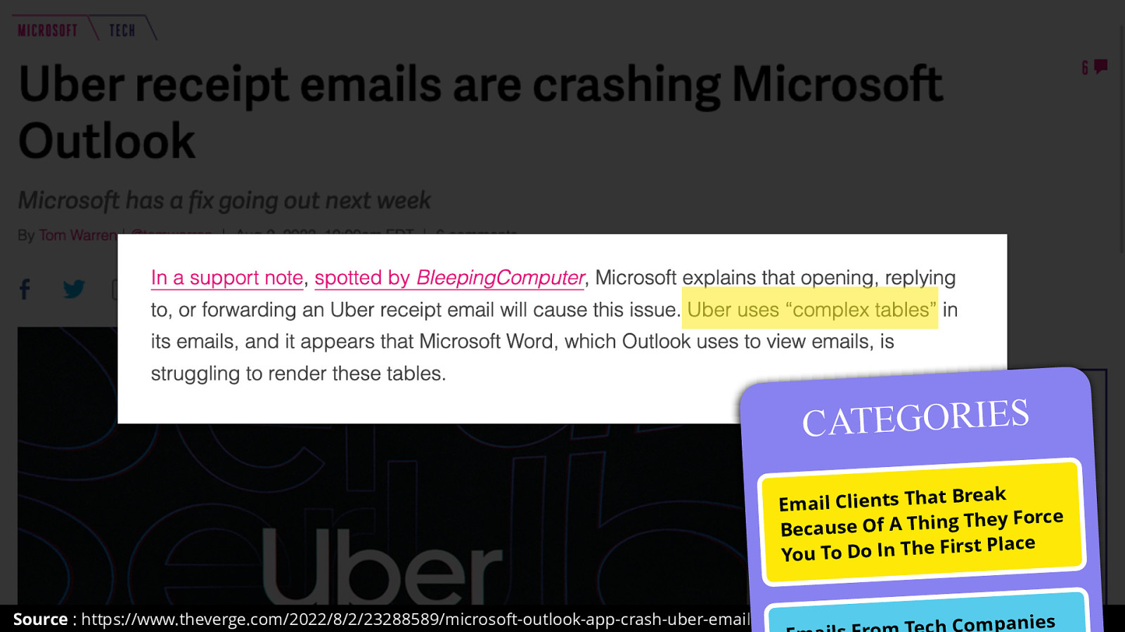
This is a top contender for me in the Category of Email Clients That Break Because of a Thing They Force You To Do In The First Place.
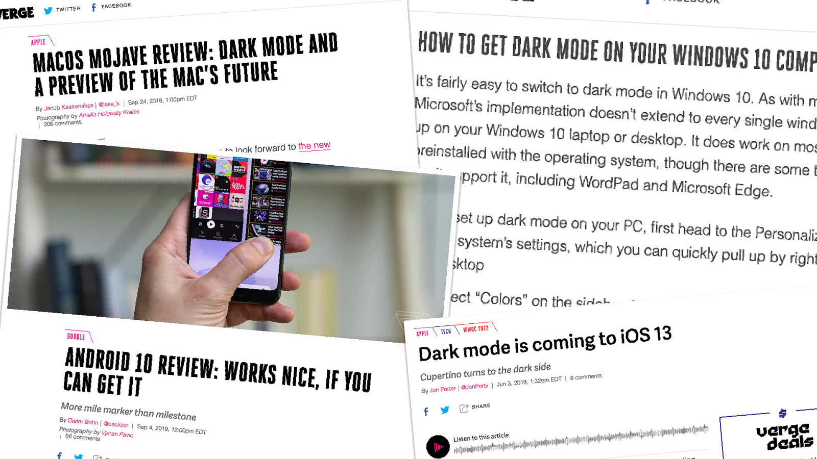
But one of the most significant news from the past three years is the debut of dark modes in operating systems and email clients. From macOS to iOS, Android and Windows, every modern OS now features a dark mode option.
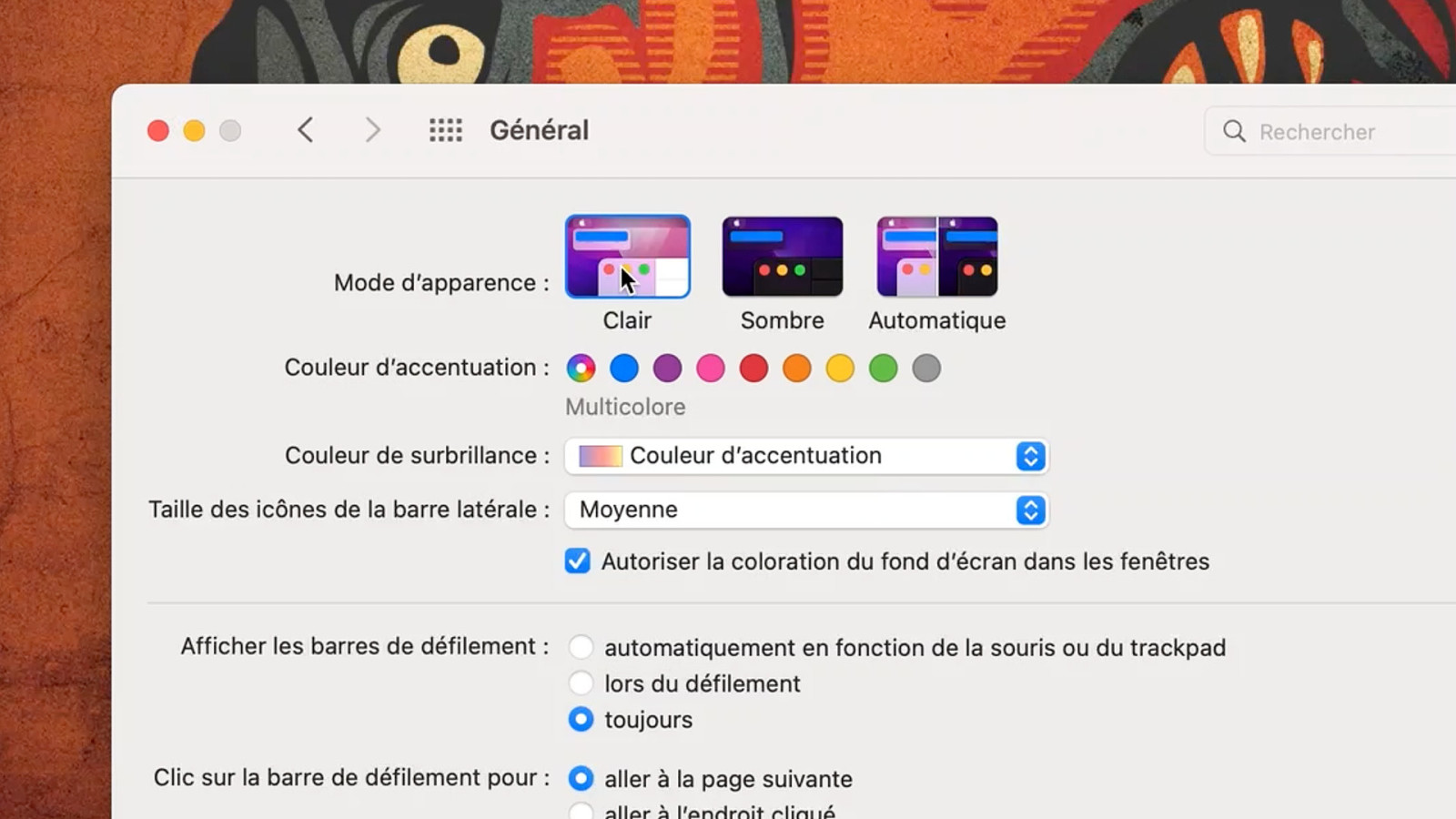
The idea is that you’ll check this setting on your operating system preferences, and then it’s up to any application to adjust its interface with a darker color scheme.
And this also applies to browsers and websites, and to email clients and HTML emails. But as you’d might expect, there are a few twists in emails that can make this a tiny bit more complicated.
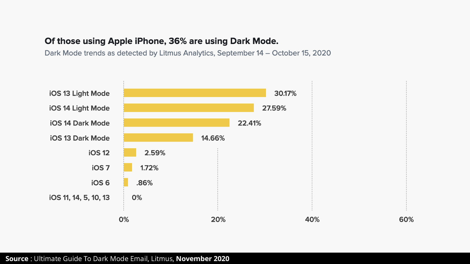
In November 2020, Email Analytics tool Litmus estimated that 36% of iPhone users where opening their emails while in dark mode.
Just out of curiosity, who here uses dark mode (either on their phone or their computer)?
In the next 30 minutes or so, I’ll be shining the light on HTML Emails Dark Modes and share with you 5 tips to make your emails better in dark modes.
“modes”, plural. Because there’s not one dark mode, there are as many as there are email clients families. In this talk I’ll focus on Apple Mail, Outlook, Gmail.
You don’t get to chose whether your email has a dark mode or not. Email clients have something we call « Forced Dark Mode ». And if you don’t do anything your emails can look like hell. Literally.
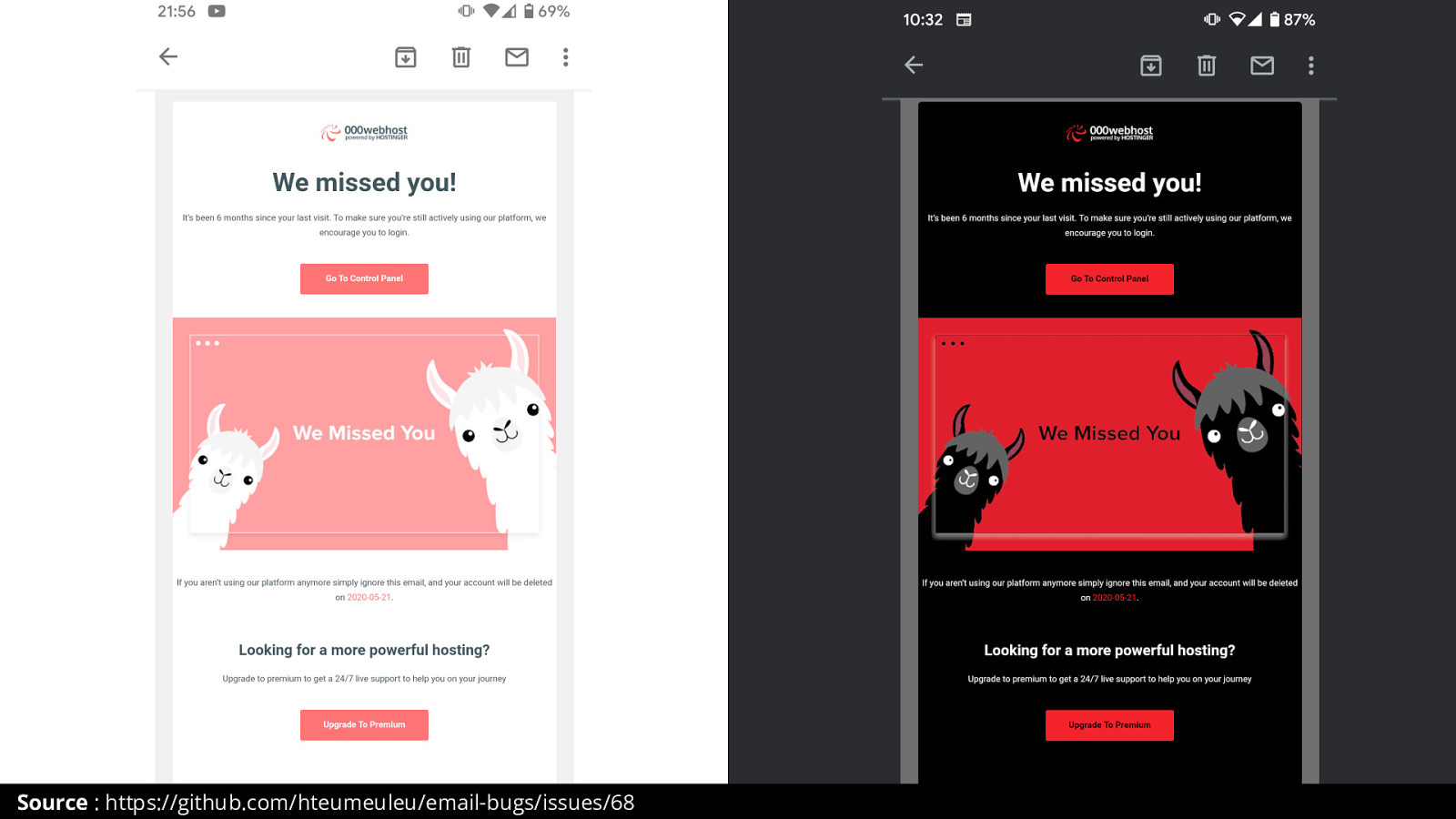
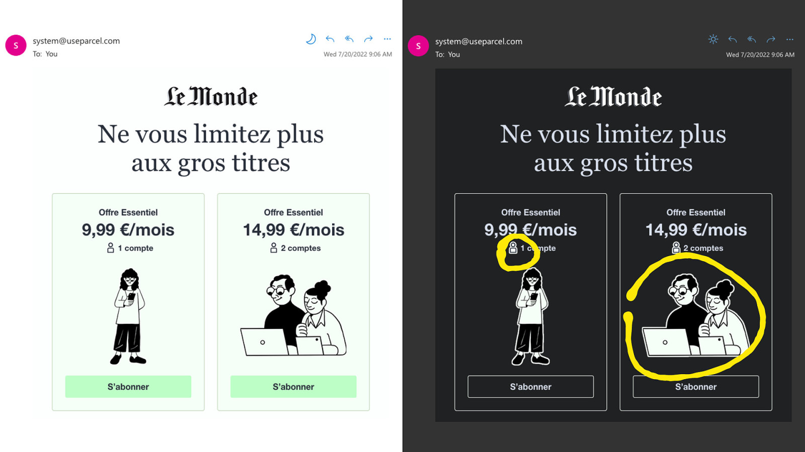
Take this example from a web host. Super cute email, lovely colors and illustration. And here it is in Gmail Forced Dark Mode. Now to be fair, Gmail since adjusted its Forced Dark Mode algorithm changes big images like this.

Email Developer Alice Li (@AliceLiCode) wrote a fantastic guide on Litmus about Forced Dark Mode in email clients.
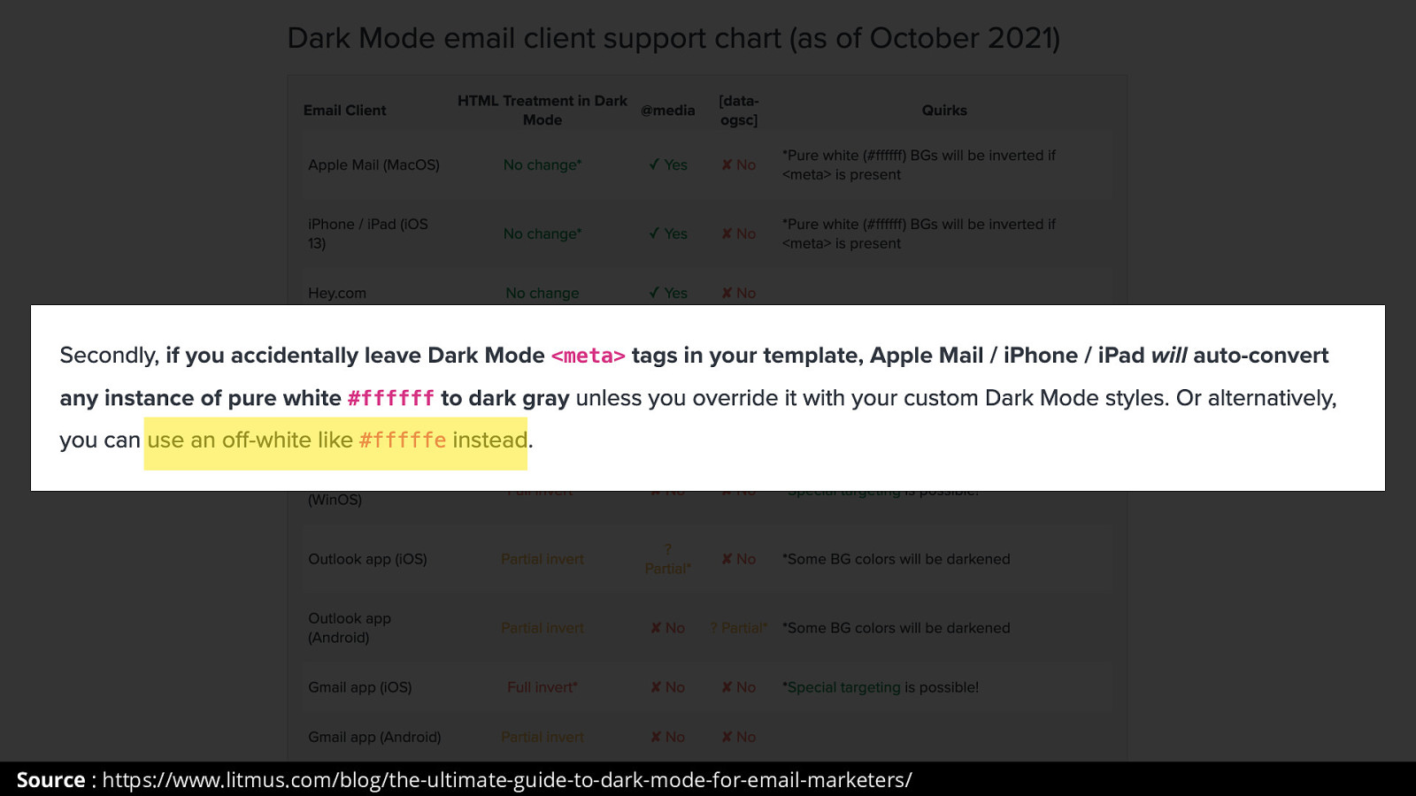
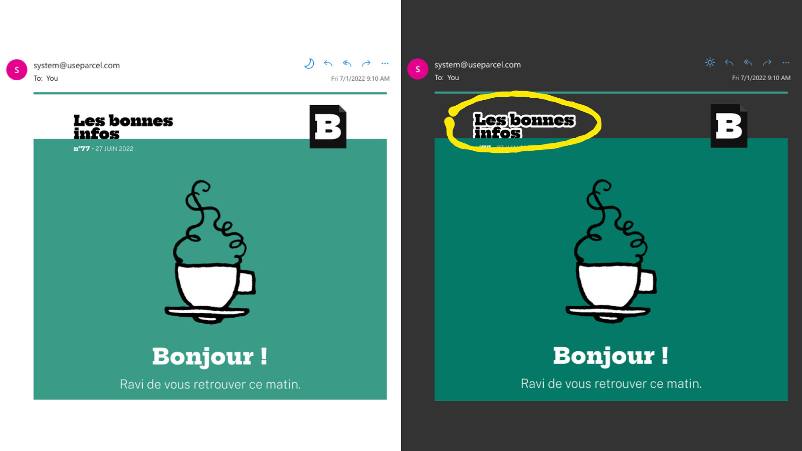
And for some of them, like Apple Mail on macOS, there are easy tweaks to avoid getting a white color turned in black. Which is to use #fffffe instead.
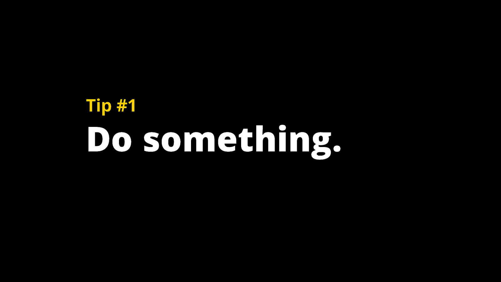
But my most important recommendation from this entire talk is Do Not Fight Dark Mode. Embrace It. Dark Mode is a user preference, the same way a user would increase their font size or read on a small device. So DO NOT try to keep a light email in dark mode. And one part of this « Do Something » is to test. You can test on real devices.
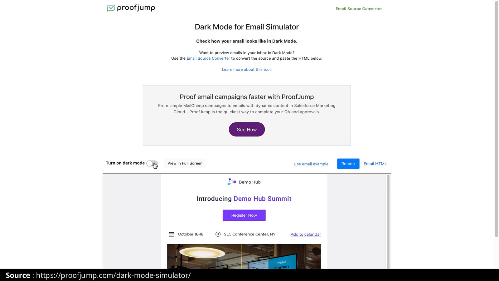
Or you can use one of these Dark Mode simulator for emails tools. Like this one from Proofjump.
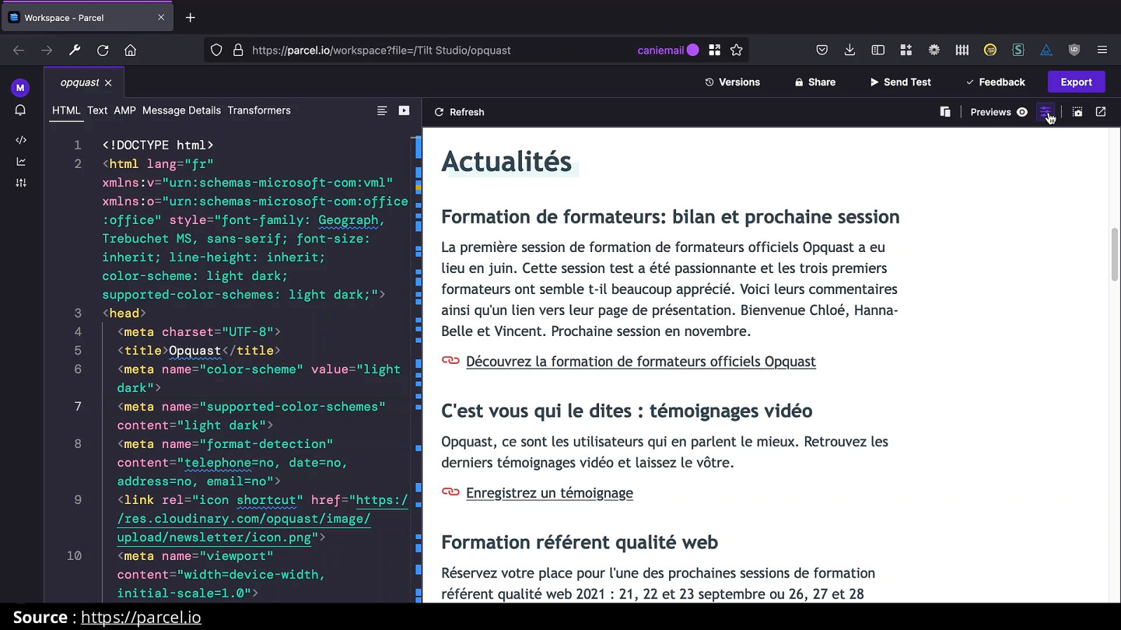
And this one that was introduced just last week in Parcel.io. Which is a fantastic email coding tool.
My second tip is to use transparent images.
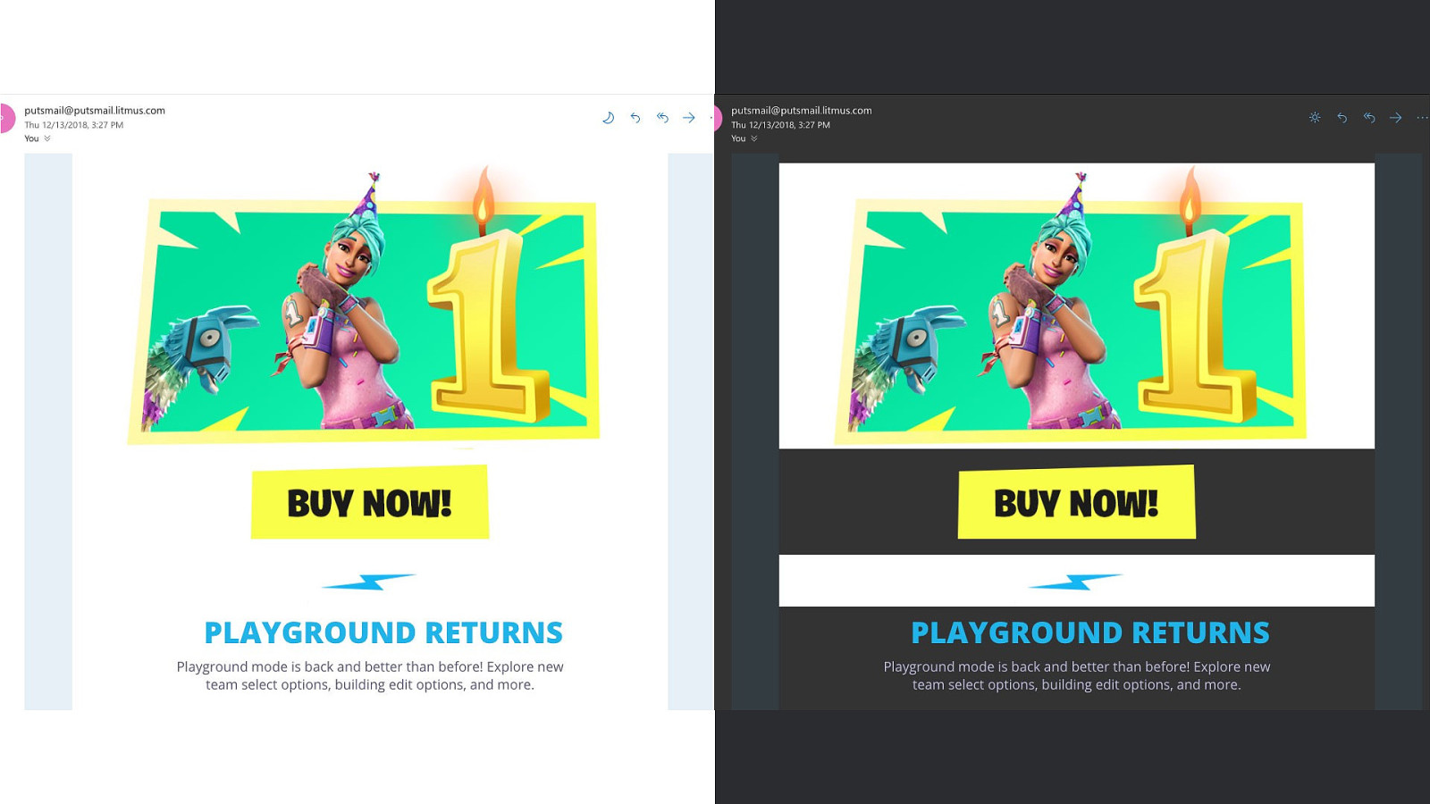
Take this email from Epic Games for Fortnite. Beautiful in light mode. But in Forced Dark Mode, here in Outlook.com, you can see how every image was sliced up.
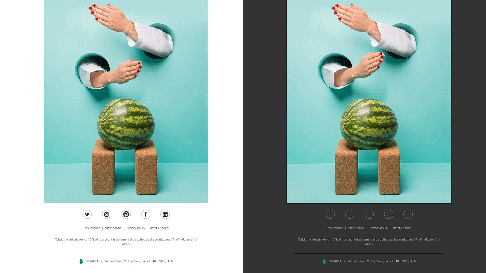
But be thoughtful about when to use fully transparent images. Take a look at these social icons. They look ok in light mode. But they become unreadable in dark mode in Outlook com. So here, it might be better to fill these images with a white background inside the circles.
And one technique I found myself using a lot is adding an outline to transparent images.
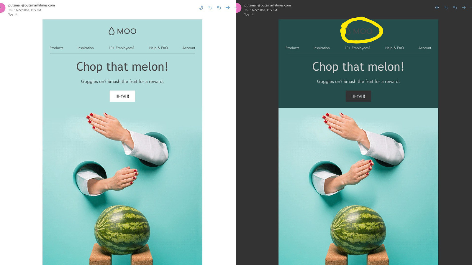
Take that logo from that same email. No longer readable in dark mode.
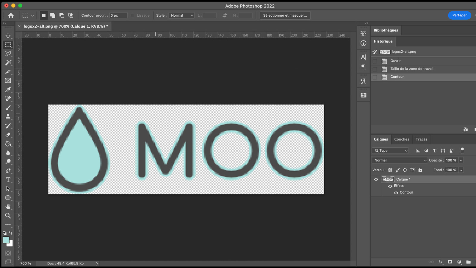
What I’d do in such a case is go back to Photoshop, add an Outline to that content from the background color in light mode.
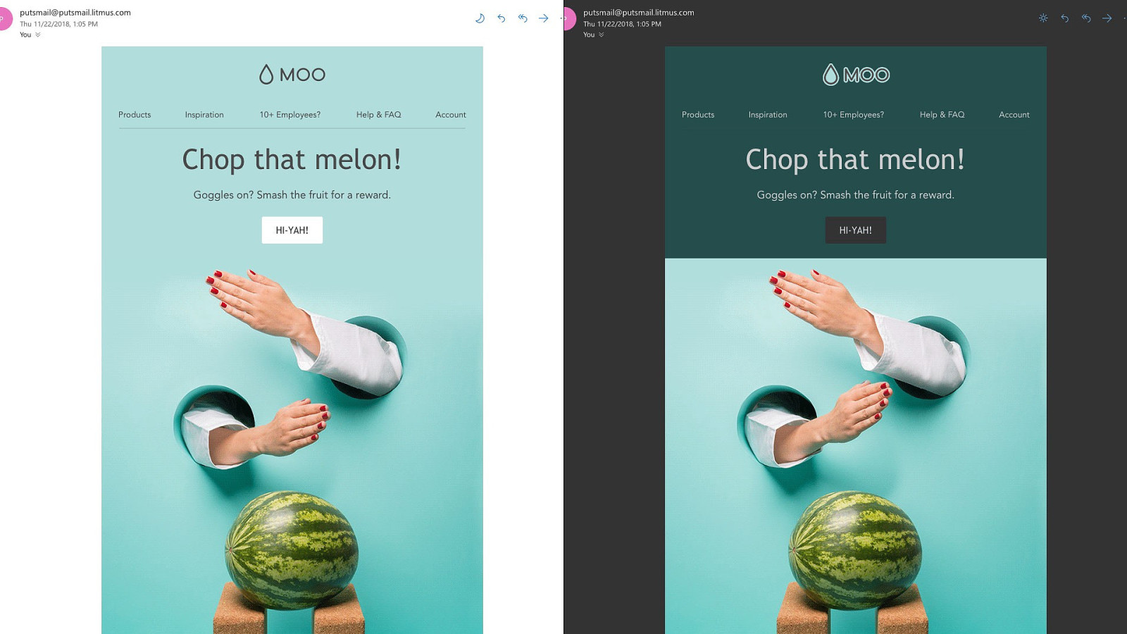
And voilà!
Here’s another example.
And another one.

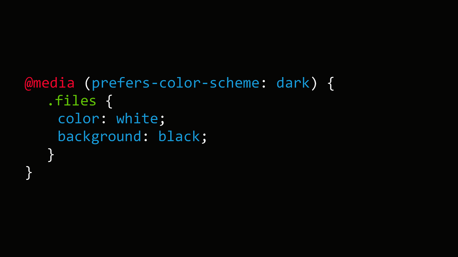
Of course we don’t have to go through Forced Dark Modes. And we can be more proactive. And so we can use the dark mode media query. This is something relatively new that appeared at the same time as dark mode in OS.

And it looks like this. […] And then inside you’d fill your classes and styles changes, just like you would in a responsive media query.
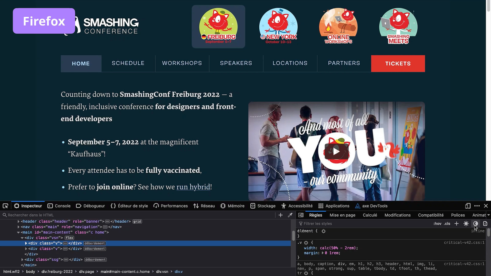
There are handy tools in browser DevTools to test dark mode styles. Firefox has these super handy icons to easily switch from a light mode to dark mode.
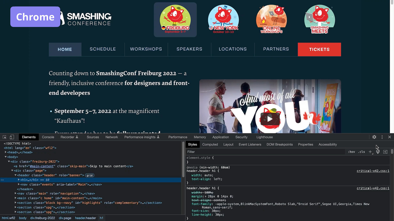
Chrome also has a similar option but it’s much more complicated.
One neat thing about the dark mode media query is you can also use it to change images.
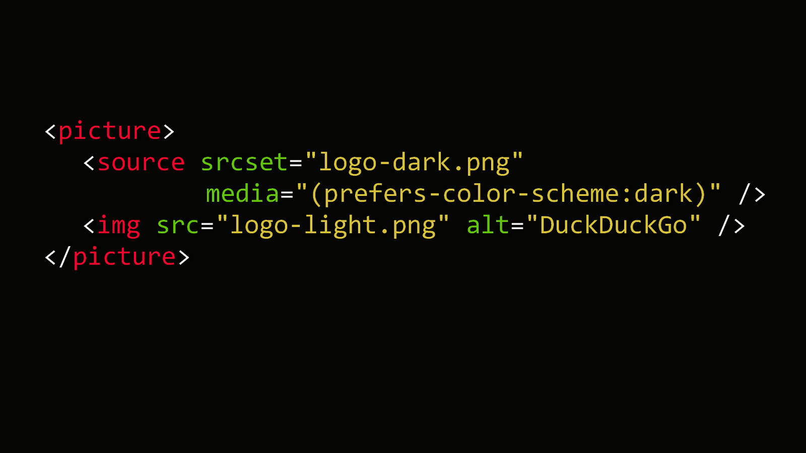
<picture>
<source srcset="logo-dark.png" media="(prefers-color-scheme:dark)" />
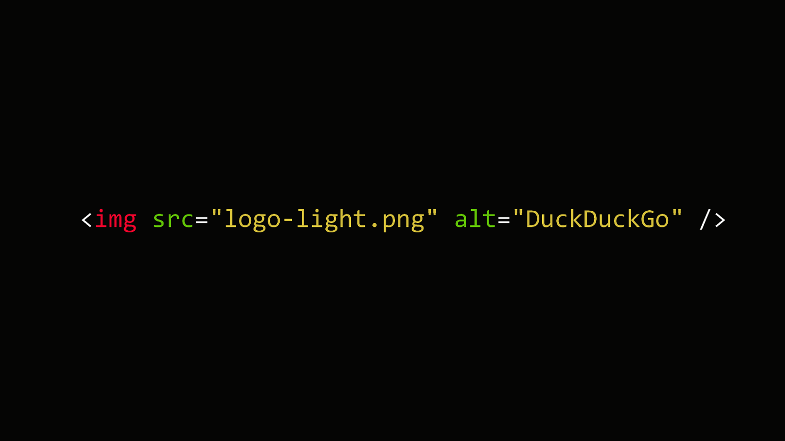
<img src="logo-light.png" alt="DuckDuckGo" />
</picture>
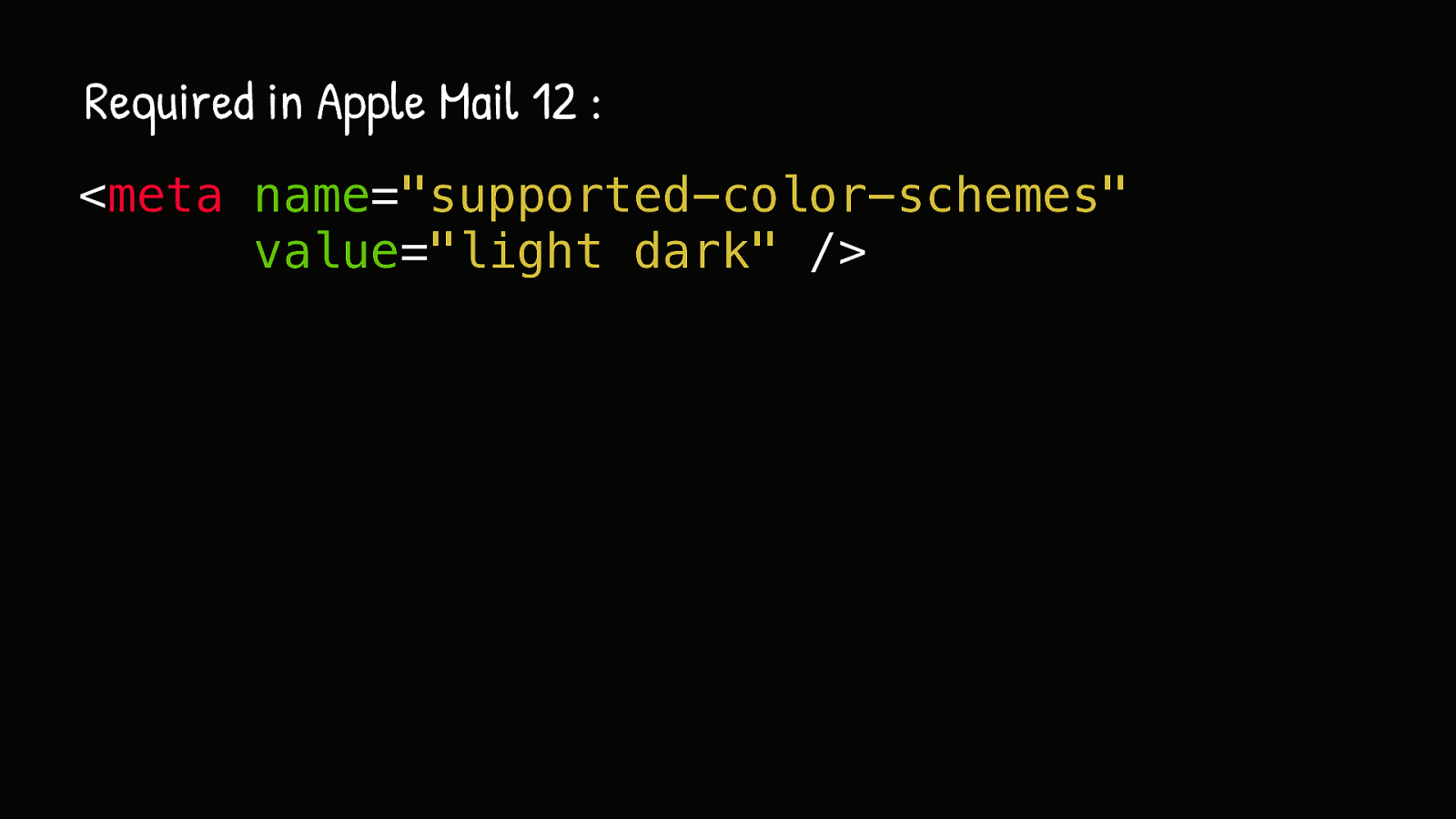
One quirk of the dark mode media query is that for it to work in Apple Mail, on macOS or iOS, you need to add the meta tag for older versions…
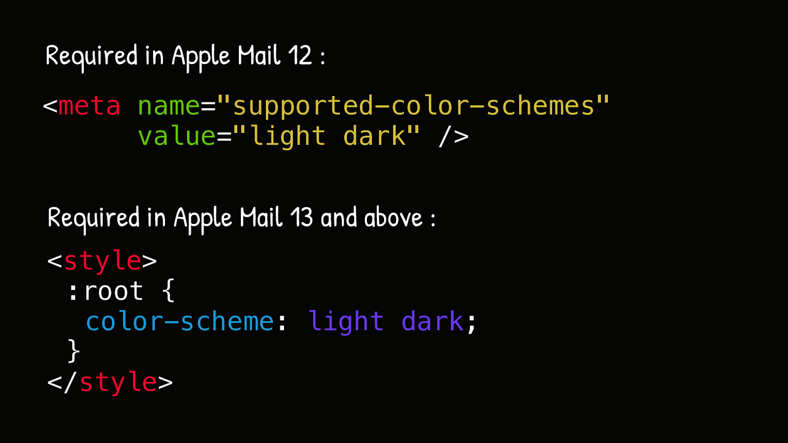
… or the CSS property for newer versions. This is totally not a requirement on the web. But weirdly it is in Apple Mail.
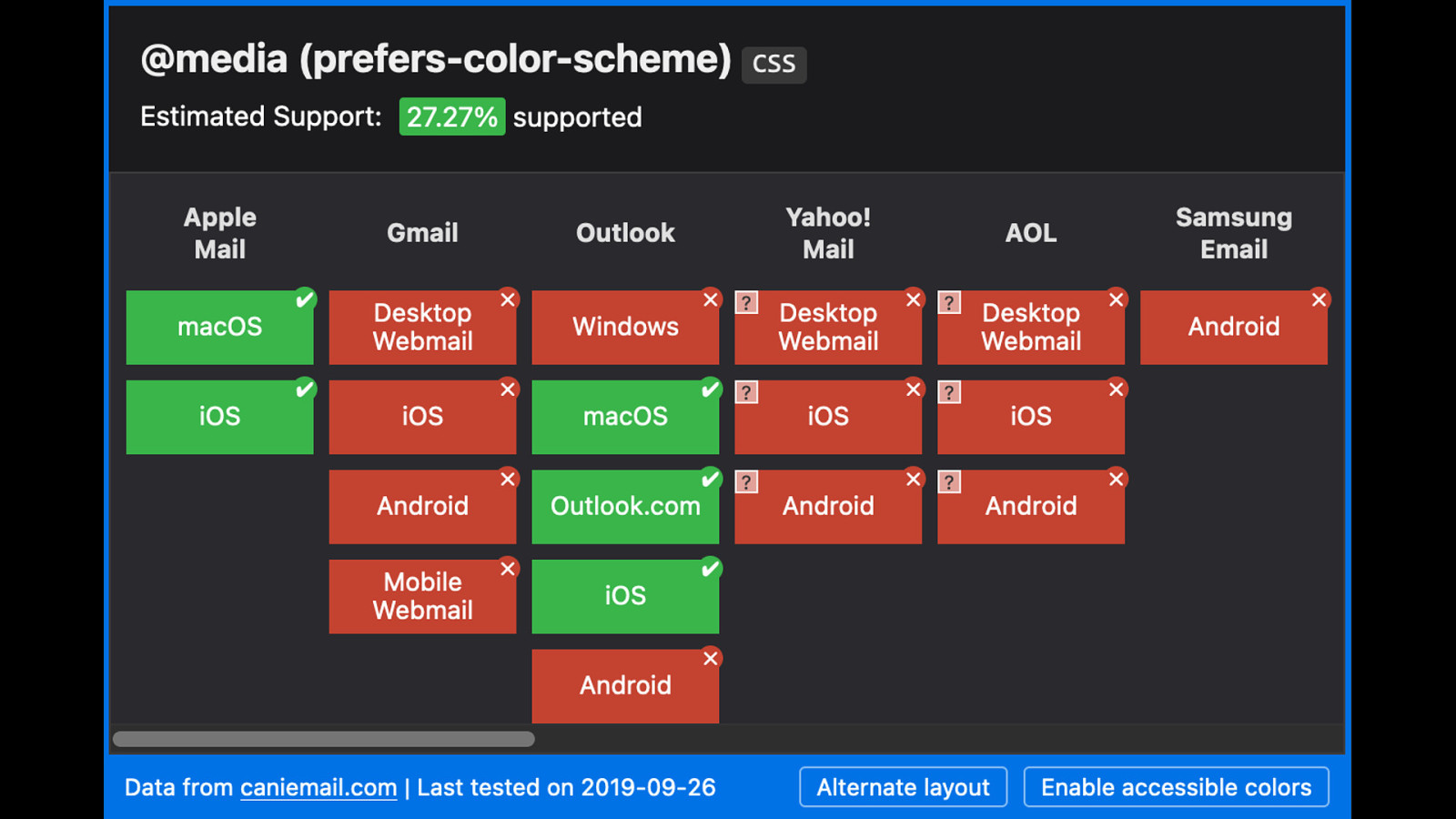
Now the overall support for this media query is… mitigated. Works well in Apple Mail. Works in Outlook on macOS, iOS or Outlook.com. But other than that, not so much. One thing that’s been bothering me with outlook.com…
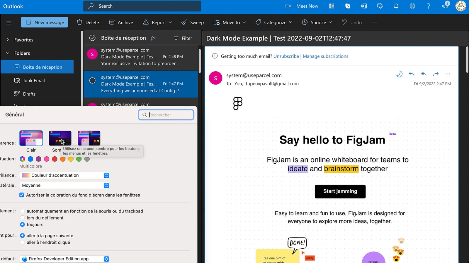
… is that since it includes a little icon to switch your email in dark mode or light mode. But because we’re in a webmail, using this switch doesn’t do anything if you use dark mode styles.

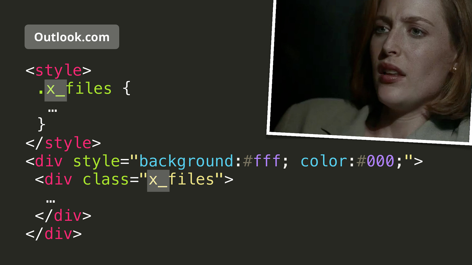
So this is my tip number 4 and how to use custom styles and make your emails properly react to outlook.com dark mode.
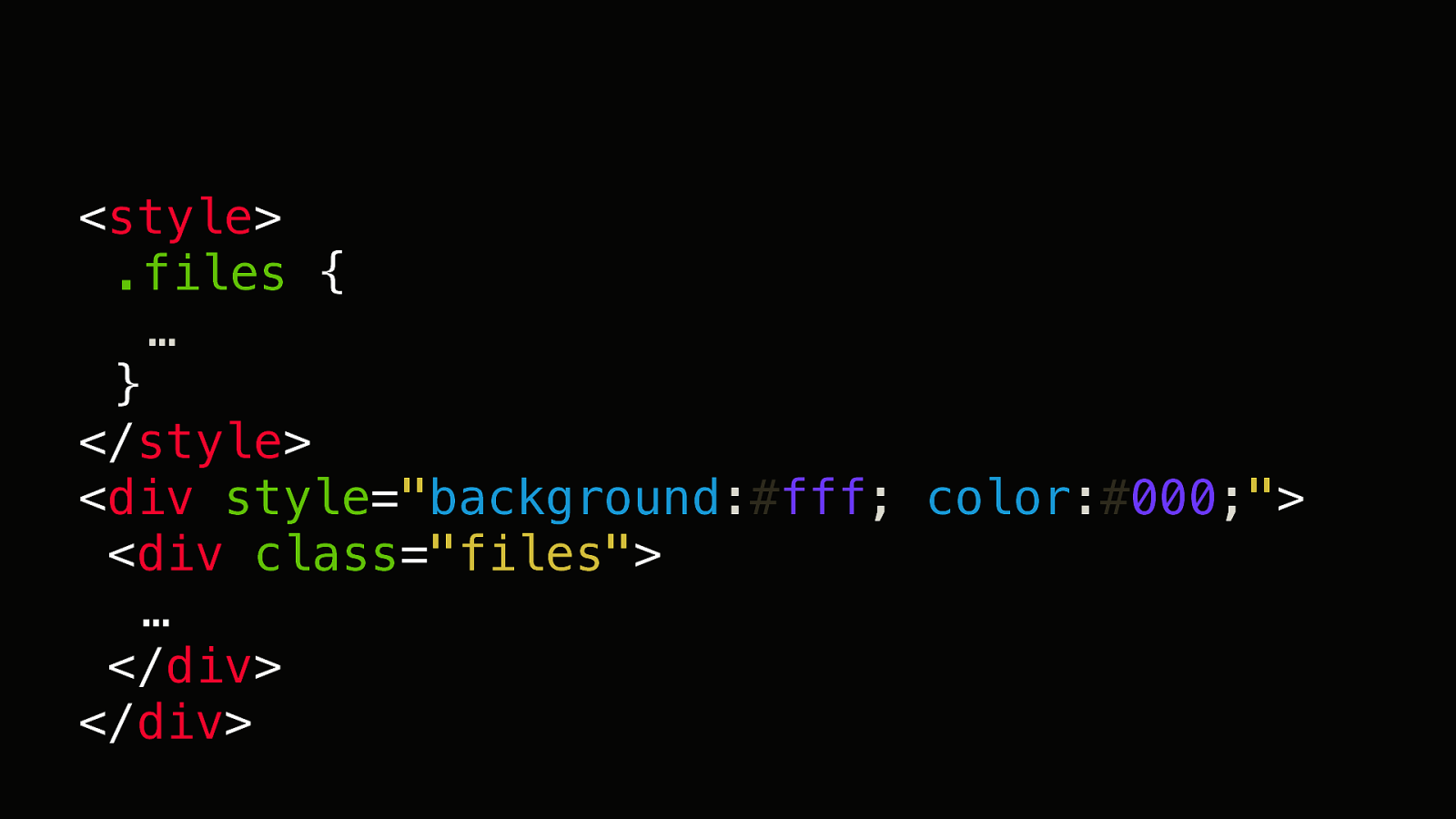
So take this piece of code. In outlook.com it would be turned like this.
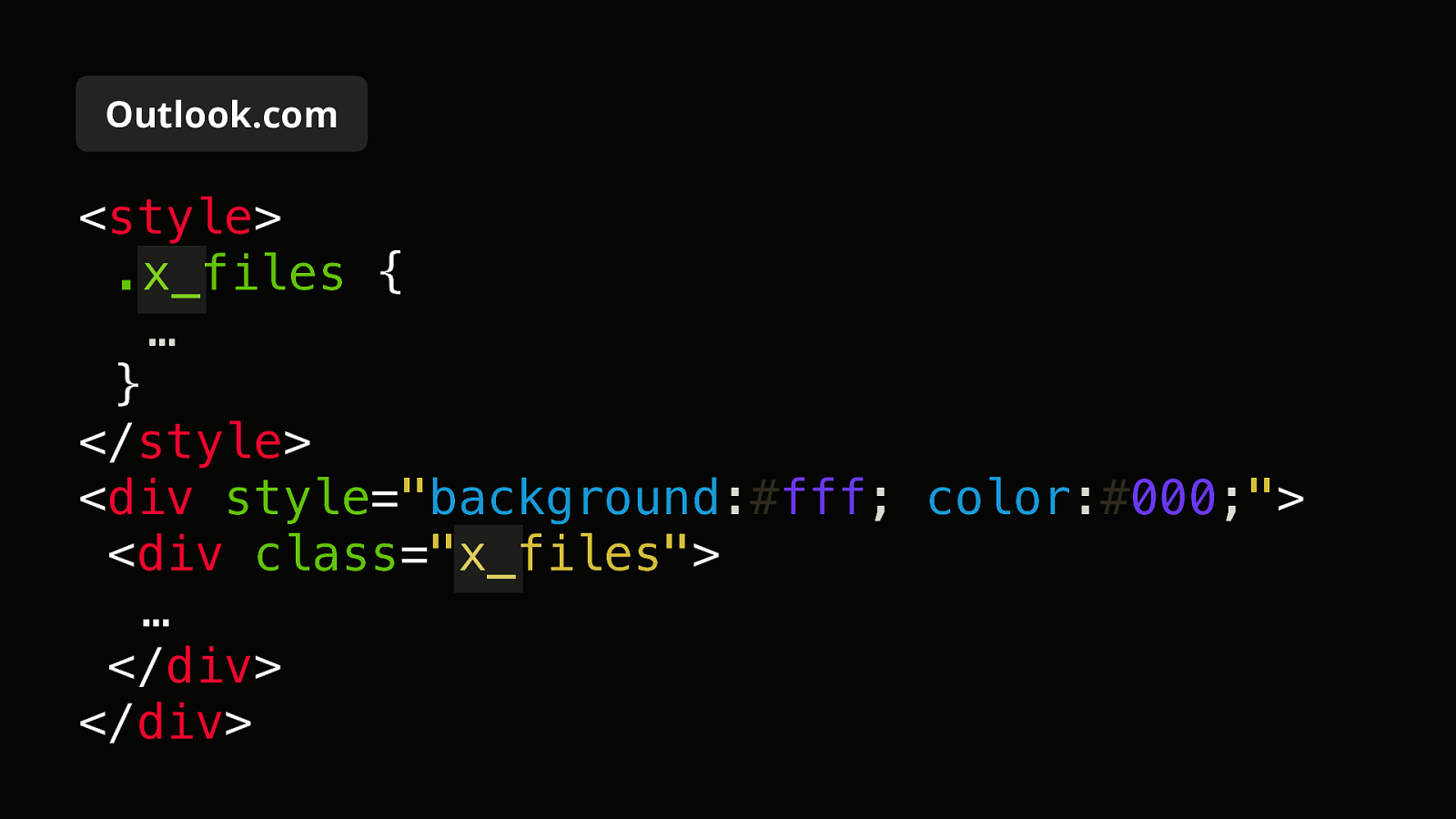
Outlook.com applies the prefix « x_ » to any class name. This is a good practice for security.
And yes, that pun here was totally intended. Because not only The X Files was my favorite TV show growing up. But also because it taught me the only words I can possibly speak in German. « Ich habe keine unruhe » but maybe a little bit when coding emails.
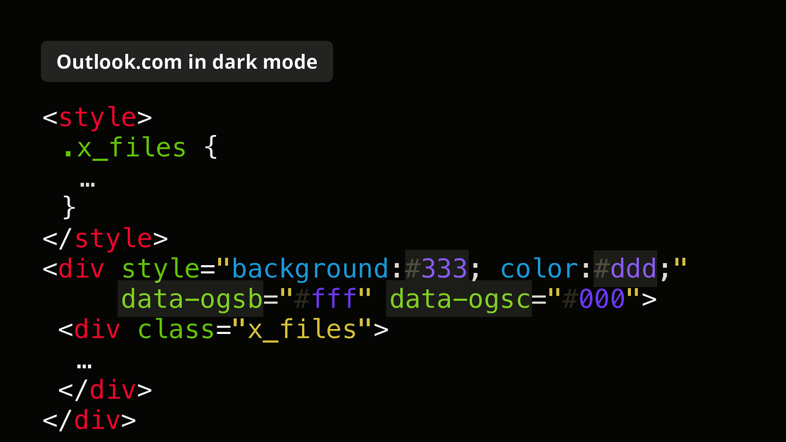
Then in dark mode, Outlook.com adds these data attributes.
So back to our initial code…
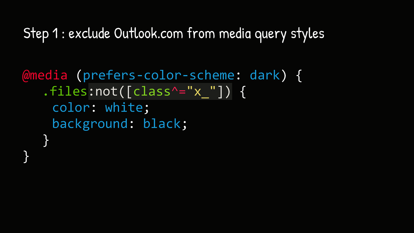
The first step is to exclude Outlook.com from media query styles. For this we append a :not([class^="x_"]) pseudo-class to every class selector.
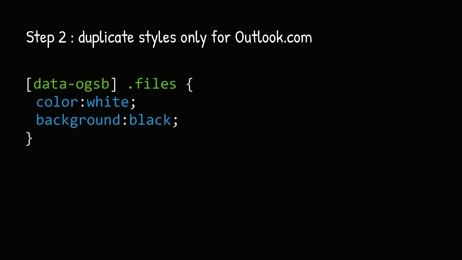
Then we duplicate styles only for Outlook.com using a [data-ogsb] attribute.
But then there’s Gmail. Gmail is really a bad student here because not only it doesn’t support the dark mode media query. But it also doesn’t have any sort of trickery or targeting to differentiate light and dark mode. And not only that, but it’s also sometimes terrible at Forced Dark Mode.
Especially if you already have a dark theme email. Gmail on iOS will try to invert it anyway.

Or this one from Google themselves.
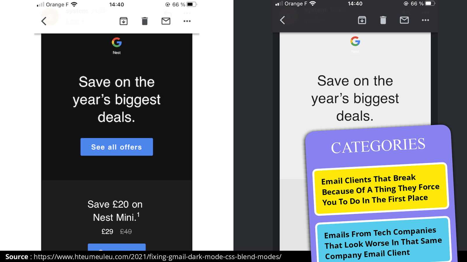
This is one of favorite thing in the category of Email Clients That Break Because Of A Thing They Force You To Do In The First Place.
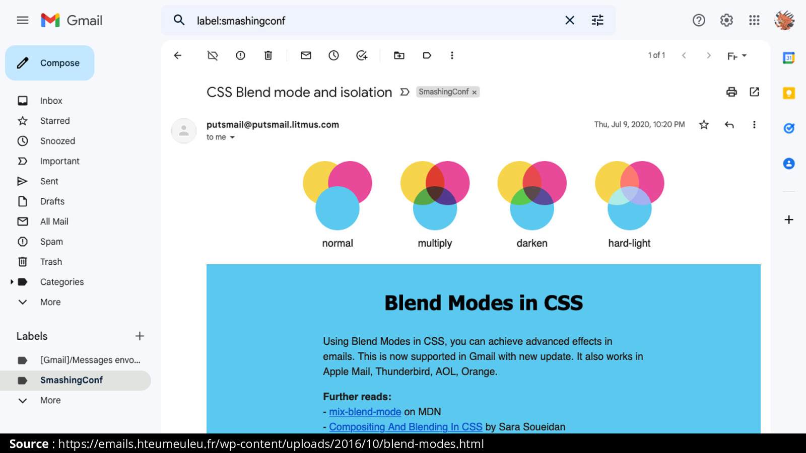
One cool thing about Gmail though is that it supports CSS Blend Modes.
Blends Modes is that thing in Photoshop that makes your developer hates you because it becomes horrible to export any individual layer.
But also Blend Modes are about blending colors from overlapping layers.
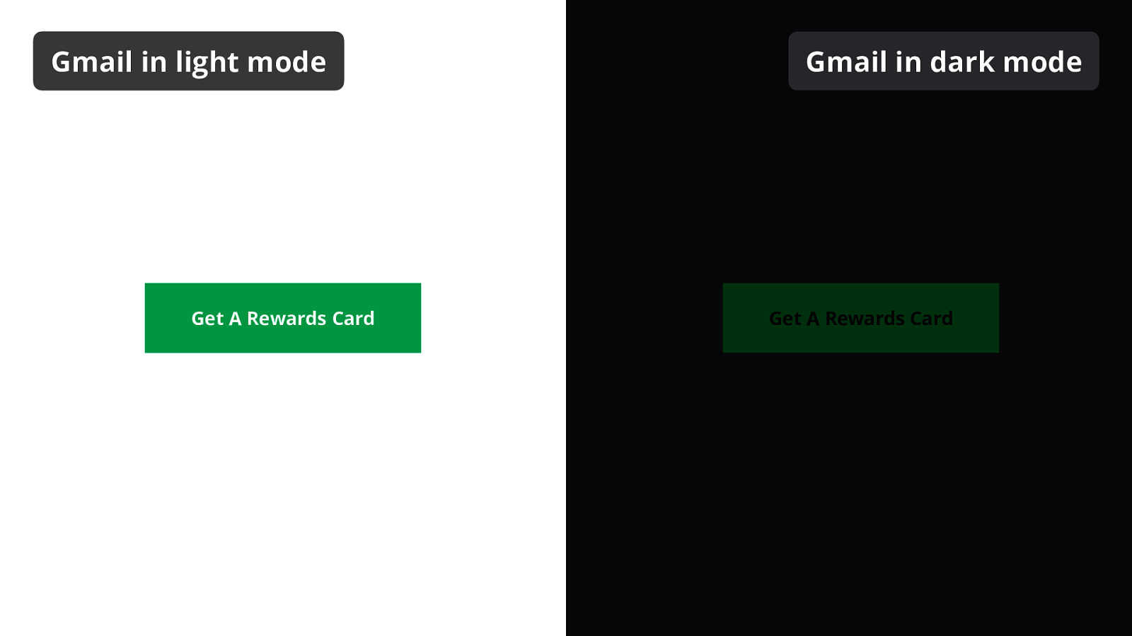
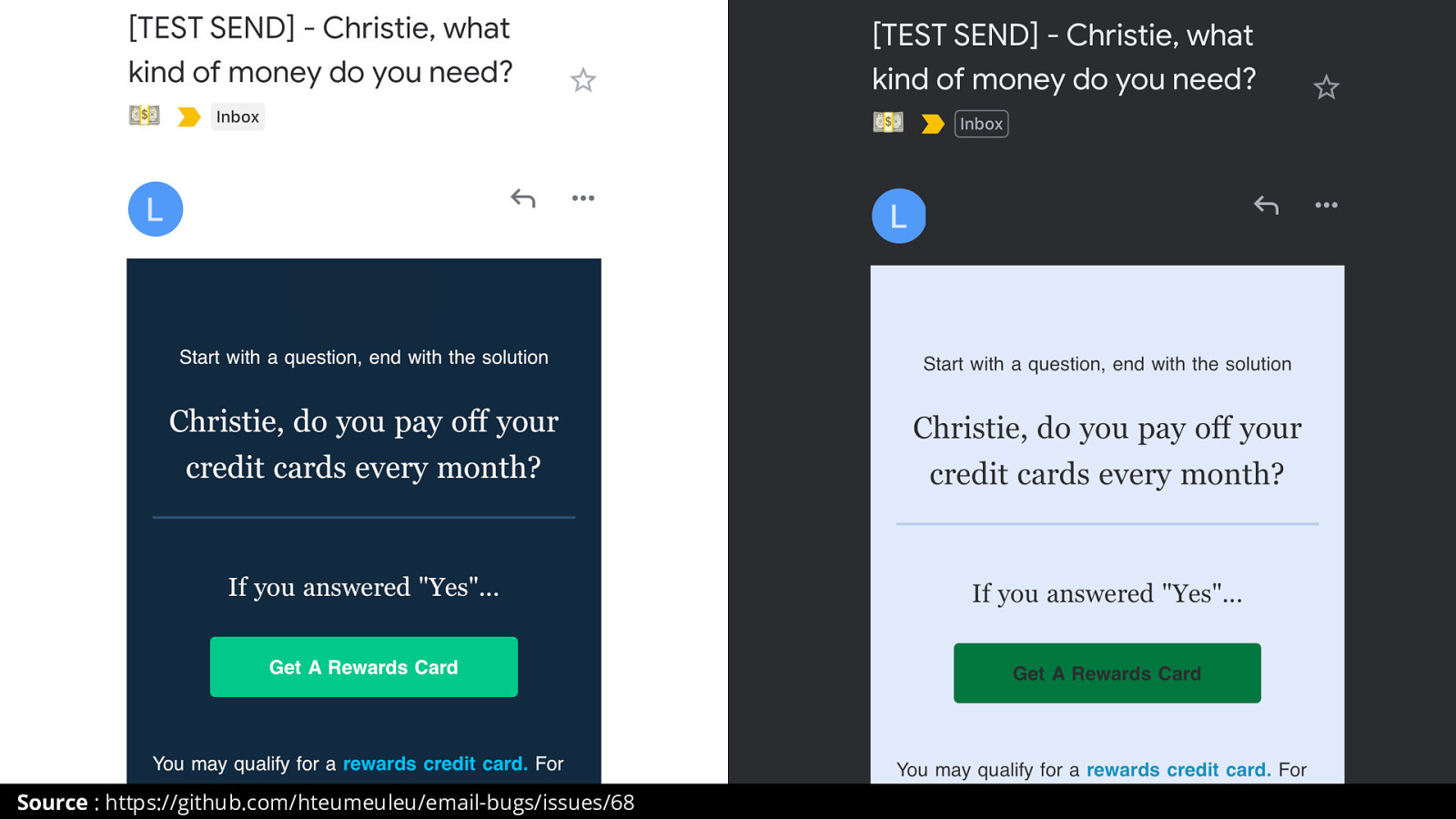
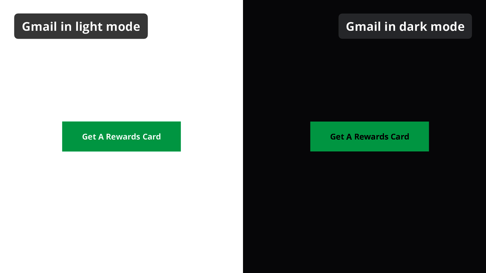
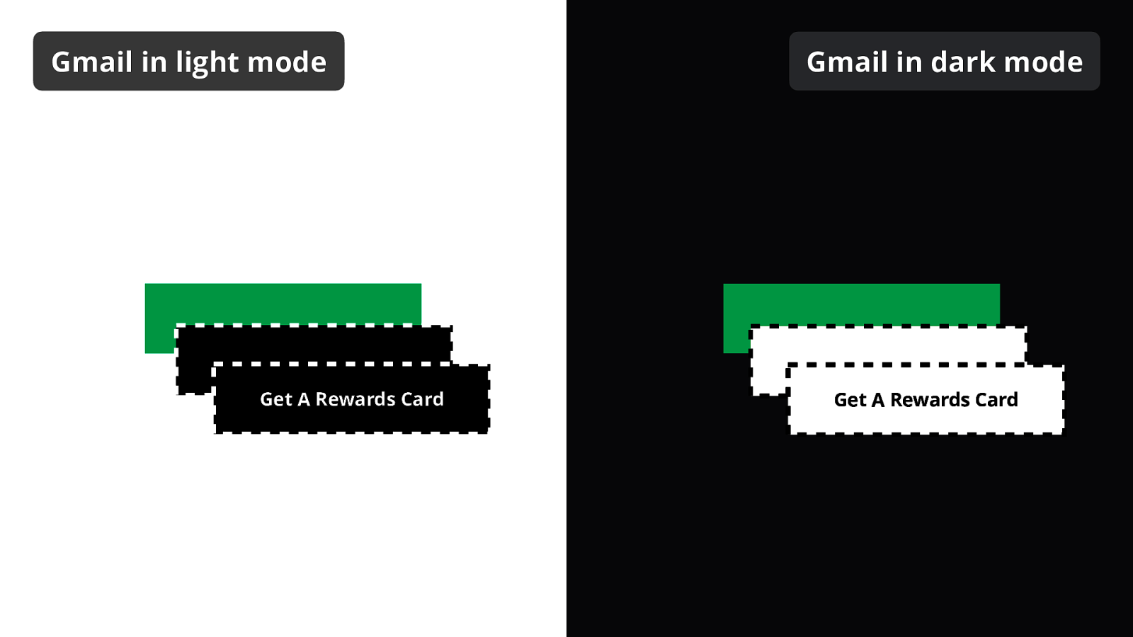
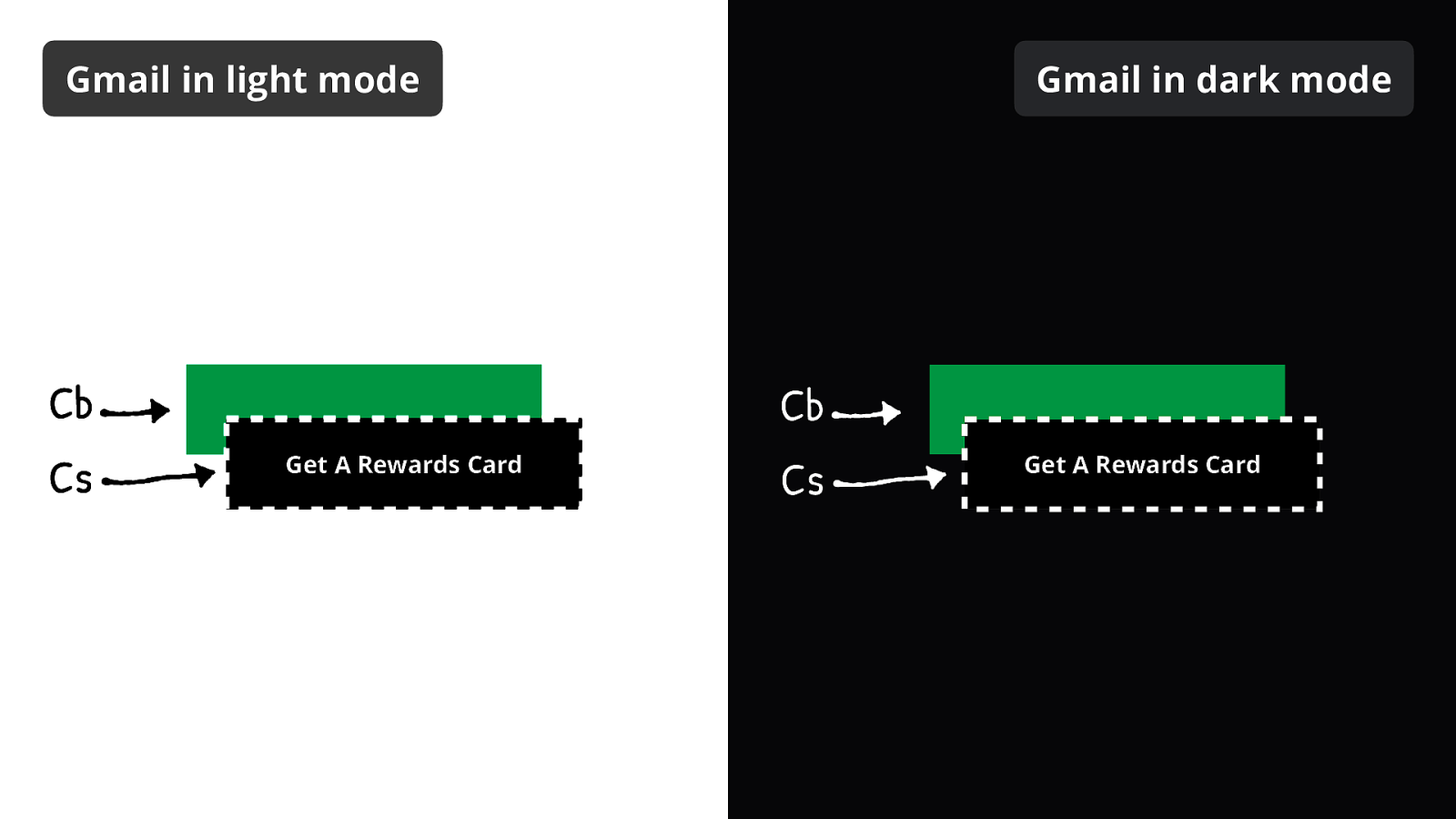
So let’s take this green button with white text. In Gmail in dark mode, the background color turns into a dark green, and the text turns into black.
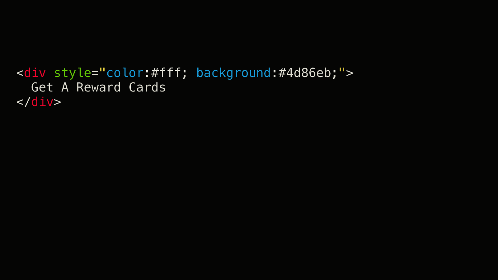
Our base code looks like this:
<div style="color:#fff; background:#4d86eb;">
Get A Reward Cards
</div>
(Don’t use <div>s for buttons. This was a bad example for the sake of having less on screen.)
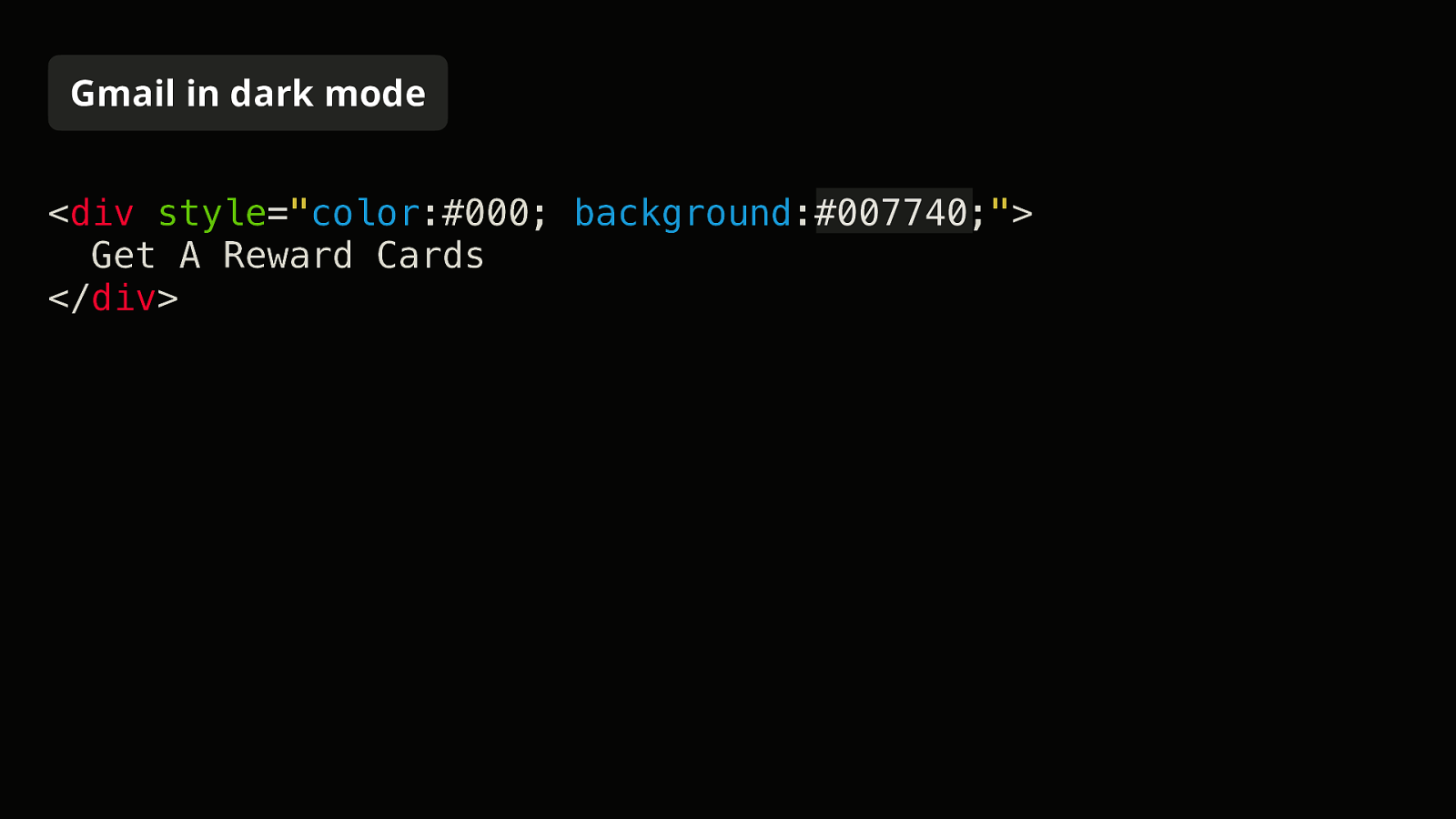
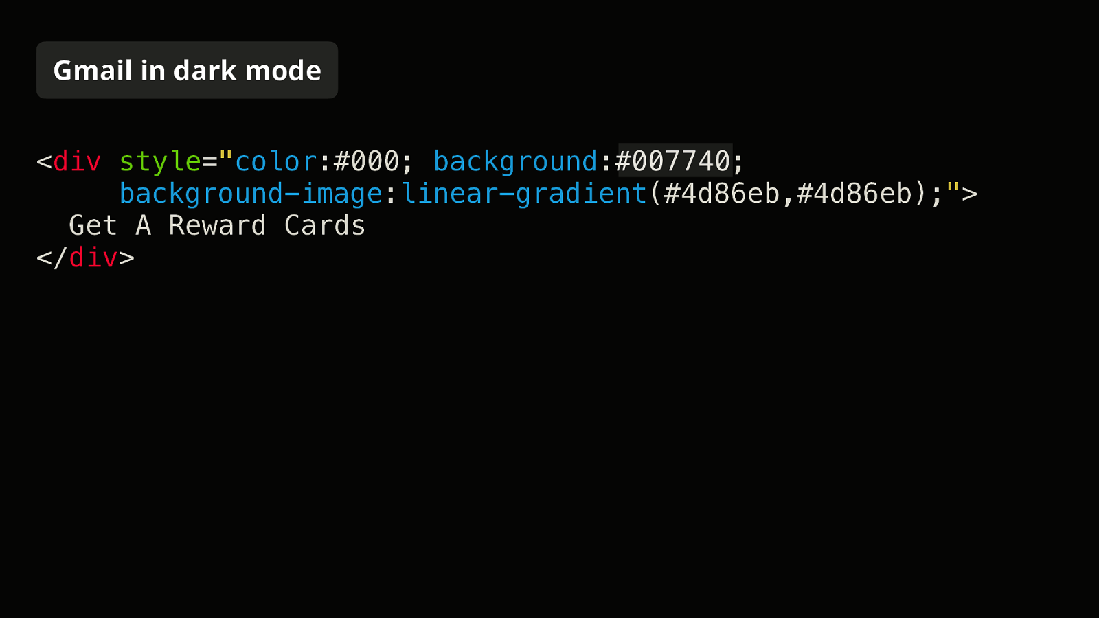
Gmail in dark mode turns it into the following:
<div style="color:#000; background:#007740;">
Get A Reward Cards
</div>
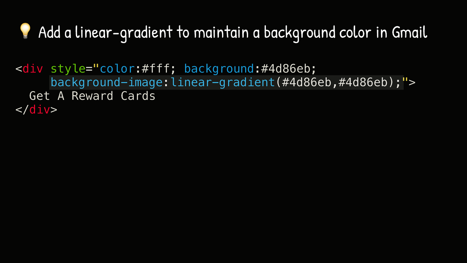
The first thing we’ll do is maintain the background color by using a linear-gradient. They’re well supported in Gmail and are not changed in dark mode.
In Gmail in dark mode, only the background-color is changed, not the background-image.

So this is what we have now.
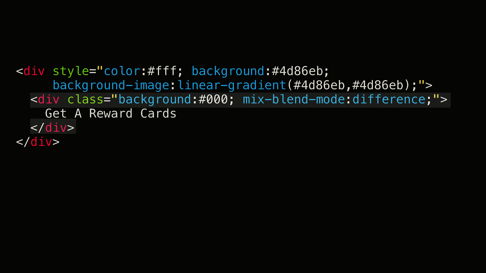
Now let’s add blend modes into the mix. We’re going to need two blend modes. The first one will be a difference blend mode.

The second one will be a screen blend mode. I introduce them in this order because this is the order they’ll be applied (inside out based on the HTML).
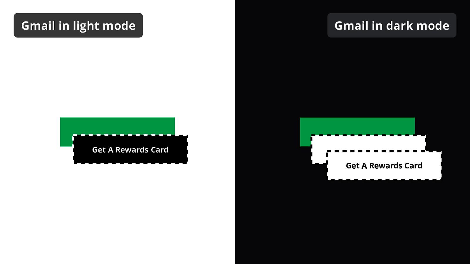
If we look back at what it looks like…
… we can kind of represent it like this. We now have three nested layers with different background colors and blend modes. So let’s see what happens when we apply the first blend mode.
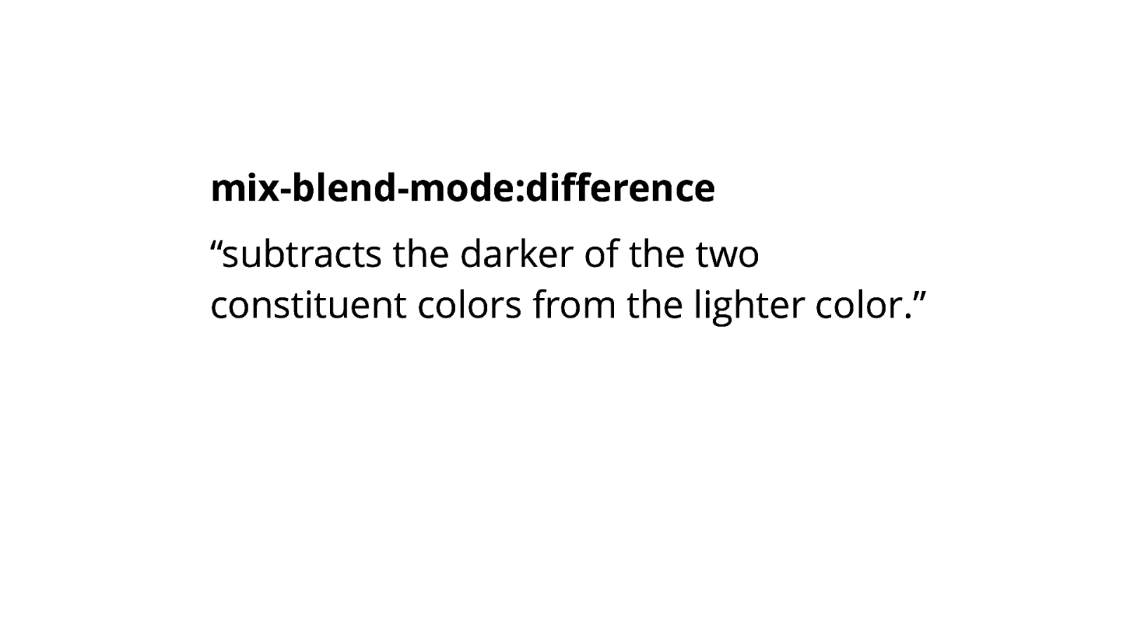
According to the spec, mix-blend-mode:difference “subtracts the darker of the two constituent colors from the lighter color.”
Yay, that didn’t make much sense for me either.
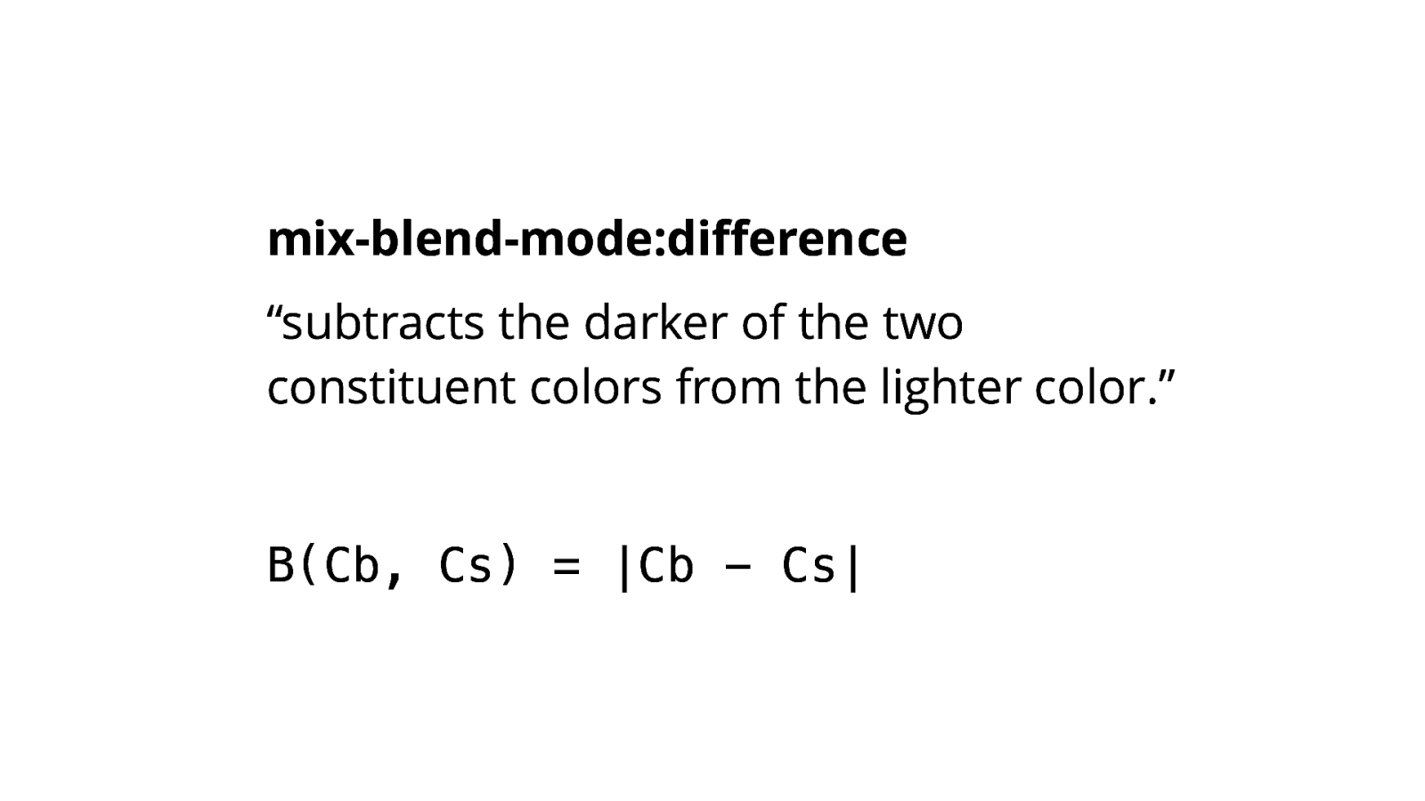
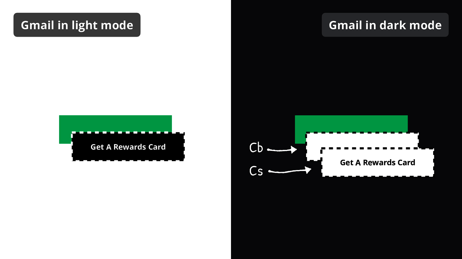
But this formula made things clearer. The result is the absolute value of the difference between our source color (Cs) and our backdrop color (Cb).
B(Cb, Cs) = |Cb - Cs|
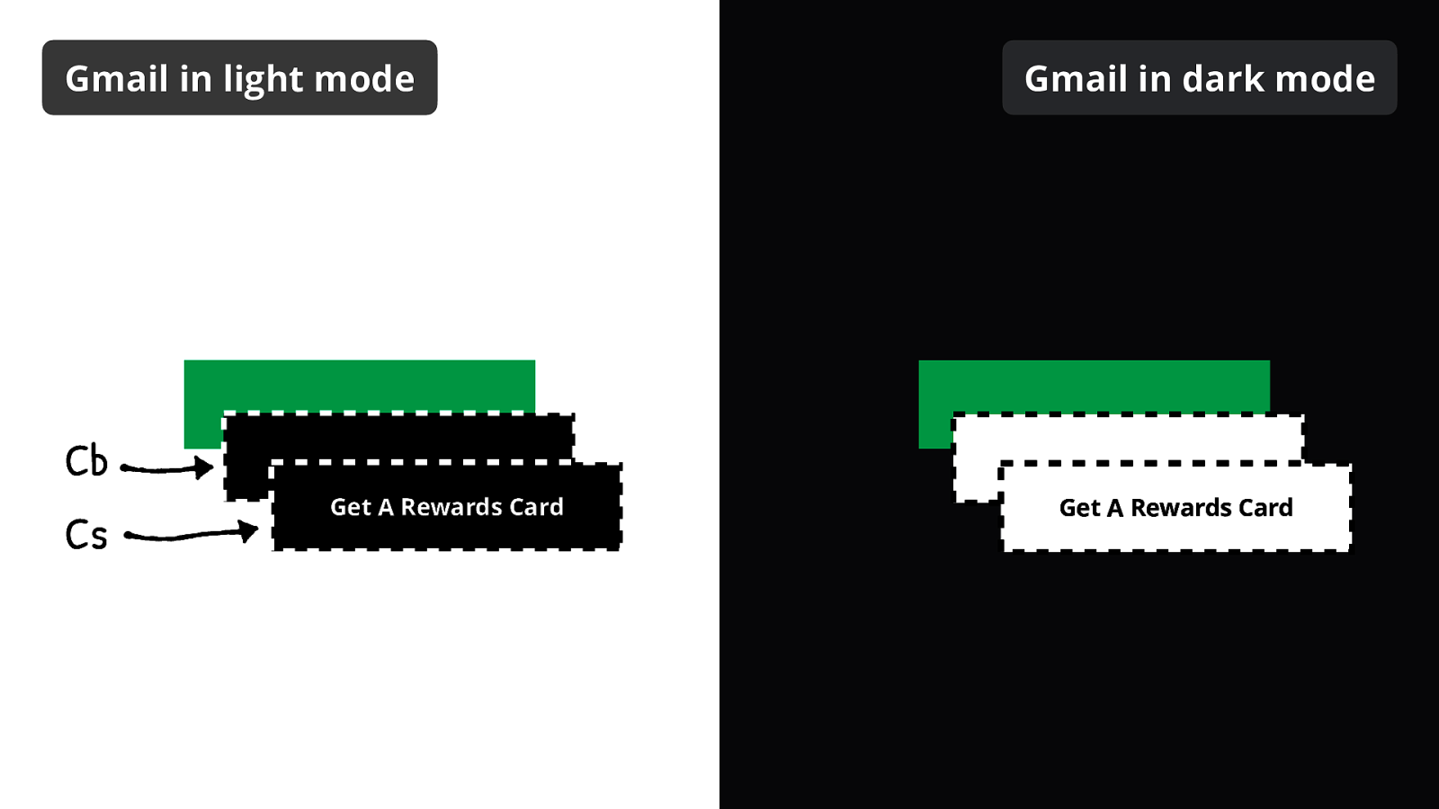
So let’s see how this looks like in light mode.
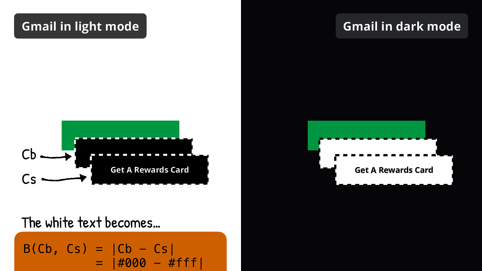
The white text from the source color (Cs) is blended with the black from the backdrop color (Cb).
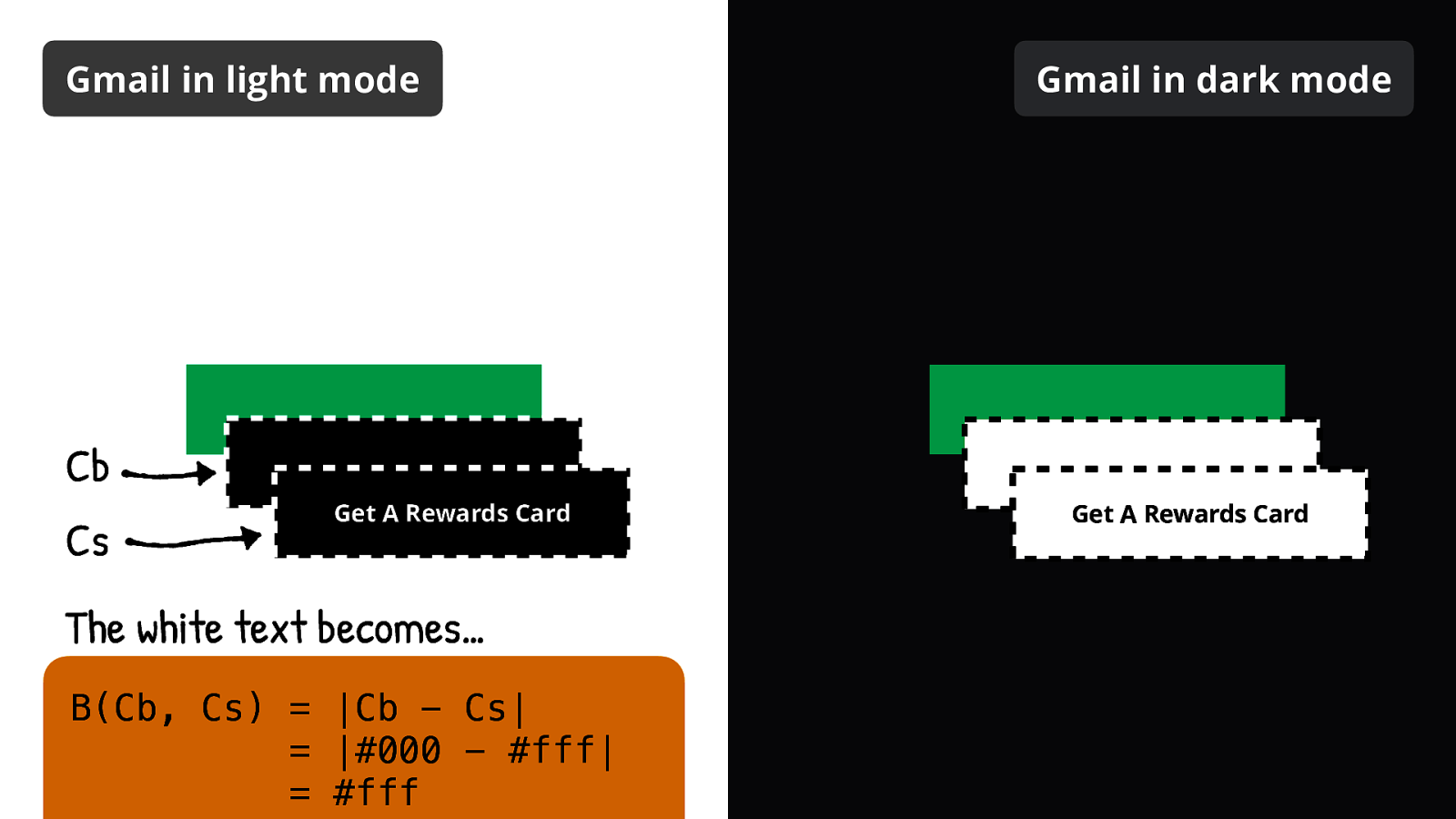
The white text becomes…
B(Cb, Cs) = |Cb - Cs| = |#000 - #fff| = #fff
White!

Now let’s do the same for the black background color from the source merged with the black background from the backdrop.

The black background becomes…
B(Cb, Cs) = |Cb - Cs| = |#000 - #000| = #000
Black!
Now let’s do the same but in dark mode.
The black text (changed by Gmail) from the source color (Cs) is blended with the white (changed by Gmail) from the backdrop color (Cb).
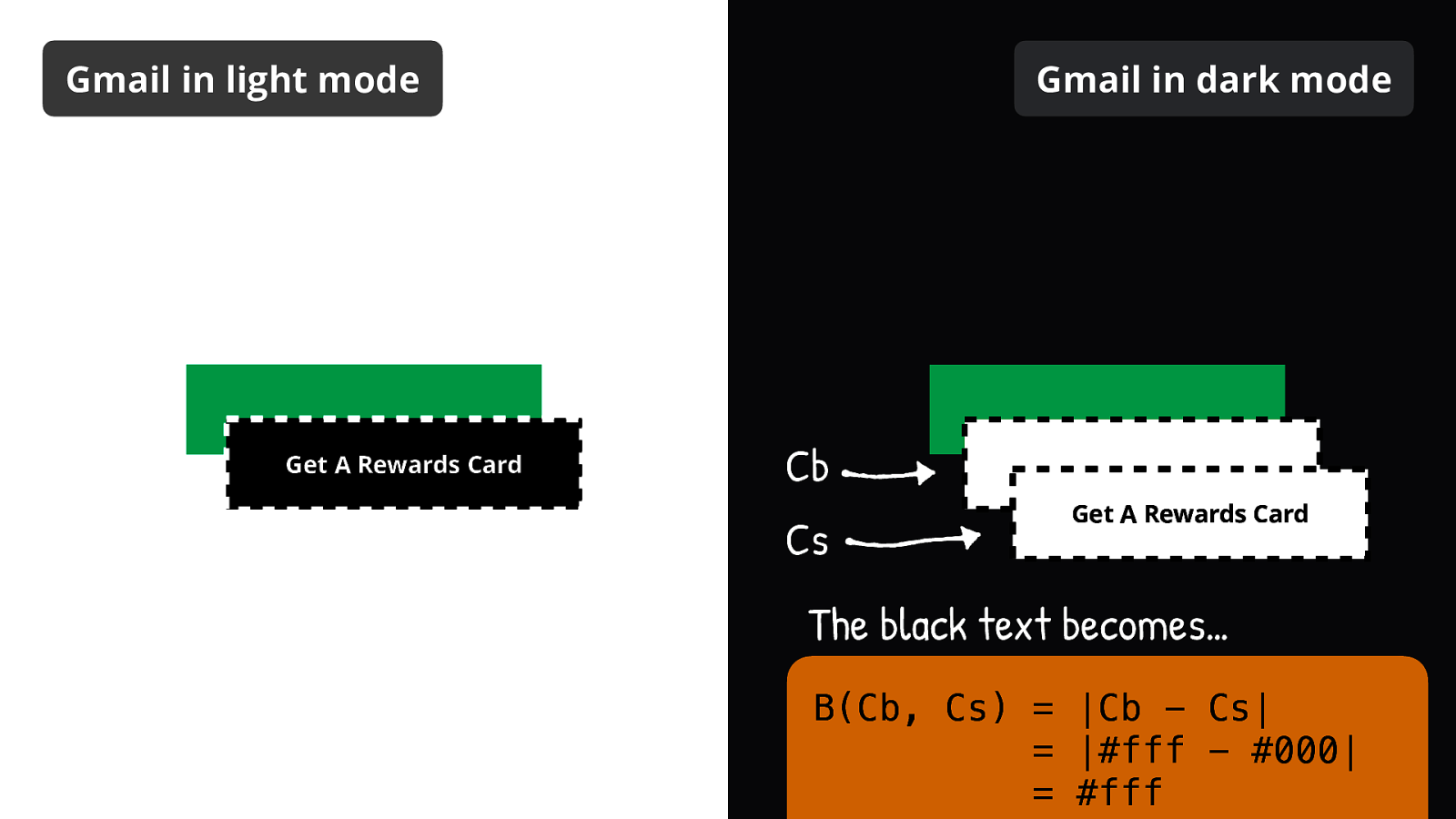
The black text becomes…
B(Cb, Cs) = |Cb - Cs| = |#fff - #000|
White!
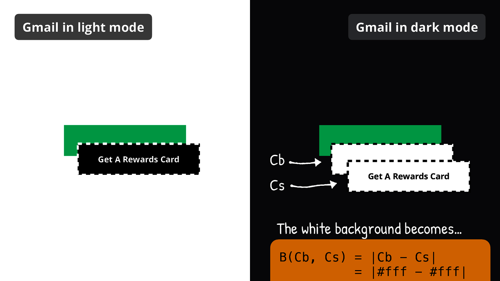
Now let’s do the same for the white background color from the source merged with the white background from the backdrop.
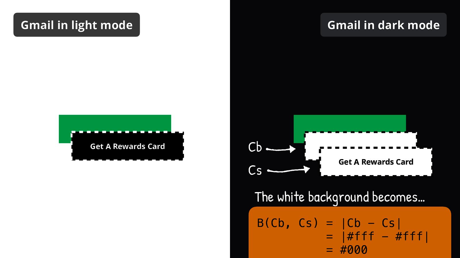
The white background becomes…
B(Cb, Cs) = |Cb - Cs| = |#fff - #fff| = #000
Black!
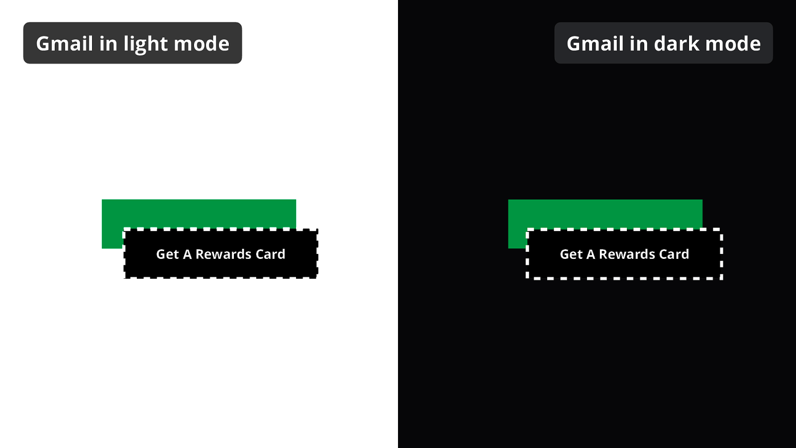
We now end up with the same thing in both light and dark mode. So let’s apply our second blend mode!
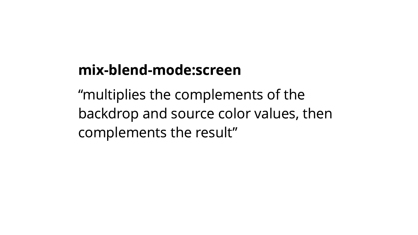
According to the spec, mix-blend-mode:screen “multiplies the complements of the backdrop and source color values, then complements the result”.
Yeah, that made no sense to me either.
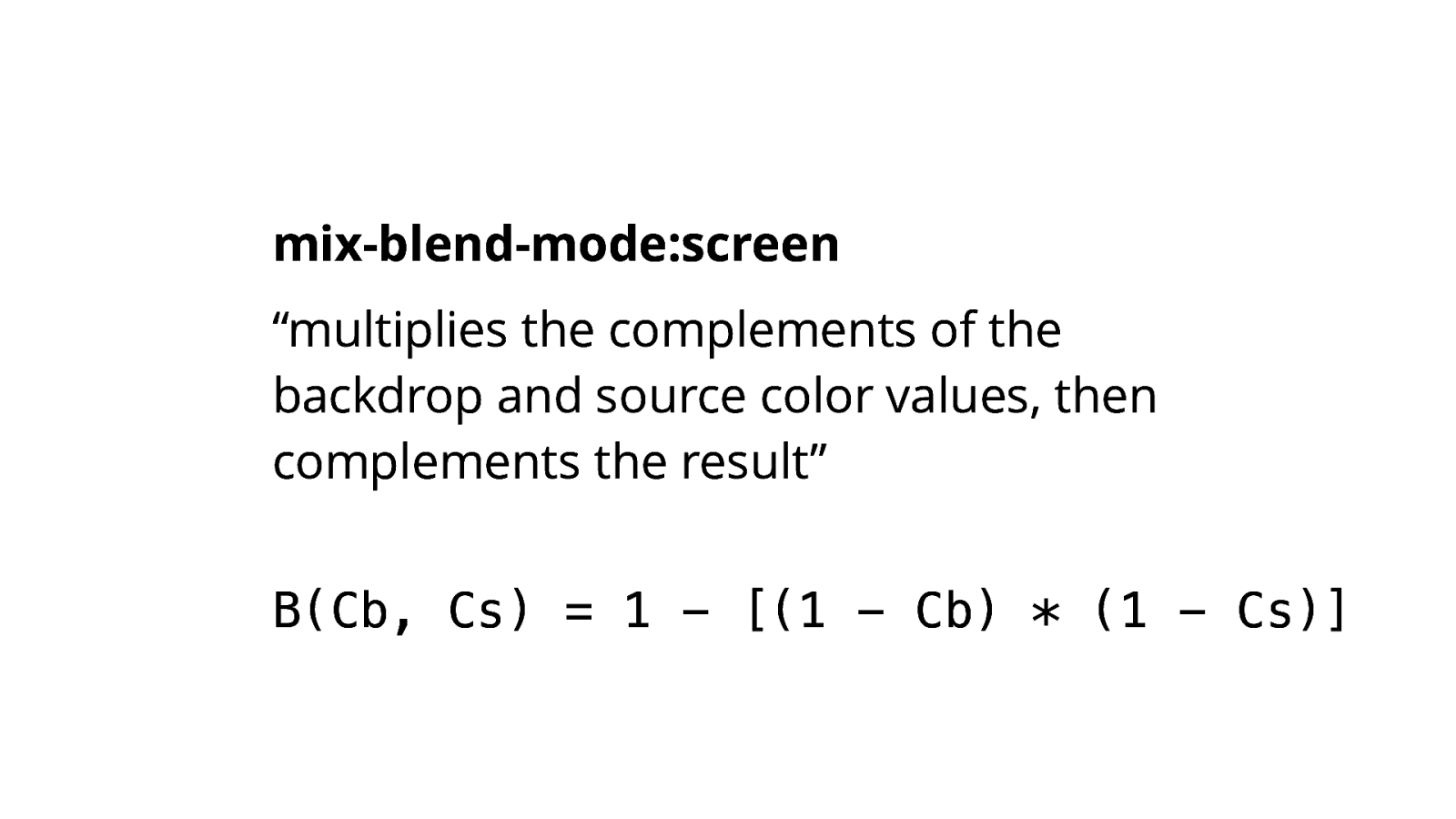
But again, the mathematical formula made it a bit clearer.
B(Cb, Cs) = 1 - [(1 - Cb) * (1 - Cs)]
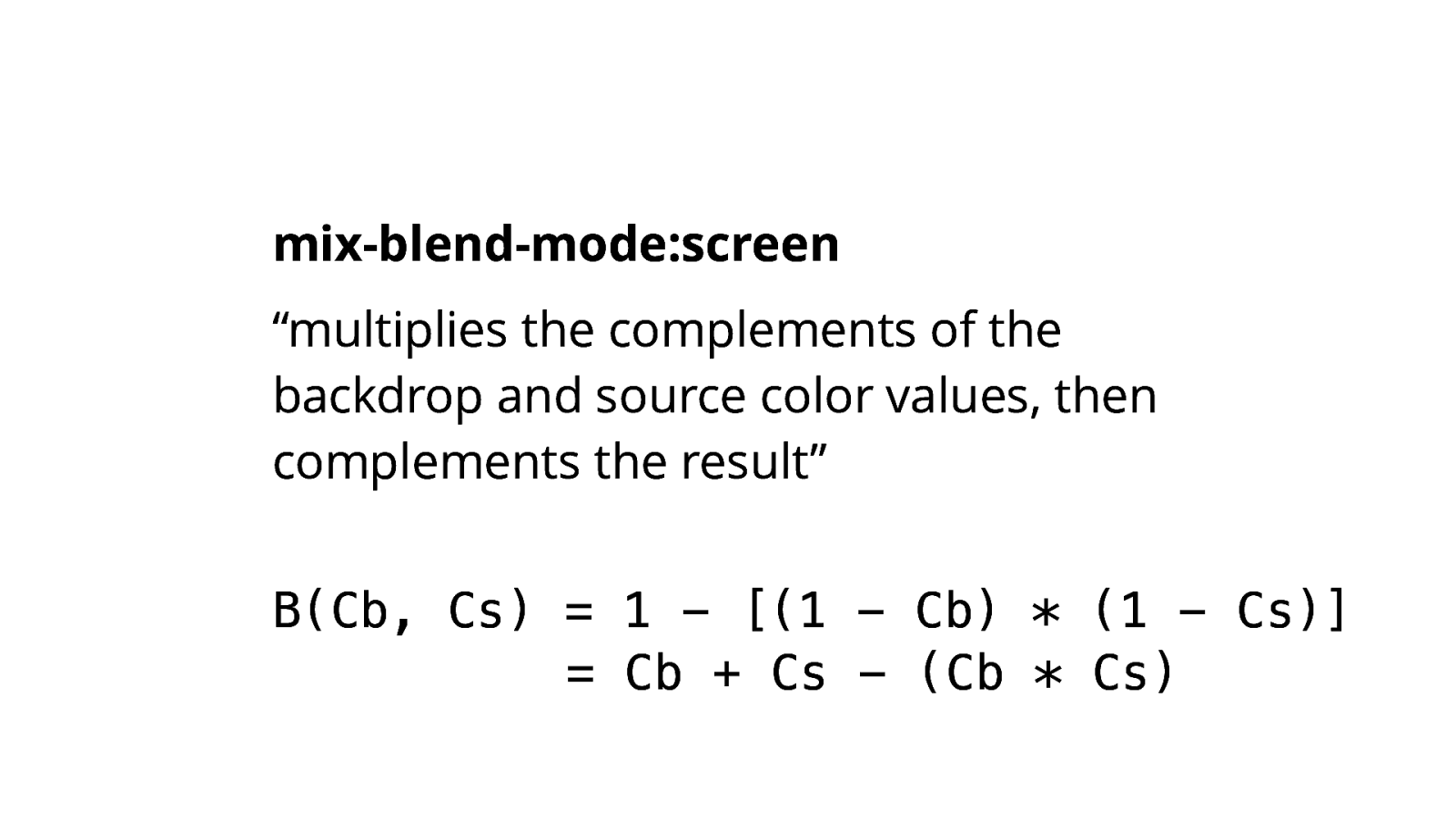
Which we can develop into the following:
B(Cb, Cs) = 1 - [(1 - Cb) * (1 - Cs)]
          = Cb + Cs - (Cb * Cs)
So let’s visualize what it looks like.
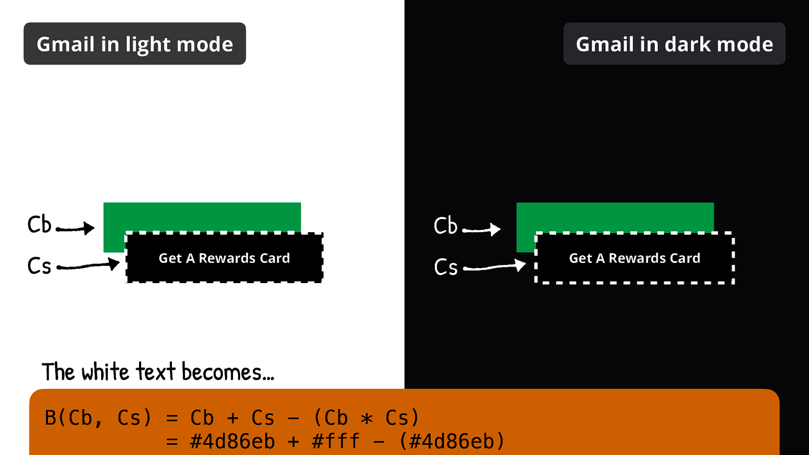
The white text becomes…
B(Cb, Cs) = Cb + Cs - (Cb * Cs) = #4d86eb + #fff - (#4d86eb)
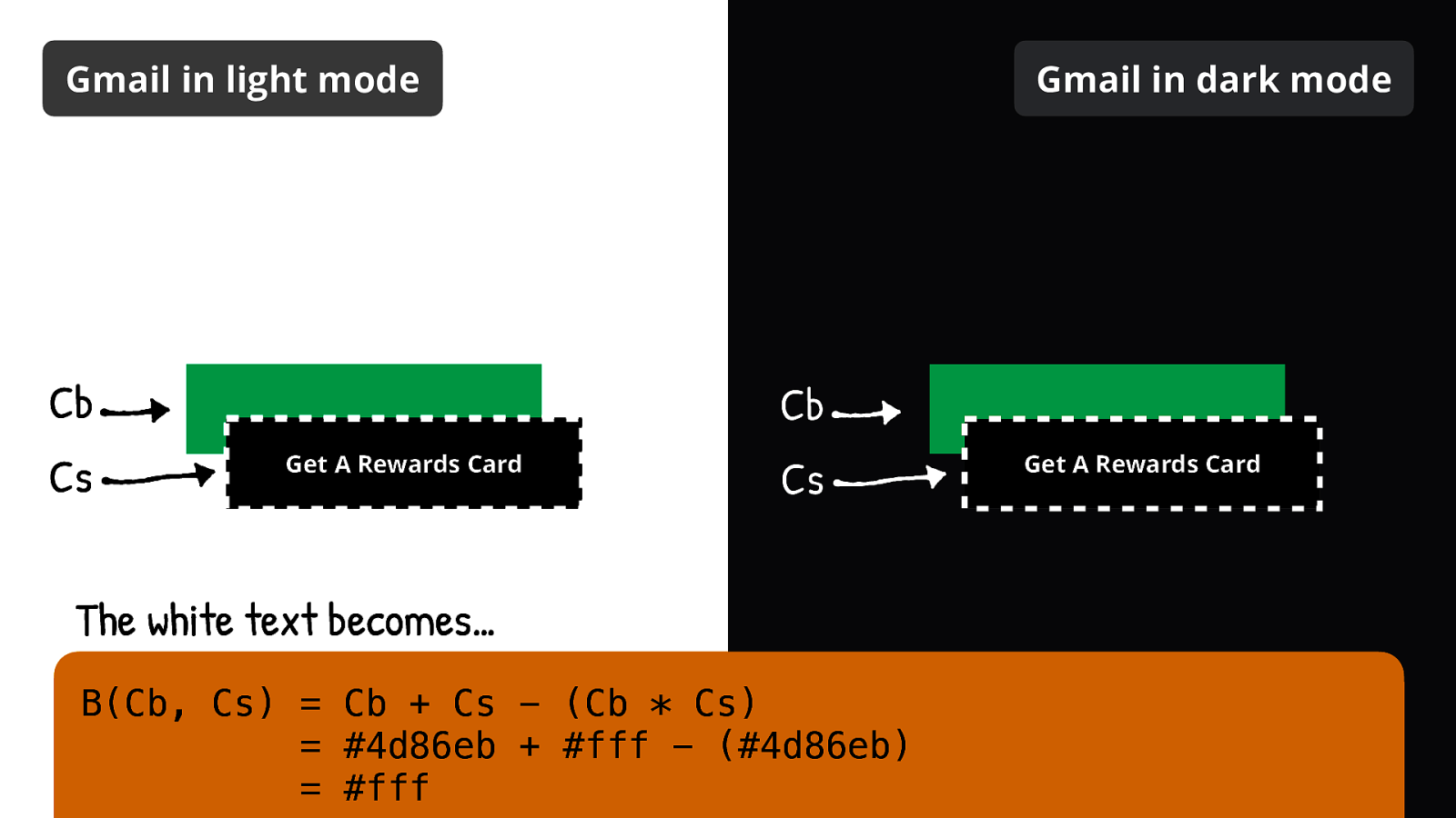
… white!

The black background becomes…
B(Cb, Cs) = Cb + Cs - (Cb * Cs) = #4d86eb + #000 - (#000)
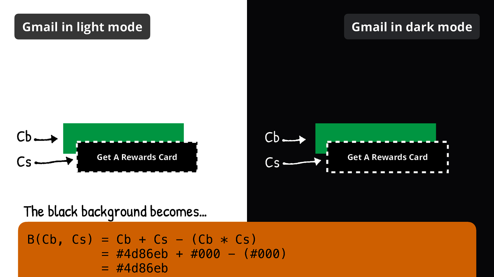
Green!
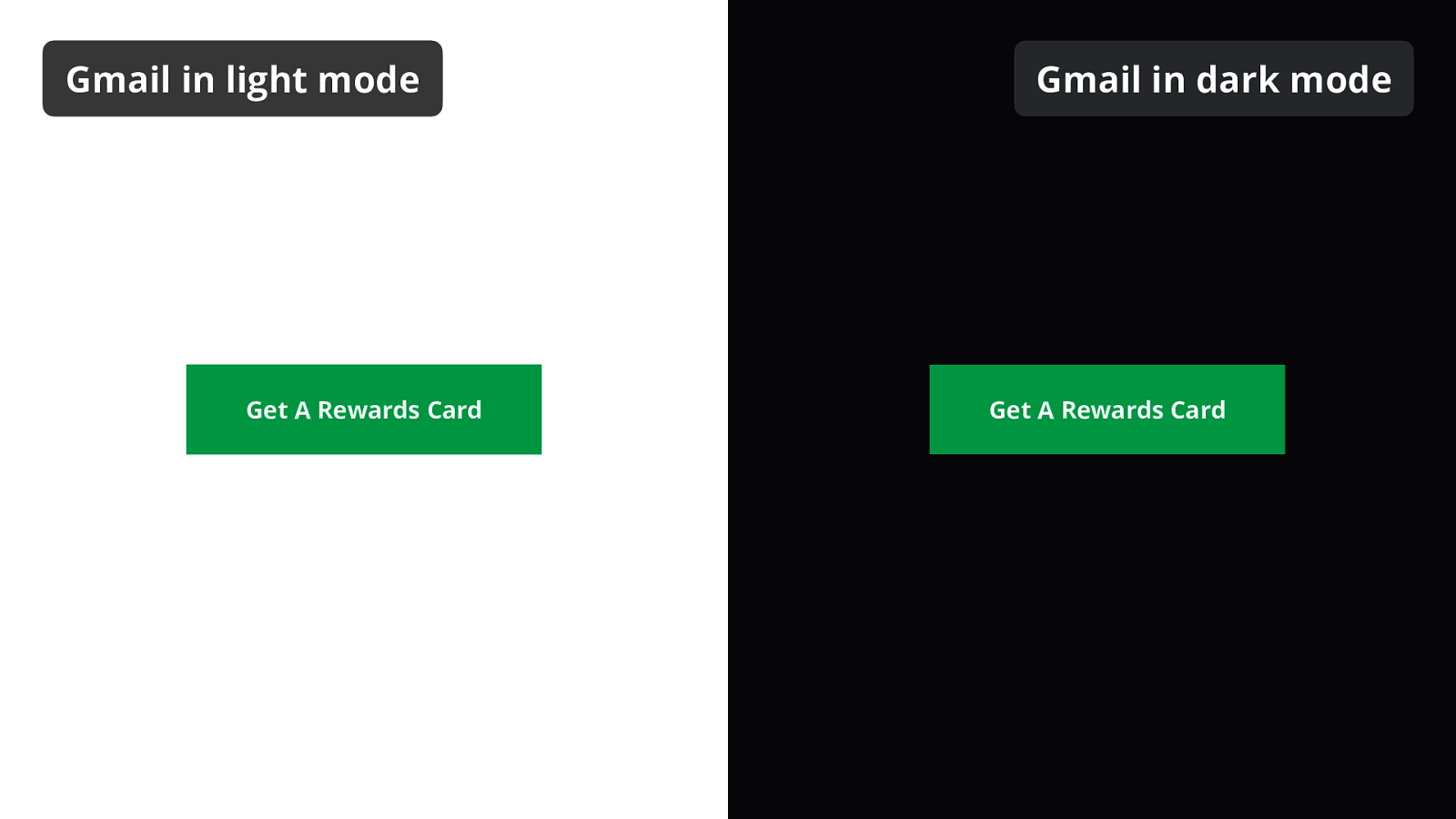
And that’s how we end up with the same button colors in both light and dark mode.
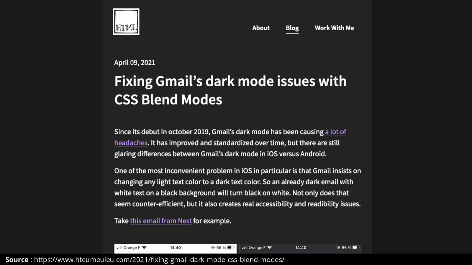
I wrote a fully detailed article if you want to learn more about this.
Source : https://www.hteumeuleu.com/2021/fixing-gmail-dark-mode-css-blend-modes/
One final trick I wanted to share with you is for Outlook on Windows. I won’t go into much details about it, but I want you to know about it.
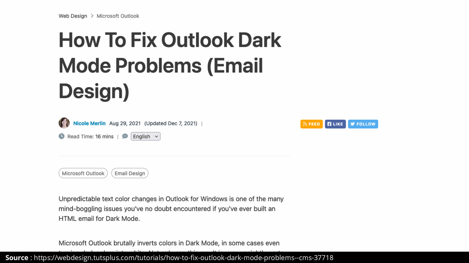
This was created by email wizard Nicole Merlin. It uses Word’s gradient to force specific colors to be maintained in both light and dark mode.
Source : https://webdesign.tutsplus.com/tutorials/how-to-fix-outlook-dark-mode-problems—cms-37718
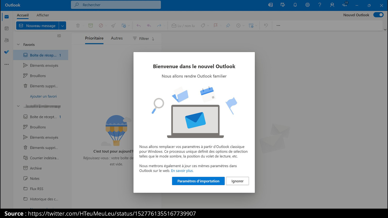
That’s all I had! To end up with a good news, Microsoft released a new version of Outlook on Windows. And for the first time in 15 years, it no longer uses Word’s rendering engine. It uses EdgeView, based on Chromium, just like in Edge.
Source : https://twitter.com/HTeuMeuLeu/status/1527761355167739907

THANK YOU
@HTeuMeuLeu remi@hteumeuleu.fr https://www.hteumeuleu.com