
A presentation at React Conf in October 2019 in Henderson, NV, USA by Jenn Creighton

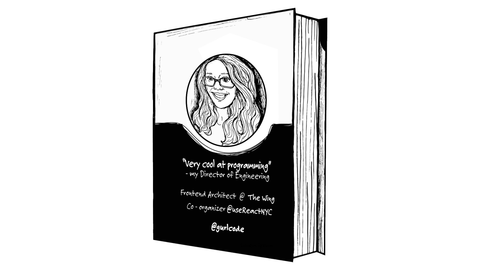
I’m Jenn. I’ve been described as “very cool at programming”. And I am currently a Frontend Architect at The Wing. I also co-organize useReactNYC - a meetup for React enthusiasts in, well, NYC. And if you want to reach me on Twitter, my handle is @gurlcode. I’m amazed to be here on this stage today because I started my career on a very different path.
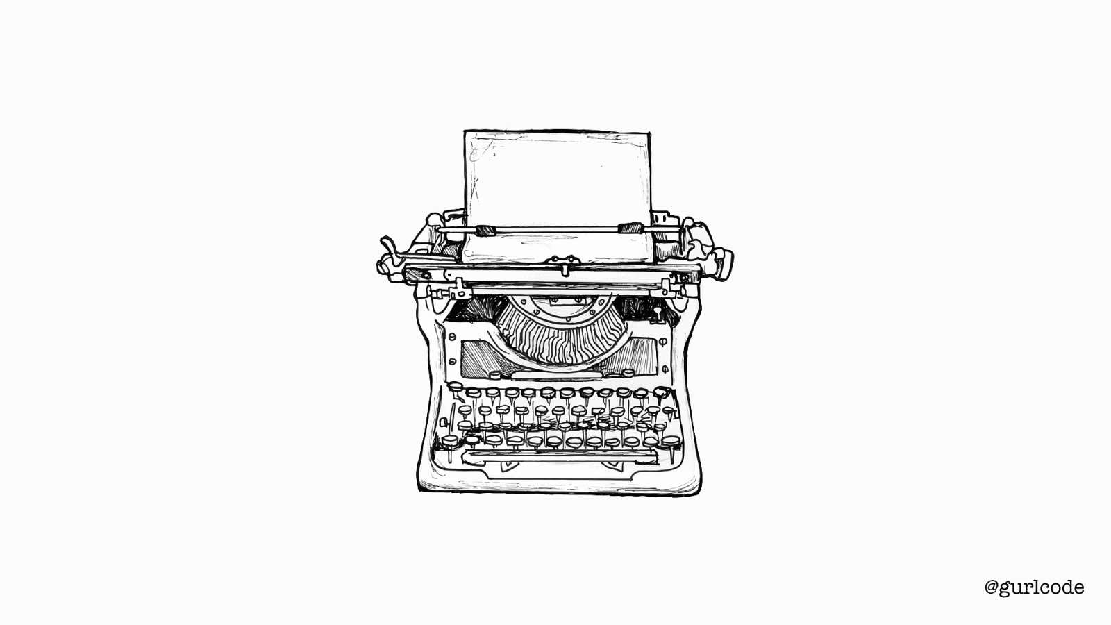
@gurlcode You see, I’ve been writing for as long as I can remember. I even owned a typewriter. At 8 years old. I begged for it for Christmas. And I would sit in my room, crafting characters, designing plot lines and thinking about the day I’d be a published writer. In college, I majored in English & Creative Writing. And later, I worked days as a paralegal, while earning an MFA in Creative Writing part-time. Well, actually, I earned a third of it. I dropped out of the program because while people telling you you’ll be a starving artist, it doesn’t quite sink in until you see your first student loan bill.

@gurlcode And I don’t regret this. Because growing up, I had a second interest and that was code. So, I left creative writing to pursue engineering. It’s a longer story than that. These are the Cliff Notes. But what’s important is the transition. Because people, whether fellow engineers or not, are often surprised by my background. To them, these two disciplines — writing and coding — don’t match. And for a long time, I thought so too.
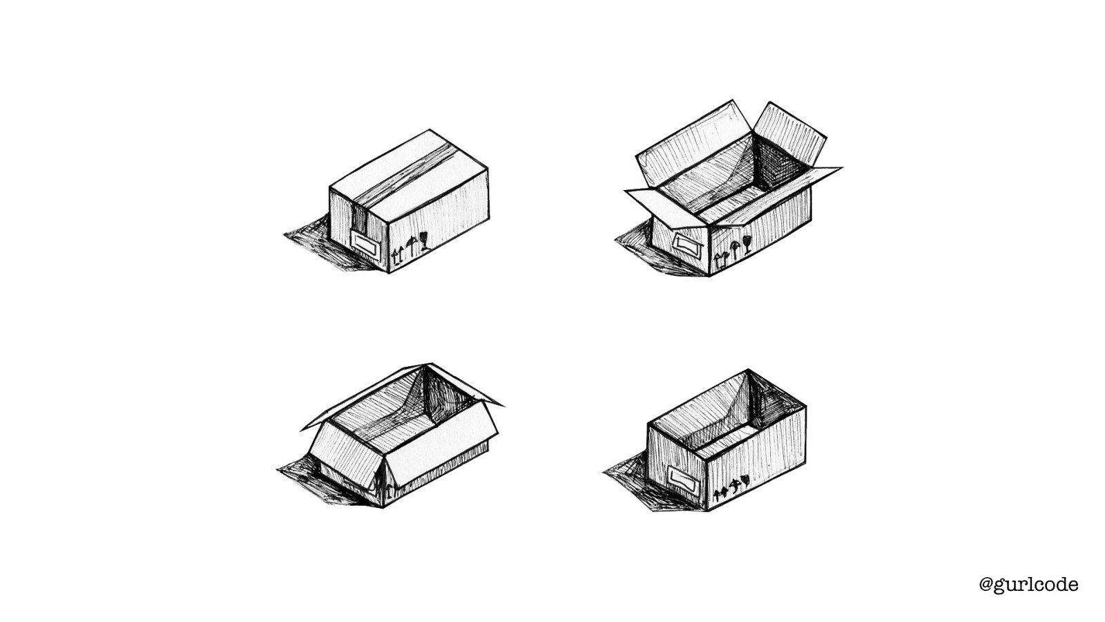
@gurlcode So when I decided to pursue engineering, I put everything I learned about writing into a box and I closed the lid. Years went by and I left the box alone. Three years of working with vanilla JS + jQuery + Angular 1.x went by. Box stayed closed. Then, about five years ago, I started writing React and there was this immediate affinity. Writing React felt like coming home — it felt familiar in a way I couldn’t pinpoint. But I also felt tension. How I wrote components felt…off. Here I am, following the conventional wisdom on what makes a good component, and it felt wrong. I couldn’t figure it out.

@gurlcode And then the lightbulb went off: writing React reminded me of writing fiction. That’s why I’m comfortable with it. And I’m violating creative writing tenants — that’s why this feels so wrong. So, I started writing components with those tenants in mind, and what I found was leaning into what I knew about writing well helped me write better components.

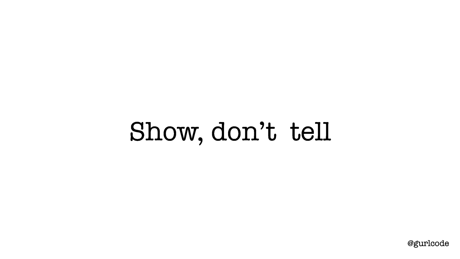
Show, don’t tell @gurlcode Like “show, don’t tell.” “Show, don’t tell” is one of the fundamental tenants of creative writing. In fact, it’s known as the Golden Rule. Its purpose is to encourage description over exposition. “Show” being the description and “tell” being the exposition.
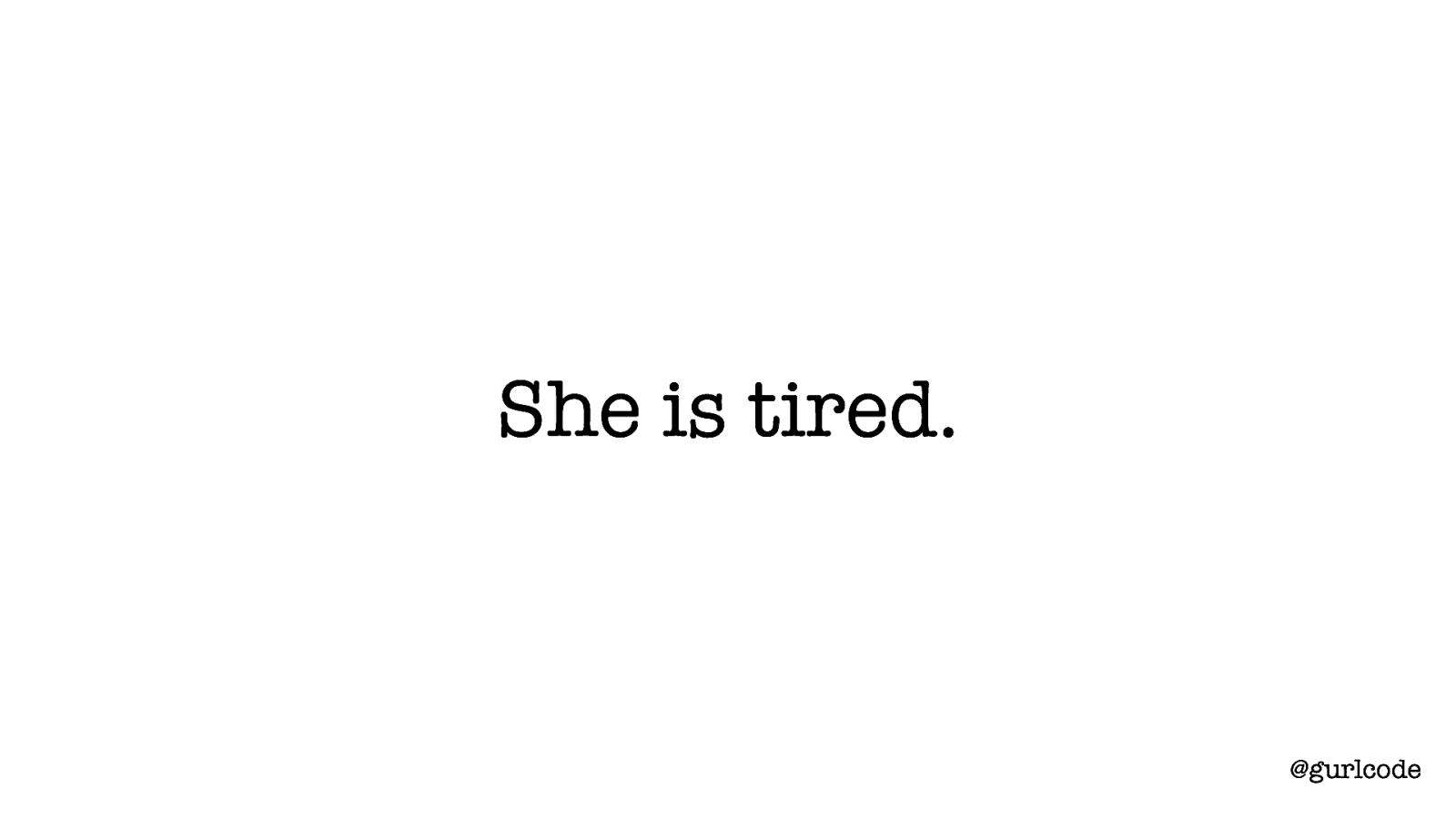
She is tired. @gurlcode So if we look at a sentence like “she is tired”, we can identify this as exposition, or telling. This sentence is instructional. View the character as tired - that’s the instruction. And that’s the basis of telling. It’s providing instructions on how to view something. It’s direct.
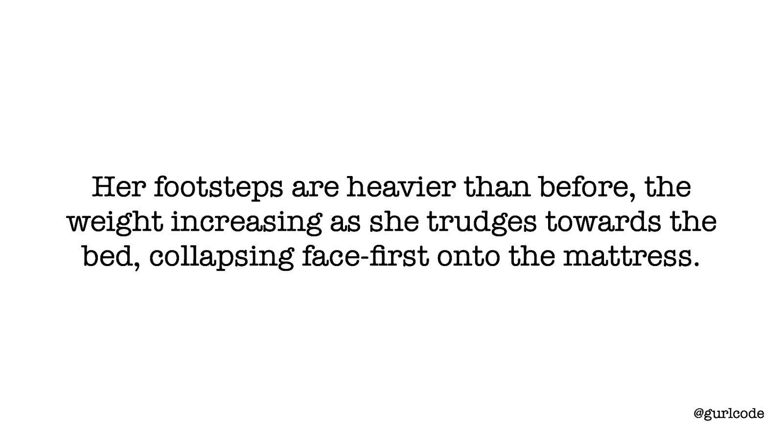
Her footsteps are heavier than before, the weight increasing as she trudges towards the bed, collapsing face-first onto the mattress. @gurlcode Showing is indirect. [READ SENTENCE] This is a dramatic shift from exposition to description. You still know the character is tired but that information is inferred from context. And notice that you can feel it more. Words like “trudges”, descriptions of heaviness, collapsing — you can feel the character’s tiredness. And that’s why writers rely on this rule. It pulls the reader in. It lets them feel what’s happening. And what I love about “show, don’t tell”
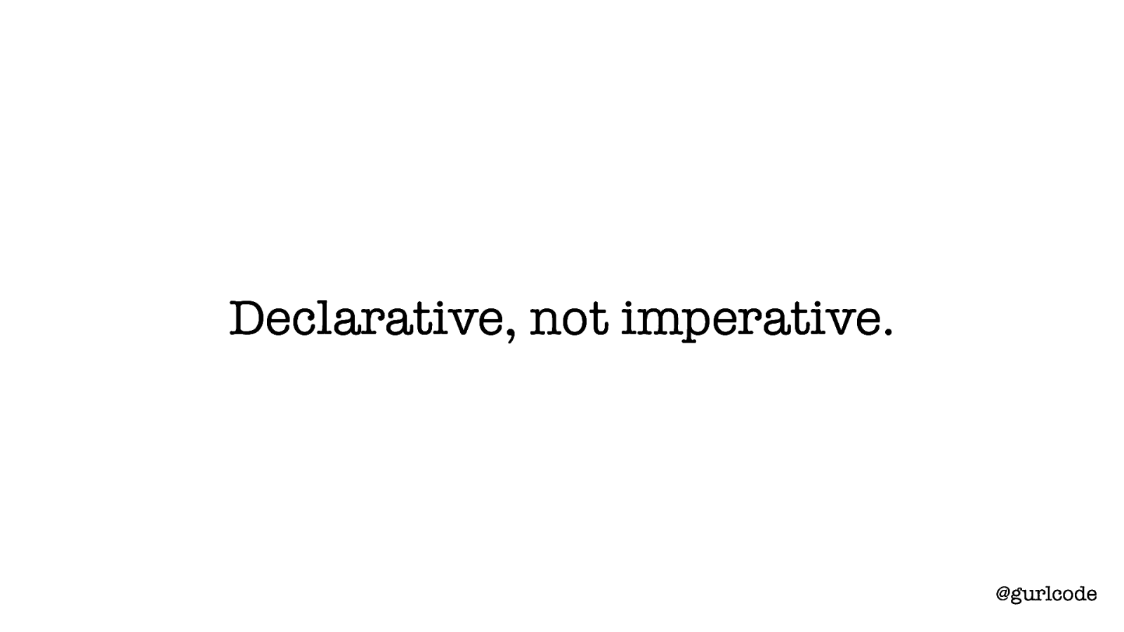
Declarative, not imperative. @gurlcode Is how it maps to React’s declarative, not imperative approach. Telling is instructional. Imperative code instructs. Showing is descriptive. Declarative code describes. When I talk about the comfort I feel with React, it’s declarative-ness is a large part of that. And when I talk about the tension I’ve felt, coming from a writing background, it’s because I knew at some level that how I wrote components violated “show, don’t tell.”
@gurlcode And this was true of other tenants of creative writing as well. Because again, I thought writing code and writing fiction had nothing in common. So, I want to take you through what happens when you take these tenants into consideration when building a component and I also want to illustrate how thin that divide is between code and creative writing.

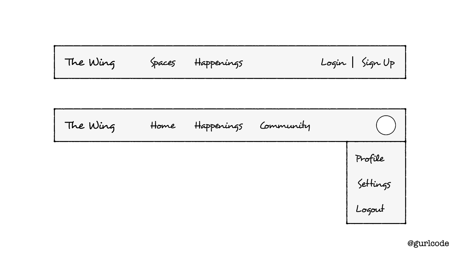
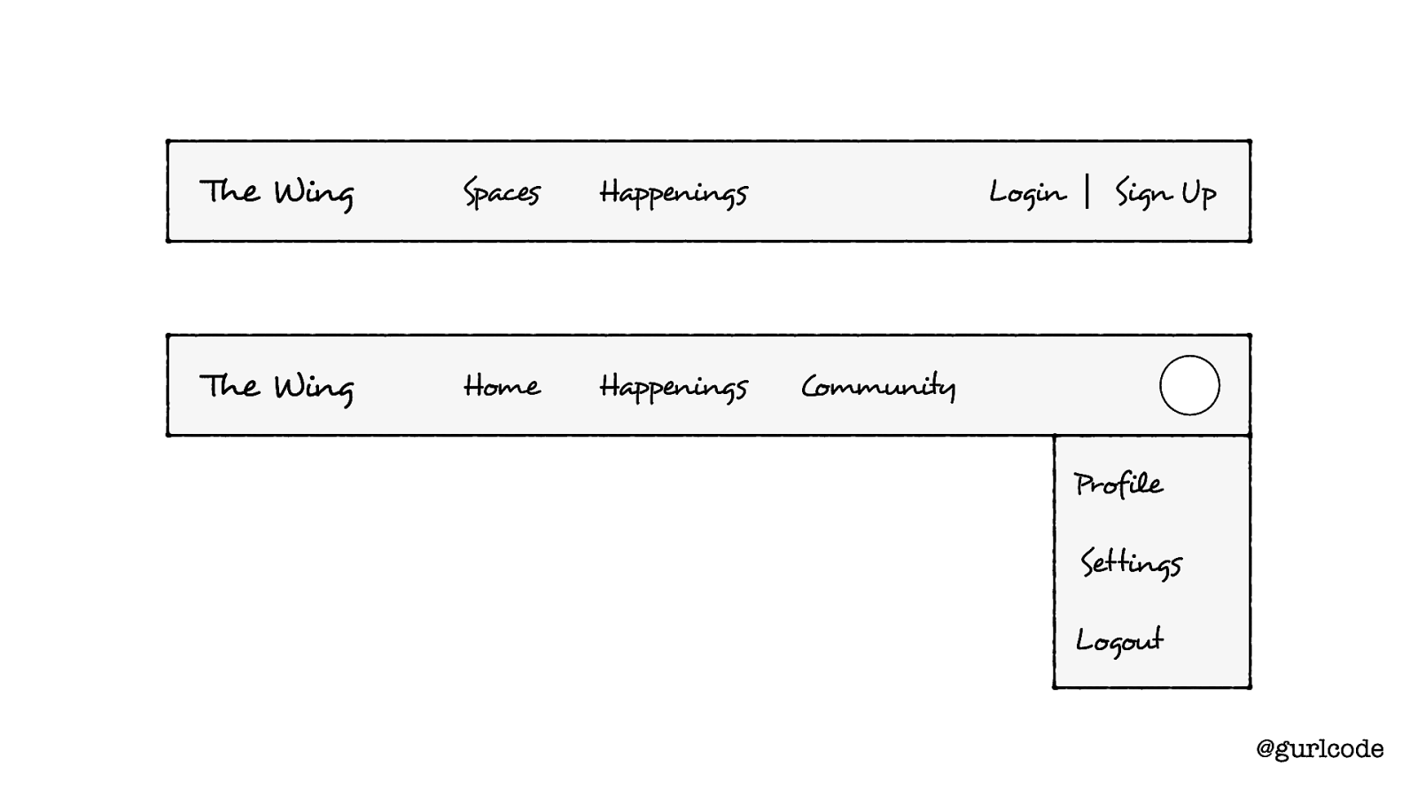
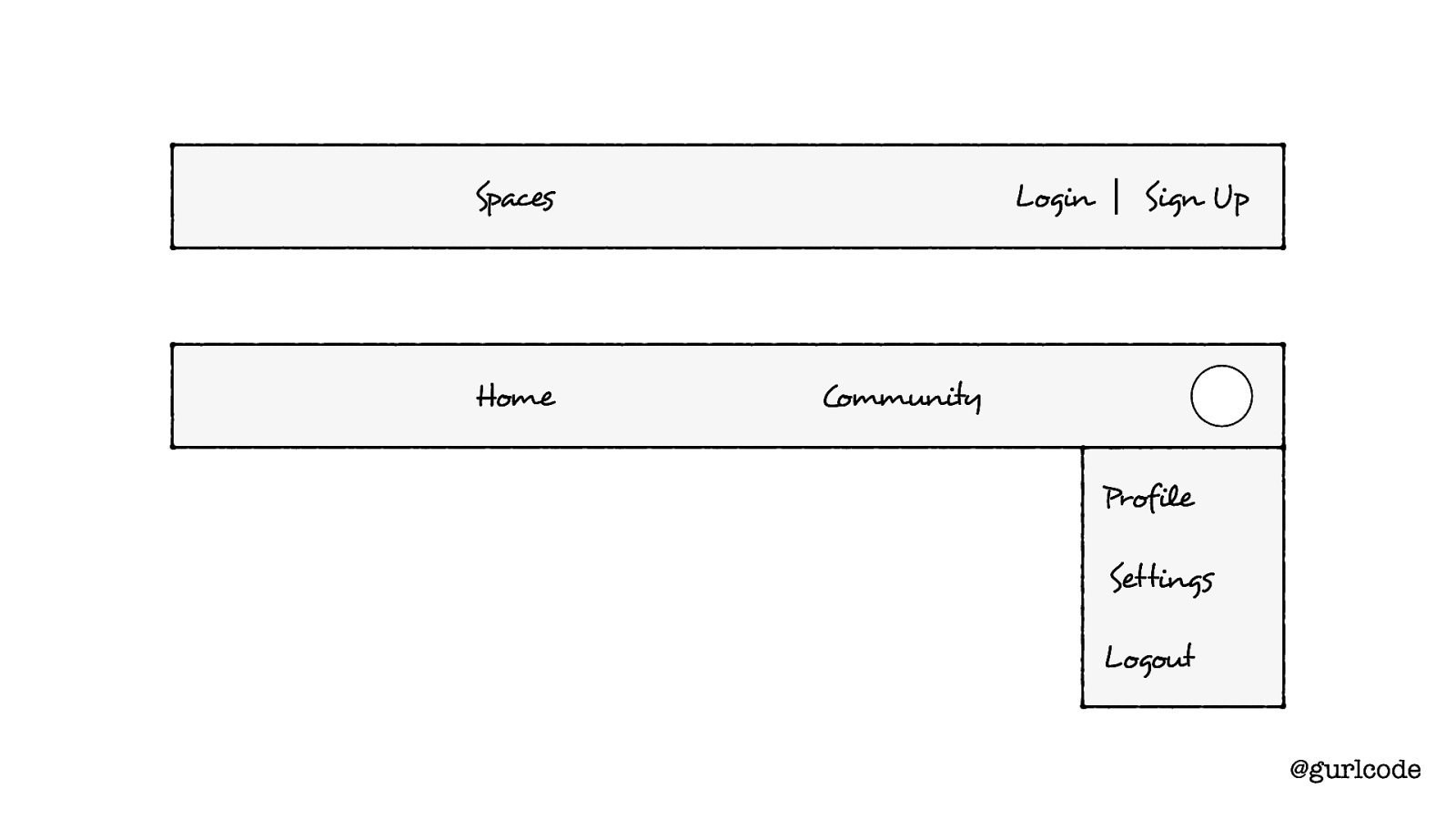
The Wing Spaces Happenings The Wing Home Happenings Login Sign Up Community Profile Settings Logout @gurlcode Here’s what we’re going to write. It’s a navigation header or navbar and depending on whether the user is logged in or not, they’ll see a different UI. So, for logged out users, there’s the two links (Spaces + Happenings) and the Login / Sign Up links. If the user is logged in, there are now three links (Home, Happenings and Community), as well as an avatar and a dropdown menu that appears when you hover on that avatar). Now one of the first things we’re going to do is start to determine what individual components we need.
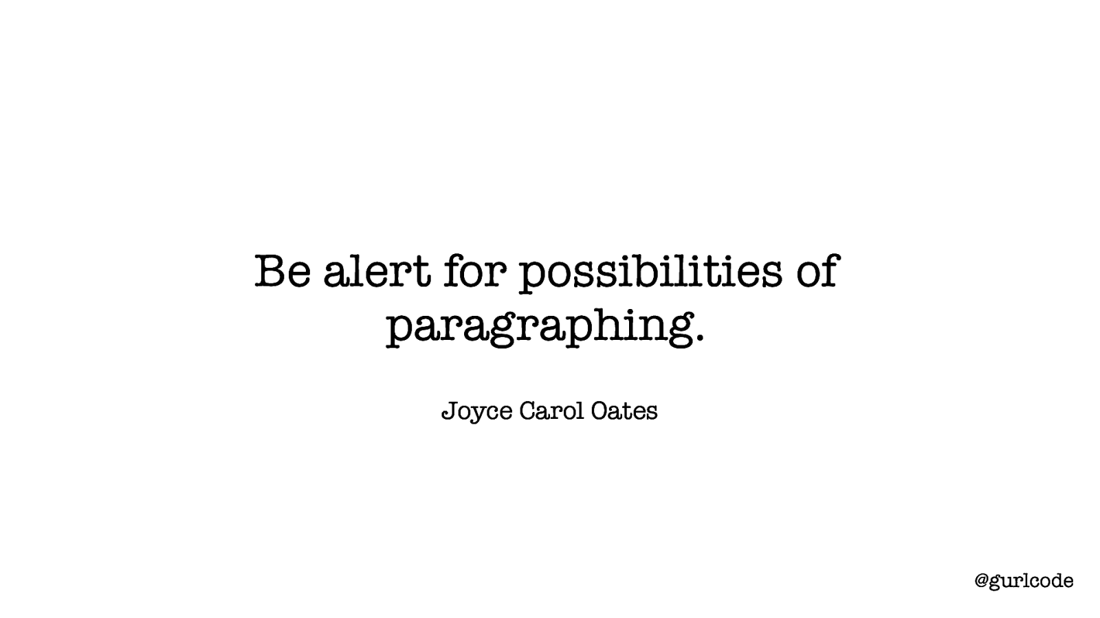
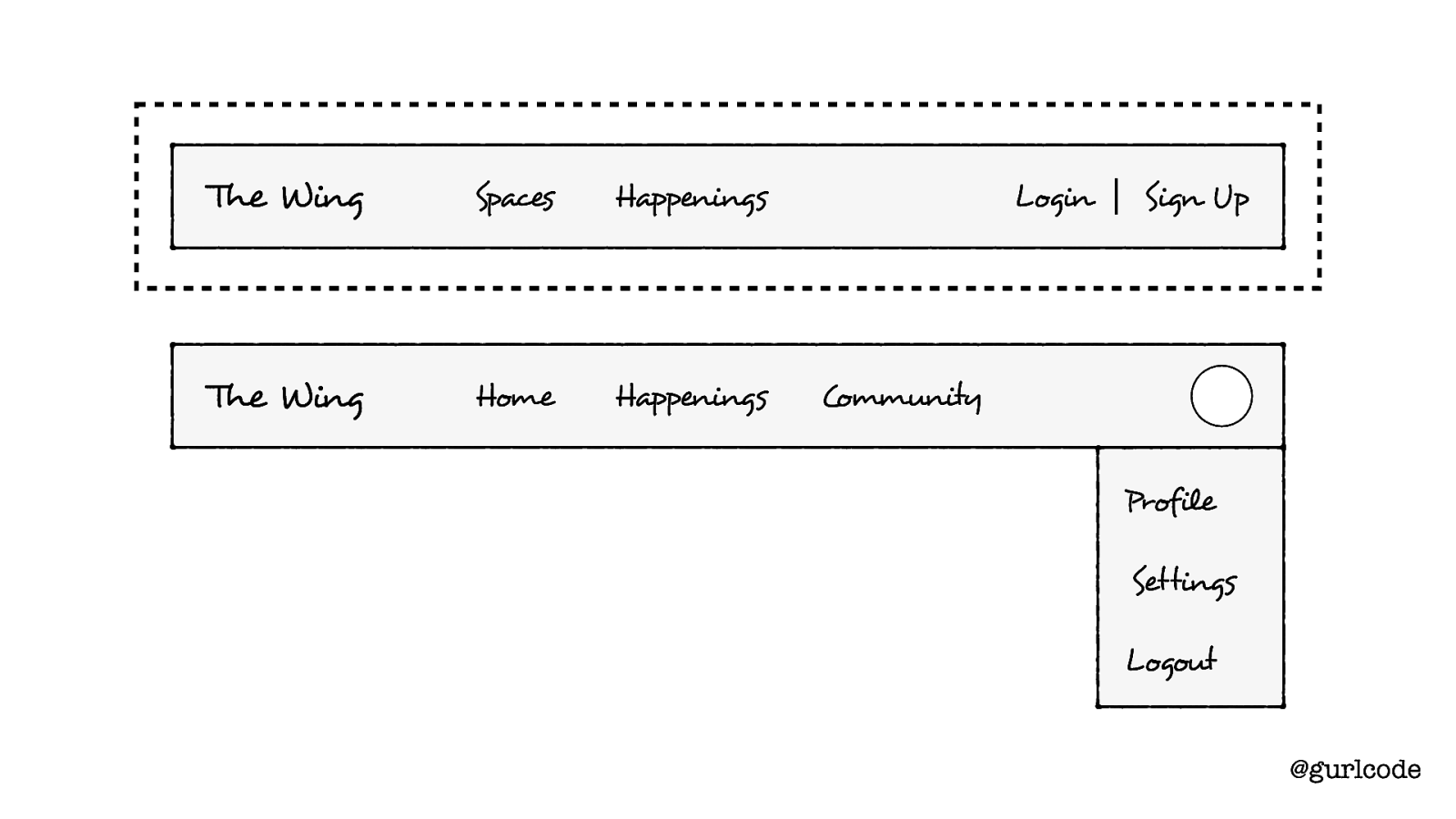
Be alert for possibilities of paragraphing. Joyce Carol Oates @gurlcode Writers do this as well. Joyce Carol Oates has this lovely advice, “Be alert for the possibilities of paragraphing.” I love that sentence and what it’s pointing to is structure. Writers focus on structure. There is an art to grouping words and sentences, to creating breaks in paragraphs and in dialogue. And this can be said of components as well.
The Wing Spaces Happenings The Wing Home Happenings Login Sign Up Community Profile Settings Logout @gurlcode So when we’re looking at this design, we’re looking for the “possibilities of paragraphing” — what should be a component. A possible component breakout is this:
The Wing Spaces Happenings The Wing Home Happenings Login Sign Up Community Profile Settings Logout @gurlcode A navbar component,
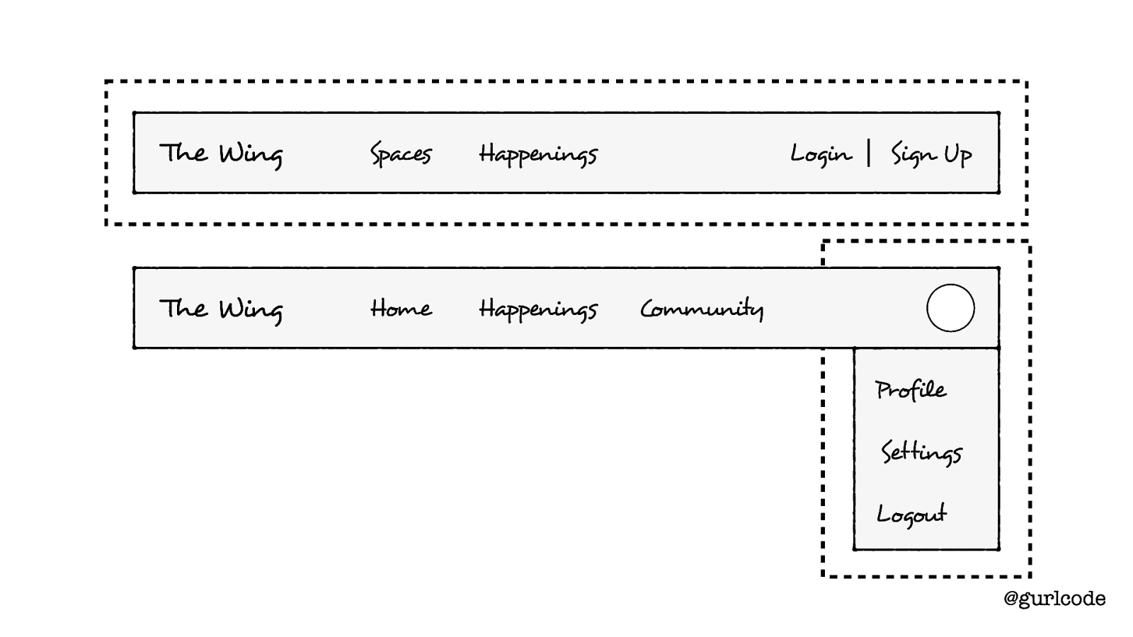
The Wing Spaces Happenings The Wing Home Happenings Login Sign Up Community Profile Settings Logout @gurlcode a profile dropdown component. Cool. I think this makes sense so let’s go with it. Let’s start to build these components out.
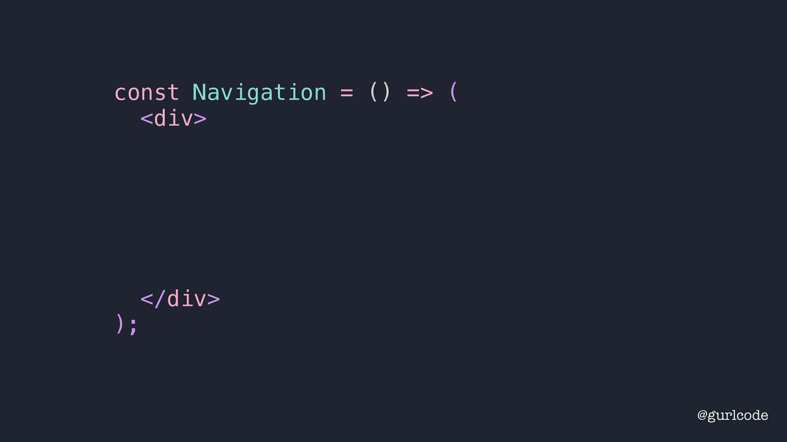
const Navigation = () => ( <div> <na v> // links </nav> {!isLoggedIn && (<Login />)} {isLoggedIn && (<ProfileDropdown />)} </div> ); @gurlcode Except we won’t build it all. We’ll put in some placeholder pieces. What I’m interested in is seeing the structure we create and noting what information we’ll need. So first, we’ll be holding our navigation inside a div. That’ll be the main container element.
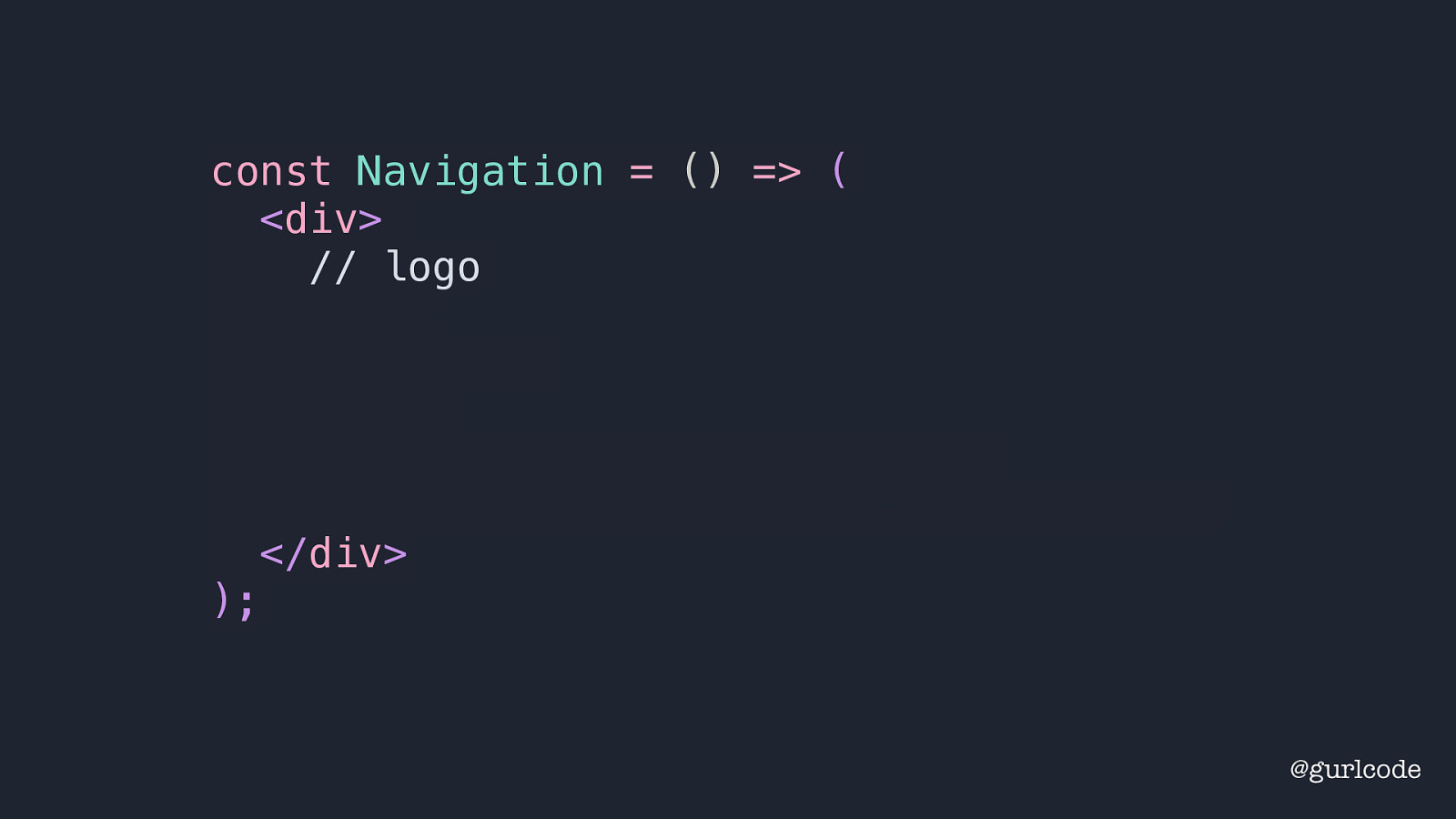
const Navigation = () => ( <div> // logo <nav> // links </nav> {!isLoggedIn && (<Login />)} {isLoggedIn && (<ProfileDropdown />)} </div> ); @gurlcode Let’s put a placeholder for the logo for now.
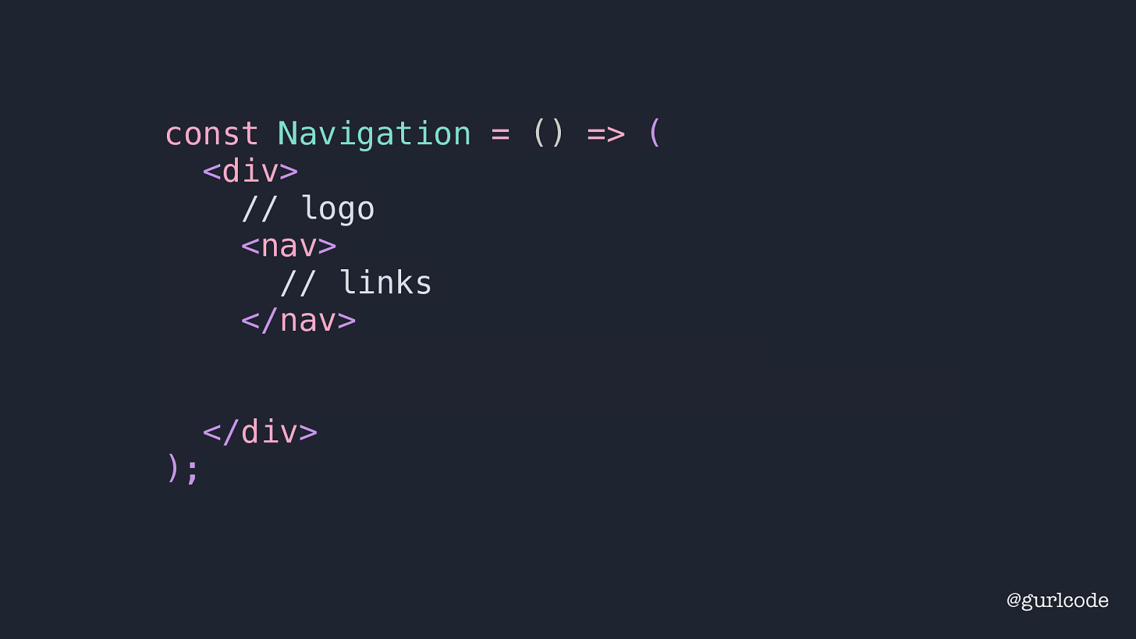
const Navigation = () => ( <div> // logo <nav> // links </nav> {!isLoggedIn && (<Login />)} {isLoggedIn && (<ProfileDropdown />)} </div> ); @gurlcode Below that we’ll place a nav element and let’s leave a placeholder for the links — we’ll deal with those in a minute. But now we’re left to decide how to show what UI: the login & sign up links or the avatar & dropdown menu.
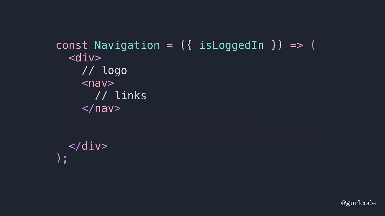
const Navigation = ({ isLoggedIn }) => ( <div> // logo <nav> // links </nav> {!isLoggedIn && (<Login />)} {isLoggedIn && (<ProfileDropdown />)} </div> ); @gurlcode Our best option here is to use a prop to denote whether the user is logged in or not.
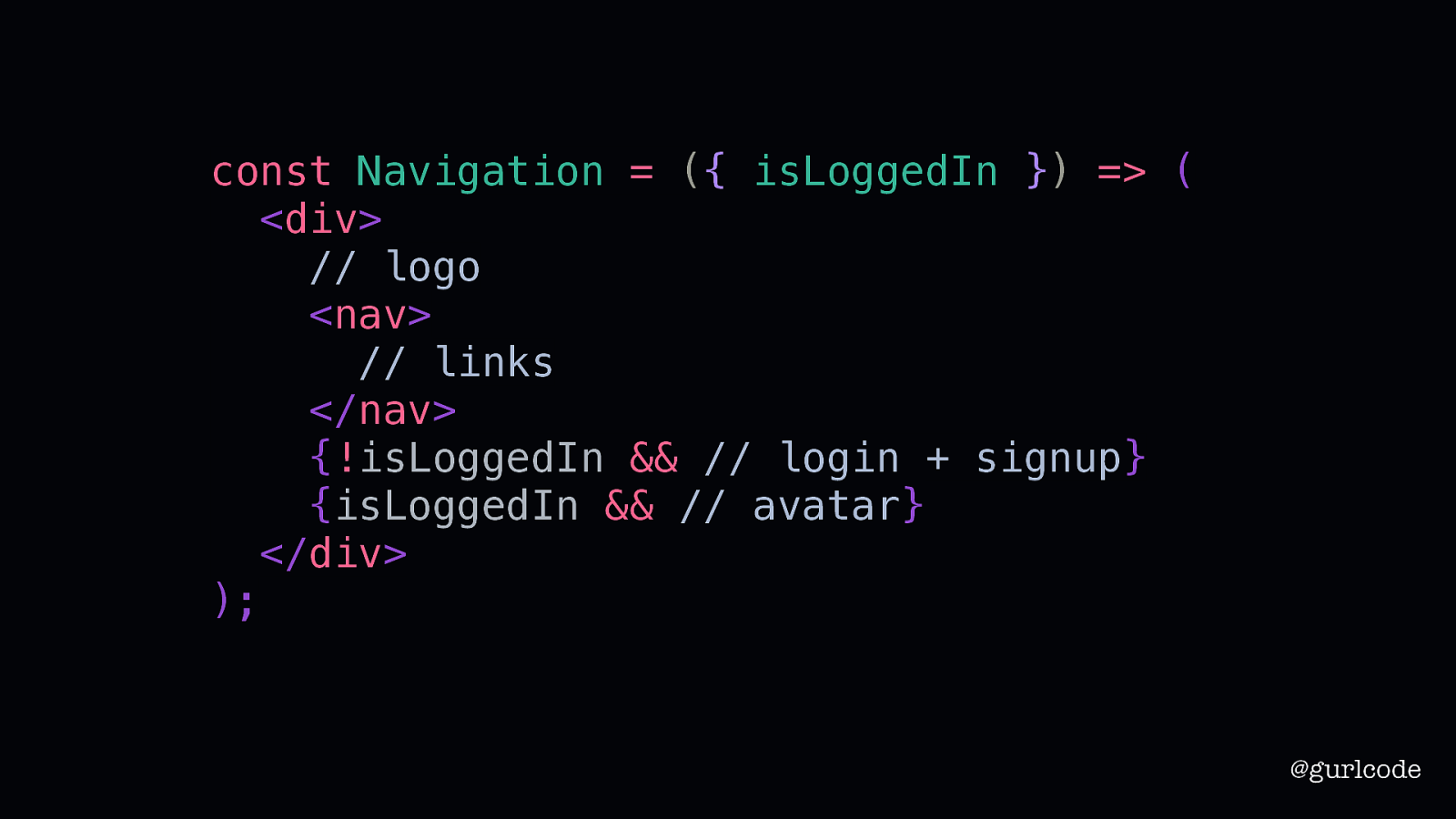
const Navigation = ({ isLoggedIn }) => ( <div> // logo <nav> // links </nav> {!isLoggedIn && // login + signup} {isLoggedIn && // avatar} </div> ); @gurlcode If the user logged out, we’ll show the login + sign up links. If the user is logged in, we’ll show the avatar. Now, looking at this, what we’ve created here
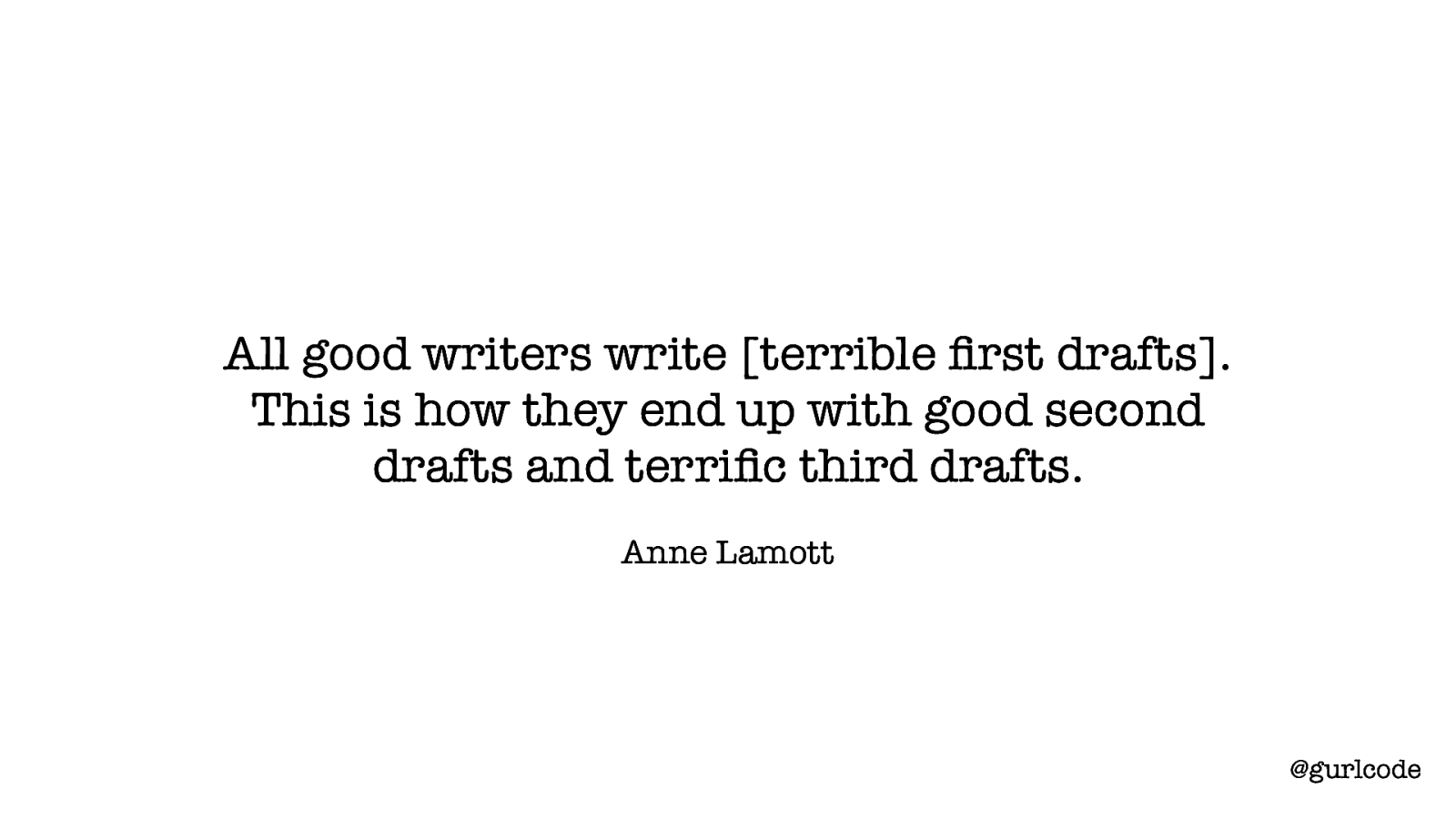
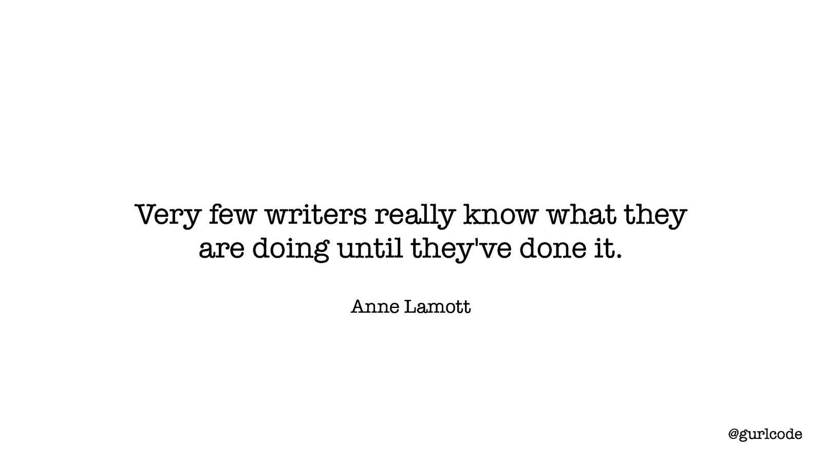
All good writers write [terrible first drafts]. This is how they end up with good second drafts and terrific third drafts. Anne Lamott @gurlcode is a terrible first draft. “All good writers write [terrible first drafts]. This is how they end up with good second drafts and terrific third drafts.” I love this. I love this because it’s all. All good writers. She goes on to say, “People tend to look at successful writers who are getting their books published and think that they sit down at their desks every morning feeling like a million dollars, feeling great about who they are and how much talent they have and what a great story they have to tell; that they take in a few deep breaths, push back their sleeves, and dive in, typing fully formed passages as fast as a court reporter. But this is just the fantasy of the uninitiated.” You are now initiated. So let’s not pretend. Our first drafts are terrible. All of us.
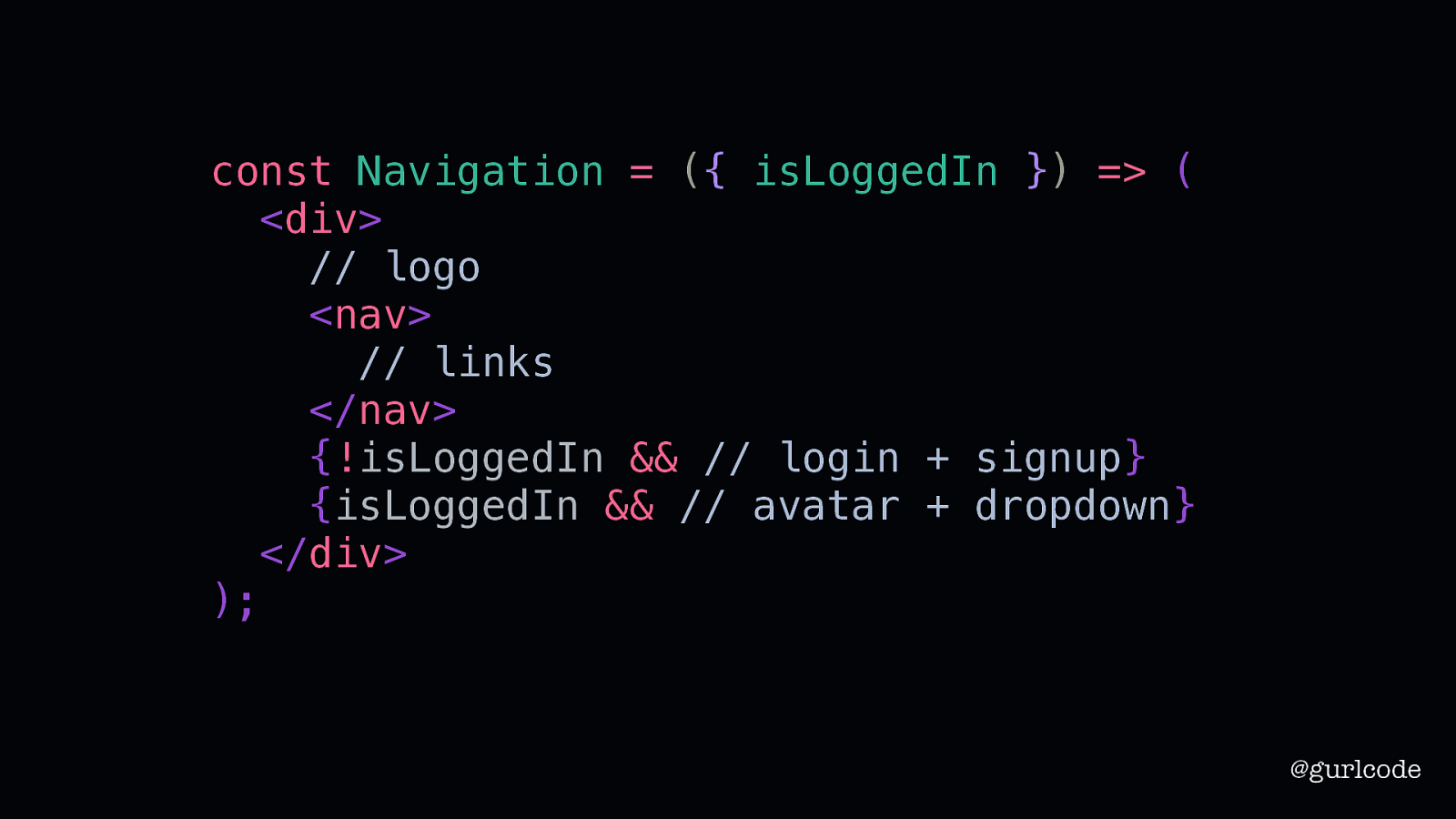
const Navigation = ({ isLoggedIn }) => ( <div> // logo <nav> // links </nav> {!isLoggedIn && // login + signup} {isLoggedIn && // avatar + dropdown} </div> ); @gurlcode Which means that this isn’t going to work out. We need to take a second look. That doesn’t require starting from scratch. Second drafts build on first drafts. Third drafts build on second. So our focus here is what can we rework? What do we keep? It’s likely not obvious at first. We’ve got this bare bones component so what even is there to work with? Well, if we’re following the principles of creative writing, I can tell you we already have a violation.
Show, don’t tell @gurlcode Which means we’ve violated “show, don’t tell.” I see this problem often. We use props like “isSomething” or “hasSomething” to denote what to render. We use if / else and ternary statements to conditionally render our UI when we should be breaking it out into separate components.
The Wing Spaces Happenings The Wing Home Happenings Login Sign Up Community Profile Settings Logout @gurlcode Looking at the designs, we think there’s enough in common between the two that we can reuse the same component for both. I understand that thought. I’ve thought that thought.

Logo Link Link Logo Link Link X Y Link Link Link Link @gurlcode And the reason I’ve thought that is I’ve been trained to look at components like this. Distilling specific parts down into generic pieces. What you see here is the similarities. Both designs have logos, links, and some other piece of functionality toward the right. And this is a good technique for understanding component architecture. But it’s not the whole story.
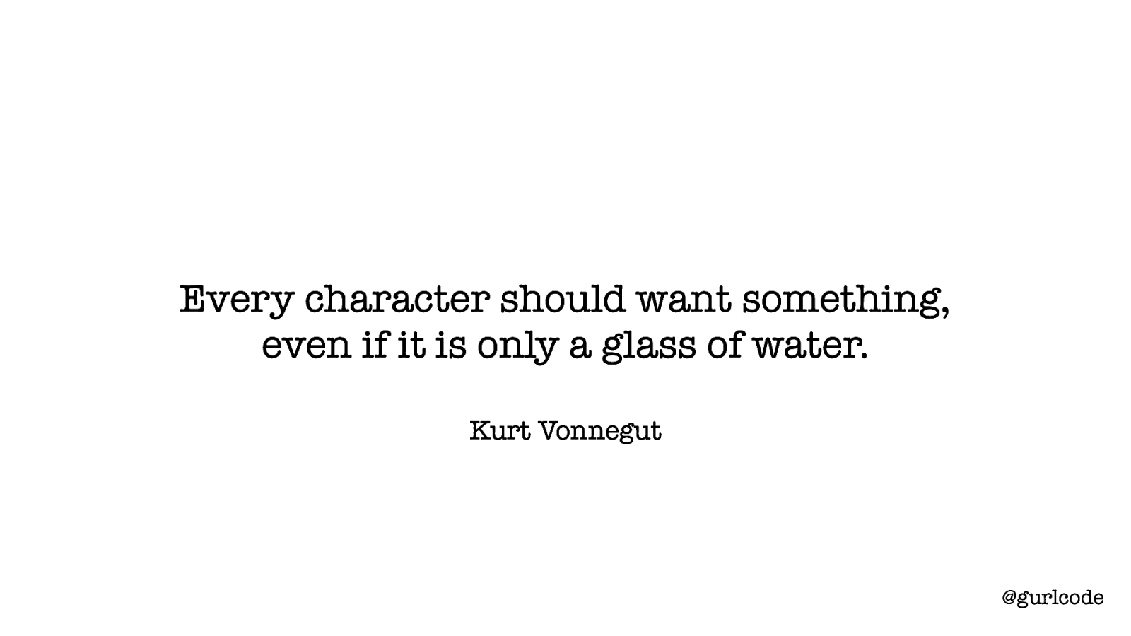
Every character should want something, even if it is only a glass of water. Kurt Vonnegut @gurlcode Because “every character should want something, even if it is only a glass of water.” What we’re defining here is character motivations — what the character wants or needs. Narratives are not formed from plot. What’s happening around your characters is less valuable than what those characters want or need and how that aligns with their behavior and actions. As readers, we are willing to suspend our disbelief for well-written, motivated characters. We know when a character’s motivations are mismatched with their behavior.
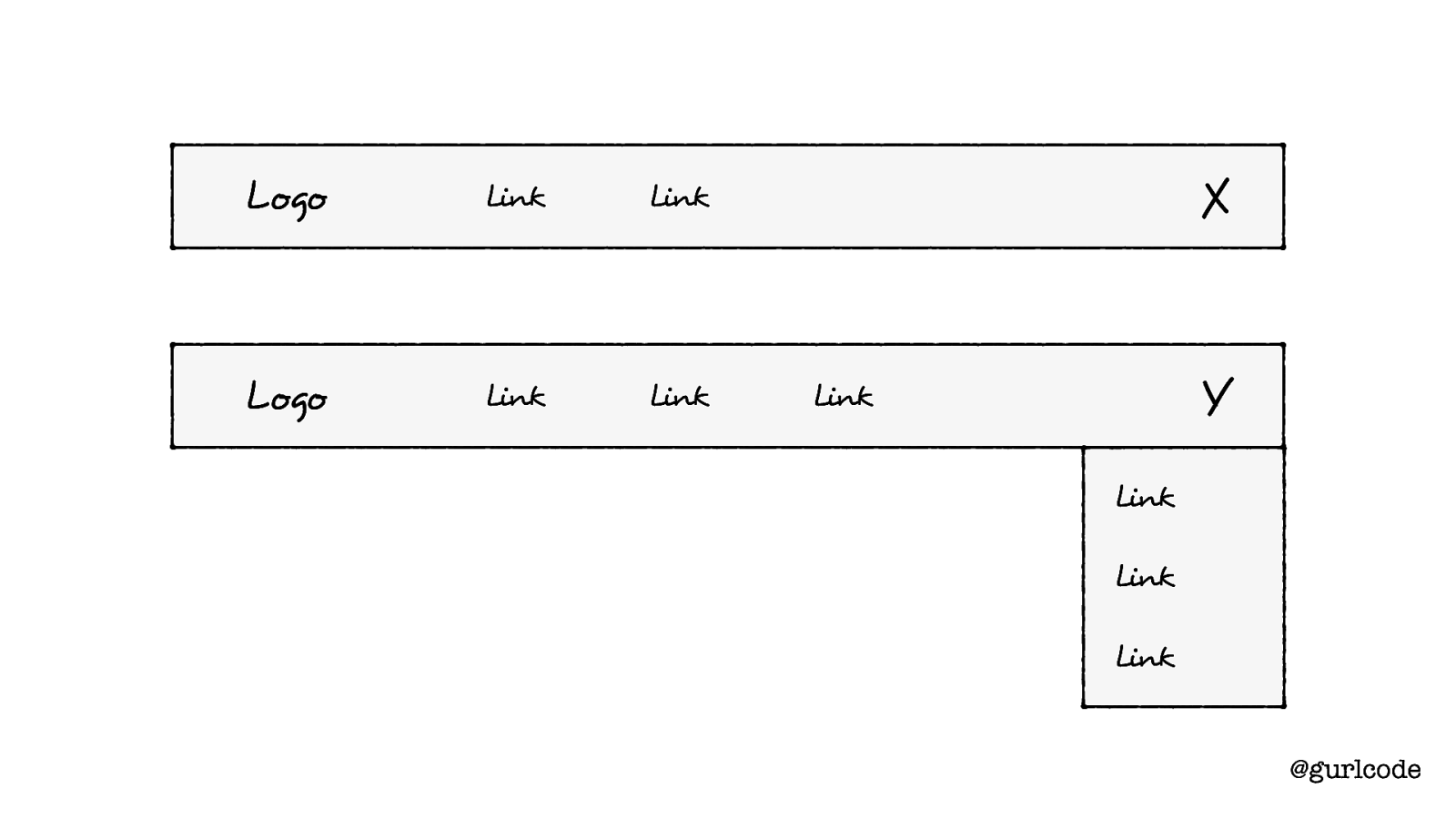
Logo Link Link Logo Link Link X Y Link Link Link Link @gurlcode That’s why this isn’t the whole story. We’re not considering the motivations.
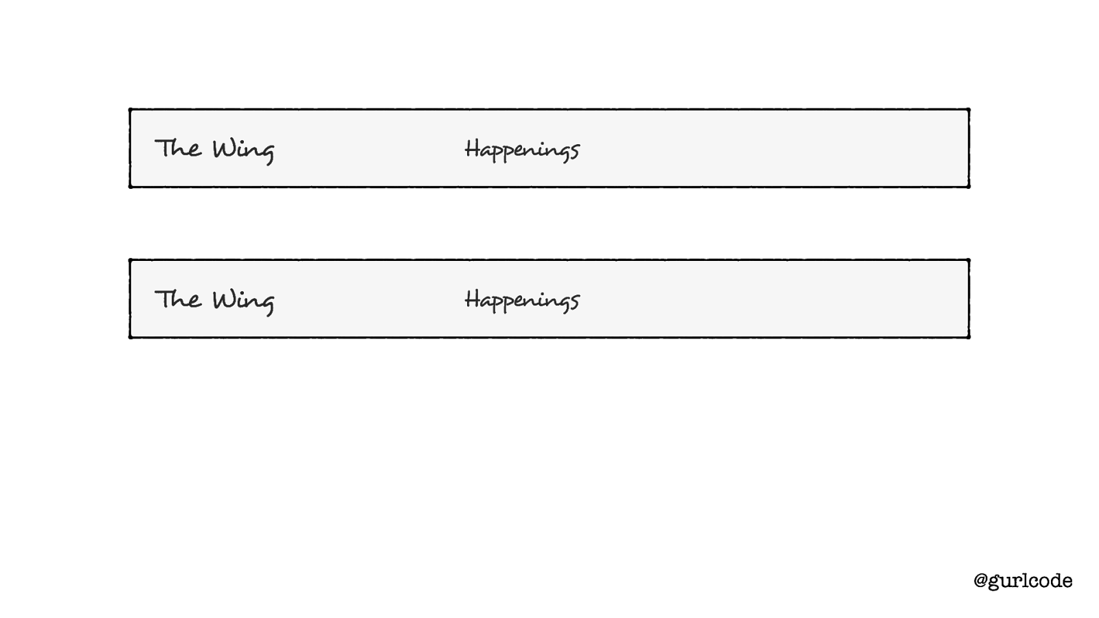
The Wing Happenings The Wing Happenings @gurlcode If we look at the shared motivations — what each component wants to give the user — we find there’s not much in common.
Spaces Home Login Sign Up Community Profile Settings Logout @gurlcode The differences outweigh the similarities. Which means this should be two components.
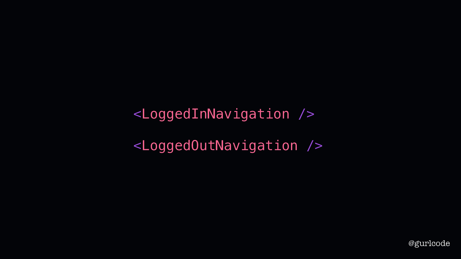
<LoggedInNavigation /> <LoggedOutNavigation /> @gurlcode So, in our second draft, we’ll create two components: a LoggedOutNavigation and a LoggedInNavigation.
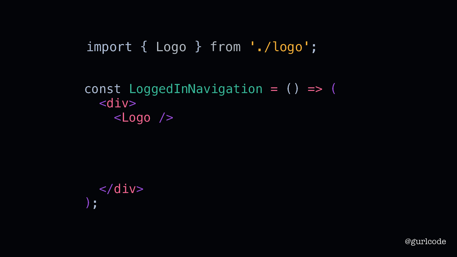
import { Logo } from ‘./logo’; const LoggedInNavigation = () => ( <div> <Logo /> <nav> // links </nav> // avatar </div> ); @gurlcode Now to save some time here, let’s pretend there’s already a logo component for us to drop in.
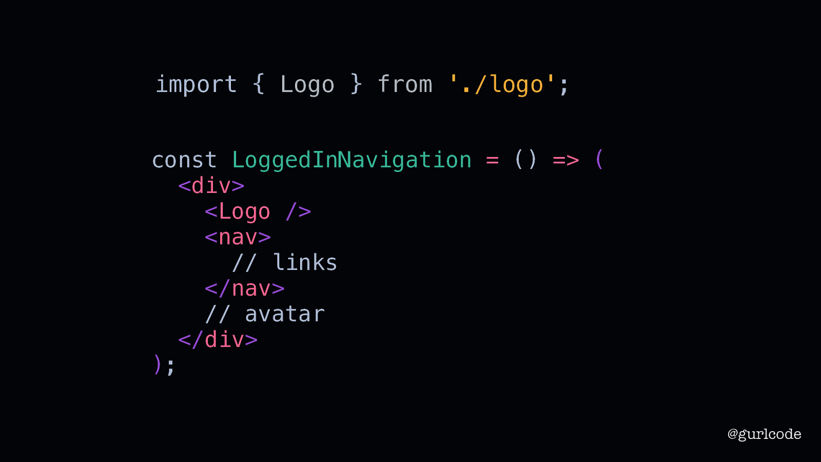
import { Logo } from ‘./logo’; const LoggedInNavigation = () => ( <div> <Logo /> <nav> // links </nav> // avatar </div> ); @gurlcode With that done, we’ll turn our focus to the navigation links. One option is to create a reusable nav component that can be used for both the LoggedOut and LoggedIn navigations. To do that, of course, we’d need to dynamically compose links.

The Wing Spaces Happenings The Wing Home Happenings Login Sign Up Community Profile Settings Logout @gurlcode Remember the logged in and logged out navigations are different. As a logged out user, you’ll see Spaces and Happenings. As a logged in, you’ll see Home, Happenings and Community. So there’s a different here in both content and length.
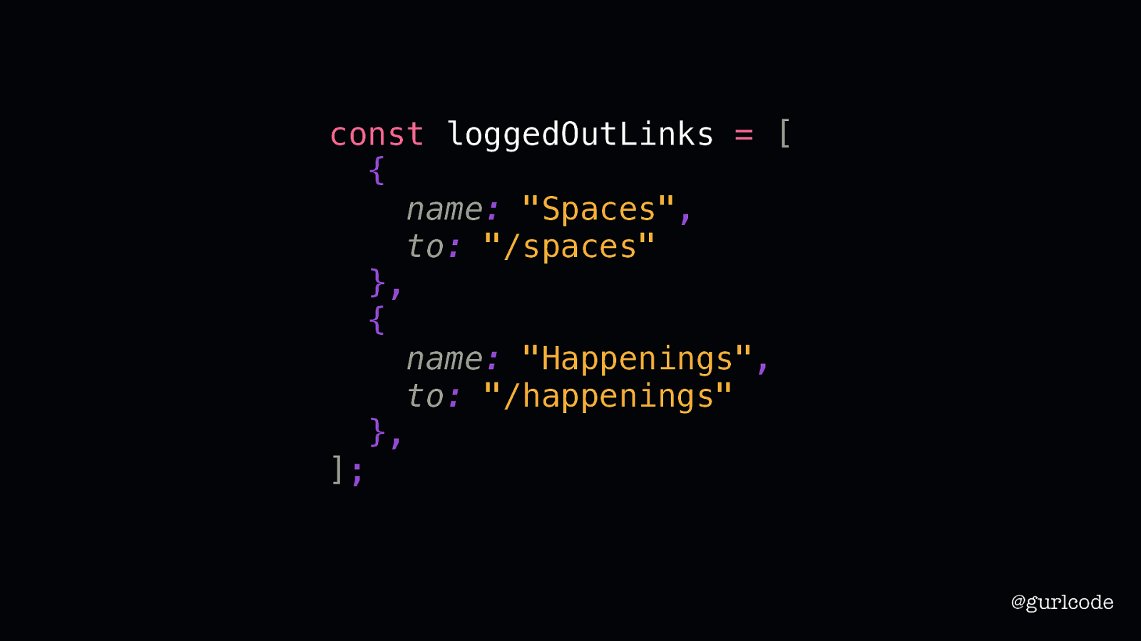
const loggedOutLinks = [ { name: “Spaces”, to: “/spaces” }, { name: “Happenings”, to: “/happenings” }, ]; @gurlcode Which is why we’ll rely on setting our links with an array of objects. Each object defines the link’s name and its to link.
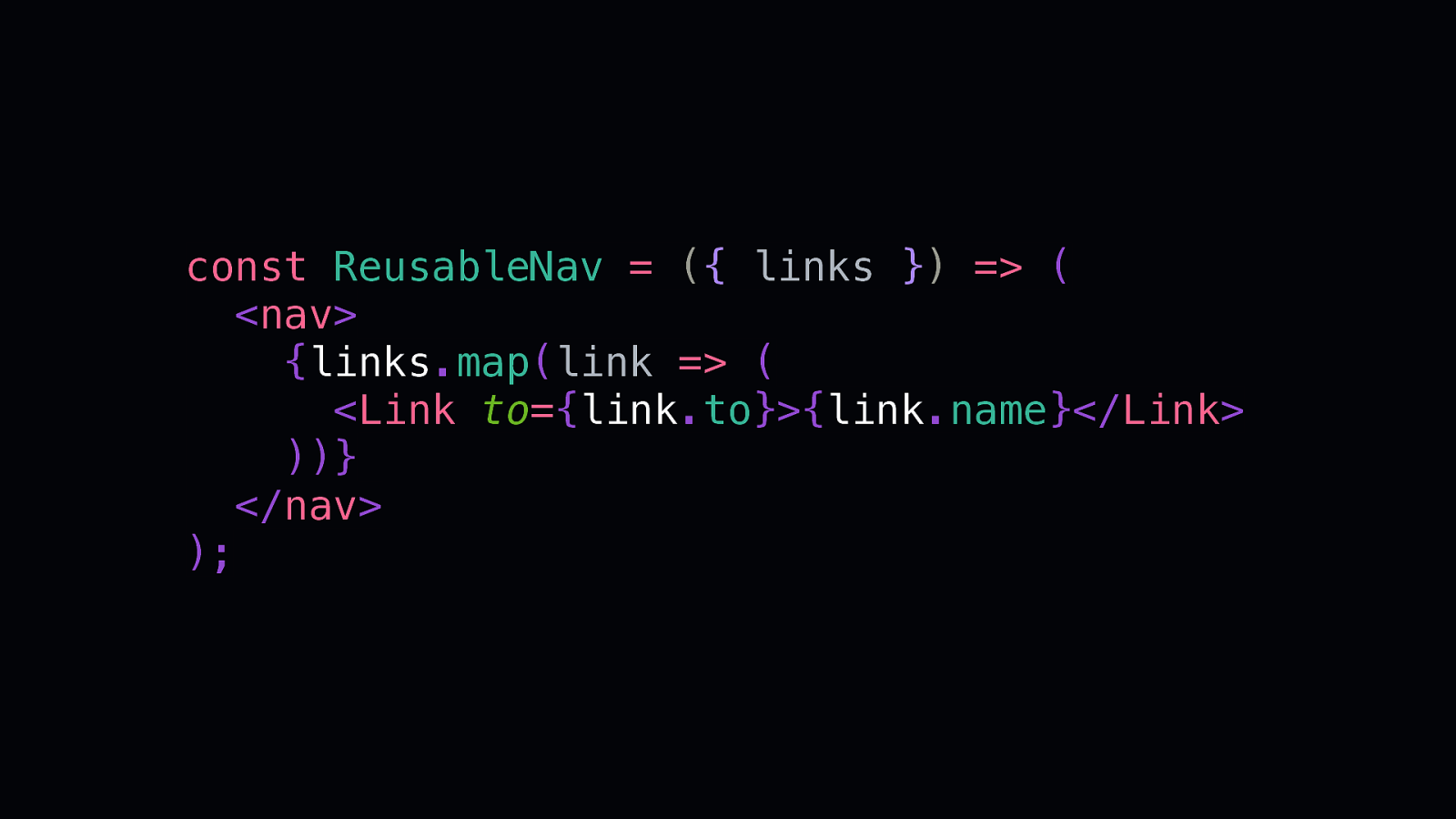
const ReusableNav = ({ links }) => ( <nav> {links.map(link => ( <Link to={link.to}>{link.name}</Link> ))} </nav> ); Then, in our reusable component, we’ll use the array to create the links. So, for each object in the array, we’ll return a Link component with that object’s to and name values. What’s nice about this approach is it limits repetitive code. It also solves for the unknown because it can dynamically create the links, so this component can be reused no matter how many links there are or what their content is.

The Wing Spaces Happenings The Wing Home Happenings Login Sign Up Community Profile Settings Logout @gurlcode Which is convenient because this design is full of links. We’re getting a lot of reuse out of this one, small component.
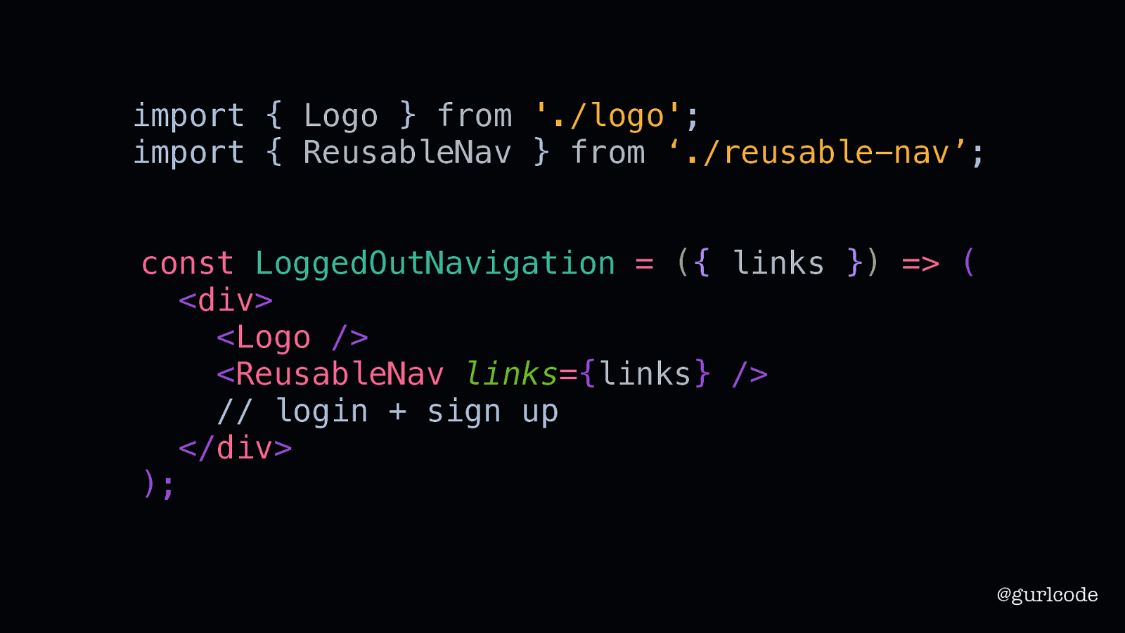
import { Logo } from ‘./logo’; import { ReusableNav } from ‘./reusable-nav’; const LoggedOutNavigation = ({ links }) => ( <div> <Logo /> <ReusableNav links={links} /> // login + sign up </div> ); @gurlcode In fact, we can use it for our next piece: the Login and Sign Up links.
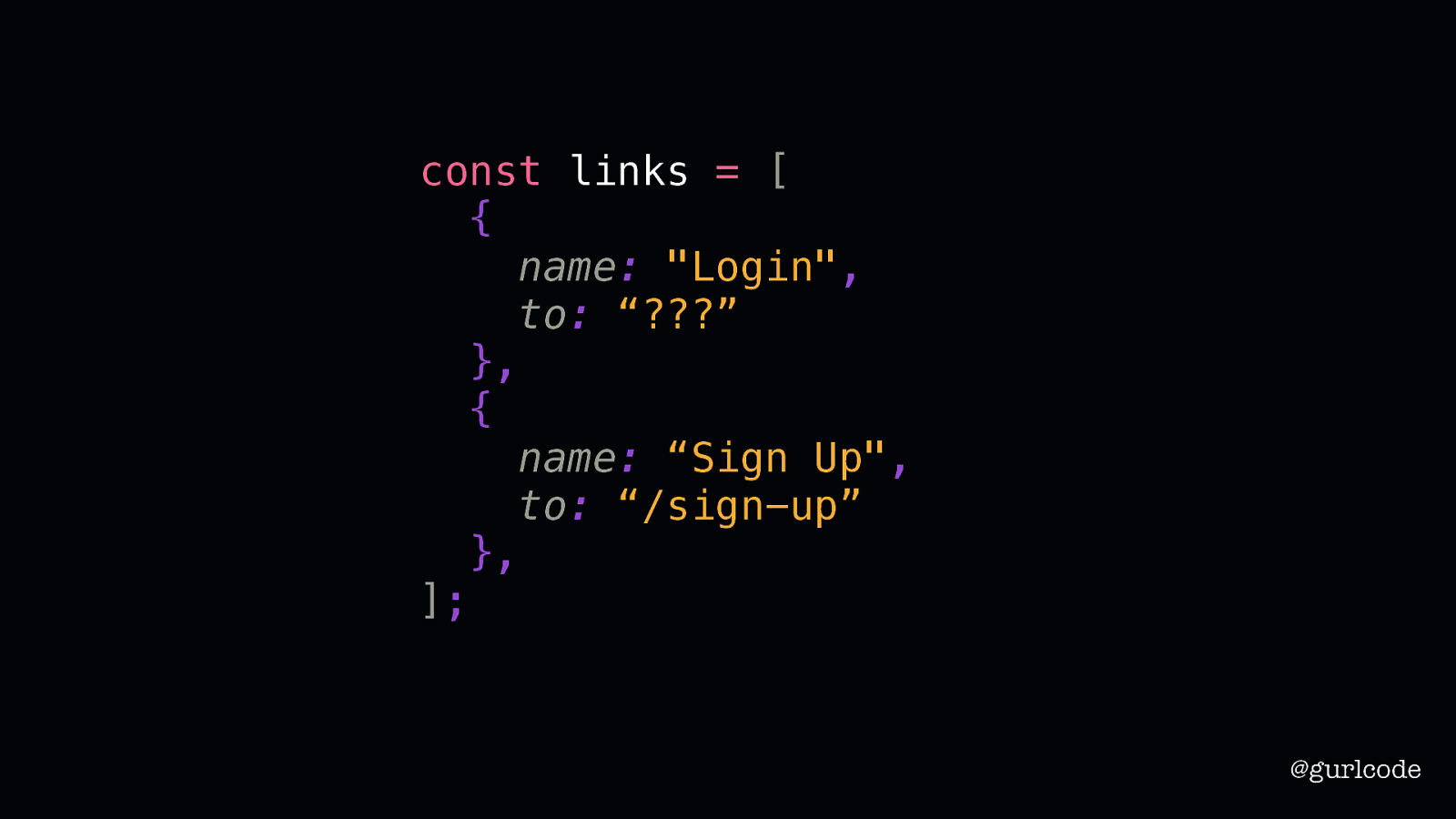
const links = [ { name: “Login”, to: “???” }, { name: “Sign Up”, to: “/sign-up” }, ]; @gurlcode To start, we’ll create our array of objects to describe those links. Now, we do have one, small hiccup. Because the Login link isn’t a link. It opens a modal. So, we need to make a decision. We have this nice, reusable component but incorporating this is going to require a few changes. Do we want to do that?

The Wing Spaces Happenings The Wing Home Happenings Login Sign Up Community Profile Settings Logout @gurlcode Looking at our design though, what we want to incorporate makes sense. We want this component to work for all the links. And if we look at the menu in the dropdown, we have the same needs. Profile and Settings are true links. But Logout is going to be performing an action. It’ll log the user out and redirect to another page.
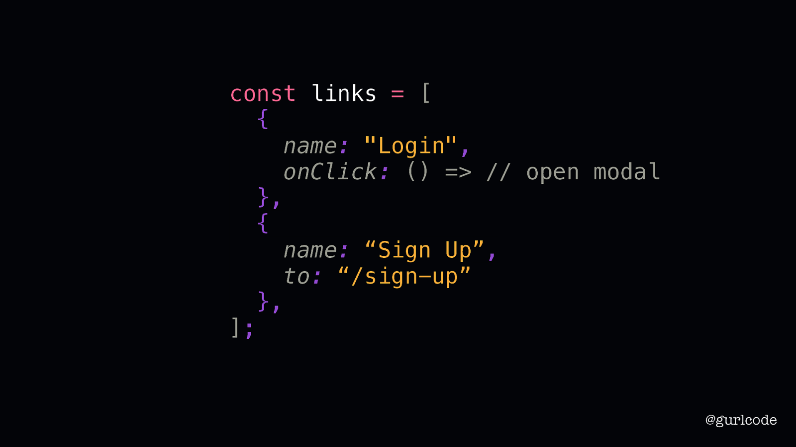
const links = [ { name: “Login”, onClick: () => // open modal }, { name: “Sign Up”, to: “/sign-up” }, ]; @gurlcode Since we need this, let’s go ahead with our revisions. We’ll add an onClick key, which will store a function as its value.
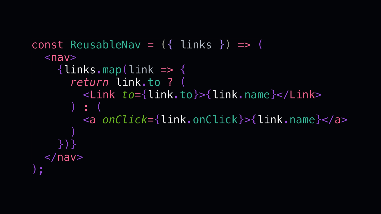
const ReusableNav = ({ links }) => ( <nav> {links.map(link => { return link.to ? ( <Link to={link.to}>{link.name}</Link> ) : ( <a onClick={link.onClick}>{link.name}</a> ) })} </nav> ); In our reusable nav, we’ll look for the to key and if it exists, we’ll pass back a Link component. Otherwise, we’ll pass back an a tag with the onClick set to our specified function.
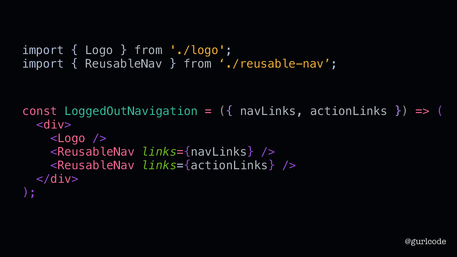
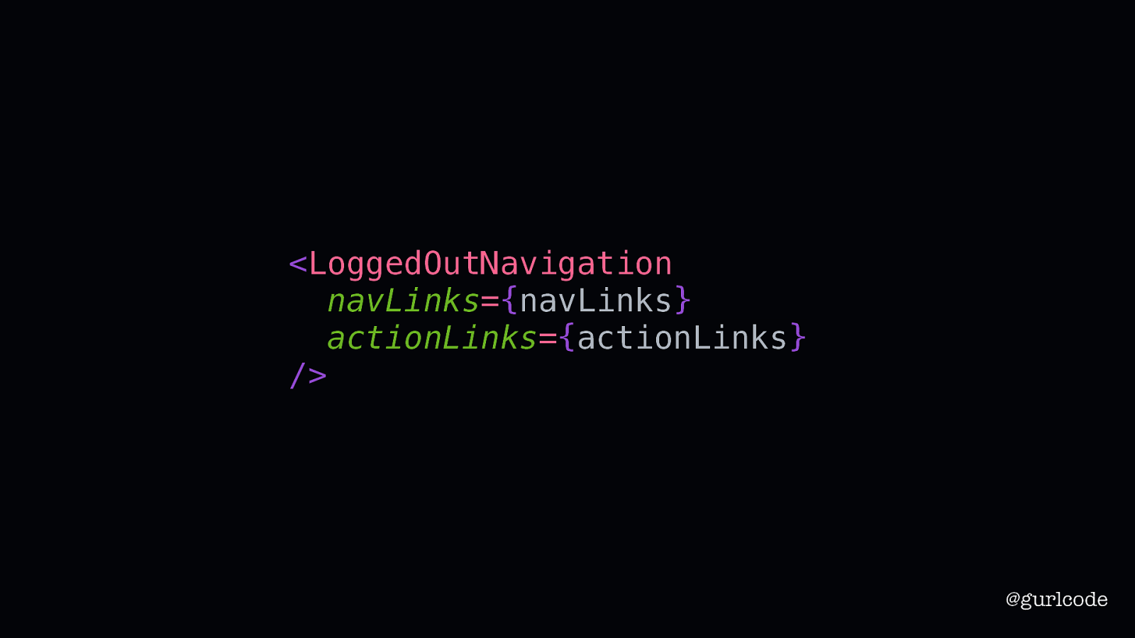
import { Logo } from ‘./logo’; import { ReusableNav } from ‘./reusable-nav’; const LoggedOutNavigation = ({ navLinks, actionLinks }) => ( <div> <Logo /> <ReusableNav links={navLinks} /> <ReusableNav links={actionLinks} /> </div> ); @gurlcode So now we’ll add another ReusableNav to our navigation component. And notice we’re passing down both the nav links and what I’m calling the action links so again, we’re getting maximum reuse out of this component as well — if this LoggedOutNavigation needs to be reused with different links, we can do that.
Write what you know @gurlcode “Write what you know” is arguably the most well-known rule in creative writing. And it’s often misinterpreted. It doesn’t mean that you look around and write that. It means that you write what you know to be true. Applied to components, it’s more concrete. If you know what a component needs and what it should render, then write what you know. I used value reuse above all else. I thought components needed to be as reusable and configurable as possible. What I ended up doing is wasting time on problems that never appeared.
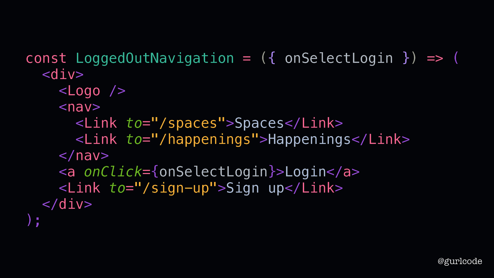
const LoggedOutNavigation = ({ onSelectLogin }) => ( <div> <Logo /> <nav> <Link to=”/spaces”>Spaces</Link> <Link to=”/happenings”>Happenings</Link> </nav> <a onClick={onSelectLogin}>Login</a> <Link to=”/sign-up”>Sign up</Link> </div> ); @gurlcode So, if we write what we know, this is what our LoggedOutNavigation looks like. I find this cleaner, easier to understand, and more prepared for the unknowns. Imagine that the design changes, and now we need to add an icon next to the Happenings link.
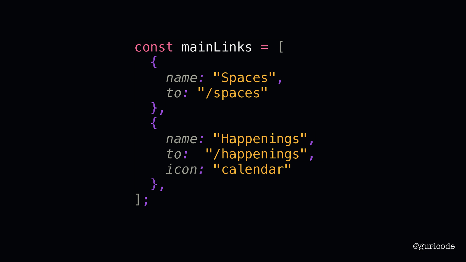
const mainLinks = [ { name: “Spaces”, to: “/spaces” }, { name: “Happenings”, to: “”/happenings”, icon: “calendar” }, ]; @gurlcode With our previous abstraction, we would’ve needed to modify the object’s details to include an icon key
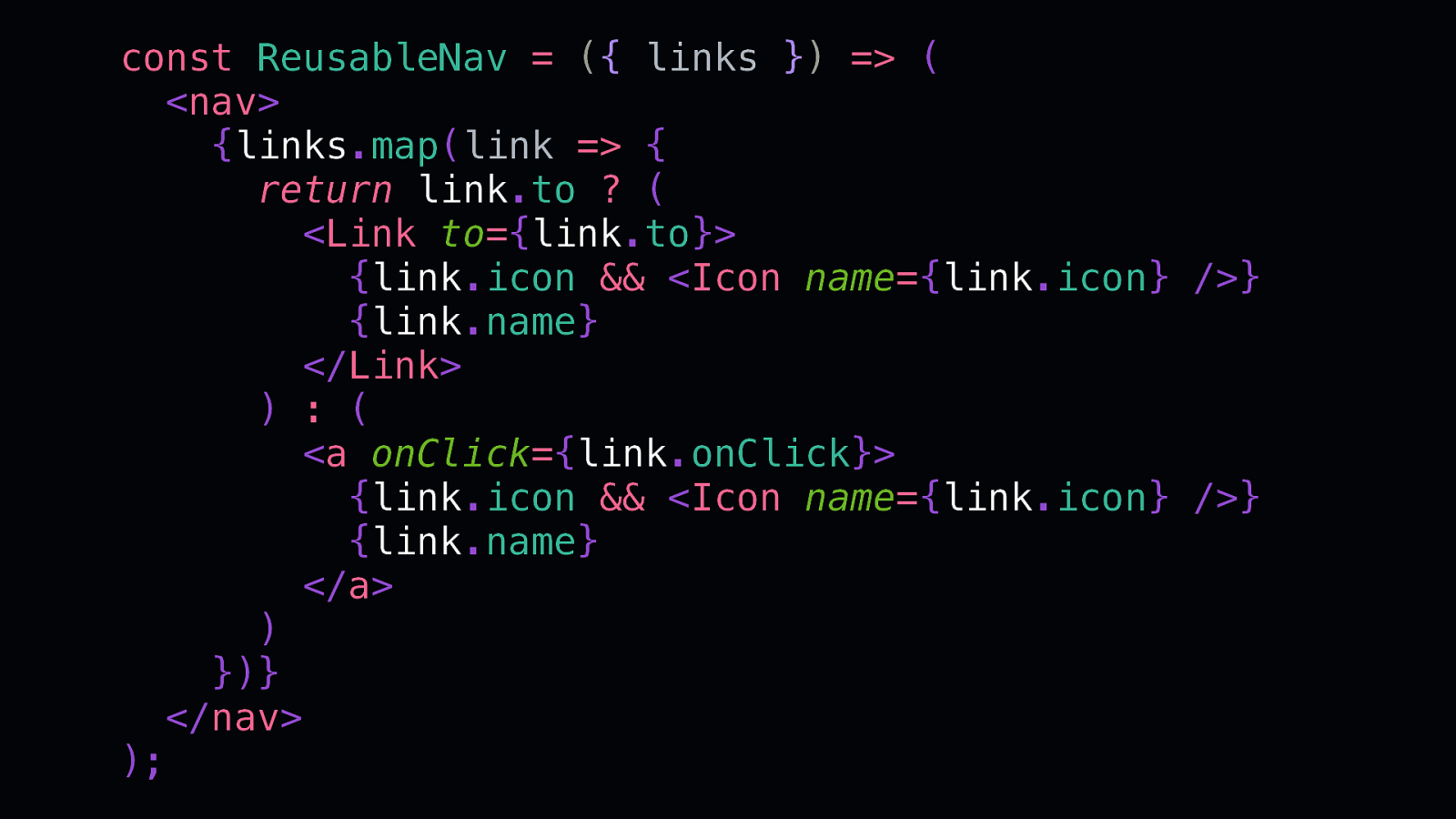
const ReusableNav = ({ links }) => ( <nav> {links.map(link => { return link.to ? ( <Link to={link.to}> {link.icon && <Icon name={link.icon} />} {link.name} </Link> ) : ( <a onClick={link.onClick}> {link.icon && <Icon name={link.icon} />} {link.name} </a> ) })} </nav> ); and in the ReusableNav we would’ve need to check for that key and conditionally add an icon — all for one icon being added to the design. You can also see now that it doesn’t take long for this pattern to breakdown. It’s fine for 1 or 2 use cases but as you add in more, it’s creating more complexity than it’s solving.
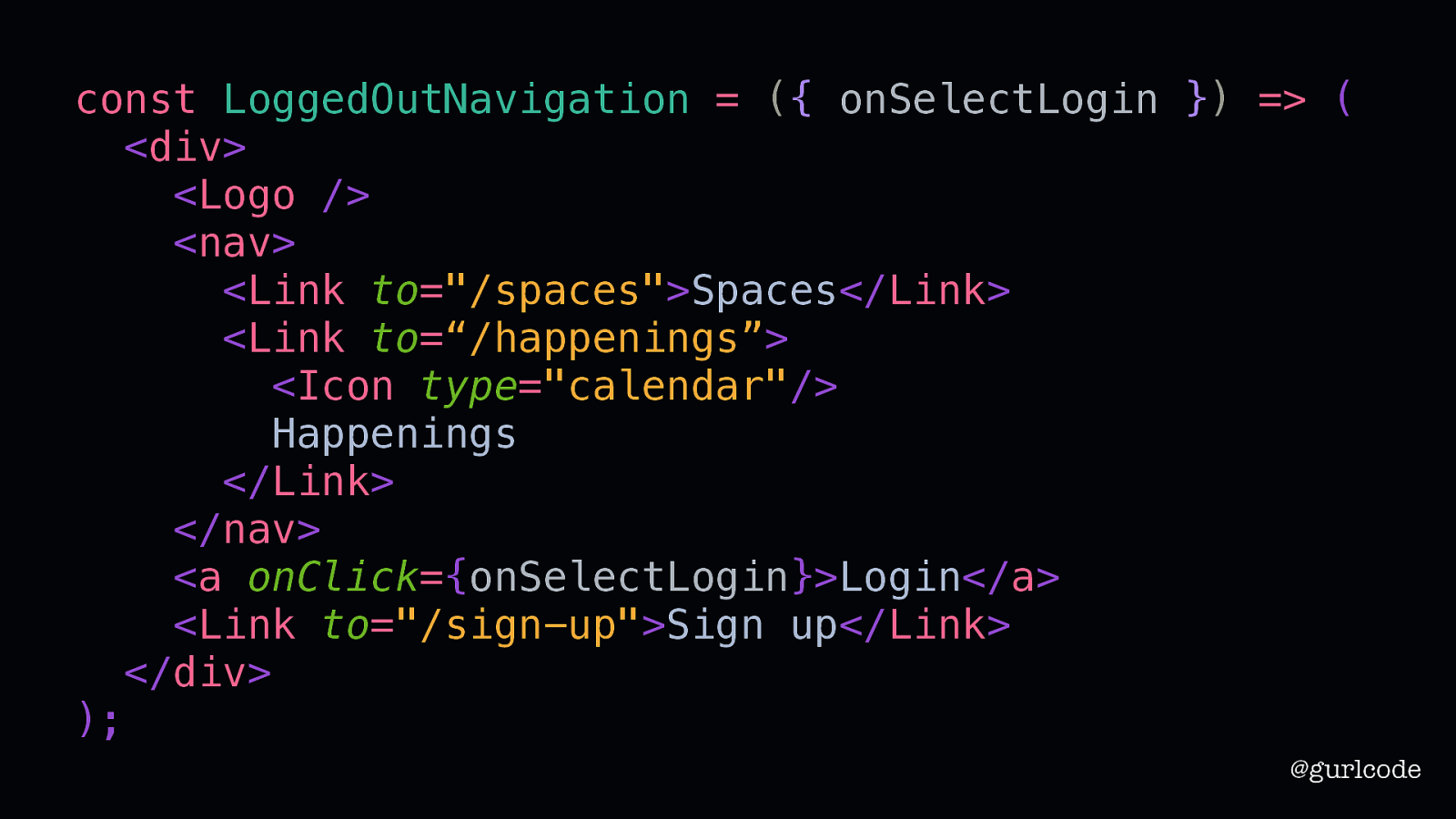
const LoggedOutNavigation = ({ onSelectLogin }) => ( <div> <Logo /> <nav> <Link to=”/spaces”>Spaces</Link> <Link to=“/happenings”> <Icon type=”calendar”/> Happenings </Link> </nav> <a onClick={onSelectLogin}>Login</a> <Link to=”/sign-up”>Sign up</Link> </div> ); @gurlcode But if we don’t commit to this abstraction. If we write what we know, the modification is one step: add the icon to the Happenings link. The downside to this approach is you are going to be repeating yourself and I know that we are trained to keep things DRY. Don’t Repeat Yourself.
Repetition is not your enemy. @gurlcode But repetition is not your enemy. Writers know this.
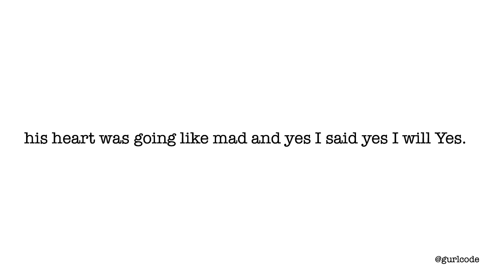
his heart was going like mad and yes I said yes I will Yes. @gurlcode [READ] I adore this line. It’s the last line in James Joyce’s Ulysses. Joyce’s use of repetition here, the word “yes” coming back again and again, is masterful. It gives this sense of hope and anticipation. Without it, this sentence is… ordinary. Writers know that repetition is a tool. Repetition of words, phrases, descriptions — writers use these to create emphasis, to create structure, to build on the previous. Writers repeat on purpose. “then I asked him with my eyes to ask again yes and then he asked me would I yes to say yes my mountain flower and first I put my arms around him yes and drew him down to me and his heart was going like mad and yes I said yes I will Yes”
Repeat on purpose. @gurlcode We can use this lesson in our components. Repeat on purpose. Repeat because you want to avoid a naive abstraction. Writing a component as a mechanism to DRY your code is often just that.
Very few writers really know what they are doing until they’ve done it. Anne Lamott @gurlcode [READ QUOTE] We often pick abstractions well before we actually know what we’re doing. That’s why “write what you know” and “repeat on purpose” are useful guidelines as you start out. That’s true of writers as well. These rules I’ve mentioned act as guidance for improving as a writer. Think of them as training wheels to keep you at least upright if nothing else. The true balancing will come later with experience. I have some more thoughts on that but first, I want us to finish what we started.
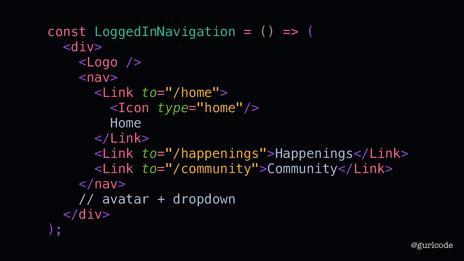
const LoggedInNavigation = () => ( <div> <Logo /> <nav> <Link to=”/home”> <Icon type=”home”/> Home </Link> <Link to=”/happenings”>Happenings</Link> <Link to=”/community”>Community</Link> </nav> // avatar + dropdown </div> ); @gurlcode There’s one more piece to write and that’s the avatar and dropdown menu in the LoggedInNavigation.
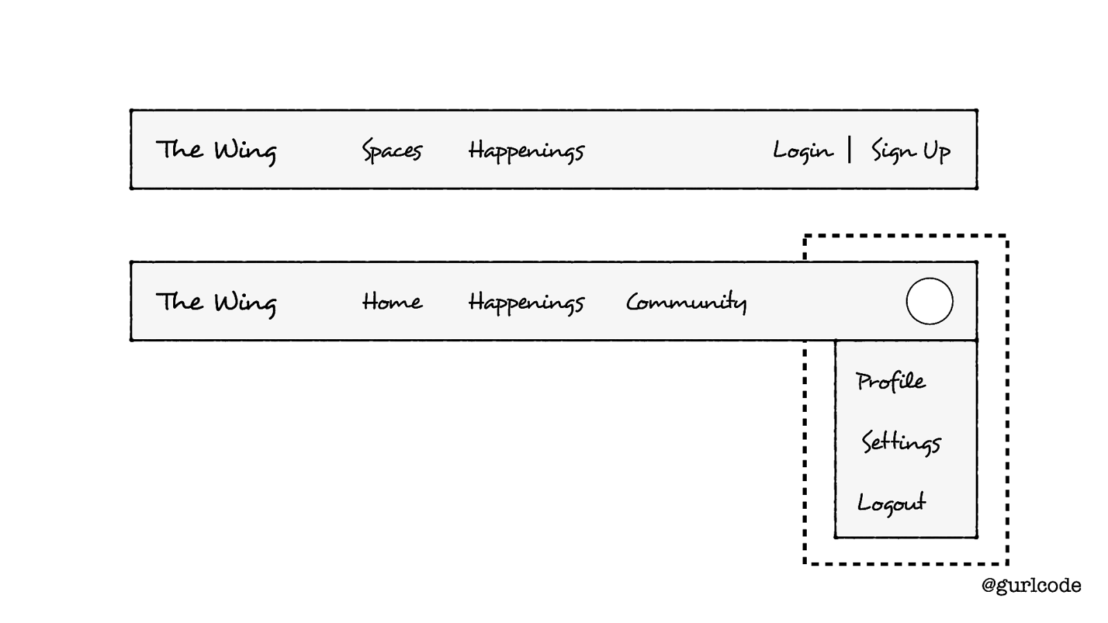
The Wing Spaces Happenings The Wing Home Happenings Login Sign Up Community Profile Settings Logout @gurlcode Recall that back at the start, we wanted to make this a separate component. I still think that’s the right move here.
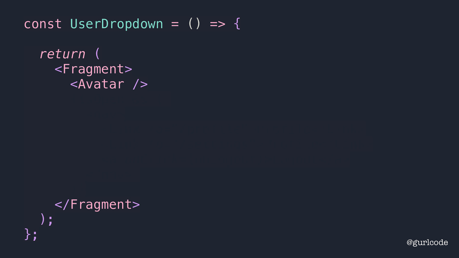
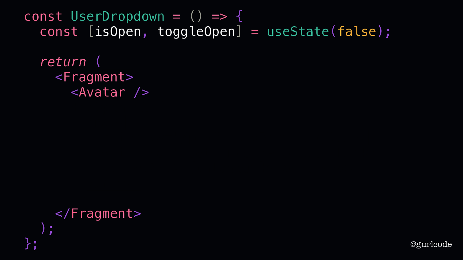
const UserDropdown = () => { return ( <Fragment> <Avatar /> {isOpen && ( <nav> <Link to=”/profile”>Profile</Link> <Link to=”/settings”>Profile</Link> <a onClick={onLogout}>Logout</a> </nav> )} </Fragment> ); }; So, here is our UserDropdown. It’ll encompass a separate Avatar component. @gurlcode
const UserDropdown = () => { const [isOpen, toggleOpen] = useState(false); }; return ( <Fragment> <Avatar /> {isOpen && ( <nav> <Link to=”/profile”>Profile</Link> <Link to=”/settings”>Profile</Link> <a onClick={onLogout}>Logout</a> </nav> )} </Fragment> ); We’ll need some state here to track whether the dropdown is open or not. @gurlcode
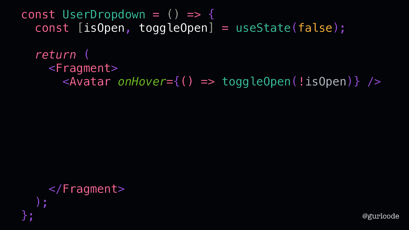
const UserDropdown = () => { const [isOpen, toggleOpen] = useState(false); }; return ( <Fragment> <Avatar onHover={() => toggleOpen(!isOpen)} /> {isOpen && ( <nav> <Link to=”/profile”>Profile</Link> <Link to=”/settings”>Profile</Link> <a onClick={onLogout}>Logout</a> </nav> )} </Fragment> ); And we’ll set the Avatar’s onHover handler to toggle that state. @gurlcode
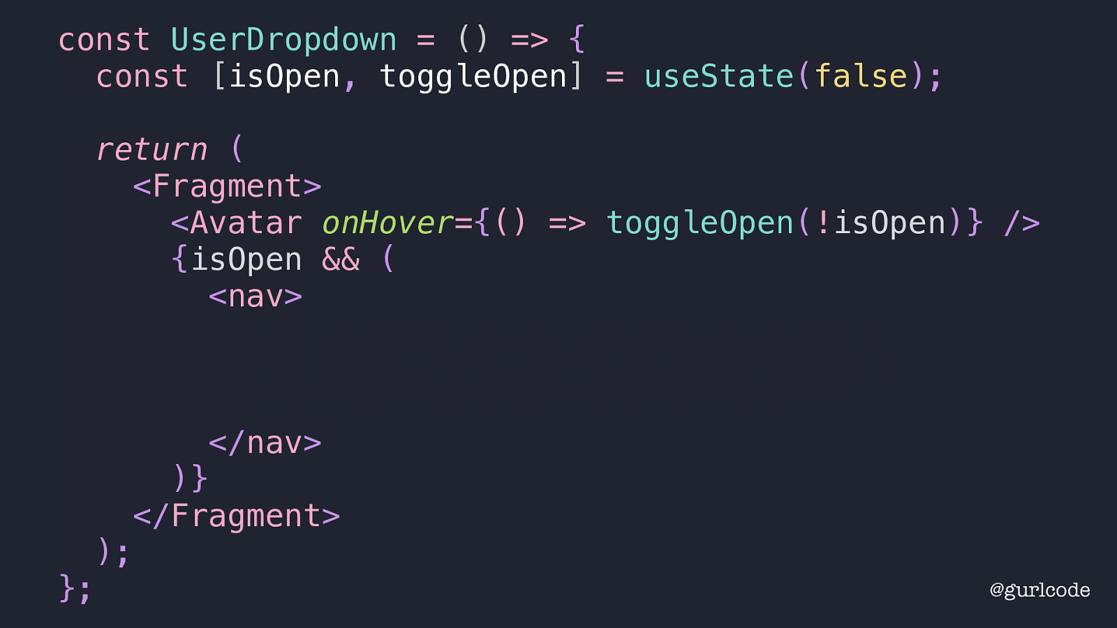
const UserDropdown = () => { const [isOpen, toggleOpen] = useState(false); }; return ( <Fragment> <Avatar onHover={() => toggleOpen(!isOpen)} /> {isOpen && ( <nav> <Link to=”/profile”>Profile</Link> <Link to=”/settings”>Profile</Link> <a onClick={onLogout}>Logout</a> </nav> )} </Fragment> ); If the dropdown is open, we render a nav element. @gurlcode
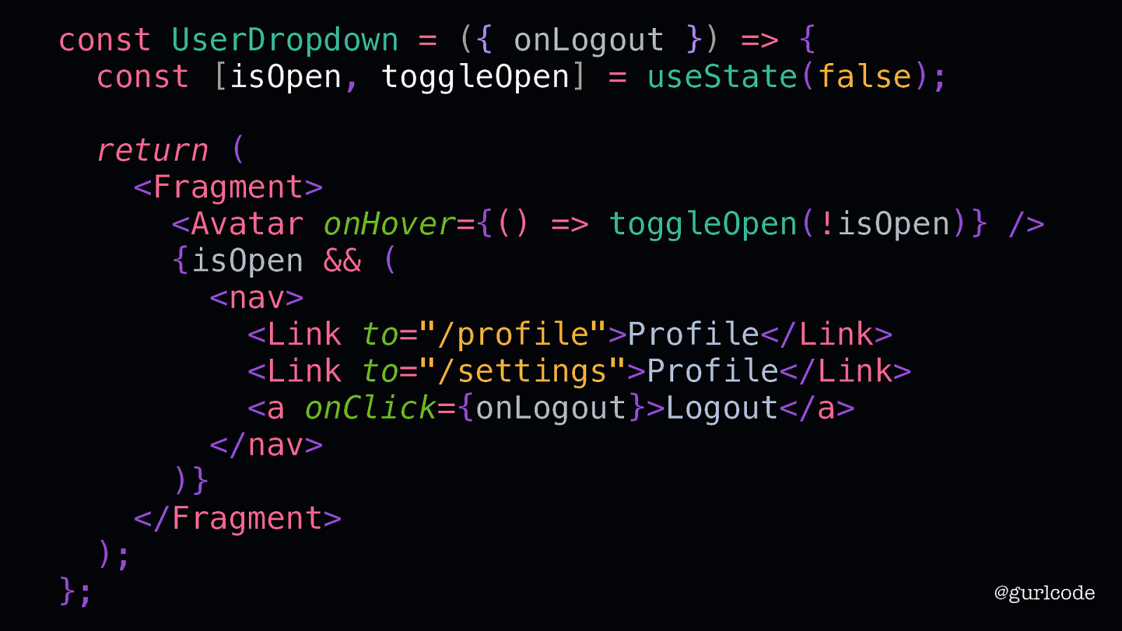
const UserDropdown = ({ onLogout }) => { const [isOpen, toggleOpen] = useState(false); }; return ( <Fragment> <Avatar onHover={() => toggleOpen(!isOpen)} /> {isOpen && ( <nav> <Link to=”/profile”>Profile</Link> <Link to=”/settings”>Profile</Link> <a onClick={onLogout}>Logout</a> </nav> )} </Fragment> ); And for the links, we’ll continue to write what we know. So this is our finished UserDropdown. @gurlcode
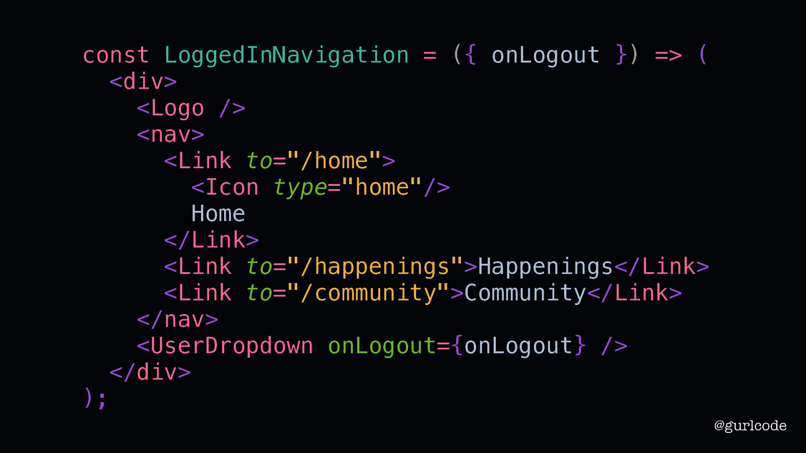
const LoggedInNavigation = ({ onLogout }) => ( <div> <Logo /> <nav> <Link to=”/home”> <Icon type=”home”/> Home </Link> <Link to=”/happenings”>Happenings</Link> <Link to=”/community”>Community</Link> </nav> <UserDropdown onLogout={onLogout} /> </div> ); @gurlcode We’ll add it to our LoggedInNavigation and we are now done. Move that ticket into the Done column. Now what? Now we move on.
Remember that, sooner or later, before it ever reaches perfection, you will have to let it go and move on and start to write the next thing. Neil Gaiman @gurlcode [QUOTE] Like writers, we often need to move on before what we’ve written is anywhere near perfect. Our time is finite. Which often means, that from time to time, we’re revisiting our old, imperfect ideas. A component we aren’t particularly proud of. A snippet of code you can now see should be structured differently. We might feel unease about refactoring these because it’s an admission that something didn’t work. But rewriting is [NEXT SLIDE]
Rewriting is the essence of writing well. William Zinsen @gurlcode [READ QUOTE] No work of fiction you have ever read came without the cost of painful, sacrificial revision. Really, if you think I am exaggerating, I am not. Writers hate revision but it is the path forward. You cannot improve without it.
Refactoring is not failure. @gurlcode Refactoring is not failure. Get comfortable with it. Take something you built and rebuild it. And then figure out why it’s better or worse. Take something someone else wrote and rewrite it. Figure out why it’s better or worse. I could tell you to follow all of what I’ve said as gospel but you know what, break the rules. See what you learn. This is how writers become writers. And what we’re doing here is a craft. I used to think code and fiction had nothing in common but we’re both building something from nothing.
There’s no win and no fail, there’s only make. Sister Corita Kent @gurlcode In our worlds, there is no win and no fail, there is only make. Thank you.