Everything You Know About Web Design Just Changed Jen Simmons An Event Apart Orlando October 2018

A presentation at An Event Apart San Francisco 2018 in December 2018 in San Francisco, CA, USA by Jen Simmons
Everything You Know About Web Design Just Changed Jen Simmons An Event Apart Orlando October 2018
For a lot of people in our industry, the way we design and create layouts — page layouts, component layouts — the drawing templates we use, the frameworks of code we use, the processes we have, who makes what and hands it off to who… for a lot of people, they have this idea that way we do things now is the way things have always been done. That this is the best way, the only way, the right way.
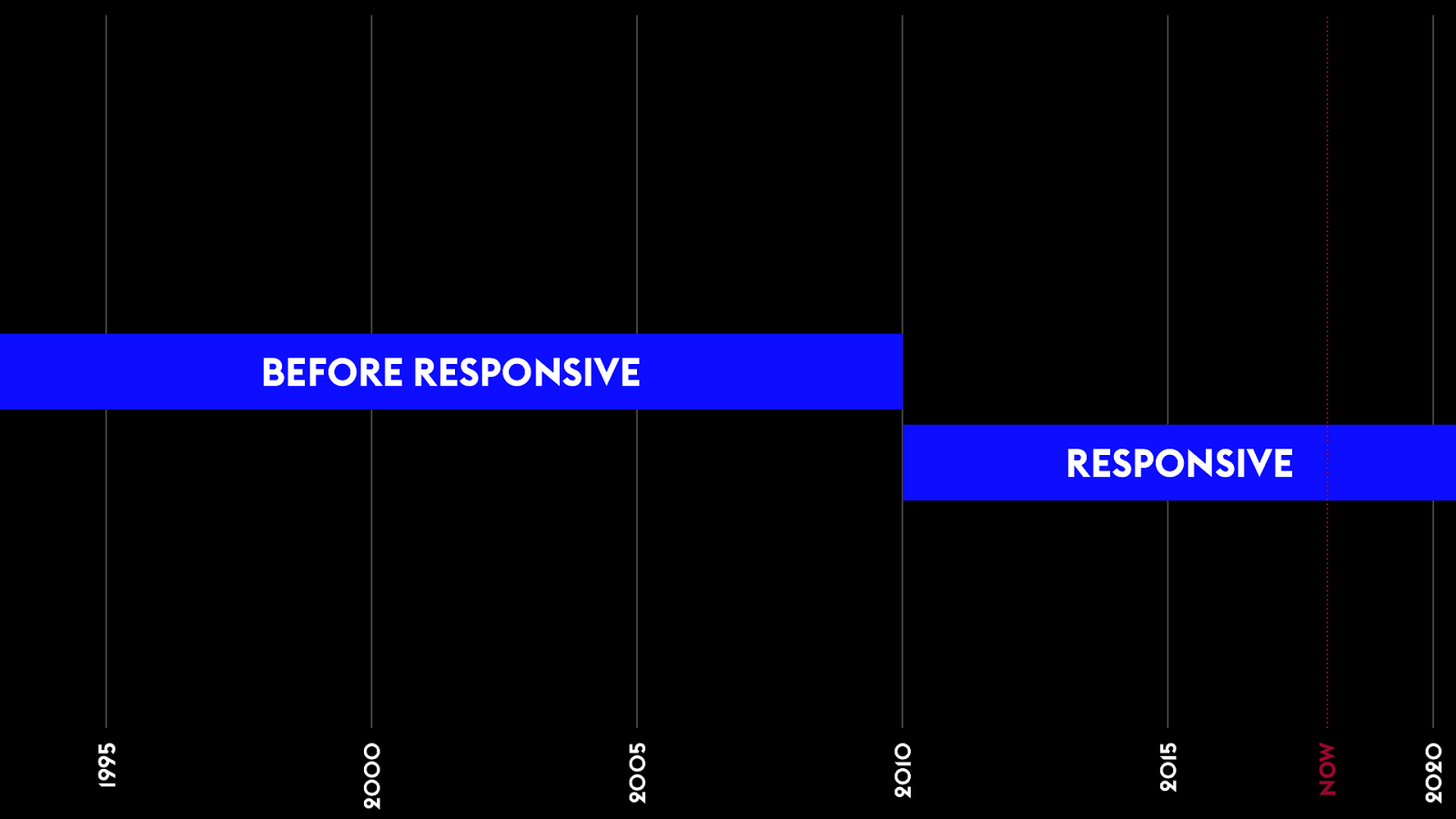
BEFORE RESPONSIVE 2020 NOW 2015 2010 2005 2000 1995 RESPONSIVE 0 For a lot of people, people who’ve been doing this a bit longer, they remember the big transition we went through switching to responsive. Rethinking everything because of responsive. So there was a time before responsive. And now, we’re all set, responsive layouts.
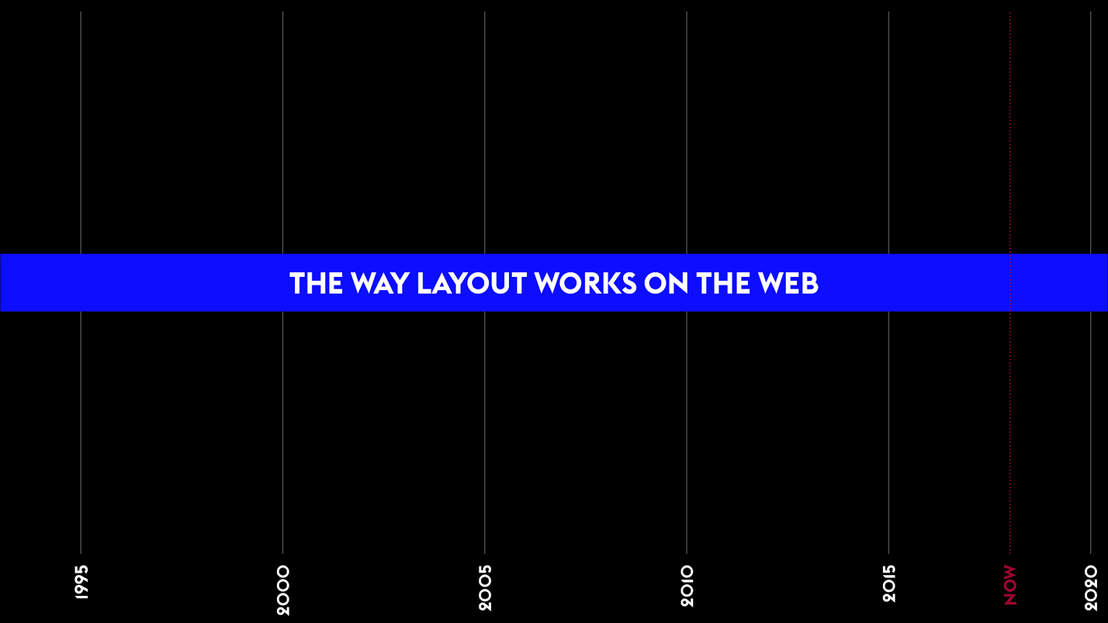
2020 NOW 2015 2010 2005 2000 1995 0 But the truth is that there’s been a series of major eras where we used totally different techniques for designing pages, for conceiving of a website, for doing graphic design on the web. We’d try an approach, and then we’d give up on it. Drop it for something else. Why? Why do we keep changing how we do layout on the web?

1 Because we’ve been having a fight. For 25 years. We think we solve it. But we’re dissatisfied. Frustrated. So we try again. Tug of war. One side sitting in the sand crying. The other playing the role of bully.
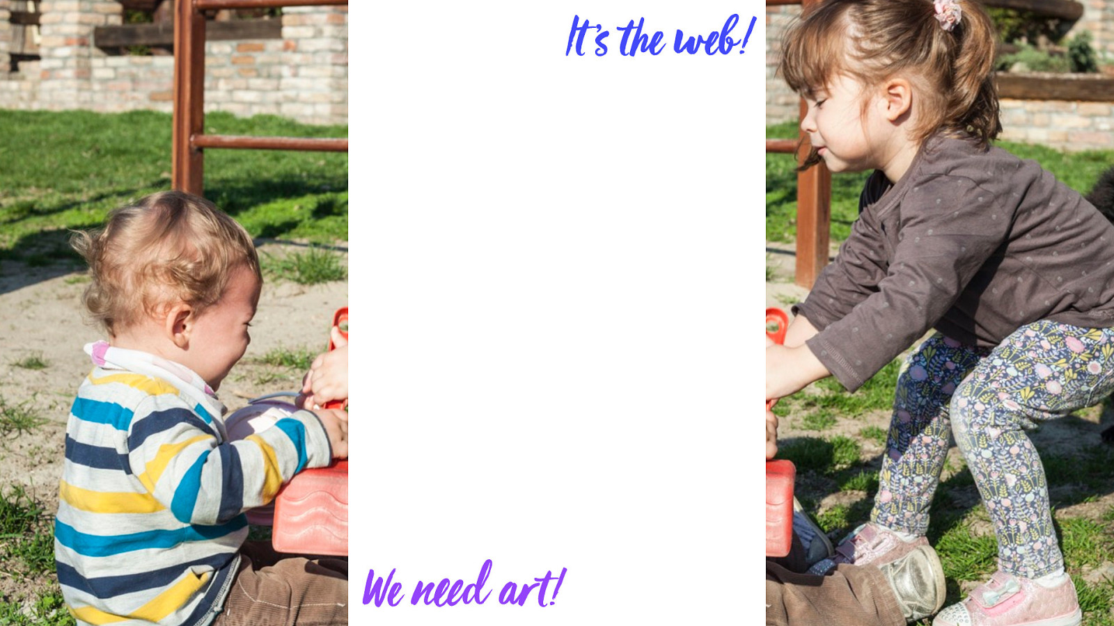
We need more art. Real graphic design. 1 It’s a fight between two forces. The desire to do amazing graphic design on the web. Art direction. To use the full power of visual language to communicate to our audience.
That’s not how the web works. 1 On the other hand — there’s a drive to truly understand the web. As it’s own medium. To lean into the nature of our medium. Go with what the web wants us to do. To create clean, simple code. Be practical about the limitations.
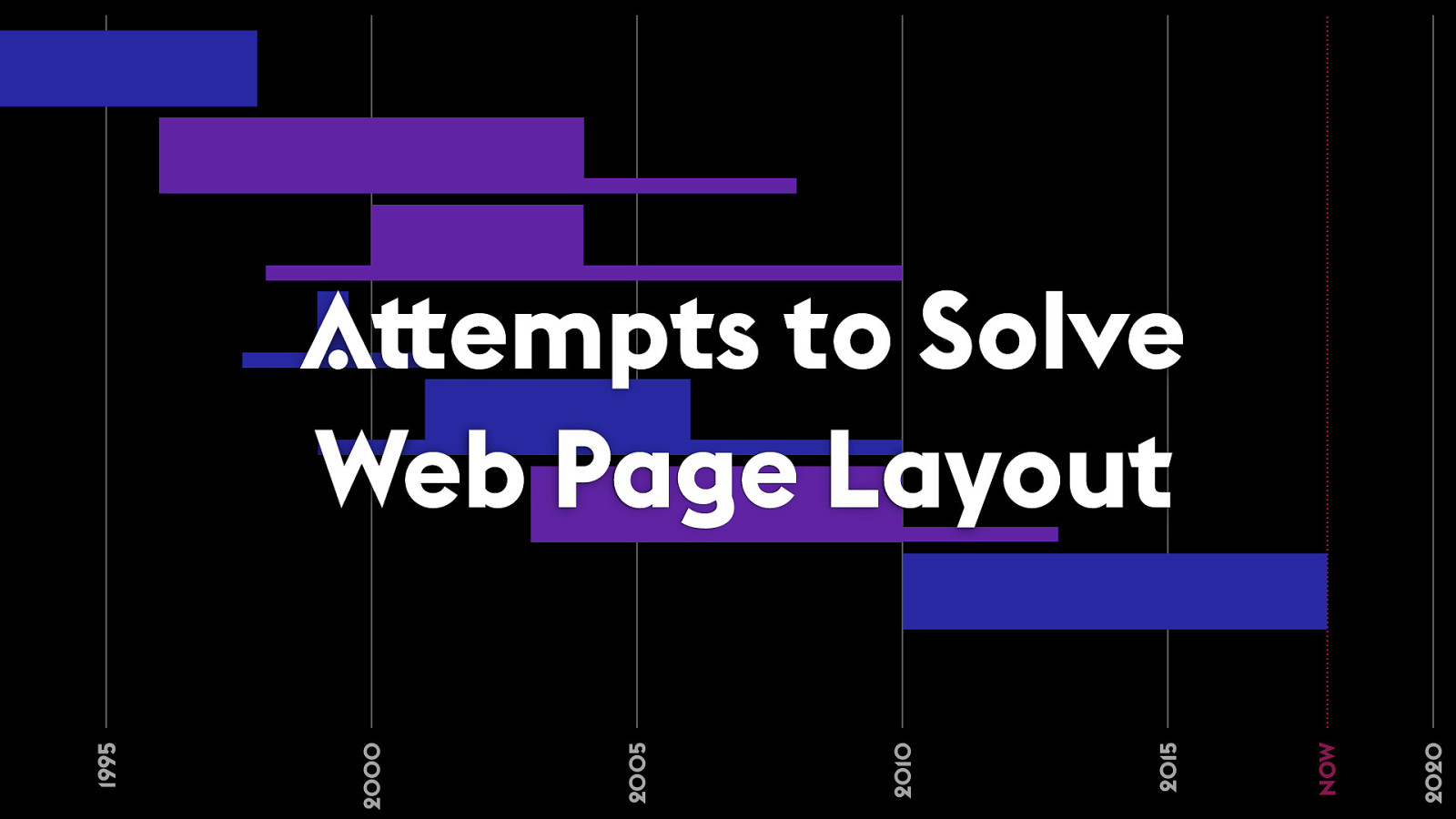
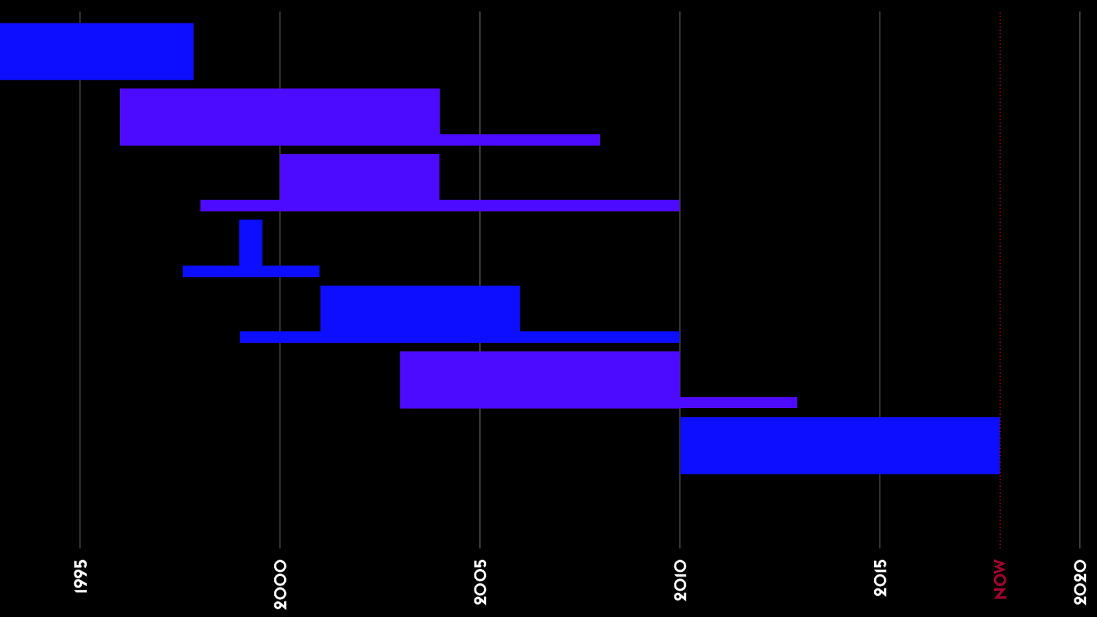
1 This fight has been going on the whole time. 25 years. Through 5 major approaches to create great designs on the web. 2020 NOW 2015 2010 2005 2000 1995 Attempts to Solve Web Page Layout
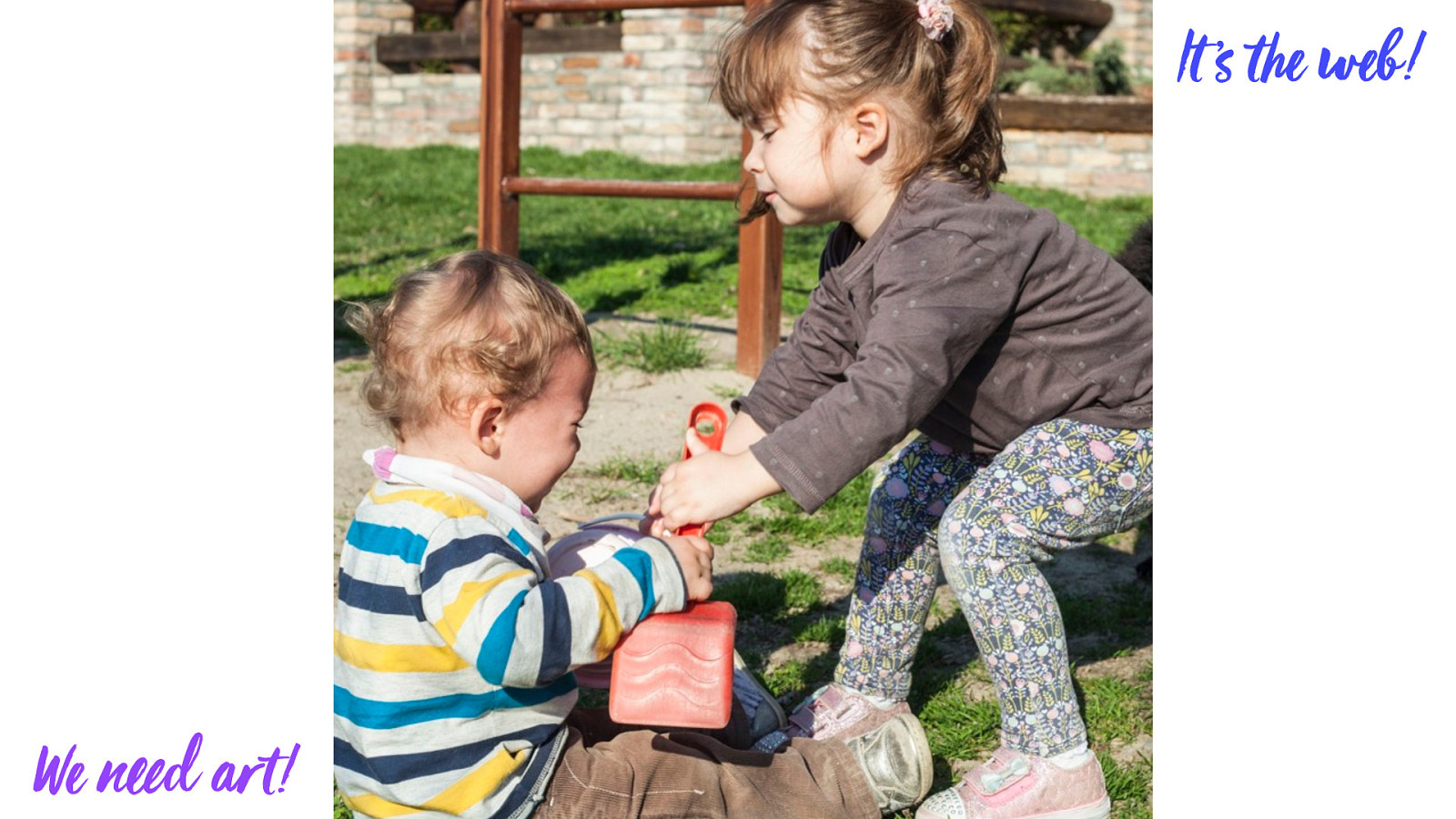
Simple HTML It ’s !e web! 1 It all started with simple HTML.
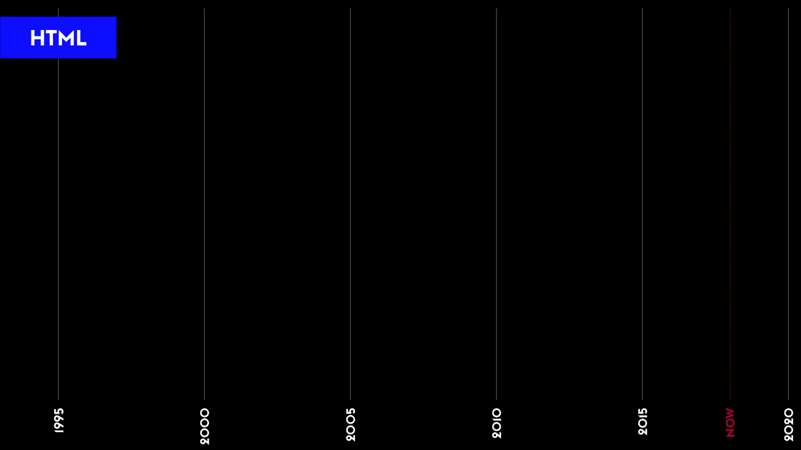
2 HTML is all we had — no CSS, no JS. Any graphic design was done with HTML. 2020 NOW 2015 2010 2005 2000 1995 HTML
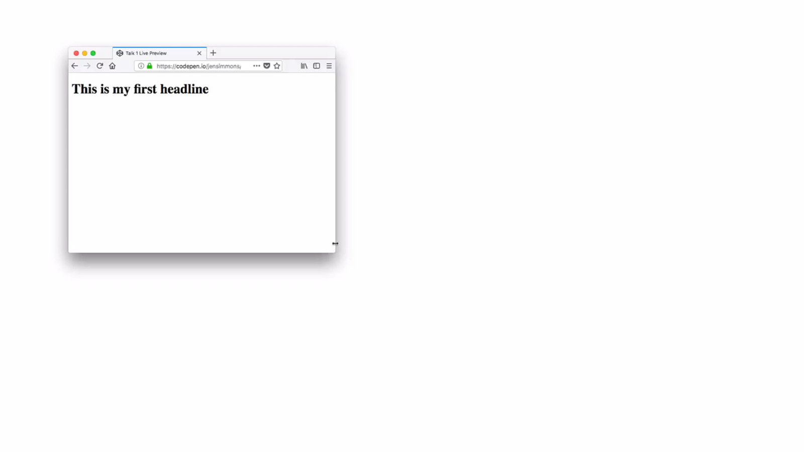
2 (1:30) There are a few qualities of the default layout on the web I want to point out. It’s been this way since the beginning and it’s still this way. Headline. In a box. Every element in the DOM exists in layout as an invisible box. I’m marking these boxes with purple lines. The h1 element box is as wide as it can be, even wider than what the words need. Goes all the way across.

LESSON LEARNED Flow 2 Introduced the concept of Flow layout. I point this out because we now need a way to refer to this layout. It’s like we are fish, who just grew legs & lungs, and we are climbing out of the water… not do we have all these new words to describe land, we need words to describe water, to understand the contrast between land & water.
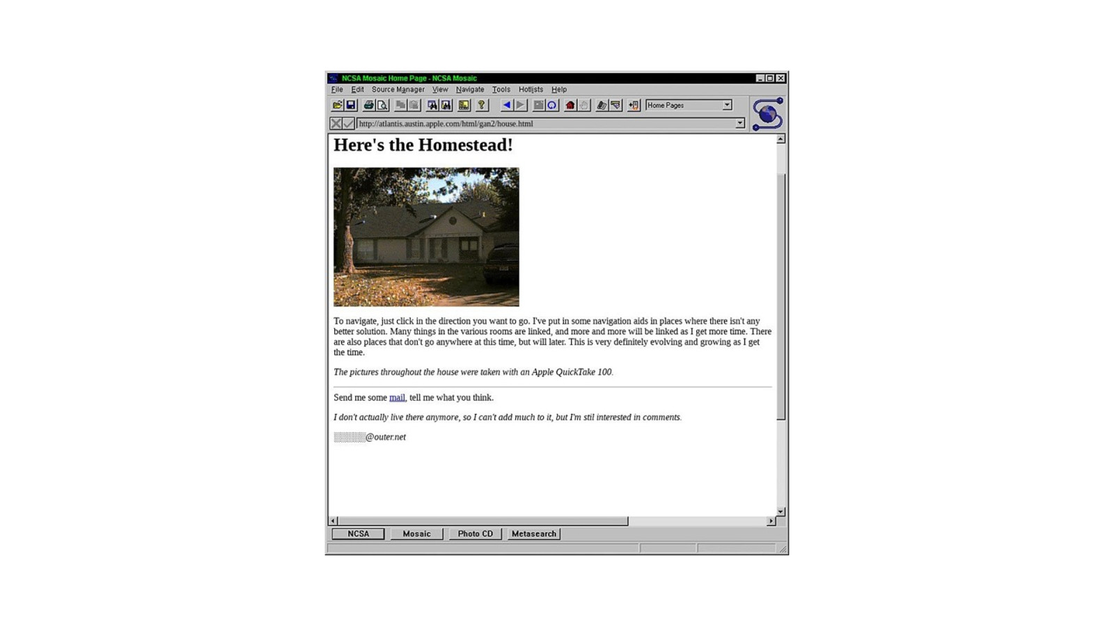
3 In the earliest days of the web, page layouts looked like this.
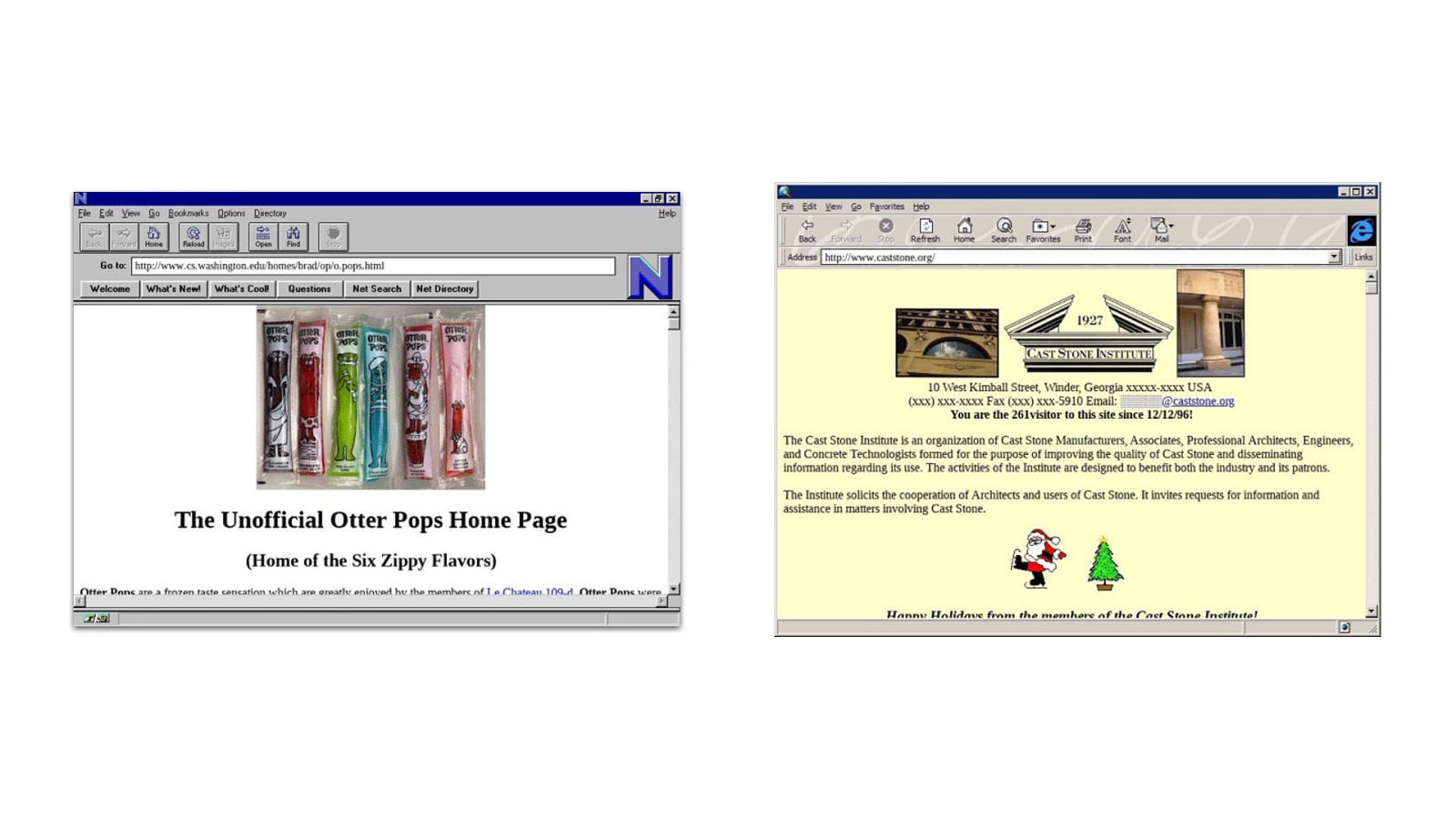
3 You could center things, change some colors, use images, pick from a few fonts…. but everything relied on Flow layout.
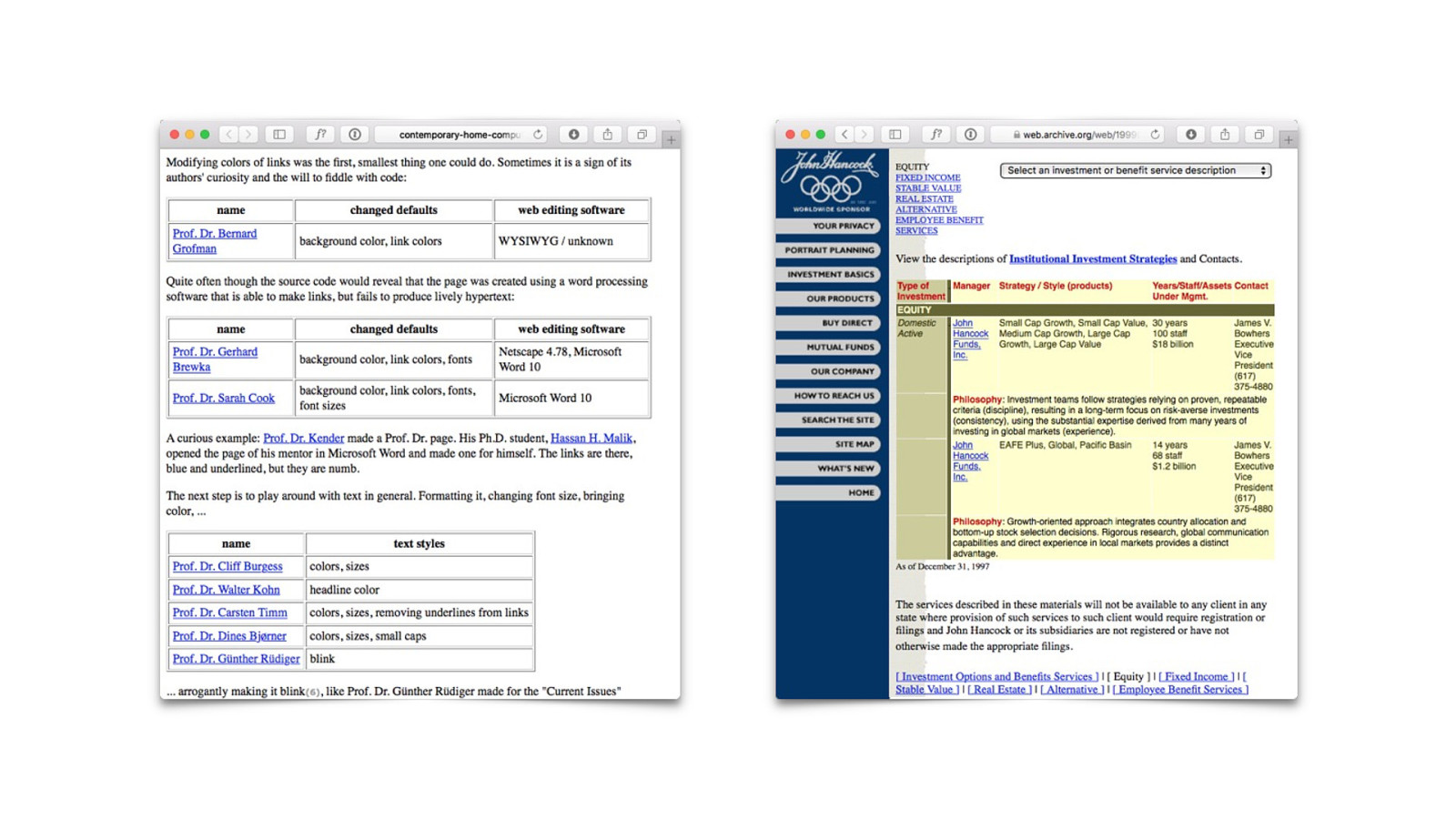
3 And we had tables. Tables are great when you have tabular data. When you have data that belongs in a table, please do use a semantic table elements to mark up that data.
3 But then people interested in graphic design looked at HTML tables and say “hmmmm. We could put other stuff in those table cells, and get a layout”.
We n"d a#! Tables for Layout 4 And the era of Tables for Layout was born.
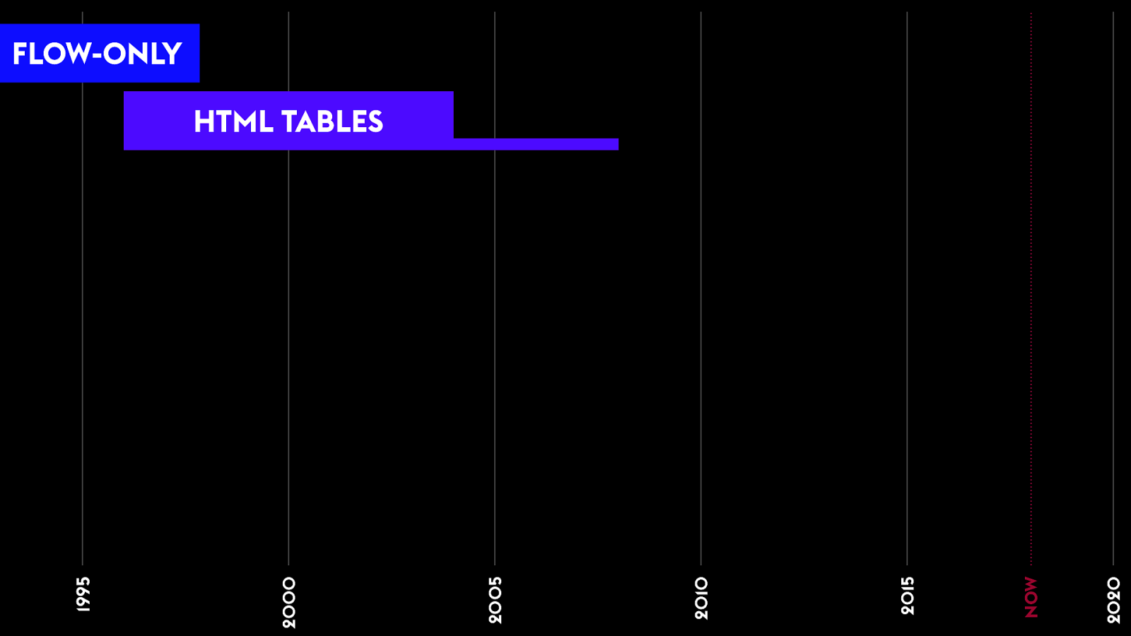
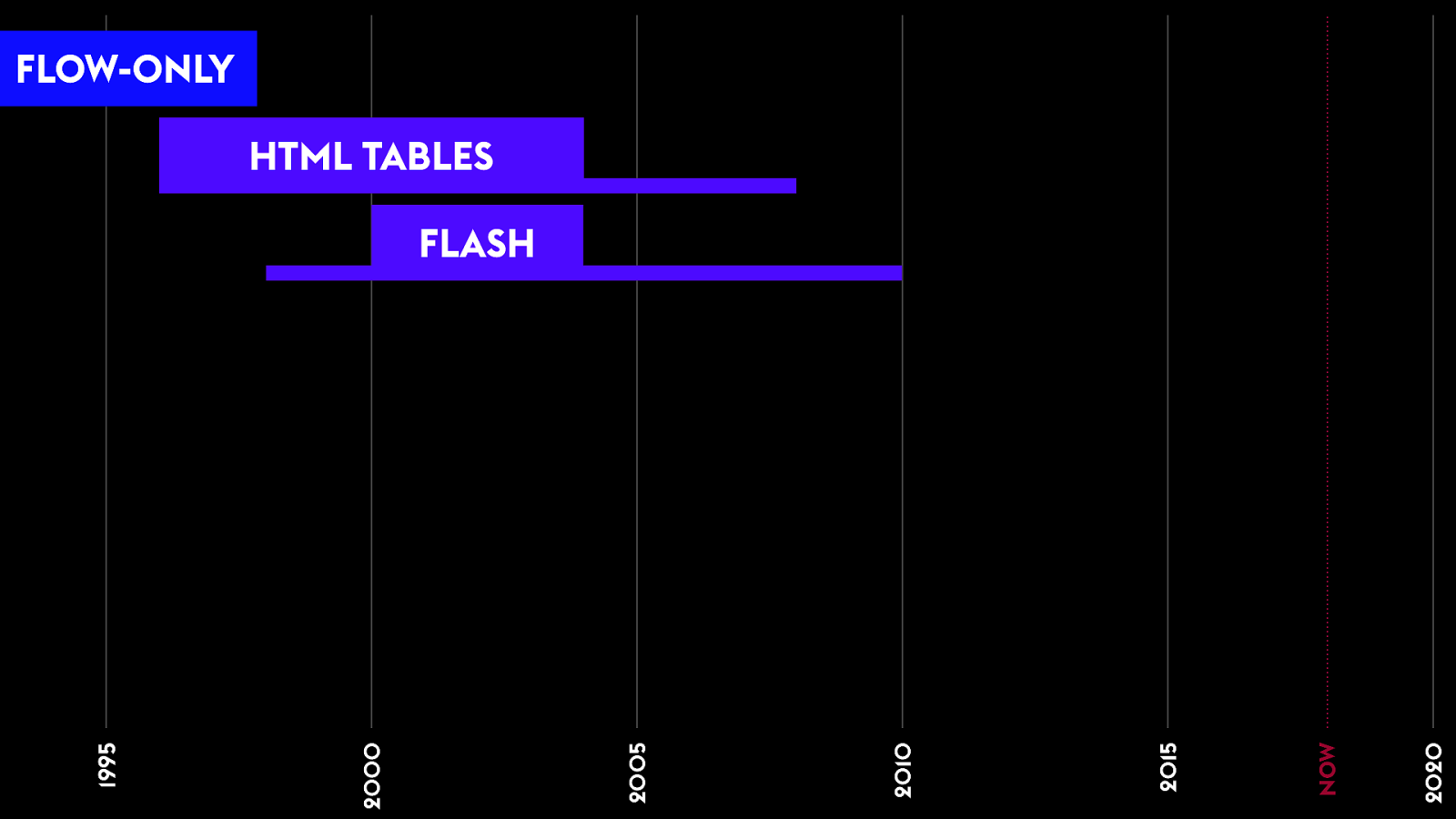
FLOW-ONLY 2020 NOW 2015 2010 2005 2000 1995 HTML TABLES 4 This era lasted for quite a while — from 1996 to 2003 it was the dominate technique. Seven or eight years. People still insisted on using HTML tables for layout well into the 2000s… I remember fighting with PHP developers about not using tables for layout in 2009.
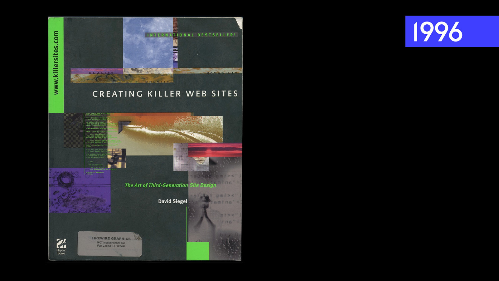
1996 4 This is the book I was reading from, Creating Killer Websites. David Seagull.
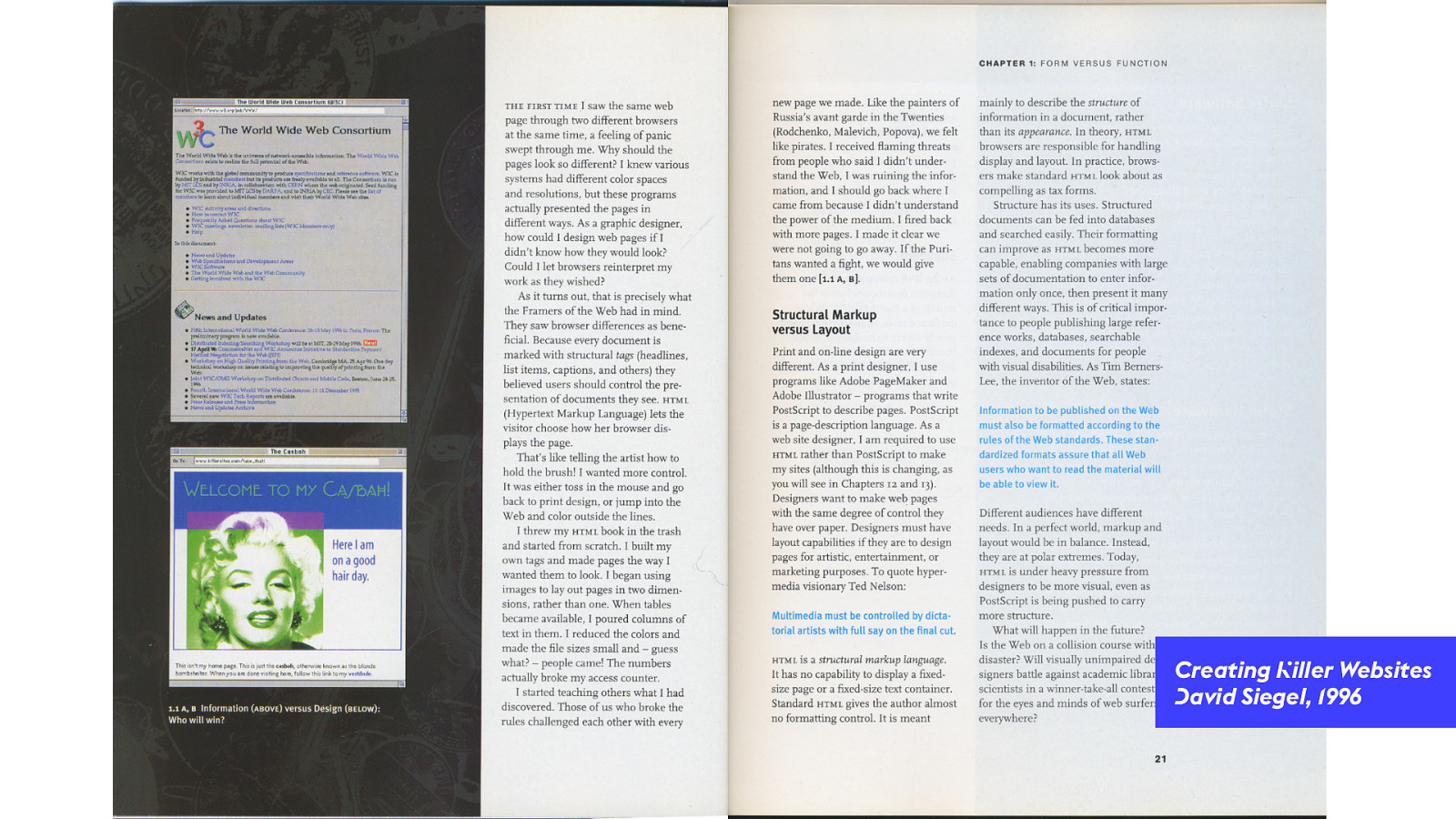
Creating Killer Websites David Siegel, 1996 4 He starts the book with a kind of manifesto — ranting about how he wanted the ability to do great graphic design. And he’d do it using any means necessary.
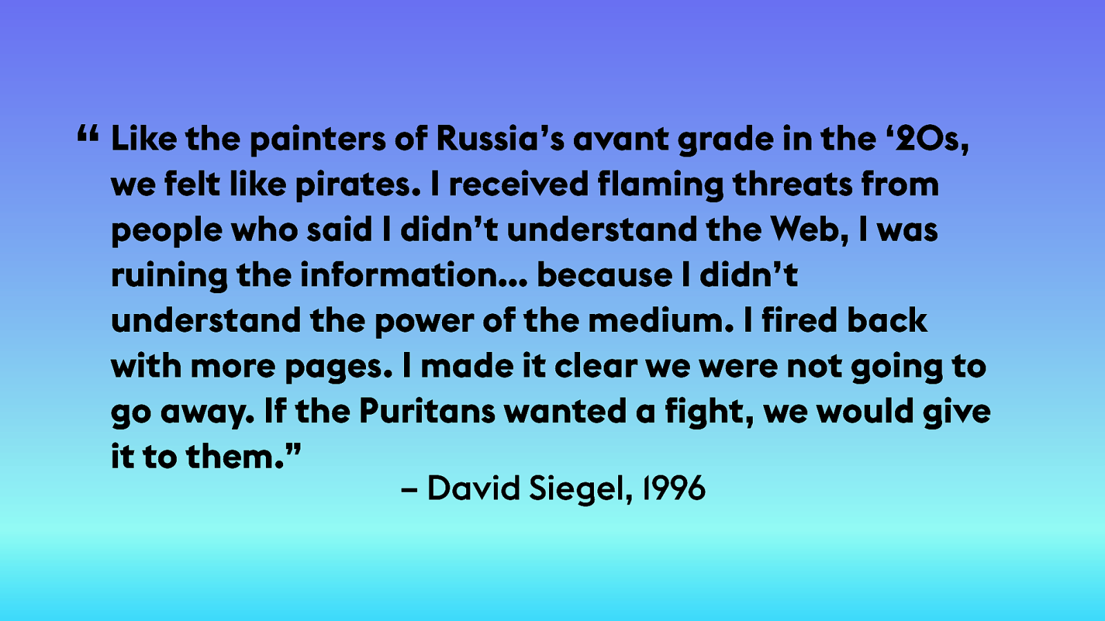
the painters of Russia’s avant grade in the ‘20s, “ Like we felt like pirates. I received flaming threats from people who said I didn’t understand the Web, I was ruining the information… because I didn’t understand the power of the medium. I fired back with more pages. I made it clear we were not going to go away. If the Puritans wanted a fight, we would give it to them.” – David Siegel, 1996 4 Like the painters of Russia’s avant grade in the 1920s, we felt like pirates. I received flaming threats from people who said I didn’t understand the Web, I was ruining the information… because I didn’t understand the power of the medium. I fired back with more pages. I made it clear we were not going to go away. If the Puritans wanted a fight, we would give it to them.
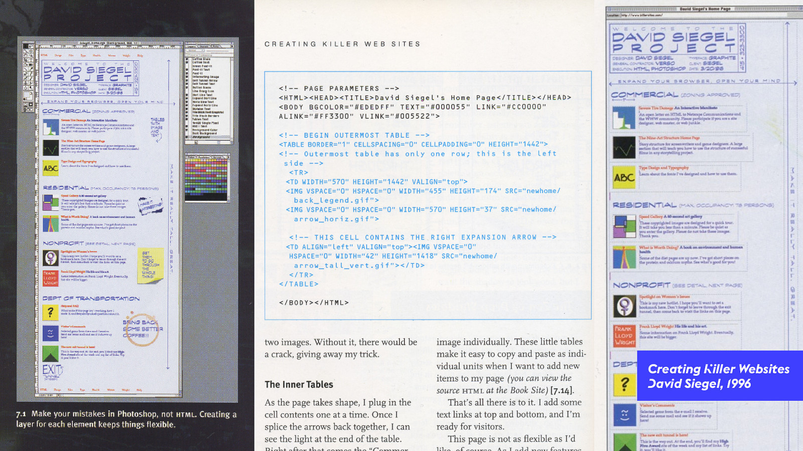
Creating Killer Websites David Siegel, 1996 4 In it he shows you should: Draw a picture of your desired website in Photoshop. Chop it up into pieces. Shove the pieces into table cells, no matter how awful the code. And you get something with more graphic design sense out the other side.
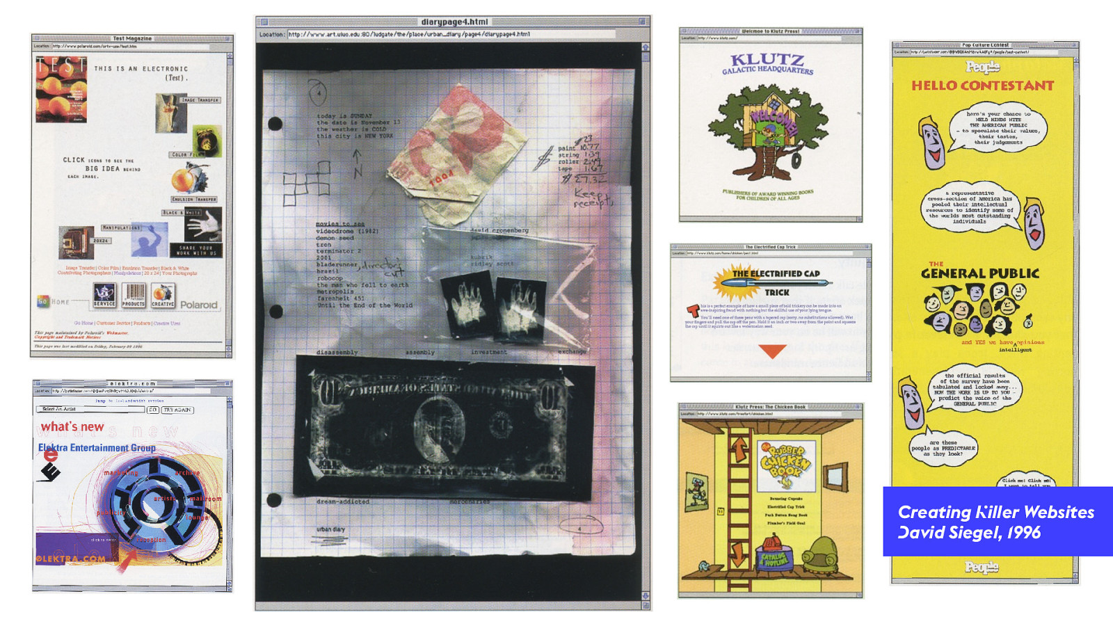
Creating Killer Websites David Siegel, 1996 5 These are the sites we could build using these techniques. Much more interesting and complex than a simple flow layout.
Creating Killer Websites David Siegel, 1996 5 We had to chop up our visuals into puzzle pieces, and put them in different cells.
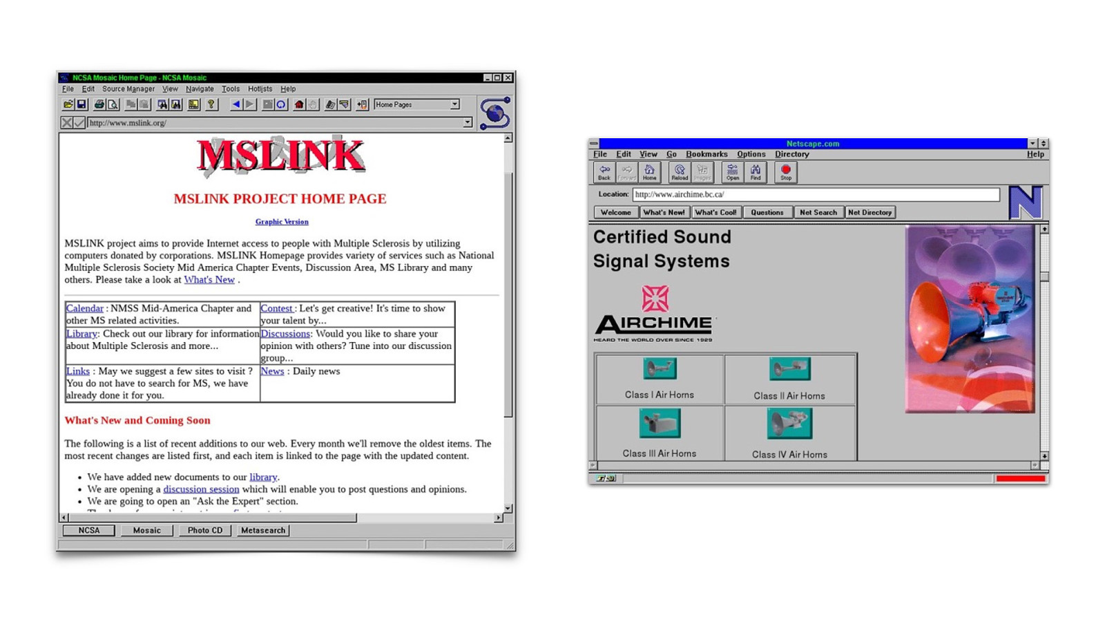
5 Using HTML tables for layout & inlining all the styling was really hard. Even with Dreamweaver, getting a layout to work in both Netscape and IE at the same time was a nightmare. Lack of standards. Lack of compat.

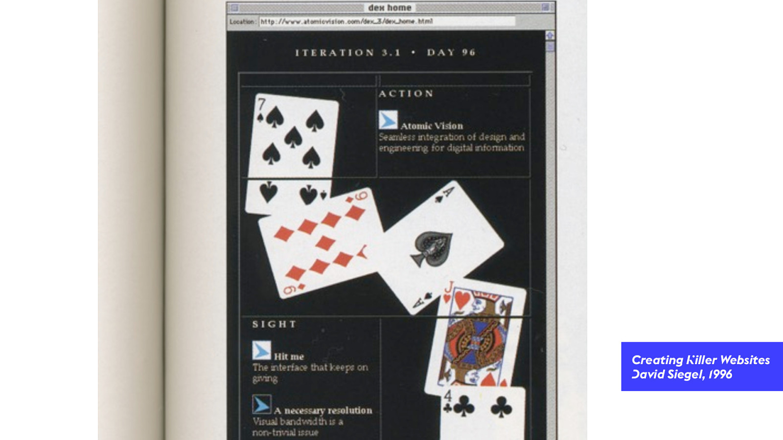
We n"d a#! Flash 6 So we tried again. Flash isn’t web stuff. It was it’s own thing, shoved onto the web. You either had Flash or you didn’t. If you did, it worked the same everywhere.
FLOW-ONLY HTML TABLES 6 Flash gave us a chance to start over. Rethink interaction patterns. How a website worked. To do things people were doing in the world CD-ROMs and interactive media. 2020 NOW 2015 2010 2005 2000 1995 FLASH
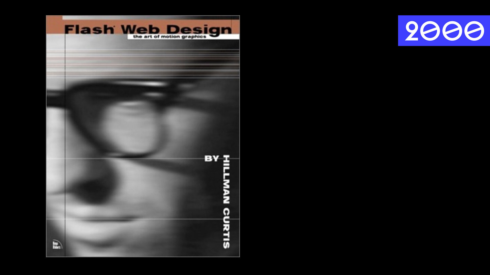
2000 6 Flash Web Design. Hillman Curtis. Highly influential book. Showed people how to use Flash to make a whole website.
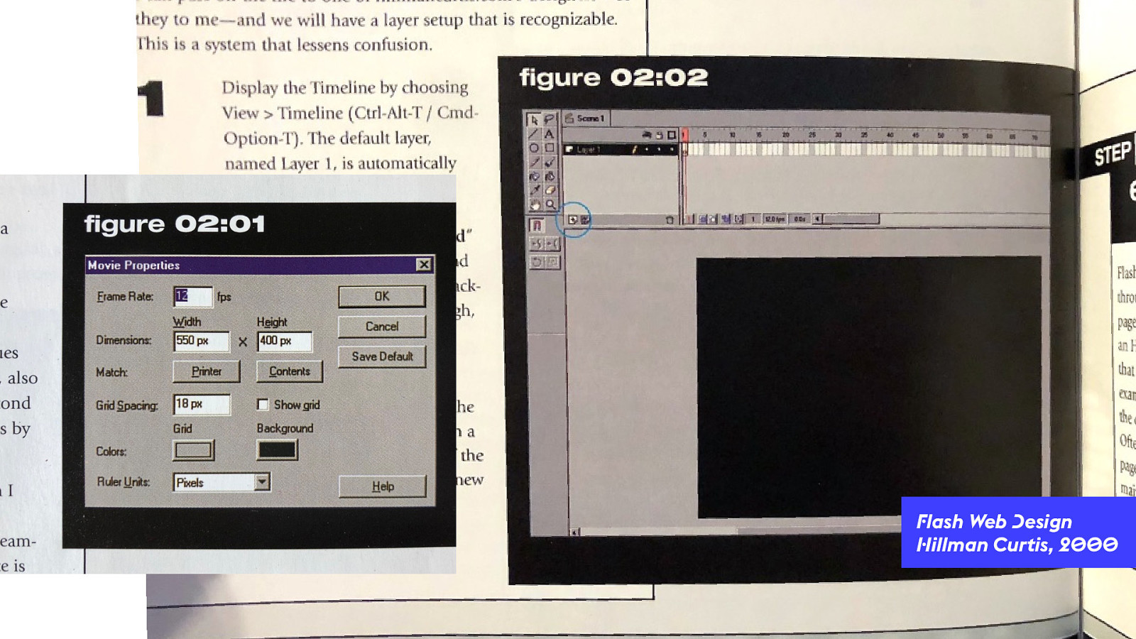
Flash Web Design Hillman Curtis, 2000 6 Started with size of the canvas. Fixed size. “Movie property.” Then every bit of content is a independent box — an independent object on the page. Defined in a separate a layer.
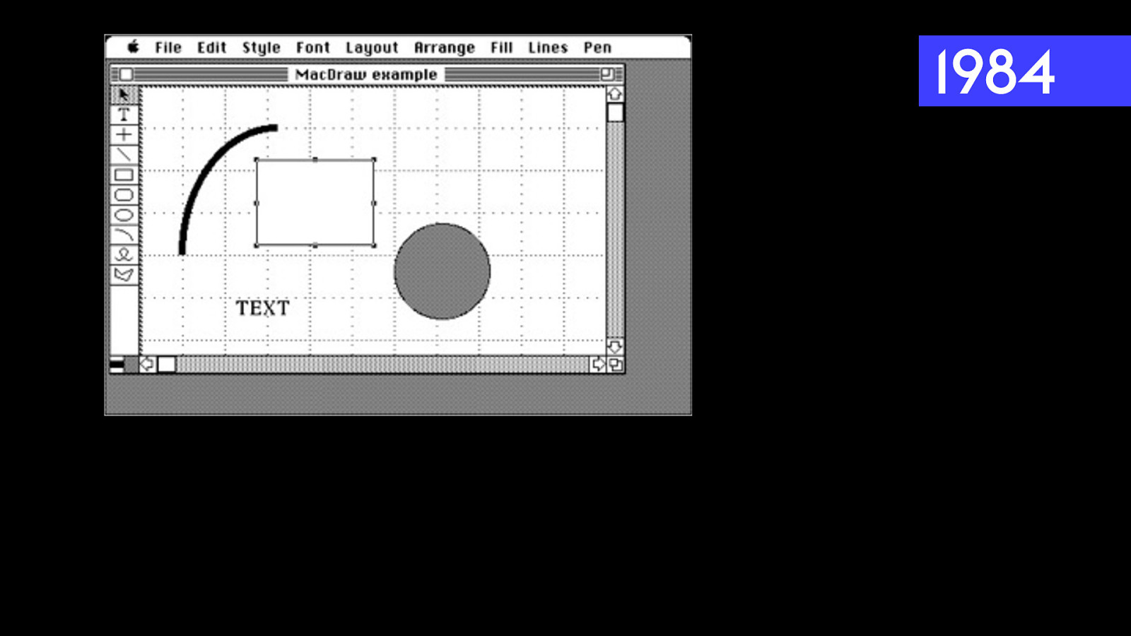
1984 7 The way you’d construct a layout in Flash completely disregarded the mental model of the Flow layout. You point at an item with your mouse. You click to grab it. Drag it where you want. And it stays there. Instead it used the mental model of MacDraw & modern tools today.
7 It’s a mental model from the real world. Direct manipulation. You want something somewhere? You put it there. Done.
7 Each object in a layer. With a timeline. Would define appearing / disappearing / moving as an event happening in time. Click a button, item would appear. No pages. Everything for the whole site was in this one movie file.
8 Then you’d put that movie box on a web page.
8 Movie didn’t communicate with outside. Wanted scrolling, had to create scrollbars. Very hard to update the content. No accessibility. No SEO. Responsible to do everything browser did. Have to have Flash plugin, right version. No resilience. Cool artistic projects. Too big of a cost.

The Web It ’s !e web! 9 So a new movement started, people insisting “It’s the Web!” We should be using the web properly. When you do, you get a lot of things for free. They just work.
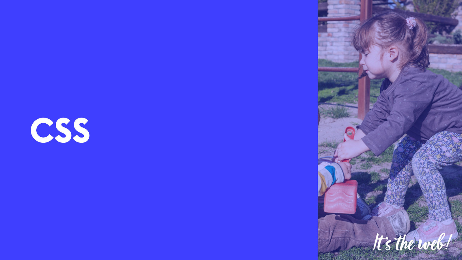
CSS It ’s !e web! 9 This happened because of CSS.
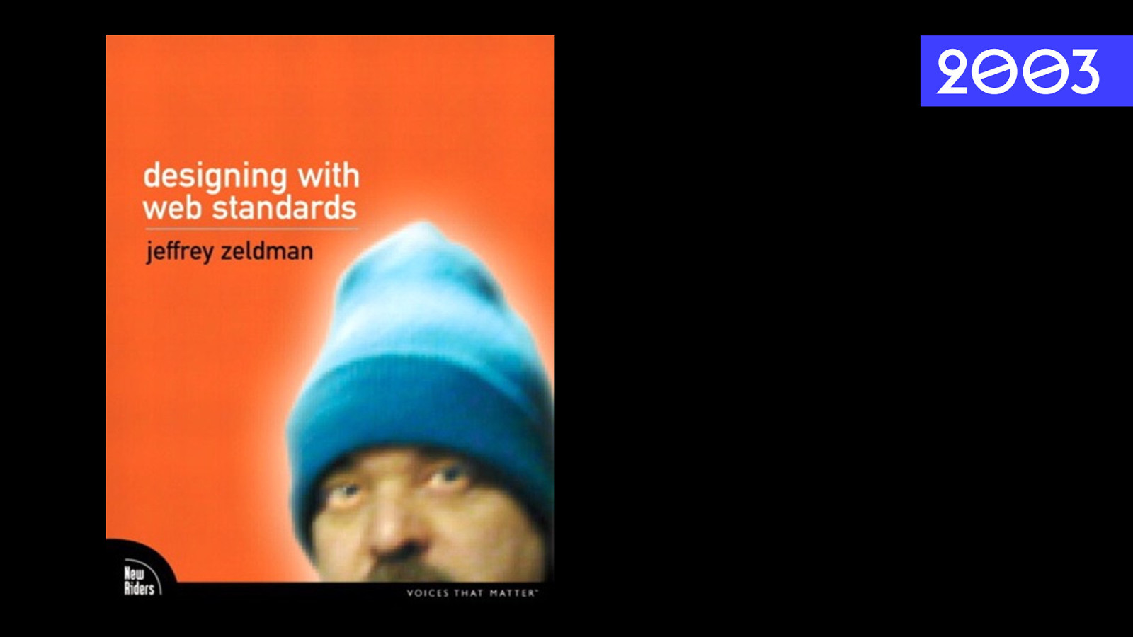
2003 9 Web standards movement.
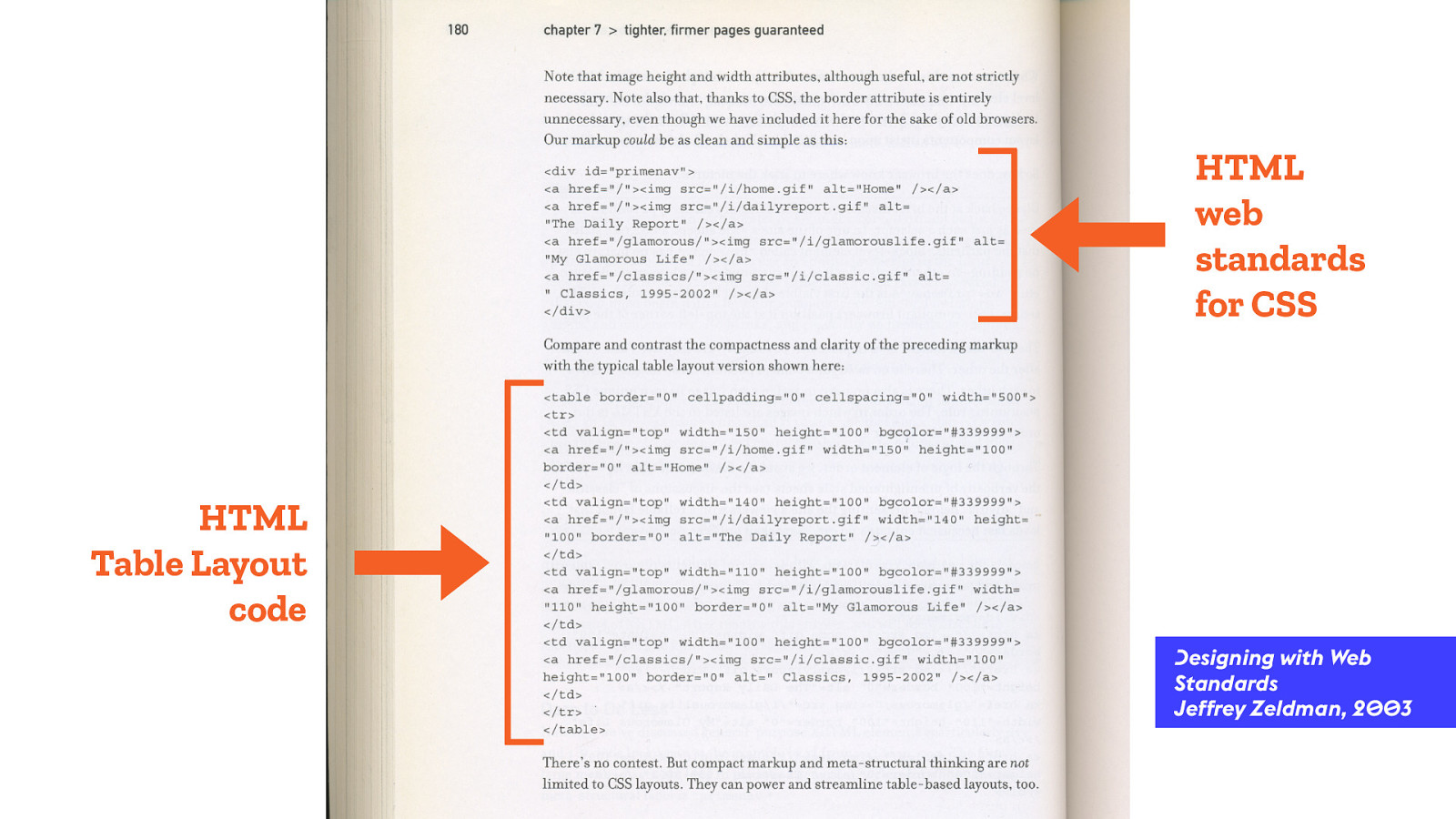
HTML web standards for CSS HTML Table Layout code Designing with Web Standards Jeffrey Zeldman, 2003 9 The code matters. The code matters a lot. We do need to lean into the medium, and understanding it. Don’t do styling in HTML. It’s not a delivery mechanism for a mess. Make HTML clean and simple. Semantic. Reusable. Then apply styling using CSS, from separate CSS files.
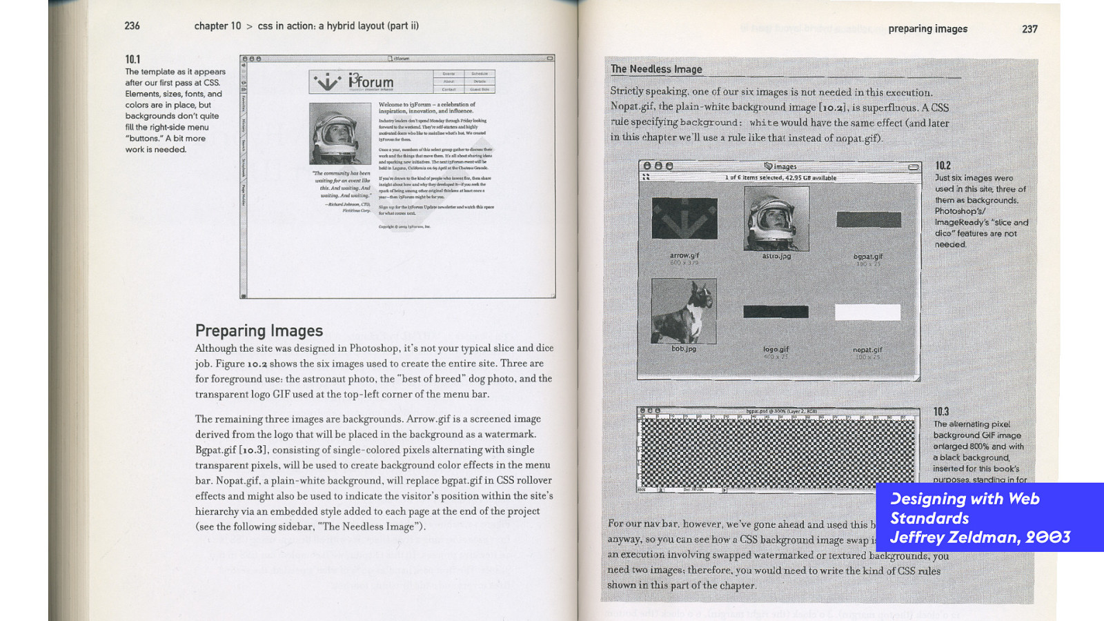
Designing with Web Standards Jeffrey Zeldman, 2003 9 This is how to assemble a web page. Don’t take your content & stick it in images. Don’t chop your images into puzzle pieces. Keep the images whole. Write clean semantic markup, wrapping content that’s in a logical order. Then apply CSS. And if you can’t accomplish a graphic design idea, then get another idea. Keep the code clean.

LESSON LEARNED Semantic Markup 9 Introduced the importance of semantic markup. Still true today. Clean, readable, reusable code. That isn’t a mess.
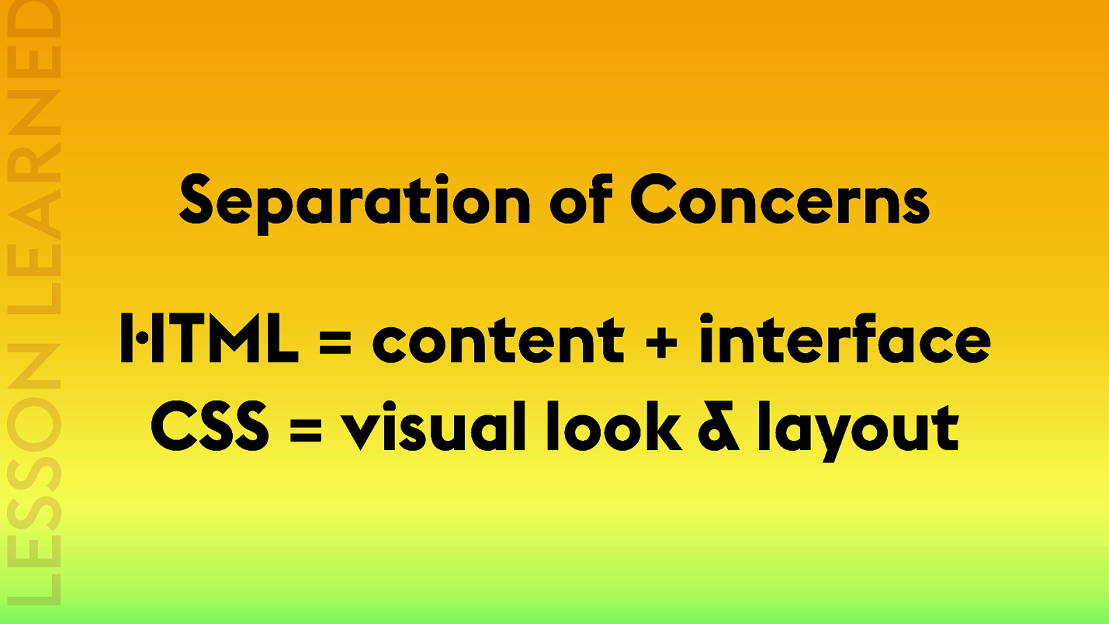
LESSON LEARNED Separation of Concerns HTML = content + interface CSS = visual look & layout 9 Introduced the importance of semantic markup. Still true today.
Layout in CSS? It ’s !e web! 10 How are we going to do layout in CSS?
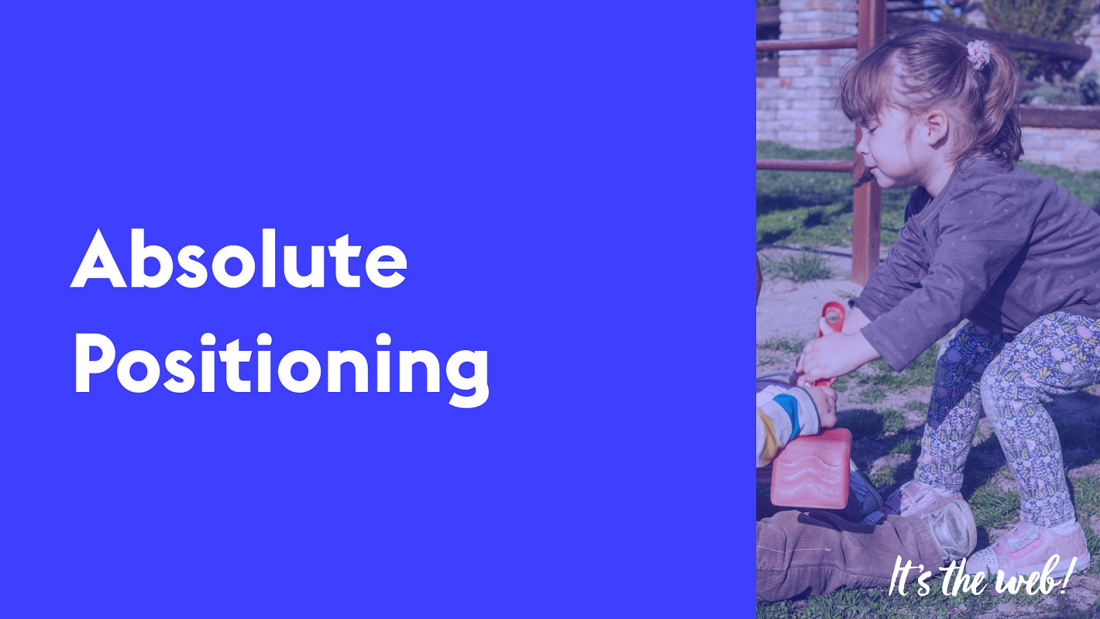
Absolute Positioning It ’s !e web! 10 position: relative; position: absolute; top: 100px; right: 300px; sort of same idea as graphic software…

1984 10 This is the mental model of AbsPos. Trying to measure fixed lengths and position elements. It doesn’t work. When something is positioned, it’s taken out of the Flow. You have to position EVERYTHING. And you HAVE to know how big everything is. It can’t change size.
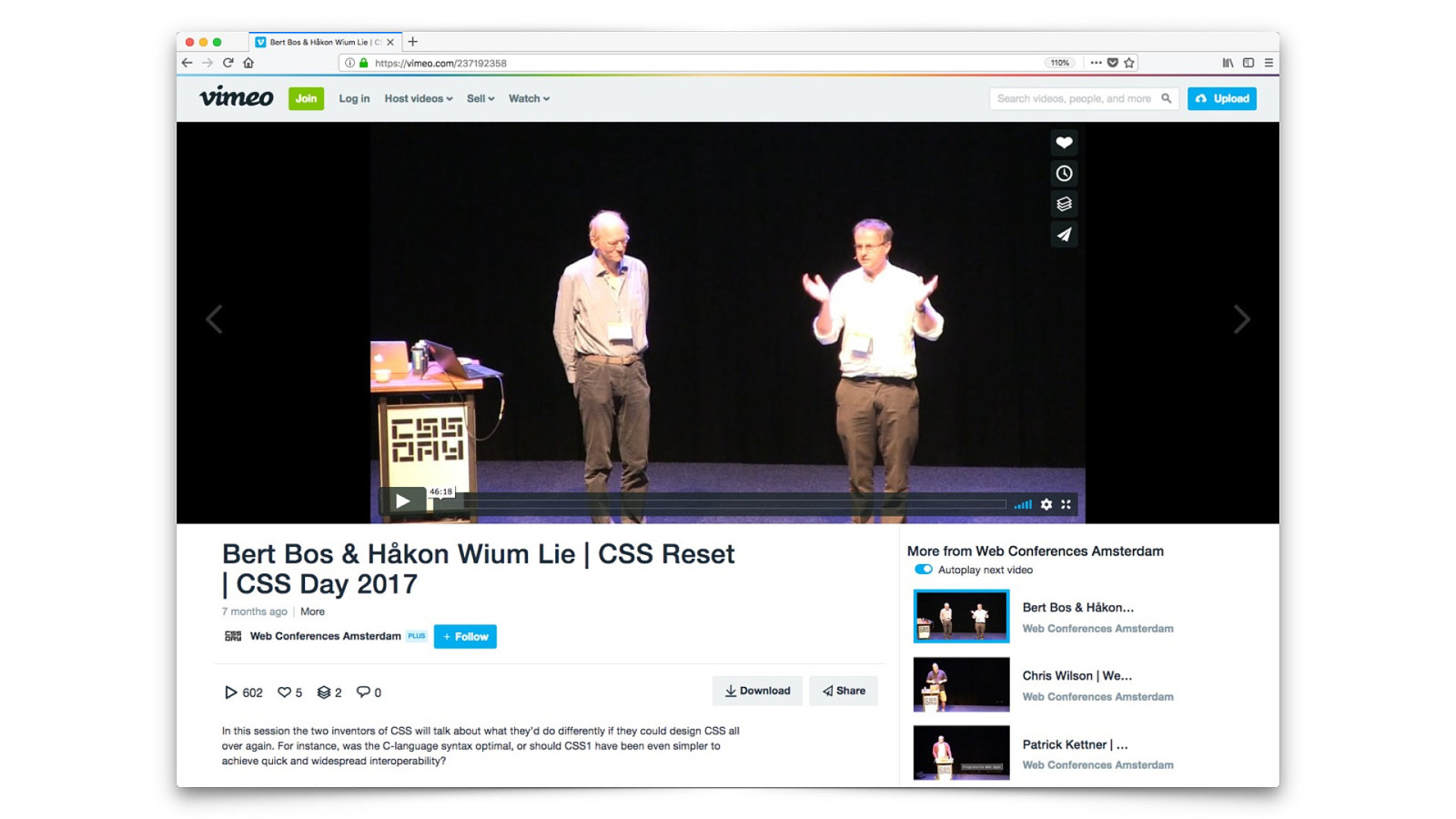
11 Bert Bos & Howcon Lee — talk at CSS Day in Amsterdam — on creating CSS1. Q&A asked: “Is there anything that you shouldn't have put into CSS at all?” Håkon answers sheepishly “Absolute Positioning.” Abspos can be useful. Nothing wrong with using it. But tricky. Because anything that is positioned is pulled out of the flow.
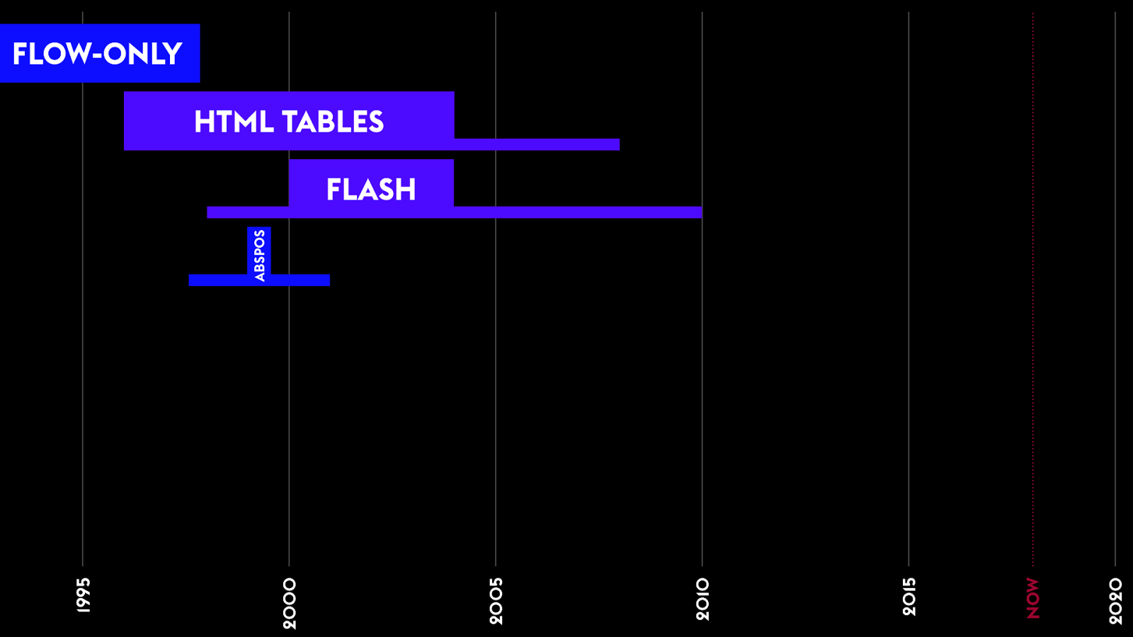
FLOW-ONLY HTML TABLES 11 We tried to layout the entire page with AbsPos, but sadface. No. 2020 NOW 2015 2010 2005 2000 1995 ABSPOS FLASH

Fluid Layouts using Floats It ’s !e web! 12 Liquid, elastic, flexible… If you can’t do an awesome layout, because of limitations of CSS, oh well. That’s ok. Those are the rules. The medium.
12 Floats were invented so we could do this. If you float the image, the flow content that comes after that floated element will wrap around… it’s a way to control the flow. But in our desperation for a tool, any tool, to alter the layout of content, we invented a hack.
12 (40s) If you take the first two elements, and wrap them in a container. Take the rest of the elements, and wrap them in another container — the orange boxes. Then you can float the first container to the left, and the second container to the right. Give each of them an explicit width, here using percentages. And wa la — we have columns. Or what look like columns. This technique is the basis for every layout ever since. Until last year.
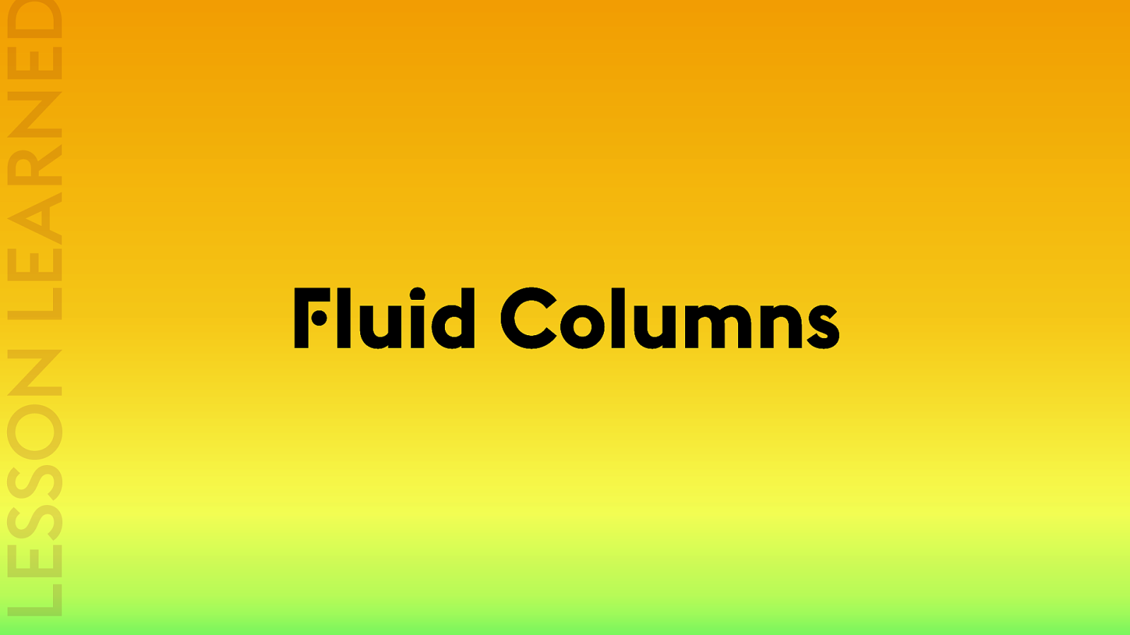
LESSON LEARNED Fluid Columns 13 Introduced the concept of fluid columns. Create a wrapper. Apply a width using percents. And create the appearance of a column. Put several next to each other, and you get a ‘grid’.
13 (31s) Typical layout of the time. It has problems, but we just assumed it’d be ok. Everyone’s screen would be at least 640px wide. Make the image a bit smaller so it’d fit. This is what a lot of Fluid designs looked like. Which is why a lot of us didn’t like them.
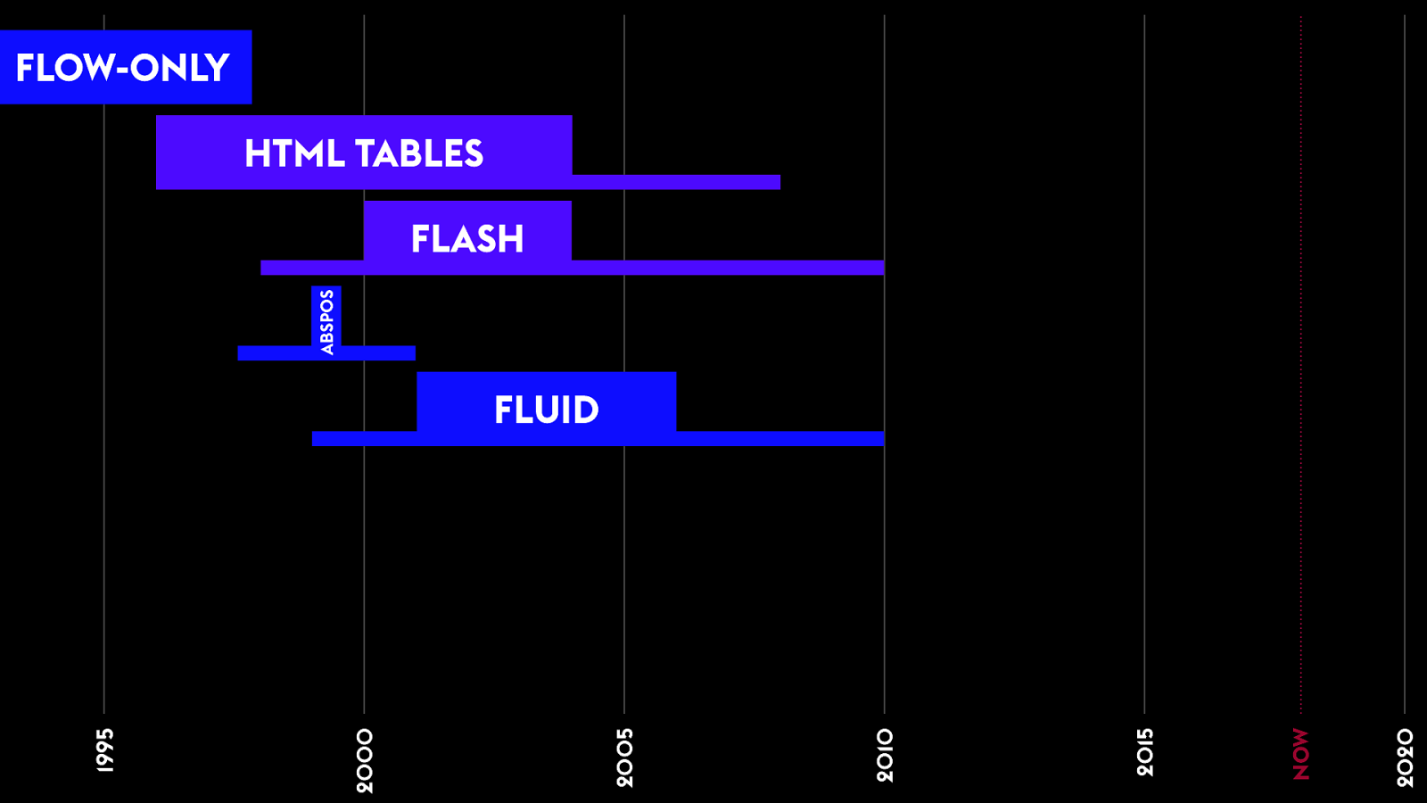
13 2020 NOW 2015 2010 2005 2000 1995 ABSPOS FLOW-ONLY HTML TABLES FLASH FLUID
It ’s !e web! We n"d a#! 13 But the fight continued.
We n"d a#! Fixed-Width Layouts using Floats 14 Fluid designs look ugly in a lot of situations. Lines of text get too long. Images have awkward space around them. Headlines have terrible widows.
14 (57s) Let’s instead put fixed pixel numbers on our wrappers. Width 300px. Float left / right. Creates overflow — but we’ll just assume that’s ok. People’s screen sizes are 800px wide. Or 1024px wide.
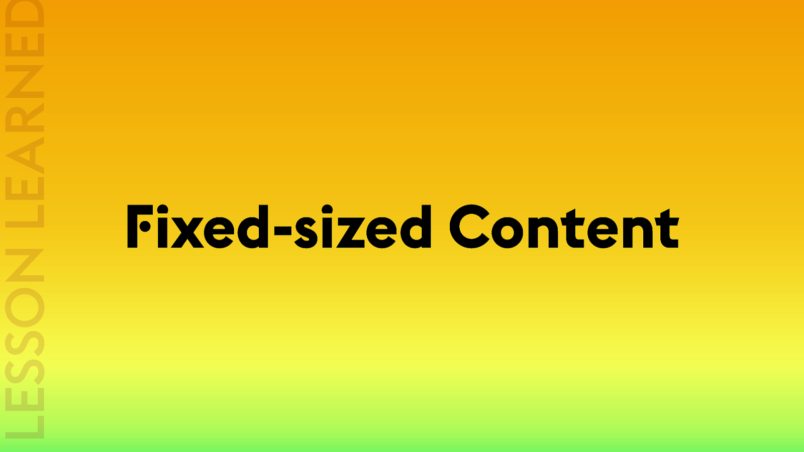
LESSON LEARNED Fixed-sized Content 14 Introduces the benefits of fixed-sixes content. There are benefits to some of the content being a known size.
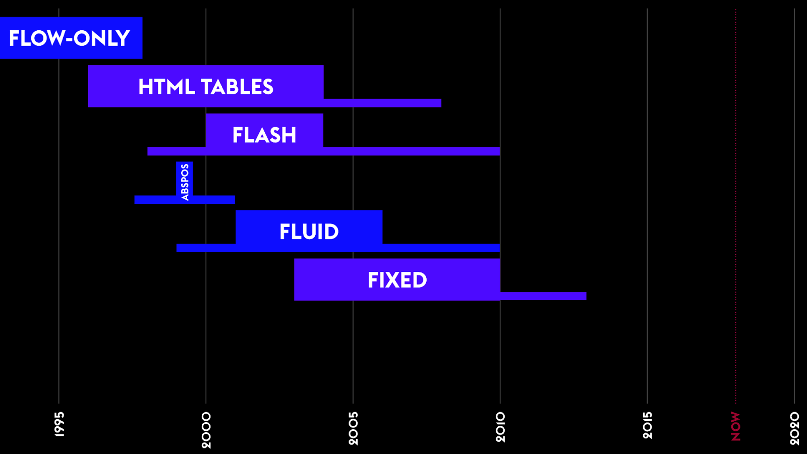
FLOW-ONLY HTML TABLES ABSPOS FLASH FLUID 2020 NOW 2015 2010 2005 2000 1995 FIXED 14 Fixed-width web design was the dominate pattern. We all seemed to agree that was best — except for the few Fluid design hold outs… until MOBILE….

Responsive Web Design It ’s !e web! 15 Brings us to the sixth era of layout.
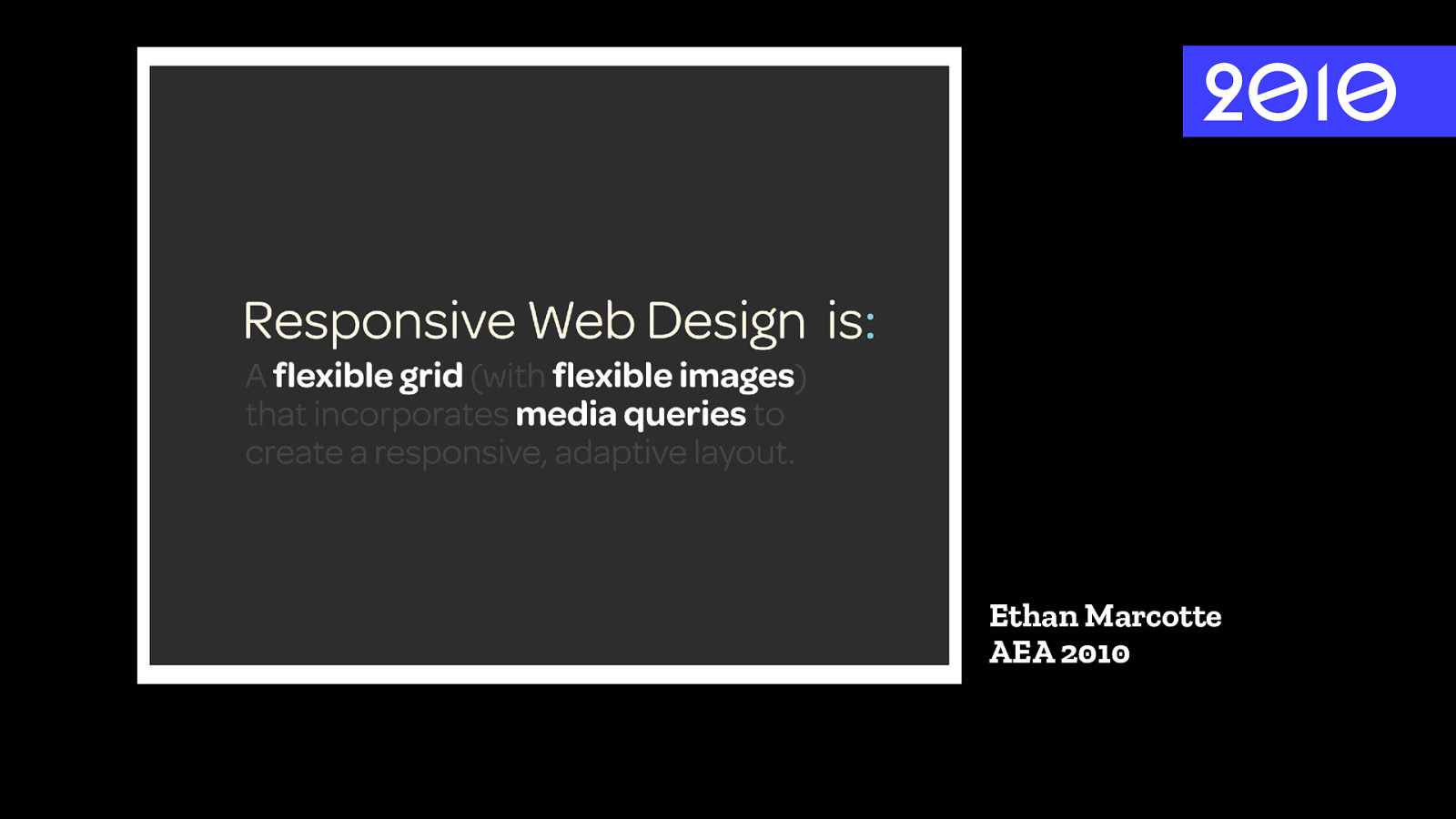
2010 Ethan Marcotte AEA 2010 14 Term coined by Ethan Marcotte in April 2010. To capture what was possible using new CSS — media queries shipped in Firefox & Safari in June 2009. Shipped in Chrome in Jan 2010. Ethan defined RWD as: flexible grid, flexible images, media queries.
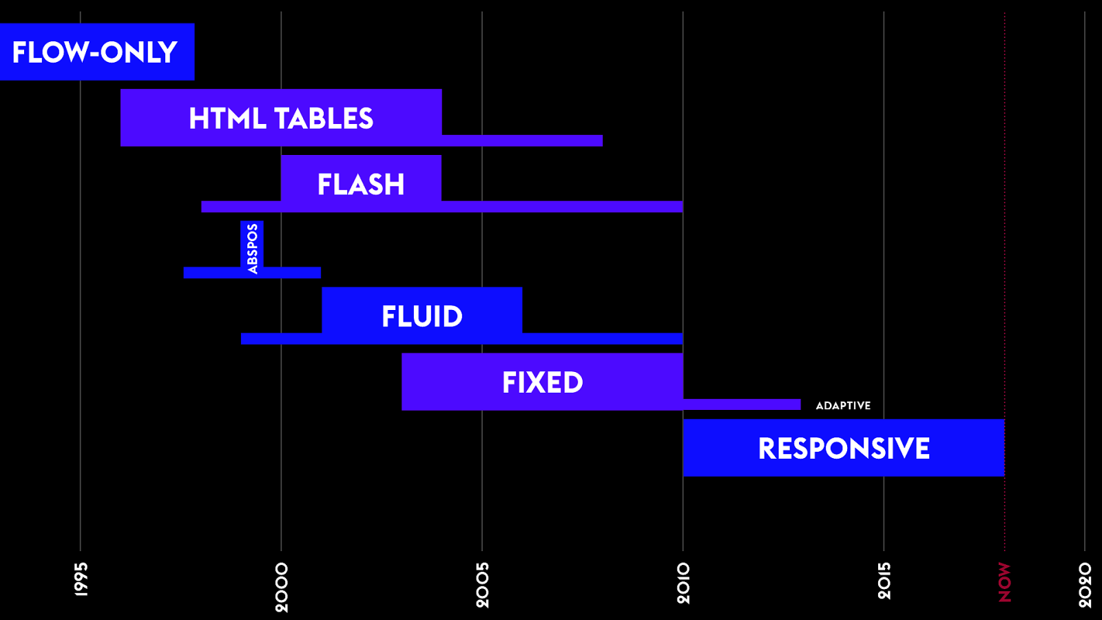
FLOW-ONLY HTML TABLES ABSPOS FLASH FLUID FIXED ADAPTIVE 14 2020 NOW 2015 2010 2005 2000 1995 RESPONSIVE
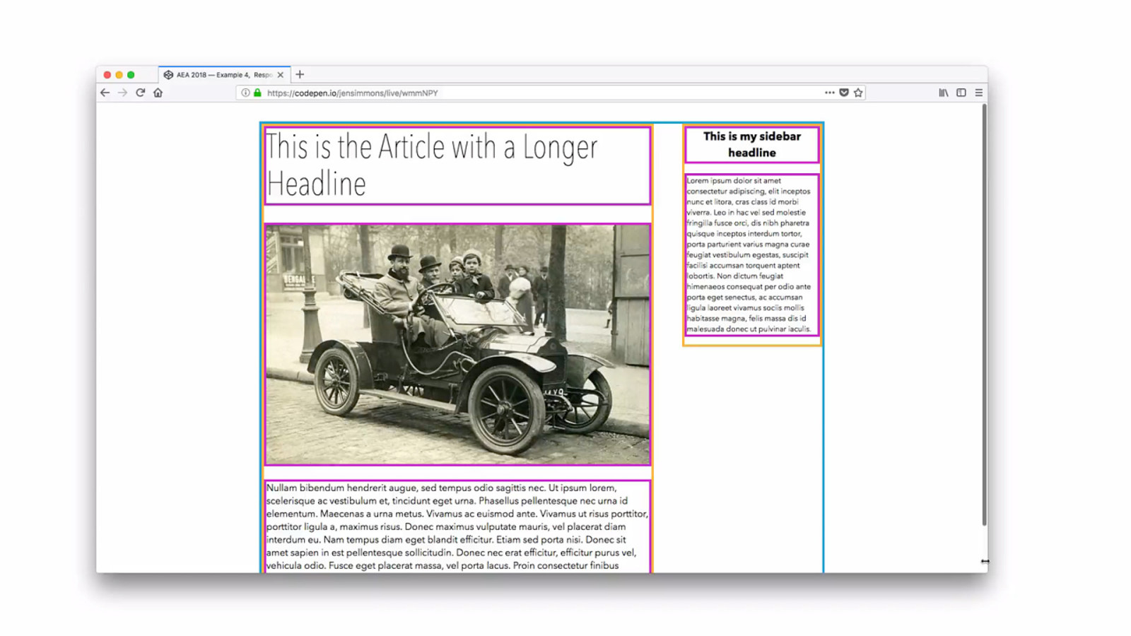
15 (1:03) Unlike fluid design, it looks great all the time. But isn’t fixed — fits into the horizontal limits of the viewport. Amazing!! Let’s make sure the layout fits in the viewport and doesn’t overflow.
LESSON LEARNED Fluid Images & Media Media Queries 15 Fluid Grids were basically the same as the Fluid Design— (although greatly improved with box-sizing: border box & better browsers support for web standards). The real innovation here is FLUID IMAGES. For us to decide, hey, it’s ok to use CSS to resize images. Big change. Plus MEDIA QUERIES.
2010 Ethan Marcotte AEA 2010 16
Responsive Web Design has been about so much more than layout. 16
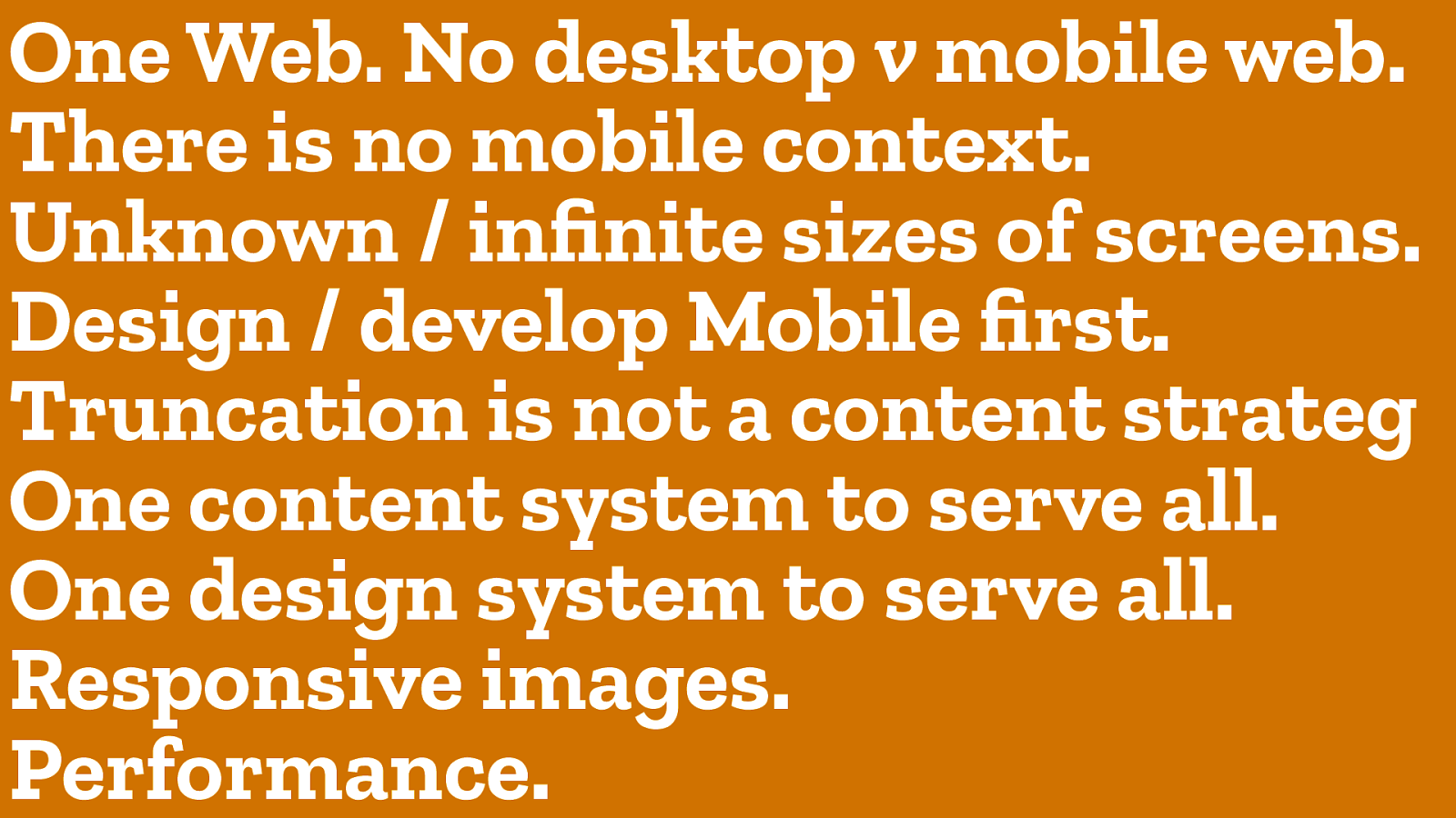
One Web. No desktop v mobile web. There is no mobile context. Unknown / infinite sizes of screens. Design / develop Mobile first. Truncation is not a content strateg One content system to serve all. One design system to serve all. Responsive images. Performance. 16 For 8 years, we’ve had all these conversations about what is a website. How do we best deliver sites to a range of devices? And we’ve had this conversations under the umbrella of “Reponsive Web Design.”
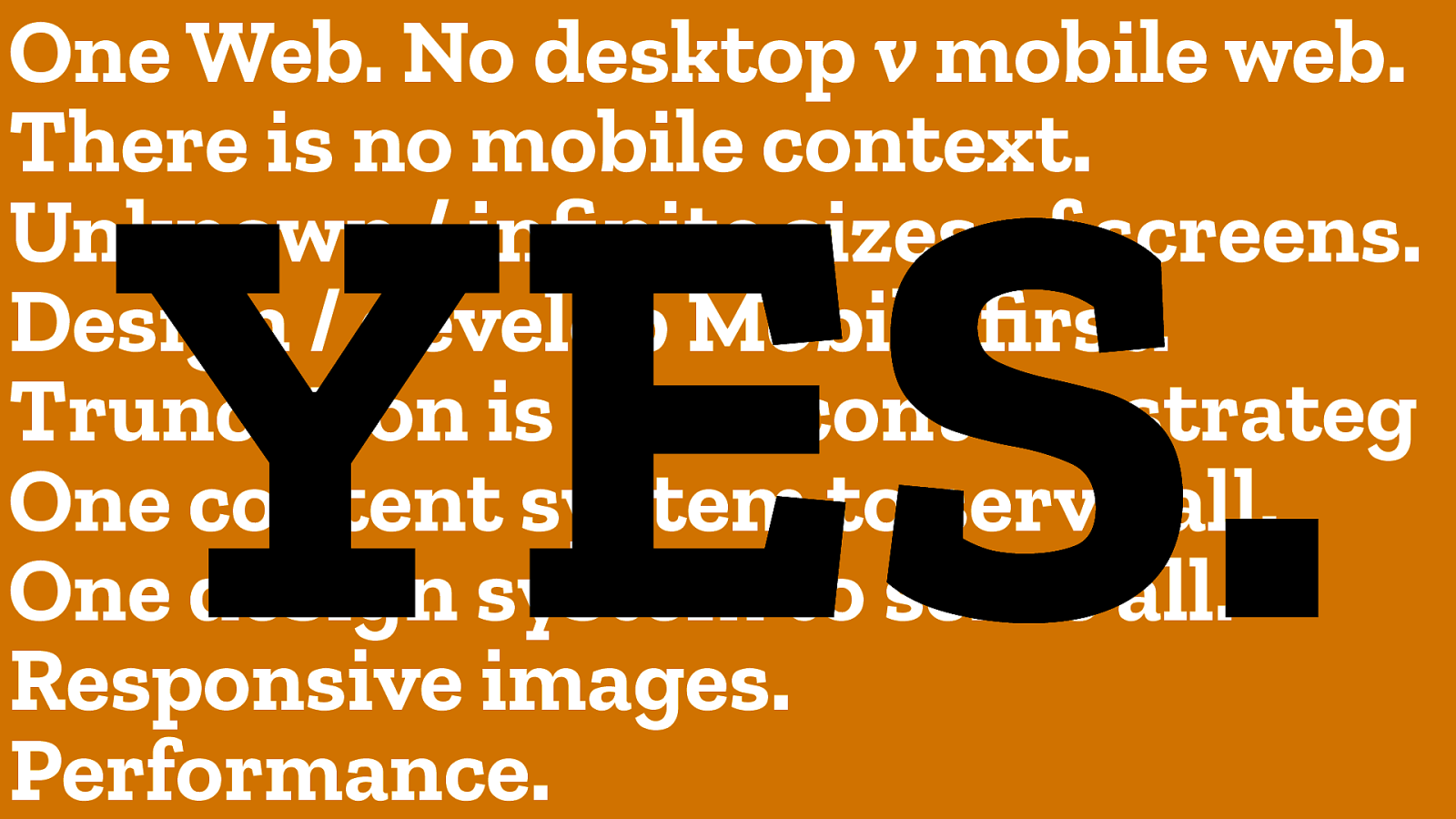
One Web. No desktop v mobile web. There is no mobile context. Unknown / infinite sizes of screens. Design / develop Mobile first. Truncation is not a content strateg One content system to serve all. One design system to serve all. Responsive images. Performance. YES. 17 YES. The last 8 years have been really important for the evolution of our understanding of our medium. These lessons are simple truths. For every project.
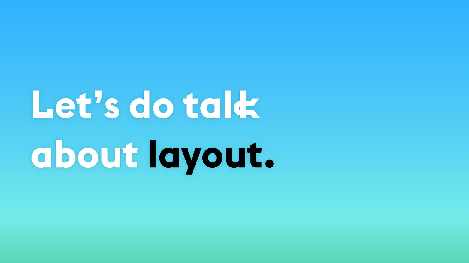
Let’s do talk about layout. 18 Let’s do talk about layout. There have been so many other things to figure out over the last 8 years, we’ve neglected this.
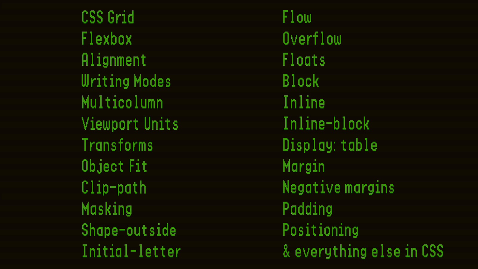
CSS Grid Flexbox Alignment Writing Modes Multicolumn Viewport Units Transforms Object Fit Clip-path Masking Shape-outside Initial-letter 18 These are all the tools we now have in our CSS toolbox to accomplish layout. Flow Floats Block Inline Inline-block Display:table Margin Negative margins Padding everything else in CSS Flow Overflow Floats Block Inline Inline-block Display: table Margin Negative margins Padding Positioning & everything else in CSS
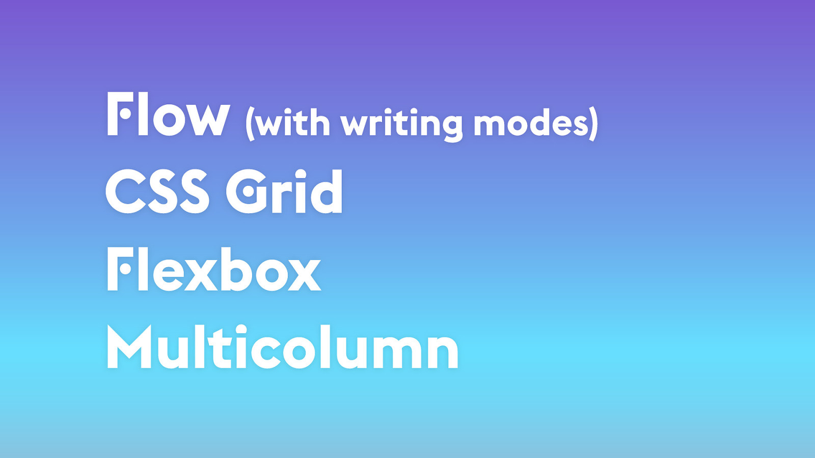
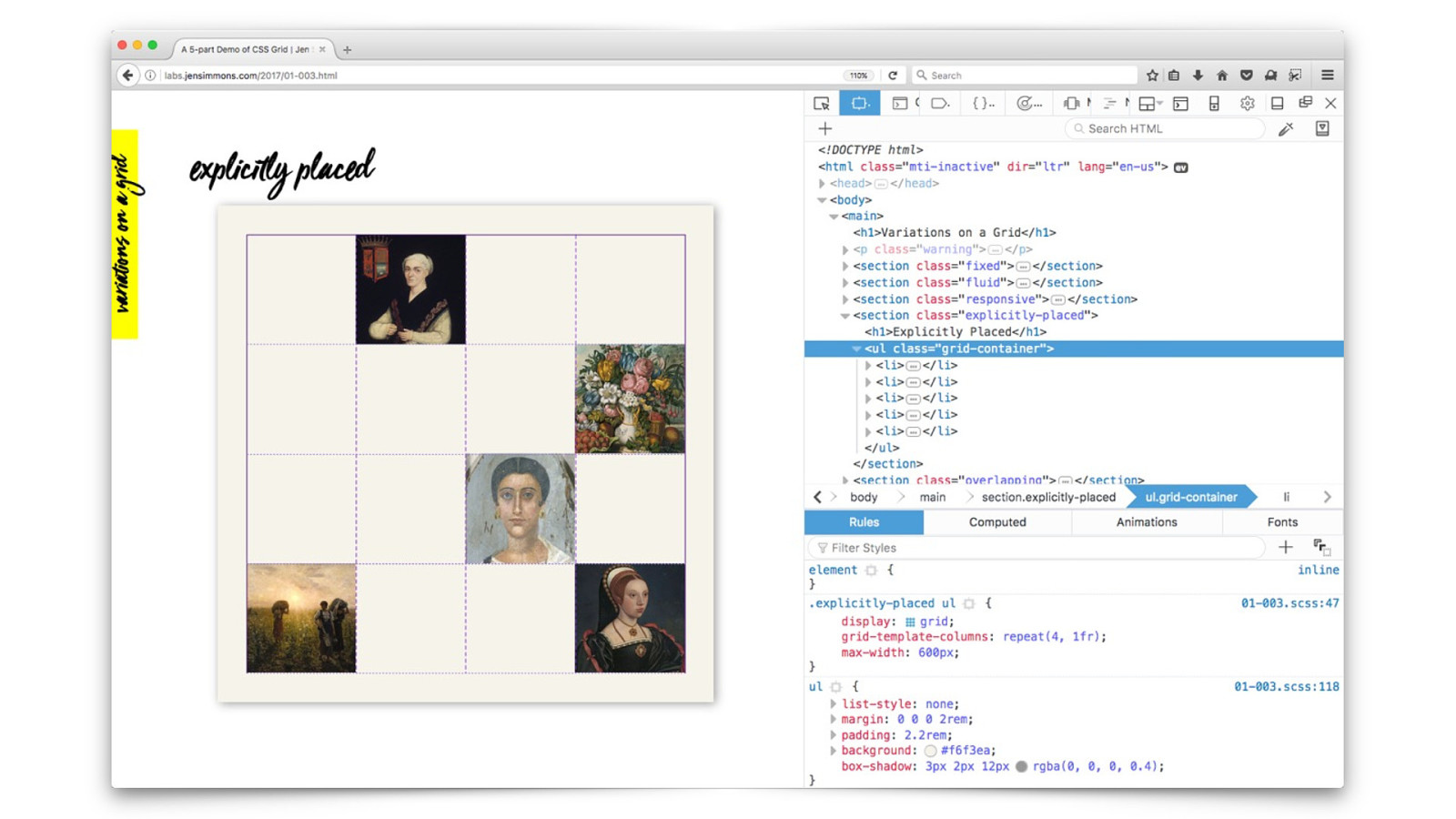
Flow (with writing modes) CSS Grid Flexbox Multicolumn 19 Nested formatting contexts. We nest these different ways of doing layout inside of each other.
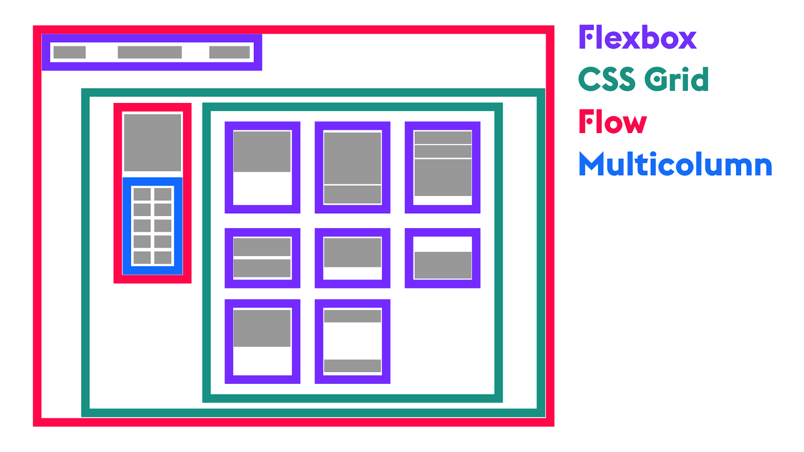
Flexbox CSS Grid Flow Multicolumn 19 Nested contexts. Flow. The real magic doesn’t just come from CSS Grid. It comes from how you combine them.

CSS Grid 20 The real star of the show — CSS Grid

Responsive Web Design *now more better. 20 I tried for a long time to think of CSS Grid as RWD *now more better. The more I explored the new layout CSS, the more I couldn’t use the word “responsive”.
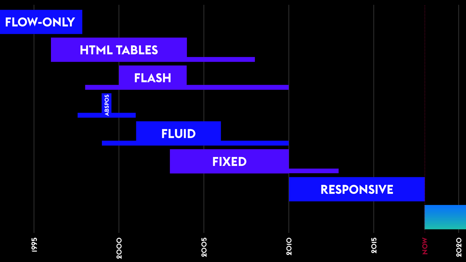
FLOW-ONLY HTML TABLES ABSPOS FLASH FLUID FIXED 21 But after a year of this, I realized, actually the new way of doing layout is so radically different from RWD, that it is a new era. I found myself separating, contrasting. I realized: this is actually a different creature. We are at an inflection point. Like going from Tables to CSS. From Fluid to Fixed. 2020 NOW 2015 2010 2005 2000 1995 RESPONSIVE

It ’s !e web! We n"d a#! 21 I also believe it’s a new era, because the dynamic of this fight has radically changed. We get art again. If we can remember that we once wanted it. So I propose we give this new era a new name.

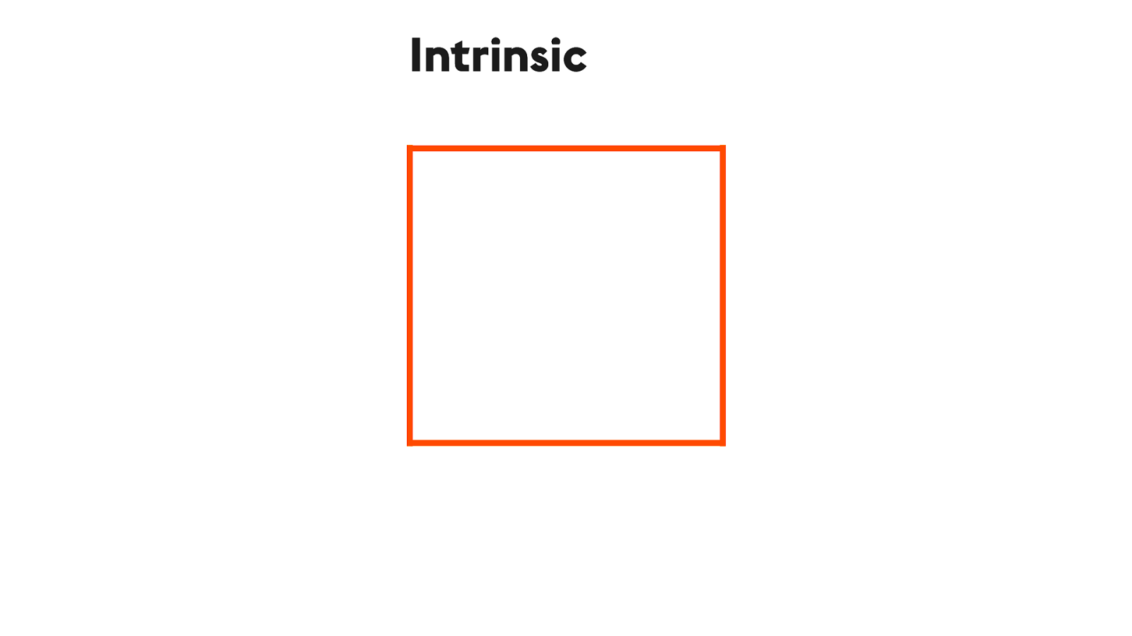
Intrinsic Web Design 22 I’m proposing we call it: Intrinsic Web Design.
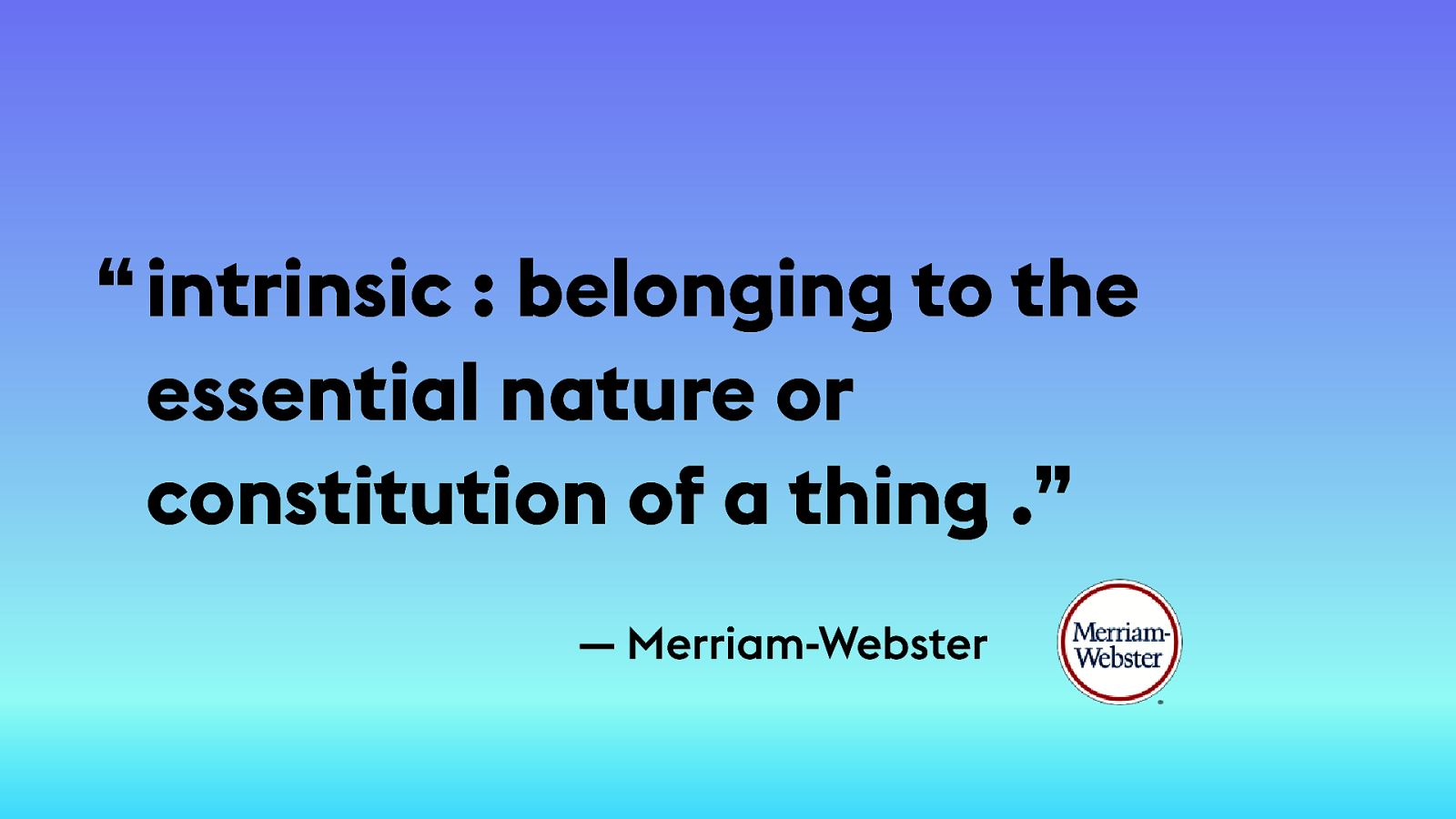
“ intrinsic : belonging to the essential nature or constitution of a thing .” — Merriam-Webster 22
22
The new reality of Intrinsic Web Design 23 More than just CSS Grid. Far more.


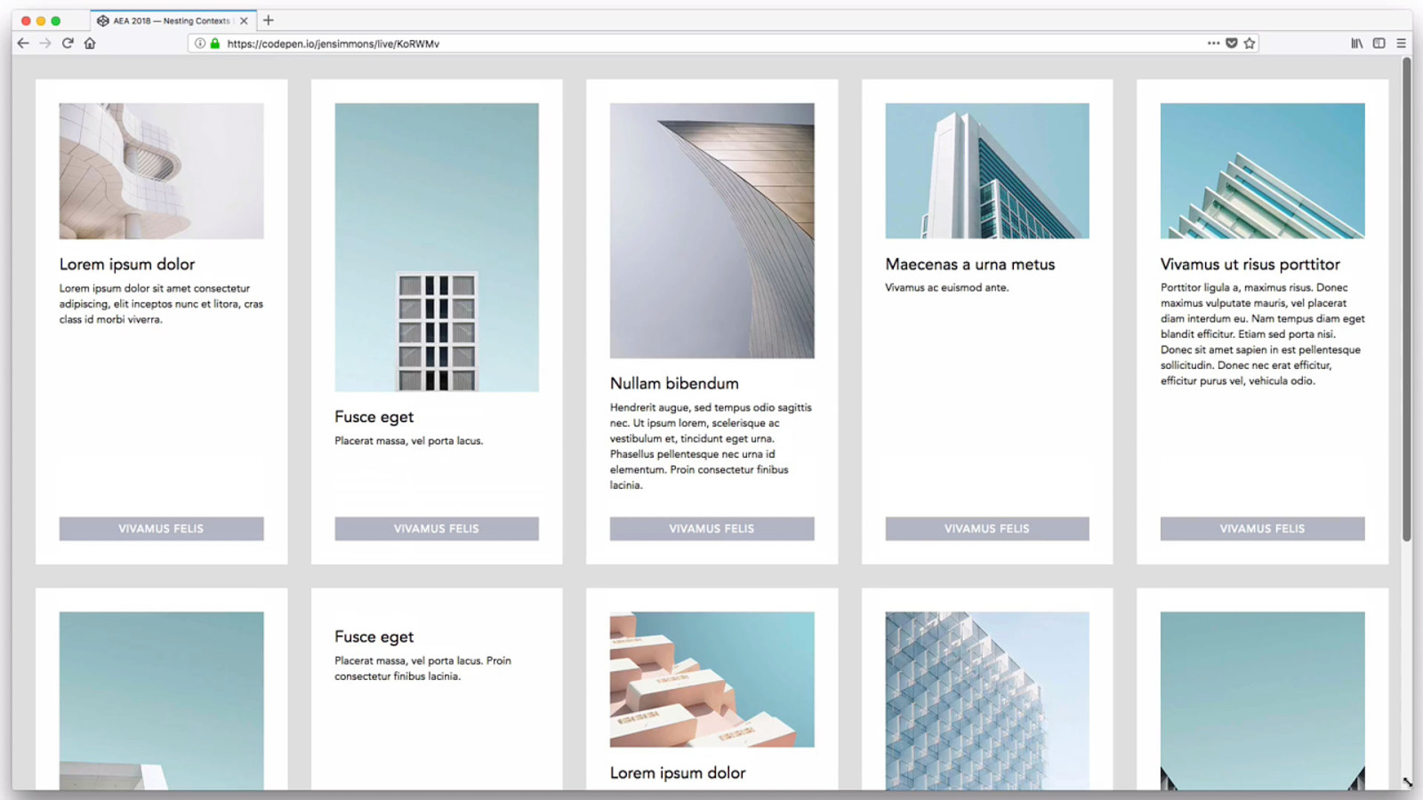
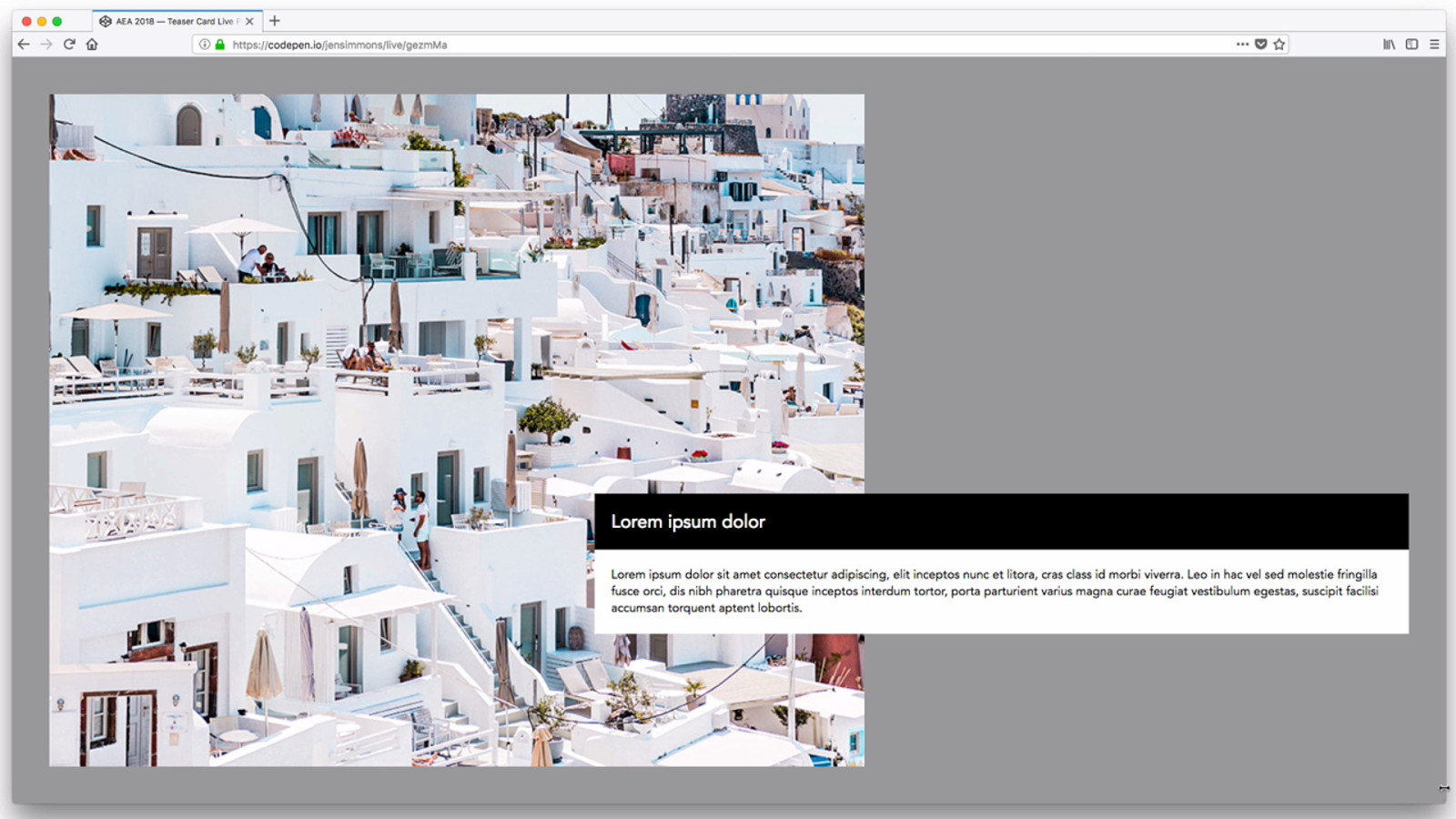
Wrap & Reflow 23 Reflow text, by expanding/contracting the text box. << Flow. Also wrap content — like a gallery of teaser cards. Wrap to new rows. << RWD
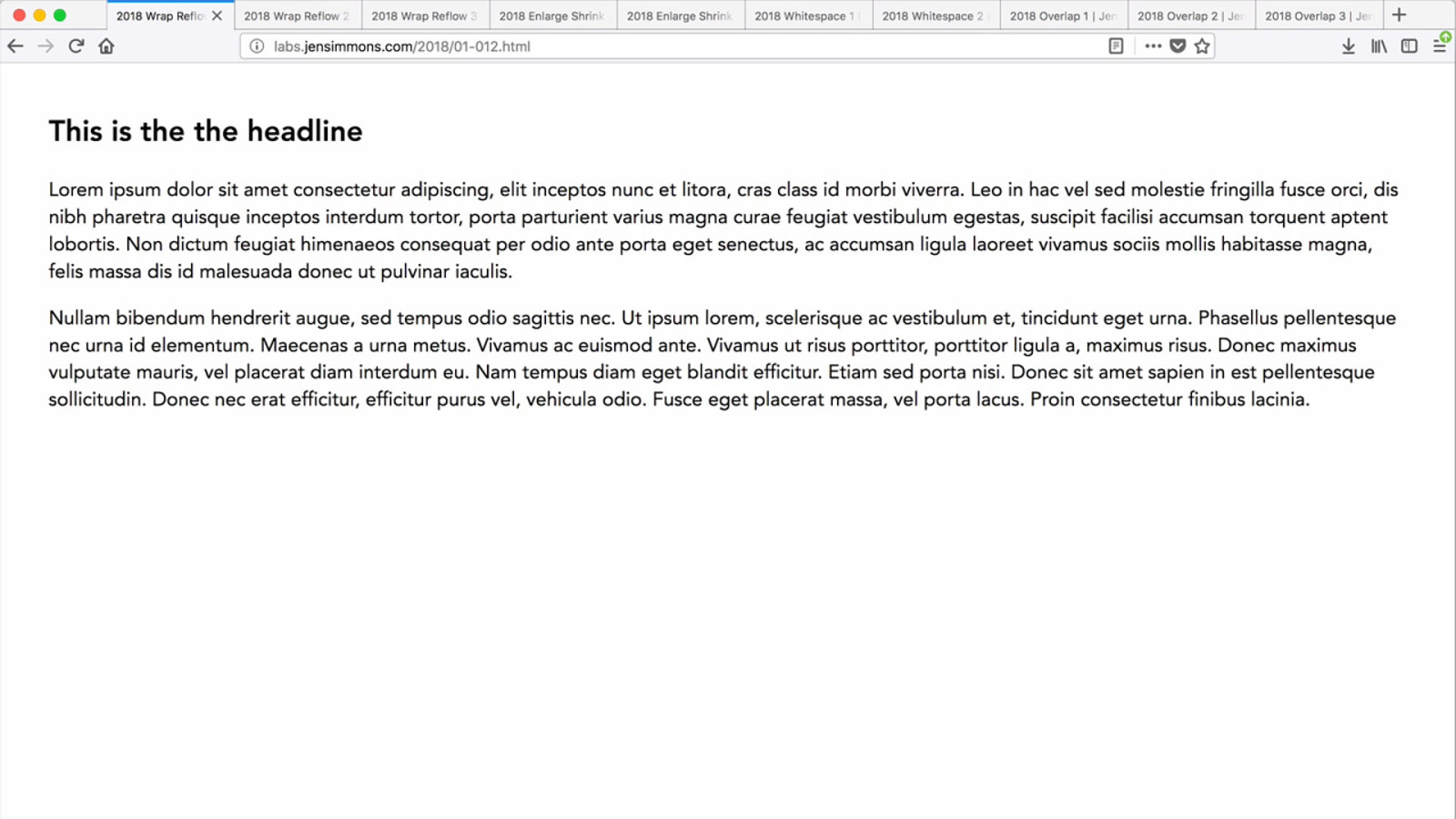
23
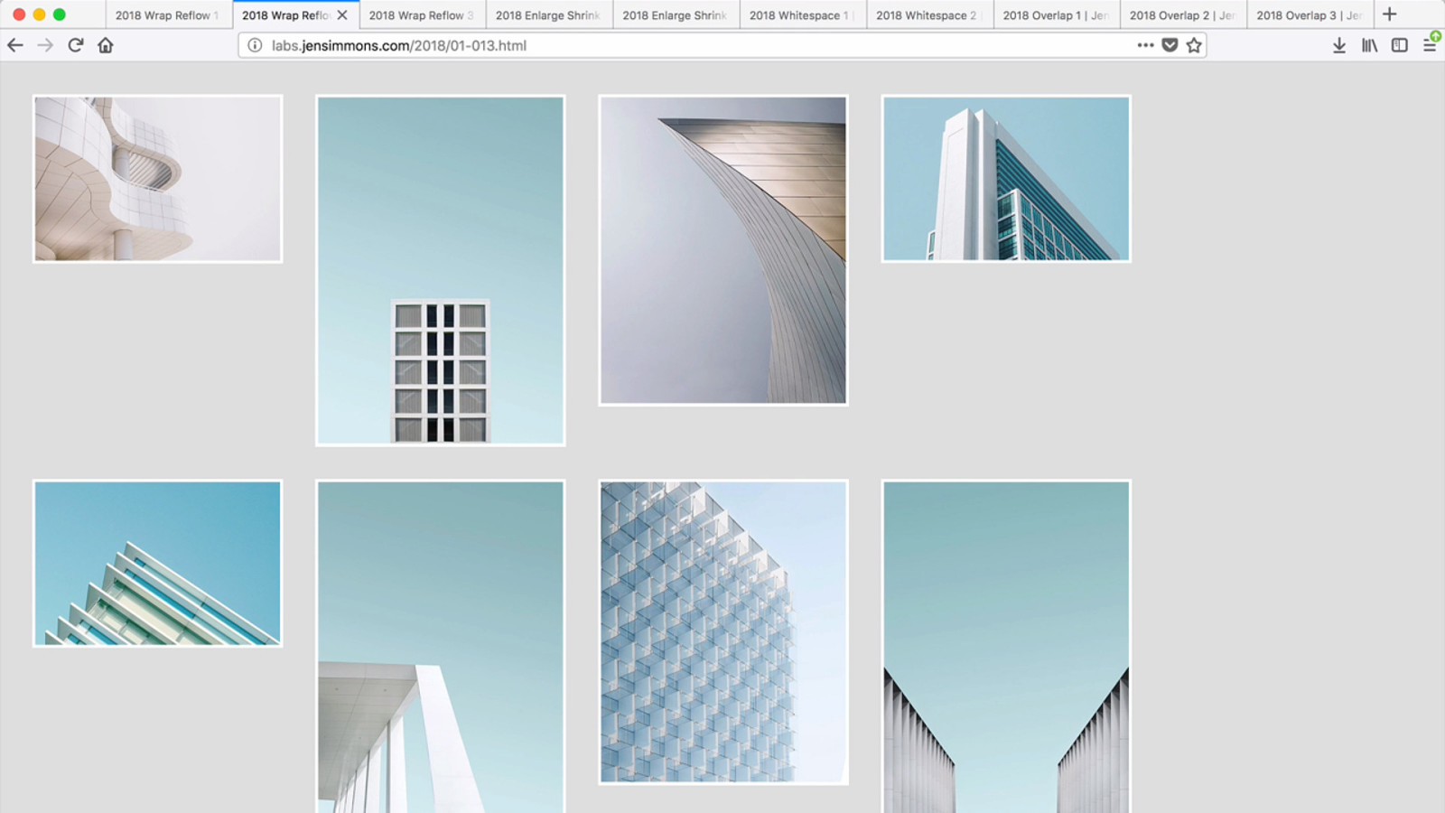
23
23

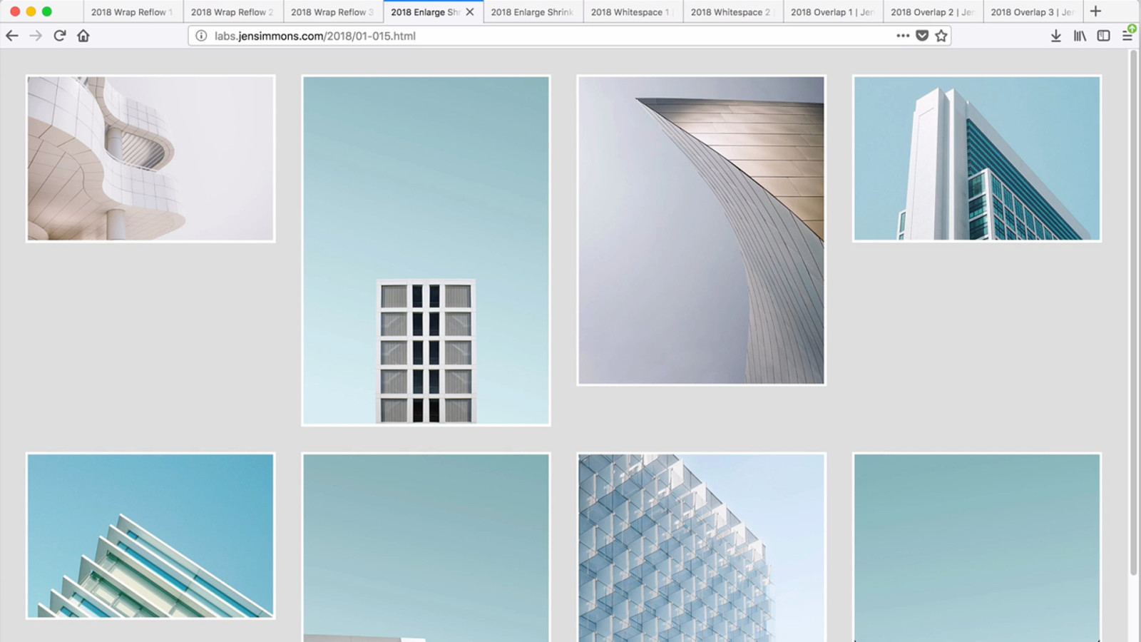
Enlarge / Shrink 24 Major focus of RWD — doing this with images. Video / graphic elements, grow & shrink. ALSO — text size grow & shrink w/ viewport units. Maybe Variable Fonts.
24
24
24
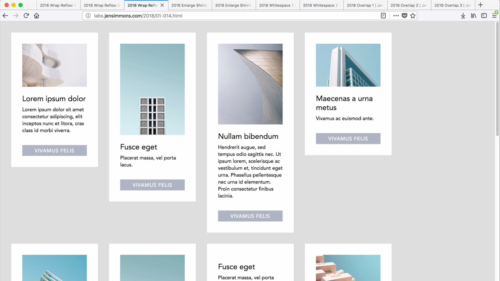
24 Of course, we can combine these. Text is reflowing. Images are growing & shrinking. Cards themselves are growing & shrinking, within a set bounds. Cards reflow so they are never too big or small.

Add / Remove Whitespace 26 Things don’t have to grow — you can add space. Then remove the space when there’s not room. This was not possible before. Not like this.
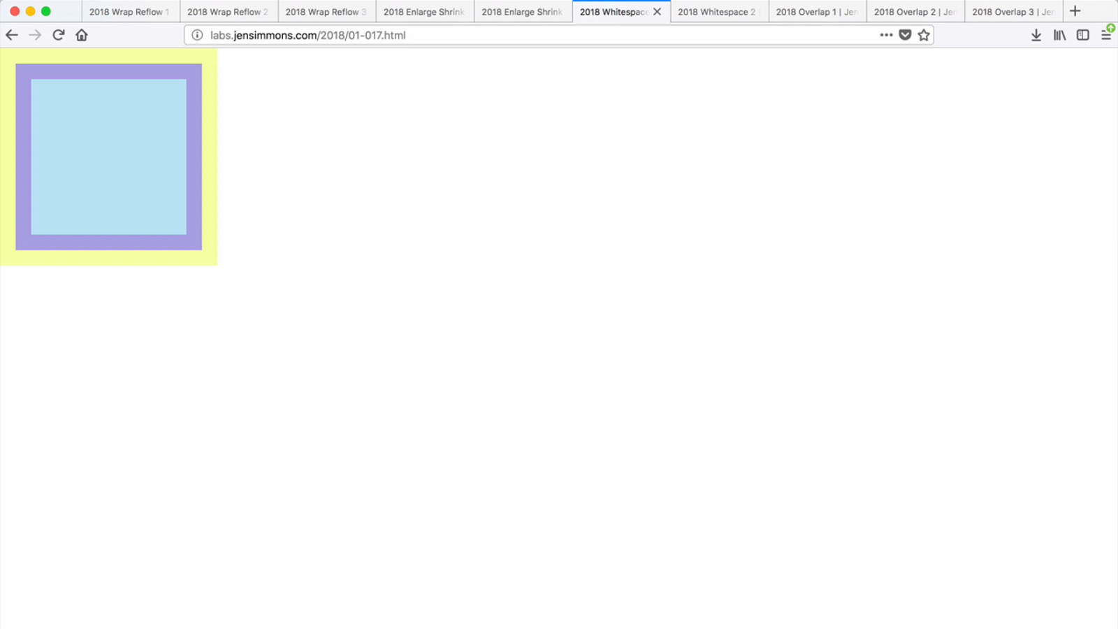
26

27 Everyone is so excited that we finally have vertical centering! With Flexbox.
27 All kinds of new ways to program whitespace. Not just layout the content and add margins/padding, but to truly create negative space directly.
27
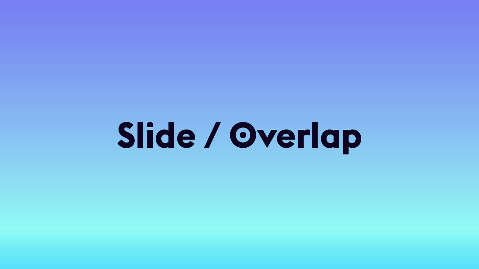
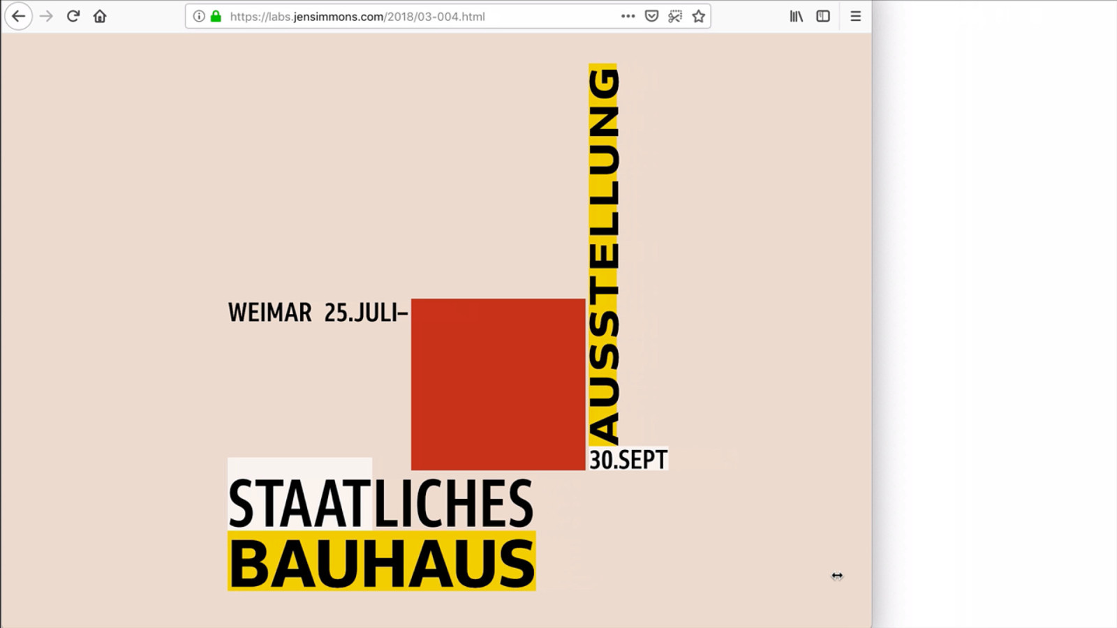
Slide / Overlap 28
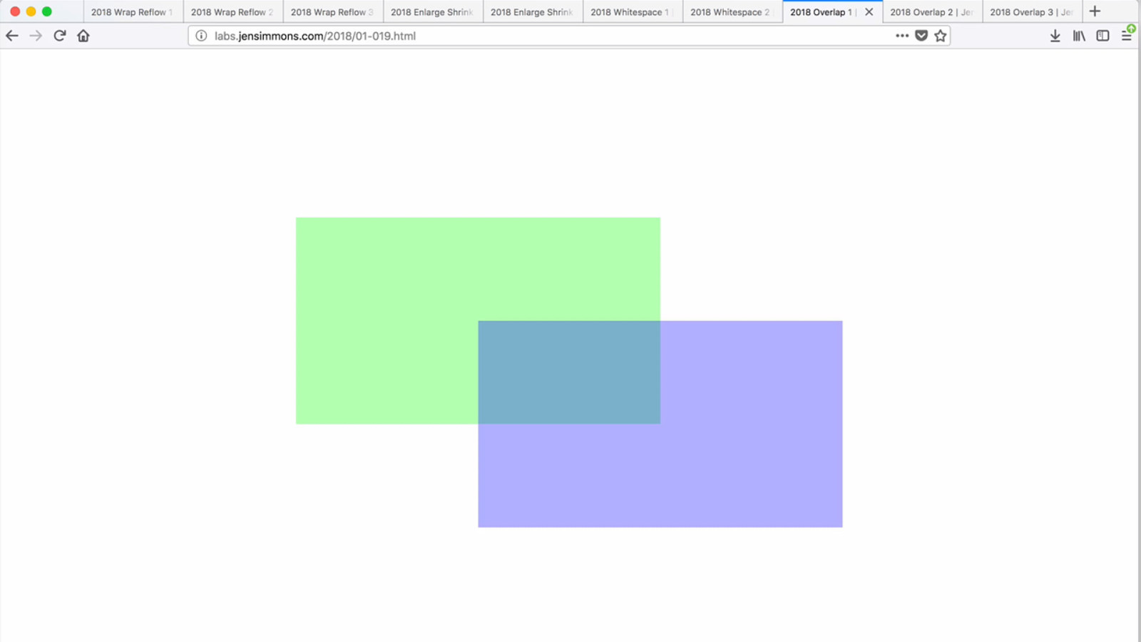
28 Remember Tables for Layout? Chopping images into puzzle pieces. One of the biggest differences between HTML Tables & CSS Grid — you can overlap. You can control stacking order w/ Z-index. We have translucency & blend modes & filters…
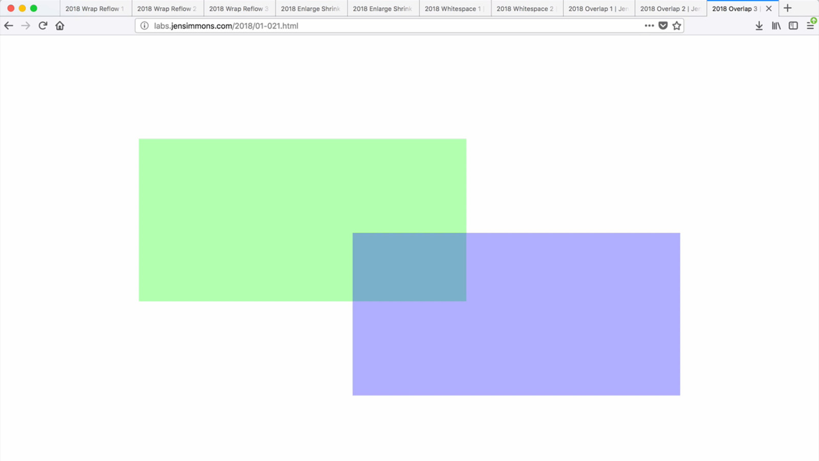
29 We can add or remove overlap in order to fit things into less space, or make them take up more space.


Wrap & Reflow Enlarge / Shrink Add / Remove Whitespace Slide / Overlap 30 The challenge is to rethink what layout is. To think about how to use space when there’s a lot, tighten things up when there’s not… to think about these four possibilities.
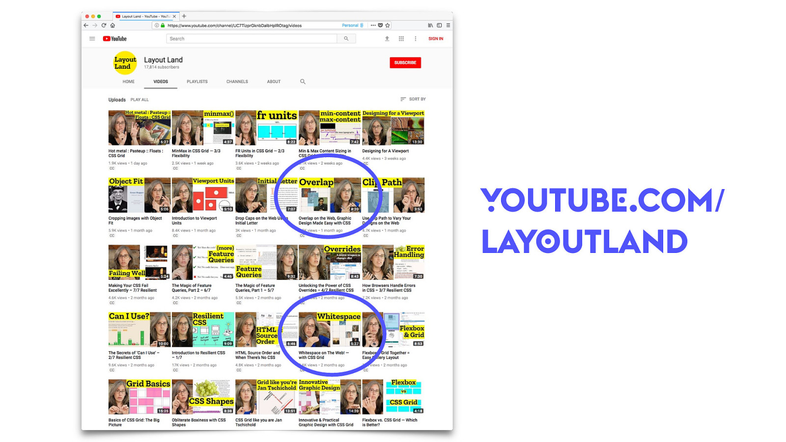
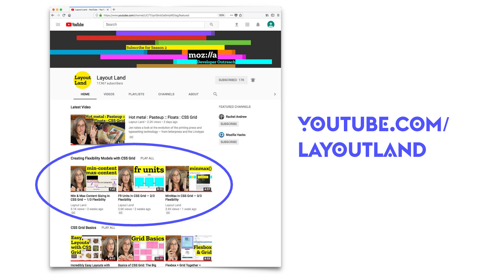
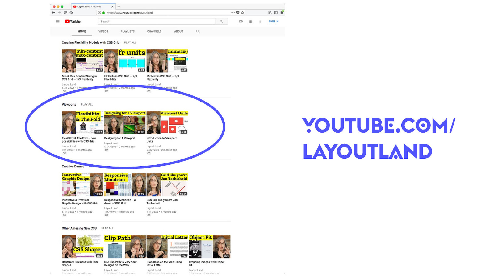
YOUTUBE.COM/ LAYOUTLAND 30 BTW, I have a YouTube channel called “Layout Land” where I talk about this revolution in graphic design, walk through examples, show you how the code works. Including one video called “Whitespace on the web” and another called “Overlap on the Web”.


Images 31

Fixed Images 31

31 (30s)

Fluid Images 32
32 (18s)

Fluid, vertically 32
32 (30s)

Set the width & height 33
33 (14s) This is not because of CSS Grid, but paired with CSS Grid, opens up amazing opportunities.

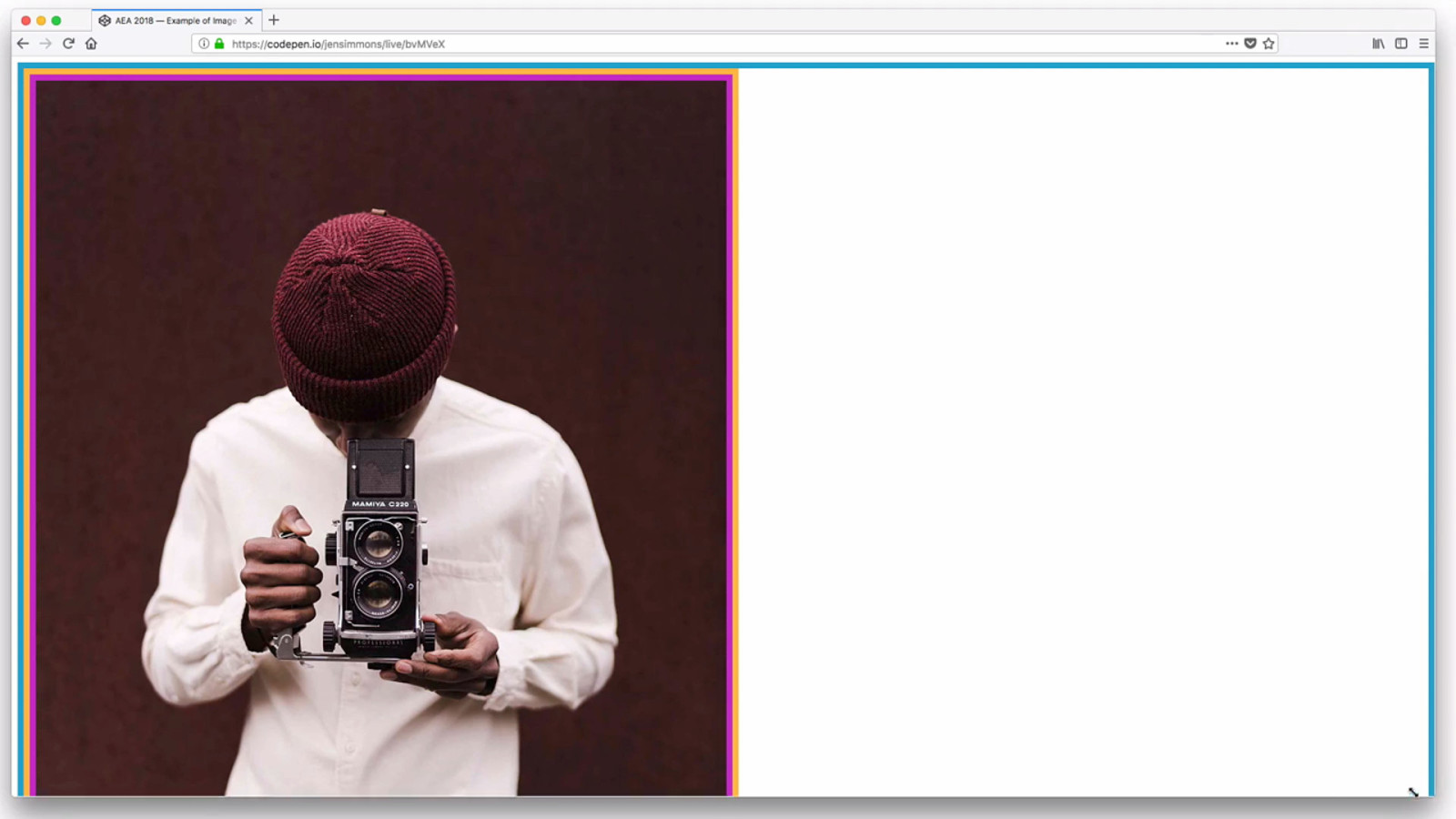
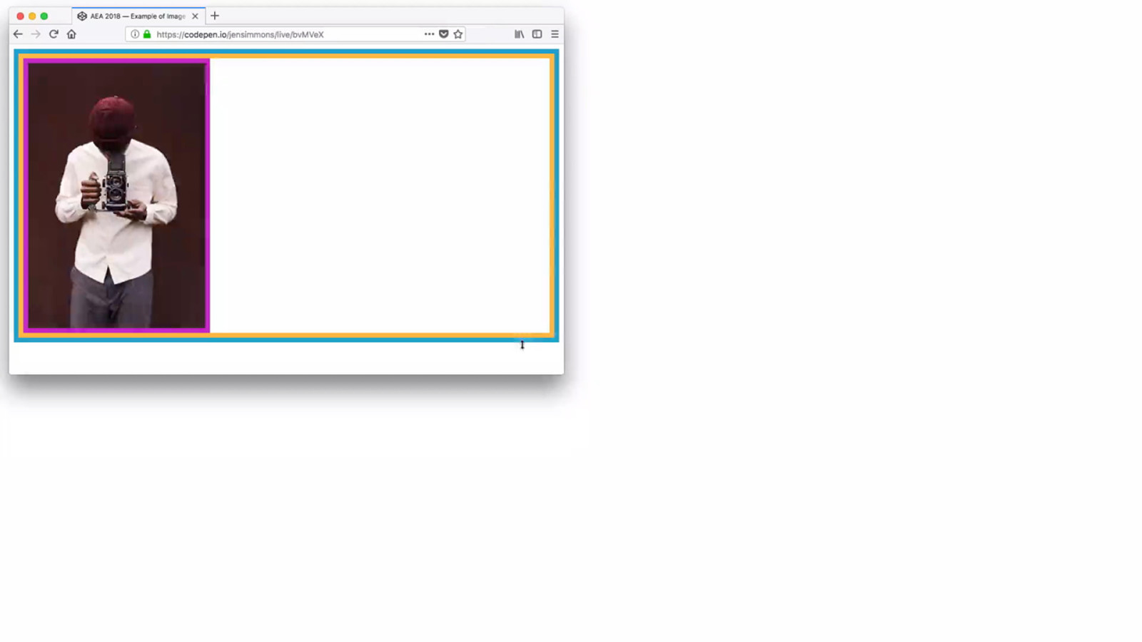
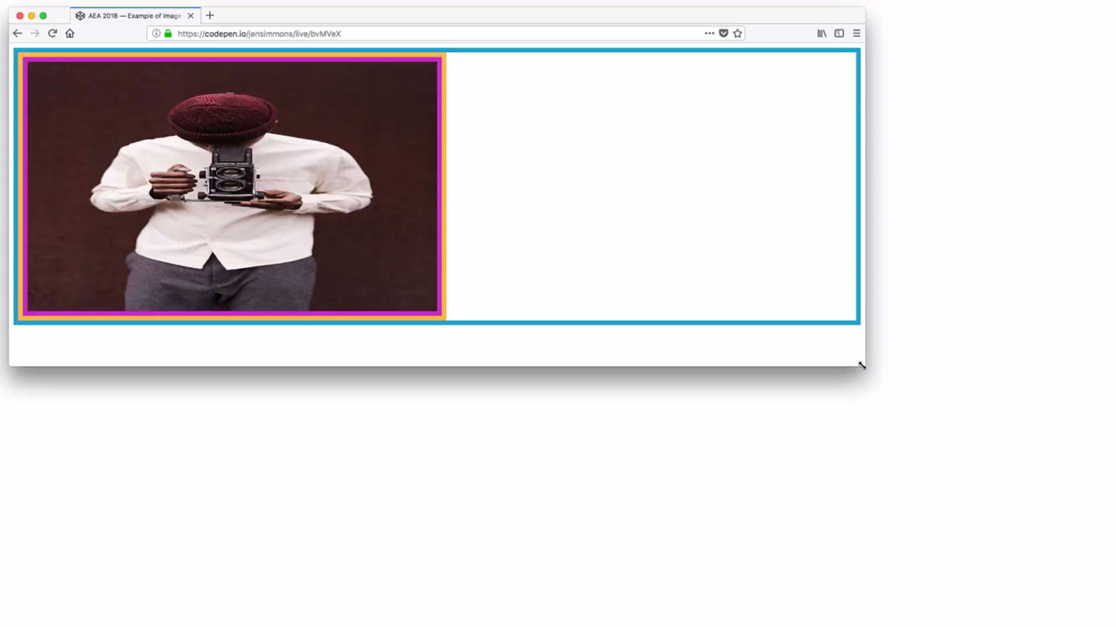
Object Fit 33
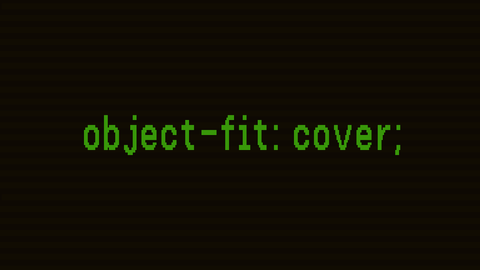
object-fit: cover; 33
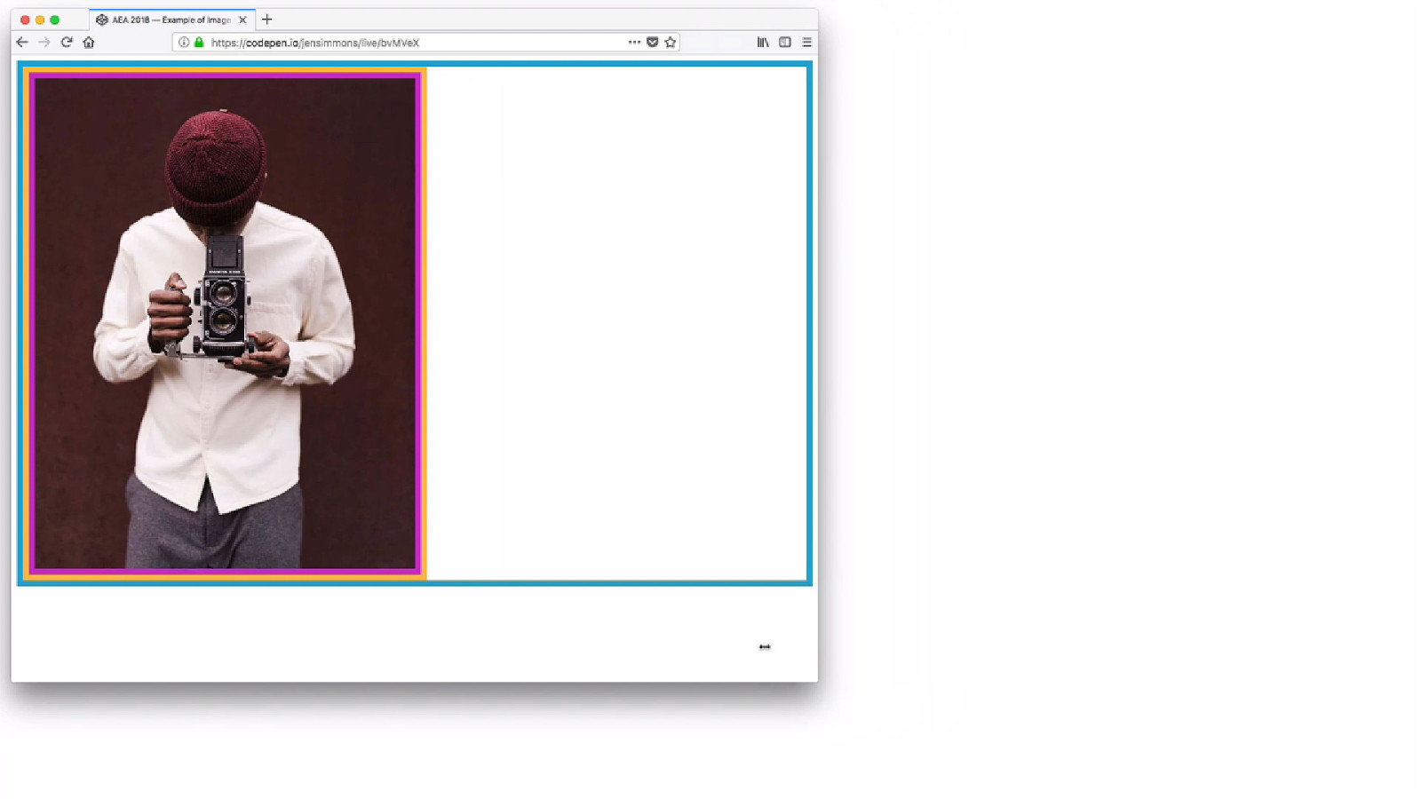
33 (51s)
YOUTUBE.COM/ LAYOUTLAND 34 Video called “Object Fit”.
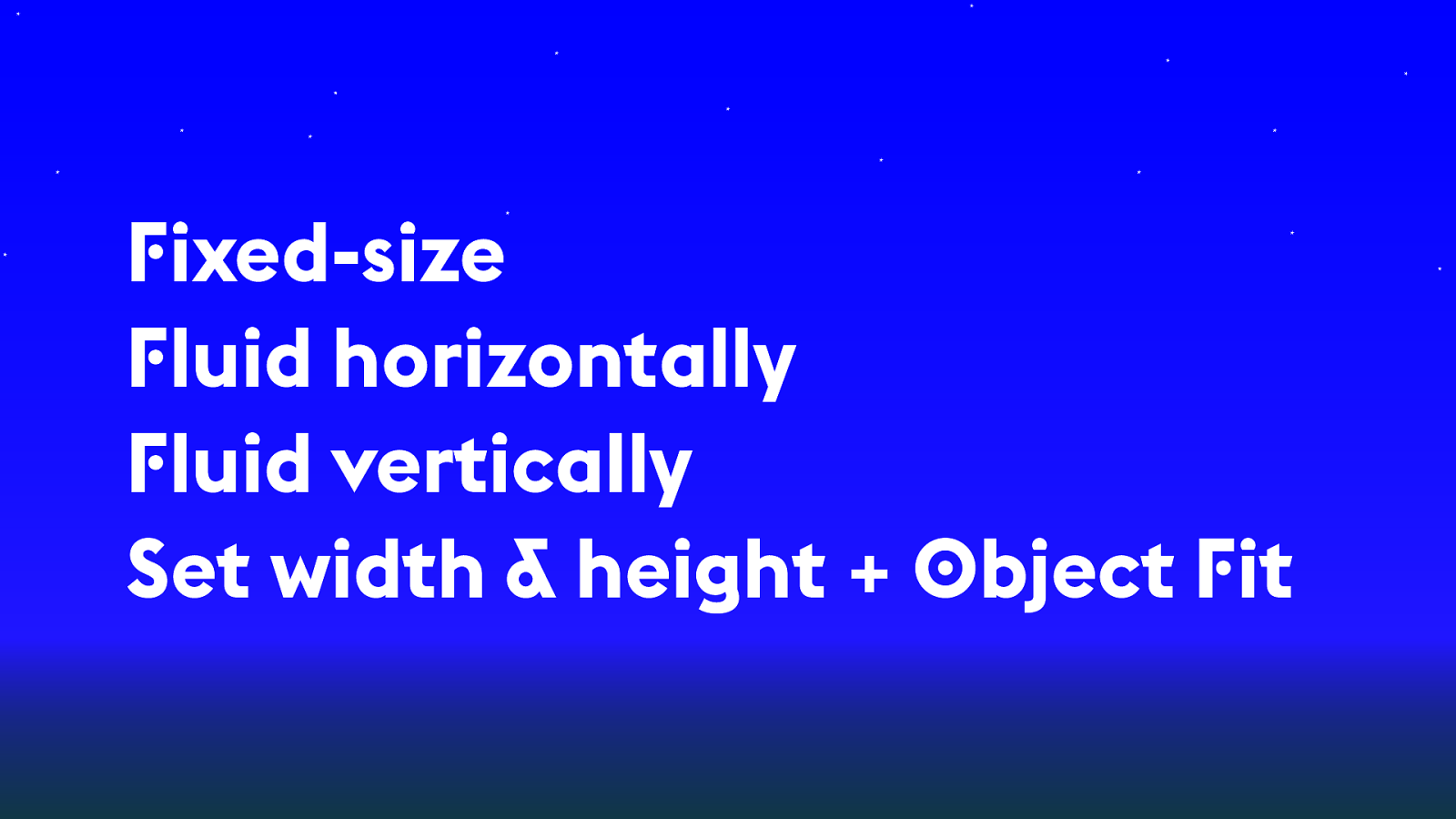
Fixed-size Fluid horizontally Fluid vertically Set width & height + Object Fit 34

Columns 36
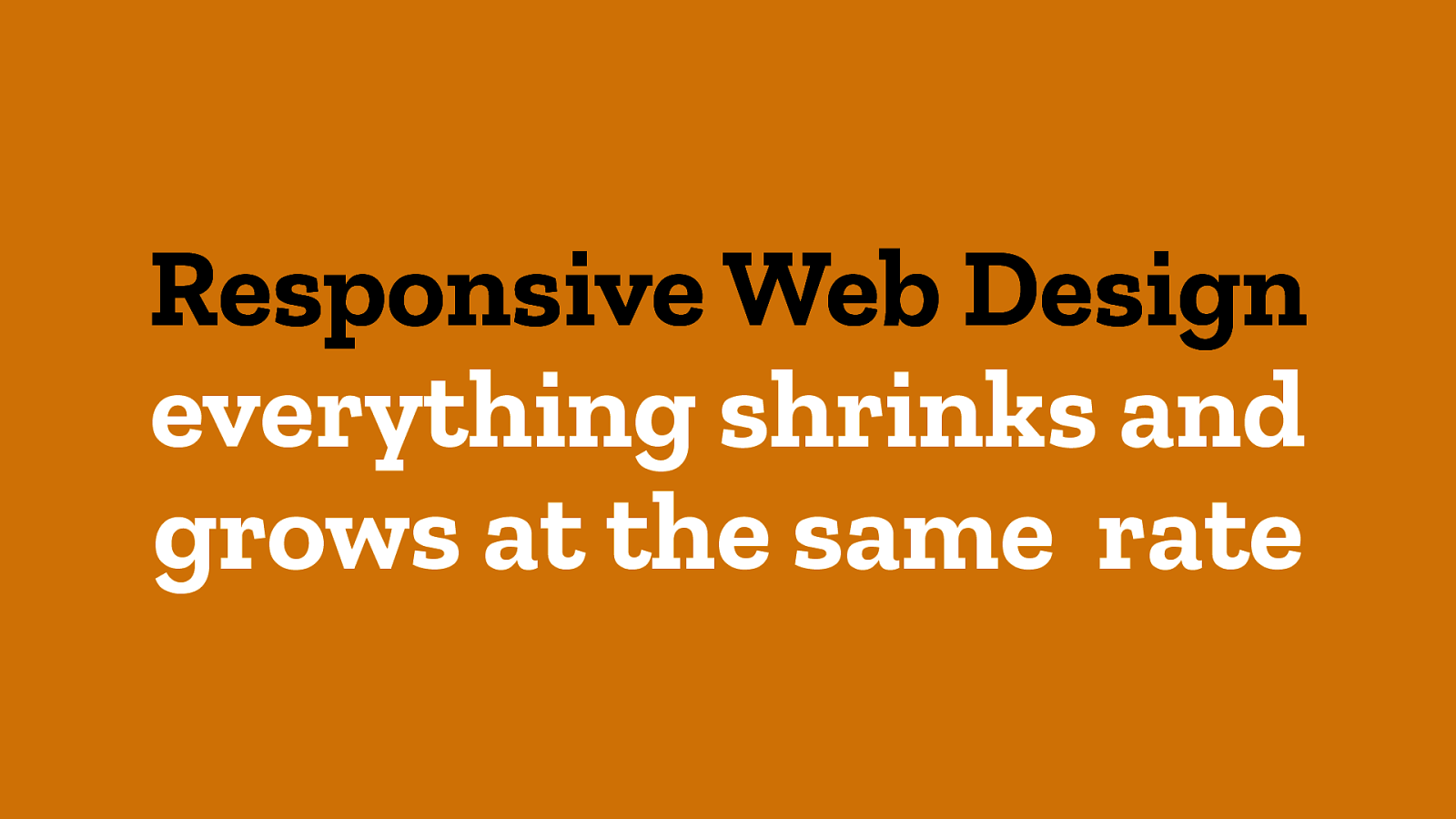
Responsive Web Design everything shrinks and grows at the same rate 36
36

% 36
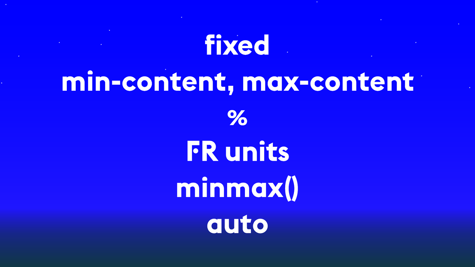
fixed min-content, max-content % FR units minmax() auto 36

FR units 37

min-content sizing 37
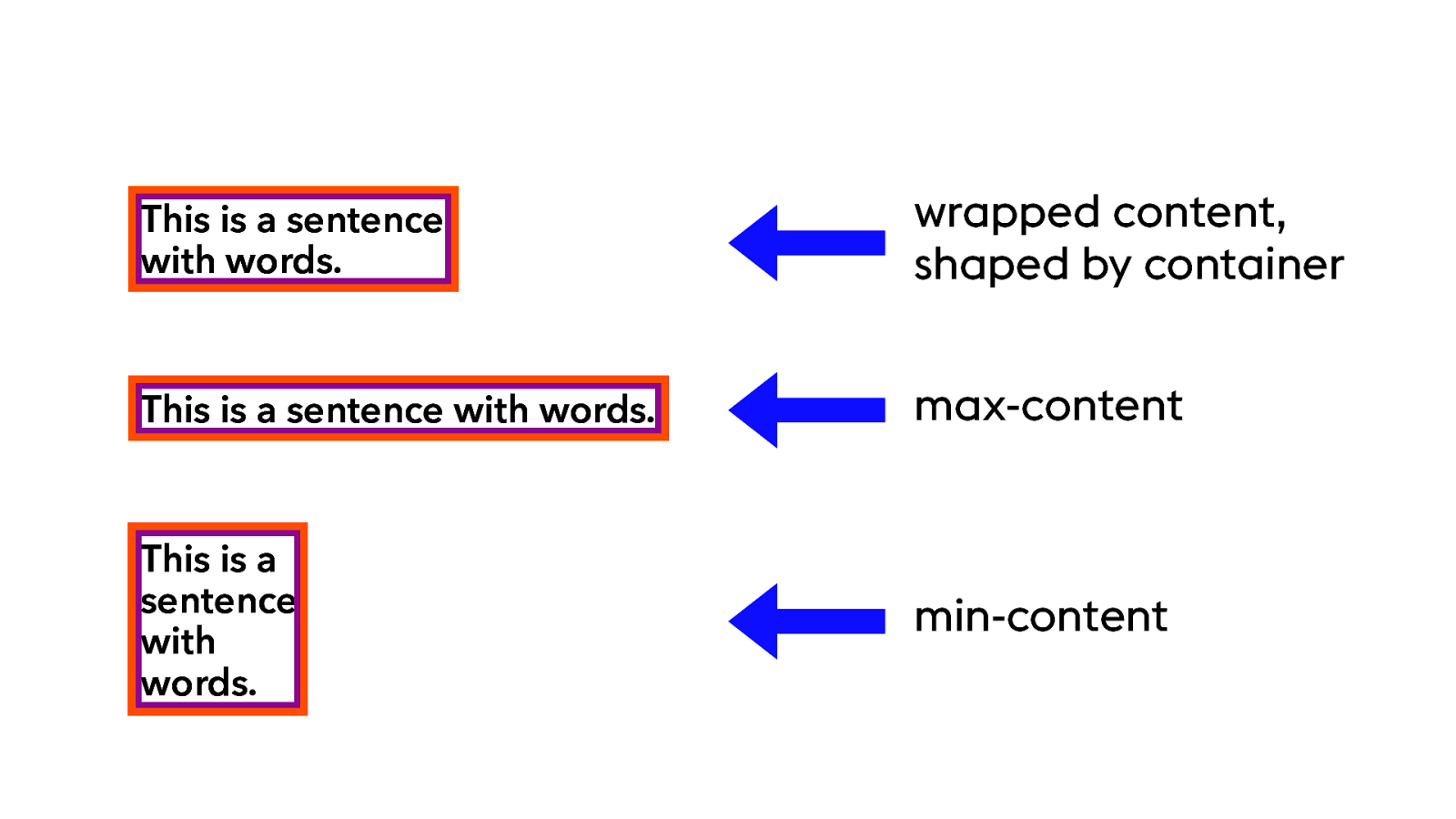
37 This is a sentence with words. wrapped content, shaped by container This is a sentence with words. max-content This is a sentence with words. min-content
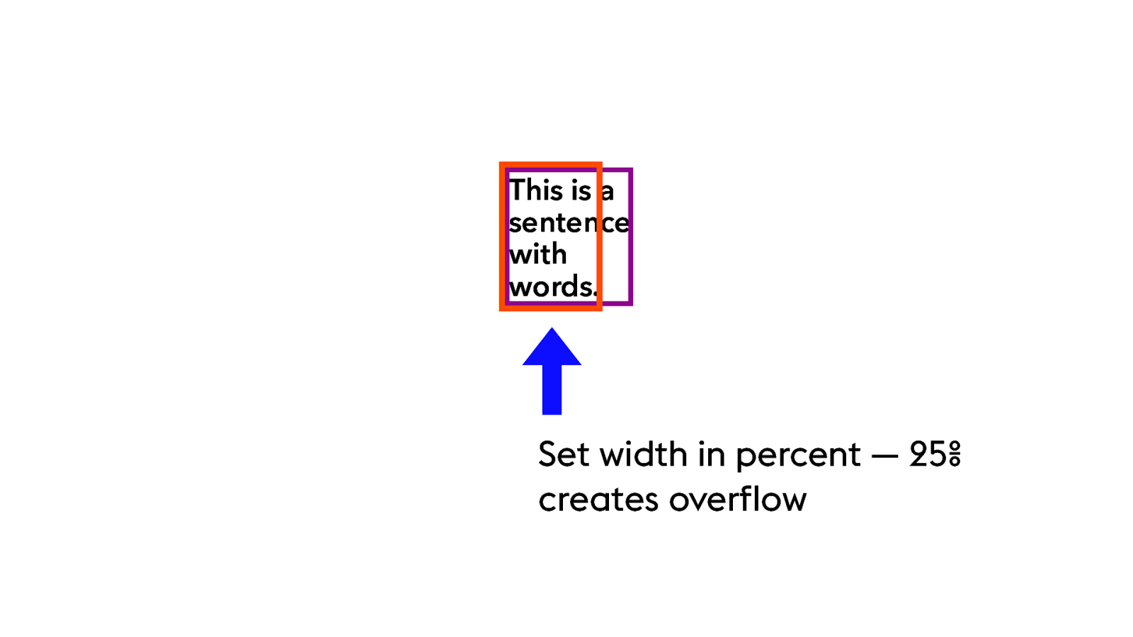
This is a sentence with words. Set width in percent — 25% creates overflow 37
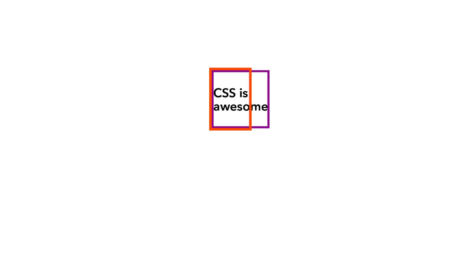
CSS is awesome 38
38 Which ends up as things like this. FRUSTRATED! This is what’s been happening as we floated divs with width = some percent…
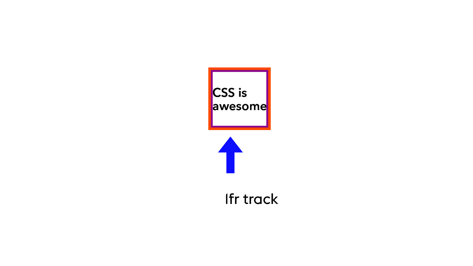
CSS is awesome 1fr track 38
38
(1:06)
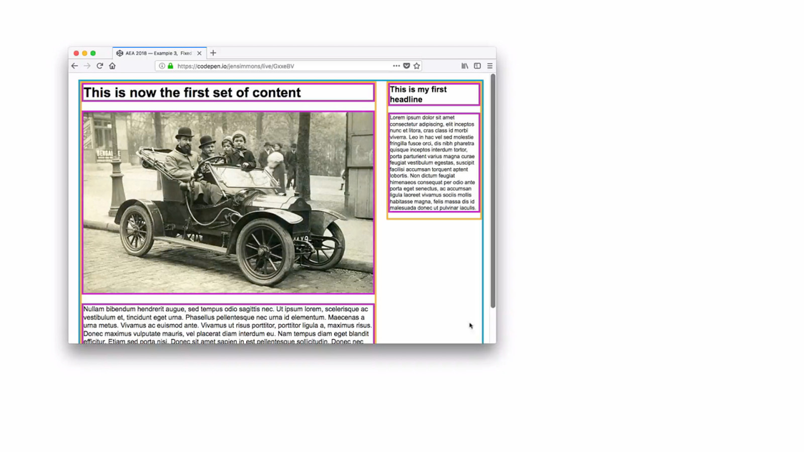
Grid layout. Container = blue. Grid items = orange. Inside the Grid items, headline, image, paragraph = purple = flow content. Four columns. All the same size. All 1fr wide. Fixed-width grid gap. When the column hits it’s min-content, it stops shrinking. (If you want it to shrink, you can do that with other code. minmax(0,1fr) ) By default, it won’t let content inside the Grid item overflow the Grid item. When the container can’t shrink anymore, it overflows it’s container. And you have to do something about that.
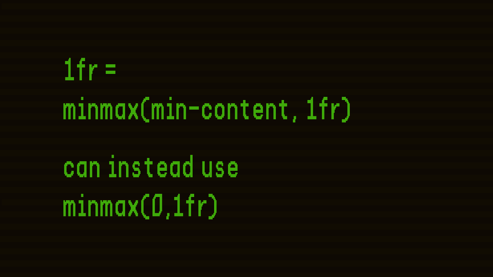
1fr = minmax(min-content, 1fr) can instead use minmax(0,1fr) 39
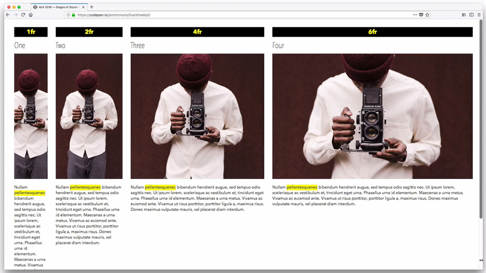
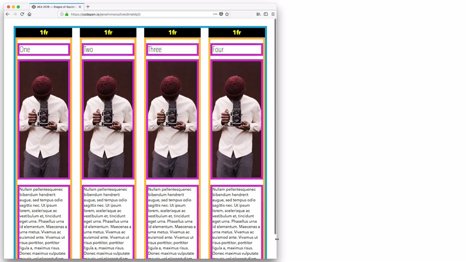
40 (54s) You don’t have to have even-sized columns. 1fr 2fr 4fr 6fr. I highlighted the longest word in yellow — that’s the min-content width. The 1fr is already at min-content… now 2fr is…. now 4fr…. Look at how this creates a staggered experience of squishiness.
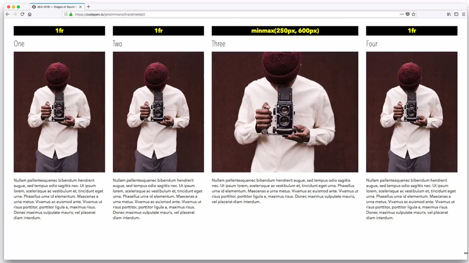
42 1fr 1fr (52s) minmax(250px, 600px) 1fr FR columns squish first. MINMAX is staying at the max. Then when all the FR columns have hit min-content, the MINMAX starts shrinking. Until it hits it’s minimum — where it stops shrinking, and the whole thing won’t shrink anymore.
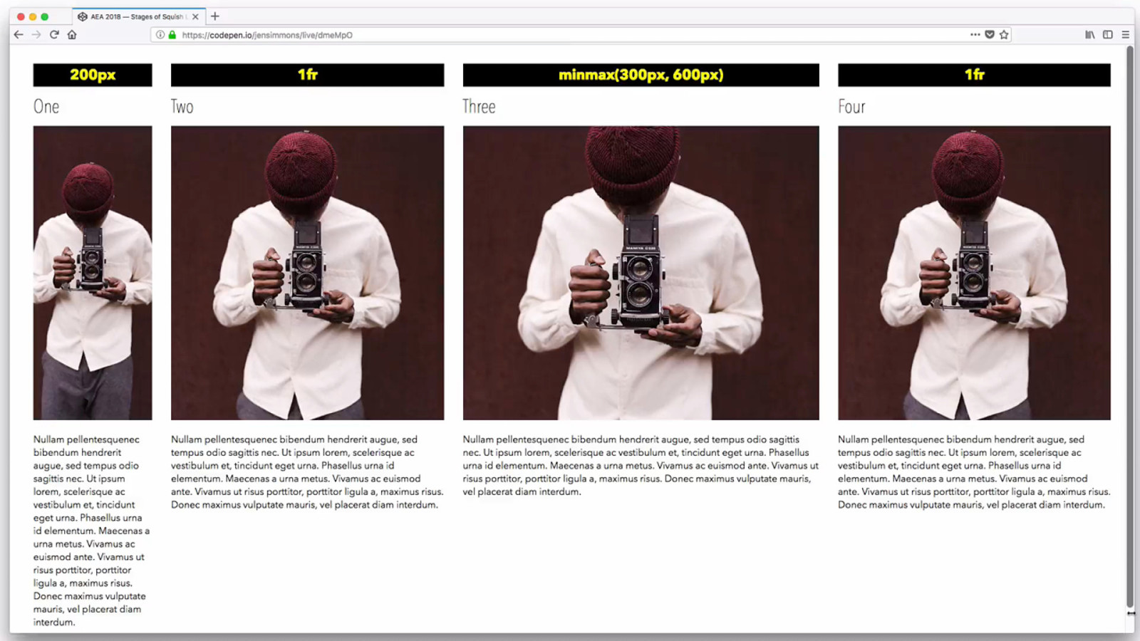
43 200px (40s) 1fr minmax(300px, 600px) 1fr First column is 200px. Stays that the whole time. FR columns are striking first. They get ‘extra space’, so they loose space first. Once the FR columns are at min-content, the minmax() starts shrinking.
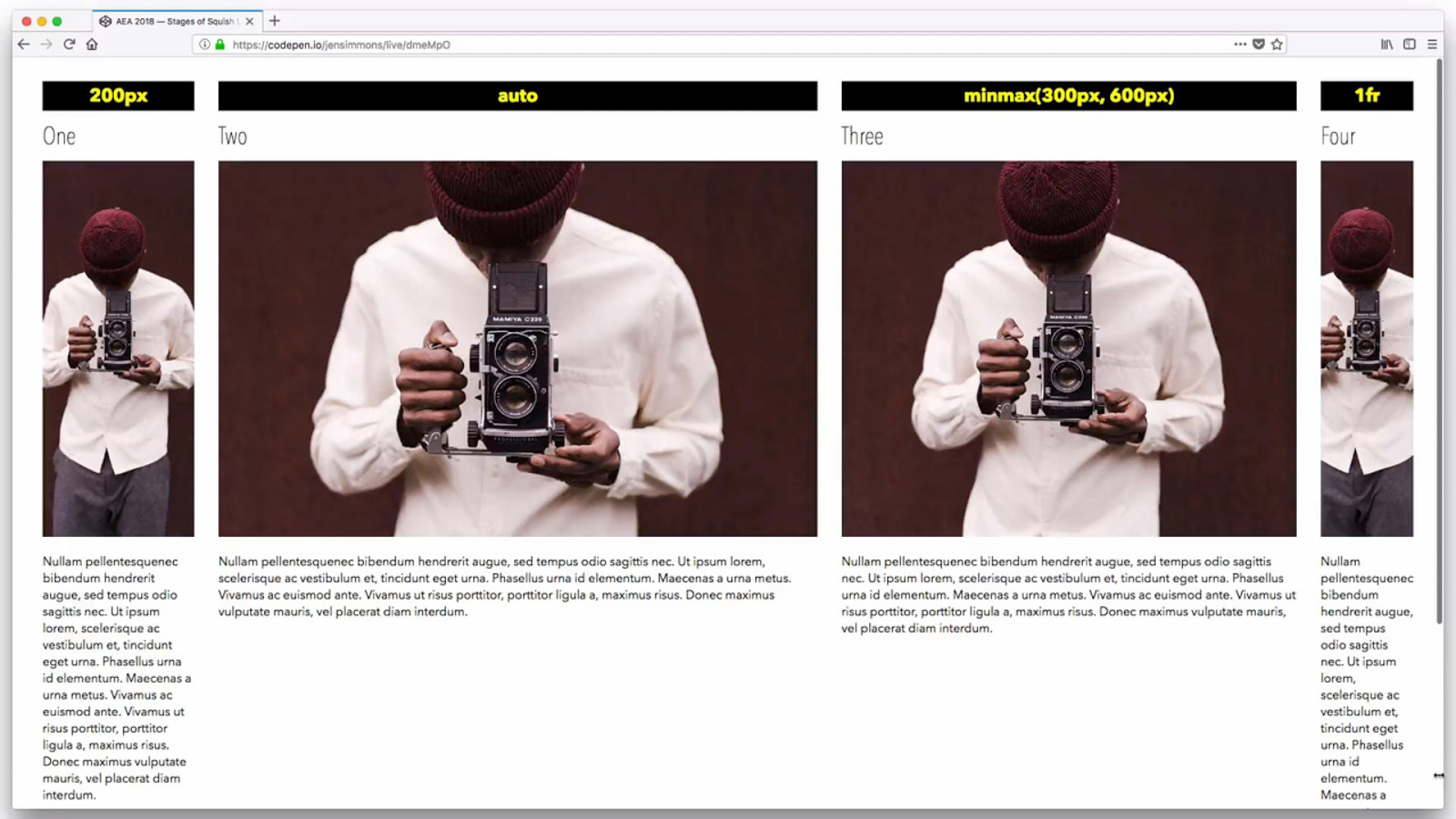
44 200px (56s) auto minmax(300px, 600px) 1fr Auto is doing what it did way back HTML Flow. Fills up all the available space. FR Units get the extra space. There is no extra space, so the FR column is min-content.

fixed min-content, max-content % FR units minmax() auto 45

Rows 46 (1)
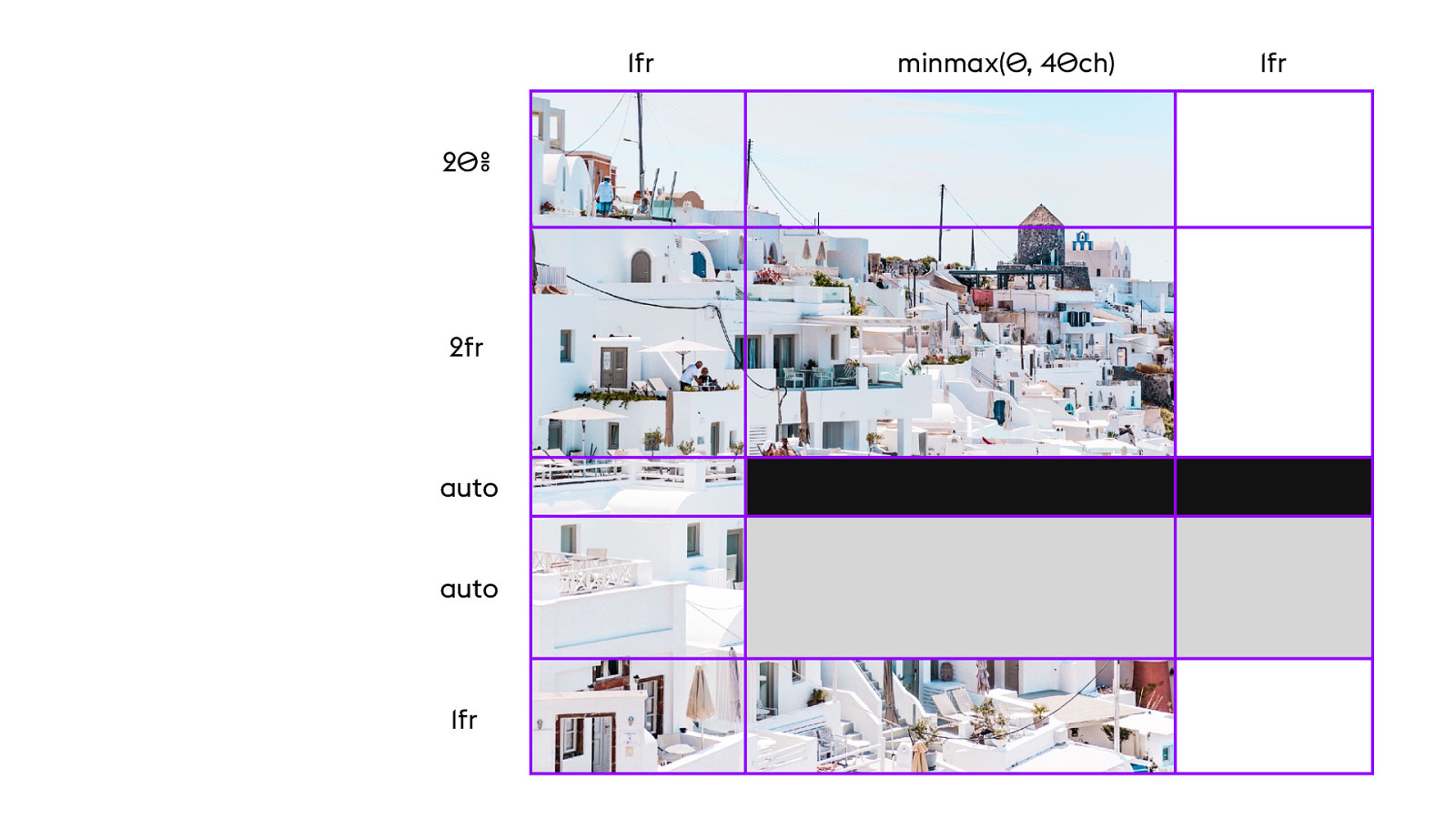
1fr 20% 2fr auto auto 1fr 46 minmax(0, 40ch) 1fr
47 (:37) Using overlap. Intentionally adding/removing whitespace. Wrapping text. Shrinking/growing image. Image sized in 2 directions. Object fit. Programming flexibility model to specify certain tracks to collapse / expand first… others later. No media queries.
YOUTUBE.COM/ LAYOUTLAND 47 3-part series watch in order


Programming Flexibility Model 48 (3)
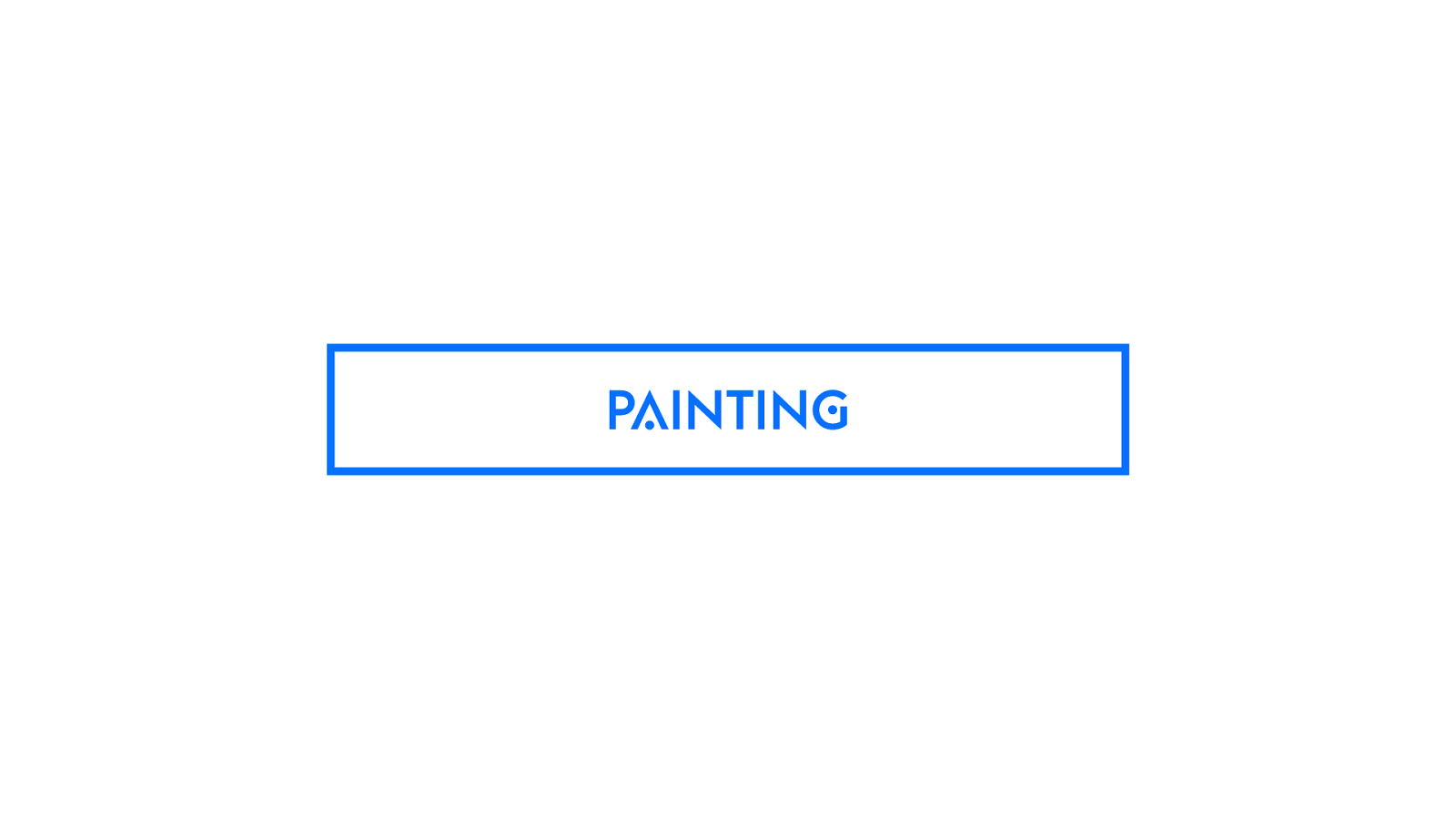
PAINTING 48 Oil painting / watercolors. You use a brush to put the paint on the canvas.
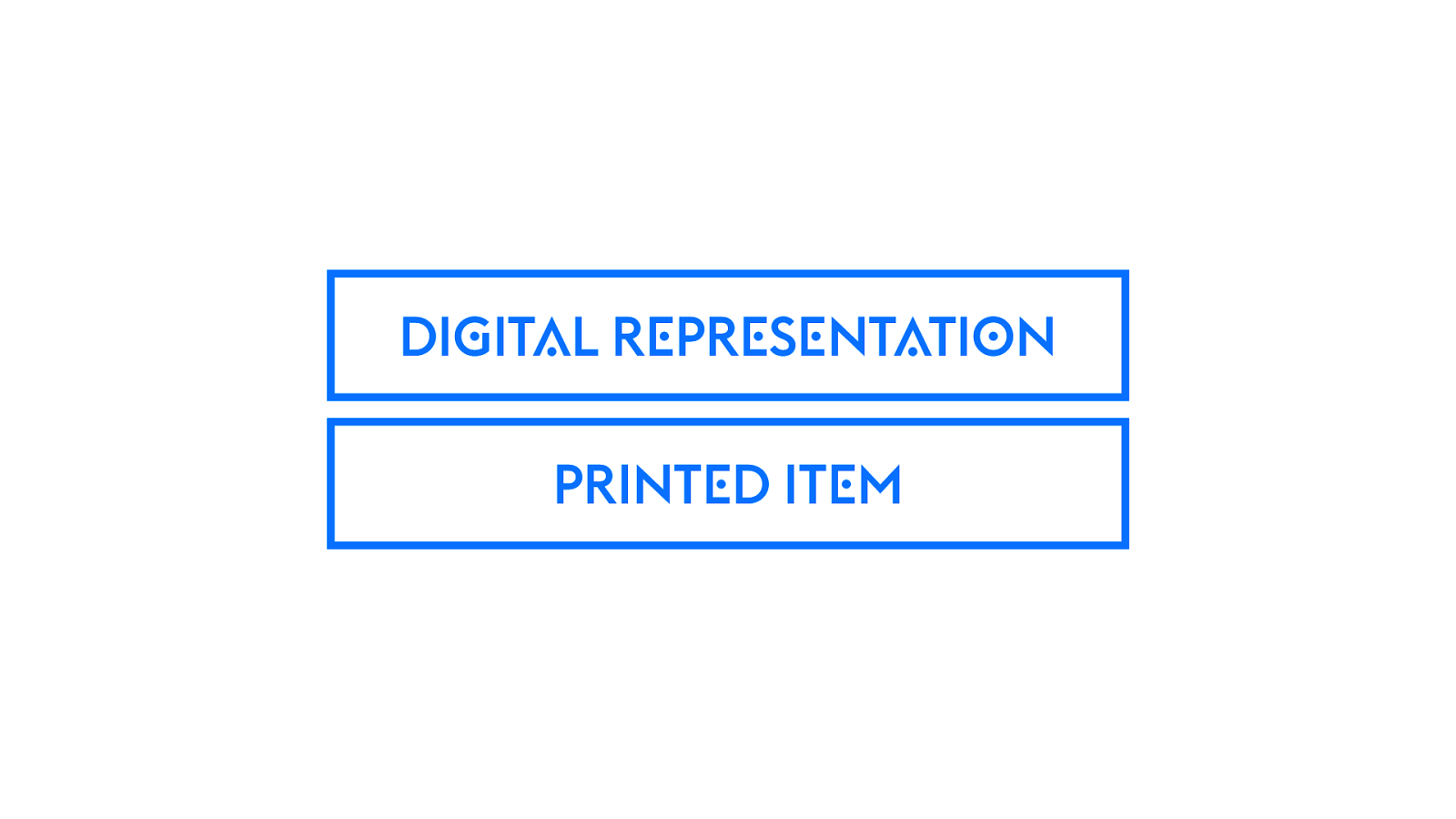
DIGITAL REPRESENTATION PRINTED ITEM 49 Desktop publishing — Move pixels around, InDesign. Send job out to be printed. It’s different. There’s a gap between what you think you are making and what you actually made. Learning curve to knowing how to predict & design what you want.
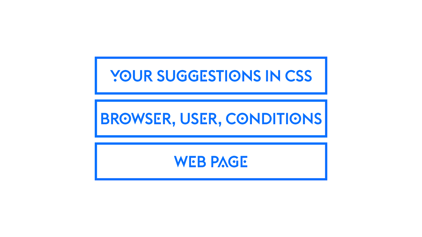
YOUR SUGGESTIONS IN CSS BROWSER, USER, CONDITIONS WEB PAGE 50 Graphic design on the web has always been one more layer of abstraction. You ask for a font, a color, a rounded corner. You might get it. Might get something slightly different. Fallback font. Square corner. Slightly different color.
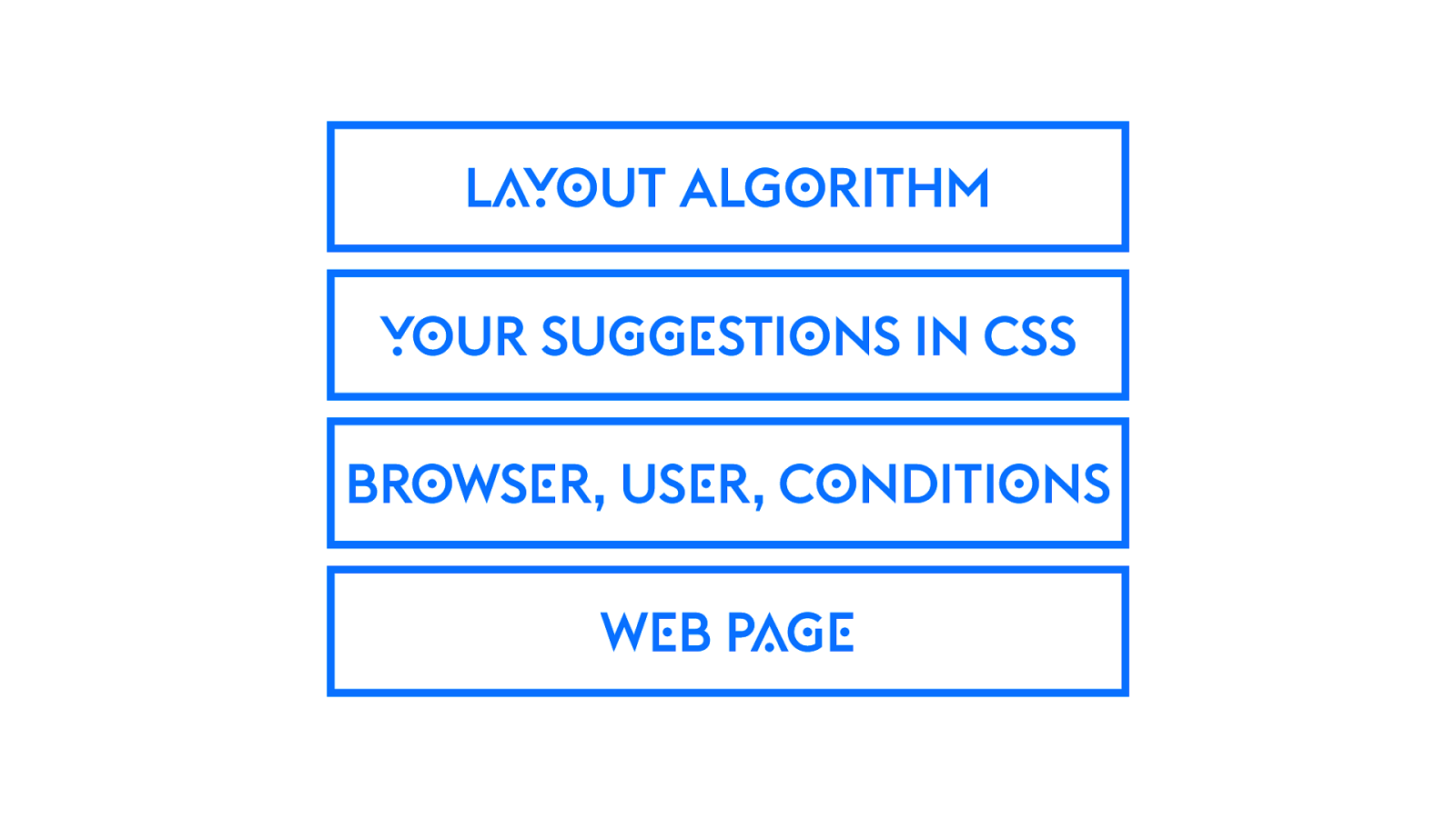
LAYOUT ALGORITHM YOUR SUGGESTIONS IN CSS BROWSER, USER, CONDITIONS WEB PAGE 51 Now, in many cases, you aren’t going to be asking for a specific layout at all. You’re writing a program, a set of conditions that you want the browser to react to — in order to figure out the layout. artificial intelligence engine for layout

Programming Flexibility Model 51 This, to me, is the biggest change from Responsive Web Design.

Should Web Designers Code 51 As soon as we start talking about Designing in the Browser, we reach this debate, “should designers code”. Does knowing CSS make you a better designer.
gn i ' d c i aph r e g r e s i h e g r n e i ! happen IDEA
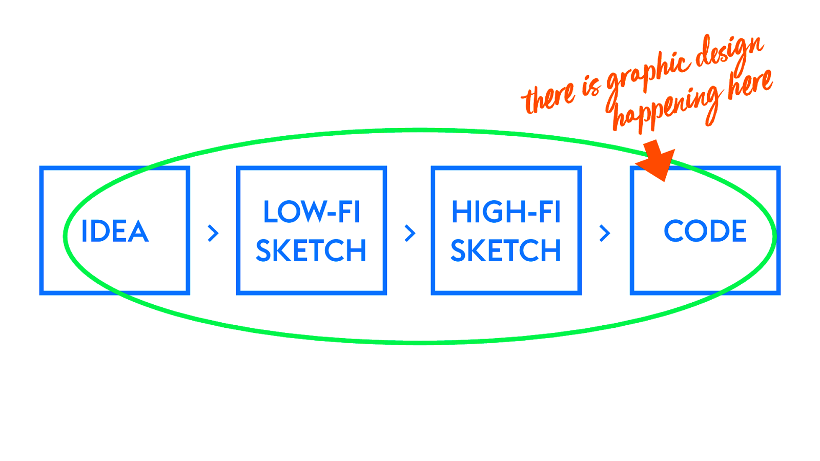
LOW-FI SKETCH 51 whether you want it to be or not, there is graphic design work happening here
HIGH-FI SKETCH
CODE
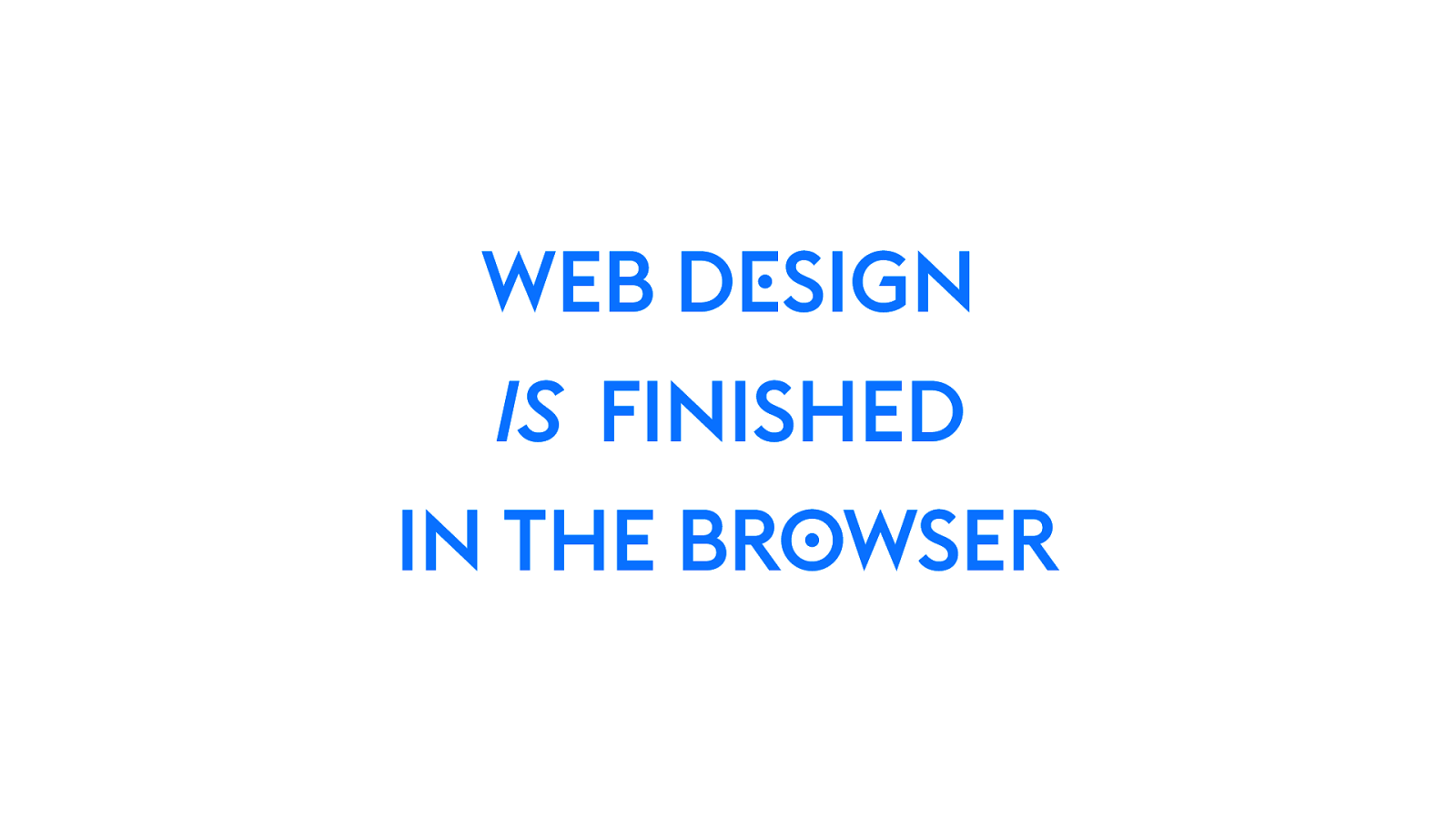
WEB DESIGN IS FINISHED IN THE BROWSER 51 Whether that person has the title of “front-end developer” or “designer” — whether you see this as a problem or a benefit, or pretend it’s not happening… this is the case. Design is finished in the browser.
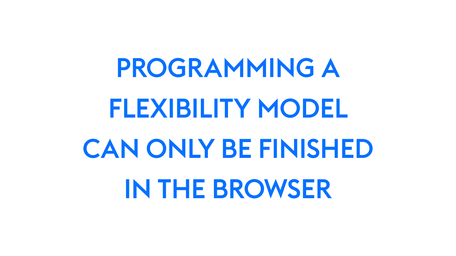
PROGRAMMING A FLEXIBILITY MODEL CAN ONLY BE FINISHED IN THE BROWSER 51 Programming a Flexibility Model can only be done in a browser. With a rendering engine. At least at this point… there aren’t any tools that don’t rely on a rendering engine that can do this. Doesn’t mean that person has to hold the title of “web designer” — could be the front-end engineer. But we should recognize that this person is making decisions that impact the graphic design of the layout.

Designing in the Browser 52 The new reality of Intrinsic Web Design breaks open the unending debate — should we be designing in the browser. I think yes — yes, many of us already are.
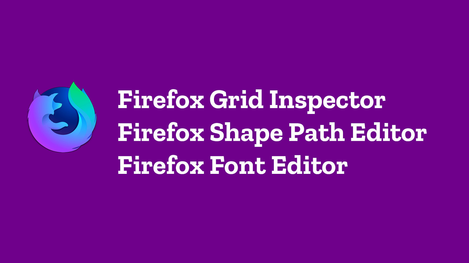
Firefox Grid Inspector Firefox Shape Path Editor Firefox Font Editor 52 Which is why I’m honored to have been able to spend the last two years of my life articulating the vision for and leading the design of these three tools.
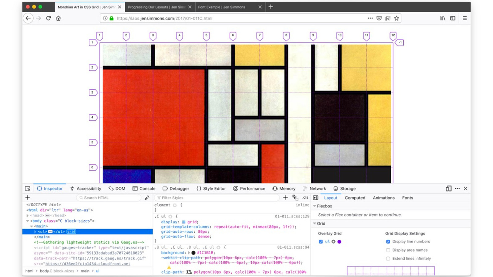
52 The Firefox Grid Inspector, so you can visualize the Grids you are making.
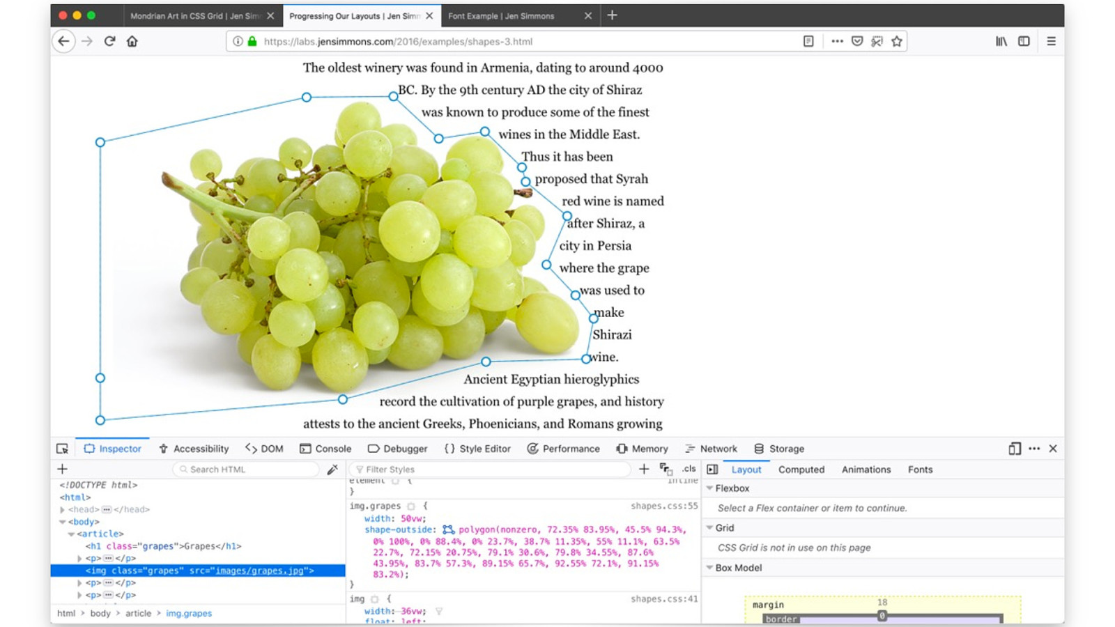
52 The Firefox Shape Path Editor, so you can directly edit, dragging points for CSS Shapes and for Clip Path.
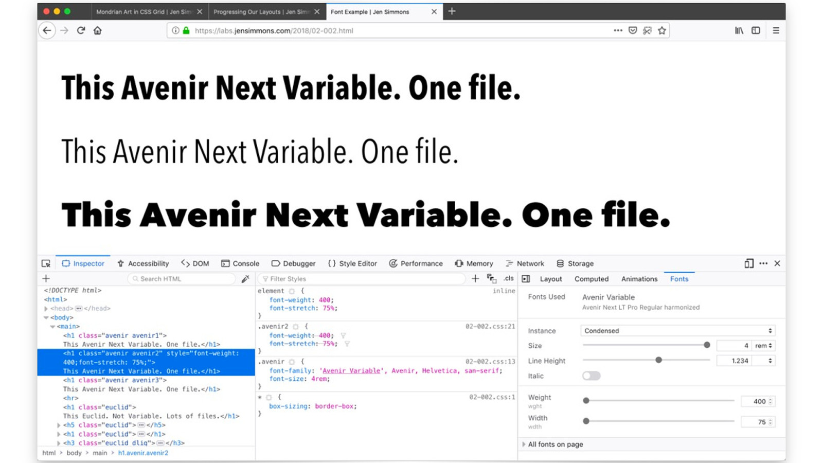
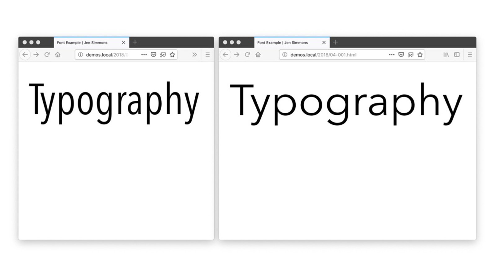
52 The Firefox Font Editor — shipping in Oct 23 — so you can easily see what variable axes are available for a Variable Font. You can quickly edit other characteristics of your typography. And hopefully in the future, you’ll be able to see what Open Type features are available.


52
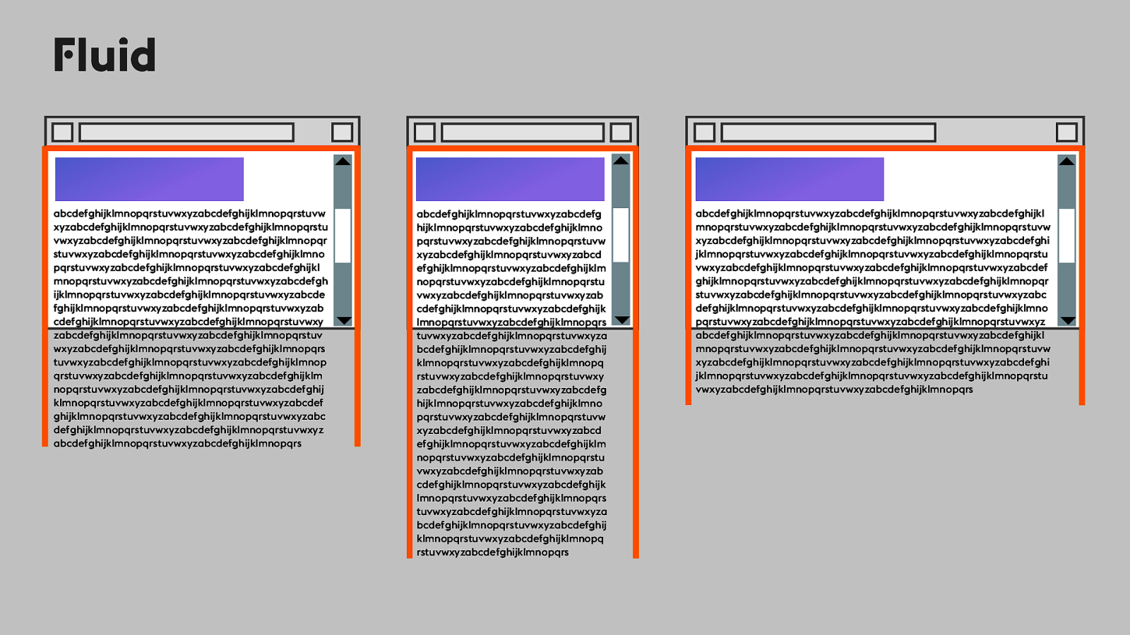
Fluid abcdefghijklmnopqrstuvwxyzabcdefghijklmnopqrstuvw xyzabcdefghijklmnopqrstuvwxyzabcdefghijklmnopqrstu vwxyzabcdefghijklmnopqrstuvwxyzabcdefghijklmnopqr stuvwxyzabcdefghijklmnopqrstuvwxyzabcdefghijklmno pqrstuvwxyzabcdefghijklmnopqrstuvwxyzabcdefghijkl mnopqrstuvwxyzabcdefghijklmnopqrstuvwxyzabcdefgh ijklmnopqrstuvwxyzabcdefghijklmnopqrstuvwxyzabcde fghijklmnopqrstuvwxyzabcdefghijklmnopqrstuvwxyzab cdefghijklmnopqrstuvwxyzabcdefghijklmnopqrstuvwxy zabcdefghijklmnopqrstuvwxyzabcdefghijklmnopqrstuv wxyzabcdefghijklmnopqrstuvwxyzabcdefghijklmnopqrs tuvwxyzabcdefghijklmnopqrstuvwxyzabcdefghijklmnop qrstuvwxyzabcdefghijklmnopqrstuvwxyzabcdefghijklm nopqrstuvwxyzabcdefghijklmnopqrstuvwxyzabcdefghij klmnopqrstuvwxyzabcdefghijklmnopqrstuvwxyzabcdef ghijklmnopqrstuvwxyzabcdefghijklmnopqrstuvwxyzabc defghijklmnopqrstuvwxyzabcdefghijklmnopqrstuvwxyz abcdefghijklmnopqrstuvwxyzabcdefghijklmnopqrs 52 Era of Fluid abcdefghijklmnopqrstuvwxyzabcdefg hijklmnopqrstuvwxyzabcdefghijklmno pqrstuvwxyzabcdefghijklmnopqrstuvw xyzabcdefghijklmnopqrstuvwxyzabcd efghijklmnopqrstuvwxyzabcdefghijklm nopqrstuvwxyzabcdefghijklmnopqrstu vwxyzabcdefghijklmnopqrstuvwxyzab cdefghijklmnopqrstuvwxyzabcdefghijk lmnopqrstuvwxyzabcdefghijklmnopqrs tuvwxyzabcdefghijklmnopqrstuvwxyza bcdefghijklmnopqrstuvwxyzabcdefghij klmnopqrstuvwxyzabcdefghijklmnopq rstuvwxyzabcdefghijklmnopqrstuvwxy zabcdefghijklmnopqrstuvwxyzabcdefg hijklmnopqrstuvwxyzabcdefghijklmno pqrstuvwxyzabcdefghijklmnopqrstuvw xyzabcdefghijklmnopqrstuvwxyzabcd efghijklmnopqrstuvwxyzabcdefghijklm nopqrstuvwxyzabcdefghijklmnopqrstu vwxyzabcdefghijklmnopqrstuvwxyzab cdefghijklmnopqrstuvwxyzabcdefghijk lmnopqrstuvwxyzabcdefghijklmnopqrs tuvwxyzabcdefghijklmnopqrstuvwxyza bcdefghijklmnopqrstuvwxyzabcdefghij klmnopqrstuvwxyzabcdefghijklmnopq rstuvwxyzabcdefghijklmnopqrs abcdefghijklmnopqrstuvwxyzabcdefghijklmnopqrstuvwxyzabcdefghijkl mnopqrstuvwxyzabcdefghijklmnopqrstuvwxyzabcdefghijklmnopqrstuvw xyzabcdefghijklmnopqrstuvwxyzabcdefghijklmnopqrstuvwxyzabcdefghi jklmnopqrstuvwxyzabcdefghijklmnopqrstuvwxyzabcdefghijklmnopqrstu vwxyzabcdefghijklmnopqrstuvwxyzabcdefghijklmnopqrstuvwxyzabcdef ghijklmnopqrstuvwxyzabcdefghijklmnopqrstuvwxyzabcdefghijklmnopqr stuvwxyzabcdefghijklmnopqrstuvwxyzabcdefghijklmnopqrstuvwxyzabc defghijklmnopqrstuvwxyzabcdefghijklmnopqrstuvwxyzabcdefghijklmno pqrstuvwxyzabcdefghijklmnopqrstuvwxyzabcdefghijklmnopqrstuvwxyz abcdefghijklmnopqrstuvwxyzabcdefghijklmnopqrstuvwxyzabcdefghijkl mnopqrstuvwxyzabcdefghijklmnopqrstuvwxyzabcdefghijklmnopqrstuvw xyzabcdefghijklmnopqrstuvwxyzabcdefghijklmnopqrstuvwxyzabcdefghi jklmnopqrstuvwxyzabcdefghijklmnopqrstuvwxyzabcdefghijklmnopqrstu vwxyzabcdefghijklmnopqrstuvwxyzabcdefghijklmnopqrs
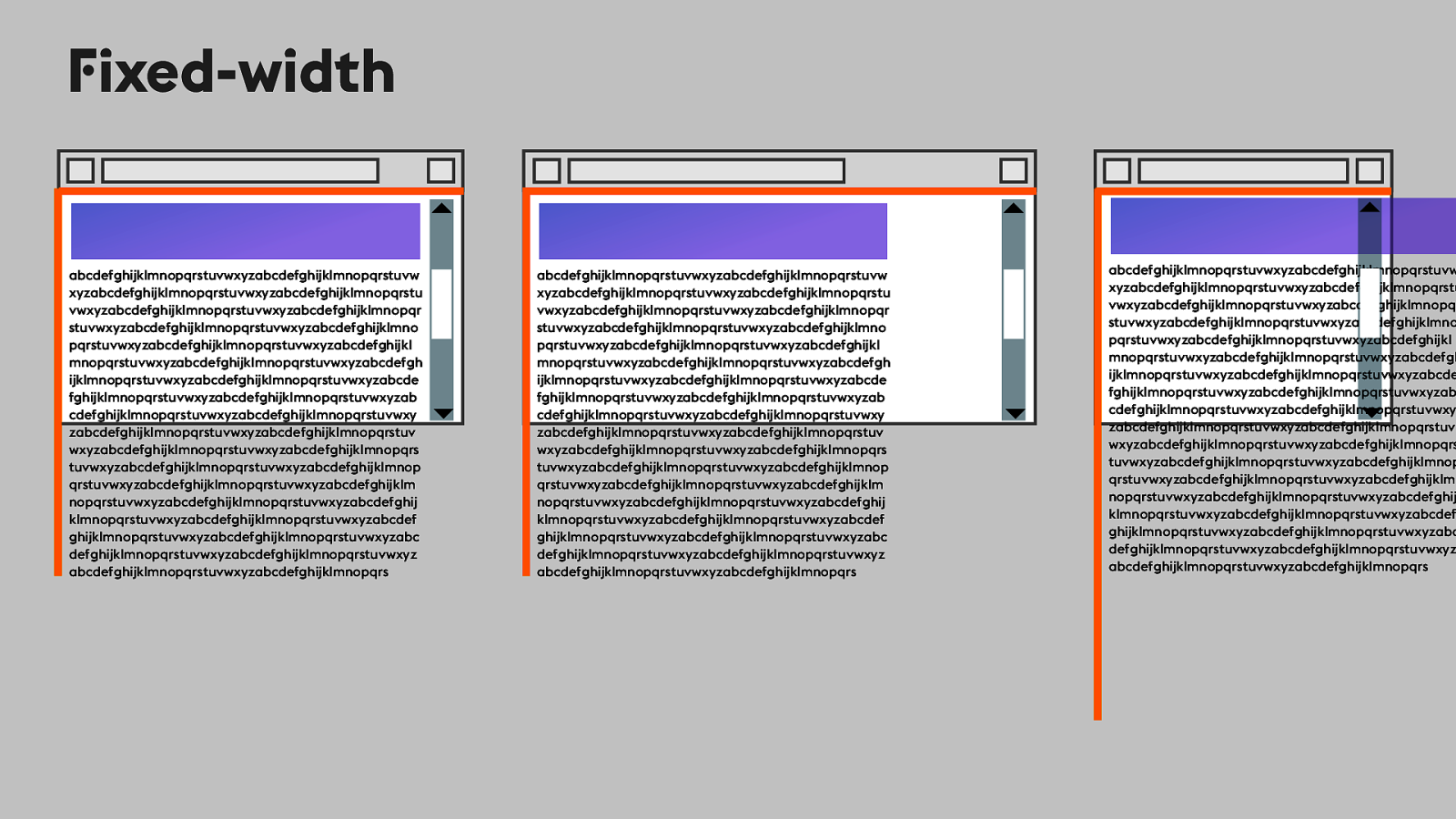
Fixed-width abcdefghijklmnopqrstuvwxyzabcdefghijklmnopqrstuvw xyzabcdefghijklmnopqrstuvwxyzabcdefghijklmnopqrstu vwxyzabcdefghijklmnopqrstuvwxyzabcdefghijklmnopqr stuvwxyzabcdefghijklmnopqrstuvwxyzabcdefghijklmno pqrstuvwxyzabcdefghijklmnopqrstuvwxyzabcdefghijkl mnopqrstuvwxyzabcdefghijklmnopqrstuvwxyzabcdefgh ijklmnopqrstuvwxyzabcdefghijklmnopqrstuvwxyzabcde fghijklmnopqrstuvwxyzabcdefghijklmnopqrstuvwxyzab cdefghijklmnopqrstuvwxyzabcdefghijklmnopqrstuvwxy zabcdefghijklmnopqrstuvwxyzabcdefghijklmnopqrstuv wxyzabcdefghijklmnopqrstuvwxyzabcdefghijklmnopqrs tuvwxyzabcdefghijklmnopqrstuvwxyzabcdefghijklmnop qrstuvwxyzabcdefghijklmnopqrstuvwxyzabcdefghijklm nopqrstuvwxyzabcdefghijklmnopqrstuvwxyzabcdefghij klmnopqrstuvwxyzabcdefghijklmnopqrstuvwxyzabcdef ghijklmnopqrstuvwxyzabcdefghijklmnopqrstuvwxyzabc defghijklmnopqrstuvwxyzabcdefghijklmnopqrstuvwxyz abcdefghijklmnopqrstuvwxyzabcdefghijklmnopqrs 53 abcdefghijklmnopqrstuvwxyzabcdefghijklmnopqrstuvw xyzabcdefghijklmnopqrstuvwxyzabcdefghijklmnopqrstu vwxyzabcdefghijklmnopqrstuvwxyzabcdefghijklmnopqr stuvwxyzabcdefghijklmnopqrstuvwxyzabcdefghijklmno pqrstuvwxyzabcdefghijklmnopqrstuvwxyzabcdefghijkl mnopqrstuvwxyzabcdefghijklmnopqrstuvwxyzabcdefgh ijklmnopqrstuvwxyzabcdefghijklmnopqrstuvwxyzabcde fghijklmnopqrstuvwxyzabcdefghijklmnopqrstuvwxyzab cdefghijklmnopqrstuvwxyzabcdefghijklmnopqrstuvwxy zabcdefghijklmnopqrstuvwxyzabcdefghijklmnopqrstuv wxyzabcdefghijklmnopqrstuvwxyzabcdefghijklmnopqrs tuvwxyzabcdefghijklmnopqrstuvwxyzabcdefghijklmnop qrstuvwxyzabcdefghijklmnopqrstuvwxyzabcdefghijklm nopqrstuvwxyzabcdefghijklmnopqrstuvwxyzabcdefghij klmnopqrstuvwxyzabcdefghijklmnopqrstuvwxyzabcdef ghijklmnopqrstuvwxyzabcdefghijklmnopqrstuvwxyzabc defghijklmnopqrstuvwxyzabcdefghijklmnopqrstuvwxyz abcdefghijklmnopqrstuvwxyzabcdefghijklmnopqrs abcdefghijklmnopqrstuvwxyzabcdefghijklmnopqrstuvw xyzabcdefghijklmnopqrstuvwxyzabcdefghijklmnopqrstu vwxyzabcdefghijklmnopqrstuvwxyzabcdefghijklmnopqr stuvwxyzabcdefghijklmnopqrstuvwxyzabcdefghijklmno pqrstuvwxyzabcdefghijklmnopqrstuvwxyzabcdefghijkl mnopqrstuvwxyzabcdefghijklmnopqrstuvwxyzabcdefgh ijklmnopqrstuvwxyzabcdefghijklmnopqrstuvwxyzabcde fghijklmnopqrstuvwxyzabcdefghijklmnopqrstuvwxyzab cdefghijklmnopqrstuvwxyzabcdefghijklmnopqrstuvwxy zabcdefghijklmnopqrstuvwxyzabcdefghijklmnopqrstuv wxyzabcdefghijklmnopqrstuvwxyzabcdefghijklmnopqrs tuvwxyzabcdefghijklmnopqrstuvwxyzabcdefghijklmnop qrstuvwxyzabcdefghijklmnopqrstuvwxyzabcdefghijklm nopqrstuvwxyzabcdefghijklmnopqrstuvwxyzabcdefghij klmnopqrstuvwxyzabcdefghijklmnopqrstuvwxyzabcdef ghijklmnopqrstuvwxyzabcdefghijklmnopqrstuvwxyzabc defghijklmnopqrstuvwxyzabcdefghijklmnopqrstuvwxyz abcdefghijklmnopqrstuvwxyzabcdefghijklmnopqrs
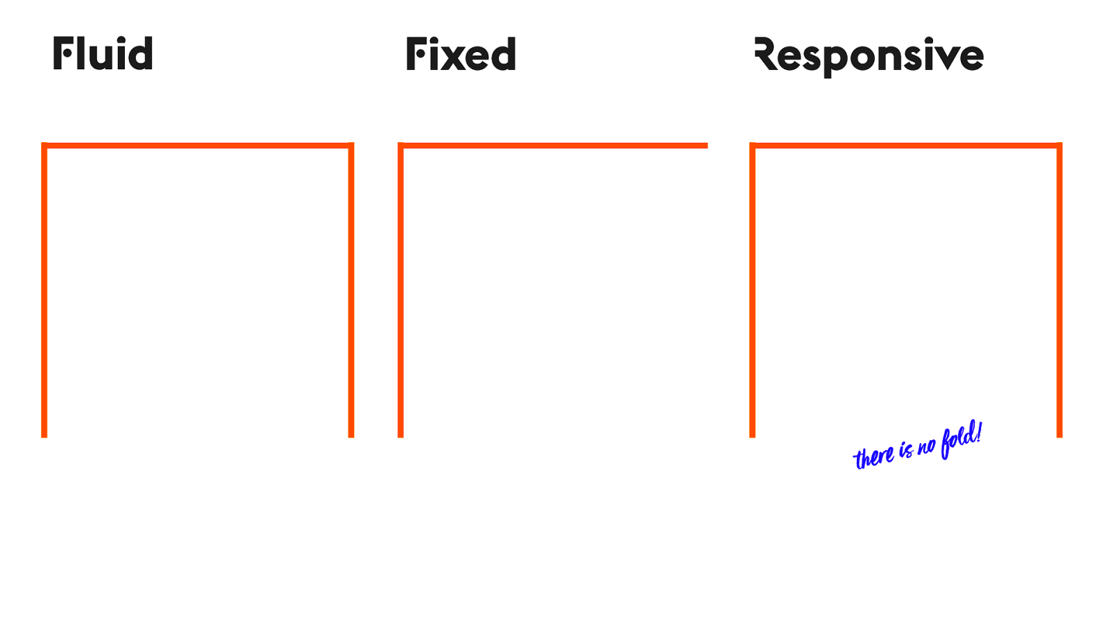
Fluid Fixed Responsive o fold! !er e is n 53
Intrinsic 54 We have a whole new set of superpowers for reacting to all four edges of the viewport.
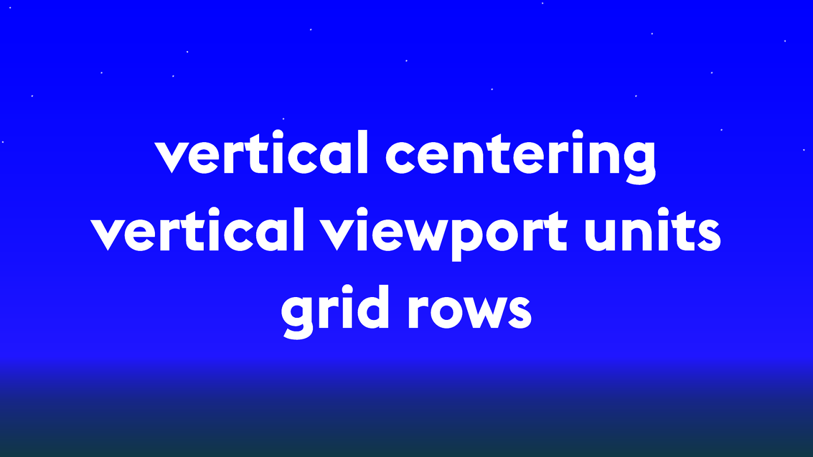
vertical centering vertical viewport units grid rows 54 Vertical centering — alignment properties, Flexbox & now Grid Vertical viewport units — for measuring, anyplace you use a measurement Grid Rows — define vertical space, create whitespace
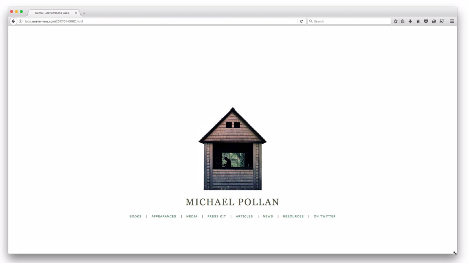
labs.jensimmons.com/2017/01-008.html 55
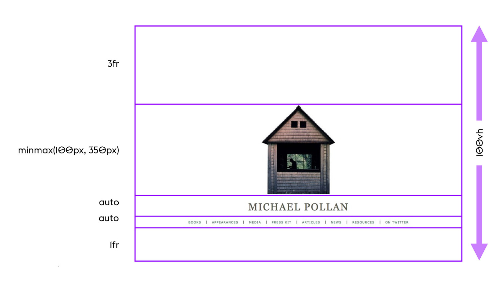
minmax(100px, 350px) auto auto 1fr 56 100vh 3fr
YOUTUBE.COM/ LAYOUTLAND 56 Videos on programming with all four edges of the Viewport

Intrinsic Web Design 57 (3)
It ’s !e web! We n"d a#! 57 After 25 years, suddenly this fight is over. We’ve been in a “It’s the Web!” mode for the last 8 years, so we need to put some effort into remembering what we wanted — art.

57 We have all the tools we need to do amazing graphic design — not every idea ever, not yet, but we can start playing again and exploring again. And meanwhile, everything we know about semantic HTML, accessibility, clean code, content first design, etc etc — all of it applies.
THE BIG WEB SHOW #176 ZELDMAN.COM 58
SHOP TALK SHOW #328 58
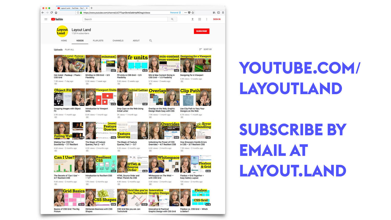
YOUTUBE.COM/ LAYOUTLAND SUBSCRIBE BY EMAIL AT LAYOUT.LAND 58
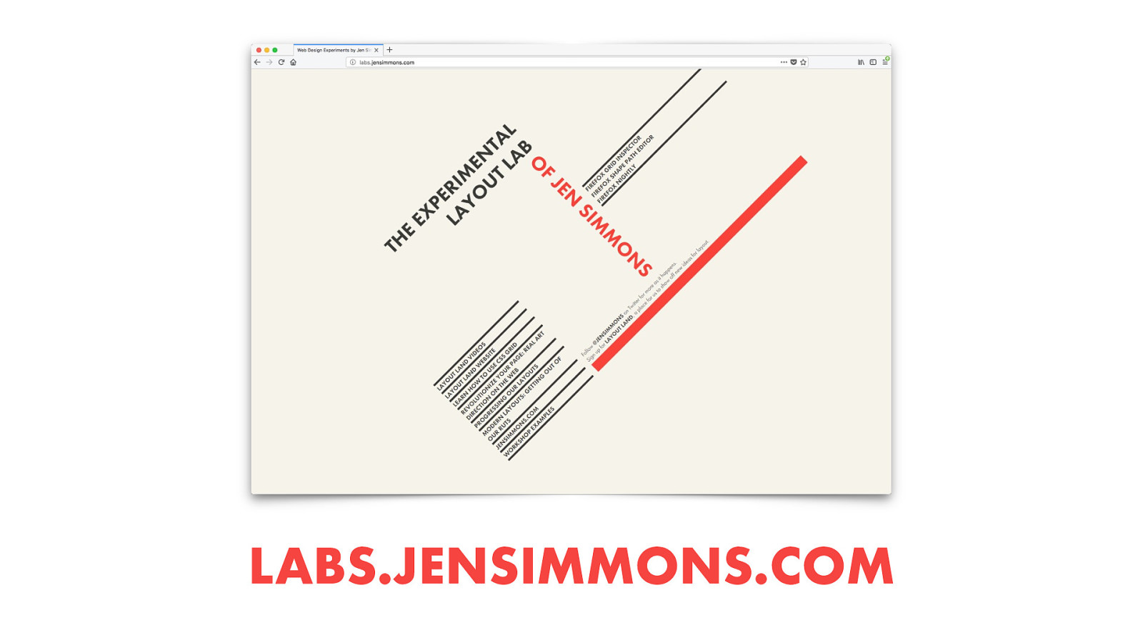
LABS.JENSIMMONS.COM 58
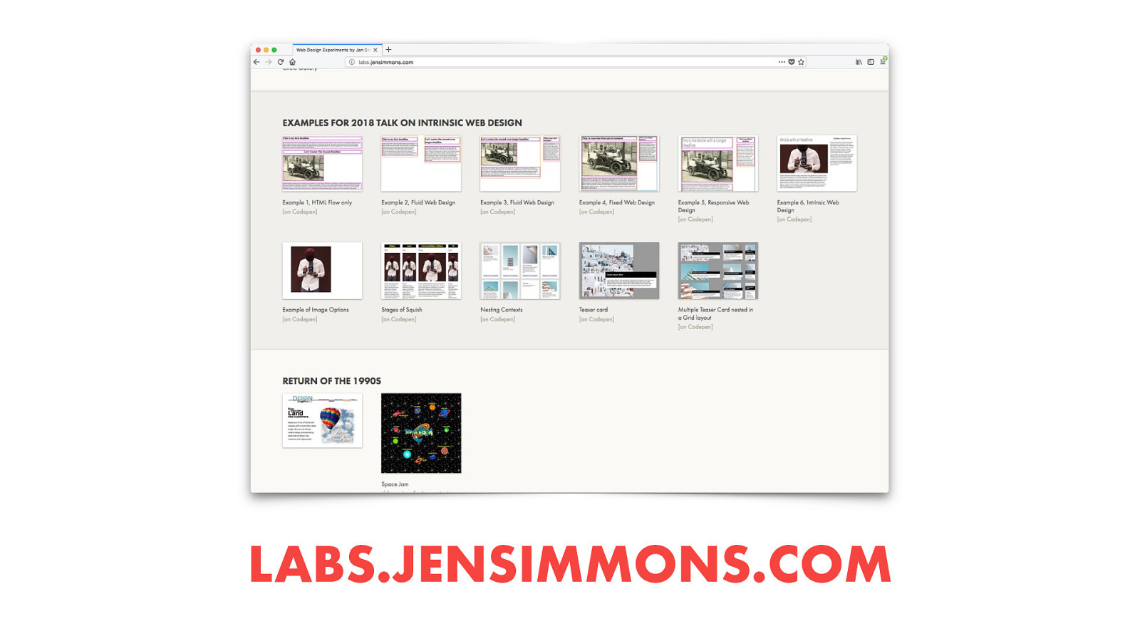
LABS.JENSIMMONS.COM 59

59 I’m very excited to see what happens if we can just change our thinking and habits about layouts. I’d love to talk to you about this — especially hear questions you have, requests for more new CSS, and see your demos. It’s time to play. Tweet me your experiments.
Thanks! JENSIMMONS.COM @JENSIMMONS LAYOUT.LAND LABS.JENSIMMONS.COM 60 Thanks so much for coming today. The happy hour starts now.