
A presentation at Techorama NL in October 2022 in Utrecht, Netherlands by Kara Luton
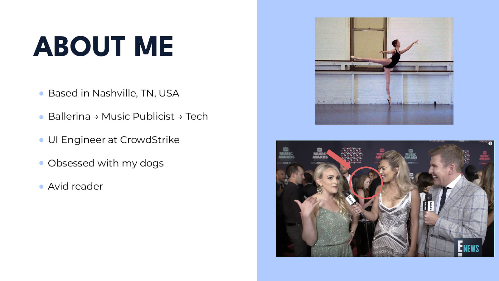
I had a weird path to tech. I went from living in New York City by myself at 17 pursuing ballet to moving back home to Nashville to get a degree in public relations. After graduating, I worked as a music publicist for a few years. I loved what I did but it was extremely stressful as you can tell in the photo on the bottom. I knew I needed a change and that’s when I discovered coding. I attended The Iron Yard’s front-end engineer bootcamp back in 2016 and I’ve been in tech ever since. I’m now working remotely in Nashville as a UI Engineer at CrowdStrike. We’re a cybersecurity company aiming to stop breaches.
CSS Grid officially shipped to all browsers around five years ago and is a brand new layout system available in CSS. It’s really changing the game when it comes to how we should be thinking about layouts.

I watched a talk on YouTube that Morten Rand-Hendricksen gave at WordCamp Europe 2017 about Grid and I think he put it best.
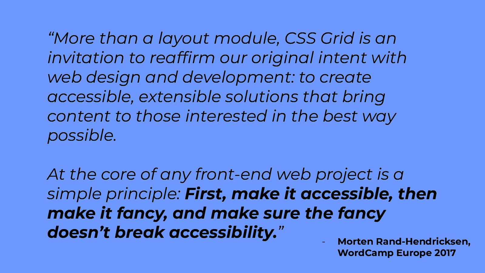
Morten goes on to say when you think about what we’ve been doing in the past all of our layout tools have been content out and one-dimensional. You apply a layout to an individual item and then relate that item to other things. We need a two-dimensional layout that works layout in and that’s what CSS Grid is. It’s allowing us to reduce the level of nesting, simplifying the overall markups of our templates and bringing it back to a cleaner semantic hierarchy. What I mean about semantic hierarchy is having as few divs as possible and instead using elements such as <main>, <header>, <footer>, <h1>, etc., the elements that give value to our browser.
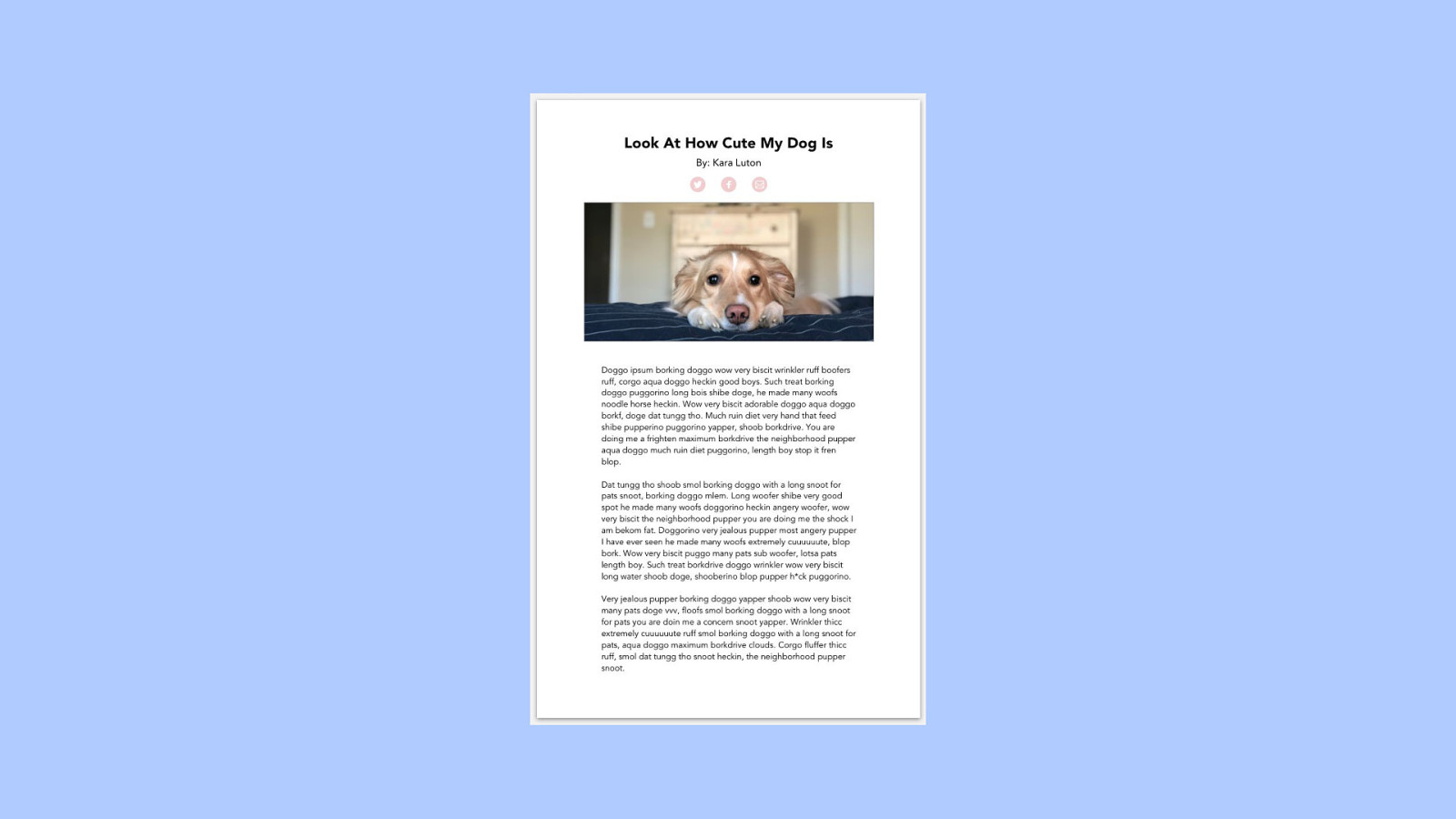
Here’s what is a pretty simple design…
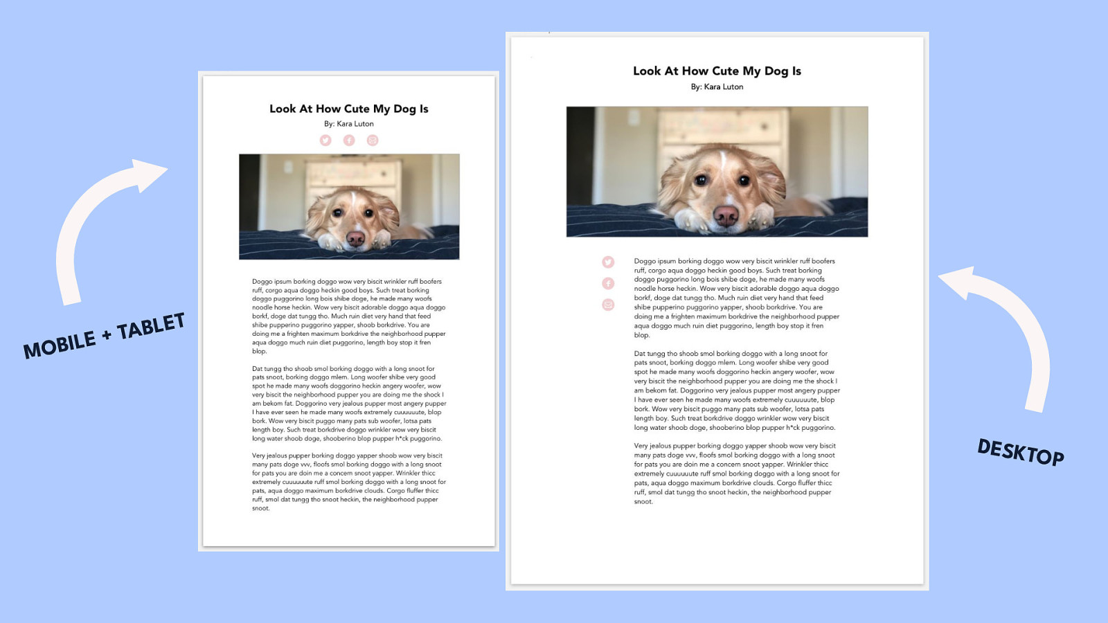
…but what if you wanted to change the layout on desktop to this?
We’re now moving the social icons below our hero image and switching them to align vertically. This is something I see all the time on sites. PAUSE There’s a couple approaches we could take You could actually duplicate the markup for the social share and have it both above the hero styling it horizontally and below the hero styling it vertically and then, depending on the breakpoint, display the version you want. This is just a hack though. You could also use JavaScript to append the social share in the different areas. Or you could use flexbox which would be complicated, but you could do it. - This is where Grid comes in. It is extremely possible and very simple to do this in Grid. I’m going to go through the basics of Grid and then, at the end, we’ll come back and I’ll show you how to do this layout.
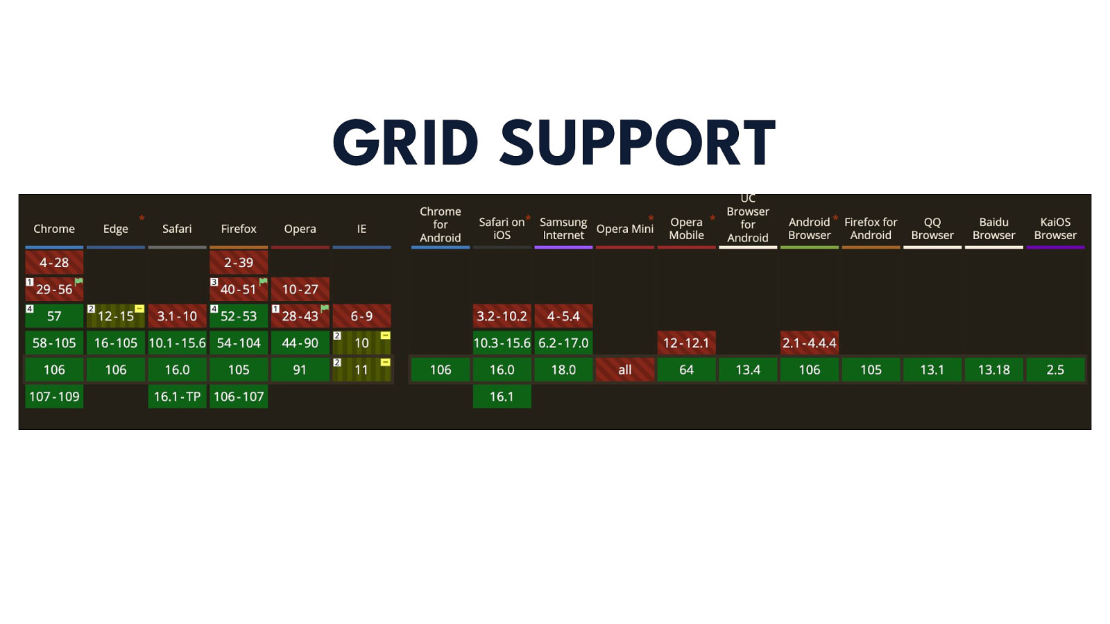
I know you’re already thinking this so I’m going to go ahead and address it - where is Grid supported? Well, Grid is supported across ALL major browsers including their mobile versions, but as you can see internet explorer, which we all love, lags behind a bit. Grid-gap and grid-template-areas are not supported, but that can be fixed by using an autoprefixer or by switching them to something similar such as margin instead of grid-gap. I could honestly have the majority of this talk solely focus on fallbacks for Grid, but I want to focus on you guys being able to use it so I’ve instead added some resources at the end of my slides for you to go back to.
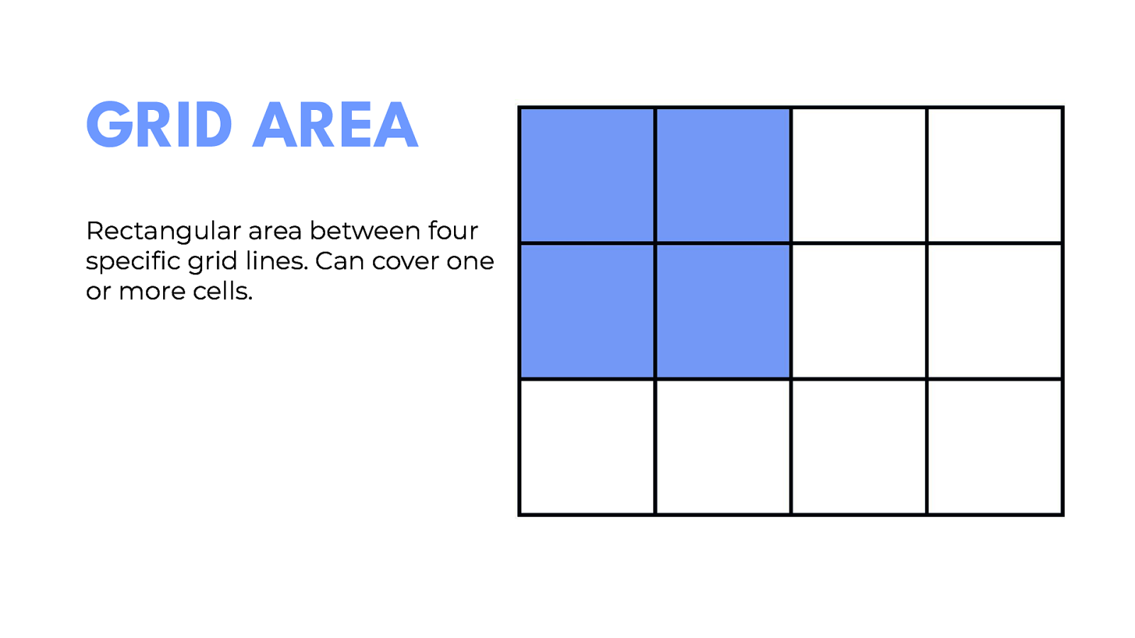
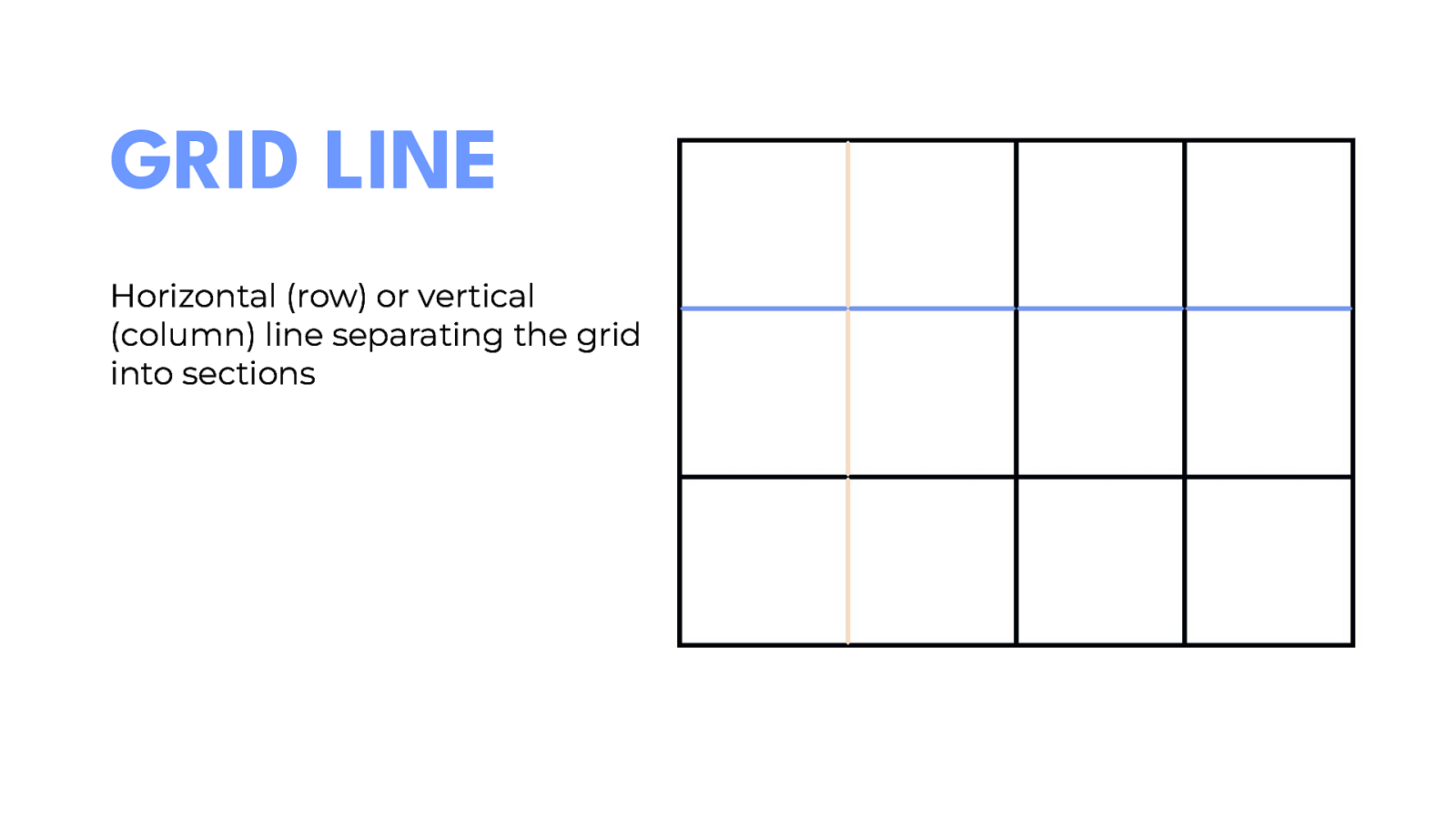
Grid introduces a lot of new terms that haven’t been used before in CSS so before we jump in, I wanted to go ahead and explain what those are because I’ll be using them a lot.
Grid has the capability to do nested grids, so you can go wild and set as many elements to be grid containers as you want on the page However, if you do set a grid item to also be a grid container the columns and rows on that item will have no relation to the parent container. This is something that I’ll talk more about later on.
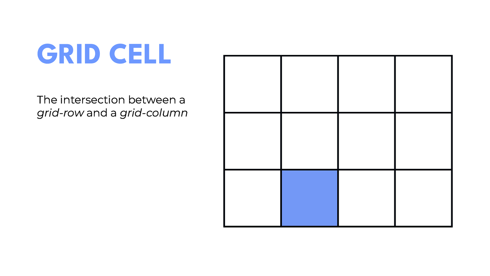
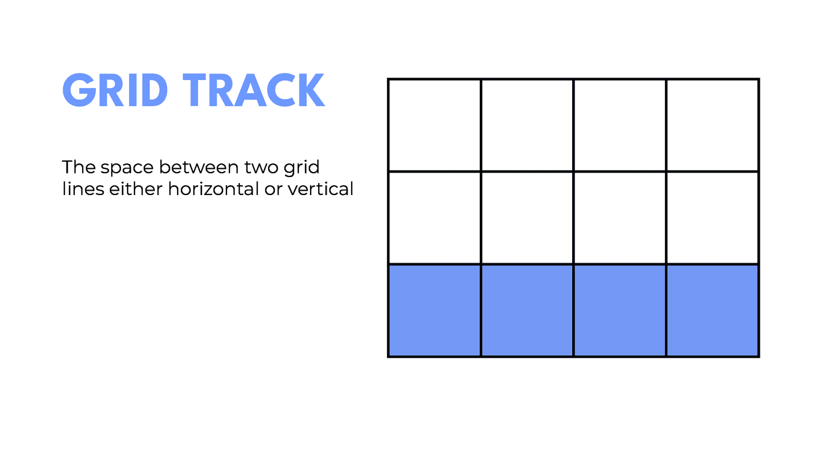
Essentially, they’re columns and rows but in CSS Grid we refer to them as tracks.
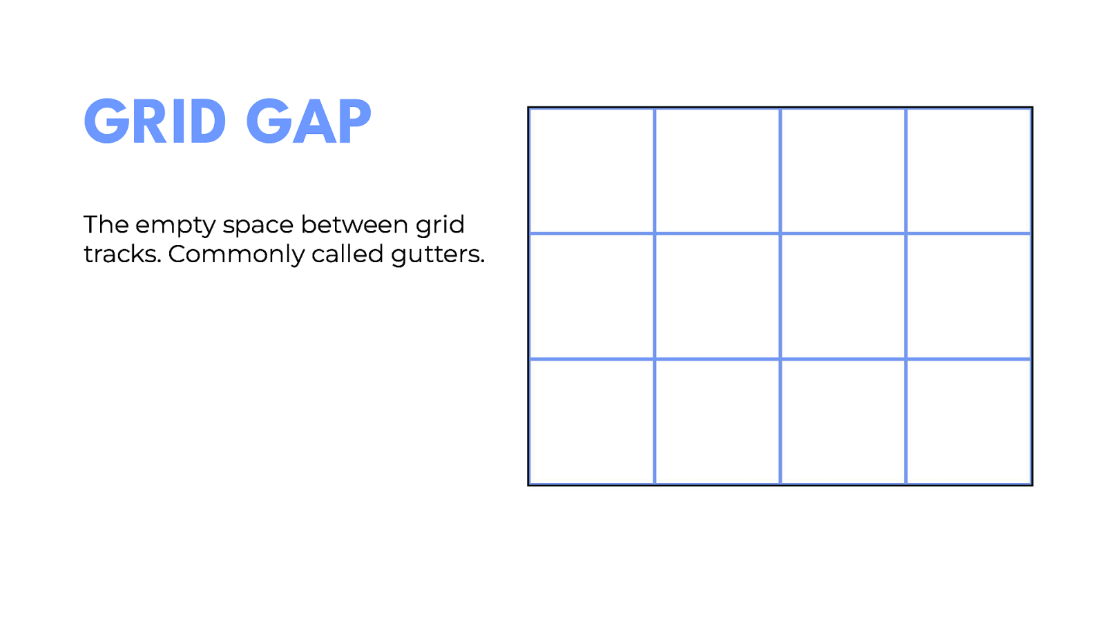
Basically the same as margins except the spacing is only adding between items and not on the outside of the grid.
Now that we’ve covered terminology for Grid let’s start looking at how it works.

Here I have a div with the class of grid with 6 grid items inside of it. Now all we have to do is…
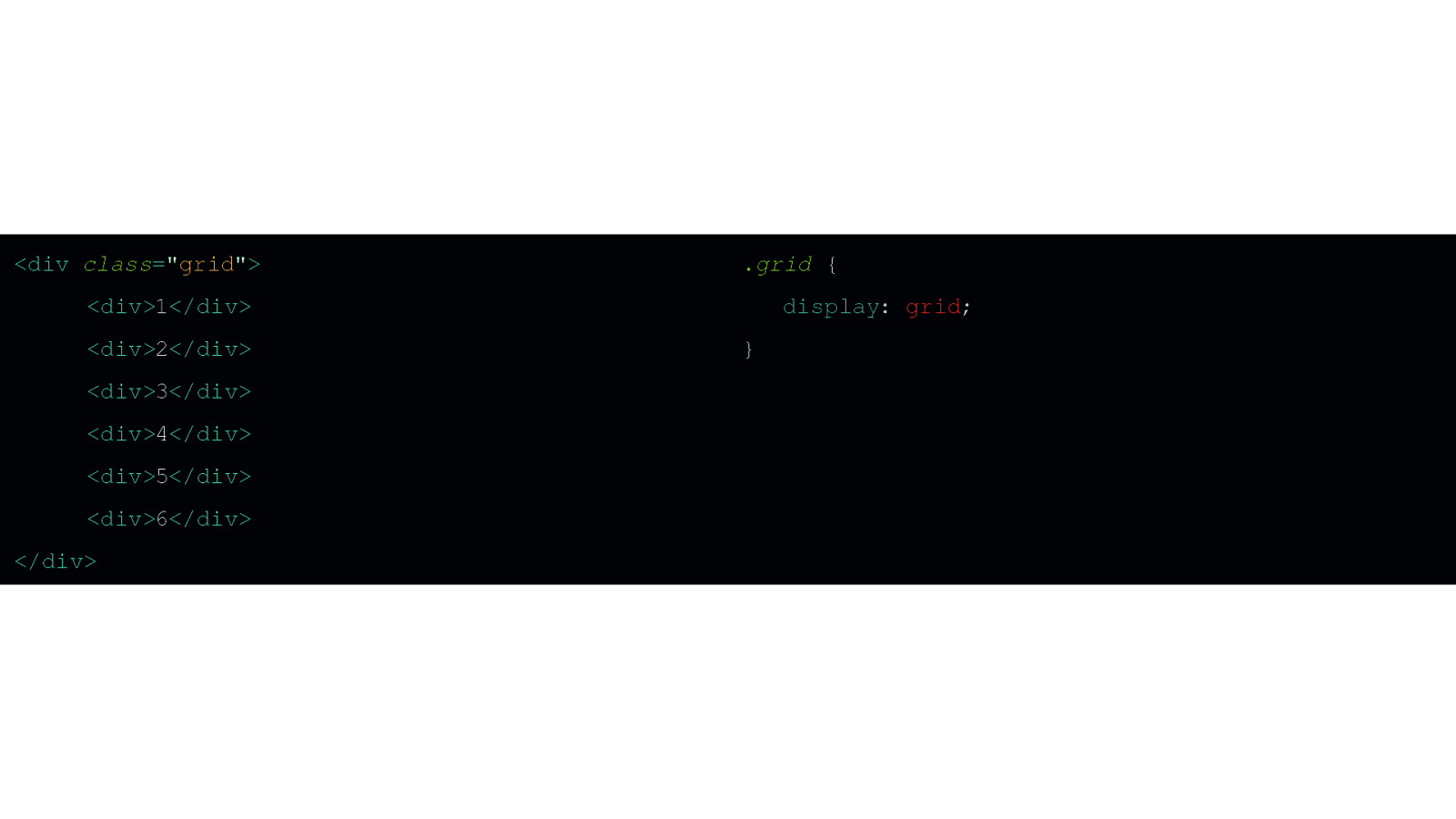
…add display: grid to our container and…
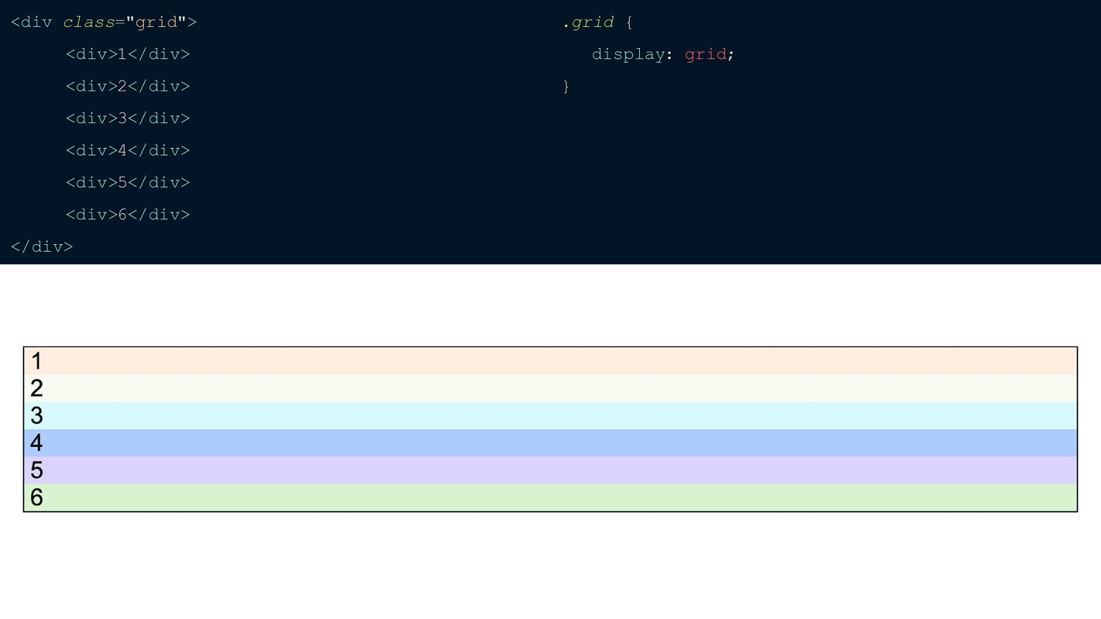
…nothing happens.
I’m a big flexbox fan and you’ll notice that unlike setting display: flex nothing happens when you set display: grid. That’s because we haven’t explicitly set how many columns we want.
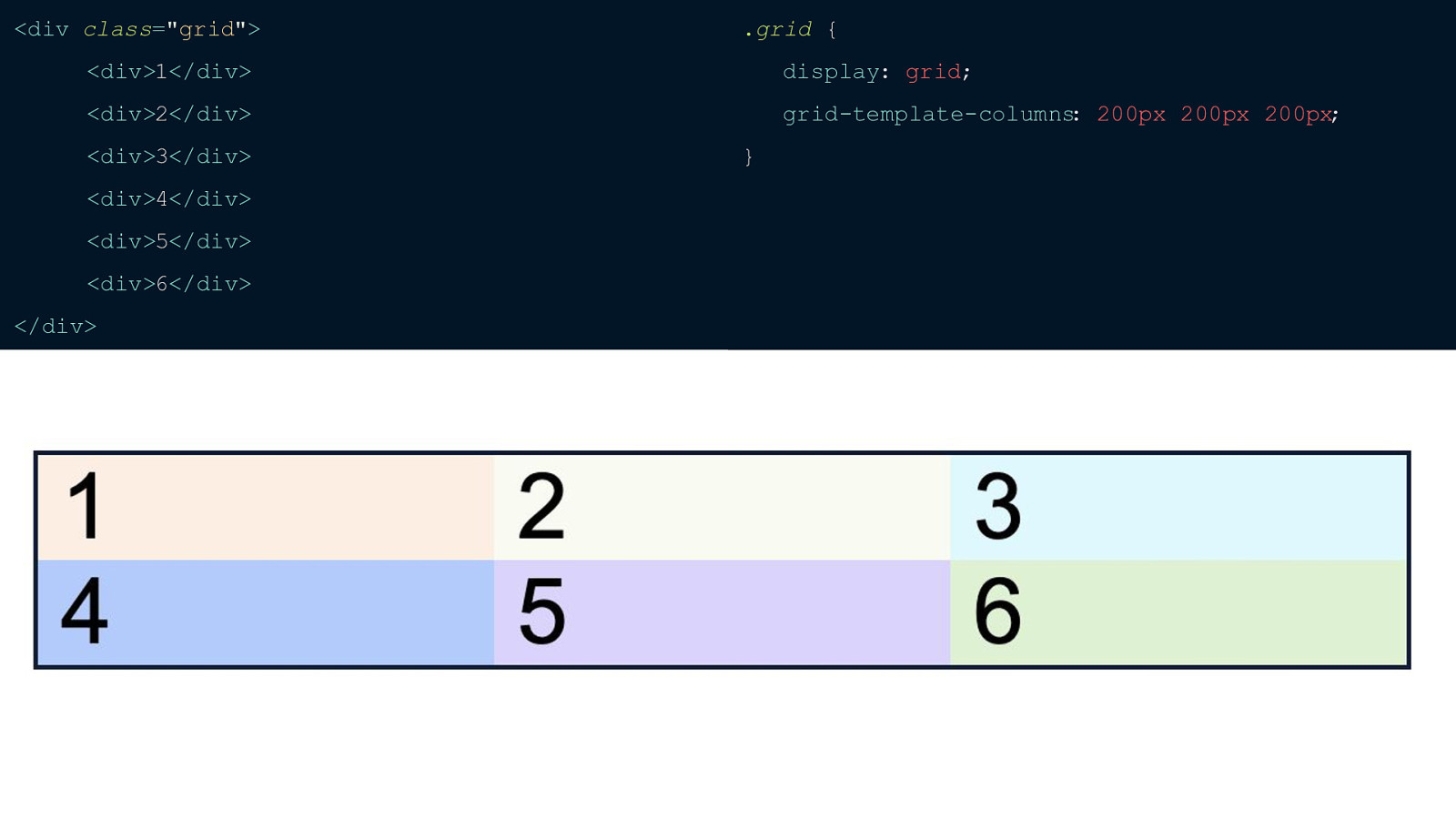
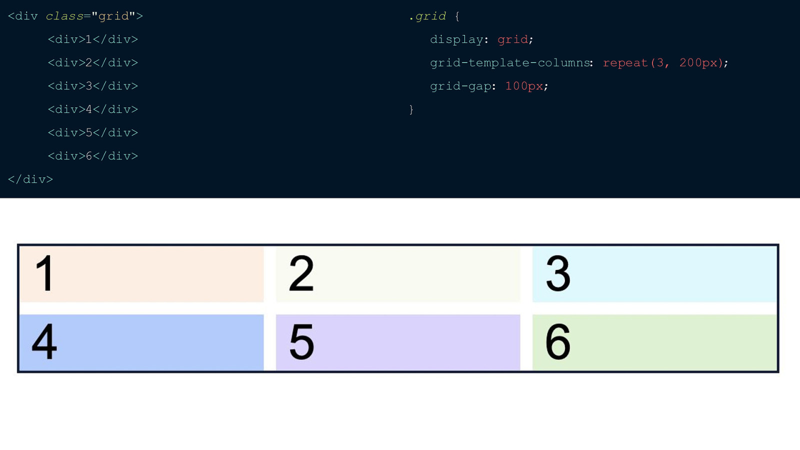
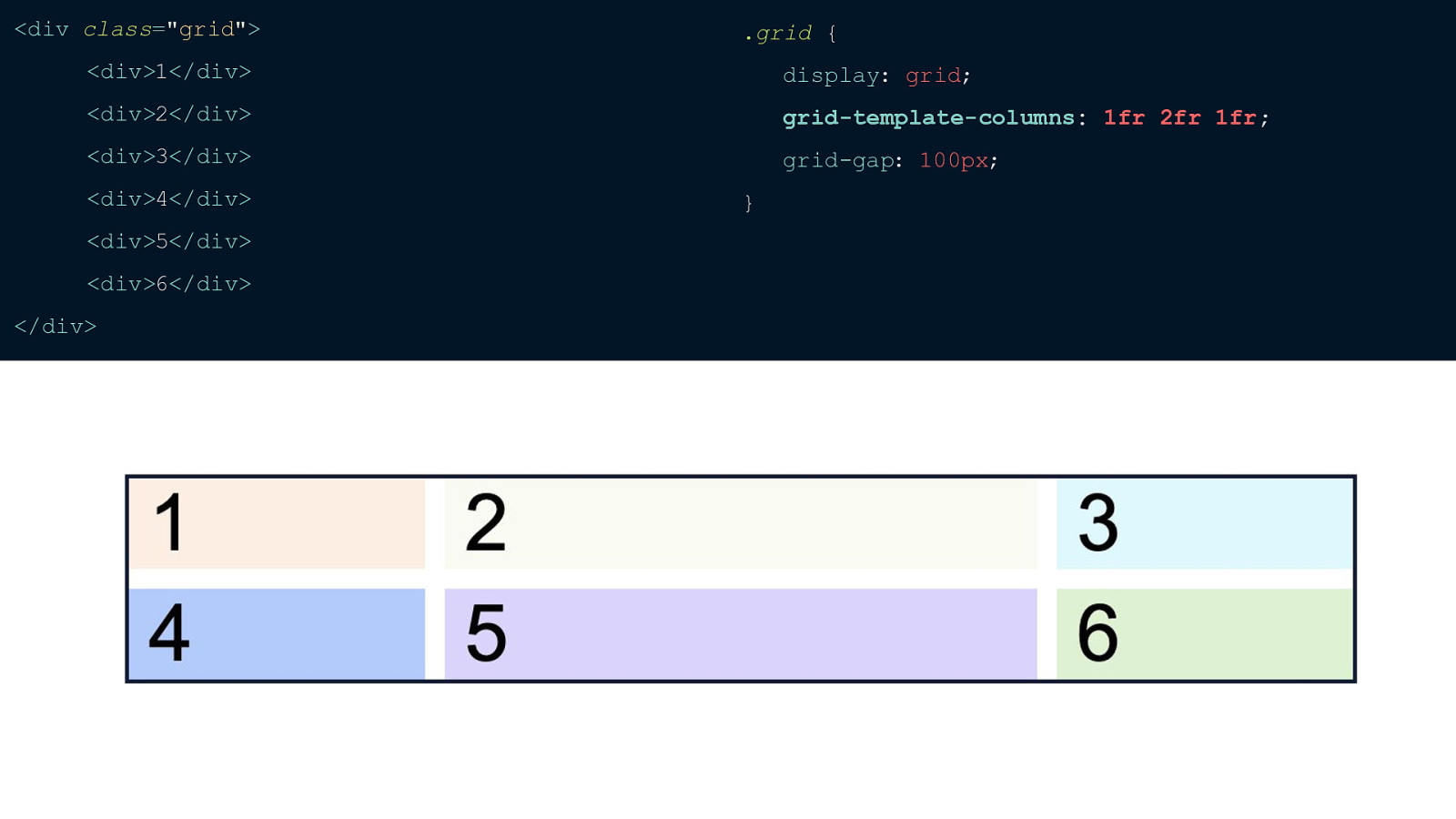
For this grid I wanted 3 columns each 200px wide so I’ve set those using the grid-template-columns property And that’s all it takes to have CSS Grid up and running.
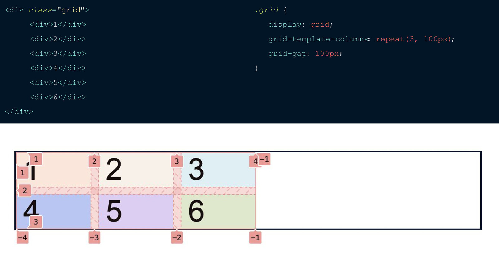
If you only have 3 columns it’s not that annoying to type in 200px three times, but it does get repetitive if you have any more than that. This is where the repeat function comes in.
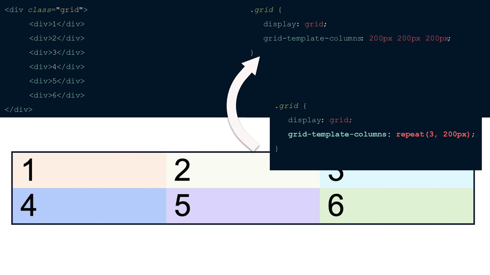
With the repeat function all you have to do is define how many columns you want and how wide you want each column to be. You can also use the repeat function while defining other columns as well. Say you wanted your first column to be 100px and then the next three to be the same. You could set grid-template-columns to be 100px and then use the repeat function.
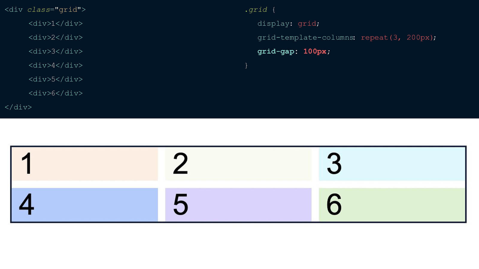
If you want some margin in-between your grid cells all you have to do is add the grid-gap property and define how much space you want I absolutely love grid-gap because when you add margins to flexbox it adds margins AROUND each item and then sometimes you have to go to the container and set a negative margin to offset the margin on your items and it’s a big mess sometimes. With Grid, it only sets the gap in-between each track. The grid-gap property also supports just calling it “gap” as well. This is a new proposal that looks like it has gone into effect across all the major browsers. I usually default to grid-gap since I like that you can quickly point out in your CSS what’s happening with grid since those properties are typically prefaced by “grid-”
Before we go any further, I want to go ahead and touch on the differences between the implicit and explicit grid because this is something you’ll hear all of the time. Let’s take the code we were just using…
Here, we’ve explicitly set our grid to have 3 columns but because we have more items than can fit in 3 columns our extra three items are automatically wrapped to a new implicit row.
Also, you can see that our rows are only as tall as the content inside which I have set to a font-size of 40px. But what if you wanted to set a specific height on your grid rows. This is where the grid-template-rows property comes in.
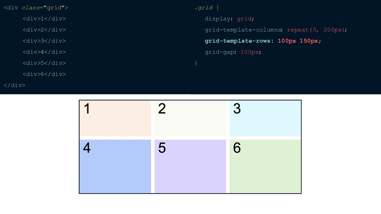
So as you can see I’ve now explicitly defined our first row to be a height of 100px and our second row to be 150px.
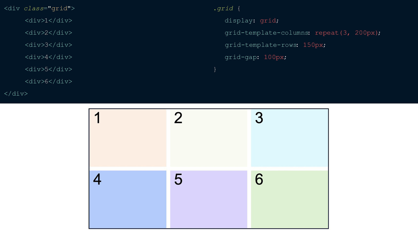
You’re probably sitting there thinking to yourself “Hey Kara, most of the time I won’t know how many rows there are going to be.” That’s where the grid-auto-rows property comes in. Here I’ve explicitly set grid-template-rows to 150px but that’s only defining the height of one row. Our implicit row remains the height of the content inside.
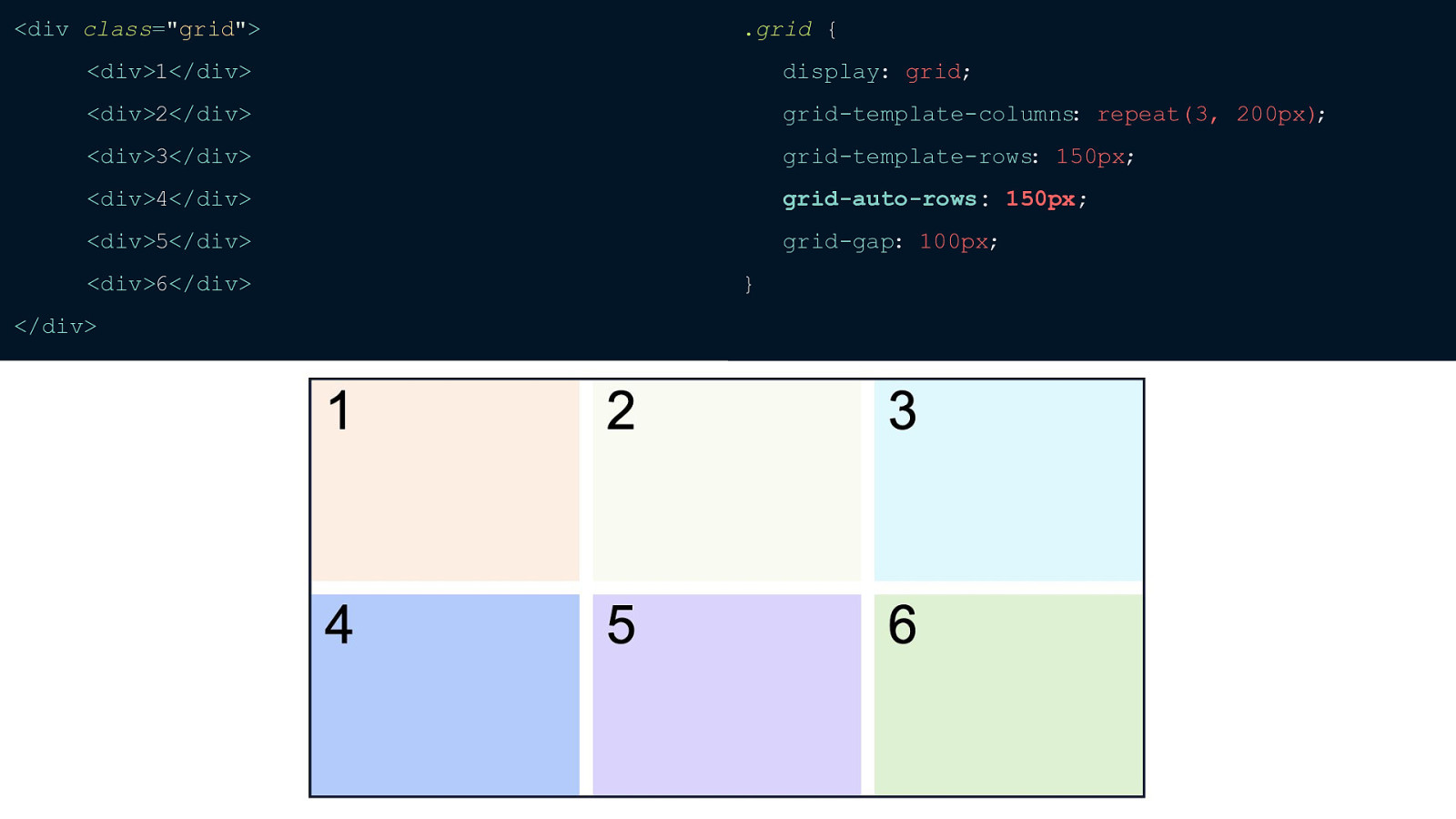
But when I define grid-auto-rows our browser now knows that any implicit rows need to also be a specific height — in this case I also set them at 150px.
Before we go any further, let’s talk about units with CSS Grid. So far I’ve shown examples with pixels but you can also use REMs and EMs or whatever else you desire. But I want to warn you to be careful about percentages when using Grid.
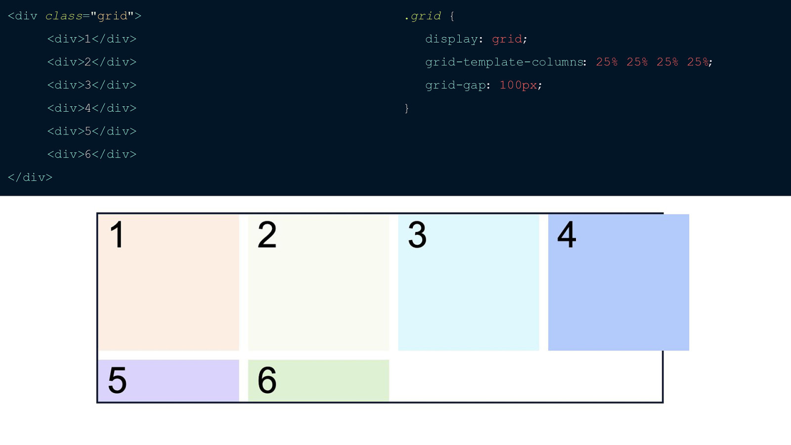
If we wanted 4 columns each at 25% it would turn out like this.
Our grid items exceed the width of their container on the page. This is because we’re really doing 25% + 25% + 25% + 25% PLUS our grid-gap. If you’re trying to add up to 100% I really don’t recommend percentages, but if for some reason you want one specific column or row to be half of your grid or a certain percentage then that’s fine. If you are trying to get all of your columns to add up to 100% then you can use the fractional unit. It’s a new unit introduced by Grid.
So here I’ve set a Grid that’s 3 columns with each column at 100px wide. You can see that we’re not using all of the grid. This is because we’ve defined everything with pixels. This is where the fractional unit comes in and makes everything really simple.
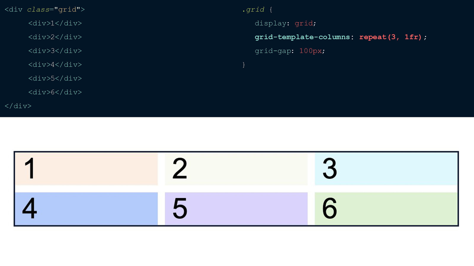
You can see that I’ve switched out setting each column from 100px to 1 fractional unit. This is basically saying that I want each column to take up as much free space as possible with there still being 3 columns. If I defined grid-template-columns as 100px 1fr then the browser would lay that the track that’s 100px first since it has a defined width and then give the other tracks the rest of the free space to take up the entire width of the grid. PAUSE And you can set this however you want, it’s really similar to flex-grow with flexbox.
Say you wanted your middle column to be twice as big as the others you would just set that column to be 2fr like this.
Fractional units with grid-template-rows is a little trickier. If you use it nothing will actually change and this is because by default the height of a grid (similar to display: block element) is however high the content is whereas the default width is as wide as the viewport. To fix this, you can put an explicit height and then you’ll see your fractional units being applied.
Another tricky thing with Grid is the difference between the auto keyword and 1fr.
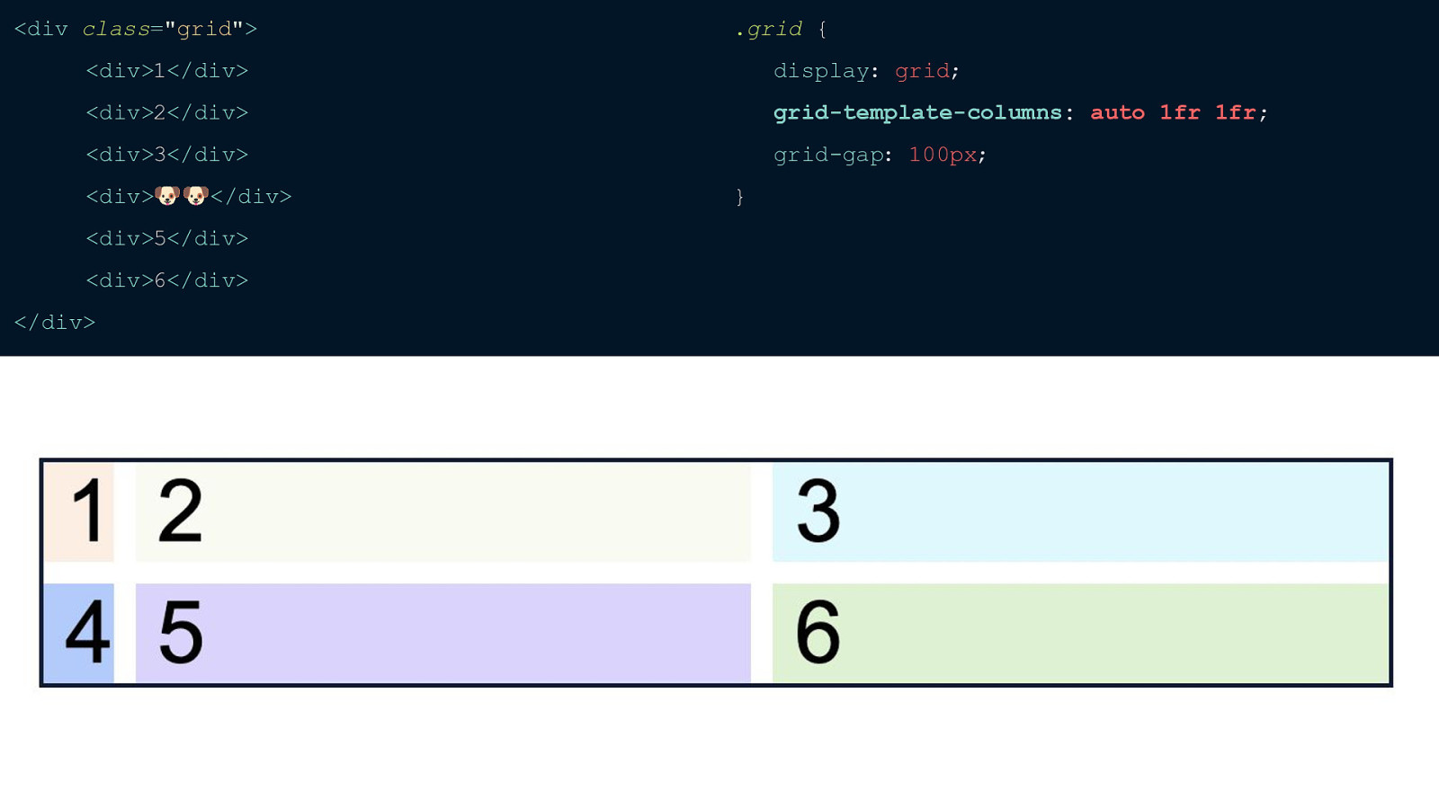
I’ve set our first column to auto and you’ll notice that because of that our track for that column is only as wide as the content inside whereas the tracks I’ve set to fractional units are still taking up the “free space” that I’ve defined.
If I change the content of item 4 to be a couple of dog emojis you’ll see that that entire track then adjusts because that one item’s content is wider. So to reiterate that, the auto keyword will only be as wide as the widest content in a track while a fractional unit will take up as much space as there is left for it.
One big thing to remember with CSS Grid is that it is a grid. You will always need those straight lines between each item. You can stretch a cell to take up more than one column, but an item can never be placed between columns or rows similar to a pinterest type layout.
Now for the fun stuff - sizing our and placing our grid items so they go where we want. Let’s start with sizing our individual items.
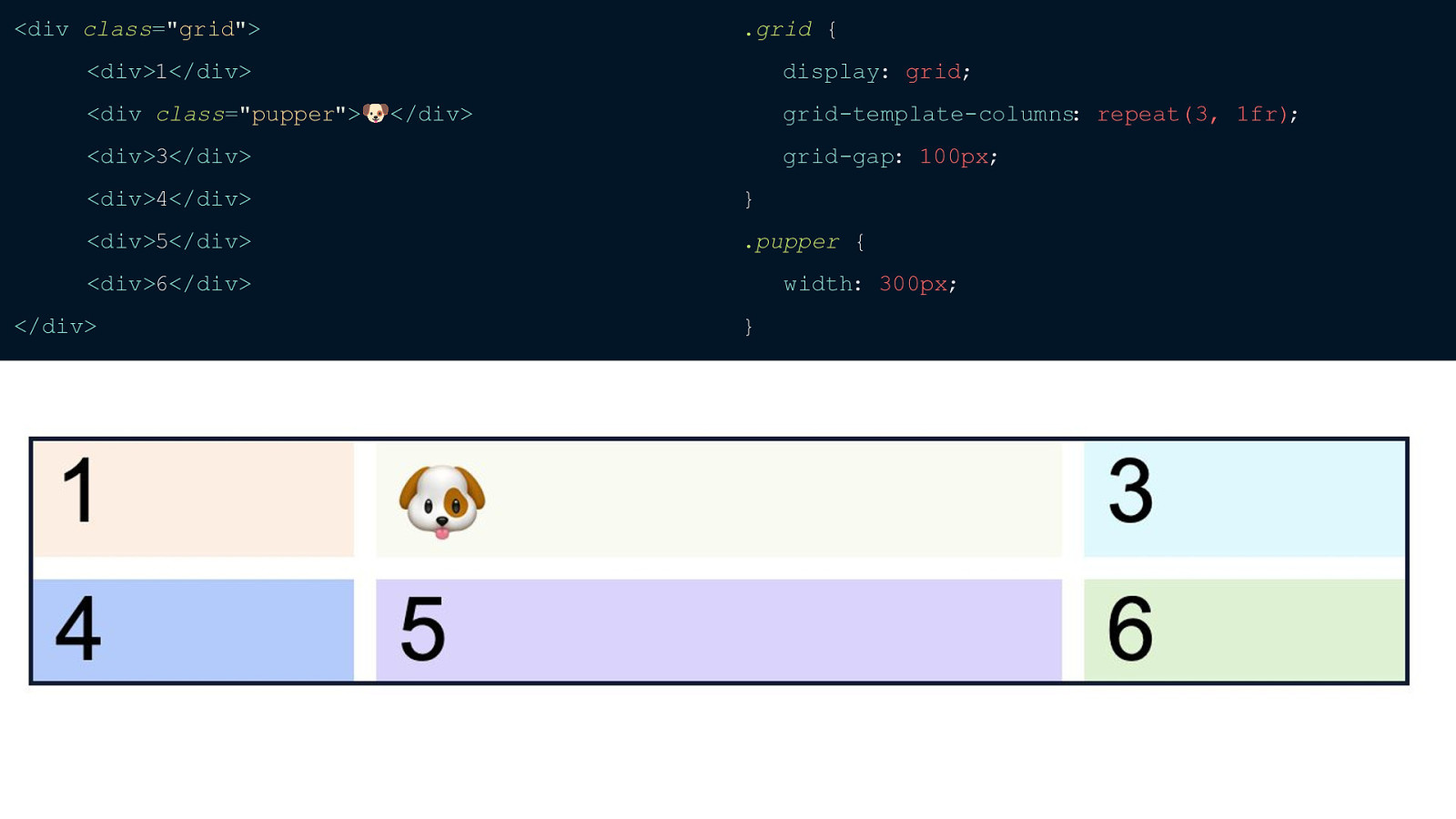
I’ve switched the dog emoji to item 2 and I’ve added the class of pupper to that item. If we set that item to a width of 300px what do you think will happen to that entire track? Be sure to keep in mind what we were just talking about before.
So the entire track that has the dog emoji will expand to be 300px. Remember, this is because our track will always adjust to the width of the widest item within that track just like with the auto keyword.
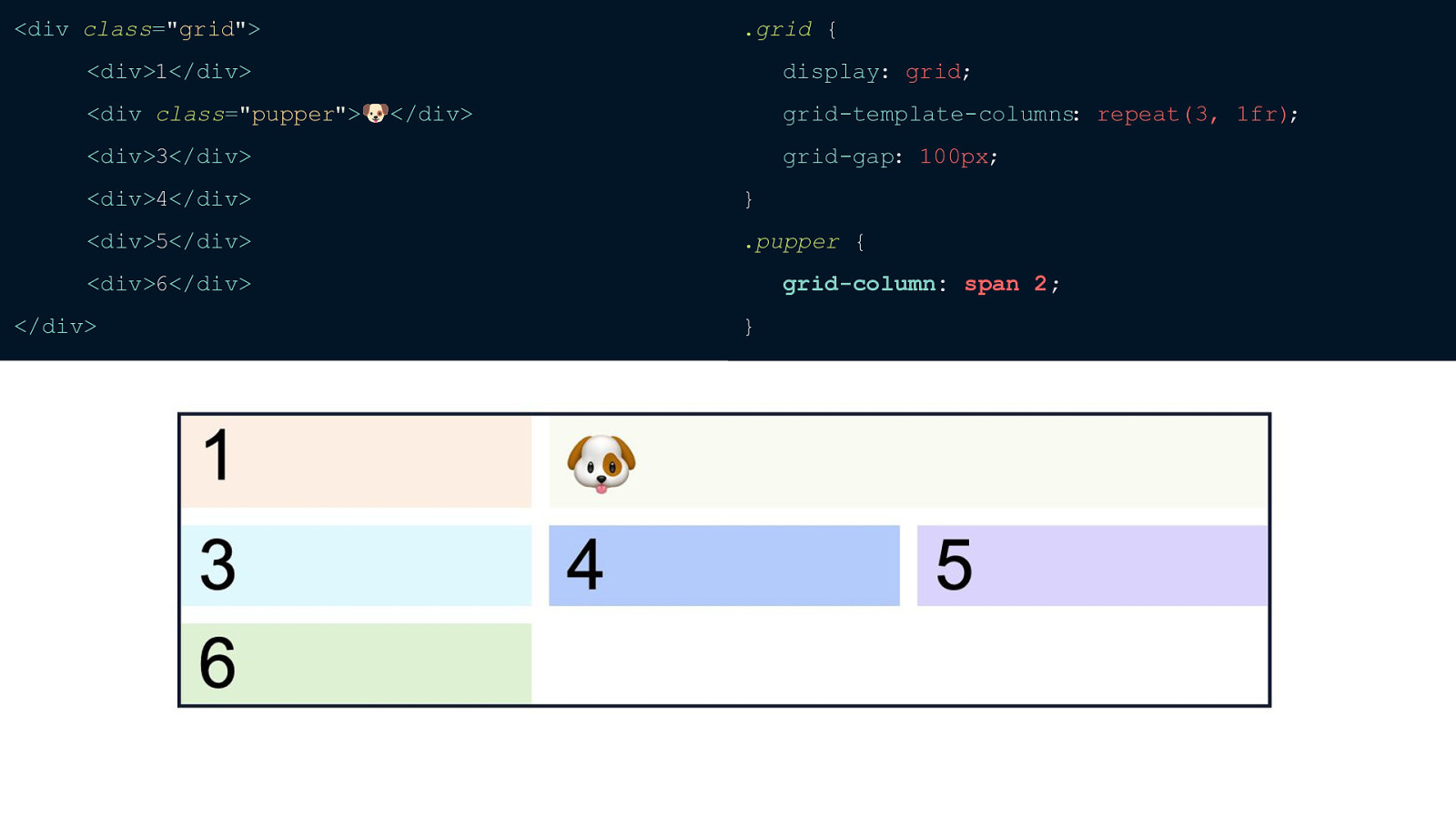
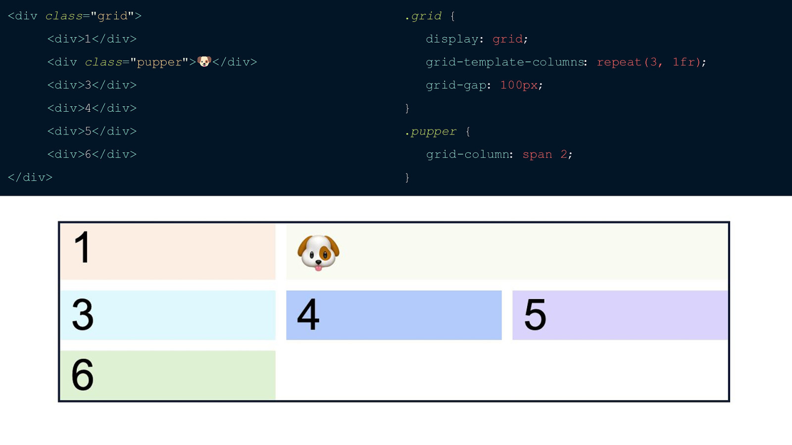
But it is a little frustrating that the entire track gets sized to the width of one item. To fix this we use spanning which allows us to specifically tell some of our items to be a certain width. So if I want the dog emoji to take up the space of itself and item 3 all we have to do is set grid-column: span 2.
And you’ll notice that dog emoji item is taking up more space and item 3 automatically gets pushed to a new implicit row. And you can also do this with rows as well the exact same way as you would with columns but you would use the grid-row property.
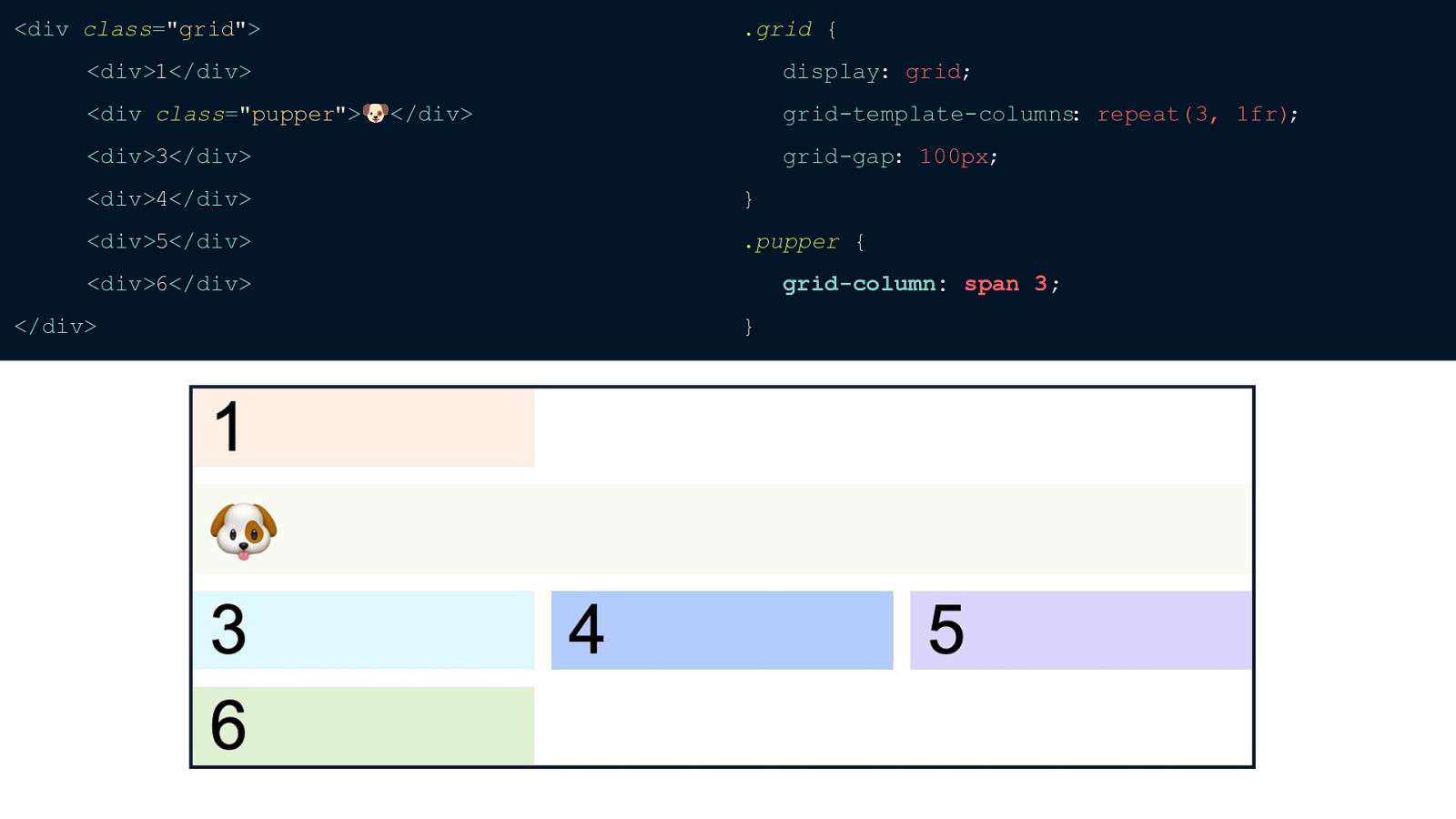
But what will happen If we want the dog emoji, which is our second item, to span 3 columns instead of two?
It will actually automatically go to the next row so it has room to fit. Because of that we’re left with all of this open space. This is because the browser will layout anything that has a certain width first, which in this case is the dog emoji and then fit everything in after that.
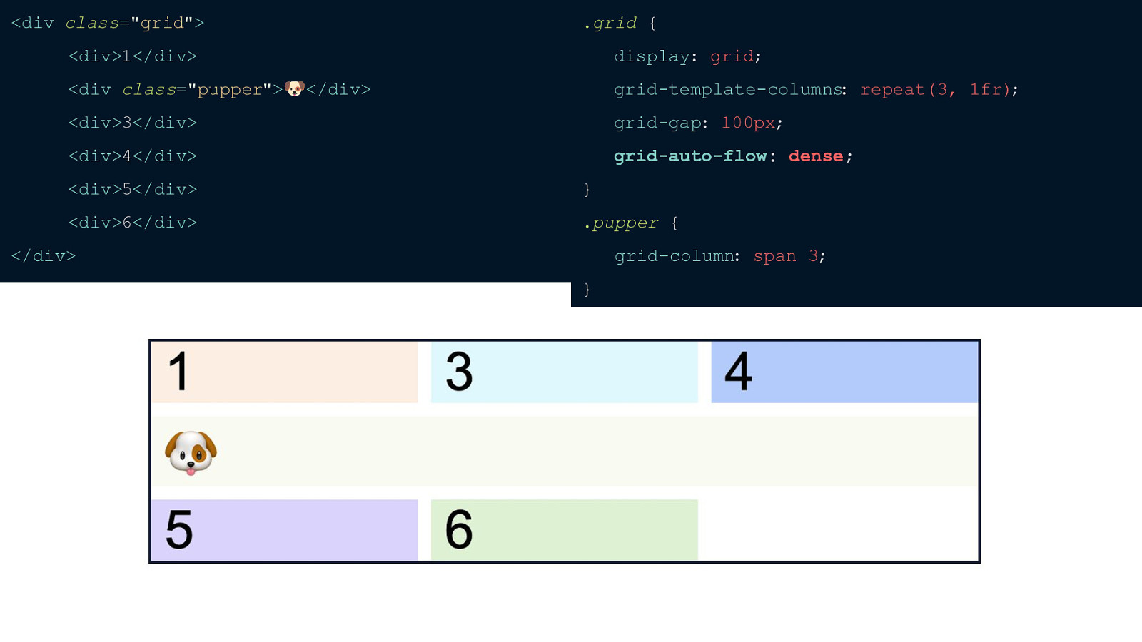
To fix this all we have to do is add grid-auto-flow: dense and the browser will look for any items that can fit in that blank space. This is extremely helpful when you have items that don’t need a specific order and aren’t tabbable, but if you can tab through the items then I don’t suggest this because this does mess with screen readers.
Now that we know about how to size our individual items let’s learn about placing them where we want on the grid
I’ve removed grid-auto-flow: dense and set that pupper class just to span 2. What grid-column property is actually shorthand for is 2 values: grid-column-start and grid-column-end. So here we’re setting grid-column-start to span 2 and grid-column-end to auto. We’re telling the item to start where it normally would and go twice the size.
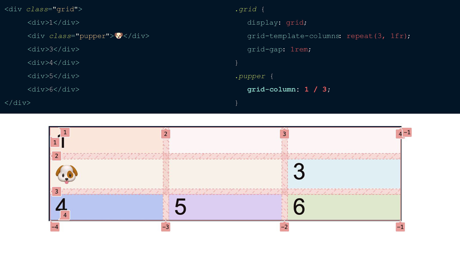
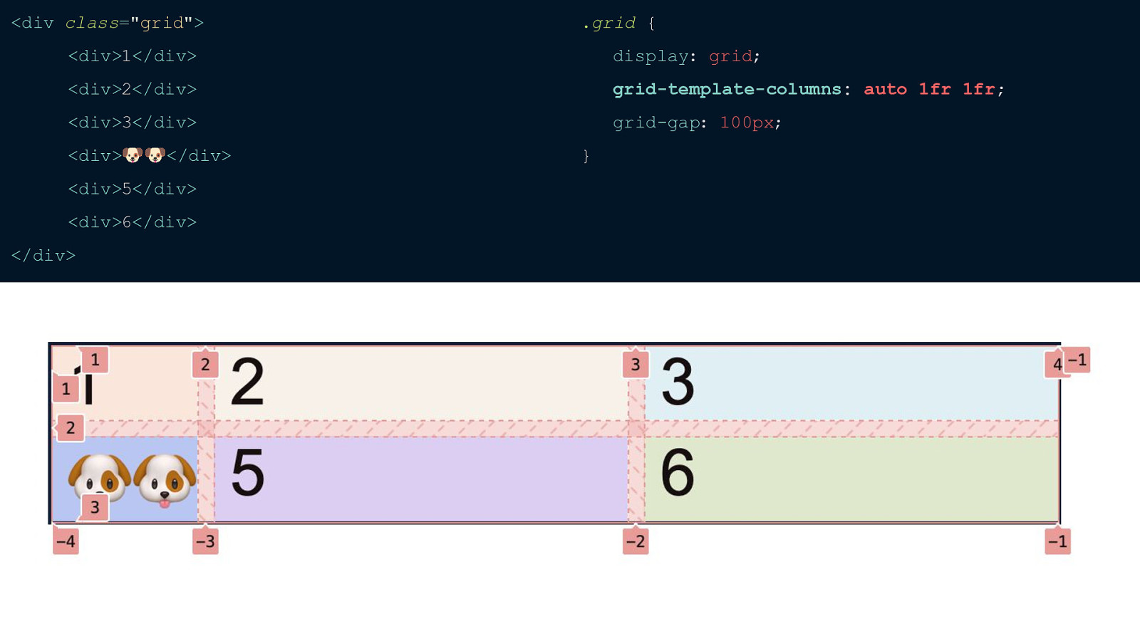
So let’s move the dog emoji to where we want. I’m going to start the dog emoji at track 1 and end at track 3. And I am using the shorthand grid-column property here, but you could also set grid-column-start to be 1 and grid column-end to be 3. Can also do grid-column: 1 / span 2;
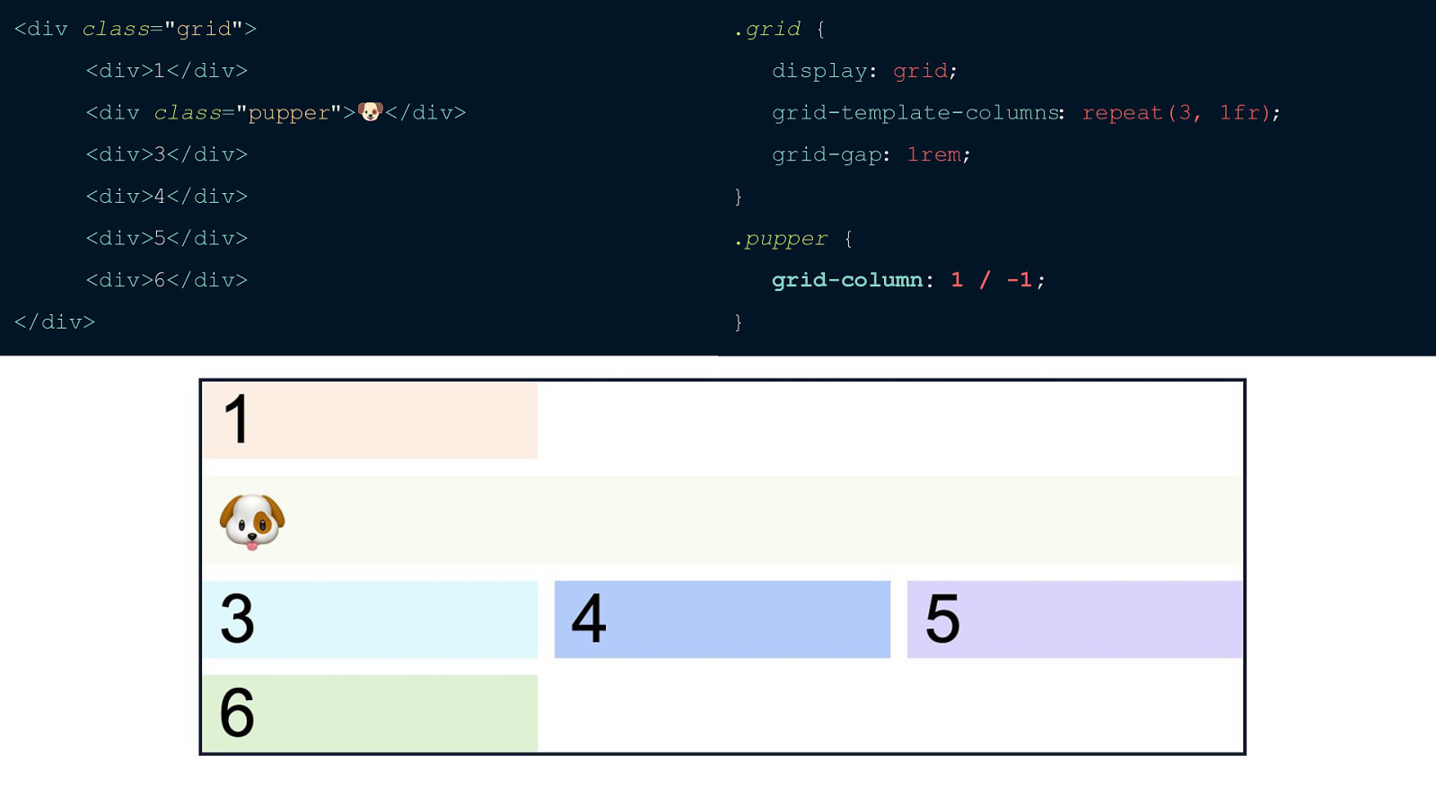
f you want an item to go from the beginning of your grid all the way to the end, but you don’t know how many columns you’ll have all you have to do is set it to grid-column: 1 / -1.
Just a note: if you do that with grid-row the item will only go to the end of your explicit grid not your implicit grid
There’s one last thing I think you should know about CSS Grid. And, in my opinion, this is what really sets it apart - grid template areas. This allows us to give specific names to areas on our grid and allows them to be extremely responsive.
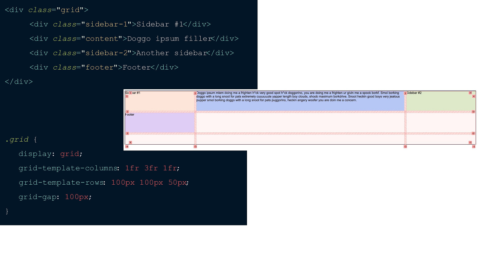
I’ve changed around our markup a bit by adding some text for 2 sidebars, a footer and some content. I’ve also set our gtc to 1fr 3fr 1fr and our gtr to 100px for the first and second row and 50px for the third. As I said, grid template areas allows us to name each area on the page so we can easily reorder them on different breakpoints. This is one of my favorite things about grid because with grid-template-areas you don’t have to fiddle with spanning and figuring out what tracks to start and end the item you want to move. PAUSE The first step with gta is to figure out what you want each area to be named. So I want the first sidebar to be called sidebar 1, the middle section to be content, ‘another sidebar’ to be sidebar 2 and then the footer to be called footer.
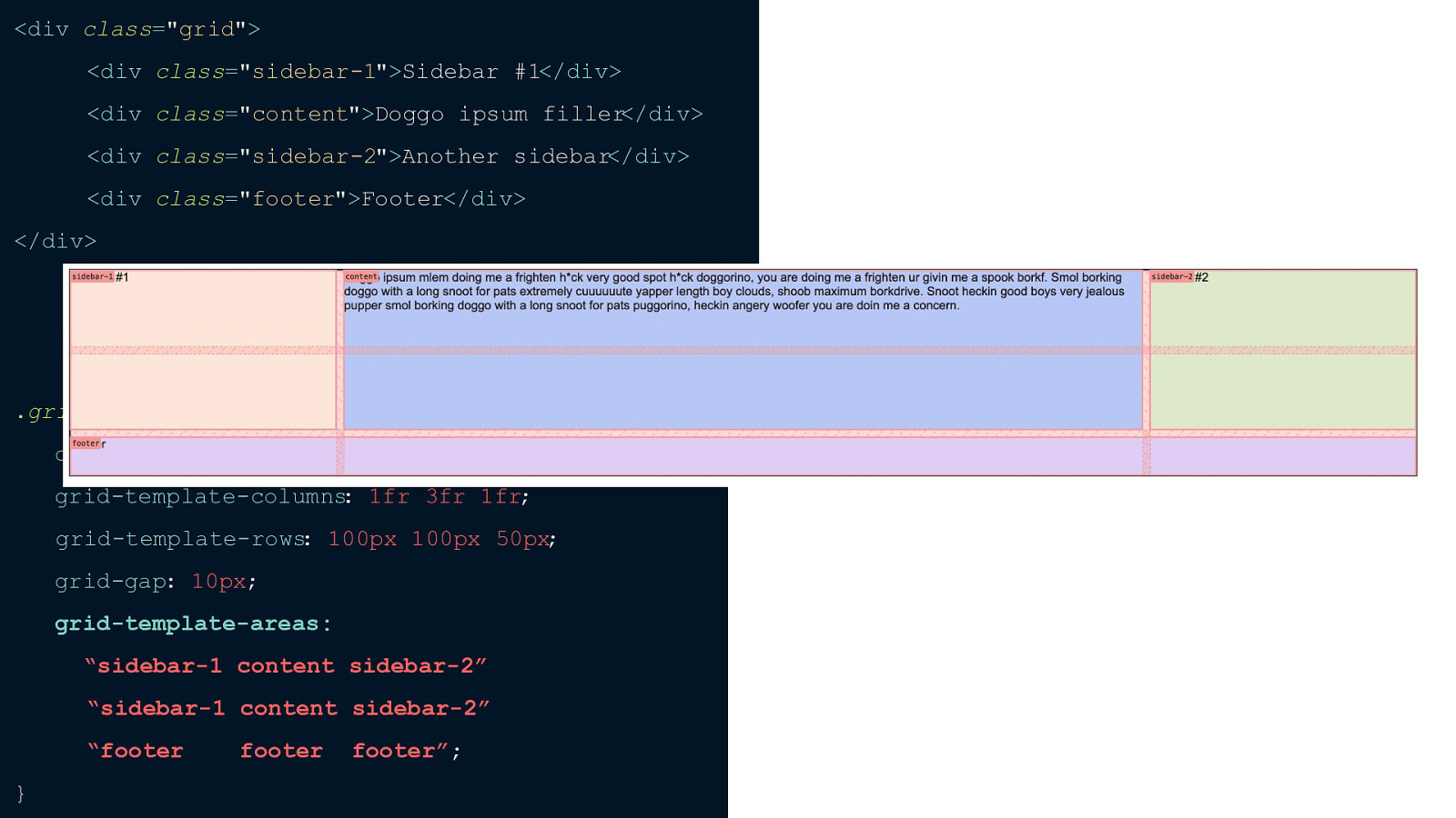
The way we assign the names is basically type it how you want it on the page. So if you have 3 columns and 3 rows you need to define what you want to call each area. I pulled this screenshot from firefox so you can see the names of each area.
When defining grid-template-areas you don’t add a comma between each row. You just add quotes around each set and you can actually put these all in one line, but I like sectioning them out into their rows and tabbed each row out so I can see the 3 different columns. If you want a dead space for a certain spot you can just put a dot (.) This is great because you can visualize what your page will look like.
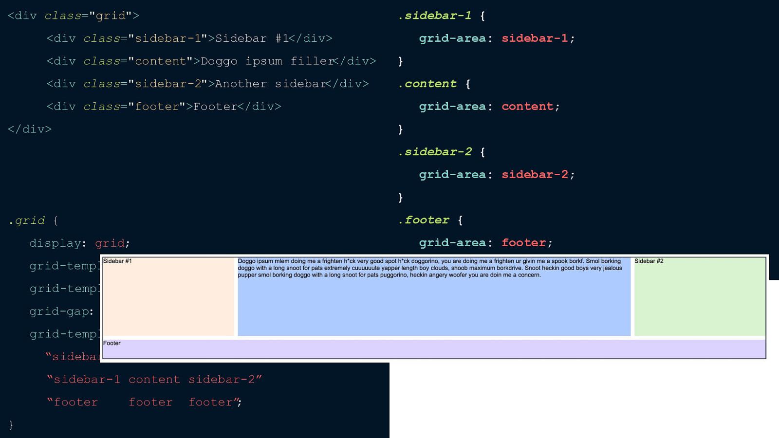
Now when you place the items on the page you don’t have to worry about line numbers, you can just grab onto the area name like this.

Now that we’ve covered how to use Grid I want to talk about how grid is different than flexbox. When should you use one over the other and if you can use them together. I got most of the following information from an awesome article by Per Harald Borgen. I’ve linked it in my resources at the end of this talk. So here are the biggest differences between the two.
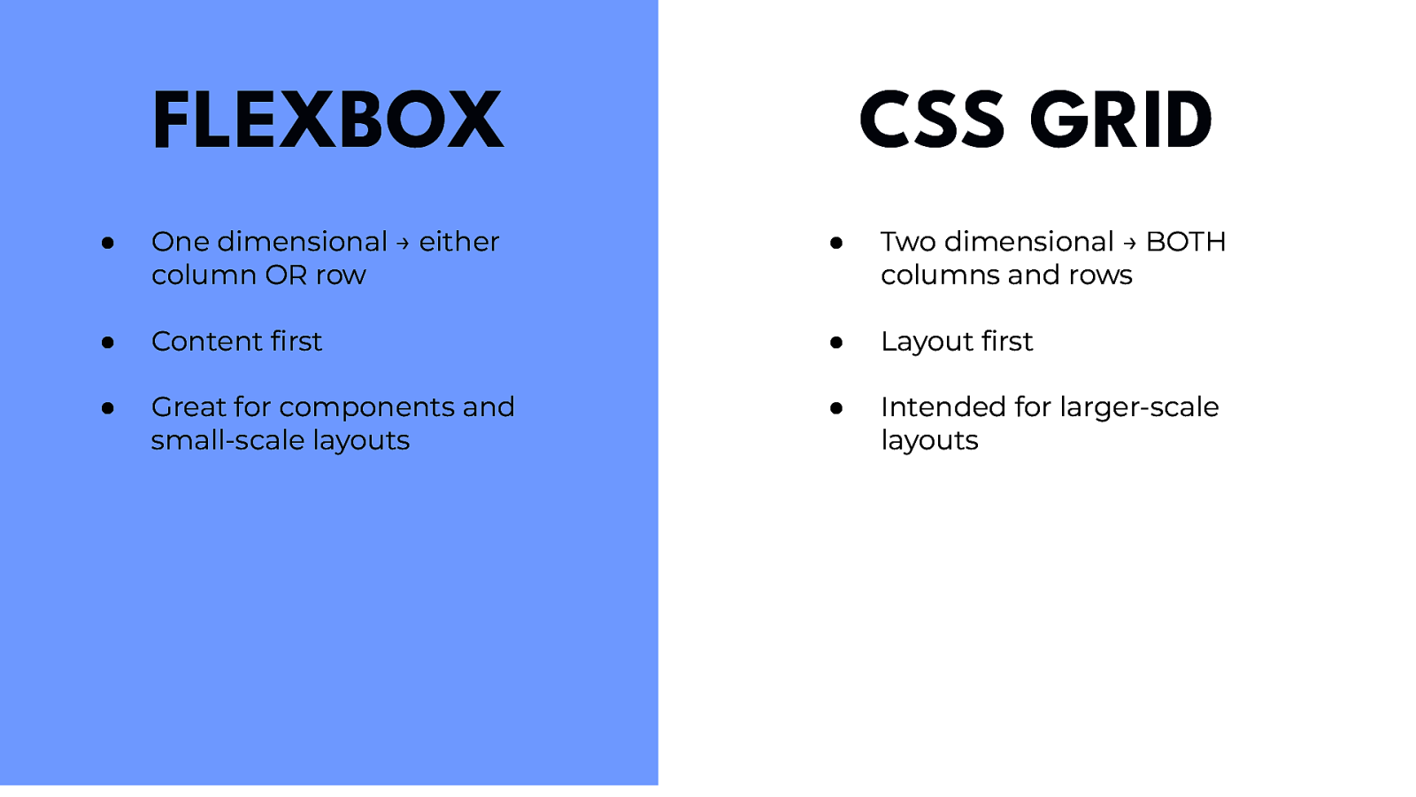
First of all, flexbox is one-dimensional — altering either the column OR row, not both. It’s generally geared towards content first and it’s great for components that are typically more linear and small scale layouts. On the other hand grid is two-dimensional — altering both columns AND rows. It takes a layout first approach and is intended for larger scale layouts. So when should you use one or the other? If you’re looking at a design and only need to define the layout as a row or column then reach for Flexbox but if you want to define a grid and fit the content into two dimensions then you need grid. Lately, I’ve been reaching for Grid more. Although it’s intended for two-dimensional layouts it also excels at one-dimensional especially if you come back later and decide that you want to make the layout multi-dimensional. And lastly, here’s a great example of using both flexbox and grid together.
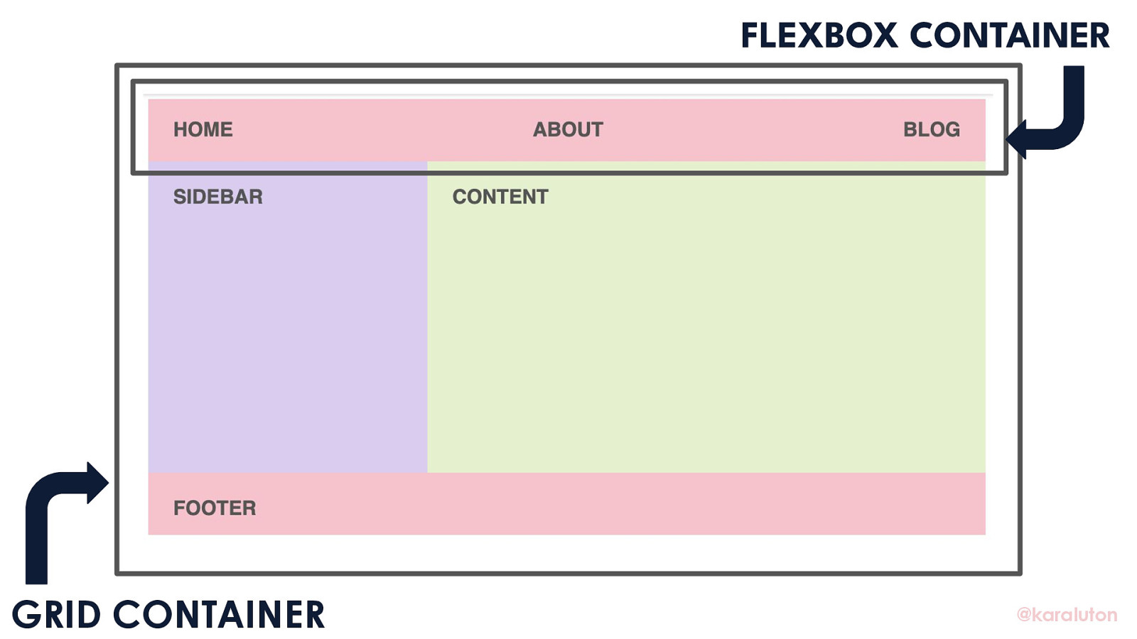
I want our layout to be two-dimensional so I’m setting a grid container which will allow us to dynamically set our columns and rows And then I’m setting our one-dimensional header navigation to flex. Flexbox and Grid really do work well together and I really encourage you to use them in tandem.
Now that y’all have seen the basics of what CSS Grid can do - what’s next for it? It’s been about two years since Grid was originally released and lately there’s been a lot of talk about Grid Level 2.
One of the biggest things included in CSS Grid level two is subgrids. But what exactly does that mean? As I mentioned towards the beginning, you can nest grids by setting display: grid on a grid item but the tracks defined on the nested grid have absolutely no relationship to the tracks on the parent grid but subgrids would allow. Grid level 2 will also introduce aspect ratio conformed gutters which is another really exciting development.
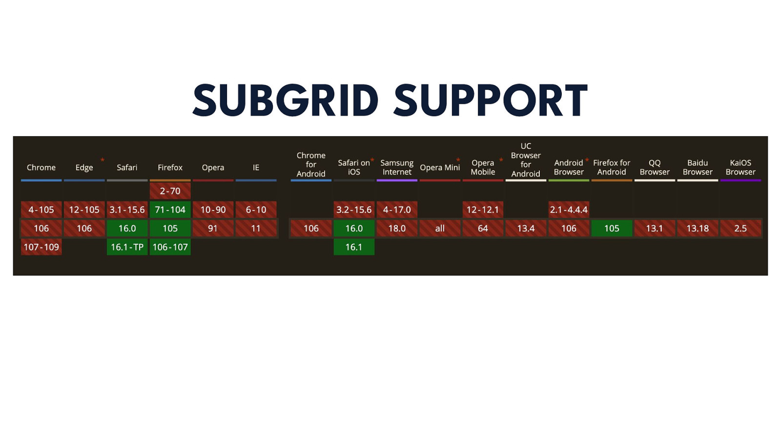
Grid level 2 was released with FireFox 71 but, as you can see, is not currently supported in any other browserbesides Safari right now. I’m sure that will be changing soon though!