Using Design Tokens To Up Your Accessibility Game Enabling designers to proactively embed accessibility considerations in their design systems November 13, 2024
A presentation at IAAP Professional Education Webinar Series in November 2024 in by Karen Hawkins
Using Design Tokens To Up Your Accessibility Game Enabling designers to proactively embed accessibility considerations in their design systems November 13, 2024

Meet Karen Hawkins Karen Hawkins, CPACC Connect with me Principal of Accessible Design, Level Access Email LinkedIn Copyright © Level Access. All Rights Reserved. | Confidential 2
Today’s agenda 1. Learn what types of design token decisions affect the accessibility of UI (User Interface) elements. 2. Learn how to use design tokens to improve the accessibility of UI elements. 3. Understand the importance of using design tokens to ensure a consistent experience across a wide set of UI elements. Copyright © Level Access. All Rights Reserved. | Confidential 3
SECTION 1 Foundations Copyright © Level Access. All Rights Reserved. | Confidential 4
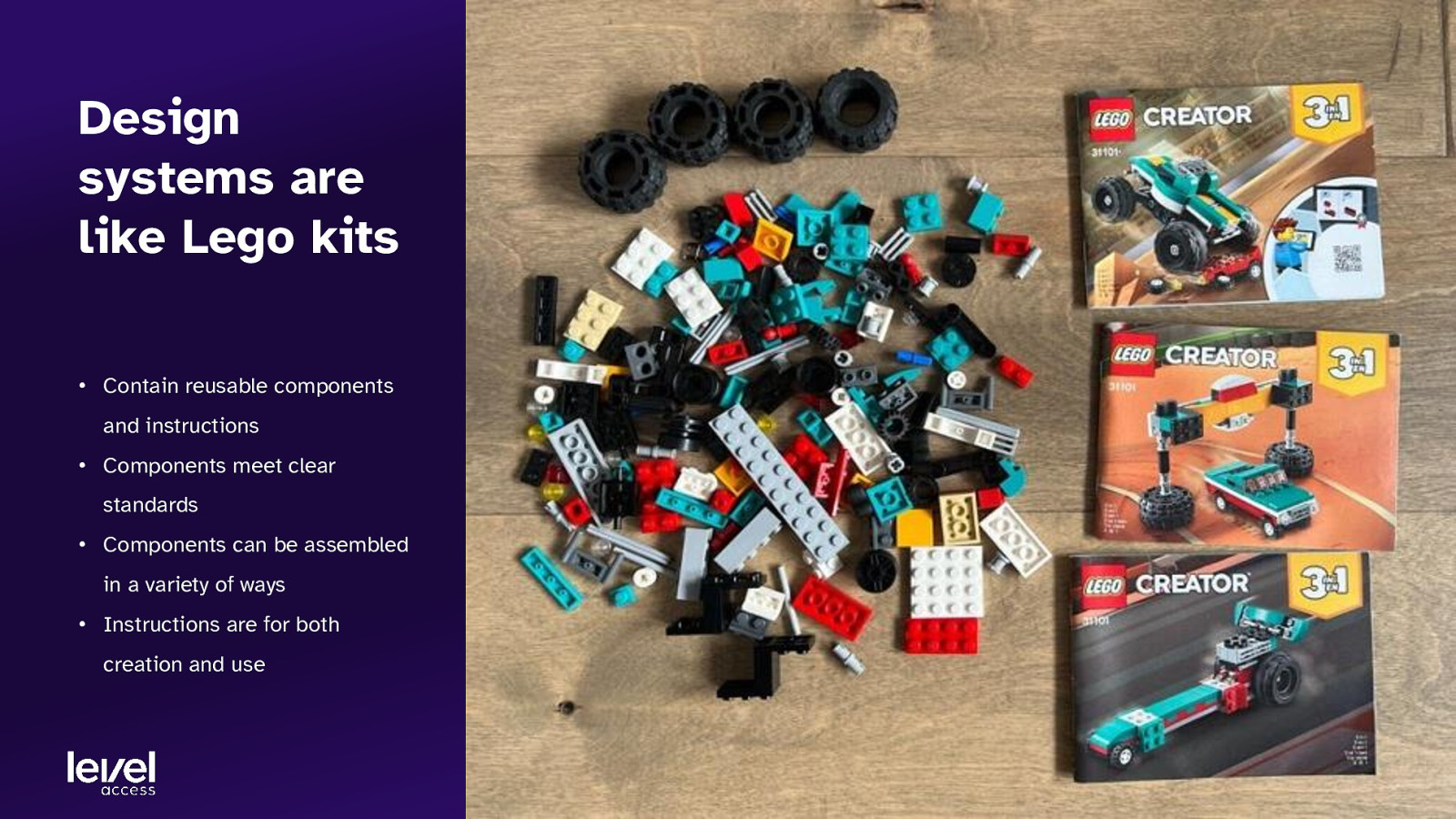
Design systems are like Lego kits • Contain reusable components and instructions • Components meet clear standards • Components can be assembled in a variety of ways • Instructions are for both creation and use
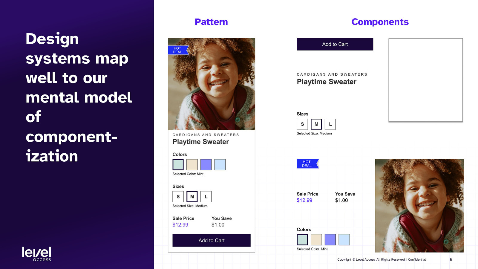
Pattern Components Design systems map well to our mental model of componentization Copyright © Level Access. All Rights Reserved. | Confidential 6
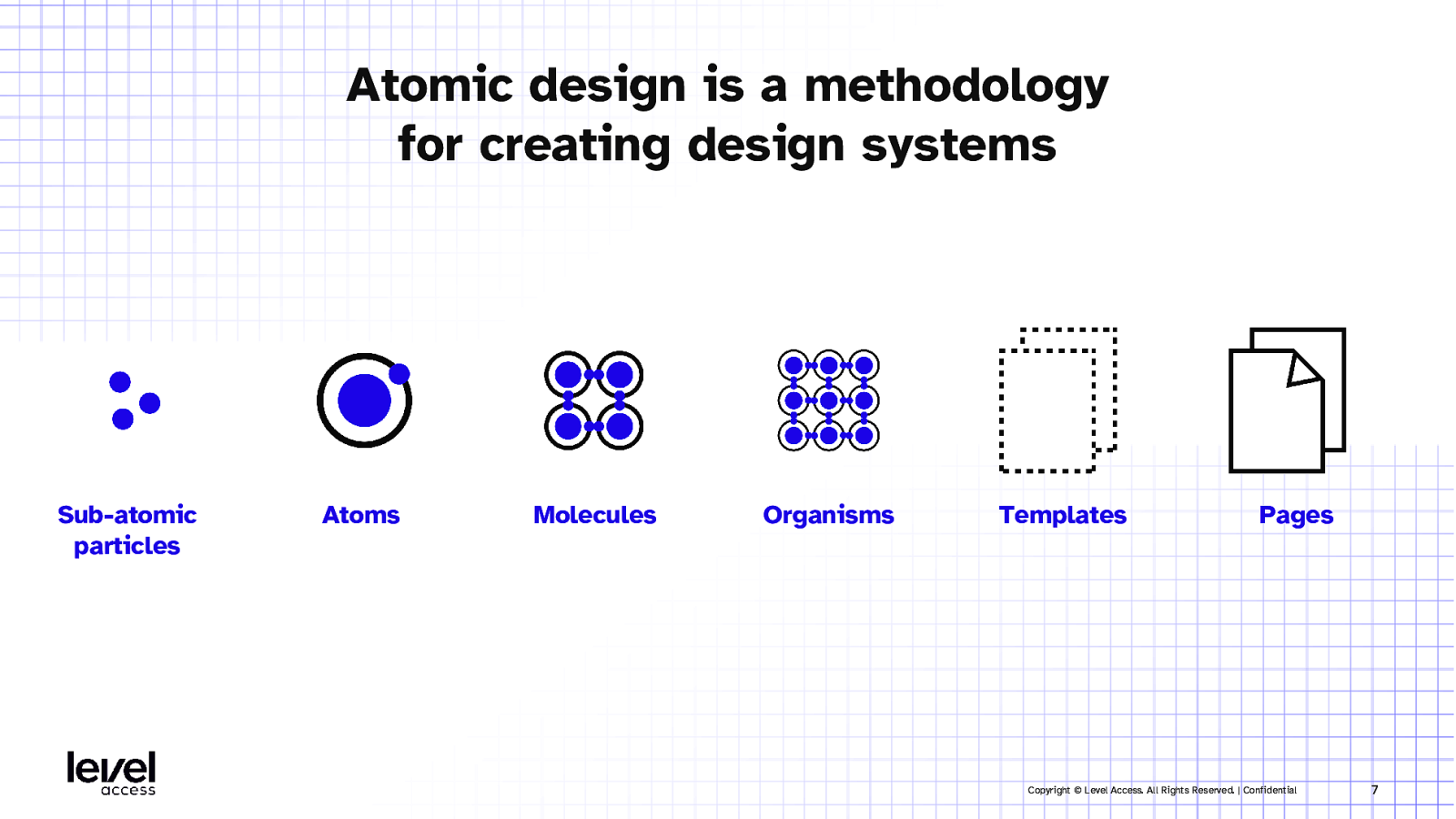
Atomic design is a methodology for creating design systems Sub-atomic particles Atoms Molecules Organisms Templates Pages Copyright © Level Access. All Rights Reserved. | Confidential 7
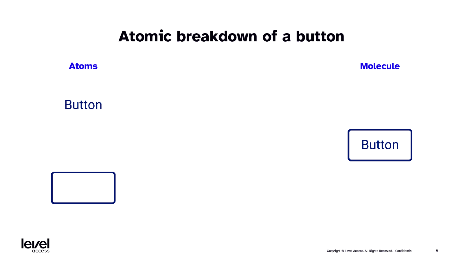
Atomic breakdown of a button Atoms Molecule Copyright © Level Access. All Rights Reserved. | Confidential 8
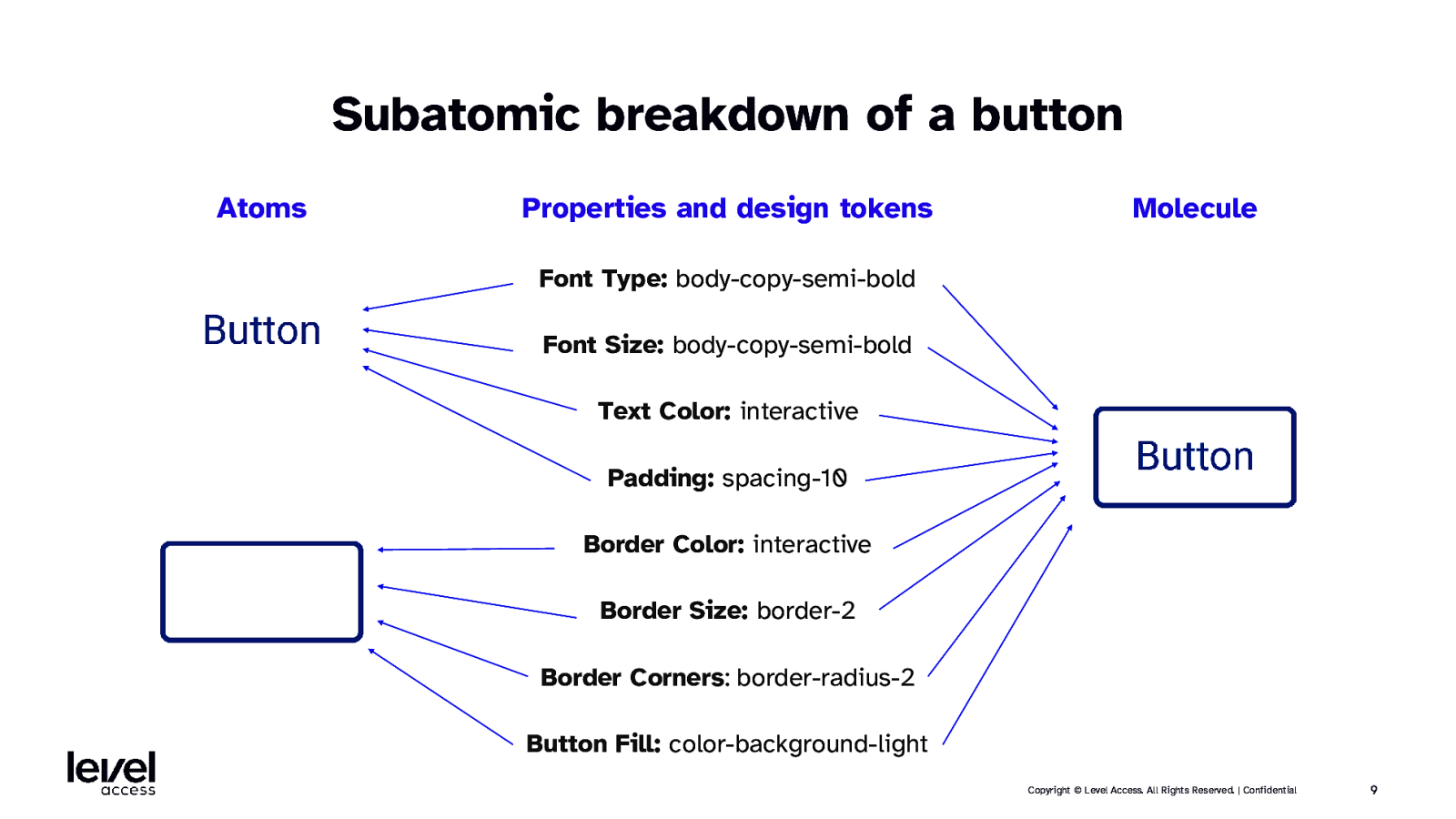
Subatomic breakdown of a button Atoms Properties and design tokens Molecule Font Type: body-copy-semi-bold Font Size: body-copy-semi-bold Text Color: interactive Padding: spacing-10 Border Color: interactive Border Size: border-2 Border Corners: border-radius-2 Button Fill: color-background-light Copyright © Level Access. All Rights Reserved. | Confidential 9
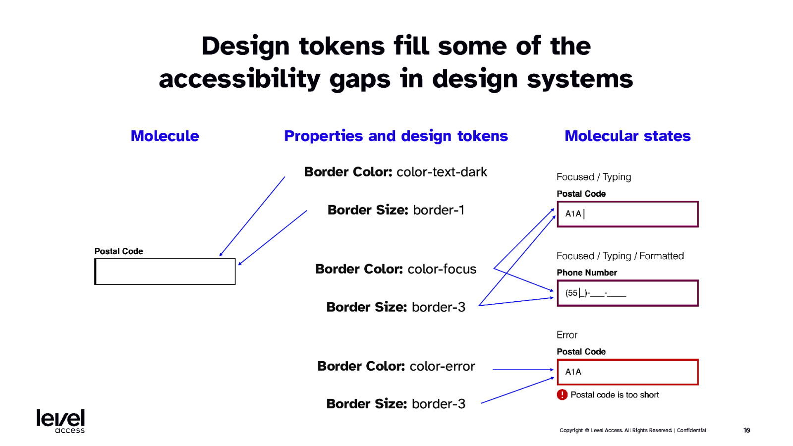
Design tokens fill some of the accessibility gaps in design systems Molecule Properties and design tokens Molecular states Border Color: color-text-dark Border Size: border-1 Border Color: color-focus Border Size: border-3 Border Color: color-error Border Size: border-3 Copyright © Level Access. All Rights Reserved. | Confidential 10
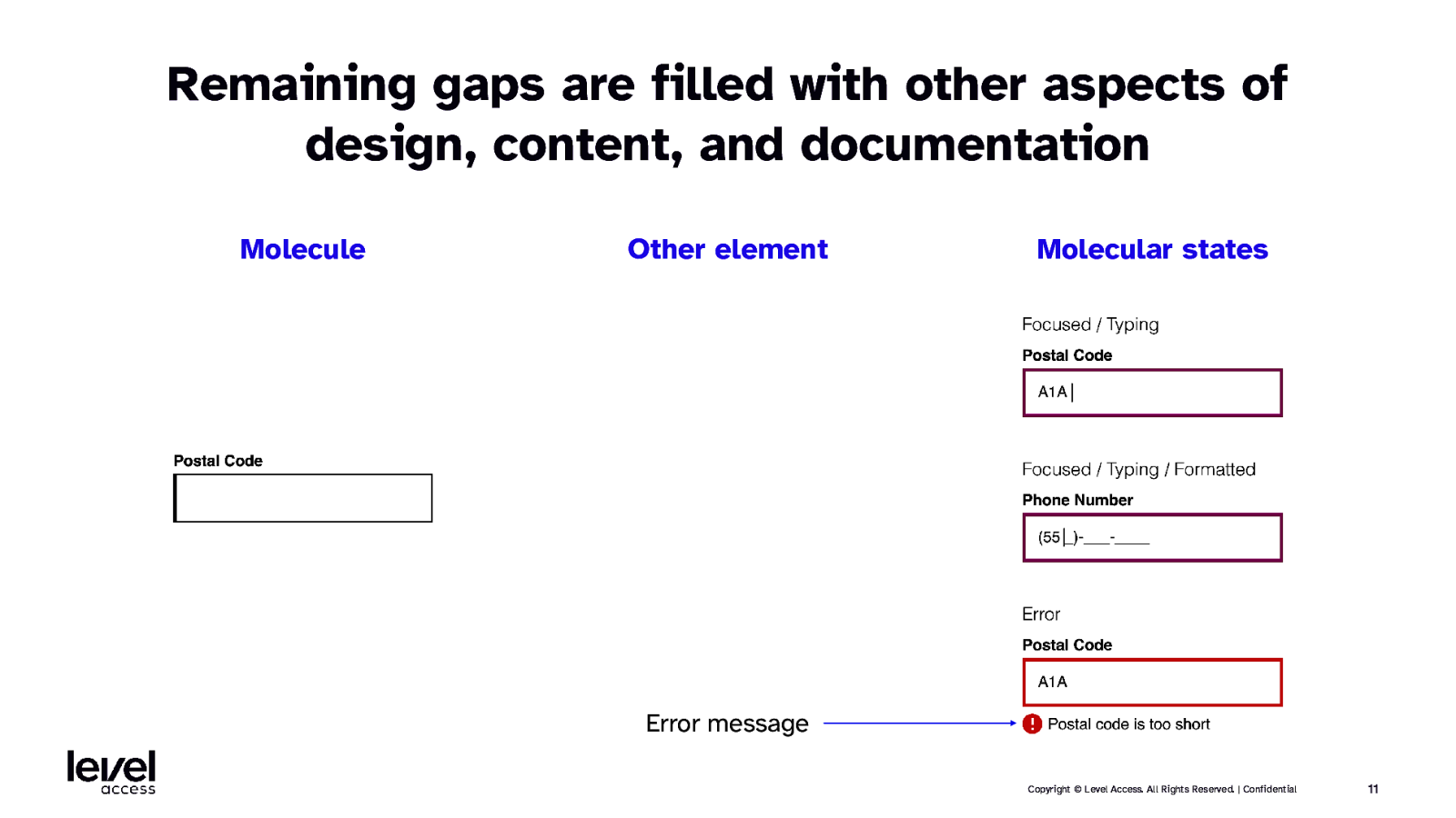
Remaining gaps are filled with other aspects of design, content, and documentation Molecule Other element Molecular states Error message Copyright © Level Access. All Rights Reserved. | Confidential 11
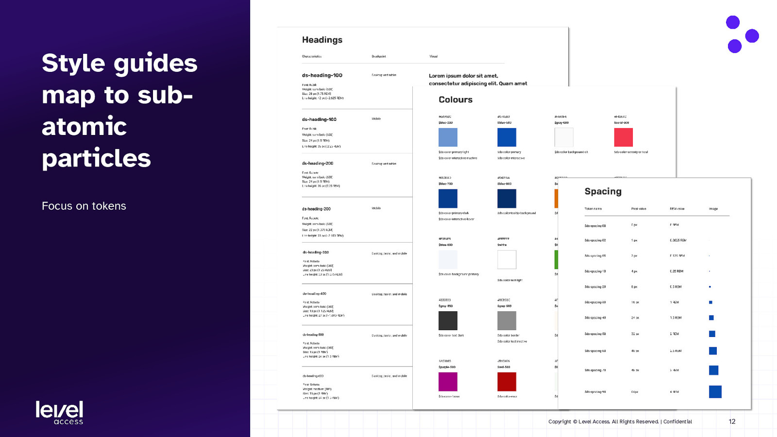
Style guides map to subatomic particles Focus on tokens Copyright © Level Access. All Rights Reserved. | Confidential 12
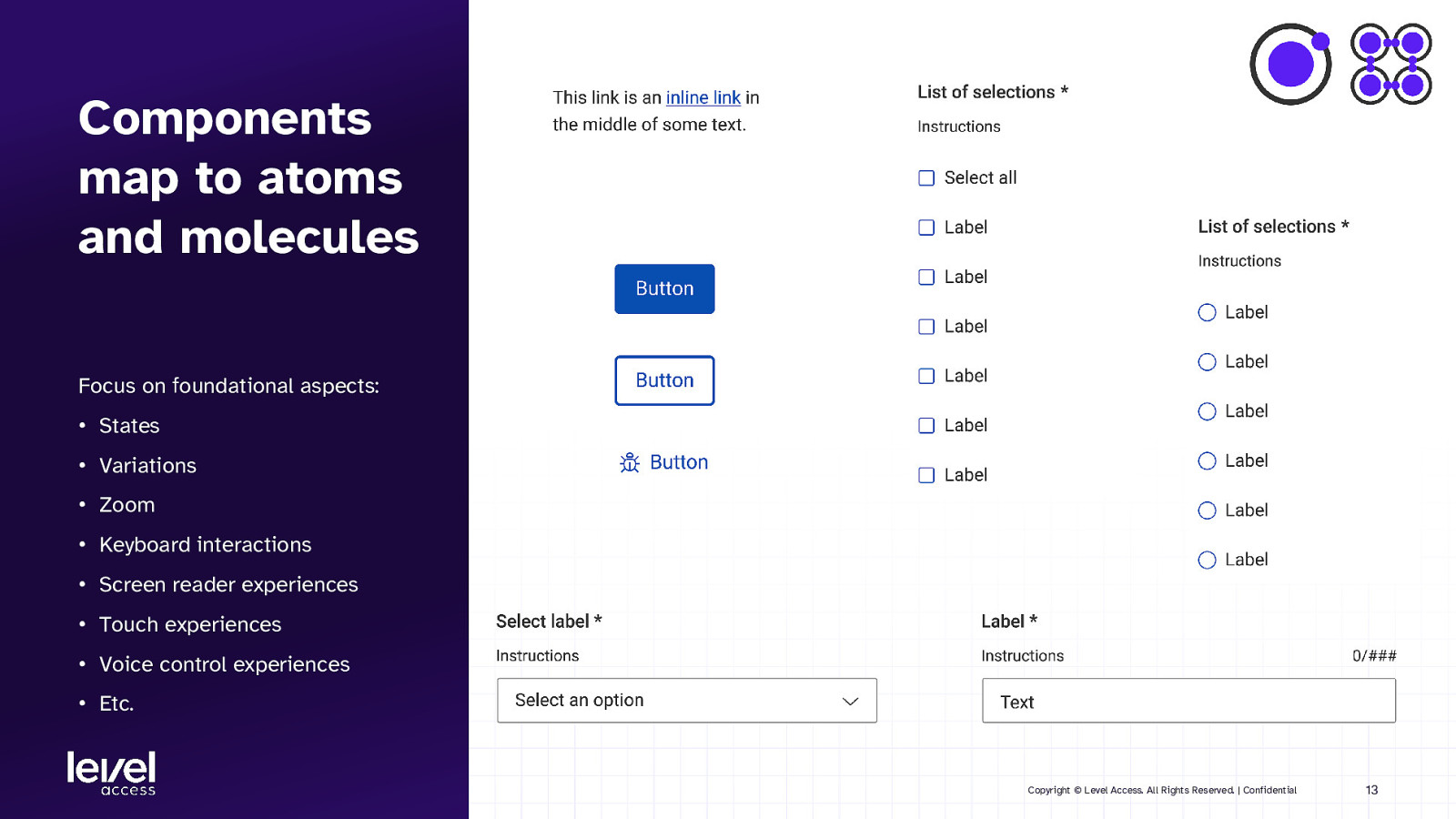
Components map to atoms and molecules Focus on foundational aspects: • States • Variations • Zoom • Keyboard interactions • Screen reader experiences • Touch experiences • Voice control experiences • Etc. Copyright © Level Access. All Rights Reserved. | Confidential 13
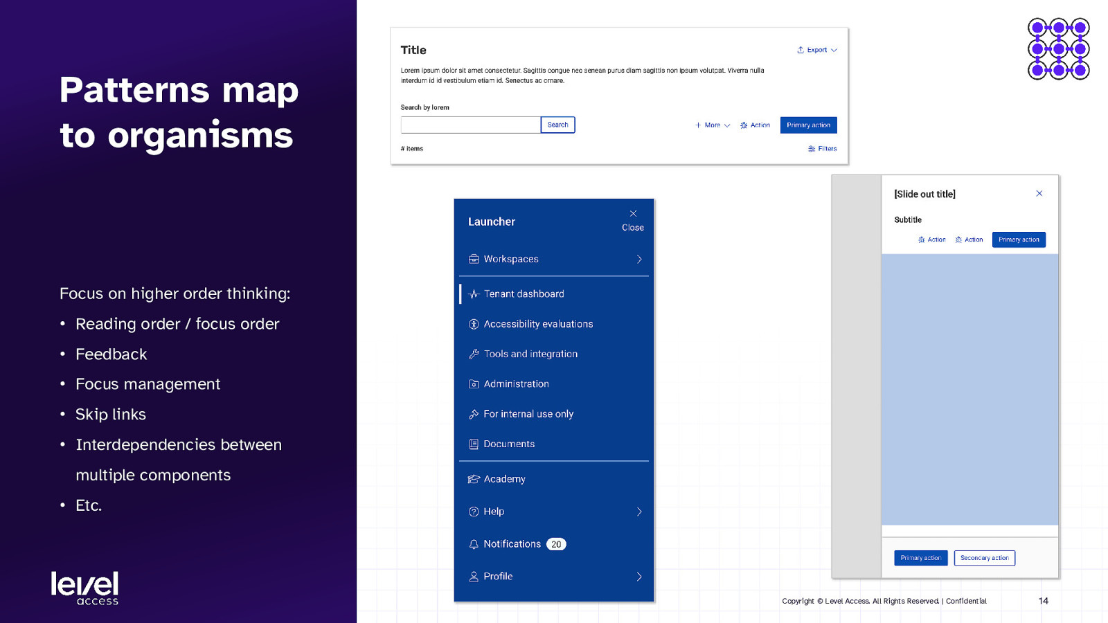
Patterns map to organisms Focus on higher order thinking: • Reading order / focus order • Feedback • Focus management • Skip links • Interdependencies between multiple components • Etc. Copyright © Level Access. All Rights Reserved. | Confidential 14
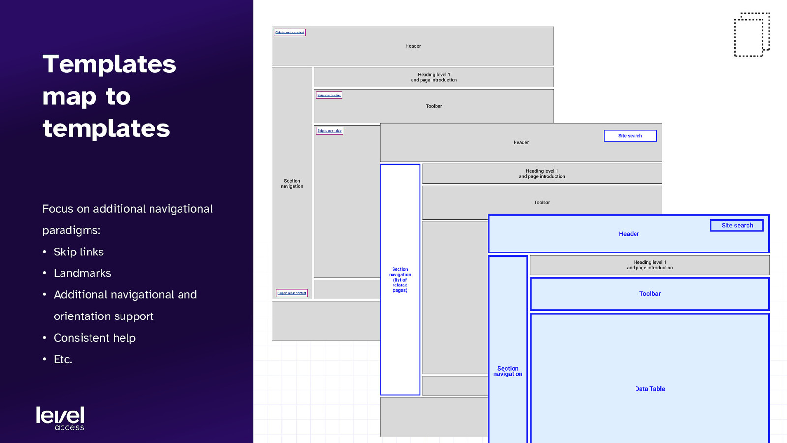
Templates map to templates Focus on additional navigational paradigms: • Skip links • Landmarks • Additional navigational and orientation support • Consistent help • Etc. Copyright © Level Access. All Rights Reserved. | Confidential 15
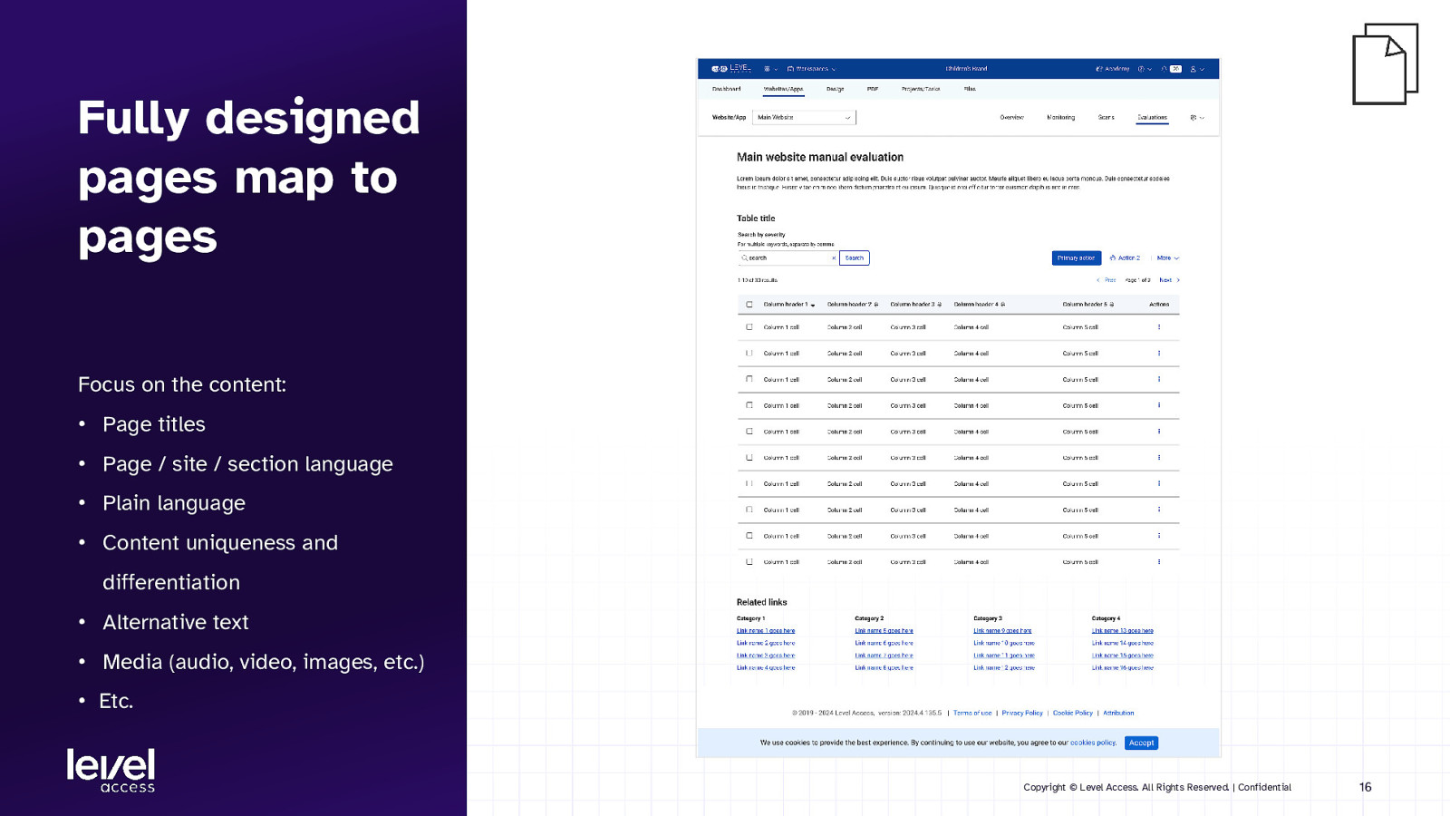
Fully designed pages map to pages Focus on the content: • Page titles • Page / site / section language • Plain language • Content uniqueness and differentiation • Alternative text • Media (audio, video, images, etc.) • Etc. Copyright © Level Access. All Rights Reserved. | Confidential 16
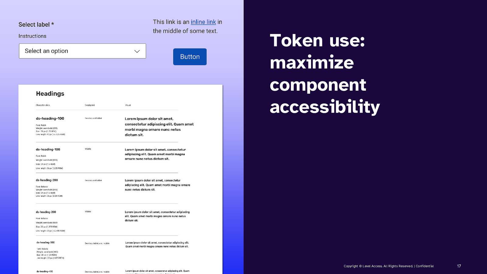
Token use: maximize component accessibility Copyright © Level Access. All Rights Reserved. | Confidential 17
SECTION 2 Using tokens to make components accessible Copyright © Level Access. All Rights Reserved. | Confidential 18
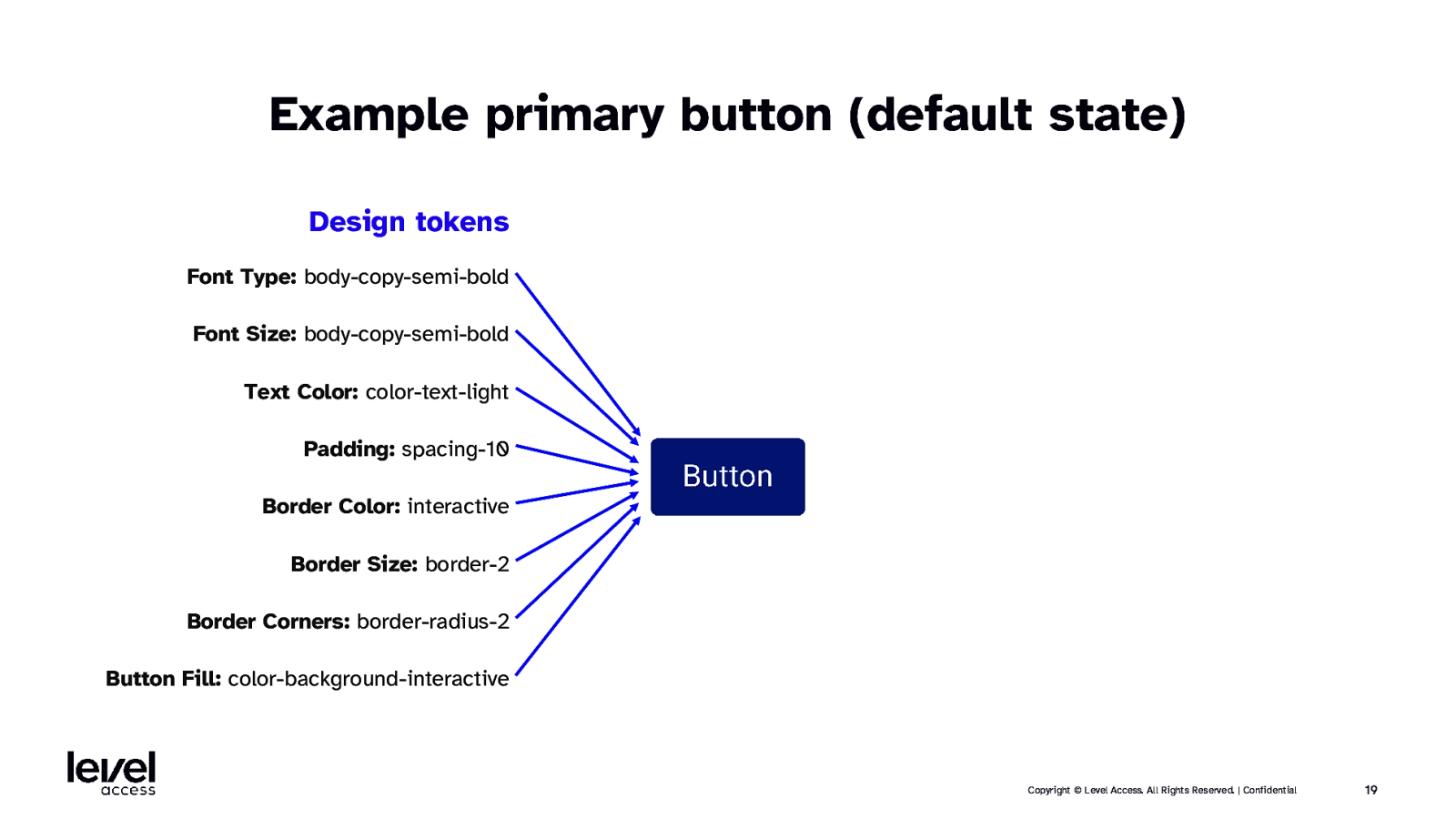
Example primary button (default state) Design tokens Font Type: body-copy-semi-bold Font Size: body-copy-semi-bold Text Color: color-text-light Padding: spacing-10 Border Color: interactive Border Size: border-2 Border Corners: border-radius-2 Button Fill: color-background-interactive Copyright © Level Access. All Rights Reserved. | Confidential 19
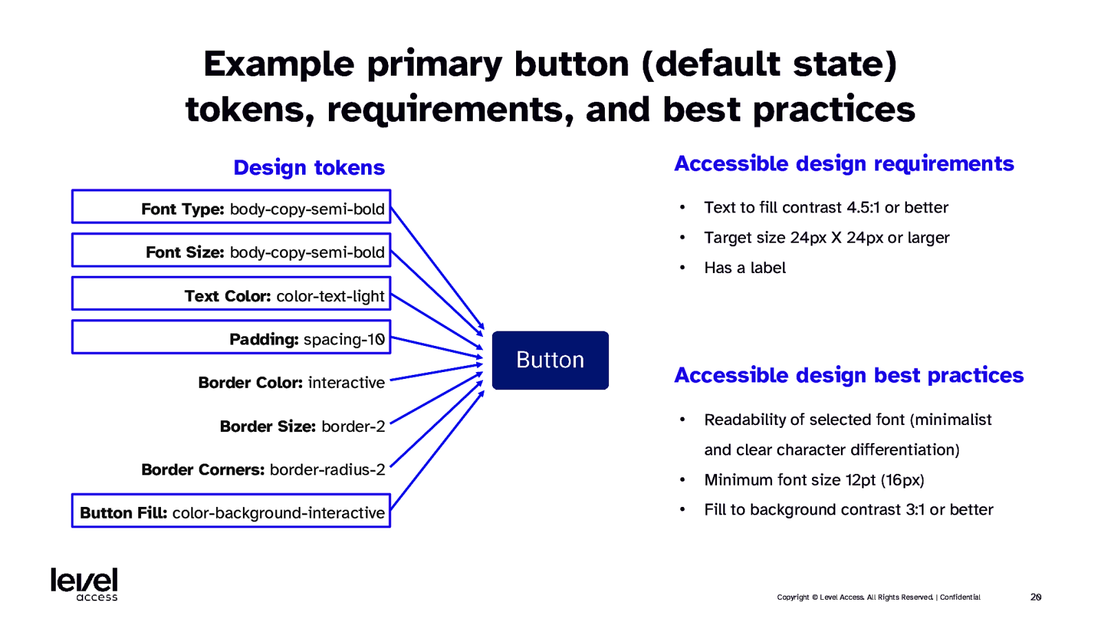
Example primary button (default state) tokens, requirements, and best practices Design tokens Font Type: body-copy-semi-bold Font Size: body-copy-semi-bold Accessible design requirements • Text to fill contrast 4.5:1 or better • Target size 24px X 24px or larger • Has a label Text Color: color-text-light Padding: spacing-10 Border Color: interactive Border Size: border-2 Accessible design best practices • Readability of selected font (minimalist and clear character differentiation) Border Corners: border-radius-2 • Minimum font size 12pt (16px) Button Fill: color-background-interactive • Fill to background contrast 3:1 or better Copyright © Level Access. All Rights Reserved. | Confidential 20
QUESTION What’s the point of states? Copyright © Level Access. All Rights Reserved. | Confidential 21
ANSWER To communicate the status of a component or interactive element. Copyright © Level Access. All Rights Reserved. | Confidential 22
ANSWER To communicate the status of a component or interactive element. Copyright © Level Access. All Rights Reserved. | Confidential 23
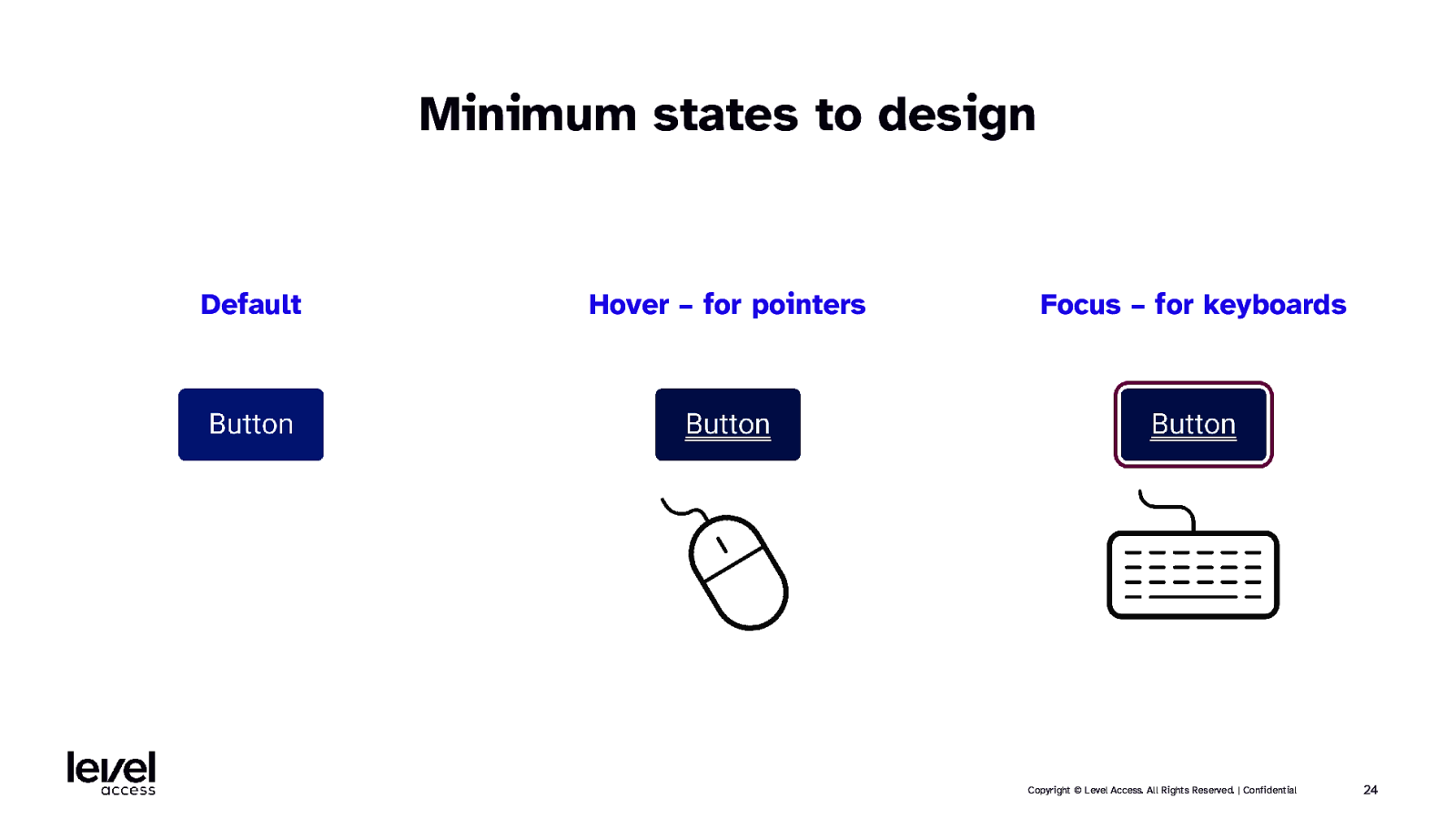
Minimum states to design Default Hover – for pointers Focus – for keyboards Copyright © Level Access. All Rights Reserved. | Confidential 24
QUESTION What’s the point of hover and focus states? Copyright © Level Access. All Rights Reserved. | Confidential 25
ANSWER They provide “you are here” feedback. Copyright © Level Access. All Rights Reserved. | Confidential 26
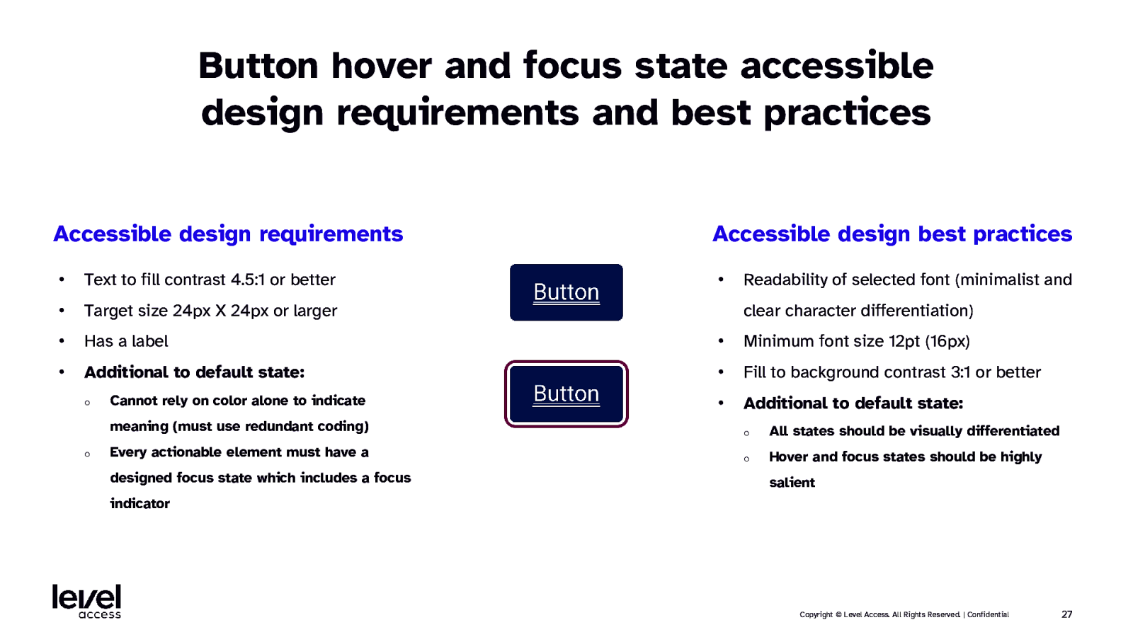
Button hover and focus state accessible design requirements and best practices Accessible design requirements Accessible design best practices • • Text to fill contrast 4.5:1 or better • Target size 24px X 24px or larger • Has a label • Minimum font size 12pt (16px) • Additional to default state: • Fill to background contrast 3:1 or better • Additional to default state: o o Cannot rely on color alone to indicate Readability of selected font (minimalist and clear character differentiation) meaning (must use redundant coding) o All states should be visually differentiated Every actionable element must have a o Hover and focus states should be highly designed focus state which includes a focus salient indicator Copyright © Level Access. All Rights Reserved. | Confidential 27
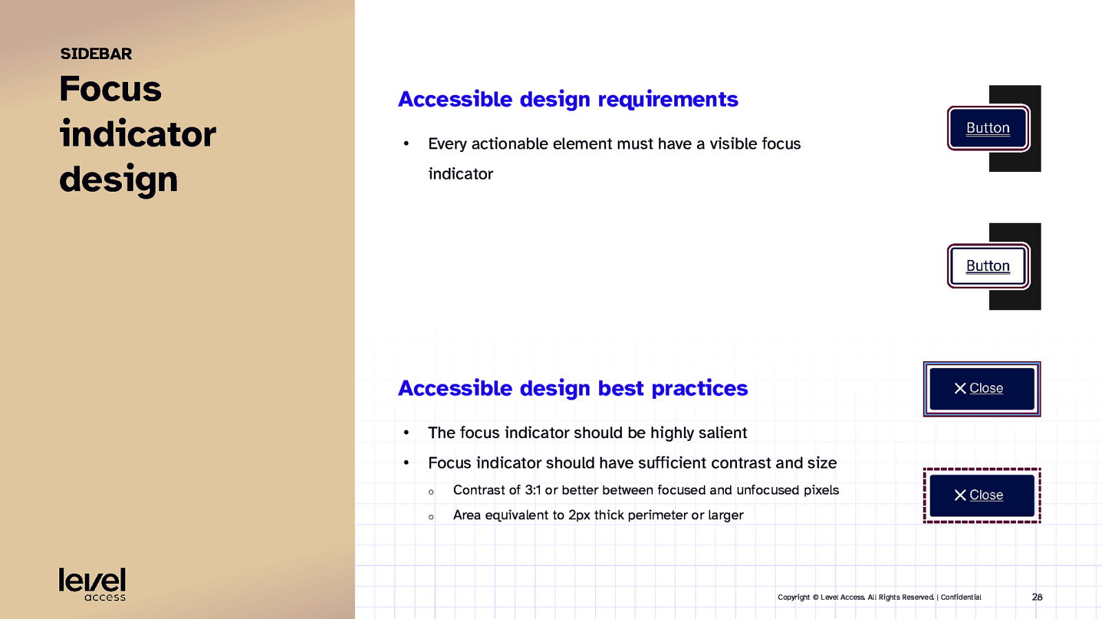
SIDEBAR Focus indicator design Accessible design requirements • Every actionable element must have a visible focus indicator Accessible design best practices • The focus indicator should be highly salient • Focus indicator should have sufficient contrast and size o Contrast of 3:1 or better between focused and unfocused pixels o Area equivalent to 2px thick perimeter or larger Copyright © Level Access. All Rights Reserved. | Confidential 28
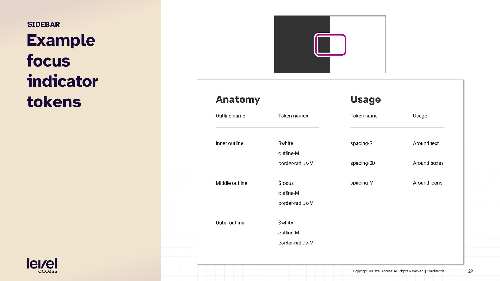
SIDEBAR Example focus indicator tokens Copyright © Level Access. All Rights Reserved. | Confidential 29
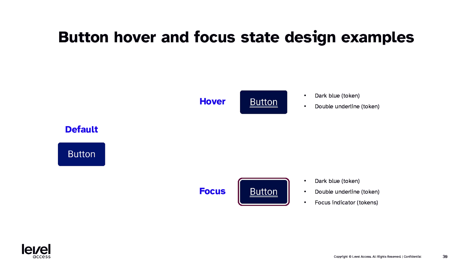
Button hover and focus state design examples Hover • Dark blue (token) • Double underline (token) • Dark blue (token) • Double underline (token) • Focus indicator (tokens) Default Focus Copyright © Level Access. All Rights Reserved. | Confidential 30
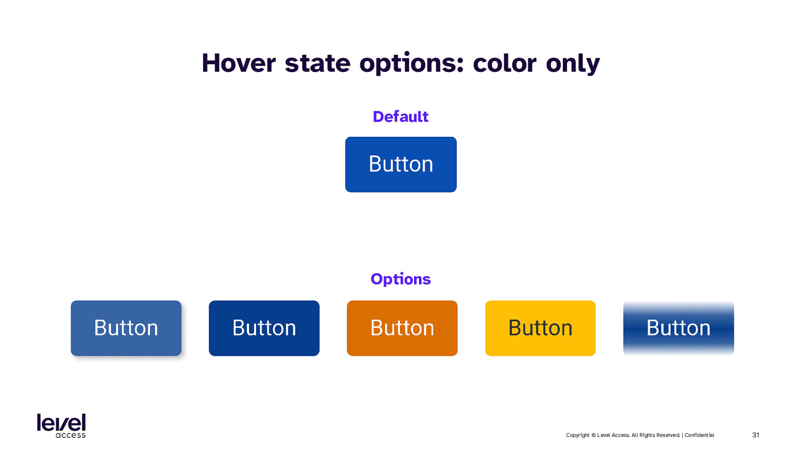
Hover state options: color only Default Options Copyright © Level Access. All Rights Reserved. | Confidential 31
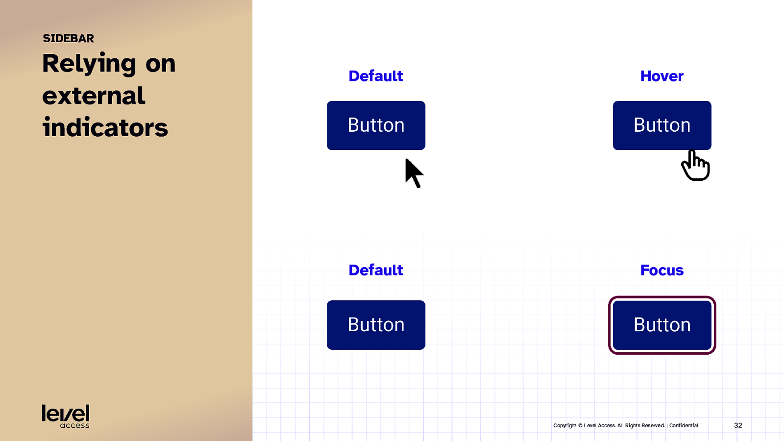
SIDEBAR Relying on external indicators Default Hover Default Focus Copyright © Level Access. All Rights Reserved. | Confidential 32
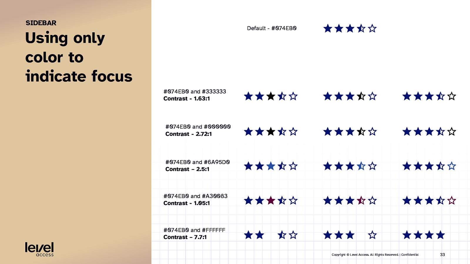
SIDEBAR Default - #074EB0 Using only color to indicate focus #074EB0 and #333333 Contrast - 1.63:1 #074EB0 and #000000 Contrast - 2.72:1 #074EB0 and #6A95D0 Contrast – 2.5:1 #074EB0 and #A30083 Contrast - 1.05:1 #074EB0 and #FFFFFF Contrast – 7.7:1 Copyright © Level Access. All Rights Reserved. | Confidential 33
BEST PRACTICE Have the element convey its state. Copyright © Level Access. All Rights Reserved. | Confidential 34
HINT Change something structural. Copyright © Level Access. All Rights Reserved. | Confidential 35
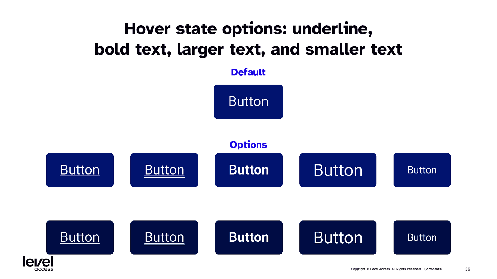
Hover state options: underline, bold text, larger text, and smaller text Default Options Copyright © Level Access. All Rights Reserved. | Confidential 36
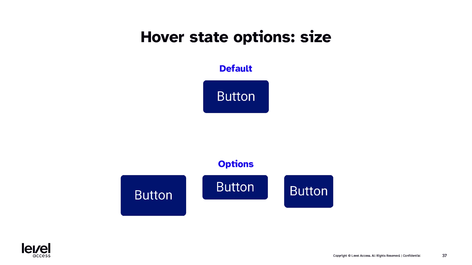
Hover state options: size Default Options Copyright © Level Access. All Rights Reserved. | Confidential 37
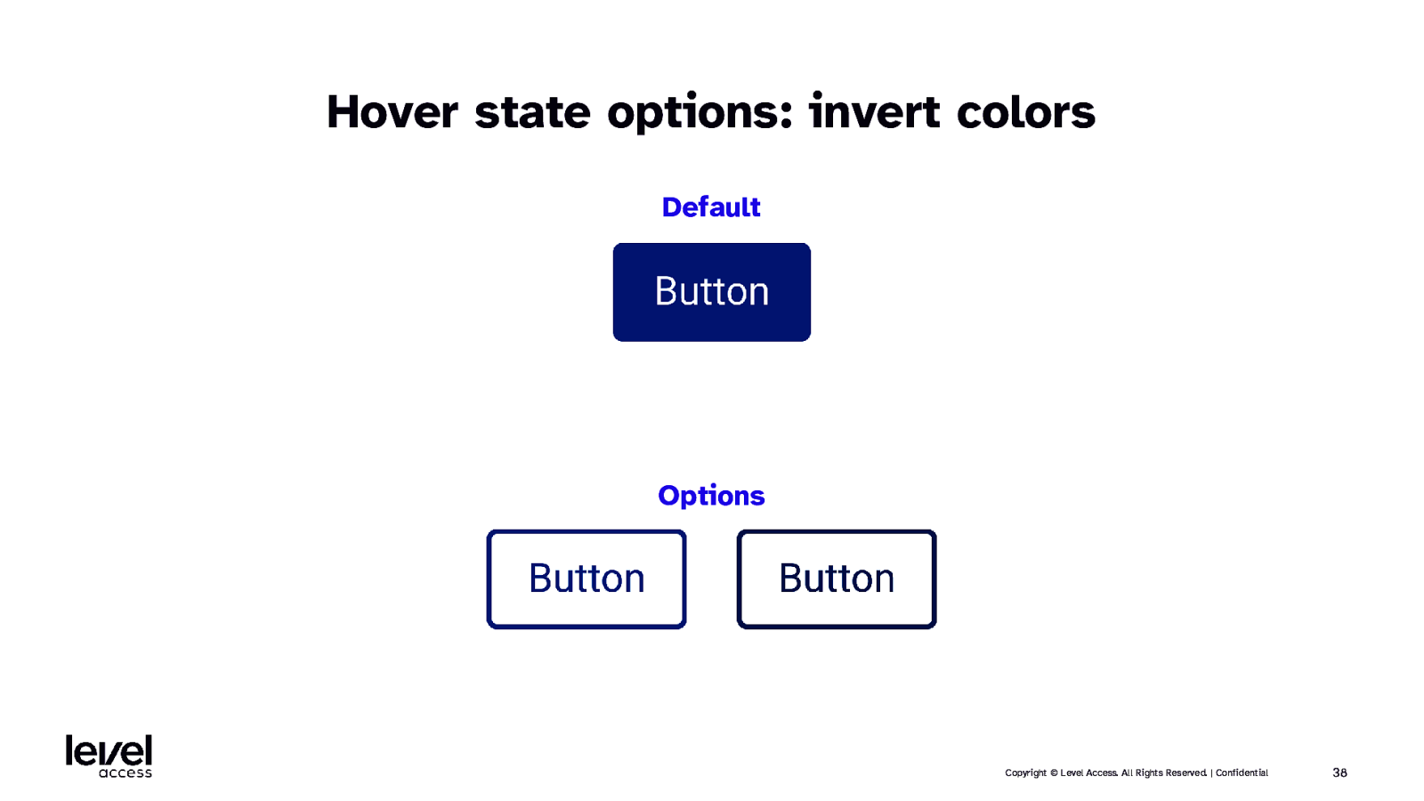
Hover state options: invert colors Default Options Copyright © Level Access. All Rights Reserved. | Confidential 38
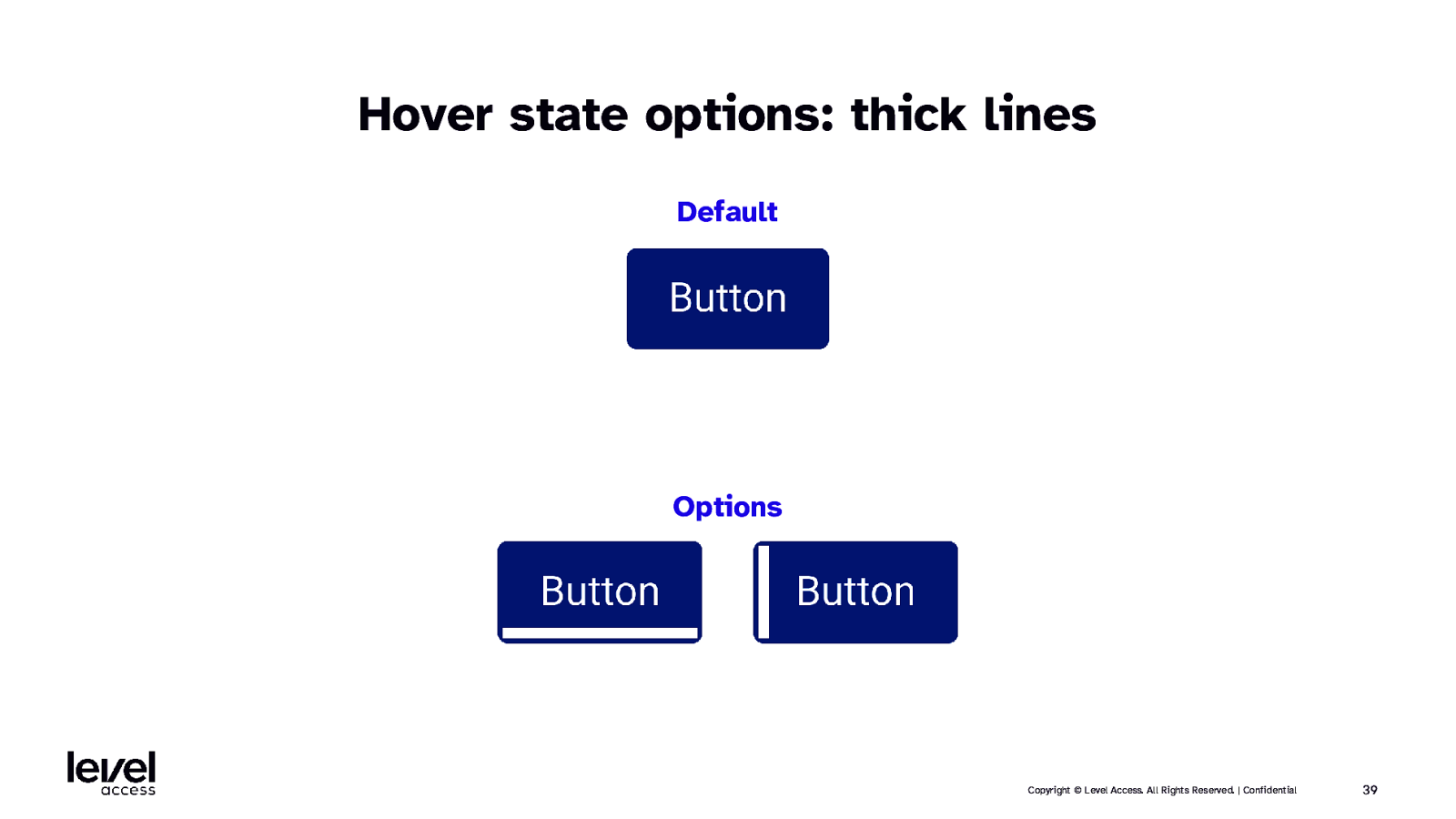
Hover state options: thick lines Default Options Copyright © Level Access. All Rights Reserved. | Confidential 39
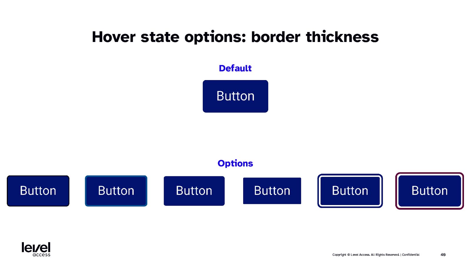
Hover state options: border thickness Default Options Copyright © Level Access. All Rights Reserved. | Confidential 40
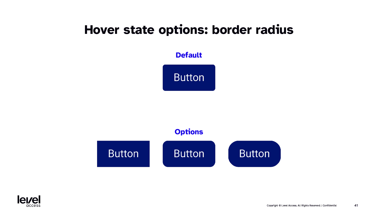
Hover state options: border radius Default Options Copyright © Level Access. All Rights Reserved. | Confidential 41
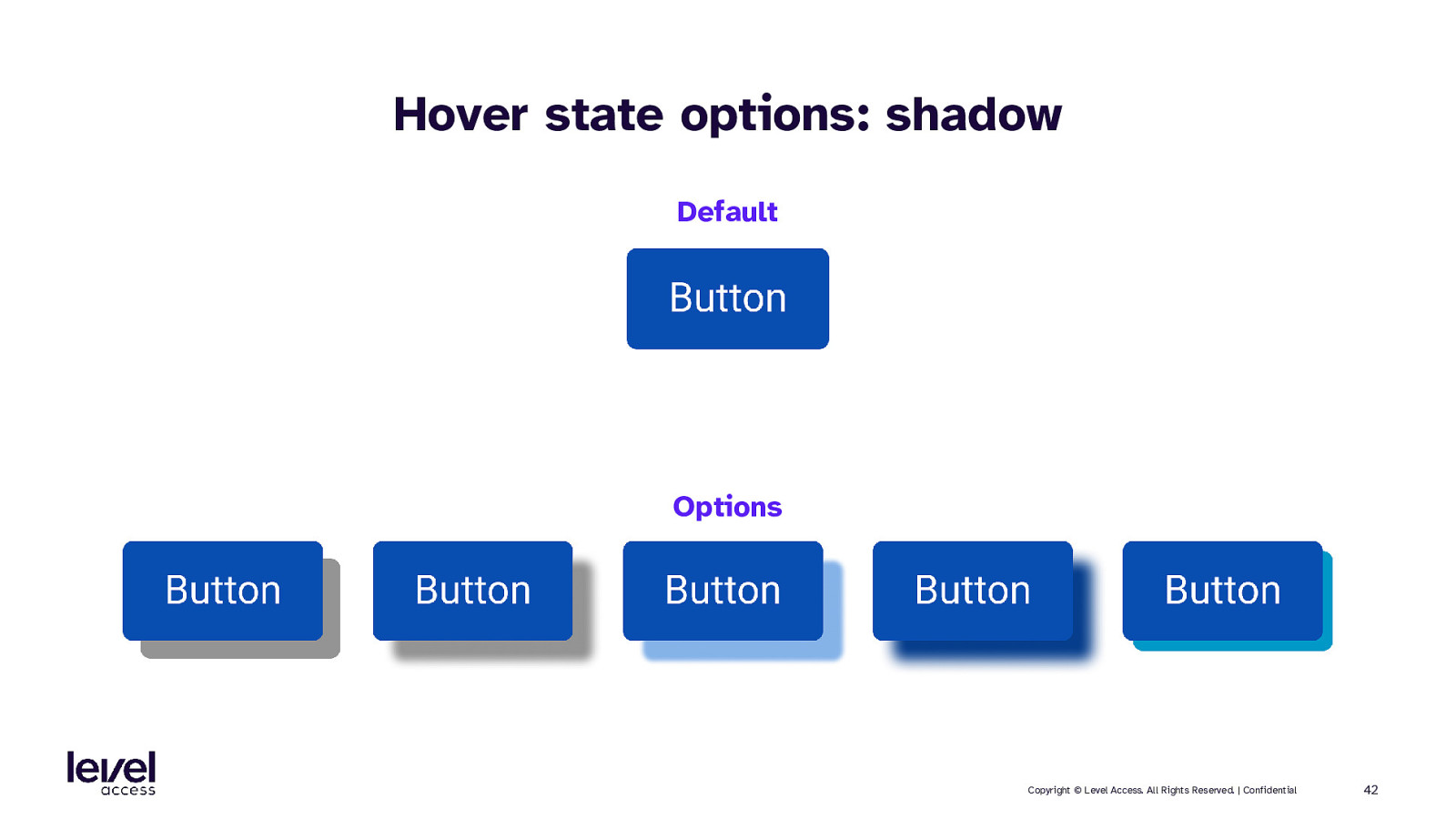
Hover state options: shadow Default Options Copyright © Level Access. All Rights Reserved. | Confidential 42
Hover state options: animation Default Options Copyright © Level Access. All Rights Reserved. | Confidential 43
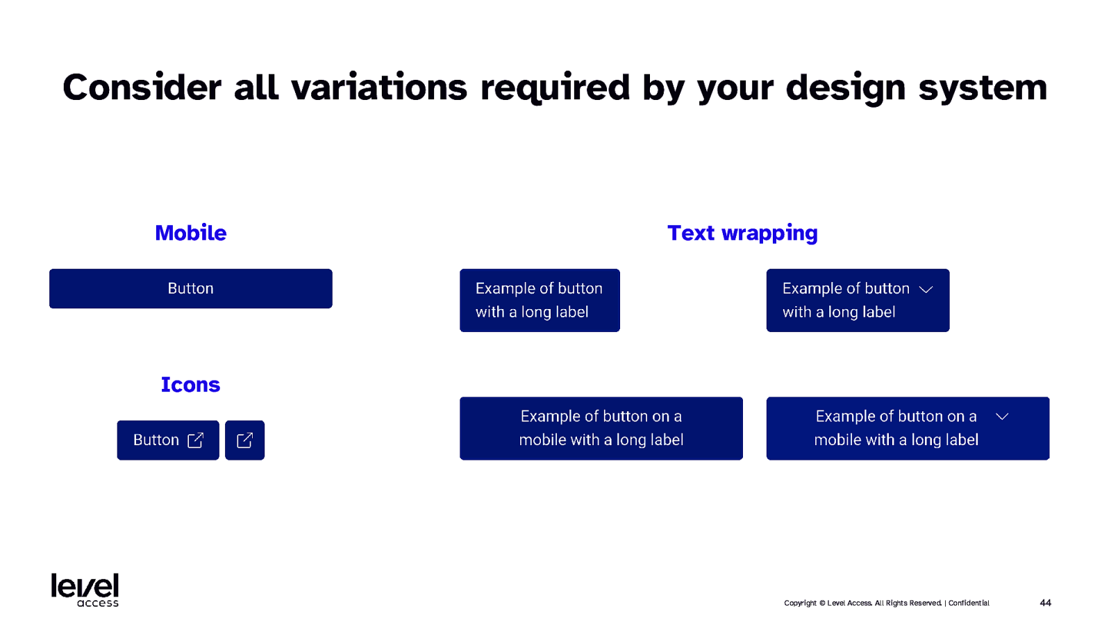
Consider all variations required by your design system Mobile Text wrapping Icons Copyright © Level Access. All Rights Reserved. | Confidential 44
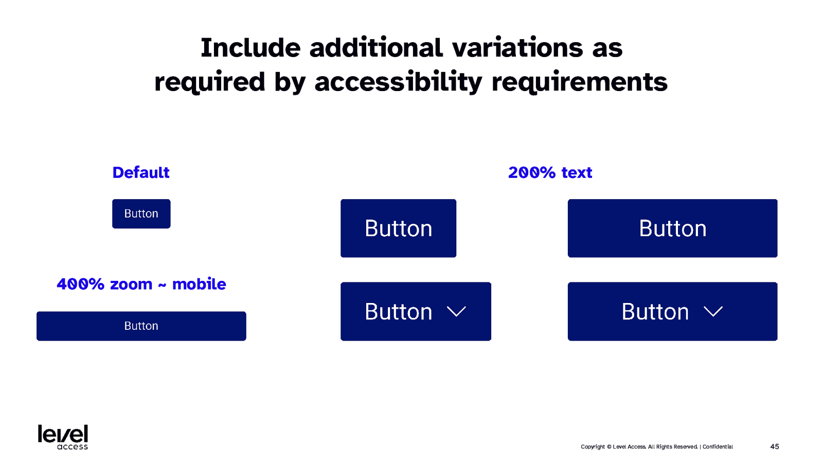
Include additional variations as required by accessibility requirements Default 200% text 400% zoom ~ mobile Copyright © Level Access. All Rights Reserved. | Confidential 45
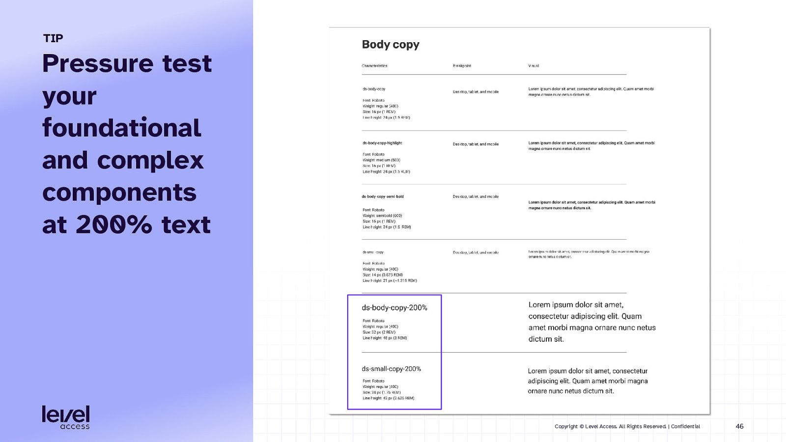
TIP Pressure test your foundational and complex components at 200% text Copyright © Level Access. All Rights Reserved. | Confidential 46
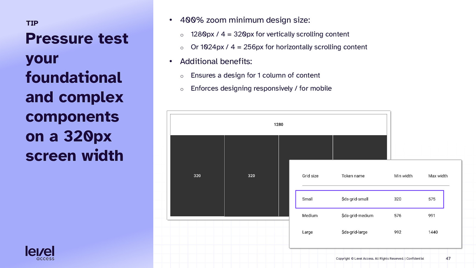
TIP Pressure test your foundational and complex components on a 320px screen width • 400% zoom minimum design size: o 1280px / 4 = 320px for vertically scrolling content o Or 1024px / 4 = 256px for horizontally scrolling content • Additional benefits: o Ensures a design for 1 column of content o Enforces designing responsively / for mobile Copyright © Level Access. All Rights Reserved. | Confidential 47
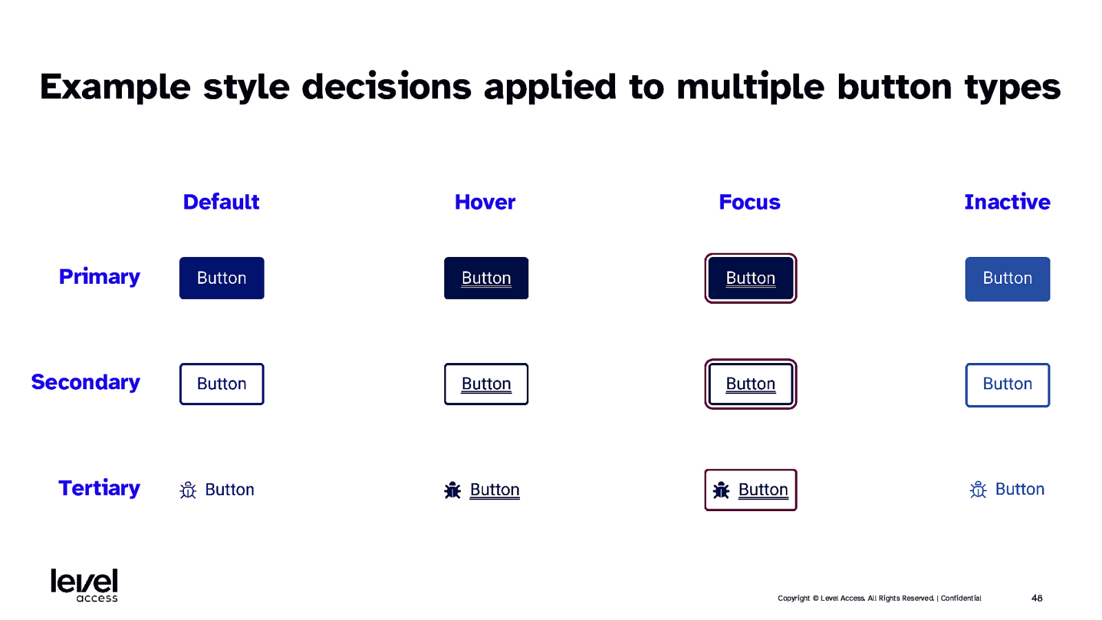
Example style decisions applied to multiple button types Default Hover Focus Inactive Primary Secondary Tertiary Copyright © Level Access. All Rights Reserved. | Confidential 48
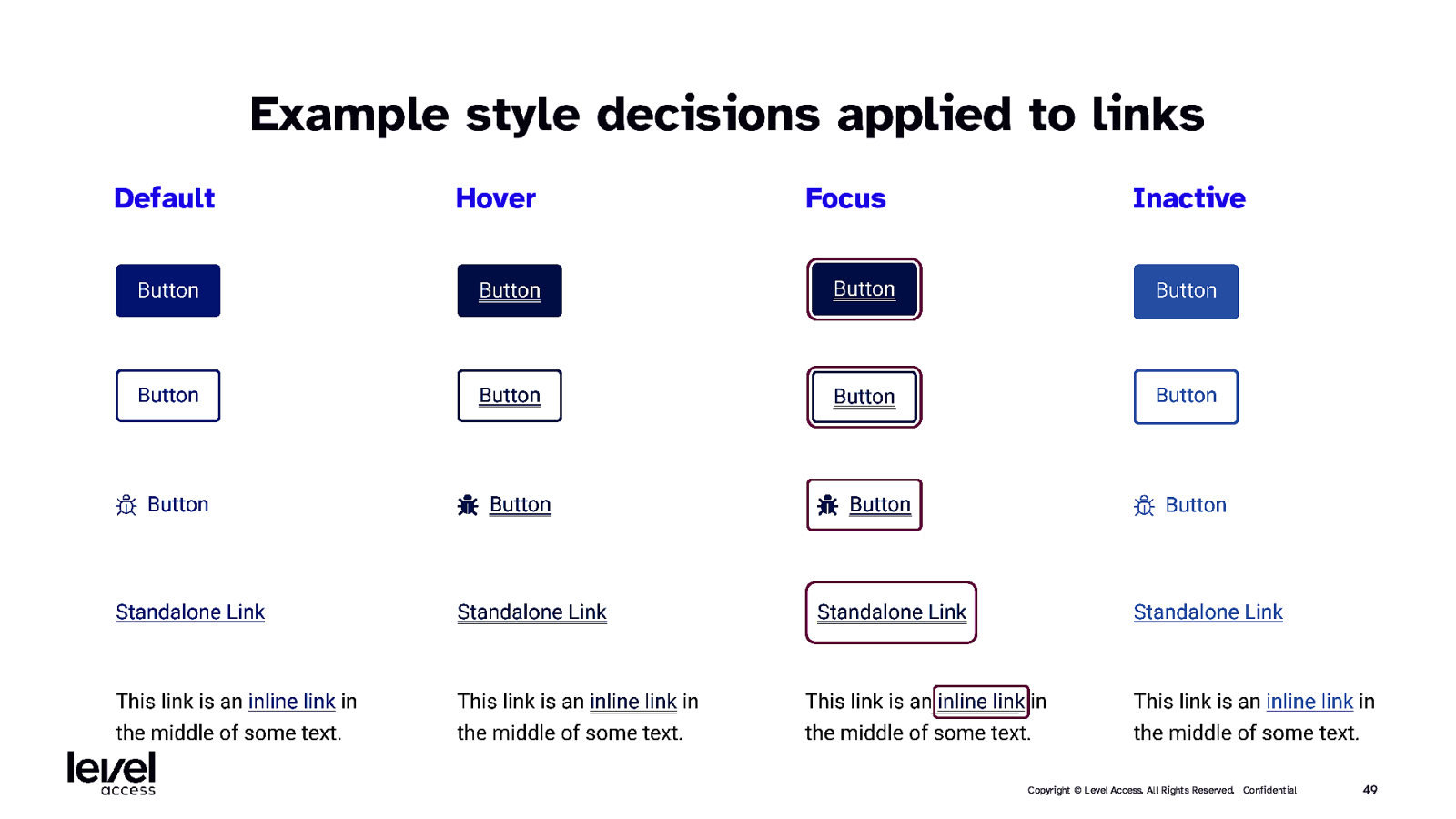
Example style decisions applied to links Default Hover Focus Inactive Copyright © Level Access. All Rights Reserved. | Confidential 49
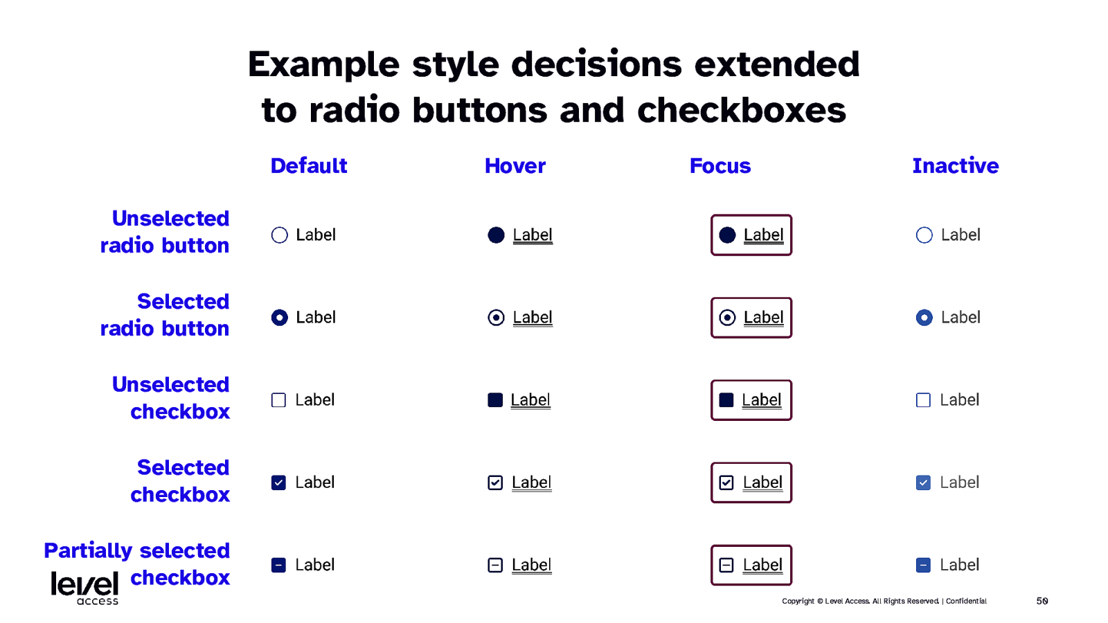
Example style decisions extended to radio buttons and checkboxes Default Hover Focus Inactive Unselected radio button Selected radio button Unselected checkbox Selected checkbox Partially selected checkbox Copyright © Level Access. All Rights Reserved. | Confidential 50
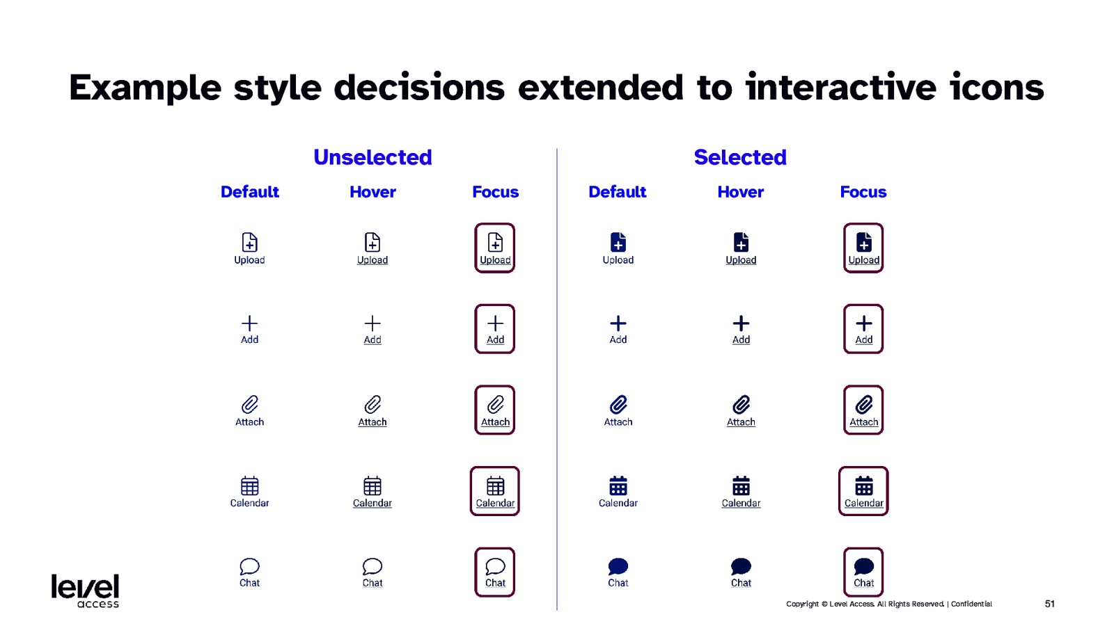
Example style decisions extended to interactive icons Unselected Default Hover Selected Focus Default Hover Focus Copyright © Level Access. All Rights Reserved. | Confidential 51
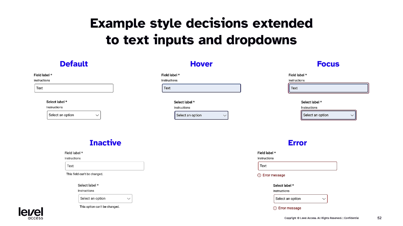
Example style decisions extended to text inputs and dropdowns Default Hover Inactive Focus Error Copyright © Level Access. All Rights Reserved. | Confidential 52
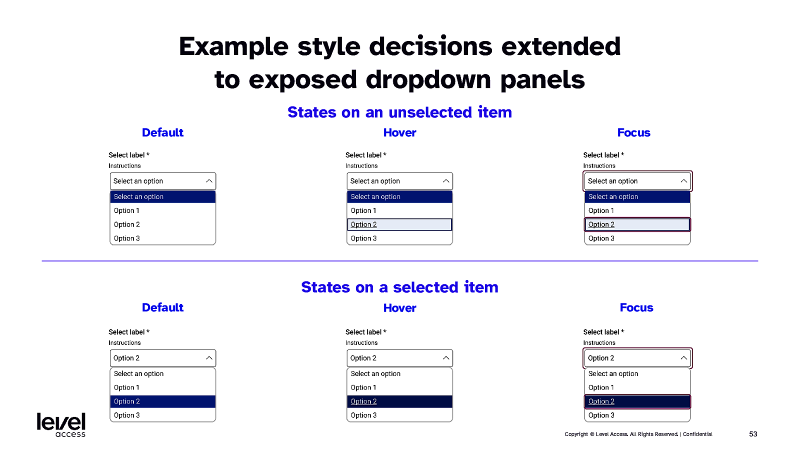
Example style decisions extended to exposed dropdown panels States on an unselected item Default Hover Focus States on a selected item Default Hover Focus Copyright © Level Access. All Rights Reserved. | Confidential 53
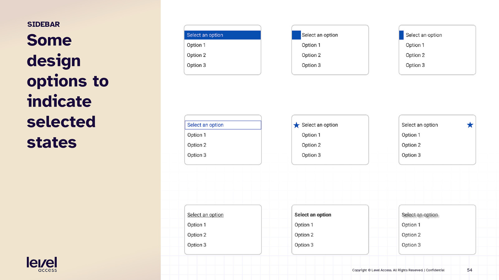
SIDEBAR Some design options to indicate selected states Copyright © Level Access. All Rights Reserved. | Confidential 54
QUESTION Why is consistency so important? Copyright © Level Access. All Rights Reserved. | Confidential 55
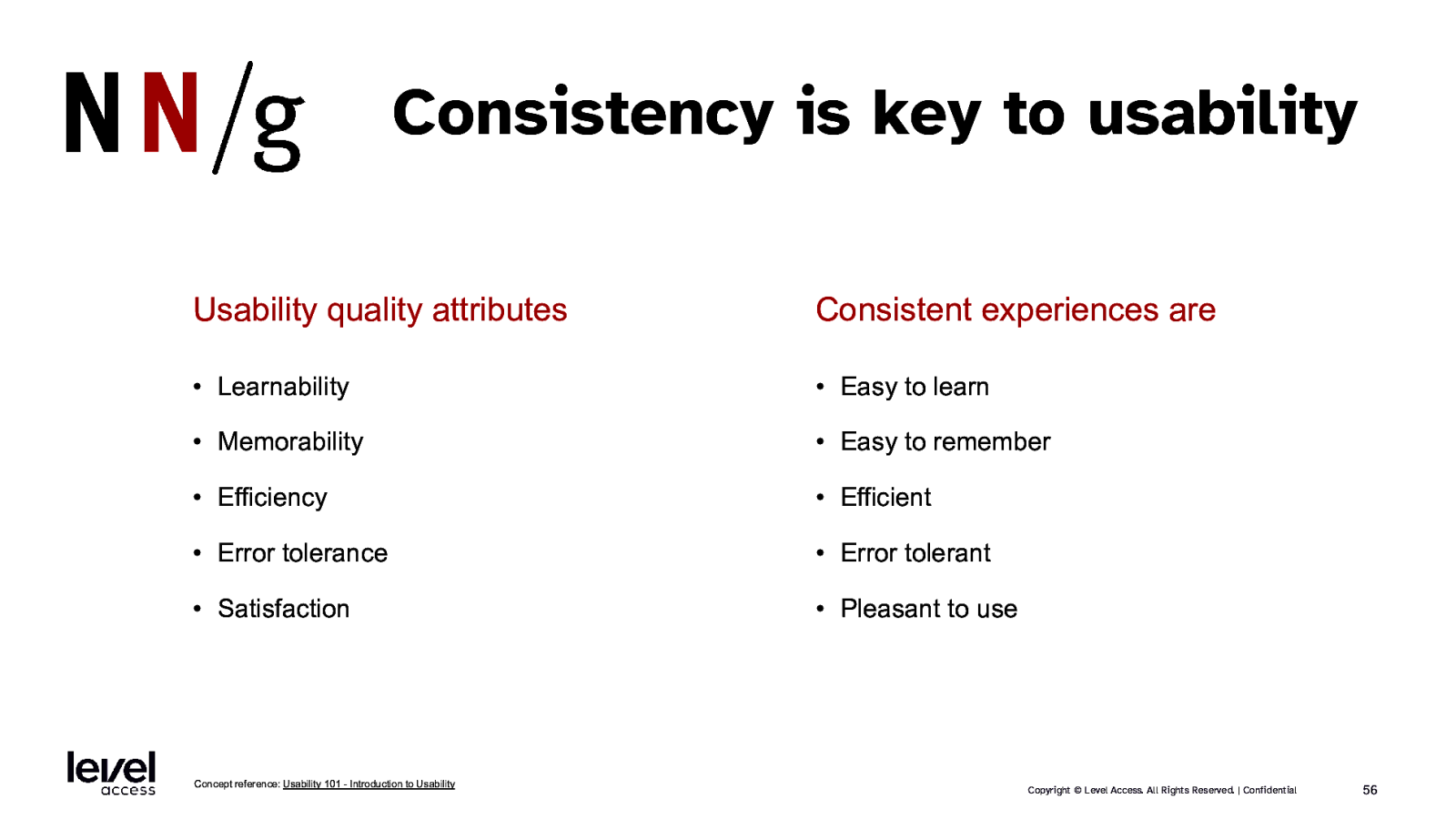
Consistency is key to usability Usability quality attributes Consistent experiences are • Learnability • Easy to learn • Memorability • Easy to remember • Efficiency • Efficient • Error tolerance • Error tolerant • Satisfaction • Pleasant to use Concept reference: Usability 101 - Introduction to Usability Copyright © Level Access. All Rights Reserved. | Confidential 56
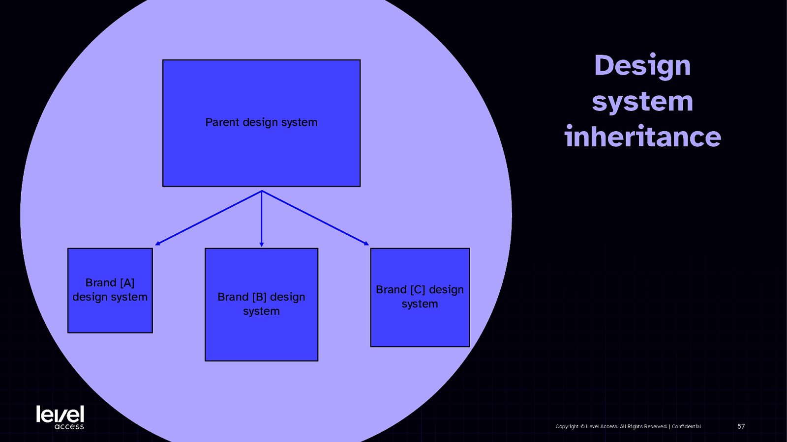
Design system inheritance Parent design system Brand [A] design system Brand [B] design system Brand [C] design system Copyright © Level Access. All Rights Reserved. | Confidential 57
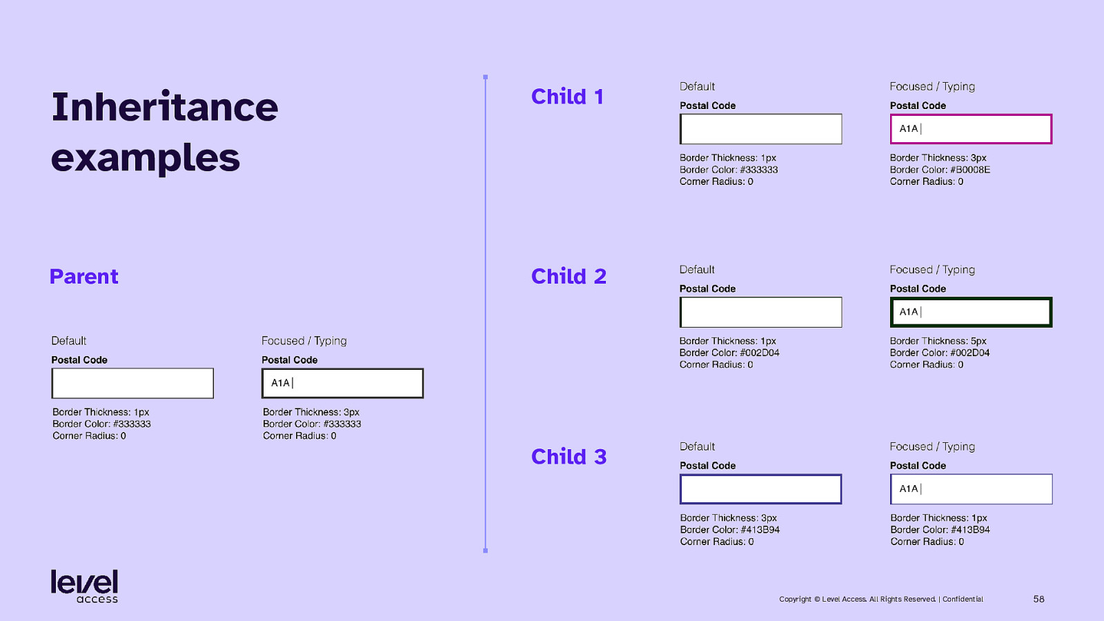
Inheritance examples Child 1 Parent Child 2 Child 3 Copyright © Level Access. All Rights Reserved. | Confidential 58
SECTION 3 Summary Copyright © Level Access. All Rights Reserved. | Confidential 59
Key takeaways • Set up your tokens to maximize component design accessibility • Component design: o Design as many variations as required by your design system o Augment that set with additional variations as required by accessibility requirements o Use redundant coding / at least 2 ways to communicate o Aim for consistency across element families Copyright © Level Access. All Rights Reserved. | Confidential 60
Any questions?

Get in touch with me Karen Hawkins, CPACC Connect with me Principal of Accessible Design, Level Access Email LinkedIn Copyright © Level Access. All Rights Reserved. | Confidential 62
Thank you