Making Websites Usable, Not Just Accessible May 15, 2019 Karen Hawkins, UX Lead, Publicis Sapient
A presentation at TechAccessOK in May 2019 in Stillwater, OK, USA by Karen Hawkins
Making Websites Usable, Not Just Accessible May 15, 2019 Karen Hawkins, UX Lead, Publicis Sapient


MYTH
Accessibility can be taken care of by front end developers, and nobody else needs to concern themselves with it.

Business Development Leads Copywriters User Experience Designers Quality Assurance Professionals Visual Designers Project Managers Front End Developers Content Strategists Account Leads Strategists
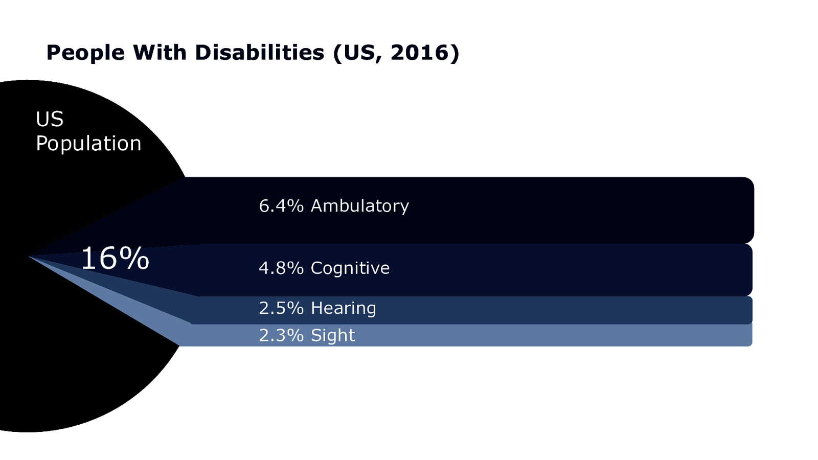
People With Disabilities (US, 2016) US Population 6.4% Ambulatory 16% 4.8% Cognitive 2.5% Hearing 2.3% Sight
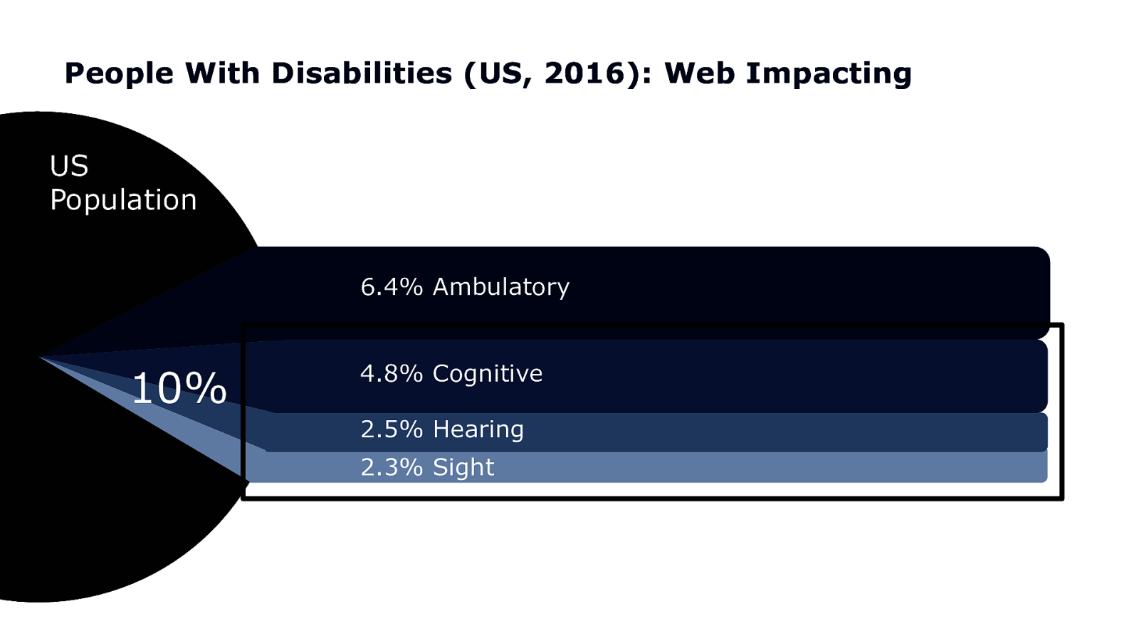
People With Disabilities (US, 2016): Web Impacting US Population 6.4% Ambulatory 10% 4.8% Cognitive 2.5% Hearing 2.3% Sight
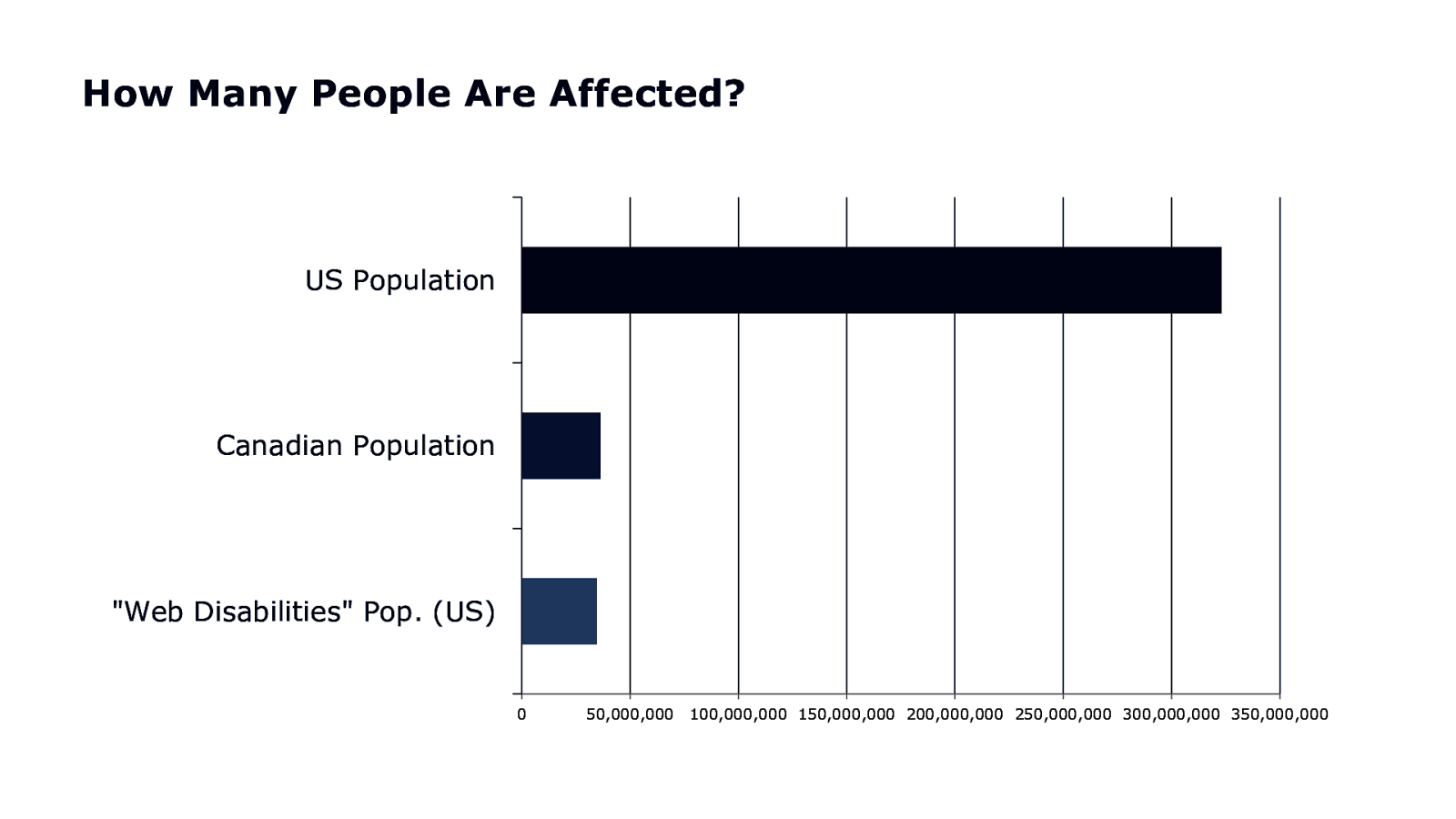
How Many People Are Affected? US Population Canadian Population “Web Disabilities” Pop. (US) 0 50,000,000 100,000,000 150,000,000 200,000,000 250,000,000 300,000,000 350,000,000

35 MILLION PEOPLE IN THE USA

770 MILLION PEOPLE IN THE WORLD
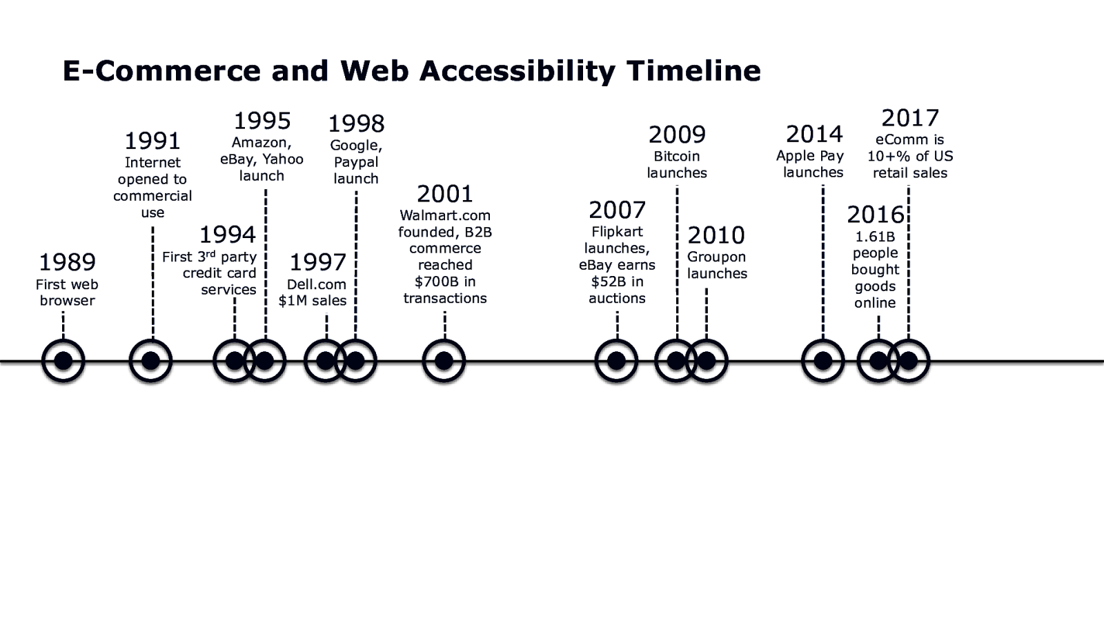
E-Commerce and Web Accessibility Timeline 1995 1991 Internet opened to commercial use 1989 First web browser Amazon, eBay, Yahoo launch 1994 3rd First party credit card services 1998 Google, Paypal launch 1997 Dell.com $1M sales 2009 2001 Walmart.com founded, B2B commerce reached $700B in transactions Bitcoin launches 2007 Flipkart launches, eBay earns $52B in auctions 2010 Groupon launches 2014 Apple Pay launches 2017 eComm is 10+% of US retail sales 2016 1.61B people bought goods online
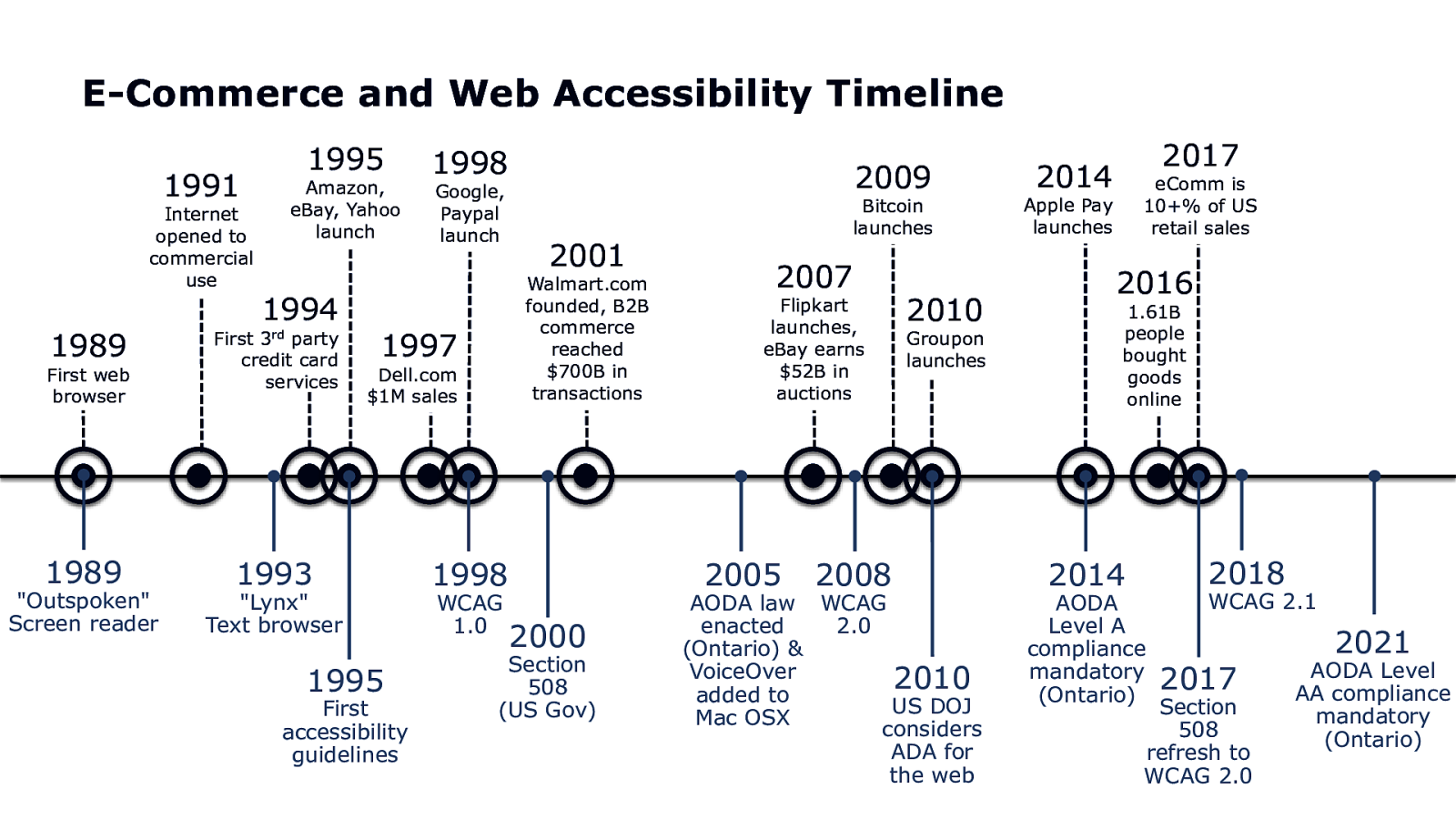
E-Commerce and Web Accessibility Timeline 1995 1991 Internet opened to commercial use Amazon, eBay, Yahoo launch 1994 1989 First party credit card services 1989 1993 First web browser “Outspoken” Screen reader 3rd 1998 Google, Paypal launch Dell.com $1M sales 1995 First accessibility guidelines 2001 Walmart.com founded, B2B commerce reached $700B in transactions 1997 “Lynx” Text browser 2009 2007 Flipkart launches, eBay earns $52B in auctions 2005 1998 WCAG 1.0 Bitcoin launches 2000 Section 508 (US Gov) 2008 2010 Groupon launches AODA law WCAG enacted 2.0 (Ontario) & VoiceOver 2010 added to US DOJ Mac OSX considers ADA for the web 2017 2014 eComm is 10+% of US retail sales Apple Pay launches 2016 1.61B people bought goods online 2014 AODA Level A compliance mandatory (Ontario) 2018 WCAG 2.1 2017 Section 508 refresh to WCAG 2.0 2021 AODA Level AA compliance mandatory (Ontario)
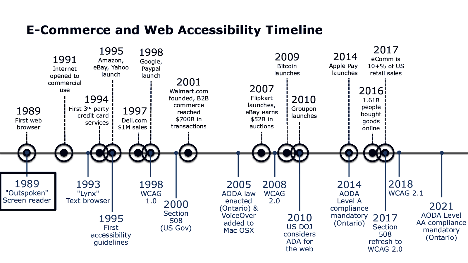
E-Commerce and Web Accessibility Timeline 1995 1991 Internet opened to commercial use Amazon, eBay, Yahoo launch 1994 1989 First party credit card services 1989 1993 First web browser “Outspoken” Screen reader 3rd 1998 Google, Paypal launch Dell.com $1M sales 1995 First accessibility guidelines 2001 Walmart.com founded, B2B commerce reached $700B in transactions 1997 “Lynx” Text browser 2009 2007 Flipkart launches, eBay earns $52B in auctions 2005 1998 WCAG 1.0 Bitcoin launches 2000 Section 508 (US Gov) 2008 2010 Groupon launches AODA law WCAG enacted 2.0 (Ontario) & VoiceOver 2010 added to US DOJ Mac OSX considers ADA for the web 2017 2014 eComm is 10+% of US retail sales Apple Pay launches 2016 1.61B people bought goods online 2014 AODA Level A compliance mandatory (Ontario) 2018 WCAG 2.1 2017 Section 508 refresh to WCAG 2.0 2021 AODA Level AA compliance mandatory (Ontario)
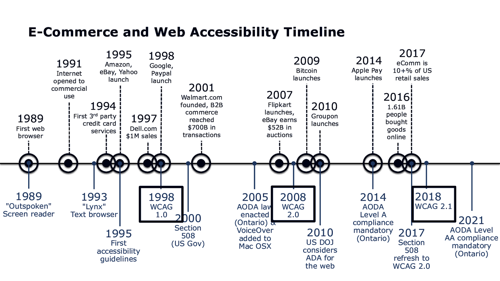
E-Commerce and Web Accessibility Timeline 1995 1991 Internet opened to commercial use Amazon, eBay, Yahoo launch 1994 1989 First party credit card services 1989 1993 First web browser “Outspoken” Screen reader 3rd 1998 Google, Paypal launch Dell.com $1M sales 1995 First accessibility guidelines 2001 Walmart.com founded, B2B commerce reached $700B in transactions 1997 “Lynx” Text browser 2009 2007 Flipkart launches, eBay earns $52B in auctions 2005 1998 WCAG 1.0 Bitcoin launches 2000 Section 508 (US Gov) 2008 2010 Groupon launches AODA law WCAG enacted 2.0 (Ontario) & VoiceOver 2010 added to US DOJ Mac OSX considers ADA for the web 2017 2014 eComm is 10+% of US retail sales Apple Pay launches 2016 1.61B people bought goods online 2014 AODA Level A compliance mandatory (Ontario) 2018 WCAG 2.1 2017 Section 508 refresh to WCAG 2.0 2021 AODA Level AA compliance mandatory (Ontario)

So in 20 years, how have we done?
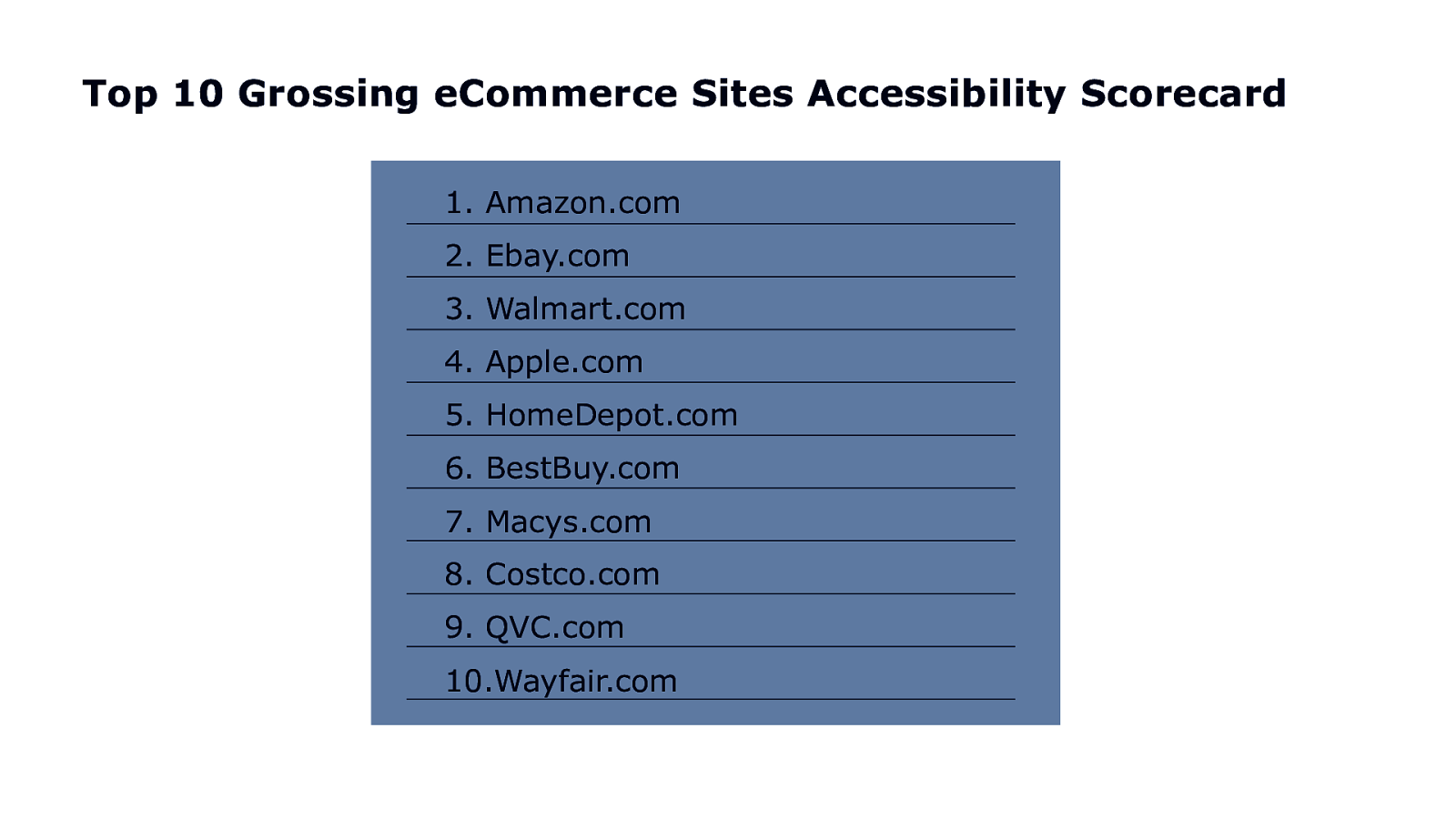
Top 10 Grossing eCommerce Sites Accessibility Scorecard 1. Amazon.com 2. Ebay.com 3. Walmart.com 4. Apple.com 5. HomeDepot.com 6. BestBuy.com 7. Macys.com 8. Costco.com 9. QVC.com 10.Wayfair.com
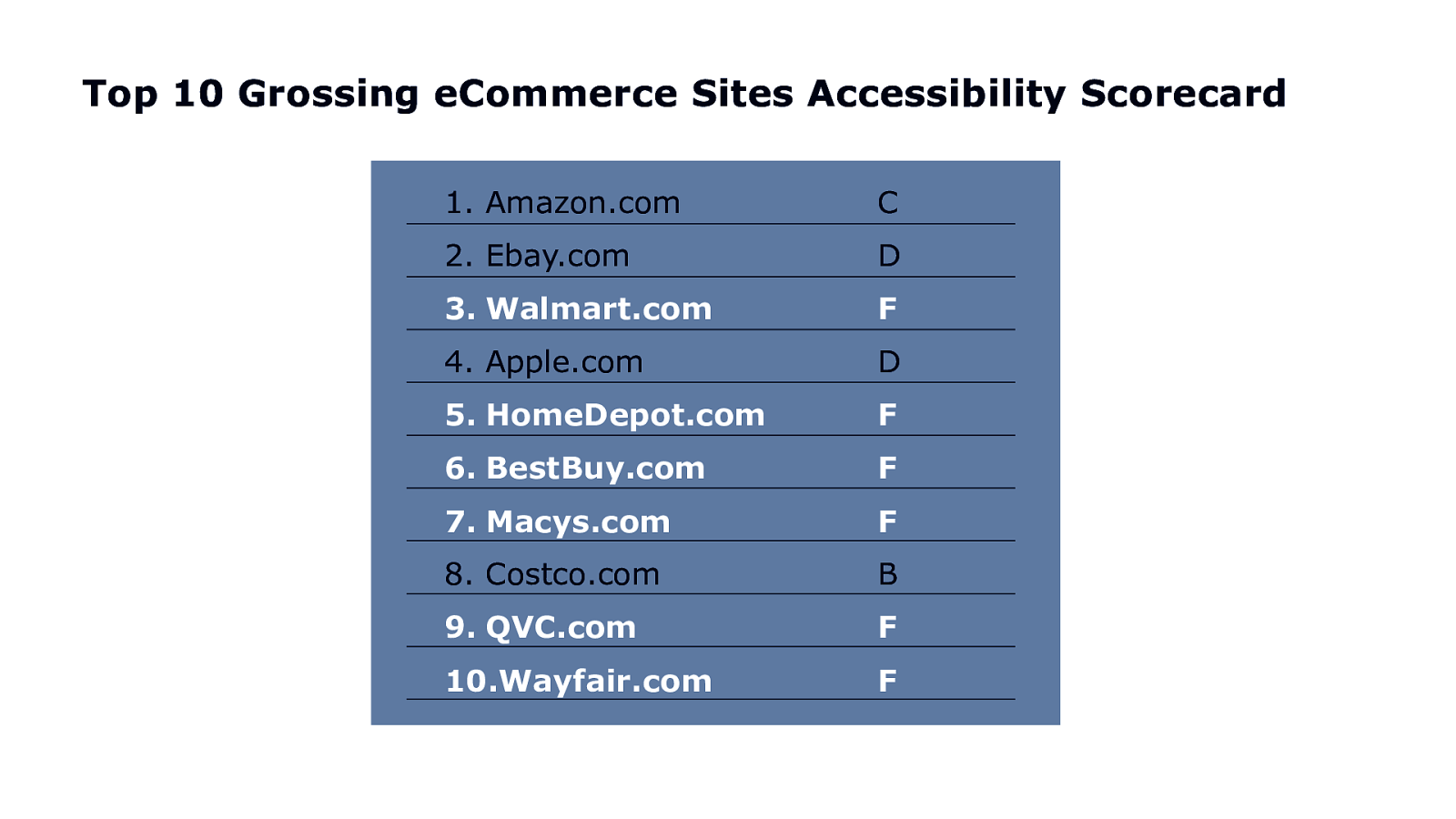
Top 10 Grossing eCommerce Sites Accessibility Scorecard 1. Amazon.com C 2. Ebay.com D 3. Walmart.com F 4. Apple.com D 5. HomeDepot.com F 6. BestBuy.com F 7. Macys.com F 8. Costco.com B 9. QVC.com F 10.Wayfair.com F

770 MILLION PEOPLE

Myth

WHY THE @^(&$ IS THIS STILL TRUE IN 2019?
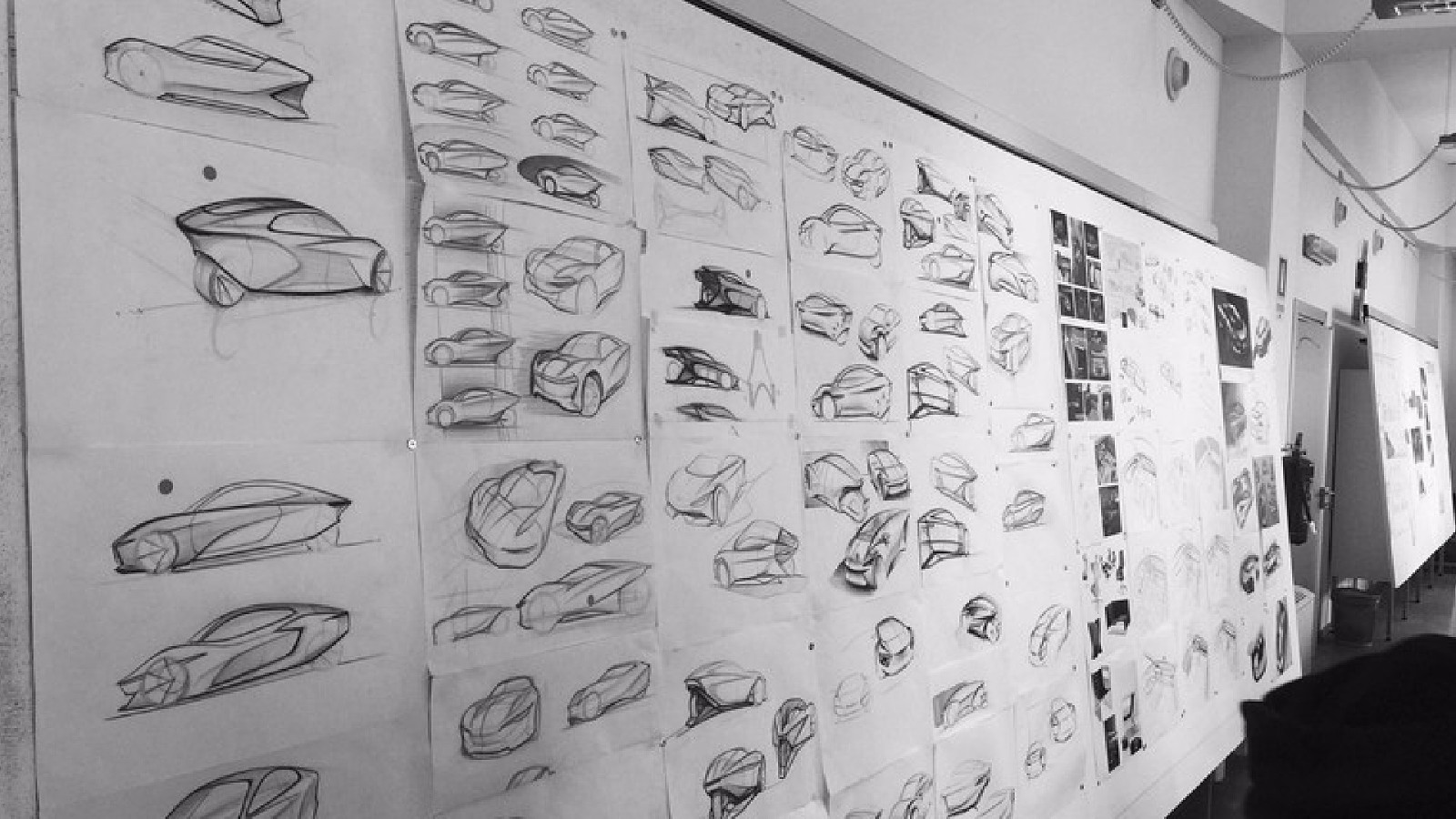
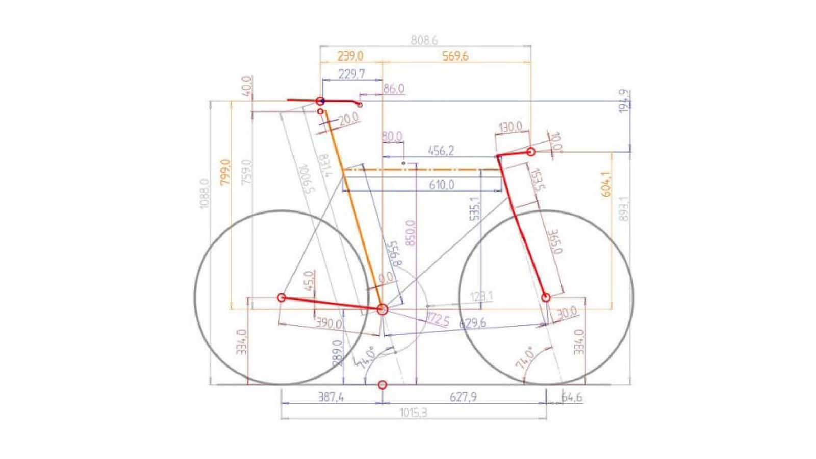
It’s a design issue
“Design is not just what it looks like and feels like. Design is how it works.” - STEVE JOBS

How The Web Works
How The Web Works
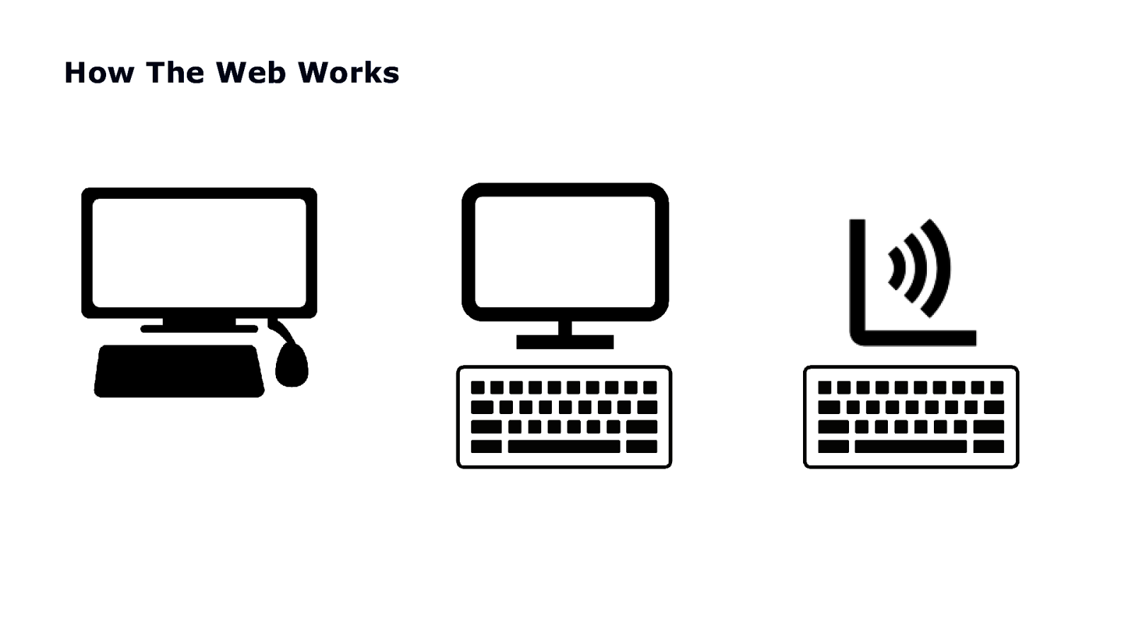
How The Web Works
COPYRIGHT SAPIENTRAZORFISH | CONFIDENTIAL 30
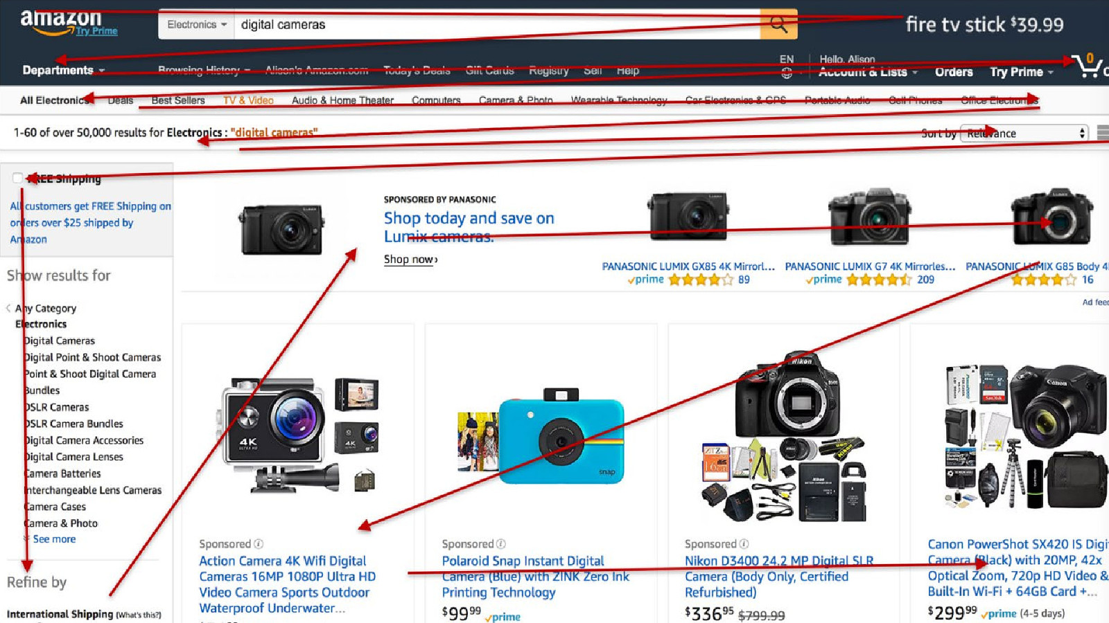
COPYRIGHT SAPIENTRAZORFISH | CONFIDENTIAL 31
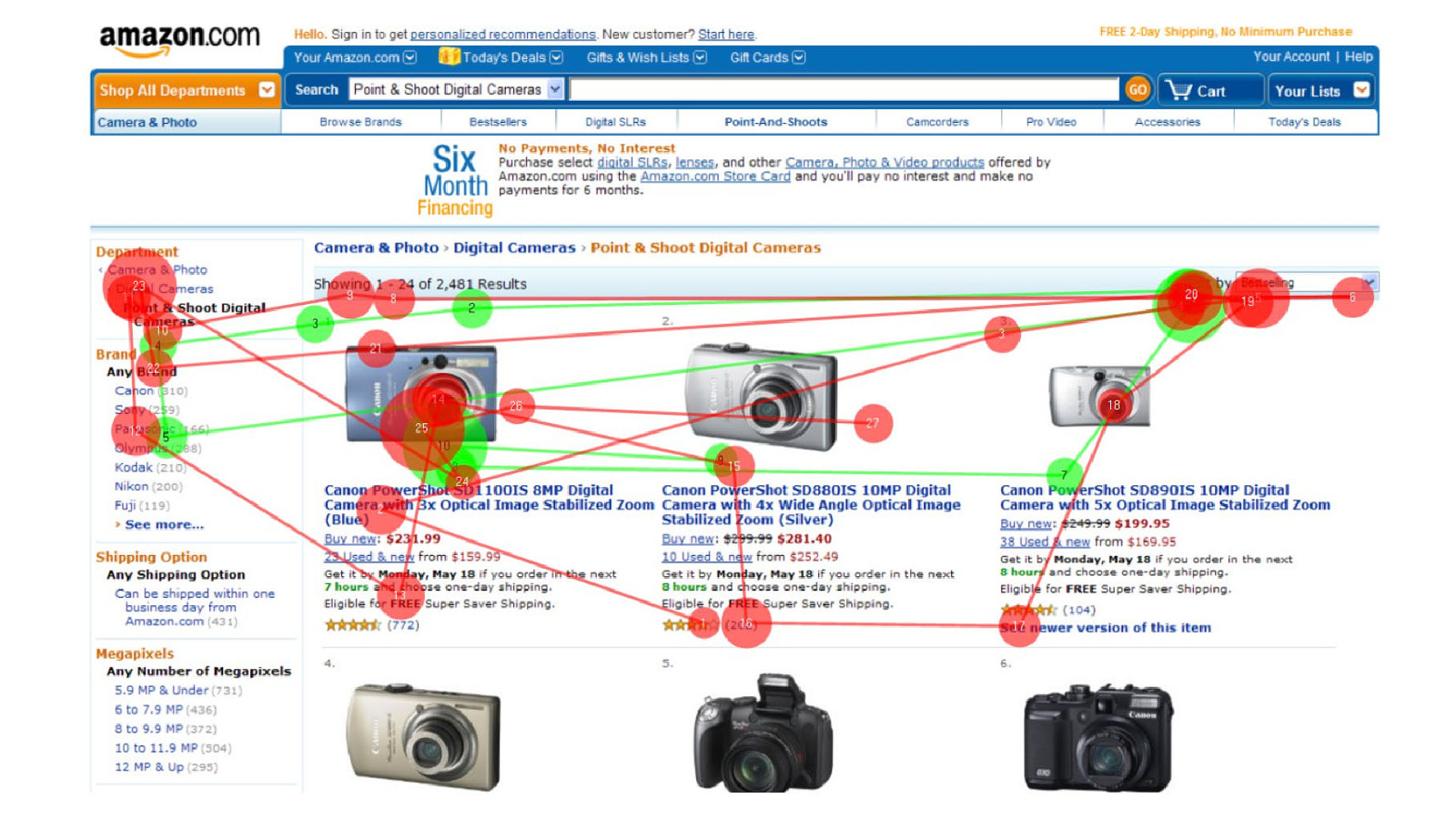
Let’s explore this concept of a linear experience.
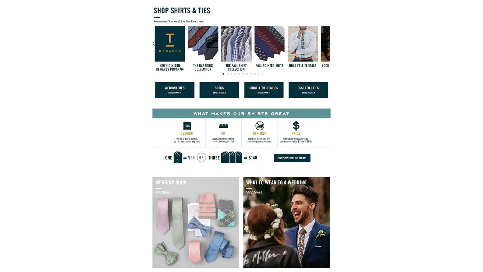

We need to imagine all that content is just in one long list







So I want to say again…

It’s a design issue
And who are the right people to design such experiences?
Business Development Leads Copywriters User Experience Designers Quality Assurance Professionals Visual Designers Project Managers Front End Developers Content Strategists Account Leads Strategists
User Experience Designers

Almost anyone can make a site accessible.
Almost anyone can make a site accessible. But it isn’t necessarily usable.
=
Your Tools In Designing Accessible Experiences

ACCESSIBLE EXPERIENCE TOOLS Your Tools In Designing Accessible Experiences • Focus Order • Reading Order • Apple’s VoiceOver Rotor or NVDA’s Elements List
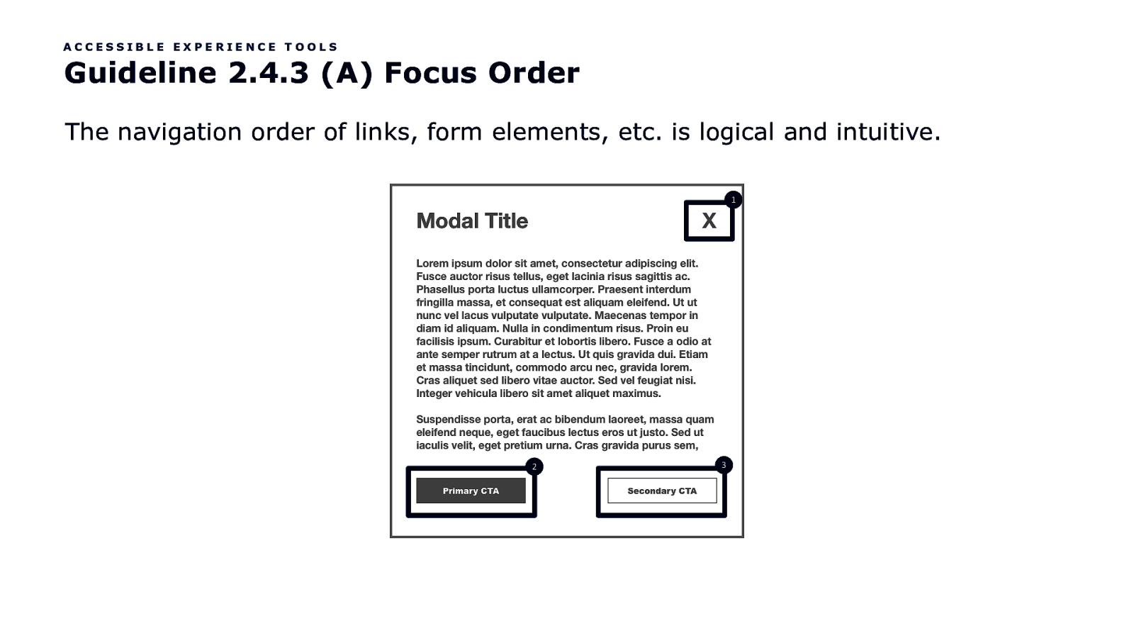
ACCESSIBLE EXPERIENCE TOOLS Guideline 2.4.3 (A) Focus Order The navigation order of links, form elements, etc. is logical and intuitive. 1 2 3
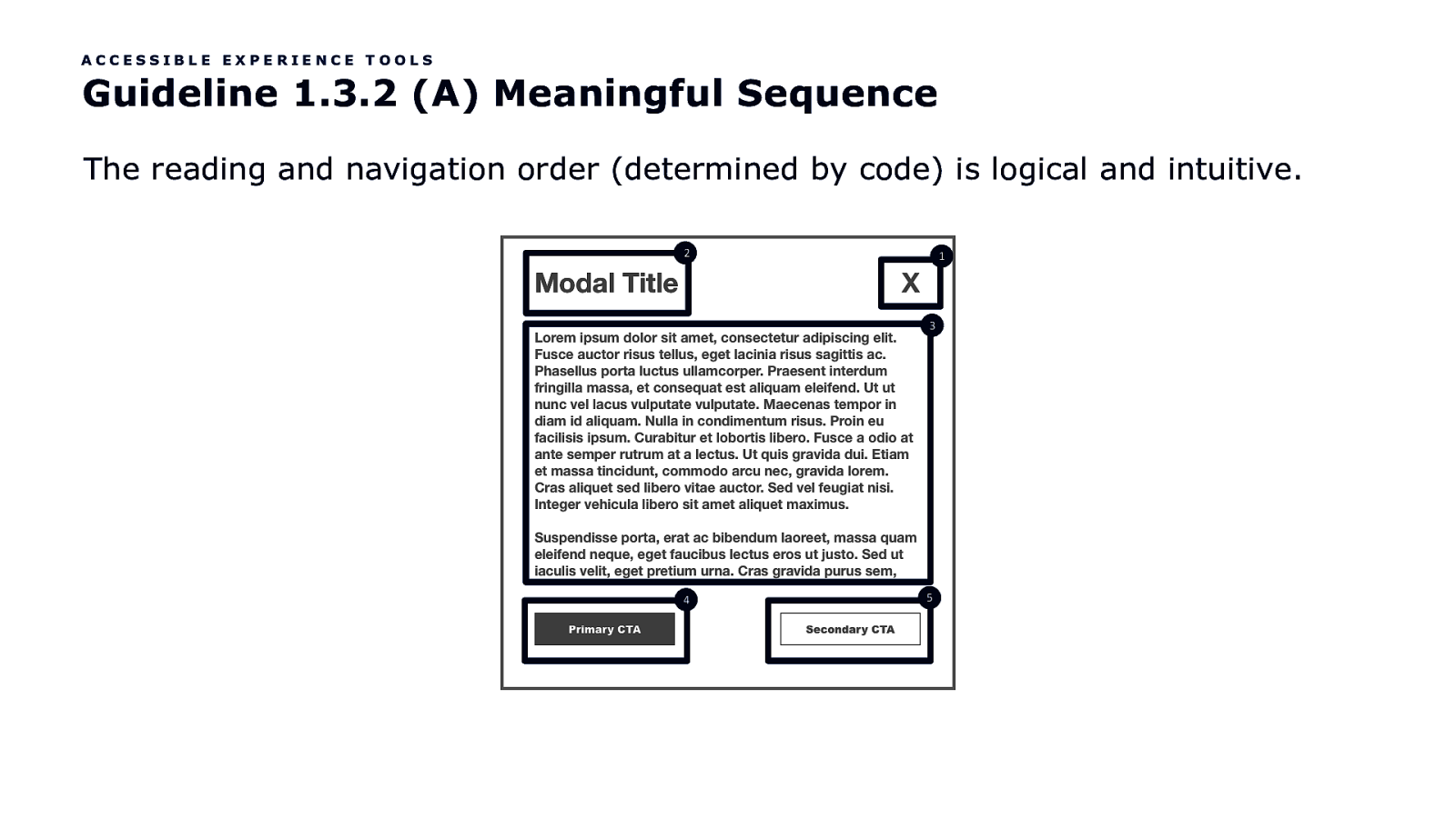
ACCESSIBLE EXPERIENCE TOOLS Guideline 1.3.2 (A) Meaningful Sequence The reading and navigation order (determined by code) is logical and intuitive. 2 1 3 4 5
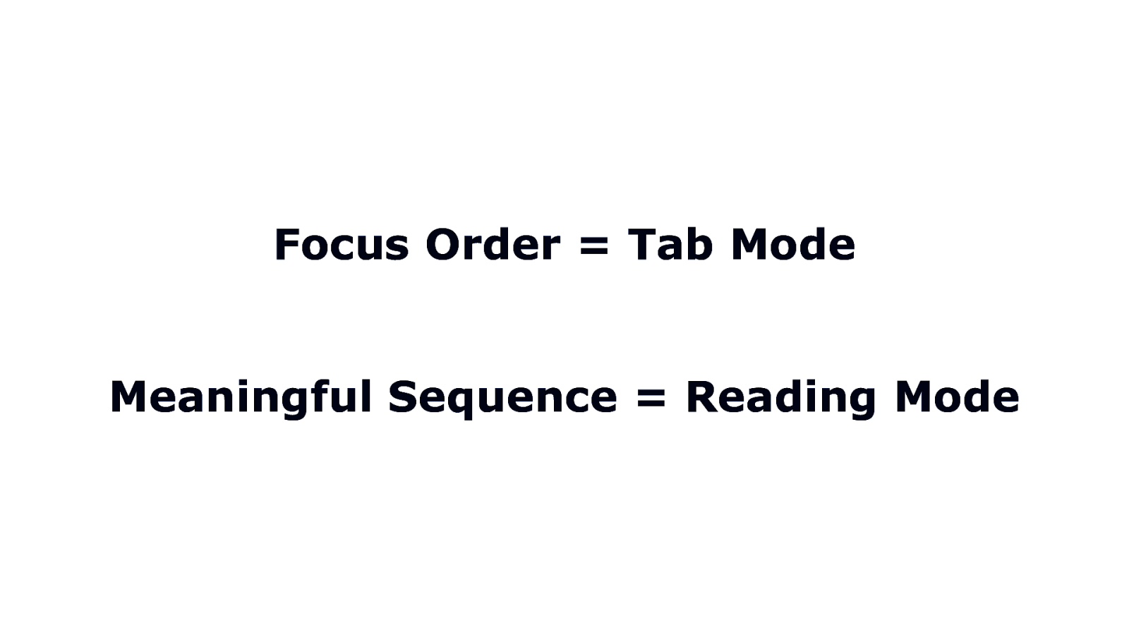
Focus Order = Tab Mode Meaningful Sequence = Reading Mode
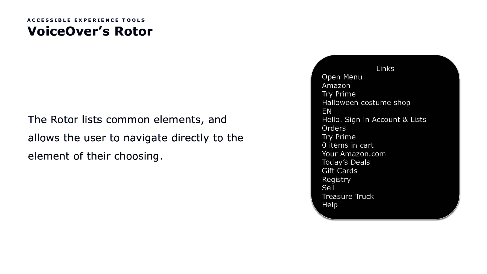
ACCESSIBLE EXPERIENCE TOOLS VoiceOver’s Rotor Links The Rotor lists common elements, and allows the user to navigate directly to the element of their choosing. Open Menu Amazon Try Prime Halloween costume shop EN Hello. Sign in Account & Lists Orders Try Prime 0 items in cart Your Amazon.com Today’s Deals Gift Cards Registry Sell Treasure Truck Help
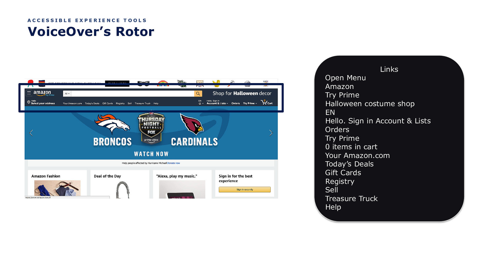
ACCESSIBLE EXPERIENCE TOOLS VoiceOver’s Rotor Links Open Menu Amazon Try Prime Halloween costume shop EN Hello. Sign in Account & Lists Orders Try Prime 0 items in cart Your Amazon.com Today’s Deals Gift Cards Registry Sell Treasure Truck Help
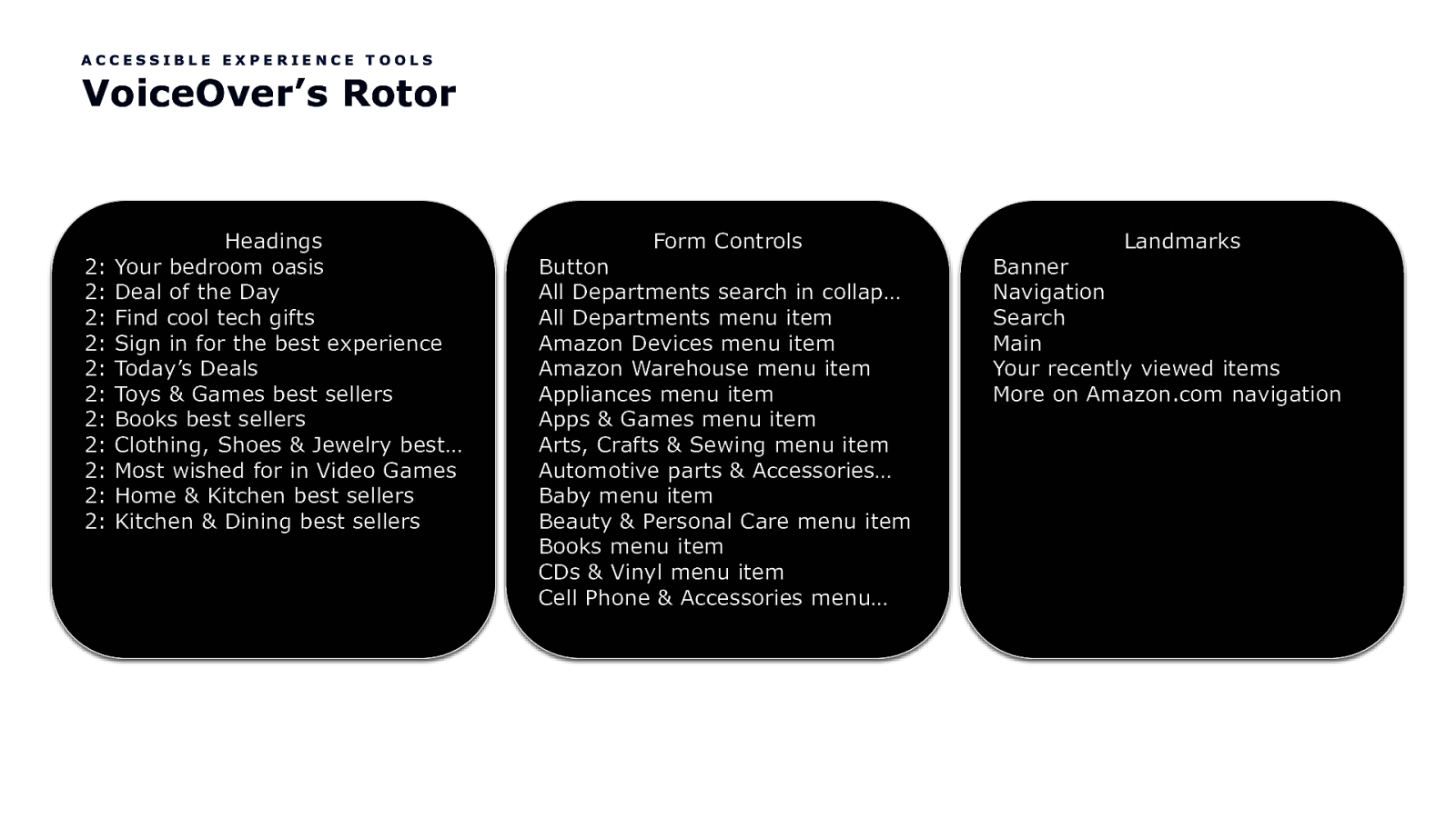
ACCESSIBLE EXPERIENCE TOOLS VoiceOver’s Rotor 2: 2: 2: 2: 2: 2: 2: 2: 2: 2: 2: Headings Your bedroom oasis Deal of the Day Find cool tech gifts Sign in for the best experience Today’s Deals Toys & Games best sellers Books best sellers Clothing, Shoes & Jewelry best… Most wished for in Video Games Home & Kitchen best sellers Kitchen & Dining best sellers Form Controls Button All Departments search in collap… All Departments menu item Amazon Devices menu item Amazon Warehouse menu item Appliances menu item Apps & Games menu item Arts, Crafts & Sewing menu item Automotive parts & Accessories… Baby menu item Beauty & Personal Care menu item Books menu item CDs & Vinyl menu item Cell Phone & Accessories menu… Landmarks Banner Navigation Search Main Your recently viewed items More on Amazon.com navigation
Umm, I get what links are. But what the heck are headings, form controls and landmarks?

Let’s Talk Headings
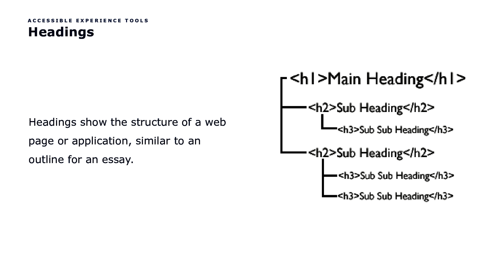
ACCESSIBLE EXPERIENCE TOOLS Headings Headings show the structure of a web page or application, similar to an outline for an essay.
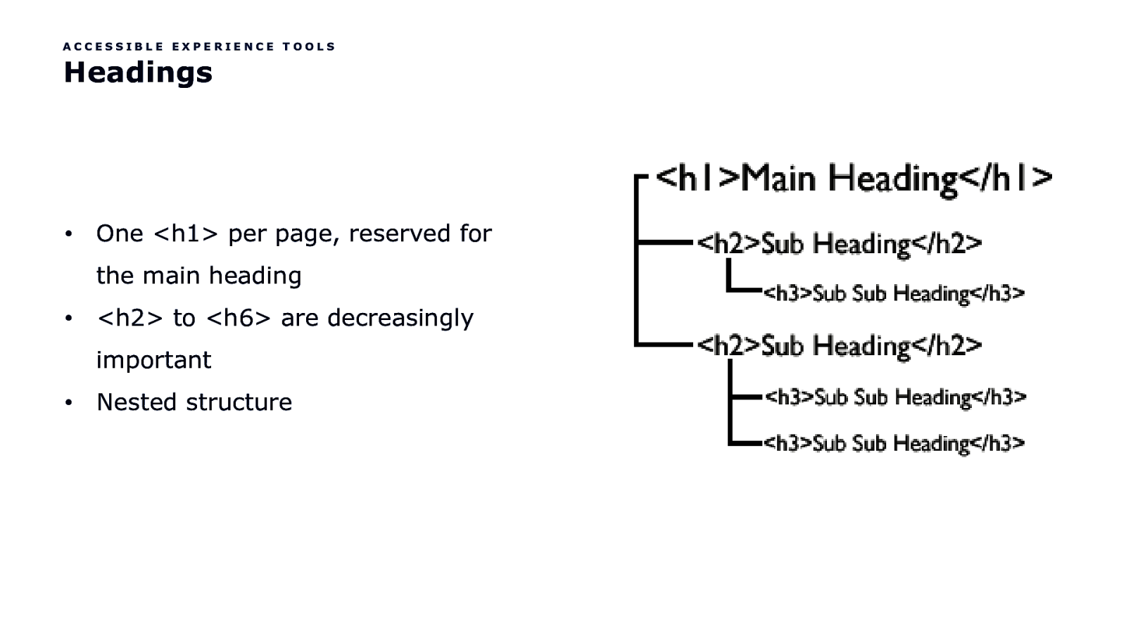
ACCESSIBLE EXPERIENCE TOOLS Headings • One <h1> per page, reserved for the main heading •
<h2> to <h6> are decreasingly important • Nested structure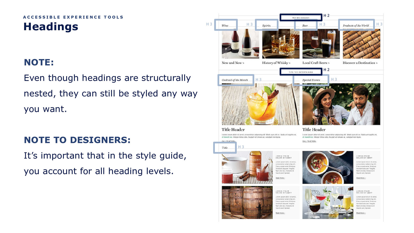
H2 ACCESSIBLE EXPERIENCE TOOLS Headings H3 H3 NOTE: H2 Even though headings are structurally H3 nested, they can still be styled any way you want. NOTE TO DESIGNERS: It’s important that in the style guide, you account for all heading levels. H3 H3 H3 H3
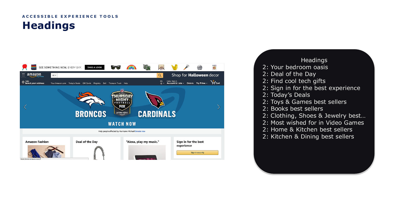
ACCESSIBLE EXPERIENCE TOOLS Headings 2: 2: 2: 2: 2: 2: 2: 2: 2: 2: 2: Headings Your bedroom oasis Deal of the Day Find cool tech gifts Sign in for the best experience Today’s Deals Toys & Games best sellers Books best sellers Clothing, Shoes & Jewelry best… Most wished for in Video Games Home & Kitchen best sellers Kitchen & Dining best sellers
Let’s Talk Form Controls
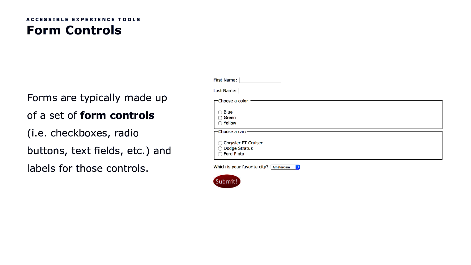
ACCESSIBLE EXPERIENCE TOOLS Form Controls Forms are typically made up of a set of form controls (i.e. checkboxes, radio buttons, text fields, etc.) and labels for those controls.
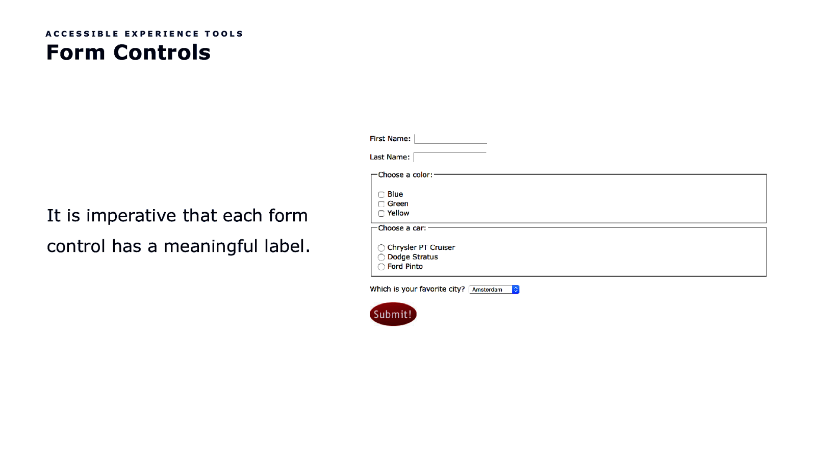
ACCESSIBLE EXPERIENCE TOOLS Form Controls It is imperative that each form control has a meaningful label.
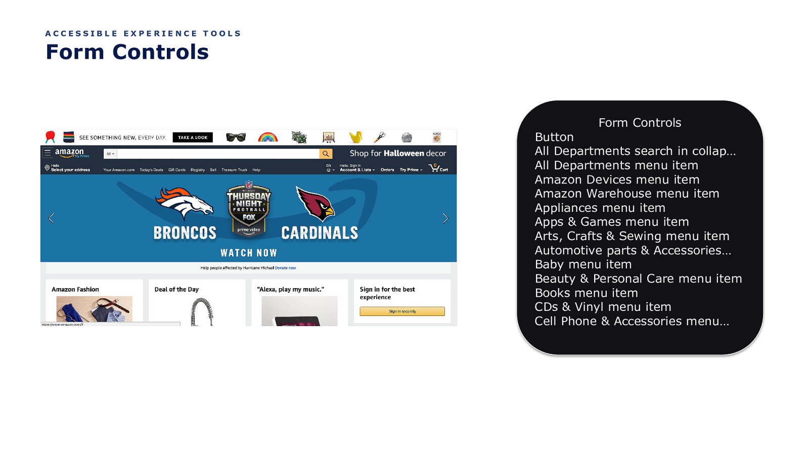
ACCESSIBLE EXPERIENCE TOOLS Form Controls Form Controls Button All Departments search in collap… All Departments menu item Amazon Devices menu item Amazon Warehouse menu item Appliances menu item Apps & Games menu item Arts, Crafts & Sewing menu item Automotive parts & Accessories… Baby menu item Beauty & Personal Care menu item Books menu item CDs & Vinyl menu item Cell Phone & Accessories menu…

Let’s Talk Landmarks
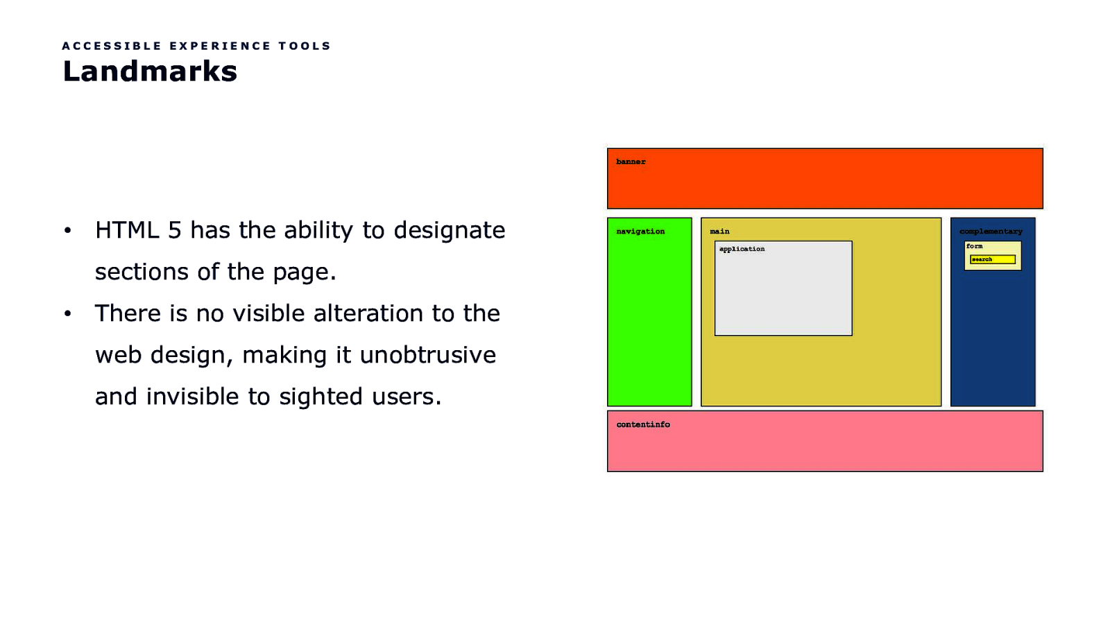
ACCESSIBLE EXPERIENCE TOOLS Landmarks • HTML 5 has the ability to designate sections of the page. • There is no visible alteration to the web design, making it unobtrusive and invisible to sighted users.

ACCESSIBLE EXPERIENCE TOOLS Landmarks Landmarks Banner Navigation Search Main Your recently viewed items More on Amazon.com navigation

So, to reiterate…
ACCESSIBLE EXPERIENCE TOOLS Your Tools In Designing Accessible Experiences • Focus Order • Reading Order • Apple’s VoiceOver Rotor or NVDA’s Elements List
Kool. But how do you put these tools to use?

Think linearly

Provide context
Provide multiple avenues for the user to find their way

Let the user decide what’s important to them

Limit the effort

Let’s get into the weeds
Product Cards
PRODUCT CARDS Product Card Examples

But first…

Let’s Talk Links
PRODUCT CARDS The Link Problem A link’s purpose should be easy to determine from the link text alone.
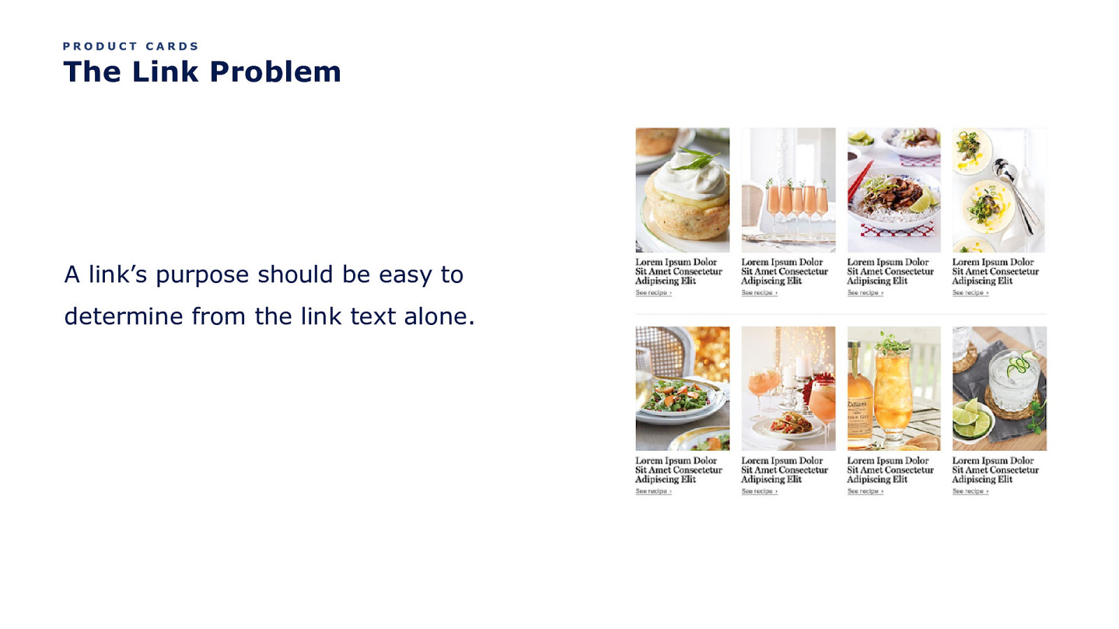
But so many product card links lack context.
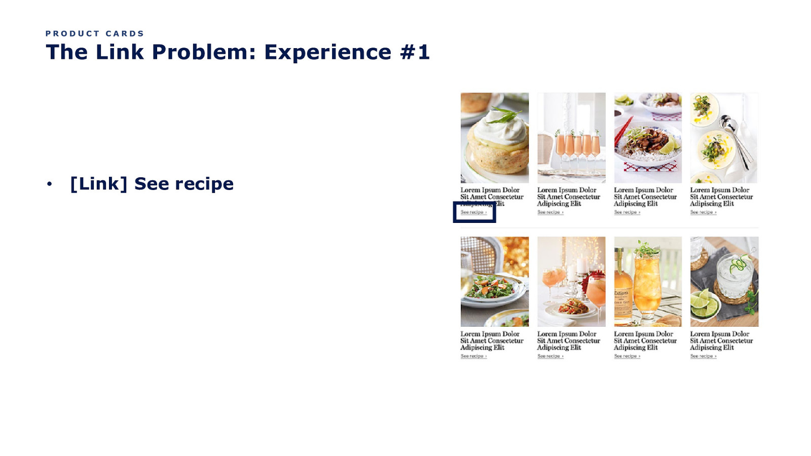
PRODUCT CARDS The Link Problem: Experience #1 • [Link] See recipe
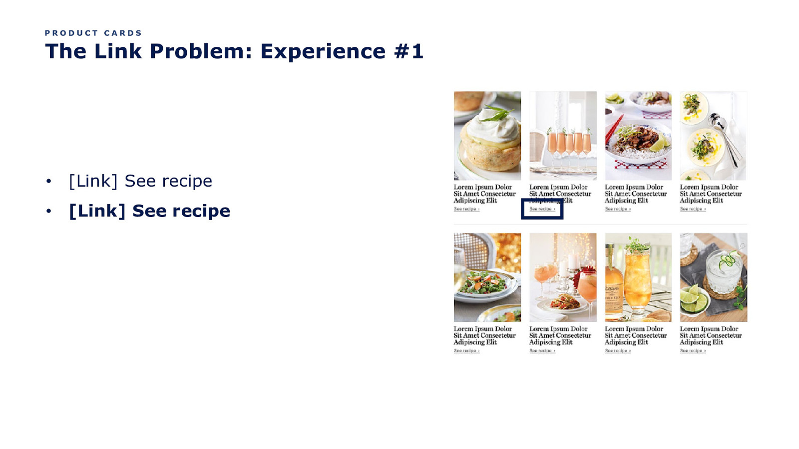
PRODUCT CARDS The Link Problem: Experience #1 • [Link] See recipe • [Link] See recipe
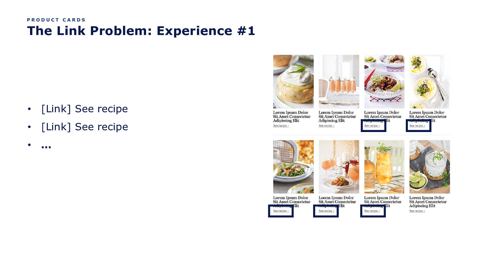
PRODUCT CARDS The Link Problem: Experience #1 • [Link] See recipe • [Link] See recipe • …
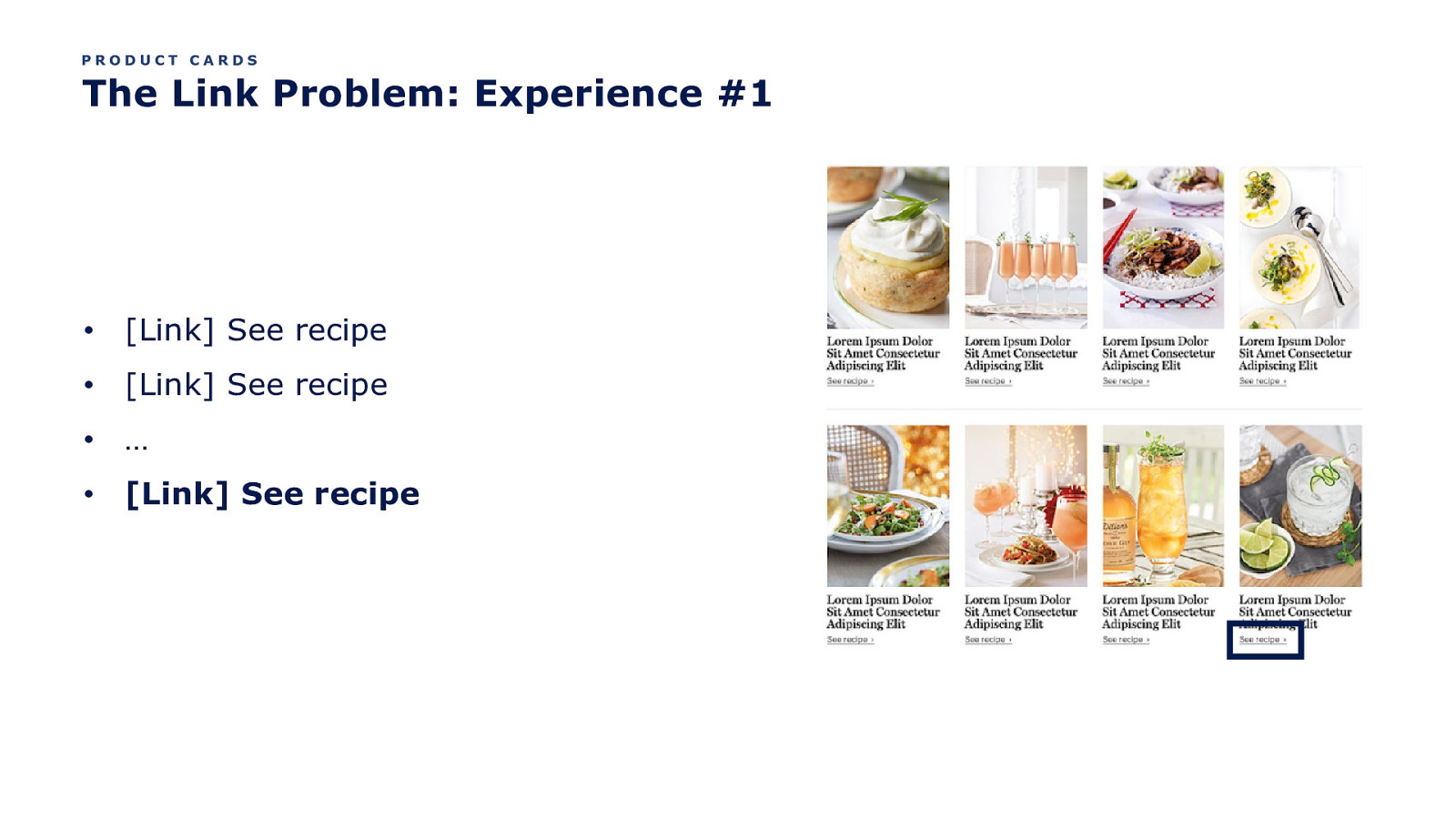
PRODUCT CARDS The Link Problem: Experience #1 • [Link] See recipe • [Link] See recipe • … • [Link] See recipe
But the product images also tend to be links.
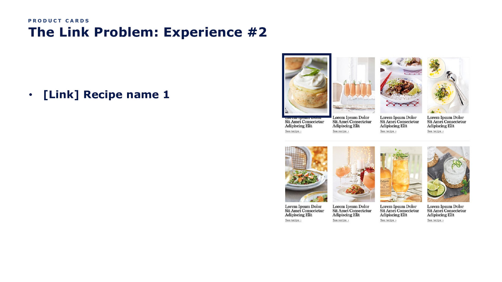
PRODUCT CARDS The Link Problem: Experience #2 • [Link] Recipe name 1
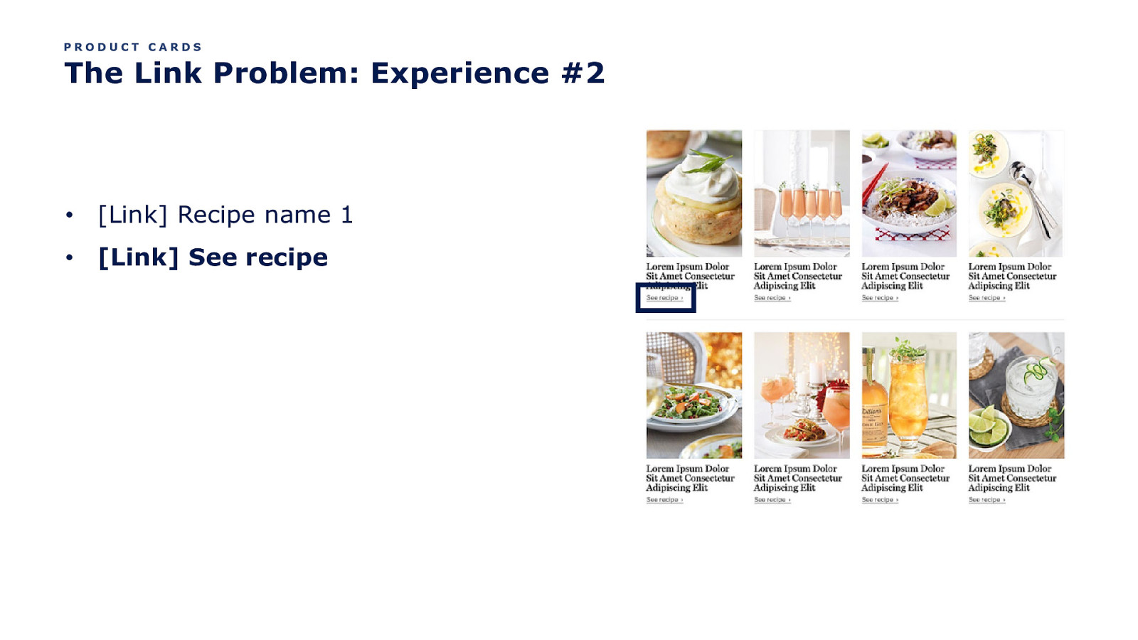
PRODUCT CARDS The Link Problem: Experience #2 • [Link] Recipe name 1 • [Link] See recipe
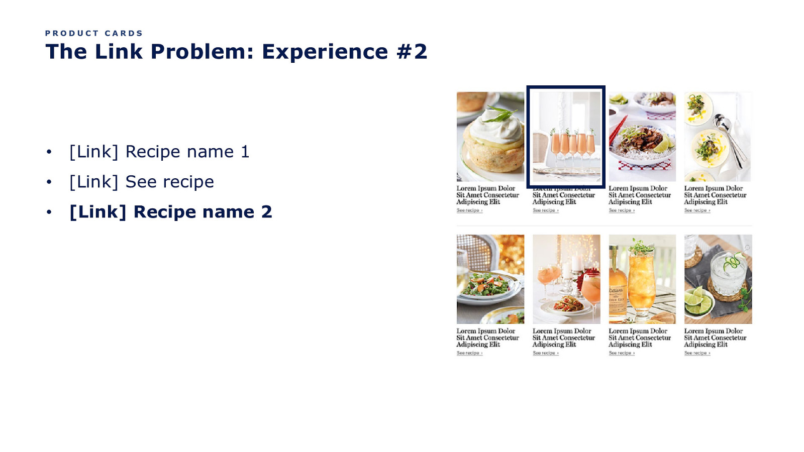
PRODUCT CARDS The Link Problem: Experience #2 • [Link] Recipe name 1 • [Link] See recipe • [Link] Recipe name 2
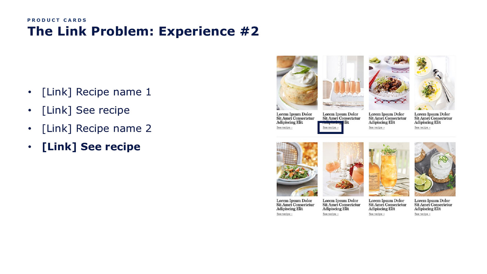
PRODUCT CARDS The Link Problem: Experience #2 • [Link] Recipe name 1 • [Link] See recipe • [Link] Recipe name 2 • [Link] See recipe
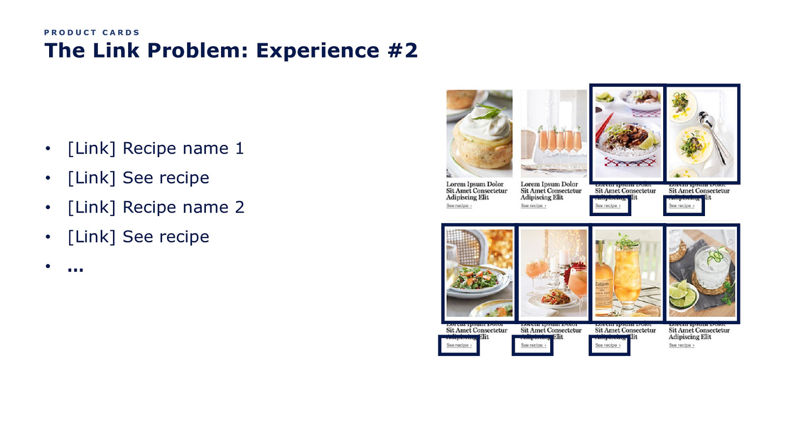
PRODUCT CARDS The Link Problem: Experience #2 • [Link] Recipe name 1 • [Link] See recipe • [Link] Recipe name 2 • [Link] See recipe • …
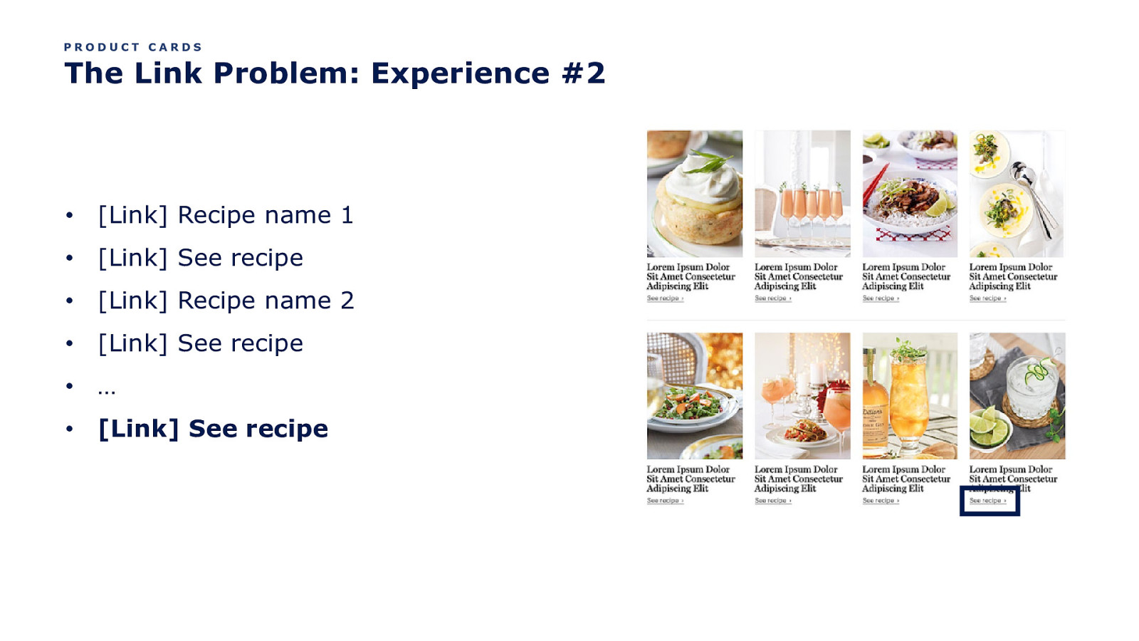
PRODUCT CARDS The Link Problem: Experience #2 • [Link] Recipe name 1 • [Link] See recipe • [Link] Recipe name 2 • [Link] See recipe • … • [Link] See recipe
Better yet, the product name is also the link.
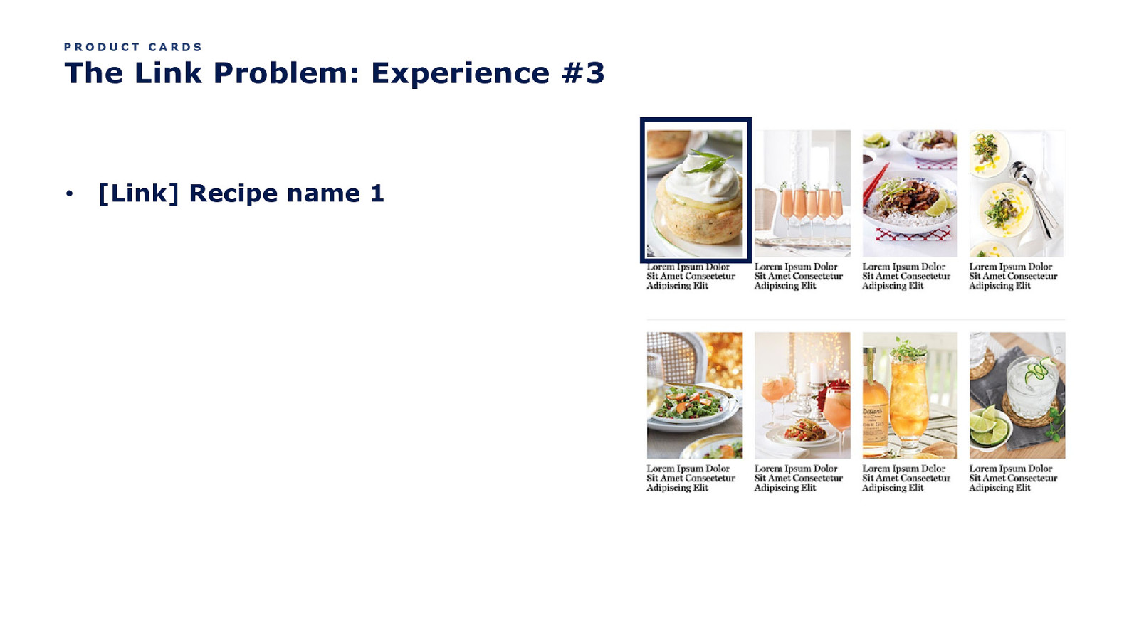
PRODUCT CARDS The Link Problem: Experience #3 • [Link] Recipe name 1
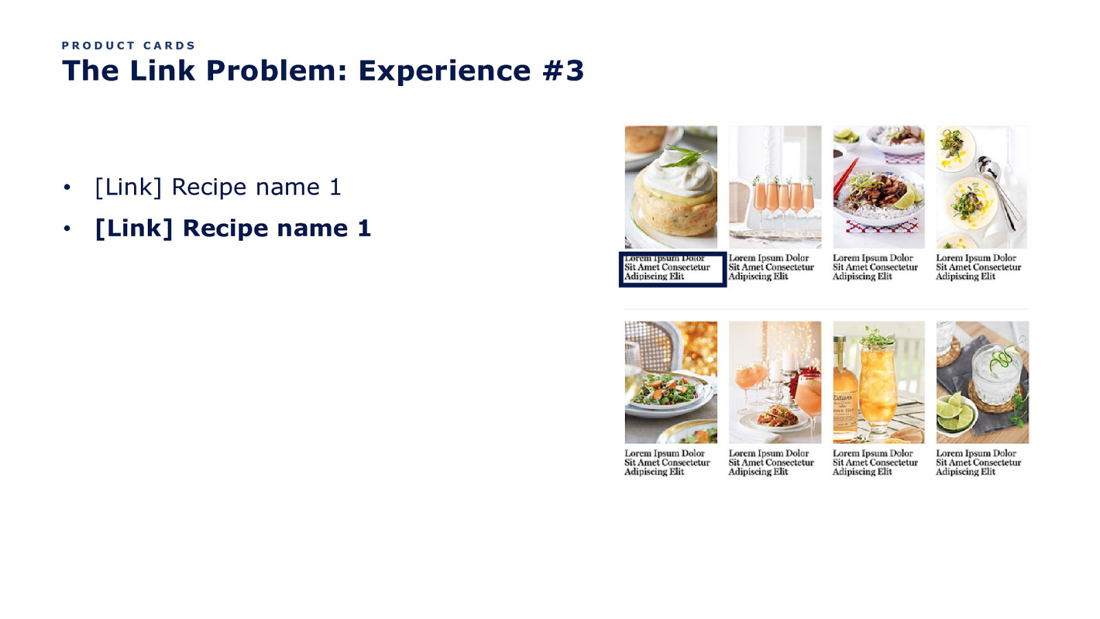
PRODUCT CARDS The Link Problem: Experience #3 • [Link] Recipe name 1 • [Link] Recipe name 1
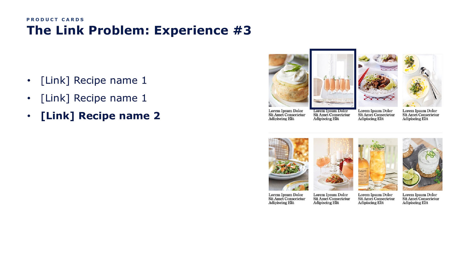
PRODUCT CARDS The Link Problem: Experience #3 • [Link] Recipe name 1 • [Link] Recipe name 1 • [Link] Recipe name 2
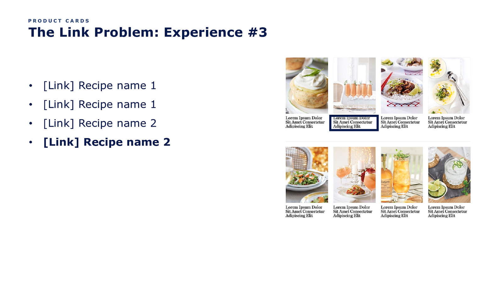
PRODUCT CARDS The Link Problem: Experience #3 • [Link] Recipe name 1 • [Link] Recipe name 1 • [Link] Recipe name 2 • [Link] Recipe name 2
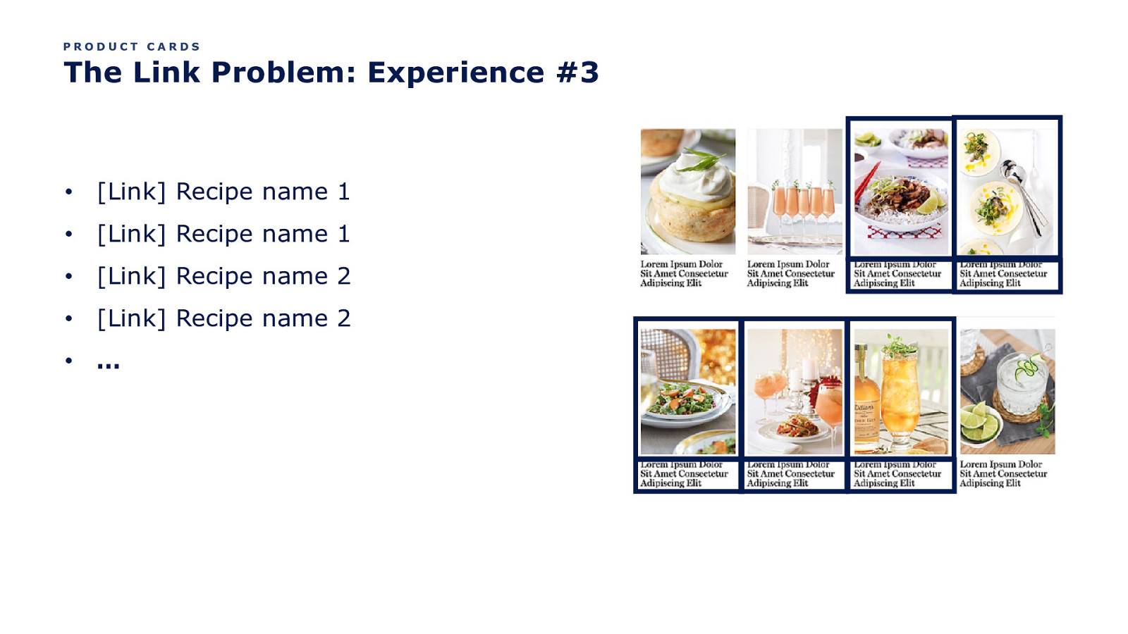
PRODUCT CARDS The Link Problem: Experience #3 • [Link] Recipe name 1 • [Link] Recipe name 1 • [Link] Recipe name 2 • [Link] Recipe name 2 • …
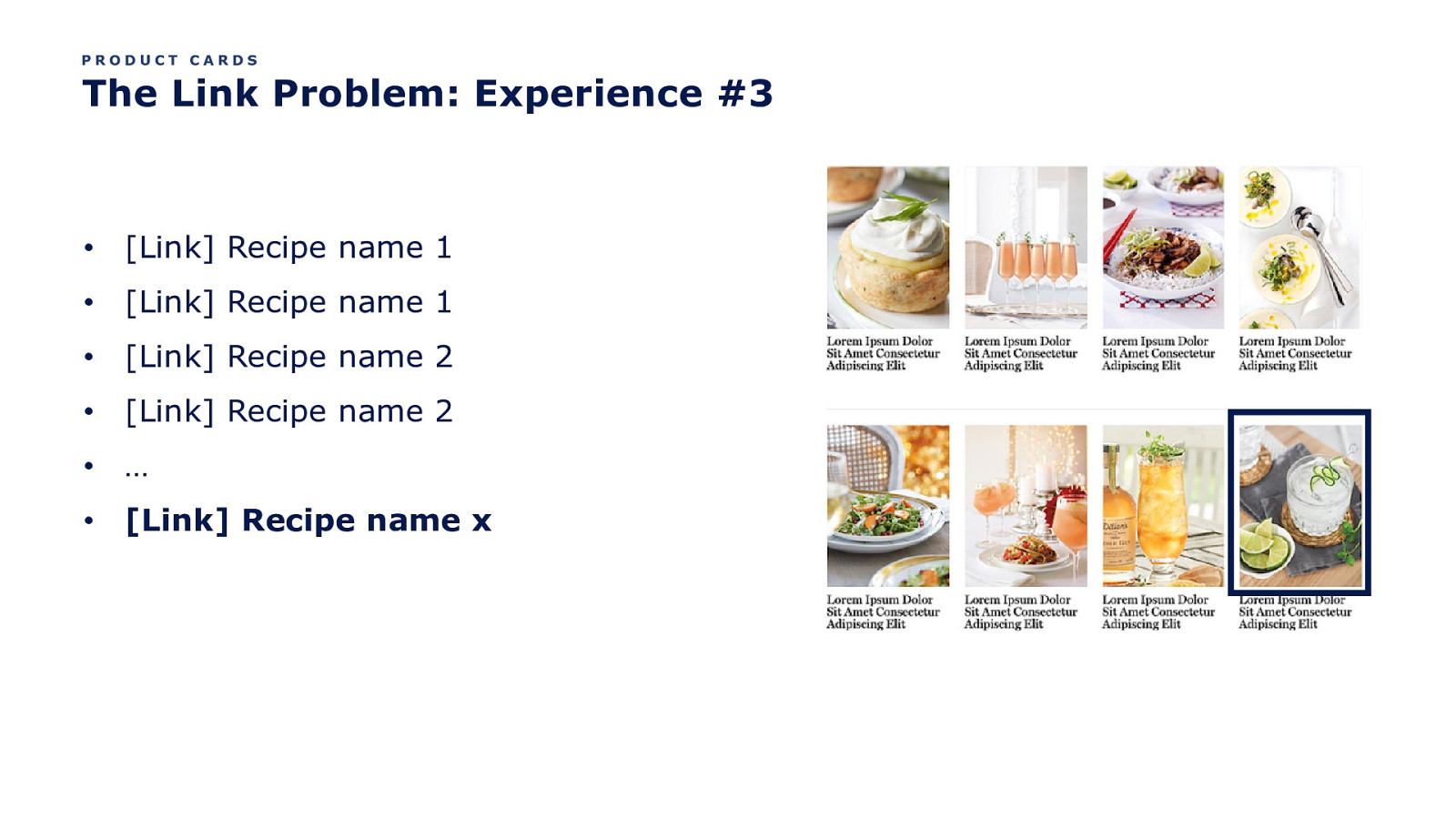
PRODUCT CARDS The Link Problem: Experience #3 • [Link] Recipe name 1 • [Link] Recipe name 1 • [Link] Recipe name 2 • [Link] Recipe name 2 • … • [Link] Recipe name x
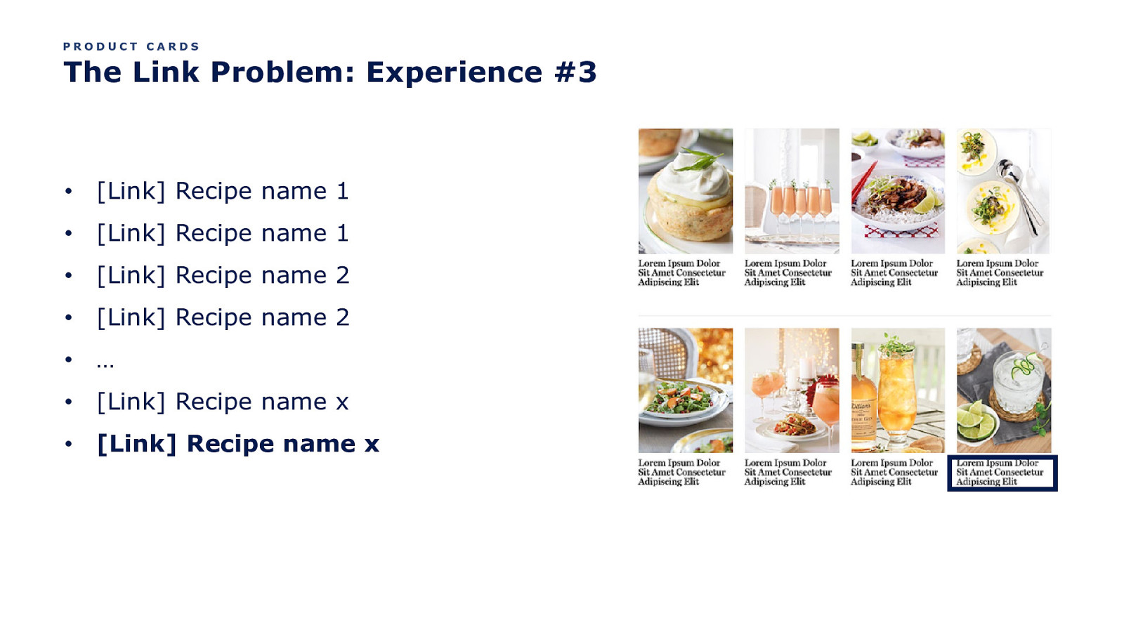
PRODUCT CARDS The Link Problem: Experience #3 • [Link] Recipe name 1 • [Link] Recipe name 1 • [Link] Recipe name 2 • [Link] Recipe name 2 • … • [Link] Recipe name x • [Link] Recipe name x

So what’s a gal to do?
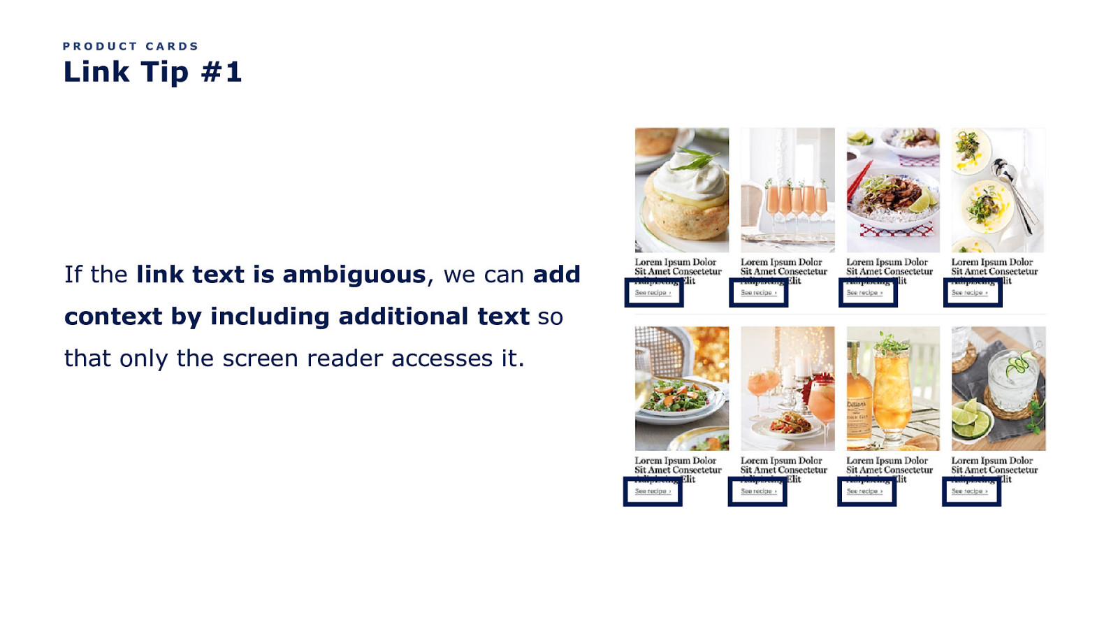
PRODUCT CARDS Link Tip #1 If the link text is ambiguous, we can add context by including additional text so that only the screen reader accesses it.
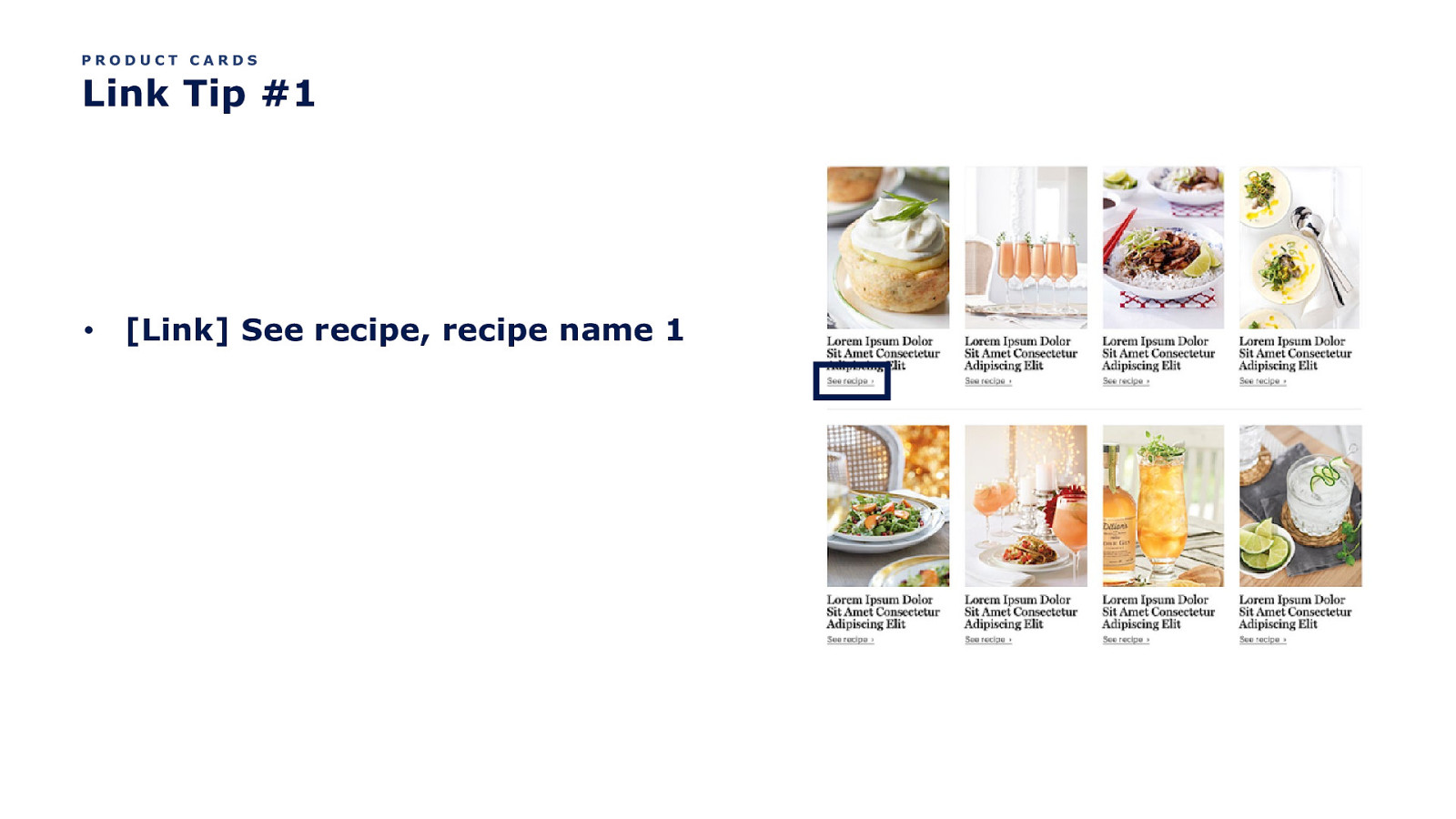
PRODUCT CARDS Link Tip #1 • [Link] See recipe, recipe name 1
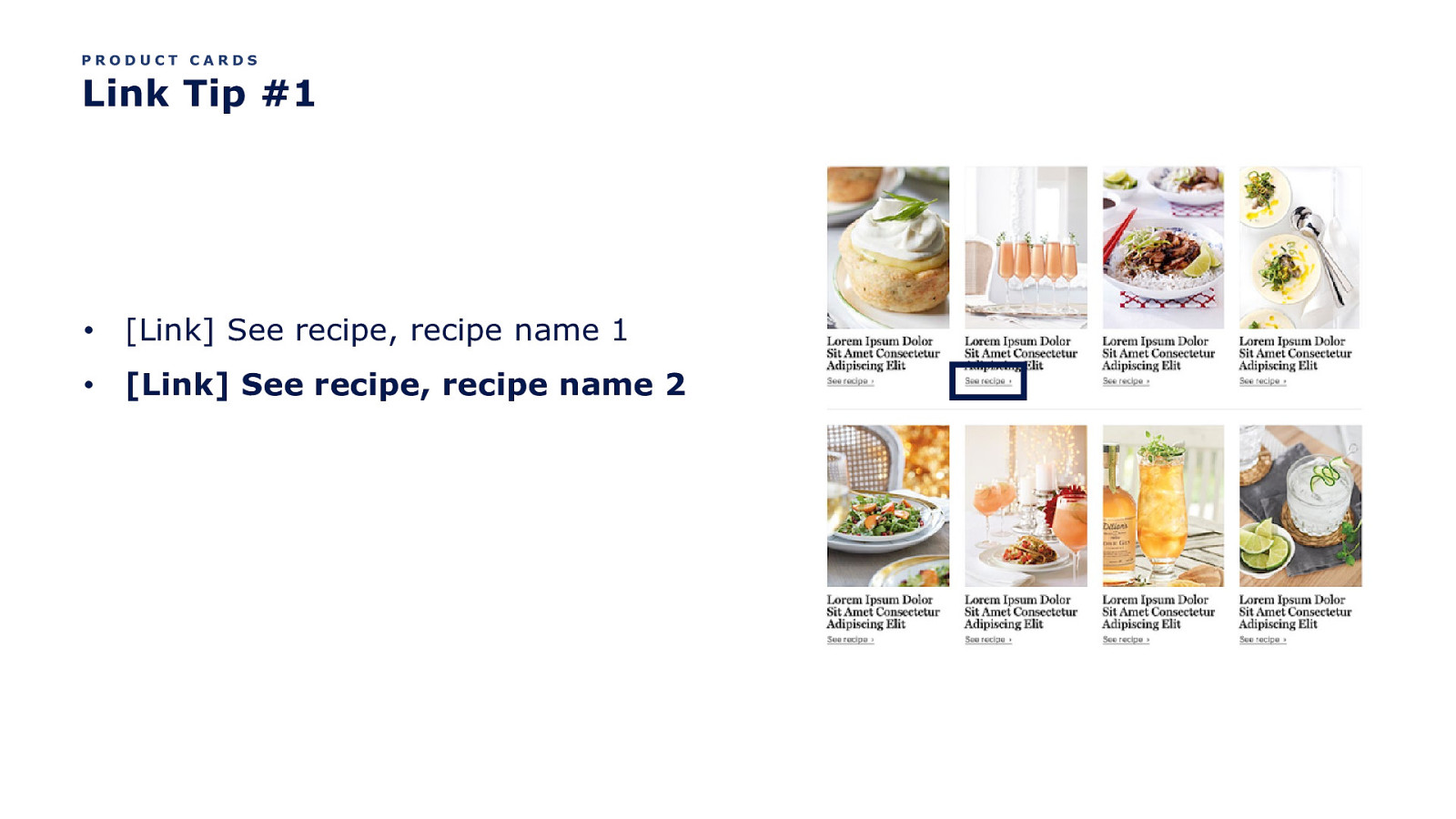
PRODUCT CARDS Link Tip #1 • [Link] See recipe, recipe name 1 • [Link] See recipe, recipe name 2
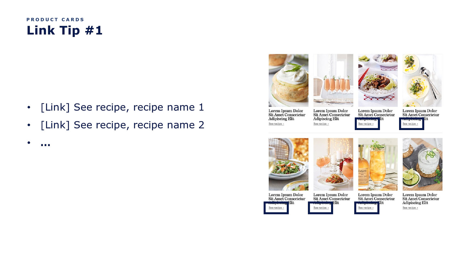
PRODUCT CARDS Link Tip #1 • [Link] See recipe, recipe name 1 • [Link] See recipe, recipe name 2 • …
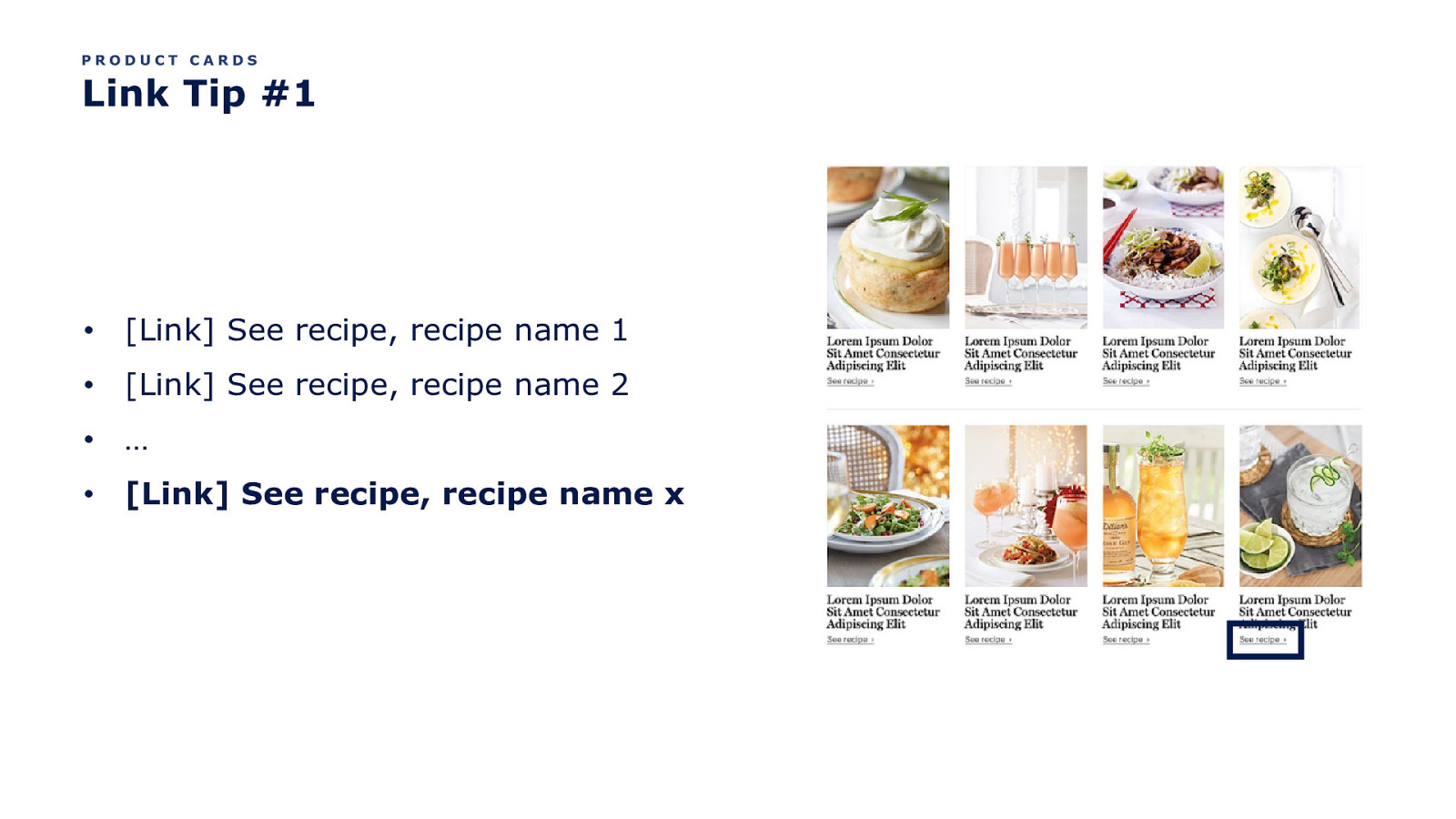
PRODUCT CARDS Link Tip #1 • [Link] See recipe, recipe name 1 • [Link] See recipe, recipe name 2 • … • [Link] See recipe, recipe name x
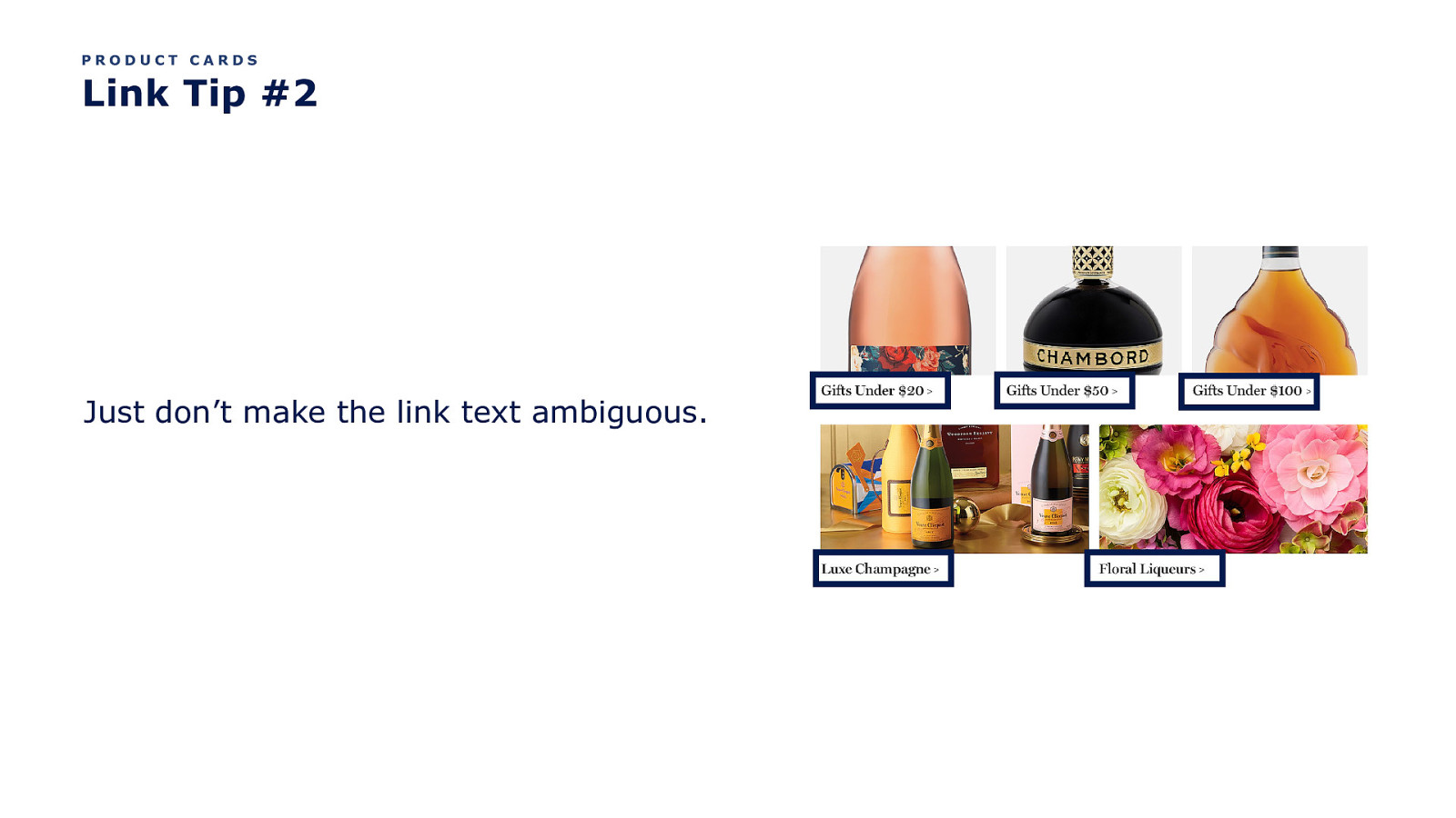
PRODUCT CARDS Link Tip #2 Just don’t make the link text ambiguous.
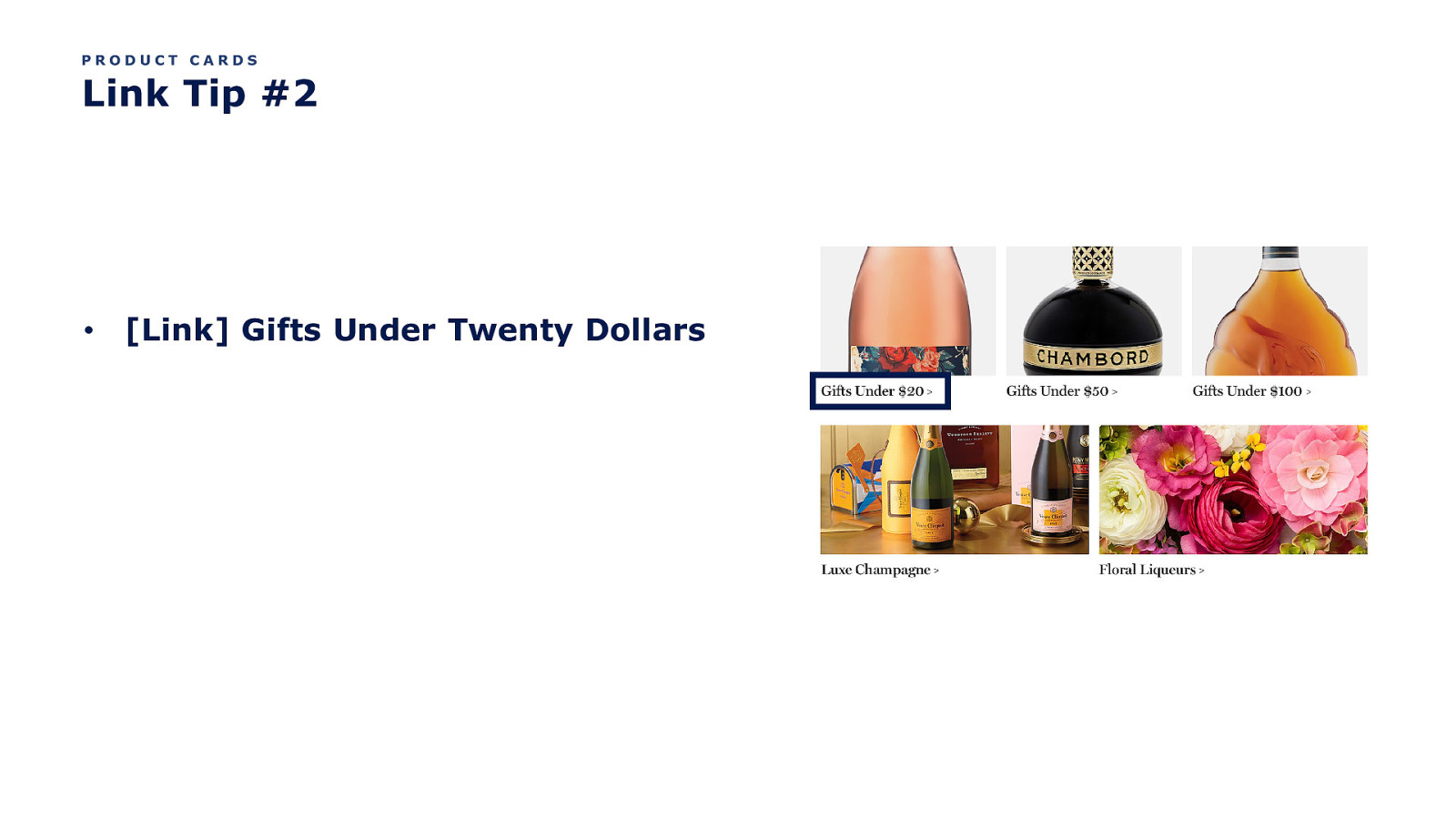
PRODUCT CARDS Link Tip #2 • [Link] Gifts Under Twenty Dollars
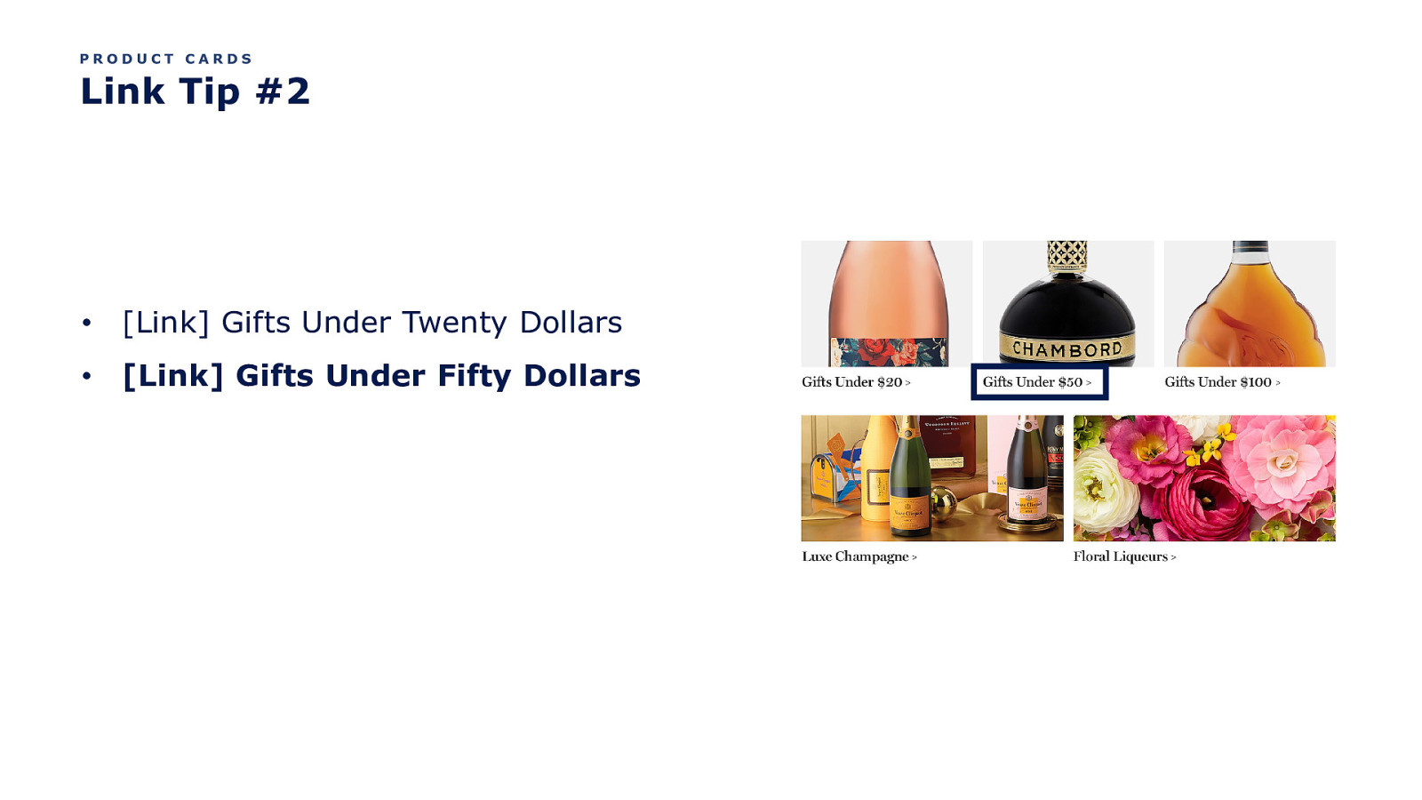
PRODUCT CARDS Link Tip #2 • [Link] Gifts Under Twenty Dollars • [Link] Gifts Under Fifty Dollars
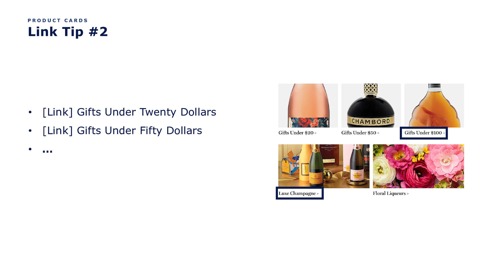
PRODUCT CARDS Link Tip #2 • [Link] Gifts Under Twenty Dollars • [Link] Gifts Under Fifty Dollars • …
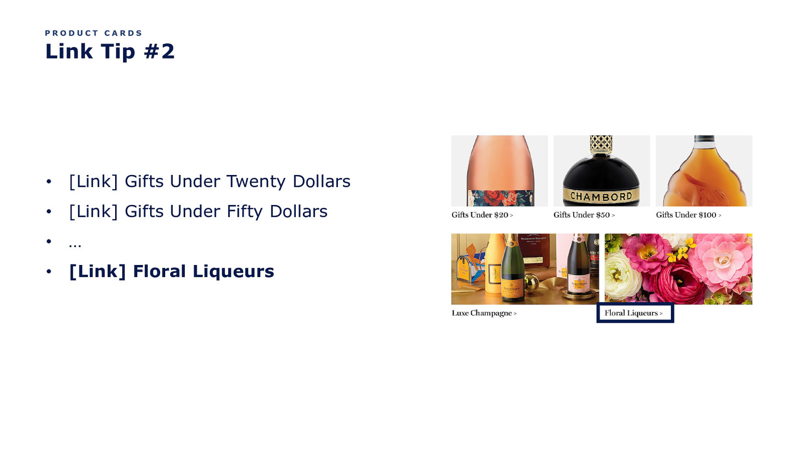
PRODUCT CARDS Link Tip #2 • [Link] Gifts Under Twenty Dollars • [Link] Gifts Under Fifty Dollars • … • [Link] Floral Liqueurs
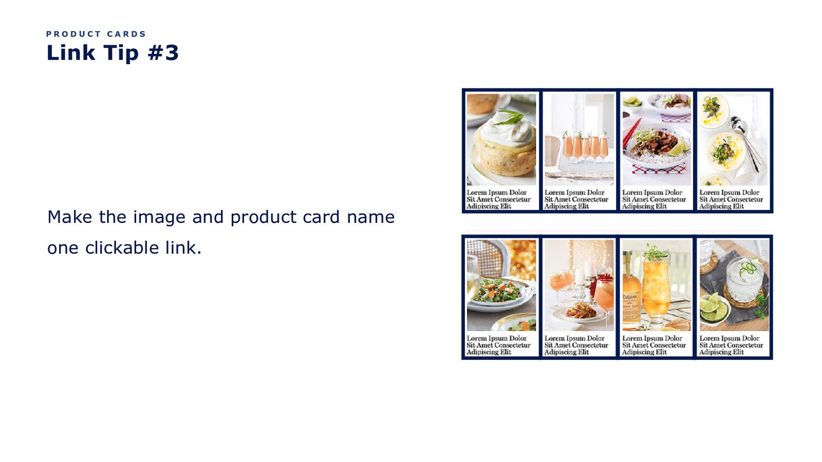
PRODUCT CARDS Link Tip #3 Make the image and product card name one clickable link.
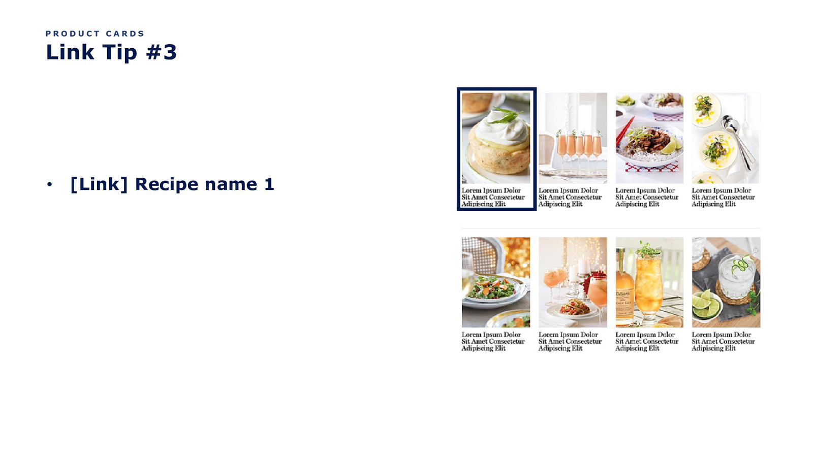
PRODUCT CARDS Link Tip #3 • [Link] Recipe name 1
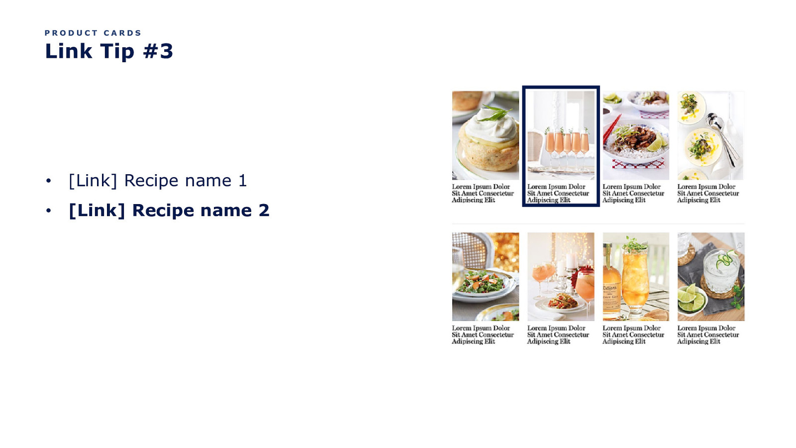
PRODUCT CARDS Link Tip #3 • [Link] Recipe name 1 • [Link] Recipe name 2
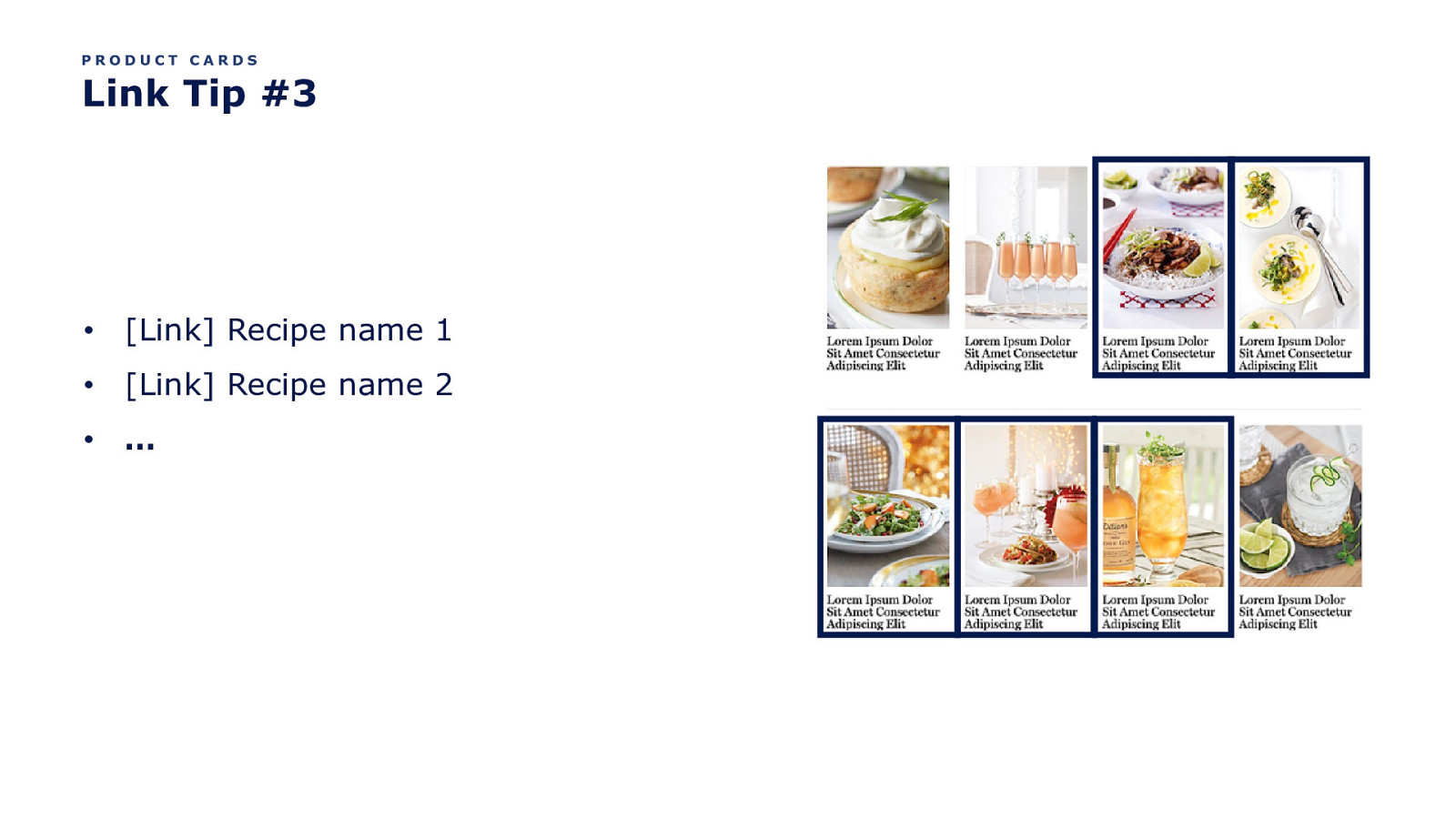
PRODUCT CARDS Link Tip #3 • [Link] Recipe name 1 • [Link] Recipe name 2 • …
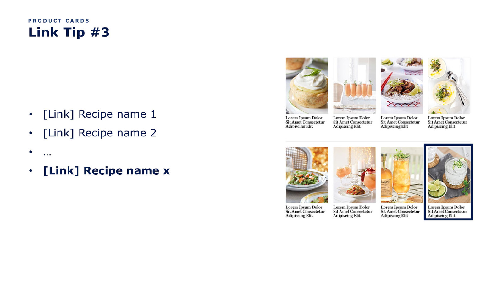
PRODUCT CARDS Link Tip #3 • [Link] Recipe name 1 • [Link] Recipe name 2 • … • [Link] Recipe name x
OK kool. Back to Product Cards.
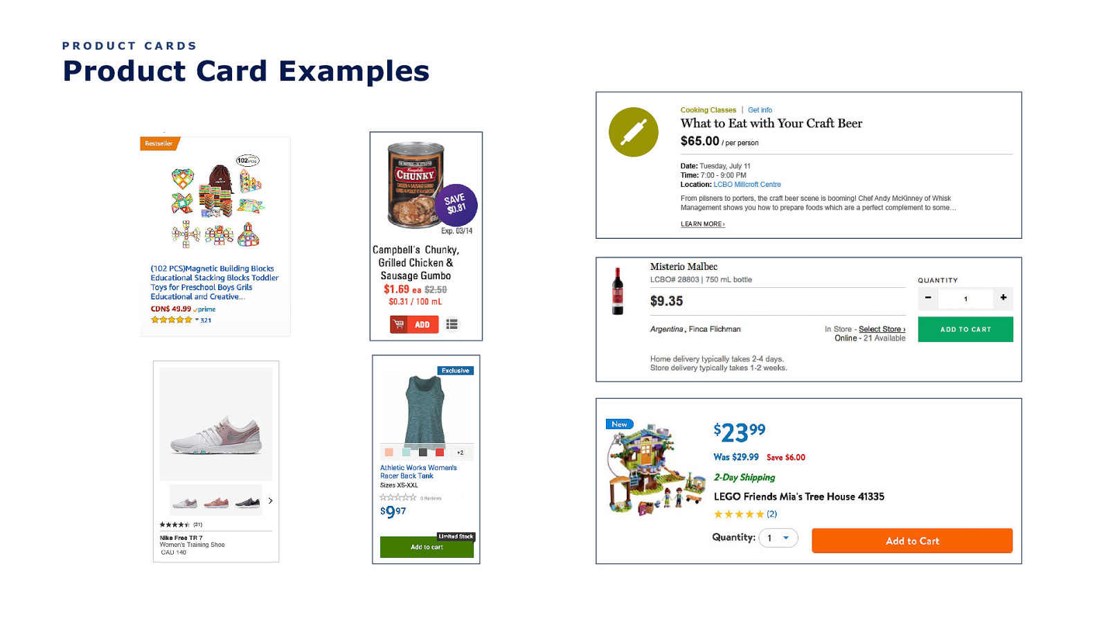
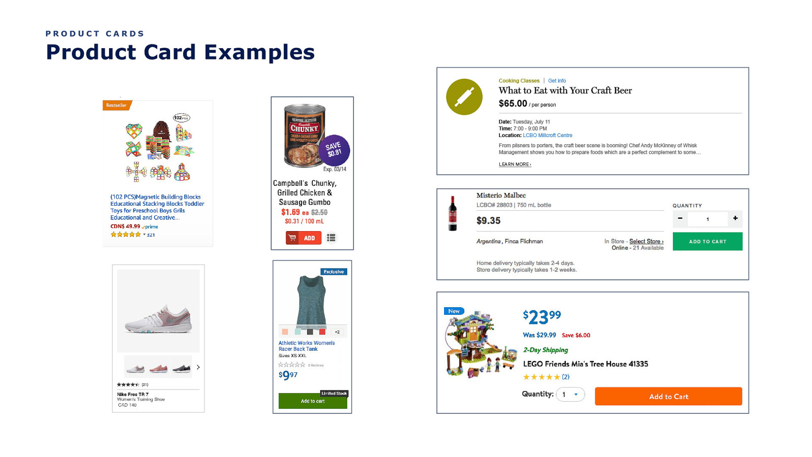
PRODUCT CARDS Product Card Examples
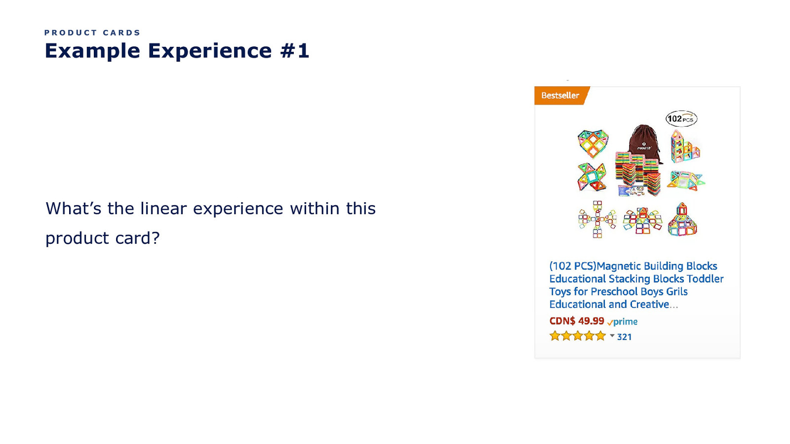
PRODUCT CARDS Example Experience #1 What’s the linear experience within this product card?
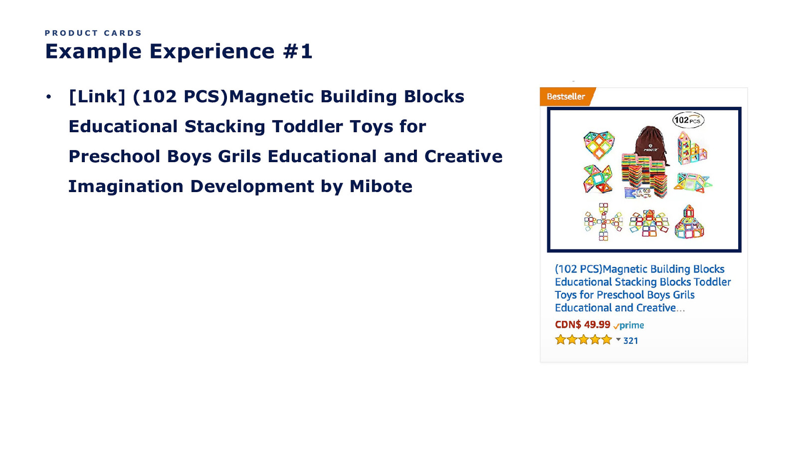
PRODUCT CARDS Example Experience #1 • [Link] (102 PCS)Magnetic Building Blocks Educational Stacking Toddler Toys for Preschool Boys Grils Educational and Creative Imagination Development by Mibote
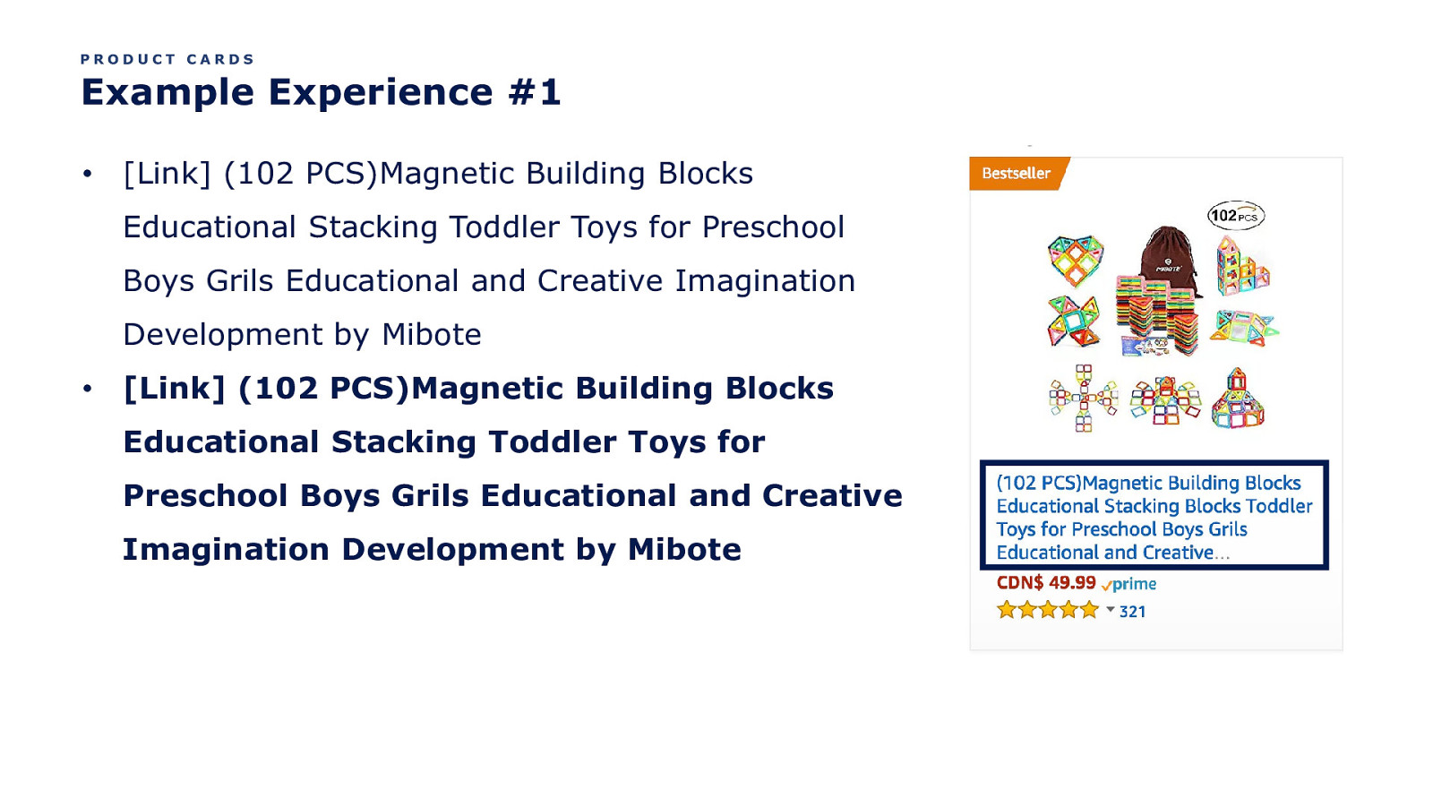
PRODUCT CARDS Example Experience #1 • [Link] (102 PCS)Magnetic Building Blocks Educational Stacking Toddler Toys for Preschool Boys Grils Educational and Creative Imagination Development by Mibote • [Link] (102 PCS)Magnetic Building Blocks Educational Stacking Toddler Toys for Preschool Boys Grils Educational and Creative Imagination Development by Mibote
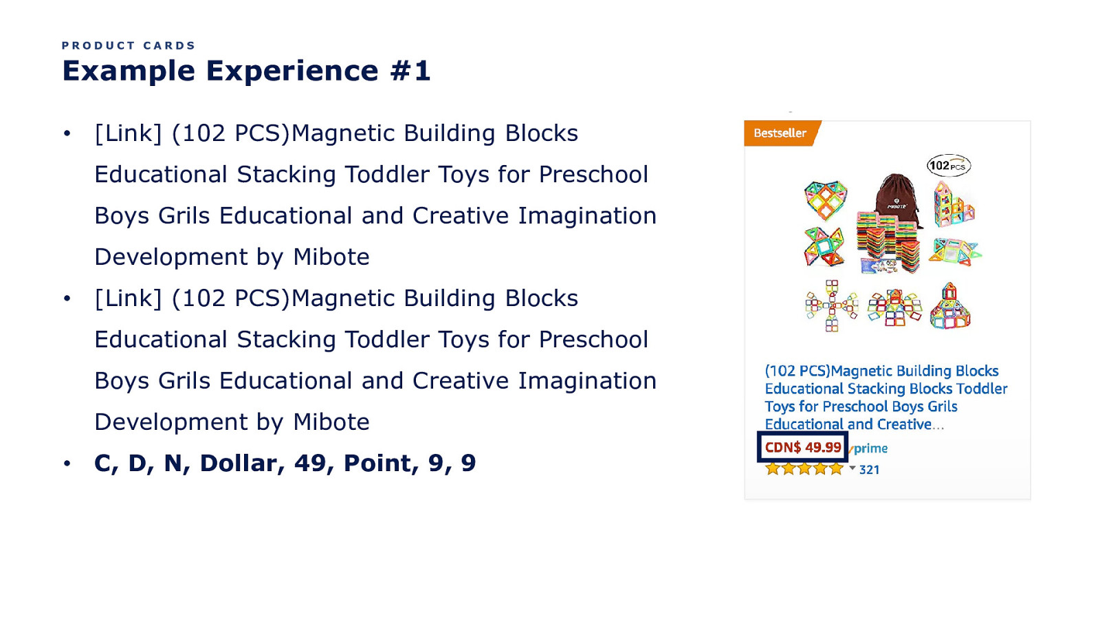
PRODUCT CARDS Example Experience #1 • [Link] (102 PCS)Magnetic Building Blocks Educational Stacking Toddler Toys for Preschool Boys Grils Educational and Creative Imagination Development by Mibote • [Link] (102 PCS)Magnetic Building Blocks Educational Stacking Toddler Toys for Preschool Boys Grils Educational and Creative Imagination Development by Mibote • C, D, N, Dollar, 49, Point, 9, 9
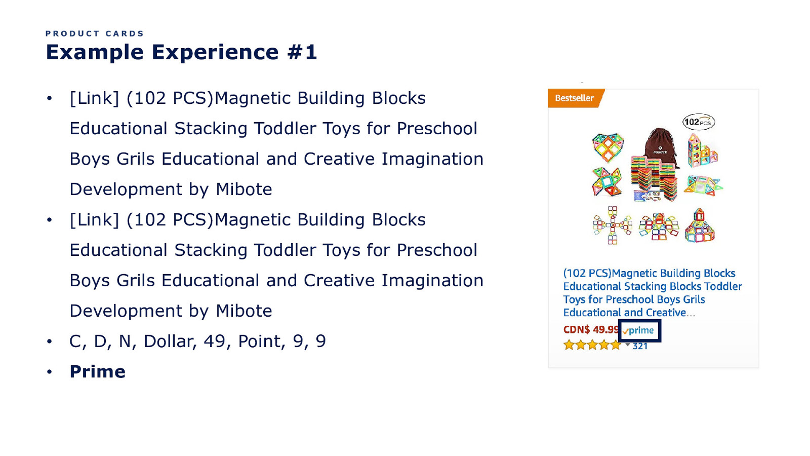
PRODUCT CARDS Example Experience #1 • [Link] (102 PCS)Magnetic Building Blocks Educational Stacking Toddler Toys for Preschool Boys Grils Educational and Creative Imagination Development by Mibote • [Link] (102 PCS)Magnetic Building Blocks Educational Stacking Toddler Toys for Preschool Boys Grils Educational and Creative Imagination Development by Mibote • C, D, N, Dollar, 49, Point, 9, 9 • Prime
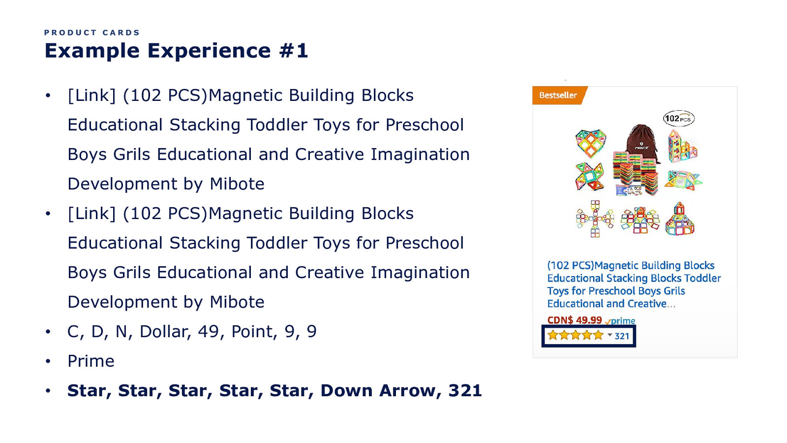
PRODUCT CARDS Example Experience #1 • [Link] (102 PCS)Magnetic Building Blocks Educational Stacking Toddler Toys for Preschool Boys Grils Educational and Creative Imagination Development by Mibote • [Link] (102 PCS)Magnetic Building Blocks Educational Stacking Toddler Toys for Preschool Boys Grils Educational and Creative Imagination Development by Mibote • C, D, N, Dollar, 49, Point, 9, 9 • Prime • Star, Star, Star, Star, Star, Down Arrow, 321
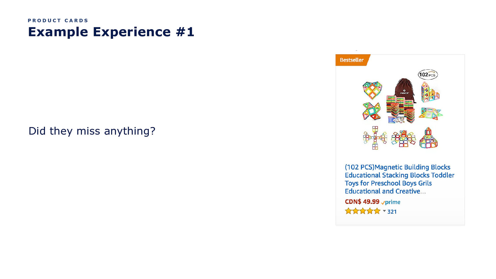
PRODUCT CARDS Example Experience #1 Did they miss anything?
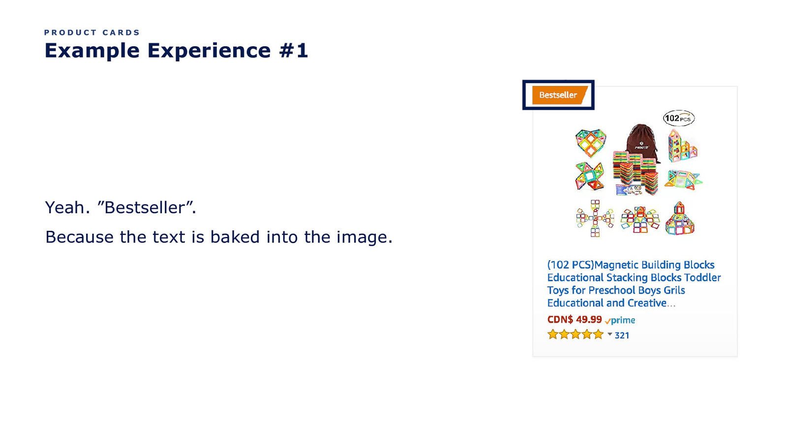
PRODUCT CARDS Example Experience #1 Yeah. ”Bestseller”. Because the text is baked into the image.
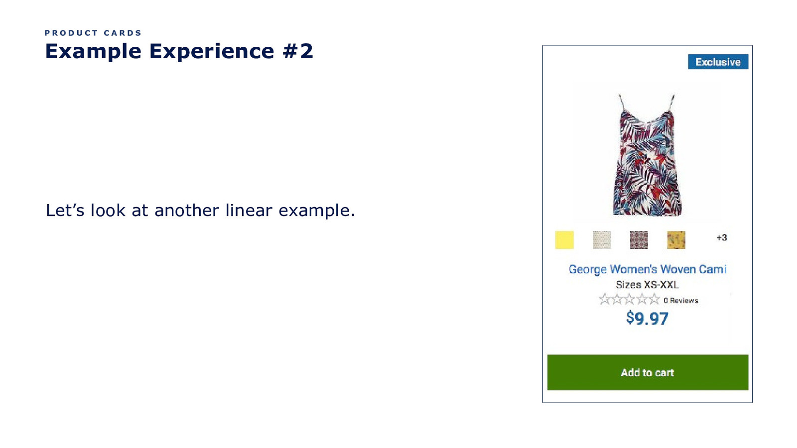
PRODUCT CARDS Example Experience #2 Let’s look at another linear example.
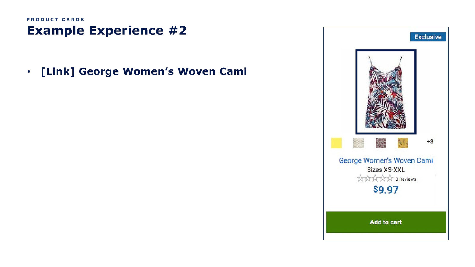
PRODUCT CARDS Example Experience #2 • [Link] George Women’s Woven Cami
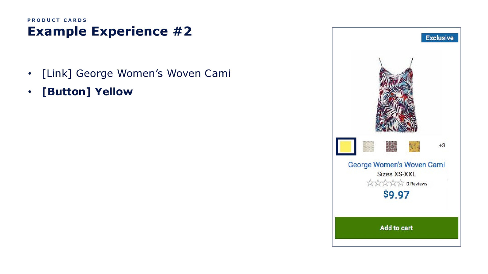
PRODUCT CARDS Example Experience #2 • [Link] George Women’s Woven Cami • [Button] Yellow
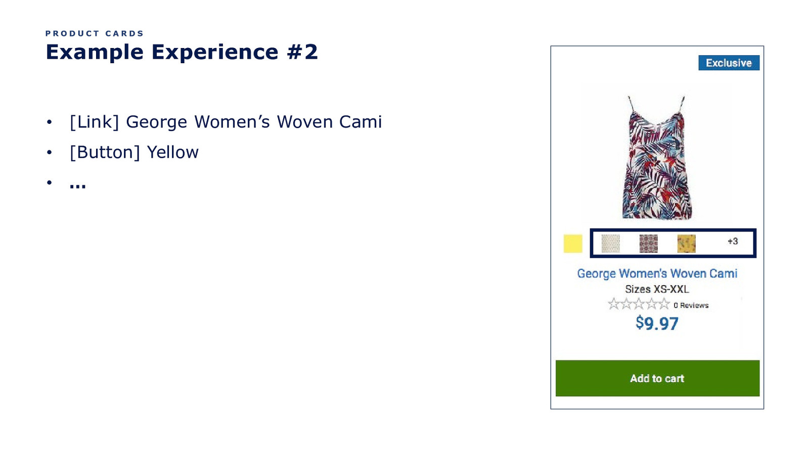
PRODUCT CARDS Example Experience #2 • [Link] George Women’s Woven Cami • [Button] Yellow • …
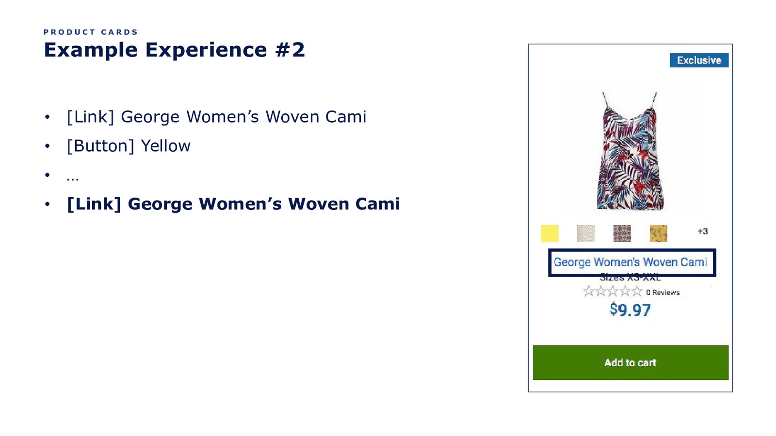
PRODUCT CARDS Example Experience #2 • [Link] George Women’s Woven Cami • [Button] Yellow • … • [Link] George Women’s Woven Cami
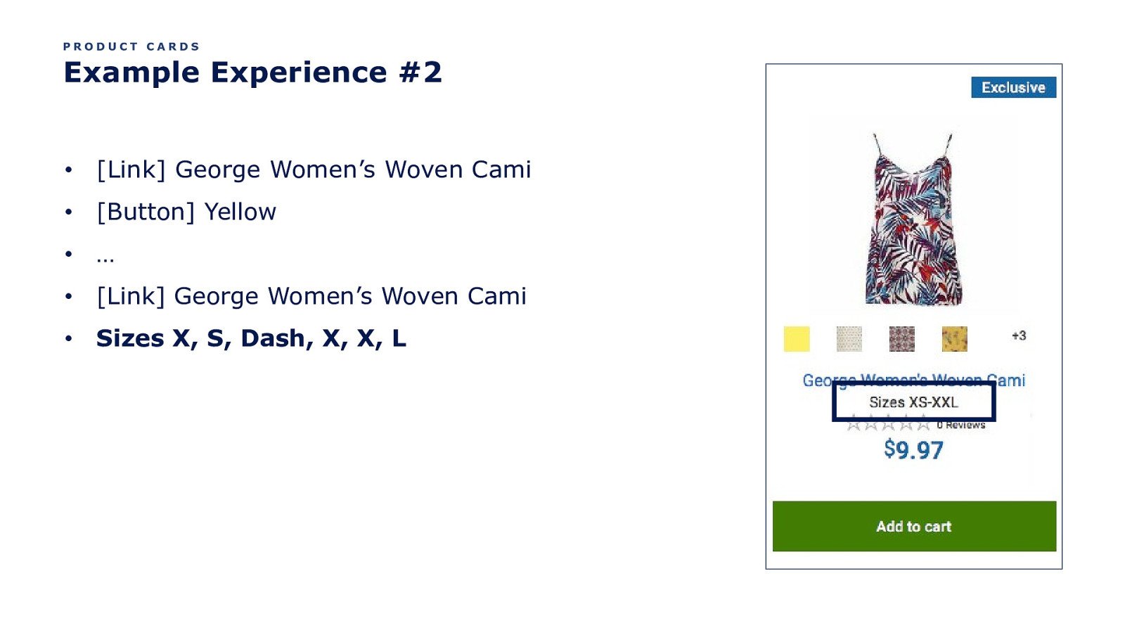
PRODUCT CARDS Example Experience #2 • [Link] George Women’s Woven Cami • [Button] Yellow • … • [Link] George Women’s Woven Cami • Sizes X, S, Dash, X, X, L
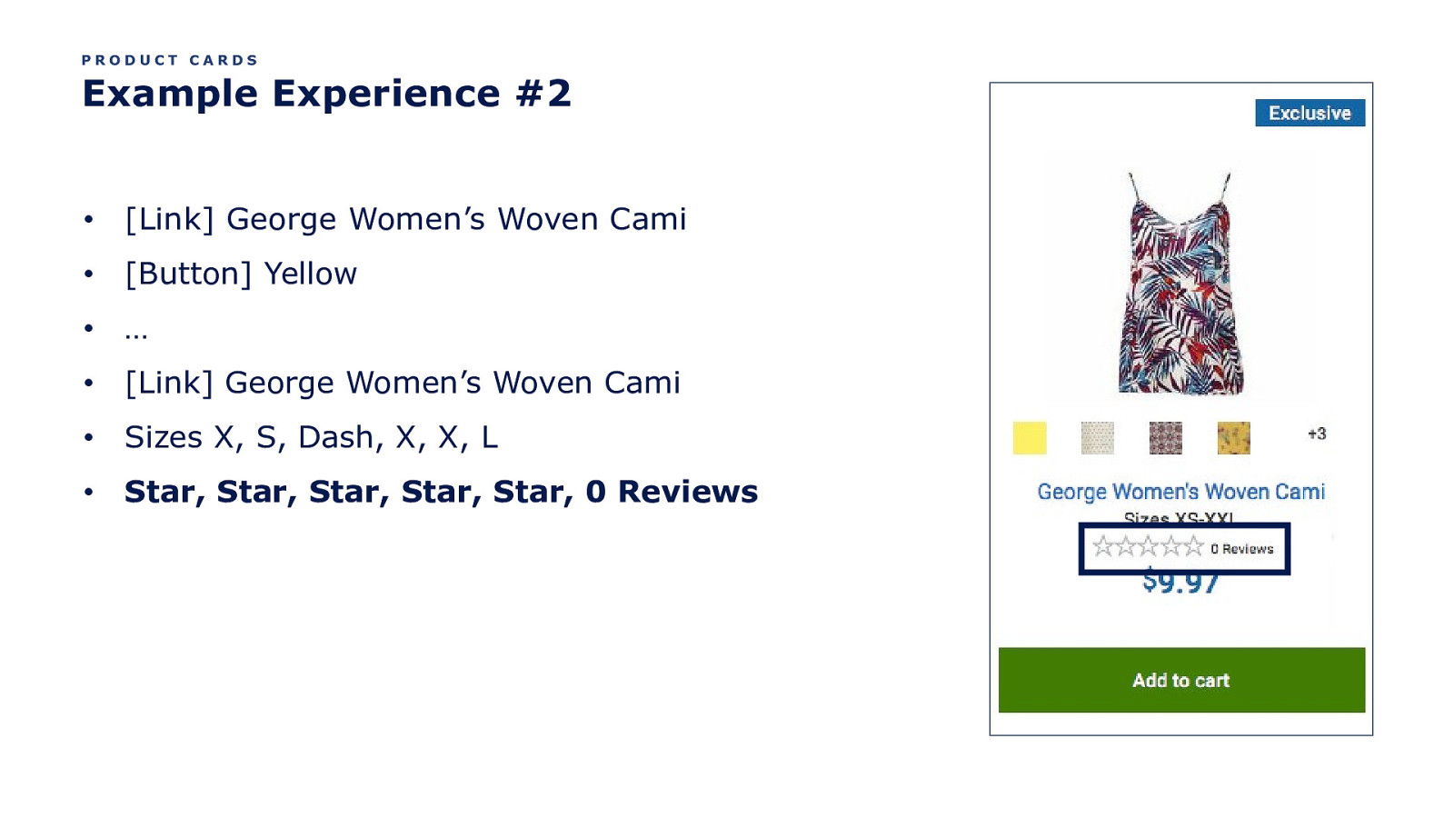
PRODUCT CARDS Example Experience #2 • [Link] George Women’s Woven Cami • [Button] Yellow • … • [Link] George Women’s Woven Cami • Sizes X, S, Dash, X, X, L • Star, Star, Star, Star, Star, 0 Reviews
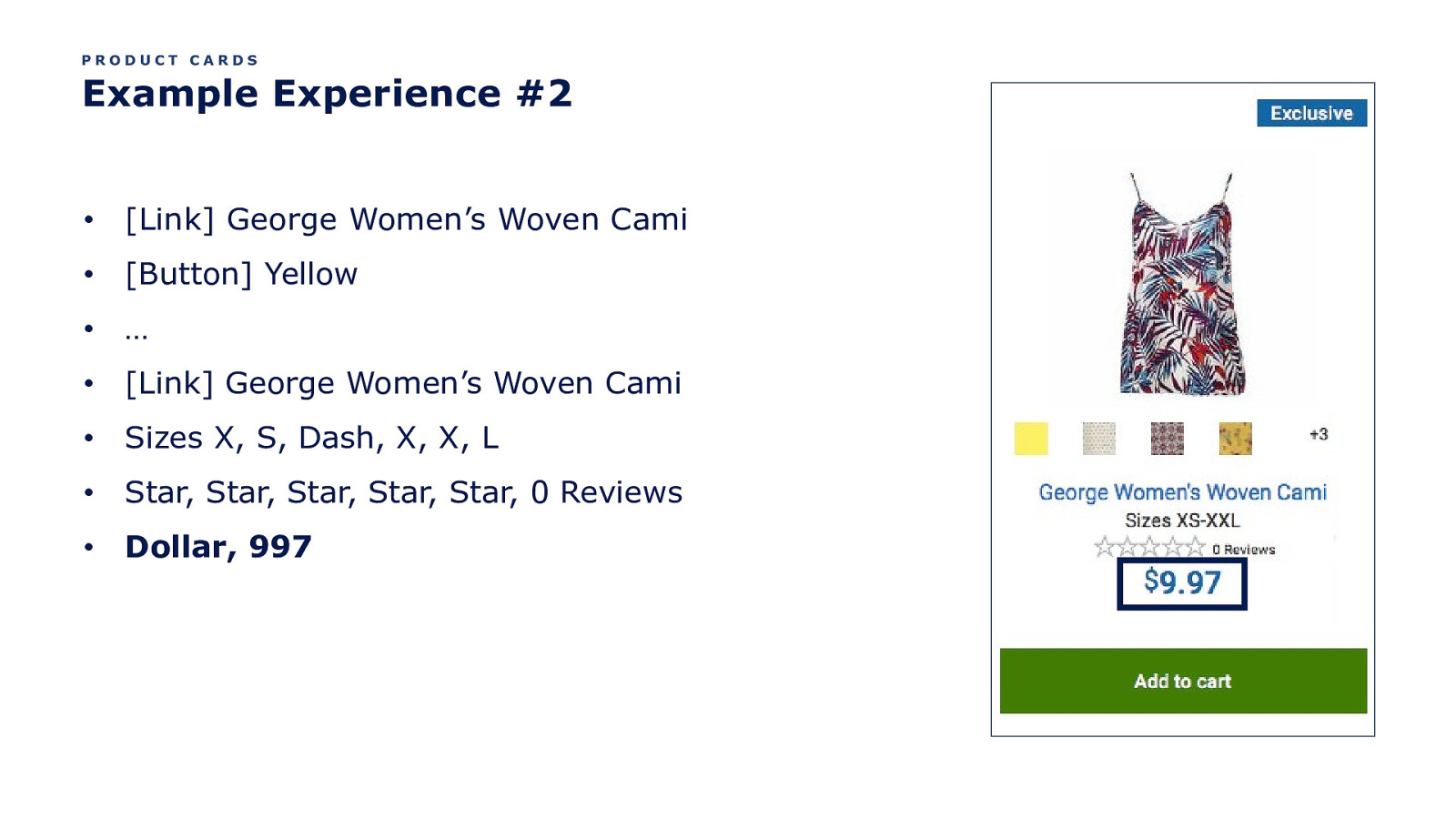
PRODUCT CARDS Example Experience #2 • [Link] George Women’s Woven Cami • [Button] Yellow • … • [Link] George Women’s Woven Cami • Sizes X, S, Dash, X, X, L • Star, Star, Star, Star, Star, 0 Reviews • Dollar, 997
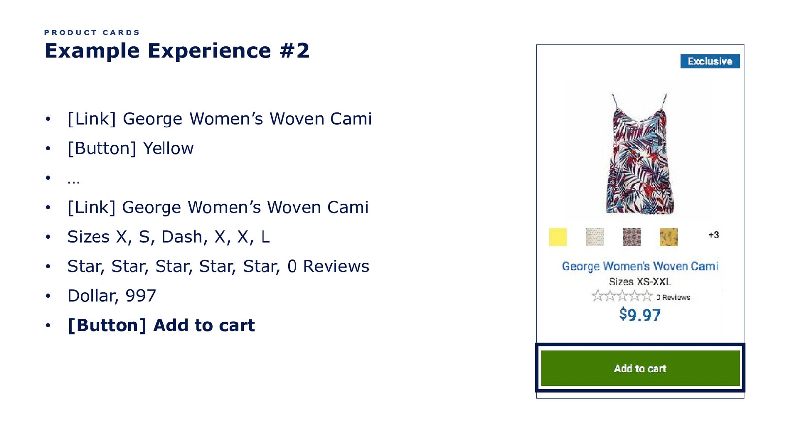
PRODUCT CARDS Example Experience #2 • [Link] George Women’s Woven Cami • [Button] Yellow • … • [Link] George Women’s Woven Cami • Sizes X, S, Dash, X, X, L • Star, Star, Star, Star, Star, 0 Reviews • Dollar, 997 • [Button] Add to cart
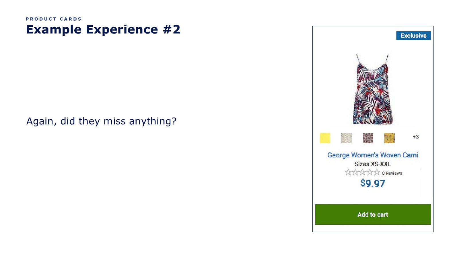
PRODUCT CARDS Example Experience #2 Again, did they miss anything?
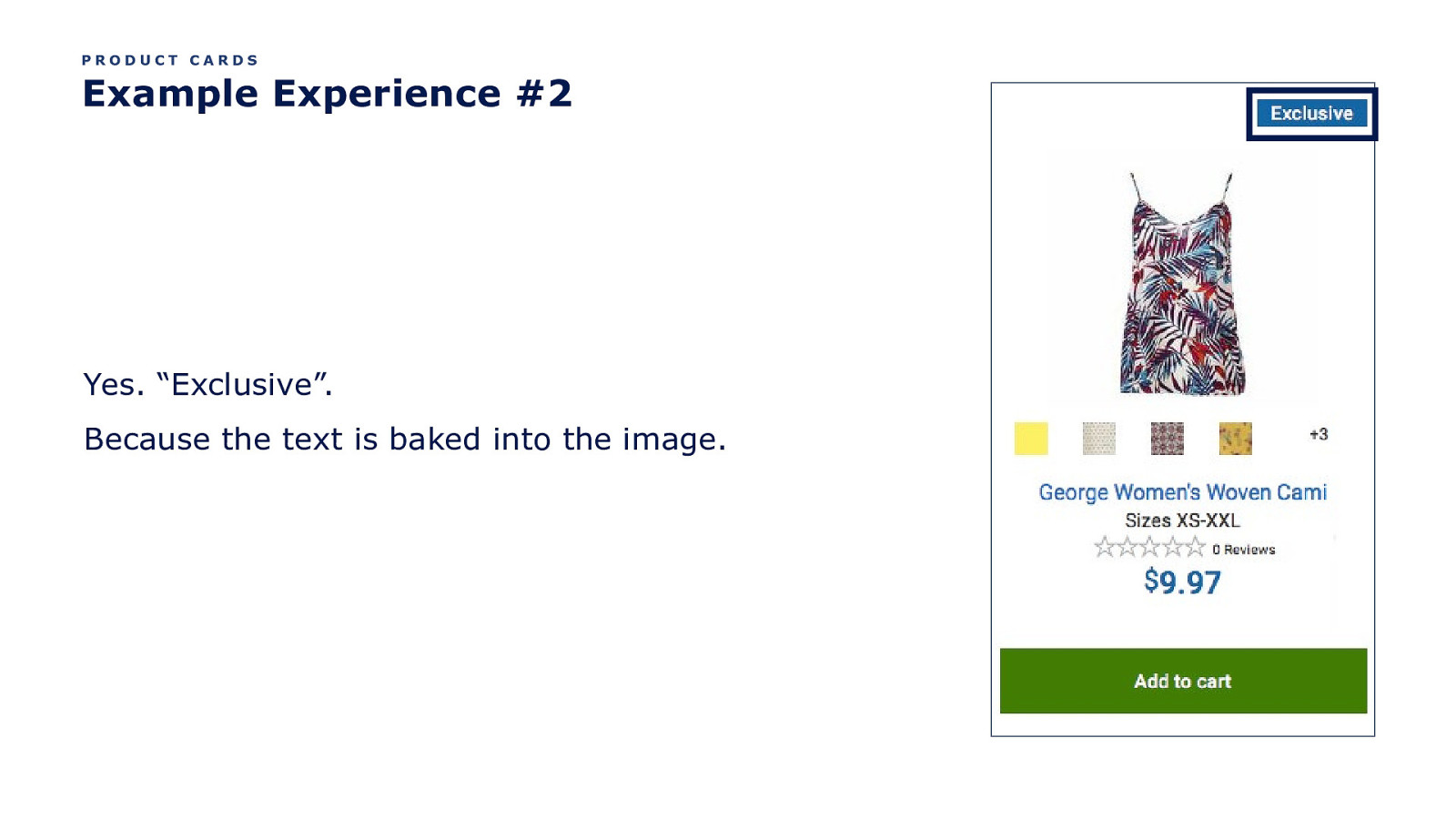
PRODUCT CARDS Example Experience #2 Yes. “Exclusive”. Because the text is baked into the image.
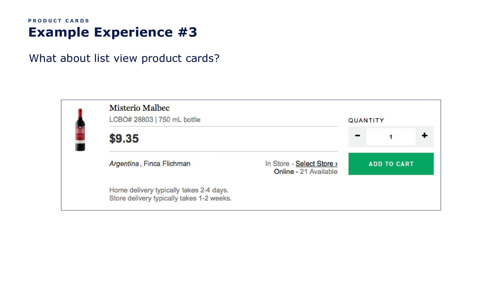
PRODUCT CARDS Example Experience #3 What about list view product cards?
OK. So they pretty much suck. How do we make them better?
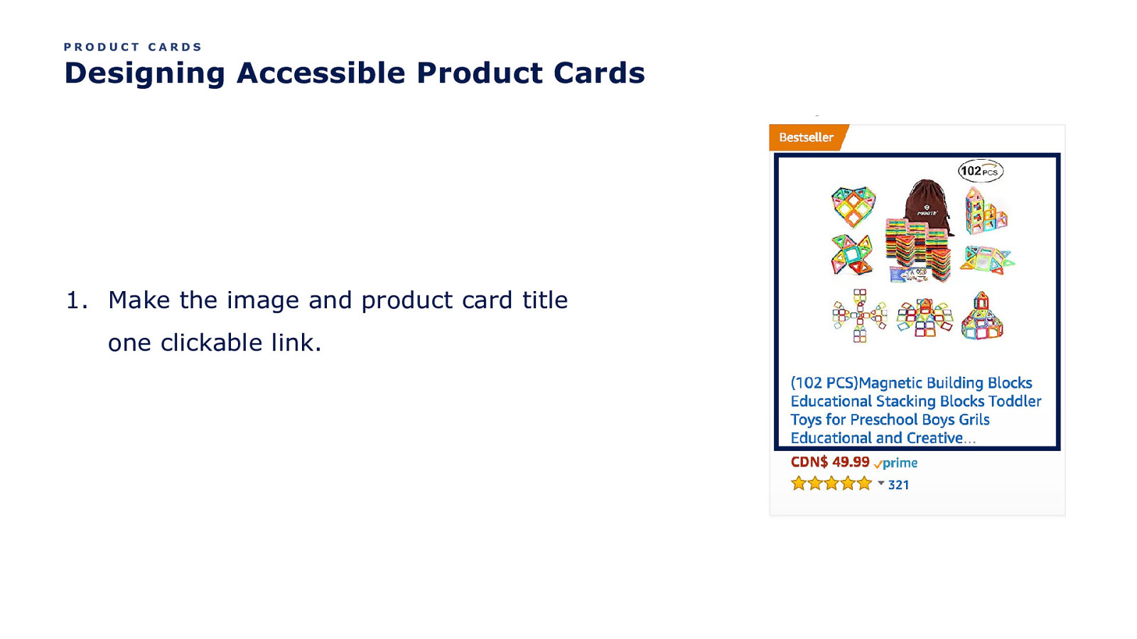
PRODUCT CARDS Designing Accessible Product Cards
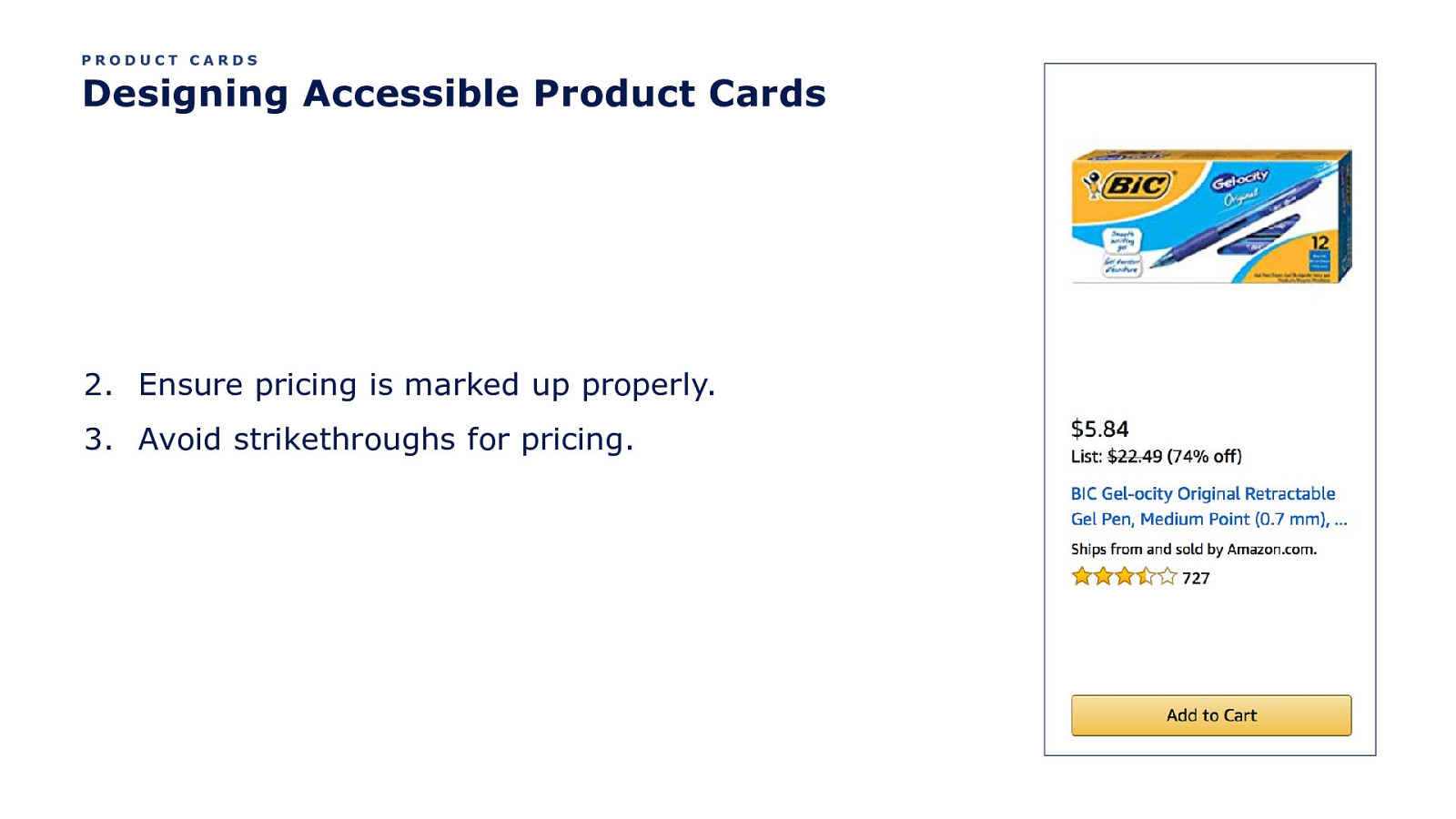
PRODUCT CARDS Designing Accessible Product Cards 2. Ensure pricing is marked up properly. 3. Avoid strikethroughs for pricing.
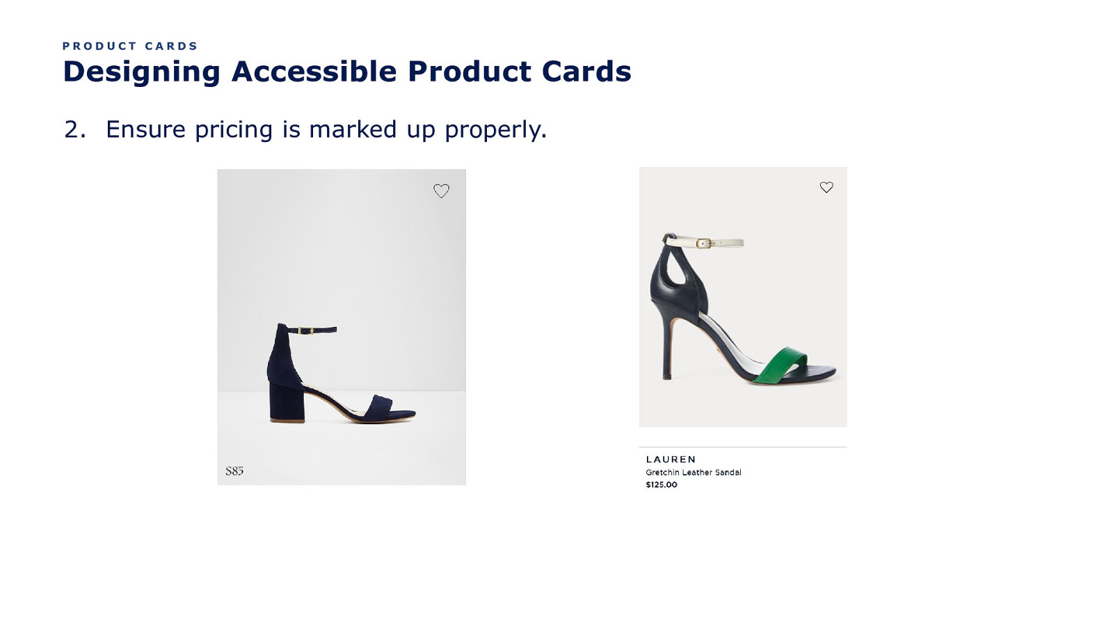
PRODUCT CARDS Designing Accessible Product Cards 2. Ensure pricing is marked up properly.
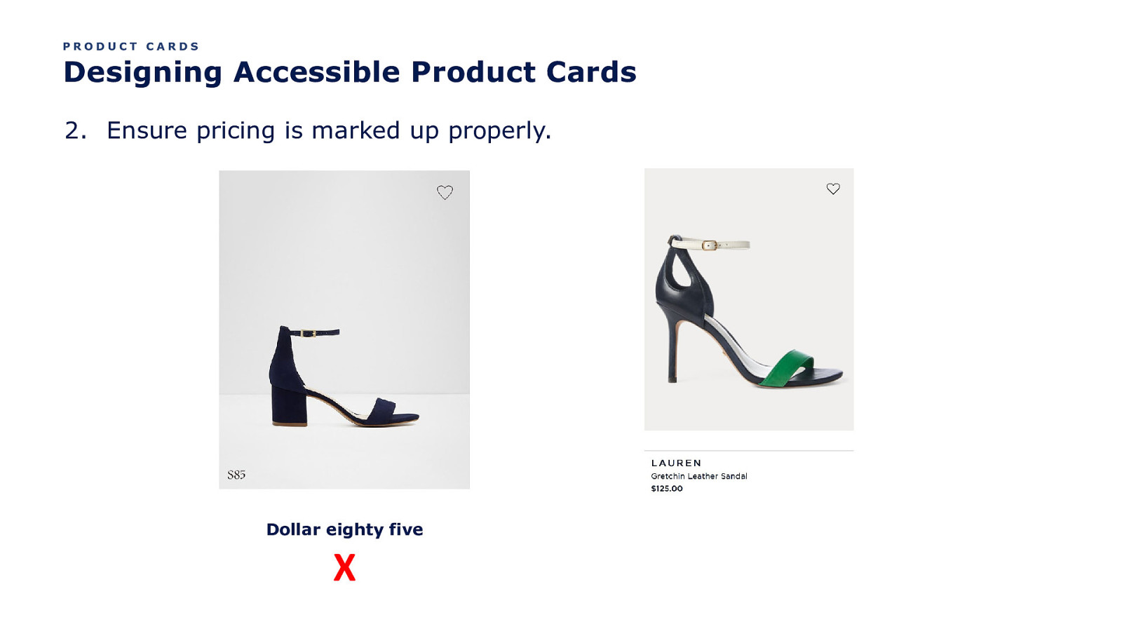
PRODUCT CARDS Designing Accessible Product Cards 2. Ensure pricing is marked up properly. Dollar eighty five X
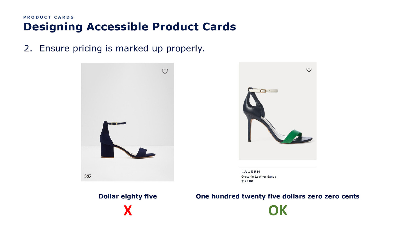
PRODUCT CARDS Designing Accessible Product Cards 2. Ensure pricing is marked up properly. Dollar eighty five X One hundred twenty five dollars zero zero cents OK
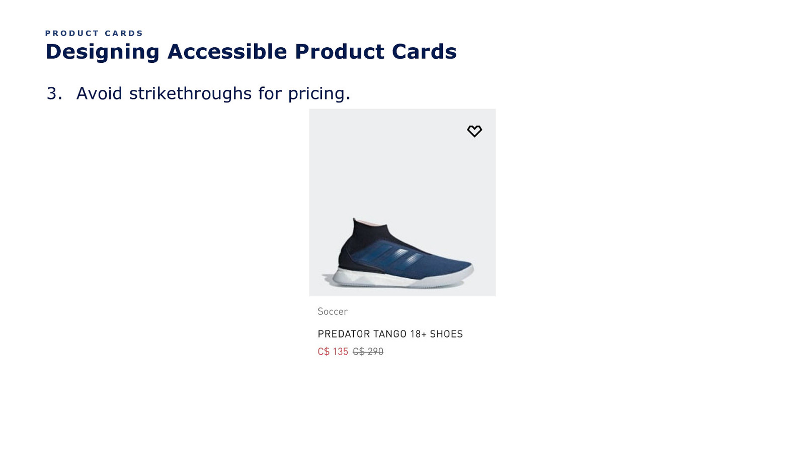
PRODUCT CARDS Designing Accessible Product Cards 3. Avoid strikethroughs for pricing.
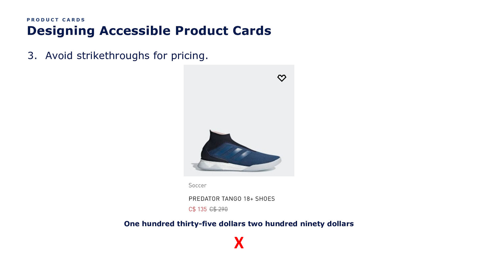
PRODUCT CARDS Designing Accessible Product Cards 3. Avoid strikethroughs for pricing. One hundred thirty-five dollars two hundred ninety dollars X
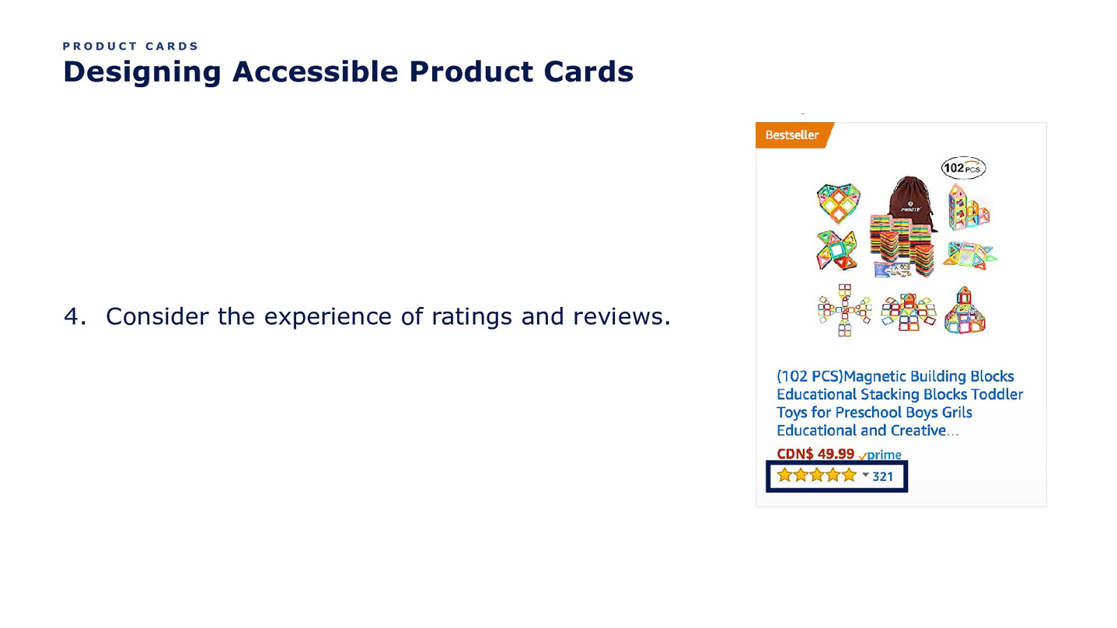
PRODUCT CARDS Designing Accessible Product Cards 4. Consider the experience of ratings and reviews.

PRODUCT CARDS Designing Accessible Product Cards 4. Consider the experience of ratings and reviews. What should this experience be?
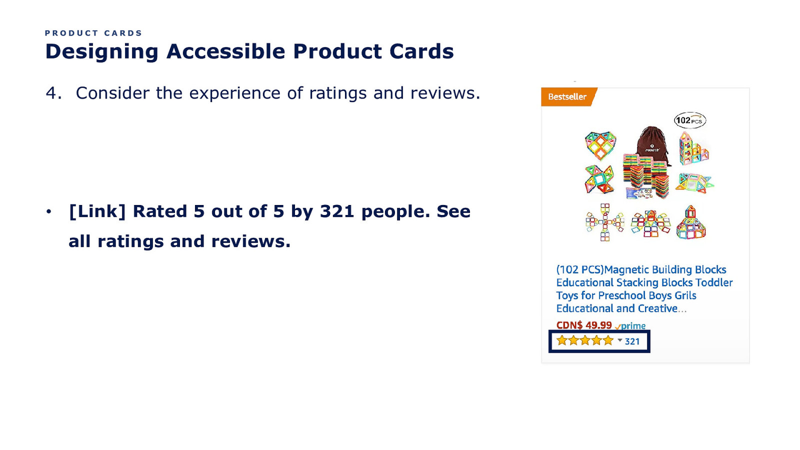
PRODUCT CARDS Designing Accessible Product Cards 4. Consider the experience of ratings and reviews. • [Link] Rated 5 out of 5 by 321 people. See all ratings and reviews.
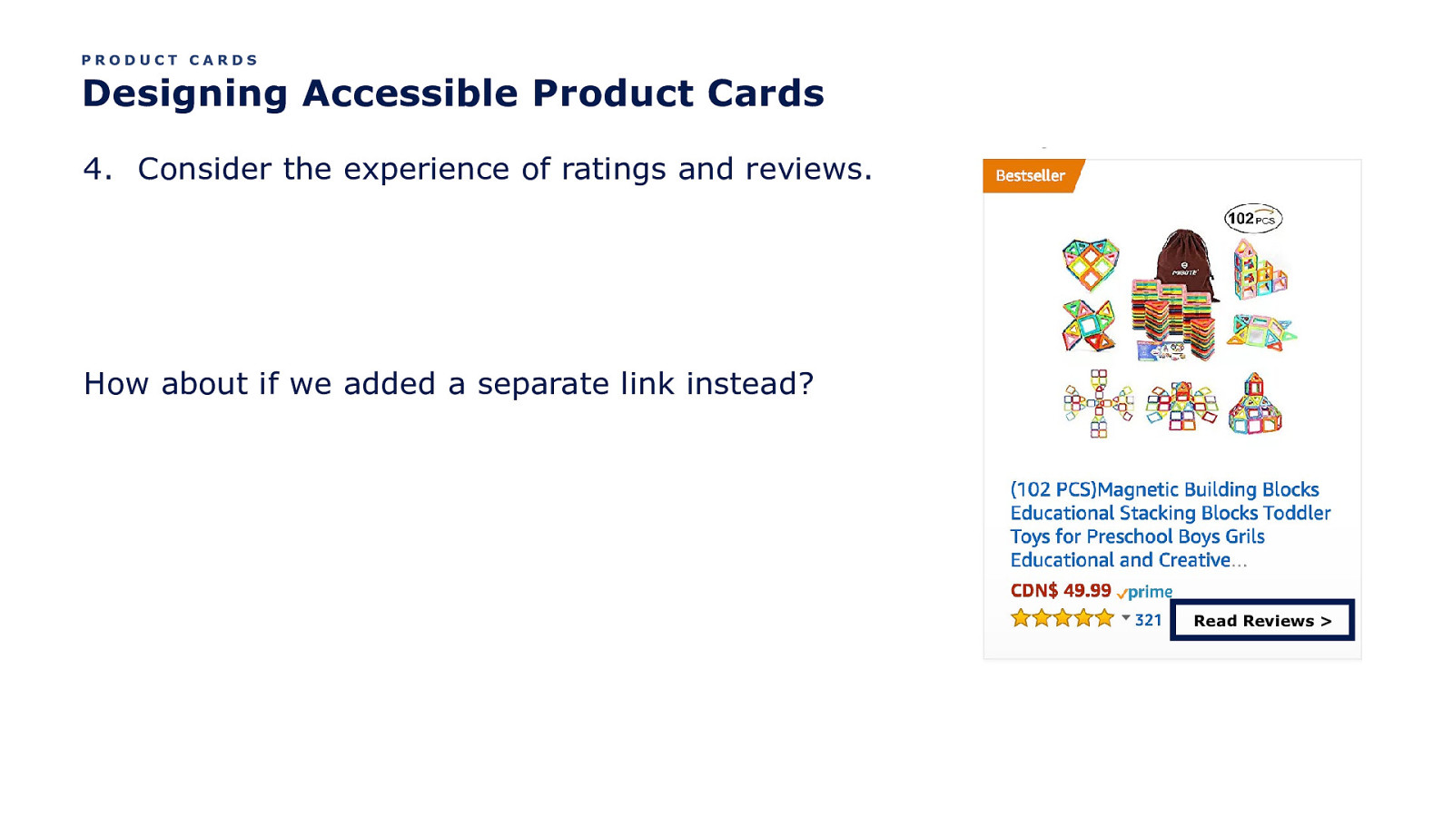
PRODUCT CARDS Designing Accessible Product Cards 4. Consider the experience of ratings and reviews. How about if we added a separate link instead? Read Reviews >
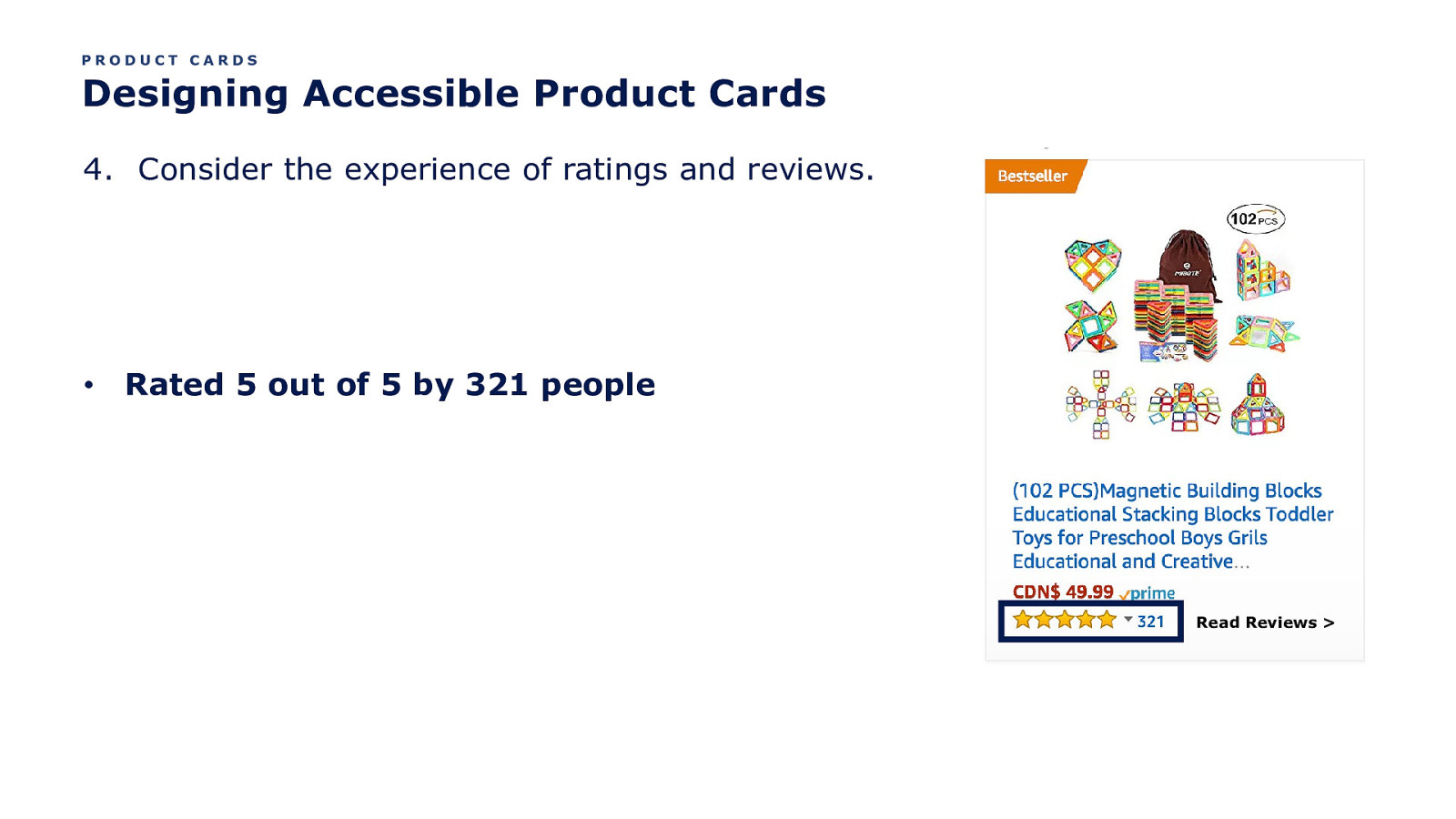
PRODUCT CARDS Designing Accessible Product Cards 4. Consider the experience of ratings and reviews. • Rated 5 out of 5 by 321 people Read Reviews >
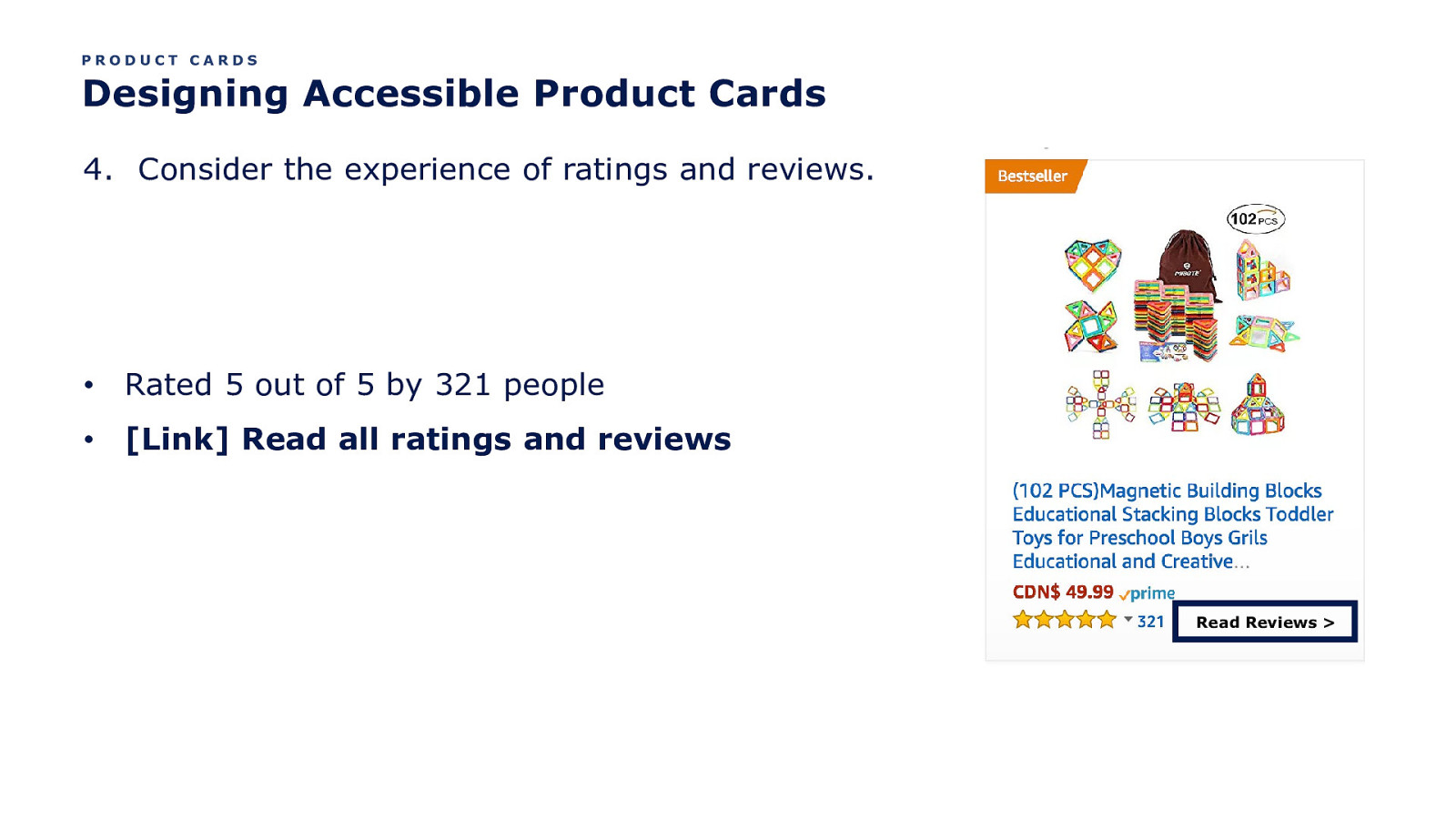
PRODUCT CARDS Designing Accessible Product Cards 4. Consider the experience of ratings and reviews. • Rated 5 out of 5 by 321 people • [Link] Read all ratings and reviews Read Reviews >
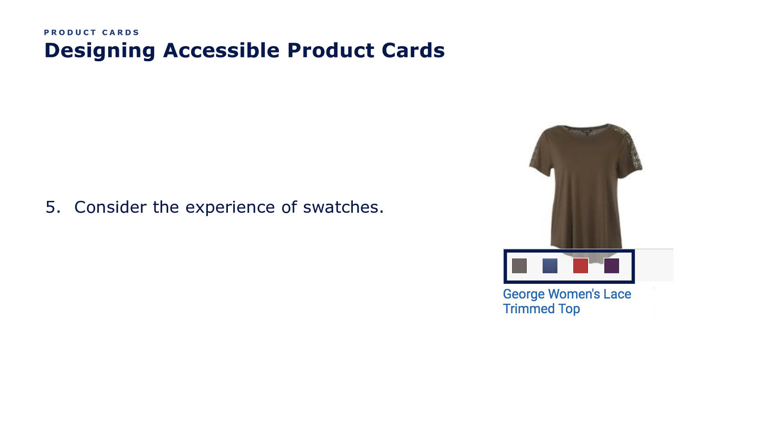
PRODUCT CARDS Designing Accessible Product Cards 5. Consider the experience of swatches.
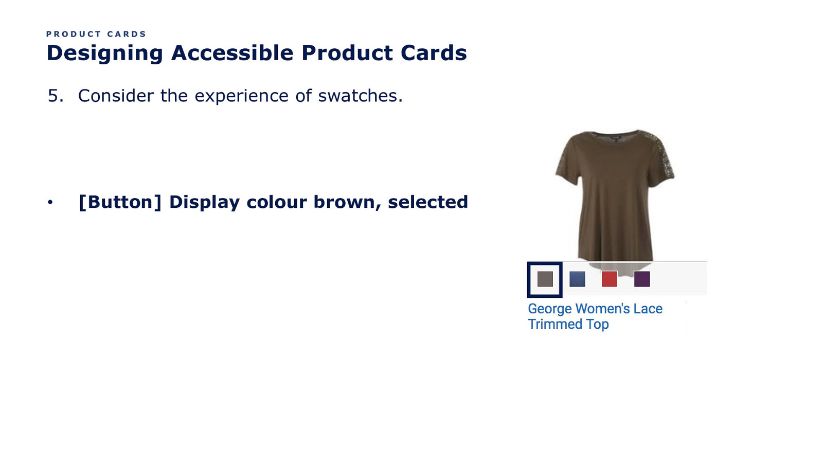
PRODUCT CARDS Designing Accessible Product Cards 5. Consider the experience of swatches. • [Button] Display colour brown, selected
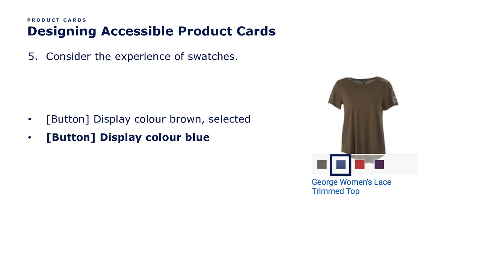
PRODUCT CARDS Designing Accessible Product Cards 5. Consider the experience of swatches. • [Button] Display colour brown, selected • [Button] Display colour blue
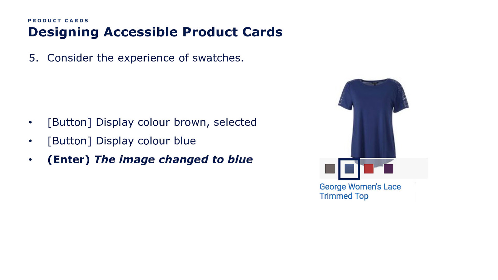
PRODUCT CARDS Designing Accessible Product Cards 5. Consider the experience of swatches. • [Button] Display colour brown, selected • [Button] Display colour blue • (Enter) The image changed to blue
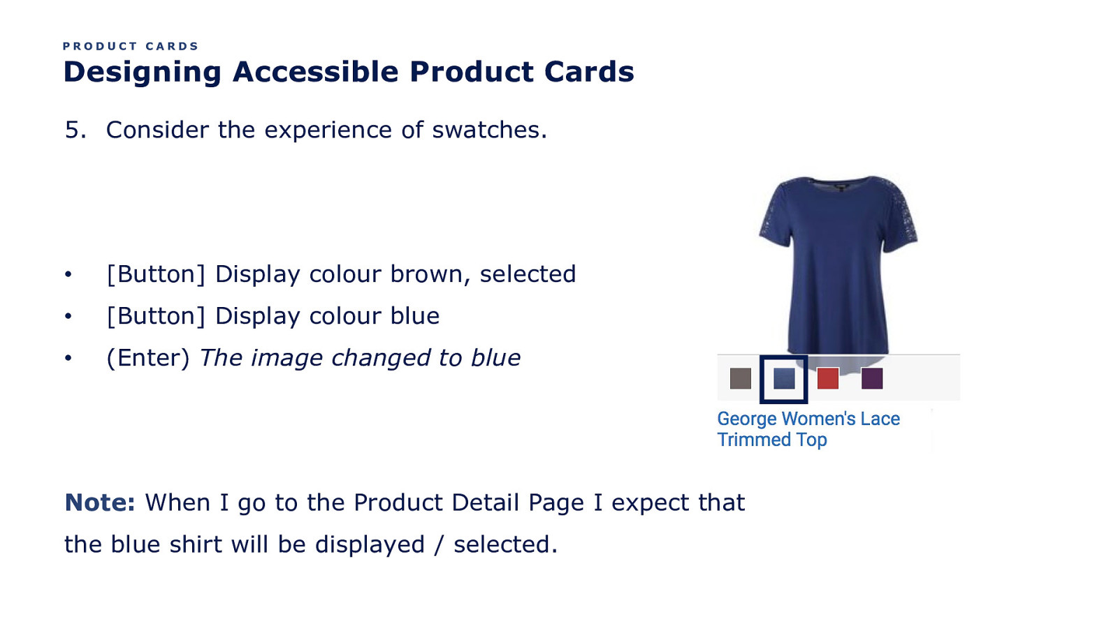
PRODUCT CARDS Designing Accessible Product Cards 5. Consider the experience of swatches. • [Button] Display colour brown, selected • [Button] Display colour blue • (Enter) The image changed to blue Note: When I go to the Product Detail Page I expect that the blue shirt will be displayed / selected.
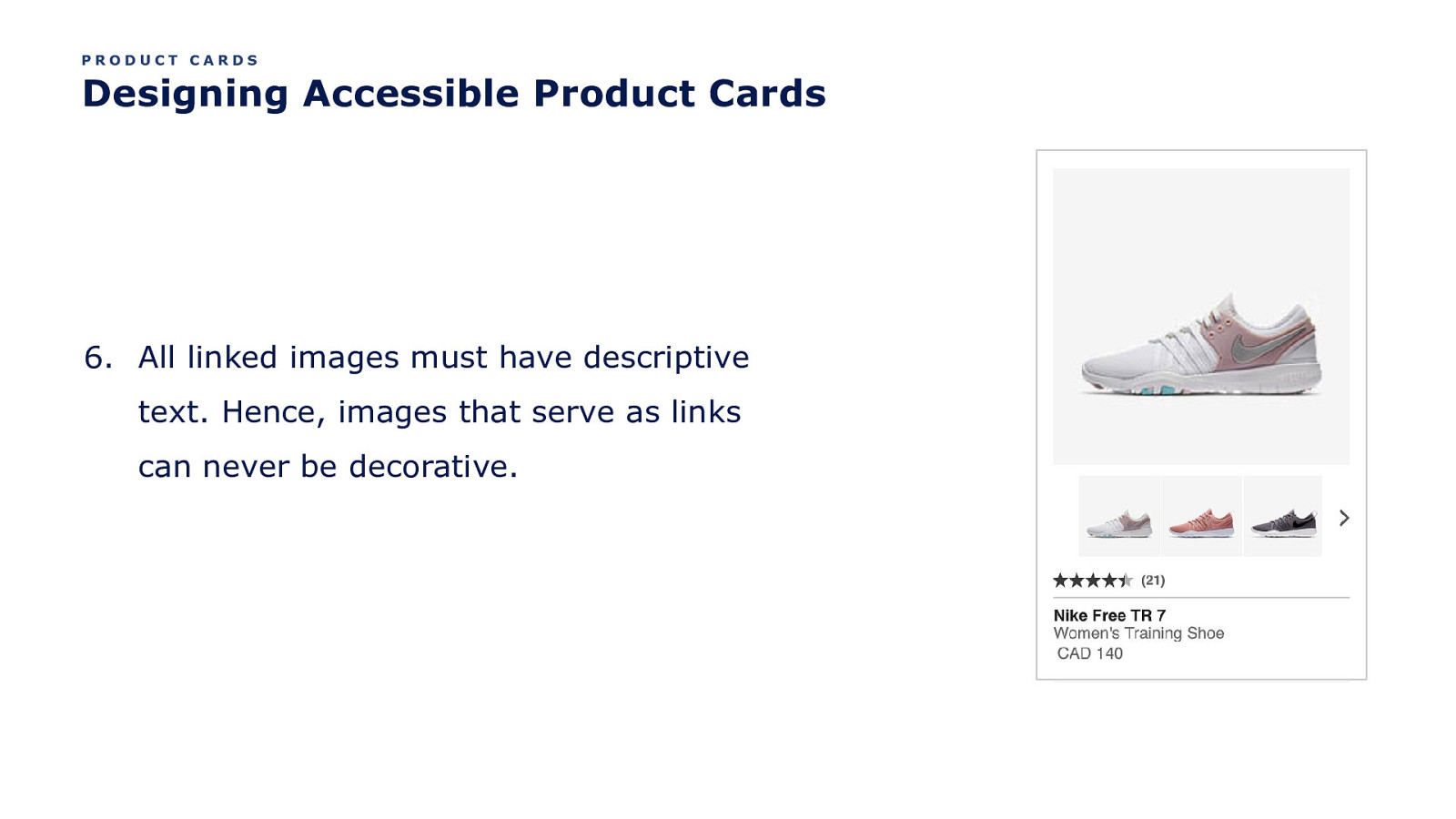
PRODUCT CARDS Designing Accessible Product Cards 6. All linked images must have descriptive text. Hence, images that serve as links can never be decorative.
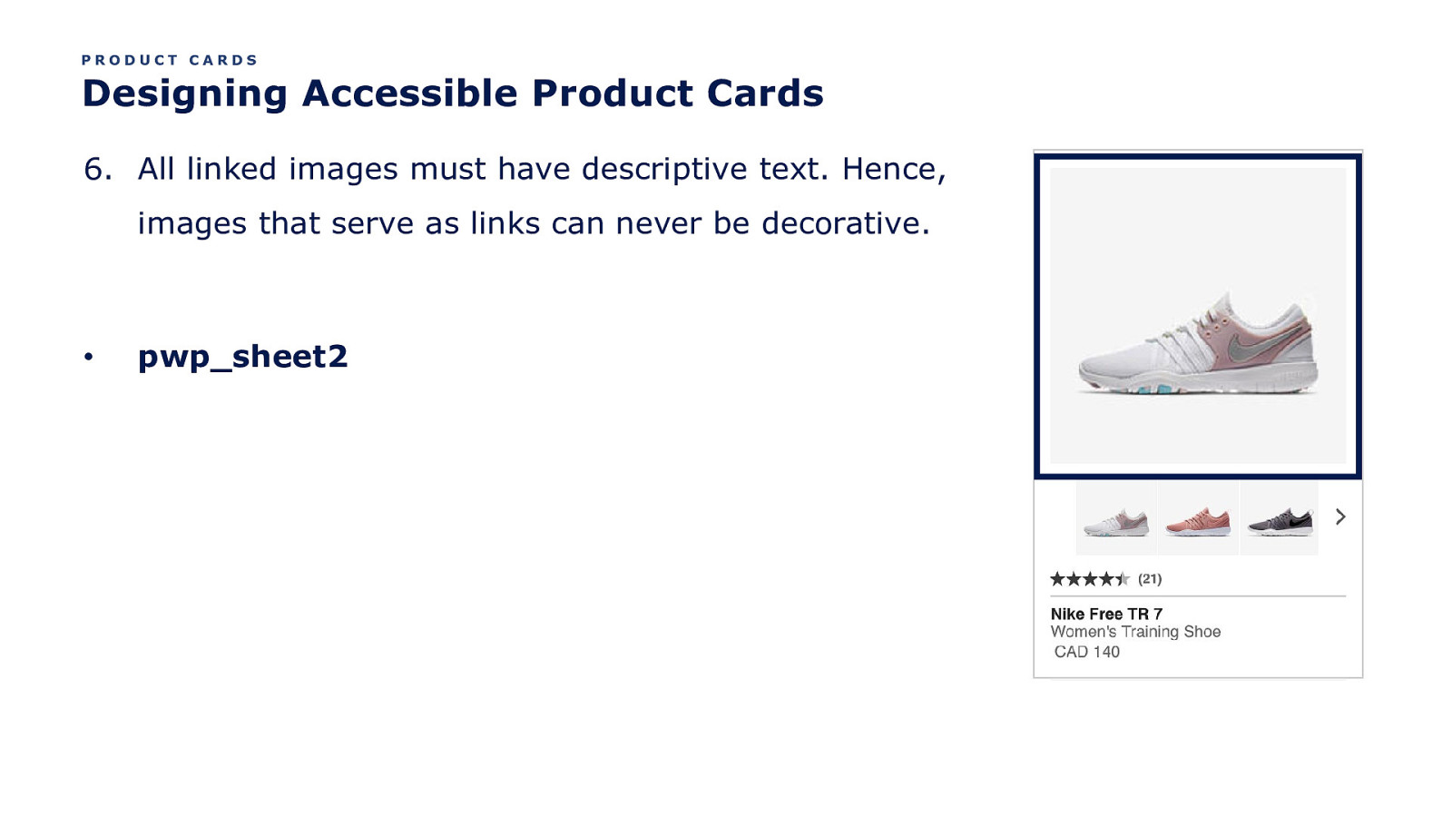
PRODUCT CARDS Designing Accessible Product Cards 6. All linked images must have descriptive text. Hence, images that serve as links can never be decorative. • pwp_sheet2
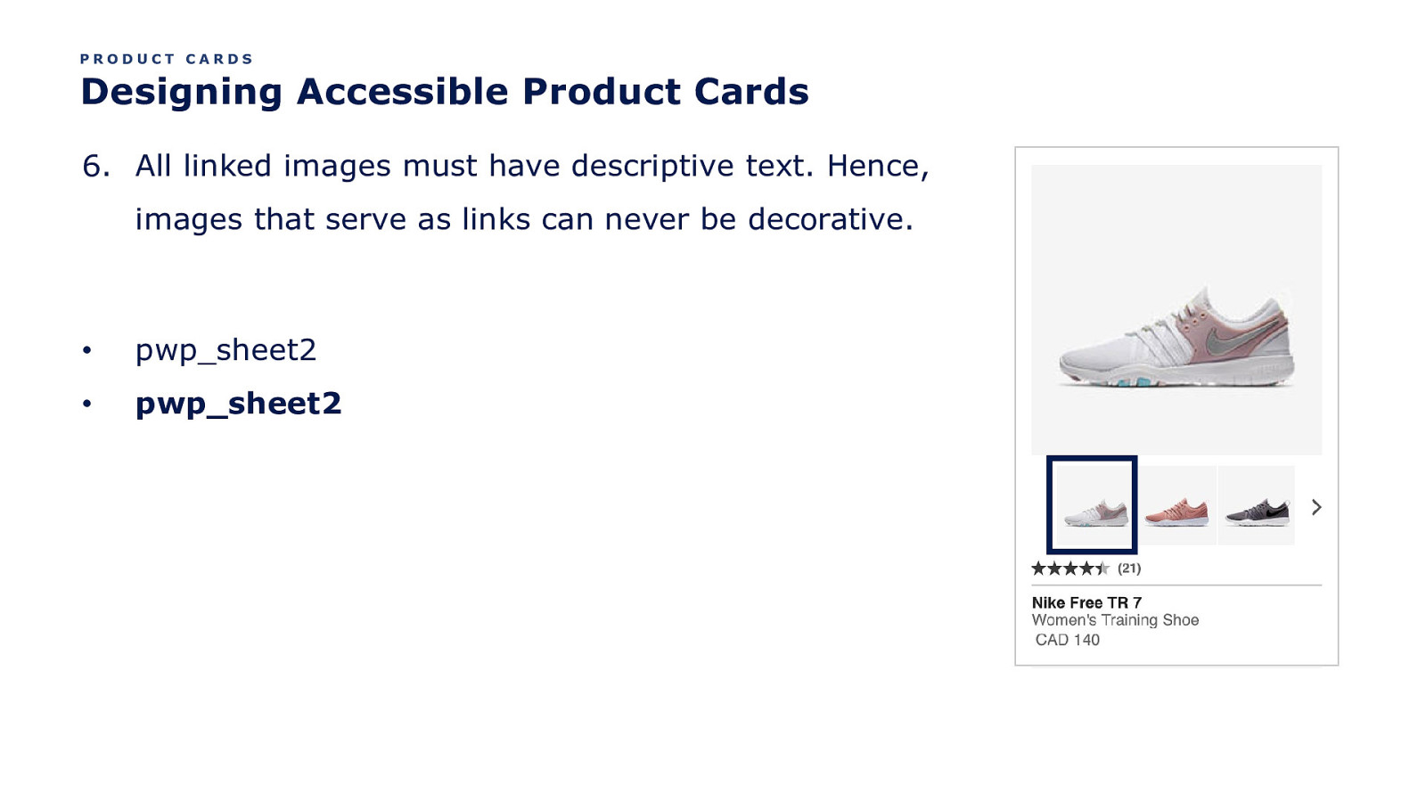
PRODUCT CARDS Designing Accessible Product Cards 6. All linked images must have descriptive text. Hence, images that serve as links can never be decorative. • pwp_sheet2 • pwp_sheet2
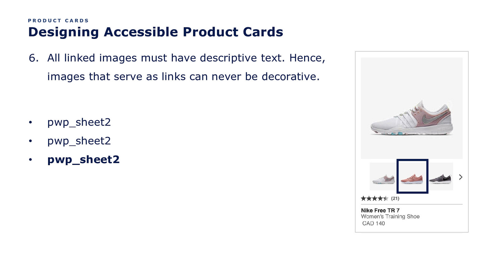
PRODUCT CARDS Designing Accessible Product Cards 6. All linked images must have descriptive text. Hence, images that serve as links can never be decorative. • pwp_sheet2 • pwp_sheet2 • pwp_sheet2
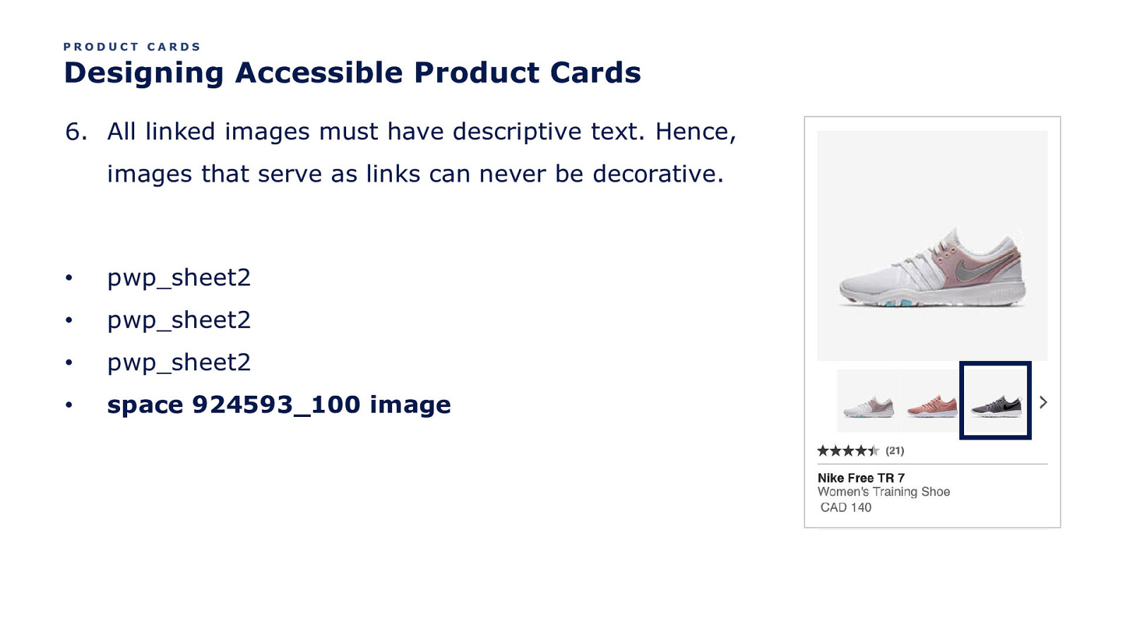
PRODUCT CARDS Designing Accessible Product Cards 6. All linked images must have descriptive text. Hence, images that serve as links can never be decorative. • pwp_sheet2 • pwp_sheet2 • pwp_sheet2 • space 924593_100 image
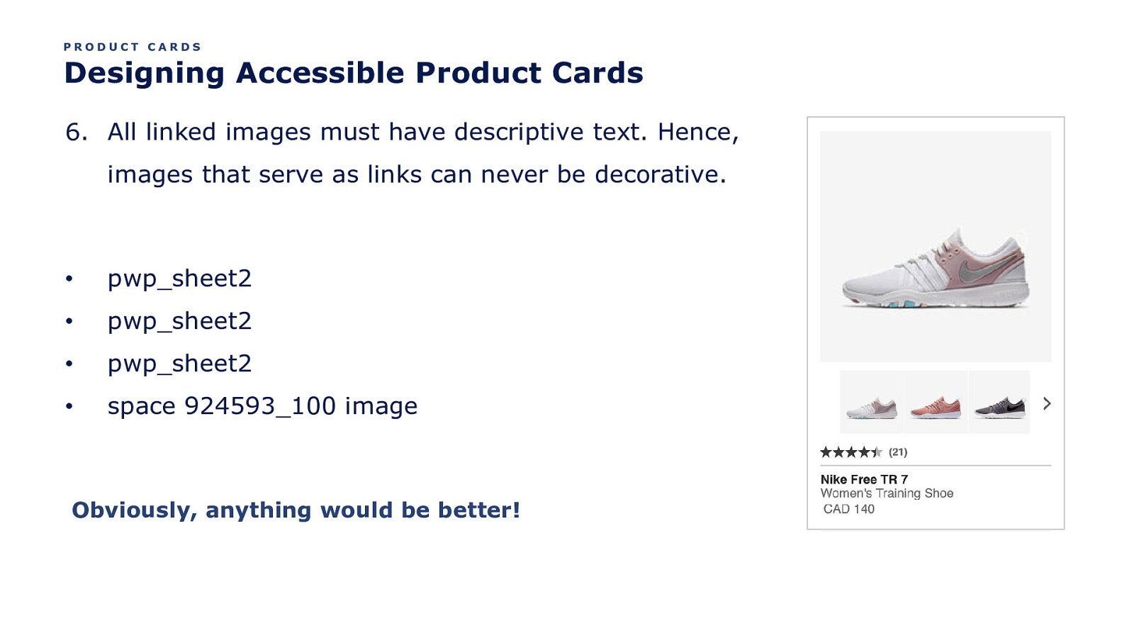
PRODUCT CARDS Designing Accessible Product Cards 6. All linked images must have descriptive text. Hence, images that serve as links can never be decorative. • pwp_sheet2 • pwp_sheet2 • pwp_sheet2 • space 924593_100 image Obviously, anything would be better!
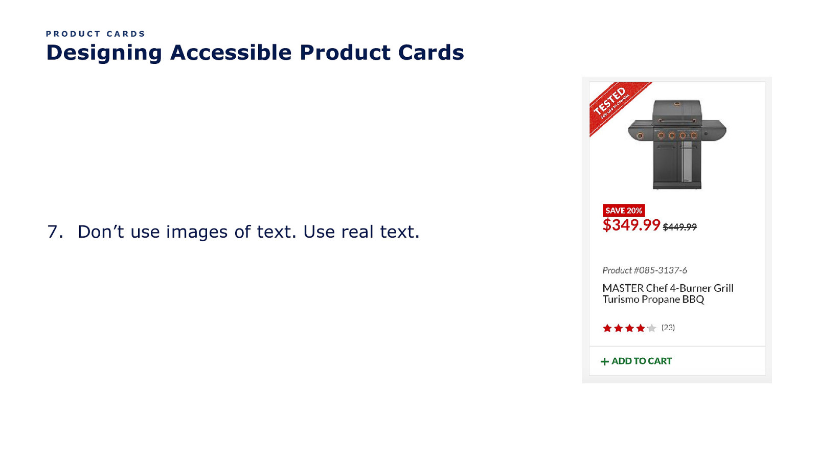
PRODUCT CARDS Designing Accessible Product Cards 7. Don’t use images of text. Use real text.
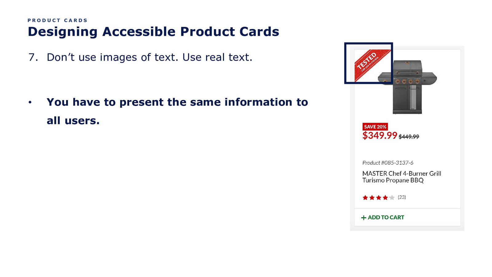
PRODUCT CARDS Designing Accessible Product Cards 7. Don’t use images of text. Use real text. • You have to present the same information to all users.
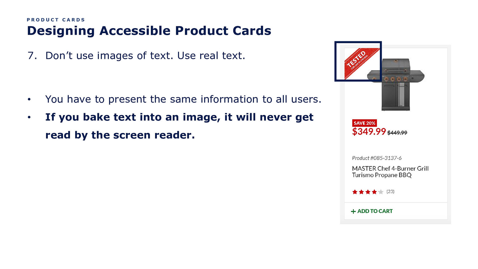
PRODUCT CARDS Designing Accessible Product Cards 7. Don’t use images of text. Use real text. • You have to present the same information to all users. • If you bake text into an image, it will never get read by the screen reader.
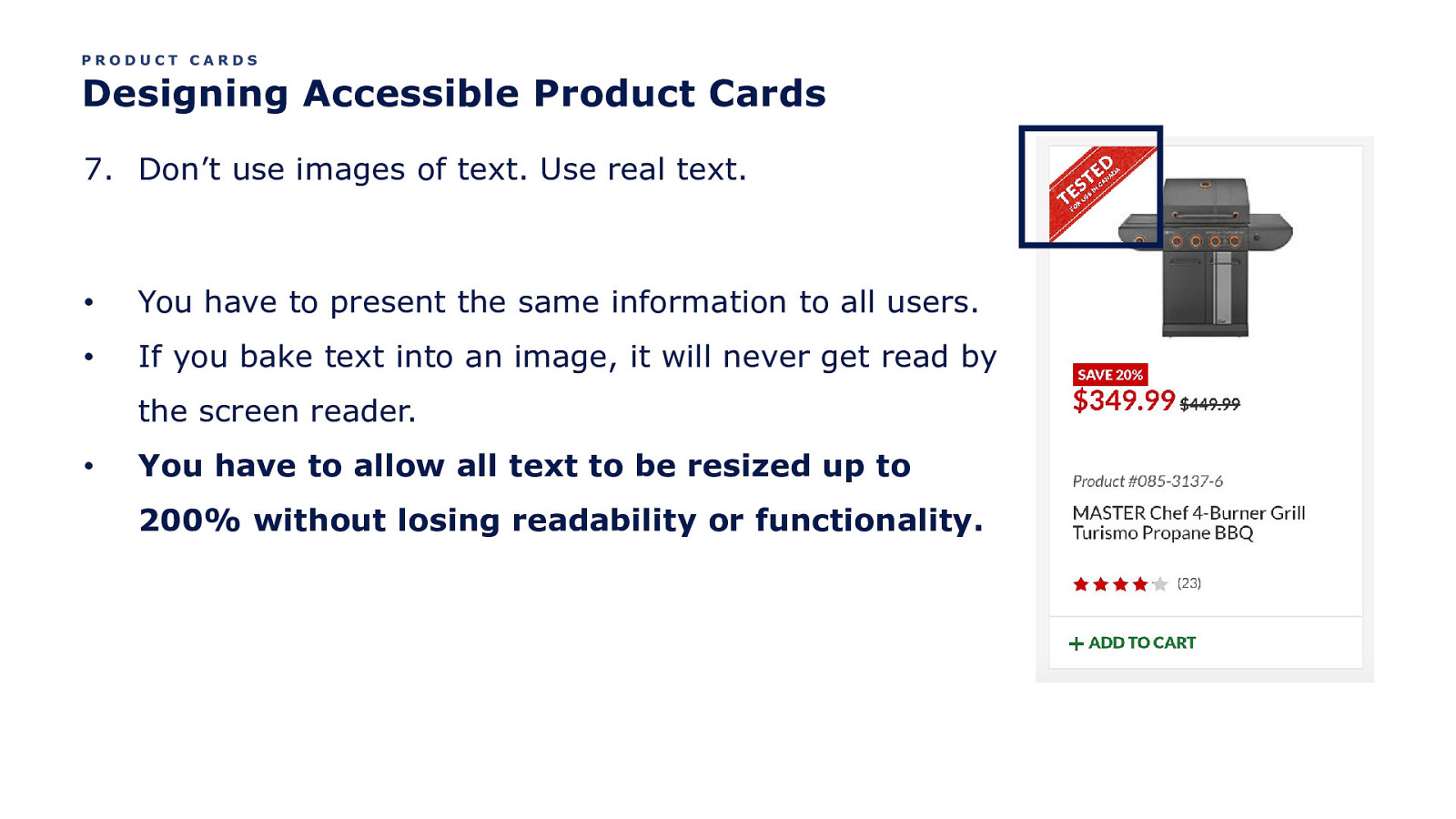
PRODUCT CARDS Designing Accessible Product Cards 7. Don’t use images of text. Use real text. • You have to present the same information to all users. • If you bake text into an image, it will never get read by the screen reader. • You have to allow all text to be resized up to 200% without losing readability or functionality.

Wow, eh?
OK. One more thing. Let’s talk “adding to cart”.
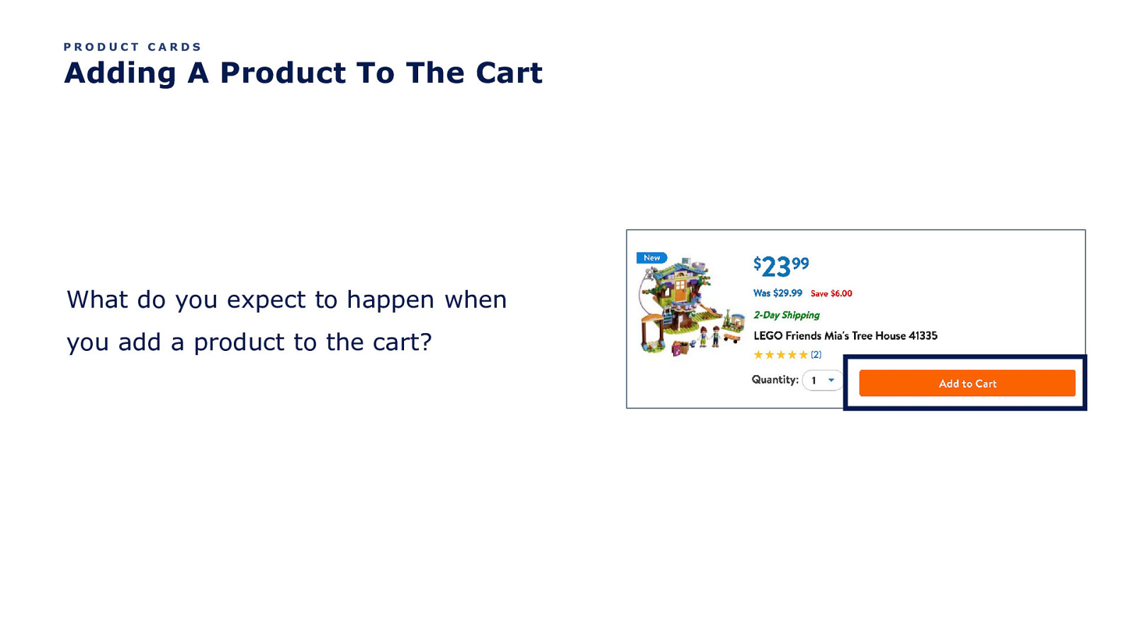
PRODUCT CARDS Adding A Product To The Cart What do you expect to happen when you add a product to the cart?
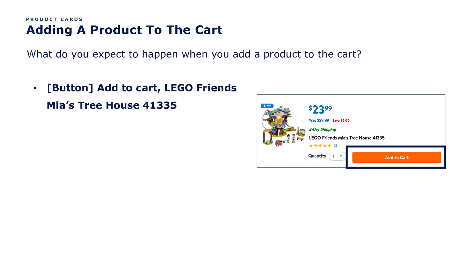
PRODUCT CARDS Adding A Product To The Cart What do you expect to happen when you add a product to the cart? • [Button] Add to cart, LEGO Friends Mia’s Tree House 41335
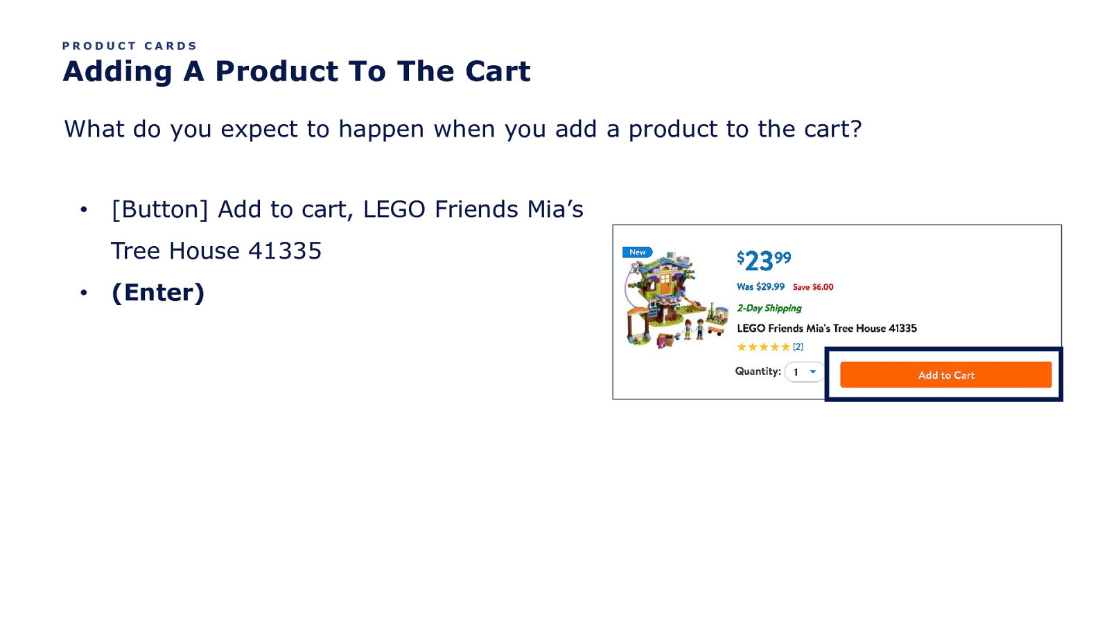
PRODUCT CARDS Adding A Product To The Cart What do you expect to happen when you add a product to the cart? • [Button] Add to cart, LEGO Friends Mia’s Tree House 41335 • (Enter)
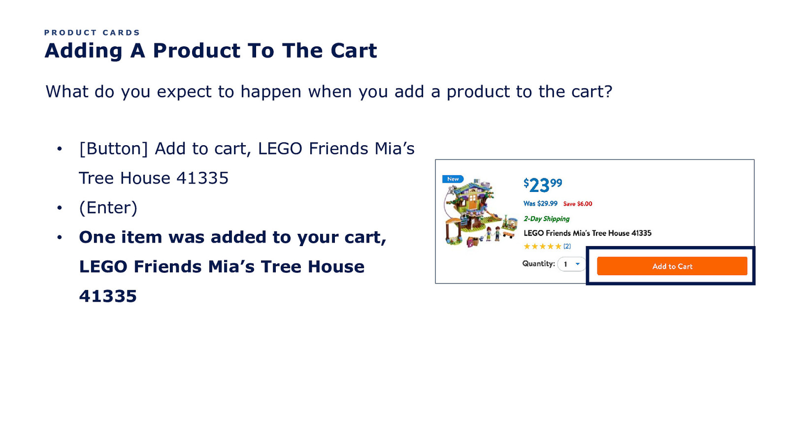
PRODUCT CARDS Adding A Product To The Cart What do you expect to happen when you add a product to the cart? • [Button] Add to cart, LEGO Friends Mia’s Tree House 41335 • (Enter) • One item was added to your cart, LEGO Friends Mia’s Tree House 41335
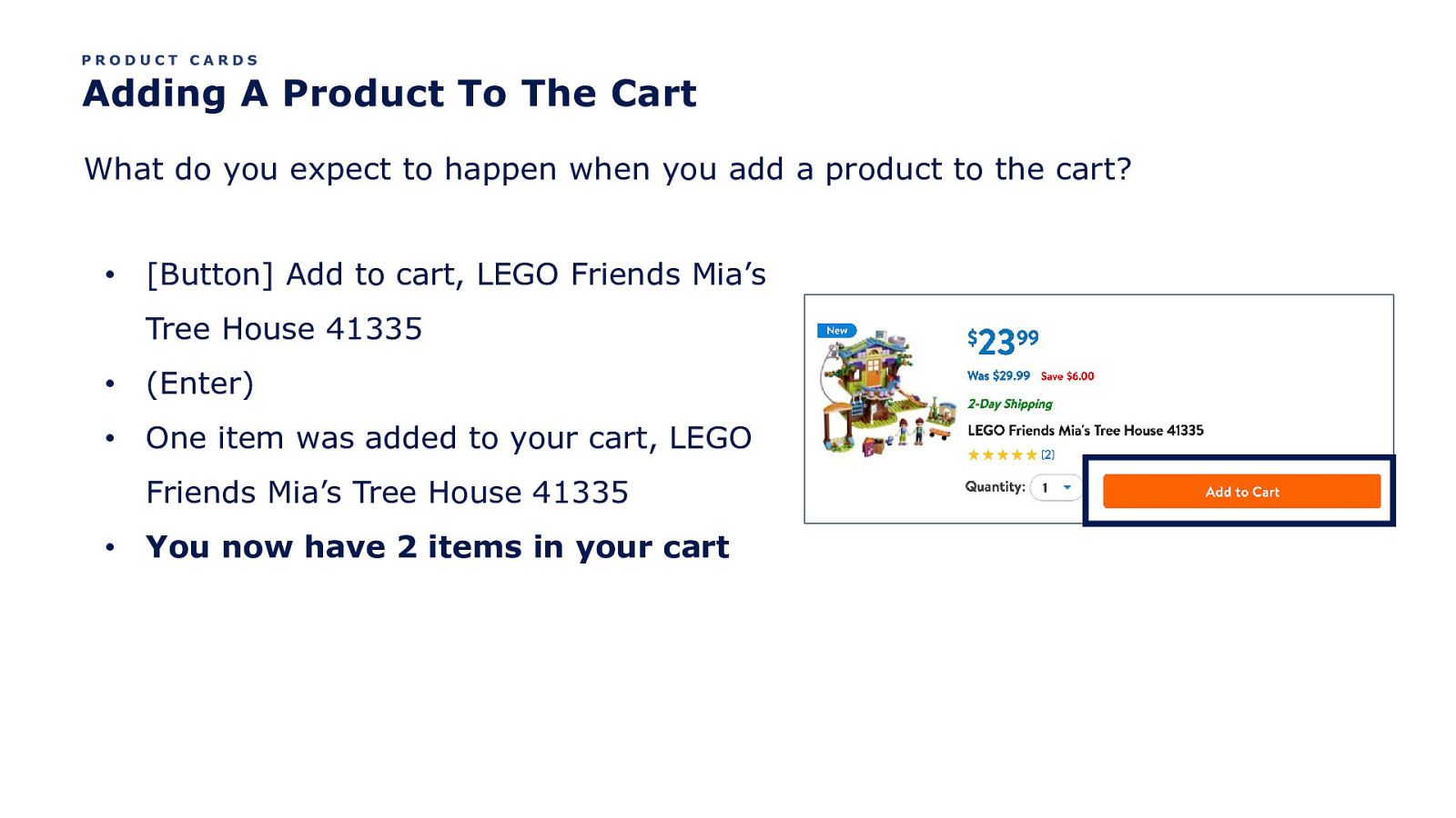
PRODUCT CARDS Adding A Product To The Cart What do you expect to happen when you add a product to the cart? • [Button] Add to cart, LEGO Friends Mia’s Tree House 41335 • (Enter) • One item was added to your cart, LEGO Friends Mia’s Tree House 41335 • You now have 2 items in your cart
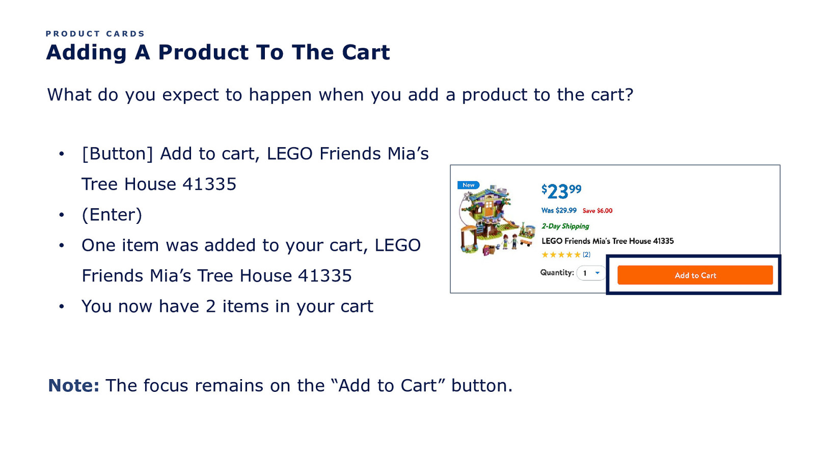
PRODUCT CARDS Adding A Product To The Cart What do you expect to happen when you add a product to the cart? • [Button] Add to cart, LEGO Friends Mia’s Tree House 41335 • (Enter) • One item was added to your cart, LEGO Friends Mia’s Tree House 41335 • You now have 2 items in your cart Note: The focus remains on the “Add to Cart” button.
PRODUCT CARDS Adding A Product To The Cart • One item was added to your cart, LEGO Friends Mia’s Tree House 41335 • You now have 2 items in your cart
PRODUCT CARDS Adding A Product To The Cart • One item was added to your cart, LEGO Friends Mia’s Tree House 41335 • You now have 2 items in your cart
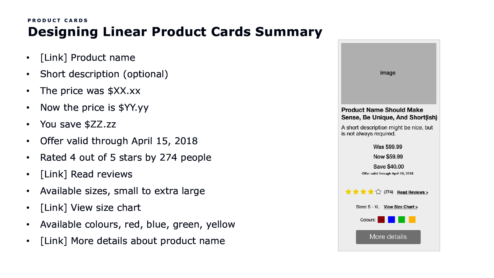
PRODUCT CARDS Designing Linear Product Cards Summary • [Link] Product name • Short description (optional) • The price was $XX.xx • Now the price is $YY.yy • You save $ZZ.zz • Offer valid through April 15, 2018 • Rated 4 out of 5 stars by 274 people • [Link] Read reviews • Available sizes, small to extra large • [Link] View size chart • Available colours, red, blue, green, yellow • [Link] More details about product name
The Mini Cart
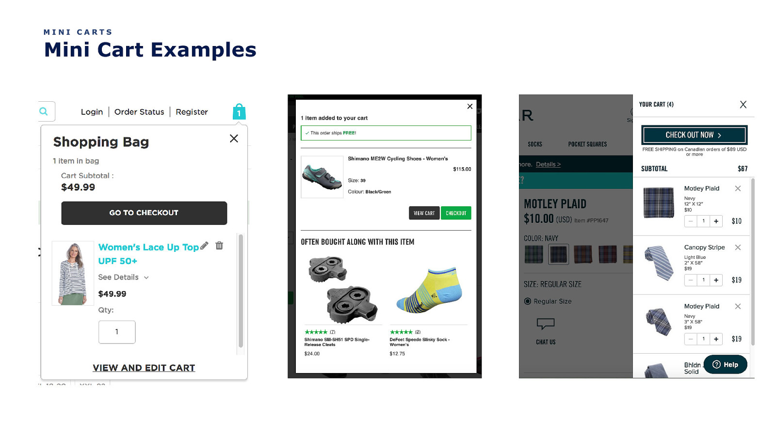
MINI CARTS Mini Cart Examples
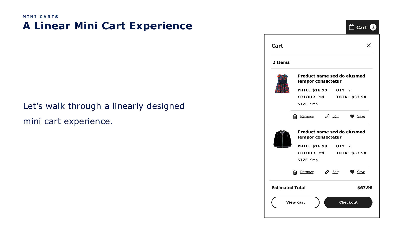
MINI CARTS A Linear Mini Cart Experience Let’s walk through a linearly designed mini cart experience.
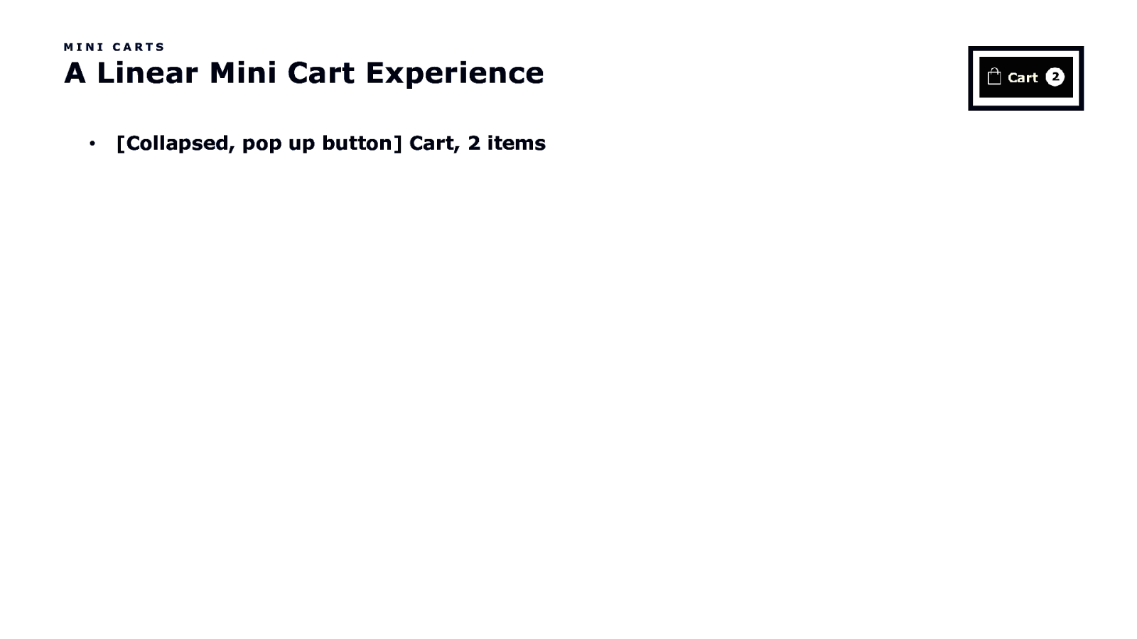
MINI CARTS A Linear Mini Cart Experience • [Collapsed, pop up button] Cart, 2 items
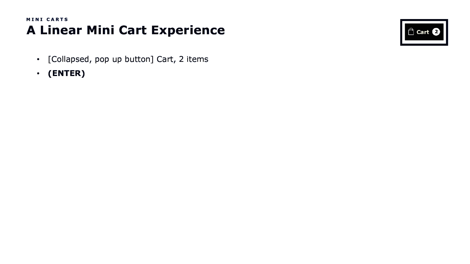
MINI CARTS A Linear Mini Cart Experience • [Collapsed, pop up button] Cart, 2 items • (ENTER)
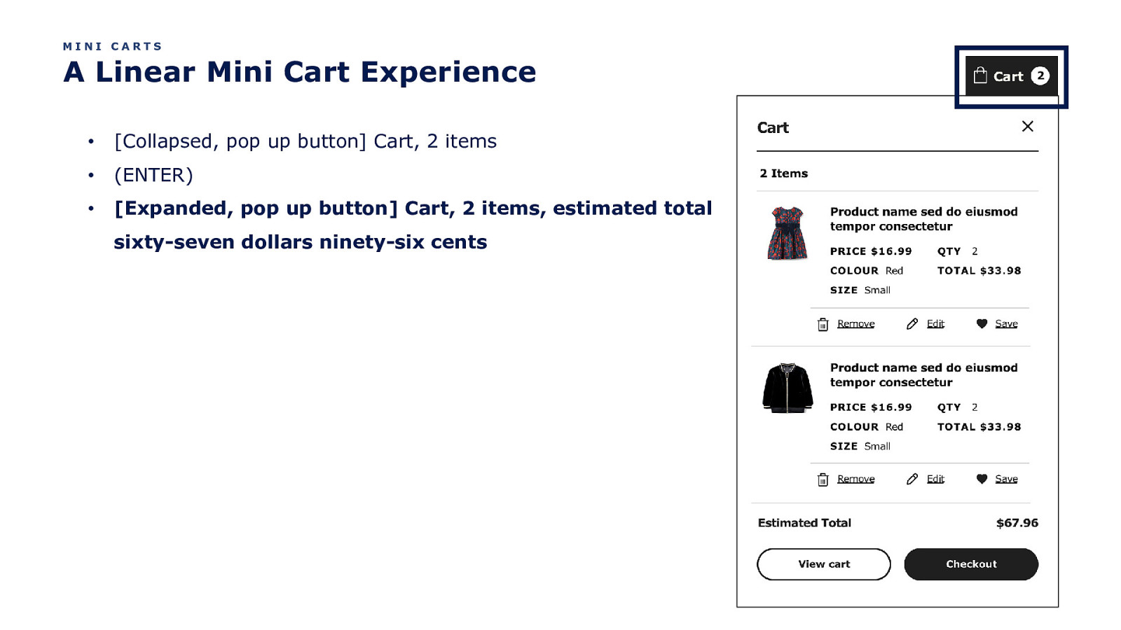
MINI CARTS A Linear Mini Cart Experience • [Collapsed, pop up button] Cart, 2 items • (ENTER) • [Expanded, pop up button] Cart, 2 items, estimated total sixty-seven dollars ninety-six cents
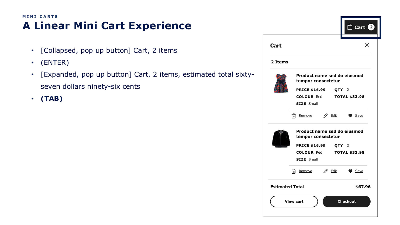
MINI CARTS A Linear Mini Cart Experience • [Collapsed, pop up button] Cart, 2 items • (ENTER) • [Expanded, pop up button] Cart, 2 items, estimated total sixtyseven dollars ninety-six cents • (TAB)
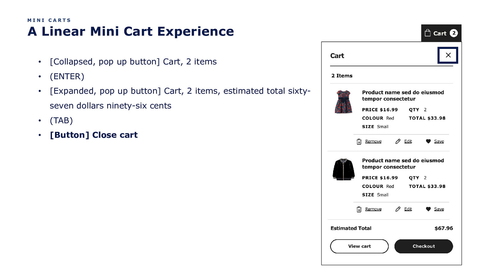
MINI CARTS A Linear Mini Cart Experience • [Collapsed, pop up button] Cart, 2 items • (ENTER) • [Expanded, pop up button] Cart, 2 items, estimated total sixtyseven dollars ninety-six cents • (TAB) • [Button] Close cart
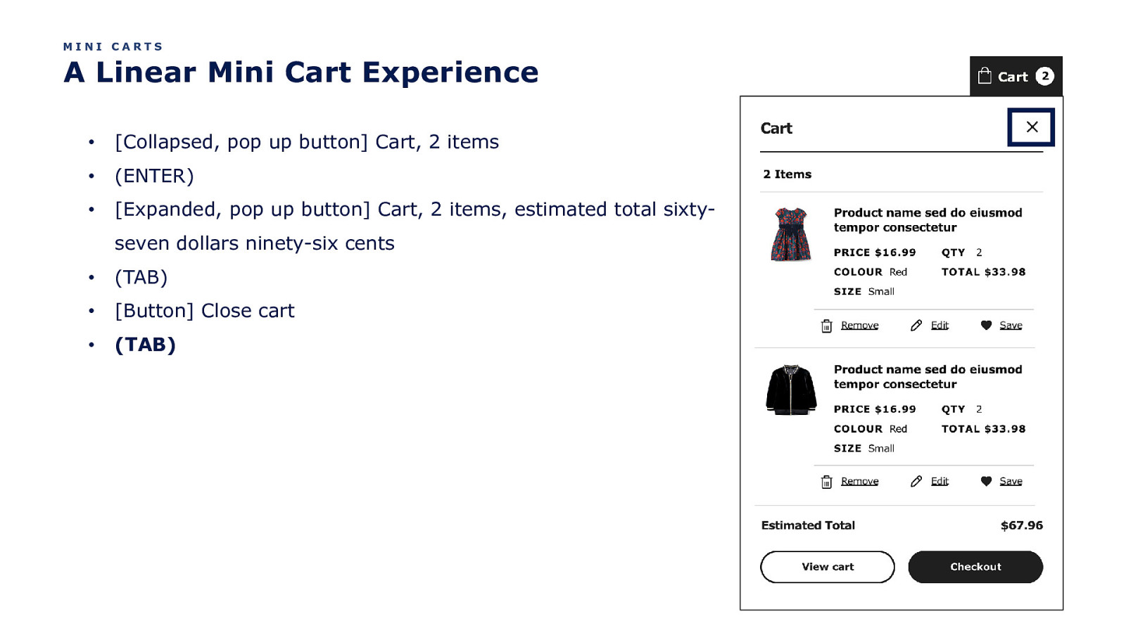
MINI CARTS A Linear Mini Cart Experience • [Collapsed, pop up button] Cart, 2 items • (ENTER) • [Expanded, pop up button] Cart, 2 items, estimated total sixtyseven dollars ninety-six cents • (TAB) • [Button] Close cart • (TAB)
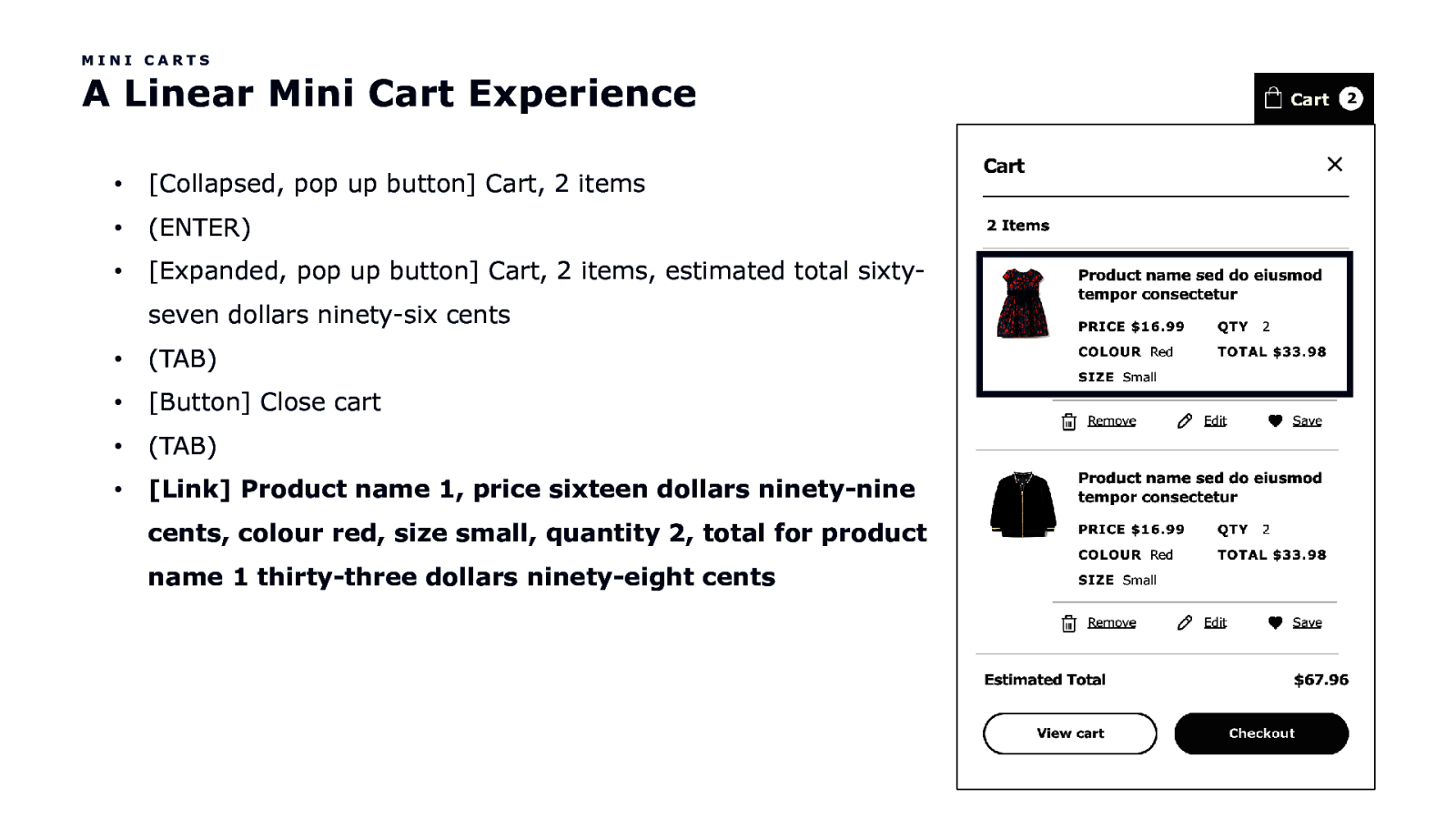
MINI CARTS A Linear Mini Cart Experience • [Collapsed, pop up button] Cart, 2 items • (ENTER) • [Expanded, pop up button] Cart, 2 items, estimated total sixtyseven dollars ninety-six cents • (TAB) • [Button] Close cart • (TAB) • [Link] Product name 1, price sixteen dollars ninety-nine cents, colour red, size small, quantity 2, total for product name 1 thirty-three dollars ninety-eight cents
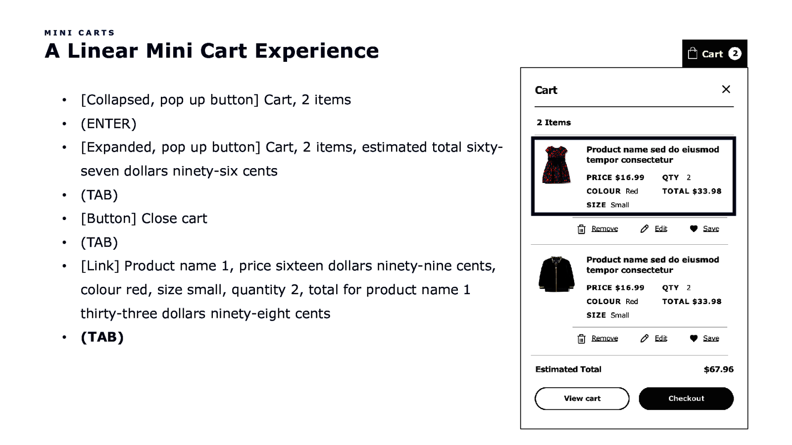
MINI CARTS A Linear Mini Cart Experience • [Collapsed, pop up button] Cart, 2 items • (ENTER) • [Expanded, pop up button] Cart, 2 items, estimated total sixtyseven dollars ninety-six cents • (TAB) • [Button] Close cart • (TAB) • [Link] Product name 1, price sixteen dollars ninety-nine cents, colour red, size small, quantity 2, total for product name 1 thirty-three dollars ninety-eight cents • (TAB)
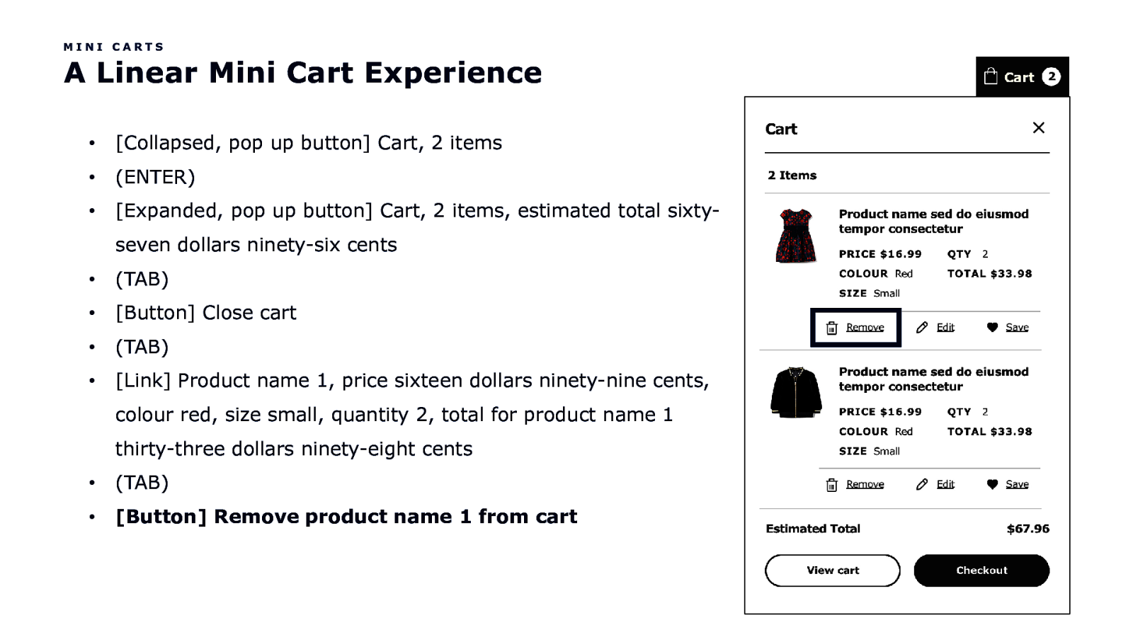
MINI CARTS A Linear Mini Cart Experience • [Collapsed, pop up button] Cart, 2 items • (ENTER) • [Expanded, pop up button] Cart, 2 items, estimated total sixtyseven dollars ninety-six cents • (TAB) • [Button] Close cart • (TAB) • [Link] Product name 1, price sixteen dollars ninety-nine cents, colour red, size small, quantity 2, total for product name 1 thirty-three dollars ninety-eight cents • (TAB) • [Button] Remove product name 1 from cart
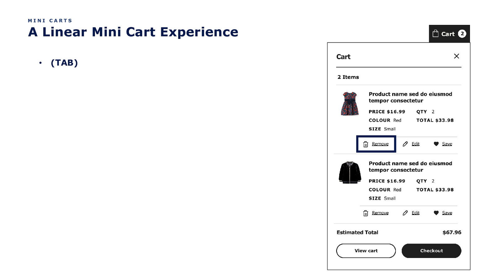
MINI CARTS A Linear Mini Cart Experience • (TAB)
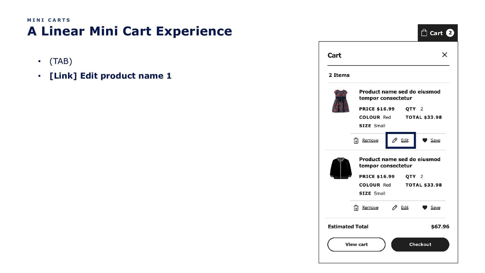
MINI CARTS A Linear Mini Cart Experience • (TAB) • [Link] Edit product name 1
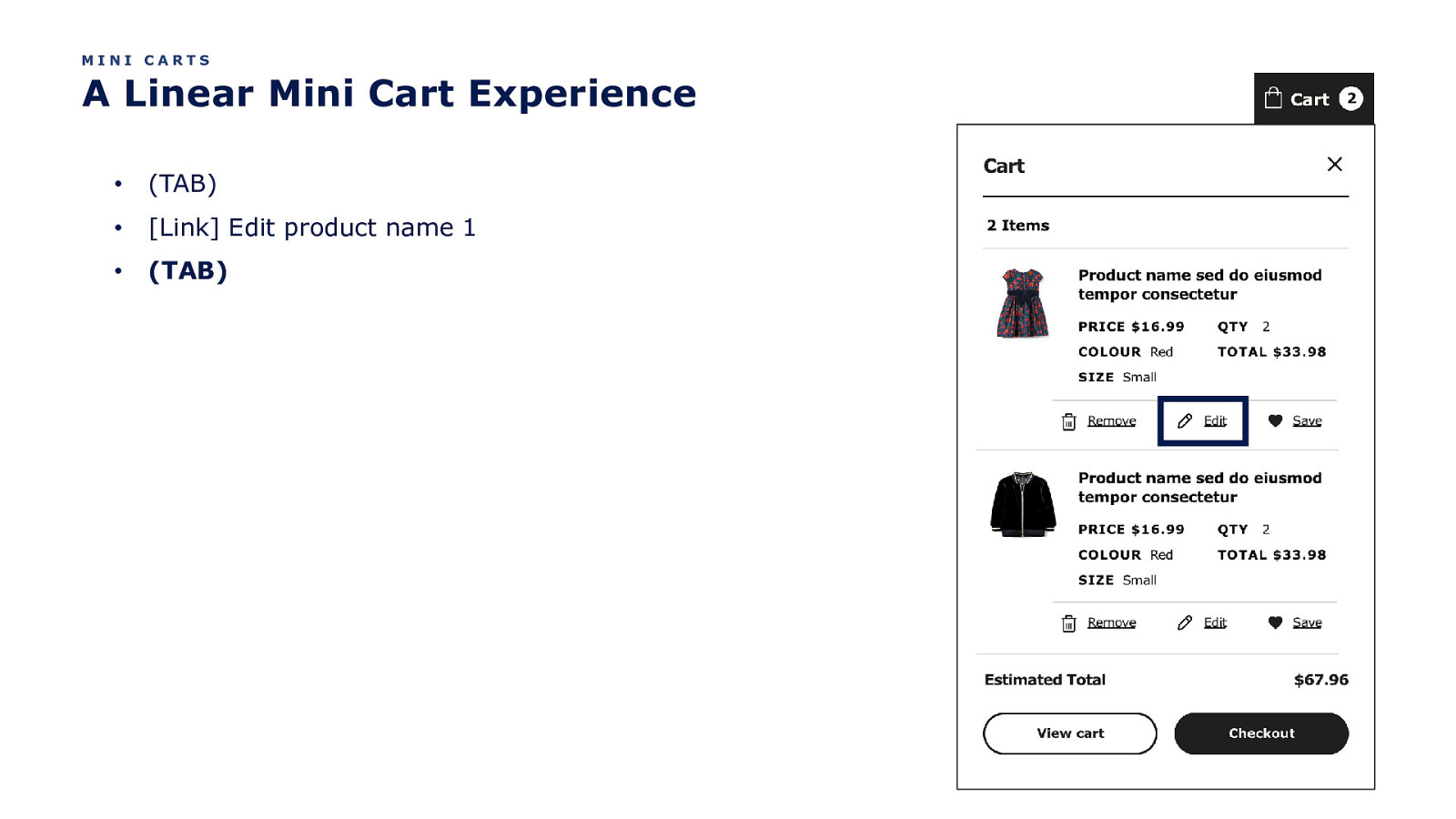
MINI CARTS A Linear Mini Cart Experience • (TAB) • [Link] Edit product name 1 • (TAB)
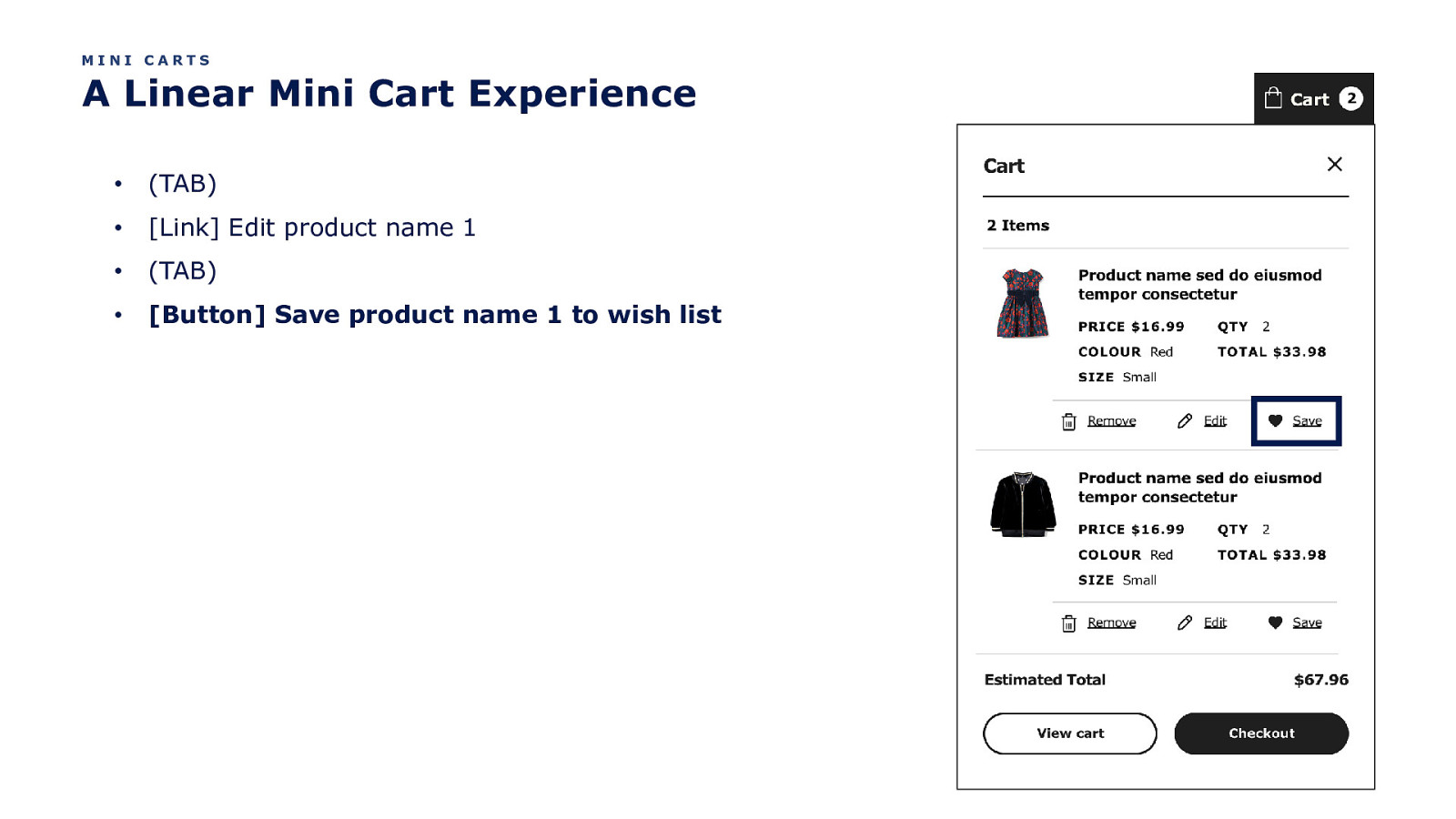
MINI CARTS A Linear Mini Cart Experience • (TAB) • [Link] Edit product name 1 • (TAB) • [Button] Save product name 1 to wish list
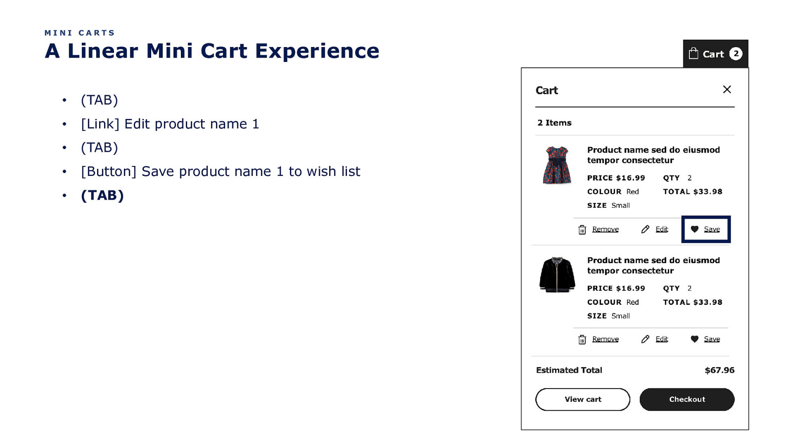
MINI CARTS A Linear Mini Cart Experience • (TAB) • [Link] Edit product name 1 • (TAB) • [Button] Save product name 1 to wish list • (TAB)
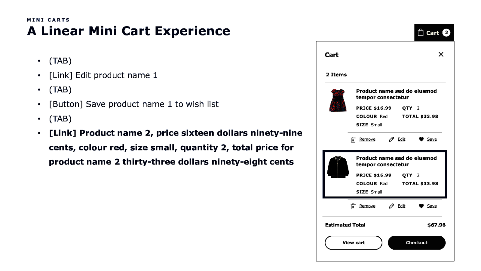
MINI CARTS A Linear Mini Cart Experience • (TAB) • [Link] Edit product name 1 • (TAB) • [Button] Save product name 1 to wish list • (TAB) • [Link] Product name 2, price sixteen dollars ninety-nine cents, colour red, size small, quantity 2, total price for product name 2 thirty-three dollars ninety-eight cents
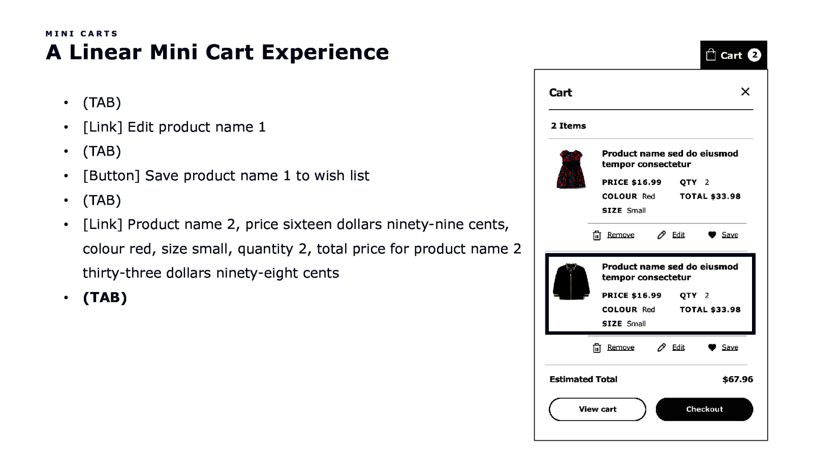
MINI CARTS A Linear Mini Cart Experience • (TAB) • [Link] Edit product name 1 • (TAB) • [Button] Save product name 1 to wish list • (TAB) • [Link] Product name 2, price sixteen dollars ninety-nine cents, colour red, size small, quantity 2, total price for product name 2 thirty-three dollars ninety-eight cents • (TAB)
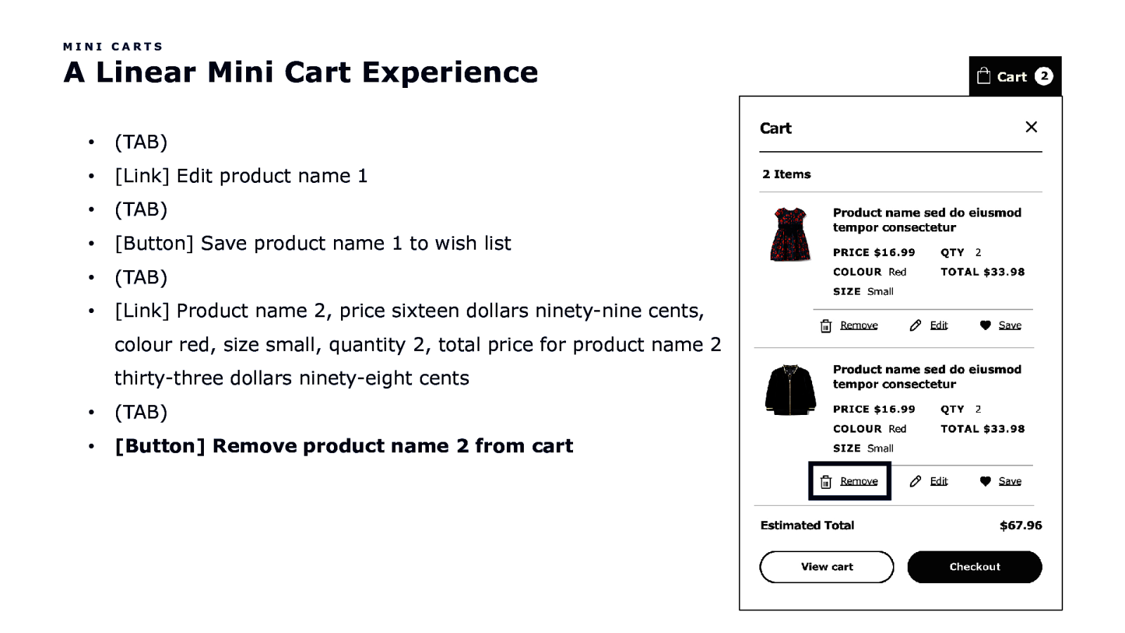
MINI CARTS A Linear Mini Cart Experience • (TAB) • [Link] Edit product name 1 • (TAB) • [Button] Save product name 1 to wish list • (TAB) • [Link] Product name 2, price sixteen dollars ninety-nine cents, colour red, size small, quantity 2, total price for product name 2 thirty-three dollars ninety-eight cents • (TAB) • [Button] Remove product name 2 from cart
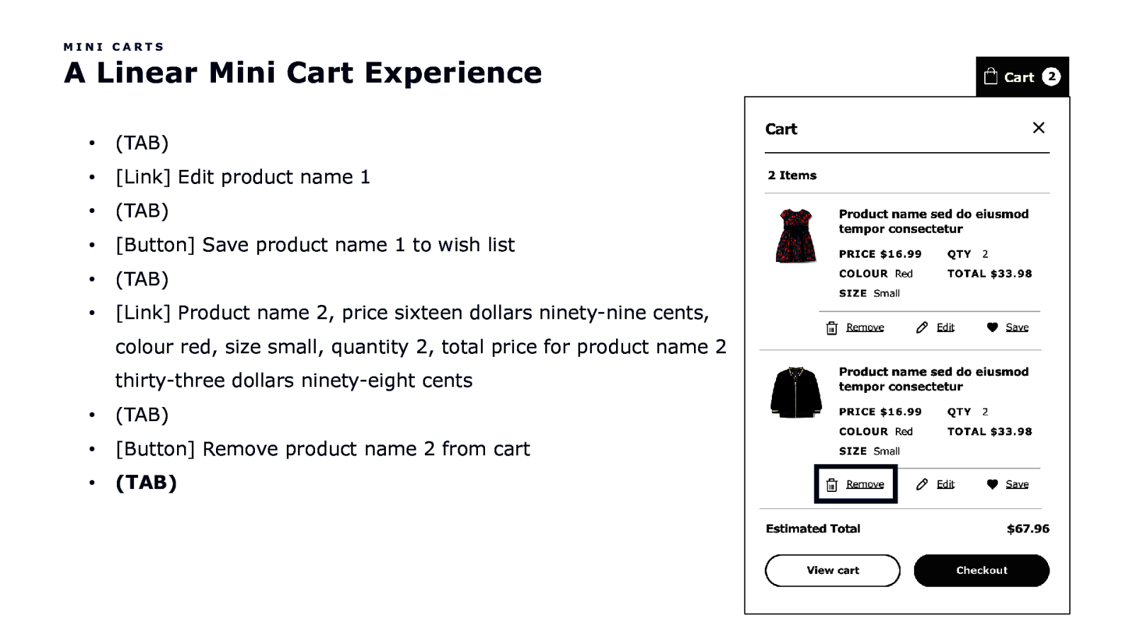
MINI CARTS A Linear Mini Cart Experience • (TAB) • [Link] Edit product name 1 • (TAB) • [Button] Save product name 1 to wish list • (TAB) • [Link] Product name 2, price sixteen dollars ninety-nine cents, colour red, size small, quantity 2, total price for product name 2 thirty-three dollars ninety-eight cents • (TAB) • [Button] Remove product name 2 from cart • (TAB)
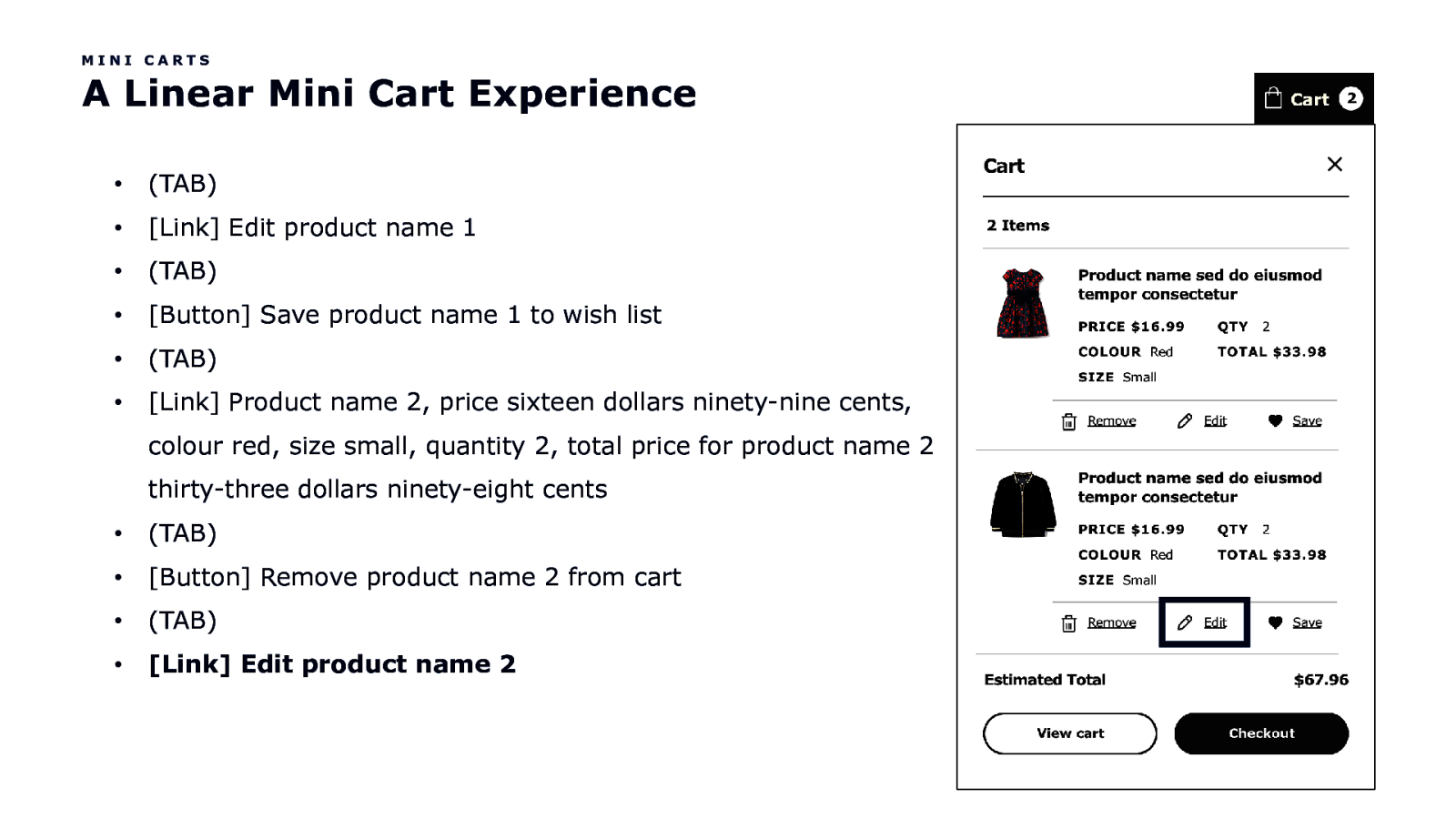
MINI CARTS A Linear Mini Cart Experience • (TAB) • [Link] Edit product name 1 • (TAB) • [Button] Save product name 1 to wish list • (TAB) • [Link] Product name 2, price sixteen dollars ninety-nine cents, colour red, size small, quantity 2, total price for product name 2 thirty-three dollars ninety-eight cents • (TAB) • [Button] Remove product name 2 from cart • (TAB) • [Link] Edit product name 2
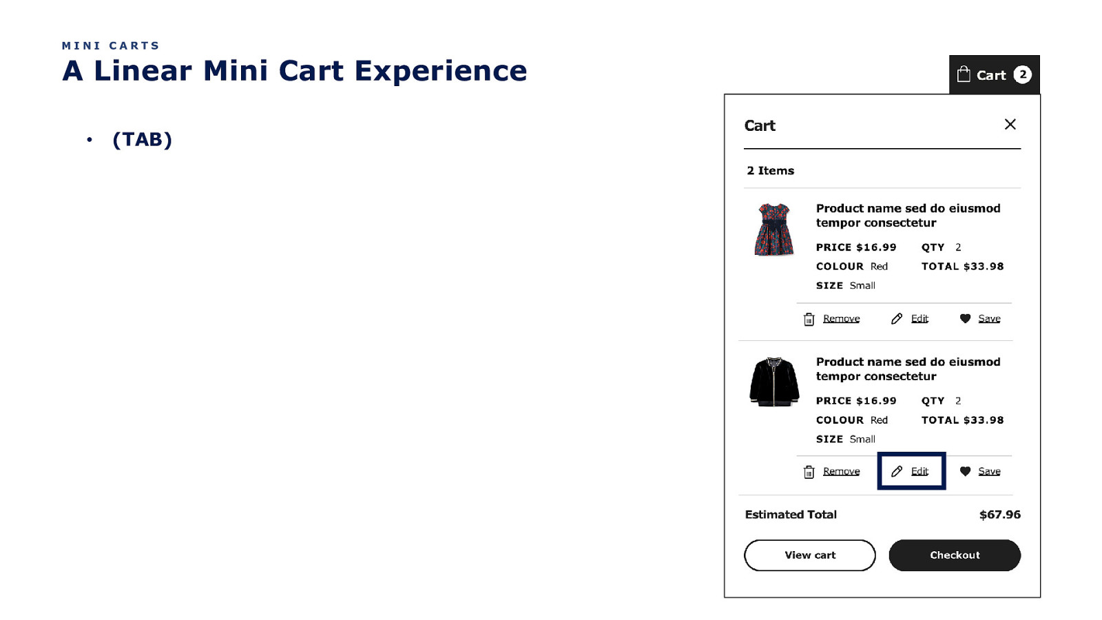
MINI CARTS A Linear Mini Cart Experience • (TAB)
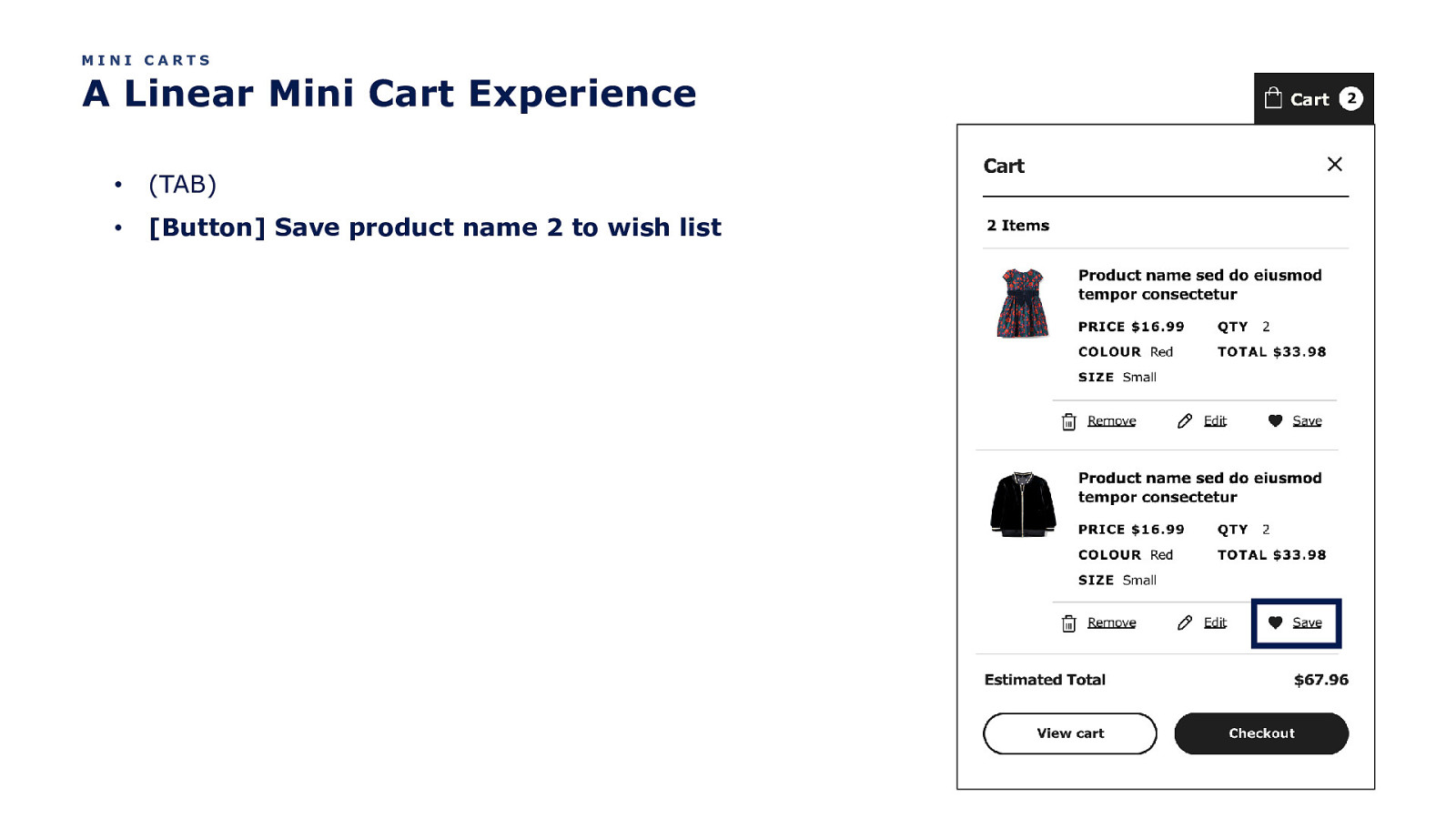
MINI CARTS A Linear Mini Cart Experience • (TAB) • [Button] Save product name 2 to wish list
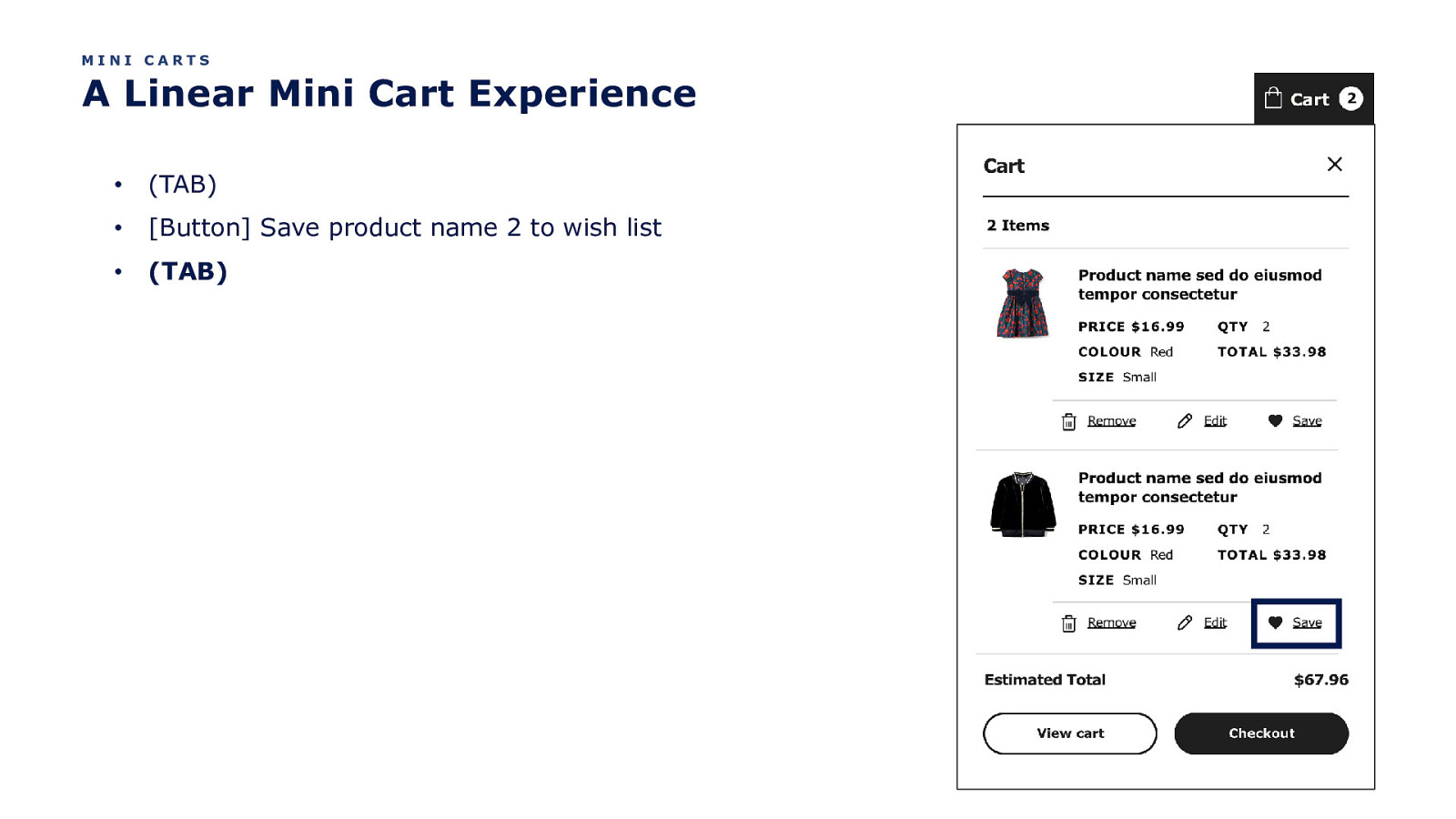
MINI CARTS A Linear Mini Cart Experience • (TAB) • [Button] Save product name 2 to wish list • (TAB)
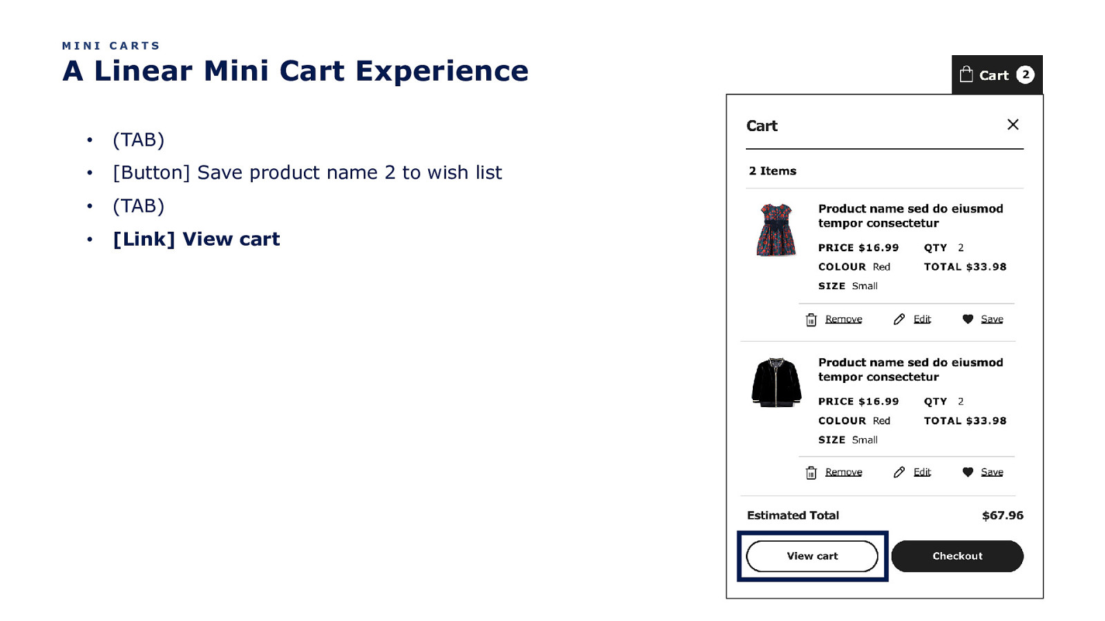
MINI CARTS A Linear Mini Cart Experience • (TAB) • [Button] Save product name 2 to wish list • (TAB) • [Link] View cart
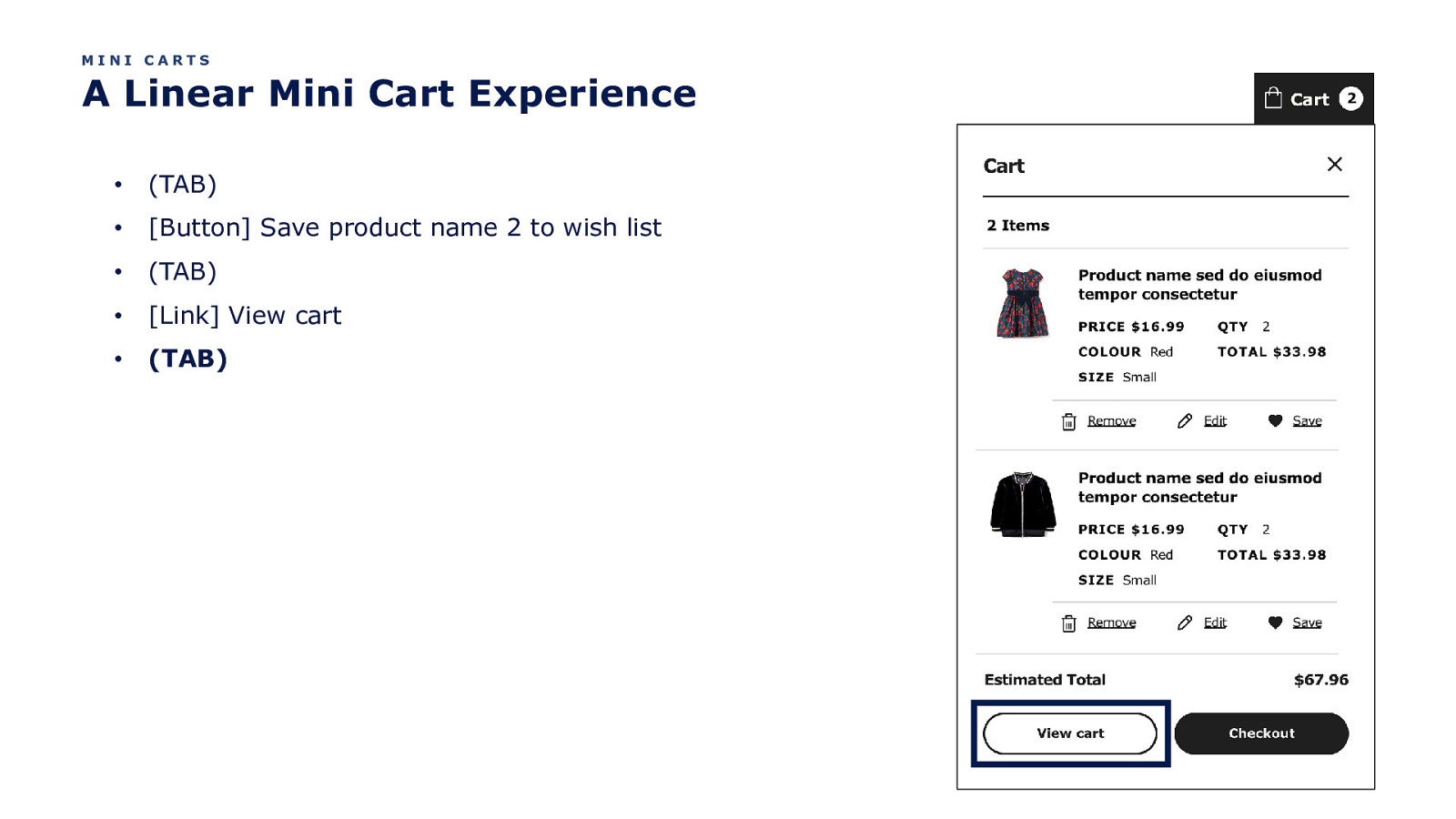
MINI CARTS A Linear Mini Cart Experience • (TAB) • [Button] Save product name 2 to wish list • (TAB) • [Link] View cart • (TAB)
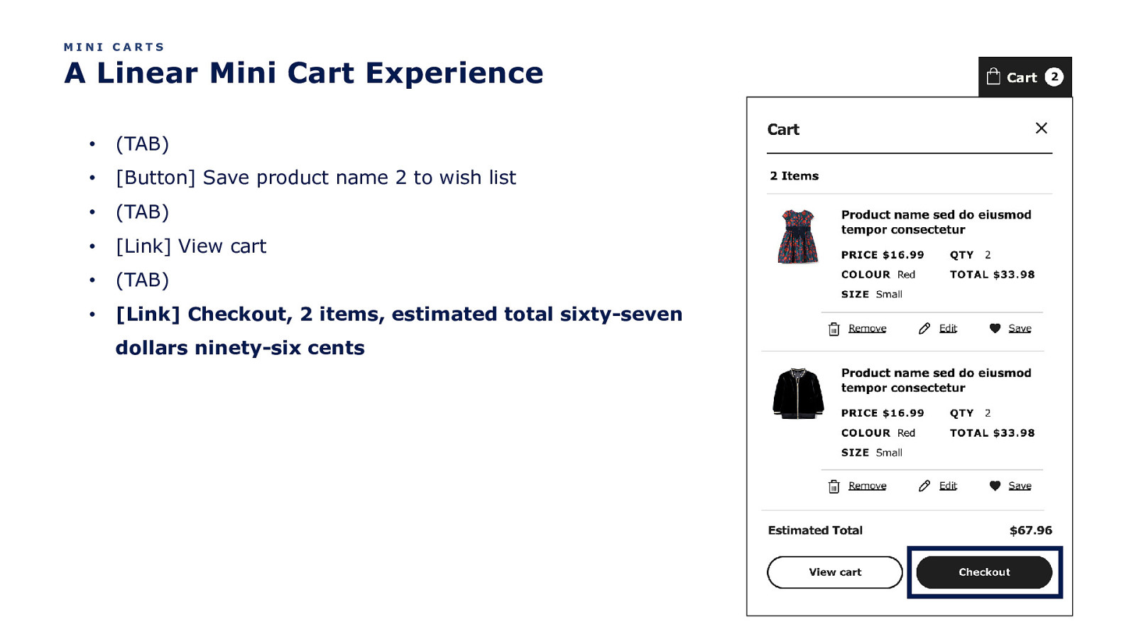
MINI CARTS A Linear Mini Cart Experience • (TAB) • [Button] Save product name 2 to wish list • (TAB) • [Link] View cart • (TAB) • [Link] Checkout, 2 items, estimated total sixty-seven dollars ninety-six cents
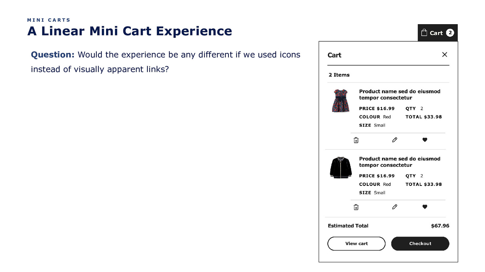
MINI CARTS A Linear Mini Cart Experience Question: Would the experience be any different if we used icons instead of visually apparent links?
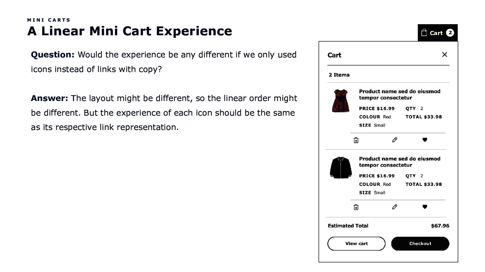
MINI CARTS A Linear Mini Cart Experience Question: Would the experience be any different if we only used icons instead of links with copy? Answer: The layout might be different, so the linear order might be different. But the experience of each icon should be the same as its respective link representation.
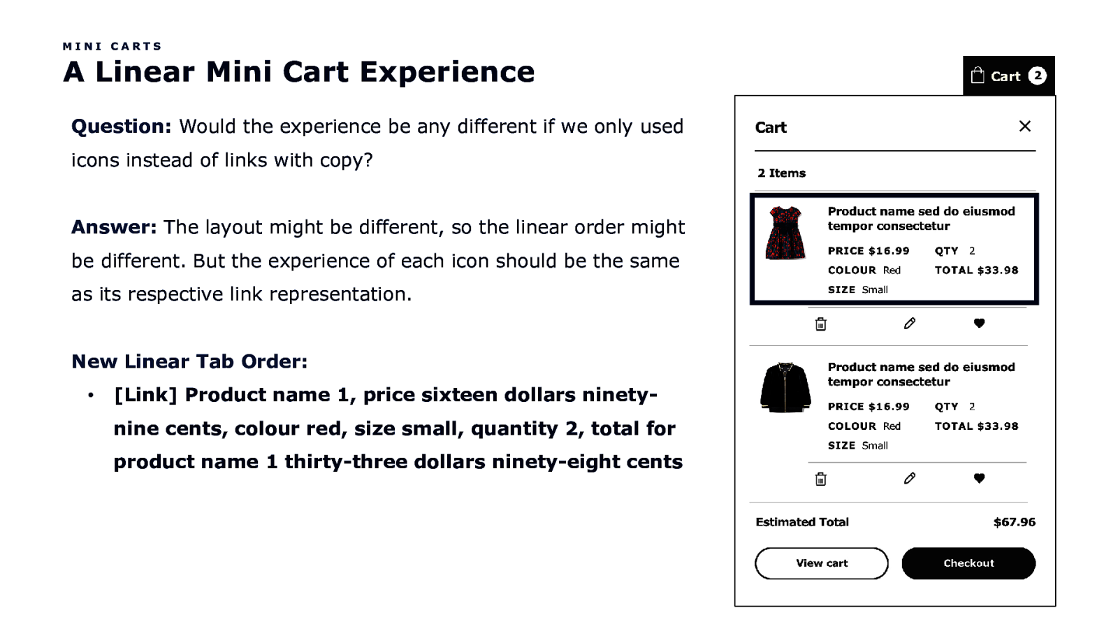
MINI CARTS A Linear Mini Cart Experience Question: Would the experience be any different if we only used icons instead of links with copy? Answer: The layout might be different, so the linear order might be different. But the experience of each icon should be the same as its respective link representation. New Linear Tab Order: • [Link] Product name 1, price sixteen dollars ninetynine cents, colour red, size small, quantity 2, total for product name 1 thirty-three dollars ninety-eight cents
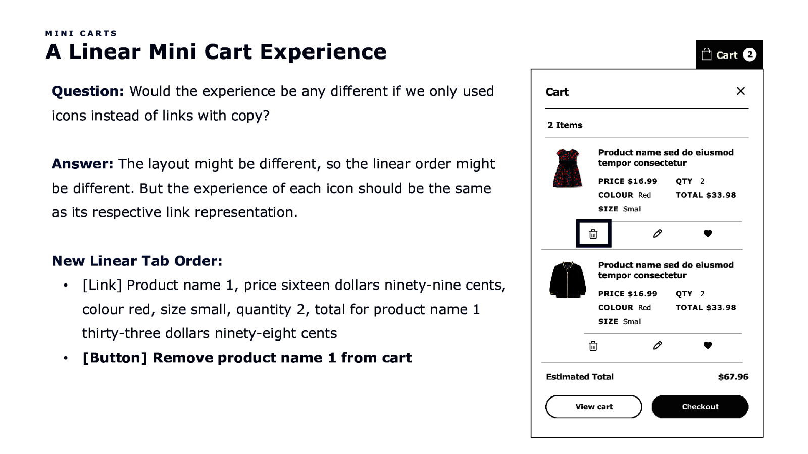
MINI CARTS A Linear Mini Cart Experience Question: Would the experience be any different if we only used icons instead of links with copy? Answer: The layout might be different, so the linear order might be different. But the experience of each icon should be the same as its respective link representation. New Linear Tab Order: • [Link] Product name 1, price sixteen dollars ninety-nine cents, colour red, size small, quantity 2, total for product name 1 thirty-three dollars ninety-eight cents • [Button] Remove product name 1 from cart
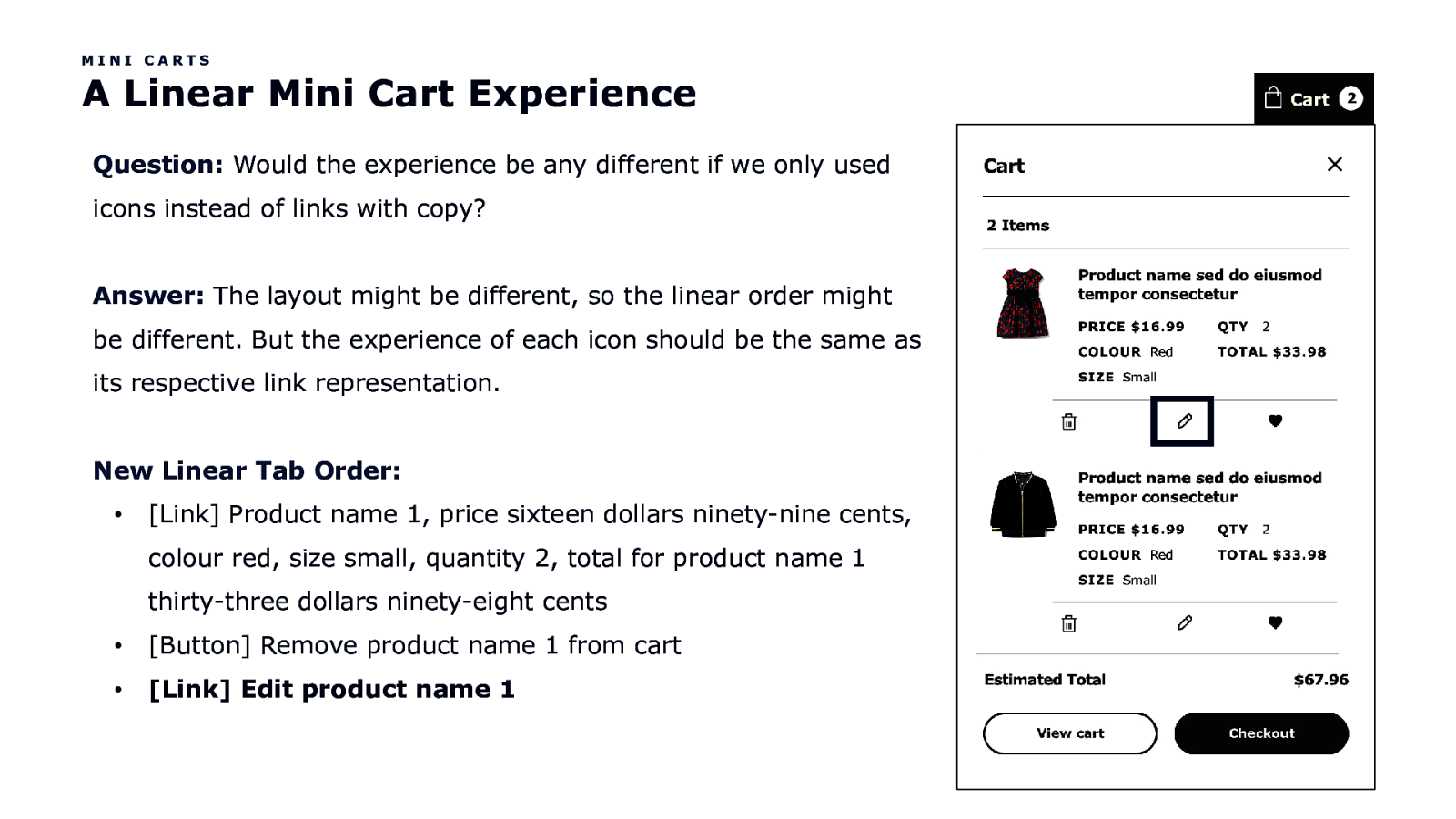
MINI CARTS A Linear Mini Cart Experience Question: Would the experience be any different if we only used icons instead of links with copy? Answer: The layout might be different, so the linear order might be different. But the experience of each icon should be the same as its respective link representation. New Linear Tab Order: • [Link] Product name 1, price sixteen dollars ninety-nine cents, colour red, size small, quantity 2, total for product name 1 thirty-three dollars ninety-eight cents • [Button] Remove product name 1 from cart • [Link] Edit product name 1
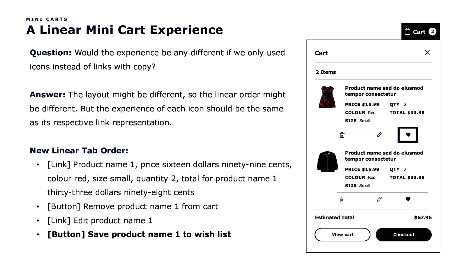
MINI CARTS A Linear Mini Cart Experience Question: Would the experience be any different if we only used icons instead of links with copy? Answer: The layout might be different, so the linear order might be different. But the experience of each icon should be the same as its respective link representation. New Linear Tab Order: • [Link] Product name 1, price sixteen dollars ninety-nine cents, colour red, size small, quantity 2, total for product name 1 thirty-three dollars ninety-eight cents • [Button] Remove product name 1 from cart • [Link] Edit product name 1 • [Button] Save product name 1 to wish list
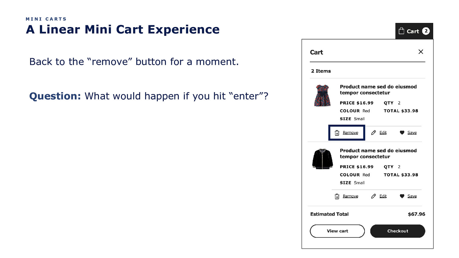
MINI CARTS A Linear Mini Cart Experience Back to the “remove” button for a moment. Question: What would happen if you hit “enter”?
Well, the product card is removed from the cart silly!
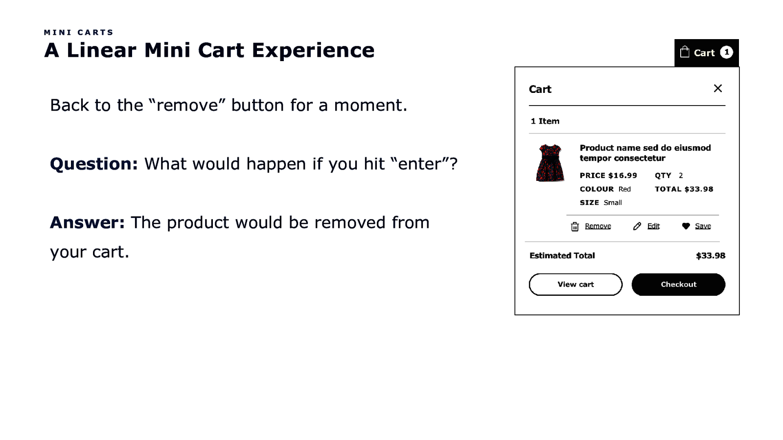
MINI CARTS A Linear Mini Cart Experience Back to the “remove” button for a moment. Question: What would happen if you hit “enter”? Answer: The product would be removed from your cart.

But what is the experience?
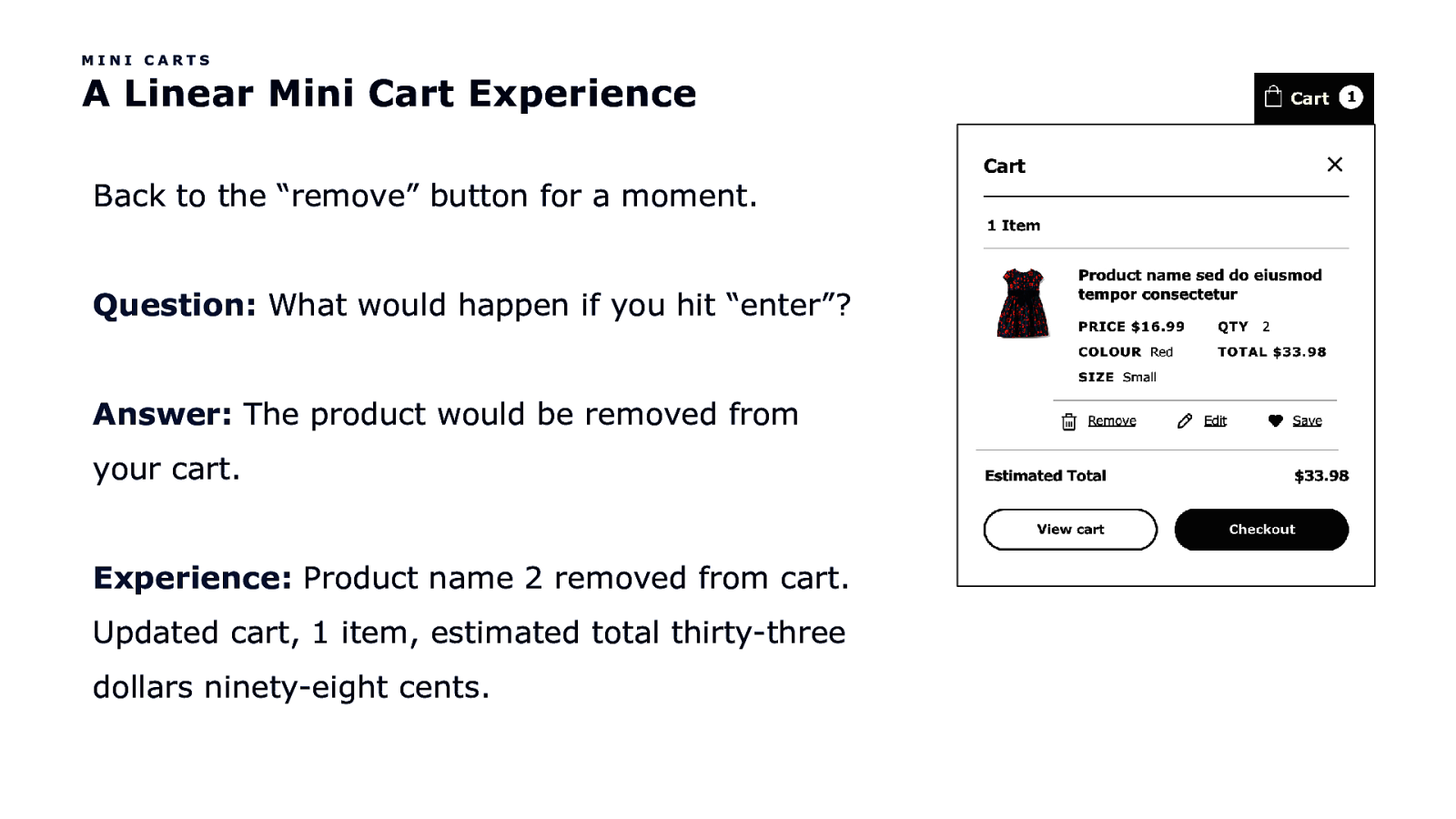
MINI CARTS A Linear Mini Cart Experience Back to the “remove” button for a moment. Question: What would happen if you hit “enter”? Answer: The product would be removed from your cart. Experience: Product name 2 removed from cart. Updated cart, 1 item, estimated total thirty-three dollars ninety-eight cents.
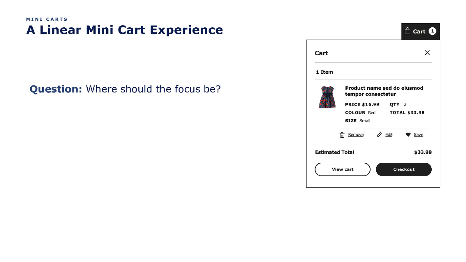
MINI CARTS A Linear Mini Cart Experience Question: Where should the focus be?
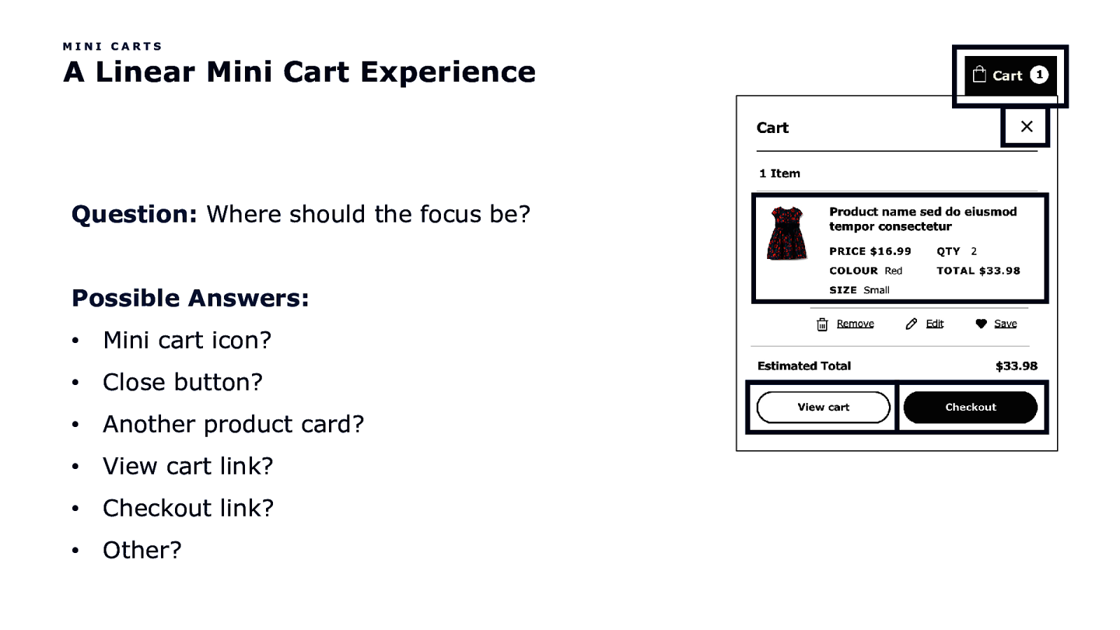
MINI CARTS A Linear Mini Cart Experience Question: Where should the focus be? Possible Answers: • Mini cart icon? • Close button? • Another product card? • View cart link? • Checkout link? • Other?
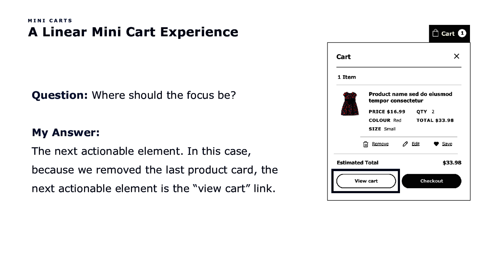
MINI CARTS A Linear Mini Cart Experience Question: Where should the focus be? My Answer: The next actionable element. In this case, because we removed the last product card, the next actionable element is the “view cart” link.
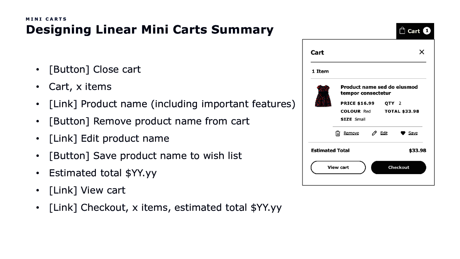
MINI CARTS Designing Linear Mini Carts Summary • [Button] Close cart • Cart, x items • [Link] Product name (including important features) • [Button] Remove product name from cart • [Link] Edit product name • [Button] Save product name to wish list • Estimated total $YY.yy • [Link] View cart • [Link] Checkout, x items, estimated total $YY.yy

One more thing…
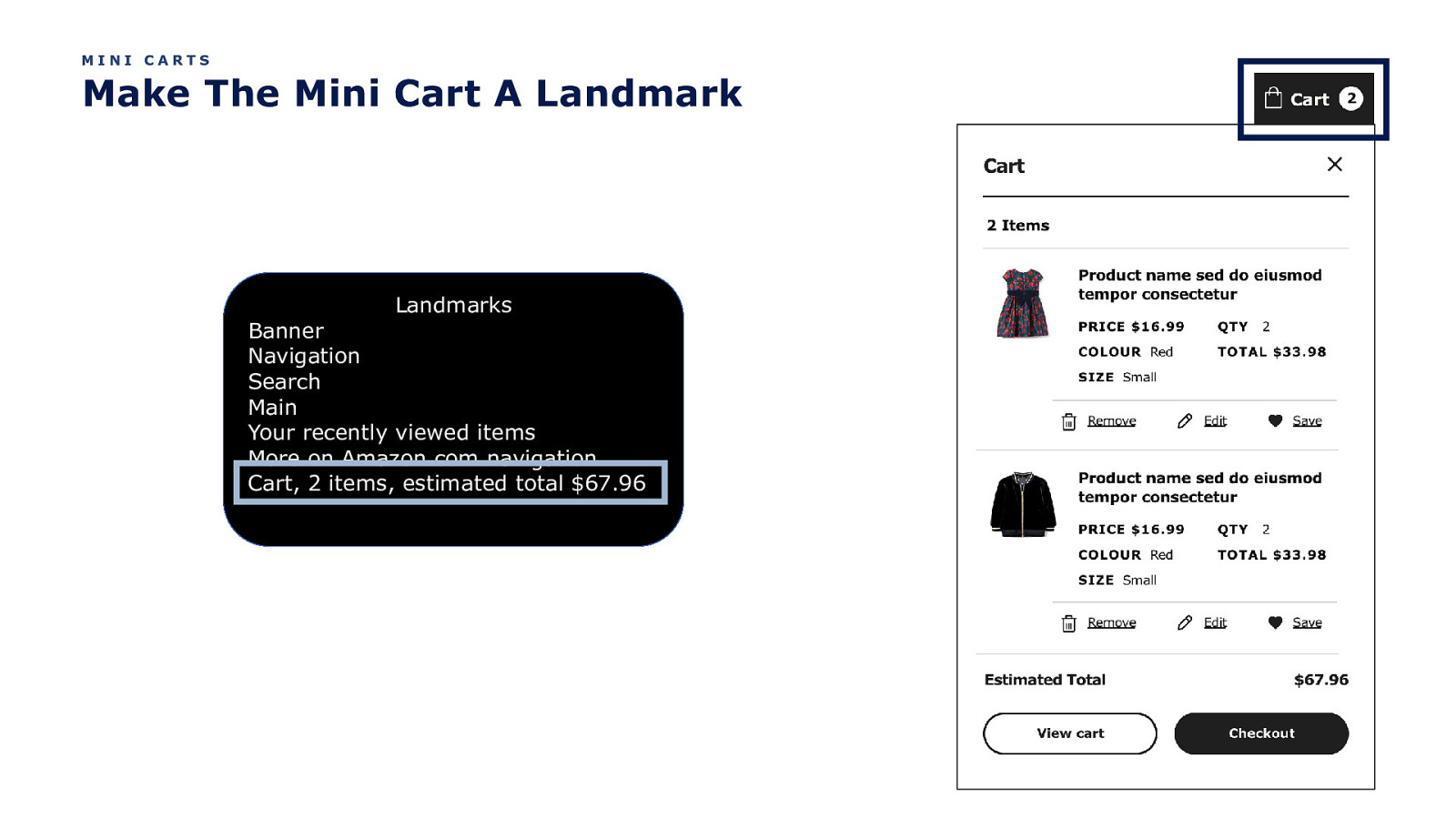
MINI CARTS Make The Mini Cart A Landmark Landmarks Banner Navigation Search Main Your recently viewed items More on Amazon.com navigation Cart, 2 items, estimated total $67.96

Filters
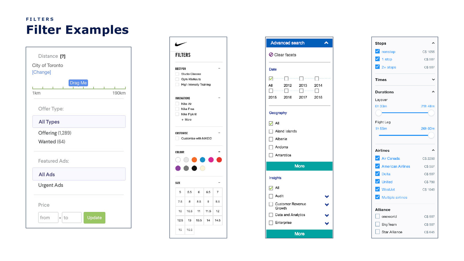
FILTERS Filter Examples
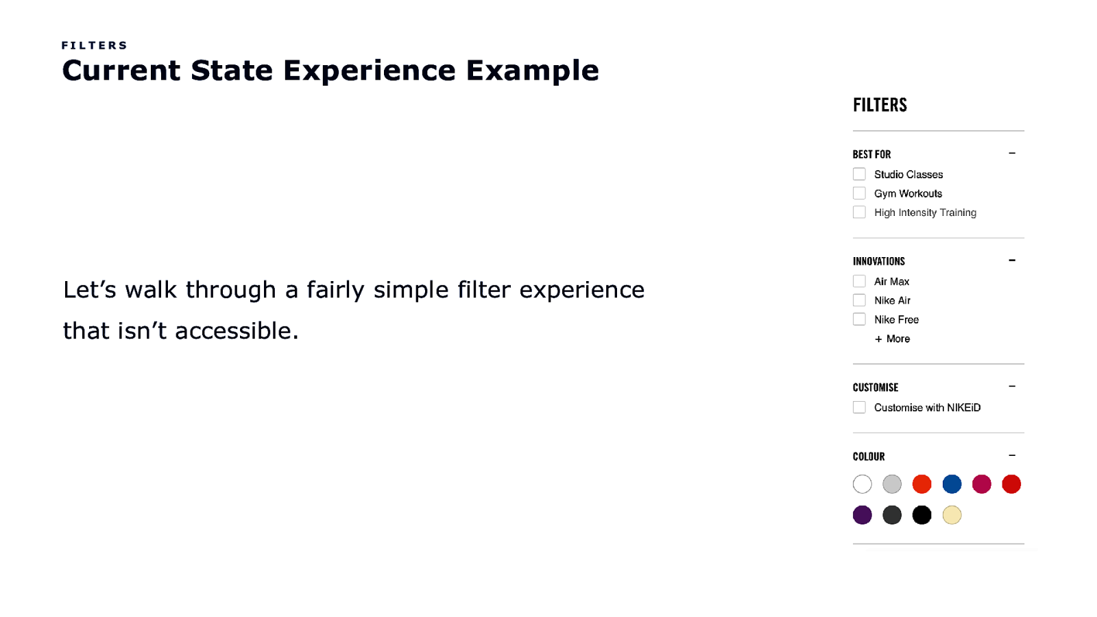
FILTERS Current State Experience Example Let’s walk through a fairly simple filter experience that isn’t accessible.
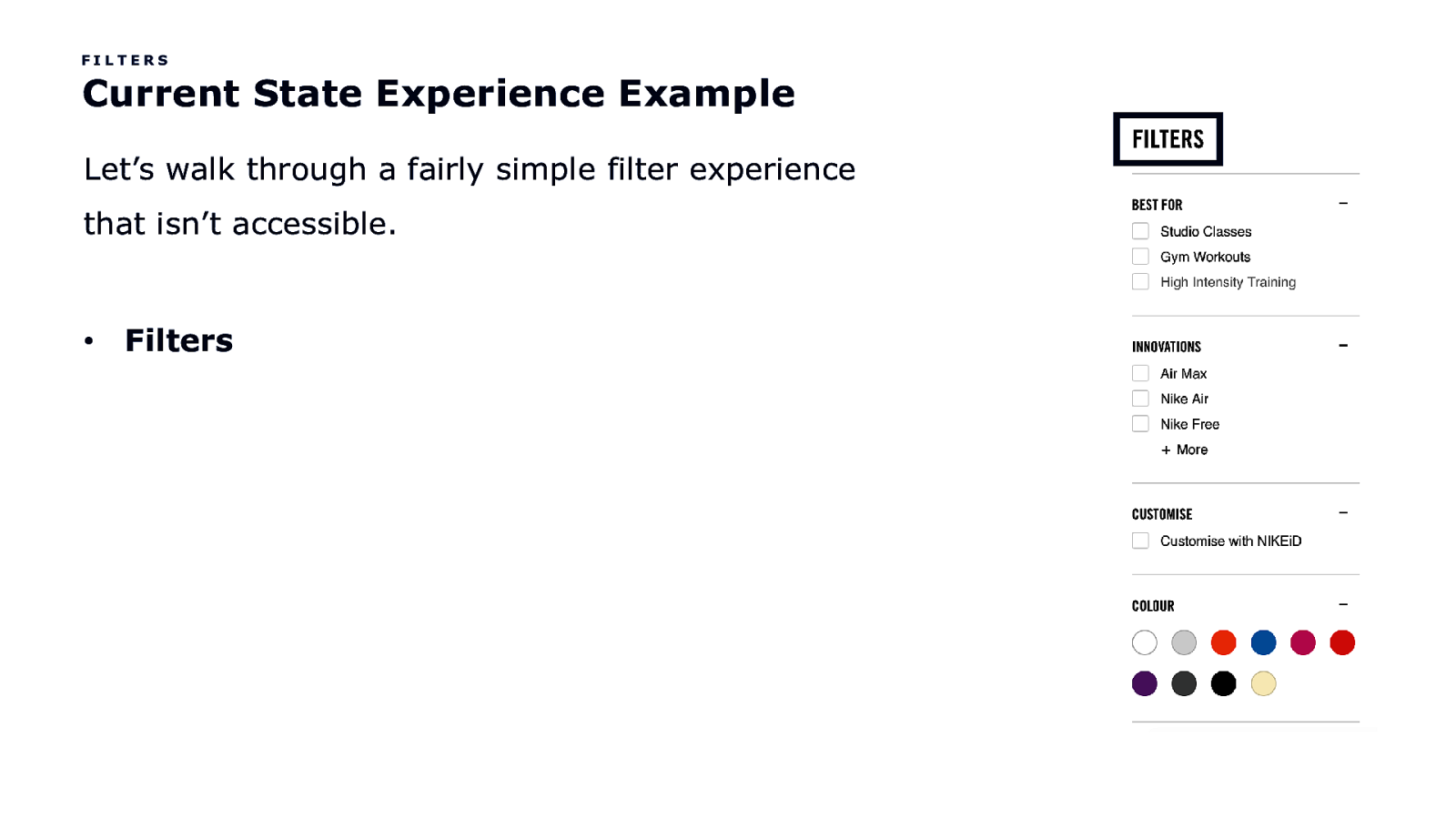
FILTERS Current State Experience Example Let’s walk through a fairly simple filter experience that isn’t accessible. • Filters
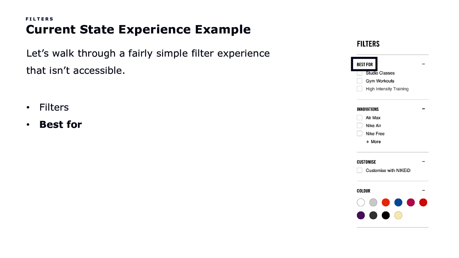
FILTERS Current State Experience Example Let’s walk through a fairly simple filter experience that isn’t accessible. • Filters • Best for
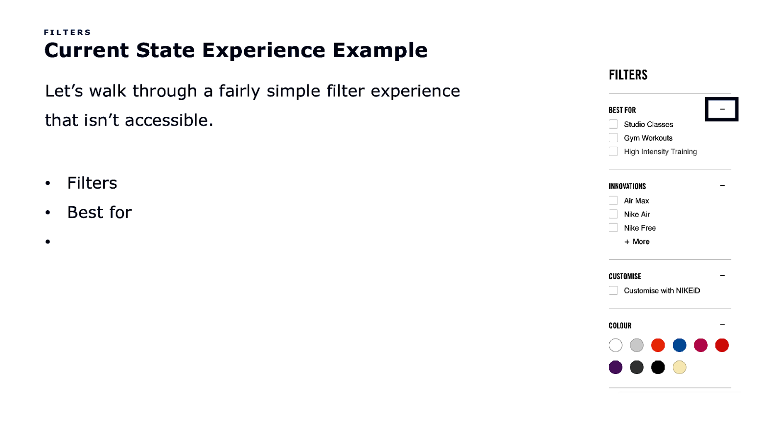
FILTERS Current State Experience Example Let’s walk through a fairly simple filter experience that isn’t accessible. • Filters • Best for •
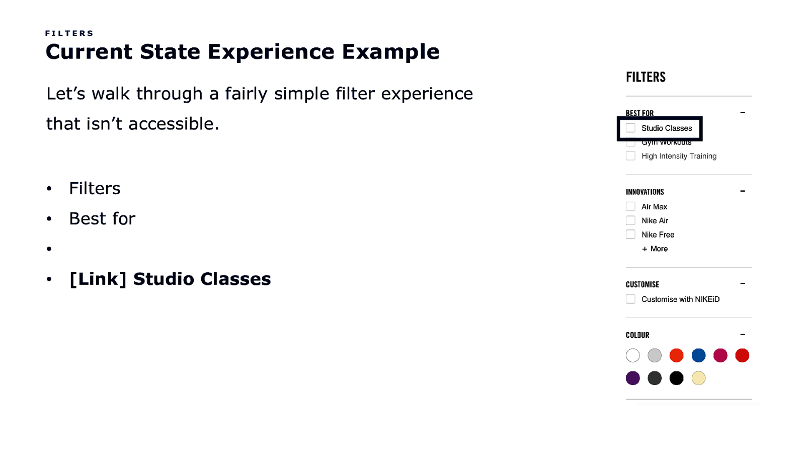
FILTERS Current State Experience Example Let’s walk through a fairly simple filter experience that isn’t accessible. • Filters • Best for • • [Link] Studio Classes
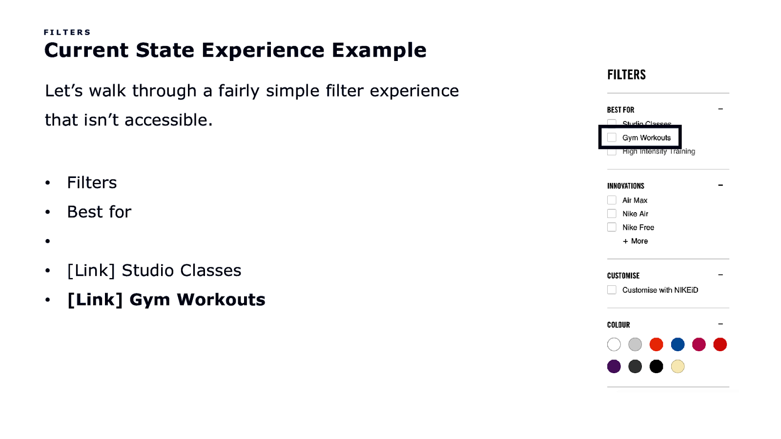
FILTERS Current State Experience Example Let’s walk through a fairly simple filter experience that isn’t accessible. • Filters • Best for • • [Link] Studio Classes • [Link] Gym Workouts
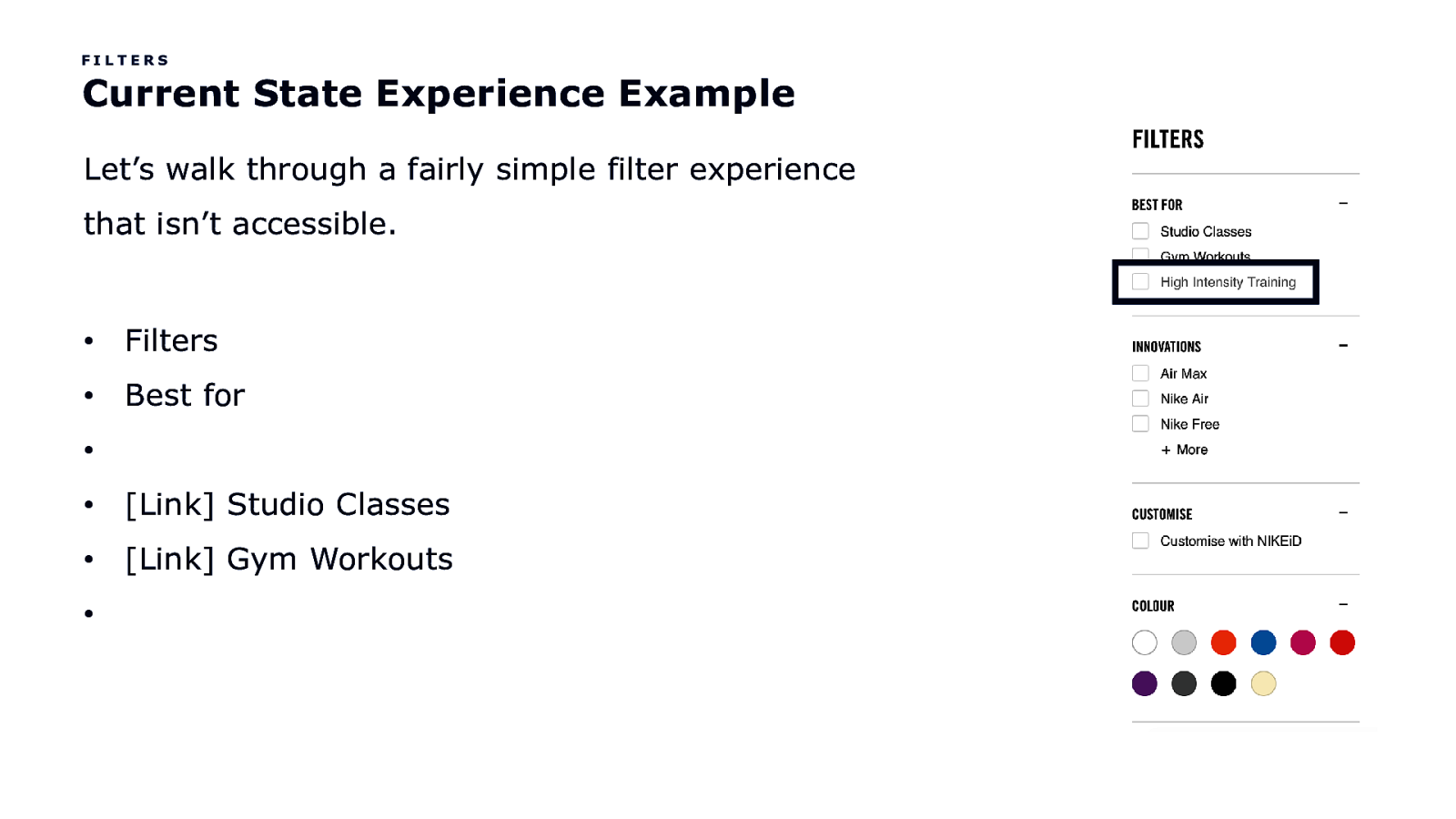
FILTERS Current State Experience Example Let’s walk through a fairly simple filter experience that isn’t accessible. • Filters • Best for • • [Link] Studio Classes • [Link] Gym Workouts •
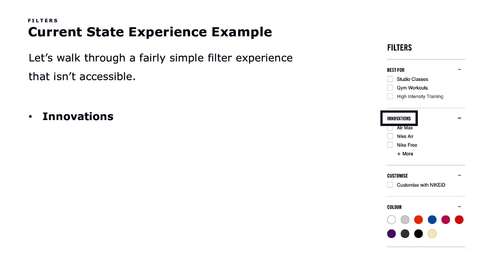
FILTERS Current State Experience Example Let’s walk through a fairly simple filter experience that isn’t accessible. • Innovations
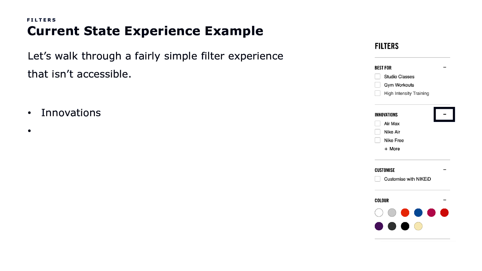
FILTERS Current State Experience Example Let’s walk through a fairly simple filter experience that isn’t accessible. • • Innovations
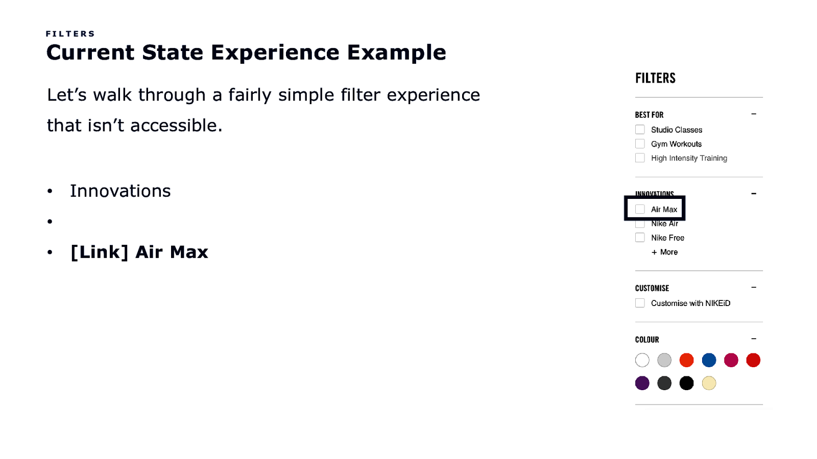
FILTERS Current State Experience Example Let’s walk through a fairly simple filter experience that isn’t accessible. • Innovations • • [Link] Air Max
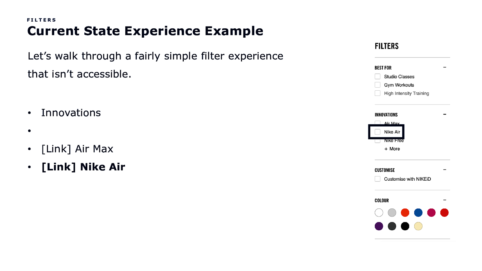
FILTERS Current State Experience Example Let’s walk through a fairly simple filter experience that isn’t accessible. • Innovations • • [Link] Air Max • [Link] Nike Air
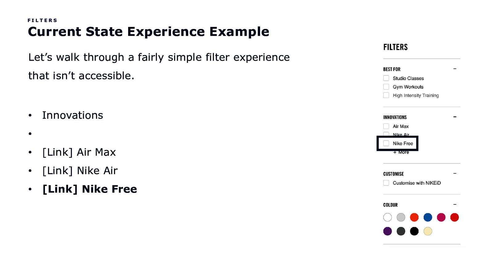
FILTERS Current State Experience Example Let’s walk through a fairly simple filter experience that isn’t accessible. • Innovations • • [Link] Air Max • [Link] Nike Air • [Link] Nike Free
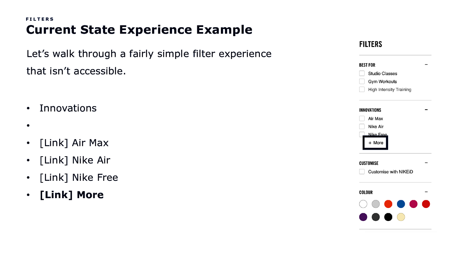
FILTERS Current State Experience Example Let’s walk through a fairly simple filter experience that isn’t accessible. • Innovations • • [Link] Air Max • [Link] Nike Air • [Link] Nike Free • [Link] More
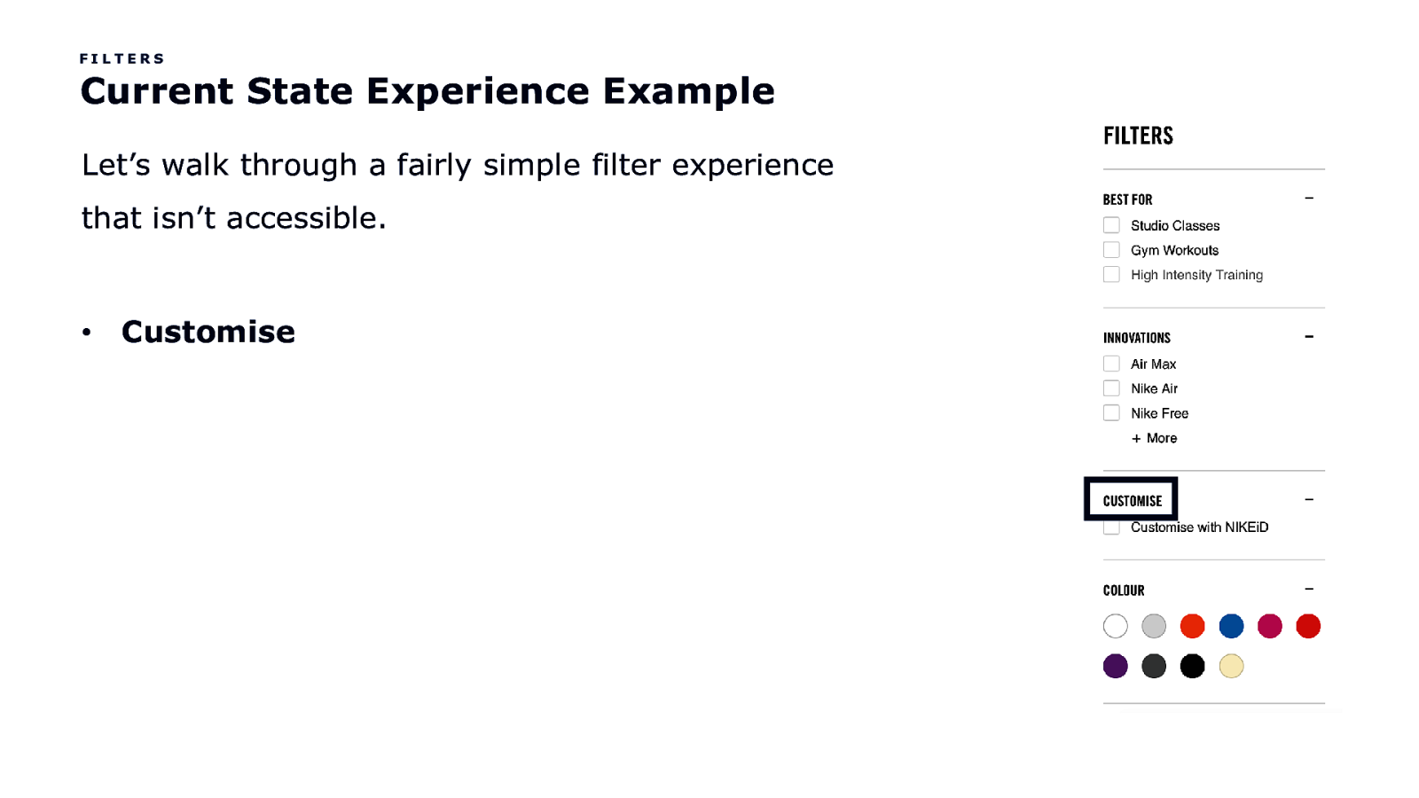
FILTERS Current State Experience Example Let’s walk through a fairly simple filter experience that isn’t accessible. • Customise
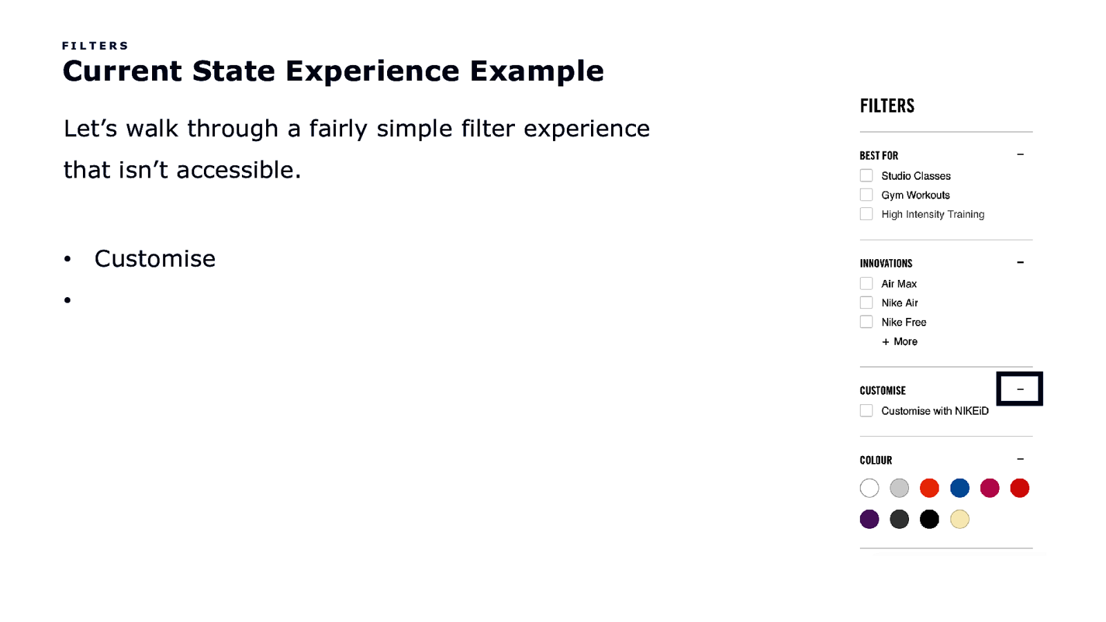
FILTERS Current State Experience Example Let’s walk through a fairly simple filter experience that isn’t accessible. • • Customise
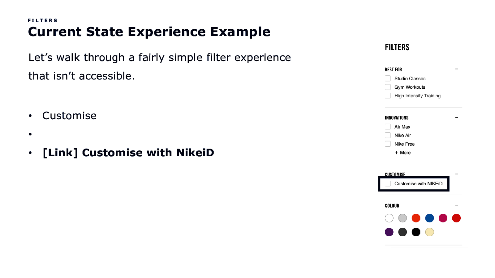
FILTERS Current State Experience Example Let’s walk through a fairly simple filter experience that isn’t accessible. • Customise • • [Link] Customise with NikeiD
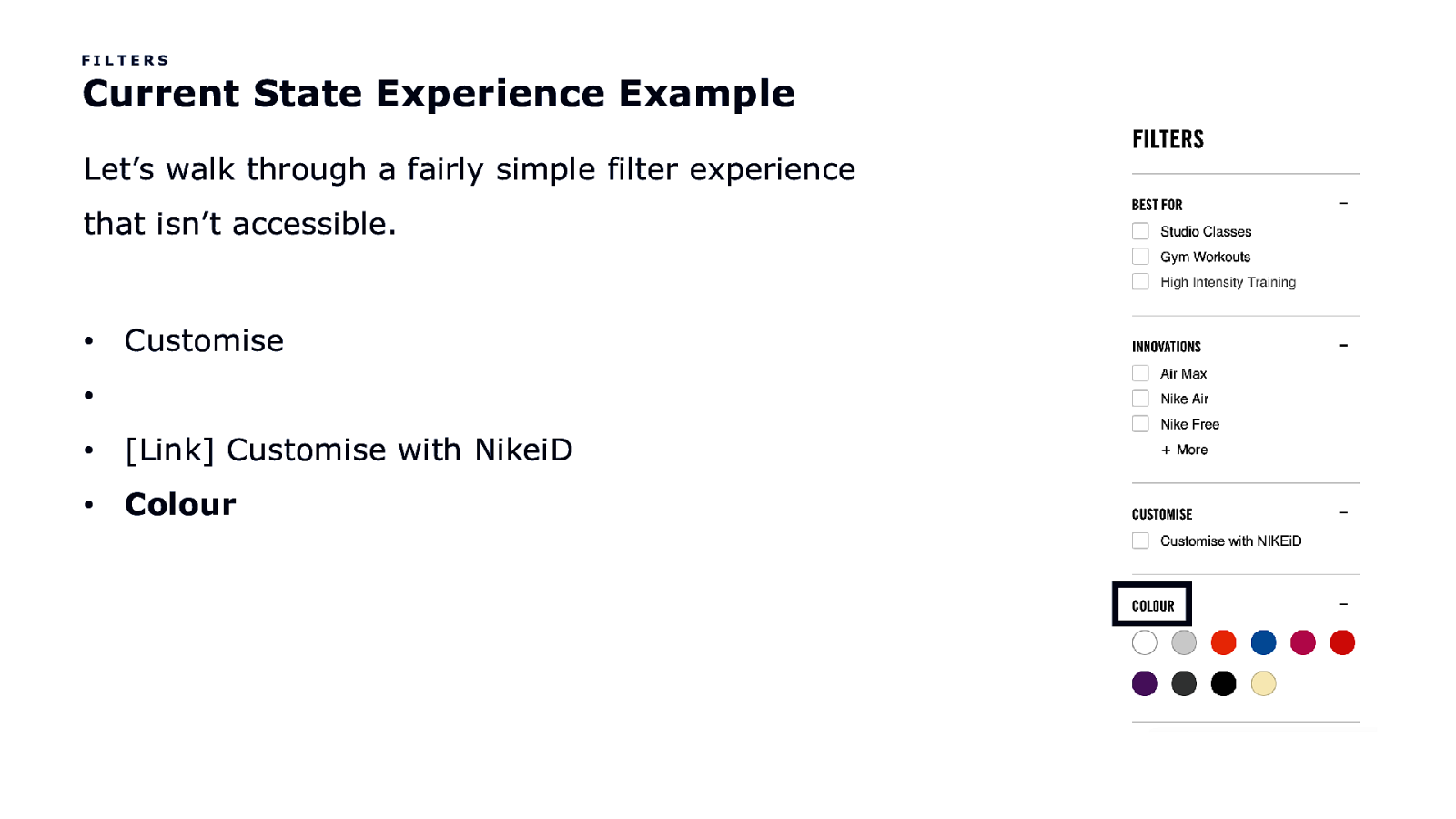
FILTERS Current State Experience Example Let’s walk through a fairly simple filter experience that isn’t accessible. • Customise • • [Link] Customise with NikeiD • Colour
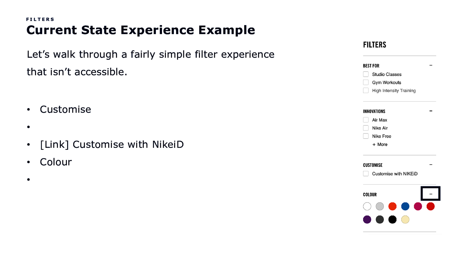
FILTERS Current State Experience Example Let’s walk through a fairly simple filter experience that isn’t accessible. • Customise • • [Link] Customise with NikeiD • Colour •
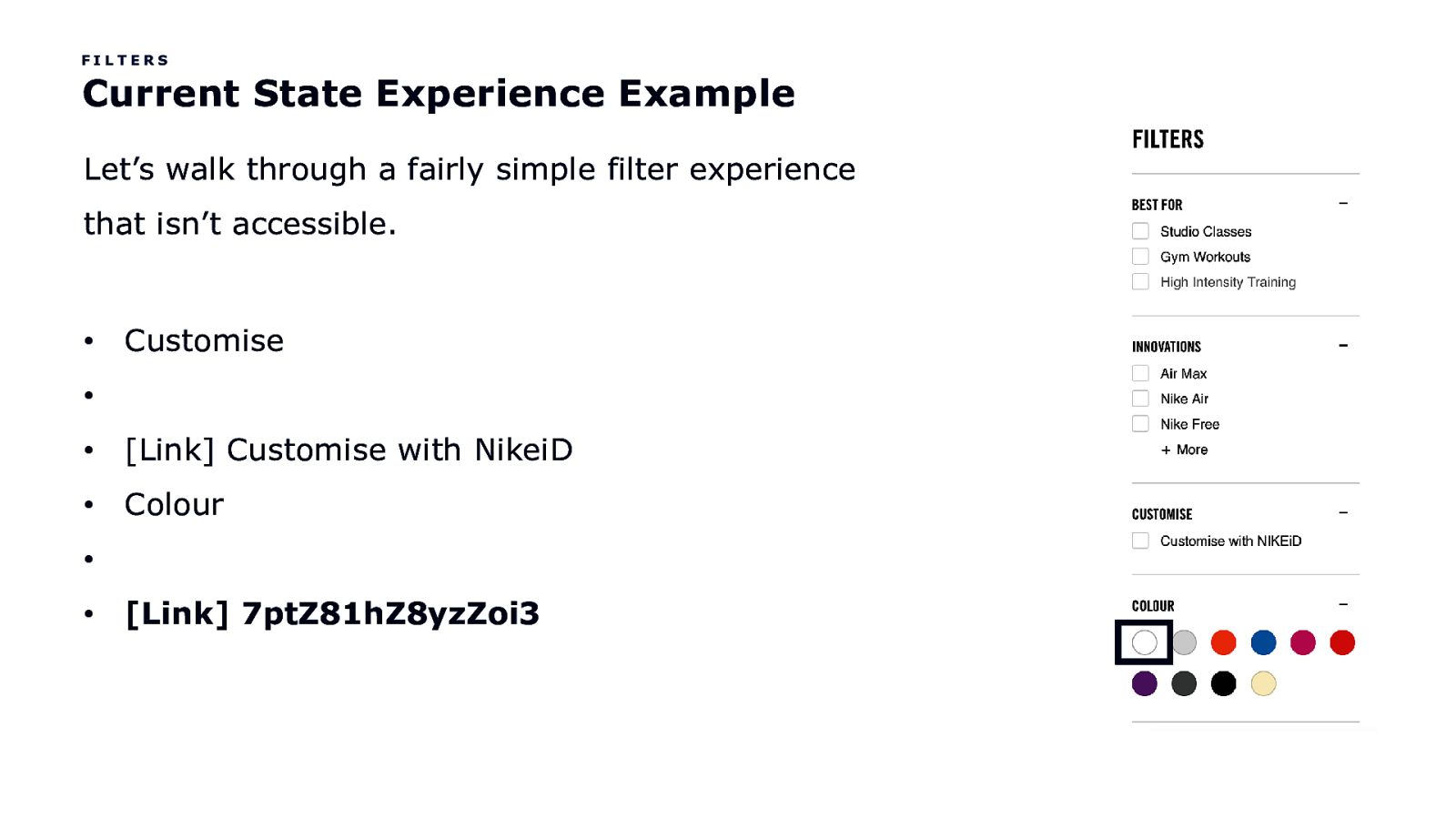
FILTERS Current State Experience Example Let’s walk through a fairly simple filter experience that isn’t accessible. • Customise • • [Link] Customise with NikeiD • Colour • • [Link] 7ptZ81hZ8yzZoi3
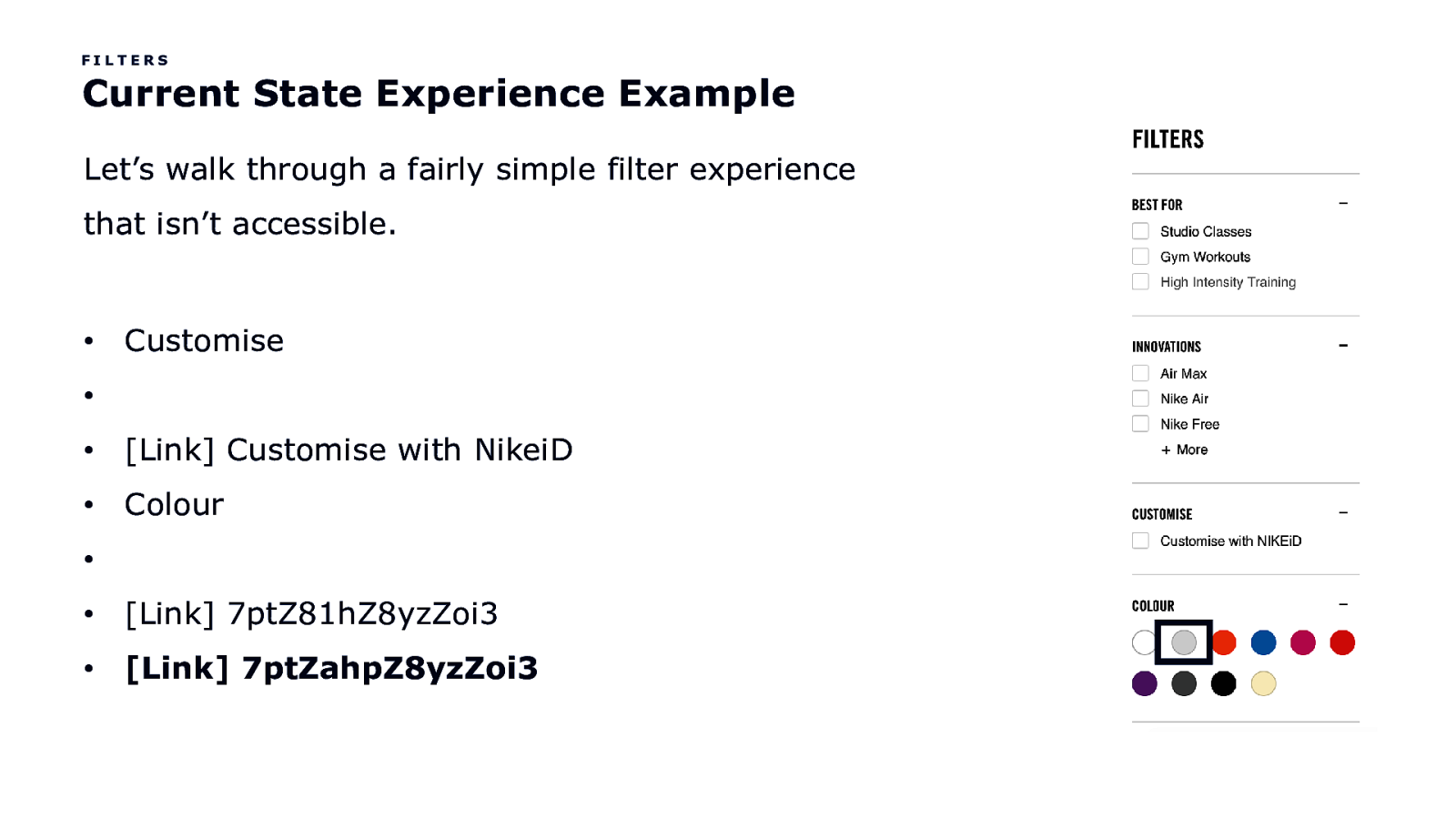
FILTERS Current State Experience Example Let’s walk through a fairly simple filter experience that isn’t accessible. • Customise • • [Link] Customise with NikeiD • Colour • • [Link] 7ptZ81hZ8yzZoi3 • [Link] 7ptZahpZ8yzZoi3
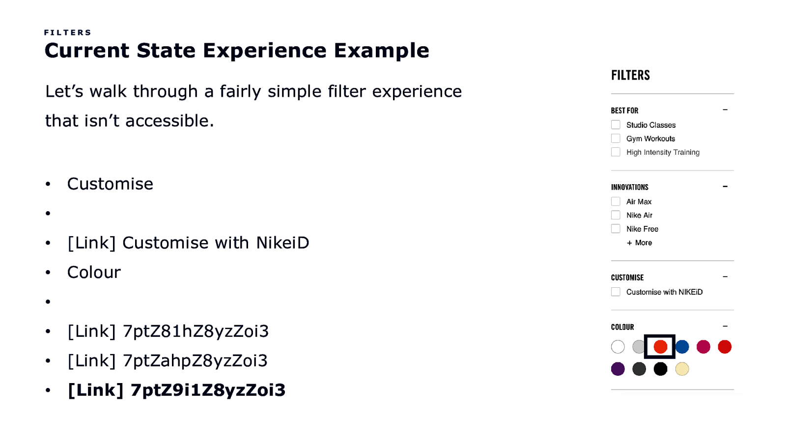
FILTERS Current State Experience Example Let’s walk through a fairly simple filter experience that isn’t accessible. • Customise • • [Link] Customise with NikeiD • Colour • • [Link] 7ptZ81hZ8yzZoi3 • [Link] 7ptZahpZ8yzZoi3 • [Link] 7ptZ9i1Z8yzZoi3

Like, OMG!
Let’s improve the experience, shall we?
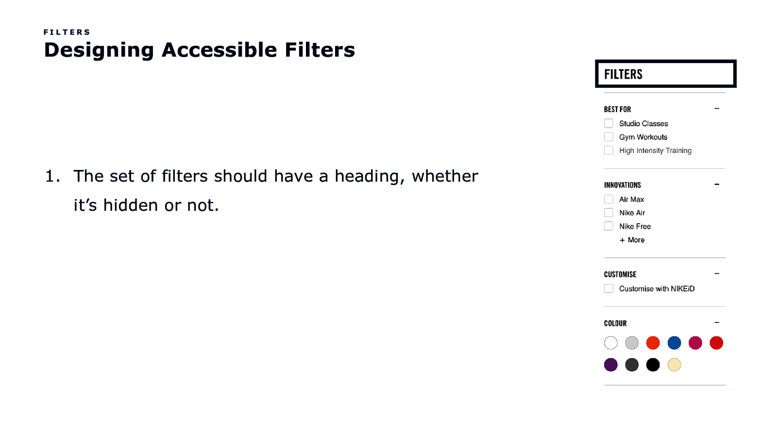
FILTERS Designing Accessible Filters
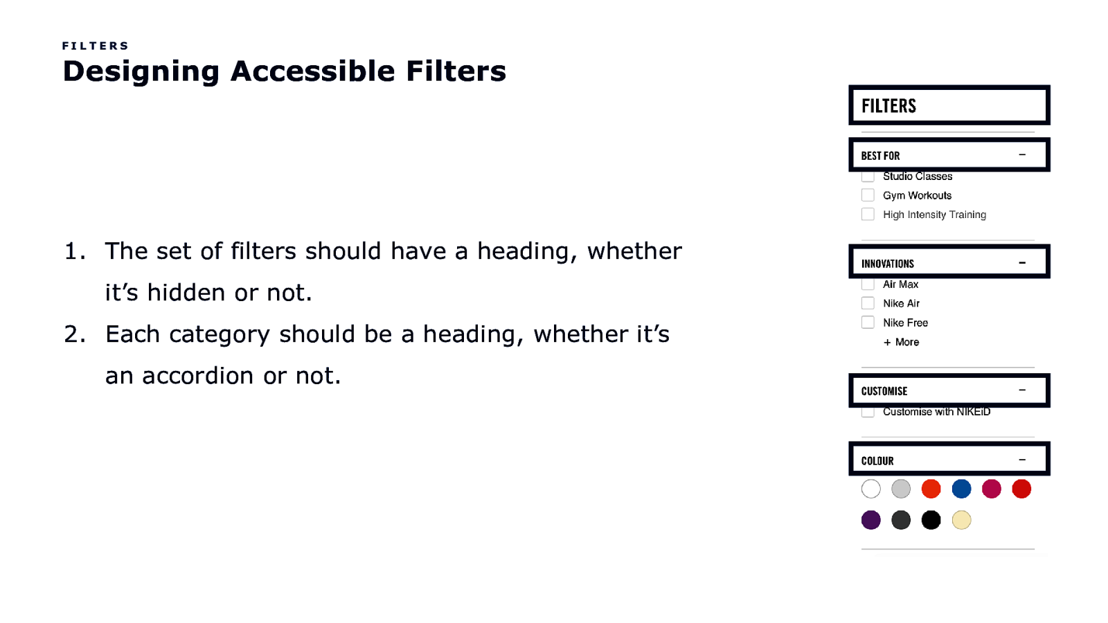
FILTERS Designing Accessible Filters
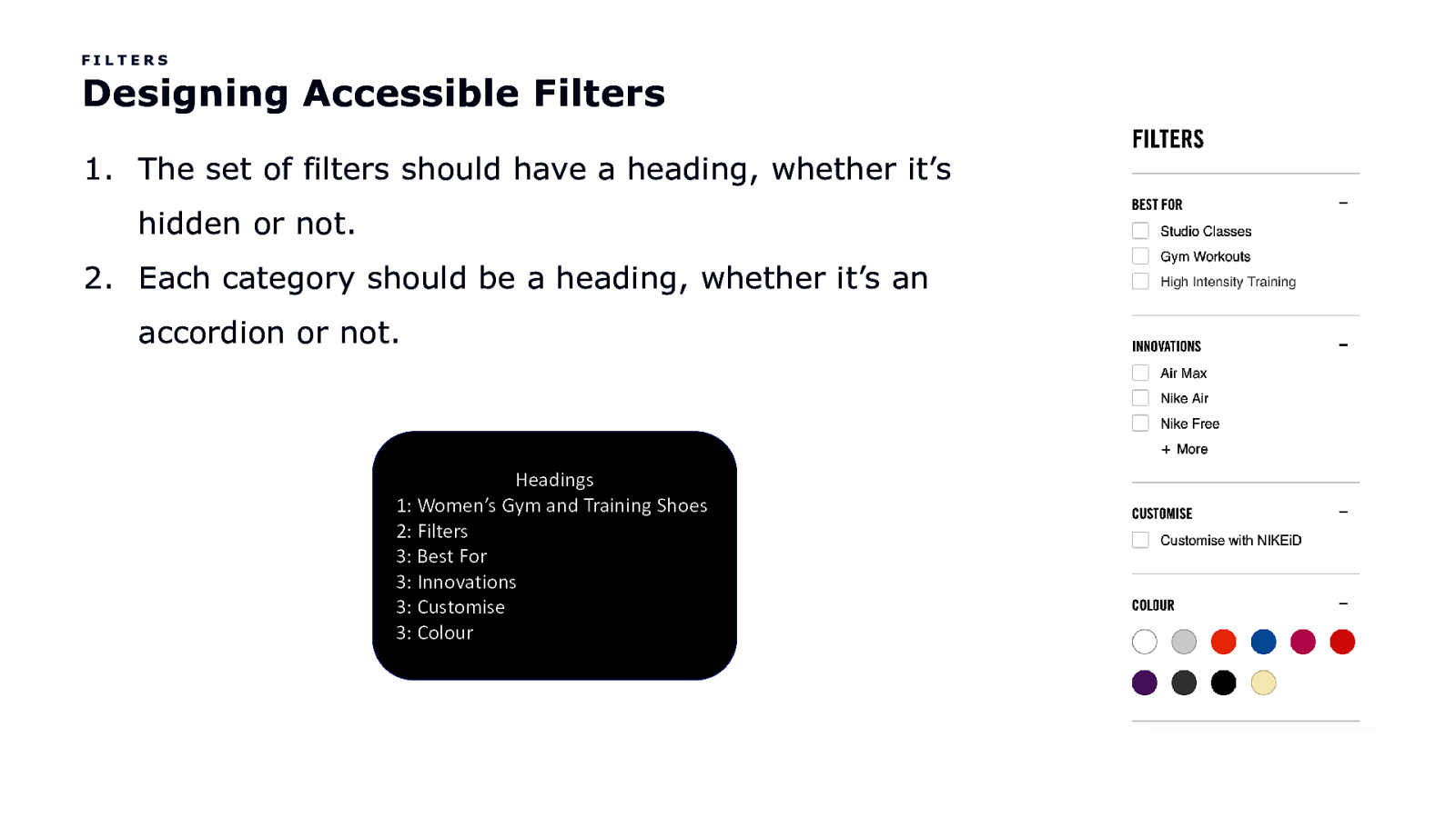
FILTERS Designing Accessible Filters 1. The set of filters should have a heading, whether it’s hidden or not. 2. Each category should be a heading, whether it’s an accordion or not. Headings 1: Women’s Gym and Training Shoes 2: Filters 3: Best For 3: Innovations 3: Customise 3: Colour
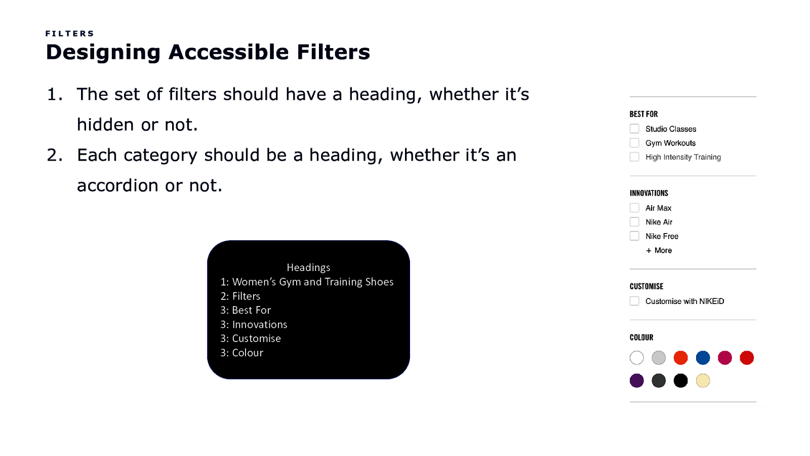
FILTERS Designing Accessible Filters 1. The set of filters should have a heading, whether it’s hidden or not. 2. Each category should be a heading, whether it’s an accordion or not. Headings 1: Women’s Gym and Training Shoes 2: Filters 3: Best For 3: Innovations 3: Customise 3: Colour
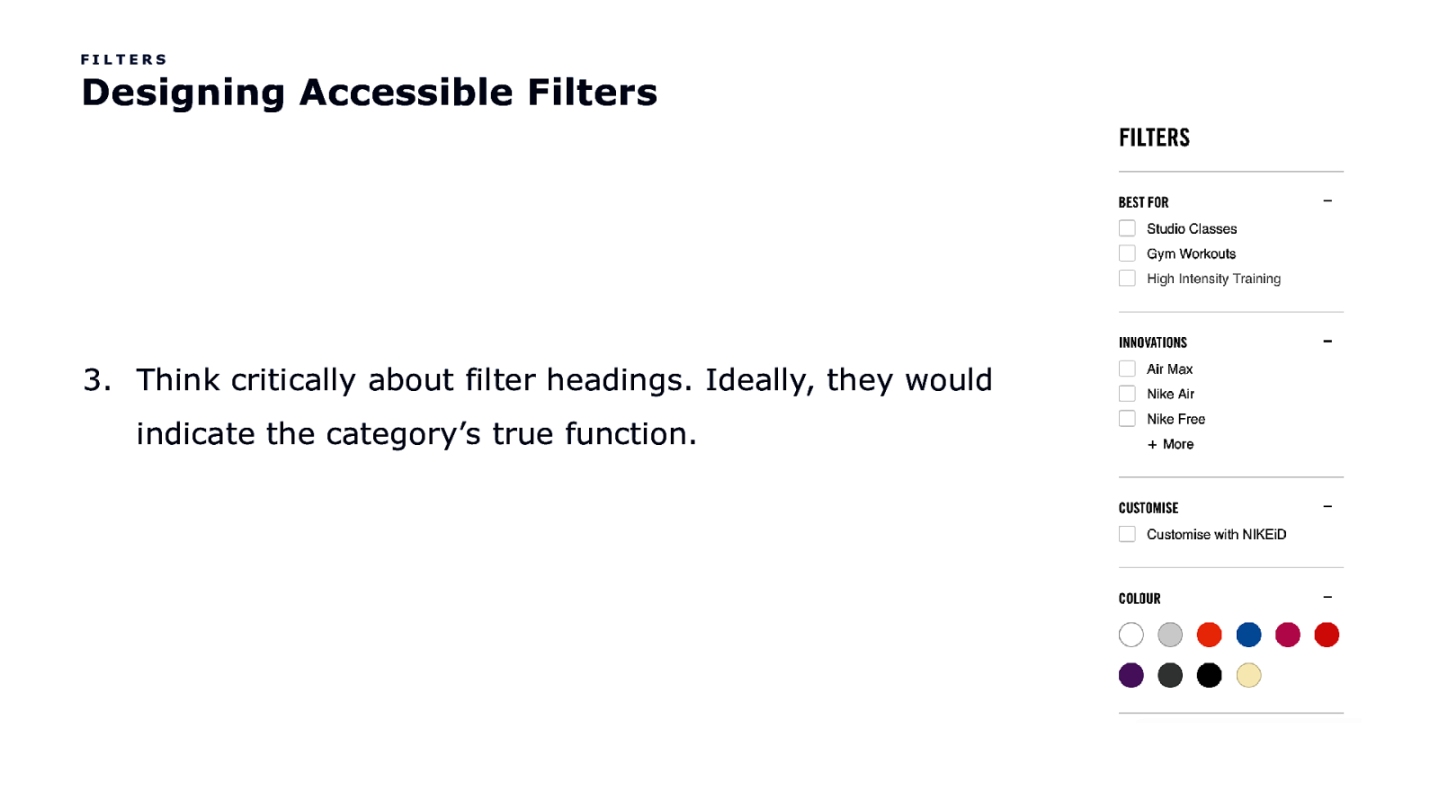
FILTERS Designing Accessible Filters 3. Think critically about filter headings. Ideally, they would indicate the category’s true function.

FILTERS Designing Accessible Filters 3. Think critically about filter headings. Ideally, they would indicate the category’s true function. Headings 1: Women’s Gym and Training Shoes 2: Filters 3: Best For 3: Innovations 3: Customise 3: Colour
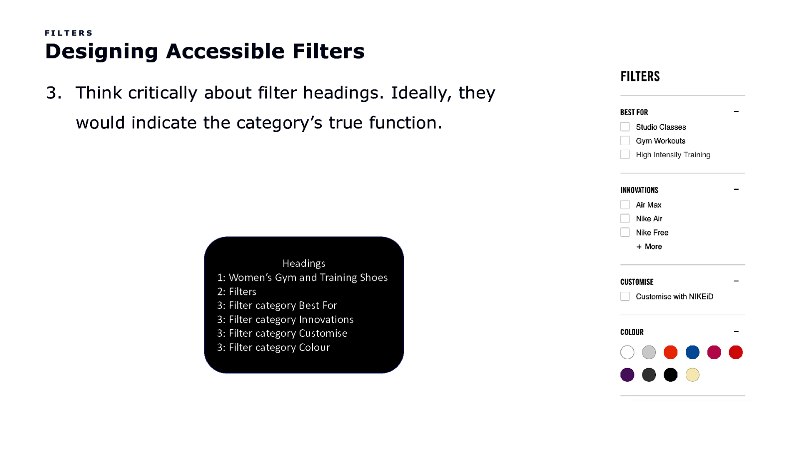
FILTERS Designing Accessible Filters 3. Think critically about filter headings. Ideally, they would indicate the category’s true function. Headings 1: Women’s Gym and Training Shoes 2: Filters 3: Filter category Best For 3: Filter category Innovations 3: Filter category Customise 3: Filter category Colour
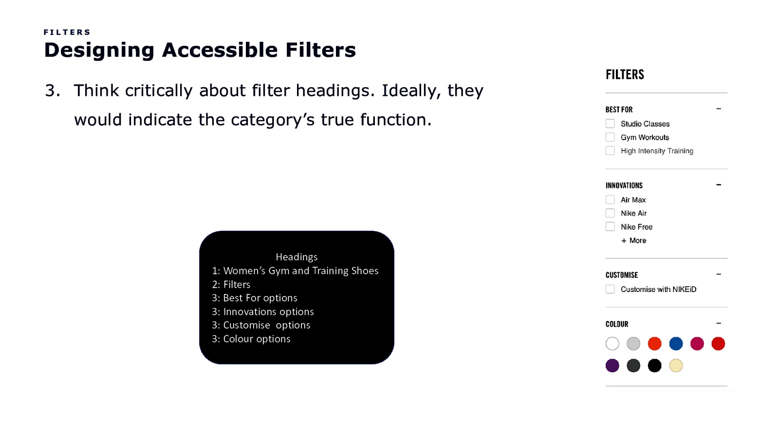
FILTERS Designing Accessible Filters 3. Think critically about filter headings. Ideally, they would indicate the category’s true function. Headings 1: Women’s Gym and Training Shoes 2: Filters 3: Best For options 3: Innovations options 3: Customise options 3: Colour options
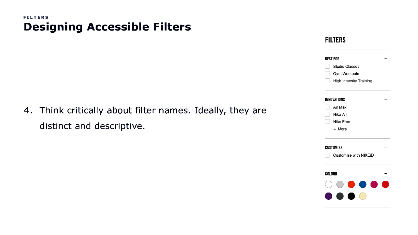
FILTERS Designing Accessible Filters 4. Think critically about filter names. Ideally, they are distinct and descriptive.
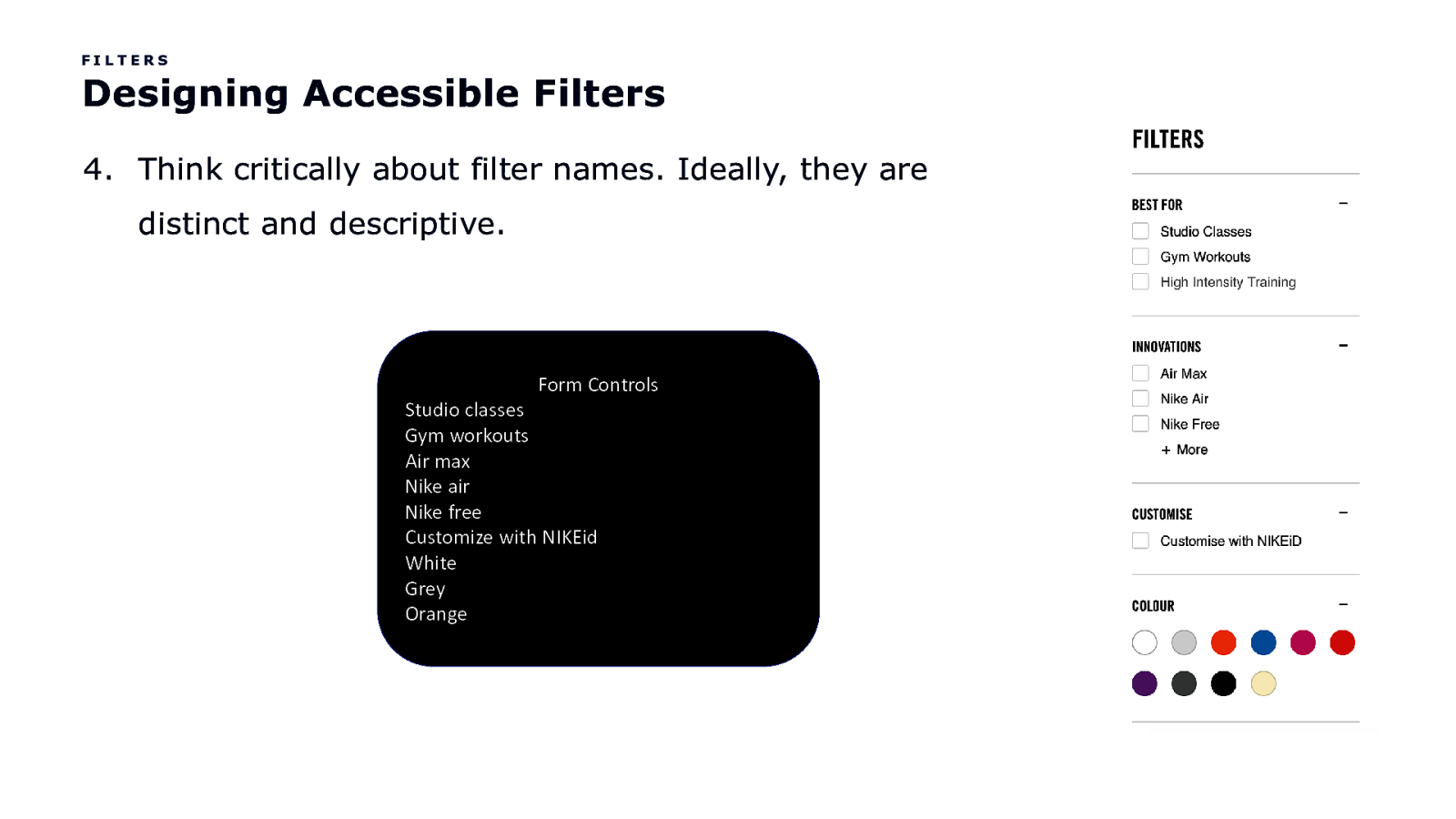
FILTERS Designing Accessible Filters 4. Think critically about filter names. Ideally, they are distinct and descriptive. Form Controls Studio classes Gym workouts Air max Nike air Nike free Customize with NIKEid White Grey Orange
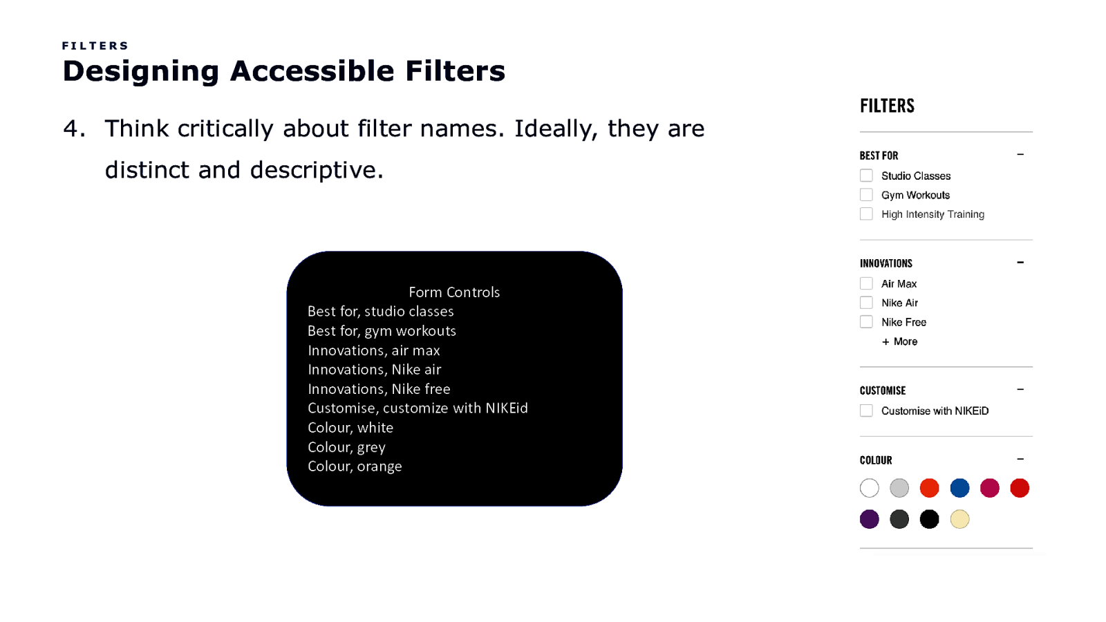
FILTERS Designing Accessible Filters 4. Think critically about filter names. Ideally, they are distinct and descriptive. Form Controls Best for, studio classes Best for, gym workouts Innovations, air max Innovations, Nike air Innovations, Nike free Customise, customize with NIKEid Colour, white Colour, grey Colour, orange
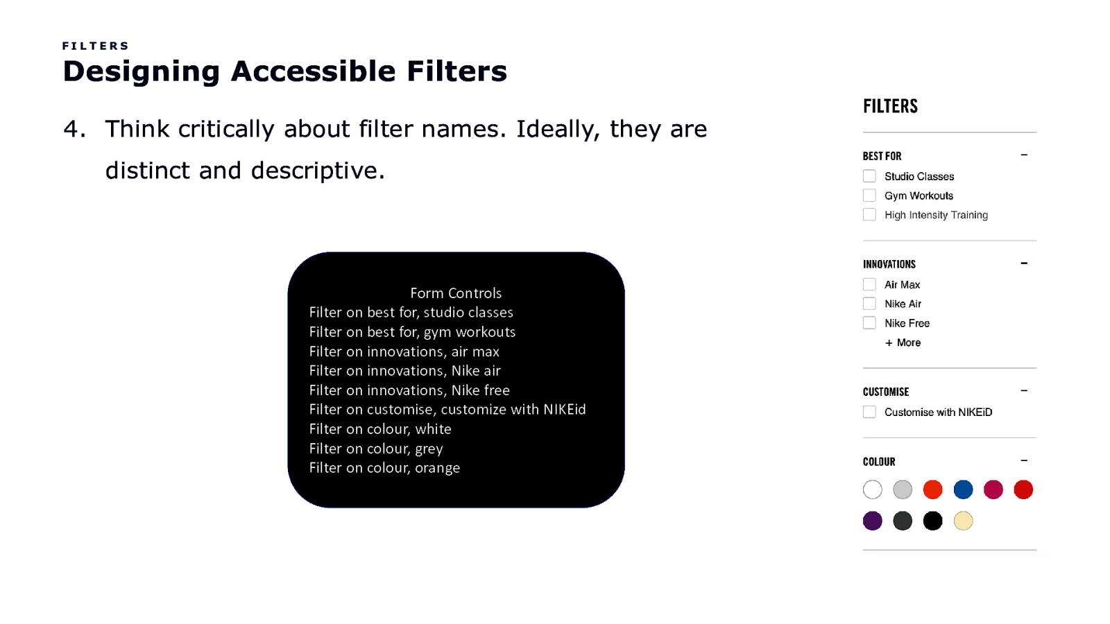
FILTERS Designing Accessible Filters 4. Think critically about filter names. Ideally, they are distinct and descriptive. Form Controls Filter on best for, studio classes Filter on best for, gym workouts Filter on innovations, air max Filter on innovations, Nike air Filter on innovations, Nike free Filter on customise, customize with NIKEid Filter on colour, white Filter on colour, grey Filter on colour, orange
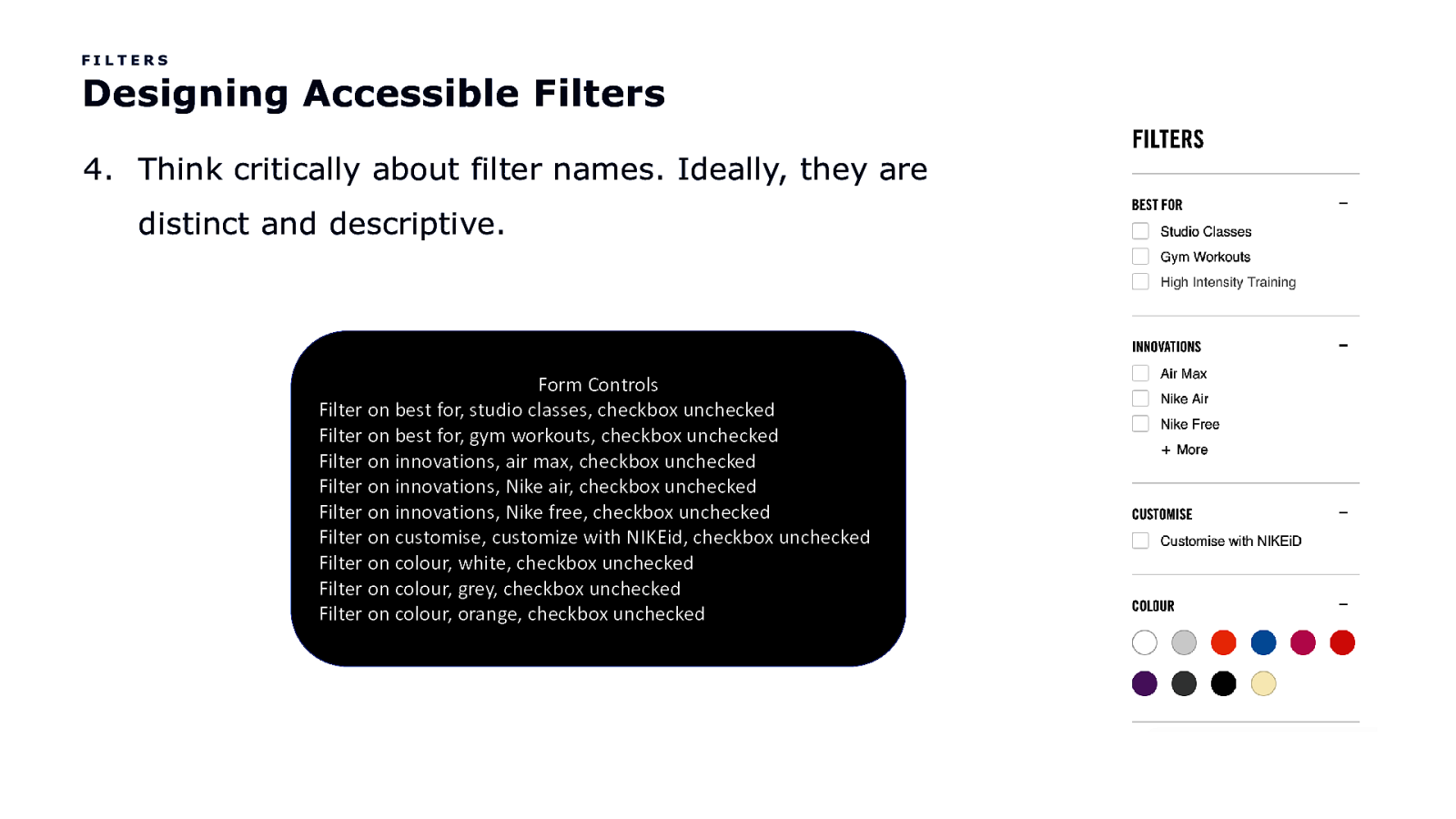
FILTERS Designing Accessible Filters 4. Think critically about filter names. Ideally, they are distinct and descriptive. Form Controls Filter on best for, studio classes, checkbox unchecked Filter on best for, gym workouts, checkbox unchecked Filter on innovations, air max, checkbox unchecked Filter on innovations, Nike air, checkbox unchecked Filter on innovations, Nike free, checkbox unchecked Filter on customise, customize with NIKEid, checkbox unchecked Filter on colour, white, checkbox unchecked Filter on colour, grey, checkbox unchecked Filter on colour, orange, checkbox unchecked
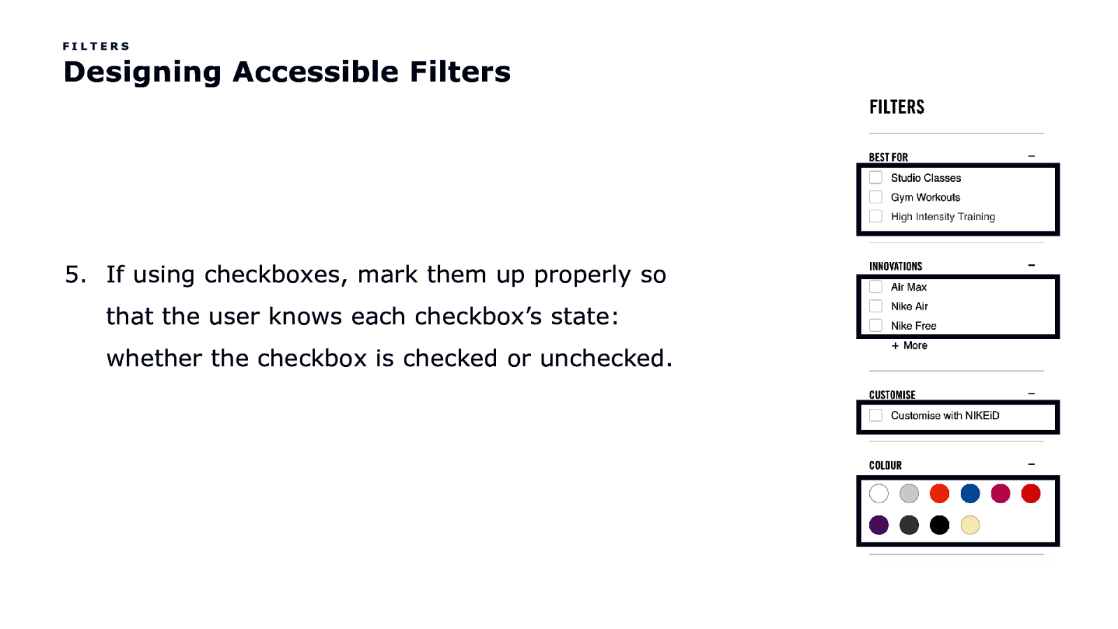
FILTERS Designing Accessible Filters 5. If using checkboxes, mark them up properly so that the user knows each checkbox’s state: whether the checkbox is checked or unchecked.
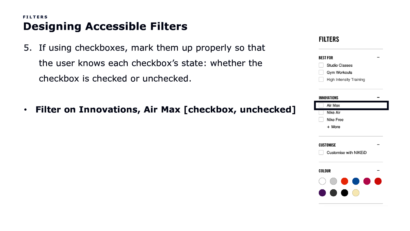
FILTERS Designing Accessible Filters 5. If using checkboxes, mark them up properly so that the user knows each checkbox’s state: whether the checkbox is checked or unchecked. • Filter on Innovations, Air Max [checkbox, unchecked]
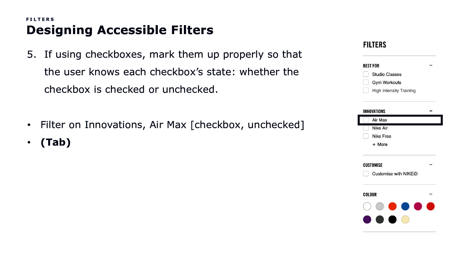
FILTERS Designing Accessible Filters 5. If using checkboxes, mark them up properly so that the user knows each checkbox’s state: whether the checkbox is checked or unchecked. • Filter on Innovations, Air Max [checkbox, unchecked] • (Tab)
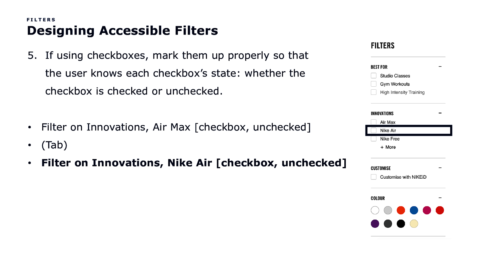
FILTERS Designing Accessible Filters 5. If using checkboxes, mark them up properly so that the user knows each checkbox’s state: whether the checkbox is checked or unchecked. • Filter on Innovations, Air Max [checkbox, unchecked] • (Tab) • Filter on Innovations, Nike Air [checkbox, unchecked]
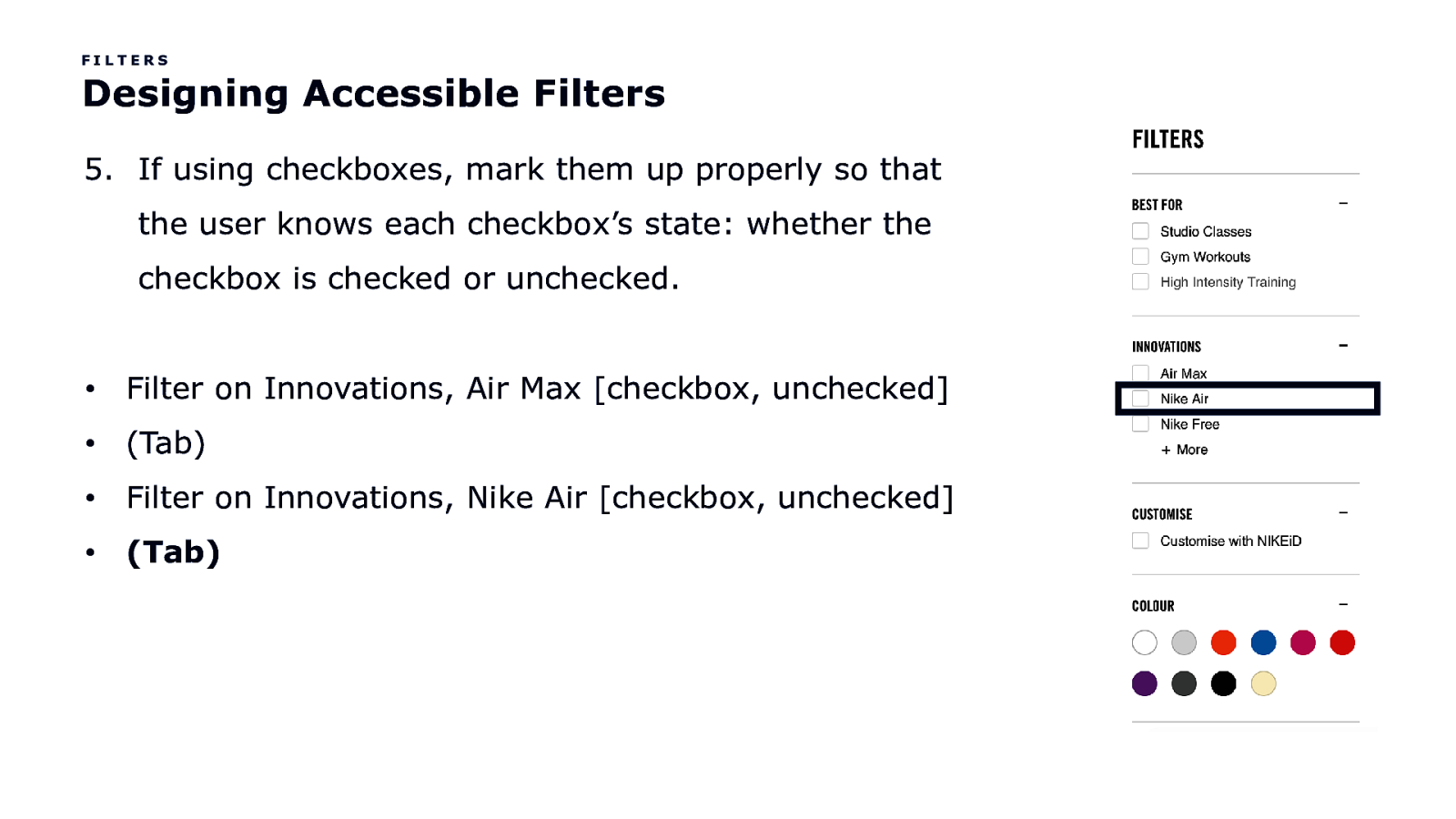
FILTERS Designing Accessible Filters 5. If using checkboxes, mark them up properly so that the user knows each checkbox’s state: whether the checkbox is checked or unchecked. • Filter on Innovations, Air Max [checkbox, unchecked] • (Tab) • Filter on Innovations, Nike Air [checkbox, unchecked] • (Tab)
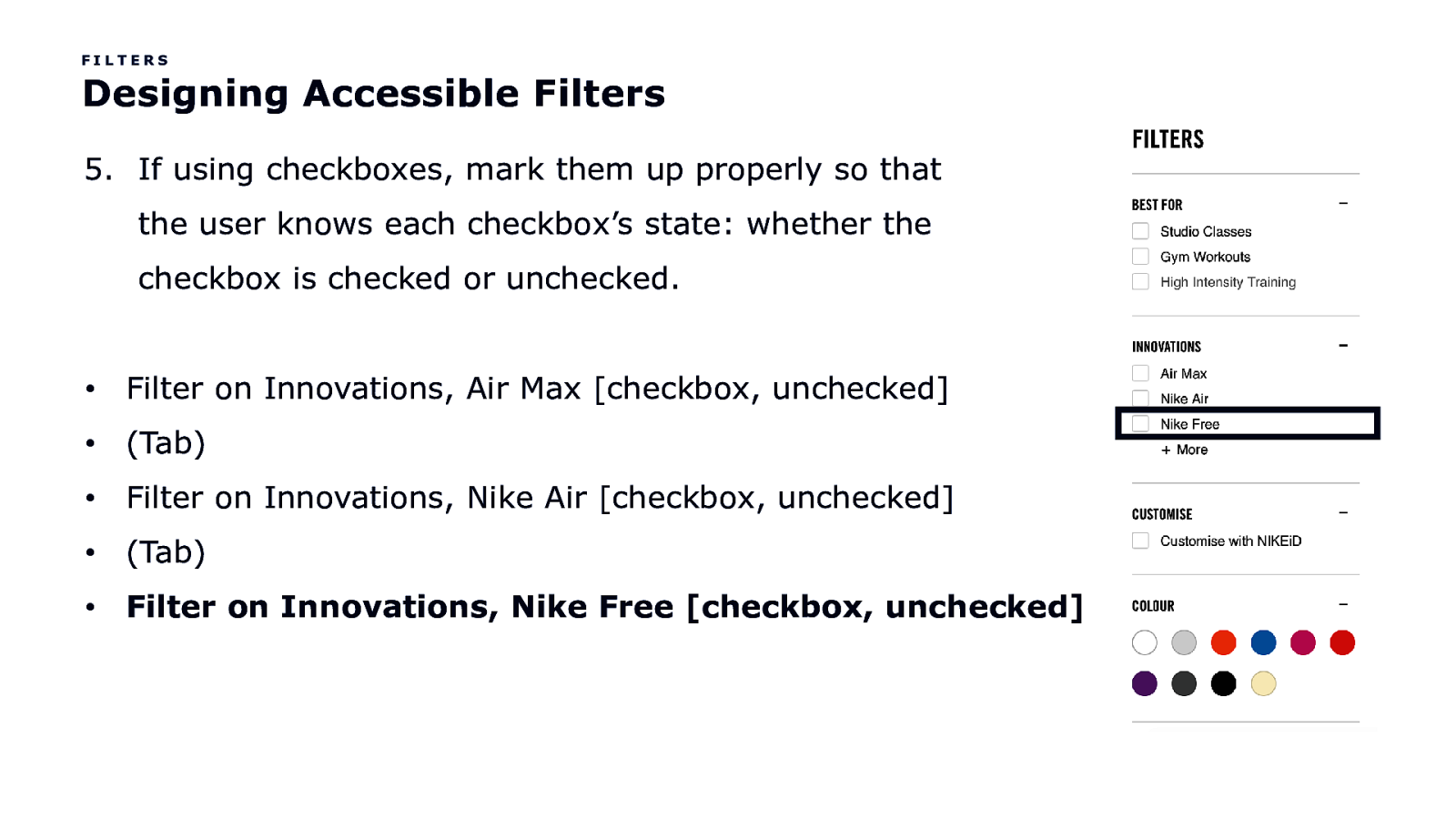
FILTERS Designing Accessible Filters 5. If using checkboxes, mark them up properly so that the user knows each checkbox’s state: whether the checkbox is checked or unchecked. • Filter on Innovations, Air Max [checkbox, unchecked] • (Tab) • Filter on Innovations, Nike Air [checkbox, unchecked] • (Tab) • Filter on Innovations, Nike Free [checkbox, unchecked]
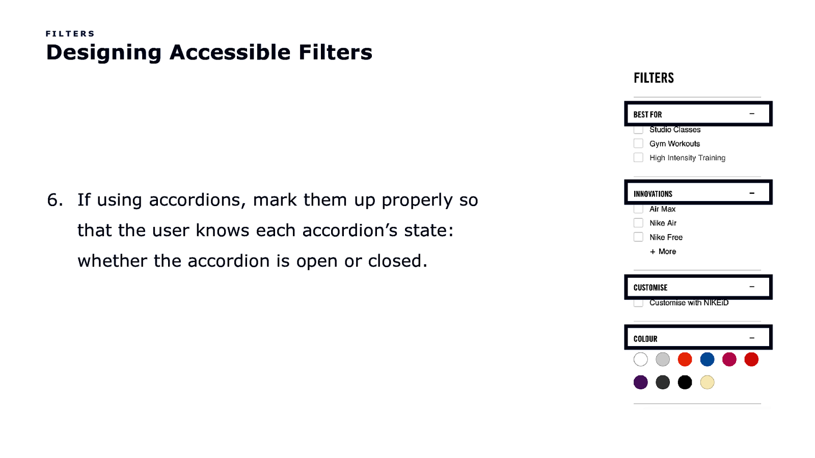
FILTERS Designing Accessible Filters 6. If using accordions, mark them up properly so that the user knows each accordion’s state: whether the accordion is open or closed.
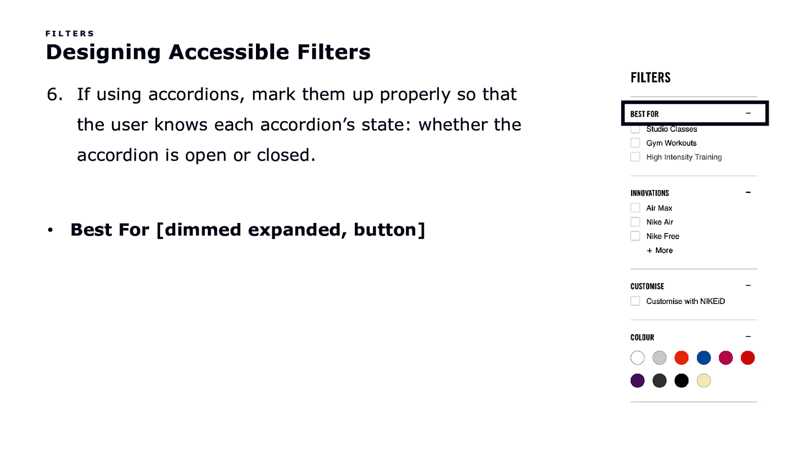
FILTERS Designing Accessible Filters 6. If using accordions, mark them up properly so that the user knows each accordion’s state: whether the accordion is open or closed. • Best For [dimmed expanded, button]
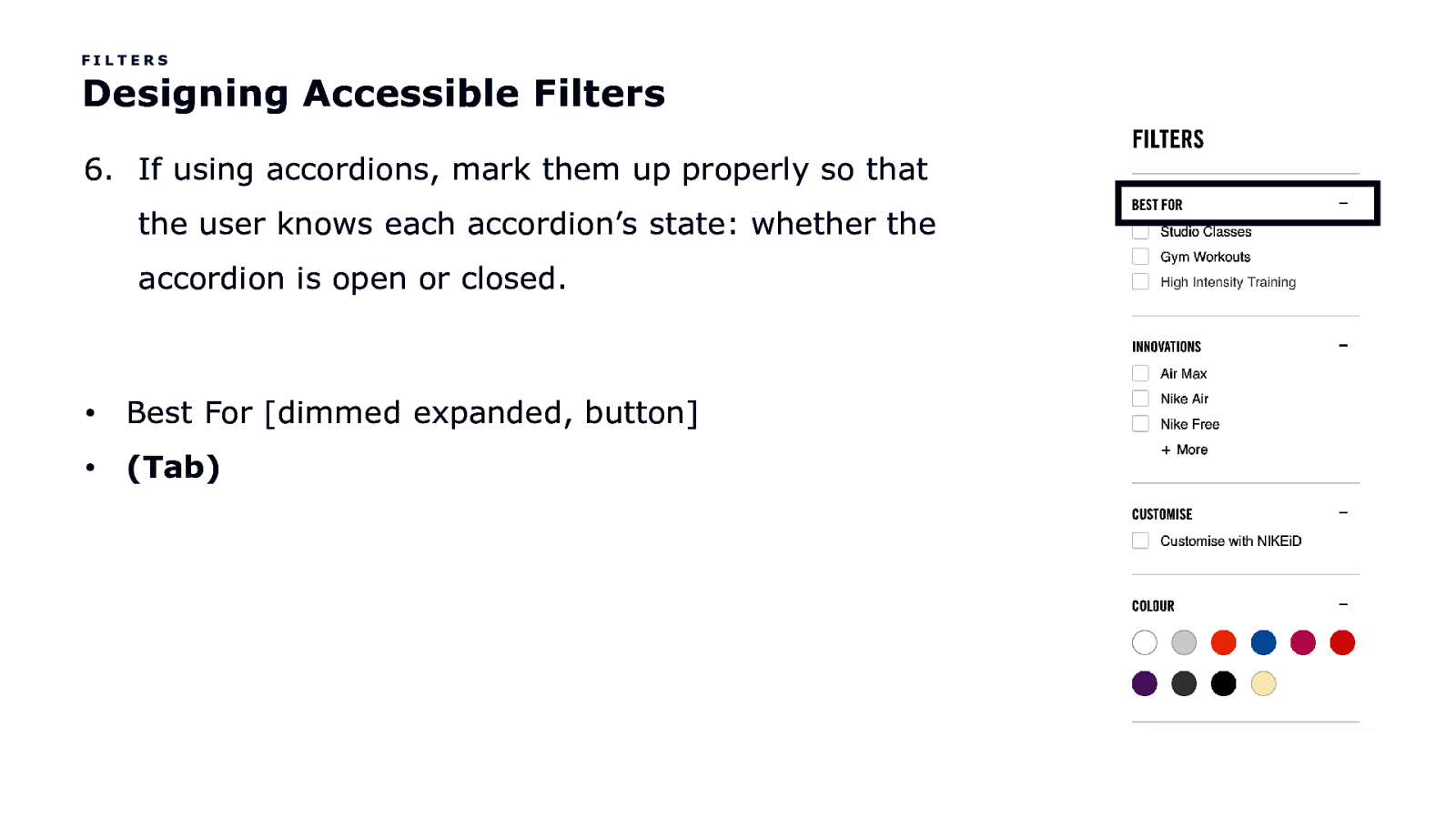
FILTERS Designing Accessible Filters 6. If using accordions, mark them up properly so that the user knows each accordion’s state: whether the accordion is open or closed. • Best For [dimmed expanded, button] • (Tab)
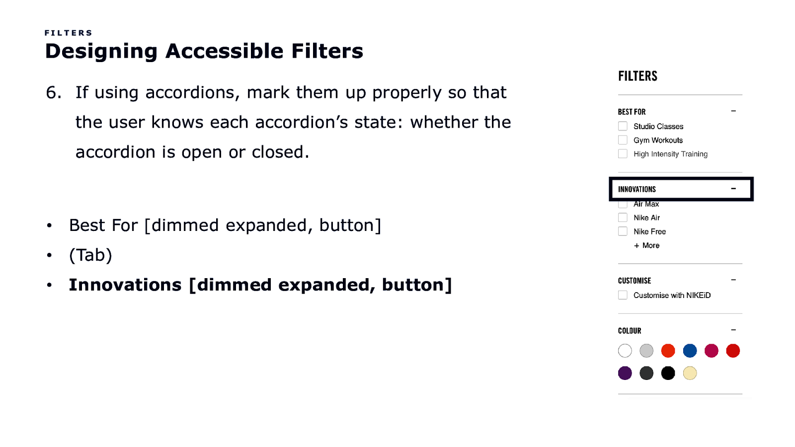
FILTERS Designing Accessible Filters 6. If using accordions, mark them up properly so that the user knows each accordion’s state: whether the accordion is open or closed. • Best For [dimmed expanded, button] • (Tab) • Innovations [dimmed expanded, button]
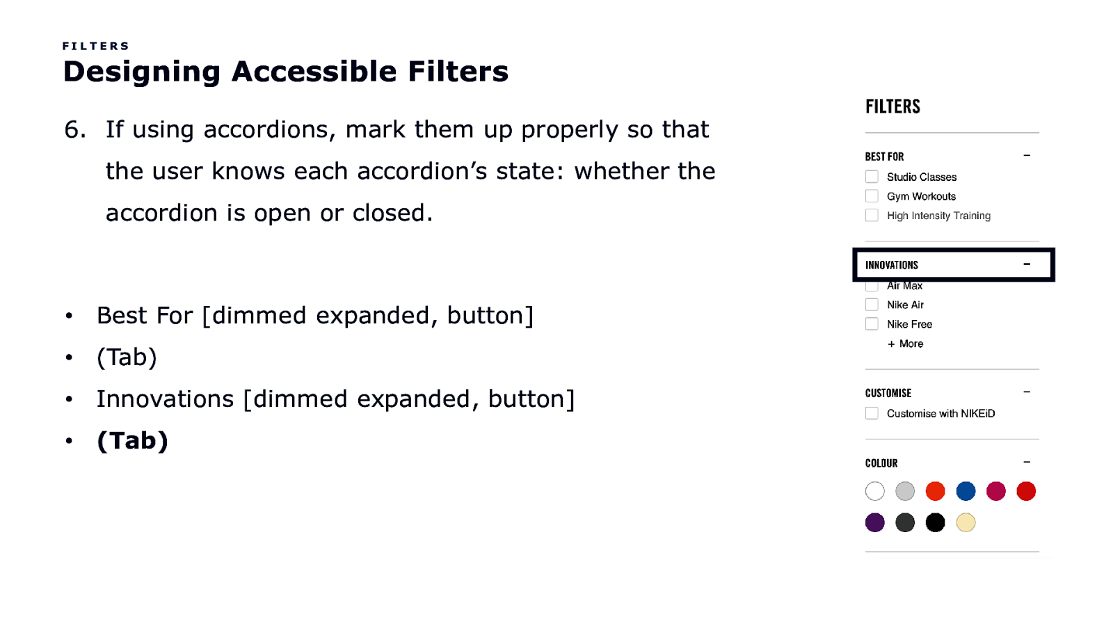
FILTERS Designing Accessible Filters 6. If using accordions, mark them up properly so that the user knows each accordion’s state: whether the accordion is open or closed. • Best For [dimmed expanded, button] • (Tab) • Innovations [dimmed expanded, button] • (Tab)
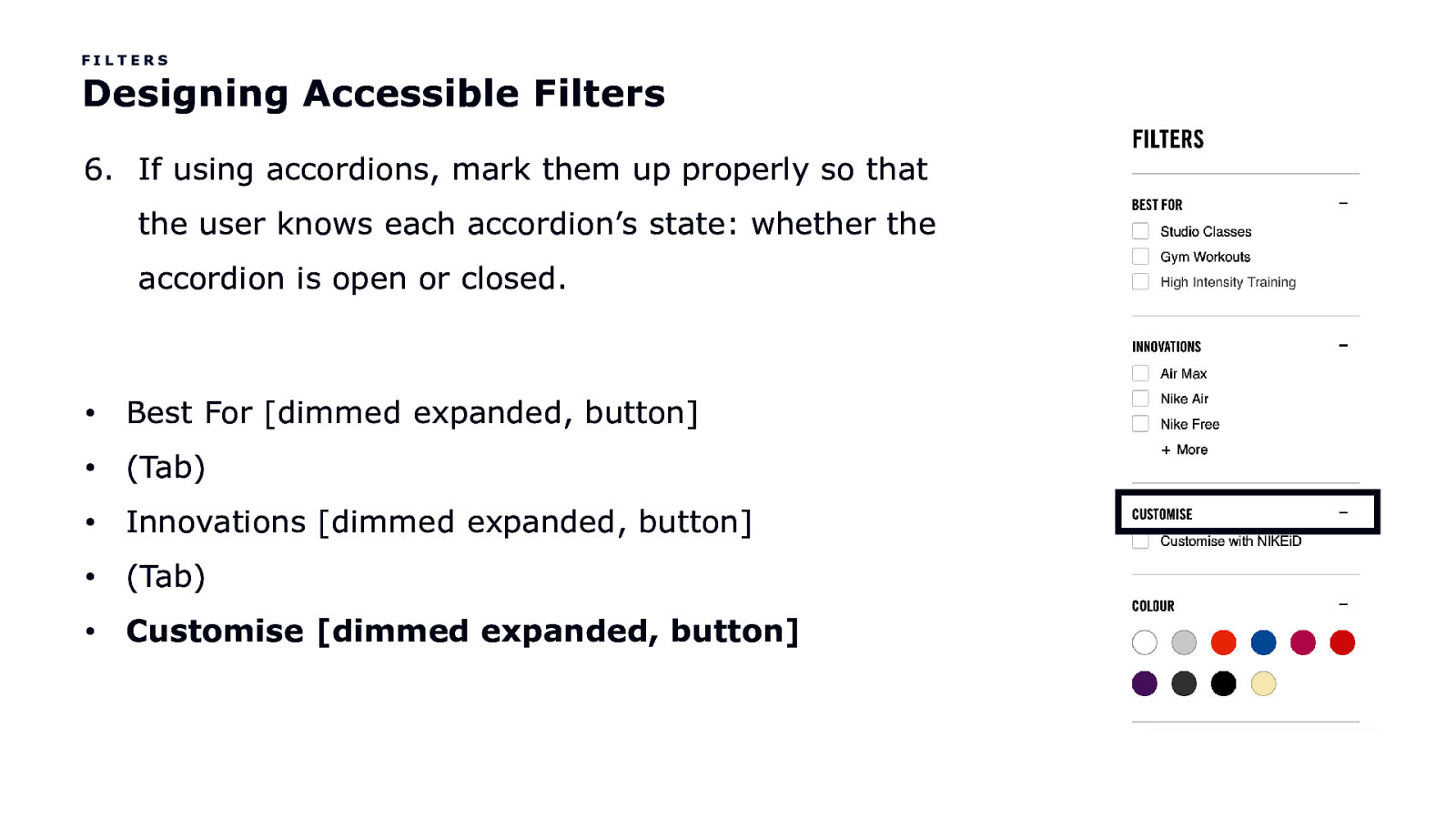
FILTERS Designing Accessible Filters 6. If using accordions, mark them up properly so that the user knows each accordion’s state: whether the accordion is open or closed. • Best For [dimmed expanded, button] • (Tab) • Innovations [dimmed expanded, button] • (Tab) • Customise [dimmed expanded, button]
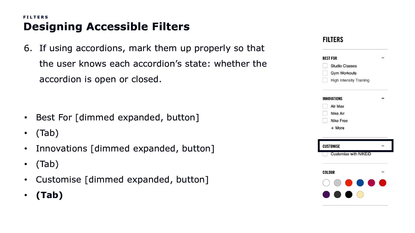
FILTERS Designing Accessible Filters 6. If using accordions, mark them up properly so that the user knows each accordion’s state: whether the accordion is open or closed. • Best For [dimmed expanded, button] • (Tab) • Innovations [dimmed expanded, button] • (Tab) • Customise [dimmed expanded, button] • (Tab)
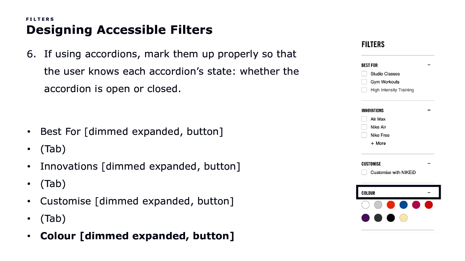
FILTERS Designing Accessible Filters 6. If using accordions, mark them up properly so that the user knows each accordion’s state: whether the accordion is open or closed. • Best For [dimmed expanded, button] • (Tab) • Innovations [dimmed expanded, button] • (Tab) • Customise [dimmed expanded, button] • (Tab) • Colour [dimmed expanded, button]
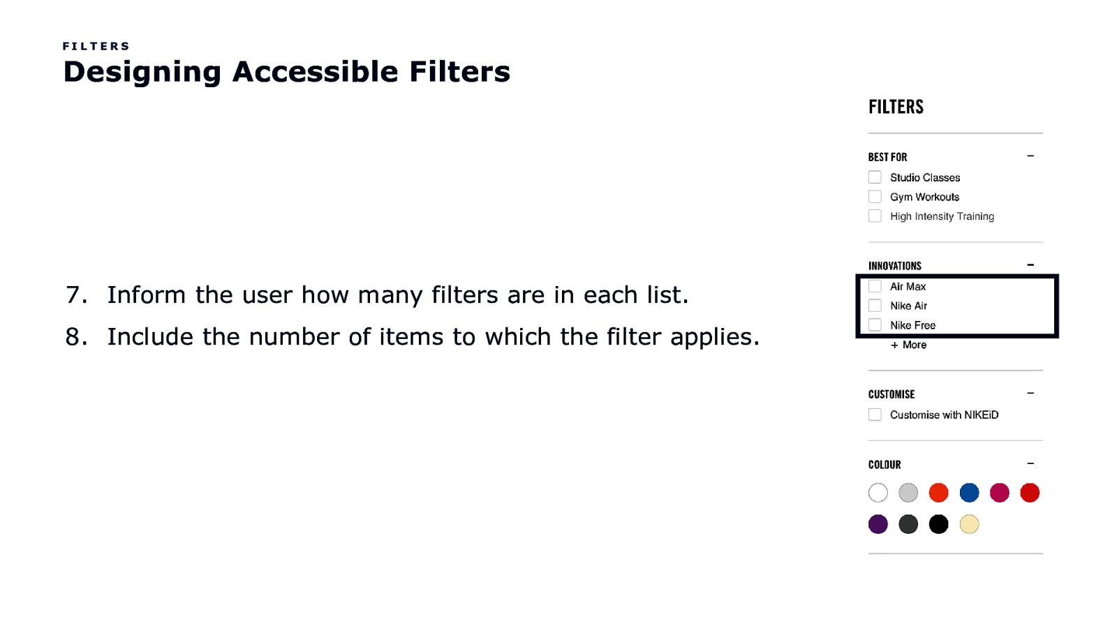
FILTERS Designing Accessible Filters 7. Inform the user how many filters are in each list. 8. Include the number of items to which the filter applies.
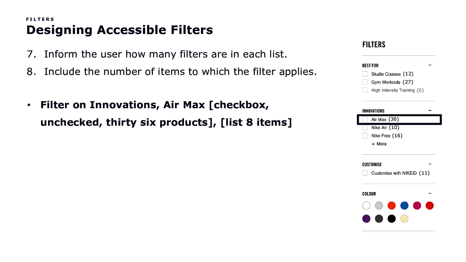
FILTERS Designing Accessible Filters 7. Inform the user how many filters are in each list. 8. Include the number of items to which the filter applies. (12) (27) (0) • Filter on Innovations, Air Max [checkbox, unchecked, thirty six products], [list 8 items] (36) (10) (16) (11)
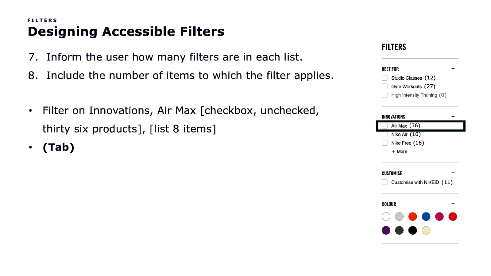
FILTERS Designing Accessible Filters 7. Inform the user how many filters are in each list. 8. Include the number of items to which the filter applies. (12) (27) (0) • Filter on Innovations, Air Max [checkbox, unchecked, thirty six products], [list 8 items] • (Tab) (36) (10) (16) (11)
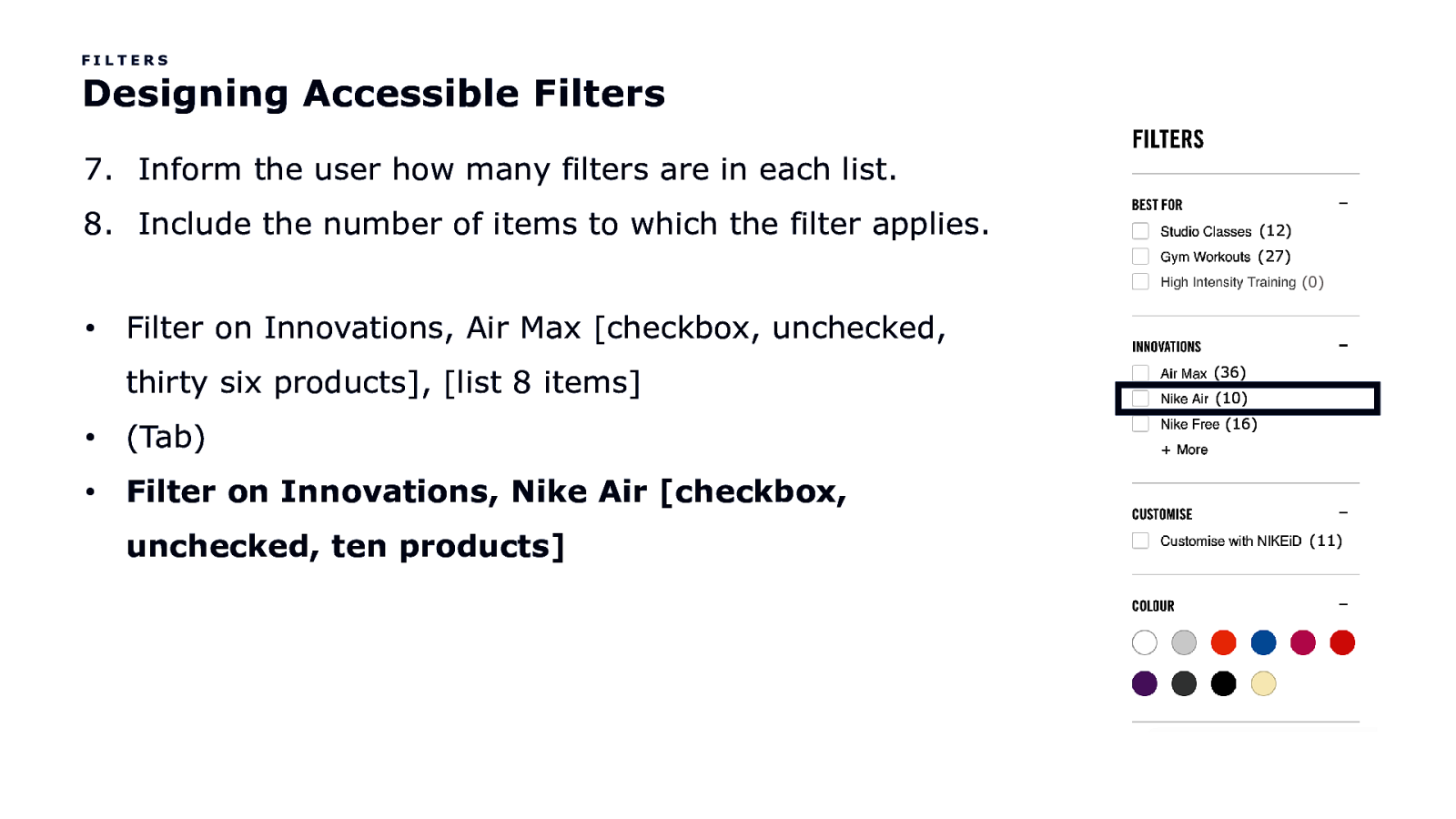
FILTERS Designing Accessible Filters 7. Inform the user how many filters are in each list. 8. Include the number of items to which the filter applies. (12) (27) (0) • Filter on Innovations, Air Max [checkbox, unchecked, thirty six products], [list 8 items] • (Tab) • Filter on Innovations, Nike Air [checkbox, unchecked, ten products] (36) (10) (16) (11)
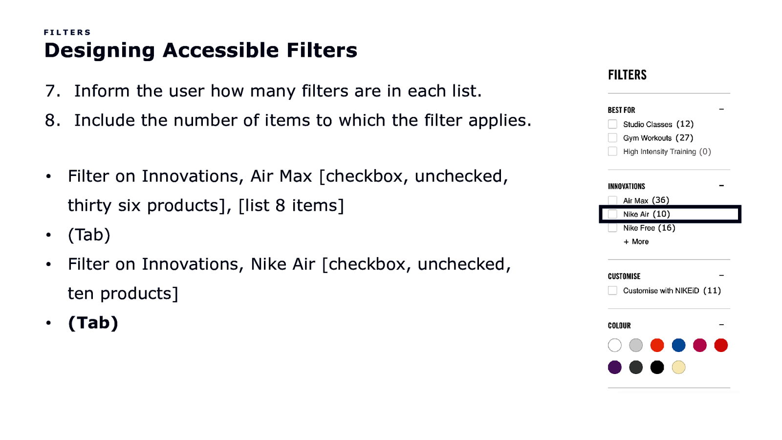
FILTERS Designing Accessible Filters 7. Inform the user how many filters are in each list. 8. Include the number of items to which the filter applies. (12) (27) (0) • Filter on Innovations, Air Max [checkbox, unchecked, thirty six products], [list 8 items] • (Tab) • Filter on Innovations, Nike Air [checkbox, unchecked, ten products] • (Tab) (36) (10) (16) (11)
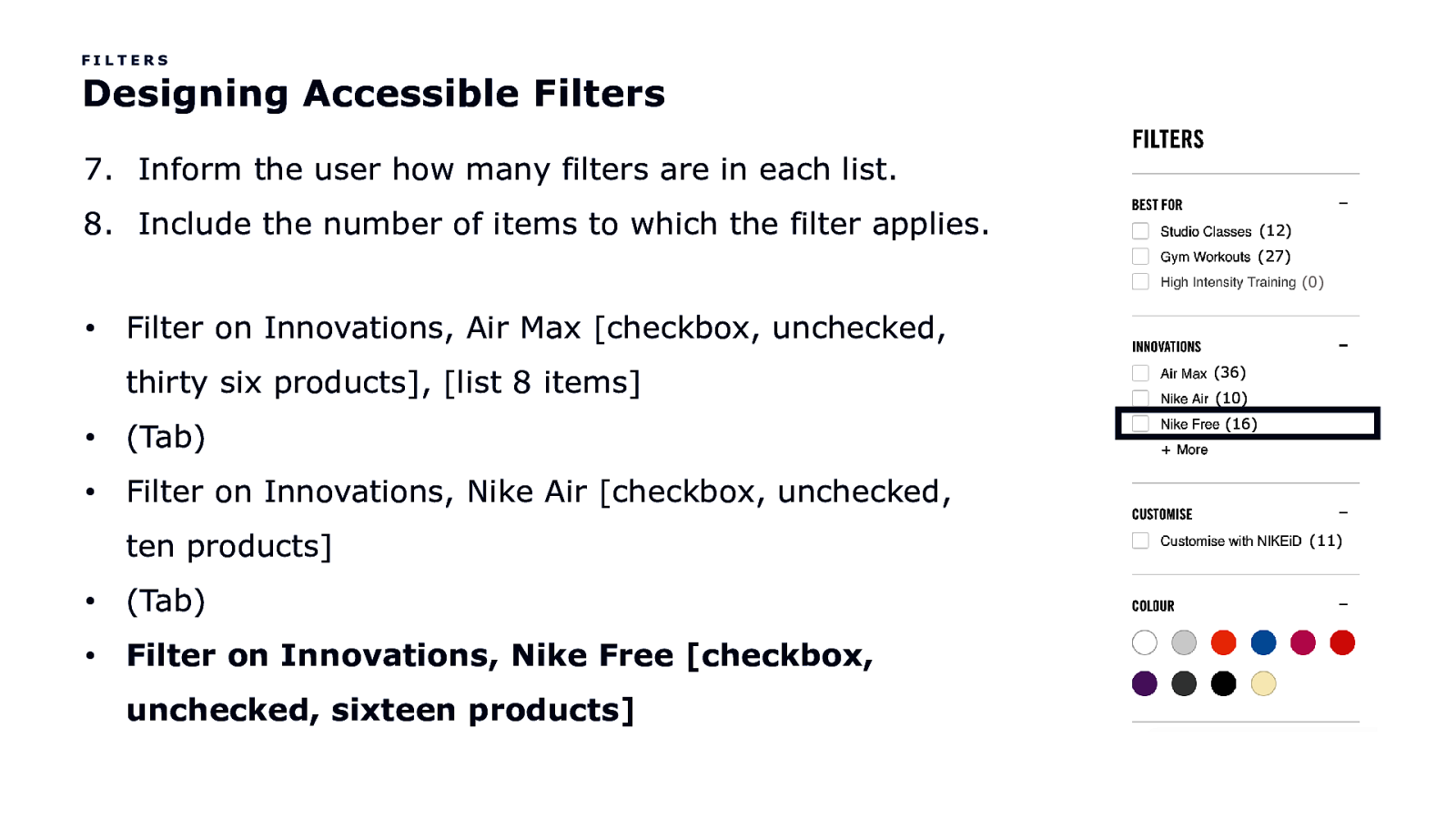
FILTERS Designing Accessible Filters 7. Inform the user how many filters are in each list. 8. Include the number of items to which the filter applies. (12) (27) (0) • Filter on Innovations, Air Max [checkbox, unchecked, thirty six products], [list 8 items] • (Tab) • Filter on Innovations, Nike Air [checkbox, unchecked, ten products] • (Tab) • Filter on Innovations, Nike Free [checkbox, unchecked, sixteen products] (36) (10) (16) (11)
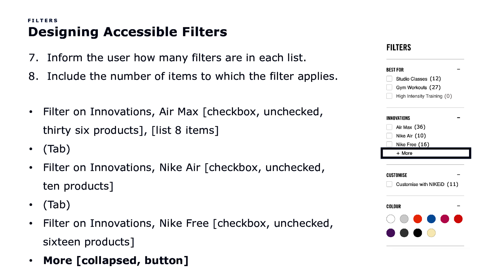
FILTERS Designing Accessible Filters 7. Inform the user how many filters are in each list. 8. Include the number of items to which the filter applies. (12) (27) (0) • Filter on Innovations, Air Max [checkbox, unchecked, thirty six products], [list 8 items] • (Tab) • Filter on Innovations, Nike Air [checkbox, unchecked, ten products] • (Tab) • Filter on Innovations, Nike Free [checkbox, unchecked, sixteen products] • More [collapsed, button] (36) (10) (16) (11)
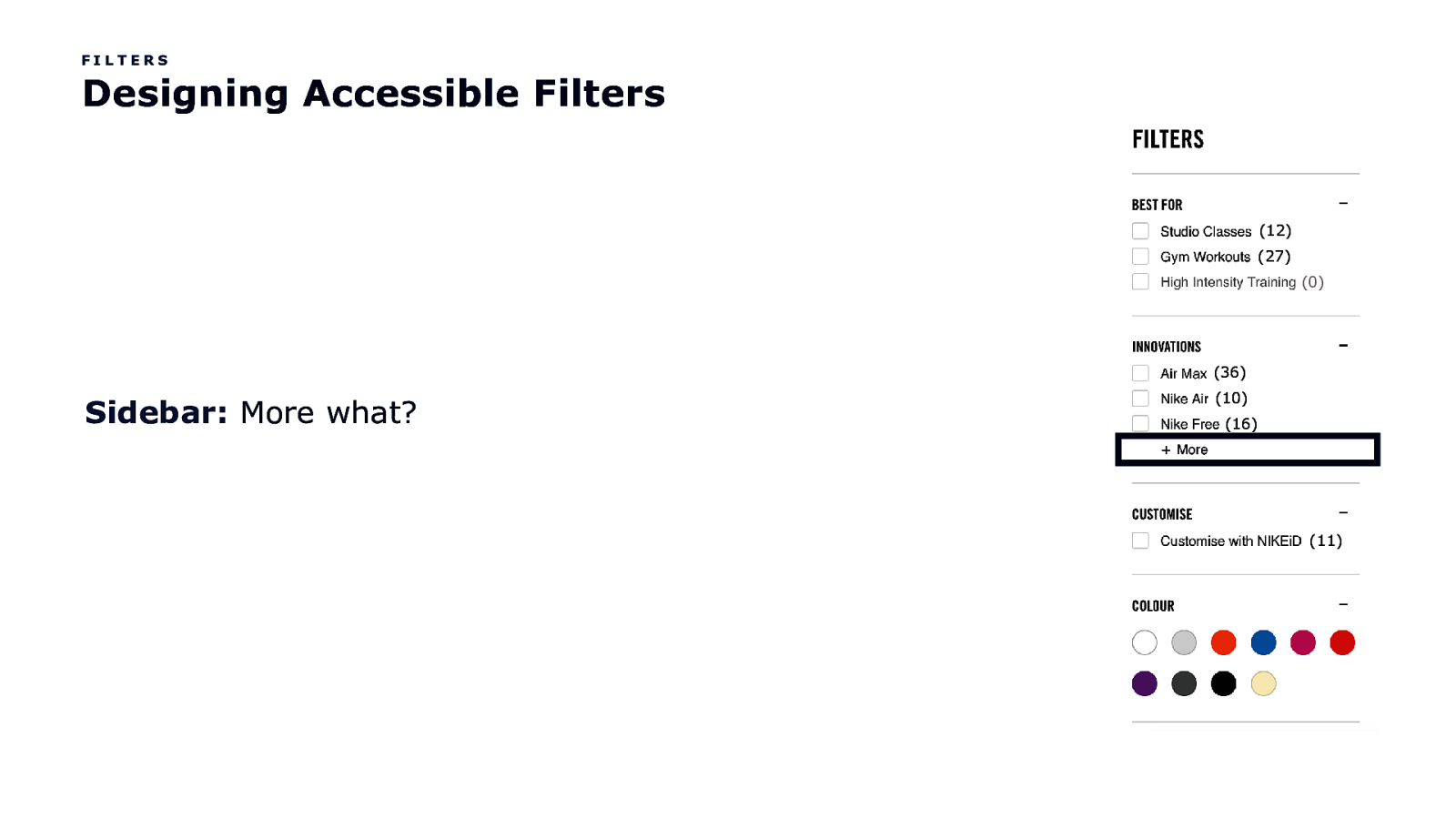
FILTERS Designing Accessible Filters (12) (27) (0) (36) Sidebar: More what? (10) (16) (11)
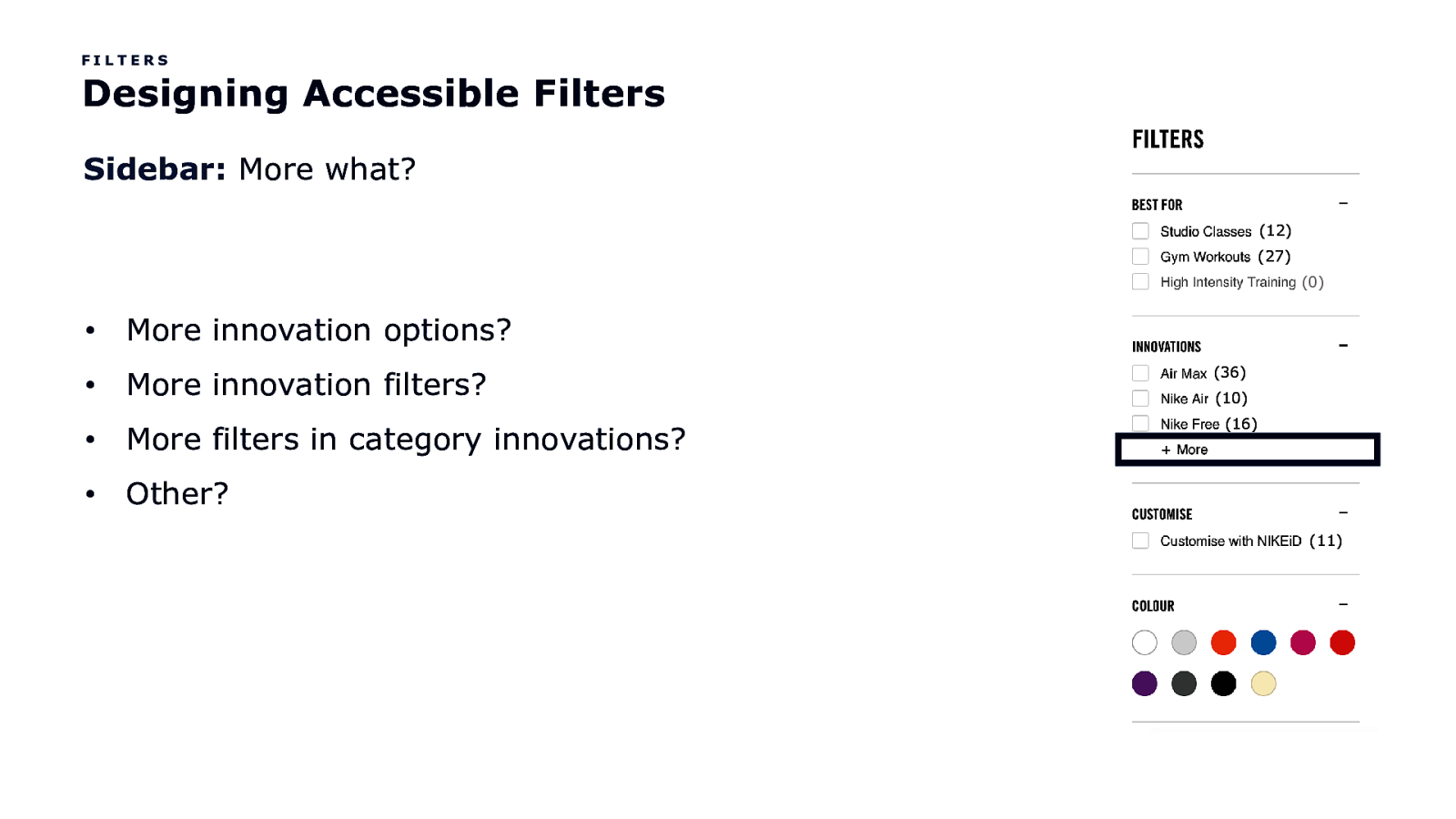
FILTERS Designing Accessible Filters Sidebar: More what? (12) (27) (0) • More innovation options? • More innovation filters? • More filters in category innovations? • Other? (36) (10) (16) (11)
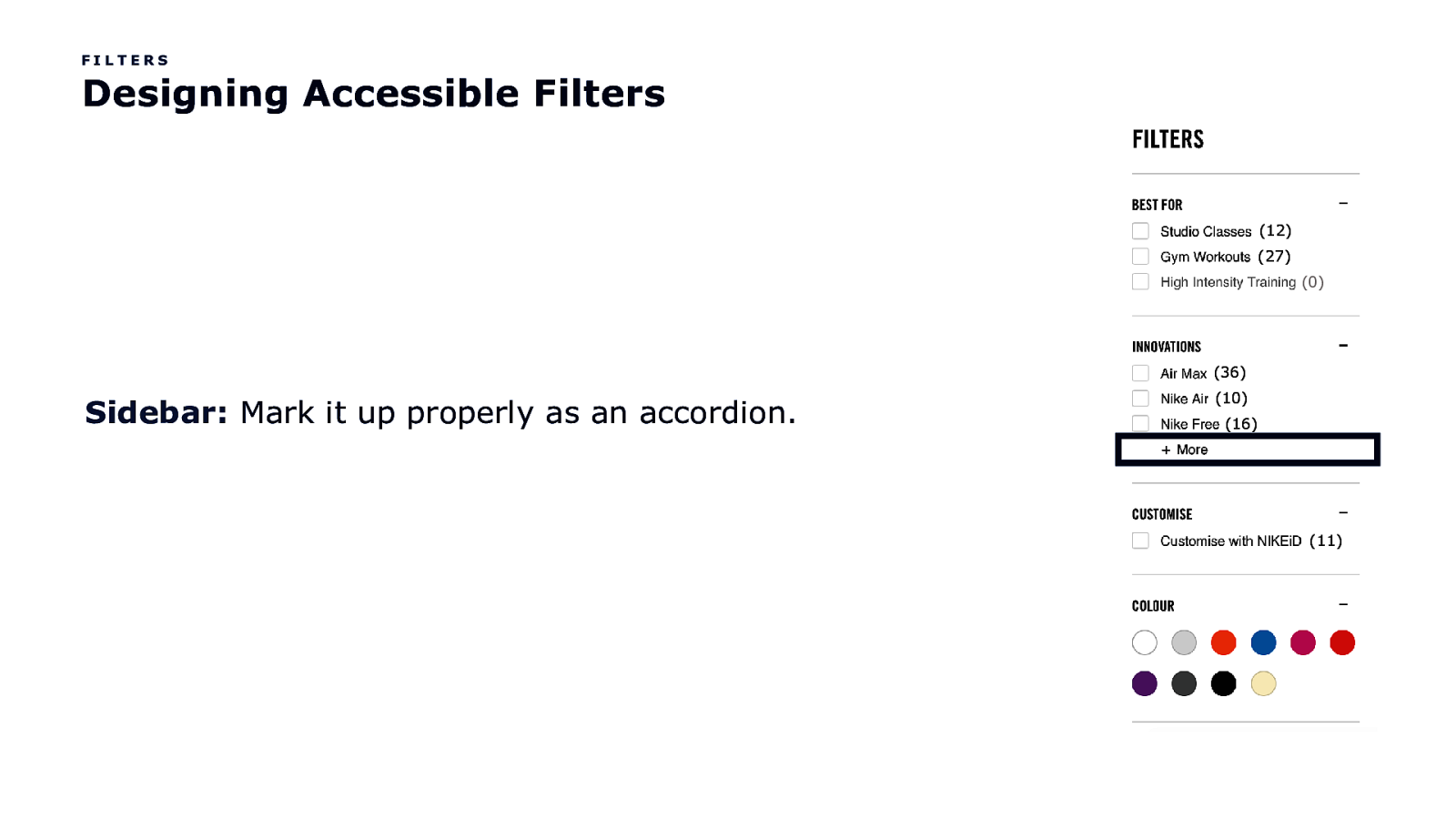
FILTERS Designing Accessible Filters (12) (27) (0) (36) Sidebar: Mark it up properly as an accordion. (10) (16) (11)
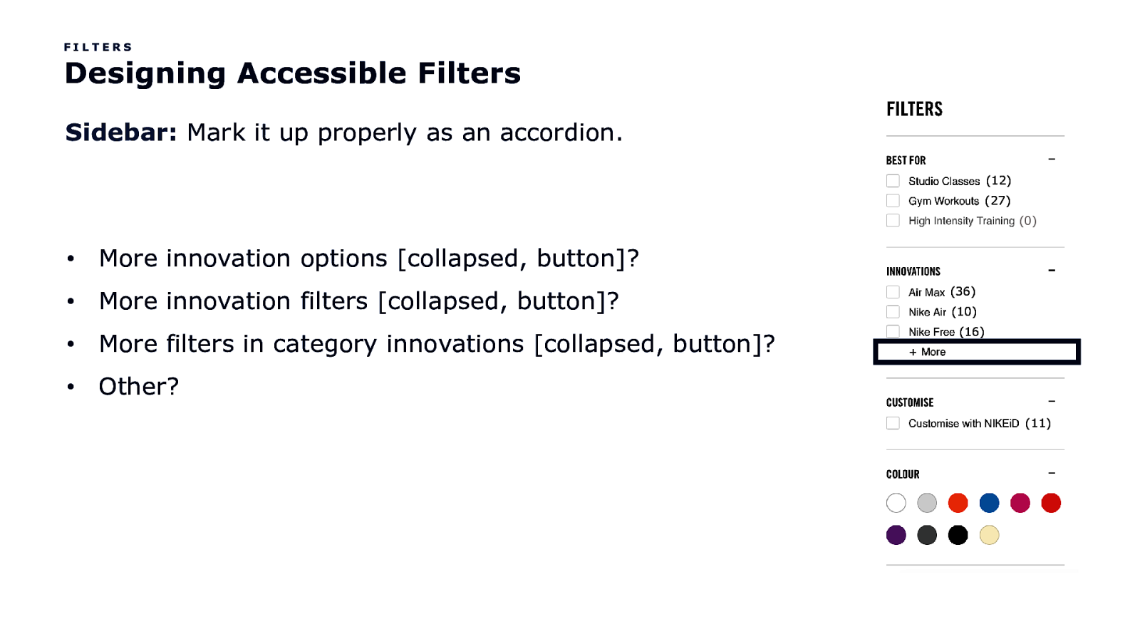
FILTERS Designing Accessible Filters Sidebar: Mark it up properly as an accordion. (12) (27) (0) • More innovation options [collapsed, button]? • More innovation filters [collapsed, button]? • More filters in category innovations [collapsed, button]? • Other? (36) (10) (16) (11)
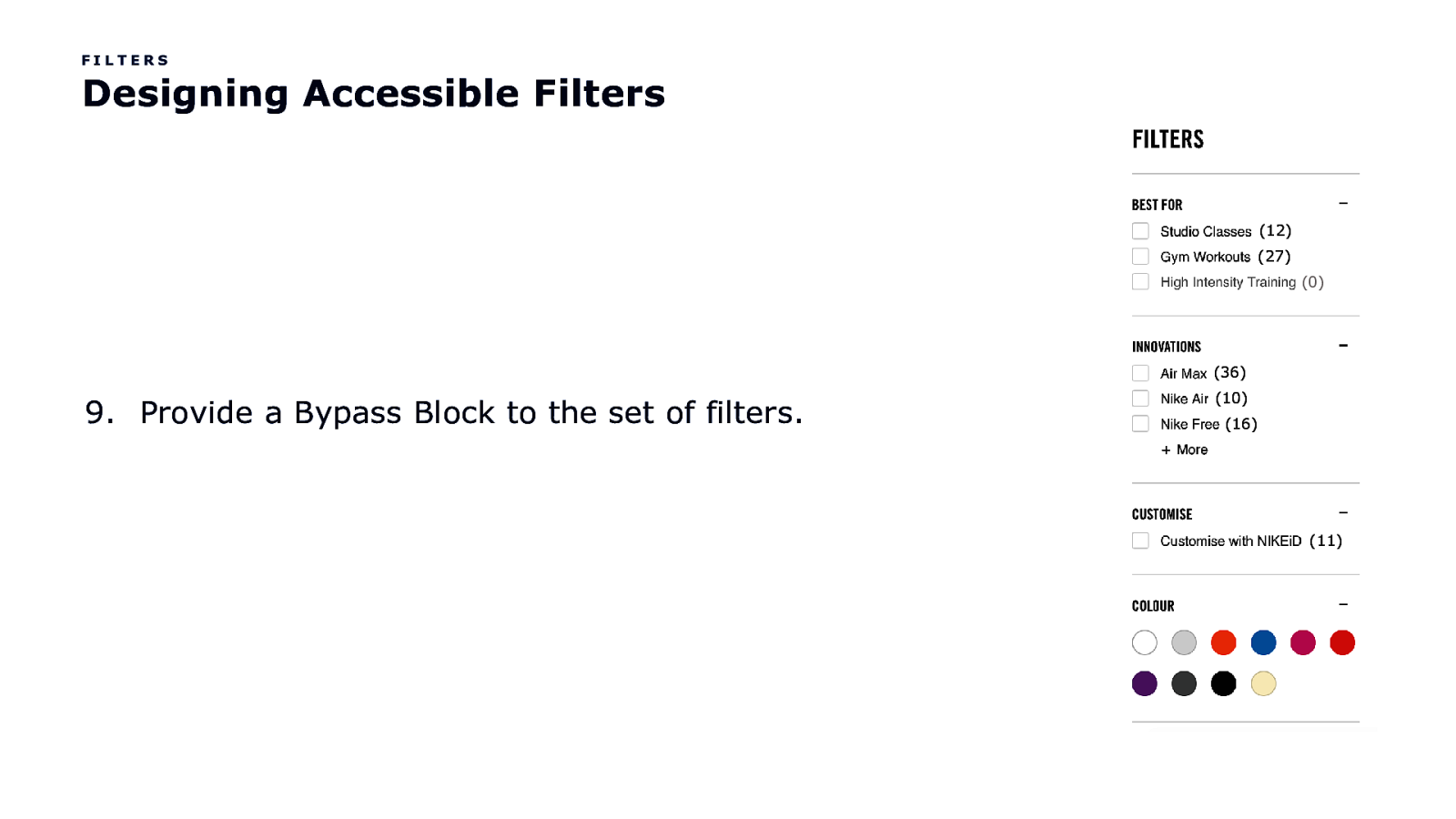
FILTERS Designing Accessible Filters (12) (27) (0) (36) 9. Provide a Bypass Block to the set of filters. (10) (16) (11)
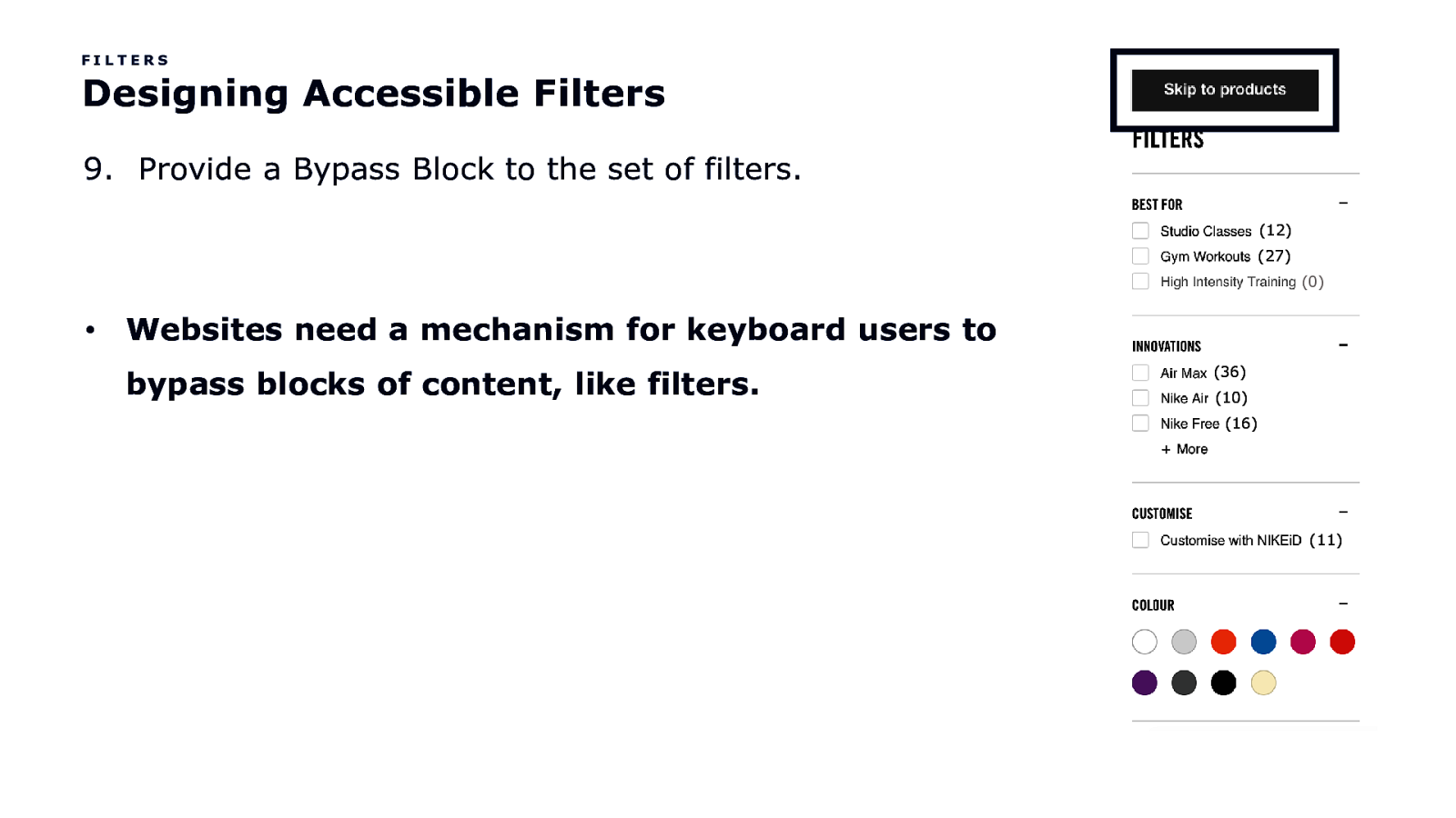
FILTERS Designing Accessible Filters 9. Provide a Bypass Block to the set of filters. (12) (27) (0) • Websites need a mechanism for keyboard users to bypass blocks of content, like filters. (36) (10) (16) (11)
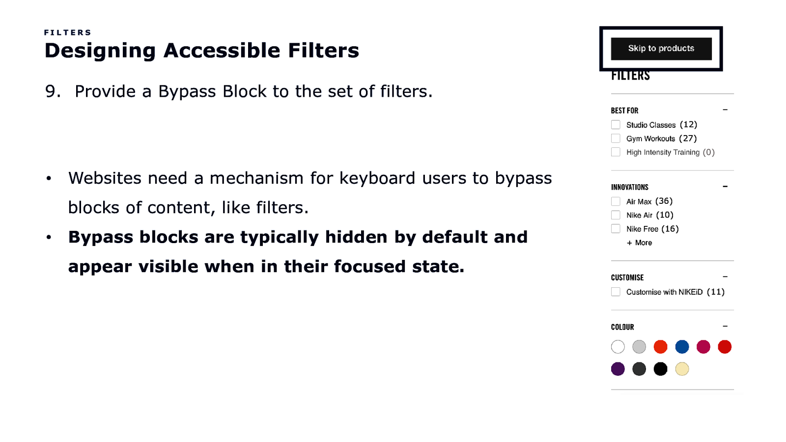
FILTERS Designing Accessible Filters 9. Provide a Bypass Block to the set of filters. (12) (27) (0) • Websites need a mechanism for keyboard users to bypass blocks of content, like filters. • Bypass blocks are typically hidden by default and (36) (10) (16) appear visible when in their focused state. (11)
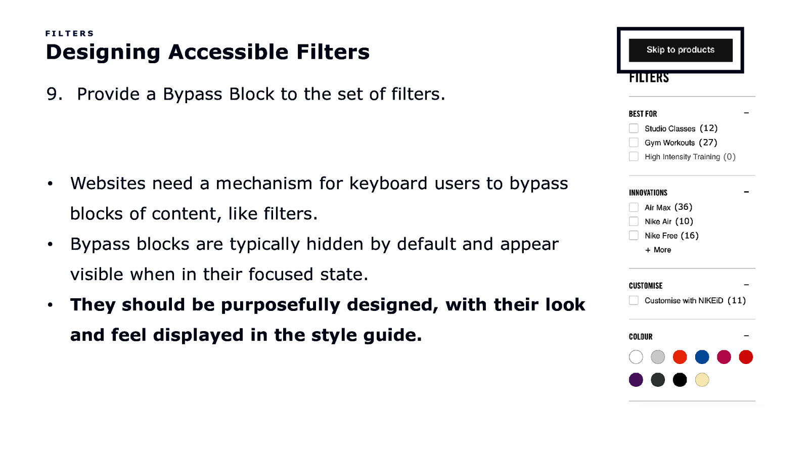
FILTERS Designing Accessible Filters 9. Provide a Bypass Block to the set of filters. (12) (27) (0) • Websites need a mechanism for keyboard users to bypass blocks of content, like filters. • Bypass blocks are typically hidden by default and appear (36) (10) (16) visible when in their focused state. • They should be purposefully designed, with their look and feel displayed in the style guide. (11)
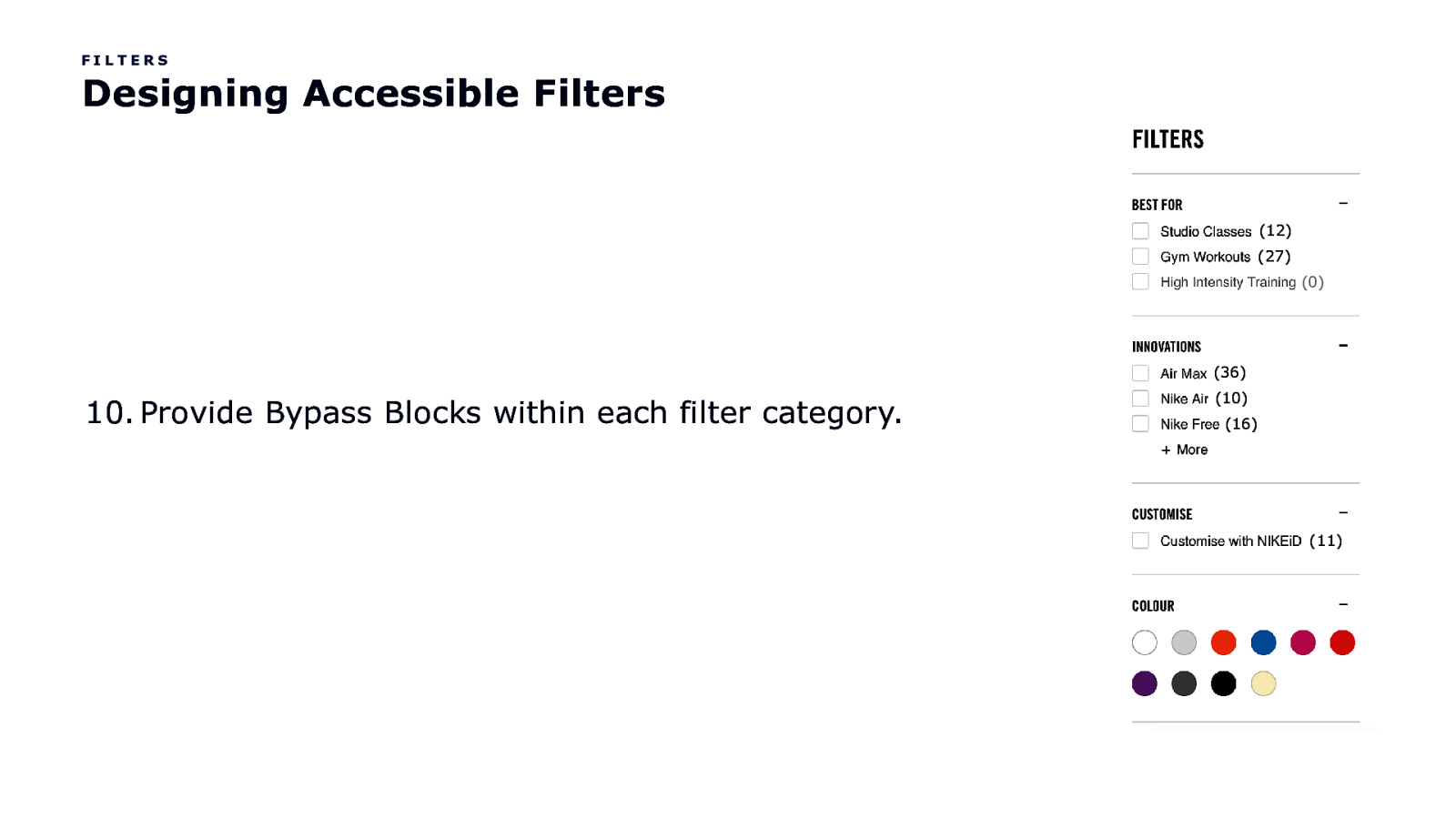
FILTERS Designing Accessible Filters (12) (27) (0) (36) 10. Provide Bypass Blocks within each filter category. (10) (16) (11)
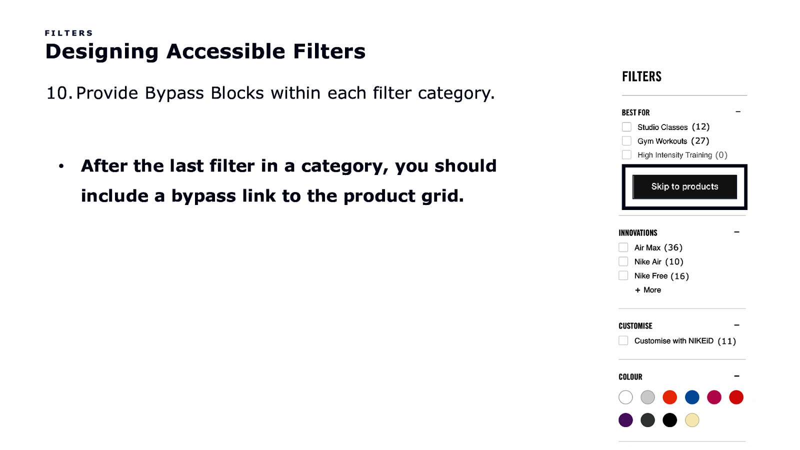
FILTERS Designing Accessible Filters 10. Provide Bypass Blocks within each filter category. (12) (27) • After the last filter in a category, you should include a bypass link to the product grid. (0)
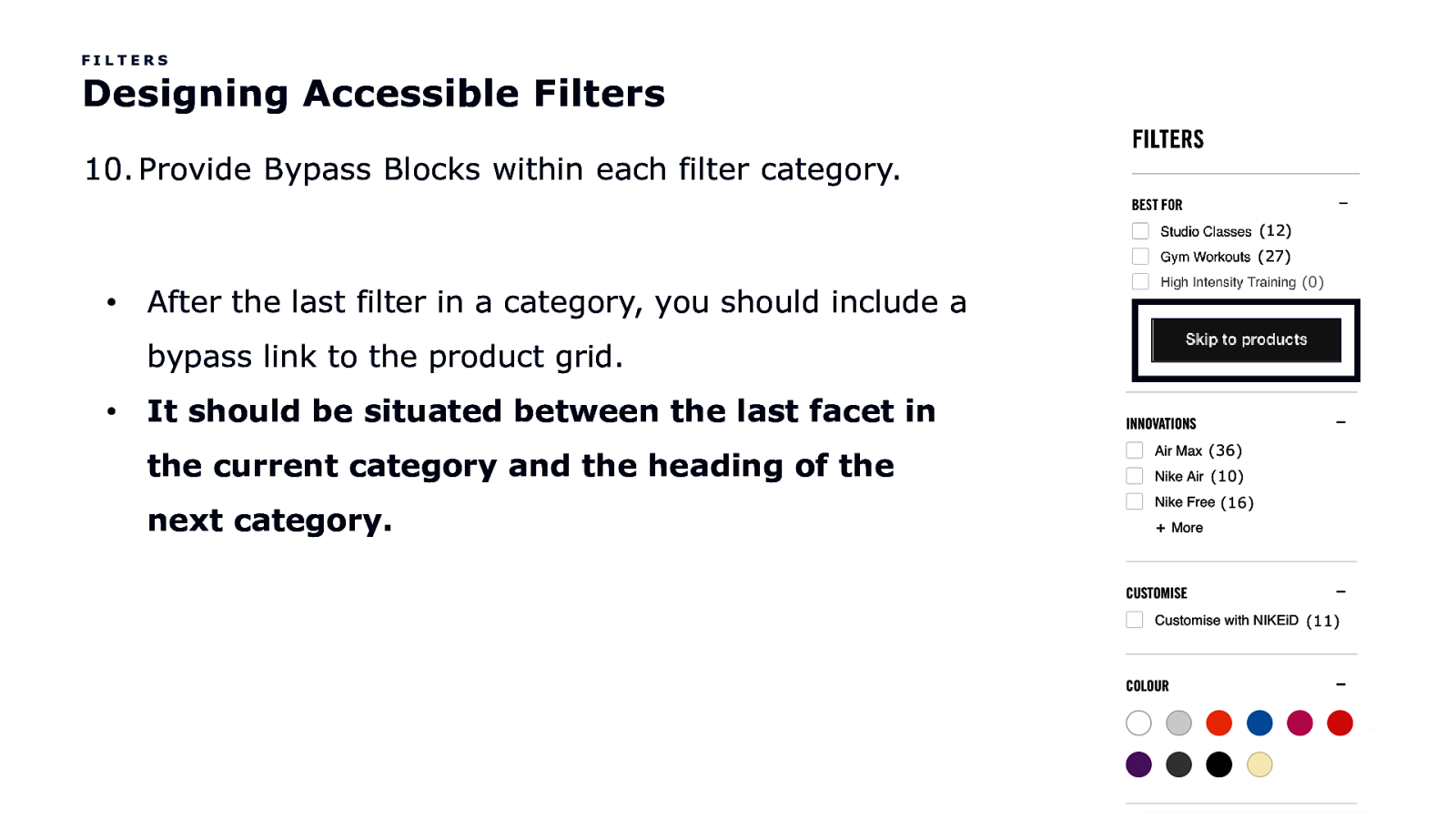
FILTERS Designing Accessible Filters 10. Provide Bypass Blocks within each filter category. (12) (27) • After the last filter in a category, you should include a bypass link to the product grid. • (0) It should be situated between the last facet in (36) (10) (16) the current category and the heading of the next category. (11)

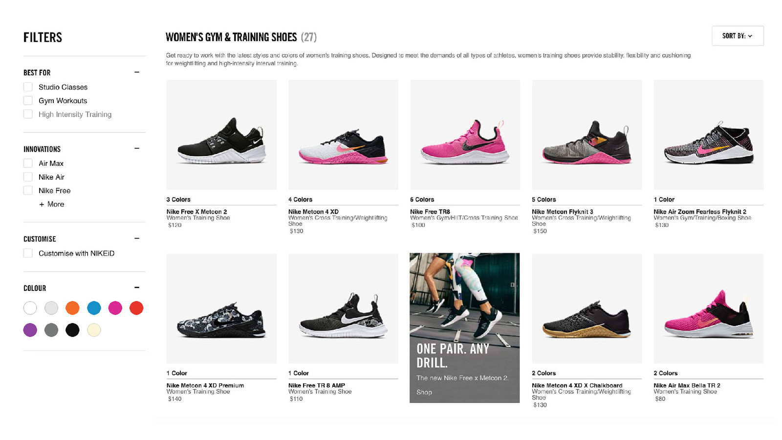
Why would I do that? How is this going to help a user?
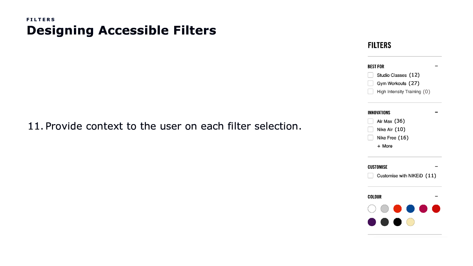
FILTERS Designing Accessible Filters (12) (27) (0) 11. Provide context to the user on each filter selection. (36) (10) (16) (11)
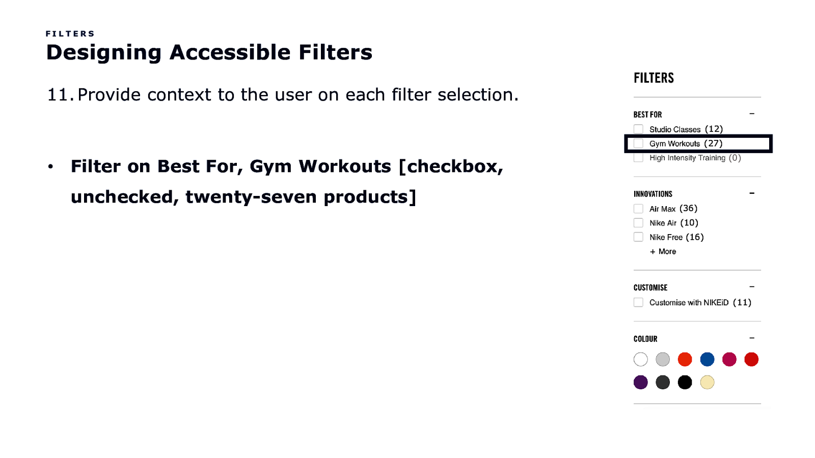
FILTERS Designing Accessible Filters 11. Provide context to the user on each filter selection. (12) (27) • (0) Filter on Best For, Gym Workouts [checkbox, unchecked, twenty-seven products] (36) (10) (16) (11)
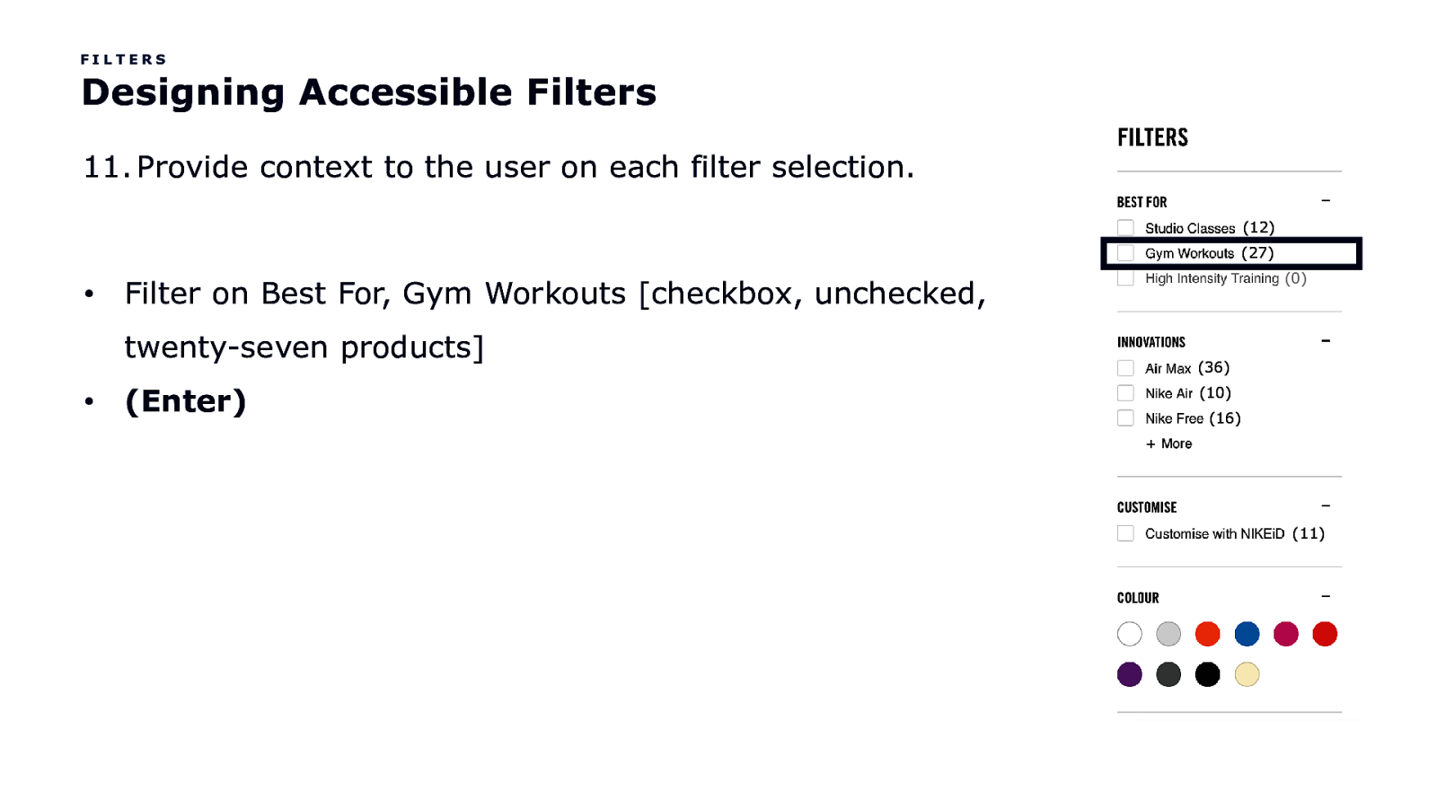
FILTERS Designing Accessible Filters 11. Provide context to the user on each filter selection. (12) (27) • twenty-seven products] • (0) Filter on Best For, Gym Workouts [checkbox, unchecked, (Enter) (36) (10) (16) (11)
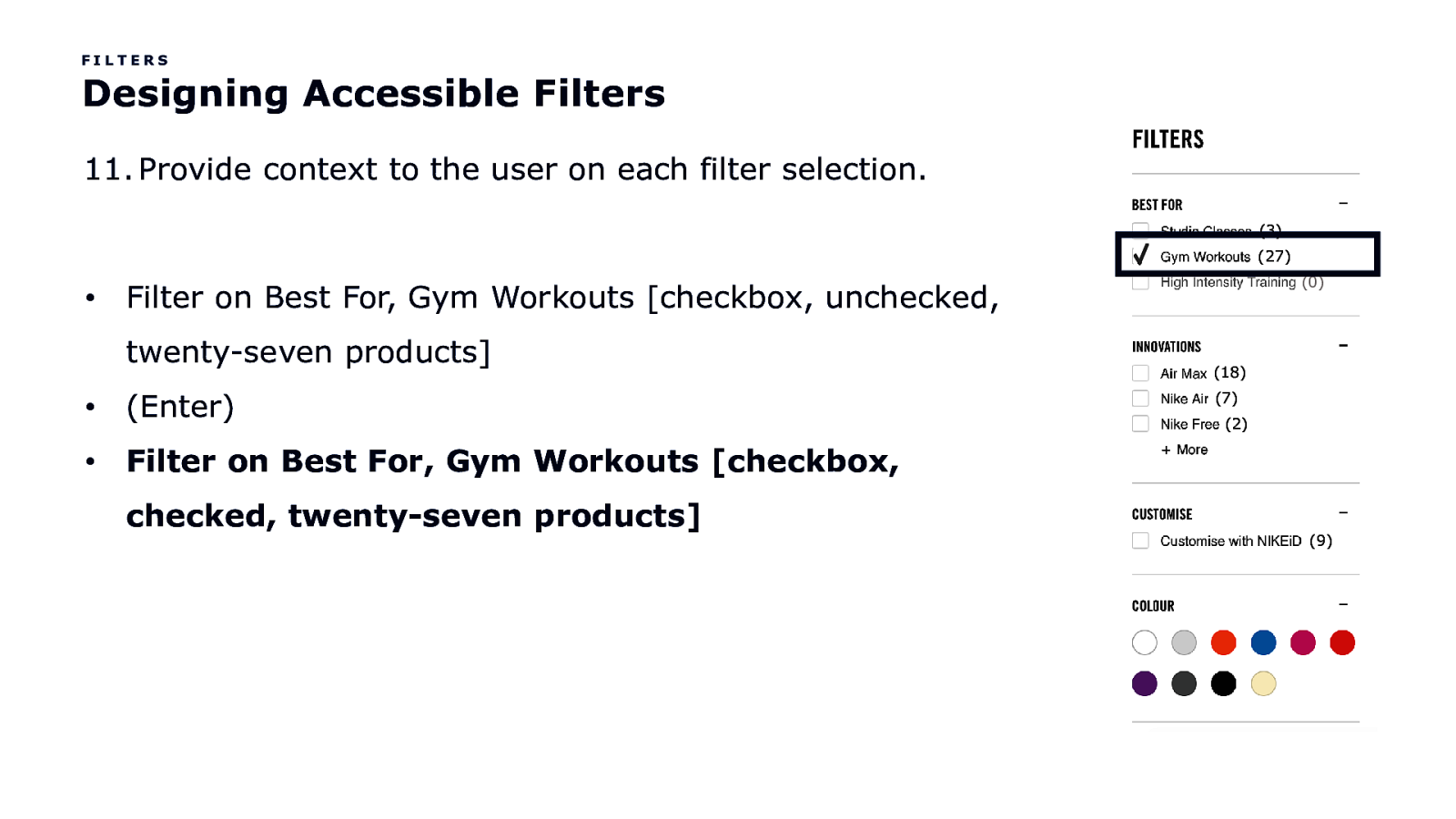
FILTERS Designing Accessible Filters 11. Provide context to the user on each filter selection. (3) (27) • (0) Filter on Best For, Gym Workouts [checkbox, unchecked, twenty-seven products] • (Enter) • Filter on Best For, Gym Workouts [checkbox, checked, twenty-seven products] (18) (7) (2) (9)
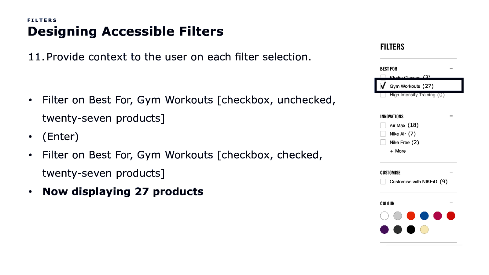
FILTERS Designing Accessible Filters 11. Provide context to the user on each filter selection. (3) (27) • twenty-seven products] • (Enter) • Filter on Best For, Gym Workouts [checkbox, checked, twenty-seven products] • (0) Filter on Best For, Gym Workouts [checkbox, unchecked, Now displaying 27 products (18) (7) (2) (9)
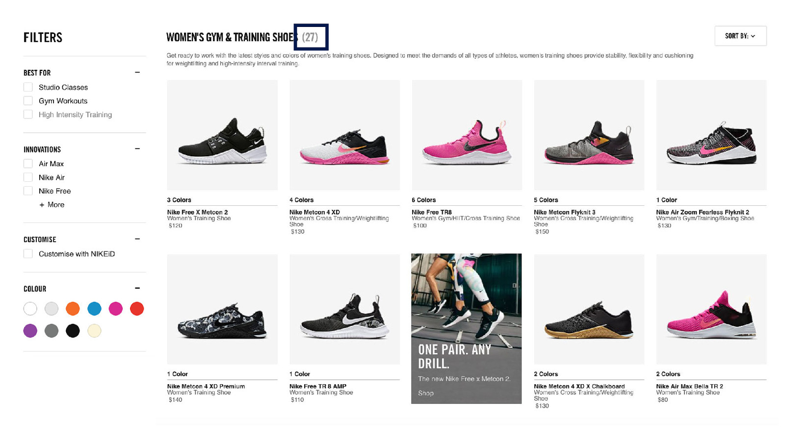

How else can I help the user get back and forth easily?
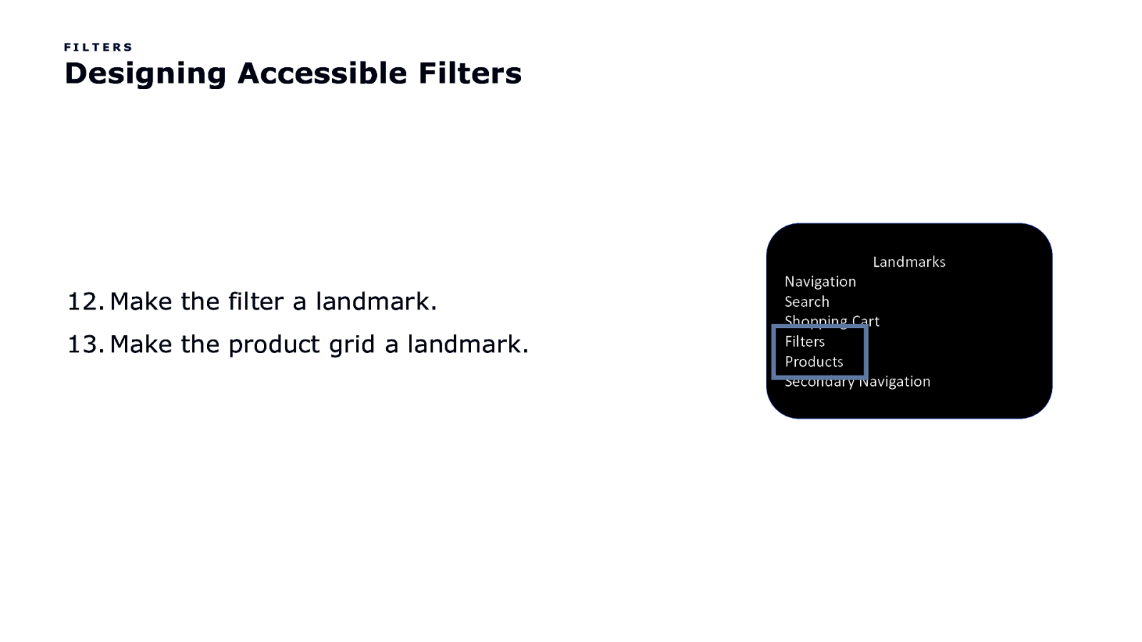
FILTERS Designing Accessible Filters Landmarks 12. Make the filter a landmark. 13. Make the product grid a landmark. Navigation Search Shopping Cart Filters Products Secondary Navigation
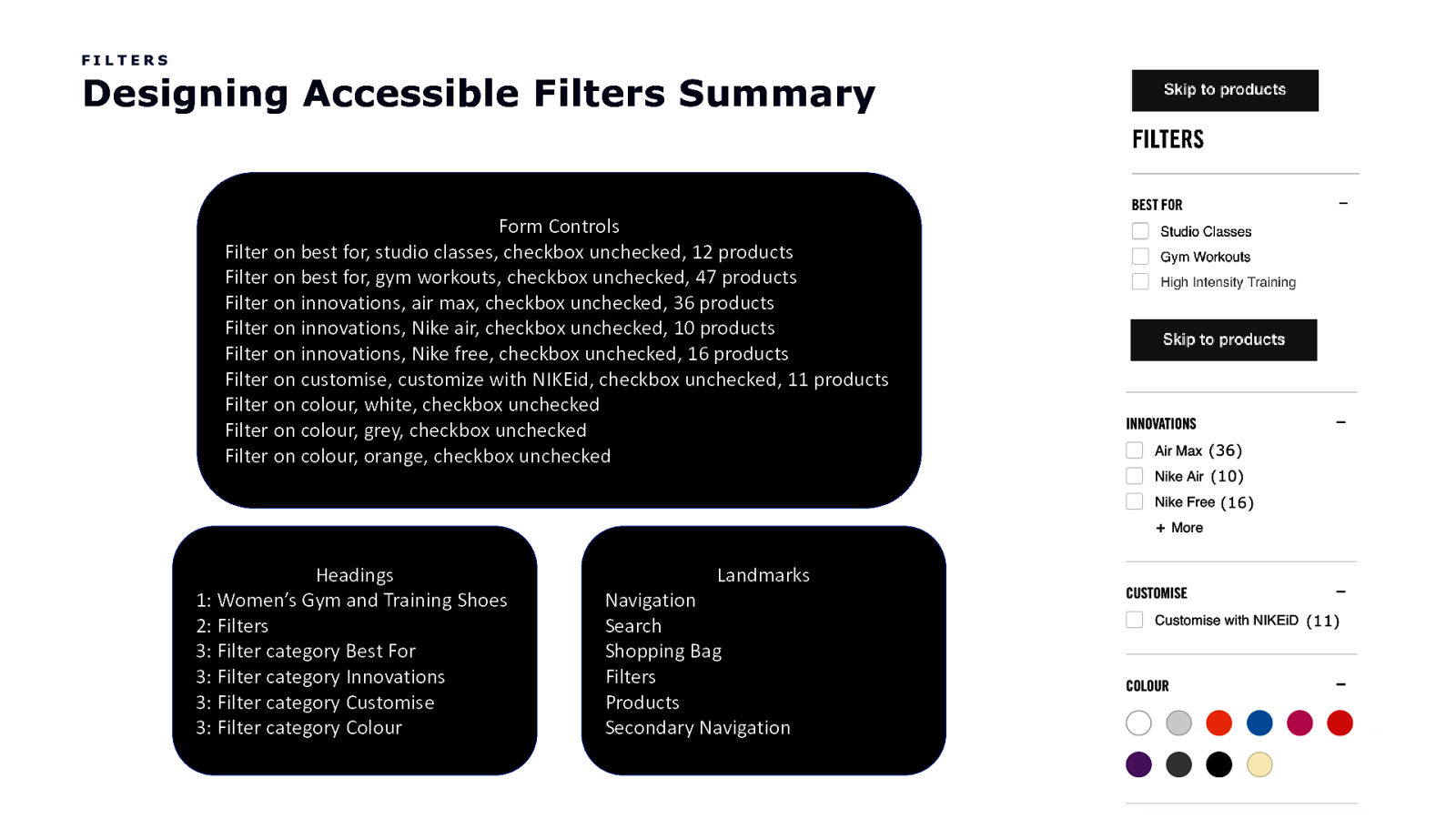
FILTERS Designing Accessible Filters Summary Form Controls Filter on best for, studio classes, checkbox unchecked, 12 products Filter on best for, gym workouts, checkbox unchecked, 47 products Filter on innovations, air max, checkbox unchecked, 36 products Filter on innovations, Nike air, checkbox unchecked, 10 products Filter on innovations, Nike free, checkbox unchecked, 16 products Filter on customise, customize with NIKEid, checkbox unchecked, 11 products Filter on colour, white, checkbox unchecked Filter on colour, grey, checkbox unchecked Filter on colour, orange, checkbox unchecked (12) (27) (0) (36) (10) (16) (11) Headings 1: Women’s Gym and Training Shoes 2: Filters 3: Filter category Best For 3: Filter category Innovations 3: Filter category Customise 3: Filter category Colour Landmarks Navigation Search Shopping Bag Filters Products Secondary Navigation
Where else do we see components having similar relationships and design considerations?

Product Detail Page
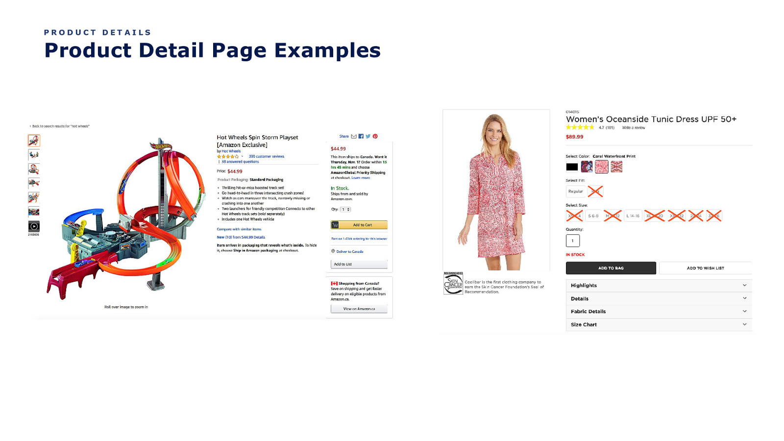
PRODUCT DETAILS Product Detail Page Examples
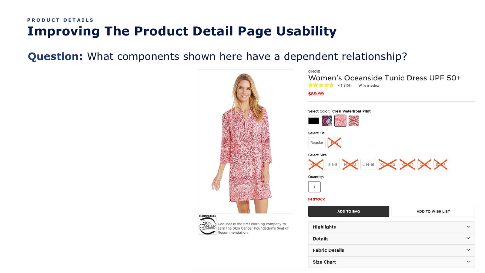
PRODUCT DETAILS Improving The Product Detail Page Usability Question: What components shown here have a dependent relationship?
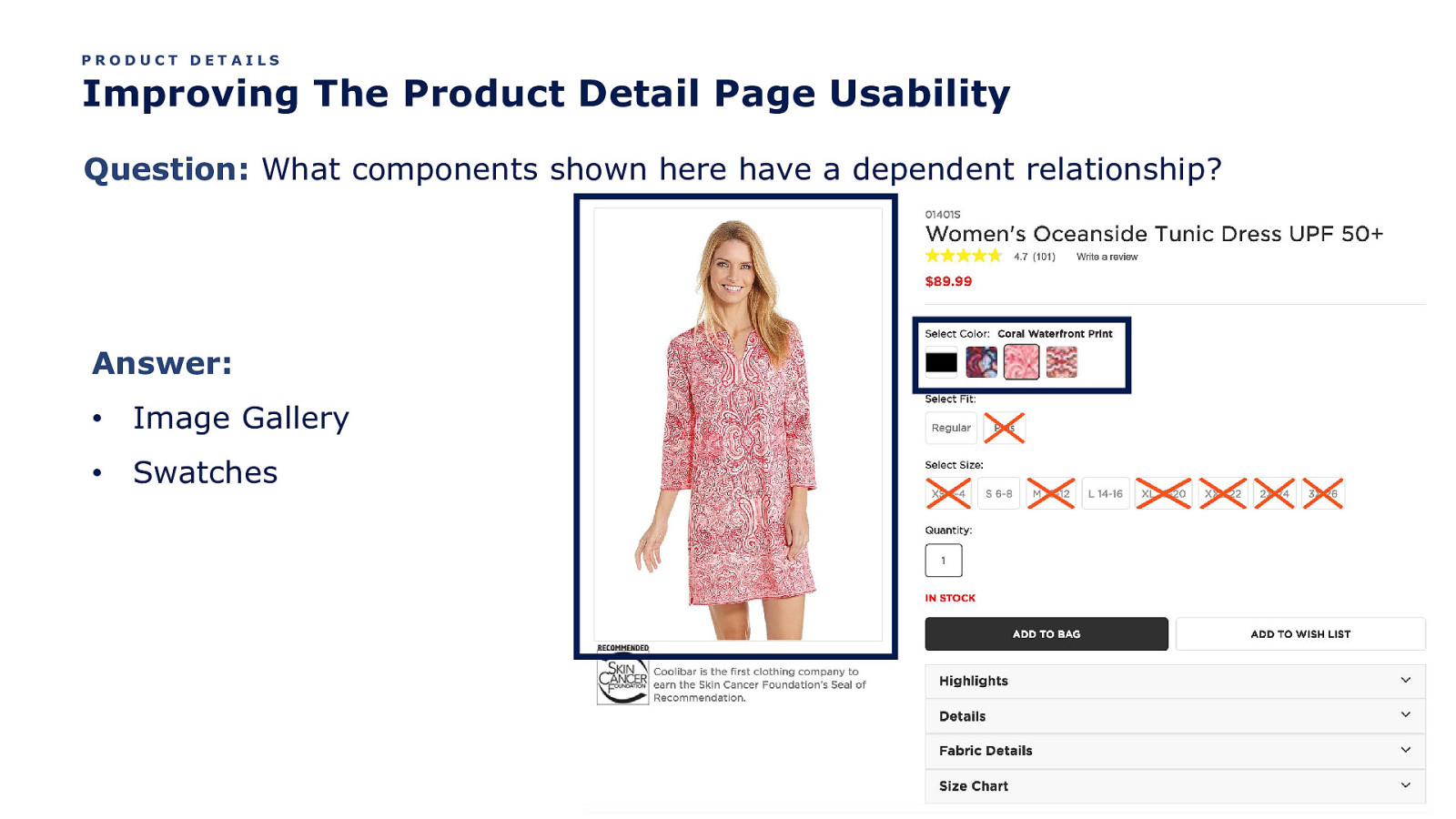
PRODUCT DETAILS Improving The Product Detail Page Usability Question: What components shown here have a dependent relationship? Answer: • Image Gallery • Swatches
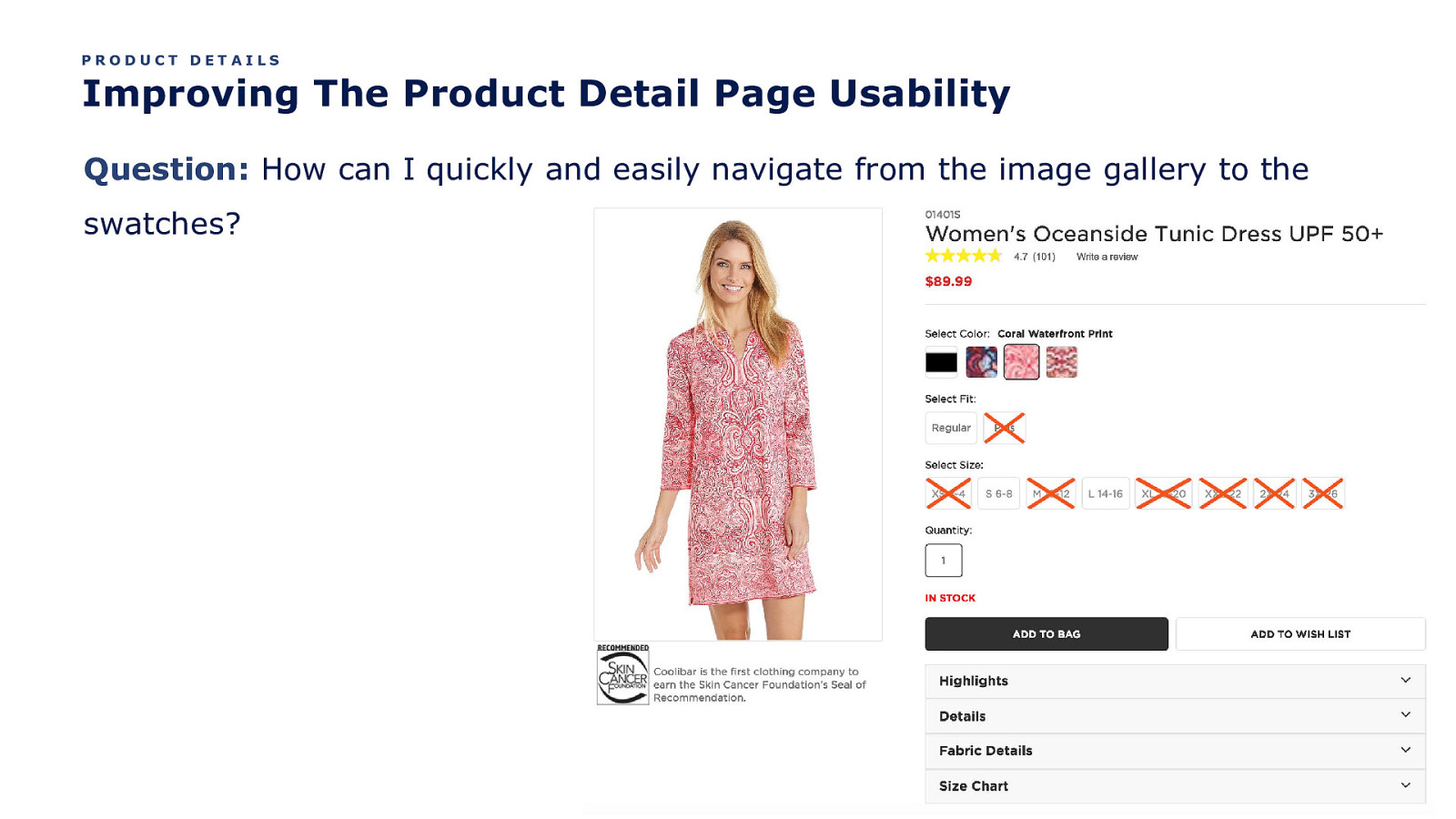
PRODUCT DETAILS Improving The Product Detail Page Usability Question: How can I quickly and easily navigate from the image gallery to the swatches?
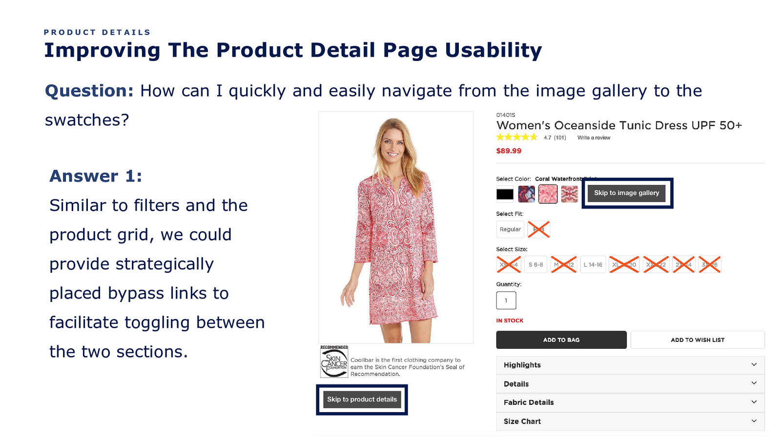
PRODUCT DETAILS Improving The Product Detail Page Usability Question: How can I quickly and easily navigate from the image gallery to the swatches? Answer 1: Similar to filters and the product grid, we could provide strategically placed bypass links to facilitate toggling between the two sections.
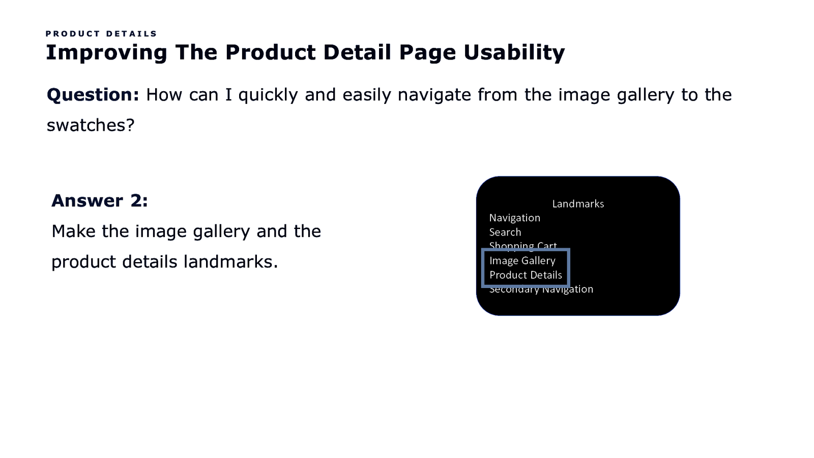
PRODUCT DETAILS Improving The Product Detail Page Usability Question: How can I quickly and easily navigate from the image gallery to the swatches? Answer 2: Make the image gallery and the product details landmarks. Landmarks Navigation Search Shopping Cart Image Gallery Product Details Secondary Navigation
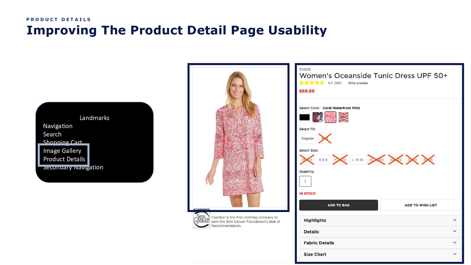
PRODUCT DETAILS Improving The Product Detail Page Usability Landmarks Navigation Search Shopping Cart Image Gallery Product Details Secondary Navigation
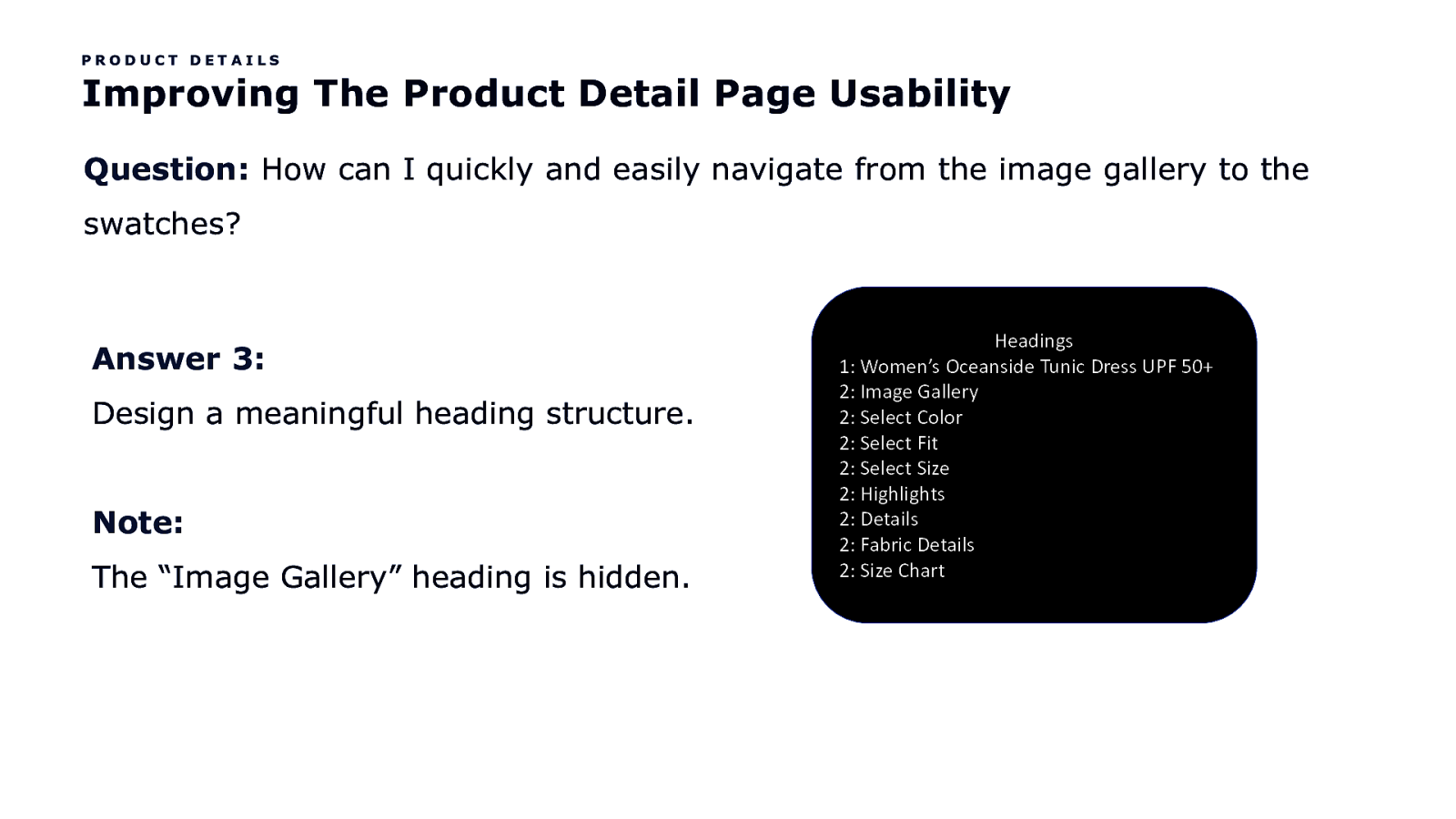
PRODUCT DETAILS Improving The Product Detail Page Usability Question: How can I quickly and easily navigate from the image gallery to the swatches? Answer 3: Design a meaningful heading structure. Note: The “Image Gallery” heading is hidden. Headings 1: Women’s Oceanside Tunic Dress UPF 50+ 2: Image Gallery 2: Select Color 2: Select Fit 2: Select Size 2: Highlights 2: Details 2: Fabric Details 2: Size Chart
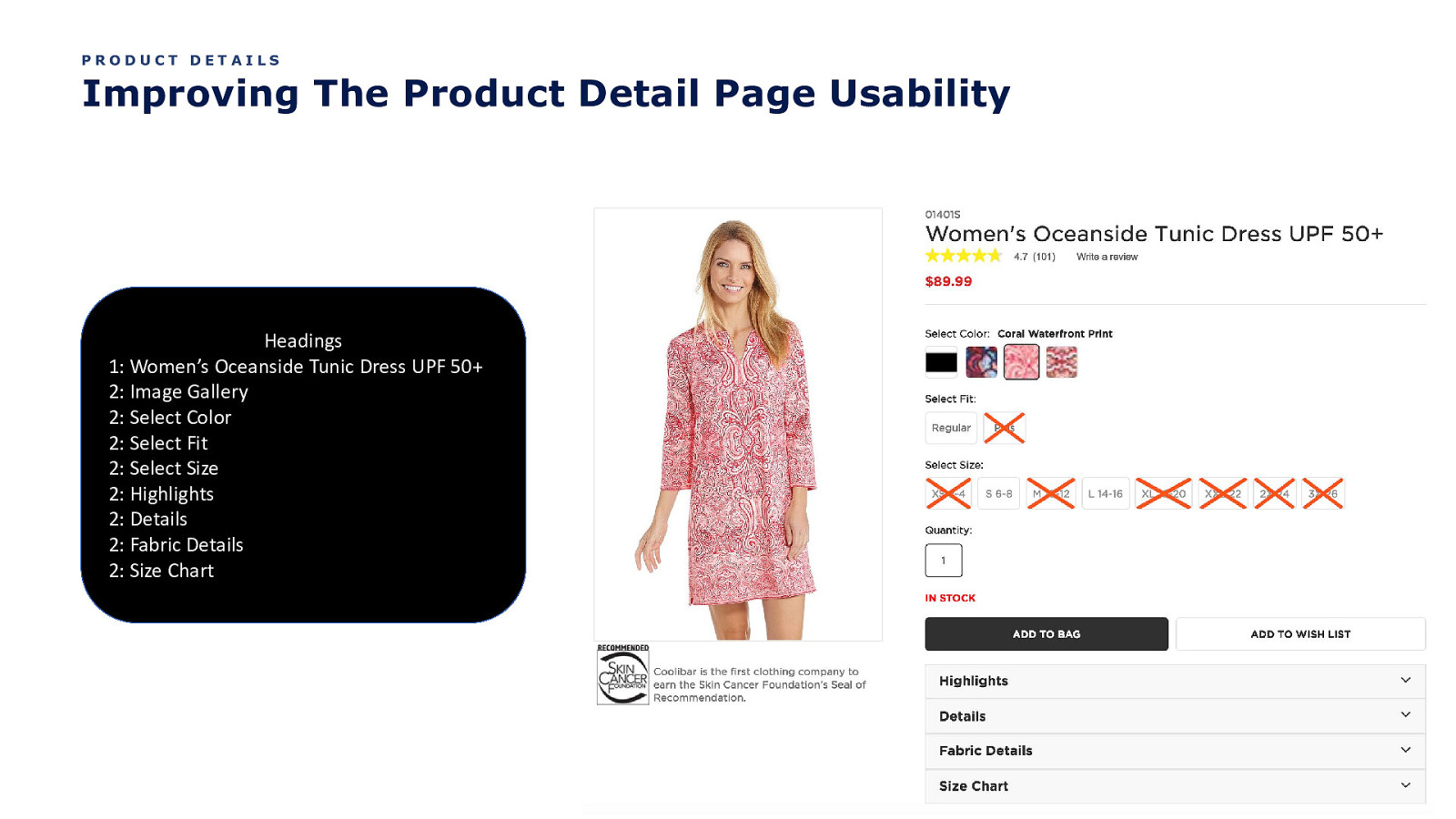
PRODUCT DETAILS Improving The Product Detail Page Usability Headings 1: Women’s Oceanside Tunic Dress UPF 50+ 2: Image Gallery 2: Select Color 2: Select Fit 2: Select Size 2: Highlights 2: Details 2: Fabric Details 2: Size Chart
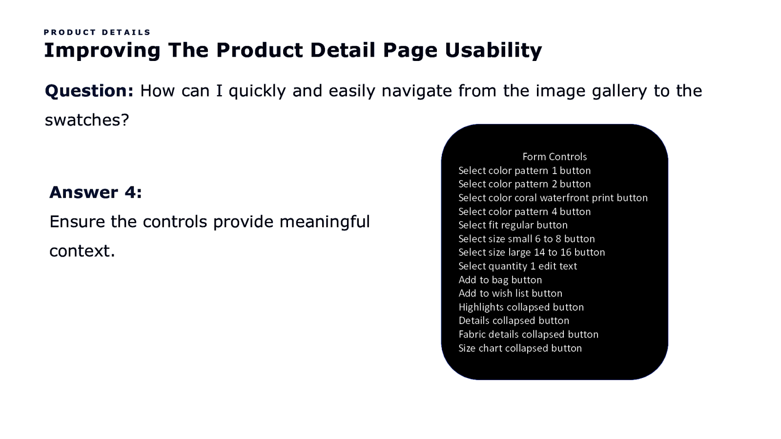
PRODUCT DETAILS Improving The Product Detail Page Usability Question: How can I quickly and easily navigate from the image gallery to the swatches? Answer 4: Ensure the controls provide meaningful context. Form Controls Select color pattern 1 button Select color pattern 2 button Select color coral waterfront print button Select color pattern 4 button Select fit regular button Select size small 6 to 8 button Select size large 14 to 16 button Select quantity 1 edit text Add to bag button Add to wish list button Highlights collapsed button Details collapsed button Fabric details collapsed button Size chart collapsed button
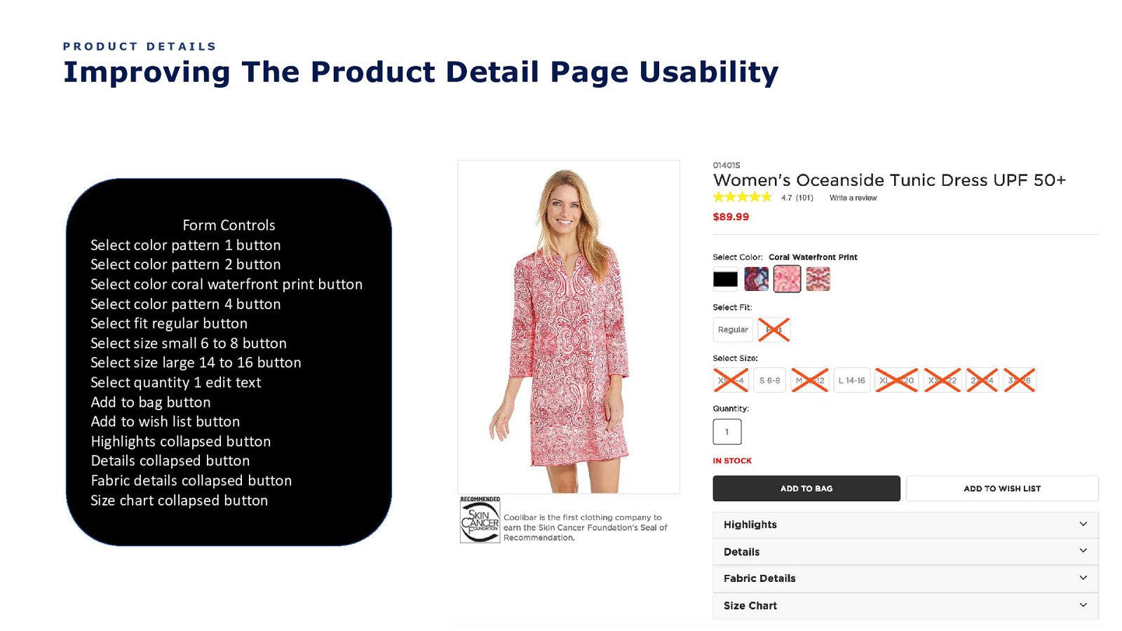
PRODUCT DETAILS Improving The Product Detail Page Usability Form Controls Select color pattern 1 button Select color pattern 2 button Select color coral waterfront print button Select color pattern 4 button Select fit regular button Select size small 6 to 8 button Select size large 14 to 16 button Select quantity 1 edit text Add to bag button Add to wish list button Highlights collapsed button Details collapsed button Fabric details collapsed button Size chart collapsed button
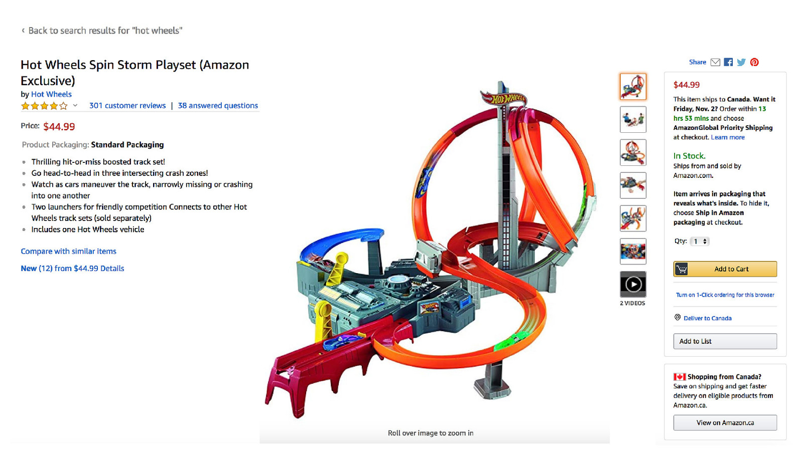
Kool. But like, what’s the biggest usability problem on the Product Detail Page?

The reading order
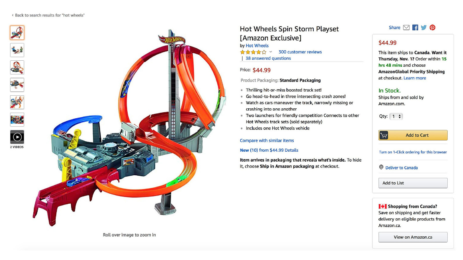
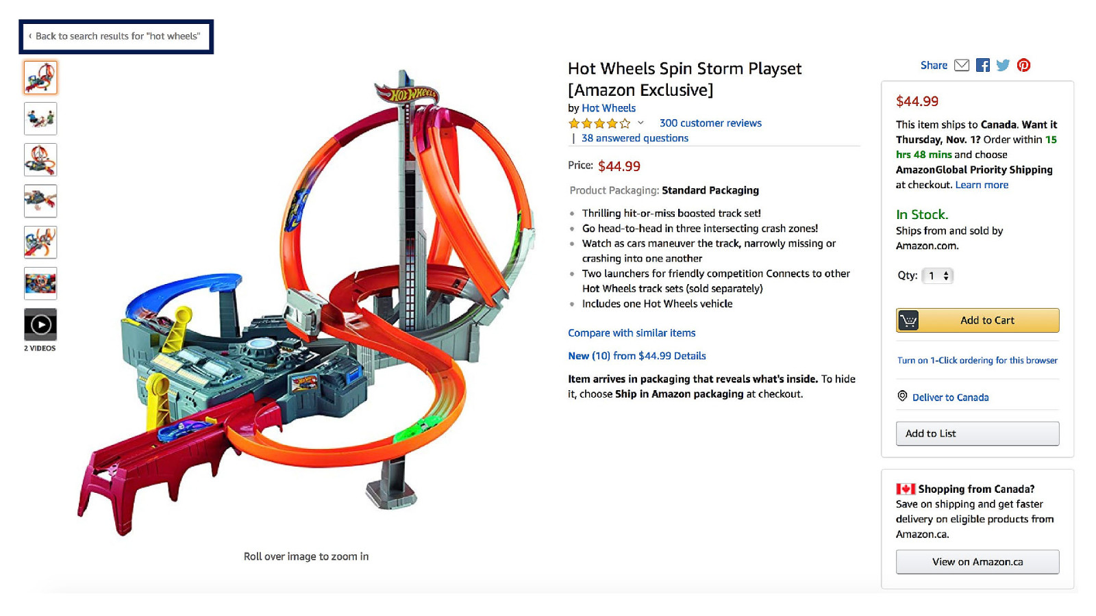
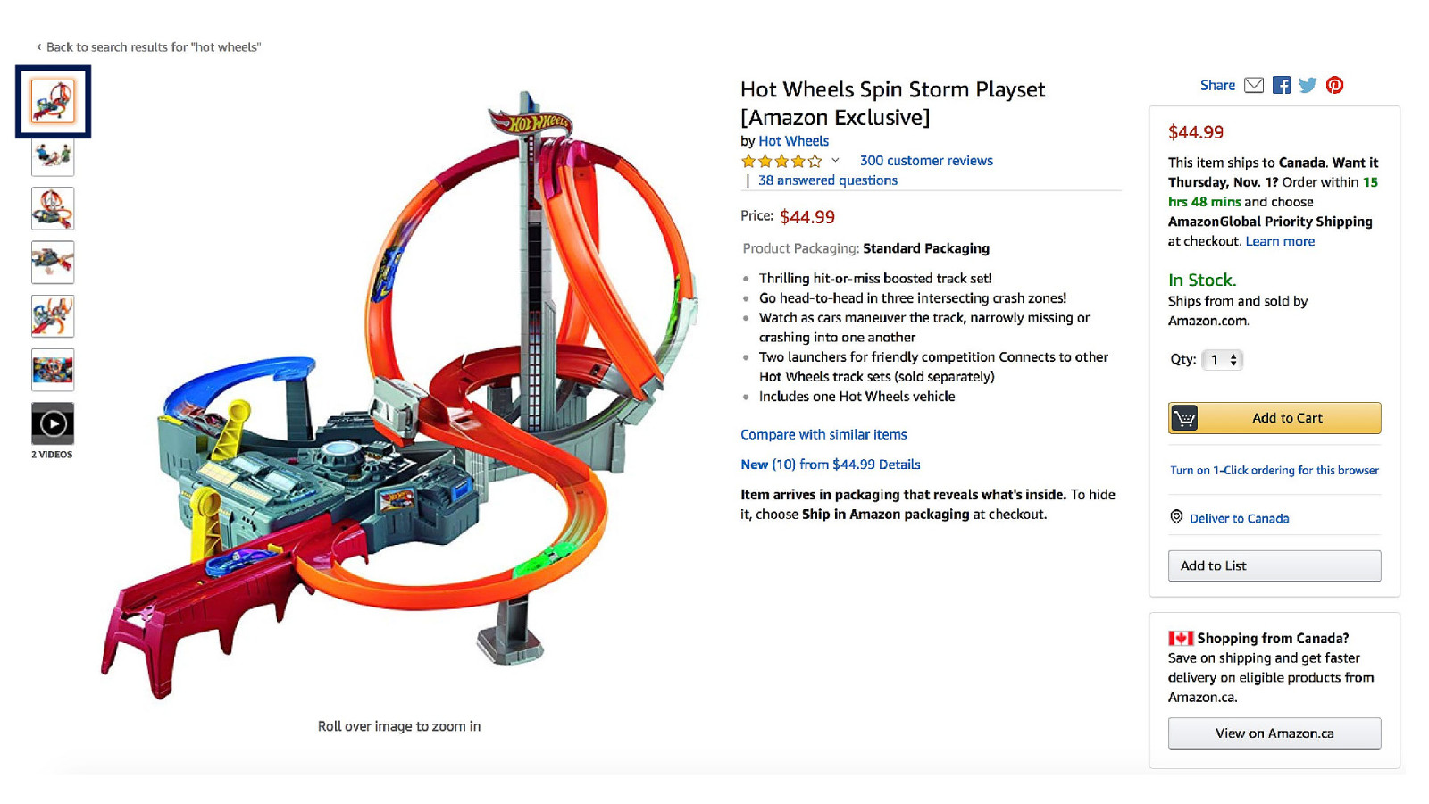
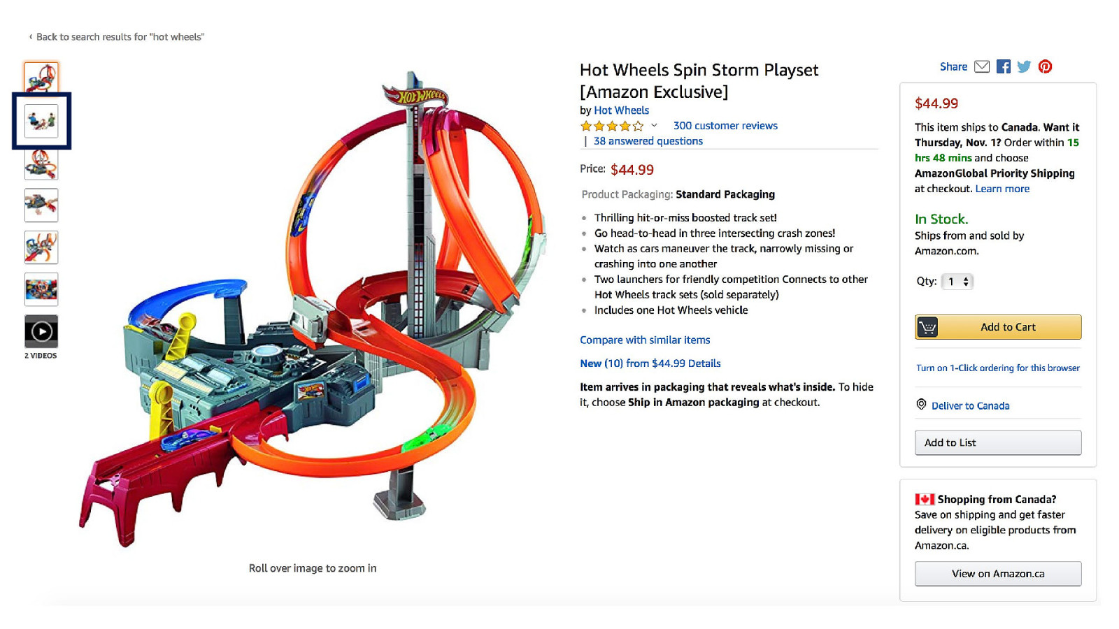
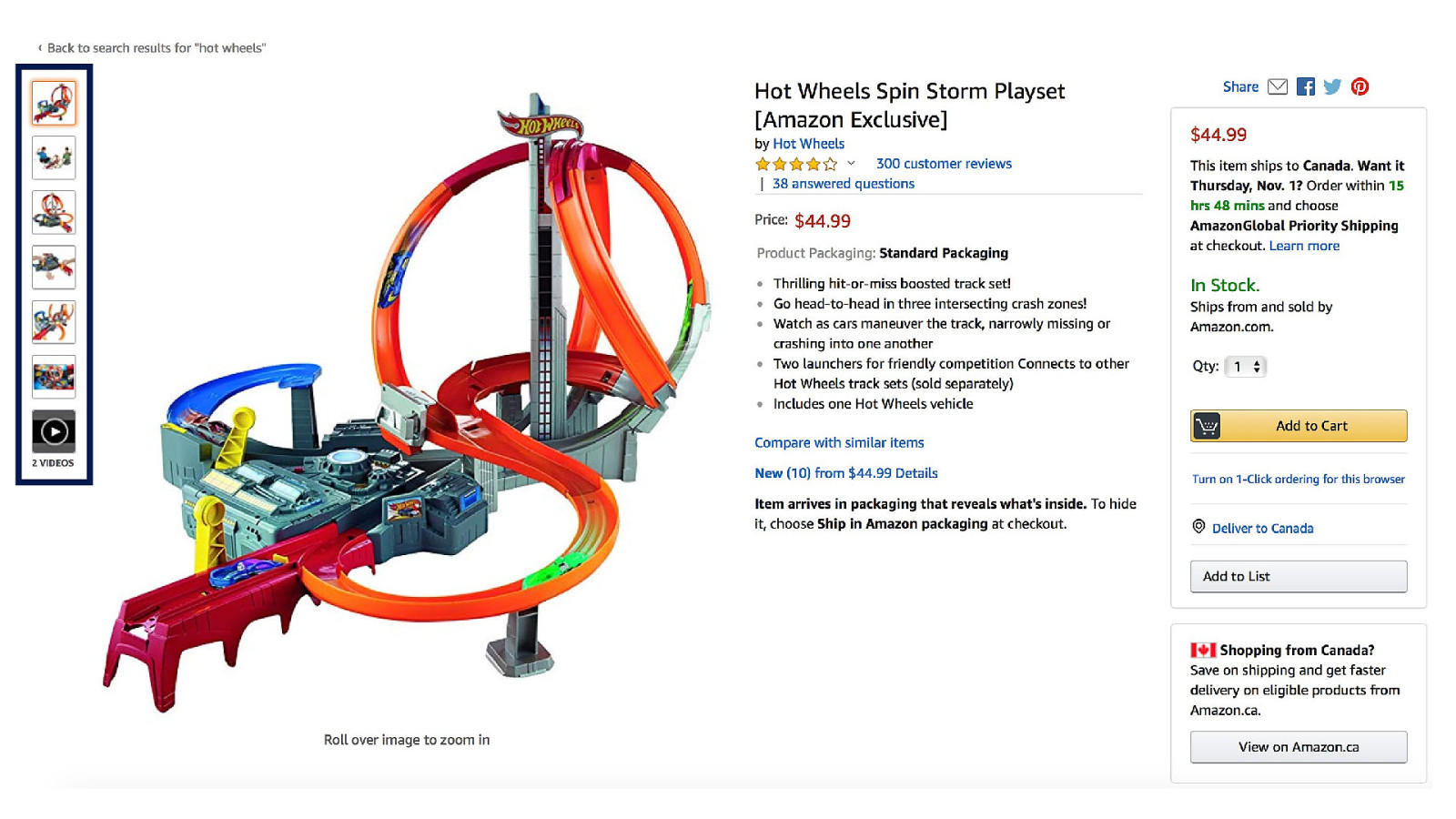
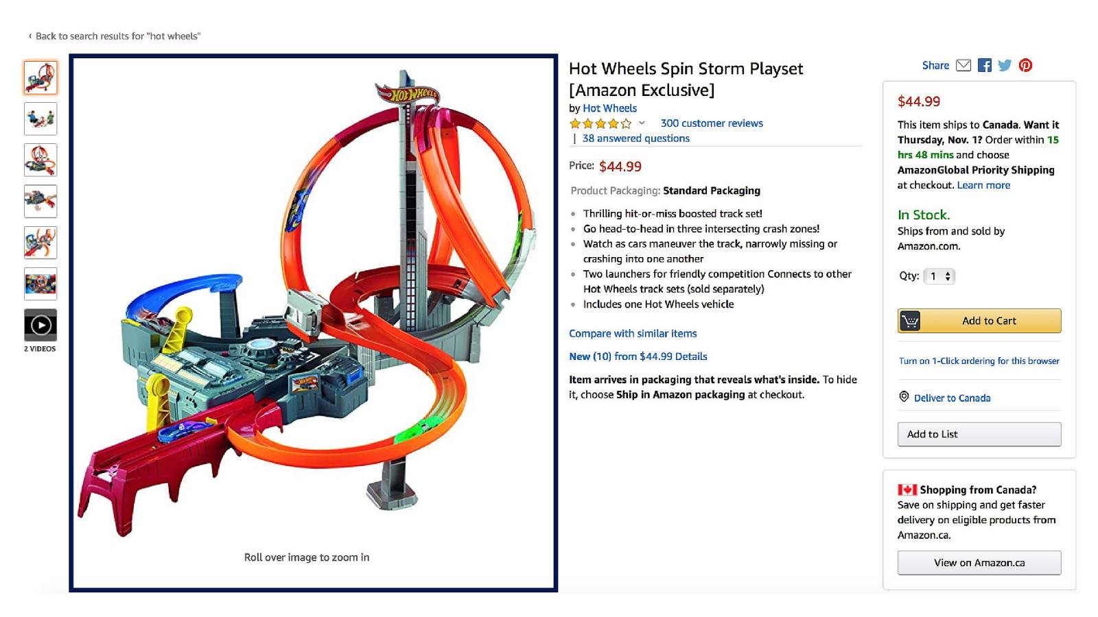
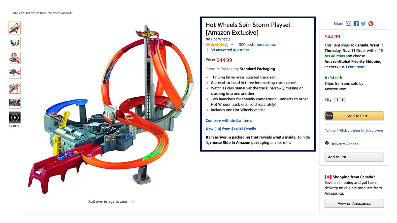
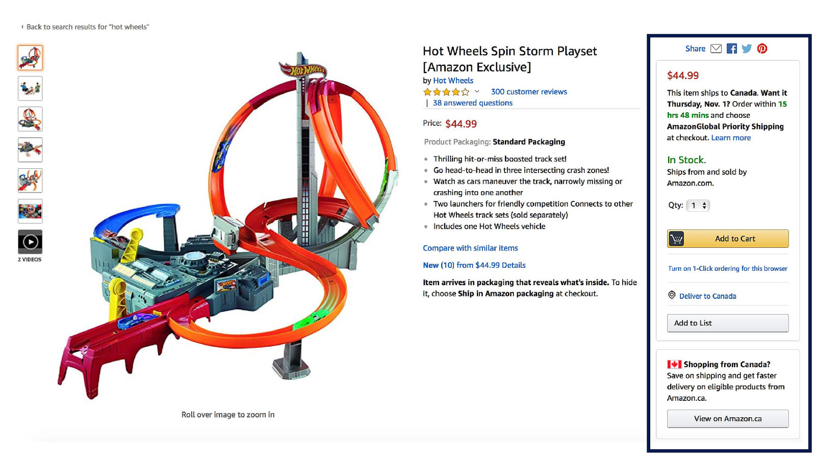

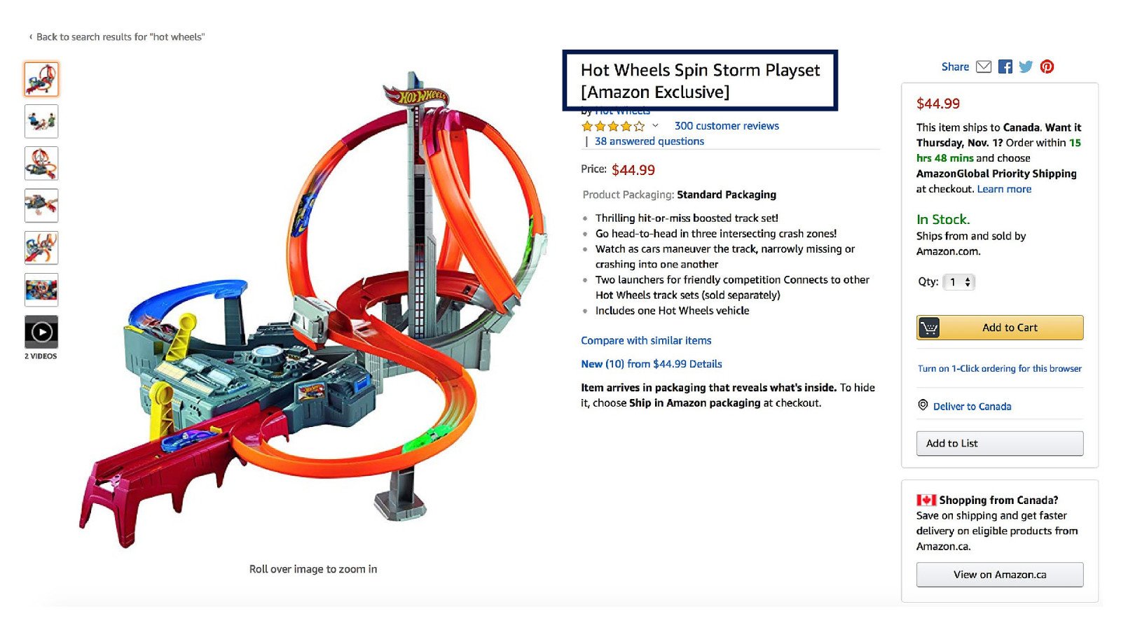
So is there a better way to design this page?

Well, yeah
OK. So I want to take a sec to ask…


In summary, I want you to know…

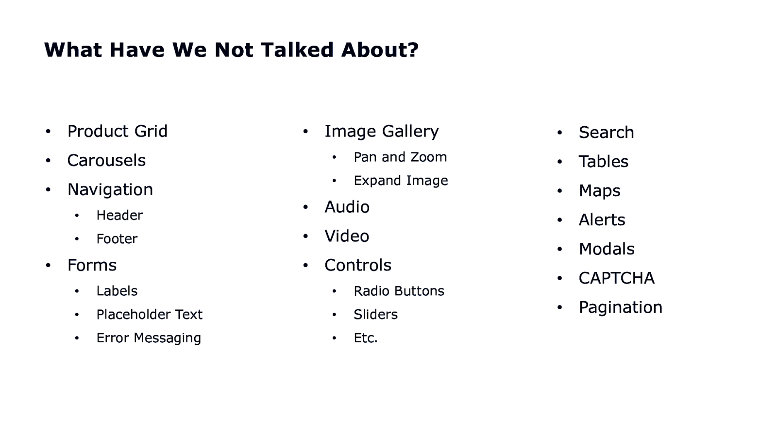
What Have We Not Talked About? • Product Grid • Carousels • Navigation • • Image Gallery • Pan and Zoom • Expand Image • Header • Audio • Footer • Video • Controls Forms • Labels • Radio Buttons • Placeholder Text • Sliders • Error Messaging • Etc. • Search • Tables • Maps • Alerts • Modals • CAPTCHA • Pagination

So I want to reiterate…

Think linearly
Provide context

Provide multiple avenues for the user to find their way
Let the user decide what’s important to them

Limit the effort

Now. You’re probably thinking, are there any good examples?

By golly, yes!
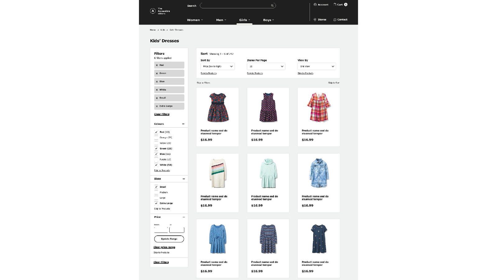
Additional Resources • Check out ”The Accessible eStore” • • Link: http://tiny.cc/estoredemo Follow me (Karen Hawkins) on Medium • Article: “Designing Accessible Web Experiences - A UX Perspective” (many more planned) • Follow my mentor (Alison Walden) on Medium • Article: “The State of Accessibility in eCommerce” (and many others)

QUESTIONS?

THANKS!