Creating and Managing Accessible Design Systems Karen Hawkins May 10, 2023

A presentation at John Slatin AccessU 2023 in May 2023 in Austin, TX, USA by Karen Hawkins
Creating and Managing Accessible Design Systems Karen Hawkins May 10, 2023
Meet Karen Hawkins Karen Hawkins, CPACC Head of Accessible User Experience Design Level Access karen.hawkins@levelaccess.com 2
Today’s Goals
SECTION 1 Level Setting on Design Systems 4
A design system is a complete set of standards intended to manage design at scale using reusable components and patterns. NN/g Niesen Norman Group 5
A design system is a complete set of standards intended to manage design at scale using reusable components and patterns. NN/g Niesen Norman Group 6
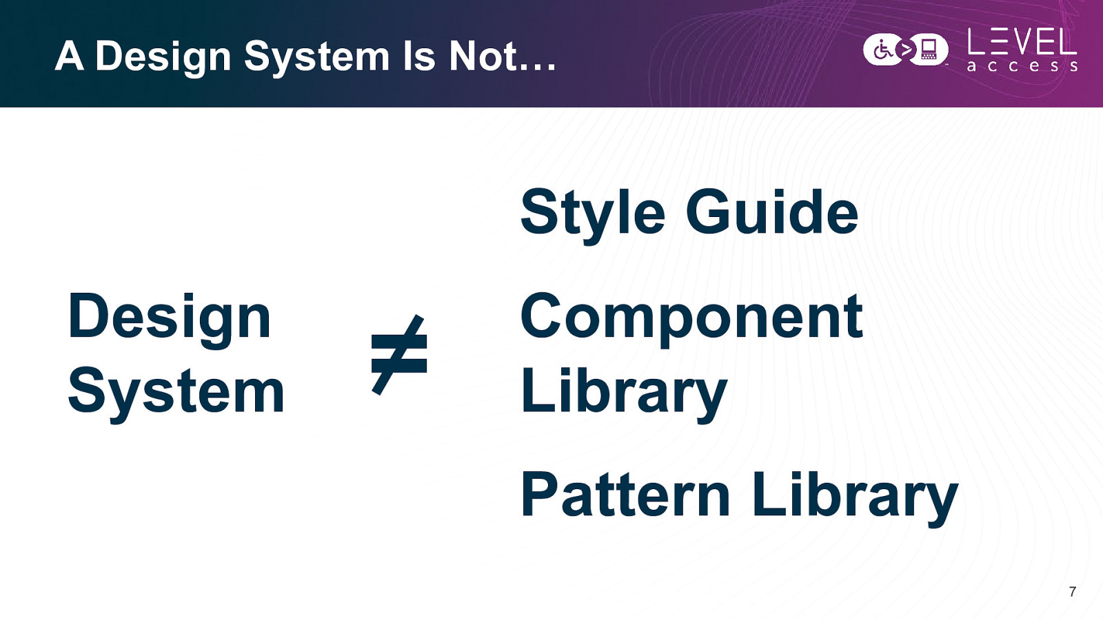
Component Library Pattern Library 7
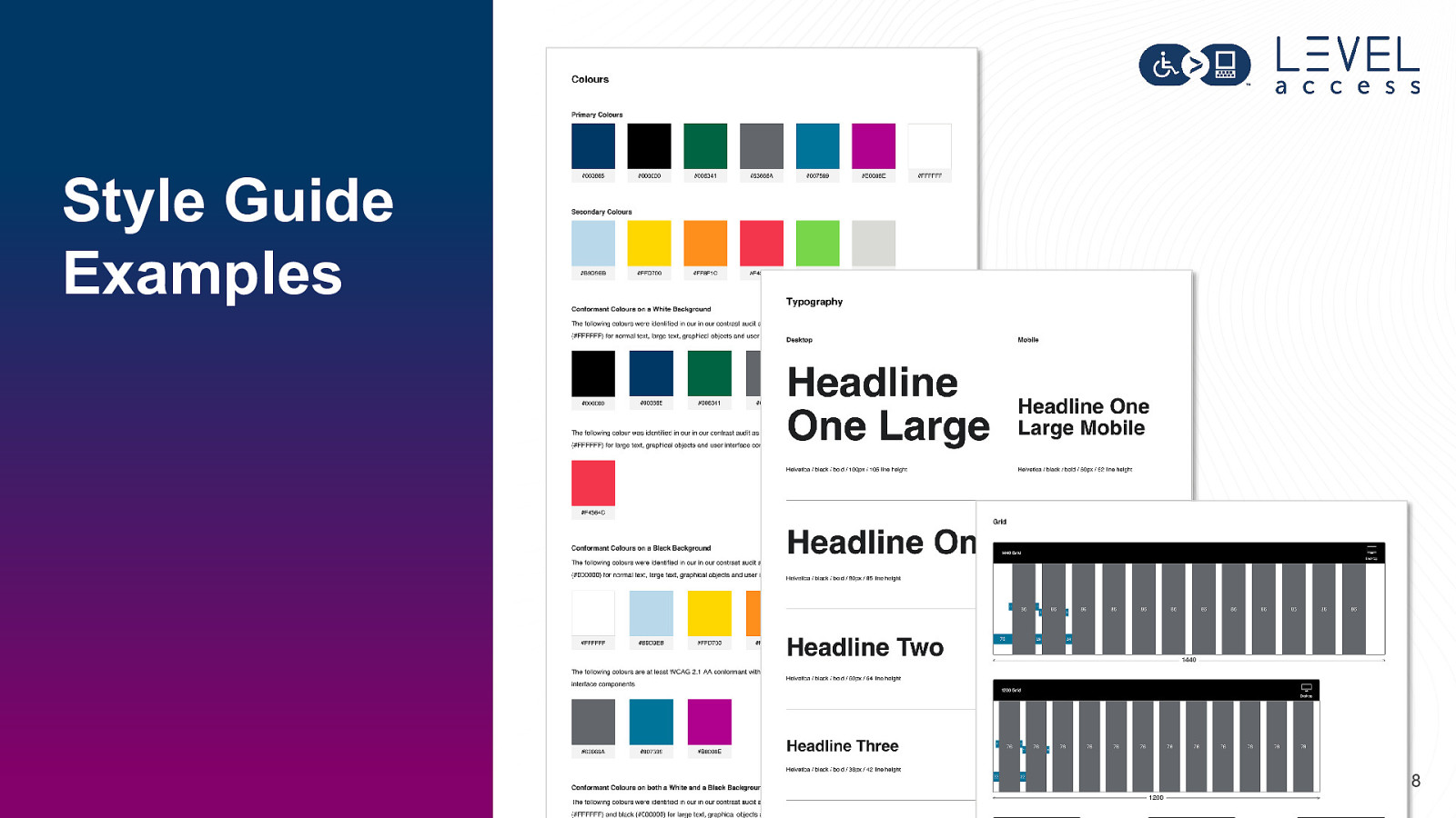
Style Guide Examples 8
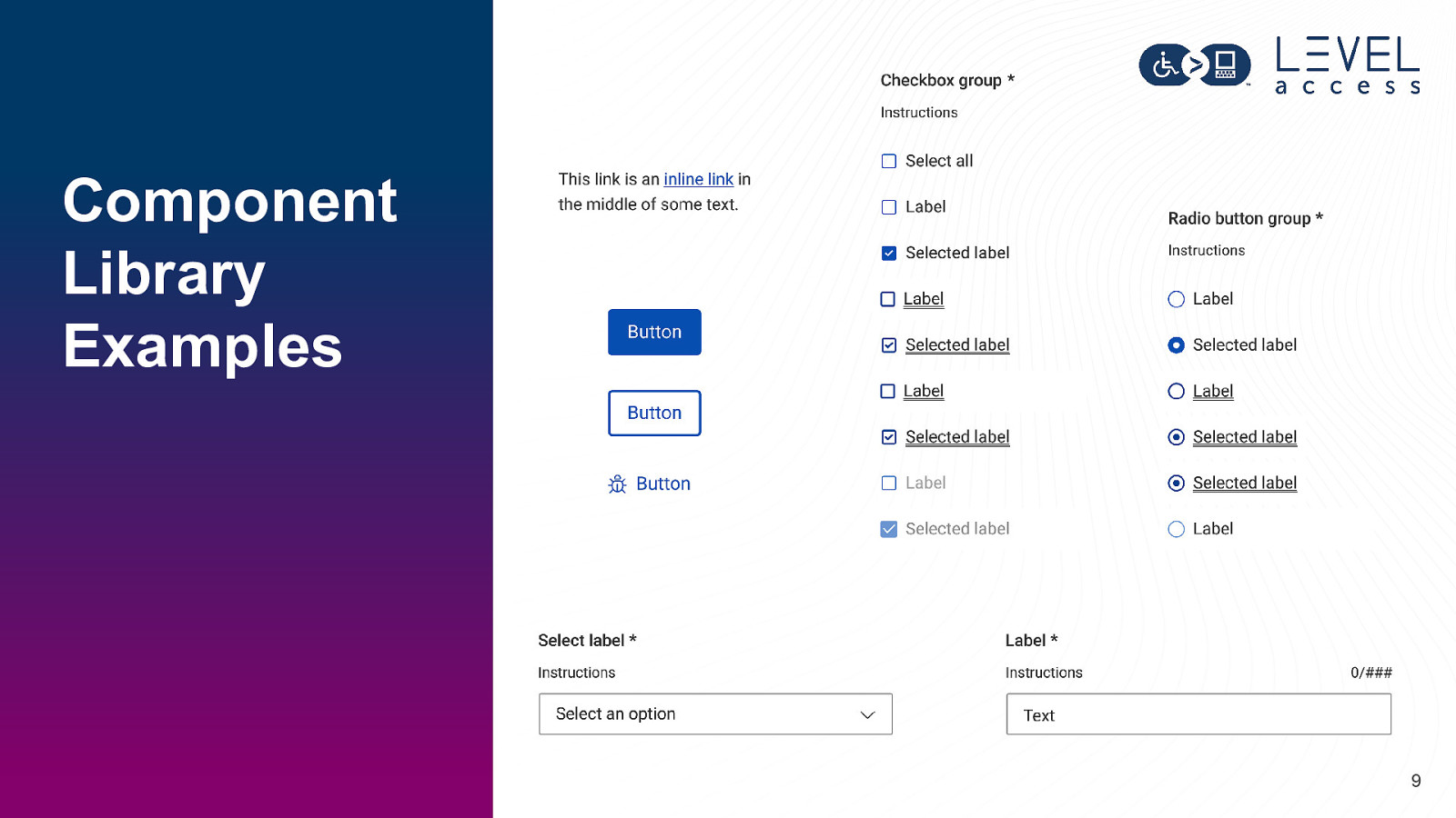
Component Library Examples 9
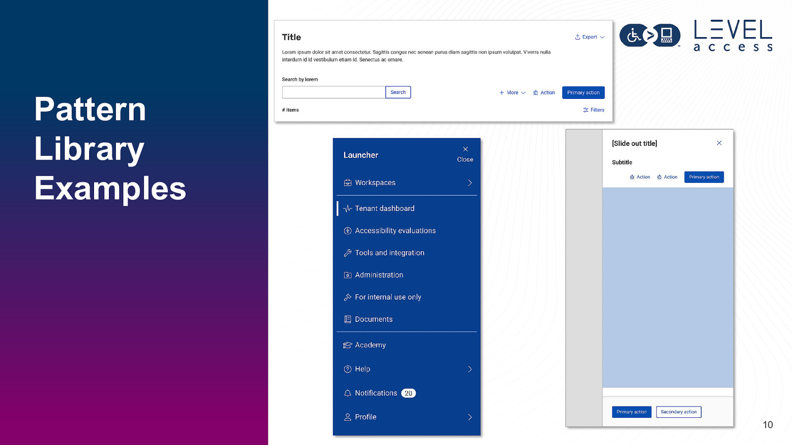
Pattern Library Examples 10
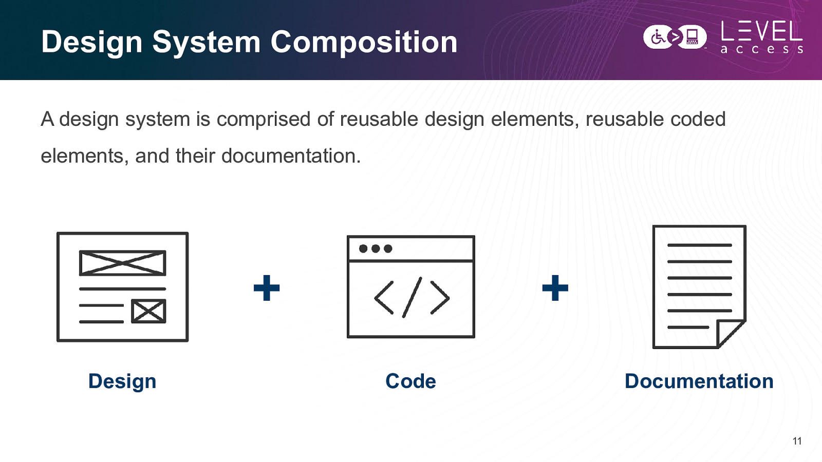
Design System Composition A design system is comprised of reusable design elements, reusable coded elements, and their documentation.
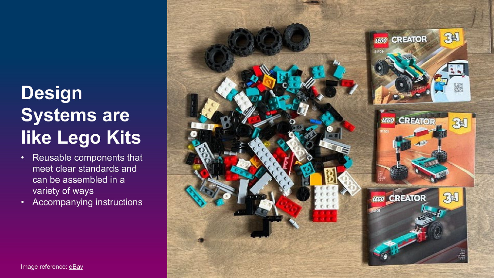
Design Systems are like Lego Kits • Reusable components that meet clear standards and can be assembled in a variety of ways • Accompanying instructions Image reference: eBay 12
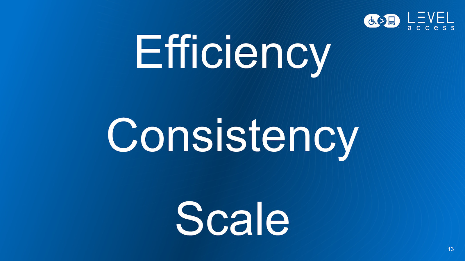
Efficiency Consistency Scale 13
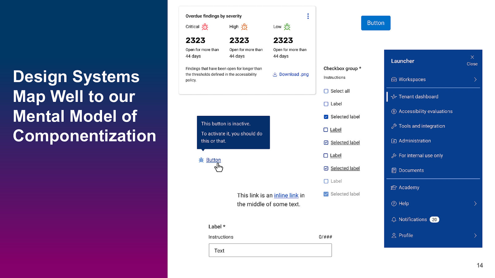
Design Systems Map Well to our Mental Model of Componentization 14
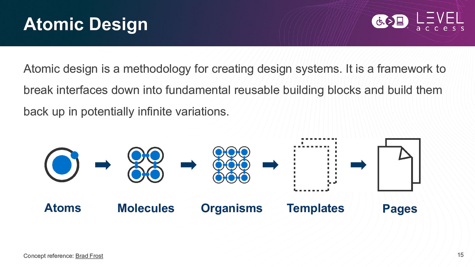
Atomic Design Atomic design is a methodology for creating design systems. It is a framework to break interfaces down into fundamental reusable building blocks and build them back up in potentially infinite variations. Atoms Concept reference: Brad Frost Molecules Organisms Templates Pages 15
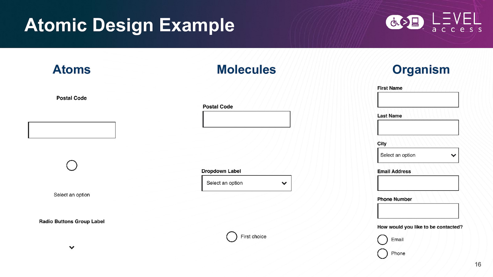
Atomic Design Example Atoms Molecules Organism 16
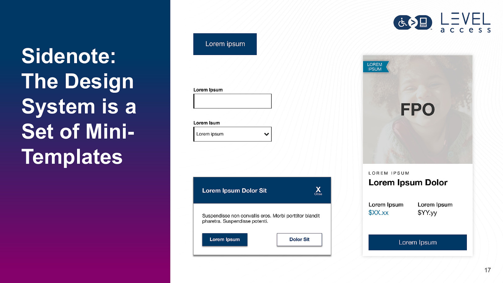
Sidenote: The Design System is a Set of MiniTemplates 17
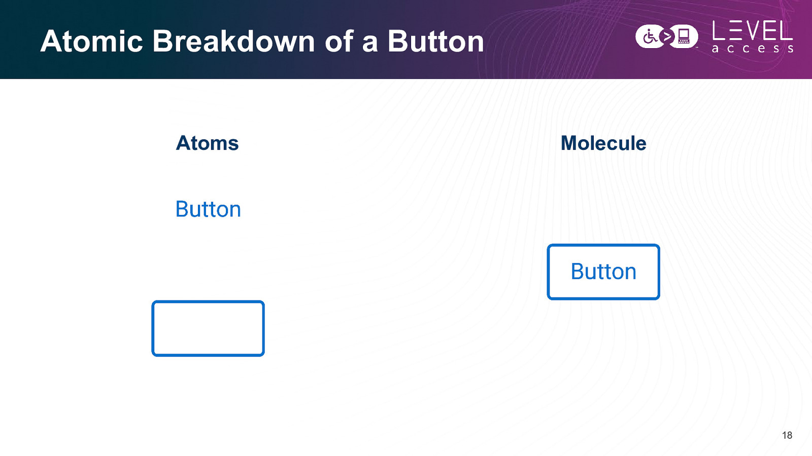
Atomic Breakdown of a Button Atoms Molecule 18
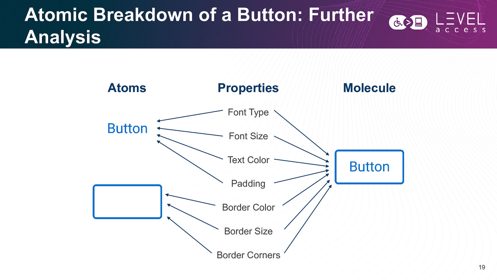
Atomic Breakdown of a Button: Further Analysis Atoms Properties Molecule Font Type Font Size Text Color Padding Border Color Border Size Border Corners 19
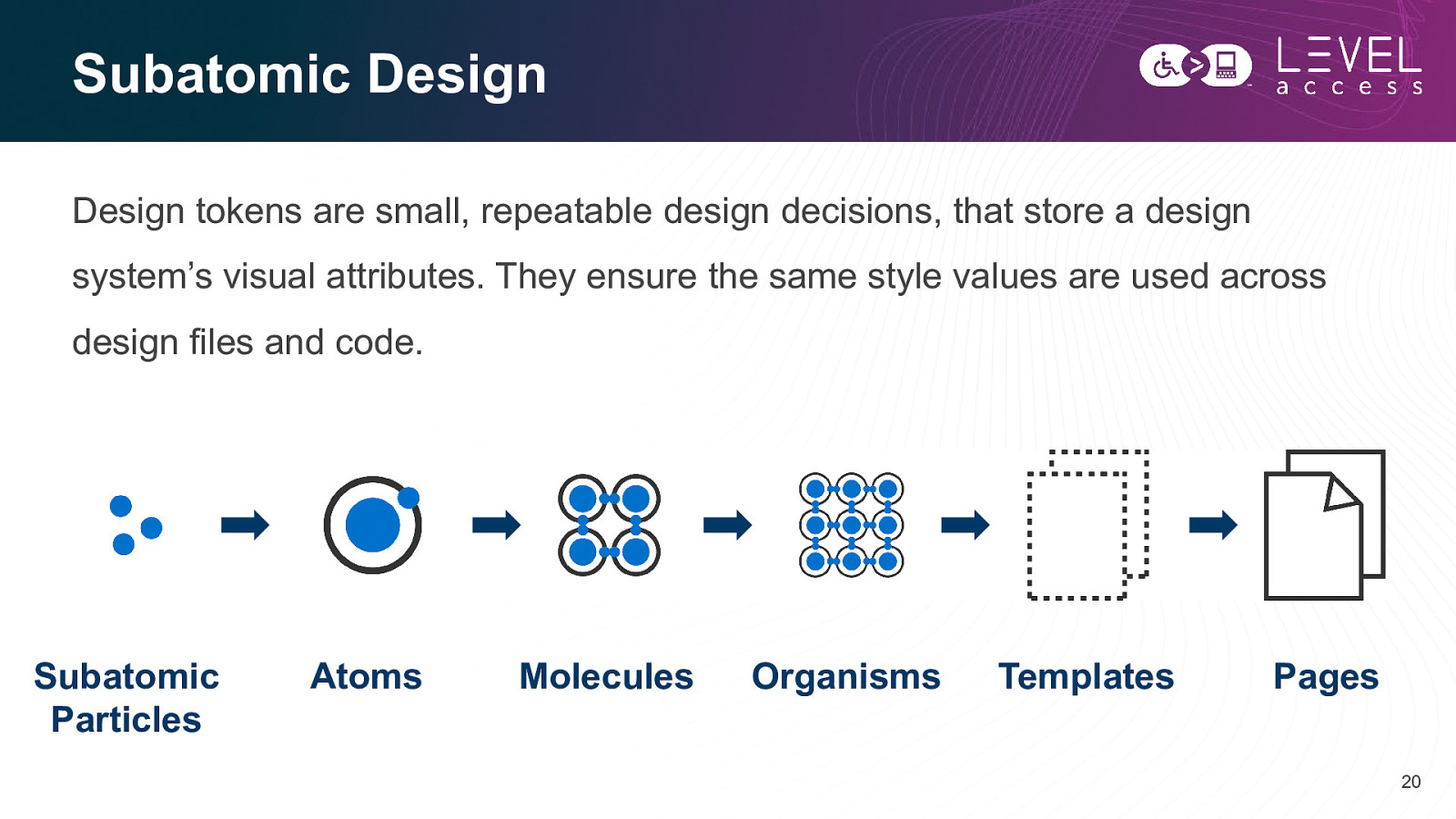
Subatomic Design Design tokens are small, repeatable design decisions, that store a design system’s visual attributes. They ensure the same style values are used across design files and code. Subatomic Particles Atoms Molecules Organisms Templates Pages 20
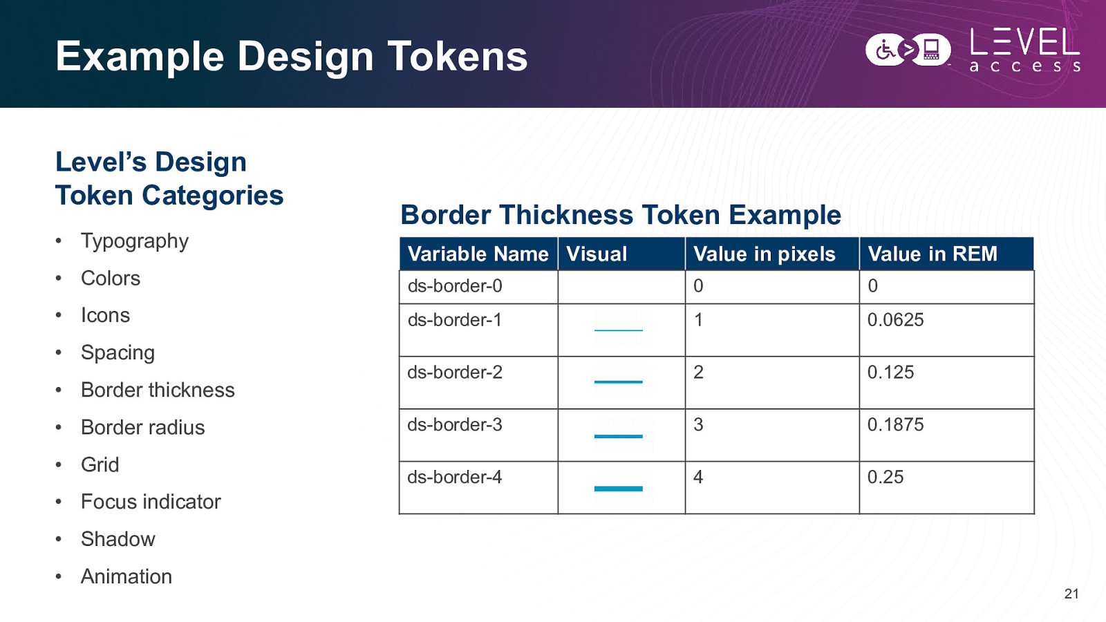
Example Design Tokens Level’s Design Token Categories • Typography • Colors • Icons • Spacing • Border thickness • Border radius • Grid • Focus indicator Border Thickness Token Example Variable Name Visual Value in pixels Value in REM ds-border-0 0 0 ds-border-1 1 0.0625 ds-border-2 2 0.125 ds-border-3 3 0.1875 ds-border-4 4 0.25 • Shadow • Animation 21
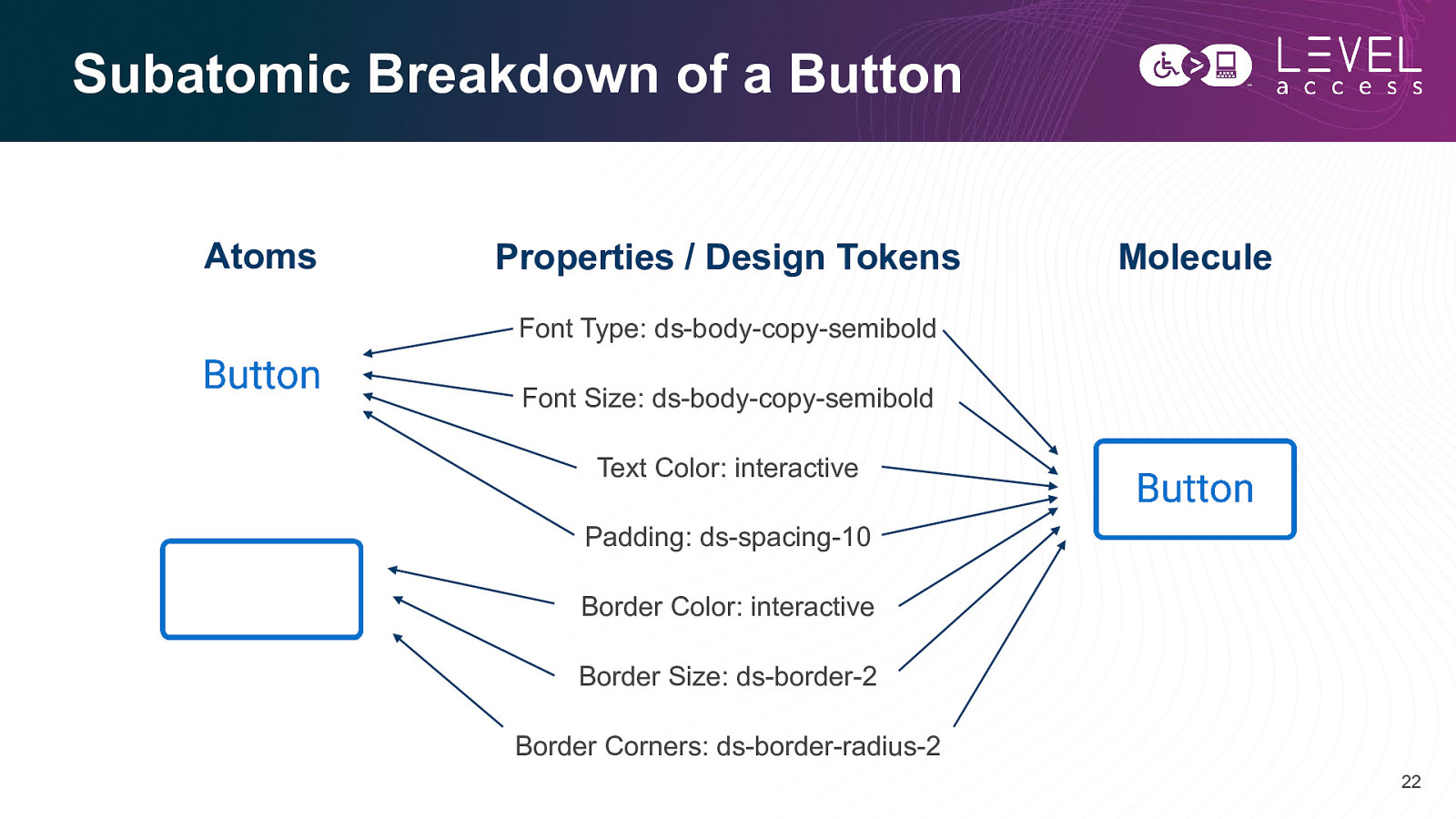
Subatomic Breakdown of a Button Atoms Properties / Design Tokens Molecule Font Type: ds-body-copy-semibold Font Size: ds-body-copy-semibold Text Color: interactive Padding: ds-spacing-10 Border Color: interactive Border Size: ds-border-2 Border Corners: ds-border-radius-2 22
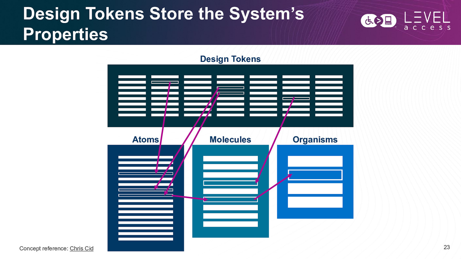
Design Tokens Store the System’s Properties Design Tokens Atoms Concept reference: Chris Cid Molecules Organisms 23
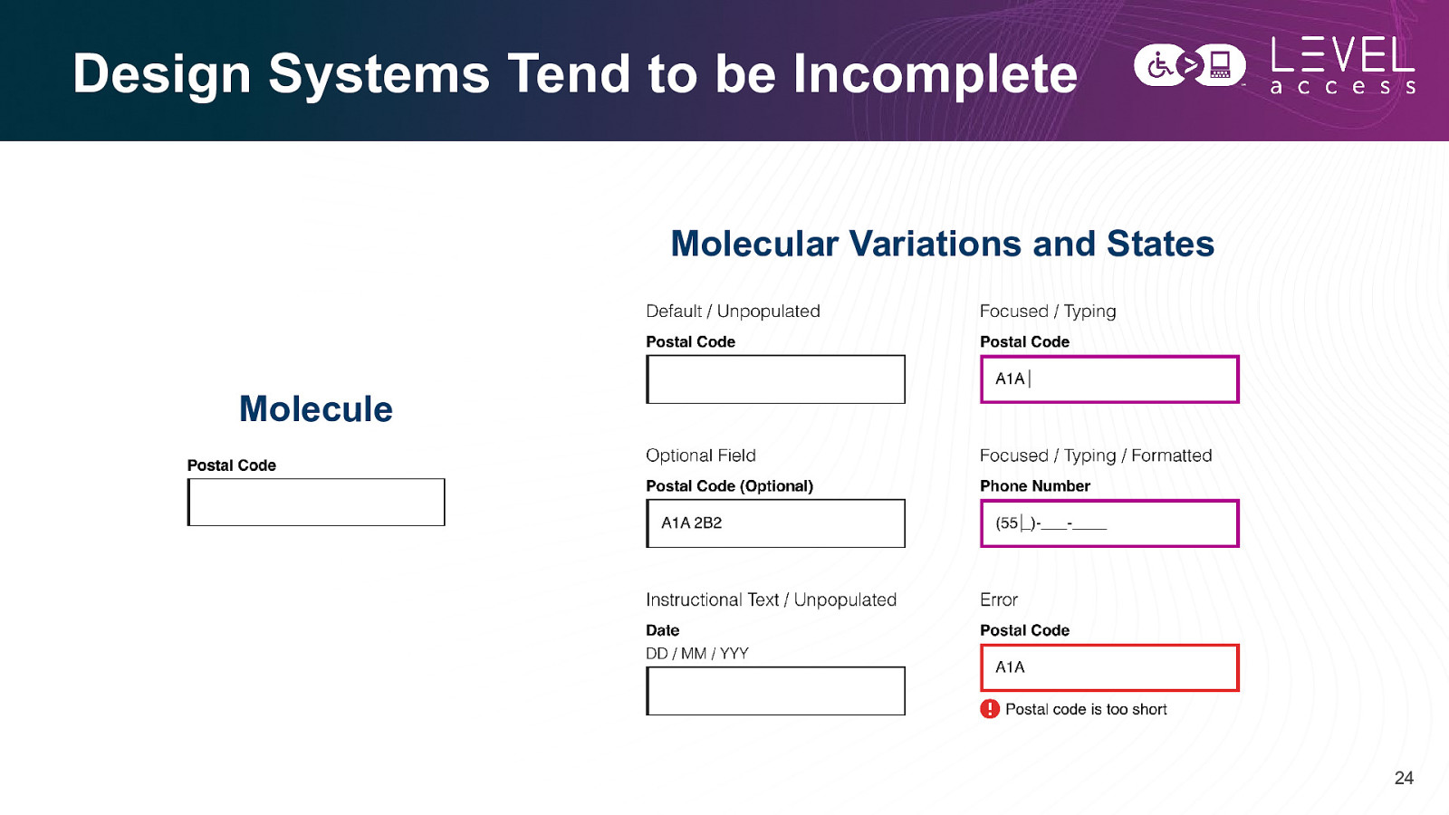
Design Systems Tend to be Incomplete Molecular Variations and States Molecule 24
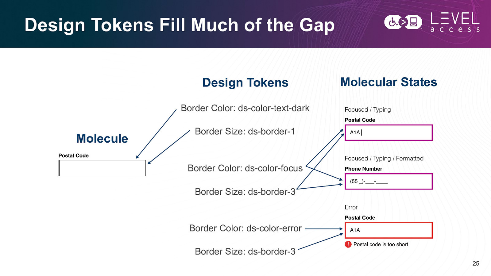
Design Tokens Fill Much of the Gap Design Tokens Molecular States Border Color: ds-color-text-dark Molecule Border Size: ds-border-1 Border Color: ds-color-focus Border Size: ds-border-3 Border Color: ds-color-error Border Size: ds-border-3 25
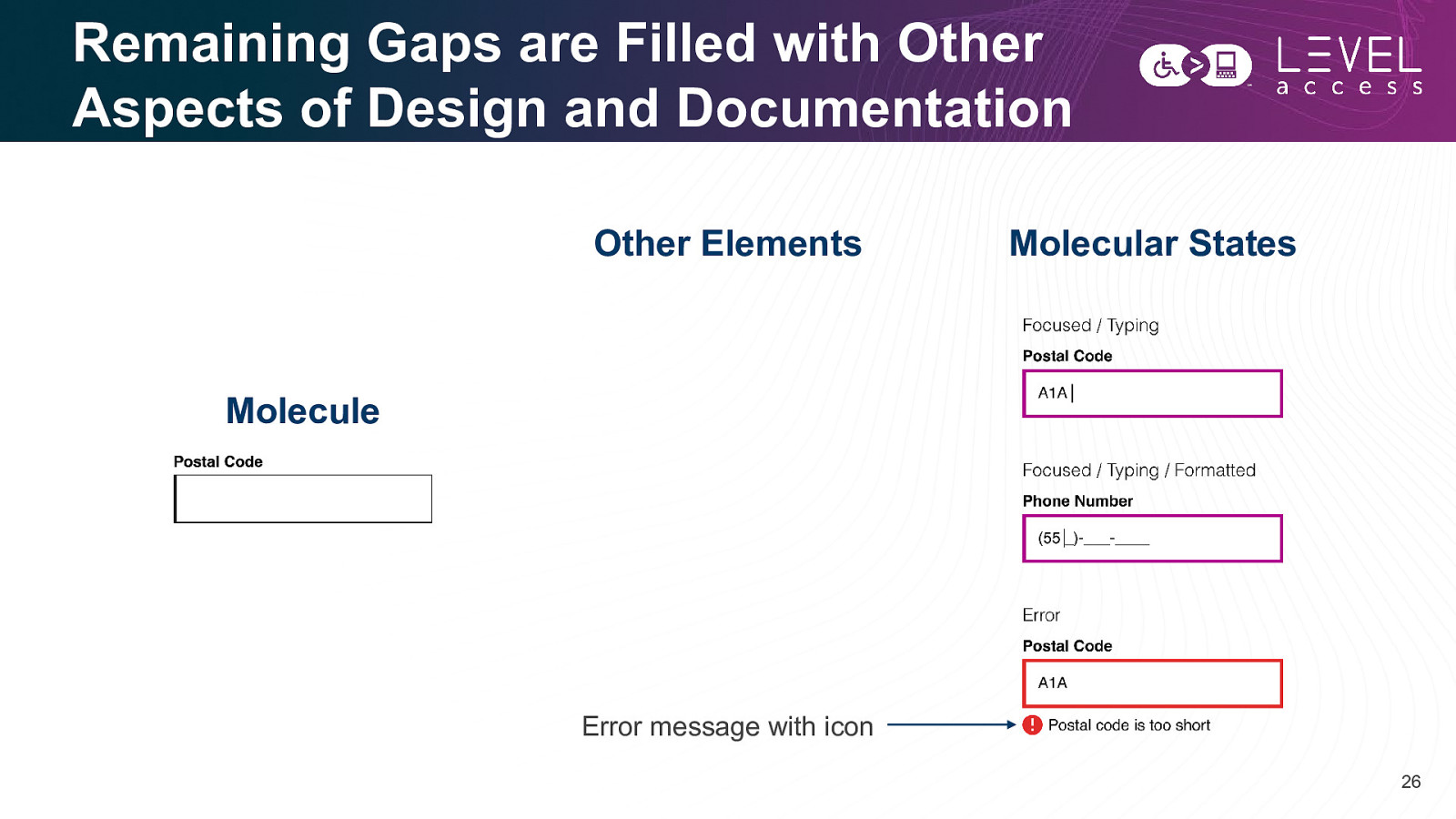
Remaining Gaps are Filled with Other Aspects of Design and Documentation Other Elements Molecular States Molecule Error message with icon 26
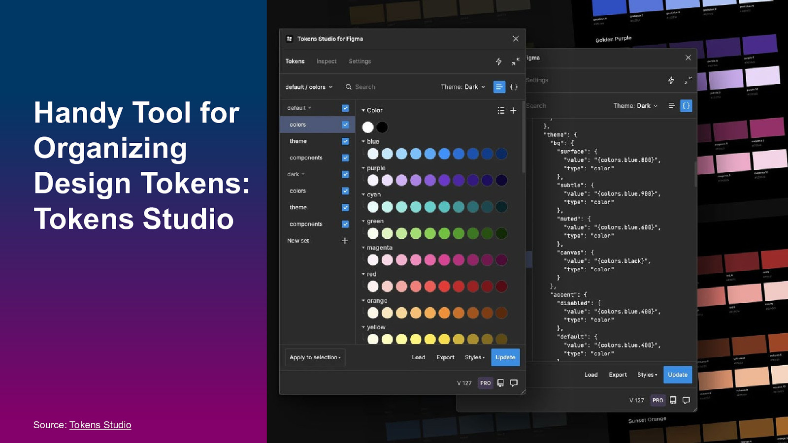
Handy Tool for Organizing Design Tokens: Tokens Studio Source: Tokens Studio 27
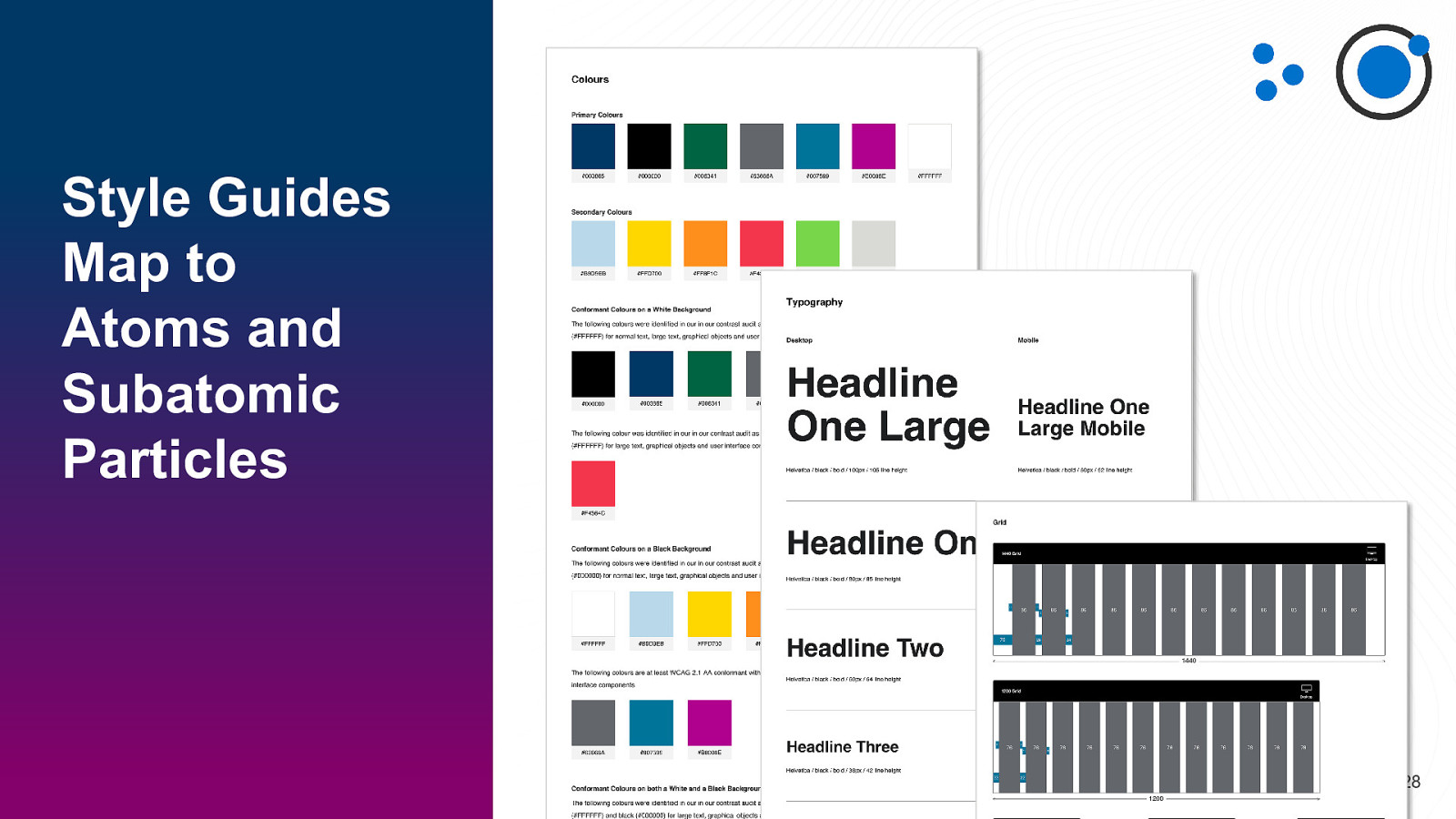
Style Guides Map to Atoms and Subatomic Particles 28
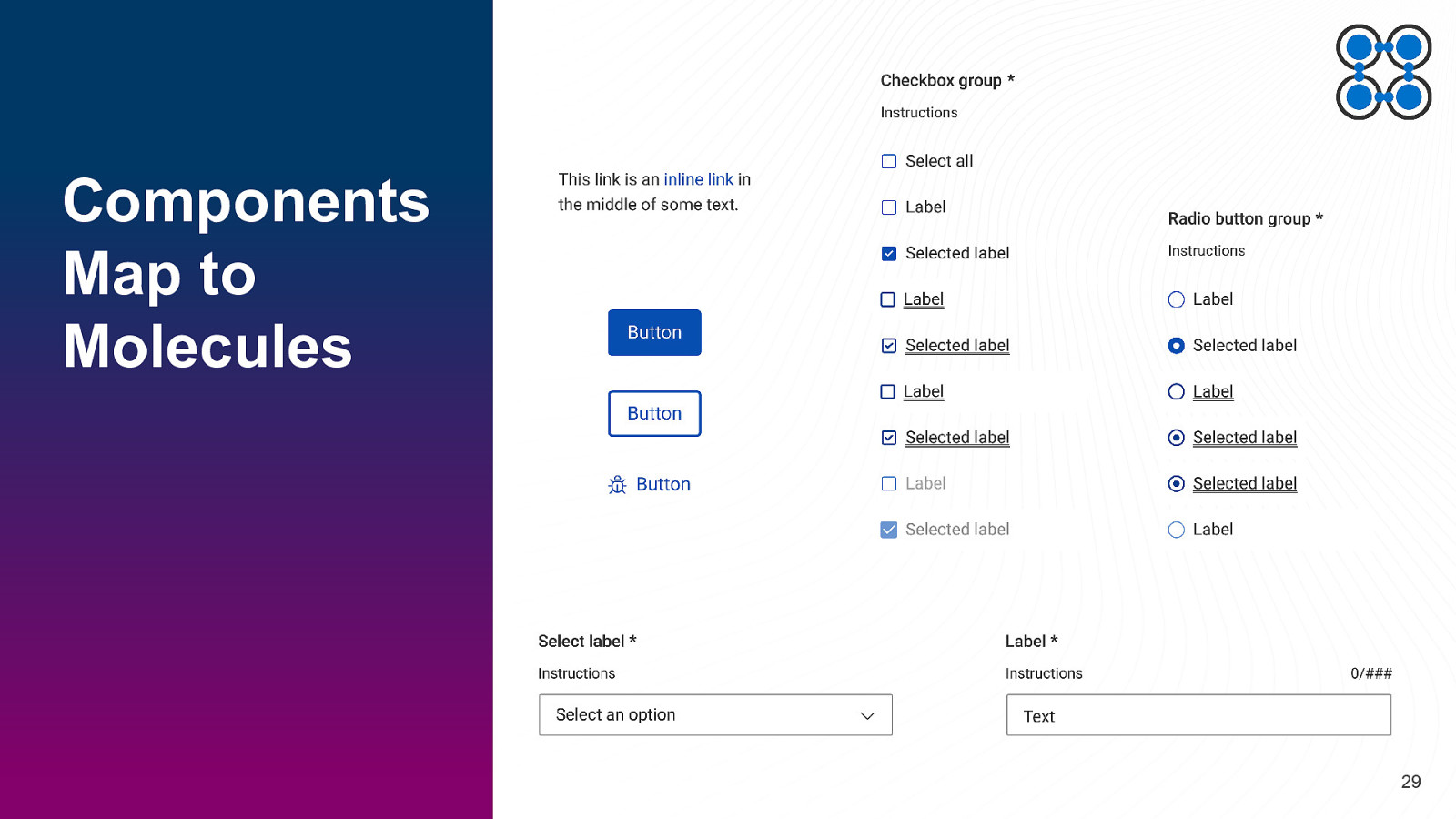
Components Map to Molecules 29
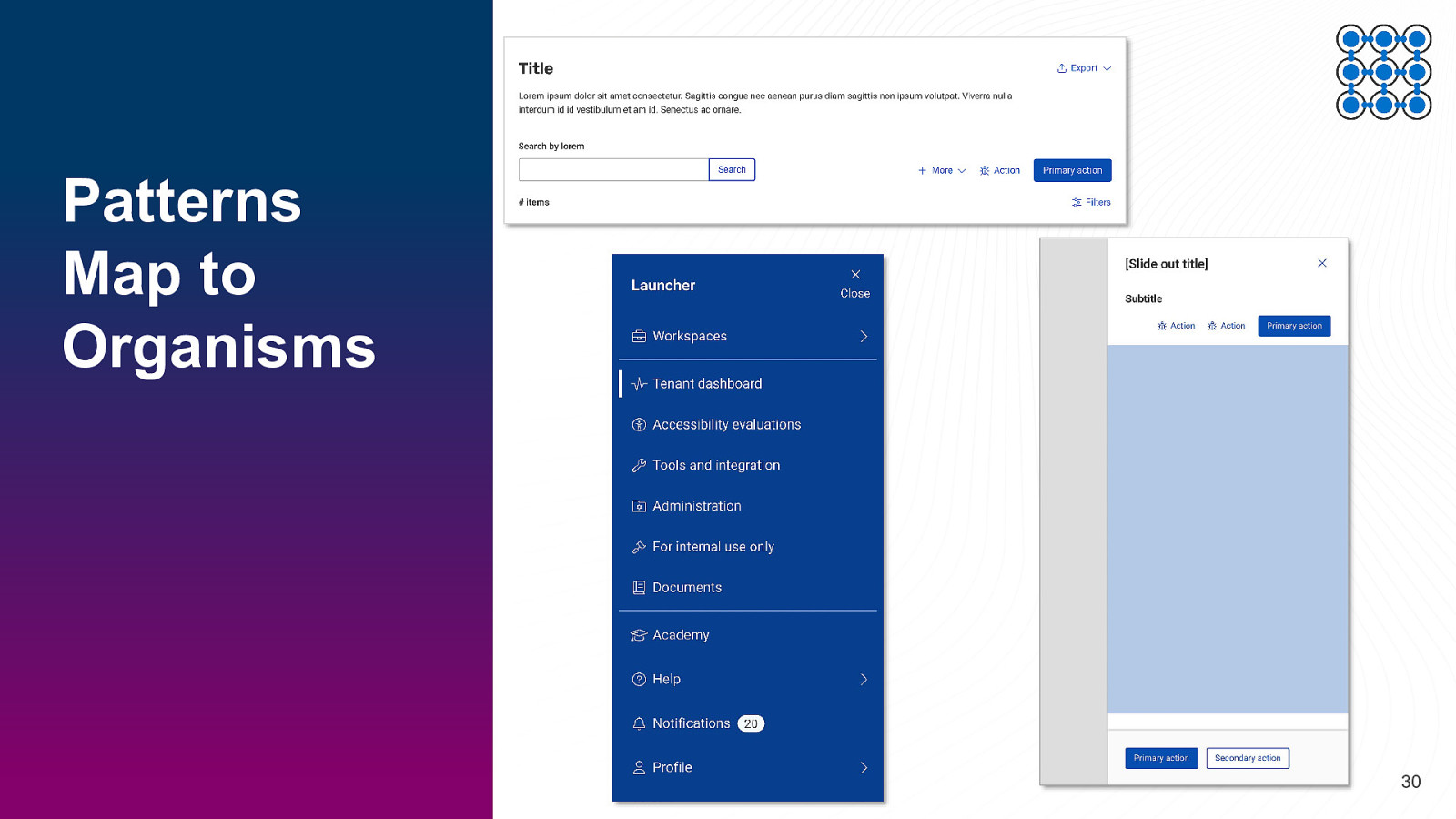
Patterns Map to Organisms 30
SECTION 2 Digital Accessible Design Roles and Responsibilities 31
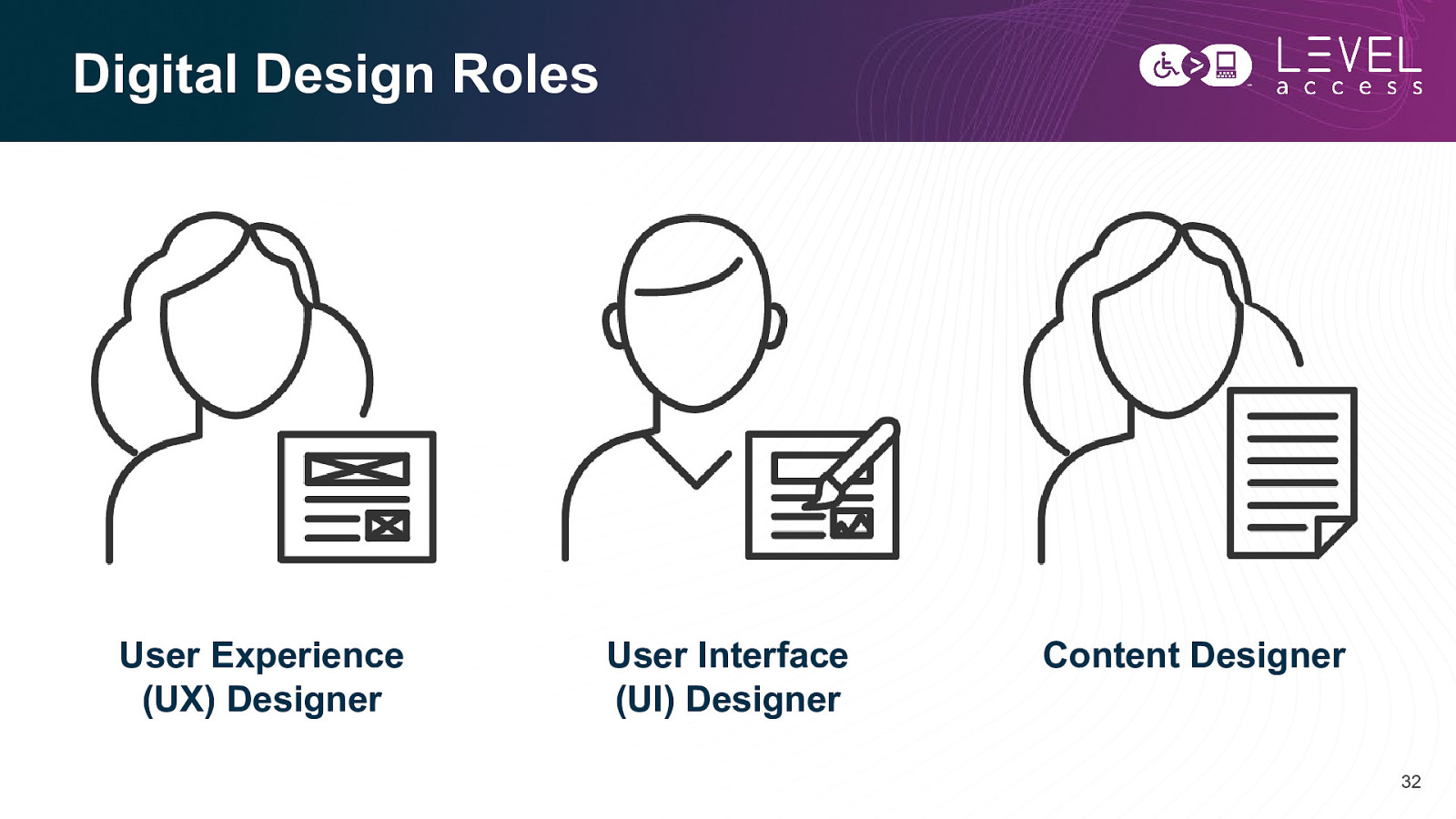
Digital Design Roles User Experience (UX) Designer User Interface (UI) Designer Content Designer 32
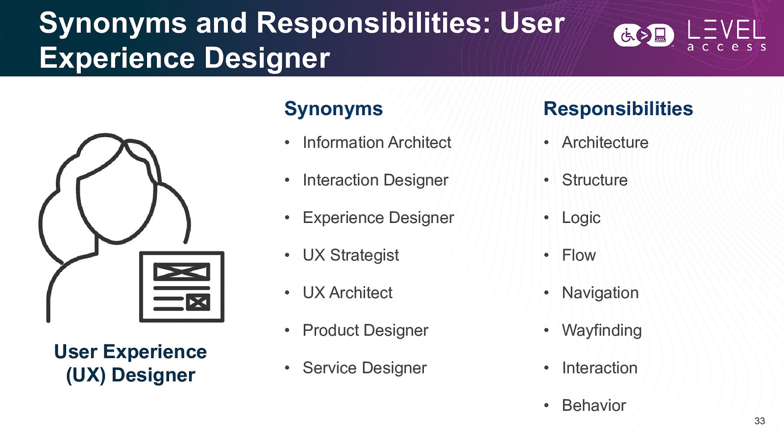
Synonyms and Responsibilities: User Experience Designer User Experience (UX) Designer Synonyms Responsibilities • Information Architect • Architecture • Interaction Designer • Structure • Experience Designer • Logic • UX Strategist • Flow • UX Architect • Navigation • Product Designer • Wayfinding • Service Designer • Interaction • Behavior 33
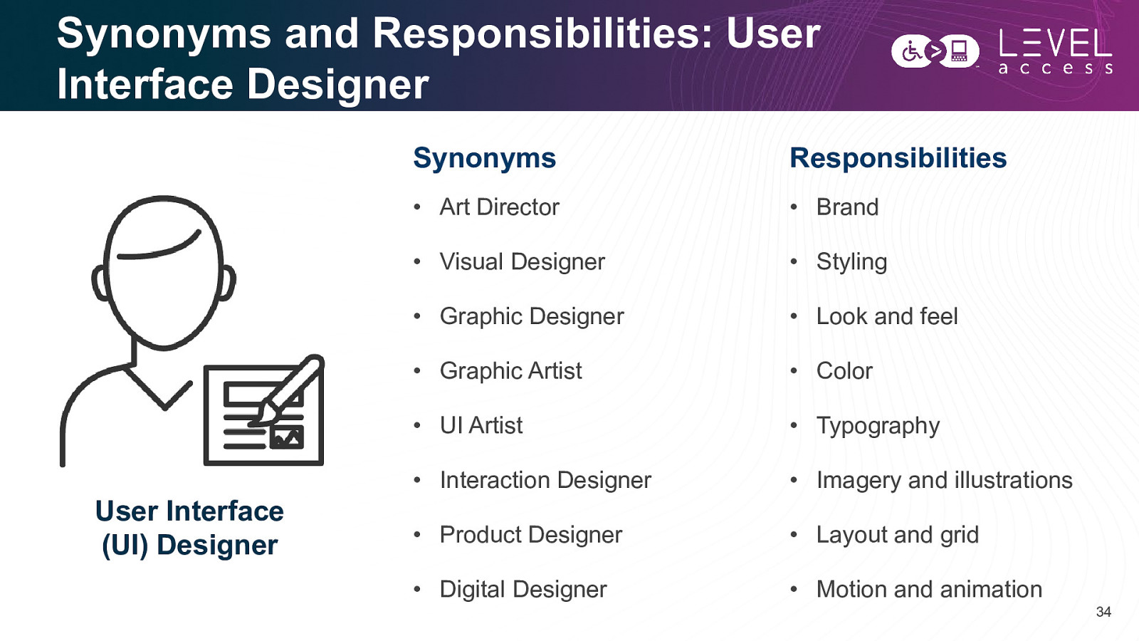
Synonyms and Responsibilities: User Interface Designer User Interface (UI) Designer Synonyms Responsibilities • Art Director • Brand • Visual Designer • Styling • Graphic Designer • Look and feel • Graphic Artist • Color • UI Artist • Typography • Interaction Designer • Imagery and illustrations • Product Designer • Layout and grid • Digital Designer • Motion and animation 34
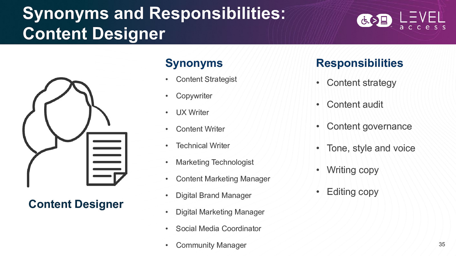
Synonyms and Responsibilities: Content Designer Content Designer Synonyms Responsibilities • Content Strategist • Content strategy • Copywriter • UX Writer • Content Writer • Content governance • Technical Writer • Tone, style and voice • Marketing Technologist • Content Marketing Manager • Digital Brand Manager • Digital Marketing Manager • Social Media Coordinator • Community Manager • Content audit • Writing copy • Editing copy 35
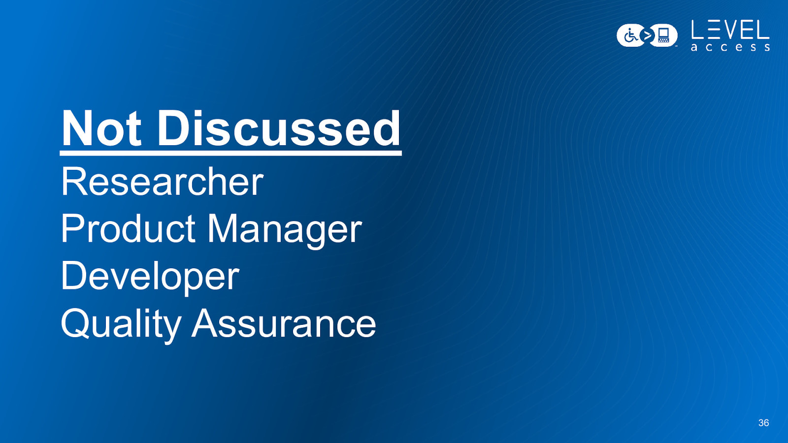
Not Discussed Researcher Product Manager Developer Quality Assurance 36
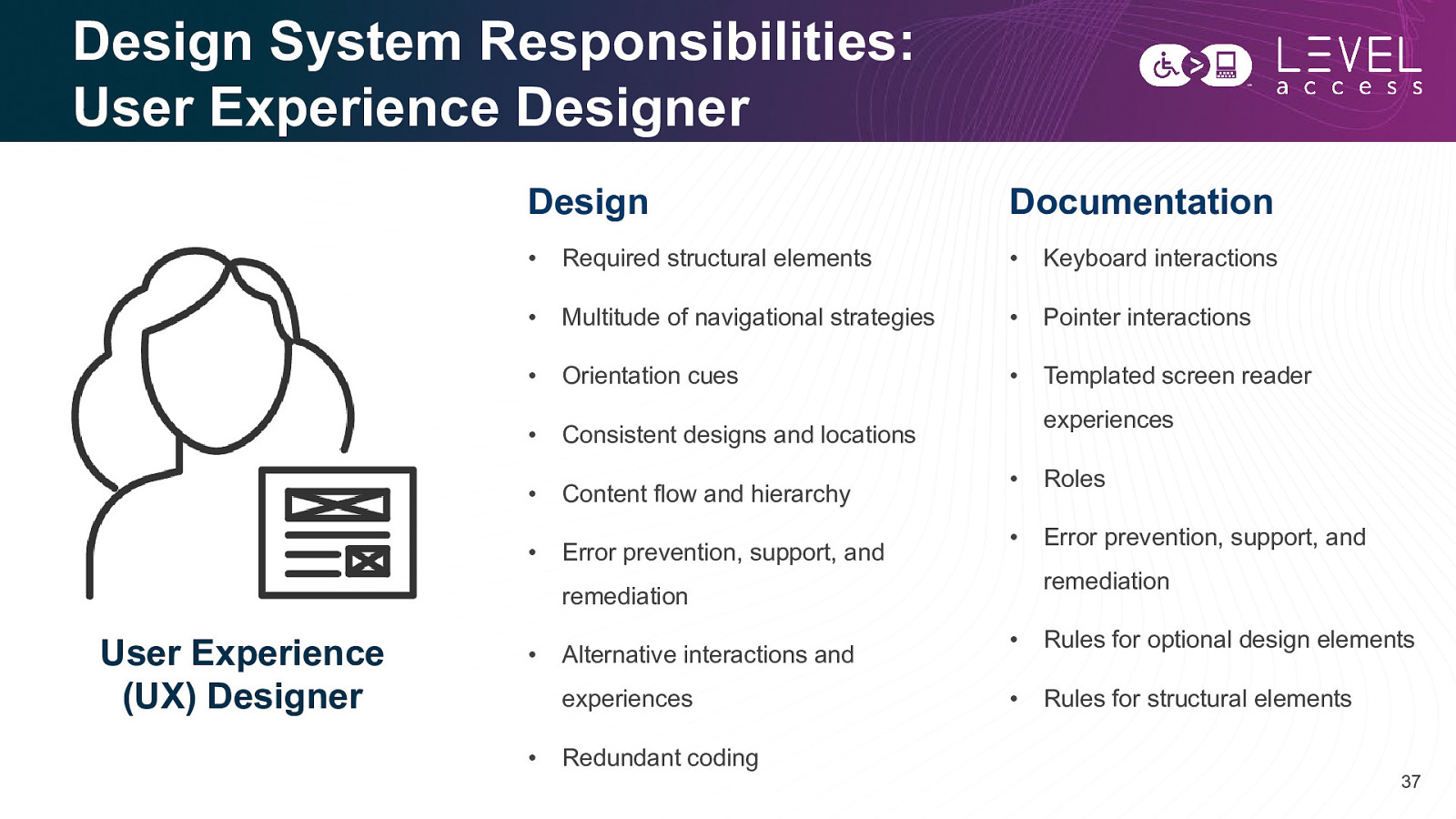
Design System Responsibilities: User Experience Designer Design Documentation • Required structural elements • Keyboard interactions • Multitude of navigational strategies • Pointer interactions • Orientation cues • Templated screen reader • Consistent designs and locations • Content flow and hierarchy • Error prevention, support, and experiences • Roles • Error prevention, support, and remediation remediation User Experience (UX) Designer • Alternative interactions and experiences • Redundant coding • Rules for optional design elements • Rules for structural elements 37
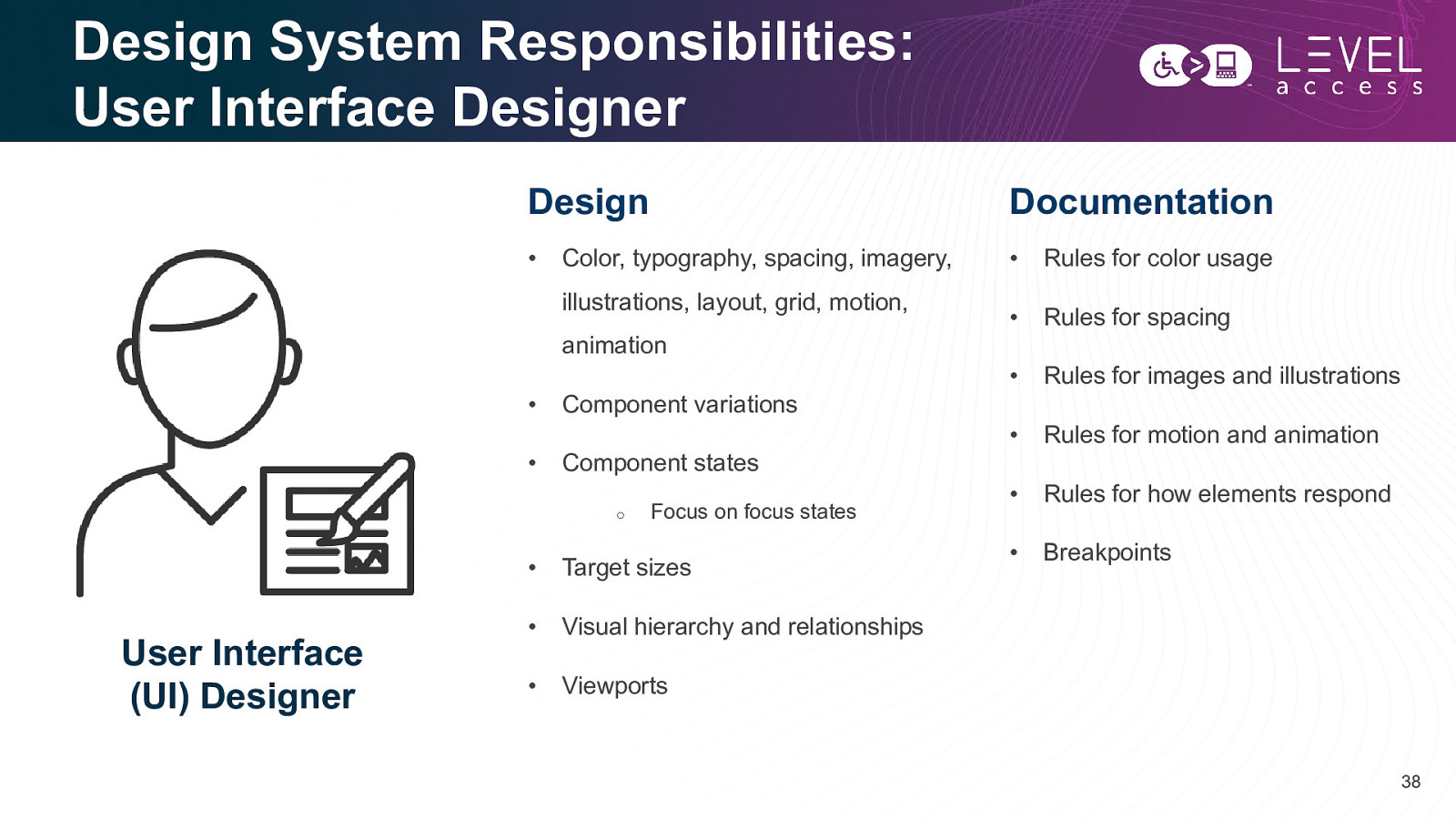
Design System Responsibilities: User Interface Designer Design Documentation • • Rules for color usage • Rules for spacing • Rules for images and illustrations • Rules for motion and animation • Rules for how elements respond • Breakpoints Color, typography, spacing, imagery, illustrations, layout, grid, motion, animation • Component variations • Component states o User Interface (UI) Designer Focus on focus states • Target sizes • Visual hierarchy and relationships • Viewports 38
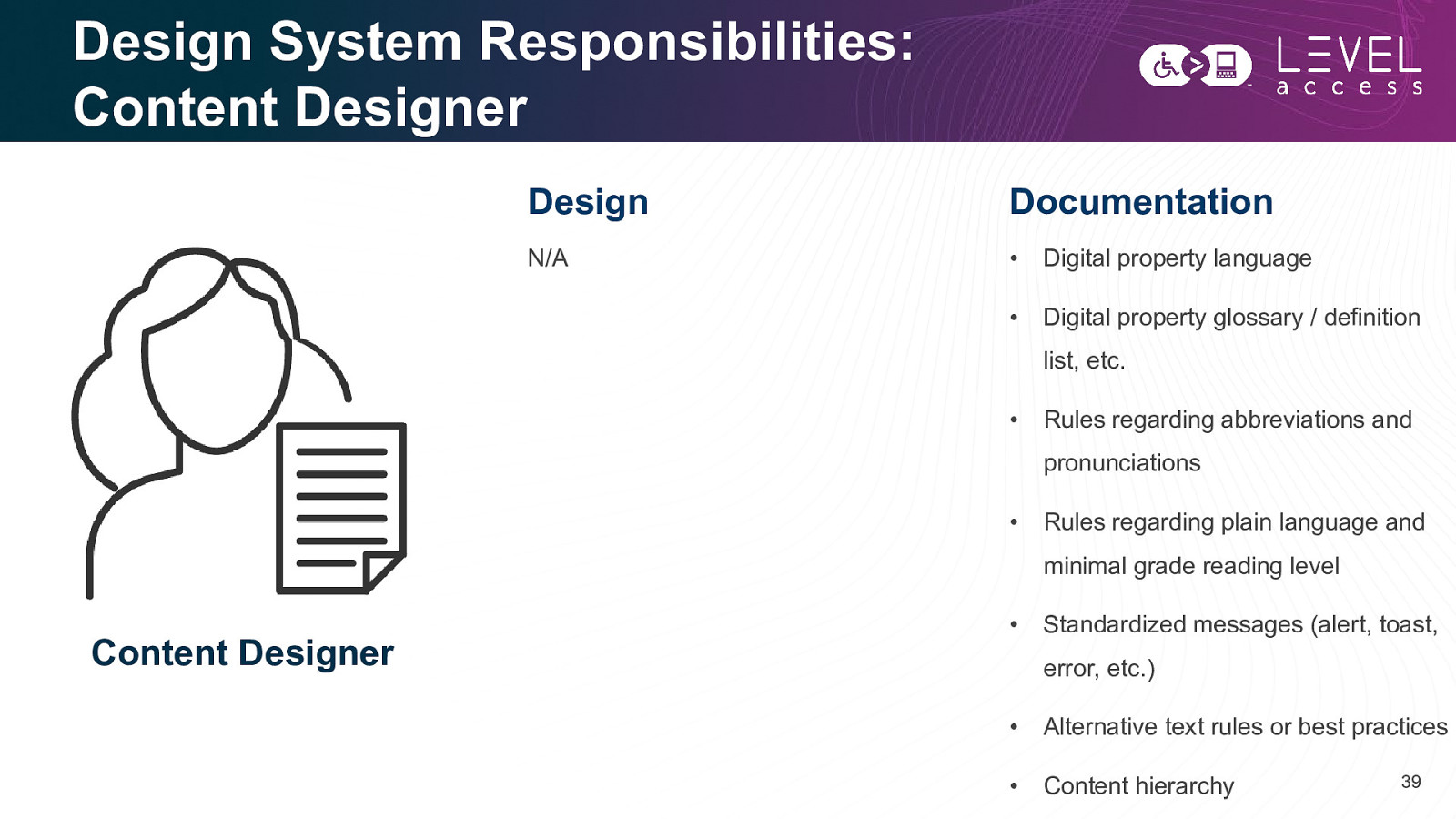
Design System Responsibilities: Content Designer Design Documentation N/A • Digital property language • Digital property glossary / definition list, etc. • Rules regarding abbreviations and pronunciations • Rules regarding plain language and minimal grade reading level Content Designer • Standardized messages (alert, toast, error, etc.) • Alternative text rules or best practices • Content hierarchy 39
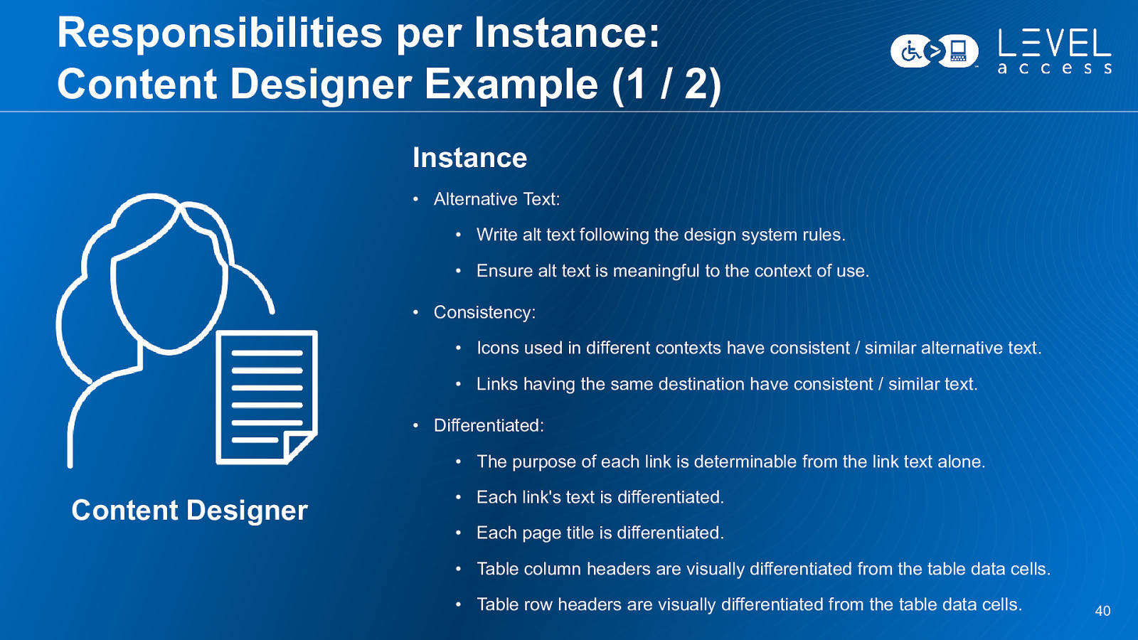
Responsibilities per Instance: Content Designer Example (1 / 2) Instance • Alternative Text: • Write alt text following the design system rules. • Ensure alt text is meaningful to the context of use. • Consistency: • Icons used in different contexts have consistent / similar alternative text. • Links having the same destination have consistent / similar text. • Differentiated: • The purpose of each link is determinable from the link text alone. Content Designer • Each link’s text is differentiated. • Each page title is differentiated. • Table column headers are visually differentiated from the table data cells. • Table row headers are visually differentiated from the table data cells. 40
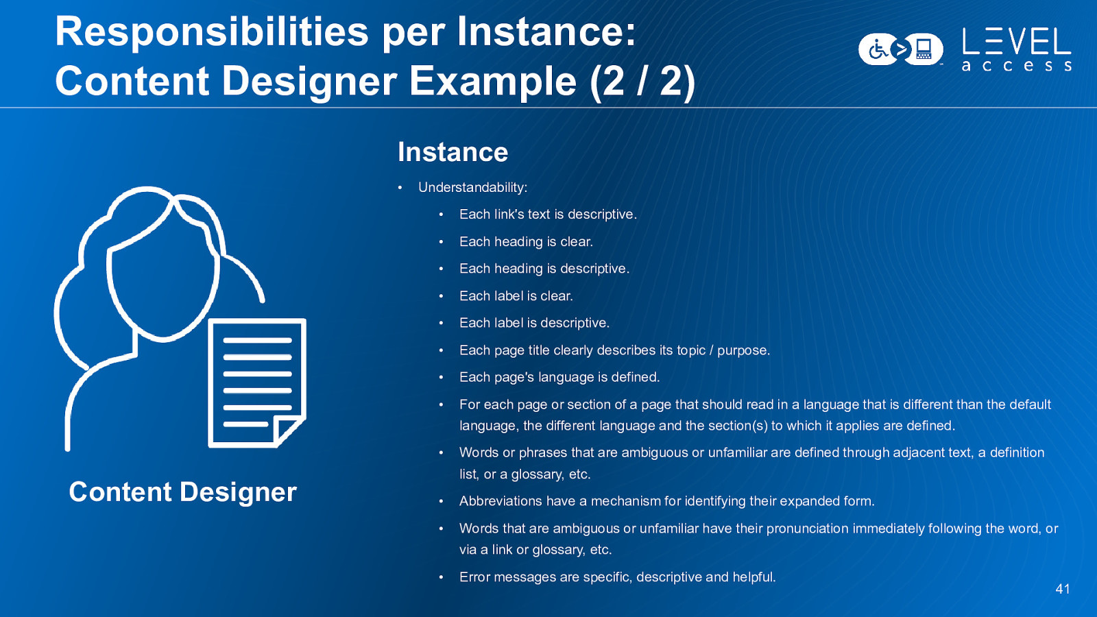
Responsibilities per Instance: Content Designer Example (2 / 2) Instance • Understandability: • Each link’s text is descriptive. • Each heading is clear. • Each heading is descriptive. • Each label is clear. • Each label is descriptive. • Each page title clearly describes its topic / purpose. • Each page’s language is defined. • For each page or section of a page that should read in a language that is different than the default language, the different language and the section(s) to which it applies are defined. • Content Designer Words or phrases that are ambiguous or unfamiliar are defined through adjacent text, a definition list, or a glossary, etc. • Abbreviations have a mechanism for identifying their expanded form. • Words that are ambiguous or unfamiliar have their pronunciation immediately following the word, or via a link or glossary, etc. • Error messages are specific, descriptive and helpful. 41
Example: Buttons 42
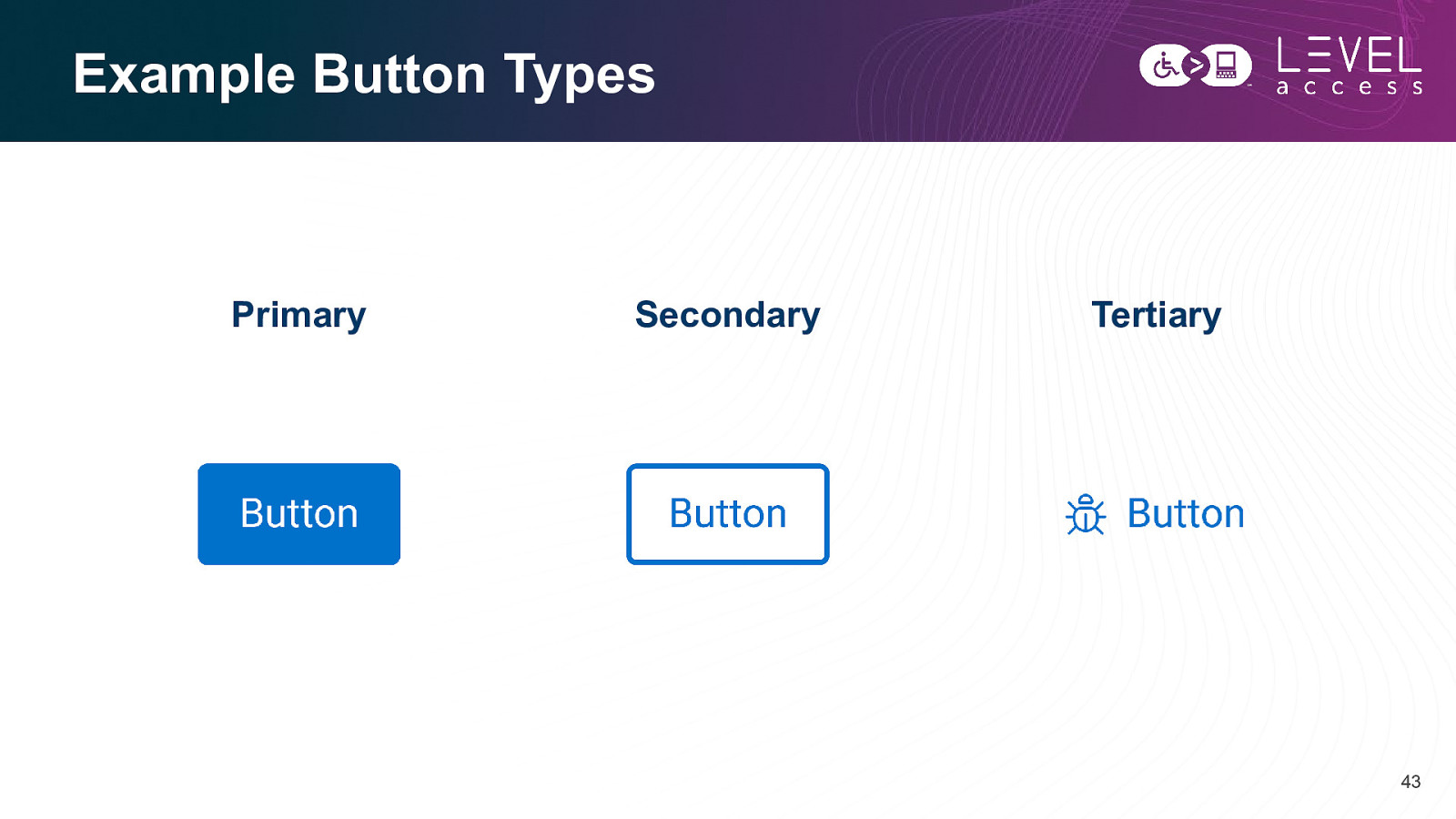
Example Button Types Primary Secondary Tertiary 43
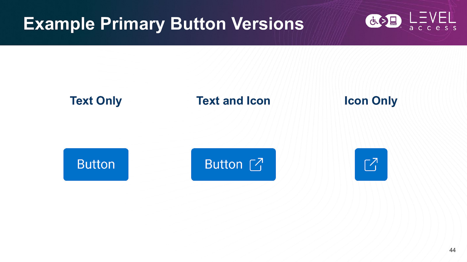
Example Primary Button Versions Text Only Text and Icon Icon Only 44
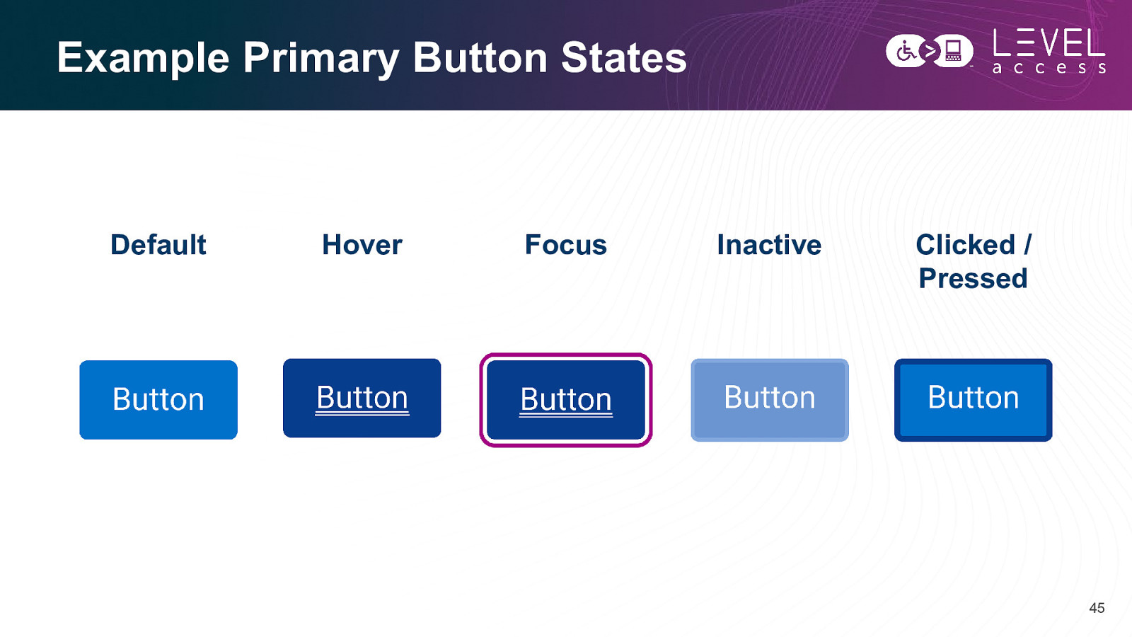
Example Primary Button States Default Hover Focus Inactive Clicked / Pressed 45
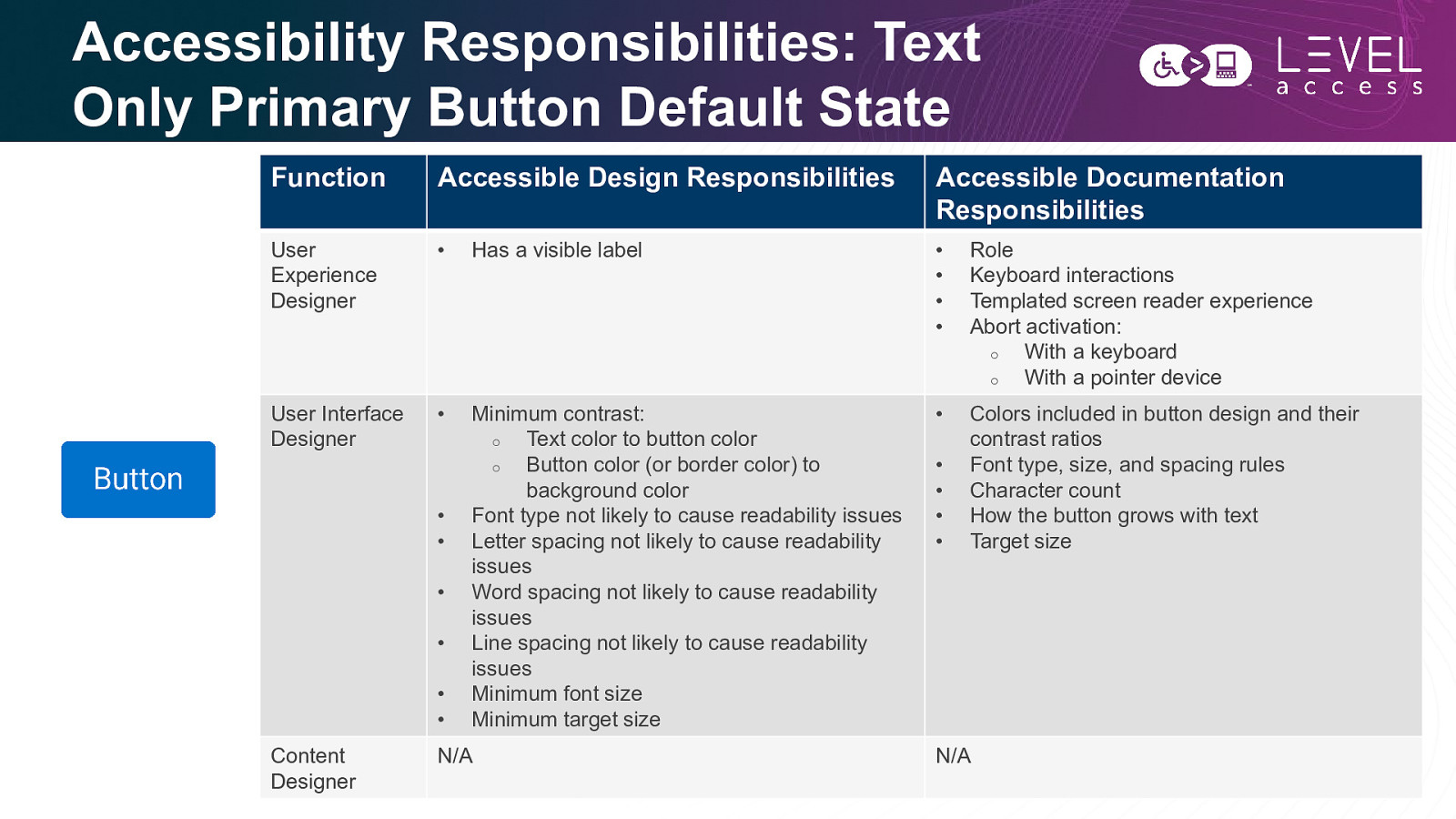
Accessibility Responsibilities: Text Only Primary Button Default State Function Accessible Design Responsibilities Accessible Documentation Responsibilities User Experience Designer • Has a visible label • • • • Role Keyboard interactions Templated screen reader experience Abort activation: o With a keyboard o With a pointer device User Interface Designer • Minimum contrast: o Text color to button color o Button color (or border color) to background color Font type not likely to cause readability issues Letter spacing not likely to cause readability issues Word spacing not likely to cause readability issues Line spacing not likely to cause readability issues Minimum font size Minimum target size • Colors included in button design and their contrast ratios Font type, size, and spacing rules Character count How the button grows with text Target size • • • • • • Content Designer N/A • • • • N/A 46
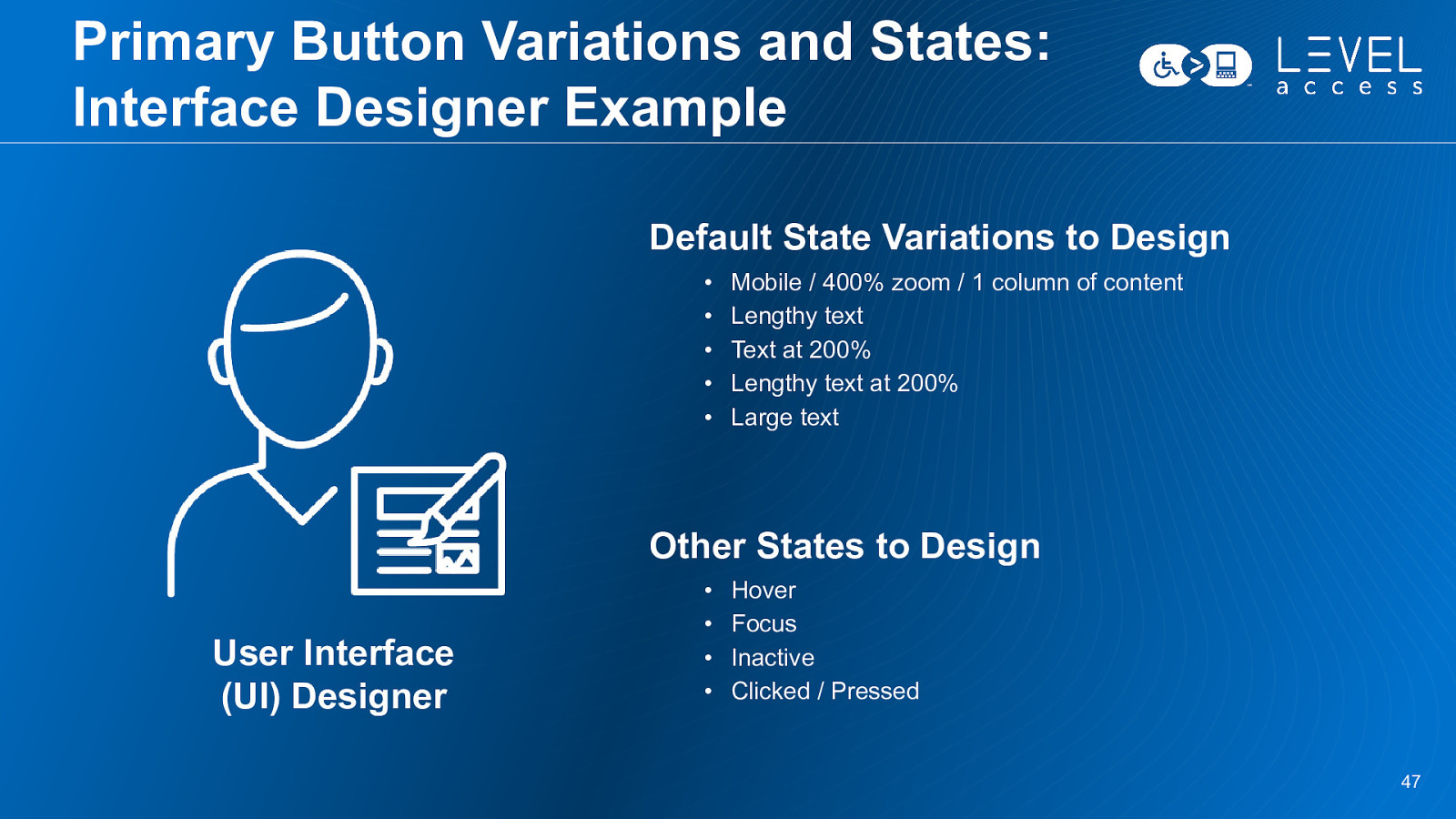
Primary Button Variations and States: Interface Designer Example Default State Variations to Design • • • • • Mobile / 400% zoom / 1 column of content Lengthy text Text at 200% Lengthy text at 200% Large text Other States to Design User Interface (UI) Designer • • • • Hover Focus Inactive Clicked / Pressed 47
Example: Product Card 48
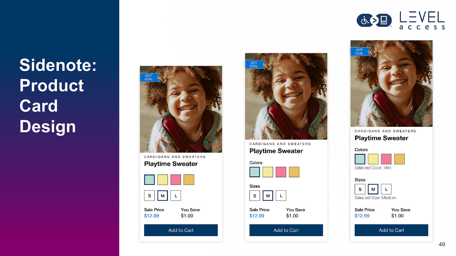
Sidenote: Product Card Design 49
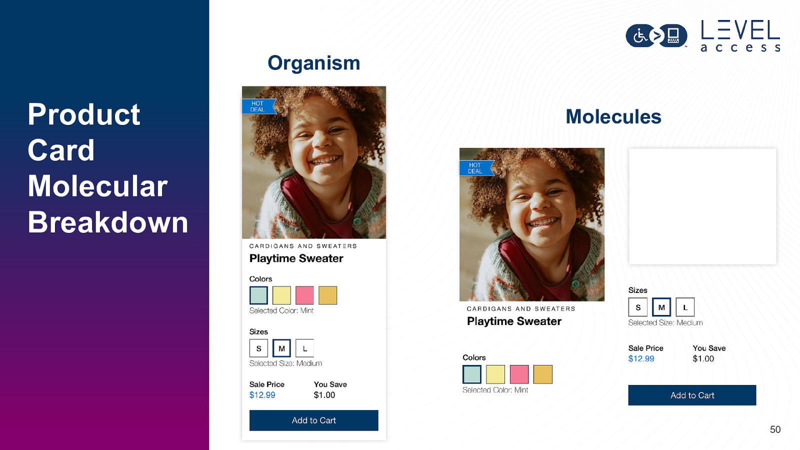
Organism Product Card Molecular Breakdown Molecules 50
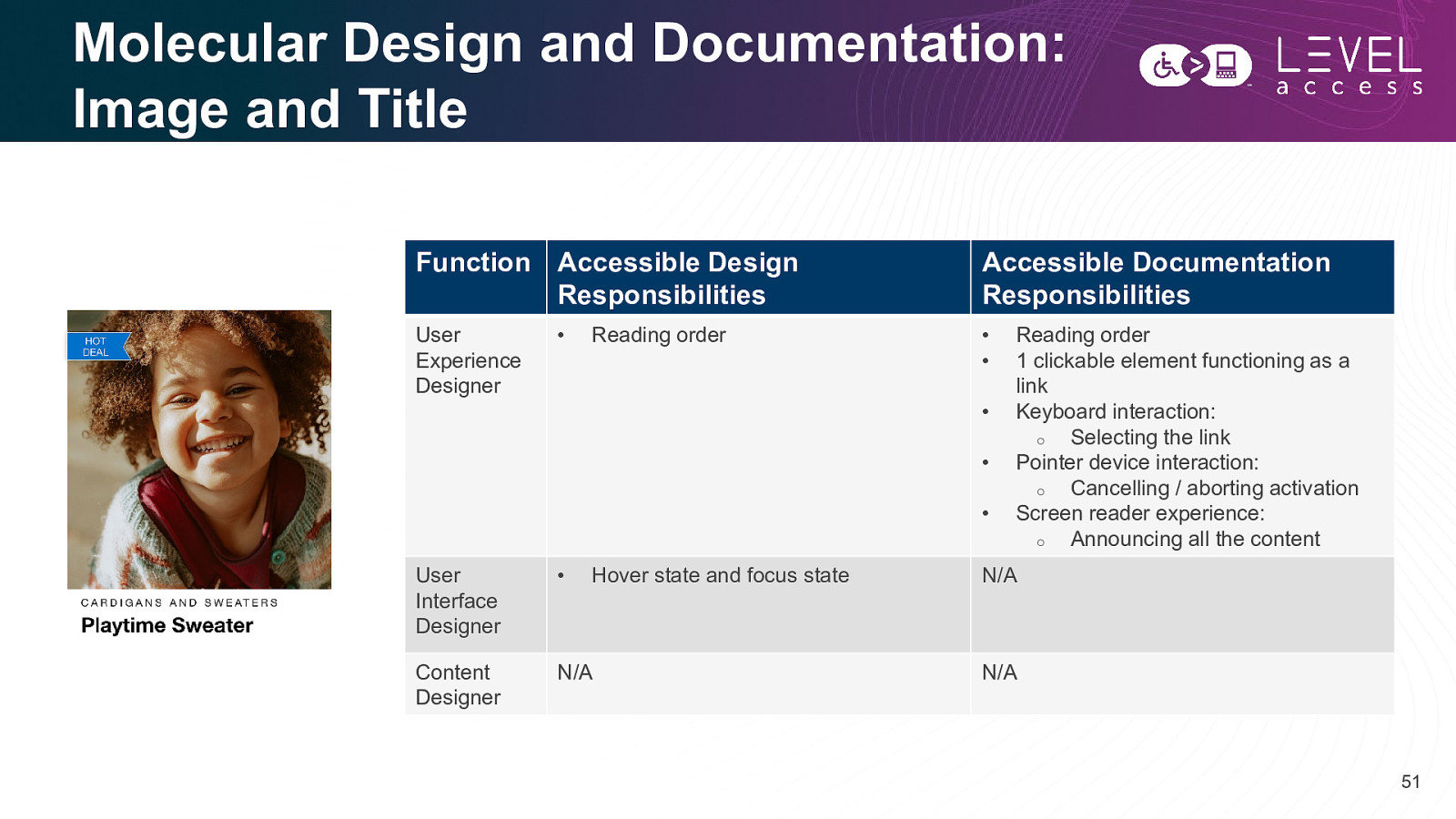
Molecular Design and Documentation: Image and Title Function Accessible Design Responsibilities Accessible Documentation Responsibilities User Experience Designer • • • Reading order • • • User Interface Designer • Content Designer N/A Hover state and focus state Reading order 1 clickable element functioning as a link Keyboard interaction: o Selecting the link Pointer device interaction: o Cancelling / aborting activation Screen reader experience: o Announcing all the content N/A N/A 51
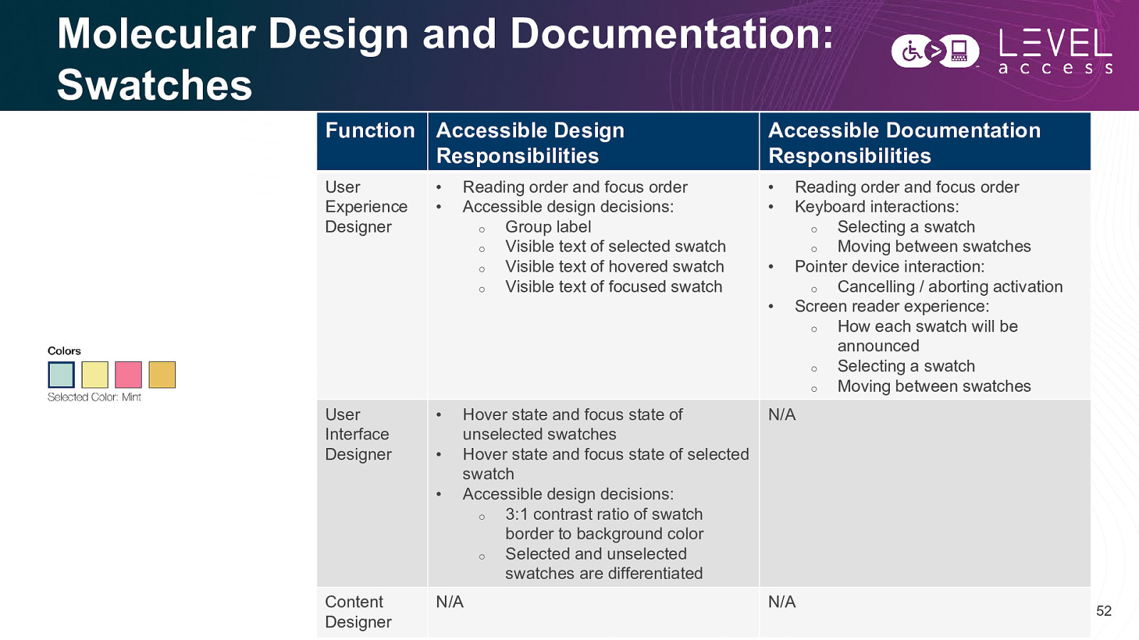
Molecular Design and Documentation: Swatches Function Accessible Design Responsibilities Accessible Documentation Responsibilities User Experience Designer • • User Interface Designer • • • • • Content Designer Reading order and focus order Accessible design decisions: o Group label o Visible text of selected swatch o Visible text of hovered swatch o Visible text of focused swatch Hover state and focus state of unselected swatches Hover state and focus state of selected swatch Accessible design decisions: o 3:1 contrast ratio of swatch border to background color o Selected and unselected swatches are differentiated N/A • • Reading order and focus order Keyboard interactions: o Selecting a swatch o Moving between swatches Pointer device interaction: o Cancelling / aborting activation Screen reader experience: o How each swatch will be announced o Selecting a swatch o Moving between swatches N/A N/A 52
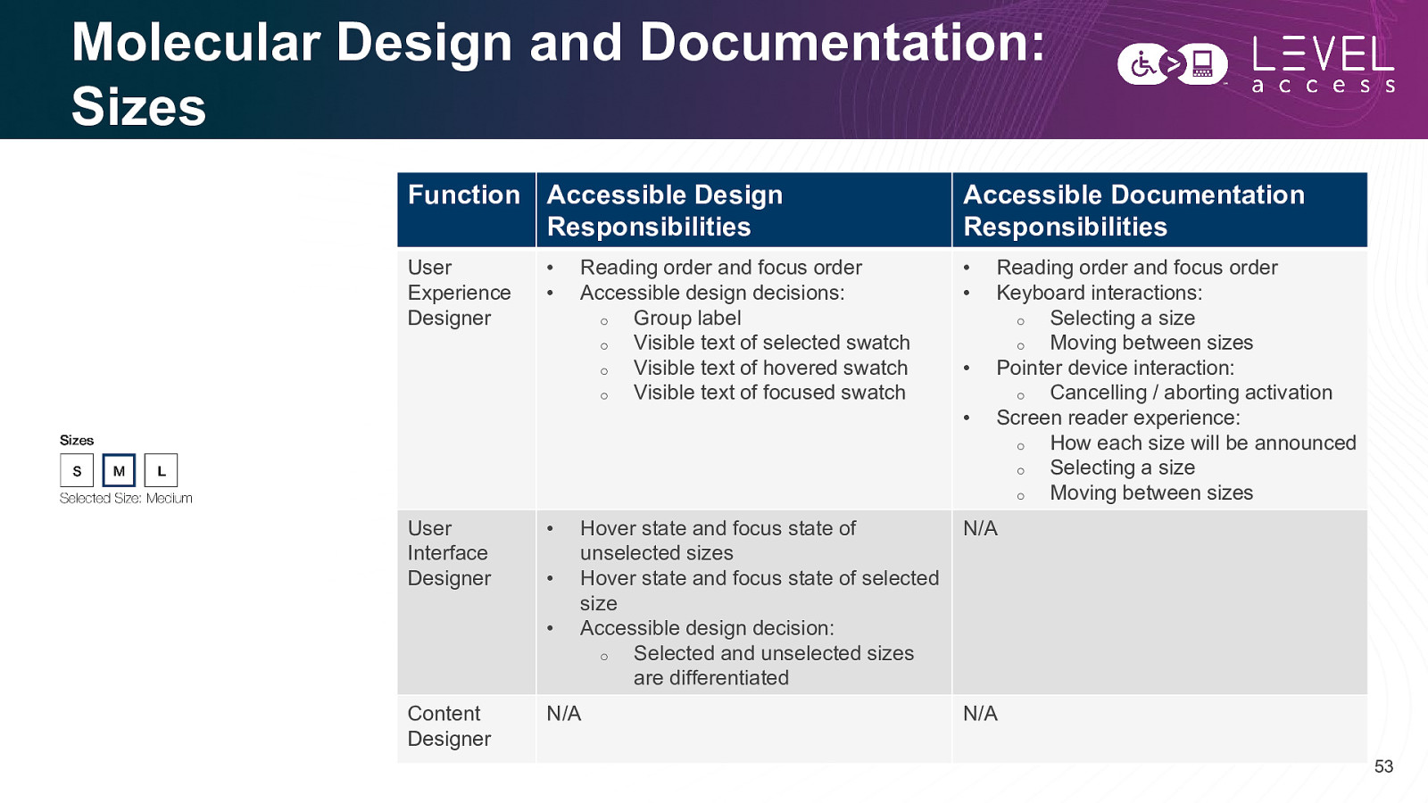
Molecular Design and Documentation: Sizes Function Accessible Design Responsibilities Accessible Documentation Responsibilities User Experience Designer • • User Interface Designer • • • • • Content Designer Reading order and focus order Accessible design decisions: o Group label o Visible text of selected swatch o Visible text of hovered swatch o Visible text of focused swatch Hover state and focus state of unselected sizes Hover state and focus state of selected size Accessible design decision: o Selected and unselected sizes are differentiated N/A • • Reading order and focus order Keyboard interactions: o Selecting a size o Moving between sizes Pointer device interaction: o Cancelling / aborting activation Screen reader experience: o How each size will be announced o Selecting a size o Moving between sizes N/A N/A 53
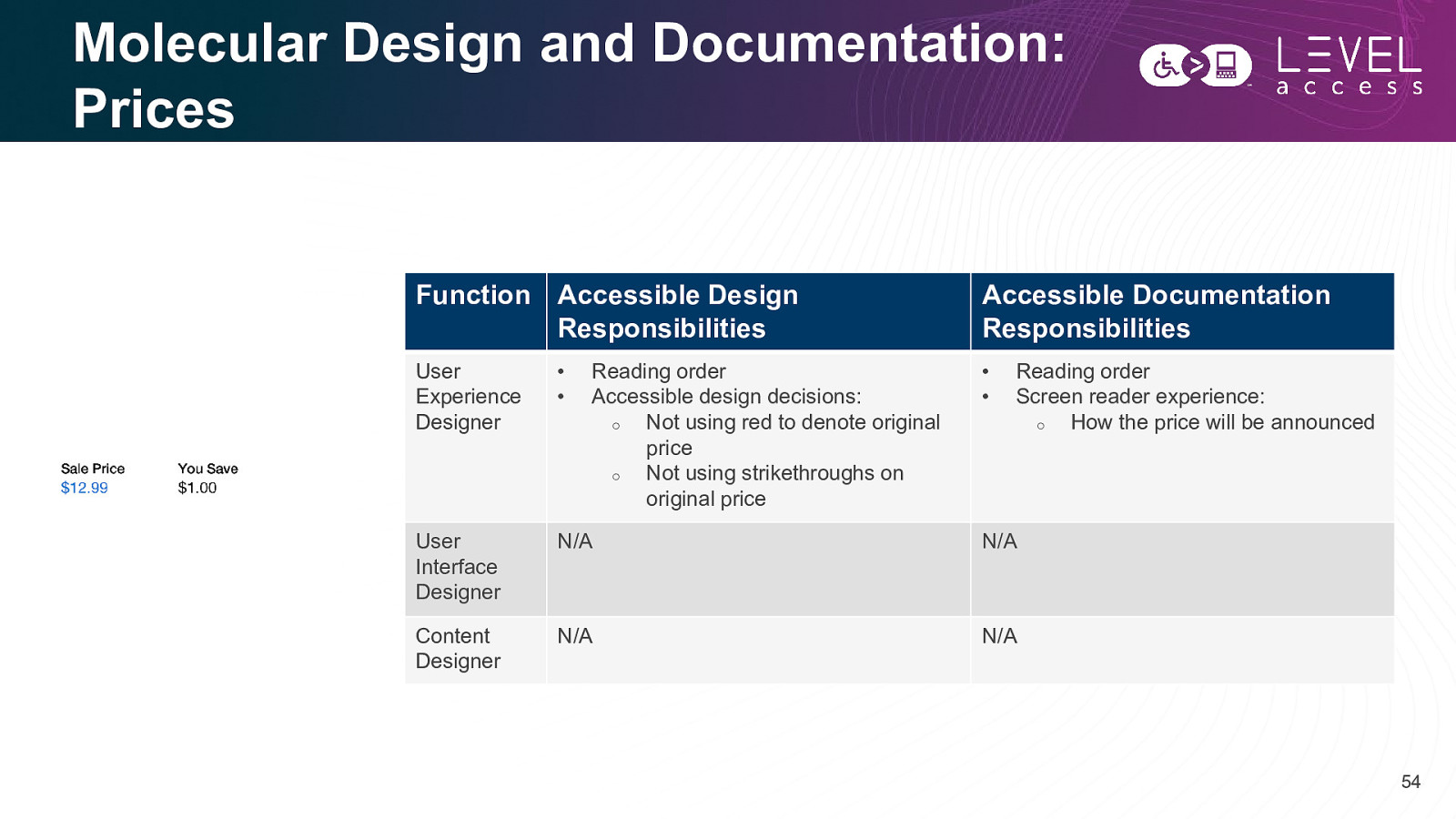
Molecular Design and Documentation: Prices Function Accessible Design Responsibilities Accessible Documentation Responsibilities User Experience Designer • • • • User Interface Designer N/A N/A Content Designer N/A N/A Reading order Accessible design decisions: o Not using red to denote original price o Not using strikethroughs on original price Reading order Screen reader experience: o How the price will be announced 54
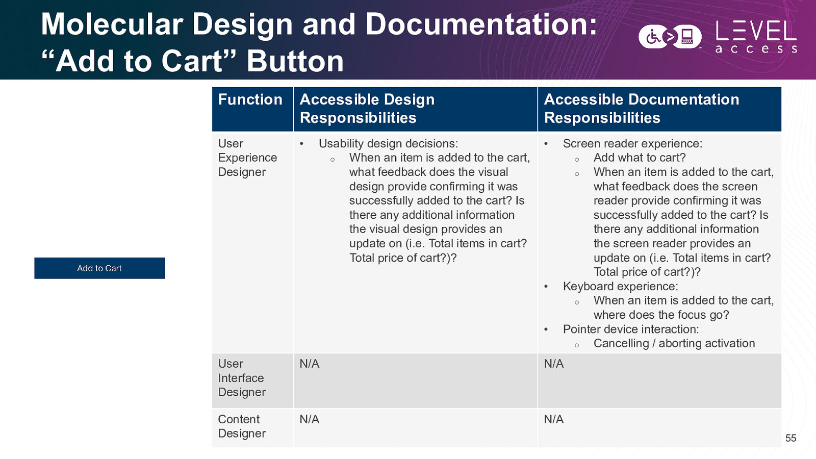
Molecular Design and Documentation: “Add to Cart” Button Function Accessible Design Responsibilities Accessible Documentation Responsibilities User Experience Designer • • Usability design decisions: o When an item is added to the cart, what feedback does the visual design provide confirming it was successfully added to the cart? Is there any additional information the visual design provides an update on (i.e. Total items in cart? Total price of cart?)? • • Screen reader experience: o Add what to cart? o When an item is added to the cart, what feedback does the screen reader provide confirming it was successfully added to the cart? Is there any additional information the screen reader provides an update on (i.e. Total items in cart? Total price of cart?)? Keyboard experience: o When an item is added to the cart, where does the focus go? Pointer device interaction: o Cancelling / aborting activation User Interface Designer N/A N/A Content Designer N/A N/A 55
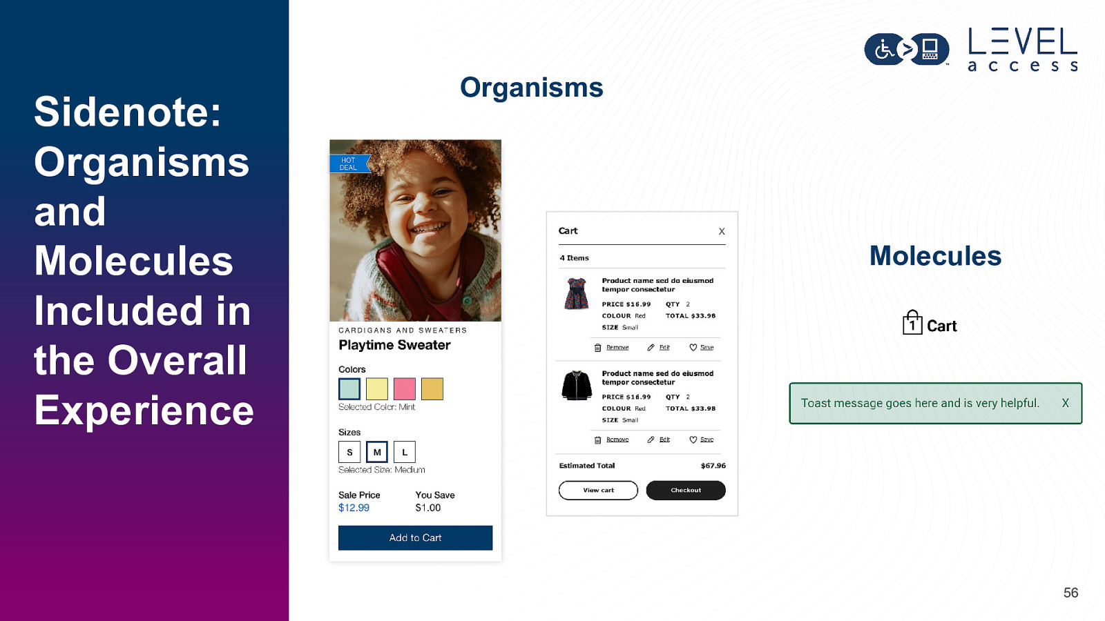
Sidenote: Organisms and Molecules Included in the Overall Experience Organisms X Molecules 56
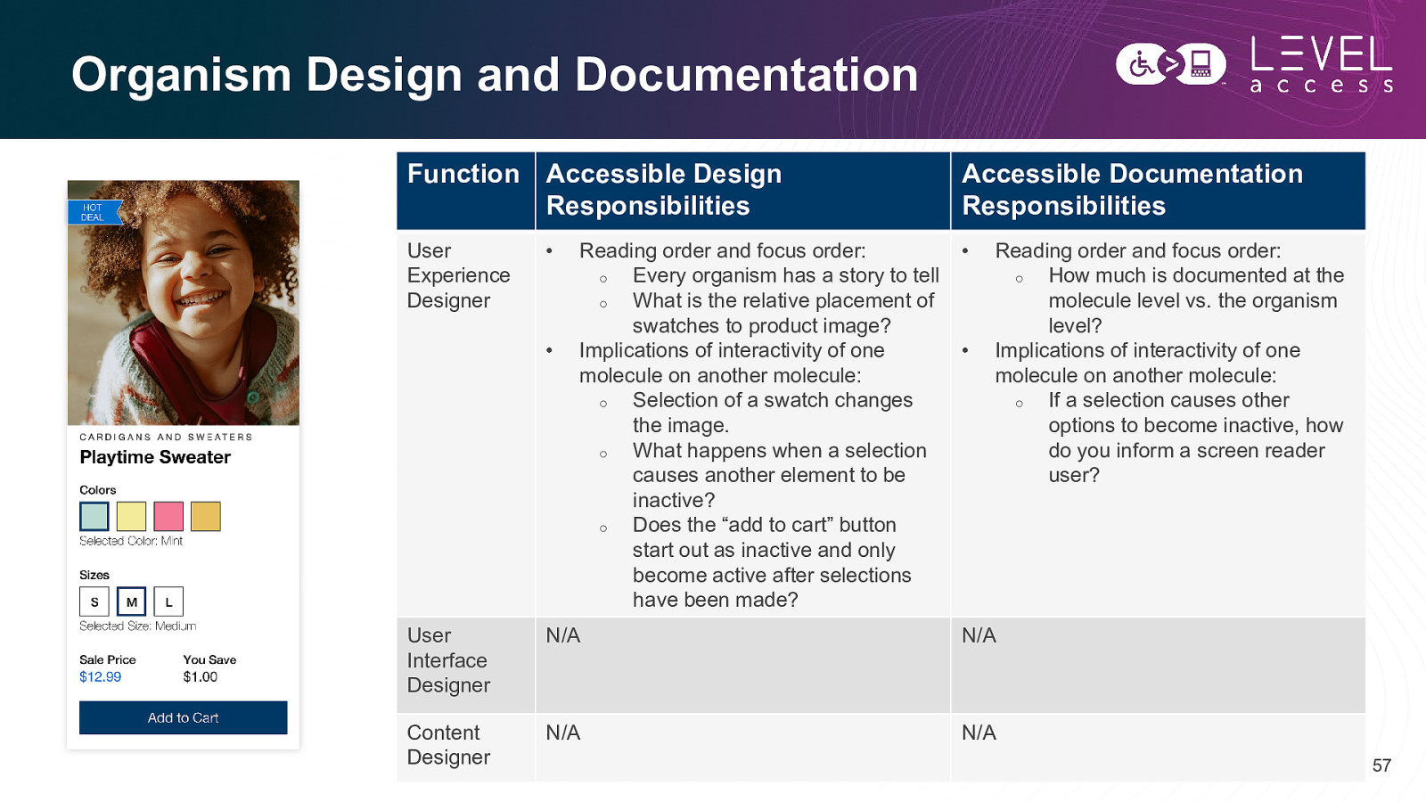
Organism Design and Documentation Function Accessible Design Responsibilities Accessible Documentation Responsibilities User Experience Designer • • • Reading order and focus order: o Every organism has a story to tell o What is the relative placement of swatches to product image? Implications of interactivity of one molecule on another molecule: o Selection of a swatch changes the image. o What happens when a selection causes another element to be inactive? o Does the “add to cart” button start out as inactive and only become active after selections have been made? • Reading order and focus order: o How much is documented at the molecule level vs. the organism level? Implications of interactivity of one molecule on another molecule: o If a selection causes other options to become inactive, how do you inform a screen reader user? User Interface Designer N/A N/A Content Designer N/A N/A 57
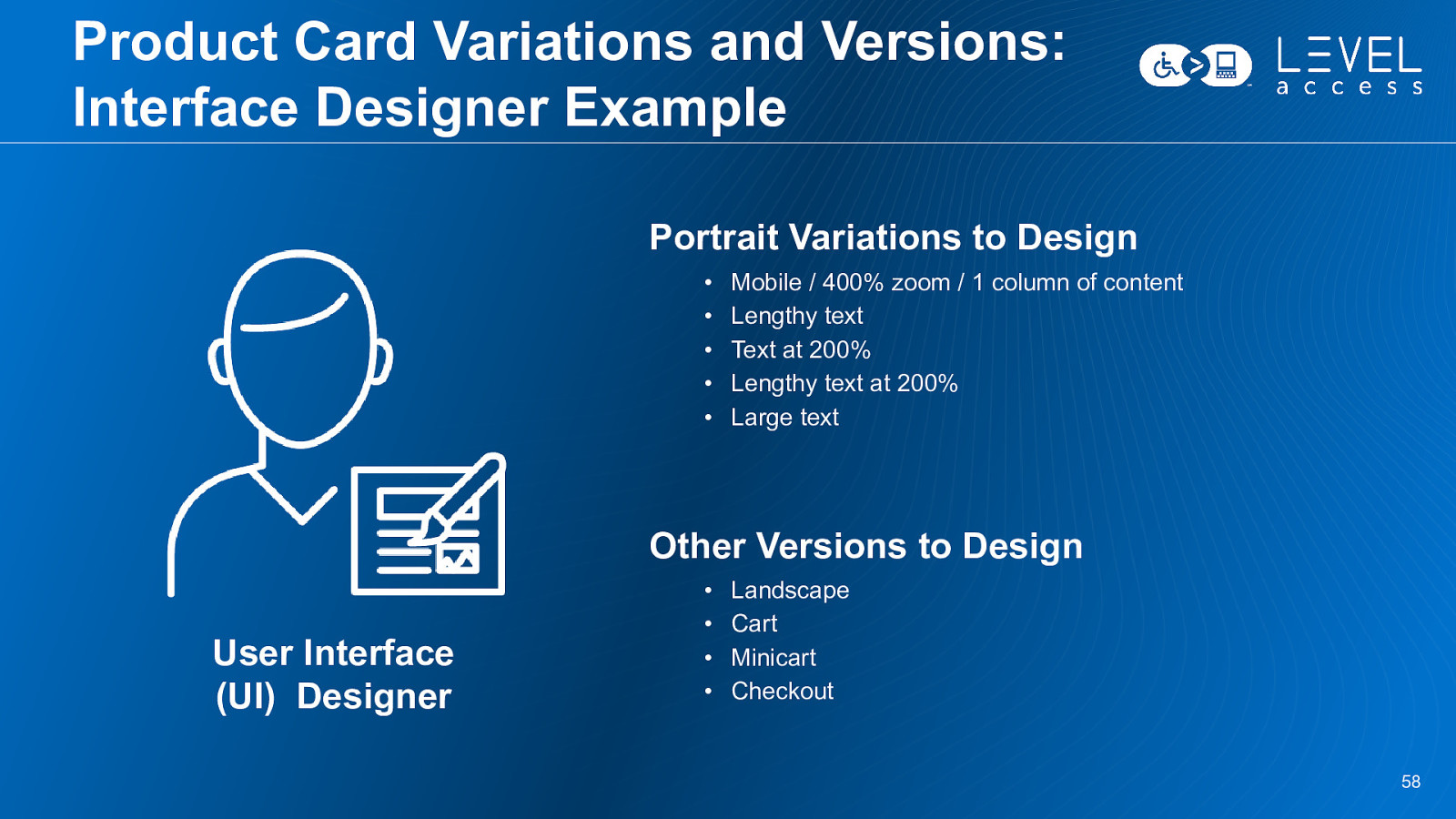
Product Card Variations and Versions: Interface Designer Example Portrait Variations to Design • • • • • Mobile / 400% zoom / 1 column of content Lengthy text Text at 200% Lengthy text at 200% Large text Other Versions to Design User Interface (UI) Designer • • • • Landscape Cart Minicart Checkout 58

SECTION 3 Practically Embedding Accessibility in Design Systems 59
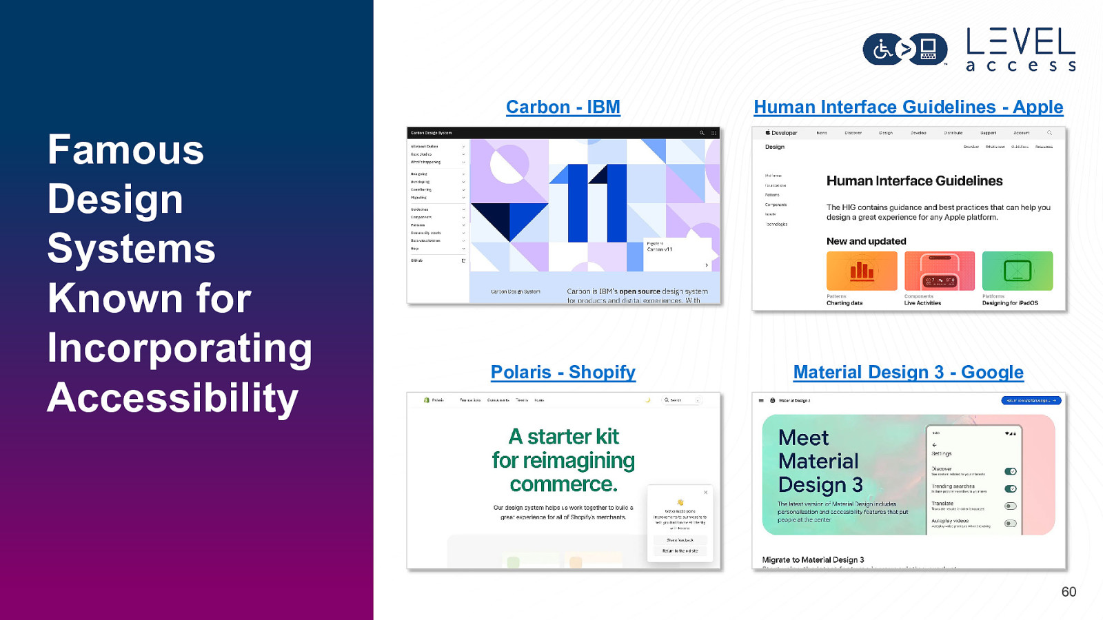
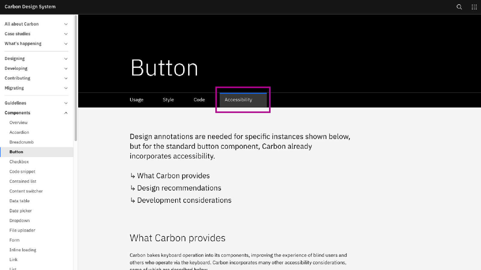
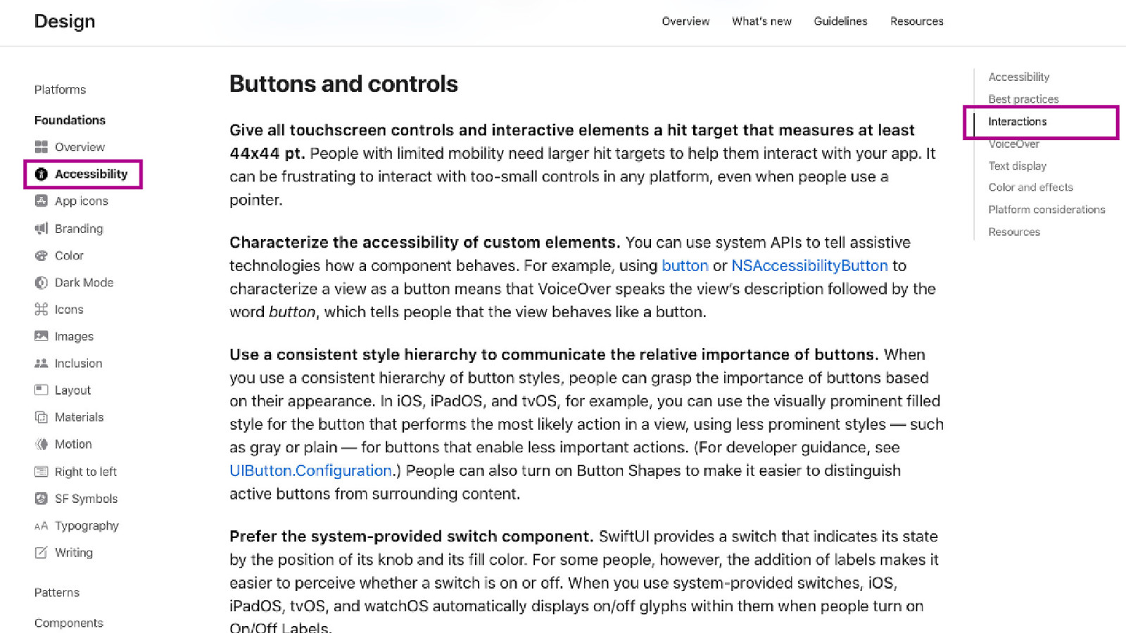
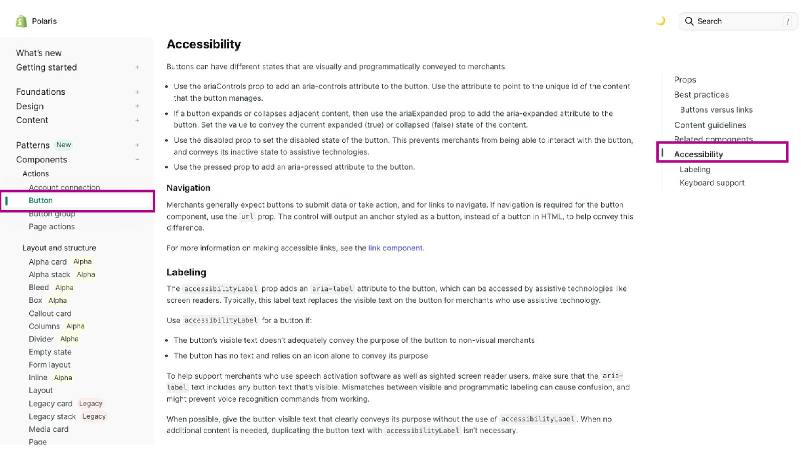
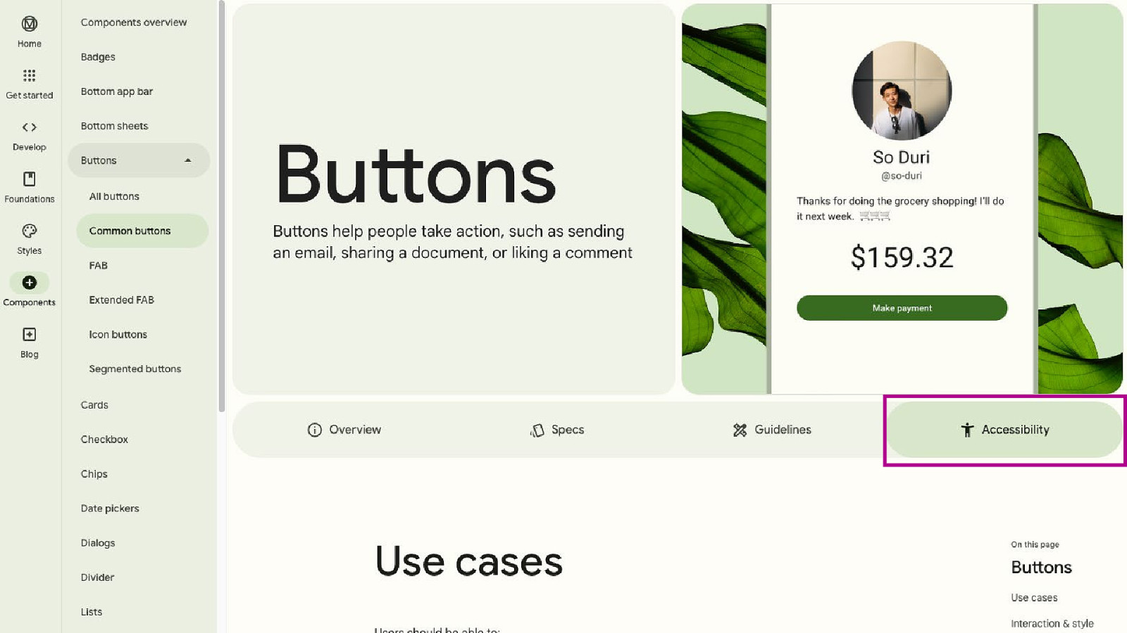
Famous Design Systems Known for Incorporating Accessibility Carbon - IBM Human Interface Guidelines - Apple Polaris - Shopify Material Design 3 - Google 60
61
62
63
64

65
Accessibility is more like the flour. It envelops all aspects of the muffin, any type of muffin. And you can’t take a bite without tasing the flour mixed in with all the other ingredients. Karen Hawkins 66
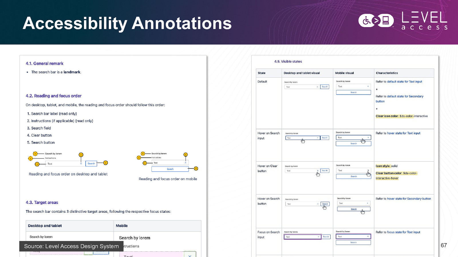
Accessibility Annotations Source: Level Access Design System 67
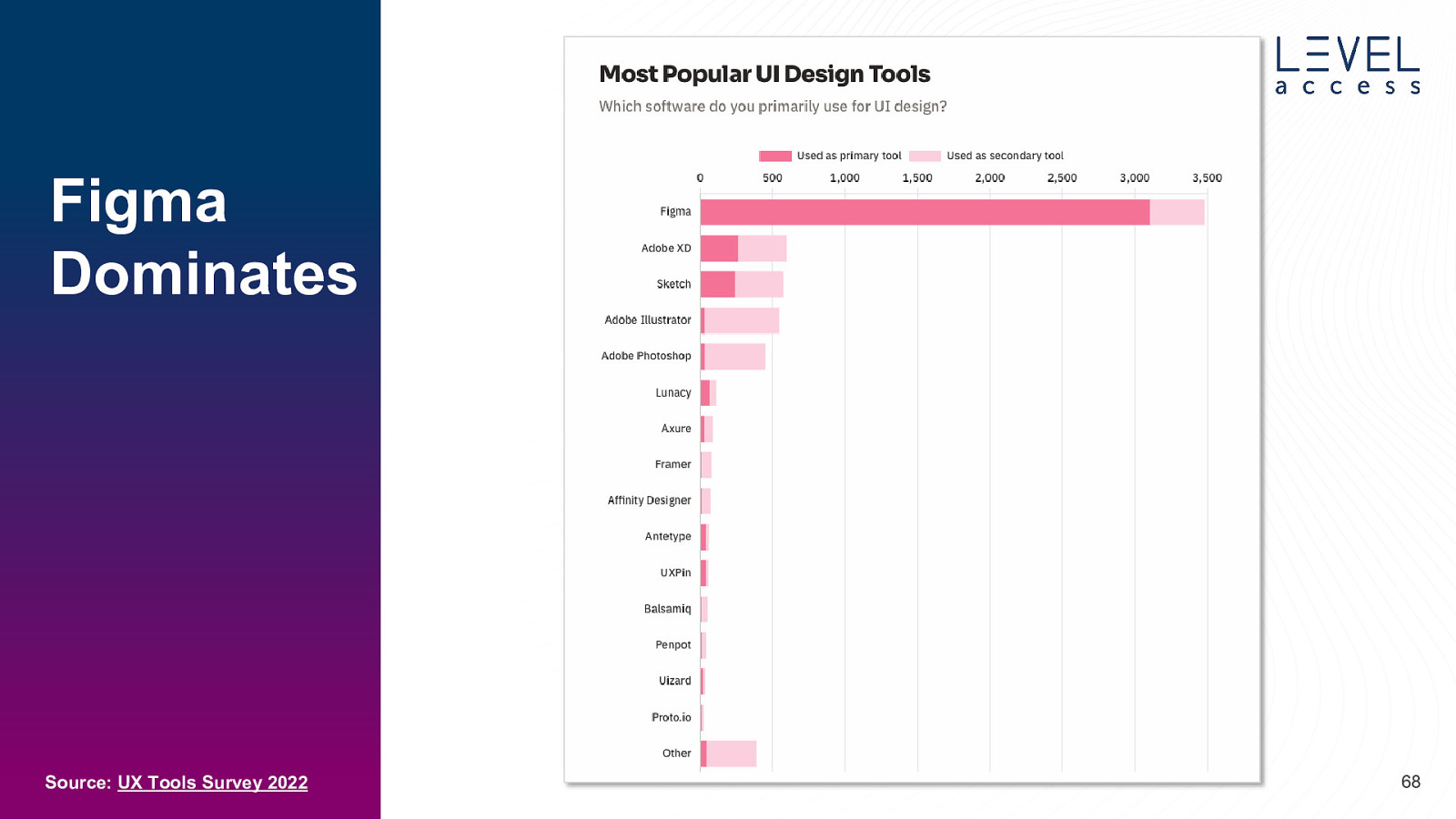
Figma Dominates Source: UX Tools Survey 2022 68
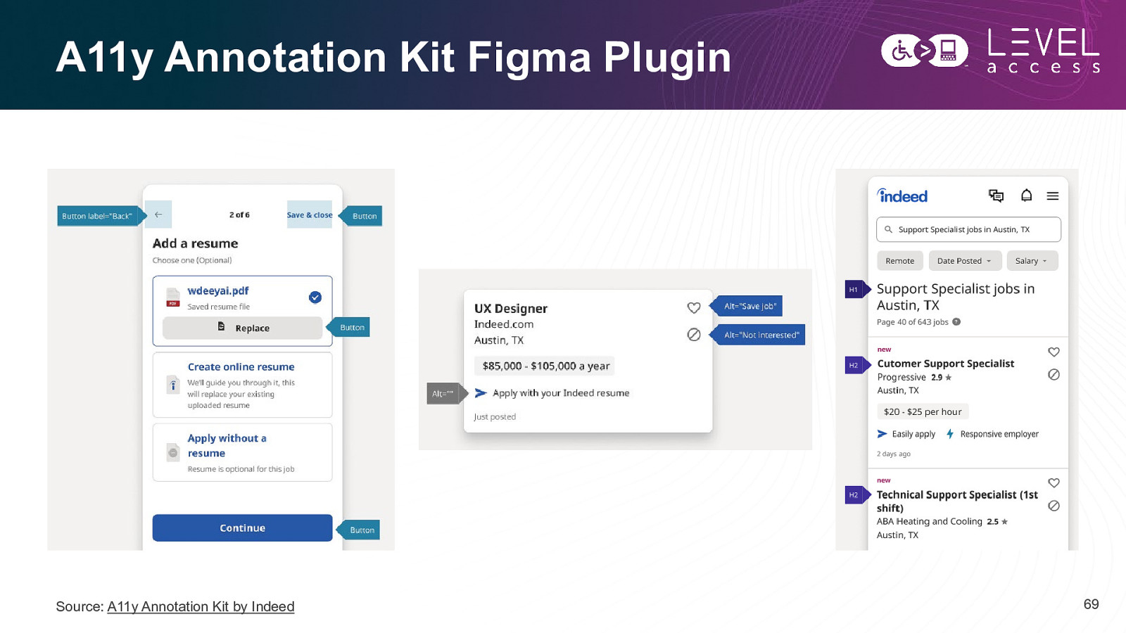
A11y Annotation Kit Figma Plugin Source: A11y Annotation Kit by Indeed 69
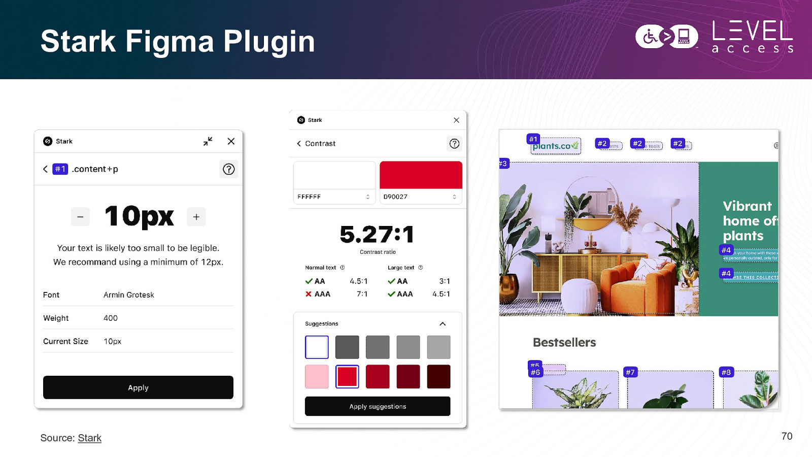
Stark Figma Plugin Source: Stark 70
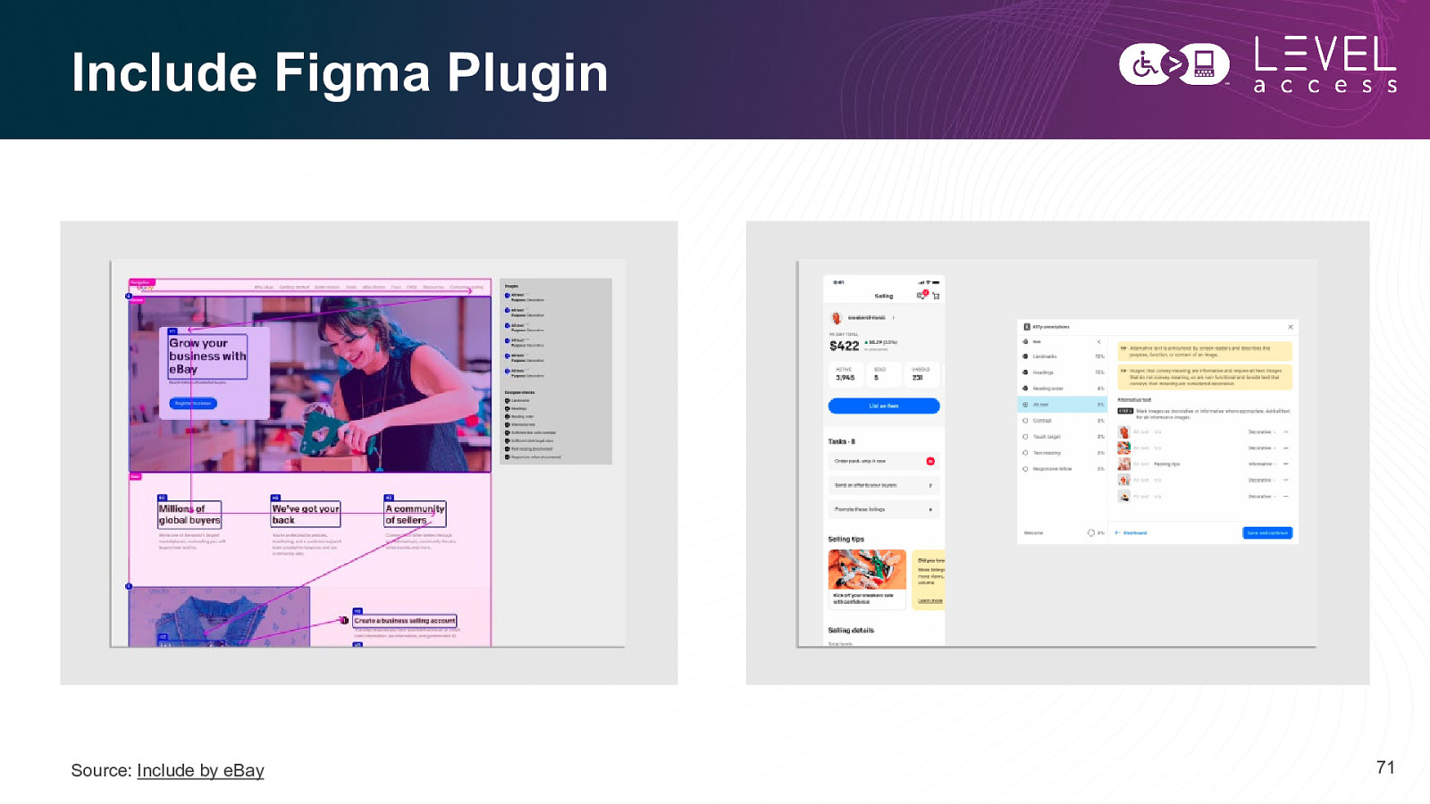
Include Figma Plugin Source: Include by eBay 71
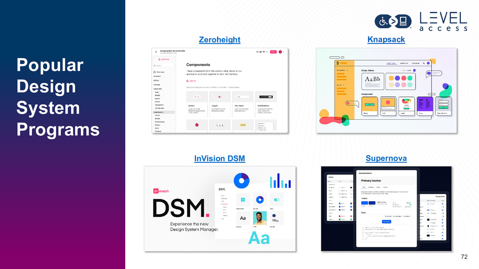
Zeroheight Knapsack InVision DSM Supernova Popular Design System Programs 72
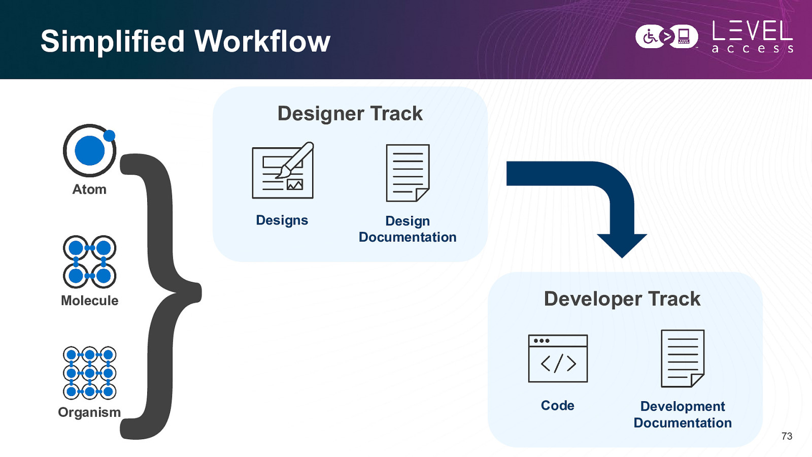
Simplified Workflow Designer Track Atom Designs Design Documentation Molecule Developer Track Organism Code Development Documentation 73
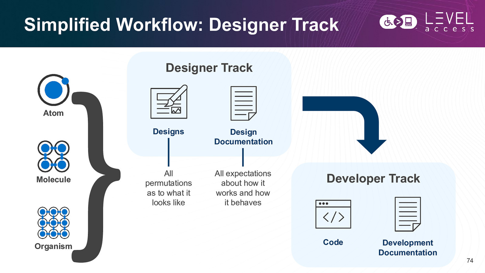
Simplified Workflow: Designer Track Designer Track Atom Molecule Organism Designs Design Documentation All permutations as to what it looks like All expectations about how it works and how it behaves Developer Track Code Development Documentation 74
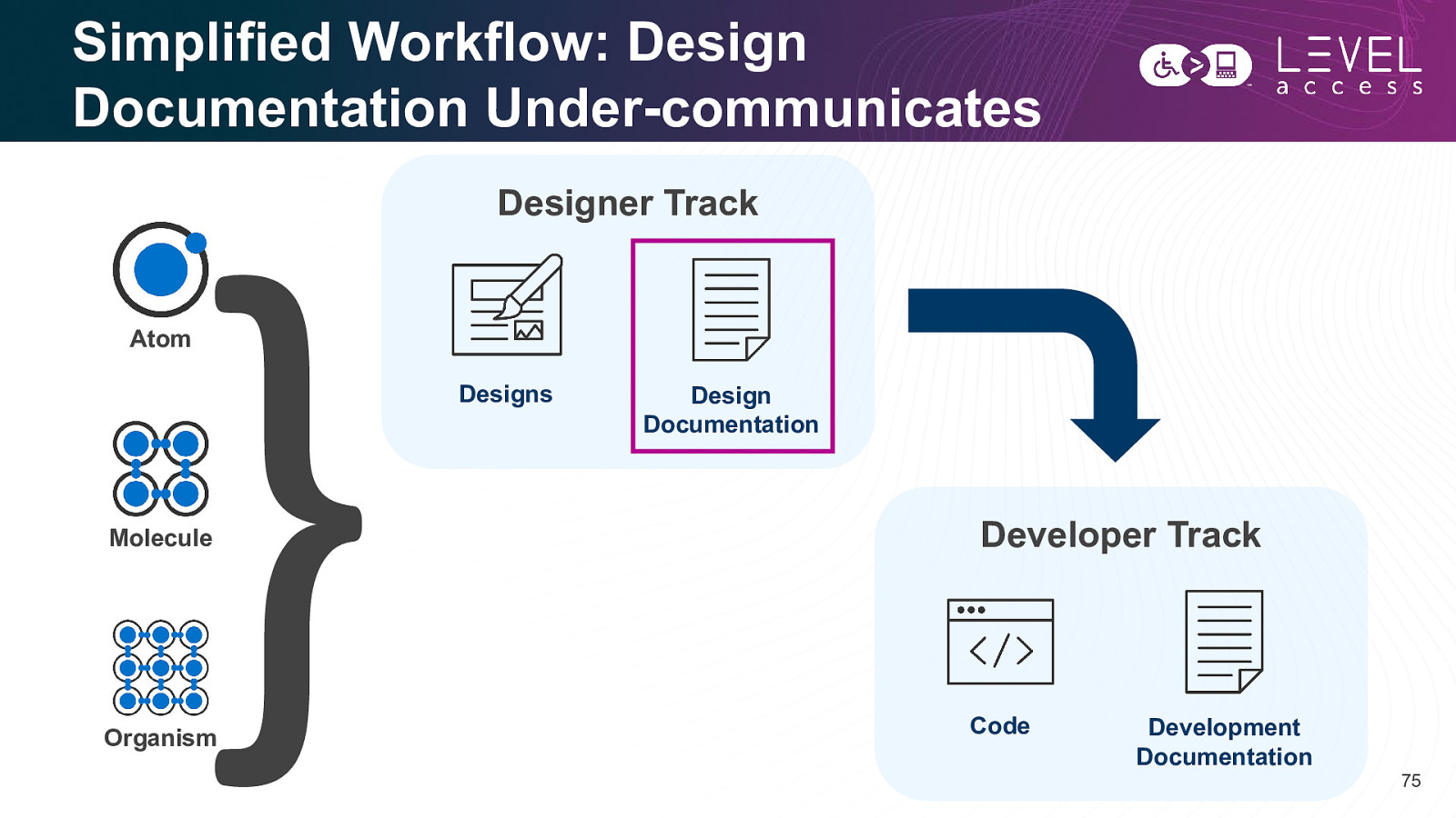
Simplified Workflow: Design Documentation Under-communicates Designer Track Atom Designs Molecule Organism Design Documentation Developer Track Code Development Documentation 75
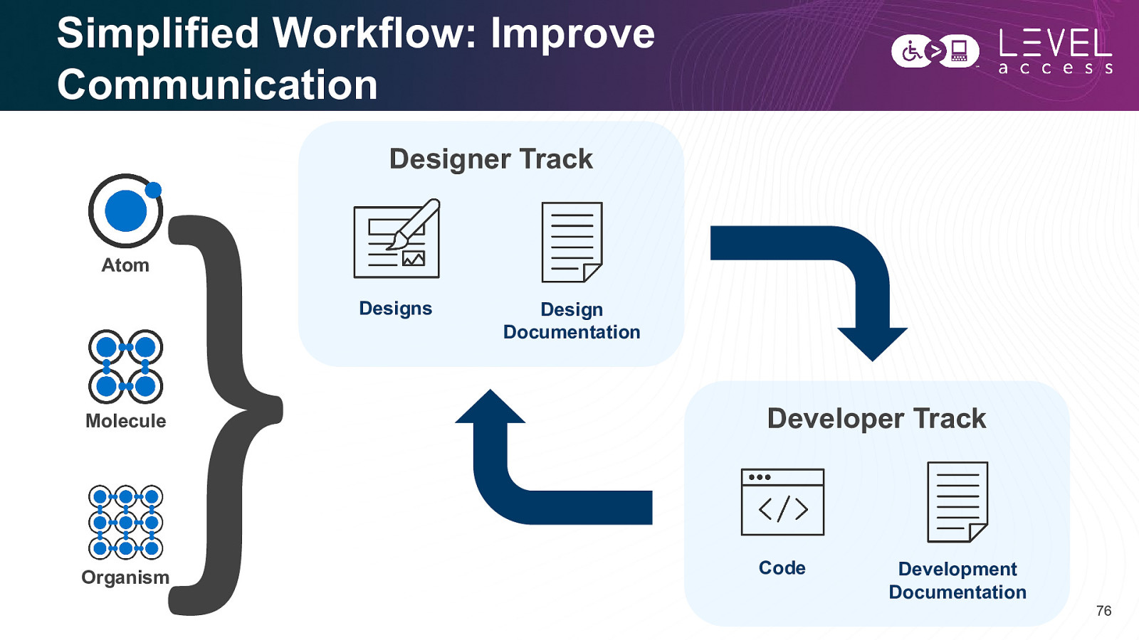
Simplified Workflow: Improve Communication Designer Track Atom Designs Molecule Organism Design Documentation Developer Track Code Development Documentation 76
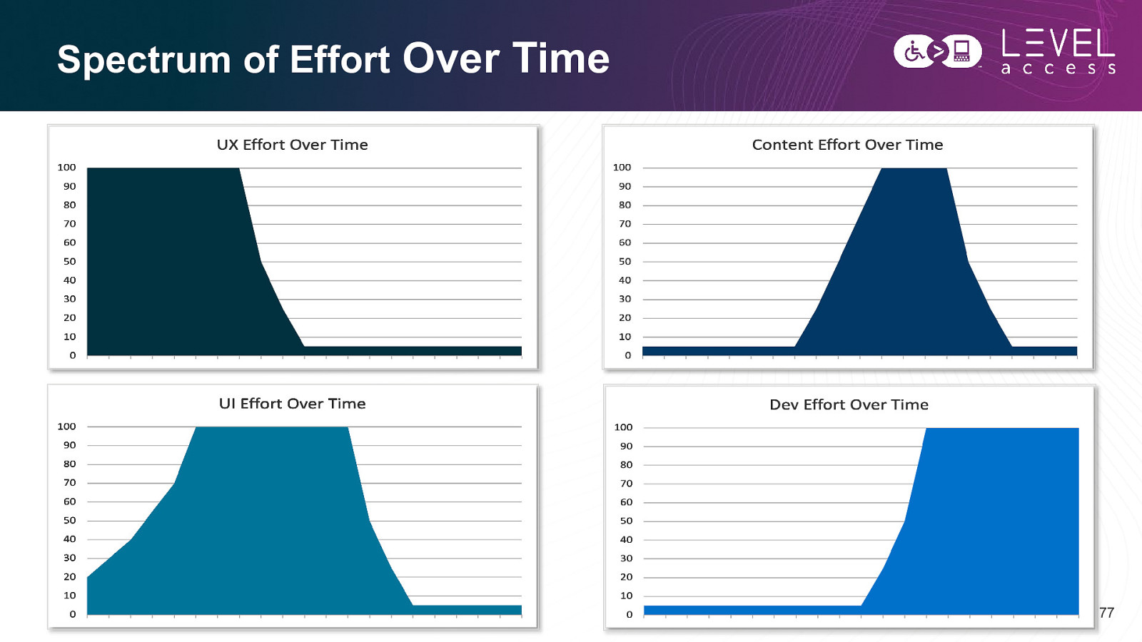
Spectrum of Effort Over Time 77
Progress over perfection Meryl Evans 78
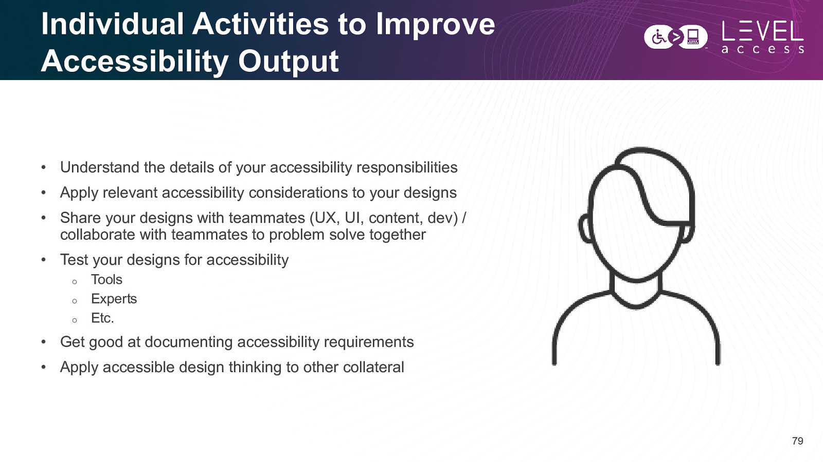
Individual Activities to Improve Accessibility Output • Understand the details of your accessibility responsibilities • Apply relevant accessibility considerations to your designs • Share your designs with teammates (UX, UI, content, dev) / collaborate with teammates to problem solve together • Test your designs for accessibility o o o Tools Experts Etc. • Get good at documenting accessibility requirements • Apply accessible design thinking to other collateral 79
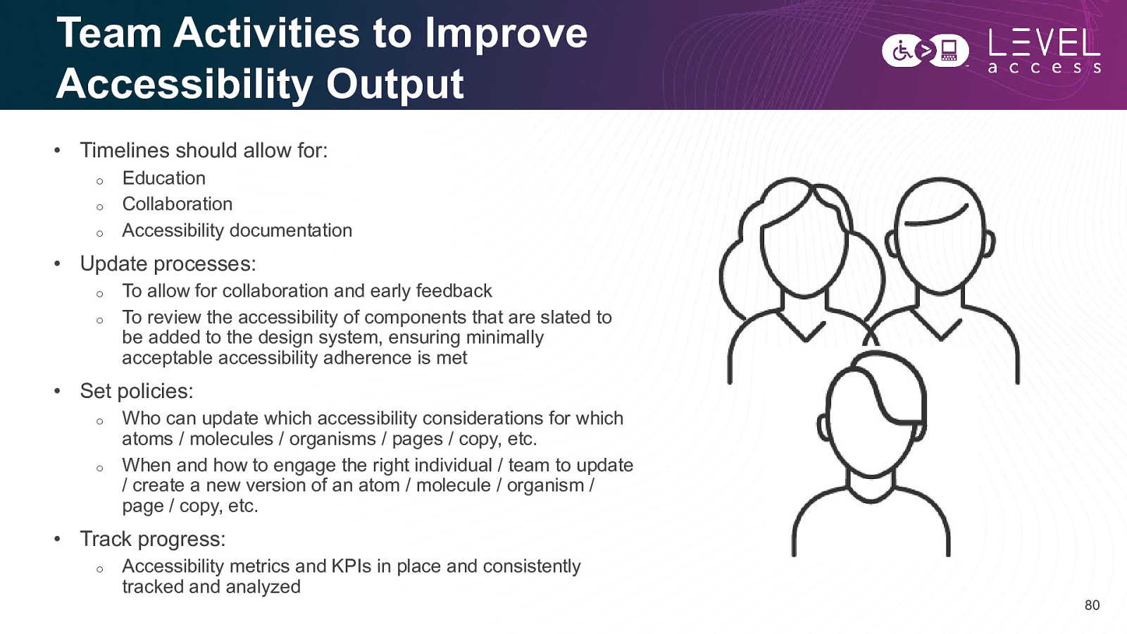
Team Activities to Improve Accessibility Output • Timelines should allow for: o o o Education Collaboration Accessibility documentation • Update processes: o o To allow for collaboration and early feedback To review the accessibility of components that are slated to be added to the design system, ensuring minimally acceptable accessibility adherence is met • Set policies: o o Who can update which accessibility considerations for which atoms / molecules / organisms / pages / copy, etc. When and how to engage the right individual / team to update / create a new version of an atom / molecule / organism / page / copy, etc. • Track progress: o Accessibility metrics and KPIs in place and consistently tracked and analyzed 80
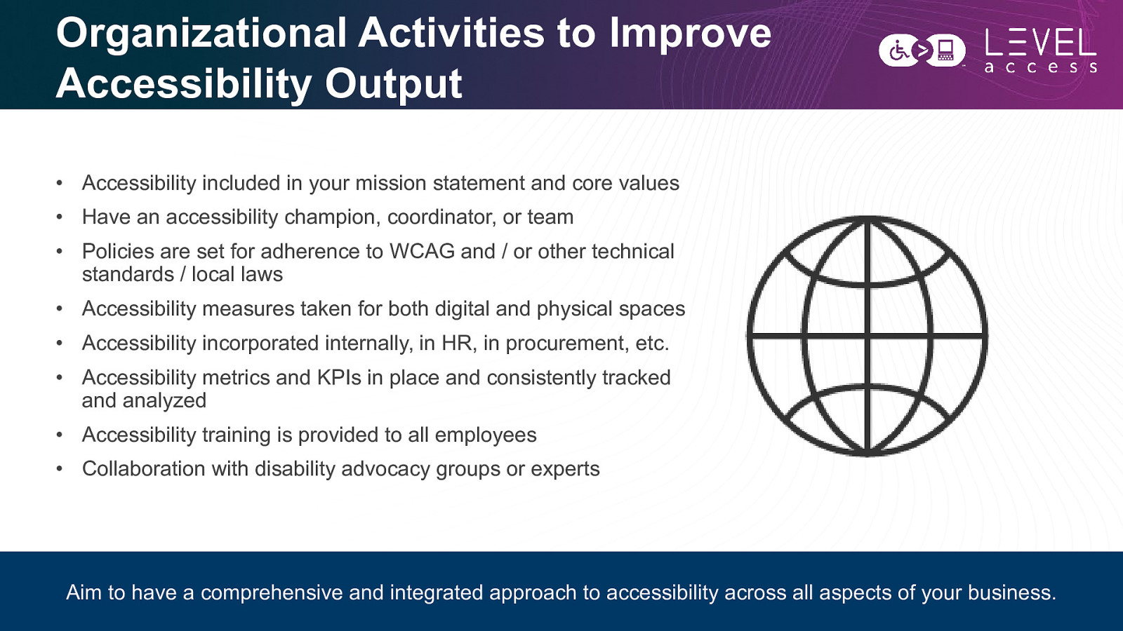
Organizational Activities to Improve Accessibility Output • Accessibility included in your mission statement and core values • Have an accessibility champion, coordinator, or team • Policies are set for adherence to WCAG and / or other technical standards / local laws • Accessibility measures taken for both digital and physical spaces • Accessibility incorporated internally, in HR, in procurement, etc. • Accessibility metrics and KPIs in place and consistently tracked and analyzed • Accessibility training is provided to all employees • Collaboration with disability advocacy groups or experts Aim to have a comprehensive and integrated approach to accessibility across all aspects of your business. 81
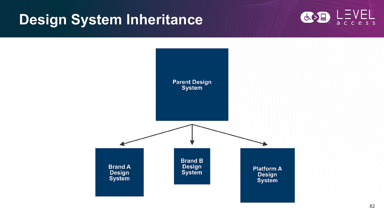
Design System Inheritance 82
SECTION 4 Wrap Up 83
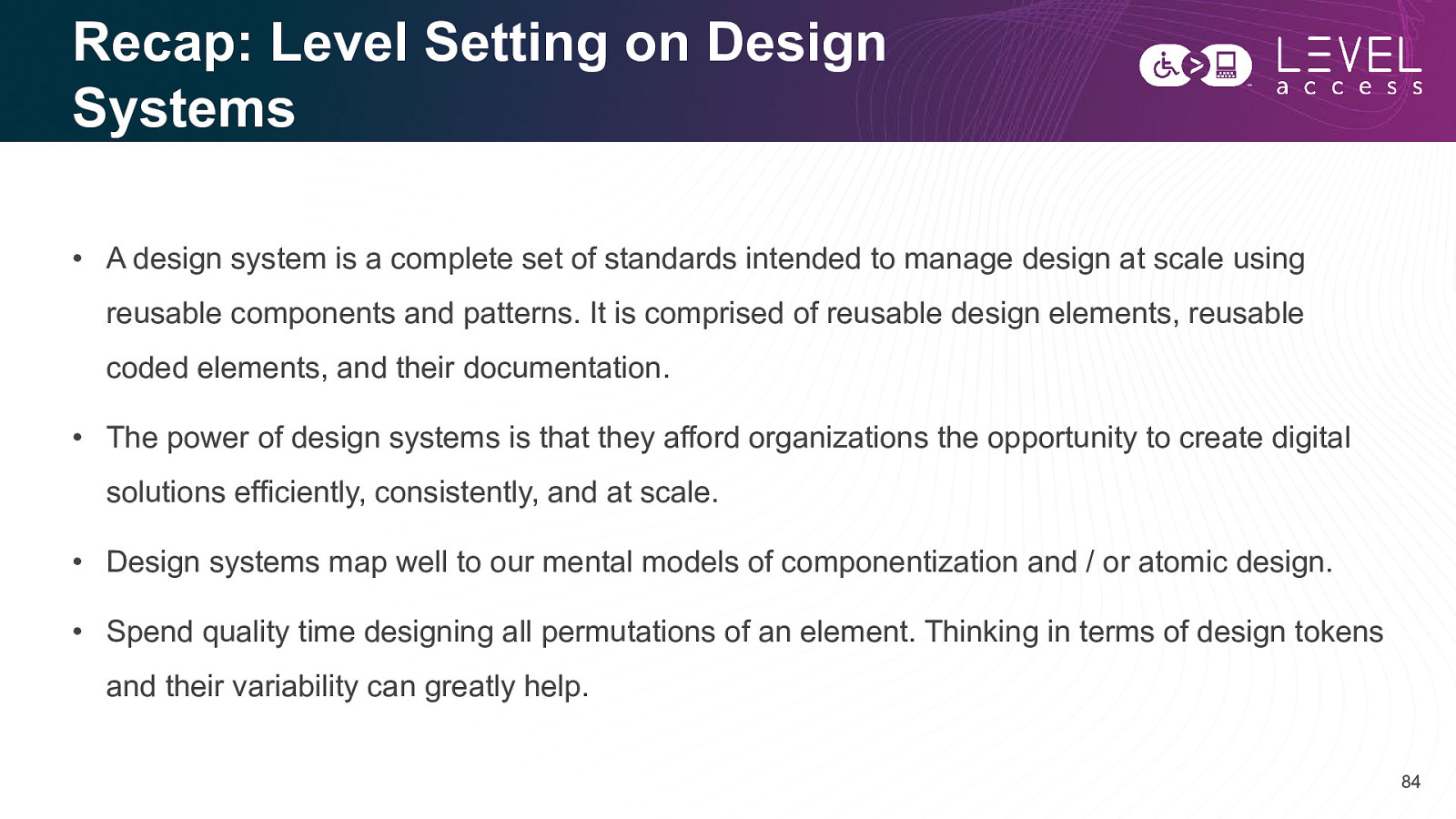
Recap: Level Setting on Design Systems • A design system is a complete set of standards intended to manage design at scale using reusable components and patterns. It is comprised of reusable design elements, reusable coded elements, and their documentation. • The power of design systems is that they afford organizations the opportunity to create digital solutions efficiently, consistently, and at scale. • Design systems map well to our mental models of componentization and / or atomic design. • Spend quality time designing all permutations of an element. Thinking in terms of design tokens and their variability can greatly help. 84
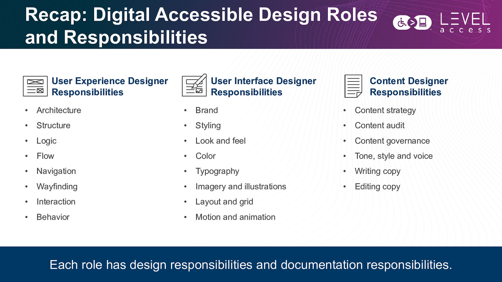
Recap: Digital Accessible Design Roles and Responsibilities User Experience Designer Responsibilities User Interface Designer Responsibilities Content Designer Responsibilities • Architecture • Brand • Content strategy • Structure • Styling • Content audit • Logic • Look and feel • Content governance • Flow • Color • Tone, style and voice • Navigation • Typography • Writing copy • Wayfinding • Imagery and illustrations • Editing copy • Interaction • Layout and grid • Behavior • Motion and animation Each role has design responsibilities and documentation responsibilities. 85
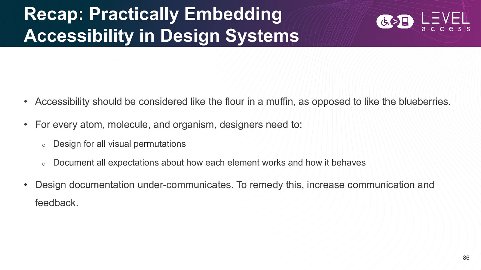
Recap: Practically Embedding Accessibility in Design Systems • Accessibility should be considered like the flour in a muffin, as opposed to like the blueberries. • For every atom, molecule, and organism, designers need to: o Design for all visual permutations o Document all expectations about how each element works and how it behaves • Design documentation under-communicates. To remedy this, increase communication and feedback. 86

Questions? 87
Thank you Karen Hawkins karen.hawkins@levelaccess.com levelaccess.com