Creating Accessible Design Systems Karen Hawkins August 29, 2023

A presentation at Web Accessibility in Mind Conference in August 2023 in by Karen Hawkins
Creating Accessible Design Systems Karen Hawkins August 29, 2023
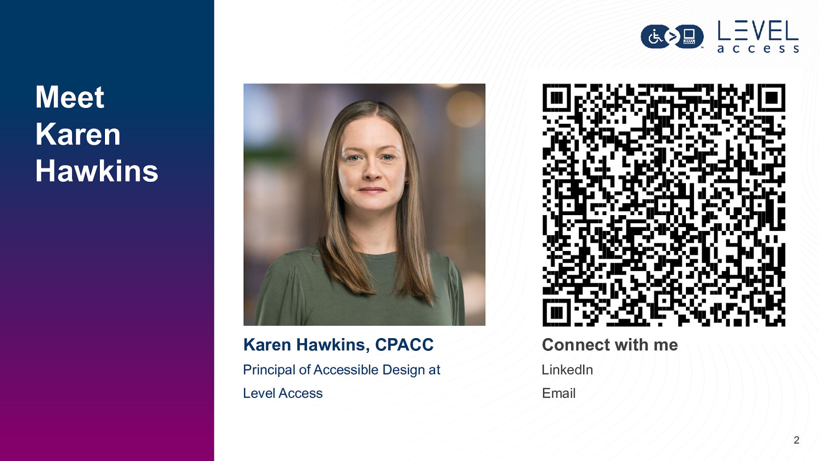
Meet Karen Hawkins Karen Hawkins, CPACC Connect with me Principal of Accessible Design at LinkedIn Level Access Email 2
Today’s Goals
SECTION 1 Accessible Design in Design Systems 4
A design system is a complete set of standards intended to manage design at scale using reusable components and patterns. NN/g Niesen Norman Group 5
A design system is a complete set of standards intended to manage design at scale using reusable components and patterns. NN/g Niesen Norman Group 6
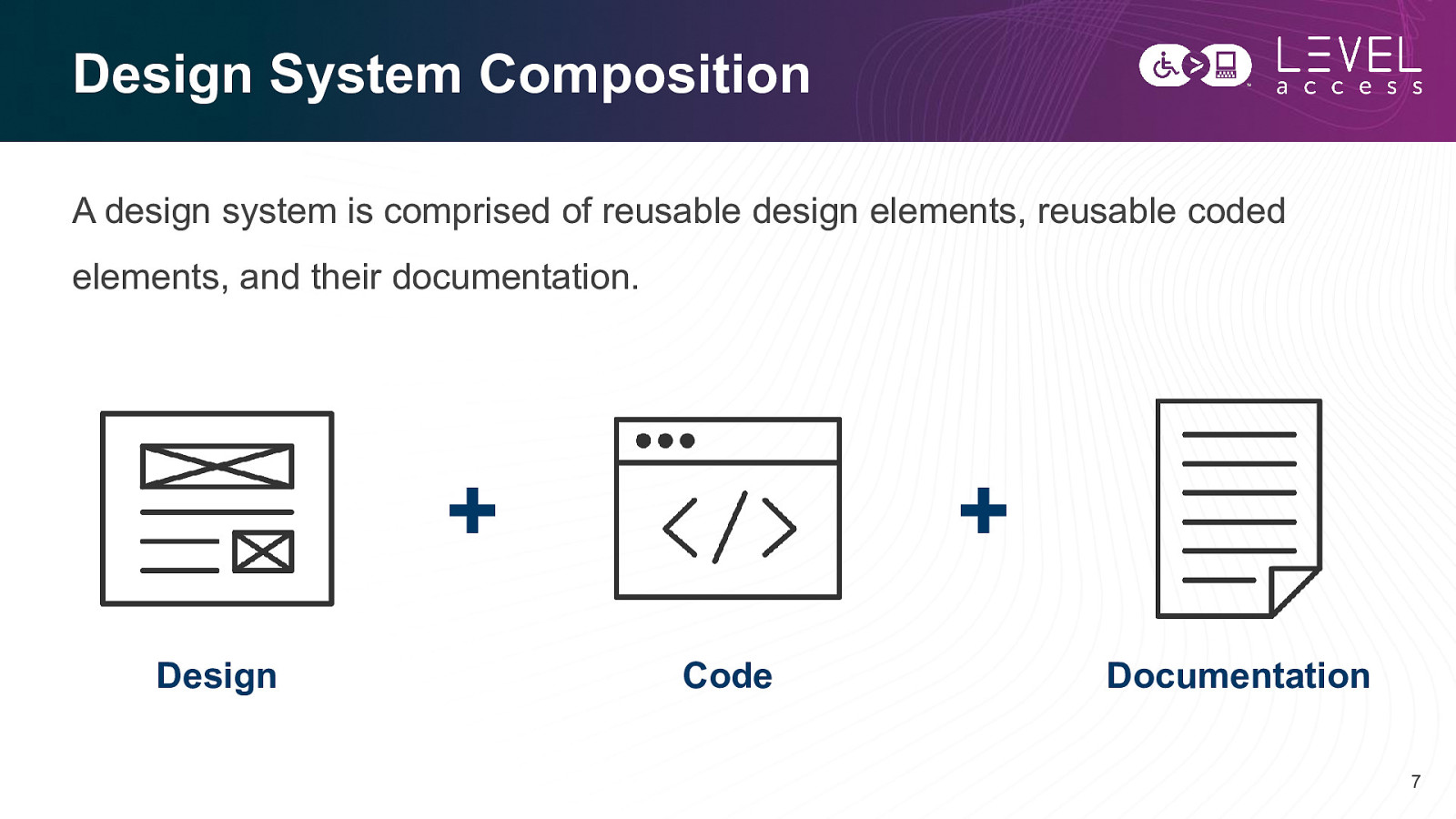
Design System Composition A design system is comprised of reusable design elements, reusable coded elements, and their documentation.
Consistency Efficiency Scale 8
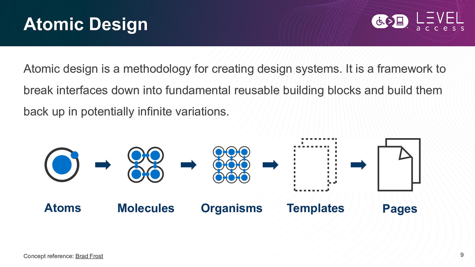
Atomic Design Atomic design is a methodology for creating design systems. It is a framework to break interfaces down into fundamental reusable building blocks and build them back up in potentially infinite variations. Atoms Concept reference: Brad Frost Molecules Organisms Templates Pages 9
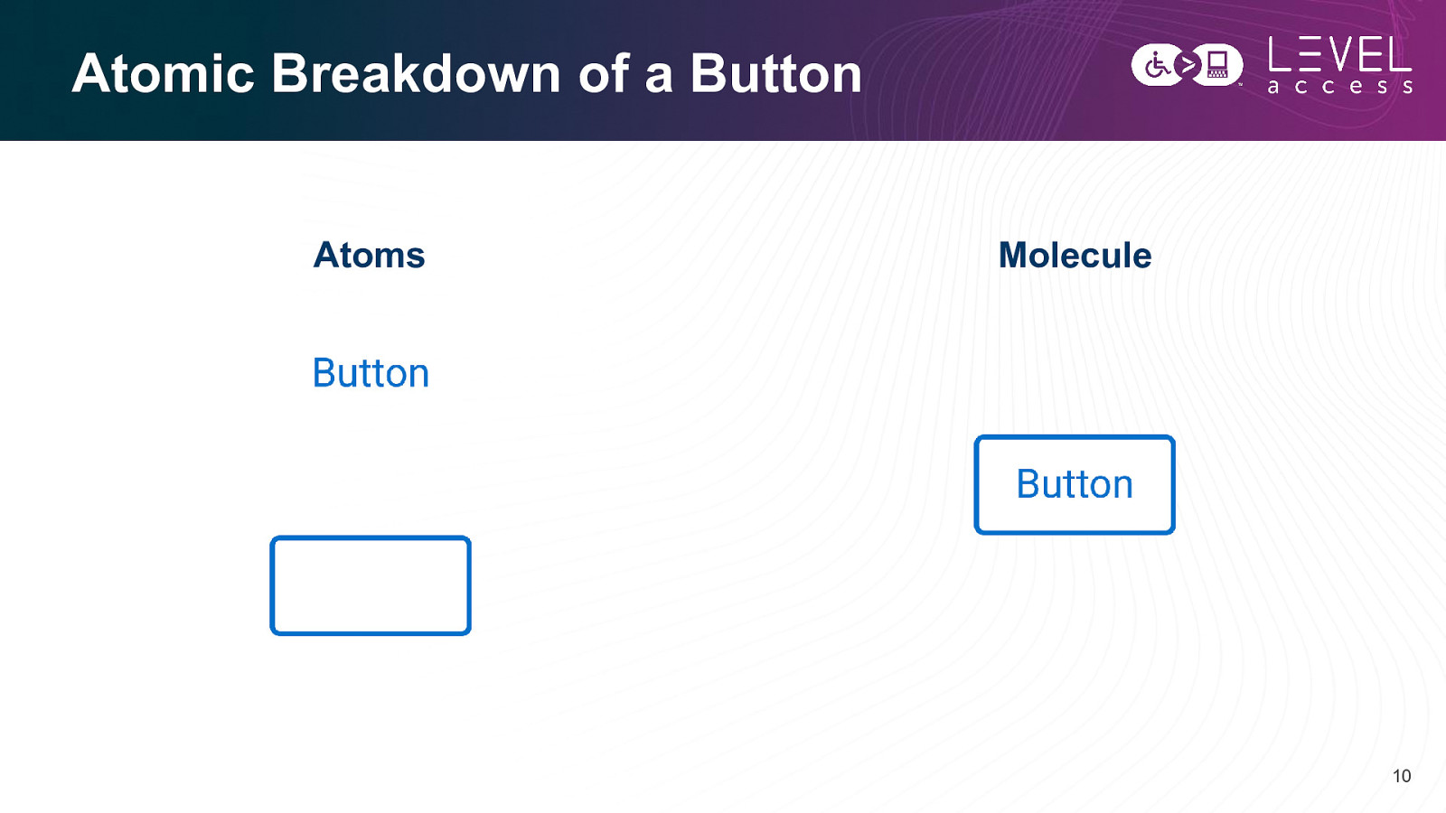
Atomic Breakdown of a Button Atoms Molecule 10
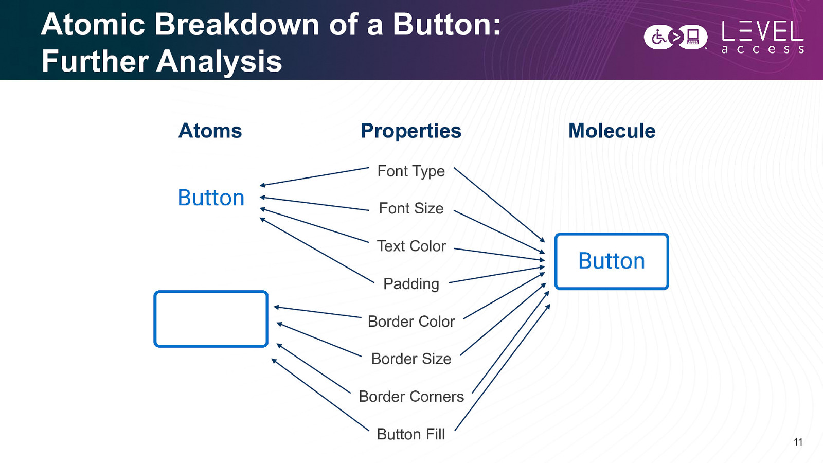
Atomic Breakdown of a Button: Further Analysis Atoms Properties Molecule Font Type Font Size Text Color Padding Border Color Border Size Border Corners Button Fill 11
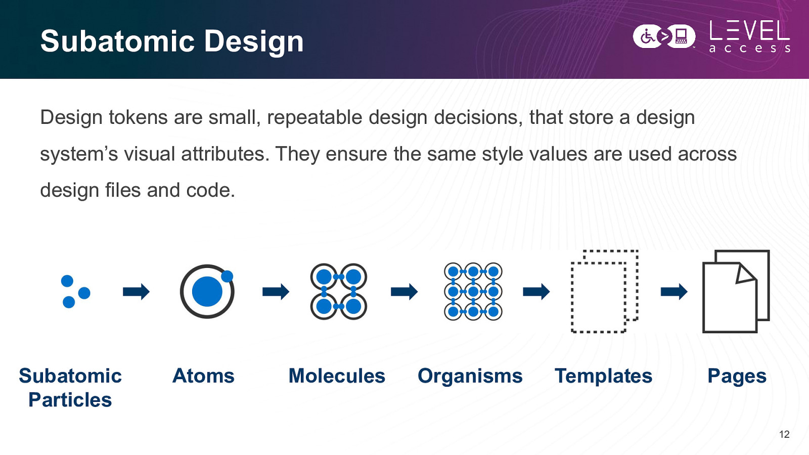
Subatomic Design Design tokens are small, repeatable design decisions, that store a design system’s visual attributes. They ensure the same style values are used across design files and code. Subatomic Particles Atoms Molecules Organisms Templates Pages 12
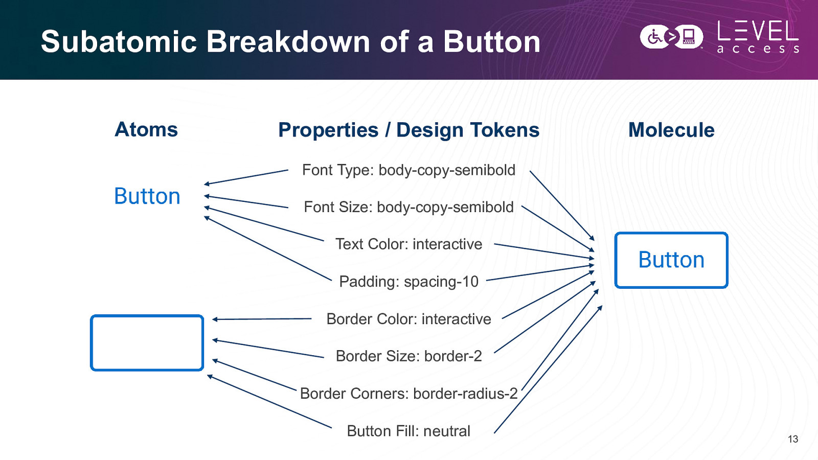
Subatomic Breakdown of a Button Atoms Properties / Design Tokens Molecule Font Type: body-copy-semibold Font Size: body-copy-semibold Text Color: interactive Padding: spacing-10 Border Color: interactive Border Size: border-2 Border Corners: border-radius-2 Button Fill: neutral 13
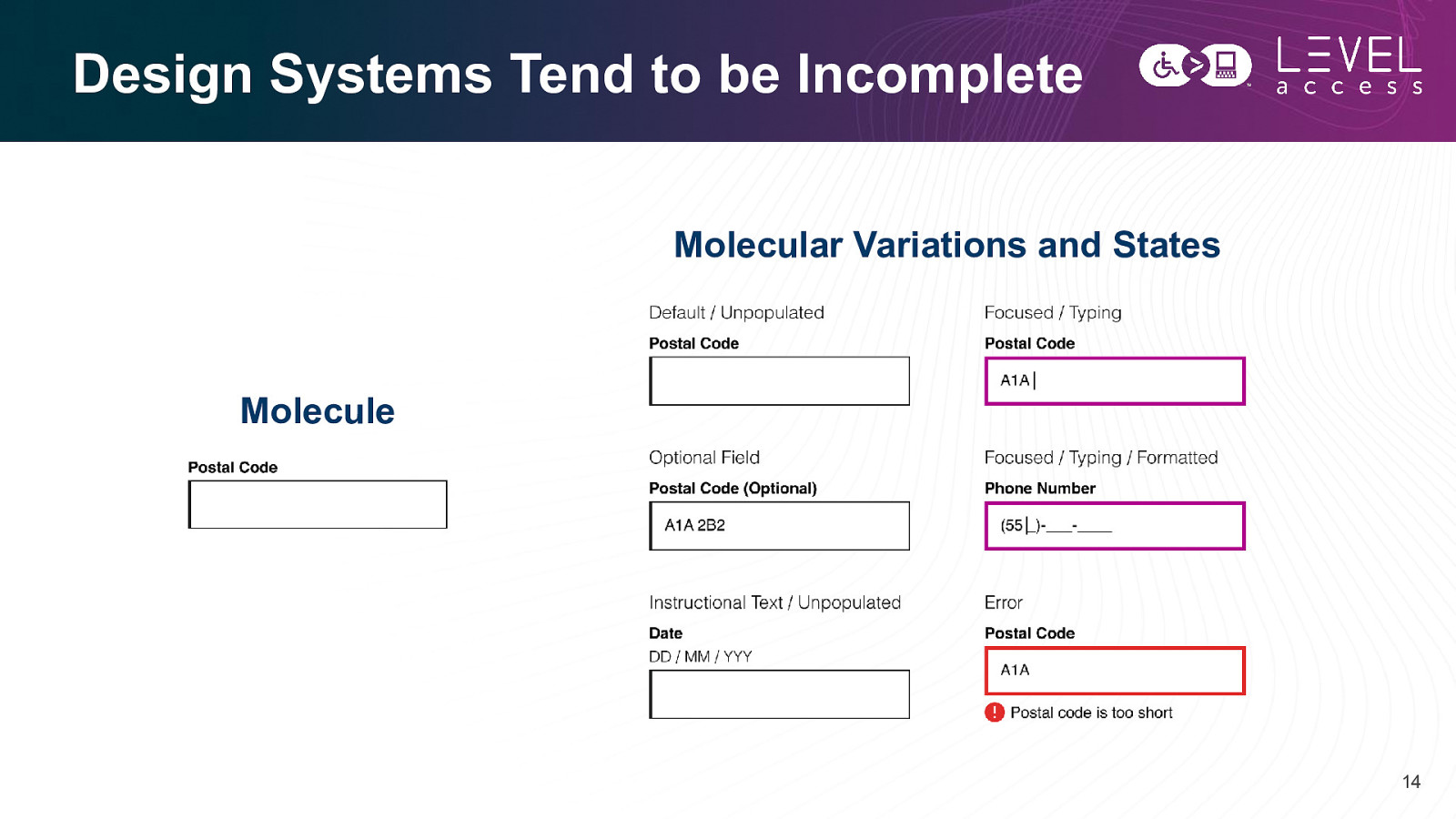
Design Systems Tend to be Incomplete Molecular Variations and States Molecule 14
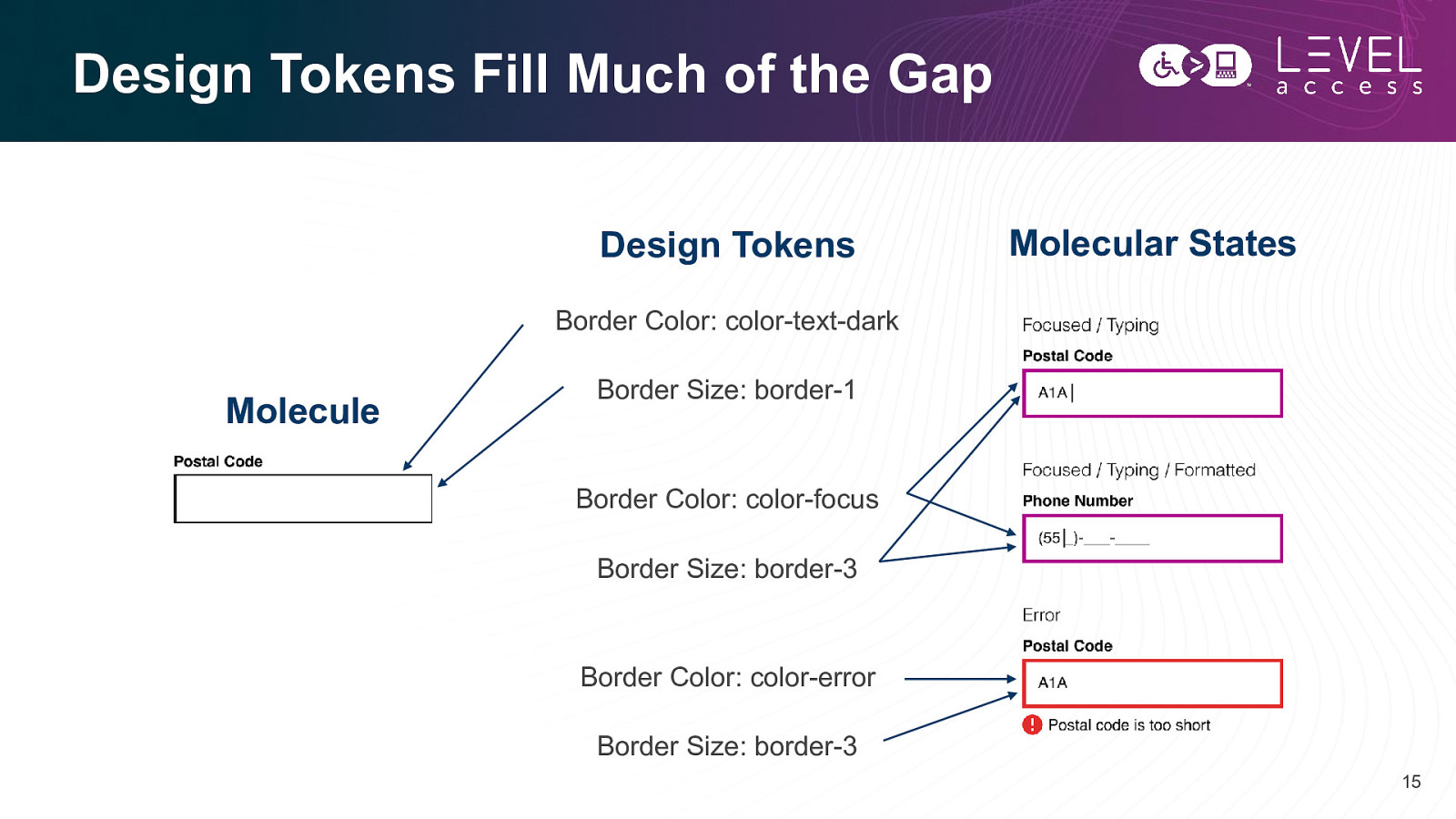
Design Tokens Fill Much of the Gap Design Tokens Molecular States Border Color: color-text-dark Molecule Border Size: border-1 Border Color: color-focus Border Size: border-3 Border Color: color-error Border Size: border-3 15
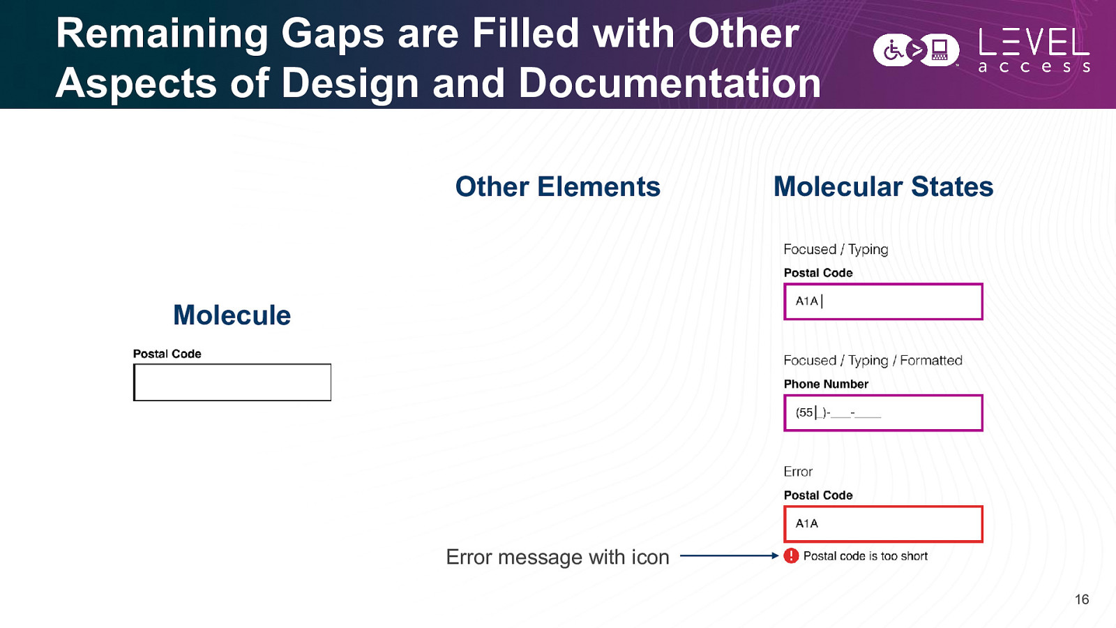
Remaining Gaps are Filled with Other Aspects of Design and Documentation Other Elements Molecular States Molecule Error message with icon 16
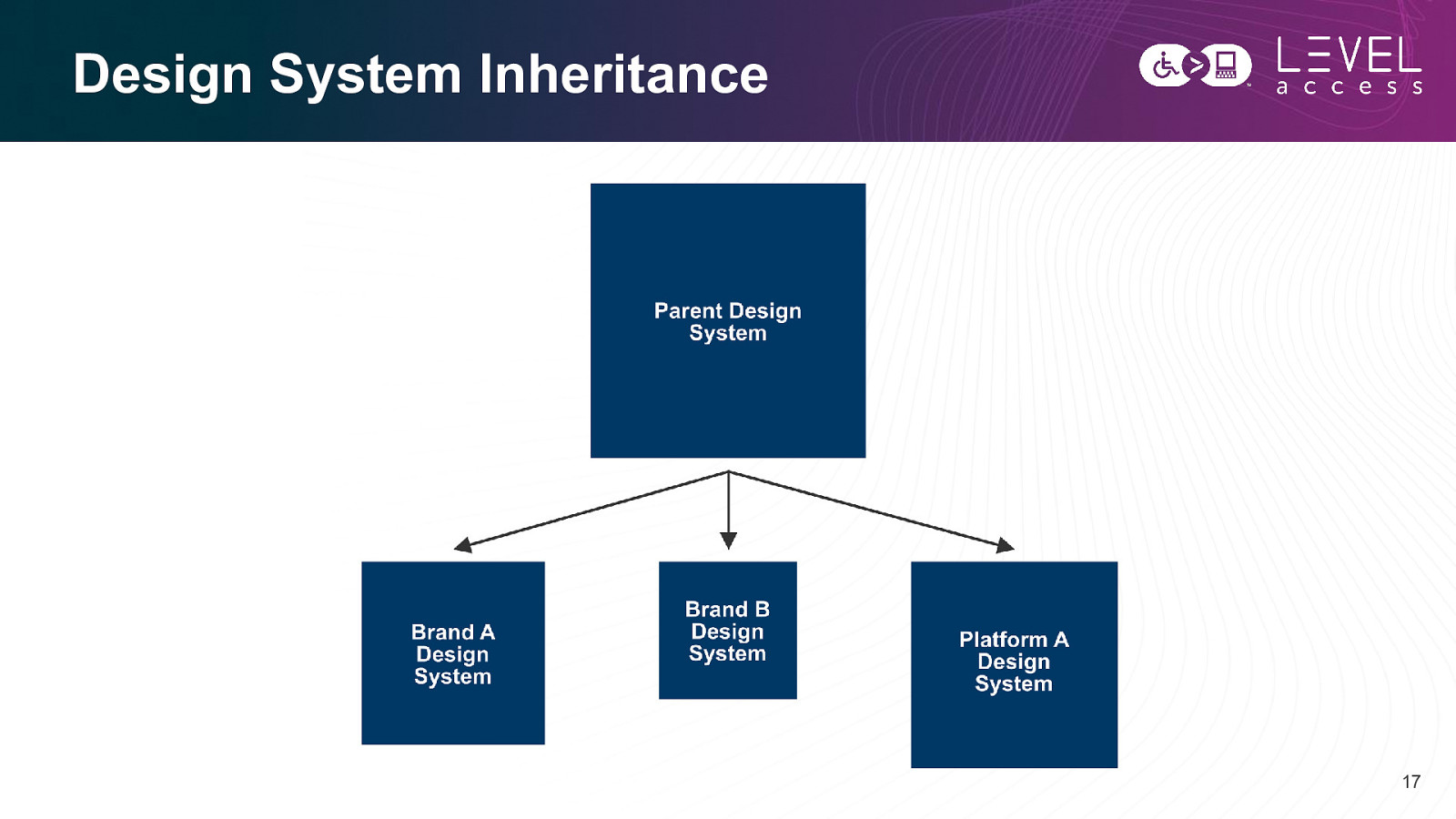
Design System Inheritance 17
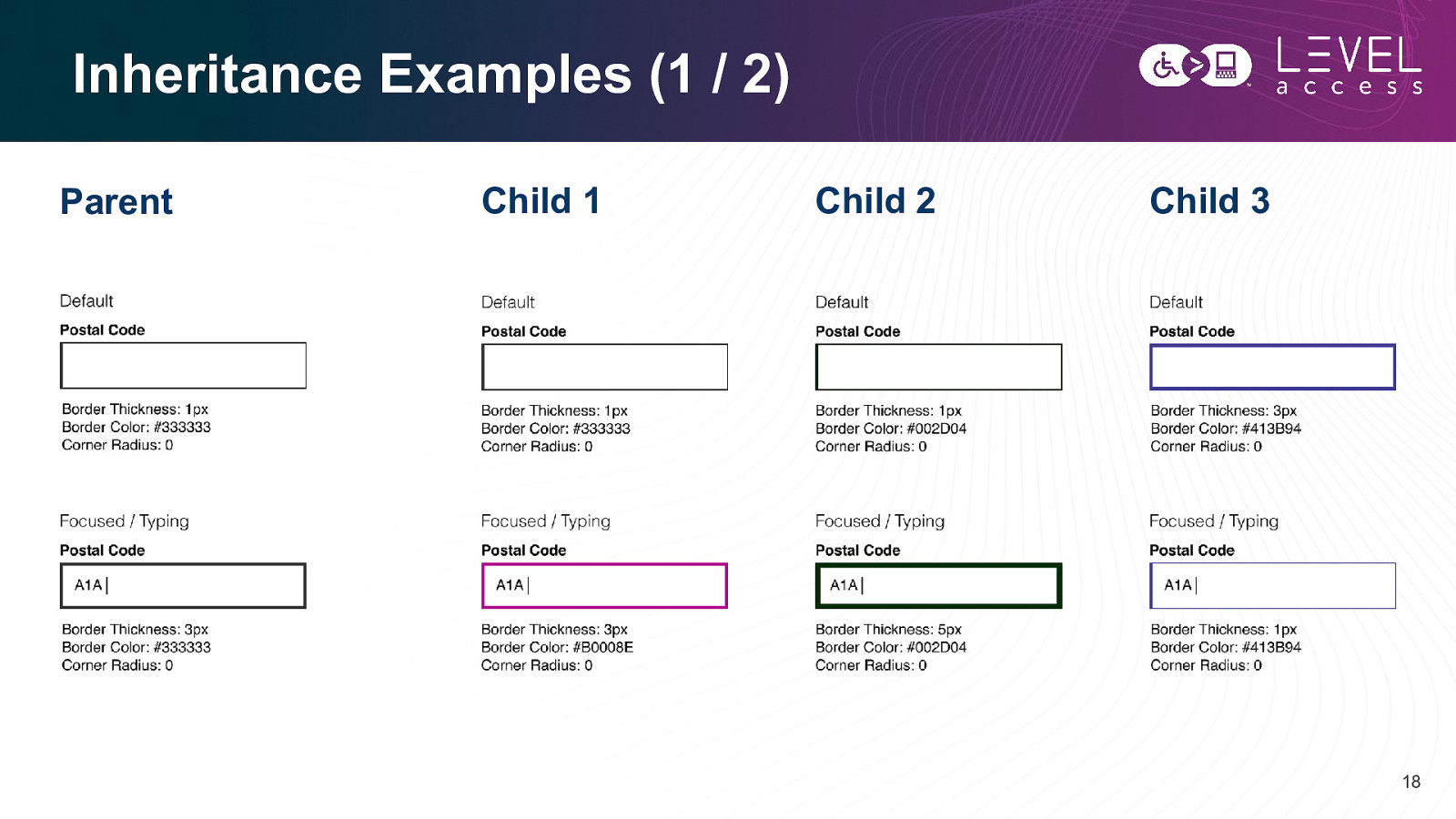
Inheritance Examples (1 / 2) Parent Child 1 Child 2 Child 3 18
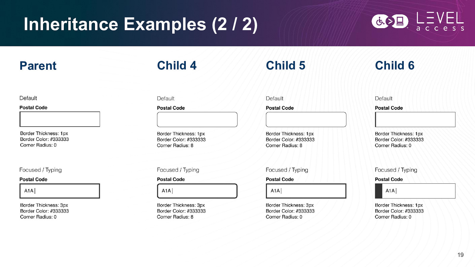
Inheritance Examples (2 / 2) Parent Child 4 Child 5 Child 6 19
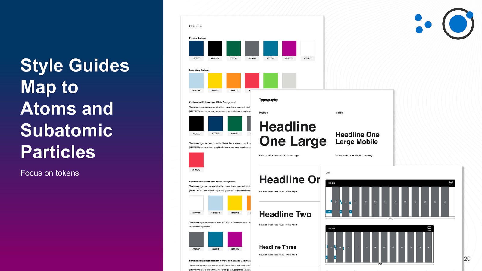
Style Guides Map to Atoms and Subatomic Particles Focus on tokens 20
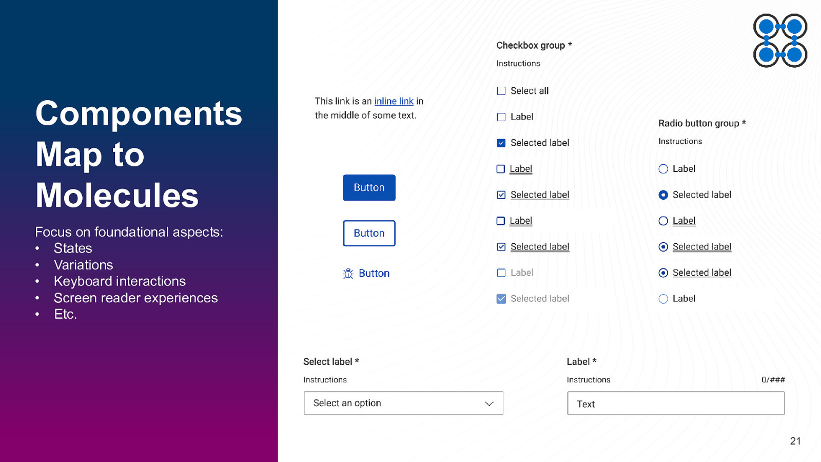
Components Map to Molecules Focus on foundational aspects: • States • Variations • Keyboard interactions • Screen reader experiences • Etc. 21
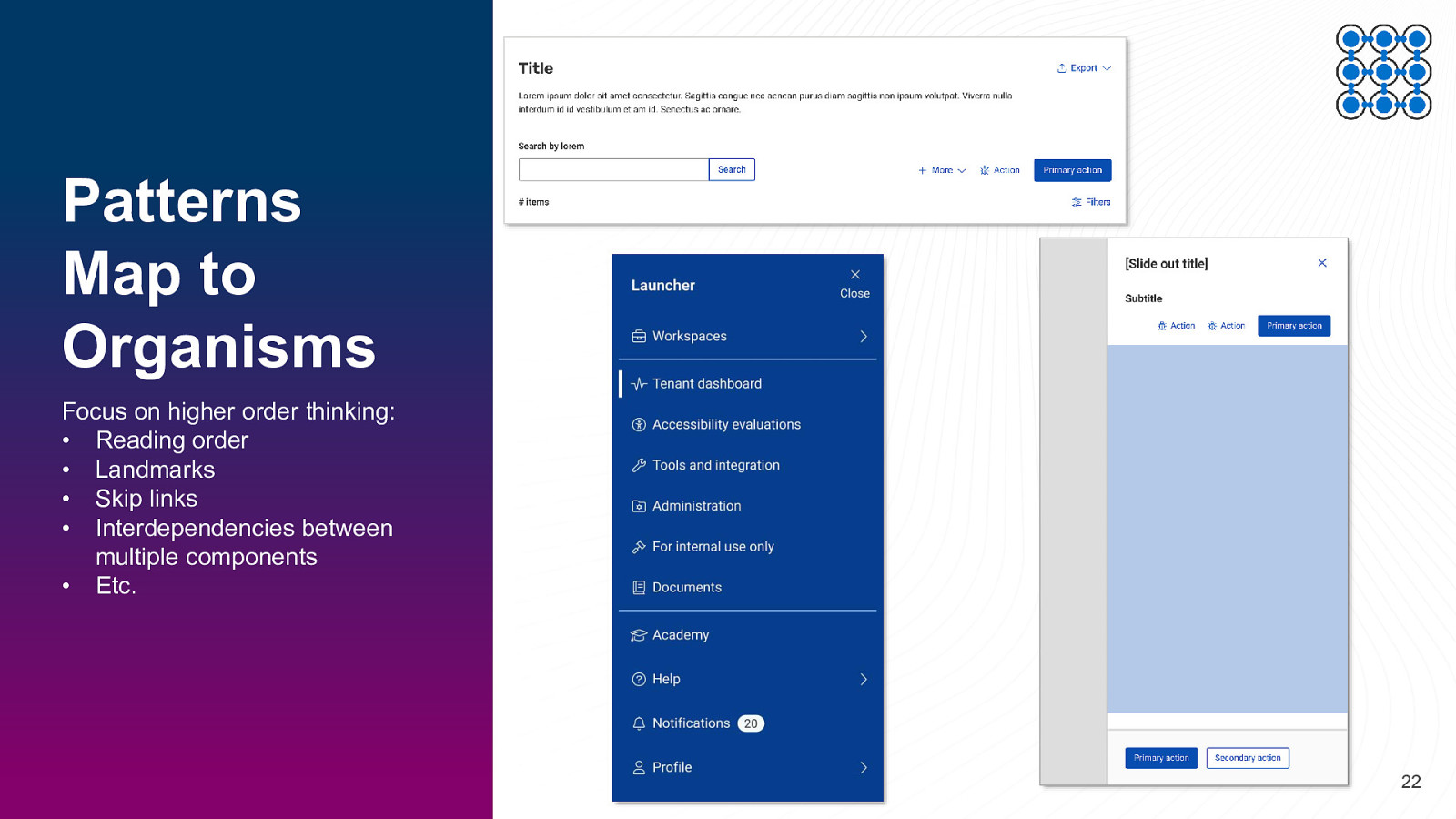
Patterns Map to Organisms Focus on higher order thinking: • Reading order • Landmarks • Skip links • Interdependencies between multiple components • Etc. 22
SECTION 2 Digital Accessible Design Roles and Responsibilities 23
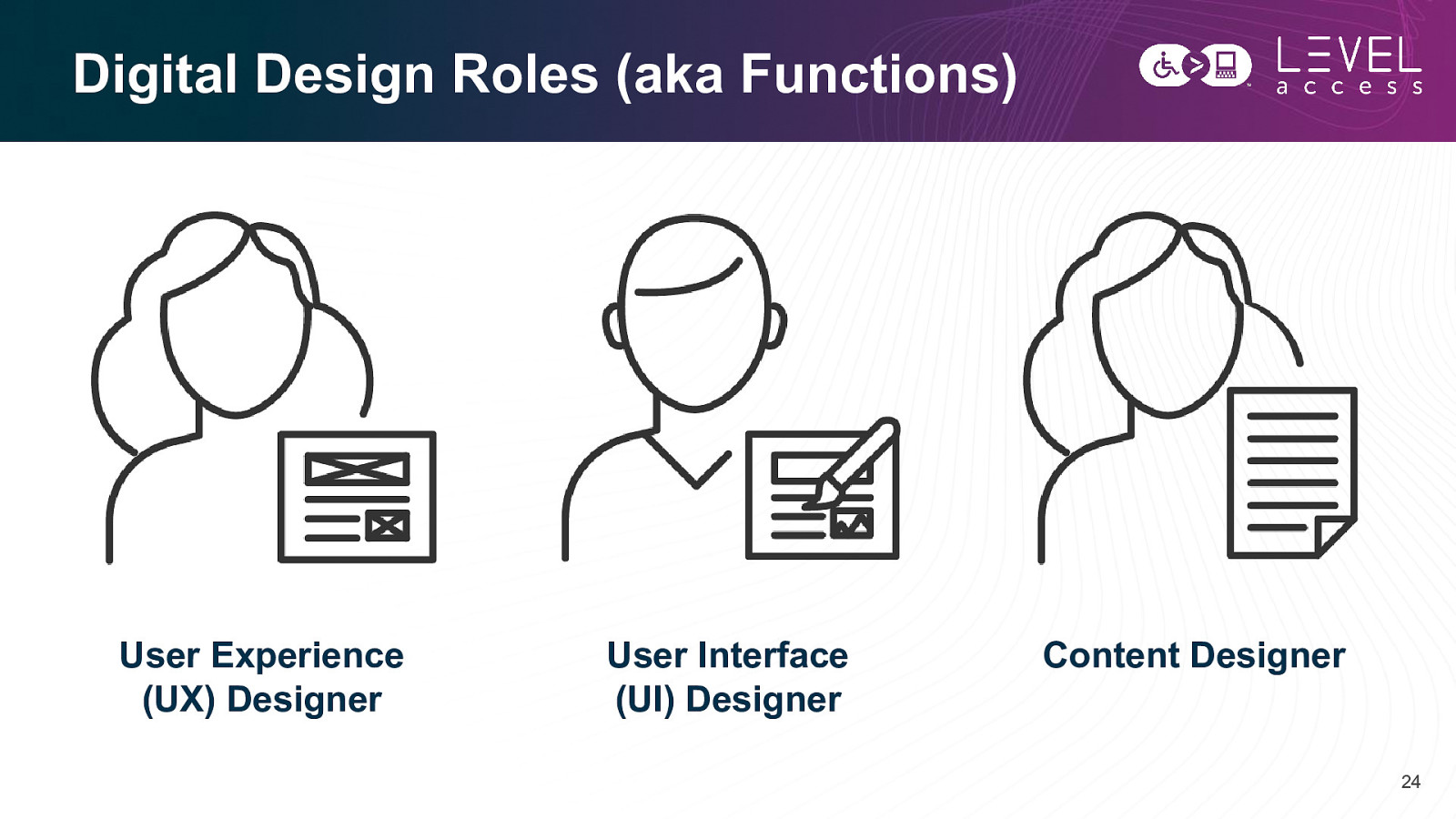
Digital Design Roles (aka Functions) User Experience (UX) Designer User Interface (UI) Designer Content Designer 24
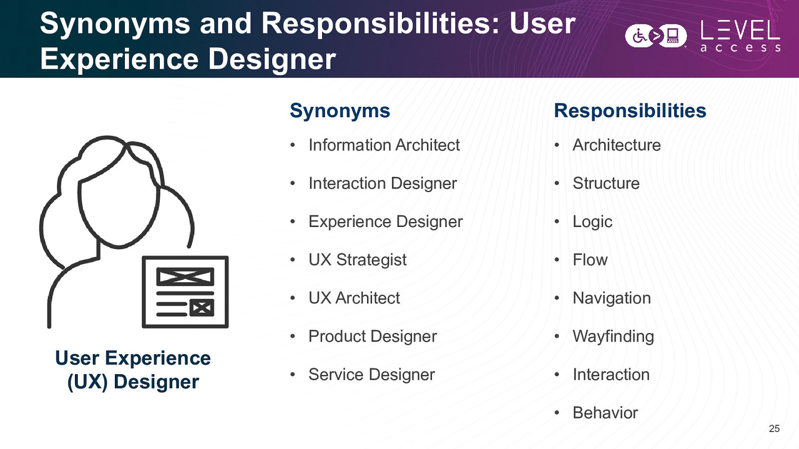
Synonyms and Responsibilities: User Experience Designer User Experience (UX) Designer Synonyms Responsibilities • Information Architect • Architecture • Interaction Designer • Structure • Experience Designer • Logic • UX Strategist • Flow • UX Architect • Navigation • Product Designer • Wayfinding • Service Designer • Interaction • Behavior 25
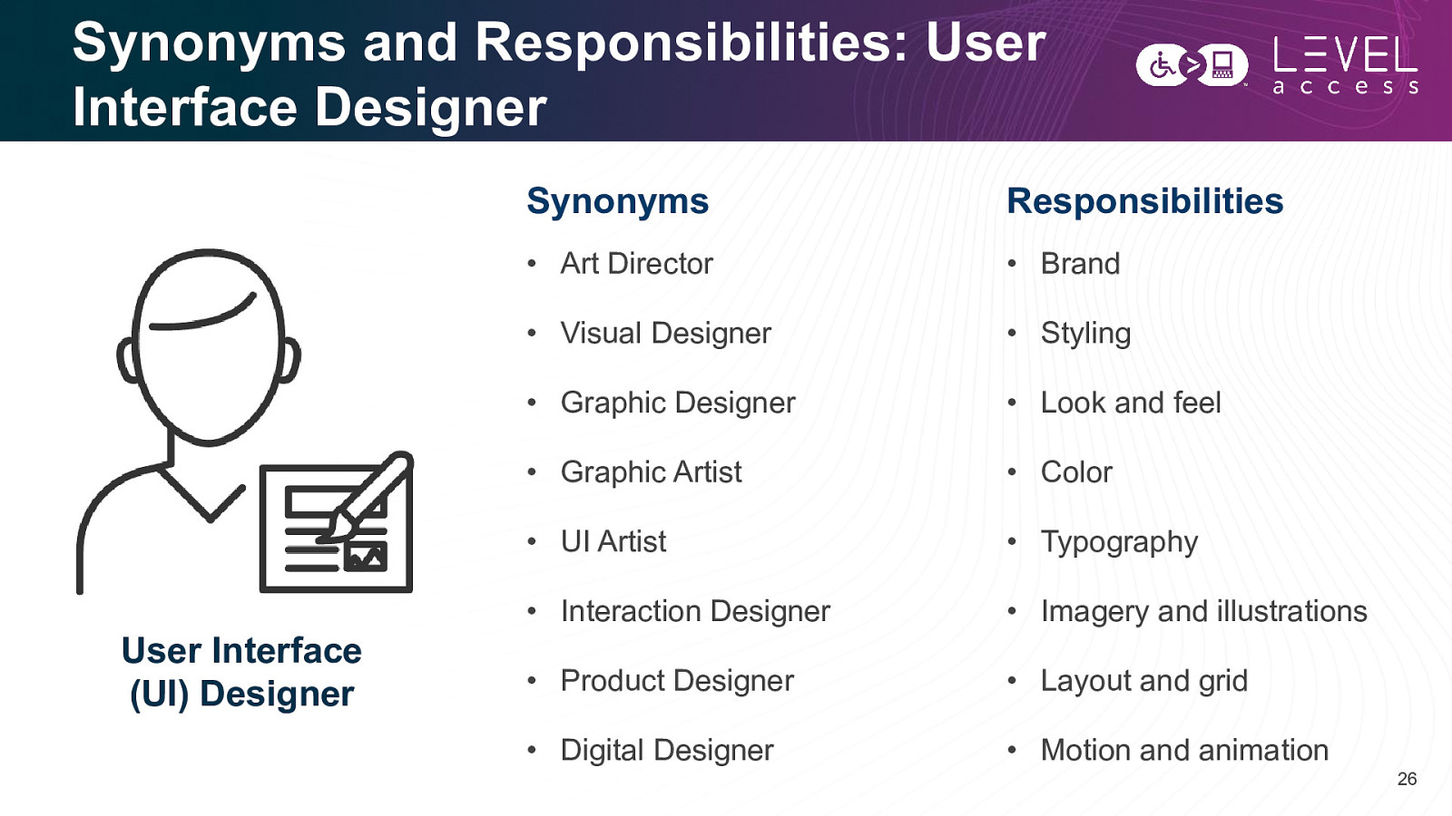
Synonyms and Responsibilities: User Interface Designer User Interface (UI) Designer Synonyms Responsibilities • Art Director • Brand • Visual Designer • Styling • Graphic Designer • Look and feel • Graphic Artist • Color • UI Artist • Typography • Interaction Designer • Imagery and illustrations • Product Designer • Layout and grid • Digital Designer • Motion and animation 26
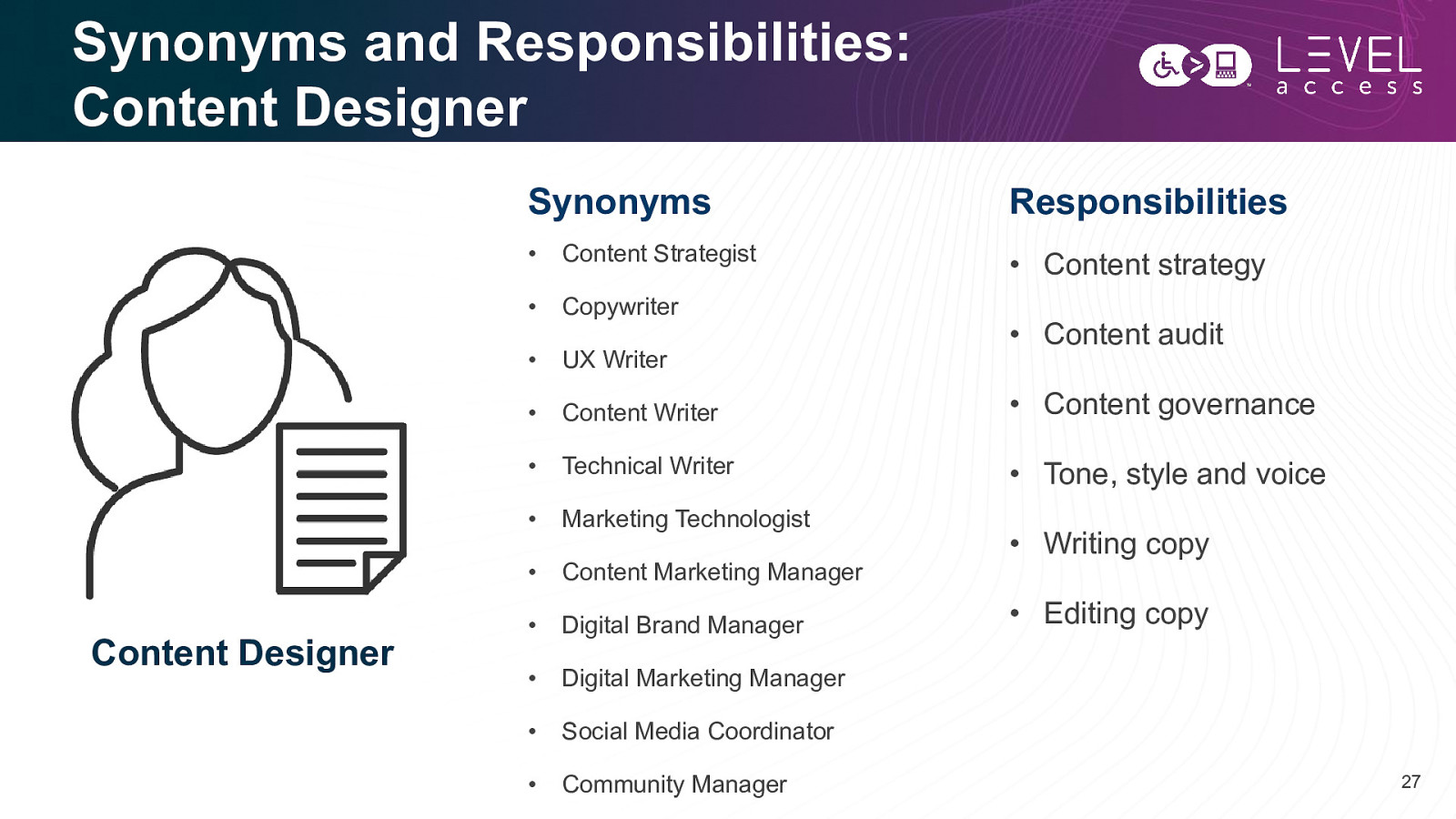
Synonyms and Responsibilities: Content Designer Content Designer Synonyms Responsibilities • Content Strategist • Content strategy • Copywriter • UX Writer • Content Writer • Content governance • Technical Writer • Tone, style and voice • Marketing Technologist • Content Marketing Manager • Digital Brand Manager • Digital Marketing Manager • Social Media Coordinator • Community Manager • Content audit • Writing copy • Editing copy 27
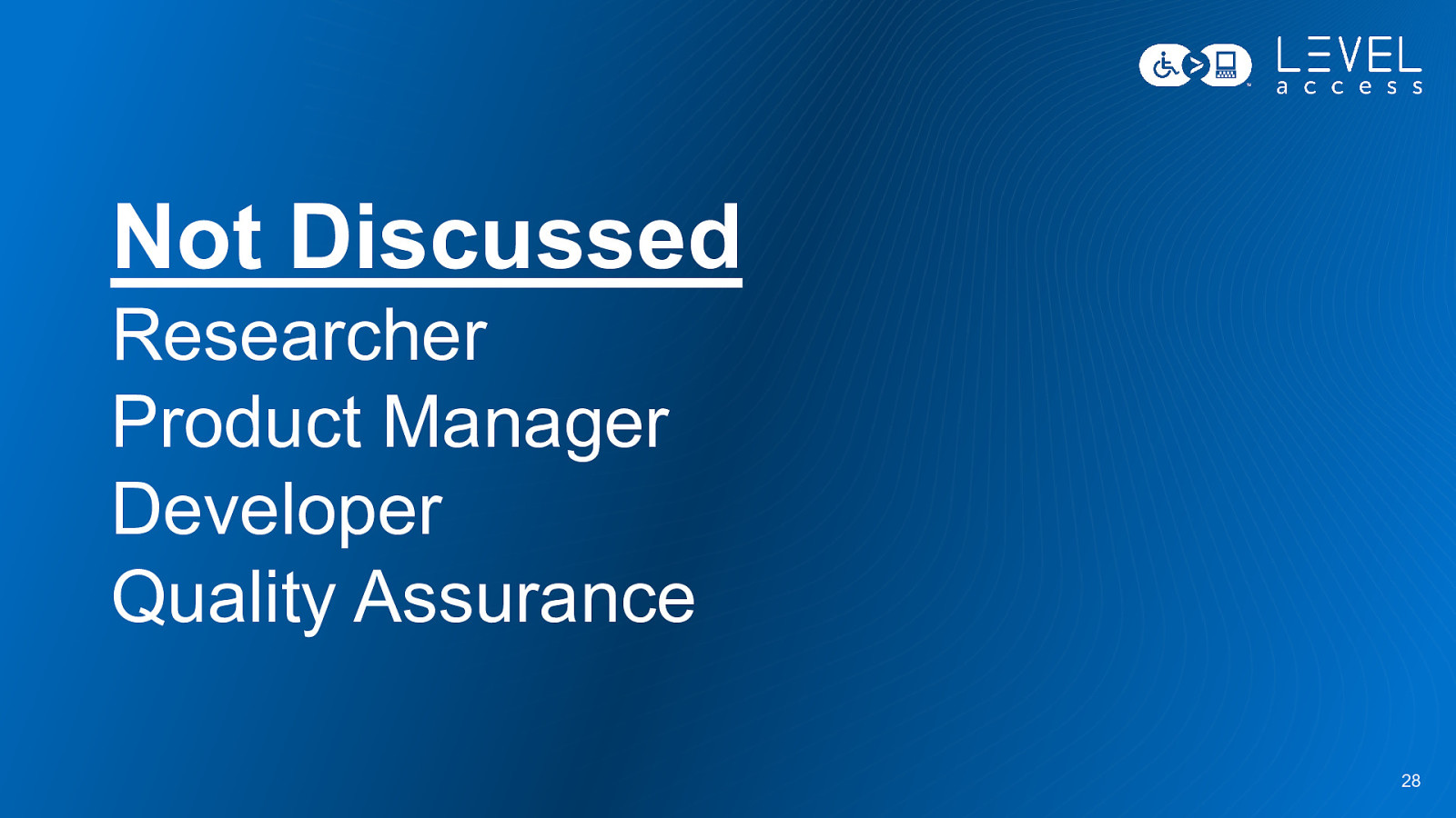
Not Discussed Researcher Product Manager Developer Quality Assurance 28
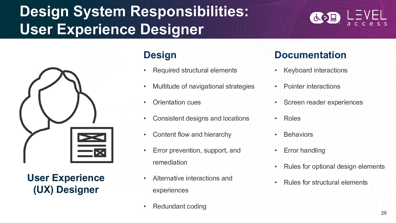
Design System Responsibilities: User Experience Designer Design Documentation • Required structural elements • Keyboard interactions • Multitude of navigational strategies • Pointer interactions • Orientation cues • Screen reader experiences • Consistent designs and locations • Roles • Content flow and hierarchy • Behaviors • Error prevention, support, and • Error handling • Rules for optional design elements • Rules for structural elements remediation User Experience (UX) Designer • Alternative interactions and experiences • Redundant coding 29
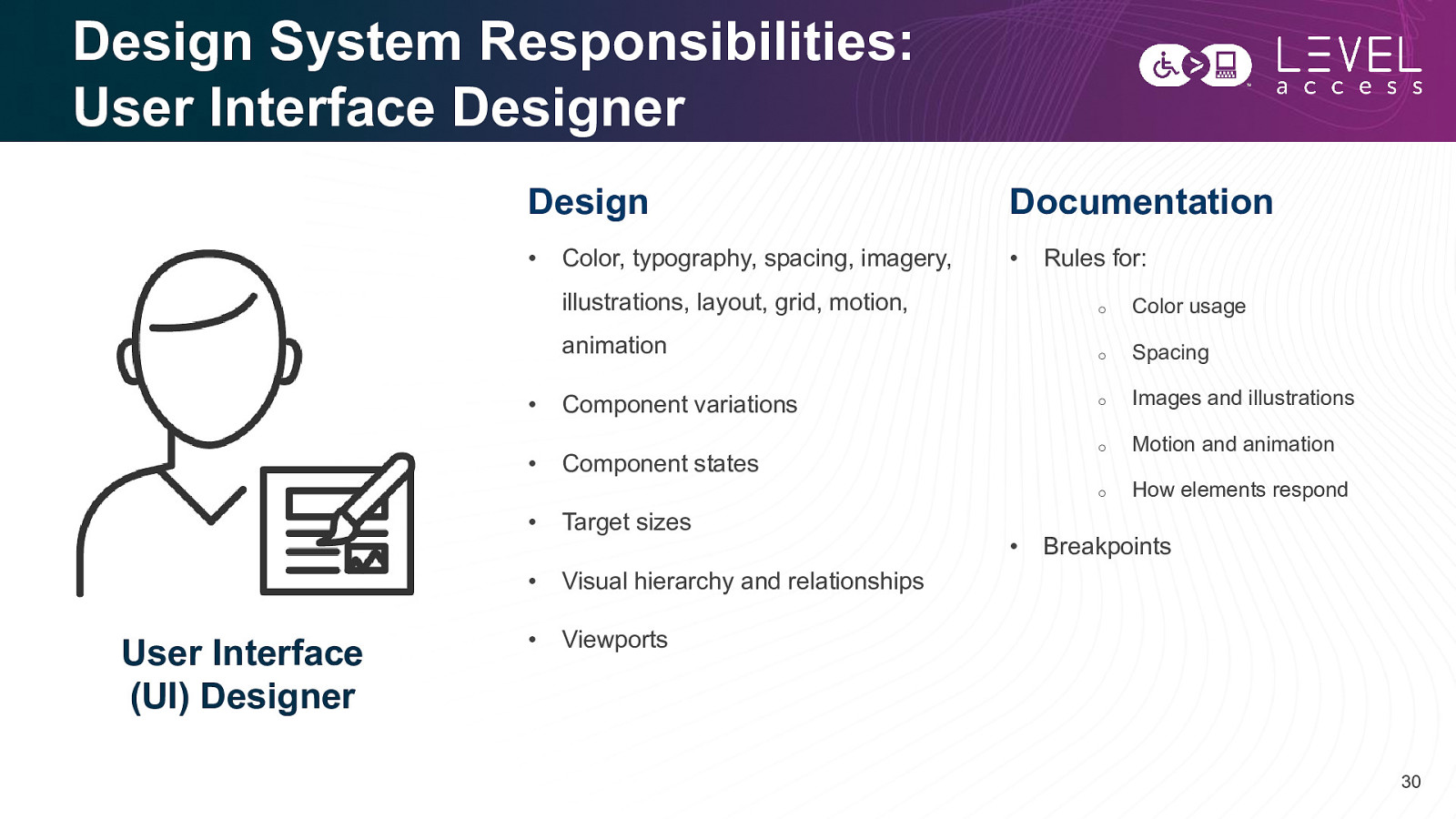
Design System Responsibilities: User Interface Designer User Interface (UI) Designer Design Documentation • • Color, typography, spacing, imagery, Rules for: illustrations, layout, grid, motion, o Color usage animation o Spacing o Images and illustrations o Motion and animation o How elements respond • Component variations • Component states • Target sizes • Visual hierarchy and relationships • Viewports • Breakpoints 30
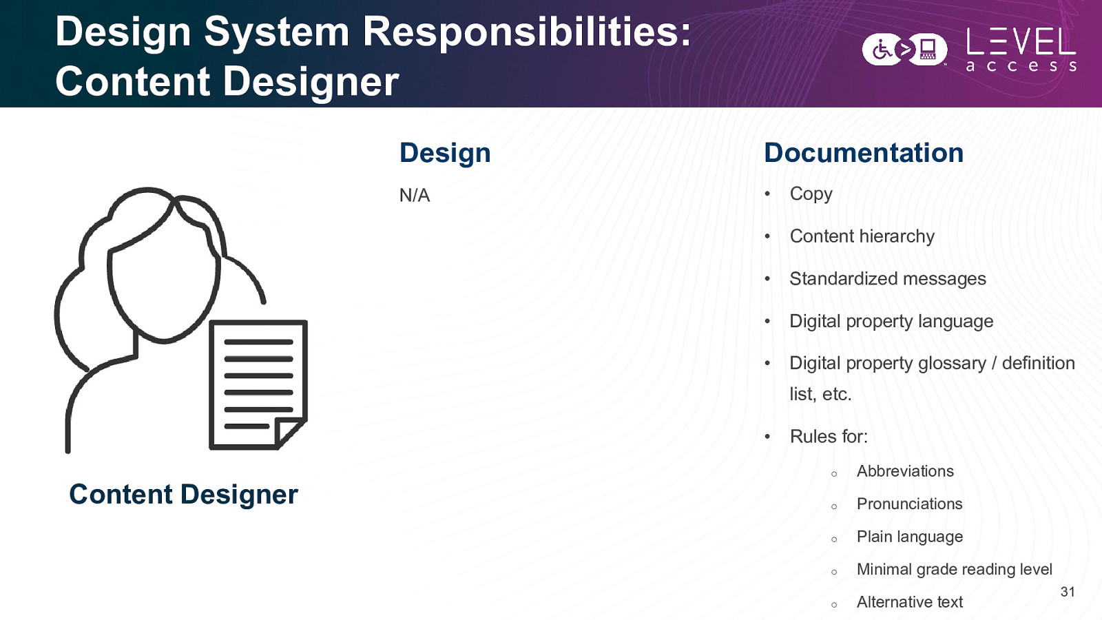
Design System Responsibilities: Content Designer Design Documentation N/A • Copy • Content hierarchy • Standardized messages • Digital property language • Digital property glossary / definition list, etc. • Content Designer Rules for: o Abbreviations o Pronunciations o Plain language o Minimal grade reading level o Alternative text 31
It doesn’t matter what your job title is. It doesn’t matter how your team is structured. 32
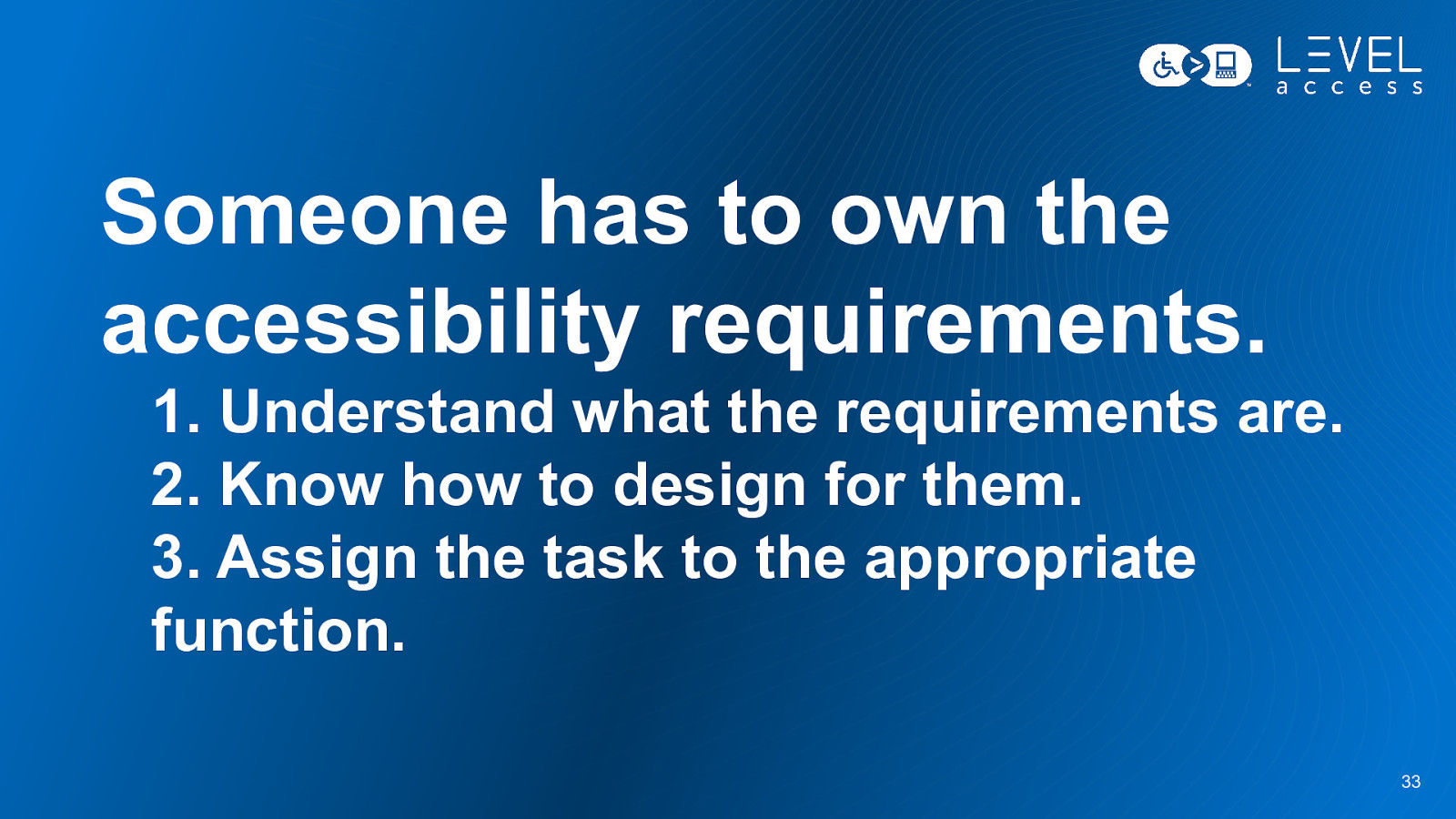
Someone has to own the accessibility requirements. 1. Understand what the requirements are. 2. Know how to design for them. 3. Assign the task to the appropriate function. 33
Some Accessible Design Requirements Button Example 34
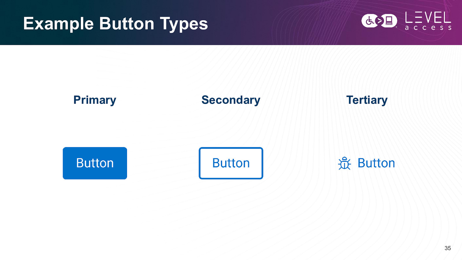
Example Button Types Primary Secondary Tertiary 35
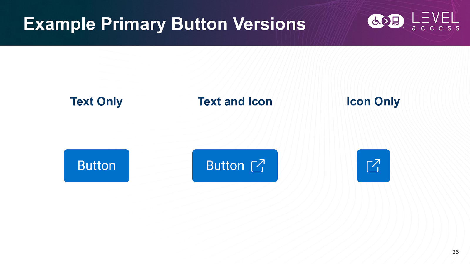
Example Primary Button Versions Text Only Text and Icon Icon Only 36
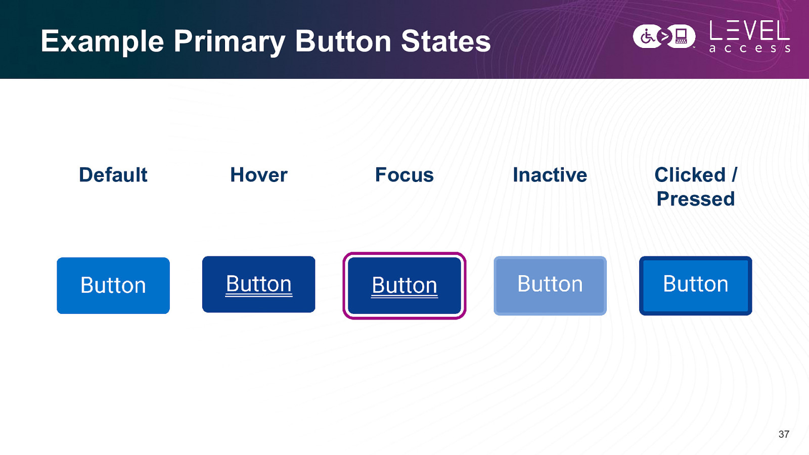
Example Primary Button States Default Hover Focus Inactive Clicked / Pressed 37
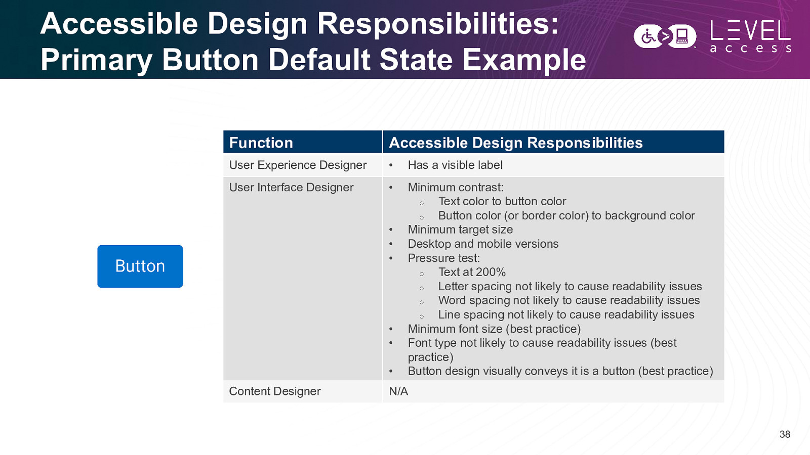
Accessible Design Responsibilities: Primary Button Default State Example Function Accessible Design Responsibilities User Experience Designer • Has a visible label User Interface Designer • Minimum contrast: o Text color to button color o Button color (or border color) to background color Minimum target size Desktop and mobile versions Pressure test: o Text at 200% o Letter spacing not likely to cause readability issues o Word spacing not likely to cause readability issues o Line spacing not likely to cause readability issues Minimum font size (best practice) Font type not likely to cause readability issues (best practice) Button design visually conveys it is a button (best practice) • • • • • • Content Designer N/A 38
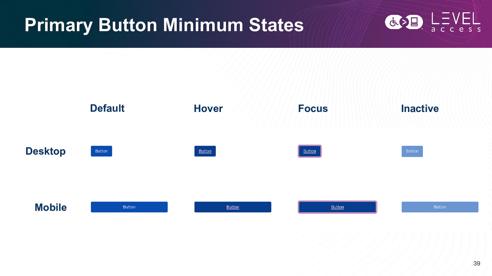
Primary Button Minimum States Default Hover Focus Inactive Desktop Mobile 39
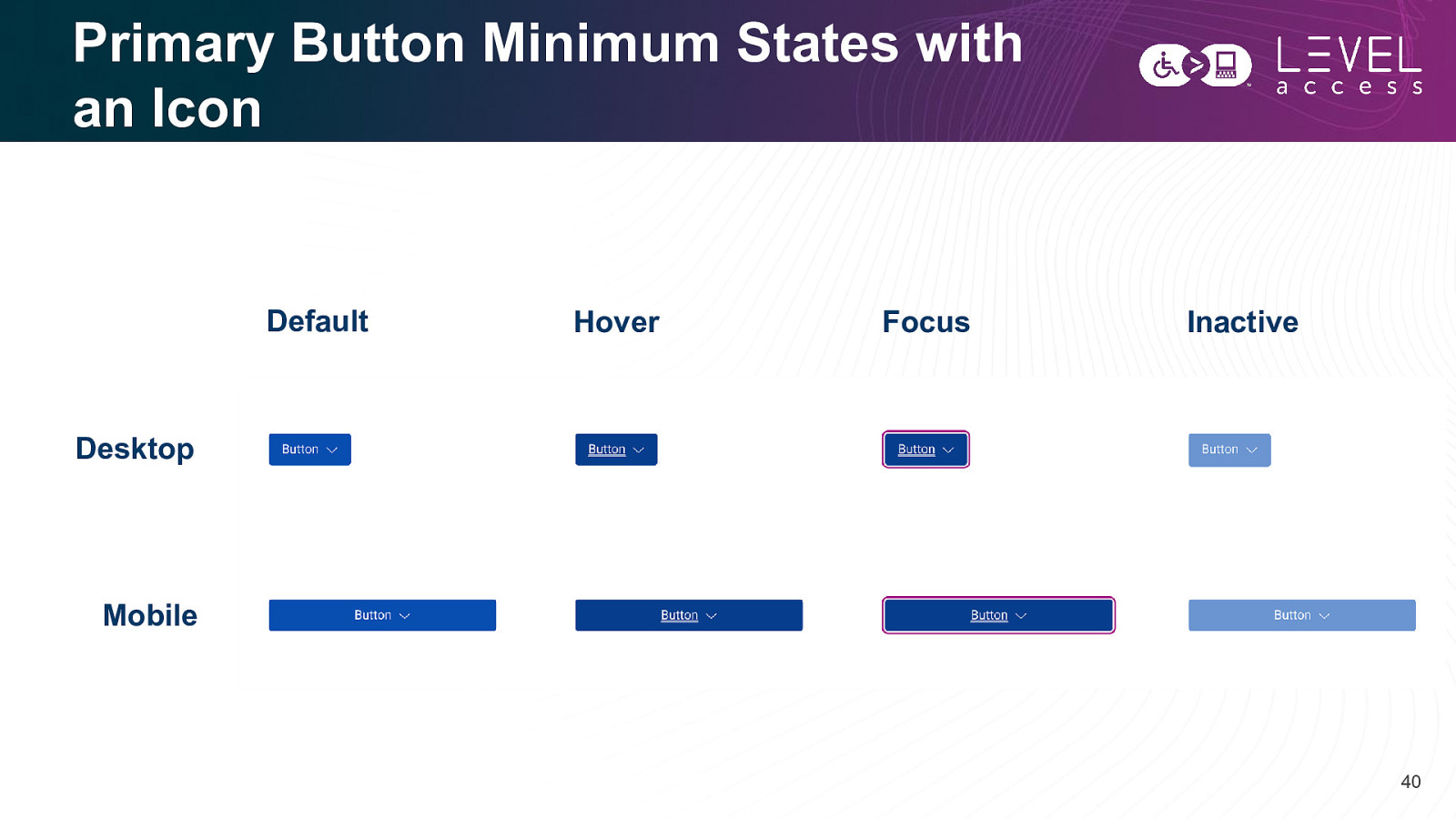
Primary Button Minimum States with an Icon Default Hover Focus Inactive Desktop Mobile 40
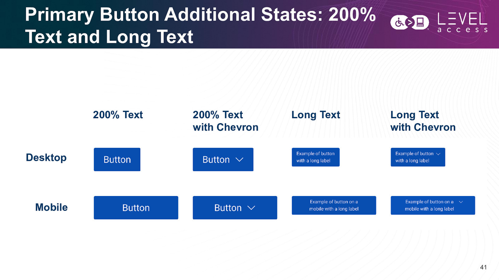
Primary Button Additional States: 200% Text and Long Text 200% Text 200% Text with Chevron Long Text Long Text with Chevron Desktop Mobile 41
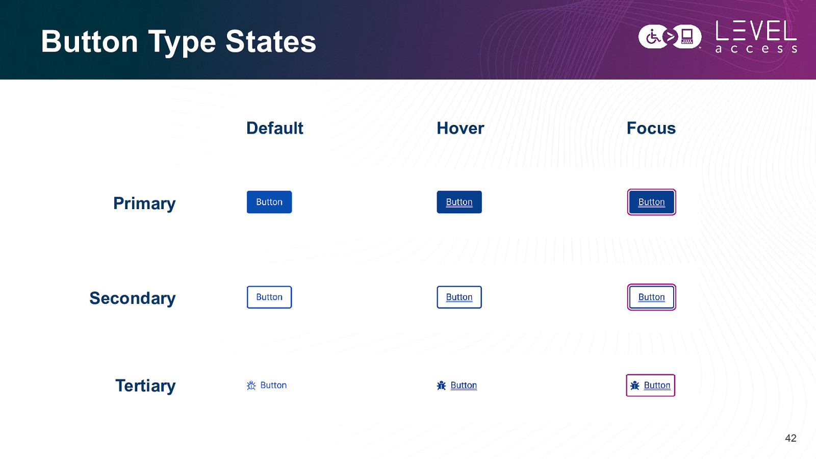
Button Type States Default Hover Focus Primary Secondary Tertiary 42
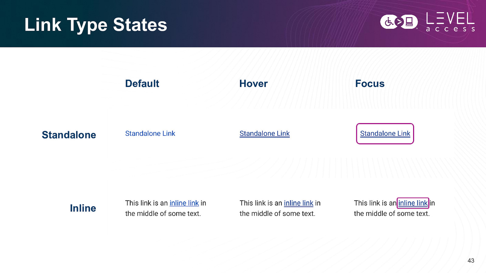
Link Type States Default Hover Focus Standalone Inline 43
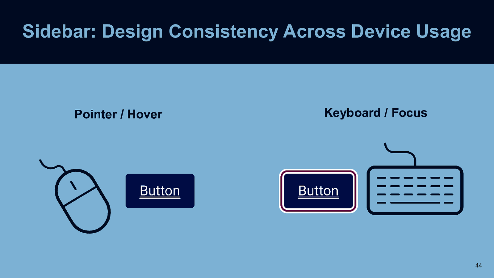
Sidebar: Design Consistency Across Device Usage Pointer / Hover Keyboard / Focus 44
Some Accessible Documentation Requirements Button Example 45
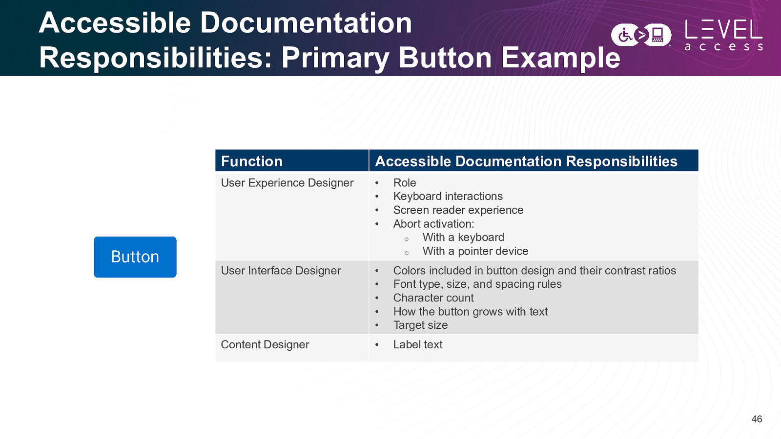
Accessible Documentation Responsibilities: Primary Button Example Function Accessible Documentation Responsibilities User Experience Designer • • • • Role Keyboard interactions Screen reader experience Abort activation: o With a keyboard o With a pointer device User Interface Designer • • • • • Colors included in button design and their contrast ratios Font type, size, and spacing rules Character count How the button grows with text Target size Content Designer • Label text 46
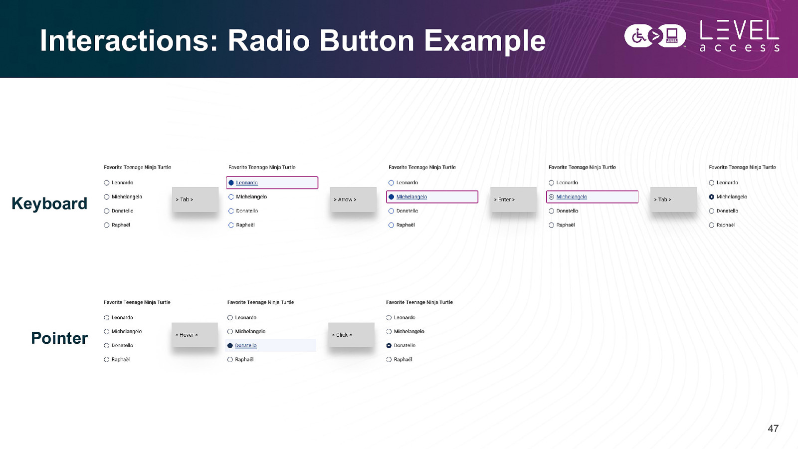
Interactions: Radio Button Example Keyboard Pointer 47
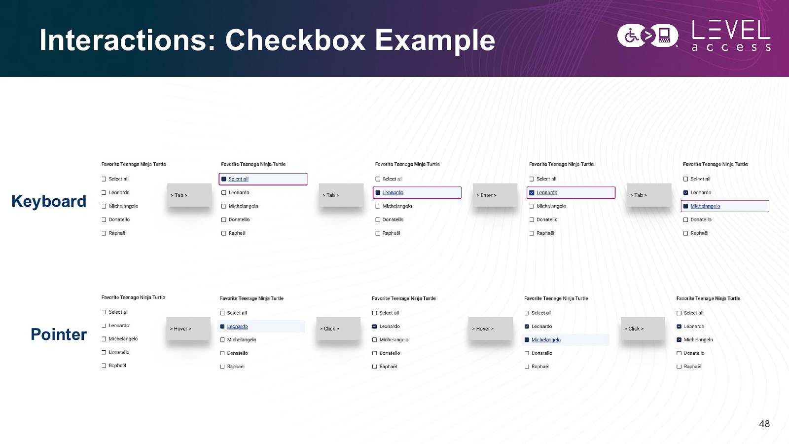
Interactions: Checkbox Example Keyboard Pointer 48
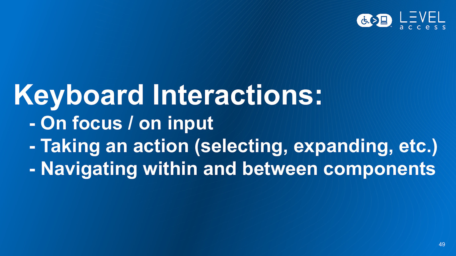
Keyboard Interactions: - On focus / on input - Taking an action (selecting, expanding, etc.) - Navigating within and between components 49
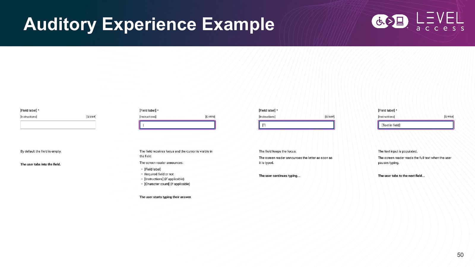
Auditory Experience Example 50
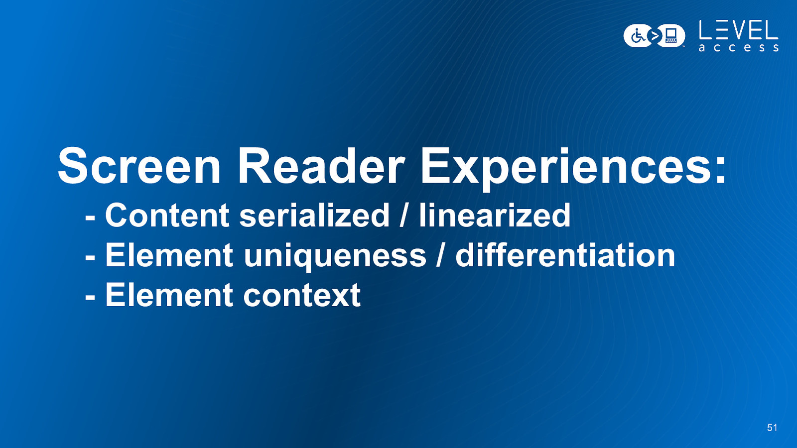
Screen Reader Experiences: - Content serialized / linearized - Element uniqueness / differentiation - Element context 51
Summary 52
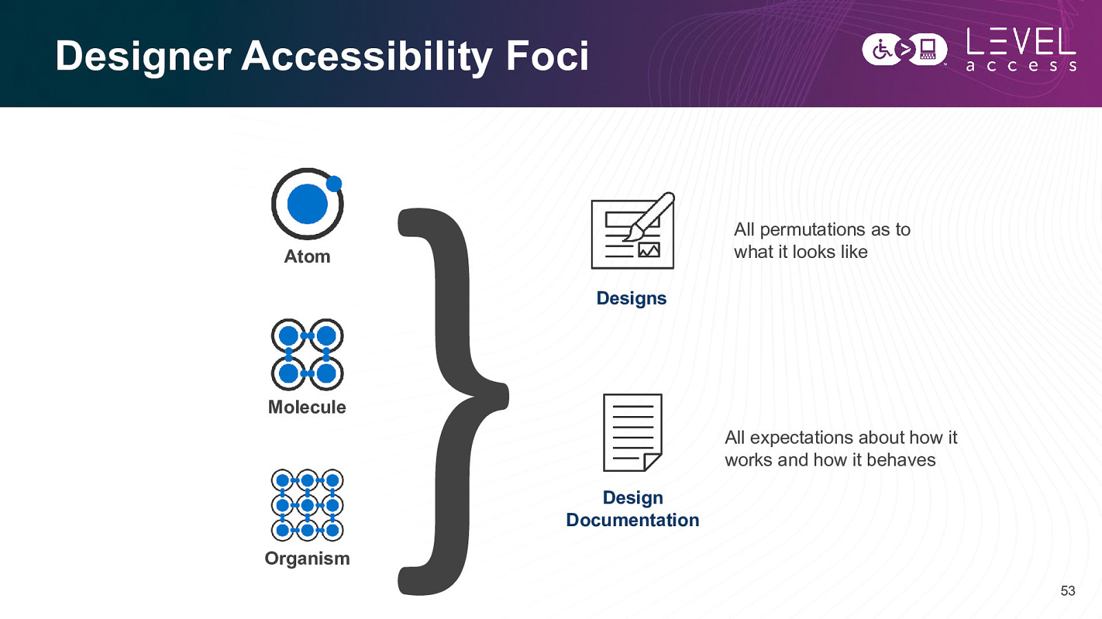
Designer Accessibility Foci All permutations as to what it looks like Atom Designs Molecule All expectations about how it works and how it behaves Design Documentation Organism 53
Questions? 54
Thank you Karen Hawkins karen.hawkins@levelaccess.com levelaccess.com