Focus People, Focus! Focusing on focus states for designers. December 12, 2022

A presentation at a11yTO in October 2022 in Toronto, ON, Canada by Karen Hawkins
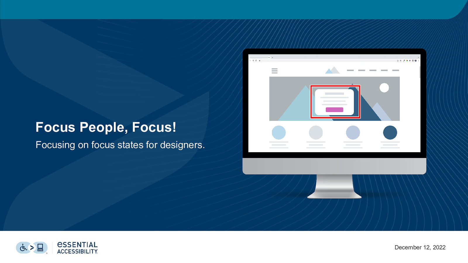
Focus People, Focus! Focusing on focus states for designers. December 12, 2022
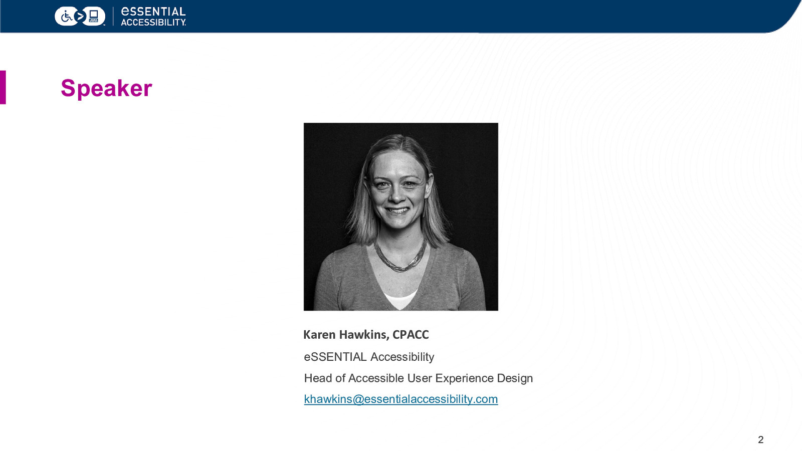
Speaker Karen Hawkins, CPACC eSSENTIAL Accessibility Head of Accessible User Experience Design khawkins@essentialaccessibility.com 2
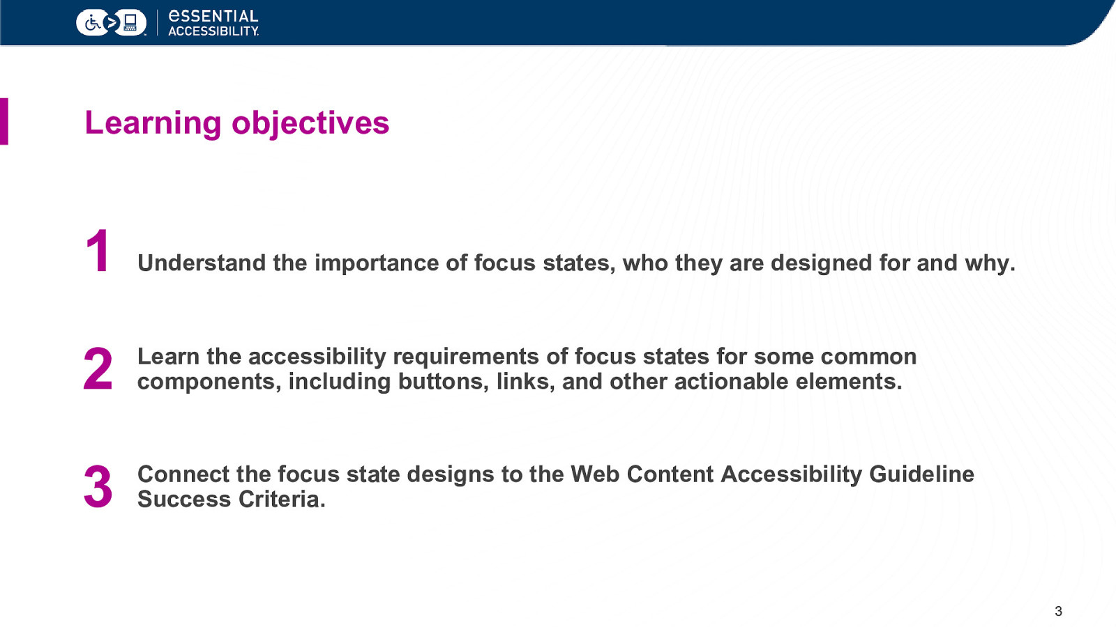
Learning objectives 1 Understand the importance of focus states, who they are designed for and why. 2 Learn the accessibility requirements of focus states for some common components, including buttons, links, and other actionable elements. 3 Connect the focus state designs to the Web Content Accessibility Guideline Success Criteria. 3
What is a focus state? 4
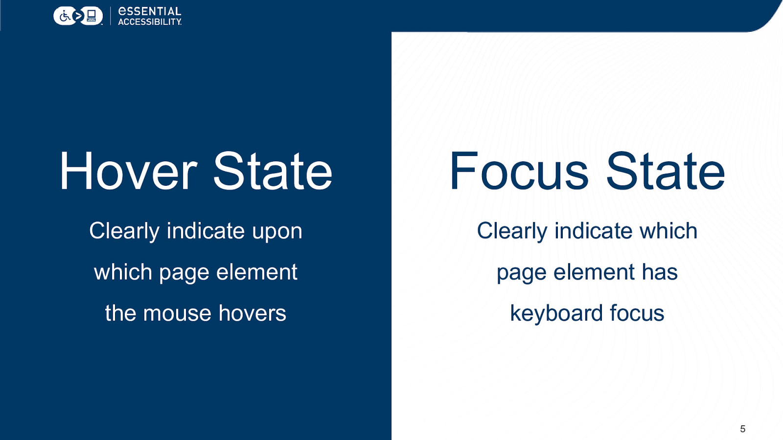
Hover State Focus State Clearly indicate upon Clearly indicate which which page element page element has the mouse hovers keyboard focus 5
Why focus on focus states? 6
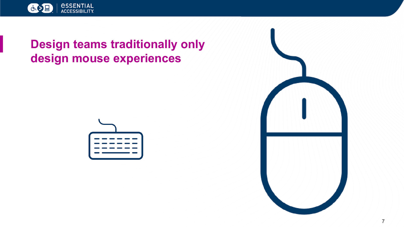
Design teams traditionally only design mouse experiences 7
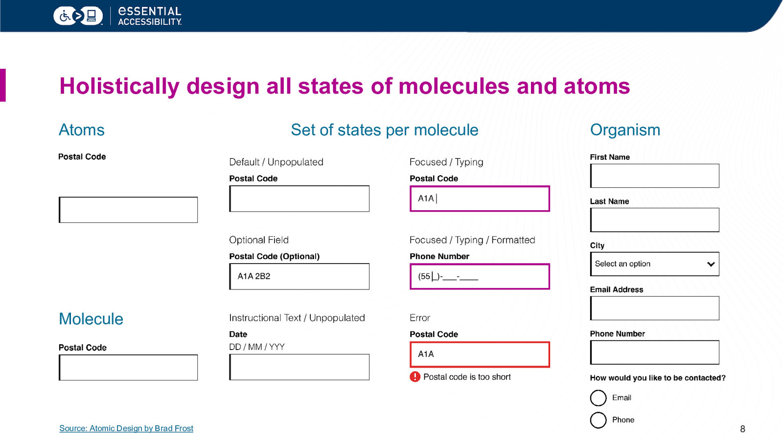
Holistically design all states of molecules and atoms Atoms Set of states per molecule Organism Molecule Source: Atomic Design by Brad Frost 8
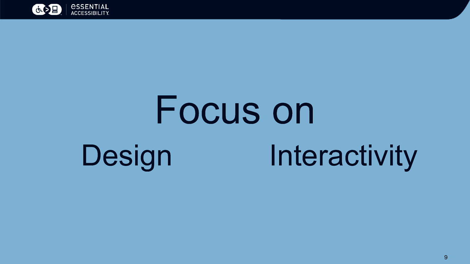
Focus on Design Interactivity 9
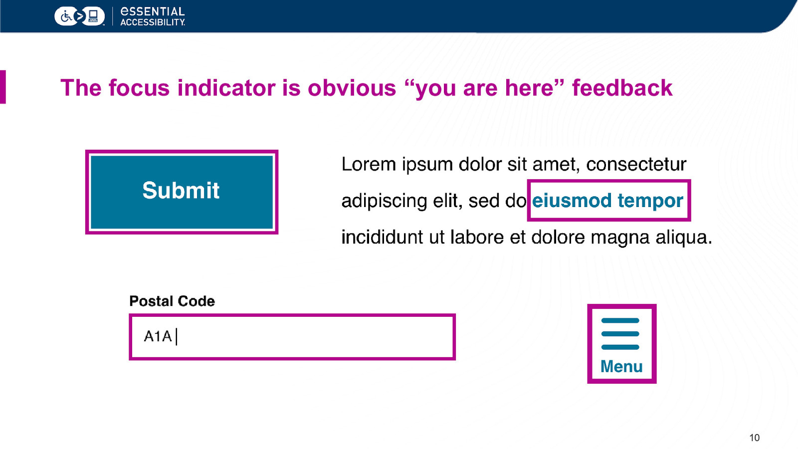
The focus indicator is obvious “you are here” feedback 10
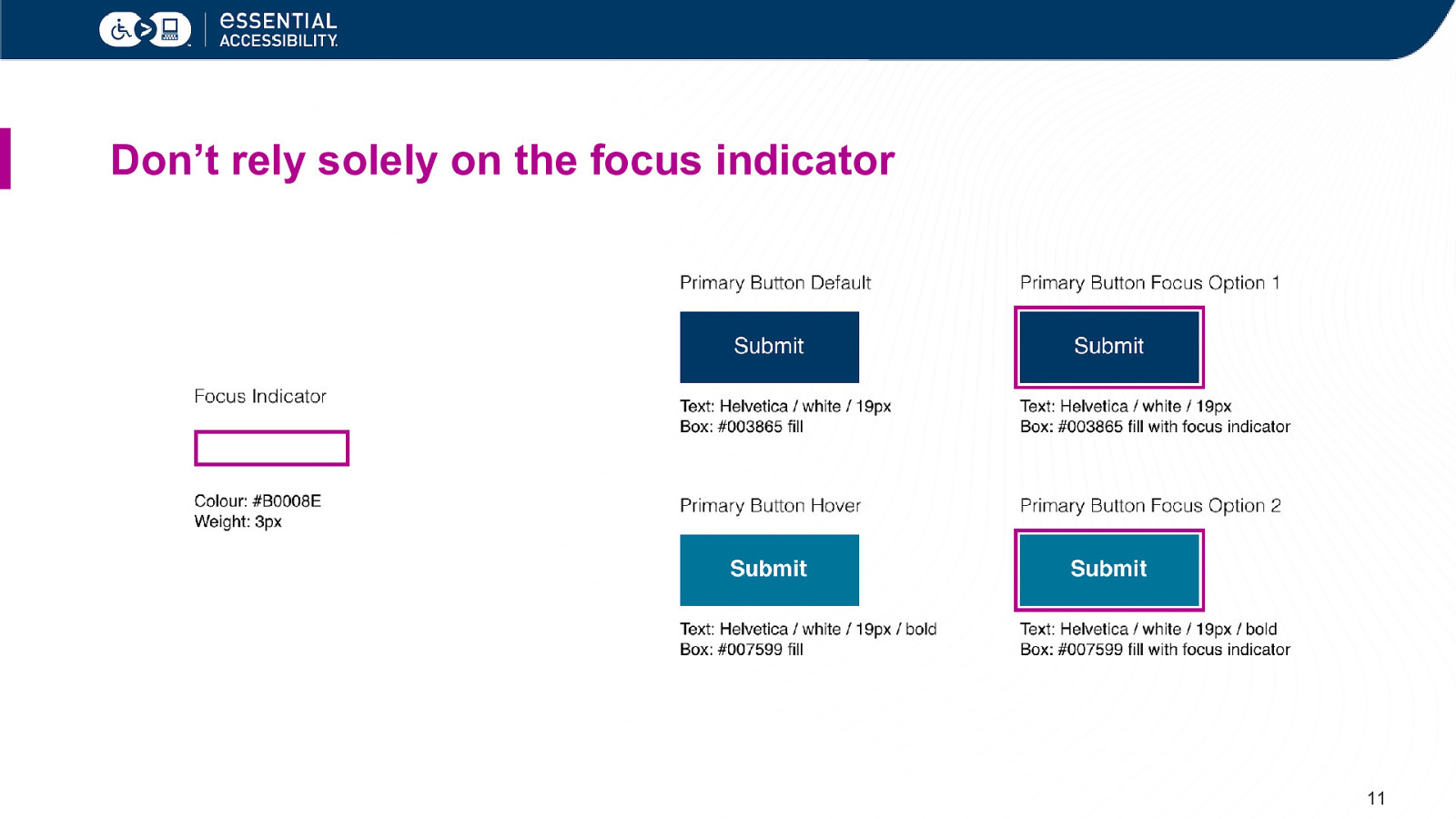
Don’t rely solely on the focus indicator 11
Think “obviousness”. 12
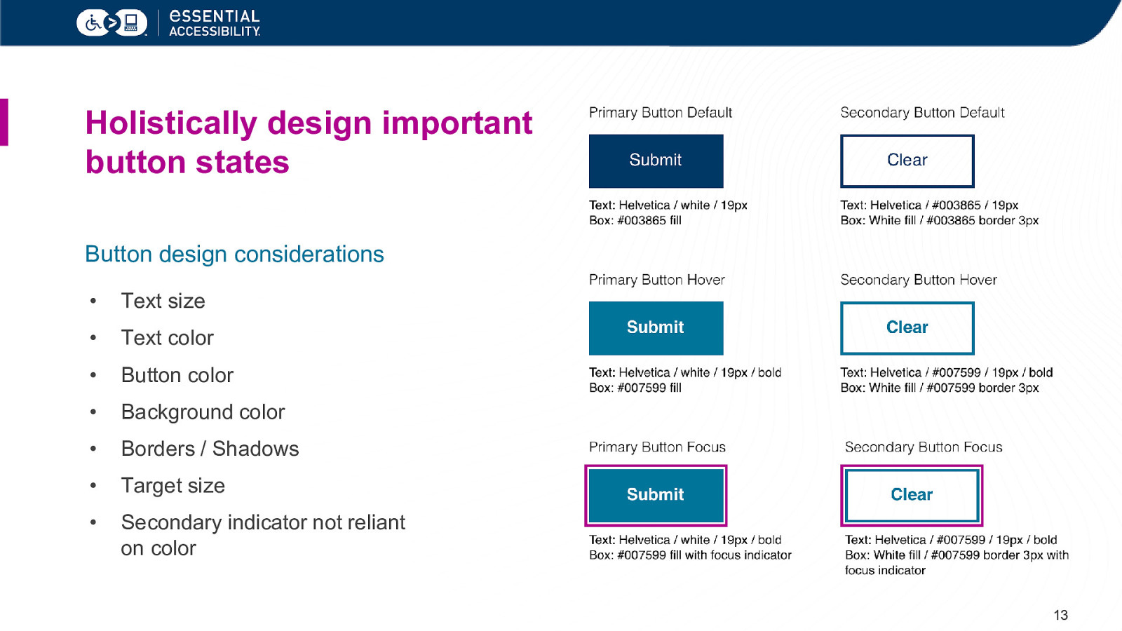
Holistically design important button states Button design considerations • Text size • Text color • Button color • Background color • Borders / Shadows • Target size • Secondary indicator not reliant on color 13
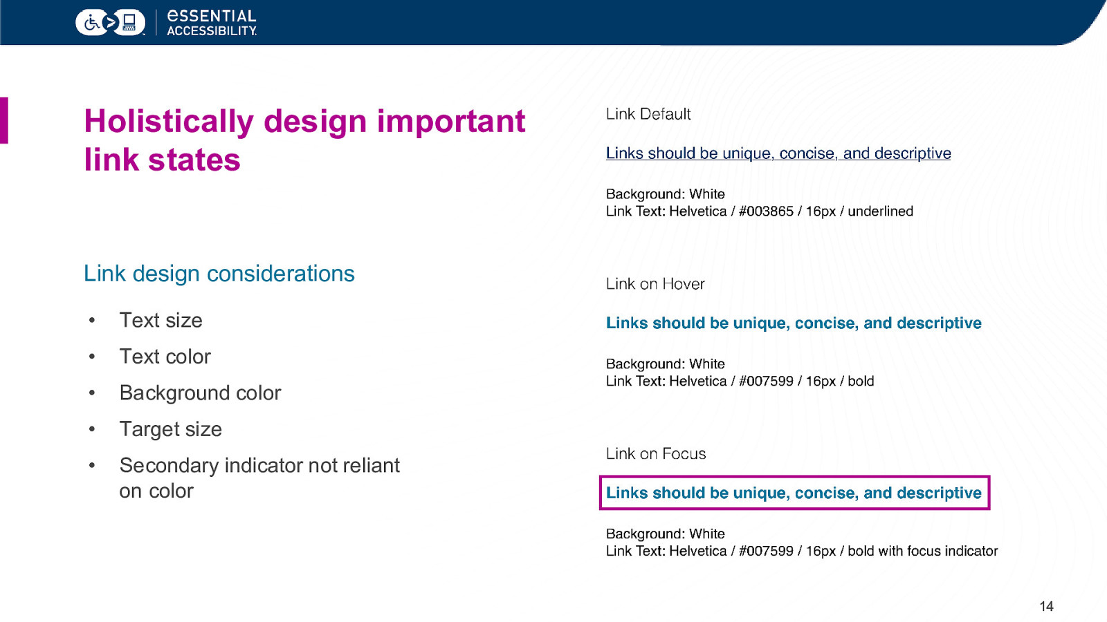
Holistically design important link states Link design considerations • Text size • Text color • Background color • Target size • Secondary indicator not reliant on color 14
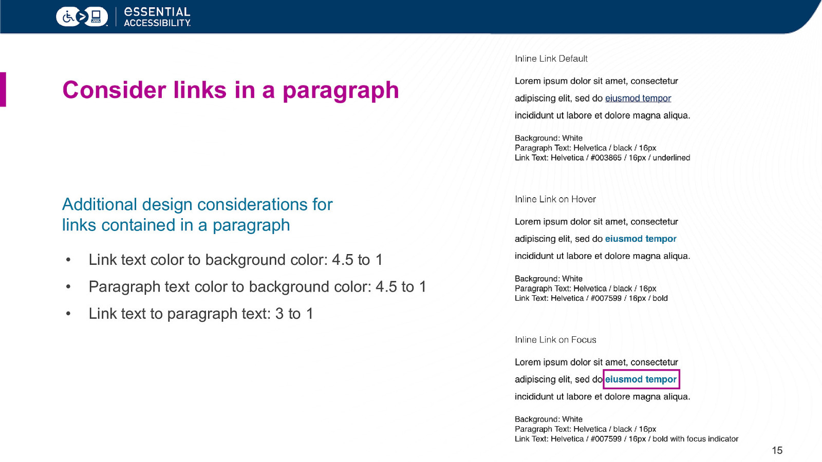
Consider links in a paragraph Additional design considerations for links contained in a paragraph • Link text color to background color: 4.5 to 1 • Paragraph text color to background color: 4.5 to 1 • Link text to paragraph text: 3 to 1 15
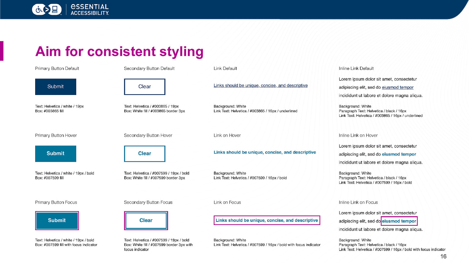
Aim for consistent styling 16
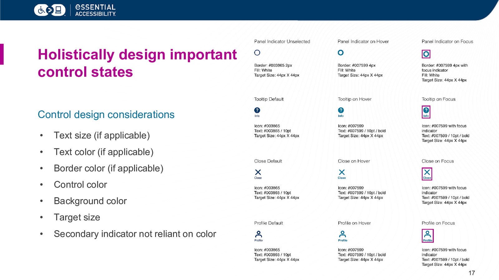
Holistically design important control states Control design considerations • Text size (if applicable) • Text color (if applicable) • Border color (if applicable) • Control color • Background color • Target size • Secondary indicator not reliant on color 17
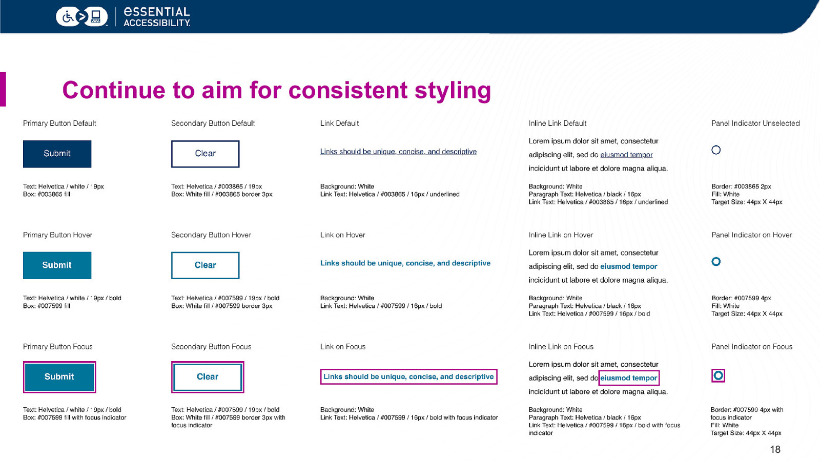
Continue to aim for consistent styling 18
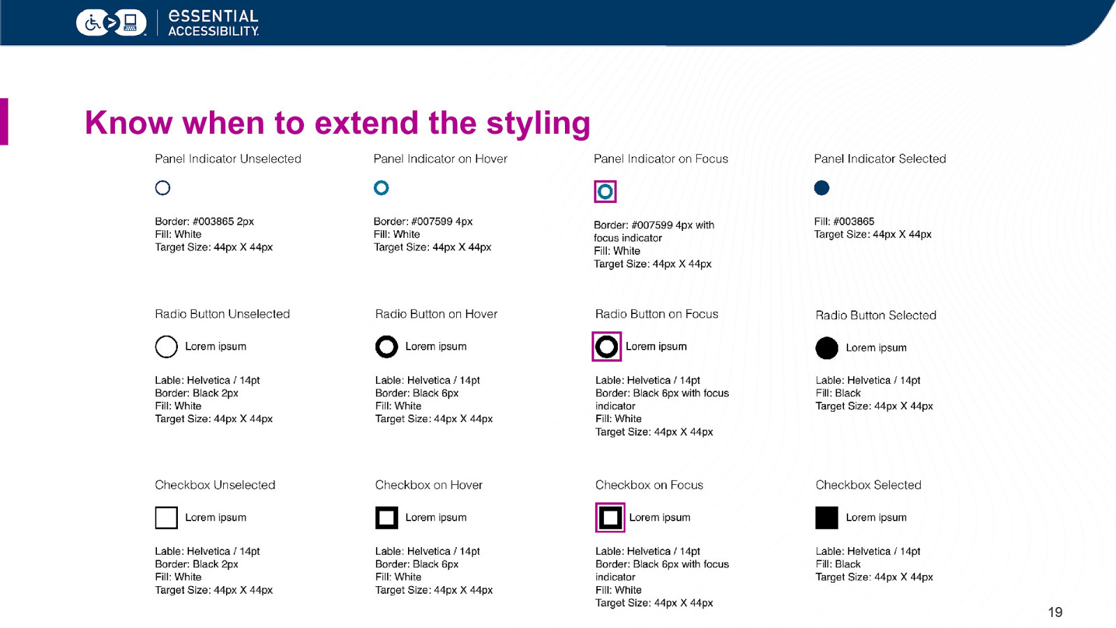
Know when to extend the styling 19
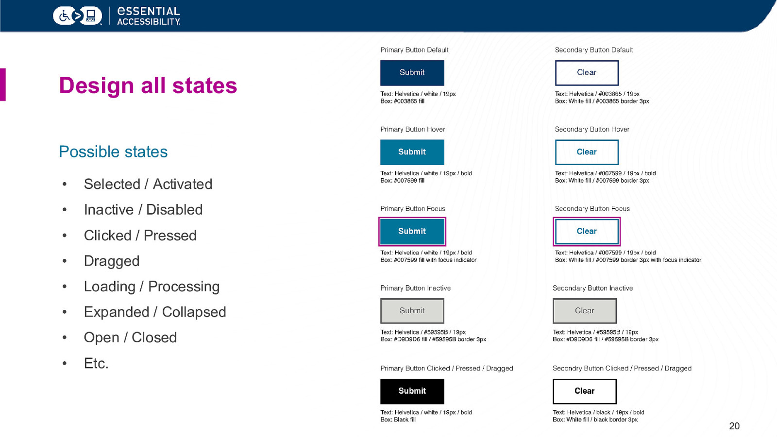
Design all states Possible states • Selected / Activated • Inactive / Disabled • Clicked / Pressed • Dragged • Loading / Processing • Expanded / Collapsed • Open / Closed • Etc. 20
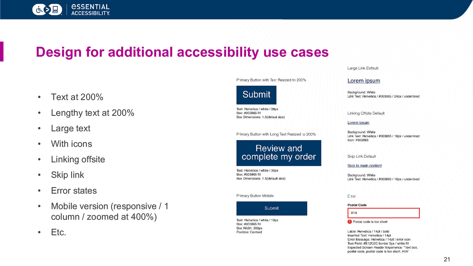
Design for additional accessibility use cases • Text at 200% • Lengthy text at 200% • Large text • With icons • Linking offsite • Skip link • Error states • Mobile version (responsive / 1 column / zoomed at 400%) • Etc. 21
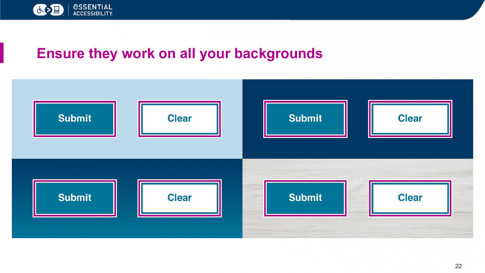
Ensure they work on all your backgrounds 22
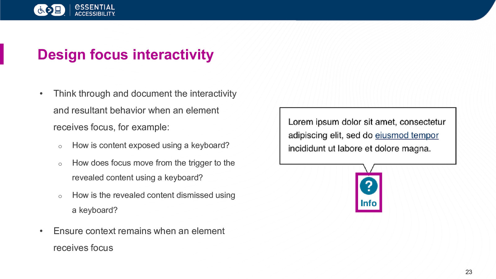
Design focus interactivity • Think through and document the interactivity and resultant behavior when an element receives focus, for example: o How is content exposed using a keyboard? o How does focus move from the trigger to the revealed content using a keyboard? o How is the revealed content dismissed using a keyboard? • Ensure context remains when an element receives focus 23
Related success criteria Design of focus state Interactivity on focus • 1.4.1 (links in paragraph) • 1.4.2 (audio control) • 1.4.3 (contrast minimum) • 1.4.13 (content on hover or focus) • 1.4.11 (non-text contrast) • 2.1.2 (no keyboard trap) • 2.4.1 (bypass blocks) • 2.2.1 (timing adjustable) • 2.4.7 (focus visible) • 2.2.2 (pause, stop, hide) • 4.1.2 (name, role, value) • 2.5.1 (pointer gestures) • 2.5.4 (motion actuation) • 3.2.1 (on focus) • 3.2.2 (on input) • 4.1.3 (status messages) 24
Focus on the focus states. 25
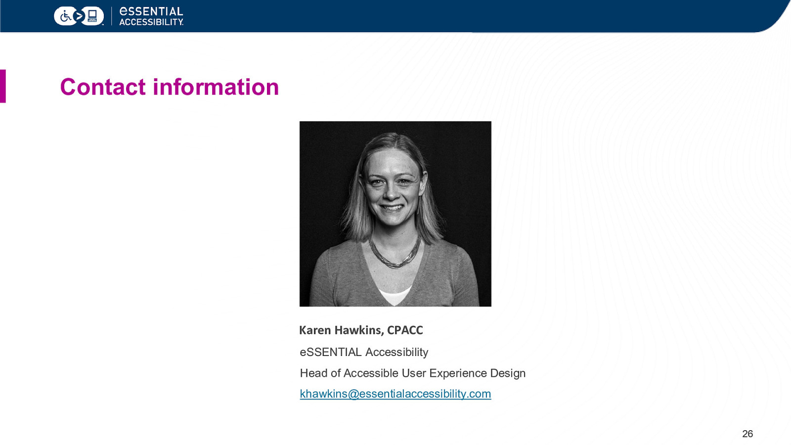
Contact information Karen Hawkins, CPACC eSSENTIAL Accessibility Head of Accessible User Experience Design khawkins@essentialaccessibility.com 26

Thank You essentialaccessibility.com